Practical Machine Learning With Python A Problem Solver’s Guide To Building Real World Intelligen
User Manual: Pdf
Open the PDF directly: View PDF ![]() .
.
Page Count: 545 [warning: Documents this large are best viewed by clicking the View PDF Link!]
- Contents
- About the Authors
- About the Technical Reviewer
- Acknowledgments
- Foreword
- Introduction
- Part I: Understanding Machine Learning
- Chapter 1: Machine Learning Basics
- The Need for Machine Learning
- Understanding Machine Learning
- Computer Science
- Data Science
- Mathematics
- Statistics
- Data Mining
- Artificial Intelligence
- Natural Language Processing
- Deep Learning
- Machine Learning Methods
- Supervised Learning
- Unsupervised Learning
- Semi-Supervised Learning
- Reinforcement Learning
- Batch Learning
- Online Learning
- Instance Based Learning
- Model Based Learning
- The CRISP-DM Process Model
- Building Machine Intelligence
- Real-World Case Study: Predicting Student Grant Recommendations
- Challenges in Machine Learning
- Real-World Applications of Machine Learning
- Summary
- Chapter 2: The Python Machine Learning Ecosystem
- Python: An Introduction
- Introducing the Python Machine Learning Ecosystem
- Summary
- Chapter 1: Machine Learning Basics
- Part II: The Machine Learning Pipeline
- Chapter 3: Processing, Wrangling, and Visualizing Data
- Chapter 4: Feature Engineering and Selection
- Features: Understand Your Data Better
- Revisiting the Machine Learning Pipeline
- Feature Extraction and Engineering
- Feature Engineering on Numeric Data
- Feature Engineering on Categorical Data
- Feature Engineering on Text Data
- Feature Engineering on Temporal Data
- Feature Engineering on Image Data
- Feature Scaling
- Feature Selection
- Dimensionality Reduction
- Summary
- Chapter 5: Building, Tuning, and Deploying Models
- Part III: Real-World Case Studies
- Chapter 6: Analyzing Bike Sharing Trends
- Chapter 7: Analyzing Movie Reviews Sentiment
- Problem Statement
- Setting Up Dependencies
- Getting the Data
- Text Pre-Processing and Normalization
- Unsupervised Lexicon-Based Models
- Classifying Sentiment with Supervised Learning
- Traditional Supervised Machine Learning Models
- Newer Supervised Deep Learning Models
- Advanced Supervised Deep Learning Models
- Analyzing Sentiment Causation
- Summary
- Chapter 8: Customer Segmentation and Effective Cross Selling
- Chapter 9: Analyzing Wine Types and Quality
- Chapter 10: Analyzing Music Trends and Recommendations
- The Million Song Dataset Taste Profile
- Exploratory Data Analysis
- Recommendation Engines
- A Note on Recommendation Engine Libraries
- Summary
- Chapter 11: Forecasting Stock and Commodity Prices
- Chapter 12: Deep Learning for Computer Vision
- Index

Practical Machine
Learning with
Python
A Problem-Solver’s Guide to Building
Real-World Intelligent Systems
—
Dipanjan Sarkar
Raghav Bali
Tushar Sharma

Practical Machine
Learning with Python
A Problem-Solver’s Guide to Building
Real-World Intelligent Systems
Dipanjan Sarkar
Raghav Bali
Tushar Sharma
Practical Machine Learning with Python
Dipanjan Sarkar Raghav Bali
Bangalore, Karnataka, India Bangalore, Karnataka, India
Tushar Sharma
Bangalore, Karnataka, India
ISBN-13 (pbk): 978-1-4842-3206-4 ISBN-13 (electronic): 978-1-4842-3207-1
https://doi.org/10.1007/978-1-4842-3207-1
Library of Congress Control Number: 2017963290
Copyright © 2018 by Dipanjan Sarkar, Raghav Bali and Tushar Sharma
This work is subject to copyright. All rights are reserved by the Publisher, whether the whole or part of the
material is concerned, specifically the rights of translation, reprinting, reuse of illustrations, recitation,
broadcasting, reproduction on microfilms or in any other physical way, and transmission or information storage
and retrieval, electronic adaptation, computer software, or by similar or dissimilar methodology now known or
hereafter developed.
Trademarked names, logos, and images may appear in this book. Rather than use a trademark symbol with
every occurrence of a trademarked name, logo, or image we use the names, logos, and images only in an
editorial fashion and to the benefit of the trademark owner, with no intention of infringement of the trademark.
The use in this publication of trade names, trademarks, service marks, and similar terms, even if they are
not identified as such, is not to be taken as an expression of opinion as to whether or not they are subject to
proprietary rights.
While the advice and information in this book are believed to be true and accurate at the date of publication,
neither the authors nor the editors nor the publisher can accept any legal responsibility for any errors or
omissions that may be made. The publisher makes no warranty, express or implied, with respect to the material
contained herein.
Cover image by Freepik (www.freepik.com)
Managing Director: Welmoed Spahr
Editorial Director: Todd Green
Acquisitions Editor: Celestin Suresh John
Development Editor: Matthew Moodie
Technical Reviewer: Jojo Moolayil
Coordinating Editor: Sanchita Mandal
Copy Editor: Kezia Endsley
Distributed to the book trade worldwide by Springer Science+Business Media New York,
233 Spring Street, 6th Floor, New York, NY 10013. Phone 1-800-SPRINGER, fax (201) 348-4505, e-mail
orders-ny@springer-sbm.com, or visit www.springeronline.com. Apress Media, LLC is a California LLC
and the sole member (owner) is Springer Science + Business Media Finance Inc (SSBM Finance Inc).
SSBM Finance Inc is a Delaware corporation.
For information on translations, please e-mail rights@apress.com, or visit http://www.apress.com/
rights-permissions.
Apress titles may be purchased in bulk for academic, corporate, or promotional use. eBook versions
and licenses are also available for most titles. For more information, reference our Print and eBook Bulk
Sales web page at http://www.apress.com/bulk-sales.
Any source code or other supplementary material referenced by the author in this book is available to
readers on GitHub via the book’s product page, located at www.apress.com/978-1-4842-3206-4. For
more detailed information, please visit http://www.apress.com/source-code.
Printed on acid-free paper
is book is dedicated to my parents, partner, friends, family, and well-wishers.
—Dipanjan Sarkar
To all my inspirations, who would never read this!
—Raghav Bali
Dedicated to my family and friends.
—Tushar Sharma

v
Contents
About the Authors ��������������������������������������������������������������������������������������������������xvii
About the Technical Reviewer ��������������������������������������������������������������������������������xix
Acknowledgments ��������������������������������������������������������������������������������������������������xxi
Foreword ��������������������������������������������������������������������������������������������������������������xxiii
Introduction �����������������������������������������������������������������������������������������������������������xxv
■Part I: Understanding Machine Learning �������������������������������������������� 1
■Chapter 1: Machine Learning Basics ��������������������������������������������������������������������� 3
The Need for Machine Learning ��������������������������������������������������������������������������������������� 4
Making Data-Driven Decisions ��������������������������������������������������������������������������������������������������������������� 4
Efficiency and Scale �������������������������������������������������������������������������������������������������������������������������������5
Traditional Programming Paradigm �������������������������������������������������������������������������������������������������������� 5
Why Machine Learning? ������������������������������������������������������������������������������������������������������������������������� 6
Understanding Machine Learning ������������������������������������������������������������������������������������ 8
Why Make Machines Learn?�������������������������������������������������������������������������������������������������������������������8
Formal Definition ������������������������������������������������������������������������������������������������������������������������������������ 9
A Multi-Disciplinary Field ��������������������������������������������������������������������������������������������������������������������� 13
Computer Science ���������������������������������������������������������������������������������������������������������� 14
Theoretical Computer Science��������������������������������������������������������������������������������������������������������������15
Practical Computer Science �����������������������������������������������������������������������������������������������������������������15
Important Concepts ������������������������������������������������������������������������������������������������������������������������������ 15
Data Science ������������������������������������������������������������������������������������������������������������������ 16
■ Contents
vi
Mathematics ������������������������������������������������������������������������������������������������������������������ 18
Important Concepts ������������������������������������������������������������������������������������������������������������������������������ 19
Statistics ������������������������������������������������������������������������������������������������������������������������ 24
Data Mining �������������������������������������������������������������������������������������������������������������������� 25
Artificial Intelligence ������������������������������������������������������������������������������������������������������ 25
Natural Language Processing ���������������������������������������������������������������������������������������� 26
Deep Learning ���������������������������������������������������������������������������������������������������������������� 28
Important Concepts ������������������������������������������������������������������������������������������������������������������������������ 31
Machine Learning Methods �������������������������������������������������������������������������������������������� 34
Supervised Learning ������������������������������������������������������������������������������������������������������ 35
Classification ���������������������������������������������������������������������������������������������������������������������������������������� 36
Regression �������������������������������������������������������������������������������������������������������������������������������������������� 37
Unsupervised Learning �������������������������������������������������������������������������������������������������� 38
Clustering ��������������������������������������������������������������������������������������������������������������������������������������������� 39
Dimensionality Reduction ��������������������������������������������������������������������������������������������������������������������� 40
Anomaly Detection�������������������������������������������������������������������������������������������������������������������������������� 41
Association Rule-Mining ����������������������������������������������������������������������������������������������������������������������� 41
Semi-Supervised Learning ��������������������������������������������������������������������������������������������� 42
Reinforcement Learning ������������������������������������������������������������������������������������������������� 42
Batch Learning ��������������������������������������������������������������������������������������������������������������� 43
Online Learning �������������������������������������������������������������������������������������������������������������� 44
Instance Based Learning ������������������������������������������������������������������������������������������������ 44
Model Based Learning ���������������������������������������������������������������������������������������������������� 45
The CRISP-DM Process Model ���������������������������������������������������������������������������������������� 45
Business Understanding ����������������������������������������������������������������������������������������������������������������������� 46
Data Understanding ������������������������������������������������������������������������������������������������������������������������������ 48
Data Preparation �����������������������������������������������������������������������������������������������������������������������������������50
Modeling ����������������������������������������������������������������������������������������������������������������������������������������������� 51
Evaluation ��������������������������������������������������������������������������������������������������������������������������������������������� 52
Deployment������������������������������������������������������������������������������������������������������������������������������������������� 52
■ Contents
vii
Building Machine Intelligence ���������������������������������������������������������������������������������������� 52
Machine Learning Pipelines ����������������������������������������������������������������������������������������������������������������� 52
Supervised Machine Learning Pipeline ������������������������������������������������������������������������������������������������ 54
Unsupervised Machine Learning Pipeline �������������������������������������������������������������������������������������������� 55
Real-World Case Study: Predicting Student Grant Recommendations ��������������������������� 55
Objective ����������������������������������������������������������������������������������������������������������������������������������������������� 56
Data Retrieval ���������������������������������������������������������������������������������������������������������������������������������������56
Data Preparation �����������������������������������������������������������������������������������������������������������������������������������57
Modeling ����������������������������������������������������������������������������������������������������������������������������������������������� 60
Model Evaluation ����������������������������������������������������������������������������������������������������������������������������������61
Model Deployment ��������������������������������������������������������������������������������������������������������������������������������61
Prediction in Action �������������������������������������������������������������������������������������������������������������������������������62
Challenges in Machine Learning ������������������������������������������������������������������������������������ 64
Real-World Applications of Machine Learning ��������������������������������������������������������������� 64
Summary ������������������������������������������������������������������������������������������������������������������������ 65
■Chapter 2: The Python Machine Learning Ecosystem ����������������������������������������� 67
Python: An Introduction �������������������������������������������������������������������������������������������������� 67
Strengths ���������������������������������������������������������������������������������������������������������������������������������������������� 68
Pitfalls ��������������������������������������������������������������������������������������������������������������������������������������������������� 68
Setting Up a Python Environment ��������������������������������������������������������������������������������������������������������� 69
Why Python for Data Science? �������������������������������������������������������������������������������������������������������������71
Introducing the Python Machine Learning Ecosystem ��������������������������������������������������� 72
Jupyter Notebooks �������������������������������������������������������������������������������������������������������������������������������� 72
NumPy �������������������������������������������������������������������������������������������������������������������������������������������������� 75
Pandas �������������������������������������������������������������������������������������������������������������������������������������������������� 84
Scikit-learn ������������������������������������������������������������������������������������������������������������������������������������������� 96
Neural Networks and Deep Learning �������������������������������������������������������������������������������������������������� 102
Text Analytics and Natural Language Processing ������������������������������������������������������������������������������� 112
Statsmodels ���������������������������������������������������������������������������������������������������������������������������������������� 116
Summary ���������������������������������������������������������������������������������������������������������������������� 118
■ Contents
viii
■Part II: The Machine Learning Pipeline ������������������������������������������� 119
■Chapter 3: Processing, Wrangling, and Visualizing Data ����������������������������������� 121
Data Collection ������������������������������������������������������������������������������������������������������������� 122
CSV ����������������������������������������������������������������������������������������������������������������������������������������������������� 122
JSON ��������������������������������������������������������������������������������������������������������������������������������������������������� 124
XML ����������������������������������������������������������������������������������������������������������������������������������������������������� 128
HTML and Scraping ����������������������������������������������������������������������������������������������������������������������������131
SQL ����������������������������������������������������������������������������������������������������������������������������������������������������� 136
Data Description ����������������������������������������������������������������������������������������������������������� 137
Numeric ���������������������������������������������������������������������������������������������������������������������������������������������� 137
Text ����������������������������������������������������������������������������������������������������������������������������������������������������� 137
Categorical ����������������������������������������������������������������������������������������������������������������������������������������� 137
Data Wrangling ������������������������������������������������������������������������������������������������������������� 138
Understanding Data ���������������������������������������������������������������������������������������������������������������������������� 138
Filtering Data �������������������������������������������������������������������������������������������������������������������������������������� 141
Typecasting ����������������������������������������������������������������������������������������������������������������������������������������� 144
Transformations ���������������������������������������������������������������������������������������������������������������������������������� 144
Imputing Missing Values ��������������������������������������������������������������������������������������������������������������������� 145
Handling Duplicates ���������������������������������������������������������������������������������������������������������������������������� 147
Handling Categorical Data ������������������������������������������������������������������������������������������������������������������ 147
Normalizing Values ����������������������������������������������������������������������������������������������������������������������������� 148
String Manipulations �������������������������������������������������������������������������������������������������������������������������� 149
Data Summarization ����������������������������������������������������������������������������������������������������� 149
Data Visualization ��������������������������������������������������������������������������������������������������������� 151
Visualizing with Pandas ���������������������������������������������������������������������������������������������������������������������� 152
Visualizing with Matplotlib������������������������������������������������������������������������������������������������������������������161
Python Visualization Ecosystem ��������������������������������������������������������������������������������������������������������� 176
Summary ���������������������������������������������������������������������������������������������������������������������� 176
■ Contents
ix
■Chapter 4: Feature Engineering and Selection �������������������������������������������������� 177
Features: Understand Your Data Better ������������������������������������������������������������������������ 178
Data and Datasets ������������������������������������������������������������������������������������������������������������������������������ 178
Features ����������������������������������������������������������������������������������������������������������������������������������������������179
Models ������������������������������������������������������������������������������������������������������������������������������������������������ 179
Revisiting the Machine Learning Pipeline �������������������������������������������������������������������� 179
Feature Extraction and Engineering ����������������������������������������������������������������������������� 181
What Is Feature Engineering?�������������������������������������������������������������������������������������������������������������181
Why Feature Engineering? ������������������������������������������������������������������������������������������������������������������183
How Do You Engineer Features? ��������������������������������������������������������������������������������������������������������� 184
Feature Engineering on Numeric Data ������������������������������������������������������������������������� 185
Raw Measures ������������������������������������������������������������������������������������������������������������������������������������185
Binarization ����������������������������������������������������������������������������������������������������������������������������������������� 187
Rounding �������������������������������������������������������������������������������������������������������������������������������������������� 188
Interactions �����������������������������������������������������������������������������������������������������������������������������������������189
Binning ����������������������������������������������������������������������������������������������������������������������������������������������� 191
Statistical Transformations ����������������������������������������������������������������������������������������������������������������� 197
Feature Engineering on Categorical Data ��������������������������������������������������������������������� 200
Transforming Nominal Features ��������������������������������������������������������������������������������������������������������� 201
Transforming Ordinal Features ����������������������������������������������������������������������������������������������������������� 202
Encoding Categorical Features �����������������������������������������������������������������������������������������������������������203
Feature Engineering on Text Data �������������������������������������������������������������������������������� 209
Text Pre-Processing ���������������������������������������������������������������������������������������������������������������������������� 210
Bag of Words Model ����������������������������������������������������������������������������������������������������������������������������211
Bag of N-Grams Model �����������������������������������������������������������������������������������������������������������������������212
TF-IDF Model �������������������������������������������������������������������������������������������������������������������������������������� 213
Document Similarity ��������������������������������������������������������������������������������������������������������������������������� 214
Topic Models ��������������������������������������������������������������������������������������������������������������������������������������� 216
Word Embeddings �������������������������������������������������������������������������������������������������������������������������������217
■ Contents
x
Feature Engineering on Temporal Data ������������������������������������������������������������������������ 220
Date-Based Features �������������������������������������������������������������������������������������������������������������������������� 221
Time-Based Features ������������������������������������������������������������������������������������������������������������������������� 222
Feature Engineering on Image Data ����������������������������������������������������������������������������� 224
Image Metadata Features �������������������������������������������������������������������������������������������������������������������225
Raw Image and Channel Pixels ���������������������������������������������������������������������������������������������������������� 225
Grayscale Image Pixels �����������������������������������������������������������������������������������������������������������������������227
Binning Image Intensity Distribution �������������������������������������������������������������������������������������������������� 227
Image Aggregation Statistics ��������������������������������������������������������������������������������������������������������������228
Edge Detection ����������������������������������������������������������������������������������������������������������������������������������� 229
Object Detection ��������������������������������������������������������������������������������������������������������������������������������� 230
Localized Feature Extraction ��������������������������������������������������������������������������������������������������������������231
Visual Bag of Words Model �����������������������������������������������������������������������������������������������������������������233
Automated Feature Engineering with Deep Learning ������������������������������������������������������������������������� 236
Feature Scaling ������������������������������������������������������������������������������������������������������������ 239
Standardized Scaling ��������������������������������������������������������������������������������������������������������������������������240
Min-Max Scaling ��������������������������������������������������������������������������������������������������������������������������������� 240
Robust Scaling ������������������������������������������������������������������������������������������������������������������������������������ 241
Feature Selection ��������������������������������������������������������������������������������������������������������� 242
Threshold-Based Methods ������������������������������������������������������������������������������������������������������������������243
Statistical Methods ����������������������������������������������������������������������������������������������������������������������������� 244
Recursive Feature Elimination ������������������������������������������������������������������������������������������������������������247
Model-Based Selection ����������������������������������������������������������������������������������������������������������������������� 248
Dimensionality Reduction ��������������������������������������������������������������������������������������������� 249
Feature Extraction with Principal Component Analysis ���������������������������������������������������������������������� 250
Summary ���������������������������������������������������������������������������������������������������������������������� 252
■Chapter 5: Building, Tuning, and Deploying Models ������������������������������������������ 255
Building Models ������������������������������������������������������������������������������������������������������������ 256
Model Types ���������������������������������������������������������������������������������������������������������������������������������������� 257
Learning a Model �������������������������������������������������������������������������������������������������������������������������������� 260
Model Building Examples ������������������������������������������������������������������������������������������������������������������� 263
■ Contents
xi
Model Evaluation ���������������������������������������������������������������������������������������������������������� 271
Evaluating Classification Models �������������������������������������������������������������������������������������������������������� 271
Evaluating Clustering Models �������������������������������������������������������������������������������������������������������������278
Evaluating Regression Models������������������������������������������������������������������������������������������������������������281
Model Tuning ���������������������������������������������������������������������������������������������������������������� 282
Introduction to Hyperparameters ��������������������������������������������������������������������������������������������������������283
The Bias-Variance Tradeoff ����������������������������������������������������������������������������������������������������������������� 284
Cross Validation ���������������������������������������������������������������������������������������������������������������������������������� 288
Hyperparameter Tuning Strategies ����������������������������������������������������������������������������������������������������� 291
Model Interpretation ����������������������������������������������������������������������������������������������������� 295
Understanding Skater ������������������������������������������������������������������������������������������������������������������������� 297
Model Interpretation in Action ������������������������������������������������������������������������������������������������������������ 298
Model Deployment ������������������������������������������������������������������������������������������������������� 302
Model Persistence ������������������������������������������������������������������������������������������������������������������������������ 302
Custom Development ������������������������������������������������������������������������������������������������������������������������� 303
In-House Model Deployment ��������������������������������������������������������������������������������������������������������������303
Model Deployment as a Service ��������������������������������������������������������������������������������������������������������� 304
Summary ���������������������������������������������������������������������������������������������������������������������� 304
■Part III: Real-World Case Studies ��������������������������������������������������� 305
■Chapter 6: Analyzing Bike Sharing Trends �������������������������������������������������������� 307
The Bike Sharing Dataset ��������������������������������������������������������������������������������������������� 307
Problem Statement ������������������������������������������������������������������������������������������������������ 308
Exploratory Data Analysis ��������������������������������������������������������������������������������������������� 308
Preprocessing �������������������������������������������������������������������������������������������������������������������������������������308
Distribution and Trends ����������������������������������������������������������������������������������������������������������������������� 310
Outliers ����������������������������������������������������������������������������������������������������������������������������������������������� 312
Correlations ����������������������������������������������������������������������������������������������������������������������������������������314
■ Contents
xii
Regression Analysis ����������������������������������������������������������������������������������������������������� 315
Types of Regression���������������������������������������������������������������������������������������������������������������������������� 315
Assumptions ��������������������������������������������������������������������������������������������������������������������������������������� 316
Evaluation Criteria ������������������������������������������������������������������������������������������������������������������������������316
Modeling����������������������������������������������������������������������������������������������������������������������� 317
Linear Regression ������������������������������������������������������������������������������������������������������������������������������� 319
Decision Tree Based Regression ��������������������������������������������������������������������������������������������������������� 323
Next Steps �������������������������������������������������������������������������������������������������������������������� 330
Summary ���������������������������������������������������������������������������������������������������������������������� 330
■Chapter 7: Analyzing Movie Reviews Sentiment ����������������������������������������������� 331
Problem Statement ������������������������������������������������������������������������������������������������������ 332
Setting Up Dependencies ��������������������������������������������������������������������������������������������� 332
Getting the Data ����������������������������������������������������������������������������������������������������������� 333
Text Pre-Processing and Normalization ����������������������������������������������������������������������� 333
Unsupervised Lexicon-Based Models �������������������������������������������������������������������������� 336
Bing Liu’s Lexicon �������������������������������������������������������������������������������������������������������������������������������337
MPQA Subjectivity Lexicon ����������������������������������������������������������������������������������������������������������������� 337
Pattern Lexicon ����������������������������������������������������������������������������������������������������������������������������������� 338
AFINN Lexicon������������������������������������������������������������������������������������������������������������������������������������� 338
SentiWordNet Lexicon ������������������������������������������������������������������������������������������������������������������������340
VADER Lexicon ������������������������������������������������������������������������������������������������������������������������������������ 342
Classifying Sentiment with Supervised Learning ��������������������������������������������������������� 345
Traditional Supervised Machine Learning Models�������������������������������������������������������� 346
Newer Supervised Deep Learning Models ������������������������������������������������������������������� 349
Advanced Supervised Deep Learning Models �������������������������������������������������������������� 355
Analyzing Sentiment Causation ������������������������������������������������������������������������������������ 363
Interpreting Predictive Models �����������������������������������������������������������������������������������������������������������363
Analyzing Topic Models ���������������������������������������������������������������������������������������������������������������������� 368
Summary ���������������������������������������������������������������������������������������������������������������������� 372
■ Contents
xiii
■Chapter 8: Customer Segmentation and Effective Cross Selling ����������������������� 373
Online Retail Transactions Dataset ������������������������������������������������������������������������������� 374
Exploratory Data Analysis ��������������������������������������������������������������������������������������������� 374
Customer Segmentation ����������������������������������������������������������������������������������������������� 378
Objectives ������������������������������������������������������������������������������������������������������������������������������������������� 378
Strategies �������������������������������������������������������������������������������������������������������������������������������������������379
Clustering Strategy ����������������������������������������������������������������������������������������������������������������������������� 380
Cross Selling ���������������������������������������������������������������������������������������������������������������� 392
Market Basket Analysis with Association Rule-Mining �����������������������������������������������������������������������393
Association Rule-Mining Basics ��������������������������������������������������������������������������������������������������������� 394
Association Rule-Mining in Action ������������������������������������������������������������������������������������������������������ 396
Summary ���������������������������������������������������������������������������������������������������������������������� 405
■Chapter 9: Analyzing Wine Types and Quality ��������������������������������������������������� 407
Problem Statement ������������������������������������������������������������������������������������������������������ 407
Setting Up Dependencies ��������������������������������������������������������������������������������������������� 408
Getting the Data ����������������������������������������������������������������������������������������������������������� 408
Exploratory Data Analysis ��������������������������������������������������������������������������������������������� 409
Process and Merge Datasets ��������������������������������������������������������������������������������������������������������������409
Understanding Dataset Features �������������������������������������������������������������������������������������������������������� 410
Descriptive Statistics �������������������������������������������������������������������������������������������������������������������������� 413
Inferential Statistics ���������������������������������������������������������������������������������������������������������������������������� 414
Univariate Analysis ����������������������������������������������������������������������������������������������������������������������������� 416
Multivariate Analysis ��������������������������������������������������������������������������������������������������������������������������419
Predictive Modeling ������������������������������������������������������������������������������������������������������ 426
Predicting Wine Types �������������������������������������������������������������������������������������������������� 427
Predicting Wine Quality ������������������������������������������������������������������������������������������������ 433
Summary ���������������������������������������������������������������������������������������������������������������������� 446
■ Contents
xiv
■Chapter 10: Analyzing Music Trends and Recommendations���������������������������� 447
The Million Song Dataset Taste Profile ������������������������������������������������������������������������� 448
Exploratory Data Analysis ��������������������������������������������������������������������������������������������� 448
Loading and Trimming Data ���������������������������������������������������������������������������������������������������������������� 448
Enhancing the Data ���������������������������������������������������������������������������������������������������������������������������� 451
Visual Analysis ������������������������������������������������������������������������������������������������������������������������������������452
Recommendation Engines �������������������������������������������������������������������������������������������� 456
Types of Recommendation Engines ���������������������������������������������������������������������������������������������������� 457
Utility of Recommendation Engines ���������������������������������������������������������������������������������������������������� 457
Popularity-Based Recommendation Engine ��������������������������������������������������������������������������������������� 458
Item Similarity Based Recommendation Engine ��������������������������������������������������������������������������������� 459
Matrix Factorization Based Recommendation Engine ������������������������������������������������������������������������ 461
A Note on Recommendation Engine Libraries �������������������������������������������������������������� 466
Summary ���������������������������������������������������������������������������������������������������������������������� 466
■Chapter 11: Forecasting Stock and Commodity Prices ������������������������������������� 467
Time Series Data and Analysis ������������������������������������������������������������������������������������� 467
Time Series Components ��������������������������������������������������������������������������������������������������������������������469
Smoothing Techniques ����������������������������������������������������������������������������������������������������������������������� 471
Forecasting Gold Price ������������������������������������������������������������������������������������������������� 474
Problem Statement ����������������������������������������������������������������������������������������������������������������������������� 474
Dataset ����������������������������������������������������������������������������������������������������������������������������������������������� 474
Traditional Approaches �����������������������������������������������������������������������������������������������������������������������474
Modeling ��������������������������������������������������������������������������������������������������������������������������������������������� 476
Stock Price Prediction �������������������������������������������������������������������������������������������������� 483
Problem Statement ����������������������������������������������������������������������������������������������������������������������������� 484
Dataset ����������������������������������������������������������������������������������������������������������������������������������������������� 484
Recurrent Neural Networks: LSTM ����������������������������������������������������������������������������������������������������� 485
Upcoming Techniques: Prophet ���������������������������������������������������������������������������������������������������������� 495
Summary ���������������������������������������������������������������������������������������������������������������������� 497
■ Contents
xv
■Chapter 12: Deep Learning for Computer Vision ����������������������������������������������� 499
Convolutional Neural Networks ������������������������������������������������������������������������������������ 499
Image Classification with CNNs ����������������������������������������������������������������������������������� 501
Problem Statement ����������������������������������������������������������������������������������������������������������������������������� 501
Dataset ����������������������������������������������������������������������������������������������������������������������������������������������� 501
CNN Based Deep Learning Classifier from Scratch ���������������������������������������������������������������������������� 502
CNN Based Deep Learning Classifier with Pretrained Models ������������������������������������������������������������ 505
Artistic Style Transfer with CNNs ��������������������������������������������������������������������������������� 509
Background ���������������������������������������������������������������������������������������������������������������������������������������� 510
Preprocessing �������������������������������������������������������������������������������������������������������������������������������������511
Loss Functions ������������������������������������������������������������������������������������������������������������������������������������ 513
Custom Optimizer ������������������������������������������������������������������������������������������������������������������������������� 515
Style Transfer in Action ����������������������������������������������������������������������������������������������������������������������� 516
Summary ���������������������������������������������������������������������������������������������������������������������� 520
Index ��������������������������������������������������������������������������������������������������������������������� 521
xvii
About the Authors
Dipanjan Sarkar is a data scientist at Intel, on a mission to make the
world more connected and productive. He primarily works on Data
Science, analytics, business intelligence, application development, and
building large-scale intelligent systems. He holds a master of technology
degree in Information Technology with specializations in Data Science
and Software Engineering from the International Institute of Information
Technology, Bangalore. He is also an avid supporter of self-learning,
especially Massive Open Online Courses and also holds a Data Science
Specialization from Johns Hopkins University on Coursera.
Dipanjan has been an analytics practitioner for several years,
specializing in statistical, predictive, and text analytics. Having a
passion for Data Science and education, he is a Data Science Mentor
at Springboard, helping people up-skill on areas like Data Science and
Machine Learning. Dipanjan has also authored several books on R,
Python, Machine Learning, and analytics, including Text Analytics with
Python, Apress 2016. Besides this, he occasionally reviews technical books
and acts as a course beta tester for Coursera. Dipanjan’s interests include learning about new technology,
financial markets, disruptive start-ups, Data Science, and more recently, artificial intelligence and Deep
Learning.
Raghav Bali is a data scientist at Intel, enabling proactive and data-driven
IT initiatives. He primarily works on Data Science, analytics, business
intelligence, and development of scalable Machine Learning-based
solutions. He has also worked in domains such as ERP and finance with
some of the leading organizations in the world. Raghav has a master’s
degree (gold medalist) in Information Technology from International
Institute of Information Technology, Bangalore.
Raghav is a technology enthusiast who loves reading and playing
around with new gadgets and technologies. He has also authored
several books on R, Machine Learning, and Analytics. He is a shutterbug,
capturing moments when he isn’t busy solving problems.

■ About the Authors
xviii
Tushar Sharma has a master’s degree from International Institute of
Information Technology, Bangalore. He works as a Data Scientist with
Intel. His work involves developing analytical solutions at scale using
enormous volumes of infrastructure data. In his previous role, he worked
in the financial domain developing scalable Machine Learning solutions
for major financial organizations. He is proficient in Python, R, and Big
Data frameworks like Spark and Hadoop.
Apart from work, Tushar enjoys watching movies, playing badminton,
and is an avid reader. He has also authored a book on R and social media
analytics.
xix
About the Technical Reviewer
Jojo Moolayil is an Artificial Intelligence professional and published
author of the book: Smarter Decisions – The Intersection of IoT and
Decision Science. With over five years of industrial experience in A.I.,
Machine Learning, Decision Science, and IoT, he has worked with
industry leaders on high impact and critical projects across multiple
verticals. He is currently working with General Electric, the pioneer and
leader in Data Science for Industrial IoT, and lives in Bengaluru—the
Silicon Valley of India.
He was born and raised in Pune, India and graduated from University
of Pune with a major in Information Technology Engineering. He started
his career with Mu Sigma Inc., the world’s largest pure play analytics
provider and then Flutura, an IoT Analytics startup. He has also worked
with the leaders of many Fortune 50 clients.
In his present role with General Electric, he focuses on solving A.I.
and decision science problems for Industrial IoT use cases and developing
Data Science products and platforms for Industrial IoT.
Apart from authoring books on decision science and IoT, Jojo has also been technical reviewer for
various books on Machine Learning and Business Analytics with Apress. He is an active Data Science tutor
and maintains a blog at http://www.jojomoolayil.com/web/blog/.
You can reach out to Jojo at:
http://www.jojomoolayil.com/
https://www.linkedin.com/in/jojo62000
I would like to thank my family, friends, and mentors for their kind support and constant motivation
throughout my life.
—Jojo John Moolayil

xxi
Acknowledgments
This book would have definitely not been a reality without the help and support from some excellent people
and organizations that have helped us along this journey. First and foremost, a big thank you to all our
readers for not only reading our books but also supporting us with valuable feedback and insights. Truly,
we have learnt a lot from all of you and still continue to do so. We would like to acknowledge the entire
team at Apress for working tirelessly behind the scenes to create and publish quality content for everyone.
A big shout-out goes to the entire Python developer community, especially to the developers of frameworks
like numpy, scipy, scikit-learn, spacy, nltk, pandas, statsmodels, keras, and tensorflow. Thanks also to
organizations like Anaconda, for making the lives of data scientists easier and for fostering an amazing
ecosystem around Data Science and Machine Learning that has been growing exponentially with time. We
also thank our friends, colleagues, teachers, managers, and well-wishers for supporting us with excellent
challenges, strong motivation, and good thoughts. A special mention goes to Ram Varra for not only being
a great mentor and guide to us, but also teaching us how to leverage Data Science as an effective tool from
technical aspects as well as from the business and domain perspectives for adding real impact and value.
We would also like to express our gratitude to our managers and mentors, both past and present, including
Nagendra Venkatesh, Sanjeev Reddy, Tamoghna Ghosh and Sailaja Parthasarathy.
A lot of the content in this book wouldn’t have been possible without the help from several people and
some excellent resources. We would like to thank Christopher Olah for providing some excellent depictions
and explanation for LSTM models (http://colah.github.io), Edwin Chen for also providing an excellent
depiction for LSTM models in his blog (http://blog.echen.me), Gabriel Moreira for providing some
excellent pointers on feature engineering techniques, Ian London for his resources on the Visual Bag of
Words Model (https://ianlondon.github.io), the folks at DataScience.com, especially Pramit Choudhary,
Ian Swanson, and Aaron Kramer, for helping us cover a lot of ground in model interpretation with skater
(https://www.datascience.com), Karlijn Willems and DataCamp for providing an excellent source of
information pertaining to wine quality analysis (https://www.datacamp.com), Siraj Raval for creating
amazing content especially with regard to time series analysis and recommendation engines, Amar Lalwani
for giving us some vital inputs around time series forecasting with Deep Learning, Harish Narayanan for an
excellent article on neural style transfer (https://harishnarayanan.org/writing), and last but certainly
not the least, François Chollet for creating keras and writing an excellent book on Deep Learning.
I would also like to acknowledge and express my gratitude to my parents, Digbijoy and Sampa, my
partner Durba and my family and well-wishers for their constant love, support, and encouragement that
drive me to strive to achieve more. Special thanks to my fellow colleagues, friends, and co-authors Raghav
and Tushar for slogging many days and nights with me and making this experience worthwhile! Finally, once
again I would like to thank the entire team at Apress, especially Sanchita Mandal, Celestin John, Matthew
Moodie, and our technical reviewer, Jojo Moolayil, for being a part of this wonderful journey.
—Dipanjan Sarkar
■ ACknowledgments
xxii
I am indebted to my family, teachers, friends, colleagues, and mentors who have inspired and encouraged
me over the years. I would also like to take this opportunity to thank my co-authors and good friends
Dipanjan Sarkar and Tushar Sharma; you guys are amazing. Special thanks to Sanchita Mandal, Celestin
John, Matthew Moodie, and Apress for the opportunity and support, and last but not the least, thank you to
Jojo Moolayil for the feedback and reviews
—Raghav Bali
I would like to express my gratitude to my family, teachers, and friends who have encouraged, supported,
and taught me over the years. Special thanks to my classmates, friends, and colleagues, Dipanjan Sarkar and
Raghav Bali, for co-authoring and making this journey wonderful through their valuable inputs and eye for
detail.
I would also like to thank Matthew Moodie, Sanchita Mandal, Celestin John, and Apress for the
opportunity and their support throughout the journey. Special thanks to the reviews and comments
provided by Jojo Moolayil.
—Tushar Sharma

xxiii
Foreword
The availability of affordable compute power enabled by Moore’s law has been enabling rapid advances
in Machine Learning solutions and driving adoption across diverse segments of the industry. The ability
to learn complex models underlying the real-world processes from observed (training) data through
systemic, easy-to-apply Machine Learning solution stacks has been of tremendous attraction to businesses
to harness meaningful business value. The appeal and opportunities of Machine Learning have resulted in
the availability of many resources—books, tutorials, online training, and courses for solution developers,
analysts, engineers, and scientists to learn the algorithms and implement platforms and methodologies. It
is not uncommon for someone just starting out to get overwhelmed by the abundance of the material. In
addition, not following a structured workflow might not yield consistent and relevant results with Machine
Learning solutions.
Key requirements for building robust Machine Learning applications and getting consistent, actionable
results involve investing significant time and effort in understanding the objectives and key value of
the project, establishing robust data pipelines, analyzing and visualizing data, and feature engineering,
selection, and modeling. The iterative nature of these projects involves several Select → Apply → Validate
→ Tune cycles before coming up with a suitable Machine Learning-based model. A final and important
step is to integrate the solution (Machine Learning model) into existing (or new) organization systems
or business processes to sustain actionable and relevant results. Hence, the broad requirements of the
ingredients for a robust Machine Learning solution require a development platform that is suited not just
for interactive modeling of Machine Learning, but also excels in data ingestion, processing, visualization,
systems integration, and strong ecosystem support for runtime deployment and maintenance. Python is
an excellent choice of language because it fits the need of the hour with its multi-purpose capabilities, ease
of implementation and integration, active developer community, and ever-growing Machine Learning
ecosystem, leading to its adoption for Machine Learning growing rapidly.
The authors of this book have leveraged their hands-on experience with solving real-world problems
using Python and its Machine Learning ecosystem to help the readers gain the solid knowledge needed to
apply essential concepts, methodologies, tools, and techniques for solving their own real-world problems
and use-cases. Practical Machine Learning with Python aims to cater to readers with varying skill levels
ranging from beginners to experts and enable them in structuring and building practical Machine
Learning solutions.
—Ram R. Varra, Senior Principal Engineer, Intel

xxv
Introduction
Data is the new oil and Machine Learning is a powerful concept and framework for making the best out of
it. In this age of automation and intelligent systems, it is hardly a surprise that Machine Learning and Data
Science are some of the top buzz words. The tremendous interest and renewed investments in the field of
Data Science across industries, enterprises, and domains are clear indicators of its enormous potential.
Intelligent systems and data-driven organizations are becoming a reality and the advancements in tools
and techniques is only helping it expand further. With data being of paramount importance, there has never
been a higher demand for Machine Learning and Data Science practitioners than there is now. Indeed,
the world is facing a shortage of data scientists. It’s been coined “The sexiest job in the 21st Century” which
makes it all the more worthwhile to try to build some valuable expertise in this domain.
Practical Machine Learning with Python is a problem solver’s guide to building real-world intelligent
systems. It follows a comprehensive three-tiered approach packed with concepts, methodologies, hands-on
examples, and code. This book helps its readers master the essential skills needed to recognize and solve
complex problems with Machine Learning and Deep Learning by following a data-driven mindset. Using
real-world case studies that leverage the popular Python Machine Learning ecosystem, this book is your
perfect companion for learning the art and science of Machine Learning to become a successful practitioner.
The concepts, techniques, tools, frameworks, and methodologies used in this book will teach you how to
think, design, build, and execute Machine Learning systems and projects successfully.
This book will get you started on the ways to leverage the Python Machine Learning ecosystem with its
diverse set of frameworks and libraries. The three-tiered approach of this book starts by focusing on building
a strong foundation around the basics of Machine Learning and relevant tools and frameworks, the next part
emphasizes the core processes around building Machine Learning pipelines, and the final part leverages this
knowledge on solving some real-world case studies from diverse domains, including retail, transportation,
movies, music, computer vision, art, and finance. We also cover a wide range of Machine Learning models,
including regression, classification, forecasting, rule-mining, and clustering. This book also touches on
cutting edge methodologies and research from the field of Deep Learning, including concepts like transfer
learning and case studies relevant to computer vision, including image classification and neural style
transfer. Each chapter consists of detailed concepts with complete hands-on examples, code, and detailed
discussions. The main intent of this book is to give a wide range of readers—including IT professionals,
analysts, developers, data scientists, engineers, and graduate students—a structured approach to gaining
essential skills pertaining to Machine Learning and enough knowledge about leveraging state-of-the-art
Machine Learning techniques and frameworks so that they can start solving their own real-world problems.
This book is application-focused, so it’s not a replacement for gaining deep conceptual and theoretical
knowledge about Machine Learning algorithms, methods, and their internal implementations. We strongly
recommend you supplement the practical knowledge gained through this book with some standard books
on data mining, statistical analysis, and theoretical aspects of Machine Learning algorithms and methods to
gain deeper insights into the world of Machine Learning.

PART I
Understanding Machine
Learning

3
© Dipanjan Sarkar, Raghav Bali and Tushar Sharma 2018
D. Sarkar et al., Practical Machine Learning with Python, https://doi.org/10.1007/978-1-4842-3207-1_1
CHAPTER 1
Machine Learning Basics
The idea of making intelligent, sentient, and self-aware machines is not something that suddenly came into
existence in the last few years. In fact a lot of lore from Greek mythology talks about intelligent machines
and inventions having self-awareness and intelligence of their own. The origins and the evolution of the
computer have been really revolutionary over a period of several centuries, starting from the basic Abacus
and its descendant the slide rule in the 17th Century to the first general purpose computer designed by
Charles Babbage in the 1800s. In fact, once computers started evolving with the invention of the Analytical
Engine by Babbage and the first computer program, which was written by Ada Lovelace in 1842, people
started wondering and contemplating that could there be a time when computers or machines truly become
intelligent and start thinking for themselves. In fact, the renowned computer scientist, Alan Turing, was
highly influential in the development of theoretical computer science, algorithms, and formal language and
addressed concepts like artificial intelligence and Machine Learning as early as the 1950s. This brief insight
into the evolution of making machines learn is just to give you an idea of something that has been out there
since centuries but has recently started gaining a lot of attention and focus.
With faster computers, better processing, better computation power, and more storage, we have been
living in what I like to call, the “age of information” or the “age of data”. Day in and day out, we deal with
managing Big Data and building intelligent systems by using concepts and methodologies from Data
Science, Artificial Intelligence, Data Mining, and Machine Learning. Of course, most of you must have heard
many of the terms I just mentioned and come across sayings like “data is the new oil”. The main challenge
that businesses and organizations have embarked on in the last decade is to use approaches to try to make
sense of all the data that they have and use valuable information and insights from it in order to make better
decisions. Indeed with great advancements in technology, including availability of cheap and massive
computing, hardware (including GPUs) and storage, we have seen a thriving ecosystem built around
domains like Artificial Intelligence, Machine Learning, and most recently Deep Learning. Researchers,
developers, data scientists, and engineers are working continuously round the clock to research and build
tools, frameworks, algorithms, techniques, and methodologies to build intelligent models and systems that
can predict events, automate tasks, perform complex analyses, detect anomalies, self-heal failures, and even
understand and respond to human inputs.
This chapter follows a structured approach to cover various concepts, methodologies, and ideas
associated with Machine Learning. The core idea is to give you enough background on why we need
Machine Learning, the fundamental building blocks of Machine Learning, and what Machine Learning
offers us presently. This will enable you to learn about how best you can leverage Machine Learning to
get the maximum from your data. Since this is a book on practical Machine Learning, while we will be
focused on specific use cases, problems, and real-world case studies in subsequent chapters, it is extremely
important to understand formal definitions, concepts, and foundations with regard to learning algorithms,
data management, model building, evaluation, and deployment. Hence, we cover all these aspects,
including industry standards related to data mining and Machine Learning workflows, so that it gives you a
foundational framework that can be applied to approach and tackle any of the real-world problems we solve

CHAPTER 1 ■ MACHINE LEARNING BASICS
4
in subsequent chapters. Besides this, we also cover the different inter-disciplinary fields associated with
Machine Learning, which are in fact related fields all under the umbrella of artificial intelligence.
This book is more focused on applied or practical Machine Learning, hence the major focus in most
of the chapters will be the application of Machine Learning techniques and algorithms to solve real-world
problems. Hence some level of proficiency in basic mathematics, statistics, and Machine Learning would be
beneficial. However since this book takes into account the varying levels of expertise for various readers, this
foundational chapter along with other chapters in Part I and II will get you up to speed on the key aspects
of Machine Learning and building Machine Learning pipelines. If you are already familiar with the basic
concepts relevant to Machine Learning and its significance, you can quickly skim through this chapter and
head over to Chapter 2, “The Python Machine Learning Ecosystem,” where we discuss the benefits of Python
for building Machine Learning systems and the major tools and frameworks typically used to solve Machine
Learning problems.
This book heavily emphasizes learning by doing with a lot of code snippets, examples, and multiple case
studies. We leverage Python 3 and depict all our examples with relevant code files (.py) and jupyter notebooks
(.ipynb) for a more interactive experience. We encourage you to refer to the GitHub repository for this book at
https://github.com/dipanjanS/practical-machine-learning-with-python, where we will be sharing
necessary code and datasets pertaining to each chapter. You can leverage this repository to try all the examples
by yourself as you go through the book and adopt them in solving your own real-world problems. Bonus content
relevant to Machine Learning and Deep Learning will also be shared in the future, so keep watching that space!
The Need for Machine Learning
Human beings are perhaps the most advanced and intelligent lifeform on this planet at the moment. We can
think, reason, build, evaluate, and solve complex problems. The human brain is still something we ourselves
haven’t figured out completely and hence artificial intelligence is still something that’s not surpassed human
intelligence in several aspects. Thus you might get a pressing question in mind as to why do we really need
Machine Learning? What is the need to go out of our way to spend time and effort to make machines learn
and be intelligent? The answer can be summed up in a simple sentence, “To make data-driven decisions at
scale”. We will dive into details to explain this sentence in the following sections.
Making Data-Driven Decisions
Getting key information or insights from data is the key reason businesses and organizations invest
heavily in a good workforce as well as newer paradigms and domains like Machine Learning and artificial
intelligence. The idea of data-driven decisions is not new. Fields like operations research, statistics, and
management information systems have existed for decades and attempt to bring efficiency to any business
or organization by using data and analytics to make data-driven decisions. The art and science of leveraging
your data to get actionable insights and make better decisions is known as making data-driven decisions.
Of course, this is easier said than done because rarely can we directly use raw data to make any insightful
decisions. Another important aspect of this problem is that often we use the power of reasoning or intuition
to try to make decisions based on what we have learned over a period of time and on the job. Our brain is
an extremely powerful device that helps us do so. Consider problems like understanding what your fellow
colleagues or friends are speaking, recognizing people in images, deciding whether to approve or reject a
business transaction, and so on. While we can solve these problems almost involuntary, can you explain
someone the process of how you solved each of these problems? Maybe to some extent, but after a while,

CHAPTER 1 ■ MACHINE LEARNING BASICS
5
it would be like, “Hey! My brain did most of the thinking for me!” This is exactly why it is difficult to make
machines learn to solve these problems like regular computational programs like computing loan interest or
tax rebates. Solutions to problems that cannot be programmed inherently need a different approach where
we use the data itself to drive decisions instead of using programmable logic, rules, or code to make these
decisions. We discuss this further in future sections.
Efficiency and Scale
While getting insights and making decisions driven by data are of paramount importance, it also needs to
be done with efficiency and at scale. The key idea of using techniques from Machine Learning or artificial
intelligence is to automate processes or tasks by learning specific patterns from the data. We all want computers
or machines to tell us when a stock might rise or fall, whether an image is of a computer or a television, whether
our product placement and offers are the best, determine shopping price trends, detect failures or outages
before they occur, and the list just goes on! While human intelligence and expertise is something that we
definitely can’t do without, we need to solve real-world problems at huge scale with efficiency.
A REAL-WORLD PROBLEM AT SCALE
Consider the following real-world problem. You are the manager of a world-class infrastructure team
for the DSS Company that provides Data Science services in the form of cloud based infrastructure
and analytical platforms for other businesses and consumers. Being a provider of services and
infrastructure, you want your infrastructure to be top-notch and robust to failures and outages.
Considering you are starting out of St. Louis in a small office, you have a good grasp over monitoring
all your network devices including routers, switches, firewalls, and load balancers regularly with your
team of 10 experienced employees. Soon you make a breakthrough with providing cloud based Deep
Learning services and GPUs for development and earn huge profits. However, now you keep getting
more and more customers. The time has come for expanding your base to offices in San Francisco,
New York, and Boston. You have a huge connected infrastructure now with hundreds of network devices
in each building! How will you manage your infrastructure at scale now? Do you hire more manpower
for each office or do you try to leverage Machine Learning to deal with tasks like outage prediction,
auto-recovery, and device monitoring? Think about this for some time from both an engineer as well as
a manager's point of view.
Traditional Programming Paradigm
Computers, while being extremely sophisticated and complex devices, are just another version of our well
known idiot box, the television! “How can that be?” is a very valid question at this point. Let’s consider a
television or even one of the so-called smart TVs, which are available these days. In theory as well as in
practice, the TV will do whatever you program it to do. It will show you the channels you want to see, record
the shows you want to view later on, and play the applications you want to play! The computer has been
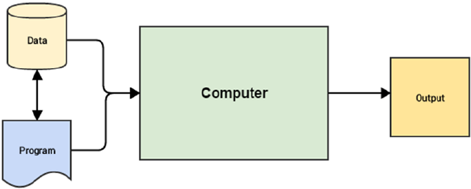
doing the exact same thing but in a different way. Traditional programming paradigms basically involve the
user or programmer to write a set of instructions or operations using code that makes the computer perform
specific computations on data to give the desired results. Figure1-1 depicts a typical workflow for traditional
programming paradigms.
CHAPTER 1 ■ MACHINE LEARNING BASICS
6
From Figure1-1, you can get the idea that the core inputs that are given to the computer are data and
one or more programs that are basically code written with the help of a programming language, such as
high-level languages like Java, Python, or low-level like C or even Assembly. Programs enable computers
to work on data, perform computations, and generate output. A task that can be performed really well with
traditional programming paradigms is computing your annual tax.
Now, let’s think about the real-world infrastructure problem we discussed in the previous section for
DSS Company. Do you think a traditional programming approach might be able to solve this problem? Well,
it could to some extent. We might be able to tap in to the device data and event streams and logs and access
various device attributes like usage levels, signal strength, incoming and outgoing connections, memory
and processor usage levels, error logs and events, and so on. We could then use the domain knowledge
of our network and infrastructure experts in our teams and set up some event monitoring systems based
on specific decisions and rules based on these data attributes. This would give us what we could call as a
rule-based reactive analytical solution where we can monitor devices, observe if any specific anomalies or
outages occur, and then take necessary action to quickly resolve any potential issues. We might also have
to hire some support and operations staff to continuously monitor and resolve issues as needed. However,
there is still a pressing problem of trying to prevent as many outages or issues as possible before they actually
take place. Can Machine Learning help us in some way?
Why Machine Learning?
We will now address the question that started this discussion of why we need Machine Learning.
Considering what you have learned so far, while the traditional programming paradigm is quite good and
human intelligence and domain expertise is definitely an important factor in making data-driven decisions,
we need Machine Learning to make faster and better decisions. The Machine Learning paradigm tries to
take into account data and expected outputs or results if any and uses the computer to build the program,
which is also known as a model. This program or model can then be used in the future to make necessary
decisions and give expected outputs from new inputs. Figure1-2 shows how the Machine Learning
paradigm is similar yet different from traditional programming paradigms.
Figure 1-1. Traditional programming paradigm

CHAPTER 1 ■ MACHINE LEARNING BASICS
7
Figure1-2 reinforces the fact that in the Machine Learning paradigm, the machine, in this context the
computer, tries to use input data and expected outputs to try to learn inherent patterns in the data that
would ultimately help in building a model analogous to a computer program, which would help in making
data-driven decisions in the future (predict or tell us the output) for new input data points by using the
learned knowledge from previous data points (its knowledge or experience). You might start to see the
benefit in this. We would not need hand-coded rules, complex flowcharts, case and if-then conditions, and
other criteria that are typically used to build any decision making system or a decision support system. The
basic idea is to use Machine Learning to make insightful decisions.
This will be clearer once we discuss our real-world problem of managing infrastructure for DSS
Company. In the traditional programming approach, we talked about hiring new staff, setting up rule-based
monitoring systems, and so on. If we were to use a Machine Learning paradigm shift here, we could go about
solving the problem using the following steps.
• Leverage device data and logs and make sure we have enough historical data in
some data store (database, logs, or flat files)
• Decide key data attributes that could be useful for building a model. This could be
device usage, logs, memory, processor, connections, line strength, links, and so on.
• Observe and capture device attributes and their behavior over various time periods
that would include normal device behavior and anomalous device behavior or
outages. These outcomes would be your outputs and device data would be your inputs
• Feed these input and output pairs to any specific Machine Learning algorithm in
your computer and build a model that learns inherent device patterns and observes
the corresponding output or outcome
• Deploy this model such that for newer values of device attributes it can predict if a
specific device is behaving normally or it might cause a potential outage
Thus once you are able to build a Machine Learning model, you can easily deploy it and build an
intelligent system around it such that you can not only monitor devices reactively but you would be able
to proactively identify potential problems and even fix them before any issues crop up. Imagine building
self-heal or auto-heal systems coupled with round the clock device monitoring. The possibilities are indeed
endless and you will not have to keep on hiring new staff every time you expand your office or buy new
infrastructure.
Of course, the workflow discussed earlier with the series of steps needed for building a Machine
Learning model is much more complex than how it has been portrayed, but again this is just to emphasize
and make you think more conceptually rather than technically of how the paradigm has shifted in case
Figure 1-2. Machine Learning paradigm
CHAPTER 1 ■ MACHINE LEARNING BASICS
8
of Machine Learning processes and you need to change your thinking too from the traditional based
approaches toward being more data-driven. The beauty of Machine Learning is that it is never domain
constrained and you can use techniques to solve problems spanning multiple domains, businesses, and
industries. Also, as depicted in Figure1-2, you always do not need output data points to build a model;
sometimes input data is sufficient (or rather output data might not be present) for techniques more suited
toward unsupervised learning (which we will discuss in depth later on in this chapter). A simple example is
trying to determine customer shopping patterns by looking at the grocery items they typically buy together
in a store based on past transactional data. In the next section, we take a deeper dive toward understanding
Machine Learning.
Understanding Machine Learning
By now, you have seen how a typical real-world problem suitable to solve using Machine Learning might
look like. Besides this, you have also got a good grasp over the basics of traditional programming and
Machine Learning paradigms. In this section, we discuss Machine Learning in more detail. To be more
specific, we will look at Machine Learning from a conceptual as well as a domain-specific standpoint.
Machine Learning came into prominence perhaps in the 1990s when researchers and scientists started
giving it more prominence as a sub-field of Artificial Intelligence (AI) such that techniques borrow concepts
from AI, probability, and statistics, which perform far better compared to using fixed rule-based models
requiring a lot of manual time and effort. Of course, as we have pointed out earlier, Machine Learning didn’t
just come out of nowhere in the 1990s. It is a multi-disciplinary field that has gradually evolved over time
and is still evolving as we speak.
A brief mention of history of evolution would be really helpful to get an idea of the various concepts
and techniques that have been involved in the development of Machine Learning and AI. You could say
that it started off in the late 1700s and the early 1800s when the first works of research were published which
basically talked about the Bayes’ Theorem. In fact Thomas Bayes’ major work, “An Essay Towards Solving
a Problem in the Doctrine of Chances,” was published in 1763. Besides this, a lot of research and discovery
was done during this time in the field of probability and mathematics. This paved the way for more ground
breaking research and inventions in the 20th Century, which included Markov Chains by Andrey Markov
in the early 1900s, proposition of a learning system by Alan Turing, and the invention of the very famous
perceptron by Frank Rosenblatt in the 1950s. Many of you might know that neural networks had several
highs and lows since the 1950s and they finally came back to prominence in the 1980s with the discovery
of backpropagation (thanks to Rumelhart, Hinton, and Williams!) and several other inventions, including
Hopfield networks, neocognition, convolutional and recurrent neural networks, and Q-learning. Of course,
rapid strides of evolution started taking place in Machine Learning too since the 1990s with the discovery
of random forests, support vector machines, long short-term memory networks (LSTMs), and development
and release of frameworks in both machine and Deep Learning including torch, theano, tensorflow,
scikit-learn, and so on. We also saw the rise of intelligent systems including IBM Watson, DeepFace, and
AlphaGo. Indeed the journey has been quite a roller coaster ride and there’s still miles to go in this journey.
Take a moment and reflect on this evolutional journey and let’s talk about the purpose of this journey. Why
and when should we really make machines learn?
Why Make Machines Learn?
We have discussed a fair bit about why we need Machine Learning in a previous section when we address
the issue of trying to leverage data to make data-driven decisions at scale using learning algorithms without
focusing too much on manual efforts and fixed rule-based systems. In this section, we discuss in more
detail why and when should we make machines learn. There are several real-world tasks and problems
that humans, businesses, and organizations try to solve day in and day out for our benefit. There are several
scenarios when it might be beneficial to make machines learn and some of them are mentioned as follows.
CHAPTER 1 ■ MACHINE LEARNING BASICS
9
• Lack of sufficient human expertise in a domain (e.g., simulating navigations in
unknown territories or even spatial planets).
• Scenarios and behavior can keep changing over time (e.g., availability of
infrastructure in an organization, network connectivity, and so on).
• Humans have sufficient expertise in the domain but it is extremely difficult to
formally explain or translate this expertise into computational tasks (e.g., speech
recognition, translation, scene recognition, cognitive tasks, and so on).
• Addressing domain specific problems at scale with huge volumes of data with too
many complex conditions and constraints.
The previously mentioned scenarios are just several examples where making machines learn would be
more effective than investing time, effort, and money in trying to build sub-par intelligent systems that might
be limited in scope, coverage, performance, and intelligence. We as humans and domain experts already
have enough knowledge about the world and our respective domains, which can be objective, subjective,
and sometimes even intuitive. With the availability of large volumes of historical data, we can leverage the
Machine Learning paradigm to make machines perform specific tasks by gaining enough experience by
observing patterns in data over a period of time and then use this experience in solving tasks in the future
with minimal manual intervention. The core idea remains to make machines solve tasks that can be easily
defined intuitively and almost involuntarily but extremely hard to define formally.
Formal Definition
We are now ready to define Machine Learning formally. You may have come across multiple definitions of
Machine Learning by now which include, techniques to make machines intelligent, automation on steroids,
automating the task of automation itself, the sexiest job of the 21st century, making computers learn by
themselves and countless others! While all of them are good quotes and true to certain extents, the best way
to define Machine Learning would be to start from the basics of Machine Learning as defined by renowned
professor Tom Mitchell in 1997.
The idea of Machine Learning is that there will be some learning algorithm that will help the machine
learn from data. Professor Mitchell defined it as follows.
“A computer program is said to learn from experience E with respect to some class of tasks
T and performance measure P, if its performance at tasks in T, as measured by P, improves
with experience E.”
While this definition might seem daunting at first, I ask you go read through it a couple of times slowly
focusing on the three parameters—T, P, and E—which are the main components of any learning algorithm,
as depicted in Figure1-3.
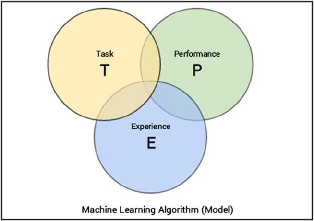
CHAPTER 1 ■ MACHINE LEARNING BASICS
10
We can simplify the definition as follows. Machine Learning is a field that consists of learning
algorithms that:
• Improve their performance P
• At executing some task T
• Over time with experience E
While we discuss at length each of these entities in the following sections, we will not spend time
in formally or mathematically defining each of these entities since the scope of the book is more toward
applied or practical Machine Learning. If you consider our real-world problem from earlier, one of the tasks
T could be predicting outages for our infrastructure; experience E would be what our Machine Learning
model would gain over time by observing patterns from various device data attributes; and the performance
of the model P could be measured in various ways like how accurately the model predicts outages.
Defining the Task, T
We had discussed briefly in the previous section about the task, T, which can be defined in a two-fold
approach. From a problem standpoint, the task, T, is basically the real-world problem to be solved at hand,
which could be anything from finding the best marketing or product mix to predicting infrastructure failures.
In the Machine Learning world, it is best if you can define the task as concretely as possible such that you
talk about what the exact problem is which you are planning to solve and how you could define or formulate
the problem into a specific Machine Learning task.
Machine Learning based tasks are difficult to solve by conventional and traditional programming
approaches. A task, T, can usually be defined as a Machine Learning task based on the process or workflow
that the system should follow to operate on data points or samples. Typically a data sample or point will
consist of multiple data attributes (also called features in Machine Learning lingo) just like the various
device parameters we mentioned in our problem for DSS Company earlier. A typical data point can be
Figure 1-3. Defining the components of a learning algorithm
CHAPTER 1 ■ MACHINE LEARNING BASICS
11
denoted by a vector (Python list) such that each element in the vector is for a specific data feature or
attribute. We discuss more about features and data points in detail in a future section as well as in Chapter 4,
“Feature Engineering and Selection”.
Coming back to the typical tasks that could be classified as Machine Learning tasks, the following list
describes some popular tasks.
• Classification or categorization: This typically encompasses the list of problems or
tasks where the machine has to take in data points or samples and assign a specific
class or category to each sample. A simple example would be classifying animal
images into dogs, cats, and zebras.
• Regression: These types of tasks usually involve performing a prediction such that
a real numerical value is the output instead of a class or category for an input data
point. The best way to understand a regression task would be to take the case of a
real-world problem of predicting housing prices considering the plot area, number
of floors, bathrooms, bedrooms, and kitchen as input attributes for each data point.
• Anomaly detection: These tasks involve the machine going over event logs,
transaction logs, and other data points such that it can find anomalous or unusual
patterns or events that are different from the normal behavior. Examples for this
include trying to find denial of service attacks from logs, indications of fraud,
and so on.
• Structured annotation: This usually involves performing some analysis on input
data points and adding structured metadata as annotations to the original data
that depict extra information and relationships among the data elements. Simple
examples would be annotating text with their parts of speech, named entities,
grammar, and sentiment. Annotations can also be done for images like assigning
specific categories to image pixels, annotate specific areas of images based on their
type, location, and so on.
• Translation: Automated machine translation tasks are typically of the nature such
that if you have input data samples belonging to a specific language, you translate it
into output having another desired language. Natural language based translation is
definitely a huge area dealing with a lot of text data.
• Clustering or grouping: Clusters or groups are usually formed from input data
samples by making the machine learn or observe inherent latent patterns,
relationships and similarities among the input data points themselves. Usually there
is a lack of pre-labeled or pre-annotated data for these tasks hence they form a part
of unsupervised Machine Learning (which we will discuss later on). Examples would
be grouping similar products, events and entities.
• Transcriptions: These tasks usually entail various representations of data that are
usually continuous and unstructured and converting them into more structured
and discrete data elements. Examples include speech to text, optical character
recognition, images to text, and so on.
This should give you a good idea of typical tasks that are often solved using Machine Learning, but this
list is definitely not an exhaustive one as the limits of tasks are indeed endless and more are being discovered
with extensive research over time.
CHAPTER 1 ■ MACHINE LEARNING BASICS
12
Defining the Experience, E
At this point, you know that any learning algorithm typically needs data to learn over time and perform a
specific task, which we named as T. The process of consuming a dataset that consists of data samples or data
points such that a learning algorithm or model learns inherent patterns is defined as the experience, E which
is gained by the learning algorithm. Any experience that the algorithm gains is from data samples or data
points and this can be at any point of time. You can feed it data samples in one go using historical data or
even supply fresh data samples whenever they are acquired.
Thus, the idea of a model or algorithm gaining experience usually occurs as an iterative process, also
known as training the model. You could think of the model to be an entity just like a human being which
gains knowledge or experience through data points by observing and learning more and more about various
attributes, relationships and patterns present in the data. Of course, there are various forms and ways of
learning and gaining experience including supervised, unsupervised, and reinforcement learning but we
will discuss learning methods in a future section. For now, take a step back and remember the analogy we
drew that when a machine truly learns, it is based on data which is fed to it from time to time thus allowing
it to gain experience and knowledge about the task to be solved, such that it can used this experience, E, to
predict or solve the same task, T, in the future for previously unseen data points.
Defining the Performance, P
Let’s say we have a Machine Learning algorithm that is supposed to perform a task, T, and is gaining
experience, E, with data points over a period of time. But how do we know if it’s performing well or behaving
the way it is supposed to behave? This is where the performance, P, of the model comes into the picture.
The performance, P, is usually a quantitative measure or metric that’s used to see how well the algorithm or
model is performing the task, T, with experience, E. While performance metrics are usually standard metrics
that have been established after years of research and development, each metric is usually computed
specific to the task, T, which we are trying to solve at any given point of time.
Typical performance measures include accuracy, precision, recall, F1 score, sensitivity, specificity,
error rate, misclassification rate, and many more. Performance measures are usually evaluated on training
data samples (used by the algorithm to gain experience, E) as well as data samples which it has not seen or
learned from before, which are usually known as validation and test data samples. The idea behind this is to
generalize the algorithm so that it doesn’t become too biased only on the training data points and performs
well in the future on newer data points. More on training, validation, and test data will be discussed when we
talk about model building and validation.
While solving any Machine Learning problem, most of the times, the choice of performance measure,
P, is either accuracy, F1 score, precision, and recall. While this is true in most scenarios, you should always
remember that sometimes it is difficult to choose performance measures that will accurately be able to
give us an idea of how well the algorithm is performing based on the actual behavior or outcome which is
expected from it. A simple example would be that sometimes we would want to penalize misclassification
or false positives more than correct hits or predictions. In such a scenario, we might need to use a modified
cost function or priors such that we give a scope to sacrifice hit rate or overall accuracy for more accurate
predictions with lesser false positives. A real-world example would be an intelligent system that predicts
if we should give a loan to a customer. It’s better to build the system in such a way that it is more cautious
against giving a loan than denying one. The simple reason is because one big mistake of giving a loan to
a potential defaulter can lead to huge losses as compared to denying several smaller loans to potential
customers. To conclude, you need to take into account all parameters and attributes involved in task, T,
such that you can decide on the right performance measures, P, for your system.
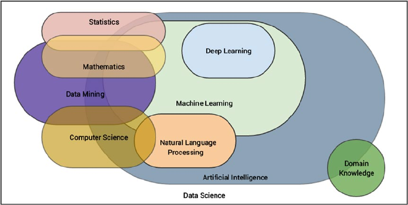
CHAPTER 1 ■ MACHINE LEARNING BASICS
13
A Multi-Disciplinary Field
We have formally introduced and defined Machine Learning in the previous section, which should give
you a good idea about the main components involved with any learning algorithm. Let’s now shift our
perspective to Machine Learning as a domain and field. You might already know that Machine Learning
is mostly considered to be a sub-field of artificial intelligence and even computer science from some
perspectives. Machine Learning has concepts that have been derived and borrowed from multiple fields
over a period of time since its inception, making it a true multi-disciplinary or inter-disciplinary field.
Figure1-4 should give you a good idea with regard to the major fields that overlap with Machine Learning
based on concepts, methodologies, ideas, and techniques. An important point to remember here is that this
is definitely not an exhaustive list of domains or fields but pretty much depicts the major fields associated in
tandem with Machine Learning.
Figure 1-4. Machine Learning: a true multi-disciplinary field
The major domains or fields associated with Machine Learning include the following, as depicted in
Figure1-4. We will discuss each of these fields in upcoming sections.
• Artificial intelligence
• Natural language processing
• Data mining
• Mathematics
• Statistics
• Computer science
• Deep Learning
• Data Science
CHAPTER 1 ■ MACHINE LEARNING BASICS
14
You could say that Data Science is like a broad inter-disciplinary field spanning across all the other fields
which are sub-fields inside it. Of course this is just a simple generalization and doesn’t strictly indicate that it
is inclusive of all other other fields as a superset, but rather borrows important concepts and methodologies
from them. The basic idea of Data Science is once again processes, methodologies, and techniques to extract
information from data and domain knowledge. This is a big part of what we discuss in an upcoming section
when we talk about Data Science in further details.
Coming back to Machine Learning, ideas of pattern recognition and basic data mining methodologies
like knowledge discovery of databases (KDD) came into existence when relational databases were very
prominent. These areas focus more on the ability and technique to mine for information from large datasets,
such that you can get patterns, knowledge, and insights of interest. Of course, KDD is a whole process by
itself that includes data acquisition, storage, warehousing, processing, and analysis. Machine Learning
borrows concepts that are more concerned with the analysis phase, although you do need to go through the
other steps to reach to the final stage. Data mining is again a interdisciplinary or multi-disciplinary field and
borrows concepts from computer science, mathematics, and statistics. The consequence of this is the fact
that computational statistics form an important part of most Machine Learning algorithms and techniques.
Artificial intelligence (AI) is the superset consisting of Machine Learning as one of its specialized areas.
The basic idea of AI is the study and development of intelligence as exhibited by machines based on their
perception of their environment, input parameters and attributes and their response such that they can
perform desired tasks based on expectations. AI itself is a truly massive field which is itself inter-disciplinary.
It draws on concepts from mathematics, statistics, computer science, cognitive sciences, linguistics,
neuroscience, and many more. Machine Learning is more concerned with algorithms and techniques that
can be used to understand data, build representations, and perform tasks such as predictions. Another
major sub-field under AI related to Machine Learning is natural language processing (NLP) which borrows
concepts heavily from computational linguistics and computer science. Text Analytics is a prominent field
today among analysts and data scientists to extract, process and understand natural human language.
Combine NLP with AI and Machine Learning and you get chatbots, machine translators, and virtual
personal assistants, which are indeed the future of innovation and technology!
Coming to Deep Learning, it is a subfield of Machine Learning itself which deals more with techniques
related to representational learning such that it improves with more and more data by gaining more
experience. It follows a layered and hierarchical approach such that it tries to represent the given input
attributes and its current surroundings, using a nested layered hierarchy of concept representations such
that, each complex layer is built from another layer of simpler concepts. Neural networks are something
which is heavily utilized by Deep Learning and we will look into Deep Learning in a bit more detail in a
future section and solve some real-world problems later on in this book.
Computer science is pretty much the foundation for most of these domains dealing with study,
development, engineering, and programming of computers. Hence we won’t be expanding too much on this
but you should definitely remember the importance of computer science for Machine Learning to exist and
be easily applied to solve real-world problems. This should give you a good idea about the broad landscape
of the multi-disciplinary field of Machine Learning and how it is connected across multiple related and
overlapping fields. We will discuss some of these fields in more detail in upcoming sections and cover some
basic concepts in each of these fields wherever necessary.
Let’s look at some core fundamentals of Computer Science in the following section.
Computer Science
The field of computer science (CS) can be defined as the study of the science of understanding computers.
This involves study, research, development, engineering, and experimentation of areas dealing with
understanding, designing, building, and using computers. This also involves extensive design and
development of algorithms and programs that can be used to make the computer perform computations
and tasks as desired. There are mainly two major areas or fields under computer science, as follows.
CHAPTER 1 ■ MACHINE LEARNING BASICS
15
• Theoretical computer science
• Applied or practical computer science
The two major areas under computer science span across multiple fields and domains wherein each
field forms a part or a sub-field of computer science. The main essence of computer science includes
formal languages, automata and theory of computation, algorithms, data structures, computer design and
architecture, programming languages, and software engineering principles.
Theoretical Computer Science
Theoretical computer science is the study of theory and logic that tries to explain the principles and
processes behind computation. This involves understanding the theory of computation which talks about
how computation can be used efficiently to solve problems. Theory of computation includes the study of
formal languages, automata, and understanding complexities involved in computations and algorithms.
Information and coding theory is another major field under theoretical CS that has given us domains like
signal processing, cryptography, and data compression. Principles of programming languages and their
analysis is another important aspect that talks about features, design, analysis, and implementations
of various programming languages and how compilers and interpreters work in understanding these
languages. Last but never the least, data structures and algorithms are the two fundamental pillars of
theoretical CS used extensively in computational programs and functions.
Practical Computer Science
Practical computer science also known as applied computer science is more about tools, methodologies,
and processes that deal with applying concepts and principles from computer science in the real world to
solve practical day-to-day problems. This includes emerging sub-fields like artificial intelligence, Machine
Learning, computer vision, Deep Learning, natural language processing, data mining, and robotics and they
try to solve complex real-world problems based on multiple constraints and parameters and try to emulate
tasks that require considerable human intelligence and experience. Besides these, we also have well-
established fields, including computer architecture, operating systems, digital logic and design, distributed
computing, computer networks, security, databases, and software engineering.
Important Concepts
These are several concepts from computer science that you should know and remember since they would be
useful as foundational concepts to understand the other chapters, concepts, and examples better. It’s not an
exhaustive list but should pretty much cover enough to get started.
Algorithms
An algorithm can be described as a sequence of steps, operations, computations, or functions that can
be executed to carry out a specific task. They are basically methods to describe and represent a computer
program formally through a series of operations, which are often described using plain natural language,
mathematical symbols, and diagrams. Typically flowcharts, pseudocode, and natural language are used
extensively to represent algorithms. An algorithm can be as simple as adding two numbers and as complex
as computing the inverse of a matrix.
CHAPTER 1 ■ MACHINE LEARNING BASICS
16
Programming Languages
A programming language is a language that has its own set of symbols, words, tokens, and operators having
their own significance and meaning. Thus syntax and semantics combine to form a formal language in itself.
This language can be used to write computer programs, which are basically real-world implementations of
algorithms that can be used to specify specific instructions to the computer such that it carries our necessary
computation and operations. Programming languages can be low level like C and Assembly or high level
languages like Java and Python.
Code
This is basically source code that forms the foundation of computer programs. Code is written using
programming languages and consists of a collection of computer statements and instructions to make the
computer perform specific desired tasks. Code helps convert algorithms into programs using programming
languages. We will be using Python to implement most of our real-world Machine Learning solutions.
Data Structures
Data structures are specialized structures that are used to manage data. Basically they are real-world
implementations for abstract data type specifications that can be used to store, retrieve, manage, and
operate on data efficiently. There is a whole suite of data structures like arrays, lists, tuples, records,
structures, unions, classes, and many more. We will be using Python data structures like lists, arrays,
dataframes, and dictionaries extensively to operate on real-world data!
Data Science
The field of Data Science is a very diverse, inter-disciplinary field which encompasses multiple fields that
we depicted in Figure1-4. Data Science basically deals with principles, methodologies, processes, tools, and
techniques to gather knowledge or information from data (structured as well as unstructured). Data Science
is more of a compilation of processes, techniques, and methodologies to foster a data-driven decision
based culture. In fact Drew Conway’s “Data Science Venn Diagram,” depicted in Figure1-5, shows the core
components and essence of Data Science, which in fact went viral and became insanely popular!
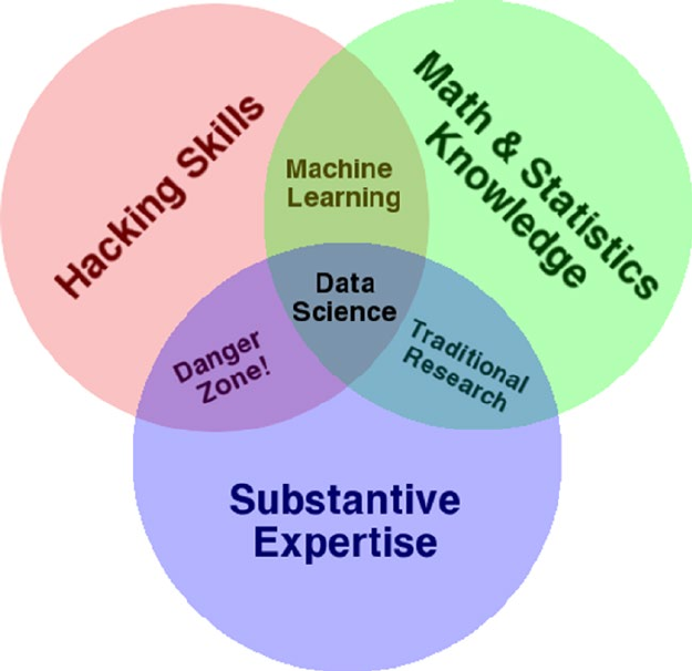
CHAPTER 1 ■ MACHINE LEARNING BASICS
17
Figure1-5 is quite intuitive and easy to interpret. Basically there are three major components and
Data Science sits at the intersection of them. Math and statistics knowledge is all about applying various
computational and quantitative math and statistical based techniques to extract insights from data. Hacking
skills basically indicate the capability of handling, processing, manipulating and wrangling data into easy to
understand and analyzable formats. Substantive expertise is basically the actual real-world domain expertise
which is extremely important when you are solving a problem because you need to know about various
factors, attributes, constraints, and knowledge related to the domain besides your expertise in data and
algorithms.
Thus Drew rightly points out that Machine Learning is a combination of expertise on data hacking
skills, math, and statistical learning methods and for Data Science, you need some level of domain expertise
and knowledge along with Machine Learning. You can check out Drew’s personal insights in his article at
http://drewconway.com/zia/2013/3/26/the-data-science-venn-diagram, where talks all about the Data
Science Venn diagram. Besides this, we also have Brendan Tierney, who talks about the true nature of Data
Science being a multi-disciplinary field with his own depiction, as shown in Figure1-6.
Figure 1-5. Drew Conway’s Data Science Venn diagram
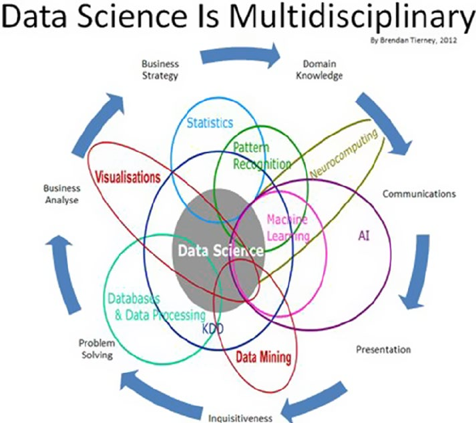
CHAPTER 1 ■ MACHINE LEARNING BASICS
18
If you observe his depiction closely, you will see a lot of the domains mentioned here are what we just
talked about in the previous sections and matches a substantial part of Figure1-4. You can clearly see Data
Science being the center of attention and drawing parts from all the other fields and Machine Learning as a
sub-field.
Mathematics
The field of mathematics deals with numbers, logic, and formal systems. The best definition of mathematics
was coined by Aristotle as “The science of quantity”. The scope of mathematics as a scientific field is huge
spanning across areas including algebra, trigonometry, calculus, geometry, and number theory just to
name a few major fields. Linear algebra and probability are two major sub-fields under mathematics that
are used extensively in Machine Learning and we will be covering a few important concepts from them in
this section. Our major focus will always be on practical Machine Learning, and applied mathematics is an
important aspect for the same. Linear algebra deals with mathematical objects and structures like vectors,
matrices, lines, planes, hyperplanes, and vector spaces. The theory of probability is a mathematical field
and framework used for studying and quantifying events of chance and uncertainty and deriving theorems
and axioms from the same. These laws and axioms help us in reasoning, understanding, and quantifying
uncertainty and its effects in any real-world system or scenario, which helps us in building our Machine
Learning models by leveraging this framework.
Figure 1-6. Brendan Tierney's depiction of Data Science as a true multi-disciplinary field
CHAPTER 1 ■ MACHINE LEARNING BASICS
19
Important Concepts
In this section, we discuss some key terms and concepts from applied mathematics, namely linear algebra
and probability theory. These concepts are widely used across Machine Learning and form some of the
foundational structures and principles across Machine Learning algorithms, models, and processes.
Scalar
A scalar usually denotes a single number as opposed to a collection of numbers. A simple example might be
x = 5 or x ∈ R, where x is the scalar element pointing to a single number or a real-valued single number.
Vector
A vector is defined as a structure that holds an array of numbers which are arranged in order. This basically
means the order or sequence of numbers in the collection is important. Vectors can be mathematically
denoted as x = [x1, x2, …, xn], which basically tells us that x is a one-dimensional vector having n elements in
the array. Each element can be referred to using an array index determining its position in the vector. The
following snippet shows us how we can represent simple vectors in Python.
In [1]: x = [1, 2, 3, 4, 5]
...: x
Out[1]: [1, 2, 3, 4, 5]
In [2]: import numpy as np
...: x = np.array([1, 2, 3, 4, 5])
...:
...: print(x)
...: print(type(x))
[1 2 3 4 5]
<class 'numpy.ndarray'>
Thus you can see that Python lists as well as numpy based arrays can be used to represent vectors. Each
row in a dataset can act as a one-dimensional vector of n attributes, which can serve as inputs to learning
algorithms.
Matrix
A matrix is a two-dimensional structure that basically holds numbers. It’s also often referred to as a 2D array.
Each element can be referred to using a row and column index as compared to a single vector index in case
of vectors. Mathematically, you can depict a matrix as M
mmm
mmm
mmm
=
é
ë
ê
ê
ê
ù
û
ú
ú
ú
11 12 13
21 22 23
31 32 33
such that M is a 3 x 3 matrix
having three rows and three columns and each element is denoted by mrc such that r denotes the row index
and c denotes the column index. Matrices can be easily represented as list of lists in Python and we can
leverage the numpy array structure as depicted in the following snippet.
In [3]: m = np.array([[1, 5, 2],
...: [4, 7, 4],
...: [2, 0, 9]])
CHAPTER 1 ■ MACHINE LEARNING BASICS
20
In [4]: # view matrix
...: print(m)
[[1 5 2]
[4 7 4]
[2 0 9]]
In [5]: # view dimensions
...: print(m.shape)
(3, 3)
Thus you can see how we can easily leverage numpy arrays to represent matrices. You can think of
a dataset with rows and columns as a matrix such that the data features or attributes are represented by
columns and each row denotes a data sample. We will be using the same analogy later on in our analyses.
Of course, you can perform matrix operations like add, subtract, products, inverse, transpose, determinants,
and many more. The following snippet shows some popular matrix operations.
In [9]: # matrix transpose
...: print('Matrix Transpose:\n', m.transpose(), '\n')
...:
...: # matrix determinant
...: print ('Matrix Determinant:', np.linalg.det(m), '\n')
...:
...: # matrix inverse
...: m_inv = np.linalg.inv(m)
...: print ('Matrix inverse:\n', m_inv, '\n')
...:
...: # identity matrix (result of matrix x matrix_inverse)
...: iden_m = np.dot(m, m_inv)
...: iden_m = np.round(np.abs(iden_m), 0)
...: print ('Product of matrix and its inverse:\n', iden_m)
...:
Matrix Transpose:
[[1 4 2]
[5 7 0]
[2 4 9]]
Matrix Determinant: -105.0
Matrix inverse:
[[-0.6 0.42857143 -0.05714286]
[ 0.26666667 -0.04761905 -0.03809524]
[ 0.13333333 -0.0952381 0.12380952]]
Product of matrix and its inverse:
[[ 1. 0. 0.]
[ 0. 1. 0.]
[ 0. 0. 1.]]
This should give you a good idea to get started with matrices and their basic operations. More on this is
covered in Chapter 2, “The Python Machine Learning Ecosystem”.

CHAPTER 1 ■ MACHINE LEARNING BASICS
21
Tensor
You can think of a tensor as a generic array. Tensors are basically arrays with a variable number of axes.
An element in a three-dimensional tensor T can be denoted by Tx,y,z where x, y, z denote the three axes for
specifying element T.
Norm
The norm is a measure that is used to compute the size of a vector often also defined as the measure of
distance from the origin to the point denoted by the vector. Mathematically, the pth norm of a vector is
denoted as follows.
Lx x
p
p
i
i
pp
==
æ
è
çö
ø
÷
å
1
Such that p ≥ 1 and p ∈ R. Popular norms in Machine Learning include the L1 norm used extensively in Lasso
regression models and the L2 norm, also known as the Euclidean norm, used in ridge regression models.
Eigen Decomposition
This is basically a matrix decomposition process such that we decompose or break down a matrix into a
set of eigen vectors and eigen values. The eigen decomposition of a matrix can be mathematically denoted
by M = V diag(λ) V-1 such that the matrix M has a total of n linearly independent eigen vectors represented
as {v(1), v(2), …, v(n)} and their corresponding eigen values can be represented as {λ1, λ2, …, λn}. The matrix V
consists of one eigen vector per column of the matrix i.e., V = [v(1), v(2), …, v(n)] and the vector λ consists of all
the eigen values together i.e., λ = [λ1, λ2, …, λn].
An eigen vector of the matrix is defined as a non-zero vector such that on multiplying the matrix by the
eigen vector, the result only changes the scale of the eigen vector itself, i.e., the result is a scalar multiplied by
the eigen vector. This scalar is known as the eigen value corresponding to the eigen vector. Mathematically
this can be denoted by Mv = λv where M is our matrix, v is the eigen vector and λ is the corresponding eigen
value. The following Python snippet depicts how to extract eigen values and eigen vectors from a matrix.
In [4]: # eigendecomposition
...: m = np.array([[1, 5, 2],
...: [4, 7, 4],
...: [2, 0, 9]])
...:
...: eigen_vals, eigen_vecs = np.linalg.eig(m)
...:
...: print('Eigen Values:', eigen_vals, '\n')
...: print('Eigen Vectors:\n', eigen_vecs)
...:
Eigen Values: [ -1.32455532 11.32455532 7. ]
Eigen Vectors:
[[-0.91761521 0.46120352 -0.46829291]
[ 0.35550789 0.79362022 -0.74926865]
[ 0.17775394 0.39681011 0.46829291]]
CHAPTER 1 ■ MACHINE LEARNING BASICS
22
Singular Value Decomposition
The process of singular value decomposition, also known as SVD, is another matrix decomposition or
factorization process such that we are able to break down a matrix to obtain singular vectors and singular
values. Any real matrix will always be decomposed by SVD even if eigen decomposition may not be
applicable in some cases. Mathematically, SVD can be defined as follows. Considering a matrix M having
dimensions m x n such that m denotes total rows and n denotes total columns, the SVD of the matrix can be
represented with the following equation.
MU
SV
mn mm mn
nn
T
´´
´´
=
This gives us the following main components of the decomposition equation.
• Um x m is an m x m unitary matrix where each column represents a left singular vector
• Sm x n is an m x n matrix with positive numbers on the diagonal, which can also be
represented as a vector of the singular values
• VT
n x n is an n x n unitary matrix where each row represents a right singular vector
In some representations, the rows and columns might be interchanged but the end result should be
the same, i.e., U and V are always orthogonal. The following snippet shows a simple SVD decomposition in
Python.
In [7]: # SVD
...: m = np.array([[1, 5, 2],
...: [4, 7, 4],
...: [2, 0, 9]])
...:
...: U, S, VT = np.linalg.svd(m)
...:
...: print('Getting SVD outputs:-\n')
...: print('U:\n', U, '\n')
...: print('S:\n', S, '\n')
...: print('VT:\n', VT, '\n')
...:
Getting SVD outputs:-
U:
[[ 0.3831556 -0.39279153 0.83600634]
[ 0.68811254 -0.48239977 -0.54202545]
[ 0.61619228 0.78294653 0.0854506 ]]
S:
[ 12.10668383 6.91783499 1.25370079]
VT:
[[ 0.36079164 0.55610321 0.74871798]
[-0.10935467 -0.7720271 0.62611158]
[-0.92621323 0.30777163 0.21772844]]
SVD as a technique and the singular values in particular are very useful in summarization based
algorithms and various other methods like dimensionality reduction.

CHAPTER 1 ■ MACHINE LEARNING BASICS
23
Random Variable
Used frequently in probability and uncertainty measurement, a random variable is basically a variable that
can take on various values at random. These variables can be of discrete or continuous type in general.
Probability Distribution
A probability distribution is a distribution or arrangement that depicts the likelihood of a random variable
or variables to take on each of its probable states. There are usually two main types of distributions based on
the variable being discrete or continuous.
Probability Mass Function
A probability mass function, also known as PMF, is a probability distribution over discrete random variables.
Popular examples include the Poisson and binomial distributions.
Probability Density Function
A probability density function, also known as PDF, is a probability distribution over continuous random
variables. Popular examples include the normal, uniform, and student’s T distributions.
Marginal Probability
The marginal probability rule is used when we already have the probability distribution for a set of random
variables and we want to compute the probability distribution for a subset of these random variables. For
discrete random variables, we can define marginal probability as follows.
Px Pxy
y
()
=
()
å
,
For continuous random variables, we can define it using the integration operation as follows.
px pxydy
()
=
()
ò,
Conditional Probability
The conditional probability rule is used when we want to determine the probability that an event is going to
take place, such that another event has already taken place. This is mathematically represented as follows.
Px yPxy
Py
()
=
()
()
,
This tells us the conditional probability of x, given that y has already taken place.
CHAPTER 1 ■ MACHINE LEARNING BASICS
24
Bayes Theorem
This is another rule or theorem which is useful when we know the probability of an event of interest P(A), the
conditional probability for another event based on our event of interest P(B | A) and we want to determine
the conditional probability of our event of interest given the other event has taken place P(A | B). This can be
defined mathematically using the following expression.
PAB
PBAP A
PB
()
=
()
()
()
such that A and B are events and PB PB AP A
x
()
=
()
()
å
.
Statistics
The field of statistics can be defined as a specialized branch of mathematics that consists of frameworks
and methodologies to collect, organize, analyze, interpret, and present data. Generally this falls more under
applied mathematics and borrows concepts from linear algebra, distributions, probability theory, and
inferential methodologies. There are two major areas under statistics that are mentioned as follows.
• Descriptive statistics
• Inferential statistics
The core component of any statistical process is data. Hence typically data collection is done first, which
could be in global terms, often called a population or a more restricted subset due to various constraints
often knows as a sample. Samples are usually collected manually, from surveys, experiments, data stores,
and observational studies. From this data, various analyses are carried out using statistical methods.
Descriptive statistics is used to understand basic characteristics of the data using various aggregation
and summarization measures to describe and understand the data better. These could be standard
measures like mean, median, mode, skewness, kurtosis, standard deviation, variance, and so on. You can
refer to any standard book on statistics to deep dive into these measures if you’re interested. The following
snippet depicts how to compute some essential descriptive statistical measures.
In [74]: # descriptive statistics
...: import scipy as sp
...: import numpy as np
...:
...: # get data
...: nums = np.random.randint(1,20, size=(1,15))[0]
...: print('Data: ', nums)
...:
...: # get descriptive stats
...: print ('Mean:', sp.mean(nums))
...: print ('Median:', sp.median(nums))
...: print ('Mode:', sp.stats.mode(nums))
...: print ('Standard Deviation:', sp.std(nums))
...: print ('Variance:', sp.var(nums))
...: print ('Skew:', sp.stats.skew(nums))
...: print ('Kurtosis:', sp.stats.kurtosis(nums))
...:
CHAPTER 1 ■ MACHINE LEARNING BASICS
25
Data: [ 2 19 8 10 17 13 18 9 19 16 4 14 16 15 5]
Mean: 12.3333333333
Median: 14.0
Mode: ModeResult(mode=array([16]), count=array([2]))
Standard Deviation: 5.44875113112
Variance: 29.6888888889
Skew: -0.49820055879944575
Kurtosis: -1.0714842769550714
Libraries and frameworks like pandas, scipy, and numpy in general help us compute descriptive
statistics and summarize data easily in Python. We cover these frameworks as well as basic data analysis and
visualization in Chapters 2 and 3.
Inferential statistics are used when we want to test hypothesis, draw inferences, and conclusions about
various characteristics of our data sample or population. Frameworks and techniques like hypothesis
testing, correlation, and regression analysis, forecasting, and predictions are typically used for any form
of inferential statistics. We look at this in much detail in subsequent chapters when we cover predictive
analytics as well as time series based forecasting.
Data Mining
The field of data mining involves processes, methodologies, tools and techniques to discover and extract
patterns, knowledge, insights and valuable information from non-trivial datasets. Datasets are defined
as non-trivial when they are substantially huge usually available from databases and data warehouses.
Once again, data mining itself is a multi-disciplinary field, incorporating concepts and techniques from
mathematics, statistics, computer science, databases, Machine Learning and Data Science. The term is a
misnomer in general since the “mining” refers to the mining of actual insights or information from the data
and not data itself! In the whole process of KDD or Knowledge Discovery in Databases, data mining is the
step where all the analysis takes place.
In general, both KDD as well as data mining are closely linked with Machine Learning since they
are all concerned with analyzing data to extract useful patterns and insights. Hence methodologies,
concepts, techniques, and processes are shared among them. The standard process for data mining followed
in the industry is known as the CRISP-DM model, which we discuss in more detail in an upcoming section in
this chapter.
Artificial Intelligence
The field of artificial Intelligence encompasses multiple sub-fields including Machine Learning, natural
language processing, data mining, and so on. It can be defined as the art, science and engineering of making
intelligent agents, machines and programs. The field aims to provide solutions for one simple yet extremely
tough objective, “Can machines think, reason, and act like human beings?” AI in fact existed as early as the
1300s when people started asking such questions and conducting research and development on building
tools that could work on concepts instead of numbers like a calculator does. Progress in AI took place in a
steady pace with discoveries and inventions by Alan Turing, McCullouch, and Pitts Artificial Neurons. AI was
revived once again after a slowdown till the 1980s with success of expert systems, the resurgence of neural
networks thanks to Hopfield, Rumelhart, McClelland, Hinton, and many more. Faster and better computation
thanks to Moore’s Law led to fields like data mining, Machine Learning and even Deep Learning come into
prominence to solve complex problems that would otherwise have been impossible to solve using traditional
approaches. Figure1-7 shows some of the major facets under the broad umbrella of AI.
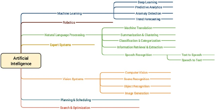
CHAPTER 1 ■ MACHINE LEARNING BASICS
26
Some of the main objectives of AI include emulation of cognitive functions also known as cognitive
learning, semantics, and knowledge representation, learning, reasoning, problem solving, planning, and
natural language processing. AI borrows tools, concepts, and techniques from statistical learning, applied
mathematics, optimization methods, logic, probability theory, Machine Learning, data mining, pattern
recognition, and linguistics. AI is still evolving over time and a lot of innovation is being done in this
field including some of the latest discoveries and inventions like self-driving cars, chatbots, drones, and
intelligent robots.
Natural Language Processing
The field of Natural Language Processing (NLP) is a multi-disciplinary field combining concepts from
computational linguistics, computer science and artificial intelligence. NLP involves the ability to
make machines process, understand, and interact with natural human languages. The major objective
of applications or systems built using NLP is to enable interactions between machines and natural
languages that have evolved over time. Major challenges in this aspect include knowledge and semantics
representation, natural language understanding, generation, and processing. Some of the major applications
of NLP are mentioned as follows.
• Machine translation
• Speech recognition
• Question answering systems
• Context recognition and resolution
• Text summarization
• Text categorization
Figure 1-7. Diverse major facets under the AI umbrella
CHAPTER 1 ■ MACHINE LEARNING BASICS
27
• Information extraction
• Sentiment and emotion analysis
• Topic segmentation
Using techniques from NLP and text analytics, you can work on text data to process, annotate, classify,
cluster, summarize, extract semantics, determine sentiment, and much more! The following example
snippet depicts some basic NLP operations on textual data where we annotate a document (text sentence)
with various components like parts of speech, phrase level tags, and so on based on its constituent grammar.
You can refer to page 159 of Text Analytics with Python (Apress; Dipanjan Sarkar, 2016) for more details on
constituency parsing.
from nltk.parse.stanford import StanfordParser
sentence = 'The quick brown fox jumps over the lazy dog'
# create parser object
scp = StanfordParser(path_to_jar='E:/stanford/stanford-parser-full-2015-04-20/stanford-
parser.jar',
path_to_models_jar='E:/stanford/stanford-parser-full-2015-04-20/stanford-
parser-3.5.2-models.jar')
# get parse tree
result = list(scp.raw_parse(sentence))
tree = result[0]
In [98]: # print the constituency parse tree
...: print(tree)
(ROOT
(NP
(NP (DT The) (JJ quick) (JJ brown) (NN fox))
(NP
(NP (NNS jumps))
(PP (IN over) (NP (DT the) (JJ lazy) (NN dog))))))
In [99]: # visualize constituency parse tree
...: tree.draw()
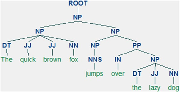
CHAPTER 1 ■ MACHINE LEARNING BASICS
28
Thus you can clearly see that Figure1-8 depicts the constituency grammar based parse tree for our
sample sentence, which consists of multiple noun phrases (NP). Each phrase has several words that are also
annotated with their own parts of speech (POS) tags. We cover more on processing and analyzing textual
data for various steps in the Machine Learning pipeline as well as practical use cases in subsequent chapters.
Deep Learning
The field of Deep Learning, as depicted earlier, is a sub-field of Machine Learning that has recently come
into much prominence. Its main objective is to get Machine Learning research closer to its true goal
of “making machines intelligent”. Deep Learning is often termed as a rebranded fancy term for neural
networks. This is true to some extent but there is definitely more to Deep Learning than just basic neural
networks. Deep Learning based algorithms involves the use of concepts from representation learning
where various representations of the data are learned in different layers that also aid in automated
feature extraction from the data. In simple terms, a Deep Learning based approach tries to build machine
intelligence by representing data as a layered hierarchy of concepts, where each layer of concepts is built
from other simpler layers. This layered architecture itself is one of the core components of any Deep
Learning algorithm.
In any basic supervised Machine Learning technique, we basically try to learn a mapping between
our data samples and our output and then try to predict output for newer data samples. Representational
learning tries to understand the representations in the data itself besides learning mapping from inputs
to outputs. This makes Deep Learning algorithms extremely powerful as compared to regular techniques,
which require significant expertise in areas like feature extraction and engineering. Deep Learning is
also extremely effective with regard to its performance as well as scalability with more and more data as
compared to older Machine Learning algorithms. This is depicted in Figure1-9 based on a slide from
Andrew Ng’s talk at the Extract Data Conference.
Figure 1-8. Constituency parse tree for our sample sentence
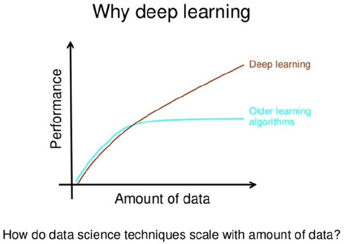
CHAPTER 1 ■ MACHINE LEARNING BASICS
29
Indeed, as rightly pointed out by Andrew Ng, there have been several noticeable trends and characteristics
related to Deep Learning that we have noticed over the past decade. They are summarized as follows.
• Deep Learning algorithms are based on distributed representational learning and
they start performing better with more data over time.
• Deep Learning could be said to be a rebranding of neural networks, but there is a lot
into it compared to traditional neural networks.
• Better software frameworks like tensorflow, theano, caffe, mxnet, and keras,
coupled with superior hardware have made it possible to build extremely complex,
multi-layered Deep Learning models with huge sizes.
• Deep Learning has multiple advantages related to automated feature extraction as
well as performing supervised learning operations, which have helped data scientists
and engineers solve increasingly complex problems over time.
The following points describe the salient features of most Deep Learning algorithms, some of which we
will be using in this book.
• Hierarchical layered representation of concepts. These concepts are also called
features in Machine Learning terminology (data attributes).
• Distributed representational learning of the data happens through a multi-layered
architecture (unsupervised learning).
• More complex and high-level features and concepts are derived from simpler, low-
level features.
Figure 1-9. Performance comparison of Deep Learning and traditional Machine Learning by Andrew Ng
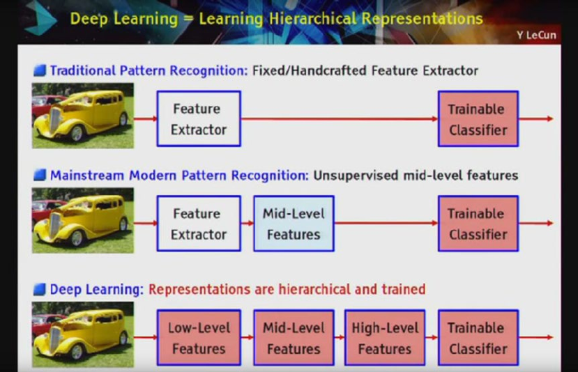
CHAPTER 1 ■ MACHINE LEARNING BASICS
30
• A “deep” neural network usually is considered to have at least more than one hidden
layer besides the input and output layers. Usually it consists of a minimum of three
to four hidden layers.
• Deep architectures have a multi-layered architecture where each layer consists of
multiple non-linear processing units. Each layer’s input is the previous layer in the
architecture. The first layer is usually the input and the last layer is the output.
• Can perform automated feature extraction, classification, anomaly detection, and
many other Machine Learning tasks.
This should give you a good foundational grasp of the concepts pertaining to Deep Learning. Suppose
we had a real-world problem of object recognition from images. Figure1-10 will give us a good idea of how
typical Machine Learning and Deep Learning pipelines differ (Source: Yann LeCun).
Figure 1-10. Comparing various learning pipelines by Yann LeCun
You can clearly see how Deep Learning methods involve a hierarchical layer representation of features
and concept from the raw data as compared to other Machine Learning methods. We conclude this section
with a brief coverage of some essential concepts pertaining to Deep Learning.

CHAPTER 1 ■ MACHINE LEARNING BASICS
31
Important Concepts
In this section, we discuss some key terms and concepts from Deep Learning algorithms and architecture.
This should be useful in the future when you are building your own Deep Learning models.
Artificial Neural Networks
An Artificial Neural Network (ANN) is a computational model and architecture that simulates biological
neurons and the way they function in our brain. Typically, an ANN has layers of interconnected nodes. The
nodes and their inter-connections are analogous to the network of neurons in our brain. A typical ANN has
an input layer, an output layer, and at least one hidden layer between the input and output with
inter-connections, as depicted in Figure1-11
Any basic ANN will always have multiple layers of nodes, specific connection patterns and links
between the layers, connection weights and activation functions for the nodes/neurons that convert
weighted inputs to outputs. The process of learning for the network typically involves a cost function and the
objective is to optimize the cost function (typically minimize the cost). The weights keep getting updated in
the process of learning.
Figure 1-11. A typical artificial neural network
CHAPTER 1 ■ MACHINE LEARNING BASICS
32
Backpropagation
The backpropagation algorithm is a popular technique to train ANNs and it led to a resurgence in the
popularity of neural networks in the 1980s. The algorithm typically has two main stages—propagation and
weight updates. They are described briefly as follows.
1. Propagation
a. The input data sample vectors are propagated forward through the neural
network to generate the output values from the output layer.
b. Compare the generated output vector with the actual/desired output vector
for that input data vector.
c. Compute difference in error at the output units.
d. Backpropagate error values to generate deltas at each node/neuron.
2. Weight Update
a. Compute weight gradients by multiplying the output delta (error) and input
activation.
b. Use learning rate to determine percentage of the gradient to be subtracted
from original weight and update the weight of the nodes.
These two stages are repeated multiple times with multiple iterations/epochs until we get satisfactory
results. Typically backpropagation is used along with optimization algorithms or functions like stochastic
gradient descent.
Multilayer Perceptrons
A multilayer perceptron, also known as MLP, is a fully connected, feed-forward artificial neural network with
at least three layers (input, output, and at least one hidden layer) where each layer is fully connected to the
adjacent layer. Each neuron usually is a non-linear functional processing unit. Backpropagation is typically
used to train MLPs and even deep neural nets are MLPs when they have multiple hidden layers. Typically
used for supervised Machine Learning tasks like classification.
Convolutional Neural Networks
A convolutional neural network, also known as convnet or CNN, is a variant of the artificial neural network,
which specializes in emulating functionality and behavior of our visual cortex. CNNs typically consist of the
following three components.
• Multiple convolutional layers, which consist of multiple filters that are convolved
across the height and width of the input data (e.g., image raw pixels) by basically
computing a dot product to give a two-dimensional activation map. On stacking
all the maps across all the filters, we end up getting the final output from a
convolutional layer.
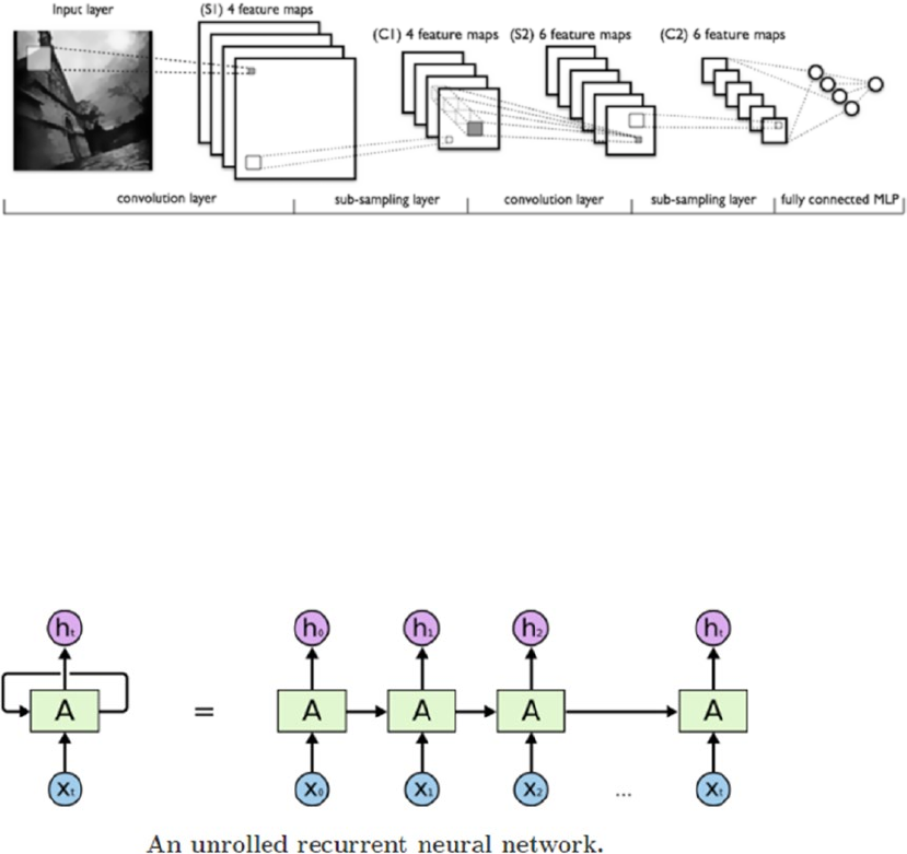
CHAPTER 1 ■ MACHINE LEARNING BASICS
33
• Pooling layers, which are basically layers that perform non-linear down sampling to
reduce the input size and number of parameters from the convolutional layer output
to generalize the model more, prevent overfitting and reduce computation time. Filters
go through the heights and width of the input and reduce it by taking an aggregate like
sum, average, or max. Typical pooling components are average or max pooling.
• Fully connected MLPs to perform tasks such as image classification and object
recognition.
A typical CNN architecture with all the components is depicted as follows in Figure1-12, which is a
LeNet CNN model (Source: deeplearning.net)
Recurrent Neural Networks
A recurrent neural network, also known as RNN, is a special type of an artificial neural network that allows
persisting information based on past knowledge by using a special type of looped architecture. They are used a
lot in areas related to data with sequences like predicting the next word of a sentence. These looped networks
are called recurrent because they perform the same operations and computation for each and every element
in a sequence of input data. RNNs have memory that helps in capturing information from past sequences.
Figure1-13 (Source: Colah’s blog at http://colah.github.io/posts/2015-08-Understanding-LSTMs/) shows
the typical structure of a RNN and how it works by unrolling the network based on input sequence length to be
fed at any point in time.
Figure 1-12. LeNet CNN model (Source: deeplearning.net)
Figure 1-13. A recurrent neural network (Source: Colah's Blog)
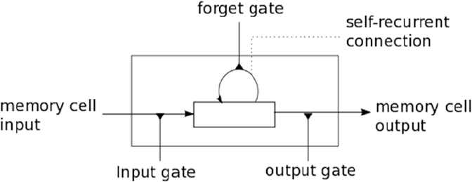
CHAPTER 1 ■ MACHINE LEARNING BASICS
34
Figure1-13 clearly depicts how the unrolled network will accept sequences of length t in each pass of
the input data and operate on the same.
Long Short-Term Memory Networks
RNNs are good in working on sequence based data but as the sequences start increasing, they start losing
historical context over time in the sequence and hence outputs are not always what is desired. This is where
Long Short-Term Memory Networks, popularly known as LSTMs, come into the picture! Introduced by
Hochreiter & Schmidhuber in 1997, LSTMs can remember information from really long sequence based
data and prevent issues like the vanishing gradient problem, which typically occurs in ANNs trained with
backpropagation. LSTMs usually consist of three or four gates, including input, output, and a special forget
gate. Figure1-14 shows a high-level pictorial representation of a single LSTM cell.
The input gate usually can allow or deny incoming signals or inputs to alter the memory cell state. The
output gate usually propagates the value to other neurons as needed. The forget gate controls the memory
cell’s self-recurrent connection to remember or forget previous states as necessary. Multiple LSTM cells are
usually stacked in any Deep Learning network to solve real-world problems like sequence prediction.
Autoencoders
An autoencoder is a specialized Artificial Neural Network that is primarily used for performing unsupervised
Machine Learning tasks. Its main objective is to learn data representations, approximations, and encodings.
Autoencoders can be used for building generative models, performing dimensionality reduction, and
detecting anomalies.
Machine Learning Methods
Machine Learning has multiple algorithms, techniques, and methodologies that can be used to build models
to solve real-world problems using data. This section tries to classify these Machine Learning methods
under some broad categories to give some sense to the overall landscape of Machine Learning methods that
are ultimately used to perform specific Machine Learning tasks we discussed in a previous section. Typically
the same Machine Learning methods can be classified in multiple ways under multiple umbrellas. Following
are some of the major broad areas of Machine Learning methods.
Figure 1-14. An LSTM cell (Source: deeplearning.net)

CHAPTER 1 ■ MACHINE LEARNING BASICS
35
1. Methods based on the amount of human supervision in the learning process
a. Supervised learning
b. Unsupervised learning
c. Semi-supervised learning
d. Reinforcement learning
2. Methods based on the ability to learn from incremental data samples
a. Batch learning
b. Online learning
3. Methods based on their approach to generalization from data samples
a. Instance based learning
b. Model based learning
We briefly cover the various types of learning methods in the following sections to build a good
foundation with regard to Machine Learning methods and the type of tasks they usually solve. This should
give you enough knowledge to start understanding which methods should be applied in what scenarios
when we tackle various real-world use cases and problems in the subsequent chapters of the book.
■ Discussing mathematical details and internals of each and every Machine Learning algorithm would be out
of the current scope and intent of the book, since the focus is more on solving real-world problems by applying
Machine Learning and not on theoretical Machine Learning. Hence you are encouraged to refer to standard
Machine Learning references like Pattern Recognition and Machine Learning, Christopher Bishop, 2006, and
The Elements of Statistical Learning, Robert Tibshirani et al., 2001, for more theoretical and mathematical
details on the internals of Machine Learning algorithms and methods.
Supervised Learning
Supervised learning methods or algorithms include learning algorithms that take in data samples (known
as training data) and associated outputs (known as labels or responses) with each data sample during the
model training process. The main objective is to learn a mapping or association between input data samples
x and their corresponding outputs y based on multiple training data instances. This learned knowledge can
then be used in the future to predict an output y′ for any new input data sample x′ which was previously
unknown or unseen during the model training process. These methods are termed as supervised because
the model learns on data samples where the desired output responses/labels are already known beforehand
in the training phase.
Supervised learning basically tries to model the relationship between the inputs and their
corresponding outputs from the training data so that we would be able to predict output responses for new
data inputs based on the knowledge it gained earlier with regard to relationships and mappings between the
inputs and their target outputs. This is precisely why supervised learning methods are extensively used in
predictive analytics where the main objective is to predict some response for some input data that’s typically
fed into a trained supervised ML model. Supervised learning methods are of two major classes based on the
type of ML tasks they aim to solve.
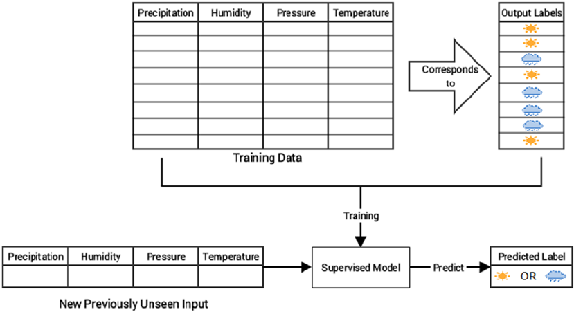
CHAPTER 1 ■ MACHINE LEARNING BASICS
36
• Classification
• Regression
Let’s look at these two Machine Learning tasks and observe the subset of supervised learning methods
that are best suited for tackling these tasks.
Classification
The classification based tasks are a sub-field under supervised Machine Learning, where the key objective
is to predict output labels or responses that are categorical in nature for input data based on what the model
has learned in the training phase. Output labels here are also known as classes or class labels are these are
categorical in nature meaning they are unordered and discrete values. Thus, each output response belongs
to a specific discrete class or category.
Suppose we take a real-world example of predicting the weather. Let’s keep it simple and say we
are trying to predict if the weather is sunny or rainy based on multiple input data samples consisting of
attributes or features like humidity, temperature, pressure, and precipitation. Since the prediction can be
either sunny or rainy, there are a total of two distinct classes in total; hence this problem can also be termed
as a binary classification problem. Figure1-15 depicts the binary weather classification task of predicting
weather as either sunny or rainy based on training the supervised model on input data samples having
feature vectors, (precipitation, humidity, pressure, and temperature) for each data sample/observation and
their corresponding class labels as either sunny or rainy.
A task where the total number of distinct classes is more than two becomes a multi-class classification
problem where each prediction response can be any one of the probable classes from this set. A simple
example would be trying to predict numeric digits from scanned handwritten images. In this case it becomes
a 10-class classification problem because the output class label for any image can be any digit from 0 - 9. In
Figure 1-15. Supervised learning: binary classification for weather prediction
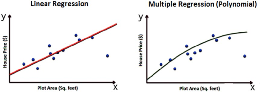
CHAPTER 1 ■ MACHINE LEARNING BASICS
37
both the cases, the output class is a scalar value pointing to one specific class. Multi-label classification tasks
are such that based on any input data sample, the output response is usually a vector having one or more
than one output class label. A simple real-world problem would be trying to predict the category of a news
article that could have multiple output classes like news, finance, politics, and so on.
Popular classification algorithms include logistic regression, support vector machines, neural networks,
ensembles like random forests and gradient boosting, K-nearest neighbors, decision trees, and many more.
Regression
Machine Learning tasks where the main objective is value estimation can be termed as regression tasks.
Regression based methods are trained on input data samples having output responses that are continuous
numeric values unlike classification, where we have discrete categories or classes. Regression models
make use of input data attributes or features (also called explanatory or independent variables) and their
corresponding continuous numeric output values (also called as response, dependent, or outcome variable)
to learn specific relationships and associations between the inputs and their corresponding outputs. With
this knowledge, it can predict output responses for new, unseen data instances similar to classification but
with continuous numeric outputs.
One of the most common real-world examples of regression is prediction of house prices. You can build
a simple regression model to predict house prices based on data pertaining to land plot areas in square feet.
Figure1-16 shows two possible regression models based on different methods to predict house prices based
on plot area.
The basic idea here is that we try to determine if there is any relationship or association between the
data feature plot area and the outcome variable, which is the house price and is what we want to predict.
Thus once we learn this trend or relationship depicted in Figure1-16, we can predict house prices in the
future for any given plot of land. If you have noticed the figure closely, we depicted two types of models on
purpose to show that there can be multiple ways to build a model on your training data. The main objective
is to minimize errors during training and validating the model so that it generalized well, does not overfit or
get biased only to the training data and performs well in future predictions.
Simple linear regression models try to model relationships on data with one feature or explanatory
variable x and a single response variable y where the objective is to predict y. Methods like ordinary least
squares (OLS) are typically used to get the best linear fit during model training.
Figure 1-16. Supervised learning: regression models for house price prediction
CHAPTER 1 ■ MACHINE LEARNING BASICS
38
Multiple regression is also known as multivariable regression. These methods try to model data where we
have one response output variable y in each observation but multiple explanatory variables in the form of a
vector X instead of a single explanatory variable. The idea is to predict y based on the different features present
in X. A real-world example would be extending our house prediction model to build a more sophisticated model
where we predict the house price based on multiple features instead of just plot area in each data sample. The
features could be represented in a vector as plot area, number of bedrooms, number of bathrooms, total floors,
furnished, or unfurnished. Based on all these attributes, the model tries to learn the relationship between each
feature vector and its corresponding house price so that it can predict them in the future.
Polynomial regression is a special case of multiple regression where the response variable y is modeled
as an nth degree polynomial of the input feature x. Basically it is multiple regression, where each feature in
the input feature vector is a multiple of x. The model on the right in Figure1-16 to predict house prices is a
polynomial model of degree 2.
Non-linear regression methods try to model relationships between input features and outputs based on
a combination of non-linear functions applied on the input features and necessary model parameters.
Lasso regression is a special form of regression that performs normal regression and generalizes the
model well by performing regularization as well as feature or variable selection. Lasso stands for least absolute
shrinkage and selection operator. The L1 norm is typically used as the regularization term in lasso regression.
Ridge regression is another special form of regression that performs normal regression and generalizes
the model by performing regularization to prevent overfitting the model. Typically the L2 norm is used as the
regularization term in ridge regression.
Generalized linear models are generic frameworks that can be used to model data predicting different
types of output responses, including continuous, discrete, and ordinal data. Algorithms like logistic
regression are used for categorical data and ordered probit regression for ordinal data.
Unsupervised Learning
Supervised learning methods usually require some training data where the outcomes which we are trying
to predict are already available in the form of discrete labels or continuous values. However, often we do not
have the liberty or advantage of having pre-labeled training data and we still want to extract useful insights
or patterns from our data. In this scenario, unsupervised learning methods are extremely powerful. These
methods are called unsupervised because the model or algorithm tries to learn inherent latent structures,
patterns and relationships from given data without any help or supervision like providing annotations in the
form of labeled outputs or outcomes.
Unsupervised learning is more concerned with trying to extract meaningful insights or information
from data rather than trying to predict some outcome based on previously available supervised training
data. There is more uncertainty in the results of unsupervised learning but you can also gain a lot of
information from these models that was previously unavailable to view just by looking at the raw data.
Often unsupervised learning could be one of the tasks involved in building a huge intelligence system. For
example, we could use unsupervised learning to get possible outcome labels for tweet sentiments by using
the knowledge of the English vocabulary and then train a supervised model on similar data points and their
outcomes which we obtained previously through unsupervised learning. There is no hard and fast rule with
regard to using just one specific technique. You can always combine multiple methods as long as they are
relevant in solving the problem. Unsupervised learning methods can be categorized under the following
broad areas of ML tasks relevant to unsupervised learning.
• Clustering
• Dimensionality reduction
• Anomaly detection
• Association rule-mining
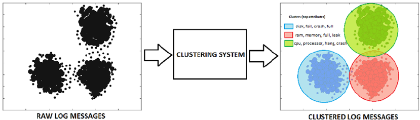
CHAPTER 1 ■ MACHINE LEARNING BASICS
39
We explore these tasks briefly in the following sections to get a good feel of how unsupervised learning
methods are used in the real world.
Clustering
Clustering methods are Machine Learning methods that try to find patterns of similarity and relationships
among data samples in our dataset and then cluster these samples into various groups, such that each group
or cluster of data samples has some similarity, based on the inherent attributes or features. These methods
are completely unsupervised because they try to cluster data by looking at the data features without any
prior training, supervision, or knowledge about data attributes, associations, and relationships.
Consider a real-world problem of running multiple servers in a data center and trying to analyze logs
for typical issues or errors. Our main task is to determine the various kinds of log messages that usually
occur frequently each week. In simple words, we want to group log messages into various clusters based on
some inherent characteristics. A simple approach would be to extract features from the log messages, which
would be in textual format and apply clustering on the same and group similar log messages together based
on similarity in content. Figure1-17 shows how clustering would solve this problem. Basically we have raw
log messages to start with. Our clustering system would employ feature extraction to extract features from
text like word occurrences, phrase occurrences, and so on. Finally, a clustering algorithm like K-means or
hierarchical clustering would be employed to group or cluster messages based on similarity of their
inherent features.
Figure 1-17. Unsupervised learning: clustering log messages
It is quite clear from Figure1-17 that our systems have three distinct clusters of log messages where
the first cluster depicts disk issues, the second cluster is about memory issues, and the third cluster is about
processor issues. Top feature words that helped in distinguishing the clusters and grouping similar data
samples (logs) together are also depicted in the figure. Of course, sometimes some features might be present
across multiple data samples hence there can be slight overlap of clusters too since this is unsupervised
learning. However, the main objective is always to create clusters such that elements of each cluster are near
each other and far apart from elements of other clusters.
There are various types of clustering methods that can be classified under the following major approaches.
• Centroid based methods such as K-means and K-medoids
• Hierarchical clustering methods such as agglomerative and divisive (Ward’s, affinity
propagation)
• Distribution based clustering methods such as Gaussian mixture models
• Density based methods such as dbscan and optics.
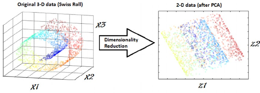
CHAPTER 1 ■ MACHINE LEARNING BASICS
40
Besides this, we have several methods that recently came into the clustering landscape, like birch
and clarans.
Dimensionality Reduction
Once we start extracting attributes or features from raw data samples, sometimes our feature space gets
bloated up with a humongous number of features. This poses multiple challenges including analyzing and
visualizing data with thousands or millions of features, which makes the feature space extremely complex
posing problems with regard to training models, memory, and space constraints. In fact this is referred
to as the “curse of dimensionality”. Unsupervised methods can also be used in these scenarios, where we
reduce the number of features or attributes for each data sample. These methods reduce the number of
feature variables by extracting or selecting a set of principal or representative features. There are multiple
popular algorithms available for dimensionality reduction like Principal Component Analysis (PCA), nearest
neighbors, and discriminant analysis. Figure1-18 shows the output of a typical feature reduction process
applied to a Swiss Roll 3D structure having three dimensions to obtain a two-dimensional feature space for
each data sample using PCA.
From Figure1-18, it is quite clear that each data sample originally had three features or dimensions,
namely D(x1, x2, x3) and after applying PCA, we reduce each data sample from our dataset into two
dimensions, namely D’(z1, z2). Dimensionality reduction techniques can be classified in two major
approaches as follows.
• Feature Selection methods: Specific features are selected for each data sample from
the original list of features and other features are discarded. No new features are
generated in this process.
• Feature Extraction methods: We engineer or extract new features from the original
list of features in the data. Thus the reduced subset of features will contain newly
generated features that were not part of the original feature set. PCA falls under this
category.
Figure 1-18. Unsupervised learning: dimensionality reduction
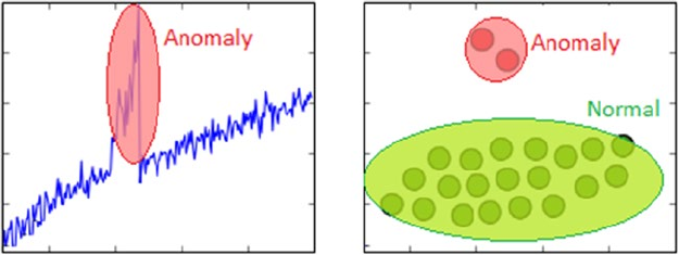
CHAPTER 1 ■ MACHINE LEARNING BASICS
41
Anomaly Detection
The process of anomaly detection is also termed as outlier detection, where we are interested in finding
out occurrences of rare events or observations that typically do not occur normally based on historical
data samples. Sometimes anomalies occur infrequently and are thus rare events, and in other instances,
anomalies might not be rare but might occur in very short bursts over time, thus have specific patterns.
Unsupervised learning methods can be used for anomaly detection such that we train the algorithm
on the training dataset having normal, non-anomalous data samples. Once it learns the necessary data
representations, patterns, and relations among attributes in normal samples, for any new data sample, it
would be able to identify it as anomalous or a normal data point by using its learned knowledge. Figure1-19
depicts some typical anomaly detection based scenarios where you could apply supervised methods like
one-class SVM and unsupervised methods like clustering, K-nearest neighbors, auto-encoders, and so on to
detect anomalies based on data and its features.
Figure 1-19. Unsupervised learning: anomaly detection
Anomaly detection based methods are extremely popular in real-world scenarios like detection of
security attacks or breaches, credit card fraud, manufacturing anomalies, network issues, and many more.
Association Rule-Mining
Typically association rule-mining is a data mining method use to examine and analyze large transactional
datasets to find patterns and rules of interest. These patterns represent interesting relationships and
associations, among various items across transactions. Association rule-mining is also often termed as
market basket analysis, which is used to analyze customer shopping patterns. Association rules help in
detecting and predicting transactional patterns based on the knowledge it gains from training transactions.
Using this technique, we can answer questions like what items do people tend to buy together, thereby
indicating frequent item sets. We can also associate or correlate products and items, i.e., insights like people
who buy beer also tend to buy chicken wings at a pub. Figure1-20 shows how a typical association rule-
mining method should work ideally on a transactional dataset.
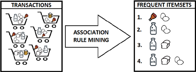
CHAPTER 1 ■ MACHINE LEARNING BASICS
42
From Figure1-20, you can clearly see that based on different customer transactions over a period of
time, we have obtained the items that are closely associated and customers tend to buy them together. Some
of these frequent item sets are depicted like {meat, eggs}, {milk, eggs} and so on. The criterion of determining
good quality association rules or frequent item sets is usually done using metrics like support, confidence,
and lift.
This is an unsupervised method, because we have no idea what the frequent item sets are or which
items are more strongly associated with which items beforehand. Only after applying algorithms like the
apriori algorithm or FP-growth, can we detect and predict products or items associated closely with each
other and find conditional probabilistic dependencies. We cover association rule-mining in further details in
Chapter 8.
Semi-Supervised Learning
The semi-supervised learning methods typically fall between supervised and unsupervised learning
methods. These methods usually use a lot of training data that’s unlabeled (forming the unsupervised
learning component) and a small amount of pre-labeled and annotated data (forming the supervised
learning component). Multiple techniques are available in the form of generative methods, graph based
methods, and heuristic based methods.
A simple approach would be building a supervised model based on labeled data, which is limited, and
then applying the same to large amounts of unlabeled data to get more labeled samples, train the model
on them and repeat the process. Another approach would be to use unsupervised algorithms to cluster
similar data samples, use human-in-the-loop efforts to manually annotate or label these groups, and then
use a combination of this information in the future. This approach is used in many image tagging systems.
Covering semi-supervised methods would be out of the present scope of this book.
Reinforcement Learning
The reinforcement learning methods are a bit different from conventional supervised or unsupervised
methods. In this context, we have an agent that we want to train over a period of time to interact with a
specific environment and improve its performance over a period of time with regard to the type of actions it
performs on the environment. Typically the agent starts with a set of strategies or policies for interacting with
the environment. On observing the environment, it takes a particular action based on a rule or policy and by
observing the current state of the environment. Based on the action, the agent gets a reward, which could be
beneficial or detrimental in the form of a penalty. It updates its current policies and strategies if needed and
Figure 1-20. Unsupervised learning: association rule-mining

CHAPTER 1 ■ MACHINE LEARNING BASICS
43
this iterative process continues till it learns enough about its environment to get the desired rewards. The
main steps of a reinforcement learning method are mentioned as follows.
1. Prepare agent with set of initial policies and strategy
2. Observe environment and current state
3. Select optimal policy and perform action
4. Get corresponding reward (or penalty)
5. Update policies if needed
6. Repeat Steps 2 - 5 iteratively until agent learns the most optimal policies
Consider a real-world problem of trying to make a robot or a machine learn to play chess. In this case
the agent would be the robot and the environment and states would be the chessboard and the positions of
the chess pieces. A suitable reinforcement learning methodology is depicted in Figure1-21.
Figure 1-21. Reinforcement learning: training a robot to play chess
The main steps involved for making the robot learn to play chess is pictorially depicted in Figure1-21.
This is based on the steps discussed earlier for any reinforcement learning method. In fact, Google’s
DeepMind built the AlphaGo AI with components of reinforcement learning to train the system to play the
game of Go.
Batch Learning
Batch learning methods are also popularly known as offline learning methods. These are Machine Learning
methods that are used in end-to-end Machine Learning systems where the model is trained using all the
available training data in one go. Once training is done and the model completes the process of learning,
on getting a satisfactory performance, it is deployed into production where it predicts outputs for new data
samples. However, the model doesn’t keep learning over a period of time continuously with the new data.
Once the training is complete the model stops learning. Thus, since the model trains with data in one single
batch and it is usually a one-time procedure, this is known as batch or offline learning.
CHAPTER 1 ■ MACHINE LEARNING BASICS
44
We can always train the model on new data but then we would have to add new data samples along
with the older historical training data and again re-build the model using this new batch of data. If most of
the model building workflow has already been implemented, retraining a model would not involve a lot of
effort; however, with the data size getting bigger with each new data sample, the retraining process will start
consuming more processor, memory, and disk resources over a period of time. These are some points to be
considered when you are building models that would be running from systems having limited capacity.
Online Learning
Online learning methods work in a different way as compared to batch learning methods. The training
data is usually fed in multiple incremental batches to the algorithm. These data batches are also known as
mini-batches in ML terminology. However, the training process does not end there unlike batch learning
methods. It keeps on learning over a period of time based on new data samples which are sent to it for
prediction. Basically it predicts and learns in the process with new data on the fly without have to re-run the
whole model on previous data samples.
There are several advantages to online learning—it is suitable in real-world scenarios where the model
might need to keep learning and re-training on new data samples as they arrive. Problems like device failure
or anomaly prediction and stock market forecasting are two relevant scenarios. Besides this, since the data
is fed to the model in incremental mini-batches, you can build these models on commodity hardware
without worrying about memory or disk constraints since unlike batch learning methods, you do not need
to load the full dataset in memory before training the model. Besides this, once the model trains on datasets,
you can remove them since we do not need the same data again as the model learns incrementally and
remembers what it has learned in the past.
One of the major caveats in online learning methods is the fact that bad data samples can affect the
model performance adversely. All ML methods work on the principle of “Garbage In Garbage Out”. Hence
if you supply bad data samples to a well-trained model, it can start learning relationships and patterns that
have no real significance and this ends up affecting the overall model performance. Since online learning
methods keep learning based on new data samples, you should ensure proper checks are in place to
notify you in case suddenly the model performance drops. Also suitable model parameters like learning
rate should be selected with care to ensure the model doesn’t overfit or get biased based on specific data
samples.
Instance Based Learning
There are various ways to build Machine Learning models using methods that try to generalize based
on input data. Instance based learning involves ML systems and methods that use the raw data points
themselves to figure out outcomes for newer, previously unseen data samples instead of building an explicit
model on training data and then testing it out.
A simple example would be a K-nearest neighbor algorithm. Assuming k = 3, we have our initial training
data. The ML method knows the representation of the data from the features, including its dimensions,
position of each data point, and so on. For any new data point, it will use a similarity measure (like cosine or
Euclidean distance) and find the three nearest input data points to this new data point. Once that is decided,
we simply take a majority of the outcomes for those three training points and predict or assign it as the
outcome label/response for this new data point. Thus, instance based learning works by looking at the input
data points and using a similarity metric to generalize and predict for new data points.
CHAPTER 1 ■ MACHINE LEARNING BASICS
45
Model Based Learning
The model based learning methods are a more traditional ML approach toward generalizing based on
training data. Typically an iterative process takes place where the input data is used to extract features and
models are built based on various model parameters (known as hyperparameters). These hyperparameters
are optimized based on various model validation techniques to select the model that generalizes best on the
training data and some amount of validation and test data (split from the initial dataset). Finally, the best
model is used to make predictions or decisions as and when needed.
The CRISP-DM Process Model
The CRISP-DM model stands for CRoss Industry Standard Process for Data Mining. More popularly known
by the acronym itself, CRISP-DM is a tried, tested, and robust industry standard process model followed for
data mining and analytics projects. CRISP-DM clearly depicts necessary steps, processes, and workflows for
executing any project right from formalizing business requirements to testing and deploying a solution to
transform data into insights. Data Science, Data Mining, and Machine Learning are all about trying to run
multiple iterative processes to extract insights and information from data. Hence we can say that analyzing
data is truly both an art as well as a science, because it is not always about running algorithms without
reason; a lot of the major effort involves in understanding the business, the actual value of the efforts being
invested, and proper methods to articulate end results and insights.
The CRISP-DM model tells us that for building an end-to-end solution for any analytics project or
system, there are a total of six major steps or phases, some of them being iterative. Just like we have a
software development lifecycle with several major phases or steps for a software development project, we
have a data mining or analysis lifecycle in this scenario. Figure1-22 depicts the data mining lifecycle with the
CRISP-DM model.
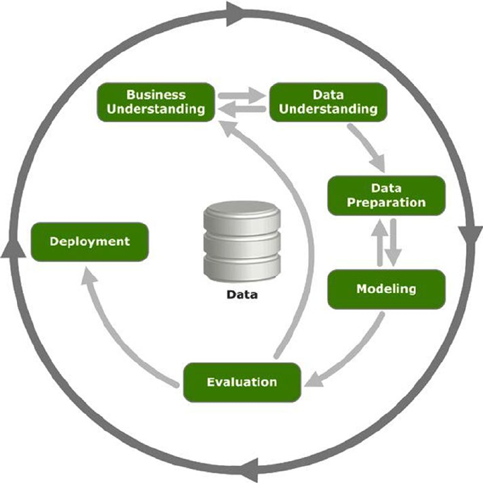
CHAPTER 1 ■ MACHINE LEARNING BASICS
46
Figure1-22 clearly shows there are a total of six major phases in the data mining lifecycle and the
direction to proceed is depicted with arrows. This model is not a rigid imposition but rather a framework to
ensure you are on the right track when going through the lifecycle of any analytics project. In some scenarios
like anomaly detection or trend analysis, you might be more interested in data understanding, exploration,
and visualization rather than intensive modeling. Each of the six phases is described in detail as follows.
Business Understanding
This is the initial phase before kick starting any project in full flow. However this is one of the most important
phases in the lifecycle! The main objective here starts with understanding the business context and
requirements for the problem to be solved at hand. Definition of business requirements is crucial to convert
the business problem into a data mining or analytics problem and to set expectations and success criteria
for both the customer as well as the solution task force. The final deliverable from this phase would be a
detailed plan with the major milestones of the project and expected timelines along with success criteria,
assumptions, constraints, caveats, and challenges.
Figure 1-22. The CRISP-DM model depicting the data mining lifecycle
CHAPTER 1 ■ MACHINE LEARNING BASICS
47
Define Business Problem
The first task in this phase would be to start by understanding the business objective of the problem to
be solved and build a formal definition of the problem. The following points are crucial toward clearly
articulating and defining the business problem.
• Get business context of the problem to be solved, assess the problem with the help of
domain, and subject matter experts (SMEs).
• Describe main pain points or target areas for business objective to be solved.
• Understand the solutions that are currently in place, what is lacking, and what needs
to be improved.
• Define the business objective along with proper deliverables and success criteria
based on inputs from business, data scientists, analysts, and SMEs.
Assess and Analyze Scenarios
Once the business problem is defined clearly, the main tasks involved would be to analyze and assess the
current scenario with regard to the business problem definition. This includes looking at what is currently
available and making a note of various items required ranging from resources, personnel, to data. Besides
this, proper assessment of risks and contingency plans need to be discussed. The main steps involved in the
assessment stage here are mentioned as follows.
• Assess and analyze what is currently available to solve the problem from various
perspectives including data, personnel, resource time, and risks.
• Build out a brief report of key resources needed (both hardware and software) and
personnel involved. In case of any shortcomings, make sure to call them out as
necessary.
• Discuss business objective requirements one by one and then identify and record
possible assumptions and constraints for each requirement with the help of SMEs.
• Verify assumptions and constraints based on data available (a lot of this might be
answered only after detailed analysis, hence it depends on the problem to be solved
and the data available).
• Document and report possible risks involved in the project including timelines,
resources, personnel, data, and financial based concerns. Build contingency plans
for each possible scenario.
• Discuss success criteria and try to document a comparative return on investment or
cost versus valuation analysis if needed. This just needs to be a rough benchmark to
make sure the project aligns with the company or business vision.
CHAPTER 1 ■ MACHINE LEARNING BASICS
48
Define Data Mining Problem
This could be defined as the pre-analysis phase, which starts once the success criteria and the business
problem is defined and all the risks, assumptions and constraints have been documented. This phase involves
having detailed technical discussions with your analysts, data scientists, and developers and keeping the
business stakeholders in sync. The following are the key tasks that are to be undertaken in this phase.
• Discuss and document possible Machine Learning and data mining methods
suitable for the solution by assessing possible tools, algorithms, and techniques.
• Develop high-level designs for end-to-end solution architecture.
• Record notes on what the end output from the solution will be and how will it
integrate with existing business components.
• Record success evaluation criteria from a Data Science standpoint. A simple example
could be making sure that predictions are at least 80% accurate.
Project Plan
This is the final stage under the business understanding phase. A project plan is generally created consisting
of the entire major six phases in the CRISP-DM model, estimated timelines, allocated resources and
personnel, and possible risks and contingency plans. Care is taken to ensure concrete high-level deliverables
and success criteria are defined for each phase and iterative phases like modeling are highlighted with
annotations like feedback based on SMEs might need models to be rebuilt and retuned before deployment.
You should be ready for the next step once you have the following points covered.
• Definition of business objectives for the problem
• Success criteria for business and data mining efforts
• Budgetallocation and resource planning
• Clear, well-defined Machine Learning and data mining methodologies to be
followed, including high-level workflows from exploration to deployment
• Detailed project plan with all six phases of the CRISP-DM model defined with
estimated timelines and risks
Data Understanding
The second phase in the CRISP-DM process involves taking a deep dive into the data available and
understanding it in further detail before starting the process of analysis. This involves collecting the data,
describing the various attributes, performing some exploratory analysis of the data, and keeping tabs on data
quality. This phase should not be neglected because bad data or insufficient knowledge about available data
can have cascading adverse effects in the later stages in this process.
Data Collection
This task is undertaken to extract, curate, and collect all the necessary data needed for your business
objective. Usually this involves making use of the organizations historical data warehouses, data marts, data
lakes and so on. An assessment is done based on the existing data available in the organization and if there is
any need for additional data. This can be obtained from the web, i.e., open data sources or it can be obtained
from other channels like surveys, purchases, experiments and simulations. Detailed documents should keep
CHAPTER 1 ■ MACHINE LEARNING BASICS
49
track of all datasets which would be used for analysis and additional data sources if any are necessary. This
document can be combined with the subsequent stages of this phase.
Data Description
Data description involves carrying out initial analysis on the data to understand more about the data, its
source, volume, attributes, and relationships. Once these details are documented, any shortcomings if
noted should be informed to relevant personnel. The following factors are crucial to building a proper data
description document.
• Data sources (SQL, NoSQL, Big Data), record of origin (ROO), record of
reference(ROR)
• Data volume (size, number of records, total databases, tables)
• Data attributes and their description (variables, data types)
• Relationship and mapping schemes (understand attribute representations)
• Basic descriptive statistics (mean, median, variance)
• Focus on which attributes are important for the business
Exploratory Data Analysis
Exploratory data analysis, also known as EDA, is one of the first major analysis stages in the lifecycle. Here,
the main objective is to explore and understand the data in detail. You can make use of descriptive statistics,
plots, charts, and visualizations to look at the various data attributes, find associations and correlations and
make a note of data quality problems if any. Following are some of the major tasks in this stage.
• Explore, describe, and visualize data attributes
• Select data and attributes subsets that seem most important for the problem
• Extensive analysis to find correlations and associations and test hypotheses
• Note missing data points if any
Data Quality Analysis
Data quality analysis is the final stage in the data understanding phase where we analyze the quality of data
in our datasets and document potential errors, shortcomings, and issues that need to be resolved before
analyzing the data further or starting modeling efforts. The main focus on data quality analysis involves the
following.
• Missing values
• Inconsistent values
• Wrong information due to data errors (manual/automated)
• Wrong metadata information
CHAPTER 1 ■ MACHINE LEARNING BASICS
50
Data Preparation
The third phase in the CRISP-DM process takes place after gaining enough knowledge on the business
problem and relevant dataset. Data preparation is mainly a set of tasks that are performed to clean, wrangle,
curate, and prepare the data before running any analytical or Machine Learning methods and building
models. We will briefly discuss some of the major tasks under the data preparation phase in this section. An
important point to remember here is that data preparation usually is the most time consuming phase in the
data mining lifecycle and often takes 60% to 70% time in the overall project. However this phase should be
taken very seriously because, like we have discussed multiple times before, bad data will lead to bad models
and poor performance and results.
Data Integration
The process of data integration is mainly done when we have multiple datasets that we might want to
integrate or merge. This can be done in two ways. Appending several datasets by combining them, which
is typically done for datasets having the same attributes. Merging several datasets together having different
attributes or columns, by using common fields like keys.
Data Wrangling
The process of data wrangling or data munging involves data processing, cleaning, normalization, and
formatting. Data in its raw form is rarely consumable by Machine Learning methods to build models. Hence
we need to process the data based on its form, clean underlying errors and inconsistencies, and format it
into more consumable formats for ML algorithms. Following are the main tasks relevant to data wrangling.
• Handling missing values (remove rows, impute missing values)
• Handling data inconsistencies (delete rows, attributes, fix inconsistencies)
• Fixing incorrect metadata and annotations
• Handling ambiguous attribute values
• Curating and formatting data into necessary formats (CSV, Json, relational)
Attribute Generation and Selection
Data is comprised of observations or samples (rows) and attributes or features (columns). The process of
attribute generation is also known as feature extraction and engineering in Machine Learning terminology.
Attribute generation is basically creating new attributes or variables from existing attributes based on some
rules, logic, or hypothesis. A simple example would be creating a new numeric variable called age based on
two date-time fields—current_date and birth_date—for a dataset of employees in an organization. There
are several techniques with regard to attribute generation that we discuss in future chapters.
Attribute selection is basically selecting a subset of features or attributes from the dataset based on
parameters like attribute importance, quality, relevancy, assumptions, and constraints. Sometimes even
Machine Learning methods are used to select relevant attributes based on the data. This is popularly known
as feature selection in Machine Learning terminology.
CHAPTER 1 ■ MACHINE LEARNING BASICS
51
Modeling
The fourth phase in the CRISP-DM process is the core phase in the process where most of the analysis
takes place with regard to using clean, formatted data and its attributes to build models to solve business
problems. This is an iterative process, as depicted in Figure1-22 earlier, along with model evaluation and all
the preceding steps leading up to modeling. The basic idea is to build multiple models iteratively trying to
get to the best model that satisfies our success criteria, data mining objectives, and business objectives. We
briefly talk about some of the major stages relevant to modeling in this section.
Selecting Modeling Techniques
In this stage, we pick up a list of relevant Machine Learning and data mining tools, frameworks, techniques,
and algorithms listed in the “Business Understanding” phase. Techniques that are proven to be robust
and useful in solving the problem are usually selected based on inputs and insights from data analysts and
data scientists. These are mainly decided by the current data available, business goals, data mining goals,
algorithm requirements, and constraints.
Model Building
The process of model building is also known as training the model using data and features from our dataset.
A combination of data (features) and Machine Learning algorithms together give us a model that tries
to generalize on the training data and give necessary results in the form of insights and/or predictions.
Generally various algorithms are used to try out multiple modeling approaches on the same data to solve
the same problem to get the best model that performs and gives outputs that are the closest to the business
success criteria. Key things to keep track here are the models created, model parameters being used, and
their results.
Model Evaluation and Tuning
In this stage, we evaluate each model based on several metrics like model accuracy, precision, recall,
F1 score, and so on. We also tune the model parameters based on techniques like grid search and cross
validation to get to the model that gives us the best results. Tuned models are also matched with the data
mining goals to see if we are able to get the desired results as well as performance. Model tuning is also
termed as hyperparameter optimization in the Machine Learning world.
Model Assessment
Once we have models that are providing desirable and relevant results, a detailed assessment of the model is
performed based on the following parameters.
• Model performance is in line with defined success criteria
• Reproducible and consistent results from models
• Scalability, robustness, and ease of deployment
• Future extensibility of the model
• Model evaluation gives satisfactory results
CHAPTER 1 ■ MACHINE LEARNING BASICS
52
Evaluation
The fifth phase in the CRISP-DM process takes place once we have the final models from the modeling
phase that satisfy necessary success criteria with respect to our data mining goals and have the desired
performance and results with regard to model evaluation metrics like accuracy. The evaluation phase
involves carrying out a detailed assessment and review of the final models and the results which are
obtained from them. Some of the main points that are evaluated in this section are as follows.
• Ranking final models based on the quality of results and their relevancy based on
alignment with business objectives
• Any assumptions or constraints that were invalidated by the models
• Cost of deployment of the entire Machine Learning pipeline from data extraction
and processing to modeling and predictions
• Any pain points in the whole process? What should be recommended? What should
be avoided?
• Data sufficiency report based on results
• Final suggestions, feedback, and recommendations from solutions team and SMEs
Based on the report formed from these points, after a discussion, the team can decide whether they
want to proceed to the next phase of model deployment or a full reiteration is needed, starting from business
and data understanding to modeling.
Deployment
The final phase in the CRISP-DM process is all about deploying your selected models to production and
making sure the transition from development to production is seamless. Usually most organizations follow
a standard path-to-production methodology. A proper plan for deployment is built based on resources
required, servers, hardware, software, and so on. Models are validated, saved, and deployed on necessary
systems and servers. A plan is also put in place for regular monitoring and maintenance of models to
continuously evaluate their performance, check for results and their validity, and retire, replace, and update
models as and when needed.
Building Machine Intelligence
The objective of Machine Learning, data mining, or artificial intelligence is to make our lives easier,
automate tasks, and take better decisions. Building machine intelligence involves everything we have
learned until now starting from Machine Learning concepts to actually implementing and building models
and using them in the real world. Machine intelligence can be built using non-traditional computing
approaches like Machine Learning. In this section, we establish full-fledged end-to-end Machine Learning
pipelines based on the CRISP-DM model, which will help us solve real-world problems by building machine
intelligence using a structured process.
Machine Learning Pipelines
The best way to solve a real-world Machine Learning or analytics problem is to use a Machine Learning
pipeline starting from getting your data to transforming it into information and insights using Machine
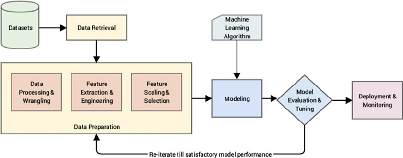
CHAPTER 1 ■ MACHINE LEARNING BASICS
53
Figure 1-23. A standard Machine Learning pipeline
Learning algorithms and techniques. This is more of a technical or solution based pipeline and it assumes
that several aspects of the CRISP-DM model are already covered, including the following points.
• Business and data understanding
• ML/DM technique selection
• Risk, assumptions, and constraints assessment
A Machine Learning pipeline will mainly consist of elements related to data retrieval and extraction,
preparation, modeling, evaluation, and deployment. Figure1-23 shows a high-level overview of a standard
Machine Learning pipeline with the major phases highlighted in their blocks.
From Figure1-23, it is evident that there are several major phases in the Machine Learning pipeline and
they are quite similar to the CRISP-DM process model, which is why we talked about it in detail earlier. The
major steps in the pipeline are briefly mentioned here.
• Data retrieval: This is mainly data collection, extraction, and acquisition from
various data sources and data stores. We cover data retrieval mechanisms in detail in
Chapter 3, “Processing, Wrangling, and Visualizing Data”.
• Data preparation: In this step, we pre-process the data, clean it, wrangle it, and
manipulate it as needed. Initial exploratory data analysis is also carried out.
Next steps involved extracting, engineering, and selecting features/attributes from
the data.
• Data processing and wrangling: Mainly concerned with data processing,
cleaning, munging, wrangling and performing initial descriptive and
exploratory data analysis. We cover this in further details with hands-on
examples in Chapter 3, “Processing, Wrangling, and Visualizing Data”.
• Feature extraction and engineering: Here, we extract important features or
attributes from the raw data and even create or engineer new features from
existing features. Details on various feature engineering techniques are covered
in Chapter 4, “Feature Engineering and Selection”.
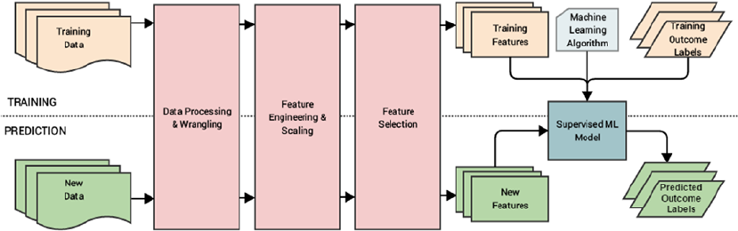
CHAPTER 1 ■ MACHINE LEARNING BASICS
54
• Feature scaling and selection: Data features often need to be normalized and
scaled to prevent Machine Learning algorithms from getting biased. Besides
this, often we need to select a subset of all available features based on feature
importance and quality. This process is known as feature selection. Chapter 4,
“Feature Engineering and Selection,” covers these aspects.
• Modeling: In the process of modeling, we usually feed the data features to a Machine
Learning method or algorithm and train the model, typically to optimize a specific
cost function in most cases with the objective of reducing errors and generalizing the
representations learned from the data. Chapter 5, “Building, Tuning, and Deploying
Models,” covers the art and science behind building Machine Learning models.
• Model evaluation and tuning: Built models are evaluated and tested on validation
datasets and, based on metrics like accuracy, F1 score, and others, the model
performance is evaluated. Models have various parameters that are tuned in a
process called hyperparameter optimization to get models with the best and optimal
results. Chapter 5, “Building, Tuning, and Deploying Models,” covers these aspects.
• Deployment and monitoring: Selected models are deployed in production and
are constantly monitored based on their predictions and results. Details on model
deployment are covered in Chapter 5, “Building, Tuning and Deploying Models”.
Supervised Machine Learning Pipeline
By now we know that supervised Machine Learning methods are all about working with supervised
labeled data to train models and then predict outcomes for new data samples. Some processes like feature
engineering, scaling, and selection should always remain constant so that the same features are used for
training the model and the same features are extracted from new data samples to feed the model in the
prediction phase. Based on our earlier generic Machine Learning pipeline, Figure1-24 shows a standard
supervised Machine Learning pipeline.
Figure 1-24. Supervised Machine Learning pipeline
You can clearly see the two phases of model training and prediction highlighted in Figure1-24.
Also, based on what we had mentioned earlier, the same sequence of data processing, wrangling, feature
engineering, scaling, and selection is used for both data used in training the model and future data samples
for which the model predicts outcomes. This is a very important point that you must remember whenever
you are building any supervised model. Besides this, as depicted, the model is a combination of a Machine
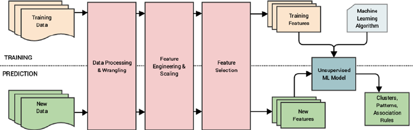
CHAPTER 1 ■ MACHINE LEARNING BASICS
55
Figure 1-25. Unsupervised Machine Learning pipeline
Learning (supervised) algorithm and training data features and corresponding labels. This model will take
features from new data samples and output predicted labels in the prediction phase.
Unsupervised Machine Learning Pipeline
Unsupervised Machine Learning is all about extracting patterns, relationships, associations, and clusters
from data. The processes related to feature engineering, scaling and selection are similar to supervised
learning. However there is no concept of pre-labeled data here. Hence the unsupervised Machine Learning
pipeline would be slightly different in contrast to the supervised pipeline. Figure1-25 depicts a standard
unsupervised Machine Learning pipeline.
Figure1-25 clearly depicts that no supervised labeled data is used for training the model. With the
absence of labels, we just have training data that goes through the same data preparation phase as in the
supervised learning pipeline and we build our unsupervised model with an unsupervised Machine Learning
algorithm and training features. In the prediction phase, we extract features from new data samples and pass
them through the model which gives relevant results according to the type of Machine Learning task we are
trying to perform, which can be clustering, pattern detection, association rules, or dimensionality reduction.
Real-World Case Study: Predicting Student Grant
Recommendations
Let’s take a step back from what we have learned so far! The main objective here was to gain a solid grasp
over the entire Machine Learning landscape, understand crucial concepts, build on the basic foundations,
and understand how to execute Machine Learning projects with the help of Machine Learning pipelines
with the CRISP-DM process model being the source of all inspiration. Let’s put all this together to take a
very basic real-world case study by building a supervised Machine Learning pipeline on a toy dataset. Our
major objective is as follows. Given that you have several students with multiple attributes like grades,
performance, and scores, can you build a model based on past historical data to predict the chance of the
student getting a recommendation grant for a research project?
This will be a quick walkthrough with the main intent of depicting how to build and deploy a real-world
Machine Learning pipeline and perform predictions. This will also give you a good hands-on experience to
get started with Machine Learning. Do not worry too much if you don’t understand the details of each and
every line of code; the subsequent chapters cover all the tools, techniques, and frameworks used here in
CHAPTER 1 ■ MACHINE LEARNING BASICS
56
detail. We will be using Python 3.5 in this book; you can refer to Chapter 2, “The Python Machine Learning
Ecosystem” to understand more about Python and the various tools and frameworks used in Machine
Learning. You can follow along with the code snippets in this section or open the Predicting Student
Recommendation Machine Learning Pipeline.ipynb jupyter notebook by running jupyter notebook
in the command line/terminal in the same directory as this notebook. You can then run the relevant code
snippets in the notebook from your browser. Chapter 2 covers jupyter notebooks in detail.
Objective
You have historical student performance data and their grant recommendation outcomes in the form of
a comma separated value file named student_records.csv. Each data sample consists of the following
attributes.
• Name (the student name)
• OverallGrade (overall grade obtained)
• Obedient (whether they were diligent during their course of stay)
• ResearchScore (marks obtained in their research work)
• ProjectScore (marks obtained in the project)
• Recommend (whether they got the grant recommendation)
You main objective is to build a predictive model based on this data such that you can predict for any
future student whether they will be recommended for the grant based on their performance attributes.
Data Retrieval
Here, we will leverage the pandas framework to retrieve the data from the CSV file. The following snippet
shows us how to retrieve the data and view it.
In [1]: import pandas as pd
...: # turn of warning messages
...: pd.options.mode.chained_assignment = None # default='warn'
...:
...: # get data
...: df = pd.read_csv('student_records.csv')
...: df
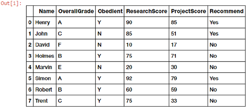
CHAPTER 1 ■ MACHINE LEARNING BASICS
57
Now that we can see data samples showing records for each student and their corresponding
recommendation outcomes in Figure1-26, we will perform necessary tasks relevant to data preparation.
Data Preparation
Based on the dataset we saw earlier, we do not have any data errors or missing values, hence we will mainly
focus on feature engineering and scaling in this section.
Feature Extraction and Engineering
Let’s start by extracting the existing features from the dataset and the outcomes in separate variables. The
following snippet shows this process. See Figures1-27 and 1-28.
In [2]: # get features and corresponding outcomes
...: feature_names = ['OverallGrade', 'Obedient', 'ResearchScore',
'ProjectScore']
...: training_features = df[feature_names]
...:
...: outcome_name = ['Recommend']
...: outcome_labels = df[outcome_name]
In [3]: # view features
...: training_features
Figure 1-26. Raw data depicting student records and their recommendations
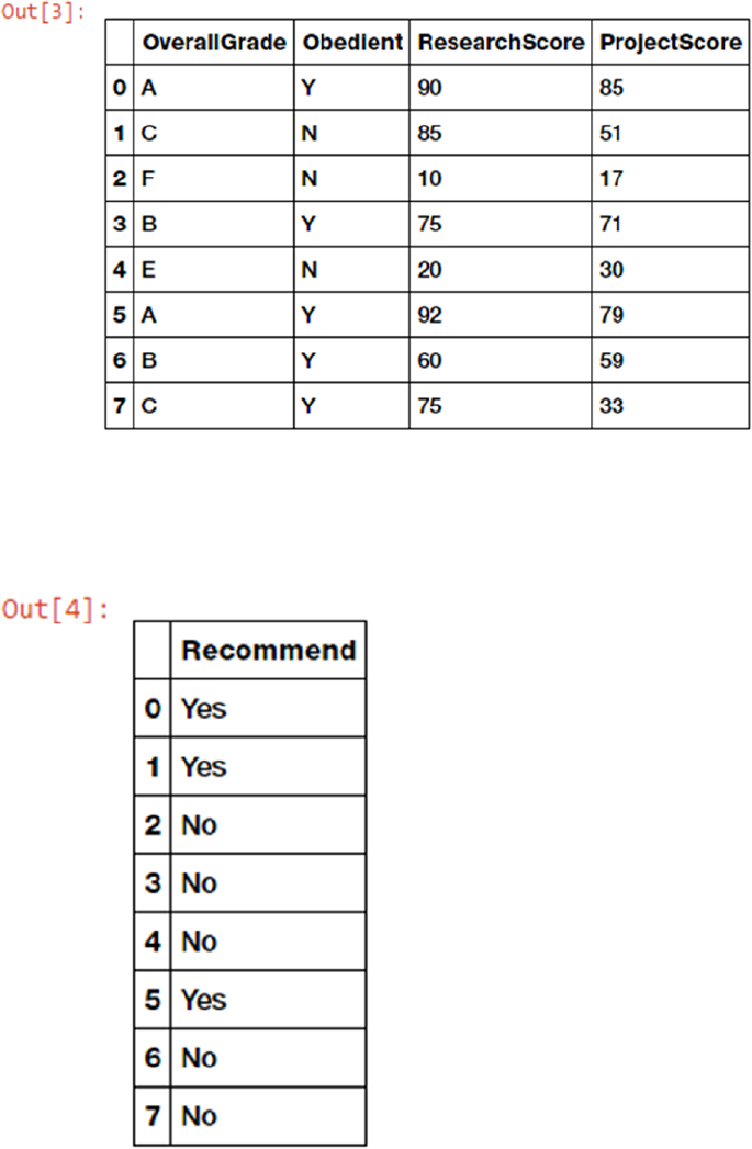
CHAPTER 1 ■ MACHINE LEARNING BASICS
58
Figure 1-28. Dataset recommendation outcome labels for each student
Figure 1-27. Dataset features
In [4]: # view outcome labels
...: outcome_labels
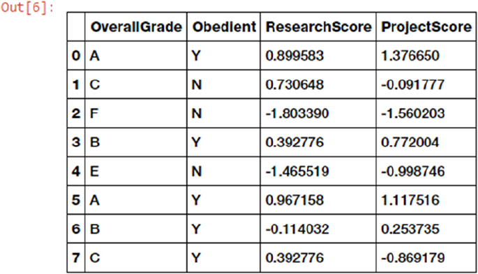
CHAPTER 1 ■ MACHINE LEARNING BASICS
59
Now that we have extracted our initial available features from the data and their corresponding outcome
labels, let’s separate out our available features based on their type (numerical and categorical). Types of
feature variables are covered in more detail in Chapter 3, “Processing, Wrangling, and Visualizing Data”.
In [5]: # list down features based on type
...: numeric_feature_names = ['ResearchScore', 'ProjectScore']
...: categoricial_feature_names = ['OverallGrade', 'Obedient']
We will now use a standard scalar from scikit-learn to scale or normalize our two numeric score-
based attributes using the following code.
In [6]: from sklearn.preprocessing import StandardScaler
...: ss = StandardScaler()
...:
...: # fit scaler on numeric features
...: ss.fit(training_features[numeric_feature_names])
...:
...: # scale numeric features now
...: training_features[numeric_feature_names] =
ss.transform(training_features[numeric_feature_names])
...:
...: # view updated featureset
...: training_features
Figure 1-29. Feature set with scaled numeric attributes
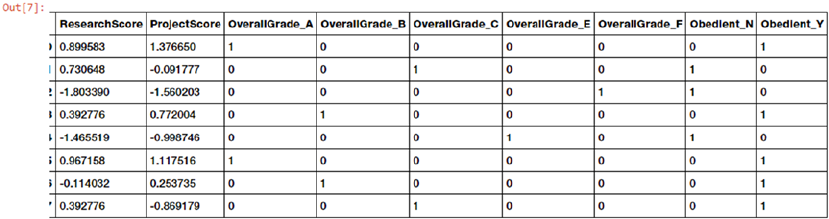
CHAPTER 1 ■ MACHINE LEARNING BASICS
60
Now that we have successfully scaled our numeric features (see Figure1-29), let’s handle our categorical
features and carry out the necessary feature engineering needed based on the following code.
In [7]: training_features = pd.get_dummies(training_features,
columns=categoricial_feature_names)
...: # view newly engineering features
...: training_features
In [8]: # get list of new categorical features
...: categorical_engineered_features = list(set(training_features.columns) -
set(numeric_feature_names))
Figure1-30 shows us the updated feature set with the newly engineered categorical variables. This
process is also known as one hot encoding.
Modeling
We will now build a simple classification (supervised) model based on our feature set by using the logistic
regression algorithm. The following code depicts how to build the supervised model.
In [9]: from sklearn.linear_model import LogisticRegression
...: import numpy as np
...:
...: # fit the model
...: lr = LogisticRegression()
...: model = lr.fit(training_features,
np.array(outcome_labels['Recommend']))
...: # view model parameters
...: model
Out[9]: LogisticRegression(C=1.0, class_weight=None, dual=False,
fit_intercept=True, intercept_scaling=1, max_iter=100,
multi_class='ovr', n_jobs=1, penalty='l2',
random_state=None, solver='liblinear', tol=0.0001,
verbose=0, warm_start=False)
Thus, we now have our supervised learning model based on the logistic regression model with
L2 regularization, as you can see from the parameters in the previous output.
Figure 1-30. Feature set with engineered categorical variables
CHAPTER 1 ■ MACHINE LEARNING BASICS
61
Model Evaluation
Typically model evaluation is done based on some holdout or validation dataset that is different from the
training dataset to prevent overfitting or biasing the model. Since this is an example on a toy dataset, let’s
evaluate the performance of our model on the training data using the following snippet.
In [10]: # simple evaluation on training data
...: pred_labels = model.predict(training_features)
...: actual_labels = np.array(outcome_labels['Recommend'])
...:
...: # evaluate model performance
...: from sklearn.metrics import accuracy_score
...: from sklearn.metrics import classification_report
...:
...: print('Accuracy:', float(accuracy_score(actual_labels,
pred_labels))*100, '%')
...: print('Classification Stats:')
...: print(classification_report(actual_labels, pred_labels))
Accuracy: 100.0 %
Classification Stats:
precision recall f1-score support
No 1.00 1.00 1.00 5
Yes 1.00 1.00 1.00 3
avg / total 1.00 1.00 1.00 8
Thus you can see the various metrics that we had mentioned earlier, like accuracy, precision, recall, and
F1 score depicting the model performance. We talk about these metrics in detail in Chapter 5, “Building,
Tuning, and Deploying Models”.
Model Deployment
We built our first supervised learning model, and to deploy this model typically in a system or server, we
need to persist the model. We also need to save the scalar object we used to scale the numerical features
since we use it to transform the numeric features of new data samples. The following snippet depicts a way
to store the model and scalar objects.
In [11]: from sklearn.externals import joblib
...: import os
...: # save models to be deployed on your server
...: if not os.path.exists('Model'):
...: os.mkdir('Model')
...: if not os.path.exists('Scaler'):
...: os.mkdir('Scaler')
...:
...: joblib.dump(model, r'Model/model.pickle')
...: joblib.dump(ss, r'Scaler/scaler.pickle')
These files can be easily deployed on a server with necessary code to reload the model and predict new
data samples, which we will see in the upcoming sections.
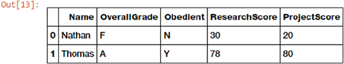
CHAPTER 1 ■ MACHINE LEARNING BASICS
62
Prediction in Action
We are now ready to start predicting with our newly built and deployed model! To start predictions, we need
to load our model and scalar objects into memory. The following code helps us do this.
In [12]: # load model and scaler objects
...: model = joblib.load(r'Model/model.pickle')
...: scaler = joblib.load(r'Scaler/scaler.pickle')
We have some sample new student records (for two students) for which we want our model to predict if
they will get the grant recommendation. Let’s retrieve and view this data using the following code.
In [13]: ## data retrieval
...: new_data = pd.DataFrame([{'Name': 'Nathan', 'OverallGrade': 'F',
'Obedient': 'N', 'ResearchScore': 30, 'ProjectScore': 20},
...: {'Name': 'Thomas', 'OverallGrade': 'A',
'Obedient': 'Y', 'ResearchScore': 78, 'ProjectScore': 80}])
...: new_data = new_data[['Name', 'OverallGrade', 'Obedient',
'ResearchScore', 'ProjectScore']]
...: new_data
Figure 1-31. New student records
We will now carry out the tasks relevant to data preparation—feature extraction, engineering, and
scaling—in the following code snippet.
In [14]: ## data preparation
...: prediction_features = new_data[feature_names]
...:
...: # scaling
...: prediction_features[numeric_feature_names] =
scaler.transform(prediction_features[numeric_feature_names])
...:
...: # engineering categorical variables
...: prediction_features = pd.get_dummies(prediction_features,
columns=categoricial_feature_names)
...:
...: # view feature set
...: prediction_features
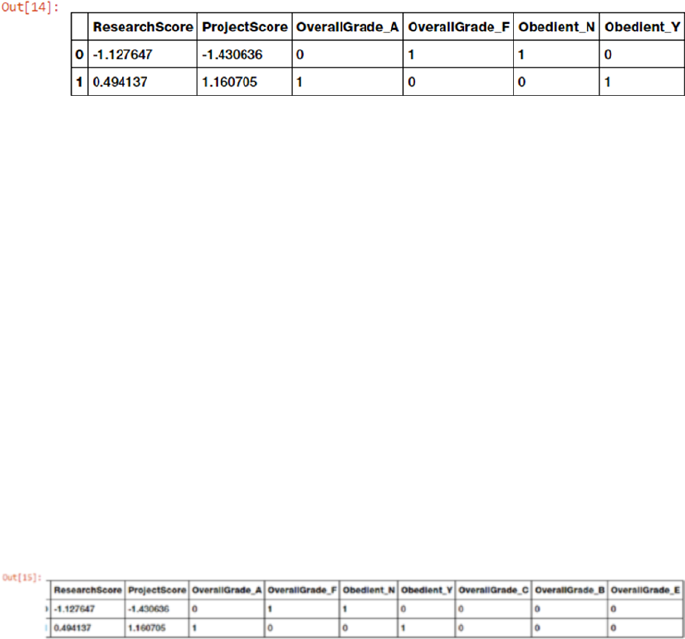
CHAPTER 1 ■ MACHINE LEARNING BASICS
63
Figure 1-32. Updated feature set for new students
We now have the relevant features for the new students! However you can see that some of the
categorical features are missing based on some grades like B, C, and E. This is because none of these
students obtained those grades but we still need those attributes because the model was trained on all
attributes including these. The following snippet helps us identify and add the missing categorical features.
We add the value for each of those features as 0 for each student since they did not obtain those grades.
In [15]: # add missing categorical feature columns
...: current_categorical_engineered_features =
set(prediction_features.columns) - set(numeric_feature_names)
...: missing_features = set(categorical_engineered_features) -
current_categorical_engineered_features
...: for feature in missing_features:
...: # add zeros since feature is absent in these data samples
...: prediction_features[feature] = [0] * len(prediction_features)
...:
...: # view final feature set
...: prediction_features
We have our complete feature set ready for both the new students. Let’s put our model to the test and
get the predictions with regard to grant recommendations!
In [16]: ## predict using model
...: predictions = model.predict(prediction_features)
...:
...: ## display results
...: new_data['Recommend'] = predictions
...: new_data
Figure 1-33. Final feature set for new students
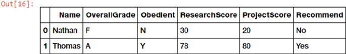
CHAPTER 1 ■ MACHINE LEARNING BASICS
64
We can clearly see from Figure1-34 that our model has predicted grant recommendation labels for both
the new students. Thomas clearly being diligent, having a straight A average and decent scores, is most likely
to get the grant recommendation as compared to Nathan. Thus you can see that our model has learned how
to predict grant recommendation outcomes based on past historical student data. This should whet your
appetite on getting started with Machine Learning. We are about to deep dive into more complex real-world
problems in the upcoming chapters!
Challenges in Machine Learning
Machine Learning is a rapidly evolving, fast-paced, and exciting field with a lot of prospect, opportunity,
and scope. However it comes with its own set of challenges, due to the complex nature of Machine Learning
methods, its dependency on data, and not being one of the more traditional computing paradigms. The
following points cover some of the main challenges in Machine Learning.
• Data quality issues lead to problems, especially with regard to data processing and
feature extraction.
• Data acquisition, extraction, and retrieval is an extremely tedious and time
consuming process.
• Lack of good quality and sufficient training data in many scenarios.
• Formulating business problems clearly with well-defined goals and objectives.
• Feature extraction and engineering, especially hand-crafting features, is one of the
most difficult yet important tasks in Machine Learning. Deep Learning seems to have
gained some advantage in this area recently.
• Overfitting or underfitting models can lead to the model learning poor
representations and relationships from the training data leading to detrimental
performance.
• The curse of dimensionality: too many features can be a real hindrance.
• Complex models can be difficult to deploy in the real world.
This is not an exhaustive list of challenges faced in Machine Learning today, but it is definitely a list of
the top problems data scientists or analysts usually face in Machine Learning projects and tasks. We will
cover dealing with these issues in detail when we discuss more about the various stages in the Machine
Learning pipeline as well as solve real-world problems in subsequent chapters.
Real-World Applications of Machine Learning
Machine Learning is widely being applied and used in the real world today to solve complex problems that
would otherwise have been impossible to solve based on traditional approaches and rule-based systems.
The following list depicts some of the real-world applications of Machine Learning.
Figure 1-34. New student records with model predictions for grant recommendations
CHAPTER 1 ■ MACHINE LEARNING BASICS
65
• Product recommendations in online shopping platforms
• Sentiment and emotion analysis
• Anomaly detection
• Fraud detection and prevention
• Content recommendation (news, music, movies, and so on)
• Weather forecasting
• Stock market forecasting
• Market basket analysis
• Customer segmentation
• Object and scene recognition in images and video
• Speech recognition
• Churn analytics
• Click through predictions
• Failure/defect detection and prevention
• E-mail spam filtering
Summary
The intent of this chapter was to get you familiarized with the foundations of Machine Learning before
taking a deep dive into Machine Learning pipelines and solving real-world problems. The need for Machine
Learning in today’s world is introduced in the chapter with a focus on making data-driven decisions at scale.
We also talked about the various programming paradigms and how Machine Learning has disrupted the
traditional programming paradigm. Next up, we explored the Machine Learning landscape starting from the
formal definition to the various domains and fields associated with Machine Learning. Basic foundational
concepts were covered in areas like mathematics, statistics, computer science, Data Science, data mining,
artificial intelligence, natural language processing, and Deep Learning since all of them tie back to Machine
Learning and we will also be using tools, techniques, methodologies, and processes from these fields in
future chapters. Concepts relevant to the various Machine Learning methods have also been covered
including supervised, unsupervised, semi-supervised, and reinforcement learning. Other classifications
of Machine Learning methods were depicted, like batch versus online based learning methods and
online versus instance based learning methods. A detailed depiction of the CRISP-DM process model was
explained to give an overview of the industry standard process for data mining projects. Analogies were
drawn from this model to build Machine Learning pipelines, where we focus on both supervised and
unsupervised learning pipelines.
We brought everything covered in this chapter together in solving a small real-world problem of
predicting grant recommendations for students and building a sample Machine Learning pipeline from
scratch. This should definitely get you ready for the next chapters, where you will be exploring each of the
stages in a Machine Learning pipeline in further details and cover ground on the Python Machine Learning
ecosystem. Last but not the least, challenges, and real-world applications of Machine Learning will give you
a good idea on the vast scope of Machine Learning and make you aware of the caveats and pitfalls associated
with Machine Learning problems.

67
© Dipanjan Sarkar, Raghav Bali and Tushar Sharma 2018
D. Sarkar et al., Practical Machine Learning with Python, https://doi.org/10.1007/978-1-4842-3207-1_2
CHAPTER 2
The Python Machine Learning
Ecosystem
In the first chapter we explored the absolute basics of Machine Learning and looked at some of the
algorithms that we can use. Machine Learning is a very popular and relevant topic in the world of technology
today. Hence we have a very diverse and varied support for Machine Learning in terms of programming
languages and frameworks. There are Machine Learning libraries for almost all popular languages including
C++, R, Julia, Scala, Python, etc. In this chapter we try to justify why Python is an apt language for Machine
Learning. Once we have argued our selection logically, we give you a brief introduction to the Python
Machine Learning (ML) ecosystem. This Python ML ecosystem is a collection of libraries that enable the
developers to extract and transform data, perform data wrangling operations, apply existing robust Machine
Learning algorithms and also develop custom algorithms easily. These libraries include numpy, scipy,
pandas, scikit-learn, statsmodels, tensorflow, keras, and so on. We cover several of these libraries
in a nutshell so that the user will have some familiarity with the basics of each of these libraries. These will
be used extensively in the later chapters of the book. An important thing to keep in mind here is that the
purpose of this chapter is to acquaint you with the diverse set of frameworks and libraries in the Python
ML ecosystem to get an idea of what can be leveraged to solve Machine Learning problems. We enrich the
content with useful links that you can refer to for extensive documentation and tutorials. We assume some
basic proficiency with Python and programming in general. All the code snippets and examples used in this
chapter is available in the GitHub repository for this book at https://github.com/dipanjanS/practical-
machine-learning-with-python under the directory/folder for Chapter 2. You can refer to the Python file
named python_ml_ecosystem.py for all the examples used in this chapter and try the examples as you
read this chapter or you can even refer to the jupyter notebook named The Python Machine Learning
Ecosystem.ipynb for a more interactive experience.
Python: An Introduction
Python was created by Guido van Rossum at Stichting Mathematisch Centrum (CWI, see https://www.cwi.nl/)
in the Netherlands. The first version of Python was released in 1991. Guido wrote Python as a successor of the
language called ABC. In the following years Python has developed into an extensively used high level language
and a general programming language. Python is an interpreted language, which means that the source code of
a Python program is converted into bytecode, which is then executed by the Python virtual machine. Python is
CHAPTER 2 ■ THE PYTHON MACHINE LEARNING ECOSYSTEM
68
different from major compiled languages like C and C++ as Python code is not required to be built and linked
like code for these languages. This distinction makes for two important points:
• Python code is fast to develop: As the code is not required to be compiled and
built, Python code can be much readily changed and executed. This makes for a fast
development cycle.
• Python code is not as fast in execution: Since the code is not directly compiled and
executed and an additional layer of the Python virtual machine is responsible for
execution, Python code runs a little slow as compared to conventional languages like
C, C++, etc.
Strengths
Python has steadily risen in the charts of widely used programming languages and according to several
surveys and research; it is the fifth most important language in the world. Recently several surveys depicted
Python to be the most popular language for Machine Learning and Data Science! We will compile a brief list
of advantages that Python offers that probably explains its popularity.
1. Easy to learn: Python is a relatively easy-to-learn language. Its syntax is simple
for a beginner to learn and understand. When compared with languages likes
C or Java, there is minimal boilerplate code required in executing a Python
program.
2. Supports multiple programming paradigms: Python is a multi-paradigm,
multi-purpose programming language. It supports object oriented programming,
structured programming, functional programming, and even aspect
oriented programming. This versatility allows it to be used by a multitude of
programmers.
3. Extensible: Extensibility of Python is one of its most important characteristics.
Python has a huge number of modules easily available which can be readily
installed and used. These modules cover every aspect of programming from data
access to implementation of popular algorithms. This easy-to-extend feature
ensures that a Python developer is more productive as a large array of problems
can be solved by available libraries.
4. Active open source community: Python is open source and supported by a large
developer community. This makes it robust and adaptive. The bugs encountered
are easily fixed by the Python community. Being open source, developers can
tinker with the Python source code if their requirements call for it.
Pitfalls
Although Python is a very popular programming language, it comes with its own share of pitfalls. One of the
most important limitations it suffers is in terms of execution speed. Being an interpreted language, it is slow
when compared to compiled languages. This limitation can be a bit restrictive in scenarios where extremely
high performance code is required. This is a major area of improvement for future implementations of
Python and every subsequent Python version addresses it. Although we have to admit it can never be as fast
as a compiled language, we are convinced that it makes up for this deficiency by being super-efficient and
effective in other departments.
CHAPTER 2 ■ THE PYTHON MACHINE LEARNING ECOSYSTEM
69
Setting Up a Python Environment
The starting step for our journey into the world of Data Science is the setup of our Python environment. We
usually have two options for setting up our environment:
• Install Python and the necessary libraries individually
• Use a pre-packaged Python distribution that comes with necessary libraries, i.e.
Anaconda
Anaconda is a packaged compilation of Python along with a whole suite of a variety of libraries,
including core libraries which are widely used in Data Science. Developed by Anaconda, formerly known
as Continuum Analytics, it is often the go-to setup for data scientists. Travis Oliphant, primary contributor
to both the numpy and scipy libraries, is Anaconda’s president and one of the co-founders. The Anaconda
distribution is BSD licensed and hence it allows us to use it for commercial and redistribution purposes.
A major advantage of this distribution is that we don’t require an elaborate setup and it works well on all
flavors of operating systems and platforms, especially Windows, which can often cause problems with
installing specific Python packages. Thus, we can get started with our Data Science journey with just one
download and install. The Anaconda distribution is widely used across industry Data Science environments
and it also comes with a wonderful IDE, Spyder (Scientific Python Development Environment), besides
other useful utilities like jupyter notebooks, the IPython console, and the excellent package management
tool, conda. Recently they have also talked extensively about Jupyterlab, the next generation UI for Project
Jupyter. We recommend using the Anaconda distribution and also checking out https://www.anaconda.
com/what-is-anaconda/ to learn more about Anaconda.
Set Up Anaconda Python Environment
The first step in setting up your environment with the required Anaconda distribution is downloading
the required installation package from https://www.anaconda.com/download/, which is the provider of
the Anaconda distribution. The important point to note here is that we will be using Python 3.5 and the
corresponding Anaconda distribution. Python 3.5.2 was released on June 2016 compared to 3.6, which
released on December 2016. We have opted for 3.5 as we want to ensure that none of the libraries that we
will be using in this book have any compatibility issues. Hence, as Python 3.5 has been around for a long
time we avoid any such compatibility issues by opting for it. However, you are free to use Python 3.6 and
the code used in this book is expected to work without major issues. We chose to leave out Python 2.7 since
support for Python 2 will be ending in 2020 and from the Python community vision, it is clear that Python 3
is the future and we recommend you use it.
Download the Anaconda3-4.2.0-Windows-x86_64 package (the one with Python 3.5) from https://
repo.continuum.io/archive/. A screenshot of the target page is shown in Figure2-1. We have chosen the
Windows OS specifically because sometimes, few Python packages or libraries cause issues with installing or
running and hence we wanted to make sure we cover those details. If you are using any other OS like Linux
or MacOSX, download the correct version for your OS and install it.
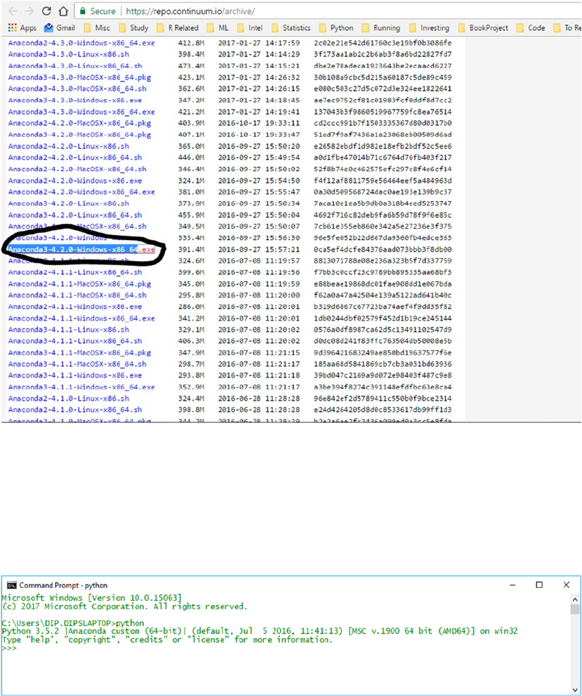
CHAPTER 2 ■ THE PYTHON MACHINE LEARNING ECOSYSTEM
70
Installing the downloaded file is as simple as double-clicking the file and letting the installer take care of
the entire process. To check if the installation was successful, just open a command prompt or terminal and
start up Python. You should be greeted with the message shown in Figure2-2 identifying the Python and the
Anaconda version. We also recommend that you use the iPython shell (the command is ipython) instead of
the regular Python shell, because you get a lot of features including inline plots, autocomplete, and so on.
Figure 2-1. Downloading the Anaconda package
Figure 2-2. Verifying installation with the Python shell
This should complete the process of setting up your Python environment for Data Science and
Machine Learning.
CHAPTER 2 ■ THE PYTHON MACHINE LEARNING ECOSYSTEM
71
Installing Libraries
We will not be covering the basics of Python, as we assume you are already acquainted with basic Python
syntax. Feel free to check out any standard course or book on Python programming to pick up on the basics.
We will cover one very basic but very important aspect of installing additional libraries. In Python the
preferred way to install additional libraries is using the pip installer. The basic syntax to install a package
from Python Package Index (PyPI) using pip is as follows.
pip install required_package
This will install the required_package if it is present in PyPI. We can also use other sources other than
PyPI to install packages but that generally would not be required. The Anaconda distribution is already
supplemented with a plethora of additional libraries, hence it is very unlikely that we will need additional
packages from other sources.
Another way to install packages, limited to Anaconda, is to use the conda install command. This will
install the packages from the Anaconda package channels and usually we recommend using this, especially
on Windows.
Why Python for Data Science?
According to a 2017 survey by StackOverflow (https://insights.stackoverflow.com/survey/2017),
Python is world’s 5th most used language. It is one of the top three languages used by data scientists and one
of the most “wanted” language among StackOverflow users. In fact, in a recent poll by KDnuggets in 2017,
Python got the maximum number of votes for being the leading platform for Analytics, Data Science, and
Machine Learning based on the choice of users (http://www.kdnuggets.com/2017/08/python-overtakes-
r-leader-analytics-data-science.html). Python has a lot of advantages that makes it a language of
choice when it comes to the practices of Data Science. We will now try to illustrate these advantages and
argue our case for “Why Python is a language of choice for Data scientists?”
Powerful Set of Packages
Python is known for its extensive and powerful set of packages. In fact one of the philosophies shared by
Python is batteries included, which means that Python has a rich and powerful set of packages ready to be
used in a wide variety of domains and use cases. This philosophy is extended into the packages required
for Data Science and Machine Learning. Packages like numpy, scipy, pandas, scikit-learn, etc., which are
tailor-made for solving a variety of real-world Data Science problems, and are immensely powerful. This
makes Python a go-to language for solving Data Science related problems.
Easy and Rapid Prototyping
Python’s simplicity is another important aspect when we want to discuss its suitability for Data Science.
Python syntax is easy to understand as well as idiomatic, which makes comprehending existing code a
relatively simple task. This allows the developer to easily modify existing implementations and develop
his own ones. This feature is especially useful for developing new algorithms which may be experimental
or yet to be supported by any external library. Based on what we discussed earlier, Python development is
independent of time consuming build and link processes. Using the REPL shell, IDEs, and notebooks, you
can rapidly build and iterate over multiple research and development cycles and all the changes can be
readily made and tested.
CHAPTER 2 ■ THE PYTHON MACHINE LEARNING ECOSYSTEM
72
Easy to Collaborate
Data science solutions are rarely a one man job. Often a lot of collaboration is required in a Data Science
team to develop a great analytical solution. Luckily Python provides tools that make it extremely easy to
collaborate for a diverse team. One of the most liked features, which empowers this collaboration, are
jupyter notebooks. Notebooks are a novel concept that allow data scientists to share the code, data, and
insightful results in a single place. This makes for an easily reproducible research tool. We consider this to
be a very important feature and will devote an entire section to cover the advantages offered by the use of
notebooks.
One-Stop Solution
In the first chapter we explored how Data Science as a field is interconnected to various domains. A typical
project will have an iterative lifecycle that will involve data extraction, data manipulation, data analysis,
feature engineering, modeling, evaluation, solution development, deployment, and continued updating
of the solution. Python as a multi-purpose programming language is extremely diverse and it allows
developers to address all these assorted operations from a common platform. Using Python libraries you
can consume data from a multitude of sources, apply different data wrangling operations to that data, apply
Machine Learning algorithms on the processed data, and deploy the developed solution. This makes Python
extremely useful as no interface is required, i.e. you don’t need to port any part of the whole pipeline to some
different programming language. Also enterprise level Data Science projects often require interfacing with
different programming languages, which is also achievable by using Python. For example, suppose some
enterprise uses a custom made Java library for some esoteric data manipulation, then you can use Jython
implementation of Python to use that Java library without writing custom code for the interfacing layer.
Large and Active Community Support
The Python developer community is very active and humongous in number. This large community ensures
that the core Python language and packages remain efficient and bug free. A developer can seek support
about a Python issue using a variety of platforms like the Python mailing list, stack overflow, blogs, and
usenet groups. This large support ecosystem is also one of the reasons for making Python a favored language
for Data Science.
Introducing the Python Machine Learning Ecosystem
In this section, we address the important components of the Python Machine Learning ecosystem and give
a small introduction to each of them. These components are few of the reasons why Python is an important
language for Data Science. This section is structured to give you a gentle introduction and acquaint you
with these core Data Science libraries. Covering all of them in depth would be impractical and beyond the
current scope since we would be using them in detail in subsequent chapters. Another advantage of having a
great community of Python developers is the rich content that can be found about each one of these libraries
with a simple search. The list of components that we cover is by no means exhaustive but we have shortlisted
them on the basis of their importance in the whole ecosystem.
Jupyter Notebooks
Jupyter notebooks, formerly known as ipython notebooks, are an interactive computational environment
that can be used to develop Python based Data Science analyses, which emphasize on reproducible
research. The interactive environment is great for development and enables us to easily share the notebook
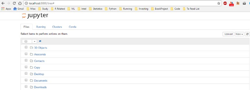
CHAPTER 2 ■ THE PYTHON MACHINE LEARNING ECOSYSTEM
73
and hence the code among peers who can replicate our research and analyses by themselves. These jupyter
notebooks can contain code, text, images, output, etc., and can be arranged in a step by step manner to
give a complete step by step illustration of the whole analysis process. This capability makes notebooks a
valuable tool for reproducible analyses and research, especially when you want to share your work with
a peer. While developing your analyses, you can document your thought process and capture the results
as part of the notebook. This seamless intertwining of documentation, code, and results make jupyter
notebooks a valuable tool for every data scientist.
We will be using jupyter notebooks, which are installed by default with our Anaconda distribution. This
is similar to the ipython shell with the difference that it can be used for different programming backends,
i.e. not just Python. But the functionality is similar for both of these with the added advantage of displaying
interactive visualizations and much more on jupyter notebooks.
Installation and Execution
We don’t require any additional installation for Jupyter notebooks, as it is already installed by the Anaconda
distribution. We can invoke the jupyter notebook by executing the following command at the command
prompt or terminal.
C:\>jupyter notebook
This will start a notebook server at the address localhost:8888 of your machine. An important point to
note here is that you access the notebook using a browser so you can even initiate it on a remote server and
use it locally using techniques like ssh tunneling. This feature is extremely useful in case you have a powerful
computing resource that you can only access remotely but lack a GUI for it. Jupyter notebook allows you to
access those resources in a visually interactive shell. Once you invoke this command, you can navigate to the
address localhost:8888 in your browser, to find the landing page depicted in Figure2-3, which can be used
to access existing notebooks or create new ones.
Figure 2-3. Jupyter notebook landing page
On the landing page we can initiate a new notebook by clicking the New button on top right. By default
it will use the default kernel (i.e., the Python 3.5 kernel) but we can also associate the notebook with a
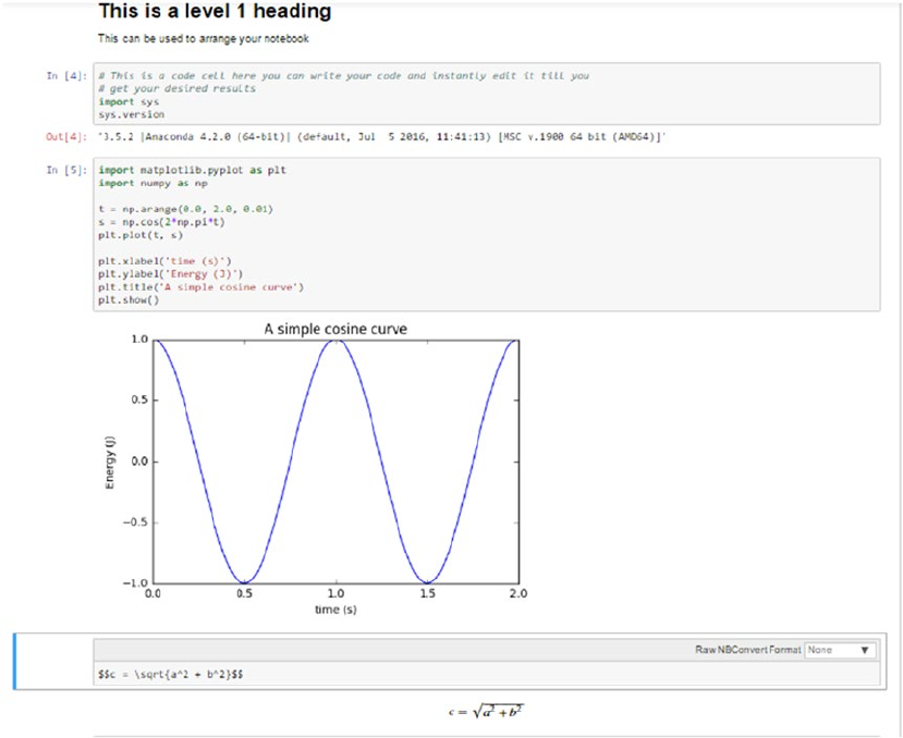
CHAPTER 2 ■ THE PYTHON MACHINE LEARNING ECOSYSTEM
74
different kernel (for example a Python 2.7 kernel, if installed in your system). A notebook is just a collection
of cells. There are three major types of cells in a notebook:
1. Code cells: Just like the name suggests, these are the cells that you can use to write
your code and associated comments. The contents of these cells are sent to the
kernel associated with the notebook and the computed outputs are displayed as
the cells’ outputs.
2. Markdown cells: Markdown can be used to intelligently notate the computation
process. These can contain simple text comments, HTML tags, images, and even
Latex equations. These will come in very handy when we are dealing with a new
and non-standard algorithm and we also want to capture the stepwise math and
logic related to the algorithm.
3. Raw cells: These are the simplest of the cells and they display the text written in
them as is. These can be used to add text that you don’t want to be converted by
the conversion mechanism of the notebooks.
In Figure2-4 we see a sample jupyter notebook, which touches on the ideas we just discussed in this section.
Figure 2-4. Sample jupyter notebook
CHAPTER 2 ■ THE PYTHON MACHINE LEARNING ECOSYSTEM
75
NumPy
Numpy is the backbone of Machine Learning in Python. It is one of the most important libraries in Python
for numerical computations. It adds support to core Python for multi-dimensional arrays (and matrices) and
fast vectorized operations on these arrays. The present day NumPy library is a successor of an early library,
Numeric, which was created by Jim Hugunin and some other developers. Travis Oliphant, Anaconda’s
president and co-founder, took the Numeric library as a base and added a lot of modifications, to launch the
present day NumPy library in 2005. It is a major open source project and is one of the most popular Python
libraries. It’s used in almost all Machine Learning and scientific computing libraries. The extent of popularity
of NumPy is verified by the fact that major OS distributions, like Linux and MacOS, bundle NumPy as a
default package instead of considering it as an add-on package.
Numpy ndarray
All of the numeric functionality of numpy is orchestrated by two important constituents of the numpy package,
ndarray and Ufuncs (Universal function). Numpy ndarray is a multi-dimensional array object which is the
core data container for all of the numpy operations. Universal functions are the functions which operate on
ndarrays in an element by element fashion. These are the lesser known members of the numpy package and
we will try to give a brief introduction to them in the later stage of this section. We will mostly be learning
about ndarrays in subsequent sections. (We will refer to them as arrays from now on for simplicity’s sake.)
Arrays (or matrices) are one of the fundamental representations of data. Mostly an array will be of
a single data type (homogeneous) and possibly multi-dimensional sometimes. The numpy ndarray is a
generalization of the same. Let’s get started with the introduction by creating an array.
In [4]: import numpy as np
...: arr = np.array([1,3,4,5,6])
...: arr
Out[4]: array([1, 3, 4, 5, 6])
In [5]: arr.shape
Out[5]: (5,)
In [6]: arr.dtype
Out[6]: dtype('int32')
In the previous example, we created a one-dimensional array from a normal list containing integers.
The shape attribute of the array object will tell us about the dimensions of the array. The data type was
picked up from the elements as they were all integers the data type is int32. One important thing to keep
in mind is that all the elements in an array must have the same data type. If you try to initialize an array in
which the elements are mixed, i.e. you mix some strings with the numbers then all of the elements will get
converted into a string type and we won’t be able to perform most of the numpy operations on that array. So a
simple rule of thumb is dealing only with numeric data. You are encouraged to type in the following code in
an ipython shell to look at the error message that comes up in such a scenario!
In [16]: arr = np.array([1,'st','er',3])
...: arr.dtype
Out[16]: dtype('<U11')
In [17]: np.sum(arr)
CHAPTER 2 ■ THE PYTHON MACHINE LEARNING ECOSYSTEM
76
Creating Arrays
Arrays can be created in multiple ways in numpy. One of the ways was demonstrated earlier to create a single-
dimensional array. Similarly we can stack up multiple lists to create a multidimensional array.
In [19]: arr = np.array([[1,2,3],[2,4,6],[8,8,8]])
...: arr.shape
Out[19]: (3, 3)
In [20]: arr
Out[20]:
array([[1, 2, 3],
[2, 4, 6],
[8, 8, 8]])
In addition to this we can create arrays using a bunch of special functions provided by numpy.
np.zeros: Creates a matrix of specified dimensions containing only zeroes:
In [21]: arr = np.zeros((2,4))
...: arr
Out[21]:array([[ 0., 0., 0., 0.],
[ 0., 0., 0., 0.]])
np.ones: Creates a matrix of specified dimension containing only ones:
In [22]: arr = np.ones((2,4))
...: arr
Out[22]:
array([[ 1., 1., 1., 1.],
[ 1., 1., 1., 1.]])
np.identity: Creates an identity matrix of specified dimensions:
In [23]: arr = np.identity(3)
...: arr
Out[23]:
array([[ 1., 0., 0.],
[ 0., 1., 0.],
[ 0., 0., 1.]])
Often, an important requirement is to initialize an array of a specified dimension with random values.
This can be done easily by using the randn function from the numpy.random package:
In [25]: arr = np.random.randn(3,4)
...: arr
Out[25]:
array([[ 0.0102692 , -0.13489664, 1.03821719, -0.28564286],
[-1.12651838, 1.41684764, 1.11657566, -0.1909584 ],
[ 2.20532043, 0.14813109, 0.73521382, 1.1270668 ]])

CHAPTER 2 ■ THE PYTHON MACHINE LEARNING ECOSYSTEM
77
In practice, most of the arrays are created during reading in the data. We will cover the text data retrieval
operations of numpy very briefly as we will try to use pandas generally, for our data ingestion process. (More
on this in a later part of the chapter.)
One of the functions that we can use to read data from text file to a numpy array is genfromtext. This
function can open a text file and read in data delimited by any character. (delimiter for a comma separated
file is “,”). Since it is not our preferred way of retrieving data, we will give a brief example of the function here.
In [39]: b = BytesIO(b"2,23,33\n32,42,63.4\n35,77,12")
...: arr = np.genfromtxt(b, delimiter=",")
...: arr
Out[39]:
array([[ 2. , 23. , 33. ],
[ 32. , 42. , 63.4],
[ 35. , 77. , 12. ]])
Accessing Array Elements
Once we have created an array by reading in our data, the next important part is to access that data using a
wide variety of mechanisms. Numpy provides a lot of ways in which array elements can be accessed. We will
try to give the most popular useful ways that facilitate this.
Basic Indexing and Slicing
Ndarray can leverage the basic indexing operations that are followed by the list class, i.e. list object [obj].
If the obj is not an ndarray object, then the indexing is said to be basic indexing.
■Note One important point to remember is that basic indexing will always return a view of the original
array. It means that it will only refer to the original array and any change in values will be reflected in the
original array also.
For example, if we want to access the complete second row of the array in one of the earlier examples,
we can simply refer to it using arr[1].
In [44]: arr[1]
Out[44]: array([32., 42., 63.4])
This access becomes interesting in the case of an array having more than two dimensions. Consider the
following code snippet.
In [48]: arr = np.arange(12).reshape(2,2,3)
In [49]: arr
Out[49]:
array([[[ 0, 1, 2],
[ 3, 4, 5]],
[[ 6, 7, 8],
[ 9, 10, 11]]])
CHAPTER 2 ■ THE PYTHON MACHINE LEARNING ECOSYSTEM
78
In [50]: arr[0]
Out[50]:
array([[0, 1, 2],
[3, 4, 5]])
Here we see that using a similar indexing scheme as above, we get an array having one lesser dimension
than the original array.
The next important concept in accessing arrays is the concept of slicing arrays. Suppose we want
to have a collection of elements only instead of all the elements. Then we can use slicing to access the
elements. We will demonstrate the concept with a one-dimensional array.
In [57]: arr = np.arange(10)
...: arr[5:]
Out[57]: array([5, 6, 7, 8, 9])
In [58]: arr[5:8]
Out[58]: array([5, 6, 7])
In [60]: arr[:-5]
Out[60]: array([0, 1, 2, 3, 4])
If the number of dimensions in the object supplied is less than the dimension of the array being
accessed then the colon (:) is assumed for all the dimensions. Consider the following example
In [13]: arr = np.arange(12).reshape(2,2,3)
...: arr
Out[13]:
array([[[ 0, 1, 2],
[ 3, 4, 5]],
[[ 6, 7, 8],
[ 9, 10, 11]]])
In [14]: arr[1:2]
Out[14]:
array([[[ 6, 7, 8],
[ 9, 10, 11]]])
Another way to access an array is to use dots (…) based indexing. Suppose in a three-dimensional array
we want to access the value of only one column. We can do it in two ways.
In [8]: arr = np.arange(27).reshape(3,3,3)
...: arr
Out[8]:
array([[[ 0, 1, 2],
[ 3, 4, 5],
[ 6, 7, 8]],
[[ 9, 10, 11],
[12, 13, 14],
[15, 16, 17]],

CHAPTER 2 ■ THE PYTHON MACHINE LEARNING ECOSYSTEM
79
[[18, 19, 20],
[21, 22, 23],
[24, 25, 26]]])
Now if we want to access the third column, we can use two different notations to access that column:
In [10]: arr[:,:,2]
Out[10]:
array([[ 2, 5, 8],
[11, 14, 17],
[20, 23, 26]])
We can also use a dot notation in the following way. Both of the methods gets us the same value but
the dot notation is concise. The dot notation stands for as many colons as required to complete an indexing
operation.
In [11]: arr[...,2]
Out[11]:
array([[ 2, 5, 8],
[11, 14, 17],
[20, 23, 26]])
Advanced Indexing
The difference in advanced indexing and basic indexing comes from the type of object being used to
reference the array. If the object is an ndarray object (data type int or bool) or a non-tuple sequence object
or a tuple object containing an ndarray (data type integer or bool), then the indexing being done on the
array is said to be advanced indexing.
■Note Advanced indexing will always return the copy of the original array data.
Integer array indexing: This advanced indexing occurs when the reference object is also an array. The
simplest type of indexing is when we provide an array that’s equal in dimensions to the array being accessed.
For example:
In [19]: arr = np.arange(9).reshape(3,3)
...: arr
Out[19]:
array([[0, 1, 2],
[3, 4, 5],
[6, 7, 8]])
In [20]: arr[[0,1,2],[1,0,0]]
Out[20]: array([1, 3, 6])
In this example we have provided an array in which the first part identifies the rows we want to access
and the second identifies the columns which we want to address. This is quite similar to providing a
collective element-wise address.
CHAPTER 2 ■ THE PYTHON MACHINE LEARNING ECOSYSTEM
80
Boolean indexing: This advanced indexing occurs when the reference object is an array of Boolean
values. This is used when we want to access data based on some conditions, in that case, Boolean indexing
can be used. We will illustrate it with an example. Suppose in one array, we have the names of some cities
and in another array, we have some data related to those cities.
In [3]: cities = np.array(["delhi","bangalore","mumbai","chennai","bhopal"])
...: city_data = np.random.randn(5,3)
...: city_data
Out[3]:array([[ 1.78780089, -0.25099029, -0.26002244],
[ 1.41016167, -0.43878679, 0.4912639 ],
[-0.32176723, -0.01912549, -1.22891881],
[-0.93371835, -0.03604015, -0.37319556],
[ 1.48625779, 0.62758167, 0.77321756]])
In [4]: city_data[cities =="delhi"]
Out[4]: array([[ 1.78780089, -0.25099029, -0.26002244]])
We can also use Boolean indexing for selecting some elements of an array that satisfy a particular
condition. For example, in the previous array suppose we want to only select non-zero elements. We can do
that easily using the following code.
In [6]: city_data[city_data >0]
Out[6]:
array([ 1.78780089, 1.41016167, 0.4912639 , 1.48625779, 0.62758167,
0.77321756])
We observe that the shape of the array is not maintained so we directly cannot always use this indexing
method. But this method is quite useful in doing conditional data substitution. Suppose in the previous case,
we want to substitute all the non-zero values with 0. We can achieve that operation by the following code.
In [7]: city_data[city_data >0] = 0
...: city_data
Out[7]:
array([[ 0. , -0.25099029, -0.26002244],
[ 0. , -0.43878679, 0. ],
[-0.32176723, -0.01912549, -1.22891881],
[-0.93371835, -0.03604015, -0.37319556],
[ 0. , 0. , 0. ]])
Operations on Arrays
At the start of this section, we mentioned the concept of Universal functions (Ufuncs). In this sub-section,
we learn some of the functionalities provided by those functions. Most of the operations on the numpy arrays
is achieved by using these functions. Numpy provides a rich set of functions that we can leverage for various
operations on arrays. We cover some of those functions in brief, but we recommend you to always refer to
the official documentation of the project to learn more and leverage them in your own projects.
Universal functions are functions that operate on arrays in an element by element fashion. The
implementation of Ufunc is vectorized, which means that the execution of Ufuncs on arrays is quite fast. The
Ufuncs implemented in the numpy package are implemented in compiled C code for speed and efficiency.
But it is possible to write custom functions by extending the numpy.ufunc class of the numpy package.
CHAPTER 2 ■ THE PYTHON MACHINE LEARNING ECOSYSTEM
81
Ufuncs are simple and easy to understand once you are able to relate the output they produce on a
particular array.
In [23]: arr = np.arange(15).reshape(3,5)
...: arr
...:
Out[23]:
array([[ 0, 1, 2, 3, 4],
[ 5, 6, 7, 8, 9],
[10, 11, 12, 13, 14]])
In [24]: arr + 5
Out[24]:
array([[ 5, 6, 7, 8, 9],
[10, 11, 12, 13, 14],
[15, 16, 17, 18, 19]])
In [25]: arr * 2
Out[25]:
array([[ 0, 2, 4, 6, 8],
[10, 12, 14, 16, 18],
[20, 22, 24, 26, 28]])
We see that the standard operators when used in conjunction with arrays work element-wise. Some
Ufuncs will take two arrays as input and output a single array, while a rare few will output two arrays also.
In [29]: arr1 = np.arange(15).reshape(5,3)
...: arr2 = np.arange(5).reshape(5,1)
...: arr2 + arr1
Out[29]:
array([[ 0, 1, 2],
[ 4, 5, 6],
[ 8, 9, 10],
[12, 13, 14],
[16, 17, 18]])
In [30]: arr1
Out[30]:
array([[ 0, 1, 2],
[ 3, 4, 5],
[ 6, 7, 8],
[ 9, 10, 11],
[12, 13, 14]])
In [31]: arr2
Out[31]:
CHAPTER 2 ■ THE PYTHON MACHINE LEARNING ECOSYSTEM
82
array([[0],
[1],
[2],
[3],
[4]])
Here we see that we were able to add up two arrays even when they were of different sizes. This is
achieved by the concept of broadcasting. We will conclude this brief discussion on operations on arrays by
demonstrating a function that will return two arrays.
In [32]: arr1 = np.random.randn(5,3)
...: arr1
Out[32]:
array([[-0.57863219, -0.36613451, -0.92311378],
[ 0.81557068, 0.20486617, -0.16740779],
[ 0.73806067, 1.30173294, 0.6144705 ],
[ 0.26294157, -0.09300711, 1.1794524 ],
[ 0.25011242, -0.65374314, -0.57663904]])
In [35]: np.modf(arr1)
Out[35]:
(array([[-0.57863219, -0.36613451, -0.92311378],
[ 0.81557068, 0.20486617, -0.16740779],
[ 0.73806067, 0.30173294, 0.6144705 ],
[ 0.26294157, -0.09300711, 0.1794524 ],
[ 0.25011242, -0.65374314, -0.57663904]]),
array([[-0., -0., -0.],
[ 0., 0., -0.],
[ 0., 1., 0.],
[ 0., -0., 1.],
[ 0., -0., -0.]]))
The function modf will return the fractional and the integer part of the input supplied to it. Hence it will
return two arrays of the same size. We tried to give you a basic idea of the operations on arrays provided by
the numpy package. But this list is not exhaustive; for the complete list you can refer to the reference page for
Ufuncs at https://docs.scipy.org/doc/numpy/reference/ufuncs.html.
Linear Algebra Using numpy
Linear algebra is an integral part of the domain of Machine Learning. Most of the algorithms we will deal
with can be concisely expressed using the operations of linear algebra. Numpy was initially built to provide
the functions similar to MATLAB and hence linear algebra functions on arrays were always an important
part of it. In this section, we learn a bit about performing linear algebra on ndarrays using the functions
implemented in the numpy package.
One of the most widely used operations in linear algebra is the dot product. This can be performed on
two compatible (brush up on your matrices and array skills if you need to know which arrays are compatible
for a dot product) ndarrays by using the dot function.
In [39]: A = np.array([[1,2,3],[4,5,6],[7,8,9]])
...: B = np.array([[9,8,7],[6,5,4],[1,2,3]])
CHAPTER 2 ■ THE PYTHON MACHINE LEARNING ECOSYSTEM
83
In [40]: A.dot(B)
Out[40]:
array([[ 24, 24, 24],
[ 72, 69, 66],
[120, 114, 108]])
Similarly, there are functions implemented for finding different products of matrices like inner, outer, and so
on. Another popular matrix operation is transpose of a matrix. This can be easily achieved by using the T function.
In [41]: A = np.arange(15).reshape(3,5)
In [46]: A.T
Out[46]:
array([[ 0, 5, 10],
[ 1, 6, 11],
[ 2, 7, 12],
[ 3, 8, 13],
[ 4, 9, 14]])
Oftentimes, we need to find out decomposition of a matrix into its constituents factors. This is called
matrix factorization. This can be achieved by the appropriate functions. A popular matrix factorization
method is SVD factorization (covered briefly in Chapter 1 concepts), which returns decomposition of a
matrix into three different matrices. This can be done using linalg.svd function.
In [48]: np.linalg.svd(A)
Out[48]:
(array([[-0.15425367, 0.89974393, 0.40824829],
[-0.50248417, 0.28432901, -0.81649658],
[-0.85071468, -0.3310859 , 0.40824829]]),
array([ 3.17420265e+01, 2.72832424e+00, 4.58204637e-16]),
array([[-0.34716018, -0.39465093, -0.44214167, -0.48963242, -0.53712316],
[-0.69244481, -0.37980343, -0.06716206, 0.24547932, 0.55812069],
[ 0.33717486, -0.77044776, 0.28661392, 0.38941603, -0.24275704],
[-0.36583339, 0.32092943, -0.08854543, 0.67763613, -0.54418674],
[-0.39048565, 0.05843412, 0.8426222 , -0.29860414, -0.21196653]]))
Linear algebra is often also used to solve a system of equations. Using the matrix notation of system of
equations and the provided function of numpy, we can easily solve such a system of equation. Consider the
system of equations:
7x + 5y -3z = 16
3x - 5y + 2z = -8
5x + 3y - 7z = 0
This can be represented as two matrices: the coefficient matrix (a in the example) and the constants
vector (b in the example).
In [51]: a = np.array([[7,5,-3], [3,-5,2],[5,3,-7]])
...: b = np.array([16,-8,0])
...: x = np.linalg.solve(a, b)
...: x
Out[51]: array([ 1., 3., 2.])
CHAPTER 2 ■ THE PYTHON MACHINE LEARNING ECOSYSTEM
84
We can also check if the solution is correct using the np.allclose function.
In [52]: np.allclose(np.dot(a, x), b)
Out[52]: True
Similarly, functions are there for finding the inverse of a matrix, eigen vectors and eigen values of
a matrix, norm of a matrix, determinant of a matrix, and so on, some of which we covered in detail in
Chapter 1. Take a look at the details of the function implemented at https://docs.scipy.org/doc/numpy/
reference/routines.linalg.html.
Pandas
Pandas is an important Python library for data manipulation, wrangling, and analysis. It functions as an
intuitive and easy-to-use set of tools for performing operations on any kind of data. Initial work for pandas
was done by Wes McKinney in 2008 while he was a developer at AQR Capital Management. Since then,
the scope of the pandas project has increased a lot and it has become a popular library of choice for data
scientists all over the world. Pandas allows you to work with both cross-sectional data and time series based
data. So let’s get started exploring pandas!
Data Structures of Pandas
All the data representation in pandas is done using two primary data structures:
• Series
• Dataframes
Series
Series in pandas is a one-dimensional ndarray with an axis label. It means that in functionality, it is
almost similar to a simple array. The values in a series will have an index that needs to be hashable. This
requirement is needed when we perform manipulation and summarization on data contained in a series
data structure. Series objects can be used to represent time series data also. In this case, the index is a
datetime object.
Dataframe
Dataframe is the most important and useful data structure, which is used for almost all kind of data
representation and manipulation in pandas. Unlike numpy arrays (in general) a dataframe can contain
heterogeneous data. Typically tabular data is represented using dataframes, which is analogous to an Excel
sheet or a SQL table. This is extremely useful in representing raw datasets as well as processed feature sets
in Machine Learning and Data Science. All the operations can be performed along the axes, rows, and
columns, in a dataframe. This will be the primary data structure which we will leverage, in most of the use
cases in our later chapters.
CHAPTER 2 ■ THE PYTHON MACHINE LEARNING ECOSYSTEM
85
Data Retrieval
Pandas provides numerous ways to retrieve and read in data. We can convert data from CSV files, databases,
flat files, and so on into dataframes. We can also convert a list of dictionaries (Python dict) into a dataframe.
The sources of data which pandas allows us to handle cover almost all the major data sources. For our
introduction, we will cover three of the most important data sources:
• List of dictionaries
• CSV files
• Databases
List of Dictionaries to Dataframe
This is one of the simplest methods to create a dataframe. It is useful in scenarios where we arrive at the data
we want to analyze, after performing some computations and manipulations on the raw data. This allows us
to integrate a pandas based analysis into data being generated by other Python processing pipelines.
In[27]: import pandas as pd
In[28]: d = [{'city':'Delhi',"data":1000},
...: {'city':'Bangalore',"data":2000},
...: {'city':'Mumbai',"data":1000}]
In[29]: pd.DataFrame(d)
Out[29]:
city data
0 Delhi 1000
1 Bangalore 2000
2 Mumbai 1000
In[30]: df = pd.DataFrame(d)
In[31]: df
Out[31]:
city data
0 Delhi 1000
1 Bangalore 2000
2 Mumbai 1000
Here we provided a list of Python dictionaries to the DataFrame class of the pandas library and the
dictionary was converted into a DataFrame. Two important things to note here: first the keys of dictionary
are picked up as the column names in the dataframe (we can also supply some other name as arguments
for different column names), secondly we didn’t supply an index and hence it picked up the default index of
normal arrays.
CSV Files to Dataframe
CSV (Comma Separated Files) files are perhaps one of the most widely used ways of creating a
dataframe. We can easily read in a CSV, or any delimited file (like TSV), using pandas and convert
into a dataframe. For our example we will read in the following file and convert into a dataframe by using
Python. The data in Figure2-5 is a sample slice of a CSV file containing the data of cities of the world from
http://simplemaps.com/data/world-cities. We will use the same data in a later part of this chapter also.
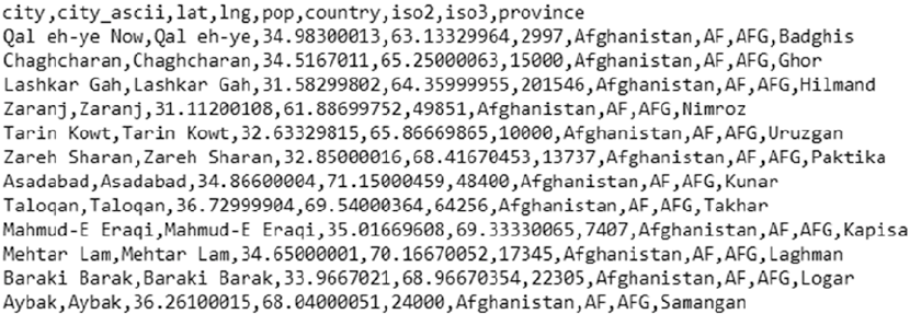
CHAPTER 2 ■ THE PYTHON MACHINE LEARNING ECOSYSTEM
86
We can convert this file into a dataframe with the help of the following code leveraging pandas.
In [1]: import pandas as pd
In [2]: city_data = pd.read_csv(filepath_or_buffer='simplemaps-worldcities-basic.csv')
In [3]: city_data.head(n=10)
Out[3]:
city city_ascii lat lng pop country \
0 Qal eh-ye Now Qal eh-ye 34.983000 63.133300 2997 Afghanistan
1 Chaghcharan Chaghcharan 34.516701 65.250001 15000 Afghanistan
2 Lashkar Gah Lashkar Gah 31.582998 64.360000 201546 Afghanistan
3 Zaranj Zaranj 31.112001 61.886998 49851 Afghanistan
4 Tarin Kowt Tarin Kowt 32.633298 65.866699 10000 Afghanistan
5 Zareh Sharan Zareh Sharan 32.850000 68.416705 13737 Afghanistan
6 Asadabad Asadabad 34.866000 71.150005 48400 Afghanistan
7 Taloqan Taloqan 36.729999 69.540004 64256 Afghanistan
8 Mahmud-E Eraqi Mahmud-E Eraqi 35.016696 69.333301 7407 Afghanistan
9 Mehtar Lam Mehtar Lam 34.650000 70.166701 17345 Afghanistan
iso2 iso3 province
0 AF AFG Badghis
1 AF AFG Ghor
2 AF AFG Hilmand
3 AF AFG Nimroz
4 AF AFG Uruzgan
5 AF AFG Paktika
6 AF AFG Kunar
7 AF AFG Takhar
8 AF AFG Kapisa
9 AF AFG Laghman
As the file we supplied had a header included, those values were used as the name of the columns in
the resultant dataframe. This is a very basic yet core usage of the function pandas.read_csv. The function
comes with a multitude of parameters that can be used to modify its behavior as required. We will not cover
Figure 2-5. A sample CSV file
CHAPTER 2 ■ THE PYTHON MACHINE LEARNING ECOSYSTEM
87
the entire gamut of parameters available and you are encouraged to read the documentation of this function
as this is one of the starting point of most Python based data analysis.
Databases to Dataframe
The most important data source for data scientists is the existing data sources used by their organizations.
Relational databases (DBs) and data warehouses are the de facto standard of data storage in almost all of the
organizations. Pandas provides capabilities to connect to these databases directly, execute queries on them
to extract data, and then convert the result of the query into a structured dataframe. The pandas.from_sql
function combined with Python’s powerful database library implies that the task of getting data from DBs is
simple and easy. Due to this capability, no intermediate steps of data extraction are required. We will now take
an example of reading data from a Microsoft SQL Server database. The following code will achieve this task.
server = 'xxxxxxxx' # Address of the database server
user = 'xxxxxx' # the username for the database server
password = 'xxxxx' # Password for the above user
database = 'xxxxx' # Database in which the table is present
conn = pymssql.connect(server=server, user=user, password=password, database=database)
query = "select * from some_table"
df = pd.read_sql(query, conn)
The important to thing to notice here is the connection object (conn in the code). This object is the
one which will identify the database server information and the type of database to pandas. Based on the
endpoint database server we will change the connection object. For example we are using the pymssql
library for access to Microsoft SQL server here. If our data source is changed to a Postgres database, the
connection object will change but the rest of the procedure will be similar. This facility is really handy when
we need to perform similar analyses on data originating from different sources. Once again, the read_sql
function of pandas provides a lot of parameters that allow us to control its behavior. We also recommend you
to check out the sqlalchemy library, which makes creating connection objects easier irrespective of the type
of database vendor and also provides a lot of other utilities.
Data Access
The most important part after reading in our data is that of accessing that data using the data structure’s
access mechanisms. Accessing data in the pandas dataframe and series objects is very much similar to the
access mechanism that exist for Python lists or numpy arrays. But they also offer some extra methods for
data access specific to dataframe/series.
Head and Tail
In the previous section we witnessed the method head. It gives us the first few rows (by default 5) of the
data. A corresponding function is tail, which gives us the last few rows of the dataframe. These are one of
the most widely used pandas functions, as we often need to take a peek at our data as and when we apply
different operations/selections on it. We already have seen the output of head, so we’ll use the tail function
on the same dataframe and see its output.
In [11]: city_data.tail()
Out[11]:
city city_ascii lat lng pop country \
7317 Mutare Mutare -18.970019 32.650038 216785.0 Zimbabwe
CHAPTER 2 ■ THE PYTHON MACHINE LEARNING ECOSYSTEM
88
7318 Kadoma Kadoma -18.330006 29.909947 56400.0 Zimbabwe
7319 Chitungwiza Chitungwiza -18.000001 31.100003 331071.0 Zimbabwe
7320 Harare Harare -17.817790 31.044709 1557406.5 Zimbabwe
7321 Bulawayo Bulawayo -20.169998 28.580002 697096.0 Zimbabwe
iso2 iso3 province
7317 ZW ZWE Manicaland
7318 ZW ZWE Mashonaland West
7319 ZW ZWE Harare
7320 ZW ZWE Harare
7321 ZW ZWE Bulawayo
Slicing and Dicing
The usual rules of slicing and dicing data that we used in Python lists apply to the Series object as well.
In [12]: series_es = city_data.lat
In [13]: type(series_es)
Out[13]: pandas.core.series.Series
In [14]: series_es[1:10:2]
Out[14]:
1 34.516701
3 31.112001
5 32.850000
7 36.729999
9 34.650000
Name: lat, dtype: float64
In [15]: series_es[:7]
Out[15]:
0 34.983000
1 34.516701
2 31.582998
3 31.112001
4 32.633298
5 32.850000
6 34.866000
Name: lat, dtype: float64
In [23]: series_es[:-7315]
Out[23]:
0 34.983000
1 34.516701
2 31.582998
3 31.112001
4 32.633298
5 32.850000
6 34.866000
Name: lat, dtype: float64
CHAPTER 2 ■ THE PYTHON MACHINE LEARNING ECOSYSTEM
89
The examples given here are self-explanatory and you can refer to the numpy section for more details.
Similar slicing rules apply for dataframes also but the only difference is that now simple slicing refers to
the slicing of rows and all the other columns will end up in the result. Consider the following example
In [24]: city_data[:7]
Out[24]:
city city_ascii lat lng pop country \
0 Qal eh-ye Now Qal eh-ye 34.983000 63.133300 2997 Afghanistan
1 Chaghcharan Chaghcharan 34.516701 65.250001 15000 Afghanistan
2 Lashkar Gah Lashkar Gah 31.582998 64.360000 201546 Afghanistan
3 Zaranj Zaranj 31.112001 61.886998 49851 Afghanistan
4 Tarin Kowt Tarin Kowt 32.633298 65.866699 10000 Afghanistan
5 Zareh Sharan Zareh Sharan 32.850000 68.416705 13737 Afghanistan
6 Asadabad Asadabad 34.866000 71.150005 48400 Afghanistan
iso2 iso3 province
0 AF AFG Badghis
1 AF AFG Ghor
2 AF AFG Hilmand
3 AF AFG Nimroz
4 AF AFG Uruzgan
5 AF AFG Paktika
6 AF AFG Kunar
For providing access to specific rows and specific columns, pandas provides useful functions like iloc
and loc which can be used to refer to specific rows and columns in a dataframe. There is also the ix function
but we recommend using either loc or iloc. The following examples leverages the iloc function provided
by pandas. This allows us to select the rows and columns using structure similar to array slicing. In the
example, we will only pick up the first five rows and the first four columns.
In [28]: city_data.iloc[:5,:4]
Out[28]:
city city_ascii lat lng
0 Qal eh-ye Now Qal eh-ye 34.983000 63.133300
1 Chaghcharan Chaghcharan 34.516701 65.250001
2 Lashkar Gah Lashkar Gah 31.582998 64.360000
3 Zaranj Zaranj 31.112001 61.886998
4 Tarin Kowt Tarin Kowt 32.633298 65.866699
Another access mechanism is Boolean based access to the dataframe rows or columns. This is
particularly important for dataframes, as it allows us to work with a specific set of rows and columns. Let’s
consider the following example in which we want to select cities that have population of more than 10
million and select columns that start with the letter l:
In [56]: city_data[city_data['pop'] >
10000000][city_data.columns[pd.Series(city_data.columns).str.
startswith('l')]]
Out[53]:
lat lng
CHAPTER 2 ■ THE PYTHON MACHINE LEARNING ECOSYSTEM
90
360 -34.602502 -58.397531
1171 -23.558680 -46.625020
2068 31.216452 121.436505
3098 28.669993 77.230004
3110 19.016990 72.856989
3492 35.685017 139.751407
4074 19.442442 -99.130988
4513 24.869992 66.990009
5394 55.752164 37.615523
6124 41.104996 29.010002
7071 40.749979 -73.980017
When we select data based on some condition, we always get the part of dataframe that satisfies the
condition supplied. Sometimes we want to test a condition against a dataframe but want to preserve the
shape of the dataframe. In these cases, we can use the where function (check out numpy's where function
also to see the analogy!). We’ll illustrate this function with an example in which we will try to select all the
cities that have population greater than 15 million.
In [6]: city_greater_10mil = city_data[city_data['pop'] > 10000000]
In [23]: city_greater_10mil.where(city_greater_10mil.population > 15000000)
Out[23]:
city city_ascii lat lng population country iso2 iso3 \
360 NaN NaN NaN NaN NaN NaN NaN NaN
1171 NaN NaN NaN NaN NaN NaN NaN NaN
2068 NaN NaN NaN NaN NaN NaN NaN NaN
3098 NaN NaN NaN NaN NaN NaN NaN NaN
3110 Mumbai Mumbai 19.016990 72.856989 15834918.0 India IN IND
3492 Tokyo Tokyo 35.685017 139.751407 22006299.5 Japan JP JPN
4074 NaN NaN NaN NaN NaN NaN NaN NaN
4513 NaN NaN NaN NaN NaN NaN NaN NaN
5394 NaN NaN NaN NaN NaN NaN NaN NaN
6124 NaN NaN NaN NaN NaN NaN NaN NaN
7071 NaN NaN NaN NaN NaN NaN NaN NaN
province
360 NaN
1171 NaN
2068 NaN
3098 NaN
3110 Maharashtra
3492 Tokyo
4074 NaN
4513 NaN
5394 NaN
6124 NaN
7071 NaN
Here we see that we get the output dataframe of the same size but the rows that don’t conform to the
condition are replaced with NaN.
CHAPTER 2 ■ THE PYTHON MACHINE LEARNING ECOSYSTEM
91
In this section, we learned some of the core data access mechanisms of pandas dataframes. The data
access mechanism of pandas are as simple and extensive to use as with numpy this ensures that we have
various way to access our data.
Data Operations
In subsequent chapters of our book, the pandas dataframe will be our data structure of choice for most data
processing and wrangling operations. So we would like to spend some more time exploring some important
operations that can be performed on dataframes using specific supplied functions.
Values Attribute
Each pandas dataframe will have certain attributes. One of the important attributes is values. It is important
as it allows us access to the raw values stored in the dataframe and if they all homogenous i.e., of the
same kind then we can use numpy operations on them. This becomes important when our data is a mix of
numeric and other data types and after some selections and computations, we arrive at the required subset
of numeric data. Using the values attribute of the output dataframe, we can treat it in the same way as a
numpy array. This is very useful when working with feature sets in Machine Learning. Traditionally, numpy
vectorized operations are much faster than function based operations on dataframes.
In [55]: df = pd.DataFrame(np.random.randn(8, 3),
...: columns=['A', 'B', 'C'])
In [56]: df
Out[56]:
A B C
0 -0.271131 0.084627 -1.707637
1 1.895796 0.590270 -0.505681
2 -0.628760 -1.623905 1.143701
3 0.005082 1.316706 -0.792742
4 0.135748 -0.274006 1.989651
5 1.068555 0.669145 0.128079
6 -0.783522 0.167165 -0.426007
7 0.498378 -0.950698 2.342104
In [58]: nparray = df.values
In [59]: type(nparray)
Out[59]: numpy.ndarray
Missing Data and the fillna Function
In real-world datasets, the data is seldom clean and polished. We usually will have a lot of issues with data
quality (missing values, wrong values and so on). One of the most common data quality issues is that of
missing data. Pandas provides us with a convenient function that allows us to handle the missing values of a
dataframe.
For demonstrating the use of the fillna function, we will use the dataframe we created in the previous
example and introduce missing values in it.
In [65]: df.iloc[4,2] = NA
In [66]: df
Out[66]:
CHAPTER 2 ■ THE PYTHON MACHINE LEARNING ECOSYSTEM
92
A B C
0 -0.271131 0.084627 -1.707637
1 1.895796 0.590270 -0.505681
2 -0.628760 -1.623905 1.143701
3 0.005082 1.316706 -0.792742
4 0.135748 -0.274006 NaN
5 1.068555 0.669145 0.128079
6 -0.783522 0.167165 -0.426007
7 0.498378 -0.950698 2.342104
In [70]: df.fillna (0)
Out[70]:
A B C
0 -0.271131 0.084627 -1.707637
1 1.895796 0.590270 -0.505681
2 -0.628760 -1.623905 1.143701
3 0.005082 1.316706 -0.792742
4 0.135748 -0.274006 0.000000
5 1.068555 0.669145 0.128079
6 -0.783522 0.167165 -0.426007
7 0.498378 -0.950698 2.342104
Here we have substituted the missing value with a default value. We can use a variety of methods to
arrive at the substituting value (mean, median, and so on). We will see more methods of missing value
treatment (like imputation) in subsequent chapters.
Descriptive Statistics Functions
A general practice of dealing with datasets is to know as much about them as possible. Descriptive statistics
of a dataframe give data scientists a comprehensive look into important information about any attributes
and features in the dataset. Pandas packs a bunch of functions, which facilitate easy access to these statistics.
Consider the cities dataframe (city_data) that we consulted in the earlier section. We will use pandas
functions to gather some descriptive statistical information about the attributes of that dataframe. As we
only have three numeric columns in that particular dataframe, we will deal with a subset of the dataframe
which contains only those three values.
In [76]: columns_numeric = ['lat','lng','pop']
In [78]: city_data[columns_numeric].mean()
Out[78]:
lat 20.662876
lng 10.711914
pop 265463.071633
dtype: float64
In [79]: city_data[columns_numeric].sum()
Out[79]:
lat 1.512936e+05
lng 7.843263e+04
pop 1.943721e+09
dtype: float64
CHAPTER 2 ■ THE PYTHON MACHINE LEARNING ECOSYSTEM
93
In [80]: city_data[columns_numeric].count()
Out[80]:
lat 7322
lng 7322
pop 7322
dtype: int64
In [81]: city_data[columns_numeric].median()
Out[81]:
lat 26.792730
lng 18.617509
pop 61322.750000
dtype: float64
In [83]: city_data[columns_numeric].quantile(0.8)
Out[83]:
lat 46.852480
lng 89.900018
pop 269210.000000
dtype: float64
All these operations were applied to each of the columns, the default behavior. We can also getall these
statistics for each row by using a different axis. This will give us the calculated statistics for each row in the
dataframe.
In [85]: city_data[columns_numeric].sum(axis = 1)
Out[85]:
0 3.095116e+03
1 1.509977e+04
2 2.016419e+05
3 4.994400e+04
4 1.009850e+04
Pandas also provides us with another very handy function called describe. This function will calculate
the most important statistics for numerical data in one go so that we don’t have to use individual functions.
In [86]: city_data[columns_numeric].describe()
Out[86]:
lat lng pop
count 7322.000000 7322.000000 7.322000e+03
mean 20.662876 10.711914 2.654631e+05
std 29.134818 79.044615 8.287622e+05
min -89.982894 -179.589979 -9.900000e+01
25% -0.324710 -64.788472 1.734425e+04
50% 26.792730 18.617509 6.132275e+04
75% 43.575448 73.103628 2.001726e+05
max 82.483323 179.383304 2.200630e+07
CHAPTER 2 ■ THE PYTHON MACHINE LEARNING ECOSYSTEM
94
Concatenating Dataframes
Most Data Science projects will have data from more than one data source. These data sources will mostly
have data that’s related in some way to each other and the subsequent steps in data analysis will require
them to be concatenated or joined. Pandas provides a rich set of functions that allow us to merge different
data sources. We cover a small subset of such methods. In this section, we explore and learn about two
methods that can be used to perform all kinds of amalgamations of dataframes.
Concatenating Using the concat Method
The first method to concatenate different dataframes in pandas is by using the concat method. The majority
of the concatenation operations on dataframes will be possible by tweaking the parameters of the concat
method. Let’s look at a couple of examples to understand how the concat method works.
The simplest scenario of concatenating is when we have more than one fragment of the same dataframe
(which may happen if you are reading it from a stream or in chunks). In that case, we can just supply the
constituent dataframes to the concat function as follows.
In [25]: city_data1 = city_data.sample(3)
In [26]: city_data2 = city_data.sample(3)
In [29]: city_data_combine = pd.concat([city_data1,city_data2])
In [30]: city_data_combine
Out[30]:
city city_ascii lat lng pop \
4255 Groningen Groningen 53.220407 6.580001 198941.0
5171 Tambov Tambov 52.730023 41.430019 296207.5
4204 Karibib Karibib -21.939003 15.852996 6898.0
4800 Focsani Focsani 45.696551 27.186547 92636.5
1183 Pleven Pleven 43.423769 24.613371 110445.5
7005 Indianapolis Indianapolis 39.749988 -86.170048 1104641.5
country iso2 iso3 province
4255 Netherlands NL NLD Groningen
5171 Russia RU RUS Tambov
4204 Namibia NaN NAM Erongo
4800 Romania RO ROU Vrancea
1183 Bulgaria BG BGR Pleven
7005 United States of America US USA Indiana
Another common scenario of concatenating is when we have information about the columns of same
dataframe split across different dataframes. Then we can use the concat method again to combine all the
dataframes. Consider the following example.
In [32]: df1 = pd.DataFrame({'col1': ['col10', 'col11', 'col12', 'col13'],
...: 'col2': ['col20', 'col21', 'col22', 'col23'],
...: 'col3': ['col30', 'col31', 'col32', 'col33'],
...: 'col4': ['col40', 'col41', 'col42', 'col43']},
...: index=[0, 1, 2, 3])
CHAPTER 2 ■ THE PYTHON MACHINE LEARNING ECOSYSTEM
95
In [33]: df1
Out[33]:
col1 col2 col3 col4
0 col10 col20 col30 col40
1 col11 col21 col31 col41
2 col12 col22 col32 col42
3 col13 col23 col33 col43
In [34]: df4 = pd.DataFrame({'col2': ['col22', 'col23', 'col26', 'col27'],
...: 'Col4': ['Col42', 'Col43', 'Col46', 'Col47'],
...: 'col6': ['col62', 'col63', 'col66', 'col67']},
...: index=[2, 3, 6, 7])
In [37]: pd.concat([df1,df4], axis=1)
Out[37]:
col1 col2 col3 col4 Col4 col2 col6
0 col10 col20 col30 col40 NaN NaN NaN
1 col11 col21 col31 col41 NaN NaN NaN
2 col12 col22 col32 col42 Col42 col22 col62
3 col13 col23 col33 col43 Col43 col23 col63
6 NaN NaN NaN NaN Col46 col26 col66
7 NaN NaN NaN NaN Col47 col27 col67
Database Style Concatenations Using the merge Command
The most familiar way to concatenate data (for those acquainted with relational databases) is using the
join operation provided by the databases. Pandas provides a database friendly set of join operations for
dataframes. These operations are optimized for high performance and are often the preferred method for
joining disparate dataframes.
Joining by columns: This is the most natural way of joining two dataframes. In this method, we have
two dataframes sharing a common column and we can join the two dataframes using that column. The
pandas library has a full range of join operations (inner, outer, left, right, etc.) and we will demonstrate
the use of inner join in this sub-section. You can easily figure out how to do the rest of join operations by
checking out the pandas documentation.
For this example, we will break our original cities data into two different dataframes, one having the
city information and the other having the country information. Then, we can join them using one of the
shared common columns.
In [51]: country_data = city_data[['iso3','country']].drop_duplicates()
In [52]: country_data.shape
Out[52]: (223, 2)
In [53]: country_data.head()
Out[53]:
iso3 country
0 AFG Afghanistan
33 ALD Aland
34 ALB Albania
60 DZA Algeria
111 ASM American Samoa
CHAPTER 2 ■ THE PYTHON MACHINE LEARNING ECOSYSTEM
96
In [56]: del(city_data['country'])
In [59]: city_data.merge(country_data, 'inner').head()
Out[59]:
city city_ascii lat lng pop iso2 iso3 \
0 Qal eh-ye Now Qal eh-ye 34.983000 63.133300 2997 AF AFG
1 Chaghcharan Chaghcharan 34.516701 65.250001 15000 AF AFG
2 Lashkar Gah Lashkar Gah 31.582998 64.360000 201546 AF AFG
3 Zaranj Zaranj 31.112001 61.886998 49851 AF AFG
4 Tarin Kowt Tarin Kowt 32.633298 65.866699 10000 AF AFG
province country
0 Badghis Afghanistan
1 Ghor Afghanistan
2 Hilmand Afghanistan
3 Nimroz Afghanistan
4 Uruzgan Afghanistan
Here we had a common column in both the dataframes, iso3, which the merge function was able to
pick up automatically. In case of the absence of such common names, we can provide the column names
to join on, by using the parameter on of the merge function. The merge function provides a rich set of
parameters that can be used to change its behavior as and when required. We will leave it on you to discover
more about the merge function by trying out a few examples.
Scikit-learn
Scikit-learn is one of the most important and indispensable Python frameworks for Data Science and
Machine Learning in Python. It implements a wide range of Machine Learning algorithms covering major
areas of Machine Learning like classification, clustering, regression, and so on. All the mainstream Machine
Learning algorithms like support vector machines, logistic regression, random forests, K-means clustering,
hierarchical clustering, and many many more, are implemented efficiently in this library. Perhaps this
library forms the foundation of applied and practical Machine Learning. Besides this, its easy-to-use API and
code design patterns have been widely adopted across other frameworks too!
The scikit-learn project was initiated as a Google summer of code project by David Cournapeau.
The first public release of the library was in late 2010. It is one of the most active Python projects and is
still under active development with new capabilities and existing enhancements being added constantly.
Scikit-learn is mostly written in Python but for providing a better performance some of the core code is
written in Cython. It also uses wrappers around popular implementations of learning algorithms like logistic
regression (using LIBLINEAR) and support vector machine (using LIBSVM).
In our introduction of scikit-learn we will first go through the basic design principles of the library
and then build on this theoretical knowledge of the package. We will implement some of the algorithms
on sample data to get you acquainted with the basic syntax. We leverage scikit-learn extensively in
subsequent chapters, so the intent here is to acquaint you with how the library is structured and its core
components.
CHAPTER 2 ■ THE PYTHON MACHINE LEARNING ECOSYSTEM
97
Core APIs
Scikit-learn is an evolving and active project, as witnessed by its GitHub repository statistics. This
framework is built on quite a small and simple list of core API ideas and design patterns. In this section we
will briefly touch on the core APIs on which the central operations of scikit-learn are based.
• Dataset representation: The data representation of most Machine Learning tasks
are quite similar to each other. Very often we will have a collection of data points
represented by a stacking of data point vectors. Basically considering a dataset,
each row in the dataset represents a vector for a specific data point observation. A
data point vector contains multiple independent variables (or features) and one or
more dependent variables (response variables). For example, if we have a linear
regression problem which can be represented as [(X1, X2, X3, X4, …, Xn), (Y)] where
the independent variables (features) are represented by the Xs and the dependent
variable (response variable) is represented by Y. The idea is to predict Y by fitting
a model on the features This data representation resembles a matrix (considering
multiple data point vectors), and a natural way to depict it is by using numpy arrays.
This choice of data representation is quite simple yet powerful as we are able to
access the powerful functionalities and the efficient nature of vectorized numpy array
operations. In fact recent updates of scikit-learn even accept pandas dataframes as
inputs instead of explicitly needing you to convert them to feature arrays!
• Estimators: The estimator interface is one of the most important components of
the scikit-learn library. All the Machine Learning algorithms in the package
implement the estimator interface. The learning process is handled in a two-step
process. The first step is the initialization of the estimator object; this involves
selecting the appropriate class object for the algorithm and supplying the parameters
or hyperparameters for it. The second step is applying the fit function to the
data supplied (feature set and response variables). The fit function will learn the
output parameters of the Machine Learning algorithm and expose them as public
attributes of the object for easy inspection of the final model. The data to the fit
function is generally supplied in the form of an input-output matrix pair. In addition
to the Machine Learning algorithms, several data transformation mechanisms are
also implemented using the estimators APIs (for example, scaling of features, PCA,
etc.). This allows for simple data transformation and a simple mechanism to expose
transformation mechanisms in a consistent way.
• Predictors: The predictor interface is implemented to generate predictions,
forecasts, etc. using a learned estimator for unknown data. For example, in the case
of a supervised learning problem, the predictor interface will provide predicted
classes for the unknown test array supplied to it. Predictor interface also contains
support for providing quantified values of the output it supplies. A requirement of a
predictor implementation is to provide a score function; this function will provide
a scalar value for the test input provided to it which will quantify the effectiveness
of the model used. Such values will be used in the future for tuning our Machine
Learning models.
CHAPTER 2 ■ THE PYTHON MACHINE LEARNING ECOSYSTEM
98
• Transformers: Transformation of input data before learning of a model is a very
common task in Machine Learning. Some data transformations are simple, for
example replacing some missing data with a constant, taking a log transform,
while some data transformations are similar to learning algorithms themselves
(for example, PCA). To simplify the task of such transformations, some estimator
objects will implement the transformer interface. This interface allows us to perform
a non-trivial transformation on the input data and supply the output to our actual
learning algorithm. Since the transformer object will retain the estimator used for
transformation, it becomes very easy to apply the same transformation to unknown
test data using the transform function.
Advanced APIs
In the earlier section we saw some of the most basic tenets of the scikit-learn package. In this section we
will briefly touch on the advanced constructs that are built on those basics. These advanced set of APIs will
often help data scientists in expressing a complex set of essential operations using a simple and stream-lined
syntax.
• Meta estimators: The meta estimator interface (implemented using the multiclass
interface) is a collection of estimators which can be composed by accumulating
simple binary classifiers. It allows us to extend the binary classifiers to implement
multi-class, multi-label, multi-regression, and multi-class-multi-label classifications.
This interface is important as these scenarios are common in modern day
Machine Learning and the capability to implement this out-of-the-box reduces the
programming requirements for data scientists. We should also remember that most
binary estimators in the scikit-learn library have multiclass capabilities built in
and we won’t be using the meta-estimators unless we need custom behavior.
• Pipeline and feature unions: The steps of Machine Learning are mostly sequential
in nature. We will read in the data, apply some simple or complex transformations,
fit an appropriate model, and predict using the model for unseen data. Another
hallmark of the Machine Learning process is the iteration of these steps multiple
times due to its iterative nature, to arrive at the best possible model and then deploy
the same. It is convenient to chain these operations together and repeat them as a
single unit instead of applying operations piecemeal. This concept is also known
as Machine Learning pipelines. Scikit-learn provides a Pipeline API to achieve
similar purpose. A Pipeline() object from the pipeline module can chain multiple
estimators together (transformations, modeling, etc.) and the resultant object can
be used as an estimator itself. In addition to the pipeline API, which applies these
estimators in a sequential method, we also have access to a FeatureUnion API, which
will perform a specified set of operation in parallel and show the output of all the
parallel operations. The use of pipelines is a fairly advanced topic and it will be made
clearer, when we specifically see an example in the subsequent chapters.
CHAPTER 2 ■ THE PYTHON MACHINE LEARNING ECOSYSTEM
99
• Model tuning and selection: Each learning algorithm will have a bunch of
parameters or hyperparameters associated with it. The iterative process of Machine
Learning aims at finding the best set of parameters that give us the model having the
best performance. For example, the process of tuning various hyperparameters of a
random forest algorithm, to find the set which gives the best prediction accuracy (or
any other performance metric). This process sometimes involves traversing through
the parameter space, searching for the best parameter set. Do note that even though
we mention the term parameter here, we typically indicate the hyperparameters of
a model. Scikit-learn provides useful APIs that help us navigate this parameter
space easily to find the best possible parameter combinations. We can use two meta-
estimators—GridSearchCV and RandomizedSearchCV—for facilitating the search of
the best parameters. GridSearchCV, as the name suggests, involves providing a grid
of possible parameters and trying each possible combination among them to arrive
at the best one. An optimized approach often is to use a random search through
the possible parameter set; this approach is provided by the RandomizedSearchCV
API. It samples the parameters and avoids the combinatorial explosions that can
result in the case of a higher number of parameters. In addition to the parameter
search, these model selection methods also allow us to use different cross-validation
schemes and score functions to measure performance.
Scikit-learn Example: Regression Models
In the first chapter, we discussed an example which involved the task of classification. In this section, we will
tackle another interesting Machine Learning problem, that of regression. Keep in mind the focus here is to
introduce you to the basic steps involved in using some of the scikit-learn library APIs. We will not try to
over-engineer our solution to arrive at the best model. Future chapters will focus on those aspects with real-
world datasets.
For our regression example, we will use one of the datasets bundled with the scikit-learn library, the
diabetes dataset.
The Dataset
The diabetes dataset is one of the bundled datasets with the scikit-learn library. This small datasetallows
the new users of the library to learn and experiment various Machine Learning concepts, with a well-known
dataset. It contains observations of 10 baseline variables, age, sex, body mass index, average blood pressure.
and six blood serum measurements for 442 diabetes patients. The dataset bundled with the package is
already standardized (scaled), i.e. they have zero mean and unit L2 norm. The response (or target variable)
is a quantitative measure of disease progression one year after baseline. The dataset can be used to answer
two questions:
• What is the baseline prediction of disease progression for future patients?
• Which independent variables (features) are important factors for predicting disease
progression?
We will try to answer the first question here by building a simple linear regression model. Let’s get
started by loading the data.
In [60]: from sklearn import datasets
In [61]: diabetes = datasets.load_diabetes()
In [63]: y = diabetes.target
In [66]: X = diabetes.data
CHAPTER 2 ■ THE PYTHON MACHINE LEARNING ECOSYSTEM
100
In [67]: X.shape
Out[67]: (442L, 10L)
In [68]: X[:5]
Out[68]:
array([[ 0.03807591, 0.05068012, 0.06169621, 0.02187235, -0.0442235 ,
-0.03482076, -0.04340085, -0.00259226, 0.01990842, -0.01764613],
[-0.00188202, -0.04464164, -0.05147406, -0.02632783, -0.00844872,
-0.01916334, 0.07441156, -0.03949338, -0.06832974, -0.09220405],
[ 0.08529891, 0.05068012, 0.04445121, -0.00567061, -0.04559945,
-0.03419447, -0.03235593, -0.00259226, 0.00286377, -0.02593034],
[-0.08906294, -0.04464164, -0.01159501, -0.03665645, 0.01219057,
0.02499059, -0.03603757, 0.03430886, 0.02269202, -0.00936191],
[ 0.00538306, -0.04464164, -0.03638469, 0.02187235, 0.00393485,
0.01559614, 0.00814208, -0.00259226, -0.03199144, -0.04664087])
In [69]: y[:10]
Out[69]: array([ 151., 75., 141., 206., 135., 97., 138., 63., 110., 310.])
Since we are using the data in the form of numpy arrays, we don’t get the name of the features in the data
itself. But we will keep the reference to the variable names as they may be needed later in our process or just
for future reference.
In [78]: feature_names=['age', 'sex', 'bmi', 'bp',
...: 's1', 's2', 's3', 's4', 's5', 's6']
For prediction of the response variable here, we will learn a Lasso model. A Lasso model is an extension
of the normal linear regression model which allows us to apply L1 regularization to the model. Simply put, a
lasso regression will try to minimize the number of independent variables in the final model. This will give
us the model with the most important variables only (feature selection).
In [2]: from sklearn import datasets
...: from sklearn.linear_model import Lasso
...: import numpy as np
...: from sklearn import linear_model, datasets
...: from sklearn.model_selection import GridSearchCV
We will split our data into separate test and train sets of data (train is used to train the model and
test is used for model performance testing and evaluation).
In [3]: diabetes = datasets.load_diabetes()
...: X_train = diabetes.data[:310]
...: y_train = diabetes.target[:310]
...:
...: X_test = diabetes.data[310:]
...: y_test = diabetes.data[310:]
CHAPTER 2 ■ THE PYTHON MACHINE LEARNING ECOSYSTEM
101
Then we will define the model we want to use and the parameter space for one of the model’s
hyperparameters. Here we will search the parameter alpha of the Lasso model. This parameter basically
controls the strictness our regularization.
In [4]: lasso = Lasso(random_state=0)
...: alphas = np.logspace(-4, -0.5, 30)
Then we will initialize an estimator that will identify the model to be used. Here we notice that the
process is identical for both learning a single model and a grid search of models, i.e. they both are objects of
the estimator class.
In [9]: estimator = GridSearchCV(lasso, dict(alpha=alphas))
In [10]: estimator.fit(X_train, y_train)
Out[10]:
GridSearchCV(cv=None, error_score='raise',
estimator=Lasso(alpha=1.0, copy_X=True, fit_intercept=True, max_iter=1000,
normalize=False, positive=False, precompute=False, random_state=0,
selection='cyclic', tol=0.0001, warm_start=False),
fit_params={}, iid=True, n_jobs=1,
param_grid={'alpha': array([ 1.00000e-04, 1.32035e-04, 1.74333e-04, 2.30181e-04,
3.03920e-04, ..., 2.39503e-01, 3.16228e-01])},
pre_dispatch='2*n_jobs', refit=True, return_train_score=True, scoring=None,
verbose=0)
This will take our train set and learn a group of Lasso models by varying the value of the alpha
hyperparameter. The GridSearchCV object will also score the models that we are learning and we can us the
best_estimator_ attribute to identify the model and the optimal value of the hyperparameter that gave us
the best score. Also we can directly use the same object for predicting with the best model on unknown data.
In [12]: estimator.best_score_
Out[12]: 0.46540637590235312
In [13]: estimator.best_estimator_
Out[13]:
Lasso(alpha=0.025929437974046669, copy_X=True, fit_intercept=True, max_iter=1000,
normalize=False, positive=False, precompute=False, random_state=0, selection='cyclic',
tol=0.0001, warm_start=False)
In [18]: estimator.predict(X_test)
Out[18]:
array([ 203.42104984, 177.6595529 , 122.62188598, 212.81136958, 173.61633075, 114.76145025,
202.36033584, 171.70767813, 164.28694562, 191.29091477, 191.41279009, 288.2772433,
296.47009002, 234.53378413, 210.61427168, 228.62812055,...])
The next steps involve reiterating the whole process making changes to the data transformation,
Machine Learning algorithm, tuning hyperparameters of the algorithm etc., but the basic steps will remain
the same. We will go into the elaborate details of these processes in future chapters of the book. Here we will
conclude our introduction to the scikit-learn framework and encourage you to check out their extensive
documentation at http://scikit-learn.org/stable, which points to the home page of the most current
stable version of scikit-learn.
CHAPTER 2 ■ THE PYTHON MACHINE LEARNING ECOSYSTEM
102
Neural Networks and Deep Learning
Deep learning has become one of the most well-known representations of Machine Learning in the recent
years. Deep Learning applications have achieved remarkable accuracy and popularity in various fields
especially in image and audio related domains. Python is the language of choice when it comes to learning
deep networks and complex representations of data. In this section, we briefly discuss ANNs (Artificial
Neural Networks) and Deep Learning networks. Then we will move on to the popular Deep Learning
frameworks for Python. Since, the mathematics involved behind ANNs is quite advanced we will keep our
introduction minimal and focused on the practical aspects of learning a neural network. We recommend
you check out some standard literature on the theoretical aspects of Deep Learning and neural networks like
Deep Learning by Goodfellow and Bengio, if you are more interested in its internal implementations. The
following section gives a brief refresher on neural networks and Deep Learning based on what we covered in
detail in Chapter 1.
Artificial Neural Networks
Deep learning can be considered as an extension of Artificial Neural Networks (ANNs) . Neural networks
were first introduced as a method of learning by Frank Rosenblatt in 1958, although the learning model
called perceptron was different from modern day neural networks, we can still regard the perceptron as the
first artificial neural network.
Artificial neural networks loosely work on the principle of learning a distributed distribution of data.
The underlying assumption is that the generated data is a result of nonlinear combination of a set of latent
factors and if we are able to learn this distributed representation then we can make accurate predictions
about a new set of unknown data. The simplest neural network will have an input layer, a hidden layer (a
result of applying a nonlinear transformation to the input data), and an output layer. The parameters of the
ANN model are the weights of each connection that exist in the network and sometimes a bias parameter.
This simple neural network is represented as shown in Figure2-6.

CHAPTER 2 ■ THE PYTHON MACHINE LEARNING ECOSYSTEM
103
This network is having an input vector of size 3, a hidden layer of size 4, and a binary output layer. The
process of learning an ANN will involve the following steps.
1. Define the structure or architecture of the network we want to use. This is critical
as if we choose a very extensive network containing a lot of neurons/units (each
circle in Figure2-6 can be labeled as neuron or a unit) then we can overfit our
training data and our model won’t generalize well.
2. Choose the nonlinear transformation to be applied to each connection. This
transformation controls the activeness of each neuron in the network.
Figure 2-6. A simple neural network
CHAPTER 2 ■ THE PYTHON MACHINE LEARNING ECOSYSTEM
104
3. Decide on a loss function we will use for the output layer. This is applicable in the
case when we have a supervised learning problem, i.e. we have an output label
associated with each of the input data points.
4. Learning the parameters of the neural network , i.e. determine the values of each
connection weight. Each arrow in Figure2-6 carries a connection weight. We
will learn these weights by optimizing our loss function using some optimization
algorithm and a method called backpropagation.
We will not go into the details of backpropagation here, as it is beyond the scope of the present chapter.
We will extend these topics when we actually use neural networks.
Deep Neural Networks
Deep neural networks are an extension of normal artificial neural networks. There are two major differences
that deep neural networks have, as compared to normal neural networks.
Number of Layers
Normal neural networks are shallow, which means that they will have at max one or two hidden layers.
Whereas the major difference in deep neural networks is that they have a lot more hidden layers. And this
number is usually very large. For example, the Google brain project used a neural network that had millions
of neurons.
Diverse Architectures
Based on what we discussed in Chapter 1, we have a wide variety of deep neural network architectures
ranging from DNNs, CNNs, RNNs, and LSTMs. Recent research have even given us attention based networks
to place special emphasis on specific parts of a deep neural network. Hence with Deep Learning, we have
definitely gone past the traditional ANN architecture.
Computation Power
The larger the network and the more layers it has, the more complex the network becomes and training
it takes a lot of time and resources. Deep neural networks work best on GPU based architectures and
take far less time to train than on traditional CPUs, although recent improvements have vastly decreased
training times.
Python Libraries for Deep Learning
Python is a language of choice, across both academia and enterprises, to develop and use normal/deep
neural networks. We will learn about two packages—Theano and TensorFlow—which will allow us to build
neural network based models on datasets. In addition to these we will learn to use Keras, which is a high
level interface to building neural networks easily and has a concise API, capable of running on top of both
TensorFlow and Theano. Besides these, there are some more excellent frameworks For Deep Learning. We
also recommend you to check out PyTorch, MXNet, Caffe (recently Caffe2 was released), and Lasagne.
CHAPTER 2 ■ THE PYTHON MACHINE LEARNING ECOSYSTEM
105
Theano
The first library popularly used for learning neural networks is Theano. Although by itself, Theano is not a
traditional Machine Learning or a neural network learning framework, what it provides is a powerful set of
constructs that can be used to train both normal Machine Learning models and neural networks. Theano
allows us to symbolically define mathematical functions and automatically derive their gradient expression.
This is one of the frequently used steps in learning any Machine Learning model. Using Theano, we can
express our learning process with normal symbolic expressions and then Theano can generate optimized
functions that carry out those steps.
Training of Machine Learning models is a computationally intensive process. Especially neural networks
have steep computational requirements due to both the number of learning steps involved and the non-linearity
involved in them. This problem is increased manifold when we decide to learn a deep neural network. One of
the important reasons of Theano being important for neural network learning is due to its capability to generate
code which executes seamlessly on both CPUs and GPUs. Thus if we specify our Machine Learning models
using Theano, we are also able to get the speed advantage offered by modern day GPUs.
In the rest of this section, we see how we can install Theano and learn a very simple neural network
using the expressions provided by Theano.
Installation
Theano can be easily installed by using the Python package manager pip or conda.
pip install theano
Often the pip installer fails on Windows, hence we recommend using conda install theano on the
Windows platform. We can verify the installation by importing our newly installed package in a Python shell.
In [1]: import theano
If you get no errors, then this indicates you have successfully installed the theano library in your system.
Theano Basics (Barebones Version)
In this section, we discuss some basics of the symbolic abilities offered by theano and how those can be
leveraged to build some simple learning models. We will not directly use theano to build a neural network in
this section, but you will know how to carry out symbolic operations in theano. Besides this, you will see in the
coming section that building neural networks is much easier when we use a higher level library such as keras.
Theano expresses symbolical expressions using something called tensors. A tensor in its simplest
definition is a multi-dimensional array. So a zero-order tensor array is a scalar, a one-order tensor is a vector,
and a two-order tensor is a matrix.
Now we look at how we can work on a zero-order tensor or a scalar by using constructs provided by theano.
In [3]: import numpy
...: import theano.tensor as T
...: from theano import function
...: x = T.dscalar('x')
...: y = T.dscalar('y')
...: z = x + y
...: f = function([x, y], z)
...: f(8, 2)
Out[3]: array(10.0)
CHAPTER 2 ■ THE PYTHON MACHINE LEARNING ECOSYSTEM
106
Here, we defined a symbolical operation (denoted by the symbol z) and then bound the input and the
operations in a function. This was achieved by using the function construct provided by theano. Contrast it
with the normal programming paradigm and we would need to define the whole function by ourselves. This
is one of the most powerful aspects of using a symbolical mathematical package like theano. Using construct
similar to these, we can define a complex set of operations.
Graph structure: Theano represents symbolical mathematical operations as graphs. So when we
define an operation like z, as depicted in the earlier example, no calculation happens instead what we get is
a graph representation of the expression. These graphs are made up of Apply, Op, and variable nodes. The
Apply node represents application of some op on some set of variable nodes. So if we wanted to visualize the
operation we defined in the preceding step as a graph, it would look like the depiction in Figure2-7. (Source:
http://deeplearning.net/software/theano/extending/graphstructures.html.)
Figure 2-7. Graph structure of Theano operation
Theano has various low-level tensor APIs for building neural network architectures using Tensor
arithmetic and Ops. This is available in the theano.tensor.nnet module and you can check out relevant
functions at http://deeplearning.net/software/theano/library/tensor/nnet/index.html, which
include conv for convolutional neural networks and nnet for regular neural network operations. This
concludes our basic introduction to theano. We kept it simple because we will rarely be using theano directly
and instead rely on high-level libraries like keras to build powerful deep neural networks with minimal code
and focus more on solving problems efficiently and effectively.
CHAPTER 2 ■ THE PYTHON MACHINE LEARNING ECOSYSTEM
107
Tensorflow
Tensorflow is an open source software library for Machine Learning released by Google in November 2015.
Tensorflow is based on the internal system that Google uses to power its research and production systems.
Tensorflow is quite similar to Theano and can be considered as Google’s attempt to provide an upgrade to
Theano by providing easy-to-use interfaces into Deep Learning, neural networks, and Machine Learning
with a strong focus on rapid prototyping and model deployment constructs. Like Theano it also provides
constructs for symbolical mathematics, which are then translated into computational graphs. These graphs
are then compiled into lower-level code and executed efficiently. Like theano, tensorflow also supports
CPUs and GPUs seamlessly. In fact tensorflow works best on a TPU, known as the Tensor Processing Unit,
which was invented by Google. In addition to having a Python API, tensorflow is also exposed by APIs to
C++, Haskell, Java, and Go languages. One of the major differences tensorflow has as compared to
theano is the support for higher-level operations, which ease the process of Machine Learning and
its focus on model development as well as deployment to production and model serving via multiple
mechanisms (https://www.tensorflow.org/serving/serving_basic). Also the documentation and usage
of theano is not so intuitive to use, which is another area tensorflow aims to fill, by its easy-to-understand
implementations and extensive documentation.
The constructs provided by tensorflow are quite similar to those of Theano so we will not be reiterating
those. You can always refer to the documentation provided for tensorflow at https://www.tensorflow.org/
for more details.
Installation
Tensorflow works well on Linux and Mac systems, but was not directly available on Windows due to internal
dependencies on Bazel. The good news is that it was recently successfully launched for Windows platforms
too. It requires a minimum of Python 3.5 for its execution. The library can be installed by using pip or by
using conda install function. Note that for successful installation of Tensorflow, we will also require
updated dask and pandas libraries on our system.
conda install tensorflow
Once we have installed the library, we can verify a successful install by verifying it in the ipython
console with the following commands.
In [21]: import tensorflow as tf
...: hello = tf.constant('Hello, TensorFlow!')
...: sess = tf.Session()
...: print(sess.run(hello))
<A bunch of warning messages>
b'Hello, TensorFlow!'
The message verifies our successful install of the tensorflow library. You are also likely to see a bunch
of warning messages but you can safely ignore them. The reason for those messages is the fact that the
default tensorflow build is not built with support for some instruction sets, which may slow down the
process of learning a bit.
CHAPTER 2 ■ THE PYTHON MACHINE LEARNING ECOSYSTEM
108
Keras
Keras is a high-level Deep Learning framework for Python, which is capable of running on top of both
Theano and Tensorflow. Developed by Francois Chollet, the most important advantage of using Keras is the
time saved by its easy-to-use but powerful high level APIs that enable rapid prototyping for an idea. Keras
allows us to use the constructs offered by Tensorflow and Theano in a much more intuitive and easy-to-use
way without writing excess boilerplate code for building neural network based models. This ease of flexibility
and simplicity is the major reason for popularity of keras. In addition to providing an easy access to both
of these somewhat esoteric libraries, keras ensures that we are still able to take the advantages that these
libraries offer. In this section, you learn how to install Keras, learn about the basics of model development
using Keras, and then learn how to develop an example neural network model using keras and tensorflow.
Installation
Keras is easy to install using the familiar pip or conda command. We will assume that we have both
tensorflow and theano installed, as they will be required to be used as backend for keras model
development.
conda install keras
We can check for the successful installation of keras in our environment by importing it in IPython.
Upon a successful import it will display the current backend, which is usually theano by default. So you need
to go to the keras.json file, available under the .keras directory under your user account directory. Our
config file contents are as follows.
{"epsilon": 1e-07, "floatx": "float32",
"backend": "tensorflow", "image_data_format": "channels_last"}
You can refer to https://keras.io/backend/, which tells you how easily you can switch the backend in
keras from theano to tensorflow. Once the backend in specified in the config file, on importing keras, you
should see the following message in your ipython shell.
In [22]: import keras
Using TensorFlow backend
Keras Basics
The main abstraction for a neural network is a model in keras. A model is a collection of neurons that will
define the structure of a neural network. There are two different types of models:
• Sequential model: Sequential models are just stacks of layers. These layers can
together define a neural network. If you refer back to Figure2-6 when we introduced
neural networks, that network can be defined by specifying three layers in a sequential
keras model. We will see an example of a sequential model later in this section.
• Functional API Model: Sequential models are very useful but sometimes our
requirement will exceed the constructs possible using sequential models. This is
where the function model APIs will come in to the picture. This API allows us to
specify complex networks i.e., networks that can have multiple outputs, networks
with shared layers, etc. These kinds of models are needed when we need to use
advanced neural networks like convolutional neural networks or recurrent neural
networks.
CHAPTER 2 ■ THE PYTHON MACHINE LEARNING ECOSYSTEM
109
Model Building
The model building process with keras is a three-step process. The first step is specifying the structure of the
model. This is done by configuring the base model that we want to use, which is either a sequential model or
a functional model. Once we have identified a base model for our problem we will further enrich that model
by adding layers to the model. We will start with the input layer, to which we will feed our input data feature
vectors. The subsequent layers to be added to the model are based on requirements of the model. keras
provides a bunch of layers which can be added to the model (hidden layers, fully connected, CNN, LSTM,
RNN, and so on), we will describe some of them while running through our neural network example. We can
stack these layers together in a complex manner and add the final output layer, to arrive at our overall model
architecture.
The next step in the model learning process is the compilation of the model architecture that we
defined in the first step. Based on what we learned in the preceding sections on Theano and Tensorflow,
most of the model building steps are symbolic and the actual learning is deferred until later. In the
compilation step, we configure the learning process. The learning process, in addition to the structure of the
model, needs to specify the following additional three important parameters:
• Optimizer: We learned in the first chapter that the simplest explanation of a learning
process is the optimization of a loss function. Once we have the model and the loss
function, we can specify the optimizer that will identify the actual optimization
algorithm or program we will use, to train the model and minimize the loss or error.
This could be a string identifier to the already implemented optimizers, a function,
or an object to the Optimizer class that we can implement.
• Loss function: A loss function, also known as an objective function, will specify the
objective of minimizing loss/error, which our model will leverage to get the best
performance over multiple epochs\iterations. It again can be a string identifier to
some pre-implemented loss functions like cross-entropy loss (classification) or mean
squared error (regression) or it can be a custom loss function that we can develop.
• Performance metrics: A metric is a quantifiable measure of the learning process.
While compiling a model, we can specify a performance metric we want to track
(for example, accuracy for a classification model), which will educate us about the
effectiveness of the learning process. This helps in evaluating model performance.
The last step in the model building process is executing the compiled method to start the training
process. This will execute the lower level compiled code to find out the necessary parameters and weights of
our model during the training process. In keras, like scikit-learn, it is achieved by calling the fit function
on our model. We can control the behavior of the function by supplying appropriate arguments. You can
learn about these arguments at https://keras.io/models/sequential/.
Learning an Example Neural Network
We will conclude this section by building a simple working neural network model on one of the datasets that
comes bundled with the scikit-learn package. We will use the tensorflow backend in our example, but
you can try to use a theano backend and verify the execution of model on both the backends.
For our example, we will use the Wisconsin Breast Cancer dataset, which is bundled with the
scikit-learn library. The dataset contains attribute drawn from a digitized image of fine needle aspirate
of a breast mass. They describe characteristics of the cell nuclei present in the image. On the basis of those
attributes, the mass can be marked as malignant or benign. The goal of our classification system is to predict
that level. So let’s get started by loading the dataset.
CHAPTER 2 ■ THE PYTHON MACHINE LEARNING ECOSYSTEM
110
In [33]: from sklearn.datasets import load_breast_cancer
...: cancer = load_breast_cancer()
...:
...: X_train = cancer.data[:340]
...: y_train = cancer.target[:340]
...:
...: X_test = cancer.data[340:]
...: y_test = cancer.target[340:]
The next step of the process is to define the model architecture using the keras model class. We see that
our input vector is having 30 attributes so we will have a shallow network having one hidden layer of half
the units (neurons), i.e., we will have 15 units in the hidden layer. We add a one unit output layer to predict
either 1 or 0 based on whether the input data point is benign or malignant. This is a simple neural network
and doesn’t involve Deep Learning.
In [39]: import numpy as np
...: from keras.models import Sequential
...: from keras.layers import Dense, Dropout
...:
In [40]: model = Sequential()
...: model.add(Dense(15, input_dim=30, activation='relu'))
...: model.add(Dense(1, activation='sigmoid'))
Here we have defined a sequential keras model, which is having a dense hidden layer of 15 units.
The dense layer means a fully connected layer so it means that each of those 15 units (neurons) is fully
connected to the 30 input features. The output layer for our example is a dense layer with the sigmoid
activation. The sigmoid activation is used to convert a real valued input into a binary output (1 or 0). Once
we have defined the model we will then compile the model by supplying the necessary optimizer, loss
function, and the metric on which we want to evaluate the model performance.
In [41]: model.compile(loss='binary_crossentropy', optimizer='rmsprop', metrics=['accuracy'])
Here we used a loss function of binary_crossentropy, which is a standard loss function for binary
classification problems. For the optimizer, we used rmsprop, which is an upgrade from the normal gradient
descent algorithm. The next step is to fit the model using the fit function.
In [41]: model.fit(X_train, y_train, epochs=20, batch_size=50)
Epoch 1/20
340/340 [==============================] - 0s - loss: 7.3616 - acc: 0.5382
Epoch 2/20
340/340 [==============================] - 0s - loss: 7.3616 - acc: 0.5382
...
Epoch 19/20
340/340 [==============================] - 0s - loss: 7.3616 - acc: 0.5382
Epoch 20/20
340/340 [==============================] - 0s - loss: 7.3616 - acc: 0.5382
Here, the epochs parameter indicates one complete forward and backward pass of all the training
examples. The batch_size parameter indicates the total number of samples which are propagated through
the NN model at a time for one backward and forward pass for training the model and updating the gradient.
CHAPTER 2 ■ THE PYTHON MACHINE LEARNING ECOSYSTEM
111
Thus if you have 100 observations and your batch size is 10, each epoch will consist of 10 iterations where 10
observations (data points) will be passed through the network at a time and the weights on the hidden layer
units will be updated. However we can see that the overall loss and training accuracy remains the same.
Which means the model isn’t really learning anything from the looks of it!
The API for keras again follows the convention for scikit-learn models, hence we can use the predict
function to predict for the data points in the test set. In fact we use predict_classes to get the actual class
label predicted for each test data instance.
In [43]: predictions = model.predict_classes(X_test)
128/229 [===============>..............] - ETA: 0s
Let’s evaluate the model performance by looking at the test data accuracy and other performance
metrics like precision, recall, and F1 score. Do not despair if you do not understand some of these terms, as
we will be covering them in detail in Chapter 5. For now, you should know that scores closer to 1 indicate
better results i.e., an accuracy of 1 would indicate 100% model accuracy, which is perfection. Luckily,
scikit-learn provides us with necessary performance metric measuring APIs.
In [44]: from sklearn import metrics
...: print('Accuracy:', metrics.accuracy_score(y_true=y_test, y_pred=predictions))
...: print(metrics.classification_report(y_true=y_test, y_pred=predictions))score
Accuracy: 0.759825327511
precision recall f1-score support
0 0.00 0.00 0.00 55
1 0.76 1.00 0.86 174
avg / total 0.58 0.76 0.66 229
From the previous performance metrics, we can see that even though model accuracy is 76%, for data
points having cancer (malignant) i.e., label 0, it misclassifies them as 1 (55 instances) and remaining 174
instances where class label is 1 (benign), it classifies them perfectly. Thus this model hasn’t learned much
and predicts every response as benign (label 1). Can we do better than this?
The Power of Deep Learning
The idea of Deep Learning is to use multiple hidden layers to learn latent and complex data patterns,
relationships, and representations to build a model that learns and generalizes well on the underlying
data. Let’s take the previous example and convert it to a fully connected deep neural network (DNN)
by introducing two more hidden layers. The following snippet builds and trains a DNN with the same
configuration as our previous experiment only with the addition of two new hidden layers.
In [45]: model = Sequential()
...: model.add(Dense(15, input_dim=30, activation='relu'))
...: model.add(Dense(15, activation='relu'))
...: model.add(Dense(15, activation='relu'))
...: model.add(Dense(1, activation='sigmoid'))
...:
...: model.compile(loss='binary_crossentropy',
...: optimizer='rmsprop',
...: metrics=['accuracy'])
...:
...: model.fit(X_train, y_train,
CHAPTER 2 ■ THE PYTHON MACHINE LEARNING ECOSYSTEM
112
...: epochs=20,
...: batch_size=50)
...:
Epoch 1/20
340/340 [==============================] - 0s - loss: 3.3799 - acc: 0.3941
Epoch 2/20
340/340 [==============================] - 0s - loss: 1.3740 - acc: 0.6059
Epoch 3/20
340/340 [==============================] - 0s - loss: 0.4258 - acc: 0.8471
...
Epoch 19/20
340/340 [==============================] - 0s - loss: 0.2361 - acc: 0.9235
Epoch 20/20
340/340 [==============================] - 0s - loss: 0.3154 - acc: 0.9000
We see a remarkable jump in the training accuracy and a drop in the loss based on the preceding
training output. This is indeed excellent and seems promising! Let’s check out our model performance on
the test data now.
In [46]: predictions = model.predict_classes(X_test)
...: print('Accuracy:', metrics.accuracy_score(y_true=y_test, y_pred=predictions))
...: print(metrics.classification_report(y_true=y_test, y_pred=predictions))score
Accuracy: 0.912663755459
precision recall f1-score support
0 0.78 0.89 0.83 55
1 0.96 0.92 0.94 174
avg / total 0.92 0.91 0.91 229
We achieve an overall accuracy and F1 score of 91% and we can see that we also have an F1 score of 83%
as compared to 0% from the previous model, for class label 0 (malignant). Thus you can clearly get a feel of
the power of Deep Learning, which is evident by just introducing more hidden layers in our network, which
enabled our model to learn better representations of our data. Try experimenting with other architectures or
even introducing regularization aspects like dropout.
Thus, in this section, you learned about some of the important frameworks relevant to neural networks
and Deep Learning. We will revisit the more advanced aspects of these frameworks in subsequent chapters
when we work on real-world case studies.
Text Analytics and Natural Language Processing
In the sections till now we have mostly dealt with structured data formats and datasets i.e., data in which
we have the observations occurring as rows and the features or attributes for each of those observations
occurring as columns. This format is most convenient for Machine Learning algorithms but the problem is
that raw data is not always available in this easy-to-interpret format. This is the case with unstructured data
formats like audio, video, textual datasets. In this section, we try to get a brief overview of the frameworks
we can use to solve this problem if the data that we are working with is unstructured text data. We will not
go into detailed examples of using these frameworks and if you are interested, we recommend checking out
Chapter 7 of this book, which deals with a real-world case study on analyzing text data.
CHAPTER 2 ■ THE PYTHON MACHINE LEARNING ECOSYSTEM
113
The Natural Language Tool Kit
Perhaps the most important library of Python to work with text data is NLTK or the Natural Language Tool
Kit. This section introduce NLTK and its important modules. We go over the installation procedure of the
library and a brief description of its important modules.
Installation and Introduction
The nltk package can be installed in the same way as most of the other packages used in this book, which is
by using the pip or conda command.
conda install nltk
We can verify the installation by importing the package in an IPython/Python shell.
In [1]: import nltk
There’s an important difference for the nltk library as compared to other standard libraries. In case of
other libraries, in general, we don’t need to download any auxiliary data. But for the nltk library to work
to its full potential, we would require some auxiliary data, which are mostly various corpora. This data is
leveraged by multiple functions and modules in the library. We can download this data by executing the
following command in the Python shell.
In [5]: nltk.download()
This command will give us the screen shown in Figure2-8, where we can select the additional data
we want to install and select the installation location. We will select to install all the additional data and
packages available.
Figure 2-8. nltk download option
CHAPTER 2 ■ THE PYTHON MACHINE LEARNING ECOSYSTEM
114
You can also choose to download all necessary datasets without the GUI by using the following
command from the ipython or Python shell.
nltk.download('all', halt_on_error=False)
Once the download is finished we will be able to use all the necessary functionalities and the bundled
data of the nltk package. We will now take a look at the major modules of nltk library and introduce the
functionality that each of them provides.
Corpora
The starting point of any text analytics process is the process of collecting the documents of interest in
a single dataset. This dataset is central to the next steps of processing and analysis. This collection of
documents is generally called a corpus. Multiple corpus datasets are called corpora. The nltk module
nltk.corpus provides necessary functions that can be used to read corpus files in a variety of formats. It
supports the reading of corpora from the datasets bundled in nltk package as well as external corpora.
Tokenization
Tokenization is one of the core steps in text pre-processing and normalization. Each text document
has several components like paragraphs, sentences, and words that together make up the document.
The process of tokenization is used to break down the document into these smaller components. This
tokenization can be into sentences, words, clauses, and so on. The most popular way to tokenize any
document is by using sentence tokenization and\or word tokenization. The nltk.tokenize module of the
nltk library provides functionality that enables efficient tokenization of any textual data.
Tagging
A text document is constructed based on various grammatical rules and constructs. The grammar depends
on the language of the text document. Each language’s grammar will contain different entities and parts of
speech like nouns, pronouns, adjectives, adverbs, and so on. The process of tagging will involve getting a text
corpus, tokenizing the text and assigning metadata information like tags to each word in the corpora. The
nltk.tag module contains implementation of different algorithms that can be used for such tagging and
other related activities.
Stemming and Lemmatization
A word can have several different forms based on what part of speech it is representing. Consider the
word fly; it can be present in various forms in the same text, like flying, flies, flyer, and so on. The process of
stemming is used to convert all the different forms of a word in to the base form, which is known as the root
step. Lemmatization is similar to stemming but the base form is known as the root word and it’s always a
semantically and lexicographically correct word. This conversion is crucial, as a lot of times the core word
contains more information about the document, which can be diluted by these different forms. The nltk
module nltk.stem contains different techniques that can be used for stemming and lemmatizing a corpus.
CHAPTER 2 ■ THE PYTHON MACHINE LEARNING ECOSYSTEM
115
Chunking
Chunking is a process which is similar to parsing or tokenization but the major difference is that instead of
trying to parse each word, we will target phrases present in the document. Consider the sentence “The brown
fox saw the yellow dog”. In this sentence, we have two phrases which are of interest. The first is the phrase
“the brown fox,” which is a noun phrase and the second one is the phrase “the yellow dog,” which again is
a noun phrase. By using the process of chunking, we are able to tag phrases with additional parts of speech
information, which is important for understanding the structure of the document. The nltk module
nltk.chunk consists of necessary techniques that can be used for applying the chunking process to our corpora.
Sentiment
Sentiment or emotion analysis is one of the most recognizable applications on text data. Sentiment analysis
is the process of taking a text document and trying to determine the opinion and polarity being represented
by that document. Polarity in the reference of a text document can mean the emotion, e.g., positive, negative,
or neutral being represented by the data. The sentiment analysis on textual data can be done using different
algorithms and at different levels of text segmentation. The nltk.sentiment package is the module that can
be used to perform different sentiment analyses on text documents. Check out Chapter 7 for a real-world
case study on sentiment analysis!
Classification/Clustering
Classification of text documents is a supervised learning problem, as we explained in the first chapter.
Classification of text documents may involve learning the sentiment, topic, theme, category, and so on of
several text documents (corpus) and then using the trained model to label unknown documents in the
future. The major difference from normal structured data comes in the form of feature representations of
unstructured text we will be using. Clustering involves grouping together similar documents based on some
similarity measure, like cosine similarity, bm25 distance, or even semantic similarity. The nltk.classify
and nltk.cluster modules are typically used to perform these operations once we do the necessary feature
engineering and extraction.
Other Text Analytics Frameworks
Typically, nltk is our go-to library for dealing with text data, but the Python ecosystem also contains other
libraries that can be useful in dealing with textual data. We will briefly mention some of these libraries so
that you get a good grasp of the toolkit that you can arm yourself with when dealing with unstructured
textual data.
• pattern: The pattern framework is a web mining module for the Python
programming language. It has tools for web mining (extracting data from Google,
Twitter, a web crawler, or an HTML DOM parser), information retrieval, NLP,
Machine Learning, sentiment analysis and network analysis, and visualization.
Unfortunately, pattern currently works best on Python 2.7 and there is no official
port for Python 3.x.
• gensim: The gensim framework, which stands for generate similar, is a Python
library that has a core purpose of topic modeling at scale! This can be used to extract
semantic topics from documents. The focus of gensim is on providing efficient
topic modeling and similarity analysis. It also contains a Python implementation of
Google’s popular word2vec model.
CHAPTER 2 ■ THE PYTHON MACHINE LEARNING ECOSYSTEM
116
• textblob: This is another Python library that promises simplified text processing.
It provides a simple API for doing common text processing tasks including parts of
speech tagging, tokenization, phrase extraction, sentiment analysis, classification,
translation, and much more!
• spacy: This is a recent addition to the Python text processing landscape but an
excellent and robust framework nonetheless. The focus of spacy is industrial
strength natural language processing, so it targets efficient text analytics for large-
scale corpora. It achieves this efficiency by leveraging carefully memory-managed
operations in Cython. We recommend using spacy for natural language processing
and you will also see it being used extensively for our text normalization process in
Chapter 7.
Statsmodels
Statsmodels is a library for statistical and econometric analysis in Python. The advantage of languages like
R is that it’s a statistically focused language with lot of capabilities. It consists of easy-to-use yet powerful
models that can be used for statistical analysis and modeling. However from deployment, integration, and
performance aspects, data scientists and engineers often prefer Python but it doesn’t have the power of
easy-to-use statistical functions and libraries like R. The statsmodels library aims to bridge this gap for
Python users. It provides the capabilities for statistical, financial and econometric operations with the aim
of combining the advantages of Python with the statistical powers of languages like R. Hence users familiar
with R, SAS, Stata, SPSS, and so on who might want similar functionality in Python can use statsmodels.
The initial statsmodel package was developed by Jonathan Taylor, a statistician at Stanford, as part of SciPy
under the name models. Improving this codebase was then accepted as a SciPy-focused project for the
Google Summer of Code in 2009 and again in 2010. The current package is available as a SciKit or an add-
on package for SciPy. We recommend you to check out the paper by Seabold, Skipper, and Josef Perktold,
“Statsmodels: Econometric and statistical modeling with Python,” proceedings of the 9th Python in Science
Conference, 2010.
Installation
The package can be installed using pip or conda install and the following commands.
pip install statsmodels
conda install -c conda-forge statsmodels
Modules
In this section, we briefly cover the important modules that comprise the statsmodel package and the
capability those models provides. This should give you enough idea of what to leverage to build statistical
models and perform statistical analysis and inference.
Distributions
One of the central ideas in statistics is the distributions of statistical datasets. Distributions are a listing or
function that assigns a probability value to all the possible values of the data. The distributions module of
the statsmodels package implements some important functions related to statistical distribution including
sampling from the distribution, transformations of distributions, generating cumulative distribution
functions of important distributions, and so on.
CHAPTER 2 ■ THE PYTHON MACHINE LEARNING ECOSYSTEM
117
Linear Regression
Linear regression is the simplest form of statistical modeling for modeling the relationship between a
response dependent variable and one or more independent variables such that the response variable
typically follows a normal distribution. The statsmodels.regression module allows us to learn linear
models on data with IID i.e., independently and identically distributed errors. This module allows us to use
different methods like ordinary least squares (OLS), weighted least squares (WLS), generalized least squares
(GLS), and so on, for the estimation of the linear model parameters.
Generalized Linear Models
Normal linear regression can be generalized if the dependent variable follows a different distribution than
the normal distribution. The statsmodels.genmod module allows us to extend the normal linear models to
different response variables. This allows us to predict the linear relationship between the independent and
dependent variable when the dependent variable follows distributions other than normal distributions.
ANOVA
Analysis of variance is a process of statistical processes used to analyze the difference between group means
and associated procedures. ANOVA analysis is an important way to test whether the means of several groups
are equal or unequal. This is an extremely powerful tool in hypothesis testing and statistical inference and is
implemented in the anova_lm module of the statsmodel package.
Time Series Analysis
Time series analysis is an important part of data analytics. A lot of data sources like stock prices, rainfall,
population statistics, etc. are periodic in nature. Time series analysis is used find structures, trends, and
patterns in these streams of data. These trends can be used to understand the underlying phenomena using
a mathematical model and even make predictions and forecasts about future events. Basic time series
models include univariate autoregressive models (AR), vector autoregressive models (VAR), univariate
autoregressive moving average models (ARMA), as well as the very popular autoregressive integrated
moving average (ARIMA) model. The tsa module of the statsmodels package provides implementation of
time series models and also provides tools for time series data manipulation.
Statistical Inference
An important part of traditional statistical inference is the process of hypothesis testing. A statistical
hypothesis is an assumption about a population parameter. Hypothesis testing is the formal process of
accepting or rejecting the assumption made about the data on the basis of observational data collected from
samples taken from the population. The stats.stattools module of statsmodels package implements the
most important of the hypothesis tests. Some of these tests are independent of any model, while some are
tied to a particular model only.
Nonparametric Methods
Nonparametric statistics refers to statistics that is not based on any parameterized family of probability
distributions. When we make an assumption about the distribution of a random variable we assign the
number of parameters required to ascertain its behavior. For example, if we say that some metric of interest
follows a normal distribution it means that we can understand its behavior if we are able to determine
CHAPTER 2 ■ THE PYTHON MACHINE LEARNING ECOSYSTEM
118
the mean and variance of that metric. This is the key difference in non-parametric methods, i.e., we don’t
have a fixed number of parameters that are required to describe an unknown random variable. Instead
the number of parameters are dependent on the amount of training data. The module nonparametric
in the statsmodels library will help us perform non-parametric analysis on our data. It includes kernel
density estimation for univariate and multivariate data, kernel regression, and locally weighted scatterplot
smoothing.
Summary
This chapter introduced a select group of packages that we will use routinely to process, analyze, and model
our data. You can consider these libraries and frameworks as the core tools of a data scientist’s toolbox. The
list of packages we covered is far from exhaustive but they certainly are the most important packages. We
strongly suggest you get more familiar with the packages by going through their documentation and relevant
tutorials. We will keep introducing and explaining other important features and aspects of these frameworks
in future chapters. The examples in this chapter, along with the conceptual knowledge provided in the first
chapter, should give you a good grasp toward understanding Machine Learning and solving problems in
a simple and concise way. We will observe, in the subsequent chapters, that often the process of learning
models on our data is a reiteration of these simple steps and concepts. In the next chapter, you learn how to
wield the set of tools to solve bigger and complex problems in the areas of data processing, wrangling, and
visualization.

PART II
The Machine Learning Pipeline

121
© Dipanjan Sarkar, Raghav Bali and Tushar Sharma 2018
D. Sarkar et al., Practical Machine Learning with Python, https://doi.org/10.1007/978-1-4842-3207-1_3
CHAPTER 3
Processing, Wrangling, and
Visualizing Data
The world around us has changed tremendously since computers and the Internet became mainstream.
With the ubiquitous mobile phones and now Internet enabled devices, the line between the digital and
physical worlds is more blurred than it ever was. At the heart of all this is data. Data is at the center of
everything around us, be it finance, supply chains, medical science, space exploration, communication, and
what not. It is not surprising that we have generated 90% of the world’s data in just the last few years and this
is just the beginning. Rightly, data is being termed as the oil of the 21st Century. The last couple of chapters
introduced the concepts of Machine Learning and the Python ecosystem to get started. This chapter
introduces the core entity upon which the Machine Learning world relies to show its magic and wonders.
Everything digital has data at its core in some form or the other. Data is generated at various rates by
numerous sources across the globe in numerous formats. Before we dive into the specifics of Machine
Learning, we will spend some time and effort understanding this central entity called data. It is important
that we understand various aspects of it and get equipped with different techniques to handle it based on
requirements.
In this chapter we will cover the journey data takes through a typical Machine Learning related use
case where it goes from its initial raw form to a form where it can be used by Machine Learning algorithms/
models to work upon. We cover various data formats, processing and wrangling techniques to get the
data into a form where it can be utilized by Machine Learning algorithms for analysis. We also learn about
different visualization techniques to better understand the data at hand. Together these techniques will help
us be prepared for the problems to be solved in the coming chapters as well as in real-world scenarios.
Chapter 1 introduced the CRISP-DM methodology. It is one of the standard workflows followed by
Data Science teams across the world. In the coming sections of this chapter, we will concentrate on the
following sub-sections of this methodology:
• Data collection: To understand different data retrieval mechanisms for different
data types
• Data description: To understand various attributes and properties of the
data collected
• Data wrangling: To prepare data for consumption in the modeling steps
• Data visualization: To visualize different attributes for sharing results, better
understanding, and so on
The code samples, jupyter notebooks, and sample datasets for this chapter are available in the GitHub
repository for this book at https://github.com/dipanjanS/practical-machine-learning-with-python
under the directory/folder for Chapter 3.
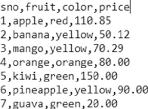
CHAPTER 3 ■ PROCESSING, WRANGLING, AND VISUALIZING DATA
122
Data Collection
Data collection is where it all begins. Though listed as a step that comes post business understanding and
problem definition, data collection often happens in parallel. This is done in order to assist in augmenting
the business understanding process with facts like availability, potential value, and so on before a complete
use case can be formed and worked upon. Of course, data collection takes a formal and better form once the
problem statement is defined and the project gets underway.
Data is at the center of everything around us, which is a tremendous opportunity. Yet this also presents
the fact that it must be present in different formats, shapes, and sizes. Its omnipresence also means that
it exists in systems such as legacy machines (say mainframes), web (say web sites and web applications),
databases, flat files, sensors, mobile devices, and so on.
Let’s look at some of the most commonly occurring data formats and ways of collecting such data.
CSV
A CSV data file is one of the most widely available formats of data. It is also one of the oldest formats still
used and preferred by different systems across domains. Comma Separated Values (CSV) are data files that
contain data with each of its attributes delimited by a “,” (a comma). Figure3-1 depicts a quick snapshot of
how a typical CSV file looks.
The sample CSV shows how data is typically arranged. It contains attributes of different data types
separated/delimited by a comma. A CSV may contain an optional header row (as shown in the example).
CSVs may also optionally enclose each of the attributes in single or double quotes to better demarcate.
Though usually CSVs are used to store tabular data, i.e., data in the form of rows and columns, this is not the
only way.
Figure 3-1. Sample CSV file
CSVs come in different variations and just changing the delimiter to a tab makes one a TSV (or a tab
separated values) file. The basic ideology here is to use a unique symbol to delimit/separate different attributes.
Now that we know how a CSV looks, let’s employ some Python magic to read/extract this data for use.
One of the advantages of using a language like Python is its ability to abstract and handle a whole lot of stuff.
Unlike other languages where specific libraries or a lot of code is required to get basic stuff done, Python
handles it with élan. Along the same lines is reading a CSV file. The simplest way to read a CSV is through the
Python csv module. This module provides an abstraction function called the reader().
CHAPTER 3 ■ PROCESSING, WRANGLING, AND VISUALIZING DATA
123
The reader function takes a file object as input to return an iterator containing the information read from
the csv file. The following code snippet uses the csv.reader() function to read a given file.
csv_reader = csv.reader(open(file_name, 'rb'), delimiter=',')
Once the iterator is returned, we can easily iterate through the contents and get the data in the
form/format required. For the sake of completeness let’s go through an example where we read the contents
of the CSV shown in Figure3-1 using the csv module. We will then extract each of its attributes and convert
the data into a dict with keys representing them. The following snippet forms the actions.
csv_rows = list()
csv_attr_dict = dict()
csv_reader = None
# read csv
csv_reader = csv.reader(open(file_name, 'rb'), delimiter=delimiter)
# iterate and extract data
for row in csv_reader:
print(row)
csv_rows.append(row)
# iterate and add data to attribute lists
for row in csv_rows[1:]:
csv_attr_dict['sno'].append(row[0])
csv_attr_dict['fruit'].append(row[1])
csv_attr_dict['color'].append(row[2])
csv_attr_dict['price'].append(row[3])
The output is a dict containing each attribute as a key with values and as an ordered list of values
read from the CSV file.
CSV Attributes::
{'color': ['red', 'yellow', 'yellow', 'orange', 'green', 'yellow', 'green'],
'fruit': ['apple', 'banana', 'mango', 'orange', 'kiwi', 'pineapple', 'guava'],
'price': ['110.85', '50.12', '70.29', '80.00', '150.00', '90.00', '20.00'],
'sno': ['1', '2', '3', '4', '5', '6', '7']}
The extraction of data from a CSV and its transformation depends on the use case requirements. The
conversion of our sample CSV into a dict of attributes is one way. We may choose different output format
depending on the data and our requirements.
Though the workflow to handle and read a CSV file is pretty straightforward and easy to use, we would
like to standardize and speed up our process. Also, more often than not, it is easier to understand data in
a tabular format. We were introduced to the pandas library in the previous chapter with some amazing
capabilities. Let’s now utilize pandas to read a CSV as well.
The following snippet shows how pandas makes reading and extracting data from a CSV that’s simpler
and consistent as compared to the csv module.
df = pd.read_csv(file_name,sep=delimiter)
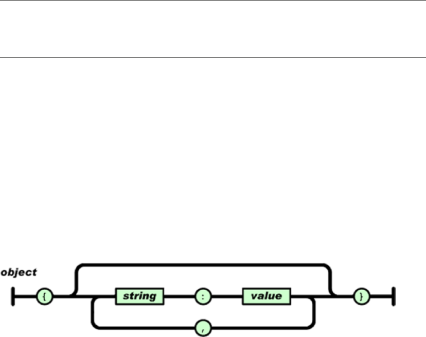
CHAPTER 3 ■ PROCESSING, WRANGLING, AND VISUALIZING DATA
124
With a single line and a few optional parameters (as per requirements), pandas extracts data from a
CSV file into a dataframe, which is a tabular representation of the same data. One of the major advantages of
using pandas is the fact that it can handle a lot of different variations in CSV files, such as files with or without
headers, attribute values enclosed in quotes, inferring data types, and many more. Also, the fact that various
machine learning libraries have the capability to directly work on pandas dataframes, makes it virtually a de
facto standard package to handle CSV files.
The previous snippet generates the following output dataframe:
sno fruit color price
0 1 apple red 110.85
1 2 banana yellow 50.12
2 3 mango yellow 70.29
3 4 orange orange 80.00
4 5 kiwi green 150.00
5 6 pineapple yellow 90.00
6 7 guava green 20.00
■Note pandas makes the process of reading CSV files a breeze, yet the csv module comes in handy when
we need more flexibility. For example, not every use case requires data in tabular form or the data might not be
consistently formatted and requires a flexible library like csv to enable custom logic to handle such data.
Along the same lines, data from flat files containing delimiters other than ’,’ (comma) like tabs or
semicolons can be easily handled with these two modules. We will use these utilities while working on
specific use cases in further chapters; until then, you are encouraged to explore and play around with these
for a better understanding.
JSON
Java Script Object Notation (JSON) is one of the most widely used data interchange formats across the digital
realm. JSON is a lightweight alternative to legacy formats like XML (we shall discuss this format next). JSON
is a text format that is language independent with certain defined conventions. JSON is a human-readable
format that is easy/simple to parse in most programming/scripting languages. A JSON file/object is simply
a collection of name(key)-value pairs. Such key-value pair structures have corresponding data structures
available in programming languages in the form of dictionaries (Python dict), struct, object, record,
keyed lists, and so on. More details are available at http://www.json.org/.
The JSON standard defines the structure, as depicted in Figure3-2.
Figure 3-2. JSON object structure (reference: http://www.json.org/)
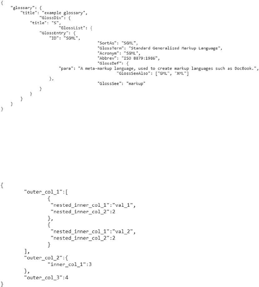
CHAPTER 3 ■ PROCESSING, WRANGLING, AND VISUALIZING DATA
125
Figure3-3 is a sample JSON depicting a record of glossary with various attributes of different data types.
Figure 3-3. Sample JSON (reference: http://www.json.org/)
Figure 3-4. Sample JSON with nested attributes
JSONs are widely to send information across systems. The Python equivalent of a JSON object is the
dict data type, which itself is a key-value pair structure. Python has various JSON related libraries that
provide abstractions and utility functions. The json library is one such option that allows us to handle JSON
files/objects. Let’s first take a look at our sample JSON file and then use this library to bring this data into
Python for use.
CHAPTER 3 ■ PROCESSING, WRANGLING, AND VISUALIZING DATA
126
The JSON object in Figure3-4 depicts a fairly nested structure that contains values of string, numeric,
and array type. JSON also supports objects, Booleans, and other data types as values as well. The following
snippet reads the contents of the file and then utilizes json.loads() utility to parse and convert it into a
standard Python dict.
json_filedata = open(file_name).read()
json_data = json.loads(json_filedata)
json_data is a Python dict with keys and values of the JSON file parsed and type casted as Python data
types. The json library also provides utilities to write back Python dictionaries as JSON files with capabilities
of error checking and typecasting. The output of the previous operation is as follows.
outer_col_1 :
nested_inner_col_1 : val_1
nested_inner_col_2 : 2
nested_inner_col_1 : val_2
nested_inner_col_2 : 2
outer_col_2 :
inner_col_1 : 3
outer_col_3 : 4
Before we move on to our next format, it is worth noting that pandas also provides utilities to parse
JSONs. The pandas read_json() is a very powerful utility that provides multiple options to handle JSONs
created in different styles. Figure3-5 depicts a sample JSON representing multiple data points, each with two
attributes listed as col_1 and col_2.
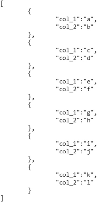
CHAPTER 3 ■ PROCESSING, WRANGLING, AND VISUALIZING DATA
127
We can easily parse such a JSON using pandas by setting the orientation parameter to “records”, as
shown here.
df = pd.read_json(file_name,orient="records")
The output is a tabular dataframe with each data point represented by two attribute values as follows.
col_1 col_2
0 a b
1 c d
2 e f
3 g h
4 i j
5 k l
Figure 3-5. Sample JSON depicting records with similar attributes
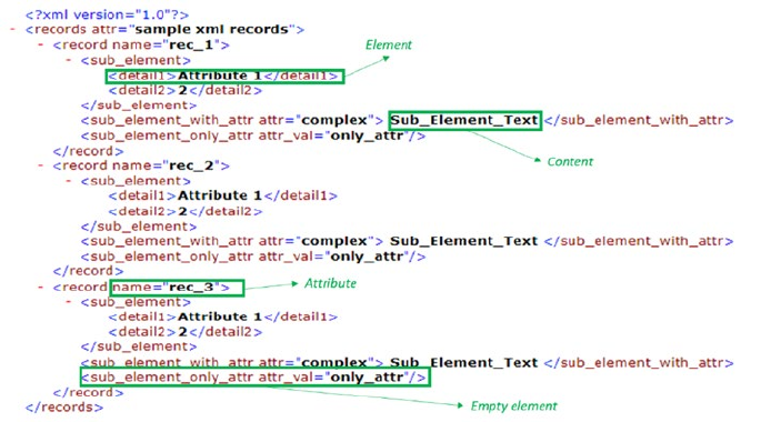
CHAPTER 3 ■ PROCESSING, WRANGLING, AND VISUALIZING DATA
128
You are encouraged to read more about pandas read_json() at https://pandas.pydata.org/pandas-
docs/stable/generated/pandas.read_json.html.
XML
Having covered two of the most widely used data formats, so now let’s take a look at XML. XMLs are quite a
dated format yet is used by a lot many systems. XML or eXtensible Markup Language is a markup language
that defines rules for encoding data/documents to be shared across the Internet. Like JSON, XML is also a
text format that is human readable. Its design goals involved strong support for various human languages
(via Unicode), platform independence, and simplicity. XMLs are widely used for representing data of varied
shapes and sizes.
XMLs are widely used as configuration formats by different systems, metadata, and data representation
format for services like RSS, SOAP, and many more.
XML is a language with syntactic rules and schemas defined and refined over the years. The most
import components of an XML are as follows:
• Tag: A markup construct denoted by strings enclosed with angled braces (“<” and “>”).
• Content: Any data not marked within the tag syntax is the content of the XML file/object.
• Element: A logical construct of an XML. An element may be defined with a start and
an end tag with or without attributes, or it may be simply an empty tag.
• Attribute: Key-value pairs that represent the properties or attributes of the element
in consideration. These are enclosed within a start or an empty tag.
Figure3-6 is a sample XML depicting various components of the eXtensible Markup Language. More
details on key concepts and details can be browsed at https://www.w3schools.com/xml/.
Figure 3-6. Sample XML annotated with key components
XMLs can be viewed as tree structures, starting with one root element that branches off into various
elements, each with their own attributes and further branches, the content being at leaf nodes.
CHAPTER 3 ■ PROCESSING, WRANGLING, AND VISUALIZING DATA
129
Most XML parsers use this tree-like structure to read XML content. The following are the two major
types of XML parsers:
• DOM parser: The Document Object Model parser is the closest form of tree
representation of an XML. It parses the XML and generates the tree structure. One
big disadvantage with DOM parsers is their instability with huge XML files.
• SAX parser: The Simple API for XML (or SAX for short) is a variant widely used on
the web. This is an event-based parser that parses an XML element by element and
provides hooks to trigger events based on tags. This overcomes the memory-based
restrictions of DOM but lacks overall representation power.
There are multiple variants available that derive from these two types. To begin with, let’s take a look at the
ElementTree parser available from Python’s xml library. The ElementTree parser is an optimization over the
DOM parser and it utilizes Python data structures like lists and dicts to handle data in a concise manner.
The following snippet uses the ElementTree parser to load and parse the sample XML file we saw
previously. The parse() function returns a tree object, which has various attributes, iterators, and utilities to
extract root and further components of the parsed XML.
tree = ET.parse(file_name)
root = tree.getroot()
print("Root tag:{0}".format(root.tag))
print("Attributes of Root:: {0}".format(root.attrib))
The two print statements provide us with values related to the root tag and its attributes (if there are
any). The root object also has an iterator attached to it which can be used to extract information related to all
child nodes. The following snippet iterates the root object to print the contents of child nodes.
for child in xml:root:
print("{0}tag:{1}, attribute:{2}".format(
"\t"*indent_level,
child.tag,
child.attrib))
print("{0}tag data:{1}".format("\t"*indent_level,
child.text))
The final output generated by parsing the XML using ElementTree is as follows. We used a custom print
utility to make the output more readable, the code for which is available on the repository.
Root tag:records
Attributes of Root:: {'attr': 'sample xml records'}
tag:record, attribute:{'name': 'rec_1'}
tag data:
tag:sub_element, attribute:{}
tag data:
tag:detail1, attribute:{}
tag data:Attribute 1
tag:detail2, attribute:{}
tag data:2
CHAPTER 3 ■ PROCESSING, WRANGLING, AND VISUALIZING DATA
130
tag:sub_element_with_attr, attribute:{'attr': 'complex'}
tag data:
Sub_Element_Text
tag:sub_element_only_attr, attribute:{'attr_val': 'only_attr'}
tag data:None
tag:record, attribute:{'name': 'rec_2'}
tag data:
tag:sub_element, attribute:{}
tag data:
tag:detail1, attribute:{}
tag data:Attribute 1
tag:detail2, attribute:{}
tag data:2
tag:sub_element_with_attr, attribute:{'attr': 'complex'}
tag data:
Sub_Element_Text
tag:sub_element_only_attr, attribute:{'attr_val': 'only_attr'}
tag data:None
The xml library provides very useful utilities exposed through the ElementTree parser, yet it lacks a
lot of fire power. Another Python library, xmltodict, provides similar capabilities but uses Python’s native
data structures like dicts to provide a more Pythonic way to handle XMLs. The following is a quick snippet
to parse the same XML. Unlike ElementTree, the parse() function of xmltodict reads a file object and
converts the contents into nested dictionaries.
xml_filedata = open(file_name).read()
ordered_dict = xmltodict.parse(xml_filedata)
The output generated is similar to the one generated using ElementTree with the exception that
xmltodict uses the @ symbol to mark elements and attributes automatically. The following is the sample
output.
records :
@attr : sample xml records
record :
@name : rec_1
sub_element :
detail1 : Attribute 1
detail2 : 2
sub_element_with_attr :
@attr : complex
#text : Sub_Element_Text
sub_element_only_attr :
@attr_val : only_attr
CHAPTER 3 ■ PROCESSING, WRANGLING, AND VISUALIZING DATA
131
HTML and Scraping
We began the chapter talking about the immense amount of information/data being generated at break-
neck speeds. The Internet or the web is one of the driving forces for this revolution coupled with immense
reach due to computers, smartphones and tablets.
The Internet is a huge interconnected web of information connected through hyperlinks. A large
amount of data on the Internet is in the form of web pages. These web pages are generated, updated,
and consumed millions of times day in and day out. With information residing in these web pages, it is
imperative that we must learn how to interact and extract this information/data as well.
So far we have dealt with formats like CSV, JSON, and XML, which can be made available/extracted
through various methods like manual downloads, APIs, and so on. With web pages, the methods change.
In this section we will discuss the HTML format (the most common form of web page related format) and
web-scraping techniques.
HTML
The Hyper Text Markup Language (HTML) is a markup language similar to XML. HTML is mainly used by
web browsers and similar applications to render web pages for consumption.
HTML defines rules and structure to describe web pages using markup. The following are standard
components of an HTML page:
• Element: Logical constructs that form the basic building blocks of an HTML page
• Tags : A markup construct defined by angled braces (< and >). Some of the important
tags are:
• <html></html>: This pair of tags contains the whole of HTML document.
It marks the start and end of the HTML page.
• <body></body>: This pair of tags contains the main content of the HTML page
rendered by the browser.
There are many more standard set of tags defined in the HTML standard; further information is
available at https://www.w3schools.com/html/html_intro.asp.
The following is a snippet to generate an HTML page that’s rendered by a web browser, as shown in the
screenshot in Figure3-7.
<!DOCTYPE html>
<html>
<head>
<title>Sample HTML Page</title>
</head>
<body>
<h1>Sample WebPage</h1>
<p>HTML has been rendered</p>
</body>
</html>

CHAPTER 3 ■ PROCESSING, WRANGLING, AND VISUALIZING DATA
132
Browsers use markup tags to understand special instructions like text formatting, positioning,
hyperlinks, and so on but only renders the content for the end user to see. For use cases where data/
information resides in HTML pages, we need special techniques to extract this content.
Web Scraping
Web scraping is a technique to scrape or extract data from the web, particularly from web pages. Web
scraping may involve manually copying the data or using automation to crawl, parse, and extract
information from web pages. In most contexts, web scraping refers to automatically crawling a particular
web site or a portion of the web to extract and parse information that can be later on used for analytics or
other use cases. A typical web scraping flow can be summarized as follows:
• Crawl: A bot or a web crawler is designed to query a web server using the required
set of URLs to fetch the web pages. A crawler may employ sophisticated techniques
to fetch information from pages linked from the URLs in question and even parse
information to a certain extent. Web sites maintain a file called robots.txt to employ
what is called as the “Robots Exclusion Protocol” to restrict/provide access to their
content. More details are available at http://www.robotstxt.org/robotstxt.html.
• Scrape: Once the raw web page has been fetched, the next task is to extract
information from it. The task of scraping involves utilizing techniques like regular
expressions, extraction based on XPath, or specific tags and so on to narrow down to
the required information on the page.
Web scraping involves creativity from the point of view of narrowing down to the exact piece of
information required. With web sites changing constantly and web pages becoming dynamic (see asp, jsp,
etc.), presence of access controls (username/password, CAPTCHA, and so on) complicate the task even
more. Python is a very powerful programming language, which should be evident by now, and scraping the
web is another task for which it provides multiple utilities. Let’s begin with extracting a blog post’s text from
the Apress blog to better understand web scraping.
The first task is to identify the URL we are interested in. For our current example, we concentrate on the
first blog post of the day on Apress web site’s blog page at http://www.apress.com/in/blog/all-blog-posts.
Clicking on the top most blog post takes us to the main article in consideration. The article is shown in the
screen in Figure3-8.
Figure 3-7. Sample HTML page as rendered in browser

CHAPTER 3 ■ PROCESSING, WRANGLING, AND VISUALIZING DATA
133
Now that we have the required page and its URL, we will use the requests library to query the required
URL and get a response. The following snippet does the same.
base_url = "http://www.apress.com/in/blog/all-blog-posts"
blog_suffix = "/wannacry-how-to-prepare/12302194"
response = requests.get(base_url+blog_suffix)
If the get request is successful, the response object’s status_code attribute contains a value of 200
(equivalent to HTML success code). Upon getting a successful response, the next task is to devise a method
to extract the required information.
Since in this case we are interested in the blog post’s actual content, let’s analyze the HTML behind the
page and see if we can find specific tags of interest.
■Note Most modern browsers come with HTML inspection tools built-in. If you are using Google Chrome,
press F12 or right-click on the page and select Inspect or View Source. This opens the HTML code for you to
analyze.
Figure 3-8. A blog post on Apress.com
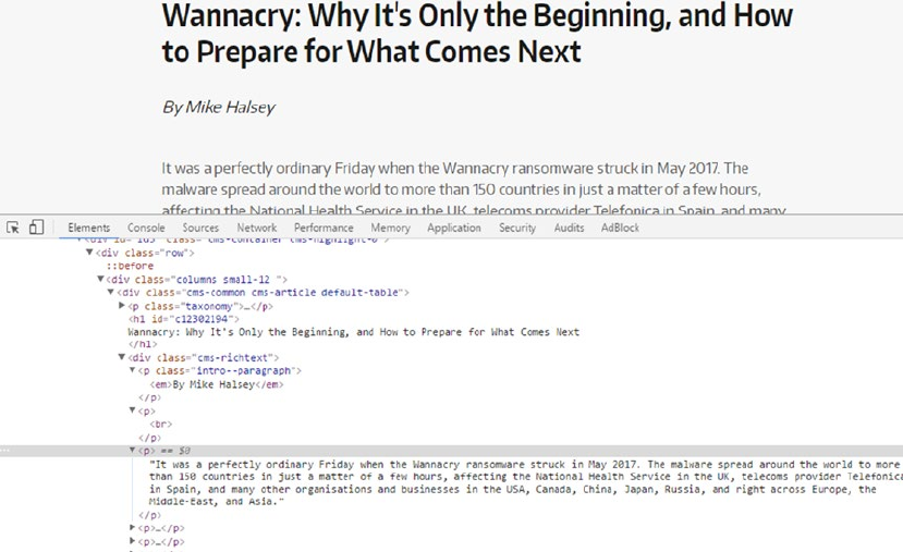
CHAPTER 3 ■ PROCESSING, WRANGLING, AND VISUALIZING DATA
134
Figure 3-9. Inspecting the HTML content of a blog post on Apress.com
Figure3-9 depicts a snapshot of the HTML behind the blog post we are interested in.
Upon careful inspection, we can clearly see text of the blog post is contained within the div tag
<div class="cms-richtext">. Now that we have narrowed down to the tag of interest, we use Python’s
regular expression library re to search and extract data contained within these tags only. The following
snippet utilizes re.compile() to compile a regular expression and then uses re.findall() to extract the
information from the fetched response.
content_pattern = re.compile(r'<div class="cms-richtext">(.*?)</div>')
result = re.findall(content_pattern, content)
The output of the find operation is the required text from the blog post. Of course, it still contains
HTML tags interlaced between the actual text. We can perform further clean up to reach the required levels,
yet this is a good start. The following is snapshot of information extracted using regular expressions.
Out[59]: '<p class="intro--paragraph"><em>By Mike Halsey</em></p><p><br/></p><p>It was a
perfectly ordinary Friday when the Wannacry ransomware struck in May 2017. The malware
spread around the world to more than 150 countries in just a matter of a few hours,
affecting the National Health Service in the UK, telecoms provider Telefonica in Spain,
and many other organisations and businesses in the USA, Canada, China, Japan, Russia, and
right across Europe, the Middle-East, and Asia.</p><p>The malware was reported to have been
stolen in an attack on the US National Security Agency (NSA), though the NSA denied this,
and exploited vulnerabilities in the Microsoft Windows operating system. Microsoft had been
aware of the vulnerabilities since early in the year, and had patched them back in March.
CHAPTER 3 ■ PROCESSING, WRANGLING, AND VISUALIZING DATA
135
This was a straightforward and a very basic approach to get the required data. What if we want to go a
step further and extract information related to all blog posts on the page and perform a better cleanup?
For such a task, we utilize the BeautifulSoup library. BeautifulSoup is the go-to standard library for
web scraping and related tasks. It provides some amazing functionality to ease out the scraping process.
For the task at hand, our process would be to first crawl the index page and extract the URLs to all the blog
post links listed on the page. For this we would use the requests.get() function to extract the content and
then utilize BeautifulSoup’s utilities to get the content from the URLs. The following snippet showcases the
function get_post_mapping(), which parses the home page content to extract the blog post headings and
corresponding URLs into a dictionary. The function finally returns a list of such dictionaries.
def get_post_mapping(content):
"""This function extracts blog post title and url from response object
Args:
content (request.content): String content returned from requests.get
Returns:
list: a list of dictionaries with keys title and url
"""
post_detail_list = []
post_soup = BeautifulSoup(content,"lxml")
h3_content = post_soup.find_all("h3")
for h3 in h3_content:
post_detail_list.append(
{'title':h3.a.get_text(),'url':h3.a.attrs.get('href')}
)
return post_detail_list
The pervious function first creates an object of BeautifulSoup specifying lxml as its parser. It then
uses the h3 tag and a regex based search to extract the required list of tags (we got to the h3 tag by the same
inspect element approach we utilized previously). The next task was to simply iterate through the list of the
h3 tags and utilize the get_text() utility function from BeautifulSoup to get the blog post heading and its
corresponding URL. The list returned from the function is as follows.
[{'title': u"Wannacry: Why It's Only the Beginning, and How to Prepare for What Comes Next",
'url': '/in/blog/all-blog-posts/wannacry-how-to-prepare/12302194'},
{'title': u'Reusing ngrx/effects in Angular (communicating between reducers)',
'url': '/in/blog/all-blog-posts/reusing-ngrx-effects-in-angular/12279358'},
{'title': u'Interview with Tony Smith - Author and SharePoint Expert',
'url': '/in/blog/all-blog-posts/interview-with-tony-smith-author-and-sharepoint-expert/12271238'},
{'title': u'Making Sense of Sensors \u2013 Types and Levels of Recognition',
'url': '/in/blog/all-blog-posts/making-sense-of-sensors/12253808'},
{'title': u'VS 2017, .NET Core, and JavaScript Frameworks, Oh My!',
'url': '/in/blog/all-blog-posts/vs-2017-net-core-and-javascript-frameworks-oh-my/12261706'}]
CHAPTER 3 ■ PROCESSING, WRANGLING, AND VISUALIZING DATA
136
Now that we have the list, the final step it to iterate through this list of URLs and extract each blog post’s
text. The following function showcases how BeautifulSoup simplifies the task as compared to our previous
method of using regular expressions. The method of identifying the required tag remains the same, though
we utilize the power of this library to get text that is free from all HTML tags.
def get_post_content(content):
"""This function extracts blog post content from response object
Args:
content (request.content): String content returned from requests.get
Returns:
str: blog's content in plain text
"""
plain_text = ""
text_soup = BeautifulSoup(content,"lxml")
para_list = text_soup.find_all("div",
{'class':'cms-richtext'})
for p in para_list[0]:
plain_text += p.getText()
return plain_text
The following output is the content from one of the posts. Pay attention to the cleaner text in this case as
compared to our previous approach.
By Mike HalseyIt was a perfectly ordinary Friday when the Wannacry ransomware struck in May
2017. The malware spread around the world to more than 150 countries in just a matter of a
few hours, affecting the National Health Service in the UK, telecoms provider Telefonica in
Spain, and many other organisations and businesses in the USA, Canada, China, Japan, Russia,
and right across Europe, the Middle-East, and Asia.The malware was reported to have been
stolen in an attack on the US National Security Agency (NSA), though the NSA denied this,
and exploited vulnerabilities in the Microsoft Windows operating system. Microsoft had been
aware of the vulnerabilities since early in the year, and had patched them back in March.
Through these two methods, we crawled and extracted information related to blog posts from our web site
of interest. You are encouraged to experiment with other utilities from BeautifulSoup along with other web
sites for a better understanding. Of course, do read the robots.txt and honor the rules set by the webmaster.
SQL
Databases date back to the 1970s and represent a large volume of data stored in relational form. Data
available in the form of tables in databases, or to be more specific, relational databases, comprise of another
format of structured data that we encounter when working on different use cases. Over the years, there have
been various flavors of databases available, most of them conforming to the SQL standard.
The Python ecosystem handles data from databases in two major ways. The first and the most common
way used while working on data science and related use cases is to access data using SQL queries directly. To
access data using SQL queries, powerful libraries like sqlalchemy and pyodbc provide convenient interfaces
to connect, extract, and manipulate data from a variety of relational databases like MS SQL Server, MySQL,
CHAPTER 3 ■ PROCESSING, WRANGLING, AND VISUALIZING DATA
137
Oracle, and so on. The sqlite3 library provides a lightweight easy-to-use interface to work with SQLite
databases, though the same can be handled by the other two libraries as well.
The second way of interacting with databases is the ORM or the Object Relational Mapper method.
This method is synonymous to the object oriented model of data, i.e., relational data is mapped in terms
of objects and classes. Sqlalchemy provides a high-level interface to interact with databases in the ORM
fashion. We will explore more on these based on the use cases in the subsequent chapters.
Data Description
In the previous section, we discussed various data formats and ways of extracting information from them.
Each of the data formats comprised of data points with attributes of diverse types. These data types in their
raw data forms form the basis of input features utilized by Machine Learning algorithms and other tasks
in the overall Data Science workflow. In this section, we touch upon major data types we deal with while
working on different use cases.
Numeric
This is simplest of the data types available. It is also the type that is directly usable and understood by most
algorithms (though this does not imply that we use numeric data in its raw form). Numeric data represents
scalar information about entities being observed, for instance, number of visits to a web site, price of a
product, weight of a person, and so on. Numeric values also form the basis of vector features, where each
dimension is represented by a scalar value. The scale, range, and distribution of numeric data has an implicit
effect on the algorithm and/or the overall workflow. For handling numeric data, we use techniques such as
normalization, binning, quantization, and many more to transform numeric data as per our requirements.
Text
Data comprising of unstructured, alphanumeric content is one of most common data types. Textual data
when representing human language content contains implicit grammatical structure and meaning. This
type of data requires additional care and effort for transformation and understanding. We cover aspects of
transforming and using textual data in the coming chapters.
Categorical
This data type stands in between the numeric and text. Categorical variables refer to categories of entities
being observed. For instance, hair color being black, brown, blonde and red or economic status as low,
medium, or high. The values may be represented as numeric or alphanumeric, which describe properties of
items in consideration. Based on certain characteristics, categorical variables can be seen as:
• Nominal: These define only the category of the data point without any ordering
possible. For instance, hair color can be black, brown, blonde, etc., but there cannot
be any order to these categories.
• Ordinal: These define category but can also be ordered based on rules on the
context. For example, people categorized by economic status of low, medium, or
high can be clearly ordered/sorted in the respective order.
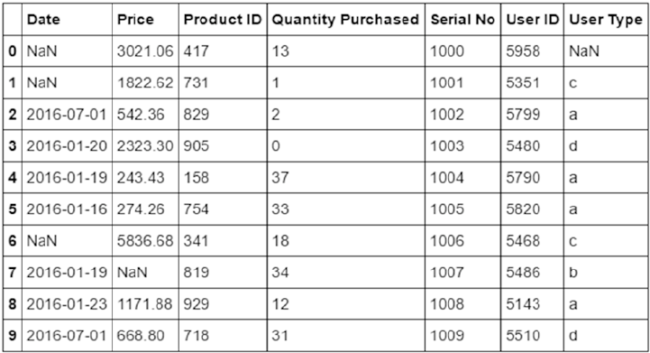
CHAPTER 3 ■ PROCESSING, WRANGLING, AND VISUALIZING DATA
138
It is important to note that standard mathematical operations like, addition, subtraction, multiplication,
etc. do not carry meaning for categorical variables even though that may be allowed syntactically
(categorical variables represented as numbers). Thus is it important to handle categorical variables with care
and we will see a couple of ways of handling categorical data in the coming section.
Different data types form the basis of features that are ingested by algorithms for analysis of data at
hand. In the coming sections and chapters, especially Chapter 4: Feature Engineering and Selection, you will
learn more on how to work with specific data types.
Data Wrangling
So far in this chapter we discussed data formats and data types and learned about ways of collecting
data from different sources. Now that we have an understanding of the initial process of collecting and
understanding data, the next logical step is to be able to use it for analysis using various Machine Learning
algorithms based upon the use case at hand. But before we reach the stage where this “raw” data is
anywhere close to be useable for the algorithms or visualizations, we need to polish and shape it up.
Data wrangling or data munging is the process of cleaning, transforming, and mapping data from one
form to another to utilize it for tasks such as analytics, summarization, reporting, visualization, and so on.
Understanding Data
Data wrangling is one of most important and involving steps in the whole Data Science workflow. The output
of this process directly impacts all downstream steps such as exploration, summarization, visualization,
analysis and even the final result. This clearly shows why Data Scientists spend a lot of time in Data
Collection and Wrangling. There are a lot many surveys which help in bringing this fact out that more than
often, Data Scientists end up spending 80% of their time in data processing and wrangling!
So before we get started with actual use cases and algorithms in the coming chapters, it is imperative
that we understand and learn how to wrangle our data and transform it into a useable form. To begin with,
let’s first describe the dataset at hand. For the sake of simplicity, we prepare a sample dataset describing
product purchase transactions by certain users. Since we already discussed ways of collecting/extracting
data, we will skip that step for this section. Figure3-10 shows a snapshot of dataset.
Figure 3-10. Sample dataset

CHAPTER 3 ■ PROCESSING, WRANGLING, AND VISUALIZING DATA
139
■Note The dataset in consideration has been generated using standard Python libraries like
random, datetime, numpy, pandas, and so on. This dataset has been generated using a utility function called
generate_sample_data() available in the code repository for this book. The data has been randomly generated
and is for representational purposes only.
The dataset describes transactions having the following attributes/features/properties:
• Date: The date of the transaction
• Price: The price of the product purchased
• Product ID: Product identification number
• Quantity Purchased: The quantity of product purchased in this transaction
• Serial No: The transaction serial number
• User ID: Identification number for user performing the transaction
• User Type: The type of user
Let’s now begin our wrangling/munging process and understand various methods/tricks to clean,
transform, and map our dataset to bring it into a useable form. The first and the foremost step usually is
to get a quick peak into the number of records/rows, the number of columns/attributes, column/attribute
names, and their data types.
For the majority of this section and subsequent ones, we will be relying on pandas and its utilities to
perform the required tasks. The following snippet provides the details on row counts, attribute counts,
and details.
print("Number of rows::",df.shape[0])
print("Number of columns::",df.shape[1] )
print("Column Names::",df.columns.values.tolist())
print("Column Data Types::\n",df.dtypes)
The required information is available straight from the pandas dataframe itself. The shape attribute
is a two-value tuple representing the row count and column count, respectively. The column names are
available through the columns attributes, while the dtypes attribute provides us with the data type of each of
the columns in the dataset. The following is the output generated by this snippet.
Number of rows:: 1001
Number of columns:: 7
Column Names:: ['Date', 'Price', 'Product ID', 'Quantity Purchased', 'Serial No', 'User ID',
'User Type']
Column Data Types::
Date object
Price float64
CHAPTER 3 ■ PROCESSING, WRANGLING, AND VISUALIZING DATA
140
Product ID int32
Quantity Purchased int32
Serial No int32
User ID int32
User Type object
dtype: object
The column names are clearly listed and have been explained previously. Upon inspecting the data types,
we can clearly see that the Date attribute is represented as an object. Before we move on to transformations and
cleanup, let’s dig in further and collect more information to understand and prepare a strategy of required tasks
for dataset wrangling. The following snippet helps get information related to attributes/columns containing
missing values, count of rows, and indices that have missing values in them.
print("Columns with Missing Values::",df.columns[df.isnull().any()].tolist())
print("Number of rows with Missing Values::",len(pd.isnull(df).any(1).nonzero()[0].tolist()))
print("Sample Indices with missing data::",pd.isnull(df).any(1).nonzero()[0].tolist()[0:5] )
With pandas, subscripting works with both rows and columns (see Chapter 2 for details). We use
isnull() to identify columns containing missing values. The utilities any() and nonzero() provide nice
abstractions to identify any row/column conforming to a condition (in this case pointing to rows/columns
having missing values). The output is as follows.
Columns with Missing Values:: ['Date', 'Price', 'User Type']
Number of rows with Missing Values:: 61
Sample Indices with missing data:: [0L, 1L, 6L, 7L, 10L]
Let’s also do a quick fact checking to get details on non-null rows for each column and the amount of
memory consumed by this dataframe. We also get some basic summary statistics like min, max, and so on;
these will be useful in coming tasks. For the first task, we use the info() utility while the summary statistics
are provided by the describe() function. The following snippet does this.
print("General Stats::")
print(df.info())
print("Summary Stats::" )
print(df.describe())
The following is the output generated using the info() and describe() utilities. It shows Date and Price
both have about 970 non-null rows, while the dataset consumes close to 40KB of memory. The summary
stats are self-explanatory and drop the non-numeric columns like Date and User Type from the output.
General Stats::
<class 'pandas.core.frame.DataFrame'>
RangeIndex: 1001 entries, 0 to 1000
Data columns (total 7 columns):
Date 970 non-null object
Price 970 non-null float64
Product ID 1001 non-null int32
Quantity Purchased 1001 non-null int32
CHAPTER 3 ■ PROCESSING, WRANGLING, AND VISUALIZING DATA
141
Serial No 1001 non-null int32
User ID 1001 non-null int32
User Type 1000 non-null object
dtypes: float64(1), int32(4), object(2)
memory usage: 39.2+ KB
None
Summary Stats::
Price Product ID Quantity Purchased Serial No User ID
count 970.000000 1001.000000 1001.000000 1001.000000 1001.000000
mean 1523.906402 600.236763 20.020979 1452.528472 5335.669331
std 1130.331869 308.072110 11.911782 386.505376 994.777199
min 2.830000 0.000000 0.000000 -1.000000 -101.000000
25% 651.622500 342.000000 10.000000 1223.000000 5236.000000
50% 1330.925000 635.000000 20.000000 1480.000000 5496.000000
75% 2203.897500 875.000000 30.000000 1745.000000 5726.000000
max 5840.370000 1099.000000 41.000000 2000.000000 6001.000000
Filtering Data
We have completed our first pass of the dataset at hand and understood what it has and what is missing.
The next stage is about cleanup. Cleaning a dataset involves tasks such as removing/handling incorrect or
missing data, handling outliers, and so on. Cleaning also involves standardizing attribute column names
to make them more readable, intuitive, and conforming to certain standards for everyone involved to
understand. To perform this task, we write a small function and utilize the rename() utility of pandas to
complete this step. The rename() function takes a dict with keys representing the old column names while
values point to newer ones. We can also decide to modify the existing dataframe or generate a new one by
setting the inplace flag appropriately. The following snippet showcases this function.
def cleanup_column_names(df,rename_dict={},do_inplace=True):
"""This function renames columns of a pandas dataframe
It converts column names to snake case if rename_dict is not passed.
Args:
rename_dict (dict): keys represent old column names and values point to
newer ones
do_inplace (bool): flag to update existing dataframe or return a new one
Returns:
pandas dataframe if do_inplace is set to False, None otherwise
"""
if not rename_dict:
return df.rename(columns={col: col.lower().replace(' ','_')
for col in df.columns.values.tolist()},
inplace=do_inplace)
else:
return df.rename(columns=rename_dict,inplace=do_inplace)
Upon using this function on our dataframe in consideration, the output in Figure3-11 is generated. Since
we do not pass any dict with old and new column names, the function updates all columns to snake case.
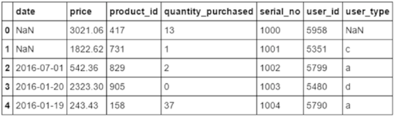
CHAPTER 3 ■ PROCESSING, WRANGLING, AND VISUALIZING DATA
142
For different algorithms, analysis and even visualizations, we often require only a subset of attributes
to work with. With pandas, we can vertically slice (select a subset of columns) in a variety of ways. pandas
provides different ways to suit different scenarios as we shall see in the following snippet.
print("Using Column Index::" )
print(df[[3]].values[:, 0] )
print("Using Column Name::" )
print(df.quantity_purchased.values)
print(Using Column Data Type::" )
print(df.select_dtypes(include=['float64']).values[:,0] )
In this snippet, we have performed attribute selection in three different ways. The first method utilizes
column index number to get the required information. In this case, we wanted to work with only the field
quantity_purchased, hence index number 3 (pandas columns are 0 indexed). The second method also
extracts data for the same attribute by directly referring to the column name in dot notation. While the first
method is very handy when working in loops, the second one is more readable and blends well when we
are utilizing the object oriented nature on Python. Yet there are times when we would need to get attributes
based on their data types alone. The third method makes use of select_dtypes() utility to get this job done.
It provides ways of both including and excluding columns based on data types alone. In this example we
selected the column(s) with data type as float (price column in our dataset). The output from this snippet is
as follows.
Using Column Index::
[13 1 2 ..., 2 30 17]
Using Column Name::
[13 1 2 ..., 2 30 17]
Using Column Data Type::
[ 3021.06 1822.62 542.36 ..., 1768.66 1848.5 1712.22]
Figure 3-11. Dataset with columns renamed
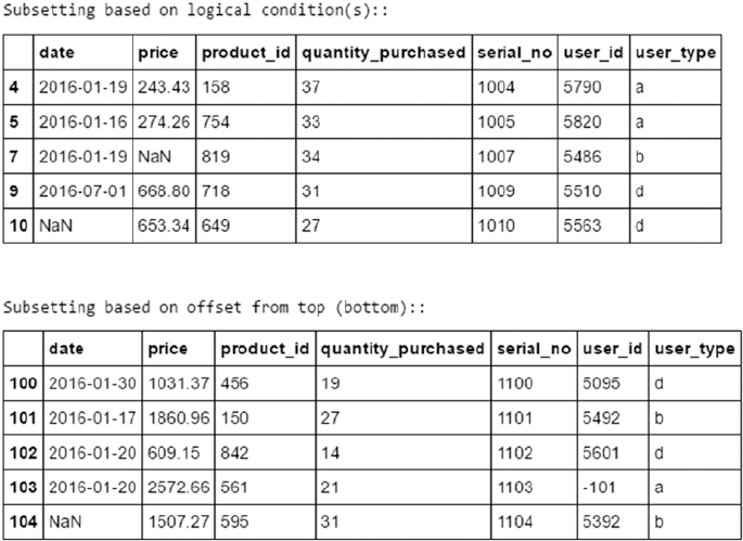
CHAPTER 3 ■ PROCESSING, WRANGLING, AND VISUALIZING DATA
143
Selecting specific attributes/columns is one of the ways of subsetting a dataframe. There may be
requirements to horizontally splitting a dataframe as well. To work with a subset of rows, pandas provides
ways as outlined in the following snippet.
print("Select Specific row indices::")
print(df.iloc[[10,501,20]] )
print(Excluding Specific Row indices::" )
print(df.drop([0,24,51], axis=0).head())
print("Subsetting based on logical condition(s)::" )
print(df[df.quantity_purchased>25].head())
print("Subsetting based on offset from top (bottom)::" )
print(df[100:].head() #df.tail(-100) )
The first method utilizes the iloc (or integer index/location) based selection, we need to specify a list
of indices we need from the dataframe. The second method allows in removing/filtering out specific row
indices from the dataframe itself. This comes in handy in scenarios where rows not satisfying certain criteria
need to be filtered out. The third method showcases conditional logic based filtering of rows. The final
method filters based on offset from the top of the dataframe. A similar method, called tail(), can be used to
offset from bottom as well. The output generated is depicted in Figure3-12.
Figure 3-12. Different ways of subsetting rows
CHAPTER 3 ■ PROCESSING, WRANGLING, AND VISUALIZING DATA
144
Typecasting
Typecasting or converting data into appropriate data types, is an important part of cleanup and wrangling in
general. Often data gets converted into wrong data types while being extracted or converted from one form
to the other. Also different platforms and systems handle each data type differently and thus getting the right
data type is important. While starting the wrangling discussion, we checked upon the data types of all the
columns of our dataset. If you remember, the date column was marked as an object. Though it may not be an
issue if we are not going to work with dates, but in cases we need date and related attributes, having them as
objects/strings can pose problems. Moreover, it is difficult to handle date operations if they are available as
strings. To fix our dataframe, we use to_datetime() function from pandas. This is a very flexible utility that
allows us to set different attributes like date time formats, timezone, and so on. Since in our case, the values
are just dates, we use the function as follows with defaults.
df['date'] = pd.to_datetime(df.date)
print(df.dtypes)
Similarly, we can convert numeric columns marked as strings using to_numeric() along with direct
Python style typecasting as well. Upon checking the data types now, we clearly see the date column in the
correct data type of datetime64.
date datetime64[ns]
price float64
product_id int32
quantity_purchased int32
serial_no int32
user_id int32
user_type object
dtype: object
Transformations
Another common task with data wrangling is to transform existing columns or derive new attributes based
on requirements of the use case or data itself. To derive or transform column, pandas provide three different
utilities—apply(), applymap(), and map(). The apply() function is used to perform actions on the
whole object, depending upon the axis (default is on all rows). The applymap() and map() functions work
element-wise with map() coming from the pandas.Series hierarchy.
As an example to understand these three utilities, let’s derive some new attributes. First, let’s expand
the user_type attribute using the map() function. We write a small function to map each of the distinct
user_type codes into their corresponding user classes as follows.
def expand_user_type(u_type):
if u_type in ['a','b']:
return 'new'
elif u_type == 'c':
return 'existing'
elif u_type == 'd':
return 'loyal_existing'
else:
return 'error'
df['user_class'] = df['user_type'].map(expand_user_type)
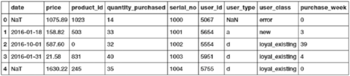
CHAPTER 3 ■ PROCESSING, WRANGLING, AND VISUALIZING DATA
145
Along the same lines, we use the applymap() function to perform another element-wise operation to get
the week of the transaction from the date attribute. For this case, we use the lambda function to get the job
done quickly. Refer to previous chapters for more details on lambda functions. The following snippet gets us
the week for each of the transactions.
df['purchase_week'] = df[['date']].applymap(lambda dt:dt.week
if not pd.isnull(dt.week)
else 0)
Figure3-13 depicts our dataframe with two additional attributes—user_class and purchase_week.
Figure 3-13. Dataframe with derived attributes using map and applymap
Let’s now use the apply() function to perform action on the whole of the dataframe object itself. The
following snippet uses the apply() function to get range (maximum value to minimum value) for all numeric
attributes. We use the previously discussed select_dtypes and lambda function to complete the task.
df.select_dtypes(include=[np.number]).apply(lambda x: x.max()- x.min())
The output is a reduced pandas.Series object showcasing range values for each of the numeric columns.
price 5837.54
product_id 1099.00
quantity_purchased 41.00
serial_no 2001.00
user_id 6102.00
purchase_week 53.00
Imputing Missing Values
Missing values can lead to all sorts of problems when dealing with Machine Learning and Data Science related
use cases. Not only can they cause problems for algorithms, they can mess up calculations and even final
outcomes. Missing values also pose risk of being interpreted in non-standard ways as well leading to confusion
and more errors. Hence, imputing missing values carries a lot of weight in the overall data wrangling process.
One of the easiest ways of handling missing values is to ignore or remove them altogether from the
dataset. When the dataset is fairly large and we have enough samples of various types required, this option
can be safely exercised. We use the dropna() function from pandas in the following snippet to remove rows
of data where the date of transaction is missing.
print("Drop Rows with missing dates::" )
df_dropped = df.dropna(subset=['date'])
print("Shape::",df_dropped.shape)
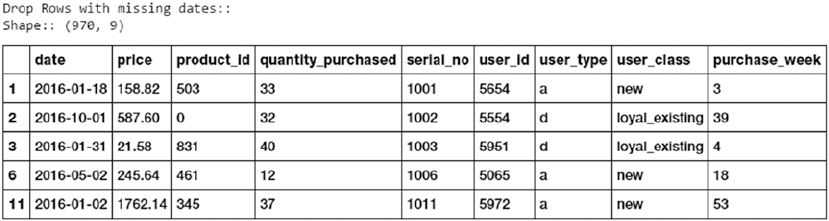
CHAPTER 3 ■ PROCESSING, WRANGLING, AND VISUALIZING DATA
146
The result is a dataframe with rows without any missing dates. The output dataframe is depicted in
Figure3-14.
Figure 3-14. Dataframe without any missing date information
Often dropping rows is a very expensive and unfeasible option. In many scenarios, missing values are
imputed using the help of other values in the dataframe. One commonly used trick is to replace missing
values with a central tendency measure like mean or median. One may also choose other sophisticated
measures/statistics as well. In our dataset, the price column seems to have some missing data. We utilize the
fillna() method from pandas to fill these values with mean price value from our dataframe.
On the same lines, we use the ffill() and bfill() functions to impute missing values for the
user_type attribute. Since, user_type is a string type attribute, we use a proximity based solution to handle
missing values in this case. The ffill() and bfill() functions copy forward the data from the previous row
(forward fill) or copy the value from the next row (backward fill). The following snippet showcases the three
functions.
print("Fill Missing Price values with mean price::" )
df_dropped['price'].fillna(value=np.round(df.price.mean(),decimals=2),
inplace=True)
print("Fill Missing user_type values with value from \
previous row (forward fill) ::" )
df_dropped['user_type'].fillna(method='ffill',inplace=True)
print("Fill Missing user_type values with value from \
next row (backward fill) ::" )
df_dropped['user_type'].fillna(method='bfill',inplace=True)
Apart from these ways, there are certain conditions where a record is not much of use if it has more than
a certain threshold of attribute values missing. For instance, if in our dataset a transaction has less than three
attributes as non-null, the transaction might almost be unusable. In such a scenario, it might be advisable to
drop that data point itself. We can filter out such data points using the function dropna() with the parameter
thresh set to the threshold of non-null attributes. More details are available on the official documentation page.
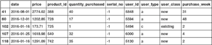
CHAPTER 3 ■ PROCESSING, WRANGLING, AND VISUALIZING DATA
147
Handling Duplicates
Another issue with many datasets is the presence of duplicates. While data is important and more the
merrier, duplicates do not add much value per se. Even more, duplicates help us identify potential areas of
errors in recording/collecting the data itself. To identify duplicates, we have a utility called duplicated()
that can applied on the whole dataframe as well as on a subset of it. We may handle duplicates by fixing the
errors and use the duplicated() function, although we may also choose to drop the duplicate data points
altogether. To drop duplicates, we use the method drop_duplicates(). The following snippet showcases
both functions discussed here.
df_dropped[df_dropped.duplicated(subset=['serial_no'])]
df_dropped.drop_duplicates(subset=['serial_no'],inplace=True)
The output of identifying a subset of a dataframe having duplicate values for the field serial_no is
depicted in Figure3-15. The second line in the previous snippet simply drops those duplicates.
Figure 3-15. Dataframe with duplicate serial_no values
Handling Categorical Data
As discussed in the section “Data Description,” categorical attributes consist of data that can take a limited
number of values (not always though). Here in our dataset, the attribute user_type is a categorical variable
that can take only a limited number of values from the allowed set {a,b,c,d}. The algorithms that we would be
learning and utilizing in the coming chapters mostly work with numerical data and categorical variables may
pose some issues. With pandas, we can handle categorical variables in a couple of different ways. The first
one is using the map() function, where we simply map each value from the allowed set to a numeric value.
Though this may be useful, this approach should be handled with care and caveats. For instance, statistical
operations like addition, mean, and so on, though syntactically valid, should be avoided for obvious reasons
(more on this in coming chapters). The second method is to convert the categorical variable into indicator
variables using the get_dummies() function. The function is simply a wrapper to generate one hot encoding
for the variable in consideration. One hot encoding and other encodings can be handled using libraries like
sklearn as well (we will see more examples in coming chapters).
The following snippet showcases both the methods discussed previously using map() and get_dummies().
# using map to dummy encode
type_map={'a':0,'b':1,'c':2,'d':3,np.NAN:-1}
df['encoded_user_type'] = df.user_type.map(type_map)
print(df.head())
# using get_dummies to one hot encode
print(pd.get_dummies(df,columns=['user_type']).head())
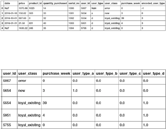
CHAPTER 3 ■ PROCESSING, WRANGLING, AND VISUALIZING DATA
148
The second image, Figure3-17, showcases the output of one hot encoding the user_type attribute.
We discuss more these approaches in detail in Chapter 4, when we discuss feature engineering.
Normalizing Values
Attribute normalization is the process of standardizing the range of values of attributes. Machine learning
algorithms in many cases utilize distance metrics, attributes or features of different scales/ranges which
might adversely affect the calculations or bias the outcomes. Normalization is also called feature scaling.
There are various ways of scaling/normalizing features, some of them are rescaling, standardization
(or zero-mean unit variance), unit scaling and many more. We may choose a normalization technique
based upon the feature, algorithm and use case at hand. This will be clearer when we work on use cases.
We also cover feature scaling strategies in detail in Chapter 4: Feature Engineering and Selection. The
following snippet showcases a quick example of using a min-max scaler, available from the preprocessing
module of sklearn, which rescales attributes to the desired given range.
df_normalized = df.dropna().copy()
min_max_scaler = preprocessing.MinMaxScaler()
np_scaled = min_max_scaler.fit_transform(df_normalized['price'].reshape(-1,1))
df_normalized['normalized_price'] = np_scaled.reshape(-1,1)
Figure3-18 showcases the unscaled price values and the normalized price values that have been scaled
to a range of [0, 1].
The output is generated as depicted in Figure3-16 and Figure3-17. Figure3-16 shows the output of
dummy encoding. With the map() approach we keep the number of features in check, yet have to be careful
about the caveats mentioned in this section.
Figure 3-16. Dataframe with user_type attribute dummy encoded
Figure 3-17. Dataframe with user_type attribute one hot encoded
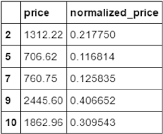
CHAPTER 3 ■ PROCESSING, WRANGLING, AND VISUALIZING DATA
149
String Manipulations
Raw data presents all sorts of issues and complexities before it can be used for analysis. Strings are another
class of raw data which needs special attention and treatment before our algorithms can make sense out
of them. As mentioned while discussing wrangling methods for categorical data, there are limitations and
issues while directly using string data in algorithms.
String data representing natural language is highly noisy and requires its own set of steps for wrangling.
Though most of these steps are use case dependent, it is worth mentioning them here (we will cover these in
detail along with use cases for better clarity). String data usually undergoes wrangling steps such as:
• Tokenization: Splitting of string data into constituent units. For example, splitting
sentences into words or words into characters.
• Stemming and lemmatization: These are normalization methods to bring words into
their root or canonical forms. While stemming is a heuristic process to achieve the
root form, lemmatization utilizes rules of grammar and vocabulary to derive the root.
• Stopword Removal: Text contains words that occur at high frequency yet
do not convey much information (punctuations, conjunctions, and so on). These
words/phrases are usually removed to reduce dimensionality and noise from data.
Apart from the three common steps mentioned previously, there are other manipulations like POS
tagging, hashing, indexing, and so on. Each of these are required and tuned based on the data and problem
statement on hand. Stay tuned for more details on these in the coming chapters.
Data Summarization
Data summarization refers to the process of preparing a compact representation of raw data at hand.
This process involves aggregation of data using different statistical, mathematical, and other methods.
Summarization is helpful for visualization, compressing raw data, and better understanding of its attributes.
The pandas library provides various powerful summarization techniques to suit different requirements.
We will cover a couple of them here as well. The most widely used form of summarization is to group values
based on certain conditions or attributes. The following snippet illustrates one such summarization.
print(df['price'][df['user_type']=='a'].mean())
print(df['purchase_week'].value_counts())
Figure 3-18. Original and normalized values for price
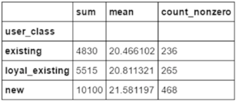
CHAPTER 3 ■ PROCESSING, WRANGLING, AND VISUALIZING DATA
150
The first statement calculates the mean price for all transactions by user_type, while the second one
counts the number of transactions per week. Though these calculations are helpful, grouping data based on
attributes helps us get a better understanding of it. The groupby() function helps us perform the same, as
shown in the following snippet.
print(df.groupby(['user_class'])['quantity_purchased'].sum())
This statement generates a tabular output representing sum of quantities purchased by each
user_class. The output is generated is as follows.
user_class
existing 4830
loyal_existing 5515
new 10100
Name: quantity_purchased, dtype: int32
The groupby() function is a powerful interface that allows us to perform complex groupings and
aggregations. In the previous example we grouped only on a single attribute and performed a single aggregation
(i.e., sum). With groupby() we can perform multi-attribute groupings and apply multiple aggregations across
attributes. The following snippet showcases three variants of groupby() usage and their corresponding outputs.
# variant-1: multiple aggregations on single attribute
df.groupby(['user_class'])['quantity_purchased'].agg([np.sum, np.mean,
np.count_nonzero])
# variant-2: different aggregation functions for each attribute
df.groupby(['user_class','user_type']).agg({'price':np.mean,
'quantity_purchased':np.max})
# variant-3
df.groupby(['user_class','user_type']).agg({'price':{'total_price':np.sum,
'mean_price':np.mean,
'variance_price':np.std,
'count':np.count_nonzero},
'quantity_purchased':np.sum})
The three different variants can be explained as follows.
Variant 1: Here we apply three different aggregations on quantity purchased which is grouped by
user_class (see Figure3-19).
Figure 3-19. Groupby with multiple aggregations on single attribute
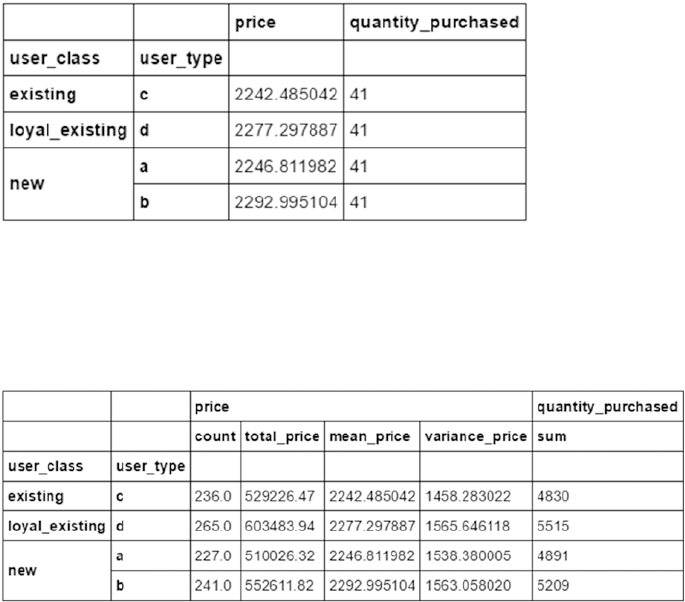
CHAPTER 3 ■ PROCESSING, WRANGLING, AND VISUALIZING DATA
151
Variant 2: Here, we apply different aggregation functions on two different attributes. The agg()
function takes a dictionary as input containing attributes as keys and aggregation functions as values (see
Figure3-20).
Figure 3-20. Groupby with different aggregation functions for different attributes
Variant 3: Here, we do a combination of variants 1 and 2, i.e., we apply multiple aggregations on the
price field while applying only a single one on quantity_purchased. Again a dictionary is passed, as shown
in the snippet. The output is shown in Figure3-21.
Figure 3-21. Groupby with showcasing a complex operation
Apart from groupby() based summarization, other functions such as pivot(), pivot_table(),
stack(), unstack(), crosstab(), and melt() provide capabilities to reshape the pandas dataframe as
per requirements. A complete description of these methods with examples is available as part of pandas
documentation at https://pandas.pydata.org/pandas-docs/stable/reshaping.html. We encourage you
to go through the same.
Data Visualization
Data Science is a type of storytelling that involves data as its lead character. As Data Science practitioners we
work with loads of data which undergo processing, wrangling, and analysis day in and day out for various
use cases. Augmenting this storytelling with visual aspects like charts, graphs, maps and so on not just helps
in improving the understanding of data (and in turn the use case/business problem) but also provides
opportunities to find hidden patterns and potential insights.

CHAPTER 3 ■ PROCESSING, WRANGLING, AND VISUALIZING DATA
152
Data visualization is thus the process of visually representing information in the form of charts, graphs,
pictures, and so on for a better and universally consistent understanding.
We mention universally consistent understanding to point out a very common issue with human
languages. Human languages are inherently complex and depending upon the intentions and skills of the
writer, the audience may perceive the written information in different ways (causing all sorts of problems).
Presenting data visually thus provides us with a consistent language to present and understand information
(though this as well is not free from misinterpretation yet it provides certain consistency).
In this section, we begin by utilizing pandas and its capabilities to visually understand data through
different visualizations. We will then introduce visualizations from the matplotlib perspective.
■Note Data visualization in itself is a popular and deep field of study utilized across domains. This chapter
and section only presents a few topics to get us started. This is by no means a comprehensive and detailed
guide on data visualization. Interested readers may explore further, though topics covered here and in coming
chapters should be enough for most common tasks related to visualizations.
Visualizing with Pandas
Data visualization is a diverse field and a science on its own. Though the selection of the type of visualization
highly depends on the data, the audience, and more, we will continue with our product transaction dataset
from the previous section to understand and visualize.
Just as a quick recap, the dataset at hand consisted of transactions indicating purchase of products by
certain users. Each transaction had the following attributes.
• Date: The date of the transaction
• Price: The price of the product purchased
• Product ID: Product identification number
• Quantity Purchased: The quantity of product purchased in this transaction
• Serial No: The transaction serial number
• User ID: Identification number of user performing the transaction
• User Type: The type of user
We wrangle our dataset to clean up the column names, convert attributes to correct data types, and
derive additional attributes of user_class and purchase_week, as discussed in the previous section.
pandas is a very popular and powerful library, examples of which we have been seeing throughout the
chapter. Visualization is another important and widely used feature of pandas. It exposes its visualization
capabilities through the plot interface and closely follows matplotlib style visualization syntax.
Line Charts
We begin with first looking at the purchase patterns of a user who has a maximum number of transactions
(we leave this as an exercise for you to identify such a user). A trend is best visualized using the line chart.
Simply subsetting the dataframe on the required fields, the plot() interface charts out a line chart by
default. The following snippet shows the price-wise trend for the given user.
df[df.user_id == max_user_id][['price']].plot(style='blue')
plt.title('Price Trends for Particular User')
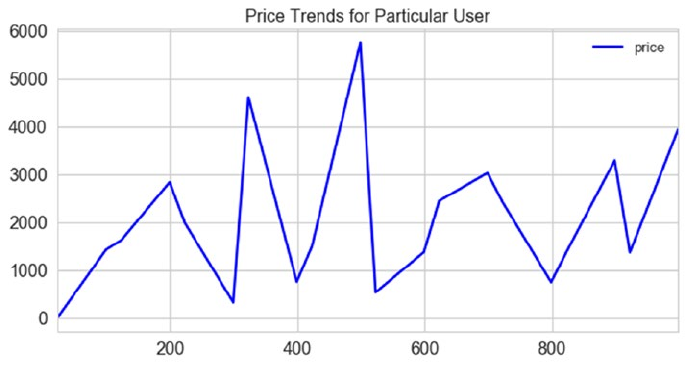
CHAPTER 3 ■ PROCESSING, WRANGLING, AND VISUALIZING DATA
153
The plt alias is for matplotlib.pyplot. We will discuss this more in the coming section, for now
assume we require this to add-on enhancements to plots generated by pandas. In this case we use it to add a
title to our plot. The plot generated is depicted in Figure3-22.
Figure 3-22. Line chart showing price trend for a user
Though we can see a visual representation of prices of different transactions by this user, it is not
helping us much. Let’s now use the line chart again to understand how his/her purchase trends over
time (remember we have date of transactions available in the dataset). We use the same plot interface by
subsetting the dataframe to the two required attributes. The following code snippet outlines the process.
df[df.user_id == max_user_id].plot(x='date',y='price',style='blue')
plt.title('Price Trends for Particular User Over Time')
This time, since we have two attributes, we inform pandas to use the date as our x-axis and price as
the y-axis. The plot interface handles datetime data types with élan as is evident in the following output
depicted in Figure3-23.
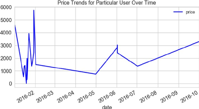
CHAPTER 3 ■ PROCESSING, WRANGLING, AND VISUALIZING DATA
154
This time our visualization clearly helps us see the purchase pattern for this user. Though we can
discuss about insights from this visualization at length, a quick inference is clearly visible. As the plot shows,
the user seems to have purchased high valued items in the starting of the year, with a decreasing trend as
the year has progressed. Also, the number of transactions in the beginning of the year are more and closer as
compared to rest of the year. We can correlate such details with more data to identify patterns and behaviors.
We shall cover more such aspects in coming chapters.
Bar Plots
Having seen trends for a particular user, let’s take a look at our dataset at an aggregated level. Since we
already have a derived attribute called the purchase_week, let’s use it to aggregate quantities purchased by
users over time. We first aggregate the data at a week level using the groupby() function and then aggregate
the attribute quantity_purchased. The final step is to plot the aggregation on a bar plot. The following
snippet helps us plot this information.
df[['purchase_week',
'quantity_purchased']].groupby('purchase_week').sum().plot.barh(
color='orange')
plt.title('Quantities Purchased per Week')
We use the barh() function to prepare a horizontal bar chart. It is similar to a standard bar() plot in
terms of the way it represents information. The difference is in the orientation of the plots. Figure3-24 shows
the generated output.
Figure 3-23. Price trend over time for a given user
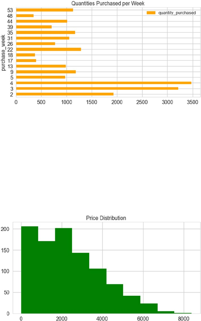
CHAPTER 3 ■ PROCESSING, WRANGLING, AND VISUALIZING DATA
155
Figure 3-24. Bar plot representing quantities purchased at a weekly level
Histograms
One of the most important aspects of exploratory data analysis (EDA) is to understand distribution of
various numerical attributes of a given dataset. The simplest and the most common way of visualizing a
distribution is through histograms. We plot the price distribution of the products purchased in our dataset as
shown in the following snippet.
df.price.hist(color='green')
plt.title('Price Distribution')
We use the hist() function to plot the price distribution in a single line of code. The output is depicted
in Figure3-25.
Figure 3-25. Histogram representing price distribution
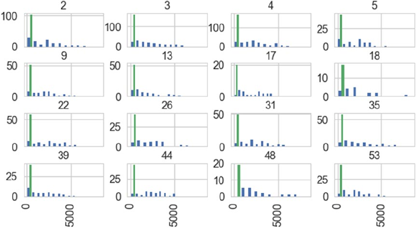
CHAPTER 3 ■ PROCESSING, WRANGLING, AND VISUALIZING DATA
156
The output shown in Figure3-25 clearly shows a skewed and tailed distribution. This information will
be useful while using such attributes in our algorithms. More will be clear when we work on actual use cases.
We can take this a step further and try to visualize the price distribution on a per week basis. We do so
by using the parameter by in the hist() function. This parameter helps us group data based on the attribute
mentioned, as by and then generates a subplot for each such grouping. In our case, we group by purchase
week as shown in the following snippet.
df[['price','purchase_week']].hist(by='purchase_week' ,sharex=True)
The output depicted in Figure3-26 showcases distribution of price on a weekly basis with the highest
bin clearly marked in a different color.
Figure 3-26. Histograms on a weekly basis
Pie Charts
One of the most commonly sought after questions while understanding the data or extracting insights is to
know which type is contributing the most. To visualize percentage distribution, pie charts are best utilized.
For our dataset, the following snippet helps us visualize which user type purchased how much.
class_series = df.groupby('user_class').size()
class_series.name = 'User Class Distribution'
class_series.plot.pie(autopct='%.2f')
plt.title('User Class Share')
plt.show()
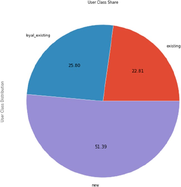
CHAPTER 3 ■ PROCESSING, WRANGLING, AND VISUALIZING DATA
157
The previous snippet uses groupby() to extract a series representing number of transactions on a per
user_class level. We then use the pie() function to plot the percentage distribution. We use the autopct
parameter to annotate the plot with actual percentage contribution by each use_class. Figure3-27 depicts
the output pie chart.
The plot in Figure3-27 clearly points out that new users are having more than 50% of the total
transaction share while existing and loyal_existing ones complete the remaining. We do not recommend
using pie charts especially when you have more than three or four categories. Use bar charts instead.
Box Plots
Box plots are important visualizations that help us understand quartile distribution of numerical data. A
box plot or box-whisker plot is a concise representation to help understand different quartiles, skewness,
dispersion, and outliers in the data.
Figure 3-27. Pie chart representing user class transaction distribution

CHAPTER 3 ■ PROCESSING, WRANGLING, AND VISUALIZING DATA
158
We’ll look at the attributes quantity_purchased and purchase_week using box plots. The following
snippet generates the required plot for us.
df[['quantity_purchased','purchase_week']].plot.box()
plt.title('Quantity and Week value distribution')
Now, we’ll look at the plots generated (see Figure3-28). The bottom edge of the box in box plot
marks the first quartile, while the top one marks the third. The line in the middle of the box marks the
second quartile or the median. The top and bottom whiskers extending from the box mark the range of
values. Outliers are marked beyond the whisker boundaries. In our example, for quantity purchased, the
median is quite close to the middle of the box while the purchase week has it toward the bottom (clearly
pointing out the skewness in the data). You are encouraged to read more about box plots for an in-depth
understanding at http://www.physics.csbsju.edu/stats/box2.html, http://www.stat.yale.edu/
Courses/1997-98/101/boxplot.htm.
Figure 3-28. Box plots using pandas
Scatter Plots
Scatter plots are another class of visualizations usually used to identify correlations or patterns between
attributes. Like most visualization we have seen so far, scatter plots are also available through the plot()
interface of pandas.
To understand scatter plots, we first need to perform a couple of steps of data wrangling to get our data
into required shape. We first encode the user_class with dummy encoding (as discussed in the previous
section) using map() and then getting mean price and count of transactions on a per week per user_class
level using groupby(). The following snippet helps us get our dataframe.
uclass_map = {'new': 1, 'existing': 2, 'loyal_existing': 3,'error':0}
df['enc_uclass'] = df.user_class.map(uclass_map)
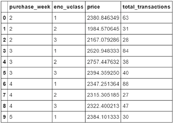
CHAPTER 3 ■ PROCESSING, WRANGLING, AND VISUALIZING DATA
159
bubble_df = df[['enc_uclass',
'purchase_week',
'price','product_id']].groupby(['purchase_week',
enc_uclass']).agg(
{'price':'mean',
'product_id':'count'}
).reset_index()
bubble_df.rename(columns={'product_id':'total_transactions'},inplace=True)
Figure3-29 showcases the resultant dataframe. Now, let’s visualize this data using a scatter plot. The
following snippet does the job for us.
bubble_df.plot.scatter(x='purchase_week',
y='price')
plt.title('Purchase Week Vs Price ')
plt.show()
Figure 3-29. Dataframe aggregated on a per week per user_class level
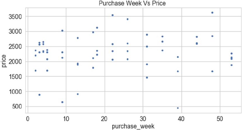
CHAPTER 3 ■ PROCESSING, WRANGLING, AND VISUALIZING DATA
160
Scatter plot also provides us the capability to visualize more than the basic dimensions. We can plot
third and fourth dimensions using color and size. The following snippet helps us understand the spread with
color denoting the user_class while size of the bubble indicates number of transaction.
bubble_df.plot.scatter(x='purchase_week',
y='price',
c=bubble_df['enc_uclass'],
s=bubble_df['total_transactions']*10)
plt.title('Purchase Week Vs Price Per User Class Based on Tx')
This generates the plot in Figure3-30 showcasing an almost random spread of data across weeks and
average price with some slight concentration in the top left of the plot.
Figure 3-30. Scatter plot showing spread of data across purchase_week and price
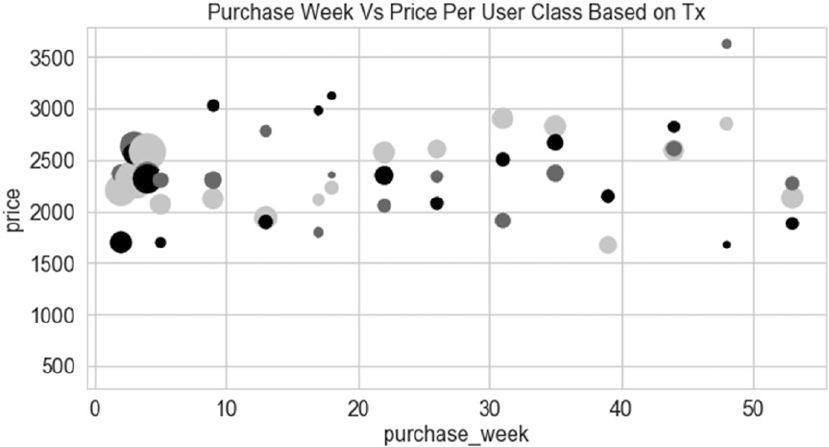
CHAPTER 3 ■ PROCESSING, WRANGLING, AND VISUALIZING DATA
161
Figure 3-31. Scatter plot visualizing multi dimensional data
The parameters are self-explanatory—c represents color while s stands for size of the bubble. Such plots
are also called bubble charts. The output generated is shown in Figure3-31.
In this section, we utilized pandas to plot all sorts of visualizations. These were some of the most widely
used visualizations and pandas provides a lot of flexibility to do more with these. Also, there is an extended
list of plots that can be visualized using pandas. The complete information is available on the pandas
documentation.
Visualizing with Matplotlib
matplotlib is a popular plotting library. It provides interfaces and utilities to generate publication quality
visualizations. Since its first version in 2003 until today, matplotlib is being continuously improved by
its active developer community. It also forms the base and inspiration of many other plotting libraries. As
discussed in the previous section, pandas along with SciPy (another popular Python library for scientific
computing) provide wrappers over matplotlib implementations for ease of visualizing data.
matplotlib provides two primary modules to work with, pylab and pyplot. In this section, we will
concentrate only on pyplot module (the use of pylab is not much encouraged). The pyplot interface is an
object oriented interface that favors explicit instantiations as opposed to pylab’s implicit ones.
In the previous section, we briefly introduced different visualizations and saw a few ways of tweaking
them as well. Since pandas visualizations are derived from matplotlib itself, we will cover additional
concepts and capabilities of matplotlib. This will enable you to not only use matplotlib with ease but also
provide with tricks to improve visualizations generated using pandas.
CHAPTER 3 ■ PROCESSING, WRANGLING, AND VISUALIZING DATA
162
Figures and Subplots
First things first. The base of any matplotlib style visualization begins with figure and subplot objects. The
figure module helps matplotlib generate the plotting window object and its associated elements. In short,
it is the top-level container for all visualization components. In matplotlib syntax, a figure is the top-most
container and, within one figure, we have the flexibility to visualize multiple plots. Thus, subplots are the
plots within the high-level figure container.
Let’s get started with a simple example and the required imports. We will then build on the example to
better understand the concept of figure and subplots. The following snippet imports the pyplot module of
matplotlib and plots a simple sine curve using numpy to generate x and y values.
import numpy as np
import matplotlib.pyplot as plt
# sample plot
x = np.linspace(-10, 10, 50)
y=np.sin(x)
plt.plot(x,y)
plt.title('Sine Curve using matplotlib')
plt.xlabel('x-axis')
plt.ylabel('y-axis')
The pyplot module exposes methods such as plot() to generate visualizations. In the example, with
plt.plot(x, y), matplotlib is working behind the scenes to generate the figure and axes objects to
output the plot in Figure3-32. For completeness’ sake, the statements plt.title(), plt.xlabel(), and so
on provide ways to set the figure title and axis labels, respectively.
Figure 3-32. Sample plot
CHAPTER 3 ■ PROCESSING, WRANGLING, AND VISUALIZING DATA
163
Now that we have a sample plot done, let’s look at how different objects interact in the matplotlib
universe. As mentioned, the figure object is the top-most container of all elements. Before complicating
things, we begin by first plotting different figures, i.e., each figure containing only a single plot. The following
snippet plots a sine and a cosine wave in two different figures using numpy and matplotlib.
# first figure
plt.figure(1)
plt.plot(x,y)
plt.title('Fig1: Sine Curve')
plt.xlabel('x-axis')
plt.ylabel('y-axis')
# second figure
plt.figure(2)
y=np.cos(x)
plt.plot(x,y)
plt.title('Fig2: Cosine Curve')
plt.xlabel('x-axis')
plt.ylabel('y-axis')
The statement plt.figure() creates an instance of type Figure. The number passed in as a parameter
is the figure identifier, which is helpful while referring to the same figure in case multiple exist. The rest of
the statements are similar to our sample plot with pyplot always referring to the current figure object to
draw to. Note that the moment a new figure is instantiated, pyplot refers to the newly created objects unless
specified otherwise. The output generated is shown in Figure3-33.
CHAPTER 3 ■ PROCESSING, WRANGLING, AND VISUALIZING DATA
164
Figure 3-33. Multiple figures using matplotlib
We plot multiple figures while telling the data story for a use case. Yet, there are cases where we need
multiple plots in the same figure. This is where the concept of subplots comes into the picture. A subplot
divides a figure into a grid of specified rows and columns and also provides interfaces to interact with
plotting elements. Subplots can be generated using a few different ways and their use depends on personal
preferences and use case demands. We begin with the most intuitive one, the add_subplot() method. This
method is exposed through the figure object itself. Its parameters help define the grid layout and other
properties. The following snippet generates four subplots in a figure.
y = np.sin(x)
figure_obj = plt.figure(figsize=(8, 6))
ax1 = figure_obj.add_subplot(2,2,1)
ax1.plot(x,y)
ax2 = figure_obj.add_subplot(2,2,2)
ax3 = figure_obj.add_subplot(2,2,3)

CHAPTER 3 ■ PROCESSING, WRANGLING, AND VISUALIZING DATA
165
ax4 = figure_obj.add_subplot(2,2,4)
ax4.plot(x+10,y)
This snippet first defines a figure object using plt.figure(). We then get an axes object pointing to
the first subplot generated using the statement figure_obj.add_subplot(2,2,1). This statement is actually
dividing the figure into two rows and two columns. The last parameter (value 1) is pointing to the first
subplot in this grid. The snippet is simply plotting the sine curve in the top-left subplot (identified as 2,2,1)
and another sine curve shifted by 10 units on the x-axis in the fourth subplot (identified as 2,2,4). The output
generated is shown in Figure3-34.
Figure 3-34. Subplots using add_subplot method
The second method for generating subplots is through the pyplot module directly. The pyplot module
exposes a method subplots(), which returns figure object and a list of axes object, each of which is pointing
to a subplot in the layout mentioned in the subplots() parameters. This method is useful when we have an
idea about how many subplots will be required. The following snippet showcases the same.
fig, ax_list = plt.subplots(2,1,sharex=True, figsize=(8, 6))
y= np.sin(x)
ax_list[0].plot(x,y)
y= np.cos(x)
ax_list[1].plot(x,y)
The statement plt.subplots(2,1,sharex=True) does three things in one go. It first of all generates
a figure object which is then divided into 2 rows and 1 column each (i.e., two subplots in total). The two
subplots are returned in the form of a list of axes objects. The final and the third thing is the sharing of
x-axis, which we achieve using the parameter sharex. This sharing of x-axis allows all subplots in this figure
CHAPTER 3 ■ PROCESSING, WRANGLING, AND VISUALIZING DATA
166
Figure 3-35. Subplots using subplots() method
to have the same x-axis. This allows us to view data on the same scale along with aesthetic improvements.
The output is depicted in Figure3-35 showcasing sine and cosine curves on the same x-axis.
Another variant is the subplot() function, which is also exposed through the pyplot module directly.
This closely emulates the add_subplot() method of the figure object. You can find examples listed in the
code for this chapter. Before moving onto other concepts, we quickly touch on the subplot2grid() function,
also exposed through the pyplot module. This function provides capabilities similar to the ones already
discussed along with finer control to define grid layout where subplots can span an arbitrary number of
columns and rows. The following snippet showcases a grid with subplots of different sizes.
y = np.abs(x)
z = x**2
plt.subplot2grid((4,3), (0, 0), rowspan=4, colspan=2)
plt.plot(x, y,'b',x,z,'r')
ax2 = plt.subplot2grid((4,3), (0, 2),rowspan=2)
plt.plot(x, y,'b')
plt.setp(ax2.get_xticklabels(), visible=False)
plt.subplot2grid((4,3), (2, 2), rowspan=2)
plt.plot(x, z,'r')
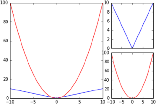
CHAPTER 3 ■ PROCESSING, WRANGLING, AND VISUALIZING DATA
167
The subplot2grid() function takes a number of parameters, explained as follows:
• shape: A tuple representing rows and columns in the grid as (rows, columns).
• loc: A tuple representing the location of a subplot. This parameter is 0 indexed.
• rowspan: This parameter represents the number of rows the subplot covers.
• colspan: This parameter represents the number of columns the subplot extends to.
The output generated in Figure3-36 by the snippet has one subplot covering four rows and two
columns containing two functions. The other two subplots cover two rows and one column each.
Figure 3-36. Subplots using subplot2grid()
Plot Formatting
Formatting a plot is another important aspect of storytelling and matplotlib provides us plenty of features
here. From changing colors to markers and so on, matplotlib provides easy-to-use intuitive interfaces.
We begin with the color attribute, which is available as part of the plot() interface. The color attribute
works on the RGBA specifications, allowing us to provide alpha and color values as strings (red, green, and
so on), as single letters (r, g, and so on) and even as hex values. More details are available on the matplotlib
documentation at https://matplotlib.org/api/colors_api.html.
The following example and output depicted in Figure3-37 illustrates how easy it is to set color and
alpha properties for plots.
y = x
# color
ax1 = plt.subplot(321)
plt.plot(x,y,color='green')
ax1.set_title('Line Color')
# alpha
ax2 = plt.subplot(322,sharex=ax1)
alpha = plt.plot(x,y)
CHAPTER 3 ■ PROCESSING, WRANGLING, AND VISUALIZING DATA
168
alpha[0].set_alpha(0.3)
ax2.set_title('Line Alpha')
plt.setp(ax2.get_yticklabels(), visible=False)
Figure 3-37. Setting color and alpha properties of a plot
Along the same lines, we also have options to use different shapes to mark data points as well as
different styles to plot lines. These options come in handy while representing different attributes/classes
onto the same plot. The following snippet and output depicted in Figure3-38 showcase the same.
# marker
# markers -> '+', 'o', '*', 's', ',', '.', etc
ax3 = plt.subplot(323,sharex=ax1)
plt.plot(x,y,marker='*')
ax3.set_title('Point Marker')
# linestyle
# linestyles -> '-','--','-.', ':', 'steps'
ax4 = plt.subplot(324,sharex=ax1)
plt.plot(x,y,linestyle='--')
ax4.set_title('Line Style')
plt.setp(ax4.get_yticklabels(), visible=False)

CHAPTER 3 ■ PROCESSING, WRANGLING, AND VISUALIZING DATA
169
Figure 3-38. Setting marker and line style properties of a plot
Though there are many more fine tuning options available, you are encouraged to go through the
documentation for detailed information. We conclude the formatting section with final two tricks related to
line width and a shorthand notation to do it all quickly, as shown in the following snippet.
# line width
ax5 = plt.subplot(325,sharex=ax1)
line = plt.plot(x,y)
line[0].set_linewidth(3.0)
ax5.set_title('Line Width')
# combine linestyle
ax6 = plt.subplot(326,sharex=ax1)
plt.plot(x,y,'b^')
ax6.set_title('Styling Shorthand')
plt.setp(ax6.get_yticklabels(), visible=False)
This snippet uses the line object returned by the plot() function to set the line width. The second part
of the snippet showcases the shorthand notation to set the line color and data point marker in one go as, b^.
The output shown in Figure3-39 helps show this effect.
CHAPTER 3 ■ PROCESSING, WRANGLING, AND VISUALIZING DATA
170
Legends
A graph legend is a key that helps us map color/shape or other attributes to different attributes being
visualized by the plot. Though in most cases matplotlib does a wonderful job at preparing and showing the
legends, there are times when we require a finer level of control.
The legend of a plot can be controlled using the legend() function, available through the pyplot
module directly. We can set the location, size, and other formatting attributes through this function. The
following example shows the legend being placed in the best possible location.
plt.plot(x,y,'g',label='y=x^2')
plt.plot(x,z,'b:',label='y=x')
plt.legend(loc="best")
plt.title('Legend Sample')
Figure 3-39. Example to show line_width and shorthand notation
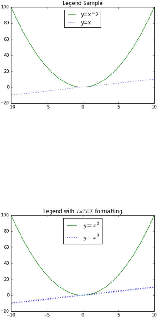
CHAPTER 3 ■ PROCESSING, WRANGLING, AND VISUALIZING DATA
171
One of the primary goals of matplotlib is to provide publication quality visualizations. Matplotlib
supports LaTEX style formatting of the legends to cleanly visualize mathematical symbols and equations.
The $ symbol is used to mark the start and end of LaTEX style formatting. The same is shown in the following
snippet and output plot (see Figure3-41).
# legend with latex formatting
plt.plot(x,y,'g',label='$y = x^2$')
plt.plot(x,z,'b:',linewidth=3,label='$y = x^2$')
plt.legend(loc="best",fontsize='x-large')
plt.title('Legend with $LaTEX$ formatting')
Figure 3-41. Sample plot with LaTEX formatted legend
Figure 3-40. Sample plot with legend
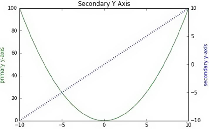
CHAPTER 3 ■ PROCESSING, WRANGLING, AND VISUALIZING DATA
172
Axis Controls
The next feature from matplotlib is the ability to control the x- and y-axes of a plot. Apart from basic
features like setting the axis labels and colors using the methods set_xlabel() and set_ylabel(), there
are finer controls available as well. Let’s first see how to add a secondary y-axis. There are many scenarios
when we plot data related to different features (having values at different scales) on the same plot. To get a
proper understanding, it usually helps to have both features on different y-axis (each scaled to respective
range). To get additional y-axis, we use the function twinx() exposed through the axes object. The
following snippet outlines the scenario.
## axis controls
# secondary y-axis
fig, ax1 = plt.subplots()
ax1.plot(x,y,'g')
ax1.set_ylabel(r"primary y-axis", color="green")
ax2 = ax1.twinx()
ax2.plot(x,z,'b:',linewidth=3)
ax2.set_ylabel(r"secondary y-axis", color="blue")
plt.title('Secondary Y Axis')
At first it may sound odd to have a function named twinx() to generate secondary y-axis. Smartly,
matplotlib has such a function to point out the fact that the additional y-axis would share the same x-axis
and hence the name twinx(). On the same lines, additional x-axis is obtained using the function twiny().
The output plot is depicted in Figure3-42.
Figure 3-42. Sample plot with secondary y-axis

CHAPTER 3 ■ PROCESSING, WRANGLING, AND VISUALIZING DATA
173
By default, matplotlib identifies the range of values being plotted and adjusts the ticks and the range
of both x- and y-axes. It also provides capability to manually set these through the axis() function. Through
this function, we can set the axis range using predefined keywords like tight, scaled, and equal, along with
passing a list such that it marks the values as [xmin, xmax, ymin, ymax]. The following snippet shows how to
adjust axis range manually.
# manual
y = np.log(x)
z = np.log2(x)
w = np.log10(x)
plt.plot(x,y,'r',x,z,'g',x,w,'b')
plt.axis([0,2,-1,2])
plt.title('Manual Axis Range')
The output in Figure3-43 showcases the plot generated without any axis adjustments on the left, while
the right one shows the axis adjustment as done in the previous snippet.
Figure 3-43. Plots showcasing default axis and manually adjusted axis
Now that we have seen how to set the axis range, we will quickly touch on setting the ticks or axis
markers manually as well. For axis ticks, we have two separate functions available, one for setting the
range of ticks while the second sets the tick labels. The functions are intuitively named as set_ticks() and
set_ticklabels(), respectively. In the following example, we set the ticks to be marked for the x-axis while
for y-axis we set both the tick range and the labels using the appropriate functions.
# Manual ticks
plt.plot(x, y)
ax = plt.gca()
ax.xaxis.set_ticks(np.arange(-2, 2, 1))
ax.yaxis.set_ticks(np.arange(0, 5))
ax.yaxis.set_ticklabels(["min", 2, 4, "max"])
plt.grid(True)
plt.title("Manual ticks on the x-axis")
CHAPTER 3 ■ PROCESSING, WRANGLING, AND VISUALIZING DATA
174
The output is a plot with x-axis having labels marked only between -2 and 1, while y-axis has a range of
0 to 5 with labels changed manually. The output plot is shown in Figure3-44.
Figure 3-44. Plot showcasing axes with manual ticks
Figure 3-45. Plot showcasing log scaled y-axis
Before we move on to next set of features/capabilities, it is worth noting that with matplotlib, we also
get the capability of scaling the axis based on the data range in a standard manner apart from manually
setting it (as seen previously). The following is a quick snippet scaling the y-axis on a log scale. The output
is shown in Figure3-45.
# scaling
plt.plot(x, y)
ax = plt.gca()
# values: log, logit, symlog
ax.set_yscale("log")
plt.grid(True)
plt.title("Log Scaled Axis")
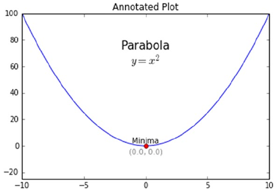
CHAPTER 3 ■ PROCESSING, WRANGLING, AND VISUALIZING DATA
175
Annotations
The text() interface from the pyplot module exposes the annotation capabilities of matplotlib. We can
annotate any part of the figure/plot/subplot using this interface. It takes the x and y coordinates, the text to
be displayed, alignment, and fontsize parameters as inputs to place the annotations at the desired place on
the plot. The following snippet annotates the minima of a parabolic plot.
# annotations
y = x**2
min_x = 0
min_y = min_x**2
plt.plot(x, y, "b-", min_x, min_y, "ro")
plt.axis([-10,10,-25,100])
plt.text(0, 60, "Parabola\n$y = x^2$", fontsize=15, ha="center")
plt.text(min_x, min_y+2, "Minima", ha="center")
plt.text(min_x, min_y-6, "(%0.1f, %0.1f)"%(min_x, min_y), ha='center',color='gray')
plt.title("Annotated Plot")
The text() interface provides many more capabilities and formatting features. You are encouraged
to go through the official documentation and examples for details on this. The output plot showcasing the
annotated parabola is shown in Figure3-46.
Figure 3-46. Plot showcasing annotations
CHAPTER 3 ■ PROCESSING, WRANGLING, AND VISUALIZING DATA
176
Global Parameters
To maintain consistency, we usually try to keep the plot sizes, fonts, and colors the same across the visual
story. Setting each of these attributes creates complexity and difficulties in maintaining the code base. To
overcome these issues, we can set formatting settings globally, as shown in the following snippet.
# global formatting params
params = {'legend.fontsize': 'large',
'figure.figsize': (10, 10),
'axes.labelsize': 'large',
'axes.titlesize':'large',
'xtick.labelsize':'large',
'ytick.labelsize':'large'}
plt.rcParams.update(params)
Once set using rcParams.update(), the attributes provided in the params dictionary are applied to
every plot generated. You are encouraged to apply these setting and generate the plots discussed in this
section again to understand the difference.
Python Visualization Ecosystem
The matplotlib library is a very powerful and popular visualization/plotting library without any doubts.
It provides most of the tools and tricks required to plot any type of data with capability to control even the
finest elements.
Yet matplotlib leaves a lot more to be desired by even pro-users. Being a low-level API, it requires a lot
of boilerplate code, interactivity is limited, and styling and other formatting defaults seem dated.
To address these issues and provide high-level interfaces and ability to work with current Python
ecosystem, the Python universe has quite a few visualization libraries to choose from. Some of the most
popular and powerful ones are bokeh, seaborn, ggplot, and plotly. Each of these libraries builds on the
understanding and feature set of matplotlib, while providing their own set of features and easy-to-use
wrappers to plug the gaps.
You are encouraged to explore these libraries and understand the differences. We will introduce some
of these in the coming chapters as and when required. Though different, most libraries work on concepts
similar to matplotlib and hence the learning curve is shorter if you’re well versed in matplotlib.
Summary
This chapter covered quite a lot of ground in terms of understanding, processing, and wrangling data. We
covered major data formats like flat files (CSV, JSON, XML, HTML, etc.), and used standard libraries to
extract/collect data. We touched on standard data types and their importance in the overall process of data
science. Major part of this chapter covered data wrangling tasks to transform, clean, and process data so as
to bring it into usable form. Though the techniques were explained using the pandas library, the concepts
are universal and applied in most Data Science related use cases. You may use these techniques as pointers
that can be easily applied using different libraries and programming/scripting languages. We covered major
plots using sample datasets describing their usage. We also touched on the basics and the powerful tricks of
matplotlib. We strongly encourage you to read the referred links for in-depth understanding. This chapter
covers the initial steps in the CRISP DM model of data collection, processing, and visualization. In the
coming chapters, we build on these concepts and apply them for solving specific real-world problems.
Stay tuned!

177
© Dipanjan Sarkar, Raghav Bali and Tushar Sharma 2018
D. Sarkar et al., Practical Machine Learning with Python, https://doi.org/10.1007/978-1-4842-3207-1_4
CHAPTER 4
Feature Engineering and Selection
Building Machine Learning systems and pipelines take significant effort, which is evident from the
knowledge you gained in the previous chapters. In the first chapter, we presented some high-level
architecture for building Machine Learning pipelines. The path from data to insights and information is
not an easy and direct one. It is tough and also iterative in nature involving data scientists and analysts to
reiterate through several steps multiple times to get to the perfect model and derive correct insights. The
limitation of Machine Learning algorithms is the fact that they can only understand numerical values as
inputs. This is because, at the heart of any algorithm, we usually have multiple mathematical equations,
constraints, optimizations and computations. Hence it is almost impossible for us to feed raw data into any
algorithm and expect results. This is where features and attributes are extremely helpful in building models
on top of our data.
Building machine intelligence is a multi-layered process having multiple facets. In this book, so far,
we have already explored how you can retrieve, process, wrangle, and visualize data. Exploratory data
analysis and visualizations are the first step toward understanding your data better. Understanding your data
involves understanding the complete scope encompassing your data including the domain, constraints,
caveats, quality and available attributes. From Chapter 3, you might remember that data is comprised of
multiple fields, attributes, or variables. Each attribute by itself is an inherent feature of the data. You can then
derive further features from these inherent features and this itself forms a major part of feature engineering.
Feature selection is another important task that comes hand in hand with feature engineering, where the
data scientist is tasked with selecting the best possible subset of features and attributes that would help in
building the right model.
An important point to remember here is that feature engineering and selection is not a one-time
process which should be carried out in an ad hoc manner. The nature of building Machine Learning systems
is iterative (following the CRISP-DM principle) and hence extracting and engineering features from the
dataset is not a one-time task. You may need to extract new features and try out multiple selections each
time you build a model to get the best and optimal model for your problem. Data processing and feature
engineering is often described to be the toughest task or step in building any Machine Learning system by
data scientists. With the need of both domain knowledge as well as mathematical transformations, feature
engineering is often said to be both an art as well as a science. The obvious complexities involve dealing
with diverse types of data and variables. Besides this, each Machine Learning problem or task needs
specific features and there is no one solution fits all in the case of feature engineering. This makes feature
engineering all the more difficult and complex.
Hence we follow a proper structured approach in this chapter covering the following three major areas
in the feature engineering workflow. They are mentioned as follows.
• Feature extraction and engineering
• Feature scaling
• Feature selection
Chapter 4 ■ Feature engineering and SeleCtion
178
This chapter covers essential concepts for all the three major areas mentioned above. Techniques for
feature engineering will be covered in detail for diverse data types including numeric, categorical, temporal,
text and image data. We would like to thank our good friend and fellow data scientist, Gabriel Moreira for
helping us with some excellent compilations of feature engineering techniques over these diverse data
types. We also cover different feature scaling methods typically used as a part of the feature engineering
process to normalize values preventing higher valued features from taking unnecessary prominence. Several
feature selection techniques like filter, wrapper, and embedded methods will also be covered. Techniques
and concepts will be supplemented with sufficient hands-on examples and code snippets. Remember to
check out the relevant code under Chapter 4 in the GitHub repository at https://github.com/dipanjanS/
practical-machine-learning-with-python which contains necessary code, notebooks, and data. This will
make things easier to understand, help you gain enough knowledge to know which technique should be
used in which scenario and thus help you get started on your own journey toward feature engineering for
building Machine Learning models!
Features: Understand Your Data Better
The essence of any Machine Learning model is comprised of two components namely, data and algorithms.
You might remember the same from the Machine Learning paradigm which we introduced in Chapter 1.
Any Machine Learning algorithm is at essence a combination of mathematical functions, equations and
optimizations which are often augmented with business logic as needed. These algorithms are not intelligent
enough to usually process raw data and discover latent patterns from the same which would be used to train
the system. Hence we need better data representations for building Machine Learning models, which are also
known as data features or attributes. Let’s look at some important concepts associated with data and features
in this section.
Data and Datasets
Data is essential for analytics and Machine Learning. Without data we are literally powerless to implement
any intelligent system. The formal definition of data would be a collection or set of qualitative and/or
quantitative variables containing values based on observations. Typically data is usually measured and
collected from various observations. This is then stored it is raw form which can then be processed further
and analyzed as required. Typically in any analytics or Machine Learning system, you might need multiple
sources of data and processed data from one component can be fed as raw data to another component for
further processing. Data can be structured having definite rows and columns indicating observations and
attributes or unstructured like free textual data.
A dataset can be defined as a collection of data. Typically this indicates data present in the form of flat
files like CSV files or MS Excel files, relational database tables or views, or even raw data two-dimensional
matrices. Sample datasets which are quite popular in Machine Learning are available in the scikit-learn
package to quickly get started. The sklearn.datasets module has these sample datasets readily available
and other utilities pertaining to loading and handling datasets. You can find more details in this link
http://scikit-learn.org/stable/datasets/index.html#datasets to learn more about the toy datasets
and best practices for handling and loading data. Another popular resource for Machine Learning based
datasets is the UC Irvine Machine Learning repository which can be found here http://archive.ics.uci.
edu/ml/index.php and this contains a wide variety of datasets from real-world problems, scenarios and
devices. In fact the popular Machine Learning and predictive analytics competitive platform Kaggle also
features some datasets from UCI and other datasets pertaining to various competitions. Feel free to check
out these resources and we will in fact be using some datasets from these resources in this chapter as well as
in subsequent chapters.
Chapter 4 ■ Feature engineering and SeleCtion
179
Features
Raw data is hardly used to build any Machine Learning model, mostly because algorithms can’t work with
data which is not properly processed and wrangled in a desired format. Features are attributes or properties
obtained from raw data. Each feature is a specific representation on top of the raw data. Typically, each
feature is an individual measurable attribute which usually is depicted by a column in a two dimensional
dataset. Each observation is depicted by a row and each feature will have a specific value for an observation.
Thus each row typically indicates a feature vector and the entire set of features across all the observations
forms a two-dimensional feature matrix also known as a feature set. Features are extremely important
toward building Machine Learning models and each feature represents a specific chunk of representation
and information from the data which is used by the model. Both quality as well as quantity of features
influences the performance of the model.
Features can be of two major types based on the dataset. Inherent raw features are obtained directly
from the dataset with no extra data manipulation or engineering. Derived features are usually what we
obtain from feature engineering where we extract features from existing data attributes. A simple example
would be creating a new feature Age from an employee dataset containing Birthdate by just subtracting their
birth date from the current date. The next major section covers more details on how to handle, extract, and
engineer features based on diverse data types.
Models
Features are better representations of underlying raw data which act as inputs to any Machine Learning
model. Typically a model is comprised of data features, optional class labels or numeric responses for
supervised learning and a Machine Learning algorithm. The algorithm is chosen based on the type of
problem we want to solve after converting it into a specific Machine Learning task. Models are built after
training the system on data features iteratively till we get the desired performance. Thus, a model is basically
used to represent relationships among the various features of our data.
Typically the process of modeling involves multiple major steps. Model building focuses on training
the model on data features. Model tuning and optimization involves tuning specific model parameters,
known as hyperparameters and optimizing the model to get the best model. Model evaluation involves
using standard performance evaluation metrics like accuracy to evaluate model performance. Model
deployment is usually the final step where, once we have selected the most suitable model, we deploy it live
in production which usually involves building an entire system around this model based on the CRISP-DM
methodology. Chapter 5 will focus on these aspects in further detail.
Revisiting the Machine Learning Pipeline
We covered the standard Machine Learning pipeline in detail in Chapter 1, which was based on the CRISP-
DM standard. Let’s refresh our memory by looking at Figure4-1, which depicts our standard generic
Machine Learning pipeline with the major components identified with the various building blocks.
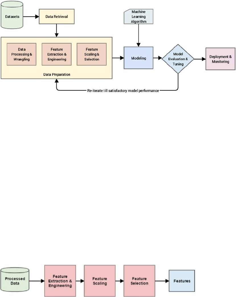
Chapter 4 ■ Feature engineering and SeleCtion
180
The figure clearly depicts the main components in the pipeline, which you should already be
well-versed on by now. These components are mentioned once more for ease of understanding.
• Data retrieval
• Data preparation
• Modeling
• Model evaluation and tuning
• Model deployment and monitoring
Our area of focus in this chapter falls under the blocks under “Data Preparation”. We already covered
processing and wrangling data in Chapter 3 in detail. Here, we will be focusing on the three major steps
essential toward handling data features. These are mentioned as follows.
1. Feature extraction and engineering
2. Feature scaling
3. Feature selection
These blocks are highlighted in Figure4-1 and are essential toward the process of transforming
processed data into features. By processed, we mean the raw data, after going through necessary pre-
processing and wrangling operations. The sequence of steps that are usually followed in the pipeline for
transforming processed data into features is depicted in a more detailed view in Figure4-2.
Figure 4-1. Revisiting our standard Machine Learning pipeline
Figure 4-2. A standard pipeline for feature engineering, scaling, and selection
Chapter 4 ■ Feature engineering and SeleCtion
181
It is quite evident that based on the sequence of steps depicted in the figure, features are first crafted
and engineering, necessary normalization and scaling is performed and finally the most relevant features
are selected to give us the final set of features. We will cover these three components in detail in subsequent
sections following the same sequence as depicted in the figure.
Feature Extraction and Engineering
The process of feature extraction and engineering is perhaps the most important one in the entire Machine
Learning pipeline. Good features depicting the most suitable representations of the data help in building
effective Machine Learning models. In fact, more than often it’s not the algorithms but the features that
determine the effectiveness of the model. In simple words, good features give good models. A data scientist
approximately spends around 70% to 80% of his time in data processing, wrangling, and feature engineering
for building any Machine Learning model. Hence it’s of paramount importance to understand all aspects
pertaining to feature engineering if you want to be proficient in Machine Learning.
Typically feature extraction and feature engineering are synonyms that indicate the process of using a
combination of domain knowledge, hand-crafted techniques and mathematical transformations to convert
data into features. Henceforth we will be using the term feature engineering to refer to all aspects concerning
the task of extracting or creating new features from data. While the choice of Machine Learning algorithm
is very important when building a model, more than often, the choice and number of features tend to have
more impact toward the model performance. In this section, we will be looking to answer some questions
such as the why, what, and how of feature engineering to get a more in-depth understanding toward feature
engineering.
What Is Feature Engineering?
We already informally explained the core concept behind feature engineering, where we use specific
components from domain knowledge and specific techniques to transform data into features. Data in
this case is raw data after necessary pre-processing and wrangling, which we have mentioned earlier. This
includes dealing with bad data, imputing missing values, transforming specific values, and so on. Features
are the final end result from the process of feature engineering, which depicts various representations of the
underlying data.
Let’s now look at a couple of definitions and quotes relevant to feature engineering from several
renowned people in the world of data science! Renowned computer and data scientist Andrew Ng talks
about Machine Learning and feature engineering.
“Coming up with features is difficult, time-consuming, requires expert knowledge. ‘Applied
Machine Learning’ is basically feature engineering.”
—Prof. Andrew Ng
This basically reinforces what we mentioned earlier about data scientists spending close to 80% of
their time in engineering features which is a difficult and time-consuming process, requiring both domain
knowledge and mathematical computations. Besides this, practical or applied Machine Learning is mostly
feature engineering because the time taken in building and evaluating models is considerably less than the
total time spent toward feature engineering. However, this doesn’t mean that modeling and evaluation are
any less important than feature engineering.
Chapter 4 ■ Feature engineering and SeleCtion
182
We will now look at a definition of feature engineering by Dr. Jason Brownlee, data scientist and ML
practitioner who provides a lot of excellent resources over at http://machinelearningmastery.com with
regard to Machine Learning and data science. Dr. Brownlee defines feature engineering as follows.
“Feature engineering is the process of transforming raw data into features that better
represent the underlying problem to the predictive models, resulting in improved model
accuracy on unseen data.”
—Dr. Jason Brownlee
Let’s spend some more time on this definition of feature engineering. It tells us that the process of
feature engineering involves transforming data into features taking into account several aspects pertaining
to the problem, model, performance, and data. These aspects are highlighted in this definition and are
explained in further detail as follows.
• Raw data: This is data in its native form after data retrieval from source. Typically
some amount of data processing and wrangling is done before the actual process of
feature engineering.
• Features: These are specific representations obtained from the raw data after the
process of feature engineering.
• The underlying problem: This refers to the specific business problem or use-
case we want to solve with the help of Machine Learning. The business problem is
typically converted into a Machine Learning task.
• The predictive models: Typically feature engineering is used for extracting features
to build Machine Learning models that learn about the data and the problem to be
solved from these features. Supervised predictive models are widely used for solving
diverse problems.
• Model accuracy: This refers to model performance metrics that are used to evaluate
the model.
• Unseen data: This is basically new data that was not used previously to build or train
the model. The model is expected to learn and generalize well for unseen data based
on good quality features.
Thus feature engineering is the process of transforming data into features to act as inputs for Machine
Learning models such that good quality features help in improving the overall model performance. Features
are also very much dependent on the underlying problem. Thus, even though the Machine Learning task
might be same in different scenarios, like classification of e-mails into spam and non-spam or classifying
handwritten digits, the features extracted in each scenario will be very different from the other.
By now you must be getting a good grasp on the idea and significance of feature engineering. Always
remember that for solving any Machine Learning problem, feature engineering is the key! This in fact is
reinforced by Prof. Pedro Domingos from the University of Washington, in his paper titled, “A Few Useful
Things to Know about Machine Learning” available at http://homes.cs.washington.edu/~pedrod/papers/
cacm12.pdf, which tells us the following.
“At the end of the day, some Machine Learning projects succeed and some fail. What makes
the difference? Easily the most important factor is the features used.”
—Prof. Pedro Domingos
Chapter 4 ■ Feature engineering and SeleCtion
183
Feature engineering is indeed both an art and a science to transform data into features for feeding
into models. Sometimes you need a combination of domain knowledge, experience, intuition, and
mathematical transformations to give you the features you need. By solving more problems over time, you
will gain the experience you need to know what features might be best suited for a problem. Hence do not be
overwhelmed, practice will make you master feature engineering with time. The following list depicts some
examples of engineering features.
• Deriving a person’s age from birth date and the current date
• Getting the average and median view count of specific songs and music videos
• Extracting word and phrase occurrence counts from text documents
• Extracting pixel information from raw images
• Tabulating occurrences of various grades obtained by students
The final quote to whet your appetite on feature engineering is from renowned Kaggler, Xavier Conort.
Most of you already know that tough Machine Learning problems are often posted on Kaggle regularly which
is usually open to everyone. Xavier’s thoughts on feature engineering are mentioned as follows.
“The algorithms we used are very standard for Kagglers. ...We spent most of our efforts in
feature engineering. ...We were also very careful to discard features likely to expose us to
the risk of over-fitting our model.”
—Xavier Conort
This should give you a good idea what is feature engineering, the various aspects surrounding it and
a very basic introduction into why do we really need feature engineering. In the following section, we will
expand more on why we need feature engineering, its benefits and advantages.
Why Feature Engineering?
We have defined feature engineering in the previous section and also touched upon the basics pertaining to
the importance of feature engineering. Let’s now look at why we need feature engineering and how can it be
an advantage for us when we are building Machine Learning models and working with data.
• Better representation of data: Features are basically various representations
of the underlying raw data. These representations can be better understood by
Machine Learning algorithms. Besides this, we can also often easily visualize
these representations. A simple example would be to visualize the frequent word
occurrences of a newspaper article as opposed to being totally perplexed as to what
to do with the raw text!
• Better performing models: The right features tend to give models that outperform
other models no matter how complex the algorithm is. In general if you have the
right feature set, even a simple model will perform well and give desired results. In
short, better features make better models.
• Essential for model building and evaluation: We have mentioned this numerous
times by now, raw data cannot be used to build Machine Learning models. Get
your data, extract features, and start building models! Also on evaluating model
performance and tuning the models, you can reiterate over your feature set to choose
the right set of features to get the best model.
Chapter 4 ■ Feature engineering and SeleCtion
184
• More flexibility on data types: While is it definitely easier to use numeric data types
directly with Machine Learning algorithms with little or no data transformations,
the real challenge is to build models on more complex data types like text, images,
and even videos. Feature engineering helps us build models on diverse data types
by applying necessary transformations and enables us to work even on complex
unstructured data.
• Emphasis on the business and domain: Data scientists and analysts are usually
busy in processing, cleaning data and building models as a part of their day to day
tasks. This often creates a gap between the business stakeholders and the technical/
analytics team. Feature engineering involves and enables data scientists to take
a step back and try to understand the domain and the business better, by taking
valuable inputs from the business and subject matter experts. This is necessary to
create and select features that might be useful for building the right model to solve
the problem. Pure statistical and mathematical knowledge is rarely sufficient to solve
a complex real-world problem. Hence feature engineering emphasizes to focus on
the business and the domain of the problem when building features.
This list, though not an exhaustive one, gives us a pretty good insight into the importance of feature
engineering and how it is an essential aspect of building Machine Learning models. The importance of the
problem to be solved and the domain is also pretty important in feature engineering.
How Do You Engineer Features?
There are no fixed rules for engineering features. It involves using a combination of domain knowledge,
business constraints, hand-crafted transformations and mathematical transformations to transform the
raw data into desired features. Different data types have different techniques for feature extraction. Hence
in this chapter, we focus on various feature engineering techniques and strategies for the following major
data types.
• Numeric data
• Categorical data
• Text data
• Temporal data
• Image data
Subsequent sections in this chapter focus on dealing with these diverse data types and specific
techniques which can be applied to engineer features. You can use them as a reference and guidebook for
engineering features from your own datasets in the future.
Another aspect into feature engineering has recently gained prominence. Here, you do not use hand-
crafted features but, make the machine itself try to detect patterns and extract useful data representations
from the raw data, which can be used as features. This process is also known as auto feature generation.
Deep Learning has proved to be extremely effective in this area and neural network architectures like
convolutional neural networks (CNNs), recurrent neural networks (RNNs), and Long Short Term Memory
networks (LSTMs) are extensively used for auto feature engineering and extraction. Let’s dive into the world
of feature engineering now with some real-world datasets and examples.
Chapter 4 ■ Feature engineering and SeleCtion
185
Feature Engineering on Numeric Data
Numeric data, fields, variables, or features typically represent data in the form of scalar information that
denotes an observation, recording, or measurement. Of course, numeric data can also be represented as a
vector of scalars where each specific entity in the vector is a numeric data point in itself. Integers and floats
are the most common and widely used numeric data types. Besides this, numeric data is perhaps the easiest
to process and is often used directly by Machine Learning models. If you remember we have talked about
numeric data previously in the “Data Description” section in Chapter 3.
Even though numeric data can be directly fed into Machine Learning models, you would still need to
engineer features that are relevant to the scenario, problem, and domain before building a model. Hence
the need for feature engineering remains. Important aspects of numeric features include feature scale and
distribution and you will observe some of these aspects in the examples in this section. In some scenarios,
we need to apply specific transformations to change the scale of numeric values and in other scenarios we
need to change the overall distribution of the numeric values, like transforming a skewed distribution to a
normal distribution.
The code used for this section is available in the code files for this chapter. You can load feature_
engineering_numeric.py directly and start running the examples or use the jupyter notebook, Feature
Engineering on Numeric Data.ipynb, for a more interactive experience. Before we begin, let’s load the
following dependencies and configuration settings.
In [1]: import pandas as pd
...: import matplotlib.pyplot as plt
...: import matplotlib as mpl
...: import numpy as np
...: import scipy.stats as spstats
...:
...: %matplotlib inline
...: mpl.style.reload_library()
...: mpl.style.use('classic')
...: mpl.rcParams['figure.facecolor'] = (1, 1, 1, 0)
...: mpl.rcParams['figure.figsize'] = [6.0, 4.0]
...: mpl.rcParams['figure.dpi'] = 100
Now that we have the initial dependencies loaded, let’s look at some ways to engineer features from
numeric data in the following sections.
Raw Measures
Just like we mentioned earlier, numeric features can be directly fed to Machine Learning models often since
they are in a format which can be easily understood, interpreted, and operated on. Raw measures typically
indicated using numeric variables directly as features without any form of transformation or engineering.
Typically these features can indicate values or counts.

Chapter 4 ■ Feature engineering and SeleCtion
186
Values
Usually, scalar values in its raw form indicate a specific measurement, metric, or observation belonging to
a specific variable or field. The semantics of this field is usually obtained from the field name itself or a data
dictionary if present. Let’s load a dataset now about Pokémon! This dataset is also available on Kaggle. If you
do not know, Pokémon is a huge media franchise surrounding fictional characters called Pokémon which
stands for pocket monsters. In short, you can think of them as fictional animals with superpowers! The
following snippet gives us an idea about this dataset.
In [2]: poke_df = pd.read_csv('datasets/Pokemon.csv', encoding='utf-8')
...: poke_df.head()
If you observe the dataset depicted in Figure4-3, there are several attributes there which represent
numeric raw values which can be used directly. The following snippet depicts some of these features with
more emphasis.
In [3]: poke_df[['HP', 'Attack', 'Defense']].head()
Out[3]:
HP Attack Defense
0 45 49 49
1 60 62 63
2 80 82 83
3 80 100 123
4 39 52 43
You can directly use these attributes as features that are depicted in the previous dataframe. These
include each Pokémon’s HP (Hit Points), Attack, and Defense stats. In fact, we can also compute some basic
statistical measures on these fields using the following code.
In [4]: poke_df[['HP', 'Attack', 'Defense']].describe()
Out[4]:
HP Attack Defense
count 800.000000 800.000000 800.000000
mean 69.258750 79.001250 73.842500
std 25.534669 32.457366 31.183501
min 1.000000 5.000000 5.000000
25% 50.000000 55.000000 50.000000
50% 65.000000 75.000000 70.000000
75% 80.000000 100.000000 90.000000
max 255.000000 190.000000 230.000000
Figure 4-3. Raw data from the Pokémon dataset
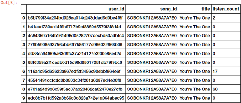
Chapter 4 ■ Feature engineering and SeleCtion
187
We can see multiple statistical measures like count, average, standard deviation, and quartiles for each
of the numeric features in this output. Try plotting their distributions if possible!
Counts
Raw numeric measures can also indicate counts, frequencies and occurrences of specific attributes. Let’s
look at a sample of data from the million-song dataset, which depicts counts or frequencies of songs that
have been heard by various users.
In [5]: popsong_df = pd.read_csv('datasets/song_views.csv', encoding='utf-8')
...: popsong_df.head(10)
We can see that the listen_count field in the data depicted in Figure4-4 can be directly used as a
count/frequency based numeric feature.
Binarization
Often raw numeric frequencies or counts are not necessary in building models especially with regard to
methods applied in building recommender engines. For example if I want to know if a person is interested
or has listened to a particular song, I do not need to know the total number of times he/she has listened to
the same song. I am more concerned about the various songs he/she has listened to. In this case, a binary
feature is preferred as opposed to a count based feature. We can binarize our listen_count field from our
earlier dataset in the following way.
In [6]: watched = np.array(popsong_df['listen_count'])
...: watched[watched >= 1] = 1
...: popsong_df['watched'] = watched
You can also use scikit-learn’s Binarizer class here from its preprocessing module to perform the
same task instead of numpy arrays, as depicted in the following code.
Figure 4-4. Song listen counts as a numeric feature
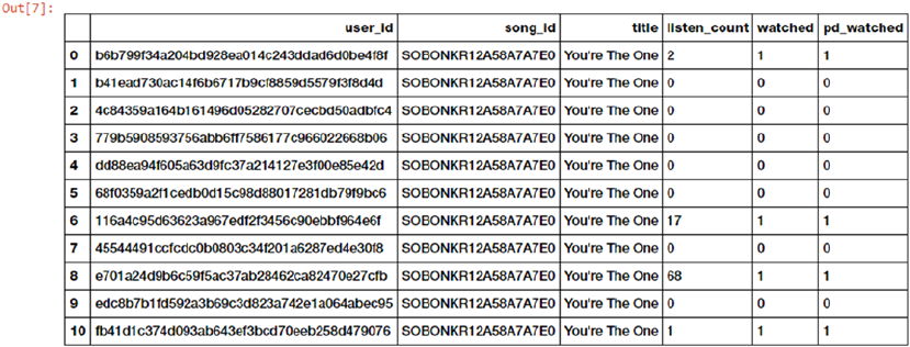
Chapter 4 ■ Feature engineering and SeleCtion
188
In [7]: from sklearn.preprocessing import Binarizer
...:
...: bn = Binarizer(threshold=0.9)
...: pd_watched = bn.transform([popsong_df['listen_count']])[0]
...: popsong_df['pd_watched'] = pd_watched
...: popsong_df.head(11)
You can clearly see from Figure4-5 that both the methods have produced the same results depicted in
features watched and pd_watched. Thus, we have the song listen counts as a binarized feature indicating if
the song was listened to or not by each user.
Rounding
Often when dealing with numeric attributes like proportions or percentages, we may not need values with a
high amount of precision. Hence it makes sense to round off these high precision percentages into numeric
integers. These integers can then be directly used as raw numeric values or even as categorical (discrete-
class based) features. Let’s try applying this concept in a dummy dataset depicting store items and their
popularity percentages.
In [8]: items_popularity = pd.read_csv('datasets/item_popularity.csv', encoding='utf-8')
...: # rounding off percentages
...: items_popularity['popularity_scale_10'] =
np.array(np.round((items_popularity['pop_percent'] * 10)), dtype='int')
...: items_popularity['popularity_scale_100'] =
np.array(np.round((items_popularity['pop_percent'] * 100)), dtype='int')
...: items_popularity
Out[8]:
item_id pop_percent popularity_scale_10 popularity_scale_100
0 it_01345 0.98324 10 98
1 it_03431 0.56123 6 56
2 it_04572 0.12098 1 12
3 it_98021 0.35476 4 35
Figure 4-5. Binarizing song counts
Chapter 4 ■ Feature engineering and SeleCtion
189
4 it_01298 0.92101 9 92
5 it_90120 0.81212 8 81
6 it_10123 0.56502 6 57
Thus after our rounding operations, you can see the new features in the data depicted in the previous
dataframe. Basically we tried two forms of rounding. The features depict the item popularities now both on
a scale of 1-10 and on a scale of 1-100. You can use these values both as numerical or categorical features
based on the scenario and problem.
Interactions
A model is usually built in such a way that we try to model the output responses (discrete classes or
continuous values) as a function of the input feature variables. For example, a simple linear regression
equation can be depicted as y = c1x1 + c2x2 + ... + cnxn where the input features are depicted by variables {x1, x2,
... xn} having weights or coefficients of {c1, c2, ... cn} respectively and the goal is the predict response y. In this
case, this simple linear model depicts the relationship between the output and inputs, purely based on the
individual, separate input features.
However, often in several real-world datasets and scenarios, it makes sense to also try to capture the
interactions between these feature variables as a part of the input feature set. A simple depiction of the
extension of the above linear regression formulation with interaction features would be y = c1x1 + c2x2 + ... +
cnxn + c11x1
2 + c22x2
2 + c12x1x2 + ... where features like {x1x2, x1
2, ...} denote the interaction features. Let’s try
engineering some interaction features on our Pokémon dataset now.
In [9]: atk_def = poke_df[['Attack', 'Defense']]
...: atk_def.head()
Out[9]:
Attack Defense
0 49 49
1 62 63
2 82 83
3 100 123
4 52 43
We can see in this output, the two numeric features depicting Pokémon attack and defense. The
following code helps us build interaction features from these two features. We will build features up to the
second degree using the PolynomialFeatures class from scikit-learn's API.
In [10]: from sklearn.preprocessing import PolynomialFeatures
...:
...: pf = PolynomialFeatures(degree=2, interaction_only=False, include_bias=False)
...: res = pf.fit_transform(atk_def)
...: res
Out[10]:
array([[ 49., 49., 2401., 2401., 2401.],
[ 62., 63., 3844., 3906., 3969.],
[ 82., 83., 6724., 6806., 6889.],
...,
[ 110., 60., 12100., 6600., 3600.],
[ 160., 60., 25600., 9600., 3600.],
[ 110., 120., 12100., 13200., 14400.]])
Chapter 4 ■ Feature engineering and SeleCtion
190
We can clearly see from this output that we have a total of five features including the new interaction
features. We can see the degree of each feature in the matrix, using the following snippet.
In [11]: pd.DataFrame(pf.powers_, columns=['Attack_degree', 'Defense_degree'])
Out[11]:
Attack_degree Defense_degree
0 1 0
1 0 1
2 2 0
3 1 1
4 0 2
Now that we know what each feature actually represented from the degrees depicted, we can assign a
name to each feature as follows to get the updated feature set.
In [12]: intr_features = pd.DataFrame(res,
...: columns=['Attack', 'Defense',
...: 'Attack^2', 'Attack x Defense', 'Defense^2'])
...: intr_features.head(5)
Out[12]:
Attack Defense Attack^2 Attack x Defense Defense^2
0 49.0 49.0 2401.0 2401.0 2401.0
1 62.0 63.0 3844.0 3906.0 3969.0
2 82.0 83.0 6724.0 6806.0 6889.0
3 100.0 123.0 10000.0 12300.0 15129.0
4 52.0 43.0 2704.0 2236.0 1849.0
Thus we can see our original and interaction features in Figure4-10. The fit_transform(...) API
function from scikit-learn is useful to build a feature engineering representation object on the training
data, which can be reused on new data during model predictions by calling on the transform(...) function.
Let’s take some sample new observations for Pokémon attack and defense features and try to transform
them using this same mechanism.
In [13]: new_df = pd.DataFrame([[95, 75],[121, 120], [77, 60]],
...: columns=['Attack', 'Defense'])
...: new_df
Out[13]:
Attack Defense
0 95 75
1 121 120
2 77 60
We can now use the pf object that we created earlier and transform these input features to give us the
interaction features as follows.
In [14]: new_res = pf.transform(new_df)
...: new_intr_features = pd.DataFrame(new_res,
...: columns=['Attack', 'Defense',
...: 'Attack^2', 'Attack x Defense', 'Defense^2'])
...: new_intr_features
Out[14]:
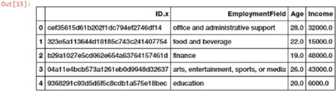
Chapter 4 ■ Feature engineering and SeleCtion
191
Attack Defense Attack^2 Attack x Defense Defense^2
0 95.0 75.0 9025.0 7125.0 5625.0
1 121.0 120.0 14641.0 14520.0 14400.0
2 77.0 60.0 5929.0 4620.0 3600.0
Thus you can see that we have successfully obtained the necessary interaction features for the new
dataset. Try building interaction features on three or more features now!
Binning
Often when working with numeric data, you might come across features or attributes which depict raw
measures such as values or frequencies. In many cases, often the distributions of these attributes are skewed
in the sense that some sets of values will occur a lot and some will be very rare. Besides that, there is also the
added problem of varying range of these values. Suppose we are talking about song or video view counts.
In some cases, the view counts will be abnormally large and in some cases very small. Directly using these
features in modeling might cause issues. Metrics like similarity measures, cluster distances, regression
coefficients and more might get adversely affected if we use raw numeric features having values which range
across multiple orders of magnitude. There are various ways to engineer features from these raw values so
we can these issues. These methods include transformations, scaling and binning/quantization.
In this section, we will talk about binning which is also known as quantization. The operation of binning
is used for transforming continuous numeric values into discrete ones. These discrete numbers can be
thought of as bins into which the raw values or numbers are binned or grouped into. Each bin represents a
specific degree of intensity and has a specific range of values which must fall into that bin. There are various
ways of binning data which include fixed-width and adaptive binning. Specific techniques can be employed
for each binning process. We will use a dataset extracted from the 2016 FreeCodeCamp Developer/Coder
survey which talks about various attributes pertaining to coders and software developers. You can check it
out yourself at https://github.com/freeCodeCamp/2016-new-coder-survey for more details. Let’s load the
dataset and take a peek at some interesting attributes.
In [15]: fcc_survey_df = pd.read_csv('datasets/fcc_2016_coder_survey_subset.csv',
encoding='utf-8')
...: fcc_survey_df[['ID.x', 'EmploymentField', 'Age', 'Income']].head()
The dataframe depicted in Figure4-6 shows us some interesting attributes of the coder survey dataset,
some of which we will be analyzing in this section. The ID.x variable is basically a unique identifier for each
coder/developer who took the survey and the other fields are pretty self-explanatory.
Figure 4-6. Important attributes from the FCC coder survey dataset
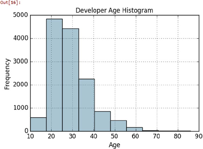
Chapter 4 ■ Feature engineering and SeleCtion
192
Fixed-Width Binning
In fixed-width binning, as the name indicates, we have specific fixed widths for each of the bins, which are
usually pre-defined by the user analyzing the data. Each bin has a pre-fixed range of values which should be
assigned to that bin on the basis of some business or custom logic, rules, or necessary transformations.
Binning based on rounding is one of the ways, where you can use the rounding operation that we
discussed earlier to bin raw values. Let’s consider the Age feature from the coder survey dataset. The
following code shows the distribution of developer ages who took the survey.
In [16]: fig, ax = plt.subplots()
...: fcc_survey_df['Age'].hist(color='#A9C5D3')
...: ax.set_title('Developer Age Histogram', fontsize=12)
...: ax.set_xlabel('Age', fontsize=12)
...: ax.set_ylabel('Frequency', fontsize=12)
The histogram in Figure4-7 depicts the distribution of developer ages, which is slightly right skewed as
expected. Let’s try to assign these raw age values into specific bins based on the following logic.
Age Range: Bin
---------------
0 - 9 : 0
10 - 19 : 1
20 - 29 : 2
30 - 39 : 3
Figure 4-7. Histogram depicting developer age distribution
Chapter 4 ■ Feature engineering and SeleCtion
193
40 - 49 : 4
50 - 59 : 5
60 - 69 : 6
... and so on
We can easily do this using what we learned in the “Rounding” section earlier where we round off these
raw age values by taking the floor value after dividing it by 10. The following code depicts the same.
In [17]: fcc_survey_df['Age_bin_round'] = np.array(np.floor(np.array(fcc_survey_df['Age']) /
10.))
...: fcc_survey_df[['ID.x', 'Age', 'Age_bin_round']].iloc[1071:1076]
Out[17]:
ID.x Age Age_bin_round
1071 6a02aa4618c99fdb3e24de522a099431 17.0 1.0
1072 f0e5e47278c5f248fe861c5f7214c07a 38.0 3.0
1073 6e14f6d0779b7e424fa3fdd9e4bd3bf9 21.0 2.0
1074 c2654c07dc929cdf3dad4d1aec4ffbb3 53.0 5.0
1075 f07449fc9339b2e57703ec7886232523 35.0 3.0
We take a specific slice of the dataset (rows 1071-1076) to depict users of varying ages. You can see
the corresponding bins for each age have been assigned based on rounding. But what if we need more
flexibility? What if I want to decide and fix the bin widths myself?
Binning based on custom ranges is the answer to the all our questions about fixed-width binning,
some of which I just mentioned. Let’s define some custom age ranges for binning developer ages using the
following scheme.
Age Range : Bin
---------------
0 - 15 : 1
16 - 30 : 2
31 - 45 : 3
46 - 60 : 4
61 - 75 : 5
75 - 100 : 6
Based on this custom binning scheme, we will now label the bins for each developer age value with the
help of the following code. We will store both the bin range as well as the corresponding label.
In [18]: bin_ranges = [0, 15, 30, 45, 60, 75, 100]
...: bin_names = [1, 2, 3, 4, 5, 6]
...: fcc_survey_df['Age_bin_custom_range'] = pd.cut(np.array(fcc_survey_df['Age']),
...: bins=bin_ranges)
...: fcc_survey_df['Age_bin_custom_label'] = pd.cut(np.array(fcc_survey_df['Age']),
...: bins=bin_ranges, labels=bin_names)
...: fcc_survey_df[['ID.x', 'Age', 'Age_bin_round',
...: 'Age_bin_custom_range', 'Age_bin_custom_label']].iloc[1071:1076]
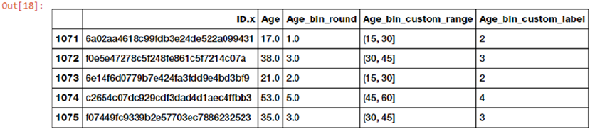
Chapter 4 ■ Feature engineering and SeleCtion
194
We can see from the dataframe output in Figure4-8 that the custom bins based on our scheme have
been assigned for each developer’s age. Try out some of your own binning schemes!
Adaptive Binning
So far, we have decided the bin width and ranges in fixed-width binning. However, this technique can lead to
irregular bins that are not uniform based on the number of data points or values which fall in each bin. Some
of the bins might be densely populated and some of them might be sparsely populated or even be empty!
Adaptive binning is a safer and better approach where we use the data distribution itself to decide what
should be the appropriate bins.
Quantile based binning is a good strategy to use for adaptive binning. Quantiles are specific values or
cut-points which help in partitioning the continuous valued distribution of a specific numeric field into
discrete contiguous bins or intervals. Thus, q-Quantiles help in partitioning a numeric attribute into q equal
partitions. Popular examples of quantiles include the 2-Quantile known as the median which divides the
data distribution into two equal bins, 4-Quantiles known as the quartiles, which divide the data into four
equal bins and 10-Quantiles also known as the deciles which create 10 equal width bins. Let’s now look at a
slice of data pertaining to developer income values in our coder survey dataset.
In [19]: fcc_survey_df[['ID.x', 'Age', 'Income']].iloc[4:9]
Out[19]:
ID.x Age Income
4 9368291c93d5d5f5c8cdb1a575e18bec 20.0 6000.0
5 dd0e77eab9270e4b67c19b0d6bbf621b 34.0 40000.0
6 7599c0aa0419b59fd11ffede98a3665d 23.0 32000.0
7 6dff182db452487f07a47596f314bddc 35.0 40000.0
8 9dc233f8ed1c6eb2432672ab4bb39249 33.0 80000.0
The slice of data depicted by the dataframe shows us the income values for each developer in our
dataset. Let’s look at the whole data distribution for this Income variable now using the following code.
In [20]: fig, ax = plt.subplots()
...: fcc_survey_df['Income'].hist(bins=30, color='#A9C5D3')
...: ax.set_title('Developer Income Histogram', fontsize=12)
...: ax.set_xlabel('Developer Income', fontsize=12)
...: ax.set_ylabel('Frequency', fontsize=12)
Figure 4-8. Custom age binning for developer ages
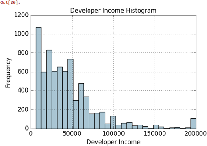
Chapter 4 ■ Feature engineering and SeleCtion
195
We can see from the distribution depicted in Figure4-9 that as expected there is a right skew with lesser
developers earning more money and vice versa. Let’s take a 4-Quantile or a quartile based adaptive binning
scheme. The following snippet helps us obtain the income values that fall on the four quartiles in the distribution.
In [21]: quantile_list = [0, .25, .5, .75, 1.]
...: quantiles = fcc_survey_df['Income'].quantile(quantile_list)
...: quantiles
Out[21]:
0.00 6000.0
0.25 20000.0
0.50 37000.0
0.75 60000.0
1.00 200000.0
To visualize the quartiles obtained in this output better, we can plot them in our data distribution using
the following code snippet.
In [22]: fig, ax = plt.subplots()
...: fcc_survey_df['Income'].hist(bins=30, color='#A9C5D3')
...:
...: for quantile in quantiles:
...: qvl = plt.axvline(quantile, color='r')
...: ax.legend([qvl], ['Quantiles'], fontsize=10)
...:
...: ax.set_title('Developer Income Histogram with Quantiles', fontsize=12)
...: ax.set_xlabel('Developer Income', fontsize=12)
...: ax.set_ylabel('Frequency', fontsize=12)
Figure 4-9. Histogram depicting developer income distribution
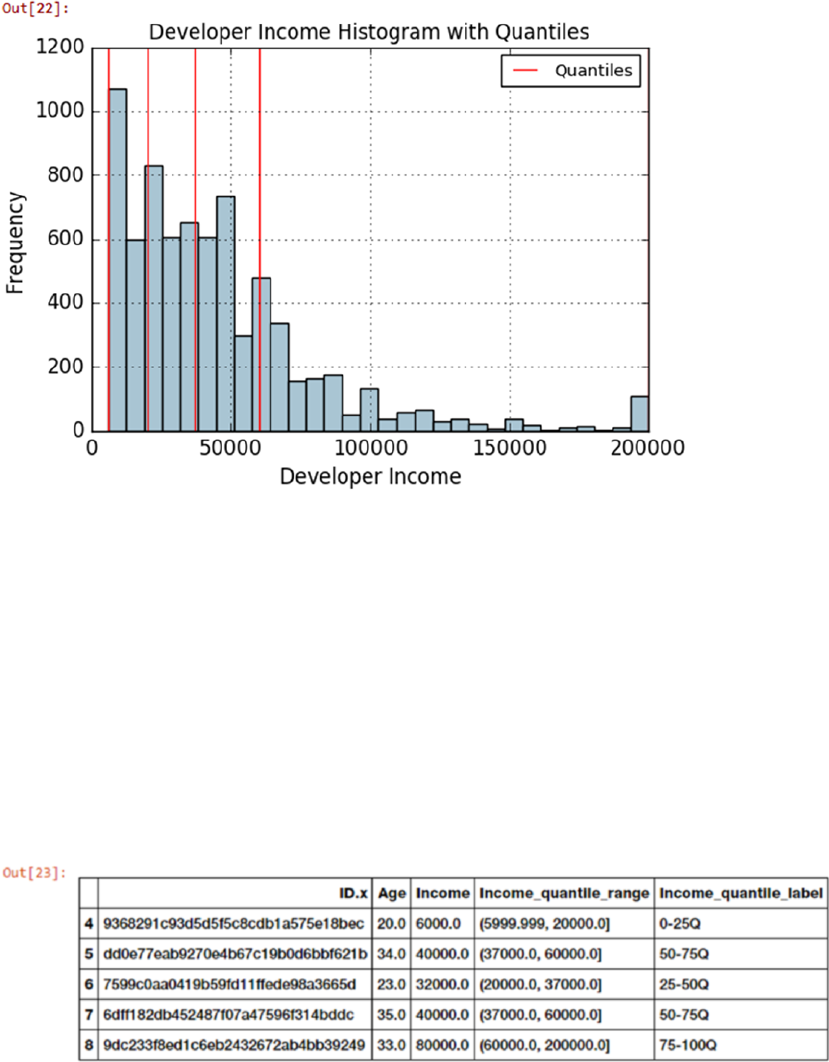
Chapter 4 ■ Feature engineering and SeleCtion
196
The 4-Quantile values for the income attribute are depicted by red vertical lines in Figure4-10.
Let’s now use quantile binning to bin each of the developer income values into specific bins using the
following code.
In [23]: quantile_labels = ['0-25Q', '25-50Q', '50-75Q', '75-100Q']
...: fcc_survey_df['Income_quantile_range'] = pd.qcut(fcc_survey_df['Income'],
...: q=quantile_list)
...: fcc_survey_df['Income_quantile_label'] = pd.qcut(fcc_survey_df['Income'],
...: q=quantile_list,
...: labels=quantile_labels)
...: fcc_survey_df[['ID.x', 'Age', 'Income',
'Income_quantile_range', 'Income_quantile_label']].iloc[4:9]
Figure 4-10. Histogram depicting developer income distribution with quartile values
Figure 4-11. Quantile based bin ranges and labels for developer incomes
Chapter 4 ■ Feature engineering and SeleCtion
197
The result dataframe depicted in Figure4-11 clearly shows the quantile based bin range and
corresponding label assigned for each developer income value in the Income_quantile_range and
Income_quantile_labels features, respectively.
Statistical Transformations
Let’s look at a different strategy of feature engineering on numerical data by using statistical or mathematical
transformations. In this section, we will look at the Log transform as well as the Box-Cox transform. Both of
these transform functions belong to the Power Transform family of functions. These functions are typically
used to create monotonic data transformations, but their main significance is that they help in stabilizing
variance, adhering closely to the normal distribution and making the data independent of the mean based
on its distribution. Several transformations are also used as a part of feature scaling, which we cover in a
future section.
Log Transform
The log transform belongs to the power transform family of functions. This function can be defined as
y = logb(x) which reads as log of x to the base b is equal to y. This translates to by = x, which indicates as
to what power must the base b be raised to in order to get x. The natural logarithm uses the base b = e
where e = 2.71828 popularly known as Euler’s number. You can also use base b = 10 used popularly in the
decimal system. Log transforms are useful when applied to skewed distributions as they tend to expand
the values which fall in the range of lower magnitudes and tend to compress or reduce the values which
fall in the range of higher magnitudes. This tends to make the skewed distribution as normal-like as
possible. Let’s use log transform on our developer income feature from our coder survey dataset.
In [24]: fcc_survey_df['Income_log'] = np.log((1+ fcc_survey_df['Income']))
...: fcc_survey_df[['ID.x', 'Age', 'Income', 'Income_log']].iloc[4:9]
Out[24]:
ID.x Age Income Income_log
4 9368291c93d5d5f5c8cdb1a575e18bec 20.0 6000.0 8.699681
5 dd0e77eab9270e4b67c19b0d6bbf621b 34.0 40000.0 10.596660
6 7599c0aa0419b59fd11ffede98a3665d 23.0 32000.0 10.373522
7 6dff182db452487f07a47596f314bddc 35.0 40000.0 10.596660
8 9dc233f8ed1c6eb2432672ab4bb39249 33.0 80000.0 11.289794
The dataframe obtained in this output depicts the log transformed income feature in the Income_log
field. Let’s now plot the data distribution of this transformed feature using the following code.
In [25]: income_log_mean = np.round(np.mean(fcc_survey_df['Income_log']), 2)
...:
...: fig, ax = plt.subplots()
...: fcc_survey_df['Income_log'].hist(bins=30, color='#A9C5D3')
...: plt.axvline(income_log_mean, color='r')
...: ax.set_title('Developer Income Histogram after Log Transform', fontsize=12)
...: ax.set_xlabel('Developer Income (log scale)', fontsize=12)
...: ax.set_ylabel('Frequency', fontsize=12)
...: ax.text(11.5, 450, r'$\mu$='+str(income_log_mean), fontsize=10)
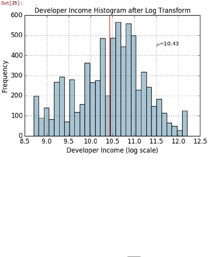
Chapter 4 ■ Feature engineering and SeleCtion
198
Figure 4-12. Histogram depicting developer income distribution after log transform
Thus we can clearly see that the original developer income distribution that was right skewed in
Figure4-10 is more Gaussian or normal-like in Figure4-12 after applying the log transform.
Box-Cox Transform
Let’s now look at the Box-Cox transform, another popular function belonging to the power transform family
of functions. This function has a prerequisite that the numeric values to be transformed must be positive
(similar to what log transform expects). In case they are negative, shifting using a constant value helps.
Mathematically, the Box-Cox transform function can be defined as,
yfxx
xfor
xfor
e
=
()
==
->
()
=
ì
í
ï
î
ï
ü
ý
ï
þ
ï
,
log
lll
l
l
l
10
0
Such that the resulted transformed output y is a function of input x and transformation parameter λ
such that when λ = 0, the resultant transform is the natural log transform, which we discussed earlier. The
optimal value of λ is usually determined using a maximum likelihood or log-likelihood estimation. Let’s
apply the Box-Cox transform on our developer income feature. To do this, first we get the optimal lambda
value from the data distribution by removing the non-null values using the following code.

Chapter 4 ■ Feature engineering and SeleCtion
199
In [26]: # get optimal lambda value from non null income values
...: income = np.array(fcc_survey_df['Income'])
...: income_clean = income[~np.isnan(income)]
...: l, opt_lambda = spstats.boxcox(income_clean)
...: print('Optimal lambda value:', opt_lambda)
Optimal lambda value: 0.117991239456
Now that we have obtained the optimal λ value, let’s use the Box-Cox transform for two values of λ such
that λ = 0 & λ = λoptimal and transform the raw numeric values pertaining to developer incomes.
In [27]: fcc_survey_df['Income_boxcox_lambda_0'] = spstats.boxcox((1+fcc_survey_df['Income']),
...: lmbda=0)
...: fcc_survey_df['Income_boxcox_lambda_opt'] = spstats.boxcox(fcc_survey_df['Income'],
...: lmbda=opt_lambda)
...: fcc_survey_df[['ID.x', 'Age', 'Income', 'Income_log',
...: 'Income_boxcox_lambda_0', 'Income_boxcox_lambda_opt']].iloc[4:9]
The dataframe obtained in the output shown in Figure4-13 depicts the income feature after applying
the Box-Cox transform for λ = 0 and λ = λoptimal in the Income_boxcox_lambda_0 and Income_boxcox_lambda_
opt fields respectively. Also as expected, the Income_log field has the same values as the Box-Cox transform
with λ = 0. Let’s now plot the data distribution for the Box-Cox transformed developer values with optimal
lambda. See Figure4-14.
In [30]: income_boxcox_mean = np.round(np.mean(fcc_survey_df['Income_boxcox_lambda_opt']), 2)
...:
...: fig, ax = plt.subplots()
...: fcc_survey_df['Income_boxcox_lambda_opt'].hist(bins=30, color='#A9C5D3')
...: plt.axvline(income_boxcox_mean, color='r')
...: ax.set_title('Developer Income Histogram after Box–Cox Transform', fontsize=12)
...: ax.set_xlabel('Developer Income (Box–Cox transform)', fontsize=12)
...: ax.set_ylabel('Frequency', fontsize=12)
...: ax.text(24, 450, r'$\mu$='+str(income_boxcox_mean), fontsize=10)
Figure 4-13. Dataframe depicting developer income distribution after box-cox transform
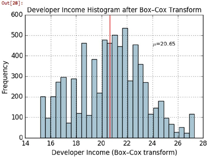
Chapter 4 ■ Feature engineering and SeleCtion
200
The distribution of the transformed numeric values for developer income after the Box-Cox distribution
also look similar to the one we had obtained after the Log transform such that it is more normal-like and the
extreme right skew that was present in the raw data has been minimized here.
Feature Engineering on Categorical Data
So far, we have been working on continuous numeric data and you have also seen various techniques for
engineering features from the same. We will now look at another structured data type, which is categorical
data. Any attribute or feature that is categorical in nature represents discrete values that belong to a specific
finite set of categories or classes. Category or class labels can be text or numeric in nature. Usually there are
two types of categorical variables—nominal and ordinal.
Nominal categorical features are such that there is no concept of ordering among the values, i.e., it does
not make sense to sort or order them. Movie or video game genres, weather seasons, and country names are
some examples of nominal attributes. Ordinal categorical variables can be ordered and sorted on the basis of
their values and hence these values have specific significance such that their order makes sense. Examples
of ordinal attributes include clothing size, education level, and so on.
In this section, we look at various strategies and techniques for transforming and encoding categorical
features and attributes. The code used for this section is available in the code files for this chapter. You can
load feature_engineering_categorical.py directly and start running the examples or use the jupyter
notebook, Feature Engineering on Categorical Data.ipynb, for a more interactive experience. Before
we begin, let’s load the following dependencies.
In [1]: import pandas as pd
...: import numpy as np
Figure 4-14. Histogram depicting developer income distribution after box-cox transform (λ = λoptimal)
Chapter 4 ■ Feature engineering and SeleCtion
201
Once you have these dependencies loaded, let’s get started and engineer some features from
categorical data.
Transforming Nominal Features
Nominal features or attributes are categorical variables that usually have a finite set of distinct discrete
values. Often these values are in string or text format and Machine Learning algorithms cannot understand
them directly. Hence usually you might need to transform these features into a more representative numeric
format. Let’s look at a new dataset pertaining to video game sales. This dataset is also available on Kaggle
(https://www.kaggle.com/gregorut/videogamesales). We have downloaded a copy of this for your
convenience. The following code helps us load this dataset and view some of the attributes of our interest.
In [2]: vg_df = pd.read_csv('datasets/vgsales.csv', encoding='utf-8')
...: vg_df[['Name', 'Platform', 'Year', 'Genre', 'Publisher']].iloc[1:7]
Out[2]:
Name Platform Year Genre Publisher
1 Super Mario Bros. NES 1985.0 Platform Nintendo
2 Mario Kart Wii Wii 2008.0 Racing Nintendo
3 Wii Sports Resort Wii 2009.0 Sports Nintendo
4 Pokemon Red/Pokemon Blue GB 1996.0 Role-Playing Nintendo
5 Tetris GB 1989.0 Puzzle Nintendo
6 New Super Mario Bros. DS 2006.0 Platform Nintendo
The dataset depicted in this dataframe shows us various attributes pertaining to video games. Features
like Platform, Genre, and Publisher are nominal categorical variables. Let’s now try to transform the video
game Genre feature into a numeric representation. Do note here that this doesn’t indicate that the transformed
feature will be a numeric feature. It will still be a discrete valued categorical feature with numbers instead of
text for each genre. The following code depicts the total distinct genre labels for video games.
In [3]: genres = np.unique(vg_df['Genre'])
...: genres
Out[3]:
array(['Action', 'Adventure', 'Fighting', 'Misc', 'Platform', 'Puzzle',
'Racing', 'Role-Playing', 'Shooter', 'Simulation', 'Sports',
'Strategy'], dtype=object)
This output tells us we have 12 distinct video game genres in our dataset. Let’s transform this feature
now using a mapping scheme in the following code.
In [4]: from sklearn.preprocessing import LabelEncoder
...:
...: gle = LabelEncoder()
...: genre_labels = gle.fit_transform(vg_df['Genre'])
...: genre_mappings = {index: label for index, label in enumerate(gle.classes_)}
...: genre_mappings
Out[4]:
{0: 'Action', 1: 'Adventure', 2: 'Fighting', 3: 'Misc',
4: 'Platform', 5: 'Puzzle', 6: 'Racing', 7: 'Role-Playing',
8: 'Shooter', 9: 'Simulation', 10: 'Sports', 11: 'Strategy'}
Chapter 4 ■ Feature engineering and SeleCtion
202
From the output, we can see that a mapping scheme has been generated where each genre value is
mapped to a number with the help of the LabelEncoder object gle. The transformed labels are stored in the
genre_labels value. Let’s write it back to the original dataframe and view the results.
In [5]: vg_df['GenreLabel'] = genre_labels
...: vg_df[['Name', 'Platform', 'Year', 'Genre', 'GenreLabel']].iloc[1:7]
Out[5]:
Name Platform Year Genre GenreLabel
1 Super Mario Bros. NES 1985.0 Platform 4
2 Mario Kart Wii Wii 2008.0 Racing 6
3 Wii Sports Resort Wii 2009.0 Sports 10
4 Pokemon Red/Pokemon Blue GB 1996.0 Role-Playing 7
5 Tetris GB 1989.0 Puzzle 5
6 New Super Mario Bros. DS 2006.0 Platform 4
The GenreLabel field depicts the mapped numeric labels for each of the Genre labels and we can clearly
see that this adheres to the mappings that we generated earlier.
Transforming Ordinal Features
Ordinal features are similar to nominal features except that order matters and is an inherent property with
which we can interpret the values of these features. Like nominal features, even ordinal features might be
present in text form and you need to map and transform them into their numeric representation. Let’s now
load our Pokémon dataset that we used earlier and look at the various values of the Generation attribute for
each Pokémon.
In [6]: poke_df = pd.read_csv('datasets/Pokemon.csv', encoding='utf-8')
...: poke_df = poke_df.sample(random_state=1, frac=1).reset_index(drop=True)
...:
...: np.unique(poke_df['Generation'])
Out[6]: array(['Gen 1', 'Gen 2', 'Gen 3', 'Gen 4', 'Gen 5', 'Gen 6'], dtype=object)
We resample the dataset in this code just so we can get a good slice of data later on that represents
all the distinct values which we are looking for. From this output we can see that there are a total of six
generations of Pokémon. This attribute is definitely ordinal because Pokémon belonging to Generation 1
were introduced earlier in the video games and the television shows than Generation 2 and so on. Hence
they have a sense of order among them. Unfortunately, since there is a specific logic or set of rules involved
in case of each ordinal variable, there is no generic module or function to map and transform these features
into numeric representations. Hence we need to hand-craft this using our own logic, which is depicted in the
following code snippet.
In [7]: gen_ord_map = {'Gen 1': 1, 'Gen 2': 2, 'Gen 3': 3,
...: 'Gen 4': 4, 'Gen 5': 5, 'Gen 6': 6}
...:
...: poke_df['GenerationLabel'] = poke_df['Generation'].map(gen_ord_map)
...: poke_df[['Name', 'Generation', 'GenerationLabel']].iloc[4:10]
Out[7]:
Name Generation GenerationLabel
4 Octillery Gen 2 2
5 Helioptile Gen 6 6
6 Dialga Gen 4 4
Chapter 4 ■ Feature engineering and SeleCtion
203
7 DeoxysDefense Forme Gen 3 3
8 Rapidash Gen 1 1
9 Swanna Gen 5 5
Thus, you can see that it is really easy to build your own transformation mapping scheme with the help
of Python dictionaries and use the map(...) function from pandas to transform the ordinal feature.
Encoding Categorical Features
We have mentioned several times in the past that Machine Learning algorithms usually work well with
numerical values. You might now be wondering we already transformed and mapped the categorical
variables into numeric representations in the previous sections so why would we need more levels
of encoding again? The answer to this is pretty simple. If we directly fed these transformed numeric
representations of categorical features into any algorithm, the model will essentially try to interpret these as
raw numeric features and hence the notion of magnitude will be wrongly introduced in the system.
A simple example would be from our previous output dataframe, a model fit on GenerationLabel
would think that value 6 > 5 > 4 and so on. While order is important in the case of Pokémon generations
(ordinal variable), there is no notion of magnitude here. Generation 6 is not larger than Generation 5 and
Generation 1 is not smaller than Generation 6. Hence models built using these features directly would
be sub-optimal and incorrect models. There are several schemes and strategies where dummy features are
created for each unique value or label out of all the distinct categories in any feature. In the subsequent
sections, we will discuss some of these schemes including one hot encoding, dummy coding, effect coding,
and feature hashing schemes.
One Hot Encoding Scheme
Considering we have numeric representation of any categorical feature with m labels, the one hot encoding
scheme, encodes or transforms the feature into m binary features, which can only contain a value of 1 or
0. Each observation in the categorical feature is thus converted into a vector of size m with only one of the
values as 1 (indicating it as active). Let’s take our Pokémon dataset and perform some one hot encoding
transformations on some of its categorical features.
In [8]: poke_df[['Name', 'Generation', 'Legendary']].iloc[4:10]
Out[8]:
Name Generation Legendary
4 Octillery Gen 2 False
5 Helioptile Gen 6 False
6 Dialga Gen 4 True
7 DeoxysDefense Forme Gen 3 True
8 Rapidash Gen 1 False
9 Swanna Gen 5 False
Considering the dataframe depicted in the output, we have two categorical features, Generation and
Legendary, depicting the Pokémon generations and their legendary status. First, we need to transform these
text labels into numeric representations. The following code helps us achieve this.
In [9]: from sklearn.preprocessing import OneHotEncoder, LabelEncoder
...:
...: # transform and map pokemon generations
...: gen_le = LabelEncoder()
Chapter 4 ■ Feature engineering and SeleCtion
204
...: gen_labels = gen_le.fit_transform(poke_df['Generation'])
...: poke_df['Gen_Label'] = gen_labels
...:
...: # transform and map pokemon legendary status
...: leg_le = LabelEncoder()
...: leg_labels = leg_le.fit_transform(poke_df['Legendary'])
...: poke_df['Lgnd_Label'] = leg_labels
...:
...: poke_df_sub = poke_df[['Name', 'Generation', 'Gen_Label', 'Legendary', 'Lgnd_Label']]
...: poke_df_sub.iloc[4:10]
Out[9]:
Name Generation Gen_Label Legendary Lgnd_Label
4 Octillery Gen 2 1 False 0
5 Helioptile Gen 6 5 False 0
6 Dialga Gen 4 3 True 1
7 DeoxysDefense Forme Gen 3 2 True 1
8 Rapidash Gen 1 0 False 0
9 Swanna Gen 5 4 False 0
The features Gen_Label and Lgnd_Label now depict the numeric representations of our categorical
features. Let’s now apply the one hot encoding scheme on these features using the following code.
In [10]: # encode generation labels using one-hot encoding scheme
...: gen_ohe = OneHotEncoder()
...: gen_feature_arr = gen_ohe.fit_transform(poke_df[['Gen_Label']]).toarray()
...: gen_feature_labels = list(gen_le.classes_)
...: gen_features = pd.DataFrame(gen_feature_arr, columns=gen_feature_labels)
...:
...: # encode legendary status labels using one-hot encoding scheme
...: leg_ohe = OneHotEncoder()
...: leg_feature_arr = leg_ohe.fit_transform(poke_df[['Lgnd_Label']]).toarray()
...: leg_feature_labels = ['Legendary_'+str(cls_label) for cls_label in leg_le.classes_]
...: leg_features = pd.DataFrame(leg_feature_arr, columns=leg_feature_labels)
Now, you should remember that you can always encode both the features together using the fit_
transform(...) function by passing it a two-dimensional array of the two features. But we are depicting this
encoding for each feature separately, to make things easier to understand. Besides this, we can also create
separate dataframes and label them accordingly. Let’s now concatenate these feature frames and see the
final result.
In [11]: poke_df_ohe = pd.concat([poke_df_sub, gen_features, leg_features], axis=1)
...: columns = sum([['Name', 'Generation', 'Gen_Label'],gen_feature_labels,
...: ['Legendary', 'Lgnd_Label'],leg_feature_labels], [])
...: poke_df_ohe[columns].iloc[4:10]
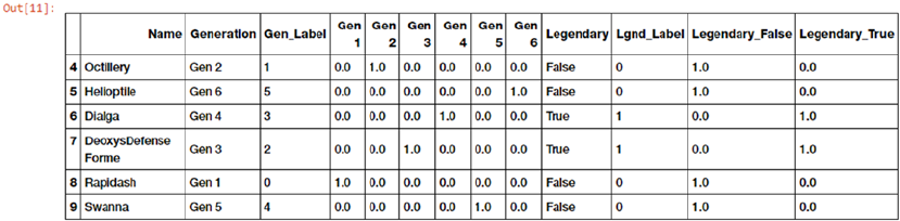
Chapter 4 ■ Feature engineering and SeleCtion
205
From the result feature set depicted in Figure4-15, we can clearly see the new one hot encoded features
for Gen_Label and Lgnd_Label. Each of these one hot encoded features is binary in nature and if they
contain the value 1, it means that feature is active for the corresponding observation. For example, row 6
indicates the Pokémon Dialga is a Gen 4 Pokémon having Gen_Label 3 (mapping starts from 0) and the
corresponding one hot encoded feature Gen 4 has the value 1 and the remaining one hot encoded features
are 0. Similarly, its Legendary status is True, corresponding Lgnd_Label is 1 and the one hot encoded feature
Legendary_True is also 1, indicating it is active.
Suppose we used this data in training and building a model but now we have some new Pokémon data
for which we need to engineer the same features before we want to run it by our trained model. We can use
the transform(...) function for our LabelEncoder and OneHotEncoder objects, which we have previously
constructed to engineer the features from the training data. The following code shows us two dummy data
points pertaining to new Pokémon.
In [12]: new_poke_df = pd.DataFrame([['PikaZoom', 'Gen 3', True],
...: ['CharMyToast', 'Gen 4', False]],
...: columns=['Name', 'Generation', 'Legendary'])
...: new_poke_df
Out[12]:
Name Generation Legendary
0 PikaZoom Gen 3 True
1 CharMyToast Gen 4 False
We will follow the same process as before of first converting the text categories into numeric
representations using our previously built LabelEncoder objects, as depicted in the following code.
In [13]: new_gen_labels = gen_le.transform(new_poke_df['Generation'])
...: new_poke_df['Gen_Label'] = new_gen_labels
...:
...: new_leg_labels = leg_le.transform(new_poke_df['Legendary'])
...: new_poke_df['Lgnd_Label'] = new_leg_labels
...:
...: new_poke_df[['Name', 'Generation', 'Gen_Label', 'Legendary', 'Lgnd_Label']]
Out[13]:
Name Generation Gen_Label Legendary Lgnd_Label
0 PikaZoom Gen 3 2 True 1
1 CharMyToast Gen 4 3 False 0
We can now use our previously built LabelEncoder objects and perform one hot encoding on these new
data observations using the following code. See Figure4-16.
Figure 4-15. Feature set depicting one hot encoded features for Pokémon generation and legendary status
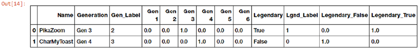
Chapter 4 ■ Feature engineering and SeleCtion
206
In [14]: new_gen_feature_arr = gen_ohe.transform(new_poke_df[['Gen_Label']]).toarray()
...: new_gen_features = pd.DataFrame(new_gen_feature_arr, columns=gen_feature_labels)
...:
...: new_leg_feature_arr = leg_ohe.transform(new_poke_df[['Lgnd_Label']]).toarray()
...: new_leg_features = pd.DataFrame(new_leg_feature_arr, columns=leg_feature_labels)
...:
...: new_poke_ohe = pd.concat([new_poke_df, new_gen_features, new_leg_features], axis=1)
...: columns = sum([['Name', 'Generation', 'Gen_Label'], gen_feature_labels,
...: ['Legendary', 'Lgnd_Label'], leg_feature_labels], [])
...: new_poke_ohe[columns]
Thus, you can see how we used the fit_transform(...) functions to engineer features on our
dataset and then we were able to use the encoder objects to engineer features on new data using the
transform(...) function based on the data what it observed previously, specifically the distinct categories
and their corresponding labels and one hot encodings. You should always follow this workflow in the future
for any type of feature engineering when you deal with training and test datasets when you build models.
Pandas also provides a wonderful function called to_dummies(...), which helps us easily perform one hot
encoding. The following code depicts how to achieve this.
In [15]: gen_onehot_features = pd.get_dummies(poke_df['Generation'])
...: pd.concat([poke_df[['Name', 'Generation']], gen_onehot_features], axis=1).
iloc[4:10]
Out[15]:
Name Generation Gen 1 Gen 2 Gen 3 Gen 4 Gen 5 Gen 6
4 Octillery Gen 2 0 1 0 0 0 0
5 Helioptile Gen 6 0 0 0 0 0 1
6 Dialga Gen 4 0 0 0 1 0 0
7 DeoxysDefense Forme Gen 3 0 0 1 0 0 0
8 Rapidash Gen 1 1 0 0 0 0 0
9 Swanna Gen 5 0 0 0 0 1 0
The output depicts the one hot encoding scheme for Pokémon generation values similar to what we
depicted in our previous analyses.
Dummy Coding Scheme
The dummy coding scheme is similar to the one hot encoding scheme, except in the case of dummy coding
scheme, when applied on a categorical feature with m distinct labels, we get m-1 binary features. Thus each
value of the categorical variable gets converted into a vector of size m-1. The extra feature is completely
disregarded and thus if the category values range from {0, 1, ..., m-1} the 0th or the m-1th feature is usually
represented by a vector of all zeros (0).
Figure 4-16. Feature set depicting one hot encoded features for new pokemon data points
Chapter 4 ■ Feature engineering and SeleCtion
207
The following code depicts the dummy coding scheme on Pokémon Generation by dropping the first
level binary encoded feature (Gen 1).
In [16]: gen_dummy_features = pd.get_dummies(poke_df['Generation'], drop_first=True)
...: pd.concat([poke_df[['Name', 'Generation']], gen_dummy_features], axis=1).iloc[4:10]
Out[16]:
Name Generation Gen 2 Gen 3 Gen 4 Gen 5 Gen 6
4 Octillery Gen 2 1 0 0 0 0
5 Helioptile Gen 6 0 0 0 0 1
6 Dialga Gen 4 0 0 1 0 0
7 DeoxysDefense Forme Gen 3 0 1 0 0 0
8 Rapidash Gen 1 0 0 0 0 0
9 Swanna Gen 5 0 0 0 1 0
If you want, you can also choose to drop the last level binary encoded feature (Gen 6) by using the
following code.
In [17]: gen_onehot_features = pd.get_dummies(poke_df['Generation'])
...: gen_dummy_features = gen_onehot_features.iloc[:,:-1]
...: pd.concat([poke_df[['Name', 'Generation']], gen_dummy_features], axis=1).iloc[4:10]
Out[17]:
Name Generation Gen 1 Gen 2 Gen 3 Gen 4 Gen 5
4 Octillery Gen 2 0 1 0 0 0
5 Helioptile Gen 6 0 0 0 0 0
6 Dialga Gen 4 0 0 0 1 0
7 DeoxysDefense Forme Gen 3 0 0 1 0 0
8 Rapidash Gen 1 1 0 0 0 0
9 Swanna Gen 5 0 0 0 0 1
Thus from these outputs you can see that based on the encoded level binary feature which we drop, that
particular categorical value is represented by a vector/encoded features, which all represent 0. For example
in the previous result feature set, Pokémon Heloptile belongs to Gen 6 and is represented by all 0s in the
encoded dummy features.
Effect Coding Scheme
The effect coding scheme is very similar to the dummy coding scheme in most aspects. However, the
encoded features or feature vector, for the category values that represent all 0s in the dummy coding scheme,
is replaced by -1s in the effect coding scheme. The following code depicts the effect coding scheme on the
Pokémon Generation feature.
In [18]: gen_onehot_features = pd.get_dummies(poke_df['Generation'])
...: gen_effect_features = gen_onehot_features.iloc[:,:-1]
...: gen_effect_features.loc[np.all(gen_effect_features == 0, axis=1)] = -1.
...: pd.concat([poke_df[['Name', 'Generation']], gen_effect_features], axis=1).iloc[4:10]
Out[18]:
Name Generation Gen 1 Gen 2 Gen 3 Gen 4 Gen 5
4 Octillery Gen 2 0.0 1.0 0.0 0.0 0.0
5 Helioptile Gen 6 -1.0 -1.0 -1.0 -1.0 -1.0
6 Dialga Gen 4 0.0 0.0 0.0 1.0 0.0
Chapter 4 ■ Feature engineering and SeleCtion
208
7 DeoxysDefense Forme Gen 3 0.0 0.0 1.0 0.0 0.0
8 Rapidash Gen 1 1.0 0.0 0.0 0.0 0.0
9 Swanna Gen 5 0.0 0.0 0.0 0.0 1.0
We can clearly see from the output feature set that all 0s have been replaced by -1 in case of values
which were previously all 0 in the dummy coding scheme.
Bin-Counting Scheme
The encoding schemes discovered so far work quite well on categorical data in general, but they start
causing problems when the number of distinct categories in any feature becomes very large. Essential for
any categorical feature of m distinct labels, you get m separate features. This can easily increase the size of
the feature set causing problems like storage issues, model training problems with regard to time, space
and memory. Besides this, we also have to deal with what is popularly known as the curse of dimensionality
where basically with an enormous number of features and not enough representative samples, model
performance starts getting affected. Hence we need to look toward other categorical data feature
engineering schemes for features having a large number of possible categories (like IP addresses).
The bin-counting scheme is useful for dealing with categorical variables with many categories. In
this scheme, instead of using the actual label values for encoding, we use probability based statistical
information about the value and the actual target or response value which we aim to predict in our modeling
efforts. A simple example would be based on past historical data for IP addresses and the ones which were
used in DDOS attacks; we can build probability values for a DDOS attack being caused by any of the IP
addresses. Using this information, we can encode an input feature which depicts that if the same IP address
comes in the future, what is the probability value of a DDOS attack being caused. This scheme needs
historical data as a pre-requisite and is an elaborate one. Depicting this with a complete example is out of
scope of this chapter but there are several resources online that you can refer to.
Feature Hashing Scheme
The feature hashing scheme is another useful feature engineering scheme for dealing with large scale
categorical features. In this scheme, a hash function is typically used with the number of encoded features
pre-set (as a vector of pre-defined length) such that the hashed values of the features are used as indices in
this pre-defined vector and values are updated accordingly. Since a hash function maps a large number of
values into a small finite set of values, multiple different values might create the same hash which is termed
as collisions. Typically, a signed hash function is used so that the sign of the value obtained from the hash is
used as the sign of the value which is stored in the final feature vector at the appropriate index. This should
ensure lesser collisions and lesser accumulation of error due to collisions.
Hashing schemes work on strings, numbers and other structures like vectors. You can think of hashed
outputs as a finite set of h bins such that when hash function is applied on the same values, they get assigned
to the same bin out of the h bins based on the hash value. We can assign the value of h, which becomes the
final size of the encoded feature vector for each categorical feature we encode using the feature hashing
scheme. Thus even if we have over 1000 distinct categories in a feature and we set h = 10, the output feature
set will still have only 10 features as compared to 1000 features if we used a one hot encoding scheme.
Let’s look at the following code snippet, which shows us the number of distinct genres we have in our
video game dataset.
In [19]: unique_genres = np.unique(vg_df[['Genre']])
...: print("Total game genres:", len(unique_genres))
...: print(unique_genres)
Chapter 4 ■ Feature engineering and SeleCtion
209
Total game genres: 12
['Action' 'Adventure' 'Fighting' 'Misc' 'Platform' 'Puzzle' 'Racing'
'Role-Playing' 'Shooter' 'Simulation' 'Sports' 'Strategy']
We can clearly see from the output that there are 12 distinct genres and if we used a one hot encoding
scheme on the Genre feature, we would end up having 12 binary features. Instead, we will now use a feature
hashing scheme by leveraging scikit-learn's FeatureHasher class, which uses a signed 32-bit version of
the Murmurhash3 hash function. The following code shows us how to use the feature hashing scheme where
we will pre-set the feature vector size to be 6 (6 features instead of 12).
In [21]: from sklearn.feature_extraction import FeatureHasher
...:
...: fh = FeatureHasher(n_features=6, input_type='string')
...: hashed_features = fh.fit_transform(vg_df['Genre'])
...: hashed_features = hashed_features.toarray()
...: pd.concat([vg_df[['Name', 'Genre']], pd.DataFrame(hashed_features)], axis=1).
iloc[1:7]
Out[21]:
Name Genre 0 1 2 3 4 5
1 Super Mario Bros. Platform 0.0 2.0 2.0 -1.0 1.0 0.0
2 Mario Kart Wii Racing -1.0 0.0 0.0 0.0 0.0 -1.0
3 Wii Sports Resort Sports -2.0 2.0 0.0 -2.0 0.0 0.0
4 Pokemon Red/Pokemon Blue Role-Playing -1.0 1.0 2.0 0.0 1.0 -1.0
5 Tetris Puzzle 0.0 1.0 1.0 -2.0 1.0 -1.0
6 New Super Mario Bros. Platform 0.0 2.0 2.0 -1.0 1.0 0.0
Thus we can clearly see from the result feature set that the Genre categorical feature has been encoded
using the hashing scheme into 6 features instead of 12. We can also see that rows 1 and 6 denote the same
genre of games, Platform which have been rightly encoded into the same feature vector as expected.
Feature Engineering on Text Data
Dealing with structured data attributes like numeric or categorical variables are usually not as challenging
as unstructured attributes like text and images. In case of unstructured data like text documents, the first
challenge is dealing with the unpredictable nature of the syntax, format, and content of the documents,
which make it a challenge to extract useful information for building models. The second challenge is
transforming these textual representations into numeric representations that can be understood by Machine
Learning algorithms. There exist various feature engineering techniques employed by data scientists
daily to extract numeric feature vectors from unstructured text. In this section, we discuss several of these
techniques. Before we get started, you should remember that there are two aspects to execute feature
engineering on text data.
• Pre-processing and normalizing text
• Feature extraction and engineering
Without text pre-processing and normalization, the feature engineering techniques will not work
at their core efficiency hence it is of paramount importance to pre-process textual documents. You can
load feature_engineering_text.py directly and start running the examples or use the jupyter notebook,
Feature Engineering on Text Data.ipynb, for a more interactive experience. Let’s load the following
necessary dependencies before we start.
Chapter 4 ■ Feature engineering and SeleCtion
210
In [1]: import pandas as pd
...: import numpy as np
...: import re
...: import nltk
Let’s now load some sample text documents, do some basic pre-processing, and learn about various
feature engineering strategies to deal with text data. The following code creates our sample text corpus (a
collection of text documents), which we will use in this section.
In [2]: corpus = ['The sky is blue and beautiful.',
...: 'Love this blue and beautiful sky!',
...: 'The quick brown fox jumps over the lazy dog.',
...: 'The brown fox is quick and the blue dog is lazy!',
...: 'The sky is very blue and the sky is very beautiful today',
...: 'The dog is lazy but the brown fox is quick!'
...: ]
...: labels = ['weather', 'weather', 'animals', 'animals', 'weather', 'animals']
...: corpus = np.array(corpus)
...: corpus_df = pd.DataFrame({'Document': corpus,
...: 'Category': labels})
...: corpus_df = corpus_df[['Document', 'Category']]
...: corpus_df
Out[2]:
Document Category
0 The sky is blue and beautiful. weather
1 Love this blue and beautiful sky! weather
2 The quick brown fox jumps over the lazy dog. animals
3 The brown fox is quick and the blue dog is lazy! animals
4 The sky is very blue and the sky is very beaut... weather
5 The dog is lazy but the brown fox is quick! animals
We can see that we have a total of six documents, where three of them are relevant to weather and the
other three talk about animals as depicted by the Category class label.
Text Pre-Processing
Before feature engineering, we need to pre-process, clean, and normalize the text like we mentioned before.
There are multiple pre-processing techniques, some of which are quite elaborate. We will not be going into
a lot of details in this section but we will be covering a lot of them in further detail in a future chapter when
we work on text classification and sentiment analysis. Following are some of the popular pre-processing
techniques.
• Text tokenization and lower casing
• Removing special characters
• Contraction expansion
• Removing stopwords
• Correcting spellings
• Stemming
• Lemmatization
Chapter 4 ■ Feature engineering and SeleCtion
211
For more details on these topics, you can jump ahead to Chapter 7 of this book or refer to the section
“Text Normalization,” Chapter 3, page 115 of Text Analytics with Python (Apress; Dipanjan Sarkar, 2016).
which covers each of these techniques in detail. We will be normalizing our text here by lowercasing,
removing special characters, tokenizing, and removing stopwords. The following code helps us achieve this.
In [3]: wpt = nltk.WordPunctTokenizer()
...: stop_words = nltk.corpus.stopwords.words('english')
...:
...: def normalize_document(doc):
...: # lower case and remove special characters\whitespaces
...: doc = re.sub(r'[^a-zA-Z0-9\s]', '', doc, re.I)
...: doc = doc.lower()
...: doc = doc.strip()
...: # tokenize document
...: tokens = wpt.tokenize(doc)
...: # filter stopwords out of document
...: filtered_tokens = [token for token in tokens if token not in stop_words]
...: # re-create document from filtered tokens
...: doc = ' '.join(filtered_tokens)
...: return doc
...:
...: normalize_corpus = np.vectorize(normalize_document)
The np.vectorize(...) function helps us run the same function over all elements of a numpy array
instead of writing a loop. We will now use this function to pre-process our text corpus.
In [4]: norm_corpus = normalize_corpus(corpus)
...: norm_corpus
Out[4]:
array(['sky blue beautiful', 'love blue beautiful sky',
'quick brown fox jumps lazy dog', 'brown fox quick blue dog lazy',
'sky blue sky beautiful today', 'dog lazy brown fox quick'],
dtype='<U32')
You can compare each text document with its original form in our initial dataframe. You will see that
each document is in the lowercase, special symbols have been removed and stopwords (words which carry
little meaning like articles, pronouns, etc.) have been removed. We can now engineer features from this pre-
processed corpus.
Bag of Words Model
This is perhaps one of the simplest yet effective schemes of vectorizing features from unstructured text. The
core principle of this model is to convert text documents into numeric vectors. The dimension or size of each
vector is N where N indicates all possible distinct words across the corpus of documents. Each document
once transformed is a numeric vector of size N where the values or weights in the vector indicate the
frequency of each word in that specific document. The following code helps us vectorize the text corpus into
numeric feature vectors.
In [5]: from sklearn.feature_extraction.text import CountVectorizer
...:
...: cv = CountVectorizer(min_df=0., max_df=1.)
Chapter 4 ■ Feature engineering and SeleCtion
212
...: cv_matrix = cv.fit_transform(norm_corpus)
...: cv_matrix = cv_matrix.toarray()
...: cv_matrix
Out[5]:
array([[1, 1, 0, 0, 0, 0, 0, 0, 0, 1, 0],
[1, 1, 0, 0, 0, 0, 0, 1, 0, 1, 0],
[0, 0, 1, 1, 1, 1, 1, 0, 1, 0, 0],
[0, 1, 1, 1, 1, 0, 1, 0, 1, 0, 0],
[1, 1, 0, 0, 0, 0, 0, 0, 0, 2, 1],
[0, 0, 1, 1, 1, 0, 1, 0, 1, 0, 0]], dtype=int64)
The output represents a numeric term frequency based feature vector for each document like we
mentioned before. To understand it better, we can represent it using the feature names and view it as a
dataframe.
In [6]: vocab = cv.get_feature_names()
...: pd.DataFrame(cv_matrix, columns=vocab)
Out[6]:
beautiful blue brown dog fox jumps lazy love quick sky today
0 1 1 0 0 0 0 0 0 0 1 0
1 1 1 0 0 0 0 0 1 0 1 0
2 0 0 1 1 1 1 1 0 1 0 0
3 0 1 1 1 1 0 1 0 1 0 0
4 1 1 0 0 0 0 0 0 0 2 1
5 0 0 1 1 1 0 1 0 1 0 0
We can clearly see now that each row of the dataframe depicts the term frequency vector for each text
document. Hence the name bag of words because this model represents unstructured text into a bag of
words without taking into account word positions, syntax, or semantics.
Bag of N-Grams Model
We have used single word terms as features in the above mentioned bag of words model. But what if we
also wanted to take into account phrases or collection of words which occur in a sequence? N-grams help
us achieve that. An n-gram is basically a collection of word tokens from a text document such that these
tokens are contiguous and occur in a sequence. Bi-grams indicate n-grams of order 2 (two words), Tri-grams
indicate n-grams of order 3 (three words), and so on. We can easily extend the bag of words model to use a
bag of n-grams model to give us n-gram based feature vectors. The following code computes bi-gram based
features on our corpus.
In [7]: bv = CountVectorizer(ngram_range=(2,2))
...: bv_matrix = bv.fit_transform(norm_corpus)
...: bv_matrix = bv_matrix.toarray()
...: vocab = bv.get_feature_names()
...: pd.DataFrame(bv_matrix, columns=vocab)
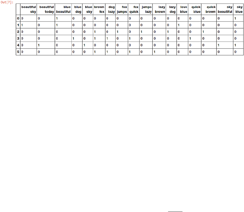
Chapter 4 ■ Feature engineering and SeleCtion
213
Figure4-17 clearly shows our bi-gram feature vectors where each feature is a bi-gram of two contiguous
words and the values depict the frequency of that bi-gram in each document. You can use the ngram_range
parameter to extend the n-gram range to get n-grams of higher orders. Typically n-grams until order three
are sufficient for most tasks in Machine Learning and natural language processing.
TF-IDF Model
There are some potential problems which might arise with the Bag of Words model when it is used on large
corpora. Since the feature vectors are based on absolute term frequencies, there might be some terms which
occur frequently across all documents and these will tend to overshadow other terms in the feature set. The
TF-IDF model tries to combat this issue by using a scaling or normalizing factor in its computation. TF-IDF
stands for Term Frequency-Inverse Document Frequency, which uses a combination of two metrics in
its computation, namely: term frequency (tf ) and inverse document frequency (idf). This technique was
developed for ranking results for queries in search engines and now it is an indispensable model in the
world of information retrieval and text analytics.
Mathematically, we can define TF-IDF as tfidf = tf x idf, which can be expanded further to be
represented as follows.
tfidfwDtfwDidf wD tf wD C
df w
,,
()
=
()
´
()
=
()
´
()
æ
è
ç
ç
ö
ø
÷
÷
,,
log
Here, tfidf (w, D) is the TF-IDF score for word w in document D. The term tf (w, D) represents the term
frequency of the word w in document D, which can be obtained from the Bag of Words model. The term
idf (w, D) is the inverse document frequency for the term w, which can be computed as the log transform
of the total number of documents in the corpus C divided by the document frequency of the word w,
which is basically the frequency of documents in the corpus where the word w occurs. The following code
depicts TF-IDF based feature engineering on our corpus.
In [8]: from sklearn.feature_extraction.text import TfidfVectorizer
...:
...: tv = TfidfVectorizer(min_df=0., max_df=1., use_idf=True)
...: tv_matrix = tv.fit_transform(norm_corpus)
...: tv_matrix = tv_matrix.toarray()
...:
...: vocab = tv.get_feature_names()
...: pd.DataFrame(np.round(tv_matrix, 2), columns=vocab)
Figure 4-17. Bi-gram feature vectors for our corpus based on bag of n-grams model
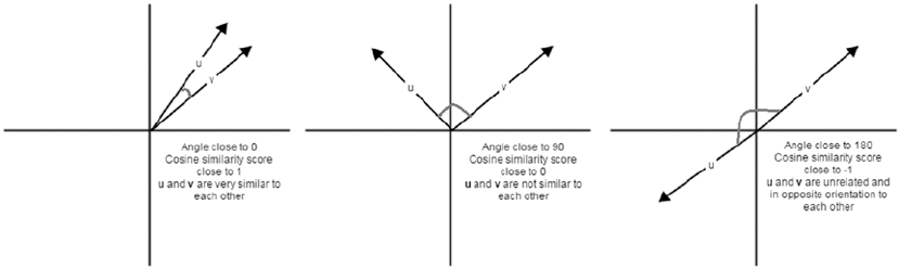
Chapter 4 ■ Feature engineering and SeleCtion
214
Out[8]:
beautiful blue brown dog fox jumps lazy love quick sky today
0 0.60 0.52 0.00 0.00 0.00 0.00 0.00 0.00 0.00 0.60 0.00
1 0.46 0.39 0.00 0.00 0.00 0.00 0.00 0.66 0.00 0.46 0.00
2 0.00 0.00 0.38 0.38 0.38 0.54 0.38 0.00 0.38 0.00 0.00
3 0.00 0.36 0.42 0.42 0.42 0.00 0.42 0.00 0.42 0.00 0.00
4 0.36 0.31 0.00 0.00 0.00 0.00 0.00 0.00 0.00 0.72 0.52
5 0.00 0.00 0.45 0.45 0.45 0.00 0.45 0.00 0.45 0.00 0.00
Thus, the preceding output depicts the TF-IDF based feature vectors for each of our text documents.
Notice how this is a scaled and normalized version as compared to the raw Bag of Words model. Interested
readers who might want to dive into further details of how the internals of this model work can refer to page
181 of Text Analytics with Python (Apress; Dipanjan Sarkar, 2016).
Document Similarity
You can even build on top of the tf-idf based features we engineered in the previous section and use them
to generate new features which can be useful in multiple applications. An example of this is computing
document similarity. This is very useful in domains like search engines, document clustering, and
information retrieval. Document similarity is the process of using a distance or similarity based metric that
can be used to identify how similar a text document is with another document based on features extracted
from the documents like bag of words or tf-idf. Pairwise document similarity in a corpus involves computing
document similarity for each pair of documents in a corpus. Thus if you have C documents in a corpus, you
would end up with a C x C matrix such that each row and column represents the similarity score for a pair of
documents, which represent the indices at the row and column, respectively.
There are several similarity and distance metrics that are used to compute document similarity. These
include cosine distance/similarity, BM25 distance, Hellinger-Bhattacharya distance, jaccard distance,
and so on. In our analysis, we will be using perhaps the most popular and widely used similarity metric,
cosine similarity. Cosine similarity basically gives us a metric representing the cosine of the angle between
the feature vector representations of two text documents. Figure4-18 shows some typical feature vector
alignments for text documents.
Figure 4-18. Cosine similarity depictions for text document feature vectors (Source: Text Analytics with
Python, Apress)
Chapter 4 ■ Feature engineering and SeleCtion
215
From Figure4-18, we can clearly see that feature vectors having a similar orientation will be very
close to one another and the angle between them will be closer to 0° and thus cosine similarity would
be cos 0° = 1 When cosine similarity is close to cos 90° = 0, the angle between the documents is closer
to 90° indicating they are far apart and hence not very similar. Similarity scores close to -1 indicate the
documents have completely opposite orientation as the angle between them would be closer to 180°.
The following code helps us compute pairwise cosine similarity for all the documents in our sample corpus.
In [9]: from sklearn.metrics.pairwise import cosine_similarity
...:
...: similarity_matrix = cosine_similarity(tv_matrix)
...: similarity_df = pd.DataFrame(similarity_matrix)
...: similarity_df
Out[9]:
0 1 2 3 4 5
0 1.000000 0.753128 0.000000 0.185447 0.807539 0.000000
1 0.753128 1.000000 0.000000 0.139665 0.608181 0.000000
2 0.000000 0.000000 1.000000 0.784362 0.000000 0.839987
3 0.185447 0.139665 0.784362 1.000000 0.109653 0.933779
4 0.807539 0.608181 0.000000 0.109653 1.000000 0.000000
5 0.000000 0.000000 0.839987 0.933779 0.000000 1.000000
From the pairwise similarity matrix obtained in the preceding output, we can clearly see that
documents 0, 1, and 4 have very strong similarity among one another. Also documents 2, 3, and 5 have
strong similarity among themselves. This must indicate they all have some similar features. This is a perfect
example of grouping or clustering that can be solved by unsupervised learning.
Let’s use K-means clustering to try to use the features to see if we can actually cluster or group these
documents based on their feature representations. In K-means clustering, we have an input parameter k,
which specifies the number of clusters it will output using the document features. This clustering method is a
centroid based clustering method, where it tries to cluster these documents into clusters of equal variance. It
tries to create these clusters by minimizing the within-cluster sum of squares measure, also known as inertia.
The following snippet builds a clustering model using our similarity features to cluster our text documents.
In [10]: from sklearn.cluster import KMeans
...:
...: km = KMeans(n_clusters=2)
...: km.fit_transform(similarity_df)
...: cluster_labels = km.labels_
...: cluster_labels = pd.DataFrame(cluster_labels, columns=['ClusterLabel'])
...: pd.concat([corpus_df, cluster_labels], axis=1)
Out[10]:
Document Category ClusterLabel
0 The sky is blue and beautiful. weather 0
1 Love this blue and beautiful sky! weather 0
2 The quick brown fox jumps over the lazy dog. animals 1
3 The brown fox is quick and the blue dog is lazy! animals 1
4 The sky is very blue and the sky is very beaut... weather 0
5 The dog is lazy but the brown fox is quick! animals 1
The output obtained clearly shows us that our K-means clustering model has labeled our documents
into two clusters with labels 0 and 1. We can also see that these labels are correct where labels with value
0 indicate documents relevant to weather and labels with value 1 indicate documents relevant to animals.
Thus you can see how useful these features are in document clustering and categorization!
Chapter 4 ■ Feature engineering and SeleCtion
216
Topic Models
Besides document terms, phrases and similarities, we can also use some summarization techniques to
extract topic or concept based features from text documents. The idea of topic models revolves around the
process of extracting key themes or concepts from a corpus of documents which are represented as topics.
Each topic can be represented as a bag or collection of words/terms from the document corpus. Together,
these terms signify a specific topic, theme or a concept and each topic can be easily distinguished from other
topics by virtue of the semantic meaning conveyed by these terms. These concepts can range from simple
facts and statements to opinions and outlook. Topic models are extremely useful in summarizing large
corpus of text documents to extract and depict key concepts. They are also useful in extracting features from
text data that capture latent patterns in the data.
There are various techniques for topic modeling and most of them involve some form of matrix
decomposition. Some techniques like Latent Semantic Indexing (LSI) use matrix decomposition operations,
more specifically Singular Valued Decomposition (refer back to important mathematical concepts in
Chapter 1), to split a term-document matrix (transpose of our TF-IDF document-term feature matrix) into
three matrices, U, S & VT. You can use the left singular vectors in matrix U and multiply it by the singular
vectors S to get terms and their weights (signifying importance) per topic. You can use scikit-learn or
gensim to use LSI based topic modeling.
Another technique is Latent Dirichlet Allocation (LDA), which uses a generative probabilistic model
where each document consists of a combination of several topics and each term or word can be assigned to
a specific topic. This is similar to pLSI based model (probabilistic LSI). Each latent topic contains a Dirichlet
prior over them in the case of LDA. The math behind this is pretty involving and it would not be possible to
go into details in the current scope. Interested readers can refer to page 241 of Text Analytics with Python
(Apress; Dipanjan Sarkar, 2016) for further details on LDA. For the purpose of feature engineering, you
need to remember that when LDA is applied on a document-term matrix (TF-IDF feature matrix), it gets
decomposed into two main components. A document-topic matrix, which would be the feature matrix we
are looking for and a topic-term matrix, which helps us in looking at potential topics in the corpus. The
following code builds an LDA model to extract features and topics from our sample corpus.
In [11]: from sklearn.decomposition import LatentDirichletAllocation
...:
...: lda = LatentDirichletAllocation(n_topics=2, max_iter=100, random_state=42)
...: dt_matrix = lda.fit_transform(tv_matrix)
...: features = pd.DataFrame(dt_matrix, columns=['T1', 'T2'])
...: features
Out[11]:
T1 T2
0 0.190615 0.809385
1 0.176860 0.823140
2 0.846148 0.153852
3 0.815229 0.184771
4 0.180563 0.819437
5 0.839140 0.160860
Thus, the dt_matrix refers to the document-topic matrix giving us two features since we chose number
of topics to be 2. You can also use the other matrix obtained from the decomposition, the topic-term matrix
to see the topics extracted from our corpus using the LDA model using the following code.
In [12]: tt_matrix = lda.components_
...: for topic_weights in tt_matrix:
...: topic = [(token, weight) for token, weight in zip(vocab, topic_weights)]
...: topic = sorted(topic, key=lambda x: -x[1])
Chapter 4 ■ Feature engineering and SeleCtion
217
...: topic = [item for item in topic if item[1] > 0.6]
...: print(topic)
...: print()
[('fox', 1.7265536238698524), ('quick', 1.7264910761871224), ('dog', 1.7264019823624879),
('brown', 1.7263774760262807), ('lazy', 1.7263567668213813), ('jumps', 1.0326450363521607),
('blue', 0.7770158513472083)]
[('sky', 2.263185143458752), ('beautiful', 1.9057084998062579), ('blue',
1.7954559705805626), ('love', 1.1476805311187976), ('today', 1.0064979209198706)]
The preceding output represents each of the two topics as a collection of terms and their importance
is depicted by the corresponding weight. It is definitely interesting to see that the two topics are quite
distinguishable from each other by looking at the terms. The first topic shows terms relevant to animals and
the second topic shows terms relevant to weather. This is reinforced by applying our unsupervised K-means
clustering algorithm on our document-topic feature matrix (dt_matrix) using the following code snippet.
In [13]: km = KMeans(n_clusters=2)
...: km.fit_transform(features)
...: cluster_labels = km.labels_
...: cluster_labels = pd.DataFrame(cluster_labels, columns=['ClusterLabel'])
...: pd.concat([corpus_df, cluster_labels], axis=1)
Out[13]:
Document Category ClusterLabel
0 The sky is blue and beautiful. weather 0
1 Love this blue and beautiful sky! weather 0
2 The quick brown fox jumps over the lazy dog. animals 1
3 The brown fox is quick and the blue dog is lazy! animals 1
4 The sky is very blue and the sky is very beaut... weather 0
5 The dog is lazy but the brown fox is quick! animals 1
This clearly makes sense and we can see that by just using two topic-model based features, we are still
able to cluster our documents efficiently!
Word Embeddings
There are several advanced word vectorization models that have recently gained a lot of prominence. Almost
all of them deal with the concept of word embeddings. Basically, word embeddings can be used for feature
extraction and language modeling. This representation tries to map each word or phrase into a complete
numeric vector such that semantically similar words or terms tend to occur closer to each other and
these can be quantified using these embeddings. The word2vec model is perhaps one of the most popular
neural network based probabilistic language models and can be used to learn distributed representational
vectors for words. Word embeddings produced by word2vec involve taking in a corpus of text documents,
representing words in a large high dimensional vector space such that each word has a corresponding vector
in that space and similar words (even semantically) are located close to one another, analogous to what we
observed in document similarity earlier.
The word2vec model was released by Google in 2013 and uses a neural network based implementation
with architectures like continuous Bag of Words and Skip-Grams to learn the distributed vector
representations of words in a corpus. We will be using the gensim framework to implement the same model
on our corpus to extract features. Some of the important parameters in the model are explained briefly as
follows.
Chapter 4 ■ Feature engineering and SeleCtion
218
• size: Represents the feature vector size for each word in the corpus when
transformed.
• window: Sets the context window size specifying the length of the window of words to
be taken into account as belonging to a single, similar context when training.
• min_count: Specifies the minimum word frequency value needed across the corpus
to consider the word as a part of the final vocabulary during training the model.
• sample: Used to downsample the effects of words which occur very frequently.
The following snippet builds a word2vec embedding model on the documents of our sample corpus.
Remember to tokenize each document before passing it to the model.
In [14]: from gensim.models import word2vec
...:
...: wpt = nltk.WordPunctTokenizer()
...: tokenized_corpus = [wpt.tokenize(document) for document in norm_corpus]
...:
...: # Set values for various parameters
...: feature_size = 10 # Word vector dimensionality
...: window_context = 10 # Context window size
...: min_word_count = 1 # Minimum word count
...: sample = 1e-3 # Downsample setting for frequent words
...:
...: w2v_model = word2vec.Word2Vec(tokenized_corpus, size=feature_size,
...: window=window_context, min_count = min_word_count,
...: sample=sample)
Using TensorFlow backend.
Each word in the corpus will essentially now be a vector itself of size 10. We can verify the same using
the following code.
In [15]: w2v_model.wv['sky']
Out[15]:
array([ 0.02626196, -0.02171229, -0.04910386, 0.0194816 , 0.01649994,
0.01200452, 0.04641563, 0.01844106, 0.02693636, -0.02992732], dtype=float32)
A question might arise in your mind now that so far, we had feature vectors for each complete
document, but now we have vectors for each word. How on earth do we represent entire documents now?
We can do that using various aggregation and combinations. A simple scheme would be to use an averaged
word vector representation, where we simply sum all the word vectors occurring in a document and then
divide by the count of word vectors to represent an averaged word vector for the document. The following
code enables us to do the same.
In [16]: def average_word_vectors(words, model, vocabulary, num_features):
...:
...: feature_vector = np.zeros((num_features,),dtype="float64")
...: nwords = 0.
...:
...: for word in words:
...: if word in vocabulary:
...: nwords = nwords + 1.
Chapter 4 ■ Feature engineering and SeleCtion
219
...: feature_vector = np.add(feature_vector, model[word])
...:
...: if nwords:
...: feature_vector = np.divide(feature_vector, nwords)
...:
...: return feature_vector
...:
...:
...: def averaged_word_vectorizer(corpus, model, num_features):
...: vocabulary = set(model.wv.index2word)
...: features = [average_word_vectors(tokenized_sentence, model, vocabulary,
num_features)
...: for tokenized_sentence in corpus]
...: return np.array(features)
In [17]: w2v_feature_array = averaged_word_vectorizer(corpus=tokenized_corpus, model=w2v_model,
...: num_features=feature_size)
...: pd.DataFrame(w2v_feature_array)
Thus, we have our averaged word vector based feature set for all our corpus documents, as depicted
by the dataframe in Figure4-19. Let’s use a different clustering algorithm this time known as Affinity
Propagation to try to cluster our documents based on these new features. Affinity Propagation is based on
the concept of message passing and you do not need to specify the number of clusters beforehand like you
did in K-means clustering.
In [18]: from sklearn.cluster import AffinityPropagation
...:
...: ap = AffinityPropagation()
...: ap.fit(w2v_feature_array)
...: cluster_labels = ap.labels_
...: cluster_labels = pd.DataFrame(cluster_labels, columns=['ClusterLabel'])
...: pd.concat([corpus_df, cluster_labels], axis=1)
Out[18]:
Document Category ClusterLabel
0 The sky is blue and beautiful. weather 0
1 Love this blue and beautiful sky! weather 0
2 The quick brown fox jumps over the lazy dog. animals 1
Figure 4-19. Averaged word vector feature set for our corpus documents
Chapter 4 ■ Feature engineering and SeleCtion
220
3 The brown fox is quick and the blue dog is lazy! animals 1
4 The sky is very blue and the sky is very beaut... weather 0
5 The dog is lazy but the brown fox is quick! animals 1
The preceding output uses the averaged word vectors based on word embeddings to cluster
the documents in our corpus and we can clearly see that it has obtained the right clusters! There are
several other schemes of aggregating word vectors like using TF-IDF weights along with the word vector
representations. Besides this there have been recent advancements in the field of Deep Learning where
architectures like RNNs and LSTMs are also used for engineering features from text data.
Feature Engineering on Temporal Data
Temporal data involves datasets that change over a period of time and time-based attributes are of
paramount importance in these datasets. Usually temporal attributes include some form of data, time,
and timestamp values and often optionally include other metadata like time zones, daylight savings time
information, and so on. Temporal data, especially time-series based data is extensively used in multiple
domains like stock, commodity, and weather forecasting. You can load feature_engineering_temporal.
py directly and start running the examples or use the jupyter notebook, Feature Engineering on Temporal
Data.ipynb, for a more interactive experience. Let’s load the following dependencies before we move on to
acquiring some temporal data.
In [1]: import datetime
...: import numpy as np
...: import pandas as pd
...: from dateutil.parser import parse
...: import pytz
We will now use some sample time-based data as our source of temporal data by loading the following
values in a dataframe.
In [2]: time_stamps = ['2015-03-08 10:30:00.360000+00:00', '2017-07-13 15:45:05.755000-07:00',
...: '2012-01-20 22:30:00.254000+05:30', '2016-12-25
00:30:00.000000+10:00']
...: df = pd.DataFrame(time_stamps, columns=['Time'])
...: df
Out[2]:
Time
0 2015-03-08 10:30:00.360000+00:00
1 2017-07-13 15:45:05.755000-07:00
2 2012-01-20 22:30:00.254000+05:30
3 2016-12-25 00:30:00.000000+10:00
Of course by default, they are stored as strings or text in the dataframe so we can convert time into
Timestamp objects by using the following code snippet.
In [3]: ts_objs = np.array([pd.Timestamp(item) for item in np.array(df.Time)])
...: df['TS_obj'] = ts_objs
...: ts_objs
Out[3]:
array([Timestamp('2015-03-08 10:30:00.360000+0000', tz='UTC'),
Chapter 4 ■ Feature engineering and SeleCtion
221
Timestamp('2017-07-13 15:45:05.755000-0700', tz='pytz.FixedOffset(-420)'),
Timestamp('2012-01-20 22:30:00.254000+0530', tz='pytz.FixedOffset(330)'),
Timestamp('2016-12-25 00:30:00+1000', tz='pytz.FixedOffset(600)')], dtype=object)
You can clearly see from the temporal values that we have multiple components for each Timestamp
object which include date, time, and even a time based offset, which can be used to identify the time zone
also. Of course there is no way we can directly ingest or use these features in any Machine Learning model.
Hence we need specific strategies to extract meaningful features from this data. In the following sections, we
cover some of these strategies that you can start using on your own temporal data in the future.
Date-Based Features
Each temporal value has a date component that can be used to extract useful information and features
pertaining to the date. These include features and components like year, month, day, quarter, day of the
week, day name, day and week of the year, and many more. The following code depicts how we can obtain
some of these features from our temporal data.
In [4]: df['Year'] = df['TS_obj'].apply(lambda d: d.year)
...: df['Month'] = df['TS_obj'].apply(lambda d: d.month)
...: df['Day'] = df['TS_obj'].apply(lambda d: d.day)
...: df['DayOfWeek'] = df['TS_obj'].apply(lambda d: d.dayofweek)
...: df['DayName'] = df['TS_obj'].apply(lambda d: d.weekday_name)
...: df['DayOfYear'] = df['TS_obj'].apply(lambda d: d.dayofyear)
...: df['WeekOfYear'] = df['TS_obj'].apply(lambda d: d.weekofyear)
...: df['Quarter'] = df['TS_obj'].apply(lambda d: d.quarter)
...:
...: df[['Time', 'Year', 'Month', 'Day', 'Quarter',
...: 'DayOfWeek', 'DayName', 'DayOfYear', 'WeekOfYear']]
The features depicted in Figure4-20 show some of the attributes we talked about earlier and have
been derived purely from the date segment of each temporal value. Each of these features can be used
as categorical features and further feature engineering can be done like one hot encoding, aggregations,
binning, and more.
Figure 4-20. Date based features in temporal data
Chapter 4 ■ Feature engineering and SeleCtion
222
Time-Based Features
Each temporal value also has a time component that can be used to extract useful information and features
pertaining to the time. These include attributes like hour, minute, second, microsecond, UTC offset, and
more. The following code snippet extracts some of the previously mentioned time-based features from our
temporal data.
In [5]: df['Hour'] = df['TS_obj'].apply(lambda d: d.hour)
...: df['Minute'] = df['TS_obj'].apply(lambda d: d.minute)
...: df['Second'] = df['TS_obj'].apply(lambda d: d.second)
...: df['MUsecond'] = df['TS_obj'].apply(lambda d: d.microsecond)
...: df['UTC_offset'] = df['TS_obj'].apply(lambda d: d.utcoffset())
...:
...: df[['Time', 'Hour', 'Minute', 'Second', 'MUsecond', 'UTC_offset']]
The features depicted in Figure4-21 show some of the attributes we talked about earlier which have
been derived purely from the time segment of each temporal value. We can further engineer these features
based on categorical feature engineering techniques and even derive other features like extracting time
zones. Let’s try to use binning to bin each temporal value into a specific time of the day by leveraging the
Hour feature we just obtained.
In [6]: hour_bins = [-1, 5, 11, 16, 21, 23]
...: bin_names = ['Late Night', 'Morning', 'Afternoon', 'Evening', 'Night']
...: df['TimeOfDayBin'] = pd.cut(df['Hour'],
...: bins=hour_bins, labels=bin_names)
...: df[['Time', 'Hour', 'TimeOfDayBin']]
Out[6]:
Time Hour TimeOfDayBin
0 2015-03-08 10:30:00.360000+00:00 10 Morning
1 2017-07-13 15:45:05.755000-07:00 15 Afternoon
2 2012-01-20 22:30:00.254000+05:30 22 Night
3 2016-12-25 00:30:00.000000+10:00 0 Late Night
Thus you can see from the preceding output that based on hour ranges (0-5, 5-11, 11-16, 16-21,
21-23) we have assigned a specific time of the day bin for each temporal value. The UTC offset component
of the temporal data is very useful in knowing how far ahead or behind is that time value from the UTC
(Coordinated Universal Time), which is the primary time standard that clocks and time are regulated from.
This information can also be used to engineer new features like potential time zones from which each
temporal value might have been obtained. The following code helps us achieve the same.
Figure 4-21. Time based features in temporal data
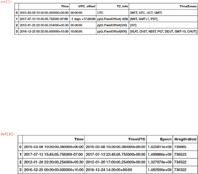
Chapter 4 ■ Feature engineering and SeleCtion
223
In [7]: df['TZ_info'] = df['TS_obj'].apply(lambda d: d.tzinfo)
...: df['TimeZones'] = df['TS_obj'].apply(lambda d: list({d.astimezone(tz).tzname()
...: for tz in map(pytz.timezone,
...: pytz.all_timezones_set)
...: if d.astimezone(tz).utcoffset() == d.utcoffset()}))
...:
...: df[['Time', 'UTC_offset', 'TZ_info', 'TimeZones']]
Thus as we mentioned earlier, the features depicted in Figure4-22 show some of the attributes
pertaining to time zone relevant information for each temporal value. We can also get time components in
other formats, like the Epoch, which is basically the number of seconds that have elapsed since January 1,
1970 (midnight UTC) and the Gregorian Ordinal, where January 1st of year 1 is represented as 1 and so on.
The following code helps us extract these representations. See Figure4-23.
In [8]: df['TimeUTC'] = df['TS_obj'].apply(lambda d: d.tz_convert(pytz.utc))
...: df['Epoch'] = df['TimeUTC'].apply(lambda d: d.timestamp())
...: df['GregOrdinal'] = df['TimeUTC'].apply(lambda d: d.toordinal())
...:
...: df[['Time', 'TimeUTC', 'Epoch', 'GregOrdinal']]
Do note we converted each temporal value to UTC before deriving the other features. These alternate
representations of time can be further used for easy date arithmetic. The epoch gives us time elapsed in
seconds and the Gregorian ordinal gives us time elapsed in days. We can use this to derive further features
like time elapsed from the current time or time elapsed from major events of importance based on the
problem we are trying to solve. Let’s compute the time elapsed for each temporal value since the current
time. See Figure4-24.
In [9]: curr_ts = datetime.datetime.now(pytz.utc)
...: # compute days elapsed since today
...: df['DaysElapsedEpoch'] = (curr_ts.timestamp() - df['Epoch']) / (3600*24)
...: df['DaysElapsedOrdinal'] = (curr_ts.toordinal() - df['GregOrdinal'])
...:
...: df[['Time', 'TimeUTC', 'DaysElapsedEpoch', 'DaysElapsedOrdinal']]
Figure 4-22. Time zone relevant features in temporal data
Figure 4-23. Time components depicted in various representations
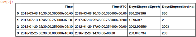
Chapter 4 ■ Feature engineering and SeleCtion
224
Based on our computations, each new derived feature should give us the elapsed time difference
between the current time and the time value in the Time column (actually TimeUTC since conversion to UTC
is necessary). Both the values are almost equal to one another, which is expected. Thus you can use time and
date arithmetic to extract and engineer more features which can help build better models. Alternate time
representations enable you to do date time arithmetic directly instead of dealing with specific API methods
of Timestamp and datetime objects from Python. However you can use any method to get to the results you
want. It’s all about ease of use and efficiency!
Feature Engineering on Image Data
Another very popular format of unstructured data is images. Sound and visual data in the form of images,
video, and audio are very popular sources of data which pose a lot of challenge to data scientists in terms
of processing, storage, feature extraction and modeling. However their benefits as sources of data are quite
rewarding especially in the field of artificial intelligence and computer vision. Due to the unstructured
nature of data, it is not possible to directly use images for training models. If you are given a raw image, you
might have a hard time trying to think of ways to represent it so that any Machine Learning algorithm can
utilize it for model training. There are various strategies and techniques that can be used in this case to
engineer the right features from images. One of the core principles to remember when dealing with images
is that any image can be represented as a matrix of numeric pixel values. With that thought in mind, let’s get
started! You can load feature_engineering_image.py directly and start running the examples or use the
jupyter notebook, Feature Engineering on Image Data.ipynb, for a more interactive experience. Let’s
start by loading the necessary dependencies and configuration settings.
In [1]: import skimage
...: import numpy as np
...: import pandas as pd
...: import matplotlib.pyplot as plt
...: from skimage import io
...:
...: %matplotlib inline
The scikit-image (skimage) library is an excellent framework consisting of several useful interfaces
and algorithms for image processing and feature extraction. Besides this, we will also leverage the mahotas
framework, which is useful in computer vision and image processing. Open CV is another useful framework
that you can check out if interested in aspects pertaining to computer vision. Let’s now look at ways to
represent images as useful feature vector representations.
Figure 4-24. Deriving elapsed time difference from current time
Chapter 4 ■ Feature engineering and SeleCtion
225
Image Metadata Features
There are tons of useful features obtainable from the image metadata itself without even processing the
image. Most of this information can be found from the EXIF data, which is usually recorded for each image
by the device when the picture is being taken. Following are some of the popular features that are obtainable
from the image EXIF data.
• Image create date and time
• Image dimensions
• Image compression format
• Device make and model
• Image resolution and aspect ratio
• Image artist
• Flash, aperture, focal length, and exposure
For more details on what other data points can be used as features from image EXIF metadata,
you can refer to https://sno.phy.queensu.ca/~phil/exiftool/TagNames/EXIF.html, which lists the
possible EXIF tags.
Raw Image and Channel Pixels
An image can be represented by the value of each of its pixels as a two dimensional array. We can leverage
numpy arrays for this. However, color images usually have three components also known as channels. The
R, G, and B channels stand for the red, green, and blue channels, respectively. This can be represented as
a three dimensional array (m, n, c) where m indicates the number of rows in the image, n indicates the
number of columns. These are determined by the image dimensions. The c indicates which channel it
represents (R, G or B). Let’s load some sample color images now and try to understand their representation.
In [2]: cat = io.imread('datasets/cat.png')
...: dog = io.imread('datasets/dog.png')
...: df = pd.DataFrame(['Cat', 'Dog'], columns=['Image'])
...:
...: print(cat.shape, dog.shape)
(168, 300, 3) (168, 300, 3)
In [3]: fig = plt.figure(figsize = (8,4))
...: ax1 = fig.add_subplot(1,2, 1)
...: ax1.imshow(cat)
...: ax2 = fig.add_subplot(1,2, 2)
...: ax2.imshow(dog)
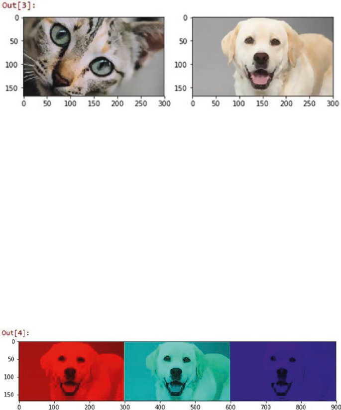
Chapter 4 ■ Feature engineering and SeleCtion
226
We can clearly see from Figure4-25 that we have two images of a cat and a dog having dimensions
168x300 pixels where each row and column denotes a specific pixel of the image. The third dimension
indicates these are color images having three color channels. Let’s now try to use numpy indexing to slice out
and extract the three color channels separately for the dog image.
In [4]: dog_r = dog.copy() # Red Channel
...: dog_r[:,:,1] = dog_r[:,:,2] = 0 # set G,B pixels = 0
...: dog_g = dog.copy() # Green Channel
...: dog_g[:,:,0] = dog_r[:,:,2] = 0 # set R,B pixels = 0
...: dog_b = dog.copy() # Blue Channel
...: dog_b[:,:,0] = dog_b[:,:,1] = 0 # set R,G pixels = 0
...:
...: plot_image = np.concatenate((dog_r, dog_g, dog_b), axis=1)
...: plt.figure(figsize = (10,4))
...: plt.imshow(plot_image)
We can clearly see from Figure4-26 how we can easily use numpy indexing and extract out the three
color channels from the sample image. You can now refer to any of these channel’s raw image pixel matrix
and even flatten it if needed to form a feature vector.
In [5]: dog_r[:,:,0]
Out[5]:
array([[160, 160, 160, ..., 113, 113, 112],
[160, 160, 160, ..., 113, 113, 112],
...,
Figure 4-25. Our two sample color images
Figure 4-26. Extracting red, green, and blue channels from our color RGB image
Chapter 4 ■ Feature engineering and SeleCtion
227
[165, 165, 165, ..., 212, 211, 210],
[165, 165, 165, ..., 210, 210, 209],
[164, 164, 164, ..., 209, 209, 209]], dtype=uint8)
This image pixel matrix is a two-dimensional matrix so you can extract features from this further or even
flatten it to a one-dimensional vector to use as inputs for any Machine Learning algorithm.
Grayscale Image Pixels
If you are dealing with color images, it might get difficult working with multiple channels and
three-dimensional arrays. Hence converting images to grayscale is a nice way of keeping the necessary pixel
intensity values but getting an easy to process two-dimensional image. Grayscale images usually capture the
luminance or intensity of each pixel such that each pixel value can be computed using the equation
Y = 0.2125 x R + 0.7154 x G + 0.0721 x B
Where R, G & B are the pixel values of the three channels and Y captures the final pixel intensity
information and is usually ranges from 0(complete intensity absence - black) to 1(complete intensity
presence - white). The following snippet shows us how to convert RGB color images to grayscale and extract
the raw pixel values, which can be used as features.
In [6]: from skimage.color import rgb2gray
...:
...: cgs = rgb2gray(cat)
...: dgs = rgb2gray(dog)
...:
...: print('Image shape:', cgs.shape, '\n')
...:
...: # 2D pixel map
...: print('2D image pixel map')
...: print(np.round(cgs, 2), '\n')
...:
...: # flattened pixel feature vector
...: print('Flattened pixel map:', (np.round(cgs.flatten(), 2)))
Image shape: (168, 300)
2D image pixel map
[[ 0.42 0.41 0.41 ..., 0.5 0.52 0.53]
[ 0.41 0.41 0.4 ..., 0.51 0.52 0.54]
...,
[ 0.11 0.11 0.1 ..., 0.51 0.51 0.51]
[ 0.11 0.11 0.1 ..., 0.51 0.51 0.51]]
Flattened pixel map: [ 0.42 0.41 0.41 ..., 0.51 0.51 0.51]
Binning Image Intensity Distribution
We already obtained the raw image intensity values for the grayscale images in the previous section. One
approach would be to use these raw pixel values themselves as features. Another approach would be to binning
the image intensity distribution based on intensity values using a histogram and using the bins as features. The
following code snippet shows us how the image intensity distribution looks for the two sample images.
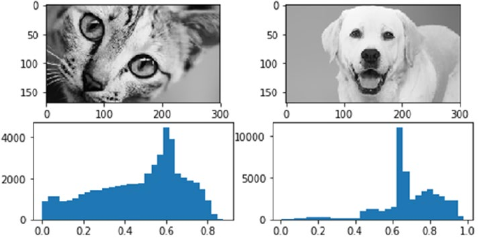
Chapter 4 ■ Feature engineering and SeleCtion
228
In [7]: fig = plt.figure(figsize = (8,4))
...: ax1 = fig.add_subplot(2,2, 1)
...: ax1.imshow(cgs, cmap="gray")
...: ax2 = fig.add_subplot(2,2, 2)
...: ax2.imshow(dgs, cmap='gray')
...: ax3 = fig.add_subplot(2,2, 3)
...: c_freq, c_bins, c_patches = ax3.hist(cgs.flatten(), bins=30)
...: ax4 = fig.add_subplot(2,2, 4)
...: d_freq, d_bins, d_patches = ax4.hist(dgs.flatten(), bins=30)
As we mentioned, image intensity ranges from 0 to 1 and is evident by the x-axes depicted in
Figure4-27. The y-axes depict the frequency of the respective bins. We can clearly see that the dog image
has more concentration of the bin frequencies around 0.6 - 0.8 indicating higher intensity and the reason
for that being that the Labrador dog is white in color and white has a high intensity value like we mentioned
in the previous section. The variables c_freq, c_bins, and d_freq, d_bins can be used to get the numeric
values pertaining to the bins and used as features.
Image Aggregation Statistics
We already obtained the raw image intensity values for the grayscale images in the previous section.
One approach would be to use them as features directly or use some level of aggregations and statistical
measures which can be obtained from the pixels and intensity. We already saw an approach of binning
intensity values using histograms. In this section, we use descriptive statistical measures and aggregations to
compute specific features from the image pixel values.
We can compute RGB ranges for each image by basically subtracting the maximum from the minimum
value for pixel values in each channel. The following code helps us achieve this.
In [8]: from scipy.stats import describe
...:
...: cat_rgb = cat.reshape((168*300), 3).T
...: dog_rgb = dog.reshape((168*300), 3).T
Figure 4-27. Binning image intensity distributions with histograms
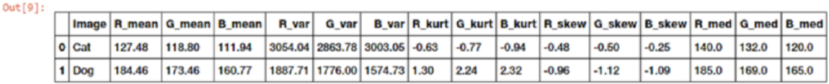
Chapter 4 ■ Feature engineering and SeleCtion
229
...:
...: cs = describe(cat_rgb, axis=1)
...: ds = describe(dog_rgb, axis=1)
...:
...: cat_rgb_range = cs.minmax[1] - cs.minmax[0]
...: dog_rgb_range = ds.minmax[1] - ds.minmax[0]
...: rgb_range_df = pd.DataFrame([cat_rgb_range, dog_rgb_range],
...: columns=['R_range', 'G_range', 'B_range'])
...: pd.concat([df, rgb_range_df], axis=1)
Out[8]:
Image R_range G_range B_range
0 Cat 240 223 235
1 Dog 246 250 246
We can then use these range features as specific characteristic attributes of each image. Besides this, we
can also compute other metrics like mean, median, variance, skewness, and kurtosis for each image channel
as follows.
In [9]: cat_stats= np.array([np.round(cs.mean, 2),np.round(cs.variance, 2),
...: np.round(cs.kurtosis, 2),np.round(cs.skewness, 2),
...: np.round(np.median(cat_rgb, axis=1), 2)]).flatten()
...: dog_stats= np.array([np.round(ds.mean, 2),np.round(ds.variance, 2),
...: np.round(ds.kurtosis, 2),np.round(ds.skewness, 2),
...: np.round(np.median(dog_rgb, axis=1), 2)]).flatten()
...:
...: stats_df = pd.DataFrame([cat_stats, dog_stats],
...: columns=['R_mean', 'G_mean', 'B_mean', 'R_var', 'G_var',
...: 'B_var', 'R_kurt', 'G_kurt', 'B_kurt', 'R_skew',
...: 'G_skew', 'B_skew', 'R_med', 'G_med', 'B_med'])
...: pd.concat([df, stats_df], axis=1)
We can observe from the features obtained in Figure4-28 that the mean, median, and kurtosis values
for the various channels for the dog image are mostly greater than corresponding ones in the cat image.
Variance and skewness are however more for the cat image.
Edge Detection
One of the more interesting and sophisticated techniques involve detecting edges in an image. Edge
detection algorithms can be used to detect sharp intensity and brightness changes in an image and find
areas of interest. The canny edge detector algorithm developed by John Canny is one of the most widely
used edge detector algorithms today. This algorithm typically involves using a Gaussian distribution with
a specific standard deviation σ (sigma) to smoothen and denoise the image. Then we apply a Sobel filter
to extract image intensity gradients. Norm value of this gradient is used to determine the edge strength.
Figure 4-28. Image channel aggregation statistical features
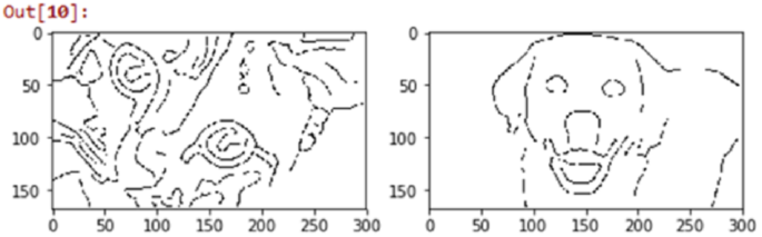
Chapter 4 ■ Feature engineering and SeleCtion
230
Potential edges are thinned down to curves with width of 1 pixel and hysteresis based thresholding is used
to label all points above a specific high threshold as edges and then recursively use the low threshold value
to label points above the low threshold as edges connected to any of the previously labeled points. The
following code applied the canny edge detector to our sample images.
In [10]: from skimage.feature import canny
...:
...: cat_edges = canny(cgs, sigma=3)
...: dog_edges = canny(dgs, sigma=3)
...:
...: fig = plt.figure(figsize = (8,4))
...: ax1 = fig.add_subplot(1,2, 1)
...: ax1.imshow(cat_edges, cmap='binary')
...: ax2 = fig.add_subplot(1,2, 2)
...: ax2.imshow(dog_edges, cmap='binary')
The image plots based on the edge feature arrays depicted in Figure4-29 clearly show the prominent
edges of our cat and dog. You can use these edge feature arrays (cat_edges and dog_edges) by flattening
them, extracting pixel values and positions pertaining to the edges (non-zero values), or even by aggregating
them like finding out the total number of pixels making edges, mean value, and so on.
Object Detection
Another interesting technique in the world of computer vision is object detection where features useful
in highlighting specific objects in the image are detected and extracted. The histogram of oriented
gradients, also known as HOG, is one of the techniques that’s extensively used in object detection. Going
into the details of this technique would not be possible in the current scope but for the process of feature
engineering, you need to remember that the HOG algorithm works by following a sequence of steps similar
to edge detection. The image is normalized and denoised to remove excess illumination effects. First
order image gradients are computed to capture image attributes like contour, texture, and so on. Gradient
histograms are built on top of these gradients based on specific windows called cells. Finally these cells
are normalized and a flattened feature descriptor is obtained, which can be used as a feature vector for our
models. The following code shows the HOG object detection technique on our sample images.
In [11]: from skimage.feature import hog
...: from skimage import exposure
...:
Figure 4-29. Canny edge detection to extract edge based features
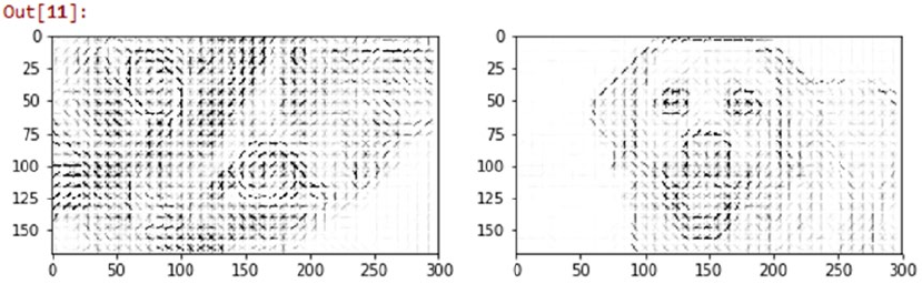
Chapter 4 ■ Feature engineering and SeleCtion
231
...: fd_cat, cat_hog = hog(cgs, orientations=8, pixels_per_cell=(8, 8),
...: cells_per_block=(3, 3), visualise=True)
...: fd_dog, dog_hog = hog(dgs, orientations=8, pixels_per_cell=(8, 8),
...: cells_per_block=(3, 3), visualise=True)
...:
...: # rescaling intensity to get better plots
...: cat_hogs = exposure.rescale_intensity(cat_hog, in_range=(0, 0.04))
...: dog_hogs = exposure.rescale_intensity(dog_hog, in_range=(0, 0.04))
...:
...: fig = plt.figure(figsize = (10,4))
...: ax1 = fig.add_subplot(1,2, 1)
...: ax1.imshow(cat_hogs, cmap='binary')
...: ax2 = fig.add_subplot(1,2, 2)
...: ax2.imshow(dog_hogs, cmap='binary')
The image plots in Figure4-30 show us how the HOG detector has identified the objects in our sample
images. You can also get the flattened feature descriptors as follows.
In [12]: print(fd_cat, fd_cat.shape)
[ 0.00288784 0.00301086 0.0255757 ..., 0. 0. 0. ] (47880,)
Localized Feature Extraction
We have talked about aggregating pixel values from two-dimensional image or feature matrices and also
flattening them into feature vectors. Localized feature extraction based techniques are slightly better
methods which try to detect and extract localized feature descriptors on various small localized regions of
our input images. This is hence rightly named localized feature extraction. We will be using the popular and
patented SURF algorithm invented by Herbert Bay, etal. SURF stands for Speeded Up Robust Features. The
main idea is to get scale invariant local feature descriptors from images which can be used later as image
features. This algorithm is similar to the popular SIFT algorithm. There are mainly two major phases in this
algorithm. The first phase is to detect points of interest using square shaped filters and hessian matrices. The
second phase is to build feature descriptors by extracting localized features around these points of interest.
There are usually computed by taking a localized square image region around a point of interest and then
aggregating Haar wavelet responses at specific interval based sample points. We use the mahotas Python
framework for extracting SURF feature descriptors from our sample images.
Figure 4-30. HOG object detector to extract features based on object detection
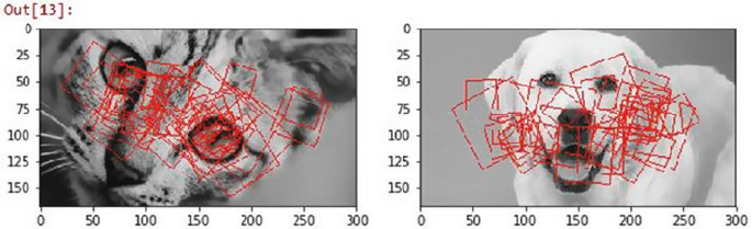
Chapter 4 ■ Feature engineering and SeleCtion
232
In [13]: from mahotas.features import surf
...: import mahotas as mh
...:
...: cat_mh = mh.colors.rgb2gray(cat)
...: dog_mh = mh.colors.rgb2gray(dog)
...:
...: cat_surf = surf.surf(cat_mh, nr_octaves=8, nr_scales=16, initial_step_size=1,
threshold=0.1, max_points=50)
...: dog_surf = surf.surf(dog_mh, nr_octaves=8, nr_scales=16, initial_step_size=1,
threshold=0.1, max_points=54)
...:
...: fig = plt.figure(figsize = (10,4))
...: ax1 = fig.add_subplot(1,2, 1)
...: ax1.imshow(surf.show_surf(cat_mh, cat_surf))
...: ax2 = fig.add_subplot(1,2, 2)
...: ax2.imshow(surf.show_surf(dog_mh, dog_surf))
Figure 4-31. Localized feature extraction with SURF
The square boxes in the image plots in Figure4-31 depict the square image regions around the points of
interest which were used for localized feature extraction. You can also use the surf.dense(...) function to
extract uniform dimensional feature descriptors at dense points with regular interval spacing in pixels. The
following code depicts how to achieve this.
In [14]: cat_surf_fds = surf.dense(cat_mh, spacing=10)
...: dog_surf_fds = surf.dense(dog_mh, spacing=10)
...: cat_surf_fds.shape
Out[14]: (140, 64)
We see from the preceding output that we have obtained 140 feature descriptors of size 64 (elements)
each. You can further apply other schemes on this like aggregation, flattening, and so on to derive further
features. Another sophisticated technique that you can use to extract features on these SURF feature
descriptors is to use the visual bag of words model, which we discuss in the next section.
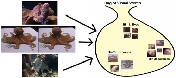
Chapter 4 ■ Feature engineering and SeleCtion
233
Visual Bag of Words Model
We have seen the effectiveness of the popular Bag of Words model in extracting meaningful features from
unstructured text documents. Bag of words refers to the document being broken down into its constituents,
words and computing frequency of occurrences or other measures like tf-idf. Similarly, in case of image raw
pixel matrices or derived feature descriptors from other algorithms, we can apply a bag of words principle.
However the constituents will not be words in this case but they will be subset of features/pixels extracted
from images which are similar to each other.
Imagine you have multiple pictures of octopuses and you were able to extract the 140 dense surf
features each having 64 values in each feature vector. You can now use an unsupervised learning algorithm
like clustering to extract clusters of similar feature descriptors. Each cluster can be labeled as a visual word
or a visual feature. Subsequently, each feature descriptor can be binned into one of these clusters or visual
words. Thus, you end up getting a one-dimensional visual bag of words vector with counts of number of
feature descriptors assigned to each of the visual words for the 140x64 feature descriptor matrix. Each
feature or visual word tends to capture some portion of the images that are similar to each other like octopus
eyes, tentacles, suckers, and so on, as depicted in Figure4-32.
The basic idea is hence to get a feature descriptor matrix from using any algorithm like SURF, apply an
unsupervised algorithm like K-means clustering, and extract out k bins or visual features/words and their
counts (based on number of feature descriptors assigned to each bin). Then for each subsequent image, once
you extract the feature descriptors, you can use the K-means model to assign each feature descriptor to one
of the visual feature clusters and get a one-dimensional vector of counts. This is depicted in Figure4-33 for
a sample octopus image, assuming our VBOW (Visual Bag of Words) model has three bins of eyes, tentacles,
and suckers.
Figure 4-32. Visual bag of words (Courtesy of Ian London, Image Classification in Python with Visual Bag
of Words)
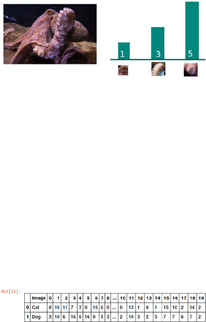
Chapter 4 ■ Feature engineering and SeleCtion
234
Figure 4-33. Transforming an image into a VBOW vector (Courtesy of Ian London, Image Classification in
Pythonwith Visual Bag of Words)
Thus you can see from Figure4-33, how a two-dimensional image and its corresponding feature
descriptors can be easily transformed into a one-dimensional VBOW vector [1, 3, 5]. Going into
extensive details of the VBOW model would not be possible in the current scope, but I would like to thank
my friend and fellow data scientist, Ian London, for helping me out with providing the two figures on VBOW
models. I would also recommend you to check out his wonderful blog article https://ianlondon.github.
io/blog/visual-bag-of-words/, which talks about using the VBOW model for image classification.
We will now use our 140x64 SURF feature descriptors for our two sample images and use K-means
clustering on them and compute VBOW vectors for each image by assigning each feature descriptor to one
of the bins. We will take k=20 in this case. See Figure4-34.
In [15]: from sklearn.cluster import KMeans
...:
...: k = 20
...: km = KMeans(k, n_init=100, max_iter=100)
...:
...: surf_fd_features = np.array([cat_surf_fds, dog_surf_fds])
...: km.fit(np.concatenate(surf_fd_features))
...:
...: vbow_features = []
...: for feature_desc in surf_fd_features:
...: labels = km.predict(feature_desc)
...: vbow = np.bincount(labels, minlength=k)
...: vbow_features.append(vbow)
...:
...: vbow_df = pd.DataFrame(vbow_features)
...: pd.concat([df, vbow_df], axis=1)
Figure 4-34. Transforming SURF descriptors into VBOW vectors for sample images
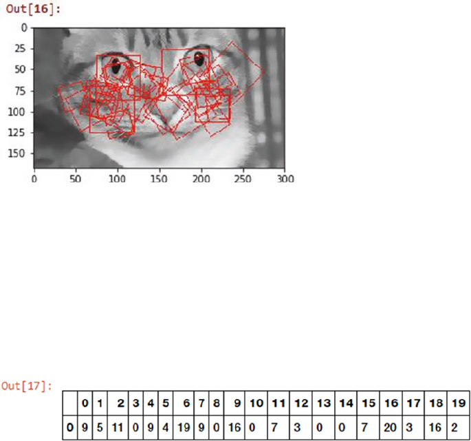
Chapter 4 ■ Feature engineering and SeleCtion
235
Figure 4-35. Localized feature extraction with SURF for new image
You can see how easy it is to transform complex two-dimensional SURF feature descriptor matrices into
easy to interpret VBOW vectors. Let’s now take a new image and think about how we could apply the VBOW
pipeline. First we would need to extract the SURF feature descriptors from the image using the following
snippet (This is only to depict the localized image subsets used in SURF we will actually use the dense
features as before.) See Figure4-35.
In [16]: new_cat = io.imread('datasets/new_cat.png')
...: newcat_mh = mh.colors.rgb2gray(new_cat)
...: newcat_surf = surf.surf(newcat_mh, nr_octaves=8, nr_scales=16, initial_step_size=1,
threshold=0.1, max_points=50)
...:
...: fig = plt.figure(figsize = (10,4))
...: ax1 = fig.add_subplot(1,2, 1)
...: ax1.imshow(surf.show_surf(newcat_mh, newcat_surf))
Let’s now extract the dense SURF features and transform them into a VBOW vector using our previously
trained VBOW model. The following code helps us achieve this. See Figure4-36.
In [17]: new_surf_fds = surf.dense(newcat_mh, spacing=10)
...:
...: labels = km.predict(new_surf_fds)
...: new_vbow = np.bincount(labels, minlength=k)
...: pd.DataFrame([new_vbow])
Thus you can see the final VBOW feature vector for the new image based on SURF feature descriptors. This
is also an example of using an unsupervised Machine Learning model for feature engineering. You can now
compare the similarity of this new image with the other two sample images using some similarity metrics.
Figure 4-36. Transforming new image SURF descriptors into a VBOW vector
Chapter 4 ■ Feature engineering and SeleCtion
236
In [18]: from sklearn.metrics.pairwise import euclidean_distances, cosine_similarity
...:
...: eucdis = euclidean_distances(new_vbow.reshape(1,-1) , vbow_features)
...: cossim = cosine_similarity(new_vbow.reshape(1,-1) , vbow_features)
...:
...: result_df = pd.DataFrame({'EuclideanDistance': eucdis[0],
...: 'CosineSimilarity': cossim[0]})
...: pd.concat([df, result_df], axis=1)
Out[18]:
Image CosineSimilarity EuclideanDistance
0 Cat 0.871609 21.260292
1 Dog 0.722096 30.000000
Based on the distance and similarity metrics, we can see that our new image (of a cat) is definitely closer
to the cat image than the dog image. Try this out with a bigger dataset to get better results!
Automated Feature Engineering with Deep Learning
We have used a lot of simple and sophisticated feature engineering techniques so far in this section. Building
complex feature engineering systems and pipelines is time consuming and building algorithms for the same
is even more tasking. Deep Learning is a novel and new approach toward automating this complex task of
feature engineering by making the machine extract features automatically by learning multiple layered and
complex representations of the underlying raw data.
Convolutional neural networks or CNNs are extensively used for automated feature extraction in
images. We have already covered the basic principles of CNNs in Chapter 1. Go ahead and refresh your
memory you heading to the “Important Concepts” sub-section under the “Deep Learning” section in
Chapter 1. Just like we mentioned before, the idea of CNNs operate on the principles of convolution and
pooling besides your regular activation function layers.
Convolutional layers typically slides or convolves learnable filters (also known as kernels or convolution
matrix) across the entire width and height of the input image pixels. Dot products between the input pixels
and the filter are computed at each position on sliding the filter. Two-dimensional activation maps for the
filter get created and consequently the network is able to learn these filters when it activates on detecting
specific features like edges, corners and so on. If we take n filters, we will get n separate two-dimensional
activation maps, which can then be stacked along the depth dimension to get the output volume.
Pooling is a kind of aggregation or downsampling layer where typically a non-linear downsampling
operation is inserted between convolutional layers. Filters are applied here too. They are slided along the
convolution output matrix and, for each sliding operation, also known as a stride, elements in the slice of
matrix covered by the pooling filter are either summed (Sum pooling) or averaged (Mean pooling) or the
maximum value is selected (Max pooling). More than often max pooling works really well in several real-
world scenarios. Pooling helps in reducing feature dimensionality and control model overfitting. Let’s now
try to use Deep Learning for automated feature extraction on our sample images using CNNs. Load the
following dependencies necessary for building deep networks.
In [19]: from keras.models import Sequential
...: from keras.layers.convolutional import Conv2D
...: from keras.layers.convolutional import MaxPooling2D
...: from keras import backend as K
Using TensorFlow backend.
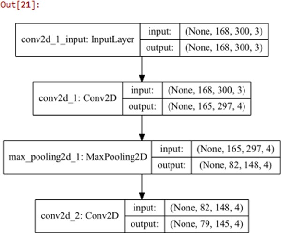
Chapter 4 ■ Feature engineering and SeleCtion
237
You can use Theano or Tensorflow as your backend Deep Learning framework for keras to work on.
I am using tensorflow in this scenario. Let’s build a basic two-layer CNN now with a Max Pooling layer
between them.
In [20]: model = Sequential()
...: model.add(Conv2D(4, (4, 4), input_shape=(168, 300, 3), activation='relu',
...: kernel_initializer='glorot_uniform'))
...: model.add(MaxPooling2D(pool_size=(2, 2)))
...: model.add(Conv2D(4, (4, 4), activation='relu',
...: kernel_initializer='glorot_uniform'))
We can actually visualize this network architecture using the following code snippet to understand the
layers that have been used in this network, in a better way.
In [21]: from IPython.display import SVG
...: from keras.utils.vis_utils import model_to_dot
...:
...: SVG(model_to_dot(model, show_shapes=True,
...: show_layer_names=True, rankdir='TB').create(prog='dot', format='svg'))
You can now understand from the depiction in Figure4-37 that we are using two two-dimensional
Convolutional layers containing four (4x4) filters. We also have a Max Pool layer between them of size (2x2)
for some downsampling. Let’s now build some functions to extract features from these intermediate network
layers.
Figure 4-37. Visualizing our two-layer convolutional neural network architecture
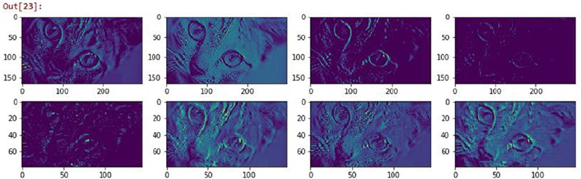
Chapter 4 ■ Feature engineering and SeleCtion
238
In [22]: first_conv_layer = K.function([model.layers[0].input, K.learning_phase()],
...: [model.layers[0].output])
...: second_conv_layer = K.function([model.layers[0].input, K.learning_phase()],
...: [model.layers[2].output])
Let’s now use these functions to extract the feature representations learned in the convolutional layers
and visualize these features to see what the network is trying to learn from the images.
In [23]: catr = cat.reshape(1, 168, 300,3)
...:
...: # extract features
...: first_conv_features = first_conv_layer([catr])[0][0]
...: second_conv_features = second_conv_layer([catr])[0][0]
...:
...: # view feature representations
...: fig = plt.figure(figsize = (14,4))
...: ax1 = fig.add_subplot(2,4, 1)
...: ax1.imshow(first_conv_features[:,:,0])
...: ax2 = fig.add_subplot(2,4, 2)
...: ax2.imshow(first_conv_features[:,:,1])
...: ax3 = fig.add_subplot(2,4, 3)
...: ax3.imshow(first_conv_features[:,:,2])
...: ax4 = fig.add_subplot(2,4, 4)
...: ax4.imshow(first_conv_features[:,:,3])
...:
...: ax5 = fig.add_subplot(2,4, 5)
...: ax5.imshow(second_conv_features[:,:,0])
...: ax6 = fig.add_subplot(2,4, 6)
...: ax6.imshow(second_conv_features[:,:,1])
...: ax7 = fig.add_subplot(2,4, 7)
...: ax7.imshow(second_conv_features[:,:,2])
...: ax8 = fig.add_subplot(2,4, 8)
...: ax8.imshow(second_conv_features[:,:,3])
Figure 4-38. Intermediate feature maps obtained after passing though convolutional Layers
Chapter 4 ■ Feature engineering and SeleCtion
239
The feature map visualizations depicted in Figure4-38 are definitely interesting. You can clearly see
that each feature matrix produced by the convolutional neural network is trying to learn something about
the image like its texture, corners, edges, illumination, hue, brightness, and so on. This should give you an
idea of how these activation feature maps can then be used as features for images. In fact you can stack the
output of a CNN, flatten it if needed, and pass it as an input layer to a multi-layer fully connected perceptron
neural network and use it to solve the problem of image classification. This should give you a head start on
automated feature extraction with the power of Deep Learning!
Don’t worry if you did not understand some of the terms mentioned in this section; we will cover Deep
Learning and CNNs in more depth in a subsequent chapter. If can’t wait to get started with Deep Learning,
you can fire up the bonus notebook provided with this chapter, called Bonus - Classifying handwritten
digits using Deep CNNs.ipynb, for a complete real-world example of applying CNNs and Deep Learning
to classify hand-written digits!
Feature Scaling
When dealing with numeric features, we have specific attributes which may be completely unbounded in nature,
like view counts of a video or web page hits. Using the raw values as input features might make models biased
toward features having really high magnitude values. These models are typically sensitive to the magnitude or
scale of features like linear or logistic regression. Other models like tree based methods can still work without
feature scaling. However it is still recommended to normalize and scale down the features with feature scaling,
especially if you want to try out multiple Machine Learning algorithms on input features. We have already seen
some examples of scaling and transforming features using log and box-cox transforms earlier in this chapter.
In this section, we look at some popular feature scaling techniques. You can load feature_scaling.py directly
and start running the examples or use the jupyter notebook, Feature Scaling.ipynb for a more interactive
experience. Let’s start by loading the following dependencies and configurations.
In [1]: from sklearn.preprocessing import StandardScaler, MinMaxScaler, RobustScaler
...: import numpy as np
...: import pandas as pd
...: np.set_printoptions(suppress=True)
Let’s now load some sample data of user views pertaining to online videos. The following snippet
creates this sample dataset.
In [2]: views = pd.DataFrame([1295., 25., 19000., 5., 1., 300.], columns=['views'])
...: views
Out[2]:
views
0 1295.0
1 25.0
2 19000.0
3 5.0
4 1.0
5 300.0
From the preceding dataframe we can see that we have five videos that have been viewed by users and
the total view count for each video is depicted by the feature views. It is quite evident that some videos have
been viewed a lot more than the others, giving a rise to values of high scale and magnitude. Let’s look at how
we can scale this feature using several handy techniques.

Chapter 4 ■ Feature engineering and SeleCtion
240
Standardized Scaling
The standard scaler tries to standardize each value in a feature column by removing the mean and scaling
the variance to be 1 from the values. This is also known as centering and scaling and can be denoted
mathematically as
SS XX
i
iX
X
()
=
-
m
s
where each value in feature X is subtracted by the mean μX and the resultant is divided by the standard
deviation σX. This is also popularly known as Z-score scaling. You can also divide the resultant by the
variance instead of the standard deviation if needed. The following snippet helps us achieve this.
In [3]: ss = StandardScaler()
...: views['zscore'] = ss.fit_transform(views[['views']])
...: views
Out[3]:
views zscore
0 1295.0 -0.307214
1 25.0 -0.489306
2 19000.0 2.231317
3 5.0 -0.492173
4 1.0 -0.492747
5 300.0 -0.449877
We can see the standardized and scaled values in the zscore column in the preceding dataframe. In
fact, you can manually use the formula we used earlier to compute the same result. The following example
computes the z-score mathematically.
In [4]: vw = np.array(views['views'])
...: (vw[0] - np.mean(vw)) / np.std(vw)
Out[4]: -0.30721413311687235
Min-Max Scaling
With min-max scaling, we can transform and scale our feature values such that each value is within the
range of [0, 1]. However the MinMaxScaler class in scikit-learn also allows you to specify your own upper
and lower bound in the scaled value range using the feature_range variable. Mathematically we can
represent this scaler as
MMS X
XX
XX
i
i
()
=-
()
()
-
()
min
maxmin
where we scale each value in the feature X by subtracting it from the minimum value in the feature min
(X) and dividing the resultant by the difference between the maximum and minimum values in the feature
max(X) - min (X). The following snippet helps us compute this.
In [5]: mms = MinMaxScaler()
...: views['minmax'] = mms.fit_transform(views[['views']])

Chapter 4 ■ Feature engineering and SeleCtion
241
...: views
Out[5]:
views zscore minmax
0 1295.0 -0.307214 0.068109
1 25.0 -0.489306 0.001263
2 19000.0 2.231317 1.000000
3 5.0 -0.492173 0.000211
4 1.0 -0.492747 0.000000
5 300.0 -0.449877 0.015738
The preceding output shows the min-max scaled values in the minmax column and as expected, the
maximum viewed video in row index 2 has a value of 1, and the minimum viewed video in row index 4 has a
value of 0. You can also compute this mathematically using the following code (sample computation for the
first row).
In [6]: (vw[0] - np.min(vw)) / (np.max(vw) - np.min(vw))
Out[6]: 0.068108847834096528
Robust Scaling
The disadvantage of min-max scaling is that often the presence of outliers affects the scaled values for any
feature. Robust scaling tries to use specific statistical measures to scale features without being affected by
outliers. Mathematically this scaler can be represented as
RS XXmedianX
IQRX
i
i
()
=
-
()
()
()
13,
where we scale each value of feature X by subtracting the median of X and dividing the resultant by the IQR
also known as the Inter-Quartile Range of X which is the range (difference) between the first quartile (25th
%ile) and the third quartile (75th %ile). The following code performs robust scaling on our sample feature.
In [7]: rs = RobustScaler()
...: views['robust'] = rs.fit_transform(views[['views']])
...: views
Out[7]:
views zscore minmax robust
0 1295.0 -0.307214 0.068109 1.092883
1 25.0 -0.489306 0.001263 -0.132690
2 19000.0 2.231317 1.000000 18.178528
3 5.0 -0.492173 0.000211 -0.151990
4 1.0 -0.492747 0.000000 -0.155850
5 300.0 -0.449877 0.015738 0.132690
The scaled values are depicted in the robust column and you can compare them with the scaled
features in the other columns. You can also compute the same using the mathematical equation we
formulated for the robust scaler as depicted in the following snippet (for the first row index value).
In [8]: quartiles = np.percentile(vw, (25., 75.))
Chapter 4 ■ Feature engineering and SeleCtion
242
...: iqr = quartiles[1] - quartiles[0]
...: (vw[0] - np.median(vw)) / iqr
Out[8]: 1.0928829915560916
There are several other techniques for feature scaling and normalization, but these should be sufficient
to get you started and are used extensively in building Machine Learning systems. Always remember to
check if you need to scale and standardize features whenever you are dealing with numerical features.
Feature Selection
While it is good to try to engineering features that try to capture some latent representations and patterns
in the underlying data, it is not always a good thing to deal with feature sets having maybe thousands
of features or even more. Dealing with a large number of features bring us to the concept of the curse of
dimensionality which we mentioned earlier during the “Bin Counting” section in “Feature Engineering on
Categorical Data”. More features tend to make models more complex and difficult to interpret. Besides this,
it can often lead to models over-fitting on the training data. This basically leads to a very specialized model
tuned only to the data which it used for training and hence even if you get a high model performance, it
will end up performing very poorly on new, previously unseen data. The ultimate objective is to select an
optimal number of features to train and build models that generalize very well on the data and prevent
overfitting.
Feature selection strategies can be divided into three main areas based on the type of strategy and
techniques employed for the same. They are described briefly as follows.
• Filter methods: These techniques select features purely based on metrics like
correlation, mutual information and so on. These methods do not depend on results
obtained from any model and usually check the relationship of each feature with
the response variable to be predicted. Popular methods include threshold based
methods and statistical tests.
• Wrapper methods: These techniques try to capture interaction between multiple
features by using a recursive approach to build multiple models using feature
subsets and select the best subset of features giving us the best performing model.
Methods like backward selecting and forward elimination are popular wrapper
based methods.
• Embedded methods: These techniques try to combine the benefits of the other
two methods by leveraging Machine Learning models themselves to rank and score
feature variables based on their importance. Tree based methods like decision trees
and ensemble methods like random forests are popular examples of embedded
methods.
The benefits of feature selection include better performing models, less overfitting, more generalized
models, less time for computations and model training, and to get a good insight into understanding
the importance of various features in your data. In this section, we look at some of the most widely used
techniques in feature selection. You can load feature_selection.py directly and start running the
examples or use the jupyter notebook, Feature Selection.ipynb for a more interactive experience. Let’s
start by loading the following dependencies and configurations.
In [1]: import numpy as np
...: import pandas as pd
...: np.set_printoptions(suppress=True)
...: pt = np.get_printoptions()['threshold']
Chapter 4 ■ Feature engineering and SeleCtion
243
We will now look at various ways of selecting features including statistical and model based techniques
by using some sample datasets.
Threshold-Based Methods
This is a filter based feature selection strategy, where you can use some form of cut-off or thresholding for
limiting the total number of features during feature selection. Thresholds can be of various forms. Some of
them can be used during the feature engineering process itself, where you can specify threshold parameters.
A simple example of this would be to limit feature terms in the Bag of Words model, which we used for text
based feature engineering earlier. The scikit-learn framework provides parameters like min_df and max_
df which can be used to specify thresholds for ignoring terms which have document frequency above and
below user specified thresholds. The following snippet depicts a way to do this.
In [2]: from sklearn.feature_extraction.text import CountVectorizer
...:
...: cv = CountVectorizer(min_df=0.1, max_df=0.85, max_features=2000)
...: cv
Out[2]:
CountVectorizer(analyzer='word', binary=False, decode_error='strict',
dtype=<class 'numpy.int64'>, encoding='utf-8', input='content',
lowercase=True, max_df=0.85, max_features=2000, min_df=0.1,
ngram_range=(1, 1), preprocessor=None, stop_words=None,
strip_accents=None, token_pattern='(?u)\\b\\w\\w+\\b',
tokenizer=None, vocabulary=None)
This basically builds a count vectorizer which ignores feature terms which occur in less than 10% of the
total corpus and also ignores terms which occur in more than 85% of the total corpus. Besides this we also
put a hard limit of 2000 maximum features in the feature set.
Another way of using thresholds is to use variance based thresholding where features having low
variance (below a user-specified threshold) are removed. This signifies that we want to remove features that
have values that are more or less constant across all the observations in our datasets. We can apply this to
our Pokémon dataset, which we used earlier in this chapter. First we convert the Generation feature to a
categorical feature as follows.
In [3]: df = pd.read_csv('datasets/Pokemon.csv')
...: poke_gen = pd.get_dummies(df['Generation'])
...: poke_gen.head()
Out[3]:
Gen 1 Gen 2 Gen 3 Gen 4 Gen 5 Gen 6
0 1 0 0 0 0 0
1 1 0 0 0 0 0
2 1 0 0 0 0 0
3 1 0 0 0 0 0
4 1 0 0 0 0 0
Next, we want to remove features from the one hot encoded features where the variance is less than
0.15. We can do this using the following snippet.
Chapter 4 ■ Feature engineering and SeleCtion
244
In [4]: from sklearn.feature_selection import VarianceThreshold
...:
...: vt = VarianceThreshold(threshold=.15)
...: vt.fit(poke_gen)
Out[4]: VarianceThreshold(threshold=0.15)
To view the variances as well as which features were finally selected by this algorithm, we can use the
variances_ property and the get_support(...) function respectively. The following snippet depicts this
clearly in a formatted dataframe.
In [5]: pd.DataFrame({'variance': vt.variances_,
...: 'select_feature': vt.get_support()},
...: index=poke_gen.columns).T
Out[5]:
Gen 1 Gen 2 Gen 3 Gen 4 Gen 5 Gen 6
select_feature True False True False True False
variance 0.164444 0.114944 0.16 0.128373 0.163711 0.0919937
We can clearly see which features have been selected based on their True values and also their variance
being above 0.15. To get the final subset of selected features, you can use the following code.
In [6]: poke_gen_subset = poke_gen.iloc[:,vt.get_support()].head()
...: poke_gen_subset
Out[6]:
Gen 1 Gen 3 Gen 5
0 1 0 0
1 1 0 0
2 1 0 0
3 1 0 0
4 1 0 0
The preceding feature subset depicts that features Gen 1, Gen 3, and Gen 5 have been finally selected
out of the original six features.
Statistical Methods
Another widely used filter based feature selection method, which is slightly more sophisticated, is to
select features based on univariate statistical tests. You can use several statistical tests for regression and
classification based models including mutual information, ANOVA (analysis of variance) and chi-square
tests. Based on scores obtained from these statistical tests, you can select the best features on the basis
of their score. Let’s load a sample dataset now with 30 features. This dataset is known as the Wisconsin
Diagnostic Breast Cancer dataset, which is also available in its native or raw format at https://archive.
ics.uci.edu/ml/datasets/Breast+Cancer+Wisconsin+(Diagnostic), which is the UCI Machine Learning
repository. We will use scikit-learn to load the data features and the response class variable.
In [7]: from sklearn.datasets import load_breast_cancer
...:
...: bc_data = load_breast_cancer()
...: bc_features = pd.DataFrame(bc_data.data, columns=bc_data.feature_names)
...: bc_classes = pd.DataFrame(bc_data.target, columns=['IsMalignant'])
...:
Chapter 4 ■ Feature engineering and SeleCtion
245
...: # build featureset and response class labels
...: bc_X = np.array(bc_features)
...: bc_y = np.array(bc_classes).T[0]
...: print('Feature set shape:', bc_X.shape)
...: print('Response class shape:', bc_y.shape)
Feature set shape: (569, 30)
Response class shape: (569,)
We can clearly see that, as we mentioned before, there are a total of 30 features in this dataset and a
total of 569 rows of observations. To get some more detail into the feature names and take a peek at the data
points, you can use the following code.
In [8]: np.set_printoptions(threshold=30)
...: print('Feature set data [shape: '+str(bc_X.shape)+']')
...: print(np.round(bc_X, 2), '\n')
...: print('Feature names:')
...: print(np.array(bc_features.columns), '\n')
...: print('Response Class label data [shape: '+str(bc_y.shape)+']')
...: print(bc_y, '\n')
...: print('Response variable name:', np.array(bc_classes.columns))
...: np.set_printoptions(threshold=pt)
Feature set data [shape: (569, 30)]
[[ 17.99 10.38 122.8 ..., 0.27 0.46 0.12]
[ 20.57 17.77 132.9 ..., 0.19 0.28 0.09]
[ 19.69 21.25 130. ..., 0.24 0.36 0.09]
...,
[ 16.6 28.08 108.3 ..., 0.14 0.22 0.08]
[ 20.6 29.33 140.1 ..., 0.26 0.41 0.12]
[ 7.76 24.54 47.92 ..., 0. 0.29 0.07]]
Feature names:
['mean radius' 'mean texture' 'mean perimeter' 'mean area'
'mean smoothness' 'mean compactness' 'mean concavity'
'mean concave points' 'mean symmetry' 'mean fractal dimension'
'radius error' 'texture error' 'perimeter error' 'area error'
'smoothness error' 'compactness error' 'concavity error'
'concave points error' 'symmetry error' 'fractal dimension error'
'worst radius' 'worst texture' 'worst perimeter' 'worst area'
'worst smoothness' 'worst compactness' 'worst concavity'
'worst concave points' 'worst symmetry' 'worst fractal dimension']
Response Class label data [shape: (569,)]
[0 0 0 ..., 0 0 1]
Response variable name: ['IsMalignant']
This gives us a better perspective on the data we are dealing with. The response class variable is a binary
class where 1 indicates the tumor detected was benign and 0 indicates it was malignant. We can also see
the 30 features that are real valued numbers that describe characteristics of cell nuclei present in digitized
images of breast mass. Let’s now use the chi-square test on this feature set and select the top 15 best features
out of the 30 features. The following snippet helps us achieve this.
Chapter 4 ■ Feature engineering and SeleCtion
246
In [9]: from sklearn.feature_selection import chi2, SelectKBest
...:
...: skb = SelectKBest(score_func=chi2, k=15)
...: skb.fit(bc_X, bc_y)
Out[9]: SelectKBest(k=15, score_func=<function chi2 at 0x0000018C2BEB7840>)
You can see that we have passed our input features (bc_X) and corresponding response class outputs
(bc_y) to the fit(...) function when computing the necessary metrics. The chi-square test will compute
statistics between each feature and the class variable (univariate tests). Selecting the top K features is more
than likely to remove features having a low score and consequently they are most likely to be independent
of the class variable and hence not useful in building models. We sort the scores to see the most relevant
features using the following code.
In [10]: feature_scores = [(item, score) for item, score in zip(bc_data.feature_names,
skb.scores_)]
...: sorted(feature_scores, key=lambda x: -x[1])[:10]
Out[10]:
[('worst area', 112598.43156405364),
('mean area', 53991.655923750892),
('area error', 8758.5047053344697),
('worst perimeter', 3665.0354163405909),
('mean perimeter', 2011.1028637679051),
('worst radius', 491.68915743332195),
('mean radius', 266.10491719517802),
('perimeter error', 250.57189635982184),
('worst texture', 174.44939960571074),
('mean texture', 93.897508098633352)]
We can now create a subset of the 15 selected features obtained from our original feature set of 30
features with the help of the chi-square test by using the following code.
In [11]: select_features_kbest = skb.get_support()
...: feature_names_kbest = bc_data.feature_names[select_features_kbest]
...: feature_subset_df = bc_features[feature_names_kbest]
...: bc_SX = np.array(feature_subset_df)
...: print(bc_SX.shape)
...: print(feature_names_kbest)
(569, 15)
['mean radius' 'mean texture' 'mean perimeter' 'mean area' 'mean concavity'
'radius error' 'perimeter error' 'area error' 'worst radius'
'worst texture' 'worst perimeter' 'worst area' 'worst compactness'
'worst concavity' 'worst concave points']
Thus from the preceding output, you can see that our new feature subset bc_SX has 569 observations
of 15 features instead of 30 and we also printed the names of the selected features for your ease of
understanding. To view the new feature set, you can use the following snippet.
In [12]: np.round(feature_subset_df.iloc[20:25], 2)
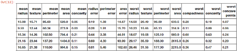
Chapter 4 ■ Feature engineering and SeleCtion
247
The dataframe with the top scoring features is depicted in Figure4-39. Let’s now build a simple
classification model using logistic regression on the original feature set of 30 features and compare the
model accuracy performance with another model built using our selected 15 features. For model evaluation,
we will use the accuracy metric (percent of correct predictions) and use a five-fold cross-validation scheme.
We will be covering model evaluation and tuning strategies in detail in Chapter 5, so do not despair if
you cannot understand some of the terminology right now. The main idea here is to compare the model
prediction performance between models trained on different feature sets.
In [13]: from sklearn.linear_model import LogisticRegression
...: from sklearn.model_selection import cross_val_score
...:
...: # build logistic regression model
...: lr = LogisticRegression()
...:
...: # evaluating accuracy for model built on full featureset
...: full_feat_acc = np.average(cross_val_score(lr, bc_X, bc_y, scoring='accuracy', cv=5))
...: # evaluating accuracy for model built on selected featureset
...: sel_feat_acc = np.average(cross_val_score(lr, bc_SX, bc_y, scoring='accuracy', cv=5))
...:
...: print('Model accuracy statistics with 5-fold cross validation')
...: print('Model accuracy with complete feature set', bc_X.shape, ':', full_feat_acc)
...: print('Model accuracy with selected feature set', bc_SX.shape, ':', sel_feat_acc)
Model accuracy statistics with 5-fold cross validation
Model accuracy with complete feature set (569, 30) : 0.950904193921
Model accuracy with selected feature set (569, 15) : 0.952643324356
The accuracy metrics clearly show us that we actually built a better model having accuracy of 95.26%
when trained on the selected 15 feature subset as compared to the model built with the original 30 features
which had an accuracy of 95.09%. Try this out on your own datasets! Do you see any improvements?
Recursive Feature Elimination
You can also rank and score features with the help of a Machine Learning based model estimator such that
you recursively keep eliminating lower scored features till you arrive at the specific feature subset count.
Recursive Feature Elimination, also known as RFE, is a popular wrapper based feature selection technique,
which allows you to use this strategy. The basic idea is to start off with a specific Machine Learning estimator
like the Logistic Regression algorithm we used for our classification needs. Next we take the entire feature set
of 30 features and the corresponding response class variables. RFE aims to assign weights to these features
based on the model fit. Features with the smallest weights are pruned out and then a model is fit again on
Figure 4-39. Selected feature subset of the Wisconsin Diagnostic Breast Cancer dataset using chi-square tests
Chapter 4 ■ Feature engineering and SeleCtion
248
the remaining features to obtain the new weights or scores. This process is recursively carried out multiple
times and each time features with the lowest scores/weights are eliminated, until the pruned feature subset
contains the desired number of features that the user wanted to select (this is taken as an input parameter at
the start). This strategy is also popularly known as backward elimination. Let’s select the top 15 features on
our breast cancer dataset now using RFE.
In [14]: from sklearn.feature_selection import RFE
...:
...: lr = LogisticRegression()
...: rfe = RFE(estimator=lr, n_features_to_select=15, step=1)
...: rfe.fit(bc_X, bc_y)
Out[14]:
RFE(estimator=LogisticRegression(C=1.0, class_weight=None, dual=False, fit_intercept=True,
intercept_scaling=1, max_iter=100, multi_class='ovr', n_jobs=1,
penalty='l2', random_state=None, solver='liblinear', tol=0.0001,
verbose=0, warm_start=False),
n_features_to_select=15, step=1, verbose=0)
We can now use the get_support(...) function to obtain the final 15 selected features. This is depicted
in the following snippet.
In [15]: select_features_rfe = rfe.get_support()
...: feature_names_rfe = bc_data.feature_names[select_features_rfe]
...: print(feature_names_rfe)
['mean radius' 'mean texture' 'mean perimeter' 'mean smoothness'
'mean concavity' 'mean concave points' 'mean symmetry' 'texture error'
'worst radius' 'worst texture' 'worst smoothness' 'worst concavity'
'worst concave points' 'worst symmetry' 'worst fractal dimension']
Can we compare this feature subset with the one we obtained using statistical tests in the previous
section and see which features are common among both these subsets? Of course we can! Let’s use set
operations to get the list of features that were selected by both these techniques.
In [16]: set(feature_names_kbest) & set(feature_names_rfe)
Out[16]:
{'mean concavity', 'mean perimeter', 'mean radius', 'mean texture',
'worst concave points', 'worst concavity', 'worst radius', 'worst texture'}
Thus we can see that 8 out of 15 features are common and have been chosen by both the feature
selection techniques, which is definitely interesting!
Model-Based Selection
Tree based models like decision trees and ensemble models like random forests (ensemble of trees) can
be utilized not just for modeling alone but for feature selection. These models can be used to compute
feature importances when building the model that can in turn be used for selecting the best features and
discarding irrelevant features with lower scores. Random forest is an ensemble model. This can be used as
an embedded feature selection method, where each decision tree model in the ensemble is built by taking
a training sample of data from the entire dataset. This sample is a bootstrap sample (sample taken with
replacement). Splits at any node are taken by choosing the best split from a random subset of the features
rather than taking all the features into account. This randomness tends to reduce the variance of the model
Chapter 4 ■ Feature engineering and SeleCtion
249
at the cost of slightly increasing the bias. Overall this produces a better and more generalized model. We will
cover the bias-variance tradeoff in more detail in Chapter 5. Let’s now use the random forest model to score
and rank features based on their importance.
In [17]: from sklearn.ensemble import RandomForestClassifier
...:
...: rfc = RandomForestClassifier()
...: rfc.fit(bc_X, bc_y)
Out[17]:
RandomForestClassifier(bootstrap=True, class_weight=None, criterion='gini',
max_depth=None, max_features='auto', max_leaf_nodes=None,
min_impurity_split=1e-07, min_samples_leaf=1,
min_samples_split=2, min_weight_fraction_leaf=0.0,
n_estimators=10, n_jobs=1, oob_score=False, random_state=None,
verbose=0, warm_start=False)
The following code uses this random forest estimator to score the features based on their importance
and we display the top 10 most important features based on this score.
In [18]: importance_scores = rfc.feature_importances_
...: feature_importances = [(feature, score) for feature, score in zip(bc_data.feature_
names, importance_scores)]
...: sorted(feature_importances, key=lambda x: -x[1])[:10]
Out[18]:
[('worst area', 0.25116985146898885),
('worst radius', 0.16995187376059454),
('worst concavity', 0.1164662504282163),
('worst concave points', 0.11253251729478526),
('mean concave points', 0.10839170432994949),
('mean concavity', 0.063554137255925847),
('mean area', 0.023771318604377804),
('worst perimeter', 0.020636790800076958),
('worst texture', 0.019171556030722112),
('mean radius', 0.014908508522792335)]
You can now use a threshold based parameter to filter out the top n features as needed or you can even
make use of the SelectFromModel meta-transformer provided by scikit-learn by using it as a wrapper on
top of this model. Can you find out how many of the higher ranked features from the random forest model
are in common with the previous two feature selectors?
Dimensionality Reduction
Dealing with a lot of features can lead to issues like model overfitting, complex models, and many more that
all roll up to what we have mentioned as the curse of dimensionality. Refer to the section “Dimensionality
Reduction” in Chapter 1 to refresh your memory. Dimensionality reduction is the process of reducing
the total number of features in our feature set using strategies like feature selection or feature extraction.
We have already talked about feature selection extensively in the previous section. We now cover feature
extraction where the basic objective is to extract new features from the existing set of features such that
the higher-dimensional dataset with many features can be reduced into a lower-dimensional dataset of
these newly created features. A very popular technique of linear data transformation from higher to lower
dimensions is Principal Component Analysis, also known as PCA. Let’s try to understand more about PCA
and how we can use it for feature extraction in the following sections.

Chapter 4 ■ Feature engineering and SeleCtion
250
Feature Extraction with Principal Component Analysis
Principal component analysis, popularly known as PCA, is a statistical method that uses the process of
linear, orthogonal transformation to transform a higher-dimensional set of features that could be possibly
correlated into a lower-dimensional set of linearly uncorrelated features. These transformed and newly
created features are also known as Principal Components or PCs. In any PCA transformation, the total
number of PCs is always less than or equal to the initial number of features. The first principal component
tries to capture the maximum variance of the original set of features. Each of the succeeding components
tries to capture more of the variance such that they are orthogonal to the preceding components. An
important point to remember is that PCA is sensitive to feature scaling.
Our main task is to take a set of initial features with dimension let’s say D and reduce it to a subset of
extracted principal components of a lower dimension LD. The matrix decomposition process of Singular
Value Decomposition is extremely useful in helping us obtain the principal components. You can quickly
refresh your memory on SVD by referring to the sub-section of “Singular Value Decomposition” under the
“Important Concepts” in the “Mathematics” section in Chapter 1 to check out the necessary mathematical
formula and concepts. Considering we have a data matrix F(n x D), where we have n observations and
D dimensions (features), we can depict SVD of the feature matrix as (F(n x D)) = USVT such that all the principal
components are contained in the component VT, which can be depicted as follows:
V
PC
PC
PC
T
DD
D
D
DD
´
()
´
()
´
()
´
()
=¼
é
ë
ê
ê
ê
ê
ê
ù
û
ú
ú
ú
ú
ú
11
21
1
The principal components are represented by {PC1, PC2, ... PCD} , which are all one-dimensional vectors
of dimensions (1 x D). For extracting the first d principal components, we can first transpose this matrix to
obtain the following representation.
PC VPCPCPC
DD
TT
DD DD´
() () ()
()
=
()
=¼
é
ë
êù
û
ú
112
11
xx x
Now we can extract out the first d principal components such that d ≤ D and the reduced principal
component set can be depicted as follows.
PC VPCPCPC
DD
TT
DD DD´
() () ()
()
=
()
=¼
é
ë
êù
û
ú
112
11
xx x
Finally, to perform dimensionality reduction, we can get the reduced feature set using the following
mathematical transformation F(n x d) = F(n x D)⋅PC(D x d) where the dot product between the original feature
matrix and the reduced subset of principal components gives us a reduced feature set of d features. A very
important point to remember here is that you might need to center your initial feature matrix by removing
the mean because by default, PCA assumes that your data is centered around the origin.
Chapter 4 ■ Feature engineering and SeleCtion
251
Let’s try to extract the first three principal components now from our breast cancer feature set of
30 features using SVD. We first center our feature matrix and then use SVD and subsetting to extract the first
three PCs using the following code.
In [19]: # center the feature set
...: bc_XC = bc_X - bc_X.mean(axis=0)
...:
...: # decompose using SVD
...: U, S, VT = np.linalg.svd(bc_XC)
...:
...: # get principal components
...: PC = VT.T
...:
...: # get first 3 principal components
...: PC3 = PC[:, 0:3]
...: PC3.shape
Out[19]: (30, 3)
We can now get the reduced feature set of three features by using the dot product operation we
discussed earlier. The following snippet gives us the final reduced feature set that can be used for modeling.
# reduce feature set dimensionality
np.round(bc_XC.dot(PC3), 2)
Out[20]:
array([[-1160.14, -293.92, -48.58],
[-1269.12, 15.63, 35.39],
[ -995.79, 39.16, 1.71],
...,
[ -314.5 , 47.55, 10.44],
[-1124.86, 34.13, 19.74],
[ 771.53, -88.64, -23.89]])
Thus you can see how powerful SVD and PCA can be in helping us reduce dimensionality by extracting
necessary features. Of course in Machine Learning systems and pipelines you can use utilities from scikit-
learn instead of writing unnecessary code and equations. The following code enables us to perform PCA on
our breast cancer feature set leveraging scikit-learn's APIs.
In [21]: from sklearn.decomposition import PCA
...: pca = PCA(n_components=3)
...: pca.fit(bc_X)
Out[21]:
PCA(copy=True, iterated_power='auto', n_components=3, random_state=None,
svd_solver='auto', tol=0.0, whiten=False)
To understand how much of the variance is explained by each of these principal components, you can
use the following code.
In [22]: pca.explained_variance_ratio_
Out[22]: array([ 0.98204467, 0.01617649, 0.00155751])

Chapter 4 ■ Feature engineering and SeleCtion
252
From the preceding output, as expected, we can see the maximum variance is explained by the first
principal component. To obtain the reduced feature set, we can use the following snippet.
In [23]: bc_pca = pca.transform(bc_X)
...: np.round(bc_pca, 2)
Out[23]:
array([[ 1160.14, -293.92, 48.58],
[ 1269.12, 15.63, -35.39],
[ 995.79, 39.16, -1.71],
...,
[ 314.5 , 47.55, -10.44],
[ 1124.86, 34.13, -19.74],
[ -771.53, -88.64, 23.89]])
If you compare the values of this reduced feature set with the values obtained in our mathematical
implementation based code, you will see they are exactly the same except sign inversions in some cases.
The reason for sign inversion in some of the values in principal components is because the direction of these
principal components is unstable. The sign indicates direction. Hence even if the principal components point in
opposite directions, they should still be on the same plane and hence shouldn't have an effect when modeling
with this data.
Let’s now quickly build a logistic regression model as before and use model accuracy and five-fold cross
validation to evaluate the model quality using these three features.
In [24]: np.average(cross_val_score(lr, bc_pca, bc_y, scoring='accuracy', cv=5))
Out[24]: 0.92808003078106949
We can see from the preceding output that even though we used only three features derived from the
principal components instead of the original 30 features, we still obtained a model accuracy close to 93%,
which is quite decent!
Summary
This was a content packed chapter with a lot of hands-on examples based on real-world datasets. The main
intent of this chapter is to get you familiarized with essential concepts, tools, techniques, and strategies used
for feature extraction, engineering, scaling, and selection. One of the toughest tasks that data scientists face
day in and day out is data processing and feature engineering. Hence it is of paramount importance that you
understand the various aspects involved with deriving features from raw data. This chapter is intended to be
used both as a starting ground as well as a reference guide for understanding what techniques and strategy
should be applied when trying to engineer features on your own datasets. We cover the basic concepts of
feature engineering, scaling, and selection and also the importance behind each of these processes. Feature
engineering techniques are covered extensively for diverse data types including numerical, categorical, text,
Chapter 4 ■ Feature engineering and SeleCtion
253
temporal and images. Multiple feature scaling techniques are also covered, which are useful to tone down
the scale and magnitude of features before modeling. Finally, we cover feature selection techniques in detail
with emphasis on the three different strategies of feature selection namely filter, wrapper, and embedded
methods. Special sections on dimensionality reduction and automated feature extraction using Deep
Learning have also been included since they have gained a lot of prominence in both research as well as the
industry. I want to conclude this chapter by leaving you with the following quote by Peter Norvig, renowned
computer scientist and director at Google, which should reinforce the importance of feature engineering.
“More data beats clever algorithms, but better data beats more data.”
—Peter Norvig

255
© Dipanjan Sarkar, Raghav Bali and Tushar Sharma 2018
D. Sarkar et al., Practical Machine Learning with Python, https://doi.org/10.1007/978-1-4842-3207-1_5
CHAPTER 5
Building, Tuning,
and Deploying Models
A very popular saying in the Machine Learning community is “70% of Machine Learning is data processing”
and going by the structure of this book, the quote seems quite apt. In the preceding chapters, you saw how
you can extract, process, and transform data to convert it to a form suitable for learning using Machine
Learning algorithms. This chapter deals with the most important part of using that processed data, to
learn a model that you can then use to solve real-world problems. You also learned about the CRISP-DM
methodology for developing data solutions and projects—the step involving building and tuning these
models is the final step in the iterative cycle of Machine Learning.
If you followed all the steps prescribed in the earlier chapters by now you must have a cleaned and
processed data\feature set. This data will mostly be numeric in the form of arrays or dataframes (feature
set). Most Machine Learning algorithms require the data to be in a numeric format as at the heart of any
Machine Learning algorithm, we have some mathematical equations and an optimization problem to either
minimize error\loss or maximize profit. Hence Machine Learning algorithms always work on numeric data.
Check out Chapter 4 for feature engineering techniques to convert structured as well as unstructured data
into ready-to-use numeric formats. We start this chapter by learning about different types of algorithms you
can use. Then you will learn how to choose a relevant algorithm for the data that you have, you will then be
introduced to the concept of hyperparameters and learn how to tune the hyperparameters of any algorithm.
The chapter also covers a novel approach to interpreting models using open source frameworks. Besides
this, you will also learn about persisting and deploying the developed models so you can start using them for
your own needs and benefits.
Based on the preceding topics, the chapter includes into the following five major sections:
• Building models
• Model evaluation techniques
• Model tuning
• Model interpretation
• Deploying models in action
You should be fully acquainted with the material of the earlier chapters, since it will help in a better
understanding of the various aspects of this chapter. All the code snippets and examples used in this
chapter are available in the GitHub repository for this book at https://github.com/dipanjanS/practical-
machine-learning-with-python under the directory/folder for Chapter 5. You can refer to the Python file
named model_build_tune_deploy.py for all the examples used in this chapter and try the examples as you
read this chapter or you can even refer to the jupyter notebook named Building, Tuning and Deploying
Models.ipynb for a more interactive experience.
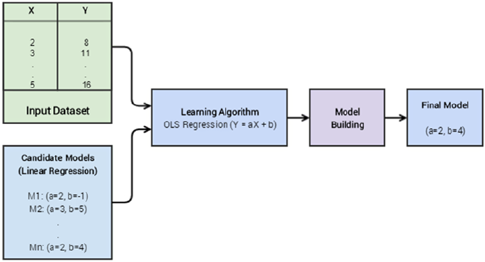
Chapter 5 ■ Building, tuning, and deploying Models
256
Building Models
Before we get on with the process of building models, we should try to understand what a model represents.
In the simplest of terms, a model can be described as a relationship between output or response variables
and its corresponding input or independent variables in a dataset. Sometimes this relationship can just be
among input variables (in case of datasets with no defined output or dependent variables). This relationship
among variables can be expressed in terms of mathematical equations, functions, and rules, which link the
output of the model to its inputs.
Consider the case of linear regression analysis, the output in that case is a set of parameters also known
as weights or coefficients (we explore this later in the chapter) and those parameters define the relationship
between the input and output variables. The idea is to build a model using a learning process, such that
you can learn the necessary parameters (coefficients) in the model that help translate the input variables
(independent) into the corresponding output variable (dependent) with the least error for a dataset
(leveraging validation metrics like mean squared error). The idea is not to predict a correct output value for
every input data point (leads to model over-fitting) but to generalize well over lots of data points such that
the error is minimum and the same is maintained when you use this model over new data points. This is
done by learning the right values of coefficients\parameters during the model building process. So when we
say we are learning a linear regression model, these are the set of important considerations implicit in that
statement. See Figure5-1.
When we specify linear regression as the candidate model, we define the nature of relationship
between our dependent and independent variables. The candidate model then becomes all the possible
combinations of parameters for our model (more on this later). The learning algorithm is the way to
determine the most optimal value of those parameters using some optimization process and validating the
performance with some metrics (such as mean squared error to reduce the overall error). The final model
is nothing but most optimal value of our parameters as selected by our learning algorithm. So in the case of
simple linear regression is nothing but a tuple containing the values of our two parameters, a and b. A point
to remember here is that the term parameter is analogous to coefficients or weights in a model. There are
some other types of parameters called hyperparameters, which represent higher-level meta-parameters
of the model and do not depend on the underlying data. They usually need to be set before we start the
Figure 5-1. A high-level representation of model building
Chapter 5 ■ Building, tuning, and deploying Models
257
building or learning process. Usually these hyperparameters are tuned to get the optimal values as a part of
the model-tuning phase (a part of the learning phase itself). Another important point to remember is that
the output model is generally dependent on the learning algorithm we choose for our data.
Model Types
Models can be differentiated on a variety of categories and nomenclatures. A lot of this is based on the
learning algorithm or method itself, which is used to build the model. Examples can be the model is linear
or nonlinear, what is the output of model, whether it is a parametric model or a non-parametric model,
whether it is supervised, unsupervised, or semi-supervised, whether it is an ensemble model or even a
Deep Learning based model. Refer to the section “Machine Learning Methods” in Chapter 1 to refresh your
memory of possible Machine Learning methods used for building models on datasets. In this section, we
focus on some of the most popular models from supervised and unsupervised learning methods.
Classification Models
Classification is one of the most readily recognizable Machine Learning tasks and it’s covered in detail in
Chapter 1. It is a subset of a broader class of Machine Learning problems known as supervised learning.
Supervised learning is the set of Machine Learning problems\tasks in which we have a labeled dataset with
input attributes and corresponding output labels or classes (discrete). These inputs and corresponding
outputs are then used in learning a generalized system, which can be used to predict results (output class
labels) for previously unseen data points. Classification is one major part of the overall supervised
learning domain.
The output of a classification model is normally a label or a category to which the input data point may
belong. The task of solving a classification (or in general any supervised) problem involves a training set of
data in which we have the data points labeled with their correct classes/categories. We then use supervised
Machine Learning algorithms specific to classification problems, to generalize something similar to a
classification function for our problem. The input to this classification function is exactly similar to the data
that we used to train our model. This input is typically data attributes or features that are generated in the
feature engineering step.
Typical classification models include the following major types of methods; however, the list is
not exhaustive.
• Linear models like logistic regression, Naïve Bayes, and support vector machines
• Non-parametric models like K-nearest neighbors
• Tree based methods like decision trees
• Ensemble methods like random forests (bagging) and gradient boosted machines
(boosting)
• Neural networks (MLPs)
Chapter 5 ■ Building, tuning, and deploying Models
258
Classification models can be further broken down on the type of output variables and the
number of output variables produced by them. This nomenclature is extremely important to understand
the type of classification problem you are dealing with by looking at the dataset attributes and the objective
to be solved.
• Binary classification: When we have a total of two categories to differentiate
between in the output response variable in the data, then the problem is termed as
a binary classification problem. Hence you would need an appropriate model that
performs binary classification (known as a binary classification model). A popular
binary classification problem is the “Email classification problem”. In this problem,
the candidate e-mails need to be classified and labeled into either of the two
different categories: “Spam” or “Non Spam” (also known as “Ham”).
• Multi-Class classification: This is an extension of the binary classification problem.
In this case we have more than two categories or classes into which our data can
be classified. An example of the multi-class classification problem is predicting
handwritten digits where a response variable can have any value ranging from 0 to
9. This becomes a 10-class classification problem. The multi-class classification is a
tough problem to solve and the general scheme for solving the multi-class problem
mostly involves some modifications of the binary classification problem.
• Multi-Label classification: These classification problems typically involve data
where the output variable is not always a single value but a vector having multiple
values or labels. A simple example is predicting categories of news articles that can
have multiple labels for each news article like science, politics, religion, and so on.
Classification models often output the actual class labels or probabilities for each possible class label
that gives a confidence level for each class in the prediction. The following are the major output formats
from classification models.
• Category classification output: In some classification models, the output for any
unknown data point is the predicted category or class label. These models usually
calculate the probabilities of all the categories, but report only one class label having
the maximum probability or confidence.
• Category probability classification output: In these classification models, the
output is the probability value of each possible class label. These models are
important when we want to further use the output produced by our classification
model for detailed analysis or to make complex decisions. A very simple example
can be a typical marketing candidate selection problem. In this problem, by getting
the probability output of a potential conversion, we can narrow down our marketing
expenses.
Regression Models
In classification models, we saw that the output variable predicted by the model was a discrete value; even
when we got the output as a probability value, those probability values were tied to the discrete class label
values of the possible categories. Regression models are another subset of the supervised learning family of
models. In these models, the input data is generally labeled with a real valued output variable (continuous
instead of discrete). Regression analysis is an important part of statistical learning and it has a very similar
utility, in the field of Machine Learning.
In statistical learning, regression analysis is used to find relationships between the dependent and the
independent variables (which can be one or more than one). In the case of regression models, when we feed
our new data points to our learned\trained regression model, the output of the model is a continuous value.
Chapter 5 ■ Building, tuning, and deploying Models
259
Based on the number of variables, the probability distribution of output variables and form of relationship
(linear versus nonlinear), we have different types of regression models. The following are some of the major
categories of regression models.
• Simple linear regression: It is the simplest of all the regression models, but it is very
effective and widely used for practical purposes. In this case, we only have a single
independent variable and a single dependent variable. The dependent variable is a
real value and assumed to follow a normal distribution. In linear regression, while
developing the model we assume a linear relationship between the independent and
dependent variable.
• Multiple linear regression: It is the extension of the simple linear regression
model, to include more than one independent variable. The other assumptions
remain the same, i.e. the dependent variable is still a real value and follows a normal
distribution.
• Non linear regression: A regression model, in which the dependent variable is
dependent on nonlinear transformation of the parameters\coefficients, is termed
a nonlinear regression model. It is slightly different from models in which we use a
nonlinear transformation of the independent variables. Let’s consider an example to
make this point clear. Consider the model, y = β0 + β1x2 + Î. In the previous model we
have used the square of the independent variable but the parameters of the models
(the betas, or coefficients) are still linear. Hence this model is still an example of a
linear regression model, or to be more specific, a polynomial regression model. The
model in which the coefficients are not linear is a model that can be termed as a
nonlinear regression model. Consider an example that will fulfill this criterion and
hence can be termed as a nonlinear regression model. y = β0 + (log β1)x 2 + Î. These
models are quite hard to learn and hence not as widely used in practice. In most
cases, a linear model with nonlinear transformations applied to the input variables
usually suffices.
Regression models are a very important part of both statistics and Machine Learning and we encourage
you to refresh your memory by checking out the “Regression” section in Chapter 1 as well as to read some
standard literature on regression models to deep dive into further detailed concepts as necessary. We will be
looking at regression in a future chapter dealing with a real-world case study.
Clustering Models
We briefly talked about clustering in Chapter 1 in case you might want to refresh your memory. Clustering is
a member of a different class of Machine Learning methods, known as unsupervised learning. The simplest
definition of clustering is the process of grouping similar data points together that do not have any pre-
labeled classes or categories. The output of a typical clustering process is segregated groups of data points,
such that the data points in the same group are similar to each other but dissimilar from the members
(data points) of other groups. The major difference between the two methods is that, unlike supervised
learning, we don’t have a pre-labeled set of data that we can use to train and build our model. The input set
for unsupervised learning problems is generally the whole dataset itself. Another important hallmark of the
unsupervised learning set of problems is that they are quite hard to evaluate, as we will see in the later part
of this chapter.
Chapter 5 ■ Building, tuning, and deploying Models
260
Clustering models can be of different types on the basis of clustering methodologies and principles.
We will briefly introduce the different types of clustering algorithms, which are as follows.
• Partition based clustering: A partition based clustering method is the most natural
way to imagine the process of clustering. A partition based clustering method will
define a notion of similarity. This can be any measure that can be derived from the
attributes of the data points by applying mathematical functions on these attributes
(features). Then, on the basis of this similarity measure, we can group data points that
are similar to each other in a single group and separate the ones that are different. A
partition based clustering model is usually developed using a recursive technique, i.e.
we start with some arbitrary partitions of data and, based on the similarity measure,
we keep reassigning data points until we reach a stable stopping criteria. Examples
include techniques like K-means, K-medoids, CLARANS, and so on.
• Hierarchical clustering: A hierarchical clustering model is different from the
partition based clustering model in the way they are developed and the way
they work. In a hierarchical clustering paradigm, we either start with all the data
points in one group (divisive clustering) or all the data points in different groups
(agglomerative). Based on the starting point we can either keep dividing the big
group into smaller groups or clusters based on some accepted similarity criteria
or we can keep merging different groups or clusters into bigger ones based on the
same criteria. This process is normally stopped when a decided stopping condition
is achieved. Similarity criteria could be inter-data point distance in a cluster as
compared to other cluster data points. Examples include Ward’s minimum variance
criterion based agglomerative hierarchical clustering.
• Density based clustering: Both the clustering models mentioned previously
are quite dependent on the notion of distance. This leads to these algorithms
primarily finding out spherical clusters of data. This can become a problem when
we have arbitrary shaped clusters in the data. This limitation can be addressed
by doing away with the concept of a distance metric based clustering. We can
define a notion of “density” of data and use that to develop our cluster. The cluster
development methodology then changes from finding points in the vicinity of some
points to finding areas where we have some data points. This approach is not as
straightforward to interpret as the distance metric approach but it leads to clusters
that necessarily need not be spherical. This is very desirable trait as it is unlikely that
all the clusters of interest will be spherical in shape. Examples include DBSCAN and
OPTICS.
Learning a Model
We have been talking about building models, learning parameters, and so on, since the very start of this
chapter. In this section, we explain what we actually mean by the term building a model from the perspective
of Machine Learning. In the following section, we briefly discuss the mathematical aspects of learning a
model by taking a specific model as an example to make things clearer. We try to go light on the math in
this section, so that you don’t get overwhelmed with excess information. However, interested readers are
recommended to check out any standard book on theoretical and conceptual details of Machine Learning
models and their implementations (we recommend An Introduction to Statistical Learning by Tibshirani
etal. http://www.springer.com/in/book/9781461471370).
Chapter 5 ■ Building, tuning, and deploying Models
261
Three Stages of Machine Learning
Machine Learning can often be a complex field. We have different types of problems and tasks and different
algorithms to solve them. We also have complex math, stats, and logic that form the very backbone of this
diverse field. If you remember, you learned in the first chapter that Machine Learning is a combination of
statistics, mathematics, optimization, linear algebra, and a bunch of other topics. But despair not; you do not
need to start learning all of them right away! These diverse set of Machine Learning practices can be mostly
unified by a simple three-stage paradigm. These three stages are:
• Representation
• Evaluation
• Optimization
Let’s now discuss each of these steps separately to understand how almost all of the Machine Learning
algorithms or methods work.
Representation
The first stage in any Machine Learning problem is the representation of the problem in a formal language.
This is where we usually define the Machine Learning task to be performed based on the data and the
business objective or problem to be solved. Usually this stage of the problem is masked as another
stage, which is the selection of the ML algorithm or algorithms (you might have multiple possible model
representations at this phase). When we select a targetalgorithm, we are implicitly deciding on the
representation that we want use for our problem. This stage is akin to deciding on the set of hypothesis
models,, any of which can be the solution of our problem. For example, when we decide the Machine
Learning task to be performed is regression looking at our dataset and then select linear regression as
our regression model. Then we have decided on the linear combination based relationship between the
dependent and the independent variables. Another implicit selection made in this stage is deciding on the
parameters/weights/coefficients of the model that we need to learn.
Evaluation
Once we decide on the representation of our problem and possible set of models, we need some judging
criterion or criteria that will help us choose one model over the others, or the best model from a set of
candidate models. The idea is to define a metric for evaluation or a scoring function\loss function that
will help enable this. This evaluation metric is generally provided in terms of an objective or an evaluation
function (can also be called a loss function). What these objective functions normally do is provide a
numerical performance value which will help us to decide on the effectiveness of any candidate model. The
objective function depends on the type of problem we are solving, the representation we selected, and other
things. A simple example would be the lower the loss or error rate, the better the model is performing.
Optimization
The final stage in the learning process is optimization. Optimization in this case can be simply described as
searching through all the hypothesis model space representations, to find the one that will give us the most
optimal value of our evaluation function. While this description of optimization hides the vast majority of
complexities involved in the process, it is a good way to understand the core principles. The optimization
method that we will normally use is dependent on the choice of representations and the evaluation function
or functions. Fortunately we already have a huge set of robust optimizers we can use once we have decided

Chapter 5 ■ Building, tuning, and deploying Models
262
on the representation and the evaluation aspects. Optimization methods can be methods like gradient
descent and even meta-heuristical methods like generic algorithms.
The Three Stages of Logistic Regression
The best way to understand the nuances of a complex process is to explain it using an example. In this
section, we trace the three stages of the Machine Learning process, using the logistic regression model.
Logistic regression is an extension of linear regression to solve classification problems. We will see how a
simple logistic regression problem is solved using a gradient descent based optimization, which is one of the
most popular optimization methods.
Representation
The representation of a logistic regression is obtained by applying the logit function to the representation of
linear regression model. The linear regression representation is given by this hypothesis function:
h(θ) = θT x
Here, θ represents the parameters of the model and x is the input vector. The logit function is given by:
s
t
et
()
=--
1
1
Applying the logit function on the representation of linear regression gives us the representation of
logistic regression.
h
eTx
qq
()
=--
1
1
This is our representation for the logistic regression model. As the value of logit function ranges
between 0 and 1, we can decide between the two categories by supplying an input vector x and a set of
parameters θ and calculating the value of h(θ) If it is less than 0.5 then typically the label is 0; otherwise, the
label is 1 (binary classification problems leverage this).
Evaluation
The next step in the process is specifying an evaluation or cost function. The cost function in our case is
dependent on the actual class of the data point. Suppose the output of the logit function is 0.75 for a data
point whose class is 1, then the error or loss of that case is 0.25. But if that data point is of category 0 then the
error is 0.75. Using this analogy, we can define the cost function for one data point as follows.
cost hxyhx if y
hx if y
qq
q
()
()
=
{
--
()
()
=
-
()
()
=
,lo
g,
log,
10
1
Leveraging the previous logic, the cost function for the whole dataset is given by:
cost lyhx
yh
x
i
m
ii
ii
qq
()
=
()
=
()
()
+-
()
-
()
()
=
å
1
11
lo
gl
og

Chapter 5 ■ Building, tuning, and deploying Models
263
Optimization
The cost function we described earlier is a function of θ and hence we need to maximize the previous
function and find the set of θ that gives us the maximum value (normally we will minimize the cost function,
but here we have taken a log and hence we will maximize the log function). The value θ that we obtain by
represents the model (parameters) that we wanted to learn.
The basic idea of maximizing or minimizing a function is that you differentiate the function and find
the point where the gradient is zero. That is the point where the function is taking either a minimum or a
maximum value. But we have to keep in mind that the function that we have is a nonlinear function in the
parameter θ. Hence we won’t be able to directly solve for the optimal values of θ. This is where we introduce
the concept of the gradient descent method.
In the simplest terms, gradient descent is the process in which we calculate the gradient of the function
we want to optimize at each point and then keep moving in the direction of negative gradient values. Here by
moving, we mean to update the values of θ according to the gradient that we calculate.
We can calculate the gradient of the cost function with respect to each component of the parameter
vector as follows:
¶=-
()
()
qq
j
j
yh
xx
By repeating this calculation for each of the component of parameter vector, we can calculate the
gradient of the function with respect to the whole parameter vector. Once we get the gradient, the next step
is to update the new set of parameter vector values using this equation.
qqaq
jj
ii
j
i
yh
xx
:=+ -
()
()
(
Here, α represents the small step we want to take in the direction of the gradient. α is a hyperparameter
of the optimization process (you can think of it as a learning rate or learning step size) and its value can
determine whether we reach a global minima or a local one.
If we keep reiterating the process, we will reach a point where our cost function will not change much
irrespective of any small update that we make to values of θ. Using this method, we can obtain the optimal
set of parameter values.
Keep in mind that this is a simple description of gradient to make things easy to understand and
interpret. Usually there are many other considerations involved in solving an optimization problem and
a vast set of challenges. The main intent of this section is to make you aware of how optimization is an
essential part of any Machine Learning problem.
Model Building Examples
The future chapters of this book are dedicated to build and tune models on real-world datasets. So we will
be doing a lot of model building, tuning, and evaluation in general. In this section, we want to depict some
examples of each category of models that we discussed in the previous section. This will serve as a ready
reckoner starting guide for our model building exploits in the future.
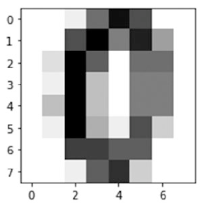
Chapter 5 ■ Building, tuning, and deploying Models
264
Classification
In all classification (or supervised learning) problems, the first step after preparing the whole dataset is
to segregate the data into a testing and a training set and optionally a validation set. The idea is to make
the model learn by training it on the train dataset, evaluate and tune it on the validation dataset, or use
techniques like cross validation and finally check its performance on the test dataset. You will learn in the
model evaluation section of this chapter that evaluating a model is a critical part of any Machine Learning
solution. Hence, as a rule of thumb, we must always remember that the actual evaluation of a Machine
Learning algorithm is always on the data that it has not previously seen (even cross validation on the training
dataset will use a part of the train data for model building and the rest for evaluation).
Sometimes we will use the whole dataset to train the model and then use some subset of it as a test set.
This is a common mistake done by many of us often in Machine Learning. To accurately analyze a model,
it must generalize well and perform well on data that it has never seen before. A good evaluation metric on
training data but a bad performance on unseen (validation or test) data means that the algorithm has failed
to produce a generalized solution for the problem (more on this later).
For our classification example, we will use a popular multi-class classification problem we talked about
earlier, handwritten digit recognition. The data for the same is available as part of the scikit-learn library.
The problem here is to predict the actual digit value from a handwritten image of a digit. In its original
form the problem comes in the domain of image based classification and computer vision. In the dataset
we have is a 1x64 feature vector, which represents the image representation of a grey scale image of the
handwritten digit.
Before we proceed to building any model, let’s first see how both the data and the image we intend to
analyze look. The following code will load the data for the image at index 10 and plot it.
In [2]: from sklearn import datasets
...: import matplotlib.pyplot as plt
...: %matplotlib inline
...: digits = datasets.load_digits()
...:
...: plt.figure(figsize=(3, 3))
...: plt.imshow(digits.images[10], cmap=plt.cm.gray_r)
The image generated by the code is depicted in Figure5-2. Any guesses as to which number it represents?
Figure 5-2. Handwritten digit data representing the digit zero
Chapter 5 ■ Building, tuning, and deploying Models
265
We can determine how the raw pixel data looks the flattened vector representation and the number
(class label), which is represented by the image using the following code.
# actual image pixel matrix
In [3]: digits.images[10]
Out[3]:
array([[ 0., 0., 1., 9., 15., 11., 0., 0.],
[ 0., 0., 11., 16., 8., 14., 6., 0.],
[ 0., 2., 16., 10., 0., 9., 9., 0.],
[ 0., 1., 16., 4., 0., 8., 8., 0.],
[ 0., 4., 16., 4., 0., 8., 8., 0.],
[ 0., 1., 16., 5., 1., 11., 3., 0.],
[ 0., 0., 12., 12., 10., 10., 0., 0.],
[ 0., 0., 1., 10., 13., 3., 0., 0.]])
# flattened vector
In [4]: digits.data[10]
Out[4]:
array([ 0., 0., 1., 9., 15., 11., 0., 0., 0., 0., 11., 16., 8., 14.,
6., 0., 0., 2., 16., 10., 0., 9., 9., 0., 0., 1., 16., 4.,
0., 8., 8., 0., 0., 4., 16., 4., 0., 8., 8., 0., 0., 1.,
16., 5., 1., 11., 3., 0., 0., 0., 12., 12., 10., 10., 0., 0.,
0., 0., 1., 10., 13., 3., 0., 0.])
# image class label
In [5]: digits.target[10]
Out[5]: 0
We will later see that we can frame this problem in a variety of ways. But for this tutorial we will use
a logistic regression model to do this classification. Before we proceed to model building, we will split
the dataset into separate test and train sets. The size of the test set is generally dependent on the total
amount of data available. In our example, we will use a test set, which is 30% of the overall dataset. The total
data points in each dataset is printed for ease of understanding
In [12]: X_digits = digits.data
...: y_digits = digits.target
...:
...: num_data_points = len(X_digits)
...:
...: X_train = X_digits[:int(.7 * num_data_points)]
...: y_train = y_digits[:int(.7 * num_data_points)]
...: X_test = X_digits[int(.7 * num_data_points):]
...: y_test = y_digits[int(.7 * num_data_points):]
...: print(X_train.shape, X_test.shape)
(1257, 64) (540, 64)
From the preceding output, we can see our train dataset has 1257 data points and the test dataset
has 540 data points. The next step in the process is specifying the model that we will be using and the
hyperparameter values that we want to use. The values of these hyperparameters do not depend on the
underlying data and are usually set prior to model training and are fine tuned for extracting the best model.
You will learn about tuning later on in this chapter. For the time being, we will use the default values as
depicted when we initialize the model estimator and fit our model on the training set.
Chapter 5 ■ Building, tuning, and deploying Models
266
In [14]: from sklearn import linear_model
...:
...: logistic = linear_model.LogisticRegression()
...: logistic.fit(X_train, y_train)
LogisticRegression(C=1.0, class_weight=None, dual=False, fit_intercept=True,
intercept_scaling=1, max_iter=100, multi_class='ovr', n_jobs=1,
penalty='l2', random_state=None, solver='liblinear', tol=0.0001,
verbose=0, warm_start=False)
You can see various hyperparameters and parameters of the model depicted in the preceding output.
Let’s now test the accuracy of this model on the test dataset.
In [15]: print('Logistic Regression mean accuracy: %f' % logistic.score(X_test, y_test))
Logistic Regression mean accuracy: 0.900000
This is all it takes in scikit-learn to fit a model like logistic regression. In the first step, we identified
the model that we wanted to use which in our case was a linear model, called logistic regression. Then we
called the fit method of that object with our training data and its output labels. The fit method updates
the model object with the learned parameters of the model. We then used the score method of the object to
determine the accuracy of the fitted model on our test set. So the model we developed without any intensive
tuning is 90% accurate at predicting handwritten digits.
This concludes our very basic example of fitting a classification model on our dataset. Note that our
dataset was in a fully processed and cleaned format. You need to ensure your data is in the same way before
you proceed to fit any models on it when solving any problem.
Clustering
In this section, you will learn how we can fit a clustering model on another dataset. In the example which
we will pick, we will use a labeled dataset to help us see the results of the clustering model and compare it
with actual labels. A point to remember here is that, usually labeled data is not available in the real world,
which is why we choose to go for unsupervised methods like clustering. We will try to cover two different
algorithms, one each from partitioning based clustering and hierarchical clustering.
The data that we will use for our clustering example will be the very popular Wisconsin Diagnostic
Breast Cancer dataset, which we covered in detail in Chapter 4 in the section “Feature Selection and
Dimensionality Reduction”. Do check out those sections to refresh your memory. This dataset has 30
attributes or features and a corresponding label for each data point (breast mass) depicting if it has cancer
(malignant: label value 0) or no cancer (benign: label value 1). Let’s load the data using the following code.
import numpy as np
from sklearn.datasets import load_breast_cancer
# load data
data = load_breast_cancer()
X = data.data
y = data.target
print(X.shape, data.feature_names)
(569, 30) ['mean radius' 'mean texture' 'mean perimeter' ... 'worst fractal dimension']
It is evident that we have a total of 569 observations and 30 attributes or features for each observation.
Chapter 5 ■ Building, tuning, and deploying Models
267
Partition Based Clustering
We will choose the simplest yet most popular partition based clustering model for our example, which
is K-means algorithm. This algorithm is a centroid based clustering algorithm, which starts with some
assumption about the total clusters in the data and with random centers assigned to each of the clusters.
It then reassigns each data point to the center closest to it, using Euclidean distance as the distance metric.
After each reassignment, it recalculates the center of that cluster. The whole process is repeated iteratively
and stopped when reassignment of data points doesn’t change the cluster centers. Variants include
algorithms like K-medoids.
Since we already know from the data labels that we have two possible types of categories either 0 or 1,
the following code tries to determine these two clusters from the data by leveraging K-means clustering. In
the real world, this is not always the case, since we will not know the possible number of clusters. This is one
of the most important downsides of K-means clustering.
from sklearn.cluster import KMeans
km = KMeans(n_clusters=2)
km.fit(X)
labels = km.labels_
centers = km.cluster_centers_
print(labels[:10])
[0 0 0 1 0 1 0 1 1 1]
Once the fit process is complete we can get the centers and labels of our two clusters in the dataset by
using the preceding attributes. The centers here refer to some numerical value of the dimensions of the data
(the 30 attributes in the dataset) around which data is clustered.
But can we visualize and compare the clusters with the actual labels? Remember we are dealing with
30 features and visualizing the clusters on a 30-dimensional feature space would be impossible to interpret
or even perform. Hence, we will leverage PCA to reduce the input dimensions to two principal components
and visualize the clusters on top of the same. Refer to Chapter 4 to learn more about principal component
analysis.
from sklearn.decomposition import PCA
pca = PCA(n_components=2)
bc_pca = pca.fit_transform(X)
The following code helps visualize the clusters on the reduced 2D feature space for the actual labels as
well as the clustered output labels.
fig, (ax1, ax2) = plt.subplots(1, 2, figsize=(8, 4))
fig.suptitle('Visualizing breast cancer clusters')
fig.subplots_adjust(top=0.85, wspace=0.5)
ax1.set_title('Actual Labels')
ax2.set_title('Clustered Labels')
for i in range(len(y)):
if y[i] == 0:
c1 = ax1.scatter(bc_pca[i,0], bc_pca[i,1],c='g', marker='.')
if y[i] == 1:
c2 = ax1.scatter(bc_pca[i,0], bc_pca[i,1],c='r', marker='.')
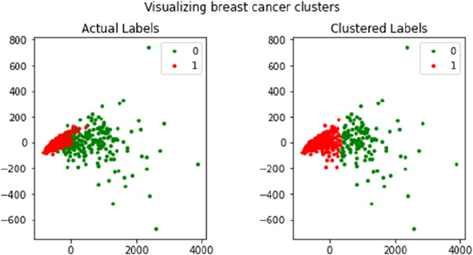
Chapter 5 ■ Building, tuning, and deploying Models
268
if labels[i] == 0:
c3 = ax2.scatter(bc_pca[i,0], bc_pca[i,1],c='g', marker='.')
if labels[i] == 1:
c4 = ax2.scatter(bc_pca[i,0], bc_pca[i,1],c='r', marker='.')
l1 = ax1.legend([c1, c2], ['0', '1'])
l2 = ax2.legend([c3, c4], ['0', '1'])
From Figure5-3, you can clearly see that the clustering has worked quite well and it shows distinct
separation between clusters with labels 0 and 1 and is quite similar to the actual labels. However we do
have some overlap where we have mislabeled some instances, which is evident in the plot on the right.
Remember in an actual real-world scenario, you will not have the actual labels to compare with and the
main idea is to find structures or patterns in your data in the form of these clusters. Another very important
point to remember is that cluster label values have no significance. The labels 0 and 1 are just values to
distinguish cluster data points from each other. If you run this process again, you can easily obtain the same
plot with the labels reversed. Hence even when dealing with labeled data and running clustering do not
compare clustered label values with actual labels and try to measure accuracy. Also another important note
is that if we had asked for more than two clusters, the algorithm would have readily supplied more clusters
but it would have been hard to interpret those and many of them would not make sense. Hence, one of
the caveats of using the K-means algorithm is to use it in the case where we have some idea about the total
number of clusters that may exist in the data.
Figure 5-3. Visualizing clusters in the breast cancer dataset
Chapter 5 ■ Building, tuning, and deploying Models
269
Hierarchical Clustering
We can use the same data to perform a hierarchical clustering and see if the results change much as
compared to K-means clustering and the actual labels. In scikit-learn we have a multitude of interfaces
like the AgglomerativeClustering class to perform hierarchical clustering. Based on what we discussed
earlier in this chapter as well as in Chapter 1, agglomerative clustering is hierarchical clustering using a
bottom up approach i.e. each observation starts in its own cluster and clusters are successively merged
together. The merging criteria can be used from a candidate set of linkages; the selection of linkage governs
the merge strategy. Some examples of linkage criteria are Ward, Complete linkage, Average linkage and so
on. We will leverage low-level functions from scipy however because we still need to mention the number
of clusters in the AgglomerativeClustering interface which we want to avoid. Since we already have the
breast cancer feature set in variable X, the following code helps us compute the linkage matrix using Ward’s
minimum variance criterion.
from scipy.cluster.hierarchy import dendrogram, linkage
import numpy as np
np.set_printoptions(suppress=True)
Z = linkage(X, 'ward')
print(Z)
[[ 287. 336. 3.81596727 2. ]
[ 106. 420. 4.11664267 2. ]
[ 55. 251. 4.93361024 2. ]
...,
[ 1130. 1132. 6196.07482529 86. ]
[ 1131. 1133. 8368.99225244 483. ]
[ 1134. 1135. 18371.10293626 569. ]]
On seeing the preceding output, you might think what does this linkage matrix indicate? You can think
of the linkage matrix as a complete historical map, keeping track of which data points were merged into
which cluster during each iteration. If you have n data points, the linkage matrix, Z will be having a shape of
(n - 1) x 4 where Z[i] will tell us which clusters were merged at the ith iteration. Each row has four elements,
the first two elements are either data point identifiers or cluster labels (in the later parts of the matrix once
multiple data points are merged), the third element is the cluster distance between the first two elements
(either data points or clusters), and the last element is the total number of elements\data points in the
cluster once the merge is complete. We recommend you refer to https://docs.scipy.org/doc/scipy/
reference/generated/scipy.cluster.hierarchy.linkage.html, which explains this in detail. The best
way to visualize these distance-based merges is to use a dendrogram, as shown in Figure5-4.
plt.figure(figsize=(8, 3))
plt.title('Hierarchical Clustering Dendrogram')
plt.xlabel('Data point')
plt.ylabel('Distance')
dendrogram(Z)
plt.axhline(y=10000, c='k', ls='--', lw=0.5)
plt.show()
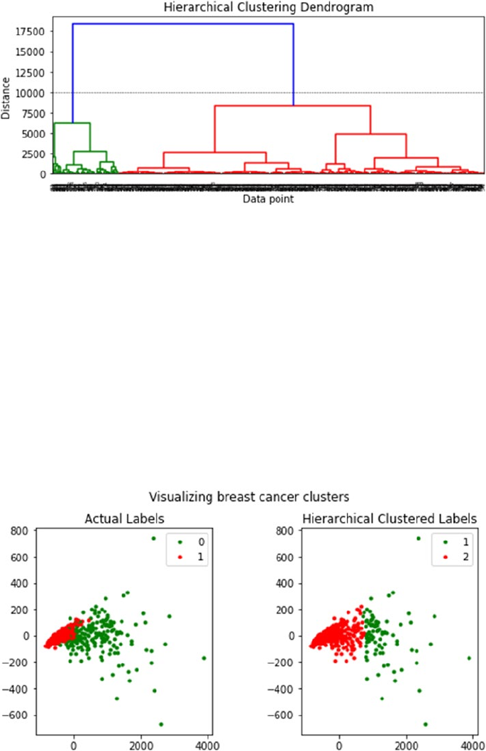
Chapter 5 ■ Building, tuning, and deploying Models
270
In the dendrogram depicted in Figure5-4, we can see how each data point starts as an individual cluster
and slowly starts getting merged with other data points to form clusters. On a high level from the colors and
the dendrogram, you can see that the model has correctly identified two major clusters if you consider a
distance metric of around 10000 or above. Leveraging this distance, we can get the cluster labels using the
following code.
from scipy.cluster.hierarchy import fcluster
max_dist = 10000
hc_labels = fcluster(Z, max_dist, criterion='distance')
Let’s compare how the cluster outputs look based on the PCA reduced dimensions as compared to the
original label distribution (detailed code is in the notebook). See Figure5-5.
Figure 5-5. Visualizing hierarchical clusters in the breast cancer dataset
Figure 5-4. Visualizing the hierarchical clustering dendrogram
Chapter 5 ■ Building, tuning, and deploying Models
271
We definitely see two distinct clusters but there is more overlap as compared to the K-means method
between the two clusters and we have more mislabeled instances. However, do take a note of the label
numbers; here we have 1 and 2 as the label values. This is just to reinforce the fact that the label values are
just to distinguish the clusters and don’t mean anything. The advantage of this method is that you do not
need to input the number of clusters beforehand and the model tries to find it from the underlying data.
Model Evaluation
We have seen the process of data retrieval, processing, wrangling and modeling based on various
requirements. A logical question that follows is how we can make the judgment whether a model is good or
bad? Just because we have developed something fancy using a renowned algorithm, doesn’t guarantee its
performance will be great. Model evaluation is the answer to these questions and is an essential part of the
whole Machine Learning pipeline. We have mentioned it quite a number of times in that past about how
model development is an iterative process. Model evaluation is the defining part of the iterative process
which makes it iterative in nature. Based on model evaluation and subsequent comparisons we can take
a call whether to continue our efforts in model enhancement or cease them and which model should be
selected as the final model to be used\deployed. Model evaluation also helps us in the very important
process of tuning the hyperparameters of the model and also deciding scenarios like, if the intelligent
feature that we just developed is adding any value to our model or not. Combining all these arguments
makes a compelling case for having a defined process for model evaluation and what metrics can be used to
measuring and evaluating models.
So how can we evaluate a model? How can we make a decision whether Model A is better or Model
B performs better? The ideal way is to have some numerical measure or metric of a model’s effectiveness
and use that measure to rank and select models. This will be one of the primary ways for us to evaluate
models but we should also keep in mind that a lot of times these evaluation metrics may not capture the
required success criteria of the problem we are trying to solve. In these cases, we will be required to become
imaginative and adapt these metrics to our problem and use things like business constraints and objectives.
Model evaluation metrics are highly dependent on the type of model we have, so metrics for regression
models will be different from the classification models or clustering models. Considering this dependency
we will break this section down in three sub-sections. We cover the major model evaluation metrics for three
categories of models.
Evaluating Classification Models
Classification models are one of the most popular models among Machine Learning practitioners. Due to
their popularity, it is essential to know how to build good quality, generalized models. They have a varied
set of metrics that can be used to evaluate classification models. In this section, we target a small subset of
those metrics that are essential. We use the models that we developed in the previous section to illustrate
them in detail. For this, let’s first prepare train and test datasets to build our classification models. We will
be leveraging the X and y variables from before, which holds the data and labels for the breast cancer dataset
observations.
from sklearn.model_selection import train_test_split
X_train, X_test, y_train, y_test = train_test_split(X, y, test_size=0.3, random_state=42)
print(X_train.shape, X_test.shape)
(398, 30) (171, 30)
Chapter 5 ■ Building, tuning, and deploying Models
272
From the preceding output, it is clear that we have 398 observations in our train dataset and 171
observations in our test dataset. We will be leveraging a nifty module we have created for model evaluation.
It is named model_evaluation_utils and you can find it along with the code files and notebooks for this
chapter. We recommend you to check out the code, which leverages the scikit-learn metrics module to
compute most of the evaluation metrics and plots.
Confusion Matrix
Confusion matrix is one of the most popular ways to evaluate a classification model. Although the matrix by
itself is not a metric, the matrix representation can be used to define a variety of metrics, all of which become
important in some specific case or scenario. A confusion matrix can be created for a binary classification as
well as a multi-class classification model.
A confusion matrix is created by comparing the predicted class label of a data point with its actual class
label. This comparison is repeated for the whole dataset and the results of this comparison are compiled
in a matrix or tabular format. This resultant matrix is our confusion matrix. Before we go any further, let’s
build a logistic regression model on our breast cancer dataset and look at the confusion matrix for the model
predictions on the test dataset.
from sklearn import linear_model
# train and build the model
logistic = linear_model.LogisticRegression()
logistic.fit(X_train,y_train)
# predict on test data and view confusion matrix
import model_evaluation_utils as meu
y_pred = logistic.predict(X_test)
meu.display_confusion_matrix(true_labels=y_test, predicted_labels=y_pred, classes=[0, 1])
Predicted:
0 1
Actual: 0 59 4
1 2 106
The preceding output depicts the confusion matrix with necessary annotations. We can see that out of
63 observations with label 0 (malignant), our model has correctly predicted 59 observations. Similarly out of
108 observations with label 1 (benign), our model has correctly predicted 106 observations. More detailed
analysis is coming right up!
Understanding the Confusion Matrix
While the name itself sounds pretty overwhelming, understanding the confusion matrix is not that confusing
once you have the basics right! To reiterate what you learned in the previous section, the confusion matrix
is a tabular structure to keep a track of correct classifications as well as misclassifications. This is useful to
evaluate the performance of a classification model for which we know the true data labels and can compare
with the predicted data labels. Each column in the confusion matrix represents classified instance counts
based on predictions from the model and each row of the matrix represents instance counts based on the
actual\true class labels. This structure can also be reversed, i.e. predictions depicted by rows and true labels
by columns. In a typical binary classification problem, we usually have a class label which defined as the
positive class which is basically the class of our interest. For instance in our breast cancer dataset, let’s say we
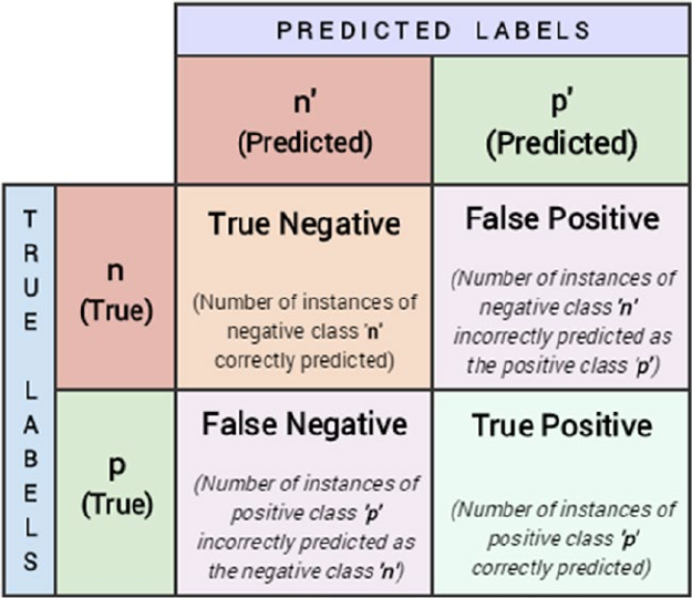
Chapter 5 ■ Building, tuning, and deploying Models
273
are interested in detecting or predicting when the patient does not have breast cancer (benign). Then label 1
is our positive class. However, suppose our class of interest was to detect cancer (malignant) then we could
have chosen label 0 as our positive class. Figure5-6 shows a typical confusion matrix for a binary classification
problem, where p denotes the positive class and n denotes the negative class.
Figure 5-6. Typical structure of a confusion matrix
Figure5-6 should make things more clear with regard to the structure of confusion matrices. In general,
we usually have a positive class as we discussed earlier and the other class is the negative class. Based on this
structure, we can clearly see four terms of importance.
• True Positive (TP): This is the count of the total number of instances from the
positive class where the true class label was equal to the predicted class label, i.e. the
total instances where we correctly predicted the positive class label with our model.
• False Positive (FP): This is the count of the total number of instances from the
negative class where our model misclassified them by predicting them as positive.
Hence the name, false positive.
• True Negative (FN): This is the count of the total number of instances from the
negative class where the true class label was equal to the predicted class label, i.e. the
total instances where we correctly predicted the negative class label with our model.
• False Negative (FN): This is the count of the total number of instances from the
positive class where our model misclassified them by predicting them as negative.
Hence the name, false negative.

Chapter 5 ■ Building, tuning, and deploying Models
274
Thus based on this information, can you compute the previously mentioned metrics for our confusion
matrix based on the model predictions on the breast cancer test data?
positive_class = 1
TP = 106
FP = 4
TN = 59
FN = 2
Performance Metrics
The confusion matrix by itself is not a performance measure for classification models. But it can be used to
calculate several metrics that are useful measures for different scenarios. We will describe how the major
metrics can be calculated from the confusion matrix, compute them manually using necessary formulae,
and then compare the results with functions provided by scikit-learn on our predicted results and give an
intuition of scenarios where each of those metric can be used.
Accuracy: This is one of the most popular measures of classifier performance. It is defined as the overall
accuracy or proportion of correct predictions of the model. The formula for computing accuracy from the
confusion matrix is:
Accuracy TP TN
TP FP TN FN
=
+
++ +
Accuracy measure is normally used when our classes are almost balanced and correct predictions of
those classes are equally important. The following code computes accuracy on our model predictions.
fw_acc = round(meu.metrics.accuracy_score(y_true=y_test, y_pred=y_pred), 5)
mc_acc = round((TP + TN) / (TP + TN + FP + FN), 5)
print('Framework Accuracy:', fw_acc)
print('Manually Computed Accuracy:', mc_acc)
Framework Accuracy: 0.96491
Manually Computed Accuracy: 0.96491
Precision: Precision, also known as positive predictive value, is another metric that can be derived from
the confusion matrix. It is defined as the number of predictions made that are actually correct or relevant out
of all the predictions based on the positive class. The formula for precision is as follows:
PrecisionTP
TP FP
=
+
A model with high precision will identify a higher fraction of positive class as compared to a model
with a lower precision. Precision becomes important in cases where we are more concerned about finding
the maximum number of positive class even if the total accuracy reduces. The following code computes
precision on our model predictions.
fw_prec = round(meu.metrics.precision_score(y_true=y_test, y_pred=y_pred), 5)
mc_prec = round((TP) / (TP + FP), 5)
print('Framework Precision:', fw_prec)
print('Manually Computed Precision:', mc_prec)

Chapter 5 ■ Building, tuning, and deploying Models
275
Framework Precision: 0.96364
Manually Computed Precision: 0.96364
Recall: Recall, also known as sensitivity, is a measure of a model to identify the percentage of relevant
data points. It is defined as the number of instances of the positive class that were correctly predicted. This is
also known as hit rate, coverage, or sensitivity. The formula for recall is:
Recall TP
TP FN
=
+
Recall becomes an important measure of classifier performance in scenarios where we want to catch
the most number of instances of a particular class even when it increases our false positives. For example,
consider the case of bank fraud, a model with high recall will give us higher number of potential fraud cases.
But it will also help us raise alarm for most of the suspicious cases. The following code computes recall on
our model predictions.
fw_rec = round(meu.metrics.recall_score(y_true=y_test, y_pred=y_pred), 5)
mc_rec = round((TP) / (TP + FN), 5)
print('Framework Recall:', fw_rec)
print('Manually Computed Recall:', mc_rec)
Framework Recall: 0.98148
Manually Computed Recall: 0.98148
F1 Score: There are some cases in which we want a balanced optimization of both precision and recall.
F1 score is a metric that is the harmonic mean of precision and recall and helps us optimize a classifier for
balanced precision and recall performance.
The formula for the F1 score is:
FScore PrecisionRecall
PrecisionRecall
12
=
´´
+
Let’s compute the F1 score on the predictions made by our model using the following code.
fw_f1 = round(meu.metrics.f1_score(y_true=y_test, y_pred=y_pred), 5)
mc_f1 = round((2*mc_prec*mc_rec) / (mc_prec+mc_rec), 5)
print('Framework F1-Score:', fw_f1)
print('Manually Computed F1-Score:', mc_f1)
Framework F1-Score: 0.97248
Manually Computed F1-Score: 0.97248
Thus you can see how our manually computed metrics match the results obtained from the scikit-learn
functions. This should give you a good idea of how to evaluate classification models with these metrics.

Chapter 5 ■ Building, tuning, and deploying Models
276
Receiver Operating Characteristic Curve
ROC which stands for Receiver Operating Characteristic is a concept from early Radar days. This concept
can be extended to evaluation of binary classifiers as well as multi-class classifiers (Note that to adapt the
ROC curve for multi-class classifiers we have to use one-vs-all scheme and averaging techniques like macro
and micro averaging.) It can be interpreted as the effectiveness with which the model can distinguish
between actual signal and the noise in the data.
The ROC curve can be created by plotting the fraction of true positives versus the fraction of false
positives, i.e. it is a plot of True Positive Rate (TPR) versus the False Positive Rate (FPR). It is applicable
mostly for scoring classifiers. Scoring classifiers are the type of classifiers which will return a probability
value or score for each class label, from which a class label can be deduced (based on maximum probability
value). This curve can be plotted using the true positive rate (TPR) and the false positive rate (FPR) of a
classifier. TPR is known as sensitivity or recall, which is the total number of correct positive results, predicted
among all the positive samples the dataset. FPR is known as false alarms or (1 - specificity), determining the
total number of incorrect positive predictions among all negative samples in the dataset. Although we will
rarely be plotting the ROC curve manually, it is always a good idea to understand how they can be plotted.
The following steps can be followed to plot a ROC curve given the class label probabilities of each data point
and their correct or true labels.
1. Order the outputs of the classifier by their scores (or the probability of being the
positive class).
2. Start at the (0, 0) coordinate.
3. For each example x in the sorted order:
• If x is positive, move 1
pos up
• If x is negative, move 1
neg right
Here pos and neg are the fraction of positive and negative examples respectively. The idea is that
typically in any ROC curve, the ROC space is between points (0, 0) and (1, 1). Each prediction result from the
confusion matrix occupies one point in this ROC space. Ideally, the best prediction model would give a point
on the top left corner (0, 1) indicating perfect classification (100% sensitivity & specificity). A diagonal line
depicts a classifier that does a random guess. Ideally if your ROC curve occurs in the top half of the graph,
you have a decent classifier which is better than average. You can always leverage the roc_curve function
provided by scikit-learn to generate the necessary data for an ROC curve. Refer to http://scikit-learn.
org/stable/auto_examples/model_selection/plot_roc.html for further details. Figure5-7 shows a
sample ROC curve from the link we just mentioned.
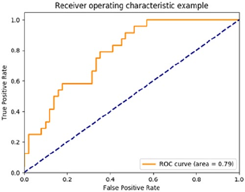
Chapter 5 ■ Building, tuning, and deploying Models
277
Figure5-7 depicts the sample ROC curve. In general, the ROC curve is an important tool for visually
interpreting classification models. But it doesn’t directly provide us with a numerical value that we can use to
compare models. The metric which does that task is the Area Under Curve popularly known as AUC. In the
ROC plot in Figure5-7, the area under the orange line is the area under the classifier’s ROC curve. The ideal
classifier will have the unit area under the curve. Based on this value we can compare two models, generally
the model with the AUC score is a better one. We have built a generic function for plotting ROC curves
with AUC scores for binary as well as multi-class classification problems in our model_evaluation_utils
module. Do check out the function, plot_model_roc_curve(...) to know more about it. The following code
plots the ROC curve for our breast cancer logistic regression model leveraging the same function.
meu.plot_model_roc_curve(clf=logistic, features=X_test, true_labels=y_test)
Figure 5-7. Sample ROC Curve (Source: http://scikit-learn.org/stable/modules/model_evaluation.
html#roc-metrics)
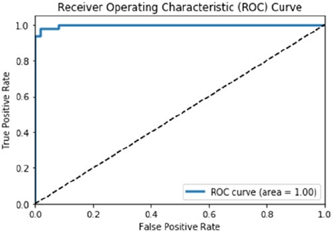
Chapter 5 ■ Building, tuning, and deploying Models
278
Considering our model has an accuracy and F1 Score of around 97%, Figure5-8 makes sense where we
see a near perfect ROC curve! Check out Chapter 9 to see a multi-class classifier ROC curve in action!
Evaluating Clustering Models
We discussed some of the popular ways to evaluate classification models in the previous section. The
confusion matrix alone provided us with a bunch of metrics that we can use to compare classification
models. The tables are turned drastically when it comes to evaluating clustering (or unsupervised models in
general). This difficulty arises from the lack of a validated ground truth in case of unsupervised models, i.e.
the absence of true labels in the data. In this section, you learn about some of the methods/metrics we can
use to evaluate the performance of our clustering models.
To illustrate the evaluation metrics with a real-world example, we will leverage the breast cancer
dataset available in the variables X for the data and y for the observation labels. We will also use the K-means
algorithm to fit two models on this data—one with two clusters and the second one with five clusters—and
then evaluate their performance.
km2 = KMeans(n_clusters=2, random_state=42).fit(X)
km2_labels = km2.labels_
km5 = KMeans(n_clusters=5, random_state=42).fit(X)
km5_labels = km5.labels_
External Validation
External validation means validating the clustering model when we have some ground truth available
as labeled data. The presence of external labels reduces most of the complexity of model evaluation as
the clustering (unsupervised) model can be validated in similar fashion to classification models. Recall
the breast cancer dataset example that we took in the first section of this chapter, we ran the labeled data
through a clustering algorithm. In that case we had two classes and we got two clusters from our algorithm.
However evaluating the performance is not as straightforward as classification algorithms.
Figure 5-8. ROC curve for our logistic regression model
Chapter 5 ■ Building, tuning, and deploying Models
279
If you remember our discussion earlier on cluster labels, they are just indicators used to distinguish data
points from each other based on which cluster or group they fall into. Hence we cannot compare a cluster
with label 0 directly with a true class label 0. It is possible that all data points with true class label of 0 were
actually clustered with label 1 during the clustering process. Based on this, we can leverage several metrics
to validate clustering performance when we have the true labels available. Three popular metrics can be
used in this scenario:
• Homogeneity: A clustering model prediction result satisfies homogeneity if all of
its clusters contain only data points that are members of a single class (based on the
true class labels).
• Completeness: A clustering model prediction result satisfies completeness if
all the data points of a specific ground truth class label are also elements of the
same cluster.
• V-measure: The harmonic mean of homogeneity and completeness scores gives us
the V-measure value.
Values are typically bounded between 0 and 1 and usually higher values are better. Let’s compute these
metric on our two K-means clustering models.
km2_hcv = np.round(metrics.homogeneity_completeness_v_measure(y, km2_labels), 3)
km5_hcv = np.round(metrics.homogeneity_completeness_v_measure(y, km5_labels), 3)
print('Homogeneity, Completeness, V-measure metrics for num clusters=2: ', km2_hcv)
print('Homogeneity, Completeness, V-measure metrics for num clusters=5: ', km5_hcv)
Homogeneity, Completeness, V-measure metrics for num clusters=2: [ 0.422 0.517 0.465]
Homogeneity, Completeness, V-measure metrics for num clusters=5: [ 0.602 0.298 0.398]
We can see that the V-measure for the first model with two clusters is better than the one with five
clusters and the reason is because of higher completeness score. Another metric you can try out includes the
Fowlkes-Mallows score.
Internal Validation
Internal validation means validating a clustering model by defining metrics that capture the expected
behavior of a good clustering model. A good clustering model can be identified by two very desirable traits:
• Compact groups, i.e. the data points in one cluster occur close to each other.
• Well separated groups, i.e. two groups\clusters have as large distance among
them as possible.
We can define metrics that mathematically calculate the goodness of these two major traits and use
them to evaluate clustering models. Most of such metrics will use some concept of distance between data
points. The distance between data points can be defined using any candidate distance metric ranging from a
Euclidian distance, Manhattan distance, or any metric that meets the criteria for being a distance metric.

Chapter 5 ■ Building, tuning, and deploying Models
280
Silhouette Coefficient
Silhouette coefficient is a metric that tries to combine the two requirements of a good clustering model. The
silhouette coefficient is defined for each sample and is a combination of its similarity to the data points in its
own cluster and its dissimilarity to the data points not in its cluster.
The mathematical formula of silhouette coefficient for a clustering model with n data points is given by:
1
1
nSample SC
i
n
i
=
å
Here, sample SC is the silhouette coefficient for each of the samples. The formula for a sample’s
silhouette coefficient is,
Sample SC ba
ba
=
-
()
max,
Here,
a = mean distance between a sample and all other points in the same class
b = mean distance between a sample and all other points in the next nearest cluster
The silhouette coefficient is usually bounded between -1 (incorrect clustering) and +1 (excellent quality
dense clusters). A higher value of silhouette coefficient generally means that the clustering model is leading
to clusters that are dense and well separated and distinguishable from each other. Lower scores indicate
overlapping clusters. In scikit-learn, we can compute the silhouette coefficient by using the silhouette_
score function. The function also allows for different options for distance metrics.
from sklearn import metrics
km2_silc = metrics.silhouette_score(X, km2_labels, metric='euclidean')
km5_silc = metrics.silhouette_score(X, km5_labels, metric='euclidean')
print('Silhouette Coefficient for num clusters=2: ', km2_silc)
print('Silhouette Coefficient for num clusters=5: ', km5_silc)
Silhouette Coefficient for num clusters=2: 0.697264615606
Silhouette Coefficient for num clusters=5: 0.510229299791
Based on the preceding output, we can observe that from the metric results it seems like we have better
cluster quality with two clusters as compared to five clusters.
Calinski-Harabaz Index
The Calinski-Harabaz index is another metric that we can use to evaluate clustering models when the
ground truth is not known. The Calinski-Harabaz score is given as the ratio of the between-clusters
dispersion mean and the within-cluster dispersion. The mathematical formula for the score for k clusters is
given by,
sk Tr B
Tr W
Nk
k
k
k
()
=
()
()
´-
-1
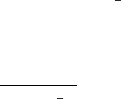
Chapter 5 ■ Building, tuning, and deploying Models
281
Here,
Wxcxc
k
q
k
xc
qq
T
q
=-
()
-
()
=Î
åå
1
Bncc
cc
k
q
qq q
T
=-
()
-
()
å
With Tr being the trace of a matrix operator, N being the number of data points in our data, Cq being the
set of points in cluster q, cq being the center of cluster q, c being the center of E, and nq being the number of
points in cluster q.
Thankfully we can calculate this index without having to calculate this complex formula by leveraging
scikit-learn. A higher score normally indicates that the clusters are dense and well separated, which
relates to the general principles of clustering models.
km2_chi = metrics.calinski_harabaz_score(X, km2_labels)
km5_chi = metrics.calinski_harabaz_score(X, km5_labels)
print('Calinski-Harabaz Index for num clusters=2: ', km2_chi)
print('Calinski-Harabaz Index for num clusters=5: ', km5_chi)
Calinski-Harabaz Index for num clusters=2: 1300.20822689
Calinski-Harabaz Index for num clusters=5: 1621.01105301
We can see that both the scores are pretty high with the results for five clusters being even higher. This
goes to show that just relying on metric number alone is not sufficient and you must try multiple evaluation
methods coupled with feedback from data scientists as well as domain experts.
Evaluating Regression Models
Regression models are an example of supervised learning methods and owing to the availability of the
correct measures (real valued numeric response variables), their evaluation is relatively easier than
unsupervised models. Usually in the case of supervised models, we are spoilt for the choice of metrics and
the important decision is choosing the right one for our use case. Regression models, like classification
models, have a varied set of metrics that can be used for evaluating them. In this section, we go through a
small subset of these metrics which are essential.
Coefficient of Determination or R2
The coefficient of determination measures the proportion of variance in the dependent variable which is
explained by the independent variable. A coefficient of determination score of 1 denotes a perfect regression
model indicating that all of the variance is explained by the independent variables. It also provides a
measure of how well the future samples are likely to be predicted by the model.
The mathematical formula for calculating r2 is given as follows, where y is the mean of the dependent
variable, yi indicates the actual true response values, and yi
indicates the model predicted outputs.
Ry
y
yy
y
y
i
n
ii
i
n
ii
samples
samples
20
12
0
1
2
1,

Chapter 5 ■ Building, tuning, and deploying Models
282
In the scikit-learn package, this can be calculated by using the r2_score function by supplying it the
true values and the predicted values (of the output\response variable).
Mean Squared Error
Mean squared error calculates the average of the squares of the errors or deviation between the actual
value and the predicted values, as predicted by a regression model. The mean squared error or MSE can be
used to evaluate a regression model, with lower values meaning a better regression models with less errors.
Taking the square root of the MSE yields the root-mean-square-error or RMSE, which can also be used as an
evaluation metric for regression models.
The mathematical formula for calculating MSE and RMSE is quite simple and is given as follows:
MSEyynyy
samplesi
n
ii
samples
,
1
0
12
In the scikit-learn package the MSE can be calculated by invoking the mean_squared_error function
from the metrics module.
Regression models have many more metrics that can be used for evaluating them, including median
absolute error, mean absolute error, explained variance score, and so on. They are easy to calculate using
the functions provided by the scikit-learn library. Their mathematical formulae are easy to interpret and
have an intuitive understanding associated with them. We have only introduced two of them but you are
encouraged to explore other sets of metrics that can be used to regression models. We will look at regression
models in more detail in the next chapter.
Model Tuning
In the first two sections of this chapter, you learned how to fit models on our processed data and how to
evaluate those models. We will build further upon the concepts introduced till now. In this section, you will
learn an important characteristic of all Machine Learning algorithms (which we have been glossing over
till now), their importance, and how to find the optimal values for these entities. Model tuning is one of the
most important concepts of Machine Learning and it does require some knowledge of the underlying math
and logic of the algorithm in focus. Although we cannot deep dive into extensive theoretical aspects of the
algorithms that we discuss, we will try to give some intuition about them so that you are empowered to tune
them better and learn the essential concepts needed for the same.
The models we have developed till now were mostly the default models provided to us by the
scikit-learn package. By default we mean models with the default configurations and settings if you
remember seeing some of the model estimator object parameters. Since the datasets we were analyzing were
essentially not tough-to-analyze datasets, even models with default configurations turn up decent solutions.
The situation is not that rosy when it comes to actual real-world datasets that have a lot of features, noise,
and missing data. You will see in the subsequent chapters how the actual datasets are often tough to process,
wrangle, and even harder to model. Hence, it is unlikely that we will always use the default configured
models out of the box. Instead we will delve deeper into the models that we are targeting, look at the knobs
that can be tuned and set to extract the best performance out of any given models. This process of iterative
experimentation with dataset, model parameters, and features is the very core of the model tuning process.
We start this section by introducing these so-called parameters that are associated with ML algorithms, then
we try to justify why it is hard to have a perfect model, and in the last section we discuss some strategies that
we can pursue to tune our models.
Chapter 5 ■ Building, tuning, and deploying Models
283
Introduction to Hyperparameters
What are hyperparameters? The simplest definition is that hyperparameters are meta parameters that are
associated with any Machine Learning algorithm and are usually set before the model training and building
process. We do this because model hyperparameters do not have any dependency on being derived from
the underlying dataset on which a model is trained. Hyperparameters are extremely important for tuning
the performance of learning algorithms. Hyperparameters are often confused with model parameters, but
we must keep in mind that hyperparameters are different than model parameters since they do not have
dependency on the data. In simple terms, model hyperparameters represent some high-level concepts or
knobs that a data scientist can tweak and tune during the model training and building process to improve its
performance. Let’s take an example to illustrate this in case you still have difficulty in interpreting them.
Decision Trees
Decision trees are one of the simplest and easy to interpret classification algorithms (also used in regression
sometimes; check out CART models). First you will learn how a decision tree is created as hyperparameters
are often tightly coupled with the actual intricacies of the algorithm. The decision tree algorithm is based on
a greedy recursive partitioning of the initial dataset (features). It leverages a decision tree based structure
for taking decisions of how to perform the partitions. The steps involved in learning a decision tree are as
follows:
1. Start with whole dataset and find the attribute (feature) that will best differentiate
between the classes. This best attribute is found out using metrics such as
Information gain or Gini impurity.
2. Once the best attribute is found, separate the dataset in two (or more parts)
based on the values of the attributes.
3. If any one part of the dataset contains only labels of one class, we can stop the
process for that part and label it as a leaf node of that class.
4. We repeat the whole process until we have leaf nodes in all, of which we have
data points of one class only.
The final model returned by the decision tree algorithm can be represented as a flow chart (the core
decision tree structure). Consider a sample decision tree for the Titanic survival prediction problem depicted
in Figure5-9.
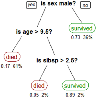
Chapter 5 ■ Building, tuning, and deploying Models
284
The decision tree is easy to interpret by following the path with the values of an unknown data point.
The leaf node where you end up is the predicted class for the data point. The model parameters in this case
are the attributes on which we are splitting (here sex, age, and sibsp) and the values of those attributes.
For example if a person was female, it is likely she had survived based on this model. However, infant males
having age less than 9 years and 6 months are likely to have perished.
In the algorithm, the decision whether we will continue splitting the dataset at a node further or stop
the splitting process is governed by one of the hyperparameters of the algorithm named min_samples_leaf.
This is a hyperparameter associated with the decision tree algorithm. The default value of this parameter is
1, which means that we can potentially keep splitting the data until we have a leaf node with a single data
point (with a unique class label). This leads to a lot of overfitting as potentially each data point can end up in
its own leaf node and the model will not learn anything useful. Suppose we want to stop the splitting process
if we have 3-4% of the whole dataset in a leaf node and label that node with the majority class of that node.
This can be achieved by setting a different value for the specified hyperparameter. This allows us to control
the overfitting and help us develop a generalized model. This is just one of the hyperparameters associated
with the algorithm; there are many more like the splitting criterion (criterion), maximum depth of the tree
(max_depth), number of features (max_features), and so on, which can have different effects on the quality
of the overall model.
Similar hyperparameters exist for each learning algorithm. Examples include the learning rate in
logistic regression, the kernel in SVMs, and the dropout rate in neural networks. Hyperparameters are
generally closely related to the learning algorithm. Hence we require some understanding of the algorithm
to have intuition about setting the value of a particular hyperparameter. In the later sections of this chapter
and the book, we deal with datasets and models that will require some level of hyperparameter tuning.
The Bias-Variance Tradeoff
So far, we learned about the necessary concepts which talk about tuning our models. But before go into the
process of putting it all together and actually tuning our models, we must understand a potential tradeoff
that puts some restriction on the best model that we can develop. This tradeoff is called the bias versus
variance tradeoff. The obvious question that arises is what are bias and variance in the context of Machine
Learning models?
Figure 5-9. A sample decision tree model
Chapter 5 ■ Building, tuning, and deploying Models
285
• Bias: This is the error that arises due to the model (learning algorithm) making
wrong assumptions on the parameters in the underlying data. The bias error is the
difference between the expected or predicted value of the model estimator and
the true or actual value which we are trying to predict. If you remember, model
building is an iterative process. If you imagine building a model multiple times over
a dataset every time you get some new observations, due to the underlying noise and
randomness in the data, predictions will not always be what is expected and bias
tries to measure the difference\error in actual and predicted values. It can also be
specified as the average approximation error that the models have over all possible
training datasets. The last part here, all possible training datasets, needs some
explanation. The dataset that we observe and develop our models on is one of the
possible combinations of data that exist. All the possible combinations of each of the
attributes\features that we have in our data will give rise to a different dataset. For
example, consider if we have a dataset with 50 binary (categorical) features, then the
size of that entire dataset would be 250 data points. The dataset that we model on will
obviously be a subset of this huge data. So bias is the average approximation error
that we can expect over subset of this entire dataset. Bias is mostly affected by our
assumptions (or the model’s assumptions) about the underlying data and patterns.
For example, consider a simple linear regression model; it makes the assumption
that the dependent variable is linearly dependent on the independent variable.
Whereas consider the case of a decision tree model it makes no such assumption
about the structure of the data and purely learns patterns from the data. Hence, in
relative sense, a linear model may tend to have a higher bias than a decision tree
model. High bias makes a model miss relevant relationships between features and
the output variables in data.
• Variance: This error arises due to model sensitivity to fluctuations in the dataset that
can arise due to new data points, features, randomness, noise, and so on. It is the
variance of our approximation function over all possible datasets. It represents the
sensitivity of the model prediction results on particular set of data points. Suppose
you could have learned the model on different subset of all possible datasets then
variance would quantify how the results of the model change with the change in
the dataset. If the results stay quite stable then the model would be said to having
a low variance but if the results vary considerably each time then the model would
said to be having a high variance. Consider the same example of contrasting a
linear model against a decision tree model, under the assumption that a clear linear
relationship exists between the dependent and the independent data variables. Then
for a sufficiently large dataset our linear model will always capture that relationship.
Whereas the capability of a decision tree model depends on the dataset, if we get
a dataset which consists of a lot of outliers, we are likely to get a bad decision tree
model. Hence we can make a statement that the decision tree model will be having
a higher variance than a linear regression model based on data and the underlying
noise\randomness. High variance makes a model too sensitive to outliers or random
noise instead of generalizing well.
An effective way to get a clearer idea at this somewhat confusing concept is through a visual
representation of bias and variance, as depicted in Figure5-10.
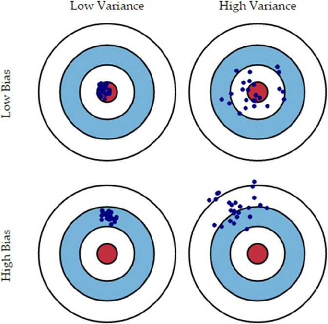
Chapter 5 ■ Building, tuning, and deploying Models
286
In Figure5-10, the inner red circle represents the perfect model that we can have considering all the
combinations of the data that we can get. Each blue dot (⋅) marks a model that we have learned on the basis
of combinations of the dataset and features that we get.
• Models with low bias, low variance, represented by the top left image, will learn a
good general structure of underlying data patterns and relationships that will be
close to the hypothetical model and predictions will be consistent and hit the
bull’s eye!
• Models with low bias, high variance, represented by the top right image, are models
that generalize to some extent (learn proper relationships\patterns) and perform
decently on average due to low bias but are sensitive to the data it is trained on
leading to high variance and hence predictions keep fluctuating.
• Models with high bias, low variance will tend to make consistent predictions
irrespective of datasets on which the models are built leading to low variance but
due to high bias, it will not learn the necessary patterns\relationships in the data that
are required for correct predictions and hence misses the mark due to the high bias
error on average, as depicted in the bottom-left image.
Figure 5-10. The Bias-variance tradeoff
Chapter 5 ■ Building, tuning, and deploying Models
287
• Models with high bias, high variance are the worst sort of models possible, as they
will not learn necessary data attribute relationships that are essential to correlation
with output responses. Also they will be extremely sensitive to data and outliers
and noise leading to highly fluctuating predictions which result in high variance, as
depicted in the bottom-right image.
Extreme Cases of Bias-Variance
In real-world modeling, we will always have a tradeoff between decreasing bias and variance
simultaneously. To understand why we have this tradeoff, we must first consider the two possible extreme
cases of bias and variance.
Underfitting
Consider a linear model that is lazy and always predicts a constant value. This model will have extremely
low variance (in fact it will be a zero variance model) as the model is not dependent at all on which subset of
data it gets. It will always predict a constant and hence have stable performance. But on the other hand it will
have extremely high bias as it has not learned anything from the data and made a very rigid and erroneous
assumption about the data. This is the case of model underfitting, in which we fail to learn anything about
the data, its underlying patterns, and relationships.
Overfitting
Consider the opposite case in which we have model that attempts to fit every data point it encounters (the
closest example would be fitting an nth order polynomial curve for an n-observation dataset so that the curve
passes through each point). In this case, we will get a model which will have low bias as no assumption to
structure of data was made (even when there was some structure) but the variance will be very high as we
have tightly fit the model to one of the possible subsets of data (focusing too much on the training data). Any
subset different from the training set will lead to a lot of error. This is the case of overfitting, where we have
built our model so specific to the data at hand that it fails to do any generalization over other subsets of data.
The Tradeoff
The total generalization error of any model will be a sum of its bias error, variance error, and irreducible
error, as depicted in the following equation.
Generalization Error = Bias Error + Variance Error + Irreducible Error
Such that the irreducible error is the error that gets introduced due to noise in the training data itself,
something that is common in real-world datasets and not much can be done about it. The idea is to focus
on the other two errors. Every model needs to do a tradeoff between the two choices: making assumptions
about the structure of data or fitting itself too closely to the data at hand. Either choice in entirety will lead to
one of the extreme cases. The idea is to focus on balancing model complexity by doing an optimal tradeoff
between bias and variance, as depicted in Figure5-11.
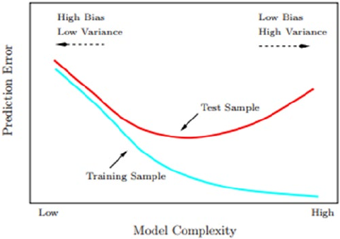
Chapter 5 ■ Building, tuning, and deploying Models
288
Figure 5-11. Test and train errors as a function of model complexity (Source: The Elements of Statistical
Learning, Tibshirani etal. Springer)
Figure5-11 should give you more clarity on the tradeoff that needs to be done to prevent an increase
in model errors. We will need to make some assumptions about the underlying structure in the data but
they must be reasonable. At the same time, the model must ensure that it learns from the data at hand
and generalizes well instead of overfitting to each and every data point. This tradeoff can be controlled by
making sure that our model is not a very complex model and by ensuring reasonable performance on the
unseen validation data. We will cover more on cross validation in the next section. We recommend you to
check out the section on model selection and the book Bias-Variance Tradeoff in the Elements of Statistical
Learning, Tibshirani etal., Springer.
Cross Validation
In the initial sections of this chapter when we were learning to fit different models, we followed the practice
of partitioning the data into a training set and a test set. We built the model on the training set and reported
its performance on the test set. Although that way of building models works, when working on tuning
models intensively, we need to consider some other strategies around validation datasets. In this section
we will discuss how we can use the same data to build different models and also tune their hyperparameters
using a simple data partitioning strategy. This strategy is one of the most prevalent practices in Data Science
domain irrespective of the type of models and it is called cross validation or just CV. This is extremely useful
when you also have less data observations and cannot segregate a specific partition of data for being a
validation set (more on this shortly!). You can then leverage a cross-validation strategy to leverage parts of
the training data itself for validation in such a way that you don’t end up overfitting the model.
The main intention of any model building activity is to develop a generalized model on the available
data which will perform well on the unseen data. But to estimate a model’s performance on unseen data,
we need to simulate that unseen data using the data that we have available. This is achieved by splitting
our available data into training and testing sets. By following this simple principle we ensure that we don’t
evaluate the model on the data that it has already seen and been trained on. The story would be over
here if we were completely satisfied with the model that we developed. But the initial models are seldom
satisfactory enough for deployment.
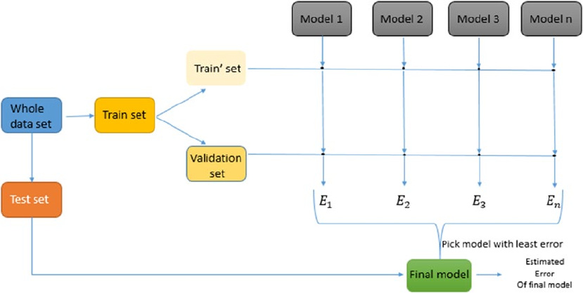
Chapter 5 ■ Building, tuning, and deploying Models
289
In theory, we can extend the same principles for tuning our algorithm. We can evaluate the
performance of particular values of the model hyperparameters on the test set. Retrain the model with a
different partition of training and test set with a different values of hyperparameters. If the new parameters
perform better than the old ones we take them and keep repeating the same process until we have the
optimal values of the hyperparameters. This scheme of things is simple but it suffers from a serious flaw. It
induces a bias in the model development process. Although the test set is changed in every iteration, the
data is being seen by the model to make some choices about the model development process (as we tune
and build the model). Hence, the models that we develop end up being biased and not well-generalized and
their performance may or may not reflect their performance on unseen data.
A simple change in the data splitting process can help us avoid this leakage of unseen data. Suppose
we initially made three different subsets of data instead of the original two. One is the usual training set, the
second one is the test set and the last one is called a validation set. So we can train our models on the train
data evaluate their performance on the validation data to tune model parameters (or even to select among
different models). Once we are done with the tuning process, we can evaluate the final model on the really
unseen test set and report the performance on the test set as the approximate performance of the model on
the real-world unseen data. In the very essence of things this is the basic principle behind the process of
cross validation, as depicted in Figure5-12.
Figure5-12 gives us an idea of how the whole process works. We divide the original dataset into a train
and test set. The test set is completely set aside from the learning process. The train set so obtained is again
split into an actual train set and a validation set. Then we learn different models on the train set. A point
worth noting here is that the models are general, i.e. all of them can be of single type for example logistic
regression but with different hyperparameters. They can also be models using other algorithms like tree
based methods, support vector machines, and so on. The process of model selection is similar irrespective of
whether we are assessing completely different models or whether we are trying out different hyperparameter
values of the same type of models. Once we have the models developed, we assess their performance on the
validation set and select the model with the best performance as the final model. We leverage model evaluation
metrics for this based on the type of model (accuracy, f1 Score, rmse, silhouette coefficient, and so on).
Figure 5-12. Building toward the cross-validation process for model building and tuning
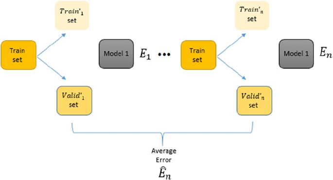
Chapter 5 ■ Building, tuning, and deploying Models
290
The previously described process seems to be good. We have described the validation part of the
process but we haven’t touched on the cross part of it. So where is the cross-validation? To understand
that intricacy of the CV process, we would have to discuss why we need this in the first place. The need for
it arises from the fact that by dividing the data into test and a validation set we have lost out on a decent
amount of data which we could have used to further refine our modeling process. Also another important
point is that if we take a model’s error for a single iteration to be its overall error we are making a serious
mistake. Instead we want to take some average measure of error by building multiple iterations of the same
model. But if we keep rebuilding the model on the same dataset, we are not going to get much difference in
the model performance. We address these two issues by introducing the cross concept of cross-validation.
The idea of cross validation is to get different splits of train and validation sets (different observations in
each set, each time) using some strategy (which we will elaborate on later) and then build multiple iterations
of each model on these different splits. The average error on these splits is then reported as the error of the
model in question and the final decision is made on this averaged error metric. This strategy has a brilliant
effect on the estimated error of each model, as it ensures that the averaged error is a close approximation of
the model’s error on really unseen data (here our test set) and we could also leverage the complete training
dataset for building the model. This process is explained pictorially in Figure5-13.
Figure 5-13. The final cross-validation process for model building and tuning
The various strategies in which these different train and validation sets can be generated gives rise
to different kind of cross-validation strategies. The common idea in each of these strategies remains the
same. The only difference is in the way the original train set is split into a train and validation set for each
iteration of model building.
Cross-Validation Strategies
We explained the basic principle of cross validation in the previous section. In this section, we see the
different strategies in which we can split the training data into training and validation data. Apart from the
way of this split, as mentioned before, the process for each of these strategies remains the same. The major
types of cross-validation strategies are described as follows.
Chapter 5 ■ Building, tuning, and deploying Models
291
Leave One Out CV
In this strategy for cross validation, we select a random single data point from the initial training dataset
and that becomes our validation set. So we have a single point only in our validation set and the rest n-1
observations become our training set. This means that if have 1000 data points in a training set than we
will be developing 1000 iterations of each model with a different training set and validation set each time
such that the validation set has one observation and the rest (999) go into the training set. This may become
infeasible if the dataset size is large. But in practice the error can be estimated by performing some small
number of iterations. Due to the computational complexity of this measure, it is mostly suitable for small
datasets and rarely used in practice.
K-Fold CV
The other strategy for cross-validation is to split the training dataset into k equal subsets. Out of these k
subsets we train the model on k-1 subsets and keep one subset as a validation set. This process is repeated k
times and the error is averaged over the k models that are obtained by developing different iterations of the
model. We keep changing the validation set in each of these iterations which ensures that in each iteration,
the model is trained on a different subset of data. This practice of cross-validation is quite effective in
practice, both for model selection and hyperparameter optimization.
A natural question for this strategy is to select the appropriate number of folds, as they will both control
our error approximation and the computational runtime of our CV process. There are mathematical ways to
select the most appropriate k but in practice a good choice of k ranges from 5-10. So, in most cases, we can
do a 5-fold or 10-fold validation and be confident of the results that we obtained.
Hyperparameter Tuning Strategies
Based on our discussions until now, we have all the prerequisites for tuning our model. We know what
hyperparameters are, how the performance of a model can be evaluated, and how we can use cross-
validation to search through the parameter space for optimal value of our algorithm’s hyperparameters.
In this section, we discuss two major strategies that tie all this together to determine the most optimal
hyperparameters. Fortunately, the scikit-learn library has an excellent built-in support for performing
hyperparameter search with cross-validation.
There are two major ways in which we can search our parameter space for an optimal model. These two
methods differ in the way we will search for them: systemic versus random. In this section we will discuss
these two methods along with hands-on examples. The takeaway from this section is to understand the
processes so that you can start leveraging on your own datasets. Also note that even if we don’t mention it
explicitly, we will always be using cross validation to perform any of these searches.
Grid Search
This is the simplest of the hyperparameter optimization methods. In this method we will specify the grid of
values (of hyperparameters) that we want to try out and optimize to get the best parameter combinations.
Then we will build models on each of those values (combination of multiple parameter values), using
cross-validation of course, and report the best parameters’ combination in the whole grid. The output will be
the model using the best combination from the grid. Although it is quite simple, it suffers from one serious
drawback that the user has to manually supply the actual parameters, which may or may not contain the
most optimal parameters.
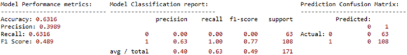
Chapter 5 ■ Building, tuning, and deploying Models
292
In scikit-learn, grid search can be done using the GridSearchCV class. We go through an example
by performing grid search on a support vector machine (SVM) model on the breast cancer dataset from
earlier. The SVM model is another example of a supervised Machine Learning algorithm that can be used for
classification. It is an example of a maximum margin classifier, where it tries to learn a representation of all
the data points such that separate categories\labels are divided or separated by a clear gap, which is as large
as possible. We won’t be going into further extensive details here since the intent is to run grid search, but we
recommend you to check out some standard literation on SVMs if you are interested.
Let’s first split our breast cancer dataset variables X and y into train and test datasets and build an
SVM model with default parameters. Then we’ll evaluate its performance on the test dataset by leveraging
our model_evaluation_utils module.
from sklearn.model_selection import train_test_split
from sklearn.svm import SVC
# prepare datasets
X_train, X_test, y_train, y_test = train_test_split(X, y, test_size=0.3, random_state=42)
# build default SVM model
def_svc = SVC(random_state=42)
def_svc.fit(X_train, y_train)
# predict and evaluate performance
def_y_pred = def_svc.predict(X_test)
print('Default Model Stats:')
meu.display_model_performance_metrics(true_labels=y_test, predicted_labels=def_y_pred,
classes=[0,1])
Would you look at that, our model gives an overall F1 Score of only 49% and model accuracy of 63%
as depicted in Figure5-14. Also by looking at the confusion matrix, you can clearly see that it is predicting
every data point as benign (label 1). Basically our model learned nothing! Let’s try tuning this model to see
if we get something better. Since we have chosen a SVM model, we specify some hyperparameters specific
to it, which includes the parameter C (deals with the margin parameter in SVM), the kernel function (used
for transforming data into a higher dimensional feature space) and gamma (determines the influence a
single training data point has). There are a lot of other hyperparameters to tune, which you can check out
at http://scikit-learn.org/stable/modules/generated/sklearn.svm.SVC.html for further details.
We build a grid by supplying some pre-set values. The next choice is selecting the score or metric we want
to maximize here we have chosen to maximize accuracy of the model. Once that is done, we will be using
five-fold cross-validation to build multiple models over this grid and evaluate them to get the best model.
Detailed code and outputs are depicted as follows.
from sklearn.model_selection import GridSearchCV
# setting the parameter grid
Figure 5-14. Model performance metrics for default SVM model on the breast cancer dataset
Chapter 5 ■ Building, tuning, and deploying Models
293
grid_parameters = {'kernel': ['linear', 'rbf'],
'gamma': [1e-3, 1e-4],
'C': [1, 10, 50, 100]}
# perform hyperparameter tuning
print("# Tuning hyper-parameters for accuracy\n")
clf = GridSearchCV(SVC(random_state=42), grid_parameters, cv=5, scoring='accuracy')
clf.fit(X_train, y_train)
# view accuracy scores for all the models
print("Grid scores for all the models based on CV:\n")
means = clf.cv_results_['mean_test_score']
stds = clf.cv_results_['std_test_score']
for mean, std, params in zip(means, stds, clf.cv_results_['params']):
print("%0.5f (+/-%0.05f) for %r" % (mean, std * 2, params))
# check out best model performance
print("\nBest parameters set found on development set:", clf.best_params_)
print("Best model validation accuracy:", clf.best_score_)
# Tuning hyper-parameters for accuracy
Grid scores for all the models based on CV:
0.95226 (+/-0.06310) for {'C': 1, 'gamma': 0.001, 'kernel': 'linear'}
0.91206 (+/-0.04540) for {'C': 1, 'gamma': 0.001, 'kernel': 'rbf'}
0.95226 (+/-0.06310) for {'C': 1, 'gamma': 0.0001, 'kernel': 'linear'}
0.92462 (+/-0.02338) for {'C': 1, 'gamma': 0.0001, 'kernel': 'rbf'}
0.96231 (+/-0.04297) for {'C': 10, 'gamma': 0.001, 'kernel': 'linear'}
0.90201 (+/-0.04734) for {'C': 10, 'gamma': 0.001, 'kernel': 'rbf'}
0.96231 (+/-0.04297) for {'C': 10, 'gamma': 0.0001, 'kernel': 'linear'}
0.92965 (+/-0.03425) for {'C': 10, 'gamma': 0.0001, 'kernel': 'rbf'}
0.95729 (+/-0.05989) for {'C': 50, 'gamma': 0.001, 'kernel': 'linear'}
0.90201 (+/-0.04734) for {'C': 50, 'gamma': 0.001, 'kernel': 'rbf'}
0.95729 (+/-0.05989) for {'C': 50, 'gamma': 0.0001, 'kernel': 'linear'}
0.93467 (+/-0.02975) for {'C': 50, 'gamma': 0.0001, 'kernel': 'rbf'}
0.95477 (+/-0.05772) for {'C': 100, 'gamma': 0.001, 'kernel': 'linear'}
0.90201 (+/-0.04734) for {'C': 100, 'gamma': 0.001, 'kernel': 'rbf'}
0.95477 (+/-0.05772) for {'C': 100, 'gamma': 0.0001, 'kernel': 'linear'}
0.93216 (+/-0.04674) for {'C': 100, 'gamma': 0.0001, 'kernel': 'rbf'}
Best parameters set found on development set: {'C': 10, 'gamma': 0.001, 'kernel': 'linear'}
Best model validation accuracy: 0.962311557789
Thus, from the preceding output and code, you can see how the best model parameters were obtained
based on cross-validation accuracy and we get a pretty awesome validation accuracy of 96%. Let’s take this
optimized and tuned model and put it to the test on our test data!
gs_best = clf.best_estimator_
tuned_y_pred = gs_best.predict(X_test)
print('\n\nTuned Model Stats:')
meu.display_model_performance_metrics(true_labels=y_test, predicted_labels=tuned_y_pred,
classes=[0,1])
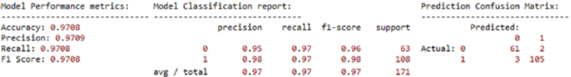
Chapter 5 ■ Building, tuning, and deploying Models
294
Well things are certainly looking great now! Our model gives an overall F1 Score and model
accuracy of 97% on the test dataset too, as depicted in Figure5-14. This should give you a clear indication of
the power of hyperparameter tuning! This scheme of things can be extended for different models and their
respective hyperparameters. We can also play around with the evaluation measure we want to optimize.
The scikit-learn framework provides us with different values that we can optimize. Some of them are
adjusted_rand_score, average_precision, f1, average_recall, and so on.
Randomized Search
Grid search is a very popular method to optimizing hyperparameters in practice. It is due to its simplicity
and the fact that it is embarrassingly parallelizable. This becomes important when the dataset we are
dealing with is of a large size. But it suffers from some major shortcomings, the most important one being
the limitation of manually specifying the grid. This brings a human element into a process that could benefit
from a purely automatic mechanism.
Randomized parameter search is a modification to the traditional grid search. It takes input for
grid elements as in normal grid search but it can also take distributions as input. For example consider
the parameter gamma whose values we supplied explicitly in the last section instead we can supply a
distribution from which to sample gamma. The efficacy of randomized parameter search is based on the
proven (empirically and mathematically) result that the hyperparameter optimization functions normally
have low dimensionality and the effect of certain parameters are more than others. We control the number
of times we want to do the random parameter sampling by specifying the number of iterations we want to
run (n_iter). Normally a higher number of iterations mean a more granular parameter search but higher
computation time.
To illustrate the use of randomized parameter search, we will use the example we used earlier but
replace the gamma and C values with a distribution. The results in our example may not be very different
from the grid search, but we establish the process that can be followed for future reference.
import scipy
from sklearn.model_selection import RandomizedSearchCV
param_grid = {'C': scipy.stats.expon(scale=10),
'gamma': scipy.stats.expon(scale=.1),
'kernel': ['rbf', 'linear']}
random_search = RandomizedSearchCV(SVC(random_state=42), param_distributions=param_grid,
n_iter=50, cv=5)
random_search.fit(X_train, y_train)
print("Best parameters set found on development set:")
random_search.best_params_
Best parameters set found on development set:
Out[183]:
{'C': 12.020578954763398, 'gamma': 0.036384519279056469, 'kernel': 'linear'}
Figure 5-15. Model performance metrics for tuned SVM model on the breast cancer dataset
Chapter 5 ■ Building, tuning, and deploying Models
295
# get best model, predict and evaluate performance
rs_best = random_search.best_estimator_
rs_y_pred = rs_best.predict(X_test)
meu.get_metrics(true_labels=y_test, predicted_labels=rs_y_pred)
Accuracy: 0.9649
Precision: 0.9649
Recall: 0.9649
F1 Score: 0.9649
In this example, we are getting the values of parameter C and gamma from an exponential distribution
and we are controlling the number of iterations of model search by the parameter n_iter. While the overall
model performance is similar to grid search, the intent is to be aware of the different strategies in model tuning.
Model Interpretation
The objective of Data Science or Machine Learning is to solve real-world problems, automate complex tasks,
and make our life easier and better. While data scientists spend a huge amount of time building, tuning,
and deploying models, one must ask the questions, “What is this going to be used for?” and “How does this
really work?” and the most important question, “Why should I trust your model?”. A business or organization
will be more concerned about business objective, generating profits, and minimizing losses by leveraging
analytics and Machine Learning. Hence often there is a disconnect between analytics teams and key
stakeholders, customers, clients, or management in trying to explain how models really work. Most of the
time, explaining complex theoretical and mathematical concepts can be really difficult to non-experts who
may not have an idea or, worse, might not be interested in knowing all the gory details. This brings us back to
the main objective, “can we explain and interpret Machine Learning models in an easy to understand way”,
such that anyone even without thorough knowledge of Machine Learning can understand them. The benefit
of this would be two-fold—Machine Learning models will not just stop at being research projects or proof-
of-concepts and it will pave the way for higher adoption of Machine Learning based solutions in enterprises.
Some Machine Learning models use interpretable algorithms, for example a decision tree will give you
the importance of all the variables as an output. Also the prediction path of any new data point can be analyzed
using a decision tree hence we can learn what variable played a crucial role for a prediction. Unfortunately, this
can’t be said for a lot of models, especially for the ones who have no notion of variable importance.
Some Machine Learning Models are interpretable in nature by default - e.g. generative model such
as Bayesian Rule List, Letham et. al (https://arxiv.org/abs/1511.01644), while other simple black box
models such as Simple Decision Trees could be made interpretable by using the feature importance as
an output. Also, the prediction path for a single tree from the root of the tree to its leaves can be visualized
capturing the contribution of the feature to the estimators decision policies. But, this intuitiveness may not
be possible for complex non-linear models - Random Forest, Deep Neural Networks - Convolutional Neural
Networks (CNNs), Recurrent Neural Networks (RNNS). The lack of understanding of the complex nature
of Machine Learned decision policies makes predictive models to be still viewed as black boxes. Model
interpretations can help a data scientist and an end user in a variety of ways. It will help bridge the gap that
often exists between the technology teams and the business. For example, it can help identify the reason
why a particular prediction is being made and it can be verified using the domain knowledge of the end
user by leveraging that easy to understand interpretation. It can also help the data scientists understand the
interactions among features that can lead to better feature engineering and enhanced performance. It can
also help in model comparisons and explaining the results better to the business stakeholders.
Chapter 5 ■ Building, tuning, and deploying Models
296
While the simplest approach to having models that are interpretable is to use algorithms that lead to
interpretable models like decision trees, logistic regression and others. But we don’t have the guarantee that
an interpretable model will provide us with the best performance. Hence we cannot always resort to such
models. A recent, much better approach is to explain model predictions in an easy-to-interpret manner
by learning an interpretable model locally around the prediction. This topic in fact has gained extensive
attention very recently in 2016. Refer to the original research paper by M.T. Ribeiro, S. Singh & C. Guestrin
titled “Why Should I Trust You?”: Explaining the Predictions of Any Classifier from https://arxiv.org/
pdf/1602.04938.pdf to understand more about model interpretation and the LIME framework, which
proposes to solve this. The LIME framework attempts to successfully explain any black box model locally
(somewhere we need define the scope of Interpretation - Globally and Locally) and you can check out the
GitHub repository at https://github.com/marcotcr/lime.
We will be leveraging another library named Skater, an open sourced Python library designed to
demystify the inner workings of of predictive models. Skater defines the scope of interpretating models
1.Globally(on the basis of a complete dataset) and 2. Locally (on the basis of an individual prediction). For
global explanations, Skater makes use of model-agnostic variable importance and partial dependence plots
to judge the bias of a model and understand its general behavior. To validate a model’s decision policies
for a single prediction, on the other hand, the library currently embraces a novel technique called local
interpretable model agnostic explanation (LIME, Ribeiro et al., 2016), which uses local surrogate models to
assess performance. The library is authored by Aaron Kramer, Pramit Choudhary, and the DataScience.com
team, Skater is now a mainstream project and an excellent framework for model interpretation. We would
like to acknowledge and thank the folks at DataScience.com—Ian Swanson, Pramit Choudhary, and Aaron
Kramer—for developing this amazing framework and especially Pramit for taking out time to explain to us in
detail the features and vision for the Skater project. Some advantages of leveraging Skater are mentioned as
follows and some of them are still actively being worked on and improved.
• Production ready code using functional style programming (declarative
programming paradigm)
• Enable Interpretation for both classification and regression based models for
Supervised Learning problems to start with and then gradually extend it to
support interpretation for Unsupervised Learning problems as well. This includes
computationally efficient Partial Dependence Plots and model independent feature
importance plots.
• Workflow abstraction: Common interface to perform local interpretation for
In-Memory (Model is under development) as well as Deployed Model (Model has
been deployed in production)
• Extending LIME - added support for interpreting Regression based model, better
sampling distribution for generating samples around a local prediction, researching
the ability to include non-linear models for local evaluation
• Enabling support of Rule Based interpretable Models - e.g. Letham et. al
(https://arxiv.org/abs/1511.01644)
• Better support for model Evaluation for NLP based models - e.g. Bach et. al
Layerwise Relevance Propagation (http://journals.plos.org/plosone/
article?id=10.1371/journal.pone.0130140)
• Better support for Image Interpretability - Batra et. al. Gradient weighted Class
Activation Map (https://arxiv.org/abs/1610.02391)
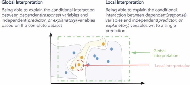
Chapter 5 ■ Building, tuning, and deploying Models
297
Besides this, since, the time this project started, they have committed some improvements, namely
support for regression back into the original LIME repository and they still have other aspects of
interpretation in their roadmap and further improvements to LIME in the future. You can easily install
skater by running the pip install -U Skater command from your prompt or terminal. For more
information, you can check out the GitHub repository at https://github.com/datascienceinc/Skater or
join the chat group here: https://gitter.im/datascienceinc-skater/Lobby.
Understanding Skater
Skater is an open source Python framework that aims to provide model agnostic interpretation of predictive
models. It is an active project on GitHub at https://github.com/datascienceinc/Skater with many of
the previously mentioned features being worked upon actively. The idea of skater is to understand black
box Machine Learning models by querying them and interpreting their learned decision policies. The
philosophy of skater is that all models should be evaluated as black boxes and decision criteria of the
models are inferred and interpreted based on input perturbations and observing the corresponding output
predictions. The scope of model interpretation by leveraging skater, enables us to do both global and local
interpretation as depicted in Figure 5-16.
Using the skater library, we can explore the features’ importance, partial dependency plots upon
features, and global and local fidelity of the predictions made by the model. The fidelity of a model can be
described as the reasons on the basis of which the model calculated and predicted a particular class. For
example, suppose we have a model that predicts whether a particular user transaction can be tagged as a
fraudulent transaction or not. The output of the model will be much more trustworthy if we can identify,
interpret, and depict that the reason the model marked the prediction as fraud, is because the amount is
larger than the maximum transaction of the user in the last six months and the location of transaction is
1000 kms away from user’s normal transaction areas. Contrast it with the case where we are only given a
prediction label without any justifying explanation.
Figure 5-16. Scope of Model Interpretation (source: DataScience.com)
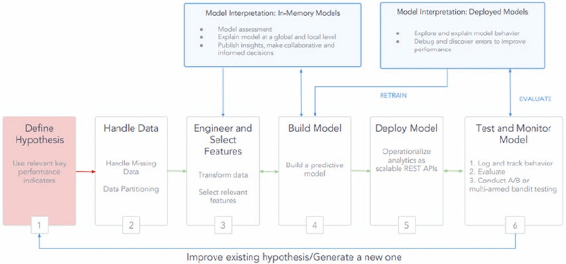
Chapter 5 ■ Building, tuning, and deploying Models
298
The general workflow within the skater package is to create an interpretation object, create a model
object, and run interpretation algorithms. Also, an Interpretation object takes as input, a dataset, and
optionally some metadata like feature names and row identifiers. Internally, the Interpretation object
will generate a DataManager to handle data requests and sampling. While we can interpret any model by
leveraging the model estimator objects, for ensuring consistency and proper functionality across all of
skater's interfaces, model objects need to be wrapped in skater's Model object, which can either be an
InMemoryModel object over an actual model or even a DeployedModel object to take a model behind an API
or web service. Figure 5-17 depicts a standard machine learning workflow and how skater can be leveraged
for interpreting the two different types of models we just mentioned. Let’s use our logistic regression model
from earlier to do some model interpretation on our breast cancer dataset!
Model Interpretation in Action
We will be using our train and test datasets from the breast cancer dataset that we have been using in this
chapter for consistency. We will leverage the X_train and X_test variables and also the logistic model
object (logistic regression model) that we created previously. We will try to run some model interpretations
on this model object. The standard workflow for model interpretation is to create a skater interpretation
and model object.
from skater.core.explanations import Interpretation
from skater.model import InMemoryModel
interpreter = Interpretation(X_test, feature_names=data.feature_names)
model = InMemoryModel(logistic.predict_proba, examples=X_train, target_names=logistic.classes_)
Figure 5-17. Model Interpretation in a standard Machine Learning Workflow (source: DataScience.com)
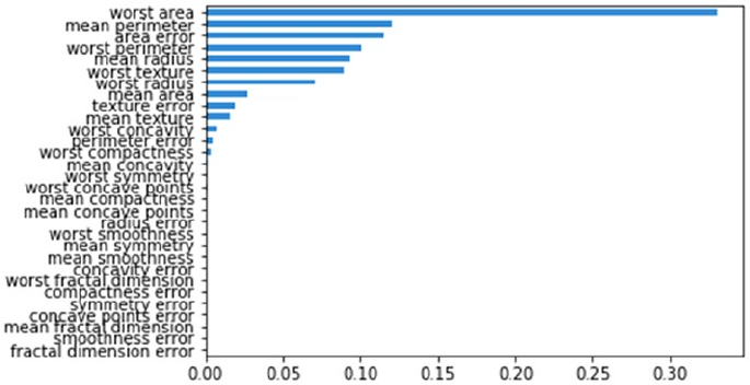
Chapter 5 ■ Building, tuning, and deploying Models
299
Once this is complete, we are ready to run model interpretation algorithms. We will start by trying to
generate feature importances. This will give us an idea of the degree to which our predictive model relies on
particular features. The skater framework’s feature importance implementation is based on an information
theory criterion, where it measures the entropy in the change of predictions, given a perturbation of a
specific feature. The idea is that the more a model’s decision making criteria depends on a feature, the more
the predictions will change as a function of perturbing the feature.
plots = interpreter.feature_importance.plot_feature_importance(model, ascending=False)
We can clearly observe from Figure5-18 that the most important feature in our model is worst
area, followed by mean perimeter and area error. Let’s now consider the most important feature,
worst area, and think about ways it might influence the model decision making process during
predictions. Partial dependence plots are an excellent tool to leverage to visualize this. In general,
partial dependence plots help describe the marginal impact of a specific feature on model prediction
by holding the other features in the model constant. The derivative of partial dependence, describes
the impact of a feature. The following code helps build the partial dependence plot for the worst area
feature in our model.
p = interpreter.partial_dependence.plot_partial_dependence(['worst area'], model,
grid_resolution=50,
with_variance=True, figsize = (6, 4))
Figure 5-18. Feature importances obtained from our logistic regression model
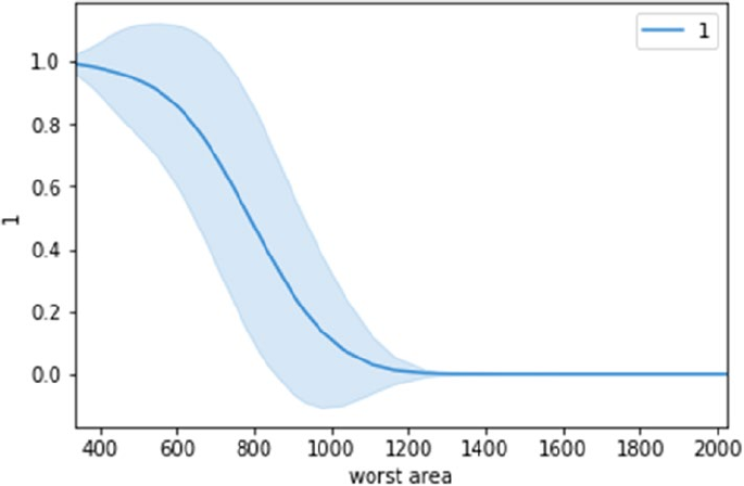
Chapter 5 ■ Building, tuning, and deploying Models
300
From the plot in Figure5-19, we can see that the worst area feature has a strong influence on the
model decision making process. Based on the plot, if the worst area value decreases from 800, the model
is more prone to classify the data point as benign (label 1) which indicates no cancer. This is definitely
interesting! Let’s try to interpret some actual predictions now. We will predict two data points, one not
having cancer (label 1) and one having cancer (label 0), and try to interpret the prediction making process.
from skater.core.local_interpretation.lime.lime_tabular import LimeTabularExplainer
exp = LimeTabularExplainer(X_train, feature_names=data.feature_names,
discretize_continuous=True, class_names=['0', '1'])
# explain prediction for data point having no cancer, i.e. label 1
exp.explain_instance(X_test[0], logistic.predict_proba).show_in_notebook()
Figure 5-19. One-way partial dependence plot for our logistic regression model predictor based on worst area
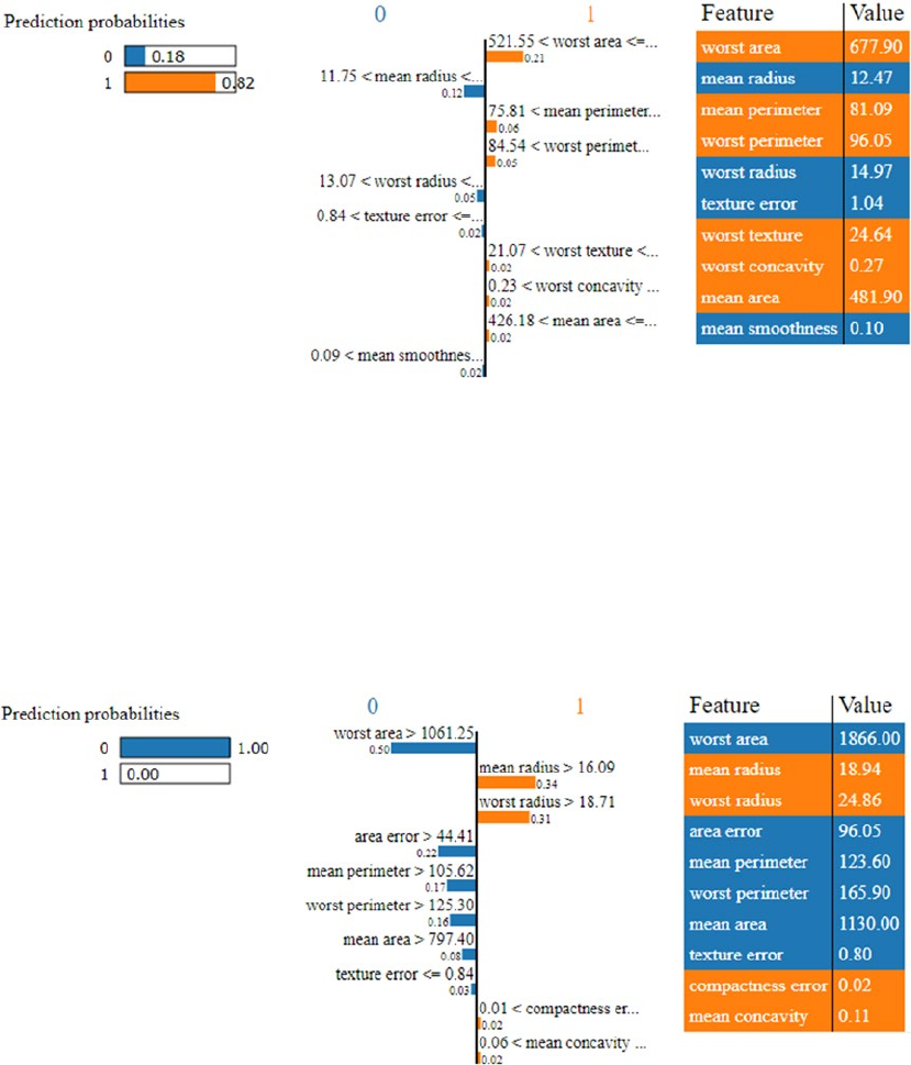
Chapter 5 ■ Building, tuning, and deploying Models
301
The results depicted in Figure5-20 show the features that were primarily responsible for the model
to predict the data point as label 1, i.e. having no cancer. We can also see the feature that was the most
influential in this decision was worst area! Let’s run a similar interpretation on a data point with malignant
cancer.
# explain prediction for data point having malignant cancer, i.e. label 0
exp.explain_instance(X_test[1], logistic.predict_proba).show_in_notebook()
Figure 5-20. Model interpretation for our logistic regression model’s prediction for a data point having no
cancer (benign)
Figure 5-21. Model interpretation for our logistic regression model’s prediction for a data point having cancer
(malignant)
Chapter 5 ■ Building, tuning, and deploying Models
302
The results depicted in Figure5-21 once again show us the features that were primarily responsible
for the model to predict the data point as label 0, i.e. having malignant cancer. The feature worst area
was again the most influential one and you can notice the stark difference in its value as compared to the
previous data point. Hopefully this should give you some insight into how model interpretation works. A
point to remember here is that we are just getting started with model interpretation based on the recent
interest since 2016, but it is going to be a good and worthwhile journey toward making models easy to
understand for anyone!
Model Deployment
The tough part of the whole modeling process is mostly the iterative process of feature engineering, model
building, tuning, and evaluation. Once we are done with this iterative process of model development, we can
breathe a sigh of relief—but not for long! The final piece of the Machine Learning modeling puzzle is that of
deploying the model in production so that we actually start using it. In this section, you learn of the various
ways you can deploy your models in action and the necessary dependencies that must be taken care of in
this process.
Model Persistence
Model persistence is the simplest way of deploying a model. In this scheme of things we will persist our
final model on permanent media like our hard drive and use this persisted version for making predictions
in the future. This simple scheme is a good way to deploy models with minimal effort. Model development
is generally done on a static data source but once deployed, typically the model is used on a constant
stream of data either in realtime\near-realtime or in batches. For example, consider a bank fraud detection
model; at the time of model development, we will have data collected over some historical time span. We
will use this data for the model development process and come up with a model with good performance,
i.e. a model that is very good at flagging potential fraud transactions. The model then needs to be deployed
over all of the future transactions that the bank (or any other financial entity) conducts. It means that for all
the transactions, we need to extract the data required for our model and feed that data to our model. The
model prediction is attached to the transaction and on the basis of it the transaction is flagged as a fraud
transaction or a clean transaction.
In the simplest scheme of things, we can write a standalone Python script that is given the new data as
soon as it arrives. It performs the necessary data transformations on the raw data and then reads our model
from the permanent data store. Once we have the data and the model we can make a prediction and this
prediction communication can be integrated with the required operations. These required operations are
often tied to the business needs of the model. In our case of tagging fraudulent transactions, it can involve
notifying the fraud department or simply denying the transaction. Most of the steps involved in this process
like data acquisition\retrieval, extraction, feature engineering and actions to be taken upon prediction are
related to the software or data engineering process and require custom software development and tinkering
with data engineering processes like ETL (extract-transform-load).
For persisting our model to disk, we can leverage libraries like pickle or joblib, which is also available
with scikit-learn. This allows us to deploy and use the model in the future, without having to retrain it
each time we want to use it.
from sklearn.externals import joblib
joblib.dump(logistic, 'lr_model.pkl')
Chapter 5 ■ Building, tuning, and deploying Models
303
This code will persist our model on the disk as a file named lr_model.pkl. So whenever we will load
this object in memory again we will get the logistic regression model object.
lr = joblib.load('lr_model.pkl')
lr
LogisticRegression(C=1.0, class_weight=None, dual=False, fit_intercept=True,
intercept_scaling=1, max_iter=100, multi_class='ovr', n_jobs=1,
penalty='l2', random_state=None, solver='liblinear', tol=0.0001,
verbose=0, warm_start=False)
We can now use this lr object, which is our model loaded from the disk, and make predictions.
A sample is depicted as follows.
print(lr.predict(X_test[10:11]), y_test[10:11])
[1] [1]
Remember that once you have a persisted model, you can easily integrate it with a Python based
script or application that can be scheduled to predict in realtime or batches of new data. However, proper
engineering of the solution is necessary to ensure the right data reaches the model and the prediction output
should also be broadcasted to the right channels.
Custom Development
Another option to deploy a model is by developing the implementation of model prediction method
separately. The output of most Machine Learning algorithms is just the values of parameters that were
learned. Once we have extracted these parameter values, the prediction process is pretty straightforward.
For example, the prediction of a logistic regression can be done by multiplying the coefficient vector with
the input data vector. This simple calculation will give us the score for the data vector that we can feed to the
sigmoid\logistic function and extract the prediction for our input data.
This method has more roots in the software development process as the developed model is reduced
to a set of configurations and parameters and the main focus would be on engineering the data and the
necessary mathematical computations using some programming language. This configuration can be used
to develop a custom implementation pipeline in which the prediction process is just a simple mathematical
operation.
In-House Model Deployment
A lot of enterprises and organizations will not want to expose their private and confidential data on which
models need to be built and deployed. Hence they will be leveraging their own software and Data Science
expertise to build and deploy custom solutions on their own infrastructure. This can involve leveraging
commercial-off-the-shelf tools to deploy models or using custom open source tools and frameworks.
Python based models can be easily integrated with frameworks like Flask or Django to create REST APIs or
Micro-services on top of the prediction models and these API endpoints can then be exposed and integrated
with any other solutions or applications that might need it.
Chapter 5 ■ Building, tuning, and deploying Models
304
Model Deployment as a Service
The computational world is seeing a surge of the cloud and the XAAS (anything as a service) model in all
areas. This is also true for model development and deployment. Major providers like Google, Microsoft, and
Amazon Web Services (AWS) provide the facility of developing Machine Learning models using their cloud
services and also the facility of deploying those models as a service on the cloud. This is very beneficial to
the end users due to the reliability and ease of scaling offered by these service providers. A major downside
to custom development or deploying models in-house is the extra work and maintenance required.
The scalability of the solution is also another problem that may exist for some kind of models like fraud
prediction, due to the sheer number of prediction volumes required.
Model deployment as a service takes care of these issues as in most cases the model prediction can be
accessed via a request made to a cloud based API endpoint (by supplying in the necessary data of course).
This capability frees the burden of maintaining an extra system for the developers of the application that
will be consuming the outputs of our model. In most cases, if the developers can take care of passing the
required data to the model deployment APIs, they don’t have to deal with the computational requirement of
the prediction system and dealing with its maintenance.
Another advantage of cloud deployment comes from how easy it is to update the models. Model
development is an iterative process and the deployed models need to be updated from time to time to
maintain their relevance. By maintaining the models at a single end point in the cloud, we simplify the
process of model updating as only a single replacement is required, which can actually happen with the
push of a button, which also syncs with all downstream applications.
Summary
This chapter concludes the second part of this book, which focused on the Machine Learning pipeline.
We learned the most important aspects of the model building process, which include model training, tuning,
evaluation, interpretation, and deployment. Details of various types of models was discussed in the model
building section including classification, regression, and clustering models. We also covered the three vital
stages of any Machine Learning process with an example of the logistic regression model and how gradient
descent is an important optimization process. Hands-on examples of classification and clustering model
building processes were depicted on real datasets. Various strategies of evaluating classification, regression,
and clustering models were also covered with detailed metrics for each of them, which were depicted with real
examples. A section of this book has been completely dedicated to tuning of models that include strategies for
hyperparameter tuning and cross validation with detailed depiction of tuning on real models. A nascent field
in Machine Learning is model interpretation, where we try to understand and explain how model predictions
really work. Detailed coverage on various aspects of model interpretation have also been covered, including
feature importances, partial dependence plots, and prediction explanations. Finally, we also looked at some
aspects pertaining to model deployment and the various options for deploying models. This should give you a
good idea of how to start building and tuning models. We will reinforce these concepts and methodologies in
the third part of this book where we will be working on real-world case studies.

PART III
Real-World Case Studies

307
© Dipanjan Sarkar, Raghav Bali and Tushar Sharma 2018
D. Sarkar et al., Practical Machine Learning with Python, https://doi.org/10.1007/978-1-4842-3207-1_6
CHAPTER 6
Analyzing Bike Sharing Trends
“All work and no play” is a well-known proverb and we certainly do not want to be dull. So far, we have
covered the theoretical concepts, frameworks, workflows, and tools required to solve Data Science problems.
The use case driven theme begins with this chapter. In this section of the book, we cover a wide range of
Machine Learning/Data Science concepts through real life case studies. Through this and subsequent
chapters, we will discuss and apply concepts learned so far to solve some exciting real-world problems.
This chapter discusses regression based models to analyze data and predict outcomes. In particular,
we will utilize the Capital Bike Sharing dataset from the UCI Machine Learning Repository to understand
regression models to predict bike usage demand. Through this chapter, we cover the following topics:
• The Bike Sharing dataset to understand the dataset available from the UCI Machine
Learning Repository
• Problem statement to formally define the problem to be solved
• Exploratory data analysis to explore and understand the dataset at hand
• Regression analysis to understand regression modeling concepts and apply them to
solve the problem
The Bike Sharing Dataset
The CRISP-DM model introduced in the initial chapters talks about a typical workflow associated with
a Data Science problem/project. The workflow diagram has data at its center for a reason. Before we get
started on different techniques to understand and play with the data, let’s understand its origins.
The Bike Sharing dataset is available from the UCI Machine Learning Repository. It is one of the largest
and probably also the longest standing online repository of datasets used in all sorts of studies and research
from across the world. The dataset we will be utilizing is one such dataset from among hundreds available
on the web site.
The dataset was donated by University of Porto, Portugal in 2013. More information is available at
https://archive.ics.uci.edu/ml/datasets/Bike+Sharing+Dataset.
■Note We encourage you to check out the UCI Machine Learning Repository and particularly the Bike
Sharing Data Set page. We thank Fanaee et al. for their work and sharing the dataset through the UCI Machine
Learning Repository.
Fanaee-T, Hadi, and Gama, Joao, Event labeling combining ensemble detectors and background knowledge,
Progress in Artificial Intelligence (2013): pp. 1-15, Springer Berlin Heidelberg.

CHAPTER 6 ■ ANALYZING BIKE SHARING TRENDS
308
Problem Statement
With environmental issues and health becoming trending topics, usage of bicycles as a mode of
transportation has gained traction in recent years. To encourage bike usage, cities across the world have
successfully rolled out bike sharing programs. Under such schemes, riders can rent bicycles using manual/
automated kiosks spread across the city for defined periods. In most cases, riders can pick up bikes from one
location and return them to any other designated place.
The bike sharing platforms from across the world are hotspots of all sorts of data, ranging from travel
time, start and end location, demographics of riders, and so on. This data along with alternate sources
of information such as weather, traffic, terrain, and so on makes it an attractive proposition for different
research areas.
The Capital Bike Sharing dataset contains information related to one such bike sharing program
underway in Washington DC. Given this augmented (bike sharing details along with weather information)
dataset, can we forecast bike rental demand for this program?
Exploratory Data Analysis
Now that we have an overview of the business case and a formal problem statement, the very next stage is to
explore and understand the data. This is also called the Exploratory Data Analysis (EDA) step. In this section,
we will load the data into our analysis environment and explore its properties. It is worth mentioning
again that EDA is one of the most important phases in the whole workflow and can help with not just
understanding the dataset, but also in presenting certain fine points that can be useful in the coming steps.
■Note The bike sharing dataset contains day level and hour level data. We will be concentrating only on
hourly data available in hour.csv.
Preprocessing
The EDA process begins with loading the data into the environment, getting a quick look at it along with
count of records and number of attributes. We will be making heavy use of pandas and numpy to perform data
manipulation and related tasks. For visualization purposes, we will use matplotlib and seaborn along with
pandas' visualization capabilities wherever possible.
We begin with loading the hour.csv and checking the shape of the loaded dataframe. The following
snippet does the same.
In [2]: hour_df = pd.read_csv('hour.csv')
...: print("Shape of dataset::{}".format(hour_df.shape))
Shape of dataset::(17379, 17)
The dataset contains more than 17k records with 17 attributes. Let’s check the top few rows to see how
the data looks. We use the head() utility from pandas for the same to get the output in Figure6-1.
CHAPTER 6 ■ ANALYZING BIKE SHARING TRENDS
309
The data seems to have loaded correctly. Next, we need to check what data types pandas has inferred
and if any of the attributes require type conversions. The following snippet helps us check the data types of
all attributes.
In [3]: hour_df.dtypes
Out[3]:
instant int64
dteday object
season int64
yr int64
mnth int64
hr int64
holiday int64
weekday int64
workingday int64
weathersit int64
temp float64
atemp float64
hum float64
windspeed float64
casual int64
registered int64
cnt int64
dtype: object
As mentioned in the documentation for the dataset, there are bike sharing as well as weather attributes
available. The attribute dteday would require type conversion from object (or string type) to timestamp.
Attributes like season, holiday, weekday, and so on are inferred as integers by pandas, and they would
require conversion to categoricals for proper understanding.
Before jumping into type casting attributes, the following snippet cleans up the attribute names to make
them more understandable and pythonic.
In [4]: hour_df.rename(columns={'instant':'rec_id',
...: 'dteday':'datetime',
...: 'holiday':'is_holiday',
...: 'workingday':'is_workingday',
...: 'weathersit':'weather_condition',
...: 'hum':'humidity',
...: 'mnth':'month',
...: 'cnt':'total_count',
...: 'hr':'hour',
...: 'yr':'year'},inplace=True)
Figure 6-1. Sample rows from Bike Sharing dataset
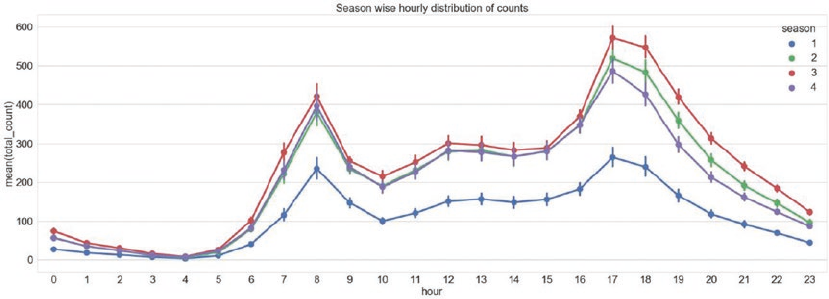
CHAPTER 6 ■ ANALYZING BIKE SHARING TRENDS
310
Now that we have attribute names cleaned up, we perform type-casting of attributes using utilities like
pd.to_datetime() and astype(). The following snippet gets the attributes into proper data types.
In [5]: # date time conversion
...: hour_df['datetime'] = pd.to_datetime(hour_df.datetime)
...:
...: # categorical variables
...: hour_df['season'] = hour_df.season.astype('category')
...: hour_df['is_holiday'] = hour_df.is_holiday.astype('category')
...: hour_df['weekday'] = hour_df.weekday.astype('category')
...: hour_df['weather_condition'] = hour_df.weather_condition.astype('category')
...: hour_df['is_workingday'] = hour_df.is_workingday.astype('category')
...: hour_df['month'] = hour_df.month.astype('category')
...: hour_df['year'] = hour_df.year.astype('category')
...: hour_df['hour'] = hour_df.hour.astype('category')
Distribution and Trends
The dataset after preprocessing (which we performed in the previous step) is ready for some visual
inspection. We begin with visualizing hourly ridership counts across the seasons. The following snippet uses
seaborn’s pointplot to visualize the same.
In [6]: fig,ax = plt.subplots()
...: sn.pointplot(data=hour_df[['hour',
...: 'total_count',
...: 'season']],
...: x='hour',y='total_count',
...: hue='season',ax=ax)
...: ax.set(title="Season wise hourly distribution of counts")
The plot in Figure6-2 shows similar trends for all seasons with counts peaking in the morning between
7-9 am and in the evening between 4-6 pm, possibly due to high movement during start and end of office
hours. The counts are lowest for the spring season, while fall sees highest riders across all 24 hours.
Figure 6-2. Season wise hourly data distribution
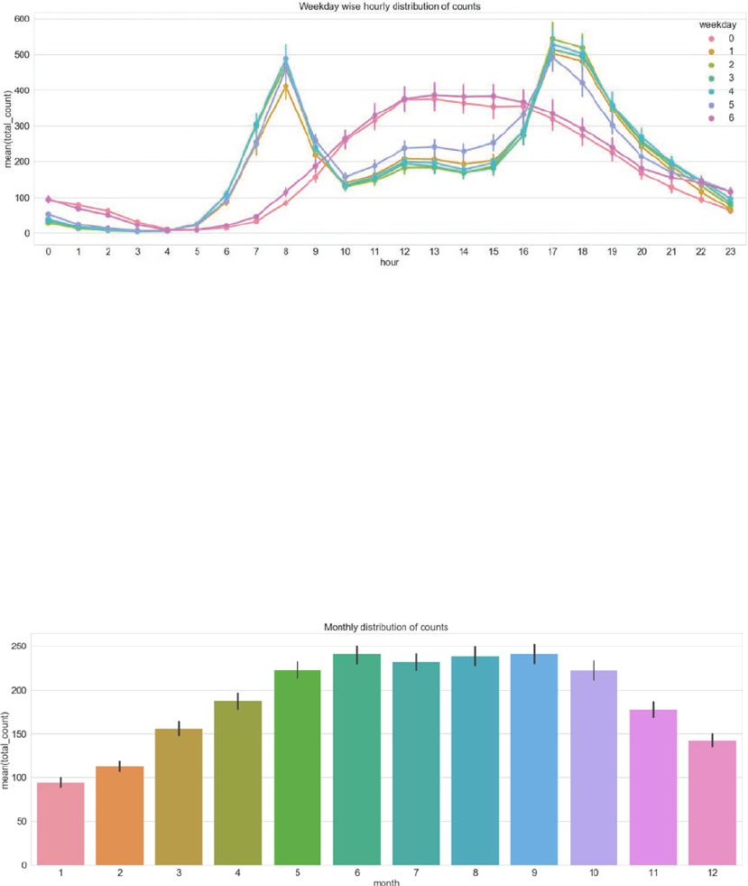
CHAPTER 6 ■ ANALYZING BIKE SHARING TRENDS
311
Similarly, distribution of ridership across days of the week also presents interesting trends of higher
usage during afternoon hours over weekends, while weekdays see higher usage during mornings and
evenings. The code for the same is available in the jupyter notebook bike_sharing_eda.ipynb. The plot is as
shown in Figure6-3.
Having observed hourly distribution of data across different categoricals, let’s see if there are any
aggregated trends. The following snippet helps us visualize monthly ridership trends using seaborn’s
barplot().
In [7]: fig,ax = plt.subplots()
...: sn.barplot(data=hour_df[['month',
...: 'total_count']],
...: x="month",y="total_count")
...: ax.set(title="Monthly distribution of counts")
The generated barplot showcases a definite trend in ridership based on month of the year. The
months June-September see highest ridership. Looks like Fall is a good season for Bike Sharing programs in
Washington, D.C. The plot is shown in Figure6-4.
Figure 6-3. Day-wise hourly data distribution
Figure 6-4. Month-wise ridership distribution
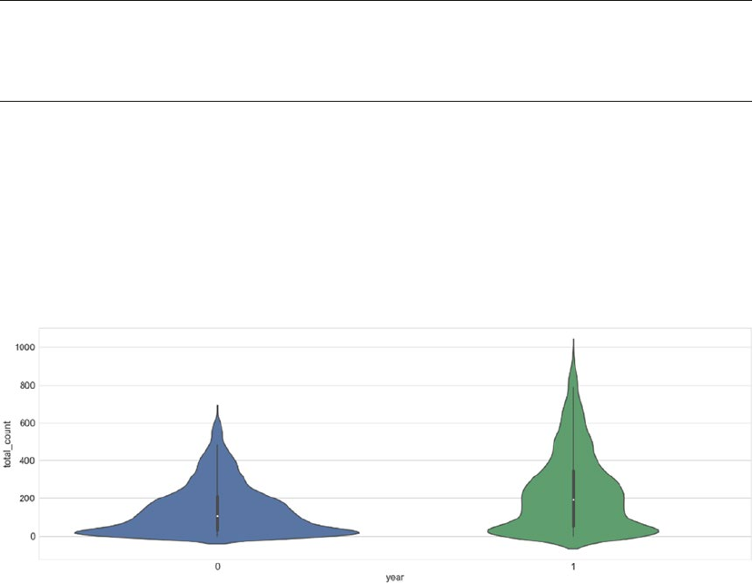
CHAPTER 6 ■ ANALYZING BIKE SHARING TRENDS
312
We encourage you to try and plot the four seasons across different subplots as an exercise to employ
plotting concepts and see the trends for each season separately.
Moving up the aggregation level, let’s look at the distribution at year level. Our dataset contains year
value of 0 representing 2011 and 1 representing 2012. We use a violin plot to understand multiple facets of
this distribution in a crisp format.
■Note Violin plots are similar to boxplots. Like boxplots, violin plots also visualize inter-quartile range and
other summary statistics like mean/median. Yet these plots are more powerful than standard boxplots due to
their ability to visualize probability density of data. This is particularly helpful if data is multimodal.
The following snippet plots yearly distribution on violin plots.
In [8]: sn.violinplot(data=hour_df[['year',
...: 'total_count']],
...: x="year",y="total_count")
Figure6-5 clearly helps us understand the multimodal distribution in both 2011 and 2012 ridership
counts with 2011 having peaks at lower values as compared to 2012. The spread of counts is also much more
for 2012, although the max density for both the years is between 100-200 rides.
Outliers
While exploring and learning about any dataset, it is imperative that we check for extreme and unlikely
values. Though we handle missing and incorrect information while preprocessing the dataset, outliers are
usually caught during EDA. Outliers can severely and adversely impact the downstream steps like modeling
and the results.
We usually utilize boxplots to check for outliers in the data. In the following snippet, we analyze outliers
for numeric attributes like total_count, temperature, and wind_speed.
Figure 6-5. Violin plot showcasing year-wise ridership distribution
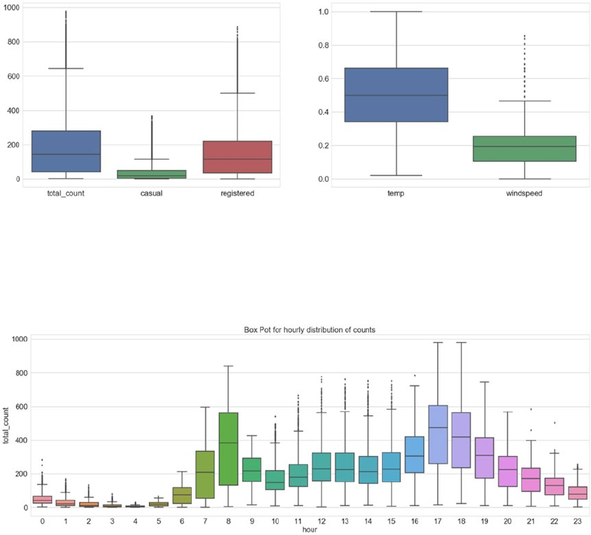
CHAPTER 6 ■ ANALYZING BIKE SHARING TRENDS
313
In [9]: fig,(ax1,ax2)= plt.subplots(ncols=2)
...: sn.boxplot(data=hour_df[['total_count',
...: 'casual','registered']],ax=ax1)
...: sn.boxplot(data=hour_df[['temp','windspeed']],ax=ax2)
The generated plot is shown in Figure6-6. We can easily mark out that for the three count related
attributes, all of them seem to have a sizable number of outlier values. The casual rider distribution has
overall lower numbers though. For weather attributes of temperature and wind speed, we find outliers only
in the case of wind speed.
We can similarly try to check outliers at different granularity levels like hourly, monthly, and so on. The
visualization in Figure6-7 showcases boxplots at hourly level (the code is available in the bike_sharing_
eda.ipynb jupyter notebook).
Figure 6-6. Outliers in the dataset
Figure 6-7. Outliers in hourly distribution of ridership
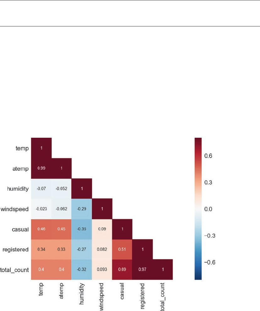
CHAPTER 6 ■ ANALYZING BIKE SHARING TRENDS
314
Correlations
Correlation helps us understand relationships between different attributes of the data. Since this chapter
focuses on forecasting, correlations can help us understand and exploit relationships to build better models.
■Note It is important to understand that correlation does not imply causation. We strongly encourage you to
explore more on the same.
The following snippet first prepares a correlational matrix using the pandas utility function corr().
It then uses a heat map to plot the correlation matrix.
In [10]: corrMatt = hour_df[["temp","atemp",
...: "humidity","windspeed",
...: "casual","registered",
...: "total_count"]].corr()
...: mask = np.array(corrMatt)
...: mask[np.tril_indices_from(mask)] = False
...: sn.heatmap(corrMatt, mask=mask,
...: vmax=.8, square=True,annot=True)
Figure6-8 shows the output correlational matrix (heat map) showing values in the lower triangular
form on a blue to red gradient (negative to positive correlation).
Figure 6-8. Correlational matrix

CHAPTER 6 ■ ANALYZING BIKE SHARING TRENDS
315
The two count variables, registered and casual, show obvious strong correlation to total_count.
Similarly, temp and atemp show high correlation. wind_speed and humidity have slight negative correlation.
Overall, none of the attributes show high correlational statistics.
Regression Analysis
Regression analysis is a statistical modeling technique used by statisticians and Data Scientists alike. It is
the process of investigating relationships between dependent and independent variables. Regression itself
includes a variety of techniques for modeling and analyzing relationships between variables. It is widely
used for predictive analysis, forecasting, and time series analysis.
The dependent or target variable is estimated as a function of independent or predictor variables. The
estimation function is called the regression function.
■Note In a very abstract sense, regression is referred to estimation of continuous response/target variables
as opposed to classification, which estimates discrete targets.
The height-weight relationship is a classic example to get started with regression analysis. The example
states that weight of a person is dependent on his/her height. Thus, we can formulate a regression function
to estimate the weight (dependent variable) given height (independent variable) of a person, provided we
have enough training examples. We discuss more on this in the coming section.
Regression analysis models the relationship between dependent and independent variables. It should
be kept in mind that correlation between dependent and independent variables does not imply causation!
Types of Regression
There are multiple techniques that have evolved over the years and that help us perform regression analysis.
In general, all regression modeling techniques involve the following:
• The independent variable X
• The dependent or target variable Y
• Unknown parameter(s), denoted as β
Thus, a regression function relates these entities as:
YfX=
()
,
b
The function f() needs to be specified or learned from the dataset available. Depending upon the data
and use case at hand, the following are commonly used regression techniques:
• Linear regression: As the name suggests, it maps linear relationships between
dependent and independent variables. The regression line is a straight line in this
technique. The aim here is to minimize the error (sum of squared error for instance).
• Logistic regression: In cases where the dependent variable is binary (0/1 or Yes/No),
this technique is utilized. It helps us determine the probability of the binary target
variable. It derives its name from the logit function used by this technique. The aim
here is to maximize the likelihood of observed values. This technique has more in
common with classification techniques than regression.
CHAPTER 6 ■ ANALYZING BIKE SHARING TRENDS
316
• Non-linear regression: In cases where dependent variable is related polynomially to
independent variable, i.e. the regression function has independent variables’ power
of more than 1. It is also termed as polynomial regression.
Regression techniques may also be classified as non-parametric.
Assumptions
Regression analysis has a few general assumptions while specific analysis techniques have added (or
reduced) assumptions as well. The following are important general assumptions for regression analysis:
• The training dataset needs to be representative of the population being modeled.
• The independent variables are linearly independent, i.e., one independent variable
cannot be explained as a linear combination of others. In other words, there should
be no multicollinearity.
• Homoscedasticity of error, i.e. the variance of error, is consistent across the sample.
Evaluation Criteria
Evaluation of model performance is an important aspect of Data Science use cases. We should be able to
not just understand the outcomes but also evaluate how models compare to each other or whether the
performance is acceptable or not.
In general, evaluation metrics and performance guidelines are pretty use case and domain specific,
regression analysis often uses a few standard metrics.
Residual Analysis
Regression is an estimation of target variable using the regression function on explanatory variables. Since
the output is an approximation, there will be some difference between the predicted value of target and the
observed value.
Residual is the difference between the observed and the predicted (output of the regression function).
Mathematically, the residual or difference between the observed and the predicted value of the ith data
point is given as:
eyfx
ii i
=-
()
,
b
A regression model that has nicely fit the data will have its residuals display randomness (i.e., lack of any
pattern). This comes from the homoscedasticity assumption of regression modeling. Typically scatter plots
between residuals and predictors are used to confirm the assumption. Any pattern, results in a violation of
this property and points toward a poor fitting model.
Normality Test (Q-Q Plot)
This is a visual/graphical test to check for normality of the data. This test helps us identify outliers, skewness,
and so on. The test is performed by plotting the data verses theoretical quartiles. The same data is also
plotted on a histogram to confirm normality. The following are sample plots showcasing data confirming the
normality test (see Figure6-9).
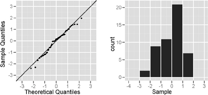
CHAPTER 6 ■ ANALYZING BIKE SHARING TRENDS
317
Any deviation from the straight line in normal plot or skewness/multi-modality in histogram shows that
the data does not pass the normality test.
R-Squared: Goodness of Fit
R-Squared or the coefficient of determination is another measure used to check for goodness of fit for
regression analysis. It is a measure used to determine if the regression line is able to indicate the variance in
dependent variable as explained by the independent variables(s).
R-squared is a numeric value between 0 and 1, with 1 pointing to the fact that the independent
variable(s) are able to explain the variance in dependent variable. Values closer to 0 are indicative of poor
fitting models.
Cross Validation
As discussed in Chapter 5, model generalization is also an important aspect of working on Data Science
problems. A model which overfits its training set may perform poorly on unseen data and lead to all sorts of
problems and business impacts. Hence, we employ k-fold cross validation on regression models as well to
make sure there is no overfitting happening.
Modeling
The stage is now set to start modeling our Bike Sharing dataset and solve the business problem of predicting
bike demand for a given date time. We will utilize the concepts of regression analysis discussed in the
previous section to model and evaluate the performance of our models.
The dataset was analyzed and certain transformations like renaming attributes and type casting were
performed earlier in the chapter. Since the dataset contains multiple categorical variables, it is imperative
that we encode the nominal ones before we use them in our modeling process.
Figure 6-9. Normal plot (Q-Q plot) on the left and histogram to confirm normality on the right

CHAPTER 6 ■ ANALYZING BIKE SHARING TRENDS
318
The following snippet showcases the function to one hot encode categorical variables, based on
methodologies we discussed in detail in Chapter 4: Feature Engineering and Selection.
def fit_transform_ohe(df,col_name):
"""This function performs one hot encoding for the specified
column.
Args:
df(pandas.DataFrame): the data frame containing the mentioned column name
col_name: the column to be one hot encoded
Returns:
tuple: label_encoder, one_hot_encoder, transformed column as pandas Series
"""
# label encode the column
le = preprocessing.LabelEncoder()
le_labels = le.fit_transform(df[col_name])
df[col_name+'_label'] = le_labels
# one hot encoding
ohe = preprocessing.OneHotEncoder()
feature_arr = ohe.fit_transform(df[[col_name+'_label']]).toarray()
feature_labels = [col_name+'_'+str(cls_label) for cls_label in le.classes_]
features_df = pd.DataFrame(feature_arr, columns=feature_labels)
return le,ohe,features_df
We use the fit_transform_ohe() function along with transform_ohe() to encode the categoricals.
The Label and One Hot encoders are available as part of scikit-learn’s preprocessing module.
■Note We will be using scikit and sklearn interchangeably in the coming sections.
As discussed in the earlier chapters, we usually divide the dataset at hand into training and testing sets
to evaluate the performance of our models. In this case as well, we use scikit-learn’s train_test_split()
function available through model_selection module. We split our dataset into 67% and 33% as train and
test, respectively. The following snippet showcases the same.
In [11]: X, X_test, y, y_test = train_test_split(hour_df.iloc[:,0:-3],
...: hour_df.iloc[:,-1],
...: test_size=0.33,
...: random_state=42)
...:
...: X.reset_index(inplace=True)
...: y = y.reset_index()
...:
...: X_test.reset_index(inplace=True)
...: y_test = y_test.reset_index()

CHAPTER 6 ■ ANALYZING BIKE SHARING TRENDS
319
The following snippet loops through the list of categorical variables to transform and prepare a list of
encoded attributes.
In [12]: cat_attr_list = ['season','is_holiday',
...: 'weather_condition','is_workingday',
...: 'hour','weekday','month','year']
...:
...: encoded_attr_list = []
...: for col in cat_attr_list:
...: return_obj = fit_transform_ohe(X,col)
...: encoded_attr_list.append({'label_enc':return_obj[0],
...: 'ohe_enc':return_obj[1],
...: 'feature_df':return_obj[2],
...: 'col_name':col})
■Note Though we have transformed all categoricals into their one-hot encodings, note that ordinal
attributes such as hour, weekday, and so on do not require such encoding.
Next, we merge the numeric and one hot encoded categoricals into a dataframe that we will use for our
modeling purposes. The following snippet helps us prepare the required dataset.
In [13]: feature_df_list = [X[numeric_feature_cols]]
...: feature_df_list.extend([enc['feature_df'] \
...: for enc in encoded_attr_list \
...: if enc['col_name'] in subset_cat_features])
...:
...: train_df_new = pd.concat(feature_df_list, axis=1)
...: print("Shape::{}".format(train_df_new.shape))
We prepared a new dataframe using numeric and one hot encoded categorical attributes from the
original training dataframe. The original dataframe had 10 such attributes (including both numeric and
categoricals). Post this transformation, the new dataframe has 19 attributes due to one hot encoding of the
categoricals.
Linear Regression
One of the simplest regression analysis techniques is linear regression. As discussed earlier in the chapter,
linear regression is the analysis of relationship between the dependent and independent variables. Linear
regression assumes linear relationship between the two variables. Extending on the general regression
analysis notation, linear regression takes the following form:
YabX=+
In this equation, Y is the dependent variable, X is the independent variable. The symbol a denotes the
intercept of the regression line and b is the slope of it.
Numerous lines can be fitted to a given dataset based on different combinations of the intercept (i.e. a)
and slope (i.e. b). The aim is to find the best fitting line to model our data.
CHAPTER 6 ■ ANALYZING BIKE SHARING TRENDS
320
If we think for a second, what would a best fitting line look like? Such line would invariably have the
least error/residual, i.e. the difference between the predicted and observed would be least for such a line.
The Ordinary Least Squares criterion is one such technique to identify the best fitting line. The
algorithm tries to minimize the error with respect to slope and intercept. It uses the squared error form,
shown as follows:
q=å-
()
yy
observed predicted
2
where, q is the total squared error. We minimize the total error to get the slope and intercept of the best
fitting line.
Training
Now that we have the background on linear regression and OLS, we’ll get started with the model building.
The linear regression model is exposed through scikit-learn’s linear_model module. Like all Machine
Learning algorithms in scikit, this also works on the familiar fit() and predict() theme. The following
snippet prepares the linear regression object for us.
In [14]: X = train_df_new
...: y= y.total_count.values.reshape(-1,1)
...:
...: lin_reg = linear_model.LinearRegression()
One simple way of proceeding would be call the fit() function to build our linear regression model
and then call the predict() function on the test dataset to get the predictions for evaluation. We also want to
keep in mind the aspects of overfitting and reduce its affects and obtain a generalizable model. As discussed
in the previous section and earlier chapters, cross validation is one method to keep overfitting in check.
We thus use the k-fold cross validation (specifically 10-fold) as shown in the following snippet.
In [15]: predicted = cross_val_predict(lin_reg, X, y, cv=10)
The function cross_val_predict() is exposed through model_selection module of sklearn. This
function takes the model object, predictors, and targets as inputs. We specify the k in k-fold using the cv
parameter. In our example, we use 10-fold cross validation. This function returns cross validated prediction
values as fitted by the model object.
We use scatter plot to analyze our predictions. The following snippet uses matplotlib to generate
scatter plot between residuals and observed values.
In [16]: fig, ax = plt.subplots()
...: ax.scatter(y, y-predicted)
...: ax.axhline(lw=2,color='black')
...: ax.set_xlabel('Observed')
...: ax.set_ylabel('Residual')
...: plt.show()
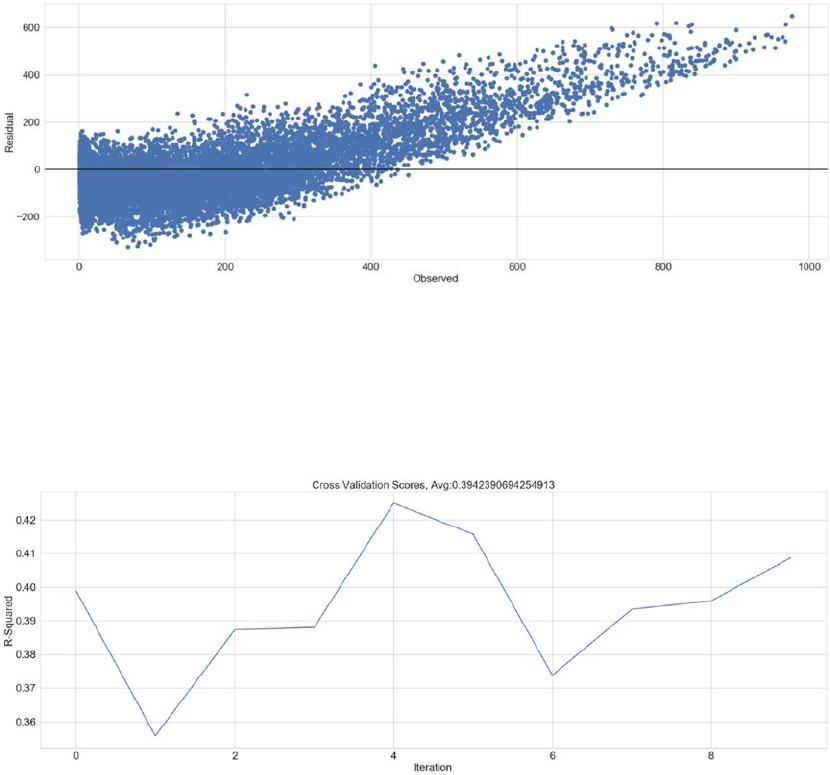
CHAPTER 6 ■ ANALYZING BIKE SHARING TRENDS
321
The plot in Figure6-10 clearly violates the homoscedasticity assumption, which is about residuals
being random and not following any pattern. To further quantify our findings related to the model, we
plot the cross-validation scores. We use the cross_val_score() function available again as part of the
model_selection module, which is shown in the visualization in Figure6-11.
The r-squared or the coefficient of determination is 0.39 on an average for 10-fold cross validation. This
points to the fact that the predictor is only able to explain 39% of the variance in the target variable.
You are encouraged to plot and confirm the normality of data. It is important to understand if the data
can be modeled by a linear model or not. This is being left as an exercise for you to explore.
Testing
The linear regression model prepared and evaluated in the training phase needs to be checked for its
performance on a completely un-seen dataset, the testing dataset. At the beginning of this section, we used
the train_test_split() function to keep a dataset specifically for testing purposes.
Figure 6-10. Residual plot
Figure 6-11. Cross validation scores
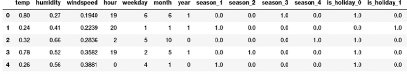
CHAPTER 6 ■ ANALYZING BIKE SHARING TRENDS
322
But before we can use the test dataset on the learned regression line, we need to make sure the
attributes have been through the same preprocessing in both training and testing sets. Since we transformed
categorical variables into their one hot encodings in the train dataset, in the following snippet we perform
the same actions on the test dataset as well.
In [17]: test_encoded_attr_list = []
...: for enc in encoded_attr_list:
...: col_name = enc['col_name']
...: le = enc['label_enc']
...: ohe = enc['ohe_enc']
...: test_encoded_attr_list.append({'feature_df':transform_ohe(X_test,
...: le,ohe,
...: col_name),
...: 'col_name':col_name})
...:
...:
...: test_feature_df_list = [X_test[numeric_feature_cols]]
...: test_feature_df_list.extend([enc['feature_df'] \
...: for enc in test_encoded_attr_list \
...: if enc['col_name'] in subset_cat_features])
...:
...: test_df_new = pd.concat(test_feature_df_list, axis=1)
...: print("Shape::{}".format(test_df_new.shape))
The transformed test dataset is shown in Figure6-12.
The final piece of the puzzle is to use the predict() function of the LinearRegression object and
compare our results/predictions. The following snippet performs the said actions.
In [18]: X_test = test_df_new
...: y_test = y_test.total_count.values.reshape(-1,1)
...:
...: y_pred = lin_reg.predict(X_test)
...:
...: residuals = y_test-y_pred
We also calculate the residuals and use them to prepare the residual plot, similar to the one we created
during training step. The following snippet plots the residual plot on the test dataset.
In [19]: fig, ax = plt.subplots()
...: ax.scatter(y_test, residuals)
Figure 6-12. Test dataset after transformations
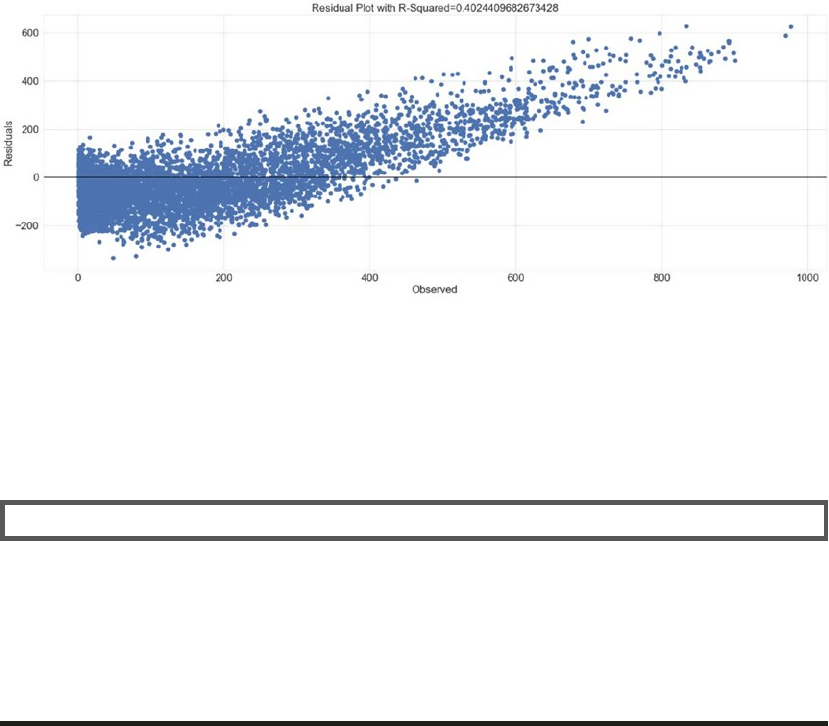
CHAPTER 6 ■ ANALYZING BIKE SHARING TRENDS
323
...: ax.axhline(lw=2,color='black')
...: ax.set_xlabel('Observed')
...: ax.set_ylabel('Residuals')
...: ax.title.set_text("Residual Plot with R-Squared={}".format(np.average(r2_score)))
...: plt.show()
The generated plot shows an R-squared that is comparable to training performance. The plot is shown
in Figure6-13.
It is clearly evident from our evaluation that the linear regression model is unable to model the data to
generate decent results. Though it should be noted that the model is performing equally on both training
and testing datasets. It seems like a case where we would need to model this data using methods that can
model non-linear relationships.
EXERCISE
In this section, we used training and testing datasets with 19 attributes (including both numeric and one
hot encoded categoricals). The performance is dismal due to non-linearity and other factors.
Experiment with different combination of attributes (use only a subset or use only numerical attributes
or any combination of them) and prepare different linear regression models. Follow the same steps as
outlined in this section. Check the performance against the model prepared in this section and analyze if
a better performing model could be possible.
Decision Tree Based Regression
Decision trees are supervised learning algorithms used for both regression and classification problems. They
are simple yet powerful in modeling non-linear relationships. Being a non-parametric model, the aim of this
algorithm is to learn a model that can predict outcomes based on simple decision rules (for instance,
if-else conditions) based on features. The interpretability of decision trees makes them even more
lucrative, as we can visualize the rules it has inferred from the data.
Figure 6-13. Residual plot for test dataset
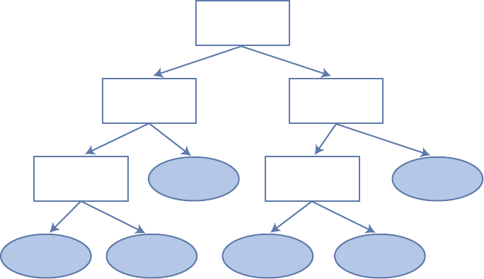
CHAPTER 6 ■ ANALYZING BIKE SHARING TRENDS
324
We explain the concepts and terminologies related to decision trees using an example. Suppose we
have a hypothetical dataset of car models from different manufacturers. Assume each data point has features
like fuel_capacity, engine_capacity, price, year_of_purchase, miles_driven, and mileage. Given
this data, we need a model that can predict the mileage given other attributes.
Since decision trees are supervised learning algorithms, we have certain number of data points with
actual mileage values available. A decision tree starts off at the root and divides the dataset into two or more
non-overlapping subsets, each represented as child node of the root. It divides the root into subsets based
on a specific attribute. It goes on performing the split at every node until a leaf node is achieved where the
target value is available. There might be a lot many questions on how it all happens, and we will get to each
of them in a bit. For better understanding, assume Figure6-14 is the structure of the decision tree inferred
from the dataset at hand.
The visualization depicted in Figure6-14 showcases a sample decision tree with leaf nodes pointing
toward target values. The tree starts off by splitting the dataset at root based on year of purchase with left
child representing purchases before 2010 and right child for purchases after 2010, and similarly for other
nodes. When presented with new/unseen data point, we simply traverse the tree and arrive at a leaf node
which determines the target value. Even though the previous example is simple, it clearly brings out the
interpretability of the model as well as its ability to learn simple rules.
Node Splitting
Decision trees work in a top-down manner and node splitting is an important concept for any decision tree
algorithm. Most algorithms follow a greedy approach to divide the input space into subsets.
The basic process in simple terms is to try and split data points using different attributes/features
and test against a cost function. The split resulting in least cost is selected at every step. Classification and
regression problems use different set of cost functions. Some of the most common ones are as follows:
• Mean Squared Error (MSE): Used mainly for regression trees, it is calculated as the
square of difference between observed and predicted values.
Year of Purchase
Price
Engine Capacity
Miles Driven
Fuel Capacity 23.2 mi/gal
20 mi/gal
30.5 mi/gal 14.2 mi/gal
< 2010
< $50000
< 2000cc >= 2000cc < 15 gal >= 15 gal
>= 30k miles
< 30k miles
>= $50000
>=2010
55 mi/gal 35.3 mi/gal
Figure 6-14. Sample decision tree

CHAPTER 6 ■ ANALYZING BIKE SHARING TRENDS
325
• Mean Absolute Error: Used for regression trees, it is similar to MSE though we only
use the difference between the observed and predicted values.
• Variance Reduction: This was first introduced with CART algorithm, and it uses the
standard formula of variance and we choose the split that results in least variance.
• Gini Impurity/Index: Mainly used by classification trees, it is a measure of a
randomly chosen data point to have an incorrect label given it was labeled randomly.
• Information Gain: Again used mainly for classification problems, it is also termed as
entropy. We choose the splits based on the amount of information gain. The higher
information gain, the better it is.
■Note These are some of the most commonly used cost functions. There are many more which are used
under specific scenarios.
Stopping Criteria
As mentioned, decision trees follow greedy recursive splitting of nodes, but how or when do they stop? There
are many strategies applied to define the stopping criteria. The most common being the minimum count
of data points. Node splitting is stopped if further splitting would violate this constraint. Another constraint
used is the depth of the tree.
The stopping criteria together with other parameters help us achieve trees that can generalize well. A
tree that is very deep or has too many non-leaf nodes often results in overfitting.
Hyperparameters
Hyperparameters are the knobs and controls we set with an aim to optimize the model’s performance on
unseen data. These hyperparameters are different from parameters which are learned by our learning
algorithm over the course of training process. Hyperparameters help us achieve objectives of avoiding
overfitting and so on. Decision trees provide us with quite a few hyperparameters to play with, some of
which we discussed in Chapter 5.
Maximum depth, minimum samples for leaf nodes, minimum samples to split internal nodes,
maximum leaf nodes, and so on are some of the hyperparameters actively used to improve performance
of decision trees. We will use techniques like grid search (refresh your memory from Chapter 5) to identify
optimal values for these hyperparameters in the coming sections.
Decision Tree Algorithms
Decision trees have been around for quite some time now. They have evolved with improvements in
algorithms based on different techniques over the years. Some of the most commonly used algorithms are
listed as follows:
• CART or Classification And Regression Tree
• ID3 or Iterative Dichotomizer 3
• C4.5
Now that we have a decent understanding of decision trees, let’s see if we can achieve improvements by
using them for our regression problem of predicting the bike sharing demand.

CHAPTER 6 ■ ANALYZING BIKE SHARING TRENDS
326
Training
Similar to the process with linear regression, we will use the same preprocessed dataframe train_df_new
with categoricals transformed into one hot encoded form along with other numerical attributes. We also
split the dataset into train and test again using the train_test_split() utility from scikit-learn.
The training process for decision trees is a bit involved and different as compared to linear regression.
Even though we performed cross validation while training our linear regression model, we did not have
any hyperparameters to tune. In the case of decision trees, we have quite a handful of them (some of
which we even discussed in the previous section). Before we get into the specifics of obtaining optimal
hyperparameters, we will look at the DecisionTreeRegressor from sklearn’s tree module. We do so by
instantiating a regressor object with some of the hyperparameters set as follows.
In [1]: dtr = DecisionTreeRegressor(max_depth=4,
...: min_samples_split=5,
...: max_leaf_nodes=10)
This code snippet prepares a DecisionTreeRegressor object that is set to have a maximum depth of 4,
maximum leaf nodes as 10, and minimum number of samples required to split a node as 5. Though there
can be many more, this example outlines how hyperparameters are utilized in algorithms.
■Note You are encouraged to try and fit the default Decision Tree Regressor on the training data and
observe its performance on testing dataset.
As mentioned, decision trees have an added advantage of being interpretable. We can visualize the
model object using Graphviz and pydot libraries, as shown in the following snippet.
In [2]: dot_data = tree.export_graphviz(dtr, out_file=None)
...: graph = pydotplus.graph_from_dot_data(dot_data)
...: graph.write_pdf("bikeshare.pdf")
The output is a pdf file showcasing a decision tree with hyperparameters as set in the previous step. The
following plot as depicted in Figure6-15, shows the root node being split on attribute 3 and then going on
until a depth of 4 is achieved. There are some leaves at a depth lesser than 4 as well. Each node clearly marks
out the attributes associated with it.
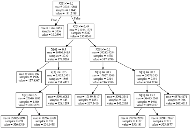
CHAPTER 6 ■ ANALYZING BIKE SHARING TRENDS
327
Now we start with the actual training process. As must be evident from our workflow so far, we would
train our regressor using k-fold cross validation. Since we have hyperparameters as well in case of decision
trees to worry, we need a method to fine-tune them as well.
There are many ways of fine-tuning the hyperparameters, the most common ones are grid search
and random search, with grid search being the more popular one. As the name suggests, random search
randomly searches the combinations of hyperparameters to find the best combination, grid search on the
other hand is a more systematic approach where all combinations are tried before the best is identified. To
make our lives easier, sklearn provides a utility to grid search the hyperparameters while cross validating
the model using the GridSearchCV() method from model_selection module.
The GridSearchCV() method takes the Regression/Classifier object as input parameter along with a
dictionary of hyperparameters, number of cross validations required, and a few more. We use the following
dictionary to define our grid of hyperparameters.
In [3]: param_grid = {"criterion": ["mse", "mae"],
...: "min_samples_split": [10, 20, 40],
...: "max_depth": [2, 6, 8],
...: "min_samples_leaf": [20, 40, 100],
...: "max_leaf_nodes": [5, 20, 100, 500, 800],
...: }
The dictionary basically provides a list of feasible values for each of the hyperparameters that we want
to fine-tune. The hyperparameters are the keys, while the values are presented as list of possible values of
these hyperparameters. For instance, our dictionary provides max_depth with possible values of 2, 6, and 8
levels. The GridSearchCV() function will in turn search in this defined list of possible values to arrive at the
best one value. The following snippet prepares a GridSearchCV object and fits our training dataset to it.
In [4]: grid_cv_dtr = GridSearchCV(dtr, param_grid, cv=5)
Figure 6-15. Decision tree with defined hyperparameters on Bike Sharing dataset

CHAPTER 6 ■ ANALYZING BIKE SHARING TRENDS
328
The grid search of hyperparameters with k-fold cross validation is an iterative process wrapped,
optimized, and standardized by GridSearchCV() function. The training process takes time due to the same
and results in quite a few useful attributes to analyze. The best_score_ attribute helps us get the best cross
validation score our Decision Tree Regressor could achieve. We can view the hyperparameters for the model
that generates the best score using best_params_. We can view the detailed information of each iteration of
GridSearchCV() using the cv_results_ attribute. The following snippet showcases some of these attributes.
In [5]: print("R-Squared::{}".format(grid_cv_dtr.best_score_))
...: print("Best Hyperparameters::\n{}".format(grid_cv_dtr.best_params_))
R-Squared::0.85891903233008
Best Hyperparameters::
{'min_samples_split': 10, 'max_depth': 8, 'max_leaf_nodes': 500, 'min_samples_leaf': 20,
'criterion': 'mse'}
The results are decent and show a dramatic improvement over our linear regression model. Let’s first
try to understand the learning/model fitting results across different settings of this model fitting. To get to
different models prepared during our grid search, we use the cv_results_ attribute of our GridSearchCV
object. The cv_results_ attribute is a numpy array that we can easily convert to a pandas dataframe. The
dataframe is shown in Figure6-16.
It important to understand that grid search with cross validation was optimizing on finding the best set
of hyperparameters that can help prepare a generalizable Decision Tree Regressor. It may be possible that
there are further optimizations possible. We use seaborn to plot the impact of depth of the tree on the overall
score along with number of leaf nodes. The following snippet uses the same dataframe we prepared using
cv_results_ attribute of GridSearchCV object discussed previously.
In [6]: fig,ax = plt.subplots()
...: sn.pointplot(data=df[['mean_test_score',
...: 'param_max_leaf_nodes',
...: 'param_max_depth']],
...: y='mean_test_score',x='param_max_depth',
...: hue='param_max_leaf_nodes',ax=ax)
...: ax.set(title="Affect of Depth and Leaf Nodes on Model Performance")
Figure 6-16. Dataframe showcasing tuning results with a few attributes of Grid Search with CV
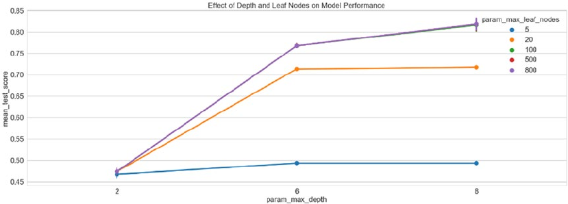
CHAPTER 6 ■ ANALYZING BIKE SHARING TRENDS
329
The output shows a sudden improvement in score as depth increases from 2 to 6 while a gradual
improvement as we reach 8 from 6. The impact of number of leaf nodes is rather interesting. The difference
in scores between 100 and 800 leaf nodes is strikingly not much. This is a clear indicator that further fine-
tuning is possible. Figure6-17 depicts the visualization showcasing these results.
As mentioned, there is still scope of fine-tuning to further improve the results. It is therefore a decision
which is use case and cost dependent. Cost can be in terms of effort, time and corresponding improvements
achieved. For now, we’ll proceed with the best model our GridSearchCV object has helped us identify.
Testing
Once we have a model trained with optimized hyperparameters, we can begin with our usual workflow to
test performance on an unseen dataset. We will utilize the same preprocessing as discussed while preparing
test set for linear regression (you may refer to the “Testing” section of linear regression and/or the jupyter
notebook decision_tree_regression.ipynb). The following snippet predicts the output values for the test
dataset using the best estimator achieved during training phase.
In [7]: y_pred = best_dtr_model.predict(X_test)
...: residuals = y_test.flatten() - y_pred
The final step is to view the R-squared score on this dataset. A well-fit model should have comparable
performance on this set as well, the same is evident from the following snippet.
In [1]: print("R-squared::{}".format(r2_score))
R-squared::0.8722
As is evident from the R-squared value, the performance is quite comparable to our training
performance. We can conclude by saying Decision Tree Regressor was better at forecasting bike demand as
compared to linear regression.
Figure 6-17. Mean test score and impact of tree depth and count of leaf nodes
CHAPTER 6 ■ ANALYZING BIKE SHARING TRENDS
330
Next Steps
Decision trees helped us achieve a better performance over linear regression based models, yet there are
improvements possible. The following are a few next steps to ponder and keep in mind:
• Model fine-tuning: We achieved a drastic improvement from using decision trees,
yet this can be improved further by analyzing the results of training, cross validation,
and so on. Acceptable model performance is something that is use case dependent
and is usually discussed upon while formalizing the problem statement. In our case,
an R-squared of 0.8 might be very good or missing the mark, hence the results need
to be discussed with all stakeholders involved.
• Other models and ensembling: If our current models do not achieve the
performance criteria, we need to evaluate other algorithms and even ensembles.
There many other regression models to explore. Ensembles are also quite useful and
are used extensively.
• Machine Learning pipeline: The workflow shared in this chapter was verbose to
assist in understanding and exploring concepts and techniques. Once a sequence of
preprocessing and modeling steps have stabilized, standardized pipelines are used
to maintain consistency and validity of the entire process. You are encouraged to
explore sklearn’s pipeline module for further details.
Summary
This chapter introduced the Bike Sharing dataset from the UCI Machine Learning repository. We followed
the Machine Learning workflow discussed in detail in the previous section of the book. We started off with
a brief discussion about the dataset followed by formally defining the problem statement. Once we had a
mission to forecast the bike demand, the next was to get started with exploratory data analysis to understand
and uncover properties and patterns in the data. We utilized pandas, numpy, and seaborn/matplotlib to
manipulate, transform, and visualize the dataset at hand. The line plots, bar charts, box plots, violin plots,
etc. all helped us understand various aspects of the dataset.
We then took a detour and explored the regression analysis. The important concepts, assumptions,
and types of regression analysis techniques were discussed. Briefly, we touched on various performance/
evaluation criteria typically used for regression problems like residual plots, normal plots, and coefficient
of determination. Equipped with a better understanding of dataset and regression itself, we started off
with a simple algorithm called linear regression. It is not only a simple algorithm but one of the most well
studied and extensively used algorithms for regression use cases. We utilized sklearn’s linear_model to
build and test our dataset for the problem at hand. We also utilized the model_selection module to split
our dataset and cross validate our model. The next step saw us graduating to decision tree based regression
model to improve on the performance of linear regression. We touched upon the concepts and important
aspects related to decision trees before using them for modeling our dataset. The same set of preprocessing
steps was used for both linear regression and decision trees. Finally, we concluded the chapter by briefly
discussing about next steps for improvement and enhancements. This chapter sets the flow and context for
coming chapters, which will build on the concepts and workflows from here on.

331
© Dipanjan Sarkar, Raghav Bali and Tushar Sharma 2018
D. Sarkar et al., Practical Machine Learning with Python, https://doi.org/10.1007/978-1-4842-3207-1_7
CHAPTER 7
Analyzing Movie Reviews
Sentiment
In this chapter, we continue with our focus on case-study oriented chapters, where we will focus on specific
real-world problems and scenarios and how we can use Machine Learning to solve them. We will cover aspects
pertaining to natural language processing (NLP), text analytics, and Machine Learning in this chapter. The
problem at hand is sentiment analysis or opinion mining, where we want to analyze some textual documents
and predict their sentiment or opinion based on the content of these documents. Sentiment analysis is perhaps
one of the most popular applications of natural language processing and text analytics with a vast number of
websites, books and tutorials on this subject. Typically sentiment analysis seems to work best on subjective
text, where people express opinions, feelings, and their mood. From a real-world industry standpoint,
sentiment analysis is widely used to analyze corporate surveys, feedback surveys, social media data, and
reviews for movies, places, commodities, and many more. The idea is to analyze and understand the reactions
of people toward a specific entity and take insightful actions based on their sentiment.
A text corpus consists of multiple text documents and each document can be as simple as a single
sentence to a complete document with multiple paragraphs. Textual data, in spite of being highly
unstructured, can be classified into two major types of documents. Factual documents that typically depict
some form of statements or facts with no specific feelings or emotion attached to them. These are also
known as objective documents. Subjective documents on the other hand have text that expresses feelings,
moods, emotions, and opinions.
Sentiment analysis is also popularly known as opinion analysis or opinion mining. The key idea is to
use techniques from text analytics, NLP, Machine Learning, and linguistics to extract important information
or data points from unstructured text. This in turn can help us derive qualitative outputs like the overall
sentiment being on a positive, neutral, or negative scale and quantitative outputs like the sentiment polarity,
subjectivity, and objectivity proportions. Sentiment polarity is typically a numeric score that’s assigned to
both the positive and negative aspects of a text document based on subjective parameters like specific words
and phrases expressing feelings and emotion. Neutral sentiment typically has 0 polarity since it does not
express and specific sentiment, positive sentiment will have polarity > 0, and negative < 0. Of course, you can
always change these thresholds based on the type of text you are dealing with; there are no hard constraints
on this.
In this chapter, we focus on trying to analyze a large corpus of movie reviews and derive the sentiment.
We cover a wide variety of techniques for analyzing sentiment, which include the following.
• Unsupervised lexicon-based models
• Traditional supervised Machine Learning models
• Newer supervised Deep Learning models
• Advanced supervised Deep Learning models
Chapter 7 ■ analyzing Movie reviews sentiMent
332
Besides looking at various approaches and models, we also focus on important aspects in the Machine
Learning pipeline including text pre-processing, normalization, and in-depth analysis of models, including
model interpretation and topic models. The key idea here is to understand how we tackle a problem like
sentiment analysis on unstructured text, learn various techniques, models and understand how to interpret
the results. This will enable you to use these methodologies in the future on your own datasets. Let’s get
started!
Problem Statement
The main objective in this chapter is to predict the sentiment for a number of movie reviews obtained from
the Internet Movie Database (IMDb). This dataset contains 50,000 movie reviews that have been pre-labeled
with “positive” and “negative” sentiment class labels based on the review content. Besides this, there are
additional movie reviews that are unlabeled. The dataset can be obtained from http://ai.stanford.
edu/~amaas/data/sentiment/, courtesy of Stanford University and Andrew L. Maas, Raymond E. Daly, Peter
T. Pham, Dan Huang, Andrew Y. Ng, and Christopher Potts. This dataset was also used in their famous paper,
Learning Word Vectors for Sentiment Analysis proceedings of the 49th Annual Meeting of the Association
for Computational Linguistics (ACL 2011). They have datasets in the form of raw text as well as already
processed bag of words formats. We will only be using the raw labeled movie reviews for our analyses in
this chapter. Hence our task will be to predict the sentiment of 15,000 labeled movie reviews and use the
remaining 35,000 reviews for training our supervised models. We will still predict sentiments for only 15,000
reviews in case of unsupervised models to maintain consistency and enable ease of comparison.
Setting Up Dependencies
We will be using several Python libraries and frameworks specific to text analytics, NLP, and Machine
Learning. While most of them will be mentioned in each section, you need to make sure you have pandas,
numpy, scipy, and scikit-learn installed, which will be used for data processing and Machine Learning.
Deep Learning frameworks used in this chapter include keras with the tensorflow backend, but you can
also use theano as the backend if you choose to do so. NLP libraries which will be used include spacy, nltk,
and gensim. Do remember to check that your installed nltk version is at least >= 3.2.4, otherwise, the
ToktokTokenizer class may not be present. If you want to use a lower nltk version for some reason, you can
use any other tokenizer like the default word_tokenize() based on the TreebankWordTokenizer. The version
for gensim should be at least 2.3.0 and for spacy, the version used was 1.9.0. We recommend using the latest
version of spacy which was recently released (version 2.x) as this has fixed several bugs and added several
improvements. You also need to download the necessary dependencies and corpora for spacy and nltk in
case you are installing them for the first time. The following snippets should get this done. For nltk you need
to type the following code from a Python or ipython shell after installing nltk using either pip or conda.
import nltk
nltk.download('all', halt_on_error=False)
For spacy, you need to type the following code in a Unix shell\windows command prompt, to install the
library (use pip install spacy if you don’t want to use conda) and also get the English model dependency.
$ conda config --add channels conda-forge
$ conda install spacy
$ python -m spacy download en
Chapter 7 ■ analyzing Movie reviews sentiMent
333
We also use our custom developed text pre-processing and normalization module, which you will
find in the files named contractions.py and text_normalizer.py. Utilities related to supervised model
fitting, prediction, and evaluation are present in model_evaluation_utils.py, so make sure you have these
modules in the same directory and the other Python files and jupyter notebooks for this chapter.
Getting the Data
The dataset will be available along with the code files for this chapter in the GitHub repository for this
book at https://github.com/dipanjanS/practical-machine-learning-with-python under the filename
movie_reviews.csv containing 50,000 labeled IMDb movie reviews. You can also download the same data
from http://ai.stanford.edu/~amaas/data/sentiment/ if needed. Once you have the CSV file, you can
easily load it in Python using the read_csv(...) utility function from pandas.
Text Pre-Processing and Normalization
One of the key steps before diving into the process of feature engineering and modeling involves cleaning,
pre-processing, and normalizing text to bring text components like phrases and words to some standard
format. This enables standardization across a document corpus, which helps build meaningful features
and helps reduce noise that can be introduced due to many factors like irrelevant symbols, special
characters, XML and HTML tags, and so on. The file named text_normalizer.py has all the necessary
utilities we will be using for our text normalization needs. You can also refer to the jupyter notebook named
Text Normalization Demo.ipynb for a more interactive experience. The main components in our text
normalization pipeline are described in this section.
• Cleaning text: Our text often contains unnecessary content like HTML tags, which
do not add much value when analyzing sentiment. Hence we need to make sure we
remove them before extracting features. The BeautifulSoup library does an excellent
job in providing necessary functions for this. Our strip_html_tags(...) function
enables in cleaning and stripping out HTML code.
• Removing accented characters: In our dataset, we are dealing with reviews in
the English language so we need to make sure that characters with any other
format, especially accented characters are converted and standardized into ASCII
characters. A simple example would be converting é to e. Our remove_accented_
chars(...) function helps us in this respect.
• Expanding contractions: In the English language, contractions are basically
shortened versions of words or syllables. These shortened versions of existing words
or phrases are created by removing specific letters and sounds. More than often
vowels are removed from the words. Examples would be, do not to don’t and I
would to I’d. Contractions pose a problem in text normalization because we have
to deal with special characters like the apostrophe and we also have to convert each
contraction to its expanded, original form. Our expand_contractions(...) function
uses regular expressions and various contractions mapped in our contractions.py
module to expand all contractions in our text corpus.
• Removing special characters: Another important task in text cleaning and
normalization is to remove special characters and symbols that often add to the extra
noise in unstructured text. Simple regexes can be used to achieve this. Our function
remove_special_characters(...) helps us remove special characters. In our code,
we have retained numbers but you can also remove numbers if you do not want
them in your normalized corpus.
Chapter 7 ■ analyzing Movie reviews sentiMent
334
• Stemming and lemmatization: Word stems are usually the base form of possible
words that can be created by attaching affixes like prefixes and suffixes to the stem
to create new words. This is known as inflection. The reverse process of obtaining
the base form of a word is known as stemming. A simple example are the words
WATCHES, WATCHING, and WATCHED. They have the word root stem WATCH
as the base form. The nltk package offers a wide range of stemmers like the
PorterStemmer and LancasterStemmer. Lemmatization is very similar to stemming,
where we remove word affixes to get to the base form of a word. However the base
form in this case is known as the root word but not the root stem. The difference
being that the root word is always a lexicographically correct word (present in the
dictionary) but the root stem may not be so. We will be using lemmatization only in
our normalization pipeline to retain lexicographically correct words. The function
lemmatize_text(...) helps us with this aspect.
• Removing stopwords: Words which have little or no significance especially when
constructing meaningful features from text are also known as stopwords or stop
words. These are usually words that end up having the maximum frequency if you do
a simple term or word frequency in a document corpus. Words like a, an, the, and
so on are considered to be stopwords. There is no universal stopword list but we use
a standard English language stopwords list from nltk. You can also add your own
domain specific stopwords if needed. The function remove_stopwords(...) helps
us remove stopwords and retain words having the most significance and context in a
corpus.
We use all these components and tie them together in the following function called normalize_
corpus(...), which can be used to take a document corpus as input and return the same corpus with
cleaned and normalized text documents.
def normalize_corpus(corpus, html_stripping=True, contraction_expansion=True,
accented_char_removal=True, text_lower_case=True,
text_lemmatization=True, special_char_removal=True,
stopword_removal=True):
normalized_corpus = []
# normalize each document in the corpus
for doc in corpus:
# strip HTML
if html_stripping:
doc = strip_html_tags(doc)
# remove accented characters
if accented_char_removal:
doc = remove_accented_chars(doc)
# expand contractions
if contraction_expansion:
doc = expand_contractions(doc)
# lowercase the text
if text_lower_case:
doc = doc.lower()
# remove extra newlines
doc = re.sub(r'[\r|\n|\r\n]+', ' ',doc)
# insert spaces between special characters to isolate them
special_char_pattern = re.compile(r'([{.(-)!}])')
doc = special_char_pattern.sub(" \\1 ", doc)
Chapter 7 ■ analyzing Movie reviews sentiMent
335
# lemmatize text
if text_lemmatization:
doc = lemmatize_text(doc)
# remove special characters
if special_char_removal:
doc = remove_special_characters(doc)
# remove extra whitespace
doc = re.sub(' +', ' ', doc)
# remove stopwords
if stopword_removal:
doc = remove_stopwords(doc, is_lower_case=text_lower_case)
normalized_corpus.append(doc)
return normalized_corpus
The following snippet depicts a small demo of text normalization on a sample document using our
normalization module.
In [1]: from text_normalizer import normalize_corpus
In [2]: document = """<p>Héllo! Héllo! can you hear me! I just heard about <b>Python</
b>!<br/>\r\n
...: It's an amazing language which can be used for Scripting, Web development,\r\n\r\n
...: Information Retrieval, Natural Language Processing, Machine Learning & Artificial
Intelligence!\n
...: What are you waiting for? Go and get started.<br/> He's learning, she's learning,
they've already\n\n
...: got a headstart!</p>
...: """
In [3]: document
Out[3]: "<p>Héllo! Héllo! can you hear me! I just heard about <b>Python</b>!<br/>\r\n
\n It's an amazing language which can be used for Scripting, Web development,
\r\n\r\n\n Information Retrieval, Natural Language Processing, Machine
Learning & Artificial Intelligence!\n\n What are you waiting for? Go and
get started.<br/> He's learning, she's learning, they've already\n\n\n got a
headstart!</p>\n "
In [4]: normalize_corpus([document], text_lemmatization=False, stopword_removal=False,
text_lower_case=False)
Out[4]: ['Hello Hello can you hear me I just heard about Python It is an amazing language
which can be used for Scripting Web development Information Retrieval Natural Language
Processing Machine Learning Artificial Intelligence What are you waiting for Go and get
started He is learning she is learning they have already got a headstart ']
In [5]: normalize_corpus([document])
Out[5]: ['hello hello hear hear python amazing language use scripting web development
information retrieval natural language processing machine learning artificial intelligence
wait go get start learn learn already get headstart']
Chapter 7 ■ analyzing Movie reviews sentiMent
336
Now that we have our normalization module ready, we can start modeling and analyzing our corpus.
NLP and text analytics enthusiasts who might be interested in more in-depth details of text normalization
can refer to the section “Text Normalization,” Chapter 3, page 115, of Text Analytics with Python (Apress;
Dipanjan Sarkar, 2016).
Unsupervised Lexicon-Based Models
We have talked about unsupervised learning methods in the past, which refer to specific modeling methods
that can be applied directly on data features without the presence of labeled data. One of the major challenges
in any organization is getting labeled datasets due the lack of time as well as resources to do this tedious task.
Unsupervised methods are very useful in this scenario and we will be looking at some of these methods in
this section. Even though we have labeled data, this section should give you a good idea of how lexicon based
models work and you can apply the same in your own datasets when you do not have labeled data.
Unsupervised sentiment analysis models use well curated knowledgebases, ontologies, lexicons, and
databases that have detailed information pertaining to subjective words, phrases including sentiment,
mood, polarity, objectivity, subjectivity, and so on. A lexicon model typically uses a lexicon, also known as
a dictionary or vocabulary of words specifically aligned toward sentiment analysis. Usually these lexicons
contain a list of words associated with positive and negative sentiment, polarity (magnitude of negative or
positive score), parts of speech (POS) tags, subjectivity classifiers (strong, weak, neutral), mood, modality,
and so on. You can use these lexicons and compute sentiment of a text document by matching the presence
of specific words from the lexicon, look at other additional factors like presence of negation parameters,
surrounding words, overall context and phrases and aggregate overall sentiment polarity scores to decide
the final sentiment score. There are several popular lexicon models used for sentiment analysis. Some of
them are mentioned as follows.
• Bing Liu’s Lexicon
• MPQA Subjectivity Lexicon
• Pattern Lexicon
• AFINN Lexicon
• SentiWordNet Lexicon
• VADER Lexicon
This is not an exhaustive list of lexicon models, but definitely lists among the most popular ones
available today. We will be covering the last three lexicon models in more detail with hands-on code
and examples using our movie review dataset. We will be using the last 15,000 reviews and predict their
sentiment and see how well our model performs based on model evaluation metrics like accuracy,
precision, recall, and F1-score, which we covered in detail in Chapter 5. Since we have labeled data, it
will be easy for us to see how well our actual sentiment values for these movie reviews match our lexicon-
model based predicted sentiment values. You can refer to the Python file titled unsupervised_sentiment_
analysis.py for all the code used in this section or use the jupyter notebook titled Sentiment Analysis -
Unsupervised Lexical.ipynb for a more interactive experience. Before we start our analysis, let’s load the
necessary dependencies and configuration settings using the following snippet.
In [1]: import pandas as pd
...: import numpy as np
...: import text_normalizer as tn
...: import model_evaluation_utils as meu
...:
...: np.set_printoptions(precision=2, linewidth=80)
Chapter 7 ■ analyzing Movie reviews sentiMent
337
Now, we can load our IMDb review dataset, subset out the last 15,000 reviews which will be used for our
analysis, and normalize them using the following snippet.
In [2]: dataset = pd.read_csv(r'movie_reviews.csv')
...:
...: reviews = np.array(dataset['review'])
...: sentiments = np.array(dataset['sentiment'])
...:
...: # extract data for model evaluation
...: test_reviews = reviews[35000:]
...: test_sentiments = sentiments[35000:]
...: sample_review_ids = [7626, 3533, 13010]
...:
...: # normalize dataset
...: norm_test_reviews = tn.normalize_corpus(test_reviews)
We also extract out some sample reviews so that we can run our models on them and interpret their
results in detail.
Bing Liu’s Lexicon
This lexicon contains over 6,800 words which have been divided into two files named positive-words.txt,
containing around 2,000+ words/phrases and negative-words.txt, which contains 4,800+ words/phrases.
The lexicon has been developed and curated by Bing Liu over several years and has also been explained
in detail in his original paper by Nitin Jindal and Bing Liu, “Identifying Comparative Sentences in Text
Documents” proceedings of the 29th Annual International ACM SIGIR, Seattle 2006. If you want to use this
lexicon, you can get it from https:// www.cs.uic.edu/~liub/FBS/sentiment-analysis.html#lexicon,
which also includes a link to download it as an archive (RAR format).
MPQA Subjectivity Lexicon
The term MPQA stands for Multi-Perspective Question Answering and it contains a diverse set of resources
pertaining to opinion corpora, subjectivity lexicon, subjectivity sense annotations, argument lexicon, debate
corpora, opinion finder, and many more. This is developed and maintained by the University of Pittsburgh
and their official web site http://mpqa.cs.pitt.edu/ contains all the necessary information. The
subjectivity lexicon is a part of their opinion finder framework and contains subjectivity clues and contextual
polarity. Details on this can be found in the paper by Theresa Wilson, Janyce Wiebe, and Paul Hoffmann,
“Recognizing Contextual Polarity in Phrase-Level Sentiment Analysis” proceeding of HLT-EMNLP-2005.
You can download the subjectivity lexicon from their official web site at http://mpqa.cs.pitt.edu/
lexicons/subj_lexicon/, contains subjectivity clues present in the dataset named subjclueslen1-
HLTEMNLP05.tff. The following snippet shows some sample lines from the lexicon.
type=weaksubj len=1 word1=abandonment pos1=noun stemmed1=n priorpolarity=negative
type=weaksubj len=1 word1=abandon pos1=verb stemmed1=y priorpolarity=negative
...
...
type=strongsubj len=1 word1=zenith pos1=noun stemmed1=n priorpolarity=positive
type=strongsubj len=1 word1=zest pos1=noun stemmed1=n priorpolarity=positive
Each line consists of a specific word and its associated polarity, POS tag information, length (right now
only words of length 1 are present), subjective context, and stem information.
Chapter 7 ■ analyzing Movie reviews sentiMent
338
Pattern Lexicon
The pattern package is a complete natural language processing framework available in Python which can be
used for text processing, sentiment analysis and more. This has been developed by CLiPS (Computational
Linguistics & Psycholinguistics), a research center associated with the Linguistics Department of the Faculty
of Arts of the University of Antwerp. Pattern uses its own sentiment module which internally uses a lexicon
which you can access from their official GitHub repository at https://github.com/clips/pattern/blob/
master/pattern/text/en/en-sentiment.xml and this contains the complete subjectivity based lexicon
database. Each line in the lexicon typically looks like the following sample.
<word form="absurd" wordnet_id="a-02570643" pos="JJ" sense="incongruous" polarity="-0.5"
subjectivity="1.0" intensity="1.0" confidence="0.9" />
Thus you get important metadata information like WordNet corpus identifiers, polarity scores, word
sense, POS tags, intensity, subjectivity scores, and so on. These can in turn be used to compute sentiment
over a text document based on polarity and subjectivity score. Unfortunately, pattern has still not been
ported officially for Python 3.x and it works on Python 2.7.x. However, you can still load this lexicon and do
your own modeling as needed.
AFINN Lexicon
The AFINN lexicon is perhaps one of the simplest and most popular lexicons that can be used extensively
for sentiment analysis. Developed and curated by Finn Årup Nielsen, you can find more details on this
lexicon in the paper by Finn Årup Nielsen, “A new ANEW: evaluation of a word list for sentiment analysis in
microblogs”, proceedings of the ESWC2011 Workshop. The current version of the lexicon is AFINN-en-165.
txt and it contains over 3,300+ words with a polarity score associated with each word. You can find this
lexicon at the author’s official GitHub repository along with previous versions of this lexicon including
AFINN-111 at https://github.com/fnielsen/afinn/blob/master/afinn/data/. The author has also
created a nice wrapper library on top of this in Python called afinn which we will be using for our analysis
needs. You can import the library and instantiate an object using the following code.
In [3]: from afinn import Afinn
...:
...: afn = Afinn(emoticons=True)
We can now use this object and compute the polarity of our chosen four sample reviews using the
following snippet.
In [4]: for review, sentiment in zip(test_reviews[sample_review_ids], test_
sentiments[sample_review_ids]):
...: print('REVIEW:', review)
...: print('Actual Sentiment:', sentiment)
...: print('Predicted Sentiment polarity:', afn.score(review))
...: print('-'*60)
REVIEW: no comment - stupid movie, acting average or worse... screenplay - no sense at
all... SKIP IT!
Actual Sentiment: negative
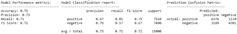
Chapter 7 ■ analyzing Movie reviews sentiMent
339
Predicted Sentiment polarity: -7.0
------------------------------------------------------------
REVIEW: I don't care if some people voted this movie to be bad. If you want the Truth this
is a Very Good Movie! It has every thing a movie should have. You really should Get this
one.
Actual Sentiment: positive
Predicted Sentiment polarity: 3.0
------------------------------------------------------------
REVIEW: Worst horror film ever but funniest film ever rolled in one you have got to see this
film it is so cheap it is unbelievable but you have to see it really!!!! P.S. Watch the
carrot
Actual Sentiment: positive
Predicted Sentiment polarity: -3.0
------------------------------------------------------------
We can compare the actual sentiment label for each review and also check out the predicted sentiment
polarity score. A negative polarity typically denotes negative sentiment. To predict sentiment on our
complete test dataset of 15,000 reviews (I used the raw text documents because AFINN takes into account
other aspects like emoticons and exclamations), we can now use the following snippet. I used a threshold
of >= 1.0 to determine if the overall sentiment is positive else negative. You can choose your own threshold
based on analyzing your own corpora in the future.
In [5]: sentiment_polarity = [afn.score(review) for review in test_reviews]
...: predicted_sentiments = ['positive' if score >= 1.0 else 'negative' for score in
sentiment_polarity]
Now that we have our predicted sentiment labels, we can evaluate our model performance based on
standard performance metrics using our utility function. See Figure7-1.
In [6]: meu.display_model_performance_metrics(true_labels=test_sentiments,
predicted_labels=predicted_sentiments,
classes=['positive', 'negative'])
We get an overall F1-Score of 71%, which is quite decent considering it’s an unsupervised model.
Looking at the confusion matrix we can clearly see that quite a number of negative sentiment based
reviews have been misclassified as positive (3,189) and this leads to the lower recall of 57% for the negative
sentiment class. Performance for positive class is better with regard to recall or hit-rate, where we correctly
predicted 6,376 out of 7,510 positive reviews, but precision is 67% because of the many wrong positive
predictions made in case of negative sentiment reviews.
Figure 7-1. Model performance metrics for AFINN lexicon based model
Chapter 7 ■ analyzing Movie reviews sentiMent
340
SentiWordNet Lexicon
The WordNet corpus is definitely one of the most popular corpora for the English language used extensively
in natural language processing and semantic analysis. WordNet gave us the concept of synsets or synonym
sets. The SentiWordNet lexicon is based on WordNet synsets and can be used for sentiment analysis and
opinion mining. The SentiWordNet lexicon typically assigns three sentiment scores for each WordNet synset.
These include a positive polarity score, a negative polarity score and an objectivity score. Further details
are available on the official web site http://sentiwordnet.isti.cnr.it, including research papers and
download links for the lexicon. We will be using the nltk library, which provides a Pythonic interface into
SentiWordNet. Consider we have the adjective awesome. We can get the sentiment scores associated with
the synset for this word using the following snippet.
In [8]: from nltk.corpus import sentiwordnet as swn
...:
...: awesome = list(swn.senti_synsets('awesome', 'a'))[0]
...: print('Positive Polarity Score:', awesome.pos_score())
...: print('Negative Polarity Score:', awesome.neg_score())
...: print('Objective Score:', awesome.obj_score())
Positive Polarity Score: 0.875
Negative Polarity Score: 0.125
Objective Score: 0.0
Let’s now build a generic function to extract and aggregate sentiment scores for a complete textual
document based on matched synsets in that document.
def analyze_sentiment_sentiwordnet_lexicon(review,
verbose=False):
# tokenize and POS tag text tokens
tagged_text = [(token.text, token.tag_) for token in tn.nlp(review)]
pos_score = neg_score = token_count = obj_score = 0
# get wordnet synsets based on POS tags
# get sentiment scores if synsets are found
for word, tag in tagged_text:
ss_set = None
if 'NN' in tag and list(swn.senti_synsets(word, 'n')):
ss_set = list(swn.senti_synsets(word, 'n'))[0]
elif 'VB' in tag and list(swn.senti_synsets(word, 'v')):
ss_set = list(swn.senti_synsets(word, 'v'))[0]
elif 'JJ' in tag and list(swn.senti_synsets(word, 'a')):
ss_set = list(swn.senti_synsets(word, 'a'))[0]
elif 'RB' in tag and list(swn.senti_synsets(word, 'r')):
ss_set = list(swn.senti_synsets(word, 'r'))[0]
# if senti-synset is found
if ss_set:
# add scores for all found synsets
pos_score += ss_set.pos_score()
neg_score += ss_set.neg_score()
obj_score += ss_set.obj_score()
token_count += 1
Chapter 7 ■ analyzing Movie reviews sentiMent
341
# aggregate final scores
final_score = pos_score - neg_score
norm_final_score = round(float(final_score) / token_count, 2)
final_sentiment = 'positive' if norm_final_score >= 0 else 'negative'
if verbose:
norm_obj_score = round(float(obj_score) / token_count, 2)
norm_pos_score = round(float(pos_score) / token_count, 2)
norm_neg_score = round(float(neg_score) / token_count, 2)
# to display results in a nice table
sentiment_frame = pd.DataFrame([[final_sentiment, norm_obj_score, norm_pos_score,
norm_neg_score, norm_final_score]],
columns=pd.MultiIndex(levels=[['SENTIMENT STATS:'],
['Predicted Sentiment',
'Objectivity',
'Positive', 'Negative',
'Overall']],
labels=[[0,0,0,0,0],[0,1,2,3,4]]))
print(sentiment_frame)
return final_sentiment
Our function basically takes in a movie review, tags each word with its corresponding POS tag, extracts
out sentiment scores for any matched synset token based on its POS tag, and finally aggregates the scores.
This will be clearer when we run it on our sample documents.
In [10]: for review, sentiment in zip(test_reviews[sample_review_ids], test_
sentiments[sample_review_ids]):
...: print('REVIEW:', review)
...: print('Actual Sentiment:', sentiment)
...: pred = analyze_sentiment_sentiwordnet_lexicon(review, verbose=True)
...: print('-'*60)
REVIEW: no comment - stupid movie, acting average or worse... screenplay - no sense at
all... SKIP IT!
Actual Sentiment: negative
SENTIMENT STATS:
Predicted Sentiment Objectivity Positive Negative Overall
0 negative 0.76 0.09 0.15 -0.06
------------------------------------------------------------
REVIEW: I don't care if some people voted this movie to be bad. If you want the Truth this
is a Very Good Movie! It has every thing a movie should have. You really should Get this
one.
Actual Sentiment: positive
SENTIMENT STATS:
Predicted Sentiment Objectivity Positive Negative Overall
0 positive 0.74 0.2 0.06 0.14
------------------------------------------------------------
REVIEW: Worst horror film ever but funniest film ever rolled in one you have got to see this
film it is so cheap it is unbelievable but you have to see it really!!!! P.S. watch the
carrot

Chapter 7 ■ analyzing Movie reviews sentiMent
342
Actual Sentiment: positive
SENTIMENT STATS:
Predicted Sentiment Objectivity Positive Negative Overall
0 positive 0.8 0.14 0.07 0.07
------------------------------------------------------------
We can clearly see the predicted sentiment along with sentiment polarity scores and an objectivity
score for each sample movie review depicted in formatted dataframes. Let’s use this model now to predict
the sentiment of all our test reviews and evaluate its performance. A threshold of >=0 has been used for the
overall sentiment polarity to be classified as positive and < 0 for negative sentiment. See Figure7-2.
In [11]: predicted_sentiments = [analyze_sentiment_sentiwordnet_lexicon(review,
verbose=False)
for review in norm_test_reviews]
...: meu.display_model_performance_metrics(true_labels=test_sentiments,
predicted_labels=predicted_sentiments,
...: classes=['positive', 'negative'])
We get an overall F1-Score of 68%, which is definitely a step down from our AFINN based model. While
we have lesser number of negative sentiment based reviews being misclassified as positive, the other aspects
of the model performance have been affected.
VADER Lexicon
The VADER lexicon, developed by C.J. Hutto, is a lexicon that is based on a rule-based sentiment analysis
framework, specifically tuned to analyze sentiments in social media. VADER stands for Valence Aware
Dictionary and Sentiment Reasoner. Details about this framework can be read in the original paper by Hutto,
C.J. & Gilbert, E.E. (2014) titled “VADER: A Parsimonious Rule-based Model for Sentiment Analysis of Social
Media Text”, proceedings of the Eighth International Conference on Weblogs and Social Media (ICWSM-14).
You can use the library based on nltk's interface under the nltk.sentiment.vader module. Besides this,
you can also download the actual lexicon or install the framework from https://github.com/cjhutto/
vaderSentiment, which also contains detailed information about VADER. This lexicon, present in the file
titled vader_lexicon.txt contains necessary sentiment scores associated with words, emoticons and slangs
(like wtf, lol, nah, and so on). There were a total of over 9000 lexical features from which over 7500 curated
lexical features were finally selected in the lexicon with proper validated valence scores. Each feature was
rated on a scale from "[-4] Extremely Negative" to "[4] Extremely Positive", with allowance for "[0]
Neutral (or Neither, N/A)". The process of selecting lexical features was done by keeping all features that
had a non-zero mean rating and whose standard deviation was less than 2.5, which was determined by the
aggregate of ten independent raters. We depict a sample from the VADER lexicon as follows.
Figure 7-2. Model performance metrics for SentiWordNet lexicon based model
Chapter 7 ■ analyzing Movie reviews sentiMent
343
:( -1.9 1.13578 [-2, -3, -2, 0, -1, -1, -2, -3, -1, -4]
:) 2.0 1.18322 [2, 2, 1, 1, 1, 1, 4, 3, 4, 1]
...
terrorizing -3.0 1.0 [-3, -1, -4, -4, -4, -3, -2, -3, -2, -4]
thankful 2.7 0.78102 [4, 2, 2, 3, 2, 4, 3, 3, 2, 2]
Each line in the preceding lexicon sample depicts a unique term, which can either be an emoticon or a
word. The first token indicates the word/emoticon, the second token indicates the mean sentiment polarity
score, the third token indicates the standard deviation, and the final token indicates a list of scores given
by ten independent scorers. Now let’s use VADER to analyze our movie reviews! We build our own modeling
function as follows.
from nltk.sentiment.vader import SentimentIntensityAnalyzer
def analyze_sentiment_vader_lexicon(review,
threshold=0.1,
verbose=False):
# pre-process text
review = tn.strip_html_tags(review)
review = tn.remove_accented_chars(review)
review = tn.expand_contractions(review)
# analyze the sentiment for review
analyzer = SentimentIntensityAnalyzer()
scores = analyzer.polarity_scores(review)
# get aggregate scores and final sentiment
agg_score = scores['compound']
final_sentiment = 'positive' if agg_score >= threshold\
else 'negative'
if verbose:
# display detailed sentiment statistics
positive = str(round(scores['pos'], 2)*100)+'%'
final = round(agg_score, 2)
negative = str(round(scores['neg'], 2)*100)+'%'
neutral = str(round(scores['neu'], 2)*100)+'%'
sentiment_frame = pd.DataFrame([[final_sentiment, final, positive,
negative, neutral]],
columns=pd.MultiIndex(levels=[['SENTIMENT STATS:'],
['Predicted Sentiment', 'Polarity Score',
'Positive', 'Negative', 'Neutral']],
labels=[[0,0,0,0,0],[0,1,2,3,4]]))
print(sentiment_frame)
return final_sentiment
In our modeling function, we do some basic pre-processing but keep the punctuations and emoticons
intact. Besides this, we use VADER to get the sentiment polarity and also proportion of the review text with
regard to positive, neutral and negative sentiment. We also predict the final sentiment based on a user-input
threshold for the aggregated sentiment polarity. Typically, VADER recommends using positive sentiment
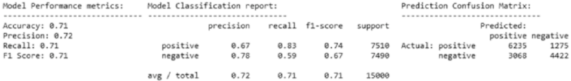
Chapter 7 ■ analyzing Movie reviews sentiMent
344
for aggregated polarity >= 0.5, neutral between [-0.5, 0.5], and negative for polarity < -0.5. We use a
threshold of >= 0.4 for positive and < 0.4 for negative in our corpus. The following is the analysis of our
sample reviews.
In [13]: for review, sentiment in zip(test_reviews[sample_review_ids], test_
sentiments[sample_review_ids]):
...: print('REVIEW:', review)
...: print('Actual Sentiment:', sentiment)
...: pred = analyze_sentiment_vader_lexicon(review, threshold=0.4, verbose=True)
...: print('-'*60)
REVIEW: no comment - stupid movie, acting average or worse... screenplay - no sense at
all... SKIP IT!
Actual Sentiment: negative
SENTIMENT STATS:
Predicted Sentiment Polarity Score Positive Negative Neutral
0 negative -0.8 0.0% 40.0% 60.0%
------------------------------------------------------------
REVIEW: I don't care if some people voted this movie to be bad. If you want the Truth this
is a Very Good Movie! It has every thing a movie should have. You really should Get this
one.
Actual Sentiment: positive
SENTIMENT STATS:
Predicted Sentiment Polarity Score Positive Negative Neutral
0 negative -0.16 16.0% 14.0% 69.0%
------------------------------------------------------------
REVIEW: Worst horror film ever but funniest film ever rolled in one you have got to see this
film it is so cheap it is unbelievable but you have to see it really!!!! P.S. Watch the carrot
Actual Sentiment: positive
SENTIMENT STATS:
Predicted Sentiment Polarity Score Positive Negative Neutral
0 positive 0.49 11.0% 11.0% 77.0%
------------------------------------------------------------
We can see the details statistics pertaining to the sentiment and polarity for each sample movie review.
Let’s try out our model on the complete test movie review corpus now and evaluate the model performance.
See Figure7-3.
In [14]: predicted_sentiments = [analyze_sentiment_vader_lexicon(review, threshold=0.4,
verbose=False) for review in test_
reviews]
...: meu.display_model_performance_metrics(true_labels=test_sentiments,
predicted_labels=predicted_sentiments,
...: classes=['positive', 'negative'])
Figure 7-3. Model performance metrics for VADER lexicon based model
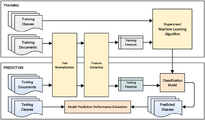
Chapter 7 ■ analyzing Movie reviews sentiMent
345
We get an overall F1-Score and model accuracy of 71%, which is quite similar to the AFINN based
model. The AFINN based model only wins out on the average precision by 1%; otherwise, both models have
a similar performance.
Classifying Sentiment with Supervised Learning
Another way to build a model to understand the text content and predict the sentiment of the text based
reviews is to use supervised Machine Learning. To be more specific, we will be using classification models
for solving this problem. We have already covered the concepts relevant to supervised learning and
classification in Chapter 1 under the section “Supervised Learning”. With regard to details on building and
evaluating classification models, you can head over to Chapter 5 and refresh your memory if needed. We will
be building an automated sentiment text classification system in subsequent sections. The major steps to
achieve this are mentioned as follows.
1. Prepare train and test datasets (optionally a validation dataset)
2. Pre-process and normalize text documents
3. Feature engineering
4. Model training
5. Model prediction and evaluation
These are the major steps for building our system. Optionally the last step would be to deploy the
model in your server or on the cloud. Figure7-4 shows a detailed workflow for building a standard text
classification system with supervised learning (classification) models.
Figure 7-4. Blueprint for building an automated text classification system (Source: Text Analytics with
Python, Apress 2016)
Chapter 7 ■ analyzing Movie reviews sentiMent
346
In our scenario, documents indicate the movie reviews and classes indicate the review sentiments that
can either be positive or negative, making it a binary classification problem. We will build models using both
traditional Machine Learning methods and newer Deep Learning in the subsequent sections. You can refer
to the Python file titled supervised_sentiment_analysis.py for all the code used in this section or use the
jupyter notebook titled Sentiment Analysis - Supervised.ipynb for a more interactive experience. Let’s
load the necessary dependencies and settings before getting started.
In [1]: import pandas as pd
...: import numpy as np
...: import text_normalizer as tn
...: import model_evaluation_utils as meu
...:
...: np.set_printoptions(precision=2, linewidth=80)
We can now load our IMDb movie reviews dataset, use the first 35,000 reviews for training models and
the remaining 15,000 reviews as the test dataset to evaluate model performance. Besides this, we will also
use our normalization module to normalize our review datasets (Steps 1 and 2 in our workflow).
In [2]: dataset = pd.read_csv(r'movie_reviews.csv')
...:
...: # take a peek at the data
...: print(dataset.head())
...: reviews = np.array(dataset['review'])
...: sentiments = np.array(dataset['sentiment'])
...:
...: # build train and test datasets
...: train_reviews = reviews[:35000]
...: train_sentiments = sentiments[:35000]
...: test_reviews = reviews[35000:]
...: test_sentiments = sentiments[35000:]
...:
...: # normalize datasets
...: norm_train_reviews = tn.normalize_corpus(train_reviews)
...: norm_test_reviews = tn.normalize_corpus(test_reviews)
review sentiment
0 One of the other reviewers has mentioned that ... positive
1 A wonderful little production. <br /><br />The... positive
2 I thought this was a wonderful way to spend ti... positive
3 Basically there's a family where a little boy ... negative
4 Petter Mattei's "Love in the Time of Money" is... positive
Our datasets are now prepared and normalized so we can proceed from Step 3 in our text classification
workflow described earlier to build our classification system.
Traditional Supervised Machine Learning Models
We will be using traditional classification models in this section to classify the sentiment of our movie
reviews. Our feature engineering techniques (Step 3) will be based on the Bag of Words model and the
TF-IDF model, which we discussed extensively in the section titled “Feature Engineering on Text Data” in
Chapter 4. The following snippet helps us engineer features using both these models on our train and test
datasets.

Chapter 7 ■ analyzing Movie reviews sentiMent
347
In [3]: from sklearn.feature_extraction.text import CountVectorizer, TfidfVectorizer
...:
...: # build BOW features on train reviews
...: cv = CountVectorizer(binary=False, min_df=0.0, max_df=1.0, ngram_range=(1,2))
...: cv_train_features = cv.fit_transform(norm_train_reviews)
...: # build TFIDF features on train reviews
...: tv = TfidfVectorizer(use_idf=True, min_df=0.0, max_df=1.0, ngram_range=(1,2),
...: sublinear_tf=True)
...: tv_train_features = tv.fit_transform(norm_train_reviews)
...:
...: # transform test reviews into features
...: cv_test_features = cv.transform(norm_test_reviews)
...: tv_test_features = tv.transform(norm_test_reviews)
...:
...: print('BOW model:> Train features shape:', cv_train_features.shape,
' Test features shape:', cv_test_features.shape)
...: print('TFIDF model:> Train features shape:', tv_train_features.shape,
' Test features shape:', tv_test_features.shape)
BOW model:> Train features shape: (35000, 2114021) Test features shape: (15000, 2114021)
TFIDF model:> Train features shape: (35000, 2114021) Test features shape: (15000, 2114021)
We take into account word as well as bi-grams for our feature-sets. We can now use some traditional
supervised Machine Learning algorithms which work very well on text classification. We recommend using
logistic regression, support vector machines, and multinomial Naïve Bayes models when you work on your
own datasets in the future. In this chapter, we built models using Logistic Regression as well as SVM. The
following snippet helps initialize these classification model estimators.
In [4]: from sklearn.linear_model import SGDClassifier, LogisticRegression
...:
...: lr = LogisticRegression(penalty='l2', max_iter=100, C=1)
...: svm = SGDClassifier(loss='hinge', n_iter=100)
Without going into too many theoretical complexities, the logistic regression model is a supervised
linear Machine Learning model used for classification regardless of its name. In this model, we try to predict
the probability that a given movie review will belong to one of the discrete classes (binary classes in our
scenario). The function used by the model for learning is represented here.
Py positive
XX
T
=
()
=
()
sq
Py negative
XX
T
=
()
=-
()
1
sq
Where the model tries to predict the sentiment class using the feature vector
X
and
s
z
ez
()
=+-
1
1, which is
popularly known as the sigmoid function or logistic function or the logit function. The main objective of this
model is to search for an optimal value of
q
such that probability of the positive sentiment class is
maximum when the feature vector
X
is for a positive movie review and small when it is for a negative movie
review. The logistic function helps model the probability to describe the final prediction class. The optimal
value of
q
can be obtained by minimizing an appropriate cost\loss function using standard methods like
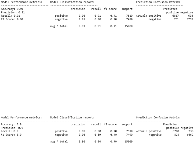
Chapter 7 ■ analyzing Movie reviews sentiMent
348
gradient descent (refer to the section, “The Three Stages of Logistic Regression” in Chapter 5 if you are
interested in more details). Logistic regression is also popularly known as logit regression or MaxEnt
(maximum entropy) classifier.
We will now use our utility function train_predict_model(...) from our model_evaluation_utils
module to build a logistic regression model on our training features and evaluate the model performance on
our test features (Steps 4 and 5). See Figure7-5.
In [5]: # Logistic Regression model on BOW features
...: lr_bow_predictions = meu.train_predict_model(classifier=lr,
...: train_features=cv_train_features, train_labels=train_
sentiments,
...: test_features=cv_test_features, test_labels=test_sentiments)
...: meu.display_model_performance_metrics(true_labels=test_sentiments,
...: predicted_labels=lr_bow_predictions,
...: classes=['positive', 'negative'])
We get an overall F1-Score and model accuracy of 91%, as depicted in Figure7-5, which is really
excellent! We can now build a logistic regression model similarly on our TF-IDF features using the following
snippet. See Figure7-6.
In [6]: # Logistic Regression model on TF-IDF features
...: lr_tfidf_predictions = meu.train_predict_model(classifier=lr,
...: train_features=tv_train_features, train_labels=train_
sentiments,
...: test_features=tv_test_features, test_labels=test_sentiments)
...: meu.display_model_performance_metrics(true_labels=test_sentiments,
...: predicted_labels=lr_tfidf_predictions,
...: classes=['positive', 'negative'])
Figure 7-6. Model performance metrics for logistic regression on TF-IDF features
Figure 7-5. Model performance metrics for logistic regression on Bag of Words features
Chapter 7 ■ analyzing Movie reviews sentiMent
349
We get an overall F1-Score and model accuracy of 90%, depicted in Figure7-6, which is great
but our previous model is still slightly better. You can similarly use the Support Vector Machine model
estimator object svm, which we created earlier, and use the same snippet to train and predict using an SVM
model. We obtained a maximum accuracy and F1-score of 90% with the SVM model (refer to the jupyter
notebook for step-by-step code snippets). Thus you can see how effective and accurate these supervised
Machine Learning classification algorithms are in building a text sentiment classifier.
Newer Supervised Deep Learning Models
We have already mentioned multiple times in previous chapters about how Deep Learning has
revolutionized the Machine Learning landscape over the last decade. In this section, we will be building
some deep neural networks and train them on some advanced text features based on word embeddings
to build a text sentiment classification system similar to what we did in the previous section. Let’s load the
following necessary dependencies before we start our analysis.
In [7]: import gensim
...: import keras
...: from keras.models import Sequential
...: from keras.layers import Dropout, Activation, Dense
...: from sklearn.preprocessing import LabelEncoder
Using TensorFlow backend.
If you remember in Chapter 4, we talked about encoding categorical class labels and also the one-
hot encoding scheme. So far, our models in scikit-learn directly accepted the sentiment class labels as
positive and negative and internally performed these operations. However for our Deep Learning models,
we need to do this explicitly. The following snippet helps us tokenize our movie reviews and also converts
the text-based sentiment class labels into one-hot encoded vectors (forms a part of Step 2).
In [8]: le = LabelEncoder()
...: num_classes=2
...: # tokenize train reviews & encode train labels
...: tokenized_train = [tn.tokenizer.tokenize(text)
...: for text in norm_train_reviews]
...: y_tr = le.fit_transform(train_sentiments)
...: y_train = keras.utils.to_categorical(y_tr, num_classes)
...: # tokenize test reviews & encode test labels
...: tokenized_test = [tn.tokenizer.tokenize(text)
...: for text in norm_test_reviews]
...: y_ts = le.fit_transform(test_sentiments)
...: y_test = keras.utils.to_categorical(y_ts, num_classes)
...:
...: # print class label encoding map and encoded labels
...: print('Sentiment class label map:', dict(zip(le.classes_, le.transform
(le.classes_))))
...: print('Sample test label transformation:\n'+'-'*35,
...: '\nActual Labels:', test_sentiments[:3], '\nEncoded Labels:', y_ts[:3],
...: '\nOne hot encoded Labels:\n', y_test[:3])
Sentiment class label map: {'positive': 1, 'negative': 0}
Chapter 7 ■ analyzing Movie reviews sentiMent
350
Sample test label transformation:
-----------------------------------
Actual Labels: ['negative' 'positive' 'negative']
Encoded Labels: [0 1 0]
One hot encoded Labels:
[[ 1. 0.]
[ 0. 1.]
[ 1. 0.]]
Thus, we can see from the preceding sample outputs how our sentiment class labels have been encoded
into numeric representations, which in turn have been converted into one-hot encoded vectors. The
feature engineering techniques we will be using in this section (Step 3) are slightly more advanced word
vectorization techniques that are based on the concept of word embeddings. We will be using the word2vec
and GloVe models to generate embeddings. The word2vec model was built by Google and we have covered
this in detail in Chapter 4 under the section “Word Embeddings”. We will be choosing the size parameter to
be 500 in this scenario representing feature vector size to be 500 for each word.
In [9]: # build word2vec model
...: w2v_num_features = 500
...: w2v_model = gensim.models.Word2Vec(tokenized_train, size=w2v_num_features,
window=150,
...: min_count=10, sample=1e-3)
We will be using the document word vector averaging scheme on this model from Chapter 4 to
represent each movie review as an averaged vector of all the word vector representations for the different
words in the review. The following function helps us compute averaged word vector representations for any
corpus of text documents.
def averaged_word2vec_vectorizer(corpus, model, num_features):
vocabulary = set(model.wv.index2word)
def average_word_vectors(words, model, vocabulary, num_features):
feature_vector = np.zeros((num_features,), dtype="float64")
nwords = 0.
for word in words:
if word in vocabulary:
nwords = nwords + 1.
feature_vector = np.add(feature_vector, model[word])
if nwords:
feature_vector = np.divide(feature_vector, nwords)
return feature_vector
features = [average_word_vectors(tokenized_sentence, model, vocabulary, num_features)
for tokenized_sentence in corpus]
return np.array(features)
We can now use the previous function to generate averaged word vector representations on our two
movie review datasets.
Chapter 7 ■ analyzing Movie reviews sentiMent
351
In [10]: # generate averaged word vector features from word2vec model
...: avg_wv_train_features = averaged_word2vec_vectorizer(corpus=tokenized_train,
...: model=w2v_model, num_features=500)
...: avg_wv_test_features = averaged_word2vec_vectorizer(corpus=tokenized_test,
...: model=w2v_model, num_features=500)
The GloVe model, which stands for Global Vectors, is an unsupervised model for obtaining word vector
representations. Created at Stanford University, this model is trained on various corpora like Wikipedia,
Common Crawl, and Twitter and corresponding pre-trained word vectors are available that can be used
for our analysis needs. You can refer to the original paper by Jeffrey Pennington, Richard Socher, and
Christopher D. Manning. 2014, called GloVe: Global Vectors for Word Representation, for more details. The
spacy library provided 300-dimensional word vectors trained on the Common Crawl corpus using the GloVe
model. They provide a simple standard interface to get feature vectors of size 300 for each word as well as the
averaged feature vector of a complete text document. The following snippet leverages spacy to get the GloVe
embeddings for our two datasets. Do note that you can also build your own GloVe model by leveraging other
pre-trained models or by building a model on your own corpus by using the resources available at
https://nlp.stanford.edu/projects/glove which contains pre-trained word embeddings, code and examples.
In [11]: # feature engineering with GloVe model
...: train_nlp = [tn.nlp(item) for item in norm_train_reviews]
...: train_glove_features = np.array([item.vector for item in train_nlp])
...:
...: test_nlp = [tn.nlp(item) for item in norm_test_reviews]
...: test_glove_features = np.array([item.vector for item in test_nlp])
You can check the feature vector dimensions for our datasets based on each of the previous models
using the following code.
In [12]: print('Word2Vec model:> Train features shape:', avg_wv_train_features.shape,
' Test features shape:', avg_wv_test_features.shape)
...: print('GloVe model:> Train features shape:', train_glove_features.shape,
' Test features shape:', test_glove_features.shape)
Word2Vec model:> Train features shape: (35000, 500) Test features shape: (15000, 500)
GloVe model:> Train features shape: (35000, 300) Test features shape: (15000, 300)
We can see from the preceding output that as expected the word2vec model features are of size 500
and the GloVe features are of size 300. We can now proceed to Step 4 of our classification system workflow
where we will build and train a deep neural network on these features. We have already briefly covered the
various aspects and architectures with regard to deep neural networks in Chapter 1 under the section “Deep
Learning”. We will be using a fully-connected four layer deep neural network (multi-layer perceptron or deep
ANN) for our model. We do not count the input layer usually in any deep architecture, hence our model will
consist of three hidden layers of 512 neurons or units and one output layer with two units that will be used to
either predict a positive or negative sentiment based on the input layer features. Figure7-7 depicts our deep
neural network model for sentiment classification.
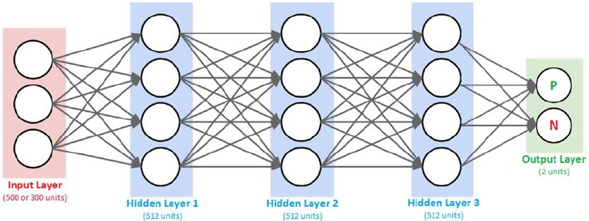
Chapter 7 ■ analyzing Movie reviews sentiMent
352
We call this a fully connected deep neural network (DNN) because neurons or units in each pair
of adjacent layers are fully pairwise connected. These networks are also known as deep artificial neural
networks (ANNs) or Multi-Layer Perceptrons (MLPs) since they have more than one hidden layer. The
following function leverages keras on top of tensorflow to build the desired DNN model.
def construct_deepnn_architecture(num_input_features):
dnn_model = Sequential()
dnn_model.add(Dense(512, activation='relu', input_shape=(num_input_features,)))
dnn_model.add(Dropout(0.2))
dnn_model.add(Dense(512, activation='relu'))
dnn_model.add(Dropout(0.2))
dnn_model.add(Dense(512, activation='relu'))
dnn_model.add(Dropout(0.2))
dnn_model.add(Dense(2))
dnn_model.add(Activation('softmax'))
dnn_model.compile(loss='categorical_crossentropy', optimizer='adam',
metrics=['accuracy'])
return dnn_model
From the preceding function, you can see that we accept a parameter num_input_features, which
decides the number of units needed in the input layer (500 for word2vec and 300 for glove features). We
build a Sequential model, which helps us linearly stack our hidden and output layers.
We use 512 units for all our hidden layers and the activation function relu indicates a rectified linear
unit. This function is typically defined as relu
xx
()
=
()
max0, where x is typically the input to a neuron. This
is popularly known as the ramp function also in electronics and electrical engineering. This function is
preferred now as compared to the previously popular sigmoid function because it tries to solve the vanishing
gradient problem. This problem occurs when
x>0
and as x increases, the gradient from sigmoids becomes
really small (almost vanishing) but relu prevents this from happening. Besides this, it also helps with faster
convergence of gradient descent. We also use regularization in the network in the form of Dropout layers. By
adding a dropout rate of 0.2, it randomly sets 20% of the input feature units to 0 at each update during
training the model. This form of regularization helps prevent overfitting the model.
Figure 7-7. Fully connected deep neural network model for sentiment classification
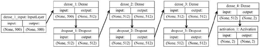
Chapter 7 ■ analyzing Movie reviews sentiMent
353
The final output layer consists of two units with a softmax activation function. The softmax function is
basically a generalization of the logistic function we saw earlier, which can be used to represent a probability
distribution over n possible class outcomes. In our case
n=2
where the class can either be positive or
negative and the softmax probabilities will help us determine the same. The binary softmax classifier is also
interchangeably known as the binary logistic regression function.
The compile(...) method is used to configure the learning or training process of the DNN model
before we actually train it. This involves providing a cost or loss function in the loss parameter. This will be
the goal or objective which the model will try to minimize. There are various loss functions based on the
type of problem you want to solve, for example the mean squared error for regression and categorical cross-
entropy for classification. Check out https://keras.io/losses/ for a list of possible loss functions.
We will be using categorical_crossentropy, which helps us minimize the error or loss from the
softmax output. We need an optimizer for helping us converge our model and minimize the loss or error
function. Gradient descent or stochastic gradient descent is a popular optimizer. We will be using the adam
optimizer which only required first order gradients and very little memory. Adam also uses momentum
where basically each update is based on not only the gradient computation of the current point but also
includes a fraction of the previous update. This helps with faster convergence. You can refer to the original
paper from https://arxiv.org/pdf/1412.6980v8.pdf for further details on the ADAM optimizer. Finally,
the metrics parameter is used to specify model performance metrics that are used to evaluate the model
when training (but not used to modify the training loss itself). Let’s now build a DNN model based on our
word2vec input feature representations for our training reviews.
In [13]: w2v_dnn = construct_deepnn_architecture(num_input_features=500)
You can also visualize the DNN model architecture with the help of keras, similar to what we had done
in Chapter 4, by using the following code. See Figure7-8.
In [14]: from IPython.display import SVG
...: from keras.utils.vis_utils import model_to_dot
...:
...: SVG(model_to_dot(w2v_dnn, show_shapes=True, show_layer_names=False,
...: rankdir='TB').create(prog='dot', format='svg'))
We will now be training our model on our training reviews dataset of word2vec features represented
by avg_wv_train_features (Step 4). We will be using the fit(...) function from keras for the training
process and there are some parameters which you should be aware of. The epoch parameter indicates one
complete forward and backward pass of all the training examples through the network. The batch_size
parameter indicates the total number of samples which are propagated through the DNN model at a time
for one backward and forward pass for training the model and updating the gradient. Thus if you have 1,000
observations and your batch size is 100, each epoch will consist of 10 iterations where 100 observations will
be passed through the network at a time and the weights on the hidden layer units will be updated. We also
Figure 7-8. Visualizing the DNN model architecture using keras

Chapter 7 ■ analyzing Movie reviews sentiMent
354
specify a validation_split of 0.1 to extract 10% of the training data and use it as a validation dataset for
evaluating the performance at each epoch. The shuffle parameter helps shuffle the samples in each epoch
when training the model.
In [18]: batch_size = 100
...: w2v_dnn.fit(avg_wv_train_features, y_train, epochs=5, batch_size=batch_size,
...: shuffle=True, validation_split=0.1, verbose=1)
Train on 31500 samples, validate on 3500 samples
Epoch 1/5 31500/31500 - 11s - loss: 0.3097 - acc: 0.8720 - val_loss: 0.3159 - val_acc: 0.8646
Epoch 2/5 31500/31500 - 11s - loss: 0.2869 - acc: 0.8819 - val_loss: 0.3024 - val_acc: 0.8743
Epoch 3/5 31500/31500 - 11s - loss: 0.2778 - acc: 0.8857 - val_loss: 0.3012 - val_acc: 0.8763
Epoch 4/5 31500/31500 - 11s - loss: 0.2708 - acc: 0.8901 - val_loss: 0.3041 - val_acc: 0.8734
Epoch 5/5 31500/31500 - 11s - loss: 0.2612 - acc: 0.8920 - val_loss: 0.3023 - val_acc: 0.8763
The preceding snippet tells us that we have trained our DNN model on the training data for five epochs
with 100 as the batch size. We get a validation accuracy of close to 88%, which is quite good. Time now to put
our model to the real test! Let’s evaluate our model performance on the test review word2vec features (Step 5).
In [19]: y_pred = w2v_dnn.predict_classes(avg_wv_test_features)
...: predictions = le.inverse_transform(y_pred)
...: meu.display_model_performance_metrics(true_labels=test_sentiments,
...: predicted_labels=predictions, classes=['positive', 'negative'])
The results depicted in Figure7-9 show us that we have obtained a model accuracy and F1-score of
88%, which is great! You can use a similar workflow to build and train a DNN model for our GloVe based
features and evaluate the model performance. The following snippet depicts the workflow for Steps 4 and 5
of our text classification system blueprint.
# build DNN model
glove_dnn = construct_deepnn_architecture(num_input_features=300)
# train DNN model on GloVe training features
batch_size = 100
glove_dnn.fit(train_glove_features, y_train, epochs=5, batch_size=batch_size,
shuffle=True, validation_split=0.1, verbose=1)
# get predictions on test reviews
y_pred = glove_dnn.predict_classes(test_glove_features)
predictions = le.inverse_transform(y_pred)
# Evaluate model performance
meu.display_model_performance_metrics(true_labels=test_sentiments, predicted_
labels=predictions,
classes=['positive', 'negative'])
Figure 7-9. Model performance metrics for deep neural networks on word2vec features
Chapter 7 ■ analyzing Movie reviews sentiMent
355
We obtained an overall model accuracy and F1-score of 85% with the GloVe features, which is still good
but not better than what we obtained using our word2vec features. You can refer to the Sentiment Analysis -
Supervised.ipynb jupyter notebook to see the step-by-step outputs obtained for the previous code. This
concludes our discussion on building text sentiment classification systems leveraging newer Deep Learning
models and methodologies. Onwards to learning about advanced Deep Learning models!
Advanced Supervised Deep Learning Models
We have used fully connected deep neural network and word embeddings in the previous section. Another
new and interesting approach toward supervised Deep Learning is the use of recurrent neural networks
(RNNs) and long short term memory networks (LSTMs) which also considers the sequence of data (words,
events, and so on). These are more advanced models than your regular fully connected deep networks
and usually take more time to train. We will leverage keras on top of tensorflow and try to build a LSTM-
based classification model here and use word embeddings as our features. You can refer to the Python file
titled sentiment_analysis_adv_deep_learning.py for all the code used in this section or use the jupyter
notebook titled Sentiment Analysis - Advanced Deep Learning.ipynb for a more interactive experience.
We will be working on our normalized and pre-processed train and test review datasets, norm_
train_reviews and norm_test_reviews, which we created in our previous analyses. Assuming you have
them loaded up, we will first tokenize these datasets such that each text review is decomposed into its
corresponding tokens (workflow Step 2).
In [1]: tokenized_train = [tn.tokenizer.tokenize(text) for text in norm_train_reviews]
...: tokenized_test = [tn.tokenizer.tokenize(text) for text in norm_test_reviews]
For feature engineering (Step 3), we will be creating word embeddings. However, we will create them
ourselves using keras instead of using pre-built ones like word2vec or GloVe, which we used earlier. Word
embeddings tend to vectorize text documents into fixed sized vectors such that these vectors try to capture
contextual and semantic information.
For generating embeddings, we will use the Embedding layer from keras, which requires documents
to be represented as tokenized and numeric vectors. We already have tokenized text vectors in our
tokenized_train and tokenized_text variables. However we would need to convert them into numeric
representations. Besides this, we would also need the vectors to be of uniform size even though the
tokenized text reviews will be of variable length due to the difference in number of tokens in each review. For
this, one strategy could be to take the length of the longest review (with maximum number of tokens\words)
and set it as the vector size, let’s call this max_len. Reviews of shorter length can be padded with a PAD term
in the beginning to increase their length to max_len.
We would need to create a word to index vocabulary mapping for representing each tokenized text
review in a numeric form. Do note you would also need to create a numeric mapping for the padding term
which we shall call PAD_INDEX and assign it the numeric index of 0. For unknown terms, in case they are
encountered later on in the test dataset or newer, previously unseen reviews, we would need to assign it to
some index too. This would be because we will vectorize, engineer features, and build models only on the
training data. Hence, if some new term should come up in the future (which was originally not a part of the
model training), we will consider it as an out of vocabulary (OOV) term and assign it to a constant index (we
will name this term NOT_FOUND_INDEX and assign it the index of vocab_size+1). The following snippet helps
us create this vocabulary from our tokenized_train corpus of training text reviews.
Chapter 7 ■ analyzing Movie reviews sentiMent
356
In [2]: from collections import Counter
...:
...: # build word to index vocabulary
...: token_counter = Counter([token for review in tokenized_train for token in review])
...: vocab_map = {item[0]: index+1
for index, item in enumerate(dict(token_counter).items())}
...: max_index = np.max(list(vocab_map.values()))
...: vocab_map['PAD_INDEX'] = 0
...: vocab_map['NOT_FOUND_INDEX'] = max_index+1
...: vocab_size = len(vocab_map)
...: # view vocabulary size and part of the vocabulary map
...: print('Vocabulary Size:', vocab_size)
...: print('Sample slice of vocabulary map:', dict(list(vocab_map.items())[10:20]))
Vocabulary Size: 82358
Sample slice of vocabulary map: {'martyrdom': 6, 'palmira': 7, 'servility': 8, 'gardening':
9, 'melodramatically': 73505, 'renfro': 41282, 'carlin': 41283, 'overtly': 41284, 'rend':
47891, 'anticlimactic': 51}
In this case we have used all the terms in our vocabulary, you can easily filter and use more relevant
terms here (based on their frequency) by using the most_common(count) function from Counter and taking
the first count terms from the list of unique terms in the training corpus. We will now encode the tokenized
text reviews based on the previous vocab_map. Besides this, we will also encode the text sentiment class
labels into numeric representations.
In [3]: from keras.preprocessing import sequence
...: from sklearn.preprocessing import LabelEncoder
...:
...: # get max length of train corpus and initialize label encoder
...: le = LabelEncoder()
...: num_classes=2 # positive -> 1, negative -> 0
...: max_len = np.max([len(review) for review in tokenized_train])
...:
...: ## Train reviews data corpus
...: # Convert tokenized text reviews to numeric vectors
...: train_X = [[vocab_map[token] for token in tokenized_review]
for tokenized_review in tokenized_train]
...: train_X = sequence.pad_sequences(train_X, maxlen=max_len) # pad
...: ## Train prediction class labels
...: # Convert text sentiment labels (negative\positive) to binary encodings (0/1)
...: train_y = le.fit_transform(train_sentiments)
...:
...: ## Test reviews data corpus
...: # Convert tokenized text reviews to numeric vectors
...: test_X = [[vocab_map[token] if vocab_map.get(token) else vocab_map['NOT_FOUND_INDEX']
...: for token in tokenized_review]
...: for tokenized_review in tokenized_test]
...: test_X = sequence.pad_sequences(test_X, maxlen=max_len)
Chapter 7 ■ analyzing Movie reviews sentiMent
357
...: ## Test prediction class labels
...: # Convert text sentiment labels (negative\positive) to binary encodings (0/1)
...: test_y = le.transform(test_sentiments)
...:
...: # view vector shapes
...: print('Max length of train review vectors:', max_len)
...: print('Train review vectors shape:', train_X.shape,
' Test review vectors shape:', test_X.shape)
Max length of train review vectors: 1442
Train review vectors shape: (35000, 1442) Test review vectors shape: (15000, 1442)
From the preceding code snippet and the output, it is clear that we encoded each text review into a
numeric sequence vector so that the size of each review vector is 1442, which is basically the maximum
length of reviews from the training dataset. We pad shorter reviews and truncate extra tokens from longer
reviews such that the shape of each review is constant as depicted in the output. We can now proceed with
Step 3 and a part of Step 4 of the classification workflow by introducing the Embedding layer and coupling it
with the deep network architecture based on LSTMs.
from keras.models import Sequential
from keras.layers import Dense, Embedding, Dropout, SpatialDropout1D
from keras.layers import LSTM
EMBEDDING_DIM = 128 # dimension for dense embeddings for each token
LSTM_DIM = 64 # total LSTM units
model = Sequential()
model.add(Embedding(input_dim=vocab_size, output_dim=EMBEDDING_DIM, input_length=max_len))
model.add(SpatialDropout1D(0.2))
model.add(LSTM(LSTM_DIM, dropout=0.2, recurrent_dropout=0.2))
model.add(Dense(1, activation="sigmoid"))
model.compile(loss="binary_crossentropy", optimizer="adam",
metrics=["accuracy"])
The Embedding layer helps us generate the word embeddings from scratch. This layer is also initialized
with some weights initially and this gets updated based on our optimizer similar to weights on the neuron
units in other layers when the network tries to minimize the loss in each epoch. Thus, the embedding layer
tries to optimize its weights such that we get the best word embeddings which will generate minimum
error in the model and also capture semantic similarity and relationships among words. How do we get the
embeddings, let’s consider we have a review with 3 terms ['movie', 'was', 'good'] and a vocab_map
consisting of word to index mappings for 82358 words. The word embeddings would be generated somewhat
similar to Figure7-10.
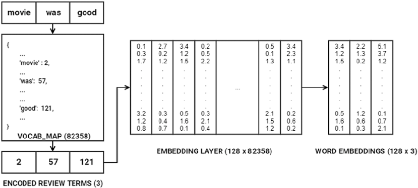
Chapter 7 ■ analyzing Movie reviews sentiMent
358
Based on our model architecture, the Embedding layer takes in three parameters—input_dim, which is
equal to the vocabulary size (vocab_size) of 82358, output_dim, which is 128, representing the dimension of
dense embedding (depicted by rows in the EMBEDDING LAYER in Figure7-10), and input_len, which specifies
the length of the input sequences (movie review sequence vectors), which is 1442. In the example depicted
in Figure7-10, since we have one review, the dimension is (1, 3). This review is converted into a numeric
sequence [2, 57, 121] based on the VOCAB_MAP. Then the specific columns representing the indices in the
review sequence are selected from the EMBEDDING LAYER (vectors at column indices 2, 57 and 121 respectively),
to generate the final word embeddings. This gives us an embedding vector of dimension (1, 128, 3)
also represented as (1, 3, 128) when each row is represented based on each sequence word embedding
vector. Many Deep Learning frameworks like keras represent the embedding dimensions as (m, n) where m
represents all the unique terms in our vocabulary (82358) and n represents the output_dim which is 128 in this
case. Consider a transposed version of the layer depicted in Figure7-10 and you are good to go!
Usually if you have the encoded review terms sequence vector represented in one-hot encoded
format (3, 82358) and do a matrix multiplication with the EMBEDDING LAYER represented as (82358, 128)
where each row represents the embedding for a word in the vocabulary, you will directly obtain the word
embeddings for the review sequence vector as (3, 128). The weights in the embedding layer get updated
and optimized in each epoch based on the input data when propagated through the whole network like we
mentioned earlier such that overall loss and error is minimized to get maximum model performance.
These dense word embeddings are then passed to the LSTM layer having 64 units. We already introduced
you to the LSTM architecture briefly in Chapter 1 in the subsection titled “Long Short Term Memory
Networks” in the “Important Concepts” section under “Deep Learning”. LSTMs basically try to overcome
the shortcomings of RNN models especially with regard to handling long term dependencies and problems
which occur when the weight matrix associated with the units (neurons) become too small (leading to
vanishing gradient) or too large (leading to exploding gradient). These architectures are more complex than
regular deep networks and going into detailed internals and math concepts would be out of the current
scope, but we will try to cover the essentials here without making it math heavy. If you’re interested in
researching the internals of LSTMs, check out the original paper which inspired it all, by Hochreiter, S., and
Schmidhuber, J. (1997). Long short-term memory. Neural computation. 9(8), 1735-1780. We depict the basic
architecture of RNNs and compare it with LSTMs in Figure7-11.
Figure 7-10. Understanding how word embeddings are generated
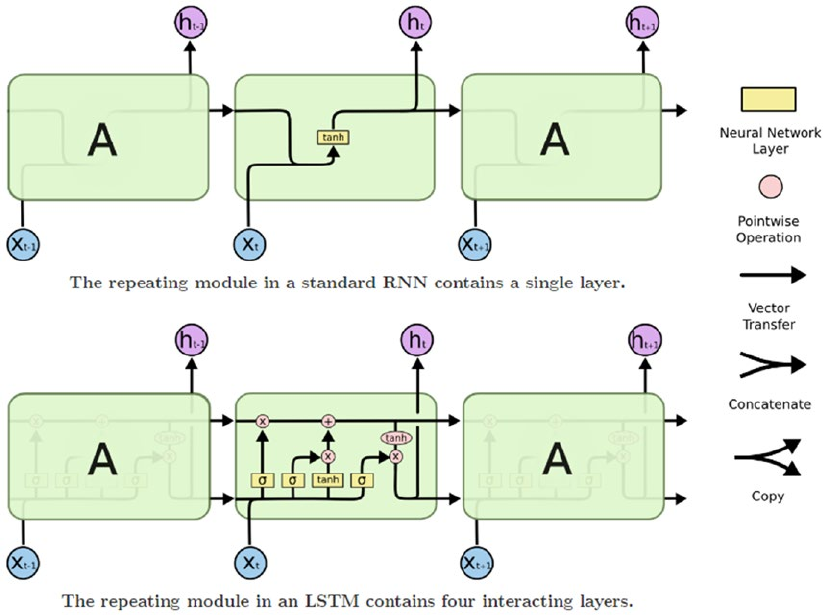
Chapter 7 ■ analyzing Movie reviews sentiMent
359
The RNN units usually have a chain of repeating modules (this happens when we unroll the loop; refer
to Figure 1-13 in Chapter 1, where we talk about this) such that the module has a simple structure of having
maybe one layer with the tanh activation. LSTMs are also a special type of RNN, having a similar structure
but the LSTM unit has four neural network layers instead of just one. The detailed architecture of the LSTM
cell is shown in Figure7-12.
Figure 7-11. Basic structure of RNN and LSTM units (Source: Christopher Olah’s blog: colah.github.io)
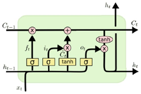
Chapter 7 ■ analyzing Movie reviews sentiMent
360
The detailed architecture of an LSTM cell is depicted in Figure7-12. The notation t indicates one time
step, C depicts the cell states, and h indicates the hidden states. The gates ifo,,
C help in removing or
adding information to the cell state. The gates i, f & o represent the input, output and forget gates respectively
and each of them are modulated by the sigmoid layer which outputs numbers from 0 to 1 controlling how
much of the output from these gates should pass. Thus this helps is protecting and controlling the cell state.
Detailed work flow of how information flows through the LSTM cell is depicted in Figure7-13 in four steps.
1. The first step talks about the forget gate layer f, which helps us decide what
information should we throw away from the cell state. This is done by looking at
the previous hidden state ht-1 and current inputs xt as depicted in the equation.
The sigmoid layer helps control how much of this should be kept or forgotten.
2. The second step depicts the input gate layer t, which helps decide what
information will be stored in the current cell state. The sigmoid layer in the input
gate helps decide which values will be updated based on
hx
tt
-1 again. The tanh
layer helps create a vector of the new candidate values
Ct based on
hx
tt
-1,
which can be added to the current cell state. Thus the tanh layer creates the
values and the input gate with sigmoid layer helps choose which values should
be updated.
3. The third step involves updating the old cell state Ct ‐ 1 to the new cell state Ct by
leveraging what we obtained in the first two steps. We multiply the old cell state
by the forget gate fC
tt
´
()
-1 and then add the new candidate values scaled by the
input gate with sigmoid layer i
tt
´
()
C.
4. The fourth and final step helps us decide what should be the final output which
is basically a filtered version of our cell state. The output gate with the sigmoid
layer o helps us select which parts of the cell state will pass to the final output.
This is multiplied with the cell state values when passed through the tanh layer to
give us the final hidden state values ho
tt t
=´
()
tanh
C.
Figure 7-12. Detailed architecture of an LSTM cell (Source: Christopher Olah’s blog: colah.github.io)
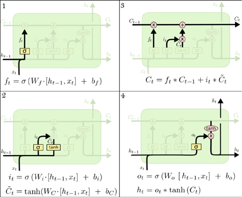
Chapter 7 ■ analyzing Movie reviews sentiMent
361
All these steps in this detailed workflow are depicted in Figure7-13 with necessary annotations and
equations. We would like to thank our good friend Christopher Olah for providing us detailed information
as well as the images for depicting the internal workings of LSTM networks. We recommend checking out
Christopher’s blog at http://colah.github.io/posts/2015-08-Understanding-LSTMs for more details.
A shout out also goes to Edwin Chen, for explaining RNNs and LSTMs in an easy-to-understand format.
We recommend referring to Edwin’s blog at http://blog.echen.me/2017/05/30/exploring-lstms for
information on the workings of RNNs and LSTMs.
The final layer in our deep network is the Dense layer with 1 unit and the sigmoid activation function.
We basically use the binary_crossentropy function with the adam optimizer since this is a binary
classification problem and the model will ultimately predict a 0 or a 1, which we can decode back to a
negative or positive sentiment prediction with our label encoder. You can also use the categorical_
crossentropy loss function here, but you would need to then use a Dense layer with 2 units instead with a
softmax function. Now that our model is compiled and ready, we can head on to Step 4 of our classification
workflow of actually training the model. We use a similar strategy from our previous deep network models,
where we train our model on the training data with five epochs, batch size of 100 reviews, and a 10%
validation split of training data to measure validation accuracy.
Figure 7-13. Walkthrough of data flow in an LSTM cell (Source: Christopher Olah’s blog: colah.github.io)
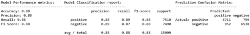
Chapter 7 ■ analyzing Movie reviews sentiMent
362
In [4]: batch_size = 100
...: model.fit(train_X, train_y, epochs=5, batch_size=batch_size,
...: shuffle=True, validation_split=0.1, verbose=1)
Train on 31500 samples, validate on 3500 samples
Epoch 1/5 31500/31500 - 2491s - loss: 0.4081 - acc: 0.8184 - val_loss: 0.3006 - val_acc:
0.8751
Epoch 2/5 31500/31500 - 2489s - loss: 0.2253 - acc: 0.9158 - val_loss: 0.3209 - val_acc:
0.8780
Epoch 3/5 31500/31500 - 2656s - loss: 0.1431 - acc: 0.9493 - val_loss: 0.3483 - val_acc:
0.8671
Epoch 4/5 31500/31500 - 2604s - loss: 0.1023 - acc: 0.9658 - val_loss: 0.3803 - val_acc:
0.8729
Epoch 5/5 31500/31500 - 2701s - loss: 0.0694 - acc: 0.9761 - val_loss: 0.4430 - val_acc:
0.8706
Training LSTMs on CPU is notoriously slow and as you can see my model took approximately 3.6 hours
to train for just five epochs on an i5 3rd Gen Intel CPU with 8 GB of memory. Of course, a cloud-based
environment like Google Cloud Platform or AWS on GPU took me approximately less than an hour to train
the same model. So I would recommend you choose a GPU based Deep Learning environment, especially
when working with RNNs or LSTM based network architectures. Based on the preceding output, we can
see that just with five epochs we have decent validation accuracy but the training accuracy starts shooting
up indicating some over-fitting might be happening. Ways to overcome this include adding more data or by
increasing the drouput rate. Do give it a shot and see if it works! Time to put our model to the test! Let’s see
how well it predicts the sentiment for our test reviews and use the same model evaluation framework we
have used for our previous models (Step 5).
In [5]: # predict sentiments on test data
...: pred_test = model.predict_classes(test_X)
...: predictions = le.inverse_transform(pred_test.flatten())
...: # evaluate model performance
...: meu.display_model_performance_metrics(true_labels=test_sentiments,
...: predicted_labels=predictions, classes=['positive', 'negative'])
The results depicted in Figure7-14 show us that we have obtained a model accuracy and F1-score
of 88%, which is quite good! With more quality data, you can expect to get even better results. Try
experimenting with different architectures and see if you get better results!
Figure 7-14. Model performance metrics for LSTM based Deep Learning model on word embeddings
Chapter 7 ■ analyzing Movie reviews sentiMent
363
Analyzing Sentiment Causation
We built both supervised and unsupervised models to predict the sentiment of movie reviews based on the
review text content. While feature engineering and modeling is definitely the need of the hour, you also need
to know how to analyze and interpret the root cause behind how model predictions work. In this section,
we analyze sentiment causation. The idea is to determine the root cause or key factors causing positive or
negative sentiment. The first area of focus will be model interpretation, where we will try to understand,
interpret, and explain the mechanics behind predictions made by our classification models. The second area
of focus is to apply topic modeling and extract key topics from positive and negative sentiment reviews.
Interpreting Predictive Models
One of the challenges with Machine Learning models is the transition from a pilot or proof-of-concept
phase to the production phase. Business and key stakeholders often perceive Machine Learning models as
complex black boxes and poses the question, why should I trust your model? Explaining to them complex
mathematical or theoretical concepts doesn’t serve the purpose. Is there some way in which we can explain
these models in an easy-to-interpret manner? This topic in fact has gained extensive attention very recently
in 2016. Refer to the original research paper by M.T. Ribeiro, S. Singh & C. Guestrin titled “Why Should
I Trust You?: Explaining the Predictions of Any Classifier” from https://arxiv.org/pdf/1602.04938.
pdf to understand more about model interpretation and the LIME framework. Check out more on model
interpretation in Chapter 5 where we cover the skater framework in detail which performs excellent
interpretations of various models.
There are various ways to interpret the predictions made by our predictive sentiment classification
models. We want to understand more into why a positive review was correctly predicted as having positive
sentiment or a negative review having negative sentiment. Besides this, no model is a 100% accurate always,
so we would also want to understand the reason for mis-classifications or wrong predictions. The code used
in this section is available in the file named sentiment_causal_model_interpretation.py or you can also
refer to the jupyter notebook named Sentiment Causal Analysis - Model Interpretation.ipynb for an
interactive experience.
Let’s first build a basic text classification pipeline for the model that worked best for us so far. This is the
Logistic Regression model based on the Bag of Words feature model. We will leverage the pipeline module
from scikit-learn to build this Machine Learning pipeline using the following code.
from sklearn.feature_extraction.text import CountVectorizer
from sklearn.linear_model import LogisticRegression
from sklearn.pipeline import make_pipeline
# build BOW features on train reviews
cv = CountVectorizer(binary=False, min_df=0.0, max_df=1.0, ngram_range=(1,2))
cv_train_features = cv.fit_transform(norm_train_reviews)
# build Logistic Regression model
lr = LogisticRegression()
lr.fit(cv_train_features, train_sentiments)
# Build Text Classification Pipeline
lr_pipeline = make_pipeline(cv, lr)
# save the list of prediction classes (positive, negative)
classes = list(lr_pipeline.classes_)
Chapter 7 ■ analyzing Movie reviews sentiMent
364
We build our model based on norm_train_reviews, which contains the normalized training reviews
that we have used in all our earlier analyses. Now that we have our classification pipeline ready, you can
actually deploy the model by using pickle or joblib to save the classifier and feature objects similar to what
we discussed in the “Model Deployment” section in Chapter 5. Assuming our pipeline is in production, how
do we use it for new movie reviews? Let’s try to predict the sentiment for two new sample reviews (which
were not used in training the model).
In [3]: lr_pipeline.predict(['the lord of the rings is an excellent movie',
...: 'i hated the recent movie on tv, it was so bad'])
Out[3]: array(['positive', 'negative'], dtype=object)
Our classification pipeline predicts the sentiment of both the reviews correctly! This is a good start,
but how do we interpret the model predictions? One way is to typically use the model prediction class
probabilities as a measure of confidence. You can use the following code to get the prediction probabilities
for our sample reviews.
In [4]: pd.DataFrame(lr_pipeline.predict_proba(['the lord of the rings is an excellent movie',
...: 'i hated the recent movie on tv, it was so bad']),
columns=classes)
Out[4]:
negative positive
0 0.169653 0.830347
1 0.730814 0.269186
Thus we can say that the first movie review has a prediction confidence or probability of 83% to
have positive sentiment as compared to the second movie review with a 73% probability to have negative
sentiment. Let’s now kick it up a notch, instead of playing around with toy examples, we will now run the
same analysis on actual reviews from the test_reviews dataset (we will use norm_test_reviews, which
has the normalized text reviews). Besides prediction probabilities, we will be using the skater framework
for easy interpretation of the model decisions, similar to what we have done in Chapter 5 under the section
“Model Interpretation”. You need to load the following dependencies from the skater package first. We
also define a helper function which takes in a document index, a corpus, its response predictions, and an
explainer object and helps us with the our model interpretation analysis.
from skater.core.local_interpretation.lime.lime_text import LimeTextExplainer
explainer = LimeTextExplainer(class_names=classes)
# helper function for model interpretation
def interpret_classification_model_prediction(doc_index, norm_corpus, corpus,
prediction_labels, explainer_obj):
# display model prediction and actual sentiments
print("Test document index: {index}\nActual sentiment: {actual}
\nPredicted sentiment: {predicted}"
.format(index=doc_index, actual=prediction_labels[doc_index],
predicted=lr_pipeline.predict([norm_corpus[doc_index]])))
# display actual review content
print("\nReview:", corpus[doc_index])
# display prediction probabilities
print("\nModel Prediction Probabilities:")
for probs in zip(classes, lr_pipeline.predict_proba([norm_corpus[doc_index]])[0]):
print(probs)
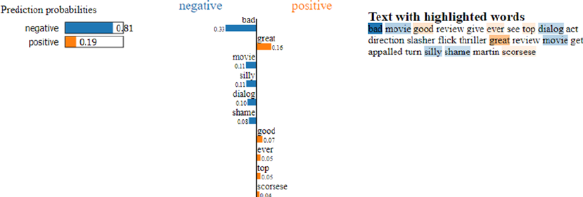
Chapter 7 ■ analyzing Movie reviews sentiMent
365
# display model prediction interpretation
exp = explainer.explain_instance(norm_corpus[doc_index],
lr_pipeline.predict_proba, num_features=10,
labels=[1])
exp.show_in_notebook()
The preceding snippet leverages skater to explain our text classifier to analyze its decision-making
process in an easy to interpret form. Even though the model might be a complex one in a global perspective,
it is easier to explain and approximate the model behavior on local instances. This is done by learning the
model around the vicinity of the data point of interest X by sampling instances around X and assigning
weightages based on their proximity toX. Thus, these locally learned linear models help in explaining
complex models in a more easy to interpret way with class probabilities, contribution of top features to the
class probabilities that aid in the decision making process. Let’s take a movie review from our test dataset
where both the actual and predicted sentiment is negative and analyze it with the helper function we created
in the preceding snippet.
In [6]: doc_index = 100
...: interpret_classification_model_prediction(doc_index=doc_index, corpus=norm_test_
reviews,
corpus=test_reviews, prediction_labels=test_
sentiments,
explainer_obj=explainer)
Test document index: 100
Actual sentiment: negative
Predicted sentiment: ['negative']
Review: Worst movie, (with the best reviews given it) I've ever seen. Over the top dialog,
acting, and direction. more slasher flick than thriller. With all the great reviews this
movie got I'm appalled that it turned out so silly. shame on you Martin Scorsese
Model Prediction Probabilities:
('negative', 0.8099323456145181)
('positive', 0.19006765438548187)
Figure 7-15. Model interpretation for our classification model’s correct prediction for a negative review
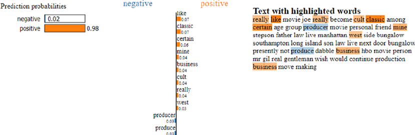
Chapter 7 ■ analyzing Movie reviews sentiMent
366
The results depicted in Figure7-15 show us the class prediction probabilities and also the top 10
features that contributed the maximum to the prediction decision making process. These key features
are also highlighted in the normalized movie review text. Our model performs quite well in this scenario
and we can see the key features that contributed to the negative sentiment of this review including bad,
silly, dialog, and shame, which make sense. Besides this, the word great contributed the maximum to
the positive probability of 0.19 and in fact if we had removed this word from our review text, the positive
probability would have dropped significantly.
The following code runs a similar analysis on a test movie review with both actual and predicted
sentiment of positive value.
In [7]: doc_index = 2000
...: interpret_classification_model_prediction(doc_index=doc_index, corpus=norm_test_
reviews,
corpus=test_reviews, prediction_labels=test_
sentiments,
explainer_obj=explainer)
Test document index: 2000
Actual sentiment: positive
Predicted sentiment: ['positive']
Review: I really liked the Movie "JOE." It has really become a cult classic among
certain age groups.<br /><br />The Producer of this movie is a personal friend of mine.
He is my Stepsons Father-In-Law. He lives in Manhattan's West side, and has a Bungalow.
in Southampton, Long Island. His son-in-law live next door to his Bungalow.<br /><br
/>Presently, he does not do any Producing, But dabbles in a business with HBO movies.<br
/><br />As a person, Mr. Gil is a real gentleman and I wish he would have continued in the
production business of move making.
Model Prediction Probabilities:
('negative', 0.020629181561415355)
('positive', 0.97937081843858464)
Figure 7-16. Model interpretation for our classification model’s correct prediction for a positive review

Chapter 7 ■ analyzing Movie reviews sentiMent
367
The results depicted in Figure7-16 show the top features responsible for the model making a decision of
predicting this review as positive. Based on the content, the reviewer really liked this model and also it was a
real cult classic among certain age groups. In our final analysis, we will look at the model interpretation of an
example where the model makes a wrong prediction.
In [8]: doc_index = 347
...: interpret_classification_model_prediction(doc_index=doc_index, corpus=norm_test_
reviews,
corpus=test_reviews, prediction_labels=test_
sentiments,
explainer_obj=explainer)
Test document index: 347
Actual sentiment: negative
Predicted sentiment: ['positive']
Review: When I first saw this film in cinema 11 years ago, I loved it. I still think the
directing and cinematography are excellent, as is the music. But it's really the script that
has over the time started to bother me more and more. I find Emma Thompson's writing self-
absorbed and unfaithful to the original book; she has reduced Marianne to a side-character,
a second fiddle to her much too old, much too severe Elinor - she in the movie is given
many sort of 'focus moments', and often they appear to be there just to show off Thompson
herself.<br /><br />I do understand her cutting off several characters from the book, but
leaving out the one scene where Willoughby in the book is redeemed? For someone who red
and cherished the book long before the movie, those are the things always difficult to
digest.<br /><br />As for the actors, I love Kate Winslet as Marianne. She is not given the
best script in the world to work with but she still pulls it up gracefully, without too much
sentimentality. Alan Rickman is great, a bit old perhaps, but he plays the role beautifully.
And Elizabeth Spriggs, she is absolutely fantastic as always.
Model Prediction Probabilities:
('negative', 0.067198213044844413)
('positive', 0.93280178695515559)
Figure 7-17. Model interpretation for our classification model’s incorrect prediction
Chapter 7 ■ analyzing Movie reviews sentiMent
368
The preceding output tells us that our model predicted the movie review indicating a positive sentiment
when in-fact the actual sentiment label is negative for the same review. The results depicted in Figure7-17
tell us that the reviewer in fact shows signs of positive sentiment in the movie review, especially in parts
where he\she tells us that “I loved it. I still think the directing and cinematography are excellent, as is the
music... Alan Rickman is great, a bit old perhaps, but he plays the role beautifully. And Elizabeth Spriggs, she
is absolutely fantastic as always.” and feature words from the same have been depicted in the top features
contributing to positive sentiment. The model interpretation also correctly identifies the aspects of the
review contributing to negative sentiment like, “But it’s really the script that has over the time started to
bother me more and more.”. Hence, this is one of the more complex reviews which indicate both positive
and negative sentiment and the final interpretation would be in the reader’s hands. You can now use this
same framework to interpret your own classification models in the future and understand where your model
might be performing well and where it might need improvements!
Analyzing Topic Models
Another way of analyzing key terms, concepts or topics responsible for sentiment is to use a different
approach known as topic modeling. We have already covered some basics into topic modeling in the section
titled “Topic Models” under “Feature Engineering on Text Data” in Chapter 4. The main aim of topic models
is to extract and depict key topics or concepts which are otherwise latent and not very prominent in huge
corpora of text documents. We have already seen the use of Latent Dirichlet Allocation (LDA) for topic
modeling in Chapter 4. In this section, we use another topic modeling technique called Non-Negative Matrix
factorization. Refer to the Python file named sentiment_causal_topic_models.py or the jupyter notebook
titled Sentiment Causal Analysis - Topic Models.ipynb for a more interactive experience.
The first step in this analysis is to combine all our normalized train and test reviews and separate out
these reviews into positive and negative sentiment reviews. Once we do this, we will extract features from
these two datasets using the TF-IDF feature vectorizer. The following snippet helps us achieve this.
In [11]: from sklearn.feature_extraction.text import TfidfVectorizer
...:
...: # consolidate all normalized reviews
...: norm_reviews = norm_train_reviews+norm_test_reviews
...: # get tf-idf features for only positive reviews
...: positive_reviews = [review for review, sentiment in zip(norm_reviews, sentiments)
if sentiment == 'positive']
...: ptvf = TfidfVectorizer(use_idf=True, min_df=0.05, max_df=0.95,
ngram_range=(1,1), sublinear_tf=True)
...: ptvf_features = ptvf.fit_transform(positive_reviews)
...: # get tf-idf features for only negative reviews
...: negative_reviews = [review for review, sentiment in zip(norm_reviews, sentiments)
if sentiment == 'negative']
...: ntvf = TfidfVectorizer(use_idf=True, min_df=0.05, max_df=0.95,
ngram_range=(1,1), sublinear_tf=True)
...: ntvf_features = ntvf.fit_transform(negative_reviews)
...: # view feature set dimensions
...: print(ptvf_features.shape, ntvf_features.shape)
(25000, 331) (25000, 331)
Chapter 7 ■ analyzing Movie reviews sentiMent
369
From the preceding output dimensions, you can see that we have filtered out a lot of the features we
used previously when building our classification models by making min_df to be 0.05 and max_df to be
0.95. This is to speed up the topic modeling process and remove features that either occur too much or too
rarely. Let’s now import the necessary dependencies for the topic modeling process.
In [12]: import pyLDAvis
...: import pyLDAvis.sklearn
...: from sklearn.decomposition import NMF
...: import topic_model_utils as tmu
...:
...: pyLDAvis.enable_notebook()
...: total_topics = 10
The NMF class from scikit-learn will help us with topic modeling. We also use pyLDAvis for building
interactive visualizations of topic models. The core principle behind Non-Negative Matrix Factorization
(NNMF) is to apply matrix decomposition (similar to SVD) to a non-negative feature matrix X such that
the decomposition can be represented as X ≈ WH where W & H are both non-negative matrices which if
multiplied should approximately re-construct the feature matrix X. A cost function like L2 norm can be used
for getting this approximation. Let’s now apply NNMF to get 10 topics from our positive sentiment reviews.
We will also leverage some utility functions from our topic_model_utils module to display the results in a
clean format.
In [13]: # build topic model on positive sentiment review features
...: pos_nmf = NMF(n_components=total_topics,
...: random_state=42, alpha=0.1, l1_ratio=0.2)
...: pos_nmf.fit(ptvf_features)
...: # extract features and component weights
...: pos_feature_names = ptvf.get_feature_names()
...: pos_weights = pos_nmf.components_
...: # extract and display topics and their components
...: pos_topics = tmu.get_topics_terms_weights(pos_weights, pos_feature_names)
...: tmu.print_topics_udf(topics=pos_topics, total_topics=total_topics,
...: num_terms=15, display_weights=False)
Topic #1 without weights
['like', 'not', 'think', 'really', 'say', 'would', 'get', 'know', 'thing', 'much', 'bad',
'go', 'lot', 'could', 'even']
Topic #2 without weights
['movie', 'see', 'watch', 'great', 'good', 'one', 'not', 'time', 'ever', 'enjoy',
'recommend', 'make', 'acting', 'like', 'first']
Topic #3 without weights
['show', 'episode', 'series', 'tv', 'watch', 'dvd', 'first', 'see', 'time', 'one', 'good',
'year', 'remember', 'ever', 'would']
Topic #4 without weights
['performance', 'role', 'play', 'actor', 'cast', 'good', 'well', 'great', 'character',
'excellent', 'give', 'also', 'support', 'star', 'job']
...
Topic #10 without weights
['love', 'fall', 'song', 'wonderful', 'beautiful', 'music', 'heart', 'girl', 'would',
'watch', 'great', 'favorite', 'always', 'family', 'woman']
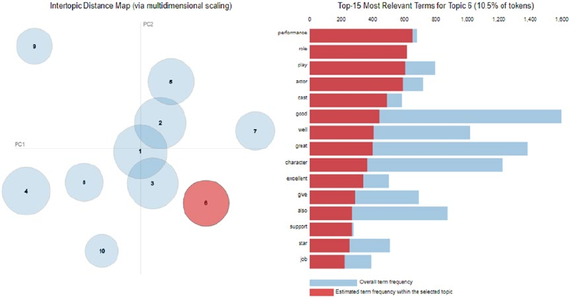
Chapter 7 ■ analyzing Movie reviews sentiMent
370
We depict some of the topics out of the 10 topics generated in the preceding output. You can leverage
pyLDAvis now to visualize these topics in an interactive visualization. See Figure7-18.
In [14]: pyLDAvis.sklearn.prepare(pos_nmf, ptvf_features, ptvf, R=15)
The visualization depicted in Figure7-18 shows us the 10 topics from positive movie reviews and we
can see the top relevant terms for Topic 6 highlighted in the output. From the topics and the terms, we can
see terms like movie cast, actors, performance, play, characters, music, wonderful, good, and so on have
contributed toward positive sentiment in various topics. This is quite interesting and gives you a good
insight into the components of the reviews that contribute toward positive sentiment of the reviews. This
visualization is completely interactive if you are using the jupyter notebook and you can click on any of the
bubbles representing topics in the Intertopic Distance Map on the left and see the most relevant terms in
each of the topics in the right bar chart.
The plot on the left is rendered using Multi-dimensional Scaling (MDS). Similar topics should be close
to one another and dissimilar topics should be far apart. The size of each topic bubble is based on the
frequency of that topic and its components in the overall corpus.
The visualization on the right shows the top terms. When no topic it selected, it shows the top 15 most
salient topics in the corpus. A term’s saliency is defined as a measure of how frequently the term appears the
corpus and its distinguishing factor when used to distinguish between topics. When some topic is selected,
the chart changes to show something similar to Figure7-13, which shows the top 15 most relevant terms for
that topic. The relevancy metric is controlled by λ, which can be changed based on a slider on top of the bar
chart (refer to the notebook to interact with this). If you’re interested in more mathematical theory behind
these visualizations, you are encouraged to check out more details at https://cran.r-project.org/web/
packages/LDAvis/vignettes/details.pdf, which is a vignette for the R package LDAvis, which has been
ported to Python as pyLDAvis.
Figure 7-18. Visualizing topic models on positive sentiment movie reviews
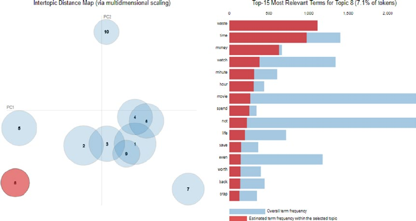
Chapter 7 ■ analyzing Movie reviews sentiMent
371
Let’s now extract topics and run this same analysis on our negative sentiment reviews from the movie
reviews dataset.
In [15]: # build topic model on negative sentiment review features
...: neg_nmf = NMF(n_components=10,
...: random_state=42, alpha=0.1, l1_ratio=0.2)
...: neg_nmf.fit(ntvf_features)
...: # extract features and component weights
...: neg_feature_names = ntvf.get_feature_names()
...: neg_weights = neg_nmf.components_
...: # extract and display topics and their components
...: neg_topics = tmu.get_topics_terms_weights(neg_weights, neg_feature_names)
...: tmu.print_topics_udf(topics=neg_topics,
...: total_topics=total_topics,
...: num_terms=15,
...: display_weights=False)
Topic #1 without weights
['get', 'go', 'kill', 'guy', 'scene', 'take', 'end', 'back', 'start', 'around', 'look',
'one', 'thing', 'come', 'first']
Topic #2 without weights
['bad', 'movie', 'ever', 'acting', 'see', 'terrible', 'one', 'plot', 'effect', 'awful',
'not', 'even', 'make', 'horrible', 'special']
...
Topic #10 without weights
['waste', 'time', 'money', 'watch', 'minute', 'hour', 'movie', 'spend', 'not', 'life',
'save', 'even', 'worth', 'back', 'crap']
In [16]: pyLDAvis.sklearn.prepare(neg_nmf, ntvf_features, ntvf, R=15)
Figure 7-19. Visualizing topic models on positive sentiment movie reviews
Chapter 7 ■ analyzing Movie reviews sentiMent
372
The visualization depicted in Figure7-19 shows us the 10 topics from negative movie reviews and we
can see the top relevant terms for Topic 8 highlighted in the output. From the topics and the terms, we can
see terms like waste, time, money, crap, plot, terrible, acting, and so on have contributed toward negative
sentiment in various topics. Of course, there are high chances of overlap between topics from positive
and negative sentiment reviews, but there will be distinguishable, distinct topics that further help us with
interpretation and causal analysis.
Summary
This case-study oriented chapter introduces the IMDb movie review dataset with the objective of predicting
the sentiment of the reviews based on the textual content. We covered concepts and techniques from natural
language processing (NLP), text analytics, Machine Learning and Deep Learning in this chapter. We covered
multiple aspects from NLP including text pre-processing, normalization, feature engineering as well as text
classification. Unsupervised learning techniques using sentiment lexicons like Afinn, SentiWordNet, and
VADER were covered in extensive detail, to show how we can analyze sentiment in the absence of labeled
training data, which is a very valid problem in today’s organizations. Detailed workflow diagrams depicting
text classification as a supervised Machine Learning problem helped us in relating NLP with Machine
Learning so that we can use Machine Learning techniques and methodologies to solve this problem of
predicting sentiment when labeled data is available.
The focus on supervised methods was two-fold. This included traditional Machine Learning
approaches and models like Logistic Regression and Support Vector Machines and newer Deep Learning
models including deep neural networks, RNNs, and LSTMs. Detailed concepts, workflows, hands-on
examples and comparative analyses with multiple supervised models and different feature engineering
techniques have been covered for the purpose of predicting sentiment from movie reviews with maximum
model performance. The final section of this chapter covered a very important aspect of Machine Learning
that is often neglected in our analyses. We looked at ways to analyze and interpret the cause of positive or
negative sentiment. Analyzing and visualizing model interpretations and topic models have been covered
with several examples, to give you a good insight into how you can re-use these frameworks on your own
datasets. The frameworks and methodologies used in this chapter should be useful for you in tackling
similar problems on your own text data in the future.

373
© Dipanjan Sarkar, Raghav Bali and Tushar Sharma 2018
D. Sarkar et al., Practical Machine Learning with Python, https://doi.org/10.1007/978-1-4842-3207-1_8
CHAPTER 8
Customer Segmentation and
Effective Cross Selling
Money makes the world go round and in the current ecosystem of data intensive business practices, it is safe
to claim that data also makes the world go round. A very important skill set for data scientists is to match the
technical aspects of analytics with its business value, i.e., its monetary value. This can be done in a variety of
ways and is very much dependent on the type of business and the data available. In the earlier chapters, we
covered problems that can be framed as business problems (leveraging the CRISP-DM model) and linked to
revenue generation. In this chapter we will directly focus on two very important problems that can directly
have a positive impact on the revenue streams of businesses and establishments particularly from the retail
domain. This chapter is also unique in the way that we address a different paradigm of Machine Learning
algorithm altogether, focusing more on tasks pertaining to pattern recognition and unsupervised learning.
In this chapter, first we digress from our usual technical focus and try to gather some business and
domain knowledge. This knowledge is quite important, as often this is the stumbling block for many data
scientists in scenarios where a perfectly developed Machine Learning solution is not productionalized due
to a lack of focus in the actual value obtained from the solution based on business demands. A firm grasp on
the underlying business (and monetary) motivation helps the data scientists with defining the value aspect
of their solutions and hence ensuring that they are deployed and contribute to generation of realizable value
for their employers.
For achieving this objective, we will start with a retail transactions based dataset sourced from UCI
Machine Learning Repository (http://archive.ics.uci.edu/ml/datasets/online+retail) and we will
use this dataset to target two fairly simple but important problems. The detailed code, notebooks, and
datasets used in this chapter are available in the respective directory for Chapter 8 in the GitHub repository
at https://github.com/dipanjanS/practical-machine-learning-with-python.
• Customer segmentation: Customer segmentation is the problem of uncovering
information about a firm’s customer base, based on their interactions with the
business. In most cases this interaction is in terms of their purchase behavior and
patterns. We explore some of the ways in which this can be used.
• Market basket analysis: Market basket analysis is a method to gain insights
into granular behavior of customers. This is helpful in devising strategies which
uncovers deeper understanding of purchase decisions taken by the customers. This
is interesting as a lot of times even the customer will be unaware of such biases or
trends in their purchasing behavior.

CHAPTER 8 ■ CUSTOMER SEGMENTATION AND EFFECTIVE CROSS SELLING
374
Online Retail Transactions Dataset
The online retail transactions dataset is available from the UCI Machine Learning Repository. We already
used some datasets from this repository in our earlier chapters and this should underline the importance
of this repository to the users. The dataset we will be using for our analysis is quite simple. Based on
its description on the UCI web site, it contains all the transactions occurring between 01/12/2010 and
09/12/2011 for a UK-based and registered non-store online retail. From the web site, we also learn that the
company sells unique all-occasion gift items and a lot of customers of the organization are wholesalers.
The last piece of information is particularly important as gives us an opportunity to explore purchase
behaviors of large-scale customers instead of normal retail customers only. The dataset does not have any
information that will help us distinguish between a wholesale purchase and a retail purchase. Before we get
started, make sure you load the following dependencies.
import pandas as pd
import datetime
import math
import numpy as np
import matplotlib.pyplot as plt
import matplotlib.mlab as mlab
%matplotlib inline
■Note We encourage you to check out the UCI Machine Learning Repository and the page for this particular
dataset at http://archive.ics.uci.edu/ml/datasets/online+retail. On the web site, you can find some
research papers that use the same dataset. We believe the papers along with the analysis performed in this
chapter will make an interesting read for all our readers.
Exploratory Data Analysis
We have always maintained that irrespective of the actual use case or the algorithm, we intend to implement
the standard analysis workflow, which should always start with exploratory data analysis (EDA). So following
the tradition, we will start with EDA on our dataset.
The first thing you should notice about the dataset is its format. Unlike most of the datasets that we have
handled in this book the dataset is not in a CSV format and instead comes as an Excel file. In some other
languages (or even frameworks) it could have been a cause of problem but with python and particularly
pandas we don’t face any such problem and we can read the dataset using the function read_excel provided
by the pandas library. We also take a look at some of the lines in the dataset.
In [3]: cs_df = pd.read_excel(io=r'Online Retail.xlsx')
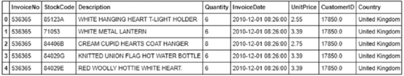
CHAPTER 8 ■ CUSTOMER SEGMENTATION AND EFFECTIVE CROSS SELLING
375
The few lines from the dataset gives us information about the attributes of the datasets, as shown in
Figure8-1.
The attributes of the dataset are easily identifiable from their names. We know right away what each of
these fields might mean. For the sake of completeness, we include the description of each column here:
• InvoiceNo: A unique identifier for the invoice. An invoice number shared across
rows means that those transactions were performed in a single invoice (multiple
purchases).
• StockCode: Identifier for items contained in an invoice.
• Description: Textual description of each of the stock item.
• Quantity: The quantity of the item purchased.
• InvoiceDate: Date of purchase.
• UnitPrice: Value of each item.
• CustomerID: Identifier for customer making the purchase.
• Country: Country of customer.
Let’s analyze this data and first determine which are the top countries the retailer is shipping its items
to, and how are the volumes of sales for those countries.
In [5]: cs_df.Country.value_counts().reset_index().head(n=10)
Out[5]:
index Country
0 United Kingdom 495478
1 Germany 9495
2 France 8557
3 EIRE 8196
4 Spain 2533
5 Netherlands 2371
6 Belgium 2069
7 Switzerland 2002
8 Portugal 1519
9 Australia 1259
This shows us that the bulk of ordering is taking place in its home country only which is not surprising. We
also notice the odd country name EIRE, which is a little concerning. But a quick web search indicates that it is just
an old name for Ireland, so no harm done! Interestingly, Australia is also in the top-ten list of sales by country.
Figure 8-1. Sample transactions from the Retail Transactions dataset
CHAPTER 8 ■ CUSTOMER SEGMENTATION AND EFFECTIVE CROSS SELLING
376
Next we might be interested in how many unique customers the retailer is having and how do they stack
up in the number of orders they make. We are also interested in knowing that what percentage of orders is
made by the top 10 customers of the retailer. This information is interesting as it would tell us whether the
user base of the firm is distributed relatively uniformly.
In [7]: cs_df.CustomerID.unique().shape
Out[7]: (4373,)
In [8]: (cs_df.CustomerID.value_counts()/sum(cs_df.CustomerID.value_counts())*100).
head(n=13).cumsum()
Out[8]:
17841.0 1.962249
14911.0 3.413228
14096.0 4.673708
12748.0 5.814728
14606.0 6.498553
15311.0 7.110850
14646.0 7.623350
13089.0 8.079807
13263.0 8.492020
14298.0 8.895138
15039.0 9.265809
14156.0 9.614850
18118.0 9.930462
Name: CustomerID, dtype: float64
This tells us that we have 4,373 unique customers but almost 10% of total sales are contributed by only
13 customers (based on the cumulative percentage aggregation in the preceding output). This is expected
given the fact that we have both wholesale and retail customers. The next thing we want to determine is how
many unique items the firm is selling and check whether we have equal number of descriptions for them.
In [9]: cs_df.StockCode.unique().shape
Out[9]: (4070,)
In [10]: cs_df.Description.unique().shape
Out[10]: (4224,)
We have a mismatch in the number of StockCode and Description, as we can see that item descriptions
are more than stock code values, which means that we have multiple descriptions for some of the stock
codes. Although this is not going to interfere with our analysis, we would like to dig a little deeper in this to
find out what may have caused this issue or what kind of duplicated descriptions are present in the data.
cat_des_df = cs_df.groupby(["StockCode","Description"]).count().reset_index()
cat_des_df.StockCode.value_counts()[cat_des_df.StockCode.value_counts()>1].reset_index().head()
index StockCode
0 20713 8
1 23084 7
2 85175 6
3 21830 6
4 21181 5
CHAPTER 8 ■ CUSTOMER SEGMENTATION AND EFFECTIVE CROSS SELLING
377
In [13]: cs_df[cs_df['StockCode']
...: ==cat_des_df.StockCode.value_counts()[cat_des_df.StockCode.value_counts()>1].
...: reset_index()['index'][6]]['Description'].unique()
Out[13]:
array(['MISTLETOE HEART WREATH CREAM', 'MISTLETOE HEART WREATH WHITE',
'MISTLETOE HEART WREATH CREAM', '?', 'had been put aside', nan], dtype=object)
This gives the multiple descriptions for one of those items and we witness the simple ways in which
data quality can be corrupted in any dataset. A simple spelling mistake can end up in reducing data quality
and an erroneous analysis. In an enterprise-level scenario, dedicated people work toward restoring data
quality manually over time. Since the intent of this section is to focus on customer segmentation, we will be
skipping this tedious activity for now. Let’s now verify the sanctity of the Quantity and UnitPrice attributes,
as those are the attributes we will be using in our analysis.
In [14]: cs_df.Quantity.describe()
Out[14]:
count 541909.000000
mean 9.552250
std 218.081158
min -80995.000000
25% 1.000000
50% 3.000000
75% 10.000000
max 80995.000000
Name: Quantity, dtype: float64
In [15]: cs_df.UnitPrice.describe()
Out[15]:
count 541909.000000
mean 4.611114
std 96.759853
min -11062.060000
25% 1.250000
50% 2.080000
75% 4.130000
max 38970.000000
Name: UnitPrice, dtype: float64
We can observe from the preceding output that both of these attributes are having negative values,
which may mean that we may have some return transactions in our data also. This scenario is quite common
for any retailer but we need to handle these before we proceed to our analysis. These are some of the
data quality issues we found in our dataset. In the real world, the datasets are generally messy and have
considerable data quality issues, so it is always a good practice to explicitly verify information at hand before
performing any kind of analysis. We encourage you to try and find similar issues with any dataset which you
might want to analyze in the future.
CHAPTER 8 ■ CUSTOMER SEGMENTATION AND EFFECTIVE CROSS SELLING
378
Customer Segmentation
Segmentation is the process of segregating any aggregated entity into separate parts or groups (segments).
These parts may or may not share something common across them. Customer segmentation is similarly the
process of dividing an organization’s customer bases into different sections or segments based on various
customer attributes. It is driven by the belief that customers are inherently different and this difference is
exemplified by their behavior. A deep understanding of an organization’s customer base and their behavior
is often the focus of any customer segmentation project. The process of customer segmentation is based on
the premise of finding differences among the customers’ behavior and patterns. These differences can be
on the basis of their buying behavior, their demographic information, their geographic information, their
psychographic attributes, and so on.
Objectives
Customer segmentation can help an organization in multitude of ways. Before we describe the various ways
it can be done, we want to enumerate the major objectives and benefits behind the motivation for customer
segmentation.
Customer Understanding
One of the primary objectives of a customer segmentation process is a deeper understanding of a firm’s
customers and their attributes and behavior. These insights into the customer base can be used in different
ways, as we will discuss shortly. But the information is useful by itself. One of the mostly widely accepted
business paradigms is “know your customer” and a segmentation of the customer base allows for a perfect
dissection of this paradigm. This understanding and its exploitation is what forms the basis of the other
benefits of customer segmentation.
Target Marketing
The most visible reason for customer segmentation is the ability to focus marketing efforts effectively
and efficiently. If a firm knows the different segments of its customer base, it can devise better marketing
campaigns which are tailor made for the segment. Consider the example of any travel company, if it knows
that the major segments of its customers are the budget travelers and the luxury travelers, it can have two
separate marketing campaigns for each of the group. One can focus on the higher value aspects of the
company’s offerings relevant to budget deals while the other campaign deals with luxurious offerings.
Although the example seems quite trivial, the same logic can be extended in a number of ways to arrive
at better marketing practices. A good segmentation model allows for better understanding of customer
requirements and hence increases the chances of the success of any marketing campaign developed by the
organization.
Optimal Product Placement
A good customer segmentation strategy can also help the firm with developing or offering new products.
This benefit is highly dependent on the way the segmentation process is leveraged. Consider a very simple
example in which an online retailer finds out that a major section of its customers are buying makeup
products together. This may prompt him to bundle those product together as a combined offering, which
may increase sales margin for the retailer and make the buying process more streamlined for the customer.
CHAPTER 8 ■ CUSTOMER SEGMENTATION AND EFFECTIVE CROSS SELLING
379
Finding Latent Customer Segments
A customer segmentation process helps the organization with knowing its customer base. An obvious side
effect of any such practice is finding out which segment of customers it might be missing. This can help in
identifying untapped customer segments by focused on marketing campaigns or new product development.
Higher Revenue
This is the most obvious requirement of any customer segmentation project. The reason being that customer
segmentation can lead to higher revenue due to the combined effects of all the advantages identified in this
section.
Strategies
The easy answer to the question of “How to do customer segmentation?” would be “In any way you deem fit”
and it would be a perfectly acceptable answer. The reason this is the right answer, is because of the original
definition of customer segmentation. It is just a way of differentiating between the customers. It can be as
simple as making groups of customers based on age groups or other attributes using a manual process or as
complex as using a sophisticated algorithm for finding out those segments in an automated fashion. Since
our book is all about Machine Learning, we describe how customer segmentation can be translated into a
core Machine Learning task. The detailed code for this section is available in the notebook titled Customer
Segmentation.ipynb.
Clustering
We are dealing with an unlabeled, unsupervised transactional dataset from which we want to find
out customer segments. Thus, the most obvious method to perform customer segmentation is using
unsupervised Machine Learning methods like clustering. Hence, this will be the method that we use for
customer segmentation in this chapter. The method is as simple as collecting as much data about the
customers as possible in the form of features or attributes and then finding out the different clusters that can
be obtained from that data. Finally, we can find traits of customer segments by analyzing the characteristics
of the clusters.
Exploratory Data Analysis
Using exploratory data analysis is another way of finding out customer segments. This is usually done by
analysts who have a good knowledge about the domain relevant to both products and customers. It can be
done flexibly to include the top decision points in an analysis. For example, finding out the range of spends
by customers will give rise to customer segments based on spends. We can proceed likewise on important
attributes of customers until we get segments of customer that have interesting characteristics.
Clustering vs. Customer Segmentation
In our use case, we will be using a clustering based model to find out interesting segments of customers.
Before we go on to modify our data for the model there is an interesting point we would like to clarify. A lot of
people think that clustering is equivalent to customer segmentation. Although it is true that clustering is one
of the most suitable techniques for segmentation, it is not the only technique. Besides this, it is just a method
that is “applied” to extract segments.
CHAPTER 8 ■ CUSTOMER SEGMENTATION AND EFFECTIVE CROSS SELLING
380
Customer segmentation is just the task of segmenting customers. It can be solved in several ways
and it need not always be a complex model. Clustering provides a mathematical framework which can be
leveraged for finding out such segment boundaries in the data. Clustering is especially useful when we have
a lot of attributes about the customer on which we can make different segments. Also, often it is observed
that a clustering-based segmentation will be superior to an arbitrary segmentation process and it will often
encompass the segments that can be devised using such an arbitrary process.
Clustering Strategy
Now that we have some information about what customer segmentation is, various strategies and how it can
be useful, we can start with the process of finding out customer segments in our online retail dataset. The
dataset that we have consists of only the sales transactions of the customers and no other information about
them, i.e., no other additional attributes. Usually in larger organizations we will usually have more attributes
of information about the customers that can help in clustering. However, it will be interesting and definitely
a challenge to work with this limited attribute dataset! So we will use a RFM—Recency, Frequency and
Monetary Value—based model of customer value for finding our customer segments.
RFM Model for Customer Value
The RFM model is a popular model in marketing and customer segmentation for determining a customer’s
value. The RFM model will take the transactions of a customer and calculate three important informational
attributes about each customer:
• Recency: The value of how recently a customer purchased at the establishment
• Frequency: How frequent the customer’s transactions are at the establishment
• Monetary value: The dollar (or pounds in our case) value of all the transactions that
the customer made at the establishment
A combination of these three values can be used to assign a value to the customer. We can directly think
of some desirable segments that we would want on such model. For example, a high value customer is one
who buys frequently, just bought something recently, and spends a high amount whenever he buys or shops!
Data Cleaning
We hinted in the “Exploratory Data Analysis” section about the return transactions that we have in our
dataset. Before proceeding with our analysis workflow, we will find out all such transactions and remove
them. Another possibility is to remove the matching buying transactions also from the dataset. But we will
assume that those transactions are still important hence we will keep them intact. Another data cleaning
operation is to separate transactions for a particular geographical region only, as we don’t want data from
Germany’s customers to affect the analysis for another country’s customers. The following snippet of code
achieves both these tasks. We focus on UK customers, which are notably the largest segment (based on country!).
In [16]: # Separate data for one geography
...: cs_df = cs_df[cs_df.Country == 'United Kingdom']
...:
...: # Separate attribute for total amount
...: cs_df['amount'] = cs_df.Quantity*cs_df.UnitPrice
...:
...: # Remove negative or return transactions
CHAPTER 8 ■ CUSTOMER SEGMENTATION AND EFFECTIVE CROSS SELLING
381
...: cs_df = cs_df[~(cs_df.amount<0)]
...: cs_df.head()
...:
Out[16]:
InvoiceNo StockCode Description Quantity \
0 536365 85123A WHITE HANGING HEART T-LIGHT HOLDER 6
1 536365 71053 WHITE METAL LANTERN 6
2 536365 84406B CREAM CUPID HEARTS COAT HANGER 8
3 536365 84029G KNITTED UNION FLAG HOT WATER BOTTLE 6
4 536365 84029E RED WOOLLY HOTTIE WHITE HEART. 6
InvoiceDate UnitPrice CustomerID Country amount
0 2010-12-01 08:26:00 2.55 17850.0 United Kingdom 15.30
1 2010-12-01 08:26:00 3.39 17850.0 United Kingdom 20.34
2 2010-12-01 08:26:00 2.75 17850.0 United Kingdom 22.00
3 2010-12-01 08:26:00 3.39 17850.0 United Kingdom 20.34
4 2010-12-01 08:26:00 3.39 17850.0 United Kingdom 20.34
The data now has only buying transactions from United Kingdom. We will now remove all the
transactions that have a missing value for the CustomerID field as all our subsequent transactions will be
based on the customer entities.
In [17]: cs_df = cs_df[~(cs_df.CustomerID.isnull())]
In [18]: cs_df.shape
Out[18]: (354345, 9)
The next step is creating the recency, frequency, and monetary value features for each of the customers
that exist in our dataset.
Recency
To create the recency feature variable, we need to decide the reference date for our analysis. For our use
case, we will define the reference date as one day after the last transaction in our dataset.
In [19]: refrence_date = cs_df.InvoiceDate.max()
...: refrence_date = refrence_date + datetime.timedelta(days = 1)
...: refrence_date
Out[20]: Timestamp('2011-12-10 12:49:00')
We will construct the recency variable as the number of days before the reference date when a customer
last made a purchase. The following snippet of code will create this variable for us.
In [21]: cs_df['days_since_last_purchase'] = refrence_date - cs_df.InvoiceDate
...: cs_df['days_since_last_purchase_num'] = cs_df['days_since_last_purchase'].
astype('timedelta64[D]')
In [22]: customer_history_df = cs_df.groupby("CustomerID").min().reset_index()
[['CustomerID', 'days_since_last_purchase_num']]
...: customer_history_df.rename(columns={'days_since_last_purchase_num':'recency'},
inplace=True)
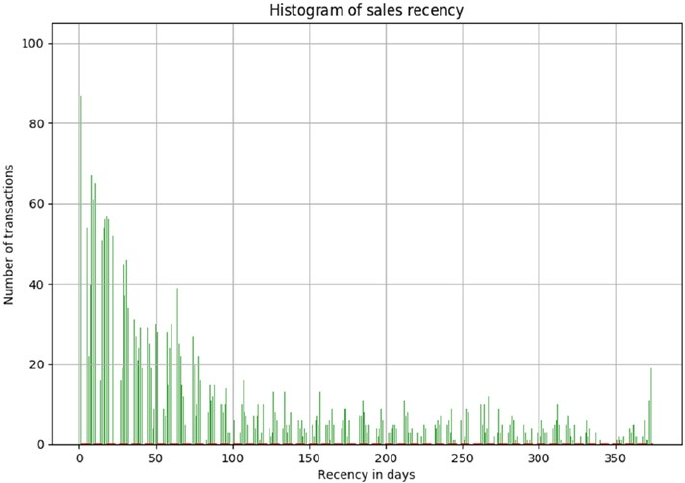
CHAPTER 8 ■ CUSTOMER SEGMENTATION AND EFFECTIVE CROSS SELLING
382
Before we proceed, let’s examine how the distribution of customer recency looks for our data
(see Figure8-2).
x = customer_history_df.recency
mu = np.mean(customer_history_df.recency)
sigma = math.sqrt(np.var(customer_history_df.recency))
n, bins, patches = plt.hist(x, 1000, facecolor='green', alpha=0.75)
# add a 'best fit' line
y = mlab.normpdf( bins, mu, sigma)
l = plt.plot(bins, y, 'r--', linewidth=2)
plt.xlabel('Recency in days')
plt.ylabel('Number of transactions')
plt.title(r'$\mathrm{Histogram\ of\ sales\ recency}\ $')
plt.grid(True)
Figure 8-2. Distribution of sales recency
The histogram in Figure8-2 tells us that we have skewed distribution of sales recency with a much
higher number of frequent transactions and a fairly uniform number of less recent transactions.
Frequency and Monetary Value
Using similar methods, we can create a frequency and monetary value variable for our dataset. We will
create these variables separately and then merge all the dataframes to arrive at the customer value dataset.
We will perform our clustering-based customer segmentation on this dataframe. The following snippet will
create both these variables and the final merged dataframe.
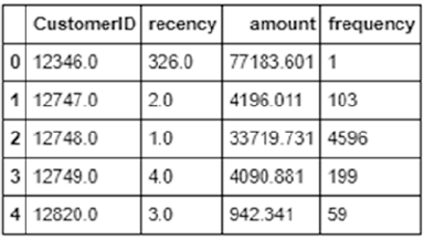
CHAPTER 8 ■ CUSTOMER SEGMENTATION AND EFFECTIVE CROSS SELLING
383
In [29]: customer_monetary_val = cs_df[['CustomerID',
'amount']].groupby("CustomerID").sum().reset_index()
...: customer_history_df = customer_history_df.merge(customer_monetary_val, how='outer')
...: customer_history_df.amount = customer_history_df.amount+0.001
...:
...: customer_freq = cs_df[['CustomerID',
'amount']].groupby("CustomerID").count().reset_index()
...: customer_freq.rename(columns={'amount':'frequency'},inplace=True)
...: customer_history_df = customer_history_df.merge(customer_freq, how='outer')
The input dataframe for clustering will look like the dataframe depicted in Figure8-3. Notice that we
have added a small figure 0.001 to the customer monetary value, as we will be transforming our values to
the log scale and presence of zeroes in our data may lead to an error.
Figure 8-3. Customer value dataframe
Data Preprocessing
Once we have created our customer value dataframe, we will perform some preprocessing on the data. For
our clustering, we will be using the K-means clustering algorithm, which we discussed in the earlier chapters.
One of the requirements for proper functioning of the algorithm is the mean centering of the variable
values. Mean centering of a variable value means that we will replace the actual value of the variable with a
standardized value, so that the variable has a mean of 1 and variance of 0. This ensures that all the variables
are in the same range and the difference in ranges of values doesn’t cause the algorithm to not perform well.
This is akin to feature scaling.
Another problem that you can investigate about is the huge range of values each variable can take. This
problem is particularly noticeable for the monetary amount variable. To take care of this problem, we will
transform all the variables on the log scale. This transformation, along with the standardization, will ensure
that the input to our algorithm is a homogenous set of scaled and transformed values.
An important point about the data preprocessing step is that sometimes we need it to be reversible. In
our case, we will have the clustering results in terms of the log transformed and scaled variable. But to make
inferences in terms of the original data, we will need to reverse transform all the variable so that we get back
the actual RFM figures. This can be done by using the preprocessing capabilities of Python.
In [30]: from sklearn import preprocessing
...: import math
...: customer_history_df['recency_log'] = customer_history_df['recency'].apply(math.log)
...: customer_history_df['frequency_log'] = customer_history_df['frequency'].apply(math.log)
...: customer_history_df['amount_log'] = customer_history_df['amount'].apply(math.log)
...: feature_vector = ['amount_log', 'recency_log','frequency_log']
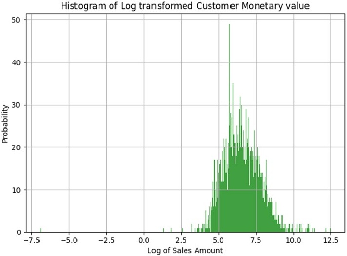
CHAPTER 8 ■ CUSTOMER SEGMENTATION AND EFFECTIVE CROSS SELLING
384
...: X = customer_history_df[feature_vector].as_matrix()
...: scaler = preprocessing.StandardScaler().fit(X)
...: X_scaled = scaler.transform(X)
The previous code snippet will create a log valued and mean centered version of our dataset. We can
visualize the results of our preprocessing by inspecting the variable with the widest range of values. The
following code snippet will help us visualize this.
In [31]: x = customer_history_df.amount_log
...: n, bins, patches = plt.hist(x, 1000, facecolor='green', alpha=0.75)
...: plt.xlabel('Log of Sales Amount')
...: plt.ylabel('Probability')
...: plt.title(r'$\mathrm{Histogram\ of\ Log\ transformed\ Customer\ Monetary\ value}\ $')
...: plt.grid(True)
...: plt.show()
The resulting graph is a distribution resembling normal distribution with mean 0 and variance of 1, as
clearly depicted in Figure8-4.
Figure 8-4. Scaled and log transformed sales amount
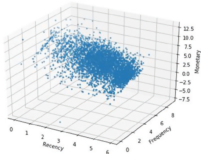
CHAPTER 8 ■ CUSTOMER SEGMENTATION AND EFFECTIVE CROSS SELLING
385
Let’s try to visualize our three main features (R, F, and M) on a three-dimensional plot to see if we can
understand any interesting patterns that the data distribution is showing.
from mpl_toolkits.mplot3d import Axes3D
fig = plt.figure(figsize=(8, 6))
ax = fig.add_subplot(111, projection='3d')
xs =customer_history_df.recency_log
ys = customer_history_df.frequency_log
zs = customer_history_df.amount_log
ax.scatter(xs, ys, zs, s=5)
ax.set_xlabel('Recency')
ax.set_ylabel('Frequency')
ax.set_zlabel('Monetary')
The obvious patterns we can see from the plot in Figure8-5 is that people who buy with a higher
frequency and more recency tend to spend more based on the increasing trend in Monetary value with a
corresponding increasing and decreasing trend for Frequency and Recency, respectively. Do you notice any
other interesting patterns?
Figure 8-5. Customer value dataframe
CHAPTER 8 ■ CUSTOMER SEGMENTATION AND EFFECTIVE CROSS SELLING
386
Clustering for Segments
We will be using the K-means clustering algorithm for finding out clusters (or segments in our data). It is one
of the simplest clustering algorithms that we can employ and hence it is widely used in practice. We will give
you a brief primer of the algorithm before we go on to using the same, for finding segments in our data.
K-Means Clustering
The K-means clustering belongs to the partition based\centroid based clustering family of algorithms. The
steps that happen in the K-means algorithm for partitioning the data are as given follows:
1. The algorithm starts with random point initializations of the required number of
centers. The “K” in K-means stands for the number of clusters.
2. In the next step, each of the data point is assigned to the center closest to it. The
distance metric used in K-means clustering is normal Euclidian distance.
3. Once the data points are assigned, the centers are recalculated by averaging the
dimensions of the points belonging to the cluster.
4. The process is repeated with new centers until we reach a point where the
assignments become stable. In this case, the algorithm terminates.
We will adapt the code given in the scikit-learn documentation at http://scikit-learn.org/
stable/auto_examples/cluster/plot_kmeans_silhouette_analysis.html and use the silhouette score for
finding out the optimal number of clusters during our clustering process. We leave it as an exercise for you
to adapt the code and create the visualization in Figure8-6. You are encouraged to modify the code in the
documentation to not only build the visualization, but also to capture the centers and the silhouette score
of each cluster in a dictionary, as we will need to refer to those for performing our analysis of the customer
segments obtained. Of course, in case you find it overwhelming, you can always refer to the detailed code
snippet in the Customer Segmentation.ipynb notebook.
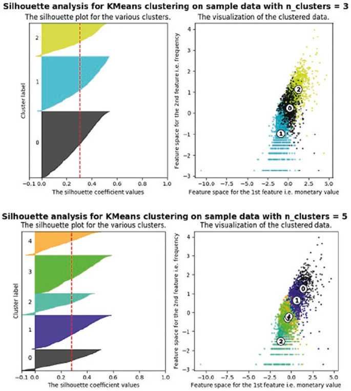
CHAPTER 8 ■ CUSTOMER SEGMENTATION AND EFFECTIVE CROSS SELLING
387
In the visualization depicted in Figure8-6, we plotted the silhouette score of each cluster along with the
center of each of the cluster discovered. We will use this information in the next section on cluster analysis.
Although we have to keep in mind that in several cases and scenarios, sometimes we may have to drop the
mathematical explanation given by the algorithm and look at the business relevance of the results obtained.
Cluster Analysis
Before we proceed to the analysis of clusters such obtained, let’s look at the cluster center values after
retransforming them to normal values from the log and scaled version. The following code helps us convert
the center values to the reversed transformed values.
In [38]: for i in range(3,6,2):
...: print("for {} number of clusters".format(i))
Figure 8-6. Silhouette analysis with three and five clusters
CHAPTER 8 ■ CUSTOMER SEGMENTATION AND EFFECTIVE CROSS SELLING
388
...: cent_transformed = scaler.inverse_transform(cluster_centers[i]['cluster_center'])
...: print(pd.DataFrame(np.exp(cent_transformed),columns=feature_vector))
...: print("Silhouette score for cluster {} is {}". format(i,
cluster_centers[i]['silhouette_score']))
...: print()
for 3 number of clusters
amount_log recency_log frequency_log
0 843.937271 44.083222 53.920633
1 221.236034 121.766072 10.668661
2 3159.294272 7.196647 177.789098
Silhouette score for cluster 3 is 0.30437444714898737
for 5 number of clusters
amount_log recency_log frequency_log
0 3905.544371 5.627973 214.465989
1 1502.519606 46.880212 92.306262
2 142.867249 126.546751 5.147370
3 408.235418 139.056216 25.530424
4 464.371885 13.386419 29.581298
Silhouette score for cluster 5 is 0.27958641427323727
When we look at the results of the clustering process, we can infer some interesting insights. Consider
the three-cluster configuration and try to understand the following insights.
• We get three clusters with stark differences in the Monetary value of the customer.
• Cluster 2 is the cluster of high value customer who shops frequently and is certainly
an important segment for each business.
• In the similar way we obtain customer groups with low and medium spends in
clusters with labels 1 and 0, respectively.
• Frequency and Recency correlate perfectly to the Monetary value based on the trend
we talked about in Figure8-3 (High Monetary-Low Recency-High Frequency).
The five-cluster configuration results are more surprising! When we go looking for more segments, we
find out that our high valued customer base is comprised of two subgroups:
• Those who shop often and with high amount (represented by cluster 0).
• Those who have a decent spend but are not as frequent (represented by cluster 1).
This is in direct conflict with the result we obtain from the silhouette score matrix which says the five-
cluster segments are less optimal then the three cluster segments. Of course, remember you must not strictly
go after mathematical metrics all the time and think about the business aspects too. Besides this, there could
be more insights that are uncovered as you visualize the data based on these segments which might prove
that in-fact the three-cluster segmentation was far better. For instance, if you check the right-side plot in
Figure8-6, you can see that segments with five clusters have too much overlap among them, as compared to
segments with three clusters.

CHAPTER 8 ■ CUSTOMER SEGMENTATION AND EFFECTIVE CROSS SELLING
389
Cluster Descriptions
On the basis of eyeballing the cluster centers, we can figure out that we have a good difference in the
customer value in the segments as defined in terms of recency, amount and frequency. To further drill
down on this point and find out the quality of these difference, we can label our data with the corresponding
cluster label and then visualize these differences. We will do this visualization for probably one of the most
important customer value indicators, the total dollar value sales.
To arrive at such distinction based summary computations, we will first label each data row in our
customer summary dataframe with the corresponding label as returned by our clustering algorithm.
Note that you have to modify the code you are using if you want to try a different configuration of let’s say
two or four clusters. We will have to make changes so that we capture the labels for each different cluster
configuration. We encourage you to try other cluster configurations to see if you get even better segments!
The following code will extract the clustering label and attach it with our customer summary dataframe.
labels = cluster_centers[5]['labels']
customer_history_df['num_cluster5_labels'] = labels
labels = cluster_centers[3]['labels']
customer_history_df['num_cluster3_labels'] = labels
Once we have the labels assigned to each of the customers, our task is simple. Now we want to find out
how the summary of customer in each group is varying. If we can visualize that information we will able to
find out the differences in the clusters of customers and we can modify our strategy on the basis of those
differences. We have used a lot of matplotlib and seaborn so far; we will be using plotly in this section for
creating some interactive plots that you can play around with in your jupyter notebook!
■Note While plotly provides excellent interactive visualizations in jupyter notebooks, you might come
across some notebook rendering issues that come up as popups when you open the notebook. To fix this
problem, upgrade your nbformat library by running the conda update nbformat command and re-open the
notebook. The problem should disappear.
The following code leverages plotly and will take the cluster labels we got for the configuration of
five clusters and create boxplots that will show how the median, minimum, maximum, highest, and lowest
values are varying in the five groups. Note that we want to avoid the extremely high outlier values of each
group, as they will interfere in making a good observation (due to noise) around the central tendencies of
each cluster. So we will restrict the data such that only data points which are less than 0.8th percentile of the
cluster is used. This will give us good information about the majority of the users in that cluster segment.
The following code will help us create this plot for the total sales value.
import plotly as py
import plotly.graph_objs as go
py.offline.init_notebook_mode()
x_data = ['Cluster 1','Cluster 2','Cluster 3','Cluster 4', 'Cluster 5']
cutoff_quantile = 80
field_to_plot = 'amount'
y0=customer_history_df[customer_history_df['num_cluster5_labels']==0][field_to_plot].values
y0 = y0[y0<np.percentile(y0, cutoff_quantile)]
y1=customer_history_df[customer_history_df['num_cluster5_labels']==1][field_to_plot].values
CHAPTER 8 ■ CUSTOMER SEGMENTATION AND EFFECTIVE CROSS SELLING
390
y1 = y1[y1<np.percentile(y1, cutoff_quantile)]
y2=customer_history_df[customer_history_df['num_cluster5_labels']==2][field_to_plot].values
y2 = y2[y2<np.percentile(y2, cutoff_quantile)]
y3=customer_history_df[customer_history_df['num_cluster5_labels']==3][field_to_plot].values
y3 = y3[y3<np.percentile(y3, cutoff_quantile)]
y4=customer_history_df[customer_history_df['num_cluster5_labels']==4][field_to_plot].values
y4 = y4[y4<np.percentile(y4, cutoff_quantile)]
y_data = [y0,y1,y2,y3,y4]
colors = ['rgba(93, 164, 214, 0.5)', 'rgba(255, 144, 14, 0.5)', 'rgba(44, 160, 101, 0.5)',
'rgba(255, 65, 54, 0.5)', 'rgba(207, 114, 255, 0.5)', 'rgba(127, 96, 0, 0.5)']
traces = []
for xd, yd, cls in zip(x_data, y_data, colors):
traces.append(go.Box(
y=yd, name=xd, boxpoints=False,
jitter=0.5, whiskerwidth=0.2,
fillcolor=cls, marker=dict(size=2,),
line=dict(width=1), ))
layout = go.Layout(
title='Difference in sales {} from cluster to cluster'.format(field_to_plot),
yaxis=dict(
autorange=True, showgrid=True,
zeroline=True, dtick=1000,
gridcolor='black', gridwidth=0.1,
zerolinecolor='rgb(255, 255, 255)',
zerolinewidth=2, ),
margin=dict(l=40,r=30, b=80, t=100, ),
paper_bgcolor='white', plot_bgcolor='white', showlegend=False
)
fig = go.Figure(data=traces, layout=layout)
py.offline.iplot(fig)
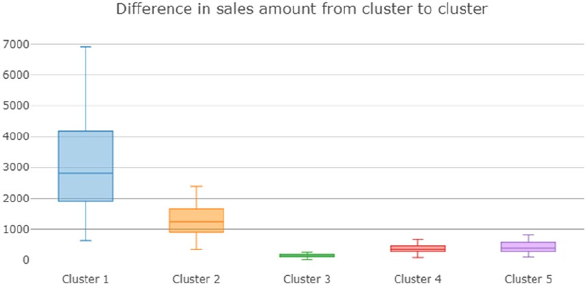
CHAPTER 8 ■ CUSTOMER SEGMENTATION AND EFFECTIVE CROSS SELLING
391
Let’s also take a look at the plot that is generated as a result of this code snippet. In Figure8-7 we can see
that the Clusters 1 and 2 have a higher average sales amount, thus being the highest spenders. Although we
don’t see much difference in the sales values of Clusters 4 and 5, we do see a markedly smaller sales amount
in Cluster 3. This gives us an indication that we can merge the candidates of Clusters 4 and 5 together, at
least on the basis of sales amount. You can plot similar figures for recency and frequency also to figure out
differences in the cluster on the basis of those values. Detailed code and visualizations are present in the
notebook for three- and five-cluster based segments. Plotly enables us to interact with the plots to see the
central tendency values in each boxplot in the notebook. We show the difference in sales amount across
three segments based on the three-cluster configuration just so you can compare it with Figure8-7.
The detailed visualization is shown in Figure8-8, which talks about difference in the sales\revenue
across the three segments. It is clear that this is much more distinguishable and we also have lesser overlap
as compared to Figure8-7 where Clusters 4 and 5 were very similar. This doesn’t mean that the previous
method was wrong; it’s just one of the dimensions where some segments were similar to each other.
Figure 8-7. Difference in sales amount values across the five segments
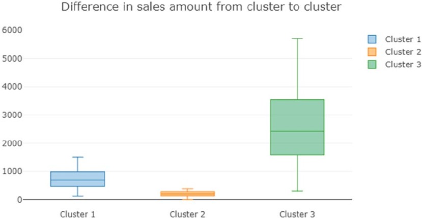
CHAPTER 8 ■ CUSTOMER SEGMENTATION AND EFFECTIVE CROSS SELLING
392
We can further improve the quality of clustering by adding relevant features to the dataset that we
have created. Often firms will buy data regarding their customers from external data vendors and use it to
enhance the segmentation process. We had a limitation of only having around a year worth of transaction
data but even a mid-size organization may have multiple years of transaction data which can improve
the results. Another dimension to explore can be trying out different algorithms for performing the
segmentation for instance hierarchical clustering, which we explored in some of the earlier chapters. A good
segmentation process will encompass all these avenues to arrive at optimal segments that provide valuable
insight. We encourage you to get creative with the process and build your own examples.
The important caveat from this analysis is that when it comes to correlating the actual value of results
with the mathematical metrics we cannot always rely on the metrics. We need to include this habit of
including business metrics and domain insights in our modeling process as often times this becomes the
difference between an implemented high value project and a forgotten data-focused solution. Once we
obtain these results, we can further discuss them with the marketing team of the organization to come up
with appropriate practices for each of the segment identified.
Cross Selling
What is cross selling? In the simplest terms, cross selling is the ability to sell more products to a customer
by analyzing the customer’s shopping trends as well as general shopping trends and patterns which are in
common with the customer’s shopping patterns. This simple definition captures the essential idea of cross
selling, but it is not as descriptive as we would like it to be.
We will illustrate the idea with an example. Say we are concerned about our health (which everyone
should be) and decide to buy a protein supplement on our favorite e-commerce site. In most scenarios, the
moment you get to your product page, you will have a section that will tell you other products that you can
buy along with the product(s) of your choice. See Figure8-9.
Figure 8-8. Difference in sales amount values across the three segments
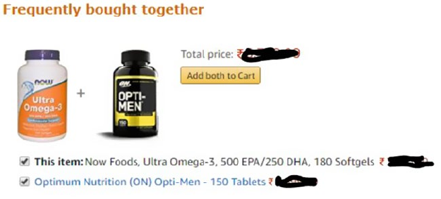
CHAPTER 8 ■ CUSTOMER SEGMENTATION AND EFFECTIVE CROSS SELLING
393
More often than not, these recommended products would be very appealing. For example, if I am in
the market for a protein supplement it will definitely be a good idea for me to buy a vitamin supplement too.
The retailer will often offer you a bundle of products with some attractive offer and it is highly likely that we
will end up buying the bundled products instead of just the original item. This is the simple but powerful
concept of cross selling. We research the customer transactions and find out potential additions to the
customer’s original needs and offer it to the customer as a suggestion in the hope and intent that they buy
them benefiting both the customer as well as the retail establishment.
Cross selling is ubiquitous in both the online and offline retail worlds. The simplicity and the
effectiveness of the idea make it an essential and powerful marketing tool for all types of retailers. The idea of
cross selling can be extended to any organization, irrespective of whether it is an online or offline retailer or
whether it is selling its products to the end users of whole sellers.
In this section, we explore association rule-mining, a powerful technique that can be used for cross
selling, then we illustrate the concept of market basket analysis for a toy dataset, and finally we apply the
same concepts to our retail transactions dataset.
Market Basket Analysis with Association Rule-Mining
Before we go on to understand how to generate the association rules from our transactional data, let’s try
to understand how we will use those rules. A famous story in data analytics circles is the story of “Beer and
Diapers”. The basic crux of the story is the concept that a major retailer upon analyzing their customer
transaction behavior discovered a strong association between sales of beer and diapers. The retailer was
able to exploit this association by moving the beer section close to the diapers section leading to higher sales
volume (The origins of the story may have some fact but the whole concept is debatable. We encourage you
to go through the discussion at http://www.dssresources.com/newsletters/66.php for learning more
about this story).
Although the beer and diaper story may or may not have been a myth, the concept of finding sales
association in customer behavior is an important and inspiring one. Suppose we can mathematically
capture the significance of these associations, then it would be a good idea to try and exploit the rules which
are likely to be correct. The whole concept of association rule-mining is based on the concept that customer
purchase behavior has a pattern which can be exploited for selling more items to the customer in the future.
An association rule usually has the structure as depicted in this equation:
item item item itemk123
,,®
{}
Figure 8-9. Cross selling example

CHAPTER 8 ■ CUSTOMER SEGMENTATION AND EFFECTIVE CROSS SELLING
394
This rule can be read in the obvious manner that when the customer bought items on the (left hand
side) LHS of the rule he is likely to buy the itemk. In the later sections, we define mathematical metrics that
will capture the strength of such rules.
We can use these rules in a variety of ways. The most obvious way to use these rules is to develop
bundles of products which make it convenient for the customer to buy these items together. Another way to
use these rules is to bundle products along with some discounts for other relevant products in the bundle,
hence ensuring that the customer becomes more likely to buy more items. Some unlikely ways to use
association rules is for designing a better web site navigational structure, intrusion detection, bioinformatics,
and so on.
Association Rule-Mining Basics
Before proceeding to explore the association rules in our dataset, we will go through some essential concepts
for association rule-mining. These terms and concepts will help you in the later analysis and also in
understanding the rules that the algorithm will generate. Consider Table8-1 with some toy transaction data.
Each row in the table consists of a transaction. For example, the customer bought milk and bread in the
first transaction. Following are some vital concepts pertaining to association rule-mining.
• Itemset: Itemset is just a collection of one or more items that occur together in a
transaction. For example, here {milk, bread} is example of an itemset.
• Support: Support is defined as number of times an itemset appears in the dataset.
Mathematically it is defined as:
supp beer diaper t
,
{}
()
=number of transactions with beer anddiaper
ootal transactions
In the previous example, support (beer, diaper) = 1/5 = 0.2.
• Confidence: Confidence is a measure of the times the number of times a rule is
found to exist in the dataset. For a rule which states beer diaper®
{}
the confidence
is mathematically definedas:
confidence beer diaper supp beer anddiaper
supp beer
,
{}
()
=
()
()
Table 8-1. Example of a Transaction Set
Trans.ID Items
1{milk, bread}
2{butter}
3{beer, diaper}
4{milk, bread, butter}
5{bread}
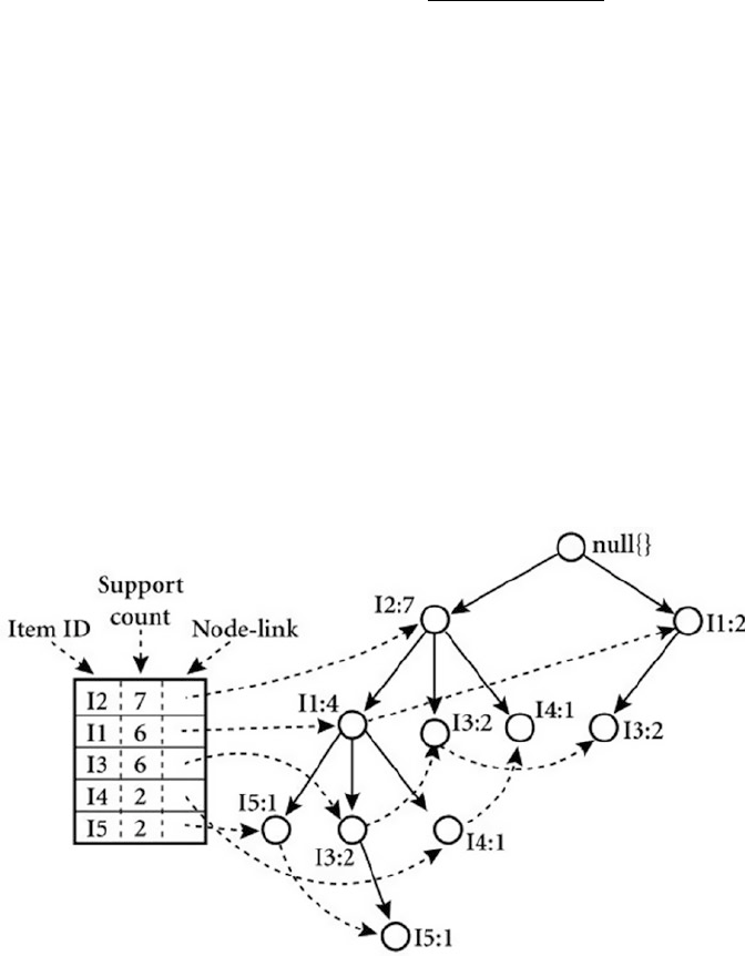
CHAPTER 8 ■ CUSTOMER SEGMENTATION AND EFFECTIVE CROSS SELLING
395
• Lift: Lift of the rule is defined as the ratio of observed support to the support
expected in the case the elements of the rule were independent. For the previous set
of transactions if the rule is defined as X®
{}
Y, then the lift of the rule is defined as:
lift XY supp XY
supp XsuppY
®
()
=
È
()
()
*
()
()
• Frequent itemset: Frequent itemsets are itemsets whose support is greater than a
user defined support threshold.
FP Growth
The most famous algorithm for association rule-mining is the Apriori algorithm, for which you will find a lot
of code and resources on the web and in standard data mining literature. However, here we will use a
different and more efficient algorithm, the FP growth algorithm for finding our association rules. The major
bottleneck in any association rule-mining algorithm is the generation of frequent itemsets. If the transaction
dataset is having k unique products, then potentially we have
2
k possible itemsets. The Apriori algorithm
will first generate these itemsets and then proceed to finding the frequent itemsets.
This limitation is a huge performance bottleneck as even for around 100 unique products the possible
number of itemsets is huge. This limitation makes the Apriori algorithm prohibitively computationally
expensive. The FP growth algorithm is superior to Apriori algorithm as it doesn’t need to generate all the
candidate itemsets. The algorithm uses a special data structure that helps it retains itemset association
information. An example of the data structure is depicted in Figure8-10.
Figure 8-10. An example of an FP-tree
CHAPTER 8 ■ CUSTOMER SEGMENTATION AND EFFECTIVE CROSS SELLING
396
We will not go into detailed mathematical descriptions of the algorithm here, as the intent is to not to
keep this section math heavy but to focus on how it can be leveraged to find patterns in this data. However,
we will explain it in brief so you can understand the core concepts in this method. The FP growth algorithm
uses a divide-and-conquer strategy and leverages a special data structure called the FP-tree, as depicted
in Figure8-10, to find frequent itemsets without generating all itemsets. The core steps of the algorithm are
as follows:
1. Take in the transactional database and create an FP-tree structure to represent
frequent itemsets.
2. Divide this compressed representation into multiple conditional datasets such
that each one is associated with a frequent pattern.
3. Mine for patterns in each such dataset so that shorter patterns can be recursively
concatenated to longer patterns, hence making it more efficient.
If you are interested in finding about it, you can refer to the Wikibooks link at https://en.wikibooks.
org/wiki/Data_Mining_Algorithms_In_R/Frequent_Pattern_Mining/The_FP-Growth_Algorithm, which
talks about FP growth and the FP tree structure in detail.
Association Rule-Mining in Action
We will illustrate association rule-mining using the famous grocery dataset. The dataset is available by
default in the R language’s base package. To use in in Python, you can obtain it from https://github.com/
stedy/Machine-Learning-with-R-datasets/blob/master/groceries.csv or even from our official GitHub
repository mentioned at the start of this chapter. This dataset consists of a collection of transactions that are
sourced from a grocery retailer. We will use this data as the basis of our analysis and build our rule-mining
work flow using this data.
Once we have grasped the basics of association rule-mining on the grocery dataset, we will leave it
as an exercise for you to apply the same concepts on our transaction dataset that we used in the customer
segmentation section. Remember to load the following dependencies before getting started.
import csv
import pandas as pd
import matplotlib.pyplot as plt
import Orange
from Orange.data import Domain, DiscreteVariable, ContinuousVariable
from orangecontrib.associate.fpgrowth import *
%matplotlib inline
Check out the “Mining Rules” section for details on how to install the Orange framework dependencies.
The code for this section is available in the Cross Selling.ipynb notebook.
Exploratory Data Analysis
The grocery dataset that we mentioned earlier is arranged so that each of the line occurring in the dataset
is a transaction. The items given in each row are comma-separated and are the items in that particular
transaction. Take a look at the first few lines of the dataset depicted in Figure8-11.
CHAPTER 8 ■ CUSTOMER SEGMENTATION AND EFFECTIVE CROSS SELLING
397
The first observation that we make from this dataset is that it is not available in a completely structured,
easy-to-analyze format. This limitation will mean that the first thing we will have to do is to write custom
code that will convert the raw file into a data structure we can use. Since we have done most of our analysis
until now using the pandas dataframe, we will convert this data into a similar data structure. The following
code snippet will perform the conversion for us.
grocery_items = set()
with open("grocery_dataset.txt") as f:
reader = csv.reader(f, delimiter=",")
for i, line in enumerate(reader):
grocery_items.update(line)
output_list = list()
with open("grocery_dataset.txt") as f:
reader = csv.reader(f, delimiter=",")
for i, line in enumerate(reader):
row_val = {item:0 for item in grocery_items}
row_val.update({item:1 for item in line})
output_list.append(row_val)
grocery_df = pd.DataFrame(output_list)
In [3]: grocery_df.shape
Out[3]: (9835, 169)
The conversion gives us a dataframe of dimension (num_transaction, total_items), where each
transaction row has columns corresponding to its constituent items as 1. For example, for row 3 in Figure8-11,
we will have the column for whole milk as 1 and the rest of columns will be all 0. Although this data structure
is sparse, meaning it has a lot of zeros, our framework that extracts association rules will take care of this
sparseness.
Before we proceed to building association rules on our dataset, we will explore some salient features of
our dataset. We already know that we have 9,835 total transactions and a total of 169 items in the dataset. But
what are the top 10 items that occur in the dataset and how much of the total sales they account for. We can
plot a simple histogram that will help us extract this information.
In [4]: total_item_count = sum(grocery_df.sum())
...: print(total_item_count)
...: item_summary_df = grocery_df.sum().sort_values(ascending = False).reset
...: _index().head(n=20)
...: item_summary_df.rename(columns={item_summary_df.columns[0]:'item_name',
Figure 8-11. Grocery dataset transactions
CHAPTER 8 ■ CUSTOMER SEGMENTATION AND EFFECTIVE CROSS SELLING
398
...: item_summary_df.columns[1]:'item_count'}, inplace=True)
...: item_summary_df.head()
43367
Out[4]:
item_name item_count
0 whole milk 2513
1 other vegetables 1903
2 rolls/buns 1809
3 soda 1715
4 yogurt 1372
For creating the histogram, we will create a summary dataframe using the previous code. This tells us
that we have a total of 43,000+ items occurring in total in all those transactions and we also see the top five
most sold items. Let’s use this dataframe to plot the top 20 most sold items. The following snippet of code
will help us create the required bar graph.
objects = (list(item_summary_df['item_name'].head(n=20)))
y_pos = np.arange(len(objects))
performance = list(item_summary_df['item_count'].head(n=20))
plt.bar(y_pos, performance, align='center', alpha=0.5)
plt.xticks(y_pos, objects, rotation='vertical')
plt.ylabel('Item count')
plt.title('Item sales distribution')
The bar graph depicting the item sales is depicted in Figure8-12. It indicates that a surprisingly large
share of total items is claimed by only these 20 items.
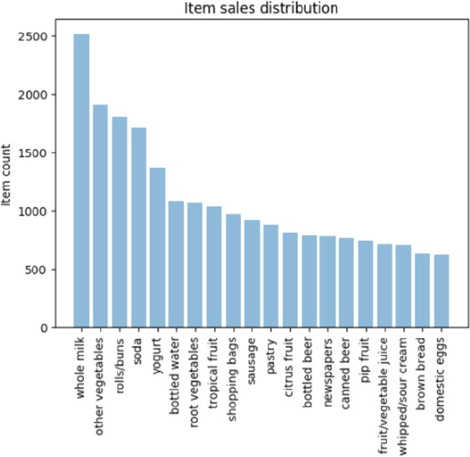
CHAPTER 8 ■ CUSTOMER SEGMENTATION AND EFFECTIVE CROSS SELLING
399
Let’s also find out how much percentage of total sales is explained by these 20 items alone. We will use
the cumulative sum function offered by pandas (cumsum) to find this out. We will create two columns in our
dataframe. One will tell how much percentage of total sales can be attributed to a particular item and the
other will keep a cumulative sum of this sales percentage.
item_summary_df['item_perc'] = item_summary_df['item_count']/total_item_count
item_summary_df['total_perc'] = item_summary_df.item_perc.cumsum()
item_summary_df.head(10)
item_name item_count item_perc total_perc
0 whole milk 2513 0.057947 0.057947
1 other vegetables 1903 0.043881 0.101829
2 rolls/buns 1809 0.041714 0.143542
3 soda 1715 0.039546 0.183089
4 yogurt 1372 0.031637 0.214725
In [12]: item_summary_df[item_summary_df.total_perc <= 0.5].shape
Out[12]: (19, 4)
Figure 8-12. Grocery dataset top 20 items based on sales

CHAPTER 8 ■ CUSTOMER SEGMENTATION AND EFFECTIVE CROSS SELLING
400
This shows us that the top five items are responsible for 21.4% of the entire sales and only the top 20
items are responsible for over 50% of the sales! This is important for us, as we don’t want to find association
rules for items which are bought very infrequently. With this information we can limit the items we want
to explore for creating our association rules. This also helps us in keeping our possible itemset number to a
manageable figure.
Mining Rules
We will be using the Orange and the Orange3-Associate frameworks, which can be installed using the
commands conda install orange3 and pip install orange3-associate. The orange3-associate
package contains the implementation of FP growth provided by the group who developed for the Orange
data mining package, The Bioinformatics Laboratory at the University of Ljubljana, Slovenia
(https://fri.uni-lj.si/en/laboratory/biolab).
■Note We encourage you to experiment with the Orange package, which is available at https://orange.
biolab.si/. It is a GUI-driven data mining framework written in Python and highly conducive for learning data
analysis in an interactive way.
Before we go on using the package for finding association rules, we will discuss about the way data
is represented in Orange library. The data representation is a little tricky but we will help you modify the
existing data into the format required by Orange. Primarily we will focus on how to convert our pandas
dataframes to the Orange Table data structure.
Orange Table Data Structure
The Table data structure is the primary way to represent any tabular data in Orange. Although it is similar
in some way to a numpy array or a pandas dataframe, it differs from them in the way it stores metadata
about the actual data. In our case we can easily convert our pandas dataframe to the Table data structure
by providing the metadata about our columns. We need to define the domain for each of our variables. The
domain means the possible set of values that each of our variables can use. This information will be stored
as metadata and will be used in later transformation of the data. As our columns are only having binary
values—i.e. either 0 or 1—we can easily create the domain by using this information. The following code
snippet helps us convert our dataframe to an Orange table.
from Orange.data import Domain, DiscreteVariable, ContinuousVariable
from orangecontrib.associate.fpgrowth import *
input_assoc_rules = grocery_df
domain_grocery = Domain([DiscreteVariable.make(name=item, values=['0', '1']) for item in
input_assoc_rules.columns])
data_gro_1 = Orange.data.Table.from_numpy(domain=domain_grocery,
X=input_assoc_rules.as_matrix(),Y= None)
Here we defined the domain of our data by specifying each variable as a DiscreteVariable having
values as (0, 1). Then using this domain, we created our Table structure for our data.
CHAPTER 8 ■ CUSTOMER SEGMENTATION AND EFFECTIVE CROSS SELLING
401
Using the FP Growth Algorithm
Now we have all the pieces required to perform our rule-mining. But before proceeding, we want to take care
of one more important aspect of the analysis. We saw in the earlier section how only a handful of items are
responsible for bulk of our sales so we want to prune our dataset to reflect this information. For this we have
created a function prune_dataset (check out the notebook), which will help us reduce the size of our dataset
based on our requirements. The function can be used for performing two types of pruning:
• Pruning based on percentage of total sales: The parameter total_sales_perc will
help us select the number of items that will explain the required percentage of sales.
The default value is 50% or 0.5.
• Pruning based on ranks of items: Another way to perform the pruning is to specify
the starting and the ending rank of the items for which we want to prune our dataset.
By default, we will only look for transactions which have at least two items, as transactions with only
one item are counter to the whole concept of association rule-mining. The following code snippet will help
us select only that subset of data which explain 40% of the total sales by leveraging our pruning function.
output_df, item_counts = prune_dataset(input_df=grocery_df, length_trans=2,total_sales_perc=0.4)
print(output_df.shape)
print(list(output_df.columns))
(4585, 13)
['whole milk', 'other vegetables', 'rolls/buns', 'soda', 'yogurt', 'bottled water', 'root
vegetables', 'tropical fruit', 'shopping bags', 'sausage', 'pastry', 'citrus fruit',
'bottled beer']
So we find out that we have only 13 items responsible for 40% of sales and 4585 transactions that have
those items along with other items and we can also see what those items are. The next step is to convert this
selected data into the required Table data structure.
input_assoc_rules = output_df
domain_grocery = Domain([DiscreteVariable.make(name=item,values=['0', '1']) for item in
input_assoc_rules.columns])
data_gro_1 = Orange.data.Table.from_numpy(domain=domain_grocery,
X=input_assoc_rules.as_matrix(), Y= None)
data_gro_1_en, mapping = OneHot.encode(data_gro_1, include_class=False)
The new addition to the previous code is the last line. This is required for coding our input so that the
entire domain is represented as binary variables. This will complete all the parsing and data manipulation
required for our rule-mining. Phew!
The final step is creating our rules. We need to specify two pieces of information for generating our
rules: support and confidence. We have already defined both of them conceptually earlier, so we will not be
defining them again. An important piece of information is to start with a higher support, as lower support
will mean a higher number of frequent itemsets and hence a longer execution time. We will specify a min-
support of 0.01—45 transactions at least—and see the number of frequent itemsets that we get before we
specify confidence and generate our rules.
min_support = 0.01
print("num of required transactions = ", int(input_assoc_rules.shape[0]*min_support))
num_trans = input_assoc_rules.shape[0]*min_support
itemsets = dict(frequent_itemsets(data_gro_1_en, min_support=min_support))
CHAPTER 8 ■ CUSTOMER SEGMENTATION AND EFFECTIVE CROSS SELLING
402
num of required transactions = 45
In [25]: len(itemsets)
Out[25]: 166886
So we get a whopping 166,886 itemsets for a support of only 1%! This will increase exponentially if
we decrease the support or if we increase the number of items in our dataset. The next step is specifying a
confidence value and generating our rules. We have written a code snippet that will take a confidence value
and generate the rules that fulfill our specified support and confidence criteria. The rules generated are then
decoded using the mapping and variable names. Orange3-Associate also provides a helper function that will
help us extract metrics about each of these rules. The following code snippet will perform rule generation and
decoding of rules, and then compile it all in a neat dataframe that we can use for further analysis.
confidence = 0.3
rules_df = pd.DataFrame()
if len(itemsets) < 1000000:
rules = [(P, Q, supp, conf)
for P, Q, supp, conf in association_rules(itemsets, confidence)
if len(Q) == 1 ]
names = {item: '{}={}'.format(var.name, val)
for item, var, val in OneHot.decode(mapping, data_gro_1, mapping)}
eligible_ante = [v for k,v in names.items() if v.endswith("1")]
N = input_assoc_rules.shape[0] * 0.5
rule_stats = list(rules_stats(rules, itemsets, N))
rule_list_df = []
for ex_rule_frm_rule_stat in rule_stats:
ante = ex_rule_frm_rule_stat[0]
cons = ex_rule_frm_rule_stat[1]
named_cons = names[next(iter(cons))]
if named_cons in eligible_ante:
rule_lhs = [names[i][:-2] for i in ante if names[i] in eligible_ante]
ante_rule = ', '.join(rule_lhs)
if ante_rule and len(rule_lhs)>1 :
rule_dict = {'support' : ex_rule_frm_rule_stat[2],
'confidence' : ex_rule_frm_rule_stat[3],
'coverage' : ex_rule_frm_rule_stat[4],
'strength' : ex_rule_frm_rule_stat[5],
'lift' : ex_rule_frm_rule_stat[6],
'leverage' : ex_rule_frm_rule_stat[7],
'antecedent': ante_rule,
'consequent':named_cons[:-2] }
rule_list_df.append(rule_dict)
rules_df = pd.DataFrame(rule_list_df)
print("Raw rules data frame of {} rules generated".format(rules_df.shape[0]))
if not rules_df.empty:
pruned_rules_df = rules_df.groupby(['antecedent','consequent']).max().reset_index()
else:
print("Unable to generate any rule")
Raw rules data frame of 16628 rules generated
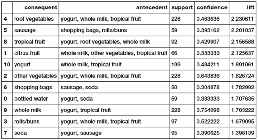
CHAPTER 8 ■ CUSTOMER SEGMENTATION AND EFFECTIVE CROSS SELLING
403
The output of this code snippet consists of the association rules dataframe that we can use for our
analysis. You can play around with the item number, consequent, antecedent, support, and confidence
values to generate different rules. Let’s take some sample rules generated using transactions that explain
40% of total sales, min-support of 1% (required number of transactions >=45) and confidence greater than
30%. Here, we have collected rules having maximum lift for each of the items that can be a consequent (that
appear on the right side) by using the following code.
(pruned_rules_df[['antecedent','consequent',
'support','confidence','lift']].groupby('consequent')
.max()
.reset_index()
.sort_values(['lift',
'support','confidence'],
ascending=False))
Let’s interpret the first rule, which states that:
yogurt wholemilktropicalfruit,,
®
{}
root vegtables
The pattern that the rule states in the equation is easy to understand—people who bought yogurt, whole
milk, and tropical fruit also tend to buy root vegetables. Let’s try to understand the metrics. Support of the
rule is 228, which means, all the items together appear in 228 transactions in the dataset. Confidence of the
rule is 46%, which means that 46% of the time the antecedent items occurred we also had the consequent
in the transaction (i.e. 46% of times, customers who bought the left side items also bought root vegetables).
Another important metric in Figure8-13 is Lift. Lift means that the probability of finding root vegetables
in the transactions which have yogurt, whole milk, and tropical fruit is greater than the normal probability
Figure 8-13. Association rules on the grocery dataset
CHAPTER 8 ■ CUSTOMER SEGMENTATION AND EFFECTIVE CROSS SELLING
404
of finding root vegetables in the previous transactions (2.23). Typically, a lift value of 1 indicates that the
probability of occurrence of the antecedent and consequent together are independent of each other. Hence,
the idea is to look for rules having a lift much greater than 1. In our case, all the previously mentioned rules
are good quality rules.
This is a significant piece of information, as this can prompt a retailer to bundle specific products like
these together or run a marketing scheme that offers discount on buying root vegetables along with these
other three products.
We encourage you to try similar analyses with your own datasets in the future and also with the online
retail transactions dataset that we used for our market segmentation case study. Considering the dataset
Online Retail from market segmentation, the workflow for that particular analysis will be very similar. The
only difference among these two datasets is the way in which they are represented. You can leverage the
following code snippets to analyze patterns from the United Kingdom in that dataset.
cs_mba = pd.read_excel(io=r'Online Retail.xlsx')
cs_mba_uk = cs_mba[cs_mba.Country == 'United Kingdom']
# remove returned items
cs_mba_uk = cs_mba_uk[~(cs_mba_uk.InvoiceNo.str.contains("C") == True)]
cs_mba_uk = cs_mba_uk[~cs_mba_uk.Quantity<0]
# create transactional database
items = list(cs_mba_uk.Description.unique())
grouped = cs_mba_uk.groupby('InvoiceNo')
transaction_level_df_uk = grouped.aggregate(lambda x: tuple(x)).reset_index()
[['InvoiceNo','Description']]
transaction_dict = {item:0 for item in items}
output_dict = dict()
temp = dict()
for rec in transaction_level_df_uk.to_dict('records'):
invoice_num = rec['InvoiceNo']
items_list = rec['Description']
transaction_dict = {item:0 for item in items}
transaction_dict.update({item:1 for item in items if item in items_list})
temp.update({invoice_num:transaction_dict})
new = [v for k,v in temp.items()]
tranasction_df = pd.DataFrame(new)
del(tranasction_df[tranasction_df.columns[0]])
Once you build the transactional dataset, you can choose your own configuration based on which you
want to extract and mine rules. For instance, the following code mines for patterns on the top 15 most sold
products with min-support of 0.01 (min transactions 49) and minimum confidence of 0.3
output_df_uk_n, item_counts_n = prune_dataset(input_df=tranasction_df, length_trans=2,
start_item=0, end_item=15)
input_assoc_rules = output_df_uk_n
domain_transac = Domain([DiscreteVariable.make(name=item,values=['0', '1']) for item in
input_assoc_rules.
columns])
data_tran_uk = Orange.data.Table.from_numpy(domain=domain_transac, X=input_assoc_rules.
as_matrix(),Y= None)
data_tran_uk_en, mapping = OneHot.encode(data_tran_uk, include_class=True)
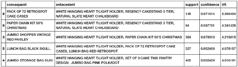
CHAPTER 8 ■ CUSTOMER SEGMENTATION AND EFFECTIVE CROSS SELLING
405
support = 0.01
num_trans = input_assoc_rules.shape[0]*support
itemsets = dict(frequent_itemsets(data_tran_uk_en, support))
confidence = 0.3
rules_df = pd.DataFrame()
... # rest of the code similar to what we did earlier
The rest of the analysis can be performed using the same workflow which we used for the groceries
dataset. Feel free to check out the Cross Selling.ipynb notebook in case you get stuck. Figure8-14 shows
some patterns from the previous analysis on our Online Retail dataset.
It is quite evident from the metrics in Figure8-14 that these are excellent quality rules. We can see that
items relevant to baking are purchased together and items like bags are purchased together. Try changing
the previously mentioned parameters and see if you can find more interesting patterns!
Summary
In this chapter, we read about some simple yet high-value case studies. The crux of the chapter was to realize
that the most important part about any analytics or Machine Learning-based solution is the value it can
deliver to the organization. Being an analytics or data science professional, we must always try to balance
the value aspect of our work with its technical complexity. We learned some important methods that have
the potential to directly contribute to the revenue generation of organizations and retail establishments.
We looked at ideas pertaining to customer segmentation, its impact, and explored a novel way of using
unsupervised learning to find out customer segments and view interesting patterns and behavior. Cross
selling introduced us to the world of pattern-mining and rule-based frameworks like association rule-
mining and principles like market basket analysis. We utilized a framework that was entirely different from
the ones that we have used until now and understood the value of data parsing and pre-processing besides
regular modeling and analysis. In subsequent chapters of this book, we increase the technical complexity
of our case studies, but we urge you to always have an eye out for defining the value and impact of these
solutions. Stay tuned!
Figure 8-14. Association rules on the online retail dataset for UK customers

407
© Dipanjan Sarkar, Raghav Bali and Tushar Sharma 2018
D. Sarkar et al., Practical Machine Learning with Python, https://doi.org/10.1007/978-1-4842-3207-1_9
CHAPTER 9
Analyzing Wine Types and Quality
In the last chapter, we looked at specific case studies leveraging unsupervised Machine Learning techniques
like clustering and rule-mining frameworks. In this chapter, we focus on some more case studies relevant to
supervised Machine Learning algorithms and predictive analytics. We have looked at classification based
problems in Chapter 7, where we built sentiment classifiers based on text reviews to predict the sentiment
of movie reviews. In this chapter, the problem at hand is to analyze, model, and predict the type and quality
of wine using physicochemical attributes. Wine is a pleasant tasting alcoholic beverage, loved by millions
across the globe. Indeed many of us love to celebrate our achievements or even unwind at the end of a tough
day with a glass of wine! The following quote from Francis Bacon should whet your appetite about wine and
its significance.
“Age appears best in four things: old wood to burn, old wine to drink, old friends to trust,
and old authors to read.”
—Francis Bacon
Regardless of whether you like and consume wine or not, it will definitely be interesting to analyze the
physicochemical attributes of wine and understand their relationships and significance with wine quality
and types. Since we will be trying to predict wine types and quality, the supervised Machine Learning
task involved here is classification. In this chapter, we look at various ways to analyze and visualize wine
data attributes and features. We focus on univariate as well as multivariate analyses. For predicting wine
types and quality, we will be building classifiers based on state-of-the-art supervised Machine Learning
techniques, including logistic regression, deep neural networks, decision trees, and ensemble models like
random forests and gradient boosting to name a few. Special emphasis is on analyzing, visualizing, and
modeling data such that you can emulate similar principles on your own classification based real-world
problems in the future. We would like to thank the UC Irvine ML repository for the dataset. Also a special
mention goes to DataCamp and Karlijn Willems, notable Data Science journalist, who has done some
excellent work in analyzing the wine quality dataset and has written an article on her findings at
https://www.datacamp.com/community/tutorials/deep-learning-python, which you can check out for
more details. We have taken a couple of analyses and explanations from this article as an inspiration for our
chapter and Karlijn has been more than helpful in sharing the same with us.
Problem Statement
“Given a dataset, or in this case two datasets that deal with physicochemical properties of wine, can you
guess the wine type and quality?” This is the main objective of this chapter. Of course this doesn’t mean
the entire focus will be only on leveraging Machine Learning to build predictive models. We will process,
analyze, visualize, and model our dataset based on standard Machine Learning and data mining workflow
models like the CRISP-DM model.
Chapter 9 ■ analyzing Wine types and Quality
408
The datasets used in this chapter are available in the very popular UCI Machine Learning Repository
under the name of Wine Quality Data Set. You can access more details at https://archive.ics.uci.edu/
ml/datasets/wine+quality, which gives you access to the raw datasets as well as details about the various
features in the datasets. There are two datasets, one for red wines and the other for white wines. To be more
specific, the wine datasets are related to red and white vinho verde wine samples, from the north of Portugal.
Another file in the same web page talks about the details for the datasets including attribute information.
Credits for the datasets go out to P. Cortez, A. Cerdeira, F. Almeida, T. Matos, and J. Reis and you can get more
details in their paper, “Modeling wine preferences by data mining from physicochemical properties”
in Decision Support Systems, Elsevier, 47(4): 547-553, 2009.
To summarize our main objectives, we will be trying to solve the following major problems by
leveraging Machine Learning and data analysis on our wine quality dataset.
• Predict if each wine sample is a red or white wine.
• Predict the quality of each wine sample, which can be low, medium, or high.
Let’s get started by setting up the necessary dependencies before moving on to accessing and analyzing
our data!
Setting Up Dependencies
We will be using several Python libraries and frameworks specific to Machine Learning and Deep Learning.
Just like in our previous chapters, you need to make sure you have pandas, numpy, scipy, and scikit-learn
installed, which will be used for data processing and Machine Learning. We will also use matplotlib and
seaborn extensively for exploratory data analysis and visualizations. Deep Learning frameworks used in
this chapter include keras with the tensorflow backend, but you can also use theano as the backend if you
choose to do so. We also use the xgboost library for the gradient boosting ensemble model. Utilities related
to supervised model fitting, prediction, and evaluation are present in model_evaluation_utils.py, so make
sure you have these modules in the same directory and the other Python files and jupyter notebooks for this
chapter, which you can obtain from the relevant directory for this chapter on GitHub at https://github.
com/dipanjanS/practical-machine-learning-with-python.
Getting the Data
The datasets will be available along with the code files for this chapter in the GitHub repository for this book
at https://github.com/dipanjanS/practical-machine-learning-with-python under the respective
folder for Chapter 9. The following files refer to the datasets of interest.
• The file named winequality-red.csv contains the dataset pertaining to 1599
records of red wine samples
• The file named winequality-white.csv contains the dataset pertaining to 4898
records of white wine samples
• The file named winequality.names consists of detailed information and the data
dictionary pertaining to the datasets
You can also download the same data from https://archive.ics.uci.edu/ml/datasets/
wine+quality if needed. Once you have the CSV file, you can easily load it in Python using the read_
csv(...) utility function from pandas.
Chapter 9 ■ analyzing Wine types and Quality
409
Exploratory Data Analysis
Standard Machine Learning and analytics workflow recommend processing, cleaning, analyzing, and
visualizing your data before moving on toward modeling your data. We will also follow the same workflow
we used in all our other chapters. You can refer to the Python file titled exploratory_data_analysis.py for
all the code used in this section or use the jupyter notebook titled Exploratory Data Analysis.ipynb for a
more interactive experience.
Process and Merge Datasets
Let’s load the following necessary dependencies and configuration settings.
import pandas as pd
import matplotlib.pyplot as plt
import matplotlib as mpl
import numpy as np
import seaborn as sns
%matplotlib inline
We will now process the datasets (red and white wine) and add some additional variables that we would
want to predict in future sections. The first variable we will add is wine_type, which would be either red or
white wine based on the dataset and the wine sample. The second variable we will add is quality_label,
which is a qualitative measure of the quality of the wine sample based on the quality variable score. The
rules used for mapping quality to quality_label are described as follows.
• Wine quality scores of 3, 4, and 5 are mapped to low quality wines under the
quality_label attribute.
• Wine quality scores of 6 and 7 are mapped to medium quality wines under the
quality_label attribute.
• Wine quality scores of 8 and 9 are mapped to high quality wines under the
quality_label attribute.
After adding these attributes, we also merge the two datasets for red and white wine together to create
a single dataset and we use pandas to merge and shuffle the records of the data frame. The following snippet
helps us in achieving this.
In [3]: white_wine = pd.read_csv('winequality-white.csv', sep=';')
...: red_wine = pd.read_csv('winequality-red.csv', sep=';')
...:
...: # store wine type as an attribute
...: red_wine['wine_type'] = 'red'
...: white_wine['wine_type'] = 'white'
...: # bucket wine quality scores into qualitative quality labels
...: red_wine['quality_label'] = red_wine['quality'].apply(lambda value: 'low'
...: if value <= 5 else 'medium'
...: if value <= 7 else 'high')
...: red_wine['quality_label'] = pd.Categorical(red_wine['quality_label'],
...: categories=['low', 'medium', 'high'])
...: white_wine['quality_label'] = white_wine['quality'].apply(lambda value: 'low'
Chapter 9 ■ analyzing Wine types and Quality
410
...: if value <= 5 else 'medium'
...: if value <= 7 else 'high')
...: white_wine['quality_label'] = pd.Categorical(white_wine['quality_label'],
...: categories=['low', 'medium', 'high'])
...:
...: # merge red and white wine datasets
...: wines = pd.concat([red_wine, white_wine])
...: # re-shuffle records just to randomize data points
...: wines = wines.sample(frac=1, random_state=42).reset_index(drop=True)
Our objective in future sections would be to predict wine_type and quality_label based on other
features in the wines dataset. Let’s now try to understand more about our dataset and its features.
Understanding Dataset Features
The wines dataframe we obtained in the previous section is our final dataset we will be using for our analysis
and modeling. We will also be using the red_wine and white_wine dataframes where necessary for basic
exploratory analysis and visualizations. Let’s start by looking at the total number of data samples we are
dealing with and also the different features in our dataset.
In [3]: print(white_wine.shape, red_wine.shape)
...: print(wines.info())
(4898, 14) (1599, 14)
<class 'pandas.core.frame.DataFrame'>
RangeIndex: 6497 entries, 0 to 6496
Data columns (total 14 columns):
fixed acidity 6497 non-null float64
volatile acidity 6497 non-null float64
citric acid 6497 non-null float64
residual sugar 6497 non-null float64
chlorides 6497 non-null float64
free sulfur dioxide 6497 non-null float64
total sulfur dioxide 6497 non-null float64
density 6497 non-null float64
pH 6497 non-null float64
sulphates 6497 non-null float64
alcohol 6497 non-null float64
quality 6497 non-null int64
wine_type 6497 non-null object
quality_label 6497 non-null category
dtypes: category(1), float64(11), int64(1), object(1)
memory usage: 666.4+ KB
This information tells us that we have 4898 white wine data points and 1599 red wine data points. The
merged dataset contains a total of 6497 data points and we also get an idea of numeric and categorical
attributes. Let’s take a peek at our dataset to see some sample data points.
In [4]: wines.head()

Chapter 9 ■ analyzing Wine types and Quality
411
The output depicted in Figure9-1 shows us sample wine records for our wine quality dataset. Looking
at the values, we can get an idea of numeric as well as categorical features. Let’s now try to gain some
domain knowledge about wine and its attributes. Domain knowledge is essential and always recommended,
especially if you are trying to analyze and model data from diverse domains.
Wine is an alcoholic beverage made by the process of fermentation of grapes, without the addition of
sugars, acids, enzymes, water, or other nutrients. Red and white wine are two variants. Usually, red wine is
made from dark red and black grapes. The color ranges from various shades of red, brown, and violet. This
is produced with whole grapes, including the skin, which adds to the color and flavor of red wines giving it a
rich flavor. White wine is made from white grapes with no skins or seeds. The color is usually straw-yellow,
yellow-green, or yellow-gold. Most white wines have a light and fruity flavor as compared to richer red wines.
Let’s now dive into details for each feature in the dataset. Credits once again go to Karlijn for some of the
attribute descriptions. Our dataset has a total of 14 attributes and they are described as follows.
• fixed acidity: Acids are one of the fundamental properties of wine and contribute
greatly to the taste of the wine. Reducing acids significantly might lead to wines
tasting flat. Fixed acids include tartaric, malic, citric, and succinic acids, which are
found in grapes (except succinic). This variable is usually expressed in
gtartaricacid
dm
()
3 in the dataset.
• volatile acidity: These acids are to be distilled out from the wine before
completing the production process. It is primarily constituted of acetic acid, though
other acids like lactic, formic, and butyric acids might also be present. Excess of
volatile acids are undesirable and lead to unpleasant flavor. In the United States, the
legal limits of volatile acidity are 1.2 g/L for red table wine and 1.1 g/L for white table
wine. The volatile acidity is expressed in gaceticacid
dm
()
3 in the dataset.
• citric acid: This is one of the fixed acids that gives a wine its freshness. Usually
most of it is consumed during the fermentation process and sometimes it is added
separately to give the wine more freshness. It’s usually expressed in g
dm3 in the
dataset.
• residual sugar: This typically refers to the natural sugar from grapes that remains
after the fermentation process stops, or is stopped. It’s usually expressed in g
dm3
in the dataset.
Figure 9-1. Sample data points from the wine quality dataset

Chapter 9 ■ analyzing Wine types and Quality
412
• chlorides: This is usually a major contributor to saltiness in wine. It’s usually
expressed in gsodiumchloride
dm
()
3 in the dataset.
• free sulfur dioxide: This is the part of the sulfur dioxide that, when added to a
wine, is said to be free after the remaining part binds. Winemakers will always try to
get the highest proportion of free sulfur to bind. They are also known as sulfites and
too much is undesirable and gives a pungent odor. This variable is expressed in
mg
dm3 in the dataset.
• total sulfur dioxide: This is the sum total of the bound and the free sulfur
dioxide (SO2). Here, it’s expressed in mg
dm3. This is mainly added to kill harmful
bacteria and preserve quality and freshness. There are usually legal limits for
sulfur levels in wines and excess of it can even kill good yeast and produce an
undesirable odor.
• density: This can be represented as a comparison of the weight of a specific volume
of wine to an equivalent volume of water. It is generally used as a measure of the
conversion of sugar to alcohol. Here, it’s expressed in g
cm3.
• pH: Also known as the potential of hydrogen, this is a numeric scale to specify the
acidity or basicity the wine. Fixed acidity contributes the most toward the pH of
wines. You might know, solutions with a pH less than 7 are acidic, while solutions
with a pH greater than 7 are basic. With a pH of 7, pure water is neutral. Most wines
have a pH between 2.9 and 3.9 and are therefore acidic.
• sulphates: These are mineral salts containing sulfur. Sulphates are to wine as gluten
is to food. They are a regular part of the winemaking around the world and are
considered essential. They are connected to the fermentation process and affect the
wine aroma and flavor. Here, they are expressed in gpotassiumsulphate
dm
()
3 in the
dataset.
• alcohol: Wine is an alcoholic beverage. Alcohol is formed as a result of yeast
converting sugar during the fermentation process. The percentage of alcohol can
vary from wine to wine. Hence it is not a surprise for this attribute to be a part of this
dataset. It’s usually measured in % vol or alcohol by volume (ABV).
• quality: Wine experts graded the wine quality between 0 (very bad) and 10 (very
excellent). The eventual quality score is the median of at least three evaluations made
by the same wine experts.
• wine_type: Since we originally had two datasets for red and white wine, we
introduced this attribute in the final merged dataset, which indicates the type of
wine for each data point. A wine can be a red or a white wine. One of the predictive
models we will build in this chapter would be such that we can predict the type of
wine by looking at other wine attributes.
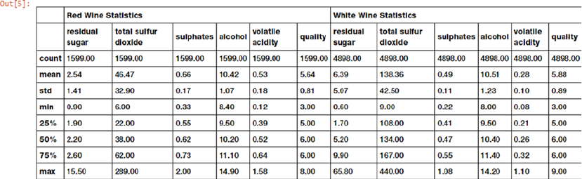
Chapter 9 ■ analyzing Wine types and Quality
413
• quality_label: This is a derived attribute from the quality attribute. We bucket
or group wine quality scores into three qualitative buckets, namely low, medium,
and high. Wines with a quality score of 3, 4, and 5 are low quality; scores of 6 and 7
are medium quality; and scores of 8 and 9 are high quality wines. We will also build
another model in this chapter to predict this wine quality label based on other wine
attributes.
Now that you have a solid foundation on the dataset as well as its features, let’s analyze and visualize
various features and their interactions.
Descriptive Statistics
We will start by computing some descriptive statistics of our various features of interest in our dataset. This
involves computing aggregation metrics like mean, median, standard deviation, and so on. If you remember
one of our primary objectives is to build a model that can correctly predict if a wine is a red or white wine based
on its attributes. Let’s build a descriptive summary table on various wine attributes separated by wine type.
In [5]: subset_attributes = ['residual sugar', 'total sulfur dioxide', 'sulphates',
'alcohol', 'volatile acidity', 'quality']
...: rs = round(red_wine[subset_attributes].describe(),2)
...: ws = round(white_wine[subset_attributes].describe(),2)
...: pd.concat([rs, ws], axis=1, keys=['Red Wine Statistics', 'White Wine Statistics'])
The summary table depicted in Figure9-2 shows us descriptive statistics for various wine attributes. Do
you notice any interesting properties? For starters, mean residual sugar and total sulfur dioxide content in
white wine seems to be much higher than red wine. Also, the mean value of sulphates and volatile acidity
seem to be higher in red wine as compared to white wine. Try including other features too and see if you
can find more interesting comparisons! Considering wine quality levels as data subsets, let’s build some
descriptive summary statistics with the following snippet.
In [6]: subset_attributes = ['alcohol', 'volatile acidity', 'pH', 'quality']
...: ls = round(wines[wines['quality_label'] == 'low'][subset_attributes].describe(),2)
...: ms = round(wines[wines['quality_label'] == 'medium'][subset_attributes].describe(),2)
...: hs = round(wines[wines['quality_label'] == 'high'][subset_attributes].describe(),2)
...: pd.concat([ls, ms, hs], axis=1, keys=['Low Quality Wine', 'Medium Quality Wine',
'High Quality Wine'])
Figure 9-2. Descriptive statistics for wine attributes separated by wine type
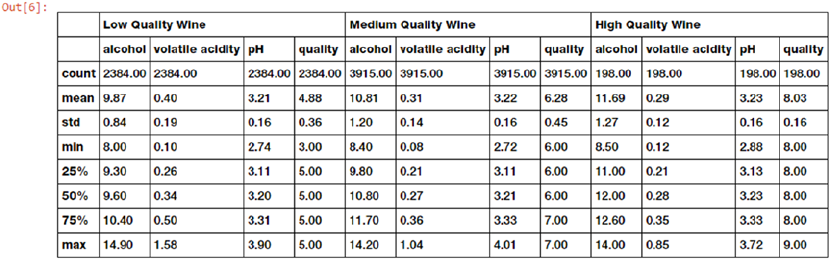
Chapter 9 ■ analyzing Wine types and Quality
414
The summary table depicted in Figure9-3 shows us descriptive statistics for various wine attributes
subset by wine quality ratings. Interestingly, mean alcohol levels seem to increase based on the rating of the
wine quality. We also see that pH levels are almost consistent across the wine samples of varying quality. Is
there any way to statistically prove this? We will see that in the following section.
Inferential Statistics
The general notion of inferential statistics is to draw inferences and propositions of a population using a
data sample. The idea is to use statistical methods and models to draw statistical inferences from a given
hypotheses. Each hypothesis consists of a null hypothesis and an alternative hypothesis. Based on statistical
test results, if the result is statistically significant based on pre-set significance levels (e.g., if obtained
p-value is less than 5% significance level), we reject the null hypothesis in favor of the alternative hypothesis.
Otherwise, if the results is not statistically significant, we conclude that our null hypothesis was correct.
Coming back to our problem from the previous section, given multiple data groups or subsets of wine
samples based on wine quality rating, is there any way to prove that mean alcohol levels or pH levels vary
significantly among the data groups?
A great statistical model to prove or disprove the difference in mean among subsets of data is to use
the one-way ANOVA test. ANOVA stands for “analysis of variance,” which is a nifty statistical model and can
be used to analyze statistically significant differences among means or averages of various groups. This is
basically achieved using a statistical test that helps us determine whether or not the means of several groups
are equal. Usually the null hypothesis is represented as
H0: μ1 = μ2 = μ3 = ... = μn
Where n is the number of data groups or subsets and it indicates that the group means for the various
groups are not very different from each other based on statistical significance levels. The alternative
hypotheses, HA, tells us that there exists at least two group means that are statistically significantly different
from each other. Usually the F-statistic and the associated p-value from it is used to determine the statistical
significance. Typically a p-value less than 0.05 is taken to be a statistically significant result where we reject
the null hypothesis in favor of the original. We recommend reading up a standard book on inferential
statistics to gain more in-depth knowledge regarding these concepts.
Figure 9-3. Descriptive statistics for wine attributes separated by wine quality
Chapter 9 ■ analyzing Wine types and Quality
415
For our scenario, three data subsets or groups from the data are created based on wine quality ratings. The
mean values in the first test would be based on the wine alcohol content and the second test would be based
on the wine pH levels. Also let’s assume the null hypothesis is that the group means for low, medium, and high
quality wine is same and the alternate hypothesis would be that there is a difference (statistically significant)
between at least two group means. The following snippet helps us perform the one-way ANOVA test.
In [7]: from scipy import stats
...:
...: F, p = stats.f_oneway(wines[wines['quality_label'] == 'low']['alcohol'],
...: wines[wines['quality_label'] == 'medium']['alcohol'],
...: wines[wines['quality_label'] == 'high']['alcohol'])
...: print('ANOVA test for mean alcohol levels across wine samples with different quality
ratings')
...: print('F Statistic:', F, '\tp-value:', p)
...:
...: F, p = stats.f_oneway(wines[wines['quality_label'] == 'low']['pH'],
...: wines[wines['quality_label'] == 'medium']['pH'],
...: wines[wines['quality_label'] == 'high']['pH'])
...: print('\nANOVA test for mean pH levels across wine samples with different quality
ratings')
...: print('F Statistic:', F, '\tp-value:', p)
ANOVA test for mean alcohol levels across wine samples with different quality ratings
F Statistic: 673.074534723 p-value: 2.27153374506e-266
ANOVA test for mean pH levels across wine samples with different quality ratings
F Statistic: 1.23638608035 p-value: 0.290500277977
From the preceding results we can clearly see we have a p-value much less than 0.05 in the first test and
greater than 0.05 in the second test. This tells us that there is a statistically significant difference in alcohol
level means for at least two groups out of the three (rejecting the null hypothesis in favor of the alternative).
However, in case of pH level means, we do not reject the null hypothesis and thus we conclude that the pH
level means across the three groups are not statistically significantly different. We can even visualize these
two features and observe the means using the following snippet.
f, (ax1, ax2) = plt.subplots(1, 2, figsize=(10, 4))
f.suptitle('Wine Quality - Alcohol Content/pH', fontsize=14)
f.subplots_adjust(top=0.85, wspace=0.3)
sns.boxplot(x="quality_label", y="alcohol",
data=wines, ax=ax1)
ax1.set_xlabel("Wine Quality Class",size = 12,alpha=0.8)
ax1.set_ylabel("Wine Alcohol %",size = 12,alpha=0.8)
sns.boxplot(x="quality_label", y="pH", data=wines, ax=ax2)
ax2.set_xlabel("Wine Quality Class",size = 12,alpha=0.8)
ax2.set_ylabel("Wine pH",size = 12,alpha=0.8)
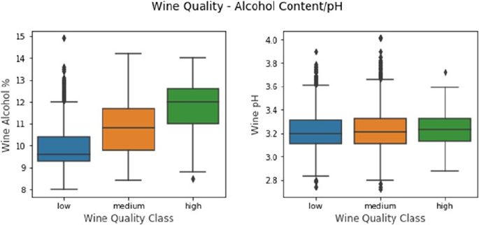
Chapter 9 ■ analyzing Wine types and Quality
416
The boxplots depicted in Figure9-4 show us stark differences in wine alcohol content distributions
based on wine quality as compared to pH levels, which look to be between 3.1 - 3.3 and in fact if you look at
the mean and median values for pH levels across the three groups, it is approximately 3.2 across the three
groups as compared to alcohol %, which varies significantly. Can you find our more interesting patterns and
hypothesis with other features from this data? Give it a try!
Univariate Analysis
This is perhaps one of the easiest yet a core foundational step in exploratory data analysis. Univariate
analysis involves analyzing data such that at any instance of analysis we are only dealing with one variable or
feature. No relationships or correlations are analyzed among multiple variables. The simplest way to easily
visualize all the variables in your data is to build some histograms. The following snippet helps visualize
distributions of data values for all features. While histogram may not be an appropriate visualization in many
cases, it is a good one to start with for numeric data.
red_wine.hist(bins=15, color='red', edgecolor='black', linewidth=1.0,
xlabelsize=8, ylabelsize=8, grid=False)
plt.tight_layout(rect=(0, 0, 1.2, 1.2))
rt = plt.suptitle('Red Wine Univariate Plots', x=0.65, y=1.25, fontsize=14)
white_wine.hist(bins=15, color='white', edgecolor='black', linewidth=1.0,
xlabelsize=8, ylabelsize=8, grid=False)
plt.tight_layout(rect=(0, 0, 1.2, 1.2))
wt = plt.suptitle('White Wine Univariate Plots', x=0.65, y=1.25, fontsize=14)
Figure 9-4. Visualizing wine alcohol content and pH level distributions based on quality ratings
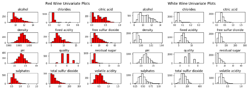
Chapter 9 ■ analyzing Wine types and Quality
417
The power of packages like matplotlib and pandas enable you to easily plot variable distributions as
depicted in Figure9-5 using minimal code. Do you notice any interesting patterns across the two wine types?
Let’s take the feature named residual sugar and plot the distributions across data pertaining to red and
white wine samples.
fig = plt.figure(figsize = (10,4))
title = fig.suptitle("Residual Sugar Content in Wine", fontsize=14)
fig.subplots_adjust(top=0.85, wspace=0.3)
ax1 = fig.add_subplot(1,2, 1)
ax1.set_title("Red Wine")
ax1.set_xlabel("Residual Sugar")
ax1.set_ylabel("Frequency")
ax1.set_ylim([0, 2500])
ax1.text(8, 1000, r'$\mu$='+str(round(red_wine['residual sugar'].mean(),2)),
fontsize=12)
r_freq, r_bins, r_patches = ax1.hist(red_wine['residual sugar'], color='red', bins=15,
edgecolor='black', linewidth=1)
ax2 = fig.add_subplot(1,2, 2)
ax2.set_title("White Wine")
ax2.set_xlabel("Residual Sugar")
ax2.set_ylabel("Frequency")
ax2.set_ylim([0, 2500])
ax2.text(30, 1000, r'$\mu$='+str(round(white_wine['residual sugar'].mean(),2)),
fontsize=12)
w_freq, w_bins, w_patches = ax2.hist(white_wine['residual sugar'], color='white', bins=15,
edgecolor='black', linewidth=1)
Figure 9-5. Univariate plots depicting feature distributions for the wine quality dataset
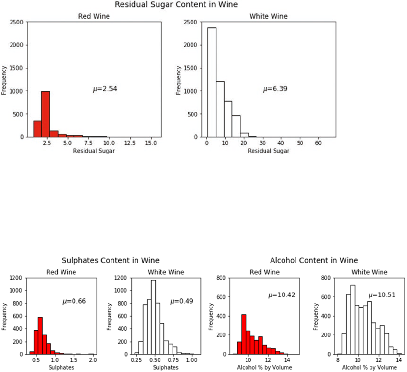
Chapter 9 ■ analyzing Wine types and Quality
418
We can notice easily from the visualization in Figure9-6 that residual sugar content in white wine
samples seems to be more as compared to red wine samples. You can reuse the plotting template in the
preceding code snippet and visualize more features. Some plots are depicted as follows (detailed code is
present in the jupyter notebook).
Figure 9-7. Distributions for sulphate content and alcohol content for red and white wine samples
Figure 9-6. Residual sugar distribution for red and white wine samples
The plots depicted in Figure9-7 show us that the sulphate content is slightly more in red wine samples
as compared to white wine samples and alcohol content is almost similar in both types on an average. Of
course, frequency counts are higher in all cases for white wine because we have more white wine sample
records as compared to red wine. Next, we plot the distributions of the quality and quality_label
categorical features to get an idea of the class distributions, which we will be predicting later on.
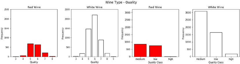
Chapter 9 ■ analyzing Wine types and Quality
419
The bar plots depicted in Figure9-8 show us the distribution of wine samples based on type and
quality. It is quite evident that high quality wine samples are far less as compared to low and medium
quality wine samples.
Multivariate Analysis
Analyzing multiple feature variables and their relationships is what multivariate analysis is all about. We
would want to see if there are any interesting patterns and relationships among the physicochemical
attributes of our wine samples, which might be helpful in our modeling process in the future. One of the best
ways to analyze features is to build a pairwise correlation plot depicting the correlation coefficient between
each pair of features in the dataset. The following snippet helps us build a correlation matrix and plot the
same in the form of an easy-to-interpret heatmap.
f, ax = plt.subplots(figsize=(10, 5))
corr = wines.corr()
hm = sns.heatmap(round(corr,2), annot=True, ax=ax, cmap="coolwarm",fmt='.2f',
linewidths=.05)
f.subplots_adjust(top=0.93)
t= f.suptitle('Wine Attributes Correlation Heatmap', fontsize=12)
Figure 9-8. Distributions for wine quality for red and white wine samples
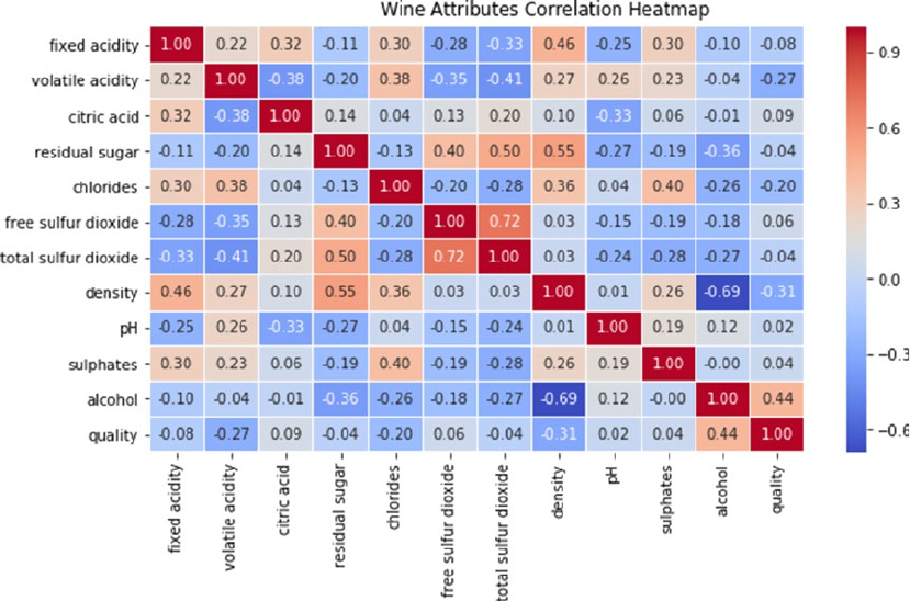
Chapter 9 ■ analyzing Wine types and Quality
420
While most of the correlations are weak, as observed in Figure9-9, we can see a strong negative
correlation between density and alcohol and a strong positive correlation between total and free sulfur
dioxide, which is expected. You can also visualize patterns and relationships among multiple variables
using pairwise plots and use different hues for the wine types essentially plotting three variables at a time.
The following snippet depicts a sample pairwise plot for some features in our dataset.
cols = ['wine_type', 'quality', 'sulphates', 'volatile acidity']
pp = sns.pairplot(wines[cols], hue='wine_type', size=1.8, aspect=1.8,
palette={"red": "#FF9999", "white": "#FFE888"},
plot_kws=dict(edgecolor="black", linewidth=0.5))
fig = pp.fig
fig.subplots_adjust(top=0.93, wspace=0.3)
t = fig.suptitle('Wine Attributes Pairwise Plots', fontsize=14)
Figure 9-9. Correlation heatmap for features in the wine quality dataset
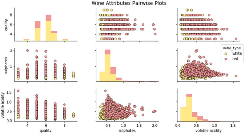
Chapter 9 ■ analyzing Wine types and Quality
421
From the plots in Figure9-10, we can notice several interesting patterns, which are in alignment with
some insights we obtained earlier. These observations include the following:
• Presence of higher sulphate levels in red wines as compared to white wines
• Lower sulphate levels in wines with high quality ratings
• Lower levels of volatile acids in wines with high quality ratings
• Presence of higher volatile acid levels in red wines as compared to white wines
You can use similar plots on other variables and features to discover more patterns and relationships.
To observe relationships among features with a more microscopic view, joint plots are excellent visualization
tools specifically for multivariate visualizations. The following snippet depicts the relationship between wine
types, sulphates, and quality ratings.
rj = sns.jointplot(x='quality', y='sulphates', data=red_wine,
kind='reg', ylim=(0, 2),
color='red', space=0, size=4.5, ratio=4)
rj.ax_joint.set_xticks(list(range(3,9)))
fig = rj.fig
fig.subplots_adjust(top=0.9)
t = fig.suptitle('Red Wine Sulphates - Quality', fontsize=12)
wj = sns.jointplot(x='quality', y='sulphates', data=white_wine,
kind='reg', ylim=(0, 2),
color='#FFE160', space=0, size=4.5, ratio=4)
wj.ax_joint.set_xticks(list(range(3,10)))
fig = wj.fig
fig.subplots_adjust(top=0.9)
t = fig.suptitle('White Wine Sulphates - Quality', fontsize=12)
Figure 9-10. Pairwise plots by wine type for features in the wine quality dataset
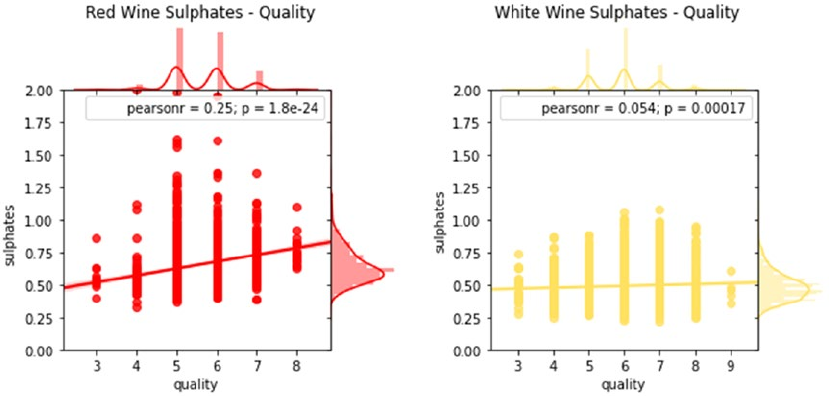
Chapter 9 ■ analyzing Wine types and Quality
422
While there seems to be some pattern depicting lower sulphate levels for higher quality rated wine
samples, the correlation is quite weak (see Figure9-11). However, we do see clearly that sulphate levels
for red wine are much higher as compared to the ones in white wine. In this case we have visualized three
features (type, quality, and sulphates) with the help of two plots. What if we wanted to visualize a higher
number of features and determine patterns from them? The seaborn framework provides facet grids that
help us visualize higher number of variables in two-dimensional plots. Let’s try to visualize relationships
between wine type, quality ratings, volatile acidity, and alcohol volume levels.
g = sns.FacetGrid(wines, col="wine_type", hue='quality_label',
col_order=['red', 'white'], hue_order=['low', 'medium', 'high'],
aspect=1.2, size=3.5, palette=sns.light_palette('navy', 3))
g.map(plt.scatter, "volatile acidity", "alcohol", alpha=0.9,
edgecolor='white', linewidth=0.5)
fig = g.fig
fig.subplots_adjust(top=0.8, wspace=0.3)
fig.suptitle('Wine Type - Alcohol - Quality - Acidity', fontsize=14)
l = g.add_legend(title='Wine Quality Class')
Figure 9-11. Visualizing relationships between wine types’ sulphates and quality with joint plots
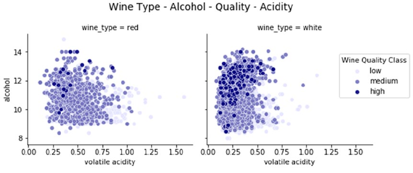
Chapter 9 ■ analyzing Wine types and Quality
423
The plot in Figure9-12 shows us some interesting patterns. Not only are we able to successfully visualize
four variables, but also we can see meaningful relationships among them. Higher quality wine samples
(depicted by darker shades) have lower levels of volatile acidity and higher levels of alcohol content as
compared to wine samples with medium and low ratings. Besides this, we can also see that volatile acidity
levels are slightly lower in white wine samples as compared to red wine samples.
Let’s now build a similar visualization. However, in this scenario, we want to analyze patterns in wine
types, quality, sulfur dioxide, and acidity levels. We can use the same framework as our last code
snippet to achieve this.
g = sns.FacetGrid(wines, col="wine_type", hue='quality_label',
col_order=['red', 'white'], hue_order=['low', 'medium', 'high'],
aspect=1.2, size=3.5, palette=sns.light_palette('green', 3))
g.map(plt.scatter, "volatile acidity", "total sulfur dioxide", alpha=0.9,
edgecolor='white', linewidth=0.5)
fig = g.fig
fig.subplots_adjust(top=0.8, wspace=0.3)
fig.suptitle('Wine Type - Sulfur Dioxide - Acidity - Quality', fontsize=14)
l = g.add_legend(title='Wine Quality Class')
Figure 9-12. Visualizing relationships between wine types: alcohol, quality, and acidity levels
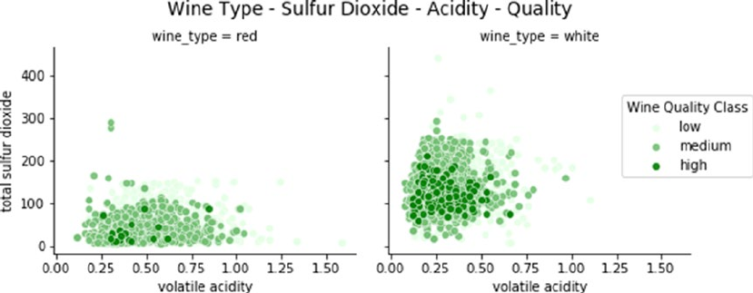
Chapter 9 ■ analyzing Wine types and Quality
424
We can easily interpret from Figure9-13 that volatile acidity as well as total sulfur dioxide is
considerably lower in high quality wine samples. Also, total sulfur dioxide is considerable more in white
wine samples as compared to red wine samples. However, volatile acidity levels are slightly lower in white
wine samples as compared to red wine samples we also observed in the previous plot.
A nice way to visualize numerical features segmented by groups (categorical variables) is to use box
plots. In our dataset, we have already discussed the relationship of higher alcohol levels with higher quality
ratings for wine samples in the “Inferential Statistics” section. Let’s try to visualize the relationship between
wine alcohol levels grouped by wine quality ratings. We will generate two plots for wine alcohol content
versus both wine quality and quality_label.
f, (ax1, ax2) = plt.subplots(1, 2, figsize=(14, 4))
f.suptitle('Wine Type - Quality - Alcohol Content', fontsize=14)
sns.boxplot(x="quality", y="alcohol", hue="wine_type",
data=wines, palette={"red": "#FF9999", "white": "white"}, ax=ax1)
ax1.set_xlabel("Wine Quality",size = 12,alpha=0.8)
ax1.set_ylabel("Wine Alcohol %",size = 12,alpha=0.8)
sns.boxplot(x="quality_label", y="alcohol", hue="wine_type",
data=wines, palette={"red": "#FF9999", "white": "white"}, ax=ax2)
ax2.set_xlabel("Wine Quality Class",size = 12,alpha=0.8)
ax2.set_ylabel("Wine Alcohol %",size = 12,alpha=0.8)
l = plt.legend(loc='best', title='Wine Type')
Figure 9-13. Visualizing relationships between wine types: quality, sulfur dioxide, and acidity levels
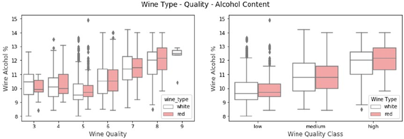
Chapter 9 ■ analyzing Wine types and Quality
425
Based on our earlier analysis for wine quality versus alcohol volume in the “Inferential Statistics”
section, these results look consistent. Each box plot in Figure9-14 depicts the distribution of alcohol level
for a particular wine quality rating separated by wine types. The box itself depicts the inter-quartile range
and the line inside depicts the median value of alcohol. Whiskers indicate the minimum and maximum
value with outliers often depicted by individual points. We can clearly observe the wine alcohol by volume
distribution has an increasing trend based on higher quality rated wine samples. Similarly we can also using
violin plots to visualize distributions of numeric features over categorical features. Let’s build a visualization
for analyzing the fixed acidity of wine sample by quality ratings.
f, (ax1, ax2) = plt.subplots(1, 2, figsize=(14, 4))
f.suptitle('Wine Type - Quality - Acidity', fontsize=14)
sns.violinplot(x="quality", y="volatile acidity", hue="wine_type",
data=wines, split=True, inner="quart", linewidth=1.3,
palette={"red": "#FF9999", "white": "white"}, ax=ax1)
ax1.set_xlabel("Wine Quality",size = 12,alpha=0.8)
ax1.set_ylabel("Wine Fixed Acidity",size = 12,alpha=0.8)
sns.violinplot(x="quality_label", y="volatile acidity", hue="wine_type",
data=wines, split=True, inner="quart", linewidth=1.3,
palette={"red": "#FF9999", "white": "white"}, ax=ax2)
ax2.set_xlabel("Wine Quality Class",size = 12,alpha=0.8)
ax2.set_ylabel("Wine Fixed Acidity",size = 12,alpha=0.8)
l = plt.legend(loc='upper right', title='Wine Type')
Figure 9-14. Visualizing relationships between wine types: quality and alcohol content
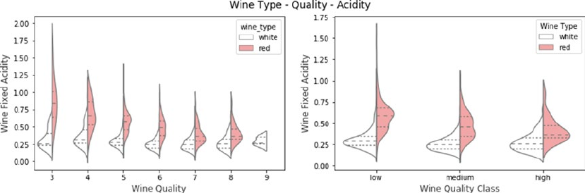
Chapter 9 ■ analyzing Wine types and Quality
426
In Figure9-15, Each violin plot typically depicts the inter-quartile range with the median which is shown
with dotted lines in this figure. You can also visualize the distribution of data with the density plots where
width depicts frequency. Thus in addition to the information you get from box plots, you can also visualize the
distribution of data with violin plots. In fact we have built a split-violin plot in this case depicting both types of
wine. It is quite evident that red wine samples have higher acidity as compared to its white wine counterparts.
Also we can see an overall decrease in acidity with higher quality wine for red wine samples but not so much
for white wine samples. These code snippets and examples should give you some good frameworks and
blueprints to perform effective exploratory data analysis on your datasets in the future.
Predictive Modeling
We will now focus on our main objectives of building predictive models to predict the wine types and quality
ratings based on other features. We will be following the standard classification Machine Learning pipeline
in this case. There will be two main classification systems we will be building in this section.
• Prediction system for wine type (red or white wine)
• Prediction system for wine quality rating (low, medium, or high)
We will be using the wines data frame from the previous sections. The entire code for this section is
available in the Python file titled predictive_analytics.py or you can use the jupyter notebook titled
Predictive Analytics.ipynb for a more interactive experience. To start with, let’s load the following
necessary dependencies and settings.
import pandas as pd
import numpy as np
import matplotlib.pyplot as plt
import model_evaluation_utils as meu
from sklearn.model_selection import train_test_split
from collections import Counter
from sklearn.preprocessing import StandardScaler
from sklearn.preprocessing import LabelEncoder
%matplotlib inline
Figure 9-15. Visualizing relationships between wine types: quality and acidity
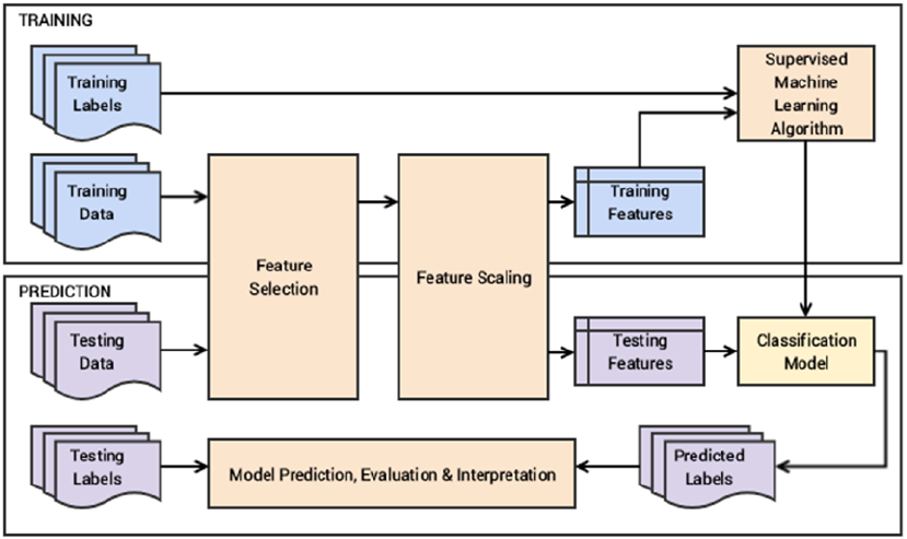
Chapter 9 ■ analyzing Wine types and Quality
427
Do remember to have the model_evaluation_utils.py module in the same directory where you are
running your code since we will be using it for evaluating our predictive models. Let’s briefly look at the
workflow we will be following for our predictive systems. We will focus on two major phases—model training
and model predictions and evaluation.
From Figure9-16, we can see that training data and testing data refer to the wine quality dataset
features. Since we already have the necessary wine attributes, we won’t be building additional hand-crafted
features. Labels can be either wine types or quality ratings based on the classification system. In the training
phase, feature selection will mostly involve selecting all the necessary wine physicochemical attributes and
then after necessary scaling we will be training our predictive models for prediction and evaluation in the
prediction phase.
Predicting Wine Types
In our wine quality dataset, we have two variants or types of wine—red and white wine. The main task of
our classification system in this section is to predict the wine type based on other features. To start with, we
will first select our necessary features and separate out the prediction class labels and prepare train and test
datasets. We use the prefix wtp_ in our variables to easily identify them as needed, where wtp depicts wine
type prediction.
In [5]: wtp_features = wines.iloc[:,:-3]
...: wtp_feature_names = wtp_features.columns
...: wtp_class_labels = np.array(wines['wine_type'])
...:
Figure 9-16. Workflow blueprint for our wine type and quality classification system
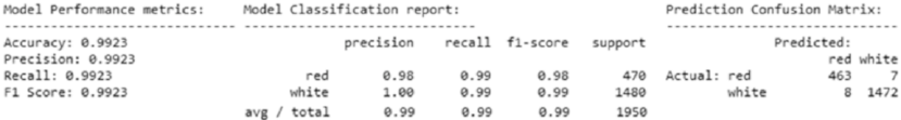
Chapter 9 ■ analyzing Wine types and Quality
428
...: wtp_train_X, wtp_test_X, wtp_train_y, wtp_test_y = train_test_split(wtp_features,
...: wtp_class_labels, test_size=0.3, random_state=42)
...:
...: print(Counter(wtp_train_y), Counter(wtp_test_y))
...: print('Features:', list(wtp_feature_names))
Counter({'white': 3418, 'red': 1129}) Counter({'white': 1480, 'red': 470})
Features: ['fixed acidity', 'volatile acidity', 'citric acid', 'residual sugar', 'chlorides',
'free sulfur dioxide', 'total sulfur dioxide', 'density', 'pH', 'sulphates', 'alcohol']
The numbers show us the wine samples for each class and we can also see the feature names which will
be used in our feature set. Let’s move on to scaling our features. We will be using a standard scaler in this
scenario.
In [6]: # Define the scaler
...: wtp_ss = StandardScaler().fit(wtp_train_X)
...: # Scale the train set
...: wtp_train_SX = wtp_ss.transform(wtp_train_X)
...: # Scale the test set
...: wtp_test_SX = wtp_ss.transform(wtp_test_X)
Since we are dealing with a binary classification problem, one of the traditional Machine Learning
algorithms we can use is the logistic regression model. If you remember we had talked about this in detail
in Chapter 7. Feel free to skim through the “Traditional Supervised Machine Learning Models” section
in Chapter 7 to refresh your memory on logistic regression or you can refer to any standard text book or
material on classification models. Let’s now train a model on our training dataset and labels using logistic
regression
In [7]: from sklearn.linear_model import LogisticRegression
...:
...: wtp_lr = LogisticRegression()
...: wtp_lr.fit(wtp_train_SX, wtp_train_y)
Out[7]:
LogisticRegression(C=1.0, class_weight=None, dual=False, fit_intercept=True,
intercept_scaling=1, max_iter=100, multi_class='ovr', n_jobs=1,
penalty='l2', random_state=None, solver='liblinear', tol=0.0001,
verbose=0, warm_start=False)
Now that our model is ready, let’s predict the wine types for our test data samples and evaluate the
performance.
In [8]: wtp_lr_predictions = wtp_lr.predict(wtp_test_SX)
...: meu.display_model_performance_metrics(true_labels=wtp_test_y,
...: predicted_labels=wtp_lr_predictions, classes=['red', 'white'])
Figure 9-17. Model performance metrics for logistic regression for wine type predictive model
Chapter 9 ■ analyzing Wine types and Quality
429
We get an overall F1 Score and model accuracy of 99.2%, as depicted in Figure9-17 which is really
amazing! In spite of low samples of red wine, we seem to do pretty well. In case your models do not perform
well on other datasets due to a class imbalance problem, you can consider over-sampling or under-sampling
techniques including sample selection as well as SMOTE. Coming back to our classification problem,
we have a really good model, but can we do better? While that seems to be a far-fetched dream, let’s try
modeling the data using a fully connected deep neural network (DNN) with three hidden layers. Refer to the
“Newer Supervised Deep Learning Models” section in Chapter 7 to refresh your memory on fully-connected
DNNs and MLPs. Deep Learning frameworks like keras on top of tensorflow prefer if your output response
labels are encoded to numeric forms which are easier to work with. The following snippet encodes our wine
type class labels.
In [9]: le = LabelEncoder()
...: le.fit(wtp_train_y)
...: # encode wine type labels
...: wtp_train_ey = le.transform(wtp_train_y)
...: wtp_test_ey = le.transform(wtp_test_y)
Let’s build the architecture for our three-hidden layer DNN where each hidden layer has 16 units (the
input layer has 11 units for the 11 features) and the output layer has 1 unit to predict a 0 or 1, which maps
back to red or white wine.
In [10]: from keras.models import Sequential
...: from keras.layers import Dense
...:
...: wtp_dnn_model = Sequential()
...: wtp_dnn_model.add(Dense(16, activation='relu', input_shape=(11,)))
...: wtp_dnn_model.add(Dense(16, activation='relu'))
...: wtp_dnn_model.add(Dense(16, activation='relu'))
...: wtp_dnn_model.add(Dense(1, activation='sigmoid'))
...:
...: wtp_dnn_model.compile(loss='binary_crossentropy', optimizer='adam',
metrics=['accuracy'])
Using TensorFlow backend.
You can see that we are using keras on top of tensorflow, and for our optimizer, we have chosen the
adam optimizer with a binary cross-entropy loss. You can also use categorical cross-entropy if needed, which
is especially useful when you have more than two classes. The following snippet helps train our DNN.
In [11]: history = wtp_dnn_model.fit(wtp_train_SX, wtp_train_ey, epochs=10, batch_size=5,
...: shuffle=True, validation_split=0.1, verbose=1)
Train on 4092 samples, validate on 455 samples
Epoch 1/10 4092/4092 - 1s - loss: 0.1266 - acc: 0.9467 - val_loss: 0.0115 - val_acc: 0.9978
Epoch 2/10 4092/4092 - 1s - loss: 0.0315 - acc: 0.9934 - val_loss: 0.0046 - val_acc: 1.0000
...
Epoch 9/10 4092/4092 - 1s - loss: 0.0112 - acc: 0.9973 - val_loss: 0.0029 - val_acc: 1.0000
Epoch 10/10 4092/4092 - 1s - loss: 0.0098 - acc: 0.9978 - val_loss: 0.0013 - val_acc: 1.0000
We use 10% of the training data for a validation set while training the model to see how it performs at
each epoch. Let’s now predict and evaluate our model on the actual test dataset.
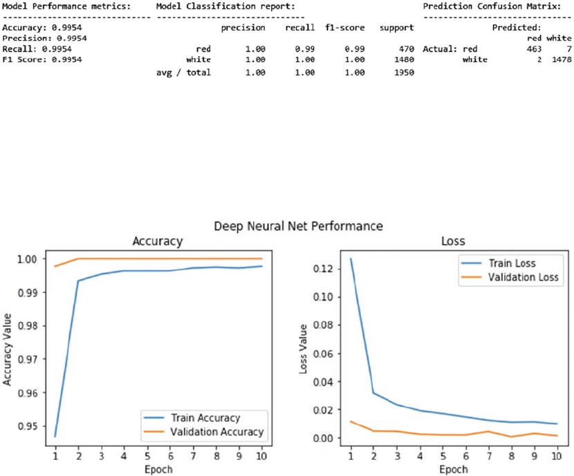
Chapter 9 ■ analyzing Wine types and Quality
430
In [15]: wtp_dnn_ypred = wtp_dnn_model.predict_classes(wtp_test_SX)
...: wtp_dnn_predictions = le.inverse_transform(wtp_dnn_ypred)
...: meu.display_model_performance_metrics(true_labels=wtp_test_y,
...: predicted_labels=wtp_dnn_predictions, classes=['red', 'white'])
We get an overall F1 Score and model accuracy of 99.5%, as depicted in Figure9-18, which is even
better than our previous model! This goes to prove you don’t always need big data but good quality data
and features even for Deep Learning models. The loss and accuracy measures at each epoch are depicted in
Figure9-19, with the detailed code present in the notebook.
Now that we have a working wine type classification system, let’s try to interpret one of these predictive
models. One of the key aspects in model interpretation is to try to understand the importance of each feature
from the dataset. We will be using the skater package that we used in the previous chapters for our model
interpretation needs. The following code helps visualize feature importances for our logistic regression model.
Figure 9-19. Model performance metrics for DNN model per epoch
Figure 9-18. Model performance metrics for deep neural network for wine type predictive model
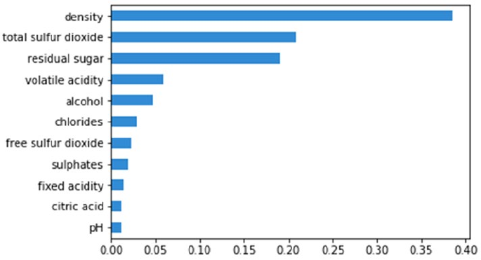
Chapter 9 ■ analyzing Wine types and Quality
431
In [16]: from skater.core.explanations import Interpretation
...: from skater.model import InMemoryModel
...:
...: wtp_interpreter = Interpretation(wtp_test_SX, feature_names=wtp_features.columns)
...: wtp_im_model = InMemoryModel(wtp_lr.predict_proba, examples=wtp_train_SX,
target_names=wtp_lr.classes_)
...: plots = wtp_interpreter.feature_importance.plot_feature_importance(wtp_im_model,
ascending=False)
We can see in Figure9-20 that density, total sulfur dioxide, and residual sugar are the top three
features that contributed toward classifying wine samples as red or white. Another way of understand how
well a model is performing besides looking at metrics is to plot a receiver operating characteristics curve
also known popularity as a ROC curve. This curve can be plotted using the true positive rate (TPR) and the
false positive rate (FPR) of a classifier. TPR is known as sensitivity or recall, which is the total number
of correct positive results predicted among all the positive samples the dataset. FPR is known as false
alarms or (1 - specificity), determining the total number of incorrect positive predictions among all negative
samples in the dataset. The ROC curve is also known as a sensitivity versus (1 − specificity) plot sometimes.
The following code uses our model evaluation utilities module to plot the ROC curve for our logistic
regression model in the ROC space.
In [17]: meu.plot_model_roc_curve(wtp_lr, wtp_test_SX, wtp_test_y)
Typically in any ROC curve, the ROC space is between points (0,0) and (1, 1). Each prediction result
from the confusion matrix occupies one point in this ROC space. Ideally, the best prediction model would
give a point on the top-left corner (0,1) indicating perfect classification (100% sensitivity and specificity).
A diagonal line depicts a classifier that does a random guess. Ideally if your ROC curve occurs in the top half
of the graph, you have a decent classifier, which is better than average. Figure9-21 makes this clearer.
Figure 9-20. Feature importances obtained from our logistic regression model
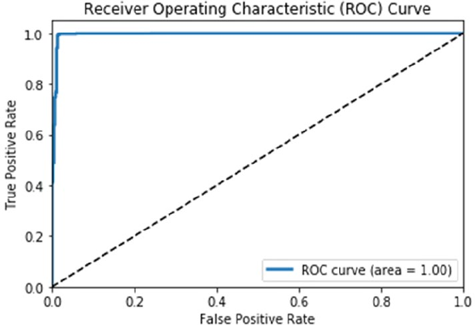
Chapter 9 ■ analyzing Wine types and Quality
432
We achieved almost 100% accuracy if you remember for this model and hence the ROC curve is almost
perfect where we also see that the area under curve (AUC) is 1 which is perfect. Finally, from our feature
importance ranks we obtained earlier, let’s see if we can visualize the model’s decision surface or decision
boundary, which basically gives us a visual depiction of how well the model is able to learn data points
pertaining to each class and separate points belonging to different classes. This surface is basically the
hypersurface, which helps in separating the underlying vector space of data samples based on their features
(feature space). If this surface is linear, the classification problem is linear and the hypersurface is also
known as a hyperplane. Our model evaluation utilities module helps us plot this with the help of an easy-to-
use function (do note this works only for scikit estimators at the moment since there was no clone function
for keras based estimators and it just got published last month as of writing this book; we might push a
change sometime in the future once it is stable).
In [18]: feature_indices = [i for i, feature in enumerate(wtp_feature_names)
...: if feature in ['density', 'total sulfur dioxide']]
...: meu.plot_model_decision_surface(clf=wtp_lr,
...: train_features=wtp_train_SX[:, feature_indices],
...: train_labels=wtp_train_y, plot_step=0.02,
...: cmap=plt.cm.Wistia_r, markers=[',', 'o'],
...: alphas=[0.9, 0.6], colors=['r', 'y'])
Since we would want to plot the decision surface on the underlying feature space, visualizing this
becomes extremely difficult when you have more than two features. Hence for the sake of simplicity and ease
of interpretation, we will use the top two most important features (density and total sulfur dioxide) to
visualize the model decision surface. This is done by fitting a cloned model of the original model estimator
on those two features and then plotting the decision surface based on what it has learned. Check out the
plot_model_decision_surface(...) function for more low-level details on how we visualize the decision
surfaces.
Figure 9-21. ROC curve for our logistic regression model
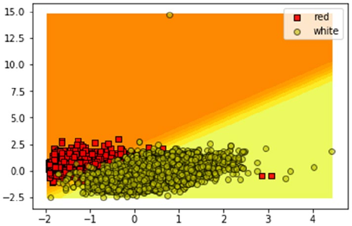
Chapter 9 ■ analyzing Wine types and Quality
433
Figure 9-22. Visualizing the model decision surface for our logistic regression model
The plot depicted in Figure9-22 reinforces the fact that our model has learned the underlying patterns
quite well based on just the two most important features, which it has used to separate out majority
of the red wine samples from the white wine samples depicted by the scatter dots. There are very few
misclassifications here and there, which are evident based on the statistics we obtained earlier in the
confusion matrices.
Predicting Wine Quality
In our wine quality dataset, we have several quality rating classes ranging from 3 to 9. What we will be
focusing on is the quality_label variable that classifies wine into low, medium, and high ratings based
on the underlying quality variable based on the mapping we created in the “Exploratory Data Analysis”
section. This is done because several rating scores have very few wine samples and hence similar quality
ratings were clubbed together into one quality class rating. We use the prefix wqp_ for all variables and
models involved in prediction of wine quality to distinguish it from other analysis. The prefix wqp stands for
wine quality prediction. We will evaluate and look at tree based classification models as well as ensemble
models in this section. The following code helps us prepare our train and test datasets for modeling.
In [19]: wqp_features = wines.iloc[:,:-3]
...: wqp_class_labels = np.array(wines['quality_label'])
...: wqp_label_names = ['low', 'medium', 'high']
...: wqp_feature_names = list(wqp_features.columns)
...: wqp_train_X, wqp_test_X, wqp_train_y, wqp_test_y = train_test_split(wqp_features,
...: wqp_class_labels, test_size=0.3, random_state=42)
...:
...: print(Counter(wqp_train_y), Counter(wqp_test_y))
...: print('Features:', wqp_feature_names)
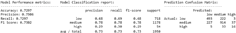
Chapter 9 ■ analyzing Wine types and Quality
434
Counter({'medium': 2737, 'low': 1666, 'high': 144}) Counter({'medium': 1178, 'low': 718,
'high': 54})
Features: ['fixed acidity', 'volatile acidity', 'citric acid', 'residual sugar', 'chlorides',
'free sulfur dioxide', 'total sulfur dioxide', 'density', 'pH', 'sulphates', 'alcohol']
From the preceding output, it is evident we use the same physicochemical wine features. The number of
samples in each quality rating class is also depicted. It is quite evident we have very few wine samples of high
class rating and a lot of medium quality wine samples. We move on to the next step of feature scaling.
In [20]: # Define the scaler
...: wqp_ss = StandardScaler().fit(wqp_train_X)
...: # Scale the train set
...: wqp_train_SX = wqp_ss.transform(wqp_train_X)
...: # Scale the test set
...: wqp_test_SX = wqp_ss.transform(wqp_test_X)
Let’s train a tree based model on this data. The Decision Tree Classifier is an excellent example of a
classic tree model. This is based on the concept of decision trees, which focus on using a tree-like graph
or flowchart to model decisions and their possible outcomes. Each decision node in the tree represents a
decision test on a specific data attribute. Edges or branches from each node represent possible outcomes of
the decision test. Each leaf node represents a predicted class label. To getall the end-to-end classification
rules, you need to consider the paths from the root node to the leaf nodes. Decision tree models in the
context of Machine Learning are non-parametric supervised learning methods, which use these decision
tree based structures for classification and regression tasks. The core objective is to build a model such that
we can predict the value of a target response variable by leveraging decision tree based structures to learn
decision rules from the input data features. The main advantage of decision tree based models is model
interpretability, since it is quite easy to understand and interpret the decision rules which led to a specific
model prediction. Besides this, other advantages include the model’s ability to handle both categorical
and numeric data with ease as well as multi-class classification problems. Trees can be even visualized to
understand and interpret decision rules better. The following snippet leverages the DecisionTreeClassifier
estimator to build a decision tree model and predict the wine quality ratings of our wine samples.
In [21]: from sklearn.tree import DecisionTreeClassifier
...: # train the model
...: wqp_dt = DecisionTreeClassifier()
...: wqp_dt.fit(wqp_train_SX, wqp_train_y)
...: # predict and evaluate performance
...: wqp_dt_predictions = wqp_dt.predict(wqp_test_SX)
...: meu.display_model_performance_metrics(true_labels=wqp_test_y,
...: predicted_labels=wqp_dt_predictions, classes=wqp_label_names)
Figure 9-23. Model performance metrics for decision tree for wine quality predictive model
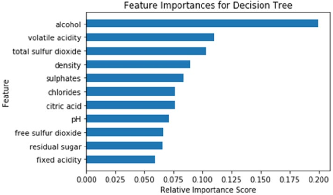
Chapter 9 ■ analyzing Wine types and Quality
435
We get an overall F1 Score and model accuracy of approximately 73%, as depicted in Figure9-23,
which is not bad for a start. Looking at the class based statistics; we can see the recall for the high quality
wine samples is pretty bad since a lot of them have been misclassified into medium and low quality ratings.
This is kind of expected since we do not have a lot of training samples for high quality wine if you remember
our training sample sizes from earlier. Considering low and high quality rated wine samples, we should at
least try to see if we can prevent our model from predicting a low quality wine as high and similarly prevent
predicting a high quality wine as low. Interpreting this model, you can use the following code to look at the
feature importance scores based on the patterns learned by our model.
In [22]: wqp_dt_feature_importances = wqp_dt.feature_importances_
...: wqp_dt_feature_names, wqp_dt_feature_scores = zip(*sorted(zip(wqp_feature_names,
...: wqp_dt_feature_importances), key=lambda x: x[1]))
...: y_position = list(range(len(wqp_dt_feature_names)))
...: plt.barh(y_position, wqp_dt_feature_scores, height=0.6, align='center')
...: plt.yticks(y_position , wqp_dt_feature_names)
...: plt.xlabel('Relative Importance Score')
...: plt.ylabel('Feature')
...: t = plt.title('Feature Importances for Decision Tree')
We can clearly observe from Figure9-24 that the most important features have c hanged as compared to
our previous model. Alcohol and volatile acidity occupy the top two ranks and total sulfur dioxide
seems to be one of the most important features for classifying both wine type and quality (as observed in
Figure9-20). If you remember, we mentioned earlier that you can also easily visualize the decision tree
structure from decision tree models and check out the decision rules that it learned from the underlying
features used in prediction for new data samples. The following code helps us visualize decision trees.
Figure 9-24. Feature importances obtained from our decision tree model
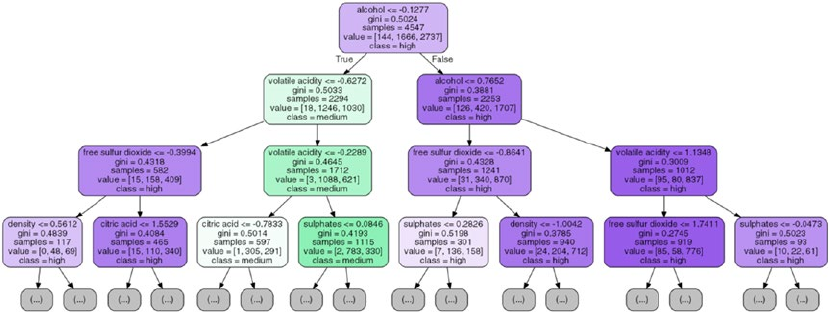
Chapter 9 ■ analyzing Wine types and Quality
436
In [23]: from graphviz import Source
...: from sklearn import tree
...: from IPython.display import Image
...:
...: graph = Source(tree.export_graphviz(wqp_dt, out_file=None, class_names=wqp_label_names,
...: filled=True, rounded=True, special_
characters=False,
...: feature_names=wqp_feature_names, max_depth=3))
...: png_data = graph.pipe(format='png')
...: with open('dtree_structure.png','wb') as f:
...: f.write(png_data)
...: Image(png_data)
Our decision tree model has a huge number of nodes and branches hence we visualized our tree for a
max depth of three based on the preceding snippet. You can start observing the decision rules from the tree
in Figure9-25 where the starting split is determined by the rule of alcohol <= -0.1277 and with each
yes\no decision branch split, we have further decision nodes as we descend into the tree at each depth level.
The class variable is what we are trying to predict, i.e. wine quality being low, medium, or high and value
determines the total number of samples at each class present in the current decision node at each instance.
The gini parameter is basically the criterion which is used to determine and measure the quality of the split
at each decision node. Best splits can be determined by metrics like gini impurity\gini index or information
gain. Just to give you some context, the gini impurity is a metric that helps in minimizing the probability of
misclassification. It is usually mathematically denoted as follows,
Ip pp p
G
i
C
ii
i
C
i
()
=-
()
=-
==
åå
11
2
11
Where we have C classes to predict, pi is the fraction of items labeled as class i or the probability
measure of instance with class label i being chosen and (1 - pi) is the mistake in categorizing that item or
misclassification measure. The gini impurity\index is computed by summing the square of the fraction of
classified instances for each class label in the C classes and subtracting the result from 1. Interested readers
can check out some standard literature on decision trees if interested in diving deeper into differences
between entropy and gini or to understand more intricate mathematical details.
Figure 9-25. Visualizing our decision tree model
Chapter 9 ■ analyzing Wine types and Quality
437
Moving forward with our mission of improving our wine quality predictive model, let’s look at some
ensemble modeling methods. Ensemble models are typically Machine Learning models that combine or
take a weighted (average\majority) vote of the predictions of each of the individual base model estimators
that have been built using supervised methods of their own. The ensemble is expected to generalize better
over underlying data, be more robust, and make superior predictions as compared to each individual base
model. Ensemble models can be categorized under three major families.
• Bagging methods: The term bagging stands for bootstrap aggregating, where the
ensemble model tries to improve prediction accuracy by combining predictions of
individual base models trained over randomly generated training samples. Bootstrap
samples, i.e. independent samples with replacement, are taken from the original
training dataset and several base models are built on these sampled datasets. At any
instance, an average of all predictions from the individual estimators is taken for
the ensemble model to make its final prediction. Random sampling tries to reduce
model variance, reduce overfitting, and boost prediction accuracy. Examples include
the very popular random forests.
• Boosting methods: In contrast to bagging methods, which operate on the principle
of combining or averaging, in boosting methods, we build the ensemble model
incrementally by training each base model estimator sequentially. Training
each model involves putting special emphasis on learning the instances which it
previously misclassified. The idea is to combine several weak base learners to form a
powerful ensemble. Weak learners are trained sequentially over multiple iterations
of the training data with weight modifications inserted at each retrain phase. At
each re-training of a weak base learner, higher weights are assigned to those training
instances which were misclassified previously. Thus, these methods try to focus on
training instances which it wrongly predicted in the previous training sequence.
Boosted models are prone to over-fitting so one should be very careful. Examples
include Gradient Boosting, AdaBoost, and the very popular XGBoost.
• Stacking methods: In stacking based methods, we first build multiple base models
over the training data. Then the final ensemble model is built by taking the output
predictions from these models as its additional inputs for training to make the final
prediction.
Let’s now try building a model using random forests, a very popular bagging method. In the random
forest model, each base learner is a decision tree model trained on a bootstrap sample of the training data.
Besides this, when we want to split a decision node in the tree, the split is chosen from a random subset of all
the features instead of taking the best split from all the features. Due to the introduction of this randomness,
bias increases and when we average the result from all the trees in the forest, the overall variance decreases,
giving us a robust ensemble model which generalizes well. We will be using the RandomForestClassifier
from scikit-learn, which averages the probabilistic prediction from all the trees in the forest for the final
prediction instead of taking the actual prediction votes and then averaging it.
In [24]: from sklearn.ensemble import RandomForestClassifier
...: # train the model
...: wqp_rf = RandomForestClassifier()
...: wqp_rf.fit(wqp_train_SX, wqp_train_y)
...: # predict and evaluate performance
...: wqp_rf_predictions = wqp_rf.predict(wqp_test_SX)
...: meu.display_model_performance_metrics(true_labels=wqp_test_y,
...: predicted_labels=wqp_rf_predictions,
...: classes=wqp_label_names)

Chapter 9 ■ analyzing Wine types and Quality
438
The model prediction results on the test dataset depict an overall F1 Score and model accuracy of
approximately 77%, as seen in Figure9-26. This is definitely an improvement of 4% from what we obtained
with just decision trees proving that ensemble learning is working better.
Another way to further improve on this result is model tuning. To be more specific, models have
hyperparameters that can be tuned, as we have discussed previously in detail in the “Model Tuning and
Hyperparameter Tuning” sections in Chapter 5. Hyperparameters are also known as meta-parameters
and are usually set before we start the model training process. These hyperparameters do not have any
dependency on being derived from the underlying data on which the model is trained. Usually these
hyperparameters represent some high level concepts or knobs, which can be used to tweak and tune the
model during training to improve its performance. Our random forest model has several hyperparameters
and you can view its default values as follows.
In [25]: print(wqp_rf.get_params())
{'bootstrap': True, 'random_state': None, 'verbose': 0, 'min_samples_leaf': 1, 'min_weight_
fraction_leaf': 0.0, 'max_depth': None, 'class_weight': None, 'max_leaf_nodes': None,
'oob_score': False, 'criterion': 'gini', 'n_estimators': 10, 'max_features': 'auto', 'min_
impurity_split': 1e-07, 'n_jobs': 1, 'warm_start': False, 'min_samples_split': 2}
From the preceding output, you can see a number of hyperparameters. We recommend checking out
the official documentation at http://scikit-learn.org/stable/modules/generated/sklearn.ensemble.
RandomForestClassifier.html to learn more about each parameter. For hyperparameter tuning, we will
keep things simple and focus our attention on n_estimators which represents the total number of base
tree models in the forest ensemble model and max_features which represents the number of features to
consider during each best split. We use a standard grid search method with five-fold cross validation to
select the best hyperparameters.
In [26]: from sklearn.model_selection import GridSearchCV
...:
...: param_grid = {
...: 'n_estimators': [100, 200, 300, 500],
...: 'max_features': ['auto', None, 'log2']
...: }
...:
...: wqp_clf = GridSearchCV(RandomForestClassifier(random_state=42), param_grid, cv=5,
...: scoring='accuracy')
...: wqp_clf.fit(wqp_train_SX, wqp_train_y)
...: print(wqp_clf.best_params_)
{'max_features': 'auto', 'n_estimators': 200}
We can see the chosen value of the hyperparameters obtained after the grid search in the preceding
output. We have 200 estimators and auto maximum features which represents the square root of the total
number of features to be considered during the best split operations. The scoring parameter was set to
Figure 9-26. Model performance metrics for random forest for wine quality predictive model
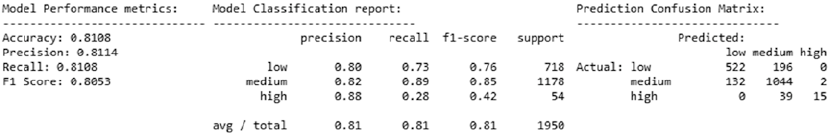
Chapter 9 ■ analyzing Wine types and Quality
439
accuracy to evaluate the model for best accuracy. You can set it to other parameters to evaluate the model
on other metrics like F1 score, precision, recall and so on. Check out http://scikit-learn.org/stable/
modules/model_evaluation.html#scoring-parameter for further details. You can view the grid search
results for all the hyperparameter combinations as follows.
In [27]: results = wqp_clf.cv_results_
...: for param, score_mean, score_sd in zip(results['params'], results['mean_test_score'],
results['std_test_score']):
...: print(param, round(score_mean, 4), round(score_sd, 4))
{'max_features': 'auto', 'n_estimators': 100} 0.7928 0.0119
{'max_features': 'auto', 'n_estimators': 200} 0.7955 0.0101
{'max_features': 'auto', 'n_estimators': 300} 0.7941 0.0086
{'max_features': 'auto', 'n_estimators': 500} 0.795 0.0094
{'max_features': None, 'n_estimators': 100} 0.7847 0.0144
{'max_features': None, 'n_estimators': 200} 0.781 0.0149
{'max_features': None, 'n_estimators': 300} 0.784 0.0128
{'max_features': None, 'n_estimators': 500} 0.7858 0.0107
{'max_features': 'log2', 'n_estimators': 100} 0.7928 0.0119
{'max_features': 'log2', 'n_estimators': 200} 0.7955 0.0101
{'max_features': 'log2', 'n_estimators': 300} 0.7941 0.0086
{'max_features': 'log2', 'n_estimators': 500} 0.795 0.0094
The preceding output depicts the selected hyperparameter combinations and its corresponding mean
accuracy and standard deviation values across the grid. Let’s train a new random forest model with the
tuned hyperparameters and evaluate its performance on the test data.
In [28]: wqp_rf = RandomForestClassifier(n_estimators=200, max_features='auto', random_state=42)
...: wqp_rf.fit(wqp_train_SX, wqp_train_y)
...:
...: wqp_rf_predictions = wqp_rf.predict(wqp_test_SX)
...: meu.display_model_performance_metrics(true_labels=wqp_test_y,
...: predicted_labels=wqp_rf_predictions, classes=wqp_label_names)
The model prediction results on the test dataset depict an overall F1 Score and model accuracy
of approximately 81%, as seen in Figure9-27. This is quite good considering we got an improvement of
4% from the initial random forest model before tuning and overall we got an improvement of 8% from
the base decision tree model. Also we can see that no low quality wine sample has been misclassified as
high. Similarly no high quality wine sample has been misclassified as low. There is a considerable overlap
between medium and high\low quality wine samples but that is expected given the nature of the data and
class distribution.
Figure 9-27. Model performance metrics for tuned random forest for wine quality predictive model
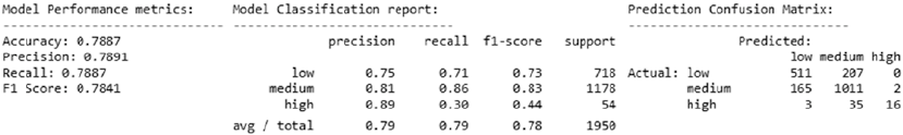
Chapter 9 ■ analyzing Wine types and Quality
440
Another way of modeling ensemble based methods is boosting. A very popular method is XGBoost
which stands for Extreme Gradient Boosting. It is a variant of the Gradient Boosting Machines (GBM)
model. This model is extremely popular in the Data Science community owing to its superior performance
in several Data Science challenges and competitions especially on Kaggle. For using this model, you can
install the xgboost package in Python. For details on this framework, feel free to check out the official
web site at http://xgboost.readthedocs.io/en/latest, which offers detailed documentation on the
installation, model tuning, and much more. Credits go to the Distributed Machine Learning Community,
popularly known as DMLC for creating the XGBoost framework along with the popular MXNet Deep
Learning framework. Gradient boosting using the principles of boosting methodology for ensembling, which
we discussed earlier, and it uses gradient descent to minimize error or loss when adding new weak base
learners. Going into details of the model internals would be out of the current scope, but we recommend
checking out http://xgboost.readthedocs.io/en/latest/model.html for a nice introduction into boosted
trees and the principle of XGBoost. We trained a basic XGBoost model first on our data and obtained an
overall accuracy of around 74%. After tuning the model with grid search, we trained the model with the
following parameter values and evaluated its performance on the test data (detailed step-by-step snippets
are available in the jupyter notebook).
In [29]: import os
...: mingw_path = r'C:\mingw-w64\mingw64\bin'
...: os.environ['PATH'] = mingw_path + ';' + os.environ['PATH']
...: import xgboost as xgb
...:
...: # train the model on tuned hyperparameters
...: wqp_xgb_model = xgb.XGBClassifier(seed=42, max_depth=10, learning_rate=0.3,
n_estimators=100)
...: wqp_xgb_model.fit(wqp_train_SX, wqp_train_y)
...: # evaluate and predict performance
...: wqp_xgb_predictions = wqp_xgb_model.predict(wqp_test_SX)
...: meu.display_model_performance_metrics(true_labels=wqp_test_y,
...: predicted_labels=wqp_xgb_predictions, classes=wqp_label_names)
The model prediction results on the test dataset depict an overall F1 Score and model accuracy of
approximately 79%, as seen in Figure9-28. Though random forests perform slightly better, it definitely
performs better than a basic model like a decision tree. Try adding more hyperparameters to tune the model
and see if you can get a better model. If you do find one, feel free to send a pull request to our repository!
We have successfully built a decent wine quality classifier using several techniques and also seen the
importance of model tuning and validation. Let’s take our best model and run some model interpretation
tasks on it to try to understand it better. To start with, we can look at the feature importance ranks given to
the various features in the dataset. The following snippet shows comparative feature importance plots using
skater as well as the default feature importances obtained from the scikit-learn model itself. We build
an Interpretation and InMemoryModel object using skater, which will be useful for our future analyses in
model interpretation.
Figure 9-28. Model performance metrics for tuned XGBoost model for wine quality predictive model
Chapter 9 ■ analyzing Wine types and Quality
441
In [31]: from skater.core.explanations import Interpretation
...: from skater.model import InMemoryModel
...: # leveraging skater for feature importances
...: interpreter = Interpretation(wqp_test_SX, feature_names=wqp_feature_names)
...: wqp_im_model = InMemoryModel(wqp_rf.predict_proba, examples=wqp_train_SX,
target_names=wqp_rf.classes_)
...: # retrieving feature importances from the scikit-learn estimator
...: wqp_rf_feature_importances = wqp_rf.feature_importances_
...: wqp_rf_feature_names, wqp_rf_feature_scores = zip(*sorted(zip(wqp_feature_names,
wqp_rf_feature_importances), key=lambda x: x[1]))
...: # plot the feature importance plots
...: f, (ax1, ax2) = plt.subplots(1, 2, figsize=(10, 3))
...: t = f.suptitle('Feature Importances for Random Forest', fontsize=12)
...: f.subplots_adjust(top=0.85, wspace=0.6)
...: y_position = list(range(len(wqp_rf_feature_names)))
...: ax1.barh(y_position, wqp_rf_feature_scores, height=0.6, align='center',
tick_label=wqp_rf_feature_names)
...: ax1.set_title("Scikit-Learn")
...: ax1.set_xlabel('Relative Importance Score')
...: ax1.set_ylabel('Feature')
...: plots = interpreter.feature_importance.plot_feature_importance(wqp_im_model,
ascending=False, ax=ax2)
...: ax2.set_title("Skater")
...: ax2.set_xlabel('Relative Importance Score')
...: ax2.set_ylabel('Feature')
We can clearly observe from Figure9-29 that the most important features are consistent across the
two plots, which is expected considering we are just using different interfaces on the same model. The top
two features are alcohol by volume and the volatile acidity content. We will be using them shortly
for further analysis. But right now, let’s look at the model’s ROC curve and the area under curve (AUC)
statistics. Plotting a binary classifier’s ROC curve is easy, but what do you do when you are dealing with a
multi-class classifier (3-class in our case)? There are several ways to do this. You would need to binarize the
output. Once this operation is executed, you can plot one ROC curve per class label. Besides this, you can
also follow two aggregation metrics for computing the average ROC measures. Micro-averaging involves
plotting an ROC curve over the entire prediction space by considering each predicted element as a binary
Figure 9-29. Comparative feature importance analysis obtained from our tuned random forest model
Chapter 9 ■ analyzing Wine types and Quality
442
prediction. Hence equal weight is given to each prediction classification decision. Macro-averaging involves
giving equal weight to each class label when averaging. Our model_evaluation_utils module has a nifty
customizable function plot_model_roc_curve(...), which can help plot multi-class classifier ROC curves
with both micro- and macro-averaging capabilities. We recommend you to check out the code, which is
pretty self-explanatory. Let’s now plot the ROC curve for our random forest classifier.
In [32]: meu.plot_model_roc_curve(wqp_rf, wqp_test_SX, wqp_test_y)
You can see the various ROC plots (per-class and averaged) in Figure9-30 for our tuned random forest
model. The AUC is pretty good based on what we see. The dotted lines indicate the per-class ROC curves and
the lines in bold are the macro and micro-average ROC curves. Let’s now revisit our top two most important
features—alcohol and volatile acidity. Let’s use them and try to plot the decision surface\boundary of
our random forest model, similar to what we had done earlier for our logistic regression based wine type
classifier in Figure9-22.
In [33]: feature_indices = [i for i, feature in enumerate(wqp_feature_names)
...: if feature in ['alcohol', 'volatile acidity']]
...: meu.plot_model_decision_surface(clf=wqp_rf,
...: train_features=wqp_train_SX[:, feature_indices],
...: train_labels=wqp_train_y, plot_step=0.02, cmap=plt.cm.RdYlBu,
...: markers=[',', 'd', '+'], alphas=[1.0, 0.8, 0.5],
...: colors=['r', 'b', 'y'])
Figure 9-30. ROC curve for our tuned random forest model
Chapter 9 ■ analyzing Wine types and Quality
443
The plot depicted in Figure9-31 shows us that the three classes are definitely not as easily
distinguishable as our wine type classifier for red and white wine. Of course, visualizing the hypersurfaces
with multiple features becomes difficult as compared to visualizing with the two most important features,
but the plot should give you a good idea that the model is able to distinguish well between the classes,
although there is a certain amount of overlap, especially with the wine samples of medium quality rating
with high and low quality rated wine samples.
Let’s look at some model prediction interpretations similar to what we did in Chapter 7, where we
analyzed movie review sentiments. For this, we will be leveraging skater and look at model predictions.
We will try to interpret why the model predicted a class label and which features were influential in its
decision. First we build a LimeTabularExplainer object using the following snippet, which will help us in
interpreting and explaining predictions.
from skater.core.local_interpretation.lime.lime_tabular import LimeTabularExplainer
exp = LimeTabularExplainer(wqp_train_SX, feature_names=wqp_feature_names,
discretize_continuous=True,
class_names=wqp_rf.classes_)
Let’s now look at two wine sample instances from our test dataset. The first instance is a wine of low
quality rating. We show the interpretation for the predicted class with maximum probability\confidence
using the top_labels parameter. You can set it to 3 to view the same for all the three class labels.
exp.explain_instance(wqp_test_SX[10], wqp_rf.predict_proba, top_labels=1).show_in_notebook()
Figure 9-31. Visualizing the model decision surface for our tuned random forest model
Chapter 9 ■ analyzing Wine types and Quality
444
Figure 9-32. Model interpretation for our wine quality model's prediction for a low quality wine
The results depicted in Figure9-32 show us the features that were primarily responsible for the model to
predict the wine quality as low. We can see that the most important feature was alcohol, which makes sense
considering what we obtained in our analyses so far from feature importances and model decision surface
interpretations. The values for each corresponding feature depicted here are the scaled values obtained after
feature scaling. Let’s interpret another prediction, this time for a wine of high quality.
exp.explain_instance(wqp_test_SX[747], wqp_rf.predict_proba, top_labels=1).show_in_notebook()
From the interpretation in Figure9-33, we can see the features responsible for the model correctly
predicting the wine quality as high and the primary feature was again alcohol by volume (besides other
features like density, volatile acidity, and so on). Also you can notice a stark difference in the scaled
values of alcohol for the two instances depicted in Figure9-32 and Figure9-33.
Figure 9-33. Model interpretation for our wine quality model's prediction for a high quality wine
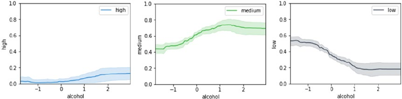
Chapter 9 ■ analyzing Wine types and Quality
445
To wrap up our discussion on model interpretation, we will be talking about partial dependence plots
and how they are useful in our scenario. In general, partial dependence helps describe the marginal impact
or influence of a feature on the model prediction decision by holding the other features constant. Because it
is very difficult to visualize high dimensional feature spaces, typically one or two influential and important
features are used to visualize partial dependence plots. The scikit-learn framework has functions like
partial_dependence(...) and plot_partial_dependence(...), but unfortunately as of the time of writing
this book, these functions only work on boosting models like GBM. The beauty of skater is that we can build
partial dependence plots on any model including our tuned random forest model. We will leverage skater's
Interpretation object, interpreter, and the InMemoryModel object, wqp_im_model, based on our random
forest model that we had created earlier when we computed the feature importances. The following code
depicts one-way partial dependence plots for our model prediction function based on the most important
feature, alcohol.
In [36]: axes_list = interpreter.partial_dependence.plot_partial_dependence(['alcohol'],
...: wqp_im_model, grid_resolution=100, with_variance=True, figsize = (4, 3))
...: axs = axes_list[0][3:]
...: [ax.set_ylim(0, 1) for ax in axs];
From the plots in Figure9-34, we can see that with an increase in the quantity of alcohol content, the
confidence\probability of the model predictor increases in predicting the wine to be either medium or high
and similarly it decreases for the probability of wine to be of low quality. This shows there is definitely some
relationship between the class predictions with the alcohol content and again the influence of alcohol for
predictions of class high is pretty low, which is expected considering training samples for high quality wine
are less. Let’s now plot two-way partial dependence plots for interpreting our random forest predictor’s
dependence on alcohol and volatile acidity, the top two influential features.
In [42]: plots_list = interpreter.partial_dependence.plot_partial_dependence([('alcohol',
...: 'volatile acidity')],
...: wqp_im_model, n_samples=1000, figsize=(10, 5), grid_resolution=100)
...: axs = plots_list[0][3:]
...: [ax.set_zlim(0, 1) for ax in axs];
Figure 9-34. One-way partial dependence plots for our random forest model predictor based on alcohol
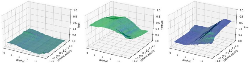
Chapter 9 ■ analyzing Wine types and Quality
446
The plots in Figure9-35 bear some resemblance with the plots in Figure9-34. For predicting high
quality wine, due to the lack of training data, while some dependency is there for high wine quality class
prediction with the increase in alcohol and corresponding decrease in volatile acidity is it quite weak, as
we can see in the left most plot. There also seems to be a strong dependency on low wine quality class
prediction with the corresponding decrease in alcohol and the increase in volatile acidity levels. This
is clearly visible in the rightmost plot. The plot in the middle talks about medium wine quality class
predictions. We can observe predictions having a strong dependency with corresponding increase in alcohol
and with decrease in volatile acidity levels. This should give you a good foundation on leveraging partial
dependence plots to dive deeper into model interpretation.
Summary
In this case study oriented chapter, we processed, analyzed, and modeled on a dataset pertaining to wine
samples with a focus on type and quality ratings. Special emphasis was on exploratory data analysis, which
is often overlooked by data scientists in a hurry to build and deploy models. Some background in the
domain was explored with regard to various features in our wine dataset, which were explained in detail. We
recommend always exploring the domain in which you are solving problems and taking the help of subject
matter experts whenever needed, besides focusing on math, Machine Learning, and analysis.
We looked at multiple ways to analyze and visualize our data and its features, including descriptive and
inferential statistics and univariate and multivariate analysis. Special techniques for visualizing categorical
and multi-dimensional data were explained in detail. The intent is for you to build on these principles and
re-use similar principles and code to visualize attributes and relationships on your own datasets in the future.
Two main objectives of this chapter were to build predictive models for predicting wine types and quality
based on various physicochemical wine attributes. We covered a variety of predictive models, including
linear models like logistic regression and complex models including deep neural networks. Besides this, we
also covered tree based models like decision trees and ensemble models like random forests and the very
popular extreme gradient boosting model. Various aspects of model training, prediction, evaluation, tuning,
and interpretation were covered in detail. We recommend you to not only build models but evaluate them
thoroughly with validation metrics, use hyperparameter tuning where necessary, and leverage ensemble
modeling to build robust, generalized, and superior models. Special focus has also been given to concepts and
techniques for interpreting models, including analyzing feature importances, visualizing model ROC curves
and decision surfaces, explaining model predictions, and visualizing partial dependence plots.
Figure 9-35. Two-way partial dependence plots for our random forest model predictor based on alcohol and
volatile acidity

447
© Dipanjan Sarkar, Raghav Bali and Tushar Sharma 2018
D. Sarkar et al., Practical Machine Learning with Python, https://doi.org/10.1007/978-1-4842-3207-1_10
CHAPTER 10
Analyzing Music Trends and
Recommendations
Recommendation engines are probably one of the most popular and well known Machine Learning
applications. A lot of people who don’t belong to the Machine Learning community often assume that
recommendation engines are its only use. Although we know that Machine Learning has a vast subspace
where recommendation engines are just one of the candidates, there is no denying the popularity of
recommendation engines. One of the reasons for their popularity is their ubiquitous nature; anyone who is
online, in any way, has been in touch with a recommendation engine in some form or the other. They are
used for recommending products on ecommerce sites, travel destinations on travel portal, songs/videos on
streaming sites, restaurants on food aggregator portals, etc. A long list underlines their universal application.
The popularity of recommendation engines stems from two very important points about them:
• They are easy to implement: Recommendation engines are easy to integrate in
an already existing workflow. All we need is to collect some data regarding our
user trends and patterns, which normally can be extracted from the business’
transactional database.
• They work: This statement is equally true for all the other Machine Learning
solutions that we have discussed. But an important distinction comes from the fact
that they have a very limited downside. For example, consider a travel portal, which
suggests a set of most popular locations from its dataset. The recommendation
system can be a trivial one but its mere presence in front of the user is likely to
generate user interest. The firm can definitely gain by working a sophisticated
recommendation engine but even a very simple one is guaranteed to pay some
dividends with minimal investments. This point makes them a very attractive
proposition.
This chapter studies how we can use transactional data to develop different types of recommendation
engines. We will learn about an auxiliary dataset of a very interesting dataset, “The million song dataset”.
We will go through user listening history and then use it to develop multiple recommendation engines with
varying levels of sophistication.

CHAPTER 10 ■ ANALYZING MUSIC TRENDS AND RECOMMENDATIONS
448
The Million Song Dataset Taste Profile
The million song dataset is a very popular dataset and is available at https://labrosa.ee.columbia.edu/
millionsong/. The original dataset contained quantified audio features of around a million songs
ranging over multiple years. The dataset was created as a collaborative project between The Echonest
(http://the.echonest.com/) and LABRosa (http://labrosa.ee.columbia.edu/). Although we will not be
using this dataset directly, we will be using some parts of it.
Several other datasets were spawned from the original million song dataset. One of those datasets was
called The Echonest Taste Profile Subset. This particular dataset was created by The Echonest with some
undisclosed partners. The dataset contains play counts by anonymous users for songs contained in the
million songs dataset. The taste profile dataset is quite big, as it contains around 48 million lines of triplets.
The triplets contain the following information:
(user id, song id, play counts)
Each row gives the play counts of a song identified by the song ID for the user identified by the user ID.
The overall dataset contains around a million unique users and around 384,000 songs from the million song
dataset are contained in it.
The readers can download the dataset from http://labrosa.ee.columbia.edu/millionsong/sites/
default/files/challenge/train_triplets.txt.zip. The size of the compressed dataset is around 500MB
and, upon decompression, you need a space of around 3.5GB. Once you have the data downloaded and
uncompressed, you will see how to subset the dataset to reduce its size.
■ The million song dataset has several other useful auxiliary datasets. We will not be covering them in detail
here, but we encourage the reader to explore these datasets and use their imagination for developing innovative
use cases.
Exploratory Data Analysis
Exploratory data analysis is an important part of any data analysis workflow. By this time, we have
established this fact firmly in the mindset of our readers. The exploratory data analysis becomes even more
important in the cases of large datasets, as this will often lead us to information that we can use to trim down
the dataset a little. As we will see, sometimes we will also go beyond the traditional data access tools to
bypass the problems posed by the large size of data.
Loading and Trimming Data
The first step in the process is loading the data from the uncompressed files. As the data size is around 3GB,
we will not load the complete data but we will only load a specified number of rows from the dataset. This
can be achieved by using the nrows parameter of the read_csv function provided by pandas.
In [2]: triplet_dataset = pd.read_csv(filepath_or_buffer=data_home+'train_triplets.txt',
...: nrows=10000,sep='\t', header=None, names=['user','song','play_count'])
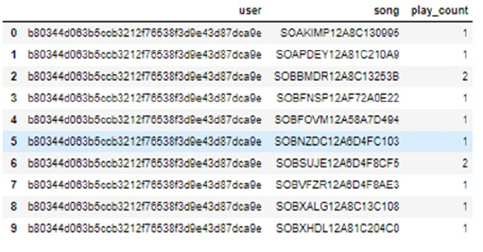
CHAPTER 10 ■ ANALYZING MUSIC TRENDS AND RECOMMENDATIONS
449
Since the dataset doesn’t have a header, we also provided the column name to the function. A subset of
the data is shown in Figure10-1.
The first thing we may want to do in the dataset of this size is determine how many unique users (or
songs) we should consider. In the original dataset, we have around a million users, but we want to determine
the number of users we should consider. For example, if 20% of all the users account for around 80% of total
play counts, then it would be a good idea to focus our analysis on those 20% users. Usually this can be done
by summarizing the dataset by users (or by songs) and getting a cumulative sum of the play counts. Then
we can find out how many users account for 80% of the play counts, etc. But due to the size of the data, the
cumulative summation function provided by pandas will run into trouble. So we will write code to read the
file line by line and extract the play count information on a user (or song). This will also serve as a possible
method that readers can use in case the dataset size exceeds the memory available on their systems. The
code snippet that follows will read the file line by line, extract total play count of all the users, and persist that
information for later use.
In [2]: output_dict = {}
...: with open(data_home+'train_triplets.txt') as f:
...: for line_number, line in enumerate(f):
...: user = line.split('\t')[0]
...: play_count = int(line.split('\t')[2])
...: if user in output_dict:
...: play_count +=output_dict[user]
...: output_dict.update({user:play_count})
...: output_dict.update({user:play_count})
...: output_list = [{'user':k,'play_count':v} for k,v in output_dict.items()]
...: play_count_df = pd.DataFrame(output_list)
...: play_count_df = play_count_df.sort_values(by = 'play_count', ascending = False)
...: play_count_df.to_csv(path_or_buf='user_playcount_df.csv', index = False)
Figure 10-1. Sample rows from The Echonest taste profile dataset
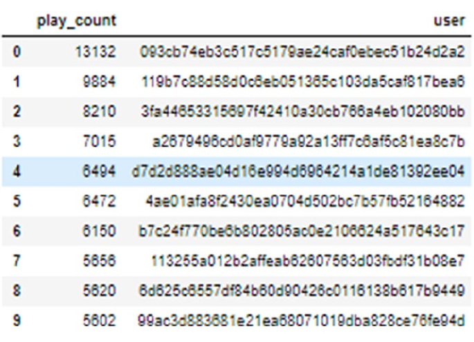
CHAPTER 10 ■ ANALYZING MUSIC TRENDS AND RECOMMENDATIONS
450
The persisted dataframe can be then loaded and used based on our requirements. We can use a similar
strategy to extract play counts for each of the songs. A few lines from the dataset are shown in Figure10-2
The first thing we want to find out about our dataset is the number of users that we will need to
account for around 40% of the play counts. We have arbitrarily chosen a value of 40% to keep the dataset
size manageable; you can experiment with these figures to get different sized datasets and even leverage big
data processing and analysis frameworks like Spark on top of Hadoop to analyze the complete dataset! The
following code snippet will determine the subset of users that account for this percentage of data. In our case
around 10,0000 users account for 40% of play counts, hence we will subset those users.
In [2]: total_play_count = sum(song_count_df.play_count)
...: (float(play_count_df.head(n=100000).play_count.sum())/total_play_count)*100
...: play_count_subset = play_count_df.head(n=100000)
In similar way, we can determine the number of unique songs required to explain 80% of the total play
count. In our case, we will find that 30,000 songs account for around 80% of the play count. This information
is already a great find, as around 10% of the songs are contributing to 80% of the play count. Using a code
snippet similar to one given previously, we can determine the subset of such songs. With these songs and
user subsets, we can subset our original dataset to reduce the dataset to contain only filtered users and
songs. The code snippet that follows uses these dataframes to filter the original dataset and then persists the
resultant dataset for future uses.
In [2]: triplet_dataset =
...: pd.read_csv(filepath_or_buffer=data_home+'train_triplets.txt',sep='\t', header=None,
...: names=['user','song','play_count'])
...: triplet_dataset_sub = triplet_dataset[triplet_dataset.user.isin(user_subset) ]
Figure 10-2. Play counts for some users
CHAPTER 10 ■ ANALYZING MUSIC TRENDS AND RECOMMENDATIONS
451
...: del(triplet_dataset)
...: triplet_dataset_sub_song =
...: triplet_dataset_sub[triplet_dataset_sub.song.isin(song_subset)]
...: del(triplet_dataset_sub)
...: triplet_dataset_sub_song.to_csv(path_or_buf=data_home+'triplet_dataset_sub_song.
csv', index = False)
This subsetting will give us a dataframe with around 10 million rows of tuples. We will use this as the
starting dataset for our all future analyses. You can play around with these numbers to arrive at different
datasets and possibly different results.
Enhancing the Data
The data we loaded is just the triplet data so we are not able to see the song name, the artist name, or the
album names. We can enhance our data by adding this information about the songs. This information is part
of the million song database. This data is provided as a SQLite database file. First we will download the data
by downloading the track_metadata.db file from the web page at https://labrosa.ee.columbia.edu/
millionsong/pages/getting-dataset#subset.
The next step is to read this SQLite database to a dataframe and extract track information by merging
it with our triplet dataframe. We will also drop some extra columns that we won’t be using for our analysis.
The code snippet that follows will load the entire dataset, join it with our subsetted triplet data, and drop the
extra columns.
In [2]: conn = sqlite3.connect(data_home+'track_metadata.db')
...: cur = conn.cursor()
...: cur.execute("SELECT name FROM sqlite_master WHERE type='table'")
...: cur.fetchall()
Out[2]: [('songs',)]
The output of the above snippet shows that the database contains a table named songs. We will getall
the rows from this table and read it into a dataframe.
In [5]: del(track_metadata_df_sub['track_id'])
...: del(track_metadata_df_sub['artist_mbid'])
...: track_metadata_df_sub = track_metadata_df_sub.drop_duplicates(['song_id'])
...: triplet_dataset_sub_song_merged = pd.merge(triplet_dataset_sub_song, track_metadata_
df_sub, how='left', left_on='song', right_o
...: n='song_id')
...: triplet_dataset_sub_song_merged.rename(columns={'play_count':'listen_
count'},inplace=True)
...: del(triplet_dataset_sub_song_merged['song_id'])
...: del(triplet_dataset_sub_song_merged['artist_id'])
...: del(triplet_dataset_sub_song_merged['duration'])
...: del(triplet_dataset_sub_song_merged['artist_familiarity'])
...: del(triplet_dataset_sub_song_merged['artist_hotttnesss'])
...: del(triplet_dataset_sub_song_merged['track_7digitalid'])
...: del(triplet_dataset_sub_song_merged['shs_perf'])
...: del(triplet_dataset_sub_song_merged['shs_work'])
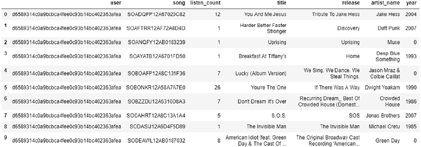
CHAPTER 10 ■ ANALYZING MUSIC TRENDS AND RECOMMENDATIONS
452
The final dataset, merged with the triplets dataframe looks similar to the depiction in Figure10-3. This
will form the starting dataframe for our exploratory data analysis.
Figure 10-3. Play counts dataset merged with songs metadata
Visual Analysis
Before we start developing various recommendation engines, let’s do some visual analysis of our dataset. We
will try to see what the different trends are regarding the songs, albums, and releases.
Most Popular Songs
The first information that we can plot for our data concerns the popularity of the different songs in the
dataset. We will try to determine the top 20 songs in our dataset. A slight modification of this popularity will
also serve as our most basic recommendation engine.
The following code snippet gives us the most popular songs from our dataset.
In [7]: import matplotlib.pyplot as plt; plt.rcdefaults()
...: import numpy as np
...: import matplotlib.pyplot as plt
...:
...: popular_songs = triplet_dataset_sub_song_merged[['title','listen_count']].
groupby('title').sum().reset_index()
...: popular_songs_top_20 = popular_songs.sort_values('listen_count', ascending=False).
head(n=20)
...: objects = (list(popular_songs_top_20['title']))
...: y_pos = np.arange(len(objects))
...: performance = list(popular_songs_top_20['listen_count'])
...:
...: plt.bar(y_pos, performance, align='center', alpha=0.5)
...: plt.xticks(y_pos, objects, rotation='vertical')
...: plt.ylabel('Item count')
...: plt.title('Most popular songs')
...: plt.show()
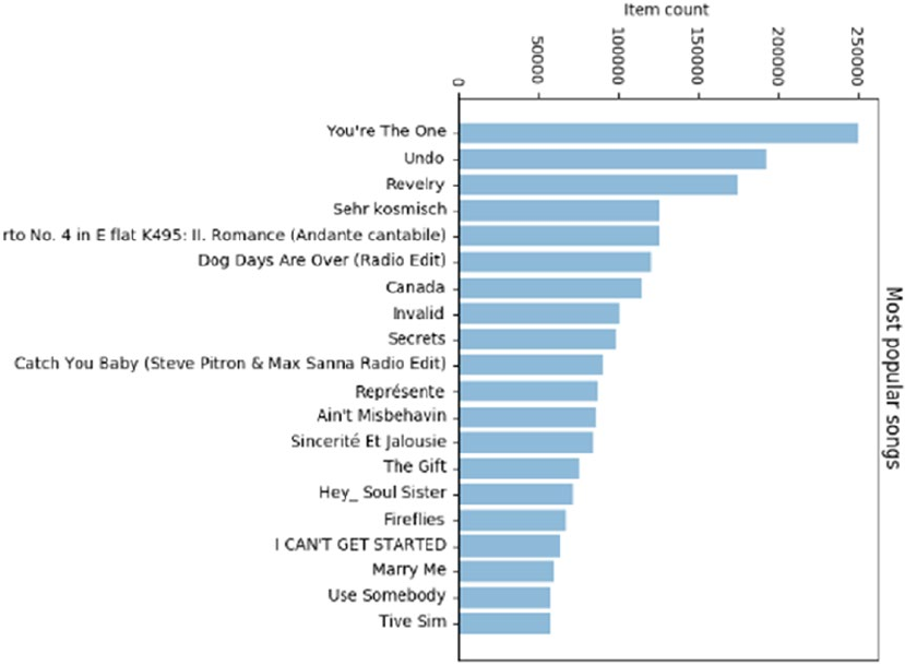
CHAPTER 10 ■ ANALYZING MUSIC TRENDS AND RECOMMENDATIONS
453
The plot that’s generated by the code snippet is shown in Figure10-4. The plot shows that the most
popular song of our dataset is “You’re the One”. We can also search through our track dataframe to see that
the band responsible for that particular track is The Black Keys.
Figure 10-4. Most popular songs
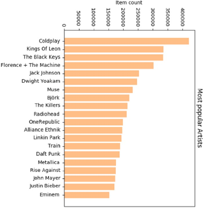
CHAPTER 10 ■ ANALYZING MUSIC TRENDS AND RECOMMENDATIONS
454
Most Popular Artist
The next information the readers may be interested in is, who are the most popular artists in the dataset?
The code to plot this information is quite similar to the code given previously, so we will not include the
exact code snippet. The resultant graph is shown in Figure10-5.
Figure 10-5. Most popular artists
We can read the plot to see that Coldplay is one of the most popular artists according to our dataset. A
keen music enthusiast can see that we don’t have a lot of representation from the classic artists like U2 or
The Beatles, except for maybe Metallica and Radiohead. This underlines two key points—first, the data is
mostly sourced from the generation that’s not just always listening to the classic artists online and second,
that very rarely we have an artist that’s not of the present generation but still scores high when it comes to
online plays. Surprisingly the only example of such behavior in our dataset is Metallica and Radiohead.
They have their origins in the 1980s but are still pretty popular when it comes to online play counts.
Diverse music genre representations are depicted however in the top artists with popular rap artists like
Eminem, alternative rock bands like Linkin Park and The Killers and even pop\rock bands like Train and
OneRepublic, besides classic rock or metal bands like Radiohead and Metallica!
CHAPTER 10 ■ ANALYZING MUSIC TRENDS AND RECOMMENDATIONS
455
Another slightly off reading is that Coldplay is the most popular artist, but they don’t have a candidate
in the most popular songs list. This indirectly hints at an even distribution of those play counts across all
of their tracks. You can take it as exercise to determine song play distribution for each of the artists who
appear in the plot in Figure10-5. This will give you a clue as to whether the artist holds a skewed or uniform
popularity. This idea can be further developed to a full-blown recommendation engine.
User vs. Songs Distribution
The last information that we can seek from our dataset is regarding the distribution of song count for users.
This information will tell us how the number of songs that users listen to on average are distributed. We
can use this information to create different categories of users and modify the recommendation engine on
that basis. The users who are listening to a very select number of songs can be used for developing simple
recommendation engines and the users who provide us lots of insight into their behavior can be candidates
for developing complex recommendation engines.
Before we go on to plot that distribution, let’s try to find some statistical information about that
distribution. The following code calculates that distribution and then shows summary statistics about it.
In [11]: user_song_count_distribution = triplet_dataset_sub_song_merged[['user','title']].
groupby('user').count().reset_index().sort_values(by='title', ascending = False)
...: user_song_count_distribution.title.describe()
Out[11]:
count 99996.000000
mean 107.752160
std 79.741555
min 1.000000
25% 53.000000
50% 89.000000
75% 141.000000
max 1189.000000
Name: title, dtype: float64
This gives us some important information about how the song counts are distributed across the users.
We see that on an average, a user will listen to 100+ songs, but some users have a more voracious appetite for
song diversification. Let’s try to visualize this particular distribution. The code that follows will help us plot
the distribution of play counts across our dataset. We have intentionally kept the number of bins to a small
amount, as that can give approximate information about the number of classes of users we have.
In [12]: x = user_song_count_distribution.title
...: n, bins, patches = plt.hist(x, 50, facecolor='green', alpha=0.75)
...: plt.xlabel('Play Counts')
...: plt.ylabel('Probability')
...: plt.title(r'$\mathrm{Histogram\ of\ User\ Play\ Count\ Distribution}\ $')
...: plt.grid(True)
...: plt.show()
The distribution plot generated by the code is shown in Figure10-6. The image clearly shows that,
although we have a huge variance in the minimum and maximum play count, the bulk of the mass of the
distribution is centered on 100+ song counts.
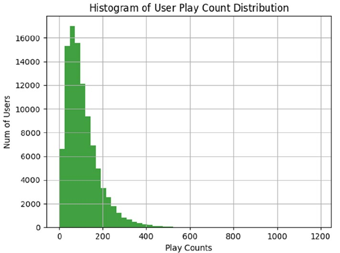
CHAPTER 10 ■ ANALYZING MUSIC TRENDS AND RECOMMENDATIONS
456
Given the nature of the data, we can perform a large variety of cool visualizations; for example, plotting
how the top tracks of artists are played, the play count distribution on a yearly basis, etc. But we believe by
now you are sufficiently skilled in both the art of asking pertinent questions and answering them through
visualizations. So we will conclude our exploratory data analysis and move on to the major focus of the
chapter, which is development of recommendation engines. But feel free to try out additional analysis
and visualizations on this data and if you find out something cool, as always, feel free to send across a pull
request to the book’s code repository!
Recommendation Engines
The work of a recommendation engine is succinctly captured in its name—all it needs to do is make
recommendations. But we must admit that this description is deceptively simple. Recommendation engines
are a way of modeling and rearranging information available about user preferences and then using this
information to provide informed recommendations on the basis of that information. The basis of the
recommendation engine is always the recorded interaction between the users and products. For example,
a movie recommendation engine will be based on the ratings provided to different movies by the users; a
news article recommender will take into account the articles the user has read in past; etc.
This section uses the user-song play count dataset to uncover different ways in which we can
recommend new tracks to different users. We will start with a very basic system and try to evolve linearly into
a sophisticated recommendation system. Before we go into building those systems, we will examine their
utility and the various types of recommendation engines.
Figure 10-6. Distribution of play counts for users
CHAPTER 10 ■ ANALYZING MUSIC TRENDS AND RECOMMENDATIONS
457
Types of Recommendation Engines
The major area of distinction in different recommendation engines comes from the entity that they assume is
the most important in the process of generating recommendations. There are different options for choosing
the central entity and that choice will determine the type of recommendation engine we will develop.
• User-based recommendation engines: In these types of recommendation engines,
the user is the central entity. The algorithm will look for similarities among users and
on the basis of those similarities will come up with the recommendation.
• Content-based recommendation engines: On the other end of the
recommendation engine spectrum, we have the content-based recommendation
engine. In these, the central entity is the content that we are trying to recommend;
for example, in our case the entity will be songs we are trying to recommend. These
algorithm will attempt to find features about the content and find similar content.
Then these similarities will be used to make recommendations to the end users.
• Hybrid-recommendation engines: These types of recommendation engines
will take into account both the features of the users and the content to develop
recommendations. These are also sometimes termed as collaborative filtering
recommendation engines as they “collaborate” by using the similarities of content as
well as users. These are one of the most effective classes of recommendation engines,
as they take the best features of both classes of recommendation engines.
Utility of Recommendation Engines
In the previous chapter, we discussed an important requirement of any organization, understanding the
customer. This requirement is made more important for online businesses, which have almost no physical
interaction with their customers. Recommendation engines provide wonderful opportunities to these
organizations to not only understand their clientele but also to use that information to increase their
revenues. Another important advantage of recommendation engines is that they potentially have very
limited downside. The worst thing the user can do is not pay attention to the recommendation made to him.
The organization can easily integrate a crude recommendation engine in its interaction with the users and
then, on the basis of its performance, make the decision to develop a more sophisticated version. Although
unverified claims are often made about the impact of recommendation engines on the sales of major
online service providers like Netflix, Amazon, YouTube, etc., an interesting insight into their effectiveness
is provided by several papers. We encourage you to read one such paper at http://ai2-s2-pdfs.
s3.amazonaws.com/ba21/7822b81c3c9449014cb92e197d8a6baa4914.pdf. The study claims that a good
recommendation engine tends to increase sales volume by around 35% and also leads customers to discover
more products, which in turns adds to a positive customer experience.
Before we start discussing various recommendation engines, we would like to thank our friend and
fellow Data Scientist, Author and Course Instructor, Siraj Raval for helping us with a major chunk of the code
used in this chapter pertaining to recommendation engines as well as sharing his codebase for developing
our recommendation engines (check out Siraj’s GitHub at https://github.com/llSourcell). We would
be modifying some of his code samples to develop the recommendation engines that we discuss in the
subsequent sections. Interested readers can also check out Siraj’s YouTube channel at www.youtube.com/c/
sirajology where he makes excellent videos on machine learning, deep learning, artificial intelligence and
other fun educational content.
CHAPTER 10 ■ ANALYZING MUSIC TRENDS AND RECOMMENDATIONS
458
Popularity-Based Recommendation Engine
The simplest recommendation engine is naturally the easiest to develop. As we can easily develop
recommendation engines, this type of recommendation engine is a very straightforward one to develop. The
driving logic of this recommendation engine is that if some item is liked (or listened to) by a vast majority of
our user base, then it is a good idea to recommend that item to users who have not interacted with that item.
The code to develop this kind of recommendation is extremely easy and is effectively just a
summarization procedure. To develop these recommendations, we will determine which songs in our
dataset have the most users listening to them and then that will become our standard recommendation
set for each user. The code that follows defines a function that will do this summarization and return the
resultant dataframe.
In [1]:
def create_popularity_recommendation(train_data, user_id, item_id):
#Get a count of user_ids for each unique song as recommendation score
train_data_grouped = train_data.groupby([item_id]).agg({user_id: 'count'}).reset_index()
train_data_grouped.rename(columns = {user_id: 'score'},inplace=True)
#Sort the songs based upon recommendation score
train_data_sort = train_data_grouped.sort_values(['score', item_id], ascending = [0,1])
#Generate a recommendation rank based upon score
train_data_sort['Rank'] = train_data_sort['score'].rank(ascending=0, method='first')
#Get the top 10 recommendations
popularity_recommendations = train_data_sort.head(20)
return popularity_recommendations
In [2]: recommendations = create_popularity_recommendation(triplet_dataset_sub_song_
merged,'user','title')
In [3]: recommendations
We can use this function on our dataset to generate the top 10 recommendations to each of our users.
The output of our plain vanilla recommendation system is shown in Figure10-7. Here you can see that the
recommendations are very similar to the list of the most popular songs that you saw in the last section,
which is expected as the logic behind both is the same—only the output is different.
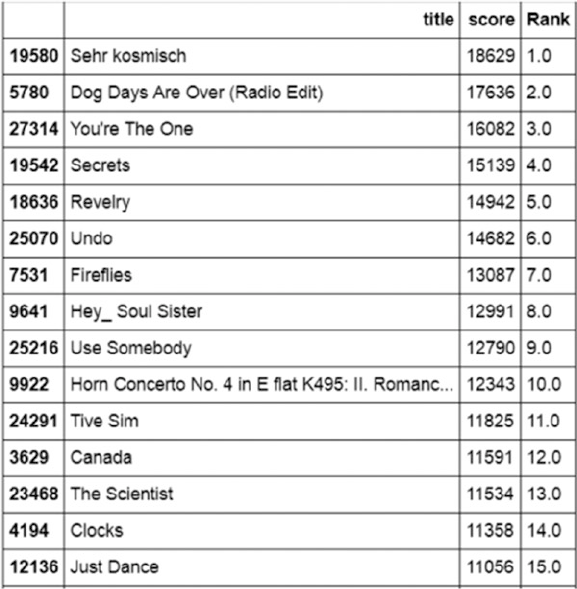
CHAPTER 10 ■ ANALYZING MUSIC TRENDS AND RECOMMENDATIONS
459
Item Similarity Based Recommendation Engine
In the last section, we witnessed one of the simplest recommendation engines. In this section we deal with a
slightly more complex solution. This recommendation engine is based on calculating similarities between a
user’s items and the other items in our dataset.
Before we proceed further with our development effort, let’s describe how we plan to calculate “item-
item” similarity, which is central to our recommendation engine. Usually to define similarity among a set
of items, we need a feature set on the basis of which both items can be described. In our case it will mean
features of the songs on the basis of which one song can be differentiated from another. Although as we
don’t have ready access to these features (or do we?), we will define the similarity in terms of the users who
listen to these songs. Confused? Consider this mathematical formula, which should give you a little more
insight into the metric.
similarityij = intersection(usersi, usersj)/union(usersi, usersj)
This similarity metric is known as the Jaccard index (https://en.wikipedia.org/wiki/Jaccard_
index) and in our case we can use it to define the similarities between two songs. The basic idea remains
that if two songs are being listened to by a large fraction of common users out of the total listeners, the two
songs can be said to be similar to each other. On the basis of this similarity metric, we can define the steps
that the algorithm will take to recommend a song to a user k.
Figure 10-7. Recommendation by the popularity recommendation engine
CHAPTER 10 ■ ANALYZING MUSIC TRENDS AND RECOMMENDATIONS
460
1. Determine the songs listened to by the user k.
2. Calculate the similarity of each song in the user’s list to those in our dataset,
using the similarity metric defined previously.
3. Determine the songs that are most similar to the songs already listened to by
the user.
4. Select a subset of these songs as recommendation based on the similarity score.
As the Step 2 can become a computation-intensive step when we have a large number of songs, we will
subset our data to 5,000 songs to make the computation more feasible. We will select the most popular 5,000
songs so it is quite unlikely that we would miss out on any important recommendations.
In [4]:
song_count_subset = song_count_df.head(n=5000)
user_subset = list(play_count_subset.user)
song_subset = list(song_count_subset.song)
triplet_dataset_sub_song_merged_sub = triplet_dataset_sub_song_merged[triplet_dataset_sub_
song_merged.song.isin(song_subset)]
This code will subset our dataset to contain only most popular 5,000 songs. We will then create our
similarity based recommendation engine and generate a recommendation for a random user. We leverage
Siraj’s Recommenders module here for the item similarity based recommendation system.
In [5]:
train_data, test_data = train_test_split(triplet_dataset_sub_song_merged_sub, test_size =
0.30, random_state=0)
is_model = Recommenders.item_similarity_recommender_py()
is_model.create(train_data, 'user', 'title')
user_id = list(train_data.user)[7]
user_items = is_model.get_user_items(user_id)
is_model.recommend(user_id)
The recommendations for random users are shown in Figure10-8. Notice the stark difference from the
popularity based recommendation engine. So this particular person is almost guaranteed to not like the
most popular songs in our dataset.
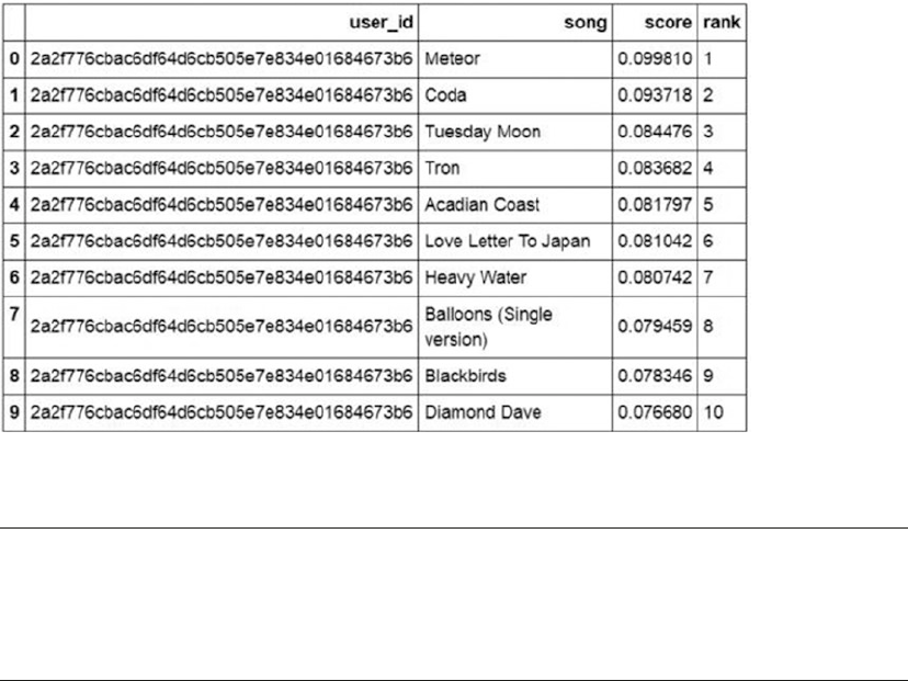
CHAPTER 10 ■ ANALYZING MUSIC TRENDS AND RECOMMENDATIONS
461
■Note At the start of this section, we mentioned we don’t readily have access to song’s features that we
can use to define similarity. As part of the million song database, we have those features available for each of
the songs in the dataset. You are encouraged to replace this implicit similarity, based on common users, with
the explicit similarity based on features of the song and see how the recommendations change.
Matrix Factorization Based Recommendation Engine
Matrix factorization based recommendation engines are probably the most used recommendation
engines when it comes to implementing recommendation engines in production. In this section, we give an
intuition-based introduction to matrix factorization based recommendation engines. We avoid going into a
heavily mathematical discussion, as from a practitioner’s perspective the intent is to see how we can leverage
this to get valuable recommendations from real data.
Matrix factorization refers to identification of two or more matrices from an initial matrix, such that
when these matrices are multiplied we get the original matrix. Matrix factorization can be used to discover
latent features between two different kinds of entities. What are these latent features? Let’s discuss that for a
moment before we go for a mathematical explanation.
Consider for a moment why you like a certain song—the answer may range from the soulful lyrics, to
catchy music, to it being melodious, and many more. We can try to explain a song in mathematical terms
by measuring its beats, tempo, and other such features and then define similar features in terms of the
user. For example, we can define that from a user’s listening history we know that he likes songs with beats
that are bit on the higher side, etc. Once we have consciously defined such “features,” we can use them to
find matches for a user based on some similarity criteria. But more often than not, the tough part in this
process is defining these features, as we have no handbook for what will make a good feature. It is mostly
based on domain experts and a bit of experimentation. But as you will see in this section, you can use matrix
factorization to discover these latent features and they seem to work great.
Figure 10-8. Recommendation by the item similarity based recommendation engine
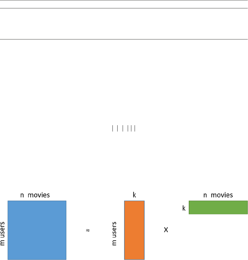
CHAPTER 10 ■ ANALYZING MUSIC TRENDS AND RECOMMENDATIONS
462
The starting point of any matrix factorization-based method is the utility matrix, as shown in
Table10-1. The utility matrix is a matrix of user X item dimension in which each row represents a user and
each column stands for an item.
Table 10-1. Example of a Utility Matrix
Item 1 Item 2 Item 3 Item 4 Item 5
User A 2 5
User B 1 5
User C 5 1
Notice that we have a lot of missing values in the matrix; these are the items that the user hasn’t rated,
either because he hasn’t watched it or because he doesn’t want to watch it. We can right away guess, say Item
4 is a recommendation for User C because User B and User C don’t like Item 2, so it is likely they may end up
liking the same items, in this case Item 4.
The process of matrix factorization means finding out a low rank approximation of the utility matrix. So
we want to break down the utility matrix U into two low rank matrices so that we can recreate the matrix U by
multiplying those two matrices. Mathematically,
R = U * It
and
RUI=*
Here R is our original rating matrix, U is our user matrix, and I is our item matrix. Assuming the process
helps us identify K latent features, our aim is to find two matrices X and Y such that their product (matrix
multiplication) approximates R.
X = |U| x K matrix (A matrix with dimensions of num_users * factors)
Y = |P| x K matrix (A matrix with dimensions of factors * num_movies)
Figure 10-9. Matrix Factorization
CHAPTER 10 ■ ANALYZING MUSIC TRENDS AND RECOMMENDATIONS
463
We can also try to explain the concept of matrix factorization as an image. Based on Figure 10-9, we can
regenerate the original matrix by multiplying the two matrices together. To make a recommendation to the
user, we can multiply the corresponding user’s row from the first matrix by the item matrix and determine
the items from the row with maximum ratings. That will become our recommendations for the user. The
first matrix represents the association between the users and the latent features, while the second matrix
takes care of the associations between items (songs in our case) and the latent features. Figure 10-9 depicts
a typical matrix factorization operation for a movie recommender system but the intent is to understand the
methodology and extend it to build a music recommendation system in this scenario.
Matrix Factorization and Singular Value Decomposition
There are multiple algorithms available for determining factorization of any matrix. We use one of the
simplest algorithms, which is the singular value decomposition or SVD. Remember that we discussed the
mathematics behind SVD in Chapter 1. Here, we explain how the decomposition provided by SVD can be
used as matrix factorization.
You may remember from Chapter 1 that singular value decomposition of a matrix returns three different
matrices: U, S, and V. You can follow these steps to determine the factorization of a matrix using the output of
SVD function.
• Factorize the matrix to obtain U, S, and V matrices.
• Reduce the matrix S to first k components. (The function we are using will only
provide k dimensions, so we can skip this step.)
• Compute the square root of reduced matrix Sk to obtain the matrix Sk
1/2.
• Compute the two resultant matrix U*Sk
1/2 and Sk
1/2*V as these will serve as our two
factorized matrices, as depicted in Figure 10-9.
We can then generate the prediction of user i for product j by taking the dot product of the ith row of the
first matrix with the jth column of the second matrix. This information gives us all the knowledge required to
build a matrix factorization based recommendation engine for our data.
Building a Matrix Factorization Based Recommendation Engine
After the discussion of the mechanics of matrix factorization based recommendation engines, let’s try to
create such a recommendation engine on our data. The first thing that we notice is that we have no concept
of “rating” in our data; all we have are the play counts of various songs. This is a well known problem in the
case of recommendation engines and is called the “implicit feedback” problem. There are many ways to
solve this problem but we will look at a very simple and intuitive solution. We will replace the play count
with a fractional play count. The logic being that this will measure the strength of “likeness” for a song in the
range of [0,1]. We can argue about better methods to address this problem, but this is an acceptable solution
to our problem. The following code will complete the task.
In [7]:
triplet_dataset_sub_song_merged_sum_df = triplet_dataset_sub_song_merged[['user','listen_
count']].groupby('user').sum().rese
t_index()
triplet_dataset_sub_song_merged_sum_df.rename(columns={'listen_count':'total_listen_
count'},inplace=True)
triplet_dataset_sub_song_merged = pd.merge(triplet_dataset_sub_song_merged,triplet_dataset_
sub_song_merged_sum_df)
triplet_dataset_sub_song_merged['fractional_play_count'] = triplet_dataset_sub_song_
merged['listen_count']/triplet_dataset_s
ub_song_merged['total_listen_count']
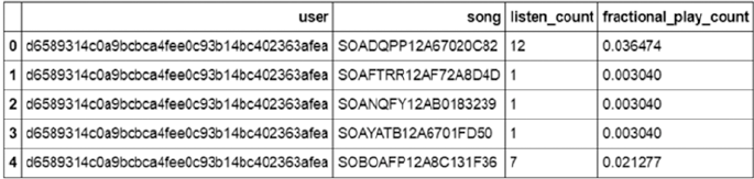
CHAPTER 10 ■ ANALYZING MUSIC TRENDS AND RECOMMENDATIONS
464
The modified dataframe is shown in Figure10-10.
The next transformation of data that is required is to convert our dataframe into a numpy matrix in
the format of utility matrix. We will convert our dataframe into a sparse matrix, as we will have a lot of
missing values and sparse matrices are suitable for representation of such a matrix. Since we won’t be able
to transform our song IDs and user IDs into a numpy matrix, we will convert these indices into numerical
indices. Then we will use these transformed indices to create our sparse numpy matrix. The following code
will create such a matrix.
In [8]:
from scipy.sparse import coo_matrix
small_set = triplet_dataset_sub_song_merged
user_codes = small_set.user.drop_duplicates().reset_index()
song_codes = small_set.song.drop_duplicates().reset_index()
user_codes.rename(columns={'index':'user_index'}, inplace=True)
song_codes.rename(columns={'index':'song_index'}, inplace=True)
song_codes['so_index_value'] = list(song_codes.index)
user_codes['us_index_value'] = list(user_codes.index)
small_set = pd.merge(small_set,song_codes,how='left')
small_set = pd.merge(small_set,user_codes,how='left')
mat_candidate = small_set[['us_index_value','so_index_value','fractional_play_count']]
data_array = mat_candidate.fractional_play_count.values
row_array = mat_candidate.us_index_value.values
col_array = mat_candidate.so_index_value.values
data_sparse = coo_matrix((data_array, (row_array, col_array)),dtype=float)
In [8]: data_sparse
Out : <99996x30000 sparse matrix of type '<class 'numpy.float64'>'
with 10774785 stored elements in COOrdinate format>
Once we have converted our matrix into a sparse matrix, we will use the svds function provided by the
scipy library to break down our utility matrix into three different matrices. We can specify the number of latent
factors we want to factorize our data. In the example we will use 50 latent factors but users are encouraged to
experiment with different values of latent factors and observe how the recommendation change as a result.
The following code creates the decomposition of our matrix and predicts the recommendation for the
same user as in the item similarity recommendation use case. We leverage our compute_svd(...) function
to perform the SVD operation and then use the compute_estimated_matrix(...) for the low rank matrix
approximation after factorization. Detailed steps with function implementations as always are present in the
jupyter notebook.
Figure 10-10. Dataset with implicit feedback
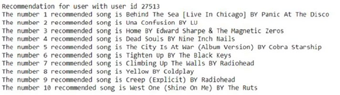
CHAPTER 10 ■ ANALYZING MUSIC TRENDS AND RECOMMENDATIONS
465
Figure 10-10. Recommendation using the matrix factorization based recommender
In [9]:
K=50
#Initialize a sample user rating matrix
urm = data_sparse
MAX_PID = urm.shape[1]
MAX_UID = urm.shape[0]
#Compute SVD of the input user ratings matrix
U, S, Vt = compute_svd(urm, K)
uTest = [27513]
#Get estimated rating for test user
print("Predicted ratings:")
uTest_recommended_items = compute_estimated_matrix(urm, U, S, Vt, uTest, K, True)
for user in uTest:
print("Recommendation for user with user id {}". format(user))
rank_value = 1
for i in uTest_recommended_items[user,0:10]:
song_details = small_set[small_set.so_index_value == i].drop_duplicates('so_index_
value')[['title','artist_name']]
print("The number {} recommended song is {} BY {}".format(rank_value, list(song_
details['title'])[0],list(song_details['artist_name'])[0]))
rank_value+=1
The recommendations made by the matrix factorization based system are also shown in Figure10-11.
If you refer to the jupyter notebook for the code, you will observe that the user with ID 27513 is the same
one for whom we performed the item similarity based recommendations earlier. Refer to the notebook for
further details on how the different functions we used earlier have been implemented and used for our
recommendations! Note how the recommendations have changed from the previous two systems. It looks
like this user might like listening to some Coldplay and Radiohead, definitely interesting!
We used one of the simplest matrix factorization algorithms for our use case; you can try to find out
other more sophisticated implementation of the matrix factorization routine, which will lead to a different
recommendation system. Another topic which we have ignored a bit is the conversion of song play count
into a measure of “implicit feedback”. The system that we chose is acceptable but is far from perfect. There
is a lot of literature that discusses the handling of this issue. We encourage you to find different ways of
handling it and experiment with various measures!
CHAPTER 10 ■ ANALYZING MUSIC TRENDS AND RECOMMENDATIONS
466
A Note on Recommendation Engine Libraries
You might have noticed that we did not use any readily available packages for building our recommendation
system. Like for every possible task, Python has multiple libraries available for building recommendation
engines too. But we have refrained from using such libraries because we wanted to give you a taste of what
goes on behind a recommendation engine. Most of these libraries will take the sparse matrix format as
input data and allow you to develop recommendation engines. We encourage you to continue with your
experimentation with at least one of those libraries, as it will give you an idea of exploring different possible
implementations of the same problem and the differences those implementations can make. Some libraries
that you can use for such exploration include scikit-surprise, lightfm, crab, rec_sys, etc.
Summary
In this chapter, we learned about recommendation systems, which are an important and widely known
Machine Learning application. We discovered a very popular data source that allowed us to peek inside a
small section of online music listeners. We then started on the learning curve of building different types
of recommendation engines. We started with a simple vanilla version based on popularity of songs. After
that, we upped the complexity quotient of our recommendation engines by developing an item similarity
based recommendation engine. We urge you to extend that recommendation engine using the metadata
provided as part of million song database. Finally, we concluded the chapter by building a recommendation
engine that takes an entirely different point of view. We explored some basics of matrix factorization and
learned how a very basic factorization method like singular value decomposition can be used for developing
recommendations. We ended the chapter by mentioning about the different libraries that you can use to
develop sophisticated engines from the dataset that we created.
We would like to close this chapter by further underlining the importance of recommendation engines,
especially in the context of online content delivery. An uncorroborated fact that’s often associated with
recommendation systems is that "60% of Netflix movie viewings are through recommendations". According
to Wikipedia, Netflix has an annual revenue of around $8 billion. Even if half of that is coming from movies
and even if the figure is 30% instead of 60%, it means that around $1 billion of Netflix revenue can be
attributed to recommendation engines. Although we will never be able to verify these figures, they are
definitely a strong argument for recommendation engines and the value they can generate.

467
© Dipanjan Sarkar, Raghav Bali and Tushar Sharma 2018
D. Sarkar et al., Practical Machine Learning with Python, https://doi.org/10.1007/978-1-4842-3207-1_11
CHAPTER 11
Forecasting Stock and
Commodity Prices
In the chapters so far, we covered a variety of concepts and solved diverse real-world problems. In this
chapter, we will dive into forecast/prediction use cases. Predictive analytics or modeling involves concepts
from data mining, advanced statistics, Machine Learning, and so on to model historical data to forecast
future events. Predictive modeling has use cases across domains such as financial services, healthcare,
telecommunications, etc.
There are a number of techniques developed over the years to understand temporal data and model
patterns to score future events and behaviors. Time series analysis forms the descriptive aspect of such data
and the understanding helps in modeling and forecasting the same. Traditional approaches like regression
analysis (see Chapter 6) and Box-Jenkins methodologies have been deeply studied and applied over the years.
More recently, improvements in computation and Machine Learning algorithms have seen Machine Learning
techniques like neural networks or to be more specific, Deep Learning, making a headway in forecasting use
cases with some amazing results.
This chapter discusses forecasting using stock and commodity price datasets. We will utilize traditional
time series models as well as deep learning models like recurrent neural networks to forecast the prices.
Through this chapter, we will cover the following topics:
• Brief overview of time series analysis
• Forecasting commodity pricing using traditional approaches like ARIMA
• Forecasting stock prices with newer deep learning approaches like RNNs and LSTMs
The code samples, jupyter notebooks, and sample datasets for this chapter is available in the GitHub
repository for this book at https://github.com/dipanjanS/practical-machine-learning-with-python
under the directory/folder for Chapter 11.
Time Series Data and Analysis
A time series is a sequence of observed values in a time-ordered manner. The observations are recorded at
equally spaced time intervals. Time series data is available and utilized in the fields of statistics, economics,
finance, weather modeling, pattern recognition, and many more.
Time series analysis is the study of underlying structure and forces that produced observations. It
provides descriptive frameworks to analyze characteristics of data and other meaningful statistics. It also
provides techniques to then utilize this to fit a model to forecast, monitor, and control.
There is another school of thought that separates the descriptive and modeling components of time
series. Here, time series analysis typically is concerned with only the descriptive analysis of time series data
to understand various components and underlying structure. The modeling aspect that utilizes time series

CHAPTER 11 ■ FORECASTING STOCK AND COMMODITY PRICES
468
for prediction/forecasting use cases is termed as time series forecasting. Though in general, both schools of
thought utilize the same set of tools and techniques. It is more about how the concepts are grouped for a
structured learning and application.
■Note Time series and its analysis is a complete field of study on its own and we merely discuss certain
concepts and techniques for our use cases here. This chapter is by no means a complete guide on time series
and its analysis.
Time series can be analyzed both in frequency and time domains. The frequency domain analysis
includes spectral and wavelet analysis techniques, while time domain includes auto- and cross-correlation
analysis. In this chapter, we primarily focus on time series forecasting in the time domain with a brief
discussion around descriptive characteristics of time series data. Moreover, we concentrate on univariate
time series analysis (time is an implicit variable).
To better understand concepts related to time series, we utilize a sample dataset. The following snippet
loads a web site visit data with a daily frequency using pandas. You can refer to the jupyter notebook
notebook_getting_started_time_series.ipynb for the necessary code snippets and examples. The dataset
is available at http://openmv.net/info/website-traffic.
In [1] : import pandas as pd
...:
...: #load data
...: input_df = pd.read_csv(r'website-traffic.csv')
...:
...: input_df['date_of_visit'] = pd.to_datetime(input_df.MonthDay.\
...: str.cat( input_df.Year.astype(str),
...: sep=' '))
The snippet first creates a new attribute called the date_of_visit using a combination of Day,
Month, and Year values available in the base dataframe. Since the dataset is about web site visits per day,
the variable of interest is the visit count for the day with the time dimension, i.e. date_of_visit being the
implicit one. The output plot of visits per day is shown in Figure11-1.
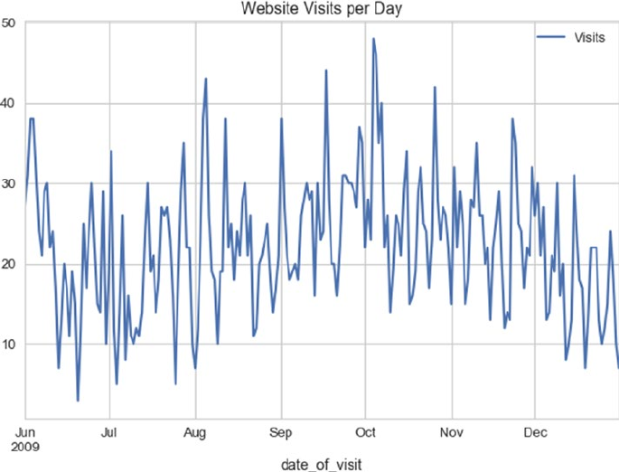
CHAPTER 11 ■ FORECASTING STOCK AND COMMODITY PRICES
469
Time Series Components
The time series at hand is data related to web site visits per day for a given web site. As mentioned earlier,
time series analysis deals with understanding the underlying structure and forces that result in the series
as we see it. Let’s now try to deconstruct various components that make up the time series at hand. A time
series is said to be comprised of the following three major components:
• Seasonality: These are the periodic fluctuations in the observed data. For example,
weather patterns or sale patterns.
• Trend: This is the increasing or decreasing behavior of the series with time. For
example, population growth patterns.
• Residual: This is the remaining signal after removing the seasonality and trend
signals. It can be further decomposed to remove the noise component as well.
It is interesting to note that most real-world time series data have a combination or all of these
components available. Yet, it is mostly the noise that’s always apparently present, with trend and seasonality
being optional in certain cases. In the following snippet, we utilize statsmodels to decompose our web site
visit time series into its three constituents and then plot the same.
In [2] : from statsmodels.tsa.seasonal import seasonal_decompose
...:
...: # extract visits as series from the dataframe
...: ts_visits = pd.Series(input_df.Visits.values,
Figure 11-1. Web site visits per day
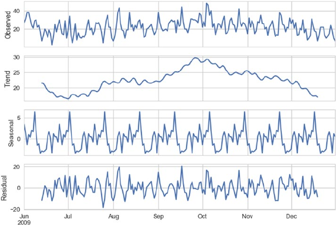
CHAPTER 11 ■ FORECASTING STOCK AND COMMODITY PRICES
470
...: index=pd.date_range(
...: input_df.date_of_visit.min(),
...: input_df.date_of_visit.max(),
...: freq='D')
...: )
...:
...:
...: deompose = seasonal_decompose(ts_visits.interpolate(),
...: freq=24)
...: deompose.plot()
We first create a pandas Series object with additional care taken to set the frequency of the time series
index. It is important to note that statsmodels has a number of time series modeling modules available and
they rely on underlying data structures (such as pandas, numpy, etc.) to specify the frequency of the time
series. In this case, since the data is at a daily level, we set the frequency of ts_visits object to ‘D’ denoting
a daily frequency. We then simply use the seasonal_decompose() function from statsmodels to get the
required constituents. The decomposed series is shown in the plot in Figure11-2.
Figure 11-2. Web site visit time series and its constituent signals
It is apparent from Figure11-2, the time series at hand has both upward and downward trends in it.
It shows a gradual increasing trend until October, post which it starts a downward behavior. The series
certainly has a monthly periodicity or seasonality to it. The remaining signal is what is marked as residual in
Figure11-2.

CHAPTER 11 ■ FORECASTING STOCK AND COMMODITY PRICES
471
Smoothing Techniques
As discussed in the previous chapters, preprocessing the raw data depends upon the data as well as the
use case requirements. Yet there are certain standard preprocessing techniques for each type of data.
Unlike the datasets we have seen so far, where we consider each observation to be independent of other
(past or future) observations, time series have inherent dependency on historical observations. As seen
from the decomposition of web site visits series, there are multiple factors impacting each observation. It
is an inherent property of time series data to have random variation to it apart from its other constituents.
To better understand, model, and utilize time series for prediction related tasks, we usually perform a
preprocessing step better termed as smoothing. Smoothing helps reduce the effect of random variation and
helps clearly reveal the seasonality, trend, and residual components of the series. There are various methods
to smooth out a time series. They are broadly categorized as follows.
Moving Average
Instead of taking an average of complete time series (which we do in cases of non-temporal data) to
summarize, moving average makes use of a rolling windowed approach. In this case, we compute the mean
of each successive smaller windows of past data to smoothen out the impact of random variation.
The following is a general formula for moving average calculation.
MA xx
xx
n
t
tt
tt
n
=
+++¼+
-- -12
Where, MAt is the moving average for time period t, xt, xt-1 and so on denote observed values at
particular time periods, and n is the window size. For example, the following snippet calculates the moving
average for visits with a window size of 3.
In [3] : # moving average
...: input_df['moving_average'] = input_df['Visits'].rolling(window=3,
...: center=False).mean()
...:
...: print(input_df[['Visits','moving_average']].head(10))
...:
...: plt.plot(input_df.Visits,'-',color='black',alpha=0.3)
...: plt.plot(input_df.moving_average,color='b')
...: plt.title('Website Visit and Moving Average Smoothening')
...: plt.legend()
...: plt.show()
The moving average calculated using a window size 3 has the following results. It should be pretty
clear that for a window size of 3, the first two observations would not have any moving averages available,
hence the NaN.
Out[3]:
Visits moving_average
0 27 NaN
1 31 NaN
2 38 32.000000
3 38 35.666667
4 31 35.666667
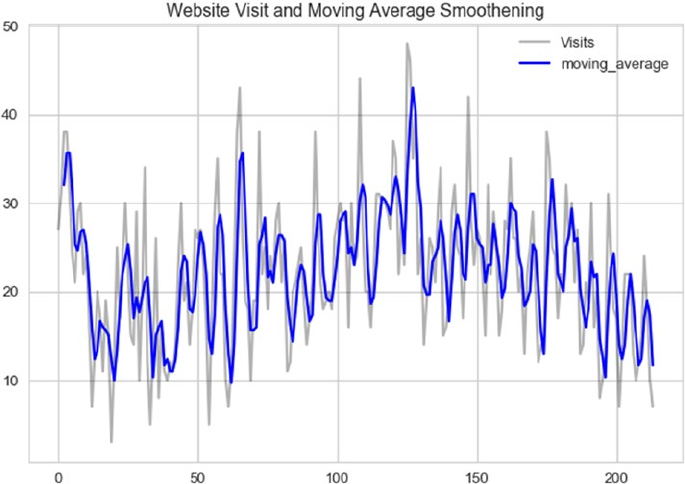
CHAPTER 11 ■ FORECASTING STOCK AND COMMODITY PRICES
472
5 24 31.000000
6 21 25.333333
7 29 24.666667
8 30 26.666667
9 22 27.000000
Figure 11-3. Smoothening using moving average
The plot in Figure11-3 shows the smoothened visits time series. The smoothened series captures the
overall structure of the original series all the while reducing the random variation in it. You are encouraged
to explore and experiment with different window sizes and compare the results.
Depending on the use case and data at hand, we also try different variations of moving average like
centered moving average, double moving average, and so on apart from different window sizes. We will utilize
some of these concepts when we deal with actual use cases in the coming sections of the chapter.
Exponential Smoothing
Moving average based smoothening is effective yet it is a pretty simple preprocessing technique. In case of
moving average, all past observations in the window are given equal weight. Unlike the previous method,
exponential smoothening techniques apply exponentially decreasing weights to older observations. In
simple words, exponential smoothening methods give more weight to recent past observations as compared
to older observations. Depending on the level of smoothening required, there may be one or more
smoothening parameters to set in case of exponential smoothening.
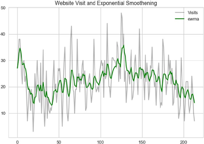
CHAPTER 11 ■ FORECASTING STOCK AND COMMODITY PRICES
473
Exponential smoothening is also called exponentially weighted moving average or EWMA for short.
Single exponential smoothening is one of the simplest to get started with. The general formula is given as.
Ey E
tt t
=+-
()
--
aa
11
1
Where, Et is the tth smoothened observation, y is the actual observed value at t-1 instance, and α
is smoothing constant between 0 and 1. There are different methods to bootstrap the value of E2 (the
time period from which smoothing begins). It can be done by setting it to y1 or an average of first n time
periods and so on. Also, the value of α determines how much of the past is accounted for. A value closer
to 1 dampens out the past observations quickly while values closer to 0 dampen out slowly. The following
snippet uses the pandas ewm() function to calculate the smoothened series for visits. The parameter
halflife is used to calculate α in this case.
In [4] : input_df['ewma'] = input_df['Visits'].ewm(halflife=3,
...: ignore_na=False,
...: min_periods=0,
...: adjust=True).mean()
...:
...: plt.plot(input_df.Visits,'-',color='black',alpha=0.3)
...: plt.plot(input_df.ewma,color='g')
...: plt.title('Website Visit and Exponential Smoothening')
...: plt.legend()
...: plt.show()
The plot depicted in Figure11-4 showcases the EWMA smoothened series along with the original one.
Figure 11-4. Smoothening using EWMA
CHAPTER 11 ■ FORECASTING STOCK AND COMMODITY PRICES
474
In the coming sections, we will apply our understanding of time series, preprocessing techniques, and
so on to solve stock and commodity price forecasting problems using different forecasting methods.
Forecasting Gold Price
Gold, the yellow shiny metal, has been the fancy of mankind since ages. From making jewelry to being used
as an investment, gold covers a huge spectrum of use cases. Gold, like other metals, is also traded on the
commodities indexes across the world. For better understanding time series in a real-world scenario, we will
work with gold prices collected historically and predict its future value. Let’s begin by first formally stating
the problem statement.
Problem Statement
Metals such as gold have been traded for years across the world. Prices of gold are determined and used
for trading the metal on commodity exchanges on a daily basis using a variety of factors. Using this daily
price-level information only, our task is to predict future price of gold.
Dataset
For any problem, first and foremost is the data. Stock and Commodity exchanges do a wonderful job of
storing and sharing daily level pricing data. For the purpose of this use case, we will utilize gold pricing from
Quandl. Quandl is a platform for financial, economic, and alternative datasets. You can refer to the jupyter
notebook notebook_gold_forecast_arima.ipynb for the necessary code snippets and examples.
To access publicly shared datasets on Quandl, we can use the pandas-datareader library as well
as quandl (library from Quandl itself). For this use case, we will depend upon quandl. Kindly install the
same using pip or conda. The following snippet shows a quick one-liner to get your hands on gold pricing
information since 1970s.
In [5]: import quandl
...: gold_df = quandl.get("BUNDESBANK/BBK01_WT5511", end_date="2017-07-31")
The get() function takes the stock/commodity identifier as first parameter followed by the date until
which we need the data. Note that not all datasets are public, for some of them, API access must be obtained.
Traditional Approaches
Time series analysis and forecasting have been long studied in detail. There are matured and extensive set of
modeling techniques available for the same. Out of the many, the following are a few most commonly used
and explored techniques:
• Simple moving average and exponential smoothing based forecasting
• Holt’s, Holt-Winter’s Exponential Smoothing based forecasting
• Box-Jenkins methodology (AR, MA, ARIMA, S-ARIMA, etc.)

CHAPTER 11 ■ FORECASTING STOCK AND COMMODITY PRICES
475
■Note Causal or cross-sectional forecasting/modeling is where the target variable has a relationship with
one or more predictor variables, example regression models (see Chapter 6). Time series forecasting is about
forecasting variable(s) that is changing over time. Both these techniques are grouped under quantitative
techniques.
As mentioned, there are quite a handful of techniques available, each a deep topic of research and
study. For the scope of this section and chapter, we will focus upon ARIMA models (from the Box-Jenkin’s
methodology) to forecast gold prices. Before we move ahead and discuss ARIMA, let’s look at a few
key concepts.
Key Concepts
• Stationarity: One the key assumptions behind the ARIMA models we will be
discussing next. Stationarity refers to the property where for a time series its mean,
variance, and autocorrelation are time invariant. In other words, mean, variance,
and autocorrelation do not change with time. For instance, a time series having
an upward (or downward) trend is a clear indicator of a non-stationarity because
its mean would change with time (see web site visit data example in the previous
section).
• Differencing: One of the methods of stationarizing series. Though there can be other
transformations, differencing is widely used to stabilize the mean of a time series. We
simply compute difference between consecutive observations to obtain a differenced
series. We can then apply different tests to confirm if the resulting series is stationary
or not. We can also perform second order differencing, seasonal differencing, and so
on, depending on the time series at hand.
• Unit Root Tests: Statistical tests that help us understand if a given series is stationary
or not. The Augmented Dickey Fuller test begins with a null hypothesis of series being
non-stationary, while Kwiatkowski-Phillips-Schmidt-Shin test or KPSS has a null
hypothesis that the series is stationary. We then perform a regression fit to reject or
fail to reject the null hypothesis.
ARIMA
The Box-Jenkin’s methodology consists of a wide range of statistical models which are widely used to model
time series for forecasting. For this section, we will be concentrating on one such model called as ARIMA.
ARIMA stands for Auto Regressive Integrated Moving Average model. Sounds pretty complex, right? Let’s
look at the basics and constituents of this model and then build on our understanding to forecast
gold prices.
• Auto Regressive or AR Modeling: A simple linear regression model where current
observation is regressed upon one or more prior observations. The model is denoted as.
XX X
ttpt
pt
=+ +¼++
--
dq qe
11

CHAPTER 11 ■ FORECASTING STOCK AND COMMODITY PRICES
476
where, Xt is the observation at time t, εt is the noise and
dqm
=-
æ
è
çö
ø
÷
=
å
1
1i
p
i
the dependency on prior values is denoted by p or the order of AR model.
• Moving Average or MA Modeling: Is again essentially a linear regression model that
models the impact of noise/error from prior observations to current one. The model
is denoted as
Xtt
tqtq
=+-+¼+
--
me je je
11
where, μ is the series mean, εi are the noise terms, and q is the order of the model.
The AR and MA models were known long before Box-Jenkin’s methodology was presented. Yet this
methodology presented a systematic approach to identify and apply these models for forecasting.
■Note Box, Jenkins, and Reinsel presented this methodology in their book titled Time Series Analysis:
Forecasting and Control. You are encouraged to go through it for a deeper understanding.
The ARIMA model is a logical progression and combination of the two models. Yet if we combine AR
and MA with a differenced series, what we get is called as ARIMA(p,d,q) model.
where,
• p is the order of Autoregression
• q is the order of Moving average
• d is the order of differencing
Thus, for a stationary time series ARIMA models combine autoregressive and moving average concepts
to model the behavior of a long running time series and helps in forecasting. Let’s now apply these concepts
to model gold price forecasting.
Modeling
While describing the dataset, we extracted the gold price information using quandl. Let’s first plot and see
how this time series looks. The following snippet uses the pandas to plot the same.
In [6]: gold_df.plot(figsize=(15, 6))
...: plt.show()
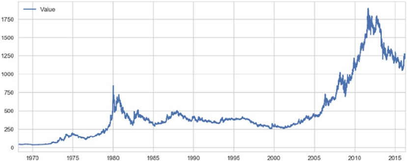
CHAPTER 11 ■ FORECASTING STOCK AND COMMODITY PRICES
477
The plot in Figure11-5 shows a general upward trend with sudden rise in the 1980s and then near 2010.
Since stationarity is one of the primary assumptions of ARIMA models, we will utilize Augmented Dickey
Fuller test to check our series for stationarity. The following snippet helps us calculate the AD Fuller test
statistics and plot rolling characteristics of the series.
In [7]: # Dickey Fuller test for Stationarity
...: def ad_fuller_test(ts):
...: dftest = adfuller(ts, autolag='AIC')
...: dfoutput = pd.Series(dftest[0:4], index=['Test Statistic',
...: 'p-value',
...: '#Lags Used',
...: 'Number of Observations Used'])
...: for key,value in dftest[4].items():
...: dfoutput['Critical Value (%s)'%key] = value
...: print(dfoutput)
...:
...: # Plot rolling stats for a time series
...: def plot_rolling_stats(ts):
...: rolling_mean = ts.rolling(window=12,center=False).mean()
...: rolling_std = ts.rolling(window=12,center=False).std()
...:
...: #Plot rolling statistics:
...: orig = plt.plot(ts, color='blue',label='Original')
...: mean = plt.plot(rolling_mean, color='red', label='Rolling Mean')
...: std = plt.plot(rolling_std, color='black', label = 'Rolling Std')
...: plt.legend(loc='best')
...: plt.title('Rolling Mean & Standard Deviation')
...: plt.show(block=False)
Figure 11-5. Gold prices over the years
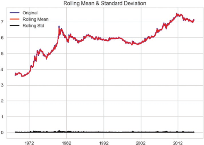
CHAPTER 11 ■ FORECASTING STOCK AND COMMODITY PRICES
478
If the test statistic of AD Fuller test is less than the critical value(s), we reject the null hypothesis of non-
stationarity. The AD Fuller test is available as part of the statsmodel library. Since it is quite evident that our
original series of gold prices is non-stationary, we will perform a log transformation and see if we are able to
obtain stationarity. The following snippet uses the rolling stats plots and AD Fuller tests to check the same.
In [8]: log_series = np.log(gold_df.Value)
...:
...: ad_fuller_test(log_series)
...: plot_rolling_stats(log_series)
The test statistic of -1.8 is greater than either of critical values, hence we fail to reject the null hypothesis,
i.e., the series is non-stationary even after log transformation. The output and plot depicted in Figure11-6
confirm the same.
Test Statistic -1.849748
p-value 0.356057
#Lags Used 29.000000
Number of Observations Used 17520.000000
Critical Value (1%) -3.430723
Critical Value (5%) -2.861705
Critical Value (10%) -2.566858
dtype: float64
Figure 11-6. Rolling mean and standard deviation plot for log transformed gold price

CHAPTER 11 ■ FORECASTING STOCK AND COMMODITY PRICES
479
The plot points out a time varying mean of the series and hence the non-stationarity. As discussed in
the key concepts, differencing a series helps in achieving stationarity. In the following snippet, we prepare a
first order differenced log series and perform the same tests.
In [9]: log_series_shift = log_series - log_series.shift()
...: log_series_shift = log_series_shift[~np.isnan(log_series_shift)]
...:
...: ad_fuller_test(log_series_shift)
...: plot_rolling_stats(log_series_shift)
The test statistic at -23.91 is lower than even 1% critical value, thus we reject the null hypothesis for AD
Fuller test. The following are the test results.
Test Statistic -23.917175
p-value 0.000000
#Lags Used 28.000000
Number of Observations Used 17520.000000
Critical Value (1%) -3.430723
Critical Value (5%) -2.861705
Critical Value (10%) -2.566858
dtype: float64
This exercise points us to the fact that we need to use a log differenced series for ARIMA to model
the dataset at hand. See Figure11-7. Yet we still need to figure out the order of autoregression and moving
average components, i.e., p and q.
Figure 11-7. Rolling mean and standard deviation plot for log differenced gold price series

CHAPTER 11 ■ FORECASTING STOCK AND COMMODITY PRICES
480
Building an ARIMA model requires some experience and intuition as compared other models.
Identifying p, d, and q parameters of the model can be done using different methods, though arriving at the
right set of numbers is dependent both upon requirements and experience.
One of the commonly used methods is the plotting of ACF and PACF plots to determine p and q values.
ACF or Auto Correlation Function plot and PACF or the Partial Auto Correlation Function plot helps us
narrow down the search space of determining the p and q values with a few caveats. There are certain rules
or heuristics developed over the years to best utilize these plots and thus these do not guarantee the best
possible values.
The ACF plot helps us understand the correlation of an observation with its lag (or previous value).
The ACF plot is used to determine the MA order, i.e. q. The value at which ACF drops is the order of the
MA model.
On the same lines, PACF points toward correlation between an observation and a specific lagged value,
excluding effect of other lags. The value at which PACF drops points toward the order of AR model or the p in
ARIMA(p,d,q).
■Note Further details on ACF and PACF is available at http://www.itl.nist.gov/div898/handbook/eda/
section3/autocopl.htm.
Let’s again utilize statsmodels to generate ACF and PACF plots for our series and try to determine
p and q values. The following snippet uses the log differenced series to generate the required plots.
In [10]: fig = plt.figure(figsize=(12,8))
...: ax1 = fig.add_subplot(211)
...: fig = sm.graphics.tsa.plot_acf(log_series_shift.squeeze(), lags=40, ax=ax1)
...: ax2 = fig.add_subplot(212)
...: fig = sm.graphics.tsa.plot_pacf(log_series_shift, lags=40, ax=ax2)
The output plots (Figure11-8) show a sudden drop at lag 1 for both ACF and PACF, thus pointing toward
possible values of q and p to be 1 each, respectively.
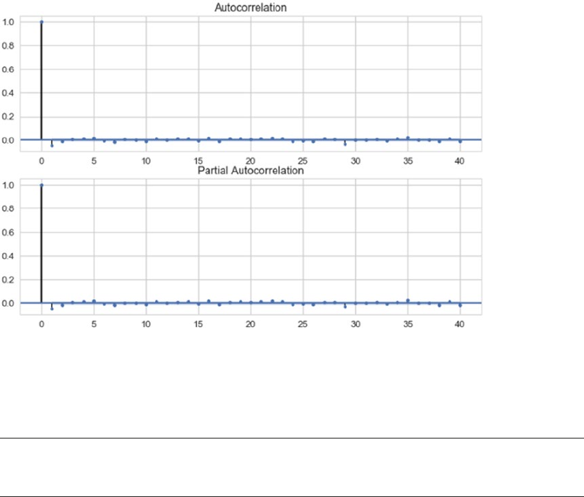
CHAPTER 11 ■ FORECASTING STOCK AND COMMODITY PRICES
481
Figure 11-8. ACF and PACF plots
The ACF and PACF plot also help us understand if a series is stationary or not. If a series has gradually
decreasing values for ACF and PACF, it points toward non-stationarity property in the series.
■Note Identifying the p, d, and q values for any ARIMA model is as much science as it is art. More details on
this are available at https://people.duke.edu/~rnau/411arim.htm.
Another method to derive the p, d, q parameters is to perform a grid search of the parameter space.
This is more in tune with the Machine Learning way of hyperparameter tuning. Though statsmodels does
not provide such a utility (for obvious reasons though), we can write our own utility to identify the best
fitting model. Also, pretty much like any other Machine Learning/Data Science use case, we need to split
our dataset into train and test sets. We utilize scikit-learn’s TimeSeriesSplit utility to help us get proper
training and testing sets.
We write a utility function arima_grid_search_cv() to grid search and cross validate the results using
the gold prices at hand. The function is available in arima_utils.py module for reference. The following
snippet performs a five-fold cross validation with auto-ARIMA to find the best fitting model.
In [11]: results_dict = arima_gridsearch_cv(gold_df.log_series,cv_splits=5)
Note that we are passing the log transformed series as input to the arima_gridsearch_cv() function.
As we saw earlier, the log differenced series was what helped us achieve stationarity, hence we use the log
transformation as our starting point and fit an ARIMA model with d set to 1. The function call generates
a detailed output for each train-test split (we have five of them lined up), each iteration performing a grid
search over p, d, and q. Figure11-9 shows the output of the first iteration, where the training set included
only 2924 observations.
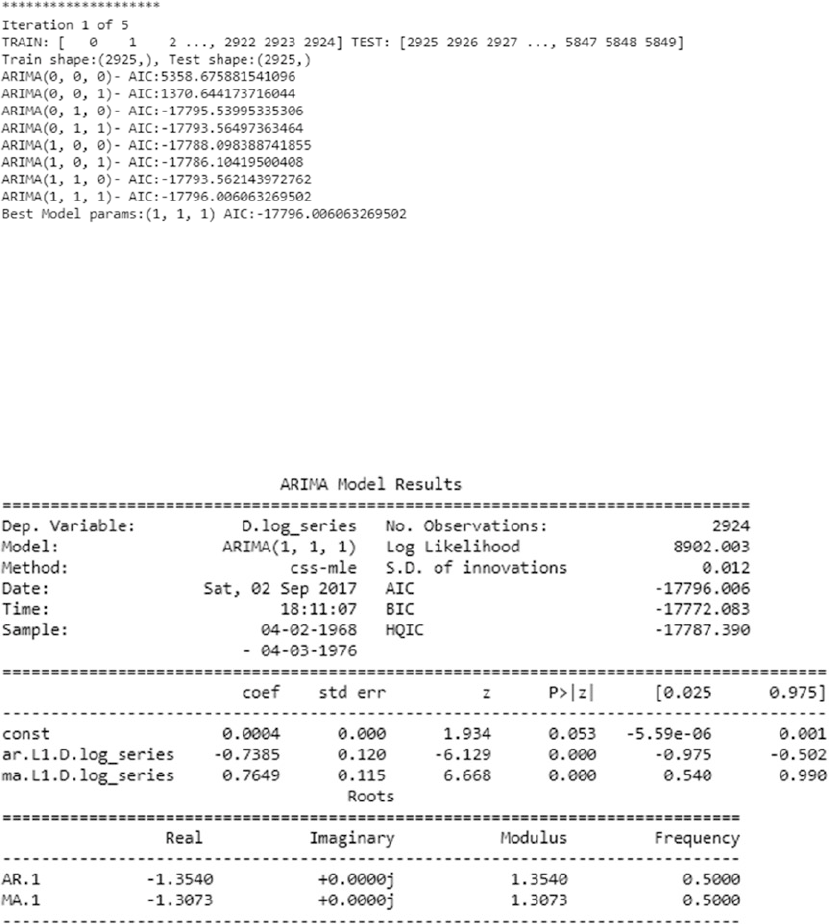
CHAPTER 11 ■ FORECASTING STOCK AND COMMODITY PRICES
482
Similar to our findings using ACF-PACF, auto ARIMA suggests that the best fitting model is
ARIMA(1,1,1) based upon the AIC criteria. Note that AIC or Akaike Information Criterion measures the
goodness of fit and parsimony. It is a relative metric and does not point toward quality of models in an
absolute sense, i.e., if all models being compared are poor, AIC will not be able to point that out. Thus, AIC
should be used as a heuristic. A low value points toward a better fitting model. The following is the summary
generated by the ARIMA(1,1,1) fit, see Figure11-10.
Figure 11-10. Summary of ARIMA(1,1,1)
Figure 11-9. Auto ARIMA
The summary is quite self-explanatory. The top section shows details about the training sample, AIC,
and other metrics. The middle section talks about the coefficients of the fitted mode. In case of ARIMA(1,1,1)
for iteration 1, both AR and MA coefficients are statistically significant. The Forecast Plot for iteration 1 with
ARIMA(1,1,1) fitted is shown in Figure11-11.
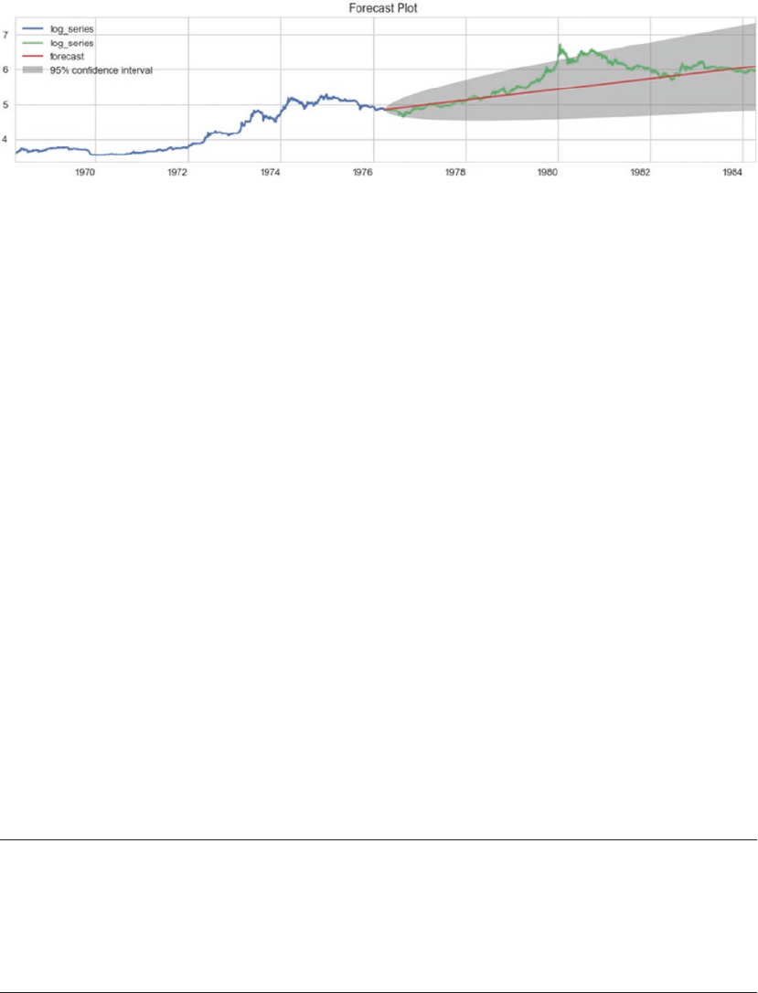
CHAPTER 11 ■ FORECASTING STOCK AND COMMODITY PRICES
483
As evident from the plot in Figure11-11, the model captures the overall upward trend though it misses
out on the sudden jump in values around 1980. Yet it seems to give a pretty nice idea of what can be achieved
using this methodology. The arima_gridsearch_cv() function produces similar statistics and plots for five
different train-test splits. We observe that ARIMA(1,1,1) provides us decent enough fit, although we can
define additional performance and error criteria to select a particular model.
In this case, we generated forecast for time periods for which we already had data. This helps us in
visualizing and understanding how the model is performing. This is also called as back testing. Out of sample
forecasting is also supported by statsmodels through its forecast() method. Also, the plot in Figure11-11
showcases values in the transformed scale, i.e. log scale. Inverse transformation can be easily applied to get
data back in original form.
You should also note that commodity prices are impacted by a whole lot of other factors like global
demand, economic conditions like recession and so on. Hence, what we showcased here was in certain ways
a naïve modeling of a complex process. We would need more features and attributes to have sophisticated
forecasts.
Stock Price Prediction
Stocks and financial instrument trading is a lucrative proposition. Stock markets across the world facilitate
such trades and thus wealth exchanges hands. Stock prices move up and down all the time and having
ability to predict its movement has immense potential to make one rich.
Stock price prediction has kept people interested from a long time. There are hypothesis like the
Efficient Market Hypothesis, which says that it is almost impossible to beat the market consistently and there
are others which disagree with it.
There are a number of known approaches and new research going on to find the magic formula to make
you rich. One of the traditional methods is the time series forecasting, which we saw in the previous section.
Fundamental analysis is another method where numerous performance ratios are analyzed to assess a given
stock. On the emerging front, there are neural networks, genetic algorithms, and ensembling techniques.
■Note Stock price prediction (along with gold price prediction in the previous section) is an attempt to
explain concepts and techniques to model real-world data and use cases. This chapter is by no means and
extensive guide to algorithmic trading. Algorithmic trading is a complete field of study on its own and you may
explore it further. Knowledge from this chapter alone would not be sufficient to perform trading of any sort and
is beyond both the scope and intent of this book.
Figure 11-11. The forecast plot for ARIMA(1,1,1)
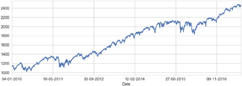
CHAPTER 11 ■ FORECASTING STOCK AND COMMODITY PRICES
484
In this section, we learn how to apply recurrent neural networks (RNNs) to the problem of stock price
prediction and understand the intricacies.
Problem Statement
Stock price prediction is the task of forecasting the future value of a given stock. Given the historical daily
close price for S&P 500 Index, prepare and compare forecasting solutions.
S&P 500 or Standard and Poor's 500 index is an index comprising of 500 stocks from different sectors of
US economy and is an indicator of US equities. Other such indices are the Dow 30, NIFTY 50, Nikkei 225, etc.
For the purpose of understanding, we are utilizing S&P500 index, concepts, and knowledge can be applied
to other stocks as well.
Dataset
Similar to gold price dataset, the historical stock price information is also publicly available. For our current
use case, we will utilize the pandas_datareader library to get the required S&P 500 index history using Yahoo
Finance databases. We will utilize the closing price information from the dataset available though other
information such as opening price, adjusted closing price, etc., are also available.
We prepare a utility function get_raw_data() to extract required information in a pandas dataframe.
The function takes index ticker name as input. For S&P 500 index, the ticker name is ^GSPC. The following
snippet uses the utility function to get the required data.
In [1]: sp_df = get_raw_data('^GSPC')
...: sp_close_series = sp_df.Close
...: sp_close_series.plot()
The plot for closing price is depicted in Figure11-12.
Figure 11-12. The S&P 500 index
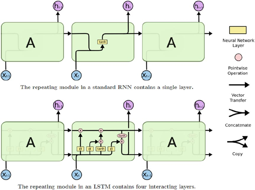
CHAPTER 11 ■ FORECASTING STOCK AND COMMODITY PRICES
485
The plot in Figure11-12 shows that we have closing price information available since 2010 up until recently.
Kindly note that the same information is also available through quandl (which we used in the previous
section to get gold price information). You may use the same to get this data as well.
Recurrent Neural Networks: LSTM
Artificial neural networks are being employed to solve a number of use cases in a variety of domains.
Recurrent neural networks are a class of neural networks with capabilities of modeling sequential data.
LSTMs or Long Short Term Memory is an RNN architecture that’s useful for modeling arbitrary intervals of
information. RNNs, particularly LSTMs were discussed in Chapter 1 while a practical use case was explored
in Chapter 7 for analyzing textual data from movie reviews for sentiment analysis.
As a quick refresher, Figure11-13 points toward the general architecture of an RNN along with the
internals of a typical LSTM unit. LSTM comprises of three major gates—the input, output, and forget gates.
These gates work in tandem to learn and store long and short term sequence related information. For more
details, refer to Advanced Supervised Deep Learning Models, Chapter 7.
Figure 11-13. Basic structure of RNN and LSTM units. (Source: Christopher Olah’s blog: colah.github.io)
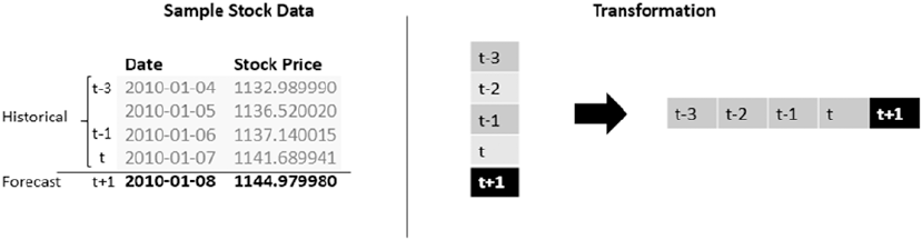
CHAPTER 11 ■ FORECASTING STOCK AND COMMODITY PRICES
486
For stock price prediction, we will utilize LSTM units to implement an RNN model. RNNs are typically
useful in sequence modeling applications; some of them are as follows:
• Sequence classification tasks like sentiment analysis of a given corpus
(see Chapter 7 for the detailed use case)
• Sequence tagging tasks like POS tagging a given sentence
• Sequence mapping tasks like speech recognition
Unlike traditional forecasting approaches (like ARIMA), which require preprocessing of time series
information to conform to stationarity and other assumptions along with parameter identification (p, d, q,
for instance), neural networks (particularly RNNs) impose far fewer restrictions.
Since stock price information is also a time series data, we will explore the application of LSTMs to this
use case and generate forecasts. There are a number of ways this problem can be modeled to forecast values.
The following sections covers two such approaches.
Regression Modeling
We introduced regression modeling in Chapter 6 to analyze bike demand based on certain predictor
variables. In essence, regression modeling refers to the process of investigating relationship between
dependent and independent variables.
To model our current use case as a regression problem, we state that the stock price at timestamp t+1
(dependent variable) is a function of stock price at timestamps t, t -1, t -2, …, t -n. Where n is the past
window of stock prices.
Now that we have a framework defined on how we would model our time series, we need to transform
our time series data into windowed form. See Figure11-14.
Figure 11-14. Transformation of stock price time series into windowed format
The windowed transformation is outlined in Figure11-15 where a window size of 4 is used. The value at
time t+1 is forecasted using past four values. We have data for the S&P 500 index since 2010, hence we would
apply this windowed transformation in a rolling fashion and create multiple such sequences. Thus, if we
have a time series of length M and a window size of n, there would be M-n-1 total windows generated.
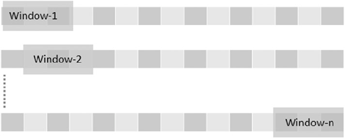
CHAPTER 11 ■ FORECASTING STOCK AND COMMODITY PRICES
487
For the hands-on examples in this section, you can refer to the jupyter notebook
notebook_stock_prediction_regression_modeling_lstm.ipynb for the necessary code snippets and
examples. For using LSTMs to model our time series, we need to apply one more level of transformation
to be able to input our data. LSTMs accept 3D tensors as input, we transform each of the windows
(or sequences) in (N, W, F) format. Here, N is the number of samples or windows from the original time
series, W is the size of each window or the number of historical time steps and F is the number of features
per time step. In our case, as we are only using the closing price, F is equal to 1, N and W are configurable.
The following function performs the windowing and 3D tensor transformations using pandas and numpy.
def get_reg_train_test(timeseries,sequence_length= 51,
train_size=0.9,roll_mean_window=5,
normalize=True,scale=False):
# smoothen out series
if roll_mean_window:
timeseries = timeseries.rolling(roll_mean_window).mean().dropna()
# create windows
result = []
for index in range(len(timeseries) - sequence_length):
result.append(timeseries[index: index + sequence_length])
# normalize data as a variation of 0th index
if normalize:
normalised_data = []
for window in result:
normalised_window = [((float(p) / float(window[0])) - 1) \
for p in window]
normalised_data.append(normalised_window)
result = normalised_data
# identify train-test splits
result = np.array(result)
row = round(train_size * result.shape[0])
# split train and test sets
train = result[:int(row), :]
test = result[int(row):, :]
Figure 11-15. Rolling/sliding windows from original time series
CHAPTER 11 ■ FORECASTING STOCK AND COMMODITY PRICES
488
# scale data in 0-1 range
scaler = None
if scale:
scaler=MinMaxScaler(feature_range=(0, 1))
train = scaler.fit_transform(train)
test = scaler.transform(test)
# split independent and dependent variables
x_train = train[:, :-1]
y_train = train[:, -1]
x_test = test[:, :-1]
y_test = test[:, -1]
# Transforms for LSTM input
x_train = np.reshape(x_train, (x_train.shape[0],
x_train.shape[1],
1))
x_test = np.reshape(x_test, (x_test.shape[0],
x_test.shape[1],
1))
return x_train,y_train,x_test,y_test,scaler
The function get_reg_train_test() also performs a number of other optional preprocessing steps.
It allows us to smoothen the time series using rolling mean before the windowing is applied. We can also
normalize the data as well as scale based on requirements. Neural networks are sensitive to input values
and it is generally advised to scale inputs before training the network. For this use case, we will utilize the
normalization of the time series wherein, for each window, every time step is the percentage change from
the first value in that window (we could also use scaling or both and repeat the process).
For our case, we begin with a window size of six days (you can experiment with smaller or larger
windows and observe the difference). The following snippet uses the get_reg_train_test() function with
normalization set to true.
In [2] : WINDOW = 6
...: PRED_LENGTH = int(window/2)
...: x_train,y_train,x_test,y_test,scaler = get_reg_train_test(sp_close_series,
...: sequence_length=WINDOW +1,
...: roll_mean_window=None,
...: normalize=True,
...: scale=False)
This snippet creates a seven-day window that is comprised of six days of historical data (x_train) and
one-day forecast y_train. The shapes of the train and test variables are as follows.
In [3] : print("x_train shape={}".format(x_train.shape))
...: print("y_train shape={}".format(y_train.shape))
...: print("x_test shape={}".format(x_test.shape))
...: print("y_test shape={}".format(y_test.shape))
CHAPTER 11 ■ FORECASTING STOCK AND COMMODITY PRICES
489
x_train shape=(2516, 6, 1)
y_train shape=(2516,)
x_test shape=(280, 6, 1)
y_test shape=(280,)
The x_train and x_test tensors conform to the (N, W, F) format we discussed earlier and is required
for input to our RNN. We have 2516 sequences in our training set, each with six time steps and one value to
forecast. Similarly, we have 280 sequences in our test set.
Now that we have our datasets preprocessed and ready, we build up an RNN network using keras. The
keras framework provides us high level abstractions to work with neural networks over theano and tensorflow
backends. The following snippet showcases the model prepared using the get_reg_model() function.
In [4]: lstm_model = get_reg_model(layer_units=[50,100],
...: window_size=window)
The generated LSTM model architecture has two hidden LSTM layers stacked over each other with
first one having 50 LSTM units and the second one having 100. The output layer is a Dense layer with linear
activation function. We use mean squared error as our loss function to optimize upon. Since we are stacking
LSTM layers, we need to set return_sequences to true in order for the subsequent layer to get the required
values. As is evident, keras abstracts most of the heavy lifting and makes it pretty intuitive to build even
complex architectures with just a few lines of code.
The next step is to train our LSTM network. We use batch size of 16 with 20 epochs and a validation set
of 5%. The following snippet uses the fit() function to train the model.
In [5]: # use early stopping to avoid overfitting
...: callbacks = [keras.callbacks.EarlyStopping(monitor='val_loss',
...: patience=2,
...: verbose=0)]
...: lstm_model.fit(x_train, y_train,
...: epochs=20, batch_size=16,
...: verbose=1,validation_split=0.05,
...: callbacks=callbacks)
The model generates information regarding training and validation loss for every epoch it runs. The callback
for stopping enables us to stop the training if there is no further improvement observed for two consecutive
epochs. We start with a batch size of 16; you may experiment with larger batch sizes and observe the difference.
Once the model is fit, the next step is to forecast using the predict() function. Since we have modeled
this as a regression problem with a fixed window size, we would generate forecasts for every sequence. To
do so, we write another utility function called predict_reg_multiple(). This function takes the lstm model,
windowed dataset, window and prediction lengths as input parameters to return a list of predictions for
every input window. The predict_reg_multiple() function works as follows.
1. For every sequence in the list of windowed sequences, repeat Steps a-c:
a. Use keras’s predict() function to generate one output value.
b. Append this output value to the end of the input sequence and remove the
first value to maintain the window size.
c. Then repeat this process (Steps a and b) until the required prediction length
is achieved.
2. The function utilizes predicted values to forecast subsequent ones.
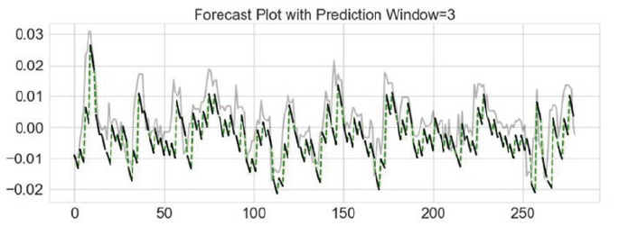
CHAPTER 11 ■ FORECASTING STOCK AND COMMODITY PRICES
490
The function is available in the script lstm_utils.py. The following snippet uses the predict_reg_
multiple() function to get predictions on the test set.
In [6] : test_pred_seqs = predict_reg_multiple(lstm_model,
...: x_test,
...: window_size=WINDOW,
...: prediction_len=PRED_LENGTH)
To analyze the performance, we will calculate the RMSE for the fitted sequence. We use sklearn’s
metrics module for the same. The following snippet calculates the RMSE score.
In [7] : test_rmse = math.sqrt(mean_squared_error(y_test[1:],
...: np.array(test_pred_seqs).\
...: flatten()))
...: print('Test Score: %.2f RMSE' % (test_rmse))
Test Score: 0.01 RMSE
The output is an RMSE of 0.01. As an exercise, you may compare RMSE with different window sizes and
prediction lengths and observe the overall model performance.
To visualize our predictions, we plot the predictions against the normalized testing data. We use the
function plot_reg_results(), which is also available for reference in lstm_utils.py. The following snippet
generates the required plot using the same function.
In [8]: plot_reg_results(test_pred_seqs,y_test,prediction_len=PRED_LENGTH)
Figure 11-16. Forecast Plot with LSTM, window size 6 and prediction length 3
In Figure11-16, the gray line is the original/true test data (normalized) and the black lines denote the
predicted/forecast values in three-day periods. The dotted line is used to explain the overall flow of the
predicted series. As is evident, the forecasts are off the mark to some extent from the actual data trends yet
they seem to have some similarity to the actual data.
Before we conclude this section, there are a few important points to be kept in mind. LSTMs are
vastly powerful units with memory to store and use past information. In our current scenario, we utilized a
windowed approach with a stacked LSTM architecture (two LSTM layers in our model). This is also termed
as many-to-one architecture where multiple input values are used to generate single output. Another
important point here is that the window size along with other hyperparameters of the network (like epochs,
batch size, LSTM units, etc.) have an impact on the final results (this is left as an exercise for you to explore).
Thus, we should be careful before deploying such models in production.
CHAPTER 11 ■ FORECASTING STOCK AND COMMODITY PRICES
491
Sequence Modeling
In the previous section we modeled our time series like a regression use case. In essence, the problem
formulation though utilized past window to forecast, it did not use the time step information. In this
section, we will solve the same stock prediction problem using LSTMs by modeling it as a sequence. For
the hands-on examples in this section, you can refer to the jupyter notebook notebook_stock_prediction_
sequence_modeling_lstm.ipynb for the necessary code snippets and examples.
Recurrent neural networks are naturally suited for sequence modeling tasks like machine translation,
speech recognition and so on. RNNs utilize memory (unlike normal feed forward neural networks) to keep
track of context and utilize the same to generate outputs. In general feed forward neural networks assume
inputs are independent of each other. This independence may not hold in many scenarios (such as time
series data). RNNs apply same transformations to each element of the sequence, with outcomes being
dependent upon previous values.
In case of our stock price time series, we would like to model it now as sequence where value at each
time step is a function of previous values. Unlike the regression-like modeling, here we do not divide
the time series into windows of fixed sizes, rather we would utilize the LSTMs to learn from the data and
determine which past values to utilize for forecasting.
To do so, we need to perform certain tweaks to the way we processed our data in the previous case and
also how we built our RNN. In the previous section, we utilized the (N,W,F) format as input. In the current
setting, the format remain the same with the following changes.
• N (number of sequences): This will be set to 1 since we are dealing with only one
stock’s price information.
• W (length of sequence): This will be set to total number of days worth of price
information we have with us. Here we use the whole series as one big sequence.
• F (features per timestamp): This is again 1, as we are only dealing with closing stock
value per timestamp.
Talking about the output, in the previous section we had one output for every window/sequence in
consideration. While modeling our data as a sequence/time series we expect our output to be a sequence as
well. Thus, the output is also a 3D tensor following the same format as the input tensor.
We write a small utility function get_seq_train_test() to help us scale and generate train and test
datasets out of our time series. We use a 70-30 split in this case. We then use numpy to reshape our time series
into 3D tensors. The following snippet utilizes the get_seq_train_test() function to do the same.
In [1]: train,test,scaler = get_seq_train_test(sp_close_series,
...: scaling=True,
...: train_size=TRAIN_PERCENT)
...:
...: train = np.reshape(train,(1,train.shape[0],1))
...: test = np.reshape(test,(1,test.shape[0],1))
...:
...: train_x = train[:,:-1,:]
...: train_y = train[:,1:,:]
...:
...: test_x = test[:,:-1,:]
...: test_y = test[:,1:,:]
...:
...: print("Data Split Complete")
...:
...: print("train_x shape={}".format(train_x.shape))

CHAPTER 11 ■ FORECASTING STOCK AND COMMODITY PRICES
492
...: print("train_y shape={}".format(train_y.shape))
...: print("test_x shape={}".format(test_x.shape))
...: print("test_y shape={}".format(test_y.shape))
Data Split Complete
train_x shape=(1, 1964, 1)
train_y shape=(1, 1964, 1)
test_x shape=(1, 842, 1)
test_y shape=(1, 842, 1)
Having prepared the datasets, let we’ll now move onto setting up the RNN network. Since we are
planning on generating a sequence as output as opposed to a single output in the previous case, we need to
tweak our network architecture.
The requirement in this case is to apply similar transformations/processing for every time step and be
able to get output for every input timestamp rather than waiting for the whole sequence to be processed. To
enable such scenarios, keras provides a wrapper over dense layers called TimeDistributed. This wrapper
applies the same task to every time step and provides hooks to get output after each such time step. We use
TimeDistributed wrapper over Dense layer to get output from each of the time steps being processed. The
following snippet showcases get_seq_model() function to generate the required model.
def get_seq_model(hidden_units=4,input_shape=(1,1),verbose=False):
# create and fit the LSTM network
model = Sequential()
# input shape = timesteps*features
model.add(LSTM(input_shape=input_shape,
units = hidden_units,
return_sequences=True
))
# TimeDistributedDense uses the processing for all time steps.
model.add(TimeDistributed(Dense(1)))
start = time.time()
model.compile(loss="mse", optimizer="rmsprop")
if verbose:
print("> Compilation Time : ", time.time() - start)
print(model.summary())
return model
This function returns a single hidden layer RNN network with four LSTM units and a TimeDistributed
Dense output layer. We again use mean squared error as our loss function.
■Note TimeDistributed is a powerful yet tricky utility available through keras. You may explore more on
this at https://github.com/fchollet/keras/issues/1029 and https://datascience.stackexchange.
com/questions/10836/the-difference-between-dense-and-timedistributeddense-of-keras.

CHAPTER 11 ■ FORECASTING STOCK AND COMMODITY PRICES
493
We have our dataset preprocessed and split into train and test along with a model object using the
function get_seq_model(). The next step is to simply train the model using the fit() function. While
modeling stock price information as a sequence, we are assuming the whole time series as one big sequence.
Hence, while training the model, we set the batch size as 1 as there is only one stock to train in this case. The
following snippet gets the model object and then trains the same using the fit() function.
In [2]: # get the model
...: seq_lstm_model = get_seq_model(input_shape=(train_x.shape[1],1),
...: verbose=VERBOSE)
...:
...: # train the model
...: seq_lstm_model.fit(train_x, train_y,
...: epochs=150, batch_size=1,
...: verbose=2)
This snippet returns a model object along with its summary. We also see the output of each of the 150
epochs while the model trains on the training data.
Figure11-17 shows the total parameters which the RNN tries to learn, a complete 101 of them. We urge
you to explore the summary on the model prepared in the previous section, the results should surprise most
(Hint: this model has far few parameters to learn!). This summary also points toward an important fact, the
shape of the first LSTM layer. This clearly shows that the model expects the inputs to adhere to this shape
(the shape of the training dataset) for training as well as predicting.
Since our test dataset is smaller (shape: (1,842,1)), we need some way to match the required shape.
While modeling sequences with RNNs, it is a common practice to pad sequences in order to match a given
shape. Usually in cases where there are multiple sequences to train upon (example, text generation), the size
of the longest sequence is used and the shorter ones are padded to match it. We do so only for programmatic
reasons and discard the padded values otherwise (see keras masking for more on this). The padding utility
is available from the keras.preprocessing.sequence module. The following snippet pads the test dataset
with 0s post the actual data (you can choose between pre-pad and post pad) and then uses the padded
sequence to predict/forecast. We also calculate and print the RMSE score of the forecast.
In [3]: # Pad input sequence
...: testPredict = pad_sequences(test_x,
...: maxlen=train_x.shape[1],
...: padding='post',
...: dtype='float64')
Figure 11-17. RNN Summary
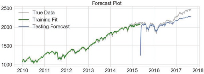
CHAPTER 11 ■ FORECASTING STOCK AND COMMODITY PRICES
494
...:
...: # forecast values
...: testPredict = seq_lstm_model.predict(testPredict)
...:
...: # evaluate performance
...: testScore = math.sqrt(mean_squared_error(test_y[0],
...: testPredict[0][:test_x.shape[1]]))
...: print('Test Score: %.2f RMSE' % (testScore))
Test Score: 0.07 RMSE
We can perform the same steps on the training set as well and check the performance. While generating
the train and test datasets, the function get_seq_train_test() also returned the scaler object. We next use
this scaler object to perform an inverse transformation to get the prediction values in the original scale. The
following snippet performs inverse transformation and then plots the series.
In [4]: # inverse transformation
...: trainPredict = scaler.inverse_transform(trainPredict.\
...: reshape(trainPredict.shape[1]))
...: testPredict = scaler.inverse_transform(testPredict.\
...: reshape(testPredict.shape[1]))
...:
...: train_size = len(trainPredict)+1
...:
...: # plot the true and forecasted values
...: plt.plot(sp_close_series.index,
...: sp_close_series.values,c='black',
...: alpha=0.3,label='True Data')
...:
...: plt.plot(sp_close_series.index[1:train_size],
...: trainPredict,
...: label='Training Fit',c='g')
...:
...: plt.plot(sp_close_series.index[train_size+1:],
...: testPredict[:test_x.shape[1]],
...: label='Forecast')
...: plt.title('Forecast Plot')
...: plt.legend()
...: plt.show()
Figure 11-18. Forecast for S&P 500 using LSTM based sequence modeling

CHAPTER 11 ■ FORECASTING STOCK AND COMMODITY PRICES
495
The forecast plot in Figure11-18 shows a promising picture. We can see that the training fit is nearly
perfect which is kind of expected. The testing performance or the forecast also shows decent performance.
Even though the forecast deviates from the actual at places, the overall performance both in terms of RMSE
and the fit seemed to have worked.
Through the use of TimeDistributed layer wrapper we achieved the goal of modeling this data as a
time series. The model not just had a better performance in terms of overall fit, it required far less feature
engineering and a much simpler model (in terms of number of training parameters). In this model, we
also truly utilized the power of LSTMs by allowing it to learn and figure out what and how much of past
information impacts the forecast (as compared to regression modeling case where we had restricted the
window sizes).
Two important points before we conclude this section. First, both the models have their own
advantages and disadvantages. The aim of this section was to chalk out potential ways of modeling a given
problem. The actual usage mostly depends upon the requirements of the use case. Secondly and more
importantly, either of the models is for learning/demonstration purposes. Actual stock price forecasting
requires far more rigor and knowledge; we just scraped the tip of the iceberg.
Upcoming Techniques: Prophet
The Data Science landscape is ever evolving and new algorithms, tweaks and tools are coming up at a rapid
pace. One such tool is called Prophet. This is a framework, open sourced by Facebook’s Data Science team
for analyzing and forecasting time series.
Prophet uses an additive model that can work with trending and seasonal data. The aim of this tool
is to enable forecasting at scale. This is still in beta, yet has some really useful features. More on this is
available at https://facebookincubator.github.io/prophet/. The research and intuition behind this tool
is available in the paper available at https://facebookincubator.github.io/prophet/static/prophet_
paper_20170113.pdf.
The installation steps are outlined on the web site and are straightforward through pip and conda.
Prophetalso uses scikit style APIs of fit() and predict() with additional utilities to better
handle time series data. For the hands-on examples in this section, you can refer to the jupyter notebook
notebook_stock_prediction_fbprophet.ipynb for the necessary code snippets and examples.
■Note Prophet is still in beta and is undergoing changes. Also, its installation on Windows platform is known
to cause issues. Kindly use conda install (steps mentioned on the web site) with Anaconda distribution to
avoid issues.
Since we already have the S&P 500 index price information available in a dataframe/series. We now test
how we can use this tool to forecast. We begin with converting the time series index into a column of its own
(simply how prophet expects the data) followed by splitting the series into training and testing (90-10 split).
The following snippet performs the required actions.
In [1] : # reset index to get date_time as a column
...: prophet_df = sp_df.reset_index()
...:
...: # prepare the required dataframe
...: prophet_df.rename(columns={'index':'ds','Close':'y'},inplace=True)
...: prophet_df = prophet_df[['ds','y']]
...:
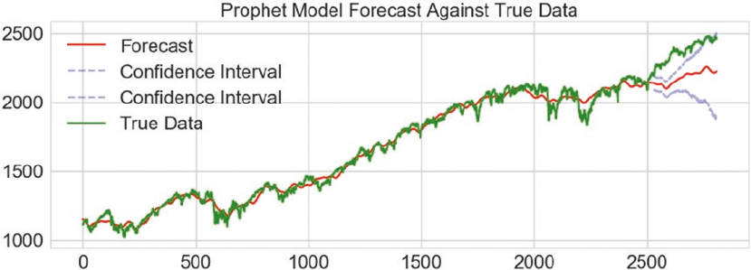
CHAPTER 11 ■ FORECASTING STOCK AND COMMODITY PRICES
496
...: # prepare train and test sets
...: train_size = int(prophet_df.shape[0]*0.9)
...: train_df = prophet_df.ix[:train_size]
...: test_df = prophet_df.ix[train_size+1:]
Once we have the datasets prepared, we create an object of the Prophet class and simply fit the model
using fit() function. Kindly note that the model expects the time series value to be in a column named ‘y’
and timestamp in column named ‘ds’. To make forecasts, prophet requires the set of dates for which we need
to forecast. For this, it provides a clean utility called the make_future_dataframe(), which takes the number
of days required for the forecast as input. The following snippet uses this dataframe to forecast values.
In [2] : # prepare a future dataframe
...: test_dates = pro_model.make_future_dataframe(periods=test_df.shape[0])
...:
...: # forecast values
...: forecast_df = pro_model.predict(test_dates)
The output from the predict() function is a dataframe that includes both in-sample predictions as
well as forecasted values. The dataframe also includes the confidence interval values. All of this can be easily
plotted using the plot() function of the model object. The following snippet plots the forecasted values
against the original time series along with its confidence intervals.
In [3] : # plot against true data
...: plt.plot(forecast_df.yhat,c='r',label='Forecast')
...: plt.plot(forecast_df.yhat_lower.iloc[train_size+1:],
...: linestyle='--',c='b',alpha=0.3,
...: label='Confidence Interval')
...: plt.plot(forecast_df.yhat_upper.iloc[train_size+1:],
...: linestyle='--',c='b',alpha=0.3,
...: label='Confidence Interval')
...: plt.plot(prophet_df.y,c='g',label='True Data')
...: plt.legend()
...: plt.title('Prophet Model Forecast Against True Data')
...: plt.show()
Figure 11-19. Forecasts from prophet against true/observed values
CHAPTER 11 ■ FORECASTING STOCK AND COMMODITY PRICES
497
The model’s forecasts are a bit off the mark (see Figure11-19), but the exercise clearly demonstrates the
possibilities here. The forecast dataframe provides even more details about seasonality, weekly trends, and
so on. You are encouraged to explore this further. Prophet is based upon Stan. Stan is statistical modeling
language/framework that provides algorithms exposed through interfaces for all major languages, including
python. You may explore more on this at http://mc-stan.org/.
Summary
This chapter introduced the concepts of time series forecasting and analysis using stock and commodity
price information. Through this chapter we covered the basic components of a time series along with
common techniques for preprocessing such data. We then worked on the gold price prediction use case.
This use case utilized the quandl library to get daily gold price information. We then discussed traditional
time series analysis techniques and introduced key concepts related to Box-Jenkin’s methodology and
ARIMA in particular. We also discussed techniques for identification and transformation of non-stationary
time series into one using AD Fuller tests, ACF and PACF plots. We modeled the gold price information
using ARIMA based on statsmodel APIs while developing some key utility functions like auto_arima() and
arima_gridsearch_cv(). Key insights and caveats were also discussed. The next section of the chapter
introduced the stock price prediction use case. Here, we utilized pandas_datareader to get S&P 500 daily
closing price information.
To solve this use case, we utilized RNN based models. Primarily we provided two alternative
perspectives of formulating the forecasting problem, both using LSTMs. The first formulation closely
imitated the regression concepts discussed in earlier chapters. A two-layer stacked LSTM network was used
to forecast stock price information. The second perspective utilized TimeDistributed layer wrapper from
keras to enable sequence modeling of the stock price information. Various utilities and key concepts were
discussed while working on the use case. Finally, an upcoming tool (still in beta), Prophet from Facebook
was discussed. The tool is made available by Facebook’s Data Science team to perform forecasting at scale.
We utilized the framework to quickly evaluate its performance on the same stock price information and
shared the results. A multitude of techniques and concepts were introduced in this chapter, along with the
intuition on how to formulate certain time series problems. Stay tuned for some more exciting use cases in
the next chapter.

499
© Dipanjan Sarkar, Raghav Bali and Tushar Sharma 2018
D. Sarkar et al., Practical Machine Learning with Python, https://doi.org/10.1007/978-1-4842-3207-1_12
CHAPTER 12
Deep Learning for Computer Vision
Deep Learning is not just a keyword abuzz in the industry and academics, it has thrown wide open a whole
new field of possibilities. Deep Learning models are being employed in all sorts of use cases and domains,
some of which we saw in the previous chapters. Deep neural networks have tremendous potential to learn
complex non-linear functions, patterns, and representations. Their power is driving research in multiple
fields, including computer vision, audio-visual analysis, chatbots and natural language understanding,
to name a few. In this chapter, we touch on some of the advanced areas in the field of computer vision,
which have recently come into prominence with the advent of Deep Learning. This includes real-world
applications like image categorization and classification and the very popular concept of image artistic
style transfer. Computer vision is all about the art and science of making machines understand high-level
useful patterns and representations from images and videos so that it would be able to make intelligent
decisions similar to what a human would do upon observing its surroundings. Building on core concepts
like convolutional neural networks and transfer learning, this chapter provides you with a glimpse into the
forefront of Deep Learning research with several real-world case studies from computer vision.
This chapter discusses convolutional neural networks through the task of image classification using
publicly available datasets like CIFAR, ImageNet, and MNIST. We will utilize our understanding of CNNs to
then take on the task of style transfer and understand how neural networks can be used to understand
high-level features. Through this chapter, we cover the following topics in detail:
• Brief overview of convolutional neural networks
• Image classification using CNNs from scratch
• Transfer learning: image classification using pretrained models
• Neural style transfer using CNNs
The code samples, jupyter notebooks, and sample datasets for this chapter are available in the GitHub
repository for this book at https://github.com/dipanjanS/practical-machine-learning-with-python
under the directory/folder for Chapter 12.
Convolutional Neural Networks
Convolutional Neural Networks (CNNs) are similar to the general neural networks we have discussed over
the course of this book. The additional explicit assumption of input being an image (tensor) is what makes
CNNs optimized and different than the usual neural networks. This explicit assumption is what allows us to
design deep CNNs while keeping the number of trainable parameters in check (in comparison to general
neural networks).
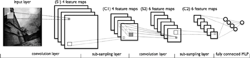
CHAPTER 12 ■ DEEP LEARNING FOR COMPUTER VISION
500
We touched upon the concepts of CNNs in Chapter 1 (in the section “Deep Learning”) and Chapter 4
(in the section :Feature Engineering on Image Data). However, as a quick refresher, the following are the key
concepts worth reiterating:
• Convolutional Layer: This is the key differentiating component of a CNN as
compared to other neural networks. Convolutional layer or conv layer is a set of
learnable filters. These filters help capture spatial features. These are usually small
(along the width and height) but cover the full depth (color range) of the image.
During the forward pass, we slide the filter across the width and the height of the
image while computing the dot product between the filter attributes and the input at
any position. The output is a two-dimensional activation map from each filter, which
are then stacked to get the final output.
• Pooling Layer: These are basically down-sampling layers used to reduce spatial
size and number of parameters. These layers also help in controlling overfitting.
Pooling layers are inserted in between conv layers. Pooling layers can perform down
sampling using functions such as max, average, L2-norm, and so on.
• Fully Connected Layer: Also known as FC layer. These are similar to fully connected
layers in general neural networks. These have full connections to all neurons in the
previous layer. This layer helps perform the tasks of classification.
• Parameter Sharing: The unique thing about CNNs apart from the conv layer
is parameter sharing. Conv layers use same set of weights across the filters thus
reducing the overall number of parameters required.
A typical CNN architecture with all the components is depicted in Figure12-1, which is a LeNet CNN
model (Source: deeplearning.net).
CNNs have been studied in-depth and are being constantly improved and experimented with. For an
in-depth understanding of CNNs, refer to courses such as one from Stanford available at http://cs231n.
github.io/convolutional-networks.
Figure 12-1. LeNet CNN model (source: deeplearning.net)
CHAPTER 12 ■ DEEP LEARNING FOR COMPUTER VISION
501
Image Classification with CNNs
Convolutional Neural Networks are prime examples of the potential and power of neural networks to learn
detailed feature representations and patterns from images and perform complex tasks, ranging from object
recognition to image classification and many more. CNNs have gone through tremendous research and
advancements have led to more complex and power architectures, like VGG-16, VGG-19, Inception V3, and
many more interesting models.
We begin with a getting some hands-on experience with CNNs by working on an image classification
problem. We shared an example of CNN based classification in Chapter 4 through the notebook, Bonus -
Classifying handwritten digits using Deep CNNs.ipynb, which talks about classifying and predicting
human handwritten digits by leveraging CNN based Deep Learning. In case you haven’t gone through it, do
not worry as we will go through a detailed example here. For our Deep Learning needs, we will be utilizing
the keras framework with the tensorflow backend, similar to what we used in the previous chapters.
Problem Statement
Given a set of images containing real-world objects, it is fairly easy for humans to recognize them. Our task
here is to build a multiclass (10 classes or categories) image classifier that can identify the correct class label
of a given image. For this task, we will be utilizing the CIFAR10 dataset.
Dataset
The CIFAR10 dataset is a collection of tiny labeled images spanning across 10 different classes.
The dataset was collected by Alex Krizhevsky, Vinod Nair, and Geoffrey Hinton and is available at
https://www.cs.toronto.edu/~kriz/cifar.html as well as through the datasets module in keras.
This dataset contains tiny images of size 32 x 32 with 50,000 training and 10,000 test samples. Each
image can fall into one and only one of the following classes.
• Automobile
• Airplane
• Bird
• Cat
• Deer
• Dog
• Frog
• Horse
• Ship
• Truck
Each class is mutually exclusive. There is another larger version of the dataset called the CIFAR100. For
the purpose of this section, we will consider the CIFAR10 dataset.
We would be accessing the CIFAR10 dataset through the keras.datasets module. Download the
required files if they are not already present.
CHAPTER 12 ■ DEEP LEARNING FOR COMPUTER VISION
502
CNN Based Deep Learning Classifier from Scratch
Similar to any Machine Learning algorithm, neural networks also require the input data to be certain shape,
size, and type. So, before we reach the modeling step, the first thing is to preprocess the data itself. The
following snippet gets the dataset and then performs one hot encoding of the labels. Remember there are 10
classes to work with and hence we are dealing with a multi-class classification problem.
In [1]: import keras
...: from keras.datasets import cifar10
...:
...: num_classes = 10
...:
...: (x_train, y_train), (x_test, y_test) = cifar10.load_data()
...:
...: # convert class vectors to binary class matrices
...: y_train = keras.utils.to_categorical(y_train, num_classes)
...: y_test = keras.utils.to_categorical(y_test, num_classes)
The dataset, if not already present locally, would be downloaded automatically. The following are the
shapes of the objects obtained.
In [2]: print('x_train shape:', x_train.shape)
...: print(x_train.shape[0], 'train samples')
...: print(x_test.shape[0], 'test samples')
...:
x_train shape: (50000, 32, 32, 3)
50000 train samples
10000 test samples
Now that we have training and test datasets. The next step is to build the CNN model. Since we have
two dimensional images (the third dimension is the channel information), we will be using Conv2D layers.
As discussed in the previous section, CNNs uses a combination of convolutional layers and pooling layers
followed by a fully connected end to identify/classify the data. The model architecture is built as follows.
In [3]: model = Sequential()
...: model.add(Conv2D(32, kernel_size=(3, 3),
...: activation='relu',
...: input_shape=input_shape))
...: model.add(Conv2D(64, (3, 3), activation='relu'))
...: model.add(MaxPooling2D(pool_size=(2, 2)))
...: model.add(Dropout(0.25))
...: model.add(Flatten())
...: model.add(Dense(128, activation='relu'))
...: model.add(Dropout(0.5))
...: model.add(Dense(num_classes, activation='softmax'))
It starts off with a convolutional layer with a total of 32 3 x 3 filters and activation function as the
rectified linear unit (relu). The input shape resembles each image size, i.e. 32 x 32 x 3 (color image has three
channels—RGB). This is followed by another convolutional layer and a max-pooling layer. Finally, we have
the fully connected dense layer. Since we have 10 classes to choose from, the final output layer has a softmax
activation.
CHAPTER 12 ■ DEEP LEARNING FOR COMPUTER VISION
503
The next step involves compiling. We use categorical_crossentropy as our loss function since we are
dealing with multiple classes. Besides this, we use the Adadelta optimizer and then train the classifier on the
training data. The following snippet showcases the same.
In [4]: model.compile(loss=keras.losses.categorical_crossentropy,
...: optimizer=keras.optimizers.Adadelta(),
...: metrics=['accuracy'])
...:
...: model.fit(x_train, y_train,
...: batch_size=batch_size,
...: epochs=epochs,
...: verbose=1)
Epoch 1/10
50000/50000 [==============================] - 256s - loss: 7.3118 - acc: 0.1798
Epoch 2/10
50000/50000 [==============================] - 250s - loss: 1.7923 - acc: 0.3564
Epoch 3/10
50000/50000 [==============================] - 252s - loss: 1.5781 - acc: 0.4383
...
Epoch 9/10
50000/50000 [==============================] - 251s - loss: 1.1019 - acc: 0.6163
Epoch 10/10
50000/50000 [==============================] - 254s - loss: 1.0584 - acc: 0.6284
From the preceding output, it is clear that we trained the model for 10 epochs. This takes anywhere
between 200-400 secs on a CPU, the performance improves manifold when done using a GPU. We can see
the accuracy is around 63% based on the last epoch. We will now evaluate the testing performance, this is
checked using the evaluate function of the model object. The results are as follows.
Test loss: 1.10143025074
Test accuracy: 0.6354
Thus, we can see that our very simple CNN based Deep Learning model achieved an accuracy of 63.5%,
given the fact that we have built a very simple model and that we haven't done much preprocessing or model
tuning. You are encouraged to try different CNN architectures and experiment with hyperparameter tuning
to see how the results can be improved.
The initial few conv layers of the model kind of work toward feature extraction while the last couple of
layers (fully connected) help in classifying the data. Thus, it would be interesting to see how the image data
is manipulated by the conv-net we just created. Luckily, keras provides hooks to extract information at
intermediate steps in the model. They depict how various regions of the image activate the conv layers and
how the corresponding feature representations and patterns are extracted.
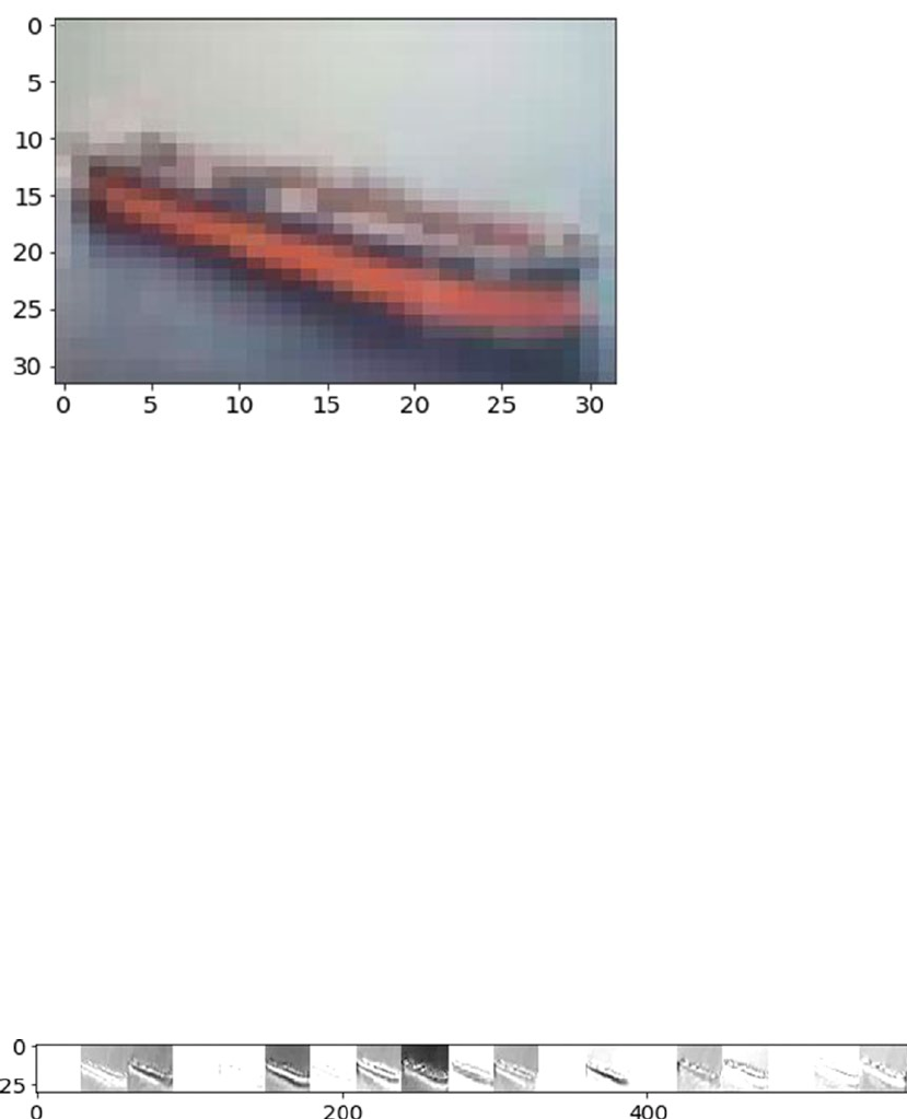
CHAPTER 12 ■ DEEP LEARNING FOR COMPUTER VISION
504
A sample flow of how an image is viewed by the CNN is explained in the notebook
notebook_cnn_cifar10_classifier.ipynb. It contains rest of the code discussed in this section. Figure12-2
shows an image from the test dataset. It looks like a ship and the model correctly identifies the same as well
as depicted in this snippet.
# actual image id
img_idx = 999
# actual image label
In [5]: y_test[img_idx]
array([ 0., 0., 0., 0., 0., 0., 0., 0., 1., 0.])
# predict label with our model
In [6]: test_image =np.expand_dims(x_test[img_idx], axis=0)
...: model.predict_classes(test_image,batch_size=1)
1/1 [==============================] - 0s
Out[16]:
array([8], dtype=int64)
You can extract and view the activation maps of the image based on what representations are learned
and extracted by the conv layers using the get_activations(...) and display_activations(...) functions
in the notebook. Figure12-3 shows the activations of initial conv layers of the CNN model we just built.
Figure 12-3. Sample image through a CNN layer
Figure 12-2. Sample image from the CIFAR10 dataset

CHAPTER 12 ■ DEEP LEARNING FOR COMPUTER VISION
505
We also recommend you go through the section “Automated Feature Engineering with Deep Learning”
in Chapter 4 to learn more about extracting feature representations from images using convolutional layers.
CNN Based Deep Learning Classifier with Pretrained Models
Building a classifier from scratch has its own set of pros and cons. Yet, a more refined approach is to leverage
pre-trained models over large complex datasets. There are many famous CNN architectures like LeNet,
ResNet, VGG-16, VGG-19, and so on. These models have deep and complex architectures that have been
fine-tuned and trained over diverse, large datasets. Hence, these models have been proven to have amazing
performance on complex object recognition tasks.
Since obtaining large labeled datasets and training highly complex and deep neural networks is a time-
consuming task (training a complex CNN like VGG-19 could take a few weeks, even using GPUs). In practice,
we utilize a concept, what is formally termed as transfer learning. This concept of transfer learning helps us
leverage existing models for our tasks. The core idea is to leverage the learning, which the model learned
from being trained over a large dataset and then transfer this learning by re-using the same model to extract
feature representations from new images. There are several strategies of performing transfer learning, some
of which are mentioned as follows:
• Pre-trained model as feature extractor: The pre-trained model is used to extract
features for our dataset. We build a fully connected classifier on top of these features.
In this case we only need to train the fully connected classifier, which does not take
much time.
• Fine-tuning pre-trained models: It is possible to fine-tune an existing pre-trained
model by fixing some of the layers and allowing others to learn/update weights
apart from the fully connected layers. Usually it is observed that initial layers capture
generic features while the deeper ones become more specific in terms of feature
extraction. Thus, depending upon the requirements, we fix certain layers and
fine-tune the rest.
In this section, we see an example where we will utilize a pre-trained conv-network as a feature
extractor and build fully connected layer based classifier on top of it and train the model. We will not train
the feature extraction layers and hence leverage principles of transfer learning by using the pre-trained conv
layers for feature extraction.
The VGG-19 model from the Visual Geometry Group of the Oxford University is one state-of-the-art
convolutional neural network. This has been shown to perform extremely well on various benchmarks and
competitions. VGG19 is a 19-layer conv-net trained on ImageNet dataset. ImageNet is visual database of
hand-annotated images amounting to 10 million spanning across 9,000+ categories. This model has been
widely studied and used in tasks such as transfer learning.
■Note More details on this and other research by the VGG group is available at http://www.robots.
ox.ac.uk/~vgg/research/very_deep/.
This pretrained model is available through the keras.applications module. As mentioned, we will
utilize VGG-19 to act as feature extractor to help us build a classifier on CIFAR10 dataset.
Since we would be using VGG-19 for feature extraction, we do not need the top (or fully connected)
layers of this model. keras makes this as simple as setting a single flag value to False. The following snippet
loads the VGG-19 model architecture consisting of the conv layers and leaves out the fully connected layers.
CHAPTER 12 ■ DEEP LEARNING FOR COMPUTER VISION
506
In [1]: from keras import applications
...:
...: vgg_model = applications.VGG19(include_top=False, weights='imagenet')
Now that the pre-trained model is available, we will utilize it to extract features from our training
dataset. Remember VGG-19 is trained upon ImageNet while we would be using CIFAR10 to build a classifier.
Since ImageNet contains over 10 million images spanning across 9,000+ categories, it is safe to assume that
CIFAR10's categories would a subset here. Before moving on to feature extraction using the VGG-19 model, it
would be a good idea to check out the model's architecture.
In [1]: vgg_model.summary()
_________________________________________________________________
Layer (type) Output Shape Param #
=================================================================
input_1 (InputLayer) (None, None, None, 3) 0
_________________________________________________________________
block1_conv1 (Conv2D) (None, None, None, 64) 1792
_________________________________________________________________
block1_conv2 (Conv2D) (None, None, None, 64) 36928
_________________________________________________________________
block1_pool (MaxPooling2D) (None, None, None, 64) 0
_________________________________________________________________
block2_conv1 (Conv2D) (None, None, None, 128) 73856
_________________________________________________________________
block2_conv2 (Conv2D) (None, None, None, 128) 147584
_________________________________________________________________
block2_pool (MaxPooling2D) (None, None, None, 128) 0
_________________________________________________________________
block3_conv1 (Conv2D) (None, None, None, 256) 295168
_________________________________________________________________
block3_conv2 (Conv2D) (None, None, None, 256) 590080
_________________________________________________________________
block3_conv3 (Conv2D) (None, None, None, 256) 590080
_________________________________________________________________
block3_conv4 (Conv2D) (None, None, None, 256) 590080
_________________________________________________________________
block3_pool (MaxPooling2D) (None, None, None, 256) 0
_________________________________________________________________
block4_conv1 (Conv2D) (None, None, None, 512) 1180160
_________________________________________________________________
block4_conv2 (Conv2D) (None, None, None, 512) 2359808
_________________________________________________________________
block4_conv3 (Conv2D) (None, None, None, 512) 2359808
_________________________________________________________________
block4_conv4 (Conv2D) (None, None, None, 512) 2359808
_________________________________________________________________
block4_pool (MaxPooling2D) (None, None, None, 512) 0
_________________________________________________________________
block5_conv1 (Conv2D) (None, None, None, 512) 2359808
_________________________________________________________________
block5_conv2 (Conv2D) (None, None, None, 512) 2359808
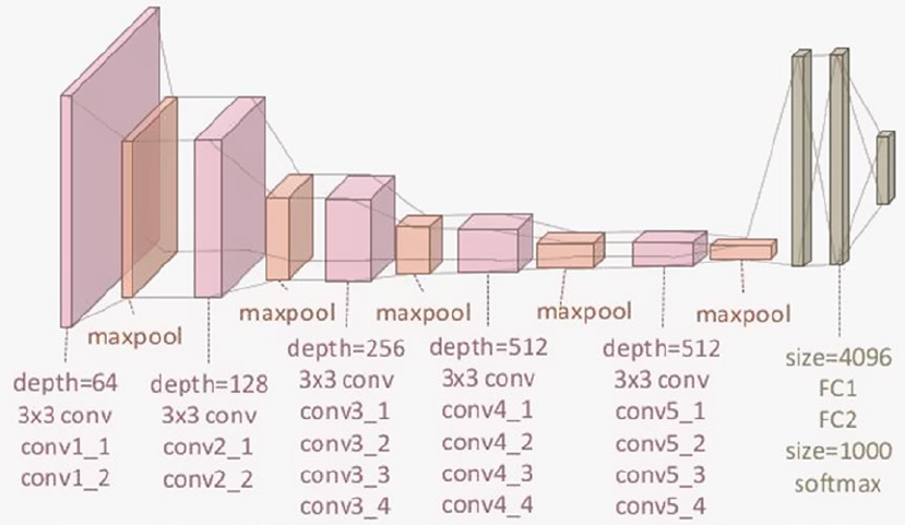
CHAPTER 12 ■ DEEP LEARNING FOR COMPUTER VISION
507
_________________________________________________________________
block5_conv3 (Conv2D) (None, None, None, 512) 2359808
_________________________________________________________________
block5_conv4 (Conv2D) (None, None, None, 512) 2359808
_________________________________________________________________
block5_pool (MaxPooling2D) (None, None, None, 512) 0
=================================================================
Total params: 20,024,384
Trainable params: 20,024,384
Non-trainable params: 0
_________________________________________________________________
From the preceding output, you can see that the architecture is huge with a lot of layers. Figure12-4
depicts the same in an easier-to-understand visual depicting all the layers. Remember that we do not use the
fully connected layers depicted in the extreme right of Figure12-4. We recommend checking out the paper Very
Deep Convolutional Networks for Large-Scale Image Recognition by Karen Simonyan and Andrew Zisserman of
the Visual Geometry Group, Department of Engineering Science, University of Oxford. The paper is available at
https://arxiv.org/abs/1409.1556 and talks in detail about the architecture of these models.
Loading the CIFAR10 training and test datasets is the same as discussed in the previous section. We
perform similar one hot encoding of the labels as well. Since the VGG19 model has been loaded without the
final fully connected layers, the predict(...) function of the model helps us get the extracted features on
our dataset. The following snippet extracts the features for both training and test datasets.
In [2]: bottleneck_features_train = vgg_model.predict(x_train, verbose=1)
...: bottleneck_features_test = vgg_model.predict(x_test, verbose=1)
Figure 12-4. Visual depiction of the VGG-19 architecture
CHAPTER 12 ■ DEEP LEARNING FOR COMPUTER VISION
508
These features are widely known as bottleneck features due to the fact that there is an overall decrease
in the volume of the input data points. It would be worth exploring the model summary to understand how
the VGG model transforms the data. The output of this stage (the bottleneck features) is used as input to
the classifier we are going to build next. The following snippet builds a simple fully connected two-layer
classifier.
In [3]: clf_model = Sequential()
...: clf_model.add(Flatten(input_shape=bottleneck_features_train.shape[1:]))
...: clf_model.add(Dense(512, activation='relu'))
...: clf_model.add(Dropout(0.5))
...: clf_model.add(Dense(256, activation='relu'))
...: clf_model.add(Dropout(0.5))
...: clf_model.add(Dense(num_classes, activation='softmax'))
...: clf_model.compile(loss=keras.losses.categorical_crossentropy,
optimizer=keras.optimizers.Adadelta(),
metrics=['accuracy'])
The model's input layer matches the dimensions of the bottleneck features (for obvious reasons). As
with the CNN model we built from scratch, this model also has a dense output layer with softmax activation
function. Training this model as opposed to a complete VGG19 is fairly simple and fast, as depicted in the
following snippet.
In [4]: clf_model.fit(bottleneck_features_train, y_train, batch_size=batch_size,
...: epochs=epochs, verbose=1)
Epoch 1/50
50000/50000 [==============================] - 8s - loss: 7.2495 - acc: 0.2799
Epoch 2/50
50000/50000 [==============================] - 7s - loss: 2.2513 - acc: 0.2768
Epoch 3/50
50000/50000 [==============================] - 7s - loss: 1.9096 - acc: 0.3521
...
Epoch 48/50
50000/50000 [==============================] - 8s - loss: 0.9368 - acc: 0.6814
Epoch 49/50
50000/50000 [==============================] - 8s - loss: 0.9223 - acc: 0.6832
Epoch 50/50
50000/50000 [==============================] - 8s - loss: 0.9197 - acc: 0.6830
We can add hooks to stop the training early based of early stop criteria, etc. But for now, we keep things
simple. Complete code for this section is available in the notebook notebook_pretrained_cnn_cifar10_
classifier.ipynb. Overall, we achieve an accuracy of 68% on the training dataset and around 64% on the
test dataset.
Now you’ll see the performance of this classifier built on top a pre-trained model on the test dataset.
The following snippet showcases a utility function that takes the index number of an image in the test
dataset as input and compares the actual labels and the predicted labels.
def predict_label(img_idx,show_proba=True):
plt.imshow(x_test[img_idx],aspect='auto')
plt.title("Image to be Labeled")
plt.show()
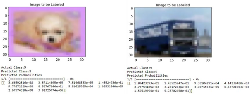
CHAPTER 12 ■ DEEP LEARNING FOR COMPUTER VISION
509
print("Actual Class:{}".format(np.nonzero(y_test[img_idx])[0][0]))
test_image =np.expand_dims(x_test[img_idx], axis=0)
bf = vgg_model.predict(test_image,verbose=0)
pred_label = clf_model.predict_classes(bf,batch_size=1,verbose=0)
print("Predicted Class:{}".format(pred_label[0]))
if show_proba:
print("Predicted Probabilities")
print(clf_model.predict_proba(bf))
The following is the output of the predict_label(...) function when tested against a couple of images
from the test dataset. As depicted in Figure12-5, we correctly predicted the images belong to class label 5
(dog) and 9 (truck)!
This section demonstrated the power and advantages of transfer learning. Instead of spending time
reinventing the wheel, with a few lines of code, we were able to leverage state of the art neural network for
our classification task.
The concept of transfer learning is what forms the basis of neural style transfer, which we will discuss in
the next section.
Artistic Style Transfer with CNNs
Paintings (or for that matter any form of art) require special skill which a few have mastered. Paintings
present complex interplay of content and style. Photographs on the other hand are a combination of
perspectives and light. When the two are combined, the results are spectacular and surprising. One such
example is shown in Figure12-6.
Figure 12-5. Predicted labels from pre-trained CNN based classifier
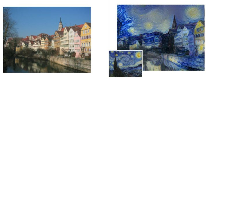
CHAPTER 12 ■ DEEP LEARNING FOR COMPUTER VISION
510
The results in Figure12-6 showcase how a painting's (Van Gogh's The Starry Night) style has been
transferred to a photograph of the Neckarfront. At first glance, the process seems to have picked up the
content from the photograph, the style, colors, and stroke patterns from the painting and generated the final
outcome. The results are amazing, but what is more surprising is, how was it done?
Figure12-6 showcases a process termed as artistic style transfer. The process is an outcome of research
by Gatys etal. and is presented in their paper A Neural Algorithm for Artistic Style. In this section, we
discuss the intricacies of this paper from an implementation point of view and see how we can perform this
technique ourselves.
■Note Prisma is an app that transforms photos into works of art using techniques of artistic style transfer
based on convolution neural networks. More about the app is available at https://prisma-ai.com/.
Background
Formally, neural style transfer is the process of applying the “style” of a reference image to a specific target
image such that in the process, the original “content” of the target image remains unchanged. Here, style
is defined as colors, patterns, and textures present in the reference image, while content is defined as the
overall structure and higher-level components of the image.
The main objective here is then, to retain the content of the original target image, while superimposing
or adopting the style of the reference image on the target image. To define this concept mathematically,
consider three images—the original content (denoted as c), the reference style (denoted as s), and the
generated image (denoted as g). Thus, we need a way to measure how different are images c and g in terms of
their content. A function that tends to 0 if c and g are completely different and grows otherwise. This can be
concisely stated in terms of a loss function as:
Lcontent = distance(c, g)
Where distance is a norm function like L2. On the same lines, we can define another function that
captures how different images s and g are in terms of their style. In other words, this can be stated as follows:
Lstyle = distance(s, g)
Figure 12-6. Left Image: The original photograph depicting the Neckarfront in Tubingen, Germany. Right
Image: The painting (inset: The Starry Night by Vincent van Gogh) that provided the style for the respective
generated image. Source: A Neural Algorithm of Artistic Style, Gatys etal. (arXiv:1508.06576v2)
CHAPTER 12 ■ DEEP LEARNING FOR COMPUTER VISION
511
Thus, for the overall process of neural style transfer, we have an overall loss function, which can be
defined as a combination of content and style loss functions.
Lstyle - transfer = argming(αLcontent(c, g) + βLstyle(s, g))
Where α and β are weights used to control the impact of content and style components on the overall
loss. The loss function we will try to minimize consists of three parts namely, the content loss, the style loss,
and the total variation loss, which we will be talking about later.
The beauty of Deep Learning is that by leveraging architectures like deep convolutional neural networks
(CNNs), we can mathematically define the above-mentioned style and content functions. We will be
using principles of transfer learning in building our system for neural style transfer. We introduced
the concept of transfer learning using a pre-trained deep CNN model like VGG-19. We will be leveraging the
same pre-trained model for the task of neural style transfer. The main steps are outlined as follows.
• Leverage VGG-19 to help compute layer activations for the style, content, and
generated image.
• Use these activations to define specific loss functions mentioned earlier.
• Finally, use gradient descent to minimize the overall loss.
We recommend you follow along this section with the notebook titled Neural Style Transfer.ipynb,
which contains step-by-step details of the style transfer process. We would also like to give a special mention
and thanks to François Chollet as well as Harish Narayanan for providing some excellent resources on style
transfer. Details on the same will be mentioned later. We also recommend you check out the following
papers (detailed links shared later on).
• A Neural Algorithm of Artistic Style by Leon A. Gatys, Alexander S. Ecker, and
Matthias Bethge
• Perceptual Losses for Real-Time Style Transfer and Super-Resolution by Justin
Johnson, Alexandre Alahi, and Li Fei-Fei
Preprocessing
The first and foremost step toward implementation of such a network is to preprocess the data or images in
this case. The following are quick utilities to preprocess images for size and channel adjustments.
import numpy as np
from keras.applications import vgg19
from keras.preprocessing.image import load_img, img_to_array
def preprocess_image(image_path, height=None, width=None):
height = 400 if not height else height
width = width if width else int(width * height / height)
img = load_img(image_path, target_size=(height, width))
img = img_to_array(img)
img = np.expand_dims(img, axis=0)
img = vgg19.preprocess_input(img)
return img
def deprocess_image(x):
# Remove zero-center by mean pixel
x[:, :, 0] += 103.939
CHAPTER 12 ■ DEEP LEARNING FOR COMPUTER VISION
512
x[:, :, 1] += 116.779
x[:, :, 2] += 123.68
# 'BGR'->'RGB'
x = x[:, :, ::-1]
x = np.clip(x, 0, 255).astype('uint8')
return x
As we would be writing custom loss functions and manipulation routines, we would need to define
certain placeholders. keras is a high-level library that utilizes tensor manipulation backends (like
tensorflow, theano, and CNTK) to perform the heavy lifting. Thus, these placeholders provide high-level
abstractions to work with the underlying tensor object. The following snippet prepares placeholders for style,
content, and generated images along with the input tensor for the neural network.
In [1]: # This is the path to the image you want to transform.
...: TARGET_IMG = 'data/city_road.jpg'
...: # This is the path to the style image.
...: REFERENCE_STYLE_IMG = 'data/style2.png'
...:
...: width, height = load_img(TARGET_IMG).size
...: img_height = 320
...: img_width = int(width * img_height / height)
...:
...:
...: target_image = K.constant(preprocess_image(TARGET_IMG,
...: height=img_height,
...: width=img_width))
...: style_image = K.constant(preprocess_image(REFERENCE_STYLE_IMG,
...: height=img_height,
...: width=img_width))
...:
...: # Placeholder for our generated image
...: generated_image = K.placeholder((1, img_height, img_width, 3))
...:
...: # Combine the 3 images into a single batch
...: input_tensor = K.concatenate([target_image,
...: style_image,
...: generated_image], axis=0)
We will load the pre-trained VGG-19 model as we did in the previous section, i.e., without the top fully
connected layers. The only difference here is that we would be providing the model constructor, the size
dimensions of the input tensor. The following snippet fetches the pretrained model.
In [2]: model = vgg19.VGG19(input_tensor=input_tensor,
...: weights='imagenet',
...: include_top=False)
You may use the summary() function to understand the architecture of the pre-trained model.
CHAPTER 12 ■ DEEP LEARNING FOR COMPUTER VISION
513
Loss Functions
As discussed in the background subsection, the problem of neural style transfer revolves around loss
functions of content and style. In this subsection, we will discuss and define the required loss functions.
Content Loss
In any CNN-based model, activations from top layers contain more global and abstract information
(high-level structures like a face) and bottom layers will contain local information (low-level structures
like eyes, nose, edges, and corners) about the image. We would want to leverage the top layers of a CNN for
capturing the right representations for the content of an image.
Hence, for the content loss, considering we will be using the pretrained VGG-19 CNN, we can define
our loss function as the L2 norm (scaled and squared Euclidean distance) between the activations of a
top layer (giving feature representations) computed over the target image and the activations of the same
layer computed over the generated image. Assuming we usually get feature representations relevant to the
content of images from the top layers of a CNN, the generated image is expected to look similar to the base
target image. The following snippet showcases the function to compute the content loss.
def content_loss(base, combination):
return K.sum(K.square(combination - base))
Style Loss
The original paper on neural style transfer, A Neural Algorithm of Artistic Style by Gatys etal., leverages
multiple convolutional layers in the CNN (instead of one) to extract meaningful patterns and representations
capturing information pertaining to appearance or style from the reference style image across all spatial
scales irrespective of the image content.
Staying true to the original paper, we will be leveraging the Gram matrix and computing the same
over the feature representations generated by the convolution layers. The Gram matrix computes the
inner product between the feature maps produced in any given conv layer. The inner products terms are
proportional to the covariances of corresponding feature sets and hence captures patterns of correlations
between the features of a layer that tend to activate together. These feature correlations help capture relevant
aggregate statistics of the patterns of a particular spatial scale, which correspond to the style, texture, and
appearance and not the components and objects present in an image.
The style loss is thus defined as the scaled and squared Frobenius norm of the difference between the
Gram matrices of the reference style and the generated images. Minimizing this loss helps ensure that the
textures found at different spatial scales in the reference style image will be similar in generated image.
The following snippet thus defines a style loss function based on Gram matrix calculation.
def style_loss(style, combination, height, width):
def build_gram_matrix(x):
features = K.batch_flatten(K.permute_dimensions(x, (2, 0, 1)))
gram_matrix = K.dot(features, K.transpose(features))
return gram_matrix
S = build_gram_matrix(style)
C = build_gram_matrix(combination)
channels = 3
size = height * width
return K.sum(K.square(S - C)) / (4. * (channels ** 2) * (size ** 2))
CHAPTER 12 ■ DEEP LEARNING FOR COMPUTER VISION
514
Total Variation Loss
It was observed that optimization to reduce only the style and content losses led to highly pixelated and
noisy outputs. To cover the same, total variation loss was introduced.
The total variation loss is analogous to regularization loss. This is introduced for ensuring spatial
continuity and smoothness in the generated image to avoid noisy and overly pixelated results. The same is
defined in the function as follows.
def total_variation_loss(x):
a = K.square(
x[:, :img_height - 1, :img_width - 1, :] - x[:, 1:, :img_width - 1, :])
b = K.square(
x[:, :img_height - 1, :img_width - 1, :] - x[:, :img_height - 1, 1:, :])
return K.sum(K.pow(a + b, 1.25))
Overall Loss Function
Having defined the components of the overall loss function for neural style transfer, the next step is to piece
together these building blocks. Since content and style information is captured by the CNNs at different
depths in the network, we need to apply and calculate loss at appropriate layers for each type of loss.
Utilizing insights and research by Gatys etal. and Johnson etal. in their respective papers, we define the
following utility to identify the content and style layers from the VGG-19 model. Even though Johnson etal.
leverages the VGG-16 model for faster and better performance, we constrain ourselves to the VGG-19 model
for ease of understanding and consistency across runs.
# define function to set layers based on source paper followed
def set_cnn_layers(source='gatys'):
if source == 'gatys':
# config from Gatys et al.
content_layer = 'block5_conv2'
style_layers = ['block1_conv1', 'block2_conv1', 'block3_conv1',
'block4_conv1', 'block5_conv1']
elif source == 'johnson':
# config from Johnson et al.
content_layer = 'block2_conv2'
style_layers = ['block1_conv2', 'block2_conv2', 'block3_conv3',
'block4_conv3', 'block5_conv3']
else:
# use Gatys config as the default anyway
content_layer = 'block5_conv2'
style_layers = ['block1_conv1', 'block2_conv1', 'block3_conv1',
'block4_conv1', 'block5_conv1']
return content_layer, style_layers
The following snippet then applies the overall loss function based on the layers selected from
the set_cnn_layers() function for content and style.
In [2]: # weights for the weighted average loss function
...: content_weight = 0.025
...: style_weight = 1.0
...: total_variation_weight = 1e-4
CHAPTER 12 ■ DEEP LEARNING FOR COMPUTER VISION
515
...:
...: # set the source research paper followed and set the content and style layers
...: source_paper = 'gatys'
...: content_layer, style_layers = set_cnn_layers(source=source_paper)
...:
...: ## build the weighted loss function
...:
...: # initialize total loss
...: loss = K.variable(0.)
...:
...: # add content loss
...: layer_features = layers[content_layer]
...: target_image_features = layer_features[0, :, :, :]
...: combination_features = layer_features[2, :, :, :]
...: loss += content_weight * content_loss(target_image_features,
...: combination_features)
...:
...: # add style loss
...: for layer_name in style_layers:
...: layer_features = layers[layer_name]
...: style_reference_features = layer_features[1, :, :, :]
...: combination_features = layer_features[2, :, :, :]
...: sl = style_loss(style_reference_features, combination_features,
...: height=img_height, width=img_width)
...: loss += (style_weight / len(style_layers)) * sl
...:
...: # add total variation loss
...: loss += total_variation_weight * total_variation_loss(generated_image)
Custom Optimizer
The objective is to iteratively minimize the overall loss with the help of an optimization algorithm. In
the paper by Gatys etal., optimization was done using the L-BFGS algorithm, which is an optimization
algorithm based on quasi-Newton methods, which is popularly used for solving non-linear optimization
problems and parameter estimation. This method usually converges faster than standard gradient descent.
SciPy has an implementation available in scipy.optimize.fmin_l_bfgs_b(). However, limitations include
the function being applicable only to flat 1D vectors, unlike 3D image matrices which we are dealing with,
and the fact that value of loss function and gradients need to be passed as two separate functions.
We build an Evaluator class based on patterns followed by keras creator François Chollet to compute
both loss and gradients values in one pass instead of independent and separate computations. This will
return the loss value when called the first time and will cache the gradients for the next call. Thus, it would
be more efficient than computing both independently. The following snippet defines the Evaluator class.
class Evaluator(object):
def __init__(self, height=None, width=None):
self.loss_value = None
self.grads_values = None
self.height = height
self.width = width
CHAPTER 12 ■ DEEP LEARNING FOR COMPUTER VISION
516
def loss(self, x):
assert self.loss_value is None
x = x.reshape((1, self.height, self.width, 3))
outs = fetch_loss_and_grads([x])
loss_value = outs[0]
grad_values = outs[1].flatten().astype('float64')
self.loss_value = loss_value
self.grad_values = grad_values
return self.loss_value
def grads(self, x):
assert self.loss_value is not None
grad_values = np.copy(self.grad_values)
self.loss_value = None
self.grad_values = None
return grad_values
The loss and gradients are retrieved as follows. The snippetalso creates an object of the Evaluator class.
In [3]: # Get the gradients of the generated image wrt the loss
...: grads = K.gradients(loss, generated_image)[0]
...:
...: # Function to fetch the values of the current loss and the current gradients
...: fetch_loss_and_grads = K.function([generated_image], [loss, grads])
...:
...: # evaluator object
...: evaluator = Evaluator(height=img_height, width=img_width)
Style Transfer in Action
The final piece of the puzzle is to use all the building blocks and see the style transfer in action. The art/style
and content images are available data directory for reference. The following snippet outlines how loss and
gradients are evaluated. We also write back outputs after regular intervals (5, 10, and so on iterations) to later
understand how the process of neural style transfer transforms the images in consideration.
In [4]: result_prefix = 'style_transfer_result_'+TARGET_IMG.split('.')[0]
...: result_prefix = result_prefix+'_'+source_paper
...: iterations = 20
...:
...: # Run scipy-based optimization (L-BFGS) over the pixels of the generated image
...: # so as to minimize the neural style loss.
...: # This is our initial state: the target image.
...: # Note that `scipy.optimize.fmin_l_bfgs_b` can only process flat vectors.
...: x = preprocess_image(TARGET_IMG, height=img_height, width=img_width)
...: x = x.flatten()
...:
...: for i in range(iterations):
...: print('Start of iteration', (i+1))
...: start_time = time.time()
...: x, min_val, info = fmin_l_bfgs_b(evaluator.loss, x,
...: fprime=evaluator.grads, maxfun=20)
CHAPTER 12 ■ DEEP LEARNING FOR COMPUTER VISION
517
...: print('Current loss value:', min_val)
...: if (i+1) % 5 == 0 or i == 0:
...: # Save current generated image only every 5 iterations
...: img = x.copy().reshape((img_height, img_width, 3))
...: img = deprocess_image(img)
...: fname = result_prefix + '_at_iteration_%d.png' %(i+1)
...: imsave(fname, img)
...: print('Image saved as', fname)
...: end_time = time.time()
...: print('Iteration %d completed in %ds' % (i+1, end_time - start_time))
It must be pretty evident by now that neural style transfer is a computationally expensive task. For the
set of images in consideration, each iteration took between 500-1000 seconds on a Intel i5 CPU with 8GB
RAM. On an average, each iteration takes around 500 seconds but if you run multiple networks together,
each iteration takes up to 1,000 seconds. You may observe speedups if the same is done using GPUs. The
following is the output of some of the iterations. We print the loss and time taken for each iteration and save
the image after five iterations.
Start of iteration 1
Current loss value: 2.4219e+09
Image saved as style_transfer_result_city_road_gatys_at_iteration_1.png
Iteration 1 completed in 506s
Start of iteration 2
Current loss value: 9.58614e+08
Iteration 2 completed in 542s
Start of iteration 3
Current loss value: 6.3843e+08
Iteration 3 completed in 854s
Start of iteration 4
Current loss value: 4.91831e+08
Iteration 4 completed in 727s
Start of iteration 5
Current loss value: 4.03013e+08
Image saved as style_transfer_result_city_road_gatys_at_iteration_5.png
Iteration 5 completed in 878s
...
Start of iteration 19
Current loss value: 1.62501e+08
Iteration 19 completed in 836s
Start of iteration 20
Current loss value: 1.5698e+08
Image saved as style_transfer_result_city_road_gatys_at_iteration_20.png
Iteration 20 completed in 838s
Now you’ll learn how the neural style transfer has worked out for the images in consideration.
Remember that we performed checkpoint outputs after certain iterations for every pair of style and
content images.
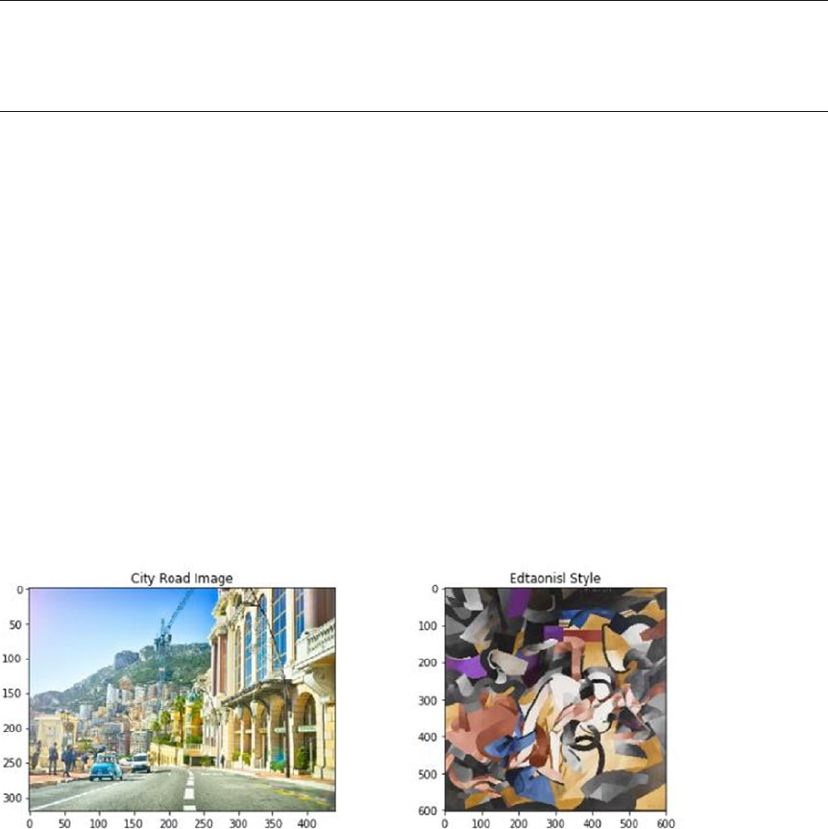
CHAPTER 12 ■ DEEP LEARNING FOR COMPUTER VISION
518
Figure 12-7. The City Road image as content and the Edtaonisl painting as style image for neural style transfer
■Note The style we use for our first image, depicted in Figure 12-7, is named Edtaonisl. This is a 1913
master piece by Francis Picabia. Through this oil painting Francis Picabia pioneered a new visual language.
More details about this painting are available at http://www.artic.edu/aic/collections/artwork/80062.
We utilize matplotlib and skimage libraries to load and understand the style transfer magic! The
following snippet loads the city road image as our content and Edtaonisl painting as our style image.
In [5]: from skimage import io
...: from glob import glob
...: from matplotlib import pyplot as plt
...:
...: cr_content_image = io.imread('results/city road/city_road.jpg')
...: cr_style_image = io.imread('results/city road/style2.png')
...:
...:
...: fig = plt.figure(figsize = (12, 4))
...: ax1 = fig.add_subplot(1,2, 1)
...: ax1.imshow(cr_content_image)
...: t1 = ax1.set_title('City Road Image')
...: ax2 = fig.add_subplot(1,2, 2)
...: ax2.imshow(cr_style_image)
...: t2 = ax2.set_title('Edtaonisl Style')
The following snippet loads the generated images (style transferred images) as observed after the first,
tenth, and twentieth iteration.
In [6]: fig = plt.figure(figsize = (20, 5))
...: ax1 = fig.add_subplot(1,3, 1)
...: ax1.imshow(cr_iter1)
...: t1 = ax1.set_title('Iteration 1')
...: ax2 = fig.add_subplot(1,3, 2)
...: ax2.imshow(cr_iter10)

CHAPTER 12 ■ DEEP LEARNING FOR COMPUTER VISION
519
...: t2 = ax2.set_title('Iteration 10')
...: ax3 = fig.add_subplot(1,3, 3)
...: ax3.imshow(cr_iter20)
...: t3 = ax3.set_title('Iteration 20')
...: t = fig.suptitle('City Road Image after Style Transfer')
The results depicted in Figure12-8 sure seem pleasant and amazing. It is quite apparent how the
generated image in the initial iterations resembles the structure of the content and, as the iterations
progress, the style starts influencing the texture, color, strokes, and so on, more and more.
■Note The style used in our next example depicted in Figure 12-9 is the famous painting named The Great
Wave by Katsushika Hokusai. The artwork was completed in 1830-32. It is amazing to see the styles of such
talented artists being transferred to everyday photographs. More on this artwork is available at http://www.
metmuseum.org/art/collection/search/36491.
We experimented with a few more sets of images and the results truly were surprising and pleasant
to look at. The output from neural style transfer for an image depicting an Italian street (see Figure12-9) is
shown in Figure12-10 at different iterations.
Figure 12-8. The City Road image style transfer at the first, tenth, and twentieth iteration
Figure 12-9. The Italy Street image as content and Wave Style painting as the style image for neural style transfer

CHAPTER 12 ■ DEEP LEARNING FOR COMPUTER VISION
520
Figure 12-10. Italian street image style transfer at the first, tenth and twentieth iteration
The results depicted in Figure12-10 are definitely a pleasure to look at and give the feeling of an entire
city underwater! We encourage you to use images of your own with this same framework. Also feel free to
experiment with leveraging different convolution layers for the style and content feature representations as
mentioned in Gatys etal. and Johnson etal.
■Note The concept and details of neural style transfer were introduced and explained by Gatys et al. and
Johnson et al. in their respective papers available at https://arxiv.org/abs/1508.06576 and
https://arxiv.org/abs/1603.08155. You can also check out the book Deep Learning with Python by François
Chollet as well as Harish Narayanan's excellent blog for a detailed step-by-step guide on neural style transfer:
https://harishnarayanan.org/writing/artistic-style-transfer/.
Summary
This chapter presented topics from the very forefront of the Machine Learning landscape. Through this
chapter we utilized our learnings about Machine Learning in general and Deep Learning in particular to
understand the concepts of image classification, transfer learning, and style transfer. The chapter started off
with a quick brush up of concepts related to Convolutional Neural Networks and how they are optimized
architectures to handle image related data. We then worked towards developing image classifiers. The first
classifier was developed from scratch and with the help of keras we were able to achieve decent results.
The second classifier utilized a pre-trained VGG-19 deep CNN model as an image feature extractor.
The pre-trained model based classifier helped us understand the concept of transfer learning and how it is
beneficial. The closing section of the chapter introduced the advanced topic of Neural Style Transfer, the
main highlight of this chapter. Style transfer is the process of applying the style of a reference image to a
specific target image such that in the process, the original content of the target image remains unchanged.
This process utilizes the potential of CNNs to understand image features at different granularities along
with transfer learning. Based on our understanding of these concepts and the research work by Gatys etal.
and Johnson etal., we provided a step-by-step guide to implement a system of neural style transfer. We
concluded the section by presenting some amazing results from the process of neural style transfer.
Deep Learning is opening new doors every day. Its application to different domains and problems is
showcasing its potential to solve problems previously unknown. Machine Learning is an ever evolving and
a very involved field. Through this book, we traveled from the basics of Machine Learning frameworks,
Python ecosystem to different algorithms and concepts. We then covered multiple use cases across chapters
showcasing different scenarios and ways a problem can be solved using the tools from the Machine Learning
toolbox. The universe of Machine Learning is expanding at breakneck speeds; our attempt here was to get
you started on the right track, on this wonderful journey.

521
© Dipanjan Sarkar, Raghav Bali and Tushar Sharma 2018
D. Sarkar et al., Practical Machine Learning with Python, https://doi.org/10.1007/978-1-4842-3207-1
A
Advanced supervised deep learning models
dense layer, 361
embedding layer, 355, 357
LSTM-based classication model, 355
LSTM cell
architecture, 360
data ow, 361
model performance metrics, LSTM, 362
most_common(count) function, 356
norm_train_reviews and
norm_test_reviews, 355
PAD_INDEX, 355
parameters, Embedding
layer, 358
RNN and LSTM units, structure, 359
text sentiment class labels, 356
tokenized_train corpus, 355
word embeddings generation, 358
AFINN lexicon, 338–339
Algorithmic trading, 483
Annotations, 175
Anomaly detection, 41
Applied computer science, See Practical computer
science
Area under curve (AUC), 277, 432
Array elements
advanced indexing, 79
basic indexing
and slicing, 77–78
boolean indexing, 80
integer array indexing, 79
linear algebra, 82–83
operations, 80–82
Articial intelligence (AI)
dened, 14, 25
major facets, 25, 26
NLP, 14
objectives, 26
text analytics, 14
Articial neural networks (ANNs), 31, 102–104, 352
Artistic style transfer, CNNs
in action, 516–519
background, 510–511
custom optimizer, 515–516
loss functions
content loss, 513
overall loss function, 514–515
style loss, 513
total variation loss, 514
preprocessing, 511–512
Association rule-mining method, 41
Autoencoders, 34
Auto feature generation, 184
Auto Regressive Integrated Moving Average
(ARIMA) model, 475–476
Axis controls
adjust axis, 173
log scale, 174
tick range, 173–174
y-axis, 172
B
Backpropagation algorithm, 32
Backward elimination, 248
Bagging methods, 437
Bag of N-grams model, 212
Bag of words model
numeric vector, 211
visual, 233–236
Bar plots, 154–155
Batch learning methods, 43
Bayes eorem, 24
Bias and variance
generalization error, 287
overtting, 287
tradeo, 284–285, 287
undertting, 287
Bike Sharing dataset
EDA
correlations, 314–315
distribution and trends, 310, 312
Index
■ INDEX
522
outliers, 312–313
preprocessing, 308–310
linear regression, 320–321
modeling (see Modeling, Bike Sharing dataset)
problem statement, 308
regression analysis
assumptions, 316
cross validation, 317
normality test, 316–317
residual analysis, 316
R-squared, 317
types, 315
Binary classication model, 258
Bin-counting scheme, 208
Bing Liu’s lexicon, 337
Binning image intensity distribution, 227
Boosting methods, 437
Bot, See Web crawler
Box-Cox transform, 198–200
Box plots, 157–158
Building machine intelligence, 52
C
Calinski-Harabaz index, 280–281
Candidate model, 256
Canny edge detector, 229
Categorical data
encoding features
bin-counting scheme, 208
dummy coding scheme, 206
eect coding scheme, 207
one hot encoding scheme, 203, 205
feature hashing scheme, 208
nominal, 200–202
ordinal, 200, 202–203
Categorical variables, 137
Channel pixels, 225–227
Chi-square test, 245–246
Classication models
binary classication, 258
confusion matrix
accuracy, 274
F1 score, 275
precision, 274–275
structure, 272–273
test dataset, 272
handwritten digit, 264–266
multi-class classication, 258
output formats, 258
Clustering methods, 39
Clustering models
Calinski-Harabaz index, 280–281
completeness, 279
density based, 260
distance between data points, 279
evaluation, 278
hierarchical, 260, 269–270
homogeneity, 279
partition based, 260, 267–268
SC, 280
V-measure, 279
Clustering strategy
data cleaning
cluster analysis, 387, 389–392
CustomerID eld, 381
data preprocessing, 383–385
frequency and monetary value, 382–383
K-means clustering, 386–387
recency, 381–382
separate transactions, geographical
region, 380
RFM model, customer value, 380
Clustering vs. customer segmentation, 379
Comma Separated Values (CSV)
dataframe, 85–87
dict, 123
pandas, 123
reader function, 123
sample le, 122
Computation, theory of, 15
Computer science (CS)
algorithms, 15
code, 16
data structures, 16
dened, 14
practical, 15
programming languages, 16
theoretical, 15
Conditional probability, 23
Confusion matrix
accuracy, 274
F1 score, 275
precision, 274–275
structure, 272–273
test dataset, 272
Content-based recommendation engines, 457
Convolutional neural networks (CNNs)
architecture, 500
artistic style transfer (see Artistic style
transfer, CNNs)
components, 32–33
feature map visualizations, 238–239
image classication
dataset, 501
deep learning classier, pretrained
models, 505–509
deep learning classier, scratch, 502–505
problem statement, 501
Bike Sharing dataset (cont.)
■ INDEX
523
two-layer
pooling, 236
stride, 236
visualizing, 237
CRoss Industry Standard Process for Data Mining
(CRISP-DM) process model
assessment stage, 47
attribute generation, 50
building machine intelligence, 52
business context and requirements, 46
business problem, 47
data collection, 48
data description, 49
data integration, 50
data mining lifecycle, 45–46
data mining problem, 48
data preparation, 50
data quality analysis, 49
data understanding, 48
data wrangling, 50
deployment, 52
EDA, 49
evaluation phase, 52
ML pipelines
data preparation, 53
data processing and wrangling, 53
data retrieval, 53
deployment and monitoring, 54
feature extraction and engineering, 53
feature scaling and selection, 54
model evaluation and tuning, 54
modeling, 54
standard, 53
supervised, 54
unsupervised, 55
model assessment, 51
project plan, 48
training model, 51
tuned models, 51
Cross selling, association rule-mining
dependencies, 396
EDA, 396–397, 399–400
FP growth, 395–396, 401–405
market basket analysis, 393–394
orange table data structure, 400
transaction set, 394
Cross validation (CV)
K-fold, 291
model building and tuning, 288–290
single data point, 291
Curse of dimensionality, 40
Customer segmentation
clustering strategy (see Clustering strategy)
objectives
customer understanding, 378
higher revenue, 379
latent customer segments, 379
optimal product placement, 378
target marketing, 378
strategies
clustering, 379
EDA, 379
Custom optimizer, 515
D
2Darray, See Matrix
Data collection
CSV le, 122–123
dened, 121–122
HTML, 131–132
JSON, 124, 126–127
SQL, 136
Web scraping (see Web scraping)
Data description
categorical, 137
dened, 121
numeric, 137
text, 137
Data-driven decisions, 4, 7
Data mining, 14, 25
problem, 48
Data munging, See Data wrangling
Data Science, 16–18
Datasets, 25, 178
Data structures, 16
Data summarization
agg() function, 151
groupby() function, 150
quantity_purchased, 151
user_class, 150
Data visualization
dened, 121
matplotlib
annotations, 175
axis controls, 172–174
gure and subplots, 162–167
global parameters, 176
graph legend, 170–171
plot formatting, 167–170
pylab, 161
pyplot, 161
pandas, 152
bar plots, 154–155
box plots, 157–158
histograms, 155–156
line charts, 152–154
pie charts, 156–157
scatter plots, 158–161
Data wrangling
dened, 121
downstream steps, 138
■ INDEX
524
product purchase transactions dataset
attributes/features/properties, 139–140
categorical data, 147–148
duplicates, 147
ltering data, 141, 143
missing values, 145–146
normalization process, 148
string data, 149
transformations, 144–145
typecasting, 144
Date-based features, 221
Decision tree, 283, 295
Decision tree based regression
algorithms, 325
hyperparameters, 325–327, 329
node splitting, 324–325
stopping criteria, 325
testing, 329
training, 326–329
Decision Tree Regressor, 326, 328–329
Deep Learning, 14
ANN, 31
architectures, 30
autoencoder, 34
backpropagation, 32
characteristics, 29
CNN, 32–33
comparing learning pipelines, 30
comparison of machine learning and, 29
distributed representational, 29
hierarchical layered representation, 29
keras, 108
LSTMs, 34
MLP, 32
model building process, 109
neural network, 30, 109–111
power, 111–112
representational learning, 28
RNN, 33
tensorow packages, 107
theano packages, 105–106
Deep neural network (DNN), 352
Density based clustering models, 260
Deployment model
custom development, 303
persistence model, 302
service, 304
Descriptive statistics, 24
Distributed Machine Learning Community
(DMLC), 440
Document Object Model (DOM) parser, 129
Dummy coding scheme, 206
E
EDA, See Exploratory data analysis (EDA)
Eect coding scheme, 207
Ecient market hypothesis, 483
Eigen decomposition, 21–22
Embedded methods, 242
Ensemble model, 248
Euler’s number, 197
Exploratory data analysis (EDA), 49, 155, 374–376
correlations, 314–315
data enhancing, 451–452
distribution and trends, 310, 312
loading and trimming data, 448, 450–451
outliers, 312–313
preprocessing, 308–310
visual analysis
popular artist, 454
popular songs, 452–453
user vs. songs distribution, 455–456
eXtensible Markup Language (XML)
annotated with key components, 128
attributes, 128
content, 128
DOM parser, 129
element, 128
ElementTree parser, 129–130
SAX parser, 129
tag, 128
F
False positive rate (FPR), 431
Feature engineering
business and domain, 184
business problem, 182
data and, datasets 178
data types, 184
denitions, 181
evaluating model, 183
feature, 182
model accuracy, 182
models, 179
predictive models, 182
raw data, 179, 182
representation of data, 183
unseen data, 182
Feature extraction methods, 40
Feature hashing scheme, 208
Feature scaling
jupyter notebook, 239
min-max, 240–241
online videos, 239
Data wrangling (cont.)
■ INDEX
525
robust, 241
standardized, 240
Feature selection methods, 40
Figure module
axes objects, 162
cosine curve, 163–164
sine curve, 162–164
Filter methods, 242
Fine-tuning pre-trained models, 505
Fixed-width binning, 193–194
Forecasting gold price
dataset, 474
modeling
ACF and PACF plots, 480
ARIMA(1,1,1), 483
arima_grid_search_cv(), 481
forecast() method, 483
mean and standard deviation plot, 478–479
plot, gold prices, 476
stationarity, 477
statsmodel library, 478
test statistic, 479
problem statement, 474
traditional approaches
ARIMA model, 475–476
dierencing, 475
stationarity, 475
unit root tests, 475
G
Generalized linear models, 38
Gini impurity/index, 325
Global parameters, 176
Global Vectors for Word
Representation (GloVe), 351
Gradient Boosting Machines (GBM) model, 440
Graph legend, 170–171
Grayscale image pixels, 227
Grid search
breast cancer dataset, 292, 294
SVM, 292
GridSearchCV() method, 327, 328
H
Hacking skills, 17
Hierarchical clustering model, 260, 269–270
Histogram of oriented gradients (HOG), 230
Histograms, price distribution, 155–156
Hybrid-recommendation engines, 457
Hyperparameters, 45
decision tree, 283
denition, 283
grid search
breast cancer dataset, 292, 294
SVM, 292
randomized search, 294–295
Hyper Text Markup Language (HTML), 131–132
Hypothesis models, 261
I
Image data
binning image intensity distribution, 227
canny edge detector, 229
channel pixels, 225–227
EXIF data, 225
grayscale image pixels, 227
HOG, 230
image aggregation statistics, 228
raw image, 224–227
SURF, 231
two-layer CNN
feature map visualizations, 238–239
pooling, 236
stride, 236
visualizing, 237
VBOW, 233–235
Inferential statistics, 25
Information gain, 325
Instance based learning methods, 44
Internet Movie Database (IMDb), 332
Interpretation model
decision trees, 296
logistic regression model
data point with no cancer, 301–302
features, 299
malignant cancer, 301
worst area feature, 299–300
Skater, 296–297
Inter-Quartile Range (IQR), 241
J
Java Script Object Notation (JSON)
dict, 126
nested attributes, 125
object structure, 124
pandas, 126–127
sample le, 125
K
K-fold cross validation, 317, 320, 327–328
K-means algorithm, 267–268
K-means clustering model, 215
Knowledge discovery of databases (KDD), 14, 25
■ INDEX
526
L
Lasso regression, See Least absolute shrinkage and
selection operator (Lasso) regression
Latent Dirichlet Allocation (LDA), 216–217, 368
Latent Semantic Indexing (LSI), 216
Least absolute shrinkage and selection operator
(Lasso) regression, 38
LeNet CNN model, 33
Linear algebra, 18
Linear regression models, 319–320
building process, 256
candidate model, 256
coecient of determination, 281
MSE, 282
multiple, 259
nonlinear, 259
simple, 259
Line charts, 152–154
Logistic regression
algorithm, 60
evaluation/cost function, 262
optimization, 263
representation, 262
Log transform, 197
Long short term memory networks (LSTMs), 34, 355
Looped networks, 33
Loss functions, 513–514
M
Machine Learning (ML)
benets, 8
bias and variance, 284–286
challenges, 64
comparison of deep learning and, 29
data analysis
features, 410–412
process and merge datasets, 409
datasets, 408
denition, 9
descriptive statistics, 413
evaluation, 261
experience (E), 12
GitHub repository, 408
history, 8
inferential statistics, 414–415
mini-batches, 44
multivariate analysis, 407, 419–426
optimization, 261
paradigm, 6–7
performance (P), 12
physicochemical properties, 407
predictive modeling, 426–427
real-world applications, 64
representation, 261
student performance data and grant
recommendation
attributes, 56
deployment, 61
evaluation, 61
feature extraction and engineering, 57–58, 60
logistic regression algorithm, 60
predictions, 62–64
retrieve data, 56–57
supervised learning, 257
task (T)
anomalous, 11
automated machine translation, 11
classication/categorization, 11
clusters/groups, 11
natural language, 11
regression, 11
structured annotation, 11
transcriptions, 11
UCI Machine Learning Repository, 408
univariate analysis, 416, 418
wine quality prediction, 433–446
wine types, 427–433
Machine Learning (ML) pipelines
components, 180
data preparation, 53
data processing and wrangling, 53
data retrieval, 53
deployment and monitoring, 54
feature engineering, scaling, and selection, 180
feature extraction and engineering, 53
feature scaling and selection, 54
model evaluation and tuning, 54
modeling, 54
revisiting, 180
supervised, 54
unsupervised, 55
Marginal probability, 23
Market basket analysis, See Association
rule-mining method
Mathematics
Bayes eorem, 24
eigen decomposition, 21–22
linear algebra, 18
matrix, 19–20
norm, 21
probability, 23
random variable, 23
scalar, 19
SVD, 22
tensor, 21
vector, 19
■ INDEX
527
Matplotlib
annotations, 175
axis controls
adjust axis, 173
log scale, 174
tick range, 173–174
y-axis, 172
gure
axes objects, 162
cosine curve, 163–164
sine curve, 162–164
global parameters, 176
graph legend, 170–171
plot formatting
color and alpha properties, 167
line_width and shorthand notation, 170
marker and line style properties, 168–169
subplots
pyplot module, 165
subplot2grid() function, 167
using add_subplot method, 165
Matrix
numpy array, 19
operations, 20
row and column index, 19
Matrix factorization based recommendation
engines, 461–465
Mean absolute error, 325
Mean squared error (MSE), 282, 324
Million song dataset taste prole, 448
Min-max scaling, 240–241
Model based learning methods, 45
Model evaluation, 271
Model ne-tuning, 330
Modeling, Bike Sharing dataset
decision tree based regression
algorithms, 325
hyperparameters, 325
interpretability, 323
node splitting, 324–325
stopping criteria, 325
testing, 329
training, 326–328
encoded categorical attributes, 319
t_transform_ohe() function, 318
linear regression
testing, 321–323
training, 320–321
model_selection module, 318
scikit-learn’s train_test_split() function, 318
MPQA subjectivity lexicon, 337
Multi-class classication model, 258
Multi-label classication model, 258
Multi-layer perceptrons (MLPs), 32, 352
Multiple regression, 38
Multivariable regression, See Multiple regression
N
Natural language processing (NLP), 14, 331
AI, 14
applications, 26–27
operations on textual data, 27–28
Natural Language Tool Kit (NLTK), 113–115
Neural networks, 14
Nominal categorical variables, 137, 200–202
Non-Negative Matrix factorization, 368
Non-zero vector, 21
Norm, 21
Numeric data, 137
binarization, 187–188
binning
adaptive, 194–197
xed-width, 192–194
quantile, 194–197
counts, 187
interaction features, 189–191
Pokémon, 186
raw measures, 185
rounding operations, 188
statistical transformations (see Statistical
transformations)
O
Oine learning methods, See Batch learning methods
One hot encoding scheme, 203, 205
Online learning methods, 44
Online retail transactions dataset, 374
Optimization methods, 262–263
Ordinal categorical variables, 137, 200, 202–203
Ordinary least squares (OLS), 37
P
Pandas
CSV les, 85–86
databases to dataframe, 87
dataframe, 84–85
data retrieval, 85
series, 84
Partition based clustering method, 260, 267
Pattern lexicon, 338
Persistence model, 302
Pie charts, 156–157
Plot formatting
color and alpha properties, 167
line_width and shorthand notation, 170
marker and line style properties, 168–169
Pokémon
attack and defense, 189–190
Generation attribute, 202–203
generations and legendary status, 203, 205
■ INDEX
528
LabelEncoder objects, 205
numeric data, 186
raw data, 186
statistical measures, 186
Pooling layers, 33
Practical computer science, 15
Pre-trained model as feature extractor, 505
Principal component analysis (PCA), 40, 250–252
Probability
conditional, 23
dened, 18
distribution, 23
marginal, 23
PDF, 23
PMF, 23
Probability density function (PDF), 23
Probability mass function (PMF), 23
Python
ABC, 67
advanced APIs, 98–99
advantages, 68
anaconda python environment, 69–70
ANNs, 102–104
ANOVA analysis, 117–118
community support, 72
core APIs, 97
data access
head and tail, 87
slicing and dicing data, 88–91
data operations
concatenating dataframes, 94–96
descriptive statistics functions, 92–93
and llna function, 91–92
values attribute, 91
data science, 71
deep neural networks, 104
easy and rapid prototyping, 71
easy to collaboration, 72
environment, 69
installation and execution, 73–74
Jupyter notebooks, 72–73
librarie installing, 71
modules, 116–117
natural language processing, 112
neural networks and deep
learning, 102
NLTK, 113–115
Numpy, 75–77
one-stop solution, 72
pitfalls, 68
powerful set of packages, 71
regression models, 99–101
scikit-learn, 96
statsmodels, 116
text analytics, 112, 115–116
Python Package Index (PyPI), 71
Q
Quasi-Newton methods, 515
R
Random forest model, 249
Randomized parameter search, 294–295
Random variable, 23
Raw image, 224–227
Raw measures, 185
Receiver Operating Characteristic (ROC) curve
AUC, 277
FPR, 276
sample, 277
scoring classiers, 276
steps, 276
TPR, 276
Recommendation engine
item similarity based, 459–461
libraries, 466
matrix factorization, 461–465
popularity-based, 458–459
singular value decomposition, 463
types, 457
utility, 457
Recurrent neural networks (RNNs), 33, 355
Recursive Feature Elimination (RFE), 247–248
Regression function, 315
Regression methods
generalized linear models, 38
Lasso, 38
multiple, 38
non-linear, 38
OLS, 37
polynomial, 38
prediction of house prices, 37
ridge, 38
scikit-learn, 99–101
Reinforcement learning methods, 42–43
Retail transactions dataset, 375
Ridge regression, 38
Robust scaling, 241
S
Scalar, 19
Semi-supervised learning methods, 42
Sentiment analysis, movie reviews
advanced supervised deep learning models
(see Advanced supervised deep learning
models)
Pokémon (cont.)
■ INDEX
529
causation
predictive models interpretation, 367
topic modeling, 371
data getting, 333
problem statement, 332
setting up dependencies, 332
supervised deep learning models
averaged word vector representations, 350
compile(…) method, 353
dependencies, 349
DNN model architecture, 353
DNN, sentiment classication, 351
GloVe embeddings, 351
num_input_features, 352
performance metrics, DNN, 354
shue parameter, 354
softmax activation function, 353
text-based sentiment class labels, 349
word2vec features, 353
word2vec model, 350–351
supervised learning, 345–346
text normalization pipeline, 333–335
traditional supervised machine learning
models, 346–348
unsupervised lexicon-based models
(see Unsupervised lexicon-based models)
SentiWordNet lexicon, 340–342
Silhouette coecient (SC), 280
Simple API for XML (SAX) parser, 129
Singular value decomposition (SVD), 22, 250–251
Skater, 297
Softmax function, 353
Speeded Up Robust Features (SURF), 231
SQL, 136
Stacking methods, 437
Standard gradient descent, 515
Statistical methods, 244–247
Statistical transformations
Box-Cox transform, 198–200
log transform, 197
Statistics
dened, 24
descriptive, 24
inferential, 25
statsmodels, 480
Stock price prediction
dataset, 484
ecient market hypothesis, 483
LSTM and RNN
regression modeling, 490
sequence modeling, 486, 495
structure, 485
problem statement, 484
Prophet tool, 495–496
String data
stemming and
lemmatization, 149
stopword removal, 149
tokenization, 149
Subplots
add_subplot method, 165
pyplot module, 165
subplot2grid() function, 167
Supervised learning methods
classication, 36, 345–346
objective, 35
regression
generalized linear models, 38
Lasso, 38
multiple, 38
non-linear, 38
OLS, 37
polynomial, 38
prediction of house prices, 37
ridge, 38
training data, 35
Support vector machine (SVM) model, 292
T
Temporal data
date-based features, 221
time-based features, 222–224
Tensor, 21
Text analytics, 14
Text data, 137, 209–210
Text normalization
expand_contractions(…) function, 333
lemmatize_text(…), 334
module, 335–336
normalize_corpus(…), 334
remove_accented_chars(…)
function, 333
remove_special_characters(…), 333
remove_stopwords(…), 334
strip_html_tags(…) function, 333
Text pre-processing, 210–211
TF-IDF model, 213
eoretical computer science, 15
reshold-based methods, 243–244
Time-based features, 222–224
Time series data analysis
components, 469–470
date_of_visit, 468
pandas, 468
smoothing techniques
exponential smoothening, 473
moving average, 471–472
■ INDEX
530
Time series forecasting, 468
Traditional programming paradigm, 5
Traditional supervised machine learning
models, 346–348
True positive rate (TPR), 431
Tuning model, 282
U
Unsupervised learning methods, 41
anomaly detection, 41
clustering, 39
dened, 38
dimensionality reduction, 40
Unsupervised lexicon-based models
AFINN lexicon, 338
Bing Liu’s lexicon, 337
dependencies and conguration
settings, 336
MPQA subjectivity lexicon, 337
pattern lexicon, 338
SentiWordNet Lexicon, 340–342
VADER lexicon, 342–344
User-based recommendation
engines, 457
V
VADER lexicon, 342–344
Variance reduction, 325
Vector, 19
Video game genres, 201–202
Visual bag of words model (VBOW)
K-means model, 233–234
SURF feature, 234–235
V-measure, 279
W
Web crawler, 132
Web scraping
Apress web site’s blog page, 132, 134
BeautifulSoup library, 135–136
crawl, 132
regular expression, 134–135
scrape, 132
Wine quality prediction
alcohol and volatile acidity, 446
Bagging methods, 437
Boosting methods, 437
DecisionTreeClassier estimator, 434
gini parameter, 436
hyperparameters, 438–439
LimeTabularExplainer object, 443
micro-averaging, 441–442
model interpretation, 444
random forest model, 437–438
scikit-learn framework, 445
skater, 440–441
stacking methods, 437
train and test datasets, 433
tree model, 435
XGBoost model, 440
word2vec embedding model, 217–220
Wrapper methods, 242
X, Y
XML, See eXtensible Markup Language (XML)
Z
Z-score scaling, 240
