TMS Advanced Poly List Developers Guide
User Manual: Pdf
Open the PDF directly: View PDF  .
.
Page Count: 75

TMS SOFTWARE
TMS Advanced Poly List
DEVELOPERS GUIDE
2
Index
Availability ............................................................................................................................................... 4
Description .............................................................................................................................................. 4
Architecture ............................................................................................................................................. 5
Designtime Organisation ......................................................................................................................... 7
Visual components .......................................................................................................................... 7
Adding / removing items ................................................................................................................. 8
Reordering items ........................................................................................................................... 11
Changing the appearance .............................................................................................................. 11
Runtime Organisation ........................................................................................................................... 12
Adding / removing items ............................................................................................................... 12
Accessing items ............................................................................................................................. 12
Reordering items ........................................................................................................................... 12
Connecting lists ............................................................................................................................. 13
List of available components and properties ........................................................................................ 14
Various list containers ................................................................................................................... 14
List Properties ................................................................................................................................ 16
Various list items ........................................................................................................................... 20
Item Properties .............................................................................................................................. 25
Item Events .................................................................................................................................... 32
Interaction ............................................................................................................................................. 34
Keyboard ....................................................................................................................................... 34
Mouse ............................................................................................................................................ 34
Scrollbars ....................................................................................................................................... 34
Code ............................................................................................................................................... 34
Drag & Drop ................................................................................................................................... 34
Working with the Poly List controls ...................................................................................................... 36
Creating a new item ...................................................................................................................... 36
Expanding / Collapsing .................................................................................................................. 44
List within List ................................................................................................................................ 45
Horizontal List within Vertical List item ......................................................................................... 46
Using the DropDownItem .............................................................................................................. 48
Custom drawing items ................................................................................................................... 50

TMS SOFTWARE
TMS Advanced Poly List
DEVELOPERS GUIDE
3
Auto Sizing ..................................................................................................................................... 53
Using the TAdvPolyPager .............................................................................................................. 55
Creating and handling previews with the PreviewItem (Delphi 2010 only) .................................. 59
Hosting a control in an item .......................................................................................................... 60
Creating a poly pager..................................................................................................................... 62
Fill Editor ................................................................................................................................................ 63
Properties ...................................................................................................................................... 63
Copying styles ................................................................................................................................ 65
Using the fill editor at runtime ...................................................................................................... 67
GDI+ Picture Container .......................................................................................................................... 68
Using the TGDIPPictureContainer component .............................................................................. 68
HTML rendering engine ......................................................................................................................... 69
Component styles and application-wide or form-wide styler components ......................................... 72
Frequently asked questions (FAQ) ........................................................................................................ 75
TMS SOFTWARE
TMS Advanced Poly List
DEVELOPERS GUIDE
4
Availability
TMS Advanced Poly List is available as VCL component set for Win32 application development
VCL versions:
TMS Advanced Poly List is available for Delphi 6,7,2005,2006,2007,2009,2010,XE & C++Builder
6,2006,2007,2009,2010,XE.
Description
The TMS Advanced Poly List components offer an extremely versatile and flexible architecture to
create virtually any possible lists of items in user interfaces. This is seen typically but not limited to
the new Office 2010 application menu.
Contrary to most user interface list controls, where a list consists of items of the same type or a
collection of items of the same type, the TMS Advanced Poly List components can hold polymorph
items. All items just need to descend from the base class TCustomItem and any inherited items can
be added.
TMS Advanced Poly List components come with a large set of prebuilt list items but custom item
classes can be added by either descending of the TCustomItem base class or any of the classes
already provided. There are item classes to show as list section item, text item with HTML
formatting, text item with buttons, item with expand/collaps behaviour, item with image and many
more. Items can be added in the polymorph lists either at design time, with a rich design time
editor and at runtime via code.
TMS SOFTWARE
TMS Advanced Poly List
DEVELOPERS GUIDE
5
Architecture
All list controls in the VCL and by extension in Windows have the restriction that items in the list
are all of the same type. Other than through custom drawing, all items in a list have the same
appearance. Assigning a different behaviour for different items in a list is an even more complex
task.
One of the design goals of the architecture of the TMS Poly List controls is to offer the capability to
add different item types that can have a different appearance as well as a different behaviour.
Polymorphism is the technique applied to reach this goal.
Other than with a standard listview for example, which has a column collection of the TListColumn
class type, the poly list takes the standard TCollection a step further. The poly list controls
maintain a polymorph collection of objects in memory and manually handles the persistence and
structure of those objects in the DFM file.
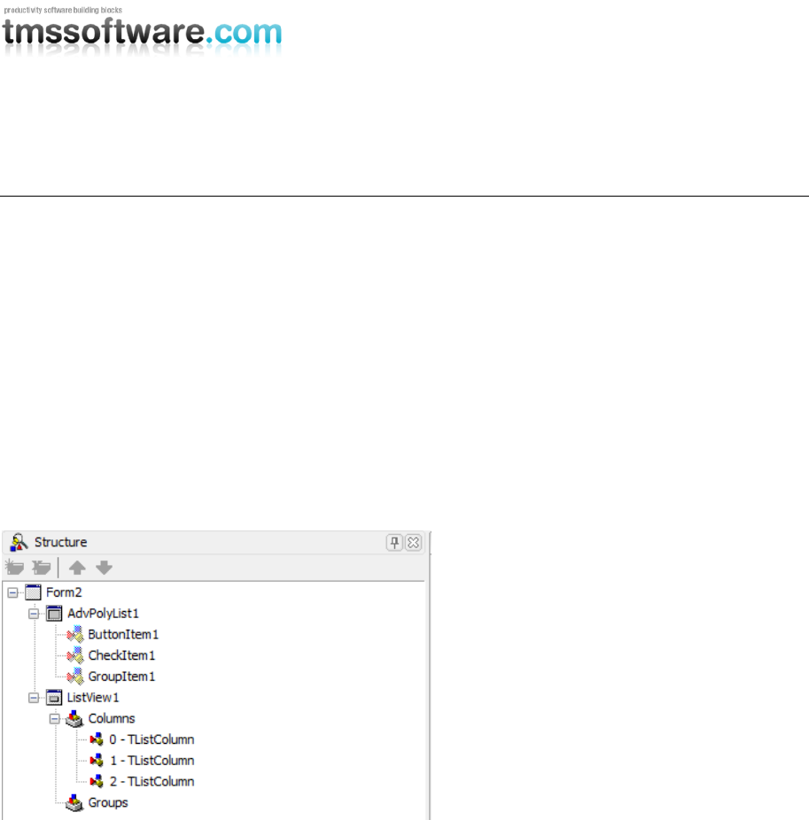
Sample polymorphism as shown in the structure pane:
The base class TCustomItem implements the minimum required common mouse, keyboard, selection
and painting handling. All new classes that descend from the TCustomItem class type also inherit
the basic interaction and appearance. Each new descending item type as such can be added to the
list and are automatically recognized by the component and added at runtime or designtime. The
polymorph list is similar to a TCollection and is instantiated in different visual controls.
The classes that descend from TCustomItem can for example override the DrawText and/or
DrawInRect methods to change the appearance of the item and override DoMouseUp to implement a
new behaviour for the mouse:
TMyExtendedItem = class(TCustomItem)
protected
function GetVersionNr: integer; override;
public
procedure Assign(Source: TPersistent); override;
function DrawText(g: TGPGraphics; ARect: TGPRectF; ItemAppearance:
TItemAppearance; DoText: Boolean = true): TGPRectF; override;
procedure DrawInRect(g: TGPGraphics; ItemAppearance: TItemAppearance;
R: TGPRectF); override;
function CreateNewItem(AOwner: TComponent): TCustomItem; override;
function GetClassType: TComponentClass; override;
class function CustomClassName: String; override;

TMS SOFTWARE
TMS Advanced Poly List
DEVELOPERS GUIDE
6
procedure DoMouseUp(Sender: TObject; Button: TMouseButton; Shift:
TShiftState;
pX, pY: Integer; Interaction: TItemInteraction; ItemAppearance:
TItemAppearance); override;
class function Display: Boolean; override;
procedure AssignEvents(Item: TCustomItem); override;
end;
More details on creating descending classes of TCustomItem is provided further in the developers
guide.
This new powerful architecture provides advantages for development. When item classes are
separated in different units, only classes effectively used in the application will be linked. Item
types can be separately developed and added and will not affect the operation of other item types
used in the control. Custom item types can be created and registered and become automatically
available both at runtime and at designtime.
TMS SOFTWARE
TMS Advanced Poly List
DEVELOPERS GUIDE
7
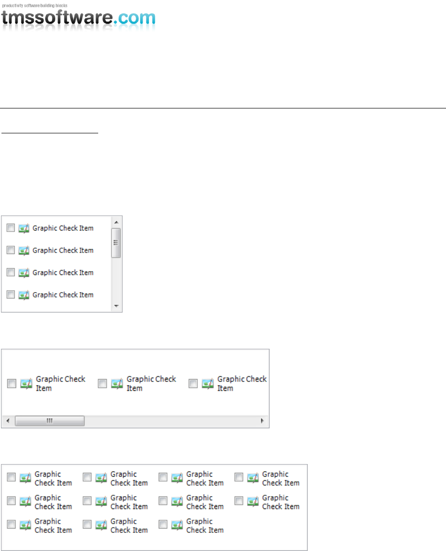
Designtime Organisation
Visual components
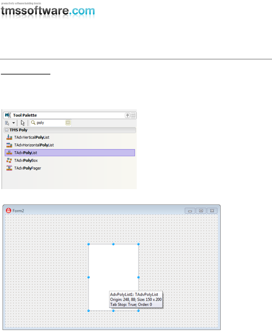
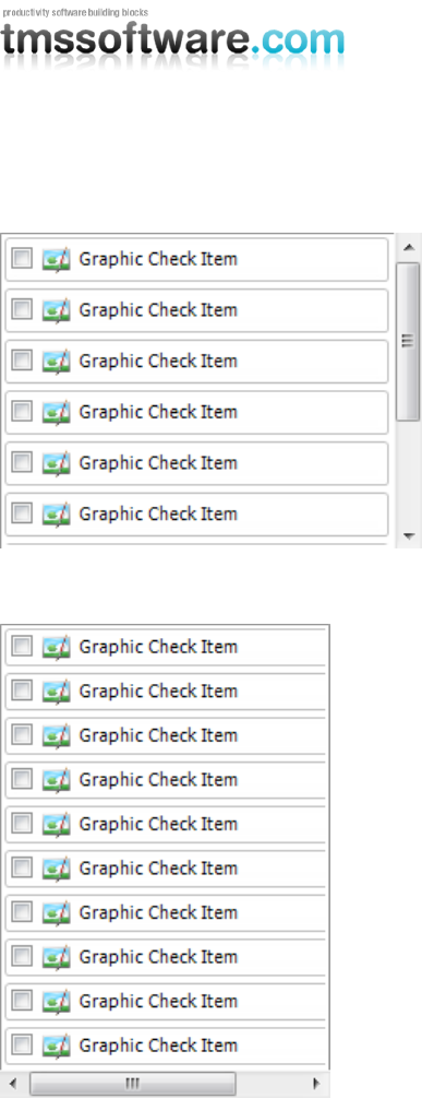
After installing the package, typing “poly” or searching for the “TMS Poly” section in the toolpalette
gives you the list of available components. Each component has similar basic functionality, but has
specific features, which are preset for you, to quickly start with the correct component.
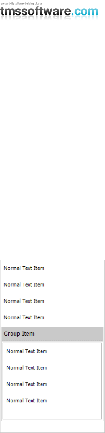
Poly list at designtime
TMS SOFTWARE
TMS Advanced Poly List
DEVELOPERS GUIDE
8
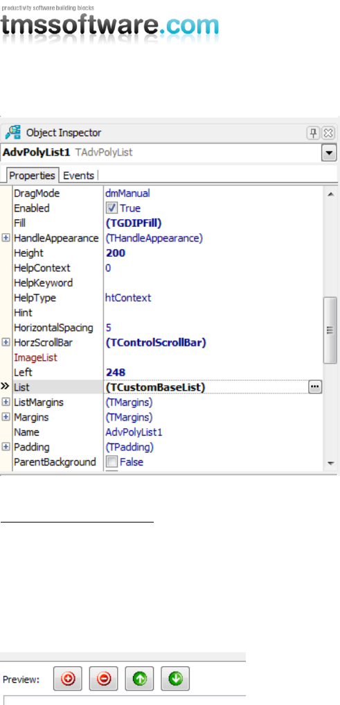
Poly list in the object inspector
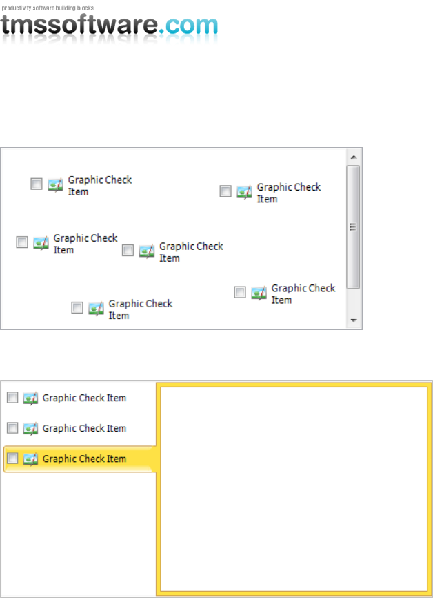
Adding / removing items
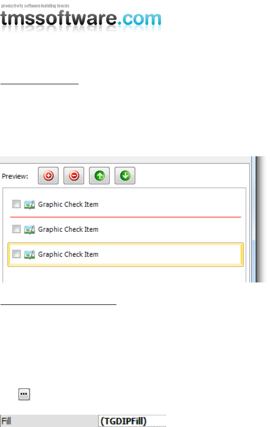
Adding an item at designtime can be done in 2 ways. Select and drag-drop an item from the
“available items” list to the “preview” list, or select an item and click the “+” button to add the
item to the list.
Removing an item at designtime can only be done by selecting the item you want to remove in the
“preview” list and clicking the “-” button.
After adding a new item, the item is also added to the list on the form and is visible in the structure
window and at the object inspector. When selecting a different item, the item selection will be
reflected in the Delphi / C++Builder environment. All item properties can be changed in the object
inspector.
TMS SOFTWARE
TMS Advanced Poly List
DEVELOPERS GUIDE
9
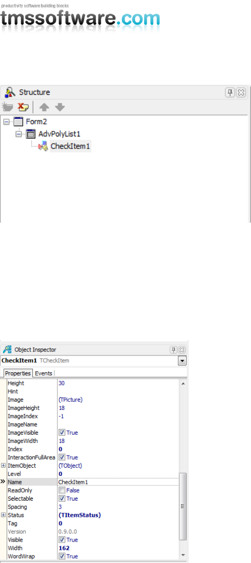
Poly list structure window
The structure window is an overview window of the components that are used in a new application.
The poly list can have items which can host components. When the component is a poly list, the
items of the new poly list can also hold items, in which components can be hosted, and there the
story never ends.
The structure window maintains an easy to use hierarchy and helps you to find the correct
component you wish to modify.
Poly list item object inspector
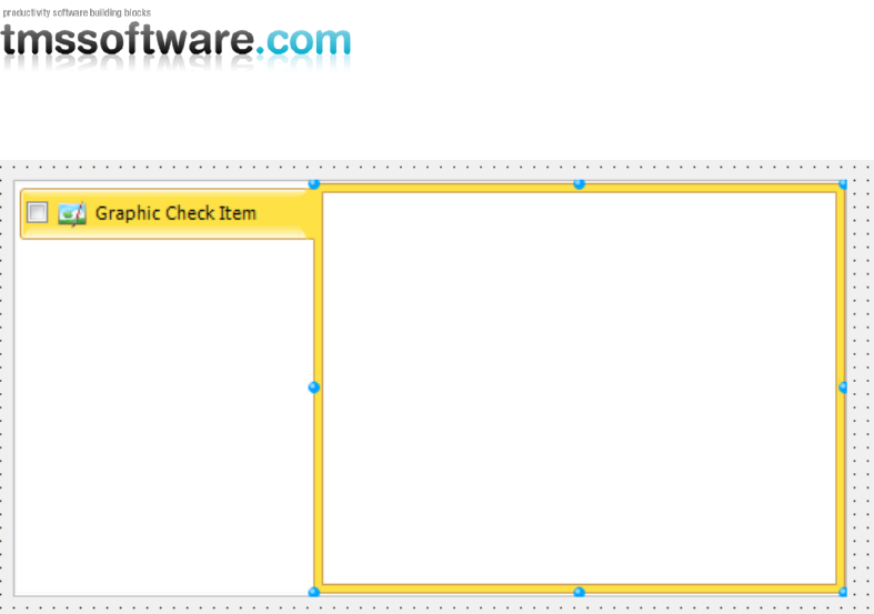
This is a sample screenshot of a TCheckItem, which is derived from TGraphicItem, and TGraphicItem
is derived from the basic TCustomItem. As you add and select multiple items, the common
properties are repeated for items of the same class or the same class they derive from. Selecting
multiple items at designtime allows you to quickly change properties for each item that is selected.
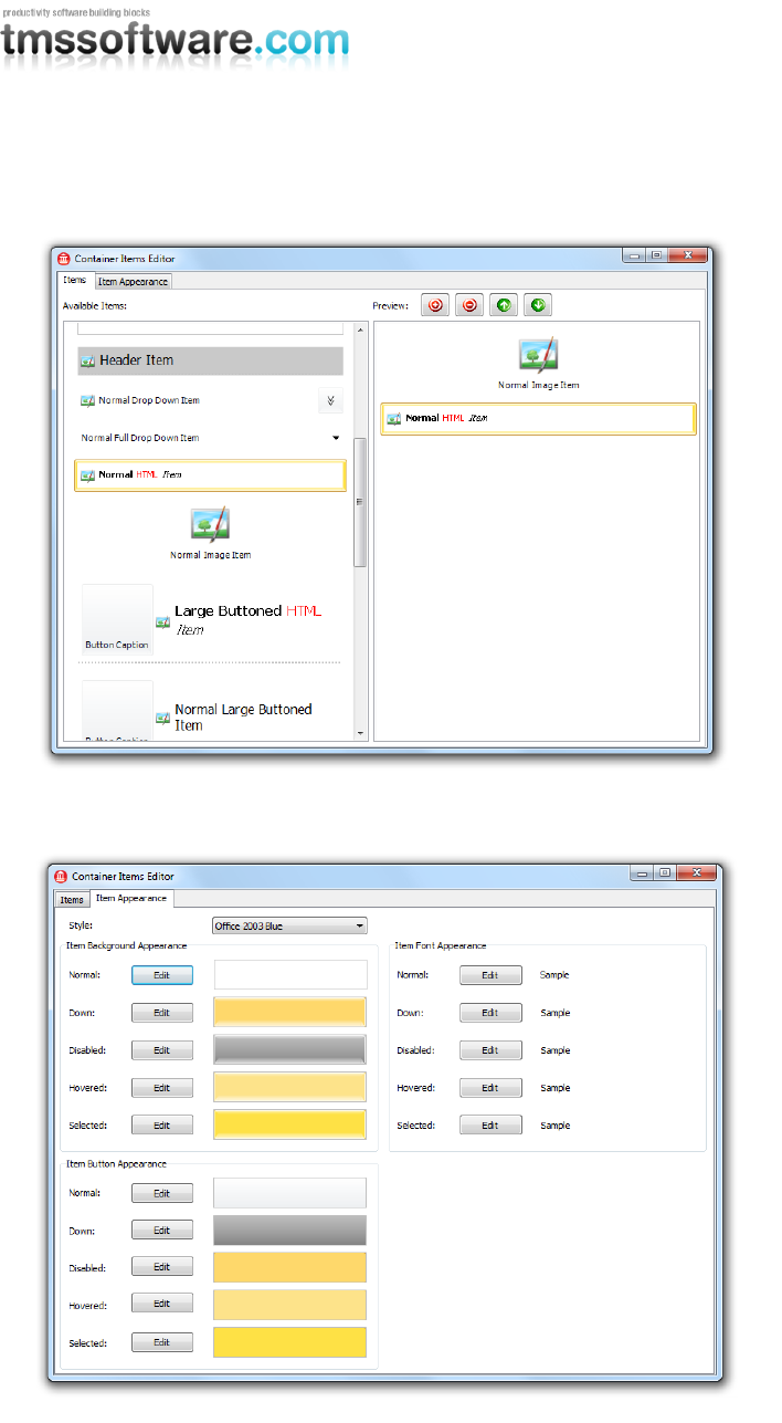
In the editor, you will notice 2 tabs, one for the items and one for the item appearance. The item
appearance is used for every item in the list. The appearance holds the layout for the font and the
fill property of the items. Items can have a different font size and color by modifying the correct
properties.
TMS SOFTWARE
TMS Advanced Poly List
DEVELOPERS GUIDE
10
Poly list editor
Poly list editor item appearance
TMS SOFTWARE
TMS Advanced Poly List
DEVELOPERS GUIDE
11
Reordering items
When the order of the items is incorrect, reordering items can be done in 2 ways. Select an item
and drag-drop the item to the new position inside the editor. A red line will automatically appear at
the drop down position. Or click on the “up” or “down” button to move the item up or down in the
list.
Changing the appearance
Everything that is related to the poly list can have a unique look and feel. These visual
enhancements can be modified with the Fill editor which applies on the list, the items and many
other elements. Some items have separate properties to change specific visual elements of that
item such as a THeaderItem.
Starting the fill editor can be done by clicking the “Edit” button in the poly list editor or clicking
the button in the object inspector for the property which type is a TGDIPFill type.
TMS SOFTWARE
TMS Advanced Poly List
DEVELOPERS GUIDE
12
Runtime Organisation
Adding / removing items
As we have explained before, the poly list has a polymorph collection of TCustomItem classes. Each
descending class inherits all properties and can also be added to the collection. To access the
properties specifically for a descending item, the item must be added to the list and typecasted to
the correct class to gain access to the properties.
Adding an item:
with TTextItem(AdvPolyList1.AddItem(TTextItem)) do
begin
Caption := 'This is a sample';
end;
Inserting an item at a specific position in the collection:
with TTextItem(AdvPolyList1.InsertItem(0, TTextItem)) do
begin
Caption := 'This is a sample';
end;
Removing an item at a specific position:
AdvPolyList1.RemoveItem(0);
To compile the project, the unit must manually be added to the uses list. In this case the unit is
GDIPTextItem which contains the TTextItem class.
The rule for adding the correct unit is:
(T)CustomItem (GDIP)CustomItem
Class Unit
When you are not sure what unit you must add to compile the project, you can always add the item
of choice at designtime, so the unit is automatically added to the uses list.
Accessing items
Items can be accessed with the “Items” property of the poly list and must be typecasted to the
correct class type:
TTextItem(AdvPolyList1.Items[0])
Reordering items
Reordering items is as simple as setting a new index property on the item:
AdvPolyList1.Items[0].Index := 1;
The item will automatically be moved to the new position in the collection. Typecasting is not
necessary for properties that are common and available on the base class.
TMS SOFTWARE
TMS Advanced Poly List
DEVELOPERS GUIDE
13
Connecting lists
Sometimes, a special layout needs to be separated in a second list, but needs to maintain a
“connection” with the second list. Multiple poly lists can be connected to eachother to visualize this
connection.
AdvPolyList1.ConnectContainer(AdvPolyList2, ccRight, cmGradientBorder);
The first parameter expects the poly list which the first needs to connect to. The second parameter
is the connection type. In this case the second poly list is on the right side of the first poly list. The
thirth parameter is the border connection type which can be set to none, normal border or gradient
border.
Multiple connections are possible. You can also experiment with different border combinations and
connect positions.
TMS SOFTWARE
TMS Advanced Poly List
DEVELOPERS GUIDE
14
List of available components and properties
Various list containers
Managing the polymorph list of items in memory is one thing, for actually displaying the items, we
provide several controls. The base class that manages the list is TCustomItemsContainer. This holds
& manages the list of items. We have provided 5 controls descending from this:
TAdvVerticalPolyList: A scrollable list of items vertically (ie. under each other) organized
TAdvHorizontalPolyList: A scrollable list of items horizontally (ie. next to each other) organized
TAdvPolyList: A grid structure of items with configurable number of columns or rows
TMS SOFTWARE
TMS Advanced Poly List
DEVELOPERS GUIDE
15
TAdvPolyBox: A control in which items can be absolutely positioned
TAdvPolyPager: A page control where a vertical list of items can be used to select a page
TMS SOFTWARE
TMS Advanced Poly List
DEVELOPERS GUIDE
16
List Properties
Property
Description
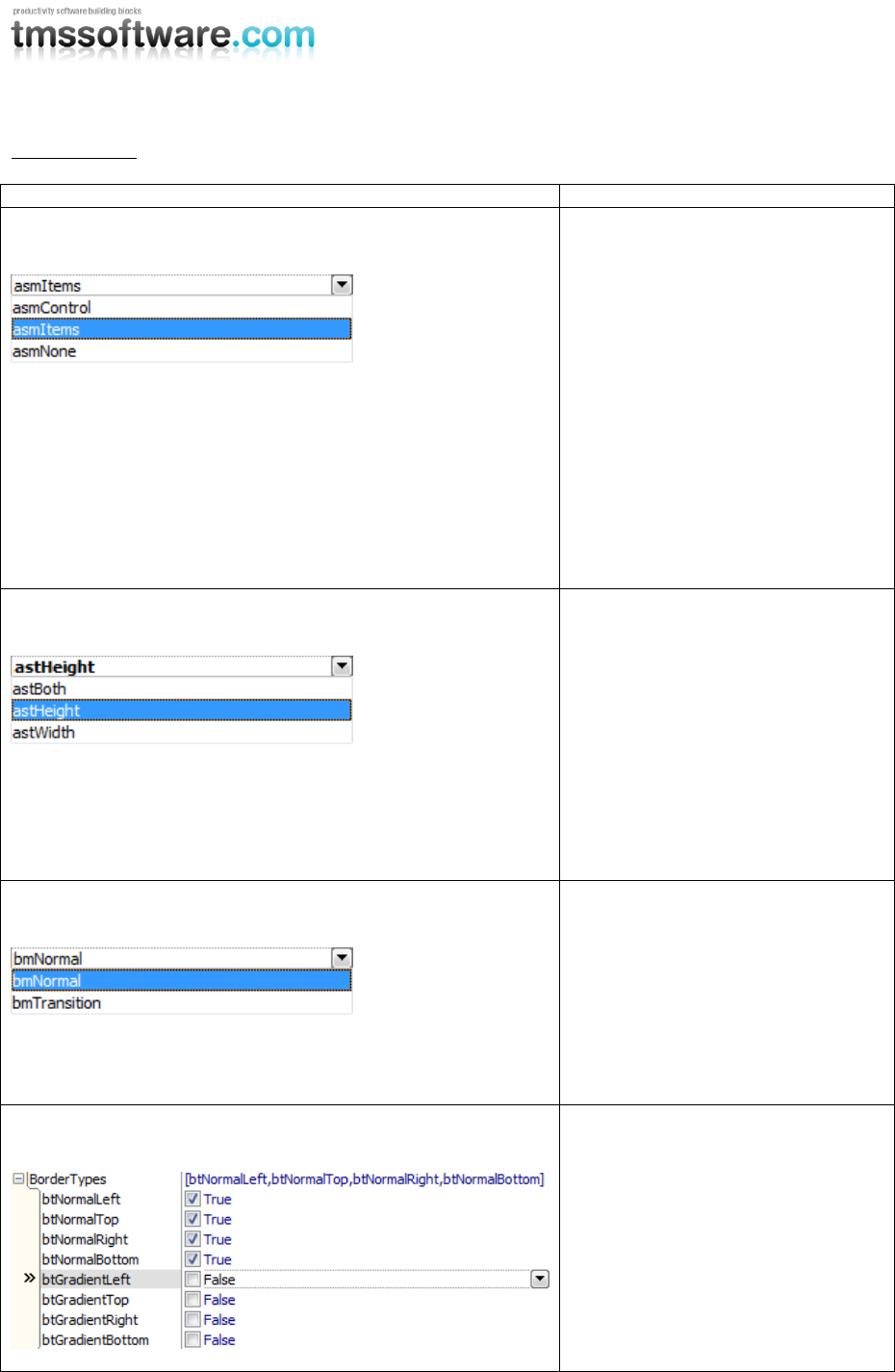
AutoSizeMode
asmControl: the width and height of
the control are automatically
resized to the total width and/or
height of the items.
asmItems: the total width and
height of the items are
automatically resized to the width
and/or height of the control.
asmNone: the automatic
calculation.
In all modes, scrollbars will be
visible if necessary.
AutoSizeType
Depending on the AutoSizeMode the
calculation will apply to:
astHeight: the total height of the
control or the items.
astWidth: the total width of the
control or the items.
astBoth: the total width and height
of the control or the items.
BorderMode
The poly list supports a
“connection” between containers.
This connection can be visualized
with a normal or gradient border.
bmNormal: Normal border.
bmTransition: Gradient border.
BorderTypes
Different bordertypes that can be
used to connect containers.
The Normal borders are used with
the bmNormal BorderMode.
The Gradient borders are used with
the bmTransition BorderMode.
TMS SOFTWARE
TMS Advanced Poly List
DEVELOPERS GUIDE
17
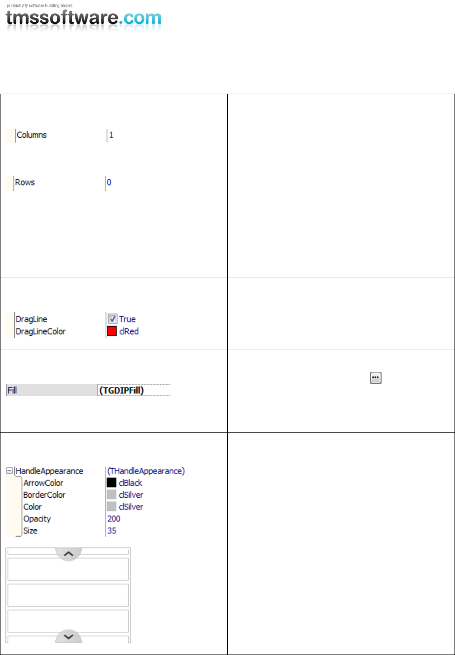
Columns
Rows
In the TAdvPolyList the columns and rows
properties are visible and can be used to divide
the items into columns or rows. For all other
variants the columns and rows properties are
fixed.
For the TAdvVerticalPolyList the Columns
property is 1 and the Rows property is 0.
For the TAdvHorizontalPolyList the Rows
property is 1 and the Columns property is 0.
For the TAdvPolyBox the Columns and Rows
properties are both 0.
Dragging
The dragline is visible when Reorder is true.
The dragline is a visual representation when
using drag drop to insert or move items.
Fill
The Fill is the background layout of the poly list
which is edited by clicking the button.
The Fill property has a separate editor which is
explained in the “Fill Editor” chapter.
HandleAppearance
The HandleAppearance is the appearance of the
handles. The handles are replacements for the
normal scrollbars that are visible when the item
bounds are too large for the list.
The handles can appear in horizontal and / or
vertical direction.
Clicking or holding down the mousebutton on
the handles causes the list to scroll down or up.
TMS SOFTWARE
TMS Advanced Poly List
DEVELOPERS GUIDE
18
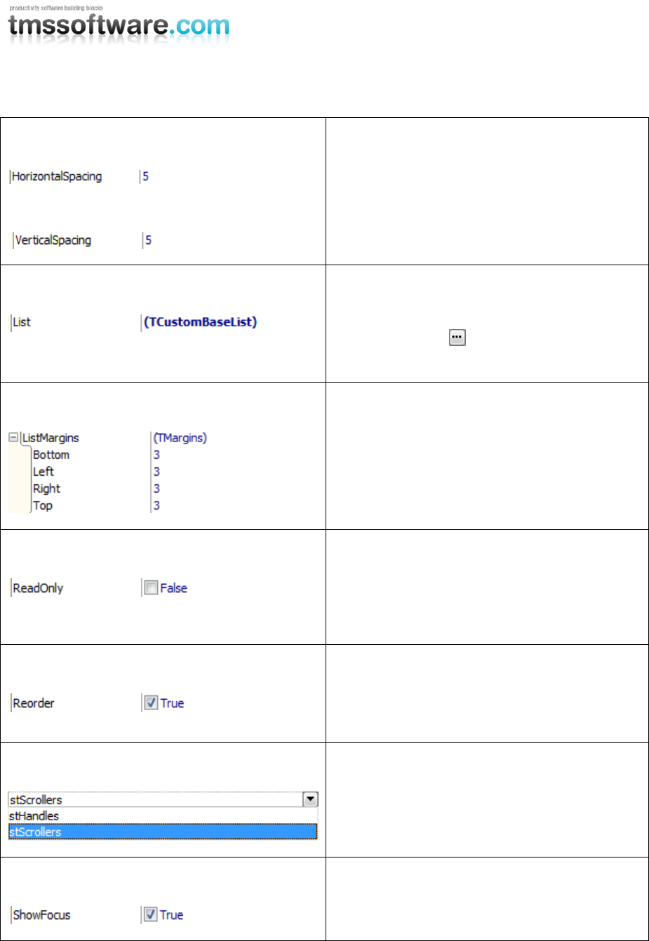
HorizontalSpacing
VerticalSpacing
The horizontal and vertical spacing properties
are used to provide spacing between the items.
List
The List property gives access to the items in
the Custom editor.
When clicking the button, the editor is
shown.
ListMargins
The spacing between the items and the edge of
the list.
ReadOnly
Enable or disable interactions with the list.
When readonly is true, mouse interaction and
keyboard support is disabled.
Scrolling is enabled when the list is readonly.
Reorder
Enable or disable reordering of items.
Select an item and drag-drop the item on a new
position in the list. The items are automatically
moved inside the collection.
ScrollType
The type of scrollers in the list. By default the
standard scrollbars of the operating system are
used. These scrollers can be switched to
alternative handles.
ShowFocus
Show or hide the focus border around the items
when the poly list has focus.
TMS SOFTWARE
TMS Advanced Poly List
DEVELOPERS GUIDE
19
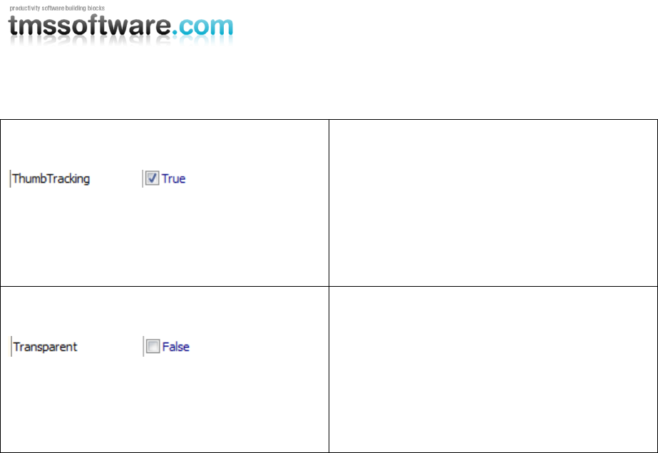
ThumbTracking
Enable or disable thumbtracking on the
scrollbars. When thumbtracking is enabled, the
list will automatically update when using the
thumb for scrolling.
When thumbtracking is disabled, the list will
update after the thumb on the scrollbar is
released.
Transparent
Enable or disable transparency on the poly list.
For performance and stability reasons, the
standard scrollbars are disabled when using
transparency.
The scrolling is still available through keyboard
and mouse wheel and with the alternative
handles.
TMS SOFTWARE
TMS Advanced Poly List
DEVELOPERS GUIDE
20
Various list items
Many behaviors are common, like mouse hovering, mouse selection, focusing, as well as many style
elements like normal state appearance, selected state appearance, and hovered state
appearance...
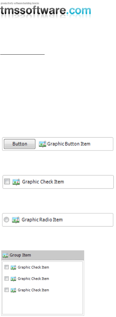
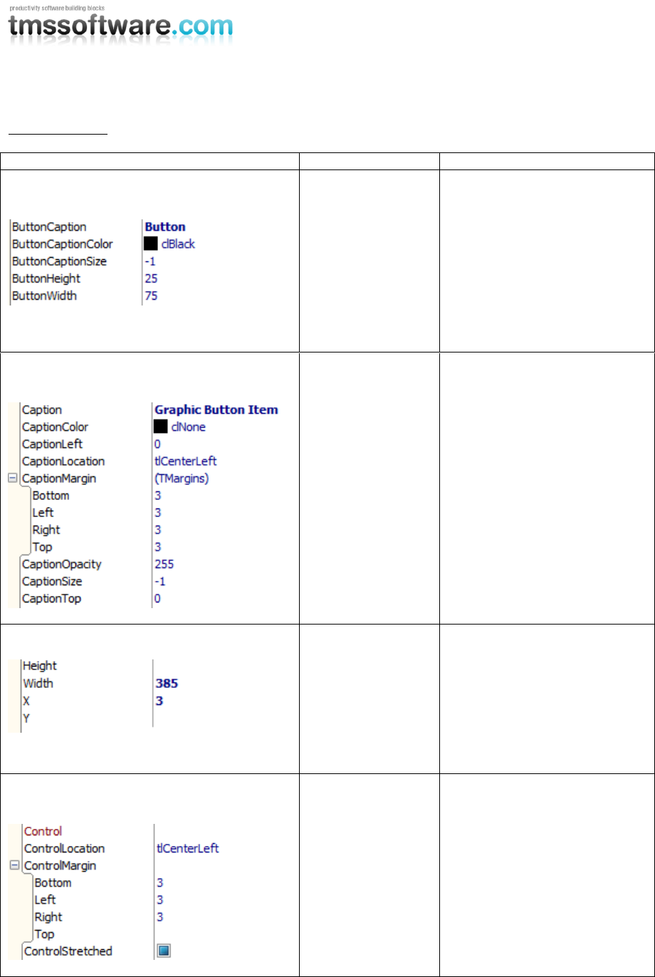
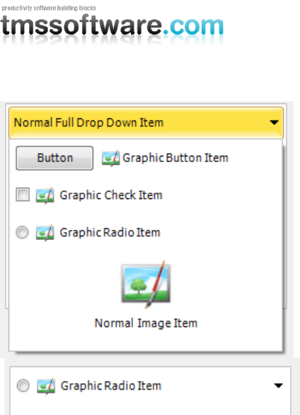
TCustomItem: Item with basic functionality, appearance and properties.
The TCustomItem class knows of the minimum required common mouse, keyboard, selection,
painting handling. From TCustomItem, we created already a wide range of ready to use classes:
TButtonItem: Item with associated button, text
TCheckItem: Item with checkbox, text
TRadioItem: Item with radiobutton, text
TGroupItem: Item with group caption and area that can be used to host another control
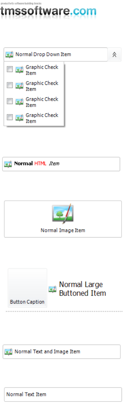
TDropDownItem: Item with text and dropdown button. A new polymorph list of items can be shown
from the dropdown
TMS SOFTWARE
TMS Advanced Poly List
DEVELOPERS GUIDE
21
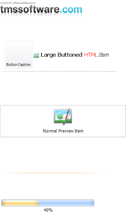
THTMLItem: Item with capability to show HTML formatted text
TImageItem: Item with image and text and various postioning methods for image versus text
TLargeButtonedItem: Item with large button with image
TImageTextItem: Item with text and image and different positioning for image versus text
TTextItem: Item with text and optional description line
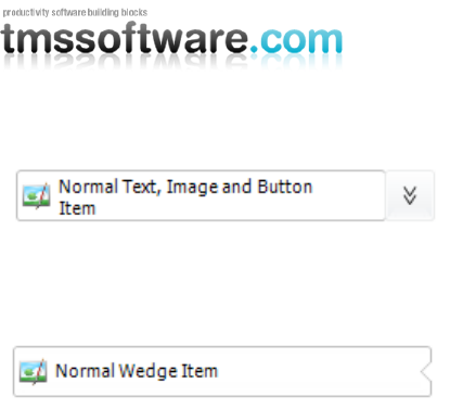
TImageTextButtonItem: Item with associated button, text and image
TMS SOFTWARE
TMS Advanced Poly List
DEVELOPERS GUIDE
22
TWedgeItem: Variation of TTextItem with selection displayed with wedge on any of the 4 sides of
the item
TMS SOFTWARE
TMS Advanced Poly List
DEVELOPERS GUIDE
23
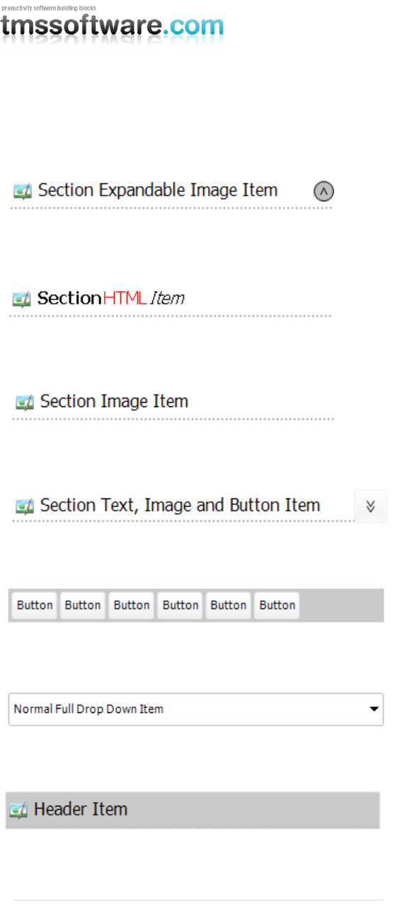
TExpandableImageSectionItem: Item with image and text and button that can collaps or expand
different items under the item
THTMLSectionItem: Section item with HTML formatted text
TImageSectionItem: Section item with image and text
TImageTextButtonSectionItem: Section item with image, text and additional button
TButtonBarItem: Item with collection of elements (buttons)
TFullDropDownItem: Item with text. A new polymorph list of items can be shown from the item
THeaderItem: Header item with image, text
TSplitterItem: Splitter item with line and different line gradient modes
TLargeButtonedHTMLItem: Item with large button with image and HTML formatted text
TMS SOFTWARE
TMS Advanced Poly List
DEVELOPERS GUIDE
24
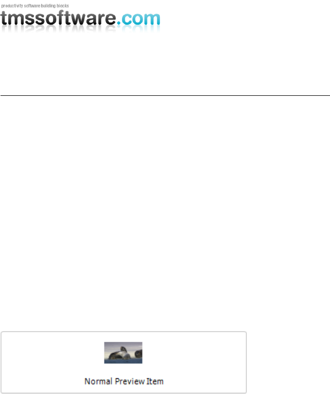
TPreviewItem: Item with the ability to show a preview of the file that is added (similar to the
preview pane in Windows Vista and Windows 7). The previewitem contains functions to extract a
thumbnail from the file which application has a preview handler.
Some of the supported files are: „wmv‟, „mp3‟, „ppt‟.
Important notice: The TPreviewItem is only available in Delphi 2010
TSplitterItem: Item that is used for dividing different categories of items such as the radioitem and
checkitem. The splitter item has a gradient line appearance.
TprogressItem: Item with integrated smooth progressbar
TMS SOFTWARE
TMS Advanced Poly List
DEVELOPERS GUIDE
25
Item Properties
Property
Item class
Description
Button properties
TButtonItem
TLargeButtonItem
The button properties to
customize the button.
By default the Normal font for
the item is used, but the
ButtonCaptionColor and
ButtonCaptionSize can be used
to change the default font of
the button.
Caption properties
All Items except
SplitterItem and
ButtonBarItem
The caption properties for the
caption of the item. The font
appearance can be edited in
the custom editor.
For separate special items
with a different font size or
color the CaptionSize and
CaptionColor properties can be
used.
The caption also supports
HTML (see minihtml reference)
Control Bounds
All Items
Each item can have it‟s own x,
y, width and height.
Depending on the list autosize
mode, the width and / or
height are automatically
calculated.
Control Properties
All items
Each item can host a control.
The control property must be
of TWinControl class type.
The other properties are used
to position the control.
TMS SOFTWARE
TMS Advanced Poly List
DEVELOPERS GUIDE
26
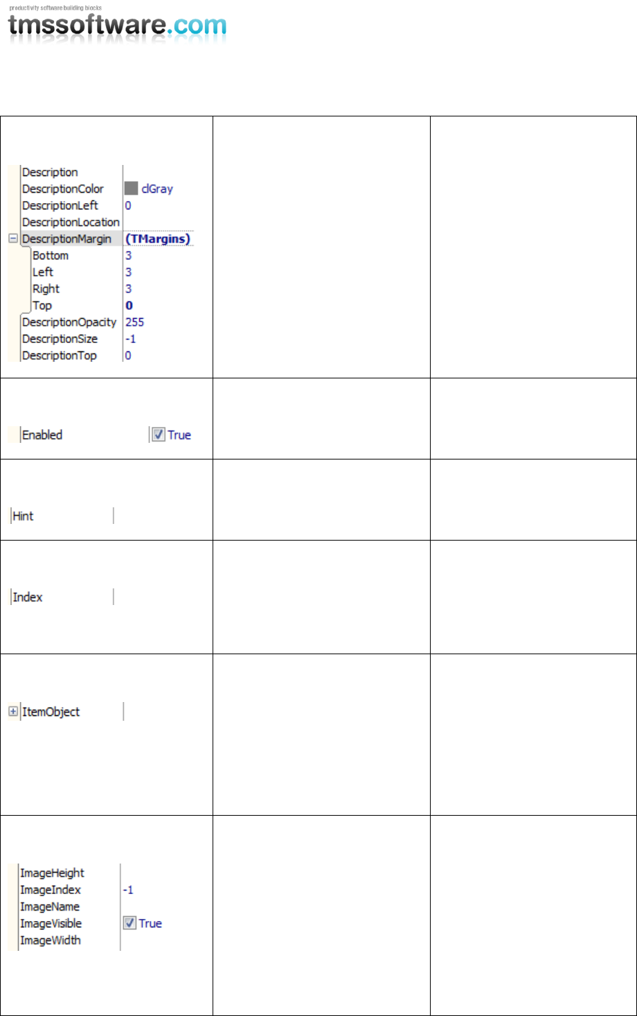
Description
All Items except SplitterItem
and ButtonBarItem
The description properties for
the description of the item.
The font appearance can be
edited in the custom editor.
For separate special items
with a different font size or
color the DescriptionSize and
DescriptionColor properties
can be used.
The description also supports
HTML (see minihtml
reference)
Enabled
All Items
Each item can be enabled or
disabled. A different style can
be applied for disabled items.
Hint
All Items
The hint property on the
item.
Index
All Items
All items get an index to
specify a position in the
collection. When changing the
index property the item will
be moved to the new position.
ItemObject
All Items
All Items can have a reference
to an object, this can be a
button, a label, …
This can be helpful when
accessing the items and extra
functionality is necessary for
the application.
Image
All Items except
SectionItem, SplitterItem,
ButtonBarItem, TextItem,
FullDropDownItem
Supports ImageList
(ImageIndex) and GDI+
PictureContainer
(ImageName) with integrated
list of images.
TMS SOFTWARE
TMS Advanced Poly List
DEVELOPERS GUIDE
27
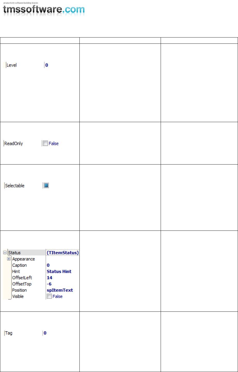
Level
All Items
The level property gives an
advantage for collapsing
expanding items that are
placed under an expandable
section item. When clicking
the expander, all items with
the same level and a higher
level than the expander will
be collapsed or expanded.
ReadOnly
All Items
ReadOnly can be enabled on
list level, but also on item
level. The item appearance
remains the same but has no
interaction.
Selectable
All Items
Each item has a selectable
property, which determines if
the item is selectable.
When clicking on the item or
using the keyboard, the item
will not be selected and the
selected appearance will not
be applied.
Status
All Items
Each item can have a status
indicator, which can have a
text and can be positioned on
the text or on the edge of the
item.
Tag
All Items
The Tag property is added for
the same reason as the
ItemObject property. To
contain extra information
when accessing items or
accessing special functions
that rely on extra
information.
TMS SOFTWARE
TMS Advanced Poly List
DEVELOPERS GUIDE
28
Ellipsis & Wordwrap
All Items except
SplitterItem and
ButtonBarItem
Enables or disable ellipsis or
wordwrap on the item caption
and description.
Using ellipsis requires switching
off wordwrap.
Specific properties
Layout
ButtonBarItem
The appearance of the
background and border of
the ButtonBarItem
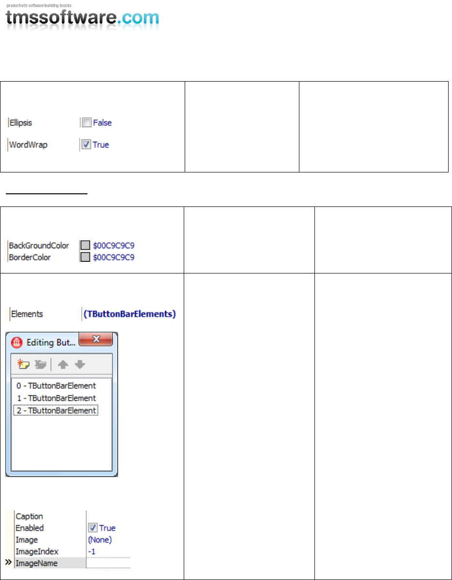
Elements Collection
Element
ButtonBarItem
The elements (buttons) of
the ButtonBarItem. The
elements are a collection of
TButtonBarElement.
Each element has a caption
and can be connected to a
GDI+ PictureContainer or an
ImageList.
TMS SOFTWARE
TMS Advanced Poly List
DEVELOPERS GUIDE
29
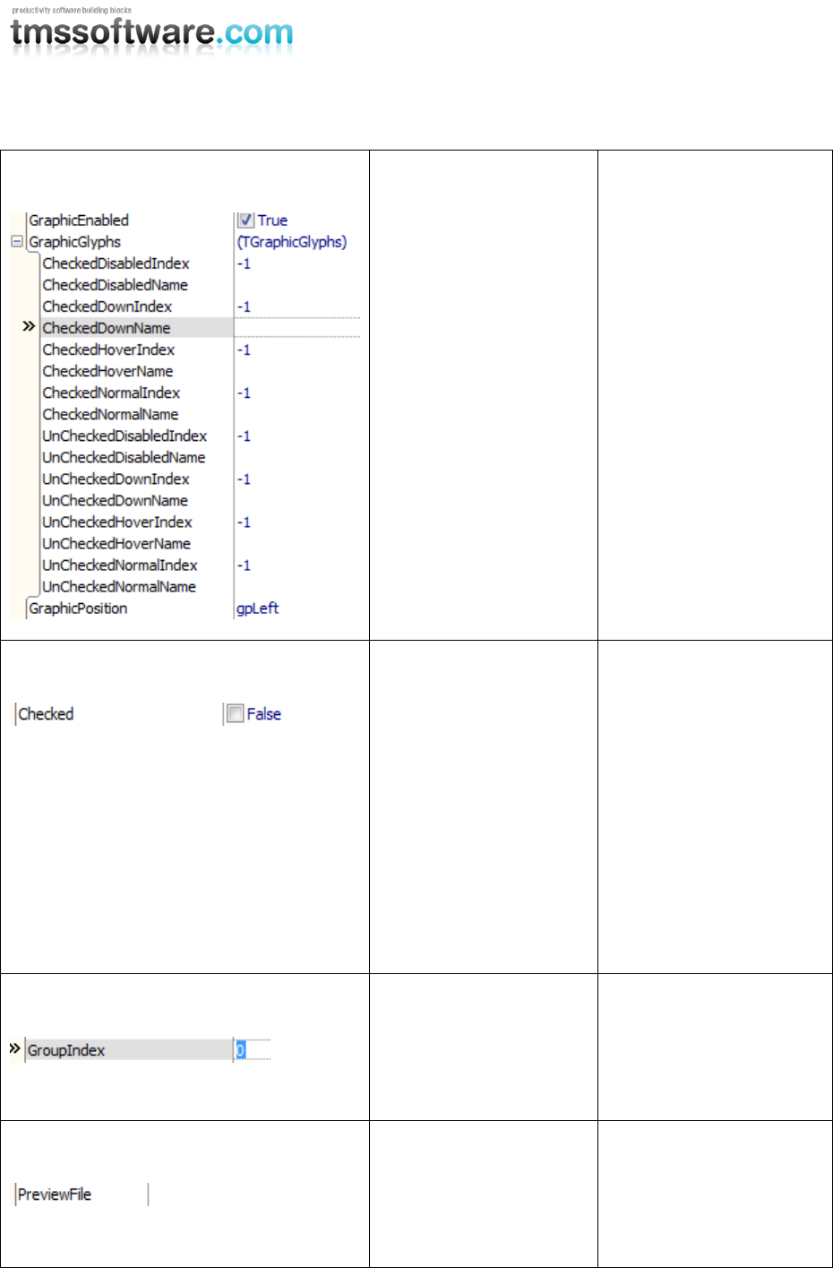
Graphic Properties
RadioItem, CheckItem,
ButtonItem
The checkbox,
radiobutton and normal
button are graphics which
can be positioned left or
right.
The GraphicGlyphs
properties are used to set
a picture for the different
states of the graphic.
When no images are set,
the default drawing is
used.
Checked
RadioItem, CheckItem
The Checked property is
automatically modified
when checking the
checkbox in a CheckItem
or the radiobutton in a
RadioItem.
The RadioItem will
automatically call all
RadioItems within the
same GroupIndex to
switch off the Checked
property to act as a
normal RadioButton.
GroupIndex
RadioItem
Index of the group used to
group radioitems, when a
radioitem is checked all
radioitems within that
group are unchecked.
PreviewFile
PreviewItem
The PreviewFile property
is used to set a file that is
supported to handle a
preview thumbnail in the
operating system.
TMS SOFTWARE
TMS Advanced Poly List
DEVELOPERS GUIDE
30
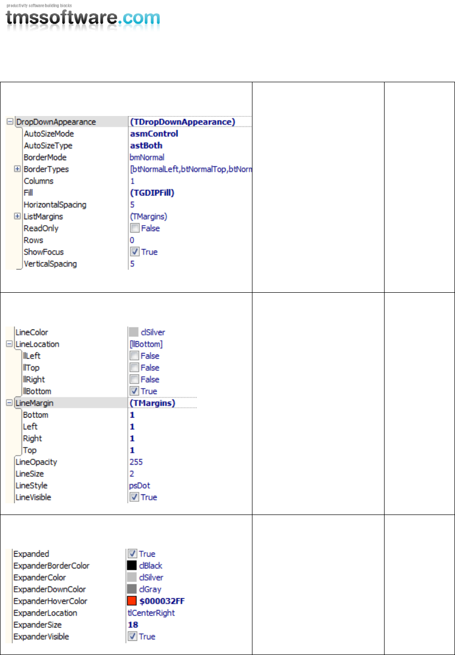
DropDownAppearance
DropDownItem,
FullDropDownItem
Each
dropdownite
m has an
internal list.
These are
the
properties to
modify the
list look and
feel.
Line style
All section items
All section
items have a
separate line
that visually
splits the
section from
the other
normal
items.
Expand / Collapse
ExpandableImageSectionIte
m
The
properties to
modify the
expander
button on
the item.
TMS SOFTWARE
TMS Advanced Poly List
DEVELOPERS GUIDE
31
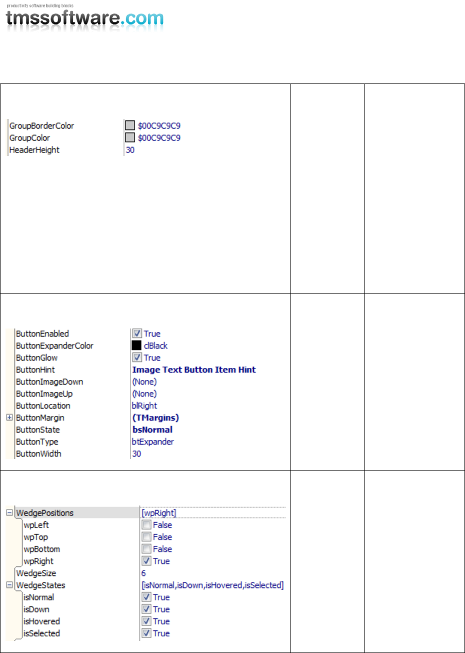
Group
GroupItem
Like the
HeaderItem the
groupitem has a
separate
GroupBorderColor
and a GroupColor,
but has an
additional
HeaderHeight to
control the height
of the header.
The GroupItem is
used to add a new
control inside the
group area.
Button
All items with
an extra
button
The items with an
extra button have
button properties
to control the
glow, color, image
up and down, the
type of the button
and many more.
Wedge
WedgeItem
Properties to set a
wedge on the item
in different
interaction states,
with a position and
size.
TMS SOFTWARE
TMS Advanced Poly List
DEVELOPERS GUIDE
32
Item Events
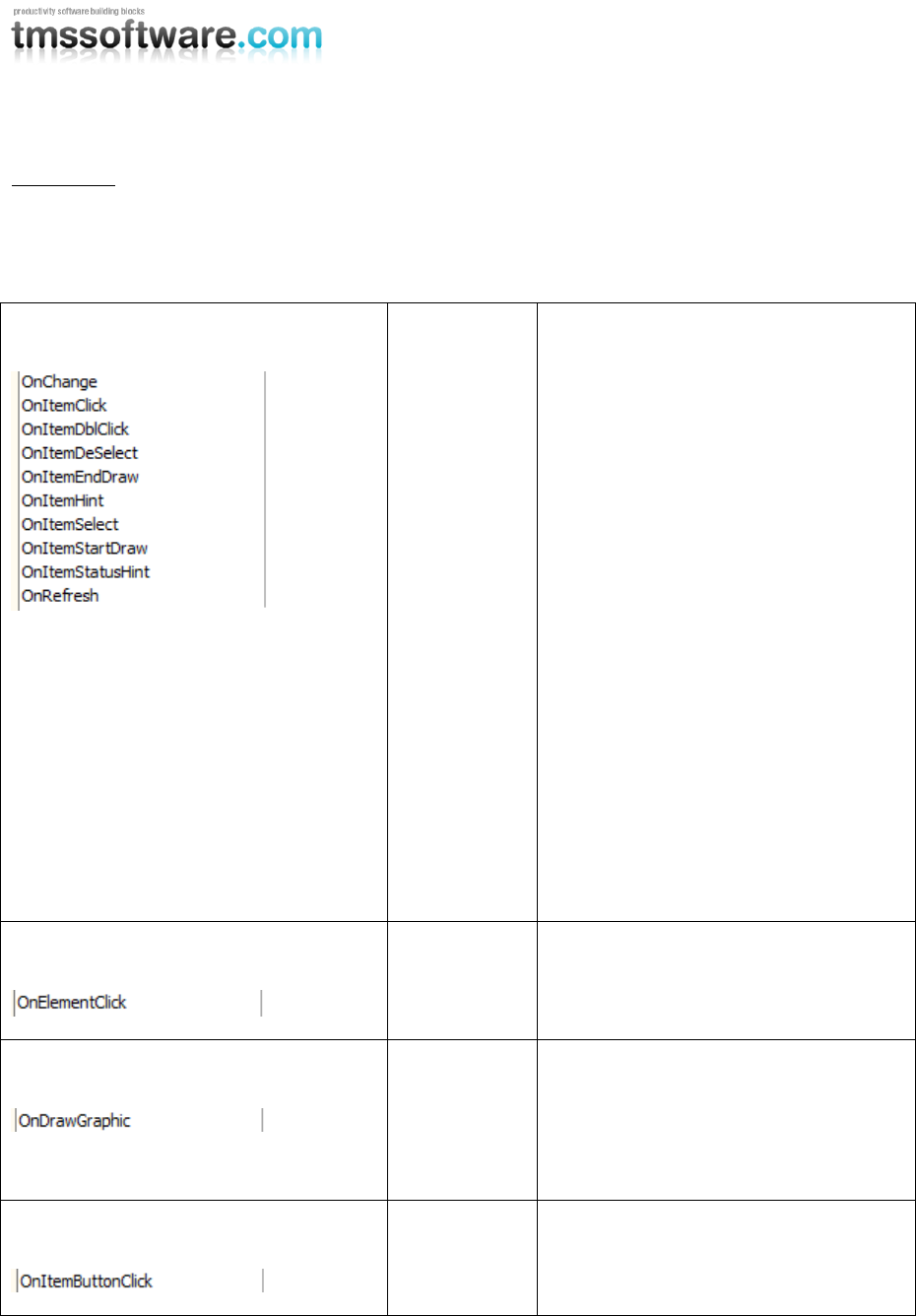
Some events are published on List level, to quickly access the correct item. The OnItemSelect
OnItemDeSelect and OnItemCompare events are published. These and other events are described
below.
Global Events
All Items
OnChange : Event called for each
property that is modified and that
needs a recalculation of the item
(position, size, control position, …)
OnItemClick: Event called when clicking
on an item.
OnItemDblClick: Event called when
double-clicking on an item.
OnItemSelect / OnItemDeSelect: Event
called when selecting / deselecting an
item.
OnItemStartDraw / OnItemEndDraw:
Events specified for custom drawing.
OnItemHint / OnItemStatusHint: Event
called on different parts of the item.
OnRefresh: Event called for each
property that is modified and that
needs a refresh of the item.
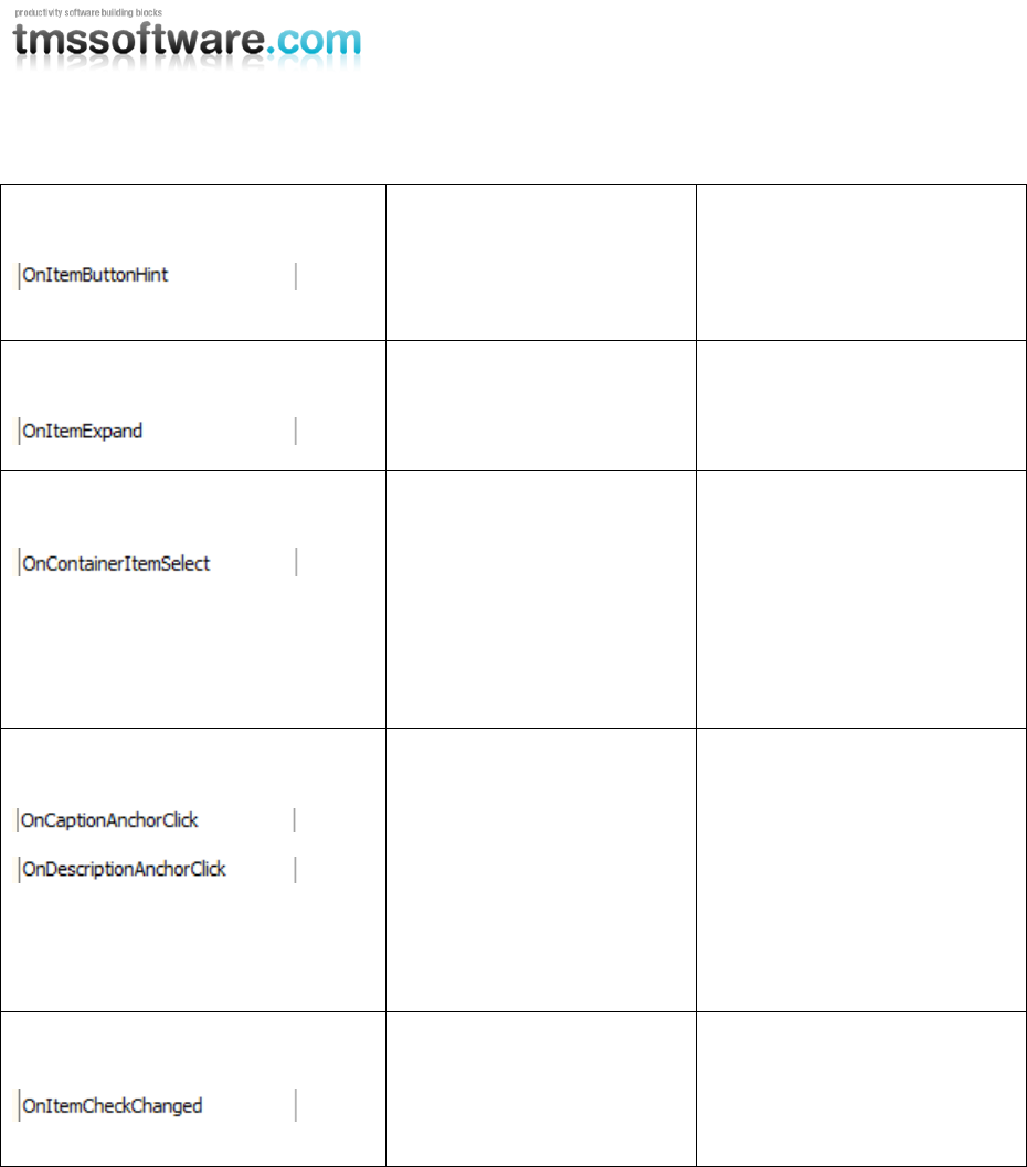
Element
ButtonBarItem
OnElementClick: Event called when
clicking on an element in the
ButtonBarItem.
Graphic
CheckItem,
RadioItem and
ButtonItem
OnDrawGraphic: Event for customized
drawing of the graphic (checkbox,
radiobutton and normal button)
Button
All Items with
a button
OnItemButtonClick: Event called when
clicking on the button.
TMS SOFTWARE
TMS Advanced Poly List
DEVELOPERS GUIDE
33
Button
All Items with a button
OnItemButtonHint: Event
called when the button is
hovered, and when the
ButtonHint property is set.
Expand
Expandable item
OnItemExpand: Event called
when the item is expanding /
collapsing.
DropDown
DropDownItem,
FullDropDownItem
OnContainerItemSelect: Event
called when an item is
selected in the list. The
events on the item self can
also be accessed through
selecting the item in the
object inspector, structure
window or the custom editor.
Caption & Description
All HTML items
When an anchor is found the
HTML caption
(OnCaptionAnchorClick) or
description
(OnDescriptionAnchorClick),
the event is triggered with the
Anchor as a parameter when
clicking on the anchor.
Checked
CheckItem, RadioItem
OnItemCheckChanged: Event
called when clicking on the
checkbox or radiobutton of
the item.
TMS SOFTWARE
TMS Advanced Poly List
DEVELOPERS GUIDE
34
Interaction
The poly list supports interaction through keyboard, mouse, scrolling and also through code. Below
is an overview of the functionality that is implemented in both the list and the items.
Keyboard
Home key: Selects the first item.
End key: Selects the last item.
Left / Up key: Selects the previous item.
Right / Down key: Selects the next item.
Mouse
When the item has extra elements such as a button or a checkbox, the interaction with those
elements is handled separately. Selecting or deselecting an item can be done by simply clicking on
the area of the item.
Using the scroll wheel of the mouse allows you to scroll up or down in the list if the list has
scrollbars.
Scrollbars
When the list is too small to maintain all items, scrollbars appear that can be used to navigate
through the list.
Code
Scrolling to an item can be done with the ScrollToItem procedure and the index of the item as
parameter:
AdvPolyList1.ScrollToItem(1);
Selecting an item with the index as parameter:
AdvPolyList1.SelectItem(1);
Visualize the item with scrolling and selecting combination. The first parameter is the index, the
second parameter is a Boolean which allows you to scroll to the item, and the thirth parameter is a
Boolean to allow you to select the item. Multiple combinations are possible.
AdvPolyList1.VisualizeItem(10, true, true);
Drag & Drop
Drag & drop from one list to a second list can be done by implementing 2 events. Allowing an item
to be dropped is setting the Accept parameter true. Dropping the item can be done by calling
AddDropItem and as parameter the SelectedDragDropItem from the first list.
procedure TForm1.AdvPolyList2DragOver(Sender, Source: TObject; X, Y:
Integer;
State: TDragState; var Accept: Boolean);
begin

TMS SOFTWARE
TMS Advanced Poly List
DEVELOPERS GUIDE
35
Accept := Source is TAdvPolyList;
end;
procedure TForm1.AdvPolyList2DragDrop(Sender, Source: TObject; X, Y:
Integer);
begin
AdvPolyList2.AddDropItem((Source as TAdvPolyList).SelectedDragDropItem);
end;
Also internal drag drop is supported. This can be switched off by setting the Reorder parameter to
false. When Reorder is true, a default red line will appear that will follow the mouse and show the
insert position of the item you want to move.
TMS SOFTWARE
TMS Advanced Poly List
DEVELOPERS GUIDE
36
Working with the Poly List controls
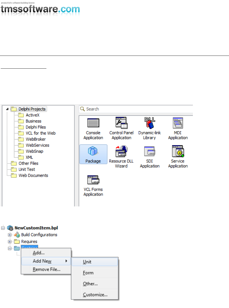
Creating a new item
This sample covers everything to create, register and display a new item that is ready to use in the
existing collection of items.
Create a new package (In this sample we have renamed Package1 to NewCustomItem)
Add a new unit pas file to the package
TMS SOFTWARE
TMS Advanced Poly List
DEVELOPERS GUIDE
37
Rename the unit to GDIPTriangleItem and add the following:
unit GDIPTriangleItem;
interface
uses
GDIPCustomItem;
type
TTriangleItem = class(TCustomItem)
end;
implementation
end.
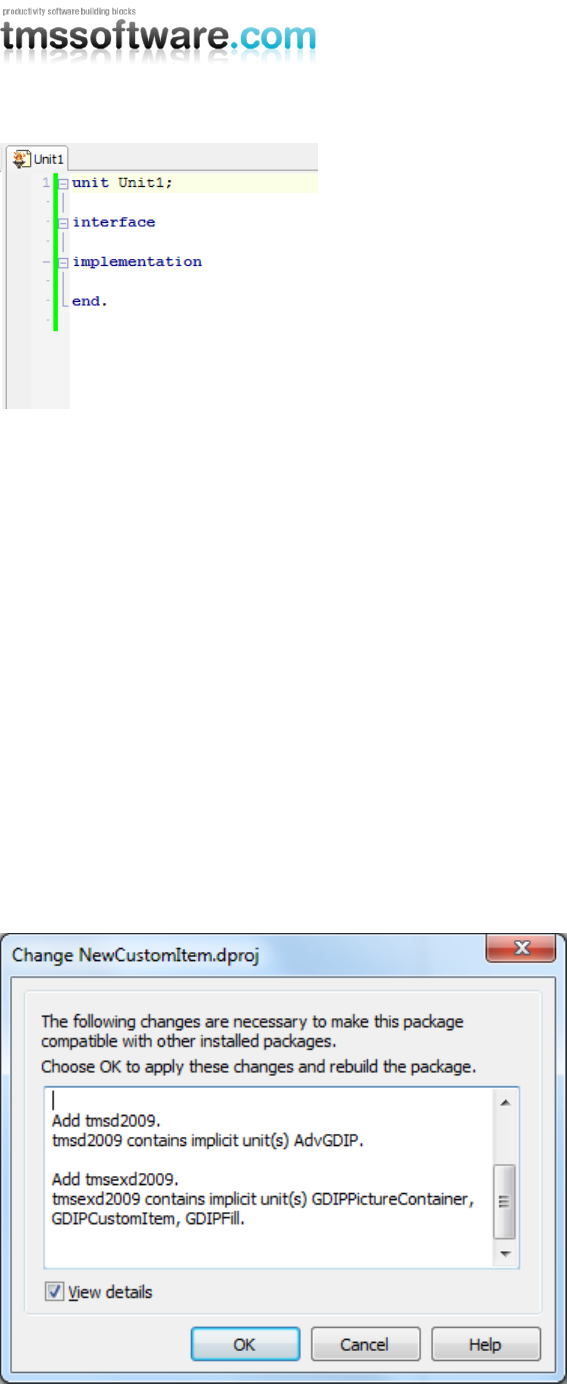
When compiling the package, depending on which main package you have installed, the compiler
will detect the GDIPCustomItem unit and automatically ask to add the correct dependencies. With
our test, the TMS Component Pack is installed. This main package could also be the standalone
installation of the TMS Advanced Poly List.
Referring to the basic layout of creating and registering an item, there are some functions that need
to be overridden to obtain a correct implementation.

TMS SOFTWARE
TMS Advanced Poly List
DEVELOPERS GUIDE
38
First we need to add some class functions to determine a unique layout for the item:

TMS SOFTWARE
TMS Advanced Poly List
DEVELOPERS GUIDE
39
unit GDIPTriangleItem;
interface
uses
GDIPCustomItem, Classes, AdvGDIP;
type
TTriangleItem = class(TCustomItem)
public
function CreateNewItem(AOwner: TComponent): TCustomItem; override;
function GetClassType: TComponentClass; override;
class function CustomClassName: String; override;
class function Display: Boolean; override;
procedure DrawInRect(g: TGPGraphics; ItemAppearance:
TItemAppearance; R: TGPRectF); override;
end;
implementation
end.
Implementing those functions, gives you the following code:
implementation
{ TTriangleItem }
function TTriangleItem.CreateNewItem(AOwner: TComponent): TCustomItem;
begin
Result := TTriangleItem.Create(AOwner);
end;
class function TTriangleItem.CustomClassName: String;
begin
Result := 'Triangle Item';
end;
class function TTriangleItem.Display: Boolean;
begin
Result := True;
end;
procedure TTriangleItem.DrawInRect(g: TGPGraphics;
ItemAppearance: TItemAppearance; R: TGPRectF);
begin
inherited;
end;
function TTriangleItem.GetClassType: TComponentClass;
begin
Result := TTriangleItem;
end;
TMS SOFTWARE
TMS Advanced Poly List
DEVELOPERS GUIDE
40
The function CreateNewItem is used in the Editor, to create a new instance of the item with the
correct owner.
The class function CustomClassName returns a friendlier name for the item that is visible in the
editor. Also, when creating a new item, this class name must be unique.
The function Display returns a Boolean whether the item should be displayed in the editor. When
the item is not display the item can only be added at runtime.
The GetClassType function returns the class type of that item. Based on the class type the correct
item is created from the editor.
The DrawInRect procedure is the visual hart of the item. When overriding from the CustomItem and
calling inherited, the item will draw all basic appearances.
When looking deeper in the CustomItem source code you will see events for mouse handling,
keyboard support and other events for createing more complex items that need special handling.
Getting a more explanatory view on complex items can be achieved by examining code from the
built-in items that were delivered with the TMS Advanced Poly List package or were present in the
TMS Component Pack package.
Building and installing this package will not change anything at designtime nor will the item be
visible or useable. One remaining important procedure must be called for the item to fully blend in
the existing collection of polymorph items.
procedure Register;
implementation
procedure Register;
begin
RegisterPolyItem(TTriangleItem);
end;
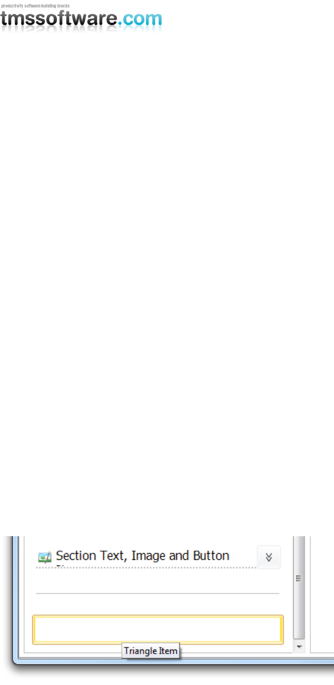
After building and installing this package, create a new project and drop one of the poly list
variants on the form. Double-click on the list to start the editor and search for the newly created
item:
TMS SOFTWARE
TMS Advanced Poly List
DEVELOPERS GUIDE
41
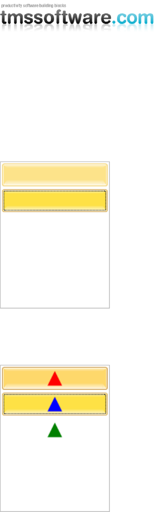
By default, in the editor, the item is a white rectangle, with an orange selection border. Adding the
item by clicking the “+” button or drag dropping the item in the preview list will add the item at
designtime in the poly list.
For this sample we have added three TriangleItems. When starting the application and interacting
with the items, the normal hover and selected states are applied.
Now, the last thing we need to do is override the DrawInRect procedure and draw a triangle, which
will change color when interacting with the items:
procedure TTriangleItem.DrawInRect(g: TGPGraphics;
ItemAppearance: TItemAppearance; R: TGPRectF);
var
b: TGPSolidBrush;
c: TColor;
path: TGPGraphicsPath;
pts: array[0..2] of TGPPointF;
begin
inherited;
c := clGreen;
case State of
isDown: c := clRed;
isHovered: c := clBlack;
isSelected: c := clBlue;
end;

TMS SOFTWARE
TMS Advanced Poly List
DEVELOPERS GUIDE
42
path := TGPGraphicsPath.Create;
pts[0].X := r.X + r.Width / 2 - 10;
pts[0].Y := R.Y + r.Height - 5;
pts[1].X := r.X + r.Width / 2 + 10;
pts[1].Y := R.Y + r.Height - 5;
pts[2].X := r.X + r.Width / 2;
pts[2].Y := R.Y + 5;
path.AddPolygon(PGPPointF(@pts), 3);
b := TGPSolidBrush.Create(MakeColor(255, c));
g.FillPath(b, path);
b.Free;
path.Free;
end;
Below is the complete source – code for a quick sample demo:
unit GDIPTriangleItem;
interface
uses
GDIPCustomItem, Classes, Graphics, AdvGDIP;
type
TTriangleItem = class(TCustomItem)
public
function CreateNewItem(AOwner: TComponent): TCustomItem; override;
function GetClassType: TComponentClass; override;
class function CustomClassName: String; override;
class function Display: Boolean; override;
procedure DrawInRect(g: TGPGraphics; ItemAppearance: TItemAppearance;
R: TGPRectF); override;
end;
procedure Register;
implementation
procedure Register;
begin
RegisterPolyItem(TTriangleItem);
end;
{ TTriangleItem }
function TTriangleItem.CreateNewItem(AOwner: TComponent): TCustomItem;
begin
Result := TTriangleItem.Create(AOwner);
end;

TMS SOFTWARE
TMS Advanced Poly List
DEVELOPERS GUIDE
43
class function TTriangleItem.CustomClassName: String;
begin
Result := 'Triangle Item';
end;
class function TTriangleItem.Display: Boolean;
begin
Result := True;
end;
procedure TTriangleItem.DrawInRect(g: TGPGraphics;
ItemAppearance: TItemAppearance; R: TGPRectF);
var
b: TGPSolidBrush;
c: TColor;
path: TGPGraphicsPath;
pts: array[0..2] of TGPPointF;
begin
inherited;
c := clGreen;
case State of
isDown: c := clRed;
isHovered: c := clBlack;
isSelected: c := clBlue;
end;
path := TGPGraphicsPath.Create;
pts[0].X := r.X + r.Width / 2 - 10;
pts[0].Y := R.Y + r.Height - 5;
pts[1].X := r.X + r.Width / 2 + 10;
pts[1].Y := R.Y + r.Height - 5;
pts[2].X := r.X + r.Width / 2;
pts[2].Y := R.Y + 5;
path.AddPolygon(PGPPointF(@pts), 3);
b := TGPSolidBrush.Create(MakeColor(255, c));
g.FillPath(b, path);
b.Free;
path.Free;
end;
function TTriangleItem.GetClassType: TComponentClass;
begin
Result := TTriangleItem;
end;
end.
TMS SOFTWARE
TMS Advanced Poly List
DEVELOPERS GUIDE
44
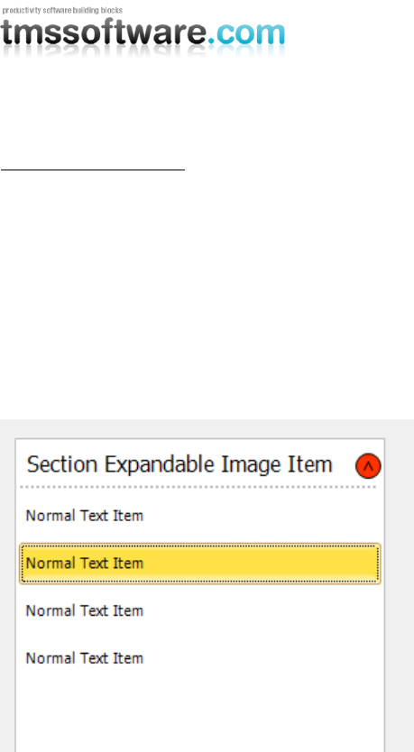
Expanding / Collapsing
One of the built in features is expanding and collapsing. When adding an
ExpandableImageSectionItem, all items below this item are automatically collapsed. That is, if the
level property of the item is the same. All the items are collapsed until a new section item is found.
A Section item is not collapsible.
AdvPolyList1.AddItem(TExpandableImageSectionItem);
AdvPolyList1.AddItem(TTextItem);
AdvPolyList1.AddItem(TTextItem);
AdvPolyList1.AddItem(TTextItem);
AdvPolyList1.AddItem(TTextItem);
When the automatic expand / collapse feature is not suitable for your application, you can
implement the OnItemExpand event and manually handle the visible state of the items.
with TExpandableImageSectionItem(AdvPolyList1.
AddItem(TExpandableImageSectionItem)) do
begin
OnItemExpand := DoItemExpand;
end;
procedure TForm1.DoItemExpand(Sender: TObject; Item: TCustomItem);
begin
end;
Expanding and collapsing all items can also be done with one procedure in code:
Expanding : AdvPolyList1.List.ShowItemsByLevel(1, 1, hsAll);
Collapsing : AdvPolyList1.List.HideItemsByLevel(1, 1, hsAll);
The first parameter is the startindex. The second parameter is the level that needs to be collapsed
and the last parameter is used to hide all items, or just the items within the given level.
TMS SOFTWARE
TMS Advanced Poly List
DEVELOPERS GUIDE
45
List within List
The power of the poly list is the hierarchy, the polymorph structure, the ability to hold different
items and controls. Therefore we have prepared a simple demo of using a poly list as an embedded
container in another poly list.
First add 2 poly list containers to the form. Add some items to both of the lists.
AdvPolyList1.AddItem(TTextItem);
AdvPolyList1.AddItem(TTextItem);
AdvPolyList1.AddItem(TTextItem);
AdvPolyList1.AddItem(TTextItem);
AdvPolyList2.AddItem(TTextItem);
AdvPolyList2.AddItem(TTextItem);
AdvPolyList2.AddItem(TTextItem);
AdvPolyList2.AddItem(TTextItem);
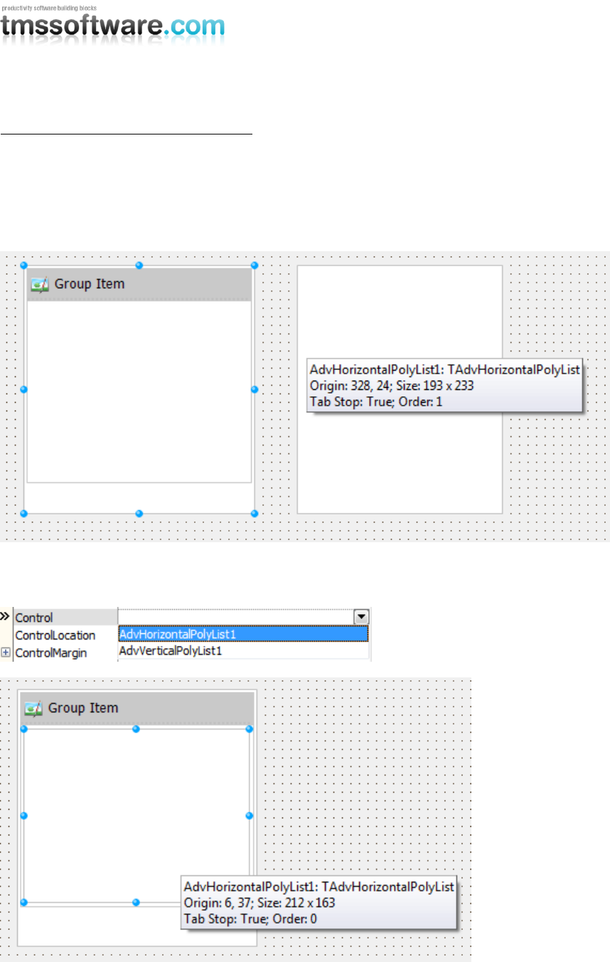
Add a GroupItem to host to second list.
AdvPolyList1.AddItem(TGroupItem);
To host the second list you can use any item, but the GroupItem has some preset properties to
automatically align the control within its area. Adding the second poly list is a simple as accessing
the control property and assigning the second list. Replace the above line with the following line:
AdvPolyList1.AddItem(TGroupItem).Control := AdvPolyList2;
TMS SOFTWARE
TMS Advanced Poly List
DEVELOPERS GUIDE
46
Horizontal List within Vertical List item
As a variant on the previous sample, this is a sample to create a vertical list, add an item and use a
horizontal list inside that item.
First add 2 lists, a vertical and a horizontal list. Then add an item in the vertical list, here we have
chosen for the GroupItem which automatically aligns the control in the area.
Select the GroupItem in the object inspector and set the control property to point to the Horizontal
list.
TMS SOFTWARE
TMS Advanced Poly List
DEVELOPERS GUIDE
47
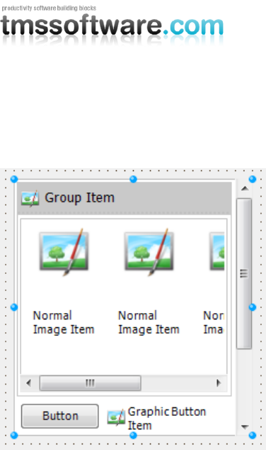
Adding a few items to the horizontal list and the vertical list, gives you a simple application which
demonstrates the power of this component.
TMS SOFTWARE
TMS Advanced Poly List
DEVELOPERS GUIDE
48
Using the DropDownItem
The dropdownitem is an item which has an internal list of items and displays those items in a
separate dropdown list. This sample shows you how to add a dropdownitem at designtime and at
runtime and fill the dropdown list with different item types.
First add a list of choice on the form, here we have chosen a standard TAdvPolyList component.
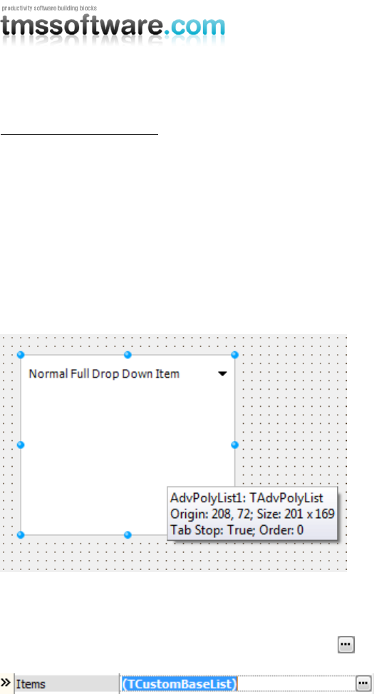
Start the editor and add a DropDownItem. You see that there are 2 types of dropdownitems
available: the normal dropdown item with a separate dropdown button, and a full dropdown item
which displays the selected item in the item area.
For this sample we have added the full dropdown item.
Selecting the item in the object inspector shows you many properties which change the appearance
and the list of items inside the dropdown item.
To add more items to the dropdown list click on the button next to the items property.
This will show a new editor which can be used to add items at designtime to the dropdown item.
Add some items of choice and start the application and click on the item to show the list. Selecting
an item will close the dropdown list and display that item in the area of the dropdown item.
TMS SOFTWARE
TMS Advanced Poly List
DEVELOPERS GUIDE
49
Adding this in code is similar when adding normal items to the list, with a slight difference in the
structure of the code:
with TFullDropDownItem(AdvPolyList1.AddItem(TFullDropDownItem)) do
begin
AddItem(TTextItem);
AddItem(TCheckItem);
AddItem(TRadioItem);
AddItem(TImageItem);
end;
The AddItem calls are present in the dropdown item which does exactly the same as the AddItem
function of the main poly list.
TMS SOFTWARE
TMS Advanced Poly List
DEVELOPERS GUIDE
50
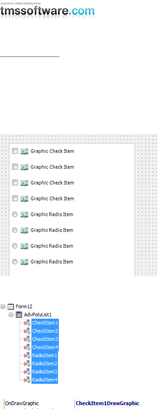
Custom drawing items
One of the advantages of the poly list items is the ability to do custom drawing. Each item has 2
basic draw events called in the beginning and the end of the drawing. Some items have an extra
draw event for special elements inside that item. This sample shows you how to customize the
drawing of the CheckItem and the RadioItem. Other than through events, these items also have
properties to provide images for custom CheckBoxes or RadioButtons.
First add a list of choice and add several CheckItems and RadioItems. The customization can be
done with the several GraphicGlyph indexes and names for respectively the ImageList and the
PictureContainer, providing a customized glyph, or image for each state.
In this sample we will look more in depth in using the events for customized drawing. In the
structure window, select all items and implement the OnDrawGraphic event.

TMS SOFTWARE
TMS Advanced Poly List
DEVELOPERS GUIDE
51
procedure TForm1.CheckItem1DrawGraphic(Sender: TObject; g: TGPGraphics;
Rect: TGPRectF; Item: TCustomItem; Checked: Boolean; State:
TGraphicState;
Kind: TGraphicKind; Enabled: Boolean; var Default: Boolean);
begin
end;
There are several parameters that can be used to obtain information or to draw custom checkboxes.
The Default parameter must be set to false to block the painting of the normal checkboxes and
radiobuttons. Below is a piece of code which uses these properties and provides different drawing
for different states of the CheckBox and RadioButton.
procedure TForm1.CheckItem1DrawGraphic(Sender: TObject; g: TGPGraphics;
Rect: TGPRectF; Item: TCustomItem; Checked: Boolean; State:
TGraphicState;
Kind: TGraphicKind; Enabled: Boolean; var Default: Boolean);
var
b: TGPBrush;
p: TGPPen;
begin
default := false;
case Kind of
gkRadioButton:
begin
if Checked then
begin
case State of
gsHovered, gsDown, gsNormal:
begin
b := TGPSolidBrush.Create(MakeColor(255, RGB(254, 144, 0)));
g.FillEllipse(b, MakeRect(Rect.X + 5, Rect.Y + 5, Rect.Width -
10, Rect.Height - 10));
b.Free;
end;
end;
end
else
begin
case State of
gsHovered, gsDown, gsNormal:
begin
p := TGPPen.Create(MakeColor(255, RGB(254, 144, 0)));
g.DrawEllipse(p, MakeRect(Rect.X + 5, Rect.Y + 5, Rect.Width -
10, Rect.Height - 10));
p.Free;
end;
end;
end;
end;
gkCheckBox:
begin
if Checked then
begin
AdvVerticalPolyList8.List.Appearance.ButtonSelected.Fill(g, Rect);
p := TGPPen.Create(MakeColor(255, clBlack));
TMS SOFTWARE
TMS Advanced Poly List
DEVELOPERS GUIDE
52
g.DrawLine(p, Rect.X + Rect.Width / 6 * 2, Rect.Y + Rect.Height /
2, Rect.X + Rect.Width / 4 * 2, Rect.Y + Rect.Height / 4 * 3);
g.DrawLine(p, Rect.X + Rect.Width / 4 * 2, Rect.Y + Rect.Height / 4
* 3, Rect.X + Rect.Width / 4 * 3, Rect.Y + Rect.Height / 3);
p.Free;
end;
end;
end;
if item.State = isNormal then
begin
p := TGPPEN.Create(MakeColor(255, RGB(226, 228, 231)));
g.drawline(p, Rect.X + Rect.Width + 5, Item.Y, Rect.X + Rect.Width + 5,
Item.Y + Item.Height);
p.Free;
end;
end;
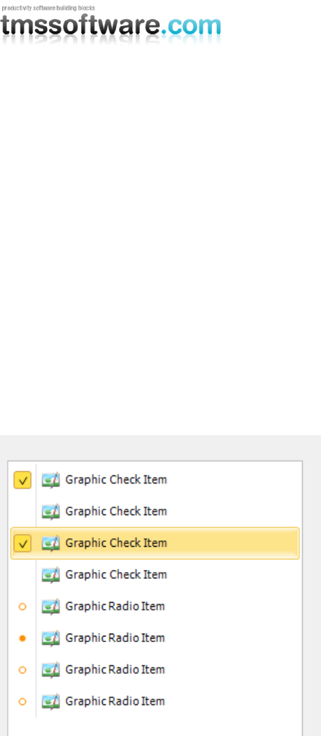
Applying this code and setting some properties in the AdvPolyList (to improve the drawing of the
separators) gives you the following look and feel:
Properties set to obtain the above look and feel:
- VerticalSpacing 0
- Each item spacing 10
TMS SOFTWARE
TMS Advanced Poly List
DEVELOPERS GUIDE
53
Auto Sizing
One of the features of the poly list is autosizing of items within the control. The autosizing can be
controlled with 2 properties, AutoSizeMode and AutoSizeType. The AutoSizeMode property defines
the kind of autosizing.
asmItems: The items are resized based on the size of the control.
asmControl: The control is resized based on the size of the items.
asmNone: Autosizing is disabled.
By default the AutoSizeMode is asmItems. Also, the AutoSizeType can be set, which determines if
the AutoSizing must be applied in the height, width or both.
astBoth: Autosizing is applied in both width and height.
astWidth: Autosizing is applied in width only.
astHeight: Autosizing is applied in height only.
Below are screenshots of the different scenarios. (asmControl is basically the same as asmItems, but
the size of the control is adapted to the size of the Items.
asmItems astBoth
TMS SOFTWARE
TMS Advanced Poly List
DEVELOPERS GUIDE
54
asmItems astWidth
asmItems astHeight
asmNone
TMS SOFTWARE
TMS Advanced Poly List
DEVELOPERS GUIDE
55
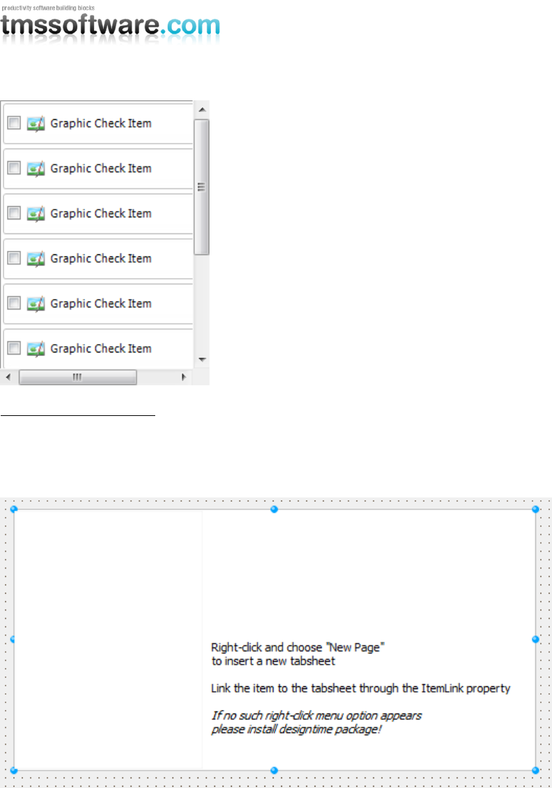
Using the TAdvPolyPager
The TAdvPolyPager is a combination of pages and items. Starting with the TAdvPolyPager shows an
empty list and describes the actions you must take to add a new page and to link the page to an
item.
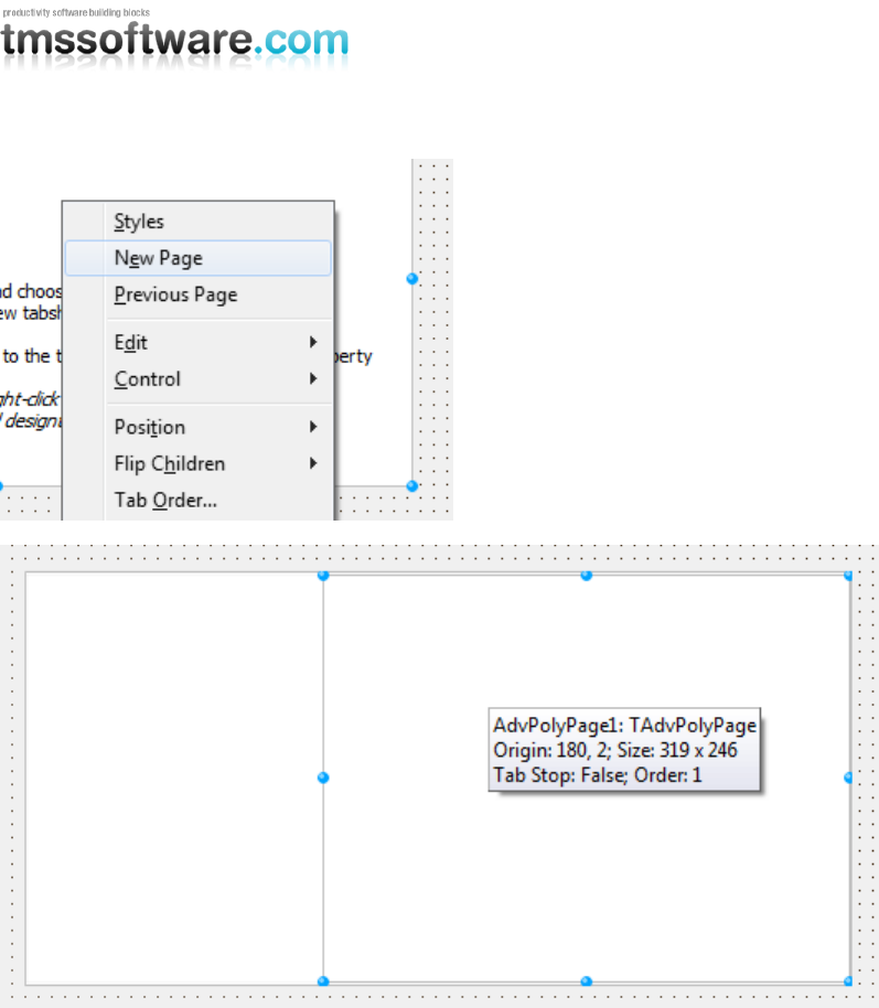
Adding a page can be done by right-clicking on the pager and choosing “New Page“.
TMS SOFTWARE
TMS Advanced Poly List
DEVELOPERS GUIDE
56
Now that the page is added, you must add a new item, to link the page and to select the page at
runtime.
To add a new item, double-click on the left side of the pager to start the editor, and add an item of
choice.
TMS SOFTWARE
TMS Advanced Poly List
DEVELOPERS GUIDE
57
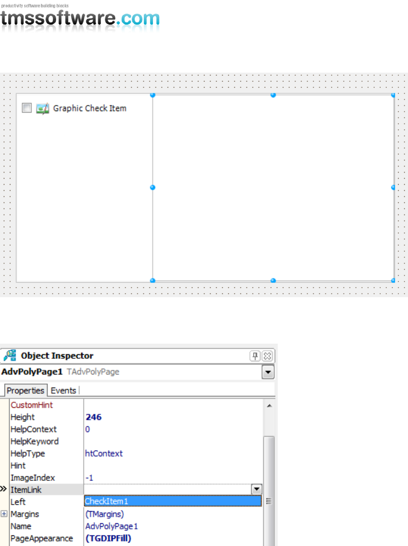
The last action that must be done is linking the item to the page. When selecting the page in the
object inspector, or selecting the page at designtime, you can select the item added through the
editor in the dropdown list.
After selecting the Item, the link is visualized at designtime:
TMS SOFTWARE
TMS Advanced Poly List
DEVELOPERS GUIDE
58
Each time a new page is added, the page must be linked to an item. The page can be linked to only
one item. When a page has no item, the page is not displayed.
TMS SOFTWARE
TMS Advanced Poly List
DEVELOPERS GUIDE
59
Creating and handling previews with the PreviewItem (Delphi 2010 only)
The previewitem is a special item. It has the same capabilities as a normal image item, but with an
extra property to display a preview of the file. This preview is based on the shell preview of the
Windows operating system.
Only file types that have a registered preview handler on Operating System level can be shown as
preview. The application that is linked to the file (ex. „.ppt‟ PowerPoint) must have a preview
handler that is registered in the operating system. In a default Windows Vista or Windows 7
operating system installation, there are some built-in preview handlers for known file types such as
„wmv‟, „mp3‟, and all image types. File types that are not recognized will not be loaded and will
show the default image that is loaded when creating the item.
To display the preview in an item, simply add the item to the list and set the PreviewFile property
to load the preview of the file.
with TPreviewItem(AdvPolyList1.AddItem(TPreviewItem)) do
begin
PreviewFile := 'C:\Users\Public\Videos\Sample Videos\WildLife.wmv';
end;
Starting the application adds the item and creates the preview, which is a frame of the video that is
added. For music files this will be a cover of the album. For PowerPoint files this will be the first
slide. For each file that has a registered preview handler, the preview thumbnail will be different.
For this application we have set the Selectable property false, to block the selection, and use the
OnItemClick event to open the file when clicking on the item.
with TPreviewItem(AdvPolyList1.AddItem(TPreviewItem)) do
begin
PreviewFile := 'C:\Users\Public\Videos\Sample Videos\WildLife.wmv';
OnItemClick := ItemClick;
Selectable := false;
end;
procedure TForm1.ItemClick(Sender: TObject; Item: TCustomItem);
begin
(Item as TPreviewItem).Run;
end;
In the ItemClick, the Run procedure is called which internally handles a ShellExecute to execute the
file. Ofcourse, this is a built-in function that is implemented to quickly write an application.
TMS SOFTWARE
TMS Advanced Poly List
DEVELOPERS GUIDE
60
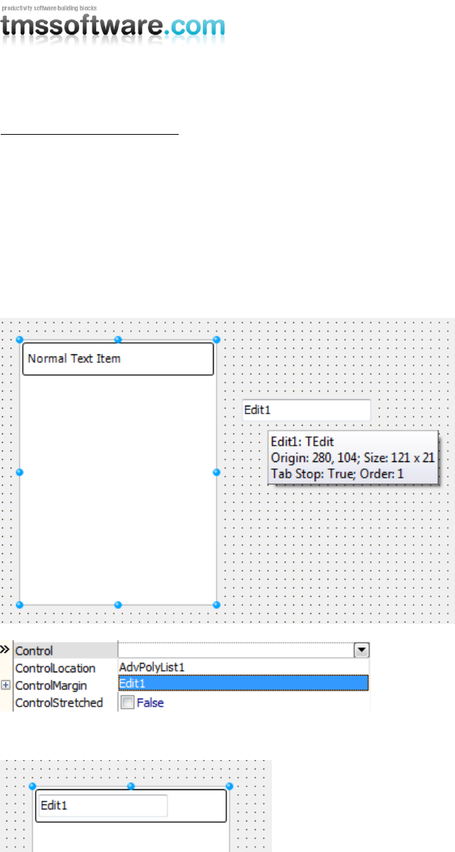
Hosting a control in an item
Each item can host a control and has properties to align this control within the boundaries of the
item. Adding a control to an item can be done at designtime and at runtime. In this sample, we will
demonstrate how to create a new item and add a standard edit control to the item.
Start the editor, and add an item of choice. When selecting this item, you will see properties to add
and align a control.
Drop a TEdit control on the form and select the item again. You will notice that the Edit control is
added to the dropdown list in the object inspector linked to the Control property.
Selecting „Edit1‟ in our sample automatically displays the Edit control in the item.
The Edit control is displayed above the text and after modifying the control properties, the height
of the item, and the caption position we have an item with an edit which is displayed inside the
item below the caption.
TMS SOFTWARE
TMS Advanced Poly List
DEVELOPERS GUIDE
61
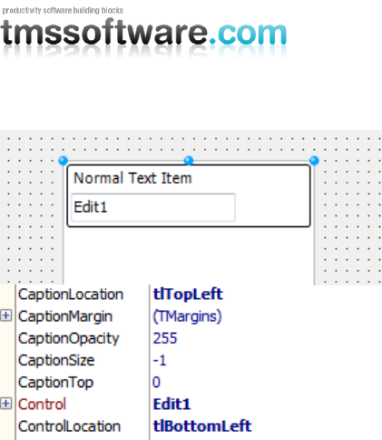
Connecting the same edit control to an item in code with the same Caption and Control property
settings can be done with the following code:
with TTextItem(AdvPolyList1.AddItem(TTextItem)) do
begin
Control := Edit1;
ControlLocation := tlBottomLeft;
CaptionLocation := tlTopLeft;
Height := 45;
end;
TMS SOFTWARE
TMS Advanced Poly List
DEVELOPERS GUIDE
62
Creating a poly pager
Using the poly pager at designtime and linking items to pages is simple and intuitive. But creating a
complete poly pager at runtime in code, the creation process can be a burden without a small
explanation or sample. Below is a sample code of creating a poly pager at runtime, adding items,
and linking those items to the pages.
Used units: AdvPolyPager, GDIPSectionItem, GDIPTextItem, StdCtrls;
var
apr: TAdvPolyPager;
app: TAdvPolyPage;
si: TSectionItem;
ti: TTextItem;
lb: TListBox;
begin
apr := TAdvPolyPager.Create(Self);
apr.Parent := self;
app := TAdvPolyPage.Create(apr);
apr.AddAdvPolyPage(app);
app := TAdvPolyPage.Create(apr);
apr.AddAdvPolyPage(app);
si := TSectionItem(apr.AddItem(TSectionItem));
si.Caption := 'Section of pages';
si.Status.Caption := '1';
si.Status.Visible := true;
ti := TTextItem(apr.AddItem(TTextItem));
ti.Caption := 'First page';
ti := TTextItem(apr.AddItem(TTextItem));
ti.Caption := 'Second page';
apr.AdvPolyPages[0].ItemLink := apr.Items[1];
apr.AdvPolyPages[1].ItemLink := apr.Items[2];
apr.ActivePageIndex := 0;
lb := TListBox.Create(apr.AdvPolyPages[0]);
lb.Parent := apr.AdvPolyPages[0];
lb.Align := alClient;
lb.Items.Add('item 1');
lb.Items.Add('item 2');
lb.Items.Add('item 3');
lb.Items.Add('item 4');
TMS SOFTWARE
TMS Advanced Poly List
DEVELOPERS GUIDE
63
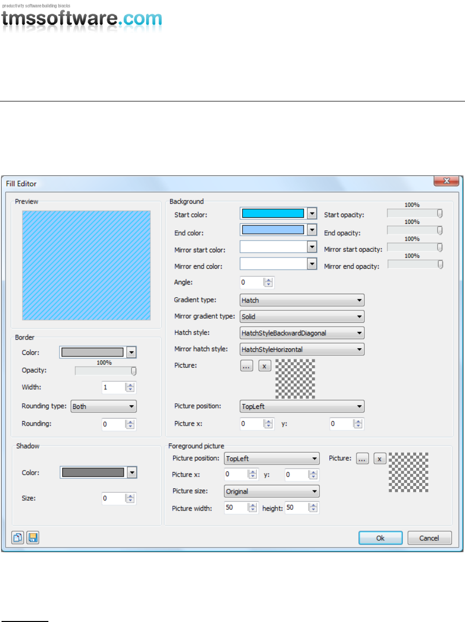
Fill Editor
For the poly list appearance, a designer is provided that can be used at design-time as well as at
run-time. The editor is capable of drawing semi transparent and complex gradients. Every time you
want to change the appearance of a visual element in the poly list, this editor with built-in preview
allows you to fully customize the look of the element:
In different groups, different categories of properties of the fill can be set: properties of the
border, a shadow, the background and a foreground.
Properties
Properties to control the border:
BorderColor: the color of the border of the fill.
BorderOpacity: the opacity of the border of the fill.
BorderWidth: the width of the border of the fill.

TMS SOFTWARE
TMS Advanced Poly List
DEVELOPERS GUIDE
64
Rounding: the rounding of the fill, set Rounding = 0 to have a rectangular shape and a
higher value to have more rounded corners.
RoundingType: the type of rounding of the fill. In some cases it can be useful to only set
the top corners of the fill to be rounded, only the bottom corners or all 4 corners.
Properties to control the background:
A background can be divided in a top and bottom part and each part can have its gradient.
Color: the start color of the top part gradient (if the GradientType is gtSolid, Color is the only
property used).
ColorTo: the end color of the top part gradient.
ColorMirror: when ColorMirror is set to a color different from clNone the fill will be split up
in 2 parts: the top part and the mirror bottom part. ColorMirror is the start color of the mirror
bottom part.
ColorMirrorTo: the end color of the mirror bottom part.
Opacity: the opacity of the start color of the top part.
OpacityTo: the opacity of the end color of the top part.
OpacityMirror: the opacity of the start color of the mirror bottom part.
OpacityMirrorTo: the opacity of the end color of the mirror bottom part.
GradientType: the type of gradient to apply: Horizontal, Vertical, Angle, Hatch... for the top
part (or full background if mirror colors are set to clNone)
GradientMirrorType: the type of gradient of the mirror bottom part.
Angle: the angle of the gradient in case GradientType is set to gtAngle.
HatchStyle: the hatchstyle in case GradientType is set to gtHatch for the top part (or full
background if mirror colors are set to clNone)
HatchStyleMirror: the hatchstyle of the mirror bottom part.
BackGroundPicture: the background picture in case GradientType gtTexture is chosen. The
background picture can be stretched or positioned on the fill.
BackGroundPicturePosition: the position of the backgroundpicture.
BackGroundPictureLeft: when the position is set to custom the left position can be set with
this property
BackGroundPictureTop: the top position of the backgroundpicture when the position is set
to custom.
Properties to control the foreground picture:
TMS SOFTWARE
TMS Advanced Poly List
DEVELOPERS GUIDE
65
Picture: you can always set a picture that is not bound to the rectangle of the fill. In other
words you can draw a picture which overlaps the fill.
PicturePosition: the position of the foreground picture.
PictureLeft: the left position of the picture in case pictureposition is set to custom.
PictureTop: the top position of the picture in case pictureposition is set to custom.
PictureSize: it can be useful to resize the picture to a different size when it is too large. Set
picturesize to custom and use picturewidth and pictureheight to change the size of the
picture.
PictureWidth: the width of the picture in case the picturesize is set to custom.
PictureHeight: the height of the picture in case the picturesize is set to custom.
Properties to control the shadow:
ShadowColor: the color of the shadow of the fill.
ShadowOffset: the offset of the shadow of the fill.
Properties to control the shadow:
GlowMode: the mode of the glow which is drawn on top of the fill, the mode can be a
gradient, a radial, or a combination.
GlowGradientColor: the color of the glow when the glowmode is set to gradient or the
combination mode.
GlowRadialColor: the color of the glow when the glowmode is set to radial or the
combination mode.
Some examples of fill styles:
Copying styles
At design-time or run-time, a style can be easily applied to many components or many visual
elements of components. The 2 speedbuttons in the lower left corner of the fill editor can be used
to copy and paste fills.

TMS SOFTWARE
TMS Advanced Poly List
DEVELOPERS GUIDE
66
When creating complex fills in a project with many different components that implement the
TGDIPFill class, you can copy the TGDIPFill settings on the clipboard and paste from the clipboard
for another component or visual element. To do the same in code, a TGDIPFill class can be assigned
to another TGDIPFill class:

TMS SOFTWARE
TMS Advanced Poly List
DEVELOPERS GUIDE
67
Example:
procedure TForm1.Button1Click(Sender: TObject);
begin
AdvPolyList1.Fill.Assign(AdvPolyList2.Fill);
end;
In this code snippet, the fill from one TAdvPolyList Fill is copied to another TAdvPolyList Fill.
Using the fill editor at runtime
It is easy to use the fill editor at runtime. To do this, add the unit AdvSmoothFillEditor to the uses
list and add following code:
var
filldlg :TAdvSmoothFillEditorDialog;
begin
filldlg := TAdvSmoothFillEditorDialog.Create(self);
filldlg.Fill := AdvPolyList1.Fill;
filldlg.Execute;
end;
With this code snippet, the TAdvPolyList fill can be edited at runtime.
TMS SOFTWARE
TMS Advanced Poly List
DEVELOPERS GUIDE
68
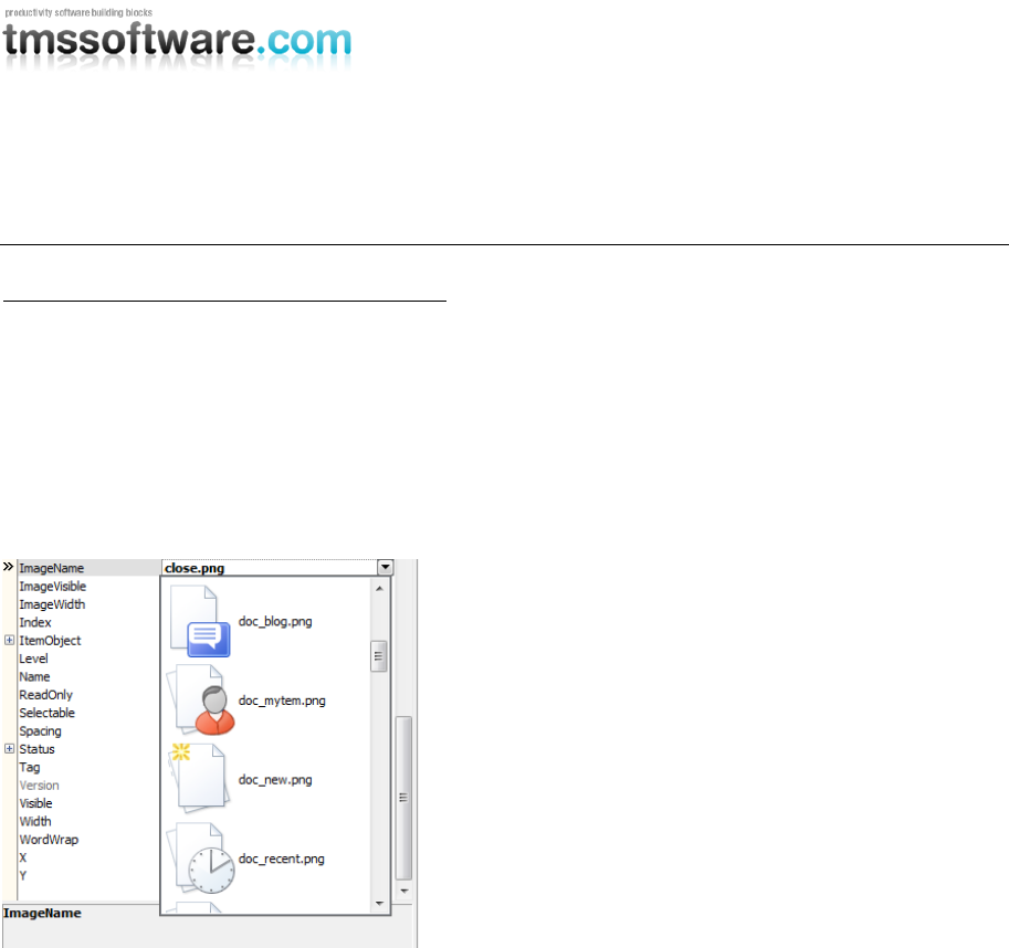
GDI+ Picture Container
Using the TGDIPPictureContainer component
The TGDIPPictureContainer makes it easy to use and embed PNG, JPEG, GIF, ICO, BMP and WMF
images in your applications from the IDE without needing to resort to resource files. Note that the
TGDIPPictureContainer does not require any additional library or code to handle these image
formats.
Applying this to the poly list, some items are able to display images. This can be done with the
ImageName property. When assigning a TGDIPPictureContainer at designtime, the complete list of
images comes available when selecting the ImageName property in the object inspector.
Suppose the images with names SOUNDS, SEARCH, PRINTER and MAIL have been added, then the
images can be shown via HTML formatted text with following tags :
First image <IMG src="SOUNDS"> , second image <IMG src="PRINTER">, etc ...
assuming of course the TGDIPPictureContainer is assigned to the HTML enabled control. When a
HTML enabled control cannot find a picture with the name referenced in the PictureContainer it will
display no image.
It is equally possible to add pictures to the TGDIPPictureContainer at run-time. Below is a code
snippet that shows how an image is loaded from file and added to the TGDIPPictureContainer:
with GDIPPictureContainer.Items.Add do
begin
Picture.LoadFromFile('myimage.png’);
Name := 'NEW';
end;
To remove a picture from the TGDIPPictureContainer later:
with GDIPPictureContainer.Items.Items[0].Free;
To control size of the picture displayed, additional tags WIDTH and HEIGHT can be used :

TMS SOFTWARE
TMS Advanced Poly List
DEVELOPERS GUIDE
69
New image <IMG src="NEW" width="24" height="24">
HTML rendering engine
Another core technology used among many components is a small fast & lightweight HTML rendering
engine. This engine implements a subset of the HTML standard to display formatted text. It supports
following tags :
B : Bold tag
<B> : start bold text
</B> : end bold text
Example : This is a <B>test</B>
U : Underline tag
<U> : start underlined text
</U> : end underlined text
Example : This is a <U>test</U>
I : Italic tag
<I> : start italic text
</I> : end italic text
Example : This is a <I>test</I>
S : Strikeout tag
<S> : start strike-through text
</S> : end strike-through text
Example : This is a <S>test</S>
A : anchor tag
<A href="value"> : text after tag is an anchor. The 'value' after the href identifier is the anchor. This
can be an URL (with ftp,http,mailto,file identifier) or any text.
If the value is an URL, the shellexecute function is called, otherwise, the anchor value can be found
in the OnAnchorClick event </A> : end of anchor
Examples : This is a <A href= "mailto:myemail@mail.com ">test</A>
This is a <A href="http://www.tmssoftware.com">test</A>
This is a <A href="somevalue">test</A>
FONT : font specifier tag
<FONT face='facevalue' size='sizevalue' color='colorvalue' bgcolor='colorvalue'> : specifies font of
text after tag.
with
face : name of the font
size : HTML style size if smaller than 5, otherwise pointsize of the font
color : font color with either hexidecimal color specification or Borland style color name, ie
clRed,clYellow,clWhite ... etc
bgcolor : background color with either hexidecimal color specification or Borland style color
name </FONT> : ends font setting

TMS SOFTWARE
TMS Advanced Poly List
DEVELOPERS GUIDE
70
Examples : This is a <FONT face="Arial" size="12" color="clred">test</FONT>
This is a <FONT face="Arial" size="12" color="#FF0000">test</FONT>
P : paragraph
<P align="alignvalue" [bgcolor="colorvalue"] [bgcolorto="colorvalue"]> : starts a new paragraph, with
left, right or center alignment. The paragraph background color is set by the optional bgcolor
parameter. If bgcolor and bgcolorto are specified,
a gradient is displayed ranging from begin to end color.
</P> : end of paragraph
Example : <P align="right">This is a test</P>
Example : <P align="center">This is a test</P>
Example : <P align="left" bgcolor="#ff0000">This has a red background</P>
Example : <P align="right" bgcolor="clYellow">This has a yellow background</P>
Example : <P align="right" bgcolor="clYellow" bgcolorto="clred">This has a gradient background</P>*
HR : horizontal line
<HR> : inserts linebreak with horizontal line
BR : linebreak
<BR> : inserts a linebreak
BODY : body color / background specifier
<BODY bgcolor="colorvalue" [bgcolorto="colorvalue"] [dir="v|h"] background="imagefile specifier"> :
sets the background color of the HTML text or the background bitmap file
Example : <BODY bgcolor="clYellow"> : sets background color to yellow
<BODY background="file://c:\test.bmp"> : sets tiled background to file test.bmp
<BODY bgcolor="clYellow" bgcolorto="clWhite" dir="v"> : sets a vertical gradient from yellow to
white
IND : indent tag
This is not part of the standard HTML tags but can be used to easily create multicolumn text
<IND x="indent"> : indents with "indent" pixels
Example :
This will be <IND x="75">indented 75 pixels.
IMG : image tag
<IMG src="specifier:name" [align="specifier"] [width="width"] [height="height"] [alt="specifier:name"]
> : inserts an image at the location
specifier can be : idx : name is the index of the image in the associated imagelist
file : name is the full filename specifier
res : name of a resource bitmap (not visible at design time)
no specifier : name of image in a TGDIPPictureContainer
Optionally, an alignment tag can be included. If no alignment is included, the text alignment with
respect to the image is bottom. Other possibilities are: align="top" and align="middle"
The width & height to render the image can be specified as well. If the image is embedded in
anchor tags, a different image can be displayed when the mouse is in the image area through the
Alt attribute.
Examples : This is an image <IMG src="idx:1" align="top">
This is an image <IMG src="file://c:\my documents\test.bmp">
This is an image <IMG src="res://BITMAP1">

TMS SOFTWARE
TMS Advanced Poly List
DEVELOPERS GUIDE
71
This is an image <IMG src="name">
SUB : subscript tag
<SUB> : start subscript text
</SUB> : end subscript text
Example : This is <SUP>9</SUP>/<SUB>16</SUB> looks like 9/16
SUP : superscript tag
<SUP> : start superscript text
</SUP> : end superscript text
UL : list tag
<UL> : start unordered list tag
</UL> : end unordered list
Example : <UL>
<LI>List item 1
<LI>List item 2
<UL>
<LI> Sub list item A
<LI> Sub list item B
</UL>
<LI>List item 3
</UL>
LI : list item
<LI [type="specifier"] [color="color"] [name="imagename"]>: new list item specifier can be "square",
"circle" or "image" bullet. Color sets the color of the square or circle bullet. Imagename sets the
PictureContainer image name for image to use as bullet
SHAD : text with shadow
<SHAD> : start text with shadow
</SHAD> : end text with shadow
Z : hidden text
<Z> : start hidden text
</Z> : end hidden text
Special characters
Following standard HTML special characters are supported :
< : less than : <
> : greater than : >
& : &
" : "
: non breaking space
™ : trademark symbol
€ : euro symbol
§ : section symbol
© : copyright symbol
¶ : paragraph symbol

TMS SOFTWARE
TMS Advanced Poly List
DEVELOPERS GUIDE
72
Component styles and application-wide or form-wide styler components
While the appearance of the TMS Advanced Poly List can be fully customized, it is often desirable to
make the application look and feel consistent with Microsoft Windows or Microsoft Office. To
access the presets at design-time, right click the component and choose Styles from the context
menu. At run-time, the style can also be set in code. To do this, add the unit AdvStyleIF to the uses
clause and call:
Component.SetComponentStyle(style)
Current available styles are:
Office 2003:
tsOffice2003Blue: Office 2003 style on a blue XP theme
tsOffice2003Silver: Office 2003 style on a silver XP theme
tsOffice2003Olive: Office 2003 style on an olive XP theme
tsOffice2003Classic: Office 2003 style on a non-themed XP or pre-XP operating system
Office 2007:
tsOffice2007Luna: Office 2007 Luna style
tsOffice2007Silver: Office 2007 Silver style
tsOffice2007Obsidian : Office 2007 Obsidian style
Office 2010:
tsOffice2010Blue: Office 2010 Blue style
tsOffice2010Silver: Office 2010 Silver style
tsOffice2010Black : Office 2010 Black style
Windows:
tsWindowsXP: Windows XP dialogs style
tsWindowsVista: Windows Vista OS style
tsWindows7: Windows Seven OS Style
Custom:
tsCustom: do not force style
We have spent quite some effort to further simplify form-wide and application-wide appearance
control for TMS components and possibly also your custom controls. To do this, two new components
have been designed:
TAdvFormStyler
TAdvAppStyler
A TAdvFormStyler is supposed to be dropped on a form and it will control the style of the TMS
components on the form. A TAdvFormStyler will only affect components on the form itself. For
application-wide appearance control, in addition to a TAdvFormStyler on a form, a TAdvAppStyler
component can be dropped on a datamodule and is connected to the TAdvFormStyler components
on the forms. By setting then a single property in TAdvAppStyler on the datamodule, the complete
application appearance can change, both at design-time but also dynamically at run-time.
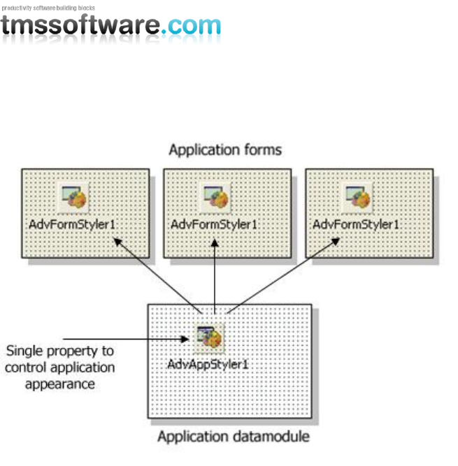
TMS SOFTWARE
TMS Advanced Poly List
DEVELOPERS GUIDE
73
Scenario
The component TAdvFormStyler has a property style. Setting this style property causes all
components on the form that support the interface to set the style to change to the selected style.
Similary, setting the style property for the TAdvAppStyler on a central data module invokes all
TAdvFormStyler style changes and thus the style of all TMS controls on the form that implement the
ITMSStyle interface. The TAdvFormStyler component has an event OnApplyStyle that can be used to
prevent that for certain components a standard style is applied.
Example:
This code snippet prevents that the style will be set for any TAdvPolyList instance on the form by
the TAdvFormStyler component:
procedure TForm2.AdvFormStyler1ApplyStyle(Sender: TObject;
AComponent: TComponent; var Allow: Boolean);
begin
Allow := not (AComponent is TAdvPolyList);
end;

TMS SOFTWARE
TMS Advanced Poly List
DEVELOPERS GUIDE
74
You can make your own controls also easily TAdvFormStyler, TAdvAppStyler aware so that your
controls also automatically change their appearance when the application and/or form style
changes. To do this, it is sufficient to add and implement the ITMSStyle interface to your control.
This code snippet shows a sample custom control that was made TMS style aware:
interface
uses
Classes, AdvStyleIF;
type
TMyCustomControl = class(TCustomControl, ITMSStyle)
public
procedure SetComponentStyle(AStyle: TTMSStyle);
end;
{ TMyCustomControl }
procedure TMyCustomControl.SetComponentStyle(AStyle: TTMSStyle);
begin
case AStyle of
tsOffice2003Blue: // set properties correct here for the selected style
tsOffice2003Silver:
tsOffice2003Olive:
tsOffice2003Classic:
tsOffice2007Luna:
tsOffice2007Obsidian:
tsOffice2007Silver:
tsOffice2010Blue:
tsOffice2010Silver:
tsOffice2010Black:
tsWindowsXP:
tsTerminal:
tsWindowsVista:
tsWindows7:
tsCustom:
end;
end;

TMS SOFTWARE
TMS Advanced Poly List
DEVELOPERS GUIDE
75
Frequently asked questions (FAQ)
Q: Is any Microsoft licensing required to use the TMS Poly list controls similar to the Office 2007
ribbon?
A: TMS Poly list controls can be used for so much more than just the Office 2010 application menu.
They extend these controls and are in several ways more versatile. Ribbon UI licensing does not
apply on such separate controls.
