User Manual
User Manual: Pdf
Open the PDF directly: View PDF  .
.
Page Count: 25
Author
ORION
Project
WooCommerce Product Designer
Title
User Manual
Reference
wpd-user-manual
Version
0.1
History and update
Version
Date
State
Nature of changes
-
© Orion - Reproduction in whole or in part of this document or its communication outside Orion is forbidden, unless written
authorization

© Orion - Reproduction in whole or in part of this document or its communication outside Orion is forbidden, unless written
authorization

CONTENTS
OVERVIEW 5
PRESENTATION OF THE PLUGIN 5
PLUGIN SPECIFICATION 5
OVERVIEW OF SOFTWARE REQUIREMENTS 5
TERMINOLOGIES 5
INSTALLATION PROCESS 5
GET STARTED 7
CONFIGURATION 7
THE DESIGN PAGE 7
GENERAL SETTINGS 7
PRODUCT PARTS 8
MANAGE THE PARTS 8
ADD A NEW PART 8
EDIT OR DELETE A PART 8
FONTS 8
CLIPARTS 9
CREATE A SET OF CLIPART 9
CUSTOMIZABLE PRODUCT 9
CREATE A CUSTOMIZABLE PRODUCT (SIMPLE PRODUCTS) 9
CUSTOMIZE A PRODUCT 11
DISPLAY CUSTOMIZABLE PRODUCTS 12
ACCESS THE USER ORDERED DESIGNS 12
TEMPLATES 12
CREATE A TEMPLE CATEGORY 12
TO CREATE NEW CATEGORIES, YOU NEED TO ACCESS THE TEMPLATES> CATEGORIES PAGE FIRST. 13
CREATE A TEMPLATE 13
QUICK DESIGNS TIPS TO DESIGN A TEMPLATE 13
DISPLAY TEMPLATES 14
ADVANCED SETTINGS 14
GENERAL 14
UPLOADS 15
SOCIAL NETWORK 15
FACEBOOK 16
O FACEBOOK APP ID: THESE SETTINGS ARE MANDATORY SO THE USER CAN CONNECT TO FACEBOOK. 16
O FACEBOOK APP SECRETS: THESE SETTINGS ARE MANDATORY SO THE USER CAN CONNECT TO FACEBOOK 16
OUTPUTS 16
COLORS 17
TEXT CONTROLS 18
SHAPES CONTROLS 18
IMAGES/ CLIPARTS CONTROL 19
DESIGNS 19
USER INTERFACE 19
LICENCE 19
BULK DEFINITION 20
HOW TO DEPLOY THE DEMO FILES 20
FREQUENTLY ASKED QUESTIONS 21
© Orion - Reproduction in whole or in part of this document or its communication outside Orion is forbidden, unless written
authorization

HOW CAN I GENERATE HD OUTPUT? 21
WHY ARE MY IMAGES/TEXT NOT VISIBLE IN THE EDITOR? 21
HOW CAN I CREATE TEMPLATES OR VIEW THE “BROWSE OUR TEMPLATES” BUTTON? 21
WHY DO I HAVE MALFUNCTIONING OR NOT FUNCTIONING BUTTONS ON WEBSITE? 21
WHAT DOES THIS ERROR MESSAGE…“ERROR: EMPTY PRODUCT PARTS LIST. AT LEAST ONE PART IS REQUIRED TO CREATE A CUSTOMIZABLE
PRODUCT.0” MEAN? 22
HOW CAN I CHANGE THE LANGUAGE? 22
WHERE CAN I FIND MY PURCHASE CODE? 22
WHY DOES MY PREVIEW NOT DISPLAY AND THE SCREEN FREEZES? 22
WHY DOES THE DESIGNER NOT LOAD THE SOME IMAGES? 22
HOW CAN I ADD FORMS? 22
CONTACT US 23
© Orion - Reproduction in whole or in part of this document or its communication outside Orion is forbidden, unless written
authorization
1.Overview
1.1.Presentation of the plugin
The WooCommerce Products Designer (WPD) is a really simple but complete HTML5 editor which
can be used to personalize logos, t-shirts, business cards, prints and any product which needs to be
customized by the client before the order.
1.2.Plugin specification
The WooCommerce product designer is a WordPress plugin. It is specially designed to work as
an Add-on to the wordpress plugin WooCommerce.
1.3.Overview of Software Requirements
● WordPress (minimum version: 4.0)
● WooCommerce (minimum version: 2.5)
● A web server with the following PHP (not WordPress) extensions installed:
○ Imagick
○ GD
○ Php ZIP
1.4.Terminologies
Term or abbreviation
Definition
WPD
WooCommerce Product Designer
1.5.Installation process
The zip file downloaded from CodeCanyon contains:
● The WooCommerce Product Designer user manual (User_manual.pdf)
● The WooCommerce Product Designer installable plugin zip file
(WooCommerce-product-designer.zip)
● The WPD_DEMO.wpress file you can import in your installation using the plugin All In One
WP Migration in order to get a clone of our official demo. This is an easy way to learn how we
build our demo installation.
Note: Make sure you import the wpress file in an empty installation because it crushes everything
installed and settles the configuration of the wpress file.
© Orion - Reproduction in whole or in part of this document or its communication outside Orion is forbidden, unless written
authorization
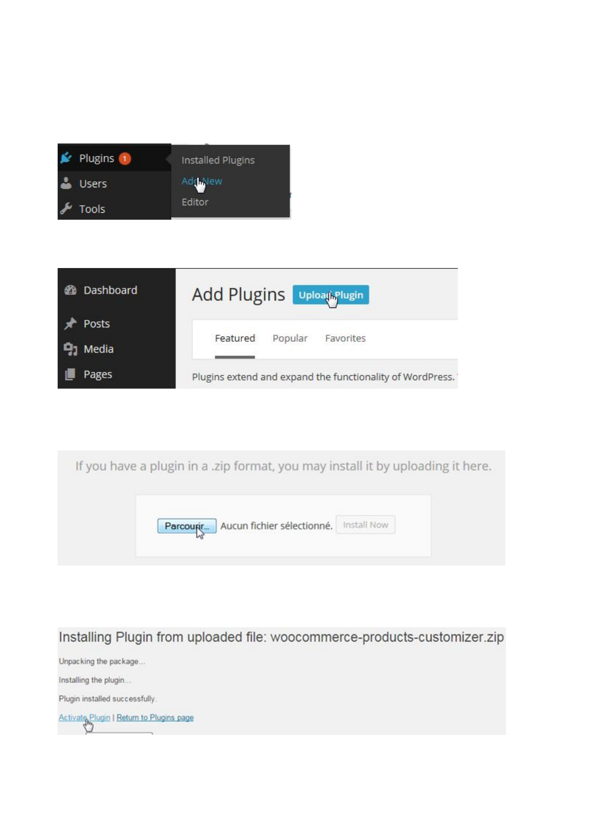
To install the plugin:
● First, extract the content of the archive in a folder of your choice and let's start the installation.
● Go to your WordPress Admin Panel and click on Plugins>Add New to access the plugins
installation screen:
● Then click on the “upload plugin” button to access the plugin upload page:
● Click on the Choose file button and select the plugin zip archive named
WooCommerce-product-designer.zip in the folder extracted in the first step.
● Click on the Install Now button to run the installation.
● Click on the Activate Plugin link to activate the plugin.
© Orion - Reproduction in whole or in part of this document or its communication outside Orion is forbidden, unless written
authorization

2.Get started
This page is automatically displayed when the plugin is activated. You can nevertheless access it
later on, through the WPD menu on your dashboard.
From this page, you can:
● Download the user manual (by clicking on the button Docs)
● Watch our tutorial videos on youtube
● Check the changelog in order to see the latest enhancements; you just have to click on
the tab changelog.
● Follow us on our social networks in order to be aware of the latest news and
opportunities related to our products.
3.Configuration
Before you start using the WooCommerce Product Designer plugin, you need to setup some
options first.
3.1.The design page
Let's start by creating the page where products will be customized. Click on menu Pages > Add New
Enter your page title and then click on publish. This page is very important and compulsory. Instead
of creating a page, you can choose an existing one and set it as designer page. Make sure you don’t
choose any of the default
3.2.General settings
Click on the menu WPD > Settings to access the designer settings.
●Design Page:This is the page where the product editor is located. Select the page you've
created in the first step of the basic configuration.
Note: This page is compulsory. It is where all designs are created. Without this page,
the designer tool can not be displayed.
●Templates Page: This is the page where the products templates will be displayed. This
setting can be overwritten per product.
Note: Use the shortcode [wpd-templates] where you want the templates to show up
in the templates page.
After setting these pages, you can move to the part creation and start your product creation process.
© Orion - Reproduction in whole or in part of this document or its communication outside Orion is forbidden, unless written
authorization

3.3.Product Parts
The product parts are a simple but really powerful concept of the plugin.
Let's say for example that you're running a business card printing website and you want your clients
to be able to personalize the front and the back view of each card, then you'll have to create two
views (Front and Back). Or you are running a shirt personalization website and want your clients to be
able to personalize the front, back, left sleeve and right sleeve of a shirt, then you'll have to create 4
parts, each corresponding to the view you want your clients to be able to customize.
Note: Every customizable product should at least have one part.
●Manage the parts
Go to WPD > Parts to access the parts list
●Add a new part
To add a new part, just enter the part name (space and special characters are accepted) and click
on the Add Part button.
●Edit or delete a part
To edit or delete a part, just put your mouse pointer right under the part name and you'll see the
additional actions Edit and Delete.
3.4.Fonts
The fonts interface allows you to define which fonts you would like your clients to use when they're
adding text to their designs. If you don't define any font, the system default fonts will be used.
To manage the fonts, go to WPD > Fonts to access the fonts list.
There are 3 ways to add a font:
● Google fonts: To add a Google font, just enter the font family name and the style sheet URL
as provided by Google Fonts and then click the Add Font button; or you browse the available
google font in the plugin and pick the desired one out of the list. You can also use this
method for any font provider service which provides a URL for the fonts style sheets.
● Custom web fonts: To add a custom web font, just enter your font family name and then
click the Add Font button. This means that the font has been loaded externally by your theme
or an external plugin. Also, to install custom fonts, you can use this plugin
https://wordpress.org/plugins/use-any-font/ and then enter the font family name in the plugin
without setting the URL.
●Through a TTF file: you import the TTF file of the font by clicking on “add font file” then you
write it’s name in the name field and you click on add font.
© Orion - Reproduction in whole or in part of this document or its communication outside Orion is forbidden, unless written
authorization

NOTICE: The fonts added through a TTF file are not displayed on the designer; they are only used on
the output of SVG files.
Please note that there is no limit to the number fonts you can define. For more details on fonts, please
Visit:
· http://wpsites.net/web-design/fonts-wordpress/
· http://wpsites.net/web-design/custom-fonts-wordpress-font-face-generator/
3.5.Cliparts
The clipart feature allows you to create one or many predefined set of pictures/vectors organized in
groups so your clients could be able to use them in their designs.
● Create a set of clipart
Just go to WPD> Cliparts.
● Click on the New clipart group
● · Then enter the group name
● Click on the Add clipart button to access the default WordPress media selector
popup.
● Select the desired pictures/vectors and then click on the Set Image button at
the bottom right of the popup.
● Enter the unit price for each picture if you want to charger your clients for each
picture used in their design
· Click on the publish button to save the group.
Note: There is no limit to the number of clipart per group or the number of group you can
define.
4.Customizable Product
4.1.Create a customizable product (Simple products)
● Click on Products > Add Products to access the product creation screen
● Enter your product name
● Enter your product price
● Select the product type (only simple and variable products are supported at this time).
● Click on canvas in order to apply a custom canvas’ size to your product and define its
template display page.
© Orion - Reproduction in whole or in part of this document or its communication outside Orion is forbidden, unless written
authorization

● Click on the bounding box menu tab in order to set the bounding boxes parameters if
needed. This parameter can be used to define the editable area INSIDE the canvas.
o X: Box coordinate X on the product
o Y: Box coordinate Y on the product
o Width: Box width (mandatory for rectangles). Must be inferior to the canvas
width.
o Height: Box height (mandatory for rectangles). Must be inferior to the
canvas height.
o Radius: Box radius (mandatory for circular boxes)
o Type: Box type (Rectangle or Circle)
o Border color: Box border color. Leave it empty for transparent borders.
● Click on the Products parts tab to access the products parts (list of products parts
defined in the section 7).
o Click on the checkbox right after the products parts you want to use for the
product you’re creating.
o Background image (not included in design): allows you to define a
background image for the parts. This image won’t be included in the final design.
o Background image (included in design): allows you to define a
background image for the parts. This image will be included in the final design.
o Overlay image: allows you to define an overlay image for the parts. This
image can be selected to either be included or not in the final design.
Note: These settings are not mandatory. You can define the pictures you want to use
for your product.
● Click on the Pricing rules tab to access the pricing rules
The Pricing rules enables the admin user to charge an extra for the customization
depending on the rules defined.
A pricing rule has 5 components:
o The rule parameter: allows you to set which condition should be checked. The
parameters currently included in the tool are:
● Number of characters in text (NB Chars in text): this has to do with the
number of alphabets or numeric figures in a text.
● Number of lines in text (NB Lines in text): this has to do with the lines
of a text.
● Number of images (NB Images): this rule is involved with the amount of
images.
● Number of vectors (NB Vectors): this rule involves the number of
vectors.
o The rule operator: allows you to define the kind of comparison to perform against
the rule value. The operators included in the tool are:
● Is less than.
● Is less or equals to.
● Equals.
© Orion - Reproduction in whole or in part of this document or its communication outside Orion is forbidden, unless written
authorization

● More than.
● More or equal to.
o The rule value to check against.
o The Price: this allows you to define the price or extra price to add to the product
base price if the rule is verified.
o The scope: allows you to set the rule scope. 2 scopes are currently supported:
● Per item: the extra will be added for each design element which
matches the rule defined.
● On Whole design: the extra will be added only once even if more than
one element matches the rule defined.
Please also note that the administrator has the ability to combine simple rules to create
a complex one.
Click on the Add rule group to set a whole new group pricing rules.
● Select your product categories if needed
Check the Customizable Product checkbox at your right to set the product as
customizable.
● Select this product templates page if you want your users to be able to choose a
template among the ones you previously created.
● Check the Clients can design from blank if you want your clients to be able to
customize this product from blank
● Check the Clients can upload their designs if you want your clients to be able to
send you files without having to go through the customization process.
● Click on the Publish button to save your product.
●
NOTICE: ALL THE ABOVE SETTING OPTIONS ARE AVAILABLE IN THE TAB OF EACH
VARIATION OF THE VARIABLE PRODUCTS.
On the variable product edition page there is a “related product/quantities” box which allows you to set
up attributes to be used for the related products box and attributes to be used for the related
quantities box.
4.2.Customize a product
Once a product has been set as customizable, there are 2 ways for customers to customize it:
· From the shop page (simple products only): a Customize button will appear under the Add to
cart button. A click on it will lead the user the editor page with the product data already loaded.
· From the product page: a Customize button will appear under the Add to cart button. A click
on it will lead the user to the editor page with the product data already loaded. If the product is
variable, make sure you select the options before clicking the Customize button.
© Orion - Reproduction in whole or in part of this document or its communication outside Orion is forbidden, unless written
authorization

Note: This does not only work for WooCommerce valid themes but also works for themes which do
not have any reference to WooCommerce. If the theme the customer is using is a WooCommerce
compatible theme or a custom theme, and all hooks are properly triggered, then all buttons will
appear.
4.3.Display customizable products
You can display the customizable products by using the shortcode:
[wpc-products cat=”10” products=”1, 2” cols=3]
With:
● 10: The ID of the category to display
● 1, 2: The ID of the products you want to display
● 3: The number of columns to display
Note: None of these parameters is mandatory. You can use one or all of them. Just remember that
the data to display will match all used parameters.
4.4.Access the user ordered designs
Once a client orders a custom design, WooCommerce saves the order and the custom design in the
back. To access a custom design:
● Click on WooCommerce > Orders to access the orders management page.
● Click on the custom order you want to access the order details page
● Click on the Download custom design button to download the user’s custom designs.
5.Templates
The templates system included in the plugin allows you to create preexisting designs your
users can customize.
5.1.Create a temple category
© Orion - Reproduction in whole or in part of this document or its communication outside Orion is forbidden, unless written
authorization

Templates categories are a very convenient way to organize your templates. You can
have parent and child categories making hierarchical arrangement of your templates
possible. In addition to that, one template can be into more than one category. This gives you
a lot of flexibility to show exactly the templates you want, exactly the way you want them in
widgets, menus or directly in your WordPress theme. This step is not mandatory.
To create new categories, you need to access the Templates> Categories page first.
●On the left side of the page you will see a tab that allows you to create
categories.
●Fill in the category name.
●Fill in Its slug (will be used in the category URLs).
●Click on the Add New Category button.
5.2.Create a template
Before creating a template, make sure you've at least one customizable product. Each
template is linked to a customizable product i.e. saying the templates depend on the product.
To create a template:
●· Click on WPD > Templates. Then click on the New template button
view your customizable products list (simple products and variations of
variable products).
●Choose the template's base product and then click on the Select button
to access the template creation screen.
A base product is a customizable product which your template extracts the
settings (parts, bounding boxes...) from.
●If you want to assign your template to a category, select the desired
templates categories.
●The Text tab option allows you to add formats and features to your
inserted text.
●The Shapes tab option allows you to insert shapes.
●The IMAGES/CLIPARTS tab option allows you to upload images or use
your clipart.
Note: After inserting a shape and selecting the shape inserted, you will
automatically be taken into the IMAGES/CLIPARTS tab to add colors fills
and features to the selected shape. In other to resize the shape, you will
have to select the shape tab option while your inserted shape is selected.
●The Locking option gives the ability to lock the movement, resizing or
deletion of any inserted elements in the editor.
●Once the design is complete, click on the Publish button to save it.
5.2.1.Quick designs tips to design a template
If your template is in a layered file (PSD, AI ...) export every layer as images or vectors (SVG) and
then import them in the edition area. All you have to do now is to organize them on the edition area.
© Orion - Reproduction in whole or in part of this document or its communication outside Orion is forbidden, unless written
authorization

But keep in mind that the editable elements (text, shapes...) must be added by the tool so your clients
can edit them to match their needs.
· Export your design as SVG and then import the single SVG file in WordPress. That way the
colors can be editable) but they can’t move the pieces. Then you add the text elements using the tool
so your clients can edit them to match their needs.
5.2.2.Display templates
There are 3 ways to display your templates using short codes:
· To display all existing templates, [wpc-templates]
· To display all templates in a specific category:
[wpc-templates cat="my category name"]
· To display all templates related to one or multiple products:
[wpc-templates products="1, 12, 123"] where 1, 12 and 123 are the IDs
of your base products.
Note: When you get the error message “You have to select a customizable product first”
when trying to browse the product templates, this means you used the same page as
customization page (WPD > Settings) and as product template page. That creates a conflict.
You need 2 separates pages. It is recommended you create another page that will be used to
display the templates of your product "Product Designer Badge". In that page you'll put a
shortcode [wpc-templates] to display the templates you need. Make sure you use a different
page for your templates and a different page for your custom page.
6.Advanced Settings
After the creation of your products, you may need to customize the designer in order to make it fit
your site graphical charter or just to make it more user friendly. Here are the features that will help
you.
6.1.General
●Automatically append canvas to design page: Allows you to define whether or not you
want to use a shortcode to display the editor in the designer page. This feature gives you the
ability to put the designer anywhere in the customization page.
Note: The shortcode is [wpd-editor].It is only necessary when the automatically append
canvas to design page option is set to NO.
●Canvas width (px): editor width in pixels.
●Canvas height (px): editor height in pixels.
© Orion - Reproduction in whole or in part of this document or its communication outside Orion is forbidden, unless written
authorization

●Parts position in cart: Allows you to define where you want to show the customized products
part thumbnail when the customer is viewing the WooCommerce cart page.
o Thumbnail column: the data will be shown in the thumbnail column.
o Name column: the data will be shown in the name column.
● Preview design: Allows you to enable or disable the Preview button on the designer page.
●Save for later:Allows you to enable or disable the Save for later button on the designer
page.
●Download design:Allows you to enable or disable the Download button on the designer
page.
●Download from user account:Allows you to enable or disable the download button on the
user account page.
●Send the design as an attachment:Allows you to send or not the design by mail to the
customer after checkout.
●Add to cart:Allows you to enable or disable the Add to cart button on the customization
page.
●Redirect after adding a custom design to the cart:Allows you to define what to do after
adding a design to the cart on the customization page.
●Responsive behavior: Allows you to define whether or not you want to enable the canvas
responsive behavior.
●Hide Add to cart button for custom products: Allows you to define whether or not you want
to hide the add to cart button for custom products on the products page.
●Load bootstrap modal:Allows you to enable or disable twitter’s bootstrap modal script. This
helps you manage the display of the popup windows. It is useful when the popups do not work
with the theme in use, but start working when you change your theme.
6.2.Uploads
●Active controls: It allows you to show or hide the editing menu of the uploaded file.
●File upload script:Allows you to define whether you want to use a normal file uploader or a
custom one with graphical enhancement.
oCustom with graphical enhancements:A custom upload script with some
graphical enhancements to make it look nice (progress bar). Be aware that this script
can trigger some conflicts with wrongly developed themes.
o Normal: The normal file uploads script with no graphical enhancements.
●Uploads minimum width:Allows you to define the minimum upload dimensions for the
pictures uploaded by the client (useful to generate HD files).
●Uploads minimum height:Allows you to define the minimum upload dimensions for the
pictures uploaded by the client (useful to generate HD files).
●Allowed uploads extensions:Allows you to select which files extensions you want your
users to be able to use in the editor. If not defined, all listed extensions will be accepted.
●Custom designs allowed extensions:Allows you to enter which files extensions you want
your users to be able to send while uploading their own designs. If not defined, all extensions
will be accepted. This parameter is only used when the user tries to upload his own design
(not to be used on the canvas but to be sent as it is to the admin for his order).
6.3.Social Network
© Orion - Reproduction in whole or in part of this document or its communication outside Orion is forbidden, unless written
authorization

This feature allows your clients to use pictures extracted from their favorite networks in their designs.
●Facebook
o Facebook App ID: These settings are mandatory so the user can connect to Facebook.
o Facebook App Secrets: These settings are mandatory so the user can connect to Facebook
● Extraction from Facebook
○ Go to https://developers.facebook.com/apps and create a new application by
clicking "Create New App".
○ Fill out any required fields such as the application name and description.
○ Once you have registered, copy and paste the created application credentials
(App ID and Secret) in the corresponding fields in the plugin social networks
settings.
To learn more about the Facebook app creation, please visit
https://developers.facebook.com/docs/games/appcenter/tutorial?locale=fr_FRe
Note: The required permission needed for Facebook picture extraction are...
Email, Public_Profile, User_Friends, User_Photos.
●Instagram
○Instagram App ID: These settings are mandatory so the user can connect to Instagram.
○Instagram App Secret: These settings are mandatory so the user can connect to Instagram.
●Extraction from Instagram
○ Go to instagram.com/developer/clients/manage/ and create a new application
(Register new Client).
○ Fill out any required fields such as the application name and description.
○ Make sure you use
http://yoursite.com/wp-content/plugins/WooCommerce-product-designer//includ
es/hybridauth/?hauth.done=Instagram&response_type=code&scope=basic as
Redirect URI in the application settings
Note: Replace “yoursite.com” with your website root url.
Once you have registered, copy and paste the created application credentials (client ID and Secret) in the
corresponding fields in the plugin social networks settings.
Note: If these steps are not followed in setting up the connection to the specific social network, the icons will be
disabled.
6.4.Outputs
●Output width (px): This setting allows you to configure the output files dimensions. So if you
want to generate high definition files, just enter the file width in pixels. The height is
determined automatically using the defined width. If the output width is empty, the output will
have the canvas dimensions.
●Output loop delay (milliseconds): Time to go through each part when trying to generate the
output files especially if during the generation process, you get the message "The edition area
is empty. You can increase this setting when the output contains HD files or when the output is
HD.
© Orion - Reproduction in whole or in part of this document or its communication outside Orion is forbidden, unless written
authorization

Note: The canvas dimensions can be set globally in the plugin general settings (so
they will be active on every product) or they can be set per product on the product creation/edition
page.
By default, the generated output file will have the canvas dimensions. But this behavior can be
overwritten by setting the Output min width in the output settings. That way, the output will have the
width defined and the height will be determined proportionally to the canvas height.
When previewing, adding to cart or generating/downloading output, the plugin needs time to
determine the optimal parameters based on the elements used by the customer (text, images,
shapes...). Unfortunately, that time can't be defined automatically. So you have to make sure that the
Output loop delay parameter is set accordingly and that its value equals at least the output width plus
300. If during the generation, you get the error message "The edition area is empty", make sure you
increase the defined value by 500 until the issue is fixed.
One more thing: to be able to send the generated data to the server, you have to make sure your
server does not have limitations related to the amount of data which can be sent through a form.
●PDF: Allows you to Enable/Disable the PDF output generation feature. If both PDF and SVG
outputs are enabled, then the SVG will be included in the PDF file.
●SVG: Allows you to Enable/Disable the SVG output generation feature. If both PDF and SVG
outputs are enabled, then the SVG will be included in the PDF file.
●Zip output folder: Allows you to get all the output files in a zip file.
●Zip output name: Here you can name zip output.
●CMYK conversion (Requires ImageMagick) : The CMYK color model (process color, four
color) is a subtractive color model, used in color printing, and is also used to describe the
printing process itself. Allows you to set whether or not you need the output to be CMYK valid.
●CMYK profile (when CMYK mode is active): Allows you to set your own CMYK profile to
use during the output conversion. It is disabled if the imagemagick extension is not installed
and active.
●PDF Format: This setting gives you the ability to define the generated PDF format (A1, A2,
A3, A4…..and up to 140 other standard formats).
●Custom PDF dimensions: allows you to set your custom PDF dimensions. These dimensions
will only be used if the PDF format is set to custom.
●PDF Orientation: This setting allows you to configure the generated PDF orientation
(Landscape or Portrait).
●PDF Margin Left & Right: This allows you to set the PDF margins at the “Top and Bottom”
and “Left & Right”.
●Design Composition: Allows you to display or not design composition in the order.
Note: These settings can be overwritten from any product admin page to different output settings per
product.
6.5.Colors
●Line colors: Allows you to change the color of the line under the menu tab of the
customization page.
© Orion - Reproduction in whole or in part of this document or its communication outside Orion is forbidden, unless written
authorization

●SVG colorization: allows you to set the colorization settings for SVG files:
o Path by path: Each path color can be customized no matter if 2 paths have
the same colors.
o Color by color: Every color in the file will be represented once so the clients
can only edit the colors group by group/
o None: SVG colorization will be disabled.
●Colors palette: allows[G1] you to define a set of colors you would like your users to use in
their designs.
6.6.Text controls
●Active Controls: Allows you to whether or not activate the options or formats needed
●Underline: Allows you to Enable/Disable the Underline settings in the text section.
●Bold: Allows you to Enable/Disable the Bold settings in the text section.
●Italic: Allows you to Enable/Disable the Italic settings in the text section.
●Text Color: Allows you to Enable/Disable the Text color settings in the text section.
●Background Color: Allows you to Enable/Disable the Background Color settings in the text
section.
●Outline: Allows you to Enable/Disable the Outline settings in the text section.
●Curved: Allows you to Enable/Disable the Curved settings in the text section.
●Font Family: Allows you to Enable/Disable the Font Family settings in the text section.
●Font Size: Allows you to Enable/Disable the Font Size settings in the text section.
●Outline Width: Allows you to Enable/Disable the Outline Width settings in the text section.
●Opacity: Allows you to Enable/Disable the Opacity settings in the text section.
●Alignment: Allows you to Enable/Disable the Alignment settings in the text section.
●Strikethrough: Allows you to Enable/Disable the Strikethrough settings in the text section.
●Overline: Allows you to Enable/Disable the Overline settings in the text section.
●Minimum font size: Allows you to set the value of the Minimum Font Size in the text section.
●Maximum font size: Allows you to set the value of the Maximum Font Size in the text section.
●Default font size: Allows you to set the value of the Default Font Size in the text section.
6.7.Shapes controls
●Active controls :Allows you to whether or not activate the options or formats needed.
●Square: Allows you to Enable/Disable the Square settings in the Shapes section.
●Rounded square: Allows you to Enable/Disable the Rounded Square settings in the Shapes
section.
●Circle: Allows you to Enable/Disable the Circle settings in the Shapes section.
●Triangle: Allows you to Enable/Disable the Triangle settings in the Shapes section.
●Polygon: Allows you to Enable/Disable the Polygon settings in the Shapes section.
●Star: Allows you to Enable/Disable the Star settings in the Shapes section.
●Heart: Allows you to Enable/Disable the Heart settings in the Shapes section.
●Outline: Allows you to Enable/Disable the Outline settings in the Shapes section.
© Orion - Reproduction in whole or in part of this document or its communication outside Orion is forbidden, unless written
authorization

●Background Color: Allows you to Enable/Disable the Background Color settings in the
Shapes section.
●Outline Width: Allows you to Enable/Disable the Outline Width settings in the Shapes
section.
●Opacity: Allows you to Enable/Disable the Opacity settings in the Shapes section.
6.8.Images/ cliparts control
●Active controls : Allows you to whether or not activate the options or formats needed.
●Grayscale: Allows you to Enable/Disable the Grayscale filter in the Cliparts/images section.
●Invert: Allows you to Enable/Disable the Invert filter in the Cliparts/images section.
●Sepia1: Allows you to Enable/Disable the Sepia1 filter in the Cliparts/images section.
●Sepia2: Allows you to Enable/Disable the Sepia2 filter in the Cliparts/images section.
●Blur: Allows you to Enable/Disable the Blur filter in the Cliparts/images section.
●Sharpen: Allows you to Enable/Disable the Sharpen filter in the Cliparts/images section.
●Emboss: Allows you to Enable/Disable the Emboss filter in the Cliparts/images section.
●Opacity: Allows you to Enable/Disable the Opacity filter in the Cliparts/images section.
●Enable lazyload for cliparts galleries: Allows you to Enable/Disable the Lazy load behaviour
in the Cliparts/images section.
6.9.Designs
●Active controls : Allows you to whether or not activate the options Saved Designs and Order
Designs
●Saved Designs: Allows you to view designs saved for later purposes.
●Orders Designs: This allow you to view the design that has been ordered.
6.10.User Interface
Here, you can personalize the designer tools preview.
●Skin: Allows you to choose the desired layout for the designer tool.
●Toolbar Icons: Allows you to set custom icons for the designer
●Toolbar Colors: Allows you to set custom colors for the toolbar
●Features Icons: Allows you to set custom icons for the features.
●Features Column Colors: Allows you to set custom colors on the feature display case.
●Separators Colors: Allows you to set custom colors on the separators between two features.
●Buttons Colors: Allows you to set the buttons colors.
●Default Text Colors: Allows you to set the default text colors.
●Default Shape Colors: Allows you to set the default shapes colors.
6.11.Licence
© Orion - Reproduction in whole or in part of this document or its communication outside Orion is forbidden, unless written
authorization
The licence menu tab allows you to setup the automatic updates notification feature. After configuring
the settings below, you will receive a notification any time a new release is available.
●Envato Username: Your Envato username.
●Secret API Key: You can find the API key by visiting your Envato Account page, then click on
the My Settings tab. At the bottom of the page, you will find your account API key.
●Purchase Code :Your purchase code which can be retrieved by following the instructions
here.
7.Bulk definition
This special feature empowers you to extract parameters from a product, and apply them on others
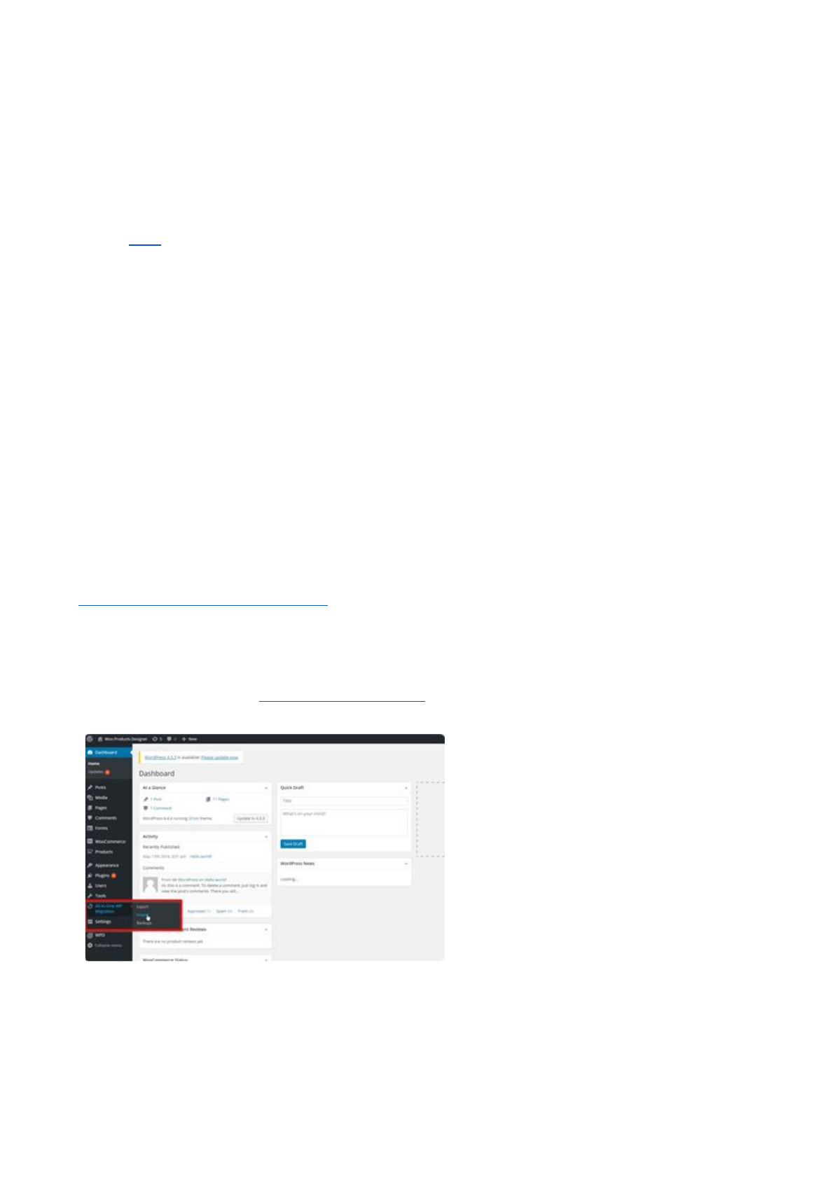
8.How to deploy the demo files
Before starting this chapter, please note that this step is not mandatory at all and is
just for helping you understand how we designed the demo website here:
http://demos.orionorigin.com/wpc/ . So if you understand how the demo works, you can skip
this chapter.
Deploying the demo files is like moving any other WordPress website.
●First thing to do is to create a fresh new installation of wordpress.
●Install the plugin “all in one wp migration”
●From your dashboard, import the file WPD_DEMO.wpress
● After importing the file WPD_DEMO.wpress, you are ready to start using the demo
installation. The default credentials are: (user: orion password: demo)
© Orion - Reproduction in whole or in part of this document or its communication outside Orion is forbidden, unless written
authorization

9.Frequently asked questions
9.1.How can I Generate HD output?
The plugin is not set to 300dpi which is a large quality and dimension. It is set to 72dpi but there is a
way around or a workaround to generate a large dimension and quality if there is a specific dimension
needed for the generated output file, all you have to do is….
For example, the output needed is 4000 x 2000. If your canvas size is set to default (canvas min width
(px) is 800 and canvas min height (px) is 500), multiply your choice of output height by your canvas
min width (px) (2000 x 800 = 1600000) then you divide your answer by your choice of output width
(px) (1600000 / 4000 = 400). The answer (400) will be what you will set as your canvas height instead
of the default (500) in order to get your choice of dimension as your generated output or something
close to thatJ.
9.2.Why are my Images/Text not Visible in the Editor?
Make sure you set the coordinates X and Y of the Bounding box properly.
The bounding box is supposed to be the editable area on the canvas. So the coordinates allow you to
define the position of that area on the canvas. If you set a couple of coordinates that put the box
outside the canvas, nothing will be visible on the canvas.
Please also note that these parameters are mandatory if you need only a specific part of the
product in the canvas/custom page to be editable. If you don't define them, the box will be disabled.
If you don’t have a specific values to set or not sure of what values to set, it is advisable you do not
define them. As said earlier, setting the wrong coordinates or values might put the box outside the
canvas thereby making anything being added in the canvas not visible.
9.3.How can I create Templates or view the “Browse Our Templates” Button?
If you are having a hard time viewing your created templates or the “Browse Our Templates” button…
Follow the instructions on the Template section above.
Go back to your Dashboard >> Products >> "select the product"...at the right side where you will see
"Customizable Products" there is a drop-down menu, click and select the template page you have
created. Click on update to save.
After all is done, go to your shop and the button "browse our templates" will be seen under the
"design from blank" button.
9.4.Why do I have Malfunctioning or not Functioning Buttons on website?
Sometimes, it might be the conflict of coding in a theme. You can change your theme to a default
theme or another theme to verify.
Sometimes, it might be the conflict of Plugins. You will have to deactivate each Plugins you have one
after the other to verify. For example…deactivate the first plugin, go to the page you are having the
issue, refresh and try again. If no solution, go back to your Plugins, activate the previously deactivated
© Orion - Reproduction in whole or in part of this document or its communication outside Orion is forbidden, unless written
authorization

plugin and deactivate the next one then go to verify again. Do this until you are sure it is or not a
plugin conflict.
9.5.What does this error message...”Fatal error: Allowed Memory size of…..” mean?
When you get the error message “Fatal error: Allowed memory size of...” Please note that it is a
server limitation. Send that message to your hosting company and they will increase your max
memory for scripts. That will fix the issue.
9.6.What does this error message…“Error: empty product parts list. At least one
part is required to create a customizable product.0” mean?
When you get the error message “Error: empty product parts list. At least one part is required to
create a customizable product.0” Please note that you have not created a product part in your
Dashboard >>WPD >> Parts… Please verify to make sure there is at least one part created.
9.7.How can I change the Language?
The plugin uses wordpress's language. So if your WordPress is in German, the German translation
file will be the one used by the plugin.
Next thing you need to know is that you need to translate it yourself because we haven't found great
translators yet for all languages. You can use a plugin like wpml or codestyling
https://wordpress.org/plugins/codestyling-localization/.
9.8.Where can I find my Purchase code?
Please visit this
website…https://help.market.envato.com/hc/en-us/articles/202822600-Where-can-I-find-my-Purchase
-Code-
9.9.Why does my Preview not display and the screen freezes?
This issue is because there is a conflict between the plugin script and the script of the theme. Only
one of the scripts should be allowed to avoid this conflict. In order to avoid this conflict there is a
setting option “LOAD BOOTSRAP MODAL” in the WPD >> Settings >> General Settings as above
to help.
9.10.Why does the designer not load the some images?
When the plugin jetpack is installed and its photon feature is active, the images are not loaded on the
designer. This is due to the fact that the images are to be uploaded from a secured server. So, if you
have the plugin “jetpack by wordpress.com" installed, please keep its photon feature deactivated.
9.11.How can I add forms?
For details and tutorials on how to add forms, please visit the url…
© Orion - Reproduction in whole or in part of this document or its communication outside Orion is forbidden, unless written
authorization

http://docs.ninjaforms.com/article/209-basic-calculations
10.Contact us
Feel free to contacts us, for tutorials, to clear your doubts, drop your suggestions and requests, or get
that bug that gives you hard time kicked out and also follow us.
Website: http://www.orionorigin.com
Facebook: https://www.facebook.com/OrionOrigin?ref=hl
Twitter: https://twitter.com/OrionOrigin
YouTube: https://www.youtube.com/channel/UCXZN3eZlLHwFgmkV8GMN78A
Google: https://plus.google.com/u/0/101733282683269338232/posts
Supports: https://orionorigin.freshdesk.com
© Orion - Reproduction in whole or in part of this document or its communication outside Orion is forbidden, unless written
authorization


