PlanetPress Connect User Guide Planet Press 1.5 Operating Instructions 15 EN
User Manual: Pdf PlanetPress Connect - 1.5 - Operating Instructions User Guide for Objectif Lune PlanetPress Software, Free Instruction Manual
Open the PDF directly: View PDF  .
.
Page Count: 849 [warning: Documents this large are best viewed by clicking the View PDF Link!]
- Table of Contents
- Welcome to PlanetPress Connect 1.5
- Setup And Configuration
- System and Hardware Considerations
- Installation and Activation
- Installation Pre-Requisites
- User accounts and security
- The Importance of User Credentials on Installing and Running PlanetPress Connect
- Installing PlanetPress Connect on Machines without Internet Access
- Installation Wizard
- How to Run Connect Installer in Silent Mode
- Activating a License
- Migrating to a new computer
- Information about PlanetPress Workflow 8
- Upgrading from PlanetPress Suite 7.6
- What do I gain by upgrading to PlanetPress Connect?
- Server Settings
- Uninstalling
- The DataMapper Module
- Basics
- Data Mapping Configuration
- Data Mapping Workflow
- The Data Model
- Data Source (Settings)
- DataMapper User Interface
- Defining Boolean Values
- Defining String Values
- Building String Values
- Defining Integer Values
- Building Integer Values
- Defining Float Values
- Building Float Values
- Defining Currency Values
- Building Currency Values
- Extracting dates
- Entering a date using JavaScript
- Defining Object Values
- DataMapper Scripts API
- The Designer
- Generating output
- Print output
- Email output
- Web output
- Optimizing a template
- Generating Print output
- Saving Printing options in Printing Presets.
- Connect Printing options that cannot be changed from within the Printer Wizard.
- Print Using Standard Print Output Settings
- Print Using Advanced Printer Wizard
- Adding print output models to the Print Wizard
- Splitting printing into more than one file
- Variables available in the Output
- Generating Fax output
- Generating Tags for Image Output
- Generating Email output
- Generating Web output
- Release Notes
- Copyright Information
- Legal Notices and Acknowledgments

User Guide
Version:1.5

© Objectif Lune, Inc. 1994-2017. All rights reserved. No part of this documentation may be
reproduced, transmitted or distributed outside of Objectif Lune Inc. by any means whatsoever
without the express written permission of Objectif Lune Inc. Objectif Lune Inc. disclaims
responsibility for any errors and omissions in this documentation and accepts no responsibility
for damages arising from such inconsistencies or their further consequences of any kind.
Objectif Lune Inc. reserves the right to alter the information contained in this documentation
without notice.
Page 4

Table of Contents
Table of Contents 5
Welcome to PlanetPress Connect 1.5 12
Icons used in this guide 12
Setup And Configuration 14
System and Hardware Considerations 14
System Requirements 14
Environment considerations 15
Database Considerations 17
Network considerations 20
Language and Encoding considerations 20
Performance Considerations 21
Installation and Activation 23
Installation Pre-Requisites 24
User accounts and security 25
The Importance of User Credentials on Installing and Running PlanetPress Connect 26
Installing PlanetPress Connect on Machines without Internet Access 28
Installation Wizard 29
How to Run Connect Installer in Silent Mode 35
Activating a License 38
Migrating to a new computer 41
Information about PlanetPress Workflow 8 41
Upgrading from PlanetPress Suite 7.6 42
What do I gain by upgrading to PlanetPress Connect? 45
Server Settings 48
Server Security Settings 48
Server Extension Settings 49
Uninstalling 52
Important Note:Stop any Anti-Virus Software before uninstalling Connect. 53
Impacts upon other Applications and Services 53
Uninstallation Wizard 53
The DataMapper Module 55
Basics 55
What's Next? 56
Page 5

Data Mapping Configuration 56
Creating A New Data Mapping Configuration 56
Opening a Data Mapping Configuration 66
Saving a Data Mapping Configuration 66
Data Mapping Workflow 67
Selecting Data 67
Extracting Data 76
About Promotional and Transactional Data 89
Steps 89
The Data Model 103
How to Use a Data Model? 104
About Records and Fields 105
Data Model File Structure 106
Data Source (Settings) 108
Input Data (Delimiters) 108
Boundaries 108
Data Samples 109
External JS Libraries 109
DataMapper User Interface 110
Menus 111
Panes 115
Example 122
Example 127
Left Operand 184
Condition 185
Operators 186
JavaScript 193
Defining Boolean Values 196
Boolean Expressions 196
Defining String Values 197
Building String Values 197
Defining Integer Values 198
Building Integer Values 198
Defining Float Values 199
Building Float Values 199
Defining Currency Values 200
Building Currency Values 200
Page 6

Extracting dates 201
Defining a date/time format 201
Examples of masks 202
Entering a date using JavaScript 202
Example 203
Defining Object Values 203
Toolbar 203
Shortcut Keys 205
Welcome Screen 205
DataMapper Scripts API 207
Objects 207
Functions 208
Methods 209
Write Your Own Scripts 214
Boundaries Using JavaScript 216
Objects 222
Functions 229
Methods 236
The Designer 255
Basic Steps 255
Templates 256
Contexts 269
Sections 271
Features 274
Print 275
Pages 276
Headers, footers, tear-offs and repeated elements (Master page) 276
Stationery (Media) 276
Creating a Print template with a Wizard 277
Print context 281
Print sections 284
Pages 291
Master Pages 299
Media 302
Email 307
Designing an Email template 308
Creating an Email template with a Wizard 311
Page 7

Email context 315
Email templates 317
Email header settings 320
Email attachments 324
Web 326
Creating a Web template with a Wizard 327
Web Context 331
Web pages 332
Forms 337
Using Form Elements 342
Using JavaScript 346
Capture OnTheGo 348
COTG Forms 349
Creating a COTG Form 349
Filling a COTG template 350
Testing the template 352
Sending the template to the Workflow tool 352
Using COTG data in a template 353
Designing a COTG Template 355
Capture OnTheGo template wizards 358
Using Foundation 362
Using COTG Elements 365
Testing a Capture OnTheGo Template 369
Content elements 373
Element types 374
Editing HTML 375
Attributes 375
Inserting an element 376
Selecting an element 377
Styling and formatting an element 378
Barcode 379
Boxes 419
Business graphics 422
COTG Elements 424
Date 429
Forms 430
Form Elements 435
Page 8

Hyperlink and mailto link 438
Images 440
Table 445
Text and special characters 449
Snippets 451
Adding a snippet 451
Creating a snippet 452
JSON Snippets 452
Styling and formatting 453
Local formatting versus style sheets 453
Layout properties 453
Styling templates with CSS files 454
How to position elements 462
Styling text and paragraphs 464
Background color and/or image 468
Border 469
Colors 472
Fonts 476
Spacing 478
Styling a table 479
Rotating elements 483
Locale 484
Personalizing content 485
Variable data 486
Conditional content 486
Dynamic images 486
Dynamic tables 487
Snippets 487
Scripts 487
Loading data 488
Variable Data 497
Formatting variable data 503
Showing content conditionally 506
Dynamic Images 508
Dynamic table 510
Personalized URL 514
Writing your own scripts 515
Page 9

How scripts work 515
Creating a new script 516
Writing a script 517
Managing scripts 519
Testing scripts 523
Optimizing scripts 526
Loading a snippet via a script 530
Control Scripts 532
Designer User Interface 546
Dialogs 547
Menus 617
Panes 628
Toolbars 643
Welcome Screen 648
Print Options 649
Job Creation Presets 701
Output Creation Settings 710
Designer JavaScript API 728
Designer API 728
Control Script API 728
Designer Scripts API 729
Control Script API 782
Generating output 798
Print output 798
Email output 798
Web output 799
Optimizing a template 799
Scripts 799
Images 800
Generating Print output 801
Saving Printing options in Printing Presets. 802
Connect Printing options that cannot be changed from within the Printer Wizard. 802
Print Using Standard Print Output Settings 803
Print Using Advanced Printer Wizard 804
Adding print output models to the Print Wizard 805
Splitting printing into more than one file 806
Variables available in the Output 806
Page 10

Generating Fax output 813
Generating Tags for Image Output 814
Generating Email output 815
Email output settings in the Email context and sections 816
Generating Email output from Connect Designer 817
Generating Email output from Workflow 818
Email attachments 819
Using an ESP with PlanetPress Connect 820
Generating Web output 825
Attaching Web output to an Email template 826
Generating Web output from Workflow 827
Web output settings in the Web context and sections 828
Release Notes 829
Overview 829
Connect 1.5 Designer Enhancements and Fixes 830
Connect 1.5 DataMapping Enhancements and Fixes 834
Connect 1.5 Output Enhancements and Fixes 834
Connect 1.5 General Enhancements and Fixes 836
Connect 8.5 Workflow Enhancements and Fixes 837
Known Issues 838
Copyright Information 843
Legal Notices and Acknowledgments 844
Page 11

Welcome to PlanetPress Connect 1.5
Note
Since we are always looking for new ways to make your life easier, we welcome your
questions and comments about our products and documentation. Shoot us an email at
doc@ca.objectiflune.com, or visit the online help: help.objectiflune.com and use the
feedback tool at the bottom of the page.
PlanetPress Connect is a series of four tools designed to optimize and automate customer
communications management. They work together to improve the creation, distribution,
interaction and maintenance of your communications.
The PlanetPress Connect Datamapper and Designer is designed to create output for print,
email and the web within a single template and from any data type, including formatted print
streams. Output presets applied outside the design phase make printing device independent.
The Designer has an easy-to-use interface that makes it possible for almost anyone to create
multi-channel output. More advanced users may use native HTML, CSS and JavaScript.
PlanetPress Connect also includes a process automation server, called Workflow. It is capable
of servicing response form web pages and email to provide interactive business
communications.
PlanetPress Connect can create documents for tablets and mobile devices that run a free
CaptureOnTheGo App. Users with a CaptureOnTheGo subscription can then download
documents to their own devices, interact with them and send the captured data back to
PlanetPress for conversion into additional documents or workflows.
This online documentation covers PlanetPress Connect version 1.5.
Icons used in this guide
Icons are used throughout this guide to point your attention to certain information.
Page 12
Note
Complementary information that is not critical, but may help you better use PlanetPress Connect.
Tip
Information that is useful or suggests an easier method.
Technical
Information that may require specific knowledge to understand.
Warning
Information that is potentially critical to using PlanetPress Connect. Pay close attention.
Page 13

Setup And Configuration
This chapter describes the PlanetPress Connect installation and the different considerations
that are important in regards to the installation and use of PlanetPress Connect.
l"System and Hardware Considerations" below
l"Installation and Activation" on page23
l"Server Settings" on page48
lUninstalling
System and Hardware Considerations
There are a variety of considerations to be aware of. These are documented in the following
pages:
l"System Requirements" below
l"Environment considerations" on the next page
l"Database Considerations" on page17
l"Network considerations" on page20
l"Language and Encoding considerations" on page20
l"Performance Considerations" on page21
System Requirements
These are the system requirements for PlanetPress Connect 1.5
Operating System (64-bit only)
lMicrosoft Windows 2008/2008 R2 Server
lMicrosoft Windows 2012/2012 R2 Server
lMicrosoft Windows Vista
lMicrosoft Windows 7
lMicrosoft Windows 8.1
lMicrosoft Windows 10
Page 14
Note
Windows 8.0, Windows XP, Windows 2003 and older versions of Windows are not
supported by PlanetPress Connect.
Minimum Hardware Requirements
lNTFS Filesystem (FAT32 is not supported)
lCPU Intel Core i7-4770 Haswell (4 Core)
l8GB RAM (16GB Recommended)
lDisk Space: At least 10GB (20GB recommended)
Note
For tips and tricks on performance, see "Performance Considerations" on page21.
Environment considerations
Virtual Machine Support
PlanetPress Connectsupports VMWare Workstation, VMWare Server, VMWare Player,
VMWare ESX (including VMotion), Microsoft Hyper-V and Microsoft Hyper-V/Azure
infrastructure environments as software installed on the Guest operating system.
Warning
Copying (duplicating) a Virtual Machine with Connect installed and using both images
simultaneously constitutes an infringement of our End-User License Agreement.
Note
While some virtual machine environments (from VMWare and Microsoft) are supported,
other virtual environments (such as Parallels, Xen and others) are not supported at this
Page 15

time.
Terminal Server/Service
PlanetPress Connect does not support Terminal Server (or Terminal Service) environment as
possible under Windows 2000, 2003 and 2008. This is to say, if Terminal Service is installed
on the server where PlanetPress Connect is located, unexpected behaviours may occur and
will not be supported by Objectif Lune Inc.. Furthermore, using PlanetPress Connect in a
Terminal Service environment is an infringement of our End-User License Agreement.
Remote Desktop
Tests have demonstrated that PlanetPress Connect can be used through Remote Desktop. It is
however possible that certain combination of OS could cause issues. If problems are
encountered, please contact OLSupport and we will investigate.
PlanetPress Connect 1.3 and later have been certified under Remote Desktop.
64-bit Operating Systems
PlanetPress Connect is a 64-bit software and can only be installed on 64-bit operating systems.
Antivirus Considerations
lAntivirus software may slow down processing or cause issues if they are scanning in
temporary folders or those used by PlanetPress Connect. Please see KB-002: Antivirus
Exclusions for more information.
lAntivirus software might interfere with installation scripts, notably a vbs script to install
fonts. McAfee, in particular, should be disabled temporarily during installation in order for
MICR fonts to install and the installation to complete successfully.
Windows Search Indexing Service
Tests have concluded that the Windows Search service, used to provide indexing for Windows
Search, can interfere with Connect when installing on a virtual machine. If the installation
hangs during the last steps, it is necessary to completely disable this service during installation.
lClick on Start, Run.
lType in services.msc and click OK.
Page 16

lLocate the Windows Searchservice and double-click on it.
lChange the Startup Type to Disable, and click Stop to stop the service.
lTry the installation again.
lOnce completely, you may re-enable the service and start it.
Commandline switches and .ini entries
PlanetPress Connect is intended to work stably and reliably, based on Java and the Eclipse
framework. To ensure this reliability and robustness, many Java and Eclipse parameters have
been tested and tuned, which is reflected in the respective .ini entries and the used command
line switches. A collection of valuable settings has been elaborated and found its entry in
PlanetPress Connect “good switches list” (called the “whitelist”).
The protection of the end user’s system is one of our main goals and therefore we have
implemented a very strict verification mechanism, which ensures, that only these whitelisted ini
entries and commandline switches are accepted, when one of Connect components is started
and run. Please be therefore advised, that any non-whitelisted ini entry or commandline switch
will be accepted and will - if tried to be used - lead to the respective application’s “sudden
death”. If you should encounter such a behaviour then please double-check your Connect log
file/s for respective entries.
Database Considerations
This page describes the different considerations and pre-requisites for the database back-end
used by PlanetPress Connect, whether using the MySQL instance provided by the installer, or
pre-existing instance.
Using the MySQL Instance from the Installer
The MySQL Instance provided in the Installation Wizard is already pre-configured with options
to provide the most stable back-end setup.
These are the specific options that have been changed in our version of "my.ini":
lmax_connections = 200 : PlanetPress Connect uses a lot of database connections. This
number ensures that even in high volume environments, enough connections will be
available.
Page 17

lmax_allowed_packet = 500M : In some implementations, especially when using Capture
OnTheGo, large packet sizes are required to allow transferring binary files. This
substantial packet size maximum setting ensures that the data received by PlanetPress
Connect will be able to be stored within the database.
lcharacter-set-server = utf8 , collation-server = utf8_unicode_ci , default-character-
set=utf8 : These indicate database support for UTF-8/Unicode.
Using a pre-existing MySQL Instance
If MySQL server is already installed and you wish to use it, the following should be taken into
consideration:
lThe MySQL account must have access to all permissions using the GRANT Command,
including creating databases.
lThe database configuration must include the options detailed in the "Using the MySQL
Instance from the Installer" on the previous page topic above.
lThe SQL instance must be open to access from other computers. This means the bind-
address option should not be set to 127.0.0.1 or localhost.
Using MS SQL Server from the Installer
lWhen MS SQL is selected, the default values for root user are sa and 1433 for the port.
lIf db settings from a previous installation are found, the pre-exising settings will be
displayed for the matching db type (for MS SQL settings, this will only work if they were
created with Server Config Tool 1.5.0 or later, or the Connect installer 1.6.0 or later). If the
db type is changed in the configuration page, the default values for this db type will be
displayed. If the pre-existing db settings are set to Hsqldb, the default db type selection
will be MySQL.
lSelected db settings are stored in the preferences as usual (C:\ProgramData\Objectif
Lune\Ol
Connect\.settings\ConnectHostScope\com.objectiflune.repository.eclipselink.generic.pref
s)
Updating With No Local MySQL Product
lWhen updating a Connect installation from 1.5.0 which contains a Server Product but no
local MySQL Product, the DB Configuration Page will detect which db type was set
before (especially if the db configuration was switched from MySQL to MS SQL using the
Server Configuration Tool), and default to those settings.
Page 18

lOn Update from 1.4.2 or earlier, the DB Configuration Page will always default to MySQL
connection settings, and if the installation was manually tweaked to connect to MS SQL
Server, the user has to switch to "Microsoft SQL Server" type and enter connection details
again.
Installing / Updating Connect Using a Local MySQL
lThe Configuration page for the local MySQL is displayed.
lMySQL settings are pre-filled with default values if no existing MySQL db configuration is
found.
lMySQL settings are pre-filled with existing db configuration settings, if they point to a
MySQL db type.
When modifying Connect
lIf local MySQL is removed from an installation, the DB Configuration page will offer
additionally the Microsoft SQL Server db type with respective default values.
lIf local MySQL is added to an installation, the usual MySQL Configuration page with
default values will be displayed.
Important
If a Server Product and a MySQL Product were selected to be installed on Connect 1.5.0, and
then the Server Configuration Tool is used to switch the database used by the Server to an
external Microsoft SQL, then the Update to 1.6 requires an extra step. The procedure is as
follows:
1. Run the Update to Connect 1.6. This will assume the local MySQL database needs to
be updated and configured, so the user has to enter a root password on the MySQL
Configuration Page (can be any password matching Connect security rules).
2. After the update, the Connect 1.6 Setup needs to be run once more to modify Connect.
3. On the Product Selection page, now the MySQL product can be unselected.
4. When stepping forward in the Wizard, the DB Configuration page will be displayed which
allows to configure the Microsoft SQL Server with appropriate settings.
After this modification, the local MySQL is removed, and also the service dependency from
Server to MySQL is removed.
Page 19

Note
If Connect was initially installed not containing the local MySQL product (i.e. on 1.5 installation an
external MySQL was configured as database), then the Update to 1.6 will allow to select either
external MySQL or external Microsoft SQL on the DB Configuration Page.
Network considerations
The following should be taken into consideration in regards to network settings and
communications
lIf a local proxy is configured (in the Internet Explorer Optionsdialog, the option Bypass
proxy server for local addresses must be checked, or some features depending on
local communication will not work.
Language and Encoding considerations
Please note the following considerations:
lLanguage:
lPlanetPress Connect is currently offered in several languages. These languages
can be switch between via the Preferences dialog. The current languages include:
lEnglish
lFrench
lGerman
lSpanish
lItalian
lPortuguese
lChinese (Simplified)
lChinese (Traditional)
lJapanese.
The default language is English.
Page 20

The PlanetPress Connect help system (this document) is currently only available in
English.
lEncoding:
lIssues can sometimes be encountered in menus and templates when running
PlanetPress Connect on a non-English operating system. These are due to
encoding issues and will be addressed in a later release.
Performance Considerations
This page is a comprehensive guide to getting the most performance out of PlanetPress
Connect as well as a rough guideline to indicate when it's best to upgrade.
Performance Analysis Details
In order to get the most out of PlanetPress Connect, it is important to determine how best to
maximize performance. The following guidelines will be helpful in extracting the best
performance from PlanetPress Connect before looking into hardware upgrades or extra
PlanetPress Connect performance packs.
lJob Sizes and Speed: In terms of pure output speed, it's important to first determine what
job size is expected, and adjust Scheduling Preferences accordingly. The basic rules are:
lIf processing a small number of very large records (when each individual record is
composed of a large number of pages), more instances with an equal amount of
speed units is better. For hardware, RAM and Hard Drive speeds are most
important, since the smallest divisible part (the record) cannot be split on multiple
machines or even cores.
lIf creating a very large number of small records (hundreds of thousands of 2-3 page
individual records, for instance), a smaller number of instances with a large number
of speed packs would be better. As for hardware, then the number of cores becomes
critical, whereas RAM and hard drive are secondary. Performance Packs, as well as
the MySQL instance being separate, would be helpful if your most powerful
machine starts struggling.
lMix and match. For example, one instance prioritized for large jobs and the rest for
smaller, quicker jobs. Or the contrary. Or, whatever you want, really.
lRAM Configuration: By default, each instance of the Merge Engine and Weaver Engine
is set to use 640MB of RAM. This means that regardless of speed units, if not enough
memory is available, output speed might not be as expected. Assuming that the machine
itself is not running any other software, the rule of thumb is the following: The total number
Page 21

of used memory in the machine should be pretty much the maximum available (around
95%).
For each engine, it's necessary to modify the .ini file that controls its JAVA arguments.
Edit as follows:
lFor the Merge Engine: see C:\Program Files\Objectif Lune\OL
Connect\MergeEngine\Mergeengine.ini
lFor the Weaver Engine: see C:\Program Files\Objectif Lune\OL
Connect\weaverengine\Weaverengine.ini
lThe parameters are -Xms640m for the minimum RAM size, -Xmx640m for the
maximum RAM size. Explaining Java arguments is beyond the scope of this
document. Please read references here,here and here for more details (fair
warning: these can get pretty technical!).
lTemplate and data mapping optimization: Some functionality offered by the
DataMapper and Designer modules are very useful, and sometimes downright awesome,
but can cause the generation of records and of contents items to slow down due to their
nature. Here are some of them:
lPreprocessor and Postprocessor scripts: manipulating data using a script may
cause delays before and after the data mapping action has actually taken place,
especially file conversion and data enrichment from other sources.
lLoading external and network resources: In Designer, using images, javascript
or css resources located on a slow network or on a slow internet connection will
obviously lead to a loss of speed. While we do our best for caching, a document
with 100,000 records which queries a page that takes 1 second to return a different
image each time will, naturally, slow output generation down by up to 27 hours.
lExternal JavaScript Libraries: While loading a single JavaScript library from the
web is generally very fast (and only done once for the record set), actually running a
script on each generated page can take some time. Because yes, JavaScript will
run for each record, and often take the same time for each record.
lInefficient Selectors: Using very precise ID selectors in script wizards can be much
faster than using a text selector, especially on very large documents. (more details
on this in another upcoming page).
lComplex Scripts: Custom scripts with large, complex or non-optimized loops can
lead to slowing down content creation. While it is sometimes difficult to troubleshoot,
there are many resources online to help learn about JavaScript performance and
coding mistakes. Here,here, and here are a few. Note that most resources on the
Page 22
web are about JavaScript in the browser, but the greatest majority of the tips do,
indeed, apply to scripts in general, wherever they are used.
High-Performance Hardware
The following is suggested when processing speed is important. Before looking into a
Performance Packs to enhance performance, ensure that the below requirements are met.
lA physical, non-virtualized server. VMWare servers are great for reducing the numbers
of physical machines in your IT space, but they must share the hardware between each
other. While you can create a virtual machine that seems as powerful as a physical, it will
still be sharing hardware with any other virtual machines, and this will adversely affect
performance.
lMySQL Database on a separate machine. MySQL's main possible bottleneck is file I/O,
and as such a high-performance setup will require this server to be on a separate
machine, ideally with a high-performance, low-latency hard drive. A Solid State Drive
(SSD) would be recommended.
lHigh-Quality 16+ GB Ram.This is especially true when working with many server
instances ("speed units") running in parallel. The more parallel processing, the more
RAM is recommended.
l4 or 8 physical cores. We're not talking Hyper-Threading here, but physical cores.
Hyper-Threading is great with small applications, but the overhead of "switching"
between the virtual cores, and the fact that, well, they're virtual, means the performance is
much lesser on high-power applications such as OL Connect. In short, a dual-core
processor with Hyper-Threading enabled is not equivalent to a quad-core processor.
Installation and Activation
This topic provides detailed information about the installation and activation of PlanetPress
Connect 1.5.
Note
A PDF version of this guide is available for use in offline installations. Click here to
download it.
Page 23
PlanetPress Connect 1.5 is comprised of 2 different installers: one for the PlanetPress Connect
software and one for PlanetPress Workflow 8.
Where to Obtain the Installers:
The installers for PlanetPress Connect 1.5 and PlanetPress Workflow 8 can be obtained on
DVD or downloaded as follows:
lIf you are a Customer, the installers can be downloaded from the Objectif Lune Web
Activations page: http://www.objectiflune.com/activations
lIf you are a Reseller, the installers can be downloaded from the Objectif Lune Partner
Portal: http://extranet.objectiflune.com/
For information on licensing, please see Activating your license.
Installation Pre-Requisites
lMake sure your system meets the System requirements.
lPlanetPress Version 1.5 can be installed under a regular user account with Administrator
privileges.
lConnect must be installed on an NTFS file system.
lPlanetPress requires Microsoft .NET Framework 3.5 already be installed on the target
system.
lIn order to use the automation feature in Version 1.5, PlanetPress Workflow 8 will need to
be installed. This can be installed on the same machine as an existing PlanetPress®
Suite 7.6 installation or on a new computer. For more information, please see Information
about PlanetPress Workflow 8.
lAs with any JAVA application, the more RAM available, the faster the product will
execute.
Users of Connect 1.1
In order for users of PlanetPress Connect 1.1 to upgrade to any later version through the
Update Manager it is necessary to install a later version (1.1.8 or later) of the Objectif Lune
Update Client.
If you do not have such a version installed already, the next time you run your Update Client it
will show that there is an update available of itself to Version 1.1.8 (or later).
Page 24

Simply click on the download button in the dialog to install the new version of the Update
Client. Note that it is no problem to run the update while the Client is open. It will automatically
update itself.
Once you have done this, PlanetPress Connect 1.5 will become available for download.
Note
From PlanetPress Connect Version 1.2 onwards, the new version (1.1.8)of the Update
Client is included by default with all setups.
Users of Connect 1.0
Users of this Connect version 1.0 cannot upgrade directly to Version 1.5. This is because
Connect Version 1.0 is a 32 bit version of Connect.
Users must first upgrade to Version 1.1 and from there upgrade to Version 1.5
If you are updating manually you must first upgrade to Version 1.1 before installing 1.5. If you
attempt go directly from Version 1.0 to Version 1.5 the installation will fail.
Also see "Users of Connect 1.1" on the previous page for extra information about updating from
that version.
User accounts and security
Permissions for PlanetPress Connect Designer
PlanetPress Connect Designer does not require any special permissions to run besides a
regular program. It does not require administrative rights and only needs permission to
read/write in any folder where Templates or Data Mapping Configurations are located.
If generating Print output, PlanetPress Connect Designer requires permission on the printer or
printer queue to send files.
Permissions for PlanetPress Connect Server
The PlanetPress Connect Server module, used by the Automation module, requires some
special permissions to run. These permissions are set during installation, in the Engine
Page 25

Configuration portion of the Installation Wizard, but it can also be configured later by modifying
permissions for the service. To do this:
lIn Windows, open the Control Panel, Administrative Tools, then Services (this may
depend on your operating system).
lLocate the service called Serverengine_UUID , where UUID is a series of characters that
depend on the machine where the software is installed.
lRight-click on the service and select Properties.
lIn the Connection tab, define the account name and password that the service should
use. This can be a local account on the computer or an account on a Windows Domain.
The account must have administrative access on the machine. It should also correspond
to the user account set up in PlanetPress Worfklow.
The Importance of User Credentials on Installing and
Running PlanetPress Connect
OL Connect and required credentials depends heavily on the Connect component and
respective tasks and what sort of user credentials are needed.
First of all, it is important to distinguish between installation and run-time
Installation
The Connect installer puts all required files, folders, registry entries and much more to their
correct places and locations. As many of these locations are protected against malicious
accesses, that very user under whose context the Connect installation is started and running,
needs very extensive rights on the respective computer. This user must belong to the Local
Administrators group on that machine. Here are some required capabilities, this user:
lMust be able to write into the "Programs" folder.
lMust be allowed to check for existing certificates and must also be allowed to install new
ones into the global certificate store on that machine.
lMust be able to write into HKLM and any subtree of it in the registry.
lMust be able to INSTALL, START and RUN services and also to MODIFY service
settings.
lMust be known in the network the machine belongs to and must also need to be able to
use shared network resources like shared drives and/or printers etc.
Page 26

This list may not be complete, but it gives the extent of the requirements. Generally, the local
administrator of the machine will have all these credentials, but there may exist network
restrictions and policies, which will block one or more of these capabilities. In such cases, the
respective network administrator should provide a valid user account for the installation.
User Account
The user account shall be used to later RUN one of the Connect Server flavors (Server or
Server Extension). This dedicated user account has to be entered on the respective installer
dialog page and must be allowed to START, STOP and RUN services on this machine. This is
different from the credentials of the installation user account, which additionally requires the
right to INSTALL services. Please be aware of this fact!
Additionally, the Server user must be able to access any network resources that are required for
OL Connect to function properly. This includes e.g. additional drives, printers, scanners, other
computers and, where appropriate, internet resources, URLs, mail servers, FTP servers,
database servers and everything else planned to be used for the intended operation of
Connect. The Server user is the run-time user.
Connect Components
Usually, a standard end user will only be facing Connect Designer and maybe the License
Activation Tool. Designer this does not require administrator rights. Either everything required
to create documents or also to run some tasks will be already available (installed by the
installer) or be accessible in a way, where no specific credentials are required. However some
tasks like starting an email campaign will possibly require a respective account at a mail server.
But this has generally nothing to do with the credentials of the Designer user.
Activation Tool
To run the Software Activation Tool, administrator rights are required because this tool needs to
write the license file in one of the protected folders of Windows. The tool will however allow to
restart it with respective credentials if required.
MySQL
MySQL database service is installed by the install user (thus again the requirement of
installing, starting, running and modifying services). Once running it will just work.
Page 27

Merge and Weaver Engines
These components do run under the Designer (if only Designer is installed) or the Server /
Extension service(s) and inherit the rights of their parent application.
Server (Extension) Configuration Tool
This component needs to access the settings of the Server. As these are stored and read by the
Server, it should be clear that the user used to run the Configuration tool should be the same as
the Server Service user as explained above.
Installing PlanetPress Connect on Machines without
Internet Access
Installing PlanetPress Connect1.5 in offline mode requires some extra steps. These are listed
below.
GoDaddy Root Certificate Authority needs to be installed.
In order to install PlanetPress Connect it is necessary for the GoDaddy Root Certificate
Authority to be installed (G2 Certificate) on the host machine and for this to be verified online.
When a machine hosting the installation does not have access to the Internet, the installation
will fail because the verification cannot be performed. To solve this problem one must first
ensure that all Windows updates have been installed on the host machine. Once the Windows
updates are confirmed as being up to date, then complete the following steps:
1. Go to https://certs.godaddy.com/repository and download the following two certificates to
copy to the offline machine:
lGoDaddy Class 2 Certification Authority Root Certificate - G2 - the file is gdroot-
g2.crt
lGoDaddy Secure Server Certificate (Intermediate Certificate) - G2 - the file is
gdig2.crt
2. Install the certificates: Right mouse click -> Install Certificate, and follow the steps through
the subsequent wizard.
3. Now copy the PlanetPress Connect installer to the offline machine and start the
installation as normal
Page 28

Windows certificate validation - Certificate Revocation List retrieval should be switched
off
For your security Objectif Lune digitally signs all relevant files with our own name and
certificate. The integrity of these files is checked at various times by different, context related,
methods. One of these checks, done during the installation process, uses the Windows
certificate validation check. .
The Windows certificate validation process not only checks the integrity of a file against its
signature, but also usually checks if the certificate itself is still valid. That check is done against
the current Certificate Revocation List (CRL), which needs to be retrieved from the internet.
However, if the machine in question does not have internet access, the retrieval of the CRL
must fail, which will lead to subsequent validation issues.
To circumvent such issues it is highly recommended to switch off the CRL retrieval prior to
installing Connect on machines without internet access. There is no security risk associated
with this, as the CRLs would never be retrievable without internet access, anyway. Advantage
of the switch will not only be found during the installation and operation of Connect, but also in
some speed improvements for any application which use signed binaries.
To switch off CRL retrieval on the computer, complete the following steps:
1. Open the “Internet Options” via the Control Panel
2. Select the “Advanced” tab and scroll down to “Security” node.
3. Uncheck the entry “Check for publisher’s certificate revocation” under that node.
4. Click the OKbutton to close the dialog.
5. Re-start the computer.
Installation Wizard
Starting the PlanetPress Connect installer
The PlanetPress Connect installer may be supplied as an ISO image or on a DVD:
lIf an ISO image, either burn the ISO onto a DVD or unzip the contents to a folder (keeping
the folder structure)
lIf on a DVD, either insert the DVD and initiate the installation from there or copy the
contents to a folder (keeping the folder structure)
Page 29

Navigate to the PlanetPress_Connect_Setup_x64.exe or and double-click on it. After a short
while the Setup Wizard will appear as a guide through the installation steps.
Note
PlanetPress Connect requires prior installation of Microsoft .NET Framework 3.5 (please refer to
https://www.microsoft.com/en-us/download/details.aspx?id=21 for more details).
Selecting the required components
After clicking the Next button, the component selection page appears, where the different
components of PlanetPress Connect can be selected for installation. Currently, the following
are available:
lPlanetPress Connect Designer: The Designer module. It may be used as a standalone
with no other installed modules, but it will not have certain capabilities such as
automation and commingling.
lPlanetPress Connect Server: The Server back-end giving capabilities such as
automation, commingling, picking. It saves all entities generated from the Automation
module into a database for future use.
lMySQL Product: The database used by the PlanetPress Connect Engine to save its
items. This item is optional if an existing MySQL server, either on the same computer or a
separate server, is to be used.
lInstallation Path: This is the location where modules are to be installed.
The installer can also calculate how much disk space is required for installing the selected
components as well as how much space is available:
lDisk space required: Displays the amount of space required on the disk by the selected
components.
lDisk space available on drive: Displays the amount of space available for installation on
the drive currently in the Installation Path.
lRecalculate disk space: Click to re-check available disk space. This is useful if space
has been made available for the installation while the installer was open.
lSource repository location: Displays the path where the installation files are located.
This can be a local drive, installation media, or a network path.
Page 30
Selection Confirmation
The next page confirms the installation selections made. Click Next to start the installation
itself.
End User License Agreement
The next page displays the End User License Agreement, which needs to be read and
accepted before clicking Next.
MySQL Configuration
The Default Database Configuration page only appears if the MySQL Product module was
selected in the Product Selection screen. It defines the administrative password for the MySQL
server as well as which port it uses for communication. Note that the installer will automatically
configure the Server to use the supplied password and port.
lMySQL user 'root' Password: Enter the password for the 'root', or administration
account, for the MySQL server. The password must be at least 8 characters long and
contain at least one of each of the following:
la lower case character (a, b, c ... )
lan upper case character (A, B, C ...)
la numeric digit (1, 2, 3 ...)
la punctuation character (@, $, ~ ...)
For example:"Th1sIs@K"
Note
When updating from an earlier Connect version, the appropriate MySQL password
must be entered or the update will fail.
If the password is subsequently forgotten, then the MySQL product must be
uninstalled and its database deleted from disk before attempting to reinstall.
lConfirm 'root' Password: Re-enter to confirm the password. Both passwords must
match for installation to continue.
Page 31
lTCP/IP Port Number: The port on which MySQL will expect, and respond to, requests. A
check is run to confirm whether the specified TCP\IP Port Number is available on the
local machine. If it is already being used by another service (generally, an existing
MySQL installation), the number is highlighted in red and a warning message is
displayed at the top of the dialog.
Note
The MySQL Product controlled by the OLConnect_MySQL service communicates
through port 3306 by default.
lAllow MySQL Server to accept non-local TCP connections: Click to enable external
access to the MySQL server.
Note
This option is required if MySQL Server will need to be accessed from any other
machine.
It is also required if the MySQL database is on a separate machine to PlanetPress
Connect.
Tip
This option may represent a security risk if the machine is open to the internet.
It is heavily recommended that your firewall is set to block access to port 3306 from
external requests.
The Database Connection page appears if the MySQL Product module was not selected. It
defines the necessary information required to connect to an existing database.
lDatabase Configuration: Select the database type to use for the PlanetPress Connect
Engine. Currently only MySQL is supported.
lAdministrator Username: Enter the username for a user with administrative rights on the
database. Administrative rights are required since tables need to be created in the
Page 32

database.
If accessing a database on a different machine, the server must also be able to accept
non-local TCPconnections, and the username must also be configured to accept remote
connection. For example, the "root"MySQLuser entered as root@localhost is not allowed
to connect from any other machine than the one where MySQLis installed.
lAdministrator Password: Enter the password for the above user. The appropriate
MySQL password must be entered or the Connect installation will fail.
lTCP/IP Port Number: Enter the port on which the database server expects connections.
For MySQL, this is 3306 by default.
lDatabase Host Name: Enter the existing database server's IP or host name.
lServer Schema/Table: Enter the name of the MySQL database into which the tables will
be created. The Connect standard name is "objectiflune".
lTest Connection button: Click to verify that the information provide into previous fields is
valid by connecting to the database.
Note
This test does not check whether the remote user has READ and WRITE
permissions to the tables under the objectiflune schema. It is solely a test of
database connectivity.
PlanetPress Connect Server Configuration
The Server Configuration page is where the Connect Server component is configured.
The Connect Server settings are as follows:.
lRun Server as: Defines the machine username and password that thePlanetPress
Connect Server module's service uses.
Note
The "Server Security Settings" on page48 dialog can only ever be executed from
the user specified here.
Page 33

lUsername: The account that the service uses to login. If the machine is on a
domain, use the format domain\username.
This account must be an existing Windows profile with local administrator rights.
lPassword: The password associated with the selected user.
lValidate user button: Click to verify that the entered username and password
combination is correct and that the service is able to login.
This button must be clicked and the user validated before the Next button becomes
available.
Click Next to start the actual installation process. This process can take several minutes.
Completing the installation
This screen describes a summary of the components that have been installed.
lConfigure Update Check checkbox: This option is enabled by default. It causes the
Product Update Manager to run after the installation is complete. This allows
configuring PlanetPress Connect to regularly check for entitled updates.
Note: this checkbox may not be available in the event that an issue was encountered
during the installation.
lShow Log... : If an issue was encountered during the installation, click this button to
obtain details. This information can then be provided to Objectif Lune for troubleshooting.
lWhen ready, click the Finish button to close the installation wizard, and initialize the
Product Update Manager, if it was selected.
The Product Update Manager
If the Configure Update Check option has been selected, the following message will be
displayed after clicking “Finish” in the setup:
Click “Yes” to install or open the Product Update Manager where the frequency with which the
updates can be checked and a proxy server (if required) can be specified.
Note: if the Product Update Manager was already installed by another Objectif Lune
application, it will be updated to the latest version and will retain the settings previously
specified.
Select the desired options and then click OK to query the server and obtain a list of any
updates that are available for your software.
Page 34
lNote that the Product Update Manager can also be called from the “Objectif Lune Update
Client” option in the Start menu.
lIt can be uninstalled via Control Panel | Programs | Programs and Features.
Product Activation
After installation, it is necessary to activate the software. See Activating your license for more
information.
Technical
Before activating the software, please wait 5 minutes for the database to initialize. If the
software is activated and the services rebooted too quickly, the database can become
corrupted and require a re-installation.
How to Run Connect Installer in Silent Mode
PlanetPress Connect can be installed in a so called "silent mode" to allow an automated setup
during a company wide roll-out or comparable situations. The trigger for the Connect Installer to
run in silent mode is a text file with the fixed name install.properties, which is located either in
the same folder as the PlanetPress_Connect_Setup_x86_64.exe or in the unpacked folder of
the installer.exe.
Note
Only the installation can be run silently. Silent mode does not apply to the uninstallation.
The file needs to be a properties file with the following line types:
lComment Lines, starting with # (e.g. # The options to configure an external database)
lKey=Value pairs (e.g. install.product.0 = Connect Designer)
For supported keys, please refer to the next paragraph.
Page 35

Note
install.properties file notation must follow Commons Configuration rules. Please refer to Properties
files for more details.
Required and Optional Properties
Here is an example of an install.properties file.
# Verbose logging
logging.verbose = true
# Product selection
install.product.0 = Connect Designer
install.product.1 = Connect Server
# Server settings
server.runas.username = Localadmin
server.runas.password = admin
# Database configuration
database.type = mysql
database.host = 192.168.116.10
database.port = 3308
database.username = root
database.password = admin
database.schema = my_ol
Verbose Logging (Optional)
By default, the Silent Installer will log in the same way as the GUI installer. That means
logging of error and warnings, and certain information during database configuration. A more
verbose logging can be switched on by using logging.verbose = true.
Page 36

Product Selection (Optional)
By default, the Silent Installer will install all products which are visible to the user in the
respective brand (except for the Server Extension, because only Server or Server Extension
can be installed at the same time).
However, it is possible to define the products to be installed using their visible product names,
and using a counter for the install.product property, e.g.
linstall.product.0 = Connect Designer
linstall.product.1 = Connect Server
Other possible product names are Connect Print Manager, Connect Server Extension and
MySQL Product.
Server / Extension configuration (required if Server / Extension is selected for install)
For both, Server and Server Extension, the user credentials who will be running the Server
service need to be provided:
lserver.runas.username
lserver.runas.password
Additionally for the Server Extension, some properties to define the Master Server are required:
lserver.master.host
lserver.master.port
lserver.master.authenticate = true_or_false
lserver.master.username
lserver.master.password
Database configuration
If the MySQL Product is part of the installation, the following properties should be defined:
ldatabase.type = mysql (required)
ldatabase.password (required, needs to match the security rules)
ldatabase.port (optional, the default is 3306. The defined port needs to be available.)
Page 37

Additional properties are required when the configuration of an external MySQL database is
required (this is the case if a Server product but not MySQL product is installed):
ldatabase.host
ldatabase.username
Optionally, the "schema" name can be defined (the default is objectiflune):
ldatabase.schema
Activating a License
PlanetPress Connect and PlanetPress Workflow 8 includes separate 30 day trial periods
during which it is not necessary to have a license for reviewing basic functionality. If a
modification to the license if required, such as to allow an extension to the trial period, or for
extra functionality or plugins (e.g., the PReS Plugin for Workflow 8), then a new activation code
will need to be requested.
Obtaining the PlanetPress Connect Magic Number
To obtain an activation file the OL™ Magic Number must first be retrieved. The Magic Number
is a machine-specific code that is generated based on the computer's hardware and software
using a top-secret Objectif Lune family recipe. Each physical computer or virtual computer
should have a different Magic Number, thus require a separate license file to be functional.
To get the PlanetPress Connect Magic Number, open the PlanetPress Connect Designer
application:
lOpen the Start Menu
lClick on All Programs, then Objectif Lune, then PlanetPress Connect
lOpen the PlanetPress Connect Designer [version] shortcut.
lWhen the application opens, if it has never been activated or the activation has expired,
the Software Activation dialog appears:
lLicense Information subsection:
lMagic Number: Displays the PlanetPress Connect Magic Number.
Page 38

lCopy to Clipboard: Click to copy the Magic Number to the clipboard. It can
then be pasted in the activation request email using the CTRL+V keyboard
shortcut.
lLicensed Products subsection:
lName: Displays the name of the application or module relevant to this
activation.
lSerial Number: Displays the activation serial number if the product has been
activated in the past.
lExpiration Date: Displays the date when the activation will expire (or the
current date if the product is not activated)
lWeb Activations: Click to be taken to the online activation page (not yet
functional).
lEnd-User License Agreement (Appears only when loading a license file):
lLicense: This box displays the EULA. Please note that this agreement is
legally binding.
lI agree: Select to accept the EULA. This option must be selected to install the
license.
lI don't agree: Select if you do not accept the EULA. You cannot install the
license if this option is selected.
lLoad License File: Click to browse to the .olconnectlicense file, once it has been
received.
lInstall License: Click to install the license and activate the software (only available
when a license file is loaded).
lClose: Click to cancel this dialog. If a license file has been loaded, it will not
automatically be installed.
Note
The Software Activation dialog can also be reached through a shortcut located in All
Programs, then Objectif Lune, then PlanetPress Connect and is named Software
Activation. Since it does not load the software, it is faster to access for the initial activation.
Page 39
Requesting a license
After getting the Magic Number, a license request must be done for bothPlanetPress Connect
and Workflow 8:
lCustomersmust submit their Magic Number and serial number to Objectif Lune via the
Web Activations page: http://www.objectiflune.com/activations. The OL Customer Care
team will then send the PlanetPress Connect license file via email.
lResellerscan create an evaluation license via the Objectif Lune Partner Portal by
following the instructions there: http://extranet.objectiflune.com/
Note that if you do not have a serial number, one will be issued to you by the OL Activations
team.
Accepting the license will activate it, after which the PlanetPress Connect services will need to
be restarted. Note that in some case the service may not restart on its own. To resolve this
issue, restart the computer, or start the service manually from the computer's Control Panel.
Activating PlanetPress Workflow 8
PlanetPress Workflow 8 uses the same licensing scheme as PlanetPress Connect. There are
two ways of activating the license for Workflow 8 after saving it to a suitable location:
lIf only PlanetPress Workflow 8 is installed, double-click on the license for the PlanetPress
Workflow 8 License Activation dialog to open. Applying the license here activates all of
the Workflow 8 components.
lIf you have both PlanetPress Workflow 8 and PlanetPress Connect installed, it will not be
possible to double-click on the license file as this will always open the PlanetPress
Connect Activations Tool. Instead, open PlanetPress Workflow 8 manually and apply the
license through the activations dialog within.
Activating PlanetPress Connect
To activate PlanetPress Connect, simply save the license file somewhere on your computer
where you can easily find it, such as on your desktop. You can then load the license by double-
clicking on it, or through the start menu:
lOpen the Start Menu
lClick on All Programs, then Objectif Lune, then PlanetPress Connect
Page 40
lOpen the PlanetPress Connect Designer [version] shortcut. The “PlanetPress Connect
Software Activation” tool displays information about the license and the End-User License
Agreement (EULA).
lClick the Load License File button.
lRead the EULA and click I agree option to accept it.
lClick Install License to activate the license. The license will then be registered on the
computer and you will be able to start using the software.
Warning
After installation message will appear warning that the Server services will need to be restarted. Just
click OK to proceed.
Migrating to a new computer
Currently there are no special migration tools to move data from one PlanetPress Connect
installation to another.
Instructions for migration will be available for later versions of the software when those tools
become available.
Information about PlanetPress Workflow 8
If you wish to use PlanetPress Workflow (automation) in conjunction with PlanetPress Connect,
you will need to install PlanetPress Workflow 8 onto the same machine. Workflow 8 is provided
through a separate installer which is available on CD or for download as follows:
lIf you are a Customer, the installer can be downloaded from the Objectif Lune Web
Activations page: http://www.objectiflune.com/activations
lIf you are a Reseller, the installer can be downloaded from the Objectif Lune Partner
Portal: http://extranet.objectiflune.com/
PlanetPress Workflow 8 can be installed in parallel on the same machine as an existing
PlanetPress® Suite 7.x installation. Note however:
lIf both versions need to be hosted on the same machine, PlanetPress Workflow 8 should
always be installed after the legacy PlanetPress® Suite 7.x installation.
Page 41
lWhen uninstalling PlanetPress Workflow 8, you may be prompted to repair your legacy
PlanetPress® Suite 7.x installation.
lIf PlanetPress Workflow 8 has been installed alongside PlanetPress® Suite 7, Capture
can no longer be used with Workflow 7. The plugins are now registered uniquely to
Workflow 8 and the messenger for Workflow 7 is taken offline. It is only then possible to
use Capture from PlanetPress Workflow 8.
lPlanetPress Workflow 8 and PlanetPress® Workflow 7 cannot run simultaneously, since
only one version of the Messenger service can run at a time. In fact, no 2 versions of
PlanetPress Workflow can on the same machine simultaneously, whatever version is
installed.
lIt is possible to switch between different versions running by shutting down one version's
services and then starting the other. However, this is not recommended. There are no
technical limitations that prevent processes from previous PlanetPress Workflow versions
(as far back as Version 4) to run on PlanetPress Workflow 8, removing the need to run
both versions.
For more information on the licensing of Workflow 8, please see Activating your license.
Upgrading from PlanetPress Suite 7.6
Note
This document is intended for people who already received their upgrade to PlanetPress Connect.
They should already have their new serial number(s) in hand and the PlanetPress Connect installers.
With the release of PlanetPress Connect, Objectif Lune’s innovative new technology, existing
users of PlanetPress Suite version 7 and 6 have the possibility to migrate to an introductory
version of PlanetPress Connect called “PlanetPress Connect Print-Only”.
This migration benefits existing users in many ways and has limited impact on their current
processes and how they use PlanetPress Suite version 7 and 6.
This document provides information on the migration process and the requirements and
considerations for existing PlanetPress Suite users to upgrade to the latest generation of our
products.
Page 42

Note
PlanetPress Connect Print-Only is available for existing users of PlanetPress version 7 or 6 with a
valid OL Care agreement. If you are using a previous version or are not covered by OL Care,
please contact your reseller or your Objectif Lune Account Manager for more information.
What does PlanetPress Connect Contain?
PlanetPress Connect is comprised of the following modules:
lPlanetPress Workflow 8. This is the natural evolution of PlanetPress® Workflow 7
(Watch, Office or Production).PlanetPress Workflow 8 is very similar to PlanetPress®
Workflow 7 version but contains new features and has the ability to run PlanetPress
Connect, PlanetPress Suite, PrintShop Mail and PReS Documents.
oImaging for PlanetPress Connect is available as an option. It contains:
lPlanetPress Fax
lPlanetPress Image
lPlanetPress Search
oPlanetPress Capture is still supported in PlanetPress Workflow 8 but only with
documents created with the PlanetPress Design 7.
lPlanetPress Connect Designer. This is the design tool based on completely new
technology. It is not backwards compatible and therefore cannot open PlanetPress
Design 7 documents. If you need to continue editing those documents you can keep
doing so in PlanetPress Design 7.
lPlanetPress Connect Server. This is the core of the Connect technology. This new
module automates the merging of data with your new templates and generates the output.
It is required for PlanetPress Workflow 8 to handle templates created with the
PlanetPress Connect Designer. It can be installed on the same or a different machine as
PlanetPress Workflow 8.
IMPORTANT: PlanetPress Connect does not contain the PlanetPress Design 7.
GOOD NEWS: PlanetPress Connect does not need any printer licenses to print from
PlanetPress Connect or PlanetPress Suite. It can also print PrintShop Mail 7 and PReS 6
documents if these programs are licensed.
Page 43

You can keep everything you have
The first thing to know is that you can keep your current PlanetPress Workflow 7 configuration
and your PlanetPress Design documents. When upgrading to PlanetPress Connect, they will
remain functional.
Please note that PlanetPress Workflow 7 and PlanetPress Workflow 8 cannot run at the same
time. See Information about PlanetPress Workflow 8 for information about these limitations. The
only exception is the PlanetPress Suite Design tool that you can continue to use as it is not part
of PlanetPress Connect.
For customers upgrading to the free “Print only” version, if you wish you to continue your OL
Care engagement, the next year will be priced at the same price as your current price.
For customer upgrading to the full version of PlanetPress Connect, with or without new options,
the next year of OL Care will be priced at the value of the new software you upgraded to.
Before going into any further details, please read the following section carefully.
PlanetPress Connect installation considerations
PlanetPress Suite could run by default on a computer with a minimum of 1GB of RAM
available. The PlanetPress Connect Server with PlanetPress Workflow 8, by default, requires 8
GB of RAM but if you intend on using the new PlanetPress Connect Designer on the same
computer, you should consider having at least 12 GB of RAM available. See System
requirements.
Distributed installation or not
You can decide to install PlanetPress Connect modules all on the same computer or have each
module on a different computer. Reasons for this could be:
lThere is insufficient memory in the computer currently running PlanetPress Workflow 8 to
also run PlanetPress Connect Server.
lYou want to use a more powerful computer with more RAM and more cores to run the
Server to achieve maximum performance.
Page 44

What do I gain by upgrading to PlanetPress Connect?
PlanetPress Watch users
When upgrading to PlanetPress Connect, you receive key features of PlanetPress Office such
as the following:
lAbility to input data from PDF
lAbility to print your PlanetPress Suite documents on any Windows printer (no need for
printer licenses)
lAbility to create standard PDF output from your PlanetPress Suite documents
lEven if you don’t recreate your existing PlanetPress Suite documents, you can easily
change your workflow to convert your output to PDF, then output them in PCL to any
device supporting it.
NOTE: If you were a PlanetPress Production user, you retain all functionalities within
PlanetPress Workflow 8. These are automatically imported during the activation (see below).
Re-purpose your existing documents
IMPORTANT: PlanetPress Suite users covered by a valid OL Care contract receive a “Print
only” version of PlanetPress Connect which can produce printed output. If you also own
PlanetPress Imaging, which can produce PDF, Tiff and other archive formats, you will also
receive a new version.
The full version of PlanetPress Connect can open your company to the digital world by
enabling you to send HTML responsive emails as well as creating dynamic responses and
interactive web pages. All that for a minimal fee. For more information on the full version of
PlanetPress Connect, contact your reseller or your Objectif Lune Account Manager.
Upgrade to the full multi-channel version and expand onto the Web
If you choose to take the optional “multi-channel” upgrade, you can start right away to reuse the
content of your existing documents and map it onto responsive documents that can be sent by
email in full HTML glory and/or make them available as native HTML web pages using the
latest CSS/JavaScript features.
IMPORTANT: If you owned them, you must also upgrade your Imaging modules to use the new
PReS version.
Page 45

Create new documents and integrate them into your workflow at your own pace
You can start benefiting from the innovative technology of the new PlanetPress Connect
Designer right away by designing new documents, or re-doing existing ones at your own pace.
With PlanetPress Connect Print-Only, you can now:
lUse the new Data Mapper to easily map any input data into a clean data model that any
designer person can use
lEasily create documents with tables that spread over multiple print pages, respecting
widow and orphan rules, displaying sub-totals and totals properly
lHave text that wrap around images
Upgrade steps
1. To upgrade to PlanetPress Connect, the first step is to stop your PlanetPress Workflow
services. You can do so from the PlanetPress Workflow configuration tool or from the
Windows Service Management console.
2. Then, using the PlanetPress Connect setup, install the Designer and/or Server on the
appropriate computers. Then, using the PlanetPress Workflow 8 setup, install
PlanetPress Workflow and/or PlanetPress Image on the appropriate computers. (See the
installation and activation document for more details)
3. If you installed PlanetPress Workflow 8 on the same computer where you had
PlanetPress Suite Workflow 6 or 7, you can use the Upgrade Wizard to import your:
lPlanetPress Workflow:
lProcesses configuration
lPlanetPress Suite compiled documents
lService configuration
lAccess manager configuration
lCustom plug-ins
lPlanetPress Fax settings
lPlanetPress Image settings
lPlanetPress Search profiles
lPrinter activation codes
lPlanetPress Capture database
lPlanetPress Capture pen licenses
Page 46

lCustom scripts
lContent of your virtual drive
lPlanetPress Messenger configuration
If you installed PlanetPress Workflow 8 on a different computer, contact support for
help importing all those settings, if you wish to import them.
4. To launch the Upgrade wizard, open the PlanetPress Workflow 8 configuration tool and,
from the Tools menu, launch the Upgrade Wizard.
IMPORTANT: Before you start this process, make sure you have a backup of your current
installation/computer.
5. Then select your upgrade type:
6. Then select the product from which you wish to upgrade:
7. If you selected to do a Custom upgrade, select the required options:
8. Then finally review the log in the final dialog for details on how it went:
9. After that you will need to get the activation file for your product.
To obtain your activation, download the PlanetPress Connect installer from the Web
Activation Manager, follow the instructions for the installation using the serial number
provided to you. You can activate your license through the Web Activation Manager.
10. From now on, if you need to modify your PlanetPress Design documents, simply open
PlanetPress Design 6 or 7, edit your document and send the updated version to
PlanetPress Workflow 8. In order to do that:
Page 47

lIf you have the PlanetPress Design on the same computer as the PlanetPress
Workflow 8, you need to save the documents to PTK by using the “Send to” menu,
then "PlanetPress Workflow”, and there use the “Save to file” button. Then, from the
PlanetPress Workflow 8 configuration tool, in the “Import” menu, select “Import a
PlanetPress Document” and select the previously saved file.
lIf you have the PlanetPress Design on a computer and the PlanetPress Workflow 8
on another, you can simply use the “Send to” menu in the Designer and select the
PlanetPress Workflow 8 to which you want to send the PlanetPress Design
document.
Server Settings
This chapter describes the different considerations that are important in regards to the use of
PlanetPress Connect Server.
l"Server Security Settings" below
l"Server Extension Settings" on the next page
Server Security Settings
This dialog controls the security settings for external applications connecting to the PlanetPress
Connect Server, such as PlanetPress Workflow or scripts communicating through the REST
API.
Warning
It is highly recommended to keep security enabled and change the password on any server that
accessible from the web. If these precautions are not taken, data saved in the server may be
accessible from the outside!
lEnable server security: Enable to add authentication to the REST server. When
disabled, a username and password is not required to make REST request, and tasks in
PlanetPress Workflow does not require them in the Proxy tab.
lAdministrator's username: Enter the username for the server security. The default
username is ol-admin.
Page 48

lAdministrator's password: Enter a password for the server security. The default
password is secret.
lConfirm password: Re-enter the password for the server security.
lDefault session length (min): Enter a session time (in minutes) that the authentication
stays valid for the requested process. This can reduce the number of requests to the
server since an authentication request is not necessary during the session.
Server Extension Settings
This dialog controls the different settings for the PlanetPress Connect Server Extension.
The Preferences dialog is separated into individual pages, where each page controls certain
aspects of the software.
The following Preferences pages are available:
l"Clean-up Service preferences" on page575
l"Server Extension Scheduling Preferences" on page52 (these are different in the Server
Extension preferences)
lMerge Engine Scheduling
lWeaver Engine Scheduling
l"Server Security Settings" on the previous page
Server Clustering
Server Clustering, available in PlanetPress Connect, enhances the processing capabilities of
PlanetPress Connect Server by load-balancing jobs between the main Server module (master)
and one or more Server Extension installations.
Setting up Server Clustering requires two or more installations of PlanetPress Connect on
separate machines. The Master server is setup by installing the PlanetPress Connect Server
module during the Installation Wizard, while the Slave Server is setup by installing the
PlanetPress Connect Server Extension module instead.
Page 49

Quick Howto
1. Install the Master server (PlanetPress Connect Server module), making sure to select the
MySQL module.
2. Set the appropriate bindings in MySQL's my.ini file on the Master server.
3. Grant access to the MySQL root user for the appropriate IP range on the Master server.
4. Restart the MySQL Service on the Master server.
5. Install Slave servers (PlanetPress Connect Server Extension module).
6. Install the license on the Master server (a Performance Pack license is required).
7. Set the preferences for the engines (see Scheduling Preferences) on both the Master and
Slaves
8. Install the license on the Slave servers
9. Restart the Master server then, once restarted, restart the Slave servers.
What if MySQL is not on the Master server?
It is possible to setup clustering with a MySQL instance that is on a Slave server instead of on
the master. In this case, the Slave server must be installed with the Server Extension and
MySQL modules, the MySQL instance configured (steps 2-4 above) then the master and other
slaves can be installed. The remainder of the instructions remain the same.
It is also possible to setup clustering with MySQL being installed completely separately from
PlanetPress Connect, such as using an existing MySQL instance. In this case, the instructions
for the bind address must be followed, but the user does not have to be root. A user for MySQL
must, however, be created and have full access (GRANT ALL PRIVILEGES) to a database
called "objectiflune" that can be created before Connect is installed.
Binding and Root access on the Master server
lThe MySQL server's binding must be set to accept connections from the slave servers. To
do this, open C:\Program Files\Objectif Lune\OL Connect\MySQL Product\MySQL\my.ini
in a text editor and change the line bind-address= 127.0.0.1 to bind-
address=0.0.0.0.
Once the changes have been made and saved you need to restart the OLConnect_
MySQL service from within the Windows Services dialog.
Page 50
lAccess must be granted to the root user on the IPs from which the Slave server will
connect:
lOpen a Command Prompt in the following folder:
C:\Program Files\Objectif Lune\OL Connect\MySQL Product\MySQL\bin
Tip
Navigate to the folder, SHIFT+Right-click, and then select "Open a command
prompt here".
lType in the following command to connect to the database, where <password> is
your MySQL password (by default it is admin):
mysql --user=root --password=<password> objectiflune
lYou should see the prompt become mysql>.
Here, type the command to allow the "root" user to be accessed from a specific IP
subnet range.
For example, to accept communication on 192.168.*.*, use:
GRANT ALL PRIVILEGES ON objectiflune.* TO
'root'@'192.168.0.0/255.255.0.0' IDENTIFIED BY 'password';,
where password is the one provided during installation.
(ref: http://dev.mysql.com/doc/mysql-security-excerpt/5.5/en/adding-users.html)
Technical
IP Subnets understanding is beyond the scope of this documentation. If you want to learn more,
please see the Subnetwork article on Wikipedia.
Clustering Preferences and Setup
When server extensions are installed and connected to a Master, the following options and
settings change in availability or behavior:
lIn the Scheduling Preferences of the Slave, both "Maximum Records" are ignored.
Scheduling is handled by the Master.
Page 51

lThe "Expected Remote Merge Engine" and "Expected Remote Weaver Engine" in Merge
Engine Scheduling and Weaver Engine Scheduling respectively, on the Master, should
each equal the total number of engines in all the slaves combined.
lFor example, the Expected Remote Merge Engine on the Master should equal the
total of "Local Engines Launched" for each slave.
lIf the number of expected remote engines is lower than the actual number,
performance will not be optimal.
lIf the number of expected remote engines is higher than the actual number, jobs
may fail and not complete.
lCleanup Service requires special configuration on Clustering setups:
lCleanup service should not run simultaneously on all machines (staggered
cleanup). Doing so may cause jobs not to be processed since all servers are busy.
lOnly the machine where the MySQL Server product is installed should attempt to
cleanup database items. Essentially server that do not have MySQL should only run
Orphan File Cleanup.
Server Extension Scheduling Preferences
The Server Extension Scheduling Preferences define the PlanetPress Connect Server
connection settings.
lLocation of the master server: Enter the location and port of the main PlanetPress
Connect Server module in the hostname:port format. For example, 192.168.100.123:9340
or connect-master:9340.
lUsername: Enter the username expected by the PlanetPress Connect Server.
lPassword: Enter the password expected by the PlanetPress Connect Server for the
selected username.
lNote that Maximum records in a small job and Minimum records in a large job are not
used in Server Extensions. All server scheduling is handled by the Master.
Uninstalling
This topic provides some important information about uninstalling (removing) PlanetPress
Connect1.5.
Page 52

To uninstall PlanetPress Connect select the application from within the Add/Remove programs
option under the Control Panel. This will start the PlanetPress Connect Setup Wizard in
uninstall mode.
Note
The PlanetPress Connect Setup Wizard might take some seconds to appear.
Important Note:Stop any Anti-Virus Software before
uninstalling Connect.
Some anti-virus systems are known to block the uninstallation of MySQL datafiles, as well as
blocking the uninstallation of the MySQLdatabase application itself. Therefore it is highly
recommended that any anti-virus application be stopped prior to uninstalling PlanetPress
Connect, as otherwise the Connect uninstallation might not work correctly.
Impacts upon other Applications and Services
lThe Uninstall will terminate the installed Server / MySQL service(s)
lThe following applications / services should be stopped in a controlled fashion, before
running the PlanetPress Connect Uninstall:
1. PlanetPress Connect
2. Any Connect Workflow using PlanetPress Connectplugins which connect to this
server.
3. PlanetPress Connect Server Extensions on remote systems which connect to this
machine as the Master Server.
4. Connect products on remote systems which refer to this MySQL database.
Uninstallation Wizard
The uninstallation is done by running the PlanetPress Connect Setup Wizard in uninstall mode.
The Wizard consists of the following pages:
1. PlanetPress Connect SetupAn information page, listing what will be uninstalled, and
also warning about impacts upon running Applications and Services.
Page 53

2. Data Management: A page that provides options for backing up or deleting Connect
data. Selections are as follows:
lDelete Connect Workspace Data: Check this box to delete the Workspace data for
the current user, or for selected users (as determined by the "Select Users" button)
lBackup Connect Workspace Data for all specified Users: Check this box
to backup the Workspace data for the specified users (as previously
determined) into a compressed ZIP file (whose location can be customized),
before deletion of the full Workspace data.
lDelete MySQL objectlune Data: Check this box to delete the MySQL database
installed with PlanetPress Connect.
lBackup MySQL Date: If the deletion check box is selected, this option
appears to allow backing up the MySQL database to a customizable location,
prior to uninstallation.
Page 54

The DataMapper Module
The DataMapper is the tool to extract your data and transpose it into a format (a Unified Data
Model or UDM) that will allow it to be shared amongst different layouts and outputs created with
the Connect Designer. This UDM is a generic format with an emphasis on content, free from
any restrictions imposed by the file types or the origin of the data. This UDM also allows a same
layout or output to be populated with data from different sources and formats without the need to
modify it.
The original data, located outside of Connect, whether it’s a file or a database is called a Data
Source. The DataMapper doesn’t use the Data Source directly, rather it uses a copy of that data
called the Data Sample. Although the Data Sample is a copy, it is updated each time the data
mapping configuration is opened or whenever the Data Sample is selected.
The first step in the data extraction process is setting Boundaries for each record inside the
data sample. As an example, “Page 1 of…” in a PDF could be used as a “signal” to indicate the
beginning of a new record. When you define the boundaries, you are actually defining a series
of records inside your data sample file. You can then start working on the logic to extract data
from each of those records (see Configuring the settings for more information). Once you know
where each record begins and ends, you need to identify and extract data from each record. To
achieve this, you will create a process consisting of multiple steps (extraction, loops and
conditions) (see Extracting Data for more information). When this process is complete, the
result is a Data Model.
This Data Model contains all the necessary information to add variable data to Connect
Designer templates. (see Data Model for more information).
Basics
Connect’s DataMapper lets you extract data from a variety of files and creating Data Mapping
Configuration file. The Data Mapping Configuration can then be used to add variable data to
Connect Designer templates.
1. Create a new Data Mapping configuration.
Start creating a Data Mapping configuration by selecting the Data Source. You can do
this manually or using one of the wizards. See Creating a new Data Mapping
configuration.
Page 55

2. Configure settings for the data source.
Configure how the Data Sample is read by the DataMapper so it can delimit each record
in the file (using Delimiters). See Data Source.
3. Configure the data extraction workflow.
Configure the workflow steps that will be required to extract the data from the Data source
to the Data Model. This way, data will be converted and prepared to be used by the
Designer module. To learn more, see Data Extraction.
4. Editing the Data Model.
In this step you can change the data type of fields, add fields, use JavaScript to change
the value of a field and much more. To learn more, see The Data Model Interface.
What's Next?
Use the Designer module to create templates for personalized customer communications. To
learn more, see The Designer Module.
Data Mapping Configuration
A Data Mapping Configuration file can refer to either the current active configuration in the
DataMapper, or a file on disk containing the information necessary for data mapping. It contains
the extraction workflow (steps), Delimiter and Boundary Settings, and any imported Data
Samples.
Creating A New Data Mapping Configuration
You can create a new Data Mapping configuration from a data file by using a wizard or
manually.
From a File
When creating a data mapping configuration from a file, you first select the file you want to
extract the data from. As opposed to using a wizard, you will later need to configure the settings
to extract the data. Please refer to Configuring Settings For The Data Source for more
information.
To create a Data Mapping from a file, use the following steps:
Page 56
From the Welcome screen
1. Open the PlanetPress ConnectWelcome page by clicking the icon at the top right or
select the Help menu and then Welcome.
2. Click Create a New Configuration.
3. From the From a file pane, select the file type (CSV, MS-Access, PDF/VT, Text or XML).
4. Click the Browse button and open the file you want to work with (for a database, you may
have to enter a password).
5. Click Finish.
From the File menu
1. Click the File menu and select New.
2. Click the Data mapping Configuration drop-down and select Files and then the file
(CSV, MS-Access, PDF/VT, Text or XML)..
3. Click Next.
4. Click the Browse button and open the file you want to work with.
5. Click Finish.
Note
PCL and PostScript (PS) files are automatically converted to PDF format before showing that PDF
in the Data Viewer. This happens once when opening the file, but in the Workflow it happens for
every file. Depending on the processing power available, this may influence the processing speed.
Using a Wizard
The DataMapper module wizards are basically shortcuts to help get started and quickly create
a data mapping configuration. The data mapping wizards are only available for CSV and
database tabular files as well as PDF/VT, because these files contain metadata that can be
used to automatically set boundaries.
When using a wizard to create a new data mapping configuration, you select the file you want
to extract the data from, and the wizard automatically selects the appropriate settings for
extracting the data. All fields are automatically extracted.
Page 57
For A CSV File
The DataMapper Wizard will guide you through setting the data mapping configuration in three
steps. The first step, is to select the data file. The Data Mapper will allow you to verify that the
right data file is being used by giving you a preview of the raw data inside the file. The second
will then display the different settings it has detected and allow you to change them. A preview
window of the extracted data helps you with choosing the settings. For the third step, click
Finish to extract all the fields inside your file.
To create a Data Mapping from a CSV file using the wizard, use the following steps:
From the Welcome screen
1. Open the PlanetPress ConnectWelcome page by clicking the icon at the top right or
select the Help menu and then Welcome.
2. Click Create a New Configuration.
3. From the Using a wizard pane, select CSV.
4. Click the Browse button and open the CSV file you want to work with.
lTake a look at the Preview box content to ensure that the file is the right one and the
encoding correctly reads the data.
lClick Next.
5. From the Select a CSV Configuration dialog, choose the proper settings:
Note
These settings are generally detected automatically.
lEncoding: Choose the correct encoding to read the file.
lSeparator: Defines what character separates each fields in the file.
lComment Delimiter: Defines what character starts a comment line.
lText Delimiter: Defines what character surrounds text fields in the file, preventing
the Field Delimiter from being interpreted within those text delimiters.
Page 58
lIgnore unparseable lines: Ignores any line that does not correspond to the settings
above.
lFirst row contains field names: Uses the first line of the CSV as headers, which
automatically names all extracted fields.
6. Verify that the data is read properly and click Finish.
From the File menu
1. Click the File menu and select New.Click the Data mapping Data mapping Wizards
drop-down and select From CSV File.
2. Click Next.
3. Click the Browse button and open the CSV file you want to work with.
lTake a look at the Preview box content to ensure that the file is the right one and the
encoding correctly reads the data.
lClick Next.
4. From the Select a CSV Configuration dialog, choose the proper settings:
Note
These settings are generally detected automatically.
lEncoding: Choose the correct encoding to read the file.
lSeparator: Defines what character separates each fields in the file.
lComment Delimiter: Defines what character starts a comment line.
lText Delimiter: Defines what character surrounds text fields in the file, preventing
the Field Delimiter from being interpreted within those text delimiters.
lIgnore unparseable lines: Ignores any line that does not correspond to the settings
above.
lFirst row contains field names: Uses the first line of the CSV as headers, which
automatically names all extracted fields.
5. Verify that the data is read properly and click Finish.
Page 59

For a Database File
To create a Data Mapping from a Database file using the wizard, use the following steps:
From the Welcome screen
1. Open the PlanetPress ConnectWelcome page by clicking the icon at the top right or
select the Help menu and then Welcome.
2. Click Create a New Configuration.
3. From the Using a wizard pane, select Database.
4. Use the drop-down to select the Database type.
5. Click Next.
From the File menu
1. Click the File menu and select New.Click the Data mapping Data mapping Wizards
drop-down and select From databases.
2. Click Next.
3. Use the drop-down to select the Database type.
4. Click Next.
Now set the following properties according to the selected database:
MySQL
lServer: Enter the server address for the MySQL database.
lPort: Enter the port to communicate with the MySQL server. The default port is 3306.
lDatabase name: Enter the exact name of the database from where the data should be
extracted.
lUser name: Enter a user name that has access to the MySQL server and specified
database. The user only requires Readaccess to the database.
lPassword: Enter the password that matches the user name above.
lTable name: The selected database is a set of related tables composed of rows and
columns corresponding respectively to source records and fields. Select a table from
which you want to extract data.
Page 60

lEncoding: Choose the correct encoding to read the file.
lClick Finish to close the dialog and open the actual Data Mapping configuration.
Microsoft Access
lClick the Browse button and open the database file you want to work with.
lPassword: Enter a password if one is required.
lClick Next.
lTable name: The selected database is a set of related tables composed of rows and
columns corresponding respectively to source records and fields. Select a table from
which you want to extract data.
lEncoding: Choose the correct encoding to read the file.
lClick Finish to close the dialog and open the actual Data Mapping configuration.
SQL Server
lServer: Enter the server address for the SQL Server database.
lPort: Enter the port to communicate with the SQL Server server. The default port is 3306.
lDatabase name: Enter the exact name of the database from where the data should be
extracted.
lUser name: Enter a user name that has access to the SQL Server server and specified
database. The user only requires Readaccess to the database.
lPassword: Enter the password that matches the user name above.
lTable name: The selected database is a set of related tables composed of rows and
columns corresponding respectively to source records and fields. Select a table from
which you want to extract data.
lEncoding: Choose the correct encoding to read the file.
lClick Finish to close the dialog and open the actual Data Mapping configuration.
ODBC DataSource
lODBC Source: Use the drop-down to select an ODBC System Data Source. This must
be a data source that has been configured in the 64-bit ODBC Data Source Administrator,
as PlanetPress Connect is a 64-bit application and thus cannot access 32-bit data
Page 61
sources.
lThis ODBC source is MSSQL: Check this option if the ODBC source is MSSQL (SQL
Server). The options below appear under MSSQL-ODBCadvanced configuration:
lWindows authentication: Select to use the Windows User name and Password
that are used by the Connect Service.
lSQL Server authentication: Select to use the User name and Password set below
to connect to the SQL Server:
lUser name: Enter the SQL Server user name.
lPassword: Enter the password for the above user name.
lClick Next.
lClick Finish to close the dialog and open the actual Data Mapping configuration.
JDBC
Note
Since JDBC can connect to multiple types of databases, a specific database driver and path to
this driver's JAR file must be specified.
lJDBC Driver: Use the drop-down to select which JDBC Driver to use for the database
connection.
lJAR file path: Enter a path to the JAR file that contains the appropriate driver for the
database below.
lServer: Enter the server address for the database server.
lDatabase name: Enter the exact name of the database from where the data should be
extracted.
lUser name: Enter a user name that has access to the server and specified database. The
user only requires Readaccess to the database.
lPassword: Enter the password that matches the user name above.
lAdvanced mode: Check to enable the Connection String field to manually enter the
database connection string.
lConnection string: Type or copy in your connection string.
Page 62

lClick Next
lClick Finish to close the dialog and open the actual Data Mapping configuration.
Oracle
lServer: Enter the server address for the Oracle database.
lPort: Enter the port to communicate with the Oracle server. The default port is 3306.
lDatabase name: Enter the exact name of the database from where the data should be
extracted.
lUser name: Enter a user name that has access to the Oracle server and specified
database. The user only requires Readaccess to the database.
lPassword: Enter the password that matches the user name above.
lTable name: The selected database is a set of related tables composed of rows and
columns corresponding respectively to source records and fields. Select a table from
which you want to extract data.
lEncoding: Choose the correct encoding to read the file.
lClick Finish to close the dialog and open the actual Data Mapping configuration.
For a PDF File
When you open a PDF/VT within the Wizard, it actually gives you the options to set the
boundaries directly. Then you need to select the record or the level at which you have a new
Source Record. We also need to select what we want to extract. What the PDF Wizard will do
is extract the fields that were selected and set the boundaries automatically On metadata as
we can see in the boundary settings. Of course as with any PDF data file, you do have the
ability to extract more information afterwards.
To create a PDF/VT file data mapping configuration using the wizard, use the following steps:
From the Welcome screen
1. Open the PlanetPress ConnectWelcome page by clicking the icon at the top right or
select the Help menu and then Welcome.
2. Click Create a New Configuration.
3. From the Using a wizard pane, select PDF/VT.
4. Click the Browse button and open the PDF/VT file you want to work with. Click Next.
Page 63
5. In the Metadata page, select the following options:
lMetadata record levels: Use the drop-down to select what level in the metadata
defines a Source Record.
lField List: This list displays all fields in all levels of the PDF/VT metadata.
lCheckmark: Check any field to add it to the extraction.
lRecord Level: Displays the level on which the field is located.
lProperty name: Displays the field names to extract.
6. Click Finish to close the dialog and open the actual Data Mapping configuration).
From the File menu
1. Click the File menu and select New.
2. Click the Data mapping Wizards drop-down and select From PDF/VT or AFP.
3. Click Next.
4. Click the Browse button and open the PDF/VT file you want to work with. Click Next.
5. In the Metadata page, select the following options:
lMetadata record levels: Use the drop-down to select what level in the metadata
defines a Source Record.
lField List: This list displays all fields in all levels of the PDF/VT metadata.
lCheckmark: Check any field to add it to the extraction.
lRecord Level: Displays the level on which the field is located.
lProperty name: Displays the field names to extract.
6. Click Finish to close the dialog and open the actual Data Mapping configuration).
From a XMLFile
To create a XML file data mapping configuration, use the following steps:
From the Welcome screen
1. Open the PlanetPress ConnectWelcome page by clicking the icon at the top right or
select the Help menu and then Welcome.
Page 64

2. Click Create a New Configuration.
3. From the Using a wizard pane, select XML.
4. Click the Browse button and open the XML file you want to work with. Click Next.
5. In the Select split level and trigger type page, select the following options:
lXML Elements: A list of node elements that have children nodes. Select the level in
the data that will define the Source Record (for example Invoice, Customer ID,
Item...etc as opposed to Last name, Due date...etc).
lTrigger: According to the node element path selected in the XML Elements field,
select On element to create a record in the Data mapping for each occurrence of
the element. Or you can select On change to create a record each time the element
is different.
6. Click Finish to close the dialog and open the Data Mapping configuration.
From the File menu
1. Click the File menu and select New.Click the Data mapping Wizards drop-down and
select From XML File.
2. Click Next.
3. Click the Browse button and open the XML file you want to work with. Click Next.
4. In the Select split level and trigger type page, select the following options:
lXML Elements: A list of node elements that have children nodes. Select the level in
the data that will define the Source Record (for example Invoice, Customer ID,
Item...etc as opposed to Last name, Due date...etc).
lTrigger: According to the node element path selected in the XML Elements field,
select On element to create a record in the Data mapping for each occurrence of
the element. Or you can select On change to create a record each time the element
is different.
5. Click Finish to close the dialog and open the Data Mapping configuration.
To Generate Counter
Generate counters is basically a way to create a series of sequential numbers. If, for instance,
you need to create sequential tickets or anything that has an ID that changes on each record,
Page 65

you can set all the parameters here. Enter the starting number, how it should be incremented,
the amount required, a suffix, a prefix or if padding is needed.
Note
You can’t join this configuration to another data file. It is just a counter to be applied on a static
template.
lStarting Value: The starting number for the counter. Defaults to 1.
lIncrement Value: The value by which to increment the counter for each record. For
example, an increment value of 3 and starting value of 1 would give the counter values of
1, 4, 7, 10, [...]
lNumber of records: The total number of counter records to generate. This is not the end
value but rather the total number of actual records to generate.
lPadding character: Which character to add if the counter's value is smaller than the
width.
lWidth: The number of digits the counter will have. If the width is larger than the current
counter value, the padding character will be used on the left of the counter value, until the
width is equal to the set value. For example for a counter value of "15", a width of "4" and
padding character of "0", the value will become "0015".
lPrefix: String to add before the counter, for example, adding # to get #00001. The prefix
length is not counted in the width.
lSuffix: String to add after the counter. The suffix length is not counted in the width.
Opening a Data Mapping Configuration
There are two ways you can open a data mapping configuration:
lIn the Menus, click on File,Open, ensure that the file type is either DataMapper files or
Connect files. Browse to the configuration file to open, select it and click Open.
lIn the Menus, click onFile,Open Recent, and select one of the recently opened
configuration files.
Saving a Data Mapping Configuration
To save a data mapping configuration:
Page 66

1. In the Menus, click on File, thenSave,orclick theSave button in theToolbars.
2. If the data mapping configuration has never been saved, browse to the location where the
data mapping configuration should be saved and type a name, then click Save.
To save a copy of a data mapping configuration under a different name:
1. In the Menus, click on File, thenSave As.
2. Browse to the location where the data mapping configuration should be saved and type a
name, then click Save.
Data Mapping Workflow
A data mapping workflow is a series of steps used to process and extract the data from Source
Records and store them into Records (see Data Model). Together with the data model, it is
what makes a data mapping configuration (See Data Mapping Configuration).
A data mapping workflow always starts with the Preprocessor step and ends with the
Postprocessor step. It can contains as many steps as needed for extracting the required data.
When working with a data mapping workflow, you need to consider the following:
lPromotional versus transactional data: Depending on the type of data, whether it is
promotional or transactional, you will use different extraction workflows. See About
Promotional and Transactional Data for more information.
lSteps: To extract data from the data sample, different steps are used that make up the
extraction process. See Steps for more information.
Selecting Data
In order to extract the data, it is necessary to first define the data to be extracted by selecting it.
The following topics contain information about how to create and manipulate a data selection,
and also how to create steps from it.
From a Text File
The Text data viewer displays the text-based contents of the Data Sample that is currently
active within the data mapping configuration in a grid-like fashion, with each character in the file
Page 67
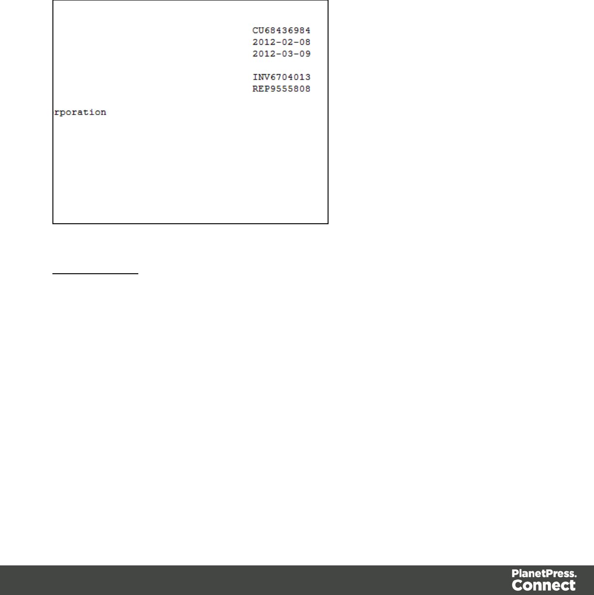
being in a separate grid position.
To select data, click on a starting character within the grid, keeping the mouse button down,
dragging to the end character and releasing the button. This creates a data selection that can
contain multiple lines.
From a PDF File
The PDF data viewer displays the PDF file contents of the Data Sample that is currently active
within the data mapping configuration as pages.
To select data, click on a starting point, keeping the mouse button down, dragging to the end
location and releasing the button. This creates a data selection that can contain multiple lines.
Page 68
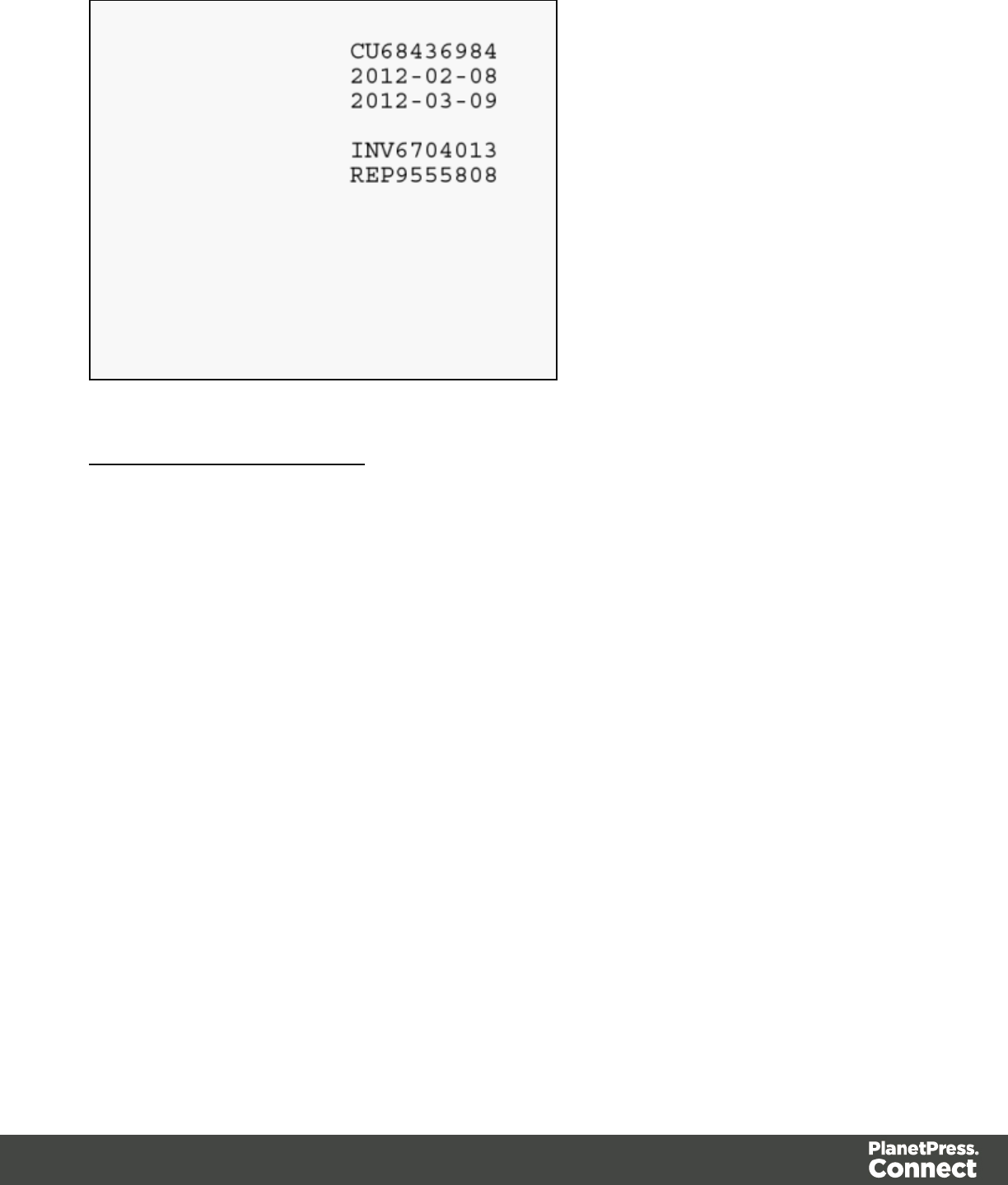
From a CSV or a Database File
The CSV/Database data viewer displays the field-based contents of the Data Sample that is
currently active within the data mapping configuration in a grid-like fashion, with each field
being in a separate grid position.
To select data, click on a starting point, keeping the mouse button down, dragging to the end
location and releasing the button. This creates a data selection that can contain multiple lines.
Page 69
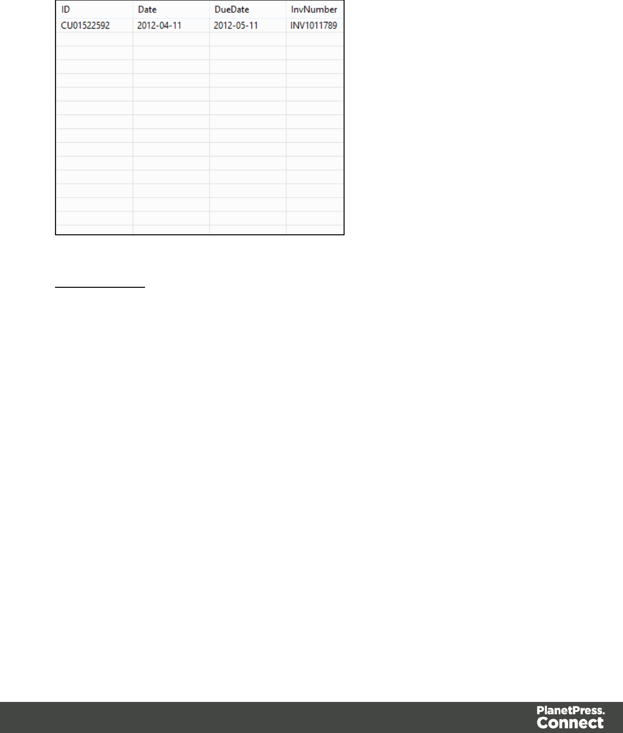
From a XML File
The XML data viewer displays the XML-based contents of the Data Sample that is currently
active within the data mapping configuration in a tree view, with XML fields displayed at each
level of the Sample Record.
To select data, click on a starting point, keeping the mouse button down, dragging to the end
location and releasing the button. This creates a data selection that can contain multiple lines.
Page 70
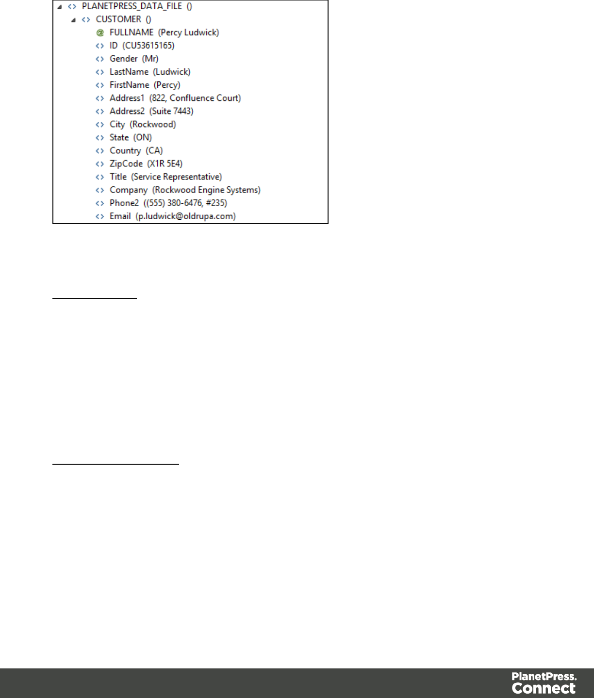
Manipulating a Data Selection
From a Text File
The Text data viewer displays the text-based contents of the Data Sample that is currently
active within the data mapping configuration in a grid-like fashion, with each character in the file
being in a separate grid position.
Once created, data selections can be modified and moved in order to change or extend the
data included in the selection. You can also modify a data selection that is attached to a field
extraction in an Extract step by double-clicking on the data selection in the Data Viewer and
then modifying the data selection.
Moving a Data Selection
To move a data selection, click and hold anywhere on the data selection, move it to its new
desired location and release the mouses.
Page 71
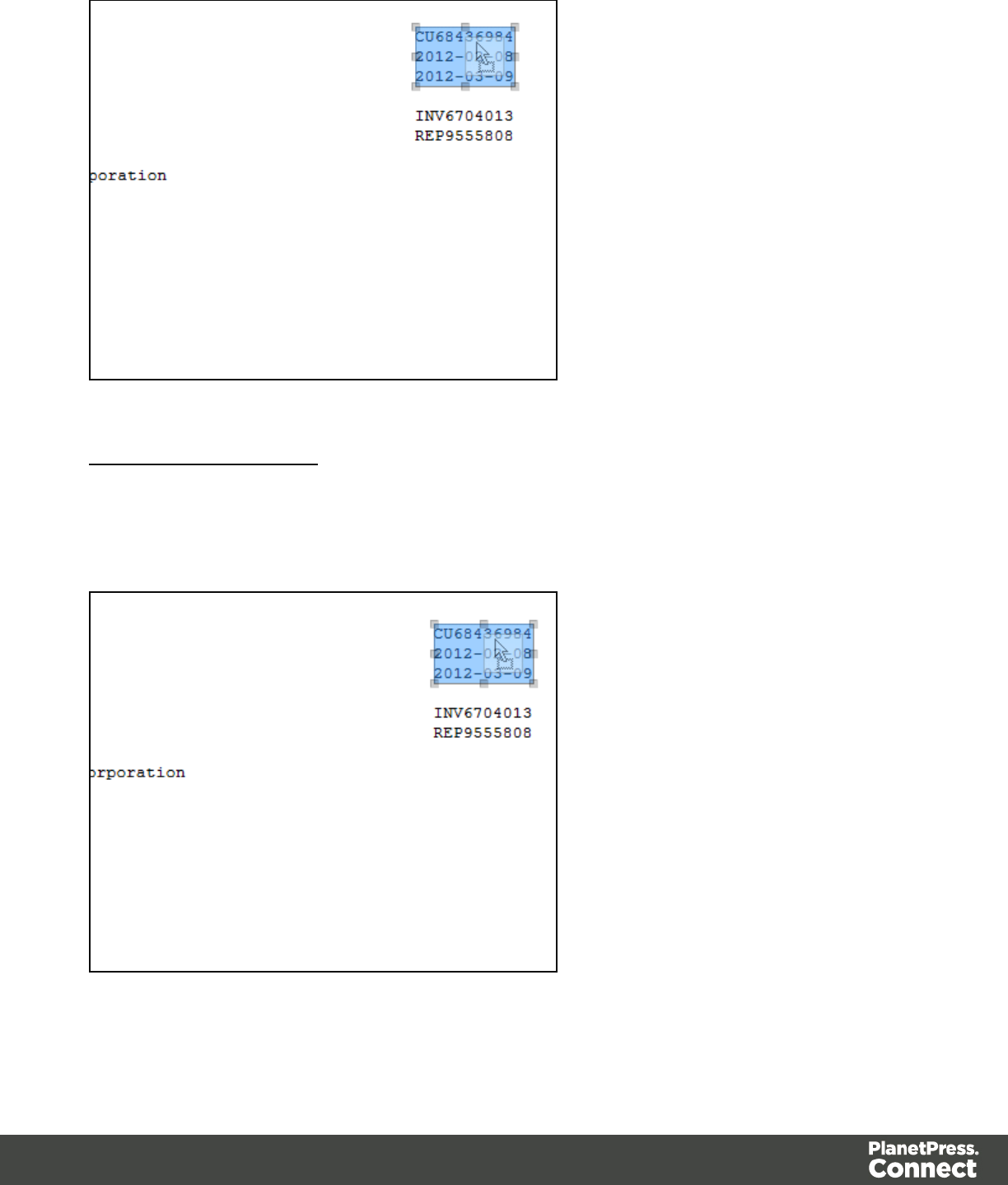
Resizing a Data Selection
To resize a data selection, click and hold on one of the resize handles on the borders or
corners, move them to the new size and release the mouse.
Page 72
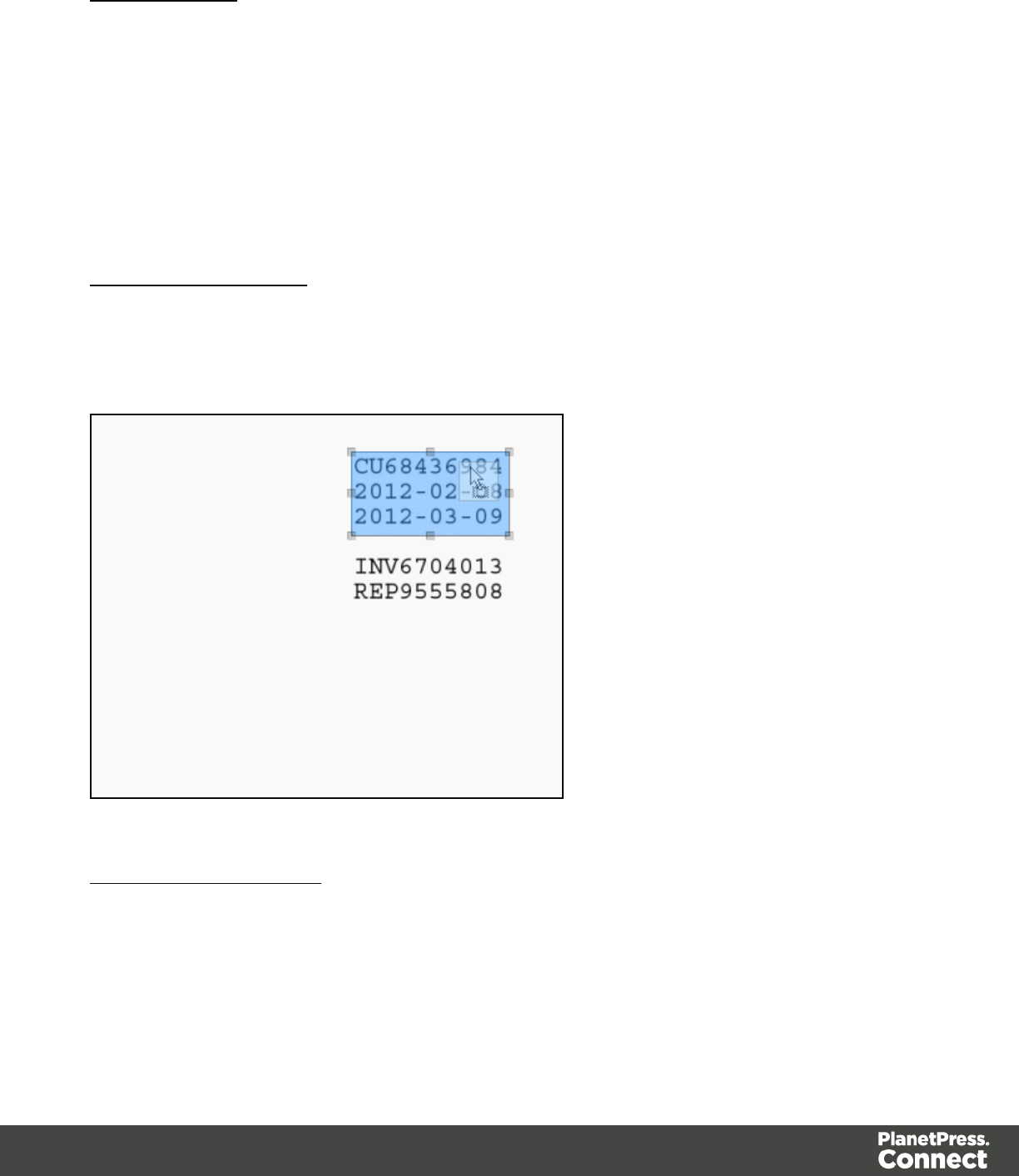
From a PDF File
The PDF data viewer displays the PDF file contents of the Data Sample that is currently active
within the data mapping configuration as pages.
Once created, data selections can be modified and moved in order to change or extend the
data included in the extraction. Moving a new data selection can be done directly if the data
selection is new. Data selections that are attached to a field extraction in an Extract step can
also be modified by double-clicking on the data selection in the Data Viewer and then
modifying the data selection.
Moving a Data Selection
To move a data selection, click and hold anywhere on the data selection, move it to its new
desired location and release the mouse.
Resizing a Data Selection
To resize a data selection, click and hold on one of the resize handles on the borders or
corners, move them to the new size and release the mouse.
Page 73
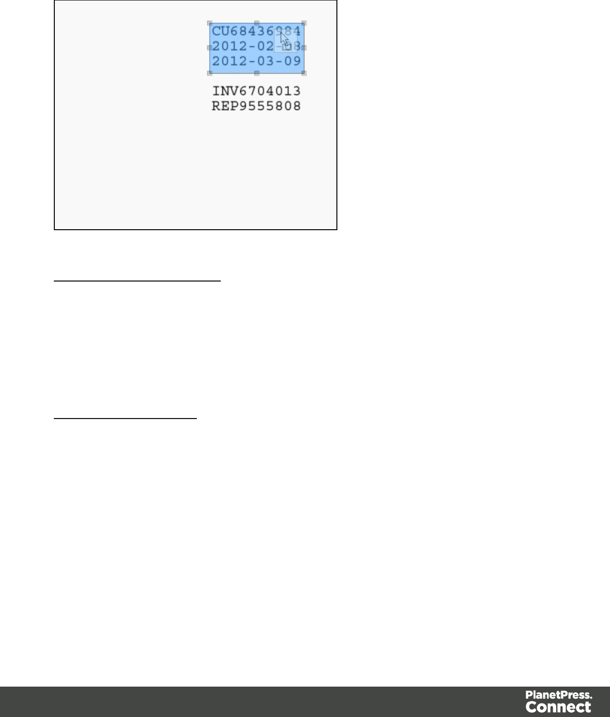
From a CSV or a Database File
The CSV/Database data viewer displays the field-based contents of the Data Sample that is
currently active within the data mapping configuration in a grid-like fashion, with each field
being in a separate grid position.
Once created, data selections can be modified. Modifying a new data selection can be done
directly if the data selection is new.
Modifying a Data Selection
To modify a data selection, press and hold the CTRLkey click, and click on a field to add it or
remove it from the selection (the blue color indicates that the field is part of the current
selection).
Page 74
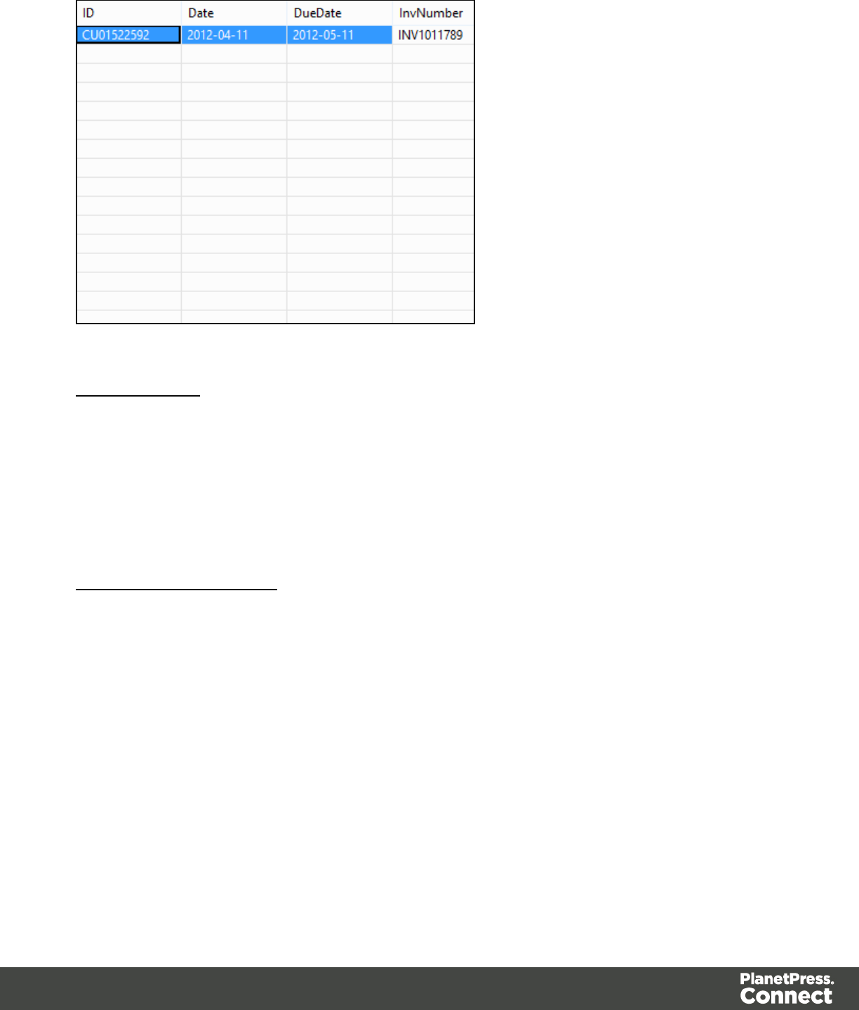
From a XML File
The XML data viewer displays the XML-based contents of the Data Sample that is currently
active within the data mapping configuration in a tree view, with XML fields displayed at each
level of the Sample Record.
Once created, data selections can be modified. Modifying a new data selection can be done
directly if the data selection is new.
Modifying a Data Selection
To modify a data selection, press and hold the CTRLkey click, and click on a field to add it or
remove it from the selection (the blue color indicates that the field is part of the current
selection).
Page 75
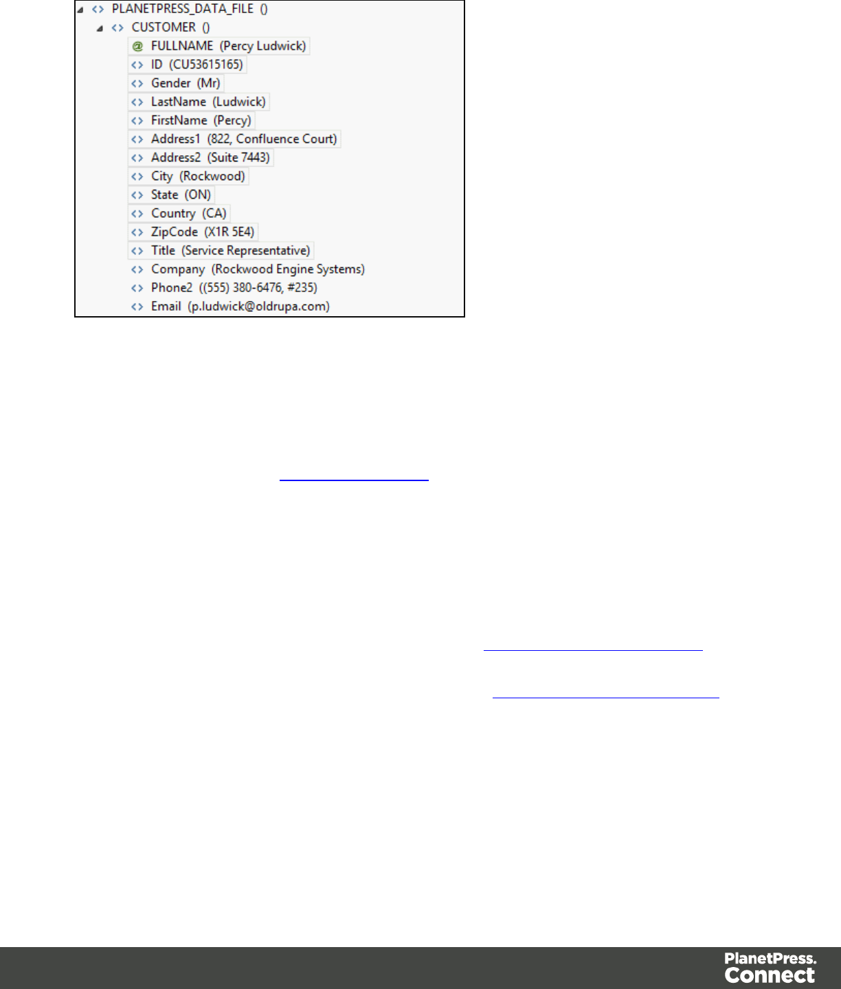
Extracting Data
The following example explains in detail how to perform a data extraction for each different data
source file types and the Steps used to achieve it. Delimiters and Boundaries must be properly
configured beforehand (see Configuring Settings for more information).
The Preprocessor and the Postprocessor
Data processors allow the application to perform actions on the data file itself before it is
handed over to the Data Mapping workflow (preprocessors) and after the Data Mapping
workflow has completed (Postprocessors).
For more information about the Preprocessor step, see Preprocessor Step Properties.
For more information about the Postprocessor step, see Postprocessor Step Properties.
The Extraction Step
The Extract step is the heart of the DataMapper software. It takes information from the Data
Sample and places it in the Extracted Record within the Record Set.
Page 76
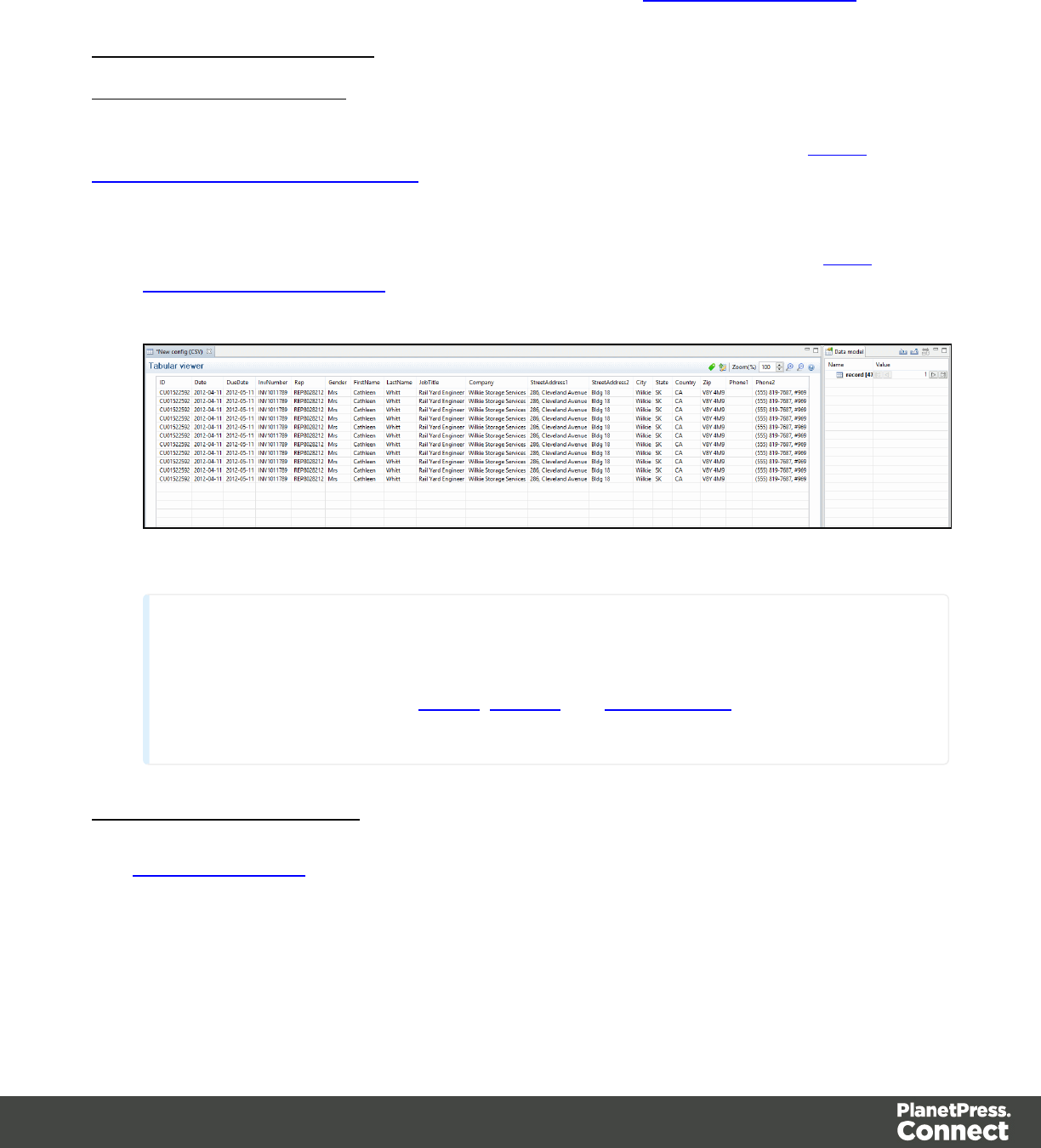
To configure the settings for the extraction step such as the list of fields included in the
extraction, how to change a field name, the data format of each field or if the information is
extracted from a position on the page or to using a script, see Extract Step Properties.
From a CSV file or a Database
Extracting Promotional Data
For more information about Promotional and Transactional data, please refer to About
Promotional and Transactional Data.
1. From the Viewer pane, select the fields that contain the customer and invoice information.
For more information about how to select data in a CSVfile, please refer to Data
Selection/From a CSV File.
2. Drag & drop the selected fields into the Data Model pane.
Note
Alternatively, you can simply right click on the selected fields and select Add
Extraction. Please refer to Menus,Toolbar and Shortcut Keys for more information
about the available toolbar buttons, menus and keyboard shortcuts.
Extracting Transactional Data
The Transactional Data (line items information) appears on multiple lines. You must create a
loop on these lines to extract the items information. The line items are extracted in a detail
table.
Page 77
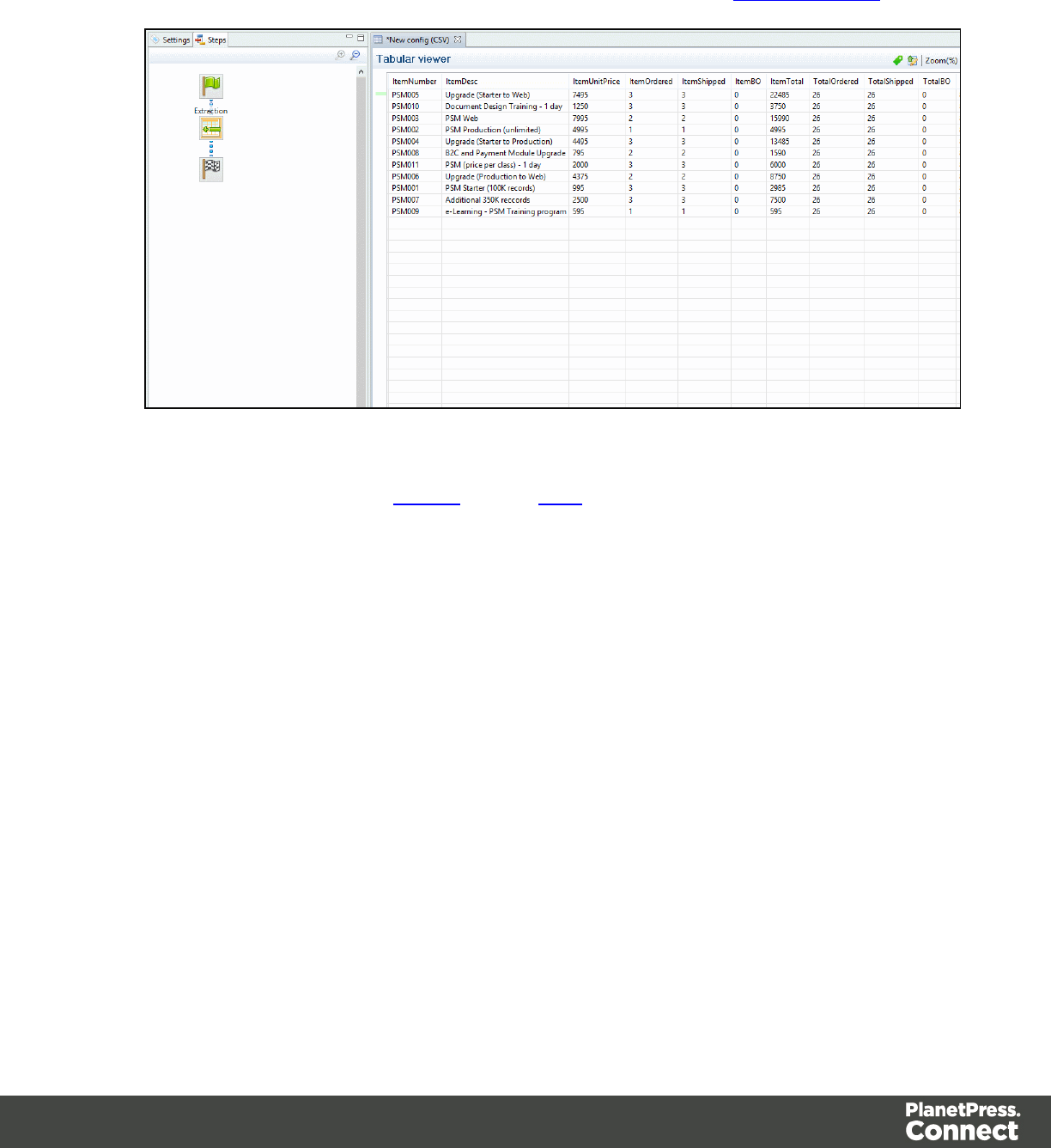
1. Select the fields that contain the first line item information.
2. Right click on this data selection and select Add Repeat . For more information about
what a Repeat step is and why it should be used, please refer to Step_types.htm.
3. Right click again on this data selection and select Add Extraction. A new extraction step
will be placed between the Repeat and the Goto steps.
Page 78
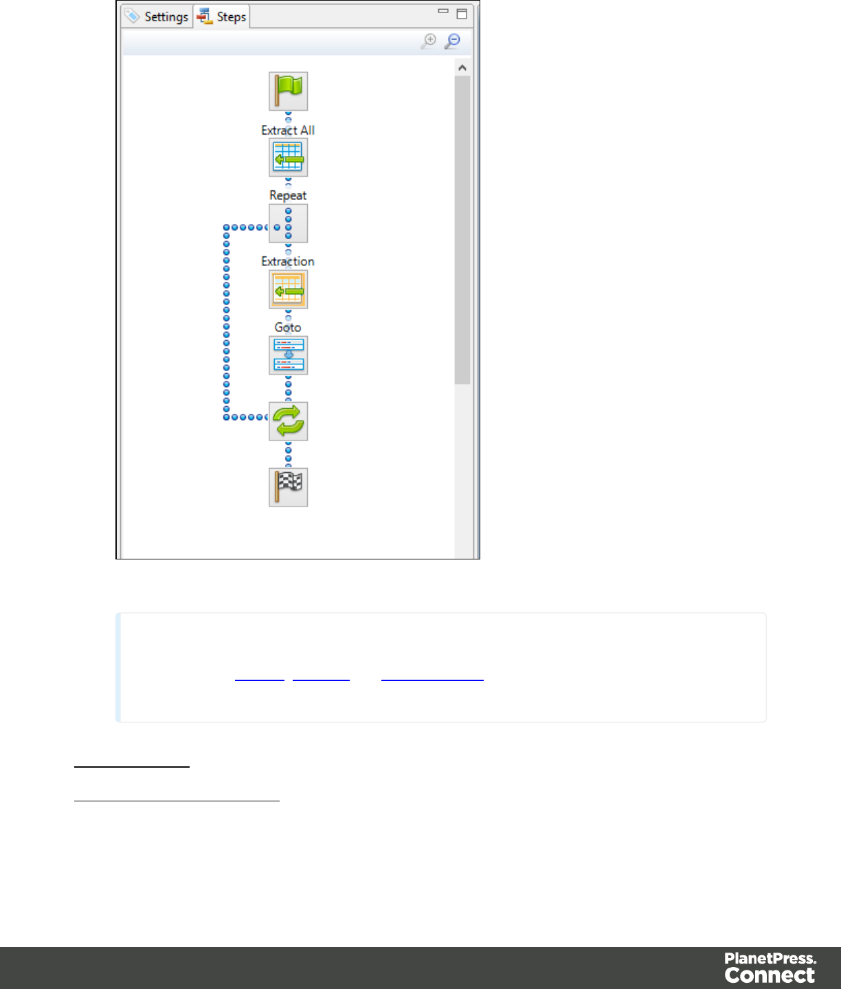
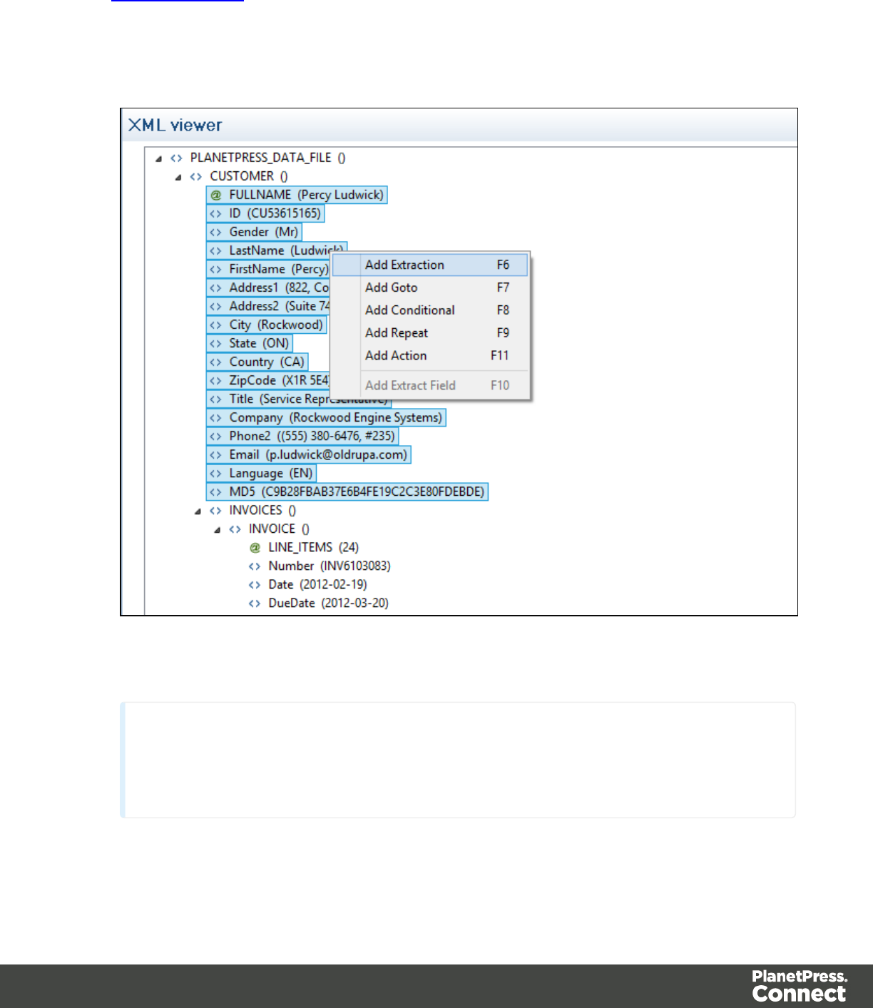
The Promotional Data (the customer and invoice information) is normally located at the top of
the Source Record, before the ITEM information. It generally includes the name, the address,
reference numbers, invoice information, etc.
1. Select the child leaf elements of the CUSTOMER() node.
2. Right click on the selected elements and select Add Extraction.
Note
Alternatively, you can simply drag & drop the selected elements into the Data Model
pane.
Page 80
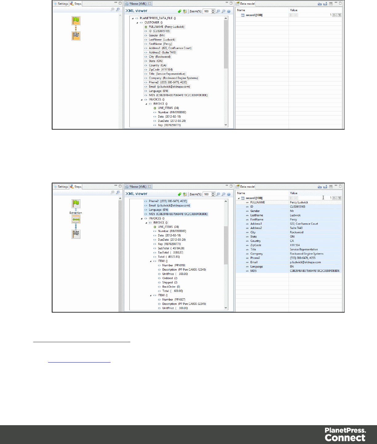
3. In this case, the invoice information is also part of the promotional data. Select the child
leaf elements of the INVOICE() node.
4. Right click on the selected nodes and select Add Extraction.
Extracting Transactional Data
The Transactional Data (line items information) appears in repeated elements. In the example
below, this information appears under the parent node ITEM(). Each ITEM() node gives
information about one item. Create a loop on the ITEM() nodes to extract the items information.
Page 81
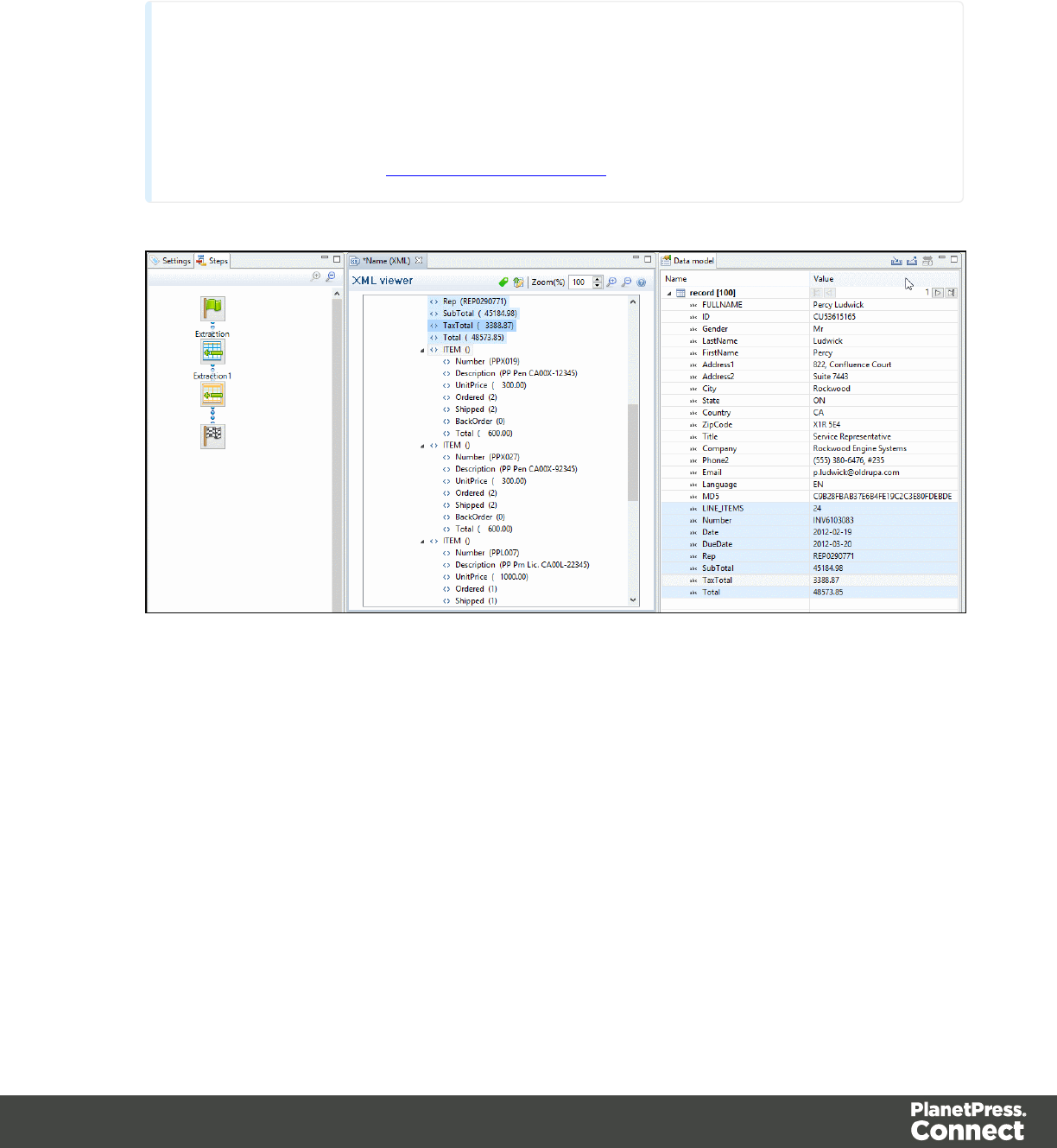
1. Select the ITEM() node.
2. Right click on the selected node and select Add Repeat.
Note
By default, when you click on the Repeat step in the Steps pane, the For Each option is
selected in the Repeat type option as shown in theStep Properties pane. The loop will
include each ITEM() node. In the Collection field, you will find the corresponding ITEM()
node path. Please refer to Repeat Step Properties.
3. Select the children leaf nodes of the ITEM() node.
Page 82
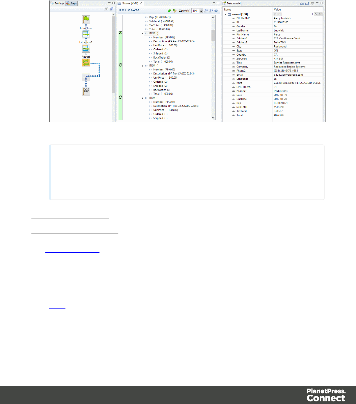
4. Right click on the selected nodes and select Add Extraction.
Note
Please refer to Menus,Toolbar and Shortcut Keys for more information about the
available toolbar buttons, menus and keyboard shortcuts.
From a Text or a PDF file
Extracting Promotional Data
The Promotional Data (customer and the invoice information) is repeated for each item and
normally located at the top of the Source Record. It generally includes the name, the address,
reference numbers, invoice information, etc.
1. From the Viewer pane, select the customer and invoice information. Note that you can
select multiple lines. For more information on how to select text, please refer to Selecting
Data.
2. Right click on the selection data and select Add Extraction .
Page 83
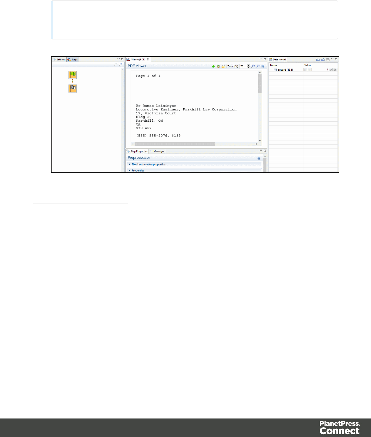
Note
Alternatively, you can simply drag & drop the selected fields into the Data Model pane.
Extracting Transactional Data
The Transactional Data (line items in an invoice) appears on multiple lines and pages. A loop
has to be created on these lines to extract the item's information. The line items are extracted in
a detail table as described below:
1. Select a simple data in the first line item. For example the product number.
2. Right-click on the selection and select Add Goto. That moves the cursor to the beginning
of the first line item.
Page 84
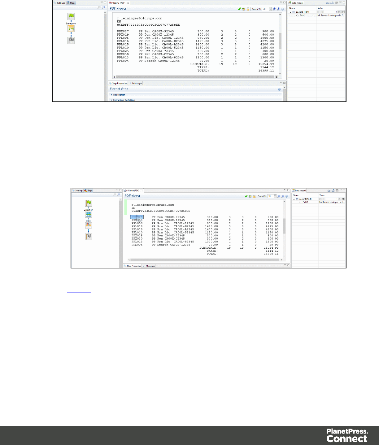
3. Add a loop to extract each item until the end of the line items. To stop the loop at the right
place, you can use a text located at the end each record. For example, it can be a text
string like SUBTOTALS, TOTAL or AMOUNT. Now you can use that text as a condition to
stop the loop at the end of the line items list. In that case:
1. Select the text (SUBTOTALSfor example) in the Viewer.
2. Right click on the selection and select Add Repeat.
The Repeat step loops on all lines until the selected text is found. Since a record can
extend on more than one page, lines that are not item lines must be excluded form the
extraction. You can use any exclusive information like a "." or "," in prices or totals for
example.
4. Select the "." or the "," in the total or in the price of the first line item.
5. Right click on the selected dot and select Add Conditional. In the Viewer pane, you will
see a green check mark besides each included line or X for other lines.
Page 85
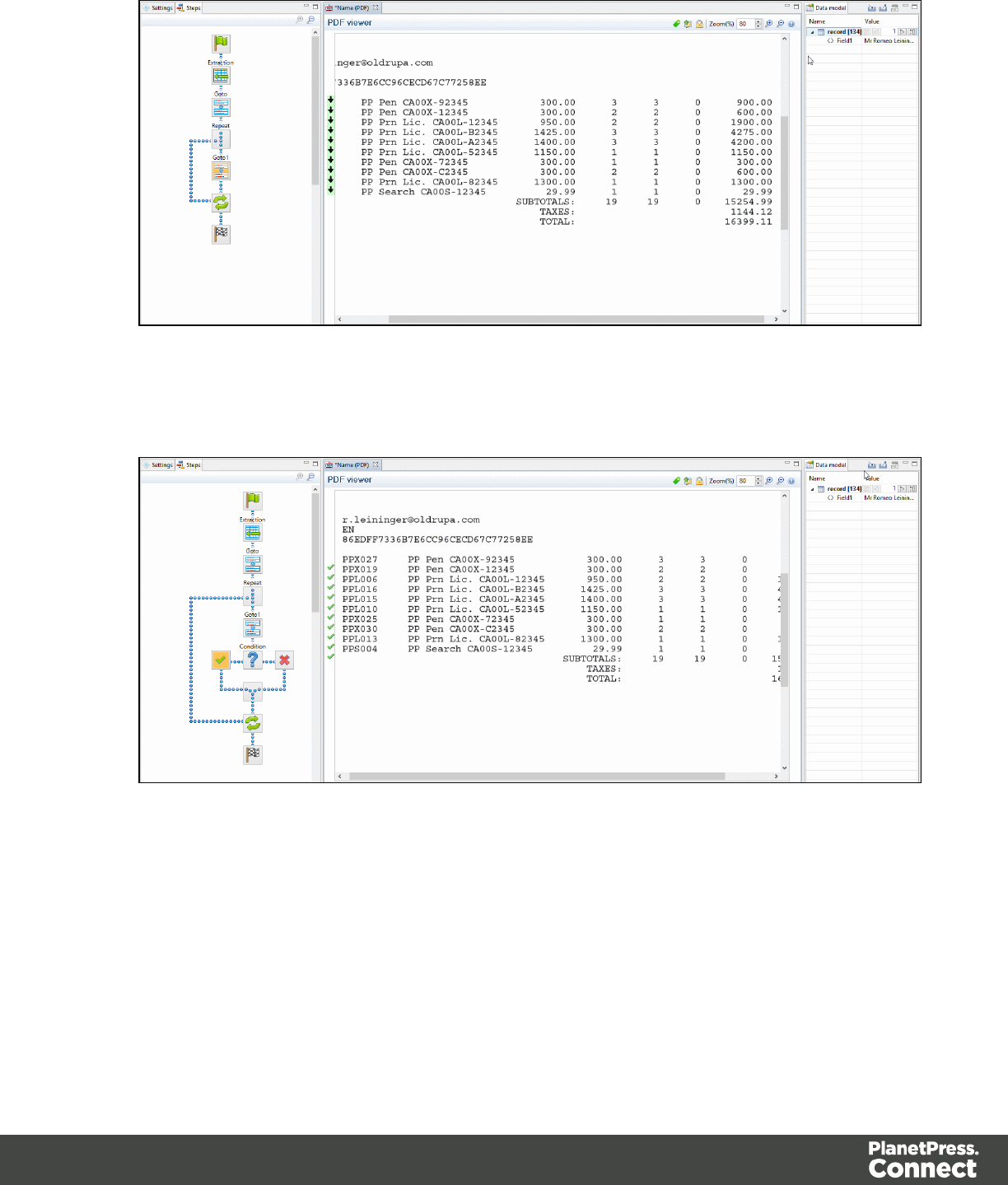
6. From the Viewer pane, select the first field on the left for the first line item.
7. Right click on the selection and select Add Extraction.
8. Select the second field.
Page 86
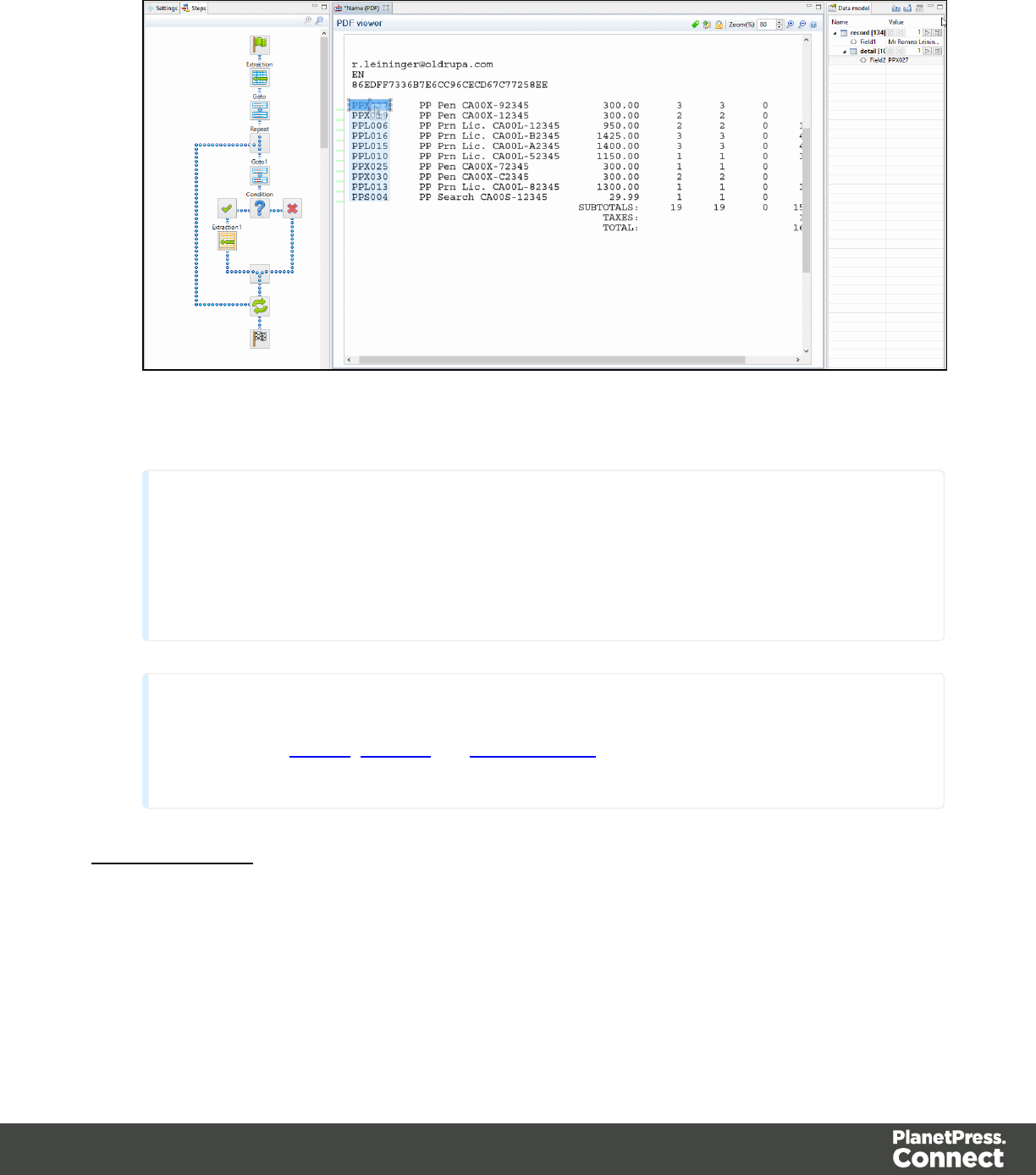
9. Right click on the selection and select Add Extract Field.
10. Do the same for the rest of the fields along that same line item.
Note
The Add Extract Field step allows to add a field to an existing extract step while the Add
Extract Step creates a new step in the Steps pane. For optimization purposes, it is better to
use Add Extract Field than to have a succession of extraction steps.
Note
Please refer to Menus,Toolbar and Shortcut Keys for more information about the
available toolbar buttons, menus and keyboard shortcuts.
Totals Information
After the loop step, the cursor position is at the end of line items. If the record contains sums or
totals at the end of the line items list:
Page 87
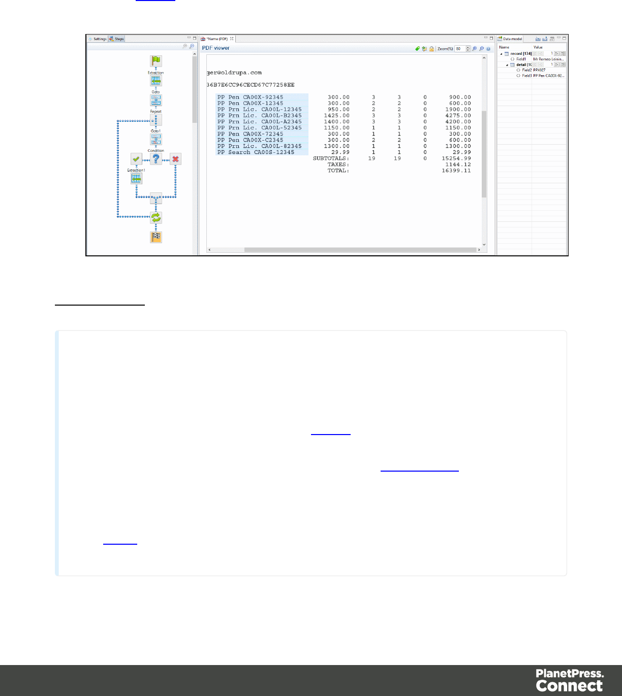
1. Select the amounts.
2. Click the Repeat step in the Steps panel.
3. Right click on the selection and select Add a Step/Add Extraction.
Also Note That...
Note
lDragging a data selection or fields into a specific level of the Data Model (record or
detail tables) will add the fields to that level.
lWhen dragging data into a detail table (in the Data Model pane), the Extract step
must be located within the appropriate Repeat step, otherwise the extract will not
function properly.
lData can be extracted conditionally. Please refer to Condition step
lIf a Data Model is loaded into the Data Model pane and if a field of the same name
already exists in that level, dragging a named field into it (CSV, XML, Database) will
extract the data to that field. Otherwise a new one with will be created.
lAction steps could be added to the process described above in order to set the
value for a Source Record property or execute a JavaScript code.
Page 88
Note
To add an Extract step, you can also use JavaScript (select JavaScript from the Mode drop-down
in the Step Properties pane). Please refer to DataMapper API for more information.
About Promotional and Transactional Data
Promotional data, like its name suggests it, is used for promotional communications. It usually
contains personal information like addresses, names and phone numbers used to identify the
recipient of these communications. Each recipient represents one record and records for
promotional data are fixed length. These communications are aimed to promote a product or
service, create a bond or establish a relationship with the customer.
Transactional data is used in the communication of transactions between a company and their
customers or suppliers. Examples of such communications are invoices, statements or
purchase orders. Because of the nature of transactions, records lengths vary from record to
record.
Steps
lSteps are executed sequentially, from top to bottom in a workflow.
lInside conditions, some steps may be skipped altogether when they are on a particular
branch, whereas in loops several steps may be repeated a number of times.
lThe Preprocessor and Postprocessor steps are special in that the former can be used to
modify the incoming data prior to executing the rest of the workflow while the latter can be
used to further process the Data Set after the entire workflow has been executed.
You will find below a list of different steps that can be added to a Data Mapping Workflow.
Note
For more details about operations that can be performed on steps, please refer to The
Steps Pane Interface.
Page 89
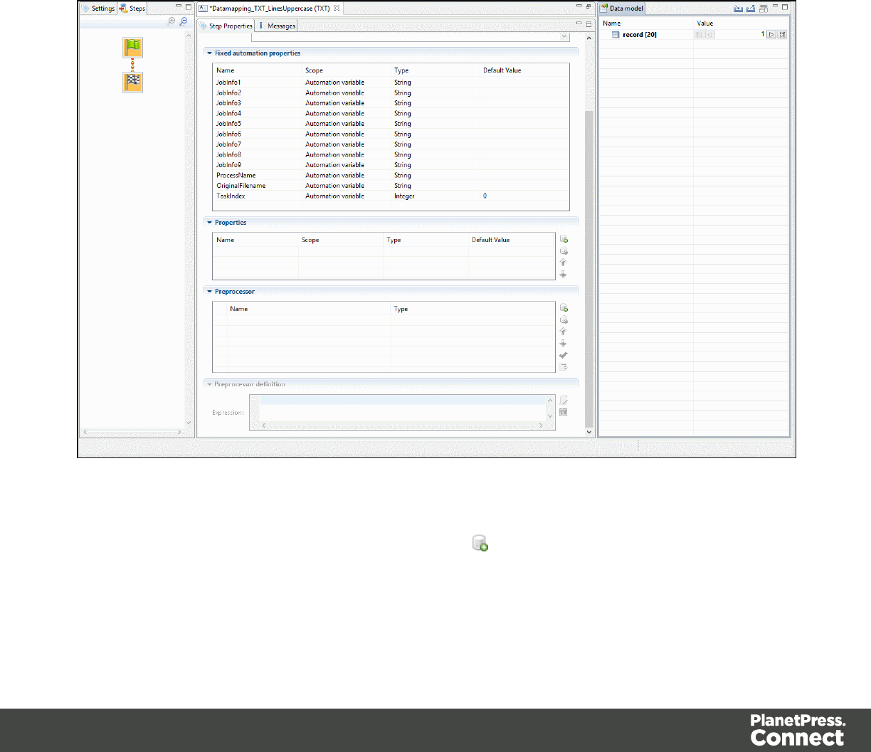
Preprocessor and Postprocessor
Preprocessors
Data preprocessors allow the application to perform actions on the data file itself before it is
handed over to the Data Mapping workflow.
Using a JavaScript a Preprocessor step could be used add a new field in each record set. A
unique ID could be created to be added to the output for integrity checks latter on. A time stamp
could be added to create reports. A tag could be added to process certain records differently. Or
Certain records could be removed altogether.
Any number of preprocessing tasks can be added to a workflow and run in sequence before the
data is sent to the Data Mapping workflow. Click the button to add a Preprocessor to the list.
Page 90
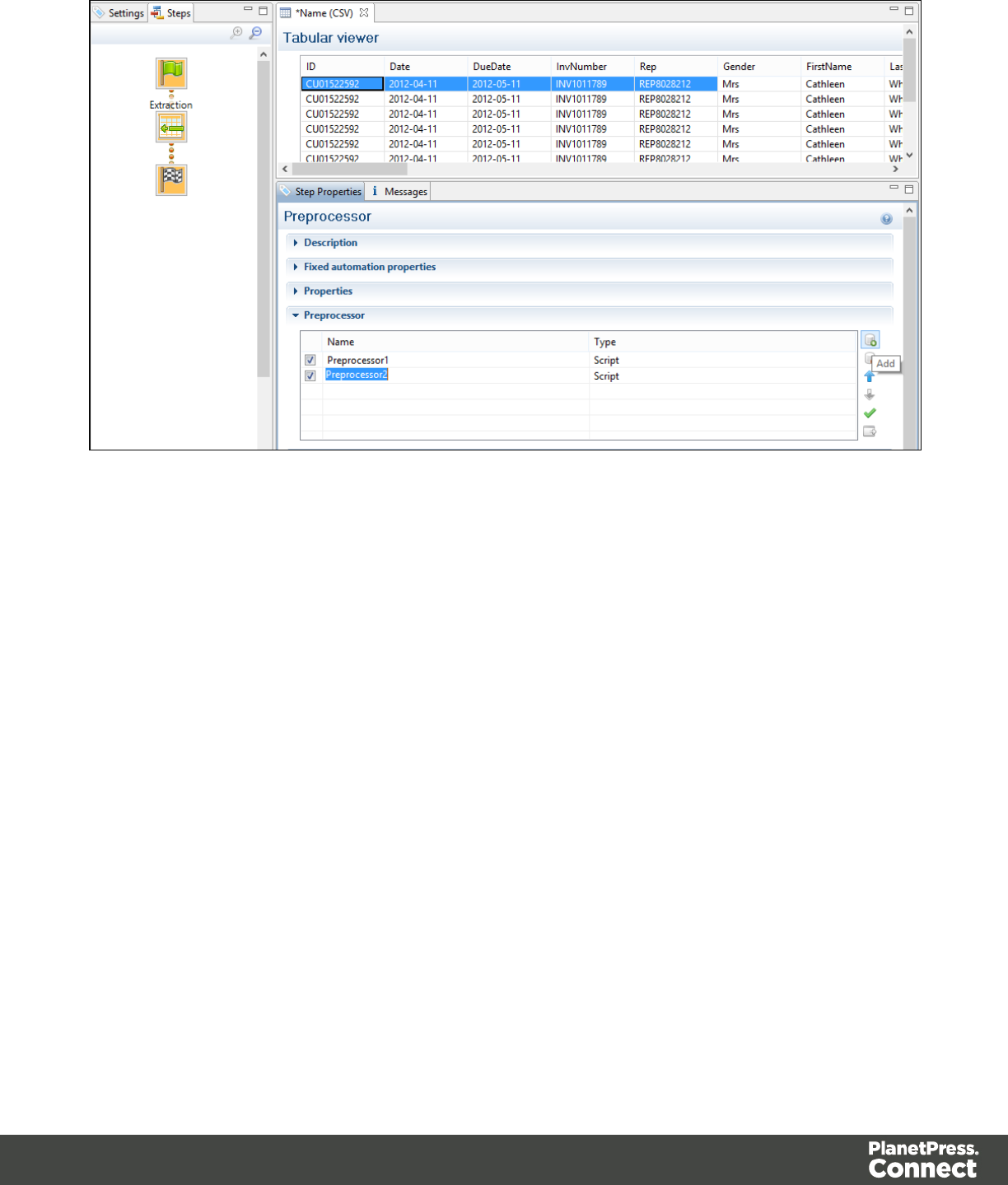
Postprocessors
Data postprocessors allow the application to extract data that was stored in the data model
once the workflow is completed. For example, the postprocessor can export all or parts of the
data to a CSV file which can then used to generate daily reports of the Workflow processes.
Page 91
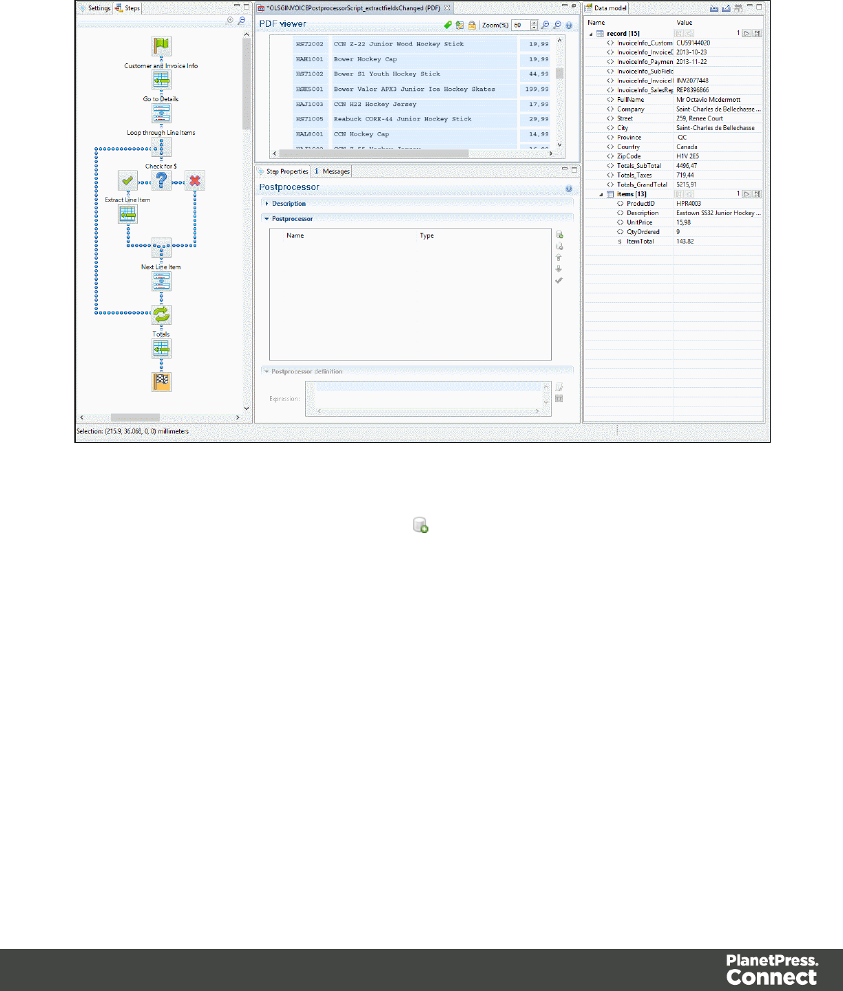
Any number of postprocessing tasks can be added to a workflow and be executed after the
Data Mapping workflow is complete. Click the button to add a Postprocessor to the list.
Page 92
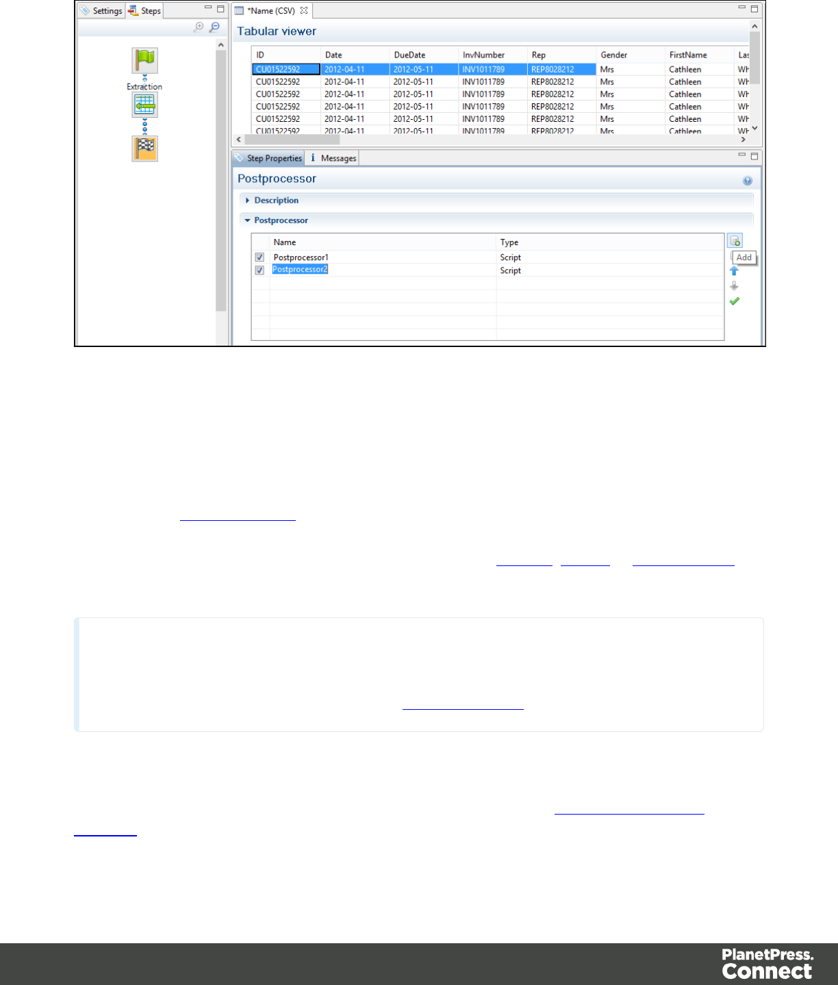
Extract
The Extract step is the heart of the DataMapper software. It takes information from the Data
Sample and places it in the Extracted Record within the Record Set.
Please refer to Data Extraction for an animated example.
For more information on how to add a step, please refer to Toolbar,Menus or Shortcut Keys
under the Interface area.
Note
To add an Extract step, you can also use JavaScript (select JavaScript from the Mode drop-down
in the Step Properties pane). Please refer to DataMapper API for more information.
Properties
You can also further customize the step properties. Please refer to The Step Properties
Interface for more information.
Page 93

Goto
The cursor position determines how data is extracted from the Source Record. The cursor in a
Source Record is always at a specific position.
In a Source Record, the cursor position starts off at the top-left corner of the Sample Data. When
the Goto step is used, that cursor position is moved to the location (either relative or absolute)
set by the Goto step. In the case of a Goto step within a Repeat step, the cursor position will
gradually be moved with each loop of the repeat step.
Since data extracted by the Extract step is always relative to the current cursor position, this
becomes useful when extracting data at the end of the loop. For instance, when a "Totals" line
appears at the end of line items in an invoice, the Extract step can find the appropriate position
of the "Totals" simply by looking at an certain distance (or offset) from the last line item and
always find the "Totals" at the same place.
For more information on how to add a step, please refer to Toolbar,Menus or Shortcut Keys
under the Interface area.
Properties
You can also further customize the step properties. Please refer to The Step Properties
Interface for more information.
Condition
ACondition step splits the extraction workflow into two separate branches, one that is
executed when the condition is True, the other when it is False. In the Viewer on the left side of
the window, an icon is displayed indicating the result of the evaluation: when true and
when false.
Page 94
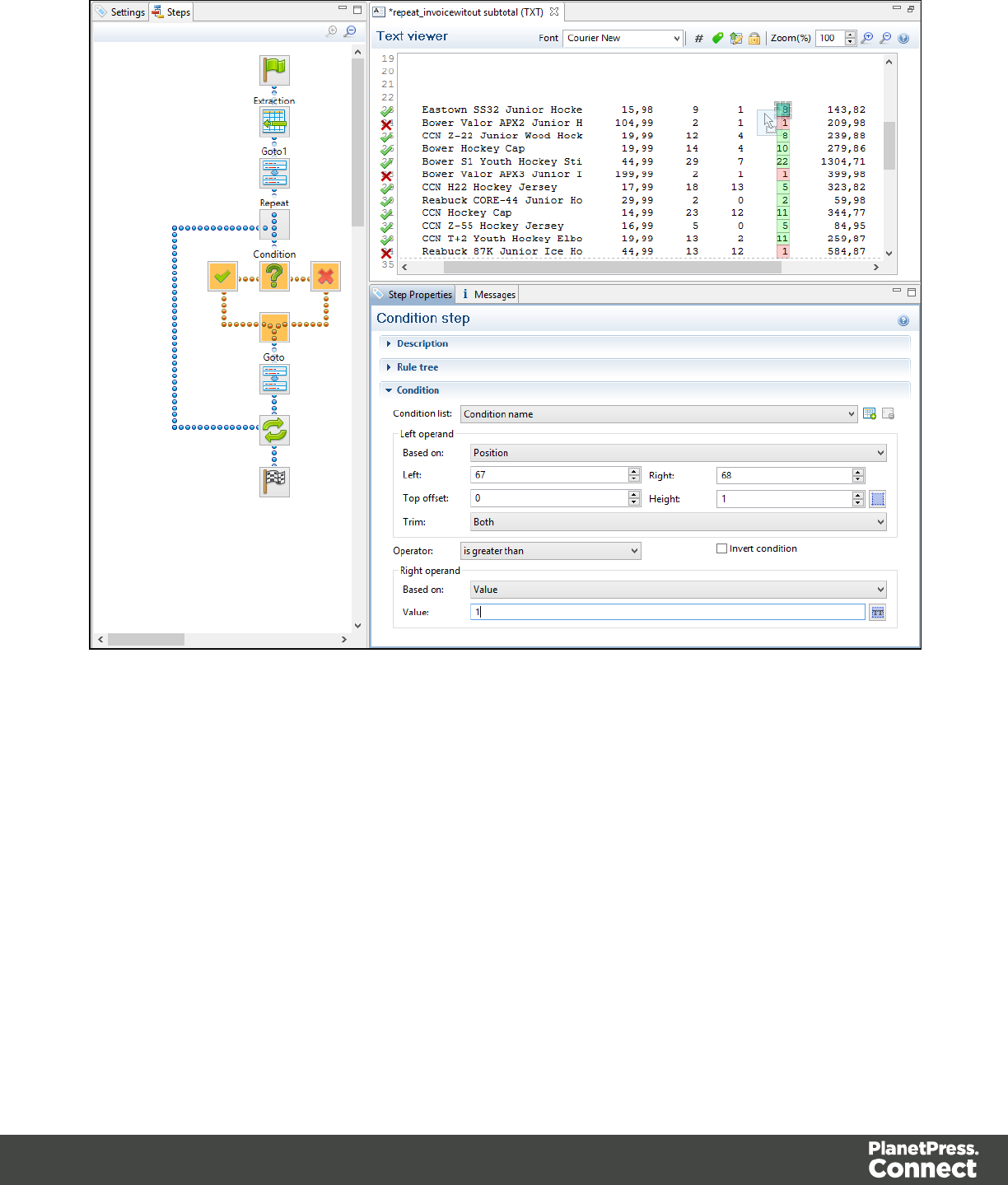
ACondition step is used when the data extraction must be made based on specific criteria. In
the following example, the transactional data must be extracted according to two main criteria.
First, the line item must include an amount of money and secondly, the lines that include a
Description field on two lines have to be extracted as a single record.
Page 95
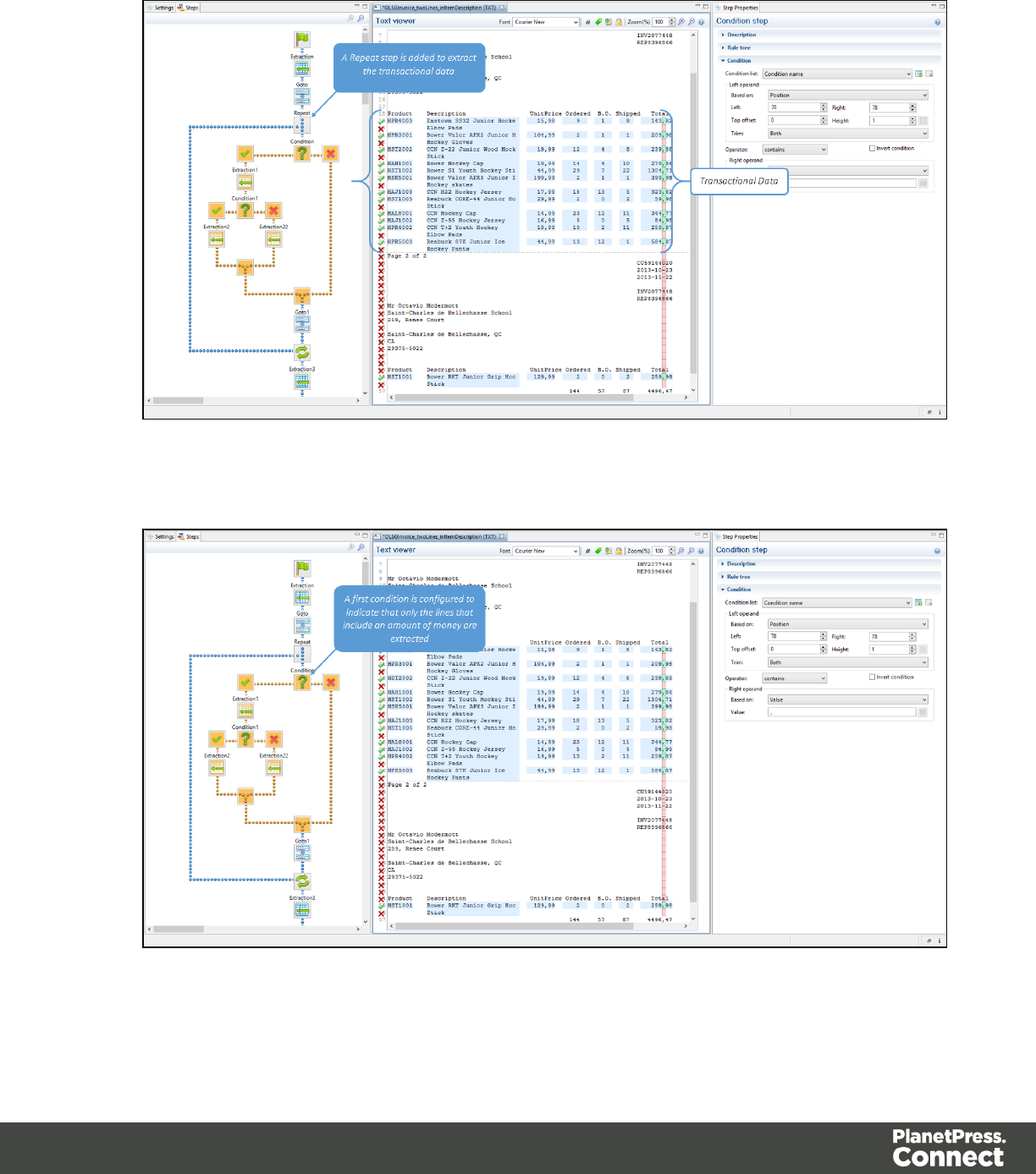
1. Since the extraction is for transactional data, a Repeat step is first added.
2. A first condition is added to determine whether the line should be considered for the
extraction.
Page 96
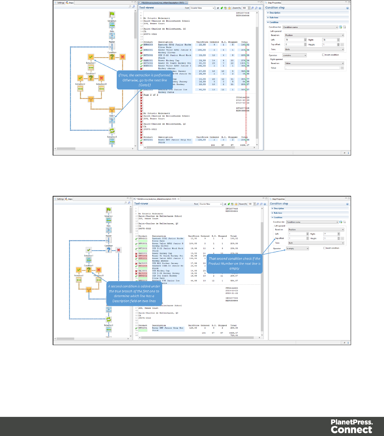
3. The extraction is performed if the condition is true.
4. Under the true branch of the first condition, a second condition is added for Description
fields on two lines.
Page 97
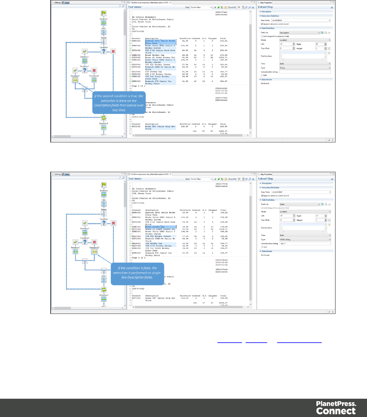
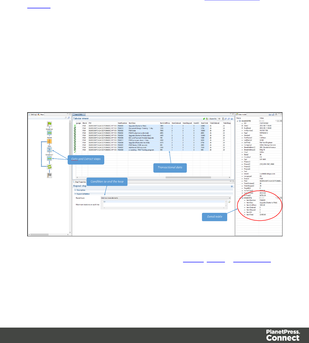
Properties
You can also further customize the step properties. Please refer to The Step Properties
Interface for more information.
Repeat
The Repeat step is a loop that may run 0 or more times, depending on the condition specified.
It is generally used for the extraction of transactional data. Repeat steps do not automatically
move the pointer in the file. In order to avoid infinite loops, a Goto step must be present within
the loop itself.
The following picture shows an example of a Repeat step. The Repeat step is a loop that
includes both Goto and Extract steps. The extraction result for transactional data is placed in a
Detail table.
For more information on how to add a step, please refer to Toolbar,Menus or Shortcut Keys
under the Interface area.
Page 99
Properties
You can also further customize the step properties. Please refer to The Step Properties
Interface for more information.
Note
By default, if an Extract step is added within a Repeat step, its extraction is made in a detail
table.
Note
If an XML node that has children is selected, and the pointer is currently at this node, creating a
repeat step will loop on that node.
Extract Field
The Add Extract Field function adds the selected data to a selected Extract step in the Steps
pane. If multiple lines, nodes or fields are selected, multiple extract fields are added
simultaneously (see also About Records and Fields for more information).
For more information on how to add a step, please refer to Toolbar,Menus or Shortcut Keys
under the Interface area.
Properties
You can also further customize the step properties. Please refer to The Step Properties
Interface for more information.
Multiple Conditions
The Multiple Conditions step is useful to avoid the use of too many nested Conditions as
shown in the following picture:
Page 100
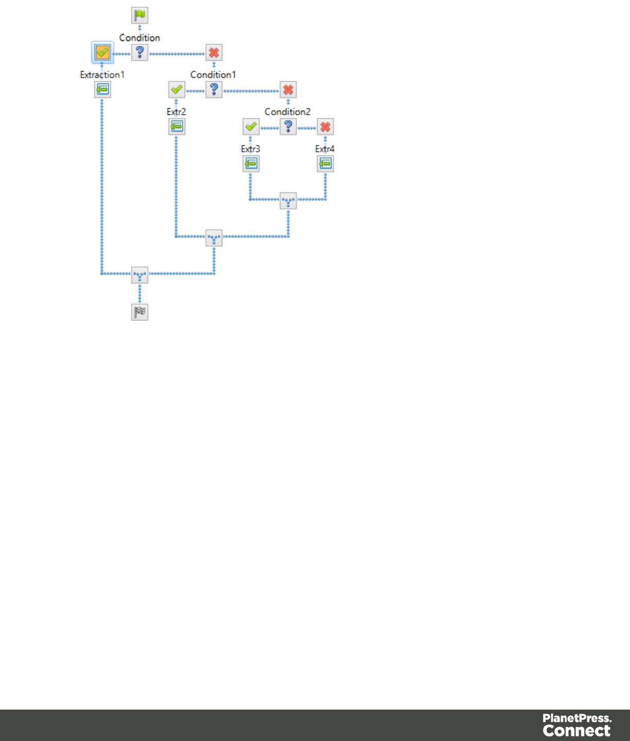
Instead of these nested conditions, it is more convenient to use the Multiple Conditions step.
If, for example, we take the case of a condition which, when true, is extracting following the
values of Mr, Mrs or Miss, we have:
Page 101
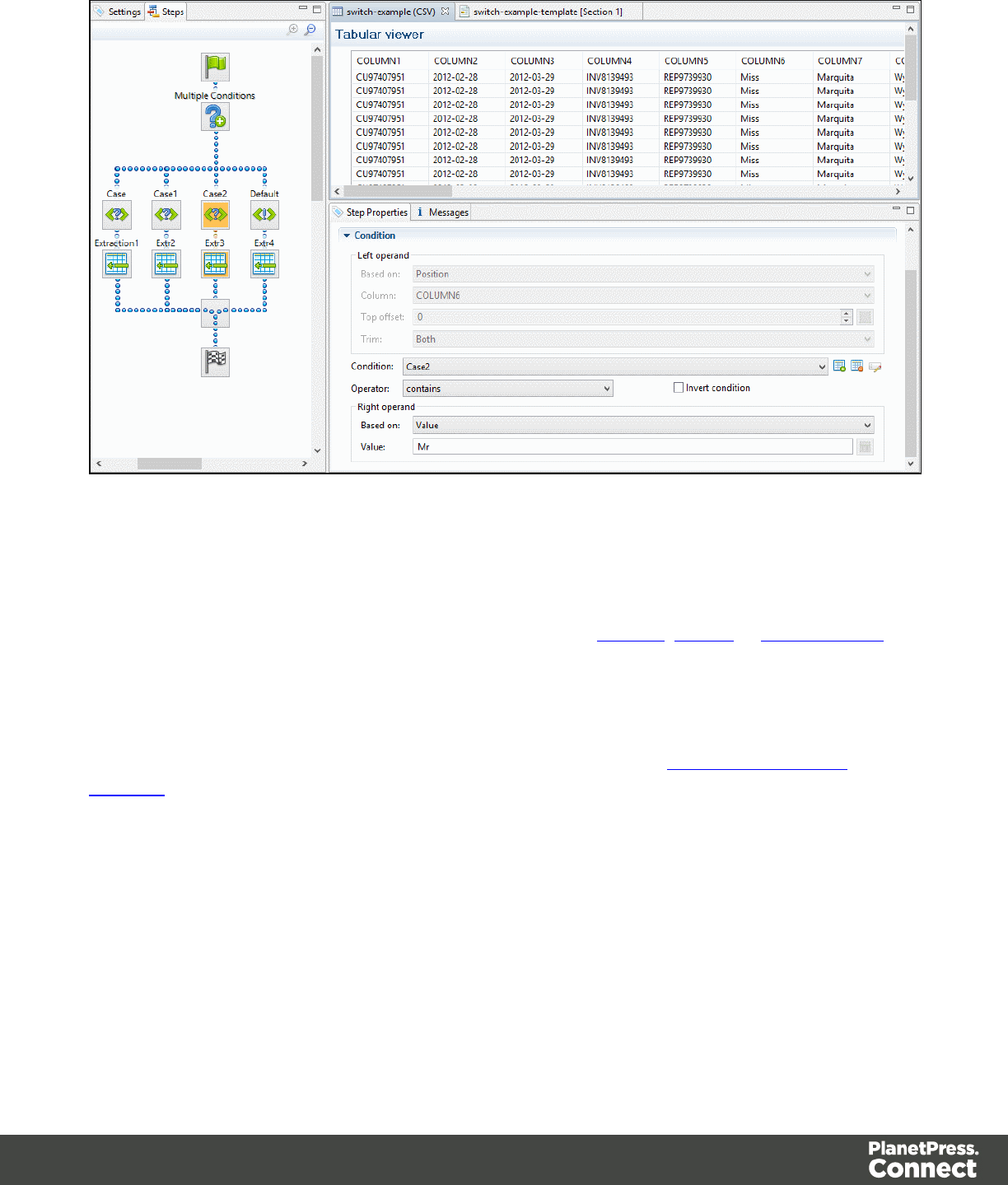
Each Case condition led to an extraction that occurs when the condition is True. The resulting
process has a structure easier to understand and manage. Cases are executed from left to right.
For more information on how to add a step, please refer to Toolbar,Menus or Shortcut Keys
under the Interface area.
Properties
You can also further customize the step properties. Please refer to The Step Properties
Interface for more information.
Action
The Action step can set the value for a Source Record property or execute a JavaScript code.
The Action Step can run multiple specific actions one after the other in order.
The following picture shows a usage example of an Action step...
Page 102
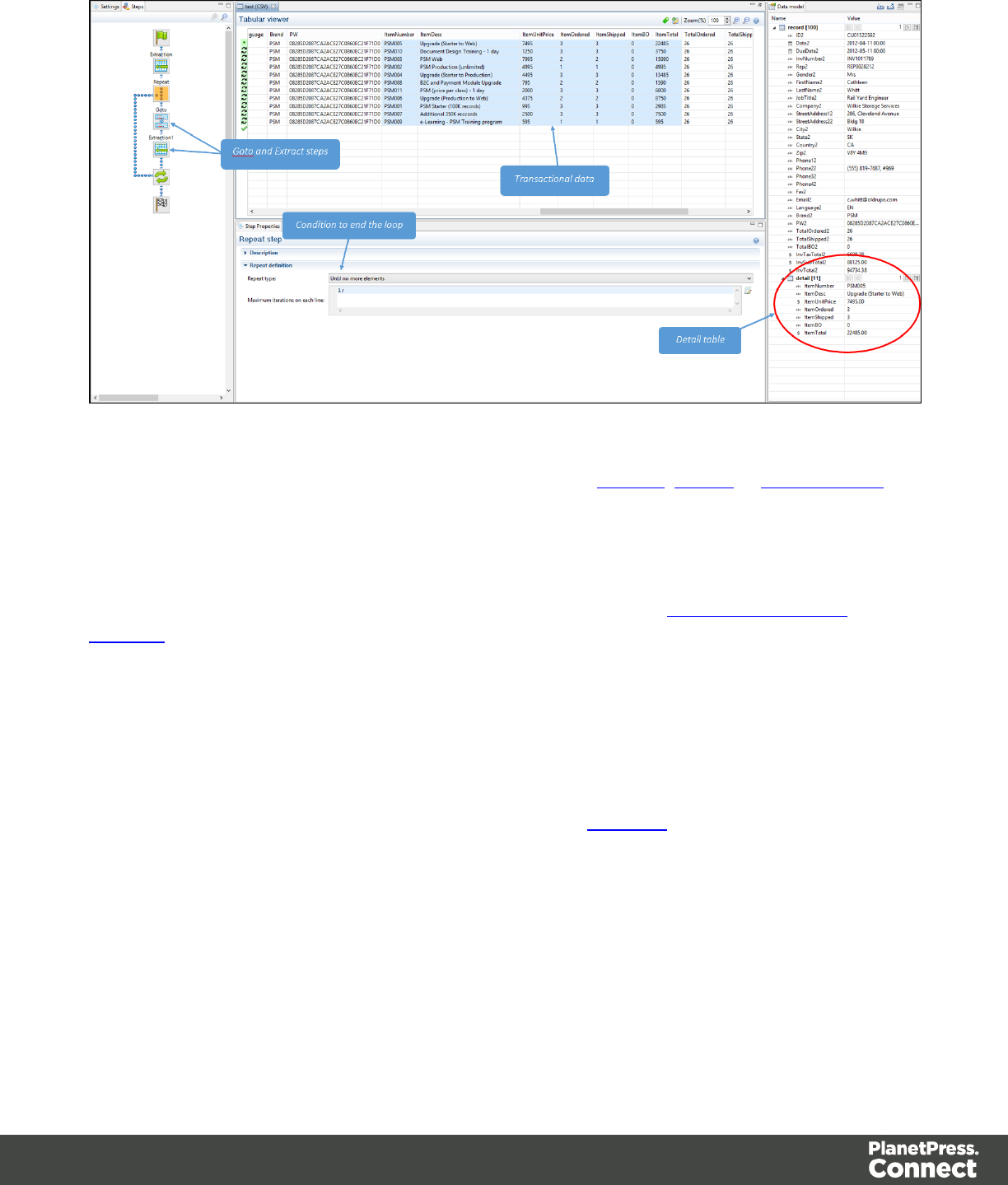
For more information on how to add a step, please refer to Toolbar,Menus or Shortcut Keys
under the Interface area.
Properties
You can also further customize the step properties. Please refer to The Step Properties
Interface for more information.
The Data Model
The Data Model is basically the structure into which the records are extracted. It is the structure
of all the fields and tables of an extracted record. The Data Model contains all the necessary
information to be used in the creation of a template in the Designer module. The group of
records generated from the Data Sample is called the Record Set and it is stored in the Unified
Data Model (UDM) format.
The main advantage of the Data Model is that it is reusable, meaning that it be shared amongst
different layouts and outputs created with the Connect Designer. This UDM also allows a same
layout or output to be populated of data from different sources and formats without the need to
modify it. This would be impossible without the universality of the UDM.
Page 103
How to Use a Data Model?
The Data Model is simply a file containing that structure and all you need to do is to import that
Data Model file into your data mapping configuration in order to be able to use it. When you
import the Data Model, it appears in the Data Model pane where you can see all the fields and
their types.
Once imported a Data Model can be modified. You can delete or add fields, or change their
type. Once the data model is imported and all the fields properly set, all you need to do is
extract the information. That is done simply via drag & drop.
Note
The order in which these panes are displayed corresponds to the order in which they are normally
used to create a data mapping configuration.
XML and Tabular Data
Multiple fields can be extracted by using a database or an XML file. To extract multiple fields
inside a tabular data type or an XML, simply select all the fields and drag & drop them.
Depending on where they are dropped, they will react a bit differently. When you drag & drop
fields directly from the Viewer to the first field ID in the Data Model pane, it takes the number of
fields and it overwrites the values inside the Data Model one after the other. If you have small
corrections to make, like inverting the first and last names, simply override the individual fields.
It will not create duplicate extractions; it will simply fix the current extraction.
If your Data Sample has fields that are named the same way as the imported Data Model, the
simpler thing to do is to drag & drop them inside the record table itself, not directly on a field.
When you do this, the DataMapper module automatically matches all the fields with the same
name and adds any field that is not already there.
The Data Model can also contain detailed tables and nested tables. These are used in the
same way: you can simply drag & drop your selection into the detail table to extract the data.
However, as in a normal data mapping, a loop is needed before extracting detail lines. Once a
loop has been created, you can select everything and drag & drop it into the detail table (see
the Repeat step for more information about loops).
Page 104

You can edit a Data Model directly from the Data Model pane. Right-click anywhere and a
contextual menu will appear, depending on the location. If you right-click inside the record itself,
you can add a field or a table. A field will simply be added at the end with no extraction, while a
table will be added with no fields inside.
The Data Model pane acts as a Data Model editor. If you create a new data mapping
configuration with nothing in it and your Data Model pane is empty, you can create it here and
then export it. Remember that the Data Model has nothing to do with the type of data. It does not
matter whether you do it from an XML, CSV or PDF.
TXT and PDF
Because PDF and text files do not have field names, but only areas from which data is
extracted, it is a bit more useful to have a Data Model, especially with the right field names.
When extracting data from a PDF or text file, you do have to go one line at a time or one field at
a time because For example, if you select a whole address block from the Viewer and try to
extract it into the data model address fields on the right, it is only going to map one field. If you
split it, it will create different fields using that address.
For more information about the operations that can be performed on the Data Model, please
refer to The Data Model Interface.
About Records and Fields
Arecord is defined as a block of information that refers to a single document for a single
recipient. A documentcan be anything, such as an invoice, a letter, a postcard, a report, a
contract. When defining records in the Data Sample (called Source Records), the concept of a
single documents and recipients is important. For instance, a Record should not contain
multiple invoices for a single client, nor should it contain multiple client addresses for
postcards.
While the record is a more general term, there are two more specific places where record is
used:
The Source Record is the piece of information as it is found in Sample Data. Source Records
are defined by Boundaries in the Settings Pane.
The Extracted Record, on the other hand, is a combination of data extracted from the Source
Record using the Extractor and data coming from other sources. Each Extracted Record is used
Page 105

in the Designer module to generate a single documentfor a singlerecipient, and is part of
theRecord Set, the complete information being generated by a data mapping configuration and
later merged with a template created in Designer.
AField is part of a record and contains a single piece of data from that record.
Data Model File Structure
The Data Model file is a XML file that contains the structure of the data model, including each
field's name, data type, and any number of detail tables and nested tables.
Example for promotional data, including a simple name and address:
<?xml version="1.0" encoding="UTF-8" standalone="yes"?>
<datamodel schemaVersion="1.0.0.3" name="Generic Address Block"
version="1"
xmlns="http://www.objectiflune.com/connectschemas/DataModelConfig"
xsi:schemaLocation="http://www.objectiflune.com/connectschemas/Data
ModelConfig
http://www.objectiflune.com/connectschemas/DataModelConfig/1_0_0_
3.xsd" xmlns:xsi="http://www.w3.org/2001/XMLSchema-instance">
<field type="string" name="Name" required="true"/>
<field type="string" name="Organization" required="true"/>
<field type="string" name="Address1" required="true"/>
<field type="string" name="Address2" required="true"/>
<field type="string" name="Address3" required="true"/>
<field type="string" name="City" required="true"/>
<field type="string" name="StateOrProvince" required="true"/>
<field type="string" name="Country" required="true"/>
<field type="string" name="ZipOrPostalCode" required="true"/>
<field type="string" name="Extra1" required="true"/>
<field type="string" name="Extra2" required="true"/>
</datamodel>
Example with transactional details, a simple invoice format
<?xml version="1.0" encoding="UTF-8" standalone="yes"?>
<datamodel schemaVersion="1.0.0.3" name="Transactional Invoice"
version="1"
xmlns="http://www.objectiflune.com/connectschemas/DataModelConfig"
Page 106

xsi:schemaLocation="http://www.objectiflune.com/connectschemas/Data
ModelConfig
http://www.objectiflune.com/connectschemas/DataModelConfig/1_0_0_
3.xsd" xmlns:xsi="http://www.w3.org/2001/XMLSchema-instance">
<field type="string" name="ID" required="true"/>
<field type="string" name="Gender" required="true"/>
<field type="string" name="LastName" required="true"/>
<field type="string" name="FirstName" required="true"/>
<field type="string" name="Address1" required="true"/>
<field type="string" name="Address2" required="true"/>
<field type="string" name="City" required="true"/>
<field type="string" name="State" required="true"/>
<field type="string" name="Country" required="true"/>
<field type="string" name="ZipCode" required="true"/>
<field type="string" name="Title" required="true"/>
<field type="string" name="Company" required="true"/>
<field type="string" name="Phone2" required="true"/>
<field type="string" name="Email" required="true"/>
<field type="string" name="Language" required="true"/>
<field type="string" name="Number" required="true"/>
<field type="datetime" name="Date" required="true"/>
<field type="datetime" name="DueDate" required="true"/>
<field type="string" name="Rep" required="true"/>
<field type="currency" name="SubTotal" required="true"/>
<field type="currency" name="TaxTotal" required="true"/>
<field type="currency" name="Total" required="true"/>
<table name="detail">
<field type="string" name="Number2" required="true"/>
<field type="string" name="Description" required="true"/>
<field type="currency" name="UnitPrice" required="true"/>
<field type="integer" name="Ordered" required="true"/>
<field type="integer" name="Shipped" required="true"/>
<field type="integer" name="BackOrder" required="true"/>
<field type="currency" name="Total2" required="true"/>
</table>
</datamodel>
Example of Nested Tables (one table into another)
<?xml version="1.0" encoding="UTF-8" standalone="yes"?>
<datamodel schemaVersion="1.0.0.3" name="Nested Table Example"
version="1"
Page 107
xmlns="http://www.objectiflune.com/connectschemas/DataModelConfig"
xsi:schemaLocation="http://www.objectiflune.com/connectschemas/Data
ModelConfig
http://www.objectiflune.com/connectschemas/DataModelConfig/1_0_0_
3.xsd" xmlns:xsi="http://www.w3.org/2001/XMLSchema-instance">
<field type="string" name="RecordField" required="true"/>
<table name="details">
<field type="string" name="DetailsTableField"
required="true"/>
<table name="nestedtable">
<field type="string" name="NestedTableField"
required="true"/>
</table>
</table>
</datamodel>
Example of Default Values that can be added to any field with the defaultValue attribute:
<field type="string" name="RecordField" required="true"
defaultValue="My Default Value">
Data Source (Settings)
A data source is simply the source of the data. It can be a file (CSV, PDF, TXT, XML) or a
particular database. The data might be located on the same computer as the program, or on
another computer somewhere on a network.
Input Data (Delimiters)
Delimiter are borders that naturally separate blocks of data in the Data Sample and are different
for each data type. For example, a text file can be delimited by the number of lines and PDF
files are delimited naturally by pages.
Please refer to The Settings Pane Interface for more information about each field and buttons.
Boundaries
Boundaries are the division between source records. They can be set using different types of
rules such as text, pages or even custom JavaScript rules.
Page 108
Boundaries differ from Delimiters. When defining boundaries , multiple delimiters can be
included between boundaries - many pages per invoice, many CSV rows per transaction, etc.
To set a boundary, a specific trigger must be found. The trigger is something that is either static
("Page 1 of" on text or PDF files) or something that changes on each source record (a customer
ID at a specific location, a username, etc).
Please refer to The Settings Pane Interface for more information about each field and buttons.
Data Samples
The Data Samples are the data sources that have been imported into the data mapping
configuration.
Please refer to The Settings Pane Interface for more information about each field and buttons.
External JS Libraries
You can use the External JS libraries to add more JavaScript functionality to your data mapping
configuration. Any functions included in the JS library will be available in Preprocessor scripts,
as well as Action tasks, Post Functions and JavaScript -based extraction steps.
For example let's take the following JavaScript file, for example:
function myAddFunction(p1, p2) {
return p1 + p2;
};
If this is saved as myFunction.js and imported, then the following would work anywhere in the
configuration:
var result = myAddFunction(25, 12); // returns 37!
The External JS Libraries box displays all the libraries that have been imported into the data
mapping configuration.
Please refer to The Settings Pane Interface for more information about each field and buttons.
Page 109
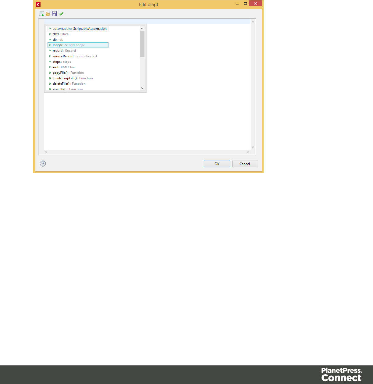
DataMapper User Interface
The DataMapper's user interface gives you several options to work with.
Page 110
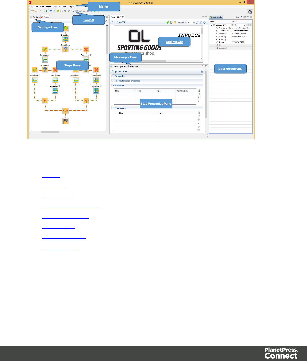

File Menu
lNew...: Opens the Creating a New Data Mapping Configuration dialog.
lOpen: Opens a standard File Open dialog. This dialog can be used to open Templates
and data mapping configurations.
lOpen Recent: List the most recently opened Templates and configurations. Clicking on a
template will open it in the Designer module, clicking on a data mapping configuration will
open it in the DataMapper module.
lClose: Close the currently open data mapping configuration or Template. If the file needs
to be saved, the appropriate Save dialog will open.
lClose All: Close any open data mapping configuration or Template. If any of the files
need to be saved, the Save Resources dialog opens.
lSave: Saves the current data mapping configuration or Template to its current location on
disk. If the file is a data mapping configuration and has never been saved, the Save As
dialog appears instead.
lSave As...: Saves the current data mapping configuration or Template to a new location
on disk. In the case of Templates, it is saved to a location that can be different than the
local repository.
lSave All: Saves all open files. If any of the open files have never been saved, the Save
As dialog opens for each new unsaved file.
lRevert: Appears only in the Designer module. Reverts all changes to the state in which
the file was opened or created.
lAdd Data: Adds data either to the current data mapping configuration or to the open
template. In data mapping configuration
lFrom File...: Opens the dialog to add a new data file to the currently loaded data
mapping configuration. Not available if the currently loaded data mapping
configuration connects to a database source.
lFrom Database...: Opens the Edit Database Configuration dialog. Not available if
the currently loaded data mapping configuration is file-based.
lSend to Workflow: Opens theSend to Workflow dialog to send files to a local
PlanetPress Workflow software installation.
lExit:Closes the software. If any of the files need to be saved, the Save Resources dialog
opens.
Page 112

Edit Menu
lUndo: Undoes the previous action.
lRedo: Redoes the last action that was undone.
lCut Step: Removes the currently selected step and places it in the clipboard. If the step is
a Repeat or a Condition, all steps under it are also placed in the clipboard. If there is
already a step in the clipboard, it will be overwritten.
lCopy Step: Places a copy of the currently selected step in the clipboard. The same
details as the Cut step applies.
lPaste Step: Takes the step or steps in the clipboard and places them in the Steps after
the currently selected step.
lDelete Step: Deletes the currently selected step. If the step is a Repeat or Condition, all
steps under it are also deleted.
lCut: Click to remove the currently selected step, or steps, and place them in the clipboard.
lCopy: Click to place a copy of the currently selected step, or steps, in the clipboard.
lPaste: Click to place any step, or steps, from the clipboard before the currently selected
step in the Steps Pane.
Data Menu
lHide/Show datamap: Click to show or hide the icons to the left of the Data Viewer that
displays how the steps affect the line.
lHide/Show extracted data: Click to show or hide the extraction selections indicating that
data is extracted. This simplifies making data selections in the same areas and is useful
to display the original data.
lValidate All Records: Runs the Steps on all records and verifies that no errors are
present in any of the records. Errors are displayed in the Messages Pane.
Steps
lIgnore Step: Click to set the step to be ignored (aka disabled). Disabled steps do not run
when in DataMapper and do not execute when the data mapping configuration is
executed in Workflow. However, they can still be modified normally.
lAdd Extract Step: Adds an Extract Step with one or more extract fields. If more than one
line or field is selected in the Data Viewer, each line or field will have an extract field.
Page 113

lAdd Goto Step: Adds a Goto step that moves the selection pointer to the beginning of the
data selection. For instance if an XML node is selected, the pointer moves to where that
node is located.
lAdd Condition Step: Adds a condition based on the current data selection. The "True"
branch gets run when the text is found on the page. Other conditions are available in the
step properties once it has been added.
lAdd Repeat Step: Adds a loop that is based on the current data selection, and
depending on the type of data. XML data will loop on the currently selected node, CSV
loops for all rows in the record. In Text and PDF data, if the data selection is on the same
line as the cursor position, the loop will be for each line until the end of the record. If the
data selection is on a lower line, the loop will be for each line until the text in the data
selection is found at the specified position on the line (e.g. until "TOTAL" is found).
lAdd Extract Field: Adds the data selection to the selected Extract step, if an extract step
is currently selected. If multiple lines, nodes or fields are selected, multiple extract fields
are added simultaneously.
lAdd Multiple Conditions: Adds a condition that splits into multiple case conditions.
lAdd Action Step: Adds a step to run one or more specific actions such as running a
JavaScript expression or setting the value of a Source Record Property.
View Menu
lZoom In: Click to zoom in the Steps Pane.
lZoom Out: Click to zoom out the Steps Pane.
Window Menu
lShow View
lMessages: Shows the Messages Pane.
lSteps: Shows the Steps Pane.
lSettings: Shows the Settings Pane.
lRecord: Shows the Record Pane.
lDetail tables : Each detail table and nested table is listed here. Click on one to
show it in the Data Model Pane.
lStep Properties: Shows the Step Properties Pane.
Page 114

lReset Perspective: Resets all toolbars and panes to the initial configuration of the
module.
lPreferences: Click to open the Preferences dialog.
Help Menu
lSoftware Activation: Displays the Software Activation dialog. See Activating your
license.
lHelp Topics: Click to open this documentation.
lContact Support: Click to open the Objectif Lune Contact Page in the default system
Web browser.
lAbout PlanetPress Connect Designer: Displays the software's About dialog.
lWelcome Screen: Click to re-open the Welcome Screen.
Panes
The following topics explain in detail the different panes of the DataMapper Interface.
Data Model Pane
The Data Model pane displays the result of all the preparation and extraction done by the
process. The pane displays the content of a single record within the Record Set.
Note
The order in which these panes were presented corresponds to the order in which they are normally
used to create a data mapping configuration.
Data is displayed as a tree view, with the root level being the Record table, levels below it
being detail tables, and any level below being called Nested Tables.
The Data Model is also used as a navigation tool between records and all tables.
Adding Data
Beyond the methods for adding data described in the Steps Pane and the Data Viewer, there is
a specific way to add an Extract step directly into the Data Model pane, which is drag & drop:
Page 115
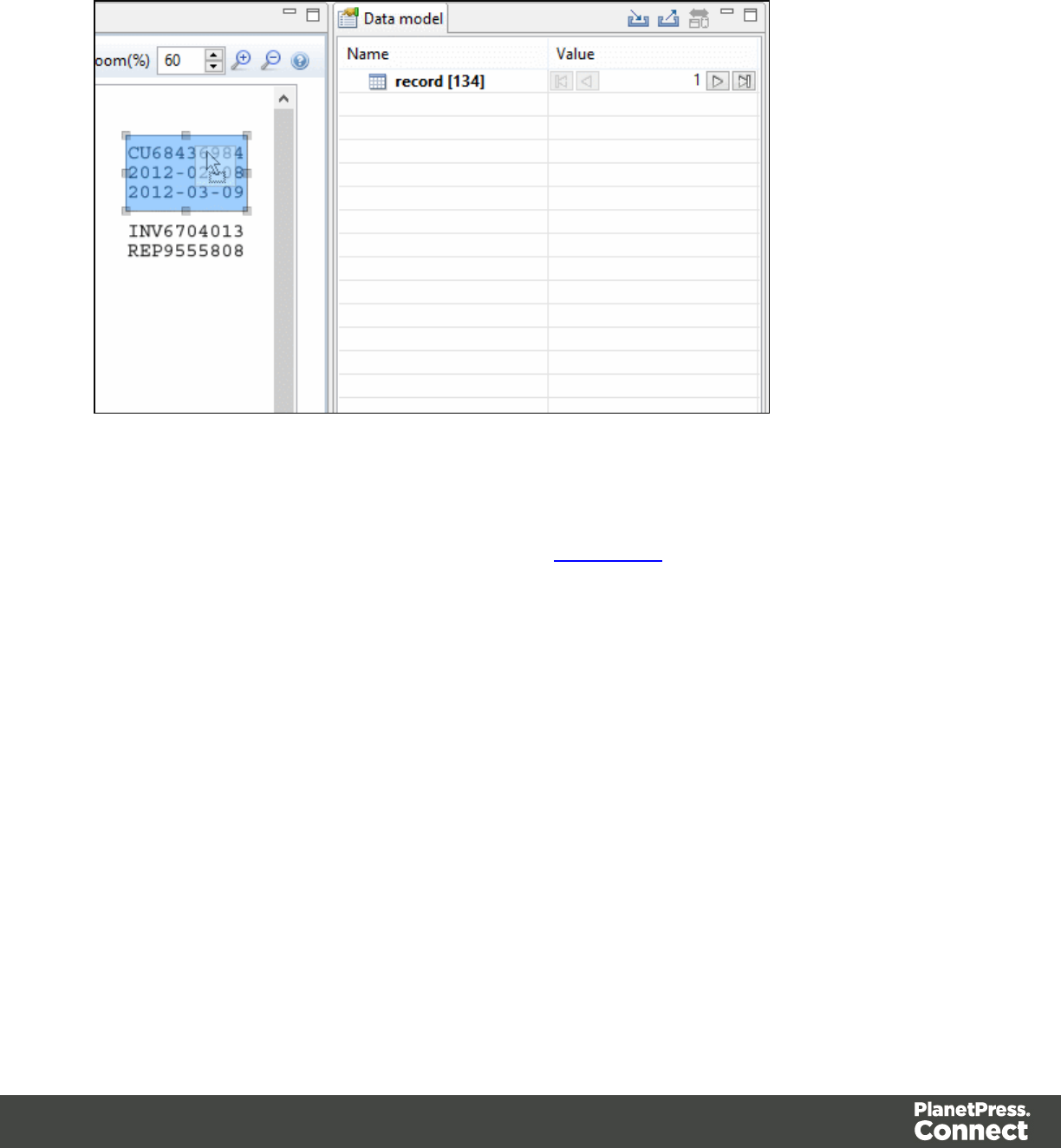
Dragging a data selection (text and PDF) or a field (CSV, XML and Database) into the Data
Model pane will automatically add the appropriate extraction method into a specific location.
There are some specific tricks and limitations, however:
lIf no Extract step is currently selected in the Steps Pane, a new Extract step is created. If
an Extract step is selected, new Extract Fields are added to this existing step.
lDragging a data selection or fields into a specific level of the Data Model (Record or detail
tables) will add the fields to that level.
lWhen dragging data into a detail table, the Extract Step must be located within the
appropriate Repeat Step, otherwise the extract will not function properly.
lIf a Data Model is loaded into the Data Model Pane, when dragging named fields (CSV,
XML, Database), if a field of the same name exists in that level, the extract field extract the
data to that field, otherwise it creates a new one.
lDragging a single field onto a Data Model field will extract to that field regardless of name.
Modifying the Data Model
It is possible to modify the fields within the Data Model pane, effectively generating data
models, even if no data is present in the pane. To do this, use the contextual menu within the
pane itself. The following options appear depending on the selected line when right-clicking:
Page 116
lAdd a field: Click to add a new field at the current level (record or table). Enter the field
name in the dialog and click OK to add it.
lAdd a table: Click to add a new table at the current level (record or existing table). Enter
the table name in the dialog and click OK to add it.
lRename: Click to rename the selected table or field. Enter the new name and click OK to
rename. Only available for empty Data Model Fields (see below) tables that only contain
them.
lDelete: Click to delete the selected table or field. Only available for empty Data Model
Fields or tables that only contain them.
lSet Type: Use the list to select which the field type (see Data Types). Only available for
empty Data Model Fields or tables that only contain them.
lDefault Value: Click to set the default value for empty Data Model Fields. This value is
used if no extraction is present, or if an extraction attached to this field returns no value.
Field Display
Fields in the Data Model pane are displayed in specific ways to simplify comprehension of the
display data:
lValue: The current value of the extracted field, based on the current Source Record.
lThe column on the left displays the name of the field. The column on the right displays
the extracted data if it exists.
lThe column on the right displays the current valueof the extracted field based on the
current Source Record, when anExtract Step has an extraction for this field.
lThe icon to the left of the name indicates the Data Type of the field (see Data Types).
lA field name with an asterisk to the right indicates that this field is part of an imported
Data Model file (called a Data Model Field).
lA field with a grey background indicates this Data Model Field does not have any
attached extracted data.
lA field with a white background indicates that the field has attached extracted data but
the step extracting the data is not currently selected.
lA field with a blue background indicates that the field has attached extracted data and
the step extracting the data is currently selected.
Page 117

Record Navigation
Records can be navigated directly from the Data Model Pane. The default Record level
navigates between records both in the Data Model pane and the Data Viewer, while each table
has a similar navigation that influence that table and each under it.
lExpand/Contract: Click to hide or show any fields or tables under the current table level.
lTable Name: Displays the name of the table as well as the number of records at that level
(in [brackets]). At the Record level this is the number of Source records (affected by the
Boundary settings, Preprocessor and the Record Limit setting). In other levels it
represents the number of entries in a table.
lNumber of Records: The number of available records in the Data Sample. Affected by
the Boundary settings, Preprocessor and the Record Limit setting.
lFirst Record: Jumps to the first record in the Data Sample. Disabled if the first record is
already shown.
lPrevious Record: Moves to the previous record in the Data Sample. Disabled if the first
record is already shown.
lCurrent Record: Displays the current record or table entry. Type in a record number and
press the Enter key to display that record. The number has to be within the number of
available records in the Data Sample.
lNext Record: Moves to the next record in the Data Sample. Disabled if the last record is
already shown.
lLast Record: Jumps to the last record in the Data Sample. Disabled if the last record is
already shown. If a Record Limit is set in the Settings Pane, the last record will be within
that limit.
Importing/Exporting Data Models
Within the Data Model pane, data model files can be exported using the current structure, or
imported in order to simplify the extraction process.
Importing and Exporting Data Models is done from within the Data model Pane, using the top-
right icons and .
Page 118

Rules for importing:
lImported Data Model fields always overwrite existing field properties when the field name
is the same. Non-existent fields are created automatically with the appropriate field
settings. The import is case-insensitive, so fields with a different case will be ignored.
lAll data model fields are tagged with the Asterisk (*). If overwriting an existing data model,
existing data model fields that are not in the imported data model file will have their
asterisks removed.
Dynamically Added Fields
There are a number of instances where data needs to be added to the data model after the
initial data mapping operation has been performed. For instance, you might need to add a
cleansed postal address next to the original address. Or use a Workflow process to retrieve a
value from a Database and add it to the data record. However, the data model is not extensible.
Once a data record has been created, the contents of its fields can be updated but not its
structure.
A new Extradata field is automatically created at every level of each data record. That means
the record itself gets an Extradata field, and each detail table also gets one.
This is what it looks like from the Designer interface:
Page 119
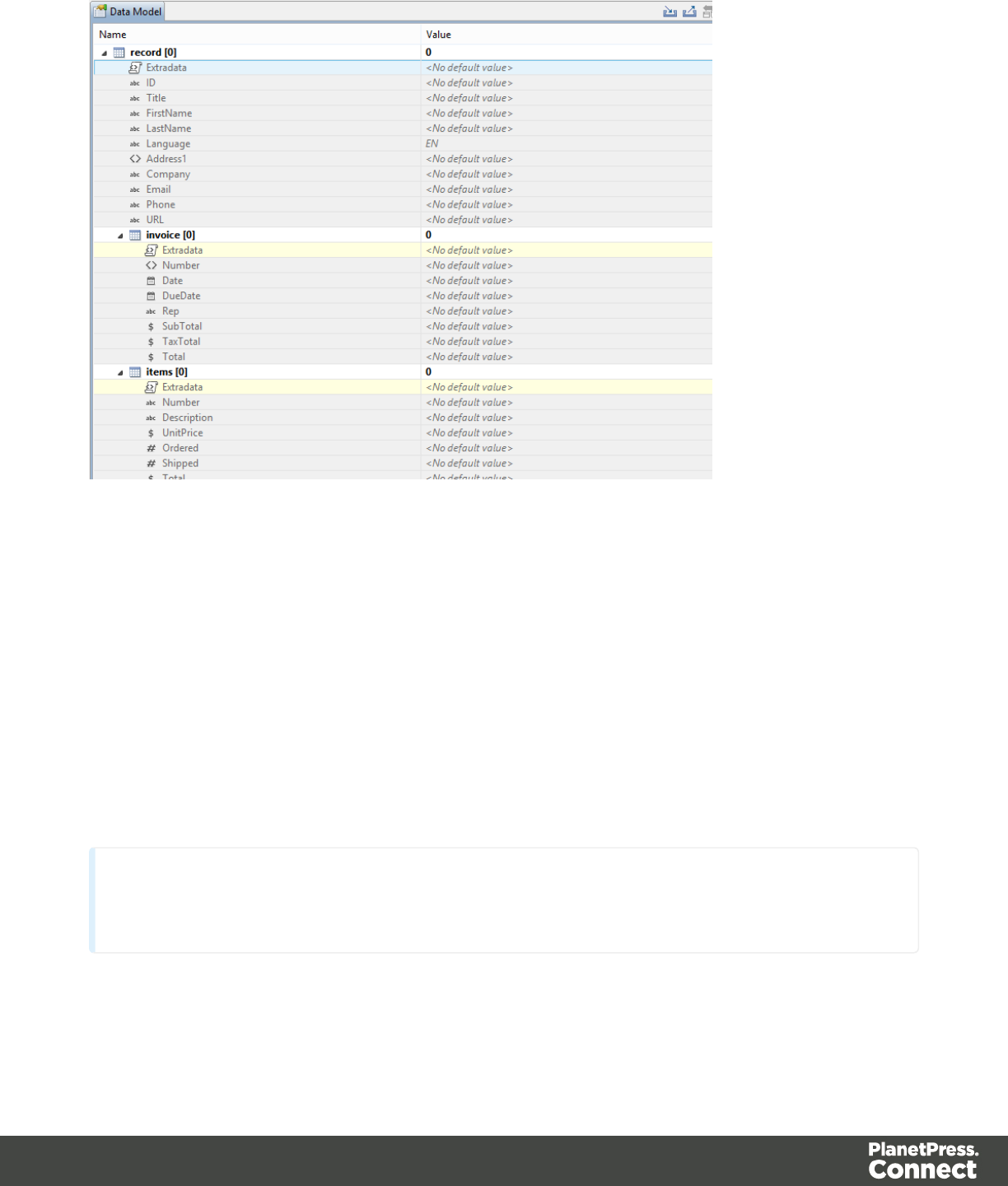
The field is not visible in the DataMapper because no data can be extracted into it during the
data mapping process. But it will be visible in the Designer, even for existing data models.
The only way to add a value to the Extradata field is by using a PlanetPress Connect Workflow
process. For example, It could basically include the following steps (2 and 3 are optional):
1. Start the data mapping process.
2. Save the Metadata.
3. Create a database with the Metadata.
4. Add a value to the Extradata field of this database.
Note
Steps 2, 3 and 4 can also be replaced by the Update Data Record plugin or by using a REST call.
Please refer to PlanetPress Connect Workflow documentation for more information.
Page 120
Detail Tables
Detail tables contain transactional data that is created when an Extract step is added within a
Repeat step.
In the most basic of transactional systems, a single detail table is used. However, it is possible
to create multiple detail tables, as well as nested tables. When detail and nested tables are
present in the record, they are displayed as separate levels in the Data Model (see The Data
Model Interface for more information).
Multiple detail tables
Multiple detail tables are useful when more than one type of transactional data is necessary, for
instance if two different type of fields are used for different types of data. One example of this
would be invoice data containing purchases (items with a set price, quantity, item number) as
well as services (service with a price, frequency, contract end date, etc).
Creating more than one detail table is simple. Click the Extract steps and change the name of
tables from record.details to something else. In the following example, we will create two
tables called record.purchases and record.services.
Page 121
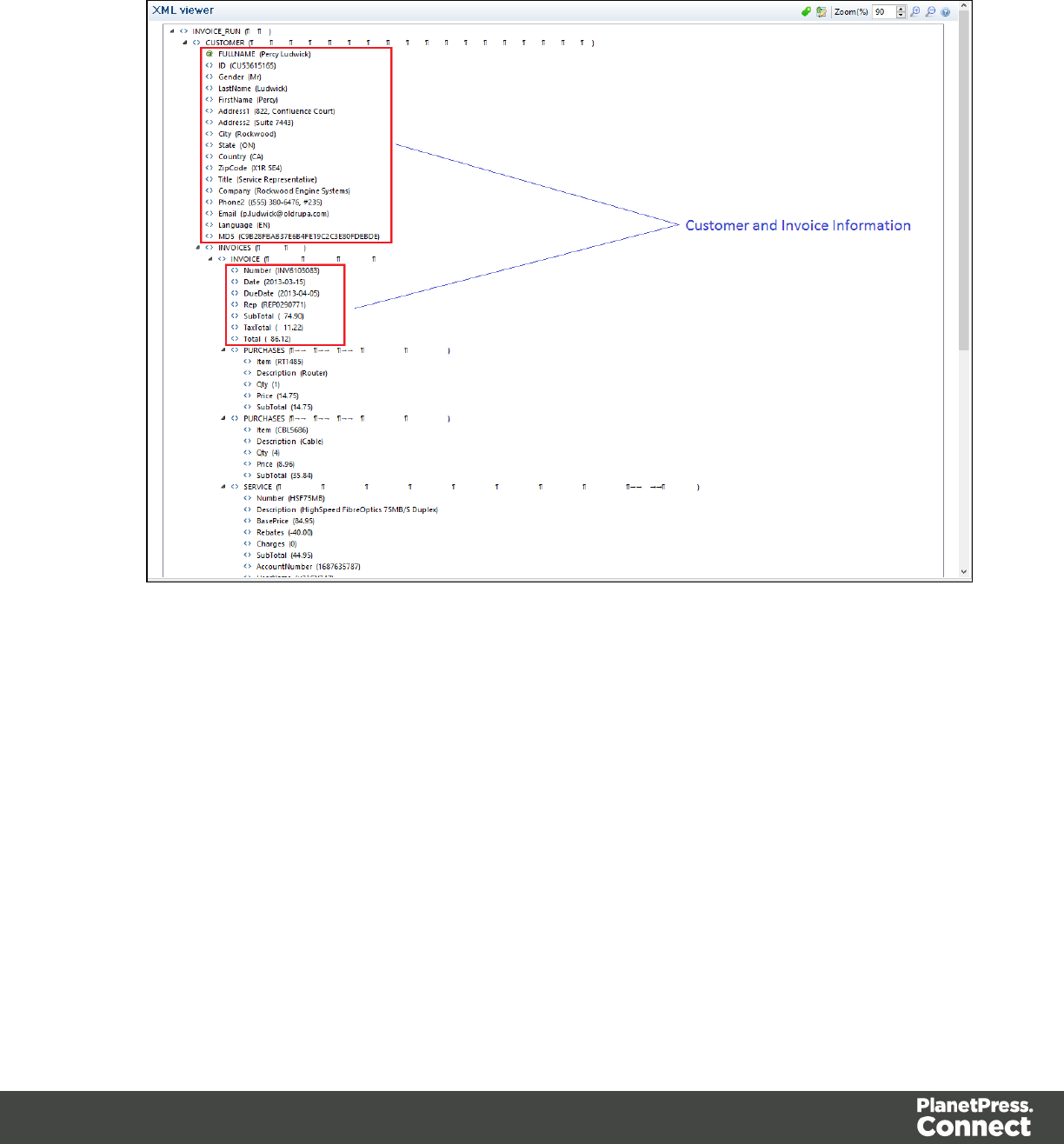
Example
1. Data Overview.
Page 122
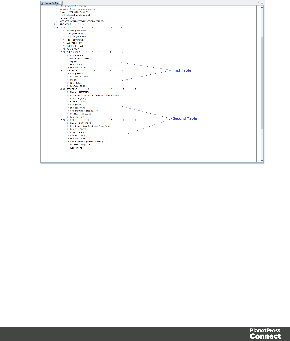
Page 123
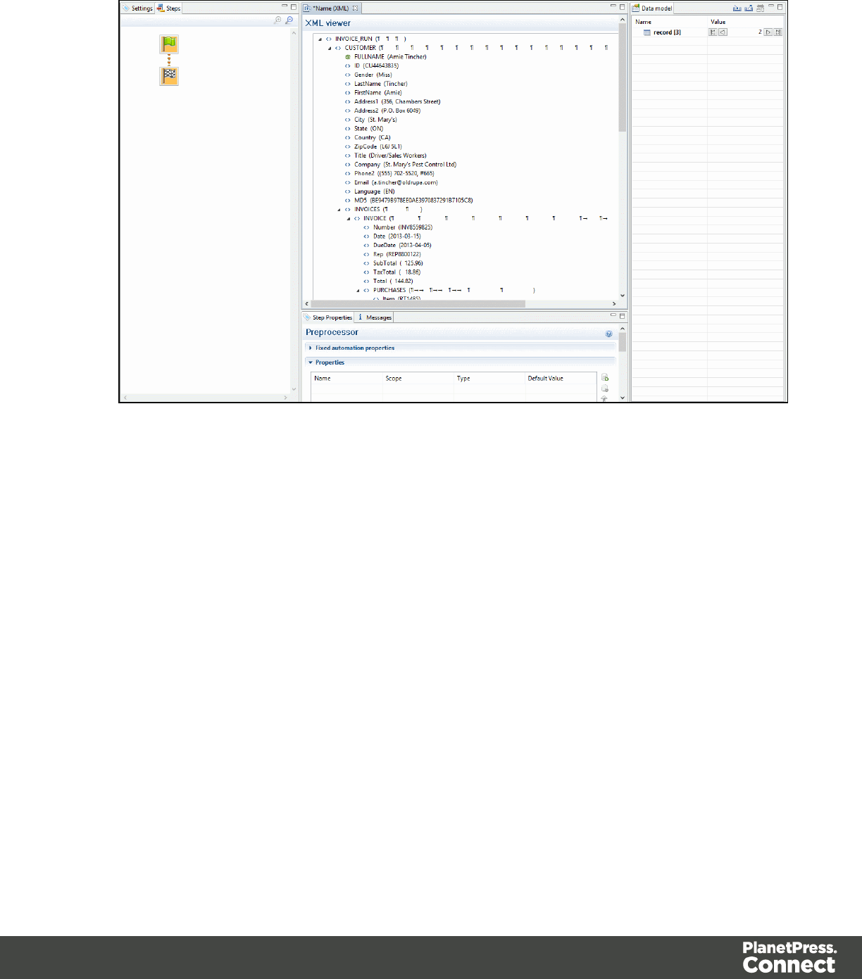
2. Extracting Customer and Invoice information.
Page 124
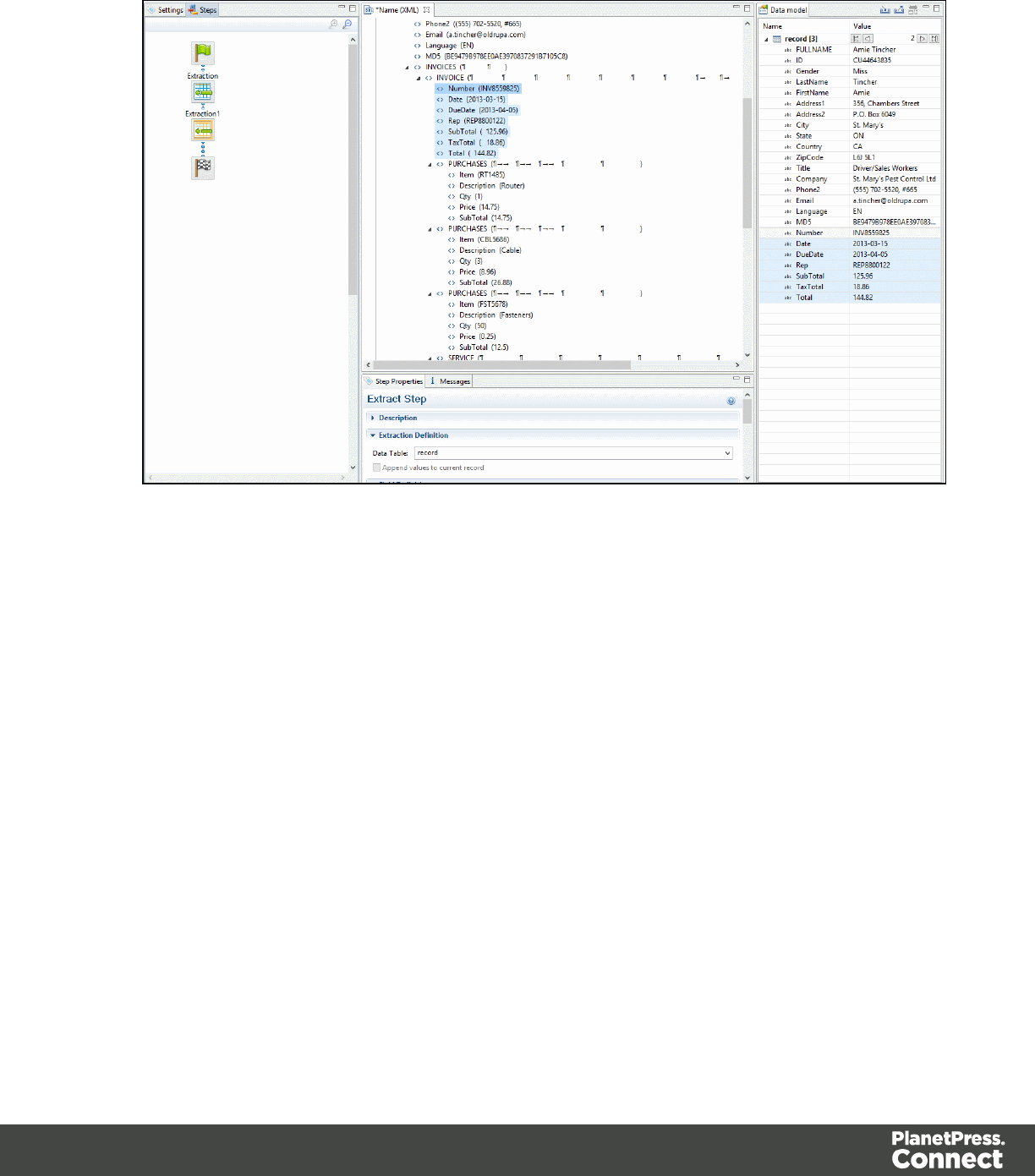
3. Extracting Transactional Data.
Page 125
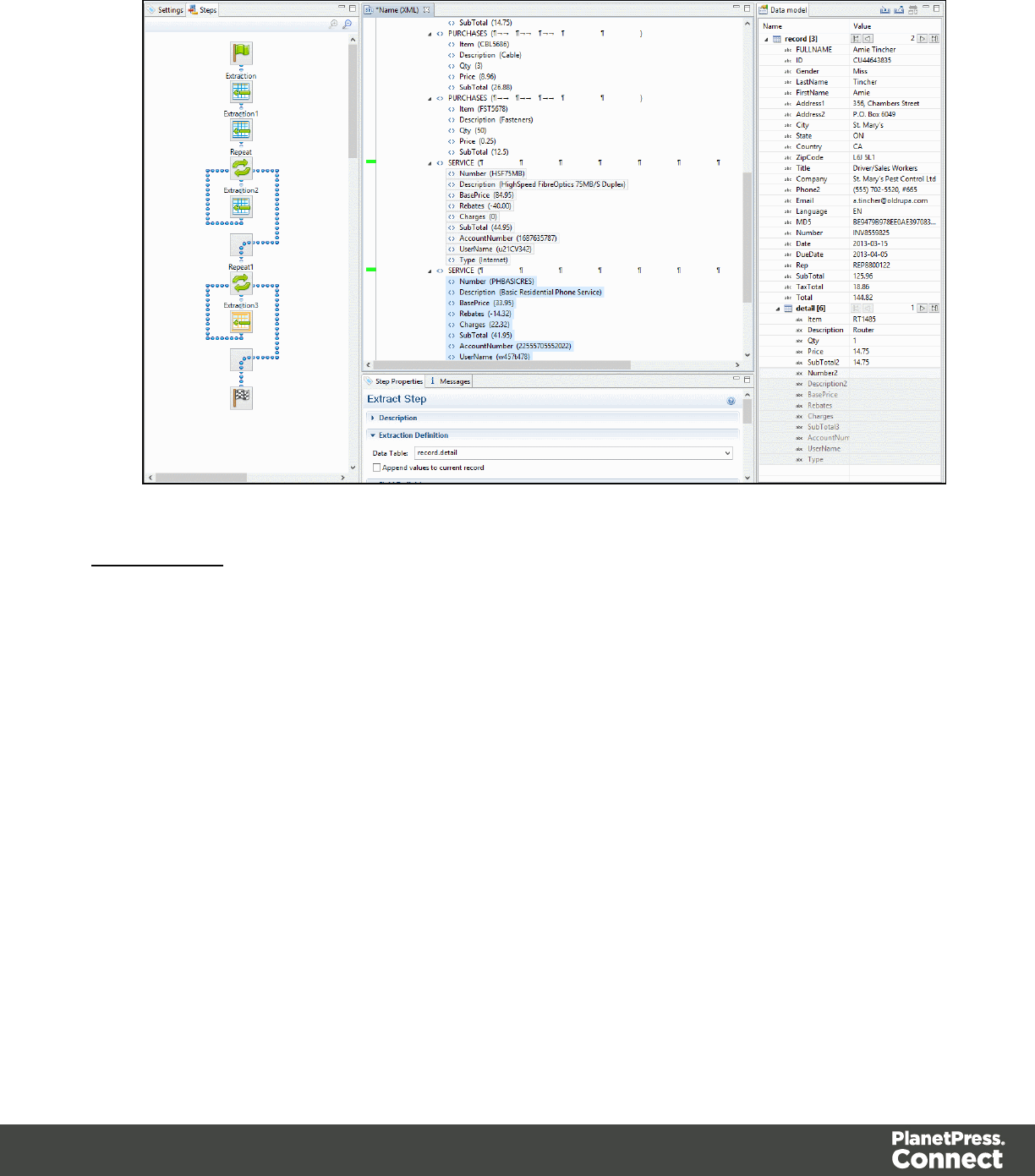
4. Renaming Tables.
Nested Tables
Nested detail tables are used to create transactional data that is relative to other data. An
example of this would be an invoice for a multi-service provider. In this example, a first table
contains services (Internet, Cable, Home Phone, Mobile), while one or more nested tables
giving details for charges and rebates on each of those services.
Nested tables are created in a similar fashion to multiple detail tables, with the difference that
the dot notation contains multiple levels. In the example above, tables could be called
record.services , record.services.charges, record.services.details , where "charges" includes all
service prices and rebates, and "details" includes extra items such as movie rentals or long
distance calls.
For the tables to be actually nested, the Repeat and its Extract step that extract the "charges"
and "details" information must be located within the Repeat step that extracts data to
"record.services". In such a setup, "record.services.charges" is a child table of
"record.services", and one "charges" table is created for each row in the "services" table.
Page 126
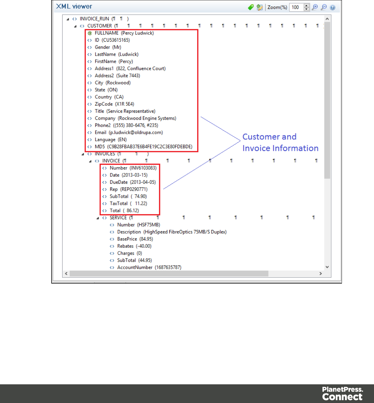
Example
1. Data Overview.
Page 127
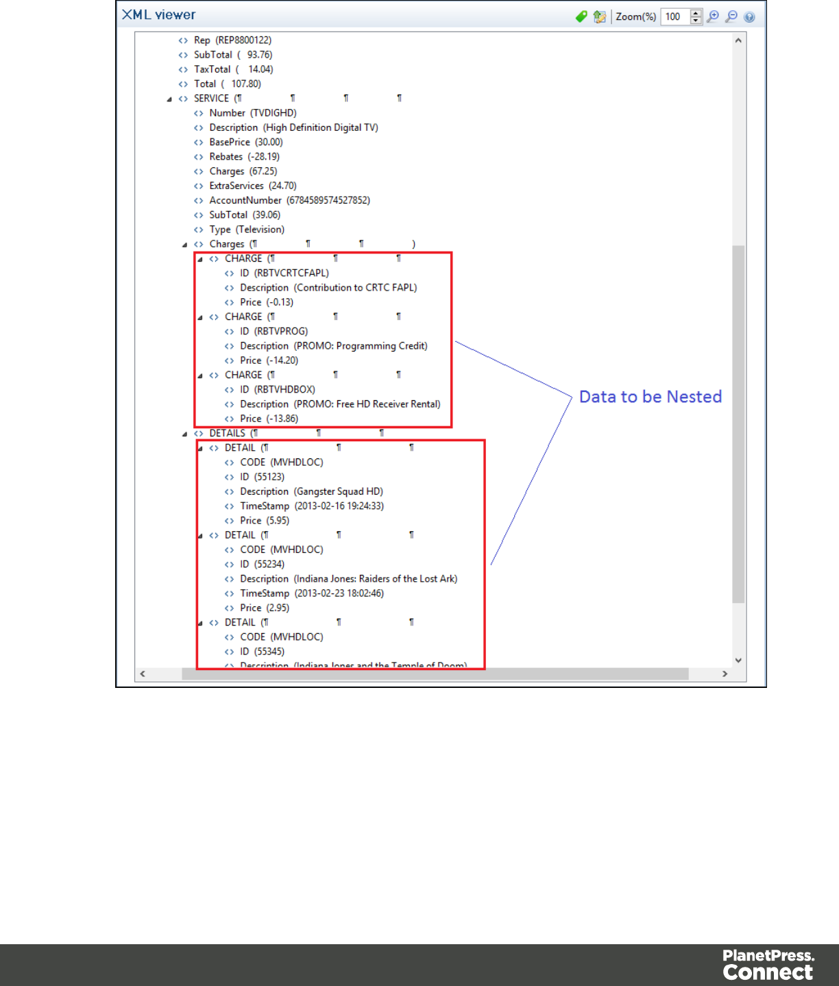
Page 128
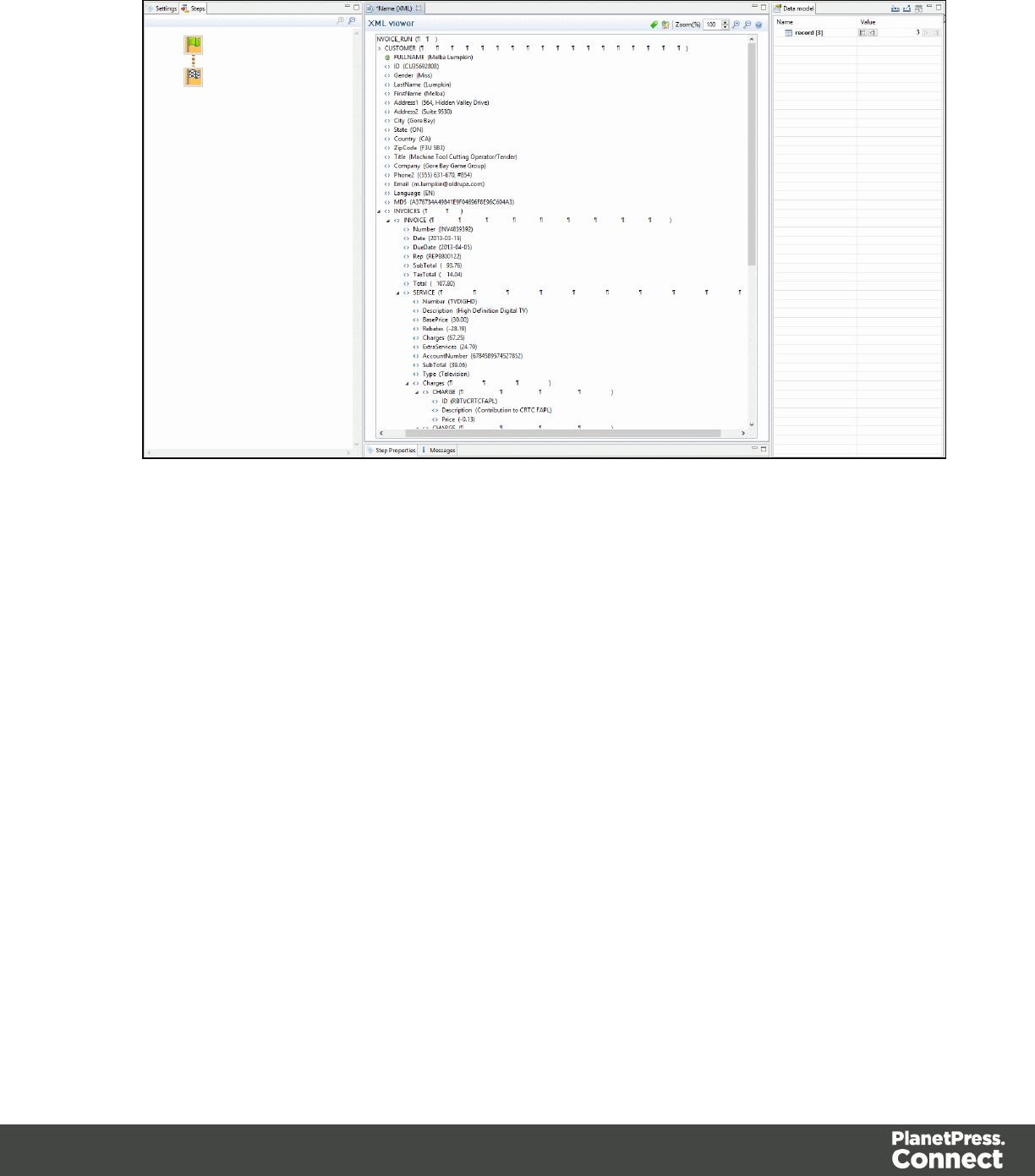
2. Extracting Customer and Invoice information.
Page 129
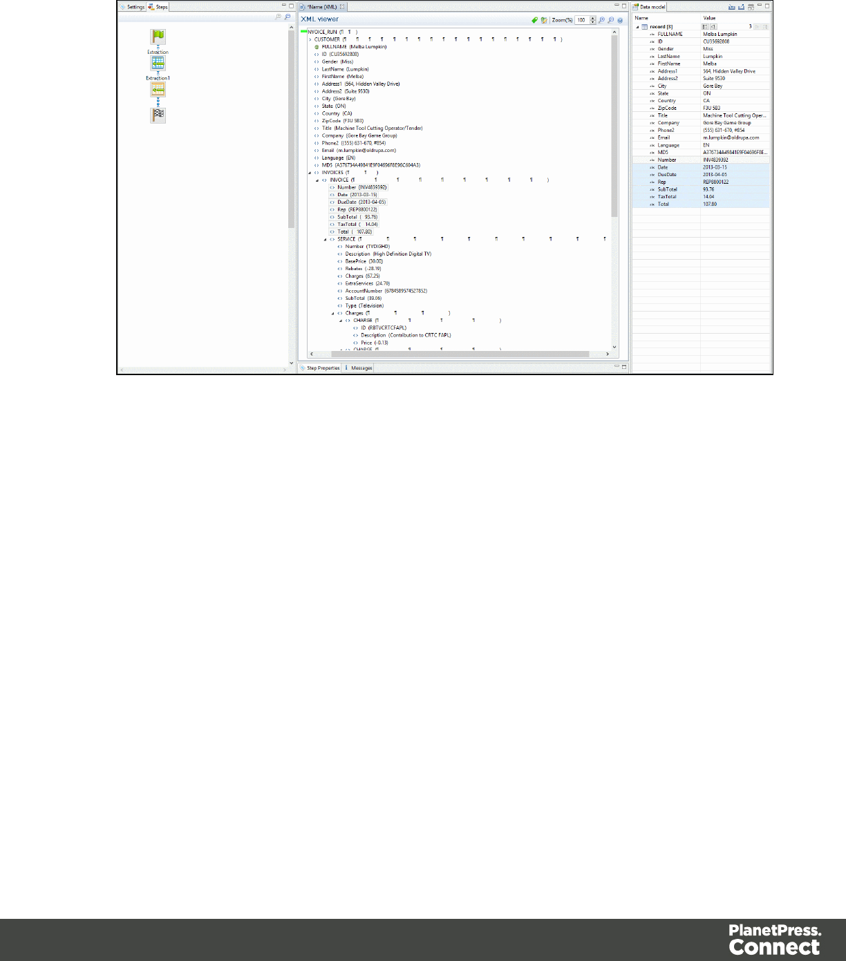
3. Extracting Transactional Data for the First Table.
Page 130
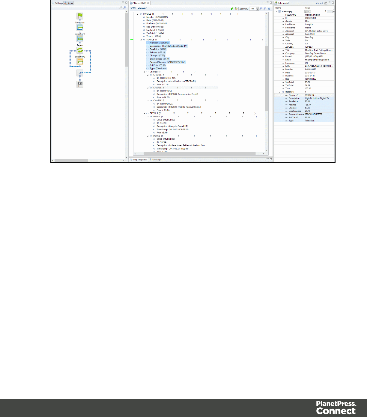
4. Extracting Transactional Data for Nested Tables.
Page 131
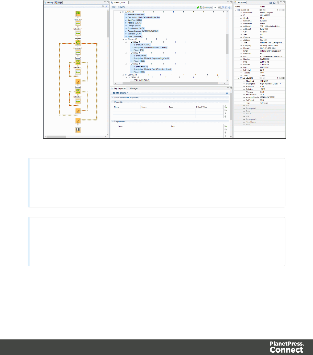
5. Renaming Tables.
Note
Creating nested tables is currently an advanced feature, and using these nested tables in the
Designer module requires some amount of coding.
Note
For more information about operations that can be performed on tables, please refer to The Data
Model Interface
The Data Viewer
The Data Viewer is a central part of the module, as the most important aspect of the
DataMapper is obviously the data. It displays the content of the Data Source that is currently
loaded in the DataMapper in a way that is easy to view and interact with. What is seen in the
Page 132

Data Viewer, however, is not simply the raw Data Source. It is formatted to fit your screen and
can be modified through the use of a Preprocessor. The Data Viewer itself is surrounded by two
different areas: the toolbar at the top and the data map on the left. The toolbar is used to control
a few options in the viewer. For example, with a text file Data Source, the font displaying the
text can be changed. A button can also hide the data map, and zoom controls are also
available. Some of the toolbar features may be unavailable, depending on the Data Source
type. The data map on the left gives you precise indications on how the cursor moves within the
DataMapper. The cursor defines where data extraction starts. It starts at the top left of the
screen and moves down as you go through the data. Data is always extracted using an offset or
a relative position from the current cursor location. This is how totals can be extracted at the
end of an invoice with a variable number of lines, since the total is always from the same
distance to the last line of the invoice. The offset is always the same. The data map can
therefore indicate loops,gotos as well as condition results for each line.
When the Delimiter and Boundary options are set in the Settings Pane, the Data Viewer reflects
those changes and can display more than one unit of the data sample (page, XML node, CSV
line, etc.), depending on these options.
Data Selection
There are three different ways to create a data selection inside the Data Viewer, depending on
the Data Source type that is currently loaded. Data selections can be used for Condition,
Repeat and Extraction steps.
Tabular Data
Tabular data is displayed in a table where multiple fields appear for each line or row in the
original data. Selections can only be done on each line, meaning you cannot select data from
multiple rows at the same time. You can select multiple fields at once in the same row using
features you would expect. Click & drag to select multiple fields or use CTRL-click and SHIFT-
click combinations.
PDF and Text
PDF and text are both handled in basically the same way. You can select any area of one or
more lines on the page. These selections can be moved and resized simply by dragging them
and using the respective resize handles. As long as data selections exist, any step you add
does not remove that data selection.
Page 133

Here is a small trick to extract multiple lines. Make a selection for the first line, click on Add
Extract Step, move the selection to the next line, then click Add Extract Field and so on until
the end of the data you want to extract. To actually use the data selection instead of moving it,
use the drag icon at the right of the selection and drag it into the Data Model pane to create an
extraction.
PDF and text Data Sources are unique in the sense that, if you select any extracted field in the
Data Model pane or an extract step, you can change the data selection for that extracted field in
the same way you move and resize data selections. This will modify the extraction properties
for that field.
XML
XML data is displayed as a tree view inside the Data Viewer. You can select multiple fields
inside an XML file using SHIFT-click and CTRL-click even if those fields are on different levels.
So if you start with the full name and end at the Total field, you can select all of them and drag
them into the Data Model pane for a quick extract step. You can also collapse any XML level if
you are not using it or do not need to see its content. Note that specifically for XML files, in most
cases it is not necessary to use a Goto step. For example, if a Repeat step is added, you can
see that a Goto is not added before or within th loop. This is because XML has its own method
of moving through the file, "Xpath", and we take advantage of this in the software. Once data is
extracted from the Data Source, it is possible to see exactly where all the data comes from.
Clicking on any Extract step highlights any area from which it extracts data. You can also click
on the Preprocessor step to select all the steps in the workflow to show a complete map of all
the data extracted from the Data Source. As you may have already realized, there are multiple
ways to interact with the Data Viewer, especially when creating data selections and using them
to create steps. Dragging a data selection into the Data Model pane will extract the data to the
selected location, either the record itself or the detail table. If any extract step is already
selected, fields are added to it. Dragging a data selection into an existing extract step forces
new fields to be added. A new extract step is never created. Right-clicking on a data selection
displays the actions (contextual menu) that can be done with that selection or the steps that can
be added to them. That menu also displays the keyboard shortcuts.
Window Controls
The following controls appear at the top of the Data Viewer:
lFont (Text file only): Use the drop-down to change the font used to display text. Useful for
double-byte data. It is recommended that monospace fonts be used.
Page 134
lHide/Show line numbers (Text file only): Click to show or hide the line numbers on
the left of the Data Viewer.
lHide/Show datamap : Click to show or hide the icons to the left of the Data Viewer
which displays how the steps affect the line.
lHide/Show extracted data : Click to show or hide the extraction selections indicating
that data is extracted. This simplifies making data selections in the same areas and is
useful to display the original data.
lLock/Unlock extracted data : Click to lock existing extraction selections so they
cannot be moved or resized. This simplifies making data selections in the same area.
lZoom Level: Use the arrows to adjust the zoom level, or type in the zoom percentage.
lZoom In (CTRL +) : Click to zoom in by increments of 10%
lZoom Out (CTRL -) : Click to zoom out by increments of 10%
Additional Keyboard Shortcuts for XML Files:
l+(while on an XML node with children): Expand the XML Node
l-(while on an XML node with children): Collapse the XML node, hiding all its children
nodes.
Contextual Menu
You can access thecontextual menu using a right-click anywhere inside the Viewer window:
Note
The Add Extract Field item is available only after an Extract step has been added to the
workflow.
Page 135
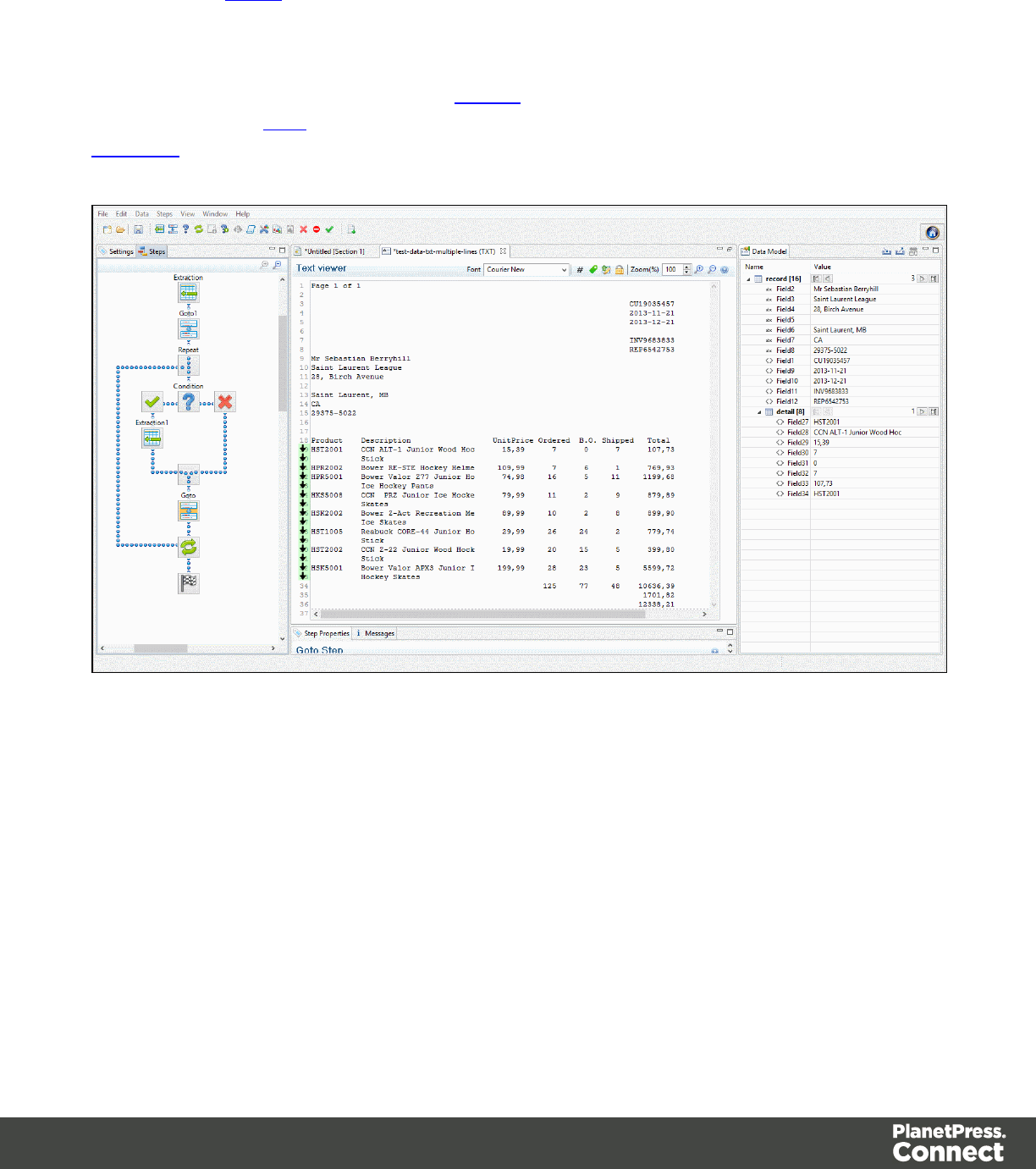
For more information about the different steps that can be added to a Data Mapping workflow,
please refer to Steps.
Operations
In the following example, clicking on the Repeat step shows in which lines the loop takes
place. Click on the Goto within the loop to show which lines are skipped. Clicking on a
Condition shows whether that condition is true or false for each line.
Drag and drops from the Viewer window to the Data Model pane can be performed to extract
data.
Page 136
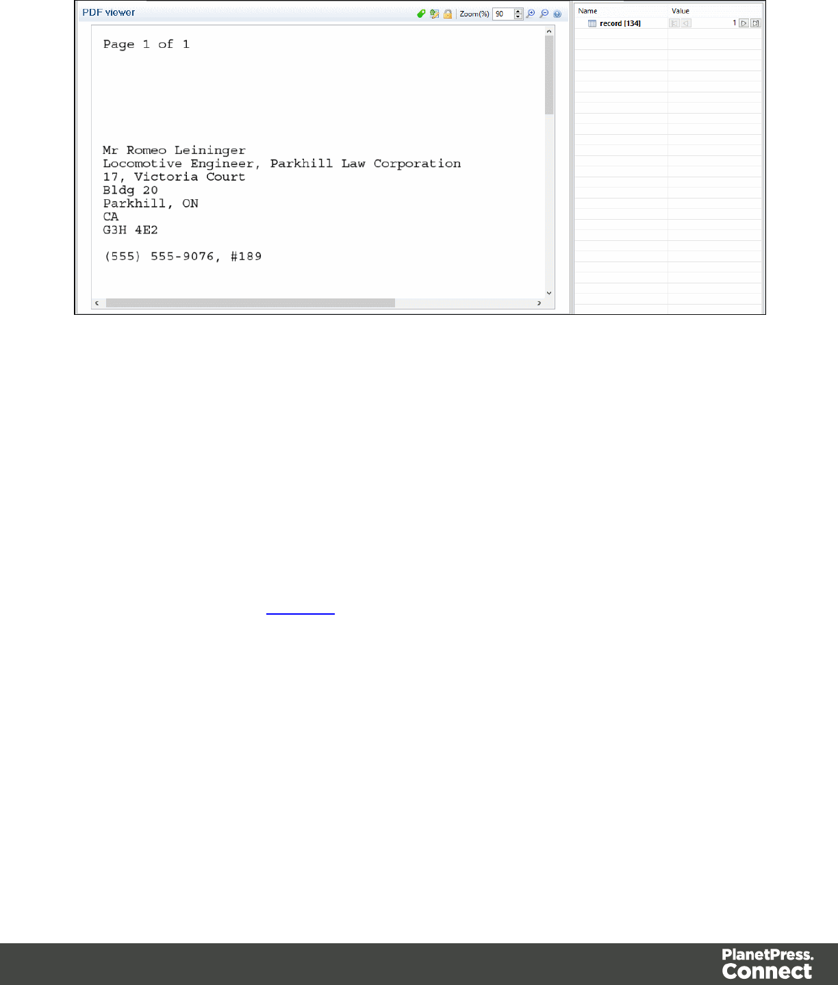
Messages Pane
The Messages pane is shared between the DataMapper and Designer modules and displays
any warnings and errors from the data mapping configuration or template.
At the top of the Message pane are control buttons:
lExport Log: Click to open a Save As dialog where the log file (.log) can be saved on
disk.
lClear Log Viewer: Click to remove all entries in the log viewer.
lFilters: Displays the Log Filter .
lActivate on new events: Click to disable or enable the automatic display of this dialog
when a new event is added to the pane.
lTime: The date and time when the error occurred.
lType: Whether the entry is a warning or an error.
lSource: The source of the error. This indicates the name of the step as defined in its step
properties.
lMessage: The contents of the message, indicating the actual error.
Page 137

Log Filter
The log filter determines what kind of events are show in the Messages Pane.
lEvent Types group:
lOK: Uncheck to hide OK-level entries.
lInformation: Uncheck to hide information-level entries.
lWarning: Uncheck to hide any warnings.
lError: Uncheck to hide any critical errors.
lLimit visible events to: Enter the maximum number of events to show in the Messages
Pane. Default is 50.
The Settings Pane
The Delimiter, Boundary setting, and a list of Data Samples used in the current data mapping
configuration can be found under the Settings tab. The available options depend on the type of
data sample that is loaded. For more information about Delimiters and Boundaries, see
Configuring The Data Source (Settings).
The Input Data (Delimiters)
Delimiters are borders that naturally separate blocks of data in the Data Sample and they differ
for each data type. For example, a CSV is delimited by record, and PDF files are delimited
naturally by pages.
For a CSV File
In a CSV file, data is read line by line, where each line can contain multiple fields. Even though
CSV stands for comma-separated values, CSV can actually refer to files where fields are
separated using a number of separators, including commas, tabs, semicolons, pipes or any
other character. The input data selection is required so you can specify to the DataMapper
module how the fields are separated. This is done using the field Separator. The other
important option is the Text delimiter, which is used to wrap around each field just in case the
field values contain the field separator. This ensures that, for example, the field “Smith John” is
not interpreted as two fields, even if the field delimiter is the semicolon.
Page 138
lField separator: Defines what character separates each fields in the file.
lText delimiter: Defines what character surrounds text fields in the file, preventing the
Field separator from being interpreted within those text delimiters.
lComment delimiter: Defines what character starts a comment line.
lEncoding: Defines what encoding is used to read the Data Source (US-ASCII, ISO-
8859-1, UTF-8, UTF-16, UTF-16BE or UTF-16LE ).
lLines to skip: Defines a number of lines in the CSV that will be skipped and not used as
Source Records.
lSet tabs as a field separator: Overwrites the Field separator option and sets the Tab
character instead for tab-delimited files.
lFirst row contains field names: Uses the first line of the CSV as headers, which
automatically names all extracted fields.
lIgnore unparseable lines: Ignores any line that does not correspond to the settings
above.
For a PDF File
PDF files already have a clear and unmovable delimiter: pages. So the settings in the input
area are not used to set delimiters of PDF files. Instead, this opportunity can be taken to add
some options on how text is read from the PDF when creating data selections. These options
determine how PDF words, lines and paragraphs are detected. For instance, the line spacing
option determines the spacing between lines of text. The default value is "1", meaning the
space between the top of each line must be equal to at least the average character height.
Note
PDF Files have a natural, static delimiter in the form of Pages, so the options here are interpretation
settings for text in the PDF file. Each value represents a fraction of the average font size of text in a
data selection, meaning "0.3" represents 30% of the height or width.
lWord spacing: Determines the spacing between words. As PDF text spacing is
somehow done through positioning instead of actual text spaces, text position is what is
used to find new words. This option determines what percentage of the average width of a
single character needs to be empty to consider a new word has started. Default value is
"0.3", meaning a space is assumed if there is a blank area of 30% of the width of the
Page 139

average character in the font.
lLine spacing: Determines the spacing between lines of text. The default value is 1,
meaning the space between lines must be equal to at least the average character height.
lParagraph spacing: Determines the spacing between paragraphs. The default value is
1.5, meaning the space between paragraphs must be equal to at least "1.5" times the
average character height to start a new paragraph.
lMagic number: Determines the tolerance factor for all of the above values. The tolerance
is meant to avoid rounding errors. If two values are more than 70% away from each other,
they are considered distinct; otherwise they are the same. For example, if two characters
have a space of exactly one times the width of the average character, any space of
between "0.7" and "1.43" of this average width is considered one space. A space of
"1.44" is considered to be 2 spaces.
lPDF file color space: Determines if the PDF if displayed in Color or Monochrome in the
Data Viewer. Monochrome display is faster in the Data Viewer, but this has no influence
on actual data extraction or the data mapping performance.
For Databases
Since data is being taken from a database instead of a data file, the input data option refers
more to the database itself rather than how to interpret the data. After all, databases all return
the same type of information. Because a database generally contains multiple tables, they can
all be listed here. Clicking on any of the tables shows the first line of the data in that table. If you
need more power, click on the Custom SQL button and work on your database using whatever
language the database supports. If it supports stored procedures, including inner joins,
grouping and sorting, it will work perfectly.
The following settings apply to any database or ODBC Data Sample.
lConnection String: Displays the connection string used to access the Data Source.
lTable: Displays the tables and stored procedures available in the database. The selected
table is the one the data is extracted from.
lEncoding: Defines what encoding is used to read the Data Source (US-ASCII, ISO-
8859-1, UTF-8, UTF-16, UTF-16BE or UTF-16LE ).
lBrowse button : Opens the Edit Database configuration dialog, which can replace
the existing database data source with a new one. This is the same as using the Replace
feature in the Data Samples window.
Page 140

lCustom SQL button : Click to open the SQL Query Designer and type in a custom SQL
query.
For a Text File
Because text files have many different shapes and sizes, there are a lot more options for the
input data in these files. You can add or remove characters in lines if you have a big header
you want to get rid of, or really weird characters at the beginning of your file. Set a line width if
you are still working with old line printer data and so on. It is still important, however, that pages
are defined properly. This can be done either by using a set number of lines or using the “P”
character - or if your data is a bit more complex, to detect text on the page. Be careful that these
are not Boundary settings but rather page settings in order to make sure you are configuring
these options to detect each new page and not each new Source Record.
lEncoding: Defines what encoding is used to read the Data Source (US-ASCII, ISO-
8859-1, UTF-8, UTF-16, UTF-16BE or UTF-16LE ).
lSelection/Text is based on bytes:Check for text files that use double-bytes characters
(resolves width issues in some text files).
lAdd/Remove characters: Defines the number of characters to add to, or remove from,
the head of the data stream. The spin buttons can also increment or decrement the value.
Positive values add blank characters while negative values remove characters.
lAdd/Remove lines: Defines the number of lines to add to, or remove from, the head of
the data stream. The spin buttons can also increment or decrement the value. Positive
values add blank lines while negative values remove lines.
lMaximum line length: Defines the number of columns on a data page. The spin buttons
can also increment or decrement the value. The maximum value for this option is 65,535
characters. The default value is 80 characters. You should tune this value to the longest
line in your input data. Setting a maximum data line length that greatly exceeds the length
of the longest line in your input data may increase execution time.
lPage delimiter type: Defines the delimiter between each page of data. Multiples of such
pages can be part of a Source Record, as defined by the Boundaries.
lOn lines: Triggers a new page in the Data Sample after a static number of lines
(called Lines per Page), or using a Form Feed character.
lOn text: Triggers a new page in the Data Sample when a specific string is found in
a certain location.
lWord to find: Compares the text value with the value in the Source Record.
lMatch case: Activates a case-sensitive text comparison.
Page 141
lLocation: Choose Selected area or Entire width to use the value of the
current data selection as the text value.
lLeft/Right: Use the spin buttons to set the start and stop columns to the
current data selection (Selected area) in the Source Record.
lLines before/after: Defines the delimiter a certain number of lines before or
after the current line. This is useful if the text triggering the delimiter is not on
the first line of each page.
For a XML File
XML is a special file format because these file types can have theoretically an unlimited
number of structure types. The input data has two simple options that basically determine at
which node level a new record is created. Use root node uses the complete XML file as a
single Source Record. The XML nodes option list all the node. Choosing one creates a new
delimiter every time that a node is encountered.
Note
The information contained in all of the selected parent nodes will be copied for each instance of that
node. For example, if a client node contains multiple invoice nodes, the information for the client
node can be duplicated for each invoice.
lUse root element: Locks the XML Elements option to the top-level element. If there is
only one top-level element, there will only be one record before the Boundaries are set.
lXML elements: Displays a list containing all the elements in the XML file. Selecting an
element causes a new page of data to be created every time an instance of this element
is encountered.
The Boundaries
When the Data Source is received by the DataMapper, it has no boundaries to tell the
DataMapper if it contains different records or where each of those records begins and ends.
This is because boundaries are not actual bits of data (like a character or a field would be).
Boundaries are a logical structure outside the Data Source (note that some formats like
PDF/VT actually include structured information, but those are the exception rather than the
rule). Boundaries are therefore a form of metadata. You could very well use the exact same
data with a different boundary structure in order to extract different information. Think, for
instance, of an Invoice Run stored in a PDF. You can use a structure where each invoice is a
Page 142

single record or you could group all invoices for one customer into a single record. So the
boundaries for each record can be completely dependent on how you want to use the data.
With no actual boundary markers inside the data, there needs to be a way to identify specific
locations in the input stream and mark those locations as record boundaries. Fortunately, every
single file format has intrinsic, natural delimiters that are used to identify chunks of related data.
These delimiters are key in helping us identify boundaries, so it is important to understand what
they are as well as when and why they occur in the Data Source.
Let's start with a seemingly arbitrary assumption: a boundary can only occur on a natural
delimiter. That is to say, a record boundary never occurs between delimiters; it only occurs on a
delimiter. The actual information we need to determine whether a delimiter can be a boundary
is very likely to be found between delimiters.
For a CSV or Database File
The natural delimiter for a CSV file is a data record, or to put it more visually, each line in a
spreadsheet or in a SQL data grid is a delimiter. Several such delimiters can be included in a
record, but you would never expect to find the end of one particular record right in the middle of
one of these lines in the grid. So the record occurs with a new line in the grid, but not on each
new line.
Since database data sources are structured the same way as CSV files, the options are
identical to these files. Boundaries will define how many lines appear for each Source Record.
This can be a static number of lines or it can be determined based on a field change that will
create a new record. For example, this can happen when the customer ID changes. There is
also an advanced scripting option to determine boundaries (see Javascript for Boundaries for
details).
lRecord limit: Defines how many Source Records are displayed in the Data Viewer. This
does not affect output production, as generating output ignores this option. To disable the
limit, use the value "0".
lLine limit: Defines the limit of detail lines in any detail table. This is useful for files with a
high number of detail lines, which in the DataMapper interface can slow down things.
This does not affect output production, as generating output ignores this option. To
disable the limit, use the value "0".
lTrigger: Defines the type of rule that controls when a boundary is created, establishing a
new record in the Data Sample (called a Source Record).
Page 143
lRecord(s) per page: Defines a fixed number of lines in the file that go in each
Source Record.
lRecords: The number of records to show in each Source Records.
lOn change: Defines a new Source Record when a specific field (Field name) has a
new value.
lField name: Displays the fields in the top line. The selected value determines
new boundaries.
lOn script: Defines the boundaries using a custom user-defined JavaScript. For
more information see Boundaries Using javaScript.
lOn field value: Defines the boundary for the contents of a specific field value.
lField name: Displays the fields in the top line. The selected value is
compared with the Expression below to create a new boundary.
lExpression: Enter the value or Regular Expression that triggers a new
boundary when it is the field value.
lUse Regular Expression: Treats the Expression as a regular expression
instead of static text. For more information on using Regular Expressions
(regex), see the Regular-Expressions.info Tutorial.
For a PDF File
Boundaries will determine how many pages are included in each of the Source Records. You
can set this up in one of three ways: by giving it a static number of pages; by checking a
specific area on each page for text changes, specific text, or the absence of text; or by using an
advanced script. For example, you could check if “Page 1 of” appears at the top left of the page,
which means it is the first page of each Source Record, regardless of how many pages are
actually in the document.
Note
While a record boundary always occurs on a new page, the opposite is not true: a new page is not
always a record boundary.
lRecord limit: Defines how many Source Records are displayed in the Data Viewer. To
disable the limit, use the value "0".
Page 144
lTrigger: Defines the type of rule that defines when a boundary is created, establishing a
new record in the Data Sample (called a Source Record).
lOn page: Defines a boundary on a static number of pages.
lNumber of pages: Defines how many pages are in each Source Record.
lOn text: Defines a boundary on a specific text comparison in the Source Record.
lStart coordinates (x,y): Defines the left and top coordinates of the data
selection to compare with the text value.
lStop coordinates (x,y): Defines the right and bottom coordinates.
lUse Selection: Select an area in the Data Viewer and click the Use selection
button to set the start and stop coordinates to the current data selection in the
Source Record.
Note
In a PDF file, all coordinates are in millimeters.
lTimes condition found: When the boundaries are based on the presence of
specific text, you can specify after how many instances of this text the
boundary can be effectively defined. For example, if a string is always found
on the first and on the last page of a document, you could specify a number of
occurrences of 2. In this way, no need to inspect other items for whether it is
on the first page or the last page. you know you have found the string two
times, which is enough to fix the boundary.
lPages before/after: Defines the boundary a certain number of pages before
or after the current page. This is useful if the text triggering the document is not
located on the first page of each Source Record.
lOperator: Selects the type of comparison (for example, "contains").
lWord to find: Compares the text value with the value in the Source Record.
lMatch case: Makes the text comparison case-sensitive.
For a Text File
For a Text file, the natural delimiter is also a Page, but contrary to PDF, the Page delimiter can
either be explicit (say, when a Form Feed character is encountered in the Data Source) or
implicit (when a certain number of lines has been reached, usually around 66). Once more, the
Page 145

end of a record would not be found in the middle of a line. Note also that it is possible with this
format to set the DataMapper's Input Data settings to 1 line per page. That essentially allows
you to set the natural delimiter on each and every line in the file.
If you select the wrong page at the top, for example, making a new selection and clicking on
Select the area will redefine the location. The other option is Use selected text, which simply
copies the text in the current selection as the one to compare to it.
lRecord limit: Defines how many Source Records are displayed in the Data Viewer. To
disable the limit, use the value "0".
lTrigger: Defines the type of rule that defines when a boundary is created, establishing a
new record in the Data Sample (called a Source Record).
lOn delimiter: Defines a boundary on a static number of pages.
lOccurrences: The number of times that the delimiter is encountered before
fixing the boundary. For example, if you know that your documents always
have four pages delimited by the FF character, you can set the boundaries
whenever you counted four delimiters.
lOn text: Defines a boundary on a specific text comparison in the Source Record.
lLocation:
lSelected area:
lSelect the area button: Uses the value of the current data
selection as the text value.
lLeft/Right: Defines where to find the text value in the row.
lTop/Bottom: Defines the start and end row of the data selection to
compare with the text value.
lEntire width: Ignores the column values and compares using the whole
line.
lEntire height: Ignores the row values and compares using the whole
column.
lEntire page: Compares the text value on the whole page. Only available
with contains,not contains,is empty and is not empty operators.
lTimes condition found: When the boundaries are based on the presence of
specific text, you can specify after how many instances of this text the
boundary can be effectively defined. For example, if a string is always found
Page 146

on the first and on the last page of a document, you could specify a number of
occurrences of 2. In this way, no need to inspect other items for whether it is
on the first page or the last page. you know you have found the string two
times, which is enough to fix the boundary.
lDelimiters before/after: Defines the boundary a certain number of pages
before or after the current page. This is useful if the text triggering the
document is not located on the first page of each Source Record.
lOperator: Selects the type of comparison (for example, "contains").
lWord to find: Compares the text value with the value in the Source Record.
lMatch case: Makes the text comparison case-sensitive.
lOn script: Defines the boundaries using a custom user-defined JavaScript. For
more information see Boundaries Using javaScript.
For a XML File
Since we know the delimiter for an XML file is a node, all we need to set for the Boundaries is
how many of those nodes we want to use. A specific number can be used, like when we have
one invoice node per Source Record─or be determined when the content of a specific field
within that node changes (e.g. when the invoice_number field changes in the invoice node).
lRecord limit: Defines how many Source Records are displayed in the Data Viewer. To
disable the limit, use the value "0".
lTrigger: Defines the type of rule for when a boundary is created, establishing a new
record in the Data Sample (called a Source Record).
lOn Element: Defines a new Source Record on each new instance of the XML level
selected in the XML elements.
lOccurrences: The number of times that the delimiter is encountered before
fixing the boundary. For example, if you know that your documents always
have four pages delimited by the FF character, you can set the boundaries
whenever you counted four delimiters.
lOn Change: Defines a new Source Record when a specific field under the XML
level has a new value.
lField: Displays the fields that are under the XML level. The value of the
selected fields determines the new boundaries.
Page 147
The Data Samples
The Data Sample area displays a list of all the imported Data Samples that are available now
in the data mapping configuration. As many Data Samples as necessary can be imported to
properly test the configuration.
Instead of buttons listed below, you can also right-click to bring up the context menu, which
offers the same options.
lAdd : Adds a new Data Sample from an external Data Source. The new Data Sample
will need to be of the same data type as the current one. For example, you can only add
PDF files to a PDF data mapping configuration. In version 1.3 and higher, multiple files
can be added simultaneously through the Add dialog.
lDelete : Removes the current Data Sample from the data mapping configuration.
lReplace : Opens a new Data Sample and replaces it with the contents of a different
data source.
lReload : Reloads the currently selected Data Sample and any changes that have been
made to it.
lSet as Active : Activates the selected Data Sample. The active data sample is shown
in the Data Viewer after it has gone through the Preprocessor step as well as the Input
Data and Boundary settings.
The External JS Libraries
Right-clicking in the box brings up a control menu, also available through the buttons on the
right:
lAdd : Adds a new external library. Opens the standard Open dialog to browse and
open the .js file.
lDelete : Removes the currently selected library from the data mapping configuration.
lReplace : Opens a new library and replaces it with the contents of a different js file.
lReload : Reloads the currently selected library and any changes that have been made
to it.
Page 148
Default Data Format
Default Format Settings can also be defined at the DataMapper configuration level (see
DataMapper Default Data Format for more information).
SQL Query Designer
The SQL Query Designer is used to design a custom SQL query to pull information from a
database.
lTables: Lists all tables and stored queries in the database.
lCustom Query: Displays the query that retries information from a database. Each
database type has their own version of the SQL query language. To learn how to build
your own query, please refer to your database's user manual.
lTest Query button : Click to test the custom query to ensure it will retrieve the
appropriate information.
lResults: Displays the result of the SQL query when clicking on Test Query.
The Steps Pane Interface
The Steps tab displays the process that prepares and extracts data. The process contains
multiple distinct steps and is run for each of the Source Records in our Data Sample.
Window Controls
The following controls appear at the top of the Steps pane:
lZoom In (CTRL +) : Click to zoom in by increments of 10%
lZoom Out (CTRL -) : Click to zoom out by increments of 10%
Contextual Menu
You can access thecontextual menu using a right-click anywhere inside the Steps pane:
Page 149
lAdd a Step: Adds a step to the process. Right click anywhere in the Steps pane and
select Add a Step from the contextual menu. For more information about the steps and
how to use them, please refer to Steps. More options are available when a Repeat or a
Condition step is selected:
lAdd Step in Repeat: To add a step into the Repeat loop, right-click on the step and
select Add a Step in Repeat.
Page 150
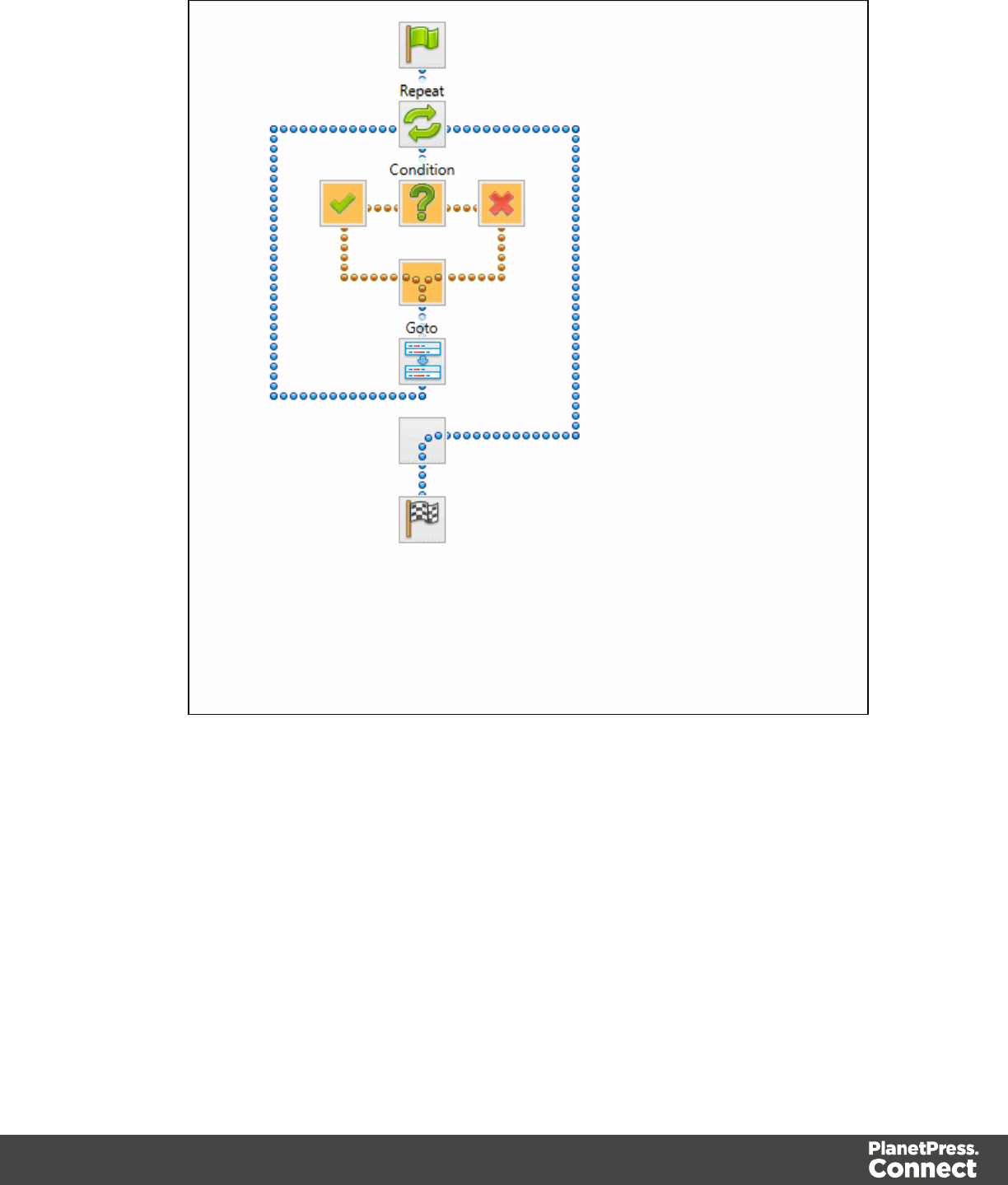
lAdd Step in True: To add a step under the true branch of a condition step, right-
click on the condition and select Add a Step in True.
Page 151
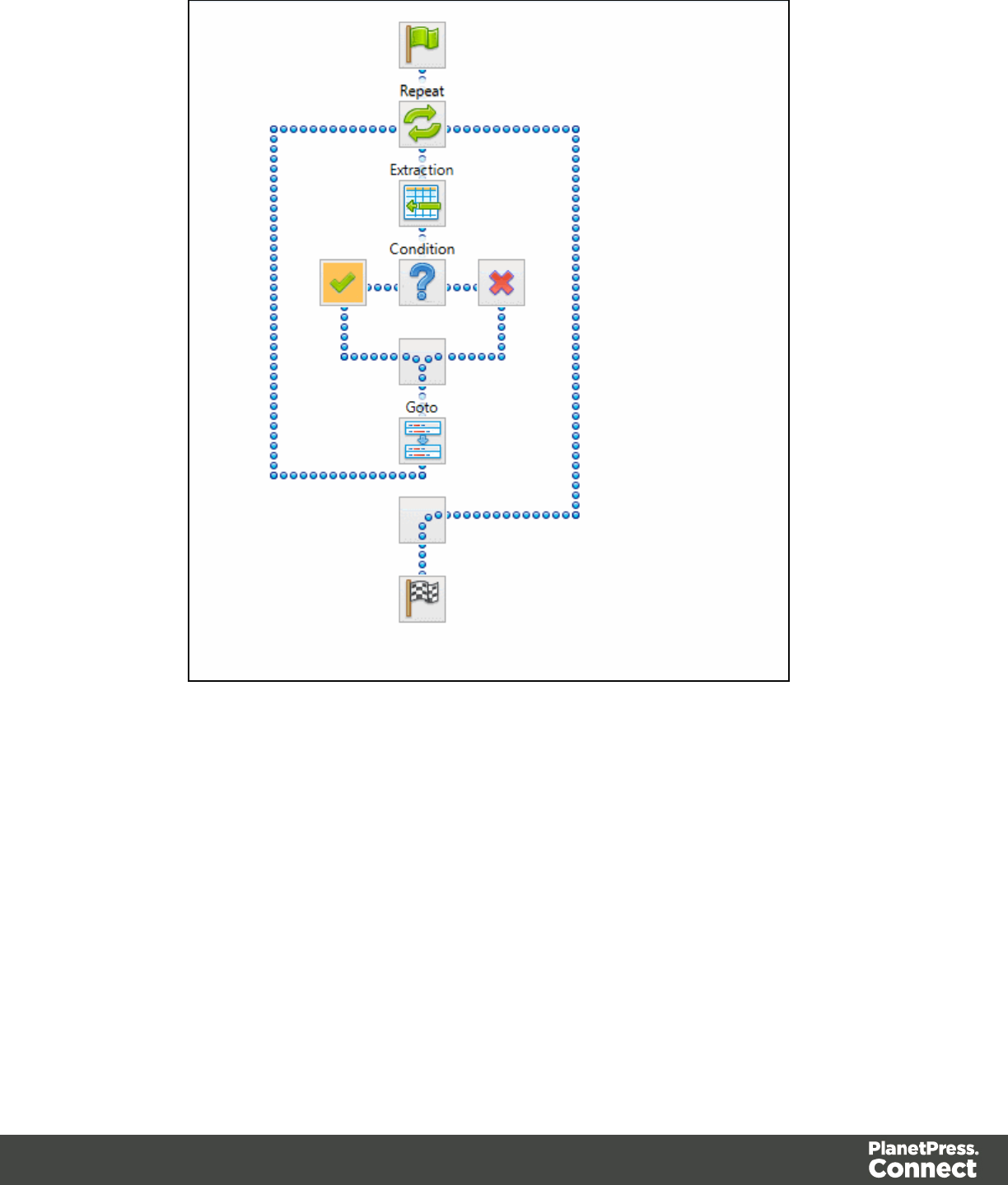
lAdd Step in False: To add a step under the false branch of a condition step, right-
click on the condition and select Add a Step in False.
lAdd Multiple Conditions Step: To add a Multiple Conditions step.
ll Add Case Step: Add a case condition under the selected Multiple Conditions
step.
Page 152
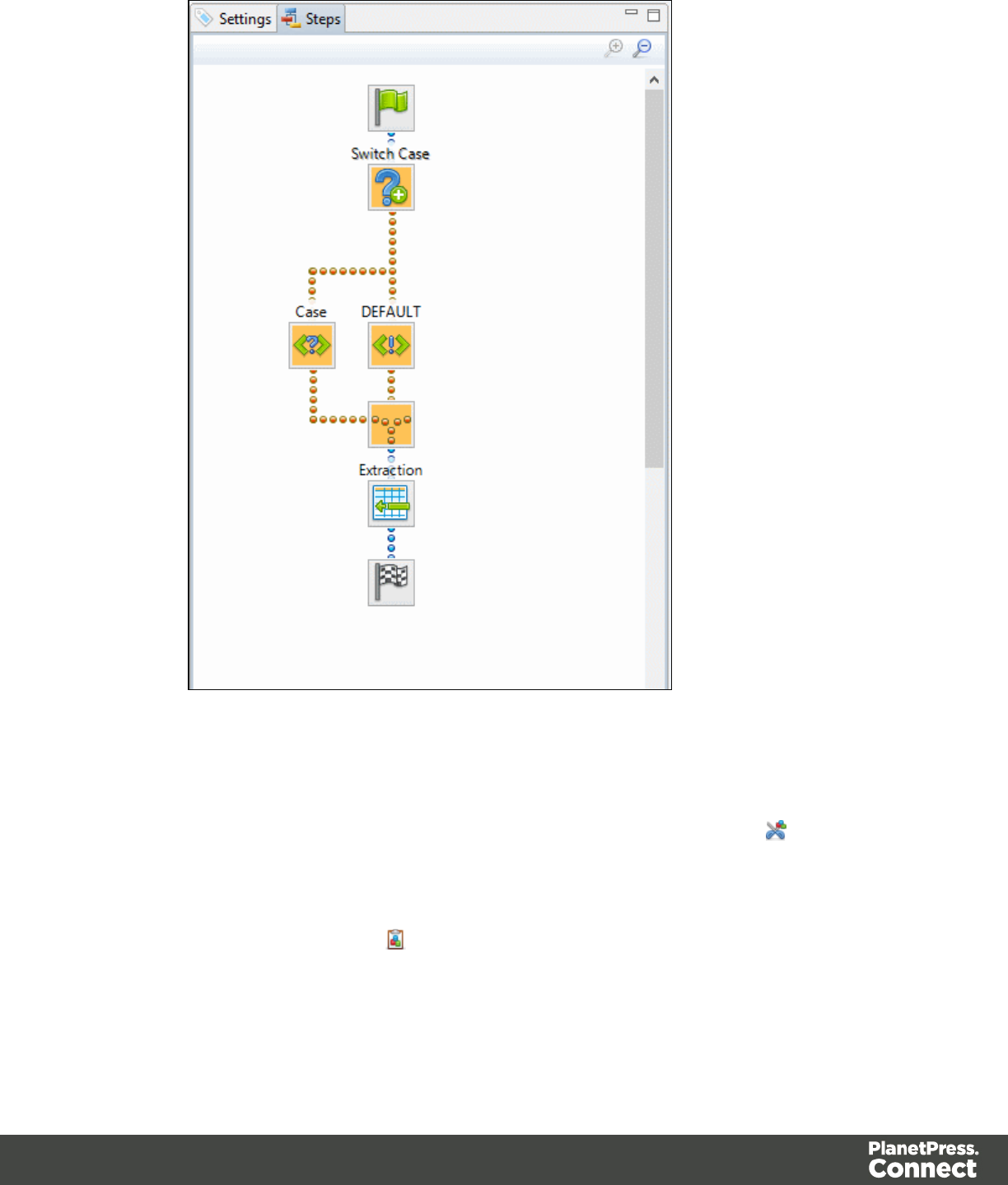
lIgnore Step: Click to set the step to be ignored (aka disabled). Disabled steps are grayed
and do not run when in DataMapper and do not execute when the data mapping
configuration is executed in Workflow. However, they can still be modified normally.
lMoving: To move a step, right-click on it and select Cut Step or use the button in the
Toolbar. If the step is Repeat or Condition, all steps under it will also be placed in the
clipboard. If there is already a step in the clipboard, it will be overwritten. To place the
step at its destination, right-click the step in the position before the desired location and
click Paste Step, or use the button in the toolbar.
Page 153
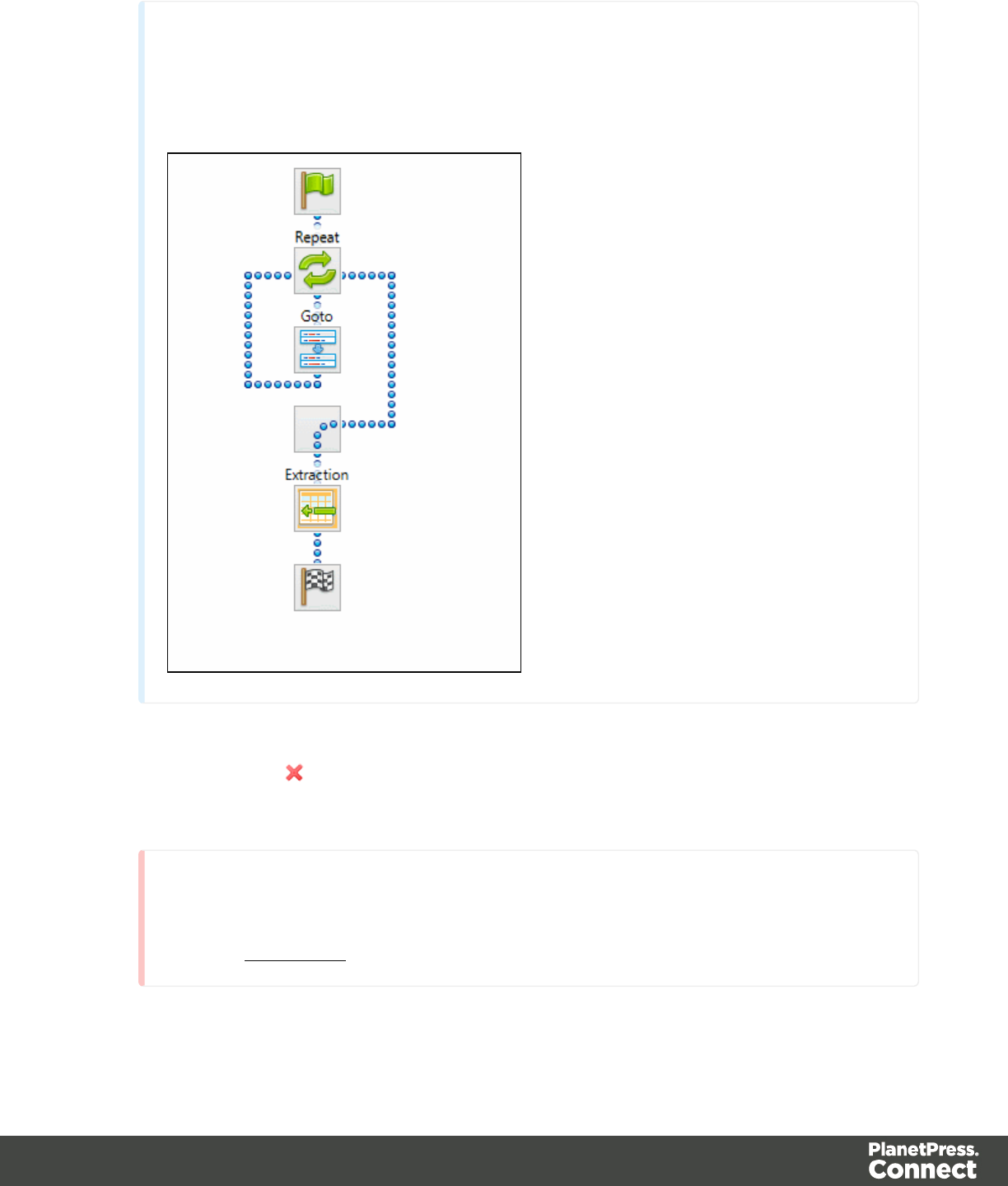
Note
You can also use a drag & drop to move steps.
lDelete Step: To remove a step, right-click on it and select Delete step from the contextual
menu or use the button in the Toolbar. If the step to be deleted is Repeat or
Condition, all steps under it will also be deleted.
Warning
Currently there is no Undo and Redo feature in the DataMapper module. Deleting
a step is permanent!
Page 154
lCopy Step: To copy a step, right-click on it and select Copy Step or use the button in
the Toolbar. If the step is Repeat or Condition, all steps under it will also be placed in the
clipboard. If there is already a step in the clipboard, it will be overwritten. To place a copy
of the step at its destination, right-click the step in the position before the desired location
and select Paste Step, or use the button in the Toolbar.
lViewing step details: To see details for the step, click on the step to show its properties
in the Step Properties pane. Hovering over the task shows a tooltip that displays some of
the details as well as the property name and comment.
Step Properties
The Step Properties pane is used to adjust the properties of each step in the process. The pane
is divided in a few subsections depending on the step and the data type. It always contains a
subsection to name and document the selected steps however.
Note
Step properties may also depend on the Data Sample's file type.
Preprocessor Step
Extract Step
Action Step
Repeat Step
Condition Step
Multiple Conditions Step
Goto Step
Postprocessor Step
Preprocessor Step Properties
The Preprocessor step does not run for every Source Record in the Data Sample. It runs once,
at the beginning of the Steps, before anything else.
Fixed Automation Properties
The Fixed automation properties subsection lists all the fixed properties available from the
PlanetPress Workflow automation module. These properties are equivalent to data available
Page 155

within the PlanetPress Workflow process. For each property, the following is available:
lName: A read-only field displaying the name of the property.
lScope: A read-only field indicating that the scope of the property is Automation.
lType: A read-only field indicating the data type for each property.
lDefault Value: Enter a default value for the property. This value is overwritten by the
actual value coming from PlanetPress Workflow when the data mapping configuration is
run using the Execute Data Mapping task.
There are currently the following automation properties available:
lJobInfoX: These properties are the equivalent of the JobInfo values available in the
PlanetPress Workflow process. They can be set using the Set Job Info and Variables
task. To access these properties inside of any JavaScript code within the Data Mapping
Configuration, use the automation.jobInfos.JobInfoX (where X is the job info number, from
0 to 9).
lOriginalFilename: This property contains the original file name that was captured by the
PlanetPress Workflow process and is equivalent to the %o variable in the process. To
access these property inside of any JavaScript code within the Data Mapping
Configuration, use automation.properties.OriginalFilename.
lProcessName: This property contains the name of the process that is currently executing
the data mapping configuration and is equivalent to the %w variable in the process. To
access this property inside of any JavaScript code within the Data Mapping
Configuration, use automation.properties.ProcessName.
lTaskIndex: This property contains the index (position) of the task inside the process that
is currently executing the data mapping configuration but it has no equivalent in
PlanetPress Workflow. To access this property inside of any JavaScript code within the
Data Mapping Configuration, use automation.properties.ProcessName.
Properties
The Properties subsection is used to create specific properties that are used throughout the
workflow. Properties can be accessed through some of the interface elements such as the
Condition and Repeat step properties, or through the DataMapper API.
Page 156

Note
Properties are evaluated in the order they are placed in the list, so properties can use the
values of previously defined properties in their expression.
lName: The name of the property used to refer to its value.
lScope: What this property applies to:
lEntire Data: These properties are static properties that cannot be changed once
they have been set, in other words they are Global constants.
lEach Record: These properties are evaluated and set at the beginning of each
Source Record. These properties can be modified once they have been set, but are
always reset at the beginning of each Source Record.
lAutomation variable: These properties initialize variables coming from the
PlanetPress Workflow automation tool. The name of the property needs to be the
same as the variable name in Workflow, and they can be either a Local variable or a
Global variable. For either one, only the actual name is to be used, so for %
{MyLocalVar} use only MyLocalVar , and for %{global.MyGlobalVar} use
MyGlobalVar. If a global and a local variable have the same name (%{myvar} and
%{global.myvar} ), the local variable's value is used and the global one is ignored.
To access a workflow variable inside of any JavaScript code within the Data
Mapping Configuration, use automation.variables.variablename
lType: The data type of the property. For more information see Data Types.
lDefault Value: The initial value of the property. This is a JavaScript expression. See
DataMapper API.
Technical
Entire Data Properties are evaluated before anything else, such as Preprocessors,
Delimiters and Boundaries in the Settings Pane. This means these properties cannot
read information from the Data Sample or from any records. They are mostly useful for
static information such as folder locations or server addresses.
Page 157

Preprocessor
The Preprocessor subsection defines what preprocessors run on the Data Sample before it is
sent to the extraction. Preprocessors modify the Data Sample in many ways, and each
Preprocessor runs in turn, using the result of the previous one as an input.
lName: The name to identify the Preprocessor.
lType: The type of Preprocessor. Currently there is only one type available.
Preprocessor definition
lExpression: The JavaScript expression that will run on the Data Sample. See
DataMapper API.
Description
This subsection is collapsed by default in the interface, to allow more screen space be given to
other important parts.
Name: The name of the step. This name will be displayed on top of the step's icon in the Steps
pane.
Comments: The text entered here gives more details on the step and will be displayed in the
tooltip appearing when hovering over the step in the Steps pane.
Extract Step Properties
The Extract step takes information from the Data Sample and places it in the Extracted Record
within the Record Set.
Description
This subsection is collapsed by default in the interface, to allow more screen space be given to
other important parts.
Name: The name of the step. This name will be displayed on top of the step's icon in the Steps
pane.
Comments: The text entered here gives more details on the step and will be displayed in the
tooltip appearing when hovering over the step in the Steps pane.
Page 158

Extraction Definition
lData Table: Defines where the data will be placed in the Extracted Record. The root
table is record, any other table becomes a detail table. For more information see detail
tables.
lAppend values to current record: When the Extract Step is within a loop, check this to
ensure that the extraction will be done in the same detail line as any previous extractions
within the same loop. This ensures that, if multiple extracts are present, only one detail
line is created.
Field Definition
This sub-section explains how the currently selected Extract Field in the Field List is defined.
Text File
lField List: The Field List displays each of the single fields that are being extracted in a
drop-down. Fields can be re-ordered and re-named within the Ordering and Renaming
Fields dialog.
lAdd Unique ID to extraction field: Check to add a unique numerical set of characters to
the end of the extracted value. This ensures no two values are identical in the Record Set.
lMode: Determines the origin of the extracted data.
lLocation: The contents of the data selection set below will determine the value of
the extracted field.
lLeft: Defines the start of the data selection to extract.
lRight: Defines the end of the data selection to extract.
lTop offset: The vertical offset from the current pointer location in the Data
Sample (Viewer).
lHeight: The height of the selection box.
lUse selection: Click to use the value (Left, Right and Height) of the current
data selection (in the Viewer) for the extraction.
Page 159

Note
If the selection contains multiple lines, only the first line is selected.
lPost Function: Enter a JavaScript expression to be run after the extraction.
For example replace("-","") would replace a single dash character inside the
extracted string.
lUse JavaScript Editor: Click to display the Script Editor dialog.
lTrim: Select to trim empty characters at the beginning or the end of the field.
lConcatenation string:
lSplit: Separate the selection into individual fields based on the
Concatenation string defined above.
lJavaScript : The result of the JavaScript Expression written below the drop-down
will be the value of the extracted field. If the expression contains multiple lines, the
last value attribution (variable = "value";) will be the value. See DataMapper API.
lType: The data type of the selected data. Please refer to ...(link to come) for more
information.
PDF File
lField List: The Field List displays each of the single fields that are being extracted in a
drop-down. Fields can be re-ordered and re-named within the Ordering and Renaming
Fields dialog.
lAdd JavaScript Field: Click to add a new extract field. By default, the field will be a
JavaScript -defined field rather than a data extraction, of String data type.
lRemove Extract Field: Click to delete the selected extract field from the list.
lOrder and rename fields: Click to openOrdering and Renaming Fields.
lAdd Unique ID to extraction field: Check to add a unique numerical set of characters to
the end of the extracted value. This ensures no two values are identical in the Record Set.
lMode: Determines the origin of the data.
lLocation: The contents of the data selection set below will be the value of the
extracted field. The data selection settings are different depending on the data
sample type.
Page 160

lLeft: Defines the start of the data selection to extract.
lRight: Defines the end of the data selection to extract.
lTop offset: The vertical offset from the current pointer location in the Data
Sample (Viewer).
lHeight: The height of the selection box.
lUse selection: Click to use the value (Left, Right and Height) of the current
data selection for the extraction.
Note
If the selection contains multiple lines, only the first line is selected.
lPost Function: Enter a JavaScript expression to be run after the extraction.
For example replace("-","") would replace a single dash character inside the
extracted string.
lTrim: Select to trim empty characters at the beginning or the end of the field.
lType: The data type of the selected data. Please refer to ...(link to come) for
more information.
lConcatenation string:
lSplit: Separate the selection into individual fields based on the
Concatenation string defined above.
lSub-Fields:
lJavaScript : The result of the JavaScript Expression written below the drop-down
will be the value of the extracted field. If the expression contains multiple lines, the
last value attribution (variable = "value";) will be the value. See DataMapper API.
lUse JavaScript Editor: Click to display the Script Editor dialog.
lUse selected text: Inserts the text in the current data selection in the
JavaScript Expression. If multiple lines or elements are selected, only the first
one is used.
lUse selection: Click to use the value of the current data selection for the
extraction.
Page 161

Note
If the selection contains multiple lines, only the first line is selected.
lType: The data type of the selected data. Please refer to ...(link to come) for
more information.
CSV and Database Files
lField List: The Field List displays each of the single fields that are being extracted in a
drop-down. Fields can be re-ordered and re-named within the Ordering and Renaming
Fields dialog.
lAdd JavaScript Field: Click to add a new extract field. By default, the field will be a
JavaScript -defined field rather than a data extraction, of String data type.
lRemove Extract Field: Click to delete the selected extract field from the list.
lOrder and rename fields: Click to openOrdering and Renaming Fields.
lAdd Unique ID to extraction field: Check to add a unique numerical set of characters to
the end of the extracted value. This ensures no two values are identical in the Record Set.
lMode: Determines the origin of the data.
lLocation: The contents of the data selection set below will be the value of the
extracted field. The data selection settings are different depending on the data
sample type.
lColumn: Drop-down listing all fields in the Data Sample, of which the value
will be used.
lTop offset: The vertical offset from the current pointer location in the Data
Sample (Viewer).
lUse selection: Click to use the value of the current data selection for the
extraction.
Note
If the selection contains multiple lines, only the first line is
selected.
Page 162

lPost Function: Enter a JavaScript expression to be run after the extraction.
For example replace("-","") would replace a single dash character inside the
extracted string.
lUse JavaScript Editor: Click to display the Script Editor dialog.
lTrim: Select to trim empty characters at the beginning or the end of the field.
lType: The data type of the selected data. Please refer to ...(link to come) for
more information.
lJavaScript : The result of the JavaScript Expression written below the drop-down
will be the value of the extracted field. If the expression contains multiple lines, the
last value attribution (variable = "value";) will be the value. See DataMapper API.
lExpression:
lUse JavaScript Editor: Click to display the Script Editor dialog.
lUse selected text: Inserts the text in the current data selection in the
JavaScript Expression. If multiple lines or elements are selected, only
the first one is used.
lUse selection: Click to use the value of the current data selection for the
extraction.
Note
If the selection contains multiple lines, only the first line is
selected.
lType: The data type of the selected data. Please refer to ...(link to come) for
more information.
XMLFile
lField List: The Field List displays each of the single fields that are being extracted in a
drop-down. Fields can be re-ordered and re-named within the Ordering and Renaming
Fields dialog.
lAdd JavaScript Field: Click to add a new extract field. By default, the field will be a
JavaScript -defined field rather than a data extraction, of String data type.
Page 163

lRemove Extract Field: Click to delete the selected extract field from the list.
lOrder and rename fields: Click to openOrdering and Renaming Fields.
lAdd Unique ID to extraction field: Check to add a unique numerical set of characters to
the end of the extracted value. This ensures no two values are identical in the Record Set.
lBased on: Determines the origin of the data.
lLocation: The contents of the data selection set below will be the value of the
extracted field. The data selection settings are different depending on the data
sample type.
lXPath: The path to the XML field that is extracted.
lUse selection: Click to use the value of the current data selection for the
extraction.
Note
If the selection contains multiple lines, only the first line is
selected.
lPost Function: Enter a JavaScript expression to be run after the extraction.
For example replace("-","") would replace a single dash character inside the
extracted string.
lUse JavaScript Editor: Click to display the Script Editor dialog.
lTrim: Select to trim empty characters at the beginning or the end of the field.
lType: The data type of the selected data. Please refer to ...(link to come) for
more information.
lJavaScript : The result of the JavaScript Expression written below the drop-down
will be the value of the extracted field. If the expression contains multiple lines, the
last value attribution (variable = "value";) will be the value. See DataMapper API.
lExpression:
lUse JavaScript Editor: Click to display the Script Editor dialog.
Page 164
lUse selected text: Inserts the text in the current data selection in the
JavaScript Expression. If multiple lines or elements are selected, only
the first one is used.
lUse selection: Click to use the value of the current data selection for the
extraction.
Note
If the selection contains multiple lines, only the first line is
selected.
lType: The data type of the selected data. Please refer to ...(link to come) for
more information.
Data Format
The data format defines the precise format for some of the variable types, such as dates and
currencies.
lBoolean
lString
lHTML String
lInteger
lNegative Sign Before: Adds a negative (-) sign before negative values in the
Extracted Record.
lThousand Separator: Adds the selected character between each thousand
position (for example, "1,000,000")
lTreat empty as 0: Considers empty spaces as 0.
lFloat
lNegative Sign Before: Adds a negative (-) sign before negative values in the
Extracted Record.
lDecimal Separator: Determines the character to use for decimal values, generally
a dot (.).
Page 165
lThousand Separator: Adds the selected character between each thousand
position (for example, "1,000,000")
lTreat empty as 0: Considers empty spaces as 0.
lCurrency
lNegative Sign Before: Adds a negative (-) sign before negative values in the
Extracted Record.
lDecimal Separator: Determines the character to use for decimal values, generally
a dot (.).
lThousand Separator: Adds the selected character between each thousand
position (for example, "1,000,000")
lCurrency Sign: Determines the character to add before the value in the Extracted
Record.
lTreat empty as 0: Considers empty spaces as 0.
lDate
lDate/Time Format: Determines how the date is read. The format written here needs
to correspond with the format in the data selection.
lLanguage: The language in which the date is written, when relevant. Useful when
months or days are written alphabetically.
Note
Default Format Settings can be defined at the user level, at the Datamapper configuration level
and/or at the field level. (see Datamapper Default Data Format for more information).
Ordering and Renaming Fields
The Order and rename fields dialog appears from the Extract step by clicking on the Rename
Fields button next to the field list. This dialog displays the extracted fields in the currently
selected Extract step. Field extractions are executed from top to bottom. Using JavaScript
fields, it is possible to refer to previously extracted fields if they are extracted higher in this list or
in previous Extract steps in the extraction workflow.
lName: The name of the field. Click the field name and enter a new name to rename the
field.
Page 166
If you intend to use the field names as metadata in a PlanetPress Workflow process, do
not add spaces to field names, as they are not permitted in metadata field names.
lValue: Displays the value of the extract field in the current Record.
lRemove button : Click to remove the currently selected field.
lMove Up button : Click to move the selected field up one position.
lMove Down button : Click to move the selected field down one position.
Action Step Properties
The Action step can run multiple specific actions one after the other in order. More actions will
be available in the future.
Description
This subsection is collapsed by default in the interface, to allow more screen space be given to
other important parts.
Name: The name of the step. This name will be displayed on top of the step's icon in the Steps
pane.
Comments: The text entered here gives more details on the step and will be displayed in the
tooltip appearing when hovering over the step in the Steps pane.
Actions
This subsection lists all actions executed by the step, and their types:
lName: A name by which to refer to the action. This name has no impact on functionality.
lType:
lSet property: Sets the value of a Source Record property which was created in the
Preprocessor Step.
lRun JavaScript : Runs a JavaScript expression, giving much more flexibility over
the extraction process.
Set Property
Text and PDF Files
Page 167
lProperty: Displays a list of Source Record properties set in the Preprocessor Step.
lType: Displays the type of the Source Record property. Read only field.
lBased on: Determines the origin of the data.
lLocation: The contents of the data selection set below will be the value of the
extracted field. The data selection settings are different depending on the data
sample type.
lLeft: Defines the start of the data selection to extract
lRight: Defines the end of the data selection to extract
lTop offset: The vertical offset from the current pointer location in the Data
Sample (Viewer).
lHeight: The height of the selection box.
lUse selection: Click to use the value of the current data selection for the
extraction.
Note
If the selection contains multiple lines, only the first line is selected.
lTrim: Select to trim empty characters at the beginning or the end of the field
lJavaScript : The result of the JavaScript Expression written below the drop-down
will be the value of the extracted field. If the expression contains multiple lines, the
last value attribution (variable = "value";) will be the value. See DataMapper API.
lExpression: The JavaScript expression to run.
lUse JavaScript Editor: Click to display the Edit Script dialog.
Note
Running a JavaScript expression offers many possibilities, for example:
lSetting Properties and Record Field values using advanced
expressions
lDo complex mathematical operations and calculations
Page 168
lMore features to come in future versions. For more information,
see JavaScript in DataMapper.
lUse selected text: Inserts the text in the current data selection in the
JavaScript Expression. If multiple lines or elements are selected, only the first
one is used.
lUse selection: Click to use the value of the current data selection for the
extraction.
Note
If the selection contains multiple lines, only the first line is selected.
lData Format
The data format defines the precise format for some of the variable types, such as dates
and currencies.
lBoolean
lString
lHTML String
lInteger
lNegative Sign Before: Adds a negative (-) sign before negative values in the
Extracted Record.
lThousand Separator: Adds the selected character between each thousand
position (for example, "1,000,000")
lTreat empty as 0: Considers empty spaces as 0.
lFloat
lNegative Sign Before: Adds a negative (-) sign before negative values in the
Extracted Record.
lDecimal Separator: Determines the character to use for decimal values,
generally a dot (.).
Page 169
lThousand Separator: Adds the selected character between each thousand
position (for example, "1,000,000")
lTreat empty as 0: Considers empty spaces as 0.
lCurrency
lNegative Sign Before: Adds a negative (-) sign before negative values in the
Extracted Record.
lDecimal Separator: Determines the character to use for decimal values,
generally a dot (.).
lThousand Separator: Adds the selected character between each thousand
position (for example, "1,000,000")
lCurrency Sign: Determines the character to add before the value in the
Extracted Record.
lTreat empty as 0: Considers empty spaces as 0.
lDate
lDate/Time Format: Determines how the date is read. The format written here
needs to correspond with the format in the data selection.
lLanguage: The language in which the date is written, when relevant. Useful
when months or days are written alphabetically.
Note
Default Format Settings can be defined at the user level, at the Datamapper configuration
level and/or at the field level. (see Datamapper Default Data Format for more
information).
CSV and Database Files
lProperty: Displays a list of Source Record properties set in the Preprocessor Step.
lType: Displays the type of the Source Record property. Read only field.
lBased on: Determines the origin of the data.
lLocation: The contents of the data selection set below will be the value of the
extracted field. The data selection settings are different depending on the data
sample type.
Page 170
lColumn: Drop-down listing all fields in the Data Sample, of which the value
will be used.
lTop offset: The vertical offset from the current pointer location in the Data
Sample (Viewer).
lUse selection: Click to use the value of the current data selection for the
extraction.
Note
If the selection contains multiple lines, only the first line is selected.
lTrim: Select to trim empty characters at the beginning or the end of the field
lJavaScript : The result of the JavaScript Expression written below the drop-down
will be the value of the extracted field. If the expression contains multiple lines, the
last value attribution (variable = "value";) will be the value. See DataMapper API.
lExpression: The JavaScript expression to run.
lUse JavaScript Editor: Click to display the Edit Script dialog.
Note
Running a JavaScript expression offers many possibilities, for example:
lSetting Properties and Record Field values using advanced
expressions
lDo complex mathematical operations and calculations
lMore features to come in future versions. For more information,
see JavaScript in DataMapper.
lUse selected text: Inserts the text in the current data selection in the
JavaScript Expression. If multiple lines or elements are selected, only the first
one is used.
Page 171

lUse selection: Click to use the value of the current data selection for the
extraction.
Note
If the selection contains multiple lines, only the first line is selected.
lData Format
The data format defines the precise format for some of the variable types, such as dates
and currencies.
lBoolean
lString
lHTML String
lInteger
lNegative Sign Before: Adds a negative (-) sign before negative values in the
Extracted Record.
lThousand Separator: Adds the selected character between each thousand
position (for example, "1,000,000")
lTreat empty as 0: Considers empty spaces as 0.
lFloat
lNegative Sign Before: Adds a negative (-) sign before negative values in the
Extracted Record.
lDecimal Separator: Determines the character to use for decimal values,
generally a dot (.).
lThousand Separator: Adds the selected character between each thousand
position (for example, "1,000,000")
lTreat empty as 0: Considers empty spaces as 0.
lCurrency
lNegative Sign Before: Adds a negative (-) sign before negative values in the
Extracted Record.
Page 172
lDecimal Separator: Determines the character to use for decimal values,
generally a dot (.).
lThousand Separator: Adds the selected character between each thousand
position (for example, "1,000,000")
lCurrency Sign: Determines the character to add before the value in the
Extracted Record.
lTreat empty as 0: Considers empty spaces as 0.
lDate
lDate/Time Format: Determines how the date is read. The format written here
needs to correspond with the format in the data selection.
lLanguage: The language in which the date is written, when relevant. Useful
when months or days are written alphabetically.
Note
Default Format Settings can be defined at the user level, at the Datamapper configuration
level and/or at the field level. (see Datamapper Default Data Format for more
information).
XMLFile
lProperty: Displays a list of Source Record properties set in the Preprocessor Step.
lType: Displays the type of the Source Record property. Read only field.
lBased on: Determines the origin of the data.
lLocation: The contents of the data selection set below will be the value of the
extracted field. The data selection settings are different depending on the data
sample type.
lXPath: The path to the XML field that is extracted.
lUse selection: Click to use the value of the current data selection for the
extraction.
Page 173

Note
If the selection contains multiple lines, only the first line is
selected.
lTrim: Select to trim empty characters at the beginning or the end of the
field
lJavaScript : The result of the JavaScript Expression written below the drop-down
will be the value of the extracted field. If the expression contains multiple lines, the
last value attribution (variable = "value";) will be the value. See DataMapper API.
lExpression: The JavaScript expression to run.
lUse JavaScript Editor: Click to display the Edit Script dialog.
Note
Running a JavaScript expression offers many possibilities, for example:
lSetting Properties and Record Field values using advanced
expressions
lDo complex mathematical operations and calculations
lMore features to come in future versions. For more information,
see JavaScript in DataMapper.
lUse selected text: Inserts the text in the current data selection in the
JavaScript Expression. If multiple lines or elements are selected, only the first
one is used.
lUse selection: Click to use the value of the current data selection for the
extraction.
Page 174

Note
If the selection contains multiple lines, only the first line is selected.
lData Format
The data format defines the precise format for some of the variable types, such as dates
and currencies.
lBoolean
lString
lHTML String
lInteger
lNegative Sign Before: Adds a negative (-) sign before negative values in the
Extracted Record.
lThousand Separator: Adds the selected character between each thousand
position (for example, "1,000,000")
lTreat empty as 0: Considers empty spaces as 0.
lFloat
lNegative Sign Before: Adds a negative (-) sign before negative values in the
Extracted Record.
lDecimal Separator: Determines the character to use for decimal values,
generally a dot (.).
lThousand Separator: Adds the selected character between each thousand
position (for example, "1,000,000")
lTreat empty as 0: Considers empty spaces as 0.
lCurrency
lNegative Sign Before: Adds a negative (-) sign before negative values in the
Extracted Record.
lDecimal Separator: Determines the character to use for decimal values,
generally a dot (.).
Page 175

lThousand Separator: Adds the selected character between each thousand
position (for example, "1,000,000")
lCurrency Sign: Determines the character to add before the value in the
Extracted Record.
lTreat empty as 0: Considers empty spaces as 0.
lDate
lDate/Time Format: Determines how the date is read. The format written here
needs to correspond with the format in the data selection.
lLanguage: The language in which the date is written, when relevant. Useful
when months or days are written alphabetically.
Note
Default Format Settings can be defined at the user level, at the Datamapper configuration
level and/or at the field level. (see Datamapper Default Data Format for more
information).
Run JavaScript
lExpression: The JavaScript expression to run.
lUse JavaScript Editor: Click to display the Edit Script dialog.
Note
Running a JavaScript expression offers many possibilities, for example:
lSetting Properties and Record Field values using advanced expressions
lDo complex mathematical operations and calculations
lMore features to come in future versions. For more information, see JavaScript
in DataMapper.
lUse selected text: Inserts the text in the current data selection in the JavaScript
Expression. If multiple lines or elements are selected, only the first one is used.
lUse selection: Click to use the value of the current data selection for the extraction.
Page 176

Note
If the selection contains multiple lines, only the first line is selected.
Repeat Step Properties
The Repeat step is a loop that runs more than once. There are multiple types of repeat steps
used for different actions. Repeat steps do not automatically move the pointer in the file. In
order to avoid infinite loops, a Goto step must be present within the loop itself.
By default, if an Extract step is added within a Repeat step, its extraction is made in a Details
Table.
Description
This subsection is collapsed by default in the interface, to allow more screen space be given to
other important parts.
Name: The name of the step. This name will be displayed on top of the step's icon in the Steps
pane.
Comments: The text entered here gives more details on the step and will be displayed in the
tooltip appearing when hovering over the step in the Steps pane.
Repeat Definition
ll Repeat type:
lWhile statement is true: The loop executes while the statement below is true. The
statement is evaluated after the loop so the loop will always run at least once.
lUntil statement is true: The loop executes until the statement below is true. The
statement is evaluated before the loop so the loop may not run at all.
lUntil no more elements (for Text, CSV, Database and PDF files only): The loop
executes as long as there are elements left as selected below.
lFor Each (for XMLfiles only): The loop executes for all nodes on a specified level.
Page 177
Note
When using an XML For Each loop, it is not necessary to skip to the
repeating node or to have a Gotostep to jump to each sibling, as this loop
takes care of it automatically.
lMaximum iterations on each line: Defines the maximum number of iterations occurring
at the same position. This expression is evaluated once when entering the loop. The
value returned by the expression must be an integer higher than 0.
lUse JavaScript Editor: Click to display the Edit Script dialog.
Note
Running a JavaScript expression offers many possibilities, for example:
lSetting Properties and Record Field values using advanced
expressions
lDo complex mathematical operations and calculations
lMore features to come in future versions. For more information, see
JavaScript in DataMapper.
Rule Tree
The Rule tree subsection displays the full combination rules (defined below under Condition)
as a tree, which gives an overview of how the conditions work together as well as the result for
each of these conditions for the current record or iteration.
Condition
First, the Condition List displays the conditions in list form, instead of the tree form above.
Three buttons are available next to the list:
lAdd condition: Click to create a new condition in the list. This will always branch the
current condition as an "AND" operator.
Page 178

lDelete condition: Delete the currently selected condition.
lTo rename a Condition, double click on its name from the Rule tree subsection .
Conditions are made by comparison of two operands using a specific Operator.
Technical
Both the Left and Right operands have the same properties.
Text and PDF Files
lBased On:
lPosition: The data in the specified position for the comparison.
lLeft: The start position for the data selection. Note that conditions are done on
the current line, either the current cursor position, or the current line in a
Repeat step.
lRight: The end position for the data selection.
lTop offset: The vertical offset from the current pointer location in the Data
Sample (Viewer).
lHeight: The height of the selection box.
lUse Selection: Click to use the value of the current data selection for the
extraction.
lTrim: Select to trim empty characters at the beginning or the end of the field.
lValue: A specified static text value.
lValue: The text value to use in the comparison.
lUse selected text: Uses the text in the current data selection as the Value. If
multiple lines or elements are selected, only the first one is used.
lField: The contents of a specific field in the Extracted Record.
lField: The Extracted Record field to use in the comparison.
lJavaScript : The result of a JavaScript Expression.
lExpression: The JavaScript line that is evaluated. Note that the last value
attribution to a variable is the one used as a result of the expression.
Page 179

lUse JavaScript Editor: Click to display the Edit Script dialog.
lUse selected text: Inserts the text in the current data selection in the
JavaScript Expression. If multiple lines or elements are selected, only the first
one is used.
lData Property: The value of a data-level property set in the Preprocessor Step.
lRecord Property: One of the local variables that you can create and that are reset
for each document as opposed to data variables that are global because they are
initialized only once at the beginning of each job.
lAutomation Property: The current value of a Document-level property set in the
Preprocessor Step.
lExtractor Property: The value of an internal extractor variable:
lCounter: The value of the current counter iteration in a Repeat step.
lVertical Position: The current vertical position on the page, either in Measure
(PDF) or Line (Text and CSV).
lOperators:
lis equal to: The two specified value are identical for the condition to be True.
lcontains: The first specified value contains the second one for the condition to be
True.
lis less than: The first specified value is smaller, numerically, than the second value
for the condition to be True.
lis greater than: The first specified value is larger, numerically, than the second
value for the condition to be True.
lis empty: The first specified value is empty. With this operator, there is no second
value.
lInvert condition: Inverts the result of the condition. For instance, is empty becomes
is not empty.
CSV and Database Files
lBased On:
Page 180

lPosition: The data in the specified position for the comparison.
ll Column: Drop-down listing all fields in the Data Sample, of which the value
will be used.
lTop offset: The vertical offset from the current pointer location in the Data
Sample (Viewer).
lUse Selection: Click to use the value of the current data selection for the
extraction.
lTrim: Select to trim empty characters at the beginning or the end of the field.
lValue: A specified static text value.
lValue: The text value to use in the comparison.
lUse selected text: Uses the text in the current data selection as the Value. If
multiple lines or elements are selected, only the first one is used.
lField: The contents of a specific field in the Extracted Record.
lField: The Extracted Record field to use in the comparison.
lJavaScript : The result of a JavaScript Expression.
lExpression: The JavaScript line that is evaluated. Note that the last value
attribution to a variable is the one used as a result of the expression.
lUse JavaScript Editor: Click to display the Edit Script dialog.
lUse selected text: Inserts the text in the current data selection in the
JavaScript Expression. If multiple lines or elements are selected, only the first
one is used.
lData Property: The value of a data-level property set in the Preprocessor step.
lRecord Property: One of the local variables that you can create and that are reset
for each document as opposed to data variables that are global because they are
initialized only once at the beginning of each job.
lAutomation Property: The current value of a Document-level property set in the
Preprocessor step.
Page 181

lExtractor Property: The value of an internal extractor variable:
lCounter: The value of the current counter iteration in a Repeat step.
lVertical Position: The current vertical position on the page, either in Measure
(PDF) or Line (Text and CSV).
lOperators:
lis equal to: The two specified value are identical for the condition to be True.
lcontains: The first specified value contains the second one for the condition to be
True.
lis less than: The first specified value is smaller, numerically, than the second value
for the condition to be True.
lis greater than: The first specified value is larger, numerically, than the second
value for the condition to be True.
lis empty: The first specified value is empty. With this operator, there is no second
value.
lInvert condition: Inverts the result of the condition. For instance, is empty becomes
is not empty.
XMLFiles
lBased On:
lPosition: The data in the specified position for the comparison.
ll XPath: The path to the XML field that is extracted.
lUse Selection: Click to use the value of the current data selection for the
extraction.
lTrim: Select to trim empty characters at the beginning or the end of the field.
lValue: A specified static text value.
lValue: The text value to use in the comparison.
lUse selected text: Uses the text in the current data selection as the Value. If
multiple lines or elements are selected, only the first one is used.
lField: The contents of a specific field in the Extracted Record.
lField: The Extracted Record field to use in the comparison.
Page 182

lJavaScript : The result of a JavaScript Expression.
lExpression: The JavaScript line that is evaluated. Note that the last value
attribution to a variable is the one used as a result of the expression.
lUse JavaScript Editor: Click to display the Edit Script dialog.
lUse selected text: Inserts the text in the current data selection in the
JavaScript Expression. If multiple lines or elements are selected, only the first
one is used.
lData Property: The value of a data-level property set in the Preprocessor step.
lRecord Property: One of the local variables that you can create and that are reset
for each document as opposed to data variables that are global because they are
initialized only once at the beginning of each job.
lAutomation Property: The current value of a Document-level property set in the
Preprocessor step.
lExtractor Property: The value of an internal extractor variable:
lCounter: The value of the current counter iteration in a Repeat step.
lVertical Position: The current vertical position on the page, either in Measure
(PDF) or Line (Text and CSV).
lOperators:
lis equal to: The two specified value are identical for the condition to be True.
lcontains: The first specified value contains the second one for the condition to be
True.
lis less than: The first specified value is smaller, numerically, than the second value
for the condition to be True.
lis greater than: The first specified value is larger, numerically, than the second
value for the condition to be True.
lis empty: The first specified value is empty. With this operator, there is no second
value.
lInvert condition: Inverts the result of the condition. For instance, is empty becomes
is not empty.
Page 183

Multiple Conditions Step Properties
Description
This subsection is collapsed by default in the interface, to allow more screen space be given to
other important parts.
Name: The name of the step. This name will be displayed on top of the step's icon in the Steps
pane.
Comments: The text entered here gives more details on the step and will be displayed in the
tooltip appearing when hovering over the step in the Steps pane.
Condition
Left Operand
The Left operand indicates the criterion that every case will be compared to. It can be Based
on:
lPosition: The data in the specified position for the comparison.
lLeft (Txt and PDF only): The start position for the data selection. Note that
conditions are done on the current line, either the current cursor position, or the
current line in a Repeat step.
lRight (Txt and PDF only): The end position for the data selection.
lHeight (Txt and PDF only): The height of the selection box.
lColumn (CSV and Database only): Drop-down listing all fields in the Data Sample,
of which the value will be used.
lXPath (XMLonly): The path to the XML field that is extracted.
ll Top offset: The vertical offset from the current pointer location in the Data Sample
(Viewer).
lUse Selection: Click to use the value of the current data selection for the extraction.
lTrim: Select to trim empty characters at the beginning or the end of the field.
Page 184

lValue: A specified static text value.
lValue: The text value to use in the comparison.
lUse selected text: Uses the text in the current data selection as the Value. If
multiple lines or elements are selected, only the first one is used.
lField: The contents of a specific field in the Extracted Record.
lField: The Extracted Record field to use in the comparison.
lJavaScript : The result of a JavaScript Expression.
lExpression: The JavaScript line that is evaluated. Note that the last value
attribution to a variable is the one used as a result of the expression.
lUse JavaScript Editor: Click to display the Edit Script dialog.
lUse selected text: Inserts the text in the current data selection in the JavaScript
Expression. If multiple lines or elements are selected, only the first one is used.
lData Property: The value of a data-level property set in the Preprocessor Step.
lRecord Property: One of the local variables that you can create and that are reset for
each document as opposed to data variables that are global because they are initialized
only once at the beginning of each job.
lAutomation Property: The current value of a Document-level property set in the
Preprocessor Step.
lExtractor Property: The value of an internal extractor variable:
lCounter: The value of the current counter iteration in a Repeat step.
lVertical Position: The current vertical position on the page, either in Measure
(PDF) or Line (Text and CSV).
Condition
The Condition drop-down displays the conditions in list form. Three buttons are available next
to the list:
lAdd condition: Click to create a new condition in the list. This will always branch the
current condition as an "AND" operator.
lDelete condition: Delete the currently selected condition.
Page 185

lOrder Multiple Conditions: Under the Name column, select a case then click one of the
buttons on the right (Delete,Move Up,Move Down) to delete or change the order of a
case in the list.
Operators
Case conditions are made by comparison of the two operands, left and right, using a specific
Operator.
lis equal to: The two specified value are identical for the condition to be True.
lcontains: The first specified value contains the second one for the condition to be True.
lis less than: The first specified value is smaller, numerically, than the second value for
the condition to be True.
lis greater than: The first specified value is larger, numerically, than the second value for
the condition to be True.
lis empty: The first specified value is empty. With this operator, there is no second value.
lInvert condition: Inverts the result of the condition. For instance, is empty becomes is
not empty.
Condition Step Properties
Description
This subsection is collapsed by default in the interface, to allow more screen space be given to
other important parts.
Name: The name of the step. This name will be displayed on top of the step's icon in the Steps
pane.
Comments: The text entered here gives more details on the step and will be displayed in the
tooltip appearing when hovering over the step in the Steps pane.
Rule Tree
The Rule tree subsection displays the full combination rules (defined below under Condition)
as a tree, which gives an overview of how the conditions work together as well as the result for
each of these conditions for the current record or iteration.
Page 186
Condition
First, the Condition List displays the conditions in list form, instead of the tree form above.
Three buttons are available next to the list:
lAdd condition: Click to create a new condition in the list. This will always branch the
current condition as an "AND" operator.
lDelete condition: Delete the currently selected condition.
lTo rename a Condition, double click on its name from the Rule tree subsection .
Conditions are made by comparison of two operands using a specific Operator.
Technical
Both the Left and Right operands have the same properties.
lBased On:
lPosition: The data in the specified position for the comparison.
lLeft (Txt and PDF only): The start position for the data selection. Note that
conditions are done on the current line, either the current cursor position, or
the current line in a Repeat step.
lRight (Txt and PDF only): The end position for the data selection.
lHeight (Txt and PDF only): The height of the selection box.
lColumn (CSV and Database only): Drop-down listing all fields in the Data
Sample, of which the value will be used.
lXPath (XMLonly): The path to the XML field that is extracted.
ll Top offset: The vertical offset from the current pointer location in the Data
Sample (Viewer).
lUse Selection: Click to use the value of the current data selection for the
extraction.
lTrim: Select to trim empty characters at the beginning or the end of the field.
Page 187

lValue: A specified static text value.
lValue: The text value to use in the comparison.
lUse selected text: Uses the text in the current data selection as the Value. If
multiple lines or elements are selected, only the first one is used.
lField: The contents of a specific field in the Extracted Record.
lField: The Extracted Record field to use in the comparison.
lJavaScript : The result of a JavaScript Expression.
lExpression: The JavaScript line that is evaluated. Note that the last value
attribution to a variable is the one used as a result of the expression.
lUse JavaScript Editor: Click to display the Edit Script dialog.
lUse selected text: Inserts the text in the current data selection in the
JavaScript Expression. If multiple lines or elements are selected, only the first
one is used.
lData Property: The value of a data-level property set in the Preprocessor Step.
lRecord Property: One of the local variables that you can create and that are reset
for each document as opposed to data variables that are global because they are
initialized only once at the beginning of each job.
lAutomation Property: The current value of a Document-level property set in the
Preprocessor Step.
lExtractor Property: The value of an internal extractor variable:
lCounter: The value of the current counter iteration in a Repeat step.
lVertical Position: The current vertical position on the page, either in Measure
(PDF) or Line (Text and CSV).
lOperators:
lis equal to: The two specified value are identical for the condition to be True.
lcontains: The first specified value contains the second one for the condition to be
True.
lis less than: The first specified value is smaller, numerically, than the second value
for the condition to be True.
lis greater than: The first specified value is larger, numerically, than the second
value for the condition to be True.
Page 188

lis empty: The first specified value is empty. With this operator, there is no second
value.
lInvert condition: Inverts the result of the condition. For instance, is empty becomes
is not empty.
Goto Step Properties
The Goto step moves the pointer within the data sample to a specific position or one that is
relative to the current position.
Description
This subsection is collapsed by default in the interface, to allow more screen space be given to
other important parts.
Name: The name of the step. This name will be displayed on top of the step's icon in the Steps
pane.
Comments: The text entered here gives more details on the step and will be displayed in the
tooltip appearing when hovering over the step in the Steps pane.
Goto Definition
Text File
lTarget Type: Defines the type of jump .
lLine: Jumps a certain number of lines or to a specific line.
lFrom: Defines where the jump begins:
lCurrent Position: The Goto begins at the current cursor position.
lTop of record: The Gotobegins at line 1 of the source record.
lMove by: Enter the number of lines or pages to jump.
lPage: Jumps between pages or to a specific page.
lFrom: Defines where the jump begins:
lCurrent Position: The Gotobegins at the current cursor position.
lTop of record: The Gotobegins at line 1 of the source record.
Page 189

lMove by: Enter the number of lines or pages to jump.
lNext line with content: Jumps to the next line that has contents, either anywhere
on the line or in specific columns.
lInspect entire page width: When checked, the Next line with content and
Next occurrence of options will look anywhere on the line. If unchecked,
options appear below to specify in which area of each line the Gotostep
checks in:
lLeft: The starting column, inclusively.
lRight: The end column, inclusively.
lUse selection: Click while a selection is made in the Data Viewer to
automatically set the left and right values to the left and right edges of the
selection.
lNext occurrence of: Jumps to the next occurrence of specific text or a text pattern,
either anywhere on the line or in specific columns.
lInspect entire page width: When checked, the Next line with content and
Next occurrence of options will look anywhere on the line. If unchecked,
options appear below to specify in which area of each line the Gotostep
checks in:
lLeft: The starting column, inclusively.
lRight: The end column, inclusively.
lUse selection: Click while a selection is made in the Data Viewer to
automatically set the left and right values to the left and right edges of the
selection.
lExpression: Enter the text or Regex expression to look for on the page.
lUse selection: Click while a selection is made in the Data Viewer to copy the
contents of the first line of the selection into the Expression box.
lUse regular expression: Check so that the Expression box is treated as a
regular expression instead of static text. For more information on using
Regular Expressions (regex), see the Regular-Expressions.info Tutorial.
PDF File
lTarget Type: Defines the type of jump .
Page 190

lPhysical distance:
lFrom: Defines where the jump begins:
lCurrent Position: The Goto begins at the current cursor position.
lTop of record: The Gotobegins at line 1 of the source record.
lMove by: Enter distance to jump.
lPage: Jumps between pages or to a specific page.
lFrom: Defines where the jump begins:
lCurrent Position: The Gotobegins at the current cursor position.
lTop of record: The Gotobegins at line 1 of the source record.
lMove by: Enter the number pages to jump.
lNext line with content: Jumps to the next line that has contents, either anywhere
on the line or in specific columns.
lInspect entire page width: When checked, the Next line with content and
Next occurrence of options will look anywhere on the line. If unchecked,
options appear below to specify in which area of each line the Gotostep
checks in:
lLeft: The starting column, inclusively.
lRight: The end column, inclusively.
lUse selection: Click while a selection is made in the Data Viewer to
automatically set the left and right values to the left and right edges of the
selection.
lNext occurrence of: Jumps to the next occurrence of specific text or a text pattern,
either anywhere on the line or in specific columns.
lInspect entire page width: When checked, the Next line with content and
Next occurrence of options will look anywhere on the line. If unchecked,
options appear below to specify in which area of each line the Gotostep
checks in:
lLeft: The starting column, inclusively.
lRight: The end column, inclusively.
Page 191

lUse selection: Click while a selection is made in the Data Viewer to
automatically set the left and right values to the left and right edges of the
selection.
lExpression: Enter the text or Regex expression to look for on the page.
lUse selection: Click while a selection is made in the Data Viewer to copy the
contents of the first line of the selection into the Expression box.
lUse regular expression: Check so that the Expression box is treated as a
regular expression instead of static text. For more information on using
Regular Expressions (regex), see the Regular-Expressions.info Tutorial.
CSV File
lFrom (CSV files): Defines where the jump begins:
lCurrent Position: The Goto begins at the current cursor position.
lMove by: Enter the number of lines or pages to jump.
lTop of record: The Gotobegins at line 1 of the source record.
lMove to: Enter the number of lines or pages to jump.
XML File
lDestination (XML files): Defines what type of jump to make:
lSibling element: Jumps the number of siblings (nodes at the same level) defined in
the Move byoption.
lSibling element with same name: Jumps the number of same name siblings
(nodes at the same level of which the node is the same name) defined in the Move
byoption.
lElement, from top of record: Jumps to the specified node. The XPATH in the
Absolute XPATHoption starts from the root node defined by /.
lElement from current position: Jumps to a position relative to the current position
of the cursor. The XPATH in the Relative XPATHoption defines where to go,../goes
up a level,./refers to the current level.
lLevel Up/Down: Jumps up or down one node level (up to the parent, down to a
child). The number of levels to change is defined in the Move byoption.
Page 192

Postprocessor Properties
The Postprocessor step does not run for every Source Record in the Data Sample. It runs once,
at the end of the Steps, after all records have been processed.
Postprocessor
The Postprocessor subsection defines what postprocessors run on the Data Sample at the end
of the data mapping workflow. Each Postprocessor runs in turn, using the result of the previous
one as an input.
lName: The name to identify the Postprocessor.
lType: The type of Postprocessor. Currently there is a single type available.
lJavaScript : Runs a JavaScript Expression to modify the Data Sample. See
DataMapper API.
lUse JavaScript Editor: Click to display the Edit Script dialog.
lAdd Postprocessor: Click to add a new Postprocessor. Its settings can be modified
once it is added.
lRemove Postprocessor: Click to remove the currently selected Postprocessor.
lMove Up: Click to move the Postprocessor up one position.
lMove Down: Click to move the Postprocessor down one position.
lExport: Click to export the current Postprocessor configuration and content to a file.
lImport: Click to import a Postprocessor configuration and content from an external file.
Postprocessor definition
JavaScript
lExpression: The JavaScript expression that will run on the Data Sample. See
DataMapper API.
lUse JavaScript Editor: Click to display the Script Editor dialog.
lUse selected text: Uses the text in the current data selection as the Value. If multiple
lines or elements are selected, only the first one is used.
Page 193

Description
This subsection is collapsed by default in the interface, to allow more screen space be given to
other important parts.
Name: The name of the step. This name will be displayed on top of the step's icon in the Steps
pane.
Comments: The text entered here gives more details on the step and will be displayed in the
tooltip appearing when hovering over the step in the Steps pane.
Data Types
Looking at the Data Model pane, you will see that the fields are either string or HTML string,
depending on how they were extracted. Basically, it is all just text. But inside the DataMapper
module, which is very useful when we’re actually working with the data in a template, you can
change the actual type of data that is being extracted so that it can be evaluated differently.
How can it be changed? Simply by clicking on any field where you want to modify the data
type. You then go to the bottom of the Step Properties pane and click the Type drop-down.
Changing the type does not only determine the data type inside your record. It also sets the way
it will be read into the Data Source. In the following example, if you select a date type, it actually
causes an error because the format inside the Source Record is not recognized. The format is
"year year year year month month day day" but the default format, in this case, adds the time. If
you remove that, it will actually apply the change. So, visually speaking, only two things have
been changed in the record: a little calendar icon now appears, indicating that it is a date type,
and you can see that a time stamp was added..
Page 194
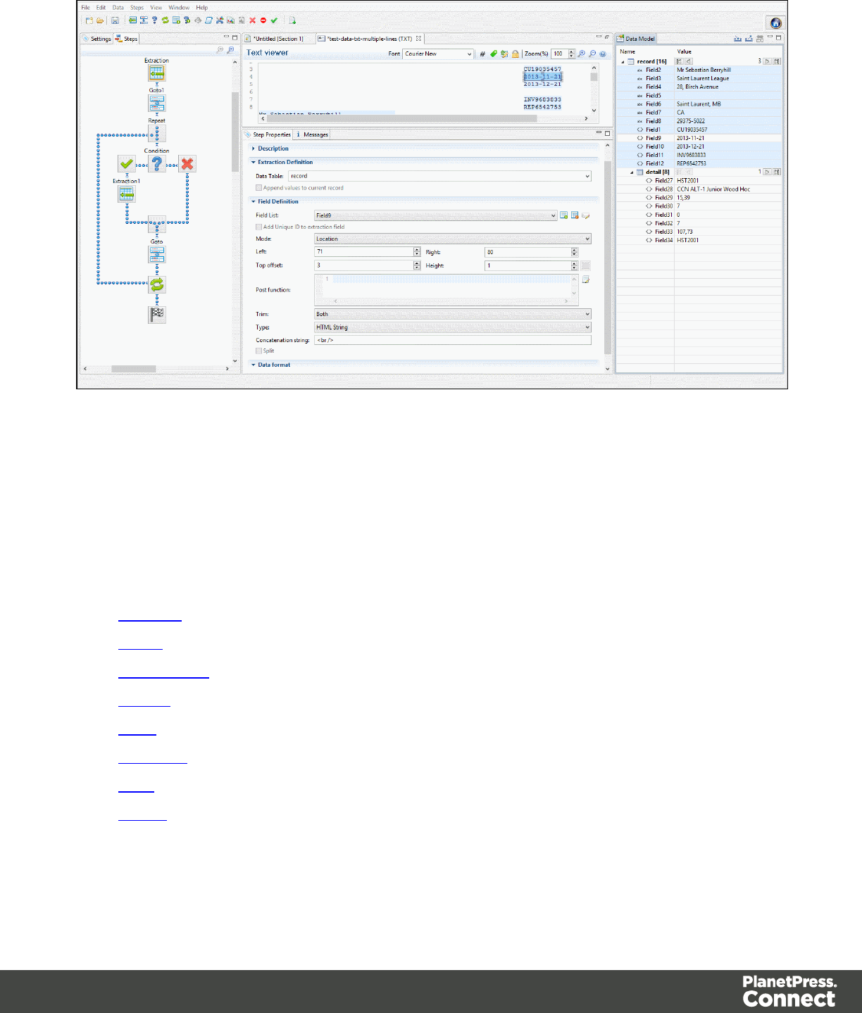
When you select a specific data type, it converts it into a native type. If the date inside the Data
Source was in a different format (Canadian format, Japanese format, etc.), the source shows
that different format. But inside the Data Model, it will always be shown as "year month day"
and the time.
Here are the data types available in all modules of PlanetPress Connect.
lBoolean
lString
lHTMLString
lInteger
lFloat
lCurrency
lDate
lObject
Page 195
Note
The Object data type is only available in the DataMapper module. It is created in the Properties
subsection in the Preprocessor step, and can be used throughout the data mapping configuration.
Boolean Data Type
Booleans are a simple True/False data type often used in conditions and comparisons.
Defining Boolean Values
lPre-Processor: Specify the "Type" as "Boolean" and set a default value of either true; or
false;
lExtraction: Specify the "Type" as "Boolean". The field value must betrueorfalse.
lJavaScript Expression: Set the desired value toeither true; or false;
Example:record.fields["isCanadian"] = true;
Note
The value must be true , all in lowercase. Any variation in case (True, TRUE) will not work.
Boolean Expressions
Boolean values can also be set using an expression of which the result is true or false. This is
done using operators and comparisons.
Example:record.fields["isCanadian"] = (extract("Country") == "CA");
For more information on JavaScript comparison and logical operators, please see
w3schools.com or developer.mozilla.org.
Page 196

String Data Type
Strings contain textual data. Strings do not have any specific meaning, which is to say that their
contents are never interpreted in any way.
Defining String Values
lPre-Processor: Specify the "Type" as "String" and set a default value as any text
between quotes, such as "This is my text";
lExtraction: Specify the "Type" as "String". The field value will be extracted and treated
as a string.
lJavaScript Expression: Set the desired value to any string between quotes.
Example:record.fields["countryOfOrigin"] = "Canada";
Building String Values
Strings values can be made up of more than just a series of characters between quotes. Here
are a few tips and tricks to build strings:
lBoth single and double quotes can be used to surround strings and they will act in
precisely the same manner. So, "this is a string" and 'this is a string' mean the same
thing. However, it's useful to have both in order to remove the need for escaping
characters. For instance, "I'm fine!" works, but 'I'm fine!' does not since only 'I' is
properly interpreted. 'I\'m fine!' works (escaping the ' with a \).
lIt is possible to put more than one string, as well as variables containing strings, by
concatenating them with the +operator. For example,"Hello " +
sourceRecord.property.FirstName + ", nice to meet you!".
lAdding more data to an existing string variable or field is possible using a combination of
concatenation and assignment. For example, if var myVar = "Is this the real life";,
andmyVar += " or is this just fantasy?";, the value ofmyVarwill be, obviously,"Is this
the real life or is this just fantasy?".
For more information on string variables, see quicksmode.org.
Page 197

HTML String Data Type
HTML Strings contain textual data that includes HTML Markup. They are essentially the same
as String values except in cases where HTML can be treated differently. For instance, when
using a script to place an HTML String field into a template, the contents will be HTML instead
of plain text.
Example: Assuming a value of "He said <b>WOW!</b>"; , if the data type is String and placed
on the page, it will display exactly as "He said <b>WOW!</b>" (without the quotes). If the data
type is HTMLString, it will display as "He said WOW!" (again, without the quotes).
Considering this is the only difference, for more information on how to create and use HTML
String values, see String values.
Integer Data Type
Integers are signed, numeric, whole 64bit numbers whose value ranges from -(2^63) to
(2^63).Integersare the numerals with the highest precision (and the fastest processing speed)
of all since theyare never rounded.
Defining Integer Values
lPre-Processor: Specify the "Type" as "Integer" and set a default value as a number,
such as 42;
lExtraction: Specify the "Type" as "Integer". The field value will be extracted and treated
as an integer.
lJavaScript Expression: Set the desired value to any integer value.
Example:record.fields["AnswerToEverything"] = 42;
Building Integer Values
Integers can be set through a few methods, all of which result into an actual integer result.
lDirect attribution: Assign an integer value directly, such as
42,99593463712ordata.extract("TotalOrdered").
Page 198

lMathematical operations: Assign the result of any mathematical operation. For
example:22 + 51,3*6,10/5orsourceRecord.property.SubTotal. For more information on
mathematics in JavaScript , see w3Schools - Mathematical Operators. For more
advanced mathematical functions, see w3schools - Math Object.
Note
When adding numbers that are not integers, for instance 4.5 + 1.2 , a round towards zero
rounding is applied after the operation was made. In the previous example, the result, 5.7, is
rounded to 5. In another example, -1.5 - 1 results in -2
Float Data Type
Floats are signed, numeric, floating-point numbers whose value has 15-16 significant digits.
Routinely used for calculations. Note that floats are inherently imprecise: their accuracy varies
according to the number of significant digits being requested.
Defining Float Values
lPre-Processor: Specify the "Type" as "Float" and set a default value as a number with
decimal points, such as 546513.8798463;
lExtraction: Specify the "Type" as "Float". The field value will be extracted and treated as
a float.
lJavaScript Expression: Set the desired value to any float value.
Example:record.fields["PreciseTaxSubtotal"] = 27.13465;
Building Float Values
Float values can be the result of direct attribution or mathematical operations just like Integer
values.
Currency Data Types
A signed, numeric, fixed-point 64-bit number with 4decimals.Values range from -922 337 203
685 477.5808 to 922 337 203 685 477.5808. This data type is routinely used for financial
Page 199

calculations: it is as precise as integers.
Defining Currency Values
lPre-Processor: In the step properties selection under Properties specify the "Type" as
"Currency" and set a default value as a number with up to 4 decimal points, such as
546513.8798
lExtraction: In the step properties under Field Definition specify "Type" as "Currency"
and configure how the value will be read from the Source Record (see Extract Step). The
field value will be extracted and treated as a float.
lJavaScript Expression: Set the desired value to any float value.
Example:record.fields["PreciseTaxSubtotal"] = 27.13465;
While currency values can be set to up to 4 significant digits, only 2 are displayed on screen.
Building Currency Values
Currency values can be the result of direct attribution or mathematical operations just like
Integer and Float values.
Date Data Type
Dates are values that represent a specific point in time, precise up to the second. They can also
be referred to as datetime values. While dates are shown visually under the system's regional
settings, in reality they are stored unformatted.
Note
The Date property is stored in Connect database with zero time zone offset, which makes it
possible to convert the time correctly in any location. PlanetPress Workflow, however, shows the
date/time as it is stored database (with 0 time zone offset). This is expected behavior for the moment
and the zone offset must be calculated manually in PlanetPress Workflow.
Page 200

Extracting dates
To extract data and have that data interpreted as a Date, set the type of the respective field to
Date:
1. Select the field in the data model.
2. On the Step properties pane, under Field Definition, specify the Type as Date.
3. Next, under Data Format, specify the Date/Time Format. This format must match the way
the date is formatted in the source data; otherwise the data cannot be interpreted as a
Date.
Defining a date/time format
A date format is a mask representing the order and meaning of each digit in the raw data, as
well as the date/time separators. The mask uses several predefined markers to parse the
contents of the raw data. Here is a list of markers that are available in the DataMapper:
lyy: Numeric representation of the Year when it is written out with only 2 digits (i.e. 13)
lyyyy: Numeric representation of the Year when it is written out with 4 digits (i.e. 2013)
lM: Short version of the month name (i.e. Jan, Aug). These values are based on the
current regional settings.
lMM: Long version of the month name (i.e. January, August). These values are based on
the current regional settings.
lmm: Numeric representation of the month (i.e. 1, 09, 12)
lD: Short version of the weekday name (i.e. Mon, Wed). These values are based on the
current regional settings.
lDD: Long version of the weekday name (i.e. Monday, Wednesday). These values are
based on the current regional settings.
ldd: Numeric representation of the day of the month (i.e. 1, 09, 22)
lhh: Numeric representation of the hours
lnn: Numeric representation of the minutes
lss: Numeric representation of the seconds
lms: Numeric representation of the milliseconds.
Page 201
lap: AM/PM string.
lIn addition, any constant character can be included in the mask, usually to indicate
date/time separators (i.e. / - :) . If one of those characters happens to be one of the
reserved characters listed above, it must be escaped using the \symbol.
Note
The markers that can be used when extracting dates are different from those that are used to
display dates in a template (see "Date and time patterns" on page751).
Examples of masks
Value in raw data Mask to use
June 25, 2013 MM dd, YYYY
06/25/13 mm/dd/yy
2013.06.25 yyyy.mm.dd
2013-06-25 07:31 PM yyyy-mm-dd hh:nn ap
2013-06-25 19:31:14.1206 yyyy-mm-dd hh:nn:ss.ms
Tuesday, June 25, 2013 @ 7h31PM DD, MM dd, yyyy @ hh\hnnap
Entering a date using JavaScript
In several places in the DataMapper, Date values can be set through a JavaScript. For
example:
lInafield in the Data Model. To do this, go to the Steps pane and select an Extract step.
Then, on the Step properties pane, under Field Definition click the Add JavaScript Field
button (next to the Field List drop-down). Type the JavaScript in the Expression field. (To
rename the field, click the Order and rename fields button.)
Page 202

lInaPreprocessor property. To do this, go to the Steps pane and select the
Preprocessor step. Then, on the Step properties pane, under Properties add a property,
specify its Type as Date and put the JavaScript in the Default Value field.
The use of the JavaScript Date() object is necessary when creating dates through a JavaScript
expression. For more information, see w3schools - JavaScript Dates and w3schools - Date
Object.
Example
The following script creates a date that is the current date + 30 days:
function addDays(date, days) {
var result = new Date(date);
result.setDate(result.getDate() + days);
return result;
}
addDays(new Date(), 30);
Object Data Type
Objects holds addresses that refer to objects. You can assign any reference type (string, array,
class, or interface) to an Object variable. An Object variable can also refer to data of any value
type (numeric, Boolean, Char, Date, structure, or enumeration).
Defining Object Values
lPre-Processor: Specify the "Type" as "Object" and set a default value as a semi-colon.
Toolbar
In the DataMapper module, the following buttons are available in the top toolbar:
File Manipulation Buttons
lNew : Displays the New wizard where a new data mapping configuration or a new
template can be created.
lOpen : Displays the Open dialog to open an existing data mapping configuration.
Page 203
lSave : Saves the current data mapping configuration. If the configuration has never
been saved, the Save As... dialog is displayed.
Step Manipulation
Note
All steps except JavaScript require an active data selection in the Data Viewer.
lAdd Extract Step : Adds an Extract Step with one or more extract fields. If more than
one line or field is selected in the Data Viewer, each line or field will have an extract field.
lAdd Goto Step : Adds a Goto step that moves the selection pointer to the beginning of
the data selection. For instance if an XML node is selected, the pointer moves to where
that node is located.
lAdd Condition Step : Adds a condition based on the current data selection. The
"True" branch gets run when the text is found on the page. Other conditions are available
in the step properties once it has been added.
lAdd Repeat Step : Adds a loop that is based on the current data selection, and
depending on the type of data. XML data will loop on the currently selected node, CSV
loops for all rows in the record. In Text and PDF data, if the data selection is on the same
line as the cursor position, the loop will be for each line until the end of the record. If the
data selection is on a lower line, the loop will be for each line until the text in the data
selection is found at the specified position on the line (e.g. until "TOTAL" is found).
lAdd Extract Field : Adds the data selection to the selected Extract step, if an extract
step is currently selected. If multiple lines, nodes or fields are selected, multiple extract
fields are added simultaneously.
lAdd Multiple Conditions : Adds a condition that splits into multiple case conditions.
lAdd Action Step : Adds a step to create a custom JavaScript snippet. See the
DataMapper API for more details.
lCut Step : Removes the currently selected step and places it in the clipboard. If the
step is a Repeat or a Condition, all steps under it are also placed in the clipboard. If there
is already a step in the clipboard, it will be overwritten.
lCopy Step : Places a copy of the currently selected step in the clipboard. The same
details as the Cut step applies.
Page 204
lPaste Step : Takes the step or steps in the clipboard and places them after the
currently selected step.
lDelete Step : Deletes the currently selected step. If the step is a Repeat or Condition,
all steps under it are also deleted.
lIgnore Step : Click to set the step to be ignored (aka disabled). Disabled steps do not
run when in DataMapper and do not execute when the data mapping configuration is
executed in Workflow. However, they can still be modified normally.
lValidate All Records : Runs the process on all records and verifies that no errors are
present in any of the records. Errors are displayed in the Messages Pane.
lAdd Data Sample : Displays a dialog to open a new Data Source to add it as a Data
Sample in the data mapping configuration. Data Samples are visible in the Settings Pane.
Shortcut Keys
You can add a step by pressing a specific key on the keyboard:
Extract: F6
Goto: F7
Conditional: F8
Repeat: F9
Action: F11
test
Welcome Screen
The Welcome Screen appears when first starting up PlanetPress Connect. It offers some
useful shortcuts to resources and to recent documents and data mapping configurations.
The Welcome Screen can be brought back in two ways:
Page 205

lThe Welcome Screen button in the Toolbars.
lFrom the Menus in Help,Welcome Screen.
Contents
lActivation: Click to open the Objectif Lune Web Activation Manager.
lRelease Notes: Opens the current Release Notes for PlanetPress Connect.
lWebsite: Opens the PlanetPress Connect website.
lTake A Tour: Click to open the YouTube Playlist giving you a tour of the software.
lUse the DataMapper to...:
lCreate a New Configuration: Opens the Creating a New Configuration screen.
lOpen an Existing Configuration: Click to open the standard Browse dialog to
open an existing data mapping configuration.
lRecent Configurations: Lists recently used configurations. Click any configuration
to open it in the DataMapper module.
lUse the Designer to...:
lCreate a New Template: Opens the Creating a new Template wizard.
lBrowse Template Wizards: Displays a list of available template wizards,
producing pre-made templates with existing demo content. These are the same that
are found at the bottom of the Creating a new Template wizard.
lOpen an Existing Template: Click to open the standard Browse dialog to open an
existing template.
lRecent Templates: Lists recently used templates. Click any template to open it in
the Designer module.
lOther Resources:
lDocumentation: Opens this documentation.
lCourses (OL Learn): Opens the Objectif Lune e-Learning Center.
lUser Forums: Opens the Questions & Answer forums.
Page 206
DataMapper Scripts API
This page describes the different features available in scripts created inside DataMapper. See
"Write Your Own Scripts" on page214.
Objects
Name Description Available In
automation Returns a ScriptableAutomation
object encapsulating the properties of
the PlanetPress Workflow process that
triggered the current operation.
Boundaries, all Steps except
Goto
boundaries Returns a boundaries object
encapsulating properties and methods
allowing to define the boundaries of
each document in the job.
Boundaries
data Returns a data object encapsulating
properties and methods pertaining to
the original data stream.
Boundaries, all Steps except
Goto
db Returns a db object allowing you to
connect to a database.
Boundaries, all Steps except
Goto
logger Allows to log messages as error,
warning or informational message.
Boundaries, all Steps except
Goto
record The current record in the main data set. Extract, Condition, Repeat
and Multiple Conditions
Steps
region The region object defines a subsection
of the input data.
Boundaries
Page 207
Name Description Available In
sourceRecord Returns a source record object
containing properties specific to the
current source record being processed.
Boundaries, all Steps except
Goto and Postprocessor
steps Returns a steps object encapsulating
properties and methods pertaining to
the current DataMapper process.
Extract, Condition, Repeat
and Multiple Conditions
Steps
Functions
Name Description Available In
copyFile() Copies a file to the target file path,
replacing it if it already exists.
Boundaries, Steps
createTmpFile() Creates a file with a unique name
in the temporary work folder and
returns a file object.
Boundaries, Steps
deleteFile() Deletes a file. Boundaries, Steps
execute() Calls an external program and
wait for its end.
Boundaries, Steps
newByteArray() Returns a new byte array. Boundaries, Steps
newCharArray() Returns a character array. Boundaries, Steps
newDoubleArray() Returns a double array. Boundaries, Steps
newFloatArray() Returns a float array. Boundaries, Steps
newIntArray() Returns an integer array. Boundaries, Steps
Page 208
Name Description Available In
newLongArray() Returns a long array. Boundaries, Steps
newStringArray() Returns a string array. Boundaries, Steps
openBinaryReader
()
Opens a file as a binary file for
reading purposes.
Boundaries, Steps
openBinaryWriter() Opens a file as a binary file for
writing purposes.
Boundaries, Steps
openTextReader() Opens a file as a text file for
reading purposes.
Boundaries, Steps
openTextWriter() Opens a file as a text file for
writing purposes.
Boundaries, Steps
Methods
Name Description Object
Related
Available In File Type
connect() Method that
returns a new
database
connection
object.
db Boundaries settings
Proprocessor,
Extract, Condition,
Repeat, Action, and
Postprocessor
steps
all
createRegion() Read-only
object
containing the
physical
coordinates of
the region.
region Boundaries all
Page 209
Name Description Object
Related
Available In File Type
currentPosition() Returns the
current position
of the pointer in
the data.
steps Extract,
Condition,
Repeat, and
Action steps
all
currentLoopCounter
()
Returns an
integer value
representing
the current
iteration of the
containing loop.
steps Extract,
Condition,
Repeat, and
Action steps
all
currentPage() Returns an
integer value
representing
the current
page where the
current position
is located,
inside the
current record.
steps Extract,
Condition,
Repeat, and
Action steps
Text and
PDF
currentPageHeight() Returns the
height of the
current page in
millimeters.
steps Extract,
Condition,
Repeat, and
Action steps
PDF
currentPageWidth() Returns the
height of the
current page in
millimeters.
steps Extract,
Condition,
Repeat, and
Action steps
PDF
extract() Extracts the text
value from a
rectangular
region.
data Extract,
Condition,
Repeat, and
Action steps
all
Page 210
Name Description Object
Related
Available In File Type
extractMeta() Method that
extracts the
value of a
metadata field.
data Extract,
Condition,
Repeat, and
Action steps
all
fieldExists() Method that
returns True if
metadata field
exists.
data Boundaries
Preprocessor,
Extract, Condition,
Repeat, Action and
Postprocessor
steps
all
find() Finds the first
occurrence of a
string starting
from the current
position.
data and
boundaries
Boundaries
Extract, Condition,
Repeat, and Action
steps
all
found() Method that
returns a
Boolean value
indicating
whether the last
call to find()
was successful.
region Boundaries all
get() Retrieves an
array of strings.
automation
and
boundaries
Boundaries all
getVariable() Method that
retrieves the
value currently
stored in a
variable.
automation
and
boundaries
Boundaries all
Page 211
Name Description Object
Related
Available In File Type
moveLines() Scope constant
that can be
used as a
parameter to
moveTo() and
moveToNext()
methods.
steps Extract,
Condition,
Repeat, and
Action steps
Text
moveDelimiters() Scope constant
that can be
used as a
parameter to
moveTo() and
moveToNext()
methods.
steps Extract,
Condition,
Repeat, and
Action steps
Text
moveMeasure() Scope constant
that can be
used as a
parameter to
moveTo() and
moveToNext()
methods.
steps Extract,
Condition,
Repeat, and
Action steps
PDF
moveNode() Scope constant
that can be
used as a
parameter to
moveTo() and
moveToNext()
methods.
steps Extract,
Condition,
Repeat, and
Action steps
XML
movePage() Scope constant
that can be
used as a
parameter to
steps Extract,
Condition,
Repeat, and
Action steps
PDF
Page 212
Name Description Object
Related
Available In File Type
moveTo() and
moveToNext()
methods.
moveSibling() Scope constant
that can be
used as a
parameter to
moveTo() and
moveToNext()
methods.
steps Extract,
Condition,
Repeat and
Multiple
Conditions Steps
XML
moveTo() Moves the
current position
to a number.
steps Extract,
Condition,
Repeat and
Action steps
all
moveToNext() Moves the
current position
to the next
instance of a
number.
steps Extract,
Condition,
Repeat and
Action steps
all
range() Read-only
object
containing the
physical
coordinates of
the region.
region Boundaries all
set() Sets a new
DataMapper
record
boundary.
automation
and
boundaries
Boundaries all
Page 213
Name Description Object
Related
Available In File Type
setVariable() Method that
sets a variable
to the specified
value,
automatically
creating the
variable if it
doesn't exist
yet.
automation
and
boundaries
Boundaries all
totalPages() Returns an
integer value
representing
the total
number of
pages inside
the current
record.
steps Extract,
Condition,
Repeat, and
Action steps
Text and
PDF
Write Your Own Scripts
Data mapping can be taken a lot further than just performing basic extractions. Every part of
your extraction process can be customized using scripts. This topic explains how scripts work
and how you can create and write a script.
How Scripts Work
A script is a small set of instructions, written in JavaScript. When Connect generates the actual
extraction process, it takes each step, one by one, and runs all scripts for it.
Creating a New Script
In DataMapper, you can use scripts to set Boundaries (see Boundaries Using JavaScript) or in
the Step Properties for steps such as:
Page 214
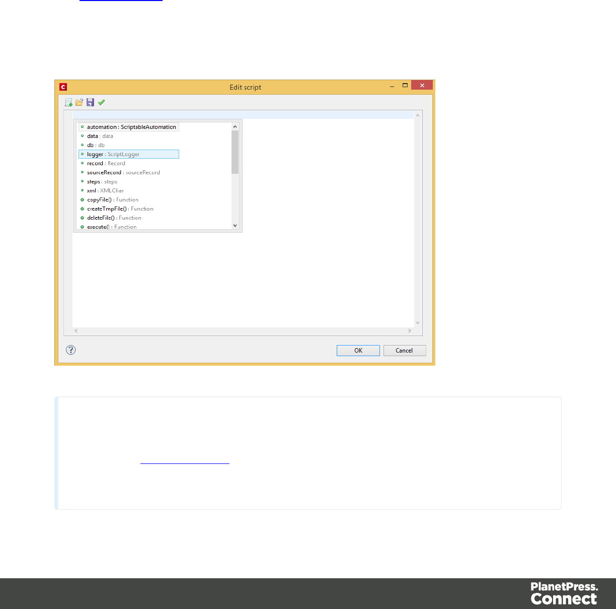
lExtraction step where the data selection is based on JavaScript or you can enter a post
function script.
lAction step using the set properties based on JavaScript or you can use JavaScript run
script.
lCondition step where the left and right operands are based on JavaScript.
See Step Propertiesfor more information.
From the Settings or from the Step Properties pane, click the Use JavaScript Editor button.
The Edit script dialog appears:
Tip
In the Edit script dialog, press Ctrl-Space to bring up the list of available JavaScript objects and
functions (see Datamapper API). Use the arrow keys to select a function or object and press enter
to insert it. Type a dot after the name of the function or object to see which features are
subsequently available.
Page 215
Syntax Rules
Every script in the DataMapper must follow JavaScript syntax rules. For example, each
statement should end with ;and the keywords that can be used, such as var to declare a
variable, are JavaScript keywords. There are countless tutorials available on the Internet to
familiarize yourself with the JavaScript syntax. For a simple script all that you need to know can
be found on the following web pages: https://developer.mozilla.org/en-
US/docs/Web/JavaScript.
Tip
For more examples of using conditions, see this how-to: Combining record-based conditions.
DataMapper API
Certain features do not exist in the native JavaScript library. These are additional JavaScript
features, designed for use in Connect only. All features designed for use in the DataMapper are
listed in the DataMapper's API (see DataMapper API).
Boundaries Using JavaScript
As soon as you select the On Script option as the trigger for establishing record boundaries,
you are instructing the DataMapper to read the file sequentially and to trigger an event each
and every time it hits a delimiter. In other words, the script that you'll be writing will be executed
- by default - as many times as there are delimiters in your input data.
If you know, for instance, that your PDF file only contains documents that are 3-pages, your
script could keep count of the number of times it's been called since the last boundary was set
(i.e. the count of delimiters it encountered) and each time the count is a multiple of 3, it could set
a new record boundary. You would basically have recreated the same functionality that is
already available through the GUI when setting the trigger to On Page and specifying 3 as the
Number of Pages.
Note
Remember that your script is being called on each new delimiter encountered by the DataMapper
parsing algorithm. If you are dealing with a DB Query that returns a million record, the script will
Page 216
be executed a million times! So you have to craft your script in such a way that it doesn't waste too
much time examining all possible conditions. Instead, it should terminate as soon as any condition
it's evaluating is false.
Data available inside each event
Every time the event is triggered, it has access to the entire data between the current location
and the next delimiter. So if you are just beginning the process for a PDF or text file, you have
access to the first page only. For CSV/DB, it means you have access to the one record line at
the current location.
What this means?
You can:
lExamine the data found in between delimiters for specific conditions.
lExamine specific regions of that data, or the available data as a whole.
lCompare the contents of one region with another.
In fact, make all the comparisons you want as long as it's all located in the data between the
current location and the next delimiter.
What happens when the record boundaries depend on data found on different pages,
within the same record?
The API allows your script to "remember", across delimiters, the values that were evaluated in
previous pages so you can easily set record boundaries that span over hundreds of delimiters
(or more).
Examples
Basic example using a CSV file
Note
In this first example, don't focus on the actual syntax being used. You can take a look at the API
Page 217
reference later on for more information.
Imagine you are a classic rock fan and you want to extract the data from a CSV listing of all the
albums in your collection. Your goal is to extract records that change whenever the artist OR
the release year changes.
Here's what the CSV looks like:
"Artist","Album","Released"
"Beatles","Abbey Road",1969
"Beatles","Yellow Submarine",1969
"Led Zeppelin","Led Zeppelin 1",1969
"Led Zeppelin","Led Zeppelin 2",1969
"Beatles","Let it be",1969
"Rolling Stones","Let it bleed",1969
"Led Zeppelin","Led Zeppelin 3",1970
"Led Zeppelin","Led Zeppelin 4",1971
"Rolling Stones","Sticky Fingers",1971
Note
The first line is just the header with the names of the CSV columns. Obviously, the data is already
sorted per year, per artist, and per album.
Your goal is to examine two values in each CSV record and to act when either changes. The
DataMapper GUI allows you to specify a On Change trigger, but you can only specify a single
field. So for instance, if you were to set the record boundary when the "Released" field
Page 218

changes, then you'd get the first four lines together inside a single record, but that's not what
you want since that would include albums from several different artists. And if you were to set it
when the "Artist" field changes, then the first few records would be OK but near the end, you'd
get both the Led Zeppelin 3 and led Zeppelin 4 albums inside the same record, even though
they were released on different years. So that's no good either.
Essentially, we need to combine both these conditions and set the record boundary when
EITHER the year OR the artist changes.
Here's what the script would look like:
// Read the values of both columns we want to check
var zeBand = boundaries.get(region.createRegion("Artist"));
var zeYear = boundaries.get(region.createRegion("Released"));
// Check that at least one of our variables holding previous values
have been initialized already, before attempting to compare the
values
if (boundaries.getVariable("lastBand")!=null) {
if ( zeBand[0]!=boundaries.getVariable("lastBand")
|| zeYear[0]!=boundaries.getVariable("lastYear") )
{
boundaries.set();
}
}
boundaries.setVariable("lastBand",zeBand[0]);
boundaries.setVariable("lastYear",zeYear[0]);
lThe script first reads the two values from the input data, using the createRegion() API
method. For a CSV/DB data type, the parameter it expects is simply the column name.
The region is then passed as a parameter to the get() method, which reads its contents
and converts it into an array of strings (because any region, even a CSV field, may
contain several lines).
lTo "remember" the values that were processed the last time the event was triggered, we
use variables that remain available in between events. Note that these variables are
specific to the Boundary context and not available in any other scripting context in the
DataMapper.
lThe script first checks if those values were initialized. If they weren't, it means this is the
first iteration so there's no need to compare the current values with previous values since
Page 219

there have been none yet. But if they have already been initialized, then a condition
checks if either field has changed since last time. If that's the case, then a boundary is
created through the set() method.
lFinally, the script stores the values it just read in the variables using the setVariables()
method. They will therefore become the "last values encountered" until the next event
gets fired. When called, setVariables() creates the specified variable if it doesn't already
exist and then sets the value to the second parameter passed to the function.
You can try it yourself. Paste the data into the text editor of your choice and save the file to
Albums.csv. Then create a new DataMapper configuration and load this CSV as your data file.
In the Data Input Settings, make sure you specify the first row contains field names and set the
Trigger to On script. Then paste the above JavaScript code in the Expression field and click
the Apply button to see the result.
Same basic example using a text file
So let's say we want to do the exact same thing, but this time around the Data Source is a plain
text file that looks like this:
Beatles Abbey Road 1969
Beatles Yellow Submarine 1968
Led Zeppelin Led Zeppelin 1 1969
Led Zeppelin Led Zeppelin 2 1969
Beatles Let it be 1970
Rolling Stones Let it bleed 1969
Led Zeppelin Led Zeppelin 3 1970
Led Zeppelin Led Zeppelin 4 1971
Rolling Stones Sticky Fingers 1971
Then our script would look like this:
// Read the values of both columns we want to check
var zeBand = boundaries.get(region.createRegion(1,1,30,1));
var zeYear = boundaries.get(region.createRegion(61,1,65,1));
// Check that at least one of our variables holding previous values
have been initialized already, before attempting to compare the
Page 220
values
if (boundaries.getVariable("lastBand")!=null) {
if ( zeBand[0]!=boundaries.getVariable("lastBand")
|| zeYear[0]!=boundaries.getVariable("lastYear") )
{
boundaries.set();
}
}
boundaries.setVariable("lastBand",zeBand[0]);
boundaries.setVariable("lastYear",zeYear[0]);
Note
We're using the exact same code we as used for CSV files, with the exception of parameters
expected by the createRegion() method. The API methods adapts to their context and therefore
expect different parameters to be passed in order to achieve the same thing. Since a text file does not
contain column names as a CSV does, the API expects the text regions to be defined using physical
coordinates. In this instance: (Left, Top, Right, Bottom).
You can try this code as well. Paste the data into the text editor of your choice and save the file
to Albums.txt. Then create a new DataMapper configuration and load this TXT as your data file.
In the Data Input Settings, specify On lines as the Page delimiter type with the number of lines
set to 1 so you can process the file line per line (i.e. triggering the event on each line). Then, set
the boundary Trigger to On script and paste the above code in the JavaScript expression and
click the Apply button to see the result.
Note
The PDF context also expects physical coordinates, just like the Text context does, but since PDF
pages do not have a grid concept of lines and columns, the above parameters would instead be
specified in millimeters relative to the upper left corner of each page. So for instance, to create a
region for the Year, the code might look like this:
region.createRegion(190,20,210,25)
which would create a region located near the upper right corner of the page.
That's the only similarity, though, since the script for a PDF would have to look through the entire
Page 221
page and probably make multiple extractions on each one since it isn't dealing with single lines like
the TXT example given here.
For more information on the API syntax, please refer to DataMapper API.
Objects
Automation Object
Returns a ScriptableAutomation object encapsulating the properties of the PlanetPress
Workflow process that triggered the current operation.
Properties
The following table lists the properties of the Automation object.
Property Type Description
JobInfo ScriptableAutomationProperty Returns a ScriptableAutomation object
containing JobInfo 1 to 9 values from
PlanetPress Workflow
Properties ScriptableAutomationProperty Returns a ScriptableAutomation object
containing additional information (file
name, process name and task ID) from
PlanetPress Workflow
Variables ScriptableAutomationProperty Returns a ScriptableAutomation object
containing the list of local and global
variables defined by the user in
PlanetPress Workflow to the
DataMapper. Note that there is no way to
distinguish local variables from global
ones (local variables take precedence
over global variables). To be used in the
DataMapper, variables must have
Page 222
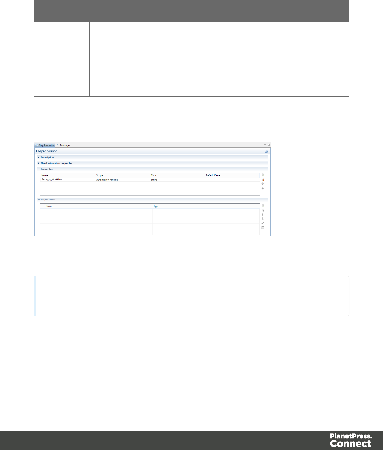
Property Type Description
already been defined in the
Preprocessor step as Automation
variables. The Preprocessor step
attempts to match variable names
passed by the Workflow process to
those defined inside the step.
Example
The variable used from Workflow must first be declared in the Preprocessor step:
See The Preprocessor Step Properties for more information.
Note
The Type of the variable must be the same as the variable from Workflow.
Accessing Automation Properties
To access JobInfo 1 to 9 from Workflow:
automation.jobInfo.JobInfo1;
To access ProcessName, OriginalFilename or TaskIndex from Workflow:
Page 223
automation.properties.OriginalFilename;
To access variables declared in the Preprocessor properties (see picture above):
automation.variables.Same_as_workflow;
Boundaries Object
Returns a boundaries object encapsulating properties and methods allowing to define the
boundaries of each document in the job.
Properties
The following table lists the properties of the Boundaries object.
Property Return Type
CurrentDelim A read-only 1-based index (number) of the current delimiter in the file. In
other words, the Beginning Of File (BOF) delimiter equals 1. It indicates the
position of the current delimiter relative to the last document boundary
Methods
The following table describes the functions of the Boundaries object.
Method
find()
get()
getVariable()
set()
setVariable()
Page 224
Data Object
Returns a data object encapsulating properties and methods pertaining to the original data
stream.
Properties
The following table lists the properties of the data object.
Property Description Return Type
filename The path of the input file. Returns the fully qualified
file name of the temporary
work file being processed.
properties Contains properties declared in the
preprocessor step (see Preprocessor Step
Properties for details).
Returns an array of
properties defined in the
Preprocessor step with
the data scope (i.e.
statically set at the start of
the job).
Methods
The following table describes the methods of the data object.
Method
extract()
extractMeta ()
fieldExists ()
find()
Db Object
Returns a db object allowing you to connect to a database.
Page 225
Method
The following table describes the methods of the db object.
Method
connect()
Logger Object
Global object that allows logging messages such as error, warning or informational messages.
Methods
The following table describes the methods of the logger object.
Method Parameters Description
error() message: string Logs an error message
info() message: string Logs an informational message
warn() message: string Logs a warning message
Record Object
The current record in the main data set.
Properties
Property Return Type
fields The field values that belong to this record. You can access a specific
field value using either a numeric index or the field name,
index The one-based index of this record, or zero if no data is available.
tables The details table that belong to this record. You can access a
specific table using a numeric index or the table name.
Page 226
Example
Region Object
The region object defines a sub-section of the input data. Its properties vary according to the
type of data.
Methods
The following table describes the methods of the region object.
Method Description Return Type
found() Contains a Boolean value indicating if
the last call to find() was successful.
Returns a region.
range() Read-only object containing the
physical coordinates of the region.
Physical location of the
region.
createRegion() Creates a region. The region object returns
an array of all strings
found in the region
SourceRecord Object
Returns a SourceRecord object containing properties specific to the current source record
being processed.
Properties
sourceRecord.properties.property;
Property Return Type
properties Returns an array of properties defined in the Preprocessor step with
the Record Scope (i.e. dynamically reset with each new record).
Page 227
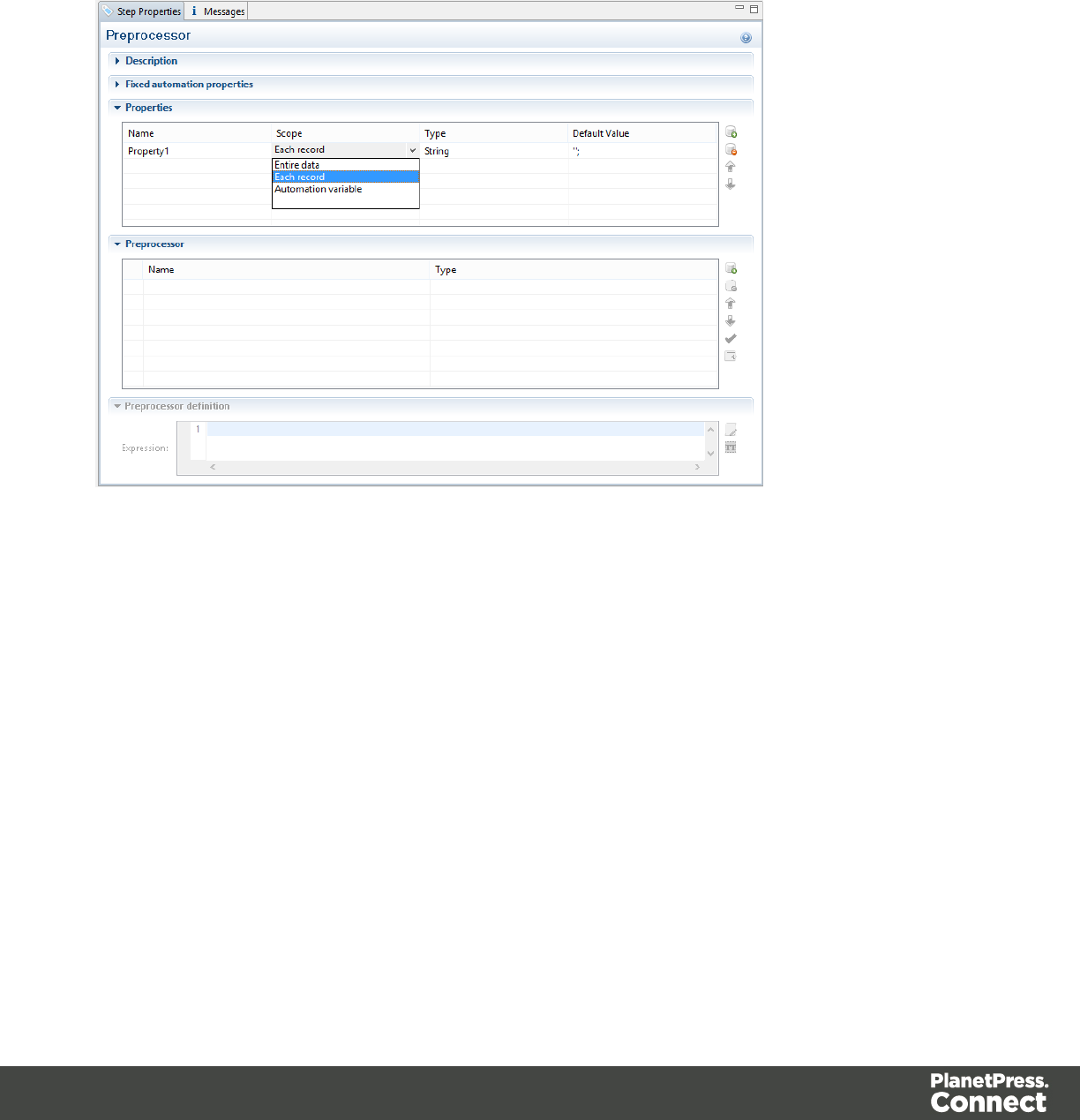
Example
The property, used by the object Source Record, must first be declared in a Preprocessor
step:
1. Enter the property Name.
2. Select Each record from the Scope drop-down list.
3. Select a Type for the Property.
Steps Object
Returns a steps object encapsulating properties and methods pertaining to the current
DataMapper process.
Methods
The following table lists the methods of the steps object.
Page 228
Method
currentPosition()
currentLoopCounter()
currentPage()
currentPageHeight()
currentPageWidth()
moveLines()
moveDelimiters()
moveMeasure()
moveNode()
movePage()
moveSibling()
moveTo()
moveToNext()
totalPages()
Functions
copyFile()
Function that copies a file to the target file path, replacing it if it already exists.
copyFile(source, target)
Copies a file to the target file path, replacing it if it already exists.
Page 229

source
String that specifies source file path and name.
target
String that specifies target file path and name.
target
String that specifies destination path and file name.
Example
In this script, the file test.txt included in c:\Content, will be copied into the c:\out folder.
copyFile("c:\Content\test.txt","c:\out\")
CreateTempFile()
Creates a file with a unique name in the temporary work folder and returns a file object. This file
stores data temporarily in memory or in a buffer. It is used to prevent multiple input/output
access to a physical file when writing. In the end, the contents is transferred into a physical file
for which only a single input/output access will occur.
Examples
In the following script, a file is read in a temporary file:
try{
// Create a temporary file
var tmpFile = createTmpFile();
// Open a writer on the temporary file
var writer = openTextWriter(tmpFile.getPath());
try{
var line = null; // Current line
// read line by line and readLine will return null at the
end of the file.
while((line = reader.readLine()) != null ){
// Edit the line
line = line.toUpperCase();
// Write the result in the temporary file
writer.write(line);
// add a new line
writer.newLine();
}
Page 230

}
finally{
// Close the writer or the temporary file
writer.close();
}
}
finally{
// Close the reader
reader.close();
}
DeleteFile()
Function used to delete a file.
DeleteFile(filename)
Deletes a file.
filename
String that specifies the path and file name of the file to be deleted.
Examples
1. You can delete the data file used in the DataMapper:
DeleteFile(data.filename);
2. You can delete a file in a local folder
DeleteFile("c:\Content\test.txt");
execute()
Function that calls an external program and waits for it to end.
execute(command)
Calls an external program and waits for it to end.
command
String that specifies the path and file name of the program to execute.
Page 231

Examples
NewByteArray()
Function that returns a new byte array.
NewByteArray(size)
Returns a new byte array of size elements.
size
Integer that represents the number of elements in the new array.
Examples
NewCharArray()
Function that returns a new character array.
NewCharArray(size)
Returns a new character array of size elements.
size
Integer that represents the number of elements in the new array.
Examples
NewDoubleArray()
Function that returns a new double array.
NewDoubleArray(size)
Returns a new double array of size elements.
size
Integer that represents the number of elements in the new array.
Page 232

Examples
NewFloatArray()
Function that returns a new float array.
NewFloatArray(size)
Returns a new float array of size elements.
size
Integer that represents the number of elements in the new array.
Examples
NewIntArray()
Function that returns a new integer array of size elements.
NewIntArray(size)
Returns a new integer array of size elements.
size
Integer that represents the number of elements in the new array.
Examples
NewLongArray()
Function that returns a new long array.
NewLongArray(size)
Returns a new long array of size elements.
size
Integer that represents the number of elements in the new array.
Page 233

Examples
NewStringArray()
Function that returns a new string array.
NewStringArray(size)
Returns a new string array of size elements.
size
Integer that represents the number of elements in the new array.
Examples
OpenBinaryReader()
Function that opens a file as a binary file for reading purposes.
OpenBinaryReader(filename)
Opens filename as a binary file for reading purposes. The function returns a BinaryReader
object.
filename
String that represents the name of the file to open.
Examples
OpenBinaryWriter()
Function that opens a file as a binary file for writing purposes.
OpenBinaryWriter(filename, append)
Opens filename as a binary file for writing purposes. The append Boolean parameter specifies
whether the file pointer should initially be positioned at the end of the existing file (append
mode) or at the beginning of the file (overwrite mode). The function returns a BinaryWriter
object.
filename
String that represents the name of the file to open.
Page 234

append
Boolean parameter that specifies whether the file pointer should initially be positioned at the
end of the existing file (append mode) or at the beginning of the file (overwrite mode).
Examples
OpenTextReader()
Function that opens a file as a text file for reading purposes.
OpenTextReader(filename,encoding)
Opens filename as a text file for reading purposes, using the encoding specified as a string
(UTF-8, ISO-8859-1, etc.). The function returns a TextReader object.
filename
String that represents the name of the file to open.
Examples
OpenTextWriter()
Function that opens a file as a text file for writing purposes.
OpenTextWriter(filename, encoding, append)
Opens filename as a text file for writing purposes, using the encoding specified as a string
(UTF-8, ISO-8859-1, etc.).
The function returns a TextWriter object.
filename
String that represents the name of the file to open.
append
Boolean parameter that specifies whether the file pointer should initially be positioned at the
end of the existing file (append mode) or at the beginning of the file (overwrite mode).
Page 235

Examples
Methods
connect()
Method that returns a new database connection object
Related Object: db.
connect(url, user, password)
Returns a new database connection object after connecting to the url and authenticating the
connection with the provided user and password information.
url
String that represents the url to connect to.
user
String that represents the user name for the authentication.
password
String that represents the password for the authentication.
Examples
createRegion()
Read-only object containing the physical coordinates of the region.
Related Object: Region.
createRegion(x1, y1, x2, y2)
Creates a region from the data, using the specified x1 (left), y1 (top), x2 (width), y2 (height)
parameters, expressed in characters for a Text file or in millimeters for a PDF file.
x1
Double that represents the left edge of the region.
y1
Double that represents the top edge of the region.
Page 236
x2
Double that represents the width of the region.
y2
Double that represents the height of the region.
createRegion(columnName)
Creates a region from the data in a CSVfile, using the specified columnName parameter.
columnName
Double that represents the column to be used to create the region.
Examples
currentLoopCounter()
Returns an integer value representing the current iteration of the containing loop. When loops
are nested, you have access to the iteration for the current loop but not to any of the parent
loops.
Related Object: Steps.
Example
currentLoopPosition()
currentPage()
Returns an integer value representing the current page where the current position is located,
inside the current record.
Related Object: Steps.
Example
currentPageHeight()
Returns the height of the current page in millimeters.
Page 237
Related Object: Steps.
Example
currentPageHeight()
Returns the height of the current page in millimeters.
Related Object: Steps.
Example
currentPosition()
Returns the current position of the pointer in the data. Depending on the type of data being
processed, the return value may be a string (e.g. XPath value in XML), an integer (e.g. line
numbers in text ot tabular data), or a measure in millimeters(e.g. PDF data).
Related Object: Steps.
Example
extract()
Extracts the text value from a rectangular region. All coordinates are expressed as characters.
The extract method always returns a String data type.
Related Object: Data.
extract(left, right, verticalOffset, regionHeight, separator)
Extracts a value from a position in a text file.
left
Number that represents the distance from the left edge of the page to the left edge of the
rectangular region.
right
Number that represents the distance from the left edge of the page to the right edge of the
rectangular region.
verticalOffset
Page 238
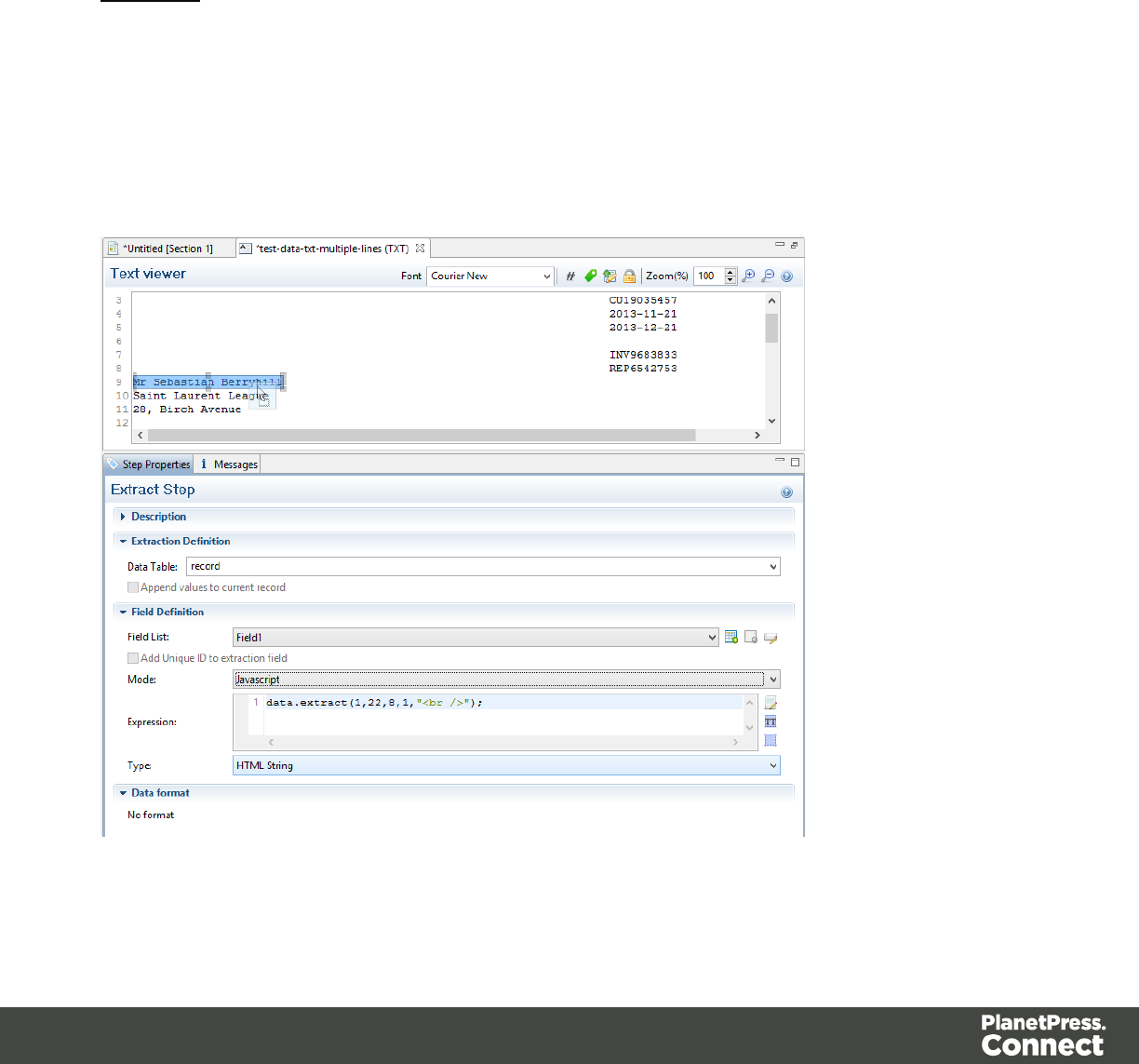
Number that represents the distance from the current vertical position.
regionHeight
Number that represents the total height of the region.
separator
String inserted between all lines returned from the region. An empty string can be specified.
Examples
Example 1:
In this example you have the script command data.extract(1,22,8,1,"<br />");. It means that the
left position of the extracted information is located at 1, the right position at 22, the offset
position is 8 (since the line number is 9) and the regionHeight is 1 (only 1 line selected).
Finally, the "<br/>" string is used for concatenation.
Page 239
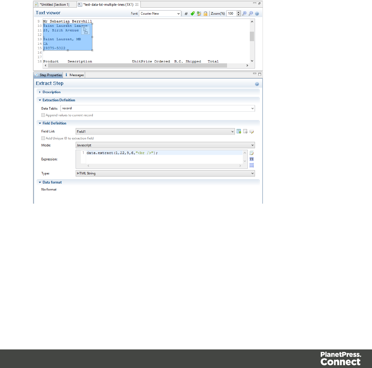
Example 2:
In this example you have the script command data.extract(1,22,9,6,"<br />");. It means that the
left position of the extracted information is located at 1, the right position at 22, the offset
position is 9 (since the first line number is 10) and the regionHeight is 6 (6 lines are selected).
Finally, the "<br/>" string is used for concatenation.
extract(xPath)
Extracts the text value of the specified node.
xPath
String that can be relative to the current location or absolute from the start of the record.
Page 240
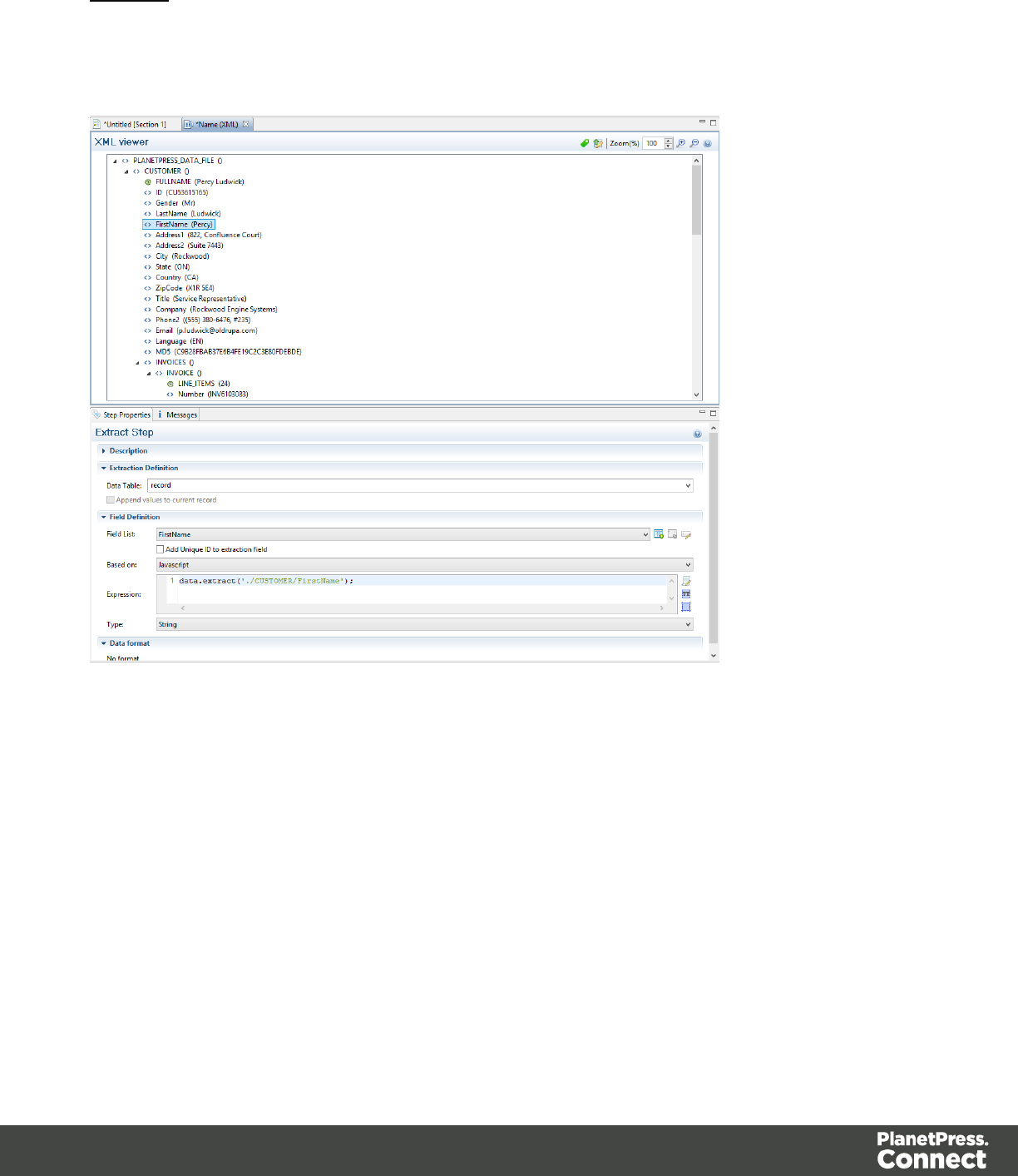
Example
In this example you have the script command data.extract('./CUSTOMER/FirstName');. It
means that the extraction is made on the FirstName node under Customer.
extract(columnName, rowOffset)
Extracts the text value for the specified fieldName.
fieldName
String that represents the column name.
rowOffset
Number that represents the row index relative to the current position. To extract the current
row, specify 0 as the rowOffset.
Page 241
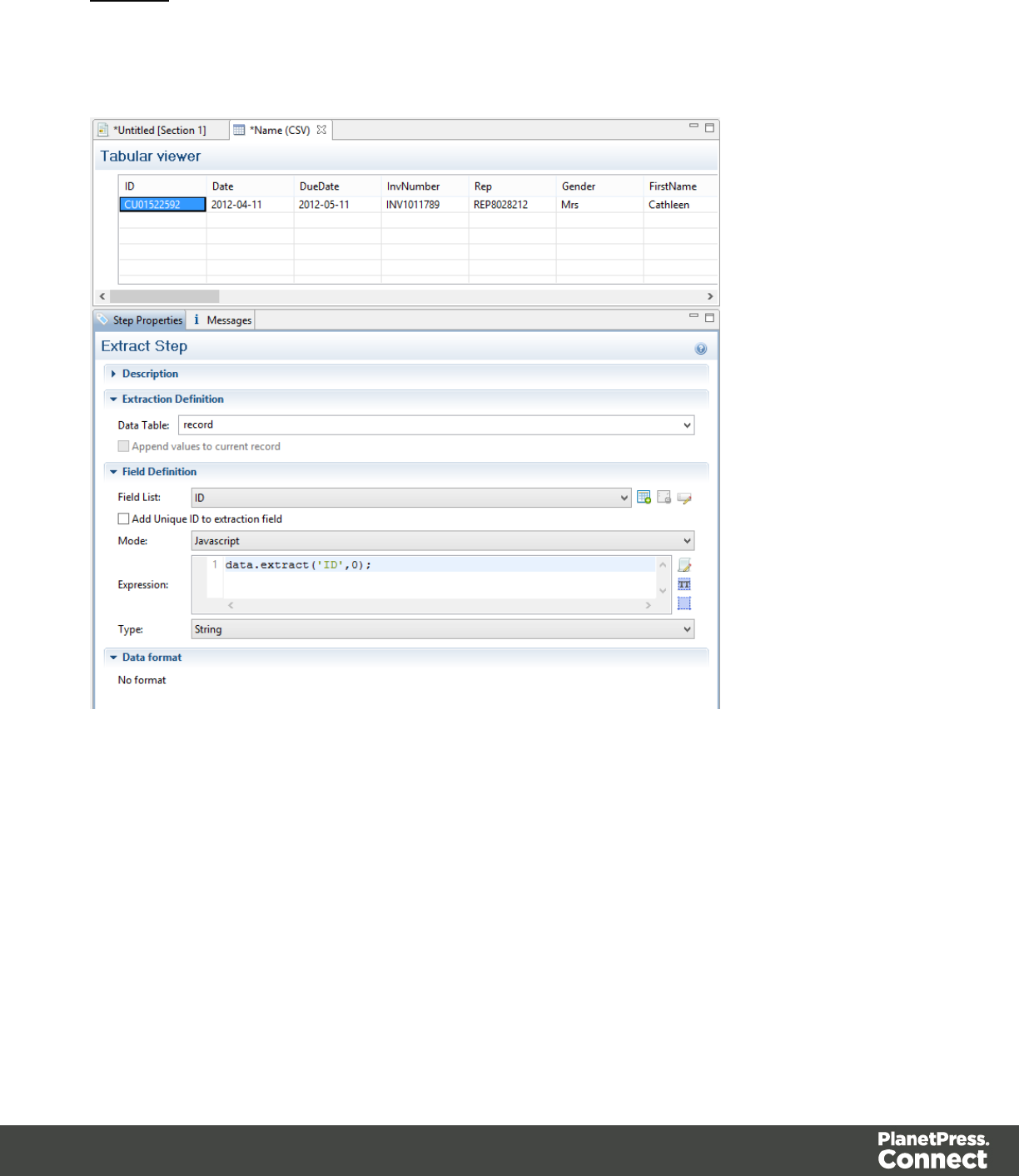
Example
In this example you have the script command data.extract('ID',0);. It means that the extraction
is made on the ID field in column 0 (the first from the left).
extract(left, right, verticalOffset, lineHeight, separator)
Extracts the text value from a rectangular region. All coordinates are expressed in millimeters.
left
Double that represents the distance from the left edge of the page to the left edge of the
rectangular region.
right
Page 242
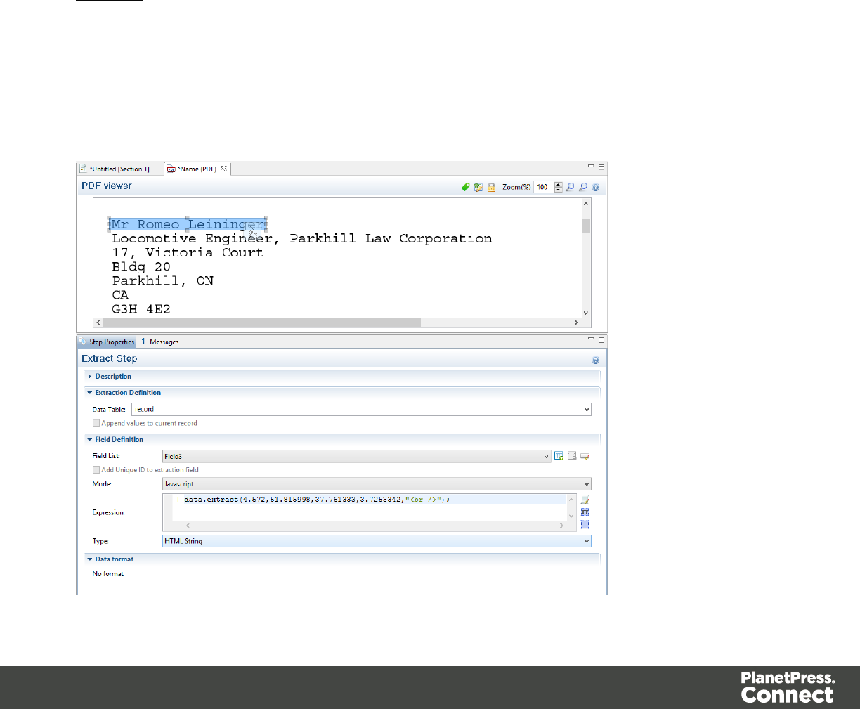
Double that represents the distance from the left edge of the page to the right edge of the
rectangular region.
verticalOffset
Double that represents the distance from the current vertical position.
lineHeight
Double that represents the total height of the region.
separator
String inserted between all lines returned from the region. An empty string can be specified.
Example
In this example you have the script command data.extract
(4.572,51.815998,37.761333,3.7253342,"<br />");. It means that the left position of the
extracted information is located at 4.572mm, the right position at 51.815998mm, the vertical
offset position is 37.761333mm and the lineHeight is 3.7253342mm. Finally, the "<br/>" string
is used for concatenation.
Page 243
extractMeta()
Method that extracts the value of a metadata field.
Related Object: Data.
extractMeta(levelName String, propertyName String)
Extracts the value of metadata field propertyName from a PDF/VT's levelName level. Note
that names are case-sensitive.
The extractMeta method always return a string data type.
levelName
String.
propertyName
String.
Examples
fieldExists()
Method that returns True if a metadata field exists.
Related Object: Data.
fieldExists(levelName, propertyName)
In a PDF file, that method that returns True if metadata field propertyName exists at the
levelName level or False otherwise.
levelName
String.
propertyName
String.
Page 244

fieldExists(fieldName)
In a CSV file, that method returns True if the specified fieldName exists in the current record.
Otherwise, it returns False.
fieldName
String that represents a field name (column) in a CSV file.
fieldExists(xPath
In a XML file, that method returns True if the specified xPath exists in the current record.
Otherwise, it returns False.
xPath
String.
Examples
find()
Finds the first occurrence of a string starting from the current position. The search can be
constrained to the series of characters in a text file or to a vertical strip in a PDF file located
between leftConstraint and rightConstraint, expressed in characters (or in millimeters for a
PDF file). The method returns null if stringToFind cannot be found, otherwise it returns a
RectValueText object.
The RectValueText contains the relative Left,Top,Right and Bottom coordinates of the
smallest possible rectangle that completely encloses stringToFind.
Note that partial matches are not allowed, i.e. the entire stringToFind must be found between
the leftConstraint and rightConstraint parameters. Also, calling this method does not move
the current position to the location where stringToFind was found, allowing you to use the
method as a look-ahead function without disrupting the rest of the workflow.
Related Objects: Boundaries and Data.
find (stringToFind, leftConstraint, rightConstraint)
Finds the first occurrence of a string starting from the current position.
stringToFind
Page 245
String to find.
leftConstraint
Number indicating the left limit from which the search is performed.
rightConstraint
Number indicating the right limit from which the search is performed.
Examples
To search the word "text" on a 8 1/2 x 11 page, the syntax is:
data.find("text", 0, 216);
Numbers 0 and 216 are in millimeters and indicate the left and right limits (constraints) within
which the search should be. Values (0, 216) in this example represent the entire width of a
page. Note that the smaller the area is, the faster the search is. So if you know that the word
"text" is within 3 inches from the left edge of the page, provide the following:
data.find("text", 0, 76.2); 76.2mm = 3*25.4 mm
The return value of the function is:
[Left=26,76, Top=149.77, Right=40,700001, Bottom=154.840302]
Which represents the size of the imaginary rectangle that encloses the string in full, in
millimeters relative to the upper left corner of the current page. This also means that the
data.find () function only works on the current page. If the record contains several pages, you
must create a loop that will perform a jump from one page to another by making a find () on
each page.
found()
Method that returns a Boolean value indicating whether the last call to find() was successful.
Related Object: Region.
found()
Method that returns a Boolean value indicating whether the last call to find() was successful.
Since the find() method always returns a region, regardless of the search results, it is
Page 246

necessary to examine the value of found() to determine the actual result of the operation.
Examples
get()
Related Object: Boundaries.
get(in_Region)
Retrieves an array of strings from the region defined by the in_Region object. in_Region
object can be created with a call to region.createRegion().
in_Region
ScriptRegion tabular Object.
Example
boundaries.get(region.createRegion("Email_Address"));
get(number)
get(object)
get(string)
getVariable()
Method that retrieves the value currently stored in a variable.
Related Object: Boundaries.
getVariable(varName)
Retrieves the value currently stored in variable varName. If the variable does not exist, the
value null is returned. It is considered good practice (almost mandatory, even!) to always check
whether a variable is defined before attempting to access its value.
varName
String name of the variable from which the value is to be retrieved.
Page 247
Example
moveDelimiters()
Scope constant that can be used as a parameter to moveTo() and moveToNext() methods.
Related Object: Steps.
Example
moveLines()
Scope constant that can be used as a parameter to moveTo() and moveToNext() methods.
Related Object: Steps.
Example
moveMeasure()
Scope constant that can be used as a parameter to moveTo() and moveToNext() methods.
Related Object: Steps.
Example
moveNode()
Scope constant that can be used as a parameter to moveTo() and moveToNext() methods.
Related Object: Steps.
Example
movePage()
Scope constant that can be used as a parameter to moveTo() and moveToNext() methods.
Page 248

Related Object: Steps.
Example
moveSibling()
Scope constant that can be used as a parameter to moveTo() and moveToNext() methods.
Related Object: Steps.
Example
moveTo()
Moves the current position to a number.
Related Object: Steps.
moveTo(scope, verticalPosition)
Moves the current position in a Text file to verticalPosition where the meaning of
verticalPosition changes according to the value specified for scope.
scope
Number (from 0-2) that represents:
0 - Lines: verticalPosition represents the index of the line to move to from the top of the
record.
1 - Delimiters: verticalPosition represents the index of the delimiter (as defined in the Input
Data settings) to move to from the top of the record.
2 - Next line with content: verticalPosition is not used, the position is moved to the next line
after the current position that contains any text.
moveTo(scope, verticalOffset)
Moves the current position in a PDF file to verticalOffset where the meaning of verticalOffset
changes according to the value specified for scope.
scope
Number (from 0-1) that represents:
Page 249

0 - millimeters: verticalOffset represents the number of millimeters to move the current
position, relative to the top of the record (NOT the top of the current page).
1 - pages: verticalOffset represents the index of the target page, relative to the top of the
record.
moveTo(xPath)
Moves the current position in a XML file to the first instance of xPath, relative to the top of the
record.
moveTo(row)
Moves the current position in a CSV file to the row index, relative to the top of the record.
Example
moveToNext()
Moves the current position to the next instance of a number.
Related Object: Steps.
moveToNext(scope)
Moves the current position in a text file to the next instance of scope.
scope
Number (from 0-3) that represents:
0 - Lines: current position is set to the next line.
1 - Delimiters: current position is set to the next delimiter (as defined in the Input Data
settings).
2 - Next line with content: current position is set to the next line that contains any text.
Page 250

moveToNext(left, right)
Moves the current position in a PDF file to the next line that contains any text, the search for text
being contained within the left and right parameters, expressed in millimeters.
left
Double that represents the left edge of the text to find.
right
Double that represents the right edge of the text to find.
moveToNext(scope)
Moves the current position in a XML file to the next node in the XML hierarchy, based on the
specified scope.
scope
Number that may be set to steps.MOVENODE (0) or steps.MOVESIBLING (1).
moveToNext()
Moves the current position in a CSV file to the next row, relative to the current position.
Example
range()
Read-only object containing the physical coordinates of the region.
Related Object: Region.
range()
For a Text file, the range() method contains the physical coordinates of the region: x1 (left), y1
(top), x2 (width), y2 (height), expressed in characters.
For a PDF file, the range() method contains the physical coordinates of the region: x1 (left), y1
(top), x2 (width), y2 (height), expressed in millimeters.
For a CSV file, the range() method contains the name of the column that defines the region.
Page 251

Examples
Set()
Sets a new DataMapper record boundary.
Related Object: Boundaries.
Set(delimiters)
Sets a new DataMapper record boundary.
Delimiters
Sets a new record boundary. The delimiters parameter is an integer number representing an
offset from the current delimiter. If this parameter is not specified, then a value of 0 is
assumed.
A value of 0 indicates the record boundary occurs on the current delimiter.
A negative value of -n indicates that the Record boundary occurred -n delimiters before the
current delimiter.
A positive value of n indicates that the Record boundary occurred +n delimiters after the
current delimiter.
IMPORTANT NOTE
Specifying a positive value not only sets the DataMapper record boundary but it also advances
the current delimiter to the specified delimiter. That's where process resumes. This allows you
to skip over the processing of some pages/records when you know they do not warrant being
examined. Negative (or 0) values simply set the boundary without changing the current
location.
For instance, if you want to set DataMapper record boundaries whenever the phrase "Invoice
Total" appears in a specific region of the page. However, the PDF file has already been
padded with blank pages for duplexing purposes. The boundary should therefore be placed at
the end of the page where the match is found if that match occurs on an even page, or at the
end of the next blank page, if the match occurs on an odd page. Recall that for PDF files, the
natural delimiter is a PDF page. The JavaScript code would look something like the following:
var myRegion = region.createRegion(150,220,200,240);
if(boundaries.find("Invoice Total",myRegion).found) {
Page 252
if(boundaries.find("Invoice Total",myRegion).found) {
// a match was found. Check if we are on a odd or even page
and set the Boundary accordingly
if((boundaries.currentDelim % 2) !=0 ) {
// Total is on odd page, let's set the document Boundary
one delimiter further, thereby skipping the next blank page
boundaries.set(1);
} else {
// Total is on an even page, set the document Boundary to
the current delimiter
boundaries.set();
}
}
}
Note
The above code could be completely rewritten as:
if(boundaries.find("Invoice Total",region.createRegion(150,220,200,240).found) {
(boundaries.currentDelim % 2) !=0 ? boundaries.set(1): boundaries.set();
}
setVariable()
Method that sets a variable to the specified value, automatically creating the variable if it
doesn't exist yet.
Related Object: Boundaries.
setVariable(varName, varValue)
Sets variable varName to value varValue.
varName
String name of the variable from which the value is to be set.
varValue
Object
Page 253


The Designer
The Designer is a WYSIWYG (what you see is what you get) editor that lets you create
templates for various output channels: Print, Email and Web. A template may contain designs
for multiple output channels: a letter intended for print and an e-mail variant of the same
message, for example. Content, like the body of the message or letter, can be shared across
these contexts. Templates are personalized using scripts and variable data extracted via the
DataMapper.More advanced users may use native HTML, CSS and JavaScript.
The following topics will help to quickly familiarize yourself with the Designer.
l"Basic Steps" below. These are the basic steps for creating and developing a template.
l"Features" on page274. These are some of the key features in the Designer.
l"Designer User Interface" on page546. This part gives an overview of all elements in the
Designer User Interface, like menus, dialogs and panes.
More help can be found here:
lTutorials On Video: watch an introductory video, overview tutorials or practical how-to
videos.
lForum: Browse the forum and feel free to ask questions about the use of Connect
software
lDemo site. Download demonstrations of OL products.
Basic Steps
With the Designer you can create templates for personalized letters, emails and web pages,
and generate output from them.
These are the basic steps for creating and developing a template:
1. Create a template
Create a template, using one of the Template Wizards. See "Creating a template" on the
facing page.
Page 255

2. Fill the template
Add text, images and other elements to the template and style them. See "Content
elements" on page373 and "Styling and formatting" on page453.
3. Personalize the content
Personalize the content using variable data. See "Personalizing content" on page485.
4. Generate output
Adjust the settings, test the template and generate output: letters, emails, and/or web
pages. See "Generating output" on page798.
5. What's next
Use Workflow to automate your customer communications.
Note
Steps 2 and 3 are not necessarily to be followed in this order. For example, as you add
elements to a template, you may start personalizing them right away, before adding other
elements to the template.
Templates
The Designer is a WYSIWYG (what you see is what you get) tool to create templates. This topic
gets you started. It explains how to create a template, what is found in a template file, and how
output can be generated.
Creating a template
In the Welcome screen that appears after startup, get off to a flying start choosing Browse
Template Wizards. Scroll down to see all the Template Wizards. After deciding which output
channel – print, email or web – will be prevalent in your template, select a template.
The Template Wizards can also be accessed from the menu: click File, click New, expand the
Template folder, and then expand one of the templates folders.
There are Wizards for the three types of output channels, or contexts as they are called in the
Designer: Print, Email and Web.
See:
Page 256

l"Creating an Email template with a Wizard" on page311
l"Creating a Print template with a Wizard" on page277
l"Creating a Web template with a Wizard" on page327
After creating a template you can add the other contexts (see "Contexts" on page269), as well
as extra sections (see "Sections" on page271), to the template.
It is, however, not possible to use a Template Wizard when adding a context or section to an
existing template.
Tip
If an Email context is going to be part of the template, it is recommended to start with an
Email Template Wizard; see "Creating an Email template with a Wizard" on page311.
After creating a template, contexts can be added to it, but that can not be done with a
wizard.
Saving a template
A Designer template file has the extension .OL-template. It is a zip file that includes up to 3
contexts, all the related resources and scripts, and (optionally) a link to a Data Mapping
Configuration.
To save a template for the first time, select File > Save as. After that you can save the template
by selecting File > Save or pressing Ctrl+S.
When more than one resource (template or data mapping configuration) is open and the
Designer software is closed, the Save Resources dialog appears. This dialog displays a list of
all open resources with their names and file location. Selected resources will be saved,
deselected resources will have all their changes since they were last saved dismissed.
Auto Save
After a template has been saved for the first time, Connect Designer can auto save the
template with a regular interval. To configure Auto Save:
1. Select the menu option Window > Preferences > Save.
2. Under Auto save, check the option Enable to activate the Auto Save function.
Page 257

3. Change how often it saves the template by typing a number of minutes.
Auto Backup
Connect Designer can automatically create a backup file when you manually save a template.
To configure Auto Backup:
1. Select the menu option Window > Preferences > Save.
2. Under Auto backup, check the option Enable to activate the Auto Backup function.
3. Type the number of revisions to keep.
4. Select the directory in which the backups should be stored.
Backup files have the same name as the original template with two underscores and a
progressive number (without leading zeros) at the end: originalname__1.OL-template,
originalname__2.OL-template, etc.
Note
The Auto Save function does not cause backup files to be created.
Sharing a template
To share a template, you can send the template file itself, or save the template to a package file,
optionally together with a Data Mapping Configuration, a Job Creation Preset and an Output
Creation Preset. (See "Job Creation Presets" on page701 and "Output Creation Settings" on
page710 for more details.)
To create a package file, select File > Send to Workflow and choose File in the Destination
box. For the other options, see "Sending files to Workflow" on the next page. The package file
has the extension .OL-package.
Generating output from the Designer
Output can be generated directly from the Designer; see "Generating Print output" on page801,
"Generating Email output" on page815 and "Generating Web output" on page825.
Page 258

To test a template first, select Context > Preflight. Preflights executes the template without
actually producing output and it displays any issues once it's done (see also: "Testing scripts"
on page523).
Sending files to Workflow
Workflow can generate output from a template as well. For this, the template has to be sent to
Workflow.
The Send to Workflow dialog sends templates, Data Mapping Configurations and print presets
to the Workflow server, or saves them as a package file. Print presets make it possible to do
such things as filtering and sorting records, grouping documents and splitting the print jobs into
smaller print jobs, as well as the more standard selection of printing options, such as binding,
OMR markings and the like. See "Job Creation Presets" on page701 and "Output Creation
Settings" on page710 for more details.
To send one or more templates to Workflow:
1. Select File > Send to Workflow.
2. Select the template to send. By default the currently active template is listed. Click
Browse to select another template. You may select more than one template in the
Browse dialog, and each of them is sent to Workflow (or added to a package file). A
template file has the extension .OL-template.
3. Select the Data Mapping Configuration to send. By default the current configuration is
listed. Click Browse to select another configuration. You may select more than one
configuration file in the Browse dialog, and each of them is sent to Workflow (or added to
a package file). A Data Mapping Configuration file has the extension .OL-datamapper.
4. Use the drop-down to select a Job Creation Preset to send. Click Browse to select a
preset that is not in the default location for presets. A Job Creation Preset file has the
extension .OL-jobpreset.
5. Use the drop-down to select an Output Creation Preset. Click Browse to select a preset
that is not in the default location for presets. An Output Creation Preset file has the
extension .OL-outputpreset.
6. Finally, choose the Destination: use the drop-down to select where to send the files. The
option Workflow machines lists all the PlanetPress Workflow installations detected on
the network. Select File to save the files as a package that can be loaded within the
Workflow tool.
Page 259

Resources
This page clarifies the difference between Internal, External and Web resources that may be
used in a template, and explains how to refer to them in HTML and in scripts.
Internal resources
Internal resources are files that are added to and saved with the template. To add images, fonts,
style sheets, and snippets to your template, you can drag or copy/paste them into the
Resources Pane. See also: "Images" on page440, "Snippets" on page451, "Styling templates
with CSS files" on page454 and "Fonts" on page476.
Resource files can also be dragged or copy/pasted out of the the application to save them on a
local hard drive.
Once imported, internal resources are accessed using a relative path, depending where they're
called from. Resources can be located in the following folders:
limages/ contains the files in the Images folder.
lfonts/ contains the files in the Fonts folder.
lcss/ contains the files in the StyleSheets folder.
ljs/ contains the files in the JavaScripts folder.
lsnippets/ contains the files in the Snippets folder.
When refering to them, normally you would simply use the path directly with the file name. The
structure within those folders is maintained, so if you create a "signatures" folder within the
"Images" folder, you need to use that structure, for example in HTML: <img
src="images/signatures/johnsmith.gif">. In scripts, you can refer to them in the same way, for
example:
results.loadhtml("snippets/en/navbar.html");
See also: "Loading a snippet via a script" on page530 and "Writing your own scripts" on
page515.
Note
When referring to images or fonts from a CSS file, you need to remember that the current path is
css/, meaning you can't just call images/image.jpg. Use a relative path, for example: #header {
background-image: url('../images/image.jpg'); }
Page 260

External resources
External resources are not stored in the template, but on the local hard drive or on a network
drive. They are accessed using a path. The path must have forward slashes, for example <img
src="file:///c:/resources/images/signatures/johnsmith.gif"> or var json_variables = loadjson
("file:///d:/jsondata/variables.json");. The complete syntax is:file://<host>/<path>. If the
host is"localhost", it can be omitted, as it is in the example, resulting infile:///<path>. The
empty string is interpreted as `the machine from which the URL is being interpreted'.
Network paths are similar: results.loadhtml
("file://servername/sharename/folder/snippet.html"); (note that in this case file is
followed by 2 slashes only).
Some limitations
lStyle sheets cannot refer to external resources.
lThe Connect Server user needs access to whichever network path is used. If the network
path is on a domain, the Connect Server must be identified with domain credentials that
have access to the domain resources.
For more information on network paths, please see this Wikipedia entry: file URI scheme.
Web resources
Web resources are simply accessed using a full URL. This URL needs to be publicly
accessible: if you type in that URL in a browser on the server, it needs to be visible.
Authentication is possible only through URL Parameters
(http://www.example.com/data.json?user=username&password=password) or through HTTP
Basic Auth (http://username:password@www.example.com/data.json).
Resources can also be called from a PlanetPress Workflow instance:
l"Static Resources", as set in the preferences, are accessed using the resource path, by
default something like http://servername:8080/_iRes/images/image.jpg. (For guidance on
setting the preferences, search for 'HTTP Server Input 2' in the PlanetPress Workflow
help files on OL Help).
lResources can also be served by processes: http://servername:8080/my_
process?filename=image.jpg (assuming "my_process" is the action in the HTTP Server
Input).
Page 261

Creating a Web template with a Wizard
With the Designer you can design Web templates and output them through Workflow or as an
attachment to an email when generating Email output.
Capture On The Go templates are a special kind of Web templates; see "Capture OnTheGo
template wizards" on page358.
A Web Template Wizard helps you create a Web page that looks good on virtually any browser,
device and screen size.
Foundation
All Web Template Wizards in Connect Designer make use of the Zurb Foundation front-end
framework. A front-end framework is a collection of HTML, CSS, and JavaScript files to build
upon. Foundation is a responsive framework: it uses CSS media queries and a mobile-first
approach, so that websites built upon Foundation look good and function well on multiple
devices including desktop and laptop computers, tablets, and mobile phones. Foundation is
tested across many browsers and devices, and works back as far as IE9 and Android 2. See
http://foundation.zurb.com/learn/about.html and "Using Foundation" on page362.
After creating a Web template, the other contexts can be added, as well as other sections (see
"Adding a context" on page270 and "Adding a Web page" on page332).
To create a Web template with a Template Wizard:
1. lIn the Welcome screen that appears after startup, choose Browse Template
Wizards.
Scroll down until you see the Foundation Web Page Starter Template Wizards.
lAlternatively, on the File menu, click New, expand the Template folder, and then
expand the Foundation Web Page Starter folder.
2. Select a template. There are 4 types of Web Template Wizards :
lBlank
lContact Us
lJumbotron
lThank You
Page 262

If you don't know what template to choose, see "Web Template Wizards" on the facing
page further down in this topic, where the characteristics of each kind of template are
described.
3. Click Next and make adjustments to the initial settings.
lSection:
lName: Enter the name of the Section in the Web context. This has no effect on
output.
lDescription: Enter the description of the page. This is the contents of a <meta
name="description"> HTML tag.
lTop bar group:
lSet width to Grid: Check this option to limit the width of the top bar contents to
the Foundation Grid, instead of using the full width of the page.
lStick to the top of the browser window: Check to lock the top menu bar to
the top of the page, even if the page has scroll bars. This means the menu bar
will always be visible in the browser.
lBackground color: Enter a valid hexadecimal color code for the page
background color (see w3school's color picker) , or click the colored circle to
the right to open the Color Picker.
lColors group: Enter a valid hexadecimal color code (see w3school's color picker)
or click the colored circle to open the Color Picker, and pick a color for the following
elements:
lPrimary: links on the page.
lSecondary: secondary links on the page.
lText: text on the page contained in paragraphs (<p>).
lHeadings: all headings (<h1> through <h6>) including the heading section's
subhead.
4. Click Finish to create the template.
The Wizard creates:
lA Web context with one web page template (also called a section) in it. The web page
contains a Header, a Section and a Footer element with dummy text, and depending on
the type of web page, a navigation bar, button and/or Form elements.
Page 263

lResources related to the Foundation framework (see "Web Template Wizards" below):
style sheets and JavaScript files. The style sheets can be found in the Stylesheets folder
on the Resources pane. The JavaScript files are located in the JavaScript folder on the
Resources pane, in a Foundation folder.
lA collection of Snippets in the Snippets folder on the Resources pane. The Snippets
contain ready-to-use parts to build the web page. Double-click to open them. See
"Snippets" on page451 for information about using Snippets.
lImages: icons, one picture and one thumbnail picture. Hover your mouse over the names
of the images in the Images folder on the Resources pane to get a preview.
The Wizard opens the Web section, so that you can fill it with text and other elements; see
"Content elements" on page373, "Web Context" on page331 and "Web pages" on page332.
Web pages can be personalized just like any other type of template; see "Variable Data" on
page497 and "Personalizing content" on page485.
Tip
Use the Outline pane at the left to see which elements are present in the template and to
select an element.
Use the Attributes pane at the right to see the current element's ID, class and some other
properties.
Use the Styles pane next to the Attributes pane to see which styles are applied to the
currently selected element.
Tip
Click the Edges button on the toolbar to make borders of elements visible on the Design
tab. The borders will not be visible on the Preview tab.
Page 264
Web Template Wizards
Foundation
All Web Template Wizards in Connect Designer make use of the Zurb Foundation front-end
framework. A front-end framework is a collection of HTML, CSS, and JavaScript files to build
upon. Foundation is a responsive framework: it uses CSS media queries and a mobile-first
approach, so that websites built upon Foundation look good and function well on multiple
devices including desktop and laptop computers, tablets, and mobile phones. Foundation is
tested across many browsers and devices, and works back as far as IE9 and Android 2. See
http://foundation.zurb.com/learn/about.html and "Using Foundation" on page362.
Jumbotron
The name of the Jumbotron template is derived from the large screens in sports stadiums. It is
mostly useful for informative or marketing-based websites. Its large banner at the top can
display important text and its "call to action" button invites a visitor to click on to more
information or an order form.
Contact Us
The Contact Us template is a contact form that can be used on a website to receive user
feedback or requests. It's great to use in conjunction with the Thank You template, which can
recap the form information and thank the user for feedback.
Thank You
The Thank You template displays a thank you message with some text and media links.
Blank web page
The Blank Web Page template is a very simple Foundation template that contains a top bar
menu and some basic contents to get you started.
Capture OnTheGo template wizards
With the Designer you can create Capture OnTheGo (COTG) templates. COTG templates are
used to generate forms for the Capture OnTheGo mobile application. For more information
about this application, see the website: Capture OnTheGo.
Page 265
A Capture OnTheGo Form is actually just a Web Form, that you could add without a wizard, but
the COTG Template Wizards include the appropriate JavaScript files for the Capture OnTheGo
app, and styles to create user-friendly, responsive forms. They are built upon the Foundation
framework.
Foundation
All Web Template Wizards in Connect Designer make use of the Zurb Foundation front-end
framework. A front-end framework is a collection of HTML, CSS, and JavaScript files to build
upon. Foundation is a responsive framework: it uses CSS media queries and a mobile-first
approach, so that websites built upon Foundation look good and function well on multiple
devices including desktop and laptop computers, tablets, and mobile phones. Foundation is
tested across many browsers and devices, and works back as far as IE9 and Android 2. See
http://foundation.zurb.com/learn/about.html and "Using Foundation" on page362.
After creating a COTG template, the other contexts can be added, as well as other sections
(see "Adding a context" on page270 and "Adding a Web page" on page332).
Tip
If the COTG Form replaces a paper form, it can be tempting to stick to the original layout. Although
that may increase the recognizability, it is better to give priority to the user-friendliness of the form.
Keep in mind that the COTG form will be used on a device and don't miss the chance to make it as
user-friendly as possible.
Creating a COTG template using a Wizard
To create a COTG template with a Template Wizard:
1. lIn the Welcome screen that appears after startup and when you click the Home icon
at the top right, choose Browse Template Wizards. Scroll down until you see the
Capture OnTheGo Starter Template Wizards.
lAlternatively, on the File menu, click New, expand the Template folder, and then
expand the Capture OnTheGo Starter folder.
2. Select a template. There are 8 types of Web Template Wizards:
lBlank. The Blank COTG Template has some basic design and the appropriate
form, but no actual form or COTG elements.
Page 266

lBill of Lading. The Bill of Lading Template is a transactional template that includes
a detail table with a checkmark on each line, along with Signature and Date COTG
elements. Use this wizard as a way to quickly start any new Zurb Foundation based
form for Capture OnTheGo.
lEvent Registration. The Event Registration Template is a generic registration form
asking for name, phone, email, etc.
lEvent Feedback. The Event Feedback Template is a questionnaire containing
different questions used to rate an experience.
lMembership Application. The Membership Application Template is a signed
generic request form that can be used for memberships such as gyms, clubs, etc.
lPatient Intake. The Patient Intake Template is a generic medical questionnaire that
could potentially be used as a base for insurance or clinic form.
lKitchen Sink. The Kitchen Sink Template includes a wide range of basic form and
COTG form elements demonstrating various possibilities of the software.
lTime Sheet. The Time Sheet Template is a single page application used to add
time entries to a list. This template demonstrates the dynamic addition of lines within
a COTG template, as the Add button creates a new time entry. There is no limit to
the number of entries in a single page.
3. Click Next and make adjustments to the initial settings.
lCreate Off-Canvas navigation menu: an Off-Canvas menu is a Foundation
component that lets you navigate between level 4 headings (<h4>) in the form.
Check this option to add the menu automatically.
lSubmit URL: enter the URL where the form data should be sent. The URL should
be a server-side script that can accept COTG Form data.
lThe Title and the Logo that you choose will be displayed at the top of the Form.
lBackground color: Enter a valid hexadecimal color code for the page background
color (see w3school's color picker).
lEnter a valid hexadecimal color code (see w3school's color picker) for the
background color of the navigation bar at the top and another for the buttons on the
Form.
4. Click Next to go to the next settings page if there is one.
5. Click Finish to create the template.
The Wizard creates:
Page 267

lAWeb context with one web page template (also called a section) in it. The web page
contains an 'off-canvas' Div element, Header, a Section and a Footer element with
dummy text, and depending on the type of web page, a navigation bar, button and/or
Form elements.
lStyle sheets and JavaScript files related to the COTG form itself and others related to
the Foundation framework (see above). The style sheets can be found in the Stylesheets
folder on the Resources pane. The JavaScript files are located in the JavaScript folder on
the Resources pane.
lA collection of snippets in the Snippets folder on the Resources pane. The snippets
contain ready-to-use parts to build the web form. Double-click to open them. See
"Snippets" on page451 and "Loading a snippet via a script" on page530 for information
about using Snippets.
The Wizard opens the Web section, so that you can fill the Capture OnTheGo form.
6. Make sure to set the action and method of the form: select the form and then enter the
action and method on the Attributes pane.
The action of a Capture OnTheGo form should specify the Workflow HTTP Server Input task
that receives and handles the submitted data. The action will look like this:
http://127.0.0.1:8080/action (8080 is Workflow's default port number; 'action' should be
replaced by the HTTP action of that particular HTTP Server Input task).
The method of a Capture OnTheGo form should be POST to ensure that it doesn't hit a data
limit when submitting the form. The GET method adds the data to the URL, and the length of a
URL is limited to 2048 characters. Especially forms containing one or more Camera inputs may
produce a voluminous data stream that doesn't fit in the URL. GET also leaves data trails in log
files, which raises privacy concerns. Therefore POST is the preferred method to use.
Filling a COTG template
Before inserting elements in a COTG Form, have the design ready; see "Designing a COTG
Template" on page355.
In a Capture OnTheGo form, you can use special Capture OnTheGo Form elements, such as a
Signature and a Barcode Scanner element; see "COTG Elements" on page424 and "Using
COTG Elements" on page365.
Page 268
Foundation, the framework added by the COTG template wizards, comes with a series of
features that can be very useful in COTG forms; see "Using Foundation" on page362.
Naturally, Web Form elements can also be used on COTG Forms (see "Forms" on page430
and "Form Elements" on page435) as well as text, images and other elements (see "Content
elements" on page373).
Capture OnTheGo templates can be personalized just like any other type of template; see
"Variable Data" on page497 and "Personalizing content" on page485.
Tip
Use the Outline pane at the left to see which elements are present in the template and to
select an element.
Use the Attributes pane at the right to see the current element's ID, class and some other
properties.
Use the Styles pane next to the Attributes pane to see which styles are applied to the
currently selected element.
Tip
Click the Edges button on the toolbar to make borders of elements visible on the Design
tab. The borders will not be visible on the Preview tab.
Contexts
Contexts are parts of a template that are each used to generate a specific type of output: Web,
Email or Print.
lThe Print context outputs documents to either a physical printer a PDF file; see "Print
context" on page281.
lThe Email context outputs HTML email, composed of HTML code with embedded CSS.
See "Email context" on page315.
lThe Web context outputs an HTML web page. See "Web Context" on page331.
Page 269

When a new template is made, the Context appropriate to that new template is automatically
created, including one section. After a template has been created, the other two contexts can be
added to it; see "Adding a context" on the facing page.
Tip
If an Email context is going to be part of the template, it is recommended to start with an
Email Template Wizard; see "Creating an Email template with a Wizard" on page311.
After creating a template, contexts can be added to it, but that can not be done with a
wizard.
Outputting and combining contexts
All three contexts can be present in any template and they can all be used to output documents;
see "Generating Email output" on page815, "Generating Print output" on page801 and
"Generating Web output" on page825.
They can even be combined in output.
If present in the same template, a Print context and a Web context can be attached to an Email
context.
Outputting other combinations of contexts, and selecting sections based on a value in the data,
can be done via a Control Script; see "Control Scripts" on page532.
Adding a context
To add a context, right-click the Contexts folder on the Resources pane and click New print
context,New email context or New web context. Only one context of each type can be
present in a template. Each context, however, can hold more than one section; see "Sections"
on the next page.
Deleting a context
To delete a context, right-click the context on the Resources pane and click Delete.
Page 270
Warning
No backup files are maintained in the template. The only way to recover a deleted
section, is to click Undo on the Edit menu, until the deleted section is restored. After
closing and reopening the template it is no longer possible to restore the deleted context
this way.
To prevent losing any work, it is recommended to configure the auto-save and auto-
backup functions in the preferences (see "Saving Preferences" on page587).
Sections
Sections are parts of one of the contexts in a template: Print, Email or Web. They contain the
main text flow for the contents. In each of the contexts there can be multiple sections. A Print
context, for example, may consist of two sections: a covering letter and a policy.
Adding a section
To add a section to a context, right-click the context (Email, Print or Web) on the Resources
pane, and then click New section.
It is not possible to use a Template Wizard when adding a section to an existing template.
Tip
If an Email context is going to be part of the template, it is recommended to start with an
Email Template Wizard; see "Creating an Email template with a Wizard" on page311.
After creating a template, contexts can be added to it, but that can not be done with a
wizard.
Editing a section
To open a section, expand the Contexts folder on the Resources pane, expand the respective
context (Print,Email or Web) and double-click a section to open it.
Each section can contain text, images and many other elements (see "Content elements" on
page373), including variable data and other dynamic elements (see "Personalizing content" on
page485).
Page 271
Copying a section
Copying a section, either within the same template or from another template, can only be done
manually. You have to copy the source of the HTML file:
1. Open the section that you want to copy and go to the Source tab in the workspace.
2. Copy the contents of the Source tab (press Ctrl+A to select everything and then Ctrl+C to
copy the selection).
3. Add a new section (see Adding a section).
4. Go to the Source tab and paste the contents of the other section here (press Ctrl+V).
5. When copying a section to another template, add the related source files, such as images,
to the other template as well.
Deleting a section
To delete a section:
lOn the Resources pane, expand the Contexts folder, expand the folder of the respective
context, right-click the name of the section, and then click Delete.
Warning
No backup files are maintained in the template. The only way to recover a deleted
section, is to click Undo on the Edit menu, until the deleted section is restored. After
closing and reopening the template it is no longer possible to restore the deleted context
this way.
Renaming a section
To rename a section:
lOn the Resources pane, expand the Contexts folder, expand the folder of the respective
context, right-click the name of the section, and then click Rename.
Note
Sections cannot have an integer as name. The name should always include alphanumeric characters.
Page 272

Section properties
Which properties apply to a section, depends on the context it is part of. See also: "Print
sections" on page284, "Email templates" on page317, and "Web pages" on page332.
To change the properties for a section:
lOn the Resources pane, expand the Contexts folder, expand the folder of the respective
context, right-click the name of the section, and then click one of the options.
Applying a style sheet to a section
In order for a style sheet to be applied to a specific section, it needs to be included in that
section. There are two ways to do this.
Drag & drop a style sheet
1. Click and hold the mouse button on the style sheet on the Resources pane.
2. Move the mouse cursor within the Resources pane to the section to which the style sheet
should be applied.
3. Release the mouse button.
Using the Includes dialog
1. On the Resources pane, right-click the section, then click Includes.
2. Choose which CSS files should be applied to this section. You can also change the order
in which the CSS files are read. This can have an effect on which CSS rule is applied in
the end.
Arranging sections
Changing the order of the sections in a context can have an effect on how they are outputted;
see: "Print sections" on page284, "Email templates" on page317 and "Web pages" on
page332.
To rearrange sections in a context:
lOn the Resources pane, expand the Contexts folder, expand the folder of the respective
context, and then drag and drop sections to change the order they are in.
Alternatively, right-click a section and click Arrange. In the Arrange Sections dialog you
Page 273

can change the order of the sections in the same context by clicking the name of a section
and moving it using the Up and Down buttons.
Outputting sections
Which sections are added to the output, depends on the type of context they are in.
When generating output from the Print context, each of the Print sections is added to the output
document, one after the other in sequence, for each record. The sections are added to the
output in the order in which they appear on the Resources pane. See "Generating Print output"
on page801.
In email and web output, only one section can be executed at a time. The section that will be
output is the section that has been set as the 'default'. See "Generating Web output" on
page825 and "Web pages" on page332 and "Generating Email output" on page815 and
"Email templates" on page317. The 'default' section is always executed when the template is
run using the Create Email Content task in Workflow (see Workflow Help: Create Email
Content).
It is, however, possible to include or exclude sections when the output is generated, or to set
another section as the 'default', depending on a value in the data. A Control Script can do this;
see "Control Scripts" on page532.
See "Generating output" on page798 to learn how to generate Print documents, Web pages or
Email.
Features
The Designer is Connect's module to create templates for personalized customer
communications. These are some of the key features in the Designer:
"Templates" on page256. Start creating, using and sharing templates.
"Contexts" on page269. A context contains one or more designs for one output channel:
l"Print" on the next page. This topic helps you design and fill sections in the Print context.
l"Email" on page307. This topics helps you design an email template.
l"Web" on page326. This topic helps you design a web page.
"Sections" on page271. Sections in one context are designed for the same output channel.
Page 274

"Content elements" on page373. Elements make up the biggest part of the content of each
design.
"Snippets" on page451. Snippets help share content between contexts, or insert content
conditionally.
"Styling and formatting" on page453. Make your Designer templates look pretty and give them
the same look and feel with style sheets.
"Personalizing content" on page485. Personalize your customer communications using
variable data.
"Writing your own scripts" on page515. Scripting can take personalization much further. Learn
how to script via this topic.
"Generating output" on page798. Learn the ins and outs of generating output from each of the
contexts.
Print
With the Designer you can create one or more Print templates and merge the template with a
data set to generate personal letters, invoices, policies etc.
The Print context is the folder in the Designer that can contain one or more Print sections.
Print templates, also called Print sections, are part of the Print context. They are meant to be
printed to a printer or printer stream, or to a PDF file (see "Generating Print output" on
page801).
The Print context can also be added to Email output as a PDF attachment; see "Generating
Email output" on page815. When generating output from the Print context, each of the Print
sections is added to the output document, one after the other in sequence, for each record.
When a Print template is created (see "Creating a Print template with a Wizard" on page277),
or when a Print context is added to an existing template (see "Adding a context" on page270)
the Print context folder is created along with other folders and files that are specific to a Print
context (see "Print context" on page281).
Page 275

Only one Print section is created at the start, but you can add as many Print sections as you
need; see "Print sections" on page284.
Pages
Unlike emails and web pages, Print sections can contain multiple pages. Pages are naturally
limited by their size and margins. If the content of a section doesn't fit on one page, the overflow
goes to the next page. This happens automatically, based on the section's page size and
margins; see "Page settings: size, margins and bleed" on page292.
Although generally the same content elements can be used in all three contexts (see "Content
elements" on page373), the specific characteristics of pages make it possible to use special
elements, such as page numbers; see "Page numbers" on page294.
See "Pages" on page291 for an overview of settings and elements that are specific for pages.
Headers, footers, tear-offs and repeated elements (Master
page)
In Print sections, there are often elements that need to be repeated across pages, like headers,
footers and logos. In addition, some elements should appear on each first page, or only on
pages in between the first and the last page, or only on the last page. Examples are a different
header on the first page, and a tear-off slip that should show up on the last page.
This is what Master Pages are used for. Master Pages can only be used in the Print context.
See "Master Pages" on page299 for an explanation of how to fill them and how to apply them
to different pages.
Stationery (Media)
When the output of a Print context is meant to be printed on paper that already has graphical
and text elements on it (called stationery, or preprinted sheets), you can add a copy of this
media, in the form of a PDF file, to the Media folder.
Media can be applied to pages in a Print section, to make them appear as a background to
those pages. This ensures that elements added to the Print context will correspond to their
correct location on the preprinted media.
Page 276

When both Media and a Master Page are used on a certain page, they will both be displayed
on the Preview tab of the workspace, the Master Page being 'in front' of the Media and the Print
section on top. To open the Preview tab, click it at the bottom of the Workspace or select View >
Preview View on the menu.
The Media will not be printed, unless this is specifically requested through the printer settings in
the Print Wizard; see "Generating Print output" on page801.
See "Media" on page302 for further explanation about how to add Media and how to apply
them to different pages.
Creating a Print template with a Wizard
A Print template may consist of various parts, such as a covering letter and a policy. Start with
one of the Template Wizards for the first part; other parts can be added later.
To create a Print template with a Template Wizard:
1. lIn the Welcome screen that appears after startup:
lChoose Browse Template Wizards and scroll down until you see the Print
Template wizards and select the Postcard or Formal Letter wizard.
lOr choose Create a New Template and select the PDF-based Print wizard.
lAlternatively, on the File menu, click New, expand the Template folder, and then:
lSelect the PDF-based Print wizard.
lOr expand the Basic Print templates folder, select Postcard or Formal Letter
and click Next.
See "Print Template Wizards" on the facing page for information about the various types
of Template wizards.
2. Make adjustments to the initial settings (the options for each type of template are listed
below). Click Next to go to the next settings page if there is one.
3. Click Finish to create the template.
See "Print context" on page281 and "Print sections" on page284 for more information about
Print templates.
Page 277

Tip
Use the Outline pane at the left to see which elements are present in the template and to
select an element.
Use the Attributes pane at the right to see the current element's ID, class and some other
properties.
Use the Styles pane next to the Attributes pane to see which styles are applied to the
currently selected element.
Print Template Wizards
There are three Print Template wizards: one for a formal letter, one for a postcard and one for a
Print template based on a PDF that you provide.
Postcard
The Postcard Wizard lets you choose a page size and two background images, one for the front
and one for the back of the postcard.
When you click Finish, the Wizard creates:
lA Print context with one section in it, that has duplex printing (printing on both sides)
enabled. See "Printing on both sides" on page283.
lTwo Master Pages that each contain a background image. The first Master Page is
applied to the front of every page in the Print section. The second Master Page is applied
to the back of every page in the Print section. See "Master Pages" on page299.
lScripts and selectors for variable data. The Scripts pane shows, for example, a script
called "first_name". This script replaces the text "@first_name@" on the front of the
postcard by the value of a field called "first_name" when you open a data set that has a
field with that name. See "Variable Data" on page497.
lA script called Dynamic Front Image Sample. This script shows how to toggle the image
on the front page dynamically. See also "Writing your own scripts" on page515.
lOne empty Media. Media, also called Virtual Stationery, can be applied to all pages in the
Print section. See "Media" on page302.
Page 278

The Wizard opens the Print section, so that you can fill it with text and other elements; see
"Content elements" on page373. It already has two Positoned Boxes on it: one on the front, for
text, and one on the back, for the address.
See "Print context" on page281 and "Print sections" on page284 for more information about
Print templates.
Formal letter
The Formal Letter Wizard first lets you select the page settings, see "Page settings: size,
margins and bleed" on page292.
These settings are fairly self-explanatory, except perhaps these:
lDuplex means double-sided printing.
lThe margins define where your text flow will go. The actual printable space on a page
depends on your printer.
lThe bleed is the printable space around a page. It can be used on some printers to
ensure that no unprinted edges occur in the final trimmed document. Printers that can’t
print a bleed, will misinterpret this setting. Set the bleed to zero to avoid this.
lThe number of sections is the number of parts in the Print context. Although this Template
wizard can add multiple Print sections to the Print context, it will only add content to the
first section.
On the next settings page (click Next to go there), you can type a subject, the sender's name
and the sender's title. These will appear in the letter. You can also:
lClick the Browse button to select a signature image. This image will appear above the
sender's name and title.
lSelect Virtual Stationery: a PDF file with the letterhead stationery. Also see Media.
When you click Finish, the Wizard creates:
lA Print context with one section in it; see "Print context" on page281 and "Print sections"
on page284.
lOne empty Master Page. Master Pages are used for headers and footers, for images and
other elements that have to appear on more than one page, and for special elements like
tear-offs. See "Master Pages" on page299.
Page 279

lOne Media. You can see this on the Resources pane: expand the Media folder. Media 1
is the Virtual Stationery that you have selected in the Wizard. It is applied to all pages in
the Print section, as can be seen in the Sheet Configuration dialog. (To open this dialog,
expand the Contexts folder on the Resources pane; expand the Print folder and right-
click "Section 1"; then select Sheet Configuration.) See "Media" on page302.
lSelectors for variable data, for example: @Recipient@. You will want to replace these by
the names of fields in your data. See "Variable Data" on page497.
The Wizard opens the Print section. You can add text and other elements; see "Content
elements" on page373.
The formal letter template already has an address on it. The address lines are paragraphs,
located in one cell in a table with the ID address-block-table. As the table has no borders, it is
initially invisible. The address lines will stick to the bottom of that cell, even when the address
has fewer lines. See "Styling and formatting" on page453 to learn how to style elements.
Tip
Click the Edges button on the toolbar to make borders of elements visible on the Design
tab. The borders will not be visible on the Preview tab.
PDF-based Print template
The PDF-based Print template wizard creates a document from an existing PDF file: a
brochure, voucher, letter, etc. The PDF is used as the background image of the Print section
(see "Using a PDF file as background image" on page288). Variable and personalized
elements, like a reseller address, voucher codes and so on, can be added in front of it (see
"Personalizing content" on page485 and "Variable Data" on page497).
By default, the PDF itself is added to the Image folder located in the Resources pane.
Uncheck the option Save with template if the PDF should not be imported in the template. If
not saved with the template, the image will remain external. Note that external images need to
be available when the template is merged with a record set to generate output, and that their
location should be accessible from the machine on which the template's output is produced.
External images are updated (retrieved) at the time the output is generated.
After clicking Next, you can change the settings for the page. The initial page size and bleed
area are taken from the selected PDF.
Page 280

When you click Finish, the Wizard creates:
lA Print context with one section in it; see "Print context" below and "Print sections" on
page284. The selected PDF is used as the background of the Print section; see "Using a
PDF file as background image" on page288. For each page in the PDF one page is
created in the Print section.
lOne empty Master Page. Master Pages are used for headers, footers, images and other
elements that have to appear on more than one page, and for special elements like tear-
offs. See "Master Pages" on page299.
lOne empty Media. Media, also called Virtual Stationery, can be applied to all pages in the
Print section. See "Media" on page302.
Print context
The Print context is the folder in the Designer that can contain one or more Print templates.
Print templates, also called Print sections, are part of the Print context. They are meant to be
printed to a printer or printer stream, or to a PDF file (see "Generating Print output" on
page801).
The Print context can also be added to Email output as a PDF attachment; see "Generating
Email output" on page815. When generating output from the Print context, each of the Print
sections is added to the output document, one after the other in sequence, for each record.
Creating the Print context
You can start creating a Print template with a Wizard (see "Creating a Print template with a
Wizard" on page277), or add the Print context to an existing template (see "Adding a context"
on page270).
Tip
Editing PDF files in the Designer is not possible, but when they're used as a section's
background, you can add text and other elements, such as a barcode, to them. To create
a new Print template from a PDF file, use the PDF-based Print template (see "Creating a
Print template with a Wizard" on page277). To use a PDF file as background image for
an existing section, see "Using a PDF file as background image" on page288.
When a Print template is created, the following happens:
Page 281

lThe Print context is created and one Print section is added to it. You can see this on the
Resources pane: expand the Contexts folder, and then expand the Print folder.
The Print context can contain multiple sections: a covering letter and a policy, for
example, or one section that is meant to be attached to an email as a PDF file and
another one that is going to be printed out on paper. Only one Print section is added to it
at the beginning, but you can add as many print sections as you need; see "Print context"
on the previous page.
See "Print sections" on page284 to learn how to fill a Print section.
lOne Master Page is added to the template, as can be seen on the Resources pane, in
the Master Page folder.
In Print sections, there are often elements that need to be repeated across pages, like
headers, footers and logos. In addition, some elements should appear on each first page,
or only on pages in between the first and the last page, or only on the last page.
Examples are a different header on the first page, and a tear-off slip that should show up
on the last page.
This is what Master Pages are used for. Master Pages can only be used in the Print
context.
See "Master Pages" on page299.
Initially, the (empty) master page that has been created with the Print context will be
applied to all pages in the Print section, but more Master Pages can be added and
applied to different pages.
lOne Media is added to the template, as is visible on the Resources pane, in the Media
folder. This folder can hold the company's stationery in the form of PDF files. When
applied to a page in a Print section, Media can help prevent the contents of a Print section
from colliding with the contents of the stationery. See "Media" on page302 to learn how to
add Media and, optionally, print them.
Initially, the (empty) media that has been created with the Print context, is applied to all
pages in the Print section. You can add more Media and apply them each to different
pages.
lOne Stylesheet, named context_print_styles.css, is added to the template, as you can
see on the Resources pane, in the Stylesheets folder. This stylesheet is meant to be
used for styles that are only applied to elements in the Print context. See also "Styling
templates with CSS files" on page454.
Page 282

Print settings in the Print context and sections
The following settings in the Print context and Print sections have an impact on how the Print
context is printed.
Arranging and selecting sections
The Print context can contain one or more Print sections. When generating output from the Print
context, each of the Print sections is added to the output document, one after the other in
sequence, for each record. The sections are added to the output in the order in which they
appear on the Resources pane. This order can be changed; see "Print sections" on the facing
page.
It is also possible to exclude sections from the output, or to include a section only on a certain
condition that depends on a value in the data. This can be done using a Control Script; see
"Control Scripts" on page532.
Printing on both sides
To print a Print section on both sides of the paper, that Print section needs to have the Duplex
printing option to be enabled; see "Enabling double-sided printing" on page290. This setting
can not be changed in a Job Creation Preset or an Output Creation Preset.
Note
Your printer must support duplex for this option to work.
Setting the binding style for the Print context
The Print context , as well as each of the Print sections, can have its own Finishing settings. In
printing, Finishing is the way pages are bound together after they have been printed. Which
binding styles can be applied depends on the type of printer that you are using.
To set the binding style of the Print context:
1. On the Resources pane, expand the Contexts folder, and right-click the Print context.
2. Click Properties.
3. Choose a Binding style and, if applicable, the number of holes.
Page 283

To set the binding style of a Print section, see "Setting the binding style for a Print section" on
page290.
Overriding binding styles in a job creation preset
AJob Creation Preset can override the binding styles set for the Print sections and for the Print
context as a whole. To bind output in another way than defined in the template’s settings:
1. Create a Job Creation Preset that overrides the settings of one or more sections: select
File > Presets and see "Job Creation Presets" on page701 for more details.
2. Select that Job Creation Preset in the Print wizard; see "Generating Print output" on
page801.
Setting the bleed
The bleed is the printable space around a page. It can be used on some printers to ensure that
no unprinted edges occur in the final trimmed document. The bleed is one of the settings for a
section. See "Page settings: size, margins and bleed" on page292.
Print sections
Print templates, also called Print sections, are part of the Print context. They are meant to be
printed to a printer or printer stream, or to a PDF file (see "Generating Print output" on
page801).
The Print context can also be added to Email output as a PDF attachment; see "Generating
Email output" on page815. When generating output from the Print context, each of the Print
sections is added to the output document, one after the other in sequence, for each record.
Pages
Unlike emails and web pages, Print sections can contain multiple pages. Pages are naturally
limited by their size and margins. If the content of a section doesn't fit on one page, the overflow
goes to the next page. This happens automatically, based on the section's page size and
margins; see "Page settings: size, margins and bleed" on page292.
Although generally the same content elements can be used in all three contexts (see "Content
elements" on page373), the specific characteristics of pages make it possible to use special
elements, such as page numbers; see "Page numbers" on page294.
See "Pages" on page291 for an overview of settings and elements that are specific for pages.
Page 284

Using headers, footers, tear-offs and repeated elements
In Print sections, there are often elements that need to be repeated across pages, like headers,
footers and logos. In addition, some elements should appear on each first page, or only on
pages in between the first and the last page, or only on the last page. Examples are a different
header on the first page, and a tear-off slip that should show up on the last page.
This is what Master Pages are used for. Master Pages can only be used in the Print context.
See "Master Pages" on page299 for an explanation of how to fill them and how to apply them
to different pages.
Using stationery (Media)
When the output of a Print context is meant to be printed on paper that already has graphical
and text elements on it (called stationery, or preprinted sheets), you can add a copy of this
media, in the form of a PDF file, to the Media folder.
Media can be applied to pages in a Print section, to make them appear as a background to
those pages. This ensures that elements added to the Print context will correspond to their
correct location on the preprinted media.
Note
When both Media and a Master Page are used on a certain page, they will both be
displayed on the Preview tab of the workspace, the Master Page being 'in front' of the
Media and the Print section on top. To open the Preview tab, click it at the bottom of the
Workspace or select View > Preview View on the menu.
See "Media" on page302 for a further explanation about how to add Media and how to apply
them to different pages.
Note: The Media will not be printed, unless this is specifically requested through the printer
settings; see "Generating Print output" on page801.
Adding a Print section
The Print context can contain multiple sections: a covering letter and a policy, for example, or
one section that is meant to be attached to an email as a PDF file and another one that is meant
Page 285

to be printed out on paper. When a Print template is created (see "Creating a Print template
with a Wizard" on page277 and "Print context" on page281), only one Print section is added to
it, but you can add as many print sections as you need.
To add a section to a context:
lOn the Resources pane, expand the Contexts folder, right-click the Print context , and
then click New section.
The first Master Page (see "Master Pages" on page299) and Media (see "Media" on page302)
will automatically be applied to all pages in the new section, but this can be changed, see
"Applying a Master Page to a page in a Print section" on page301 and "Applying Media to a
page in a Print section" on page305.
Tip
Editing PDF files in the Designer is not possible, but when they're used as a section's
background, you can add text and other elements, such as a barcode, to them. To create
a new Print template from a PDF file, use the PDF-based Print template (see "Creating a
Print template with a Wizard" on page277). To use a PDF file as background image for
an existing section, see "Using a PDF file as background image" on page288.
Note
Via a Control Script, sections can be added to a Print context dynamically; see "Control Scripts" on
page532.
Deleting a Print section
To delete a Print section:
lOn the Resources pane, expand the Contexts folder, expand the Print context, right-
click the name of the section, and then click Delete.
Page 286

Warning
No backup files are maintained in the template. The only way to recover a deleted
section, is to click Undo on the Edit menu, until the deleted section is restored. After
closing and reopening the template it is no longer possible to restore the deleted context
this way.
To prevent losing any work, it is recommended to configure the auto-save and auto-
backup functions in the preferences (see "Saving Preferences" on page587).
Arranging Print sections
When generating output from the Print context, each of the Print sections is added to the output
document, one after the other in sequence, for each record. The sections are added to the
output in the order in which they appear on the Resources pane, so changing the order of the
sections in the Print context changes the order in which they are outputted to the final
document.
To rearrange sections in a context:
lOn the Resources pane, expand the Print context and drag and drop sections to change
the order they are in.
lAlternatively, on the Resources pane, right-click a section in the Print context and click
Arrange. In the Arrange Sections dialog you can change the order of the sections by
clicking the name of a section and moving it using the Up and Down buttons.
Styling and formatting a Print section
The contents of a Print section can be formatted directly, or styled with Cascading Style Sheets
(CSS). See "Styling and formatting" on page453.
In order for a style sheet to be applied to a specific section, it needs to be included in that
section. There are two ways to do this.
Drag & drop a style sheet
1. Click and hold the mouse button on the style sheet on the Resources pane.
2. Move the mouse cursor within the Resources pane to the section to which the style sheet
Page 287

should be applied.
3. Release the mouse button.
Using the Includes dialog
1. On the Resources pane, right-click the section, then click Includes.
2. Choose which CSS files should be applied to this section. You can also change the order
in which the CSS files are read. This can have an effect on which CSS rule is applied in
the end.
Using a PDF file as background image
In the Print context, a PDF file can be used as a section's background. It is different from the
Media in that the section considers the PDF to be content, so the number of pages in the
section will be the same as the number of pages taken from the PDF file.
With this feature it is possible to create a Print template from an arbitrary PDF file or from a PDF
file provided by the DataMapper. Of course, the PDF file itself can't be edited in a Designer
template, but when it is used as a section's background, text and other elements, such as a
barcode, can be added to it.
To use a PDF file as background image:
1. On the Resources pane, expand the Print context, right-click the print section and click
Background.
2. Click the downward pointing arrow after Image and select either From Datamapper
input or From PDF resource.
From Datamapper input uses the active Data Mapping Configuration to retrieve the PDF
file that was used as input file, or another type of input file, converted to a PDF file. With
this option you don't need to make any other settings; click OK to close the dialog.
3. For a PDF resource, you have to specify where it is located. Click the Select Image
button.
Click Resources,Disk or Url, depending on where the image is located.
lResources lists the images that are present in the Images folder on the Resources
pane.
lDisk lets you choose an image file that resides in a folder on a hard drive that is
accessible from your computer. Click the Browse button to select an image.
As an alternative it is possible to enter the path manually. The complete syntax
Page 288

is:file://<host>/<path>. Note: if the host is"localhost", it can be omitted, resulting
infile:///<path>, for example: file:///c:/resources/images/image.jpg.
Check the option Save with template to insert the image into the Images folder on
the Resources pane.
lUrl allows you to choose an image from a specific web address. Select the protocol
(http or https), and then enter the web address (for example,
http://www.mysite.com/images/image.jpg).
Note
It is not possible to use a remotely stored PDF file as a section's background,
because the number of pages in a PDF file can not be determined via the http
and http protocols. Therefor, with an external image, the option Save with
template is always checked.
4. Select the PDF's position:
lFit to page stretches the PDF to fit the page size.
lCentered centers the PDF on the page, vertically and horizontally.
lAbsolute places the PDF at a specific location on the page. Use the Top field to
specify the distance between the top side of the page and the top side of the PDF,
and the Left field to specify the distance between the left side of the page and the
left side of the PDF.
5. Optionally, if the PDF has more than one page, you can set the range of pages that
should be used.
Note
The number of pages in the Print section is automatically adjusted to the number of
pages in the PDF file that are being used as the section's background image.
6. Finally, click OK.
Page 289

Note
To set the background of a section in script, you need a Control Script; see "Control Script API" on
page782.
Setting the binding style for a Print section
In printing, Finishing is the binding style, or the way pages are bound together. Each Print
section can have its own Finishing settings, as well as the Print context as a whole; see
"Setting the binding style for the Print context" on page283.
To set the binding style of a Print section:
1. On the Resources pane, expand the Contexts folder, expand the Print context and right-
click the Print section.
2. Click Finishing.
3. Choose a Binding style and, if applicable, the number of holes.
To set the binding style of the Print context, see "Setting the binding style for the Print context"
on page283.
Overriding binding styles in a job creation preset
AJob Creation Preset can override the binding styles set for the Print sections and for the Print
context as a whole. To bind output in another way than defined in the template’s settings:
1. Create a Job Creation Preset that overrides the settings of one or more sections: select
File > Presets and see "Job Creation Presets" on page701 for more details.
2. Select that Job Creation Preset in the Print wizard; see "Generating Print output" on
page801.
Enabling double-sided printing
To print a Print section on both sides of the paper, that Print section needs to have the Duplex
printing option to be enabled. This is an option in the Sheet Configuration dialog. (See "Sheet
Configuration dialog" on page606.)
Page 290

Note
Your printer must support duplex for this option to work.
To enable duplex printing:
1. On the Resources pane, expand the Print context, right-click the print section and click
Sheet configuration.
2. Check Duplex to enable content to be printed on the back of each sheet.
3. When duplex printing is enabled, further options become available.
lCheck Tumble to duplex pages as in a calendar.
lCheck Facing pages to have the side margins switched alternately, so that after
printing and binding the pages, they look like in a magazine or book. See "Pages"
below to find out how to set a left and right margin on a page.
lIf an odd page count is generated, the last page (which is a duplex backside) has
only the master page. To suppress the master page on this last page and exclude
this page from page counting, check the option Omit Master Page Back in case of
an empty back page.
Pages
Unlike emails and web pages, Print sections can contain multiple pages. Pages are naturally
limited by their size and margins. If the content of a section doesn't fit on one page, the overflow
goes to the next page. This happens automatically, based on the section's page size and
margins; see "Page settings: size, margins and bleed" on the facing page.
Although generally the same content elements can be used in all three contexts (see "Content
elements" on page373), the specific characteristics of pages make it possible to use special
elements, such as page numbers; see "Page numbers" on page294.
The widow/orphan setting lets you control how many lines of a paragraph stick together, when
content has to move to another page; see "Preventing widows and orphans" on page296. You
can also avoid or force a page break before or after an entire element, see "Page breaks" on
page297.
Page 291

Each page in a print section has a natural position: it is the first page, the last page, a 'middle'
page (a page between the first and the last page) or a single page. For each of those positions,
a different Master Page and Media can be set. A Master Page functions as a page's
background, with for example a header and footer. A Media represents preprinted paper that a
page can be printed on. See "Master Pages" on page299 and "Media" on page302.
Page specific content elements
The specific characteristics of pages make it possible to use these special elements:
lPage numbers can only be used in a Print context. See "Page numbers" on page294 to
learn how to add and change them.
lConditional content and dynamic tables, when used in a Print section, may or may not
leave an empty space at the bottom of the last page. To fill that space, if there is any, an
image or advert can be used as a whitespace element; see "Whitespace elements:
using optional space at the end of the last page" on the next page.
lDynamic tables can be used in all contexts, but transport lines are only useful in a Print
context; see "Dynamic table" on page510.
Positioning and aligning elements
Sometimes, in a Print template, you don't want content to move up or down with the text flow.
To prevent that, put that content in a Positioned Box. See "Content elements" on page373.
When it comes to positioning elements on a page, Guides can be useful, as well as Tables.
See "How to position elements" on page462.
Page settings: size, margins and bleed
On paper, whether it is real or virtual, content is naturally limited by the page size and margins.
These, as well as the bleed, are set per Print section, as follows:
lOn the Resources pane, right-click a section in the Print context and click Properties.
For the page size, click the drop-down to select a page size from a list of common paper sizes.
Changing the width or height automatically sets the page size to Custom.
Page 292
Margins define where your text flow will go. Static elements can go everywhere on a page, that
is to say, within the printable space on a page that depends on the printer.
The bleed is the printable space around a page. It can be used on some printers to ensure that
no unprinted edges occur in the final trimmed document. Note: Printers that can’t print a bleed,
will misinterpret this setting. Set the bleed to zero to avoid this.
Tip
By default, measurements settings are in inches (in). You could also type measures in
centimeters (add 'cm' to the measurement, for example: 20cm) or in millimeters (for
example: 150mm).
To change the default unit for measurement settings to centimeters or millimeters: on the
Window menu, click Preferences, click Print, and then click Measurements.
Whitespace elements: using optional space at the end of the last page
Print sections with conditional content and dynamic tables (see "Personalizing content" on
page485) can have a variable amount of space at the bottom of the last page. It is useful to fill
the empty space at the bottom with transpromotional material, but of course you don’t want
extra pages created just for promotional data. 'Whitespace elements' are elements that will only
appear on the page if there is enough space for them.
To convert an element into a whitespace element:
1. Import the promotional image or snippet; see "Images" on page440 and "Snippets" on
page451.
2. Insert the promotional image or snippet in the content.
Note
lOnly a top-level element (for example, a paragraph that is not inside a table or
div) can function as a whitespace element.
Page 293

lDo not place the promotional image or snippet inside an absolute positioned
box. Whitespacing only works for elements that are part of the text flow, not for
absolute-positioned boxes.
3. Select the image or the element that holds the promotional content: click it, or use the
breadcrumbs, or select it on the Outline tab; see "Selecting an element" on page377.
4. On the Attributes pane, check the option Whitespace element.
5. (Optional.) Add extra space at the top of the element: on the menu Format, click the
option relevant to the selected element (Image for an image, Paragraph for a paragraph,
etc.) and adjust the spacing (padding and/or margins).
Do not add an empty paragraph to provide space between the whitespace element and
the variable content. The extra paragraph would be considered content and could end up
on a separate page, together with the whitespace element.
Page numbers
Inserting page numbers
Page numbers can be added to a Print section, but they are usually added to a Master Page,
because headers and footers are designed on Master Pages; see also: "Master Pages" on
page299.
To insert a page number, select Insert > Special character > Markers on the menu, and then
click one of the options to decide with what kind of page number the marker will be replaced:
lPage number: The current page number in the document. If a page is empty or does not
display a page number, it is still added to the page count.
lPage count: The total number of pages in the document, including pages with no
contents or without a page number.
lContent page number: The current page number in the document, counting only pages
with contents that are supplied by the Print section. A page that has a Master Page (as set
in the Sheet Configuration dialog, see "Applying a Master Page to a page in a Print
section" on page301) but no contents, is not included in the Content page count.
lContent page count: This is the total number of pages in the current document that have
contents, supplied by the Print section. A page that has a Master Page but no contents, is
not included in the Content page count.
Page 294
lSheet number: The current sheet number in the document. A sheet is a physical piece of
paper, with two sides (or pages). This is equivalent to half the page number, for example if
there are 10 pages, there will be 5 sheets.
lSheet count: This marker is replaced by the total number of sheets in the document,
whether or not they have contents.
Note
When a marker is inserted, a class is added to the element in which the marker is inserted. Do not
delete that class. It enables the software to quickly find and replace the marker when generating
output. The respective classes are: pagenumber,pagecount,contentpagenumber,
contentpagecount,sheetnumber, and sheetcount.
Creating a table of contents
A table of contents can only be created in a template script. The script should make use of the
pageRef() function. For an example, see "pageRef()" on page768. If you don't know how to
write a script, see "Writing your own scripts" on page515.
Configuring page numbers
By default the page numbers are Arabic numerals (1, 2, 3, etc.) without leading zeros nor prefix,
and page numbering starts with page 1 for each section. But this can be changed. To do that:
1. On the Resources pane, right-click a section in the Print context and click Numbering.
2. Uncheck Restart Numbering if you want the page numbers to get consecutive page
numbers, instead of restarting the page numbering with this section.
Note
Even if a section is disabled, so it doesn't produce any output, this setting is still
taken into account for the other sections. This means that if Restart Numbering is
checked on a disabled section, the page numbering will be restarted on the next
section.
Disabling a section can only be done in a Control Script (see "Control Scripts" on
page532). Control Scripts can also change where page numbers restart.
Page 295

3. Use the Format drop-down to select uppercase or lowercase letters or Roman numerals
instead of Arabic numerals.
4. In Leading Zeros, type zeros to indicate how many digits the page numbers should have.
Any page number that has fewer digits will be preceded by leading zeros.
5. Type the Number prefix. Optionally, check Add Prefix to Page Counts, to add the prefix
to the total number of pages, too.
6. Close the dialog.
Preventing widows and orphans
Widows and orphans are lines at the beginning or at the end of a paragraph respectively,
dangling at the bottom or at the top of a page, separated from the rest of the paragraph.
By default, to prevent orphans and widows, lines are moved to the next page as soon as two
lines get separated from the rest of the paragraph.
This setting can be changed for the entire Print context, per paragraph and in tables.
Note
Widows and orphans are ignored if the page-break-inside property of the paragraph is
set to avoid.
In the entire Print context
To prevent widows and orphans in the entire Print context:
1. On the menu, select Edit > Stylesheets.
2. Select the Print context.
3. Click New (or, when there are already CSS rules for paragraphs, click the selector pand
click Edit).
4. Click Format.
5. After Widows and Orphans, type the number of lines that should be considered a widow
or orphan (this amounts to the minimum number of lines that may be separated from a
paragraph, minus one).
Alternatively, manually set the set the widows and orphans properties in a style sheet:
Page 296

1. Open the style sheet for the Print context: on the Resources pane, expand the Styles
folder and double-click context_print_styles.css.
2. Add a CSS rule, like the following:
p {widows: 4; orphans: 3 }
Per paragraph
To change the widow or orphan setting for one paragraph only:
1. Select the paragraph, using the breadcrumbs or the Outline pane (next to the Resources
pane).
2. Select Format > Paragraph, on the menu.
3. After Widows and Orphans, type the number of lines to be considered a widow or orphan
(this amounts to the minimum number of lines that may be separated from a paragraph,
minus one).
In tables
The CSS properties widows and orphans can be used in tables. They are not available in the
Table Formatting dialog, however, so they must be added manually, either directly in the style
attribute of the <table> element (on the Source tab in the Workspace) or in a style sheet rule, as
follows:
1. On the menu, select Edit > Stylesheets.
2. Select the Print context.
3. Click New (or, when there are already CSS rules for tables, click the selector table and
click Edit).
4. Click the Advanced button.
5. Add a rule for widows and/or orphans, typing the name of the CSS property in the left
column and the value in the right column.
6. Close the dialogs.
Page breaks
A page break occurs automatically when the contents of a section don't fit on one page.
Page 297

Inserting a page break
To insert a page break before or after a certain element, set the page-break-before property or
the page-break-after property of that element (a paragraph for example; see also "Styling text
and paragraphs" on page464):
1. Select the element (see "Selecting an element" on page377).
2. On the Format menu select the respective element to open the Formatting dialog.
3. In the Breaks group, set the before or after property.
lBefore: Sets whether a page break should occur before the element. This is
equivalent to the page-break-before property in CSS; see CSS page-break-before
property for an explanation of the available options.
lAfter: Sets whether a page break should occur after the element. Equivalent to the
page-break-after property in CSS; see CSS page-break-after property for an
explanation of the available options.
Click the button Advanced to add CSS properties and values to the inline style tag directly.
Note
You cannot use these properties on an empty <div> or on absolutely positioned elements.
Preventing a page break
To prevent a page break inside a certain element, set the page-break-inside property of that
element to avoid:
lSelect the element (see "Selecting an element" on page377).
lOn the Format menu, select the respective element to open the Formatting dialog.
lIn the Breaks group, set the inside property to avoid, to prevent a page break inside the
element. This is equivalent to the page-break-inside property in CSS; see CSS page-
break-inside property for an explanation of all available options.
Adding blank pages to a section
How to add a blank page to a section is described in a how-to: Create blank page on field
value.
Page 298

Master Pages
In Print sections, there are often elements that need to be repeated across pages, like headers,
footers and logos. In addition, some elements should appear only on specific pages, such as
only the first page, or the last page, or only on pages in-between. Examples are a different
header on the first page, and a tear-off slip that shows up on the last page.
This is what Master Pages are used for. Master Pages can only be used in the Print context
(see "Print context" on page281).
Master Pages resemble Print sections, and they are edited in much the same way (see "Editing
a Master Page" on the facing page) but they contain a single page and do not have any text
flow. Only one Master Page can be applied per page in printed output. Then a Print template is
created, one master page is added to it automatically. You can add more Master Pages; see
"Adding a Master Page" below. Initially, the original Master Page will be applied to all pages,
but different Master Pages can be applied to different pages; see "Applying a Master Page to a
page in a Print section" on page301.
Examples
This how-to demonstrates the use of Master Pages to show terms and conditions on the back of
the first page of a Print section only:
lShowing a Terms and Conditions on the back of the first page only.
How to use Master Pages to add a tear-off slip to the first page of an invoice is explained in the
following how-to :
lA tear-off section on the first page of an invoice.
Adding a Master Page
When a Print template is created, one master page is added to it automatically. Adding more
Master Pages can be done as follows:
lOn the Resources pane, right-click the Master pages folder and click New Master Page.
lType a name for the master page.
lOptionally, set the margin for the header and footer. See "Master Pages" above.
lClick OK.
Page 299

Initially, the master page that has been created together with the Print context will be applied to
all pages in the Print section. After adding more Master Pages, different Master Pages can be
applied to different pages; see "Applying a Master Page to a page in a Print section" on the
next page.
Editing a Master Page
Master Pages are edited just like sections, in the workspace. To open a Master Page, expand
the Master pages folder on the Resources pane, and double-click the Master Page to open it.
A Master Page can contain text, images and other elements (see "Content elements" on
page373), including variable data and dynamic images (see "Personalizing content" on
page485). All elements on a Master Page should have an absolute position or be inside an
element that has an absolute position. It is good practice to position elements on a Master Page
by placing them in a Positioned Box (see "Content elements" on page373).
Keep in mind that a Master Page always remains a single page. Its content cannot overflow to a
next page. Content that doesn't fit, will not be displayed.
Note
Editing the Master Page is optional. One Master Page must always exist in a Print
template, but if you don't need it, you can leave it empty.
Adding a header and footer
Headers and footers are not designed as part of the contents of a Print section, but as part of a
Master Page, which is then applied to a page in a print section.
To create a header and footer:
1. First insert elements that form the header or footer, such as the company logo and
address, on the Master Page; see "Editing a Master Page" above.
2. Next, define the margins for the header and footer. The margins for a header and footer
are set in the Master Page properties. This does not change the content placement within
the Master Page itself; in Master Pages, elements can go everywhere on the page.
Instead, the header and footer of the Master Page limit the text flow on pages in the Print
sections to which this Master Page is applied. Pages in a Print section that use this
Page 300

Master Page cannot display content in the space that is reserved by the Master Page for
the header and footer, so that content in the Print section does not collide with the content
of the header and footer. To set a margin for the header and/or footer:
1. On the Resources pane, expand the Master pages folder, right-click the master
page, and click Properties.
2. Fill out the height of the header and/or the footer. The contents of a print section will
not appear in the space reserved for the header and/or footer on the corresponding
master page.
3. Finally, apply the master page to a specific page in a print section. See "Applying a
Master Page to a page in a Print section" below.
Applying a Master Page to a page in a Print section
Every page in a print section has a natural position: it can be the first page, the last page, one of
the pages in between (a 'middle page'), or a single page. For each of those positions, you can
set a different Master Page and Media (see "Media" on the facing page). It can even have two
master pages, if printing is done on both sides (called duplex printing).
To apply Master Pages to specific page positions in a Print section:
1. On the Resources pane, expand the Print context; right-click the Print section, and click
Sheet configuration.
2. Optionally, check Duplex to enable content to be printed on the back of each sheet. Your
printer must support duplex for this option to work. If Duplex is enabled, you can also
check Tumble to duplex pages as in a calendar, and Facing pages to have the margins
of the section switch alternately, so that pages are printed as if in a magazine or book.
3. If the option Same for all positions is checked, the same Master Page will be applied to
every page in the print section (and to both the front and the back side of the page if
duplex printing is enabled). Uncheck this option.
4. Decide which Master Page should be linked to which sheet (position): click the downward
pointing arrow after Master Page Front and select a Master Page. If Duplex is enabled,
you can also select a Master Page for the back of the sheet and consequently, check
Omit Master Page Back in case of an empty back page to omit the specified Master
Page on the last backside of a section if that page is empty and to skip that page from the
page count.
5. Optionally, decide which Media should be linked to each sheet.
6. Click OK to save the settings and close the dialog.
Page 301

Deleting a Master Page
To delete a Master Page, expand the Master pages folder on the Resources pane, right-click
the master page, and click Delete.
Note that one Master Page as well as one Media must always exist in a Print template. Just
leave it empty if you don't need it.
Media
When the output of a Print context is meant to be printed on paper that already has graphical
and text elements on it (called stationery, or preprinted sheets), you can add a copy of this
media, in the form of a PDF file, to the Media folder.
Media can be applied to pages in a Print section, to make them appear as a background to
those pages. This ensures that elements added to the Print context will correspond to their
correct location on the preprinted media.
For further explanation about how to apply Media to different pages, see "Applying Media to a
page in a Print section" on page305.
Media will not be printed, unless you want them to; see below.
Per Media, a front and back can be specified and you can specify on what kind of paper the
output is meant to be printed on. This includes paper weight, quality, coating and finishing; see
"Adding Media" below.
Adding Media
To add a Media, right-click the Media folder on the Resources pane and select New Media.
The new Media is of course empty. You can specify two PDF files for the Media: one for the
front, and, optionally, another for the back.
Specifying and positioning Media
Specifying a PDF for the front: the fast way
To quickly select a PDFfile for the front of a Media, import the PDF file by dragging it from the
Windows Explorer to the Images folder on the Resources pane.
Page 302

Then drag that the PDF file from the Images folder and drop it on one of the Media in the Media
folder. With this method you can not set any options.
To be able to specify a PDF file for both the front and the back of the Media, and to specify a
position for the Media's PDF files, you have edit the properties of the Media.
Setting Media properties
Media have a number of properties that you can set, as described below. What you cannot set
are a Media's page size and margins. The page size and margins are derived from the section
to which the Media is applied.
You can, however, specify a PDF file (or any other type of image file) for both the front and the
back of the Media, and specify how the virtual stationery should be positioned on the page.
This is done as follows:
1. On the Resources pane, expand the Contexts folder, expand the Media folder, right-
click the Media and click Virtual Stationery.
2. Click the Select Image button to select a PDF image file.
3. Click Resources,Disk or Url, depending on where the image is located.
lResources lists the PDF files that are present in the Images folder on the
Resources pane.
lDisk lets you choose an image file that resides in a folder on a hard drive that is
accessible from your computer. Click the Browse button to select an image.
As an alternative it is possible to enter the path manually. The complete syntax
is:file://<host>/<path>. Note: if the host is"localhost", it can be omitted, resulting
infile:///<path>, for example: file:///c:/resources/images/image.jpg.
Check the option Save with template to insert the image into the Images folder on
the Resources pane.
lUrl allows you to choose an image from a specific web address. Select the protocol
(http or https), and then enter the web address (for example,
http://www.mysite.com/images/image.jpg).
Note
It is not possible to use a remotely stored PDF file as virtual stationery,
Page 303

because the number of pages in a PDF file can not be determined via the http
and http protocols. Therefor, with an external image, the option Save with
template is always checked.
4. Select a PDF file.
5. If the PDF file consists of more than one page, select the desired page.
6. Click Finish.
7. For each of the PDF files, select a position:
lFit to page stretches the PDF to fit the page size.
lCentered centers the PDF on the page, vertically and horizontally.
lAbsolute places the PDF at a specific location on the page. Use the Top field to
specify the distance between the top side of the page and the top side of the PDF,
and the Left field to specify the distance between the left side of the page and the
left side of the PDF.
8. Finally, click OK.
Setting the paper's characteristics
To set a Media's paper characteristics:
1. On the Resources pane, expand the Contexts folder, expand the Media folder, and
right-click the Media. Click Characteristics.
2. Specify the paper's characteristics:
lMedia Type: The type of paper, such as Plain, Continuous, Envelope, Labels,
Stationery, etc.
lWeight: The intended weight of the media in grammage (g/m2).
lFront Coating: The pre-process coating applied to the front surface of the media,
such as Glossy, High Gloss, Matte, Satin, etc.
lBack Coating: The pre-process coating applied to the back surface of the media.
lTexture: The intended texture of the media, such as Antique, Calenared, Linen,
Stipple or Vellum.
lGrade: The intended grade of the media, such as Gloss-coated paper, Uncoated
white paper, etc.
Page 304

lHole Name: A predefined hole pattern that specifies the pre-punched holes in the
media, such as R2-generic, R2m-MIB, R4i-US, etc.
3. Click OK.
Rename Media
To rename Media:
lOn the Resources pane, expand the Contexts folder, expand the Media folder, right-
click the Media and click Rename. Type the new name and click OK.
lAlternatively, on the Resources pane, expand the Contexts folder, expand the Media
folder, right-click the Media and click Properties. Type the new name in the Name field
and click OK.
Applying Media to a page in a Print section
Every page in a print section has a natural position: it can be the first page, the last page, one of
the pages in between (a 'middle page'), or a single page. For each of those positions, you can
set different Media.
To apply Media to specific page positions in a Print section:
1. On the Resources pane, expand the Print context; right-click the Print section, and click
Sheet configuration.
2. Optionally, check Duplex to enable content to be printed on the back of each sheet. Your
printer must support duplex for this option to work. If Duplex is enabled, you can also
check Tumble to duplex pages as in a calendar, and Facing pages to have the margins
of the section switch alternately, so that pages are printed as if in a magazine or book.
3. If the option Same for all positions is checked, the same Media will be applied to every
page in the print section. Uncheck this option.
4. Decide which Media should be linked to each sheet position: click the downward pointing
arrow after Media and select a Media.
5. Optionally, decide which Master Page should be linked to each sheet; see "Master
Pages" on page299.
Page 305

Note
When both Media and a Master Page are used on a certain page, they will both be
displayed on the Preview tab of the workspace, the Master Page being 'in front' of the
Media and the Print section on top. To open the Preview tab, click it at the bottom of the
Workspace or select View > Preview View on the menu.
Dynamically changing the Media
In addition to applying Media to sheets via the settings, it is possible to change Media
dynamically, based on a value in a data field, in a script. The script has already been made;
you only have to change the name of the Media and the section in the script, and write the
condition on which the Media has to be replaced.
1. On the Resources pane, expand the Contexts folder, expand the Print context, right-
click the print section and click Sheet configuration.
2. Decide which pages should have dynamically switching media: every first page in the
Print section, every last page, one of the pages in between (a 'middle page'), or a single
page. (Uncheck the option Same for all positions, to see all page positions.)
3. In the area for the respective sheet position, click the Edit script button next to Media.
The Script Wizard appears with a standard script:
results.attr("content","Media 1");
Media 1 will have been replaced with the name of the media selected for the chosen
sheet position.
The field Selector in the Script Wizard contains the name of the section and the sheet
position that you have chosen.
4. Change the script so that on a certain condition, another media will be selected for the
content. For instance:
if(record.fields.GENDER === 'M') {
results.attr("content","Media 2");
}
This script changes the media to Media 2 for male customers.
See "Writing your own scripts" on page515 if you are not familiar with how scripts are
written.
5. Click Apply, open the tab Preview and browse through the records to see if the script
Page 306

functions as expected.
6. When you click OK, the script will be added to the Scripts pane.
Printing virtual stationery
Media are not printed, unless you want them to. Printing the virtual stationery is one of the
settings in a Job Creation Preset. To have the virtual stationery printed as part of the Print
output:
1. Create a job creation preset that indicates that Media has to be printed: select File >
Presets and see "Job Creation Presets" on page701 for more details.
2. Select that job creation preset in the Print Wizard; see "Generating Print output" on
page801.
Email
With the Designer you can create one or more Email templates and merge the template with a
data set to generate personalized emails.
The Email context is the folder in the Designer that can contain one or more Email templates,
also called Email sections. The HTML generated by this context is meant to be compatible
with as many clients and as many devices as possible.
Email template
It is strongly recommended to start creating an Email template with a Wizard; see "Creating an
Email template with a Wizard" on page311. Designing HTML email that displays properly on a
variety of devices and screen sizes is challenging. Building an email is not like building for the
web. While web browsers comply with standards (to a significant extent), email clients do not.
Different email clients interpret the same HTML and CSS styles in totally different ways.
When an Email template is created, either with a Wizard or by adding an Email context to an
existing template (see "Adding a context" on page270), the Email context folder is created
along with other files that are specific to an Email context; see "Email context" on page315.
Only one Email section is created at the start, but you can add as many Email sections as you
need; see "Email templates" on page317. However, when the Designer merges a data set to
generate output from the Email context, it can merge only one of the templates with each
record; see "Generating Email output" on page815.
Page 307

Email templates are personalized just like any other template; see "Variable Data" on
page497.
Sending email
When the template is ready, you can change the email settings (see "Email header settings" on
page320) and send the email directly from the Designer or via Workflow. To test a template,
you can send a test email first.
Output, generated from an Email template, can have the following attachments:
lThe contents of the Print context, in the form of a single PDF attachment.
lThe output of the Web context, as an integral HTML file.
lOther files, an image or a PDF leaflet for example.
Attaching the Print context and/or the Web context is one of the options in the Send (Test)
Email dialog.
See "Email attachments" on page819 and "Generating Email output" on page815.
Designing an Email template
With the Designer you can design Email templates. It is strongly recommended to start creating
an Email template with an Email Template Wizard, because it is challenging to design HTML
email that looks good on all email clients, devices and screen sizes that customers use when
they are reading their email.
This topic explains why designing HTML email design is as challenging as it is, which
solutions are used in the Email Template Wizards and it lists good practices, for example
regarding the use of images in HTML email. It will help you to create the best possible Email
templates in the Designer.
HTMLemail challenges
Creating HTMLemail isn't like designing for the Web. That's because email clients aren't like
web browsers. Email clients pass HTML email through a preprocessor to remove anything that
could be dangerous, introduce privacy concerns or cause the email client to behave
unexpectedly. This includes removing javascript, object and embed tags, and unrecognized
tags. Most preprocessors are overly restrictive and remove anything with the slightest potential
to affect the layout of their email client. Next, the HTML has to be rendered so that it is safe to
Page 308
show within the email client. Unfortunately, desktop, webmail, and mobile clients all use
different rendering engines, which support different subsets of HTML and CSS. More often than
not, the result of these operations is that they completely break the HTML email's layout.
Designing HTML email in PlanetPressDesigner
The problem of HTML email is that preprocessing and rendering engines break the HTML
email's layout. HTML tables, however, are mostly left untroubled. As they are supported by
every major email client, they are pretty much the only way to design HTML emails that are
universally supported. That's why Tables are heavily used to position text and images in HTML
email.
Nesting tables (putting tables in table cells) and applying CSS styles to each table cell to make
the email look good on all screen sizes is a precision work that can be a tedious and
demanding. Connect's Designer offers the following tools to make designing HTML email
easier.
Email templates: Slate and others
The most obvious solution offered in the Designer is to use one of the templates provided with
the Designer; see "Creating an Email template with a Wizard" on page311. The layout of these
templates has been tested and proven to look good in any email client, on any device and
screen size. The Tables in these templates are nested (put inside another table) and they have
no visible borders, so readers won't notice them.
Tip
Click the Edges button on the toolbar to make borders of elements visible on the Design
tab. The borders will not be visible on the Preview tab or in the output.
Emmet
Emmet is a plugin that enables the lightning-fast creation of HTML code though the use of a
simple and effective shortcut language. The Emmet functionality is available in the HTML and
CSS source editors of Connect Designer. Emmet transforms abbreviations for HTML elements
and CSS properties to the respective source code. The expansion of abbreviations is invoked
with the Tab key.
Page 309

In the Source tab of the Workspace, you could for example type div.row. This is the
abbreviation for a <div> element with the class row. On pressing the Tab key, this abbreviation
is transformed to:
<div class="row"></div>
To quickly enter a table with the ID 'green', one row, and two cells in that row, type:
table#green>tr>td*2
On pressing the Tab key, this is transformed to:
<table id="green">
<tr>
<td></td>
<td></td>
</tr>
</table>
All standard abbreviations can be found in Emmet's documentation: Abbreviations.
To learn more about Emmet, please see their website: Emmet.io and the Emmet.io
documentation: http://docs.emmet.io/.
Preferences
To change the way Emmet works in the Designer, select Window > Preferences, and in the
Preferences dialog, select Emmet; see "Emmet Preferences" on page583.
Using CSS files with HTML email
Email clients do not read CSS files and some even remove a <style> tag when it is present in
the email's header. Nevertheless, CSS files can be used with the Email context in the
Designer. When generating output from the Email context, the Designer converts all CSS rules
that apply to the content of the email to inline style tags, as if local formatting was applied.
Using images in email campaigns: tips
Host images on a public server
In the Designer you can add images as resource to the template document. When used in
email messages these images are automatically embedded on sending the email. These
Page 310

embedded images appear instantly when viewing the message in your email client.
There is, however, a downside to this method: embedded images can't be used to track email
open rates. Email services like mandrillapp.com embed a tiny tracer image at the bottom of your
message. Each time a recipient opens the email the tracer image (aka beacon image) is
downloaded and yet another 'open' is registered. On mobile devices this happens when the
user clicks the Display Images button.
So, when tracking open rates in your email campaigns, store your images on a publicly-
accessible server (preferably your own server - you could set up a process in Workflow to serve
images and track open rates) or a reputable image hosting service, like photobucket.com. Don't
forget to set the Alternate Text for your images on the Attributes pane.
Do not capture your email in one big image
Most e-mail clients do not automatically download images, so do not capture your email in one
big image. The recipient initially sees a blank message and probably deletes it right away.
Do not resize images in your email
Many mail clients do not support image resizing and will show the image in its original
dimensions. Resize the images before you link to or embed them.
Use background images wisely
Most mail clients do not support background images: a very good reason to stay away from
them in your mainstream email campaign. There is one situation in which they do come in
handy. Both iPhone and Android default mail have solid CSS support and cover most of the
mobile marketspace. You could use background images to substitute images when viewed on
these devices. This is done by hiding the actual image and showing a mobile-friendly image as
background image instead. This is a technique used in Responsive Email Design.
Creating an Email template with a Wizard
With the Designer you can design Email templates as well as PDF attachments. PDF
attachments are designed in the Print context; see "Print context" on page281.
It is strongly recommended to start creating an Email template with a Wizard, because
designing HTML email that displays properly on a variety of devices and screen sizes is
challenging. Email clients can, and will, interpret the same HTML and (inline) CSS in totally
different ways (see "Designing an Email template" on page308).
Page 311

With an Email Template Wizard you can easily create an Email template that outputs emails
that look good on virtually any email client, device and screen size.
After creating an Email template, the other contexts can be added to it, as well as other sections
(see "Contexts" on page269 and "Email templates" on page317).
To create an Email template with a Template Wizard:
1. In the Welcome screen that appears after startup:
lChoose Browse Template Wizards.
Scroll down until you see the Email Template Wizards. There are three types of
Email Template Wizards:
lBasic Email templates
lBanded Email templates
lSlate: Responsive Email templates by Litmus.
lOr choose Create a New Template and select the Email template. This starts the
Basic Action Email wizard.
Alternatively, on the File menu, click New, and:
lSelect Email Template. This starts the Basic Action Email wizard.
lOr expand the Template folder, and then expand the Basic Email templates folder,
the Banded Email templates folder, or the Slate: Responsive Email Templates
by Litmus folder.
See "Email Template Wizards" on page314 for information about the various types of
Template Wizards.
2. Select a template and click Next. If you don't know what template to choose, see below;
the characteristics of each kind of template are described further down in this topic.
3. Make adjustments to the initial settings (the options for each type of template are listed
below). Click Next to go to the next settings page if there is one.
4. Click Finish to create the template.
The Wizard creates:
lAn Email context with one section in it. The section contains dummy text and one or more
selectors for variable data, for example: "Hello @first@". You will want to replace those
by the names of fields in your data. See "Variable Data" on page497.
The Invoice email template also contains a Dynamic Table; see "Dynamic table" on
Page 312

page510.
lOne script, named "To". Double-click that script on the Scripts pane to open it. This
script ensures that the email is sent to an email address that is specified in a data field
called "email-to". After loading data or a data mapping configuration, you can change the
script so that it uses the actual field in your data that holds the customer's email address.
See "Email header settings" on page320
lA style sheet, named context_htmlemail_styles.css, and another style sheet depending
on which Template Wizard was used. The style sheets can be found in the Stylesheets
folder on the Resources pane.
The Wizard opens the Email section, so that you can fill it with text and other elements; see
"Content elements" on page373, "Email context" on page315, and "Email templates" on
page317.
Tip
Use the Outline pane at the left to see which elements are present in the template and to
select an element.
Use the Attributes pane at the right to see the current element's ID, class and some other
properties.
Use the Styles pane next to the Attributes pane to see which styles are applied to the
currently selected element.
Note that the contents of the email are arranged in tables. The many tables in an Email
template ensure that the email looks good on virtually any email client, device and screen size.
As the tables have no borders, they are initially invisible.
Tip
Click the Edges button on the toolbar to make borders of elements visible on the Design
tab. The borders will not be visible on the Preview tab.
Page 313
Email Template Wizards
There are Wizards for three kinds of Email templates: for Basic Email, for Banded Email, and
Slate templates for responsive email designed by Litmus.
Slate: Responsive Email Templates by Litmus
Scroll past the Web Template Wizards to see the Slate: Responsive Email templates, created
by Litmus (see https://litmus.com/resources/free-responsive-email-templates).
More than 50% of emails are opened on mobile. These five responsive HTML email templates
are optimized for small screens and they look great in any inbox. They’ve been tested in Litmus
and are completely bulletproof.
Tip
After creating the email template, click the Responsive Design View icon at the top of the
workspace to see how the email looks on different screen sizes.
The only thing you can set in advance for a Slate template is the color of the call-to-action
button. Enter a hexadecimal color code. The color value must be a valid HTML Color Name, or
a valid hexadecimal color code. To get a hexadecimal color code, you could use an online
color picker tool (such as w3schools' Color Picker). The color can be changed later; see
"Colors" on page472.
Basic Email and Banded Email
The difference between Basic and Banded email is that the contents of a Basic email extend to
the email's margin, rather than to the edge of the window in which it is read, as the contents of
Banded emails do.
The Banded Email Action Template is a simple call-to-action email with a message, header
and a button linking to a website, such as an informational or landing page.
The Banded Email Invoice Template is an invoice with an optional Welcome message and
Pay Now button.
Settings
For a Blank email you can not specify any settings in the Wizard.
Page 314

For an Action or Invoice email, the Email Template Wizard lets you choose:
lThe subject. You can change and personalize the subject later, see "Email header
settings" on page320.
lThe text for the header. The header is the colored part at the top. The text can be edited
later.
lThe color of the header and the color of the button. The color value must be a valid HTML
Color Name, or a valid hexadecimal color code. To get a hexadecimal color code, you
could use an online color picker tool (such as W3Schools' Color Picker). The color can be
changed later; see "Colors" on page472.
lThe web address where the recipient of the email will be taken after clicking the button in
the email. Type the URL in the Link field.
In addition, for an Invoice email you can change the following content settings:
lShow Welcome Message. Check this option to insert a salutation and one paragraph
with dummy text in the email.
lDetail Table Name. Type the name of a detail table to fill the lines of the invoice with
data. In the Designer, a detail table is a field in the Data Model that contains a variable
number of items (usually transactional data).
Email context
In the Designer the Email context is the folder that contains Email templates. From the Email
context, output can be generated in the form of email (see below).
When an Email template is created (see "Creating an Email template with a Wizard" on
page311) or when an Email context is added to a template (see "Adding a context" on
page270) the following happens:
lThe Email context is created and one Email section is added to it. You can see this on
the Resources pane: expand the Contexts folder, and then expand the Email folder.
See "Email templates" on page317 to learn how to fill an Email section.
Although only one email can be sent per record when generating Email output, the Email
context can contain multiple sections. One Email section is created at the start, but you
can add more; see "Adding an Email template" on page318.
lA style sheet, named context_htmlemail_styles.css, is added to the template. Depending
on which Template Wizard was used to create the template, another style sheet can be
Page 315

added as well. Style sheets are located in the folder Stylesheets on the Resources
pane. These style sheets are meant to be used for styles that are only applied to elements
in the Email context.
The Wizard opens the Email section, so that you can fill it with text and other elements; see
"Content elements" on page373 and "Email templates" on the next page.
Sending email
When the template is ready, you can generate Email output; See "Generating Email output" on
page815. To test a template, you can send a test email first.
Output, generated from an Email template, can have the following attachments:
lThe contents of the Print context, in the form of a single PDF attachment.
lThe output of the Web context, as an integral HTML file.
lOther files, an image or a PDF leaflet for example.
Attaching the Print context and/or the Web context is one of the options in the Send (Test)
Email dialog.
Note
To split the Print context into multiple attachments, or to attach multiple Web sections as separate
attachments, you need to create a Control Script that specifies parts; see "Parts: splitting and
renaming email attachments" on page537.
See "Email attachments" on page819.
Email output settings
The following settings in an Email context influence how the Email output is generated.
Compressing PDF attachments
For PDF attachments, generated from the Print context, you can set the Print Context Image
Compression to determine the quality of the files, and with that, the size of the files.
To set the Print Context Image Compression:
Page 316

1. On the Resources pane, expand the Contexts folder, and right-click the Email context.
2. Click Properties.
3. Change the properties of the PDF file that will be attached when the Print context is
attached to the email.
Lossless is the maximum quality. Note that this will produce a larger PDF file. Uncheck
this option to be able to set a lower quality.
The quality is set in a percentage of the maximum quality.
Tile Size is the size of the files in which the image that is being compressed is divided. (If
the image height or width is not an even multiple of the tile size, partial tiles are used on
the edges.) Image data for each tile is individually compressed and can be individually
decompressed. When low Quality values are used to optimize images smaller than 1024
x 1024 pixels, using the largest tile size will produce better results.
Setting a default section for output
When generating output from the Email context, only one of the Email templates can be merged
with each record. One of the Email sections is the 'default'; see "Setting a default Email
template for output" on page320.
Email templates
Email templates (also called Email sections) are part of the Email context in a template. The
Email context outputs HTML email with embedded formatting to an email client through the use
of an email server. Since email clients are numerous and do not support same features, the
HTML generated by this context is not optimized for any specific client - rather, it's meant to be
compatible with as many clients and as many devices as possible.
In Email templates, many content elements can be used; see "Content elements" on page373.
However, special attention must be paid to the way elements are positioned. In Email sections,
it is advisable to position elements using Tables and to put text in table cells.
Email templates are personalized just like any other template; see "Variable Data" on
page497.
The subject, recipients (To, CC and BCC), sender and reply-to address are specified with
Email Script Wizards; see "Email header settings" on page320.
An Email context can contain multiple templates. When generating output from the Email
context, however, only one of the Email templates can be merged with each record. Set the
Page 317

'default' Email section (see below) before generating Email output; see also "Generating Email
output" on page815.
Adding an Email template
When an Email template is created (see "Creating an Email template with a Wizard" on
page311), only one Email section is added to it. An Email context may contain various
templates, but per record only one of those can be sent when you generate Email output.
It is not possible to add an Email section to an existing Email context with the help of a
Template Wizard.
To provide alternative content for your email, you could use Conditional Content (see "Showing
content conditionally" on page506), or Snippets and a script (see "Snippets" on page451 and
"Loading a snippet via a script" on page530).
If you would like to start with a template that is identical to the one you already have, consider
copying it (see "Copying a section" on page271).
To add a section to the Email context:
lOn the Resources pane, expand the Contexts folder, right-click the Email folder, and
then click New Email.
Deleting an Email template
To delete an Email section:
lOn the Resources pane, expand the Contexts folder, expand the Email context, right-
click the name of the section, and then click Delete.
Warning
No backup files are maintained in the template. The only way to recover a deleted
section, is to click Undo on the Edit menu, until the deleted section is restored. After
closing and reopening the template it is no longer possible to restore the deleted context
this way.
To prevent losing any work, it is recommended to configure the auto-save and auto-
Page 318
backup functions in the preferences (see "Saving Preferences" on page587).
Styling and formatting an Email template
The contents of an Email section can be formatted directly, or styled with Cascading Style
Sheets (CSS). See "Styling and formatting" on page453.
Email clients do not read CSS files and some even remove a <style> tag when it is present in
the email's header. Nevertheless, CSS files can be used with the Email context in the
Designer. When generating output from the Email context, the Designer converts all CSS rules
that apply to the content of the email to inline style tags, as if local formatting was applied.
Tip
Before you can style an element, you have to select it. In an Email context it can be
difficult to select an element by clicking on it. Use the breadcrumbs at the top and the
Outline pane at the left, to select an element. See "Selecting an element" on page377.
In order for a style sheet to be applied to a specific section, it needs to be included in that
section. There are two ways to do this.
Drag & drop a style sheet
1. Click and hold the mouse button on the style sheet on the Resources pane.
2. Move the mouse cursor within the Resources pane to the section to which the style sheet
should be applied.
3. Release the mouse button.
Using the Includes dialog
1. On the Resources pane, right-click the section, then click Includes.
2. Choose which CSS files should be applied to this section. You can also change the order
in which the CSS files are read. This can have an effect on which CSS rule is applied in
the end.
Page 319
Setting a default Email template for output
An Email context can contain multiple templates. When generating output from the Email
context, however, only one of the Email templates can be merged with each record.
To select the Email section that will be output by default:
lOn the Resources pane, expand the Email context, right-click a section and click Set as
Default.
Note
The Default section is executed when the template is merged using the Create Email Content task in
Workflow (see Workflow Help: Create Email Content).
Tip
Use a Control Script to dynamically select an Email section for output depending on the
value of a data field.
Email header settings
Email header settings define the information that goes into the header of each email that is
generated from an Email template.
The default Email SMTP settings and the sender's name and address are defined in the
Connect Designer preferences and can be adjusted per run in the Send Email and Send Test
Email dialogs.
The subject, the recipients (To, CC and BCC), the sender and the reply-to address can be
specified with Email Script wizards.
Tip: Load data or a data mapping configuration first, so you can create Email Scripts that use a
field in your data. See "Loading data" on page488.
Page 320

Email SMTP settings
Simple Mail Transfer Protocol (SMTP) is the standard protocol for sending emails across the
Internet.
Default SMTP settings can be specified in the Preferences dialog: select Window >
Preferences, expand the Email preferences and click SMTP.
You can add as many presets as needed, for example for different Email Service Providers
(see "Using an ESP with PlanetPress Connect" on page820). To do this, click the Add button
at the right. Then fill out the following settings:
lName: The name of the preset. This will show up in the Send Email dialog.
lHost: The SMTP server through which the emails are to be sent. This can be a host
(mail.domain.com) or an IP address.
lPort: You can specify a port number. This will be added to the host name, for example:
smtp.mandrillapp.com:465.
lUse authentication: Check this option and fill in the user name if a user name and
password are needed to send emails through the host. (The password has to be specified
in the Send Email or Send Test Email dialog.)
lStart TLS: This option is enabled if authentication is checked. It sends emails through
Transport Layer Security (TLS), which is sometimes referred to as SSL.
When you click the Restore button, the presets for a number of Email Service Providers will
appear.
Note
When updating the software from a version prior to version 1.5, pre-existing presets will be
maintained in the new version.
In the "Send Email" on page602 and "Send Test Email" on page604 dialogs you will be able
to choose one of the presets and adjust the settings to your needs.
Subject
To specify a subject for an email template:
Page 321

1. On the Resources pane, expand the Contexts folder, and expand the Email section.
2. Right-click the section of which the subject should change and click Properties. Now you
can change the subject.
Creating a dynamic subject with variable data
To replace an Email section's subject by a dynamic subject:
1. On the Scripts pane, click the black triangle on the New button and click Email Subject
Script. A new script named Subject is added to the Scripts pane.
2. Double-click the new script to open it.
3. Select a data field and type a prefix and/or suffix.
The result of this script will appear in the email as the subject line.
To create a dynamic subject without variable data, or to create a subject that depends on the
value of a data field, click Expand and modify the script. If you don't know how to write a script,
see "Writing your own scripts" on page515.
Recipients: To, CC and BCC
The Email To Script Wizard defines the email address to which the email will be sent. The
Email CC Script Wizard and the Email BCC Script Wizard define additional email addresses to
which the email will be sent.
The To and CC email addresses will be visible to all of the recipients. The BCC ('blind carbon
copy') email address(es) will not be visible to any of the other recipients.
To specify recipients for Email output:
1. On the Scripts pane, click the black triangle on the New button and click Email To Script,
Email CC Script or Email BCC script. A new script is added to the Scripts pane.
2. Double-click the new script to open it.
3. Select a data field that holds an email address.
The result of this script goes in the email's To, CC, or BCC address field, respectively. It should
be a valid, fully-formed email address.
Page 322

Sender
From address
A default From name and email address can be specified in the Preferences dialog: select
Window > Preferences, expand the Email preferences and click General.
This name and email address will appear as the default in the "Send Email" on page602 and
"Send Test Email" on page604 dialogs.
To dynamically specify a From address you have to use the Email From Script Wizard:
1. On the Scripts pane, click the black triangle on the New button and click Email From
Script. A new script is added to the Scripts pane.
2. Double-click the new script to open it.
3. Select a data field that holds an email address.
The result of this script overwrites the address given in the Send Email dialog or Send Test
Email dialog. It should be a valid, fully-formed email address.
Reply-To address
The Reply-To address is often used when sending email campaigns and to do tracking of email
replies.
The Reply-To address has to be specified in a script:
1. On the Scripts pane, click the black triangle on the New button and click Email From
Script or Email Reply-To Script. A new script is added to the Scripts pane.
2. Double-click the new script to open it.
3. Select a data field that holds an email address.
The result of this script should be a valid, fully-formed email address.
Email PDF password
The Email PDF Password Script Wizard defines a password with which to protect the PDF
generated when using the Print context as PDF Attachment option in the Send Email or Send
Test Email dialogs (see "Generating Email output" on page815). The result of the script will be
the password necessary to open the PDF when it is received by email.
Page 323
To define a password to protect the generated PDF attachment:
1. On the Scripts pane, click the black triangle on the New button and click Email PDF
password Script. A new script is added to the Scripts pane.
2. Double-click the new script to open it.
3. Select a data field and optionally, type a prefix and/or suffix.
Password types
PDF allows for two types of passwords to be set on a secured PDF file: a user password and
owner password. The user password allows a limited access to the file (e.g. printing or copying
text from the PDF is not allowed). The owner password allows normal access to the file. The
Email PDF password script sets both the user and owner password to the same value, so that
when the recipient provides the password, he can manipulate the file without limitations.
Note
If a template has a Control Script that creates multiple PDF attachments, all the attachments are
secured by the same password.
Note
Via a Control Script it is possible to set a different user password and owner password, see "Control
Script: Securing PDF attachments" on page544, "Control Scripts" on page532 and "Control Script
API" on page782.
Email attachments
Output, generated from an Email template, can have the following attachments:
lThe contents of the Print context, in the form of a single PDF attachment.
lThe output of the Web context, as an integral HTML file.
lOther files, an image or a PDF leaflet for example.
Attaching the Print context and/or the Web context is one of the options in the Send (Test)
Email dialog.
Page 324
By default, when adding the Print context to an email, all Print sections are output to a single
PDF file, named after the email subject, which is then attached to the email. The PDF can be
protected with a password (see "Email PDF password" on page323).
When adding the Web context to an email, only the default Web section is generated and
added to the email as an HTML file that is named after the email subject.
Note
To split the Print context into multiple attachments, or to attach multiple Web sections as separate
attachments, you need to create a Control Script that specifies parts; see "Parts: splitting and
renaming email attachments" on page537.
This topic explains how to attach files other than those generated by the Print or Web context.
This is also described in a how-to; see Add custom email attachments.
Attaching external files
To attach files other than those generated by the Print or Web context to Email output:
1. Add the files to the template; see Adding images, or put them in a folder that is available
to the machine that outputs the emails.
2. Create a script: on the Scripts pane at the bottom left, click New. A new script appears in
the list. Double-click on it to open it. If you are not familiar with scripts, see "Writing your
own scripts" on page515 for an explanation of how scripts work.
3. Change the name of the script, so that it reflects what the script does.
4. Choose the option Selector and in the Selector field, type head.
5. Write a script that appends a <link> element to the results (the selector is head, so the
results contain the <head> of the email).
lMake sure to set the rel attribute to related.
lThe href attribute determines where the file comes from. For resources inside of the
template, use 'images/file.extension' , or 'fonts/myfont.otf', etc.
For external resources, you need the full path to the file, such as
'file:///c:/resources/attachments/instructions.pdf'. Of course,
you can also use dynamic calls such as 'file:///c:/clientfiles/' +
record.fields.client_id + '/invoices/' +
record.fields.invoice_number + '.pdf'.
Page 325

Examples
The following script attaches a PDF file named letter-CU00048376.pdf to each generated
email. The PDF file is located in the Images folder on the Resources panel.
results.append("<link rel='related' href='images/letter-
CU00048376.pdf'>");
If that same file would be located on the C: drive, the script should refer to it as follows:
href='file:///C:/letter-CU00048376.pdf'.
The link doesn't have to be static; you could use data from the record set to build the link, for
example:
var customerID = record.fields.ID;
results.append('<link rel="related" href="images/letter-' +
customerID + '.pdf">');
Web
With the Designer you can create one or more Web templates and merge the template with a
data set to generate personal web pages.
The Web context is the Web output channel and the folder in the Designer that can contain one
or more Web templates. CaptureOnTheGo templates are a special kind of Web templates. They
are stored in the Web folder as well.
The Web context outputs one HTML web page that contains the HTML text and all the
resources necessary to display it. JavaScript files are added to the <head> in the generated
HTML file. They are useful to add special features such as those offered by jQuery and its
plugins, or MooTools. Style sheets are also added to the <head> and are used just as they
would be used in a regular web page.
It is advisable to follow design guidelines for web pages, so that they are likely to look good in
different browsers and on different devices and screen sizes. When you start with a Web
Template Wizard, the Foundation framework is added to the template, to guarantee just that;
see "Creating a Web template with a Wizard" on the next page and "Capture OnTheGo
template wizards" on page358.
Page 326

When a Web template is created, either with a Wizard or by adding the Web context to an
existing template (see "Adding a context" on page270), the Web context folder is created along
with other files that are specific to an Web context; see "Web Context" on page331.
Many of the content elements that are available for all three contexts are particularly suitable for
web pages; see "Content elements" on page373. Web templates are personalized just like any
other template; see "Variable Data" on page497.
Only one Web section is created at the start, but you can add as many Web sections as you
need; see "Web pages" on page332. Note that when the Designer merges a data set to
generate output from the Web context, it can merge only one of the templates with each record;
see "Generating Web output" on page825.
Creating a Web template with a Wizard
With the Designer you can design Web templates and output them through Workflow or as an
attachment to an email when generating Email output.
Capture On The Go templates are a special kind of Web templates; see "Capture OnTheGo
template wizards" on page358.
A Web Template Wizard helps you create a Web page that looks good on virtually any browser,
device and screen size.
Foundation
All Web Template Wizards in Connect Designer make use of the Zurb Foundation front-end
framework. A front-end framework is a collection of HTML, CSS, and JavaScript files to build
upon. Foundation is a responsive framework: it uses CSS media queries and a mobile-first
approach, so that websites built upon Foundation look good and function well on multiple
devices including desktop and laptop computers, tablets, and mobile phones. Foundation is
tested across many browsers and devices, and works back as far as IE9 and Android 2. See
http://foundation.zurb.com/learn/about.html and "Using Foundation" on page362.
After creating a Web template, the other contexts can be added, as well as other sections (see
"Adding a context" on page270 and "Adding a Web page" on page332).
To create a Web template with a Template Wizard:
Page 327

1. lIn the Welcome screen that appears after startup, choose Browse Template
Wizards.
Scroll down until you see the Foundation Web Page Starter Template Wizards.
lAlternatively, on the File menu, click New, expand the Template folder, and then
expand the Foundation Web Page Starter folder.
2. Select a template. There are 4 types of Web Template Wizards :
lBlank
lContact Us
lJumbotron
lThank You
If you don't know what template to choose, see "Web Template Wizards" on page330
further down in this topic, where the characteristics of each kind of template are
described.
3. Click Next and make adjustments to the initial settings.
lSection:
lName: Enter the name of the Section in the Web context. This has no effect on
output.
lDescription: Enter the description of the page. This is the contents of a <meta
name="description"> HTML tag.
lTop bar group:
lSet width to Grid: Check this option to limit the width of the top bar contents to
the Foundation Grid, instead of using the full width of the page.
lStick to the top of the browser window: Check to lock the top menu bar to
the top of the page, even if the page has scroll bars. This means the menu bar
will always be visible in the browser.
lBackground color: Enter a valid hexadecimal color code for the page
background color (see w3school's color picker) , or click the colored circle to
the right to open the Color Picker.
lColors group: Enter a valid hexadecimal color code (see w3school's color picker)
or click the colored circle to open the Color Picker, and pick a color for the following
elements:
Page 328

lPrimary: links on the page.
lSecondary: secondary links on the page.
lText: text on the page contained in paragraphs (<p>).
lHeadings: all headings (<h1> through <h6>) including the heading section's
subhead.
4. Click Finish to create the template.
The Wizard creates:
lA Web context with one web page template (also called a section) in it. The web page
contains a Header, a Section and a Footer element with dummy text, and depending on
the type of web page, a navigation bar, button and/or Form elements.
lResources related to the Foundation framework (see "Web Template Wizards" on the
facing page): style sheets and JavaScript files. The style sheets can be found in the
Stylesheets folder on the Resources pane. The JavaScript files are located in the
JavaScript folder on the Resources pane, in a Foundation folder.
lA collection of Snippets in the Snippets folder on the Resources pane. The Snippets
contain ready-to-use parts to build the web page. Double-click to open them. See
"Snippets" on page451 for information about using Snippets.
lImages: icons, one picture and one thumbnail picture. Hover your mouse over the names
of the images in the Images folder on the Resources pane to get a preview.
The Wizard opens the Web section, so that you can fill it with text and other elements; see
"Content elements" on page373, "Web Context" on page331 and "Web pages" on page332.
Web pages can be personalized just like any other type of template; see "Variable Data" on
page497 and "Personalizing content" on page485.
Tip
Use the Outline pane at the left to see which elements are present in the template and to
select an element.
Use the Attributes pane at the right to see the current element's ID, class and some other
properties.
Page 329
Use the Styles pane next to the Attributes pane to see which styles are applied to the
currently selected element.
Tip
Click the Edges button on the toolbar to make borders of elements visible on the Design
tab. The borders will not be visible on the Preview tab.
Web Template Wizards
Foundation
All Web Template Wizards in Connect Designer make use of the Zurb Foundation front-end
framework. A front-end framework is a collection of HTML, CSS, and JavaScript files to build
upon. Foundation is a responsive framework: it uses CSS media queries and a mobile-first
approach, so that websites built upon Foundation look good and function well on multiple
devices including desktop and laptop computers, tablets, and mobile phones. Foundation is
tested across many browsers and devices, and works back as far as IE9 and Android 2. See
http://foundation.zurb.com/learn/about.html and "Using Foundation" on page362.
Jumbotron
The name of the Jumbotron template is derived from the large screens in sports stadiums. It is
mostly useful for informative or marketing-based websites. Its large banner at the top can
display important text and its "call to action" button invites a visitor to click on to more
information or an order form.
Contact Us
The Contact Us template is a contact form that can be used on a website to receive user
feedback or requests. It's great to use in conjunction with the Thank You template, which can
recap the form information and thank the user for feedback.
Thank You
The Thank You template displays a thank you message with some text and media links.
Page 330

Blank web page
The Blank Web Page template is a very simple Foundation template that contains a top bar
menu and some basic contents to get you started.
Web Context
In the Designer the Web context is the folder that contains Web page templates.
When a Web template is created (see "Creating a Web template with a Wizard" on page327)
or when a Web context is added to a template (see "Adding a context" on page270) the
following happens:
lThe Web context is created and one Web page or section is added to it. You can see this
on the Resources pane: expand the Contexts folder, and then expand the Web folder.
See "Web pages" on the facing page to learn how to fill a web page template in the
Designer.
Although only one web page can be generated per record when generating Web output,
the Web context can contain multiple sections. One section is created at the start, but you
can add more; see "Adding a Web page" on the facing page.
lA style sheet, named context_web_styles.css, is added to the template. If a Template
Wizard was used to create the template, Foundation style sheets are added as well. Style
sheets are located in the folder Stylesheets on the Resources pane. These style sheets
are meant to be used for styles that are only applied to elements in the Web context; see
"Styling and formatting" on page453.
When the template is ready, you can:
lOutput the web page as an as an integral HTML file attached to an Email context in the
same template.
lOutput the Web context in an automated Workflow using the Create Web Content task
(see Workflow Help: Create Web Content).
See "Generating Web output" on page825
The Web context outputs one HTML web page that contains the HTML text and all the
resources necessary to display it. JavaScript files are added to the <head> in the generated
Page 331

HTML file. They are useful to add special features such as those offered by jQuery and its
plugins, or MooTools. Style sheets are also added to the <head> and are used just as they
would be used in a regular web page.
Web pages
Web pages (also called Web sections) are part of the Web context (see "Web Context" on the
previous page) in a template.
The Web context outputs one HTML web page that contains the HTML text and all the
resources necessary to display it. JavaScript files are added to the <head> in the generated
HTML file. They are useful to add special features such as those offered by jQuery and its
plugins, or MooTools. Style sheets are also added to the <head> and are used just as they
would be used in a regular web page.
A Web context can contain multiple templates. When generating output from the Web context,
however, only one of the Web templates can be merged with each record. Set the 'default' Web
section (see "Setting a default Web page for output" on page335) before generating Web
output; also see "Generating Web output" on page825.
Creating a Web page
When creating a Web page, it is advisable to follow design guidelines for web pages, so that
they are likely to look good in different browsers and on different devices and screen sizes.
When you start with a Web Template Wizard, the Foundation framework is added to the
template, to guarantee just that; see "Creating a Web template with a Wizard" on page327.
Other approaches are described below, in "Adding a Web page" below.
Adding a Web page
When a Web template is created (see "Creating a Web template with a Wizard" on page327),
only one Web section is added to it. A Web context may contain various templates, but per
record only one of those can be used to generate output.
It is not possible to add a Web section to an existing Web context with the help of a Template
Wizard.
To provide alternative content for the web page, you could use Conditional Content (see
"Showing content conditionally" on page506), or Snippets and a script (see the Help topics
Page 332

"Snippets" on page451 and "Loading a snippet via a script" on page530, and this how-to:
Multi-page Web template.)
Tip
For an example of how to serve different web pages using snippets, see the following how-to:
Creating a multi-page Web template.
If you would like to start with a template that is identical to the one you already have, consider
copying it (see "Copying a section" on page271).
To add a blank section to the Web context:
lOn the Resources pane, expand the Contexts folder, right-click the Web folder, and then
click New Web page.
Deleting a Web page
To delete a Web section:
lOn the Resources pane, expand the Contexts folder, expand the Web context, right-
click the name of the section, and then click Delete.
Warning
No backup files are maintained in the template. The only way to recover a deleted
section, is to click Undo on the Edit menu, until the deleted section is restored. After
closing and reopening the template it is no longer possible to restore the deleted context
this way.
To prevent losing any work, it is recommended to configure the auto-save and auto-
backup functions in the preferences (see "Saving Preferences" on page587).
Filling a Web page
Many of the content elements that are available for all three contexts are particularly suitable for
web pages; see "Content elements" on page373. Do not use Positioned Boxes and Tables to
position elements, however; use Inline Boxes instead.
Page 333

Forms and Form elements are only available in a Web context; see "Forms" on page430 and
"Form Elements" on page435.
Using variable data on a Web page
Web templates are personalized just like any other template; see "Variable Data" on page497.
There are a few extra possibilities, though: variable data can be used in Form elements and
they can be passed to client-side JavaScript.
Using Variable Data in Form elements
Variable data may be used in form elements, such as a drop-down list (a Select element). How
to do that, is described in this how-to: Dynamically add options to a dropdown.
Passing Variable Data to client-side JavaScript
When serving Web pages using Workflow, the HTML is first personalized and then served to
the web browser by a Workflow process. At that stage custom JavaScripts do not have access
to the information stored in the Data Model. To enable a client-side script to use variable data,
you need to create a Text Script that produces a JSON string and stores that in the attribute of
an HTML element, the value attribute of a hidden field for example. The custom JavaScript can
than retrieve that information and use it to create dynamic page elements. Producing a JSON
string and storing the results in the attribute of an HTML element are both options in the Text
Script wizard; see "Using the Text Script Wizard" on page500.
Styling and formatting a Web page
The contents of a Web section can be formatted directly, or styled with Cascading Style Sheets
(CSS). See "Styling and formatting" on page453.
In order for a style sheet to be applied to a specific section, it needs to be included in that
section. There are two ways to do this.
Drag & drop a style sheet
1. Click and hold the mouse button on the style sheet on the Resources pane.
2. Move the mouse cursor within the Resources pane to the section to which the style sheet
should be applied.
3. Release the mouse button.
Using the Includes dialog
Page 334
1. On the Resources pane, right-click the section, then click Includes.
2. Choose which CSS files should be applied to this section. You can also change the order
in which the CSS files are read. This can have an effect on which CSS rule is applied in
the end.
Setting a default Web page for output
When generating output from the Web context, only one of the Web templates can be merged
with each record.
To select the Web section that will be output by default:
lOn the Resources pane, expand the Web context, right-click a section and click Set as
Default.
Tip
Use a Control Script to dynamically select a Web section for output depending on the
value of a data field. See "Control Scripts" on page532.
Including JavaScript files
Which JavaScript files are included in the a Web section, depends on a setting for that section.
To change this:
1. On the Resources pane, right-click a section in the Web context and click Includes.
2. Choose which JavaScript files should be included in this section.
For more information about using JavaScript files, see "Using JavaScript" on page346.
Setting the title, meta data and a shortcut icon
Each Web section has a set of properties to define the title of the web page, the shortcut icon
and the meta tags appearing in the web page's head (with the HTML tag: <head>, see
http://www.w3schools.com/tags/tag_head.asp).
To change these properties:
Page 335
1. On the Resources pane, expand the Web context, right-click the section and click
Properties.
2. Enter the Page Title. The contents of this field will go in the <title> HTML tag. (Name is
the name of the section in the Web context; this has no effect on output.)
3. Add a Shortcut Icon by entering the path to the favicon.ico file, for instance
images/favicon.ico.
Tip
If a valid favicon image is dragged to the Web section, it will automatically be set as
a shortcut icon.
4. The Meta Information Group lists all <meta> tags that will be added to the header of the
HTML file generated in the output. Click the Add button to add a new <meta> tag to the
list. Then you can select the type of <meta> tag, which is either name or http-equiv, and
enter the value (for a name-type meta tag) or the content (for a . For more information on
<meta> tags, see W3Schools - HTML meta tag.
Adding information to the <head> via script
When generating Web output, the Designer automatically adds the included resources to the
<head>. To add other tags to the <head>, such as a <base> tag to set a default base
URL/target for all relative URLs in a document, you need to write a script. If you are not familiar
with scripts, see "Writing your own scripts" on page515 for an explanation of how scripts work.
1. Create a script: on the Scripts pane at the bottom left, click New. A new script appears in
the list. Double-click on it to open it.
2. Change the name of the script, so that it reflects what the script does.
3. Choose the option Selector and in the Selector field, type head.
4. Write a script that appends an element to the <head> of the web page.
Example
The following script adds a <base> element to the head of a web page.
Page 336

results.append("<base href='http://www.w3schools.com/images/'
target='_blank'>");
Forms
Web templates can contain Form elements. Capture OnTheGo templates always contain a
Form element.
Tip
To create a Capture OnTheGo template, preferably use a Template Wizard (see "Capture OnTheGo
template wizards" on page358). The Wizard doesn't just add the form, it also adds the necessary
Capture OnTheGo form elements (see ), style sheets and JavaScript files, and extra pre-made
elements.
Adding a Form
This procedure describes how to add a Form element to an existing Web context.
1. On the Resources pane, expand the Web context and double-click a Web page to open
it.
2. To use the Form Wizard, select the Insert > Form Wizard menu option. The Form Wizard
adds a Form to the Web page including the specified fields.
Alternatively, you can select Insert > Form on the menu to open a dialog that lets you set
the Form's properties, validation method and location, but doesn't allow you to specify
fields. If you choose this method, skip step 8 and 9 of this procedure and add fields after
inserting the Form (see "Forms" above).
3. Add an ID and/or a class. ID's and classes are particularly useful with regard to variable
data (see "Personalizing content" on page485) and styling (see "Styling templates with
CSS files" on page454).
4. In the Action field, enter the URL where the form data should be sent. The URL should
be a server-side script that can accept form data. The action of a Capture OnTheGo form
should specify the Workflow HTTP Server Input task that receives and handles the
submitted data. The action will look like this: http://127.0.0.1:8080/action (8080 is
Workflow's default port number; 'action' should be replaced by the HTTP action of that
particular HTTP Server Input task).The method of a Capture OnTheGo form should be
POST to ensure that it doesn't hit a data limit when submitting the form. The GET method
Page 337

adds the data to the URL, and the length of a URL is limited to 2048 characters.
Especially forms containing one or more Camera inputs may produce a voluminous data
stream that doesn't fit in the URL. GET also leaves data trails in log files, which raises
privacy concerns. Therefore POST is the preferred method to use.
5. Using the the Method drop-down, select whether the form should be sent using the GET
or POST method.
6. Using the next drop-down, select the form's Encryption Type (enctype):
lapplication/x-www-form-urlencoded: Default. All characters are encoded before
they are sent. Spaces are converted to "+" symbols, and special characters are
converted to ASCII HEX values.
lmultipart/form-data: No characters are encoded. This value is required when you
are using forms that have a file upload control.
ltext/plain: Spaces are converted to "+" symbols, but no special characters are
encoded.
7. Select a validation method:
lThe Browser validation method leaves it up to the browser to validate the user
input. When adding fields to the Form (see the next step) you can only make fields
required and set the maximum length as an additional requirement for some fields.
lSelect JQuery Validation to validate using JQuery scripts. This allows you to
specify stricter requirements per field and type a different message for each field to
display to the user if the input is not valid. This method ensures a more consistent
validation as it is browser independent. The necessary JQuery files will be added to
the JavaScript folder on the Resources pane when the form is inserted.
8. Under Fields, click the Add button and click on the desired field type to add a field of that
type; see "Form Elements" on page435.
Note
A Fieldset is not available in the Form Wizard, because a Fieldset itself can contain
multiple different fields. Add the Fieldset after inserting the Form; see "Forms" on
the previous page.
9. Double-click each field in the Fields list and change its settings. For an explanation of the
settings, see "Forms" on the previous page.
Page 338

10. The order of the elements in the list under Fields determines in which order the elements
will be added to the Form. Use the Move Up and Move Down buttons to change the
order of the elements in the list.
11. Use the Location drop-down to select where to insert the element.
lAt cursor position inserts it where the cursor is located in the template.
lBefore element inserts it before the HTML element in which the cursor is currently
located. For example if the cursor is within a paragraph, the insertion point will be
before the <p> tag.*
lAfter start tag inserts it within the current HTML element, at the beginning, just after
the start tag.*
lBefore end tag inserts it within the current HTML element, at the end, just before
the end tag.*
lAfter element inserts it after the element in which the cursor is currently located. For
example if the cursor is within a paragraph, the insertion point will be after the end
tag of the paragraph (</p>).*
* If the current element is located inside another element, use the Elements drop-down to
select which element is used for the insertion location. The list displays every element in
the breadcrumbs, from the current selection point until the root of the body.
12. Close the dialog. Now you can start adding elements to the Form (see "Form Elements"
on page435 and ).
Changing a Form's properties and validation method
Once a Form has been added, you can of course edit its HTML code directly in the Source view
of the workspace. Apart from that, there are a number of dialogs to change a Form's properties
and validation settings.
Changing a Form's properties
1. Select the form (see "Selecting an element" on page377).
2. On the Attributes pane you can change:
lThe ID and/or class. ID's and classes are particularly useful with regard to variable
data (see "Personalizing content" on page485) and styling (see "Styling templates
with CSS files" on page454).
lAn Action: the URL where the form data should be sent. The URL should be a
server-side script that can accept form data.
Page 339

lAMethod: this defines whether the form should be sent using the GET or POST
method.
lAn Encryption Type (enctype):
lapplication/x-www-form-urlencoded: Default. All characters are encoded
before they are sent. Spaces are converted to "+" symbols, and special
characters are converted to ASCII HEX values.
lmultipart/form-data: No characters are encoded. This value is required when
you are using forms that have a file upload control.
ltext/plain: Spaces are converted to "+" symbols, but no special characters are
encoded.
Changing a Form's validation method
In Connect PlanetPress Connect, there are two ways in which a Form's input can be validated:
lThe Browser validation method leaves it up to the browser to validate the user input.
When adding fields to the Form (see the next step) you can only make fields required and
set the maximum length as an additional requirement for some fields.
lJQuery Validation validates input using JQuery scripts. This allows for stricter
requirements per field and a different message for each field to display to the user if the
input is not valid. This method ensures a more consistent validation, as it is browser
independent. The necessary JQuery files will be added to the JavaScript folder on the
Resources pane when this option is chosen.
To change a Form's validation method:
1. Right-click on the Form element and choose Validation settings.
2. Choose a validation type (see above).
3. Double-click each field in the list to edit their validation settings:
lRequired: Check if the field is required to submit the form. If a field is required but
contains no data, a message will be shown to the user.
lMinimum length: Enter a numerical value for the minimum character length
required for this field.
lMaximum length: Enter a numerical value for the minimum character length
accepted for this field.
Page 340

lEqual to: Use the drop-down to select another field that is already added to the
same Form. The contents of both fields must match for the data to be validated. This
is useful for confirmation fields such as for passwords, email addresses etc.
Which of these options are available depends on the validation method of the form: with
Browser validation you can only make a field required and set a maximum length.
Changing a Form's validation in HTML
In HTML, the validation method is stored in the data-validation-method attribute of the <form>
element, with the value "browser" or "jquery-validation".
A custom message to be shown when validation of a particular Form element has failed, can be
stored in the data-custom-message attribute of the Form element, for example:
<input id="email1" name="email1" data-custom-message="Enter a valid email address."
type="email" required="">
Validation in Connect 1.0.0
In Connect 1.0.0, the validation method of the template was stored using the names "standard"
and "custom". Standard has changed to "browser" and custom is now "jquery-validation".
When you open a template made with that version of the software, the template will be migrated
to use the new attribute values for the data-validation-method attribute of the <form> element.
The JavaScript file web-form-validation.js will not be migrated: delete that file and then change
the Form's validation method to jQuery Validation, as described above. When you click OK, the
new version of the web-form-validation.js file will be added.
Submitting a Form
When a form is submitted, by clicking or touching the Submit button, the name and value of
form elements are sent to the address that is specified in the Form's action (see "Adding a
Form" on page337 or "Changing a Form's properties" on page339). If the name attribute is
omitted, the data of that input field will not be sent at all.
If a Checkbox or Radio Button is not checked, its name and value are not sent when the form is
submitted. Fortunately, there is a workaround for this; see "Getting the status of unchecked
checkboxes and radio buttons" on page346.
The Form's validation should ensure that the data that the user submits is valid.
Page 341
Using Form Elements
Web Form elements can be used in a Web Form or in a Capture OnTheGo Form (see "Forms"
on page430 and "Capture OnTheGo" on page348). This topic explains how to add these
elements to a Form and how to prepare them so that when the Form is submitted, they provide
valid data that can be handled easily.
For a description of all Form elements, see "Form Elements" on page435 and .
Adding elements to a Form
To add an element to a Form or Fieldset, click inside the Form or Fieldset, select Insert > Form
elements, and choose the respective element on the menu. Now you can change the element's
settings:
1. Add an ID (required) and, optionally, a class.
Note
The ID will be copied to the name attribute of the element. The name attribute is
what identifies the field to the receiving server-side script. To change the name,
select the element after inserting it and type the new name on the Attributes pane.
ID's and classes are also useful with regard to variable data (see "Personalizing content"
on page485) and styling (see "Styling templates with CSS files" on page454).
2. Type a label, or choose No label under Style, to omit the label. (For Label elements there
are no other options to be set.)
3. If applicable, choose a style for the label (for the label of a Checkbox, for example, you
can't set a style).
lWrap input with label places the input element inside the Label element.
lAttach label to input ties the label to the input element using the for attribute of
the Label element.
lUse label as placeholder inserts the given label text in the placeholder attribute of
the field.
Page 342
lNo style omits the label altogether.
Note
The first two label styles ensure that when the user clicks the label, the input
element gets the focus.
4. The following options are only available for specific elements:
lFor a Text Area you can specify a number of rows.
lFor a Radio Button, the submit name indicates to which Radio Button Group the
Radio Button belongs.
lFor a Button,Checkbox,Hidden Field, and Radio Button you can set the value.
The value is associated with the input and will be sent on submitting the Form.
Tip
For other Form elements, you can set the default value to be the value of a
field in the record set; see "Specifying a default value" on the facing page.
lFor a Checkbox or Radio Button you can check checked or selected respectively
for the element to initially be checked/selected when the web page is shown.
lFor a Button, you can set the button type:
lSubmit: The button will validate the form data and if validation is successful,
send the data to the provided URL (the action specified for the Form; see
"Changing a Form's properties" on page433).
lReset: The button will reset the form to its original configuration, erasing any
information entered and options provided. Note: This cannot be undone!
5. Depending on the validation method of the form (see "Using Form Elements" on the
previous page) and the type of element there are a number of options to set under
Validation. With Browser validation you can only make a field required and set a
maximum length.
lRequired: Check if the field is required to submit the form. If a field is required but
contains no data, a message will be shown to the user.
Page 343

lMinimum and maximum length: Enter a numerical value for the minimum and
maximum character length required for this field.
lEqual to: Use the drop-down to select another field that is already added to the
same Form. The contents of both fields must match for the data to be validated. This
is useful for confirmation fields such as for passwords, email addresses etc.
6. Under Warnings, type the message that will be displayed to the user if the input is not
valid.
The name attribute of Form elements is sent to the server (together with the input value) after
the form has been submitted. When adding an element to a Form or Fieldset, you cannot
specify a name; the ID will be copied to the element's name attribute. After adding the element to
the Form or Fieldset you can change the name on the Attributes pane.
Specifying a default value
Attribute a default value to a Text, Textarea and other Form elements by dragging a field from
the Data Model pane directly onto the field, once it has been created. This also works when
dragging a field from a detail table in a record set into a Form element that is contained within a
Dynamic Table.
Note that the default value doesn't disappear when the user clicks the field, as placeholders do.
To insert a placeholder in a field, type a label and choose Use label as placeholder as its style
when adding the element to the form; see "Adding elements to a Form" on page342.
Making elements required
To change the validation of a COTG or Form element, right-click the element and choose
Validation settings. Now you can change the Form's validation method and set the
requirements per field; see "Changing a Form's validation method" on page433.
Grouping data using arrays
A Job Data File is an XML file created by a Workflow process on submitting a Web Form or
COTG Form. Grouping data in a Job Data File greatly simplifies both the Data Mapping
workflow and looping over data in Designer scripts. A simple method to create arrays in that
data file is to use two pairs of square brackets in the name of the form inputs. Put the name of
the array between the first pair of square brackets. Between the second pair of square brackets,
define the key to which the value belongs. Consider the following HTML form inputs:
<input type="hidden" name="user_account"
value="pparker@eu.objectiflune.com">
Page 344
<input type="text" name="name" value="Peter Parker">
<input type="text" name="company" value="Objectif Lune">
<input type="text" name="pinElm1[pin_0][left]" value="122">
<input type="text" name="pinElm1[pin_0][top]" value="253">
<input type="text" name="pinElm1[pin_0][type]" value="dent">
<input type="text" name="pinElm1[pin_1][left]" value="361">
<input type="text" name="pinElm1[pin_1][top]" value="341">
<input type="text" name="pinElm1[pin_1][type]" value="dent">
The above HTML results in the following XML:
<values count="4">
<user_account>pparker@eu.objectiflune.com</user_account>
<name>Peter Parker</name>
<company>Objectif Lune</company>
<pinElm1>
<pin_0>
<left>122</left>
<top>253</top>
<type>dent</type>
</pin_0>
<pin_1>
<left>361</left>
<top>341</top>
<type>dent</type>
</pin_1>
</pinElm1>
</values>
Note
To enable submitting arrays, you need to check this option in the HTTP Server user preferences in
(PlanetPress Connect) Watch.
In case multiple fields with the same name are encountered the previous value is overwritten.
This way only a single occurrence of that field name will we available in the data containing the
value of the last encountered occurrence of that field. This behaviour is also seen in the PHP
language.
For a detailed explanation of how to use this feature, see: Using The PHP Array Option.
Page 345

Getting the status of unchecked checkboxes and radio buttons
Unchecked checkboxes and radio buttons are not submitted (as per standard HTML behavior),
so how to get the state of those checkboxes and radio buttons? A common approach to get the
state of unchecked checkboxes and radio buttons is to add a add a hidden field to the Form
with the same name as the checkbox or radio button, for example:
<input type="hidden" name="status_1" value="0" />
<input type="checkbox" id="status_1" name="status_1" value="1" />
When multiple fields with the same name are encountered, the previous value is overwritten.
This way the values for unchecked checkboxes and radio buttons can be processed easily.
Using JavaScript
JavaScript files, libraries and frameworks can be added to a template, primarily for use in Web
pages and Capture OnTheGo Forms. Before doing this, you need to choose which kind of
library or framework you want to work with, depending on the type of features you really desire.
For a bit of help with that and a few examples, see this how-to: Using external libraries.
Adding JavaScript files to the resources
To add a JavaScript file to the resources:
lRight-click the Javascript folder on the Resources pane, and click New Javascript.
Double-click it to open and edit it.
lAlternatively, drag and drop the JavaScript file from the Windows Explorer to the
JavaScript folder on the Resources pane.
Next, include it in a Web page; see below.
Adding a remote JavaScript file
A Remote Javascript Resource is a file that is not located within your template but is hosted on
an external web server (generally called a CDN). When generating Web output, these files are
referenced in the web page's header and are served by the remote server, not by the Connect
Server module.
There are a few advantages to using remote resources:
Page 346
lThese resources are not served by your server, saving on space, bandwidth and
processing.
lUsing a popular CDN takes advantage of caching - a client having visited another
website using that same CDN will have the file in cache and not re-download it, making
for faster load times for the client.
To add a remote javascript:
1. Right-click the Javascript folder on the Resources pane, and click New Remote
Javascript.
2. Enter a name for the file as it appears in the Javascript resources. For better
management, it's best to use the same filename as the remote resource.
3. Enter the URL for the remote resource. This must be a full URL, including the http:// or
https:// prefix, domain name, path and filename.
4. Optionally, check defer or asyncto add the async or defer attribute to the <link> element
in the <head> of the segment.
Defer postpones the execution of the script until the page has finished parsing. This
attribute is required by APIs like Google Maps.
When async is checked, the script executes asynchronously with the rest of the page
(while the page continues the parsing).
When neither option is checked, the script is fetched and executed immediately, while the
parsing of the page is paused.
6. Optionally, for a Capture OnTheGo Form, you can check Use cached Capture
OnTheGo resource, to prevent downloading a remote JavaScript file again if it has been
downloaded before. The file should be available on a publicly accessible location, for
example: a folder location on a corporate website, hosted by a CDN (Content Delivery
Network) or shared via a Workflow process.
Note
In Workflow, when using the Create Web Content task, check the Embed All Resources
option to download and embed all remote resources. (See Workflow Help: Create Web
Content.)
Popular hosted frameworks on CDN networks are:
Page 347

ljQuery on MaxCDN
lZurb Foundation on CDNJS
lBootstrap on MaxCDN
lMultiple frameworks on Google Developers
Including a JavaScript file in a Web context
To link a JavaScript file to a certain Web page template or a COTG template:
1. On the Resources pane, expand the Contexts folder, and then expand the Web context.
2. Right-click a Web page and click Includes.
3. Check the JavaScript files that should be included with the Web page. Using the Up and
Down buttons you can change the order of the files, too.
4. Click OK.
Using JavaScript in other Contexts
Email clients do not support JavaScript. Therefore, Email contexts cannot include JavaScript
resources.
When a JavaScript file is included in a Print section, the Designer itself acts as the browser.
When generating Print output, it runs the JavaScript after generating the main page flow
contents and the pagination. So, it is possible to change the Print output by a JavaScript; you
could, for example, add a barcode that includes the page number to each document. A warning
is appropriate, however: changing the DOM may change the page flow and doing so at this
point may result in bad output and/or serious errors or a crash of the software.
Capture OnTheGo
With the Designer you can create Capture OnTheGo templates. COTG templates are used to
generate forms for the Capture OnTheGo mobile application. For more information about the
application refer to these websites: Capture OnTheGo and Capture OnTheGo in the Resource
Center.
Page 348

COTG Forms
A Capture OnTheGo Form is actually just a Web Form that has a number of characteristic
features:
lIts action always specifies a Workflow HTTP Server Input task, so that when the Form is
submitted, the form data is sent to the Workflow server. (See: "Specifying an action"
below.)
lIt may contain special COTG Input elements, like a Signature, Geolocation, or Camera
element. These require the COTG JavaScript library to be added to the template. This
happens automatically when the Form is created with a COTG Template Wizard.
lThanks to the mobile app, it may be used offline. The app will submit the Form data when
a connection to the internet is available. Just make sure, if the Form uses remotely stored
style sheets or JavaScript files, that the option 'Use cached Capture OnTheGo resource'
is enabled when adding the resources to the template. This prevents that the app tries to
download a file again that has already been downloaded.
Creating a COTG Form
A Capture OnTheGo Form is actually just a Web Form, so you could add a Form element to a
Web page in the Web context without the use of a Template Wizard. It is strongly recommended
however, to start the COTG Template using one of the COTG Template Wizards. They all
include the appropriate JavaScript files and style sheets to create user-friendly, responsive
forms; see "Capture OnTheGo template wizards" on page358.
Before starting to create a COTG Form, take some time to structure the design process and to
get familiar with the principles of form design, as explained in the topic "Designing a COTG
Template" on page355.
Specifying an action
The action of the Capture OnTheGo Form element should specify a Workflow HTTP Server
Input task (see Workflow Help: HTTP Server Input) that receives and handles the submitted
data. The action will look similiar to this: http://192.168.175.1:8080/actionname (where
actionname is the HTTP action of the HTTP Server Input task).
For information about specifying an action for a Form, see "Adding a Form" on page430 or
"Changing a Form's properties" on page433.
Page 349
Note
For testing purposes, it is possible to use another URL for the Form's action or not to specify an
action at all; see "Testing a Capture OnTheGo Template" on page369.
Filling a COTG template
Before inserting elements in a COTG Form, have the design ready; see "Designing a COTG
Template" on page355.
In a Capture OnTheGo form, you can use special Capture OnTheGo Form elements, such as a
Signature and a Barcode Scanner element; see "COTG Elements" on page424 and "Using
COTG Elements" on page365.
Foundation, the framework added by the COTG template wizards, comes with a series of
features that can be very useful in COTG forms; see "Using Foundation" on page362.
Naturally, Web Form elements can also be used on COTG Forms (see "Forms" on page430
and "Form Elements" on page435) as well as text, images and other elements (see "Content
elements" on page373).
Capture OnTheGo templates can be personalized just like any other type of template; see
"Variable Data" on page497 and "Personalizing content" on page485.
Tip
Use the Outline pane at the left to see which elements are present in the template and to
select an element.
Use the Attributes pane at the right to see the current element's ID, class and some other
properties.
Use the Styles pane next to the Attributes pane to see which styles are applied to the
currently selected element.
Page 350
Tip
Click the Edges button on the toolbar to make borders of elements visible on the Design
tab. The borders will not be visible on the Preview tab.
Using JavaScript
JavaScript files, libraries and frameworks can be added to a template, to add widgets and other
functionality to your Capture OnTheGo Forms; see "Using JavaScript" on page346.
For COTG templates created with a COTG Template wizard, lots of features are already
available through the Foundation framework; see "Using Foundation" on page362.
Note
When you add a COTG element to a template that you didn't start with a COTG template wizard,
the Designer will automatically add the jQuery library and the JavaScript file cotg.js, so that the
element works well. The Foundation JavaScript files and style sheets will not be added. You only
get those automatically when you start creating a COTG template with a template wizard.
Custom save and restore functions
It is possible to save custom information when the COTG app saves the Form, and to influence
what the Form looks like when it is reopened. To do this, register for the olcotgsavestate and
the olcotgrestorestate event, respectively, in the usual way (see the addEventListener
documentation by Mozilla and w3schools, and the below example). The first event gets fired
when all the COTG widgets have saved their state. The second event gets fired when the
COTG widgets have restored their state.
Example
The following JavaScript code saves the value "test: " when the Form is saved. On reopening
the Form, the code gets the restored URL of the COTG Image element, appends it to the saved
"test: " string and puts the result in a <p> element at the top of the form.
window.addEventListener("olcotgsavestate", function(event) {
event.detail.state["mywidget"] = "test: ";
}, false);
window.addEventListener("olcotgrestorestate", function(event) {
Page 351

var value = event.detail.state["mywidget"];
value = value + $("#camera1 img").attr("src");
$("form p").html(value);
}, false);
With jQuery you must use event.originalEvent in the handler functions, for example:
$(window).on("olcotgsavestate", function(event) {
event.originalEvent.detail.state["mywidget"] = "test: ";
});
Note that you should register for the event directly in the JavaScript file (a separate JavaScript
file, preferably, not cotg-1.2.1.js). You should not do this on the document ready event.
The order of JavaScript file includes in the template does not matter.
Testing the template
A Capture OnTheGo (COTG) template will be used to create a form that can be downloaded,
filled out and submitted using the COTG app. Before starting to actually use the template, you
will want to make sure that it produces a form that looks good and functions as expected. How
to preview the form, how to submit data and how to preview the submitted data is described in
another topic: "Testing a Capture OnTheGo Template" on page369.
Sending the template to the Workflow tool
After testing the template (see "Testing a Capture OnTheGo Template" on page369) the
template must be sent to the Workflow module. Templates sent to the Workflow module can be
used in any process within it.
How to send the template and the corresponding Data Mapping Configuration to the Workflow
tool is explained in another topic: "Sending files to Workflow" on page259.
Next, you can start building a Workflow configuration that receives and handles the submitted
data. The configuration should start with a HTTP Server Input task (see Workflow Help: HTTP
Server Input) of which the HTTP action is the one specified in the COTG Form's action.
Page 352

Using COTG data in a template
When a user submits a COTG Form, a Workflow configuration may store the information in a
database and/or push it into other Workflows, for example to send a letter or an email receipt.
To be able to use the submitted data in a template for that letter or email receipt, follow these
steps:
1. Get the data
First create a Data Mapping Configuration for the data that is submitted from a certain
COTG Form. This means you have to get access to a sample of that data. There are two
ways to do this:
lUsing the option Get Job Data File on Submit in Connect Designer; see "Testing a
Capture OnTheGo Template" on page369. This way you don't have to create a
Workflow configuration first. Once the Job Data File is received by the Connect
server, a dialog appears asking where to store it.
lUsing a Workflow configuration. When a user submits a Capture OnTheGo Form,
the data are received by a Workflow HTTP Server Input task (see Workflow Help:
HTTP Server Input) that receives and handles the submitted data. Even when no
other tasks are present in that Workflow configuration, Workflow can output an XML
file that contains the submitted data, in a location specified for the Send To Folder
plugin in Workflow.
Note
When a COTG Form is submitted, by clicking or touching the Submit button, the
name and value of form elements are submitted. If a Checkbox or Radio Button is
not checked, its name and value are not sent when the form is submitted.
Fortunately, there is a workaround for this; see "Using COTG Elements" on
page365.
The Form's validation should ensure that the data that the user submits is valid (see
"Changing a Form's validation method" on page433 and "How to make COTG
elements required" on page367).
2. Create a Data Mapping Configuration
Use the resulting XML file to create a Data Mapping Configuration (see "Data Mapping
Configuration" on page56).
Page 353

1. Choose File > New > Data mapping Wizards > From XML file.
2. Select the XML data file as its source and click Next.
3. Set the XML Elements option to /request/values. This will automatically add an
extraction step for the submitted form fields.
4. Click Finish. The file is opened in the DataMapper and the form fields are
automatically extracted including the data for the signature and camera object.
5. Save the Data Mapping Configuration.
3. Create a template
Create a Designer template and personalize it using the Data Mapping Configuration
(see "Personalizing content" on page485). Strings, base64-encoded strings and SVG
data, stored in data fields using the DataMapper can be added to the template just like
any other variable data; see "Variable Data" on page497. They will show up in the
template as they are.
SVG data will be interpreted and displayed as an image. Strings and base64-encoded
strings show up as strings.
Adding Camera data to the template
The Camera widget submits a base64-encoded string, which can be put in a data field using
the DataMapper. When this data field is dragged into a template, the string will show up in the
content, instead of the image.
To make the image appear in a template, the data has to be used as the URL of an image.
The below procedure describes how to use Camera data as an image inside a <div> container.
The benefit of this approach is that the image automatically scales to the size of the container.
1. Click the Insert Inline Box icon on the toolbar. The Insert Inline Box dialog appears.
2. Enter an ID for the box (anything will do, as long as it helps you identify the box) and click
OK. The box is added to the text flow and can be resized if needed.
3. Switch to the Source tab and replace the content of the box:
<p>
Div content goes here
</p>
by this text:
<img id="camera" src="" width="100%">
4. Switch back to the Design tab. You will see a small, empty rectangle inside at the top of
the inline box.
Page 354

5. Right-click the empty rectangle and choose New Script... in the contextual menu. The
Edit Script dialog appears. The selector of the script is automatically set to the ID of the
selected element (#camera).
Alternatively, you could add a new script on the Scripts pane and make sure that the
Selector field is set to #camera.
6. Enter the following script code:
results.attr("src", record.fields.photo);
The name of the data field (in this case: photo) must be that of the Camera data in your
data model.
This script updates the attribute “src” with the field containing the base64 image.
7. Click OK to save the script and toggle to the Preview mode to see the result. You should
see your image. When you resize the inline box that surrounds the image, the image
should be resized as well.
If the inline box isn't visible, click the Show Edges button in the toolbar.
Designing a COTG Template
Designing a Capture OnTheGo template is more than adding elements to a Web form. This
topic shares some insights regarding the design process and principles.
Design process
Ideally, the design process consists of the following steps.
1. Gathering information. It is often tempting to skip this step, especially when a Capture
OnTheGo form replaces a paper form, but the research that you do to find out what the
company actually needs will prove to be well worth your time. Creating specifications up
front prevents discussions, reduces rework and therefore saves time.
2. Listing the input fields that are needed, their type, and possible input constraints. Think
of how the information should be visually grouped. To get an overview of all the elements
and features that can be used in a Capture OnTheGo form, check out the following pages:
l"COTG Elements" on page424, about elements that were specially designed for
COTG.
l"Form Elements" on page435, about elements that can be used on COTG forms
and on any other Web form.
l"Using Foundation" on page362, about elements and features that come with the
Foundation framework that is added automatically by COTG Template wizards.
Page 355
lAfter creating a Capture OnTheGo template using a wizard, you can find more
ready-made elements in the Snippets folder on the Resources pane.
3. Creating mockups. A mockup or wire frame will help you to layout the form and allows
your customer to provide feedback early in the project. This will save you a lot of time:
typically it is easier to change the sketch than to rework the code. In addition, mockups
provide a way to do usability testing before actually creating the form.
Note that mobile devices come in various sizes. It is important to adapt the form design to
these screen sizes. There are various free and commercial mockup applications (both
online and offline), but a sketch on paper will do too. Check out the free mockup
templates from www.interfacesketch.com. Their templates are designed to help you
sketch your designs for different devices on paper. Sketching tools and related
techniques can be found on Zurb's website: Sharpies,Shaders and Highlighters.
4. Creating the form. Create the form in accordance with web design principles; see "Form
design" below.
5. Testing the form. Even if you did proper research and showed a mockup, customers or
users will likely come up with new requirements once they've seen the initial live version.
Be prepared and plan for this, too.
Form design
Paper forms and web forms are very different in nature. For example, paper forms have a fixed
size: the size of the paper they are printed on. Web forms can be viewed on screens with
different sizes, in portrait or landscape format. Paper forms are filled out with a pen, while web
forms are filled out using one's fingers or a stylus. Good form design requires an understanding
on how users enter information on a mobile device and how they expect the form to look and
behave.
Tip
If the COTG Form replaces a paper form, it can be tempting to stick to the original layout for the
sake of recognizability. Don't fall into that trap. In the end, the users - customers and employees -
will be happier with a user-friendly form that adapts to different screen sizes and looks like it was
designed for the web.
Most design guidelines for web forms apply to COTG forms as well. Two key concepts are
responsive design and usability.
Page 356
Responsive design
Responsive Design is "an approach to web design aimed at crafting sites to provide an optimal
viewing and interaction experience - easy reading and navigation with a minimum of resizing,
panning, and scrolling — across a wide range of devices". (Source: Wikipedia.).
With the COTG app for Android or iOS, COTG forms can be viewed on a wide variety of mobile
devices, with different screen sizes. A responsive design will adapt to the size and orientation
of the screen, to avoid navigation tasks like zooming in or out and scrolling horizontally. The
layout may change to optimize the user experience on that device: information that is shown
side by side on a larger tablet may be stacked when viewed on a smaller device.
It is complicated and time consuming to create a responsive design all by yourself. Therefore it
is advisable to start creating a COTG form with a COTG Template Wizard (see "Capture
OnTheGo template wizards" on the facing page). All Web and COTG Template Wizards in
Connect Designer make use of the Zurb Foundation front-end framework to make the templates
responsive (see "Using Foundation" on page362 and
http://foundation.zurb.com/learn/about.html).
Tip
In the Designer, you can test the responsiveness of a form using the Responsive Design
button at the top right of the workspace.
Some browsers also let you test the responsiveness of a form. In Firefox, for example, select
Developer > Responsive Design to view a form in different sizes.
Usability
Usability defines the ease of use of a form. Is the layout intuitive? Are the form elements easy to
tap on a mobile device? A visually consistent design allows the user to follow the flow while
filling out the form. Below are some key usability aspects to keep in mind when designing
forms.
Provide clear labels. Many modern web sites show labels inside the actual form inputs while
they are empty. This saves space on the form, but once the user has entered data the label is
no longer visible. Show a label at all times to help the user review his input.
Use font sizes that are big enough. On paper, smaller fonts are easier to read than on a web
form. Of course, on a touch screen you can zoom in and out, but a user-friendly form doesn't
force the user to do that.
Page 357

Provide touch areas that are large enough. COTG forms are used on a mobile device (in the
COTG app). Make sure that the user can easily tap the form elements, hyperlinks and buttons.
The index finger of most adults covers an area that is between 45 and 55 pixels wide. There
should be enough white space between the form inputs so the user won't accidentally put focus
on the wrong element.
Visually group related information. Use headers to mark a section. This makes it easier to
navigate the form. Applying a large font size and background color will make them standout.
You can use Foundation's off-canvas menu and accordeon (collapse) functionality to make it
easier to navigate groups of input fields.
Provide feedback. Show what input data is expected, clearly identify which fields are required
and show errors when the entered data doesn’t meet the required format.
Capture OnTheGo template wizards
With the Designer you can create Capture OnTheGo (COTG) templates. COTG templates are
used to generate forms for the Capture OnTheGo mobile application. For more information
about this application, see the website: Capture OnTheGo.
A Capture OnTheGo Form is actually just a Web Form, that you could add without a wizard, but
the COTG Template Wizards include the appropriate JavaScript files for the Capture OnTheGo
app, and styles to create user-friendly, responsive forms. They are built upon the Foundation
framework.
Foundation
All Web Template Wizards in Connect Designer make use of the Zurb Foundation front-end
framework. A front-end framework is a collection of HTML, CSS, and JavaScript files to build
upon. Foundation is a responsive framework: it uses CSS media queries and a mobile-first
approach, so that websites built upon Foundation look good and function well on multiple
devices including desktop and laptop computers, tablets, and mobile phones. Foundation is
tested across many browsers and devices, and works back as far as IE9 and Android 2. See
http://foundation.zurb.com/learn/about.html and "Using Foundation" on page362.
After creating a COTG template, the other contexts can be added, as well as other sections
(see "Adding a context" on page270 and "Adding a Web page" on page332).
Page 358

Tip
If the COTG Form replaces a paper form, it can be tempting to stick to the original layout. Although
that may increase the recognizability, it is better to give priority to the user-friendliness of the form.
Keep in mind that the COTG form will be used on a device and don't miss the chance to make it as
user-friendly as possible.
Creating a COTG template using a Wizard
To create a COTG template with a Template Wizard:
1. lIn the Welcome screen that appears after startup and when you click the Home icon
at the top right, choose Browse Template Wizards. Scroll down until you see the
Capture OnTheGo Starter Template Wizards.
lAlternatively, on the File menu, click New, expand the Template folder, and then
expand the Capture OnTheGo Starter folder.
2. Select a template. There are 8 types of Web Template Wizards:
lBlank. The Blank COTG Template has some basic design and the appropriate
form, but no actual form or COTG elements.
lBill of Lading. The Bill of Lading Template is a transactional template that includes
a detail table with a checkmark on each line, along with Signature and Date COTG
elements. Use this wizard as a way to quickly start any new Zurb Foundation based
form for Capture OnTheGo.
lEvent Registration. The Event Registration Template is a generic registration form
asking for name, phone, email, etc.
lEvent Feedback. The Event Feedback Template is a questionnaire containing
different questions used to rate an experience.
lMembership Application. The Membership Application Template is a signed
generic request form that can be used for memberships such as gyms, clubs, etc.
lPatient Intake. The Patient Intake Template is a generic medical questionnaire that
could potentially be used as a base for insurance or clinic form.
lKitchen Sink. The Kitchen Sink Template includes a wide range of basic form and
COTG form elements demonstrating various possibilities of the software.
lTime Sheet. The Time Sheet Template is a single page application used to add
time entries to a list. This template demonstrates the dynamic addition of lines within
Page 359

a COTG template, as the Add button creates a new time entry. There is no limit to
the number of entries in a single page.
3. Click Next and make adjustments to the initial settings.
lCreate Off-Canvas navigation menu: an Off-Canvas menu is a Foundation
component that lets you navigate between level 4 headings (<h4>) in the form.
Check this option to add the menu automatically.
lSubmit URL: enter the URL where the form data should be sent. The URL should
be a server-side script that can accept COTG Form data.
lThe Title and the Logo that you choose will be displayed at the top of the Form.
lBackground color: Enter a valid hexadecimal color code for the page background
color (see w3school's color picker).
lEnter a valid hexadecimal color code (see w3school's color picker) for the
background color of the navigation bar at the top and another for the buttons on the
Form.
4. Click Next to go to the next settings page if there is one.
5. Click Finish to create the template.
The Wizard creates:
lAWeb context with one web page template (also called a section) in it. The web page
contains an 'off-canvas' Div element, Header, a Section and a Footer element with
dummy text, and depending on the type of web page, a navigation bar, button and/or
Form elements.
lStyle sheets and JavaScript files related to the COTG form itself and others related to
the Foundation framework (see above). The style sheets can be found in the Stylesheets
folder on the Resources pane. The JavaScript files are located in the JavaScript folder on
the Resources pane.
lA collection of snippets in the Snippets folder on the Resources pane. The snippets
contain ready-to-use parts to build the web form. Double-click to open them. See
"Snippets" on page451 and "Loading a snippet via a script" on page530 for information
about using Snippets.
The Wizard opens the Web section, so that you can fill the Capture OnTheGo form.
6. Make sure to set the action and method of the form: select the form and then enter the
action and method on the Attributes pane.
Page 360

The action of a Capture OnTheGo form should specify the Workflow HTTP Server Input task
that receives and handles the submitted data. The action will look like this:
http://127.0.0.1:8080/action (8080 is Workflow's default port number; 'action' should be
replaced by the HTTP action of that particular HTTP Server Input task).
The method of a Capture OnTheGo form should be POST to ensure that it doesn't hit a data
limit when submitting the form. The GET method adds the data to the URL, and the length of a
URL is limited to 2048 characters. Especially forms containing one or more Camera inputs may
produce a voluminous data stream that doesn't fit in the URL. GET also leaves data trails in log
files, which raises privacy concerns. Therefore POST is the preferred method to use.
Filling a COTG template
Before inserting elements in a COTG Form, have the design ready; see "Designing a COTG
Template" on page355.
In a Capture OnTheGo form, you can use special Capture OnTheGo Form elements, such as a
Signature and a Barcode Scanner element; see "COTG Elements" on page424 and "Using
COTG Elements" on page365.
Foundation, the framework added by the COTG template wizards, comes with a series of
features that can be very useful in COTG forms; see "Using Foundation" on the facing page.
Naturally, Web Form elements can also be used on COTG Forms (see "Forms" on page430
and "Form Elements" on page435) as well as text, images and other elements (see "Content
elements" on page373).
Capture OnTheGo templates can be personalized just like any other type of template; see
"Variable Data" on page497 and "Personalizing content" on page485.
Tip
Use the Outline pane at the left to see which elements are present in the template and to
select an element.
Use the Attributes pane at the right to see the current element's ID, class and some other
properties.
Page 361

Use the Styles pane next to the Attributes pane to see which styles are applied to the
currently selected element.
Tip
Click the Edges button on the toolbar to make borders of elements visible on the Design
tab. The borders will not be visible on the Preview tab.
Using Foundation
This topic explains how to use the Foundation Grid and other Foundation components in a
Web Form or COTG Form.
Foundation
All Web Template Wizards in Connect Designer make use of the Zurb Foundation front-end
framework. A front-end framework is a collection of HTML, CSS, and JavaScript files to build
upon. Foundation is a responsive framework: it uses CSS media queries and a mobile-first
approach, so that websites built upon Foundation look good and function well on multiple
devices including desktop and laptop computers, tablets, and mobile phones. Foundation is
tested across many browsers and devices, and works back as far as IE9 and Android 2. See
http://foundation.zurb.com/learn/about.html and "Using Foundation" above.
Capture OnTheGo and Jumbotron template wizards automatically add the Foundation files v.
5.5.1 to the resources of the template. In a future version of PlanetPress Connect, Foundation 6
will be included. If you'd rather start using the newest Foundation files right away, you have two
options:
lDownload the Foundation files (from http://foundation.zurb.com/sites/download.html/) and
add them to the template manually.
lUse remote Foundation files from a CDN, such as https://cdnjs.com/ (search for
Foundation).
See "Using JavaScript" on page346 and "Adding CSS files" on page456 for further
instructions.
Page 362

Once the Foundation files have been added to a template, you can use the Grid, as well as
many other Foundation components, in your template.
Tip
Take a look in the Snippets folder on the Resources pane. After creating a template with a Capture
OnTheGo or Jumbotron template wizard, this folder contains a number of ready-made elements that
make use of Foundation.
The Grid
Use the Grid to ensure the responsiveness of a form. Using the Grid essentially means building
a form or web page with Div elements (a Div is a container element, see "Div" on page421)
that have the following classes:
lrow: This class identifies a Div as a horizontal block (a row) that can contain up to 12
columns.
lcolumns: This class should be used for a Div inside a Div with the class row. It identifies
a Div as part of a row Div.
lsmall-n,medium-n,large-n: These classes indicate the number of columns that this Div
occupies within in the row, on a small, medium or large screen, respectively. Replace n
with a number, for example: small-2, large-4. If the numbers declared in one 'row' for one
screen size, added together, exceed the maximum of 12, they don't fit in one row on that
screen size. In that case the Div elements will appear below each other instead of next to
each other.
These classes can be combined, so that depending on the screen size, a Div can take
more or less space in a row. Separate the class names with a space.
Tip
Start with the class for small screens. For example: <div class="small-3 large-6" columns>. Larger
devices will inherit those styles (thanks to the mobile-first approach of Foundation's style sheet).
Customize for larger screens as necessary.
Example
This very simple layout has only one row:
Page 363
<div class="row">
<div class="small-2 large-4 columns">Content goes
here</div>
<div class="small-4 large-4 columns">Content goes
here</div>
<div class="small-6 large-4 columns">Content goes
here</div>
</div>
The Div elements inside the row take up 2, 4 and 6 parts of the total amount of screen size
(divided in 12 parts) on a small screen. On a large screen they each take one third of the
available space. If the class large-4 would have been left out, the Divs would take up 2, 4 and
6 parts of the available space, regardless of the screen size.
There's more that you can do with the Grid, for example, you could center columns, or switch
columns depending on the screen size they are viewed on. For information about all these
possibilities, see this website:
http://foundation.zurb.com/sites/docs/v/5.5.3/components/grid.html.
Adding Divs and classes to a Connect Form template
To insert a Div, select Insert > Structural Elements > Div on the menu. To add a class to the
Div, select the Div (see "Selecting an element" on page377) and type the class in the Class
field on the Attributes pane.
To add Grid rows and columns quickly, you could also use the Grid snippets or Row snippets,
found in the Snippets folder on the Resources pane after using a wizard to create a
Foundation web page or a Capture OnTheGo template. For more information about Snippets,
see "Snippets" on page451. For more information about template wizards, see "Creating a
Web template with a Wizard" on page327 and "Capture OnTheGo template wizards" on
page358.
Alternatively, If you are familiar with HTML, you can open the Source tab of the Workspace and
simply type the HTML to add the Div elements and classes.
Tip
Use Emmet to create a Grid layout on the source tab really fast. See "Emmet" on page309.
Page 364

Other Foundation components
Foundation comes with many other components to improve and embellish Web forms and
pages . A few examples:
lAn Accordion can be used to expand and collapse content that is broken into logical
sections, much like tabs. It can be very useful on long forms.
lAn Off-Canvas menu lets the user navigate between level 4 headings (<h4>) in a Web
page or form. Capture OnTheGo Template wizards offer the option to add this menu
automatically.
lSwitches are toggle elements that switch between an Off and On state on tap or click.
They make use of checkbox inputs (or radio buttons) and require no javascript. Their size
can be adapted, to make them easy to use on a touch screen.
For a full overview and explanation of all Foundation components (v. 5), see this web page:
http://foundation.zurb.com/sites/docs/v/5.5.3/.
Using COTG Elements
Capture OnTheGo (COTG) elements are Web Form elements that are specially designed to be
used in a Capture OnTheGo Form (see "Capture OnTheGo" on page348). This topic explains
how to add these elements to a Capture OnTheGo Form or and how to prepare them so that
when the Form is submitted, they provide valid data that can be handled easily.
For a description of all COTG elements, see "COTG Elements" on page424.
Adding COTG elements to a Form
To add a COTG element to a Form or Fieldset, click inside the Form or Fieldset, select Insert >
COTG elements, and choose the respective element on the menu. Now you can change the
element's settings:
Page 365
1. Add an ID (required) and, optionally, a class.
Note
The ID will be copied to the name attribute of the element. The name attribute is
what identifies the field to the receiving server-side script. To change the name,
select the element after inserting it and type the new name on the Attributes pane.
ID's and classes are also useful with regard to variable data (see "Personalizing content"
on page485) and styling (see "Styling templates with CSS files" on page454).
2. Type a label, or choose No label under Style, to omit the label. (For Label elements there
are no other options to be set.)
3. If applicable, choose a style for the label (for the label of a Checkbox, for example, you
can't set a style).
lWrap input with label places the input element inside the Label element.
lAttach label to input ties the label to the input element using the for attribute of
the Label element.
lUse label as placeholder inserts the given label text in the placeholder attribute of
the field.
lNo style omits the label altogether.
Note
The first two label styles ensure that when the user clicks the label, the input
element gets the focus.
Note
When you add a COTG element to a template that you didn't start with a COTG template wizard,
the Designer will automatically add the jQuery library and the JavaScript file cotg.js, so that the
element works well. The Foundation JavaScript files and style sheets will not be added. You only
get those automatically when you start creating a COTG template with a template wizard.
Page 366
Element specific settings
After inserting them, certain COTG elements, such as the Camera element, some important
settings have to be made. These will appear when you right-click the element and select it
from the short-cut menu.
Attributes
The attributes (which aren't the same as the settings mentioned above) of a COTG element can
be seen on the Attributes pane, after selecting the element (see "Selecting an element" on
page377).
All COTG elements have a role attribute. This attribute is not supposed to be edited:without
the correct role attribute, the element won't function.
As noted, the name attribute is what identifies the element after submitting the form.
Tip
Use the Outline pane at the left to see which elements are present in the template and to
select an element.
Use the Attributes pane at the right to see the current element's ID, class and some other
properties.
Use the Styles pane next to the Attributes pane to see which styles are applied to the
currently selected element.
Tip
Click the Edges button on the toolbar to make borders of elements visible on the Design
tab. The borders will not be visible on the Preview tab.
How to make COTG elements required
To make a COTG element required, or to change the validation of a COTG Form, right-click the
element and choose Validation settings. Set the Form's validation method to jQuery and set
Page 367

the requirements and a message per field. For an explanation see "Changing a Form's
validation method" on page433.
Grouping data using arrays
A Job Data File is an XML file created by a Workflow process on submitting a Web Form or
COTG Form. Grouping data in a Job Data File greatly simplifies both the Data Mapping
workflow and looping over data in Designer scripts. A simple method to create arrays in that
data file is to use two pairs of square brackets in the name of the form inputs. Put the name of
the array between the first pair of square brackets. Between the second pair of square brackets,
define the key to which the value belongs. Consider the following HTML form inputs:
<input type="hidden" name="user_account"
value="pparker@eu.objectiflune.com">
<input type="text" name="name" value="Peter Parker">
<input type="text" name="company" value="Objectif Lune">
<input type="text" name="pinElm1[pin_0][left]" value="122">
<input type="text" name="pinElm1[pin_0][top]" value="253">
<input type="text" name="pinElm1[pin_0][type]" value="dent">
<input type="text" name="pinElm1[pin_1][left]" value="361">
<input type="text" name="pinElm1[pin_1][top]" value="341">
<input type="text" name="pinElm1[pin_1][type]" value="dent">
The above HTML results in the following XML:
<values count="4">
<user_account>pparker@eu.objectiflune.com</user_account>
<name>Peter Parker</name>
<company>Objectif Lune</company>
<pinElm1>
<pin_0>
<left>122</left>
<top>253</top>
<type>dent</type>
</pin_0>
<pin_1>
<left>361</left>
<top>341</top>
<type>dent</type>
</pin_1>
</pinElm1>
</values>
Page 368

Note
To enable submitting arrays, you need to check this option in the HTTP Server user preferences in
(PlanetPress Connect) Watch.
In case multiple fields with the same name are encountered the previous value is overwritten.
This way only a single occurrence of that field name will we available in the data containing the
value of the last encountered occurrence of that field. This behaviour is also seen in the PHP
language.
For a detailed explanation of how to use this feature, see: Using The PHP Array Option.
Getting the status of unchecked checkboxes and radio buttons
Unchecked checkboxes and radio buttons are not submitted (as per standard HTML behavior),
so how to get the state of those checkboxes and radio buttons? A common approach to get the
state of unchecked checkboxes and radio buttons is to add a add a hidden field to the Form
with the same name as the checkbox or radio button, for example:
<input type="hidden" name="status_1" value="0" />
<input type="checkbox" id="status_1" name="status_1" value="1" />
When multiple fields with the same name are encountered, the previous value is overwritten.
This way the values for unchecked checkboxes and radio buttons can be processed easily.
Testing a Capture OnTheGo Template
A Capture OnTheGo (COTG) template will be used to create a form, that can be downloaded,
filled out and submitted using the COTG app. Before starting to actually use the template, you
will want to make sure that it produces a form that looks good and functions as expected. This
topic explains how to preview the form, and how to submit data and preview the submitted data.
Previewing the form
On a PC
A Capture OnTheGo template can be previewed on a PC in two different ways. Note that
Capture OnTheGo form elements will not be functional unless they are sent to a device.
Page 369
lWithin PlanetPress Connect Designer. You can open the Preview tab or the Live tab in
the Workspace. This displays the output HTML along with any variable data being added.
On the Live tab you can even fill out the form and submit it, and if the Get Job Data File on
Submit option is enabled (via the toolbar of the same name), the Designer will receive an
XML with the submitted data (see "Get Job Data File on Submit " on the next page).
However, remember that COTG Form elements are only functional in the COTG app, so
they won't submit any data.
lWithin the default browser on your computer. Click the Preview HTML button in the
toolbar. This opens your operating system’s default browser and displays the form in that
context.
Tip
In the Designer, you can test the responsiveness of a form using the
Responsive Design button at the top right of the workspace.
Some browsers also let you test the responsiveness of a form. In Firefox, for
example, select Developer > Responsive Design to view a form in different sizes.
Previewing a COTG Template in the app
A COTG Template cannot only be previewed on a PC; it can also be previewed on a mobile
device. This will show the template within the Capture OnTheGo mobile application, and all
widgets will be functional.
In order to test or use any Capture OnTheGo features you need to have a Repository account
(also called a COTG Server account or the Store ID). You can get a trial account for this
purpose; please see this page for more details: http://www.captureonthego.com/en/promotion/.
Once you have your Store ID and Password, you also need to create a user account:
1. Go to the Capture OnTheGo Repository Login: https://config-us.captureonthego.com/.
2. Login with your Store ID and Password.
3. Go to the Users page.
4. Add a new user. The user name should be in the form of an email address.
Page 370

Next, make sure that the Capture OnTheGo mobile application is installed and that it is logged
on as a known user of the Capture OnTheGo Repository.
Now, with your Capture OnTheGo template open in the Connect Designer module, click on the
Send COTG Test… button in the toolbar.
Enter the appropriate information in the Send Test dialog (see "Send COTG Test" on
page601).
Click Finish to send the document. It should automatically appear in the app's Repository and
remain accessible for 2 days from the moment it is sent.
Submitting and previewing data
When you hit the Submit button in a template in the Designer (on the Live tab), the submitted
data can be sent back to the Designer in the form of an XML file (see below). The advantage of
this is that you can immediately start creating a Data Mapping Configuration and use the data in
a template.
Data submitted from the Capture OnTheGo app can be sent to you in the form of an email or
saved via a Workflow configuration. Both options are explained below.
Note
The Form's validation should ensure that the submitted data is valid. Set the Form's validation
method to jQuery and set the requirements and a message per field (see "Changing a Form's
validation method" on page433 and "How to make COTG elements required" on page367).
Get Job Data File on Submit
It is possible to test a COTG Form in the Designer and get access to an XML file that contains
the submitted data, without having a Workflow configuration to handle the data. Remember,
however, that COTG Form elements are only functional in the COTG app, so they won't submit
any data.
To use this option, click the Get Job Data File on submit toolbar button. This option requires
that:
Page 371
lWorkflow has been installed on the local machine, and the Workflow HTTP/Soap Service
has been started. To do this, in the Workflow menu, click Tools > Service Console, then
right-click HTTP/Soap Server and start it.
lIn the Designer menu Window > Preferences > Web, the Workflow URL has been set to
the correct host. The default is http://127.0.0.1:8080/_getSampleFormData_. This points
to an internal process of the Workflow component running at that host.
If these conditions are met, you can fill out the form in the Designer, in Live mode, and submit it.
The data file will be sent directly to the Designer. In this case, the Form's action will not be
taken into account. Once the Job Data File is received by the Connect server, a dialog appears
asking where to store it.
After saving the XML file to disk, you can view it, create or update a Data Mapping
Configuration for it (see "Data Mapping Configuration" on page56), and insert the data in a
template, using the Data Mapping Configuration (see "Personalizing content" on page485).
Note
Checkboxes and Radio buttons that are unchecked will not be submitted to the job data. This is
standard behavior in HTML. One can work around that by adding a hidden field before the
respective checkbox with the same name and for example value 0 (see "Using COTG Elements" on
page365).
Get submitted data via email
Getting submitted data via email requires the Form's action to be set to a test URL that contains
an API Key. You can obtain an API Key as follows.
1. Go to http://learn.objectiflune.com/.
2. Create an account, or log in to your account.
3. Go to your Profile Page, and click the API Key link.
Now, when creating or editing a COTG Form, you can use the API Key in the Form's action:
1. Select the Form (see "Selecting an element" on page377).
2. On the Attributes pane, paste the following URL in the action field:
Page 372

http://learn.objectiflune.com/services/cotg-debug?__ol__auth_key={{APIKEY}}.
3. Replace {{APIKEY}} by your API Key.
When you submit the form in the COTG app (see "Previewing a COTG Template in the app" on
page370), the debug service will compose an HTML email that contains the form element
names and the submitted values. Image files, like pictures and signatures, are added to the
email as attachments. The email will be sent to the email address that you provided via your
Learn profile.
For a more detailed description of this test procedure, see this how-to: Testing a COTG
template.
Get submitted data via Workflow
Eventually, when a user submits a Capture OnTheGo Form, the data are received by the
Workflow HTTP Server Input task (see Workflow Help: HTTP Server Input) that has the same
HTTP action as the one specified in the Form's action (see "COTG Forms" on page349). The
Workflow configuration should then handle the submitted data. But even if it doesn't, when no
other tasks are present in that Workflow configuration, Workflow can output an XML file that
contains the submitted data and save it in a location specified for the Send To Folder plugin in
Workflow.
Contrary to the XML file obtained via the Get Job Data File on Submit option, this XML file does
contain the actual data submitted by COTG elements, such as a signature or barcode.
Content elements
Once you have created template, it can be filled with all kinds of elements, from text to barcodes
and from tables to fields on a web form. All types of elements are listed on this page; see below.
There are several ways to insert elements, see "Inserting an element" on page376.
Each element can have an IDand a class, as well as a number of other properties, depending
on the element's type. When an element is selected, its properties can be changed; see
"Selecting an element" on page377, "Attributes" on page375 and "Styling and formatting an
element" on page378.
When you add elements, such as text, images or a table, to the content of a template, you are
actually constructing an HTML file. It is possible to edit the source of the HTML file directly in
the Designer; see "Editing HTML" on page375.
Page 373
Element types
The following types of content can be added to the content of a template:
l"Images" on page440 and "Dynamic Images" on page508
l"Text and special characters" on page449
l"Date" on page429
l"Table" on page445and "Dynamic table" on page510
l"Boxes" on page419: Positioned Box, Inline Box, Div and Span
Tip
Wrapping elements in a box (see "Boxes" on page419) or in a semantic HTML
element makes it easier to target them in a script or a style sheet. Place the cursor
in the element or select multiple elements. Then, on the menu, click Insert > Wrap
in Box. You can now use the wrapper element as a script's or style's selector; see
"Using the Text Script Wizard" on page500 and "Styling and formatting" on
page453.
l"Hyperlink and mailto link" on page438
l"Barcode" on page379
lWeb "Forms" on page430 and Web "Form Elements" on page435
l"Whitespace elements: using optional space at the end of the last page" on page293
(Print context only)
l"Page numbers" on page294 (Print context only)
lArticle, Section, Header, Footer, Nav and Aside are HTML5 semantic elements; see
http://www.w3schools.com/html/html5_semantic_elements.asp
lOther HTML elements: Heading, Address and Pre
l"Snippets" on page451: a Snippet is a small, ready-to-use piece of content in a file
lBusiness graphics
Most elements are suitable for use in all contexts. There are a few exceptions, however. Forms
and Form elements can be used on web pages only, whereas Whitespace elements and Page
numbers can only be used in a Print context. Positioned boxes are well suited for Print
sections, but are to be avoided in the Email and Web context.
Page 374

Whether it is best to use a Table or Box to position text, images and other elements, depends
on the context in which they are used; see "How to position elements" on page462 for more
information.
Editing HTML
When you add elements, such as text, images or a table, to the content of a template, you are
actually constructing an HTML file.
To see this, toggle to the Design tab in the workspace. Click anywhere in the content. Take a
look at the breadcrumbs at the top of the workspace. The breadcrumbs show the HTML tag of
the clicked element, as well as the HTML tags of other elements to which the clicked element
belongs. The clicked element is at the end of the line.
To edit the HTMLtext directly:
lIn the workspace, toggle to the Source tab.
On this tab you can view and edit the content of the template in the form of plain text with HTML
tags (note the angle brackets: <>). You may add and edit the text and the HTML tags, classes,
ID’s and other attributes.
To learn more about HTML, see for example https://developer.mozilla.org/en-
US/docs/Web/Guide/HTML/Introduction and http://www.w3schools.com/html/default.asp.
Many video courses and hands-on courses about HTML (and CSS) are offered on the Internet
as well, some for free. Go, for example, to www.codeschool.com or www.codeacademy.com
and look for HTML (and CSS) courses.
Attributes
ID and class
Every element in the content of a template can have an ID and a class. ID's and classes are
particularly useful with regard to variable data (see "Personalizing content" on page485) and
styling (see "Styling templates with CSS files" on page454).
You can specify an ID and/or class when you add the element to the content.
Page 375

To add an ID and/or class to an element that has already been added to a template, select the
element (see "Selecting an element" on the next page) and type an ID and/or a class in the
respective fields on the Attributes pane at the top right.
Other attributes
Apart from the ID and class, elements can have a varying number of properties, or 'attributes' as
they're called in HTML (see "Editing HTML" on the previous page). Which properties an
element has, depends on the element itself. An image, for example, has at least four attributes:
src (the image's URL), alt (alternate text), width and height. These attributes are visible on the
Attributes pane when you click an image in the content.
For each type of element, a small selection of attributes is visible on the Attributes pane at the
top right.
Changing attributes via script
Many attributes can be changed via the user interface. Another way to change attributes is by
using a script.
Any of the Script Wizards can produce a script that changes an attribute of an HTML element.
Set the Options in the Script Wizard to Attribute, to output the script's results to the value of a
specific attribute. See "Using the Text Script Wizard" on page500.
In code, you can change an element's attribute using the function attr(); see "Writing your own
scripts" on page515 and "Designer Scripts API" on page729.
Inserting an element
To insert an element in the content of a template:
1. Click the respective toolbar button. Alternatively, click the element on the Insert menu.
2. Add an ID and/or a class. ID's and classes are particularly useful with regard to variable
data (see "Personalizing content" on page485) and styling (see "Styling templates with
CSS files" on page454).
Page 376
3. Use the Location drop-down (if available) to select where to insert the element.
lAt cursor position inserts it where the cursor is located in the template.
lBefore element inserts it before the HTML element in which the cursor is currently
located. For example if the cursor is within a paragraph, the insertion point will be
before the <p> tag.*
lAfter start tag inserts it within the current HTML element, at the beginning, just after
the start tag.*
lBefore end tag inserts it within the current HTML element, at the end, just before
the end tag.*
lAfter element inserts it after the element in which the cursor is currently located. For
example if the cursor is within a paragraph, the insertion point will be after the end
tag of the paragraph (</p>).*
* If the current element is located inside another element, use the Elements drop-down to
select which element is used for the insertion location. The list displays every element in
the breadcrumbs, from the current selection point until the root of the body.
Selecting an element
When an element is selected, the Attributes pane shows the attributes of that element, and the
Styles pane, next to the Attributes pane, shows which styles are applied to it.
To select an element in the content, you can of course click on it, but this isn't always as easy
as it seems, especially when the element has elements inside it.
Tip
Click the Edges button on the toolbar to make borders of elements visible on the Design
tab. The borders will not be visible on the Preview tab.
There are two more ways to select an element in the content:
Page 377
lUse the Breadcrumbs at the top of the workspace.
Breadcrumbs show the HTML tag of the clicked element, as well as the HTML tags of
'parent elements': elements inside of which the clicked element is located. The clicked
element is at the end of the line.
Elements with classes or IDs show these details next to them, for instance div
#contents > ol.salesitems > li. Click any of the elements in the Breadcrumbs
to select that element.
If an element is selected in the Breadcrumbs and the Backspace key is pressed, that
element is deleted.
lUse the Outline pane. You can find this pane next to the Resources pane. It displays a
tree view of the elements in the file. Click an element in the tree view to select it.
Styling and formatting an element
Format elements directly
Images and other graphical elements can be resized by clicking on them and dragging the
resize handles. There are toolbar buttons to color, indent or style text. Other toolbar buttons can
left-align, right-align, or rotate graphical elements.
The toolbar buttons only represent a selection of the formatting options for each element. There
are no toolbar buttons to change an element's margins, or to add a border to it, for example. To
access all formatting properties of an element, you have to open the Formatting dialog. There
are two ways to do this:
lRight-click the element and select the type of element on the shortcut menu.
lSelect the element (see "Selecting an element" on the previous page) and select the type
of element on the Format menu.
See "Styling and formatting" on page453 for more information about the formatting options.
Page 378

Format elements via Cascading Style Sheets (CSS)
It is highly recommended to use style sheets in templates right from the start. Even more so if
the communications are going to be output to different output channels, or if they consist of
different sections (for example, a covering letter followed by a policy). Using CSS with
templates allows a consistent look and feel to be applied. A style sheet can change the look of
multiple elements, making it unnecessary to format each and every element in the template,
time and again, when the company's layout preferences change. See "Styling templates with
CSS files" on page454.
Barcode
In PlanetPress Connect Designer, you can add a variety of barcodes to your template. The
supported Barcode types include 1d barcodes (the striped ones) and 2d barcodes (encoded
horizontally and vertically).
Adding a Barcode
Note
When generating Print output, you can add extra barcodes and OMR marks. The reason why you
would do this, is that at merge time more information is available about the actual output document.
The page count, for example, is not available at design time.
To add barcodes and OMR marks on the fly when generating Print output, select File > Print and
check the option Add additional content (see "Additional Content" on page666) in the Print
Wizard. To have this done automatically, save this and other output options in an Output Creation
Preset: select File > Print presets > Output Creation Settings (see "Output Creation
Settings" on page710) and send the preset to Workflow.
Before adding a Barcode, load data or at least a Data Model; see "Loading data" on page488.
You will need the field names when adding the Barcode. Then, to add a Barcode to a section,
Master Page or snippet:
1. Select Insert > Barcode on the menu or click the Barcode toolbar button
2. Choose the desired barcode type. The list is divided between 1d and 2d barcodes.
3. An ID is required. You can change the given ID and, optionally, add a class.
Page 379

4. Check the option Absolute to insert the barcode in an absolute-positioned box inside the
<body> of the HTML, but outside other elements. Alternatively, use the Location drop-
down to select where to insert the Barcode.
lAt cursor position inserts it where the cursor is located in the template.
lBefore element inserts it before the HTML element in which the cursor is currently
located. For example if the cursor is within a paragraph, the insertion point will be
before the <p> tag.*
lAfter start tag inserts it within the current HTML element, at the beginning, just after
the start tag.*
lBefore end tag inserts it within the current HTML element, at the end, just before
the end tag.*
lAfter element inserts it after the element in which the cursor is currently located. For
example if the cursor is within a paragraph, the insertion point will be after the end
tag of the paragraph (</p>).*
* If the current element is located inside another element, use the Elements drop-down to
select which element is used for the insertion location. The list displays every element in
the breadcrumbs, from the current selection point until the root of the body.
5. Under Script, select the field that contains the barcode value. The barcode type dictates
the length and exact format of the required value. For a detailed description or for
background information on a specific barcode, please refer to the documentation provided
by the individual barcode supplier. Note that some barcode readers may require specific
parameters as well.
If it is necessary to concatenate fields to compose the barcode value, edit the script after
adding the barcode; see "Barcode script" on the next page.
Note
For barcodes that require a Checksum, the Designer can calculate a Checksum if
that isn't provided by your data. In that case the field should contain the required
value minus the Checksum. To include a calculated Checksum in the barcode
value, edit the barcode properties after adding the barcode to the template; see
below.
6. Click OK to close the dialog.
Page 380
In the template the barcode shows up as a gray box. The associated barcode script is added to
the Scripts pane. To see the barcode script working, toggle to the Preview tab in the
Workspace.
A barcode is always added with the barcode type's default properties and dimensions, but they
can easily be changed; see "Barcode type and properties" below.
Changing a barcode
Barcode script
The barcode script determines which value is fed to the barcode generator. Double-click the
script on the Scripts pane to change which field or fields are added to the barcode value. When
you select more than one field, the script puts the values of the selected fields in one string and
passes that to the barcode generator.
Tip
If you don't know which script matches the barcode, click the box that contains the barcode and
check the ID of that box on the Attributes pane. Then take a look at the Scripts pane: the selector of
the associated script is the same as the ID of the barcode box.
Barcode type and properties
To change the barcode type or the barcode's properties such as the scale and color, open the
Barcode properties dialog: right-click the barcode (on the Design tab in the Workspace) and
select Barcode on the shortcut menu.
A barcode is always added with the barcode type's default properties and dimensions. Click the
barcode type below for information about its properties.
l"Code 11, Code 93, Code 93 extended, Industrial 2 of 5, Interleaved 2 of 5, Matrix 2 of 5"
on page404
l"Code 39, Code 39 extended" on page388
l"UPC-A, UPC-E, EAN-8, EAN-13" on page418
l"OneCode, KIX Code, Royal Mail, Australia Post" on page415
l"Code 128" on page391
l"GS1-128" on page397
Page 381

l"Codabar" on page385
l"MSI" on page406
l"IMPB" on page400
l"Postnet" on page411
l"QR Code" on page412
l"Data Matrix" on page393
l"Royal Mail Mailmark" on page416
l"PDF417" on page409
l"Aztec Code" on the next page
l"MaxiCode" on page405
OneCode, KIX Code, Royal Mail, Australia Post
OneCode, KIX Code, Royal Mail and Australia Post are some of the types of barcodes that can
be added to a template; see "Barcode" on page379.
The barcode can be added either using the Barcode toolbar button or through selecting Insert
> Barcode on the menu; see "Adding a Barcode" on page379.
Initially the barcode will have the barcode type's default properties. To change those properties,
such as the scale and color, open the Barcode properties dialog: right-click the barcode (on the
Design tab in the Workspace) and select the barcode type on the shortcut menu.
Barcode properties
This topic lists the properties of the barcode types OneCode, KIX Code, Royal Mail and
Australia Post. For the properties of other barcode types, see "Barcode type and properties" on
the previous page.
Height, width and spacing
The height, width and spacing of the barcode are all measured in pixels (38 dpi).
lBar height: the height of the (shorter) bars
lExtended bar height: the total height of the extended bars
lBar width: the width of the bars
lSpacing: the distance between the bars
Page 382

Scale
Defines if and how the rendered barcode is scaled in relation to the parent element:
lNone: The barcode is rendered based on the module width.
lFit to box: The barcode is stretched to fit the parent box in both width and height.
lProportionally: The barcode is stretched up to where it fits either the width or height of
the parent box, whichever requires the less stretching.
Color
The Color property allows you to choose a different Barcode color (instead of black) and
Background color (instead of white), by typing a hexadecimal color value (see for example
w3school's color picker).
Output format
Defines how the barcode is output on the page. There are two possible formats:
lSVG: Vector format. This is smaller in size, but not compatible with Email output.
lPNG: Binary rasterized format. This is slightly larger than SVG but will display properly in
Email output.
Aztec Code
Aztec is one of the types of barcodes that can be added to a template; see "Barcode" on
page379.
The barcode can be added either using the Barcode toolbar button or through selecting Insert
> Barcode on the menu; see "Adding a Barcode" on page379.
Initially the barcode will have the barcode type's default properties. To change those properties,
such as the scale and color, open the Barcode properties dialog: right-click the barcode (on the
Design tab in the Workspace) and select the barcode type on the shortcut menu.
Barcode properties
This topic lists the properties of the barcode type Aztec. For the properties of other barcode
types, see "Barcode type and properties" on page381.
Page 383

Module size
Enter the size of the square modules in pixels
Configuration type
Use the drop-down to select the format type used when creating the barcode: only full range
format, only compact formats, or any format.
Preferred configuration
Use the drop-down to select the preferred format for the barcode. Note that the barcode
generator may choose a different format if the data cannot be represented by the preferred
format.
Encoding
Use the drop-down to select the encoding type:
lNormal can encode any character but is not very efficient for encoding binary values
(above 128)
lBinary is to be used only if the data contains many bytes/characters above 128.
Error Correction Level
This option reserves a percentage of the symbol capacity for error correction. The
recommended percentage for this type of barcode is 23.
Rune
When set to a value between 0 and 255, an Aztec Rune corresponding to the selected value is
created. Set the Rune to -1 to disable this feature.
Scale
Defines if and how the rendered barcode is scaled in relation to the parent element:
lNone: The barcode is rendered based on the module width.
lFit to box: The barcode is stretched to fit the parent box in both width and height.
Page 384

lProportionally: The barcode is stretched up to where it fits either the width or height of
the parent box, whichever requires the less stretching.
Color
The Color property allows you to choose a different Barcode color (instead of black) and
Background color (instead of white), by typing a hexadecimal color value (see for example
w3school's color picker).
Output format
Defines how the barcode is output on the page. There are two possible formats:
lSVG: Vector format. This is smaller in size, but not compatible with Email output.
lPNG: Binary rasterized format. This is slightly larger than SVG but will display properly in
Email output.
Codabar
Codabar is one of the barcode types that can be added to a template.
The barcode can be added either using the Barcode toolbar button or through selecting Insert
> Barcode on the menu; see "Adding a Barcode" on page379.
Initially the barcode will have the barcode type's default properties. To change those properties,
such as the scale and color, open the Barcode properties dialog: right-click the barcode (on the
Design tab in the Workspace) and select the barcode type on the shortcut menu.
Barcode properties
This topic lists the properties of the Codabar barcode. For the properties of other barcode types,
see "Barcode type and properties" on page381.
Module width
Specifies the width of the narrow bars in centimeters. Changing this value to a higher value will
make the barcode bigger when Scale is set to None.
Page 385

Start Char and Stop Char
Use the drop-down to select the start and stop character for the barcode, which defines the
encoding mode. Available characters are A, B, C.
Scale
Defines if and how the rendered barcode is scaled in relation to the parent element:
lNone: The barcode is rendered based on the module width.
lFit to box: The barcode is stretched to fit the parent box in both width and height.
lProportionally: The barcode is stretched up to where it fits either the width or height of
the parent box, whichever requires the less stretching.
Add Checksum
When checked, PlanetPress Connect will calculate a Checksum character and add that to the
result of the Barcode script. If the value to be encoded is longer than 10 digits, a second check
character will be calculated.
Human Readable Message
When this option is checked, PlanetPress Connect shows a human readable text below or
above the barcode, as defined using the Text Position, using the specified font and font size.
The font size is given in points (pt).
Color
The Color property allows you to choose a different Barcode color (instead of black) and
Background color (instead of white), by typing a hexadecimal color value (see for example
w3school's color picker).
Output format
Defines how the barcode is output on the page. There are two possible formats:
lSVG: Vector format. This is smaller in size, but not compatible with Email output.
lPNG: Binary rasterized format. This is slightly larger than SVG but will display properly in
Email output.
Page 386

Code 11, Code 93, Code 93 extended, Industrial 2 of 5, Interleaved 2 of 5, Matrix 2 of 5
Code 11, Code 93, Code 93 extended, Industrial 2 of 5, Interleaved 2 of 5, and Matrix 2 of 5 are
a few of the barcode types that can be added to a template.
The barcode can be added either using the Barcode toolbar button or through selecting Insert
> Barcode on the menu; see "Adding a Barcode" on page379.
Initially the barcode will have the barcode type's default properties. To change those properties,
such as the scale and color, open the Barcode properties dialog: right-click the barcode (on the
Design tab in the Workspace) and select the barcode type on the shortcut menu.
Barcode properties
This topic lists the properties of the following barcode types :
lCode 11
lCode 93
lCode 93 extended
lIndustrial 2 of 5
lInterleaved 2 of 5
lMatrix 2 of 5
For the properties of other barcode types, see "Barcode type and properties" on page381.
Module width
Specifies the width of the narrow bars in centimeters. Changing this value to a higher value will
make the barcode bigger when Scale is set to None.
Scale
Defines if and how the rendered barcode is scaled in relation to the parent element:
lNone: The barcode is rendered based on the module width.
lFit to box: The barcode is stretched to fit the parent box in both width and height.
lProportionally: The barcode is stretched up to where it fits either the width or height of
the parent box, whichever requires the less stretching.
Page 387

Add Checksum
When checked, PlanetPress Connect will calculate a Checksum character and add that to the
result of the Barcode script. If the value to be encoded is longer than 10 digits, a second check
character will be calculated.
Human Readable Message
When this option is checked, PlanetPress Connect shows a human readable text below or
above the barcode, as defined using the Text Position, using the specified font and font size.
The font size is given in points (pt).
Color
The Color property allows you to choose a different Barcode color (instead of black) and
Background color (instead of white), by typing a hexadecimal color value (see for example
w3school's color picker).
Output format
Defines how the barcode is output on the page. There are two possible formats:
lSVG: Vector format. This is smaller in size, but not compatible with Email output.
lPNG: Binary rasterized format. This is slightly larger than SVG but will display properly in
Email output.
Code 39, Code 39 extended
Code 39 and Code 39 extended are two of the barcode types that can be added to a template.
The barcode can be added either using the Barcode toolbar button or through selecting Insert
> Barcode on the menu; see "Adding a Barcode" on page379.
Initially the barcode will have the barcode type's default properties. To change those properties,
such as the scale and color, open the Barcode properties dialog: right-click the barcode (on the
Design tab in the Workspace) and select the barcode type on the shortcut menu.
Page 388

Barcode properties
This topic lists the properties of the barcode types Code 39 and Code 39 extended. For the
properties of other barcode types, see "Barcode type and properties" on page381.
Module width
Specifies the width of the narrow bars in centimeters. Changing this value to a higher value will
make the barcode bigger when Scale is set to None.
Inter Character Gap
Two adjacent characters are separated by an inter-character gap. A value of 1 means that the
separator will have the same length as the width of the narrow bars (in centimeters).
Scale
Defines if and how the rendered barcode is scaled in relation to the parent element:
lNone: The barcode is rendered based on the module width.
lFit to box: The barcode is stretched to fit the parent box in both width and height.
lProportionally: The barcode is stretched up to where it fits either the width or height of
the parent box, whichever requires the less stretching.
Add Checksum
When checked, PlanetPress Connect will calculate a Checksum character and add that to the
result of the Barcode script. If the value to be encoded is longer than 10 digits, a second check
character will be calculated.
Human Readable Message
When this option is checked, PlanetPress Connect shows a human readable text below or
above the barcode, as defined using the Text Position, using the specified font and font size.
The font size is given in points (pt).
Color
The Color property allows you to choose a different Barcode color (instead of black) and
Background color (instead of white), by typing a hexadecimal color value (see for example
Page 389

w3school's color picker).
Output format
Defines how the barcode is output on the page. There are two possible formats:
lSVG: Vector format. This is smaller in size, but not compatible with Email output.
lPNG: Binary rasterized format. This is slightly larger than SVG but will display properly in
Email output.
Code 11, Code 93, Code 93 extended, Industrial 2 of 5, Interleaved 2 of 5, Matrix 2 of 5
Code 11, Code 93, Code 93 extended, Industrial 2 of 5, Interleaved 2 of 5, and Matrix 2 of 5 are
a few of the barcode types that can be added to a template.
The barcode can be added either using the Barcode toolbar button or through selecting Insert
> Barcode on the menu; see "Adding a Barcode" on page379.
Initially the barcode will have the barcode type's default properties. To change those properties,
such as the scale and color, open the Barcode properties dialog: right-click the barcode (on the
Design tab in the Workspace) and select the barcode type on the shortcut menu.
Barcode properties
This topic lists the properties of the following barcode types :
lCode 11
lCode 93
lCode 93 extended
lIndustrial 2 of 5
lInterleaved 2 of 5
lMatrix 2 of 5
For the properties of other barcode types, see "Barcode type and properties" on page381.
Module width
Specifies the width of the narrow bars in centimeters. Changing this value to a higher value will
make the barcode bigger when Scale is set to None.
Page 390

Scale
Defines if and how the rendered barcode is scaled in relation to the parent element:
lNone: The barcode is rendered based on the module width.
lFit to box: The barcode is stretched to fit the parent box in both width and height.
lProportionally: The barcode is stretched up to where it fits either the width or height of
the parent box, whichever requires the less stretching.
Add Checksum
When checked, PlanetPress Connect will calculate a Checksum character and add that to the
result of the Barcode script. If the value to be encoded is longer than 10 digits, a second check
character will be calculated.
Human Readable Message
When this option is checked, PlanetPress Connect shows a human readable text below or
above the barcode, as defined using the Text Position, using the specified font and font size.
The font size is given in points (pt).
Color
The Color property allows you to choose a different Barcode color (instead of black) and
Background color (instead of white), by typing a hexadecimal color value (see for example
w3school's color picker).
Output format
Defines how the barcode is output on the page. There are two possible formats:
lSVG: Vector format. This is smaller in size, but not compatible with Email output.
lPNG: Binary rasterized format. This is slightly larger than SVG but will display properly in
Email output.
Code 128
Code 128 is one of the types of barcodes that can be added to a template; see "Barcode" on
page379.
Page 391

The barcode can be added either using the Barcode toolbar button or through selecting Insert
> Barcode on the menu; see "Adding a Barcode" on page379.
Initially the barcode will have the barcode type's default properties. To change those properties,
such as the scale and color, open the Barcode properties dialog: right-click the barcode (on the
Design tab in the Workspace) and select the barcode type on the shortcut menu.
Barcode properties
This topic lists the properties of the barcode type Code 128. For the properties of other barcode
types, see "Barcode type and properties" on page381.
Module width
Specifies the width of the narrow bars in centimeters. Changing this value to a higher value will
make the barcode bigger when Scale is set to None.
Code set
Set of characters to be used:
lA: ASCII characters 00 to 95 (0–9, A–Z and control codes), special characters, and FNC
1–4
lB: ASCII characters 32 to 127 (0–9, A–Z, a–z), special characters, and FNC 1–4
lC: 00–99 (encodes each two digits with one code) and FNC 1
In Auto mode, the barcode generator will automatically select the correct encoding mode (set A,
B or C) according to the input data.
Scale
Defines if and how the rendered barcode is scaled in relation to the parent element:
lNone: The barcode is rendered based on the module width.
lFit to box: The barcode is stretched to fit the parent box in both width and height.
lProportionally: The barcode is stretched up to where it fits either the width or height of
the parent box, whichever requires the less stretching.
Page 392

Add Checksum
When checked, PlanetPress Connect will calculate a Checksum character and add that to the
result of the Barcode script. If the value to be encoded is longer than 10 digits, a second check
character will be calculated.
Human Readable Message
When this option is checked, PlanetPress Connect shows a human readable text below or
above the barcode, as defined using the Text Position, using the specified font and font size.
The font size is given in points (pt).
Color
The Color property allows you to choose a different Barcode color (instead of black) and
Background color (instead of white), by typing a hexadecimal color value (see for example
w3school's color picker).
Output format
Defines how the barcode is output on the page. There are two possible formats:
lSVG: Vector format. This is smaller in size, but not compatible with Email output.
lPNG: Binary rasterized format. This is slightly larger than SVG but will display properly in
Email output.
Data Matrix
Data Matrix is one of the types of barcodes that can be added to a template; see "Barcode" on
page379.
The barcode can be added either using the Barcode toolbar button or through selecting Insert
> Barcode on the menu; see "Adding a Barcode" on page379.
Initially the barcode will have the barcode type's default properties. To change those properties,
such as the scale and color, open the Barcode properties dialog: right-click the barcode (on the
Design tab in the Workspace) and select the barcode type on the shortcut menu.
Page 393

Barcode properties
This topic lists the properties of the QR barcode. For the properties of other barcode types, see
"Barcode type and properties" on page381.
Dots per pixel
Type the number of dots per pixel. To optimize barcode quality a Data Matrix symbol should not
be printed with dots smaller than 4 pixels.
Encoding
The data represented in the symbol can be compressed using of the following algorithms.
lASCII is used to encode data that mainly contains ascii characters (0-127)
lC40 is used to encode data that mainly contains numbers and uppercase characters.
lText is used to encode data that mainly contains numbers and lowercase
lBase256 is used to encode 8 bit values
lAuto Detect automatically detects the data content and encodes using the most
appropriate method.
lNone does not use any encoding.
Preferred format
Use the drop-down to select the size of the Data Matrix.
Scale
Defines if and how the rendered barcode is scaled in relation to the parent element:
lNone: The barcode is rendered based on the module width.
lFit to box: The barcode is stretched to fit the parent box in both width and height.
lProportionally: The barcode is stretched up to where it fits either the width or height of
the parent box, whichever requires the less stretching.
Page 394

Color
The Color property allows you to choose a different Barcode color (instead of black) and
Background color (instead of white), by typing a hexadecimal color value (see for example
w3school's color picker).
Output format
Defines how the barcode is output on the page. There are two possible formats:
lSVG: Vector format. This is smaller in size, but not compatible with Email output.
lPNG: Binary rasterized format. This is slightly larger than SVG but will display properly in
Email output.
UPC-A, UPC-E, EAN-8, EAN-13
UPC-A, UPC-E, EAN-8 and EAN-13 are a few of the barcode types that can be added to a
template.
The barcode can be added either using the Barcode toolbar button or through selecting Insert
> Barcode on the menu; see "Adding a Barcode" on page379.
Initially the barcode will have the barcode type's default properties. To change those properties,
such as the scale and color, open the Barcode properties dialog: right-click the barcode (on the
Design tab in the Workspace) and select the barcode type on the shortcut menu.
Barcode properties
This topic lists the properties of the barcode types UPC-A, UPC-E, EAN-8 and EAN-13. For the
properties of other barcode types, see "Barcode type and properties" on page381.
Module width
Specifies the width of the narrow bars in centimeters. Changing this value to a higher value will
make the barcode bigger when Scale is set to None.
Show guardbars
Checking this option adds guardbars to the barcode. Guardbars are bars at the start, in the
middle and at the end that help the barcode scanner to scan the barcode correctly.
Page 395

Scale
Defines if and how the rendered barcode is scaled in relation to the parent element:
lNone: The barcode is rendered based on the module width.
lFit to box: The barcode is stretched to fit the parent box in both width and height.
lProportionally: The barcode is stretched up to where it fits either the width or height of
the parent box, whichever requires the less stretching.
Supplement
UPC-A, UPC-E, EAN-13, and EAN-8 may all include an additional barcode to the right of the
main barcode.
lType: The supplement type can be 2-digit (originally used to indicate the edition of a
magazine or periodical) or 5-digit (used to indicate the suggested retail price for books). In
case this option is set to None, and the data includes digits for the 2 or 5 supplement, the
supplement data will be skipped and the additional barcode will not be rendered.
Note
When the chosen supplement type doesn't match the data, the supplement data will
be skipped and the additional barcode will not be rendered.
lHeight Factor: This is the relative height of the supplement's bars compared to the
normal bars.
lSpace Before : Defines the space between the main symbol and the supplement, in cm.
Human Readable Message
When this option is checked, PlanetPress Connect shows a human readable text below or
above the barcode, as defined using the Text Position, using the specified font and font size.
The font size is given in points (pt).
Color
The Color property allows you to choose a different Barcode color (instead of black) and
Background color (instead of white), by typing a hexadecimal color value (see for example
Page 396

w3school's color picker).
Output format
Defines how the barcode is output on the page. There are two possible formats:
lSVG: Vector format. This is smaller in size, but not compatible with Email output.
lPNG: Binary rasterized format. This is slightly larger than SVG but will display properly in
Email output.
GS1-128
GS1-128 is one of the types of barcodes that can be added to a template; see "Barcode" on
page379.
The barcode can be added either using the Barcode toolbar button or through selecting Insert
> Barcode on the menu; see "Adding a Barcode" on page379.
Initially the barcode will have the barcode type's default properties. To change those properties,
such as the scale and color, open the Barcode properties dialog: right-click the barcode (on the
Design tab in the Workspace) and select the barcode type on the shortcut menu.
Barcode properties
This topic lists the properties of the barcode type GS1-128. For the properties of other barcode
types, see "Barcode type and properties" on page381.
Module width
Specifies the width of the narrow bars in centimeters. Changing this value to a higher value will
make the barcode bigger when Scale is set to None.
Scale
Defines if and how the rendered barcode is scaled in relation to the parent element:
lNone: The barcode is rendered based on the module width.
lFit to box: The barcode is stretched to fit the parent box in both width and height.
Page 397

lProportionally: The barcode is stretched up to where it fits either the width or height of
the parent box, whichever requires the less stretching.
Add Checksum
When checked, PlanetPress Connect will calculate a Checksum character and add that to the
result of the Barcode script. If the value to be encoded is longer than 10 digits, a second check
character will be calculated.
Human Readable Message
When this option is checked, PlanetPress Connect shows a human readable text below or
above the barcode, as defined using the Text Position, using the specified font and font size.
The font size is given in points (pt).
Color
The Color property allows you to choose a different Barcode color (instead of black) and
Background color (instead of white), by typing a hexadecimal color value (see for example
w3school's color picker).
Output format
Defines how the barcode is output on the page. There are two possible formats:
lSVG: Vector format. This is smaller in size, but not compatible with Email output.
lPNG: Binary rasterized format. This is slightly larger than SVG but will display properly in
Email output.
OneCode, KIX Code, Royal Mail, Australia Post
OneCode, KIX Code, Royal Mail and Australia Post are some of the types of barcodes that can
be added to a template; see "Barcode" on page379.
The barcode can be added either using the Barcode toolbar button or through selecting Insert
> Barcode on the menu; see "Adding a Barcode" on page379.
Initially the barcode will have the barcode type's default properties. To change those properties,
such as the scale and color, open the Barcode properties dialog: right-click the barcode (on the
Design tab in the Workspace) and select the barcode type on the shortcut menu.
Page 398

Barcode properties
This topic lists the properties of the barcode types OneCode, KIX Code, Royal Mail and
Australia Post. For the properties of other barcode types, see "Barcode type and properties" on
page381.
Height, width and spacing
The height, width and spacing of the barcode are all measured in pixels (38 dpi).
lBar height: the height of the (shorter) bars
lExtended bar height: the total height of the extended bars
lBar width: the width of the bars
lSpacing: the distance between the bars
Scale
Defines if and how the rendered barcode is scaled in relation to the parent element:
lNone: The barcode is rendered based on the module width.
lFit to box: The barcode is stretched to fit the parent box in both width and height.
lProportionally: The barcode is stretched up to where it fits either the width or height of
the parent box, whichever requires the less stretching.
Color
The Color property allows you to choose a different Barcode color (instead of black) and
Background color (instead of white), by typing a hexadecimal color value (see for example
w3school's color picker).
Output format
Defines how the barcode is output on the page. There are two possible formats:
lSVG: Vector format. This is smaller in size, but not compatible with Email output.
lPNG: Binary rasterized format. This is slightly larger than SVG but will display properly in
Email output.
Page 399

IMPB
IMPB is one of the barcode types that can be added to a template; see "Barcode" on page379.
The barcode can be added either using the Barcode toolbar button or through selecting Insert
> Barcode on the menu; see "Adding a Barcode" on page379.
Initially the barcode will have the barcode type's default properties. To change those properties,
such as the scale and color, open the Barcode properties dialog: right-click the barcode (on the
Design tab in the Workspace) and select the barcode type on the shortcut menu.
Barcode properties
This topic lists the properties of the barcode type IMPB. For the properties of other barcode
types, see "Barcode type and properties" on page381.
Color
The Color property allows you to choose a different Barcode color (instead of black) and
Background color (instead of white), by typing a hexadecimal color value (see for example
w3school's color picker).
Output format
Defines how the barcode is output on the page. There are two possible formats:
lSVG: Vector format. This is smaller in size, but not compatible with Email output.
lPNG: Binary rasterized format. This is slightly larger than SVG but will display properly in
Email output.
Code 11, Code 93, Code 93 extended, Industrial 2 of 5, Interleaved 2 of 5, Matrix 2 of 5
Code 11, Code 93, Code 93 extended, Industrial 2 of 5, Interleaved 2 of 5, and Matrix 2 of 5 are
a few of the barcode types that can be added to a template.
The barcode can be added either using the Barcode toolbar button or through selecting Insert
> Barcode on the menu; see "Adding a Barcode" on page379.
Page 400

Initially the barcode will have the barcode type's default properties. To change those properties,
such as the scale and color, open the Barcode properties dialog: right-click the barcode (on the
Design tab in the Workspace) and select the barcode type on the shortcut menu.
Barcode properties
This topic lists the properties of the following barcode types :
lCode 11
lCode 93
lCode 93 extended
lIndustrial 2 of 5
lInterleaved 2 of 5
lMatrix 2 of 5
For the properties of other barcode types, see "Barcode type and properties" on page381.
Module width
Specifies the width of the narrow bars in centimeters. Changing this value to a higher value will
make the barcode bigger when Scale is set to None.
Scale
Defines if and how the rendered barcode is scaled in relation to the parent element:
lNone: The barcode is rendered based on the module width.
lFit to box: The barcode is stretched to fit the parent box in both width and height.
lProportionally: The barcode is stretched up to where it fits either the width or height of
the parent box, whichever requires the less stretching.
Add Checksum
When checked, PlanetPress Connect will calculate a Checksum character and add that to the
result of the Barcode script. If the value to be encoded is longer than 10 digits, a second check
character will be calculated.
Page 401

Human Readable Message
When this option is checked, PlanetPress Connect shows a human readable text below or
above the barcode, as defined using the Text Position, using the specified font and font size.
The font size is given in points (pt).
Color
The Color property allows you to choose a different Barcode color (instead of black) and
Background color (instead of white), by typing a hexadecimal color value (see for example
w3school's color picker).
Output format
Defines how the barcode is output on the page. There are two possible formats:
lSVG: Vector format. This is smaller in size, but not compatible with Email output.
lPNG: Binary rasterized format. This is slightly larger than SVG but will display properly in
Email output.
Code 11, Code 93, Code 93 extended, Industrial 2 of 5, Interleaved 2 of 5, Matrix 2 of 5
Code 11, Code 93, Code 93 extended, Industrial 2 of 5, Interleaved 2 of 5, and Matrix 2 of 5 are
a few of the barcode types that can be added to a template.
The barcode can be added either using the Barcode toolbar button or through selecting Insert
> Barcode on the menu; see "Adding a Barcode" on page379.
Initially the barcode will have the barcode type's default properties. To change those properties,
such as the scale and color, open the Barcode properties dialog: right-click the barcode (on the
Design tab in the Workspace) and select the barcode type on the shortcut menu.
Barcode properties
This topic lists the properties of the following barcode types :
lCode 11
lCode 93
lCode 93 extended
Page 402

lIndustrial 2 of 5
lInterleaved 2 of 5
lMatrix 2 of 5
For the properties of other barcode types, see "Barcode type and properties" on page381.
Module width
Specifies the width of the narrow bars in centimeters. Changing this value to a higher value will
make the barcode bigger when Scale is set to None.
Scale
Defines if and how the rendered barcode is scaled in relation to the parent element:
lNone: The barcode is rendered based on the module width.
lFit to box: The barcode is stretched to fit the parent box in both width and height.
lProportionally: The barcode is stretched up to where it fits either the width or height of
the parent box, whichever requires the less stretching.
Add Checksum
When checked, PlanetPress Connect will calculate a Checksum character and add that to the
result of the Barcode script. If the value to be encoded is longer than 10 digits, a second check
character will be calculated.
Human Readable Message
When this option is checked, PlanetPress Connect shows a human readable text below or
above the barcode, as defined using the Text Position, using the specified font and font size.
The font size is given in points (pt).
Color
The Color property allows you to choose a different Barcode color (instead of black) and
Background color (instead of white), by typing a hexadecimal color value (see for example
w3school's color picker).
Output format
Defines how the barcode is output on the page. There are two possible formats:
Page 403

lSVG: Vector format. This is smaller in size, but not compatible with Email output.
lPNG: Binary rasterized format. This is slightly larger than SVG but will display properly in
Email output.
Code 11, Code 93, Code 93 extended, Industrial 2 of 5, Interleaved 2 of 5, Matrix 2 of 5
Code 11, Code 93, Code 93 extended, Industrial 2 of 5, Interleaved 2 of 5, and Matrix 2 of 5 are
a few of the barcode types that can be added to a template.
The barcode can be added either using the Barcode toolbar button or through selecting Insert
> Barcode on the menu; see "Adding a Barcode" on page379.
Initially the barcode will have the barcode type's default properties. To change those properties,
such as the scale and color, open the Barcode properties dialog: right-click the barcode (on the
Design tab in the Workspace) and select the barcode type on the shortcut menu.
Barcode properties
This topic lists the properties of the following barcode types :
lCode 11
lCode 93
lCode 93 extended
lIndustrial 2 of 5
lInterleaved 2 of 5
lMatrix 2 of 5
For the properties of other barcode types, see "Barcode type and properties" on page381.
Module width
Specifies the width of the narrow bars in centimeters. Changing this value to a higher value will
make the barcode bigger when Scale is set to None.
Scale
Defines if and how the rendered barcode is scaled in relation to the parent element:
Page 404

lNone: The barcode is rendered based on the module width.
lFit to box: The barcode is stretched to fit the parent box in both width and height.
lProportionally: The barcode is stretched up to where it fits either the width or height of
the parent box, whichever requires the less stretching.
Add Checksum
When checked, PlanetPress Connect will calculate a Checksum character and add that to the
result of the Barcode script. If the value to be encoded is longer than 10 digits, a second check
character will be calculated.
Human Readable Message
When this option is checked, PlanetPress Connect shows a human readable text below or
above the barcode, as defined using the Text Position, using the specified font and font size.
The font size is given in points (pt).
Color
The Color property allows you to choose a different Barcode color (instead of black) and
Background color (instead of white), by typing a hexadecimal color value (see for example
w3school's color picker).
Output format
Defines how the barcode is output on the page. There are two possible formats:
lSVG: Vector format. This is smaller in size, but not compatible with Email output.
lPNG: Binary rasterized format. This is slightly larger than SVG but will display properly in
Email output.
MaxiCode
MaxiCode is one of the barcode types that can be added to a template; see "Barcode" on
page379.
The barcode can be added either using the Barcode toolbar button or through selecting Insert
> Barcode on the menu; see "Adding a Barcode" on page379.
Page 405

Initially the barcode will have the barcode type's default properties. To change those properties,
such as the scale and color, open the Barcode properties dialog: right-click the barcode (on the
Design tab in the Workspace) and select the barcode type on the shortcut menu.
Barcode properties
This topic lists the properties of the MaxiCode barcode. For the properties of other barcode
types, see "Barcode type and properties" on page381.
Resolution
Select the printer output definition for the barcode (200, 300, 400, 500 or 600 dpi).
Mode
PlanetPress Connect supports several modes; for an explanation of these modes see the
MaxiCode page on Wikipedia.
Color
The Color property allows you to choose a different Barcode color (instead of black) and
Background color (instead of white), by typing a hexadecimal color value (see for example
w3school's color picker).
MSI
MSI is one of the types of barcodes that can be added to a template; see "Barcode" on
page379.
The barcode can be added either using the Barcode toolbar button or through selecting Insert
> Barcode on the menu; see "Adding a Barcode" on page379.
Initially the barcode will have the barcode type's default properties. To change those properties,
such as the scale and color, open the Barcode properties dialog: right-click the barcode (on the
Design tab in the Workspace) and select the barcode type on the shortcut menu.
Barcode properties
This topic lists the properties of the barcode type MSI. For the properties of other barcode types,
see "Barcode type and properties" on page381.
Page 406

Module width
Specifies the width of the narrow bars in centimeters. Changing this value to a higher value will
make the barcode bigger when Scale is set to None.
Scale
Defines if and how the rendered barcode is scaled in relation to the parent element:
lNone: The barcode is rendered based on the module width.
lFit to box: The barcode is stretched to fit the parent box in both width and height.
lProportionally: The barcode is stretched up to where it fits either the width or height of
the parent box, whichever requires the less stretching.
Add Checksum
When checked, PlanetPress Connect will calculate a Checksum character and add that to the
result of the Barcode script. If the value to be encoded is longer than 10 digits, a second check
character will be calculated.
Checksum Type
The Checksum type can be MSI10, MSI11, MSI1010 or MSI1110; see
https://en.wikipedia.org/wiki/MSI_Barcode.
Human Readable Message
When this option is checked, PlanetPress Connect shows a human readable text below or
above the barcode, as defined using the Text Position, using the specified font and font size.
The font size is given in points (pt).
Color
The Color property allows you to choose a different Barcode color (instead of black) and
Background color (instead of white), by typing a hexadecimal color value (see for example
w3school's color picker).
Output format
Defines how the barcode is output on the page. There are two possible formats:
Page 407

lSVG: Vector format. This is smaller in size, but not compatible with Email output.
lPNG: Binary rasterized format. This is slightly larger than SVG but will display properly in
Email output.
OneCode, KIX Code, Royal Mail, Australia Post
OneCode, KIX Code, Royal Mail and Australia Post are some of the types of barcodes that can
be added to a template; see "Barcode" on page379.
The barcode can be added either using the Barcode toolbar button or through selecting Insert
> Barcode on the menu; see "Adding a Barcode" on page379.
Initially the barcode will have the barcode type's default properties. To change those properties,
such as the scale and color, open the Barcode properties dialog: right-click the barcode (on the
Design tab in the Workspace) and select the barcode type on the shortcut menu.
Barcode properties
This topic lists the properties of the barcode types OneCode, KIX Code, Royal Mail and
Australia Post. For the properties of other barcode types, see "Barcode type and properties" on
page381.
Height, width and spacing
The height, width and spacing of the barcode are all measured in pixels (38 dpi).
lBar height: the height of the (shorter) bars
lExtended bar height: the total height of the extended bars
lBar width: the width of the bars
lSpacing: the distance between the bars
Scale
Defines if and how the rendered barcode is scaled in relation to the parent element:
lNone: The barcode is rendered based on the module width.
lFit to box: The barcode is stretched to fit the parent box in both width and height.
Page 408

lProportionally: The barcode is stretched up to where it fits either the width or height of
the parent box, whichever requires the less stretching.
Color
The Color property allows you to choose a different Barcode color (instead of black) and
Background color (instead of white), by typing a hexadecimal color value (see for example
w3school's color picker).
Output format
Defines how the barcode is output on the page. There are two possible formats:
lSVG: Vector format. This is smaller in size, but not compatible with Email output.
lPNG: Binary rasterized format. This is slightly larger than SVG but will display properly in
Email output.
PDF417
PDF417 is one of the types of barcodes that can be added to a template; see "Barcode" on
page379.
The barcode can be added either using the Barcode toolbar button or through selecting Insert
> Barcode on the menu; see "Adding a Barcode" on page379.
Initially the barcode will have the barcode type's default properties. To change those properties,
such as the scale and color, open the Barcode properties dialog: right-click the barcode (on the
Design tab in the Workspace) and select the barcode type on the shortcut menu.
Barcode properties
This topic lists the properties of the barcode type PDF417. For the properties of other barcode
types, see "Barcode type and properties" on page381.
Mode
Use the drop-down to set the compaction mode:
Page 409

lBinary: allows any byte value to be encoded
lText: allows all printable ASCII characters to be encoded (values from 32 to 126 and
some additional control characters)
lNumeric: a more efficient mode for encoding numeric data
Error Correction Level
Use the drop-down to select the built-in error correction method based on Reed-Solomon
algorithms. The error correction level is adjustable between level 0 (just error detection) and
level 8 (maximum error correction). Recommended error correction levels are between level 2
and 5, but the optimal value depends on the amount of data, printing quality of the PDF417
symbol and decoding capabilities of the scanner.
Nr. of Columns
The number of data columns can vary from 3 to 30.
Nr. of Rows
A PDF417 bar code can have anywhere from 3 to 90 rows.
Bar height
Defines the height of the bars for a single row measured in pixels drawn.
Compact
Check this option to use Compact PDF417 instead of the PDF417 barcode. This shortened
form of the PDF417 barcode is useful where the space for the symbol is restricted.
Scale
Defines if and how the rendered barcode is scaled in relation to the parent element:
lNone: The barcode is rendered based on the module width.
lFit to box: The barcode is stretched to fit the parent box in both width and height.
lProportionally: The barcode is stretched up to where it fits either the width or height of
the parent box, whichever requires the less stretching.
Page 410

Color
The Color property allows you to choose a different Barcode color (instead of black) and
Background color (instead of white), by typing a hexadecimal color value (see for example
w3school's color picker).
Output format
Defines how the barcode is output on the page. There are two possible formats:
lSVG: Vector format. This is smaller in size, but not compatible with Email output.
lPNG: Binary rasterized format. This is slightly larger than SVG but will display properly in
Email output.
Postnet
Postnet is one of the barcode types that can be added to a template; see "Barcode" on
page379.
The barcode can be added either using the Barcode toolbar button or through selecting Insert
> Barcode on the menu; see "Adding a Barcode" on page379.
Initially the barcode will have the barcode type's default properties. To change those properties,
such as the scale and color, open the Barcode properties dialog: right-click the barcode (on the
Design tab in the Workspace) and select the barcode type on the shortcut menu.
Barcode properties
This topic lists the properties of the barcode type Postnet. For the properties of other barcode
types, see "Barcode type and properties" on page381.
Module width
Specifies the width of the narrow bars in centimeters. Changing this value to a higher value will
make the barcode bigger when Scale is set to None.
Bar height
You can set the height (in cm) of the short bars and the tall bars in the Postnet barcode.
Page 411

Scale
Defines if and how the rendered barcode is scaled in relation to the parent element:
lNone: The barcode is rendered based on the module width.
lFit to box: The barcode is stretched to fit the parent box in both width and height.
lProportionally: The barcode is stretched up to where it fits either the width or height of
the parent box, whichever requires the less stretching.
Human Readable Message
When this option is checked, PlanetPress Connect shows a human readable text below or
above the barcode, as defined using the Text Position, using the specified font and font size.
The font size is given in points (pt).
Color
The Color property allows you to choose a different Barcode color (instead of black) and
Background color (instead of white), by typing a hexadecimal color value (see for example
w3school's color picker).
Output format
Defines how the barcode is output on the page. There are two possible formats:
lSVG: Vector format. This is smaller in size, but not compatible with Email output.
lPNG: Binary rasterized format. This is slightly larger than SVG but will display properly in
Email output.
QR Code
A QR Code is one of the types of barcodes that can be added to a template; see "Barcode" on
page379.
The barcode can be added either using the Barcode toolbar button or through selecting Insert
> Barcode on the menu; see "Adding a Barcode" on page379.
Page 412

Initially the barcode will have the barcode type's default properties. To change those properties,
such as the scale and color, open the Barcode properties dialog: right-click the barcode (on the
Design tab in the Workspace) and select the barcode type on the shortcut menu.
Instead of using the Script wizard (see "Adding a Barcode" on page379) you could write your
own script to get the data for the QR Code; see this how-to: QR Codes in Designer.
Barcode properties
This topic lists the properties of the QR barcode. For the properties of other barcode types, see
"Barcode type and properties" on page381.
Module size
Enter the size of the square modules in pixels.
Auto configure
When this option is checked, the barcode generator overwrites the selected Preferred version
(see below) and defines the barcode version based on the supplied data.
Preferred version
There are 40 sizes of QR codes. Select the preferred version for the QR code.
Encoding
This option defines the encoding of the barcode. When Auto is selected, the barcode generator
determines the encoding based on the supplied string. The other options are:
lNumeric: 10 bits per 3 digits, with a maximum of 7089 numerical characters.
lAlphanumeric: 11 bits per 2 characters, with a maximum of 4296 alphanumerical
characters.
lByte: 8 bits per character, with a maximum of 2953 characters.
lKanji: 13 bits per character, with a maximum of 1817 characters.
Page 413

Extended Channel Interpretation (ECI)
This setting enables data using character sets other than the default set. Select Latin-1,Shift
JIS or UTF-8, or select None to disable extended channel interpretation.
Correction level
Part of the robustness of QR codes in the physical environment is their ability to sustain
'damage' and continue to function even when a part of the QR code image is obscured,
defacedorremoved. A higher correction level duplicates data within the QR Code to that effect,
making it larger.
FNC
Use the drop-down to either disable FNC or select a FNC option:
lFirst: This mode indicator identifies symbols encoding data formatted according tothe
UCC/EAN Application Identifiers
lSecond: This mode indicator identifies symbols formatted in accordance with specific
industry or application specifications previously agreed with AIM International. You must
then set a value for the Application Indicator property.
Scale
Defines if and how the rendered barcode is scaled in relation to the parent element:
lNone: The barcode is rendered based on the module width.
lFit to box: The barcode is stretched to fit the parent box in both width and height.
lProportionally: The barcode is stretched up to where it fits either the width or height of
the parent box, whichever requires the less stretching.
Color
The Color property allows you to choose a different Barcode color (instead of black) and
Background color (instead of white), by typing a hexadecimal color value (see for example
w3school's color picker).
Output format
Defines how the barcode is output on the page. There are two possible formats:
Page 414

lSVG: Vector format. This is smaller in size, but not compatible with Email output.
lPNG: Binary rasterized format. This is slightly larger than SVG but will display properly in
Email output.
Barcode Data
QR Codes can have many different types of data, which determines how the code will be
generated. On top of just straightforward data, special data structures are used to trigger actions
on the device that reads them. This can include contact cards, phone numbers, URLs, emails,
etc.
To learn more about the specifications of the different QR code types, see the ZXing Project
barcode contents page.
OneCode, KIX Code, Royal Mail, Australia Post
OneCode, KIX Code, Royal Mail and Australia Post are some of the types of barcodes that can
be added to a template; see "Barcode" on page379.
The barcode can be added either using the Barcode toolbar button or through selecting Insert
> Barcode on the menu; see "Adding a Barcode" on page379.
Initially the barcode will have the barcode type's default properties. To change those properties,
such as the scale and color, open the Barcode properties dialog: right-click the barcode (on the
Design tab in the Workspace) and select the barcode type on the shortcut menu.
Barcode properties
This topic lists the properties of the barcode types OneCode, KIX Code, Royal Mail and
Australia Post. For the properties of other barcode types, see "Barcode type and properties" on
page381.
Height, width and spacing
The height, width and spacing of the barcode are all measured in pixels (38 dpi).
lBar height: the height of the (shorter) bars
lExtended bar height: the total height of the extended bars
Page 415

lBar width: the width of the bars
lSpacing: the distance between the bars
Scale
Defines if and how the rendered barcode is scaled in relation to the parent element:
lNone: The barcode is rendered based on the module width.
lFit to box: The barcode is stretched to fit the parent box in both width and height.
lProportionally: The barcode is stretched up to where it fits either the width or height of
the parent box, whichever requires the less stretching.
Color
The Color property allows you to choose a different Barcode color (instead of black) and
Background color (instead of white), by typing a hexadecimal color value (see for example
w3school's color picker).
Output format
Defines how the barcode is output on the page. There are two possible formats:
lSVG: Vector format. This is smaller in size, but not compatible with Email output.
lPNG: Binary rasterized format. This is slightly larger than SVG but will display properly in
Email output.
Royal Mail Mailmark
Royal Mail Mailmark is one of the types of barcodes that can be added to a template; see
"Barcode" on page379.
The barcode can be added either using the Barcode toolbar button or through selecting Insert
> Barcode on the menu; see "Adding a Barcode" on page379.
Initially the barcode will have the barcode type's default properties. To change those properties,
such as the scale and color, open the Barcode properties dialog: right-click the barcode (on the
Design tab in the Workspace) and select the barcode type on the shortcut menu.
Page 416

Barcode properties
This topic lists the properties of the barcode type Royal Mail Mailmark. For the properties of
other barcode types, see "Barcode type and properties" on page381.
Module width
The recommendation is to print these barcodes with a module size of 0.5 mm, which equates to
6 dots when printed at 300dpi. The maximum module size for printing is 0.7 mm.
Preferred version
Use the drop-down to select the size of the barcode, in a number of modules. The actual size of
the barcode can be 12 mm x 12 mm up to 22.4 mm x 22.4 mm, depending on the preferred
version and the module width.
Scale
Defines if and how the rendered barcode is scaled in relation to the parent element:
lNone: The barcode is rendered based on the module width.
lFit to box: The barcode is stretched to fit the parent box in both width and height.
lProportionally: The barcode is stretched up to where it fits either the width or height of
the parent box, whichever requires the less stretching.
Color
The Color property allows you to choose a different Barcode color (instead of black) and
Background color (instead of white), by typing a hexadecimal color value (see for example
w3school's color picker).
Output format
Defines how the barcode is output on the page. There are two possible formats:
lSVG: Vector format. This is smaller in size, but not compatible with Email output.
lPNG: Binary rasterized format. This is slightly larger than SVG but will display properly in
Email output.
Page 417

UPC-A, UPC-E, EAN-8, EAN-13
UPC-A, UPC-E, EAN-8 and EAN-13 are a few of the barcode types that can be added to a
template.
The barcode can be added either using the Barcode toolbar button or through selecting Insert
> Barcode on the menu; see "Adding a Barcode" on page379.
Initially the barcode will have the barcode type's default properties. To change those properties,
such as the scale and color, open the Barcode properties dialog: right-click the barcode (on the
Design tab in the Workspace) and select the barcode type on the shortcut menu.
Barcode properties
This topic lists the properties of the barcode types UPC-A, UPC-E, EAN-8 and EAN-13. For the
properties of other barcode types, see "Barcode type and properties" on page381.
Module width
Specifies the width of the narrow bars in centimeters. Changing this value to a higher value will
make the barcode bigger when Scale is set to None.
Show guardbars
Checking this option adds guardbars to the barcode. Guardbars are bars at the start, in the
middle and at the end that help the barcode scanner to scan the barcode correctly.
Scale
Defines if and how the rendered barcode is scaled in relation to the parent element:
lNone: The barcode is rendered based on the module width.
lFit to box: The barcode is stretched to fit the parent box in both width and height.
lProportionally: The barcode is stretched up to where it fits either the width or height of
the parent box, whichever requires the less stretching.
Supplement
UPC-A, UPC-E, EAN-13, and EAN-8 may all include an additional barcode to the right of the
main barcode.
Page 418
lType: The supplement type can be 2-digit (originally used to indicate the edition of a
magazine or periodical) or 5-digit (used to indicate the suggested retail price for books). In
case this option is set to None, and the data includes digits for the 2 or 5 supplement, the
supplement data will be skipped and the additional barcode will not be rendered.
Note
When the chosen supplement type doesn't match the data, the supplement data will
be skipped and the additional barcode will not be rendered.
lHeight Factor: This is the relative height of the supplement's bars compared to the
normal bars.
lSpace Before : Defines the space between the main symbol and the supplement, in cm.
Human Readable Message
When this option is checked, PlanetPress Connect shows a human readable text below or
above the barcode, as defined using the Text Position, using the specified font and font size.
The font size is given in points (pt).
Color
The Color property allows you to choose a different Barcode color (instead of black) and
Background color (instead of white), by typing a hexadecimal color value (see for example
w3school's color picker).
Output format
Defines how the barcode is output on the page. There are two possible formats:
lSVG: Vector format. This is smaller in size, but not compatible with Email output.
lPNG: Binary rasterized format. This is slightly larger than SVG but will display properly in
Email output.
Boxes
Boxes are elements that are used to surround other elements, either to style them, to find them,
or to place them in specific locations.
Page 419
Tip
Wrapping elements in a box (see "Boxes" on the previous page) or in a semantic HTML
element makes it easier to target them in a script or a style sheet. Place the cursor in the
element or select multiple elements. Then, on the menu, click Insert > Wrap in Box. You
can now use the wrapper element as a script's or style's selector; see "Using the Text
Script Wizard" on page500 and "Styling and formatting" on page453.
Positioned Box
A Positioned Box is one that can be freely moved around the page and does not depend on the
position of other elements. A positioned box is actually a <div> element that has an absolute
position; in other words, it has its CSS property position set to absolute.
Positioned Boxes are suitable for use in Print templates only.
Adding a Positioned Box
To insert a Positioned Box, use the icon on the toolbar. Positioned Boxes can be moved by
dragging the borders, and resized using the handles on the sides and the corners. They can be
styled using the Format > Box menu item, through the CTRL+M keyboard shortcut or through
the CSS files; see "Styling and formatting" on page453 and "Styling templates with CSS files"
on page454.
Inline Box
An Inline Box is one that is placed within the text flow, where other elements (including text)
can wrap around it. An inline box is actually a <div> element that is floating; in other words, it
has its CSS property float set to left,right or no float.
Inline Boxes can be used in Print context and in Web pages. It is common to do entire web
layouts using the float property. In Email templates, it is best to use Tables to position elements.
Adding an Inline Box
To insert an inline box, use the icon on the toolbar. Inline Boxes can be resized using the
handles on the sides and corner. They can be styled using the Format > Box menu item,
through the CTRL+M keyboard shortcut or through the CSS files; see "Styling and formatting"
on page453 and "Styling templates with CSS files" on page454.
Page 420

Positioning an Inline Box
Initially an Inline Box will float to the left. Use the (Float left), (No float) and (Float right)
icons on the toolbar to change the position of an Inline Box within the text.
lThe Float leftbutton aligns the Inline Box to the left. The text is positioned to the right of it
and is wrapped around the box.
lThe Float rightbutton aligns the Inline Box to the right, with the text wrapped around it to
the left.
lThe No float button positions the Inline Box where it occurs in the text.
It is not possible to move an Inline Box using drag and drop. To move the Inline Box to another
position in the text, you have to edit the HTML on the Source tab in the Workspace, moving the
<div> element using cut and paste. To open the Source tab, click it (at the bottom of the
Workspace) or select View > Source View.
Span
The Span element (<span> in HTML code) is used to group inline elements, such as text in a
paragraph. A Span doesn't provide any visual change by itself, but it provides a way to target its
content in a script or in a style sheet.
To wrap content in a span, select the text and other inline elements and click Insert > Wrap in
Span on the menu. Give the span an ID, if you are going to add a style rule or script for it that is
unique to this span; or give the span a class, if this span can be targeted by a style or script
along with other pieces of content. Now you can use the wrapper's ID or class as a script's or
style's selector; see "Using the Text Script Wizard" on page500 and "Styling and formatting"
on page453.
Div
The Div is the element used to create both Positioned Boxes and Inline Boxes. By default, a
Div element reacts pretty much like a paragraph (<p>) or an inline box set to 'no float' except
that it can be resized directly. Just like Positioned Boxes and Inline Boxes, Div elements can be
styled using the Format > Box menu item, through the CTRL+M keyboard shortcut or through
the CSS files; see "Styling and formatting" on page453 and "Styling templates with CSS files"
on page454.
Page 421

Adding a Div element
To add a Div, select Insert > Structural Elements > Div on the menu. For an explanation of
the options, see "Inserting an element" on page376.
HTML tag: div, span
When you add elements, such as text, images or a table, to the content of a template, you are
actually constructing an HTML file. It is possible to edit the source of the HTML file directly in
the Designer; see "Editing HTML" on page375.
In HTML, boxes are <div> elements. Spans are <span> elements. To learn how to change the
attributes of elements, see "Attributes" on page375.
Business graphics
Business graphics display variable data, originating from one record, in a graphical way. Three
types of business graphics are available: Pie Charts, Bar Charts and Line Charts.
Adding a business graphic
To add a business graphic to the template:
1. Place the cursor where the graphic should be added.
2. Click the toolbar button of the type of chart you want to add, or select Insert > Business
graphic and choose the chart type.
3. An ID is required. You can change the given ID and, optionally, add a class.
4. Use the Location drop-down to select where to insert the graphic:
lAt cursor position inserts it where the cursor is located in the template.
lBefore element inserts it before the HTML element in which the cursor is currently
located. For example if the cursor is within a paragraph, the insertion point will be
before the <p> tag.*
lAfter start tag inserts it within the current HTML element, at the beginning, just after
the start tag.*
lBefore end tag inserts it within the current HTML element, at the end, just before
the end tag.*
Page 422

lAfter element inserts it after the element in which the cursor is currently located. For
example if the cursor is within a paragraph, the insertion point will be after the end
tag of the paragraph (</p>).*
* If the current element is located inside another element, use the Elements drop-down to
select which element is used for the insertion location. The list displays every element in
the breadcrumbs, from the current selection point until the root of the body.
5. Use the Input format drop-down to select the source of the data for the Chart:
lWith Static Labels the chart has the same number of items for each record. Select
the data fields (with a numerical value) and type a label for those fields.
All other options fill the chart dynamically, using data from a detail table. At least one
detail table must be available in the Data Model for this option to be functional.
lDynamic labels (Pie Charts only). The chart uses one color per record in the
detail table. Select the data field under Values.
lColumns are series (Bar Charts and Line Charts only). The chart uses one color
per data field selected under Columns. For each data field, a series of bars or lines
in one colour is added to the chart.
lRows are series (Bar Charts and Line Charts only). The chart uses one color per
record in the detail table. For each data field selected under Columns, a series of
bars or lines in different colours is added to the chart.
With the options to fill a chart dynamically you also have to select a detail table and a
(row) label: a data field of which the value appears near the parts in a pie chart or under
the bars or points of the line in a bar chart or line chart. The label is also used for the
legend. Note that initially the legend is not visible. To make it visible, check the option
Show legend in the chart's properties (see "Business graphic properties" on the facing
page).
6. Close the dialog and go in Preview mode in the Workspace to view the result.
Changing a business graphic
Chart script
The script related to a business graphic determines which values are used to generate the
graphic. Double-click the script on the Scripts pane to change this.
Page 423

Tip
To find the script that fills the chart, hover over the names of the script in the Scripts pane. That
script will highlight the chart in the template and its selector is the same as the ID of the business
graphic (preceded by #).
For an explanation of the options in the Script wizard, see step 5 of "Adding a business
graphic" on page422.
Business graphic properties
A chart is always added with the chart's default properties. To change those properties, such as
the colors and the legend, open the Chart properties dialog: right-click the business graphic (on
the Design tab in the Workspace) and select the respective business graphic on the shortcut
menu.
For an overview of all properties, see:
l"Dialogs" on page547
l"Line Chart Properties dialog" on page562
l"Pie Chart Properties dialog" on page570.
COTG Elements
With the Designer you can create Capture OnTheGo templates. COTG templates are used to
generate forms for the Capture OnTheGo mobile application. This topic is about Capture
OnTheGo form elements. For more information about the application refer to these websites:
Capture OnTheGo and Capture OnTheGo in the Resource Center.
Capture OnTheGo (COTG) elements can only be added within a Form element in a Web
context; see "COTG Forms" on page349. For information about how to add and use COTG
Elements, see "Using COTG Elements" on page365.
Barcode Scanner
The Barcode Scanner element adds a button to trigger the device to scan a barcode. A very
large variety of barcode types are supported. Once the barcode has been scanned, the data
from the barcode will be added to the COTG Form and submitted along with it.
Page 424

Note
Using the Barcode Scanner element requires the installation of the ZXing Barcode Scanner
application on Android devices. The application returns the barcode data after scanning.
Camera
The Camera element adds a group of buttons to capture or select an image. Once the image is
selected via the camera or the device's library (aka "gallery"), it is saved within the Form data.
When the form is submitted, the image is sent in a base64-encoded string format.
Buttons
By default, the Camera element adds three buttons to the form:
lTake now: Opens the device's default Camera application to take a picture using the
device's camera. Capture OnTheGo has no impact on the device's applications, so the
features available (quality, orientation, filters) are dependent on the device itself. You can,
however, set the format, quality and scaling for images that are submitted by the Camera
element, as explained below.
lLibrary: Opens the device's default library or gallery application to select a single image
that is then saved in the form data. The accessible images and navigation depend on the
device itself.
lClear: Removes any existing image data from the Camera element.
To omit the Take now or Library button, edit the Camera element's properties: right-click the
Camera element after adding it to the form, select Camera properties and then use the Source
drop-down to select which buttons will be available: Take, Pick from library, or both.
Annotations
Annotations can make a picture much more informative: an arrow, showing in which direction a
car was driving; a circle, where the car has been damaged... To allow the user to make
annotations, right-click the Camera element after adding it to the form, select Camera
properties, and then check Allow annotations.
Clicking (or rather, touching) the image will bring up the annotation dialog. Annotations can be
made in a Marker (semi-transparent) or Pencil (solid) style, in different colors and with different
widths.
Annotations are submitted in SVG format by a hidden input added to the Camera element. The
Page 425

name of that input is the ID of the Camera element, followed by "-note-data", for example
camera1-note-data.
Cropping/editing
To allow the user to crop or edit the image after taking or selecting it, select Camera
properties, and then check Edit Images. Which editing options the user actually gets depends
on the operating system of the device. On an Android device for example, the user may be able
only to crop the image, while the user of an iOS device may select part of the image and rotate
that selection.
Image format
You can set the format, quality and scaling for images that are submitted by the Camera
element. Right-click the Camera element after adding it to the form, select Camera properties
and edit the Image properties:
lFormat: The image format can be PNG or JPG.
lQuality: Set the compression in a percentage.
lScale Image: Check this option to enable image scaling. Then set the maximum width
and height of images before they are sent to the server. Note that only the smallest of
these is applied and the size ratio is always maintained.
How to use the captured or selected image in a template
When the user has submitted the form, you may want to use the captured or selected image in a
Designer template, for example in a letter or on a web page. To do this, insert a dummy image
in the template, right-click it and select Dynamic Image. The Text Script Wizard appears.
Under Field select the field that contains the base64-encoded string. The script puts the given
string in the source (src) attribute of the image (<img>).
Instead of using the Text Script Wizard, you could also write a script yourself; see "Writing your
own scripts" on page515.
Date and Formatted Date
The Date element and the Formatted Date element display the current date on the device when
the form is first opened. When the element is touched, a date selector appears so the user can
modify this date. The Formatted Date element displays dates in a format that depends on the
Page 426

locale of the device on which the user is viewing the form. A Date Element displays dates in the
ISO 8601 format: YYYY-MM-DD.
When the form is submitted, the date data is sent as plain text. A Formatted Date element
submits the date in two formats: in the format that depends on the device's regional and
language settings and in the ISO format mentioned above (using a hidden field). A Date
element sends the date in the ISO format only.
Device Info
The Device Info Element adds a field that contains some information about the device (phone
or tablet) that is submitting the COTG Form. This includes the device's type (Android or iOS),
operating system version, device model and its UUID (Universally Unique Identifier). This
information can be useful for both troubleshooting, if errors occur on specific device types for
example, as well as for security validation: it is possible to maintain a list of device UUIDs that
are allowed access, to prevent unauthorized use even if someone has a user name and
password to a repository.
Fields Table
The Fields Table element adds a table with two rows, a delete button at the end of the first row
and an add button at the end of the second row. Inside the rows you can put whatever elements
you need. The user can click (or rather, touch) the Add button to add a row to the table. The
new row will contain the same elements as the first row. The names of all elements in the first
row will be extended with __0, while the names of the elements in the second row will be
extended with __1, etc.
Geolocation
The Geolocation Element adds a button to read the device's current GPS coordinates and save
them in a form field. When the button is pressed, the GPS coordinates are requested and
saved. When the form is submitted, the Geolocation data is sent in plain text.
Image & Annotation
The Image & Annotation element is meant to be used with an image that needs input from the
user. When inserting an Image & Annotation element you have to select the image. The user
can simply click (or rather, touch) the image to bring up the annotation dialog. Annotations can
be made in a Marker (semi-transparent) or Pencil (solid) style, in different colors and with
different widths.
Annotations are submitted in SVG format by a hidden input. The name of that input is the ID of
Page 427

the Image & Annotation element, followed by "-note-data", for example image_annotation1-
note-data.
Locale
The Locale Element does not have a UI element in the form. Inserting it adds a hidden input
field that will contain the device's set locale when the form is submitted. This data is sent in
plain text format and is available when processing the form data. The format is defined by the
device.
Signature
The Signature Element adds a signature box to a COTG form. These signatures are filled in via
touch input, either with a finger or capacitive pen. Touching the signature box opens up a
fullscreen box used to sign (generally more useful in Landscape mode depending on the
device); after confirming, the dialog saves the data into the Form.
Signature data is transmitted in SVG plain text format. To insert the signature data in a
template, store the data in a field in a Data Mapping Configuration as is, and drag that field from
the Data Model into a template to create a text script. The signature data can be inserted in the
template's HTML directly, because the Designer (as well as web browsers) knows how to
display this kind of data.
Time and Formatted Time
The Time element and the Formatted Time element display the current time on the device
when the form is first opened. When the element is touched, a time selector appears so the user
can modify this time. The Formatted Time element displays times in a format that depends on
the locale of the device on which the user is viewing the form. A Time Element displays dates
in the ISO 8601 format: HH:MM.
When the form is submitted, the time data is sent as plain text. A Formatted Time element
submits the time in both the ISO format mentioned above and in the format that depends on the
device's regional and language settings. A Time element sends the time in the ISO format only.
User Account
The User Account Element adds a hidden field that contains the Capture OnTheGo user
account (an email address) that was used to submit the form to the server. This is useful if a
form is available to many different users, to detect who submitted it.
Page 428
Date
The Date element inserts the current system date, optionally making it dynamic so that it
updates whenever the template is viewed or produces output.
Adding a date
To add a Date element, use the Insert > Date option in the "Menus" on page617. A dialog
appears with the following controls:
lLanguage: Use the drop-down to select which language the date should be displayed in.
lUpdate Automatically: Check to update the date automatically when the template is
viewed or produces output. When this option is checked, a placeholder is inserted in the
template and a script is created to update it automatically, otherwise a static text with the
date is inserted.
lAvailable Formats: Select the date/time format in which to display the date.
Click OK to insert the date or Cancel to close the dialog.
Tip
If you are looking to add a date, originating from a record set, to a template, see: "Variable Data" on
page497. To insert a date you could use either the drag and drop method or the Text Script Wizard,
however the latter lets you set the date/time format.
Changing the date
Once inserted, a date can be modified directly in the template (if it does not update
automatically) or through the date script (if it does update automatically). To modify the date in
the script:
1. Double-click the date script in the Scripts pane.
2. Between the round brackets after Date, enter the desired date in the following order:year,
month, day, and optionally hours, minutes, seconds, milliseconds (see
http://www.w3schools.com/js/js_dates.asp and https://developer.mozilla.org/en-
US/docs/Web/JavaScript/Reference/Global_Objects/Date.) When the time is omitted, it
defaults to 12:00:00 AM.
Page 429
Formatting an automatically updating date
The script added to automatically update the date uses the short date format. To change this:
1. Double-click the date script in the Scripts pane.
2. Delete the first line of the script.
3. On the second line, delete what comes after format and change format to
formatter (see "formatter" on page758).
4. Now type a dot after formatter, press Ctrl +space and choose one of the functions to
format a date and time; see "Date, date/time and time functions" on page747.
Note
The Locale, set in the Edit > Locale dialog, has an influence on the formatting of a date. The
Locale can be the system's locale, a specific locale, or it can depend on the value of a data field; see
"Locale" on page484.
Forms
Web templates can contain Form elements. Capture OnTheGo templates always contain a
Form element.
Tip
To create a Capture OnTheGo template, preferably use a Template Wizard (see "Capture OnTheGo
template wizards" on page358). The Wizard doesn't just add the form, it also adds the necessary
Capture OnTheGo form elements (see ), style sheets and JavaScript files, and extra pre-made
elements.
Adding a Form
This procedure describes how to add a Form element to an existing Web context.
1. On the Resources pane, expand the Web context and double-click a Web page to open
it.
Page 430

2. To use the Form Wizard, select the Insert > Form Wizard menu option. The Form Wizard
adds a Form to the Web page including the specified fields.
Alternatively, you can select Insert > Form on the menu to open a dialog that lets you set
the Form's properties, validation method and location, but doesn't allow you to specify
fields. If you choose this method, skip step 8 and 9 of this procedure and add fields after
inserting the Form (see "Forms" on the previous page).
3. Add an ID and/or a class. ID's and classes are particularly useful with regard to variable
data (see "Personalizing content" on page485) and styling (see "Styling templates with
CSS files" on page454).
4. In the Action field, enter the URL where the form data should be sent. The URL should
be a server-side script that can accept form data. The action of a Capture OnTheGo form
should specify the Workflow HTTP Server Input task that receives and handles the
submitted data. The action will look like this: http://127.0.0.1:8080/action (8080 is
Workflow's default port number; 'action' should be replaced by the HTTP action of that
particular HTTP Server Input task).The method of a Capture OnTheGo form should be
POST to ensure that it doesn't hit a data limit when submitting the form. The GET method
adds the data to the URL, and the length of a URL is limited to 2048 characters.
Especially forms containing one or more Camera inputs may produce a voluminous data
stream that doesn't fit in the URL. GET also leaves data trails in log files, which raises
privacy concerns. Therefore POST is the preferred method to use.
5. Using the the Method drop-down, select whether the form should be sent using the GET
or POST method.
6. Using the next drop-down, select the form's Encryption Type (enctype):
lapplication/x-www-form-urlencoded: Default. All characters are encoded before
they are sent. Spaces are converted to "+" symbols, and special characters are
converted to ASCII HEX values.
lmultipart/form-data: No characters are encoded. This value is required when you
are using forms that have a file upload control.
ltext/plain: Spaces are converted to "+" symbols, but no special characters are
encoded.
7. Select a validation method:
lThe Browser validation method leaves it up to the browser to validate the user
input. When adding fields to the Form (see the next step) you can only make fields
required and set the maximum length as an additional requirement for some fields.
Page 431

lSelect JQuery Validation to validate using JQuery scripts. This allows you to
specify stricter requirements per field and type a different message for each field to
display to the user if the input is not valid. This method ensures a more consistent
validation as it is browser independent. The necessary JQuery files will be added to
the JavaScript folder on the Resources pane when the form is inserted.
8. Under Fields, click the Add button and click on the desired field type to add a field of that
type; see "Form Elements" on page435.
Note
A Fieldset is not available in the Form Wizard, because a Fieldset itself can contain
multiple different fields. Add the Fieldset after inserting the Form; see "Forms" on
page430.
9. Double-click each field in the Fields list and change its settings. For an explanation of the
settings, see "Forms" on page430.
10. The order of the elements in the list under Fields determines in which order the elements
will be added to the Form. Use the Move Up and Move Down buttons to change the
order of the elements in the list.
11. Use the Location drop-down to select where to insert the element.
lAt cursor position inserts it where the cursor is located in the template.
lBefore element inserts it before the HTML element in which the cursor is currently
located. For example if the cursor is within a paragraph, the insertion point will be
before the <p> tag.*
lAfter start tag inserts it within the current HTML element, at the beginning, just after
the start tag.*
lBefore end tag inserts it within the current HTML element, at the end, just before
the end tag.*
lAfter element inserts it after the element in which the cursor is currently located. For
example if the cursor is within a paragraph, the insertion point will be after the end
tag of the paragraph (</p>).*
* If the current element is located inside another element, use the Elements drop-down to
select which element is used for the insertion location. The list displays every element in
the breadcrumbs, from the current selection point until the root of the body.
Page 432

12. Close the dialog. Now you can start adding elements to the Form (see "Form Elements"
on page435 and ).
Changing a Form's properties and validation method
Once a Form has been added, you can of course edit its HTML code directly in the Source view
of the workspace. Apart from that, there are a number of dialogs to change a Form's properties
and validation settings.
Changing a Form's properties
1. Select the form (see "Selecting an element" on page377).
2. On the Attributes pane you can change:
lThe ID and/or class. ID's and classes are particularly useful with regard to variable
data (see "Personalizing content" on page485) and styling (see "Styling templates
with CSS files" on page454).
lAn Action: the URL where the form data should be sent. The URL should be a
server-side script that can accept form data.
lAMethod: this defines whether the form should be sent using the GET or POST
method.
lAn Encryption Type (enctype):
lapplication/x-www-form-urlencoded: Default. All characters are encoded
before they are sent. Spaces are converted to "+" symbols, and special
characters are converted to ASCII HEX values.
lmultipart/form-data: No characters are encoded. This value is required when
you are using forms that have a file upload control.
ltext/plain: Spaces are converted to "+" symbols, but no special characters are
encoded.
Changing a Form's validation method
In Connect PlanetPress Connect, there are two ways in which a Form's input can be validated:
lThe Browser validation method leaves it up to the browser to validate the user input.
When adding fields to the Form (see the next step) you can only make fields required and
set the maximum length as an additional requirement for some fields.
Page 433

lJQuery Validation validates input using JQuery scripts. This allows for stricter
requirements per field and a different message for each field to display to the user if the
input is not valid. This method ensures a more consistent validation, as it is browser
independent. The necessary JQuery files will be added to the JavaScript folder on the
Resources pane when this option is chosen.
To change a Form's validation method:
1. Right-click on the Form element and choose Validation settings.
2. Choose a validation type (see above).
3. Double-click each field in the list to edit their validation settings:
lRequired: Check if the field is required to submit the form. If a field is required but
contains no data, a message will be shown to the user.
lMinimum length: Enter a numerical value for the minimum character length
required for this field.
lMaximum length: Enter a numerical value for the minimum character length
accepted for this field.
lEqual to: Use the drop-down to select another field that is already added to the
same Form. The contents of both fields must match for the data to be validated. This
is useful for confirmation fields such as for passwords, email addresses etc.
Which of these options are available depends on the validation method of the form: with
Browser validation you can only make a field required and set a maximum length.
Changing a Form's validation in HTML
In HTML, the validation method is stored in the data-validation-method attribute of the <form>
element, with the value "browser" or "jquery-validation".
A custom message to be shown when validation of a particular Form element has failed, can be
stored in the data-custom-message attribute of the Form element, for example:
<input id="email1" name="email1" data-custom-message="Enter a valid email address."
type="email" required="">
Validation in Connect 1.0.0
In Connect 1.0.0, the validation method of the template was stored using the names "standard"
and "custom". Standard has changed to "browser" and custom is now "jquery-validation".
When you open a template made with that version of the software, the template will be migrated
to use the new attribute values for the data-validation-method attribute of the <form> element.
Page 434

The JavaScript file web-form-validation.js will not be migrated: delete that file and then change
the Form's validation method to jQuery Validation, as described above. When you click OK, the
new version of the web-form-validation.js file will be added.
Submitting a Form
When a form is submitted, by clicking or touching the Submit button, the name and value of
form elements are sent to the address that is specified in the Form's action (see "Adding a
Form" on page430 or "Changing a Form's properties" on page433). If the name attribute is
omitted, the data of that input field will not be sent at all.
If a Checkbox or Radio Button is not checked, its name and value are not sent when the form is
submitted. Fortunately, there is a workaround for this; see "Getting the status of unchecked
checkboxes and radio buttons" on page346.
The Form's validation should ensure that the data that the user submits is valid.
Form Elements
This topic lists the elements that can be added to a form in a Web page or in a Capture
OnTheGo template and explains how to add them to a Form, set a default value or change their
validation. For more information about Forms, see "Forms" on page430.
For more information about elements in Forms, see http://www.w3schools.com/html/html_
forms.asp.
Fieldset
A fieldset is a group of related elements in a form. The elements don't have to be of the same
type. After inserting and selecting the Fieldset (see "Selecting an element" on page377) you
can add elements to it in the same way you add elements to a Form; see "Form Elements"
above.
Text
The Text element is a simple <input> element with the type text. It accepts any alphanumerical
characters, including special characters. The string is HTML-encoded before it is submitted to
the server.
Page 435

Email
The Email element is a text input field that accepts only email addresses in a valid format.
URL
The URL element is a text input field that accepts only URLs (a web page address) in a valid
format.
Password
The Password element is a password field that accepts any alphanumerical characters. When
the user types in this field, characters are shown as asterisks only.
Number
The Number element is a text field accepting only numbers.
Date
The Date element is a text field accepting only dates in a valid format.
Text area
The Text area element is a text field accepting multiple paragraphs. You can set a number of
rows when adding the Text Area to the Form, and change it on the Attributes pane.
Hidden field
A hidden field can contain specific data used by the server-side script. It is not visible to the
user. When adding a Hidden Field you can set the value that will be sent on submit.
Label
A Label element is a text displaying informative text within the form. Labels are non-interactive.
Note that this type of label is not tied to an input element. At the same time you add an input
element, you can add a label to that element; see "Form Elements" on the previous page
below. To change a label after inserting the Form, simply click it and start typing.
Checkbox
A Checkbox element sends information to the server whether it is checked (true) or not (false).
When adding a Checkbox you can set its initial state and its value. The contents of the value
Page 436

property do not appear in the user interface. If a Checkbox is in checked state when the form is
submitted, the name of the checkbox is sent along with its value.
If a Checkbox is not checked, no information is sent when the form is submitted. Fortunately,
there is a workaround to submit the status of an unchecked checkbox; see "Form Elements" on
page435.
Radio Button Group
A Radio Button Group is not an input element itself. Rather it is a group of Radio Buttons that
have the same submit name, indicating that they belong to the same group. Multiple Radio
Buttons in the same group only accept one option to be selected. Only the value of the selected
Radio Button will be sent to the server on submitting the form. If more options are to be allowed
at the same time you should use Checkboxes instead.
The option to add a Radio Button Group is only available in the Form Wizard; see "Forms" on
page430. You could also create a Radio Button Group by specifying the same submit name for
a number of Radio Buttons when adding them to a Form.
Radio Button
A radio button sends information to the server whether it is selected (true) or not (false). When
adding a Radio Button you can set its initial state and its value. The contents of the value
property do not appear in the user interface. If a Radio Button is in selected state when the form
is submitted, the name of the Radio Button is sent along with its value.
If a Radio Button is not checked, no information is sent when the form is submitted. Fortunately,
there is a workaround to submit the status of the unchecked radio button, see "Form Elements"
on page435.
The submit name of a Radio Button indicates to which Radio Button Group the Radio Button
belongs.
Select
A Select element is a drop-down list with multiple entries from which the user can select only
one option. When adding a Select to a Form you can type the options to be given in the drop-
down list and the values related to them. Only the value of the selected option will be sent to the
server on submitting the form.
Page 437

To learn how to dynamically add options to a Select element, see this how-to: to Dynamically
add options to a dropdown.
Button
The Button element is an element that can be clicked. When adding a Button to a Form you can
set the button's type:
lAsubmit button will validate the form data and if validation is successful, send the data to
the provided URL (by the Action specified for the Form; see "Changing a Form's
properties" on page433).
lAreset button will reset the form to its original configuration, erasing any information
entered and options provided. Note: This cannot be undone!
The button's type can also be changed on the Attributes pane.
There may be multiple submit buttons on a Form. If this is the case, specify a different name
and/or value for each of the buttons.
Note: When adding a Button to a Form, you can specify a value, but no name. The Button's ID
will be copied to the element's name attribute. However, after inserting the Button you can
change its name on the Attributes pane.
Hyperlink and mailto link
Links can be added to any template but they only work in electronic output (web pages, email
and PDF files). They can be a regular hyperlink pointing to a web page or a mailto link that will
open the default email client when clicked.
HTML element: a
When you add elements, such as text, images or a table, to the content of a template, you are
actually constructing an HTML file. It is possible to edit the source of the HTML file directly in
the Designer; see "Editing HTML" on page375.
The HTML tag of a hyperlink or mailto-link is <a>. This is sometimes called an anchor tag. For
a list of attributes, see http://www.w3schools.com/tags/tag_a.asp.
Page 438
Adding a hyperlink or mailto link
1. Select text or an image.
Note
Although it is possible, it is not advisable to add a Hyperlink to other elements, such
as a Paragraph or Div. HTML 4 specifies that hyperlinks and mailto-links may only
contain inline elements. Block elements, such as a Div, may not appear inside a
link. HTML 5 states that the link "may be wrapped around entire paragraphs, lists,
tables, and so forth, even entire sections, so long as there is no interactive content
within (e.g. buttons or other links)"; see https://www.w3.org/TR/html5/text-level-
semantics.html.
2. Click the Insert hyperlink button on the toolbar, or on the menu, select Format >
Hyperlink > Insert.
3. Select URL to create a regular hyperlink pointing to a web page, or select Email to create
a mailto-link that will open the default email client when clicked.
4. For a URL:
lURL: enter a valid, well-formed URL to link to. It must start with the protocol, such as
http:// or https://.
lTarget: use the drop-down or type in the target for the link.When the target is _
blank the link will open in a new browser window or tab.
For a mailto link:
lEmail: enter a valid email address that appears by default in the To: field of the
email client.
lSubject: type a default subject that appears in the Subject: field of the email client.
lMessage: type a message that appears by default in the Message field of the email
client.
Note that all these can be changed within the email client once the link is clicked.
Dynamically inserting or modifying a hyperlink
You may wish to adjust a hyperlink depending on a value in a record that is merged to the
template when generating output, for example, to provide a different mailto link for different
customers.
Page 439

How to add or modify a hyperlink is described in a how-to; see How to dynamically insert a
hyperlink. This implies writing a script. For information about scripts, see "Writing your own
scripts" on page515.
Adding a personalized link
Personalized URLs (pURLs) are links that are tailor-made for a specific purpose, generally for
individual clients. Typically, a pURL in a Connect template takes the user to a personalized
landing page, for example, to download an invoice or get access to specific products or
services. For more information, see "Personalized URL" on page514.
Images
Images are a powerful ingredient in all of your templates. This topic explains how to add and
use them.
Ways to use images
In templates, both imported images and external images can be used (see "Adding images"
on the next page and "Resources" on page260). Once added to the content of a template, an
image can be resized (see "Resizing an image" on page443) and alternate text can be linked
to it (see "Setting an alternate text" on page444).
Dynamic images
Images can be switched dynamically, so that a letter, email or web page can include one image
or another, depending on a value in the data set. Read "Dynamic Images" on page508 to find
out how to add such switching images.
Background images
Several parts of templates, such as sections and media, and elements such as positioned
boxes, can have a background image. Right-click the element and click the Background tab to
select an image to be used as the element's background image. See "Background color and/or
image" on page468 and "Using a PDF file as background image" on page288.
Tip
Editing PDF files in the Designer is not possible, but when they're used as a section's
Page 440
background, you can add text and other elements, such as a barcode, to them. To create
a new Print template from a PDF file, use the PDF-based Print template (see "Creating a
Print template with a Wizard" on page277). To use a PDF file as background image for
an existing section, see "Using a PDF file as background image" on page288.
Filling optional whitespace
Conditional content and dynamic tables, when used in a Print section, may or may not leave an
empty space at the bottom of the last page. To fill that space, if there is any, an image or advert
can be used as a 'whitespace element'; see "Images" on the previous page.
Tip
Using images in an Email template? See "Using images in email campaigns: tips" on page310.
HTML tag: img
When you add elements, such as text, images or a table, to the content of a template, you are
actually constructing an HTML file. It is possible to edit the source of the HTML file directly in
the Designer; see "Editing HTML" on page375.
In the section's source file, images are <img> elements. The <img> tag has at least four
attributes: src,alt,width and height.src specifies the URL of the image. alt contains the
alternate text; see "Setting an alternate text" on page444.
The value of the attributes can be changed via a script; see "Attributes" on page375.
Adding images
Imported or external images
In templates, both imported images and external images can be used.
Imported images are images that are saved within the template file. To import images into a
template and add them to the content, you can use the drag-and-drop method or the Select
Image dialog (both are explained below).
Page 441

External images are either located on a specific website (URL), or in a folder on a hard drive
that is accessible from your computer. Note that external images need to be available at the
time the template is merged with a record set to generate output, and that their location should
be accessible from the machine on which the template's output is produced. External images
are updated (retrieved) when the output is generated. External images can not be added via the
drag-and-drop method. Use the Select Image dialog instead (see below).
For information about referring to images in HTML or in a script, see "Resources" on page260.
Via drag-and-drop
The drag-and-drop method is a quick way to import one or more images into a template.
1. Look up the image file or image files on your computer using the Windows Explorer.
2. Select the image (or images, using Shift+click or Ctrl+click) and drag the image file from
the Explorer to the Images folder on the Resources pane at the top left.
3. To place an image in the content, drag it from the Images folder on the Resources pane
to the content and drop it. The image will be inserted in the template at the position of the
cursor.
Via the Select Image dialog
To either import an image into a template or use an external image in a template, the Select
Image dialog can be used:
1. Position the cursor in the content where you want the image to be inserted.
2. On the Insert menu, click Image. Or, click the Insert Image button on the toolbar. The
Select Image dialog appears.
3. Click Resources,Disk or Url, depending on where the image is located.
lResources lists the images that are present in the Images folder on the Resources
pane.
lDisk lists image files that reside in a folder on a hard drive that is accessible from
your computer. Click the Browse button to select a folder (or an image in a folder).
As an alternative it is possible to enter the path manually. The complete syntax
is:file://<host>/<path>. Note: if the host is"localhost", it can be omitted, resulting
infile:///<path>, for example: file:///c:/resources/images/image.jpg.
Page 442

lUrl lists image files from a specific web address. Select the protocol (http or https),
and then enter a web address (for example,
http://www.mysite.com/images/image.jpg).
4. With an external image, you can check the option Save with template. If this option is
checked, the file will be inserted in the Images folder on the Resources pane at the top
left.
If not saved with the template, the image will remain external. Note that external images
need to be available when the template is merged with a record set to generate output,
and that their location should be accessible from the machine on which the template's
output is produced. External images are updated (retrieved) at the time the output is
generated.
5. Select the image from the list.
6. If the image is a PDF file that consists of more than one page, select the desired page.
7. Click Finish. The image will be inserted at the position of the cursor.
Using one file that contains a collection of images
When a template that contains lots of images is merged with a large record set, the many file
requests may slow down the process of output generation. The solution is simple: combine the
images into a single image file and display the part that holds the image. This reduces the
number of file requests and can improve the output speed significantly.
For an explanation of how to do this, see "Optimizing a template" on page799.
Styling an image
Images can be styled using the Format > Image menu item. They have a border, margin and
padding; see "Border" on page469 and "Spacing" on page478. Images can also be left-
aligned or right-aligned, just like boxes.
Resizing an image
There are three ways to resize an image after inserting it in the content of a template.
lClick the image and drag the handles to resize it. Press the Shift key while dragging, to
scale the image proportionally.
lSelect the image (see "Selecting an element" on page377) and type the desired width
and height in the respective fields on the Attributes pane.
Page 443

lSelect the image and select Format > Image, on the menu. On the Image tab, change the
width and height of the image.
Positioning an image
Initially an image will float to the left. Select the image (see "Selecting an element" on
page377) and use the (Float left), (No float) and (Float right) icons on the toolbar to
change the position of an image within the text.
lThe Float left button aligns the image to the left. The text is positioned to the right of it and
is wrapped around the box.
lThe Float right button aligns the image to the right, with the text wrapped around it to the
left.
lThe No float button positions the image where it occurs in the text.
To position an image using the menu, select the image and then select one of the options in
Format > Float.
Alternatively, select the image and on the menu, select Format > Image and on the Image tab,
set the Float property. This is equivalent to the float property in CSS.
Rotating an image
To rotate an image, select the image (see "Selecting an element" on page377) and select
Format > Image, on the menu. On the Image tab, set the rotation angle of the image in
clockwise degrees. This is equivalent to the transform:rotate property in CSS.
Setting an alternate text
Once an image has been inserted in the content of a template, it can have an alternate text. The
alternate text will be shown in emails and on web pages at the position of the image while the
image is loading and when the image is not found. On web pages, alternate texts are also used
for accessibility.
To set an alternative text, click the image and enter the alternate text in the Alternate text field
on the Attributes pane at the top right.
Page 444
Using a CSS gradient to create an image
CSS gradients are a new type of image added in the CSS3 Image Module. CSS gradients let
you display smooth transitions between two or more specified colors, while repeating gradients
let you display patterns. This way, using images for these effects can be avoided, thereby
reducing download time and bandwidth usage. In addition, objects with gradients look better
when zoomed in a browser, and you can adjust your layout with much more flexibility.
For more information about the various types of CSS gradients and how to use them, see
https://developer.mozilla.org/docs/Web/CSS/CSS_Images/Using_CSS_gradients.
Note
When CSS repeating gradients are displayed in a PDF reader, artifacts, like very thin lines may
occur. When this happens, try setting the gradient's position a little bit different.
Table
Tables serve two different purposes: they are a way to display data in a tabular format, and they
are also a way to position elements on a page.
In HTML email, Tables are the most reliable way to position text and images; see "Designing
an Email template" on page308. In web pages, on the other hand, Inline Boxes are the
preferred way to position elements. Tables should only be used to display data in a tabular
format, not to position text and images. Tables used in web pages to position elements make
those pages less accessible to users with disabilities and to viewers using smaller devices.
In print, Tables can be used for both purposes.
There are two types of tables: standard tables which are static in nature, and Dynamic Tables
which have a variable number of rows depending on a detail table in the record; see "Dynamic
table" on page510.
HTML element: table
When you add elements, such as text, images or a table, to the content of a template, you are
actually constructing an HTML file. It is possible to edit the source of the HTML file directly in
the Designer; see "Editing HTML" on page375.
Page 445

The HTML tag of a Table is <table>. Tables are divided into table rows with the <tr> tag. Table
rows are divided into table data with the <td> tag. A table row can also be divided into table
headings with the <th> tag.
The tags <thead>, <tbody> and <tfoot> can be used to group the header, body, or footer content
in a table, respectively.
For information about HTML tables and a list of attributes, see
http://www.w3schools.com/html/html_tables.asp.
Inserting a Table
1. On the toolbar, click the Insert table button, or on the menu select Insert > Table >
Standard.
2. Enter the table's desired attributes:
lID: a unique identifier for the table. IDs are used to access the Table from scripts
and as CSS selectors for style rules.
lClass: A class identifier for the table. Classes can be shared between elements and
are used to access the table from scripts and as CSS selectors for style rules.
lThe number of rows for the header, body and footer of the table.
lThe number of columns
lThe width of the table.
3. Check the option Absolute to give the Table an absolute position or use the Location
drop-down to select where to insert the table:
lAt cursor position inserts it where the cursor is located in the template.
lBefore element inserts it before the HTML element in which the cursor is currently
located. For example if the cursor is within a paragraph, the insertion point will be
before the <p> tag.*
lAfter start tag inserts it within the current HTML element, at the beginning, just after
the start tag.*
lBefore end tag inserts it within the current HTML element, at the end, just before
the end tag.*
Page 446

lAfter element inserts it after the element in which the cursor is currently located. For
example if the cursor is within a paragraph, the insertion point will be after the end
tag of the paragraph (</p>).*
* If the current element is located inside another element, use the Elements drop-down to
select which element is used for the insertion location. The list displays every element in
the breadcrumbs, from the current selection point until the root of the body.
Note
Tables on a Master Page have to have an absolute position, unless they are
located inside another element with an absolute position.
4. Click Next and select which fields should show up in the Dynamic Table.
The order of the fields indicates in which order columns are displayed in the dynamic
table, from left to right. Select a line and then use the Up and Down buttons to change the
order of the columns.
You could change the placeholder for each data field as well; just click a placeholder to
edit it.
5. Click Next and use the drop-down to select the desired table style.
6. Uncheck the box Resizable columns if the columns should not be resizable from the
Design and Preview modes in the workspace. This is useful if the column size is
determined in the Source mode or in a style sheet.
7. Click Finish to add the table to the section.
Header and footer
Adding a header or footer
To add a header or footer to an existing table, right-click the table and then select Table >
Insert thead or Insert tfoot, on the shortcut menu.
Alternatively, click in one of the cells and select Insert > Table > Insert thead or Insert tfoot,
on the menu.
Page 447

Deleting a header or footer
To delete a header or footer, simply right-click the header or footer and select Row > Delete on
the shortcut menu.
Rows and columns
Adding a row or column
To add a row or column to an existing table, click in a cell. Then click the black triangle next to
the Insert Row Above button on the toolbar, and click one of the Insert buttons, or select one
of the options in the Insert > Table Elements menu.
Alternatively, right-click the table and on the shortcut menu, select Row > Insert Above or
Insert Below, or select Column > Insert Before or Insert After.
Deleting a row or column
To delete a row or column, simply right-click the row or column and select Row > Delete or
Column > Delete on the shortcut menu.
Styling a Table
Tables can be styled using the Format > Table menu item, while individual selected cells can
be styled using the Format > Table Cell menu item.
Resizing and moving a Table
Before you can resize or move a Table:
lMake sure that the position of the Table is absolute. If it's not, right-click the Table and on
the shortcut menu, select Convert to absolute. (This option isn't available for Tables on
a Master Page, as they must always have an absolute position, or be located inside
another element with an absolute position.)
lSelect the Table (see "Selecting an element" on page377) and then, on the Attributes
pane, check the option Allow resizing.
Page 448

Resizing a Table
lClick in the table and drag the handles to resize it. Press the Shift key while dragging, to
scale the table proportionally.
lSelect the Table (see "Selecting an element" on page377) and type the desired width
and height in the respective fields on the Attributes pane.
lSelect the Table and select Format > Table, on the menu. On the Table tab, change the
width and height of the Table.
Moving a Table
lClick in the table and then drag the border to move the Table.
lSelect the Table (see "Selecting an element" on page377) and type the desired Y-offset
and X-offset in the respective fields on the Attributes pane.
lSelect the Table and select Format > Table, on the menu. On the Table tab, change the
Y-offset and X-offset of the image.
Hiding the border
When using a Table to position other elements, you will want to hide the borders of the table.
To do this, set the width of the border to 0; see "Border" on page469.
Text and special characters
The vast majority of templates for personalized customer communications contain, of course,
text. While the most common text element is a <p> or paragraph, other elements such as
Headings (<h1> through <h6>) are also considered text elements. Text elements can be
present within other types of elements such as table cells (<td>), boxes (<div>), etc.
Adding text
To add text, simply type in the workspace in the middle.
lPress Enter to insert a new paragraph.
lPress Shift+Enter to insert a line break.
Page 449

Alternatively, copy-paste text into a template, or use the Insert Lorem Ipsum toolbar button to
insert dummy text.
Text that precedes or follows the value of a data field can be added by the Text Script Wizard;
see "Using the Text Script Wizard" on page500.
Note: it is not possible to open a Word file in the Designer. When you copy text from a Word
document, however, basic style characteristics travel with the content to PlanetPress
ConnectDesigner. Formatting options like bold, italic and formats like Heading 1, Heading 2
are maintained.
Extra spaces
In HTML, extra spaces are generally removed. In Designer templates this is the same, because
they are HTML files. In some cases however, you want extra spaces to be shown in your
output. Read this how-to to learn how to maintain extra spaces in the text: Maintain extra
spaces in text.
Adding special characters
To add special characters:
1. Position the cursor where the character should be inserted.
2. On the Insert menu, point to Special Characters click Symbols,Dashes and Spaces,
Arrows, or Geometric Shapes, and click one of the available special characters.
Adding page numbers
Page numbers can only be used in the Print context. See "Page numbers" on page294.
HTML element: p, h, li and others
When adding elements, such as text, images or a table, to the content of a template, you are
actually constructing an HTML file; see "Editing HTML" on page375.
In HTML text can be contained in many different elements: paragraphs, span elements, line
items and table cells, for example.
The HTML tag of a paragraph is <p>. The paragraph should be followed by a closing tag: </p>.
A line break looks like this in HTML: <br>.
Page 450

Formatting text
Text can be styled, colored, centered, indented etc. It can even be displayed so that it reads
from right to left. See "Styling text and paragraphs" on page464.
In all templates you can use the fonts that are provided with the Designer, as well as imported
fonts; see "Fonts" on page476.
Snippets
A snippet is a small, ready-to-use piece of content in a file. Snippets can be re-used within the
same template, in all contexts and sections. They can contain any contents that a section can
have, such as text, images, variable data, dynamic tables, etc.
When a snippet is added to different sections or contexts, it is displayed according to the
section's or context's stylesheet. This means that the same content can appear differently
depending on the styles applied to the section or context, but it still has the exact same
contents.
Adding a snippet
Before adding a snippet:
lImport the resource files that are related to the snippet, such as image files and CSS files,
into the template file. Drag and drop the files to the corresponding folders (Images and
Stylesheets, respectively) on the Resources pane. If you want to use external images,
see "Images" on page440.
lDrag the snippet itself to the Snippets folder on the Resources pane, or create a new
snippet from an existing piece of content in the template (see "Creating a snippet" on the
facing page).
To add the snippet to the content of a section, drag the snippet from the Snippets folder on the
Resources pane to the desired location in a section.
Check the option Insert as shared content to insert a reference to the original snippet in the
template, rather than a copy of the original snippet. When a snippet is being used as shared
content, the contents of the snippet itself are not added to the page. Modifying the snippet on
Page 451

the page actually modifies the snippet's source. If a snippet is used in multiple locations (such
as different contexts and sections), modifying one instance will modify all of them at once.
It is also possible, and often useful, to insert a snippet or part of it, using a script. See "Loading
a snippet via a script" on page530.
Tip
To export a snippet from your template, drag or copy/paste it out of the Snippets folder to a folder
on the local hard drive.
Creating a snippet
To turn a parts of a letter, email or web page into a snippet for reuse in the content of a
template:
1. Select the part that should be saved in a snippet.
2. Right-click the selection, point to Snippet and click Create.
3. Right-click the new snippet on the Resources pane in the Snippets folder and rename it.
JSON Snippets
JSON Snippets are snippets that contain pieces of JSON data instead of HTML. Just like HTML
snippets, JSON snippets are stored in the Snippets folder on the Resources pane, but their
file names should end in '.json'.
JSON Snippets cannot be inserted into the content directly, but they can be accessed via a
script using the function loadjson():
var json_data = loadjson("snippets/snippet.json");
results.html(json_data.field1);
See also: "Writing your own scripts" on page515.
Page 452

Styling and formatting
In the Designer you have everything at hand to make your templates look good: colors, fonts
and all the tools to position, align and embellish elements in your designs. This topic informs
about the ways to style a template.
Local formatting versus style sheets
There are in general two ways to style elements:
lUsing local formatting. Local formatting means styling an element directly, using a
toolbar button or one of the formatting dialogs.
lUsing Cascading Style Sheets (CSS). Style sheets can determine the appearance of
individual elements, as well as the appearance of elements that have the same class or
HTML tag.
Whether applied through style sheets or through local formatting, behind the scenes all layout
properties in the Designer are CSS properties. When you format an element locally, an inline
style rule is added to the element.
Note that where local formatting conflicts with a formatting rule for the same element in one of
the style sheets, the local formatting rule gets priority; the rule in the style sheet will be ignored.
It is highly recommended to use style sheets in templates right from the start. Even more so if
the communications are going to be output to different output channels, or if they consist of
different sections (for example, a covering letter followed by a policy). Using CSS with
templates allows a consistent look and feel to be applied. A style sheet can change the look of
multiple elements, making it unnecessary to format each and every element in the template,
time and again, when the company's layout preferences change. See "Styling templates with
CSS files" on the facing page.
Layout properties
Colors and fonts make an important contribution to the look and feel of your template. See
"Colors" on page472 and "Fonts" on page476.
Page 453

Text and paragraphs have a number of formatting options that are not available for other
elements: font styles and line height, for example. See "Styling text and paragraphs" on
page464.
Boxes and a number of other elements can have a background color and/or background image;
see "Background color and/or image" on page468.
Several elements, such as boxes, images, paragraphs, and tables, can have a border; see
"Border" on page469.
Boxes, images, tables, text and other elements can be rotated; see "Rotating elements" on
page483.
Spacing (padding and margin) helps to position elements relative to other elements in the
template; see "Spacing" on page478.
The best way to position elements depends on the output channel for which the template is
intended; see "How to position elements" on page462.
The locale setting influences how dates, numbers and amounts of money are displayed; see
"Locale" on page484.
Styling templates with CSS files
The Layout toolbar and the Format menu offer many possibilities to style every piece of a
template. However, styling every single element, one after another, is a lot of work and, more
importantly, can result in a template with a messy mix of styles that isn’t easy to maintain and
lacks consistent design. Therefore the preferred way to style templates is with CSS: Cascading
Style Sheets.
The basic idea behind CSS is to separate the structure and contents of a (HTML) document as
much as possible from the presentation of that document.
Cascading Style Sheets were originally designed for use with web pages, or HTMLfiles. Since
every template in the Designer is constructed in HTML, CSS files can also be used in the
Designer.
Instead of setting the font size, line height, color etc. for each and every paragraph in the
template itself, you can define a layout for all paragraphs, and for all output channels, in a CSS
file.
Page 454

The benefit of this is that you can quickly and easily change the look and feel of all contexts in
one template, without having to change the contents. In the event that your company chooses to
use another font or to adjust its corporate colors, you only have to change the style sheets.
You are writing HTML
When you add elements, such as text, images or a table, to the content of a template, you are
actually constructing an HTML file.
To see this, toggle to the Design tab in the workspace. Click anywhere in the content. Take a
look at the breadcrumbs at the top of the workspace. The breadcrumbs show the HTML tag of
the clicked element, as well as the HTML tags of other elements to which the clicked element
belongs. The clicked element is at the end of the line.
To edit the HTMLtext directly:
lIn the workspace, toggle to the Source tab.
On this tab you can view and edit the content of the template in the form of plain text with HTML
tags (note the angle brackets: <>). You may add and edit the text and the HTML tags, classes,
ID’s and other attributes.
To learn more about HTML, see for example https://developer.mozilla.org/en-
US/docs/Web/Guide/HTML/Introduction and http://www.w3schools.com/html/default.asp.
Many video courses and hands-on courses about HTML (and CSS) are offered on the Internet
as well, some for free. Go, for example, to www.codeschool.com or www.codeacademy.com
and look for HTML (and CSS) courses.
Included Cascading Style Sheets
When you create a template, a number of style sheets is automatically included:
lOne style sheet that applies to all document types: context_all_styles.css.
lOne or more style sheets specific to the context (Print, Email, Web). For example, when
you create an action email using the Wizard, the files context_htmlemail_styles.ccs and
basic_email_action.css are automatically added to the Stylesheets folder on the
Resources pane.
Page 455
lA style sheet that defines default styles for tables: default.css. It contains the styles that
you can choose from when you insert a table via the Insert menu or the Insert table
toolbar button.
Note
Do not change the default.css style sheet. Use the global style sheet or the style
sheet for the relevant context to define your own styles for tables.
Adding CSS files
To add a CSS file of your own, open an Explorer window, drag the file to the Resources pane
and drop it on the Stylesheets folder.
To create a new CSS file, right-click the Stylesheet folder on the Resources pane and select
New Stylesheet.
Tip
To export a CSS file from your template, drag or copy/paste it out of the Stylesheets folder to a
folder on the local hard drive.
Note
The order in which style sheets are executed, can affect the actual output. This sequence can be set
per section; see "Determining the order in which style sheets are read" on page461.
Using a remote style sheet
A remote style sheet is not located within your template but is rather hosted on an external web
server (generally called a CDN). When generating Web output, these files are referenced in the
web page's header and are served by the remote server, not by the PlanetPress Connect
Server module.
To add a remote style sheet:
Page 456

1. Right-click the Stylesheet folder on the Resources pane, and click New Remote
Stylesheet.
2. Enter a name for the file as it appears in the Stylesheet resources. For better
management, it's best to use the same filename as the remote resource.
3. Enter the URL for the remote resource. This must be a full URL, including the http:// or
https:// prefix, domain name, path and filename.
4. Optionally, for a Capture OnTheGo Form, you can check Use cached Capture
OnTheGo resource, to prevent downloading a remote style sheet again if it has been
downloaded before. The file should be available on a publicly accessible location, for
example: a folder location on a corporate website, hosted by a CDN (Content Delivery
Network) or shared via a Workflow process.
There are a few advantages to remote resources:
lThese resources are not served by your server, saving on space, bandwidth and
processing.
lUsing a popular CDN takes advantage of caching - a client having visited another
website using that same CDN will have the file in cache and not re-download it making
for faster load times for the client.
Styling your templates with CSS files
Note
Email clients do not read CSS files and some even remove a <style> tag when it is present in the
email's header. Nevertheless, CSS files can be used with the Email context in the Designer. When
generating output from the Email context, the Designer converts all CSS rules that apply to the
content of the email to inline style tags, as if local formatting was applied.
Step 1: edit CSS
Editing CSS using a property sheet
1. Select Edit > Stylesheets.
2. Click the downward pointing arrow next to Global and select the context that you want to
edit styles for, or select the Global CSS file to edit CSS rules that apply to all contexts.
Page 457
3. Click New, or click one of the selectors that are already listed and click Edit.
4. Type a CSS selector. This can be:
lA class: .class. Class rules apply to all HTML elements with that class. When you
create a class, choose a name that indicates what the class is used for, e.g. ‘small’
for a class that gives elements the font size ‘small’. The class name has to be
preceded by a dot, e.g. .small.
lAn ID: #id. An ID is always preceded by #, e.g. #sender. When you create an ID,
choose a name that indicates what the ID is used for, e.g. #sender would refer to the
HTML element with information about the sender.
Note
Each ID should be unique and can only be used once in each section.
lAn HTML element: p, h1, table, etc. Type the tag name without the angle brackets.
lA combination of HTML elements, separated by a comma. The CSS rule will apply
to all HTML elements that are listed in the selector. For instance, a CSS rule with
the selector “h1, p” applies to first level headings as well as paragraphs.
lHTML elements inside other HTML elements. For instance, a rule for all paragraphs
inside a div element has the selector: div p.
lEtcetera. See http://www.w3schools.com/cssref/css_selectors.asp for more CSS
selectors and combinations of CSS selectors.
5. Select the layout options that should apply to selected elements; see "Styling and
formatting" on page453. Note: where a width can be set as a percentage, it is a
percentage of the space between the margins.
6. Click OK.
7. In the Stylesheets dialog, click the selector that you chose. All CSS rules for that selector
will become visible in a box below the list of selectors.
Edit plain CSS
lClick the button Advanced in any property sheet to open a CSS property editor. Type
CSS properties at the left and values at the right.
lIn the Resources pane at the left, double-click the global stylesheet or the stylesheet for
the relevant context. The file opens in the workspace in the middle.
Page 458
A list of all CSS properties and their possible values can be found here:
http://www.w3schools.com/cssref/.
Step 2: apply CSS to the content
After editing the CSS file(s), make sure that the CSS rules actually apply to one or more
elements in the template.
CSS rules for HTML elements, such as paragraphs, are automatically applied to all elements
with the corresponding HTML tag.
To make a CSS rule for a certain class or ID work for an element in your document, you have to
add the class or ID to that HTML element.
Note
Classes may be reused throughout one section, but a specific ID should not be used more than once
in each section. CSS layout rules for an element with a certain ID only apply to the first element
with that ID in each section. If you have two sections inside of a Print context, then you can have
the same ID on two sections; t hey will both be affected by the CSS rules for the element with that
ID.
Adding a class or ID to an HTML element
1. Select the element (see "Selecting an element" on page377).
2. On the Attributes pane, type the ID and/or class. Type the ID without the preceding #
and class names without a dot.
Note
Note: Elements can have multiple classes. Separate the class names with a space
(eg. “red small”).
Alternatively, after selecting an element, you can click the Source tab at the bottom of the
workspace. The selected element will be highlighted in the source. Add the class or classes
and/or the ID to the opening tag of the HTML element, for example: <p class=”intro”>.
Page 459

How to determine which styles are applied
To see which styles are applied to an element, select the element (see "Selecting an element"
on page377) and take a look at the Styles pane that sits next to the Attributes pane.
The Styles pane shows which CSS style rules apply to the currently selected element.
A link next to a style rule will open the file where that particular style is defined. This can be
either a CSS file or the source file of a section if local formatting was used (see "Styling and
formatting" on page453).
A crossed-out style rule signals that it was overruled by another style rule. This happens when:
lA more specific, and therefore more important rule, is encountered for the same element.
See "Using a more specific CSS rule" below to learn more about the specificity of style
rules.
lA rule with the same importance is read after the first rule. Not only is the order of the rules
in a CSS file important, but also the order in which the style sheets are read. The style
sheets that are included with a section are read in the specified order; see "Determining
the order in which style sheets are read" on the next page.
Using a more specific CSS rule
By default, many CSS properties of an HTML element also apply to the elements inside that
element. For example, a CSS rule that specifies a certain font-type for a box is also applied to
paragraphs in that box. In this example the box is the 'parent' element and the paragraphs are
the 'child' elements that inherit the font-type property of the box.
Note
Although the background color property seems to be inherited, it isn't. Most elements are
transparent; therefore the background color of the parent element shines through.
To replace inherited style properties, you need to add a more specific CSS rule for that (type of)
element. In case of a conflict between a general rule and a more specific rule, the more specific
rule will be applied.
The following diagram shows the order of specificity.
Page 460

Rules for HTML elements (p, table, li etc.) are general rules. Rules for classes, pseudo classes,
and elements with a certain attribute (.class, :hover, [target]) are more specific. Rules for
elements with a certain ID are even more specific. The most specific are inline styles.
Example
A more specific rule for cells in a table that has the CSS property “color: red” (which colors text
in the cells red) could be, for example:
lA rule for the text color of all table cells (td elements), for example:td {color:
green; }.
lA rule for the text color of table cells with a certain class, for example.green {color:
green; }
lA rule for the text color of a table cell with a certain ID, for example:#greentext {
color: green; }
lAn inline style rule (local formatting) added to the HTML tag of a particular table cell, for
example:<td style="color: green;">...</td>
Each of these rules is more specific than the previous rules. All of these rules are more specific
than the rule that applies to the table as a whole.
Determining the order in which style sheets are read
For each section, the style sheets are applied in a certain order. The styles in each following
style sheet add up to the styles found in previously read style sheets. When style sheets have a
conflicting rule for the same element, class or ID, the last style sheet ‘wins’ and overrides the
rule found in the previous style sheet.
The order in which style sheets are applied, can be changed per section:
Page 461

1. On the Resources pane, expand the Contexts folder, expand the folder of the
corresponding context and then right-click the template.
2. Click the tab Includes.
3. Click a CSS file and use the Up and Down buttons to change the order in which the style
sheets are read.
4. Note: Moving a style sheet up in the list gives it less weight, because style sheets read
later will override previous ones in case of conflicting rules.
How to position elements
To position elements in relation to each other in a template, wrap those elements in a Table or
Box (see "Table" on page445 and "Boxes" on page419) and/or use the Spacing property of
the elements. The Spacing property can also be used to indent elements or create a hanging
paragraph or image; see "Spacing" on page478. Guides help to align elements as well; see
below.
Where to use Tables and Boxes
Tables, Positioned Boxes and Inline Boxes can help position elements in relation to other
elements. It depends on the context which element is best to use.
In the Email context, Tables are the most reliable way to position text and images; see
"Designing an Email template" on page308 and "Table" on page445.
In the Web context, Inline Boxes are the preferred way to position elements; see "Boxes" on
page419. Tables should only be used to display data in a tabular format, not to position text
and images. Tables used in web pages to position elements (and often, Positioned Boxes)
make those pages less accessible to users with disabilities and to viewers using smaller
devices.
In the Print context, Tables can be used to position elements, as well as both types of Boxes;
see "Table" on page445 and "Boxes" on page419.
Spacing
Boxes, tables, paragraphs and many other elements have a margin and padding.
The margin is the white space around an element, outside the border. It is used to position an
element in relation to the other elements, by putting more space between the element and its
surrounding elements.
Page 462
The padding is the space between an element's content and its border. It is used to position the
content of the element inside the border.
To learn how to set an element's spacing properties, see "Spacing" on page478.
Tip
Use a negative left margin to create a hanging paragraph or image.
Guides
Guides are horizontal and vertical lines used to help in designing templates. They can only be
used in Print sections. Positioned Boxes (and any other objects that have their position set to
absolute) will snap to guides when moved within a few pixels of them.
To add a guide, press the Insert Horizontal Guide or Insert Vertical Guide buttons on the
Toolbar.
To move a guide, click and drag it to a new location. Double-clicking the guide brings up its
Edit dialog where its exact position can be adjusted.
To delete a guide, double-click on it and press the Delete button.
Using the CSS position property
An element can be positioned independently of the text flow by changing its position property
to absolute. When the element is placed inside another element, such as a Box, changing its
position property to absolute positions the element absolutely inside its 'parent'.
With the position property of an element set to absolute, the top or bottom and left or right
properties position the element inside its parent with exact values: pixels (px), centimeters (cm),
etc. Negative values are allowed.
For an explanation of all values that the position property can possibly have, see
http://www.w3schools.com/css/css_positioning.asp.
Where to use it
In Print sections, setting the position property to absolute can be very useful in Print sections.
It takes the element out of the text flow, so that the element stays where it is on the page. On
Page 463

Master Pages (which are only used in Print sections) elements are always positioned
absolutely; if not, they must be located inside an element that has an absolute position.
In Web sections, this property can be useful for elements inside a Div element. A Div element
that is not inside another element should not be positioned absolutely: designs for the Web
should be flexible so that they display nicely on a variety of devices and screen sizes.
In Email sections, do not use this property. Use Tables instead (see "Designing an Email
template" on page308 and "Table" on page445).
How to use it
In the Formatting dialog the position property can be found on the Image tab, under
Positioning.
This property isn't present in one of the tab menus of the style rule editor, but you can add it
after clicking the Advanced button in the style rule editor (see "How to position elements" on
page462).
Styling text and paragraphs
There are numerous ways to format text in a template. You can apply a certain font, make text
bold, transform it to uppercase, center it, color it, etc.
This topic explains how to apply local formatting to text. It is recommended though, to format
text using style sheets; see "Styling and formatting" on page453 and "Styling templates with
CSS files" on page454.
Formatting text and paragraphs locally
An intuitive way of formatting text locally is by using the toolbar buttons: select some text, or an
element that contains text (see: "Selecting an element" on page377) and click one of the
toolbar buttons to make it bold, center it, create a numbered or bulleted list, etc.
To quickly change a paragraph into a Heading, Address or Pre element, select the paragraph
(see: "Selecting an element" on page377) and on the Format menu, select the appropriate
element.
More local formatting options are available in the Formatting dialogs; see below.
Page 464

Formatting text
To open the Text Formatting dialog, select some text and then select Format > Text. In the Text
Formatting dialog you can set:
lThe font, font size, color and background color:
lFont: see also: "Fonts" on page476. This is equivalent to setting the font-
family property in CSS.
lFont size. Enter the size in a measure, named size or percentage. This is
equivalent to setting the font-size property in CSS.
lColor: this the color of the text. Select a named font color as defined in the Edit
Colors dialog (see "Colors" on page472) or click the colored square to create a
new color or to enter a color manually. The color value must be a valid HTML color
name or hexadecimal color code. This setting is equivalent to the color property in
CSS.
lBackground color: this is the background color of the text. Select a named font
color as defined in the Edit Colors dialog (see "Colors" on page472) or click the
colored square to create a new color or to enter a color value manually. a valid
HTML color name or hexadecimal color code. This setting is equivalent to the
background-color property in CSS.
lThe spacing between letters and words and the way the text is wrapped:
lLetter Spacing: The space between characters in a text in measure or percentage.
This is equivalent to the letter-spacing property in CSS.
lWord Spacing: Set the space between each word in a text in measure or
percentage. This is equivalent to the word-spacing property in CSS.
lWhitespace: Specify how the text wraps. See CSS White-Space for details. This is
equivalent to the white-space property in CSS.
lThe style of the text:
lBold: Sets the font-weight to 700.
lItalic: Sets the font-style to italic.
lUnderline: Sets the text-decoration to underline.
lStrikethrough: Sets the text-decoration to line-through.
lSubscript: Sets the vertical-align to super.
lSuperscript: Sets the vertical-align to sub.
Page 465

lCapitalize: Sets the text-transform to capitalize.
lUppercase: Sets thetext-transform to uppercase.
lLowercase: Sets thetext-transform to lowercase.
lSmall-caps: Sets the font-variant to small-caps.
Note
All settings in the Text Formatting dialog are in fact CSS style rules. When you change
one or more settings, the selected text gets wrapped in a Span element that has an inline
style tag containing the selected setting(s). Click the Advanced button to add CSS
properties and values to the inline style tag of the Span directly. For more information
about CSS, see "Styling and formatting" on page453.
Formatting a paragraph
Through the Paragraph Formatting dialog you can set the line height and first indent, among
other things. It also lets you add spacing and a border; see "Spacing" on page478 and
"Border" on page469.
To open the Paragraph Formatting dialog, select a paragraph (see: "Selecting an element" on
page377) or place the cursor in a paragraph, and then select Format > Text.
On the Formats tab you can set:
lLine-height: Specify the height of each line in the paragraph's text, in a measure or
percentage. Note that this is not the spacing between lines, but rather the complete height
of the line itself including the text. This is equivalent to the line-height property in
CSS.
lAlign: Select how text should be aligned, such as left, center, right or justify. Equivalent to
the align property in CSS.
lFirst Indent: Specify the indentation of the first line of the paragraph. Equivalent to the
text-indent property in CSS.
lDisplay: Select how to display the element. This can also be used to hide an element
completely using the none option. See CSS Display. Equivalent to the display property
in CSS.
Page 466
lDirection: Select in which direction text should be displayed (left to right, right to left, or
auto). Useful for certain languages such as Arabic, Hebrew, etc. This is equivalent to the
dir HTML attribute.
l(Page) breaks: these settings are only useful in Print sections, as only Print sections
have pages.
lBefore: Sets whether a page break should occur before the paragraph. This is
equivalent to the page-break-before property in CSS; see CSS page-break-
before property for an explanation of the available options.
lInside: Sets whether a page break is allowed inside the paragraph. Equivalent to
the page-break-inside property in CSS; see CSS page-break-inside property
for an explanation of the available options.
lAfter: Sets whether a page break should occur after the paragraph. Equivalent to
the page-break-after property in CSS; see CSS page-break-after property for an
explanation of the available options.
lWidows and orphans: Keeps lines of text together; see "Preventing widows and
orphans" on page296 for an explanation.
Note
For more information on page breaks, widows and orphans, see the W3 Paged
Media reference.
Click the Advanced button to add CSS properties and values to the inline style tag directly.
Remove local formatting from text
Layout buttons and options on the Format menu add inline style tags to the text. Style tags can
look like this: <b>...</b> or like this: <p style= "color: red;" >.
Inline style tags have priority over styles defined in a CSS file. For example, when a formatting
rule in a style sheet colors all paragraphs green, a paragraph with an inline style tag to color it
red would still stay red. So, when a rule in a style sheet doesn’t seem to work, an inline style
tag can be the culprit. In that case you might want to remove the local formatting.
To remove local formatting:
Page 467

lSelect the formatted text and click the toolbar button Remove Formatting. Doing this
removes inline style tags from the selection.
lAlternatively, click the Source tab at the bottom of the workspace (or select View >
Source View) to manually remove style tags.
Tip
When you select an element in the template, the Styles pane will show which
styles are applied to that element. The link behind the style will take you to the
place (the Source tab, or a CSS file) where that style is defined.
Background color and/or image
In any type of template, boxes, tables and table cells can have a background color and/or a
background image.
To select a background image or color:
1. Right-click the box and click Box on the shortcut menu.
2. Alternatively, select the box (see "Selecting an element" on page377; note that a Box is a
<div> element) and on the Format menu click Box.
3. Click the Background tab.
To select a background color: click the downward pointing arrow next to Color to select a
color from the list of predefined colors (see "Defining colors, spot colors and tints" on
page472), or click the colored rectangle to open the Color Picker dialog; see "Color Picker" on
page553. In this dialog you can select a color from the color wheel or using the eye dropper
tool, set RGB or CMYK color values or enter a hexadecimal color code.
To select a background image:
1. Click the Select Image button.
2. Click Resources,Disk or Url, depending on where the image is located.
lResources lists the images that are present in the Images folder on the Resources
pane.
Page 468

lDisk lists image files that reside in a folder on a hard drive that is accessible from
your computer. Click the Browse button to select a folder (or an image in a folder).
As an alternative it is possible to enter the path manually. The complete syntax
is:file://<host>/<path>. Note: if the host is"localhost", it can be omitted, resulting
infile:///<path>, for example: file:///c:/resources/images/image.jpg.
lUrl lists image files from a specific web address. Select the protocol (http or https),
and then enter a web address (for example,
http://www.mysite.com/images/image.jpg).
3. With an external image, you can check the option Save with template. If this option is
checked, the file will be inserted in the Images folder on the Resources pane.
If not saved with the template, the image will remain external. Note that external images
need to be available when the template is merged with a record set to generate output,
and that their location should be accessible from the machine on which the template's
output is produced. External images are updated (retrieved) at the time the output is
generated.
4. Select an image from the list.
5. If the image is contained in a PDF file that consists of more than one page, select the
desired page.
6. Click OK.
7. Set the size of the image. The options are explained here:
http://www.w3schools.com/cssref/css3_pr_background-size.asp.
8. Set the position of the image in the box.
9. Finally, click OK.
Note
It is also possible to set an element's background in a style sheet; see "Styling templates
with CSS files" on page454. When referring to images or fonts from a CSS file, refer to a
path that is relative to the current path, which is css/. For example: #header {
background-image: url('../images/image.jpg'); }.
Border
In any type of template, boxes, tables and table cells, paragraphs and other elements can have
a border.
Page 469
Elements have a rectangular shape, so their border has four sides. Each side of the border can
have a different layout.
Adding a border
1. Right-click the element and click the respective element on the shortcut menu.
Alternatively, select the element (see "Selecting an element" on page377) and on the
Format menu click the respective element.
2. Click the Border tab.
3. Uncheck the option Same for all sides to be able to style each side of the border
separately.
4. Specify the width of the border (side). This is equivalent to the border-width property
in CSS.
5. Specify the style of the border (side), such as solid, dashed or dotted. This is equivalent to
the border-style property in CSS.
6. Specify the color of the border (side): click the downward pointing arrow next to Color to
select a color from the list of predefined colors (see "Defining colors, spot colors and tints"
on page472), or click the colored rectangle to open the Color Picker dialog. In this dialog
you can select a color from the color wheel, set RGB or CMYK color values or enter a
hexadecimal color code. This setting is equivalent to the border-color property in
CSS.
Note
It is also possible to set an element's border in a style sheet; see "Styling templates with
CSS files" on page454.
Rounding corners
Any element in a template can have rounded corners. For boxes and images, this option is
available in the Formatting dialog. For other elements, you have to create a CSS rule to set the
border-radius of the element (or class of elements).
Boxes, images and tables
To round the corners of a box, image or table:
Page 470
1. Select a Box, Image or Table element (see "Selecting an element" on page377) and on
the Format menu click the respective element. Alternatively, right-click the element and
click the respective element on the shortcut menu.
2. On the first tab in the Formatting dialog (the Box,Image or Table tab respectively) specify
the corner radius in a measure (10mm, 5px, 0.5in) or percentage (0 - 90%).
3. For a Box or Image, click Apply to see the effect without closing the dialog or OK to close
the dialog.
For a Table, you have to take yet another step. Tables can't have rounded corners and
collapsed borders at the same time. All built-in table styles in the Designer have collapsed
borders. For the rounded corners to show, you must create a CSS rule that sets the table's
border-collapse property to separate instead of collapse.
1. Click the Advanced button at the bottom of the Formatting dialog.
2. Under Property, type border-collapse.
3. Under Value, type separate.
4. Add a padding to keep the table cells from sticking out of the rounded corners: under
Property type padding and under Value type a measure for the padding.
5. Click OK, and click OK again to close the Formatting dialog.
If the table's rounded corners are still not (fully) visible, check the styles for table cells. Table
cells can have their own background color and by that, hide the table's background color -
including the rounded corners. Table cells can have rounded corners as well, just as any other
elements; see below.
Other elements
To round the corners of elements other than boxes and images, or to have different roundings
on different corners, you have to make use of the CSS property: border-radius; see
http://www.w3schools.com/css/css3_borders.asp.
This is, for example, how you could round the corners of a paragraph:
1. Select the paragraph (see "Selecting an element" on page377) and then select Format >
Paragraph on the menu, or right-click the paragraph and select Paragraph on the
shortcut menu.
2. Click the Advanced button at the bottom of the Formatting dialog.
Page 471

3. Under Property, type border-radius.
4. Under Value, type the value of the corner radius in a measure (10mm, 5px, 0.5in) or
percentage (0 - 90%).
5. Click OK, and click OK again to close the Formatting dialog.
Using a CSSfile
Of course you could also add this rule to a CSS file; see "Styling templates with CSS files" on
page454. The following rule sets the border-radius of the corners of all paragraphs to 5 pixels:
p {border-radius: 5px; }.
To make this rule apply to one specific paragraph, first give the paragraph an ID (select the
paragraph and type the ID, for example rounded, on the Attributes pane). Then add the ID to
the selector of the CSSrule, for example p#rounded {border-radius: 5px; }.
To make the CSS rule apply to a set of paragraphs with the same class, first give the
paragraphs the same class (for example rounded). Then add that class to the selector of the
CSS rule, for example p.rounded {border-radius: 5px; }.
Colors
Colors make an important contribution to the look and feel of your templates. This topic
explains how to define and apply colors and how to keep them consistent in different output
channels.
Defining colors, spot colors and tints
Color selectors, such as the drop-down list on the toolbar, initially contain a small set of colors.
Add your own colors so that they can be used throughout the templates, in all contexts and in
color selector dialogs as well as with their names in style rules (see "Styling and formatting" on
page453).
Defining colors
To do this:
Page 472
1. Select Edit > Colors on the menu.
2. Add a color. There are two ways to do this:
lClick the New button (the green plus).
lSelect an existing color from the list and copy it using the Duplicate button .
(The Filter drop-down limits the list to colors of a certain type.) Select the new color
and click the Edit button .
3. In the Edit color dialog, type a name for the color (or let the Designer create a name based
on the values that you select). The color’s name can be used in style sheets. This name
should not contain spaces or special characters.
Tip
Working with style sheets? Choose a name that informs about the purpose of the
color, rather than a name that describes the color. This way you won't have to
change the color's name in the style sheets when you change the color.
4. Click Color. (Tint is used for transparent colors.)
5. Select the color type: CMYK or RGB.
The letters CMYK stand for Cyan (a greenish-blue color), Magenta (reddish-purple),
Yellow and Key (black). In color printing, these are the usual primary colors.
RGB stands for Red, Green and Blue. In the RGB color model, red, green, and blue light
are added together in various ways to reproduce a broad array of colors. This model is
typically used for electronic devices.
If applicable, check Spot color. Note that spot colors can only be used on certain printers.
6. Drag the slider bars to set the values for the color and click OK or Apply.
Defining a spot color
A spot color is any color generated by an ink (pure or mixed). If your printer can use spot colors
and you want a spot color to be used in a Print context, you can define the color as described
above, with two differences:
lCheck the option Spot color instead of Color.
lMake sure that the color’s name matches that of the spot color used in the printer.
Page 473

Defining a tint
A tint is a transparent color, based on another color in the template. To define a tint:
1. Select Edit > Colors on the menu.
2. Click the New button (the green plus) to add the tint.
3. Click the Type drop-down and select Tint.
4. In the Edit color dialog, type a name for the color (or let the Designer create a name based
on the values that you select). The color’s name can be used in style sheets. This name
should not contain spaces or special characters.
5. Select one of the existing colors in the template as t the Source of the color. The tint or
opacity will be applied to this color.
6. Check Use opacity if you want to set the Tint slider to use Opacity instead.
7. Use the slider to set the percentage of the tint or opacity, or type the percentage directly in
the input box and finally click OK.
Applying a color
Colors can be applied to elements in your templates locally or through style sheets.
Using colors in style sheets
It is highly recommended to use style sheets in templates right from the start. Even more so if
the communications are going to be output to different output channels, or if they consist of
different sections (for example, a covering letter followed by a policy). Using CSS with
templates allows a consistent look and feel to be applied. A style sheet can change the look of
multiple elements, making it unnecessary to format each and every element in the template,
time and again, when the company's layout preferences change. See "Styling templates with
CSS files" on page454.
In style sheets, you can color every type of element that has a CSS color property, such as
color,background-color or border-color. Use the color's name as it is defined in the
Designer, or any legal color value: a valid color name (see color names on w3schools),
hexadecimal color code (see w3school's color picker), RGB color value, for example rgb
(216,255,170) or CMYK color value, for example cmyk(15%, 0%, 33%, 0%).
The following CSS rule applies MyColor, which is a custom color (see "Defining colors, spot
colors and tints" on page472), to the text of all paragraphs:
Page 474

p {
color: MyColor;
}
CMYK colors
You may use the custom cmyk() CSS function to assign a CMYK color to any element, or a
series of elements. The following example assigns a steel blue color as a background for all H1
elements:
h1 {
background-color: cmyk(33%, 17%, 0%, 20%);
}
Coloring text
Instead of using a style sheet (see above), you can color text locally:
1. Select text or an HTML element that contains text (see "Selecting an element" on
page377).
2. On the menu, select Format > Color, or click the black triangle on the Text color toolbar
button.
3. Select one of the colors in the list, or click Other to set all aspects of the text style,
including text color and/or background color.
Coloring backgrounds and borders
Instead of using a style sheet (see above), you can color a background or border locally. This is
how:
1. Select an HTML element (see "Selecting an element" on page377).
2. On the Format menu, click the element. For a div element, click Box. The Formatting
dialog opens up.
3. Click the Border or Background tab.
4. Click the downward pointing arrow next to Color to select a color from the list of
predefined colors (see "Defining colors, spot colors and tints" on page472).
Alternatively, click the small rectangle to the right of the color list to open the Color Picker
dialog. In this dialog you can select a color from the color wheel. You can also choose the
color mode: RGB or CMYK. For an explanation of these two modes, see "Defining colors,
spot colors and tints" on page472; for an explanation of the other options in this dialog,
Page 475

see "Color Picker" on page553.
You could also type a name or value in the Color field directly. It must be a valid color
name (see color names on w3schools), a hexadecimal color code (see w3school's color
picker), RGB color value, for example rgb(216,255,170) or CMYK color value, for
example cmyk(15%, 0%, 33%, 0%).
5. Click OK or Apply.
Color management
Color profiles can keep colors consistent across different outputs. To manage color profiles,
select Edit > Color settings; for an explanation of the options in the Color settings dialog, see
"Color Settings" on page555.
Fonts
In templates for personalized customer communications you can use the fonts that are provided
with the Designer, as well as imported fonts.
Applying a font
To apply a particular font to a piece of text, you can:
lSelect some text, or an element that contains text (see: "Selecting an element" on
page377) and select a font from the Fonts drop-down on the toolbar.
lUse the name of the font in a CSS rule, for example:
body {
font-family: Verdana, Arial, sans-serif;
}
Instead of the body tag, any element that can have the CSS property ‘font-family’ can be
used.
Make sure that the rule is applied to the text that you wanted to apply the font to; see
Styling with CSS.
Note: The reason for specifying more than one fonts in a style sheet for web pages is that
the font might not be available on the device on which the web page is viewed. Order the
font names by preference. The last one should be generic font family (either serif or sans-
serif).
Importing a font
To import a font into a template:
Page 476

lDrag the appropriate font files into the Fonts folder on the Resources pane.
When text is displayed in an imported font, the Designer can mimic the bold and italic versions
of that font. If you have separate files for the bold, italic and possibly other versions of a font,
you can make the Designer use the appropriate files to style text. To do this:
1. Import the files for the bold, italic and/other versions of the font into the Fonts folder.
2. On the Edit menu, click Fonts, to open the Font Manager.
3. Select the normal version of the imported font and duplicate it using the Duplicate button,
once for each version of the font.
4. For each of the duplicates, combine a font effect with a file:
lClick a duplicate and click the button Edit. Note: don’t change the duplicate’s name!
lSelect the appropriate font effect (font-weight and/or font-style).
lCheck the file or files the Designer should use for that effect. Per file type, one file
can be checked.
5. Close the Font Manager.
The Designer currently supports 4 font types: TTF, OTF, WOFF, EOT and SVG.
When you are creating a Web template, keep in mind that the different font types are not
supported by all clients; for instance, EOT and SVG are used only by Explorer and Safari,
respectively.
If you're creating an Email template, it's better to import several types of the same font, in order
for any client to see the appropriate fonts.
In the case of a Print context you do not need to provide alternative fonts, because the output is
not displayed using a font from the device on which the output is read.
Note
Font software may have specific restrictions for copying and redistribution. Please consult the
license agreement for each font vendor before using it in a template. It is your responsibility to
comply with the requirements of third-party agreements.
Page 477
Applying an imported font
Once a font is imported, it is automatically added to the Fonts drop-down on the toolbar.
It can also be used in the style sheets, even in combination with other fonts, for example:
body {
font-family: 'MyWebFont', Arial, sans-serif;
}
Spacing
Boxes, tables, paragraphs and many other elements have a margin and padding.
The margin is the white space around an element, outside the border. It is used to position an
element in relation to the other elements, by putting more space between the element and its
surrounding elements.
The padding is the space between an element's content and its border. It is used to position the
content of the element inside the border.
Elements have a rectangular shape, so they have four sides. The margin and padding have be
different on all sides.
Tip
Use a negative left margin to create a hanging paragraph or image.
To set the spacing:
1. Right-click the element and click the respective element on the shortcut menu.
Alternatively, select the element (see "Selecting an element" on page377) and on the
Format menu click the respective element.
2. Click the Spacing tab.
Note
All settings in the Formatting dialog are in fact CSS style rules. Click the Advanced
Page 478

button to manually add CSS properties (at the left) and values (at the right). For
more information about CSS, see "Styling and formatting" on page453.
It is also possible to set an element's border in a style sheet; see Styling templates
with CSS files.
3. Set the value for the padding in measure or percentage. You can do this for each side
separately, which is equivalent to the padding-top,padding-bottom,padding-left or
padding-right property in CSS. To set the same padding for all sides, check the option
Same for all sides. This is equivalent to the padding property in CSS.
4. Set the value for the margin in measure or percentage. You can do this for each side
separately, which is equivalent to the margin-top,margin-bottom,margin-left or
margin-right property in CSS. To set the same margin for all sides, check the option
Same for all sides. This is equivalent to the margin property in CSS.
5. Click OK, or click Apply to apply the changes without closing the dialog.
Styling a table
Just as other elements, tables can be styled in two ways:
lWith local formatting. This means styling the table directly, using the Formatting dialog.
lVia Cascading Style Sheets (CSS). In a style sheet, style rules are declared for
elements with different HTML tags, ID's and classes.
These two methods are described below. See "Styling and formatting" on page453 for
background information about these two methods.
Selecting a table, row or cell
There are several ways to select a table or row:
lClick in the table or row. Then, in the breadcrumbs (see "Selecting an element" on
page377) click table to select the table, or tr to select the row.
lRight-click a cell and from the shortcut menu, choose Table > Select or Row > Select.
lClick in a cell and then use the toolbar: click the Select Table button or click the black
triangle next to that button and then click Select Table or Select Row.
Page 479

Selecting one cell is easy: just click in it.
Tip
Use the Styles pane to see which styles apply to the currently selected table, row or cell.
Via the Formatting dialog
The Formatting dialog allows you to change the font, font size and color (see "Fonts" on
page476), the borders (see "Border" on page469), the cell padding (the distance between the
edge of the cell and its content, see "Spacing" on page478), and the background color or
image of the table and its cells ("Background color and/or image" on page468).
To open the Formatting dialog for one cell or for the table as a whole:
lClick in a cell and choose Format > Table or Format > Table Cell.
lRight-click it and choose Cell... or Table... from the shortcut menu.
Note that in this case Table styles the table as a whole. When you choose Table and change
the border, for example, the borders of the cells inside it will not be changed.
To style all cells in a table or row at the same time via the Formatting dialog, you have to select
the table or row first; see "Selecting a table, row or cell" on the previous page
Next, to open the Formatting dialog, choose Format > Table Cell. The settings that you make
now will be applied to all cells in the selected row or table.
Via a style sheet
Cascading Style Sheets (CSS) offer more ways to style a table and its contents, than the
Formatting dialog does. This is especially true for Dynamic Tables. With local formatting, all
rows that are added on the fly (in Preview mode and in output) will look exactly the same as the
first one. Alternating row colors, for example, in dynamically added rows can only be done via
CSS. How to do this is described below
Another good reason to prefer style sheets over local formatting for Dynamic Tables, is that the
output from a Dynamic Table is created slightly faster when it's styled via Cascading Style
Sheets than when it's styled with local formatting.
Page 480

How to use style sheets is explained in another topic; see "Styling templates with CSS files" on
page454.
Note that to make a style rule apply to a specific table, row or cell, you have to add an ID or
class to that table, row or cell.
Adding an ID or class to a table, row or cell
A style sheet contains a bunch of style rules for different elements, that are identified via a CSS
selector. This can be the element's HTML tag (without the angle brackets), ID or class.
When used as a CSS selector, the HTML tag for a table is table. For a row, it is tr and for a cell,
td. A style rule that uses one of these, however, would apply to all tables, rows, or cells. For a
rule to be more specific you need to add an ID (for a unique element) or a class (for a set of
similar elements) to the table, row or cell, and use that as the style rule's selector.
Before you can add an ID or class to a table, row or cell, you have to select that table, row or
cell (see "Selecting a table, row or cell" on page479). After selecting the cell, row or table, type
the ID or class in the respective field on the Attributes pane.
In CSS, refer to the table, row or cell with #ID (where ID should be replaced with the actual ID)
or with .class (where class should be replaced with the actual class).
Styling the first, last and nth rows
The CSS pseudo-classes :first-child,:last-child and :nth-child() are very useful for
styling table rows (especially in Dynamic Tables).
A CSS pseudo-class follows a selector to specify a special state of that selector. It always
starts with a colon.
The pseudo-classes :first-child,:last-child and :nth-child() select an element only if it
is the first, last or nth child element respectively. (In HTML and CSS, the word child refers to an
element inside another element.)
The following CSS style rule selects the table row (tr) that comes first (:first-child) in its parent
(which naturally is a table), and colors its background red:
Page 481

tr:first-child {
background: red;
}
Selecting a specific row, odd or even rows, or every nth row
The pseudo-class :nth-child() lets you select a specific row, all odd or even rows, or every
nth row.
Between the round brackets in :nth-child() you can fill in a number, odd or even, or a formula:
an+b. In the formula, arepresents a cycle size (every...), nis a counter (for the child elements),
and bis an offset value ('start at b'). The following examples will make this clear.
:nth-child(3) matches just one element: the third child element.
:nth-child(odd) matches child elements 1, 3, 5, 7, etc. The keyword odd substitutes the
expression 2n+1, which in other words says: 'take every second element, starting at 1'.
:nth-child(even) matches child elements 2, 4, 6, 8, etc. The keyword even substitutes the
expression 2n+0, or simply 2n.
:nth-child(3n) matches child elements 3, 6, 9, 12 etc.
:nth-child(3n+1) matches child elements 1, 4, 7, 10 etc., so every third element, starting at 1.
Via script (based on a data field value)
To style a table, row or cell based on a data field value, you have to write a script (see "Writing
your own scripts" on page515).
First add an ID or class to the table, row or cell that needs to be styled: select the element (see
"Selecting a table, row or cell" on page479) and add an ID on the Attributes pane. Then
create a script, using that ID or class as the script's selector. The script can be very simple:
if (record.fields.COUNTRY == 'CANADA') {
results.css('color','green');
}
The Designer Scripts API provides several functions to style elements, for example css(),
hasClass() and addClass() (see "Designer Scripts API" on page729).
Page 482
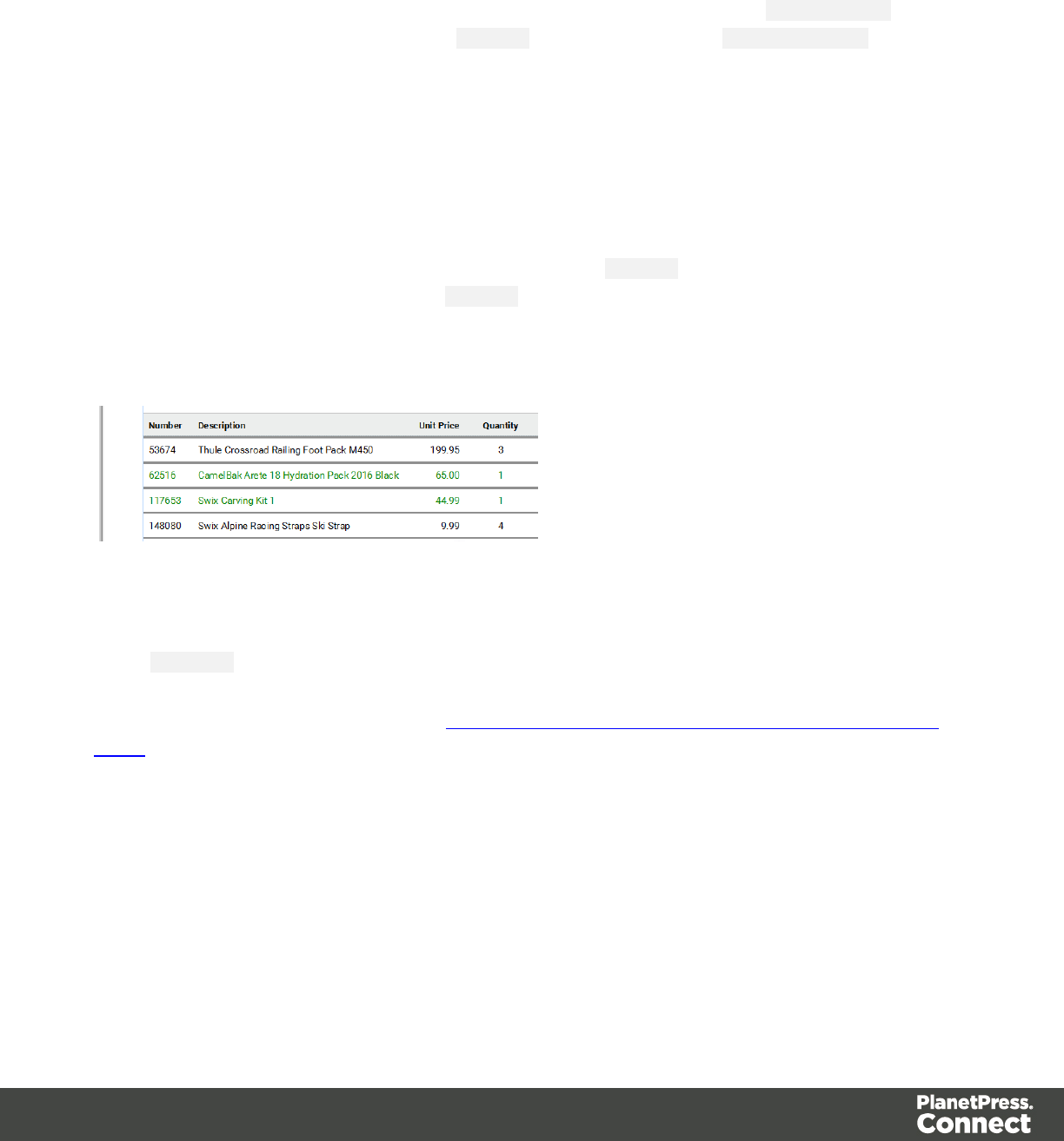
Styling based on a value in a detail table
Styling rows or cells in a detail table based on a value in the detail table goes a bit different.
First set an ID on the detail table as a whole and create a script that uses thatID tbody as the
script's selector. If for example the ID is table_1, the selector will be: #table_1 tbody. Then
write a script like the following:
for(var i = 0; i < record.tables.detail.length; i++){
if(record.tables.detail[i].fields['Shipped'] == 1)
query("tr:nth-child(" + (i+1) + ")", results).css
('color','green');
}
This script loops over a detail table, evaluating the field Shipped. If the value of that field is 1, it
looks up the corresponding row in the results (the object that contains the selected detail
table) and colors the text of that row green. (See also: "query()" on page772 and "css()" on
page745.)
To keep all CSS style rules together you could add the style rules to a class in the CSS file
(see "Styling templates with CSS files" on page454) and assign that class to the a row or cell
using addClass (see "addClass()" on page732).
For another example, see this how-to: Change detail line formatting based upon a data field
value.
Rotating elements
In any type of template, boxes, images, tables, text and other elements can be rotated.
The toolbar buttons Rotate Clockwise and Rotate Counter Clockwise rotate the element in
which the cursor is located 90 degrees at a time.
Page 483

To rotate an element into another angle position, use the 'angle' CSS property of the element.
In most cases, this can be done in the element's Formatting dialog. In other cases, such as with
text, you have to enter the CSS property and value manually. Both methods are explained in
the following procedure.
1. Right-click the element and click the respective element on the shortcut menu.
Alternatively, select the element (see "Selecting an element" on page377) and click the
respective element on the Format menu.
2. On the first tab, look for the angle property. If it is available, type the number of degrees
the element should be rotated. A positive number will rotate the element clockwise, a
negative number rotates it counter-clockwise. Skip steps 3 to 6.
If the angle property is not available, proceed with the following step.
3. Click the Advanced button to open the Advanced Formatting dialog.
4. Click in the first blank field under Property and type transform.
5. Click in the field next to it, under Value and type rotate(, followed by the number of
degrees the element should rotate, and then deg), for example: rotate(20deg). A positive
number will rotate the element clockwise, a negative number rotates it counter-clockwise.
6. Close the Advanced Formatting dialog.
7. Close the Formatting dialog, or click the Apply button to see the effect without closing the
dialog.
Note
It is also possible to rotate elements by creating a style rule in a style sheet; see "Styling
templates with CSS files" on page454.
Locale
The locale is a setting that can affect date, time and currency output, and other formatting that
depends on location and language. This setting is specific to each template, so changing it for
one template will not affect other templates.
Assume that a record set has a Date field that contains the following date: 4/11/12, and that this
field has been added to the template using the Text Script Wizard with the Long Date format
(see "Using the Text Script Wizard" on page500 and "Formatting variable data" on page503).
Page 484

If the locale is set to en-US, the date appears on the page as April 1, 2016. Setting the locale to
fr-CA makes this text appear as 1 avril 2016. Setting it to zh-CN will print 2016年4月1日.
The locale can also be used in scripts; see "Writing your own scripts" on page515 and
"Designer Scripts API" on page729.
Changing the locale
By default, the locale is the same as the operating system's locale setting. To change this
setting for the currently open template:
1. On the menu, select Edit > Locale.
2. Use the drop-down to select how the locale is to be set for the current template:
lSelect System Locale to use the operating system's locale settings. The operating
system's locale is set in the Region settings of the control panel. Note that when
output is generated on a different operating system, that operating system's locale
will be used.
lSelect Explicit Locale to specify a static locale which will remain static for this
template, whichever server the template is used on. Use the Locale drop-down to
select a specific locale. The locales comprise a language code followed by a 2-
letter country code (de-DE,zh-CN,fr-CA,fr-FR, etc), as defined by the
international standards ISO-639-1 and ISO 3166.
lSelect Data Field to use a data field from the record. The locale will be record-
specific in this case. Use the drop-down to select a field within the current Data
Model that contains the locale. This field must be a string and contain the exact
locale to be used, such as "en" or "fr-CA". It cannot be an alias such as "english" or
"french". The locale supports language codes (en,fr, etc), as well as language
codes followed by a 2-letter country code (de-DE,zh-CN,fr-CA,fr-FR, etc). The
language codes are defined by ISO-639-1. The 2-letter country code as defined by
ISO 3166.
3. Click OK to apply the setting. The setting will be saved with the template.
Personalizing content
Variable-data printing is a form of digital printing in which elements such as text and graphics
may be changed using information from a database or data file. It prints unique documents with
Page 485

customized messages for each customer. This is exactly what you can do with Connect: using
variable data you can personalize your company's communications.
Before you can start personalizing the content of a template, you must open a Data Mapping
Configuration, data file or database; see: "Loading data" on page488.
The most common ways to personalize templates are listed below.
Variable data
Variable data are data from a database or data file that are used to personalize documents for
each customer. Variable data fields can be inserted in the text directly. For example, if a
person's last name can be found in your data, the field that holds the last name can be used in
the text of a web page, letter or email. Scripts in PlanetPress Connect Designer are the basis of
Variable Data Printing.
The easiest, quickest and most direct way to add customer data to content is via drag and drop;
see "Variable Data" on page497.
The drag-and-drop method results in a Text Script. Another way to create a Text Script is to use
the Text Script Wizard. Often it is better to use the Text Script Wizard than the drag-and-drop
method.
The Text Script Wizard gives you more control over the way data is displayed. It can insert one
or more data fields, each with an optional prefix and suffix. For blocks of data, such as
addresses, the Text Script Wizard definitely is the better choice. See "Using the Text Script
Wizard" on page500.
Conditional content
In a template you may want to reveal content - text or images - to one group of recipients, but
hide it from others. You can use a Conditional Script Wizard to achieve this, if you have a data
field in your data on the basis of which a condition can be set. See "Showing content
conditionally" on page506.
Dynamic images
Dynamic Images are dynamic in the sense that they are replaced by another image when a
data field contains a certain value. Think of a signature image being swapped based on the
Page 486

sender's name, for example. You can use the Dynamic Image Script Wizard to make this
happen; see "Dynamic Images" on page508.
Dynamic tables
A Dynamic Table is a table with a variable number of rows that can overflow on one or more
pages. It can also display subtotals on transport lines. In invoices, a Dynamic Table is an
essential element. Read "Dynamic table" on page510 to learn how to insert a dynamic table.
Snippets
Snippets are pieces of content that can be re-used within the same template, in all contexts and
sections. Snippets can contain any contents that a section can have, such as text, images,
variable data, dynamic tables, etc. They are often very useful to personalize content, especially
in combination with variable data and scripts. See "Snippets" on page451 and "Loading a
snippet via a script" on page530.
Scripts
Self-made scripts
As soon as you want to do more than what can be done with the available (Text, Conditional)
Script Wizards, self-made scripts are the solution. You could, for example, combine data of two
or more data fields in a condition for conditional text. Or you could load a part of a snippet
depending on the value of a data field. With a self-made script you can achieve anything that
can be done by any of the Script Wizards, and much more. For an introduction on this, see
"Writing your own scripts" on page515.
Control Scripts
When output is generated from a template, Control Scripts run before all other scripts, when a
record is merged with a context. They determine how different sections of the context are
handled. They can, for example, make the page numbering continue over all Print sections,
split Email attachments, or omit Print sections from the output.
Some knowledge of JavaScript is needed to edit Control Scripts, just as for any other self-made
scripts, because there is no Control Script Wizard; see "Writing your own scripts" on page515.
See "Control Scripts" on page532.
Page 487

Loading data
Before you can add variable data fields to a template in the Designer, you need to have a Data
Model and a sample of customer data. At the design stage the Designer doesn't have to have
access to all data; it just needs to know which data fields exist in your data and it needs some
data to be able to display a preview of the output.
To get access to a Data Model and data, you can open:
la Data Mapping Configuration, see "Loading a Data Mapping Configuration" on the next
page
la data file, see "Adding data from a data file" on page490
la database, see "Adding data from a database" on page492.
A Data Model and sample data are part of a Data Mapping Configuration.
When you open a data file or a database, the Data Model will be derived from it unless there
already is an open Data Mapping Configuration; in that case, the current Data Mapping
Configuration will try to retrieve data from the file or database, using its own Data Model and
extraction logic.
After opening a Data Mapping Configuration or opening a data file or database, the Data Model
pane at the right hand bottom shows the data fields that occur in the data.
The Value column displays data from the first record in the data file. Use the First,Previous,
Next and Last buttons to browse through the records.
Note
Although it is possible to load data from a data file or database in the Designer without
creating a Data Mapping Configuration for it, generally the best way to extract data is by
creating a Data Mapping Configuration. With a Data Mapping Configuration you can,
among other things:
lUse the same data file with a different template, or use different kinds of data files
with the same template.
Page 488
lLoad transactional or structured data. If there are detail lines, transactions, or any
variable number of items to put into the template, you need to a Data Mapping
Configuration to extract them.
lFormat, transform, conditionally include/exclude and enhance data from the source
file.
lUse Workflow to automate the extraction of data from this kind of data file.
Tip
If you have no data at hand, download a demo from http://demo.objectiflune.com and
open a dummy data file to test with.
Loading a Data Mapping Configuration
If you have used the DataMapper first, you probably already have an open Data Mapping
Configuration. Its Data Model and sample data will automatically be used when you start
creating a template. You might have to click the Synchronize Model button on the Data Model
pane, to update the fields.
To open a Data Mapping Configuration:
1. Open the Welcome screen: click the Home icon at the top right or select Help >
Welcome on the menu.
2. Click Open an existing configuration.
3. Select the Data Mapping Configuration and open it.
4. At the top of the workspace, click the tab with the name of the template's section to go
back to the template.
5. Click the button Synchronize model at the top of the Data Model pane to reload the data
model.
Note
The EXTRADATA field that appears as the first field in each record and in each detail table is
Page 489
automatically added to the Data Model by the DataMapper. It offers the possibility to add extra data
to an existing Data Model, for example when Workflow has to perform a lookup to retrieve a value
from a database and add that value to a new field in the Data Model.
The EXTRADATA field can be added to the template just like any other data field (see "Variable
Data" on page497). When it contains a JSON string, this value can be read with a script (see
"loadjson()" on page763).
Note
When generating output with just a Data Mapping Configuration, the template is merged with the
complete sample data file that is part of the Data Mapping Configuration. The output is not limited
to the number of records shown in the Data Model pane (which is one of the settings in the
DataMapper).
Adding data from a data file
1. Click File, select Add Data and then click From file data source. Browse to the location
of the file and select it.
The Designer can open the following types of data files:
lCSV files (.csv)
lMicrosoft Access Database (.mdb, .accddb)
lXML files (.XML)
lPDF/VT files
2. Review the options presented, to ensure that the data will be interpreted correctly. The
options available depend on the type of data file (see below).
CSV file options
oEncoding: the Designer can not infer from a CSV file what encoding it is in. The default is
right in the large majority of cases, but when it isn't, it can be very difficult to figure out the
correct encoding. Ask your source what the encoding of the file is.
oField separator: choose the character that separates the fields in the file.
oComment delimiter: if there are comment lines in the file, type the character that starts a
comment line.
Page 490

oText Delimiter: type the character that surrounds text fields in the file. Other delimiters will
not be interpreted within these text delimiters.
oIgnore unparsable lines: when checked, any line that does not correspond to the above
settings will be ignored.
oFirst row contains field names: check this option to use the first line of the CSV as
headers. This option automatically names all extracted fields.
MDB file options
oFile: Include the full path to the file.
oPassword: If the file isn't password protected, you can click Next without filling out this
field.
oTable name: Use the drop-down to select the appropriate table or stored query to retrieve
the appropriate data set.
oEncoding: Use the drop-down to select the encoding with which to read the data in the
table.
XML File options
Select what level of XML elements defines a record.
The Trigger is what triggers the creation of a new record. It can be set to:
lOn element: this defines a new record when a new element occurs on the selected XML
level.
lOn change: this defines a new record when a specific field under the chosen XML level
has a new value. After selecting this option, you have to select the field that triggers the
creation of a new record.
PDF/VT file options
After selecting a file, use the drop-down to select what level in the PDF/VT file defines a record
in your data. The names of the levels are taken from the PDF/VT file itself. (See "About PDV/VT
files" on the facing page.)
All metadata fields that belong to the chosen level and levels higher up in the tree structure will
be listed. The lower the chosen level is in the tree structure, the more records you will get and
the more metadata fields will appear in the list.
Page 491

Select metadata fields to add them to your data. Their property names will be used as field
names in the Designer's data model.
About PDV/VT files
The pages in PDF/VT files can be grouped on several levels. PDF/VT files can have a variable
number of levels in their tree structure. The level's names are variable as well, with the
exception of the lowest level, which is always called the page level. Metadata can be attached
to each level in the structure.
AFP file options
After selecting a file, use the drop-down to select what level in the AFP file defines a record in
your data. The levels are defined in the AFP file itself. (See "About AFP files" below.)
All metadata fields that belong to the chosen level and higher levels in the tree structure will be
listed. The lower the chosen level is in the tree structure, the more records you will get and the
more metadata fields will appear in the list.
Select metadata fields to add them to your data. Their property names will be used as field
names in the Designer's data model.
About AFP files
Pages in AFP files are arranged in a tree structure, comprising one document at the top of the
structure, pages at the bottom of the structure and one or more levels of page groups in
between. (Unlike in PDF/VT files, the names of levels in AFP files can not be chosen freely.) In
other words, an AFP file always consists of one document, that can contain page groups, of
which each can be divided in page groups, and so on; the page groups at the lowest level
contain pages.
Metadata can be attached to each level in the structure.
Adding data from a database
1. Click File, select Add Data and then click From database data source. Browse to the
location of the file and select it.
The Designer can open databases from the following types of data sources:
lMySQL
lMicrosoft Access Database (.mdb, .accddb)
lSQL Server
lODBC DataSource
Page 492

lJDBC
lOracle.
2. Review the options presented. The options available depend on the type of database
data source; see below.
MySQL
1. Enter the appropriate information to connect to the database:
lServer: Enter the server address for the MySQL database.
lPort: Enter the port to communicate with the MySQL server. The default port is
3306.
lDatabase name: Enter the exact name of the database from where the data should
be extracted.
lUser name: Enter a user name that has access to the MySQL server and specified
database. The user only requires Read access to the database.
lPassword: Enter the password that matches the username above.
2. Click Next and enter the information for the source table.
lConnection string: Displays the full path to the database.
lTable: Use the drop-down to select the appropriate table or stored query to retrieve
the appropriate data set.
lEncoding: Use the drop-down to select the encoding with which to read the data in
the table.
3. Click Finish to open the database.
Microsoft Access
1. Enter the appropriate information to connect to the database:
lFile name: Browse to your Microsoft Access database file (.mdb)
lPassword: Enter a password if one is required.
Page 493

2. Click Next and enter the information for the source table.
lConnection string: Displays the full path to the database.
lTable: Use the drop-down to select the appropriate table or stored query to retrieve
the appropriate data set.
lEncoding: Use the drop-down to select the encoding with which to read the data in
the table.
3. Click Finish to open the database.
SQL Server
1. Enter the appropriate information to connect to the database:
lServer: Enter the server address for the SQLServer database.
lPort: Enter the port to communicate with the SQLServer. The default port is 1433.
lDatabase name: Enter the exact name of the database from where the data should
be extracted.
lUser name: Enter a username that has access to the SQLServer and specified
database. The user only requires Read access to the database.
lPassword: Enter the password that matches the username above.
2. Click Next and enter the information for the source table.
lConnection string: Displays the full path to the database.
lTable: Use the drop-down to select the appropriate table or stored query to retrieve
the appropriate data set.
lEncoding: Use the drop-down to select the encoding with which to read the data in
the table.
3. Click Finish to open the database.
ODBC DataSource
1. Select the ODBC system data source. Note: Only 32-bit data sources are currently shown
in this dialog, even if your system is 64-bits.
Page 494

2. Click Next and enter the information for the source table.
lConnection string: Displays the full path to the database.
lTable: Use the drop-down to select the appropriate table or stored query to retrieve
the appropriate data set.
lEncoding: Use the drop-down to select the encoding with which to read the data in
the table.
3. Click Finish to open the database
JDBC
1. Enter the appropriate information to connect to the database:
lJDBC Driver: Use the drop-down to select which JDBC Driver to use for the
database connection.
lJAR file path: Enter a path to the JAR file that contains the appropriate driver for the
database below.
lServer: Enter the server address for the database server.
lPort: Enter the port to communicate with the server.
lDatabase name: Enter the exact name of the database from where the data should
be extracted.
lUser name: Enter a username that has access to the server and specified
database. The user only requires Read access to the database.
lPassword: Enter the password that matches the username above.
lAdvanced mode: check to enable the Connection String to manually enter the
database connection string.
lConnection string: Type or copy in your connection string.
2. Click Next and enter the information for the source table.
lConnection string: Displays the full path to the database.
lTable: Use the drop-down to select the appropriate table or stored query to retrieve
the appropriate data set.
lEncoding: Use the drop-down to select the encoding with which to read the data in
the table.
3. Click Finish to open the database.
Page 495

Oracle
1. Enter the appropriate information to connect to the database:
lServer: Enter the server address for the Oracle database.
lPort: Enter the port to communicate with the Oracle server.
lDatabase name: Enter the exact name of the database from where the data should
be extracted.
lUser name: Enter a username that has access to the Oracle server and specified
database. The user only requires Read access to the database.
lPassword: Enter the password that matches the username above.
2. Click Next and enter the information for the source table.
lConnection string: Displays the full path to the database.
lTable: Use the drop-down to select the appropriate table or stored query to retrieve
the appropriate data set.
lEncoding: Use the drop-down to select the encoding with which to read the data in
the table.
3. Click Finish to open the database.
After adding data from a database, the Data Model pane at the right hand bottom shows the
data fields that occur in the data.
The Value column displays data from the first record in the data file. Use the First,Previous,
Next and Last buttons to browse through the records.
Add a counter using the Generate Counter Wizard
Generating a counter is useful for numbered tickets or any other template requiring sequential
numbers but no variable data.
The Generate Counter Wizard creates a record set with a Counter field and in that field, the
current counter value for each record. The Counter starts and stops at set values and is
incremented by a set value as well.
Page 496

1. To open the Generate Counter Wizard, select File > Add data > Generate counters.
2. Adjust the settings:
lStarting value: The starting number for the counter. Defaults to 1.
lIncrement value: The value by which to increment the counter for each record. For
example, an increment value of 3 and starting value of 1 would give the counter
values of 1, 4, 7, 10, [...]
lNumber of records: The total number of counter records to generate. This is not
the end value but rather the total number of actual records to generate.
lPadding character: Which character to add if the counter's value is smaller than
the width.
lWidth: The number of digits the counter will have (prefix and suffix not included). If
the width is larger than the current counter value, the padding character will be used
on the left of the counter value, until the width is equal to the set value. For example
for a counter value of "15", a width of "4" and padding character of "0", the value will
become "0015".
lPrefix: String to add before the counter, for example, adding # to get #00001. The
prefix length is not counted in the width.
lSuffix: String to add after the counter. The suffix length is not counted in the width.
3. Click Finish to generate the Counter record set.
Tip
While the Generate Counter script is really useful for things like raffle tickets, it's unusable in
combination with a data file or database, as it cannot complement that data automatically. This can
only be done with a script. A script that adds a counter to data, using the current record index to
calculate the current counter value, can be found in this how-to: Manual counter in designer.
Variable Data
Variable data are data from a database or data file that are used to personalize documents for
each customer. Variable data fields can be inserted in the text directly. For example, if a
person's last name can be found in your data, the field that holds the last name can be used in
the text of a web page, letter or email. Scripts in PlanetPress Connect Designer are the basis of
Variable Data Printing.
Page 497

After loading a Data Mapping Configuration or data from a data file or database (see "Loading
data" on page488), you can add variable data fields to the contents of your template. You can
do this via the drag-and-drop method, or using the Text Script Wizard.
Use the Text Script Wizard when there are empty fields in the data, and the value of a data
field needs to be preceded or followed by a space, line break or text in the template. Otherwise,
empty data fields will cause empty lines and superfluous white spaces to show up in the text.
You should also use this method for blocks of data, such as address blocks, and when you
want to format data differently, for example, when you want a number to be displayed as a
currency.
You can use the drag-and-drop method for simple fields that do not need to be preceded or
followed by a space, line break or text.
Note
Web templates are personalized just like any other template. There are a few extra possibilities,
though; see "Using variable data on a Web page" on page334.
Inserting variable data directly (drag-and-drop)
An easy, quick and direct way to insert variable data in the content is via drag and drop:
1. Open the section you want to add the data field to.
2. Drag and drop a data field from the Data Model pane at the bottom right into the content
of your template.
To select and insert multiple data fields at the same time, press Shift or Ctrl, whilst
selecting fields in the Data Model pane.
What happens is that:
oAplaceholder for the value of the data field shows up in the text. It looks as follows:
@FIELDNAME@.
oAtext script appears in the Scripts pane at the bottom left.
Atext script replaces placeholders in the content with the value of a data field in the current
record.
Page 498

Switch to the Preview tab at the bottom of the workspace to see the script in operation. The
value of the corresponding data field in the first record appears instead of the placeholder,
everywhere where the placeholder is found in the text. This value will be refreshed when you
browse through the records in the Data Model pane.
When the output (the letter, email, etc.) is generated, the text script executes for each record in
the record set, and each time it replaces the placeholders by the value of the field in the current
record.
In the Scripts pane you can see that the script has a name and a selector.
The drag-and-drop method automatically generates a script that is named after the data field
(see the first column of the Scripts pane).
The selector (in the second column in the Scripts pane) is the text that the script will replace.
The selector that the drag-and-drop method generates for a script, is the same as the
placeholder that is placed in the text.
When you drag the same field to the content again, a second placeholder appears in the text,
but no new script is added. The existing script will find and replace all placeholders that match
its selector.
Tip
Press the Alt key while dragging, to wrap the placeholder in a span, give the span an ID
and have that ID used as the script's selector.
Press the Ctrl key while dragging, to wrap the placeholder in an absolute positioned box
(a div) at the cursor position. A unique ID is assigned to the box and used as the script's
selector. This method is particularly useful when the document mainly consists of a PDF
used as the background image of a section (see "Using a PDF file as background image"
on page288).
Tip
Drag the data field directly to the Scripts pane to create a script without adding a
placeholder to the template.
Page 499
Note
Looking for text in a text is a less optimized operation and may impact output speeds in
longer documents. To speed up the output process, put the placeholder(s) in a Box or
Span (see "Boxes" on page419), give that Box or Span an ID and use that ID as the
script's selector. See "Using the Text Script Wizard" below for an explanation about the
various types of selectors. For more tips to make a template generate output faster, see
"Optimizing scripts" on page526.
Using the Text Script Wizard
The Text Script Wizard can insert one or more data fields into your template, each with an
optional prefix and suffix. It is recommended to use the Text Script Wizard for blocks of data,
such as address blocks, and when data fields can be empty or need to be formatted differently.
1. Create a new text script and open the Text Script Wizard. There are two ways to do this:
lOn the Scripts pane at the bottom left, click the black triangle on the New button
and click New Text Script. A new script appears in the list. Double-click the new
script to open it.
lSelect a word in the content. Right-click the selection and on the shortcut menu,
choose Text Script.
The Text Script Wizard appears.
2. Change the name of the script to make clear what it does.
3. The selector states the text to be found in the template. The results can be replaced by
the script.
Tip
Hover over the name of a script in the Scripts pane to highlight parts of the template
that are affected by the script.
lText, for example: @lastname@, or {sender}. The text doesn't have to have any
special characters, but special characters do make it easier to recognize the text for
yourself. In the Text Script Wizard, click Text and type the text to find.
Page 500
Note
A script made with the Text Script Wizard for a block of data already runs
faster than a series of individual scripts, because it only has one selector.
However, searching for text can be a lengthy operation, compared to
searching for an element with an ID. When speed matters, select one of the
two remaining options: Selector or Selector and Text. See also: "Testing
scripts" on page523 and "Optimizing scripts" on page526.
lAn HTML/CSS selector:
nHTML elements, such as a paragraph. In the Text Script Wizard, click
Selector and type the HTML tag without the angle brackets, for example: p.
nHTML elements with a specific class. In the Text Script Wizard, click Selector
and type the class name, including the preceding dot, for example: p.green for
all paragraphs with the class 'green' or .green for all kinds of HTML elements
that have the class 'green'. See "Styling and formatting" on page453 for an
explanation about CSS (Cascading Style Sheets).
nAn HTML element with a specific ID. In the script Wizard, click Selector and
type the ID, including the preceding #, for example: #intro.
Note
Each ID should be unique. An ID can be used once in each section.
nEtcetera. See http://www.w3schools.com/cssref/css_selectors.asp for more
selectors and combinations of selectors.
lAselector and text. This is text inside an HTML element (or several HTML
elements) with a specific HTML tag, class or ID. In the Text Script Wizard, click
Selector and text and type the selector and the text in the respective fields.
4. Click the the downward pointing arrow in the first row in the column Field. Select a data
field from the list that appears.
5. Add a Prefix and/or a Suffix. The prefix and suffix can contain text and/or HTML tags. If a
field is empty, the prefix and suffix will be ignored, which means you can add line returns
Page 501
and static text, such as:
lwith a Number field, Prefix: Your invoice (one space at the end), Suffix: is now ready
to be viewed!
lwith a field LastName, Suffix <br/> (which adds a line break)
lwith a field State, Prefix: , (comma then space).
For a comma between fields, use the Prefix of the second field, if you don’t want a
comma when the second field has no value.
6. The Wizard allows you to reformat the data (for example, apply uppercase, apply
thousand separators to numbers, etc.). Click the column Format, click the downward
pointing arrow and select one of the formats. See "Formatting variable data" on the next
page.
7. Add as many data fields as you need, following the same procedure.
8. Optionally, you can click Options to specify where and how the script inserts its results:
lAs HTML. HTML elements in the results are processed and displayed as HTML
elements. For instance, <b>this is bold</b> will be displayed as this is
bold. This is the default setting.
lAs text. This inserts the results as-is, meaning HTML tags and elements are
displayed as text in the output. In this scenario, "<br>" shows up in the text and does
not insert a line break.
lAs the value of an attribute of an HTML element. The selector of the script should
be an HTML element. Which attributes are available depends on the selected
HTML element. If the script's selector is an image (<img> element) for example, and
the attribute is src, the script will modify the image's source. The script's results
should be a valid value for the chosen attribute.
Note
When checked, the option Convert fields to JSON string writes the results
from the script into an attribute or text as a JSON string. This is useful for web
contexts where a front-end script can read this value easily.
9. Close the Text Script Wizard and type the placeholder for the results of the script in the
content of your template, or make sure that there is at least one element that matches the
selector of the script.
Page 502
10. Hover over the name of the script in the Scripts pane. In the workspace you will see
which parts of the template are affected by the script. If the script produces an error, the
error message will be displayed in a hint on the Scripts pane.
Tip
When one of the included data fields is empty, the respective line, including the
prefix and suffix, is skipped. The result of the script will be shorter, causing the rest
of the content to move up or down. If, in a Print context, you don't want the result of
the script to be part of the text flow (for example, when a letter is going to be sent in
an envelope with a window), put the placeholder for the script in a positioned box
(see "Boxes" on page419 and "How to position elements" on page462).
Tip
An example of how to create an address block using the Text Script Wizard is described in a how-
to; see How to create an Address Block.
Formatting variable data
When a Text Script, made with the Text Script Wizard (see "Using the Text Script Wizard" on
page500) adds variable data to a template, it can easily change the way the data are formatted
as well. This is done in the Text Script Wizard through a special formatting modifier or a format
mask for each field that the script adds to the template.
The available formatting functions depend on the data type of the corresponding field in the
Data Model. In a Data Mapping Configuration you can set the data type of each field. When you
open a data file or database without a Data Mapping Configuration, all fields are text fields
(fields of the type string).
You could also format data in a script using the formatter ; see "Designer Scripts API" on
page729.
Date
Dates in variable data can be displayed as long, medium and short dates with different time
displays. There are quite a few presets, but you can also enter a custom format mask.
Page 503

1. Open the Text Script Wizard: double-click to open an existing script in the Scripts pane or
create a new Text Script using the Text Script Wizard; see "Using the Text Script Wizard"
on page500.
2. Click a data field that contains text, or add such a data field to the script with the Add field
button on the right.
3. Under Format you can choose one of the following options:
lShort Date displays the day, month and year in two digits each, for example
01.04.16.
lMedium Date displays the day and month in two digits each and the year in four
digits, for example 01.04.2016. (This is also the value of the Default Date.)
lLong Date displays the day as a number, the month's full name and the year in four
digits, for example 1. April 2016.
lShort Time displays a time in hours and minutes in two digits each, for example
00:00.
lMedium Time displays a time in hours, minutes and seconds in two digits each, for
example 00:00:00. (This is also the value of the Default Time.)
lLong Time displays a time in hours, minutes and seconds in two digits each, and
adds a time zone, for example 00:00:00 EDT.
lShort Date/Time displays the date as a short date and the time as a short time, for
example 01.04.16 00:00.
lMedium Date/Time displays the date as a medium date and the time as a medium
time, for example 01.04.2016 00:00:00 (This is also the value of the Default
Date/Time.)
lLong Date/Time displays the date as a medium date and the time as a medium
time, for example 1. April 2016 00:00:00 EDT.
Alternatively, you can enter a custom format mask: click in the Format column for the
corresponding field and start typing a pattern to format the date (and optionally, the time).
Do not put the pattern in quotes. For possible patterns see "Date and time patterns" on
page751.
Note that this will only work if the type of the field has been set to Date in the Data
Mapping Configuration and if the field contains a valid date.
Page 504

Note
The locale influences the way dates, times, numbers and currencies are formatted;
see "Locale" on page484.
4. Close the Script Wizard. For a new script, don’t forget to add the selector to the template.
Font style
Text originating from variable data can be displayed in uppercase, lowercase or proper case.
1. Open the Text Script Wizard: double-click to open an existing script in the Scripts pane or
create a new Text Script using the Text Script Wizard; see "Using the Text Script Wizard"
on page500.
2. Click a data field that contains text, or add such a data field to the script with the Add field
button on the right.
3. Under Format choose the correct setting:
lUppercase transforms all characters to uppercase.
lLowercase displays transforms all characters to lowercase.
lPropercase transforms the first character of each word to uppercase and all other
characters to lowercase.
lNone leaves the text as is.
4. Close the Script Wizard. For a new script, don’t forget to add the selector to the template.
Numbers and currencies
Numbers, and strings existing of digits, can be displayed as a number with a certain formatting
or as an amount of money. There are a few presets, but you can also type a format mask.
1. Open the Script Wizard: in the Scripts pane, double-click the script, or create a new Text
Script using the Text Script Wizard; see "Using the Text Script Wizard" on page500.
2. Click the data field that contains the numeric value that you want to display differently, or
add the data field to the script with the Add field button on the right.
Page 505

3. Under Format choose one of the following settings:
lGrouped displays a number with three decimal places and sets the thousands
separator for the value based on the current locale; see "Locale" on page484.
lCurrency displays a number as an amount of money, with a thousands separator
and rounded to two decimal places, based on the current locale; see "Locale" on
page484.
lCurrency no symbol does the same as Currency, but omits the currency symbol.
lLeading zero adds a leading zero to a floating value between 0 and 1. This format
is only available for fields that contain a float value. Note that when you open a
data file or database without a Data Mapping Configuration, all fields are of the type
string.
l∑ (Sum) and ∑↑ (Sum Up) are used in Dynamic Tables in a Print context. ∑is for
transport rules at the end of a page and ∑↑ shows the subtotal of the previous page.
Alternatively, you can enter a custom format mask: click in the Format column for the
corresponding field and start typing a pattern. For example, the pattern 000000 means
that the number should count six digits; leading zeros are added to numbers shorter than
six digits. For an overview of pattern symbols see "Number patterns" on page767 and
http://docs.oracle.com/javase/7/docs/api/java/text/DecimalFormat.html. Note that for this to
work, in the DataMapper the field that contains the value must be set to SmallInteger,
BigInteger, Float, SmallCurrency or LargeCurrency.
4. Close the Script Wizard. For a new script, don’t forget to add the selector to the template.
Showing content conditionally
One way to personalize content is to show or hide one or more elements depending on a field’s
value. For example, a paragraph written for Canadian customers could be hidden when the
recipient of the letter is not living in Canada, if that can be derived from the data.
Use the Conditional Script Wizard to show or hide one element – a paragraph, image or other
HTML element - based on the value of a data field.
Showing or hiding elements using the Conditional Script Wizard
1. Right-click the element and click Make Conditional. Alternatively click the black triangle
on the New button on the Scripts pane at the bottom left of the window, and click
Conditional Content Script. The Conditional Script Wizard opens.
Page 506

2. Rename the script so that it reflects what the script does.
3. If you have started creating the script from the Scripts pane, you have to type a Selector.
The selector selects one or more pieces of text or elements from the template, so that the
conditional content script can hide or show those pieces. An ID (for example:
#conditional-script) is best if you want to show or hide one element only. Use a class
selector (for example: .conditional) if the script should show or hide more than one
element. See "Using the Text Script Wizard" on page500 for further explanation on
selectors.
If you have started the Conditional Script Wizard by right-clicking an element, you don't
have to set a selector. If the element didn't have an ID, a new ID has been generated
automatically. The new ID functions as the selector of the script.
You can change the selector after closing and reopening the script (double-click the
name of the script in the Scripts pane).
4. Set the Action: use the drop-down to select whether to Show or Hide the element when
the condition below is true.
5. Click the downward pointing arrow next to Field, to select the data field that should be
evaluated.
6. Click the downward pointing arrow next to Condition to expand the list of conditions with
which the data field can be evaluated. The options are: Equal to,Not equal to,
Contains,Does not contain,Begins with,Ends with.
7. Type the Value that should be used for the conditional check.
For example, you could check whether the data field Gender is 'Equal To' the value 'M', in
order to show a paragraph or an image applying to male customers only.
If the condition evaluates to true, the selected action will be performed. If, conversely, the
condition evaluates to false, and the option Toggle Visibility is checked, the opposite
action will be performed. By default, this option is checked.
Note
To combine the values of two or more data fields, you have to click Expand and
edit the code of the script. See "Writing your own scripts" on page515.
8. Click Apply or OK.
9. To see the result, toggle to the Preview tab at the bottom of the workspace (or select View
> Preview View on the menu).
Page 507

Showing or hiding several elements with one conditional script
To apply one conditional content script to several elements, you have to use a CSS class or
HTMLelement as the selector of the script. When using a CSSclass, apply that class to the
elements in question:
1. Double-click the conditional script in the Scripts pane to reopen it, or create a new
conditional content script and follow the actions described in "Showing or hiding
elements using the Conditional Script Wizard" on page506.
2. Change the selector to a CSS class (for example, .male) or to an HTML element with a
certain CSS class (for example, p.male). See "Using the Text Script Wizard" on page500
for further explanation on selectors.
3. Apply the same CSS class to all elements that should be shown or hidden under the
condition that you have set in the conditional script. Click each element and type the class
(without the preceding dot) in the Class field.
Showing or hiding a text selection
When you right-click on an element and make it conditional, the element as a whole will be
made conditional. This happens even when you select a few words in a paragraph and right-
click those words; the paragraph as a whole will be made conditional.
It is, however, possible to partially show or hide a paragraph or a line item in a list. Before you
can do that, you have to select the text that you want to be shown or hidden and wrap it in a
span element first:
1. Select the part of the text that you want to make conditional.
2. Right-click the selected text and click Wrap in span.
3. Type an ID and/or a class. An ID is fine if this is the only thing that should be shown or
hidden on a given condition. Use a class if there is more that should be shown or hidden
on the same condition.
4. Start creating a conditional content script from the Scripts pane. Use the ID or class as
the selector of the script. See "Showing or hiding elements using the Conditional Script
Wizard" on page506.
Dynamic Images
Dynamic images are called dynamic because they are switched, depending on the value of a
data field. This way, a template can be adjusted to different customers.
Page 508

Adding dynamic images
Dynamic images can be added to the template using the Dynamic Image Script Wizard only if
you have:
lOne or more data fields that contain values on the basis of which the images can be
switched.
lAn appropriate image for each group of customers. All files should be of the same type
and they need to be stored in one folder (the Images folder on the Resources pane, or
an external folder). It is important that they are named after the various possible values of
the related data field. Adding dynamic images that are not named after a data field value
requires a self-made script.
To use the Dynamic Image Script Wizard:
1. Add one image to the template. See "Adding images" on page441.
2. Right-click the image and click Dynamic Image. The Dynamic Image Script Wizard
opens.
The image's ID is used as the script's selector. If the image did not have an ID, it is
automatically generated.
The Dynamic Image Script Wizard composes a file name (including the path) based on
the value of a data field, a prefix and a suffix:
lThe prefix shows the path of the image.
lThe suffix states the file extension of the image.
lThe file name is the value of the data field(s) in the Field column.
The prefix and suffix are derived from the current image.
3. If necessary, enter another Prefix and/or Suffix.
4. Click the first field in the column Field, and then click the downward pointing arrow.
Select the data field to be evaluated.
Click the button Add, to add more fields if you want the file name to be composed of the
value of several data fields. Note that only the suffix of the last data field should hold the
file extension.
The resulting file name, including the path and file extension, is assigned to the src
(source) attribute of the image. You can click Options to verify this.
5. Click Apply or OK. Now click the Preview tab and browse through the records to verify
that the script works as expected.
Page 509
Tip
The dynamic images feature can be used to insert dynamic signatures, as described in
this how-to: Dynamic signatures.
How to insert dynamic images if there are no data fields with the actual names of the
images is described in another how-to: Dynamic image that doesn't contain the data field
value.
Editing a Dynamic Image
To edit dynamic images added to the template earlier, right-click the image, or the space
reserved for the dynamic images. Then click Dynamic Image to open the Dynamic Image
Script Wizard again.
Dynamic table
In invoice templates, a Dynamic Table is an essential element. A Dynamic Table is different
from a standard table in that it has a variable number of rows. In a Print context it will
automatically overflow into as many pages as necessary to output all rows and it can display a
transport line.
Dynamic Tables are only available when the loaded record set or Data Mapping Configuration
contains transactional data in one or more detail tables (see "Loading data" on page488).
Creating a Dynamic Table
To create a Dynamic Table:
1. Open the Insert Detail Table dialog. There are several ways to do that:
lDrag the data field that contains the name of the detail table into the template.
lOn the menu select Insert > Table > Dynamic.
lOn the toolbar, click the Insert detail table button.
2. Enter the table's desired attributes:
lID: A unique identifier for the table. IDs are used to access the table from scripts and
as CSS selectors for style rules.
Page 510

lClass: A class identifier for the table. Classes can be shared between elements and
are used to access the table from scripts and as CSS selectors for style rules.
lDetail Table: Use the drop-down to select which detail table to display within the
dynamic table.
lWidth: Enter the width of the table.
A Dynamic Table is always inserted at the cursor position.
3. Click Next and select which fields should show up in the Dynamic Table.
The order of the fields indicates in which order columns are displayed in the dynamic
table, from left to right. Select a line and then use the Up and Down buttons to change the
order of the columns.
You could change the placeholder for each data field as well; just click a placeholder to
edit it.
4. Click Next and check Calculate Subtotals to enable the options for a (sub)total at the
end and (in Print sections) transport lines. The options are:
lColumn: Use the drop-down list to select the field that contains the currency value
to be used to calculate the subtotal of the table. This field generally contains the
result of item prices multiplied by the quantity.
lField name: Type the name to display in the footer when displaying that page's
subtotal.
lShow in footer: Check to display the subtotal in the footer of the table at the bottom
of each page and at the end of the table.
lShow in header (transportline): Check to display the subtotal of the previous page
at the top of the table.
5. Click Next and select the styling attributes. Use the drop-down to select the desired table
style. Choose No Style if you want to style the table yourself.
6. Click Finish to add the table to the section.
When a Dynamic Table is added, a script is created for each of the columns containing a
placeholder for a field that is to be replaced. These scripts are placed inside a folder named
after the table's ID, on the Scripts pane.
Adding a row at the bottom or the top of a Dynamic Table
Sometimes you'll want to add one or more rows to the header or footer of a Dynamic Table: to
add taxes and/or the total of the invoice to the table, for example, or to add a custom message.
A header or footer row can be added to a Dynamic Table as follows:
Page 511

1. In the workspace, open the Design tab. Right-click the first line of the table if you want to
add a header row, or the last line if you want to add a footer row.
2. On the shortcut menu select Row > Insert below or Insert above. The new row will be
added to either the header or footer.
3. Right-click the row and choose Row > Show. Now you have the following options:
lA header row marked as a Transport line will not appear at the very top of the
table, but only on following pages if the table gets split over multiple pages. Note
that only the first row that is marked as Transport line will be taken into account. To
make a header row appear at the start of the table and on following pages, make
sure that it is not marked as Transport line.
lA footer row can appear before each page break (Before page break), if the table
gets split over multiple pages, or only at the end of the table (At end of table), or
before each page break and at the end (Always).
You can fill additional rows as usual. You could for example drag a data field to the new row
(see "Variable Data" on page497) or type in the cells.
Examples
For a few examples of how to adjust the default subtotals footer and (transport line) header, see
the following how-to: Custom table overflow footers.
Styling a Dynamic Table
The Insert Detail Table wizard lets you select a style, but if you want to apply a different style to
the table, choose No Style when creating the table. Then the style of a Dynamic Table is
completely customizable: you can change the font, font size and color, the borders, the cell
padding (the distance between the edge of the cell and its content), and the background color
or image of the table and its cells. See "Styling a table" on page479.
Note
When generating output from a template, a Dynamic Table is created slightly faster when it's styled
via Cascading Style Sheets than when it's styled with local formatting. Therefore the preferred way
to style a dynamic table is via style sheets.
Page 512

Change detail line formatting based upon a data field value
An example of how to change the formatting of a line in a Dynamic Table, based upon a data
field value, is given in the following how-to: Change detail line formatting based upon a data
field value.
Resizing a Dynamic Table
To change the width of a Dynamic Table or of a column in a Dynamic Table, select it (see
"Selecting an element" on page377) and type the desired width as a percentage in the
respective field on the Attributes pane.
The height of the Dynamic Table is adjusted automatically to the amount of data added to it in
Preview mode or when generating output.
It is however possible to change the height of the rows: click in the row and type the desired
height in the respective field on the Attributes pane. All line item rows will have the same
height.
HTML elements and attributes
In HTML, a Detail Table is just a normal <table> element with rows and cells (see "HTML
element: table" on page445). But apart from the native attributes of a table, row and cell
element, some data- attributes can be seen in detail tables:
ldata-detail: The name of the detail table in the data, for example: data-
detail="products".
ldata-repeat: The row will be repeated if it has this attribute: data-repeat="".
ldata-showin: This attribute determines the visibility of the row in different situations, if
the table gets split over multiple pages:
lheader will make the row show up at the top of the table on the first page only.
lfooter will make the row show up in the footer of the table on the last page only.
lbreak used in a row in the <thead> section of a table indicates that the row should
not be displayed at the top of the table on the first page, but only on following pages.
Used on a row in the <tfoot> section, it indicates that the row should be displayed
before each page-break. This value may be combined with footer or header, for
example: data-showin="footer, break", to make the row show up on every
page.
Note that these options can also be set via the user interface: right-click on the row and
Page 513

select Row > Show; see "Adding a row at the bottom or the top of a Dynamic Table" on
page511.
ldata-breakable: this attribute is added to every copied row (in preview mode or when
creating output). It is required by the pagination routines of Connect to split the table
across pages.
ldata-column-resize, if present, indicates that the columns may be resized (data-
column-resize="").
Personalized URL
Personalized URLs (pURLs) are links that are tailor-made for a specific purpose, generally for
individual clients. They can serve multiple purposes, for instance:
lClick Tracking: A unique ID in the link makes it possible to track the source of the click
(for example, a link in an email campaign).
lUser Tracking: A user-specific ID reveals who clicked the link and at what time.
lLanding Pages: Information in the link invokes a unique landing page with specific
products or services.
lPersonalized User Pages: Using information from a database, a user is served a
completely personalized web page with their name and information tailored to them,
enhancing user response.
Typically, a pURL in a Connect template takes the user to a personalized landing page, for
example, to download an invoice or get access to specific products or services.
In addition to the pURL, to generate a personalized landing page the Connect Server needs a
template with a Web context and a Workflow process with the following tasks:
lA HTTP Server Input task to capture incoming web requests (see Workflow Help: HTTP
Server Input).
lAn Execute Data Mapping task to create the record set appropriate for the template (see
Workflow Help: Execute DataMapping Task).
lA Create Web Content task that generates the HTML files (see Workflow Help: Create
Web Content).
Creating a personalized URL
Creating a personalized URL implies writing a script. See "Writing your own scripts" below.
Page 514

It also requires some planning, because the pURL needs to contain data that is necessary to
create the web page. For instance, creating a personalized URL for a client's invoice may
require the Invoice Number to be present in the URL, which is then used to retrieve the invoice
data, generate the invoice in PDF or HTML format using a template, and then return it to the
browser. The trick is then to add the designated information to a hyperlink. How to do this is
described in a how-to; see How to dynamically insert a hyperlink.
Writing your own scripts
Personalization can be taken a lot further than just inserting names and addresses, and hiding
or showing text or images. Every bit of information in your communications can be made
entirely personal, using scripts.
Most scripts can be made using one of the script Wizards. For a block of variable data, such as
an address, the Text Script Wizard is a perfect fit. Paragraphs can be made conditional with a
Conditional Script Wizard. For dynamic images, you can use the Dynamic Image Script Wizard.
In an Email context, you are provided with a number of script Wizards to set the sender, the
recipients and the subject of the email.
However, when you want to do something that goes beyond what you can do with a Wizard,
like creating a conditional paragraph with a condition that is based on a combination of data
fields, you have to write the script yourself.
This topic explains how scripts work and how you can create and write a script.
How scripts work
A script is a small set of instructions to the program, written in JavaScript.
When Connect generates the actual output – letters, web pages or emails -, it opens a record
set and merges it with the template. It takes each record, one by one, and runs all scripts for it
(Control Scripts first).
All scripts, except Control Scripts, must have a selector. The selector can be text, an HTML
element and/or a CSS selector. Running a script starts with looking for pieces of content in the
template that match the script's selector.
Page 515

The results of this query can vary from one occurrence of a simple text (for example:
@EMAIL@) to a large collection of HTML elements. For example, when the selector is p, the
HTML tag for a paragraph, all paragraphs will be collected and passed to the script.
Tip
Hover over the name of a script in the Scripts pane to highlight parts of the template that are
affected by the script.
Next, the script can modify the selected pieces of content, using values from the record that is
merged to the template at the time the script runs. It can, for example, hide, replace or add text
or change the style of those pieces of content. This is how scripts personalize documents.
Creating a new script
Writing a script starts with this procedure:
1. On the Scripts pane at the bottom left, click New. A new script appears in the list. Double-
click on it to open it.
2. Change the name of the script, so that it reflects what the script does.
3. Choose which kind of selector you want to use. Running a script starts with searching the
template for pieces of content that match the script's selector. The collected pieces of
content are passed on to the script, so that the script can modify them.
The selector can be:
lText, for example: @lastname@, or {sender}. The text doesn't have to have any
special characters, but special characters do make them easier to recognize for
yourself. In the Script Wizard, click Text and type the text to find.
lAselector (HTML/CSS):
nHTML elements of a certain type, such as a paragraph: <p>. In the script
Wizard, click Selector and type the HTML tag without the angle brackets: p.
nHTML elements with a specific CSS class (.green). In the script Wizard, click
Selector and type the class name, including the preceding dot: .green.
nAn HTML element with a specific ID (#intro). In the script Wizard, click
Selector and type the ID, including the preceding #: #intro.
Page 516

In an HTML file, each ID should be unique. This means that a particular ID can
be used only once in each section.
nEtcetera. See http://www.w3schools.com/cssref/css_selectors.asp for more
selectors and combinations of selectors.
lAselector and text. This is text inside an HTML element (or several HTML
elements) with a specific HTML tag, CSS class or ID. In the script Wizard, click
Selector and Text.
Tip
When output speed matters, choose selector or selector and text. Searching text
is a rather lengthy operation, compared to searching for HTML elements and/or
CSS selectors. See also profiling scripts.
There is a shorter route to create a script for an element with a specific ID:
1. In the template, click the element for which you want to create a script.
2. On the Attributes pane at the top right, type an ID. (In HTML,IDs start with #, but in
this field you should type it without the preceding #).
3. Click the label to the left of the ID input field (ID)to make a new script with the ID that
you typed as a selector.
Writing a script
1. Create a new script (see: "Creating a new script" on the previous page), or double-click
an existing script in the Scripts pane on the bottom left.
If the script was made with a Script Wizard, you have to click the Expand button before
you can start writing code. This will change the Script Wizard into an editor window.
Warning
When you change an expanded text script and save it, it becomes impossible to
edit the script using the Script Wizard again.
2. Write the script. Click Apply from time to time to see if the script works as expected. This
Page 517

will be visible on the Preview tab in the main workspace.
Syntax rules
Every script in the Designer must follow JavaScript syntax rules. For example, each
statement should end with ;and the keywords that can be used, such as var to declare a
variable, are JavaScript keywords. There are countless tutorials available on the Internet
to familiarize yourself with the JavaScript syntax. For a simple script all that you need to
know can be found on the following web pages: http://www.w3schools.com/js/js_
syntax.asp and http://www.w3schools.com/js/js_if_else.asp.
Tip
In the editor window, press Ctrl+Space to see the available features and their
descriptions.
Use the arrow keys to select a function or object and press enter to insert it in the
script.
Type a dot after the name of the function or object and press Ctrl+Space again to
see which features are subsequently available.
Two basic code examples
Writing a script generally comes down to modifying the piece(s) of content collected from
the template with the script's selector, using values, or depending on values of the record
that is being merged to the template at the moment the script runs.
Modifying the template
To access and change the results of the query that is carried out with the selector (in other
words: to modify the output), use the object results.
The following script (with the selector p) changes the text-color of all paragraphs to red
with a single line of code:
results.css('color', 'red')
It does this for each and every customer, because it does not depend on a value from the
record that is being merged to the template.
Using values from the record in a script
To access the record that is being merged to the template when the script runs, use the
object record.
Page 518
Suppose you want to display negative amounts in red and positive amounts in green.
Assuming that there is an AMOUNT field in your customer data, you could write the
following script (with the selector: td.amount, that is: table cells with the class 'amount').
var amount = record.fields.AMOUNT;
if (amount >= 0)
{results.css('color', 'green');}
else if (amount < 0) {
results.css('color', 'red');
}
When this script executes, it stores the value of the AMOUNT field from the current record
in a variable and evaluates it. If the value is zero or higher, the color of text in the results -
in this case they are cells with the CSS class 'amount' - will be set to green; if the value is
below zero, the text color will be set to red.
Tip
For more examples of using conditions, see this how-to: Combining record-based
conditions.
Designer API
Features like results and record do not exist in the native JavaScript library. These are
additional JavaScript features, designed for use in Connect scripts only. All features
designed for use in the Designer are listed in the Designer's API, with a lot of examples;
see "Designer Scripts API" on page729.
Managing scripts
Order of execution
When a record set is merged with a template to generate output, all scripts are executed once
for every record in the record set, in the order in which they appear in the Scripts pane at the
bottom left.
The order in which scripts are executed is particularly important when one script produces
content that contains a selector for another script. If the other script has already been executed,
it will not run again automatically. So, scripts that produce content that contains one or more
selectors for other scripts, need to come first.
Page 519
To change the order in which scripts are executed:
lClick a script or a folder in the Scripts pane at the bottom. Drag it up or down and drop it.
Note
Control scripts are always executed first, regardless of where they are in the Scripts pane.
They can not be excluded from execution for a specific context or section, using the
execution scope of a folder; see "Execution scope" on the next page. What you can do is
disable the script or the containing folder; see "Enable/disable scripts" on page522.
Script folders
Scripts can be organized in folders. Why would you do that? For three reasons:
lFolders have an execution scope. You can specify for which contexts and sections the
scripts in a folder have to run.
lFolders provide a better overview than a long unorganized list of scripts.
lFolders make it easier to change the order of execution for a bunch of scripts (see: "Order
of execution" on the previous page to learn why the order of execution is important).
Dragging a folder up or down will cause all the scripts in that folder to be executed earlier
or later, respectively.
To make a new folder on the Scripts pane:
1. In the Scriptspane, click the black triangle on theNewbutton.
2. Click Folder. The folder will appear in the list of scripts.
3. Change the name of the new folder: right-click the folder and click Rename.
4. Drag scripts to the folder.
Tip
It may be helpful to put scripts that have an effect on the same context or section in one
folder, because you can set the execution scope of scripts per folder (see: "Execution
scope" below).
Page 520
Note
Control scripts are always executed first, regardless of where they are in the Scripts pane.
They can not be excluded from execution for a specific context or section, using the
execution scope of a folder; see "Execution scope" below. What you can do is disable the
script or the containing folder; see "Enable/disable scripts" on the facing page.
Execution scope
A particular script may be used in one context or section, but not in other contexts or sections.
Nevertheless, when processing the template, the Designer tries to find the selector of each
script in all contexts and sections – unless the script is located in a scripts folder for which the
execution scope has been set to the relevant contexts or sections. So, setting the execution
scope of a folder saves processing time.
To change the execution scope of a script:
1. Put the script in a folder; see "Managing scripts" on page519.
2. Right-click the folder, and then click Properties.
3. Check the contexts and sections for which the scripts in this folder should run.
Note
Control scripts are always executed first, regardless of where they are in the Scripts pane.
They can not be excluded from execution for a specific context or section, using the
execution scope of a folder; see "Execution scope" above. What you can do is disable
the script or the containing folder; see "Enable/disable scripts" on the facing page.
Tip
For more ways to optimize scripts, see "Optimizing scripts" on page526.
Enable/disable scripts
A disabled script will not run at all when the template is merged with a record set to generate
output. Disabling script execution in certain contexts or sections helps with performance, since
Page 521

scripts normally run, whether or not their placeholder or selector is present in your template. It is
highly recommended to disable any script that is not relevant to specific sections or contexts.
When you disable a folder, all scripts in the folder will be disabled.
To enable or disable a script or a folder:
lOn the Scripts pane, right-click the script or the folder and click Disable (if the script or
folder was enabled) or Enable (if the script or folder was disabled).
Tip
For more ways to optimize scripts, see "Optimizing scripts" on page526.
Import/export scripts
Scripts can be exported - one at a time - for use in other templates. To do this:
1. On the Scriptspane, click on a script, and then click theExportbutton, or right-click a
script and selectExport.
2. Give the script a name and click OK.
To import a script in a template:
lOn the Scriptspane, click theImportbutton. Find the script and clickOK
Files that a script may refer to, such as images, snippets and fonts, are not exported or imported
together with a script.
Test the script to make sure that all files are present in the template and that the script's selector
matches something in the content of the template; see "Testing scripts" below.
Testing scripts
The quickest way to test that scripts work as expected, is to click the Preview tab at the bottom
of the workspace.
Page 522
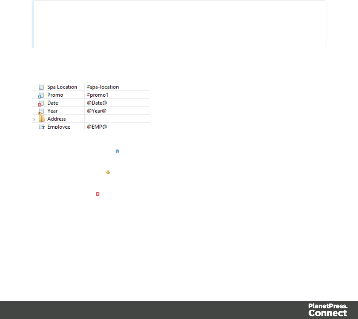
You can even do this while creating a new script, either with a Script Wizard or in the expanded
script editor. Click Apply at the bottom of the script editor to see the effect of the script on the
Preview tab of the Designer.
Note that scripts that use values of data fields can only be effective when a data file or Data
Mapping Configurationis open. See "Loading data" on page488.
Test for errors
Another way to 'test' a script is to take a look at the Scripts pane.
Tip
Hover over the name of a script in the Scripts pane to highlight parts of the template that are
affected by the script.
Icons on the name of scripts in the Scripts pane can show a warning, information or error icon.
lThe information icon (i) shows that the selector of the script does not produce a result in
the current section.
lThe warning icon (!) appears, for example, when a script refers to an unknown field in
the record set, or when ;is missing after a statement.
lThe error icon (x) displays when the script results in an error, for example, when it uses
an undeclared variable.
In addition to the icons and messages in the Scripts pane, there is another way to see if your
scripts function as expected before generating output:
lOn the Context menu, click Preflight.
Page 523

Preflight executes the template without actually producing output and it displays any issues
once it’s done.
It will tell, for example, which selectors were not encountered in the template.
Test for speed issues
To measure the time that the execution of scripts will take:
lOn the Context menu, click Profile scripts.
Profiling means running the scripts in the template, to see how fast scripts in the Scripts pane
execute. It helps greatly in troubleshooting performance issues caused by scripts.
After running the Script Profiler you can see in which sections the script has run:
lHover the mouse over a value in the column Count to see the number of times that the
script has run, per section.
You can also see the breakdown of the execution time across different execution stages:
lHover the mouse over a value in the column Elapsed to see the time elapsed (in
milliseconds) since the start of the session. In the Scripts Profiler, the scripts are by
default sorted based on the values in the Elapsed column, from high to low.
lHover the mouse over a value the column Delta to see the difference between the time
elapsed (in milliseconds) in the previous session and in the current session.
The script execution stages are:
Query: the time it takes to find the selector in the template.
Tip
Looking for text is a rather lengthy operation. Use an ID (possibly in combination with a
text) instead of a text selector to make the query faster. For more tips, see "Optimizing
scripts" on the facing page.
Page 524

Execution: the time it takes to execute the script. If you are an experienced JavaScript coder
you may be able to optimize the code to speed up the execution of the script.
Tip
Functions that actually change the content of the template (for example,append()) are
comparatively time consuming. Avoid using such functions in a loop. For more tips, see
"Optimizing scripts" on the facing page.
Note that the times vary slightly per run of the Script Profiler. Run the Script Profiler a number of
times and calculate an average from the results, before trying to speed up the execution of a
script.
Script Profiler settings
Number of runs
By default, the Script Profiler runs on 1000 instances of all the scripts. To test on a higher or
lower number of instances:
1. On the menu, select Window > Preferences.
2. Click Scripting.
3. Set a number of iterations (maximum one billion) and click OK.
Sorting
In the Scripts Profiler, the scripts are by default sorted based on the values in the Elapsed
column, from high to low. Click any of the columns to sort the scripts according to the values in
that column.
Optimizing scripts
In the process of output generation, the execution of scripts may take up more time than
necessary. To optimize a template, it helps to disable scripts that don't have an effect on the
output; see "Managing scripts" on page519.
This topic presents a number of other ways to speed up script execution by optimizing the
scripts.
Page 525

Use an ID as selector
Scripts (except control scripts) start with a query. The selector in the second column in the
Scripts pane is what a script looks for in the template. If you've used the drag-and-drop method
(without pressing the Alt or Ctrl key) to insert a data field in a template, the selector is a small
text: the name of the data field surrounded by @ signs, @firstname@ for example.
Looking for text in a text is a less optimized operation and may impact output speeds in longer
documents. To speed up the output process, point the script to the element that contains the
placeholder, by using its ID as selector. This narrows the scope of the search and results in a
very fast query, as elements with an ID are indexed by Connect Designer's layout engine.
To learn how to put a placeholder or placeholders inside an element that has an ID, see
"Boxes" on page419. To use that ID as the script's selector: double-click the script in the
Scripts pane and change the Find method to Selector and Text, or to Selector if the
placeholder is the only content of the container. Enter the ID of the wrapper element in the
Selector field, preceded by #, for example: #firstname.
Tip
When using the drag-and-drop method to insert data fields in a template:
lPress the Alt key while dragging, to wrap the placeholder in a span, give the span
an ID and have that ID used as the script's selector.
lPress the Ctrl key while dragging, to wrap the placeholder in an absolute
positioned box (a div) at the cursor position. A unique ID is assigned to the box and
used as the script's selector.
Avoid DOM manipulations
The Scripting API of the Designer is a very powerful tool to manipulate and personalize your
document. But keep in mind that DOM manipulation commands like append(), prepend(),
before() and after() are resource intensive.
Try avoiding DOM modifications, especially within loops. Storing the content in a variable and
appending the information after the loop is more efficient: this way, the template will be touched
only once.
Page 526

Example
The following example loads a snippet into a variable and uses the find() and text() commands
of the Designer scripting API.
var labelElm = loadhtml('snippets/label.html');
for(var i = 0; i < record.tables.products.length; i++) {
var label = labelElm.clone();
label.find('@ProductLabel@').text(record.tables.products
[i].ProductDescription);
results.after(label);
}
What's wrong with this code is that it inserts the personalized information within the loop. The
after() command runs as many times as there are records in the detail table 'products'.
The script below is much more efficient: it adds the personalized content to a string called
labelStr and only calls after() after the for loop.
var labelElm = loadhtml('snippets/label.html');
var labelStr = "";
for(var i = 0; i < record.tables.products.length); i++) {
var label = labelElm.clone();
label.find('@ProductLabel@').text(record.tables.products
[i].ProductDescription);
labelStr += label;
}
results.after(labelStr);
Use replace()
When personalizing HTML fragments retrieved from a snippet or from the template itself,
JavaScript's replace() method shows the best performance.
Replace() can only be used on Strings, while the commands loadhtml() and query() return or a
QueryResult, which is a set of strings, like the results object.
A QueryResult allows you to perform DOM manipulations like adding and removing elements,
adding and removing CSS classes etc. When the required manipulations are limited to
find/replace actions, you could change the QueryResult into a string. This allows you to replace
text using the replace() method.
Page 527
For this, you could use toString():
var labelSnippet = loadhtml('snippets/label.html').toString();
Or you could copy the HTML of the QueryResults to a variable:
var block = results.html();
Example
var labelSnippet = loadhtml('snippets/label.html').toString();
var labelStr = "";
for(var i = 0; i < record.tables.detail.length; i++) {
var label = labelSnippet;
label = label.replace('#', i);
label = label.replace('@product@', record.tables.detail[i].fields
['product']);
label = label.replace('@notes@', record.tables.detail[i].fields
['notes']);
label = label.replace('@netweight@', record.tables.detail
[i].fields['netweight']);
labelStr += label;
}
results.after(labelStr);
Tip
The replace() method as used in the above example replaces only the first occurrence of the search
string. To replace every occurrence of a search string in a given string, use a regular
expression. In the following line of code, the regular expression /@product@/g makes
replace() search for all occurrences of the string @product@ in the label string:
label = label.replace(/@product@/g, record.tables.detail
[i].fields['product']);
In this example, @product@ is a pattern (to be used in a search) and g is a modifier (to
find all matches rather than stopping after the first match). For more information about
possible regular expressions, see http://www.w3schools.com/js/js_regexp.asp.
Page 528

Replace several placeholders in one script
Suppose there are 20 different placeholders in a postcard (for the address, account and
customer details, a promo code, the due date, discounts, a link to a personalized landing page
etc.). Typically this would require 20 queries. Even after optimizing these scripts by using an ID
as selector for those scripts, there are still 20 scripts, 20 queries to run.
If there was only one query, one single script to do all the work, the output could be generated
much faster. Reducing the number of scripts improves the performance of the template. How to
do this?
First, wrap the content that contains all of the placeholders in one (inline) Box and give that Box
or Span an ID (on the Attributes pane). Next, create a script that uses that ID as selector. Then
replace all placeholders in the script and put the content back in the template.
This is similar to working with snippets, but in this case the element is extracted from the actual
template.
Example
The following script replaces all of the placeholders on a postcard. It takes advantage of the
JavaScript replace() command. Assuming that the ID of the block that requires personalization
is promoblock, the script has to have its selector set to #promoblock.
var block = results.html();
var data = record.fields;
block = block.replace('@name@',data.first + ' ' + data.last);
block = block.replace('@address@',data.address);
block = block.replace('@zip@',data.zip);
block = block.replace('@city@',data.city);
block = block.replace('@country@',data.country);
block = block.replace('@saldo@',data.saldo);
block = block.replace('@promo@',data.promo);
block = block.replace('@customercode@', data.customercode);
…
results.html(block);
The first line retrieves the HTML of the promo block and stores it in a variable called block. To
make the code more readible, the fields from the record are stored in a variable named data.
After replacing the placeholders by values, the script replaces the HTML of the promoblock with
the personalized string.
Page 529

Loading a snippet via a script
Instead of dragging it into the content directly, it is possible, and often very useful, to load a
snippet dynamically. Create a script (see "Writing your own scripts" on page515) and in the
code, use the following function:
results.loadhtml(‘snippets/nameofthesnippet.html’)
This function will insert the snippet in the content at any position where the script's selector is
encountered.
For more examples, see "loadhtml()" on page761.
Note
Make sure that the file name is exactly the same as the file in the Snippets folder. If the
file name isn’t correct, the snippet will not appear in the template.
Loading part of a snippet
When a snippet contains a part that can be identified by a selector, that selector can be used to
load that part of the snippet into a template.
In script, use the following code:
results.loadhtml(‘snippets/nameofthesnippet.html’, ‘selector’)
See "loadhtml()" on page761 for more information about this function.
Loading a snippet, depending on the value of a data field
To load a snippet depending on the value of a data field, you have to add a condition to the
script.
Example
The following script evaluates if the value of the LANGUAGE field in the record is ‘En’. If so, the
snippet is added to the content.
Page 530
if (record.fields.LANGUAGE == ‘En’) {
results.loadhtml(‘snippets/nameofthesnippet.html’);
}
Another example is given in a how-to; see Load a snippet based on a data field value.
Loading part of a snippet, based on the value of a data field
When a snippet contains a part that can be identified by a selector, that selector can be used to
load that part of the snippet into a template. It is possible to do this, based on the value of the
data field. This is easiest when the selector matches the value of a data field.
Example
The following script reads the value of the LANGUAGE field in the record and uses that value
as the selector in the function loadhtml(). If the snippet contains an HTML element with this ID
(for example, <p ID=”En”>), that HTML element will be added to the content:
var language = record.fields.LANGUAGE;
results.loadhtml(‘snippets/nameofthesnippet.html’, ‘#’+ language)
Another example is given in the following how-to: Using a selector to load part of a snippet.
See also: "Designer Scripts API" on page729.
Tip
An easy way to group content in a snippet is putting each part in a container and giving
that container an ID, for example:
<div ID=”EN”><p>This is text for English customers.</p></div>
Use the function .children() to load the contents of the container, and not the container
itself. For example:
results.loadhtml(‘Snippets/myfooter.html’, ‘#EN’).children()
This script loads the paragraph of the example (<p>), but not the container itself (<div>).
Load a snippet and insert variable data into it
The following script loads part of a snippet based on the value of a field, and then
finds/replaces text by the value of a field before inserting the content into the document.
Page 531

var promoTxt = loadhtml('snippets/promo-en.html', '#' +
record.fields['YOGA']);
promoTxt.find('@first@').text(record.fields['FIRSTNAME']);
results.html(promoTxt);
Control Scripts
When output is generated from a template, Control Scripts run before all other scripts, when a
record is merged with a context. They determine how different sections of the context are
handled. They can, for example, make the page numbering continue over all Print sections,
split Email attachments, or omit Print sections from the output.
Some knowledge of JavaScript is needed to edit Control Scripts, just as for any other self-made
scripts, because there is no Control Script Wizard; see "Writing your own scripts" on page515.
This topic explains how to add a Control Script and it gives an overview of what Control Scripts
can do. It will also tell you where you will find information about each feature, including
examples.
What Control Scripts are
Control Scripts are a special kind of Designer script. They can manipulate the way output is
generated from a template. They allow you, for example, to change the page numbering in Print
output, to split one generated Print document into multiple Email attachments, or to set a Print
section's background dynamically. (These are only a few examples; for more uses of Control
Scripts see "What to use a Control Script for" on the next page.)
Control Scripts differ from template scripts in two ways:
lControl Scripts run before all other scripts. When a template consists of several contexts,
and these contexts are combined in the output - for example, when an Email is generated
with the Print context as attachment - all scripts run once before each context; Control
Scripts first.
lControl Scripts don't have a selector, like the other scripts do. A selector selects parts of
the content of a section and stores them in the results object, so that they can be modified
in the script. As Control Scripts don't have a selector, the results object can't be used
there. Control Scripts don't touch the content - meaning, the text flow - of the sections.
Adding a Control Script
To add a Control Script:
Page 532
1. On the Scripts pane at the bottom left, click the black triangle on the New button and click
New Control Script. A new script appears in the list.
2. Double-click the new script to open it. The script editor appears.
3. Change the name of the script so that it reflects what the script does.
4. Write the script; see the "Control Script API" on page782. If you are not familiar with
scripting, also see "Writing your own scripts" on page515.
Tip
New Control Scripts added to the template contain code to continue the page
numbering over all print sections, and two examples: one to select different sections
of a Print context for email and print output, and one to select a web section.
What to use a Control Script for
Control Scripts let you change the way a template is merged, by giving access to the template
with all its contexts and sections in a script. A Control Script may, for example, omit, group and
clone sections; add a background to a Print section; or add a header to an email. A number of
the things that you can do with them is listed in the table below, with a link to a topic that
explains how to do them and that shows what the script should look like.
Control Scripts differ from template scripts in two ways:
lControl Scripts run before all other scripts. When a template consists of several contexts,
and these contexts are combined in the output - for example, when an Email is generated
with the Print context as attachment - all scripts run once for each context, but Control
Scripts always go first.
lControl Scripts don't touch the content - meaning, the text flow - of the sections. They
don't have a selector, like the other scripts do. A selector selects parts of the content of a
section and stores them in the results object, so that they can be modified in the script.
As Control Scripts don't have a selector, the results object can't be used there.
In a Control Script, section usually is the most important object. To get a quick overview and
lots of examples, see "section" on page786. For help on specific tasks, see the table below.
Page 533
Task See topic Field/function of
section object
Change the page numbering of Print
sections
"Control Script: Page
numbering" on the next
page
restartPageNumbering
Set the background image of a Print
section
"Control Script: Setting a
Print section's
background" on
page540
background.source,
background.url,
background.position
Split Email attachments and rename
them
"Parts: splitting and
renaming email
attachments" on
page537
part
Dynamically set a password on PDF
attachments
"Control Script: Securing
PDF attachments" on
page544
password,
ownerPassword
Include/exclude sections:
lConditionally omit sections
lOutput one section or another,
based on the value of a data
field
lSelect one print section as
PDF attachment if the output is
to be emailed, and another
print section if the output is to
be printed.
"section" on page786,
take a look at the
examples.
enabled
Add sections dynamically "Dynamically adding
sections (cloning)" on
page541.
clone()
Add a header to an email "section" on page786, headers
Page 534
Task See topic Field/function of
section object
example: "Adding custom
ESP handling
instructions" on
page822.
Control Script: Page numbering
This topic explains how to write a Control Script that changes the page numbering in Print
sections. Note that when you add a Control Script, it already contains a script to make the page
numbering continue over all Print sections.
For information about Control Scripts in general, see "Control Scripts" on page532 and
"Control Script API" on page782. If you don't know how to write scripts, see "Writing your own
scripts" on page515.
How to change page numbering in a control script
A Control Script can make the page numbering continue over all Print sections or let it restart
on a section. This is done by setting the restartPageNumber field on a section to true or false.
For example: merge.template.contexts.PRINT.sections['Section 2'].restartPageNumber =
true;. (Also see "section" on page786 and "Control Script API" on page782.)
Page numbering starts with page 1 for each section. If for a section restartPageNumber is set to
false, that section will start with the page number following the last page of the previous
section.
Note that even if a section is not enabled (so it will not be outputted), its restartPageNumber flag
is still taken into account for composing the page number sequences.
By default, each section has restartPageNumber = false when the first control script runs.
Tip
If you are looking to create a table of contents, add a template script that uses the pageRef()
function. For an example, see "pageRef()" on page768.
Page 535

Examples
Restarting the page numbers several times
Assume that a template has four sections (of 1 page each) in the Print context and a Control
Script sets the page numbering as follows:
1. Section A (1 page) restartPageNumber = true
2. Section B (1 page) restartPageNumber = true
3. Section C (1 page) restartPageNumber = false
4. Section D (1 page) restartPageNumber = true
The code would look like this:
if (merge.context.type == ContextType.PRINT) {
merge.context.sections['Section A'].restartPageNumber = true;
merge.context.sections['Section B'].restartPageNumber = true;
merge.context.sections['Section C'].restartPageNumber = false;
merge.context.sections['Section D'].restartPageNumber = true;
}
The page numbering in the output will be:
1. Section A page 1
2. Section B page 1
3. Section C page 2
4. Section D page 1
Disabled section
When a section is disabled, it will not be outputted, but its restartPageNumber flag will still be
taken into account for composing the page number sequences. So, if the restartPageNumber
flags are set as follows:
1. Section A (1 page) restartPageNumber = true
2. Section B (2 pages) restartPageNumber = false
3. Section C (3 pages) restartPageNumber = true, enabled = false
4. Section D (4 pages) restartPageNumber = false
In code:
Page 536

if (merge.context.type == ContextType.PRINT) {
merge.context.sections['Section A'].restartPageNumber = true;
merge.context.sections['Section B'].restartPageNumber = false;
merge.context.sections['Section C'].restartPageNumber = true;
merge.context.sections['Section C'].enabled = false;
merge.context.sections['Section D'].restartPageNumber = false;
}
The page numbering in the output will be:
1. Section A page 1
2. Section B page 2
3. Section D page 1 (page numbering is restarted due to section C's restartPageNumber =
true)
Parts: splitting and renaming email attachments
In a Control Script, parts can be defined to determine which sections should be output to the
same file. This way it is possible to split the Print context or the Web context into multiple email
attachments. This topic shows how to do that.
For information about Control Scripts in general, see "Control Scripts" on page532 and
"Control Script API" on page782. If you don't know how to write scripts, see "Writing your own
scripts" on page515.
Defining parts
Defining parts is done by setting the part field on a section, for example:
merge.template.contexts.PRINT.sections['Section 2'].part = "PDF_Attachment2";. (Also
see "section" on page786 and "Control Script API" on page782.)
lIf a part name is given, then that delimits the start of a new part (even if the part name is
the same as the previous one). Following sections that don't define a part name, will be
added to the previous part.
lA part ends at the last enabled* section or at the last section before the start of a new part.
*When a Control Script has set the enabled field of a section to false, it will not be
outputted.
Page 537
If no part name is set on any section, it is assumed that there is only one part, consisting of the
default section (for Web output) or of all sections (for Print output). The attachment(s) will be
named after the email subject.
Examples
No parts defined
Assume there are three Print sections: sections A, B and C. When generating Email output with
the Print context as attachment, all three Print sections will be put together in one file and
attached to the email. If the email's subject is 'Take action', the name of the attached file will be
'Take action.PDF'.
Splitting and renaming a Print attachment
Assume there are three Print sections: sections A, B and C. In a Control Script a part name is
defined for section C:
var section = merge.template.contexts.PRINT.sections['Section C'];
section.part = 'Part2';
When generating Email output with the Print context as attachment, the email will have two
attachments:
lattachment 1: Section A, Section B
lattachment 2: "part2", which is Section C. The file name of this attachment is the part
name.
Note
For Web sections, a part always consists of only the given section. Web pages cannot be appended
to form a single part. It is however possible to attach multiple Web pages to one email; see "Control
Script API" on page782 for an example.
Controlling multiple Email attachments
The following script attaches the following sections to an email:
lPrint section 3 + 4 as attachment with continued page numbers
lPrint section 6 as separate attachment
Page 538
lWeb sections A and B as separate attachments
if (channel == Channel.EMAIL) {// only when generating Email
output
if (merge.context.type == ContextType.PRINT) {
merge.context.sections['Section 1'].enabled = false;
merge.context.sections['Section 2'].enabled = false;
merge.context.sections['Section 3'].enabled = true;
merge.context.sections['Section 3'].part = "PDFAttach1";
merge.context.sections['Section 4'].enabled = true;
merge.context.sections['Section 4'].restartPageNumber = false;
merge.context.sections['Section 5'].enabled = false;
merge.context.sections['Section 6'].enabled = true;
merge.context.sections['Section 6'].part = "PDFAttach2";
} else if (merge.context.type == ContextType.WEB) {
merge.context.sections['default Section'].enabled = false; //
disable whatever is the default section
merge.context.sections['Section A'].enabled = true;
merge.context.sections['Section A'].part = "WebPartA";
merge.context.sections['Section B'].enabled = true;
merge.context.sections['Section B'].part = "WebPartB";
}
}
Note
For another example, see this how-to: Output sections conditionally.
Control Script: Setting a Print section's background
In the Print context, a PDF file can be used as a Print section's background. To learn how to do
this without a Control Script, see "Using a PDF file as background image" on page288.
With a Control Script, a Print section's background can be set dynamically. You could for
example specify a particular PDF file as a section's background depending on the value of a
field in the current record. This topic shows how.
For information about Control Scripts in general, see "Control Scripts" on page532 and
"Control Script API" on page782. If you don't know how to write scripts, see "Writing your own
scripts" on page515.
Page 539

Setting a background in script
The Control Script should first enable a background on the section, in case an initial
background wasn't set via the user interface. This is done by setting the source type for the
background of the section to either DataMapper PDF or Resource PDF (see
"BackgroundResource" on page794). For example:
merge.template.contexts.PRINT.sections['Policy'].background.source
= BackgroundResource.RESOURCE_PDF;
A DataMapper PDF is, as you would expect, a PDFgenerated by the DataMapper. A Resource
PDF is a PDF from another source.
For a DataMapper PDF, nothing else has to be done to set the background. For a PDF from
another source, the Control Script should specify a path, for example:
var resourceUrl = 'images/policy-' + record.fields.policy + '.pdf';
merge.template.contexts.PRINT.sections['Policy'].background.url =
resourceUrl;
Positioning the background
After that, the background can be positioned, setting the section's background.position:
activeSection.background.position = MediaPosition.FIT_TO_MEDIA;
For all possible positions, see "MediaPosition" on page797.
Setting a page range in script
When a PDF that serves as a dynamic section background has multiple pages, you can specify
a range of pages to be used, in a control script.
Put the number of the first page in the range in the section's background.start field and the last
page in background.end.
This requires you to set the background.allPages option to false, first. This option is true by
default and takes precedence, so when it is true, the entire PDF will be used, even if a page
range has been set.
The following script sets the page range from 2 to 5:
merge.template.contexts.PRINT.sections
['Policy'].background.allPages = false;
Page 540

merge.template.contexts.PRINT.sections['Policy'].background.start =
2;
merge.template.contexts.PRINT.sections['Policy'].background.start =
5;
Example
This scripts sets a background on a Print section using absolute positioning.
var activeSection = merge.template.contexts.PRINT.sections['Section
1'];
activeSection.background.source = BackgroundResource.RESOURCE_PDF;
activeSection.background.url = "images/somepage.pdf";
activeSection.background.position = MediaPosition.ABSOLUTE;
activeSection.background.left = "10mm";
activeSection.background.top = "10mm";
You could replace the last three lines of the previous script by the following line to scale the
Print section background to Media size:
activeSection.background.position = MediaPosition.FIT_TO_MEDIA;
Dynamically adding sections (cloning)
This topic explains how to clone a section in a Control Script, Print sections can be cloned, so
that a document can have a dynamic number of sections, based on data. This is particularly
useful when the record set defines one or more PDFs (e.g. insurance policies) per recipient.
Via a Control Script, for each PDF a section can be cloned and each clone can be given one of
the PDFs as background (see "Control Script: Setting a Print section's background" on
page540). For each page in the PDF, a page will be added to the section.
For information about Control Scripts in general, see "Control Scripts" on page532 and
"Control Script API" on page782. If you don't know how to write scripts, see "Writing your own
scripts" on page515.
Cloning a section
To clone a section, first use the clone() function and then add the clone to the Print context
before or after a specific section, using addAfter() or addBefore():
var clone = printSections["Section 1"].clone();
printSections["Section 1"].addAfter(clone);
Page 541
Cloned sections have the same properties as normal sections, but they cannot call section
functions.
Note
Due to resource constraints, the number of clones that can be created is limited to 60.
Renaming a clone
By default, clones receive the name of their source section with a "Clone {sequence}" suffix, for
example:
Source: "Section 1"
Clone Name: "Section 1 Clone 1"
Use thename property to assign the cloned section another name, for example:
clone.name = "my_section_clone";
Note that section names must be unique.
Targeting elements in a cloned section
As each clone receives a unique section name, one could use CSS style sheets (see "Styling
and formatting" on page453) and personalization scripts (see "Variable Data" on page497 and
"Writing your own scripts" on page515) to further personalize the cloned sections.
The following CSS style rules target the <h1> element in a number of clones and assigns the
respective text a different color:
[section="my_section_clone_0"] h1 {color: red; }
[section="my_section_clone_1"] h1 {color: green; }
[section="my_section_clone_2"] h1 {color: blue; }
The same selectors could be used in personalization scripts:
Selector: [section="my_section_clone_0"] h1
Script: results.css('color','red');
In a template script, cloned sections can be found using merge.section:
Page 542

if (merge.section == "my_section_clone_0") {
results.html("Clone!");
} else {
results.html("Original.");
}
Note that in a Control Script, merge.section is only defined when the output channel is WEB;
see "merge" on page785.
Examples
Cloning a section based on the number of records in a detail table
This script creates as many clones of a section as there are records in a detail table. It assigns
the new sections a unique name.
var printSections = merge.template.contexts.PRINT.sections;
var numClones = record.tables['detail'].length;
for(var i = 0; i < numClones; i++){
var clone = printSections["Section 1"].clone();
clone.name = "my_section_clone_" + i;
printSections["Section 1"].addAfter(clone);
}
Cloning a section based on data and assigning a background PDF
This script clones a section based on data fields. It disables the source section first and then
calls the addPolicy function. addPolicy clones the section, renames it and sets a PDF from the
resources as its background. It explicitly enables the clone and then adds it to the Print context.
var printSections = merge.template.contexts.PRINT.sections;
merge.template.contexts.PRINT.sections["Policy"].enabled = false;
if(record.fields.policy_a == 1) {
addPolicy('a');
}
if(record.fields.policy_b == 1) {
addPolicy('b');
}
function addPolicy(policy){
var resourceUrl = 'images/policy-' + policy + '.pdf';
var clone = printSections["Policy"].clone();
clone.name = "policy_" + policy;
clone.background.url = resourceUrl;
Page 543

clone.enabled = true;
printSections["Policy"].addAfter(clone);
}
Control Script: Securing PDF attachments
The Print context can be attached to an email in the form of a PDF file and secured with a
password. This can be done without a Control Script, see "Email attachments" on page819
and "Email PDF password" on page323.
With a Control Script, you can do the same, and more: the attachment can be split into multiple
attachments (see Parts). Each attachment may have a different (or no) set of passwords, so you
could mix secured and unsecured attachments in a single email. This topic shows how.
For information about Control Scripts in general, see "Control Scripts" on page532 and
"Control Script API" on page782. If you don't know how to write scripts, see "Writing your own
scripts" on page515.
Setting passwords in script
To set a password on a Print section in a Control Script, the script should first retrieve the Print
section/s using merge.template.contexts.PRINT.sections or merge.context.sections (also
see the example below).
Next, the script can split the attachments, if needed (see "Parts: splitting and renaming email
attachments" on page537), and it can set a password on each section. For example:
lmerge.template.contexts.PRINT.sections['Section 2'].password =
'secret';
lmerge.template.contexts.PRINT.sections['Section
2'].ownerPassword = 'secret';
When producing a single attachment, the password(s) should be set on the first Print section.
When producing multiple attachments, it should be set on the first section of each part.
Password types
PDF allows for two types of passwords to be set on a secured PDF file: a user password and
owner password. The user password allows a limited access to the file (e.g. printing or copying
text from the PDF is not allowed). The owner password allows normal access to the file. The
Email PDF password script sets both the user and owner password to the same value, so that
when the recipient provides the password, he can manipulate the file without limitations.
Page 544

In a Control Script:
lpassword is used to set the user password and owner password for a PDF attachment to
the same value.
lownerPassword is used to set the owner password for a PDF attachment. Setting only the
owner password creates a secured PDF that can be freely viewed, but cannot be
manipulated unless the owner password is provided. Note that the recipient needs Adobe
Acrobat to do this, because the Acrobat Reader does not allow users to enter the owner
password.
Removing a password
Passwords set in the Control Script override the password set through the Email PDF
password script (see "Email PDF password" on page323). This allows you to change or
remove the password from a specific part. Removal is done by setting the password field to null
or an empty string ("").
Example
This scripts splits the Print output into two PDF attachments and sets a password for the
second attachment.
var printSections;
if (channel == Channel.EMAIL) {// only when generating Email
output
if (merge.context.type == ContextType.PRINT) {
printSections = merge.template.contexts.PRINT.sections;
printSections['Section 1'].part = 'PDFAttach1';
printSections['Section 2'].part = 'PDFAttach2'
printSections['Section 2'].password = 'secret';
}
}
Designer User Interface
The Designer's user interface gives you several options to work with.
Page 545
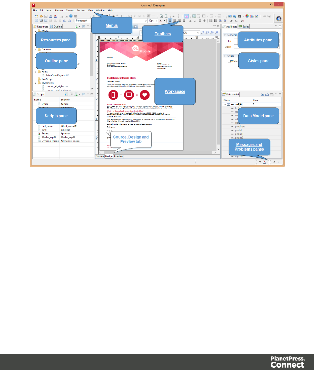

Dialogs
Bar Chart Properties dialog
The Bar Chart dialog appears when a Bar Chart object is right-clicked and the Bar Chart...
option is clicked. It determines how the Bar Chart is displayed when generating output and in
Preview mode.
General Tab
lGeneral Group:
lDisplay grid above graph: Check to display the grid on top of the bars so that it is
always visible.
lRotate: Check to rotate the graph 90 degrees so that the bars are horizontal starting
from the left.
lStack Series: [TBD]
lText Group: Determines how text is displayed in labels and legends.
lFont: Type in the font-face to use to display text. The font must be installed on the
system and defaults to Verdana if the font is not found. Equivalent to the font-
family property.
lSize: Type in the size of the font. For example, 12pt or 20px. Defaults to 11px.
Equivalent to the font-size property.
lColor: Type in the color in which to display text. The color value must be a valid
HTML Hex Color. Equivalent to the color property.
lFill Group:
lColor: Enter a color for the bars. The color value must be a valid HTML Color
Name, or a valid HTML Hex Color. This color replaces all initial colors.
lOpacity: Enter the percentage for the opacity of the bars. Does work on the initial
colors, if no fill color is entered in this dialog.
lLine Group:
lShow Line: Adds a line around each bar (or fills the bar if the bar has no fill color).
lColor: Enter a color for the line. The color value must be a valid HTML Color Name,
or a valid HTML Hex Color.
lOpacity: Enter the percentage for the opacity of the line.
Page 547
Value Axis Tab
lTitle group:
lLabel: Enter a label for the Y axis (X axis if the graph is rotated).
lBold: Check if you want the label to be in bold style.
lColor: Enter a custom color for the label (Default is Black). The color value must be
a valid HTML Color Name, or a valid HTML Hex Color.
lFont Size: Enter a font size for the label, in pt.
lGrid group:
lShow Grid: Displays a grid behind the bars.
lColor: Enter a color for the grid that displays in the graph. The color value must be
a valid HTML Color Name, or a valid HTML Hex Color.
lOpacity: Enter the opacity percentage of the grid. Default is 15%.
lThickness: Enter a thickness for the grid, in pixels. Default is 1px.
lTick Length: The distance between each vertical line in the grid.
lAxis group:
lShow Axis: Check to show the value axis (the line between the chart and the
values).
lColor: Enter a color for the value axis. The color value must be a valid HTML Color
Name, or a valid HTML Hex Color.
lOpacity: Enter the opacity in percentage for the axis.
lThickness: Enter the thickness, in pixels, for the axis.
Category Axis Tab
lTitle group:
lLabel: Enter a label for the X axis (Y axis if the graph is rotated).
lBold: Check if you want the label to be in bold style.
lColor: Enter a custom color for the label (Default is Black). The color value must be
a valid HTML Color Name, or a valid HTML Hex Color.
lFont Size: Enter a font size for the label, in pt.
Page 548

lGrid group:
lColor: Enter a color for the grid that is displays in the graph. The color value must
be a valid HTML Color Name, or a valid HTML Hex Color.
lOpacity: Enter the opacity percentage of the grid. Default is 15%.
lThickness: Enter a thickness for the grid, in pixels. Default is 1px.
lPosition: Choose Middle to centre the grid over the graph, or choose Start to make
the first vertical grid lign match the value axis.
lTick Length: The distance between each vertical line in the grid.
lAxis group:
lShow Axis: Check to show the value axis (the line between the chart and the
values).
lColor: Enter a color for the value axis. The color value must be a valid HTML Color
Name, or a valid HTML Hex Color.
lOpacity: Enter the opacity in percentage for the axis.
lThickness: Enter the thickness, in pixels, for the axis.
Chart Tab
l3D group:
lApply 3D Effect: Check to apply a 3D effect to the bars.
lDepth: Enter a thickness of the 3D effect, in pixels.
lAngle: Enter angle for the 3D effect, in degrees.
Legend tab
lShow Legend: Check to show the legends in the chart object.
lLegend Group: Defines how the legends are shown.
lEqual label widths: Check so that all labels are of equal width in the Legends box.
The Legend's width will accommodate the largest value.
lPosition: Use the drop-down to select where the labels are shown: Right, Left, Top
or Bottom.
Page 549

lAlign: Use the drop-down to select how to align the text in the labels: Left, Middle or
Right.
lHorizontal Space: When multiple columns appear, enter a numerical value (in
pixels) to define horizontal spacing between the columns.
lVertical Space: Enter a numerical value (in pixels) to define vertical spacing
between legends.
lMax Columns: Enter a numerical value to define the maximum number of columns
allowed in the Legends box.
lValues Group: Defines if and how values are shown in the Legends box.
lShow Values: Check to show values besides the Legend's label.
lText: Enter the text used to display the values. Variables can be used to display
specific data, <br> can be used to create a new line:
l[[percents]] : Contains the percentage of the chart the value represents.
l[[value]] : Contains the numerical value of the field.
lAny Text: Adding text (such as a dollar sign or column, etc) will make it appear
in each label.
lMarkers Group: Defines how the Legends Markers. Markers are icons with a color
matching the Legend with its corresponding bar.
lType: Use the drop-down to select in which shape the Markers are displayed.
Select None to hide the Markers completely.
lSize: Enter the size (in pixels) for the Markers to be displayed.
lLabel Gap: Enter the distance (in pixels) between the Markers and the Legends
text.
lBorder Width: Use the drop-down to define the thickness of the border added to the
Markers. Default is 0pt.
lBorder Color: Enter a valid HTML Hex Color for the border's color.
lBorder Opacity: Enter a numerical value between 0 and 100 to define the opacity
(in percentage) of the border.
Box Formatting dialog
The Text Formatting dialog is accessible by clicking inside a positioned box in the template
and then selecting Format > Box in the menu.
Page 550

Box Tab
lGeneral group:
lWidth: Set the width of the boxin measure or percentage. Equivalent to the CSS
width property.
lHeight: Set the height of the boxin measure or percentage. Equivalent to the CSS
height property.
lAngle: Set the rotation angle of the boxin clockwise degrees. Equivalent to the
CSS transform:rotate property.
lCorner radius: Set the radius of rounded border cornersin measure or percentage.
Equivalent to the CSS border-radius property.
lDisplay: Use the drop-down or type in the value for how to display the box.
Equivalent to the CSS display property.
lOverflow: Use the drop-down or type in the value for how to handle overflow (text
that does not fit in the current size of the box). Equivalent to the overflow property.
lText wrap group:
lFloat: Use the drop-down or type in the value for how to float the box, if the box is
not in an absolute position. Equivalent to the CSS float property.
lClear: Use the drop-down or type in the value for clearing pre-existing alignments.
Equivalent to the CSS clear property.
lPositioning:
lPosition: Use the drop-down or type in the value for the type of positioning for the
box. Equivalent to the CSS position property.
lTop: Set the vertical offset between this box and its parent's top position. Equivalent
to the CSS top property.
lLeft: Set the horizontal offset between this box and its parent's left position.
Equivalent to the CSS left property.
lBottom: Set the vertical offset between this box and its parent's bottom position.
Equivalent to the CSS bottom property.
lRight: Set the horizontal offset between this box and its parent's left position.
Equivalent to the CSS right property.
lZ-index: Set the z-index of the box. The z-index defines in which order elements
appear. Equivalent to the CSS z-index property.
Page 551

Background Tab
lGeneral group:
lColor: Specify the color of the box background. The color value must be a valid
HTML Color Name, or a valid HTML Hex Color. Equivalent to the CSS
background-color property.
lBackground image group:
lSource: click the Select Image button to select an image via the "Select Image
dialog" on page606. Equivalent to the CSS background property.
lSize: select auto,cover or contain (for an explanation see
http://www.w3schools.com/cssref/css3_pr_background-size.asp), or type the width
and height of the image in a measure (e.g. 80px 60px) or as a percentage of the
box size (e.g. 50% 50%). Equivalent to the CSS background-size property.
lPosition: select the position for the background-image. Equivalent to the CSS
background-position property.
Spacing Tab
lPadding group: Defines padding (spacing inside the element) in measure or percentage:
lAll sides: Check to set all padding to use the Top value. Equivalent to the CSS
padding property.
lTop, Left, Bottom, Right: Set padding for each side. Equivalent to the CSS
padding-left,padding-top,padding-right and padding-bottom
properties.
lMargin group: Defines margins (spacing outside the element) in measure or percentage:
lAll sides: Check to set all margins to use the Top value. Equivalent to the CSS
margin property.
lTop, Left, Bottom, Right: Set the margin for each side. Equivalent to the CSS
margin-left,margin-top,margin-right and margin-bottom properties.
Border Tab
lSame for all sides: Defines the border properties for all sides using the Top properties.
Equivalent to the CSS border property.
Page 552
lTop, Left, Bottom, Right: Each group defines the following properties:
lWidth: Specify the thickness of the border. Equivalent to the CSS border-
widthproperty.
lStyle: Specify the style of the border such as solid,dashed or dotted.
Equivalent to the CSS border-style property.
lColor: Specify the color of the border. The color value must be a valid HTML Color
Name, or a valid HTML Hex Color. Equivalent to the CSS border-color
property.
Color Picker
The Color Picker dialog appears when creating a color in the formatting dialogs of certain
elements, for example border colors in boxes and paragraphs.
The dialog consists of two main parts. On the left is the color wheel that can be used to select a
color hue by clicking anywhere on that wheel. To the right of the color wheel there is a vertical
bar used to select the color saturation. At the top-right, two colors are shown: the New box
displays the currently selected color, while the Original shows the color currently attributed to
the element.
The rest of the dialog has various options for choosing colors:
lColor Mode: Use the drop-down to select whether the color is set as RGB or CMYK. This
determines how the color is saved in the formatting properties, and how they are printed
or output; see "Colors" on page472.
lRGB group: Enter the Red, Green and Blue color values from 0 to 255.
lHEX: Enter a valid HTML Hex Color.
lThe eye dropper lets you select a color from anywhere on your desktop. To open it, click
the eye dropper button next to the HEX color field.
lCMYK group:Enter the Cyan, Magenta, Yellow and Black color values from 0 to 100
percent.
Page 553

Note
Whenever one value within this dialog is changed, all the other values are adjusted to their
equivalent.
Colors Properties
The Colors Properties defines and sets named colors used in the template; see "Colors" on
page472. Named colors can be used throughout the templates, in all contexts. They are visible
in color selector dialogs and useable with their names in style sheets; see "Styling and
formatting" on page453.
lColor Type Selector: Click and use the drop-down to display which color types to show
in the list: All, RGB, CMYK or Spot colors.
lColor List: Displays the colors, filtered using the Color Type Selector.
lNew: Create a new color using the Edit Color dialog (see below and see "Colors" on
page472).
lEdit: Edit the currently selected color using the Edit Color dialog (see below and see
"Colors" on page472).
lDelete: Delete the currently selected color.
lDuplicate: Duplicate the currently selected color using the name [color]CopyX.
Edit color
You can edit the following color properties.
lName: Enter the name of the color. This name should not contain spaces or special
characters.
lCreate name based on values: Check so that the name is automatically based on the
color slider values below.
lType: Use the drop-down to specify which type of color this should be: either a Tint or a
Color.
lOption group: contains the options for the chosen type. Options change depending on
the selected type.
Page 554

lColor:
lModel: This can be either CMYK or RGB.
lSpot Color: Check to set the color as Spot Color. When Spot Colors are used,
the Name must match that of the spot color used in the printer.
lCyan/Magenta/Yellow/Black (CMYK): Each slider sets a percentage for the
color. Set the values using the sliders, or type in the percentage directly in the
input boxes.
lRed/Green/Blue (RGB): Each slider sets the values of 0-255 for the color. Set
the value using the sliders or type in the value directly in the input boxes.
lColor Preview: Box displaying the preview of the color (converted to RGB
when relevant).
lTint:
lSource: Select an existing Color in the template. The tint or opacity will be
applied to this color.
lTint/Opacity: The slider sets the percentage of tint or opacity. Set the value
using the slider, or type the percentage directly in the input box.
lUse Opacity: Check to set the Tint slider to use Opacity instead.
Color Settings
Color Management can keep colors consistent across different outputs by using Color Profiles.
When producing output to a new device, color adjustments are made to present the color as
accurately as possible on this new device.
lEnable Color Management: Check to disable color management and ignore embedded
color profiles when importing images (with the exception of imported PDF files as it might
contain a multiple tagged sub images).
lWorking Space Group: Defines the color profiles for the currenttemplate.
lRGB: Use the drop-down to select a color profile for RGB colors. The list displays
ICC profiles located in "%USERPROFILE%\Connect\color-profiles\rgb".
lCMYK: Use the drop-down to select a color profile for CMYK colors. The list
displays ICC profiles located in "%USERPROFILE%\Connect\color-profiles\cmyk"
lGray: Use the drop-down to select a color profile for Grayscale. The list displays
ICC profiles located in "%USERPROFILE%\Connect\color-profiles\gray"
Page 555

lUntagged Images Group: Defines color profiles for any image that does not specifically
have color profiles or color settings enabled.
lRGB: Use the drop-down to select a color profile for RGB colors. The list displays
ICC profiles located in "%USERPROFILE%\Connect\color-profiles\rgb".
lCMYK: Use the drop-down to select a color profile for CMYK colors. The list
displays ICC profiles located in "%USERPROFILE%\Connect\color-profiles\cmyk"
lGray: Use the drop-down to select a color profile for Grayscale. The list displays
ICC profiles located in "%USERPROFILE%\Connect\color-profiles\gray"
lOptions Group:
lRendering intent: Use the drop-down to specify how colors are converted that are
out of range of a profile. For example, you may use tricks like reducing the
saturation of the entire print so that a color that is out of range still appears a bit
more vibrant than ones that are in range. Rendering intents use different methods to
trick the eye into believing that the print can reproduce irreproducible colors.
Context Properties dialog
Which properties are available in the Context Properties dialog depends on the context: Email
or Print.
To open this dialog, right-click the context on the Resources pane and select Properties.
Email Context Properties
For the Email context, the Context Properties dialog defines options that are used when
generating email output (see "Generating Email output" on page815).
lPrint Context Image Compression: Defines the properties of the PDF when attaching
the Print context to email output.
lLossless: Enables maximum quality in the PDF. Note that this will produce a larger
PDF.
lQuality: Disabled when Lossless is checked. Determines the quality (aka
compression) of the attached PDF.
lTile Size: Use the drop-down to select the size of the tiles used in the image. When
low Quality values are used to optimize images smaller than 1024 x 1024 pixels,
using the largest tile size will produce better results.
Page 556

Print Context Finishing Options
For the Print context, the Context Properties dialog defines finishing options for when it is
printed (see "Generating Print output" on page801). These options affect the context as a
whole including all sections.
For an explanation of all Binding and Hole making options, see "Finishing Options" on
page702.
Edit Label Properties
The Edit Label Properties defines how a Pie Chart Label displays its title and data. It contains
two options:
lLabel: Enter a title for Labels and Legends when they are shown (see "Pie Chart
Properties dialog" on page570).
lValue: Use the drop-down to select which Value to use as data within the Pie Chart as
well as for Label and Legend values.
Find/Replace Dialog
The Find/Replace dialog can replace text within the current template. The scope of the
replacement depends on the currently selected tab in the Workspace. If the Source tab is
selected, the replace will affect the HTML source code. If the Design tab is selected, the replace
will affect the text on the page. If the Preview tab is selected, the Replace feature is inactive.
Note
When replacing text in the Design tab, formatting in the replaced text will be removed. If formatting
is necessary in the new text, select the Source tab before opening the Find/Replace dialog and
include the required HTML tags in the replacement text.
Here are the options available in this dialog
lFind: The source string to find.
lReplace with: The string to replace the source with.
Page 557

lDirection
lForward: Look forward from the current position of the pointer in the template or
source.
lBackward: Look backward from the current position of the pointer in the template or
source.
lScope
lAll: Searches in the complete text of the template or source.
lSelected lines: Searches in the currently selected text or source.
lOptions
lCase sensitive: Use a case-sensitive search, which differentiates TEXT from text
or TexT.
lWrap search: Loop back from the end of the template or selection to its beginning,
when the Search is at the end of the template or the selection.
lWhole word: Searches for the source string as a whole word.
lIncremental: With this option selected, each letter you type in the Find field causes
the editor focus to move to the first complete occurrence of the text you are typing.
lRegular expressions: Enables regular expressions for a search in the Source
view of the workspace. After checking this option, you can type Ctrl + Space in
either text box to view a list of regular expressions.
Tip
The Find/Replace dialog can fill in regular expressions in the Find field by
itself. Open the dialog, check the option Regular expressions and close the
dialog again. Select the text you want to search for and reopen the dialog: the
Find field will now contain the regular expression for the text to find.
lFind: Click to find the next instance of the source string.
lReplace/Find: Click to replace the current instance with the replacement text and go to
the next instance of the source string.
lReplace: Click to replace the current instance with the replacement text.
lReplace All: Click to replace all instances of the source string with the replacement text.
Page 558

lClose: Close the dialog.
Fonts Manager
The Fonts Manager contains the fonts that were added to the template manually. It essentially
lists the fonts located in the Fonts folder of the Resources pane (see "Fonts" on page476).
Fonts with the same file name with a different extension are considered variations of the same
font. For example, if there are three files, named gotham-book-webfont.eot, gotham-book-
webfont.ttf, gotham-book-webfont.woff, only "gotham-book-webfont" appears in the Name
column of this dialog.
The following buttons appear to the right of the list of fonts:
lNew: Click to open the Edit Font dialog to add a new font.
lEdit: Click to open the Edit Font dialog to edit the currently selected font.
lRemove: Click to delete the currently selected font entry.
lDuplicate: Click to create a copy of the currently selected font entry.
Edit Font
The Edit Font dialog appears when clicking New or Edit from the Fonts Dialog.
lName: Enter the name that should be used to refer to the font. This is equivalent to the
font-family property of the @font-face CSS rule (see
http://www.w3schools.com/cssref/css3_pr_font-face_rule.asp).
lFont Weight: Use the drop-down to select the default font weight (the thickness, see
http://www.w3schools.com/cssref/pr_font_weight.asp):
lNone: Does not define the property.
lNormal: Defines font-weight as normal
lBold: Defines the font-weight as bold (equivalent to a numerical value of 700).
lNumerical values: Defines the line thickness; 400 is normal, 700 is bold.
lFont Style: Use the drop-down to select the font style (see
http://www.w3schools.com/cssref/pr_font_font-style.asp:
lNone: Does not define the property.
lNormal: Defines font-style as normal
Page 559

lItalic: Makes the font italic.
lOblique: Makes the font oblique (this is generally the same as italic but does not
require a special italic version of the font).
lName: Check the fonts in the list to include them in the font definition.
Image Formatting dialog
The Image Formatting dialog is accessible by selecting an image in the template and then
selecting Format > Image in the menu.
Image Tab
lGeneral group:
lWidth: Set the width of the image in measure or percentage. Equivalent to the CSS
width property.
lHeight: Set the height of the image in measure or percentage. Equivalent to the
CSS height property.
lAngle: Set the rotation angle of the image in clockwise degrees. Equivalent to the
CSS transform:rotate property.
lCorner radius: Set the radius of rounded border cornersin measure or percentage.
Equivalent to the CSS border-radius property.
lDisplay: Use the drop-down or type in the value for how to display the image.
Equivalent to the CSS display property.
lOverflow: Use the drop-down or type in the value for how to handle overflow (the
part of the image that does not fit in the current size of the box). Equivalent to the
CSS overflow property.
lSource: Enter the web address or local file address of the image. Equivalent to the
HTML src attribute.
lAlternate text: Enter an alternate text for the image. This is displayed in browsers
and email clients when the image is loading or if the image cannot be displayed. It
is also used for accessibility. Equivalent to the HTML alt attribute.
lText wrap group:
lFloat: Use the drop-down or type in the value for how to float the image, if the image
is not in an absolute position. Equivalent to the CSS float property.
Page 560

lClear: Use the drop-down or type the value to clear pre-existing alignments.
Equivalent to the CSS clear property.
lPositioning:
lPosition: Use the drop-down or type in the value for the type of positioning for the
image. Equivalent to the CSS position property.
lTop: Set the vertical offset between this image and its parent's top position.
Equivalent to the CSS top property.
lLeft: Set the horizontal offset between this image and its parent's left position.
Equivalent to the CSS left property.
lBottom: Set the vertical offset between this image and its parent's bottom position.
Equivalent to the CSS bottom property.
lRight: Set the horizontal offset between this image and its parent's left position.
Equivalent to the CSS right property.
lZ-index: Set the z-index of the image. The z-index defines in which order elements
appear. Equivalent to the CSS z-index property.
Spacing Tab
lPadding group: Defines padding (spacing inside the element) in measure or percentage:
lAll sides: Check to set all padding to use the Top value. Equivalent to the CSS
border property.
lTop, Left, Bottom, Right: Set padding for each side. Equivalent to the CSS
border-left,border-top,border-right and border-bottom properties.
lMargin group: Defines margins (spacing outside the element) in measure or percentage:
lAll sides: Check to set all margins to use the Top value. Equivalent to the CSS
margin property.
lTop, Left, Bottom, Right: Set the margin for each side. Equivalent to the CSS
margin-left,margin-top,margin-right and margin-bottom properties.
Border Tab
lSame for all sides: Defines the border properties for all sides using the Top properties.
Equivalent to the CSS border property.
Page 561

lTop, Left, Bottom, Right: Each group defines the following properties:
lWidth: Specify the thickness of the border. Equivalent to the CSS border-
widthproperty.
lStyle: Specify the style of the border such as solid,dashed or dotted.
Equivalent to the CSS border-style property.
lColor: Specify the color of the border. The color value must be a valid HTML Color
Name, or a valid HTML Hex Color. Equivalent to the CSS border-color
property.
Line Chart Properties dialog
The Line Chart dialog appears when a Line Chart object is right-clicked and the Line Chart...
option is clicked. It determines how the chart is displayed when generating output and in
Preview mode.
General Tab
lGeneral Group:
lDisplay grid above graph: Check to display the grid on top of the lines so that it is
always visible.
lRotate: Check to rotate the graph 90 degrees so that the lines are vertical starting
from the top.
lStack Series: Stack the lines so that lines representing the same value do not
overlap.
lText Group: Determines how text is displayed in labels and legends.
lFont: Type in the font-face to use to display text. The font must be installed on the
system and defaults to Verdana if the font is not found. Equivalent to the font-
family property.
lSize: Type in the size of the font. For example, 12pt or 20px. Defaults to 11px.
Equivalent to the font-size property.
lColor: Type in the color in which to display text. The color value must be a valid
HTML Hex Color. Equivalent to the color property.
lFill Group:
Page 562

lColor: Enter a color for the lines. The color value must be a valid HTML Color
Name, or a valid HTML Hex Color. This color replaces all initial colors.
lOpacity: Enter the percentage for the opacity of the bars. Does work on the initial
colors, if no fill color is entered in this dialog.
lLine Group:
lShow Line: Adds a line around each line part (or fills the line part if it has no fill
color).
lColor: Enter a color for the line. The color value must be a valid HTML Color Name,
or a valid HTML Hex Color.
lOpacity: Enter the percentage for the opacity of the line.
Value Axis Tab
lTitle group:
lLabel: Enter a label for the Y axis (X axis if the graph is rotated).
lBold: Check if you want the label to be in bold style.
lColor: Enter a custom color for the label (Default is Black). The color value must be
a valid HTML Color Name, or a valid HTML Hex Color.
lFont Size: Enter a font size for the label, in pt.
lGrid group:
lColor: Enter a color for the grid that is displays in the graph. The color value must
be a valid HTML Color Name, or a valid HTML Hex Color.
lOpacity: Enter the opacity percentage of the grid. Default is 15%.
lThickness: Enter a thickness for the grid, in pixels. Default is 1px.
lTick Length: The distance between each vertical line in the grid.
lAxis group:
lShow Axis: Check to show the value axis (the line between the chart and the
values).
lColor: Enter a color for the value axis. The color value must be a valid HTML Color
Name, or a valid HTML Hex Color.
lOpacity: Enter the opacity in percentage for the axis.
lThickness: Enter the thickness, in pixels, for the axis.
Page 563

Category Axis Tab
lTitle group:
lLabel: Enter a label for the X axis (Y axis if the graph is rotated).
lBold: Check if you want the label to be in bold style.
lColor: Enter a custom color for the label (Default is Black). The color value must be
a valid HTML Color Name, or a valid HTML Hex Color.
lFont Size: Enter a font size for the label, in pt.
lGrid group:
lColor: Enter a color for the grid that is displays in the graph. The color value must
be a valid HTML Color Name, or a valid HTML Hex Color.
lOpacity: Enter the opacity percentage of the grid. Default is 15%.
lThickness: Enter a thickness for the grid, in pixels. Default is 1px.
lPosition: Choose Middle to centre the grid over the graph, or choose Start to make
the first vertical grid lign match the value axis.
lTick Length: The distance between each vertical line in the grid.
lAxis group:
lShow Axis: Check to show the value axis (the line between the chart and the
values).
lColor: Enter a color for the value axis. The color value must be a valid HTML Color
Name, or a valid HTML Hex Color.
lOpacity: Enter the opacity in percentage for the axis.
lThickness: Enter the thickness, in pixels, for the axis.
Legend tab
lShow Legend: Check to show the legends in the chart object.
lLegend Group: Defines how the legends are shown.
lEqual label widths: Check so that all labels are of equal width in the Legends box.
The Legend's width will accommodate the largest value.
lPosition: Use the drop-down to select where the labels are shown: Right, Left, Top
or Bottom.
Page 564

lAlign: Use the drop-down to select how to align the text in the labels: Left, Middle or
Right.
lHorizontal Space: When multiple columns appear, enter a numerical value (in
pixels) to define horizontal spacing between the columns.
lVertical Space: Enter a numerical value (in pixels) to define vertical spacing
between legends.
lMax Columns: Enter a numerical value to define the maximum number of columns
allowed in the Legends box.
lValues Group: Defines if and how values are shown in the Legends box.
lShow Values: Check to show values besides the Legend's label.
lText: Enter the text used to display the values. Variables can be used to display
specific data, <br> can be used to create a new line:
l[[percents]] : Contains the percentage of the chart the value represents.
l[[value]] : Contains the numerical value of the field.
lAny Text: Adding text (such as a dollar sign or column, etc) will make it appear
in each label.
lMarkers Group: Defines how the Legends Markers. Markers are icons with a color
matching the Legend with its corresponding line.
lType: Use the drop-down to select in which shape the Markers are displayed.
"none" hides the Markers completely.
lSize: Enter the size (in pixels) for the Markers to be displayed.
lLabel Gap: Enter the distance (in pixels) between the Markers and the Legends
text.
lBorder Width: Use the drop-down to define the thickness of the border added to the
Markers. Default is 0pt.
lBorder Color: Enter a valid HTML Hex Color for the border's color.
lBorder Opacity: Enter a numerical value between 0 and 100 to define the opacity
(in percentage) of the border.
Locale Settings
The Locale dialog box sets the locale used inside the template. The Locale can affect time,
currency output, and other formatting that depends on location and language (see "Locale" on
page484).
Page 565

lUse: Use the drop-down to select how the Locale is set for the current template.
lSystem Locale: Select this to use the operating system's locale settings. This is set
in the Region settings of the control panel.
lExplicit Locale: Select this option to specify a static locale which will remain static
for this template, whichever server the template is used on.
lData Field: Select this to use a data field from the record. The locale will be record-
specific in this case.
lLocale: Use the drop-down to select a specific locale. Only enabled when Explicit
Locale is selected above.
lData Field: Use the drop-down to select a field within the current data model that contains
the locale. This field must be a string and contain the exact locale to be used, such as
"en" or "fr-CA". It cannot be an alias such as "english" or "french". The locale supports
both ISO-639-1 alone ("en", "fr", etc) or ISO-639-1 followed by a 2-letter country code
("de-DE", "zh-CN", "fr-CA", "fr-FR", etc).
Master Page Properties
Master Pages can only be used in a Print context; see "Master Pages" on page299.
The following properties are available for Master Page resources:
lName: The name of the master page, displayed in all drop-downs where the Master Page
is shown as well as in the "Resources Pane" on page634.
lMargins group:
lHeader: The space at the top of the Master Page where no content will print, when
this Master Page is used in a Section.
lFooter: The space at the bottom of the Master Page where no content will print,
when this Master Page is used in a Section.
Media Properties
Media can only be used in a Print context; see "Media" on page302.
Media are not printed, unless you want them to; see "Printing virtual stationery" on page307.
The following properties are available for Media resources.
Page 566

Properties Tab
lName: The name of the media, displayed in all drop-downs where the Media is shown as
well as in the Resources Pane.
lSize group: This group is read-only and only used to display the size selected in the
linked Print section's properties (see "Print Section Properties" on page596).
lPage Size: The named page size.
lWidth: The width of the page.
lHeight: The height of the page.
lOrientation: Whether the page is portrait or landscape.
Virtual Stationery Tab
lFront/Back group: Defines the preprinted media used for the front and back of the Virtual
Stationery.
lPDF: Click the Select Image button to open the "Select Image dialog" on page606
and select which PDF (and optionally, which page of the PDF) to display as a
background for the page.
lPosition: Use the drop-down to select how the PDF is displayed on the page:
lFit to Media: Select to stretch the PDF to fit the media size.
lCentered: Select to center the PDF on the page, vertically and horizontally.
lAbsolute: Select to place the PDF at a specific location on the page. Use the
Top and Left options below to specify the positioning of the PDF.
lTop: The distance between the top side of the page and the top side of
the PDF.
Left: The distance between the left side of the page and the left side of
the PDF.
lFront side: Select the image that is shown as a background for all "front" sides in the
template.
lBack side: Select the image that is shown as a background for all "back" sides in the
template.
Characteristics tab
The characteristics define the type of paper on which the Print context is meant to be printed on.
Page 567

lMedia Type: The type of paper, such as Continuous,Envelope,Labels,Stationery, etc.
lWeight: The weight of the media in grammage (g/m2).
lFront Coating: The pre-process coating applied to the front surface of the media, such as
Glossy,High Gloss,Matte,Satin, etc.
lBack Coating: The pre-process coating applied to the front surface of the media.
lTexture: The texture of the media, such as Antique,Calenared,Linen,Stipple or Vellum.
lGrade: The grade of the media, such as Gloss-coated paper,Uncoated white paper, etc.
lHole Name: Pre-defined hole pattern that specifies the pre-punched holes in the media,
such as R2-generic,R2m-MIB,R4i-US, etc.
Paragraph Formatting dialog
The Paragraph formatting controls how the selected paragraph is formatted. It is accessed by
placing the cursor within a paragraph then going in the Format menu, then Paragraph...
Formats Tab
lGeneral group:
lLine-height: Specify the height of each line in the element's text, in measure or
percentage. Note that this is not spacing between lines, but rather the complete
height of the line itself including the text. Equivalent to the line-height property.
lAlign: Select how text should be aligned, such as left,center,right or
justify. Equivalent to the align property.
lFirst Indent: Specify the indentation of the first line of each paragraph in the
element. Equivalent to the text-indent property.
lDisplay: Select how to display the element. This can also be used to hide an
element completely using the none option. See CSS Display. Equivalent to the
display property.
lDirection: Select in which direction text should be displayed (ltr, rtl, auto). Useful for
certain languages such as arabic, hebrew, etc. Equivalent to the dir HTML
attribute.
lBreaks group:
lBefore: Specifies how to handle page breaks before the element. Equivalent to the
page-break-before property.
Page 568
lInside: Specifies whether to accept page breaks within the paragraph. Equivalent to
the page-break-inside property.
lAfter: Specifies how to handle page breaks after the element. Equivalent to the
page-break-after property.
lWidows: Specifies how to handle widows within the paragraph (lines appearing
alone on the next page if the paragraph does not fit on the current one). Equivalent
to the widows property. Widows and orphans are ignored if the page-break-
inside property is set to avoid.
lOrphans: Specifies how to handle orphans within the paragraph (lines appearing
alone at the end of a page if the paragraph does not fit on the current one).
Equivalent to the orphans property.
Note
For more information on page breaks, widows and orphans, see the W3 Paged Media reference.
Spacing Tab
lPadding group: Defines padding (spacing inside the element) in measure or percentage:
lAll sides: Check to set all padding to use the Top value. Equivalent to the CSS
padding property.
lTop, Left, Bottom, Right: Set padding for each side. Equivalent to the CSS
padding-left,padding-top,padding-right and padding-bottom
properties.
lMargin group: Defines margins (spacing outside the element) in measure or percentage:
lAll sides: Check to set all margins to use the Top value. Equivalent to the margin
property.
lTop, Left, Bottom, Right: Set the margin for each side. Equivalent to the margin-
left,margin-top,margin-right and margin-bottom properties.
Page 569

Border Tab
lSame for all sides: Defines the border properties for all sides using the Top properties.
Equivalent to the border property.
lTop, Left, Bottom, Right: Each group defines the following properties:
lWidth: Specify the thickness of the border. Equivalent to the border-width
property.
lStyle: Specify the style of the border such as solid,dashed or dotted.
Equivalent to the border-style property.
lColor: Specify the color of the border. The color value must be a valid HTML Color
Name, or a valid HTML Hex Color. Equivalent to the border-color property.
Pie Chart Properties dialog
The Pie Chart dialog appears when a Pie Chart object is right-clicked and the Pie Chart...
option is clicked. It determines how the Pie Chart is displayed when generating output and in
Preview mode (see "Business graphics" on page422).
General tab
lText Group: Determines how text is displayed in labels and legends.
lFont: Type in the font-face to use to display text. The font must be installed on the
system and defaults to Verdana if the font is not found. Equivalent to the font-
family property.
lSize: Type in the size of the font. For example, 12pt or 20px. Defaults to 11px.
Equivalent to the font-size property.
lColor: Type in the color in which to display text. The color value must be a valid
HTML Hex Color. Equivalent to the color property.
lSlice Colors Group: Determines which colors are used to display the Pie Chart.
lApply: select which set of colors to use for the chart: standardColors,baseColor
(a set of colors based on the color defined in the Base Color option) or colors (a set
of colors defined in the Color Array option).
lBase Color: Enter a valid HTML Hex Color. When a Base Color is set, it will be the
color of the first slice and the colors of all other slices are based on this color.
Page 570

lBrightness Step: Enter the amount of brightness to change on each new slice.
Positive values increase brightness (max: 100), minimum values decrease
brightness (minimum: -100). Default is 10.
lColor Array: Enter a comma separated list of hexcolors tospecifythe colors of the
slices.If there are more slices than colors in thislist, the chart picks random colors.
Example: #FF3300,#FFFF00,#33CC33,#FFCC00.
lGradient Ratio: Enter a start and end point gradient to be applied to each slice (for
example: -0.5,0.5).
lSlice Outline Group: Determines whether an outline should be added to each slice of the
chart.
lWidth: Use the drop-down to select the width of the outline for each pie slice.
Values are 0pt, 0.5pt, 1pt, 1.5pt, 2pt or 3pt.
lColor: Enter a valid HTML Hex Color for the outline to appear.
lOpacity: Enter the opacity of the outline. 100 is fully opaque, 0 is transparent.
Pie tab
lPie Group: Defines how the pie chart is displayed in the template.
lAutomatically calculate radius: Check to automatically calculate the radius of the
Pie Chart, determined by the size of the object it is contained in. The radius, by
default, is 50% of the shortest length of the containing <div> object.
lRadius: Enter the radius of the Pie Chart in percentage of the shortest length of the
containing <div> object.
lHole Radius: Enter the radius of the center of the Pie Chart to remove, between 0%
and 100%. The hole radius removes the center of the chart, creating a doughnut
hole pie chart.
lStart Angle: Enter the starting angle of the first slice of the chart, between 0 and
360. This essentially rotates the Pie Chart. Note that if a 3D effect is added to the
chart, the only accepted values are 90 or 270 degrees.
l3D Group: Defines 3D effects of the Pie Chart.
lApply 3D effect: Check to enable the Pie Chart to be displayed in a 3D fashion.
lDepth: Enter a numerical value for the thickness of the Pie Chart. Must be in steps
of 10 (0, 10, 20, etc).
Page 571

lAngle: Enter the angle at which the Pie Chart is rotated to create the 3D effect.
Default is 20 degrees of rotation.
Labels tab
lHide Labels: Check to disable the label's display.
lLabels Group: Defines how the label text is shown.
lCustom label text: Check to enable custom text for the labels. The default display
is [[title]]: [[percents]].
lText: Enter the text to use to display labels. Variables can be used to display
specific data, <br> can be used to create a new line:
l[[title]] : Contains either the contents the Label column if Static Labels are
used, or the Field Name if Dynamic Labels are used.
l[[percents]] : Contains the percentage of the Pie Chart the value represents.
l[[value]] : Contains the numerical value of the field.
lAny Text: Adding text (such as a dollar sign or column, etc) will make it appear
in each label.
lRadius: Enter a numerical value representing the percentage of the Pie Chart's
radius to add as a space between the pie and the labels. The value can be
negative, in which case labels are shown within the Pie Chart. If a positive value is
used, a line (called a "tick") from each slice of the pie to its label is added.
lTick Group: Defines how ticks (line between the Pie Chart and its labels) is shown.
lColor: Enter a valid HTML Hex Color for the color of the tick.
lOpacity: Enter a percentage of opacity for the tick to be displayed. Default 20 (20%
opacity).
lGrouping Group: Defines how smaller percentage are grouped together into an
individual "Other" category.
lApply slice grouping: Check to enable grouping.
lLess than %: Enter a percentage below which values are placed within the "Other"
category.
lSlice Title: Enter a name for the label of the "Other" category. Defaults to "Other".
lColor: Enter a valid HTML Hex Color for the slice. Defaults to the colors set in the
General tab.
Page 572

Legend tab
lShow Legend: Check to show the legend in the Pie Chart object.
lLegend Group: Defines how the legend is shown.
lEqual label widths: Check so that all labels are of equal width in the Legend box.
The Legend's width will accommodate the largest value.
lPosition: Use the drop-down to select where the labels are shown: Right, Left, Top
or Bottom.
lAlign: Use the drop-down to select how to align the text in the labels: Left, Middle or
Right.
lHorizontal Space: When multiple columns appear, enter a numerical value (in
pixels) to define horizontal spacing between the columns.
lVertical Space: Enter a numerical value (in pixels) to define vertical spacing
between legends.
lMax Columns: Enter a numerical value to define the maximum number of columns
allowed in the Legends box.
lValues Group: Defines if and how values are shown in the Legends box.
lShow Values: Check to show values besides the Legend's label.
lText: Enter the text used to display the values. Variables can be used to display
specific data, <br> can be used to create a new line:
l[[percents]] : Contains the percentage of the Pie Chart the value represents.
l[[value]] : Contains the numerical value of the field.
lAny Text: Adding text (such as a dollar sign or column, etc) will make it appear
in each label.
lMarkers Group: Defines how the Legends Markers. Markers are icons with a color
matching the Legend with its corresponding Pie Chart slice.
lType: Use the drop-down to select in which shape the Markers are displayed.
"none" hides the Markers completely.
lSize: Enter the size (in pixels) for the Markers to be displayed.
lLabel Gap: Enter the distance (in pixels) between the Markers and the Legends
text.
lBorder Width: Use the drop-down to define the thickness of the border added to the
Markers. Default is 0pt.
Page 573

lBorder Color: Enter a valid HTML Hex Color for the border's color.
lBorder Opacity: Enter a numerical value between 0 and 100 to define the opacity
(in percentage) of the border.
Preferences
The Preferences dialog is used to modify the general software preferences. Changes made in
this dialog affect the software globally, not individual templates and data mapping
configurations.
The Preferences dialog is separated into individual tabs, where each tab controls certain
aspects of the software.
General preferences
The General Preferences are as follows:
lAlways run in background: This option correlates with the "Always run in background"
option selectable in the "Document Boundaries Refresh" dialog and "Print via Print
Server" dialog. When either of these dialogs is used and the option is checked, it will also
be checked here. To prevent the refresh boundaries and print via print server dialogs to
automatically run as background, uncheck this option.
Clean-up Service preferences
The Clean-up Service defines how the Connect database and the "managed" temporary files
(referenced within said database) created during Connect production runs are cleaned up after
the production run has finished. The "managed" files include temporary data files, configuration
files and intermediate files created during the production process. They are longer be needed,
once the run has completed.
The values below define when the specified targets are to be set as ready for deletion, not
when they are actually deleted. The actual deletion occurs only when PlanetPress Connect is
started (if Run at application start up is selected), or when the Run Now button is pressed, or
as per the cron job scheduling.
Tip
The more items present in the database, and the larger they are, the more time and processing power
Page 574

(CPU) that is required in cleaning them up. Thus a regular clean-up of the database (as often as
possible)is recommended. This is especially the case if items are not going to be retrieved from the
database at a later date. i.e. If the Connect job is not going to be re-run.
The clean-up can always be set to run outside of business hours (see the Run according to the
cron schedule option below), to reduce impact upon Production systems.
lEnable clean-up service: Check to enable the clean-up services. When checked, either
or both of the Database clean-up and File clean-up services can be set individually.
If the box is not checked, then no clean-up will occur.
lRun at application start up: Click to start the clean-up service when the Designer
module is opened, or the Managing Service is started.
lRun according to the cron schedule: Enter the interval at which the clean-up service
runs.
To understand how to write a cron job schedule, please refer to the excellent Quartz
Scheduler reference page.
Note
If the Product managing the service is set to Designer, then the Designer must be
running at the time that the cron job is scheduled, for the clean-up to run.
lProduct managing the service: Select which of the applications will run the service.
Note
The Server Engine is set as the default as it is generally considered the best
option.
This is particularly the case when using a scheduled cron job, as the Sever Engine
is always running, whilst the Designer might well not be at the scheduled time (in
which case the clean-up will fail to run).
Page 575
lDatabase Clean-up Service:
lAllow database clean-up service: Select this checkbox to enable the database
clean-up settings, and enable the actual clean-up.
lThreads to use for database deletions: The number of Threads to be used in the
clean-up. PlanetPress Connect is a multi-threaded application, and the clean-up is
likewise.
Tip
The default number of threads is considered the best compromise for running
both clean-up and production jobs simultaneously. If experience suggests that
the clean-up is not running efficiently, then upping the number of threads here
would be recommended. Conversely, if production appears to be suffering
courtesy of the clean-up process, then reduce the number of threads here.
In general, higher end machines (those with multiple cores) will allow a higher
numbers of threads, whilst low end machines will perform better with a lower
number of threads.
lNumber of entities in each deletion batch: The number of entities to be deleted at
a time. This is done to break the clean-up into smaller chunks. This improves
PlanetPress Connect clean-up responsiveness, whilst the clean-up is occurring.
The number selected here applies to all the following settings.
i.e. a selection of 1,000 would delete 1,000 data records within a Data Set, 1,000
content items within a Content Set, and so on.
lMinimum time to retain Data Sets: The minimum time a Data Set (and all the
records it contains) is retained within the database before being set for deletion.
lMinimum time to retain Content Sets: The minimum time a Content Set (and all
the content items it contains) is retained within the database before being set for
deletion.
lMinimum time to retain Job Sets: The minimum time a Job Set (and all the jobs
information it contains) is retained within the database before being set for deletion.
Page 576
lMinimum time to retain Managed Files: The minimum time file references (to files
such as data mapping configurations and templates) are retained within the
database before being set for deletion.
lMinimum time to retain other entities: The minimum time any orphaned data
(such as Finishing tables, Media tables, DataModels and Properties tables) are
retained within the database before being set for deletion.
lFile Clean-up Service:
lAllow file clean-up service: Check to automatically detect orphan files and set
them for deletion. Orphan files could be resources and internal files used by
Connect, but which are not needed by any running job.
lMinimum time to retain orphaned files: The minimum time during which orphaned
files are kept in the database before being set for deletion.
Dialog to allow changing the PlanetPress Connect back-end Database. This screen supports
swapping the back-end database between vendor database. The alternate vendor database(s)
must already be installed and available in order to swap to them.
Note
This is not a migration tool. It is a connection tool, that enables swapping between back-
end databases. Any existing data will not be transferred/ migrated between the
databases, and any existing Filestores will be cleansed by the Clean-up Service after the
swap.
Note
When a different back-end database is selected, the changes won't apply until after
PlanetPress Connect is restarted, including the Connect services. A full machine restart
would be recommended, as this provides the cleanest restart.
Page 577
lBasic Connection Settings selections:
lDatabase vendor: Select the back-end database vendor type from drop down list.
Note
Moving from one vendor database to another will revert all screen selections
to defaults, regardless of what may have been previously selected.
lDatabase URL: This is a read-only summation of the current database connection
settings.
Tip
If the Test Connection button shows that the database cannot be
successfully connected to using the selected settings, then the contents of this
field could be used to try to connect to the database outside of PlanetPress
Connect, to allow refining of acceptable connection options.
lHostname: Enter the IP Address or alias of the server where database resides.
lPort: Enter Port number. The defaults are those which the vendors use by default.
lSchema: The individual database schema, within the vendor database.
Note
If a previously non-existent schema were chosen here, then a new schema of
that name will be created within the database when the back-end database
swap is applied. The tables within that schema will not be created until
Connect is restarted.
Page 578
lUsername: Enter the database login username.
Note
It is considered best practice for this user to have root privileges.
lPassword: Enter the password associated with selected username.
lConfirm password: Re-enter the user password.
lAdvanced Connection Settings selections:
lMaximum concurrent connections: This number is based upon the cores
available on the machine. The default number should suffice in most instances.
lCustom database parameters table: These are extra parameters which are
appended to the database connection URL. The default values are those which
have been determined to be useful in connecting to specific vendor databases.
lProperty:These are free field text fields.
Note
These fields and their associated values get appended to the JDBC
connection and therefore must follow all rules regarding acceptable
URLaddresses for such.
lValue:The value applied to the associated Property.
lAdd: Used to add extra Property values to the table.
lDelete:Used to remove existing Property values from the table.
lTest Connection:Use to test if current connection settings will connect to the specified
database.
lRestore Defaults: Will restore the settings to PlanetPress Connect HyperSQLstandard
defaults.
lApply:When a database connection is confirmed as correct this button becomes active,
and is used to actually apply the database swap.
Page 579

Datamapper preferences
Datamapper XML Preferences
lDisplay New Line Character as ¶ : Check to show line returns as ¶ in the Data Viewer,
when XML files are shown. If the option is unchecked, you will not see spaces and line
returns after element names in the Data Viewer.
Datamapper Default Format Settings
Users do not always process data files that were generated on their own system, therefore
those settings rarely match. So instead of specifying these settings for every single field of that
type, which can become cumbersome, Default Format Settings can be defined at the user level,
at the Datamapper configuration level and/or at the field level. So, remember that:
lDatamapper stores user preferences for the Date, Number and Currency formats.
lBy default, the user preferences are set to the system preferences
lThese user preferences become the default format values for any newly created
Datamapper Configuration.
lThe Datamapper can store different preferences for any specific Datamapper
Configuration. These Configuration based values are used for any newly created field
extraction.
lAny current format already defined for an existing field remains untouched.
lThe existing preference specified in an existing field is always used, regardless of the
User or Configuration preferences.
lThe Configuration-wide preference is always assigned by default to any newly created
field.
lThe User-wide preference is always assigned by default to any new Datamapper
Configuration
lNegative Sign Before : A negative sign will be displayed before any negative
value.
lDecimal Separator : Set the decimal separator for a numerical value.
lThousand Separator: Set the thousand separator for a numerical value.
lCurrency Sign : Set the currency sign for a currency value.
lDate Format : Set the date format for a date value.
Page 580

lDate Language : Set the date language for a date value (ex: If English is selected,
the term May will be identified as the month of May).
lTreat empty as 0 : A numerical empty value is treated as a 0 value.
Editing preferences
These preferences define different editing options in the Designer module.
lObject Resizing for <div> elements: This defines in which contexts to enable the resizing
of <div> elements (including Positioned and Inline boxes). Resizing <div> elements may
cause layouts to produce undesirable results especially when using Foundation
templates.
lEnable for Print Context: Check to enable <div> resizing in the Print contexts.
lEnable for Web Context: Check to enable <div> resizing in the Web contexts.
lEnable for Email Context: Check to enable <div> resizing in the Email contexts.
Images Preferences
lTransparent PDF image preview: Check this option so that PDF resources added to the
template (including in the Master Page and Media) display using transparency. Note that
this can affect display performance (showing transparent PDFs is slower) but will not
affect output speed.
Email Preferences
Email (General) Preferences
lDefault From Group:
lName: Enter the name that is set by default in the "From name" field in the "Send
Email" on page602 and "Send Test Email" on page604 dialogs.
lEmail Address: Enter the email that is set by default in the "From Email" field in the
"Send Email" on page602 and "Send Test Email" on page604 dialogs.
lLitmus account Group:
lEmail Test address: If you have a Litmus account, enter the test address to use
when using the "Send Test Email" on page604 dialog. For more information on
Litmus, please see http://litmus.com/
Page 581

Email (SMTP) Preferences
SMTP server presets can be selected when sending emails using either the "Send Email" on
page602 or "Send Test Email" on page604 dialogs. See also: "Email header settings" on
page320. For all presets, the password is not saved and must be re-entered when sending
emails.
lThe Add,Edit and Delete buttons let you create and manage the presets.
lSMTP Host Settings: These settings can be made or edited after clicking the Add or Edit
button.
lName: The name of the preset. This will show up in the Send Email dialog.
lHost: The SMTP server through which the emails are to be sent. Can be a host
(mail.domain.com) or an IP address.
lPort: The specified port number will be added to the host name, for example:
smtp.mandrillapp.com:465.
lUse authentication: Check if a user name and password are needed to send
emails through the host.
lStart TLS: Enabled if authentication is checked. Sends emails through Transport
Layer Security (TLS), which is sometimes referred to as SSL.
lUser: Enter the user name used to connect to the SMTP server.
lRestore Defaults: There are three default presets, each for working with a different Email
Service Provider (ESP): Mandrilapp.com, Sendgrid and Mailgun (see "Using an ESP with
PlanetPress Connect" on page820).
lApply: Apply the new settings without closing the Preferences dialog.
Emmet Preferences
Emmet is a framework that enables the lightning-fast creation of HTML code though the use of
a simple and effective shortcut language resembling CSS Selectors (see "Emmet" on
page309). The Emmet functionality is available in the HTML and CSS source editors of
Connect Designer. Emmet transforms abbreviations for HTML elements and CSS properties to
the respective source code.
This is, for example, the abbreviation for a <div> element with the class row:
div.row
On pressing the Tab key, this abbreviation is transformed to:
Page 582

<div class="row"></div>
To learn more about Emmet itself, please see their website Emmet.io and the Emmet.io
documentation.
Note
Emmet is a plugin. All options listed below are Emmet's default options. They are not specifically
adjusted for Connect.
Common Emmet preferences
lExpand abbreviations by Tab key: Check to enable the Expand Abbreviation function.
l... in files with extension: Enter a comma-separated list of all file extensions in which
expand abbreviation will work.
lUpgrade web editors: This Emmet option doesn't affect how Emmet works in Connect
Designer.
lExtensions Path: Choose a folder where to put json and js files to extend Emmet. This
includes custom snippets, preferences and syntax profiles. For more information see
Customization.
Emmet Abbreviation Preferences
This Preferences tab lets you add and manage custom abbreviations. All standard
abbreviations can be found in Emmet's documentation: Abbreviations.
If there is no need to transform the text while expanding it, create an Emmet snippet instead
(see below).
lNew: Add a new abbreviation.
lName: The name of the abbreviation is also its trigger.
lContext: The context in which the abbreviation is enabled (HTML, CSS, etc.).
lDescription: A short description of the abbreviation .
lPattern: This defines what an abbreviation expands to. Since Emmet is mostly used
for writing HTML/XML tags, abbreviation definition uses XML format to describe
elements; see Abbreviation types.
Page 583
lAutomatically insert: This standard option doesn't affect how Emmet works in
Connect Designer.
lEdit: Edit the currently selected abbreviation.
lRemove: Remove the currently selected abbreviation.
lImport: Click to open a browse dialog to import an XML file containing exported
abbreviations. The imported abbreviations are added to the current list.
lExport: Click to open a Save as dialog to export all the abbreviations in an XML file that
can be shared and re-imported.
lPreview box: Shows what the selected abbreviation is expanded to.
lRestore Defaults: clear all custom abbreviations.
lTo temporarily disable an abbreviation, uncheck the checkbox next to the name of the
abbreviation in the list.
Emmet Output Preferences
The Output Preferences dialog is used to control how the expanded (output) code behaves
when expanding abbreviations and snippets. There are 6 different dialogs to control output and,
while they all have identical options, they control different output types: CSS, HAML, HTML,
XML, XSL and the "Default" one controlling the rest of the types.
These options are equivalent to Emmet's syntaxProfiles.json feature.
Emmet Snippets Preferences
Emmet Snippet are similar to abbreviations in that they are expanded when the Tab key is
pressed, but they are just blocks of plain text. Anything in a snippet will be outputted “as is”,
without any transformation.
lNew: Click to create a new snippet.
lName: The name of the abbreviation is also its trigger.
lContext: The context in which the snippet is enabled (HTML, CSS, etc.).
lDescription: A short description of the snippet.
lPattern: The pattern defines what a snippet expands to.
lAutomatically insert: This option doesn't affect how Emmet works in Connect
Designer.
lEdit: Modify the currently selected snippet.
Page 584

lRemove: Remove the currently selected snippet from the list.
lImport: Click to open a browse dialog to import an XML file containing exported snippets.
The imported snippets are added to the current list.
lExport: Click to open a Save as dialog to export all the snippets in an XML file that can
be shared and re-imported.
lPreview box: Shows what the selected snippet is expanded to.
lTo temporarily disable a snippet, uncheck the checkbox next to the name of the snippet in
the list.
Emmet Variables Preferences
Variables are placeholders used in Emmet snippets to output predefined data. For example, the
html:5 snippet of HTML syntax has the following definition:
<!doctype html>\n<html lang="${lang}">...</body>\n</html>
In the example above, ${lang} is used to refer lang variable defined in variables below. If your
primary language is, for example, Russian, you can simply override lang variable with ru value
and keep the original snippets. Also, you can override variable values with inline abbreviation
attributes: html:5[lang=ru].
lName: The name of the variable. This should be a single alphanumeric string with no
spaces or special characters. For example, the myVar name is referred to as ${myVar}.
lValue: The value of the variable when the snippet is expanded.
lNew: Click to create a new variable and define its name and value.
lEdit: Click to modify the currently selected Variable.
lRemove: Click to delete the currently selected Variable.
Language Setting Preferences
The Language Setting preferences are used for selecting the language used in the User
Interface.
lLanguage: Select a language from the options available in the drop down list.
Page 585

Print Preferences
Available Printers Preferences
The Available Printers preferences control which printer definitions are available when
generating print output or creating Output Presets. Any printer that is unchecked in this dialog
will not be visible in the "Model" drop-down of the Print Options dialog; see "Print Options" on
page710.
Available Printer Preferences:
lSelected Printers: Lists the available Printer Definition Files in the system. Note that
these are not installed Windows printers or printer queues, but PlanetPress Connect
Printer Definition Files.
lPrinter checkbox: This checkbox selects/deselects all printers in the list. Click to check
all, click again to uncheck all.
General Print Preferences
The General Print Preferences are used to set communication settings with the PlanetPress
Connect Server module that does the actual generation of print output. The Server module can
be located on the same computer (hostname: localhost) or on a different machine. Multiple
Designer modules can use a single Server module to generate Print output, as long as the
appropriate hostname, username and password are provided. In essence, this can be used to
create a single Print Server.
lPrint Server Settings group:
lProtocol: Use the drop-down to select whether to use the HTTP or the secure
HTTPS protocol to connect to the Print Server.
lHostname: Enter the IP, machine name or URL of the Print Server. Default is
localhost.
lPort: Enter the port through which to communicate with the Print Server. Default is
9340.
lUsername: Enter the username to authenticate to the Print Server. Default is ol-
admin. This is set on the server's "Server Security Settings" on page48.
lPassword: Enter the password to authenticate to the Print Server. Default is
secret.
lConfirm Password: Re-enter the password above.
Page 586

lExternal sort command timeout (seconds): Enter the number of seconds to wait for an
external sort command before giving up. External sort commands are set up in the Sorting
Options page of the Output module.
Print Measurements Preferences
lUnits: Use the dropdown to specify the default measurements system used for
dimensions of the template and boxes. In addition it defines the coordinates/position of
box elements.
lFlip insert guide axis: Check this option to flip the axis on which guides are inserted.
Normally, dragging a guide from a horizontal ruler inserts a horizontal guide (see
"Guides" on page463). With this option checked, dragging a guide from a horizontal ruler
inserts a vertical guide.
Saving Preferences
The saving preferences are a way control if and how often PlanetPress Connect saves your
work in the background, and if how many backup files it creates when you save the template or
data mapping configuration. See also: "Saving a template" on page257.
Auto Save
After a template or data mapping configuration has been saved for the first time, Connect
Designer can auto save it with a regular interval.
lEnable: activate the Auto Save function.
lInterval (minutes): enter a number of minutes, e.g. 3 to auto-save the template or data
mapping configuration every 3 minutes.
Auto Backup
Connect Designer can automatically create a backup file when you manually save a template
or data mapping configuration. The Auto Save function does not cause backup files to be
created.
lEnable: activate the Auto Backup function.
lRevisions to keep: Enter the maximum number of backup files. When the maximum is
reached, Auto Backup will overwrite the oldest file.
Page 587
lDestination: Select the directory in which the backups should be stored.
lOriginal: the directory in which the original file is stored.
lOther directory: use the Browse button to select another directory.
Backup files have the same name as the original file with two underscores and a progressive
number (without leading zeros) at the end: originalname__1.OL-template,originalname__
2.OL-template, etc.
Scheduling Preferences
The scheduling preferences are a way to control precisely how the PlanetPress Connect
services work in the background.
Scheduling options
This preference page defines what is considered a small or large job (anything in between is
considered "medium" jobs). For a detailed description of all options, see Scheduling
Preferences.
Scheduling - Merge engine
This preferences page defines how different instances and speed units are attributed to
different jobs when creating output documents. For a detailed description of all options, see
Merge Engine Scheduling.
Scheduling - Weaver engine
This preference page determines the number of engines launched, as well as their speed,
when generating Print Output of any type. For a detailed description of all options, see Weaver
Engine Scheduling.
Scripting Preferences
The Scripting preferences define different options related to scripting with the PlanetPress
Connect interface.
lDesigner scripting profiling group:
lNumber of iterations: Enter the number of times to run scripts when running the
Profile Scripts dialog. The default is 1000. Accepted values are 1 to 1000000000.
Yes, that's 1 billion - which would take a long time to run!
Page 588

Web Preferences
Web Form Preferences
These preferences define the default behavior of some form elements.
The preferences are as follows:
lInsert Form Field Defaults:
lStyle: Defines how labels are added to input form elements:
lWrap input with label: The label is wrapped around the element, such as
<label>First Name <input type="text" name="first_name"></label>
lAttach label to input: The label is placed before the input, and refers to it:
<label for="first_name">First Name</label> <input type="text" name="first_
name">
lUse label as placeholder: The label is removed and the text is put as a
placeholder, such as: <input type="text" name="first_name" placeholder="First
Name">
lNo label: The label value is ignored.
lInsertion Point: Defines how new elements are inserted, by default:
lAt cursor position: The element is inserted where the cursor is located in the
template.
lBefore element: The element is inserted before the current element where the
cursor is located. For example if the cursor is within a paragraph, insertion
occurs before the <p> tag.
lAfter start tag: The element is inserted within the current element, at the
beginning, just after the start tag.
lBefore end tag: The element is inserted within the current element, at the
end, just before the end tag.
lAfter element: The element is inserted after the current element where the
cursor is located. For example if the cursor is within a paragraph, insertion
occurs after the <p> tag.
lGet Job Data File: Defines the Workflow URL to be used when the Get Job Data
File on submit toolbar button is active. This simplifies the process of creating and
testing COTG Forms (see "Capture OnTheGo" on page348).
Page 589
lWorkflow URL: The default URLis: http://127.0.0.1:8080/_
getSampleFormData_
Profile Scripts dialog
The Script Profiler is accessible through the Context >Profile Scripts menu option. It runs the
scripts in the template in order to verify the speed at which scripts in the Scripts Pane execute. It
helps greatly in troubleshooting performance issues caused by scripting (see also: "Testing
scripts" on page523).
When the dialog opens, the script profiler runs automatically, on 1000 instances of all the
scripts by default (this can be changed through the "Scripting Preferences" on the previous
page).
Note
The script profiler can take a while, so please be patient.
The results are shown as follows (the first in the line is indicated as Total and represents the
totals of all the scripts underneath, representing a good overview of the scripts performance in
the template):
lName: The name of the script being executed.
lCount: As the profiler runs, Count shows the current number of iterations that have been
run. This goes up to the total number of set instances and then stops. Hover with your
mouse to display a tooltip indicating in which sections the scripts has run (and in which
contexts).
lElapsed: Displays the total elapsed time since the start of the session. The table entries
are initially sorted based on the values in this column, from high to low. Hovering the
mouse over it will display a tooltip that indicates the breakdown of the execution time
across different execution stages.
lDelta: Displays the estimated difference in performance between the current session and
the previous session. Uses average values, so should still work if the previous session
was stopped after a different number of iterations. Will be empty if no previous data is
available. Hover with your mouse to display a tooltip indicating the breakdown of the
execution time across different execution stages.
Page 590

Script wizards
Wizard types
Script wizards are simplified interfaces for common scripts in templates:
lText Script: This is the default script that is created when a data field is dragged from the
Data Model onto the page. See "Variable Data" on page497.
lDynamic Image Script: Provided that its selector refers to an image, this script
dynamically changes the image for each record. See "Dynamic Images" on page508.
lEmail Scripts. The Email To Script is automatically added to any new Email context; it
defines where the email should be sent for each record. Other Email scripts define other
recipients, the subject of the email that is sent, and the PDF password. See "Email
header settings" on page320.
lBarcode Script: This script controls the contents of a Barcode. It is automatically added
when a barcode is added to a template. See "Barcode" on page379
lBusiness Graphic Script: This script controls the contents of a Pie Chart, Bar Chart or
Line Chart.
The result of the script can be either text appearing on the page, an email address or subject,
the barcode data, or a JSON string that is written to the attribute of an HTML element.
Options
Here are the options visible in Script wizards:
lName: The name of the script, making it easier to identify it.
lFind: The Selector or Text to apply the result of the script to.
lSelector: Uses CSS selectors to find the element to which the script applies
lText: Uses text as a trigger for the script. The script applies to all instances of the text
found in the template.
lWizard Results: Displays a list of the data that is sent to replace the content that matches
the script's selector:
lPrefix: Static text to use before the set field. For example in Dynamic Image scripts,
the default prefix is images/.
Page 591

lField: A drop-down to select which field contents to use in the script. The field
should contain a valid value. For an email script, for example, the field would have
to contain an email address. Note that you can't select a field that belongs to a detail
table.
lFormat: A special formatting modifier applied to the Field; see "Formatting variable
data" on page503.
lSuffix: Static text to use after the set field. For Dynamic Image Scripts, the default
suffix is .jpgand refers to the file extension.
l[+]: Adds a new line to the Wizard Results. Note that by default there is no line return
between fields in the list. Adding <br> in the Suffix or Prefix field can establish a line
return.
l[-]: Removes the currently selected line in the Wizard Results list.
lArrow Up: Moves the currently selected line up one position.
lArrow Down: Moves the currently selected line down one position.
lOptions (only available in the Text Script wizard and the Dynamic Image wizard):
specifies where and how the script inserts its results:
lAs HTML. HTML elements in the results are processed and displayed as HTML
elements. For instance, <b>this is bold</b> will be displayed as this is
bold. This is the default setting.
lAs text. This inserts the results as-is, meaning HTML tags and elements are
displayed as text in the output. In this scenario, "<br>" shows up in the text and does
not insert a line break.
lAs the value of an attribute of an HTML element. The selector of the script should
be an HTML element. Which attributes are available depends on the selected
HTML element. If the script's selector is an image (<img> element) for example, and
the attribute is src, the script will modify the image's source. The script's results
should be a valid value for the chosen attribute.
lWhen checked, the option Convert fields to JSON string writes the results from
the script into an attribute or text as a JSON string. This is useful for Web contexts
where a front-end script can read this value easily.
lOK: Click to save any changes made to the script, apply the changes in the template, and
close the dialog.
lCancel: Click to close the dialog without saving changes.
Page 592

lExpand: Click to convert the script generator to a regular script. Note that this action is not
reversible once the regular script has been saved.
lApply: Saves changes made to the script and applies the changes in the template
without closing the dialog.
Epanded Script window
When expanded, the Script window replaces all parts of the wizard below the Selector by a box
in which the script can be typed. See "Writing your own scripts" on page515.
Chart Script dialog
These are the options in the Chart Script dialog:
lName: The name of the script, making it easier to identify it.
lFind: The Selector or Text to apply the result of the script to.
lSelector: Uses CSS selectors to find the element to which the script applies.
lText: Uses text as a trigger for the script. The script applies to all instances of the
text found in the template.
lSelector and Text: Uses text as a trigger for the script but only applies to text within
the specified Selector.
lInput Type: Use the drop-down to select the source of the data to add to the Chart. The
selection changes the options below:
lStatic Labels: Select to use a static number of data lines below. The chart will
always have the same number of items.
lData List: Lists the data lines that are part of the Chart. Each line represents a
segment of the pie as well as a label if they are shown.
lLabels: The text of the label to display next to the Chart or within the
legends.
lValues: The value that will be used to create the Chart. This is the name
of a field within the Data Model.
lAdd: Click to add an entry to the Data List. Opens the Edit Label Properties
dialog.
lDelete: Click to delete the currently selected line in the Data List.
Page 593

lMove Up: Click to move the currently selected line up one position.
lMove Down: Click to move the currently selected line down one position.
lDynamic Labels: Select to use data from a detail table to fill the Chart dynamically.
At least one detail table must be available in the Data Model Pane for this option to
be functional.
lDetails: Use the drop-down to select which detail table provides the data for
the Chart.
lLabels: Use the drop-down to select which field within the detail table
contains the text for the labels shown in the Chart.
lValues: Use the drop-down to select which field within the detail table
contains the numerical values used to build the Chart.
Conditional script dialog
Conditional script generators can show or hide elements on the page depending on certain
conditions and values. They can be added by right-clicking any element in a template and
clicking Make Conditional. If the current element does not have an ID, one will be
automatically generated. See "Showing content conditionally" on page506.
The options in the Conditional Script wizard are:
lName: The name of the script, making it easier to identify it.
lSelector: The Selector or Text to apply the result of the script to.
lSelector: Uses CSS selectors to find the element to which the script applies.
lText: Uses text as a trigger for the script. The script applies to all instances of the
text found in the template.
lSelector and Text: Uses text as a trigger for the script but only applies to text within
the specified Selector.
For more information about Selectors see "Using the Text Script Wizard" on page500.
lAction: Use the drop-down to select whether to Show or Hide the element when the
condition below is true.
lData Field: Use the drop-down to select which data field in the record the condition will
be based on.
Page 594

lCondition: Select which kind of condition is applied. Possible options are: Equal to,Not
equal to,Contains,Does not contain,Begins with,Ends with.
lValue: The value used for the conditional check.
For example, you could check whether the value in the data field "Gender" is "Equal To" the
value Mr, in order to show a paragraph or an image applying only to male customers.
Section properties dialogs
Email Section Properties
Properties Tab
The properties for an Email section are minimal and contain the following options:
lName: Enter the name of the Section in the Email Context. This has no effect on output.
lSubject: Enter a name for the default Subject of any email sent out. This is superseded
by an Email subject script, when it is present (see "Email header settings" on page320).
Includes Tab
This tab defines what other resources are included in the output
lStylesheets: What CSS stylesheets to use in producing the output. Stylesheets are
loaded in the order shown, and styles in later Stylesheets overwrites earlier ones when
the same selector is used.
lJavaScript (Web and Print only): Which JavaScript resources are included in the HTML
header of the web output.
lUp: Move the selected StyleSheet or JavaScript up in priority.
lDown: Move the selected StyleSheet or JavaScript down in priority.
Print Section Properties
The Section Properties dialog is separated in a few separate tabs depending on the Context in
which it resides:
Page 595

General tab (all Contexts)
lSection group:
lName: The name of the Section.
lShow PDF data mapping input as background image: Check this option to
display each page of a PDF data source when using a PDF data mapping
configuration. Each page of the PDF is shown, separated by the appropriate
records. Note that as many pages as there are in the PDF will be created in the
section.
lPagegroup:
lSize: The named page size.
lWidth: The width of the page.
lHeight: The height of the page.
lPortrait: Whether the page is portrait (otherwise, it's landscape).
lMargins group: Defines the margins where contents will not appear on the page.
lAll sides: Check to use the same margin setting for all sides. Note that this will copy
the Top value to all margins, overwriting existing values.
lTop: The top margin.
lLeft: The left margin.
lBottom: The bottom margin.
lRight: The right margin.
lBleed group: This group defines the bleeds for the sections added within the print
context.
lAll sides: Check to define all bleeds identically using the Top value.
lTop: The bleed at the top of the page.
lLeft: The bleed at the left of the page.
lBottom: The bleed at the bottom of the page.
lRight: The bleed at the right of the page.
Includes Tab
This tab defines what other resources are included in the output
Page 596
lStylesheets: What CSS stylesheets to use in producing the output. Stylesheets are
loaded in the order shown, and styles in later Stylesheets overwrites earlier ones when
the same selector is used.
lJavaScript (Web and Print only): Which JavaScript resources are included in the HTML
header of the web output.
lUp: Move the selected StyleSheet or JavaScript up in priority.
lDown: Move the selected StyleSheet or JavaScript down in priority.
Finishing tab
This tab defines finishing options for this section when it is printed.
lBinding group:
lStyle: What type of binding to request on the printer. This includes Stapled, Glued,
Stitched, etc.
lSide: On which side the binding occurs, such as Bottom, Left, top, etc.
lLocation: The location of the binding, such as Saddle, Side, Corner, etc.
lAngle: If the binding should be done horizontally, vertically, or at an angle.
lItem count: When certain binding styles are selected which require multiple items
(such as Stapled or Stiched), use the Count option to specify the number of items
the printer should use, or select Default to let the printer decide how many items to
use.
lArea: The area where the binding can be applied.
lHole making group:
lNumber of holes: When certain binding styles are selected which require the
printer to create holes in the paper, use this drop-down to select the number of holes
that should be created, or use Default to let the printer decide.
lPattern Catalog ID: When the Number of Holes is not the default in the option
above, use the drop-down to select the Pattern Catalog ID for the hole making.
Sheet Configuration Tab
This tab defines how different Print Context Sections output on different Media and using
different Master Pages.
Page 597

There are multiple groups, each defining the settings for individual position within the section
as it outputs: First,Middle and Last sheet, as well as a group for Single sheets.
This tab contains the following options:
lDuplex: Check to enable content to be printed on the back of each sheet. Your printer
must support duplex for this option to work.
lTumble: Check to enable tumble mode so pages are duplexed as in a notebook (on
Portrait output, this would be equivalent to short-edge duplex).
lSame for all positions: Check to enable a single group below, which defines the same
options for all positions in the document. If unchecked, individual position options are
available.
The next options are identical for all positions, but of course only affects the position where you
change the options:
lAllow content on: Selects on which face of the sheet content is allowed. If "Front only" or
"Back Only" is selected, the other page may contain a Master Page, but no contents will
be printed on it. As such it does not count in the "Content Page Number" and "Content
Page Count" markers which can be inserted via the Insert menu.
lMedia: Defines the media that is used. If the Media has Preprinted Media defined, the
selected preprinted media image is shown as a background to each page that correspond
to the media's sheet position.
lEdit Script: Click to open a Script Editor dialog. The script defines what Media is
used, so it can be dynamically defined using data from the source record or the
extracted record.
lMaster Page Front: Defines the Master Page used for the front of the selected sheet's
position. Disabled if "Back Only" is selected under Allow content on.
lMaster Page Back: Defines the Master Page used for the front of the selected sheet's
position.Disabled if "Back Only" is selected under Allow content on, or if Duplex is
unchecked.
Background Tab
This tab defines the background for the current Print Context Section. It contains the following
options:
Page 598

lGeneral group:
lPDF: Select the PDF to use as the section's background: a PDF Datamapper Input
or a PDF Resource.
lPath: The path to a PDF Resource. Enter a path and file name or click the Browse
button to open the Select Image dialog; see "Select Image dialog" on page606.
lPosition:
lCentered: The PDF will be centered on the page and will not be resized.
lFit to Media: The PDF will be resized to fit the Media.
lAbsolute. Set a position for the top left corner of the PDF. The PDF will not be
resized.
lTop: the distance between the top of the page and the top of the PDF
lLeft: the distance between the left side of the page and the left side of the
PDF.
lPages group:
lAll: Use all pages in the PDF file as the section's background. For each page in the
PDF file one page will be added to the Print section.
lPages: Select a number of pages from the PDF file. For each page in the range,
one page will be added to the Print section.
Web Section Properties
The Web Section Properties defines some of the web page properties, especially details
appearing in the header.
Properties Tab
lSection Group:
lName: Enter the name of the Section in the Web Context. This has no effect on
output.
lPage Title: Enter the title for the page. This is the contents of the <title> HTML tag.
lShortcut Icon: Enter the path to the favicon.ico file, for instance images/favicon.ico.
If a valid favicon image is dragged to the Web Section, it will automatically be set as
a shortcut icon.
Page 599

lMeta Information Group: This lists all <meta> tags that are added to the header of the
HTML file generated in the output. For more information on <meta> tags, see W3Schools
- HTML meta tag.
lType: Select the type of <meta> tag. This is either name or http-equiv.
lValue: Enter the value of the <meta> tag, for instance when name is selected, this
could be keywords or description.
lContent: Enter the desired contents of the <meta> tag.
lAdd: Click to add a new <meta> tag. to the list.
lDelete: Click to delete the currently selected <meta> tag.
lMove up: Click to move the currently selected <meta> tag up one position.
lMove down: Click to move the currently selected <meta> tag down one position.
Includes Tab
This tab defines what other resources are included in the output
lStylesheets: What CSS stylesheets to use in producing the output. Stylesheets are
loaded in the order shown, and styles in later Stylesheets overwrites earlier ones when
the same selector is used.
lJavaScript (Web and Print only): Which JavaScript resources are included in the HTML
header of the web output.
lUp: Move the selected StyleSheet or JavaScript up in priority.
lDown: Move the selected StyleSheet or JavaScript down in priority.
Arrange Sections
The Arrange dialog is used to change the order of sections within a context. To access the
Arrange dialog, right-click on any section or the context containing them, and click Arrange.
lName: Displays the name of each section within the context.
lMove Up: Click to move the currently selected section up one position.
lMove Down: Click to move the currently selected section down one position.
Section Includes
This dialog defines what other resources are included in the output
Page 600
lStylesheets: What CSS stylesheets to use in producing the output. Stylesheets are
loaded in the order shown, and styles in later Stylesheets overwrites earlier ones when
the same selector is used.
lJavaScript (Web and Print only): Which JavaScript resources are included in the HTML
header of the web output.
lUp: Move the selected StyleSheet or JavaScript up in priority.
lDown: Move the selected StyleSheet or JavaScript down in priority.
Send COTG Test
The Send COTG Test dialog is used to send a document to the Capture OnTheGo application,
without the need to go through the Output to Capture OnTheGo task in PlanetPress Workflow
(see Workflow Help: Output to Capture OnTheGo).
Note that to the contrary of the Send to Capture OnTheGo task in Workflow, when using the
Send COTG Test dialog, the contents of the file will be sent to the Nu-Book server. The Send to
Capture OnTheGo task only sends document meta data to the Nu-Book server. The contents of
the file are transmitted (by Workflow) when requested by the COTG app.
For more information about testing a COTG template, see this how-to: Testing a COTG
template.
Note
The dialog is only available on templates containing a Web context. It does not, however, verify
whether any Capture OnTheGo form elements have been added to the page.
The dialog contains the following options:
lGeneral group:
lStore ID: The Nu-Book Store ID. If you don't have one, you can get a trial account
for this purpose; please see this page for more details:
http://www.captureonthego.com/en/promotion/.
lPassword: The password to the above Nu-Book Store.
lRecipient(s): The user name(s) that should receive the document. One or more
emails and/or user groups, separated by a comma.
Page 601

lCategory: The category under which the document appears. If the category does
not exist, it will be created on the server.
lDocument Information group:
lTitle: The title that appears both on the Nu-Book management interface, as well as
on the Capture OnTheGo application on the mobile device. Defaults to the name of
the template and the currently active section.
lAuthor: The name of the author or company.
lDescription: The title that appears both on the Nu-Book management interface, as
well as on the Capture OnTheGo application on the mobile device when looking at
the document's details.
Send Email
The Send Email dialog is used to generate mail output and send it to each recipient in the
Record Set.
Options for this dialog:
lFrom group:
lName: Enter the name that should appear when sending emails. The name is
optional.
lEmail: Enter the email address that will appear as a Sender to the email recipient. A
single email address should be written.
lRecords group:
lAll: Select to send to all records in the Record Set.
lSelection: Select this open and enter a range of records that should be sent.
lAttachments:
lPrint context as PDF: If a Print Context exists in the template, its output will be
generated and a PDF version of it will be attached to the outgoing email.
lWeb Page context as HTML: If a Web Page Context exists in the template, its
output will be generated as a single HTML file with all required resources
embedded in the file. This HTML file is then added as an attachment to the outgoing
email.
Page 602
lOutgoing mail settings:
lPresets: Use the drop-down to select a preset. These presets are configured in the
Email (SMTP) preferences; see "Email SMTP settings" on page321.
Note
It is recommended to use an Email Service Provider to get access to tools that
give you full control over your mailings, like open rates, click through rates etc.
See "Using an ESP with PlanetPress Connect" on page820.
lHost: The SMTP server through which the emails are to be sent. Can be a host
(mail.domain.com) or an IP address. You can specify a port number as part of the
host name, for example: smtp.mandrillapp.com:465.
lUse authentication: Check if a username and password are needed to send
emails through the host.
lStart TLS: Enabled if authentication is checked. Sends emails through Transport
Layer Security (TLS), which is sometimes referred to as SSL.
lUser: Enter the username used to connect to the SMTP server.
lPassword: Enter the password for the above username.
Send Test Email
The Send Test Email dialog is used to generate mail output of a certain number of records and
send them to one recipient. To open this dialog, select File > Send Test Email, on the menu.
For more information about the process of sending out email and the possible settings, see
"Generating Email output" on page815.
Options for this dialog:
lFromgroup:
lName: Enter the name that should appear when sending emails. The name is
optional.
lEmail: Enter the email address that will appear as a Sender to the email recipient. A
single email address should be written.
Page 603

lTogroup:
lEmail address(es): Enter one or more email addresses where the test emails are
sent. Multiple emails can be separated by semicolons (;), and can be in the same
format as above. Note that every email here will receive all the emails for the record-
range below.
lUse Litmus: Check to also send the emails to the Litmus test email set in the Email
Preferences (to go to the Email Preferences, select Window > Preferences, click
the arrow next to Email, and then click General). Disabled if no Litmus email is set.
Also see this how-to: Test your emails with Litmus.
lRecords:
lSelect All, or click Selection and enter the range of records that should be sent.
Removing the range disables the selection and sends emails to all records in the
record set.
lAttachments:
lPrint context as PDF: If a Print context exists in the template, its output will be
generated and a PDF version of it will be attached to the outgoing email.
lWeb Page context as ZIP archive: If a Web context exists in the template, its
output will be generated as an HTML file. A ZIP archive, containing the HTML file
and all required resources, will be attached to the outgoing email.
lOutgoing mail settings:
lHost: The SMTP server through which the emails are to be sent. Can be a host
(mail.domain.com) or an IP address. You can specify a port number as part of the
host name, for example: smtp.mandrillapp.com:465.
lUse authentication: Check if a username and password are needed to send
emails through the host.
lStart TLS: Enabled if authentication is checked. Sends emails through Transport
Layer Security (TLS), which is sometimes referred to as SSL.
lUser: Enter the username used to connect to the SMTP server.
lPassword: Enter the password for the above username.
Send to Workflow/Files dialog
The Send to Workflow dialog sends templates, data mapping configurations and print presets
to the PlanetPress Workflow server, or saves it as a package file. Package files can be sent to
other users of the Connect Designer. They cannot be loaded from PlanetPress Workflow.
Page 604

lFiles to Package group:
lTemplate: Select the template to send. By default the currently active template is
listed. Click Browse to select another template. In version 1.3 you may select more
than one template in the Browse dialog, and each of them is sent to Workflow or
added to a package file.
lData mapping configuration: Select the data mapping configuration to send. By
default the current configuration is listed. Click Browse to select another
configuration.You may select more than one configuration file in the Browse dialog,
and each of them is sent to Workflow or added to a package file.
lJob Creation Preset: Use the drop-down to select a Job Creation Preset to send.
Click Browse to select a preset that is not in the default save location.
lOutput Creation Preset: Use the drop-down to select an Output Creation Preset.
Click Browse to select a preset that is not in the default save location.
lDestination group:
lSend files to: Use the drop-down to select where to send the files.
lWorkflow machines: Send the files to a PlanetPress Workflow installation.
This lists all the detected PlanetPress Workflow installations detected on the
network.
lFile...: Click to save the files as a package. This package can be loaded within
the Workflow tool.
Select Image dialog
The Select Image dialog lets you select an image, depending on where the image is located.
Resources: lists the images that are present in the Images folder on the Resources pane. A
preview of the selected image will be shown at the right.
Disk: lets you select an image file that resides in a folder on a hard drive that is accessible from
your computer. A preview of the selected image will be shown below.
lPath. The complete syntax of the path is:file://<host>/<path>. Note: if the host
is"localhost", it can be omitted, resulting infile:///<path>, for example:
file:///c:/resources/images/image.jpg.
lBrowse: opens an explorer window to browse folders and select an image.
Page 605

Url lets you select an image file from a specific web address. Select the protocol and then enter
the URL (for example, http://www.mysite.com/images/image.jpg). A preview of the selected
image will be shown below.
lProtocol:http or https.
The option Save with template, available when choosing an image from disk or by URL,
inserts the file in the Images folder on the Resources pane. If not saved with the template, the
image will remain external.
Note
External images need to be available when the template is merged with a record set to generate
output, and their location should be accessible from the machine on which the template's output is
produced. External images are updated (retrieved) at the time the output is generated.
Sheet Configuration dialog
The Sheet Configuration dialog defines how different Print context sections output on different
Media (see "Master Pages" on page299) and using different Master Pages (see "Media" on
page302).
There are multiple groups, each defining the settings for pages grouped by their position within
the section as it outputs: First,Middle,Last and Single sheets.
The first option defines Duplex printing, which also enables or disable the Back side of each
sheet.
If Duplex is enabled, you can also check Tumble to duplex pages as in a calendar, and Facing
pages to have the margins of the section switch alternately, so that pages are printed as if in a
magazine or book.
If the option Same for all positions is checked, the same Master Page and Media will be
applied to every page in the Print section.
Each group defines:
Page 606

lAllow content on: Selects on which face of the sheet content is allowed. If Front only or
Back only is selected, the page acts as a Simplex page even if Duplex printing is
enabled.
lMedia: Defines the media that is used. If the Media has Virtual Stationery defined, the
selected image is shown as a background to each page that corresponds to the media's
sheet position.
lMaster Page Front: Defines the Master Page used for the front of the selected sheet's
position.
lMaster Page Back: Defines the Master Page used for the back of the selected sheet's
position.
Style sheets dialog
The Stylesheet editor dialog is used to edit CSS style sheet resources. For information on the
use of style sheets, see "Styling and formatting" on page453 and "Styling templates with CSS
files" on page454.
This dialog lets you edit the Global style sheet (context_all_styles.css, which by default applies
to all contexts), and the style sheet that applies to the context that is currently being edited in
the workspace: Print (context_print_style.css), Email (context_email_style.css) or Web
(context_web_style.css).
To open this dialog, select Edit > Stylesheets....
lContext: Use the drop-down to select Global (all contexts) or the context that is open in
the workspace, such as Print. Selecting a context shows all it's CSS rules in the Rule
List.
lShow: Use the drop-down to select whether to show all CSS rules or limit to certain
types: Class,ID or Element rules.
lRule List: Displays the list of rules in the currently selected style sheet.
lRule Display: Displays the contents of the currently selected rule in the Rule List.
lNew: Click to create a new rule with the Edit Rule dialog. See "New/Edit Rule dialog"
below.
lEdit: Click to edit the currently selected rule in the Rule List using the Edit Rule dialog.
See "New/Edit Rule dialog" below.
lDelete: Click to delete the currently selected rule in the Rule List.
Page 607

lDuplicate: Click to create a duplicate of the currently selected rule in the Rule List using
the Edit Rule dialog. The default name for the new rule is the name of the current one plus
"-duplicated". See "New/Edit Rule dialog" below.
lMove Up: Move the currently selected rule in the Rule List up one position in the list.
lMove Down: Move the currently selected rule in the Rule List down one position in the
list.
lSave: Click to save all changes to the stylesheet and close the dialog.
lCancel: Click to close the dialog without saving any changes.
New/Edit Rule dialog
The New/Edit Rule dialog shows the properties for a specific CSS selector and how it affects
all elements subject to that selector.
At any point you can click on the Advanced button to see the Advanced Stylesheet Rule. See
"Advanced Stylesheet Rule" on page611.
lName: The CSS selector to which this rule applies. Since CSS selectors are not specific
to PlanetPress Connect, any selector used in regular CSS can also be used here. See
CSS Selectors on W3Schools for a simple reference page.
Type Tab
lGeneral group:
lFont: Select the font used to display text. This is equivalent to the CSS font-
family property.
lSize: Enter the size in measure, named size or percentage. This is equivalent to the
CSS font-size property.
lColor: Select a named font color as defined in the Colors Editor, create a new color
or enter a color manually for text to be displayed. The color value must be a valid
HTML Color Name, or a valid HTML Hex Color. This is equivalent to the CSS
color property.
lBackground Color: Select a named font color as defined in the Colors Editor,
create a new color or enter a color manually for the background color of the element.
The color value must be a valid HTML Color Name, or a valid HTML Hex Color.
This is equivalent to the CSS backround-color property.
Page 608

lSpacing group:
lLetter Spacing: Set the space between characters in a text in measure or
percentage. This is equivalent to the CSS letter-spacing property.
lWord Spacing: Set the space between each word in a text in measure or
percentage. This is equivalent to the CSS word-spacing property.
lWhitespace: Specify how to handle white spaces inside of an element. See CSS
White-Space for details. This is equivalent to the CSS white-space property.
lStyle group: Check any option to apply the selected style to text within the element. This
list shows the CSS property and value for each of the options.
lBold: Sets the font-weight to 700.
lItalic: Sets font-style to italic.
lUnderline: Sets text-decoration to underline.
lStrikethrough: Sets text-decoration to line-through.
lSubscript: Sets vertical-align to super.
lSuperscript: Sets vertical-align to sub.
lCapitalize: Sets text-transform to capitalize.
lUppercase: Sets text-transform to uppercase.
lLowercase: Sets text-transform to lowercase.
lSmall-caps: Sets font-variant to small-caps.
Formats Tab
lGeneral group:
lLine-height: Specify the height of each line in the element's text, in measure or
percentage. Note that this is not spacing between lines, but rather the complete
height of the line itself including the text. Equivalent to the line-height property.
lAlign: Select how text should be aligned, such as left,center,right or
justify. Equivalent to the align property.
lFirst Indent: Specify the indentation of the first line of each paragraph in the
element. Equivalent to the text-indent property.
Page 609

lDisplay: Select how to display the element. This can also be used to hide an
element completely using the none option. See CSS Display. Equivalent to the
display property.
lBreaks group:
lBefore: Specifies how to handle page breaks before the element. Equivalent to the
page-break-before property.
lInside: Specifies whether to accept page breaks within the paragraph. Equivalent to
the page-break-inside property.
lAfter: Specifies how to handle page breaks after the element. Equivalent to the
page-break-after property.
lWidows: Specifies how to handle widows within the paragraph (lines appearing
alone on the next page if the paragraph does not fit on the current one). Equivalent
to the widows property. Widows and orphans are ignored if the page-break-
inside property is set to avoid.
lOrphans: Specifies how to handle orphans within the paragraph (lines appearing
alone at the end of a page if the paragraph does not fit on the current one).
Equivalent to the orphans property.
Spacing Tab
lPadding group: Defines padding (spacing inside the element) in measure or percentage:
lAll sides: Check to set all padding to use the Top value. Equivalent to the border
property.
lTop, Left, Bottom, Right: Set padding for each side. Equivalent to the border-
left,border-top,border-right and border-bottom properties.
lMargin group: Defines margins (spacing outside the element) in measure or percentage:
lAll sides: Check to set all margins to use the Top value. Equivalent to the margin
property.
lTop, Left, Bottom, Right: Set the margin for each side. Equivalent to the margin-
left,margin-top,margin-right and margin-bottom properties.
Page 610

Border Tab
lSame for all sides: Defines the border properties for all sides using the Top properties.
Equivalent to the border property.
lTop, Left, Bottom, Right: Each group defines the following properties:
lWidth: Specify the thickness of the border. Equivalent to the border-width
property.
lStyle: Specify the style of the border such as solid,dashed or dotted.
Equivalent to the border-style property.
lColor: Specify the color of the border. The color value must be a valid HTML Color
Name, or a valid HTML Hex Color. Equivalent to the border-color property.
Advanced Stylesheet Rule
The Advanced editor is used to manually input rules. Note that to use this dialog, basic
knowledge of CSS rules is a pre-requisite, as no check is currently done to verify that properties
and values are correct.
lProperty List: Lists all the currently available properties for the selector.
lProperty: The name of the property. This must correspond exactly to a known
property (see CSS Reference). An autocompletion drop-down displays to show
possible values when typing.
lValue: The value for the given property. The values must be valid for that property,
see the CSS Reference link above and check the property for valid values.
lNew: Click to create a new line and type in the property.
lDelete: Click to delete the currently selected property in the Property List.
lMove Up: Move the currently selected property in the Property List up one position in the
list.
lMove Down: Move the currently selected property in the Property List down one position
in the list.
Table Formatting dialog
The Table Formatting dialog defines how the table looks and reacts.
Page 611

Table Tab
lGeneral group:
lWidth: Set the width of the table in measure or percentage. Equivalent to the
CSS width property.
lHeight: Set the height of the table in measure or percentage. Equivalent to the
CSS height property.
lAngle: Set the rotation angle of the table in clockwise degrees. Equivalent to
the CSS transform:rotate property.
lCorner radius: Set the radius of rounded border cornersin measure or
percentage. Equivalent to the CSS border-radius property.
lDisplay: Use the drop-down or type in the value for how to display the table.
Equivalent to the CSS display property.
lOverflow: Use the drop-down or type in the value for how to handle overflow
(text that does not fit in the current size of the box). Equivalent to the CSS
overflow property.
lText wrap group:
lFloat: Use the drop-down or type in the value for how to float the table, if the
table is not in an absolute position. Equivalent to the CSS float property.
lClear: Use the drop-down or type in the value for clearing pre-existing
alignments. Equivalent to the CSS clear property.
lPositioning:
lPosition: Use the drop-down or type in the value for the type of positioning for
the table. Equivalent to the CSS position property.
lTop: Set the vertical offset between this table and its parent's top position.
Equivalent to the CSS top property.
lLeft: Set the horizontal offset between this table and its parent's left position.
Equivalent to theCSS left property.
lBottom: Set the vertical offset between this table and its parent's bottom
position. Equivalent to theCSS bottom property.
lRight: Set the horizontal offset between this table and its parent's left position.
Equivalent to theCSS right property.
Page 612

lZ-index: Set the z-index of the table. The z-index defines in which order
elements appear. Equivalent to the CSS z-index property.
lBreaks group:
lBefore: Specifies how to handle page breaks before the table. Equivalent to
the CSS page-break-before property.
lInside: Specifies whether to accept page breaks within the table. Equivalent
to the CSS page-break-inside property.
lAfter: Specifies how to handle page breaks after the table. Equivalent to the
CSS page-break-after property.
lWidows: Specifies how to handle widows within the table (rows appearing
alone on the next page if the table does not fit on the current one). Equivalent
to the CSS widows property. Widows and orphans are ignored if the page-
break-inside property is set to avoid.
lOrphans: Specifies how to handle orphans within the tables (rows appearing
alone at the end of a page if the table does not fit on the current one).
Equivalent to the CSS orphans property.
Spacing Tab
lPadding group: Defines padding (spacing inside the element) in measure or
percentage:
lAll sides: Check to set all padding to use the Top value. Equivalent to the
CSS padding property.
lTop, Left, Bottom, Right: Set padding for each side. Equivalent to the CSS
padding-left,padding-top,padding-right and padding-bottom
properties.
lMargin group: Defines margins (spacing outside the element) in measure or
percentage:
lAll sides: Check to set all margins to use the Top value. Equivalent to the
CSS margin property.
lTop, Left, Bottom, Right: Set the margin for each side. Equivalent to the CSS
margin-left,margin-top,margin-right and margin-bottom
properties.
Page 613

Border Tab
lSame for all sides: Defines the border properties for all sides using the Top
properties. Equivalent to the CSS border property.
lTop, Left, Bottom, Right: Each group defines the following properties:
lWidth: Specify the thickness of the border. Equivalent to the CSS border-
widthproperty.
lStyle: Specify the style of the border such as solid,dashed or dotted.
Equivalent to the CSS border-style property.
lColor: Specify the color of the border. The color value must be a valid HTML
Color Name, or a valid HTML Hex Color. Equivalent to the CSS border-
color property.
Background Tab
lGeneral group:
lColor: Specify the color of the table background. The color value must be a
valid HTML Color Name, or a valid HTML Hex Color. Equivalent to the CSS
background-color property.
lBackground image group:
lSource: click the Select Image button to select an image via the "Select
Image dialog" on page606. Equivalent to the CSS background property.
lSize: select auto,cover or contain (for an explanation see
http://www.w3schools.com/cssref/css3_pr_background-size.asp), or type the
width and height of the image in a measure (e.g. 80px 60px) or as a
percentage of the parent element's size (e.g. 50% 50%). Equivalent to the
CSS background-size property.
lPosition: select the position for the background-image. Equivalent to the CSS
background-position property.
Table Cell Formatting dialog
Cell Tab
lWidth: Set the width of the table in measure or percentage. Equivalent to the CSS width
property.
Page 614

lHeight: Set the height of the table in measure or percentage. Equivalent to the CSS
height property.
lVertical Align: Specify how text is vertically aligned in the cell: top, middle, bottom or
baseline. With the baseline value all the table data share the same baseline. Often this
has the same effect as the bottom value. However, if the fonts are in different sizes,
baseline looks better.
Type Tab
lGeneral group:
lFont: Select the font used to display text, equivalent to the CSS font-family
property.
lSize: Enter the size in measure, named size or percentage, equivalent to the CSS
font-size property.
lColor: Select a named font color as defined in the Colors Editor, create a new color
or enter a color manually for text to be displayed. The color value must be a valid
HTML Color Name, or a valid HTML Hex Color. Equivalent to the CSS color
property.
lSpacing group:
lLetter Spacing: Set the space between characters in a textin measure or
percentage. Equivalent to the CSS letter-spacing property.
lWord Spacing: Set the space between each word in a textin measure or
percentage. Equivalent to the CSS word-spacing property.
lWhitespace: Specify how to handle white spaces inside of an element. Equivalent
to the CSS white-space property. See CSS White-Space for details.
lStyle group: Check any option to apply the selected style to text within the element:
lBold: Sets the font-weight to 700.
lItalic: Sets the font-style to italic.
lUnderline: Sets the text-decoration to underline.
lStrikethrough: Sets the text-decoration to line-through.
lSubscript: Sets the vertical-align to super.
lSuperscript: Sets the vertical-align to sub.
lCapitalize: Sets the text-transform to capitalize.
Page 615

lUppercase: Sets thetext-transformto uppercase.
lLowercase: Sets thetext-transformto lowercase.
lSmall-caps: Sets the font-variant to small-caps.
Spacing Tab
lPadding group: Defines padding (spacing inside the element) in measure or percentage:
lAll sides: Check to set all padding to use the Top value. Equivalent to the CSS
border property.
lTop, Left, Bottom, Right: Set padding for each side. Equivalent to the CSS
padding-left,padding-top,padding-right and padding-bottom
properties.
Border Tab
lSame for all sides: Defines the border properties for all sides using the Top properties.
Equivalent to the border property.
lTop, Left, Bottom, Right: Each group defines the following properties:
lWidth: Specify the thickness of the border. Equivalent to the CSS border-width
property.
lStyle: Specify the style of the border such as solid,dashed or dotted.
Equivalent to the CSS border-style property.
lColor: Specify the color of the border. The color value must be a valid HTML Color
Name, or a valid HTML Hex Color. Equivalent to the CSS border-color
property.
Background Tab
lGeneral group:
lColor: Specify the color of the table cell background. The color value must be a
valid HTML Color Name, or a valid HTML Hex Color. Equivalent to the CSS
background-color property.
lBackground image group:
Page 616

lSource: click the Select Image button to select an image via the "Select Image
dialog" on page606. Equivalent to the CSS background property.
lSize: select auto,cover or contain (for an explanation see
http://www.w3schools.com/cssref/css3_pr_background-size.asp), or type the width
and height of the image in a measure (e.g. 80px 60px) or as a percentage of the
parent element's size (e.g. 50% 50%). Equivalent to the CSS background-size
property.
lPosition: select the position for the background-image. Equivalent to the CSS
background-position property.
Menus
The following menu items are shown in the Designer menu:
File Menu
lNew...: Opens the New (Select a Wizard) dialog. You can choose from the Email, Print or
Web Template Wizards. See "Templates" on page256.
lOpen: Opens a standard File Open dialog. This dialog can be used to open Templates
and Data Mapping Configurations. See "Templates" on page256 and "Data Mapping
Configuration" on page56.
lOpen Recent: List the most recently opened Templates and configurations. Clicking on a
template will open it in the Designer module, clicking on a Data Mapping Configuration
will open it in the DataMapper module.
lClose: Close the currently active Data mapping configuration or Template. If the file
needs to be saved, the appropriate Save dialog will open.
lClose All: Close any open Data Mapping Configuration or template. If any of the files
needs to be saved, the Save Resources dialog opens.
lClose Others: Close all Data mapping configuration and templates except the one that is
currently active in the workspace.
lSave: Saves the current Data mapping configuration or Template to its current location on
disk. If the file has never been saved, the Save As dialog appears instead.
lSave All: Saves all open files. If any of the open files have never been saved, the Save
As dialog opens for each new unsaved file.
lSave As...: Saves the current file to a new location on disk.
Page 617

lRevert: Appears only in the Designer module. Reverts all changes to the state in which
the file was opened or created.
lAdd Data: Adds data either to the current data mapping configuration or to the open
template. See "Loading data" on page488 .
lFrom File Data Source...: Opens the dialog to add a new data file to the currently
loaded data mapping configuration. Not available if the currently loaded data
mapping configuration connects to a database source.
lFrom Database Data Source...: Opens the Edit Database Configuration dialog.
Not available if the currently loaded data mapping configuration is file-based.
lGenerate Counters: Opens the Generate Counter Wizard to create a custom
counter as a data source.
lSend to Workflow...: Opens the "Send to Workflow/Files dialog" on page605 to send
files to a local Workflow software installation.
lPrint: Opens the "Print Options" on page710 dialog.
lPrint Presets: Selecting this option allows you to create or modify Printing Presets, which
can be saved and used in print runs thereafter.
lJob Creation Presets: Click to open the"Job Creation Presets" on page701
dialog.
lOutput Creation Presets: Click to open the "Output Creation Settings" on
page710 dialog.
lProof Print: Opens the "Print Options" on page710 dialog as a Proof Print dialog which
limits the number of records output. The options themselves are identical to the regular
Print Output dialog.
lSend Email: Opens the "Send Email" on page602 dialog; see "Generating Email output"
on page815.
lSend Test Email: Click to open the "Send Test Email" on page604 dialog.
lSend COTG Test: Click to open the "Send COTG Test" on page601 dialog, to send the
current Web Context to the Capture OnTheGo Application.
lExit: Closes the software. If any of the files needs to be saved, the Save Resources
dialog opens.
Page 618

Edit Menu
lUndo <action>: Undoes the previous action that was done.
lRedo<action>: Redoes an action that was previously undone.
lCut: Cuts the currently selected text, object or element and puts it on the clipboard.
lCopy: Copies the the currently selected text, object or element to the clipboard.
lCopy to snippet: Creates a new snippet from the selected text, object or element.
lPaste: Takes the current clipboard content and pastes it at the pointer location.
lDelete Browser Element: Removes the currently selected element in the workspace.
lFind/Replace: Only active while inside the Workspace. Opens the Find/Replace dialog.
lStylesheets...: Open the "Style sheets dialog" on page607. See "Styling and formatting"
on page453 and "Styling templates with CSS files" on page454.
lColors...: Opens the Colors Editor dialog. See "Colors" on page472.
lFonts...: opens the "Fonts Manager" on page559. See "Fonts" on page476.
lLocale...: Opens the Locale Settings dialog. See "Locale" on page484.
lColor Settings...: Opens the Color Settings dialog. See "Colors" on page472.
Insert Menu
lImage: Inserts an image using a resource that is local to the template, a resource on disk
or a URL. See "Images" on page440.
lText:
lWrap in span: Wraps selected text in a <span> element. The ID or class of the span
can be used as a selector for scripts and styles.
lSpecial Characters: Displays a categorized list of special HTML characters that can be
inserted at the current pointer location. When a character is clicked, its HTML Entity is
inserted. This includes:
lSymbols: Use the list to insert a special symbol such as Copyright, Trademark, or
Ellipsis.
lMarkers: Use the list to insert pagination markers that are replaced with specific
page numbering:
Page 619

lPage Number: This marker is replaced by the current page number in the
document. Even if the page number is not used on certain pages, those page
are still added to the page count.
lPage Count: This marker is replaced by the total number of pages in the
document, including pages with no contents.
lContent Page Number: This marker is replaced by the current page number
(with contents) in the document.
lContent Page Count: This marker is replaced by the total number of pages
that have contents in them, in the document. A page with contents is a page
that is part of a section that has variable data on it. A page with a Master Page
but no contents (set in the Sheet Configuration tab of the "Print Section
Properties" on page596) is not included in the Content Page Count.
lSheet Number: This marker is replaced by the current sheet number (physical
piece of paper with two sides, or pages) in the document. This is equivalent to
half the page number, for example if there are 10 pages, there will be 5 sheets.
lSheet Count: This marker is replaced by the total number of sheets in the
document, whether or not they have contents.
lDashes and Spaces: Use the list to insert special dashes, such as an em-dash,
and spaces, such as non-breaking spaces or an en-space. (The HTML code
inserted for the dash or space is visible on the Source tab of the workspace.)
lArrows: Use the list to insert directional arrows (in one of four directions).
lGeometric Shapes: Use the list to insert a special geometric shape, such as
circles, triangles and squares.
lDate: Click to open the "Date" on page429 dialog to add a date to the template based on
the current system's date and time.
lWrap in box: Puts the element in which the cursor is located in an inline box (a <div>).
lTable
lThead, tbody, tfoot: Insert a header, body or footer (if not already present) in the
current table.
lStandard: Inserts a table with a specific number of columns and rows through the
Standard Table Wizard; see "Table" on page445.
lDynamic: Inserts a dynamic table where the number of rows is determined by a
Details table, through the Dynamic Table Wizard; see "Dynamic table" on page510.
Page 620

lTable Elements:
lInsert Row Above: Inserts a row above the current one. The row configuration, such
as merged cells and cell styles, is duplicated, but contents is not.
lInsert Row Below: Inserts a row below the current one. The row configuration, such as
merged cells and cell styles, is duplicated, but contents is not.
lInsert Column Before: Inserts a column to the left of the current one. The column
configuration, such as merged cells and cell styles, is duplicated, but contents is not.
lInsert Column After: Inserts a column to the right of the current one. The column
configuration, such as merged cells and cell styles, is duplicated, but contents is not.
lCommon Elements:
lParagraph...: Click to open a dialog to add a <p> element; see "Text and special
characters" on page449.
lH1 through H6...: Click to open a dialog to add a <h1> to <h6> element; see "Text
and special characters" on page449.
lAddress...: Click to open a dialog to add an <address> element.
lPreformatted...: Click to open a dialog to add a <pre> element.
lStructural Elements:
lDiv...: Click to open a dialog to add a <div> element; see "Boxes" on page419
lSpan...:Click to open a dialog to add a <span> element; see "Boxes" on page419
lArticle...:Click to open a dialog to add an <article> element
lSection...:Click to open a dialog to add a <section> element (the HTML element,
not a section in a context).
lHeader...:Click to open a dialog to add a <header> element.
lFooter...:Click to open a dialog to add a <footer> element.
lNav...:Click to open a dialog to add a <nav> element.
lAside...:Click to open a dialog to add an <aside> element.
Page 621

Note
Article, Section, Header, Footer, Nav and Aside are HTML5 semantic
elements; see http://www.w3schools.com/html/html5_semantic_elements.asp
lForm Elements (see "Form Elements" on page435)
lForm...:Click to open a dialog to add a Form Element; see "Forms" on page430.
lFieldset...:Click to open a dialog to add a Fieldset Element; see "Fieldset" on
page435.
lText Field...:Click to open a dialog to add a Text Field; see "Text" on page435.
lEmail Field...:Click to open a dialog to add an Email Field; see "Email" on
page436.
lURL Field...:Click to open a dialog to add a URL Field; see "URL" on page436.
lPassword Field...:Click to open a dialog to add a Password Field; see "Password"
on page436.
lText Area...:Click to open a dialog to add a Text Area; see "Text area" on
page436.
lDate Field...:Click to open a dialog to add a Date Field; see "Date" on page436.
lNumber Field...:Click to open a dialog to add a Number Field; see "Number" on
page436.
lHidden Field...:Click to open a dialog to add a Hidden Field; see "Hidden field" on
page436.
lLabel...:Click to open a dialog to add a Label; see "Label" on page436.
lCheckbox Field...:Click to open a dialog to add a Checkbox; see "Checkbox" on
page436.
lRadio Button...:Click to open a dialog to add a Radio Button; see "Radio Button"
on page437.
lSelect Field...:Click to open a dialog to add a Select (drop-down); see "Select" on
page437.
lButton...:Click to open a dialog to add a Button; see "Button" on page438.
lHelp text: Click to open a dialog to insert a paragraph (<p>) for help text.
Page 622

lCOTG Form Elements (see )
lSignature...: Click to open a dialog to add a Signature Element, see .
lDate...: Click to open a dialog to add a Date Element, see .
lDate Formatted...: Click to open a dialog to add a Formatted Date Element, see .
lTime...: Click to open a dialog to add a Time Element, see .
lTime Formatted...: Click to open a dialog to add a Formatted Time Element, see .
lGeolocation...: Click to open a dialog to add a Geolocation Element, see .
lLocale...: Click to open a dialog to add a Locale Element, see .
lCamera...: Click to open a dialog to add a Camera Element, see .
lImage and annotation: Click to open a dialog to add an image that can be
annotated by the user; see .
lBarcode Scanner...: Click to open a dialog to add a Barcode Scanner Element,
see .
lUser Account...: Click to open a dialog to add a User Account Element, see .
lDevice Info...: Click to open a dialog to add a Device Info Element, see .
lForm Wizard: Click to open the Form Wizard to add a form to a Web context; see "Forms"
on page430
lValidation Wizard: Click to open the Validation Settings dialog to change the validation
settings on the currently selecting tools; see "Changing a Form's validation method" on
page433
lBusiness Graphic: Displays a list of available business graphic object to be inserted:
lInsert Pie Chart: Click to insert a new Pie Chart and open the Pie Chart script
dialog.
lInsert Bar Chart: Click to insert a new Bar Chart and open the Bar Chart script
dialog.
lInsert Line Chart: Click to insert a new Line Chart and open the Line Chart script
dialog.
lBarcode: Displays a list of available barcodes. Click on one to insert it in the page. See
"Barcode" on page379.
Page 623

Format Menu
lSize: When text is selected, choose a predefined or custom font size in this submenu to
change the size of the selected text.
lOther...: Opens the Text Formatting dialog for advanced style selection; see "Styling
text and paragraphs" on page464.
l7pt - 72pt: Sets the size of the selected text to the chosen font size.
lStyle: When text is selected, sets the text style by applying or removing the following
attributes: Plain, Bold, Italic, Underline, Strikethrough, Subscript, Superscript, Capitalize,
Uppercase, Lowercase, Small-caps. This is the same as opening the Text Formatting
dialog (Format > Text) and checking the appropriate style. See "Styling text and
paragraphs" on page464.
lColor: When text is selected, sets the text color by applying the color attribute to the text.
The color submenu lists all the colors in the Colors Editor.
lText...: Opens the Text Formatting dialog to modify the current text selection. See "Styling
text and paragraphs" on page464.
lAlign: When an element is selected, determines how its contents is aligned inside the
element. Options are Align Left, Align Right, Align Center and Justify.
lParagraph...: Opens the "Paragraph Formatting dialog" on page568 to modify the
paragraph where the cursor is located. See "Styling text and paragraphs" on page464.
lParagraph Format: Displays a list of generic element types that can be used for a text
element. Selecting one of them converts the element where the cursor is located into the
appropriate element (for example <p> for Paragraph, <h3> for Heading 3, etc).
lFloat
lLeft: Floats the current element to the left. This is equivalent to setting the CSS
float property to left.
lRight: Floats the current element to the right. This is equivalent to setting the CSS
float property to right.
lNone: Removes any float style applied to the currently selected element.
lBox...: Opens the "Box Formatting dialog" on page551 to modify the box where the
cursor is located.
lImage...: Opens the "Image Formatting dialog" on page560 to modify the image that is
currently selected.
Page 624

lTable...: Opens the "Table Formatting dialog" on page612 to modify the table in which
the cursor is located. If the cursor is within a table embedded within another, the
innermost table's formatting is the one modified.
lTable Cell...: Opens "Table Cell Formatting dialog" on page615 to modify the cell where
the cursor is located.
lHyperlink
lInsert...: Creates a hyperlink on the currently selected text or element and opens its
properties; see "Hyperlink and mailto link" on page438.
lEdit...: Opens the properties for the currently selected hyperlink; see "Hyperlink and
mailto link" on page438.
lRemove: Removes the currently selected hyperlink. The text or element that was
the hyperlink is not removed.
Context Menu
lAdd:
lPrint Context: Click to add a new Print context to the template if one does not exist.
lHTML Email Context: Click to add a new Email context to the template if one does
not exist.
lWeb Page Context: Click to add a new Web context to the template if one does not
exist.
lDelete: Click to delete the currently selected context. The last remaining context cannot
be deleted.
lGo to: Click to open the first section in the selected context. This is the same as double-
clicking on the first section of any context in the Resource Pane.
lProperties: Click to open the currently selected context's properties; see "Context
Properties dialog" on page556.
lPreview HTML: Click to preview the currently open section in the default system browser
to preview it. This feature works in all contexts.
lProfile Scripts: Click to open the "Profile Scripts dialog" on page590 to test script
performance (see "Testing scripts" on page523).
lPreflight: Click to preflight the document and open the Preflight dialog. Preflight verifies
the template for common errors (see "Testing scripts" on page523).
Page 625

Section Menu
lAdd: Click to create a new section to the currently selected context.
lDelete: Click to delete the currently selected section.
lArrange: Click to open the "Arrange Sections" on page601 dialog.
lGo to: Click to list the sections in the currently selected context and open one by clicking
it.
lProperties...: Click to open the appropriate section properties: Email , Print or Web. See
"Section properties dialogs" on page595.
lIncludes...: Click to open the "Section Includes" on page601 dialog.
lFinishing... (Print Sections only): Click to open the Finishing tab in the "Print Section
Properties" on page596.
lSheet Configuration... (Print Sections Only): Click to open the "Sheet Configuration
dialog" on page606.
lMaster Pages: Click to list the available Master Pages in the template, and open one by
clicking it (see "Master Pages" on page299).
lMaster Page Properties...: Click to open the currently selected Master Page's properties
dialog; see "Master Pages" on page299.
View Menu
l50/75/100/150/200%: Click to zoom the Workspace at the selected level.
lSource View: Click to show the HTML source for the template, including CSS and HTML
code.
lDesign View: Click to show the template including all styles, text and images as well as
the placeholders used for variable data.
lPreview View: Click to show the template as it will output with the current record, with the
personalized content (see "Personalizing content" on page485).
lShow Edges: Click to show or hide a colored border around elements on the page.
lRulers: Click to show or hide the rulersin the Workspace. Rulers only appear for Print
contexts.
lMargins and Guides: Click to show or hide the margin lines and guides in the
Workspace.
Page 626

lSnap to Guides: Click to enable or disable snapping to guides and to margins when
moving objects.
lVirtual Stationery: Click to enable or disable the visibility of the PDF Background image
set in the Media.
lHighlight Master Page Items: Click to enable or disable a yellow border around Master
Page items in a section.
lObject Resizing: Click to enable or disable the ability to resize <div> elements on the
page. See "Editing preferences" on page581 for more fine-tuned control.
Window Menu
lShow View>: Use the options in this menu to show or hide different panes of the UI.
lProperties > Attributes: Shows the Attributes pane
lMessages: Shows the Messages pane, see "Problems and messages" on
page631.
lProblems: Shows the Problems pane, see "Problems and messages" on page631.
lResources: Shows the Resources pane
lOutline: Shows the Outline pane
lData Model: Shows the Data Model pane
lScripts: Shows the Scripts pane
lReset Perspective: Resets all toolbars and panes to the initial configuration of the
module.
lPreferences: Click to open the Preferences dialog.
Help Menu
lSoftware Activation: Displays the Software Activation dialog. See "Activating a License"
on page38.
lHelp Topics: Click to open the help system in the default web browser.
lContact Support: Click to open the Objectif Lune Contact Page in the default system
web browser.
lAbout PlanetPress Connect Designer: Displays the software's About dialog.
lWelcome Screen: Click to re-open the Welcome Screen.
Page 627

Panes
Panes are windows containing user interface elements (such as information or properties),
which can be docked and undocked, moved around and merged together through tabbed
panes.
Here is a list of all panes:
Attributes Pane
The Properties Pane displays all of the properties of the currently selected object in the
Workspace. These properties vary greatly depending on the object that has been selected.
General
These attributes are common to all elements in the template and will always appear.
lID: A unique identifier for the selected element. Used for CSS selections as well as
JavaScript expressions affecting single elements.
lClass: One or more classes that can be common to more than one elements. Used for
CSS selections and JavaScript expressions that can affect multiple elements.
Other
These attributes are available depending on the item selected (in parenthesis).
lWhitespace element : Check to make the element a whitespace element, meaning it will
only appear on the page if there is enough space for it. This is useful for templates with
variable height elements or conditional elements, to fill empty spaces with
transpromotional material. Note that only top-level elements (a paragraph not inside a
table or a div) will function at whitespace elements.
lSource (image): The location of the image file. For image resources in the template, the
image path is often images/<imagefile>.<extension>
When the source is a PDF, an addition button appears next to this box that opens the
"Select Image dialog" on page606.
lAlternate text (image): The "Alt" text used when hovering over the image in a browser.
Also used for accessibility.
Page 628

lHeight (image): The specified height of the image. Defaults to the original image height
in pixels.
lWidth (image): The specified width of the image. Defaults to the original image width in
pixels.
lCell Spacing (tableonly): Defines the cellspacing attribute of the table which controls
the spacing between cells in the table.
lCell Padding (tableonly): Defines the cellpadding attribute of the table which controls
the padding inside each cell of the table.
lColumn Resizing (tableonly): Check to enable columns to be resized directly within the
Workspace.
lDetail Table (table only): Defines which detail table the repeat of the table is based on.
The number of detail lines in the table is the number of the time the repeating row (see
below) is repeated.
lTitle (table only): Defines the title of the table. This has no impact on the table's displays,
only on accessibility of HTML pages and screen readers.
lRepeat (table row not in <tfoot> or <thead> only): Defines if the row is affected by the
detail table calculation. This row is the one repeated in a Dynamic Table.
lShow Row (table row only): Use the drop-down to determine when the selected row
appears when a dynamic table overflows. This option is only available in a row manually
added inside of a Dynamic Table.
lBefore page break: The row will appear on all pages except the last one.
lAt end of table: The row will appear only on the last page.
lAlways: The row will appear on every page of the table.
lSubtotal Line (table row inside a <tfoot> only): Defines the footer row as the place
where the SubTotal is displayed. This is the row where a subtotal script is expected to
display the result.
Geometry
These attributes are available for certain elements that have position or size attributes such as
images and boxes.
lX-Offset: The horizontal distance from the top-left of the object to the left position of its
parent. This is used only for relative and absolute positioned elements.
Page 629
lY-Offset: The vertical distance from the top-left of the object to the top position of its
parent.
lWidth: The width of the element, by default in pixels.
lHeight: The height of the element, by default in pixels.
Page
These attributes appear when selecting the Page node in the Outline Pane.
lMaster Page: Which of the "Master Pages" on page299 to use for the template.
Data Model Pane
The Data Model Pane displays a Data Model used to help design the template, along with
optional Extracted Data generally resulting from the execution of a Data Mapping
Configuration. The information shown is the extracted information for the current record within
the Record Set. It is also used as a navigation tool between records and all tables.
Data is displayed as a tree view, with the root level being the Record table, levels below it
being detail tables, and any level below being called Nested Tables.
Pane Options
lMinimize/Maximize: Click to minimize or maximize the pane. See Moving and Merging
Panes.
lImport Data Model: Click to browse to a Data Model File and import it. See "Importing a
Data Model File" below.
lExport Data Model: Click to browse to a location to save the Data Model File and save it.
lSynchronize Data Model: Click to synchronize the data model with the one currently
loaded in the open Data Mapping Configuration. Disabled if no configuration is currently
open. See "Synchronizing Data Models" below.
Page 630

Using the Data Model
When a Data Model is loaded inside of the Data Model Pane, it can be used to design
templates by dragging the fields directly into the template; see "Variable Data" on page497. If
data is present (from a Data Model File or a Data Mapping Configuration), it is possible to
preview the resulting data in the template using the Preview tab (see Workspace).
Importing a Data Model
There are three different ways to import a Data Model into a Template to help designing it.
Importing a Data Model File
Importing a Data Model File displays the file's data model structure into the Data Model Pane,
with optional sample data for each field. To import a data model file, click the Import button at
the top of the Data Model Pane.
Synchronizing Data Models
If a Data Mapping Configuration is open and contains fields in its record, it is possible to use
the Synchronize data models button in the pane's toolbar to retrieve the model currently stored
in the DataMapper Module's Data Model Pane.
Running a Data Mapping Configuration or Wizard
If executing a data mapping configuration or directly loading a data source, the resulting record
set is loaded in the Data Model Pane. See "Loading data" on page488.
Problems and messages
Messages Pane
The Messages pane is shared between the DataMapper and Designer modules and displays
any warnings and errors from the data mapping configuration or template.
To open it in the Designer module, click the Messages button at the bottom right of the window
(see "Designer User Interface" on page546).
Page 631

Buttons
lExport Log : Click to open a Save As dialog where the log file (.log) can be saved on
disk.
lClear Log Viewer : Click to remove all entries in the log viewer.
lFilters : Displays the Log Filter.
lActivate on new events : Click to disable or enable the automatic display of this
dialog when a new event is added to the pane.
Field Headers
lMessage: The contents of the message, indicating the actual error.
lComponent: Whether the entry is a warning or an error.
lSource: The source of the error. This indicates the name of the step as defined in its step
properties.
lDate: The date and time when the error occurred.
Problems Pane
The Problems pane displays any notifications or errors related to the template, its scripts, its
code or output generation.
Log Filter
The log filter determines what kind of events are show in the Messages Pane.
lEvent Types group:
lOK: Uncheck to hide OK-level entries.
lInformation: Uncheck to hide information-level entries.
lWarning: Uncheck to hide any warnings.
lError: Uncheck to hide any critical errors.
lLimit visible events to: Enter the maximum number of events to show in the Messages
Pane. Default is 50.
Page 632

Moving and merging panes
The PlanetPress Connect interface for both the Designer and DataMapper module is highly
configurable. Each panel in the application can be moved, with the exception of the Data
Viewer and"Workspace" on page641 which area always in a static location. All panels can be
minimized or maximized.
To move a panel:
lClick and hold the left mouse button on the panel title (tab) to move and keep the button
pressed.
lStart moving the mouse to the new location. A grey outline shows where the tab will show
up:
lA small grey outline next to a current panel tab indicates that both tabs will be at the
same location and only the active tab will display its content.
lAt larger grey outline at one of the edges of the Workspace or Data Viewer indicates
that the separate will be separate and always visible.
lWhen the grey outline displays the location where the panel should be, release the
mouse button.
To minimize a panel:
lClick the Minimize panel button at the top-right corner of the panel.
A minimized panel displays only as its icon wherever it was docked, generally on the left or
right side, or the bottom.
To restore a minimized or maximized panel:
lClick the Restore button next to the panel's display icon.
The restored panel will return to its original docked location.
To temporarily display a minimized panel:
lClick the panel's display icon.
When another panel, menu or toolbar is clicked, the panel will be minimized again.
Page 633
To maximize a panel:
lClick the Maximize button at the top-right corner of the panel.
A maximized panel takes the full available size for the panels. All other panels are minimized.
Outline Pane
The Outline Pane displays the current structure of the template, including all HTML tags
present in each page.
lThe display is in a treeview, the root being the Pagenode.
lAt the top of the pane, a Text Filter box appears. Enter text in this box to only show
elements which correspond to this inclusive filter. This can be class names, IDs, or
element types (div, table, etc).
lUnder thePagenode, all top-level page elements are displayed. Each element under
them is accessible by expanding (with the [+]) elements with children.
lClicking on any element will select it in theWorkspace, whether it displays the Source,
Design or Preview tab.
lDragging an element inside the Outline Pane re-orders it in the actual HTML. Elements
are executed top-to-bottom with lower elements appearing on top of previous elements
(unless a CSS Z-Index is used).
lRight-clicking an element displays a contextual menu offering the following options:
lDelete Element: Click to delete the element from the outline view. This also
removes it in the template itself for the current section.
Resources Pane
The Resource Pane displays the resources that affect the template and its output.
Tip
Images, fonts, stylesheets and snippets can be dragged or copied and pasted into the Resources Pane
to add them to your template.
Page 634
Media
Media resources define paper handling configurations for Print output (see "Generating Print
output" on page801 and "Print Options" on page710) including page size and paper type. See
"Media" on page302 for more information.
Contextual menu
lNew Media: Click to create a new media and open its properties.
lDelete: Click to delete the resource. This is the same as pressing the Delete key while
the resource is selected.
lRename: Click to open the resource's Rename. This is the same as pressing the F2 key
while the resource is selected.
lProperties: Click to open the media properties.
Master Pages
Master Pages are layers of content that can be used by multiple Print Contexts to provide a
reusable static background of content. Only one Master Page can be selected for each page
position in the context. See "Master Pages" on page299 for more information.
Contextual menu
lNew Master Page: Click to create a new Master Page and open its properties.
lRename: Click to open the resource's Rename. This is the same as pressing the F2 key
while the resource is selected.
lDelete: Click to delete the resource. This is the same as pressing the Delete key while
the resource is selected.
lProperties: Click to open the Master Page properties; see "Master Pages" on page299
for more information.
Contexts
Contexts hold the actual content of the template that is used to generate output. See "Contexts"
on page269 for more information.
Page 635

Contextual menu (Context folder or individual contexts)
lNew Print Context: Click to create a new Print Context with a single section.
lNew Web Page Context: Click to create a new Web Page Context with a single section.
lNew HTML Email Context: Click to create a new HTML Email context with a single
section.
lProperties... (Print and Email Contexts): Click to open the Context's properties. See
"Contexts" on page269 for more information.
Sections
Sections hold part of the contents within a specific context. See "Sections" on page271 for
more information.
Contextual menu
lSet as Default (Email and Web contexts only): Click to set the default section that is
output if none is selected in the output generation.
lNew Section: Click to add a new section within the context.
lRename: Click to open the resource's Rename. This is the same as pressing the F2 key
while the resource is selected.
lDelete: Click to delete the resource. This is the same as pressing the Delete key while
the resource is selected.
lProperties...: Click to open the appropriate section properties: Email, Print or Web. See
"Section properties dialogs" on page595.
lIncludes...: Click to open the "Section Includes" on page601 dialog.
lFinishing... (Print Sections only): Click to open the Finishing tab in the "Print Section
Properties" on page596
lSheet Configuration... (Print Sections Only): Click to open the Sheet Configuration
dialog; see "Master Pages" on page299 and "Media" on page302.
Images
Images are graphical elements that can be added to the page for display, either statically or
dynamically. See "Images" on page440 for more information.
Page 636

Contextual menu
lNew Folder: Click to create a new folder to organize resources more easily.
lRename: Click to open the resource's Rename. This is the same as pressing the F2 key
while the resource is selected.
lDelete: Click to delete the resource. This is the same as pressing the Delete key while
the resource is selected.
Fonts
Font Resources included in a template are transported with it, so they can be accessed even if
the template is moved to a different computer. Currently, fonts must be set through the CSS
Stylesheet and do not appear in the fonts drop-down menu.
Currently supported font types: otf, woff, ttf, svg. Fonts must be set to installable to be useable in
the output.
Please see the Tips & Tricks post for details on how to embed the fonts.
JavaScripts
JavaScripts are scripted programs that can run on Web output when added to the page header.
See "Using JavaScript" on page346 for more information.
Contextual menu
lNew Javascript: Click to create a new JavaScript resource.
lNew Remote Javascript: Click to add a Remote JavaScript resource. See "Using
JavaScript" on page346 for more information.
lNew Folder: Click to create a new folder to organize resources more easily.
lRename: Click to open the resource's Rename. This is the same as pressing the F2 key
while the resource is selected.
lDelete: Click to delete the resource. This is the same as pressing the Delete key while
the resource is selected.
Page 637

Stylesheets
Stylesheets control how contents appears on the page. It defines spacing, color, size and other
properties of elements on the page. See "Styling templates with CSS files" on page454 for
more information.
Contextual menu
lNew Stylesheet: Click to create a new Stylesheet resource. Adding a new stylesheet will
automatically include it in the currently active section.
lNew Remote Stylesheet: Click to add a Remote Stylesheet resource. See "Styling
templates with CSS files" on page454 for more information.
lNew Folder: Click to create a new folder to organize resources more easily.
lRename: Click to open the resource's Rename. This is the same as pressing the F2 key
while the resource is selected.
lDelete: Click to delete the resource. This is the same as pressing the Delete key while
the resource is selected.
Snippets
Snippets are pieces of HTML or JSON code that can be inserted within sections and master
pages, dynamically or statically. See "Snippets" on page451 for more information.
Contextual menu
lNew HTML Snippet: Click to create a new HTML Snippet resource.
lNew JSON Snippet: Click to create a new JSON Snippet resource.
lNew Folder: Click to create a new folder to organize resources more easily.
lRename: Click to open the resource's Rename. This is the same as pressing the F2 key
while the resource is selected.
lDelete: Click to delete the resource. This is the same as pressing the Delete key while
the resource is selected.
Scripts pane
The Scripts pane contains all of the scripts that are used to replace data in a template, or to
modify its look. Scripts can be exported and imported via the buttons or through drag & drop
Page 638

between the Scripts pane and any location on the computer.
Note
Scripts included on the Scripts pane are completely distinct from the JavaScript resources found in
the "Resources Pane" on page634 (see "Using JavaScript" on page346). Think of scripts as
server-side in the sense that they are executed through the Connect modules (Server and Content
Creation especially). Scripts have access to the whole PlanetPress Connect JavaScript API (see
"Designer Scripts API" on page729), such as the record object. JavaScript resources, on the
other hand, are only executed after the content creation is done, generally in a browser.
Note
The scripts in the Scripts pane are always executed top-to-bottom. They can be dragged up or down
in the pane to change their order of execution. For example, content loading scripts (snippets with
variable data, for instance) must come before scripts that replace data within that loaded contents.
Buttons
lImport...: Click to open a standard Open dialog to import a script. The script must have
the .OL-script extension.
lExport...: Click to open a standard Save As dialog to save the currently selected scripts to
disk. These scripts can be re-used in other templates. If more than one script is selected,
they are all saved to a single file. If some scripts are inside folders, this folder structure is
kept and will be restored when the scripts are imported.
lNew: Displays a drop-down that shows the following options:
lScript: Adds a new empty basic script.
lText Script: The default script that is created when adding variable data to a
template. See "Variable Data" on page497.
lDynamic Image script: Provided that its selector refers to an image, this script
dynamically changes the image for each record. See "Dynamic Images" on
page508.
lEmail scripts: Email scripts define the sender, recipients, subject etc. of the email
that is sent, and the PDF password. See "Email header settings" on page320.
Page 639

lControl script: A Control script affects the output of a template per record as a
whole, instead of parts of the content. See "Control Scripts" on page532 and
"Control Script API" on page782.
lConditional Content Script: This script can conditionally show or hide any
element in the template. See "Showing content conditionally" on page506 and
"Conditional script dialog" on page594.
lFolder: Adds a folder in which scripts can be placed for easier management. See
"Script folders" on page520.
lCollapse All: Collapses all the folders, hiding the scripts inside of them.
Scripts Pane column
lName: The name added to better identify the script.
lSelector: Displays the initial text or selector that the script applies to.
Note
Fields from the Data Model pane can be dragged directly into the Scripts pane to create a Text
Script. Additionally, Text scripts can be dragged into any section to add the script's placeholder at
the insert location. See "Variable Data" on page497.
Contextual menu options
lDuplicate: Click to create an exact copy of the script.
lDelete: Click to delete the selected script. This does not delete any element or text in the
template itself.
lRename: Click to open a dialog to rename the script. This is the same as changing the
Name field in the Edit Script window, which can be opened by double-clicking the script.
lEnable/Disable: Click to trigger the script to be enabled or disabled. Disabled scripts are
greyed out and italic and will not be executed. See "Enable/disable scripts" on page522
lImport: load a script from a Scripts file (*.OL-script).
lExport: save the script to a Scripts file (*.OL-script).
lProperties (Script folders only): edit the name and execution scope of the folder. See
"Execution scope" on page521.
Page 640

Styles pane
The Styles pane shows which CSS style rules apply to the currently selected element.
A link next to a style rule will open the file where that particular style is defined. This can be
either a CSS file or the source file of a section if local formatting was used (see "Styling and
formatting" on page453).
A crossed-out style rule signals that it was overruled by another style rule. This happens when:
lA more specific, and therefore more important rule, is encountered for the same element.
See "Using a more specific CSS rule" on page460 to learn more about the specificity of
style rules.
lA rule with the same importance is read after the first rule. Not only is the order of the rules
in a CSS file important, but also the order in which the style sheets are read. The style
sheets that are included with a section are read in the specified order; see "Determining
the order in which style sheets are read" on page461.
Workspace
The Workspace pane is where everything comes together. It is the contents of the page, the
WYSIWYG editor that shows what the output will look like.
The Workspace contains three tabs. To switch between the tabs, click on the tab at the bottom
or select View > Design View,Preview View or Source View on the menu.
Source Tab
The source tab displays the HTML source for the template, including HTML Headers, CSS and
HTML code. The source is displayed in a color-coded text editor, to quickly visualize the code.
In this tab changes and adjustments can be made to the code.
To the left of the Source tab, a bar helps visually identify the start and stop of an element. For
example when clicking on the opening <table> element, this bar marks the whole <table> and
all its contents, until the ending </table> tag.
The top of the Design tab contains an area with the following options:
lBreadcrumbs: Displays the element type where the cursor is located and any of its
parent elements. Elements with classes or IDs show these details next to them, for
instance div #contents > ol.salesitems > li. Click on an element in the
Page 641

Breadcrumbs to select it. If an element is selected in the breadcrumbs and the Backspace
key is pressed, that element is deleted.
lContext Selector: Displays the current context. The drop-down lists available contexts.
Clicking on a context switches to that context.
lSection Selector: Displays the currently active section. Clicking on another section
switches to that section.
Design Tab
The design tab show the template including all styles, text and images as well as the
placeholders used for variable data. In this tab, the template's scripts are not executed and only
placeholders are shown.
The top of the Design tab contains an area with the following options:
lBreadcrumbs: Displays the element type where the cursor is located and any of its
parent elements. Elements with classes or IDs show these details next to them, for
instance div #contents > ol.salesitems > li. Click on an element in the
Breadcrumbs to select it. If an element is selected in the breadcrumbs and the Backspace
key is pressed, that element is deleted.
lContext Selector: Displays the current context. The drop-down lists available contexts.
Clicking on a context switches to that context.
lSection Selector: Displays the currently active section. Clicking on another section
switches to that section.
lMedia Selector (Master Page editor only): Displays a list of Media resources. Clicking on
a media will display its Virtual Stationery background while in Preview mode.
lZoom Level: Displays the current zoom level and drops-down to change the level.
lZoom in: Zooms in by 25%
lZoom out: Zooms out by 25%
lActual Size: Zooms to 100%.
lFit Width: Adjusts zoom to fit the exact width of the template to the available workspace.
lResponsive Design View: Use the drop-down to select a specific screen width, to test
the design for different devices. Not available in Print contexts.
Page 642

Preview Tab
The preview tab shows the template as it will output with the current record (see "Loading data"
on page488), with the personalized content (see "Personalizing content" on page485).
Although it is possible to edit the template in Preview mode to a certain extent, it is
recommended to do all editing in the Design mode.
Live Tab (HTML context only)
The Live tab shows the result of the template as rendered by the Gecko rendering engine. It is a
good indication of how an HTML template would display in a visitor's browser, especially if they
are using FireFox (which uses the Gecko engine).
Toolbars
In the Designer module, the following buttons are available in the top toolbar:
lFile Manipulation
lNew: Displays the New Wizard where a new data mapping configuration or a new
template can be created.
lOpen: Displays the Open dialog to open an existing template.
lSave: Saves the current template. If the template has never been saved, the Save
As... dialog is displayed.
lPrint: Opens the Print Output dialog.
lProof Print: Opens the "Print Options" on page710 dialog as a "Proof Print" which
limits the number of records output. The options themselves are identical to the
regular Print Output dialog.
lOutput
lSend Email: Opens the Send Email dialog.
lSend Test Email: Opens the "Send Test Email" on page604 dialog.
lPreview HTML: Opens the current template's Preview in the system default
browser. Useful for testing scripts and HTML output.
lSend COTG Test: Click to open the Send COTG Test dialog, to send the current
Web Context to the Capture OnTheGo Application. See this how-to: Testing a
COTG template.
Page 643

lGet Job Data File on submit: Click to enable/disable. When enabled, the Job Data
File will be returned to Connect Designer directly after a COTG Form has been
submitted (see also: "Using COTG data in a template" on page353).
lForms
lInsert Form: Inserts a <form> element.
lInsert Fieldset: Insert a <fieldset> element.
lInsert Text Field: Inserts a <input type="text" /> element. A drop-down is available
to insert other fields, such as a URL, Password etc.
lInsert Text Area Field: Inserts a <textarea> element.
lInsert Label: Inserts a <label> element.
lInsert Checkbox: Inserts a <input type="checkbox"> element.
lInsert Radio Button: Inserts a <input type="radio"> element.
lInsert Select Field: Inserts a <select> element and add multiple possible options to
it.
lInsert Button: Inserts a <button type="submit"> element at the current cursor
location.
For information about Forms and Form elements, see "Forms" on page430 and "Form
Elements" on page435.
lPagination (Print Context only)
lPage Number: Inserts a placeholder for the current page number
lPage Count: Inserts a placeholder for the total number of pages in the current
section.
lGuides
lInsert Horizontal Guide: Click to insert a new horizontal guide; see "How to
position elements" on page462.
lInsert Vertical Guide: Click to insert a new horizontal guide; see "How to position
elements" on page462.
lMiscellaneous
lInsert Lorem Ipsum: Inserts a paragraph of generic lorem ipsum text, useful for
placeholder or template design.
Page 644

lShow Edges: Shows a colored border around elements on the page and the type of
element that is highlighted.
lForm Wizard
lForm Wizard: Click to open the Form Wizard to add a form to a Web Context. See
"Forms" on page430 and "Form Elements" on page435.
lValidation Settings: Click to open the Validation settings dialog to change the
validation settings on the currently selecting tools. See "Forms" on page430.
lTable Manipulation
lInsert Standard Table...: Inserts a table with a specific number of columns and
rows through the "Table" on page445 Wizard.
lInsert Dynamic Table...: Inserts a dynamic table where the number of rows is
determined by a Details table, through the "Dynamic table" on page510 Wizard.
lSelect
lSelect Table: Selects the table where the cursor is located. If the cursor is
within a table embedded within another, the innermost table is the one
selected.
lSelect Row: Selects the innermost row where the cursor is located.
lSelect Cell: Selects the innermost cell where the cursor is located.
lDelete
lDelete Table: Deletes the innermost table where the cursor is located.
lDelete Row: Deletes the innermost row where the cursor is located.
lDelete Column: Deletes the innermost cell where the cursor is located.
lInsert
lInsert Row Above: Inserts a row above the current one. The row
configuration, such as merged cells and cell styles, are duplicated, but
contents is not.
lInsert Row Below: Inserts a row below the current one. The row
configuration, such as merged cells and cell styles, are duplicated, but
contents is not.
Page 645

lInsert Column Before: Inserts a column to the left of the current one. The
column configuration, such as merged cells and cell styles, are duplicated, but
contents is not.
lInsert Column After: Inserts a column to the right of the current one. The
column configuration, such as merged cells and cell styles, are duplicated, but
contents is not.
lObjects
lInsert Image...: Inserts an Image using a resource that is local to the template, at the
current location of the pointer and opens its properties. See "Images" on page440.
lInsert Image from Address...: Inserts an Image using a URL instead of a resource,
at the current location of the pointer and opens its properties. See "Images" on
page440.
lInsert Barcode: Displays a list of available barcodes. Click on one to insert it on the
page. See "Barcode" on page379.
lInsert Pie Chart: Click to insert a new Pie Chart object and open the Chart Script
wizard.
lInsert Bar Chart: Click to insert a new Bar Chart object and open the Chart Script
wizard.
lInsert Line Chart: Click to insert a new Line Chart object and open the Chart Script
wizard.
lHyperlinks
lInsert Hyperlink...: Creates a Hyperlink or mailto link on the currently selected text
or element and opens its properties. See "Hyperlink and mailto link" on page438.
lRemove Hyperlink: Removes the currently selected hyperlink. The text or element
that was the hyperlink is not removed.
lBoxes
lInsert Positioned Box: Inserts an absolute-positioned box on the page, which can
be moved around freely.
lInsert Inline Box: Inserts an inline box that is set to float to the left, at the position of
the cursor.
lWrap in Box: Takes the current selection and wraps it inside a new box.
lFloat Left: Floats the current element to the left using a float:left style.
Page 646

lNo Float: Removes any float style applied to the currently selected element.
lFloat Right: Floats the current element to the right using a float:right style.
lRotate Counter Clockwise: Rotates the currently selected box 90° counter-
clockwise.
lRotate Clockwise: Rotates the currently selected box 90° counter-clockwise.
lStyles
lElement Type: Displays the element type of the selected element and drops down
to show other element types in which it can be changed.
lStyle: Displays the style of the selected element and drops down to show other
available styles which can be applied to it.
lFont Face: Displays the font face of the selected text or element where the cursor is
located and drops down to show other available font faces which can be applied to
it.
Fonts added to the Fonts folder of the Resources pane are shown automatically in
the Fonts drop-down.
lFont Size: Displays the font size of the selected text or element where the cursor is
located and drops down to show other available sizes which can be applied to it.
lFont Color: When text is selected, click to apply the shown color to the selected
text, or use the drop-down to change the color and apply it.
lAlignment
lAlign Left: Aligns the currently selected element to the left.
lAlign Center: Aligns the currently selected element to the center.
lAlign Right: Aligns the currently selected element to the right.
lJustify: Aligns the currently selected element to stretch text lines to fill all available
width.
lText Decoration
lBold: Makes the currently selected text bold.
lItalic: Makes the currently selected text italic.
lUnderline: Makes the currently selected text underline.
lStrikethrough: Makes the currently selected text strikethrough.
Page 647

lIndentation
lCreate Numbered List: Makes the selected text element a numbered list (<ol>). If
multiple paragraphs are selected, each becomes a list item (<li class="Bullet">).
lCreate Bulleted List: Makes the selected text element a bullet list (<ul>). If multiple
paragraphs are selected, each becomes a list item (<li class="Bullet">).
lIndent: Increases indentation of the selected text element. If the element is a
paragraph, it is wrapped in a <blockquote> element. If it is a list item, it is moved to a
child level, creating a new list if necessary.
lOutdent: Decreases indentation of the selected text element. If the element is
wrapped in a blockquote element, one blockquote is removed. If the element is a list
item, it is removed from one surrounding list.
lPosition
lSuperscript: Makes the currently selected text a superscript.
lSubscript: Makes the currently selected text a subscript.
lRemove Formatting: Remove any and all styles, text decorations and other formatting
from the selected text. Indentation is not affected.
lWelcome Screen: Click to re-open the Welcome Screen.
Welcome Screen
The Welcome Screen appears when first starting up PlanetPress Connect. It offers some
useful shortcuts to resources and to recent documents and data mapping configurations.
The Welcome Screen can be brought back in two ways:
lThe Welcome Screen button in the "Toolbars" on page643.
lFrom the Menus in Help,Welcome Screen.
Contents
lActivation: Click to open the Objectif Lune Web Activation Manager.
lRelease Notes: Opens the current Release Notes for PlanetPress Connect.
lWebsite: Opens the PlanetPress Connect website.
lTake A Tour: Click to open the YouTube Playlist giving you a tour of the software.
Page 648

lUse the DataMapper to...:
lCreate a New Configuration: Opens the Creating a New Configuration screen.
lOpen an Existing Configuration: Click to open the standard Browse dialog to
open an existing data mapping configuration.
lRecent Configurations: Lists recently used configurations. Click any configuration
to open it in the DataMapper module.
lUse the Designer to...:
lCreate a New Template: Lets you choose a Context to create a new template
without a Wizard.
lBrowse Template Wizards: Displays a list of available Template Wizards,
producing premade templates with existing demo content; see "Creating a template"
on page256.
lOpen an Existing Template: Click to open the standard Browse dialog to open an
existing template.
lRecent Templates: Lists recently used templates. Click any template to open it in
the Designer module.
lOther Resources:
lDocumentation: Opens this documentation.
lCourses (OL Learn): Opens the Objectif Lune e-Learning Center.
lUser Forums: Opens the Questions & Answer forums.
Print Options
The Print Options page is the first page of both the Advanced Print Wizard and the Output
Creation Settings Preset .
This page is the most important of the Advanced Print Wizard.
The other pages that appear throughout the Wizard are determined by the selections made on
this page.
The choices can be broken down as follows:
Page 649
lPrinter section:
lModel: Use the drop-down to select the printer language / output type that will be
generated.
Connect output options cover a range of industry standard print output types.
These include PCL, PDF and PostScript (including PPML, VIPP and VPSvariants),
with a range of quality settings available.
Note
By default, Connect displays only the PDFoutput option, but other print output
types can be added to the Printer Model drop down list via the Gear button
For more information on how to do this, see "Adding print output models to the Print
Wizard" on page805.
lOutput Options section:
lOutput Local checkbox:Select to have the output created using the local Print
Server.
lOutput Type choices:
lPrompt for file name: Select to output to a local file on the hard drive. When
this option is selected, no other configuration is necessary. A Save As dialog
will appear to allow selection of the folder and filename.
lDirectory: Select to output to a local folder on the machine.
lJob Output Mask: The name of the file that will output.
You can use ${template} as a variable for the name of the Designer
Template used to generate the output.
lJob Output Folder: The path on the disk where the file is produced.
Please note that the folder must exist, or output will fail when produced
through the server.
lLPR Queue: Select to send the print job to an LPR queue. It is assumed that
the print technology is supported by the system receiving the LPR job.
lLocal Printer: The IP or host name of the printer or machine where the
LPD is installed and will receive
Page 650

lQueue Name: The queue name that will accept the job on the LPD.
Default is generally "auto".
lJob Owner Name: Optional entry for adding the name of the job owner.
lJob Name: The name of the output file. You can use ${template} as a
variable for the name of the Designer Template used to generate the
output.
lWindows Printer: Select to send the Print Job to a Printer Queue. The job is
rendered as a PDF before being printed through the Windows driver.
lWindows Printer: Use the drop-down to select the windows printer
queue where the job will be sent.
lJob Owner Name: Optional entry for adding the name of the job owner.
lJob Name: The name of the output file. You can use ${template} as a
variable for the name of the Designer Template used to generate the
output.
lPDF Rendering Options (PDF output only):
lAuto-rotate and center: Check to automatically select the page
orientation that best matches the content and paper.
lChoose paper source by page size: Check to use the PDF page size
to determine the output tray rather than the page setup option. This
option is useful for printing PDFs that contain multiple page sizes on
printers that have different-sized output trays.
lScale:
lNone: Select to not scale any page, whether it fits or not.
lExpand to printable area: Select to expand any page to fit the
page area. Pages larger than the paper size are not resized.
lShrink to printable area: Select to shrink any page to fit the page
area. Pages smaller than the paper size are not resized.
lProduction Options:
lBooklet Imposition checkbox: Check to tell the printer to generate a booklet for the
print output. Booklet options are set in the "Booklet Options" on page716 page.
This option is unselected by default unless selected in the Designer "Print Section
Properties" on page596.
Page 651

lCut and Stack Imposition checkbox: Check to enable Cut & Stack Imposition,
which is set in the "Imposition Options" on page717 page.
lAdd Inserter marks checkbox: Check to enable inserter mark functionality, which is
set in the "Inserter Options" on page720 page.
lOverride Finishing options checkbox:Check to configure custom "Finishing
Options" on page702, such as binding.
lPrint virtual stationery checkbox: Check to enable virtual stationery in the output.
lUse grouping checkbox:Check to configure grouping of output into jobs, job
segments or document sets. See "Grouping Options" on page707.
lInclude meta data checkbox: Check to add meta data to the output. This can be
done at Job, Job Segment, Document, Document Set and Page level. See
"Metadata Options " on page709.
lSeparation: Check to activate the "Separation Options" on page715 page of the
wizard.
lAdd additional content checkbox: Check to activate the "Additional Content" on
page666 page of the wizard.
lRecords section:
lRecord Range: Allows selection of a range of records or a custom selection.
You can specific individual records separated by semi-colons (;) or ranges using
dashes.
For example: 2;4;6-10 would print pages 2, 4, 6, 7, 8, 9 and 10.
lCopiessection:
lCopies: Enter the number of copies to print, of each record.
lCollate: When printing multiple copies you can check this checkbox to have the
record copies printed together.
For example in a three record job the records would print out as 1-1-2-2-3-3, rather
than 1-2-3-1-2-3.
lPure Color Thresholds section:
This section is valid for PCL only. It applies to elements within the record that are shades
of gray, rather than black or white.
lBlack Threshold Percentage: The percentage of shading at which the element will
appear as full black, rather than dark gray.
Page 652

lWhite Threshold Percentage:The percentage at which the element will appear as
full white, rather than light gray.
Advanced Print Wizard navigation options
lLoad button: Click to select a previously created Output Creation Preset. This will change
the Advanced Print Options to match the entries contained within the Preset.
lPreview button:Click to launch a Proof Preview window, which displays how the printed
output would look based upon the currently chosen selections.
lBack and Next buttons:Used to navigate back and forth through all the selected options
within the Wizard. Up until the Print button is pressed, one can reverse all the way
through the wizard to return to the main selection page (the "Print Options" on page649
page) and add or remove printing options from the print run.
lPrint button: Click to produce print output according to the current settings. This can be
done at any point within the Wizard, whether or not the options selected in the the "Print
Options" on page649 page have been completed or not.
lCancel button:Cancels the Print Wizard, without creating any printout.
Printer Settings
The Printer Settings page defines options on the printer. It is available for PostScript (and the
VIPP and VPSvariants of PostScript) only.
lMap media by options:Select from following choices:
lMedia Attribute displays all Media details, except the Tray selection.
lTray displays just the Media name and Tray selections.
lBoth displays all Media details.
lTray selection columns:
lMedia: Lists the Media name, as defined in the template.
lTray: Use the drop-down to select in which tray to send any page using the media.
lPosition: Enter a MediaPosition option on the printer to define the media to use.
lWeight: Enter a weight for the paper.
lType: Use the drop-down to select which type of stock to use on the printer.
Page 653

lColor: Use the drop-down to select which color the paper should be on the printer.
Booklet Options
The Booklet Options page defines how to generate booklets in the output. It is used in
conjunction with Imposition settings, which will appear after the Booklet entries have been
made.
This page includes a handy illustration that displays how the final binding would look, based
upon the current selections.
Options:
lConfiguration: Use the drop-down to select the type of binding to use:
lSaddle Binding: This binding places all the pages in a stack, binds the middle and
folds the stack as one.
lPerfect Binding: This binding type is often used for books. Pages are folded in the
middle and then set side by side. The pages are then bound along the folded
"spine".
l1 up Perfect Binding: This binding does not contain any folding. The pages are
lined up side by side and bound along one edge.
lBooklet Binding Edge: Use the drop-down to select the side on which to bind the
booklet.
Optional Cover Page selections are available to Saddle Binding only.
lCover Page checkbox: Check to enable cover pages to be created with the options
below:
lMedia selections:
lCover Media Size: Use the drop-down to select the media size for the cover
page, or use a Custom size and select Width and Height values.
lFront Cover selections:
lBlank: Select to add no data to the front cover.
lFirst page on outside and second page on inside: Select to use the first 2
pages as the inside and outside of the front cover.
Page 654

lBack Cover selections:
lBlank: Select to add no data to the back cover.
lLast two pages on inside and outside: Select to use the final 2 pages as the
inside and outside of the back cover.
Imposition Options
Imposition refers to the printing of multiple pages on a single sheet. This is also known as N-Up
printing.
The options on this page allow for the setting of imposition repetition, order, margins and
markings.
lSheet Size group:
lFinal Media Size: Use the drop-down to select the size of the media where the
output is printed. The size of the media should be equivalent to the initial Section
size multiplied by the number of repetitions, added with the margins and spaces
between the repetitions.
If Custom media size is selected, enter the custom Width and Height values.
Note
The Sheet Size cannot be altered if a Cover Page was selected in the
"Booklet Options" on page716 Page.
lSheet Rotations: Select aspect ratio of media (Landscape or Portrait), or allow
Connect to automatically determine the proper aspect ratio (Auto-Rotate).
lPosition: Select from following options:
lAuto-positioned: This option creates unscaled imposition-ed pages.
lScale to fit: Scales the imposition-ed pages so they fit on the N-Up stock. The
scaled pages are then auto-positioned as usual.
lOffset: Allows for the selection of an offset position. The imposition-ed pages
will be laid out so that the top left corner of the top left imposition-ed page is
located at the selected offset.
If Offset is chosen, then the Left Offset and Top Offset selection boxes
become active.
Page 655
Note
The offset measures from the top left of the physical N-Up sheet to the
top left imposition-ed page. If Auto-Rotate is selected(causing the N-Up
stock to be rotated to fit the imposition-ed pages) then the measurement
becomes the top left position of the rotated stock. i.e. The top left corner
does not rotate with the stock.
Note
If Booklet Binding has been selected, then the Position settings are pre-set
and cannot be altered here.
lRotate final output Sheet 180 degrees (upside down):Select to flip the output
upside down.
lRepetition group:
Allows selection of how many Sections are to be placed, both Horizontally and Vertically.
This is the total number of items, not the number of additional items being placed.
Note
If Booklet Binding were selected, some of these settings will be determined by the
options made within the "Booklet Options" on page716 Page and they cannot be
altered here.
lSpace Between group:
Allows selection of the amount of blank space to add between each repetition.
Note
If Booklet Binding were selected, some of these settings will be determined by the
Page 656
options made within the "Booklet Options" on page716 Page and they cannot be
altered here.
lOrder group:
Note
If Booklet Binding were selected, some of these settings will be determined by the
options made within the "Booklet Options" on page716 Page and they cannot be
altered here.
lPage Order: Select in which direction to go when adding sections to the output:
lLeft to right, then top to bottom
lRight to left, then top to bottom
lTop to bottom, then left to right
lTop to bottom, then right to left
lStack Depth: Enter a stack depth or use the arrows to increment or decrement.
lReverse Pages: Select this option to reverse the order of pages.
This would print the final record on the first page and the first record on the last
page.
lForce simplex: Select this option to make the output Simplex, rather than the
imposition default of Duplex.
lBleed Margins group:
lTop, Bottom, Left, Right: Enter the bleed margins for each side of the page.
lCropMarks group:
lType: Use the drop-down to select the type of crop marks to add to the page.
lOffset: How much separation (if any) to leave between the vertical and horizontal
corner markings.
lWidth: Select the width of the crop mark lines.
lLength: Select the Length of the crop mark lines.
Page 657

Advanced Print Wizard navigation options
lLoad button: Click to select a previously created Output Creation Preset. This will change
the Advanced Print Options to match the entries contained within the Preset.
lPreview button:Click to launch a Proof Preview window, which displays how the printed
output would look based upon the currently chosen selections.
lBack and Next buttons:Used to navigate back and forth through all the selected options
within the Wizard. Up until the Print button is pressed, one can reverse all the way
through the wizard to return to the main selection page (the "Print Options" on page710
page) and add or remove printing options from the print run.
lPrint button: Click to produce print output according to the current settings. This can be
done at any point within the Wizard, whether or not the options selected in the the "Print
Options" on page710 page have been completed or not.
lCancel button:Cancels the Print Wizard, without creating any printout.
Inserter Options
The Inserter Options page allows the selection of a High Capacity Feeder (HCF) model. These
machines are also commonly referred to as Inserters or Folder-Inserters.
The options available on this page are dependent upon the model selected.
The options selected on this page influence the position of the markings set on the next page:
"Mark Position Options" on page722.
lModel: Use the drop-down to select from any previously loaded Inserter model, or use the
Browse button to select a HCF file to load a new Inserter model.
An image representing the chosen folder-inserter is displayed under the list, along with
the HCFfile details.
lOptions Group:
The options available here are all Inserter dependent, and thus will change based upon
the Inserter model selection.
To see how the selected Inserter markings would look on the printed page, click the Next
button to move to the "Mark Position Options" on page722 page, which has a preview of
the page. You can move back and forward between these two pages until you are entirely
satisfied with the selections made.
lMark Configuration: Use the drop-down to select the type of markings to add. This
selection basically equates to the amount of area the markings will take up on the
Page 658

printed page.
lFold Type: Use the drop-down to select the type of fold to apply to the paper. This
will impact upon where on the page the markings will be placed.
lCollation level: Select whether the markings will be made at Document level, or
Document Set level.
lPrint marks on back: Check to place the Inserter Marks on the rear of the page.
lSelective Inserts:If selective inserts are supported by the chosen Mark
Configuration you can select what markings to include and whether those markings
are to included based upon some conditional setting.
For example, you could add a marking to the third page of a document by making
the selection Conditional and then setting the Condition entry to "page.nr = 3".
lClear Background Area: Check to add a white background to the OMR, preventing
background colors or elements interfering with the OMR Markings when they are read by
the Inserter.
lMargins:
lSame for all sides: Check so that the Left margin selection is used to set all sides
identically.
lLeft, top, right, bottom: Enter a measure for the margins on each side of the OMR
Marks.
lCustom OMRmark sizing: If supported by the chosen Mark Configuration you can select
a Custom OMR size.
You can select from any of the following, or leave the entries blank to use default values:
lLine length: Enter a value between 10.16mm and 20mm.
lLine thickness: Enter a value between 0.254mm and 0.63mm.
lGap distance: Enter a millimeter value 2.91mm and 4.2mm.
Advanced Print Wizard navigation options
lLoad button: Click to select a previously created Output Creation Preset. This will change
the Advanced Print Options to match the entries contained within the Preset.
lPreview button:Click to launch a Proof Preview window, which displays how the printed
output would look based upon the currently chosen selections.
lBack and Next buttons:Used to navigate back and forth through all the selected options
within the Wizard. Up until the Print button is pressed, one can reverse all the way
Page 659
through the wizard to return to the main selection page (the "Print Options" on page710
page) and add or remove printing options from the print run.
lPrint button: Click to produce print output according to the current settings. This can be
done at any point within the Wizard, whether or not the options selected in the the "Print
Options" on page710 page have been completed or not.
lCancel button:Cancels the Print Wizard, without creating any printout.
Mark Position Options
This page displays a Preview of the output and the possible locations to place the inserter
marks. The initial settings are determined by the selections made within the "Inserter Options"
on page720 page.
You can move back and forward between these two pages to perfect the settings, or you could
move the inserter mark box to the desired location on the preview.
Preview box:
lThe pink area displays the areas of the page where inserter marks can be positioned.
lThe small checkered box displays the current location of the inserter marks. This box is
selectable and can be dragged to the desired location within the printable (pink) areas.
If the box is placed outside the printable areas the page will display an error and prevent
attempts at leaving the page.
Below the Preview box are buttons which allow control of the Preview box. The selections that
can be made are:
lFirst Page: Click to jump to the first page.
lPrevious Page: Click to move to the previous page.
lNext Page: Click to move to the next page.
lLast Page: Click to jump to the last page.
lShow Page: Use the up and down arrows or type a page number to display a specific
page within the document.
lZoom in/out: Click to zoom in or out by 25%
Page 660
lZoom Level: Use the drop-down to select a predefined level or enter a zooming
percentage.
Finishing Options
Use this dialog to force specific finishing options, instead of using finishing options that were
set in the Template's Media and Section options.
This is only applied when producing print output. It does not modify the original finishing
options in either the Section or the Template.
lIgnore section level finishing: Check to override finishing options at the document level
only.
lSection to edit: Use the drop-down to select which Section to apply the options below.
The Document level is also listed to edit document-level finishing.
lSettings: Click the settings button to bring up control options:
lReload: Restores the current Section's properties to the default values set
in the template for this Section
lReload All: Restores all Section properties to the default values set in the
template for each Section.
lApply finishing from: Displays a list of available Sections. Clicking on a
Section name loads that Section's properties into the current Section to edit.
lApply current finishing to all sections: Applies the current properties to
all Sections.
lBinding group:
lStyle: What type of Binding to request on the printer. This includes Stapled, Glued,
Stitched, Ring, and various other options..
lSide: Sets the side of the paper that the Binding is to occur.
lLocation: Sets where the binding is to occur, if applicable.
The selections available here are dependent upon the selection made in the
Binding Style. Only Stapled and Stitched bindings have a Location option
available to them.
lAngle: Set Stapling or Stitching binding either horizontally, vertically, or at an angle
(as supported by printer).
lItem count: Select the amount of Staples or Stitches to use. The choice is between
the default amount or selecting a specific number using the Count option.
Page 661

Tip
The options actually available to you at print time will be printer dependent, so
you will need to know the capabilities of your printer, or leave the value set to
Default.
lArea: The area where the binding can be applied.
lHole making group:
Hole making options are available only to Ring, Comb (wire and plastic) and Coil Binding
Styles. The selections will need to be made at run-time based upon the types of binding
options available that the printer supports.
lNumber of holes: The number of holes to punch for the selected Binding option.
lStyleThe style of hole punches for the selected Binding option.
lPattern Catalog ID: The Catalog IDof the selected Binding option.
Advanced Print Wizard navigation options
lLoad button: Click to select a previously created Output Creation Preset. This will change
the Advanced Print Options to match the entries contained within the Preset.
lPreview button:Click to launch a Proof Preview window, which displays how the printed
output would look based upon the currently chosen selections.
lBack and Next buttons:Used to navigate back and forth through all the selected options
within the Wizard. Up until the Print button is pressed, one can reverse all the way
through the wizard to return to the main selection page (the "Print Options" on page710
page) and add or remove printing options from the print run.
lPrint button: Click to produce print output according to the current settings. This can be
done at any point within the Wizard, whether or not the options selected in the the "Print
Options" on page710 page have been completed or not.
lCancel button:Cancels the Print Wizard, without creating any printout.
Grouping Options
The Grouping options separates the job output into multiple blocks that can then be physically
separated using split sheets in the printer.
Page 662

lGrouping Tabs: Jobs can be grouped at three different levels, each of which is contained
in a tab in this area. The groups/tabs are:
lJob Grouping Fields
lJob Segment Grouping Fields
lDocument Set Grouping Fields
All the Fields available to be used for Grouping are contained within the Available Fields
box in each tab. Fields that you want to use for Grouping need to be added to the
Selected Fields box via the arrows between the two boxes. Simply select the Field(s) you
want to move and click the arrow. Any fields that you decide don't need to be used in
Grouping can be returned to the Available Fields box in the same fashion.
lPage Break Grouping: Check to enable page break grouping, which separates different
groups by the number of pages they contain. For example, enabling the Document Set
Grouping Level and creating a page range from 1-5 and 6 to Largest, will create two
groups. The first will contain all document sets of 1 to 5 pages, the second will contain
any document set of 6 or more pages.
lGrouping Level: Use the drop-down to select which grouping level to use, between
Job,Job Segment or Document Set. Only one grouping level can be selected.
lGrouping list: Add (or remove ) entries to this list to create new groups based
upon the number of pages in the level selected above. All groups must be
contiguous from 1 to Largest and they must not contain any gaps.
lRange Name: Enter a name identifying the range. It must be unique, but
otherwise bears no impact on the range feature.
lFrom: Enter the starting page number of the range. The first range must start
with 1, all other ranges must be contiguous (the "From" range must be one
higher than the previous "To" value).
lTo: Enter the last page number for the range. The last range must end with a
selection of "Largest".
lGenerate page break ranges in reverse order: Reverses the order of the groups
created. By default, grouping will be from smallest to largest. Checking this option
creates groups from largest to smallest.
lGenerate page break range groups after normal grouping: Check this option to
first group using the levels above, following which page break grouping are applied.
This creates two different levels of grouping, applied in order.
Page 663

Advanced Print Wizard navigation options
lLoad button: Click to select a previously created Output Creation Preset. This will change
the Advanced Print Options to match the entries contained within the Preset.
lPreview button:Click to launch a Proof Preview window, which displays how the printed
output would look based upon the currently chosen selections.
lBack and Next buttons:Used to navigate back and forth through all the selected options
within the Wizard. Up until the Print button is pressed, one can reverse all the way
through the wizard to return to the main selection page (the "Print Options" on page710
page) and add or remove printing options from the print run.
lPrint button: Click to produce print output according to the current settings. This can be
done at any point within the Wizard, whether or not the options selected in the the "Print
Options" on page710 page have been completed or not.
lCancel button:Cancels the Print Wizard, without creating any printout.
Metadata Options
The Metadata Option page defines metadata tags that will be added to the output file when
producing PDF and AFP output in the Output Creation Presets. Metadata tags are ignored in all
other output types. The tags are added to each of the levels, as indicated by the tabs on top:
Job,Job Segment,Document,Document Set, and Page Tags.
In each of these levels, a list of tags is available:
lAlways create meta data for this level even when fields are selected:Select to create
a blank meta data entry if no fields are selected. Done to ensure that a meta data store is
always available, if required.
lTag Name: Name of the metadata tag added to this level. Once a tag has been added, its
name can be edited by double-clicking on the Tag Name.
lSource Type: Displays the type of field being used - either Text or Data Field.
lSource: For Data Fields only. The Field name from the data mapping configuration
whose value will be used for this tag.
lAdd Field: Click to add a new tag to the current level. The Field Selection dialog
appears. Select either Add field meta data or Add text meta data.
When adding field meta data select a field name from the Field List and click OK to add it
as a tag of the same name.
Page 664

lDelete Field: Click to delete the currently selected tag.
lMove Up: Click to move the currently selected tag one position up.
lMove Down: Click to move the currently selected tag one position down.
Separation Options
This page defines how to separate the jobs using subsets, slip sheets, or jogging.
lSheet Count Splitting group.
This group allows for the splitting of output based upon a pre-determined number of
pages
lSplit: Use the drop-down to select how to split.
lNone: Select to ignore sheet count splitting entirely.
lAt exactly: Select to create a split at a specific sheet number.
lEvery: Enter the number of sheets at which to split the output.
lSeparation Settings group.
This setting is only available if no Sheet Count Split were specified.
lSeparation: Use the drop-down to select when a job separation occurs, which is
either None (no separation) or at the Job,Job Segment,Document or Document
Set level.
lSlip Sheets group
lAdd slip sheet: Use the drop-down to select whether to add a slip sheet before or
after a specific separation, or whether to use none.
lEvery: Use the drop-down to select at which separation to add a slip sheet, at the
Job,Job Segment,Document or Document Set level.
lMedia Size: Use the drop-down to select the media size of the slip sheet.
If a custom Media Size was chosen:
lWidth: enter slip sheet page width.
lHeight: enter slip sheet page height.
lJog group
lJog after every: Use the drop-down to select when to jog the printer, which is either
None (no forced jogging) or at the Job,Job Segment,Document or Document
Set level.
Page 665

Advanced Print Wizard navigation options
lLoad button: Click to select a previously created Output Creation Preset. This will change
the Advanced Print Options to match the entries contained within the Preset.
lPreview button:Click to launch a Proof Preview window, which displays how the printed
output would look based upon the currently chosen selections.
lBack and Next buttons:Used to navigate back and forth through all the selected options
within the Wizard. Up until the Print button is pressed, one can reverse all the way
through the wizard to return to the main selection page (the "Print Options" on page710
page) and add or remove printing options from the print run.
lPrint button: Click to produce print output according to the current settings. This can be
done at any point within the Wizard, whether or not the options selected in the the "Print
Options" on page710 page have been completed or not.
lCancel button:Cancels the Print Wizard, without creating any printout.
Additional Content
There are four different types of additional content that can be added at print time. Text,
Images,Barcodes and OMRMarks. They are used to add static or variable content when
generating output. This is useful when driving custom processes on machines using either
Barcodes or OMRMarks, as well as allowing the addition of last minute information through text
and images.
Additional Text
Text is added to the output at specific positions. This dialog displays all the text settings:
lLeft: Displays the distance between the left margin of the page and the text.
lBottom: Displays the distance between the bottom margin of the page and the text .
lOrientation: Displays the orientation of the text.
lText: Displays the actual text.
Note
The entered text might have been entered over multiple lines, so not all of the text
Page 666
will be displayed here. You might consider this a text entry preview of the text,
rather than the complete text entry.
lCondition: Displays the condition which is used to determine if text element is to be
included or not.
lAdd: Click to open the Additional Text Settings dialog to add a new text entry.
lDelete: Click to delete the currently selected entry.
lEdit: Click to edit the currently selected entry using the Additional Text Settings dialog.
lDuplicate: Click to create a copy of the entry.
Additional Images
Images are added at specific positions, with optional dimension constrains. This dialog
displays all the configured additional image settings:
lLeft: Displays the distance between the left margin of the page and the image.
lBottom: Displays the distance between the bottom margin of the page and the image .
lOrientation: Displays the orientation of the picture.
lFilename: Displays the selected image filename.
lCondition: Displays the condition which is used to determine if the image is to be
included or not.
lAdd: Click to open the "Image Settings" on page670 dialog to add a new text entry.
lDelete: Click to delete the currently selected entry.
lEdit: Click to edit the currently selected entry using the "Image Settings" on page670
dialog.
lDuplicate: Click to create a copy of the entry.
Additional Barcodes
Barcodes are added at specific positions. This dialog displays all the configured additional
Barcode settings:
Page 667
lLeft: Displays the distance between the left margin of the page and the Barcode .
lBottom: Displays the distance between the bottom margin of the page and the Barcode .
lOrientation: Displays the orientation of the Barcode .
lType: Displays the type of Barcode that's added.
lText: Displays a preview of the Barcode contents.
lCondition: Displays a preview of the condition.
lAdd: Click to add a Barcode. Select from the list of Barcode types that appears. The
Additional Barcode Settings page lists all the available Barcodes, and links to their
options..
lDelete: Click to delete the currently selected Barcode entry.
lEdit: Click to edit the currently selected Barcode entry using the Additional Barcode
Settings dialog.
lDuplicate: Click to create a copy of the barcode entry.
Additional OMRMarks
Optical Mark Recognition (OMR)marks are added at specific positions, with optional dimension
constrains. This dialog displays all the configured additional image settings:
lLeft: Displays the distance between the left margin of the page and the OMRmark.
lBottom: Displays the distance between the bottom margin of the page and the
OMRmark.
lOrientation: Displays the orientation of the OMRmark.
lCondition: Displays the condition which is used to determine if the OMRmark is to be
included or not.
lAdd: Click to open the "OMR Mark Settings" on page692 dialog to add a new text
entry.
lDelete: Click to delete the currently selected entry.
lEdit: Click to edit the currently selected entry using the "OMR Mark Settings" on
page692 dialog.
lDuplicate: Click to create a copy of the entry.
Page 668
Advanced Print Wizard navigation options
lLoad button: Click to select a previously created Output Creation Preset. This will change
the Advanced Print Options to match the entries contained within the Preset.
lPreview button:Click to launch a Proof Preview window, which displays how the printed
output would look based upon the currently chosen selections.
lBack and Next buttons:Used to navigate back and forth through all the selected options
within the Wizard. Up until the Print button is pressed, one can reverse all the way
through the wizard to return to the main selection page (the "Print Options" on page710
page) and add or remove printing options from the print run.
lPrint button: Click to produce print output according to the current settings. This can be
done at any point within the Wizard, whether or not the options selected in the the "Print
Options" on page710 page have been completed or not.
lCancel button:Cancels the Print Wizard, without creating any printout.
Additional Text Settings
The Additional Text Settings dialog displays the property of Text added in the "Additional
Content" on page666 page.
lPosition group:
lOrientation: Use the drop-down to select the orientation of the Text added to the
page.
lOutput once per sheet: Option relates to Imposition (also known as N-Up) printing.
Select this box to have the Text printed once per sheet rather than once per
document page.
Note
If Imposition options such as auto-positioning and scaling were selected, these options
won't apply to the Additional Content added to the physical N-Up sheet.
lLeft: Enter the distance between the left margin of the page and the Text, in either
metric (cm/mm), inch (in), pixel (px) or point (pt) values.
Page 669

lBottom: Enter the distance between the bottom margin of the page and the Text, in
either metric (cm/mm), inch (in), pixel (px) or point (pt) values.
lFont group:
lFont Name: Use the drop-down to select which font type to apply to the Text. The
drop-down displays all the fonts installed on the system.
lFont Size: Enter the font size in points (pt).
lBold: Check to make the Text bold.
lItalic: Check to make the Text italic.
lColor: Select what color the Text will be.
lText: Enter the actual Text to appear on the page in the selected location. The Text can
be spread over multiple lines, but no additional formatting can be added within this edit
box. The entire Text will be printed use the formatting options selected in the Font group.
lAdd: Click to display a list of variable data that can be added to the Text. This
includes metadata fields added in the Metadata Options, as well as some document
information fields.
lCondition: Enter the condition which determines whether or not the Text will be added to
the document at print time.
For details on how to create a conditional, see the Conditionals page.
Image Settings
The Image dialog displays the properties of the image added in the "Additional Content" on
page666 page.
lPosition group:
lOrientation: Use the drop-down to select the orientation of the image.
lLayer: Whether this image will appear behind the text (the text will print over the
image) or in front of the text(the text behind will be blanked out by the image, as
transparent images are not supported)
lOuput once per sheet: Option relates to Imposition (also known as N-Up) printing.
Select this box to have the Image printed once per sheet rather than once per
document page.
Page 670
Note
If Imposition options such as auto-positioning and scaling were selected,
these options won't apply to the Additional Content added to the physical N-
Up sheet.
lLeft: Enter the distance between the left margin of the page and the image, in either
metric (cm/mm), inch (in), pixel (px) or point (pt) values.
lBottom: Enter the distance between the bottom margin of the page and the image,
in either metric (cm/mm), inch (in), pixel (px) or point (pt) values.
lFilename: Use the browse button to select an image.
Note
Transparent images are not supported.
lScaling group:
Scaling the image expands the image but keeps the aspect ratio. The amount of scale
and specific limitations can be applied used a combination of the following options:
lMax Width: Enter the absolute maximum width the image can be scaled to, in either
metric (cm/mm), inch (in), pixel (px) or point (pt) values.
lMax Height: Enter the absolute maximum height the image can be scaled to, in
either metric (cm/mm), inch (in), pixel (px) or point (pt) values.
lScale: What scale to apply to the image. The maximum scale is 10.0 to 1. Decimal
values are allowed for this field.
lCondition: Enter the condition which determines whether or not the image will be added
to the document at print time.
For details on how to create a conditional, see Conditionals page.
Barcode Options
When adding Barcodes in the "Additional Content" on page666 page you can select from a
series of predetermined Barcode types.
Page 671
The options for each of these types is described on the following pages:
l"Codabar Settings" below
l"Code 128 Settings" on page674
l"Code 39 Settings" on page675
l"DataMatrix Settings" on page677
l"EAN-128 Settings" on page678
l"EAN-13 Settings" on page680
l"EAN-8 Settings" on page682
l"Interleaved 2 of 5 Settings" on page683
l"PDF417 Settings" on page685
l"QR Code Settings" on page686
l"UPC-A Settings" on page689
l"UPC-E Settings" on page691
Codabar Settings
Codabar barcodes support the following data:0-9 - $: / . + plus the optional specification of
start/stop characters. Use the following options to configure the output Barcode settings:
lPosition group:
lOrientation: Use the drop-down to select the orientation of the Barcode added to
the page.
lOutput once per sheet: Option relates to Imposition (also known as N-Up) printing.
Select this box to have the Barcode printed once per sheet rather than once per
document page.
Note
If Imposition options such as auto-positioning and scaling were selected,
these options won't apply to the Additional Content added to the physical N-
Up sheet.
lLeft: Enter the distance between the left margin of the page and the Barcode, in
either metric (cm/mm), inch (in), pixel (px) or point (pt) values.
Page 672

lBottom: Enter the distance between the bottom margin of the page and the
Barcode, in either metric (cm/mm), inch (in), pixel (px) or point (pt) values.
lCodabar Properties group:
lHeight: Enter the Barcode height in either metric (cm/mm), inch (in), pixel (px) or
point (pt) values.
lModule Width: Specifies the width of the narrow bars. Changing this value to
higher value will generally make the Barcode bigger.
lBar width ratio: Set the Barcode bar width.
lDefault start symbol: Use the drop-down to select the optional Barcode start
character, which defines the encoding mode.
lDefault stop symbol: Use the drop-down to select the Barcode stop character,
which defines the encoding mode.
lPrint human readable text: Check to add a textual version of the Barcode data.
lPlacement: Use the drop-down to select whether to place the human
readable text above or below the Barcode.
lFont name: Use the drop-down to select the font with which to display the
human readable text.
lFont size: Enter a font size for the human readable text.
lDisplay start/stop symbols check box: Adds the stop/start symbols to the
Barcode text.
lText: Enter the text used to generate the Barcode.
lAdd button: Click to display a list of variable data that can be added to the
Barcode. This includes metadata fields added in the Metadata Options, as well as
some information fields.
lCondition: Enter the condition which determines whether or not the Barcode will be
added to the document at print time. For details on how to create a conditional, see the
Conditionals page.
lAdd button: Click to display a list of metadata fields, information fields to add, or
common expressions to the condition.
Page 673

Code 128 Settings
Code 128 is a high-density barcode, used for alphanumeric or numeric-only barcodes. It
supports all 128 ASCII characters. Use the following options to configure the output Barcode
settings:
lPosition group:
lOrientation: Use the drop-down to select the orientation of the Barcode added to
the page.
lOutput once per sheet: Option relates to Imposition (also known as N-Up) printing.
Select this box to have the Barcode printed once per sheet rather than once per
document page.
Note
If Imposition options such as auto-positioning and scaling were selected,
these options won't apply to the Additional Content added to the physical N-
Up sheet.
lLeft: Enter the distance between the left margin of the page and the Barcode, in
either metric (cm/mm), inch (in), pixel (px) or point (pt) values.
lBottom: Enter the distance between the bottom margin of the page and the
Barcode, in either metric (cm/mm), inch (in), pixel (px) or point (pt) values.
lCode 128 Properties group:
lHeight: Enter the Barcode height in either metric (cm/mm), inch (in), pixel (px) or point (pt)
values.
lModule Width: Specifies the width of the narrow bars. Changing this value to higher
value will generally make the Barcode bigger.
lPrint human readable text: Check to add a textual version of the Barcode data.
lPlacement: Use the drop-down to select whether to place the human readable text
above or below the Barcode.
lFont name: Use the drop-down to select the font with which to display the human
readable text.
lFont size: Enter a font size for the human readable text.
Page 674
lText: Enter the text used to generate the Barcode.
lAdd button: Click to display a list of variable data that can be added to the
Barcode. This includes metadata fields added in the Metadata Options, as well as
some information fields.
lCondition: Enter the condition which determines whether or not the Barcode will be
added to the document at print time. For details on how to create a conditional, see the
Conditionals page.
lAdd button: Click to display a list of metadata fields, information fields to add, or
common expressions to the condition.
Code 39 Settings
Code 39 is a discrete, self-checking barcode that is also known as "Alpha39", "Code 3 of 9"
(often abbreviated to "3 of 9"), "Code 3/9", "Type 39", "USS Code 39" and "USD-3".
Code 39 data should contain no more than 20 digits from within the following range:Numeric
digits:(0-9), upper-case letters (A-Z), seven special characters (- . space $/ + %) and the
start/stop asterisk (*) character.
If the Extended character set is chosen, then lower-case letters (a-z) and other special
ASCIIcharacters can also be included.
Use the following options to configure the output Barcode settings:
lPosition group:
lOrientation: Use the drop-down to select the orientation of the Barcode added to
the page.
lOutput once per sheet: Option relates to Imposition (also known as N-Up) printing.
Select this box to have the Barcode printed once per sheet rather than once per
document page.
Note
If Imposition options such as auto-positioning and scaling were selected,
these options won't apply to the Additional Content added to the physical N-
Up sheet.
Page 675

lLeft: Enter the distance between the left margin of the page and the Barcode, in
either metric (cm/mm), inch (in), pixel (px) or point (pt) values.
lBottom: Enter the distance between the bottom margin of the page and the
Barcode, in either metric (cm/mm), inch (in), pixel (px) or point (pt) values.
lCode 39 Properties group:
lHeight: Enter the Barcode height in either metric (cm/mm), inch (in), pixel (px) or
point (pt) values.
lUse extended character set: Check to use the Code 39 Extended character set.
This extends the range of supported data to include the full ASCII character set.
This adds support for lower case letters (a-z) and the full range of ASCIIpunctuation
and special characters.
lModule Width: Specifies the width of the narrow bars. Changing this value to
higher value will generally make the Barcode bigger. The smallest Module Width is
0.19mm (high density).
lBar width ratio: Set the Barcode bar width.
lChecksum: Use the drop-down to select how to deal with the Barcode checksum:
lIgnore: Ignore checksum calculations.
lAuto: Add a checksum character to the Barcode if the initial value does not
validate. This is the default value.
lCheck: Verify the Barcode has a valid checksum.
lAdd: Calculate and add a checksum character to Barcode, regardless of
current value.
lPrint human readable text: Check to add a textual version of the Barcode data.
lPlacement: Use the drop-down to select whether to place the human
readable text above or below the Barcode.
lFont name: Use the drop-down to select the font with which to display the
human readable text.
lFont size: Enter a font size for the human readable text.
lText: Enter the text used to generate the Barcode.
lAdd button: Click to display a list of variable data that can be added to the
Barcode. This includes metadata fields added in the Metadata Options, as well as
some information fields.
Page 676

lCondition: Enter the condition which determines whether or not the Barcode will be
added to the document at print time. For details on how to create a conditional, see the
Conditionals page.
lAdd button: Click to display a list of metadata fields, information fields to add, or
common expressions to the condition.
DataMatrix Settings
A Data Matrix barcode is a high-density, two-dimensional (2D) matrix barcode which supports
encoded text, numbers, files and digital data. Use the following options to configure the output
Barcode settings:
lPosition group:
lOrientation: Use the drop-down to select the orientation of the Barcode added to
the page.
lOutput once per sheet: Option relates to Imposition (also known as N-Up) printing.
Select this box to have the Barcode printed once per sheet rather than once per
document page.
Note
If Imposition options such as auto-positioning and scaling were selected,
these options won't apply to the Additional Content added to the physical N-
Up sheet.
lLeft: Enter the distance between the left margin of the page and the Barcode, in
either metric (cm/mm), inch (in), pixel (px) or point (pt) values.
lBottom: Enter the distance between the bottom margin of the page and the
Barcode, in either metric (cm/mm), inch (in), pixel (px) or point (pt) values.
lDatamatrix Properties g:
lModule Width: Specifies the width of the narrow bars. Changing this value to
higher value will generally make the Barcode bigger.
lEncoding: The data represented in the symbol can be compressed using one of the
following algorithms:
Page 677

lAuto: Automatically detect the data content and encodes using the most
appropriate method. This is the default option.
lASCII: is used to encode data that mainly contains ASCIIalphanumeric
characters (ASCII0-127). Use where Barcode size is a concern and where the
data is alphanumeric.
lBase 256: used to encode 8-bit values.
lC40: used for data that mainly consists of numbers and upper-case alphabetic
letters.
lText: used for data that mainly consists of numbers and lower-case alphabetic
letters.
lNone: Does not use any encoding.
lFormat: select the Barcode size format from the drop-down list .
lText: Enter the text used to generate the Barcode.
lAdd button: Click to display a list of variable data that can be added to the
Barcode. This includes metadata fields added in the Metadata Options, as well as
some information fields.
lCondition: Enter the condition which determines whether or not the Barcode will be
added to the document at print time. For details on how to create a conditional, see the
Conditionals page.
lAdd button: Click to display a list of metadata fields, information fields to add, or
common expressions to the condition.
EAN-128 Settings
EAN128 is also known as "EAN/UCC 128", "UCC 128" and "GS1-128". This barcode type not
only encodes data, but also provides a mechanism for defining the meaning (or format)of that
data. It supports alphanumeric data and some predefined Function Codes. See the Wikipedia
GS1-128 entry for more information.
Use the following options to configure the output Barcode settings:
lPosition group:
lOrientation: Use the drop-down to select the orientation of the Barcode added to
the page.
Page 678

lOutput once per sheet: Option relates to Imposition (also known as N-Up) printing.
Select this box to have the Barcode printed once per sheet rather than once per
document page.
Note
If Imposition options such as auto-positioning and scaling were selected,
these options won't apply to the Additional Content added to the physical N-
Up sheet.
lLeft: Enter the distance between the left margin of the page and the Barcode, in
either metric (cm/mm), inch (in), pixel (px) or point (pt) values.
lBottom: Enter the distance between the bottom margin of the page and the
Barcode, in either metric (cm/mm), inch (in), pixel (px) or point (pt) values.
lEAN 128 Properties group:
lHeight: Enter the Barcode height in either metric (cm/mm), inch (in), pixel (px) or
point (pt) values.
lModule Width: Specifies the width of the narrow bars. Changing this value to
higher value will generally make the Barcode bigger.
lCheck Digit marker: This character is used as a placeholder for the check digit,
which we be calculated at runtime. The character must be expressed in Hex.
lGroup separator: This character is used to define group separation points. The
character must be expressed in Hex.
lTemplate: Specify an optional Barcode "template".
Examples:
ln13 defines a numeric field with exactly 13 digits.
ln13+cd defines a numeric field with exactly 13 digits plus a check digit.
lan1-9 defines an alpha-numeric field with 1 to 9 characters.
Elements can be combined using the '+' symbol.
lPrint human readable text: Check to add a textual version of the Barcode data.
lPlacement: Use the drop-down to select whether to place the human
readable text above or below the Barcode.
Page 679
lFont name: Use the drop-down to select the font with which to display the
human readable text.
lFont size: Enter a font size for the human readable text.
lText: Enter the text used to generate the Barcode.
lAdd button: Click to display a list of variable data that can be added to the
Barcode. This includes metadata fields added in the Metadata Options, as well as
some information fields.
lCondition: Enter the condition which determines whether or not the Barcode will be
added to the document at print time. For details on how to create a conditional, see the
Conditionals page.
lAdd button: Click to display a list of metadata fields, information fields to add, or
common expressions to the condition.
EAN-13 Settings
EAN-13 barcodes are composed entirely of numerical data. The first 12 digits representing
country/economic area, manufacturer and product codes + 1 following checksum digit. Use the
following options to configure the output Barcode settings:
lPosition group:
lOrientation: Use the drop-down to select the orientation of the Barcode added to
the page.
lOutput once per sheet: Option relates to Imposition (also known as N-Up) printing.
Select this box to have the Barcode printed once per sheet rather than once per
document page.
Note
If Imposition options such as auto-positioning and scaling were selected,
these options won't apply to the Additional Content added to the physical N-
Up sheet.
lLeft: Enter the distance between the left margin of the page and the Barcode, in
either metric (cm/mm), inch (in), pixel (px) or point (pt) values.
Page 680
lBottom: Enter the distance between the bottom margin of the page and the
Barcode, in either metric (cm/mm), inch (in), pixel (px) or point (pt) values.
lEAN 13 Properties group:
lHeight: Enter the Barcode height in either metric (cm/mm), inch (in), pixel (px) or
point (pt) values.
lModule Width: Specifies the width of the narrow bars. Changing this value to
higher value will generally make the Barcode bigger. The EAN-13 barcode employs
a module width between 0.27mm and 0.66mm.
lChecksum: Use the drop-down to select how to deal with the Barcode checksum:
lIgnore: Ignore checksum calculations.
lAuto: Add a checksum character to the Barcode if the initial value does not
validate. This is the default value.
lCheck: Verify the Barcode has a valid checksum.
lAdd: Calculate and add a checksum character to Barcode, regardless of
current value.
lPrint human readable text: Check to add a textual version of the Barcode data.
lPlacement: Use the drop-down to select whether to place the human
readable text above or below the Barcode.
lFont name: Use the drop-down to select the font with which to display the
human readable text.
lFont size: Enter a font size for the human readable text.
lText: Enter the text used to generate the Barcode.
lAdd button: Click to display a list of variable data that can be added to the
Barcode. This includes metadata fields added in the Metadata Options, as well as
some information fields.
lCondition: Enter the condition which determines whether or not the Barcode will be
added to the document at print time. For details on how to create a conditional, see the
Conditionals page.
lAdd button: Click to display a list of metadata fields, information fields to add, or
common expressions to the condition.
Page 681

EAN-8 Settings
An EAN-8 barcodes are composed entirely of numerical data. It is comprised of 7 data digits
containing the country/economic area code and an item reference code, with 1 following
checksum digit. Use the following options to configure the output Barcode settings:
lPosition group:
lOrientation: Use the drop-down to select the orientation of the Barcode added to
the page.
lOutput once per sheet: Option relates to Imposition (also known as N-Up) printing.
Select this box to have the Barcode printed once per sheet rather than once per
document page.
Note
If Imposition options such as auto-positioning and scaling were selected,
these options won't apply to the Additional Content added to the physical N-
Up sheet.
lLeft: Enter the distance between the left margin of the page and the Barcode, in
either metric (cm/mm), inch (in), pixel (px) or point (pt) values.
lBottom: Enter the distance between the bottom margin of the page and the
Barcode, in either metric (cm/mm), inch (in), pixel (px) or point (pt) values.
lEAN 8 Properties:
lHeight: Enter the Barcode height in either metric (cm/mm), inch (in), pixel (px) or
point (pt) values.
lModule Width: Specifies the width of the narrow bars. Changing this value to
higher value will generally make the Barcode bigger. The EAN-8 barcode employs
a module width between 0.27mm and 0.66mm.
lChecksum: Use the drop-down to select how to deal with the Barcode checksum:
lIgnore: Ignore checksum calculations.
lAuto: Add a checksum character to the Barcode if the initial value does not
validate. This is the default value.
lCheck: Verify the Barcode has a valid checksum.
Page 682
lAdd: Calculate and add a checksum character to Barcode, regardless of
current value.
lPrint human readable text: Check to add a textual version of the Barcode data.
lPlacement: Use the drop-down to select whether to place the human
readable text above or below the Barcode.
lFont name: Use the drop-down to select the font with which to display the
human readable text.
lFont size: Enter a font size for the human readable text.
lText: Enter the text used to generate the Barcode.
lAdd button: Click to display a list of variable data that can be added to the
Barcode. This includes metadata fields added in the Metadata Options, as well as
some information fields.
lCondition: Enter the condition which determines whether or not the Barcode will be
added to the document at print time. For details on how to create a conditional, see the
Conditionals page.
lAdd button: Click to display a list of metadata fields, information fields to add, or
common expressions to the condition.
Interleaved 2 of 5 Settings
Interleaved 2 of 5 barcodes are also known as "ITF" and "2/5 Interleaved". It is a numeric only
barcode whose data must contain an even number of digits, as the barcode uses sequences of
two digits interleaved with each other to create a single symbol. If the numeric data contains an
odd number of digits, then a leading zero must be added to the beginning of the data.
Use the following options to configure the output Barcode settings:
lPosition group:
lOrientation: Use the drop-down to select the orientation of the Barcode added to
the page.
lOutput once per sheet: Option relates to Imposition (also known as N-Up) printing.
Select this box to have the Barcode printed once per sheet rather than once per
document page.
Page 683
Note
If Imposition options such as auto-positioning and scaling were selected,
these options won't apply to the Additional Content added to the physical N-
Up sheet.
lLeft: Enter the distance between the left margin of the page and the Barcode, in
either metric (cm/mm), inch (in), pixel (px) or point (pt) values.
lBottom: Enter the distance between the bottom margin of the page and the
Barcode, in either metric (cm/mm), inch (in), pixel (px) or point (pt) values.
lInterleaved 2 of 5 Properties group:
lHeight: Enter the Barcode height in either metric (cm/mm), inch (in), pixel (px) or
point (pt) values.
lModule Width: Specifies the width of the narrow bars. Changing this value to
higher value will generally make the Barcode bigger.
lBar width ratio: Set the Barcode bar width.
lPrint human readable text: Check to add a textual version of the Barcode data.
lPlacement: Use the drop-down to select whether to place the human
readable text above or below the Barcode.
lFont name: Use the drop-down to select the font with which to display the
human readable text.
lFont size: Enter a font size for the human readable text.
lText: Enter the text used to generate the Barcode.
lAdd button: Click to display a list of variable data that can be added to the
Barcode. This includes metadata fields added in the Metadata Options, as well as
some information fields.
lCondition: Enter the condition which determines whether or not the Barcode will be
added to the document at print time. For details on how to create a conditional, see the
Conditionals page.
lAdd button: Click to display a list of metadata fields, information fields to add, or
common expressions to the condition.
Page 684

PDF417 Settings
PDF417 is a two-dimensional, multi-row Barcode. It is used for encoding large amounts of data,
with hundreds or even thousands of characters. It encodes alphabetic text, numbers, binary
files and actual data bytes.
Use the following options to configure the output Barcode settings:
lPosition group:
lOrientation: Use the drop-down to select the orientation of the Barcode added to
the page.
lOutput once per sheet: Option relates to Imposition (also known as N-Up) printing.
Select this box to have the Barcode printed once per sheet rather than once per
document page.
Note
If Imposition options such as auto-positioning and scaling were selected,
these options won't apply to the Additional Content added to the physical N-
Up sheet.
lLeft: Enter the distance between the left margin of the page and the Barcode, in
either metric (cm/mm), inch (in), pixel (px) or point (pt) values.
lBottom: Enter the distance between the bottom margin of the page and the
Barcode, in either metric (cm/mm), inch (in), pixel (px) or point (pt) values.
lPDF417 Properties group:
lModule Width: Specifies the width of the narrow bars. Changing this value to
higher value will generally make the Barcode bigger.
lRow height: Defines the height of the bars for a single row, measured in pixels,
points or metric.
lWidth to height ratio: Select the ratio of column width to row height.
lMode: Use the drop-down to set the compaction mode.
Page 685

lBinary: allows any byte value to be encoded.
lText: allows all printable ASCII characters to be end coded (ASCIIvalues 32
to 126 and some additional control characters).
lNumeric: more efficient mode for encoding numeric data.
lAuto: Automatically detect the data content and encodes using the most
appropriate method. This is the default option.
lError Correction Level: Enter the error correction level for the built-in error
correction method based on Reed-Solomon algorithms. The error correction level is
adjustable between level 0 (just error detection, without correction) and level 8
(maximum error correction). Recommended error correction levels are between
level 2 and 5, but the optimal value depends on the amount of data, printing quality
of the PDF417 symbol and decoding capabilities.
lRows: A PDF417 bar code can have anywhere from 3 to 90 rows.
lColumns: The number of data columns can vary from 1 to 30.
lText: Enter the text used to generate the Barcode.
lAdd button: Click to display a list of variable data that can be added to the
Barcode. This includes metadata fields added in the Metadata Options, as well as
some information fields.
lCondition: Enter the condition which determines whether or not the Barcode will be
added to the document at print time. For details on how to create a conditional, see the
Conditionals page.
lAdd button: Click to display a list of metadata fields, information fields to add, or
common expressions to the condition.
QR Code Settings
QRCode (Quick Response Code) is a 2D Barcode format that supports alphanumeric,
numeric, byte/binary, and Kanji (Japanese-Chinese character)data.
Use the following options to configure the output Barcode settings:
lPosition group:
lOrientation: Use the drop-down to select the orientation of the Barcode added to
the page.
Page 686

lOutput once per sheet: Option relates to Imposition (also known as N-Up) printing.
Select this box to have the Barcode printed once per sheet rather than once per
document page.
Note
If Imposition options such as auto-positioning and scaling were selected,
these options won't apply to the Additional Content added to the physical N-
Up sheet.
lLeft: Enter the distance between the left margin of the page and the Barcode, in
either metric (cm/mm), inch (in), pixel (px) or point (pt) values.
lBottom: Enter the distance between the bottom margin of the page and the
Barcode, in either metric (cm/mm), inch (in), pixel (px) or point (pt) values.
QRCode Properties group:
lSize by: Select size from the two options available:
lBy area: Connect will try to size the Barcode to fit the specified area by dynamically
changing the module width to the Size selection. The lower module width limit is
governed by the Minimum module width selection.
Enter the sizes in either metric (cm/mm), inch (in), pixel (px) or point (pt) values.
lBy module width: Connect will try to size the Barcode to the module width of the
characters. Large Barcode values will result in larger Barcode and vice versa.
Enter the Module widthin either metric (cm/mm), inch (in), pixel (px) or point (pt)
values.
lEncoding: Define the encoding of the Barcode:
lAuto: Automatically detect the data content and encodes using the most
appropriate method. This is the default option.
lNumeric: 7089 numerical characters.
lAlphanumeric: 4296 alphanumerical characters.
lByte: 2953 characters.
lKanji: 1817 Japanese/Chinese characters.
Page 687

lVersion: Select the preferred QR code version (which sets the data length field)from the
40 available.
Note
The Encoding and Version fields work together to determine how many characters
are encoded within a length field.The following table shows the number of bits in a
length field, based upon the selections made:
Encoding Ver. 1-9 Ver. 10-23 Ver. 27-40
Numeric 10 12 14
Alphanumeric 9 11 13
Byte 8 16 16
Kanji 8 10 12
lError Correction Level: Part of the robustness of QR codes is their ability to sustain
“damage” and continue to function even when a part of the QR code image is obscured,
defacedorremoved. A higher correction level duplicates data within the QR Code to
allow for damaged areas. The higher the Error Correction Level, the larger the Barcode
will be. The choices are (in order from lowest to highest):Low, Medium, Quartile and
High.
lUse ECI for encoding messages as bytes: Selecting Extended Channel Interpretations
(ECI)allows encoding multiple character sets (e.g. Arabic, Cyrillic, Greek, Hebrew) and
other data interpretations, into one QR Code symbol.
lMulti-part QR Code (structured append): Select to append a QR Code symbol in a
structured format.
lPart: indicates the position of the QR Code symbol within the group of Structured
Append symbols.
lof: indicates how many Structured Append symbols exist.
Note
The Structured Append symbols Part number can never exceed the sum total of
Page 688
Structured Append symbols available (the "of" value). Thus selecting a Part number
beyond the existing sum total will increase the sum total to the same value.
lUse FNC1: Check to enable Application Identifiers. These are often used to encode links
to websites, or to encode production/batch details.
lPosition: Select between the two methods for encoding FNC1 characters within QR
Codes:
lFirst Position - uses the GS1 QRCode standard.
lSecond Position - uses the AIMQRCode standard. If this option is chosen
then the appropriate Application Indicator will also need to be set.
lApplication ID: Enter the appropriate QR-Code Application Indicator in
accordance with the specific industry or application specifications (as
provided by AIM International).
lText: Enter the text used to generate the Barcode.
lAdd button: Click to display a list of variable data that can be added to the
Barcode. This includes metadata fields added in the Metadata Options, as well as
some information fields.
lCondition: Enter the condition which determines whether or not the Barcode will be
added to the document at print time. For details on how to create a conditional, see the
Conditionals page.
lAdd button: Click to display a list of metadata fields, information fields to add, or
common expressions to the condition.
UPC-A Settings
The Universal Product Code (UPC-A) Barcode is widely used for tracking trade items in stores
and at the point-of-sale. It consists of 12 numerical digits which are uniquely assigned to each
trade item.
Use the following options to configure the output Barcode settings:
lPosition group:
lOrientation: Use the drop-down to select the orientation of the Barcode added to
the page.
Page 689

lOutput once per sheet: Option relates to Imposition (also known as N-Up) printing.
Select this box to have the Barcode printed once per sheet rather than once per
document page.
Note
If Imposition options such as auto-positioning and scaling were selected,
these options won't apply to the Additional Content added to the physical N-
Up sheet.
lLeft: Enter the distance between the left margin of the page and the Barcode, in
either metric (cm/mm), inch (in), pixel (px) or point (pt) values.
lBottom: Enter the distance between the bottom margin of the page and the
Barcode, in either metric (cm/mm), inch (in), pixel (px) or point (pt) values.
UPC A Properties group:
lHeight: Enter the Barcode height in either metric (cm/mm), inch (in), pixel (px) or point (pt)
values.
lModule Width: Specifies the width of the narrow bars. Changing this value to higher
value will generally make the Barcode bigger.
lChecksum: Use the drop-down to select how to deal with the Barcode checksum:
lIgnore: Ignore checksum calculations.
lAuto: Add a checksum character to the Barcode if the initial value does not validate.
This is the default value.
lCheck: Verify the Barcode has a valid checksum.
lAdd: Calculate and add a checksum character to Barcode, regardless of current
value.
lPrint human readable text: Check to add a textual version of the Barcode data.
lPlacement: Use the drop-down to select whether to place the human readable text
above or below the Barcode.
lFont name: Use the drop-down to select the font with which to display the human
readable text.
lFont size: Enter a font size for the human readable text.
Page 690
lText: Enter the text used to generate the Barcode.
lAdd button: Click to display a list of variable data that can be added to the
Barcode. This includes metadata fields added in the Metadata Options, as well as
some information fields.
lCondition: Enter the condition which determines whether or not the Barcode will be
added to the document at print time. For details on how to create a conditional, see the
Conditionals page.
lAdd button: Click to display a list of metadata fields, information fields to add, or
common expressions to the condition.
UPC-E Settings
The Universal Product Code (UPC-E) Barcode is widely used for tracking trade items in stores
and at the point-of-sale. It consists of 6 numerical digits which are uniquely assigned to each
trade item.
Use the following options to configure the output Barcode settings:
lPosition group:
lOrientation: Use the drop-down to select the orientation of the Barcode added to
the page.
lOutput once per sheet: Option relates to Imposition (also known as N-Up) printing.
Select this box to have the Barcode printed once per sheet rather than once per
document page.
Note
If Imposition options such as auto-positioning and scaling were selected,
these options won't apply to the Additional Content added to the physical N-
Up sheet.
lLeft: Enter the distance between the left margin of the page and the Barcode, in
either metric (cm/mm), inch (in), pixel (px) or point (pt) values.
lBottom: Enter the distance between the bottom margin of the page and the
Barcode, in either metric (cm/mm), inch (in), pixel (px) or point (pt) values.
UPC A Properties group:
Page 691

lHeight: Enter the Barcode height in either metric (cm/mm), inch (in), pixel (px) or point (pt)
values.
lModule Width: Specifies the width of the narrow bars. Changing this value to higher
value will generally make the Barcode bigger.
lChecksum: Use the drop-down to select how to deal with the Barcode checksum:
lIgnore: Ignore checksum calculations.
lAuto: Add a checksum character to the Barcode if the initial value does not validate.
This is the default value.
lCheck: Verify the Barcode has a valid checksum.
lAdd: Calculate and add a checksum character to Barcode, regardless of current
value.
lPrint human readable text: Check to add a textual version of the Barcode data.
lPlacement: Use the drop-down to select whether to place the human readable text
above or below the Barcode.
lFont name: Use the drop-down to select the font with which to display the human
readable text.
lFont size: Enter a font size for the human readable text.
lText: Enter the text used to generate the Barcode.
lAdd button: Click to display a list of variable data that can be added to the
Barcode. This includes metadata fields added in the Metadata Options, as well as
some information fields.
lCondition: Enter the condition which determines whether or not the Barcode will be
added to the document at print time. For details on how to create a conditional, see the
Conditionals page.
lAdd button: Click to display a list of metadata fields, information fields to add, or
common expressions to the condition.
OMR Mark Settings
The Add OMR dialog displays the properties of an OMRMark that was added in the
"Additional Content" on page666 page.
These OMRmarks differ from High Capacity Feeder (HCF) generated inserter marks. Those
marks are specific to the inserter machine they were created for, whereas these additional OMR
Page 692
marks are completely independent and customizable. These custom OMR marks can be used
to cater for inserter machines not currently support by a HCF, or they can be used for any non-
inserter related post processing driven by OMR marks
lPosition group:
lOrientation: Use the drop-down to select the orientation of the OMRMark added to
the page.
lPage Side: Select whether the OMRMark will print on the front or back of page.
lOutput once per sheet:Option relates to Imposition (also known as N-Up) printing.
Select this box to have the OMRMark printed once per sheet rather than once per
document page.
Note
If Imposition options such as auto-positioning and scaling were selected,
these options won't apply to the Additional Content added to the physical N-
Up sheet.
lLeft: Enter the distance between the left margin of the page and the OMRMark, in
either metric (cm/mm), inch (in), pixel (px) or point (pt) values.
lBottom: Enter the distance between the bottom margin of the page and the OMR
Mark, in either metric (cm/mm), inch (in), pixel (px) or point (pt) values.
lOptions Tab:
lCollation Level: Choices are:
lDocument: Treats each document as a group and the group and match marks
will be set based upon the start and end of a document.
lDocument Set: Treats each document set as a group and the group and
match marks will be set based upon the start and end of a document set.
lDraw Hot Spots: This adds a red rectangle around the location of each individual
mark in the output, allowing easier checking of the OMRmark logic.
lLine Options group:
lLine Thickness: Sets the thickness of each OMR mark line.
lLine Length: Sets the lenght of each OMR mark line.
Page 693

lLine Spacing: Determines how the spacing between each OMR mark line will
be determined. The associated control beneath the combination box will be
enabled, based upon this selection.
lLine Per Inch:IfLine Spacing is set to Lines Per Inch this option will be
enabled. It defines how many lines will print per inch.
lGap Distance:IfLine Spacing is set to Gap Distance this option will be
enabled. It defines the size of the gap between lines.
i.e. the distance from the bottom of one OMR mark line to the top of the
next.
lLine Distance:IfLine Spacing is set to Line Distance this option will be
enabled. It defines the distance from the top one line to the top of the
next.
lSequence Number Range group: Allows selection of Start and Stop points for the
wrapping page sequence number in a group.
For example, a range of 2-10 would cause the sequence numbers to iterate as
follows: 2, 3, 4, 5, 6, 7, 8, 9, 10, 2, 3, 4 ...
Note
The Sequence Number iterates per page within a group and is used to
identify missing pages in a group.
lStart: The starting point for the range
lStop: The end point of the range
lStart number: The number to start from (from within the selected range).
lMatch Number Range group: Allows selection of Start and Stop points for the
wrapping match number for a group.
For example, a range of 1-6, with a Start number of 2 would cause the matched
numbers to be as follows: 2, 3, 4, 5, 6, 2, 3, 4, 5, 6, 2, ...
Page 694
Note
The Match Number iterates per group and is used to identify missing groups
lStart: Start number
lStop: Stop number
lCondition: Enter the condition which determines whether or not the OMR Mark will
be added to the document at print time.
For details on how to create a conditional, see the Conditionals page.
lOMRMarks Tab:
l#: OMR Mark number (display only).
lType: Type of OMR Mark (display only).
lValue: OMR Mark Value. These can be selected and altered for Sequence, Match
and Parity marks, as described below.
lAdd: Add an OMRMark entry to the table.
Choices are between:
lOn: This represents a mark that is always printed
lOff: This represents a mark that is never printed.
i.e. it pads the marks out with an empty position
lGroup Start: This represents a mark that is printed on the first page of a group
lGroup End: This represents a mark that is printed on the last page of a group
Note
In a single page group both Group Start and End marks will print if
defined since the page is both the start and end of the group.
lSequence: This represents a mark that is printed when the specified bit is set
in the sequence number of the page.
For example, if the bit for the mark is set to 2 and the sequence number for the
page is 5 then it will not print since the value 5 consists of the bits 1 and 4.
Use the drop down box to select the entry.
Page 695
lMatch: This represents a mark that is printed when the specified bit is set in
the match number of the group.
For example, if the bit for the mark is set to 2 and the match number for the
group is 3 then it will print since 3 consists of the bits 1 and 2.
Use the drop down box to select the entry.
Note
The match number is the same for all pages in a group
lParity: This mark prints in order to maintain the parity of the number of lines
printed on the page. If set to Even then it will print if the total count of the other
printed marks in the printed is odd.
For example, by printing the parity mark it will create an even number of marks
on the page. And vice versa with Odd parity - the parity mark will print if the
total number of other printed marks on the page is even in order to keep the
overall count odd.
Use the drop down box to select the entry.
lConditional: Enter the condition which determines whether or not this
OMRMark will be added to the document at print time.
For details on how to create a conditional, see the Conditionals page
lDelete: Delete an entry from the table
lMove up: Move a entry up the table
lMove down: Move a entry down the table
lEdit: Edit a Conditional entry within the table.
Tip
You can also double click a Conditional entry within the table to edit it.
PDF Options
The PDF Options page is shown only when a PDF Print output type is selected in the Print
Options dialog.
Page 696
lPDF Options Group
lPDF Type: Use the drop-down to specify which format the PDF should be
generated in. These options are standard PDF, archive format PDF(PDFA-1b),
graphics format PDF(PDF-X4 ) and variable data printing format PDF(PDF-VT).
lEmbed standard fonts: Click to embed the 14 standard system fonts within the
PDF output. This increases the output filesize but makes the PDF output truly
portable. Such PDFs print as displayed on screen, regardless of whether the 14
standard fonts are present on the target printing system or not.
Note
This box is ignored for PDFA and PDF-X4 output, as fonts are always
embedded in those output types.
lAdd Digital Signature Group: Check to enable the integration of a digital signature into
the PDF.
A digital signature identifies the person signing a document, similarly to a conventional
handwritten signature. Unlike a handwritten signature, a digital signature is difficult to
forge as it contains encrypted information which is unique to the signer and which can be
password protected and verifiable.
lAll Keystores:
Here you can choose from existing digital signatures, or select new ones.
lName: The user-defined name of the keystore.
lFile: The file path and name to the keystore file.
This is where you select keystore values.
lNew: Click to open the Key Store dialog to add a new keystore to the list.
lDuplicate: Click to make a copy of the currently selected keystore.
lEdit: Click to edit the currently selected keystore in the Key Store dialog.
lDelete: Click to delete the currently selected keystore.
lMove Up: Click to move the currently selected keystore up.
lMove Down: Click to move the currently selected keystore down.
lAll Signatures: Displays a list of signatures to add to the PDF output.
Page 697
lName: The user-defined name of the signature.
lFile: The file path and name to the signature file.
lAlias: The user-defined alias for the signature.
lNew: Click to open the PDF Signature dialog to add a new signature to the
list.
lDuplicate: Click to make a copy of the currently selected signature.
lEdit: Click to edit the currently selected signature in the PDF Signature
dialog.
lDelete: Click to delete the currently selected signature.
lMove Up: Click to move the currently selected signature up.
lMove Down: Click to move the currently selected signature down.
Advanced Print Wizard navigation options
lLoad button: Click to select a previously created Output Creation Preset. This will change
the Advanced Print Options to match the entries contained within the Preset.
lPreview button:Click to launch a Proof Preview window, which displays how the printed
output would look based upon the currently chosen selections.
lBack and Next buttons:Used to navigate back and forth through all the selected options
within the Wizard. Up until the Print button is pressed, one can reverse all the way
through the wizard to return to the main selection page (the "Print Options" on page710
page) and add or remove printing options from the print run.
lPrint button: Click to produce print output according to the current settings. This can be
done at any point within the Wizard, whether or not the options selected in the the "Print
Options" on page710 page have been completed or not.
lCancel button:Cancels the Print Wizard, without creating any printout.
Keystore
The security certificate Keystore dialog appears when adding or editing a keystore from the
"PDF Options" on page723 page.
This dialog allows you to select a keystore with a private key.
The keystores currently supported by Connect are:
Page 698

lJKS (Java Key Store) format.
lPKCS#12
lPKCS#11
Note
PKCS#11 requires an extra plug-in not included in the PlanetPress Connect
installation.
These are the options available in this dialog:
lName: Enter a name for the keystore to describe it within Connect.
lFile: Enter the path to the keystore file, or use the Browse button to locate the file.
lKeystore properties group:
lType: Use the drop-down to select the appropriate type of the keystore format the
file is: JKS, PKCS11, PKCS12.
lProvider: Enter the provider of the keystore.
l"SUN"for JKS
l"SunJSSE" for PKCS#12
l"IAIK PKCS#11:1" for PKCS#11
lPassword: Type in the password that secures the keystore, if the keystore is
password protected.
lRepeat Password: Re-type in the password that secures the keystore. Once this is
done the two Password entry boxes will no longer have the red cross icon
(indicating incomplete or unselected) flag beside them.
lProperties file group:
lFile: Load optional keystore properties file. Could be used to store the password in
a file.
PDF Signature
The PDF Signature dialog appears when adding or editing a signature from the "PDF Options"
on page723 page.
Page 699
lName: Enter a name that describes the signature entry.
lKeystore: Use the drop-down to select which keystore the signature is pulled from.
These keystores are set in the "Keystore" on page727 dialog, called from the "PDF
Options" on page723 page.
lSignature Properties group: These are optional Metadata fields associated with the
signature, which can be omitted.
lLocation: The CPU host name or physical location of the signing.
lReason: Records the reason for the signing.
lContact: Information to enable a recipient to contact the signer to verify the
signature. For example: a phone number.
lHandler: The PDF reader plugin used to interpret the signature data. It should be
left at its default setting (Adobe.PPKLite) unless time-stamping is desired, in which
case "Adobe.PPKMS" is likely the best option.
lKey group: Refers to a key from the keystore.
lAlias: The user-friendly name of the key
lPassword: Enter the password for the key (the same password as was entered in
Key Store).
lRepeat Password: Re-enter the password for the key (same as previous).
lApply Time Stamping Authentication group: Check to enable time stamping
authentication.
Note
Not available for signatures set to use Adobe.PPKLite Handler.
lURL: Select the Time Stamp Authority (TSA)URLaddress.
lAccount: Account name specific to the TSAserver chosen.
lPassword: Password specific to the TSAserver chosen.
lRepeat Password: Repeat of password.
lVisible Signature group: Check to add a visible signature to the PDF file.
Page 700

lX: Enter the horizontal distance between the left side of the page and the left side of
the signature, in points (pt).
lY: Enter the vertical distance between the top of the page and the top of the
signature, in points (pt).
lWidth: Enter the desired width of the signature, in points (pt).
lHeight: Enter the desired height of the signature, in points (pt).
Advanced Print Wizard navigation options
lLoad button: Click to select a previously created Output Creation Preset. This will change
the Advanced Print Options to match the entries contained within the Preset.
lPreview button:Click to launch a Proof Preview window, which displays how the printed
output would look based upon the currently chosen selections.
lBack and Next buttons:Used to navigate back and forth through all the selected options
within the Wizard. Up until the Print button is pressed, one can reverse all the way
through the wizard to return to the main selection page (the "Print Options" on page710
page) and add or remove printing options from the print run.
lPrint button: Click to produce print output according to the current settings. This can be
done at any point within the Wizard, whether or not the options selected in the the "Print
Options" on page710 page have been completed or not.
lCancel button:Cancels the Print Wizard, without creating any printout.
Job Creation Presets
The Job Creation Setting dialog displays a list of available presets and a summary of their
settings. Presets can also be edited from this dialog.
lData Mapping Configuration: Use the drop-down to select which data mapping
configuration this job creation preset will be based on. The data mapping configuration's
model is used for field names in sorting, etc.
lConfiguration Name: Use the drop-down to select the presets saved in the default
location Click the Gear icon for more options:
lClick the Reload option to look for new presets.
lClick the Import Configuration... option to import one or more Job Presets using a
Browse dialog.
Page 701

lProperties: Displays a summary of the settings for this Job Creation Preset.
lHas Custom Job Creation Options: Indicates if any job creation settings have
been added. Becomes Yes if any setting in any of the below windows have been
added:
lHas Data Selection Filter: Becomes Yes if Data Filtering Options are set.
lHas Sorting: Becomes Yes if any Sorting Options are set.
lHas Grouping: Becomes Yes if grouping options are set in the Grouping and
Splitting Options.
lPage Count Splitting: Becomes Yes if page count splitting is used in the
Grouping and Splitting Options.
lSlip Sheets: Becomes Yes if a slip sheet is set in the Grouping and Splitting
Options.
lOptions Group: These options are checked, or not, depending on the selected preset
chosen in the Configuration name.
lUse Grouping: Check to activate the Grouping and Splitting Options page of the
wizard.
lApply filtering and sorting to record selection: Check to activate the Data
Filtering Options page of the wizard.
lInclude Metadata (PDF and AFP only): Check to activate the Metadata Options
page of the wizard.
lOverride Finishing Options: Check to activate the Finishing Options.
lNext: Click to go to the next page of the Job Creation Wizard, Data Filtering Options
lFinish: At any point during the wizard, click to save the current configurations, whatever
page you are on.
lCancel: At any point during the wizard, click to exit the wizard without saving changes.
Finishing Options
Use this dialog to force specific finishing options, instead of using finishing options that were
set in the Template's Media and Section options.
This is only applied when producing print output. It does not modify the original finishing
options in either the Section or the Template.
Page 702
lIgnore section level finishing: Check to override finishing options at the document level
only.
lSection to edit: Use the drop-down to select which Section to apply the options below.
The Document level is also listed to edit document-level finishing.
lSettings: Click the settings button to bring up control options:
lReload: Restores the current Section's properties to the default values set
in the template for this Section
lReload All: Restores all Section properties to the default values set in the
template for each Section.
lApply finishing from: Displays a list of available Sections. Clicking on a
Section name loads that Section's properties into the current Section to edit.
lApply current finishing to all sections: Applies the current properties to
all Sections.
lBinding group:
lStyle: What type of Binding to request on the printer. This includes Stapled, Glued,
Stitched, Ring, and various other options..
lSide: Sets the side of the paper that the Binding is to occur.
lLocation: Sets where the binding is to occur, if applicable.
The selections available here are dependent upon the selection made in the
Binding Style. Only Stapled and Stitched bindings have a Location option
available to them.
lAngle: Set Stapling or Stitching binding either horizontally, vertically, or at an angle
(as supported by printer).
lItem count: Select the amount of Staples or Stitches to use. The choice is between
the default amount or selecting a specific number using the Count option.
Tip
The options actually available to you at print time will be printer dependent, so
you will need to know the capabilities of your printer, or leave the value set to
Default.
Page 703

lArea: The area where the binding can be applied.
lHole making group:
Hole making options are available only to Ring, Comb (wire and plastic) and Coil Binding
Styles. The selections will need to be made at run-time based upon the types of binding
options available that the printer supports.
lNumber of holes: The number of holes to punch for the selected Binding option.
lStyleThe style of hole punches for the selected Binding option.
lPattern Catalog ID: The Catalog IDof the selected Binding option.
Advanced Print Wizard navigation options
lLoad button: Click to select a previously created Output Creation Preset. This will change
the Advanced Print Options to match the entries contained within the Preset.
lPreview button:Click to launch a Proof Preview window, which displays how the printed
output would look based upon the currently chosen selections.
lBack and Next buttons:Used to navigate back and forth through all the selected options
within the Wizard. Up until the Print button is pressed, one can reverse all the way
through the wizard to return to the main selection page (the "Print Options" on page710
page) and add or remove printing options from the print run.
lPrint button: Click to produce print output according to the current settings. This can be
done at any point within the Wizard, whether or not the options selected in the the "Print
Options" on page710 page have been completed or not.
lCancel button:Cancels the Print Wizard, without creating any printout.
Data Filtering Options
The data filtering page is used to filter records and prevent them from being printed. Conditions
are evaluated on each record.
Data Selection Filter
lGrouping: Displays the type of line, either a Rule or a rule Grouping. The root of each
group of rule is a drop-down selector that defines how the rules inside the grouping work
together, which is either to make any of the rulesorall of the ruleshave to be true for the
group to be true.
lField: Use the drop-down to select the field on which to make the comparison.
Page 704

lOperator: Use the drop-down to select the comparison operator for the condition.
lValue: Type in a value for the comparison.
lAdd: Click to add a new line to list. Different options are available in this menu, such as
filtering by field, media and finishing properties, or document length.
lAdd a new nested rule group: Click to add a new grouping at the current level.
lDelete: Click to delete the currently selected rule or group. Note: deleting a group deletes
all rules under it, and this action cannot be undone.
lGroup selected rules as nested rules: Click to create a group with the currently
selected rules.
lMerge selected rules/ruleset to parent rules: Click to move the currently selected rule
(s) to the parent group.
Preview
This box displays a textual representation of the conditions set in the data filtering.
Sorting Options
The sorting options page is used to sort the records in the output. Sorting is done from the top to
the bottom, one after the other.
Sorting Settings
lUse standard sort: Sort using the fields below:
lField Name: Use the drop-down to select which field to sort on.
lOrder: Use the drop-down to choose Ascending or Descending.
lAdd: Click to add a new row to the sort list. The list that appears contains all the
fields in the Data Model, as well as a special <Document Length> option which is
used to sort by the number of pages in each document.
lDelete: Click to delete the currently selected row in the list.
lMove up: Click to move the currently selected row up in the list.
lMove down: Click to move the currently selected row down in the list.
lUse external sort: Sort the records using an external sorting software. A CSV file is
exported, sorted by the external application and the sorted CSV file is returned and
integrated, with the records now sorted according to the new order in the CSV file.
Page 705

lCommand: Enter either:
lThe full path to the executable that will sort the CSV file.
lA valid Windows command line instruction to sort the records.
This instruction should do the following:
1. Do some processing of the input CSVfile which PlanetPress Connect
will pass through in the position of the ${input} placeholder.
2. Generate an output file that contains the sorted data and must be named
according the file name PlanetPress Connect will pass through in the
position of the ${output} placeholder
For example: cmd /C sort /R ${input} ${output}
This would reverse the order of the ${input} file, and sent the output to the
${output} file.
lSeparator: Enter the field separator used in the CSV file, such as a comma (,), pipe
(|), semicolon (;), etc.
lQuote Character: Enter the quoting character that wraps around any field that
contains the separator.
lEscape Character: Enter the character use to escape the Quote character if it
appears in the field value.
lLine Ending: Use the drop-down to select which line ending to use. The selections
are: Windows Carriage Return/Line Feed combination (CRLF), Linux Line Feed
(LF) or Apple Macintosh Carriage Return (CR).
lCharacter Set: Use the drop-down to select which character set to use when
encoding the CSV file. This always defaults to UTF-8, as this caters for all possible
characters, is relatively compact (in terms of Unicode character sets) and is
compatible with standard ASCII.
lExported sort data group:
lFirst row of sort data has field names checkbox: select to have field names
placed on the first line of the exported CSVfile.
lFields to export: Lists the fields to export in the CSV file. The buttons to the
right of the table provide the following functionality:
lClick to select from available datatfields. The Field Selection dialog
will appear, which allows selection of one or several fields from those
available.
Page 706
lClick to remove a field from the list.
l/ Click to move fields up or down in the order of output.
lRecord ID Field: The Record ID field is a database Primary Key field, which
is automatically added to the exported data file. The Record IDfield name
defaults to RecID, but can be changed here as desired.
lProcessing returns data group: This allows the external sort application to
introduce new data for each record. This data can be embedded in the metadata
and used as the source for additional content within PlanetPress Connect.
An example usage would be generating a postcode or postal barcode data from
address details, making it available for use in PlanetPress Connect.
lProcessing returns data checkbox:Select this if the sort processing will be
returning data. This activates the whole optional Processing returns data
subsection.
lFirst row of return data has field names checkbox: select to have field
names placed on the first line of the returning datafile.
lReturn Fields: Lists the fields available in the selected data mapping
configuration that can be used to sort the records. Fields can be added or
removed by use of the add datafield ( ) and remove datafield ( ) buttons, or
re-arranged with the arrow buttons ( / ).
Field names can be altered by selecting the field in the table, and editing the
name.
Fields can be made available to PlanetPress Connect via the "Include in meta
data" checkbox. Click the checkbox beside the field name to make that
datafield available as meta data.
lRecord IDField selection box: Select which return field is to be the Record
IDfield.
lSorting by selection box: Select whether the sorting will be by the returned
sort order or whether it is to be sorted on a selected datafield.
lSequence Field selection box: Select the datafield to be sorted on, if
such was chosen in the Sorting by entry.
Grouping Options
The Grouping options separates the job output into multiple blocks that can then be physically
separated using split sheets in the printer.
Page 707

lGrouping Tabs: Jobs can be grouped at three different levels, each of which is contained
in a tab in this area. The groups/tabs are:
lJob Grouping Fields
lJob Segment Grouping Fields
lDocument Set Grouping Fields
All the Fields available to be used for Grouping are contained within the Available Fields
box in each tab. Fields that you want to use for Grouping need to be added to the
Selected Fields box via the arrows between the two boxes. Simply select the Field(s) you
want to move and click the arrow. Any fields that you decide don't need to be used in
Grouping can be returned to the Available Fields box in the same fashion.
lPage Break Grouping: Check to enable page break grouping, which separates different
groups by the number of pages they contain. For example, enabling the Document Set
Grouping Level and creating a page range from 1-5 and 6 to Largest, will create two
groups. The first will contain all document sets of 1 to 5 pages, the second will contain
any document set of 6 or more pages.
lGrouping Level: Use the drop-down to select which grouping level to use, between
Job,Job Segment or Document Set. Only one grouping level can be selected.
lGrouping list: Add (or remove ) entries to this list to create new groups based
upon the number of pages in the level selected above. All groups must be
contiguous from 1 to Largest and they must not contain any gaps.
lRange Name: Enter a name identifying the range. It must be unique, but
otherwise bears no impact on the range feature.
lFrom: Enter the starting page number of the range. The first range must start
with 1, all other ranges must be contiguous (the "From" range must be one
higher than the previous "To" value).
lTo: Enter the last page number for the range. The last range must end with a
selection of "Largest".
lGenerate page break ranges in reverse order: Reverses the order of the groups
created. By default, grouping will be from smallest to largest. Checking this option
creates groups from largest to smallest.
lGenerate page break range groups after normal grouping: Check this option to
first group using the levels above, following which page break grouping are applied.
This creates two different levels of grouping, applied in order.
Page 708

Advanced Print Wizard navigation options
lLoad button: Click to select a previously created Output Creation Preset. This will change
the Advanced Print Options to match the entries contained within the Preset.
lPreview button:Click to launch a Proof Preview window, which displays how the printed
output would look based upon the currently chosen selections.
lBack and Next buttons:Used to navigate back and forth through all the selected options
within the Wizard. Up until the Print button is pressed, one can reverse all the way
through the wizard to return to the main selection page (the "Print Options" on the facing
page page) and add or remove printing options from the print run.
lPrint button: Click to produce print output according to the current settings. This can be
done at any point within the Wizard, whether or not the options selected in the the "Print
Options" on the facing page page have been completed or not.
lCancel button:Cancels the Print Wizard, without creating any printout.
Metadata Options
The Metadata Option page defines metadata tags that will be added to the output file when
producing PDF and AFP output in the Output Creation Presets. Metadata tags are ignored in all
other output types. The tags are added to each of the levels, as indicated by the tabs on top:
Job,Job Segment,Document,Document Set, and Page Tags.
In each of these levels, a list of tags is available:
lAlways create meta data for this level even when fields are selected:Select to create
a blank meta data entry if no fields are selected. Done to ensure that a meta data store is
always available, if required.
lTag Name: Name of the metadata tag added to this level. Once a tag has been added, its
name can be edited by double-clicking on the Tag Name.
lSource Type: Displays the type of field being used - either Text or Data Field.
lSource: For Data Fields only. The Field name from the data mapping configuration
whose value will be used for this tag.
lAdd Field: Click to add a new tag to the current level. The Field Selection dialog
appears. Select either Add field meta data or Add text meta data.
When adding field meta data select a field name from the Field List and click OK to add it
as a tag of the same name.
Page 709

lDelete Field: Click to delete the currently selected tag.
lMove Up: Click to move the currently selected tag one position up.
lMove Down: Click to move the currently selected tag one position down.
Output Creation Settings
The Output Creation Settings dialog displays a list of available presets and a summary oftheir
settings. Presets can also be edited from this dialog.
lConfiguration Name: Use the drop-down to select the presets saved in the default
location. Click the Gear icon for more options:
lClick the Reload option to look for new presets.
lClick the Import Configuration... option to import one or more Output Presets using
a Browse dialog.
lProperties: Displays a summary of the settings for this Output Creation Preset.
lOutput Type: Displays the print technology used, as defined in the Print Options
lInserter: Indicates whether Inserter Marks have been added in the Inserter Marks
dialog. Expand to see which High Capacity Feeder (HCF) model is loaded.
lImposition: Indicates if Imposition has been set in the "Imposition Options" on
page717 dialog. Expand to see the specific imposition settings.
lHas custom printer settings: Indicates if custom printer settings have been set in the
Printer Settings dialog. Expand to see the list of settings.
lOutput to: Indicates where the output will be done, either to a file or a printer.
lHas Custom Finishing: Indicates that the output creation settings contain custom
finishing overrides.
Click Next in this dialog to see the Print Options window where output creation settings are
selected.
Print Options
The Print Options page is the first page of both the Advanced Print Wizard and the Output
Creation Settings Preset .
Page 710
This page is the most important of the Advanced Print Wizard.
The other pages that appear throughout the Wizard are determined by the selections made on
this page.
The choices can be broken down as follows:
lPrinter section:
lModel: Use the drop-down to select the printer language / output type that will be
generated.
Connect output options cover a range of industry standard print output types.
These include PCL, PDF and PostScript (including PPML, VIPP and VPSvariants),
with a range of quality settings available.
Note
By default, Connect displays only the PDFoutput option, but other print output
types can be added to the Printer Model drop down list via the Gear button
For more information on how to do this, see "Adding print output models to the Print
Wizard" on page805.
lOutput Options section:
lOutput Local checkbox:Select to have the output created using the local Print
Server.
lOutput Type choices:
lPrompt for file name: Select to output to a local file on the hard drive. When
this option is selected, no other configuration is necessary. A Save As dialog
will appear to allow selection of the folder and filename.
lDirectory: Select to output to a local folder on the machine.
lJob Output Mask: The name of the file that will output.
You can use ${template} as a variable for the name of the Designer
Template used to generate the output.
lJob Output Folder: The path on the disk where the file is produced.
Please note that the folder must exist, or output will fail when produced
through the server.
Page 711

lLPR Queue: Select to send the print job to an LPR queue. It is assumed that
the print technology is supported by the system receiving the LPR job.
lLocal Printer: The IP or host name of the printer or machine where the
LPD is installed and will receive
lQueue Name: The queue name that will accept the job on the LPD.
Default is generally "auto".
lJob Owner Name: Optional entry for adding the name of the job owner.
lJob Name: The name of the output file. You can use ${template} as a
variable for the name of the Designer Template used to generate the
output.
lWindows Printer: Select to send the Print Job to a Printer Queue. The job is
rendered as a PDF before being printed through the Windows driver.
lWindows Printer: Use the drop-down to select the windows printer
queue where the job will be sent.
lJob Owner Name: Optional entry for adding the name of the job owner.
lJob Name: The name of the output file. You can use ${template} as a
variable for the name of the Designer Template used to generate the
output.
lPDF Rendering Options (PDF output only):
lAuto-rotate and center: Check to automatically select the page
orientation that best matches the content and paper.
lChoose paper source by page size: Check to use the PDF page size
to determine the output tray rather than the page setup option. This
option is useful for printing PDFs that contain multiple page sizes on
printers that have different-sized output trays.
lScale:
lNone: Select to not scale any page, whether it fits or not.
lExpand to printable area: Select to expand any page to fit the
page area. Pages larger than the paper size are not resized.
lShrink to printable area: Select to shrink any page to fit the page
area. Pages smaller than the paper size are not resized.
Page 712

lProduction Options:
lBooklet Imposition checkbox: Check to tell the printer to generate a booklet for the
print output. Booklet options are set in the "Booklet Options" on page716 page.
This option is unselected by default unless selected in the Designer "Print Section
Properties" on page596.
lCut and Stack Imposition checkbox: Check to enable Cut & Stack Imposition,
which is set in the "Imposition Options" on page717 page.
lAdd Inserter marks checkbox: Check to enable inserter mark functionality, which is
set in the "Inserter Options" on page720 page.
lOverride Finishing options checkbox:Check to configure custom "Finishing
Options" on page702, such as binding.
lPrint virtual stationery checkbox: Check to enable virtual stationery in the output.
lUse grouping checkbox:Check to configure grouping of output into jobs, job
segments or document sets. See "Grouping Options" on page707.
lInclude meta data checkbox: Check to add meta data to the output. This can be
done at Job, Job Segment, Document, Document Set and Page level. See
"Metadata Options " on page709.
lSeparation: Check to activate the "Separation Options" on page715 page of the
wizard.
lAdd additional content checkbox: Check to activate the "Additional Content" on
page666 page of the wizard.
lRecords section:
lRecord Range: Allows selection of a range of records or a custom selection.
You can specific individual records separated by semi-colons (;) or ranges using
dashes.
For example: 2;4;6-10 would print pages 2, 4, 6, 7, 8, 9 and 10.
lCopiessection:
lCopies: Enter the number of copies to print, of each record.
lCollate: When printing multiple copies you can check this checkbox to have the
record copies printed together.
For example in a three record job the records would print out as 1-1-2-2-3-3, rather
than 1-2-3-1-2-3.
lPure Color Thresholds section:
This section is valid for PCL only. It applies to elements within the record that are shades
Page 713

of gray, rather than black or white.
lBlack Threshold Percentage: The percentage of shading at which the element will
appear as full black, rather than dark gray.
lWhite Threshold Percentage:The percentage at which the element will appear as
full white, rather than light gray.
Advanced Print Wizard navigation options
lLoad button: Click to select a previously created Output Creation Preset. This will change
the Advanced Print Options to match the entries contained within the Preset.
lPreview button:Click to launch a Proof Preview window, which displays how the printed
output would look based upon the currently chosen selections.
lBack and Next buttons:Used to navigate back and forth through all the selected options
within the Wizard. Up until the Print button is pressed, one can reverse all the way
through the wizard to return to the main selection page (the "Print Options" on page710
page) and add or remove printing options from the print run.
lPrint button: Click to produce print output according to the current settings. This can be
done at any point within the Wizard, whether or not the options selected in the the "Print
Options" on page710 page have been completed or not.
lCancel button:Cancels the Print Wizard, without creating any printout.
Printer Settings
The Printer Settings page defines options on the printer. It is available for PostScript (and the
VIPP and VPSvariants of PostScript) only.
lMap media by options:Select from following choices:
lMedia Attribute displays all Media details, except the Tray selection.
lTray displays just the Media name and Tray selections.
lBoth displays all Media details.
lTray selection columns:
lMedia: Lists the Media name, as defined in the template.
lTray: Use the drop-down to select in which tray to send any page using the media.
lPosition: Enter a MediaPosition option on the printer to define the media to use.
Page 714

lWeight: Enter a weight for the paper.
lType: Use the drop-down to select which type of stock to use on the printer.
lColor: Use the drop-down to select which color the paper should be on the printer.
Separation Options
This page defines how to separate the jobs using subsets, slip sheets, or jogging.
lSheet Count Splitting group.
This group allows for the splitting of output based upon a pre-determined number of
pages
lSplit: Use the drop-down to select how to split.
lNone: Select to ignore sheet count splitting entirely.
lAt exactly: Select to create a split at a specific sheet number.
lEvery: Enter the number of sheets at which to split the output.
lSeparation Settings group.
This setting is only available if no Sheet Count Split were specified.
lSeparation: Use the drop-down to select when a job separation occurs, which is
either None (no separation) or at the Job,Job Segment,Document or Document
Set level.
lSlip Sheets group
lAdd slip sheet: Use the drop-down to select whether to add a slip sheet before or
after a specific separation, or whether to use none.
lEvery: Use the drop-down to select at which separation to add a slip sheet, at the
Job,Job Segment,Document or Document Set level.
lMedia Size: Use the drop-down to select the media size of the slip sheet.
If a custom Media Size was chosen:
lWidth: enter slip sheet page width.
lHeight: enter slip sheet page height.
lJog group
lJog after every: Use the drop-down to select when to jog the printer, which is either
Page 715
None (no forced jogging) or at the Job,Job Segment,Document or Document
Set level.
Advanced Print Wizard navigation options
lLoad button: Click to select a previously created Output Creation Preset. This will change
the Advanced Print Options to match the entries contained within the Preset.
lPreview button:Click to launch a Proof Preview window, which displays how the printed
output would look based upon the currently chosen selections.
lBack and Next buttons:Used to navigate back and forth through all the selected options
within the Wizard. Up until the Print button is pressed, one can reverse all the way
through the wizard to return to the main selection page (the "Print Options" on page710
page) and add or remove printing options from the print run.
lPrint button: Click to produce print output according to the current settings. This can be
done at any point within the Wizard, whether or not the options selected in the the "Print
Options" on page710 page have been completed or not.
lCancel button:Cancels the Print Wizard, without creating any printout.
Booklet Options
The Booklet Options page defines how to generate booklets in the output. It is used in
conjunction with Imposition settings, which will appear after the Booklet entries have been
made.
This page includes a handy illustration that displays how the final binding would look, based
upon the current selections.
Options:
lConfiguration: Use the drop-down to select the type of binding to use:
lSaddle Binding: This binding places all the pages in a stack, binds the middle and
folds the stack as one.
lPerfect Binding: This binding type is often used for books. Pages are folded in the
middle and then set side by side. The pages are then bound along the folded
"spine".
l1 up Perfect Binding: This binding does not contain any folding. The pages are
lined up side by side and bound along one edge.
Page 716

lBooklet Binding Edge: Use the drop-down to select the side on which to bind the
booklet.
Optional Cover Page selections are available to Saddle Binding only.
lCover Page checkbox: Check to enable cover pages to be created with the options
below:
lMedia selections:
lCover Media Size: Use the drop-down to select the media size for the cover
page, or use a Custom size and select Width and Height values.
lFront Cover selections:
lBlank: Select to add no data to the front cover.
lFirst page on outside and second page on inside: Select to use the first 2
pages as the inside and outside of the front cover.
lBack Cover selections:
lBlank: Select to add no data to the back cover.
lLast two pages on inside and outside: Select to use the final 2 pages as the
inside and outside of the back cover.
Imposition Options
Imposition refers to the printing of multiple pages on a single sheet. This is also known as N-Up
printing.
The options on this page allow for the setting of imposition repetition, order, margins and
markings.
lSheet Size group:
lFinal Media Size: Use the drop-down to select the size of the media where the
output is printed. The size of the media should be equivalent to the initial Section
size multiplied by the number of repetitions, added with the margins and spaces
between the repetitions.
If Custom media size is selected, enter the custom Width and Height values.
Page 717

Note
The Sheet Size cannot be altered if a Cover Page was selected in the
"Booklet Options" on page716 Page.
lSheet Rotations: Select aspect ratio of media (Landscape or Portrait), or allow
Connect to automatically determine the proper aspect ratio (Auto-Rotate).
lPosition: Select from following options:
lAuto-positioned: This option creates unscaled imposition-ed pages.
lScale to fit: Scales the imposition-ed pages so they fit on the N-Up stock. The
scaled pages are then auto-positioned as usual.
lOffset: Allows for the selection of an offset position. The imposition-ed pages
will be laid out so that the top left corner of the top left imposition-ed page is
located at the selected offset.
If Offset is chosen, then the Left Offset and Top Offset selection boxes
become active.
Note
The offset measures from the top left of the physical N-Up sheet to the
top left imposition-ed page. If Auto-Rotate is selected(causing the N-Up
stock to be rotated to fit the imposition-ed pages) then the measurement
becomes the top left position of the rotated stock. i.e. The top left corner
does not rotate with the stock.
Note
If Booklet Binding has been selected, then the Position settings are pre-set
and cannot be altered here.
lRotate final output Sheet 180 degrees (upside down):Select to flip the output
upside down.
Page 718
lRepetition group:
Allows selection of how many Sections are to be placed, both Horizontally and Vertically.
This is the total number of items, not the number of additional items being placed.
Note
If Booklet Binding were selected, some of these settings will be determined by the
options made within the "Booklet Options" on page716 Page and they cannot be
altered here.
lSpace Between group:
Allows selection of the amount of blank space to add between each repetition.
Note
If Booklet Binding were selected, some of these settings will be determined by the
options made within the "Booklet Options" on page716 Page and they cannot be
altered here.
lOrder group:
Note
If Booklet Binding were selected, some of these settings will be determined by the
options made within the "Booklet Options" on page716 Page and they cannot be
altered here.
lPage Order: Select in which direction to go when adding sections to the output:
lLeft to right, then top to bottom
lRight to left, then top to bottom
lTop to bottom, then left to right
lTop to bottom, then right to left
Page 719

lStack Depth: Enter a stack depth or use the arrows to increment or decrement.
lReverse Pages: Select this option to reverse the order of pages.
This would print the final record on the first page and the first record on the last
page.
lForce simplex: Select this option to make the output Simplex, rather than the
imposition default of Duplex.
lBleed Margins group:
lTop, Bottom, Left, Right: Enter the bleed margins for each side of the page.
lCropMarks group:
lType: Use the drop-down to select the type of crop marks to add to the page.
lOffset: How much separation (if any) to leave between the vertical and horizontal
corner markings.
lWidth: Select the width of the crop mark lines.
lLength: Select the Length of the crop mark lines.
Advanced Print Wizard navigation options
lLoad button: Click to select a previously created Output Creation Preset. This will change
the Advanced Print Options to match the entries contained within the Preset.
lPreview button:Click to launch a Proof Preview window, which displays how the printed
output would look based upon the currently chosen selections.
lBack and Next buttons:Used to navigate back and forth through all the selected options
within the Wizard. Up until the Print button is pressed, one can reverse all the way
through the wizard to return to the main selection page (the "Print Options" on page710
page) and add or remove printing options from the print run.
lPrint button: Click to produce print output according to the current settings. This can be
done at any point within the Wizard, whether or not the options selected in the the "Print
Options" on page710 page have been completed or not.
lCancel button:Cancels the Print Wizard, without creating any printout.
Inserter Options
The Inserter Options page allows the selection of a High Capacity Feeder (HCF) model. These
machines are also commonly referred to as Inserters or Folder-Inserters.
The options available on this page are dependent upon the model selected.
Page 720

The options selected on this page influence the position of the markings set on the next page:
"Mark Position Options" on the facing page.
lModel: Use the drop-down to select from any previously loaded Inserter model, or use the
Browse button to select a HCF file to load a new Inserter model.
An image representing the chosen folder-inserter is displayed under the list, along with
the HCFfile details.
lOptions Group:
The options available here are all Inserter dependent, and thus will change based upon
the Inserter model selection.
To see how the selected Inserter markings would look on the printed page, click the Next
button to move to the "Mark Position Options" on the facing page page, which has a
preview of the page. You can move back and forward between these two pages until you
are entirely satisfied with the selections made.
lMark Configuration: Use the drop-down to select the type of markings to add. This
selection basically equates to the amount of area the markings will take up on the
printed page.
lFold Type: Use the drop-down to select the type of fold to apply to the paper. This
will impact upon where on the page the markings will be placed.
lCollation level: Select whether the markings will be made at Document level, or
Document Set level.
lPrint marks on back: Check to place the Inserter Marks on the rear of the page.
lSelective Inserts:If selective inserts are supported by the chosen Mark
Configuration you can select what markings to include and whether those markings
are to included based upon some conditional setting.
For example, you could add a marking to the third page of a document by making
the selection Conditional and then setting the Condition entry to "page.nr = 3".
lClear Background Area: Check to add a white background to the OMR, preventing
background colors or elements interfering with the OMR Markings when they are read by
the Inserter.
lMargins:
lSame for all sides: Check so that the Left margin selection is used to set all sides
identically.
lLeft, top, right, bottom: Enter a measure for the margins on each side of the OMR
Marks.
Page 721

lCustom OMRmark sizing: If supported by the chosen Mark Configuration you can select
a Custom OMR size.
You can select from any of the following, or leave the entries blank to use default values:
lLine length: Enter a value between 10.16mm and 20mm.
lLine thickness: Enter a value between 0.254mm and 0.63mm.
lGap distance: Enter a millimeter value 2.91mm and 4.2mm.
Advanced Print Wizard navigation options
lLoad button: Click to select a previously created Output Creation Preset. This will change
the Advanced Print Options to match the entries contained within the Preset.
lPreview button:Click to launch a Proof Preview window, which displays how the printed
output would look based upon the currently chosen selections.
lBack and Next buttons:Used to navigate back and forth through all the selected options
within the Wizard. Up until the Print button is pressed, one can reverse all the way
through the wizard to return to the main selection page (the "Print Options" on page710
page) and add or remove printing options from the print run.
lPrint button: Click to produce print output according to the current settings. This can be
done at any point within the Wizard, whether or not the options selected in the the "Print
Options" on page710 page have been completed or not.
lCancel button:Cancels the Print Wizard, without creating any printout.
Mark Position Options
This page displays a Preview of the output and the possible locations to place the inserter
marks. The initial settings are determined by the selections made within the "Inserter Options"
on page720 page.
You can move back and forward between these two pages to perfect the settings, or you could
move the inserter mark box to the desired location on the preview.
Preview box:
lThe pink area displays the areas of the page where inserter marks can be positioned.
lThe small checkered box displays the current location of the inserter marks. This box is
selectable and can be dragged to the desired location within the printable (pink) areas.
If the box is placed outside the printable areas the page will display an error and prevent
attempts at leaving the page.
Page 722
Below the Preview box are buttons which allow control of the Preview box. The selections that
can be made are:
lFirst Page: Click to jump to the first page.
lPrevious Page: Click to move to the previous page.
lNext Page: Click to move to the next page.
lLast Page: Click to jump to the last page.
lShow Page: Use the up and down arrows or type a page number to display a specific
page within the document.
lZoom in/out: Click to zoom in or out by 25%
lZoom Level: Use the drop-down to select a predefined level or enter a zooming
percentage.
PDF Options
The PDF Options page is shown only when a PDF Print output type is selected in the Print
Options dialog.
lPDF Options Group
lPDF Type: Use the drop-down to specify which format the PDF should be
generated in. These options are standard PDF, archive format PDF(PDFA-1b),
graphics format PDF(PDF-X4 ) and variable data printing format PDF(PDF-VT).
lEmbed standard fonts: Click to embed the 14 standard system fonts within the
PDF output. This increases the output filesize but makes the PDF output truly
portable. Such PDFs print as displayed on screen, regardless of whether the 14
standard fonts are present on the target printing system or not.
Note
This box is ignored for PDFA and PDF-X4 output, as fonts are always
embedded in those output types.
Page 723
lAdd Digital Signature Group: Check to enable the integration of a digital signature into
the PDF.
A digital signature identifies the person signing a document, similarly to a conventional
handwritten signature. Unlike a handwritten signature, a digital signature is difficult to
forge as it contains encrypted information which is unique to the signer and which can be
password protected and verifiable.
lAll Keystores:
Here you can choose from existing digital signatures, or select new ones.
lName: The user-defined name of the keystore.
lFile: The file path and name to the keystore file.
This is where you select keystore values.
lNew: Click to open the Key Store dialog to add a new keystore to the list.
lDuplicate: Click to make a copy of the currently selected keystore.
lEdit: Click to edit the currently selected keystore in the Key Store dialog.
lDelete: Click to delete the currently selected keystore.
lMove Up: Click to move the currently selected keystore up.
lMove Down: Click to move the currently selected keystore down.
lAll Signatures: Displays a list of signatures to add to the PDF output.
lName: The user-defined name of the signature.
lFile: The file path and name to the signature file.
lAlias: The user-defined alias for the signature.
lNew: Click to open the PDF Signature dialog to add a new signature to the
list.
lDuplicate: Click to make a copy of the currently selected signature.
lEdit: Click to edit the currently selected signature in the PDF Signature
dialog.
lDelete: Click to delete the currently selected signature.
lMove Up: Click to move the currently selected signature up.
lMove Down: Click to move the currently selected signature down.
Page 724

Advanced Print Wizard navigation options
lLoad button: Click to select a previously created Output Creation Preset. This will change
the Advanced Print Options to match the entries contained within the Preset.
lPreview button:Click to launch a Proof Preview window, which displays how the printed
output would look based upon the currently chosen selections.
lBack and Next buttons:Used to navigate back and forth through all the selected options
within the Wizard. Up until the Print button is pressed, one can reverse all the way
through the wizard to return to the main selection page (the "Print Options" on page710
page) and add or remove printing options from the print run.
lPrint button: Click to produce print output according to the current settings. This can be
done at any point within the Wizard, whether or not the options selected in the the "Print
Options" on page710 page have been completed or not.
lCancel button:Cancels the Print Wizard, without creating any printout.
PDF Digital Signature Options
PDF Signature
The PDF Signature dialog appears when adding or editing a signature from the "PDF Options"
on page723 page.
lName: Enter a name that describes the signature entry.
lKeystore: Use the drop-down to select which keystore the signature is pulled from.
These keystores are set in the "Keystore" on page727 dialog, called from the "PDF
Options" on page723 page.
lSignature Properties group: These are optional Metadata fields associated with the
signature, which can be omitted.
lLocation: The CPU host name or physical location of the signing.
lReason: Records the reason for the signing.
lContact: Information to enable a recipient to contact the signer to verify the
signature. For example: a phone number.
lHandler: The PDF reader plugin used to interpret the signature data. It should be
left at its default setting (Adobe.PPKLite) unless time-stamping is desired, in which
case "Adobe.PPKMS" is likely the best option.
lKey group: Refers to a key from the keystore.
Page 725

lAlias: The user-friendly name of the key
lPassword: Enter the password for the key (the same password as was entered in
Key Store).
lRepeat Password: Re-enter the password for the key (same as previous).
lApply Time Stamping Authentication group: Check to enable time stamping
authentication.
Note
Not available for signatures set to use Adobe.PPKLite Handler.
lURL: Select the Time Stamp Authority (TSA)URLaddress.
lAccount: Account name specific to the TSAserver chosen.
lPassword: Password specific to the TSAserver chosen.
lRepeat Password: Repeat of password.
lVisible Signature group: Check to add a visible signature to the PDF file.
lX: Enter the horizontal distance between the left side of the page and the left side of
the signature, in points (pt).
lY: Enter the vertical distance between the top of the page and the top of the
signature, in points (pt).
lWidth: Enter the desired width of the signature, in points (pt).
lHeight: Enter the desired height of the signature, in points (pt).
Advanced Print Wizard navigation options
lLoad button: Click to select a previously created Output Creation Preset. This will change
the Advanced Print Options to match the entries contained within the Preset.
lPreview button:Click to launch a Proof Preview window, which displays how the printed
output would look based upon the currently chosen selections.
lBack and Next buttons:Used to navigate back and forth through all the selected options
within the Wizard. Up until the Print button is pressed, one can reverse all the way
through the wizard to return to the main selection page (the "Print Options" on page710
page) and add or remove printing options from the print run.
Page 726
lPrint button: Click to produce print output according to the current settings. This can be
done at any point within the Wizard, whether or not the options selected in the the "Print
Options" on page710 page have been completed or not.
lCancel button:Cancels the Print Wizard, without creating any printout.
Keystore
The security certificate Keystore dialog appears when adding or editing a keystore from the
"PDF Options" on page723 page.
This dialog allows you to select a keystore with a private key.
The keystores currently supported by Connect are:
lJKS (Java Key Store) format.
lPKCS#12
lPKCS#11
Note
PKCS#11 requires an extra plug-in not included in the PlanetPress Connect
installation.
These are the options available in this dialog:
lName: Enter a name for the keystore to describe it within Connect.
lFile: Enter the path to the keystore file, or use the Browse button to locate the file.
lKeystore properties group:
lType: Use the drop-down to select the appropriate type of the keystore format the
file is: JKS, PKCS11, PKCS12.
lProvider: Enter the provider of the keystore.
l"SUN"for JKS
l"SunJSSE" for PKCS#12
l"IAIK PKCS#11:1" for PKCS#11
Page 727

lPassword: Type in the password that secures the keystore, if the keystore is
password protected.
lRepeat Password: Re-type in the password that secures the keystore. Once this is
done the two Password entry boxes will no longer have the red cross icon
(indicating incomplete or unselected) flag beside them.
lProperties file group:
lFile: Load optional keystore properties file. Could be used to store the password in
a file.
Designer JavaScript API
In Designer templates, every bit of information can be tailor-made, using scripts. Most scripts
can be made using one of the Script Wizards (see "Personalizing content" on page485).
However, when you want to do more than what you can do with a Wizard, you may write a
script yourself. If you are not familiar with writing scripts, please read "Writing your own scripts"
on page515 first.
All scripts in the Designer have to be written in JavaScript.
If you don't know JavaScript, the many examples given in this API will help you get started.
It is worth the effort, however, to familiarize yourself with the JavaScript syntax. For a simple
script all you need to know can be found on the following web pages:
http://www.w3schools.com/js/js_syntax.asp and http://www.w3schools.com/js/js_if_else.asp.
Designer API
The "Designer Scripts API" on the next page describes the objects and functions that are
available in template scripts, created inside the Scripts pane. Template scripts change the
contents of sections in a template.
Control Script API
Control Scripts are a special kind of Designer Scripts. They don't touch the content of the
sections themselves, but they change the way a template is outputted, for example by selecting
or omitting sections from the output.
For more information about Control Scripts and their use, see "Control Scripts" on page532.
Features that are specific to Control Scripts are listed in the "Control Script API" on page782.
Page 728

Designer Scripts API
This page lists the global objects and functions that are available in scripts, created inside the
Scripts pane. Click through to an object or function to get a description and examples.
If you are not familiar with writing scripts, see "Writing your own scripts" on page515.
Control Scripts
Control Scripts are a special kind of Designer Scripts. They don't touch the content of the
sections themselves, but they change the way a template is outputted, for example by selecting
or omitting sections from the output. For more information about Control Scripts and their use,
see "Control Scripts" on page532. Features that are specific to Control Scripts are listed in the
"Control Script API" on page782.
Objects
Object Description
"results" on
page778
This object is used to manipulate the content of the template. It contains the
HTML element or set of HTML elements that match the selector of the script,
specified in the script editor.
This object is not available in Control Scripts, because that type of script
doesn't have a selector (see "Control Scripts" on page532).
"record" on
page774
The record in the main data set that is currently being merged. To get the
value of a field in the record, use record.fields['fieldname'] or
record.fields.fieldname.
"logger" on
page765
Global object that allows you to log messages.
locale Defines which locale to use. See "Locale" on page484.
"formatter"
on page758
Global object that allows you to format values (such as a date or number).
"automation" This object encapsulates the properties of the Workflow process that
Page 729
Object Description
on page739 triggered the current operation. Not available in PrintShopMail Connect.
"merge" on
page785
The merge object is mainly used in Control Scripts. It gives access to the
template with all of its contexts and sections. It doesn't give access to the
content of the sections. To change the content of a section, you would
create a script with a selector and use the results object in the script (see
"results" on page778).
Global functions
Function Description
"loadhtml()"
on
page761
Loads HTML data from aHTML (snippet). The returned HTML can be
placed into a variable or into a set of HTML elements.
"loadjson()"
on
page763
Loads jsondata from a URL. This is a simple way to retrieve content from
external systems.
"query()" on
page772
Performs a query in the template's contents and creates a new result set
containing the HTML elements that match the given CSS selector.
Examples of iterator functions
Function Description
"Each" on
page753
A generic iterator function, to iterate over the elements in the result set
"For...in" on
page757
Iterates over the enumerable properties of an object, in arbitrary order. For
each distinct property, statements can be executed.
Page 730
add()
The add() function allowsyou to add elements to a set of HTML elements that match the
selector of the script or of another query in the template (see "query()" on page772).
add(content)
Returns the union of this result or result set and other content.
content
A query result. This can be an HTML string or a result set.
Examples
Add one result set to another
This script adds one query result to another and sets the background color to yellow.
query("#test1").add(query("#test2")).css("background", "yellow");
Note: the way the functions add() and css() are used in this script is called 'chaining'. Chaining
is optional; the same could be achieved by storing the results of the queries in a variable:
var myResult = query("#test1");
myResult.add(query("#test2");
myResult.css("background", "yellow");
Creating an empty result set and adding elements to it
The following script loads snippets in an iteration and adds their elements to an empty result
set (using query()). Then it replaces a placeholder in the template with the new result.
var chapters = query();
for (var i = 1; i <= 4; i++) {
chapters = chapters.add(loadhtml('snippets/Chapter' + i +
'.html'));
}
results.replaceWith(chapters);
Selector Matched element Matched element after script execution
#chapters <p id="chapters">{{chapters}}</p> <h1>Chapter 1</h1>
Page 731
Selector Matched element Matched element after script execution
<p>Lorem ipsum...</p>
<h1>Chapter 2</h1>
<p>Loremipsum...</p>
<h1>Chapter 3</h1>
<p>Loremipsum...</p>
<h1>Chapter 4</h1>
<p>Loremipsum...</p>
addClass()
Adds the specified class(es) to each element in a set of HTML elements that match the selector
of the script or of another query in the template (see "query()" on page772).This has no effect if
the class is already present.
addClass(classname)
Adds the specified class(es) to each element in a result set. Has no effect if the class is already
present.
classname
String, space separated list of class names.
Examples
This script adds a class name to a paragraph.
results.addClass("foo");
Selector Matched element Matched element after script execution
p <p>Hello world</p> <p class="foo bar">Hello world</p>
The following script adds two class names to a paragraph.
results.addClass("foo bar");
Page 732
Selector Matched element Matched element after script execution
p <p>Hello world</p> <p class="foo bar">Hello world</p>
after()
Insert contentafter each element in the set of HTML elements that match the selector of the
script or of another query in the template (see "query()" on page772).See also: "before()" on
page740.
after(content)
Insert content after each element in the set of HTML elements that match the selector of the
script, or of another query in the template (see "query()" on page772).After creates a new
result set.
content
String, HTML string or result set to insert after the matched elements. In case a plain text
string is provided, it is automatically wrapped in a <span> element to avoid orphan text nodes
to appear in the <body> element.
Examples
This script looks up an element with the ID #salesrep and inserts a paragraph after it.
query("#salesrep").after("<p>Lorem ipsum</p>");
Matched element Matched element after script execution
<p id="salesrep">Peter Parker</p> <p id="salesrep">Peter Parker</p>
<p>Lorem ipsum</p>
This script looks up an element with the ID #salesrep, sets its text color to red and inserts a
paragraph after it.
query("#salesrep").after("<p>Lorem ipsum</p>").css("color","red");
Page 733
Matched element Matched element after script execution
<p id="salesrep">Peter Parker</p> <p id="salesrep"style="color: red;">Peter Parker</p>
<p>Lorem ipsum</p>
Note: the way the functions after() and css() are used in this script is called 'chaining'. Chaining
is optional; the same could be achieved by storing the result of the query in a variable:
var salesrep = query("#salesrep");
salesrep.after("<p>Lorem ipsum</p>");
salesrep.css("color","red");
The following script inserts a paragraph after the elements in the results (the set of HTML
elements that match the selector of the script).
results.after("<p>Lorem Ipsum</p>");
Matched element Matched element after script execution
<p id="salesrep">Peter Parker</p> <p id="salesrep">Peter Parker</p>
<p>Lorem ipsum</p>
This script looks for the string "Lorem " in the results (the set of HTML elements that match the
selector of the script).and inserts the string "ipsum" right after that text. The string is
automatically enclosed in a span.
results.find("Lorem").after("ipsum");
Matched element Matched element after script execution
<p>Lorem dolor sit amet,
consectetur adipiscing elit.</p>
<p>Lorem<span>ipsum</span>dolor sit amet,
consectetur adipiscing elit.</p>
This script looks up an element with the ID #salesrep and inserts a string after it. The string is
automatically enclosed in a span.
query("#salesrep").after("Lorem Ipsum");
Page 734
Matched element Matched element after script execution
<p id="salesrep">Peter Parker</p> <p id="salesrep">Peter Parker</p>
<span>Lorem Ipsum</span>
append()
Insert contentat the end of each element in the set of each element in a set of HTML elements
that match the selector of the script or of another query in the template (see "query()" on
page772).See also: "prepend()" on page770.
append(content)
Insert content as the last element toeach element in the set of HTML elements that match the
selector of the script or of another query in the template (see "query()" on page772). Append
creates a new result set.
content
String, HTML string or result set to insert after the elements. In case a plain text string is
provided, it is automatically wrapped in a <span> element to avoid orphan text nodes to
appear in the <body> element.
Examples
This script appends a paragraph to the results (the set of HTML elements that match the
selector of the script).
results.append("<p>Peter Parker</p>");
Selector Matched element Matched element after script execution
#box <div id="box">
<h1>Personal information</h1>
</div>
<div id="box">
<h1>Personal information</h1>
<p>Peter Parker</p>
</div>
Page 735
This script appends a string to the results (the HTML elements that match the selector of the
script). The string is added to the end of the matched element(s) and wrapped in a Span
element.
results.append("Peter Parker");
Selector Matched element Matched element after script execution
.name <div>
<h1>Personal
information</h1>
<p
class="name"><b>Name:
</b></p>
</div>
<div>
<h1>Personal information</h1>
<p class="name"><b>Name: </b><span>Peter
Parker</span></p>
</div>
This script's selector is <div>, so the script appends a paragraph to all Div elements in the
template.
results.append("<p>Peter Parker</p>");
Selector Matched element Matched element after script execution
div <div>
<h1>Personal information</h1>
</div>
<div>
<h1>Personal information</h1>
</div>
<div>
<h1>Personal information</h1>
<p>Peter Parker</p>
</div>
<div>
<h1>Personal information</h1>
<p>Peter Parker</p>
</div>
The following script appends a snippet to a Div element with the ID box.
var a = loadhtml('snippets/snippet_name.html');
results.append(a);
Page 736
Selector Matched element Matched element after script execution
#box <div id="box">
<h1>Personal information</h1>
</div>
<div id="box">
<h1>Personal information</h1>
<p>Peter Parker</p>
</div>
This script looks for an element with the ID box and appends a paragraph to it.
query("#box").append("<p>Peter Parker</p>");
Matched element Matched element after script execution
<div id="box">
<h1>Personal information</h1>
</div>
<div id="box">
<h1>Personal information</h1>
<p>Peter Parker</p>
</div>
This script looks for an element with the ID box, appends a paragraph to it and colors all text
inside the box red.
query("#box").append("<p>Peter Parker</p>").css("color","red");
Matched element Matched element after script execution
<div id="box">
<h1>Personal information</h1>
</div>
<div id="box"style="color:red;">
<h1>Personal information</h1>
<p>Peter Parker</p>
</div>
Note: the way the functions append() and css() are used in this script is called 'chaining'.
Chaining is optional; the same could be achieved by storing the result of the query in a
variable:
var box = query("#box");
box.append("<p>Peter Parker</p>");
box.css("color","red");
Page 737

attr()
Returns the value of the specified attribute of the first element in a result set, or sets the value of
the specified attribute of each element in a result set.
attr(attributeName) : String
Returns the value of the specified attribute of the first element in a result set.
attributeName
String; the name of the attribute.
Examples
This script - with the selector img - stores the source of the first image in a variable.
var src = results.attr("src");
The following script looks up an image with the ID #image1 and stores its background color in a
variable.
var imgURL = query("#image1").attr("src");
attr(attributeName, value)
Sets the value of the specified attribute of each element in a result set.
attributeName
String; the name of the attribute.
value
String; value for the attribute.
Examples
This script looks up an image in an element with the ID #calloutbox and sets its alternative text
to a value from a data field
var altText = record.fields.FavHobby;
query("#callout img").attr('alt', altText);
Page 738
The following script sets the background color of a specific table cell in an email to red if the
value of the field TOTAL has a negative value in the current record.
if(record.fields.TOTAL<0) {
query("#total").attr("bgcolor","red");
}
automation
This is a ScriptableAutomation object that encapsulates the properties of the PlanetPress
Workflow process that triggered the current operation.
Note
In the Designer, currently this object is only available in a Web context.
Properties
The following table lists the properties of the Automation object.
Property Type Description
JobInfo ScriptableAutomationProperty Returns a ScriptableAutomation object
containing JobInfo 1 to 9 values from
PlanetPress Workflow
Properties ScriptableAutomationProperty Returns a ScriptableAutomation object
containing additional information (file name,
process name and task ID) from PlanetPress
Workflow
Accessing automation properties
To access JobInfo 1 to 9 (defined in Workflow):
automation.jobInfo.JobInfo1;
To access ProcessName, OriginalFilename or TaskIndex (defined in Workflow):
Page 739
automation.properties.OriginalFilename;
Example
Assume that a Workflow process can be triggered when an XML file appears in a certain folder.
The XML file contains data that you want to show on a web page.
Add a Set Job Infos and Variables Task to the Workflow process. Define a Job Info (see Set
Job Infos), say, %9, and fill it with data from the XML, for example:
xmlget('/request[1]/values[1]/first[1]',Value,KeepCase,NoTrim)
In Connect Designer, you can use the automation object to retrieve the value in a script, like
this:
var my_var = automation.jobInfos.JobInfo9;
before()
Insert content before each element in the set of HTML elements that match the selector of the
script or of another query in the template (see "query()" on page772). See also: "after()" on
page733.
before(content)
Before(content) inserts content before each element in the set of elements that match the
script's selector. Before() creates a new result set.
content
String, HTML string or result set to insert after the elements. In case a plain text string is
provided, it is automatically wrapped in a <span> element to avoid orphan text nodes to
appear in the <body> element.
Examples
This script looks for an element with the ID salesrepand inserts a paragraph before that
element.
results.before("<p>Lorem Ipsum</p>");
Page 740
Selector Matched element Matched element after script
execution
#salesrep <p id="salesrep">Peter
Parker</p>
<p>Lorem ipsum</p>
<p id="salesrep">Peter Parker</p>
This script does the same, but it uses the query() function to look up the element.
query("#salesrep").before("<p>Lorem ipsum</p>");
Matched element Matched element after script execution
<p id="salesrep">Peter Parker</p> <p>Lorem ipsum</p>
<p id="salesrep">Peter Parker</p>
The following script looks for an element with the ID salesrep, inserts a paragraph before that
element and colors that element red.
query("#salesrep").before("<p>Lorem ipsum</p>").css("color","red");
Matched element Matched element after script execution
<p id="salesrep">Peter Parker</p> <p >Lorem ipsum</p>
<p id="salesrep"style="color: red;">Peter Parker</p>
Note: the way the functions before() and css() are used in this script is called 'chaining'.
Chaining is optional; the same could be achieved by storing the result of the query in a
variable:
var salesrep = query("#salesrep");
salesrep.before("<p>Lorem ipsum</p>");
salesrep.css("color","red");
The following script searches the results for the string "ipsum" and puts "Lorem " before it.
"Lorem " is automatically wrapped in a Span element.
results.find("ipsum").before("Lorem");
Page 741
Matched element Matched element after script execution
<p>ipsumdolor sit amet, consectetur
adipiscing elit.</p>
<p><span>Lorem </span>ipsumdolor sit amet,
consectetur adipiscing elit.</p>
The following script looks for an element with the ID salesrep and inserts the text "Lorem
Ipsum" before that element. "Lorem Ipsum" is automatically wrapped in a Span element.
query("#salesrep").before("Lorem Ipsum");
Matched element Matched element after script
execution
<p>ipsumdolor sit amet, consectetur adipiscing
elit.</p>
<span>Lorem Ipsum</span>
<p id="salesrep">Peter Parker</p>
children()
Returns the immediate children (inner HTML) of the elements in a result set.
Examples
This script retrieves the inner HTML of an element selected from a snippet.
var snippet = loadhtml('snippets/snippet.html','#foobar').children
();
results.append(snippet);
The following script retrieves the inner HTML of the elements and then performs a find/replace.
var snippet = loadhtml('snippets/snippet.html','#foobar').children
();
snippet.find('@firstname@').text('foobar');
results.append(snippet);
clone()
This function returns a new set containing a copy of each element in a set; see "Dynamically
adding sections (cloning)" on page541.
Page 742

To duplicate an existing template element, clone it before calling append(); see "append()" on
page735.
Examples
This script performs an iteration over the elements in the results (the elements that match the
selector of the script).
var row = query("tbody tr", results).clone();
query("tbody", results).append(row);
The following script clones an existing table row to match the number of rows in a detail table.
Afterwards it iterates over the rows to populate the fields.
// Create the number of rows based on the records in the detail
table
// We start at 1 so the boilerplate row is used too and there is no
need to delete that row
for(var r = 1; r < record.tables['detail'].length; r++) {
results.parent().append(results.clone());
}
// Iterate over the rows and populate them with the data from the
accompanying data row
query("#table_2 > tbody > tr").each(function(i) {
this.find('@ItemNumber@').text(record.tables['detail'][i].fields
["ItemNumber"]);
this.find('@ItemOrdered@').text(record.tables['detail'][i].fields
["ItemOrdered"]);
this.find('@ItemTotal@').text(record.tables['detail'][i].fields
["ItemTotal"]);
this.find('@ItemDesc@').text(record.tables['detail'][i].fields
["ItemDesc"]);
this.find('@nr@').text(i);
});
The following script clones and populates a boilerplate row. Once completed you will need to
hide the boilerplate row.
for(var i = 0; i < record.tables['detail'].length; i++) {
var row = results.clone(); //Clone our boilerplate row
row.find('@ItemNumber@').text(record.tables['detail'][i].fields
Page 743

["ItemNumber"]);
row.find('@ItemOrdered@').text(record.tables['detail'][i].fields
["ItemOrdered"]);
row.find('@ItemTotal@').text(record.tables['detail'][i].fields
["ItemTotal"]);
row.find('@ItemDesc@').text(record.tables['detail'][i].fields
["ItemDesc"]);
row.find('@nr@').text(i );
results.parent().append(row);
}
// Hide our boilerplate row (note that this doesn't really delete
the row).
results.hide();
closest()
For each element in a set, this function gets the first parent element that matches a selector, by
testing the element itself and traversing up through its ancestors in the DOM tree. (In HTML, a
parent is an element that contains another element.)
To get a child element or all child elements, use children() (see "children()" on page742).
The closest() command is based on the closest() command found in the jQuery library:
https://api.jquery.com/closest/.
closest(selector)
For each element in a set, this function gets the first element that matches the selector by
testing the element itself and traversing up through its ancestors in the DOM tree.
selector
A String containing an HTML tag (without the angle brackets, <>).
Examples
The following script looks up all table rows in the template that contain an <input> element.
query("input").closest("tr");
Page 744

This code gets the closest 'parent' row for each element that matches the selector of the script
(collected in the results object):
results.closest("tr");
The rows could be coloured red within the same statement:
results.closest("tr").css('background-color','red');
css()
Gets the value of a style property for the first element in the set of HTML elements that match
the selector of the script or of another query in the template (see "query()" on page772), or sets
one or more CSS properties for every element in the set.
css(styleName) : String
Returns the value of the specified CSS property.
propertyName
String; the name of the CSS property.
Examples
This script stores the text color of the results (the HTML elements that match the selector of the
script) in a variable.
var textcolor = results.css("color");
The following script looks up an element with the ID #calloutbox and stores its background
color in a variable.
var backgroundcolor = query("#calloutbox").css("background-color");
css(styleName, value)
Function to set a CSS property.
propertyName
String; the name of the CSS property.
Page 745

value
String; value for the CSS property or a map of property-value pairs to set.
Examples
This script looks up an element with the ID #calloutbox and sets its text color to red.
query("#callout p").css('color' , 'red');
The following script does the same, but it only sets the text color to red if in the current record
the value of the field 'accounttype' is 'PRO'.
if(record.fields.accounttype== "PRO") {
query("#callout p").css("color","red");
}
This script sets the text color of the results to a hexadecimal color code.
results.css('color' , '#669900');
This script loads a snippet into a variable. Then it finds/replaces text in the snippet and applies
a css property to the replacing text.
var mysnippet = loadhtml('snippets/snippet vars.html');
mysnippet.find('@var@').text('OL Connect').css('text-
decoration','underline');
results.replaceWith(mysnippet);
css(properties)
Function to set one or multiple CSS properties.
properties
Array; map of property-value pairs to set.
Examples
This script colors the text of the results (the set of HTML elements that match the selector of
the script) red and makes it bold.
results.css({'color' : 'red', 'font-weight' : 'bold'});
Page 746

Date, date/time and time functions
ldate()
ldateLong()
ldateMedium()
ldateShort()
ldateTime()
ldateTimeLong()
ldateTimeMedium()
ldateTimeShort()
ltime()
ltimeLong()
ltimeMedium()
ltimeShort()
Note
The locale also influences the output of the different Date functions; see "Locale" on page484.
Tip
To format a date from a date field in the record set, you can enter a formatting pattern directly in
the Text Script Wizard; see "Using the Text Script Wizard" on page500, "Formatting variable
data" on page503 and "Date and time patterns" on page751).
date(value, pattern)
Formats a date object using a custom pattern.
value
A Date object. A Date can contain a date and time.
pattern
Page 747

String. The custom pattern may consist of pattern letters, separating symbols and quoted text,
for example: "MMMM dd, yyyy"; see "Date and time patterns" on page751. Note that the
repetition of pattern letters determines the exact presentation.
dateLong(value)
Formats a date as long string representation, for example April 1, 2016.
value
A Date object. A Date can contain a date and time.
dateMedium(value)
Formats a date as medium string representation, for example 01/04/16.
value
A Date object. A Date can contain a date and time.
dateShort(value)
Formats a date as short string representation, for example 1-Apr-2016.
value
A Date object. A Date can contain a date and time.
dateTime(value, pattern)
Formats a date and time object using a custom pattern.
value
A Date object. A Date can contain a date and time.
pattern
String. The custom pattern may consist of pattern letters, separating symbols and quoted text,
for example: "yyyy.MM.dd G 'at' HH:mm:ss z"; see "Date and time patterns" on page751.
Note that the repetition of pattern letters determines the exact presentation.
Page 748

dateTimeLong(value)
Formats a date and time as long string representation, for example April 1, 2016 12:00:00 EDT
AM.
value
A Date object. A Date can contain a date and time.
dateTimeMedium(value)
Formats a date and time as medium string representation, for example 1-Apr-2016 12:00:00
AM.
value
A Date object. A Date can contain a date and time.
dateTimeShort(value)
Formats a date and time as short string representation, for example 01/04/16 12:00 AM.
value
A Date object. A Date can contain a date and time.
time(value, pattern)
Formats a time using a custom pattern.
value
A Date object. A Date can contain a date and time.
pattern
String. The custom pattern may consist of pattern letters, separating symbols and quoted text,
for example: "'at' HH:mm:ss z"; see "Date and time patterns" on page751. Note that the
repetition of pattern letters determines the exact presentation.
timeLong(value)
Formats a time as long string representation, for example 12:00:00 EDT AM.
value
Page 749

A Date object. A Date can contain a date and time.
timeMedium(value)
Formats a time as medium string representation, for example 12:00:00 AM.
value
A Date object. A Date can contain a date and time.
timeShort(value)
Formats a time as short string representation, for example 12:00 AM.
value
A Date object. A Date can contain a date and time.
Examples
The following script passes the value of a field in the record set to the date() function. This will
only work if the type of the field has been set to Date in the Data Mapping Configuration and if
the field contains a valid date.
var myDate = formatter.date(records.fields.DATE, "MM/dd/yyyy");
The custom pattern that the script provides, outputs the month and day in two digits each and
the year in four digits: 05/21/2016. For more examples of formatting patterns, see "Date and
time patterns" on the next page.
Creating a Date object from a string
In a Data Mapping Configuration you can set the type of a field to Date, but when you open a
data file or database in the Designer without a Data Mapping Configuration, all fields are text
fields (fields of the type string). The formatter cannot be used to format a string with a
particular date format. The solution is to store the string in a variable as a Date object, and use
the formatter with that variable.
The following sample script demonstrates this solution. It splits a string into parts and then
creates a new Date object with the parts in the correct order. To construct a Date, the parts of
the date must be put in the following order:year, month, day, and optionally hours, minutes,
seconds, milliseconds (see http://www.w3schools.com/js/js_dates.asp and
Page 750
https://developer.mozilla.org/en-US/docs/Web/JavaScript/Reference/Global_Objects/Date.)
When the time is omitted, it defaults to 12:00:00 AM.
/* Convert the string 21-12-1997 into a valid JavaScript date */
var strDate = record.fields["date"];
var dateParts = strDate.split("-");
var date = new Date(dateParts[2], (dateParts[1] - 1), dateParts
[0]);
Note
JavaScript counts months from 0 to 11. January is 0. December is 11.
Another way to put a string in a Date is to use the Date.parse function; see
https://developer.mozilla.org/en-US/docs/Web/JavaScript/Reference/Global_
Objects/Date/parse.
The date variable can be used as the value in the date, dateTime or time functions of the
formatter.
var myDate = formatter.date(date, "MM/dd/yyyy");
Date and time patterns
Dates and times in a template originating from a date field in a record set can be displayed
using a custom pattern. You can type the pattern directly in the Format field in the Text Script
Wizard, lest the field type is set to Date in a Data Mapping Configuration and the field contains
a valid date; see "Using the Text Script Wizard" on page500 and "Formatting variable data" on
page503. In the Script Editor, the pattern can be passed to a date, dateTime or Time function of
the formatter; see "formatter" on page758.
The custom pattern may consist of pattern letters (see below), for example: "MM/dd/yyyy". The
components can be separated with a space or a symbol, e.g. .,/,-. Text must be put in quotes.
The repetition of pattern letters determines the exact presentation. For example, if the number of
pattern letters for a month is less than 3 (M or MM), the month is displayed as a number. If the
number of pattern letters is 3 (MMM), it will be displayed as text; if available, a short or
abbreviated form of the month's name will be used. If the number of pattern letters is 4 or more
(MMMM), the month's full name is displayed.
Page 751

Note
The pattern letters and patterns on this page are only suitable for displaying dates and times in
templates, not for extracting dates in the DataMapper module.
Pattern letters
Letter Component Presentation Examples
G Era designator Text AD
y Year Year 1996; 96
Y Week year Year 2009; 09
M Month in year Month July; Jul; 07
w Week in year Number 27
W Week in month Number 2
D Day in year Number 189
d Day in month Number 10
F Day of week in month Number 2
E Day name in week Text Tuesday; Tue
uDay number of week (1 = Monday, ..., 7
= Sunday) Number 1
a Am/pm marker Text PM
H Hour in day (0-23) Number 0
k Hour in day (1-24) Number 24
K Hour in am/pm (0-11) Number 0
h Hour in am/pm (1-12) Number 12
m Minute in hour Number 30
s Second in minute Number 55
S Millisecond Number 978
z Time zone General time
zone
Pacific Standard Time; PST;
GMT-08:00
Z Time zone RFC 822 time
zone -0800
X Time zone ISO 8601 time
zone -08; -0800; -08:00
Page 752
For more information about patterns, see
http://docs.oracle.com/javase/7/docs/api/java/text/SimpleDateFormat.html.
Each
A generic iterator function, to iterate over the elements in the result set.
each(callback)
Iterates over the elements in a set, such as the enumerable properties of an object, in arbitrary
order. For each distinct property, statements can be executed.
callback
A function. The callback function is passed the iteration index and the current element. In the
scope of the callback function, this refers to the current element.
Examples
The following two scripts demonstrate a simple iteration over the elements in the results (the
set of HTML elements that match the selector of the script).
This script sets the background color of each of the elements to red. (This is just to demonstrate
how this function works. It is easier to change the style of a set of HTML elements using the css
() function; see "css()" on page745.)
results.each(function(index){
results[index].css('background-color','red');
});
The following script adds a random integer to each element in the result set.
results.each(function(index){
var test = Math.floor((Math.random() * 10) + 1);
this.html(test);
});
Selector Matched
element
Matched element after script
execution
p <p></p>
<p></p>
<p>3</p>
<p>1</p>
Page 753
Selector Matched
element
Matched element after script
execution
<p></p> <p>7</p>
This script gets the row index (of the current element in the set) and puts it in a paragraph.
results.each(function(index){
this.text(index);
}
Selector Matched
element
Matched element after script
execution
p <p></p>
<p></p>
<p></p>
<p>0</p>
<p>1</p>
<p>2</p>
Using each() in a translation script
The following script first loads a snippet containing translation strings, depending on the value
of a field. Then it inserts translations by iterating over elements in the results (the set of HTML
elements that match the selector of the script) and setting the HTML of each element with a
value from the array of translation strings.
var strings = loadjson('snippets/' + record.fields.locale +
'.html');
results.each(function(index){
if(strings[this.attr('data-translate')])
this.html(strings[this.attr('data-translate')]);
});
Note: for documentation on the data-* attribute, see http://www.w3schools.com/tags/att_
global_data.asp.
Selector Matched element Matched element after script
execution
p<p data- <p>primero</p>
Page 754
Selector Matched element Matched element after script
execution
translate="first"></p>
<p data-
translate="last"></p>
<p data-
translate="email"></p>
<p>último</p>
<p>dirección de correo
electrónico</p>
empty()
Remove the contents (child elements and inner HTML) from one element or a set of elements in
the template.
Use remove() to remove the elements themselves.
Example
This script empties all Span elements found in the template.
results.empty();
Selector Paragraph
before script
execution
Paragraph after script
execution
span <p>Lorem ipsum
<span>dolor
sit</span> amet,
consectetuer
adipiscing
elit.</p>
<p>Lorem ipsum
<span></span> amet,
consectetuer adipiscing
elit.</p>
filter()
filter(callback)
Returns a subset of a set. All elements for which the callback function returns true will be
included in the result.
callback
Page 755

A function used as a test for each element in the set. Filter() passes the iteration index and the
current element to the callback function. In the scope of the callback function, this refers to
the current element.
Example
The selector of the following script is li (list item), so the results object contains all list items in
the template. The scripts filters the third and sixth line items from the results, taking advantage
of the index that is passed to the filter function, and colors them red. It uses the modulus
operator (%) to select every item with an index value that, when divided by 3, has a remainder
of 2. (The index starts counting at zero.)
results.filter(function(index) {
return index % 3 === 2;
}).css("background-color", "red" );
filter(selector)
Returns a subset of a set. All elements matching the selector will be included in the result.
The difference between results.filter(selector) and query(selector, results) is that
query() searches throughout the entire results while filter() only takes the top-level elements
into account.
selector
A String containing a CSS selector. See http://www.w3schools.com/cssref/css_selectors.asp
for CSS selectors and combinations of CSS selectors.
Example
The selector of the following script is tr (table row), so the object results contains all rows in
the template. The scripts filters all even rows from the results and colors them red.
results.filter(":nth-child(even)").css("background-color", "red");
find()
find(textToFind)
Performs a deep search for textToFind in the children of each element, and returns a new result
set with elements that surround the occurrences.
textToFind
Page 756
A String that contains the search text.
Example
The following piece of code loads a snippet, then looks for placeholders using find(), and
replaces them with a text.
var mysnippet = loadhtml('snippets/snippet.html');
mysnippet.find('@var1@').text('OL Connect 1');
mysnippet.find('@var2@').html('<i>OL Connect 2</i>').css('text-
decoration','underline');
results.replaceWith(mysnippet);
For...in
Can be used to iterate over fields in a data set or rows in detail table. Also see
https://developer.mozilla.org/en-US/docs/Web/JavaScript/Reference/Statements/for...in.
for(variable in object) {... }
Iterates over the enumerable properties of an object, in arbitrary order. For each distinct
property, statements can be executed.
Examples
This script iterates over field namesin the current record and adds them to a paragraph.
for(var i in record.fields){
results.after("<p>" + i + "</p>");
}
Selector Matched element Matched element after script execution
#test <h1 id="test">Fields</h1> <h1 id="test">Fields</h1>
<p>first</p>
<p>last</p>
<p>email</p>
This script iterates over fieldsin the current record, retrieving their values. Then it adds the
values to a paragraph.
Page 757
for(var i in record.fields){
results.after("<p>" + record.fields[i] + "</p>");
}
Selector Matched element Matched element after script execution
#test <h1 id="test">Fields</h1> <h1 id="test">Fields</h1>
<p>Peter</p>
<p>Parker</p>
<p>pparker@localhost.com</p>
This script iterates over rows in a detail table and adds the contents of the 'country' field to a
paragraph.
for(var i in record.tables['countries']) {
results.after("<p>" + record.tables['countries'][i].fields
['country'] + "</p>");
}
Selector Matched element Matched element after script
execution
#countries <h1
id="countries">Countries</h1>
<h1 id="countries">Countries</h1>
<p>The Netherlands</p>
<p>Canada</p>
<p>Australia</p>
This script iterates over rows in a detail table and adds the contents of the 'ItemID2' field to an
option. The <option> tag defines an option in a select list in an HTML form.
for(var i in record.tables['detail']) {
var str = record.tables['detail'][i].fields["ItemID2"];
results.append("<option value='" + str + "'>" + str +
"</option>");
}
formatter
The formatter is a global object that allows you to format values in a script.
Page 758
The Text Script Wizard also allows you to format variable data; see "Using the Text Script
Wizard" on page500 and "Formatting variable data" on page503.
Note
The TextFormatter object is now deprecated and will eventually be removed.
Functions
Function Description
lcurrency()
lcurrencyNoSymbol
()
lgrouped()
linteger()
lintegerUngrouped
()
lnumber()
lnumberUngrouped
()
The currency(),grouped(),integer() and number() functions
allow you to format a number, possibly with a custom pattern.
See "Number functions" on page765.
ldate()
ldateLong()
ldateMedium()
ldateShort()
ldateTime()
ldateTimeLong()
ldateTimeMedium()
ldateTimeShort()
ltimeLong()
ltimeMedium()
ltimeShort()
The date(),dateTime() and time() functions allow you to
format a date and/or time in different ways. See "Date, date/time
and time functions" on page747.
Page 759

Function Description
llowerCase()
lupperCase()
lproperCase()
The text formatting functions are used on Strings. lowerCase()
transform all characters to lowercase, upperCase() transforms
all characters to uppercase and properCase() transforms the
first character of each word to uppercase and all other
characters to lowercase.
hasClass()
hasClass(classname) : Boolean
Returns true if the first element in this result set has the specified class.
classname
String containing one class name.
Example
This script checks if the first of the results (the set of elements matching the selector of the
script) has the class 'green'. If so, it colors the text of all the elements in the results green.
if (results.hasClass('green')) {
results.css('color', 'green');
}
hide()
Hides the elements in a set. This doesn't remove the elements; to make them visible again, use
the function "show()" on page781.
These functions are used by the Conditional Script Wizard, as you can see when you open a
Conditional Script and click the Expand button; see "Showing content conditionally" on
page506.
Example
This script hides or shows the elements matched by the selector of the script (which are stored
in the results object), depending on the value of the data field Country in the current record.
if (record.fields["Country"] == "CANADA") {
results.show();
Page 760

} else {
results.hide();
}
html()
html() : String
Returns the inner HTML of the first element in this result set.
html(value)
Replaces the inner HTML of each element in this result set by the supplied value.
value
A String that may contain HTML tags.
Examples
The following script loads part of a snippet based on the value of a field, and then inserts the
content into the document using html().
var promoTxt = loadhtml('snippets/promo-en.html', '#' +
record.fields['YOGA']);
results.html(promoTxt);
The following script loads a snippet. Then it looks for a placeholder (@var2@) in the text of that
snippet and replaces every found placeholder by the text '<i>OL Connect 1</i>'. It uses html()
so the HTML formatting (<i> and </i>) will indeed be interpreted as HTML. Finally, it places the
snippet in the template.
var mysnippet = loadhtml('snippets/snippet.html');
mysnippet.find('@var1@').html('<i>OL Connect 1</i>');
results.replaceWith(mysnippet);
loadhtml()
Global function that replaces the content (inner html) of each matched element in the result set,
alternatively load the data into a variable. The location should be an URL or a relative file path.
Page 761

Note
Loadhtml() is cached per batch run (based on the URL) in print/email.
loadhtml(location)
Loads all HTML from the specified HTML file.
location
String containing a path that can be absolute or relative to the section/context. Use:
snippets/<snippet-name> to retrieve the content from a HTML file residing in the Snippets
folder on the Resources panel.
Examples
This script loads a local HTML snippet (from the Resources panel) directly into the matched
elements
results.loadhtml("snippets/snippet.html");
The following script loads a local HTML snippet (Resources panel) into a variable. The
replaceWith() command is used to replace the element(s) matched by the script's selector with
the contents of the snippet.
var mysnippet = loadhtml('snippets/snippet.html');
results.replaceWith(mysnippet);
Same result as the previous script, but a different notation:
results.replaceWith(loadhtml('snippets/snippet.html'));
The following script loads a snippet into a variable and finds/replaces text in the variable before
inserting the content into the page. The second find command also adds formatting to the
replacing text.
var mysnippet = loadhtml('snippets/snippet.html');
mysnippet.find('@var1@').text('OL Connect 1');
mysnippet.find('@var2@').html('<i>OL Connect 2</i>').css('text-
decoration','underline');
results.replaceWith(mysnippet);
Page 762

This last script loads a snippet into a variable and retrieves an element from the snippet using
query().
var mysnippet = loadhtml('snippets/text-root-wrapped.html');
var subject = query("#subject", mysnippet).text();
results.append("<p style='font-weight: bold;'>" + subject +
"</p>");
loadhtml(location, selector)
Retrieves specific content from the specified HTML file.
location
String; the location can be absolute or relative to the section/context. Use: snippets/<snippet-
name> to retrieve the contentfrom a HTML file residing in snippets folder of the Resources
panel.
selector
String. The supplied selector should conform to CSS selector syntaxand allows you to
retrieve only the content of matching elements.
Examples
This script loads a specific element from the snippet.
var mysnippet = loadhtml('snippets/snippet-
selectors.html','#item3');
results.replaceWith(mysnippet);
This script loads the children of the selected element.
var snippet = loadhtml('snippets/snippet.html','foobar').children
();
results.replaceWith(snippet);
Another example is given in the following how-to: Using a selector to load part of a snippet.
loadjson()
Creates a JSON object based on the text retrieved fromthe suppliedlocation. The function lets
you retrieve content from an JSON enabled server using a standard HTTP request. Popular
Page 763

content management systems, like WordPress (requires JSON API plug-in) and Drupalprovide
a JSON service/API to retrieve content.
Note
Loadjson() is cached per batch run (based on the URL) in print/email.
This online JSON viewer is handy to debug JSON data: http://jsonviewer.stack.hu
loadjson(location)
Loads json data from a remote location.
location
String; the supplied location should be either a URL or a relative filepath.
Examples
This sample script retrieves JSON data from a snippet.
var localJSON = loadjson('snippets/jsonsnippet.html');
if(localJSON.post){
results.html("<h3>" + localJSON.post.title + "</h3><p>" +
localJSON.post.modified + "</p>");
}
This script retrieves a post from a WordPress site.
var wpPost = loadjson('http://192.168.101.58/2013/06/leave-the-
third-dimension-behind-and-focus-on-real-printing-
innovation/?json=1');
if(wpPost.post){
results.html("<h1>" + wpPost.post.title + "</h1>"
+ wpPost.post.content);
}
This script retrieves multiple posts from a WordPress site.
var numPosts = 3;
var wpPost = '';
var wpRecentPosts = loadjson('http://192.168.101.58/?json=get_
Page 764
recent_posts&count=' + numPosts);
if(wpRecentPosts.posts){
for (var i = 0; i < numPosts ; i++) {
wpPost += "<p>" + wpRecentPosts.posts[i].title + "</p>";
}
}
results.after(wpPost)
logger
This is a global ScriptLogger object that allows logging messages such as error, warning or
informational messages. The messages will appear in the Messages pane (see "Problems and
messages" on page631 and "Designer User Interface" on page546).
Methods
These are the methods of the logger object.
Method Parameters Description
error() message: string Logs an error message
info() message: string Logs an informational message
warn() message: string Logs a warning message
Number functions
Note
The locale also influences the output of some Number functions; see "Locale" on page484.
Tip
For fields that contain a number, you can also enter a formatting pattern directly in the Text Script
Page 765

Wizard; see "Using the Text Script Wizard" on page500, "Formatting variable data" on page503
and "Number patterns" on the next page).
currency(value)
Formats a number as an amount of money. Which currency symbol and which thousands
separator are used depends on the Locale; see "Locale" on page484.
value
A number. This can be a value from a field that contains a SmallInteger, BigInteger, Float,
SmallCurrency or LargeCurrency.
currency(value, pattern)
Formats a number as an amount of money using a custom pattern. Which currency symbol and
which thousands separator are used depends on the Locale; see "Locale" on page484. For
available patterns, see see "Number patterns" on the next page.
value
A number. This can be a value from a field that contains a SmallInteger, BigInteger, Float,
SmallCurrency or LargeCurrency.
pattern
A custom pattern that may consist of symbols; see "Number patterns" on the next page. Note
that the repetition of pattern letters plays a part in determining the exact presentation.
currencyNoSymbol(value)
Formats a number as a currency whilst omitting the currency symbol.
value
A number. This can be a value from a field that contains a SmallInteger, BigInteger, Float,
SmallCurrency or LargeCurrency.
grouped(value)
Formats a number using a thousands separator. Which separator is used depends on the
Locale, see "Locale" on page484.
Page 766
value
A number. This can be a value from a field that contains a SmallInteger, BigInteger, Float,
SmallCurrency or LargeCurrency.
Number patterns
Numbers, used in a template and originating from a field in a record set, can be displayed using
a custom pattern. You can type the pattern directly in the Format field in the Text Script Wizard;
see "Using the Text Script Wizard" on page500 and "Formatting variable data" on page503. In
the Script Editor, the pattern can be passed to a function of the formatter; also see "formatter"
on page758.
Note that for this to work, in the DataMapper the field that contains the value must be set to
SmallInteger, BigInteger, Float, SmallCurrency or LargeCurrency.
The custom pattern may consist of pattern characters (see below), a prefix and a suffix.
The repetition of pattern letters determines the exact presentation. For example, the pattern
"00000" limits the number to 5 digits and adds leading zeros to any numbers that are not 5
digits long.
Pattern characters
Symbol Location Localized? Meaning
0 Number Text Digit
# Number Year Digit, zero shows as absent
. Number Year Decimal separator or monetary decimal separator
- Number Month Minus sign
, Number Number Grouping separator
E Number Number Separates mantissa and exponent in scientific
notation. Need not be quoted in prefix or suffix.
Page 767
; Subpattern
boundary
Number Separates positive and negative subpatterns
% Prefix or
suffix
Number Multiply by 100 and show as percentage
\u2030 Prefix or
suffix
Number Multiply by 1000 and show as per mille value
¤
(\u00A4)
Prefix or
suffix
Number Currency sign, replaced by currency symbol. If
doubled, replaced by international currency
symbol. If present in a pattern, the monetary
decimal separator is used instead of the decimal
separator.
' Prefix or
suffix
Text Used to quote special characters in a prefix or
suffix, for example, "'#'#" formats 123 to "#123". To
create a single quote itself, use two in a row: "#
o''clock".
Source: http://docs.oracle.com/javase/7/docs/api/java/text/DecimalFormat.html.
pageRef()
Returns a marker that will be replaced with the element's page number after pagination. This
only works for elements in the section that is currently being merged.
Example
Creating a table of contents
The following script creates a table of contents for all level 1 headings (<h1> elements) with the
class title in one section.
var toc = '<ul ID="toc">';
query('h1.title').each(function()
{toc += '<li>' + this.text() + ' <span class="li_toc">' +
this.pageref() + '</span></li>';
});
Page 768

toc += '</ul>';
results.after(toc);
The first line creates a variable for the table of contents, which will be a list (a <ul> element with
the ID toc). The start tag of the list is added to the variable.
The next line does a query for all level 1 headings (<h1> elements) with the class title in the
current section. With each() the script loops through them. For each of the headings it adds a
line item to the list, with the text (this.text()) and the page reference of the respective
heading.
After the loop, the end tag of the list is added to the variable.
Finally, the script adds the variable - that now contains the table of contents - after the results.
The results object contains the elements that match the selector of the script. So, if the script's
selector selects the title of the table of contents, the table of contents will be added after that.
The following style rules, added to the style sheet, will align the chapter titles to the left and the
page numbers to the right:
#toc li {
text-align:left;
}
#toc span {
float: right;
}
Note that these styles use the list's ID, that was defined in the first line of code. For information
about style sheets, see "Styling templates with CSS files" on page454.
parent()
Returns the parents of the elements in a set. (In HTML, a parent is an element that contains
another element.)
To get an ancestor that matches a particular selector, use closest() (see "closest()" on
page744).
Example
Assume that there are three paragraphs in a Box and that one of those paragraphs matches the
selector of this script. The paragraph is stored in the results object (see "results" on page778).
The script retrieves the Box (which is the parent of the paragraph) using results.parent(), and
then changes its background color to red.
results.parent().css('background-color' , 'red');
Page 769
prepend()
Insert contentat the beginningof each element in the set of HTML elements that match the
selector of the script or of another query in the template (see "query()" on page772).See also:
"append()" on page735.
prepend(content)
Insert contentas the first element toeach element in the set of HTML elements that match the
selector of the script or of another query in the template (see "query()" on page772).Append
creates a new result set.
content
HTML string, string or HTML string to insert after the matched elements. In case a plain text
string is provided, it is automatically wrapped in a <span> element to avoid orphan text nodes
to appear in the <body> element.
Examples
This script inserts a heading as the first element in an element that has the ID #box.
results.prepend("<h1>Personal information</h1>");
Selector Matched element Matched element after script execution
#box <div id="box">
<p>Peter Parker</p>
</div>
<div id="box">
<h1>Personal information</h1>
<p>PeterParker</p>
</div>
This script inserts a heading as the first element in an element that has the class name.
results.prepend("<b>Name: </b>");
Selector Matched element Matched element after script execution
.name <div>
<h1>Personal
information</h1>
<div>
<h1>Personal information</h1>
<p class="name"><b>Name: </b>Peter
Page 770
Selector Matched element Matched element after script execution
<p class="name">Peter
Parker</p>
</div>
Parker</p>
</div>
This script inserts content in multiple <div> elements at the same time.
results.prepend("<h1>Personal information</h1>");
Selector Matched element Matched element after script execution
div <div id="box">
<p>Peter Parker</p>
</div>
<div id="box">
<p>Peter Parker</p>
</div>
<div id="box">
<h1>Personal information</h1>
<p>PeterParker</p>
</div>
<div id="box">
<h1>Personal information</h1>
<p>PeterParker</p>
</div>
This script prepends a snippet that contains the text "<h1>Personal information</h1>".
var a = loadhtml('snippets/snippet.html');
results.prepend(a);
Selector Matched element Matched element after script execution
div <div id="box">
<p>Peter Parker</p>
</div>
<div id="box">
<h1>Personal information</h1>
<p>PeterParker</p>
</div>
This script uses the function query() to find a box. Then it inserts a heading as the first element
in that box.
query("#box").prepend("<h1>Personal information</h1>");
Page 771
Matched element Matched element after script execution
<div id="box">
<p>Peter Parker</p>
</div>
<div id="box">
<h1>Personal information</h1>
<p>PeterParker</p>
</div>
This script uses the function query() to find a box, prepends a heading and sets the text color of
the entire box to red.
query("#box").prepend("<h1>Personal information</h1>").css
("color","red");
Matched element Matched element after script execution
<div id="box">
<p>Peter Parker</p>
</div>
<div id="box"style="color: red;">
<h1>Personal information</h1>
<p>Peter Parker</p>
</div>
Note: the way the functions prepend() and css() are used in this script is called 'chaining'.
Chaining is optional; the same could be achieved by storing the result of the query in a
variable:
var box = query("#box");
box.prepend("<p>Peter Parker</p>");
box.css("color","red");
query()
This function creates a new result set, containing the HTML elements that match the supplied
CSS selector. The context (optional) allows you to restrict the search to descendants of one or
more context elements.
lquery(selector)
lquery(selector, context)
The new result set is of the type QueryResults. All functions that can be used with the results
object can also be used with this result set; see "results" on page778.
Page 772
query(selector)
Creates a new result set containing the HTML elements in the template that match the supplied
CSS selector.
selector
A String containing a CSS selector. See http://www.w3schools.com/cssref/css_selectors.asp
for CSS selectors and combinations of CSS selectors.
query(selector, context)
Creates a new result set containing the HTML elements that match the supplied CSS selector.
The context (optional) allows you to restrict the search to descendants of one or more context
elements.
selector
A String containing a CSS selector. See http://www.w3schools.com/cssref/css_selectors.asp
for CSS selectors and combinations of CSS selectors.
context
A result set or an HTML string. If the passed context is not a result set of HTML string it will be
coerced to a String and interpreted as HTML.
Examples
Look for an element with a certain ID
This scripts applies a style rule to the queried elements.
query("#test1").css("color", "yellow");
Matched element; Matched element after script execution
<p id="test1">foo</p> <p id="test1" style="color: yellow;">foo</p>
Look for an element in a snippet
The following script loads a snippet. Then it looks up an element in a snippet and sets its text.
Finally, it replaces the elements matched by the script's selector by the snippet.
Page 773
var snippet = loadhtml('snippets/mysnippet.html');
query("#foo", snippet).text("bar");
results.replaceWith(snippet);
record
The record object gives access to the record that is currently being merged with the template.
Properties
Field Type Description
fields Array The field values that belong to this record. You can access a
specific field value using either a numeric index or the field
name: record.fields['fieldname'] or
record.fields.fieldname.
id Number The id of this record.
index Number The one-based index of this record, or zero if no data is
available.
tables Array The detail tables that belong to this record. You can access a
specific table using either a numeric index or the table name.
Examples
The following template script evaluates the data field Country in the current record. If the value
is 'CANADA' it will show the results, otherwise it will hide them. (The results object contains
the elements that match the script's selector; see "results" on page778 and "Writing your own
scripts" on page515.)
if (record.fields["Country"] == "CANADA") {
results.show();
} else {
results.hide();
}
In a Control Script, an entire section could be enabled or disabled based on the same
condition:
Page 774
if (record.fields["Country"] == "CANADA") {
merge.template.contexts.PRINT.sections["Section 1"].enabled =
true;
} else {
merge.template.contexts.PRINT.sections["Section 1"].enabled =
false;
}
For more information about Control Scripts, see "Control Scripts" on page532.
remove()
Removes each element in a set from the DOM.
This function returns a new result set containing each removed element. These can be
changed and inserted in the document. This could be beneficial in terms of performance, as
manipulating elements inside the DOM is relatively time consuming.
Examples
This script removes all Span elements found in the template.
results.remove();
Selector Paragraph
before script
execution
Paragraph after
script execution
span <p>Lorem ipsum
<span>dolor
sit</span> amet,
consectetuer
adipiscing
elit.</p>
<p>Lorem ipsum
amet, consectetuer
adipiscing elit.</p>
The selector of the following sample script is tbody. Before this script runs, the table body
consists of a single placeholder row with three cells. After running the script, it contains thirty
Page 775

rows. To improve performance, most of the DOM manipulation takes place on detached
elements.
// Detach the placeholder row from the DOM
var row = query("tr", results).remove();
// Modify the cells of this row
var cells = row.children();
cells[0].html("some text").css("background-color", "yellow");
cells[1].html("some text").css("font-weight", "bold");
cells[2].html("some text");
// Create a number of copies
var rows = row.clone();
for (var i = 0; i < 30; i++) {
rows = rows.add(row.clone());
}
// Attach all copies to the DOM as children of tbody
results.append(rows);
removeAttr()
Removes the specified HTML attribute from an element or from each element in a set of
elements. To add or change an attribute, use attr() (see "attr()" on page738).
removeAttr(attributeName)
attributeName
String; the name of the attribute.
Examples
This script looks up an email field in a form (which is an <input> with the ID #email1) and
removes its readonly attribute.
query("#email1").removeAttr('readonly');
removeClass()
Removes the specified class from each element in this result set. Has no effect if the class is
not present.
Page 776

removeClass(classname)
classname
String, space separated list of class names.
Examples
This script removes the class name "foo" from all elements in the results that have this class.
results.addClass("foo");
Selector Matched element Matched element after script execution
p <p class="foo">Hello world</p> <p>Hello world</p>
replaceWith()
Replaces each element in a set of HTML elements.
replaceWith(content)
Replaces each element in a set of HTML elements. Returns the result set.
content
A query result. This can be an HTML string or a result set.
Examples
Replace elements with a snippet
The following script loads a snippet and then replaces the elements matched by the script's
selector with the snippet.
var snippet = loadhtml('snippets/mysnippet.html');
results.replaceWith(snippet);
Replace elements with a set of snippets
The following script loads snippets and adds their elements to a new, empty result set (using
query()). Then it replaces a placeholder in the template with the set of snippets.
var chapters = query();
for (var i = 1; i <= 4; i++) {
Page 777
chapters = chapters.add(loadhtml('snippets/Chapter' + i +
'.html'));
}
results.replaceWith(chapters);
results
The results object (type: QueryResults) contains the HTML element or set of HTML elements
matched by the selector of the script. The selector of a script can be specified in the Script
Editor and is visible in the second column of the Scripts pane, next to the name of the script.
If, for example, a script would have the selector p.onlyCanada, the script would apply to all
paragraphs that have the class onlyCanada. (Classes can be defined in the Attributes pane at
the right: select the element in the content and type the class(es) in the Class field.)
The script could then use the results object to hide or show those paragraphs, depending on
the value of the data field Country in the current record:
if (record.fields["Country"] == "CANADA") {
results.show();
} else {
results.hide();
}
Note
This object can't be used in Control Scripts, because they don't have a selector.
Property
Field Type Description
length Number Number of elements in this result set. Equivalent to calling size().
Functions
The functions below can be called by the results object or by the result set that is returned by a
query, see "query()" on page772.
Page 778

Function Description
"add()" on
page731
Adds elements to a set of HTML elements.
"addClass()"
on page732
Adds the specified class to each element in a set of HTML elements.Has
no effect if the class is already present.
"after()" on
page733
Inserts contentafter each element in a set of HTML elements..
"append()" on
page735
Inserts content at the end of eachelement in a set of HTML elements.
"attr()" on
page738
Change the given attribute of the element or set of HTML elements with
the given value.
"before()" on
page740
Inserts content before an element or before each element in a set of HTML
elements.
"css()" on
page745
Gets the value of a style property for the first element in set of HTML
elements or sets one or more CSS properties for every element in a set of
HTML elements.
"children()"
on page742
Returns the immediate children of an HTML element.
"clone()" on
page742
Returns a new result set containing a copy of each element in a set of
HTML elements.
"filter()" on
page755
Returns a subset of the current result set.
"find()" on
page756
Performs a search for a text in the children of each element in a set of
HTML elements, and returns a new result set with elements that surround
the occurrences.
Page 779

Function Description
"hasClass()"
on page760
Returns true if the first element in this result set has the specified class.
"hide()" on
page760
Hides the HTML element or set of HTML elements.
"html()" on
page761
Replaces the inner HTML of the element or of each element in a set of
HTML elements with the supplied value, or returns the HTML of the first
element if no value is supplied.
is(selector) Returns true if at least one of the elements in a set of HTML elements
matches the supplied CSS selector.
"pageRef()"
on page768
Returns a marker that will be replaced with the element's page number
after pagination. This only works for elements in the section that is
currently being merged.
"parent()" on
page769
Returns the parents of the elements in a set of HTML elements.
"prepend()"
on page770
Inserts content at the beginning of an HTML element or of each element in
a set of HTML elements.
"remove()" on
page775
Removes an HTML element or a set of HTML elements from the
document.
"removeAttr()"
on page776
Removes the specified attribute from each element in this result set.
"removeClass
()" on
page776
Removes the specified class from an element or from each element in a
set of HTML elements. Has no effect if the class is not present.
"replaceWith
()" on
Replaces an HTML element or a set of HTML elements (with a snippet, for
example). Returns the result set.
Page 780

Function Description
page777
"show()"
below
Shows the HTML element or a set of HTML elements.
size() Gets the number of elements in this result set. Equivalent to the length
property.
"text()" below Replaces the textcontentof an HTML element or of each element in a set
of HTML elements with the supplied value, or returns the text content of
the first element if no value is supplied.
show()
Shows the elements in a set. To hide elements (again), use the function "hide()" on page760.
These functions are used by the Conditional Script Wizard, as you can see when you open a
Conditional Script and click the Expand button; see "Showing content conditionally" on
page506.
Example
This script hides or shows the elements matched by the selector of the script (which are stored
in the results object), depending on the value of the data field Country in the current record.
if (record.fields["Country"] == "CANADA") {
results.show();
} else {
results.hide();
}
text()
text() : String
Returns the text content of the first element in a result set.
Page 781
Example
This script loads a snippet into a variable and retrieves an element from the snippet using query
() and text().
var mysnippet = loadhtml('snippets/text-root-wrapped.html');
var subject = query("#subject", mysnippet).text();
results.append("<p style='font-weight: bold;'>" + subject +
"</p>");
text(value)
Replaces the text content of each element in a result set by the supplied value.
Example
This script loads a snippet, then looks for placeholders using find(), and replaces them using
text(value).
var mysnippet = loadhtml('snippets/snippet.html');
mysnippet.find('@var1@').text('OL Connect 1');
mysnippet.find('@var2@').html('<i>OL Connect 2</i>').css('text-
decoration','underline');
results.replaceWith(mysnippet);
Control Script API
The table below lists the objects that are the most important in Control Scripts. Click through to
the object to find a description and sample scripts.
See "Control Scripts" on page532 for information about this kind of scripts, how to insert them
and what you can do with them.
Object Usage
"section"
on
page786
Much of the Control Script magic is performed by setting one of the fields of
the section object. Via the section object you can omit, select and clone
sections; add a background to a Print section; add a header to an email; etc.
A section can be retrieved via the context that it belongs to, using
merge.template.contexts.ContextType.sections["section name"]. For
example: merge.template.contexts.PRINT.sections["Section EN"].
Page 782

Object Usage
"context"
on the
facing
page
Object that contains one context and its sections. It is accessed through the
template object: merge.template.contexts.
To get access to one context, you have to specify the ContextType (see
"ContextType" on page796), for example: var printContext =
merge.template.contexts.PRINT;.
Through the merge object you can find out which context is currently being
merged: merge.context.
"template"
on
page793
The template object contains all contexts and sections. It is accessed
through the merge object: merge.template.
"merge" on
page785
The merge object gives access to the template with all of its contexts and
sections .
channel
(see
"Channel"
on
page795)
The channel for which output is generated. This is registered in the merge
object: merge.channel.
Note that the channel doesn't change when the output consists of different
contexts. When generating email, for example, the channel is EMAIL, even
when merging the Print context to attach it to the email.
"record" on
page774
The current record in the main data set. To get the value of a field in the
record, use record.fields['fieldname'] or record.fields.fieldname.
Other objects that are available to Control Scripts
The list above isn't exhaustive: most of the objects listed in the Designer API (see "Designer
Scripts API" on page729) are also available in Control Scripts. Not all of those objects can be
used in Control Scripts, however. This is because Control Scripts differ from template scripts in
two ways:
lControl Scripts don't have a selector, like template scripts do.
A selector selects parts of the content of a section and stores them in the results
object, so that they can be modified in the script. As Control Scripts don't have a selector,
the results object can't be used there. Control Scripts don't touch the content -
Page 783

meaning, the text flow - of the sections.
lControl Scripts run before all other scripts.
When a template consists of several contexts, and these contexts are combined in the
output - for example, when an Email is generated with the Print context as attachment - all
scripts run once for each context, but Control Scripts always go first.
context
In a Control Script, the context object represents one context in the template.
Which contexts are available in the template can be queried using merge.template.contexts.
The context being merged can be queried using merge.context.
Field Type Description
sections Array Array of sections (see "section" on page786) inside a
particular context defined in the template.
Note: When using merge.context.sections keep in mind that
for example 'Section X' might only exist in your Print context, so
using merge.context.sections['Section X'] without
enclosing it in the if statement if (merge.context.type ==
ContextType.PRINT) {} will yield an error when the script runs
for other contexts.
Alternatively, use the template object to access a specific
context: merge.template.contexts.PRINT.sections['Section
X'].
type ContextType The context type: PRINT, EMAIL or WEB (see "ContextType"
on page796).
Example
This script checks if the output channel is EMAIL and if the context to be merged is the Print
context (which happens if the Print context is attached to an email). If this is the case, it includes
and excludes certain Print sections from the output.
if (channel == Channel.EMAIL) {
if (merge.context.type == ContextType.PRINT) {
merge.context.sections['Section 1'].enabled = false;
Page 784
merge.context.sections['Section 2'].enabled = false;
merge.context.sections['Section 3'].enabled = true;
}
}
merge
In Control Scripts, the root level instance of the object merge is the entry point from where you
can query and change the way contexts are merged. It gives access to the template with all its
contexts and sections.
For sample scripts, follow the links to the respective objects.
For more information about Control Scripts, see "Control Scripts" on page532 and "Control
Script API" on page782.
Field Type Description
channel "Channel"
on
page795
The final output channel: EMAIL, PRINT or WEB. The channel
doesn't change when the output consists of different contexts.
When generating an email, for example, the channel is EMAIL,
even when merging the Print context to attach it to the email.
"context"
on the
previous
page
Context The context rendered by this merge run. If for one record,
different contexts need to be output (for example, when the
Print context is attached to an email) a record is merged
multiple times: once per context. Per merge run,
merge.context shows with which context the record is
merged.
"section"
on the
facing
page
Section In template scripts, this object defines the section that is being
merged.
Note! In Control Scripts, merge.section is only available
when the output channel is WEB. To make sure that it is
defined, use the following statement: if (merge.channel
== Channel.WEB && merge.context.type ==
ContextType.WEB) {... }.
To retrieve any section in a Control Script, use:
merge.template.contexts.ContextType.Section
['Section name']; (for example:
Page 785
Field Type Description
merge.template.contexts.PRINT.sections
["Section EN"]).
"template"
on
page793
Template This object contains the template and all of its contexts. It can
be used to find out which contexts are available in the template,
using merge.template.contexts (see "context" on
page784) and to manipulate the sections in those contexts
(see "section" below).
section
The section object can be used to query and modify how the section (and the related context)
will be outputted. It is one of the most important objects in Control Scripts (see "Control Scripts"
on page532 and "Control Script API" on page782).
Retrieving a section
A section can be retrieved using merge.template.contexts.ContextType.sections["section
name"], for example: merge.template.contexts.PRINT.sections["Section EN"].
A section can also be retrieved via merge.context.sections['section name']. Remember,
however, that when several contexts need to be merged (for example, when the Print context is
attached to an email), the script needs to check if the current context is of the type that contains
the desired section (for example: if (merge.context.type == ContextType.PRINT) {}). When
sections in different contexts have the same name, it is safer to use
merge.template.contexts.ContextType.sections["section name"].
Fields
Field Type Description
background String Print sections only. Used to set a PDF background on
a Print section. See "Control Script: Setting a Print
section's background" on page540 and
"BackgroundResource" on page794.
Page 786

Field Type Description
enabled boolean Enables or disables this section for output (see
"Examples" on page789). Note that even if a section is
disabled, the part and restartPageNumber fields
are still effective to define the parts division and page
numbering over multiple sections when applicable.
The default enabled state for sections (before any
control script runs) is as follows:
For Web channel requests, the requested web section
is enabled by default. It is possible to redirect to another
section by disabling the requested section and enabling
another section.
For Email channel requests on the Web context, only
the default section is enabled by default. It is possible to
enable different or multiple sections, to control which
sections will be attached to the email.
For Email channel requests on the Print context all
Print sections are enabled by default. It is possible to
enable different or multiple sections to control which
sections will be attached to the email.
For Print channel requests on the Print context all
sections are enabled by default.
headers String Email sections only. Used to set custom email
headers. For examples, see "Adding custom ESP
handling instructions" on page822.
name String Used to get or set the name of the section. Note that
section names must be unique and that sections cannot
have an integer as its name. The name should always
include alphanumeric characters.
To rename email attachments, use the field part.
ownerPassword String Print sections only. Used to set the owner password
Page 787
Field Type Description
for a PDF attachment.*Setting only the owner password
creates a secured PDF that can be freely viewed, but
cannot be manipulated unless the owner password is
provided. (Note that the recipient needs Adobe Acrobat
to do this, because the Acrobat Reader does not allow
users to enter the owner password.) See "Control
Script: Securing PDF attachments" on page544.
part String Name for the part. part is used to specify where a new
part starts and the title for the part. This is used to split
Email attachments. The Email output can, for example,
attach 3 PDFs generated from the Print context. The
part name will be used as the file name for the
attachment. See "Parts: splitting and renaming email
attachments" on page537.
password String Print sections only. Used to set the user password and
owner password for a PDF attachment to the same
value. See "Control Script: Securing PDF attachments"
on page544.*
restartPageNumber boolean Print sections only. Enables or disables a restart of the
page numbering. When generating Print output this can
be used to let page numbering continue over multiple
sections.
The default value is false, meaning that each section
will start with page 1 (to emulate behavior of previous
versions).
*The password(s) should be set on the first Print section when producing a single attachment,
or on the first section of each part when producing multiple attachments. Each of the parts
(attachments) may have a different (or no) set of passwords.
Passwords set in the Control Script override the password set through the Email PDF
password script (see "Email PDF password" on page323). This allows you to change or
Page 788
remove the password from a specific part. Removal is done by setting the password field to null
or "" (empty string).
Functions
Note
For cloned sections, functions are not available.
Function Description
clone() Clone this section. See "Dynamically adding sections (cloning)" on
page541.
addAfter() Add a cloned section after this section.
addBefore() Add a cloned section before this section.
Examples
Conditionally skipping or printing Print sections
This script disables all Print sections and then re-enables one of them, depending on a value in
the current record.
var printSections = merge.template.contexts.PRINT.sections;
printSections['Section EN'].enabled = false;
printSections['Section FR'].enabled = false;
if(record.fields.Language === 'FR'){
printSections['Section FR'].enabled = true;
} else {
printSections['Section EN'].enabled = true;
}
Page 789

Selecting different sections for Print output and Email PDF attachment
This script selects a different Print section for output, depending on the output channel (Email or
Print).
var printSections = merge.template.contexts.PRINT.sections;
if(merge.channel === Channel.EMAIL){
printSections['Section 1'].enabled = false;
printSections['Section 2'].enabled = true;
}
if(merge.channel === Channel.PRINT){
printSections['Section 1'].enabled = true;
printSections['Section 2'].enabled = false;
}
Setting the name of Email PDF attachments
This script renames the file name of an attachment by setting the part name of a section (see
"Parts: splitting and renaming email attachments" on page537).
var section = merge.template.contexts.PRINT.sections['Section 1'];
section.part = 'Invoice ' + record.fields['InvoiceNo'];
Controlling multiple Email attachments
The following script attaches the following sections to an email:
lPrint section 3 + 4 as attachment with continued page numbers
lPrint section 6 as separate attachment (also see "Parts: splitting and renaming email
attachments" on page537)
lWeb sections A and B as separate attachment
if (channel == Channel.EMAIL) {// only when generating Email
output
if (merge.context.type == ContextType.PRINT) {
merge.context.sections['Section 1'].enabled = false;
merge.context.sections['Section 2'].enabled = false;
merge.context.sections['Section 3'].enabled = true;
merge.context.sections['Section 3'].part = "PDFAttach1";
merge.context.sections['Section 4'].enabled = true;
merge.context.sections['Section 4'].restartPageNumber = false;
merge.context.sections['Section 5'].enabled = false;
Page 790
merge.context.sections['Section 6'].enabled = true;
merge.context.sections['Section 6'].part = "PDFAttach2";
} else if (merge.context.type == ContextType.WEB) {
merge.context.sections['default Section'].enabled = false; //
disable whatever is the default section
merge.context.sections['Section A'].enabled = true;
merge.context.sections['Section A'].part = "WebPartA";
merge.context.sections['Section B'].enabled = true;
merge.context.sections['Section B'].part = "WebPartB";
}
}
Note
For another example, see this how-to: Output sections conditionally.
Note
If the Email PDF Password Script Wizard defines a password, and a template has a Control Script
that creates multiple PDF attachments, all the attachments are secured by the same password by
default. Using a Control Script, you can set set different passwords for attachments; see "Control
Script: Securing PDF attachments" on page544.
Positioning the background of a Print section
These scripts both set the background of a Print section to the same PDF, but they position it
differently.
Using abolute positioning
var activeSection = merge.template.contexts.PRINT.sections['Section
1'];
activeSection.background.source = BackgroundResource.RESOURCE_PDF;
activeSection.background.position = MediaPosition.ABSOLUTE;
activeSection.background.left = "10mm";
activeSection.background.top = "10mm";
activeSection.background.url = "images/somepage.pdf";
Page 791

Scaling to Media size
var activeSection = merge.template.contexts.PRINT.sections['Section
1'];
activeSection.background.source = BackgroundResource.RESOURCE_PDF;
activeSection.background.position = MediaPosition.FIT_TO_MEDIA;
activeSection.background.url = "images/somepage.pdf";
See also: "BackgroundResource" on page794, "MediaPosition" on page797 and "Control
Script: Setting a Print section's background" on page540.
Cloning Print sections
For background information on cloning Print sections, see: "Dynamically adding sections
(cloning)" on page541.
Cloning a section based on the number of records in a detail table
This script creates as many clones of a section as there are records in a detail table. It assigns
the new sections a unique name.
var printSections = merge.template.contexts.PRINT.sections;
var numClones = record.tables['detail'].length;
for(var i = 0; i < numClones; i++){
var clone = printSections["Section 1"].clone();
clone.name = "my_section_clone_" + i;
printSections["Section 1"].addAfter(clone);
}
Cloning a section based on data and assign a background PDF
This script clones a section based on data fields. It disables the source section first and then
calls the addPolicy function. addPolicy clones the section, renames it and sets a PDF from the
resources as its background. It explicitly enables the clone and then adds it to the Print context.
var printSections = merge.template.contexts.PRINT.sections;
merge.template.contexts.PRINT.sections["Policy"].enabled = false;
if(record.fields.policy_a == 1) {
addPolicy('a');
}
if(record.fields.policy_b == 1) {
addPolicy('b');
}
Page 792
function addPolicy(policy){
var resourceUrl = 'images/policy-' + policy + '.pdf';
var clone = printSections["Policy"].clone();
clone.name = "policy_" + policy;
clone.background.url = resourceUrl;
clone.enabled = true;
printSections["Policy"].addAfter(clone);
}
template
The template object represents the template with all its contexts and sections. It is used
frequently in Control Scripts (see "Control Scripts" on page532 and "Control Script API" on
page782).
It is retrieved via the merge object: merge.template (see "merge" on page785).
Which contexts are available in the template can be queried using merge.template.contexts.
To get access to a specific context, you have to specify the ContextType (see "ContextType" on
page796).
Field Type Description
contexts Array Array of contexts (see "context" on page784) available in the
template. The contexts contain the sections (see "section" on
page786).
Example
The following Control Script retrieves two Print sections. Then, depending on a value in the
current record, it enables one section or the other, so that only one of the two sections appears
in the output.
var printSections = merge.template.contexts.PRINT.sections;
printSections['Section EN'].enabled = false;
printSections['Section FR'].enabled = false;
if(record.fields.Language === 'FR'){
printSections['Section FR'].enabled = true;
} else {
Page 793
printSections['Section EN'].enabled = true;
}
BackgroundResource
BackgroundResource is an enumeration for the types of background resources for a Print
section (see "Control Script: Setting a Print section's background" on page540 and the topic
about the section object: "section" on page786).
A Print section can be retrieved in script using
merge.template.contexts.ContextType.sections["section name"], for example
merge.template.contexts.PRINT.sections["Section EN"].
Field Description
DATAMAPPER_
PDF
A PDF file retrieved via the active Data Mapping Configuration. This
can be the PDF file that was used as input file, or another type of input
file, converted to PDF.
NONE No PDF background.
RESOURCE_
PDF
A PDF file stored in the template or on the network. Note that it isn't
possible to use a remotely stored PDF file as a section's background.
Example
The following script sets the background for a section called 'Policy' to RESOURCE_PDF and
specifies a path for it, using a data value:
// Enable the section background and specify that the PDF should be
read
// from a resource file rather than using a PDF DataMapper
background
merge.template.contexts.PRINT.sections['Policy'].background.source
= BackgroundResource.RESOURCE_PDF;
// Specify the path
var resourceUrl = 'images/policy-' + record.fields.policy + '.pdf';
merge.template.contexts.PRINT.sections['Policy'].background.url =
resourceUrl;
Page 794
Note
To learn how to set a PDF file as a background image on a Print section without a Control Script,
see "Using a PDF file as background image" on page288.
Channel
Channel is an enumeration for the output channels. The active output channel is registered in
merge.channel.
The channel doesn't change when the output consists of different contexts. When generating
email, for example, the channel is EMAIL, even when merging the Print context to attach it to
the email.
Value Description
EMAIL The merge request is for output to Email.
PRINT The merge request is for output to Print.
WEB The merge request is for output to Web.
THUMBNAIL The merge request is for generating a template
preview.
Example
The following Control Script selects different sections for Print output and for Email with the
Print context attached to it.
var printSections = merge.template.contexts.PRINT.sections;
if(merge.channel === Channel.EMAIL){
printSections['Section 1'].enabled = false;
printSections['Section 2'].enabled = true;
}
if(merge.channel === Channel.PRINT){
printSections['Section 1'].enabled = true;
Page 795
printSections['Section 2'].enabled = false;
}
ContextType
ContextType is an enumeration for the context types.
The type of the context that is going to be merged next can be retrieved via type:
merge.context.type.
The context type needs to be specified when retrieving a section with
merge.template.contexts.ContextType.sections["section name"], for example
merge.template.contexts.PRINT.sections["Section EN"].
Value Description
HTML_EMAIL The context is the Email context.
PRINT The context is the Print context.
WEB The context is the Web context.
Example
This script retrieves two Print sections. Then, depending on a value in the current record, it
enables one section or the other, so that only one of the two sections appears in the output.
var printSections = merge.template.contexts.PRINT.sections;
printSections['Section EN'].enabled = false;
printSections['Section FR'].enabled = false;
if(record.fields.Language === 'FR'){
printSections['Section FR'].enabled = true;
} else {
printSections['Section EN'].enabled = true;
}
Page 796
MediaPosition
In a Control Script, the position is an enumeration for the position of background resources for
a Print section. It is retrieved and set via background.position.
Field Description
ABSOLUTE Places the PDF at a specific location on the page. Set the background's top
(background.top) and left (background.left) measured from the top
and left side of the section.
CENTERED Centers the PDF on the page, vertically and horizontally.
FIT_TO_
MEDIA
Stretches the PDF to fit the page size.
Examples
This script applies absolute positioning to the background of a Print section.
var activeSection = merge.template.contexts.PRINT.sections['Section
1'];
activeSection.background.source = BackgroundResource.RESOURCE_PDF;
activeSection.background.position = MediaPosition.ABSOLUTE;
activeSection.background.left = "10mm";
activeSection.background.top = "10mm";
activeSection.background.url = "images/somepage.pdf";
The next script scales the background of a Print section to the size of the Media.
var activeSection = merge.template.contexts.PRINT.sections['Section
1'];
activeSection.background.source = BackgroundResource.RESOURCE_PDF;
activeSection.background.position = MediaPosition.FIT_TO_MEDIA;
activeSection.background.url = "images/somepage.pdf";
Page 797

Generating output
When merged with a record set, the templates made in the Designer can generate three types
of output: Print, Email and Web.
Print output
Print templates, also called Print sections, are part of the Print context. They are meant to be
printed to a printer or printer stream, or to a PDF file (see "Generating Print output" on
page801).
The Print context can also be added to Email output as a PDF attachment; see "Generating
Email output" on page815. When generating output from the Print context, each of the Print
sections is added to the output document, one after the other in sequence, for each record.
To dynamically select a section for output, use a Control Script; see "Control Scripts" on
page532.
There is a number of settings in the Print context and Print sections that have an impact on how
the Print context is printed; see "Print settings in the Print context and sections" on page283.
To split the Print output into several files, see "Splitting printing into more than one file" on
page806.
Email output
The Email context outputs HTML email with embedded formatting to an email client through the
use of an email server. The HTML generated by this context is meant to be compatible with as
many clients and as many devices as possible.
Although the Email context can contain multiple Email templates, only one of them can be
merged with each record. Which one is used, depends on a setting; see "Email output settings
in the Email context and sections" on page816.
Email Output can be generated in two different ways: from the Designer or via Workflow. In both
cases, email is sent in a single batch for the whole record set.
Page 798

To test a template, you can test the scripts (see "Testing scripts" on page523) and send a test
email first (see "Send Test Email" on page604), before actually sending the email (see
"Generating Email output" on page815).
Attachments
Output, generated from an Email template, can have the following attachments:
lThe contents of the Print context, in the form of a single PDF attachment.
lThe output of the Web context, as an integral HTML file.
lOther files, an image or a PDF leaflet for example.
Attaching the Print context and/or the Web context is one of the options in the Send (Test)
Email dialog.
To learn how to attach other files, see "Email attachments" on page819.
Web output
The Web context outputs an HTML web page that contains the HTML text and all the resources
necessary to display it.
Web output can be generated in two different ways: it can be attached to an Email template
when generating Email output (see above), or it can be generated using Workflow; see
"Generating Web output" on page825.
Although the Web context can contain multiple Web pages, only one of them can be merged
with each record. Which one is used, depends on a setting; see "Web output settings in the
Web context and sections" on page828.
Optimizing a template
Scripts
In the process of output generation, the execution of scripts may take up more time than
necessary. To optimize a template, it helps to disable scripts that don't have an effect on the
context that you're generating output from; see "Managing scripts" on page519.
Page 799

Other ways to speed up script execution are described in another topic: "Optimizing scripts" on
page526.
Images
When a template that contains lots of images is merged with a large record set, the many file
requests may slow down the process of output generation. The solution is simple: combine the
images into a single image file and display the part that holds the image. This reduces the
number of file requests and can improve the output speed significantly.
Step 1. Create a file that contains a collection of images.
Static images may go in any type of image file. Store images that need be added dynamically to
the template, in one PDFfile, one image per page.
There are several tools to combine image files into a singe PDF. ImageMagick is one of them.
You could use the convert command of the ImageMagick library:
convert C:/myimages/*.jpg C:/myimages/image-collection.pdf
You could also use Connect Designer itself: create a print template with the size of your
images and set the page margins to 0. Create a script that loops over your images and adds
them to the text flow of the template. Subsequently generate PDF output and use the resulting
file as your collection file.
Step 2. Add the file that contains the collection of images to the template's Resources
(see "Adding images" on page441).
Step 3. Display part of the collection file as an image in the template.
lStatic images that are part of an image file can be displayed via Cascading Style Sheets
(CSS). This technique is much used in web design. In this technique, the file that contains
a collection of images is called an image sprite. The trick is to create a Box (or Div) for
each image and give that box an ID (see "Boxes" on page419). Then use the ID in a style
sheet to select the Box and write a style rule (see "Styling templates with CSS files" on
page454) that sets its background image to the image sprite and positions the image.
For an explanation and examples of this style rule, see
http://www.w3schools.com/css/css_image_sprites.asp.
lDynamically added images are loaded in a script. To retrieve one page from a PDF file
Page 800

in a script, add the page parameter to the file path and set that as the source of the image.
Here is an example (assuming that the page number is stored in a variable pageNumber):
var imageStr = "";
var imagePath = "file:///C:/image-collection.pdf?page=" +
pageNumber;
imageStr += '<img src="' + imagePath + '">';
results.after(imageStr);
Generating Print output
Print output can only be generated from the Designer when a data set is available (see
Loading_Data). The Designer merges all sections in the Print context (see Print_Context) with
the data set, and generates the output using those data values.
To generate Print output, select File from the menu and choose Print or Proof Print. .
Note
Proof Print generates output directly from the Designer, without using the Print Service.
A Proof Print run won't impact upon production printing
lFile > Print... allows the following printing options:
lUsing the Default output settings.
For more details, see "Print Using Standard Print Output Settings" on page803
lUsing the same settings that were last used to produce printed output.
For more details, see "Print Using Standard Print Output Settings" on page803
lUsing entirely new output settings set via the Advanced option, which allows
selection from a myriad of print output options.
Note
These settings cannot be saved for later re-use. To do that, one should
instead create printing Presets, which are designed to allow just this behavior.
For a detailed description see "Print Using Advanced Printer Wizard " on page804.
Page 801

lUsing previously saved Printing Preset options.
See "Job Creation Presets" on page701 and Output Creation Presets for more
details.
lFile >Proof Print... allows either the default output settings; the last used output settings
or previously saved output Presets.
For more information on this option see "Print Using Standard Print Output Settings" on
the next page. for more details.
Saving Printing options in Printing Presets.
Selecting File > Print Presets allows you to create or modify printing Presets (which contain all
the printing options), which can be saved for re-use in later print runs. This can be particularly
handy when creating special print runs, that need to be run periodically.
These presets make it possible to do such things as filtering and sorting records, grouping
documents and splitting the print jobs into smaller print jobs, as well as the more standard
selection of printing options, such as binding, OMR markings and the like.
See "Job Creation Presets" on page701 and "Output Creation Settings" on page710 for more
details.
Connect Printing options that cannot be changed from
within the Printer Wizard.
There are a number of settings for the Print context and Print sections that have an impact on
how Print sections are printed, which cannot be influenced through either a job creation preset
or output creation preset.
These settings are:
lDuplex printing. Duplex printing has to be enabled for a Print section, in order to print
that section on both sides of the paper. See "Enabling double-sided printing" on
page290.
Page 802
lFinishing. The Print context , as well as each of the Print sections, can have its own
Finishing settings. In printing, Finishing is the way pages are bound together after they
are printed. See "Setting the binding style for the Print context" on page283 and "Setting
the binding style for a Print section" on page290. Also see "Finishing Options" on
page702 for an explanation of the Finishing options.
lBleed. The margins around a page are called the Bleed. It can be used on some printers
to ensure that no unprinted edges occur in the final trimmed document. See "Page
settings: size, margins and bleed" on page292.
Print Using Standard Print Output Settings
When using the File >Print... option, the Print Configuration dialog appears. This dialog allows
you to print the template using Default printer settings, or the Last Used printer settings or by
using previously created Printing Presets.
To learn how to create Printing Presets please see Job Creation Presets and Output Creation
Presets.
lConfiguration Selection Group:
lOutput Creation: Use the drop-down to select existing Output Creation Presets.
Use the Gear button to edit the currently selected Preset or to reload the list of
Presets from the system.
lJob Creation: Use the drop-down to select existing Job Creation Presets.
Use the Gear button to edit the currently selected Preset or to reload the list of
Presets from the system.
lPreset Summary: Displays a summary of the settings for the currently selected
Presets.
Note
The Default output type of PDF Output is actually a built in system Preset,
whilst the Last Used settings can likewise be considered an un-named and
un-saved Preset.
lRecords Group:
Page 803

lAll: Outputs all records in the active dataset.
lSelection: Allows selection of a range of records or a custom selection.
You can specific individual records separated by semi-colons (;) or ranges using
dashes.
For example: 2;4;6-10 would print pages 2, 4, 6, 7, 8, 9 and 10.
lApply filtering and sorting to record selection checkbox:Check o filter and/or
sort records. Selecting this will open both the "Data Filtering Options" on page704
and "Sorting Options" on page705 pages.
lCopies Group :
lCopies: Enter the number of output copies you want.
lCollate: When printing multiple copies you can check this checkbox to have the
record copies printed together.
For example in a three record job the records would print out as 1-1-2-2-3-3, rather
than 1-2-3-1-2-3.
Wizard navigation buttons
lAdvanced button: Click to open the "Print Using Advanced Printer Wizard " belowwhere
you can manually change the printing options.
Note
Any settings made within the Advanced Print Wizard do not permanently update
any Preset(s) being used.
lPrint button: Click to produce print output according to the current settings.
lCancel button:Cancels the Print Wizard, without creating any printout.
Print Using Advanced Printer Wizard
The Advanced Printer Wizard allows you to select from any and all output settings.
The Wizard can be used to generate once-off print runs (either entirely from scratch, or based
upon selected pre-existing Presets).
Page 804

Note:These print runs cannot be saved as presets and can only be replicated in the following
print run, using the Last Used option.
The output settings are determined by selections made throughout the Wizard. For example, if
you want to add Inserter Marks to the output, you select the Add Inserter Marks option on the
first page of the Wizard, and the Inserter Options page will then appear later in the Wizard.
To open the Advanced Printer Wizard, select the File >Print... option and then click the
Advanced button.
The first page of the Advanced Printer Wizard is the "Print Options" on page710 page.
Adding print output models to the Print Wizard
Connect comes with several pre-prepared print output models. These include Printer Control
Language (PCL), Portable Document Format (PDF) and PostScript (including the PostScript
variants of PPML, VIPP and VPS).
To keep the Print Wizard interface manageable only a limited range of print output models are
available by default. Additional print output models can be added to the list at any time, though.
They can be selected from the range of pre-prepared models that come with Connect. The
following topic describes how to do this.
After they have been added, the newly selected print output models will be available in the
Print Wizard thereafter.
How to add print output models from within the Print Wizard
Here is how to add print output options from within the Print Wizard dialog itself.
1. Select File > Print... from the menu. The Print dialog will be launched.
2. Click on the Advanced button. The Print Wizard will be launched.
3. Click the settings button at the end of the Model selection.
4. Select Edit available printers from options.
5. In the Preferences dialog, select the print output models to be added to the PrintWizard,
then click OK.
Page 805

How to add print output models from within the Designer
Here is how to add print output models from within the main Designer interface itself.
1. Select Window > Preferences... from the menu. Preference dialog is launched.
2. Select Print > Available Printers from the options.
3. In the Available Printers area, select the print output options to be added to the
PrintWizard, then click OK.
Splitting printing into more than one file
By default, when Connect saves the print output spool file to a directory, it creates one spool file
that contains all the generated documents. It is, however, possible to output one spool file per
document, or to create groups of documents and store those in separate spool files.
Where the output should go, and how documents should be grouped, is set in a Job Creation
Preset.
To make one document or a group of documents go into a separate file, the print job needs to
be 'separated'. Separation is one of the options to set in an Output Creation Preset.
See "Generating Print output" on page801 for a further explanation about Job Creation Presets
and Output Creation Presets.
Variables available in the Output
In the Output Module, there are some variables available that offer more control over how
templates are generated, or the data added to them.
Templates can be used in the following locations:
lThe Job Output Mask field in the Print Options, when using the Directory option.
lThe Text, Barcodes, OMR and Image data available in the Additional Content Options
page.
Page 806

Available Variables
The following is a list of variables that can be used independently of any job options loaded.
The Template object
${template}
Contains information about the template. The default use of
${template} expands to a name based on the template name. A
four digit sequence number is added at the end of the basename. The
file extension is determined by the selected output technology.
${template} is basically a short hand for ${template.base}_
${template.nr,0000}.${template.ext}
The 0000 in ${template.nr,0000} is a format pattern that takes care of
formatting the number with at least four digits and leading zero's. See
"Formatting date and number values " on page812, below.
Example
If the template file is C:\Data\My-Invoices-EN.OL-template which gets
printed to PDF, then ${template} expands to My-Invoices-EN_
0001.pdf
${template.base}
Returns the base name of the template, which is the name of the
template file without its path and without the trailing file extension.
Example
If the template file is C:\Data\My-Invoices-EN.OL-template, then
${template.base} expands to My-Invoices-EN
${template.name}
Returns the name of the template file without the path.
Example
If the template file is C:\Data\My-Invoices-EN.OL-template, then
${template.name} expands to My-Invoices-EN.OL-template
Note, that ${template.name} this still includes the extension of the
template file (.OL-template in the example above).
${template.nr} An automatic sequence number belonging to the current output file. It is
automatically incremented for each new output file that gets created.
Page 807

Note, that multiple output files are created, for example, when output
separation has been selected for output creation.
It is possible to format the number using a pattern and locale. See
"Formatting date and number values " on page812, below.
${template.ext}
The extension that corresponds to the chosen output technology.
For example, for PDF output, ${template.ext} would be PDF, for
PostScript output, ${template.ext} would return PS
Note, that ${template.ext} does not include a leading dot.
The File object
${file}
${file} is basically a short hand for ${file.base}_
${file.nr,0000}.${file.ext} where 0000 in ${file.nr,0000} is a
format pattern that takes care of formatting the number with at least four
digits including leading zero's. See "Formatting date and number
values " on page812, below.
Server context:
On the Server, ${file} expands to a file name based on the job name. A
four digit sequence number is added at the end of the basename. The
suffix (the extension) is defined by the selected output technology.
Example
If the job name is my-invoices-reprint and is printed to PDF, then
${file} expands to my-invoices-reprint_0001.pdf
Designer context:
In the Designer, ${file} returns a generated name based on the
current template name. A four digit sequence number is added at the
end of the basename. The suffix is defined by the selected output
technology.
Example
Page 808

If the template file is my-invoices.OL-template and is printed to
PostScript, then ${file} expands to my-invoices_0001.ps
${file.base}
The name of the template without dot extension (designer context) or
the name of the job without dot extenstion (server context)
Example (Designer context)
If the template file is C:\Data\my-invoices.OL-template, then
${file.base} returns my-invoices
${file.ext}
The extension that corresponds to the chosen output technology.
For example, for PDF output, ${file.ext} would be PDF, for
PostScript output, ${file.ext} would return PS
Note, that ${file.ext} does not include a leading dot.
${file.name}
The name of the template (designer context) or the name of the job
(server context)
Example
If the template file is C:\Data\my-invoices.OL-template, then
${file.name} returns my-invoices.OL-template
${file.nr}
An automatic sequence number belonging to the current output file. It is
automatically incremented for each new output file that gets created.
Note, that multiple output files are created, for example, when output
separation has been selected for output creation.
It is possible to format the number using a pattern and locale. See
"Formatting date and number values " on page812, below.
${file.pageCount}
This variable is intended for internal use only.
It was introduced for use in Printer Definitions for PostScript printers.
Usage of this variable in an Output Preset or in the Print Wizard is
discouraged and it should be regarded as deprecated.
The Job object
${job} ${job} expands to a name based on the job name. A four digit
sequence number is added at the end of the basename. The file
Page 809

extension is determined by the selected output technology.
${job} is basically a short hand for ${job.base}_
${job.nr,0000}.${job.ext}
The 0000 in ${job.nr,0000} is a format pattern that takes care of
formatting the number with at least four digits including leading zero's.
See "Formatting date and number values " on page812, below.
Example
If the job name My-Invoices-Reprint.XY2016 gets printed to PDF, then
${job} expands to My-Invoices-Reprint_0001.pdf
${job.base}
Returns the base name of the job without any extension.
Example
If the job name is My-Invoices-Reprint.XY2016, then ${job.base}
expands to My-Invoices-Reprint
${job.name}
Returns the name of the job.
Example
If the job name is My-Invoices-Reprint.XY2016, then ${job.name}
expands to My-Invoices-Reprint.XY2016
${job.nr}
An automatic sequence number belonging to the current output file. It is
automatically incremented for each new output file that gets created.
Note, that multiple output files are created, for example, when output
separation has been selected for output creation.
It is possible to format the number using a pattern and locale. See
"Formatting date and number values " on page812, below.
${job.ext}
The extension that corresponds to the chosen output technology.
For example, for PDF output, ${job.ext} would be PDF, for PostScript
output, ${job.ext} would return PS
Note, that ${job.ext} does not include a leading dot.
${job.metadata. Value of a meta data property of thejob.
Page 810

propertyname}
The propertyname must have been defined as a Tag Name on the Job
Tags tab of the Metadata Options page in the Advanced Print Wizard.
Note: this is only available if separation is disabled or ifSeparation
based on Job has been selectedon the Separation pagein the
Advanced Print Wizard.
${job.count.pages} The total number of pages in the Job.
Other available properties
These are various properties available to the Output module that are not part of a larger object:
${system.time}
Displays the current system data and/or time. Can be formatted
using the "Formatting date and number values " on the facing
page, as seen below.
${page.nr} Page number, within Document.
${page.sequence.job} Page number, within the Job.
${page.sequence.segment}Page index, within the Job Segment.
${page.sequence.set} Page index, within the Document Set.
${document.metadata.
propertyname}
Value of a meta data property of the document.
The propertyname must have been defined as a Tag Name on
the Document Tags tab of the Metadata Options page in the
Advanced Print Wizard.
Note: this is only available if Separation based on Document has
been selected on the Separation pagein the Advanced Print
Wizard.
${document.sequence.job} Document index, within the Job.
${document.sequence.set} Document index, within the Document Set.
${document.count.pages} Total pages within the Document.
${set.metadata.
propertyname}
Value of a meta data property of the document set.
Thepropertyname must have been defined as a Tag Name on
the Document Set Tags tab of the Metadata Options page in the
Advanced Print Wizard.
Note: this is only available if Separation based on Document Set
Page 811

has been selectedon the Separation pagein the Advanced Print
Wizard.
${set.count.pages} Total pages of the Document Set.
${set.count.documents} Number of Documents within the Document Set.
${segment.metadata.
propertyname}
Value of a meta data property of thejob segment.
Thepropertyname must have been defined as a Tag Name on
the Job Segment Tags tab of the Metadata Options page in the
Advanced Print Wizard.
Note: this is only available if Separation based on Job Segment
or Split At Exactly n Sheets has been selectedon the Separation
page in the Advanced Print Wizard.
${segment.count.pages} Total pages within Job Segment.
Formatting date and number values
Date and number values can be formatted using an optional pattern and/or locale.
Form Description Example Result
${expression} Do not format. ${system.time} July 4, 2009
12:30:55 PM
${expression,pattern}Apply pattern with
system locale
${system.time,
yyyyMMdd-HH:mm:ss} 20090704-12:30:55
${
expression,pattern,locale
}
Apply pattern with
the specified
country locale
${system.time, "dd
MMMM yyyy", nl} 4 juli 2009
${expression,,locale}
Apply a default
format with the
specified country
locale
${system.time,,nl} 4 juli 2009 12:30:55
It is possible to enclose the values of the pattern and locale in single or double quotes. This is
required for including whitespace in a pattern, or when the ${expression} would otherwise be
ambiguous.
At run-time, the output engine determines the type of the value yielded by the expression. If this
is a number, a number pattern is expected. For date/time-like types, a date pattern is expected.
Page 812

When no pattern is specified, some default format is applied. For other types, it is not possible
to specify a pattern or locale.
Generating Fax output
It is possible to generate Fax output from PlanetPress Connect through the use of PDF/VT
output. Here are the details on how to implement such a process.
Required Components
The following components are required in order to output to Fax:
lA PlanetPress Image license which includes PlanetPress Fax.
lA Job Preset adding the appropriate metadata fields
lAn Output preset generating a PDF/VT file.
lA PlanetPress Workflow process outputting to the PlanetPress Fax task.
Job Preset Configuration
The following metadata fields must be added to the Metadata Options page:
lFaxNumber: The phone number where the fax will be sent. Often part of the data.
lFaxInfo: The description of the fax in both the PlanetPressFax dialog box and the fax log
file.
Output Preset Configuration
The following settings must be used in the Output Preset:
lIn the Print Options, a PDF type should be selected, such as Generic PDF.
lIn the PDF Options, the PDF Type should be set to PDF/VT
PlanetPress Workflow Process
The following Workflow will produce Fax output:
lThe four regular Connect tasks to generate print output:
lExecute Data Mapping
lCreate Print Content
Page 813

lCreate Job using the above Job Preset
lCreate Output using the above Output Preset. The task's Output Management
must be set to be Through Workflow.
lThe PlanetPress Fax connector task set to Passthrough (the first "Document" on the list).
Generating Tags for Image Output
It is possible, even easy, to generate specific tags and indexes for PlanetPress Image. This can
be used to send email, archive with Search or output to image formats.
Required Components
The following components are required in order to output to Image:
lA PlanetPress Imaging license.
lA Job Preset adding the appropriate metadata fields
lAn Output preset generating a PDF/VT file.
lA PlanetPress Workflow process outputting to the PlanetPress Image task.
Job Preset Configuration
For email output, the following metadata fields must be added to the Metadata Options page:
lImageSendTo: Add to have PlanetPress Image use the specified field as the E-mail
address to which to send the PDF file.
lImageSendCc: Add to have PlanetPress Image usethe specified field as the E-mail
address to which to send the PDF file as a carbon copy (CC).
lImageSendBcc: Add to have PlanetPress Image usethe specified field as the E-mail
address to which to send the PDF file as a blind carbon copy (BCC).
lImageSubject: Add to have PlanetPress Image usethe specified field as the subject of
the email that is sent.
lImageBody: Add to have PlanetPress Image use the specified field as the body of the
email that is sent.
Note that the PDF file generated by the Print context is sent as an attachment to the email sent
using the information above.
Page 814
PlanetPress Search Indexing
For PlanetPress Search indexing, you can add your own custom fields. Each field that is not
included in the above or in Generating Fax output is added as an index for PlanetPress Search.
For example you could add CustomerID and this would appear as the CustomerID index in
Search. Yes, it's that easy!
Output Preset Configuration
The following settings must be used in the Output Preset:
lIn the Print Options, a PDF type should be selected, such as Generic PDF.
lIn the PDF Options, the PDF Type should be set to PDF/VT
PlanetPress Workflow Process
The following Workflow will produce Image output:
lThe four regular Connect tasks to generate print output:
lExecute Data Mapping
lCreate Print Content
lCreate Job using the above Job Preset
lCreate Output using the above Output Preset. The task's Output Management
must be set to be Through Workflow.
lThe PlanetPress Image connector task set to Passthrough (the first "Document" on the
list). If sending Email, choose the "Send Email" option of the Output group. Otherwise,
choose Archive Output, ensure the output type is PDF, and optionally fill in the
PlanetPress Search Database tab appropriately.
Generating Email output
The Email context outputs HTML email with embedded formatting to an email client through the
use of an email server. The HTML generated by this context is meant to be compatible with as
many clients and as many devices as possible.
Email Output can be generated in two different ways: from the Designer or via Workflow. In both
cases, email is sent in a single batch for the whole record set.
Page 815

To test a template, you can send a test email first.
Output, generated from an Email template, can have the following attachments:
lThe contents of the Print context, in the form of a single PDF attachment.
lThe output of the Web context, as an integral HTML file.
lOther files, an image or a PDF leaflet for example.
Attaching the Print context and/or the Web context is one of the options in the Send (Test)
Email dialog.
To learn how to attach other files, see "Email attachments" on page819.
Before generating Email output
lDecide on the use of an Email Service Provider; see "Using an ESP with PlanetPress
Connect" on page820.
lMake sure that a data set is loaded, that any necessary files, such as images and
attachments, are in place, and that the correct settings are selected (see below).
lYou may want to rasterize certain elements, such as <div> elements, business graphics,
or headings with a special font type. Rasterizing converts the element to a JPG or PNG
image. This is very useful to support as many clients as possible. For example, some
email clients may not support SVG, so converting a resource to JPG instead would
ensure that most email clients would actually see the output.
To rasterize an element, right-click it and select Rasterize options. For a JPG image you
can set the quality of the resulting image in a percentage.
Email output settings in the Email context and sections
The following settings for the Email context and Email sections have an impact on how the
actual emails are sent.
lAn Email To Script must be available in the template and refer to a valid email address;
see "Email header settings" on page320. If any record does not have a valid email, this
record is skipped automatically when generating email output.
Page 816
Note
When you send a test email, the Email To Script will not be used; instead, the email
will be sent to the address that you specify in the Send Test Email dialog.
lThe subject of the email is a property of an email section. See "Subject" on page321.
lThe sender(s), recipient(s) and the subject can be set using Script Wizards; see "Email
header settings" on page320.
lDefault SMTP settings can be set in the preferences; see "Email header settings" on
page320.
lIf there are multiple Email sections, only one of them can be merged with each record.
Make sure that the correct section has been set as the default; see "Setting a default
Email template for output" on page320.
To dynamically select a section for output, use a Control Script; see "Control Scripts" on
page532.
lPDF attachments can be compressed to make the files smaller; see "Compressing PDF
attachments" on page316.
Generating Email output from Connect Designer
To generate Email output from the Designer:
1. Open a template with an Email context.
2. Load a data file or database compatible with this template, or open a Data Mapping
Configuration. See "Loading data" on page488.
If you have an open Data Mapping Configuration and open another data file, the current
Data Mapping Configuration will try to retrieve data from the file or database using its own
Data Model and extraction logic.
Note
When generating output with just an open Data Mapping Configuration, the
template is merged with the complete sample data file that is part of the Data
Mapping Configuration. The output is not limited to the number of records shown in
the Data Model pane (which is one of the settings in the DataMapper).
Page 817
3. On the File menu, click Send Email or Send Test Email. In the dialog that appears you
can, among other things, attach the Print context or the Web context to the email. See
"Send Email" on page602 or "Send Test Email" on page604 for a description of all the
options. Finally, click OK.
Note
About testing emails
When you send a test email, the Email To Script will not be used; instead, the email
will be sent to the address that you specify in the Send Test Email dialog. If you
have a Litmus account, you can enter your Litmus test address. To make the test
address appear by default, you can set the default test address in the Email
Preferences: select Window > Preferences, click the arrow next to Email, click
General and type the test address next to Email Test address.
For a description of how to test your email for different email clients, see this how-to:
Test your emails with Litmus. For more information on Litmus, please see
http://litmus.com/
Tip
For a detailed description of how to use Mandrill with Connect to send and track emails, see the
following how-to: Using Mandrill.
Generating Email output from Workflow
1. Open a template with an Email context.
2. Send the template to PlanetPress Workflow; see "Sending files to Workflow" on
page259.
3. Create a process in PlanetPress Workflow containing at least the following steps:
lAny input that will capture a job file that is compatible with the data mapping
configuration that is used.
lAn Execute Data Mapping task to generate a valid record set (see Workflow Help:
Execute DataMapping Task).
Page 818

lA Create Email Content task with the appropriate settings (see Workflow Help:
Create Email Content).
Email attachments
Output, generated from an Email template, can have the following attachments:
lThe contents of the Print context, in the form of a single PDF attachment.
lThe output of the Web context, as an integral HTML file.
lOther files, an image or a PDF leaflet for example.
Attaching the Print context and/or the Web context is one of the options in the Send (Test)
Email dialog.
By default, when adding the Print context to an email, all Print sections are output to a single
PDF file, named after the email subject, which is then attached to the email. The PDF can be
protected with a password (see "Email PDF password" on page323).
When adding the Web context to an email, only the default Web section is generated and
added to the email as an HTML file that is named after the email subject.
Note
To split the Print context into multiple attachments, or to attach multiple Web sections as separate
attachments, you need to create a Control Script that specifies parts; see "Parts: splitting and
renaming email attachments" on page537.
This topic explains how to attach files other than those generated by the Print or Web context.
This is also described in a how-to; see Add custom email attachments.
Attaching external files
To attach files other than those generated by the Print or Web context to Email output:
1. Add the files to the template; see Adding images, or put them in a folder that is available
to the machine that outputs the emails.
Page 819

2. Create a script: on the Scripts pane at the bottom left, click New. A new script appears in
the list. Double-click on it to open it. If you are not familiar with scripts, see "Writing your
own scripts" on page515 for an explanation of how scripts work.
3. Change the name of the script, so that it reflects what the script does.
4. Choose the option Selector and in the Selector field, type head.
5. Write a script that appends a <link> element to the results (the selector is head, so the
results contain the <head> of the email).
lMake sure to set the rel attribute to related.
lThe href attribute determines where the file comes from. For resources inside of the
template, use 'images/file.extension' , or 'fonts/myfont.otf', etc.
For external resources, you need the full path to the file, such as
'file:///c:/resources/attachments/instructions.pdf'. Of course,
you can also use dynamic calls such as 'file:///c:/clientfiles/' +
record.fields.client_id + '/invoices/' +
record.fields.invoice_number + '.pdf'.
Examples
The following script attaches a PDF file named letter-CU00048376.pdf to each generated
email. The PDF file is located in the Images folder on the Resources panel.
results.append("<link rel='related' href='images/letter-
CU00048376.pdf'>");
If that same file would be located on the C: drive, the script should refer to it as follows:
href='file:///C:/letter-CU00048376.pdf'.
The link doesn't have to be static; you could use data from the record set to build the link, for
example:
var customerID = record.fields.ID;
results.append('<link rel="related" href="images/letter-' +
customerID + '.pdf">');
Using an ESP with PlanetPress Connect
An email service provider (ESP) is a company that offers email marketing or bulk email
services.
This topic explains why and how to use an ESP with PlanetPress Connect
Page 820

Reasons to use an ESP
These are a number of reasons why you would need an ESP:
lESPs ensure a high deliverability, as most ESPs are whitelisted or approved by ISPs
(Internet Service Providers) as legitimate email delivery service. So they help you to avoid
having mail detected as spam.
lESPs provide comprehensive tracking options to measure open rates and they log which
links were clicked and by who. Typically this information is available via an online
dashboard.
lMost ESPs provide Bounce Management options. They will stop sending messages to
addresses that return a hard bounce and retry for soft bounces before removing that
address.
lEPSs can handle unsubscribes and prevent accidental sends in the future.
Choosing an ESP
The first thing to do to use an ESP with PlanetPress Connect is to choose an ESP and create
an account.
Mandrillapp.com, a popular ESP, used to have a free account but now requires a paid
MailChimp account. Luckily there are plenty of alternatives that provide free accounts (often
capped to a max number of emails per month and sometimes having throttled output).
PlanetPress Connect has been tested with: Mandrillap.com, SendGrid (easy user
management), MailGun (nearly instant statistics) and MailJet (shows best performance on the
free account).
Adding an SMTP Preset for an ESP
After creating an account, add a SMTP settings preset in PlanetPress Connect for the chosen
ESP, via the Preferences dialog of the Designer (see "Email SMTP settings" on page321).
Make sure Use authentication is checked, and put in your SMTP Username in the box below.
Note
Presets for different ESPs are already available in the list of default presets.
Page 821
Sending an email with an ESP
To send an email or test email with the use of an ESP, start generating the email as usual (see
"Generating Email output" on page815). In the Send (Test) Email dialog, pay attention to the
following settings:
lIn the Outgoing mail settings area, select the preset for your ESP in the Presets drop-
down.
lIn the Password box, type the password provided by the ESP.
Note
The ESP might also have a test function you can use. Check the options of your ESP.
Tip
For a detailed description of how to use Mandrill to send and track emails, see the following how-
to: Using Mandrill.
Adding custom ESP handling instructions
Most ESPs allow you to provide custom handling instructions as part of the email message, via
custom headers. Typically these include instructions to enable open rate tracking, click through
rate tracking and assign tags/categories to messages. Assigning a tag/category allows you to
view statistics per email type in the dashboard of the ESP. Note that each ESP has its own
notation and instructions.
In a Connect template, adding these custom headers is handled through a Control Script (see
"Control Scripts" on page532 and "Control Script API" on page782). The following samples
show how to assign a tag or category to a message (e.g. ‘invoice’, ‘confirmation’, ’newsletter-
jan-2017’) for various ESPs.
SendGrid
Dashboard: https://app.sendgrid.com/
Page 822
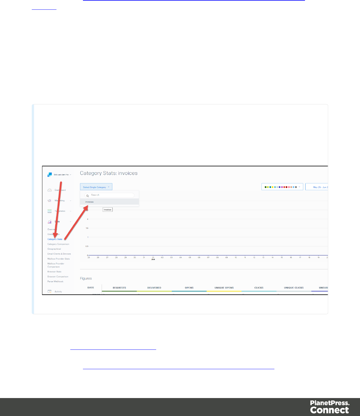
Documentation: https://sendgrid.com/docs/API_Reference/SMTP_API/using_the_smtp_
api.html
Sample Control Script to assign a category:
var headerObj = {
"category": ["invoices"]
};
merge.context.sections["Content"].headers = {
"X-SMTPAPI": JSON.stringify(headerObj)
};
Note
Sendgrid strips out their mail headers. The results need to be verified via their Dashboards (e.g. the
Stats section lets you verify the stats for specific categories). Alternatively one can use their Web
API to retrieve stats in JSON format. To view the category stats, log in to Sendgrid and choose:
Stats > Category Stats > your category name.
MailGun
Dashboard: https://mailgun.com/cp/stats
Documentation: https://documentation.mailgun.com/api-sending.html#sending
Page 823
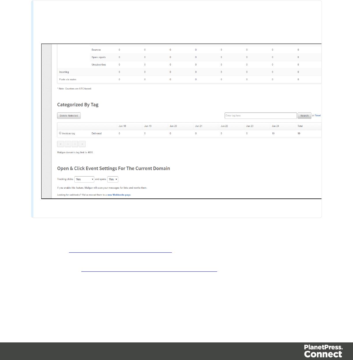
Sample Control Script to assign a tag:
merge.context.sections["Content"].headers = {
"X-Mailgun-Tag": "invoices"
};
Note
The Mailgun tag allows you to view the stats per tag. Mailgun has a quick refresh and stats are
available almost instantly.
MailJet
Dashboard: https://app.mailjet.com/dashboard
Documentation: https://app.mailjet.com/docs/emails_headers
Sample Control Script to assign a campaign:
Page 824
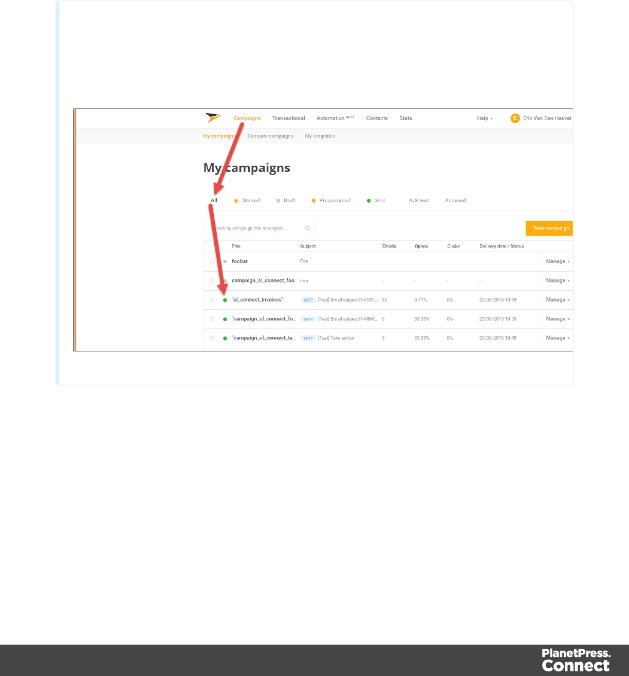
merge.context.sections["Content"].headers = {
"X-Mailjet-Campaign": "invoices"
};
Note
Mailjet strips out their own mailheaders like X-Mailjet-Campaign. The results can only be verified
via the respective campaign stats page in the Mailjet dashboard. There is no need to pre-create the
campaign: adding it to the email header via a Control Script auto-generates the campaign. To view
the campaign, login to Mailjet and choose: Campaigns > All.
Generating Web output
The Web context outputs one HTML web page that contains the HTML text and all the
resources necessary to display it. JavaScript files are added to the <head> in the generated
HTML file. They are useful to add special features such as those offered by jQuery and its
plugins, or MooTools. Style sheets are also added to the <head> and are used just as they
would be used in a regular web page.
Web output can be generated in two different ways: it can be attached to an Email template
when generating Email output, or it can be generated using Workflow.
Page 825
Web output can be generated from the Designer when a data set is available. The data can be
retrieved from a database or data file, or from a Data Mapping Configuration.
If you have an open Data Mapping Configuration and open another data file, the current Data
Mapping Configuration will try to retrieve data from the file or database using its own Data
Model and extraction logic.
Note
When generating output with just an open Data Mapping Configuration, the template is merged
with the complete sample data file that is part of the Data Mapping Configuration. The output is not
limited to the number of records shown in the Data Model pane (which is one of the settings in the
DataMapper).
Before generating Web output
Before actually generating the Web output, you may want to rasterize certain elements, such
as <div> elements, business graphics, or headings with a special font type. Rasterizing
converts the element to a JPG or PNG image. This is very useful to support as many clients as
possible. For example, when a heading uses a font type that is not a Web font, converting the
heading to JPG instead would ensure that the heading looks the same in all browsers.
To rasterize an element, right-click it and select Rasterize options. For a JPG image you can
set the quality of the resulting image in a percentage.
Attaching Web output to an Email template
To attach the Web context to Email output:
1. Open a template with a Web context and an Email context.
2. Check the output settings for both contexts; see "Email output settings in the Email
context and sections" on page816 and "Web output settings in the Web context and
sections" on page828.
Note
When adding the Web context to an email, only the default Web section is
Page 826

generated and added to the email as an HTML file. To attach multiple Web sections
as separate attachments, you need to create a Control Script that specifies parts;
see "Control Scripts" on page532 and "Control Script API" on page782.
3. Load a data file or database compatible with this template. See "Loading data" on
page488.
4. On the File menu, click Send Email or Send Test Email. In the dialog that appears,
check the option to attach the Web context to the email. See "Send Email" on page602 or
"Send Test Email" on page604 for a description of all options.
Note
When you send a test email, the Email To Script will not be used; instead, the email
will be sent to the address that you specify in the Send Test Email dialog.
5. Fill in the dialog and send the emails.
Generating Web output from Workflow
1. Open a template with a Web context.
2. Send it to Workflow using the Package Files dialog; see "Sending files to Workflow" on
page259.
3. Create a process in Workflow containing at least the following steps:
lAny input that will capture a job file that is compatible with the Data Mapping
Configuration that is used. To capture incoming web requests, such as from a
personalized URL (see "Personalized URL" on page514), use a HTTP Server
Input task (see Workflow Help: HTTP Server Input).
lAn Execute Data Mapping task to generate a valid record set (see Workflow Help:
Execute DataMapping Task).
lA Create Web Content task with the appropriate settings, to generate the HTML
output (see Workflow Help: Create Web Content).
Page 827

Web output settings in the Web context and sections
There are a few settings for the Web context and Web sections that have an impact on the
actual web page that is generated.
These settings are:
lWhich Web section is the 'default'; see "Setting a default Web page for output" on
page335. When generating Web output, if there are multiple Web sections, only one of
them can be merged with each record.
lThe title, shortcut icon and meta tags appearing in the web page's header. See "Setting
the title, meta data and a shortcut icon" on page335
Page 828

Release Notes
Overview
This document provides an overview of the new features and enhancements in PlanetPress
Connect 1.5 and PlanetPress Workflow 8.5.
Installing PlanetPress Connect 1.5 and PlanetPress Workflow 8.5
lPlanetPress Connect is released as a 64 Bit version only (with the exception of the
Workflow, Fax, Search and Imaging modules).
lFull details on installing and licensing PlanetPress Connect and PlanetPress Workflow
can be found in the online help in the installer.
lNote that both PlanetPress and PlanetPress Connect Workflow come with 30 day trial
licenses by default.
Updating from PlanetPress Connect 1.1
In order to upgrade from Connect Version 1.1 to Version 1.5 via the Update Manager it is
necessary to install a new version of the Objectif Lune Update Client. The next time you run
your current Update Client it will show that there is an update available for itself. Simply click on
the download button in the dialog to install the new version of the Update Client. Note that it is
no problem to run the update while the Client is open. It will automatically update itself.
Once you have done this, PlanetPress Connect 1.5 will become available for download.
From Connect Version 1.2.0 onwards, the newer version of the Update Client was included
with the Connect installation.
Updating stand-alone Workflow Messenger installations
If Workflow Messenger were installed stand alone, with no other Workflow components
installed, the Update Client cannot find the Messenger component and thus it will not
automatically update the component to the Workflow 8.5 version of Messenger. To get around
this, download and run the Workflow 8.5 installer manually.
Page 829

Print Only Version
A Print Only license is available with version 1.5 of PlanetPress Connect which allows legacy
PlanetPress Suite 7 customers on OL Care to upgrade to Connect for a minimal fee. The
license allows regular printing via the Print Wizard but runs Email and Web output in demo
mode. For more information, please contact your local OL Customer Care or Sales team.
Templates Used in Workflow
For improved performance we recommend re-saving Workflow templates set up in the previous
versions to run with PlanetPress Connect 1.5\Workflow 8.5.
Reduced Memory Version
Note
This is not recommended for production.
It is now possible to install PlanetPress Connect on a machine with a minimum of 2 GB of
RAM. The PlanetPress Connect Designer will automatically detect whether it has been
installed on a machine with less than 4 GB of RAM and default to only using one internal
Weaver and one internal merge engine on that system. The Server will also run using internal
engines.
Connect 1.5 Designer Enhancements and
Fixes
General Designer improvements
lAcolor selection eyedropper has been added, to allow the selection of a color from
elsewhere on screen. (SHARED-33561/33646/36293)
lImproved responsiveness within the Designer, particularly when dealing with large and
complex documents. (SHARED-44309)
Page 830

lAconfigurable Auto Save functionality has been added for both templates and
DataMapping configurations. (SHARED-40942/42085)
lImprovements made to image file selection functionality. (SHARED-
42231/42451/42503/42556//43778)
Simplified creation of templates based on existing PDFs
lOption added to allow the creation of a new print document based on an existing PDF.
(SHARED-19220)
lImproved support for adding PDF files as Section backgrounds. Files can now be
referenced from disk or imported into Template. (SHARED-42496)
lAdded support for drag and dropping Data Fields directly onto the page as absolutely
positioned textboxes. (SHARED-43311)
Print Layout improvements
lPage Number formatting options (start/stop page numbering for sections, set numbering
notation) improved in Print Section Properties dialog. (SHARED-39048)
lAdded repeating background images support for print documents. (SHARED-43201)
lOption added to allow the insertion of absolute positioned tables on a master page.
(SHARED-21967)
Email enhancements
lUser-definable SMTP settings. New defaults are added for Sendgrid and Mailgun (in
addition to Mandrill). (SHARED-43897)
lThe standard New email wizard has been replaced with the new Basic Email template
wizard. The new wizard has improved HTML structure. (SHARED-43338)
lSending a test email no longer requires data. (SHARED-41889)
lTighter compression for PDF attachments that are based on a print section. (SHARED-
38575)
lColour picker support added to the Email template wizards. (SHARED-33561)
lAdded support for PNG barcode images in email messages. (SHARED-43787)
Page 831

Barcode enhancements
lImproved Barcode creation with improved dialogs, better data validation and better
error messaging. (SHARED-39295/42879)
lFont controls added to the Barcode Properties dialogs. (SHARED-22722/43659)
lBarcode improvements made in Preview mode. Support added for resizing and dragging
of absolute positioned barcode objects, as well as resizing of inline barcode objects.
(SHARED-43641)
lBarcodes can now have transparent backgrounds. (SHARED-43659)
Scripting improvements
lNew closest() command added to the Scripting API, to locate closest matching element
above it in the Document Object Model (DOM) tree. (SHARED-41789)
lScript editing improved. Line numbering now available within the editor, support for
code completion and syntax highlighting added, as well as support for various ECMA6
commands. (SHARED-42768/43696)
lSupport added for cloning Sections in a Control Script to allow a document to have a
dynamic number of Sections. (SHARED-43683)
lImproved Scripts tool tip warning and error messaging. (SHARED-42550/43758)
Improvements include:
lBetter tailored error messages and warnings.
lIcons added representing script type as well as showing the issue severity.
lDuplicated problems now filtered out.
lSeveral other minor improvements.
lImproved support for raw HTML within Designer scripting API commands. (SHARED-
43075)
Capture On The Go (COTG)and Web form improvements
lInput fields residing in a Field Table or Dynamic table are submitted using an array
notation (requires Workflow 8.5). This results in a nested XML structure (grouped fields)
in the job data file, simplifying the Workflow process and extracting data in the
DataMapper. (SHARED-45577)
Page 832

lCOTG/Web-Form: Option introduced to retrieve the jobdata XML file from within the
Designer. An icon has been added to the toolbar that intercepts the Submit action in Live
view and then submits the form to a local or remote Workflow engine. A dialog also allows
for saving the data file. (SHARED-44899)
lDeploying a COTG Test form no longer requires data. (SHARED-41889)
lNew scripting options have been added to the COTG.js library to register custom
functions for save and restore. (SHARED-40670)
lColour picker support has been added to the COTG Starter Template wizards.
(SHARED-33561)
lImproved speed/size of COTG Camera objects. Rather than embedding images in output
PDFs, Connect now supports embedding data URLs in COTG templates. (SHARED-
38575)
lDocuments from the Library now automatically deleted upon successful submission.
(COTG-367)
Page 833

Connect 1.5 DataMapping Enhancements
and Fixes
lMultiple Conditions step can now evaluate several conditions and branch out
accordingly. (SHARED-14329/44435)
lPerformance improvements made when extracting text from PDFs and spool files.
(SHARED-43056)
lImproved default formatting when extracting Date, Float or Currency data fields.
(SHARED-43415)
lAn extra field is now appended to every Document record and to every Detail table
inside that record. This allows other processes to add data on the fly. This provides
enormous flexibility. For example, adding a JSON object (which could contain several
additional fields) to the new field value extends the data structure almost infinitely.
(SHARED-43518)
lThe JavaScript API now displays detailed hints for every command, object and method
available. (SHARED-44838)
Connect 1.5 Output Enhancements and
Fixes
General
lImproved content creation processing speed for templates featuring PDF backgrounds.
(SHARED-44350)
Email Output
lBasic Email Action wizard now made the default for new Email templates. (SHARED-
43338)
lSupport added for user defined SMTP/Email Service Provider (ESP) settings.
(SHARED-43897)
Page 834

Print Output
lNew option added, allowing printing to Windows Printer Driver. (SHARED-35536)
lImprovements made to external sort option in Job presets. Support added for using
input/output file placeholders. (SHARED-40944)
lNew HCF file added that supports “top down wrap around sequence marks”. (SHARED-
42326)
lUse PostScript Media name values in the PostScript DSC comments, to improve
subsequent searches. (SHARED-42826)
lOption added to allow storing of job resources on PostScript printer’s own storage
medium. (SHARED-43467)
lOMR marks improved, with support added for Match Numbers (Match Code, MC).
(SHARED-43589)
lAProof preview function has been added to the Output Wizard, to display onscreen
how the current print job would appear when printed. (SHARED-43885)
lImposition improvement. Can now set specific starting position via new Offset option.
(SHARED-44022)
lMinor glitches in Booklet and Imposition output addressed. (SHARED-44340/44430)
Web Output
lExtra customization added to custom OMR settings. (SHARED-36267)
Page 835

Connect 1.5 General Enhancements and
Fixes
Installer improvements
lImprovements made to installation robustness. The installer now copes better when
encountered permissions issues during installation. (SHARED-43732/43737)
lThe Update Client has been updated to 1.1.9 and has been included in both the Connect
1.5 and Workflow 8.5 installations. (SHARED-47065)
Page 836

Connect 8.5 Workflow Enhancements and
Fixes
lSupport for PHP-like arrays for COTG or web-based form submissions. (SHARED-41706)
lNew Workflow system variable (%r) added to allow a process to determine which if it is
currently running in service or debug mode. (SHARED-43411)
lCreate Output and the Connect All In One tasks can now be added as Output tasks
without waiting for the operation's result. (SHARED-43413)
lThe Folder Capture task can now monitor multiple folders. (SHARED-43417)
lThe HTTP Server Input task can now be set to monitor multiple actions to receive files
from different URLs. (SHARED-43419)
lThe Create Web and Create Email Content tasks have been enhanced with a list of the
available template sections made available to simplify selection. (SHARED-43421)
lA new Data Repository has been created to allow for storing data that can then be
subsequently reused, modified or augmented, by different processes.
A new Data Repository Management Tool (DRMT) has also been added to the
Workflow, to provide simple repository management tasks. (SHARED-
43423/43438/43488/43521)
lSupport added for Regular Expressions in the Folder Capture task FileName masks.
(SHARED-43436)
lThe Debug information panel is now automatically made visible when debugging a
process. (SHARED-43763)
lAdditional encryption options (RC4 and AES-256 in addition to AES-128) added for
password protecting PDF files. (SHARED-44208)
Page 837

Known Issues
Installation Paths with Multi-Byte Characters
When installing the Chinese (Traditional or Simplified) or Japanese versions of Connect, if the
user specifies an alternative installation path containing multi-byte/wide-char characters it can
break some of the links to the Connect-related shortcuts in the Start Menu and cause an error to
appear at the end of the installer. The workaround for the moment is to use the default
installation path. The problem will be addressed in a later release.
Switching Languages
Changing the language using the Window>Preferences>Language Setting menu option
does not currently change all of the strings in the application to the selected language. This is a
known issue and will be fixed in a later release.
In the meantime we offer the following workaround for anyone who needs to change the
language:
1. Go to the .ini files for the Designer and Server Config:
lC:\Program Files\Objectif Lune\OL Connect\Connect Designer\Designer.ini
lC:\Program Files\Objectif Lune\OL Connect\Connect Server
Configuration\ServerConfig.ini
2. Change the language parameter to the required one under Duser.language=en | es | de |
fr | it | ja | pt | tw | zh
Only one of the above language tags should be selected. Once saved, Connect will appear in
the selected language at next start-up.
GoDaddy Certificates
When installing Connect offline, dialogs allow installing the GoDaddy certificates. Most users
should use the default settings and click Next. In some cases, however, this may not work
correctly. For this reason those users should activate Place all certificates in the following
store and then select the Trusted Root Certification Authorities as the target certificate store.
Page 838

MySQL Compatibility
After installing Connect 1.5 a downgrade to a Connect version earlier than Connect 1.3 or to a
MySQL version earlier than 5.6.25 is not seamlessly possible. This is because the database
model used in Connect 1.3 and later (MySQL 5.6) is different to that used in earlier versions. If
you need to switch to an older version of Connect / MySQL, it is first necessary to remove the
Connect MySQL Database folder from "%ProgramData%\Connect\MySQL\data" before
installing the older version.
PostScript Print Presets
The print presets for PostScript were changed from Version 1.1 onwards meaning that some
presets created in Version 1.0 or 1.0.1 may no longer work.
Any PostScript print preset from Version 1.0 that contains the following will not work in Version
1.5: *.all[0].*
Any preset containing this code will need to be recreated in Version 1.5.
Available Printer Models
Note that only the single Printer Model (Generic PDF) will appear on the Advanced page of the
Print Wizard by default.
To add additional printer models click on the settings button next to the Model selection
entry box.
Note that the descriptions of some of the printers were updated in version 1.2 meaning that if
you had version 1.n installed, you may find that the same printer style appears twice in the list,
but with slightly different descriptions.
For example the following printer types are actually identical:
lGeneric PS LEVEL2 (DSC compliant)
lGeneric PS LEVEL2 (DSC)
External Resources in Connect
There are certain limitations on how external resources can be used in Connect. For example if
you want to link a file (e.g., CSS, image, JavaScript etc.) from a location on the network but you
Page 839
do not want to have a copy of the file saved with the template you need to do the following:
1. The resource must be located where it can be accessed by all Servers/Slaves run as
users. Failure to do this will cause the image to appear as a Red X in the output for all
documents which were merged by engines which could not access the file. The job will
terminate normally and the error will be logged.
2. The file must be referenced via a UNC path e.g.,
file:////w2k8r2envan/z%20images/Picture/Supported/JPG/AB004763.jpg
lUNC paths are required because the services will be unable to access mapped
network drives (Windows security feature).
lThe engine processing the job will look on the local file system for the direct file
path leading to the “resource not found” issue mentioned above.
Warning
Important Note: The Designer itself and Proof Print do not use processes that run as
services and they may find local files with non-UNC paths which can lead to the false
impression that the resources are correct.
Using Capture After Installing Workflow 8
If PlanetPress Connect Workflow 8 is installed alongside PlanetPress Suite Workflow 7,
Capture can no longer be used within Workflow 7. The plugins are now registered uniquely to
Workflow 8 and the messenger for Workflow 7 is taken offline. It is only possible to use Capture
from PlanetPress Connect Workflow 8 thereafter.
Capturing Spool Files After Installing Workflow 8
If PlanetPress Connect Workflow 8 is installed alongside PlanetPress Suite Workflow 7, the
PlanetPress Suite 7 option to capture spool files from printer queues will no longer function.
The solution is to use PlanetPress Connect Workflow 8 to capture spool files from printer
queues.
Colour Model in Stylesheets
The colour model of colours defined in a stylesheet can sometimes change after editing the
stylesheet. This is a known issue and will be addressed in a subsequent release.
Page 840

Online Help Links Point to Introductory Page
Context sensitivity for the online help is not yet enabled in Connect. All links and F1 calls point
to the introductory page, where you can Search on keywords to bring up Help pages relating to
the topic.
Context sensitivity will be introduced in a subsequent release of Connect.
Image Preview in Designer
If in the Windows Internet settings (Connection Settings > LAN configuration) a proxy is
enabled, but "Bypass proxy settings for local addresses" is not checked, the image preview
service, conversion service and live preview tab in the Designer will not work and exhibit the
following issues:
lImages will be shows as 0 size boxes (no red 'X' is displayed)
lLive preview does not progress, and when re-activated reports "browsers is busy"
To fix the issue you must check the "Bypass proxy settings for local addresses" option.
Merge\Weaver Engines when Printing
The print operation in the Designer will automatically detect whether the Merge\Weaver
engines are available and display a message for the user to retry or cancel if not. Once the
Merge\Weaver engine becomes available and the user presses retry the print operation will
proceed as normal. This message can also occur in the following circumstances:
lIf the server is offline and you are not using Proof Print
lOn some occasions before the Print Wizard opens
REST Calls for Remote Services
The Server will now accept REST calls for all remote services and will make commands wait
indefinitely until the required engines become available. The Server will log when it is waiting
for an engine and when it becomes available. Note that there is no way to cancel any
commands other than stopping the Server.
Page 841

Print Content and Email Content in PlanetPress Workflow
In PlanetPress Workflow’s Print Content and Email Content tasks, the option to Update
Records from Metadata will only work for fields whose data type is set to String in the data
model. Fields of other types will not be updated in the database and no error will be raised.
This will be fixed in a later release.
VIPP Output
Some templates set up with landscape orientation are being produced as portrait in VIPP. It can
also sometimes be the case that text and images can be slightly displaced. These are known
issues and will be addressed in a later release of Connect.
Print Limitations when the Output Server is located on a different machine
The following limitation may occur when using the Print options from a Designer located on a
different machine to the Output Server:
lThe file path for the prompt and directory output modes is evaluated on both the client
AND server side. When printing to a network share it must be available to BOTH the
Designer and Server for the job to terminate successfully.
lThe Windows printer must be installed on both the Server and Designer machines.
lWhen printing via the Server from a remote Designer, the output file remains on the
Server machine. This is remedied by selecting “Output Local” in the Output Creation
configuration.
Page 842

Copyright Information
Copyright © 1994-2017 Objectif Lune Inc. All Rights Reserved.
No part of this publication may be reproduced, transmitted, transcribed, stored in a retrieval
system, or translated into any other language or computer language in whole or in part, in any
form or by any means, whether it be electronic, mechanical, magnetic, optical, manual or
otherwise, without prior written consent of Objectif Lune Inc.
Objectif Lune Inc.disclaims all warranties as to this software, whether expressed or implied,
including without limitation any implied warranties of merchantability, fitness for a particular
purpose, functionality, data integrity or protection.
PlanetPress, PReS and PrintShop Mail are registered trademarks of Objectif Lune Inc.
Page 843

Legal Notices and Acknowledgments
PlanetPress Connect, Copyright © 2017, Objectif Lune Inc. All rights reserved.
The license agreements for the associated open source third party components can be
downloaded here.
This application uses the following third party components:
lAdobe PDF Library which is either a registered trademark or trademark of Adobe
Systems Incorporated in the United States and\or other countries.
lAdobe XMP Core Copyright © 1999 - 2010, Adobe Systems Incorporated. All rights
reserved.
lEclipse Persistence Services Project (EclipseLink), Copyright © 2007, Eclipse
Foundation, Inc. and its licensors. All rights reserved. This is distributed under the terms
of the Eclipse Public License Version 1.0 and Eclipse Distribution License Version 1.0.
lFugue Icons by Yusuke Kamiyamane which are distributed under the terms of the
Creative Commons Attribution 3.0 License.
lGecko which is distributed under the terms of the Mozilla Public License Version 2.0.
Information on obtaining Gecko can be found on the following page:
https://wiki.mozilla.org/Gecko:Getting_Started
lGlassfish Java Mail which is licensed under the terms of the Common Development and
Distribution License (CDDL) Version 1.0. Information on how to download the Glassfish
source can be obtained from here:
https://wikis.oracle.com/display/GlassFish/Java+EE+7+Maven+Coordinates
lHamcrest Matchers Copyright © 2000-2006, www.hamcrest.org. All rights reserved.
lHyperSQL, Copyright © 2001-2010, The HSQL Development Group. All rights reserved.
lICU4J 4.4.2 Copyright © 1995-2013 International Business Machines Corporation and
others. All rights reserved.
lJ2V8 which is distributed under the terms of the Eclipse Public License Version 1.0. The
source code for J2V8 can be obtained from the following location:
https://github.com/eclipsesource/j2v8
Page 844

lJacob Java Com Bridge which is licensed under the terms of the GNU Lesser General
Public License Version 2. The source code for this can be obtained from the following
location: http://sourceforge.net/projects/jacob-project/files/jacob-project/
lJavaCraft JSch Copyright © 2002 - 2012 Atsuhiko Yamanaka, JCraft Inc. All rights
reserved.
lJavaSysMon Copyright © 2009 ThoughtWorks, Inc. All rights reserved.
lJavaX Mail which is distributed under the terms of the Common Development and
Distribution License (CDDL) Version 1.1. The source code for this can be obtained from
the following location: https://java.net/projects/javamail/downloads/directory/source
lJersey which is distributed under the terms of the Common Development and Distribution
License (CDDL) Version 1.1. Information on how to obtain the source code can be found
at the following location: http://repo1.maven.org/maven2/org/glassfish/jersey/jersey-bom
ljersey-json-1.13 which is licensed under the terms of the Common Development and
Distribution License (CDDL) Version 1.1. Information on how to obtain the source code
can be found at the following location:
http://mvnrepository.com/artifact/com.sun.jersey/jersey-json/1.13-b01
lJersey Multipart which is distributed under the terms of the Common Development and
Distribution License (CDDL) Version 1.1. Information on how to obtain the source code
can be found at the following location:
http://repo1.maven.org/maven2/org/glassfish/jersey/jersey-bom
lJGoodies Forms, JGoodies Binding and JGoodies Looks, Copyright © 2002-2013
JGoodies Software GmbH. All rights reserved.
lJNA Version 3.5.1 which is distributed under the terms of the GNU Lesser General
Public License Version 2.1. The source code for this can be obtained from the following
location: https://github.com/twall/jna/releases
lJunit which is distributed under the terms of the Eclipse Public License Version 1.0. The
source code for Junit can be obtained from the following location: https://github.com/junit-
team/junit/tree/master/src
lMimepull which is distributed under the terms of the Common Development and
Distribution License (CDDL) Version 1.1. The source code for this can be obtained from
the following location:
https://maven.java.net/content/repositories/releases/org/jvnet/mimepull/mimepull/
lObjectweb ASM, Copyright © 2000-2011 INRIA, France Telecom. All rights reserved.
Page 845

lRelique CSV Driver which is licensed under the terms of the Lesser General Public
License Version 2.0. This can be obtained from the following location:
http://sourceforge.net/p/csvjdbc/code/ci/master/tree/
lRhino 1.7R4 and 1.7.7.1 which are licensed under the terms of the Mozilla License
Version 2.0. The source code for these can be obtained from the following location:
https://developer.mozilla.org/en-US/docs/Mozilla/Projects/Rhino/Download_Rhino
lSaxon which is distributed under the terms of the Mozilla Public License Version 2.0. The
source code for this can be obtained from the following location:
http://sourceforge.net/projects/saxon/files/Saxon-HE/9.6/
lServlet API developed by Sun as part of the Glassfish project and licensed under the
terms of the Common Development and Distribution License (CDDL) Version 1.0.
Information on how to download the Glassfish source (as part of Java EE platform) can be
obtained from here:
https://wikis.oracle.com/display/GlassFish/Java+EE+7+Maven+Coordinates
lSpring Framework which is distributed under the terms of the Apache Software License
Version 2.0. This product includes subcomponents with separate copyright notices and
license terms.
lSpringsource JavaX Mail which is distributed under the terms of the Common
Development and Distribution License (CDDL) Version 1.0. The source code for this can
be obtained from the following location:
http://ebr.springsource.com/repository/app/bundle/version/detail?name=com.springsourc
e.javax.mail&version=1.4.5&searchType=bundlesByName&searchQuery=mail
lSpringsource SLF4J 1.6.1, Copyright © 2004-2008 QOS.ch. All rights reserved.
lWeb Services Description Language for Java which is distributed under the terms of
the Common Public License v 1.0. The source code for this can be obtained from the
following location: http://wsdl4j.cvs.sourceforge.net/viewvc/wsdl4j/
lXULRunner which is distributed under the terms of the Mozilla Public License Version
2.0. The source code for this can be obtained from the following location:
http://ftp.mozilla.org/pub/mozilla.org/xulrunner/releases/latest/source/
lzziplib which is licensed under the terms of the Mozilla License Version 1.1. The source
code for this can be obtained from the following location:
http://sourceforge.net/projects/zziplib/files/zziplib13/
l7-Zip SFX which is licensed under the terms of the GNU Lesser General Public License
Version 2.1. The source code for this can be obtained from the following location:
http://www.7zsfx.info/files/7zsd_src_160_2712.7z
Page 846

Portions of certain libraries included in this application which are distributed under the terms of
the Mozilla Public License have been modified. To obtain copies of the modified libraries
please contact your local Objective Lune Support team.
This application also uses the following components which are distributed under the terms of
the Apache Software License Version 2.0:
lApache Ant
lApache Axis
lApache CFX
lApache Commons Beanutils
lApache Commons CLI
lApache Commons Codec
lApache Commons Collections
lApache Commons Configuration
lApache Commons DBCP
lApache Commons Digester
lApache Commons Discovery
lApache Commons FileUpload
lApache Commons Imaging
lApache Commons IO
lApache Commons Lang
lApache Commons Logging
lApache Commons Net
lApache Commons Pool
lApache Commons Validator
lApache Commons VFS
lApache Derby
lApache Felix and dependencies
lApache Geronimo
lApache Jakarta HttpClient
lApache Log4j
lApache Neethi
Page 847

lApache OpenCMIS
lApache POI
lApache ServiceMix
lApache Tomcat
lApache WSS4J
lApache Xalan
lApache Xerces2 Java Parser
lApache XMLGraphics
lApache XML-RPC
lBarcode4j
lGoogle Collections
lGoogle GSON
lJetty
lLMAX Disruptor
lOPS4J Pax Web
lorg.json.simple
lSpring Dynamic Modules
lStAX
lXMLBeans
Eclipse Technology:
This Software includes unmodified Eclipse redistributables, which are available at
www.eclipse.org. The Eclipse redistributables are distributed under the terms of the Eclipse
Public License - v 1.0 that can be found at https://www.eclipse.org/legal/epl-v10.html.
VSS Java FreeMarker:
This product includes software developed by the Visigoth Software Society
(http://www.visigoths.org/).
This includes the following subcomponents that are licensed by the Apache Software
Foundation under the Apache License, Version 2.0:
Page 848

lfreemarker/ext/jsp/web-app_2_2.dtd
lfreemarker/ext/jsp/web-app_2_3.dtd
lfreemarker/ext/jsp/web-app_2_4.xsd
lfreemarker/ext/jsp/web-app_2_5.xsd
lfreemarker/ext/jsp/web-jsptaglibrary_1_1.dtd
lfreemarker/ext/jsp/web-jsptaglibrary_1_2.dtd
lfreemarker/ext/jsp/web-jsptaglibrary_2_0.xsd
lfreemarker/ext/jsp/web-jsptaglibrary_2_1.xsd
Java SE framework and platform:
This application uses the Java SE framework and platform which is distributed under the terms
of the Oracle Binary Code License Agreement for the Java SE Platform Products and Java FX.
Copyright 2013, Oracle America ,Inc. All rights reserved.
Use is subject to license terms. ORACLE and JAVA trademarks and all ORACLE- and JAVA-
related trademarks, service marks, logos and other brand designations are trademarks or
registered trademarks of Oracle in the U.S. and other countries.
Use of the Commercial Features for any commercial or production purpose requires a separate
license from Oracle. “Commercial Features” means those features identified Table 1-1
(Commercial Features In Java SE Product Editions) of the Java SE documentation accessible
at http://www.oracle.com/technetwork/java/javase/documentation/index.html.
Further Components:
lThis product includes software developed by the JDOM Project (http://www.jdom.org/).
lPortions of this software are copyright © 2010 The FreeType Project (www.freetype.org).
All rights reserved.
lThis product includes software developed by JSON.org
(http://www.json.org/java/index.html).
Click to download the EULA as PDF
Page 849
