Primefaces User Guide 6 1
primefaces_user_guide_6_1
primefaces_user_guide_6_1
User Manual: Pdf
Open the PDF directly: View PDF  .
.
Page Count: 653 [warning: Documents this large are best viewed by clicking the View PDF Link!]
- About the Author
- 1. Introduction
- 2. Setup
- 3. Component Suite
- 3.1 AccordionPanel
- 3.2 AjaxBehavior
- 3.3 AjaxExceptionHandler
- 3.4 AjaxStatus
- 3.5 AutoComplete
- 3.6 Barcode
- 3.7 BlockUI
- 3.8 BreadCrumb
- 3.9 Button
- 3.10 Cache
- 3.11 Calendar
- 3.12 Captcha
- 3.13 Carousel
- 3.14 CellEditor
- 3.15 Chart
- 3.16 Checkbox
- 3.17 Chips
- 3.18 Clock
- 3.19 Collector
- 3.20 Color Picker
- 3.21 Column
- 3.22 Columns
- 3.23 ColumnGroup
- 3.24 ColumnToggler
- 3.25 CommandButton
- 3.26 CommandLink
- 3.27 Confirm
- 3.28 ConfirmDialog
- 3.29 ContentFlow
- 3.30 ContextMenu
- 3.31 Dashboard
- 3.32 DataExporter
- 3.33 DataGrid
- 3.34 DataList
- 3.35 DataScroller
- 3.36 DataTable
- 3.37 DefaultCommand
- 3.38 Diagram
- 3.39 Dialog
- 3.40 Drag&Drop
- 3.41 Dock
- 3.42 Editor
- 3.43 Effect
- 3.44 FeedReader
- 3.45 Fieldset
- 3.46 FileDownload
- 3.47 FileUpload
- 3.48 Focus
- 3.49 Fragment
- 3.50 Galleria
- 3.51 GMap
- 3.52 GMapInfoWindow
- 3.53 GraphicImage
- 3.54 Grid CSS
- 3.55 Growl
- 3.56 HeaderRow
- 3.57 HotKey
- 3.58 IdleMonitor
- 3.59 ImageCompare
- 3.60 ImageCropper
- 3.61 ImageSwitch
- 3.62 ImportConstants
- 3.63 ImportEnum
- 3.64 Inplace
- 3.65 InputMask
- 3.66 InputNumber
- 3.67 InputSwitch
- 3.68 InputText
- 3.69 InputTextarea
- 3.70 Keyboard
- 3.71 KeyFilter
- 3.72 Knob
- 3.73 Layout
- 3.74 LayoutUnit
- 3.75 Lifecycle
- 3.76 LightBox
- 3.77 Link
- 3.78 Log
- 3.79 Media
- 3.80 MegaMenu
- 3.81 Menu
- 3.82 Menubar
- 3.83 MenuButton
- 3.84 MenuItem
- 3.85 Message
- 3.86 Messages
- 3.87 Mindmap
- 3.88 MultiSelectListbox
- 3.89 NotificationBar
- 3.90 OrderList
- 3.91 Organigram
- 3.92 OrganigramNode
- 3.93 OutputLabel
- 3.94 OutputPanel
- 3.95 OverlayPanel
- 3.96 Panel
- 3.97 PanelGrid
- 3.98 PanelMenu
- 3.99 Password
- 3.100 PhotoCam
- 3.101 PickList
- 3.102 Poll
- 3.103 Printer
- 3.104 ProgressBar
- 3.105 RadioButton
- 3.106 Rating
- 3.107 RemoteCommand
- 3.108 Repeat
- 3.109 ResetInput
- 3.110 Resizable
- 3.111 Ribbon
- 3.112 RibbonGroup
- 3.113 Ring
- 3.114 Row
- 3.115 RowEditor
- 3.116 RowExpansion
- 3.117 RowToggler
- 3.118 Schedule
- 3.119 ScrollPanel
- 3.120 SelectBooleanButton
- 3.121 SelectBooleanCheckbox
- 3.122 SelectCheckboxMenu
- 3.123 SelectManyButton
- 3.124 SelectManyCheckbox
- 3.125 SelectManyMenu
- 3.126 SelectOneButton
- 3.127 SelectOneListbox
- 3.128 SelectOneMenu
- 3.129 SelectOneRadio
- 3.130 Separator
- 3.131 Signature
- 3.132 SlideMenu
- 3.133 Slider
- 3.134 Spotlight
- 3.135 Socket
- 3.136 Spacer
- 3.137 Spinner
- 3.138 SplitButton
- 3.139 Submenu
- 3.140 Stack
- 3.141 Steps
- 3.142 Sticky
- 3.143 SubTable
- 3.144 SummaryRow
- 3.145 Tab
- 3.146 TabMenu
- 3.147 TabView
- 3.148 TagCloud
- 3.149 Terminal
- 3.150 TextEditor
- 3.151 ThemeSwitcher
- 3.152 TimeLine
- 3.153 TieredMenu
- 3.154 Toolbar
- 3.155 ToolbarGroup
- 3.156 Tooltip
- 3.157 Tree
- 3.158 TreeNode
- 3.159 TreeTable
- 3.160 TriStateCheckbox
- 3.161 Watermark
- 3.162 Wizard
- 4. Partial Rendering and Processing
- 5. Javascript API
- 6. Dialog Framework
- 7. Client Side Validation
- 8. Themes
- 9. PrimeFaces Push
- 10. PrimeFaces Mobile
- 10.1 Setup
- 10.2 Pages
- 10.2 Navigations
- 10.3 Components
- 10.4 RenderKit
- 10.4.1 AccordionPanel
- 10.4.2 AutoComplete
- 10.4.3 Button
- 10.4.4 Calendar
- 10.4.5 ConfirmDialog
- 10.4.6 DataList
- 10.4.7 DataGrid
- 10.4.8 DataTable
- 10.4.9 Dialog
- 10.4.10 FileUpload
- 10.4.11 Growl
- 10.4.12 InputText
- 10.4.13 InputTextarea
- 10.4.14 Link
- 10.4.15 Menu
- 10.4.16 Panel
- 10.4.17 PanelGrid
- 10.4.17 SelectBooleanCheckbox
- 10.4.18 SelectCheckboxMenu
- 10.4.18 SelectManyButton
- 10.4.19 SelectManyCheckbox
- 10.4.20 SelectOneButton
- 10.4.21 SelectOneMenu
- 10.4.22 SelectOneRadio
- 10.4.23 TabMenu
- 10.4.24 TabView
- 10.4.25 Toolbar
- 10.5 Themes
- 10.6 Framework
- 11. Misc
- 12. Portlets
- 13. IDE Support
- 14. Project Resources
- 15. FAQ

USER GUIDE
6.1
Author
Çağatay Çivici
PrimeFaces User Guide
First Edition
Table of Contents
About the Author..................................................................................................................................9
1. Introduction....................................................................................................................................10
1.1 What is PrimeFaces?.............................................................................................................10
2. Setup...............................................................................................................................................11
2.1 Download...............................................................................................................................11
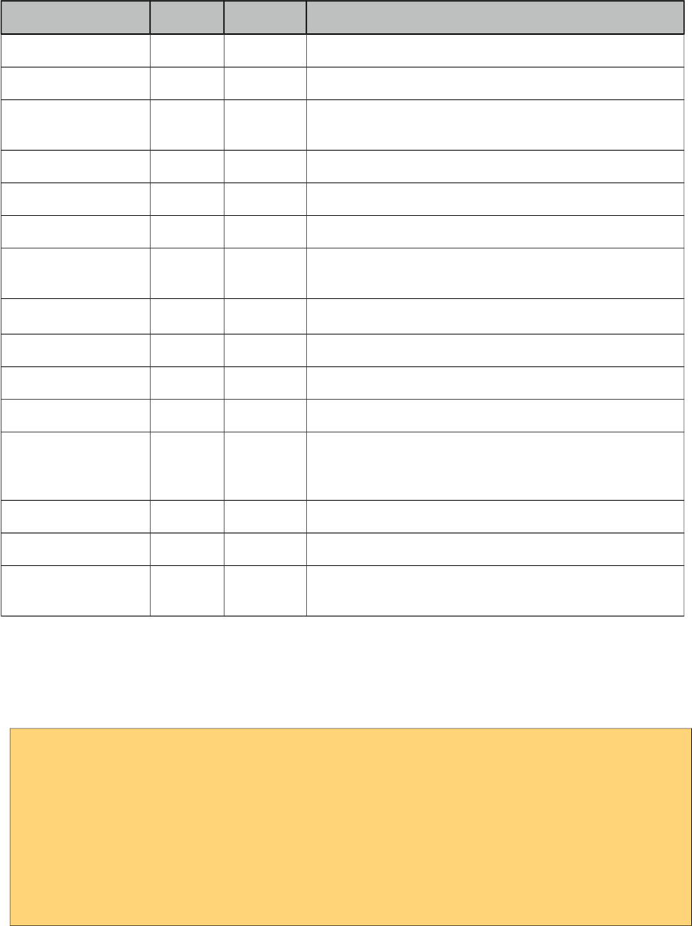
2.2 Dependencies.........................................................................................................................12
2.3 Configuration.........................................................................................................................13
2.4 Hello World...........................................................................................................................13
3. Component Suite............................................................................................................................14
3.1 AccordionPanel......................................................................................................................14
3.2 AjaxBehavior.........................................................................................................................19
3.3 AjaxExceptionHandler..........................................................................................................22
3.4 AjaxStatus..............................................................................................................................23
3.5 AutoComplete........................................................................................................................26
3.6 Barcode..................................................................................................................................36
3.7 BlockUI.................................................................................................................................39
3.8 BreadCrumb..........................................................................................................................42
3.9 Button....................................................................................................................................44
3.10 Cache...................................................................................................................................47
3.11 Calendar...............................................................................................................................49
3.12 Captcha................................................................................................................................60
3.13 Carousel...............................................................................................................................63
3.14 CellEditor............................................................................................................................69
3.15 Chart....................................................................................................................................70
3.15.1 PieChart.......................................................................................................................71
3.15.2 LineChart.....................................................................................................................73
3.15.3 BarChart.......................................................................................................................76
3.15.4 DonutChart..................................................................................................................78
3.15.5 BubbleChart.................................................................................................................80
3.15.6 Ohlc Chart....................................................................................................................82
3.15.7 MeterGauge Chart.......................................................................................................84
3.15.8 Combined Chart...........................................................................................................86
3.15.9 Multiple Axis...............................................................................................................87
3.15.10 Date Axis...................................................................................................................89
3.15.11 Interactive Chart........................................................................................................90
3.15.12 Export........................................................................................................................91
3.15.13 Static Images..............................................................................................................92
3.15.14 Skinning.....................................................................................................................93
3.15.15 Extender.....................................................................................................................94
3.15.16 Chart API...................................................................................................................95
3.16 Checkbox...........................................................................................................................100
2
PrimeFaces User Guide
3.17 Chips..................................................................................................................................101
3.18 Clock..................................................................................................................................103
3.19 Collector............................................................................................................................105
3.20 Color Picker.......................................................................................................................106
3.21 Column..............................................................................................................................109
3.22 Columns.............................................................................................................................111
3.23 ColumnGroup....................................................................................................................113
3.24 ColumnToggler..................................................................................................................114
3.25 CommandButton................................................................................................................115
3.26 CommandLink...................................................................................................................120
3.27 Confirm..............................................................................................................................124
3.28 ConfirmDialog...................................................................................................................125
3.29 ContentFlow......................................................................................................................128
3.30 ContextMenu.....................................................................................................................130
3.31 Dashboard..........................................................................................................................133
3.32 DataExporter......................................................................................................................138
3.33 DataGrid............................................................................................................................142
3.34 DataList.............................................................................................................................149
3.35 DataScroller.......................................................................................................................153
3.36 DataTable...........................................................................................................................157
3.37 DefaultCommand..............................................................................................................182
3.38 Diagram.............................................................................................................................184
3.39 Dialog................................................................................................................................188
3.40 Drag&Drop........................................................................................................................193
3.40.1 Draggable...................................................................................................................193
3.40.2 Droppable..................................................................................................................197
3.41 Dock..................................................................................................................................202
3.42 Editor.................................................................................................................................204
3.43 Effect.................................................................................................................................208
3.44 FeedReader........................................................................................................................211
3.45 Fieldset..............................................................................................................................212
3.46 FileDownload....................................................................................................................215
3.47 FileUpload.........................................................................................................................218
3.48 Focus..................................................................................................................................225
3.49 Fragment............................................................................................................................227
3.50 Galleria..............................................................................................................................229
3.51 GMap.................................................................................................................................232
3.52 GMapInfoWindow.............................................................................................................244
3.53 GraphicImage....................................................................................................................245
3.54 Grid CSS............................................................................................................................249
3.55 Growl.................................................................................................................................252
3.56 HeaderRow........................................................................................................................256
3.57 HotKey..............................................................................................................................257
3
PrimeFaces User Guide
3.58 IdleMonitor........................................................................................................................260
3.59 ImageCompare..................................................................................................................262
3.60 ImageCropper....................................................................................................................264
3.61 ImageSwitch......................................................................................................................268
3.62 ImportConstants................................................................................................................271
3.63 ImportEnum.......................................................................................................................272
3.64 Inplace...............................................................................................................................273
3.65 InputMask..........................................................................................................................277
3.66 InputNumber......................................................................................................................281
3.67 InputSwitch........................................................................................................................286
3.68 InputText............................................................................................................................289
3.69 InputTextarea.....................................................................................................................292
3.70 Keyboard...........................................................................................................................297
3.71 KeyFilter............................................................................................................................302
3.72 Knob..................................................................................................................................304
3.73 Layout................................................................................................................................307
3.74 LayoutUnit.........................................................................................................................312
3.75 Lifecycle............................................................................................................................314
3.76 LightBox............................................................................................................................315
3.77 Link....................................................................................................................................318
3.78 Log.....................................................................................................................................321
3.79 Media.................................................................................................................................323
3.80 MegaMenu.........................................................................................................................325
3.81 Menu..................................................................................................................................328
3.82 Menubar.............................................................................................................................334
3.83 MenuButton.......................................................................................................................337
3.84 MenuItem..........................................................................................................................339
3.85 Message.............................................................................................................................342
3.86 Messages............................................................................................................................344
3.87 Mindmap............................................................................................................................347
3.88 MultiSelectListbox............................................................................................................350
3.89 NotificationBar..................................................................................................................353
3.90 OrderList............................................................................................................................355
3.91 Organigram........................................................................................................................359
3.92 OrganigramNode...............................................................................................................362
3.93 OutputLabel.......................................................................................................................363
3.94 OutputPanel.......................................................................................................................366
3.95 OverlayPanel.....................................................................................................................368
3.96 Panel..................................................................................................................................371
3.97 PanelGrid...........................................................................................................................374
3.98 PanelMenu.........................................................................................................................377
3.99 Password............................................................................................................................379
3.100 PhotoCam........................................................................................................................383
4
PrimeFaces User Guide
3.101 PickList............................................................................................................................386
3.102 Poll...................................................................................................................................393
3.103 Printer..............................................................................................................................396
3.104 ProgressBar......................................................................................................................397
3.105 RadioButton.....................................................................................................................401
3.106 Rating..............................................................................................................................402
3.107 RemoteCommand............................................................................................................406
3.108 Repeat..............................................................................................................................409
3.109 ResetInput........................................................................................................................410
3.110 Resizable..........................................................................................................................412
3.111 Ribbon..............................................................................................................................416
3.112 RibbonGroup...................................................................................................................419
3.113 Ring.................................................................................................................................420
3.114 Row..................................................................................................................................423
3.115 RowEditor........................................................................................................................424
3.116 RowExpansion.................................................................................................................425
3.117 RowToggler.....................................................................................................................426
3.118 Schedule...........................................................................................................................427
3.119 ScrollPanel.......................................................................................................................437
3.120 SelectBooleanButton.......................................................................................................439
3.121 SelectBooleanCheckbox..................................................................................................441
3.122 SelectCheckboxMenu......................................................................................................444
3.123 SelectManyButton...........................................................................................................448
3.124 SelectManyCheckbox......................................................................................................450
3.125 SelectManyMenu.............................................................................................................453
3.126 SelectOneButton..............................................................................................................457
3.127 SelectOneListbox............................................................................................................459
3.128 SelectOneMenu...............................................................................................................462
3.129 SelectOneRadio...............................................................................................................468
3.130 Separator..........................................................................................................................471
3.131 Signature..........................................................................................................................473
3.132 SlideMenu........................................................................................................................478
3.133 Slider................................................................................................................................481
3.134 Spotlight..........................................................................................................................486
3.135 Socket..............................................................................................................................488
3.136 Spacer..............................................................................................................................490
3.137 Spinner.............................................................................................................................491
3.138 SplitButton.......................................................................................................................496
3.139 Submenu..........................................................................................................................501
3.140 Stack................................................................................................................................502
3.141 Steps................................................................................................................................504
3.142 Sticky...............................................................................................................................506
3.143 SubTable..........................................................................................................................508
5
PrimeFaces User Guide
3.144 SummaryRow..................................................................................................................509
3.145 Tab...................................................................................................................................510
3.146 TabMenu..........................................................................................................................511
3.147 TabView...........................................................................................................................513
3.148 TagCloud.........................................................................................................................518
3.149 Terminal...........................................................................................................................521
3.150 TextEditor........................................................................................................................523
3.151 ThemeSwitcher................................................................................................................526
3.152 TimeLine.........................................................................................................................528
3.153 TieredMenu......................................................................................................................535
3.154 Toolbar.............................................................................................................................538
3.155 ToolbarGroup...................................................................................................................540
3.156 Tooltip..............................................................................................................................541
3.157 Tree..................................................................................................................................544
3.158 TreeNode.........................................................................................................................555
3.159 TreeTable.........................................................................................................................556
3.160 TriStateCheckbox............................................................................................................561
3.161 Watermark.......................................................................................................................564
3.162 Wizard..............................................................................................................................566
4. Partial Rendering and Processing.................................................................................................572
4.1 Partial Rendering.................................................................................................................572
4.1.1 Infrastructure................................................................................................................572
4.1.2 Using IDs.....................................................................................................................572
4.1.3 Notifying Users............................................................................................................574
4.1.4 Bits&Pieces..................................................................................................................574
4.2 Partial Processing................................................................................................................575
4.2.1 Partial Validation..........................................................................................................575
4.2.2 Using Ids......................................................................................................................576
4.3 Search Expression Framework............................................................................................577
4.3.1 Keywords.....................................................................................................................577
4.3.2 PrimeFaces Selectors (PFS).........................................................................................578
4.4 PartialSubmit.......................................................................................................................580
5. Javascript API...............................................................................................................................581
5.1 PrimeFaces Namespace.......................................................................................................581
5.2 Ajax API..............................................................................................................................583
6. Dialog Framework........................................................................................................................585
7. Client Side Validation...................................................................................................................589
7.1 Configuration.......................................................................................................................589
7.2 Ajax vs Non-Ajax................................................................................................................589
7.3 Events..................................................................................................................................590
7.4 Messages..............................................................................................................................590
7.5 Bean Validation...................................................................................................................591
7.6 Extending CSV....................................................................................................................592
6
PrimeFaces User Guide
8. Themes..........................................................................................................................................597
8.1 Applying a Theme...............................................................................................................598
8.2 Creating a New Theme........................................................................................................599
8.3 How Themes Work..............................................................................................................600
8.4 Theming Tips.......................................................................................................................601
8.5 FontAwesome......................................................................................................................602
9. PrimeFaces Push...........................................................................................................................603
9.1 Setup....................................................................................................................................603
9.2 Annotations..........................................................................................................................604
9.3 API.......................................................................................................................................606
9.4 Socket Component...............................................................................................................606
9.5 Putting It All Together.........................................................................................................607
9.5.1 Counter........................................................................................................................607
9.5.2 FacesMessage..............................................................................................................609
9.6 Tips and Tricks.....................................................................................................................611
10. PrimeFaces Mobile.....................................................................................................................612
10.1 Setup..................................................................................................................................612
10.2 Pages..................................................................................................................................613
10.2 Navigations........................................................................................................................614
10.3 Components.......................................................................................................................615
10.3.1 Content.......................................................................................................................615
10.3.2 Field...........................................................................................................................616
10.3.3 Footer.........................................................................................................................617
10.3.4 Header........................................................................................................................618
10.3.5 InputSlider.................................................................................................................619
10.3.6 Page............................................................................................................................621
10.3.7 RangeSlider................................................................................................................622
10.3.8 Switch (Deprecated)..................................................................................................623
10.4 RenderKit..........................................................................................................................625
10.4.1 AccordionPanel..........................................................................................................625
10.4.2 AutoComplete............................................................................................................625
10.4.3 Button........................................................................................................................625
10.4.4 Calendar.....................................................................................................................626
10.4.5 ConfirmDialog...........................................................................................................626
10.4.6 DataList......................................................................................................................626
10.4.7 DataGrid....................................................................................................................627
10.4.8 DataTable...................................................................................................................627
10.4.9 Dialog........................................................................................................................627
10.4.10 FileUpload...............................................................................................................628
10.4.11 Growl.......................................................................................................................628
10.4.12 InputText..................................................................................................................628
10.4.13 InputTextarea...........................................................................................................628
10.4.14 Link..........................................................................................................................628
7
PrimeFaces User Guide
10.4.15 Menu........................................................................................................................628
10.4.16 Panel........................................................................................................................628
10.4.17 PanelGrid.................................................................................................................629
10.4.17 SelectBooleanCheckbox..........................................................................................629
10.4.18 SelectCheckboxMenu..............................................................................................629
10.4.18 SelectManyButton...................................................................................................629
10.4.19 SelectManyCheckbox..............................................................................................629
10.4.20 SelectOneButton......................................................................................................629
10.4.21 SelectOneMenu........................................................................................................629
10.4.22 SelectOneRadio.......................................................................................................629
10.4.23 TabMenu..................................................................................................................630
10.4.24 TabView...................................................................................................................630
10.4.25 Toolbar.....................................................................................................................630
10.5 Themes..............................................................................................................................631
10.6 Framework.........................................................................................................................632
10.6.1 Ajax Updates..............................................................................................................632
10.6.2 Pass Through Elements..............................................................................................632
10.6.3 Lazy Pages.................................................................................................................633
10.6.4 Touch Events..............................................................................................................633
11. Misc............................................................................................................................................635
11.1 RequestContext..................................................................................................................635
11.2 EL Functions......................................................................................................................638
11.3 Exception Handler.............................................................................................................639
11.4 BeanValidation Transformation.........................................................................................641
11.5 PrimeFaces Locales...........................................................................................................642
11.6 Right to Left.......................................................................................................................645
11.7 Responsive Design............................................................................................................646
11.8 WAI-ARIA.........................................................................................................................647
12. Portlets........................................................................................................................................648
13. IDE Support................................................................................................................................649
13.1 NetBeans............................................................................................................................649
13.2 Eclipse...............................................................................................................................650
14. Project Resources.......................................................................................................................651
15. FAQ............................................................................................................................................652
8
PrimeFaces User Guide
About the Author
Çağatay Çivici is a member of JavaServer Faces Expert Group, the founder of PrimeFaces,
PrimeNG, PrimeReact, PrimeUI and a PMC member of open source JSF implementation Apache
MyFaces. He is a recognized speaker in international conferences and in many local events.
9
PrimeFaces User Guide
1. Introduction
1.1 What is PrimeFaces?
PrimeFaces is an open source JSF component suite with various extensions.
• Rich set of components (HtmlEditor, Dialog, AutoComplete, Charts and many more).
• Built-in Ajax based on standard JSF Ajax APIs.
• Lightweight, one jar, zero-configuration and no required dependencies.
• Push support via Atmosphere Framework.
• Mobile UI kit to create mobile web applications.
• Skinning Framework with 35+ built-in themes and support for visual theme designer tool.
• Premium themes and layouts
• Extensive documentation.
• Large, vibrant and active user community.
• Developed with "passion" from application developers to application developers.
10
PrimeFaces User Guide
2. Setup
2.1 Download
PrimeFaces has a single jar called primefaces-{version}.jar. There are two ways to download this
jar, you can either download from PrimeFaces homepage or if you are a maven user you can define
it as a dependency.
Download Manually
Manual downloads are actually links to the maven repository, for more information please visit;
http://www.primefaces.org/downloads
Download with Maven
Group id is org.primefaces and artifact id is primefaces.
<dependency>
<groupId>org.primefaces</groupId>
<artifactId>primefaces</artifactId>
<version>6.1</version>
</dependency>
11
PrimeFaces User Guide
2.2 Dependencies
PrimeFaces only requires a JAVA 5+ runtime and a JSF 2.x implementation as mandatory
dependencies. There’re some optional libraries for certain features. Licenses of all dependencies and
any 3rd part work incorporated are compatible with the PrimeFaces Licenses.
Dependency Version * Type Description
JSF runtime 2.0, 2.1, 2.2, 2.3 Required Apache MyFaces or Oracle Mojarra
itext 2.1.7 Optional DataExporter (PDF)
apache poi 3.13 Optional DataExporter (Excel)
rome 1.0 Optional FeedReader
commons-fileupload 1.3 Optional FileUpload
commons-io 2.2 Optional FileUpload
atmosphere 2.4.6 Optional PrimeFaces Push
barcode4j-light 2.1 Optional Barcode
qrgen 1.4 Optional QR Code support for Barcode
* Listed versions are tested and known to be working with PrimeFaces, other versions of these
dependencies may also work but not tested.
JSF Runtime
PrimeFaces supports JSF 2.0, 2.1, 2.2 and 2.3 runtimes at the same time using feature detection and
by not having compile time dependency to a specific version. As a result some features are only
available depending on the runtime.
A good example for runtime compatibility is the passthrough attributes, a JSF 2.2 specific feature to
display dynamic attributes. In following page, pass through attribute placeholder only gets rendered
if the runtime is JSF 2.2.
<!DOCTYPE html>
<html xmlns="http://www.w3c.org/1999/xhtml"
xmlns:h="http://java.sun.com/jsf/html"
xmlns:p="http://primefaces.org/ui"
xmlns:pt="http://xmlns.jcp.org/jsf/passthrough">
<h:head>
</h:head>
<h:body>
<p:inputText value="#{bean.value}" pt:placeholder="Watermark here"/>
</h:body>
</html>
12
PrimeFaces User Guide
2.3 Configuration
PrimeFaces does not require any mandatory configuration and follows configuration by exception
pattern of JavaEE. Here is the list of all configuration options defined with a context-param such as;
<context-param>
<param-name>primefaces.THEME</param-name>
<param-value>omega</param-value>
</context-param>
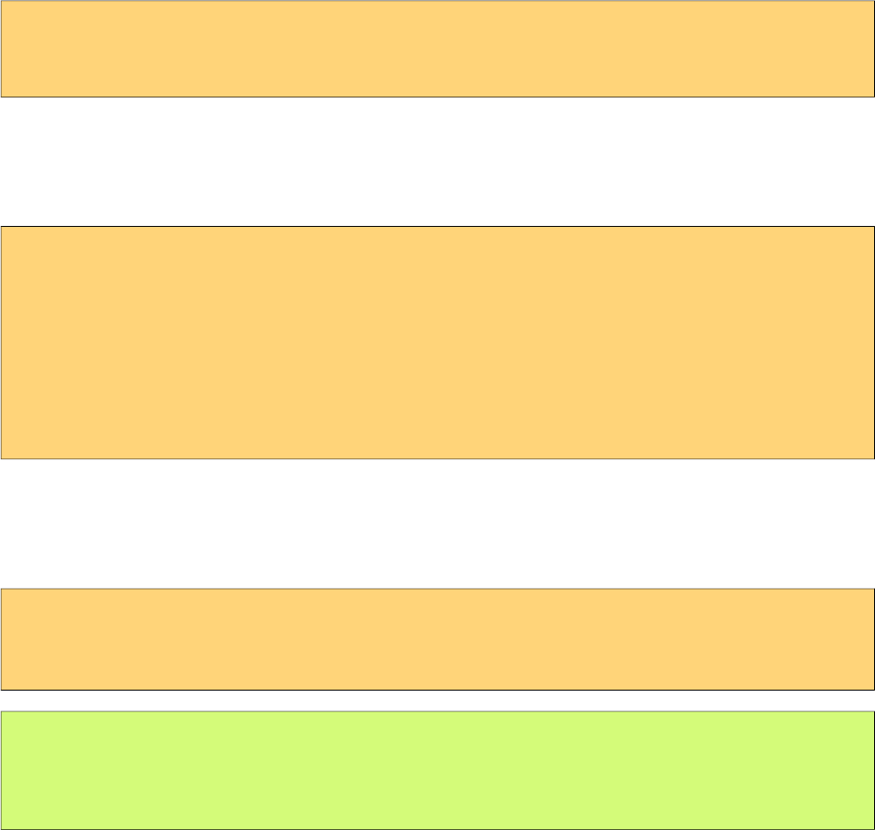
Name Default Description
THEME omega Theme of the application.
mobile.THEME null Theme of the mobile application.
PUSH_SERVER_URL null Custom server url for PrimeFaces Push.
SUBMIT full Defines ajax submit mode, full or partial.
DIR ltr Defines orientation, ltr or rtl.
RESET_VALUES false When enabled, ajax updated inputs are reset.
SECRET primefaces Secret key to encrypt-decrypt value expressions exposed
in rendering StreamedContents.
CLIENT_SIDE_VALIDATION false Controls client side validatation.
UPLOADER auto Defines uploader mode; auto, native or commons.
TRANSFORM_METADATA false Transforms bean validation metadata to html attributes.
LEGACY_WIDGET_
NAMESPACE
false Enables window scope so that widgets can be accessed
using widgetVar.method() in addition to default PF
namespace approach like PF('widgetVar').method().
FONT_AWESOME false Enabled font-awesome icons.
INTERPOLATE_CLIENT_SID
E_VALIDATION_MESSAGES
false Whether to load the CSV messages from server.
2.4 Hello World
Once you have added the primefaces jar to your classpath, you need to add the PrimeFaces
namespace to your page to begin using the components. Here is a simple page like test.xhtml;
13

PrimeFaces User Guide
<!DOCTYPE html>
<html xmlns="http://www.w3c.org/1999/xhtml"
xmlns:h="http://xmlns.jcp.org/jsf/html"
xmlns:p="http://primefaces.org/ui">
<h:head></h:head>
<h:body>
<p:editor />
</h:body>
</html>
When you run this page through Faces Servlet mapping e.g. *.jsf, you should see a rich text editor
when you run the page with test.jsf.
14
PrimeFaces User Guide
3. Component Suite
3.1 AccordionPanel
AccordionPanel is a container component that displays content in stacked format.
Info
Tag accordionPanel
Component Class org.primefaces.component.accordionpanel.Accordionpanel
Component Type org.primefaces.component.AccordionPanel
Component Family org.primefaces.component
Renderer Type org.primefaces.component.AccordionPanelRenderer
Renderer Class org.primefaces.component.accordionpanel.AccordionPanelRenderer
Attributes
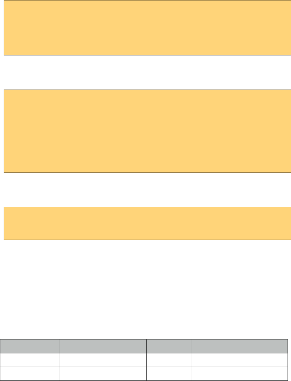
Name Default Type Description
id null String Unique identifier of the component
rendered true boolean Boolean value to specify the rendering of the component.
binding null Object An EL expression that maps to a server side
UIComponent instance in a backing bean.
activeIndex false String Index of the active tab or a comma separated string of
indexes when multiple mode is on.
15
PrimeFaces User Guide
Name Default Type Description
style null String Inline style of the container element.
styleClass null String Style class of the container element.
onTabChange null String Client side callback to invoke when an inactive tab is
clicked.
onTabShow null String Client side callback to invoke when a tab gets activated.
onTabClose null String Client side callback to invoke when a tab is closed.
dynamic false Boolean Defines the toggle mode.
cache true Boolean Defines if activating a dynamic tab should load the
contents from server again.
value null List List to iterate to display dynamic number of tabs.
var null String Name of iterator to use in a dynamic number of tabs.
multiple false Boolean Controls multiple selection.
dir ltr String Defines text direction, valid values are ltr and rtl.
prependId true Boolean AccordionPanel is a naming container thus prepends its
id to its children by default, a false value turns this
behavior off except for dynamic tabs.
widgetVar null String Name of the client side widget.
tabindex 0 String Position of the headers in the tabbing order.
tabController null MethodEx
pr
Server side listener to decide whether a tab change or tab
close should be allowed.
Getting Started with Accordion Panel
Accordion panel consists of one or more tabs and each tab can group any content. Titles can also be
defined with “title” facet.
<p:accordionPanel>
<p:tab title="First Tab Title">
<h:outputText value= "Lorem"/>
...More content for first tab
</p:tab>
<p:tab title="Second Tab Title">
<h:outputText value="Ipsum" />
</p:tab>
//any number of tabs
</p:accordionPanel>
16
PrimeFaces User Guide
Dynamic Content Loading
AccordionPanel supports lazy loading of tab content, when dynamic option is set true, only active
tab contents will be rendered to the client side and clicking an inactive tab header will do an ajax
request to load the tab contents.
This feature is useful to reduce bandwidth and speed up page loading time. By default activating a
previously loaded dynamic tab does not initiate a request to load the contents again as tab is cached.
To control this behavior use cache option.
<p:accordionPanel dynamic="true">
//..tabs
</p:accordionPanel>
Client Side Callbacks
onTabChange is called before a tab is shown and onTabShow is called after. Both receive container
element of the tab to show as the parameter.
<p:accordionPanel onTabChange="handleChange(panel)">
//..tabs
</p:accordionPanel>
<script type="text/javascript">
function handleChange(panel) {
//panel: new tab content container
}
</script>
Ajax Behavior Events
tabChange and tabClose are the ajax behavior events of accordion panel. An example with
tabChange would be;
<p:accordionPanel>
<p:ajax event=”tabChange” listener=”#{bean.onChange}” />
</p:accordionPanel>
public void onChange(TabChangeEvent event) {
//Tab activeTab = event.getTab();
//...
}
Your listener(if defined) will be invoked with an org.primefaces.event.TabChangeEvent instance
that contains a reference to the new active tab and the accordion panel itself. Similarly
org.primefaces.event.TabCloseEvent is passed to the listener of tabClose event when an active tab is
closed.
Dynamic Number of Tabs
When the tabs to display are not static, use the built-in iteration feature similar to ui:repeat.
17
PrimeFaces User Guide
<p:accordionPanel value=”#{bean.list}” var=”listItem”>
<p:tab title="#{listItem.propertyA}">
<h:outputText value= "#{listItem.propertyB}"/>
...More content
</p:tab>
</p:accordionPanel>
Disabled Tabs
A tab can be disabled by setting disabled attribute to true.
<p:accordionPanel>
<p:tab title="First Tab Title" disabled=”true”>
<h:outputText value= "Lorem"/>
...More content for first tab
</p:tab>
<p:tab title="Second Tab Title">
<h:outputText value="Ipsum" />
</p:tab>
//any number of tabs
</p:accordionPanel>
Multiple Selection
By default, only one tab at a time can be active, enable multiple mode to activate multiple tabs.
<p:accordionPanel multiple=”true”>
//tabs
</p:accordionPanel>
TabController
TabController is a server side listener that can be utilized to decide if a client side tab change or tab
close action is allowed. When one of these two events occur, an ajax call is made to invoke the tab
controller, then the boolean return value of this controller is sent back to click to decide if the event
should be performed. An example use case is disallowing tab change if current tab has invalid
inputs.
Client Side API
Widget: PrimeFaces.widget.AccordionPanel
Method Params Return Type Description
select(index) index: Index of tab void Activates tab with given index.
unselect(index) index: Index of tab void Deactivates tab with given index.
Skinning
AccordionPanel resides in a main container element which style and styleClass options apply. As
skinning style classes are global, see the main theming section for more information. Following is
the list of structural style classes;
18
PrimeFaces User Guide
Class Applies
.ui-accordion Main container element
.ui-accordion-header Tab header
.ui-accordion-content Tab content
19
PrimeFaces User Guide
3.2 AjaxBehavior
AjaxBehavior is an extension to standard f:ajax.
Info
Tag ajax
Behavior Id org.primefaces.component.AjaxBehavior
Behavior Class org.primefaces.component.behavior.ajax.AjaxBehavior
Attributes
Name Default Type Description
listener null Method
Expr
Method to process in partial request.
immediate false boolean Boolean value that determines the phaseId, when true
actions are processed at apply_request_values, when false
at invoke_application phase.
async false Boolean When set to true, ajax requests are not queued.
process null String Component(s) to process in partial request.
update null String Component(s) to update with ajax.
onstart null String Callback to execute before ajax request is begins.
oncomplete null String Callback to execute when ajax request is completed.
onsuccess null String Callback to execute when ajax request succeeds.
onerror null String Callback to execute when ajax request fails.
global true Boolean Global ajax requests are listened by ajaxStatus component,
setting global to false will not trigger ajaxStatus.
delay null String If less than delay milliseconds elapses between calls to
request() only the most recent one is sent and all other
requests are discarded. If this option is not specified, or if
the value of delay is the literal string 'none' without the
quotes, no delay is used.
partialSubmit false Boolean Enables serialization of values belonging to the partially
processed components only.
partialSubmitFilter null String Selector to use when partial submit is on, default is ":input"
to select all descendant inputs of a partially processed
components.
disabled false Boolean Disables ajax behavior.
20
PrimeFaces User Guide
Name Default Type Description
event null String Client side event to trigger ajax request.
resetValues false Boolean If true, local values of input components to be updated
within the ajax request would be reset.
ignoreAutoUpdate false Boolean If true, components which autoUpdate="true" will not be
updated for this request. If not specified, or the value is
false, no such indication is made.
form null String Form to serialize for an ajax request. Default is the
enclosing form.
skipChildren true Boolean Containers components like, datatable, panel, tabview skip
their children if the request owner is them. For example,
sort, page event of a datatable. As children are skipped,
input values get lost, assume a case with a datatable and
inputs components in a column. Sorting the column
discards the changes and data is sorted according to
original value. Setting skipChildren to false, enabled input
values to update the value and sorting to be happened with
user values.
Getting Started with AjaxBehavior
AjaxBehavior is attached to the component to ajaxify.
<h:inputText value="#{bean.text}">
<p:ajax update="out" />
</h:inputText>
<h:outputText id="out" value="#{bean.text}" />
In the example above, each time the input changes, an ajax request is sent to the server. When the
response is received output text with id "out" is updated with value of the input.
Listener
In case you need to execute a method on a backing bean, define a listener;
<h:inputText id="counter">
<p:ajax update="out" listener="#{counterBean.increment}"/>
</h:inputText>
<h:outputText id="out" value="#{counterBean.count}" />
21

PrimeFaces User Guide
public class CounterBean {
private int count;
//getter setter
public void increment() {
count++;
}
}
Events
Default client side events are defined by components that support client behaviors, for input
components it is onchange and for command components it is onclick. In order to override the dom
event to trigger the ajax request use event option. In following example, ajax request is triggered
when key is up on input field.
<h:inputText id="firstname" value="#{bean.text}">
<p:ajax update="out" event="keyup"/>
</h:inputText>
<h:outputText id="out" value="#{bean.text}" />
22
PrimeFaces User Guide
AjaxExceptionHandler is a utility component for the built-in ExceptionHandler.
Info
Tag ajaxExceptionHandler
Component Class org.primefaces.component.ajaxexceptionhandler.AjaxExceptionHandler
Component Type org.primefaces.component.AjaxExceptionHandler
Component Family org.primefaces.component
Attributes
Name Default Type Description
id null String Unique identifier of the component.
rendered true Boolean Boolean value to specify the rendering of the
component.
binding null Object An el expression that maps to a server side
UIComponent instance in a backing bean
onexception null String Client side callback to execute after a exception
with this type occured.
update null String Components to update after a exception with this
type occured.
type null String Exception type to handle.
Getting Started with AjaxExceptionHandler
Find the detailed information about this component at ExceptionHandler section at Utilities chapter.
23
PrimeFaces User Guide
3.4 AjaxStatus
AjaxStatus is a global notifier for ajax requests.
Info
Tag ajaxStatus
Component Class org.primefaces.component.ajaxstatus.AjaxStatus
Component Type org.primefaces.component.AjaxStatus
Component Family org.primefaces.component
Renderer Type org.primefaces.component.AjaxStatusRenderer
Renderer Class org.primefaces.component.ajaxstatus.AjaxStatusRenderer
Attributes
Name Default Type Description
id null String Unique identifier of the component.
rendered true Boolean Boolean value to specify the rendering of the
component.
binding null Object An el expression that maps to a server side
UIComponent instance in a backing bean
onstart null String Client side callback to execute after ajax requests
start.
oncomplete null String Client side callback to execute after ajax requests
complete.
onsuccess null String Client side callback to execute after ajax requests
completed succesfully.
onerror null String Client side callback to execute when an ajax
request fails.
style null String Inline style of the component.
styleClass null String Style class of the component.
widgetVar null String Name of the client side widget.
24

PrimeFaces User Guide
Getting Started with AjaxStatus
AjaxStatus uses facets to represent the request status. Most common used facets are start and
complete. Start facet will be visible once ajax request begins and stay visible until it’s completed.
Once the ajax response is received and page is updated, start facet gets hidden and complete facet
shows up.
<p:ajaxStatus>
<f:facet name="start">
<p:graphicImage value="ajaxloading.gif" />
</f:facet>
<f:facet name="complete">
<h:outputText value="Done!" />
</f:facet>
</p:ajaxStatus>
Events
Here is the full list of available event names;
default: Initially visible when page is loaded.
start: Before ajax request begins.
success: When ajax response is received without error.
error: When ajax response is received with an http error.
complete: When everything finishes.
<p:ajaxStatus>
<f:facet name="error">
<h:outputText value="Error" />
</f:facet>
<f:facet name="success">
<h:outputText value="Success" />
</f:facet>
<f:facet name="default">
<h:outputText value="Idle" />
</f:facet>
<f:facet name="start">
<h:outputText value="Sending" />
</f:facet>
<f:facet name="complete">
<h:outputText value="Done" />
</f:facet>
</p:ajaxStatus>
Custom Events
Facets are the declarative way to use, if you’d like to implement advanced cases with scripting you
can take advantage of on* callbacks which are the event handler counterparts of the facets.
<p:ajaxStatus onstart="alert('Start')" oncomplete="alert('End')"/>
25
PrimeFaces User Guide
A comman usage of programmatic approach is to implement a custom status dialog;
<p:ajaxStatus onstart="PF('status').show()" oncomplete="PF('status').hide()"/>
<p:dialog widgetVar="status" modal="true" closable="false">
Please Wait
</p:dialog>
Client Side API
Widget: PrimeFaces.widget.AjaxStatus
Method Params Return Type Description
trigger(event) event: Name of event. void Triggers given event.
Skinning
AjaxStatus is equipped with style and styleClass. Styling directly applies to a container element
which contains the facets.
<p:ajaxStatus style="width:32px;height:32px" ... />
Tips
• Avoid updating ajaxStatus itself to prevent duplicate facet/callback bindings.
• Provide a fixed width/height to an inline ajaxStatus to prevent page layout from changing.
•Components like commandButton has an attribute (global) to control triggering of AjaxStatus.
• AjaxStatus also supports core JSF ajax requests of f:ajax as well.
26
PrimeFaces User Guide
3.5 AutoComplete
AutoComplete provides live suggestions while an input is being typed.
Info
Tag autoComplete
Component Class org.primefaces.component.autocomplete.AutoComplete
Component Type org.primefaces.component.AutoComplete
Component Family org.primefaces.component
Renderer Type org.primefaces.component.AutoCompleteRenderer
Renderer Class org.primefaces.component.autocomplete.AutoCompleteRenderer
Attributes
Name Default Type Description
id null String Unique identifier of the component.
rendered true Boolean Boolean value to specify the rendering of the
component.
binding null Object An el expression that maps to a server side
UIComponent instance in a backing bean.
value null Object Value of the component than can be either an EL
expression of a literal text.
converter null Object An el expression or a literal text that defines a
converter for the component. When it’s an EL
expression, it’s resolved to a converter instance. In
case it’s a static text, it must refer to a converter id.
27
PrimeFaces User Guide
Name Default Type Description
immediate false Boolean When set true, process validations logic is executed
at apply request values phase for this component.
required false Boolean Marks component as required.
validator null Method
Expr
A method expression that refers to a method
validationg the input.
valueChangeListener null Method
Expr
A method expression that refers to a method for
handling a valuchangeevent.
requiredMessage null String Message to be displayed when required field
validation fails.
converterMessage null String Message to be displayed when conversion fails.
validatorMessage null String Message to be displayed when validation fails.
widgetVar null String Name of the client side widget.
completeMethod null Method
Expr
Method providing suggestions.
var null String Name of the iterator used in pojo based suggestion.
itemLabel null String Label of the item.
itemValue null String Value of the item.
maxResults unlimited Integer Maximum number of results to be displayed.
minQueryLength true Integer Number of characters to be typed before starting to
query.
queryDelay 300 Integer Delay to wait in milliseconds before sending each
query to the server.
forceSelection false Boolean When enabled, autoComplete only accepts input
from the selection list.
scrollHeight null Integer Defines the height of the items viewport.
effect null String Effect to use when showing/hiding suggestions.
effectDuration 400 Integer Duration of effect in milliseconds.
dropdown false Boolean Enables dropdown mode when set true.
panelStyle null String Inline style of the items container element.
panelStyleClass null String Style class of the items container element.
multiple null Boolean When true, enables multiple selection.
accesskey null String Access key that when pressed transfers focus to the
input element.
alt null String Alternate textual description of the input field.
28
PrimeFaces User Guide
Name Default Type Description
autocomplete null String Controls browser autocomplete behavior.
dir null String Direction indication for text that does not inherit
directionality. Valid values are LTR and RTL.
disabled false Boolean Disables input field
label null String A localized user presentable name.
lang null String Code describing the language used in the generated
markup for this component.
maxlength null Integer Maximum number of characters that may be
entered in this field.
onblur null String Client side callback to execute when input element
loses focus.
onchange null String Client side callback to execute when input element
loses focus and its value has been modified since
gaining focus.
onclick null String Client side callback to execute when input element
is clicked.
ondblclick null String Client side callback to execute when input element
is double clicked.
onfocus null String Client side callback to execute when input element
receives focus.
onkeydown null String Client side callback to execute when a key is
pressed down over input element.
onkeypress null String Client side callback to execute when a key is
pressed and released over input element.
onkeyup null String Client side callback to execute when a key is
released over input element.
onmousedown null String Client side callback to execute when a pointer
button is pressed down over input element
onmousemove null String Client side callback to execute when a pointer
button is moved within input element.
onmouseout null String Client side callback to execute when a pointer
button is moved away from input element.
onmouseover null String Client side callback to execute when a pointer
button is moved onto input element.
onmouseup null String Client side callback to execute when a pointer
button is released over input element.
onselect null String Client side callback to execute when text within
input element is selected by user.
29
PrimeFaces User Guide
Name Default Type Description
placeholder null String Specifies a short hint.
readonly false Boolean Flag indicating that this component will prevent
changes by the user.
size null Integer Number of characters used to determine the width
of the input element.
style null String Inline style of the container element.
styleClass null String Style class of the container element.
tabindex null Integer Position of the input element in the tabbing order.
title null String Advisory tooltip informaton.
itemtipMyPosition left top String Position of itemtip corner relative to item.
itemtipAtPosition right bottom String Position of item corner relative to itemtip.
cache false Boolean When enabled autocomplete caches the searched
result list.
cacheTimeout 300000 Integer Timeout value for cached results.
emptyMessage null String Text to display when there is no data to display.
appendTo null String Appends the overlay to the element defined by
search expression. Defaults to document body.
resultsMessage null String Hint text for screen readers to provide information
about the search results.
groupBy null Object Value to group items in categories.
queryEvent keyup String Event to initiate the query, valid options are
"keyup" and "enter".
dropdownMode blank String Specifies the behavior dropdown button. Default
"blank" mode sends an empty string and "current"
mode sends the input value.
autoHighlight true Boolean Highlights the first suggested item automatically.
selectLimit null Integer Limits the multiple selection. Default is unlimited.
inputStyle null String Inline style of the input element.
inputStyleClass null String Style class of the input element.
groupByTooltip null String Tooltip to display on group headers.
my left top String Position of panel with respect to input.
at left bottom String Position of input with respect to panel.
active true Boolean Defines if autocomplete functionality is enabled.
type text String Input field type.
30
PrimeFaces User Guide
Name Default Type Description
moreText ... String The text shown in panel when the suggested list is
greater than maxResults.
Getting Started with AutoComplete
AutoComplete is an input component so it requires a value as usual. Suggestions are loaded by
calling a server side completeMethod that takes a single string parameter which is the text entered.
<p:autoComplete value="#{bean.text}" completeMethod="#{bean.complete}" />
public class Bean {
private String text;
public List<String> complete(String query) {
List<String> results = new ArrayList<String>();
for (int i = 0; i < 10; i++)
results.add(query + i);
return results;
}
//getter setter
}
Pojo Support
Most of the time, instead of simple strings you would need work with your domain objects,
autoComplete supports this common use case with the use of a converter and data iterator.
Following example loads a list of players, itemLabel is the label displayed as a suggestion and
itemValue is the submitted value. Note that when working with pojos, you need to plug-in your own
converter.
<p:autoComplete value="#{playerBean.selectedPlayer}"
completeMethod="#{playerBean.completePlayer}"
var="player"
itemLabel="#{player.name}"
itemValue="#{player}"
converter="playerConverter"/>
31
PrimeFaces User Guide
public class PlayerBean {
private Player selectedPlayer;
public Player getSelectedPlayer() {
return selectedPlayer;
}
public void setSelectedPlayer(Player selectedPlayer) {
this.selectedPlayer = selectedPlayer;
}
public List<Player> complete(String query) {
List<Player> players = readPlayersFromDatasource(query);
return players;
}
}
public class Player {
private String name;
//getter setter
}
Limiting the Results
Number of results shown can be limited, by default there is no limit. When the suggestions exceed
the number of results, a text defined by moreText is displayed to indicate this case. There is no
default action when the moreText is clicked, you need to use moreText ajax behavior event to handle
more results.
<p:autoComplete value="#{bean.text}"
completeMethod="#{bean.complete}"
maxResults="5" />
Minimum Query Length
By default queries are sent to the server and completeMethod is called as soon as users starts typing
at the input text. This behavior is tuned using the minQueryLength attribute.
<p:autoComplete value="#{bean.text}" completeMethod="#{bean.complete}"
minQueryLength="3" />
With this setting, suggestions will start when user types the 3rd character at the input field.
Query Delay
AutoComplete is optimized using queryDelay option, by default autoComplete waits for 300
milliseconds to query a suggestion request, if you’d like to tune the load balance, give a longer
value. Following autoComplete waits for 1 second after user types an input.
<p:autoComplete value="#{bean.text}" completeMethod="#{bean.complete}"
queryDelay="1000" />
32
PrimeFaces User Guide
Custom Content
AutoComplete can display custom content by nesting columns.
<p:autoComplete value="#{autoCompleteBean.selectedPlayer}"
completeMethod="#{autoCompleteBean.completePlayer}"
var="p" itemValue="#{p}" converter="player">
<p:column>
<p:graphicImage value="/images/barca/#{p.photo}" width="40" height="50"/>
</p:column>
<p:column>
#{p.name} - #{p.number}
</p:column>
</p:autoComplete>
Dropdown Mode
When dropdown mode is enabled, a dropdown button is displayed next to the input field.
Depending on dropdownMode configuration, clicking this button will either do a search with an
empty query or search with the current value in input.
<p:autoComplete value="#{bean.text}" completeMethod="#{bean.complete}"
dropdown="true" />
Multiple Selection
AutoComplete supports multiple selection as well, to use this feature set multiple option to true and
define a list as your backend model. Following example demonstrates multiple selection with
custom content support.
<p:autoComplete id="advanced" value="#{autoCompleteBean.selectedPlayers}"
completeMethod="#{autoCompleteBean.completePlayer}"
var="p" itemLabel="#{p.name}" itemValue="#{p}" converter="player"
multiple="true">
<p:column style="width:20%;text-align:center">
<p:graphicImage value="/images/barca/#{p.photo}"/>
</p:column>
<p:column style="width:80%">
#{p.name} - #{p.number}
</p:column>
</p:autoComplete>
33

PrimeFaces User Guide
public class AutoCompleteBean {
private List<Player> selectedPlayers;
//...
}
Caching
Suggestions can be cached on client side so that the same query does not do a request which is
likely to return same suggestions again. To enable this, set cache option to true. There is also a
cacheTimeout option to configure how long it takes to clear a cache automatically.
<p:autoComplete value="#{bean.text}" completeMethod="#{bean.complete}"
cache="true"/>
Ajax Behavior Events
Instead of waiting for user to submit the form manually to process the selected item, you can enable
instant ajax selection by using the itemSelect ajax behavior. Example below demonstrates how to
display a message about the selected item instantly.
<p:autoComplete value="#{bean.text}" completeMethod="#{bean.complete}">
<p:ajax event="itemSelect" listener="bean.handleSelect" update="msg" />
</p:autoComplete>
<p:messages id=”msg” />
public class Bean {
public void handleSelect(SelectEvent event) {
Object item = event.getObject();
FacesMessage msg = new FacesMessage("Selected", "Item:" + item);
}
//...
}
Your listener(if defined) will be invoked with an org.primefaces.event.Select instance that contains a
reference to the selected item. Note that autoComplete also supports events inherited from regular
input text such as blur, focus, mouseover in addition to itemSelect. Similarly, itemUnselect event is
34
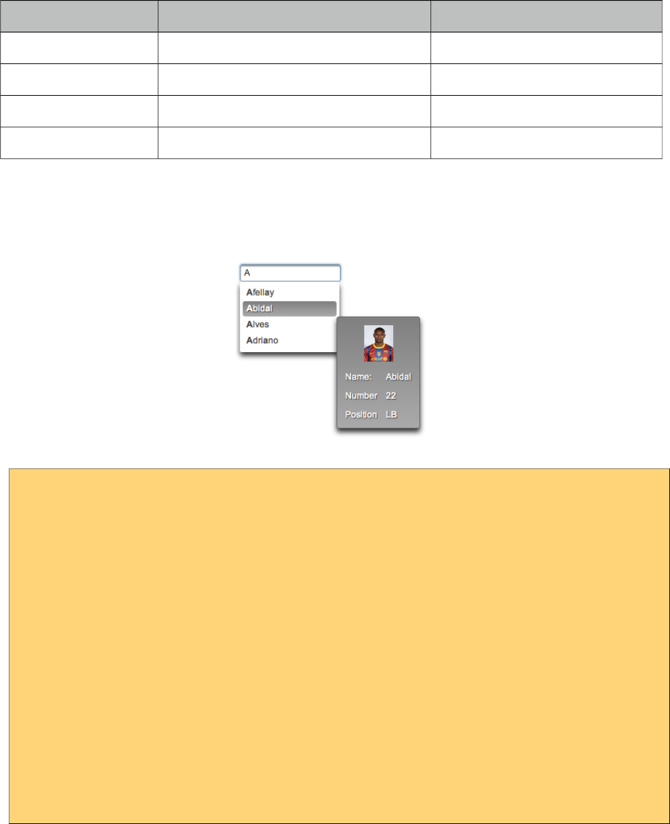
PrimeFaces User Guide
provided for multiple autocomplete when an item is removed by clicking the remove icon. In this
case org.primefaces.event.Unselect instance is passed to a listener if defined.
Event Listener Parameter Fired
itemSelect org.primefaces.event.SelectEvent On item selection.
itemUnselect org.primefaces.event.UnselectEvent On item unselection.
query - On query.
moreText - When moreText is clicked.
ItemTip
Itemtip is an advanced built-in tooltip when mouse is over on suggested items. Content of the
tooltip is defined via the itemtip facet.
<p:autoComplete value="#{autoCompleteBean.selectedPlayer1}" id="basicPojo"
completeMethod="#{autoCompleteBean.completePlayer}"
var="p" itemLabel="#{p.name}" itemValue="#{p}" converter="player">
<f:facet name="itemtip">
<h:panelGrid columns="2" cellpadding="5">
<f:facet name="header">
<p:graphicImage value="/images/barca/#{p.photo}" />
</f:facet>
<h:outputText value="Name: " />
<h:outputText id="modelNo" value="#{p.name}" />
<h:outputText value="Number " />
<h:outputText id="year" value="#{p.number}" />
<h:outputText value="Position " />
<h:outputText value="#{p.position}"/>
</h:panelGrid>
</f:facet>
</p:autoComplete>
Client Side API
Widget: PrimeFaces.widget.AutoComplete
35
PrimeFaces User Guide
Method Params Return Type Description
search(value) value: keyword for search void Initiates a search with given value
close() - void Hides suggested items menu
disable() - void Disables the input field
enable() - void Enables the input field
deactivate() - void Deactivates search behavior
activate() - void Activates search behavior
Skinning
Following is the list of structural style classes;
Class Applies
.ui-autocomplete Container element.
.ui-autocomplete-input Input field.
.ui-autocomplete-panel Container of suggestions list.
.ui-autocomplete-items List of items
.ui-autocomplete-item Each item in the list.
.ui-autocomplete-query Highlighted part in suggestions.
As skinning style classes are global, see the main theming section for more information.
Tips
• Do not forget to use a converter when working with pojos.
• Enable forceSelection if you would like to accept values only from suggested list.
• Increase query delay to avoid unnecessary load to server as a result of user typing fast.
• Use emptyMessage option to provide feedback to the users that there are no suggestions.
• Enable caching to avoid duplicate queries.
36
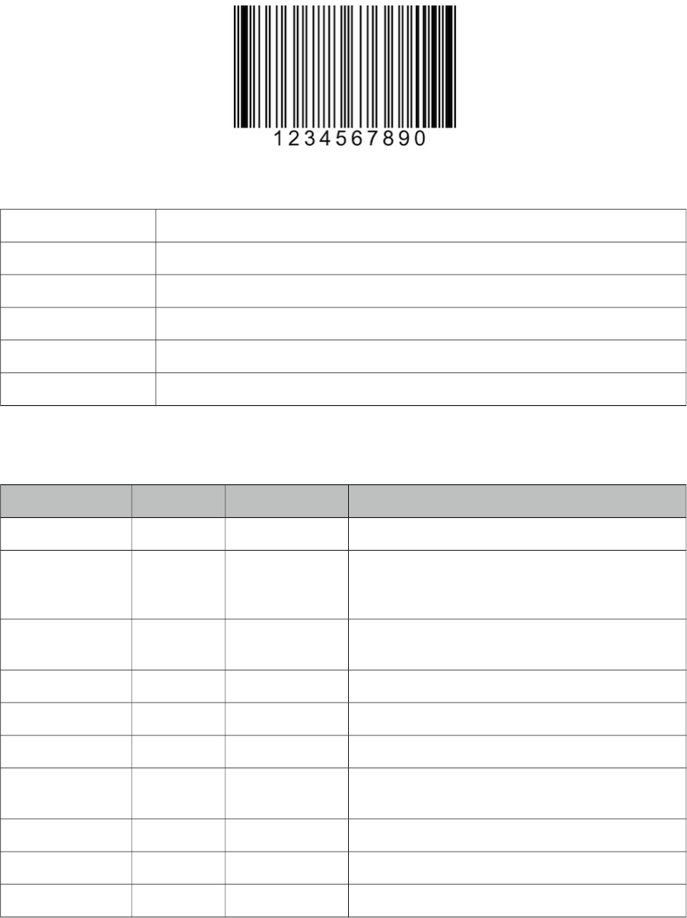
PrimeFaces User Guide
3.6 Barcode
Barcode component is used to display various barcode formats.
Info
Tag barcode
Component Class org.primefaces.component.barcode.Barcode
Component Type org.primefaces.component.Barcode
Component Family org.primefaces.component
Renderer Type org.primefaces.component.BarcodeRenderer
Renderer Class org.primefaces.component.barcode.BarcodeRenderer
Attributes
Name Default Type Description
id null String Unique identifier of the component
rendered true boolean Boolean value to specify the rendering of the
component, when set to false component will not
be rendered.
binding null Object An el expression that maps to a server side
UIComponent instance in a backing bean
value null Object Binary data to stream or context relative path.
type null String Type of the barcode.
cache true Boolean Controls browser caching mode of the resources.
format svg String Format of the generated barcode, valid values are
"svg" (default) and "png".
orientation 0 Integer Orientation in terms of angle. (0, 90, 180, 270)
alt null String Alternate text for the image
url null String Alias to value attribute
37
PrimeFaces User Guide
Name Default Type Description
width null String Width of the image
height null String Height of the image
title null String Title of the image
dir null String Direction of the text displayed
lang null String Language code
ismap false Boolean Specifies to use a server-side image map
usemap null String Name of the client side map
style null String Style of the image
styleClass null String Style class of the image
onclick null String onclick dom event handler
ondblclick null String ondblclick dom event handler
onkeydown null String onkeydown dom event handler
onkeypress null String onkeypress dom event handler
onkeyup null String onkeyup dom event handler
onmousedown null String onmousedown dom event handler
onmousemove null String onmousemove dom event handler
onmouseout null String onmouseout dom event handler
onmouseover null String onmouseover dom event handler
onmouseup null String onmouseup dom event handler
Getting started with Barcode
Barcode type should be provided along with the value to display. Supported formats are;
•int2of5
•codabar
•code39
•code128
•ean8
•ean13
•upca
•postnet
•pdf417
•datamatrix
•qr
<p:barcode value="0123456789" type="int2of5" />
38
PrimeFaces User Guide
Value can also be retrieved from a backend value.
<p:barcode value="#{bean.barcodeValue}" type="int2of5" />
Format
Default display format is svg and other possible option is png. In case the client browser does not
support svg e.g. IE8, barcode automatically chooses png format.
<p:barcode value="#{bean.barcodeValue}" type="int2of5" format="png" />
Orientation
In order to change the orientation, choose the angle from the 4 pre-defined values.
<p:barcode value="#{bean.barcodeValue}" type="int2of5" orientation="90"/>
Dependencies
Barcode component uses barcode4j library underneath except QR code support, which is handled
by qrgen library. Following versions are supported officially.
<dependency>
<groupId>net.glxn</groupId>
<artifactId>qrgen</artifactId>
<version>1.4</version>
</dependency>
<dependency>
<groupId>net.sf.barcode4j</groupId>
<artifactId>barcode4j-light</artifactId>
<version>2.1</version>
</dependency>
* barcode4j 2.1 does not exist in maven central repository so manual installation is necessary for
maven users.
39
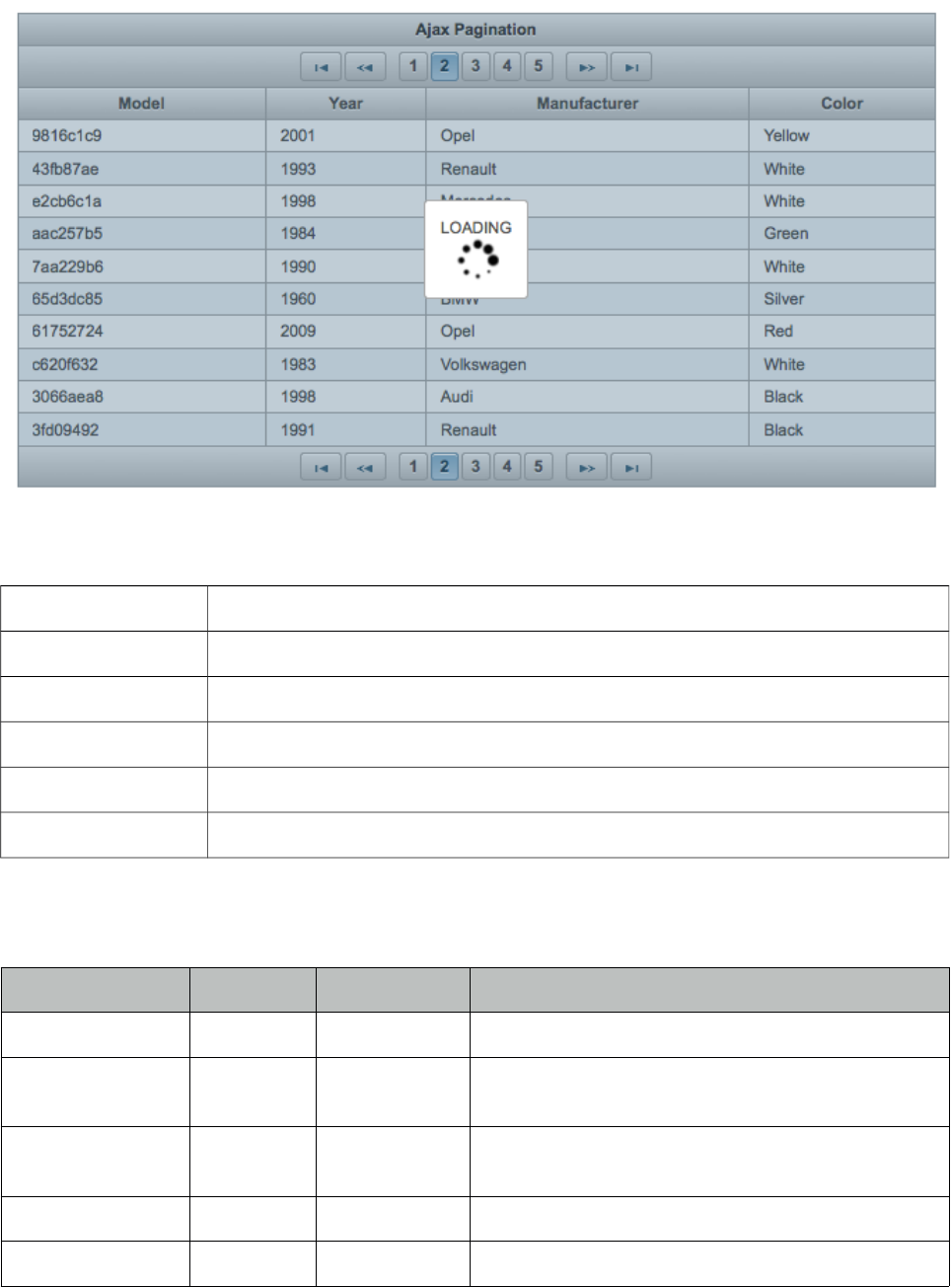
PrimeFaces User Guide
3.7 BlockUI
BlockUI is used to block interactivity of JSF components with optional ajax integration.
Info
Tag blockUI
Component Class org.primefaces.component.blockui.BlockUI
Component Type org.primefaces.component.BlockUI
Component Family org.primefaces.component
Renderer Type org.primefaces.component.BlockUIRenderer
Renderer Class org.primefaces.component.blockui.BlockUIRenderer
Attributes
Name Default Type Description
id null String Unique identifier of the component.
rendered true Boolean Boolean value to specify the rendering of the
component.
binding null Object An el expression that maps to a server side
UIComponent instance in a backing bean
widgetVar null String Name of the client side widget.
trigger null String Identifier of the component(s) to bind.
40
PrimeFaces User Guide
Name Default Type Description
block null String Search expression for block targets.
blocked false Boolean Blocks the UI by default when enabled.
animate true Boolean When disabled, displays block without animation
effect.
styleClass null String Style class of the component.
Getting Started with BlockUI
BlockUI requires trigger and block attributes to be defined. With the special ajax integration, ajax
requests whose source are the trigger components will block the ui onstart and unblock oncomplete.
Example below blocks the ui of the panel when saveBtn is clicked and unblock when ajax response
is received.
<p:panel id="pnl" header="My Panel">
//content
<p:commandButton id="saveBtn" value="Save" />
</p:panel>
<p:blockUI block="pnl" trigger="saveBtn" />
Multiple triggers are defined as a comma separated list. Multiple block targets are also possible
using a search expression.
<p:blockUI block="pnl" trigger="saveBtn,deleteBtn,updateBtn" />
Custom Content
In order to display custom content like a loading text and animation, place the content inside the
blockUI.
<p:dataTable id="dataTable" var="car" value="#{tableBean.cars}"
paginator="true" rows="10">
<p:column>
<f:facet name="header">
<h:outputText value="Model" />
</f:facet>
<h:outputText value="#{car.model}" />
</p:column>
//more columns
</p:dataTable>
<p:blockUI block="dataTable" trigger="dataTable">
LOADING<br />
<p:graphicImage value="/images/ajax-loader.gif"/>
</p:blockUI>
41
PrimeFaces User Guide
Client Side API
Widget: PrimeFaces.widget.BlockUI
Method Params Return Type Description
show() - void Blocks the UI.
hide() - void Unblocks the UI
Skinning
Following is the list of structural style classes;
Class Applies
.ui-blockui Container element.
.ui-blockui-content Container for custom content.
As skinning style classes are global, see the main theming section for more information.
Tips
• BlockUI does not support absolute or fixed positioned components. e.g. dialog.
42
PrimeFaces User Guide
3.8 BreadCrumb
Breadcrumb is a navigation component that provides contextual information about page hierarchy
in the workflow.
Info
Tag breadCrumb
Component Class org.primefaces.component.breadcrumb.BreadCrumb
Component Type org.primefaces.component.BreadCrumb
Component Family org.primefaces.component
Renderer Type org.primefaces.component.BreadCrumbRenderer
Renderer Class org.primefaces.component.breadcrumb.BreadCrumbRenderer
Attributes
Name Default Type Description
id null String Unique identifier of the component.
rendered true Boolean Boolean value to specify the rendering of the
component.
binding null Object An el expression that maps to a server side
UIComponent instance in a backing bean
widgetVar null String Name of the client side widget.
model null MenuModel MenuModel instance to create menus
programmatically
style null String Style of main container element.
styleClass null String Style class of main container
homeDisplay icon String Defines display mode of root link, valid values are
"icon" default and "text".
43
PrimeFaces User Guide
Getting Started with BreadCrumb
Steps are defined as child menuitem components in breadcrumb.
<p:breadCrumb>
<p:menuitem label="Categories" url="#" />
<p:menuitem label="Sports" url="#" />
//more menuitems
</p:breadCrumb>
Dynamic Menus
Menus can be created programmatically as well, see the dynamic menus part in menu component
section for more information and an example.
Options Facet
In order to place custom content inside breadcrumb, options facet is provided. Options facet content
is aligned right by default.
Skinning
Breadcrumb resides in a container element that style and styleClass options apply. Following is the
list of structural style classes;
Style Class Applies
.ui-breadcrumb Main breadcrumb container element.
.ui-breadcrumb .ui-menu-item-link Each menuitem.
.ui-breadcrumb .ui-menu-item-text Each menuitem label.
.ui-breadcrumb-chevron Seperator of menuitems.
As skinning style classes are global, see the main theming section for more information.
Tips
• If there is a dynamic flow, use model option instead of creating declarative p:menuitem
components and bind your MenuModel representing the state of the flow.
• Breadcrumb can do ajax/non-ajax action requests as well since p:menuitem has this option. In this
case, breadcrumb must be nested in a form.
•url option is the key for a menuitem, if it is defined, it will work as a simple link. If you’d like to
use menuitem to execute command with or without ajax, do not define the url option.
44
PrimeFaces User Guide
3.9 Button
Button is an extension to the standard h:button component with skinning capabilities.
Info
Tag button
Component Class org.primefaces.component.button.Button
Component Type org.primefaces.component.Button
Component Family org.primefaces.component
Renderer Type org.primefaces.component.ButtonRenderer
Renderer Class org.primefaces.component.button.ButtonRenderer
Attributes
Name Default Type Description
id null String Unique identifier of the component.
rendered true Boolean Boolean value to specify the rendering of the component.
binding null Object An el expression that maps to a server side UIComponent
instance in a backing bean.
widgetVar null String Name of the client side widget.
value null Object Value of the component than can be either an EL expression
of a literal text.
outcome null String Used to resolve a navigation case.
includeViewParams false Boolean Whether to include page parameters in target URI
fragment null String Identifier of the target page which should be scrolled to.
disabled false Boolean Disables button.
accesskey null String Access key that when pressed transfers focus to button.
alt null String Alternate textual description.
dir null String Direction indication for text that does not inherit
directionality. Valid values are LTR and RTL.
image null String Style class for the button icon. (deprecated: use icon)
lang null String Code describing the language used in the generated markup
45
PrimeFaces User Guide
Name Default Type Description
for this component.
onblur null String Client side callback to execute when button loses focus.
onchange null String Client side callback to execute when button loses focus and
its value has been modified since gaining focus.
onclick null String Client side callback to execute when button is clicked.
ondblclick null String Client side callback to execute when button is double
clicked.
onfocus null String Client side callback to execute when button receives focus.
onkeydown null String Client side callback to execute when a key is pressed down
over button.
onkeypress null String Client side callback to execute when a key is pressed and
released over button.
onkeyup null String Client side callback to execute when a key is released over
button.
onmousedown null String Client side callback to execute when a pointer button is
pressed down over button.
onmousemove null String Client side callback to execute when a pointer button is
moved within button
onmouseout null String Client side callback to execute when a pointer button is
moved away from button.
onmouseover null String Client side callback to execute when a pointer button is
moved onto button.
onmouseup null String Client side callback to execute when a pointer button is
released over button.
style null String Inline style of the button.
styleClass null String Style class of the button.
tabindex null Integer Position in the tabbing order.
title null String Advisory tooltip informaton.
href null String Resource to link directly to implement anchor behavior.
icon null String Icon of the button.
iconPos left String Position of the button icon.
target _self String The window target.
escape true Boolean Defines whether label would be escaped or not.
inline false String Displays as inline instead of 100% width, mobile only.
disableClientWindow false Boolean Disable appending the ClientWindow
46
PrimeFaces User Guide
Name Default Type Description
on the rendering of this element.
Getting Started with Button
p:button usage is same as standard h:button, an outcome is necessary to navigate using GET
requests. Assume you are at source.xhtml and need to navigate target.xhtml.
<p:button outcome="target" value="Navigate"/>
Parameters
Parameters in URI are defined with nested <f:param /> tags.
<p:button outcome="target" value="Navigate">
<f:param name="id" value="10" />
</p:button>
Icons
Icons for button are defined via css and icon attribute, if you use title instead of value, only icon
will be displayed and title text will be displayed as tooltip on mouseover. You can also use icons
from PrimeFaces themes such ui-icon-check.
<p:button outcome="target" icon="star" value="With Icon"/>
<p:button outcome="target" icon="star" title="With Icon"/>
.star {
background-image: url("images/star.png");
}
Skinning
Button renders a button tag which style and styleClass applies. As skinning style classes are global,
see the main theming section for more information. Following is the list of structural style classes;
Style Class Applies
.ui-button Button element
.ui-button-text-only Button element when icon is not used
.ui-button-text Label of button
47
PrimeFaces User Guide
3.10 Cache
Cache component is used to reduce page load time by caching the content after initial rendering.
Info
Tag cache
Component Class org.primefaces.component.cache.UICache
Component Type org.primefaces.component.Cache
Component Family org.primefaces.component
Renderer Type org.primefaces.component.UICacheRenderer
Renderer Class org.primefaces.component.cache.UICacheRenderer
Attributes
Name Default Type Description
id null String Unique identifier of the component.
rendered true Boolean Boolean value to specify the rendering of the component,
when set to false component will not be rendered.
binding null Object An el expression that maps to a server side UIComponent
instance in a backing bean.
disabled false Boolean Disables caching.
region View Id String Unique id of the cache region, defaults to view id.
key null String Unique id of the cache entry in region, defaults to client id of
component.
processEvents false Boolean When enabled, lifecycle events such as button actions are
executed.
Getting Started with Cache
A cache store is required to use the cache component, two different providers are supported as cache
implementation; EHCache and Hazelcast. Provider is configured via a context-param.
<context-param>
<param-name>primefaces.CACHE_PROVIDER</param-name>
<param-value>org.primefaces.cache.EHCacheProvider</param-value>
</context-param>
Here is a sample ehcache.xml to configure cache regions, there are two regions in this
configuration.
48

PrimeFaces User Guide
<?xml version="1.0" encoding="UTF-8"?>
<ehcache xmlns:xsi="http://www.w3.org/2001/XMLSchema-instance"
xsi:noNamespaceSchemaLocation="ehcache.xsd"
updateCheck="true" monitoring="autodetect"
dynamicConfig="true">
<diskStore path="java.io.tmpdir"/>
<defaultCache
maxEntriesLocalHeap="10000"
eternal="false"
timeToIdleSeconds="120"
timeToLiveSeconds="120"
diskSpoolBufferSizeMB="30"
maxEntriesLocalDisk="10000000"
diskExpiryThreadIntervalSeconds="120"
memoryStoreEvictionPolicy="LRU">
<persistence strategy="localTempSwap"/>
</defaultCache>
<cache name="testcache"
maxEntriesLocalHeap="10000"
eternal="false"
timeToIdleSeconds="120"
timeToLiveSeconds="120"
diskSpoolBufferSizeMB="30"
maxEntriesLocalDisk="10000000"
diskExpiryThreadIntervalSeconds="120"
memoryStoreEvictionPolicy="LRU">
<persistence strategy="localTempSwap"/>
</cache>
</ehcache>
After the configuration, at UI side, the cached part needs to be wrapped inside the p:cache
component.
<p:cache>
//content to cache
</p:cache>
Once the page is loaded initially, content inside p:cache component is cached inside the cache
region of the cache provider. Postbacks on the same page or reopening the page retrieve the output
from cache instead of rendering the content regularly.
Cache Provider API
CacheProvider can be accessed via;
RequestContext.getCurrentInstance().getApplicationContext().getCacheProvider()
For example using this API, all cache regions can be cleaned using clear() method. Refer to javadoc
of CacheProvider for the full list of available methods.
49
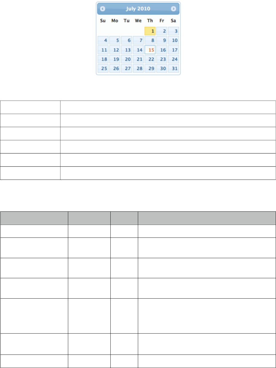
PrimeFaces User Guide
3.11 Calendar
Calendar is an input component used to select a date featuring display modes, paging, localization,
ajax selection and more.
Info
Tag calendar
Component Class org.primefaces.component.calendar.Calendar
Component Type org.primefaces.component.Calendar
Component Family org.primefaces.component
Renderer Type org.primefaces.component.CalendarRenderer
Renderer Class org.primefaces.component.calendar.CalendarRenderer
Attributes
Name Default Type Description
id null String Unique identifier of the component
rendered true Boolean Boolean value to specify the rendering of the
component.
binding null Object An el expression that maps to a server side
UIComponent instance in a backing bean
value null java.util
.Date
Value of the component
converter null Convert
er/Strin
g
An el expression or a literal text that defines a
converter for the component. When it’s an EL
expression, it’s resolved to a converter instance. In
case it’s a static text, it must refer to a converter id
immediate false Boolean When set true, process validations logic is executed
at apply request values phase for this component.
required false Boolean Marks component as required
50
PrimeFaces User Guide
Name Default Type Description
validator null Method
Expr
A method expression that refers to a method
validationg the input
valueChangeListener null Method
Expr
A method expression that refers to a method for
handling a valuchangeevent
requiredMessage null String Message to be displayed when required field
validation fails.
converterMessage null String Message to be displayed when conversion fails.
validatorMessage null String Message to be displayed when validation fails.
widgetVar null String Name of the client side widget.
mindate null Date or
String
Sets calendar's minimum visible date
maxdate null Date or
String
Sets calendar's maximum visible date
pages 1 Integer Enables multiple page rendering.
disabled false Boolean Disables the calendar when set to true.
mode popup String Defines how the calendar will be displayed.
pattern MM/dd/yyyy String DateFormat pattern for localization
locale null Object Locale to be used for labels and conversion.
navigator false Boolean Enables month/year navigator
timeZone null Time
Zone
String or a java.util.TimeZone instance to specify
the timezone used for date conversion, defaults to
TimeZone.getDefault()
readonlyInput false Boolean Makes input text of a popup calendar readonly.
showButtonPanel false Boolean Visibility of button panel containing today and done
buttons.
effect null String Effect to use when displaying and showing the
popup calendar.
effectDuration normal String Duration of the effect.
showOn both String Client side event that displays the popup calendar.
showWeek false Boolean Displays the week number next to each week.
disabledWeekends false Boolean Disables weekend columns.
showOtherMonths false Boolean Displays days belonging to other months.
selectOtherMonths false Boolean Enables selection of days belonging to other
months.
yearRange null String Year range for the navigator, default "c-10:c+10"
51
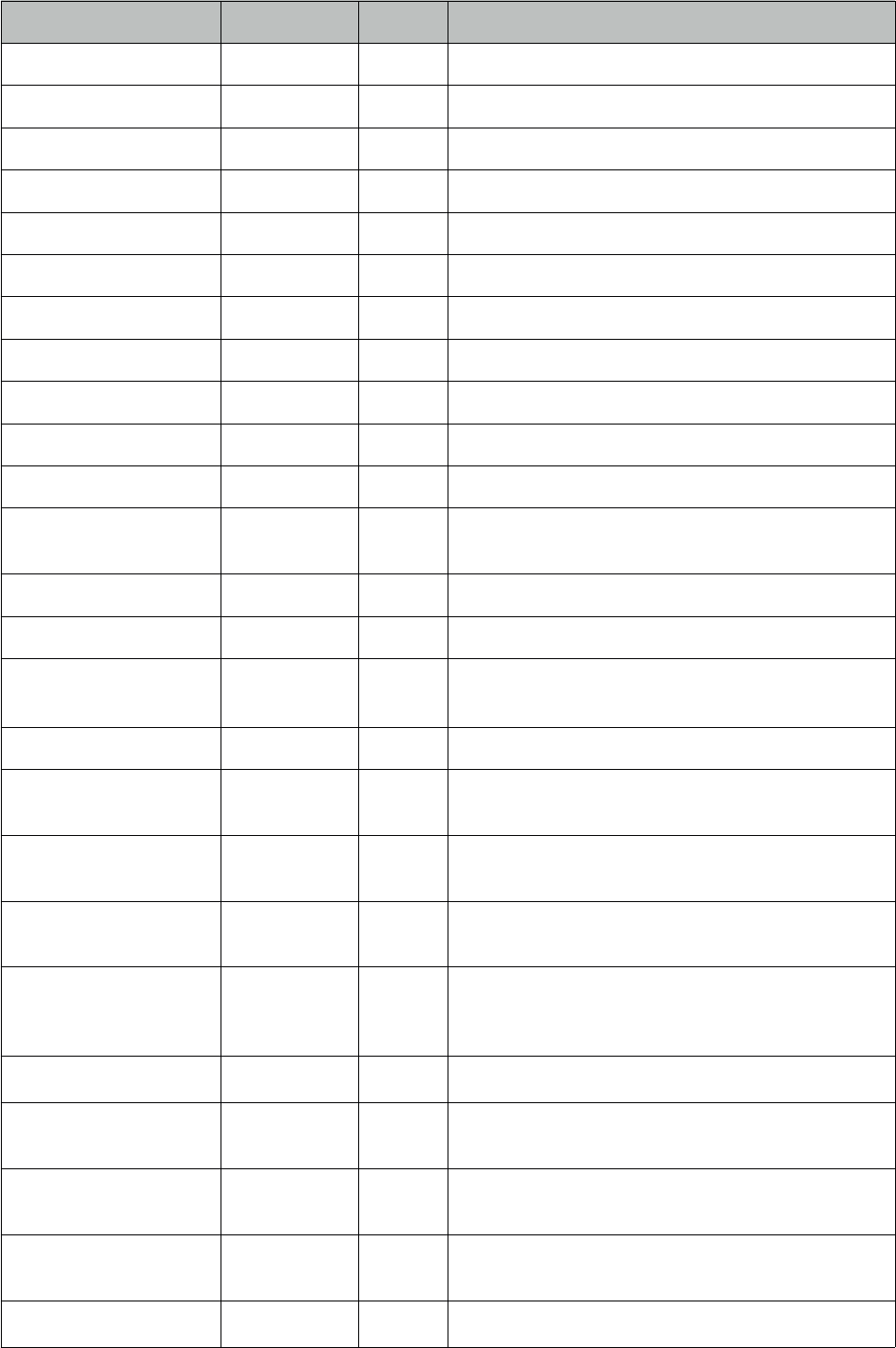
PrimeFaces User Guide
Name Default Type Description
timeOnly false Boolean Shows only timepicker without date.
stepHour 1 Integer Hour steps.
stepMinute 1 Integer Minute steps.
stepSecond 1 Integer Second steps.
minHour 0 Integer Minimum boundary for hour selection.
maxHour 23 Integer Maximum boundary for hour selection.
minMinute 0 Integer Minimum boundary for minute selection.
maxMinute 59 Integer Maximum boundary for hour selection.
minSecond 0 Integer Minimum boundary for second selection.
maxSecond 59 Integer Maximum boundary for second selection.
pagedate null Object Initial date to display if value is null.
accesskey null String Access key that when pressed transfers focus to the
input element.
alt null String Alternate textual description of the input field.
autocomplete null String Controls browser autocomplete behavior.
dir null String Direction indication for text that does not inherit
directionality. Valid values are LTR and RTL.
label null String A localized user presentable name.
lang null String Code describing the language used in the generated
markup for this component.
maxlength null Integer Maximum number of characters that may be
entered in this field.
onblur null String Client side callback to execute when input element
loses focus.
onchange null String Client side callback to execute when input element
loses focus and its value has been modified since
gaining focus.
onclick null String Client side callback to execute onclick event.
ondblclick null String Client side callback to execute when input element
is double clicked.
onfocus null String Client side callback to execute when input element
receives focus.
onkeydown null String Client side callback to execute when a key is
pressed down over input element.
onkeypress null String Client side callback to execute when a key is
52

PrimeFaces User Guide
Name Default Type Description
pressed and released over input element.
onkeyup null String Client side callback to execute when a key is
released over input element.
onmousedown null String Client side callback to execute when a pointer
button is pressed down over input element
onmousemove null String Client side callback to execute when a pointer
button is moved within input element.
onmouseout null String Client side callback to execute when a pointer
button is moved away from input element.
onmouseover null String Client side callback to execute when a pointer
button is moved onto input element.
onmouseup null String Client side callback to execute when a pointer
button is released over input element.
onselect null String Client side callback to execute when text within
input element is selected by user.
placeholder null String Specifies a short hint.
readonly false Boolean Flag indicating that this component will prevent
changes by the user.
style null String Inline style of the component.
styleClass null String Style class of the component.
size null Integer Number of characters used to determine the width
of the input element.
tabindex null Integer Position of the input element in the tabbing order.
title null String Advisory tooltip informaton.
beforeShowDay null String Client side callback to execute before displaying a
date, used to customize date display.
mask null String Applies a mask using the pattern.
timeControlType slider String Defines the type of element to use for time picker,
valid values are "slider" and "select".
beforeShow null String Callback to execute before displaying calendar,
element and calendar instance are passed as
parameters
maskSlotChar null String Placeholder in mask template.
maskAutoClear true Boolean Clears the field on blur when incomplete input is
entered
53
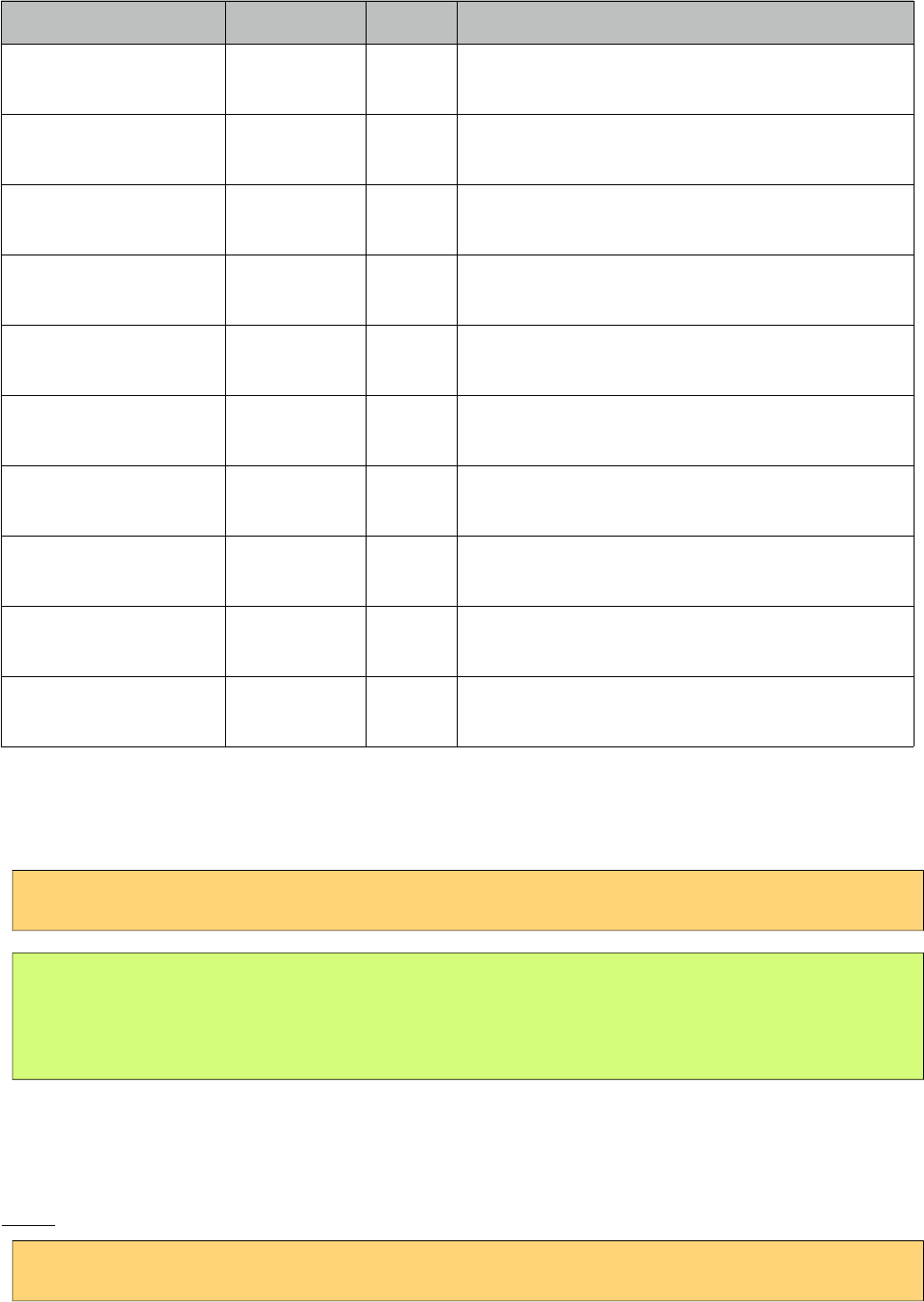
PrimeFaces User Guide
Name Default Type Description
timeControlObject null String Client side object to use in custom
timeControlType.
timeInput false Boolean Allows direct input in time field.
showHour null String Whether to show the hour control.
shıwMinute null String Whether to show the minute control.
showSecond null String Whether to show the second control.
showMillisec null String Whether to show the millisec control
showTodayButton true Boolean Whether to show the "Current Date" button if
showButtonPanel is rendered.
buttonTabindex null String Position of the button in the tabbing order.
inputStyle null String Inline style of the input element. Used when mode
is popup.
inputStyleClass null String Style class of the input element. Used when mode is
popup.
Getting Started with Calendar
Value of the calendar should be a java.util.Date.
<p:calendar value="#{dateBean.date}"/>
public class DateBean {
private Date date;
//Getter and Setter
}
Display Modes
Calendar has two main display modes, popup (default) and inline.
Inline
<p:calendar value="#{dateBean.date}" mode="inline" />
54
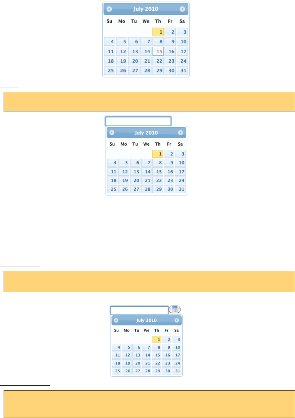
PrimeFaces User Guide
Popup
<p:calendar value="#{dateBean.date}" mode="popup" />
showOn option defines the client side event to display the calendar. Valid values are;
• focus: When input field receives focus
• button: When popup button is clicked
•both: Both focus and button cases
Popup Button
<p:calendar value="#{dateBean.date}" mode="popup" showOn="button" />
Popup Icon Only
<p:calendar value="#{dateBean.date}" mode="popup"
showOn="button" popupIconOnly="true" />
55
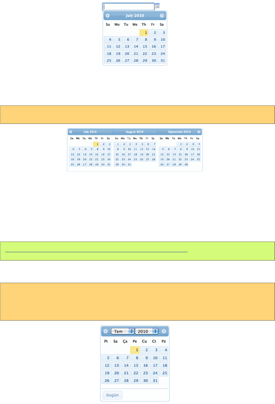
PrimeFaces User Guide
Paging
Calendar can also be rendered in multiple pages where each page corresponds to one month. This
feature is tuned with the pages attribute.
<p:calendar value="#{dateController.date}" pages="3"/>
Localization
By default locale information is retrieved from the view’s locale and can be overridden by the locale
attribute. Locale attribute can take a locale key as a String or a java.util.Locale instance. Default
language of labels are English and you need to add the necessary translations to your page manually
as PrimeFaces does not include language translations. PrimeFaces Wiki Page for
PrimeFacesLocales is a community driven page where you may find the translations you need.
Please contribute to this wiki with your own translations.
https://code.google.com/p/primefaces/wiki/PrimeFacesLocales
Translation is a simple javascript object, we suggest adding the code to a javascript file and include
in your application. Following is a Turkish calendar.
<h:outputScript name=”path_to_your_translations.js” />
<p:calendar value="#{dateController.date}" locale="tr" navigator="true"
showButtonPanel="true"/>
56
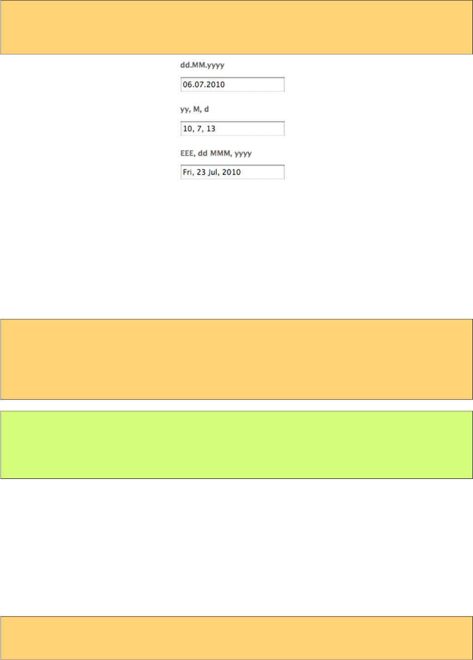
PrimeFaces User Guide
To override calculated pattern from locale, use the pattern option;
<p:calendar value="#{dateController.date1}" pattern="dd.MM.yyyy"/>
<p:calendar value="#{dateController.date2}" pattern="yy, M, d"/>
<p:calendar value="#{dateController.date3}" pattern="EEE, dd MMM, yyyy"/>
Effects
Various effects can be used when showing and hiding the popup calendar, options are; show,
slideDown, fadeIn, blind, bounce, clip, drop, fold and slide.
Ajax Behavior Events
Calendar provides a dateSelect ajax behavior event to execute an instant ajax selection whenever a
date is selected. If you define a method as a listener, it will be invoked by passing an
org.primefaces.event.SelectEvent instance.
<p:calendar value="#{calendarBean.date}">
<p:ajax event=”dateSelect” listener=”#{bean.handleDateSelect}” update=”msg” />
</p:calendar>
<p:messages id="msg" />
public void handleDateSelect(SelectEvent event) {
Date date = (Date) event.getObject();
//Add facesmessage
}
In popup mode, calendar also supports regular ajax behavior events like blur, keyup and more.
Another handy event is the viewChange that is fired when month and year changes. An instance of
org.primefaces.event.DateViewChangeEvent is passed to the event listener providing the current
month and year information.
Date Ranges
Using mindate and maxdate options, selectable dates can be restricted. Values for these attributes
can either be a string or a java.util.Date.
<p:calendar value="#{dateBean.date}" mode="inline"
mindate="07/10/2010" maxdate="07/15/2010"/>
57
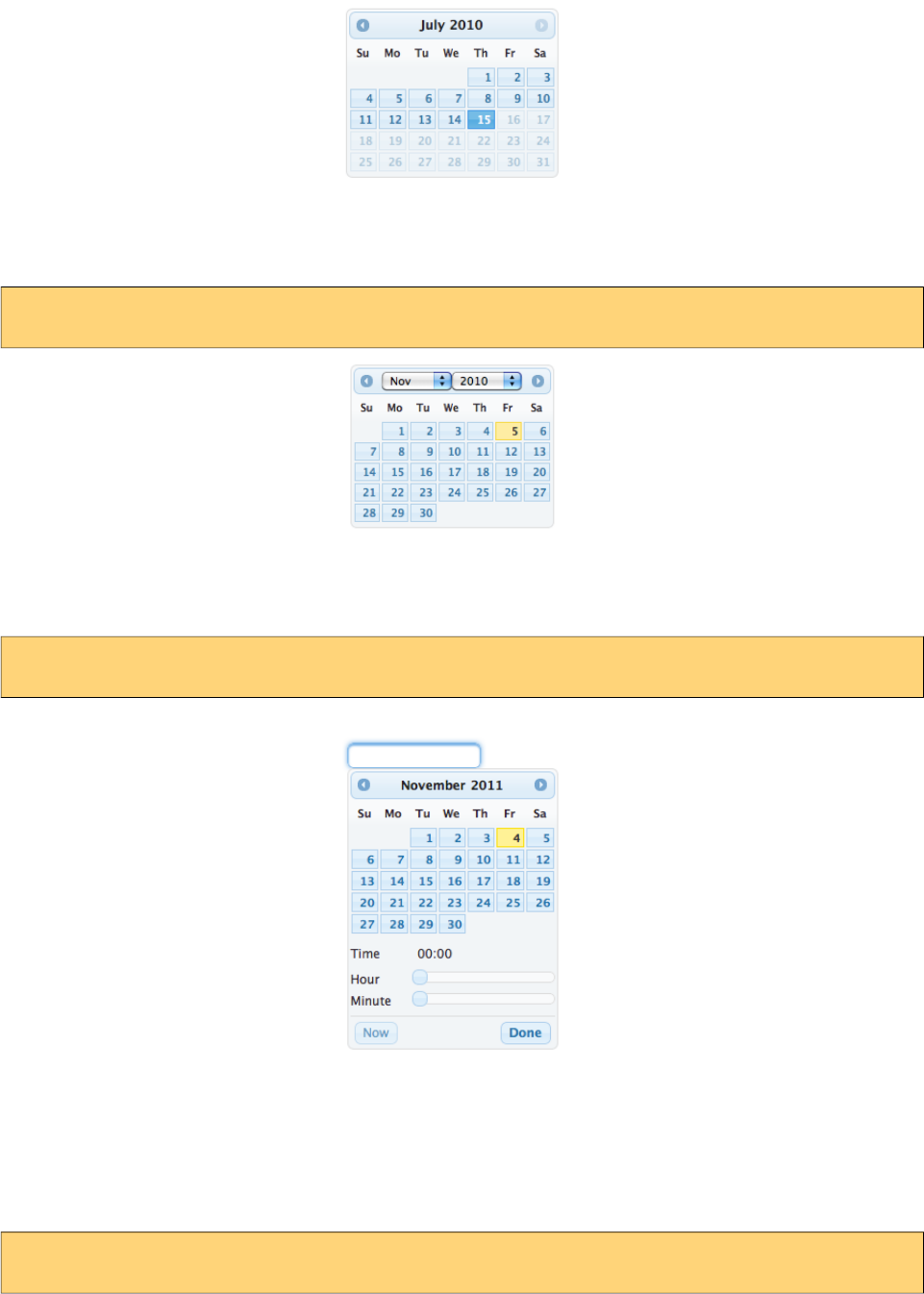
PrimeFaces User Guide
Navigator
Navigator is an easy way to jump between months/years quickly.
<p:calendar value="#{dateBean.date}" mode="inline" navigator="true" />
TimePicker
TimePicker functionality is enabled by adding time format to your pattern.
<p:calendar value="#{dateBean.date}" pattern=”MM/dd/yyyy HH:mm” />
Advanced Customization
Use beforeShowDay javascript callback to customize the look of each date. The function returns an
array with two values, first one is flag to indicate if date would be displayed as enabled and second
parameter is the optional style class to add to date cell. Following example disabled tuesdays and
fridays.
<p:calendar value="#{dateBean.date}" beforeShowDay="tuesdaysAndFridaysOnly" />
58
PrimeFaces User Guide
Function tuesdaysAndFridaysDisabled(date) {
var day = date.getDay();
return [(day != 2 && day != 5), '']
}
Mask
Calendar has a built-in mask feature similar to the InputMask component. Set mask option to true to
enable mask support.
Client Side API
Widget: PrimeFaces.widget.Calendar
Method Params Return Type Description
getDate() - Date Return selected date
setDate(date) date: Date to display void Sets display date
disable() - void Disables calendar
enable() - void Enables calendar
Skinning
Calendar resides in a container element which style and styleClass options apply.
Following is the list of structural style classes;
Style Class Applies
.ui-datepicker Main container
.ui-datepicker-header Header container
.ui-datepicker-prev Previous month navigator
.ui-datepicker-next Next month navigator
.ui-datepicker-title Title
.ui-datepicker-month Month display
.ui-datepicker-table Date table
.ui-datepicker-week-end Label of weekends
.ui-datepicker-other-month Dates belonging to other months
.ui-datepicker td Each cell date
.ui-datepicker-buttonpane Button panel
.ui-datepicker-current Today button
59

PrimeFaces User Guide
Style Class Applies
.ui-datepicker-close Close button
As skinning style classes are global, see the main theming section for more information.
60
PrimeFaces User Guide
3.12 Captcha
Captcha is a form validation component based on Recaptcha API V2.
Info
Tag captcha
Component Class org.primefaces.component.captcha.Captcha
Component Type org.primefaces.component.Captcha
Component Family org.primefaces.component
Renderer Type org.primefaces.component.CaptchaRenderer
Renderer Class org.primefaces.component.captcha.CaptchaRenderer
Attributes
Name Default Type Description
id null String Unique identifier of the component.
rendered true Boolean Boolean value to specify the rendering of the
component, when set to false component will not
be rendered.
binding null Object An el expression that maps to a server side
UIComponent instance in a backing bean.
value null Object Value of the component than can be either an EL
expression of a literal text.
converter null Converter/Stri
ng
An el expression or a literal text that defines a
converter for the component. When it’s an EL
expression, it’s resolved to a converter instance.
In case it’s a static text, it must refer to a
converter id.
immediate false Boolean When set true, process validations logic is
executed at apply request values phase for this
component.
required false Boolean Marks component as required.
validator null MethodExpr A method binding expression that refers to a
61
PrimeFaces User Guide
Name Default Type Description
method validationg the input.
valueChangeListener null ValueChange
Listener
A method binding expression that refers to a
method for handling a valuchangeevent.
requiredMessage null String Message to be displayed when required field
validation fails.
converterMessage null String Message to be displayed when conversion fails.
validatorMessage null String Message to be displayed when validation fields.
publicKey null String Public recaptcha key for a specific domain
(deprecated)
theme red String Theme of the captcha.
language en String Key of the supported languages.
tabindex null Integer Position of the input element in the tabbing order.
label null String User presentable field name.
callback null String The name of your callback function to be
executed when the user submits a successful
CAPTCHA response. The user's response, g-
recaptcha-response, will be the input for your
callback function.
expired null String Callback executed when the captcha response
expires and the user needs to solve a new captcha.
Getting Started with Captcha
Catpcha is implemented as an input component with a built-in validator that is integrated with
reCaptcha. First thing to do is to sign up to reCaptcha to get public&private keys. Once you have
the keys for your domain, add them to web.xml as follows;
<context-param>
<param-name>primefaces.PRIVATE_CAPTCHA_KEY</param-name>
<param-value>YOUR_PRIVATE_KEY</param-value>
</context-param>
<context-param>
<param-name>primefaces.PUBLIC_CAPTCHA_KEY</param-name>
<param-value>YOUR_PUBLIC_KEY</param-value>
</context-param>
That is it, now you can use captcha as follows;
<p:captcha />
Themes
Captcha features light and dark modes for theme, light is the default one.
62
PrimeFaces User Guide
<p:captcha theme="dark"/>
Languages
Text instructions displayed on captcha is customized with the language attribute. Below is a captcha
with Turkish text.
<p:captcha language="tr"/>
Overriding Validation Messages
By default captcha displays it’s own validation messages, this can be easily overridden by the JSF
message bundle mechanism. Corresponding keys are;
Summary primefaces.captcha.INVALID
Detail primefaces.captcha.INVALID_detail
Tips
• Use label option to provide readable error messages in case validation fails.
•Enable secure option to support https otherwise browsers will give warnings.
•See http://www.google.com/recaptcha/learnmore to learn more about how reCaptcha works.
63
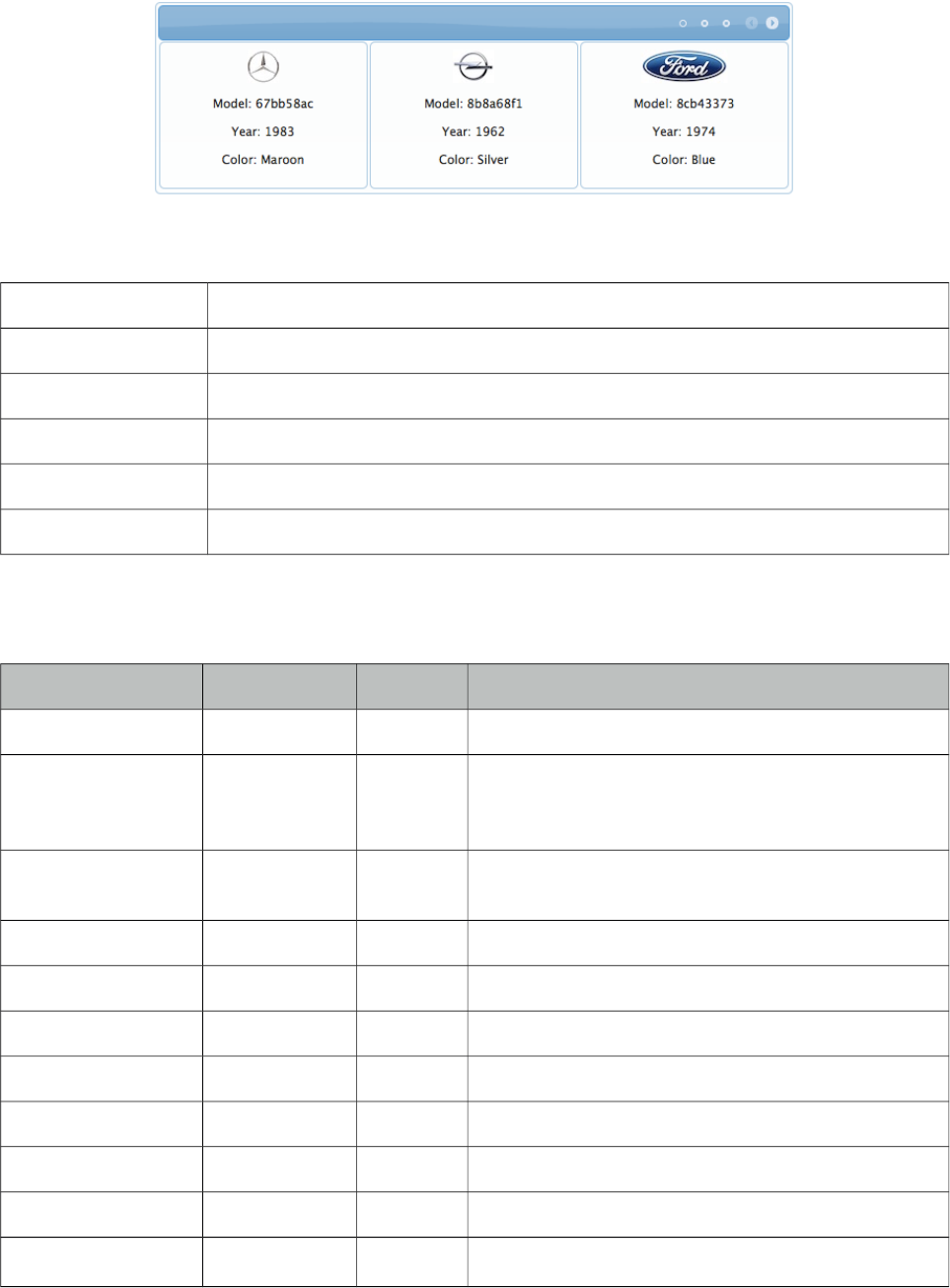
PrimeFaces User Guide
3.13 Carousel
Carousel is a multi purpose component to display a set of data or general content with slide effects.
Info
Tag carousel
Component Class org.primefaces.component.carousel.Carousel
Component Type org.primefaces.component.Carousel
Component Family org.primefaces.component
Renderer Type org.primefaces.component.CarouselRenderer
Renderer Class org.primefaces.component.carousel.CarouselRenderer
Attributes
Name Default Type Description
id null String Unique identifier of the component
rendered true Boolean Boolean value to specify the rendering of the
component, when set to false component will not be
rendered.
binding null Object An el expression that maps to a server side
UIComponent instance in a backing bean
value null Object A value expression that refers to a collection
var null String Name of the request scoped iterator
numVisible 3 Integer Number of visible items per page
firstVisible 0 Integer Index of the first element to be displayed
widgetVar null String Name of the client side widget.
circular false Boolean Sets continuous scrolling
vertical false Boolean Sets vertical scrolling
autoPlayInterval 0 Integer Sets the time in milliseconds to have Carousel start
64
PrimeFaces User Guide
Name Default Type Description
scrolling automatically after being initialized
pageLinks 3 Integer Defines the number of page links of paginator.
effect slide String Name of the animation, could be “fade” or “slide”.
easing easeInOutCirc String Name of the easing animation.
effectDuration 500 Integer Duration of the animation in milliseconds.
dropdownTemplate. {page} String Template string for dropdown of paginator.
style null String Inline style of the component..
styleClass null String Style class of the component..
itemStyle null String Inline style of each item.
itemStyleClass null String Style class of each item.
headerText null String Label for header.
footerText null String Label for footer.
responsive false Boolean In responsive mode, carousel adjusts its content
based on screen size.
breakpoint 560 Integer Breakpoint value in pixels to switch between small
and large viewport.
Getting Started with Carousel
Carousel has two main use-cases; data and general content display. To begin with data iteration let’s
use a list of cars to display with carousel.
public class Car {
private String model;
private int year;
private String manufacturer;
private String color;
...
}
65
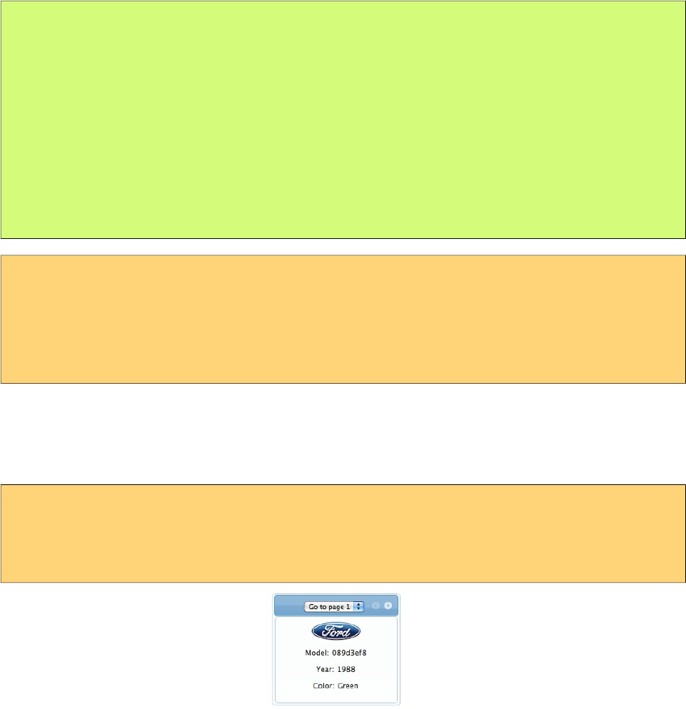
PrimeFaces User Guide
public class CarBean {
private List<Car> cars;
public CarListController() {
cars = new ArrayList<Car>();
cars.add(new Car("myModel", 2005, "ManufacturerX", "blue"));
//add more cars
}
//getter setter
}
<p:carousel value="#{carBean.cars}" var="car">
<p:graphicImage value="/images/cars/#{car.manufacturer}.jpg"/>
<h:outputText value="Model: #{car.model}" />
<h:outputText value="Year: #{car.year}" />
<h:outputText value="Color: #{car.color}" />
</p:carousel>
Carousel iterates through the cars collection and renders it’s children for each car.
Limiting Visible Items
Bu default carousel lists its items in pages with size 3. This is customizable with the rows attribute.
<p:carousel value="#{carBean.cars}" var="car" numVisible="1"
itemStyle="width:200px" >
...
</p:carousel>
Effects
Paging happens with a slider effect by default and following easing options are supported.
• backBoth
• backIn
• backOut
• bounceBoth
• bounceIn
• bounceOut
• easeBoth
• easeBothStrong
• easeIn
• easeInStrong
66
PrimeFaces User Guide
• easeNone
• easeOut
• easeInOutCirc
• easeOutStrong
• elasticBoth
• elasticIn
• elasticOut
SlideShow
Carousel can display the contents in a slideshow, for this purpose autoPlayInterval and circular
attributes are used. Following carousel displays a collection of images as a slideshow.
<p:carousel autoPlayInterval="2000" rows="1" effect="easeInStrong" circular="true"
itemStyle=”width:200px” >
<p:graphicImage value="/images/nature1.jpg"/>
<p:graphicImage value="/images/nature2.jpg"/>
<p:graphicImage value="/images/nature3.jpg"/>
<p:graphicImage value="/images/nature4.jpg"/>
</p:carousel>
Content Display
Another use case of carousel is tab based content display.
67

PrimeFaces User Guide
<p:carousel rows="1" itemStyle="height:200px;width:600px;">
<p:tab title="Godfather Part I">
<h:panelGrid columns="2" cellpadding="10">
<p:graphicImage value="/images/godfather/godfather1.jpg" />
<h:outputText value="The story begins as Don Vito ..." />
</h:panelGrid>
</p:tab>
<p:tab title="Godfather Part II">
<h:panelGrid columns="2" cellpadding="10">
<p:graphicImage value="/images/godfather/godfather2.jpg" />
<h:outputText value="Francis Ford Coppola's ..."/>
</h:panelGrid>
</p:tab>
<p:tab title="Godfather Part III">
<h:panelGrid columns="2" cellpadding="10">
<p:graphicImage value="/images/godfather/godfather3.jpg" />
<h:outputText value="After a break of ..." />
</h:panelGrid>
</p:tab>
</p:carousel>
Item Selection
Sample below selects an item from the carousel and displays details within a dialog.
<h:form id=”form">
<p:carousel value="#{carBean.cars}" var="car" itemStyle=”width:200px” >
<p:graphicImage value="/images/cars/#{car.manufacturer}.jpg"/>
<p:commandLink update=":form:detail" oncomplete="PF('dlg').show()">
<h:outputText value="Model: #{car.model}" />
<f:setPropertyActionListener value="#{car}" target="#{carBean.selected}" />
</p:commandLink>
</p:carousel>
<p:dialog widgetVar="dlg">
<h:outputText id="detail" value="#{carBean.selected}" />
</p:dialog>
</h:form>
public class CarBean {
private List<Car> cars;
private Car selected;
//getters and setters
}
68
PrimeFaces User Guide
Header and Footer
Header and Footer of carousel can be defined in two ways either, using headerText and footerText
options that take simple strings as labels or by header and footer facets that can take any custom
content.
Responsive
When responsive mode is enabled via setting responsive option to true, carousel switches between
small and large viewport depending on the breakpoint value which is 560 by default.
Client Side API
Widget: PrimeFaces.widget.Carousel
Method Params Return Type Description
next() - void Displays next page.
prev() - void Displays previous page.
setPage() index void Displays page with given index.
startAutoplay() - void Starts slideshow.
stopAutoplay() - void Stops slideshow.
Skinning
Carousel resides in a container element which style and styleClass options apply. itemStyle and
itemStyleClass attributes apply to each item displayed by carousel. Following is the list of structural
style classes;
Style Class Applies
.ui-carousel Main container
.ui-carousel-header Header container
.ui-carousel-header-title Header content
.ui-carousel-viewport Content container
.ui-carousel-button Navigation buttons
.ui-carousel-next-button Next navigation button of paginator
.ui-carousel-prev-button Prev navigation button of paginator
.ui-carousel-page-links Page links of paginator.
.ui-carousel-page-link Each page link of paginator.
.ui-carousel-item Each item.
As skinning style classes are global, see the main theming section for more information.
69

PrimeFaces User Guide
3.14 CellEditor
CellEditor is a helper component of datatable used for incell editing.
Info
Tag cellEditor
Component Class org.primefaces.component.celleditor.CellEditor
Component Type org.primefaces.component.CellEditor
Component Family org.primefaces.component
Renderer Type org.primefaces.component.CellEditorRenderer
Renderer Class org.primefaces.component.celleditor.CellEditorRenderer
Attributes
Name Default Type Description
id null String Unique identifier of the component
rendered true Boolean Boolean value to specify the rendering of the
component, when set to false component will not
be rendered.
binding null Object An el expression that maps to a server side
UIComponent instance in a backing bean
Getting Started with CellEditor
See inline editing section in datatable documentation for more information about usage.
70
PrimeFaces User Guide
3.15 Chart
Chart component is a generic graph component to create various types of charts using jqplot library.
Each chart type has its own subsection with code examples and section 3.12.10 documents the full
charting API.
Info
Tag chart
Component Class org.primefaces.component.chart.Chart
Component Type org.primefaces.component.Chart
Component Family org.primefaces.component
Renderer Type org.primefaces.component.ChartRenderer
Renderer Class org.primefaces.component.chart.ChartRenderer
Attributes
Name Default Type Description
id null String Unique identifier of the component
rendered true Boolean Boolean value to specify the rendering of the
component, when set to false component will not
be rendered.
binding null Object An el expression that maps to a server side
UIComponent instance in a backing bean
type null String Type of the chart.
model null ChartModel Model object of data and settings.
style null String Inline style of the component.
styleClass null String Style class of the component.
widgetVar null String Name of the client side widget.
responsive false Boolean In responsive mode, chart is redrawn when
window is resized.
71
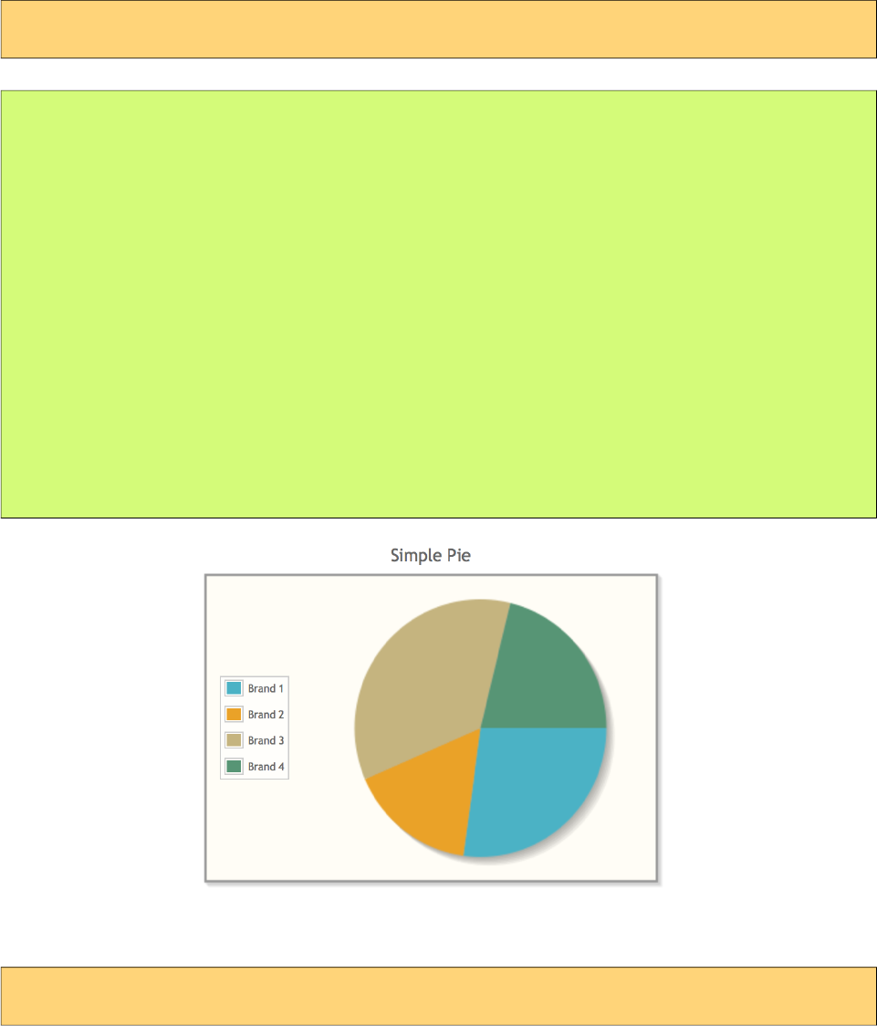
PrimeFaces User Guide
PieChart is created with PieChartModel.
Basic
<p:chart type="pie" model="#{bean.model}" />
public class Bean {
private PieChartModel model;
public Bean() {
model = new PieChartModel();
model.set("Brand 1", 540);
model.set("Brand 2", 325);
model.set("Brand 3", 702);
model.set("Brand 4", 421);
model.setTitle("Simple Pie");
model.setLegendPosition("w");
}
public PieChartModel getModel() {
return model;
}
}
Customized
<p:chart type="pie" model="#{bean.model}" />
72
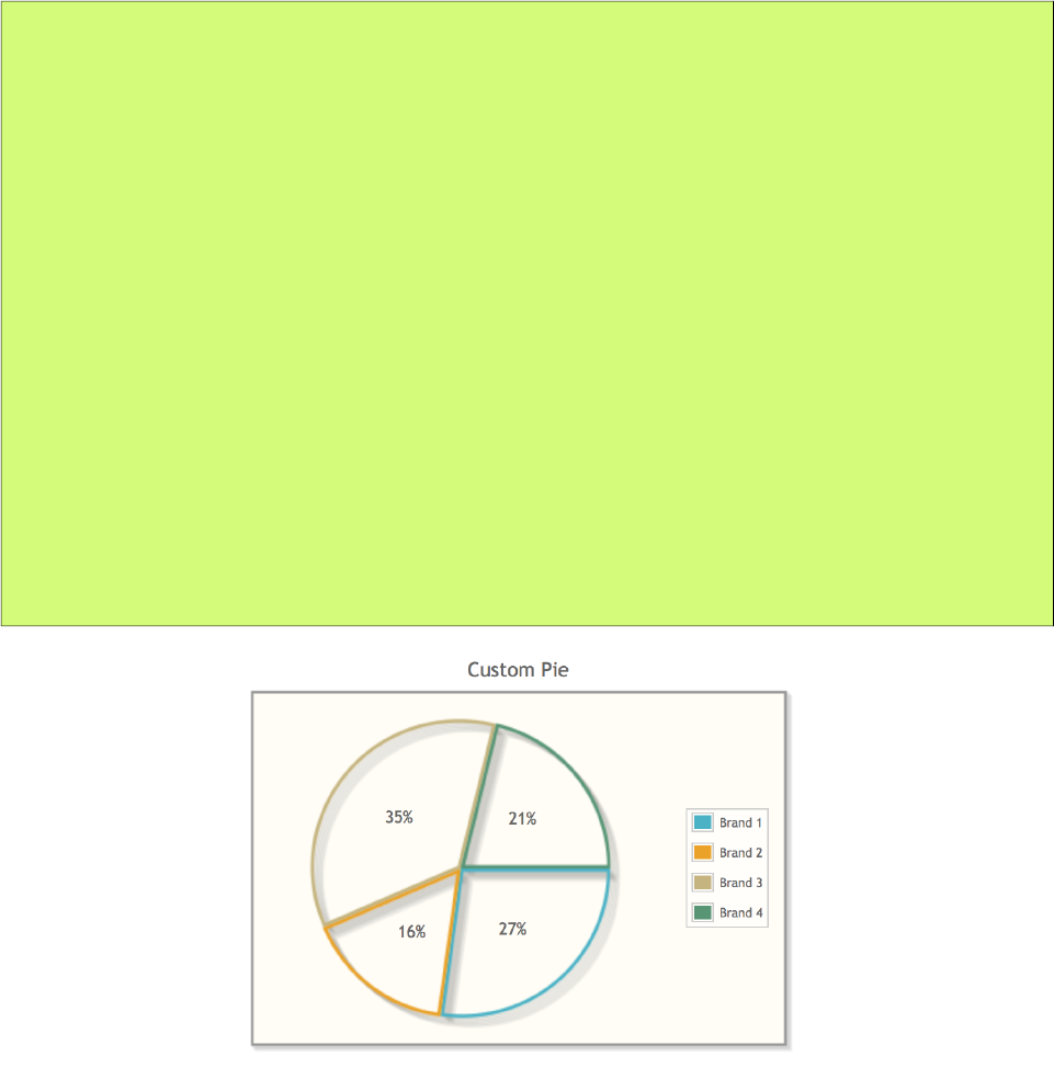
PrimeFaces User Guide
public class Bean {
private PieChartModel model;
public Bean() {
model = new PieChartModel();
model.set("Brand 1", 540);
model.set("Brand 2", 325);
model.set("Brand 3", 702);
model.set("Brand 4", 421);
model.setTitle("Custom Pie");
model.setLegendPosition("e");
model.setFill(false);
model.setShowDataLabels(true);
model.setDiameter(150);
}
public PieChartModel getModel() {
return model;
}
}
73
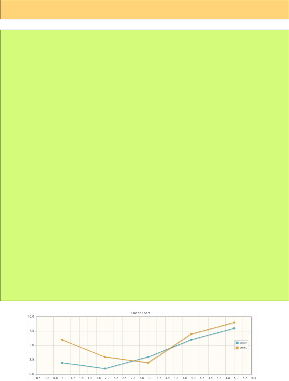
PrimeFaces User Guide
LineChartModel is used to create a line chart.
Basic
<p:chart type="line" model="#{bean.model}" />
public class Bean {
private LineChartModel model;
public Bean() {
model = new LineChartModel();
LineChartSeries series1 = new LineChartSeries();
series1.setLabel("Series 1");
series1.set(1, 2);
series1.set(2, 1);
series1.set(3, 3);
series1.set(4, 6);
series1.set(5, 8);
LineChartSeries series2 = new LineChartSeries();
series2.setLabel("Series 2");
series2.set(1, 6);
series2.set(2, 3);
series2.set(3, 2);
series2.set(4, 7);
series2.set(5, 9);
model.addSeries(series1);
model.addSeries(series2);
model.setTitle("Linear Chart");
model.setLegendPosition("e");
Axis yAxis = model.getAxis(AxisType.Y);
yAxis.setMin(0);
yAxis.setMax(10);
}
public LineChartModel getModel() {
return model;
}
}
74
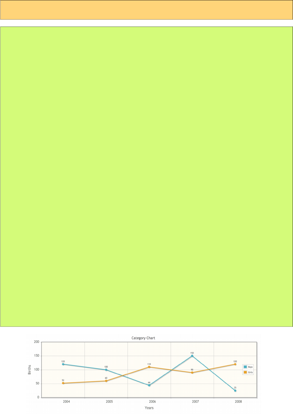
PrimeFaces User Guide
Customized
<p:chart type="line" model="#{bean.model}" />
public class Bean {
private LineChartModel model;
public Bean() {
model = new LineChartModel();
ChartSeries boys = new ChartSeries();
boys.setLabel("Boys");
boys.set("2004", 120);
boys.set("2005", 100);
boys.set("2006", 44);
boys.set("2007", 150);
boys.set("2008", 25);
ChartSeries girls = new ChartSeries();
girls.setLabel("Girls");
girls.set("2004", 52);
girls.set("2005", 60);
girls.set("2006", 110);
girls.set("2007", 90);
girls.set("2008", 120);
model.addSeries(boys);
model.addSeries(girls);
model.setTitle("Category Chart");
model.setLegendPosition("e");
model.setShowPointLabels(true);
model.getAxes().put(AxisType.X, new CategoryAxis("Years"));
Axis yAxis = model.getAxis(AxisType.Y);
yAxis.setLabel("Births");
yAxis.setMin(0);
yAxis.setMax(200);
}
public LineChartModel getModel() {
return model;
}
}
75
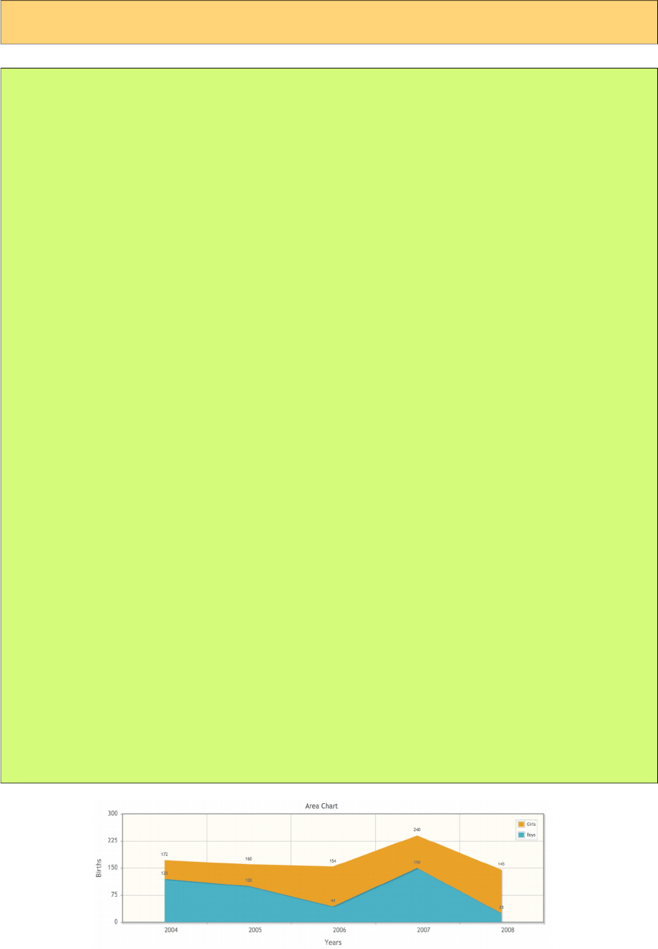
PrimeFaces User Guide
Area
<p:chart type="line" model="#{bean.model}" />
public class Bean {
private LineChartModel model;
public Bean() {
model = new LineChartModel();
LineChartSeries boys = new LineChartSeries();
boys.setFill(true);
boys.setLabel("Boys");
boys.set("2004", 120);
boys.set("2005", 100);
boys.set("2006", 44);
boys.set("2007", 150);
boys.set("2008", 25);
LineChartSeries girls = new LineChartSeries();
girls.setFill(true);
girls.setLabel("Girls");
girls.set("2004", 52);
girls.set("2005", 60);
girls.set("2006", 110);
girls.set("2007", 90);
girls.set("2008", 120);
model.addSeries(boys);
model.addSeries(girls);
model.setTitle("Area Chart");
model.setLegendPosition("ne");
model.setStacked(true);
model.setShowPointLabels(true);
model.getAxis(AxisType.X).setLabel("Years");
Axis yAxis = model.getAxis(AxisType.Y);
yAxis.setLabel("Births");
yAxis.setMin(0);
yAxis.setMax(300);
}
public CartesianChartModel getModel() {
return model;
}
}
76
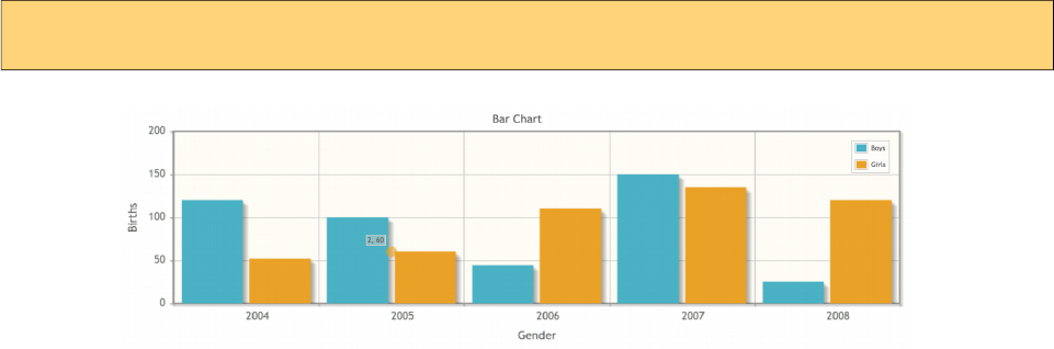
PrimeFaces User Guide
BarChartModel is used to created a BarChart.
Basic
<p:chart type="bar" model="#{bean.model}" />
77
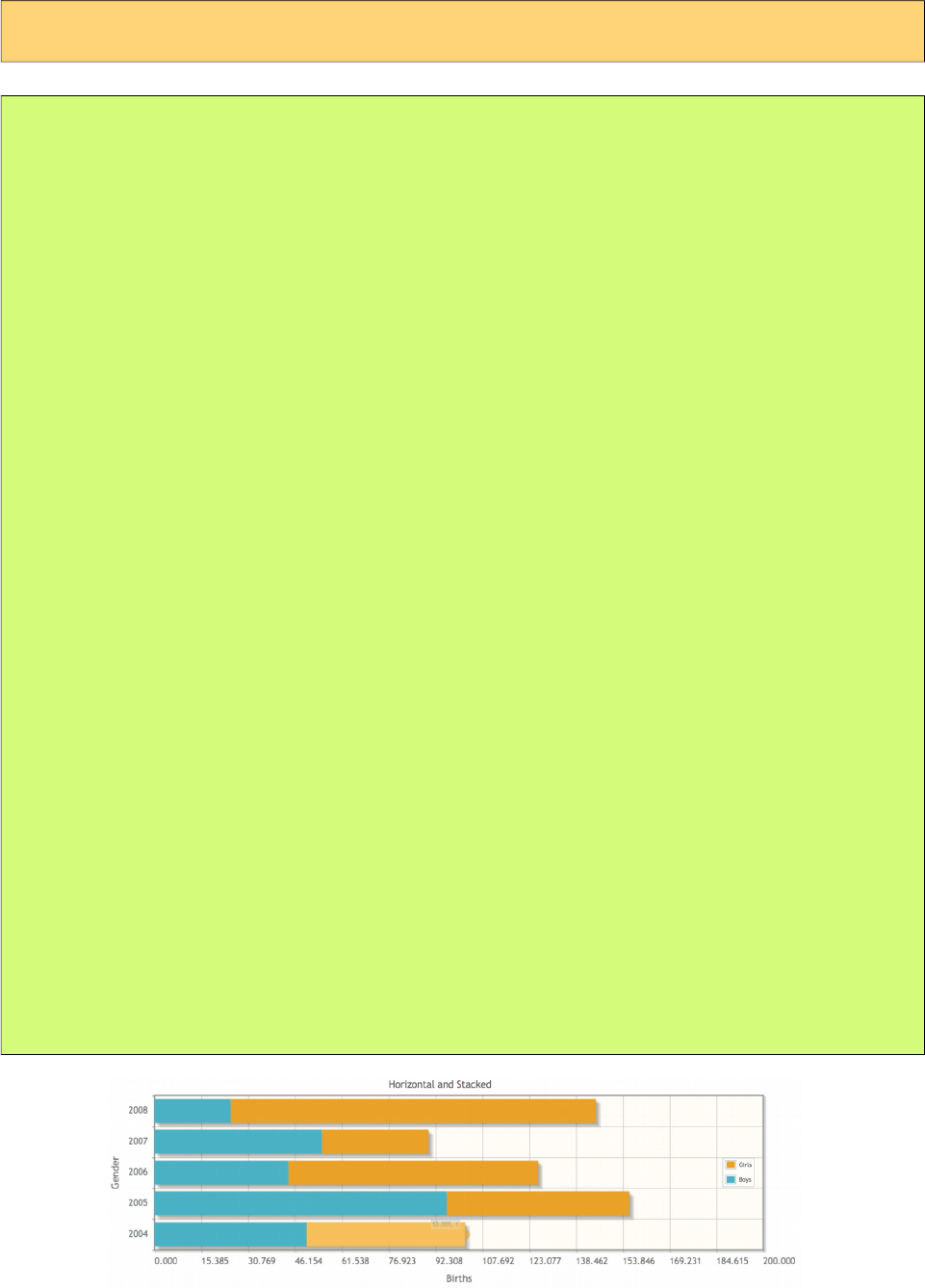
PrimeFaces User Guide
Horizontal and Stacked
<p:chart type="bar" model="#{bean.model}" />
public class Bean {
private HorizontalBarChartModel model;
public ChartBean() {
model = new HorizontalBarChartModel();
ChartSeries boys = new ChartSeries();
boys.setLabel("Boys");
boys.set("2004", 50);
boys.set("2005", 96);
boys.set("2006", 44);
boys.set("2007", 55);
boys.set("2008", 25);
ChartSeries girls = new ChartSeries();
girls.setLabel("Girls");
girls.set("2004", 52);
girls.set("2005", 60);
girls.set("2006", 82);
girls.set("2007", 35);
girls.set("2008", 120);
model.addSeries(boys);
model.addSeries(girls);
model.setTitle("Horizontal and Stacked");
model.setLegendPosition("e");
model.setStacked(true);
Axis xAxis = model.getAxis(AxisType.X);
xAxis.setLabel("Births");
xAxis.setMin(0);
xAxis.setMax(200);
Axis yAxis = model.getAxis(AxisType.Y);
yAxis.setLabel("Gender");
}
public HorizontalBarChartModel getModel() { return model; }
}
78
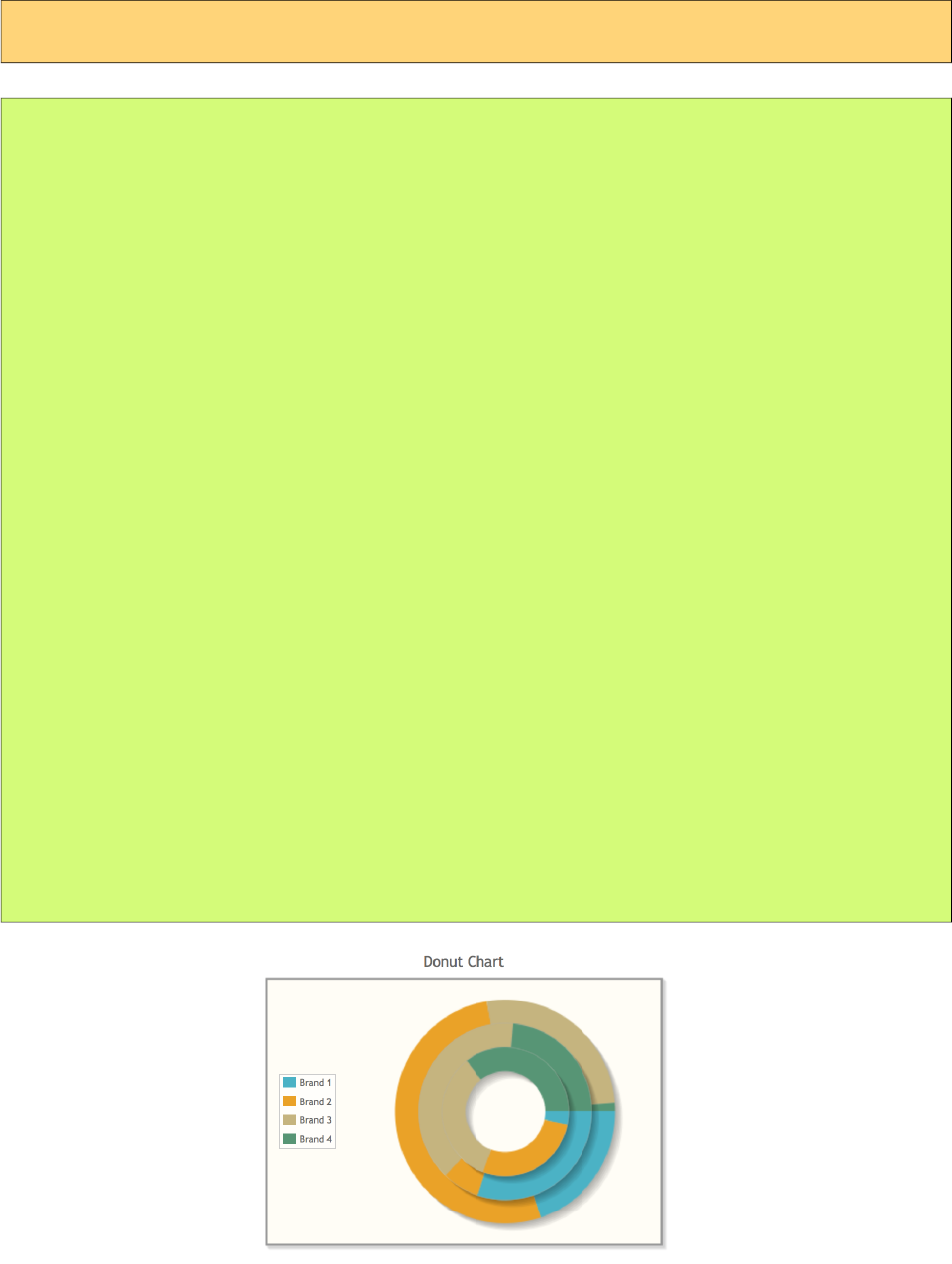
PrimeFaces User Guide
DonutChart is generated using DonutChartModel.
Basic
<p:chart type="donut" model="#{bean.model}" />
public class Bean {
private DonutChartModel model;
public ChartBean() {
model = new DonutChartModel();
Map<String, Number> circle1 = new LinkedHashMap<String, Number>();
circle1.put("Brand 1", 150);
circle1.put("Brand 2", 400);
circle1.put("Brand 3", 200);
circle1.put("Brand 4", 10);
model.addCircle(circle1);
Map<String, Number> circle2 = new LinkedHashMap<String, Number>();
circle2.put("Brand 1", 540);
circle2.put("Brand 2", 125);
circle2.put("Brand 3", 702);
circle2.put("Brand 4", 421);
model.addCircle(circle2);
Map<String, Number> circle3 = new LinkedHashMap<String, Number>();
circle3.put("Brand 1", 40);
circle3.put("Brand 2", 325);
circle3.put("Brand 3", 402);
circle3.put("Brand 4", 421);
model.addCircle(circle3);
model.setTitle("Donut Chart");
model.setLegendPosition("w");
}
public DonutChartModel getModel() { return model; }
}
79
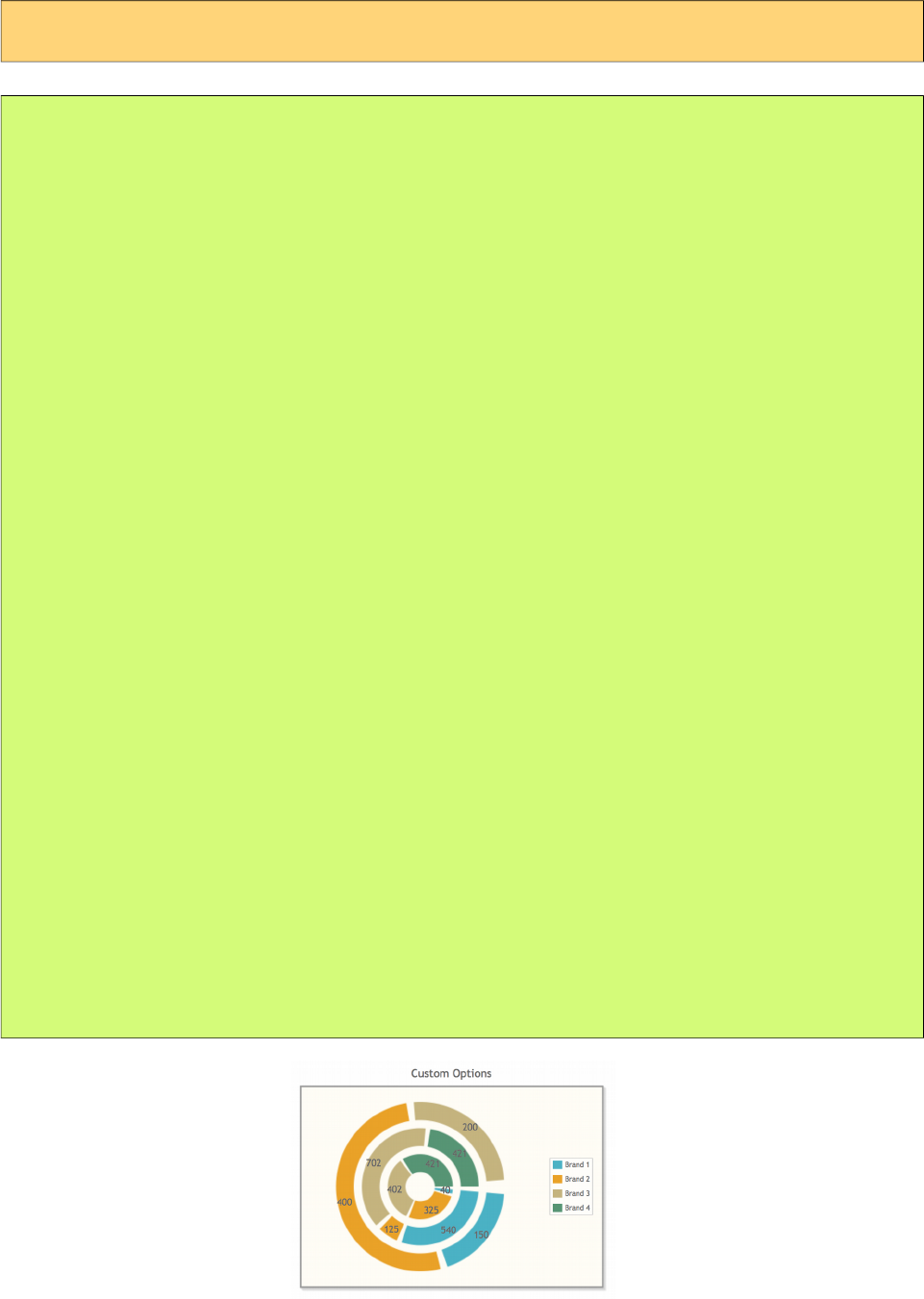
PrimeFaces User Guide
Customized
<p:chart type="donut" model="#{bean.model}" />
public class Bean {
private DonutChartModel model;
public ChartBean() {
model = new DonutChartModel();
Map<String, Number> circle1 = new LinkedHashMap<String, Number>();
circle1.put("Brand 1", 150);
circle1.put("Brand 2", 400);
circle1.put("Brand 3", 200);
circle1.put("Brand 4", 10);
model.addCircle(circle1);
Map<String, Number> circle2 = new LinkedHashMap<String, Number>();
circle2.put("Brand 1", 540);
circle2.put("Brand 2", 125);
circle2.put("Brand 3", 702);
circle2.put("Brand 4", 421);
model.addCircle(circle2);
Map<String, Number> circle3 = new LinkedHashMap<String, Number>();
circle3.put("Brand 1", 40);
circle3.put("Brand 2", 325);
circle3.put("Brand 3", 402);
circle3.put("Brand 4", 421);
model.addCircle(circle3);
model.setTitle("Donut Chart");
model.setLegendPosition("w");
model.setTitle("Custom Options");
model.setLegendPosition("e");
model.setSliceMargin(5);
model.setShowDataLabels(true);
model.setDataFormat("value");
model.setShadow(false);
}
public DonutChartModel getModel() { return model; }
}
80
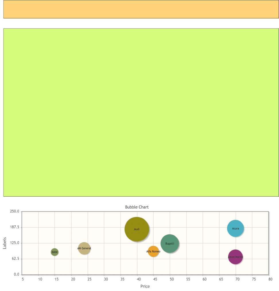
PrimeFaces User Guide
BubbleChart is created with a BubbleChartModel.
Basic
<p:chart type="bubble" model="#{bean.model}" />
public class Bean {
private BubbleChartModel model;
public ChartBean() {
model = new BubbleChartModel();
model.add(new BubbleChartSeries("Acura", 70, 183,55));
model.add(new BubbleChartSeries("Alfa Romeo", 45, 92, 36));
model.add(new BubbleChartSeries("AM General", 24, 104, 40));
model.add(new BubbleChartSeries("Bugatti", 50, 123, 60));
model.add(new BubbleChartSeries("BMW", 15, 89, 25));
model.add(new BubbleChartSeries("Audi", 40, 180, 80));
model.add(new BubbleChartSeries("Aston Martin", 70, 70, 48));
model.setTitle("Bubble Chart");
model.getAxis(AxisType.X).setLabel("Price");
Axis yAxis = model.getAxis(AxisType.Y);
yAxis.setMin(0);
yAxis.setMax(250);
yAxis.setLabel("Labels");
}
public BubbleChartModel getModel() { return model; }
}
81
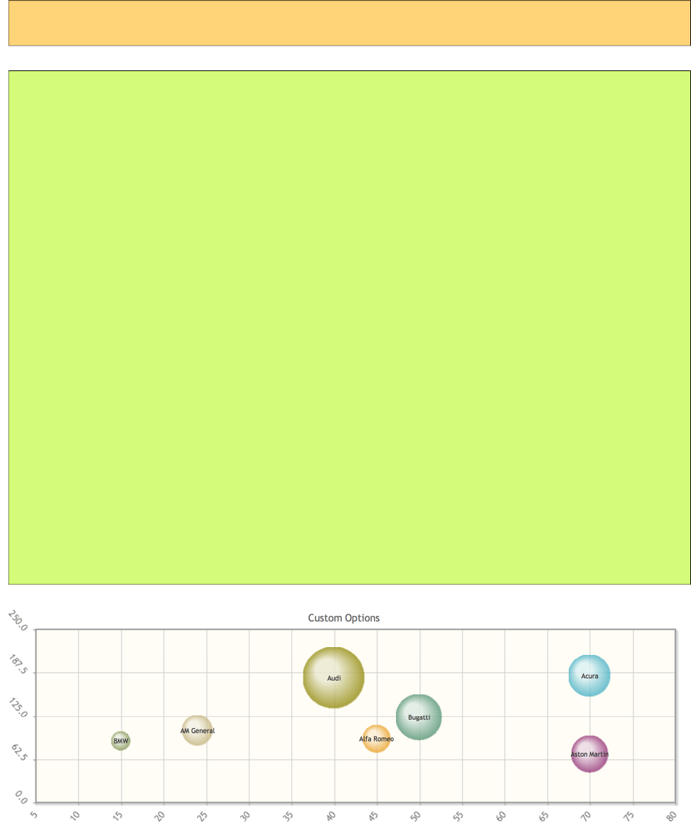
PrimeFaces User Guide
Customized
<p:chart type="bubble" model="#{bean.model}" />
public class Bean {
private BubbleChartModel model;
public ChartBean() {
model = new BubbleChartModel();
model.add(new BubbleChartSeries("Acura", 70, 183,55));
model.add(new BubbleChartSeries("Alfa Romeo", 45, 92, 36));
model.add(new BubbleChartSeries("AM General", 24, 104, 40));
model.add(new BubbleChartSeries("Bugatti", 50, 123, 60));
model.add(new BubbleChartSeries("BMW", 15, 89, 25));
model.add(new BubbleChartSeries("Audi", 40, 180, 80));
model.add(new BubbleChartSeries("Aston Martin", 70, 70, 48));
model = initBubbleModel();
model.setTitle("Custom Options");
model.setShadow(false);
model.setBubbleGradients(true);
model.setBubbleAlpha(0.8);
model.getAxis(AxisType.X).setTickAngle(-50);
Axis yAxis = model.getAxis(AxisType.Y);
yAxis.setMin(0);
yAxis.setMax(250);
yAxis.setTickAngle(50);
}
public BubbleChartModel getModel() { return model; }
}
82
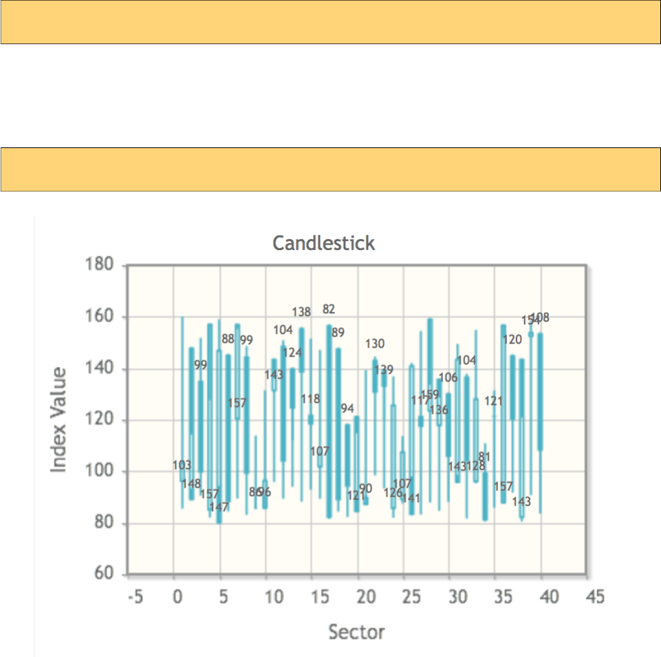
PrimeFaces User Guide
!
OhlcChartModel is used to display Ohlc Charts.
Basic
<p:chart type="ohlc" model="#{bean.model}" />
Candlestick
<p:chart type="ohlc" model="#{bean.model}" />
83
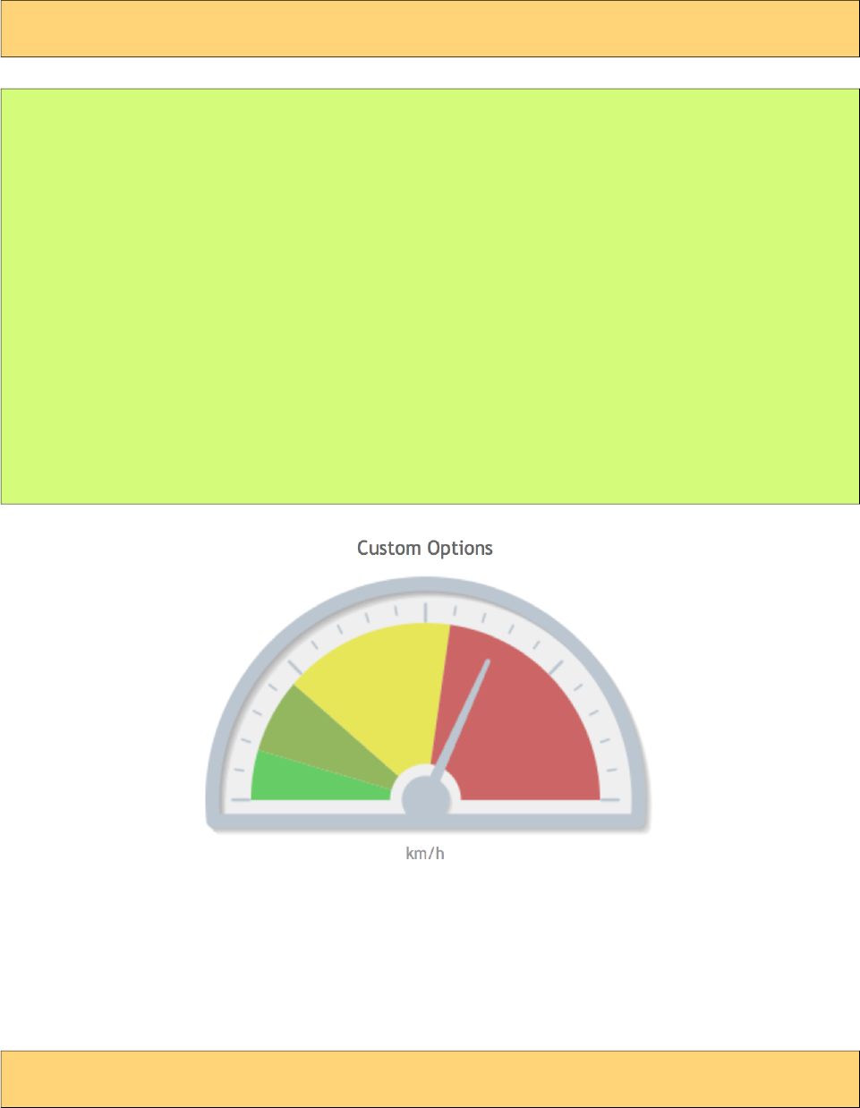
PrimeFaces User Guide
"#$%
MeterGauge Chart is created using MeterGaugeChartModel.
Basic
<p:chart type="metergauge" model="#{bean.model}" />
public class Bean {
private MeterGaugeChartModel model;
public ChartBean() {
List<Number> intervals = new ArrayList<Number>(){{
add(20);
add(50);
add(120);
add(220);
}};
model = new MeterGaugeChartModel(140, intervals);
model.setTitle("MeterGauge Chart");
model.setGaugeLabel("km/h");
}
public MeterGaugeChartModel getModel() { return model; }
}
Customized
<p:chart type="metergauge" model="#{bean.model}" />
84
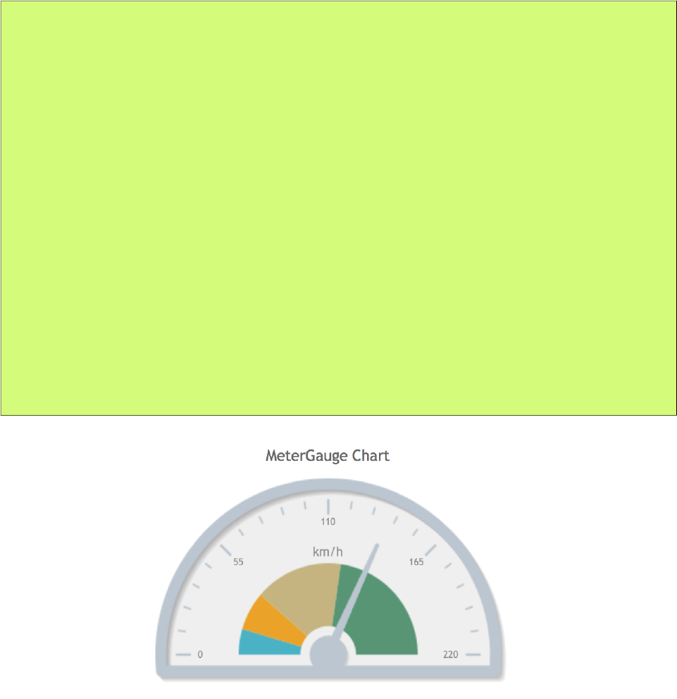
PrimeFaces User Guide
public class Bean {
private MeterGaugeChartModel model;
public ChartBean() {
List<Number> intervals = new ArrayList<Number>(){{
add(20);
add(50);
add(120);
add(220);
}};
model = new MeterGaugeChartModel(140, intervals);
model.setTitle("Custom Options");
model.setSeriesColors("66cc66,93b75f,E7E658,cc6666");
model.setGaugeLabel("km/h");
model.setGaugeLabelPosition("bottom");
model.setShowTickLabels(false);
model.setLabelHeightAdjust(110);
model.setIntervalOuterRadius(130);
}
public MeterGaugeChartModel getModel() { return model; }
}
85
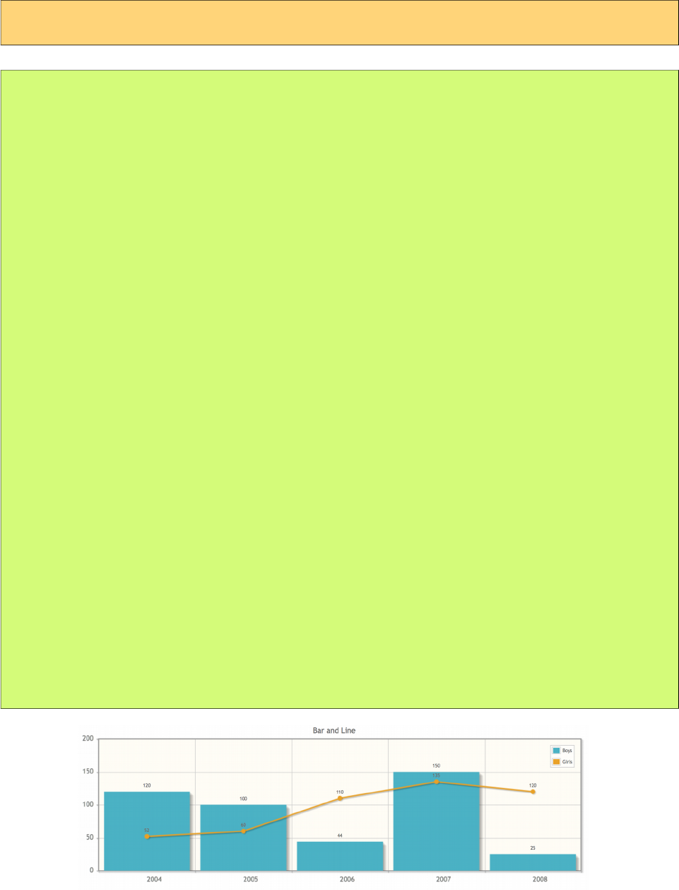
PrimeFaces User Guide
&'
On same graph, different series type can be displayed together.
Basic
<p:chart type="bar" model="#{bean.model}" />
public class Bean {
private BarChartModel model;
public ChartBean() {
combinedModel = new BarChartModel();
BarChartSeries boys = new BarChartSeries();
boys.setLabel("Boys");
boys.set("2004", 120);
boys.set("2005", 100);
boys.set("2006", 44);
boys.set("2007", 150);
boys.set("2008", 25);
LineChartSeries girls = new LineChartSeries();
girls.setLabel("Girls");
girls.set("2004", 52);
girls.set("2005", 60);
girls.set("2006", 110);
girls.set("2007", 135);
girls.set("2008", 120);
model.addSeries(boys);
model.addSeries(girls);
model.setTitle("Bar and Line");
model.setLegendPosition("ne");
model.setMouseoverHighlight(false);
model.setShowDatatip(false);
model.setShowPointLabels(true);
Axis yAxis = model.getAxis(AxisType.Y);
yAxis.setMin(0);
yAxis.setMax(200);
}
public BarChartModel getModel() { return model; }
}
86

PrimeFaces User Guide
(#)
Up to 9 axes (xaxis-x9axis, yaxis-y9axis) can be displayed on the same chart.
Basic
<p:chart type="line" model="#{bean.model}" />
public class Bean {
private LineChartModel model;
public ChartBean() {
model = new LineChartModel();
BarChartSeries boys = new BarChartSeries();
boys.setLabel("Boys");
boys.set("2004", 120);
boys.set("2005", 100);
boys.set("2006", 44);
boys.set("2007", 150);
boys.set("2008", 25);
LineChartSeries girls = new LineChartSeries();
girls.setLabel("Girls");
girls.setXaxis(AxisType.X2);
girls.setYaxis(AxisType.Y2);
girls.set("A", 52);
girls.set("B", 60);
girls.set("C", 110);
girls.set("D", 135);
girls.set("E", 120);
model.addSeries(boys);
model.addSeries(girls);
model.setTitle("Multi Axis Chart");
model.setMouseoverHighlight(false);
model.getAxes().put(AxisType.X, new CategoryAxis("Years"));
model.getAxes().put(AxisType.X2, new CategoryAxis("Period"));
Axis yAxis = model.getAxis(AxisType.Y);
yAxis.setLabel("Birth");
yAxis.setMin(0);
yAxis.setMax(200);
Axis y2Axis = new LinearAxis("Number");
y2Axis.setMin(0);
y2Axis.setMax(200);
model.getAxes().put(AxisType.Y2, y2Axis);
}
public LineChartModel getModel() { return model; }
}
87
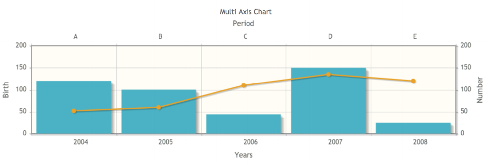
PrimeFaces User Guide
88
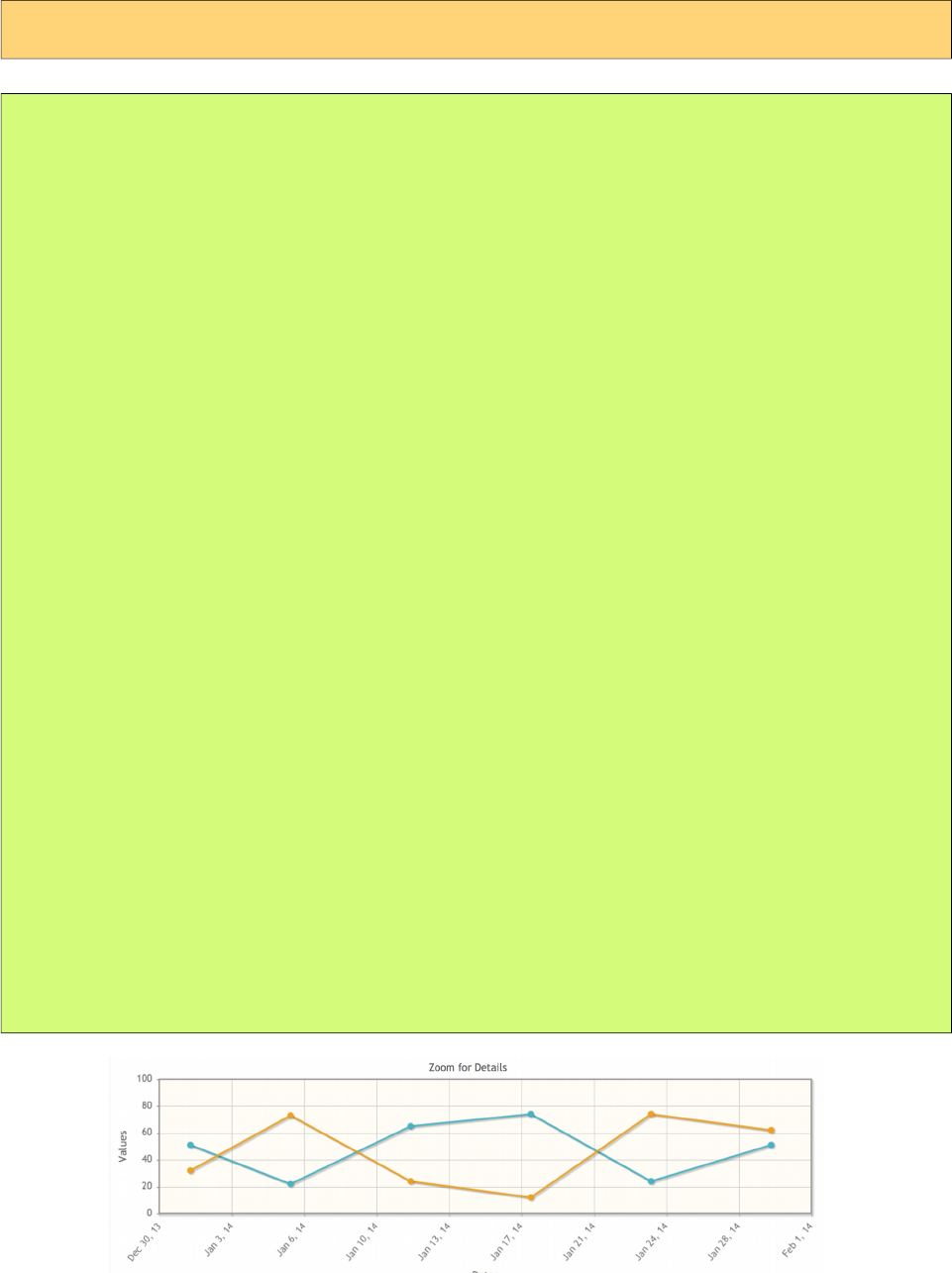
PrimeFaces User Guide
*)
Use DateAxis if you are displaying dates in an axis.
Basic
<p:chart type="line" model="#{bean.model}" />
public class Bean {
private LineChartModel model;
public ChartBean() {
dateModel = new LineChartModel();
LineChartSeries series1 = new LineChartSeries();
series1.setLabel("Series 1");
series1.set("2014-01-01", 51);
series1.set("2014-01-06", 22);
series1.set("2014-01-12", 65);
series1.set("2014-01-18", 74);
series1.set("2014-01-24", 24);
series1.set("2014-01-30", 51);
LineChartSeries series2 = new LineChartSeries();
series2.setLabel("Series 2");
series2.set("2014-01-01", 32);
series2.set("2014-01-06", 73);
series2.set("2014-01-12", 24);
series2.set("2014-01-18", 12);
series2.set("2014-01-24", 74);
series2.set("2014-01-30", 62);
dateModel.addSeries(series1);
dateModel.addSeries(series2);
dateModel.setTitle("Zoom for Details");
dateModel.setZoom(true);
dateModel.getAxis(AxisType.Y).setLabel("Values");
DateAxis axis = new DateAxis("Dates");
axis.setTickAngle(-50);
axis.setMax("2014-02-01");
axis.setTickFormat("%b %#d, %y");
dateModel.getAxes().put(AxisType.X, axis);
}
public LineChartModel getModel() { return model; }
}
89

PrimeFaces User Guide
+,
Charts are interactive components, information about selected series and items can be passed via
ajax to a JSF backing bean using ItemSelectEvent.
Basic
<p:chart type="pie" model="#{bean.model}">
<p:ajax event="itemSelect" listener="#{bean.itemSelect}" />
</p:chart>
public class Bean {
private PieChartModel model;
public ChartBean() {
model = new PieChartModel();
model.set("Brand 1", 540);
model.set("Brand 2", 325);
model.set("Brand 3", 702);
model.set("Brand 4", 421);
model.setTitle("Simple Pie");
model.setLegendPosition("w");
}
public PieChartModel getModel() { return model; }
public void itemSelect(ItemSelectEvent event) {
FacesMessage msg = new FacesMessage(FacesMessage.SEVERITY_INFO,
"Item selected", "Item Index: " + event.getItemIndex() +
", Series Index:" + event.getSeriesIndex());
FacesContext.getCurrentInstance().addMessage(null, msg);
}
}
90

PrimeFaces User Guide
Chart component provides a client side method to convert the graph to an image. Example below
demonstrates how to use a button click to export the chart as an image and display it in a dialog so
that users can download it as a regular image.
<p:chart type="line" model="#{bean.model}" style="width:500px;height:300px"
widgetVar="chart"/>
<p:commandButton type="button" value="Export" icon="ui-icon-extlink"
onclick="exportChart()"/>
<p:dialog widgetVar="dlg" showEffect="fade" modal="true" header="Chart as an Image">
<p:outputPanel id="output" layout="block" style="width:500px;height:300px"/>
</p:dialog>
function exportChart() {
//export image
$('#output').empty().append(PF('chart').exportAsImage());
//show the dialog
PF('dlg').show();
}
91
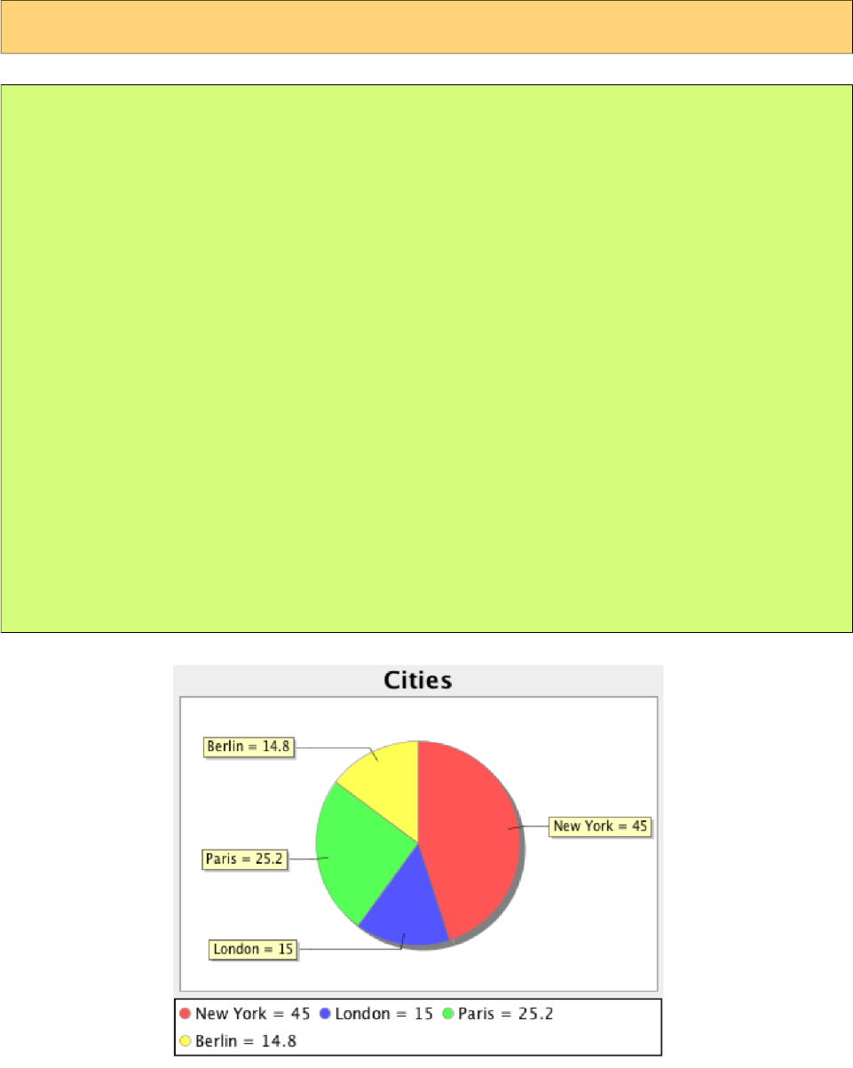
PrimeFaces User Guide
-+'%)
JFreeChart with GraphicImage component is an alternative to the chart component.
Basic
<p:graphicImage value="#{bean.chart}" />
public class Bean {
private StreamedContent chart;
public Bean() {
JFreeChart jfreechart = ChartFactory.createPieChart("Cities",
createDataset(), true, true, false);
File chartFile = new File("dynamichart");
ChartUtilities.saveChartAsPNG(chartFile, jfreechart, 375, 300);
chart = new DefaultStreamedContent(new FileInputStream(chartFile),
"image/png");
}
public StreamedContent getChart() { return model; }
private PieDataset createDataset() {
DefaultPieDataset dataset = new DefaultPieDataset();
dataset.setValue("New York", new Double(45.0));
dataset.setValue("London", new Double(15.0));
dataset.setValue("Paris", new Double(25.2));
dataset.setValue("Berlin", new Double(14.8));
return dataset;
}
}
92
PrimeFaces User Guide
-.%
Charts can be styled using regular css. Following is the list of style classes;
Style Class Applies
.jqplot-target Plot target container.
.jqplot-axis Axes.
.jqplot-xaxis Primary x-axis.
.jqplot-yaxis Primary y-axis.
.jqplot-x2axis, .jqplot-x3axis ... 2nd, 3rd ... x-axis.
.jqplot-y2axis, .jqplot-y3axis ... 2nd, 3rd ... y-axis.
.jqplot-axis-tick Axis ticks.
.jqplot-xaxis-tick Primary x-axis ticks.
.jqplot-x2axis-tick Secondary x-axis ticks.
.jqplot-yaxis-tick Primary y-axis-ticks.
.jqplot-y2axis-tick Seconday y-axis-ticks.
table.jqplot-table-legend Legend table.
.jqplot-title Title of the chart.
.jqplot-cursor-tooltip Cursor tooltip.
.jqplot-highlighter-tooltip Highlighter tooltip.
div.jqplot-table-legend-swatch Colors swatch of the legend.
Additionally style and styleClass options of chart component apply to the container element of
charts, use these attribute to specify the dimensions of a chart.
<p:chart type="pie" model="#{bean.model}" style=”width:320px;height:200px” />
In case you’d like to change the colors of series, use the seriesColors option in ChartModel API.
93
PrimeFaces User Guide
Chart API provide high level access to commonly used jqplot options however there are many more
customization options available in jqplot. Extender feature provide access to low level apis to do
advanced customization by enhancing the configuration object, here is an example to increase
shadow depth of the line series where model's extender property is set to "ext".
<p:chart type="line" model="#{bean.model}" />
function ext() {
//this = chart widget instance
//this.cfg = options
this.cfg.seriesDefaults = {
shadowDepth: 5
};
}
Refer to jqPlot docs for available options.
94
PrimeFaces User Guide
+
Axis
org.primefaces.model.chart.Axis
Property Default Type Description
label null String Title of the axis.
min null Object Minimum boundary value.
max null Object Maximum boundary value.
tickAngle null Integer Angle of text, measured clockwise.
tickFormat null String Format string to use with the axis tick formatter
tickInterval null String Number of units between ticks.
tickCount null Integer Desired number of ticks.
AxisType
org.primefaces.model.chart.AxisType
AxisType is an enum to define the type of the axis from X-Y to X9-Y9.
BarChartModel
org.primefaces.model.chart.BarChartModel extends org.primefaces.model.chart.ChartModel
Property Default Type Description
barPadding 8 Integer Padding between bars.
barMargin 10 Integer Margin between bars.
stacked false Boolean Displays series in stacked format.
BarChartSeries
org.primefaces.model.chart.BarChartSeries extends org.primefaces.model.chart.ChartSeries
Property Default Type Description
disableStack false Boolean When true, series data is not included in a stacked chart.
BubbleChartModel
org.primefaces.model.chart.BubbleChartModel extends org.primefaces.model.chart.ChartModel
Property Default Type Description
data null List<BubbleChartSeries> Data as a list of BubbleChartSeries.
bubbleGradients false Boolean Displays bubbles with gradients.
bubbleAlpha 1.0 Double Opacity of bubbles.
showLabels true Boolean Displays label of a series inside a bubble.
95
PrimeFaces User Guide
BubbleChartSeries
org.primefaces.model.chart.BarChartSeries extends org.primefaces.model.chart.ChartSeries
Property Default Type Description
x null Integer X-Axis value of the bubble.
y null Integer Y-Axis value of the bubble.
radius null Integer Radius of the bubble.
label null String Label text of the bubble.
CartesianChartModel
org.primefaces.model.chart.CartesianChartModel
Property Default Type Description
series null List<ChartSeries> List of series.
axes HashMap Map<AxisType,Axis> Map of chart axis.
zoom false Boolean Adds zoom feature when enabled.
animate false Boolean When enabled, series are drawn with an effect.
showDatatip true Boolean Displays a tooltip on hover.
datatipFormat null String Format of the data tooltip.
showPointLabels false Boolean Displays data inline in plot.
datatipEditor function String Javascript callback to customize the datatips.
CategoryAxis
org.primefaces.model.chart.CategoryAxis extends org.primefaces.model.chart.Axis
CategoryAxis is used when data on the axis does not consists of numbers.
ChartModel
org.primefaces.model.chart.ChartModel
Property Default Type Description
title null String Title text for the plot
shadow true Boolean To show shadow or not on series.
seriesColors null String Comma separated list of series colors e.g. "#4BB2C5",
"CCCCC"
negativeSeriesColors null String Similar to seriesColors but for negative values.
legendPosition null String Position of the legend like "n" or "ne".
legendCols 0 Integer Maximum number of columns in the legend.
legendRows 0 Integer Maximum number of rows in the legend.
legendPlacement null Enum Defines the location of the legend.
mouseoverHighlight true Boolean Highlights series on hover.
extender null String Name of javascript function to extend chart with.
resetAxesOnResize true Boolean Resets axes on resize for responsive charts.
96
PrimeFaces User Guide
ChartSeries
org.primefaces.model.chart.ChartSeries
Property Default Type Description
label null String Title text of the series.
data null Map<Object,Number> Data of the series as a map.
xaxis null AxisType X-Axis of the series.
yaxis null AxisType Y-Axis of the series.
DateAxis
org.primefaces.model.chart.DateAxis extends org.primefaces.model.chart.Axis
DateAxis is used when data on the axis consists of string representations of date values.
DonutChartModel
org.primefaces.model.chart.DonutChartModel extends org.primefaces.model.chart.ChartModel
Property Default Type Description
data null List>Map<String,Object>> Data as a list of map instances.
sliceMargin 0 Integer Angular spacing between pie slices in degrees.
fill true Boolean True or False to fill the slices.
showDataLabels false Boolean True to False show data labels on slices.
dataFormat percent String Either ‘label’, ‘value’, ‘percent’ or an array of
labels to place on the pie slices.
dataLabelFormat
String
null String Format string for data labels. If none, ‘%s’ is
used for “label” and for arrays, ‘%d’ for value
and ‘%d%%’ for percentage.
dataLabelThreshold 3 Integer Threshhold in percentage (0-100) of pie area,
below which no label will be displayed. This
applies to all label types, not just to percentage
labels.
showDatatip true Boolean Displays tooltip when enabled.
datatipFormat %s-%d String Format string for datatip.
datatipEditor null String Name of client side function that returns html
to provide custom content in datatip.
HorizontalBarChartModel
org.primefaces.model.chart.HorizontalBarChartModel extends
org.primefaces.model.chart.BarChartModel
HorizontalBarChartModel is an extension to BarChartModel with y-axis used for the categories and
x-axis for the data values.
LineChartSeries
org.primefaces.model.chart.LineChartSeries extends org.primefaces.model.chart.ChartSeries
Property Default Type Description
markerStyle filledCircle String Style of the markers, valid values are diamond, circle, square,
97
PrimeFaces User Guide
Property Default Type Description
x, plus, dash, filledDiamond, filledCircle, filledSquare.
showLine true Boolean Whether to actually draw the line or not.
showMarker true Boolean Displays markes at data points.
fill false Boolean Fills the area between lines.
fillAlpha 1 Double Opacity of the filled area.
smoothLine false Boolean Enables smooth renderer.
disableStack false Boolean When true, series data is not included in a stacked chart.
LinearAxis
org.primefaces.model.chart.LinearAxis extends org.primefaces.model.chart.Axis
LinearAxis is the Axis implementation used to display numbers.
LineChartModel
org.primefaces.model.chart.LineChartModel extends
org.primefaces.model.chart.CartesianChartModel
Property Default Type Description
stacked null List<ChartSeries> Displays series in stacked format.
breakOnNull HashMap Map<AxisType,Axis> Discontinues line plot for null values.
MeterGaugeChartModel
org.primefaces.model.chart.MeterGaugeChartModel extends
org.primefaces.model.chart.ChartModel
Property Default Type Description
value null Number Value of the gauge.
intervals null List<Number> List of ranges to be drawn around the gauge.
ticks 0 List<Number> List of tick values.
gaugeLabel true String Label text of the gauge.
gaugeLabelPosition false String Where to position the label, either ‘inside’ or ‘bottom’.
min null Double Minimum value on the gauge.
max null Double Minimum value on the gauge.
showTickLabels true Boolean Displays tick labels next to ticks.
intervalInnerRadius null Integer Radius of the inner circle of the interval ring.
intervalOuterRadius 85 Integer Radius of the outer circle of the interval ring.
labelHeightAdjust -25 Integer Number of Pixels to offset the label up (-) or down (+)
from its default position.
OhlcChartModel
org.primefaces.model.chart.OhlcChartModel extends org.primefaces.model.chart.ChartModel
Property Default Type Description
data null List<OhlcChartSeries> Data as a list of OhlChartSeries.
98
PrimeFaces User Guide
Property Default Type Description
candleStick false Boolean Displays series as candlestick.
OhlcChartSeries
org.primefaces.model.chart.OhlcChartSeries extends org.primefaces.model.chart.ChartSeries
Property Default Type Description
value null List<OhlcChartSeries> Data as a list of OhlChartSeries.
open null Double Open value.
high null Double High value.
low null Double Low value.
close null Double Close value.
PieChartModel
org.primefaces.model.chart.PieChartModel extends org.primefaces.model.chart.ChartModel
Property Default Type Description
data null Map<String,Object> Data as a Map instance.
diameter null Integer Outer diameter of the pie, auto computed by default
sliceMargin 0 Integer Angular spacing between pie slices in degrees.
fill true Boolean True or False to fill the slices.
showDataLabels false Boolean True to False show data labels on slices.
dataFormat percent String Either ‘label’, ‘value’, ‘percent’ or an array of labels
to place on the pie slices.
dataLabelFormat
String
null String Format string for data labels. If none, ‘%s’ is used
for “label” and for arrays, ‘%d’ for value and ‘%d%
%’ for percentage.
dataLabelThreshold 3 Integer Threshhold in percentage (0-100) of pie area, below
which no label will be displayed. This applies to all
label types, not just to percentage labels.
showDatatip true Boolean Displays tooltip when enabled.
datatipFormat %s-%d String Format string for datatip.
datatipEditor null String Name of client side function that returns html to
provide custom content in datatip.
99
PrimeFaces User Guide
3.16 Checkbox
Checkbox is a helper component of SelectManyCheckbox to implement custom layouts.
Info
Tag checkbox
Component Class org.primefaces.component.checkbox.Checkbox
Component Type org.primefaces.component.Checkbox
Component Family org.primefaces.component
Renderer Type org.primefaces.component.CheckboxRenderer
Renderer Class org.primefaces.component.checkbox.CheckboxRenderer
Attributes
Name Default Type Description
id null String Unique identifier of the component
rendered true Boolean Boolean value to specify the rendering of the
component, when set to false component will not be
rendered.
binding null Object An el expression that maps to a server side
UIComponent instance in a backing bean
disabled false Boolean Disabled the component.
itemIndex null Integer Index of the selectItem.
onchange null String Client side callback to execute on state change.
for null String Id of the selectManyCheckbox to attach to.
style null String Inline style of the component.
styleClass null String Style class of the container.
tabindex null String Specifies the tab order of element in tab navigation.
Getting started with Checkbox
See custom layout part in SelectManyCheckbox section for more information.
100
PrimeFaces User Guide
3.17 Chips
Chips is used to enter multiple values on an inputfield.
Info
Tag chips
Component Class org.primefaces.component.chips.Chips
Component Type org.primefaces.component.Chips
Component Family org.primefaces.component
Renderer Type org.primefaces.component.ChipsRenderer
Renderer Class org.primefaces.component.chips.ChipsRenderer
Attributes
Name Default Type Description
id null String Unique identifier of the component
rendered true Boolean Boolean value to specify the rendering of the
component, when set to false component will not
be rendered.
binding null Object An el expression that maps to a server side
UIComponent instance in a backing bean
value null Object Value of the component.
converter null Converter/Str
ing
An el expression or a literal text that defines a
converter for the component. When it’s an EL
expression, it’s resolved to a converter instance. In
case it’s a static text, it must refer to a converter id
immediate false Boolean When set true, process validations logic is
executed at apply request values phase for this
component.
required false Boolean Marks component as required.
validator null MethodExpr A method expression that refers to a method for
validation the input.
valueChangeListener null ValueChange
Listener
A method binding expression that refers to a
method for handling a valuchangeevent.
requiredMessage null String Message to be displayed when required field
validation fails.
converterMessage null String Message to be displayed when conversion fails.
validatorMessage null String Message to be displayed when validation fields.
101
PrimeFaces User Guide
Name Default Type Description
widgetVar null String Name of the client side widget.
max null Integer Maximum number of entries allowed.
Getting started with Chips
Value of the component should be a List where type of the elements it contains can be a string or a
custom one if a converter is defined.
public class ChipsView {
private List<String> cities;
public List<String> getCities() {
return this.cities;
}
public void setCities(List<String> cities) {
this.cities = cities;
}
}
<p:chips value="#{chipsView.cities}" />
Ajax Behavior Events
Event Listener Parameter Fired
itemSelect org.primefaces.event.SelectEvent When an item is added.
itemUnselect org.primefaces.event.UnselectEvent When an item is removed.
Skinning
Following is the list of structural style classes;
Style Class Applies
.ui-chips Container element.
.ui-chips-container List element.
.ui-chips-token A list item.
.ui-chips-input-token List item containing the input.
.ui-chips-token-icon Close icon of a token.
102
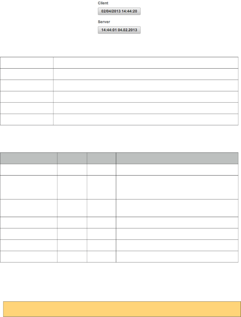
PrimeFaces User Guide
3.18 Clock
Clock displays server or client datetime live.
Info
Tag clock
Component Class org.primefaces.component.clock.Clock
Component Type org.primefaces.component.Clock
Component Family org.primefaces.component
Renderer Type org.primefaces.component.ClockRenderer
Renderer Class org.primefaces.component.clock.ClockRenderer
Attributes
Name Default Type Description
id null String Unique identifier of the component.
rendered true Boolean Boolean value to specify the rendering of the
component, when set to false component will not be
rendered.
binding null Object An el expression that maps to a server side
UIComponent instance in a backing bean.
pattern null String Datetime format.
mode client String Mode value, valid values are client and server.
autoSync false Boolean Syncs time periodically in server mode.
syncInterval 60000 Integer Defines the sync in ms interval in autoSync setting.
Getting Started with Clock
Clock has two modes, client (default) and server. In simples mode, datetime is displayed by just
adding component on page. On page load, clock is initialized and start running based on client time.
<p:clock />
103
PrimeFaces User Guide
Server Mode
In server mode, clock initialized itself with the server’s datetime and starts running on client side.
To make sure client clock and server clock is synced, you can enable autoSync option that makes an
ajax call to the server periodically to refresh the server time with client.
DateTime Format
Datetime format used can be changed using pattern attribute.
<p:clock pattern="HH:mm:ss dd.MM.yyyy" />
Skinning
Clock resides in a container element which style and styleClass options apply. Following is the list
of structural style classes;
Style Class Applies
.ui-clock Container element.
104
PrimeFaces User Guide
(
Collector is a simple utility to manage collections declaratively.
Info
Tag collector
ActionListener Class org.primefaces.component.collector.Collector
Attributes
Name Default Type Description
value null Object Value to be used in collection operation
addTo null java.util.Collection Reference to the Collection instance
removeFrom null java.util.Collection Reference to the Collection instance
unique true Boolean When enabled, rejects duplicate items on addition.
Getting started with Collector
Collector requires a collection and a value to work with. It’s important to override equals and
hashCode methods of the value object to make collector work.
public class BookBean {
private Book book = new Book();
private List<Book> books;
public CreateBookBean() {
books = new ArrayList<Book>();
}
//getters and setters
}
<p:commandButton value="Add">
<p:collector value="#{bookBean.book}" addTo="#{bookBean.books}" />
</p:commandButton>
<p:commandLink value="Remove">
<p value="#{book}" removeFrom="#{createBookBean.books}" />
</p:commandLink>
105
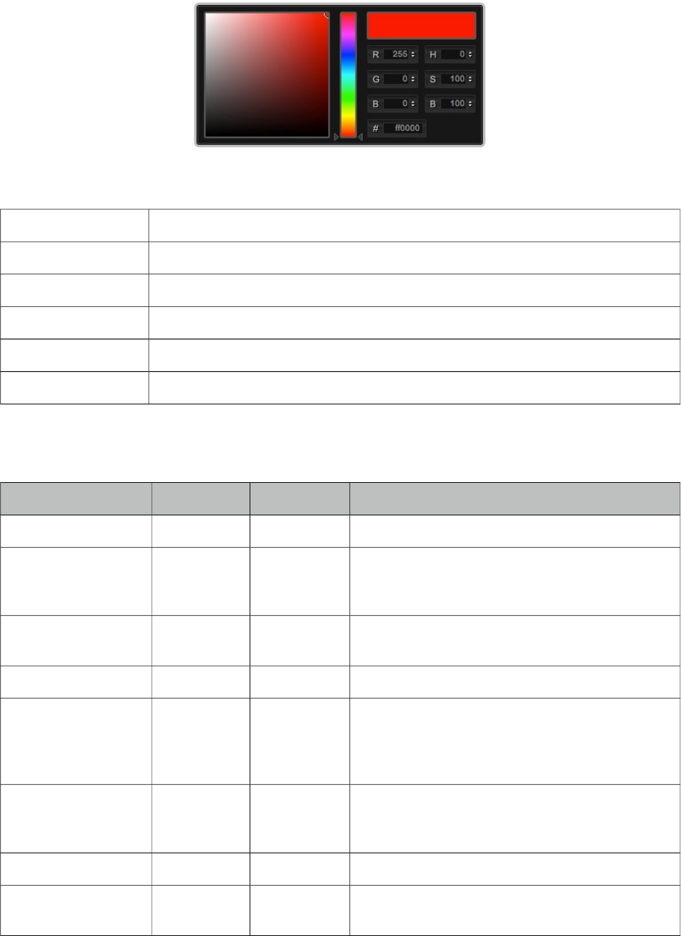
PrimeFaces User Guide
3.20 Color Picker
ColorPicker is an input component with a color palette.
Info
Tag colorPicker
Component Class org.primefaces.component.colorpicker.ColorPicker
Component Type org.primefaces.component.ColorPicker
Component Family org.primefaces.component
Renderer Type org.primefaces.component.ColorPickerRenderer
Renderer Class org.primefaces.component.colorpicker.ColorPickerRenderer
Attributes
Name Default Type Description
id null String Unique identifier of the component
rendered true Boolean Boolean value to specify the rendering of the
component, when set to false component will not
be rendered.
binding null Object An el expression that maps to a server side
UIComponent instance in a backing bean
value null Object Value of the component.
converter null Converter/Str
ing
An el expression or a literal text that defines a
converter for the component. When it’s an EL
expression, it’s resolved to a converter instance. In
case it’s a static text, it must refer to a converter id
immediate false Boolean When set true, process validations logic is
executed at apply request values phase for this
component.
required false Boolean Marks component as required.
validator null MethodExpr A method expression that refers to a method for
validation the input.
106
PrimeFaces User Guide
Name Default Type Description
valueChangeListener null ValueChange
Listener
A method binding expression that refers to a
method for handling a valuchangeevent.
requiredMessage null String Message to be displayed when required field
validation fails.
converterMessage null String Message to be displayed when conversion fails.
validatorMessage null String Message to be displayed when validation fields.
widgetVar null String Name of the client side widget.
mode popup String Display mode, valid values are “popup” and
“inline”.
style null String Inline style of the component.
styleClass null String Style class of the component.
Getting started with ColorPicker
ColorPicker’s value should be a hex string.
public class Bean {
private String color;
public String getColor() {
return this.color;
}
public void setColor(String color) {
this.color = color;
}
}
<p:colorPicker value="#{bean.color}" />
Display Mode
ColorPicker has two modes, default mode is popup and other available option is inline.
<p:colorPicker value="#{bean.color}" mode="inline"/>
107
PrimeFaces User Guide
Skinning
ColorPicker resides in a container element which style and styleClass options apply. Following is
the list of structural style classes;
Style Class Applies
.ui-colorpicker Container element.
.ui-colorpicker_color Background of gradient.
.ui-colorpicker_hue Hue element.
.ui-colorpicker_new_color New color display.
.ui-colorpicker_current_color Current color display.
.ui-colorpicker-rgb-r Red input.
.ui-colorpicker-rgb-g Greed input.
.ui-colorpicker-rgb-b Blue input.
.ui-colorpicker-rgb-h Hue input.
.ui-colorpicker-rgb-s Saturation input.
.ui-colorpicker-rgb-b Brightness input.
.ui-colorpicker-rgb-hex Hex input.
108
PrimeFaces User Guide
3.21 Column
Column is an extended version of the standard column used by various components like datatable,
treetable and more.
Info
Tag column
Component Class org.primefaces.component.column.Column
Component Type org.primefaces.component.Column
Component Family org.primefaces.component
Attributes
Name Default Type Description
id null String Unique identifier of the component
rendered true Boolean Boolean value to specify the rendering of the component,
when set to false component will not be rendered.
binding null Object An el expression that maps to a server side
UIComponent instance in a backing bean
style null String Inline style of the column.
styleClass null String Style class of the column.
sortBy null ValueExpr ValueExpression to be used for sorting.
sortFunction null MethodExpr Custom pluggable sortFunction.
filterBy null ValueExpr ValueExpression to be used for filtering.
filterStyle null String Inline style of the filter element
filterStyleClass null String Style class of the filter element
filterOptions null Object A collection of selectitems for filter dropdown.
filterMatchMode startsWith String Match mode for filtering.
filterPosition bottom String Location of the column filter with respect to header
content. Options are 'bottom'(default) and 'top'.
rowspan 1 Integer Defines the number of rows the column spans.
colspan 1 Integer Defines the number of columns the column spans.
headerText null String Shortcut for header facet.
footerText null String Shortcut for footer facet.
109
PrimeFaces User Guide
Name Default Type Description
selectionMode null String Enables selection mode.
filterMaxLength null Integer Maximum number of characters for an input filter.
resizable true Boolean Specifies resizable feature at column level. Datatable's
resizableColumns must be enabled to use this option.
width null String Width in pixels or percentage.
exportable true Boolean Defines if the column should be exported by
dataexporter.
filterValue null Object Value of the filter field.
toggleable true Boolean Defines if panel is toggleable by columnToggler
component. Default value is true and a false value marks
the column as static.
filterFunction null MethodExpr Custom implementation to filter a value against a
constraint.
field null String Name of the field to pass lazy load method for filtering
and sorting. If not specified, filterBy-sortBy values are
used to identify the field name.
priority 0 Integer Priority of the column defined as an integer, lower values
have more priority.
sortable true Boolean Boolean value to mark column as sortable.
filterable true Boolean Boolean value to mark column as filterable.
visible true Boolean Controls the visibilty of the column.
selectRow true Boolean Whether clicking the column selects the row when
parent component has row selection enabled, default is
true.
ariaHeaderText null String Label to read by screen readers, when not specified
headerText is used.
exportFunction null MethodExpr Custom pluggable exportFunction for data exporter.
Getting Started with Column
As column is a reused component, see documentation of components that use a column.
Note
Not all attributes of column are implemented by the components that utilize column.
110
PrimeFaces User Guide
3.22 Columns
Columns is used by datatable to create columns dynamically.
Info
Tag columns
Component Class org.primefaces.component.column.Columns
Component Type org.primefaces.component.Columns
Component Family org.primefaces.component
Attributes
Name Default Type Description
id null String Unique identifier of the component
rendered true Boolean Boolean value to specify the rendering of the
component, when set to false component will not be
rendered.
binding null Object An el expression that maps to a server side
UIComponent instance in a backing bean
value null Object Data to represent columns.
var null String Name of iterator to access a column.
style null String Inline style of the column.
styleClass null String Style class of the column.
sortBy null ValueExpr ValueExpression to be used for sorting.
sortFunction null MethodExpr Custom pluggable sortFunction.
filterBy null ValueExpr ValueExpression to be used for filtering.
filterStyle null String Inline style of the filter element
filterStyleClass null String Style class of the filter element
filterOptions null Object A collection of selectitems for filter dropdown.
filterMatchMode startsWith String Match mode for filtering.
rowspan 1 Integer Defines the number of rows the column spans.
colspan 1 Integer Defines the number of columns the column spans.
headerText null String Shortcut for header facet.
footerText null String Shortcut for footer facet.
111
PrimeFaces User Guide
Name Default Type Description
filterMaxLength null Integer Maximum number of characters for an input filter.
resizable true Boolean Specifies resizable feature at column level. Datatable's
resizableColumns must be enabled to use this option.
width null String Width in pixels or percentage.
exportable true Boolean Defines if the column should be exported by
dataexporter.
columnIndexVar null String Name of iterator to refer each index.
filterValue null Object Value of the filter field.
toggleable true Boolean Defines if panel is toggleable by columnToggler
component. Default value is true and a false value marks
the column as static.
filterFunction null MethodExpr Custom implementation to filter a value against a
constraint.
field null String Name of the field to pass lazy load method for filtering
and sorting. If not specified, filterBy-sortBy values are
used to identify the field name.
priority 0 Integer Priority of the column defined as an integer, lower
values have more priority.
sortable true Boolean Boolean value to mark column as sortable.
filterable true Boolean Boolean value to mark column as filterable.
visible true Boolean Controls the visibilty of the column.
selectRow true Boolean Whether clicking the column selects the row when
parent component has row selection enabled, default is
true.
Getting Started with Columns
See dynamic columns section in datatable documentation for detailed information.
112
PrimeFaces User Guide
3.23 ColumnGroup
ColumnGroup is used by datatable for column grouping.
Info
Tag columnGroup
Component Class org.primefaces.component.columngroup.ColumnGroup
Component Type org.primefaces.component. ColumnGroup
Component Family org.primefaces.component
Attributes
Name Default Type Description
id null String Unique identifier of the component
rendered true Boolean Boolean value to specify the rendering of the
component, when set to false component will not be
rendered.
binding null Object An el expression that maps to a server side
UIComponent instance in a backing bean
type null String Type of group, valid values are “header” and “footer”.
Getting Started with ColumnGroup
See grouping section in datatable documentation for detailed information.
113
PrimeFaces User Guide
3.24 ColumnToggler
ColumnToggler is a helper component for datatable to toggle visibility of columns.
Info
Tag columnToggler
Component Class org.primefaces.component.columngroup.ColumnGroup
Component Type org.primefaces.component. ColumnGroup
Component Family org.primefaces.component
Renderer Type org.primefaces.component.ColumnTogglerRenderer
Renderer Class org.primefaces.component.columntoggler.ColumnTogglerRenderer
Attributes
Name Default Type Description
id null String Unique identifier of the component
rendered true Boolean Boolean value to specify the rendering of the
component, when set to false component will not be
rendered.
binding null Object An el expression that maps to a server side
UIComponent instance in a backing bean
widgetVar null String Name of the client side widget.
trigger null String A search expression resolving to a component to
get attached to.
datasource null String A search expression resolving to a DataTable
component whose columns to be toggled.
Getting Started with ColumnToggler
See column toggler section in datatable documentation for detailed information.
114
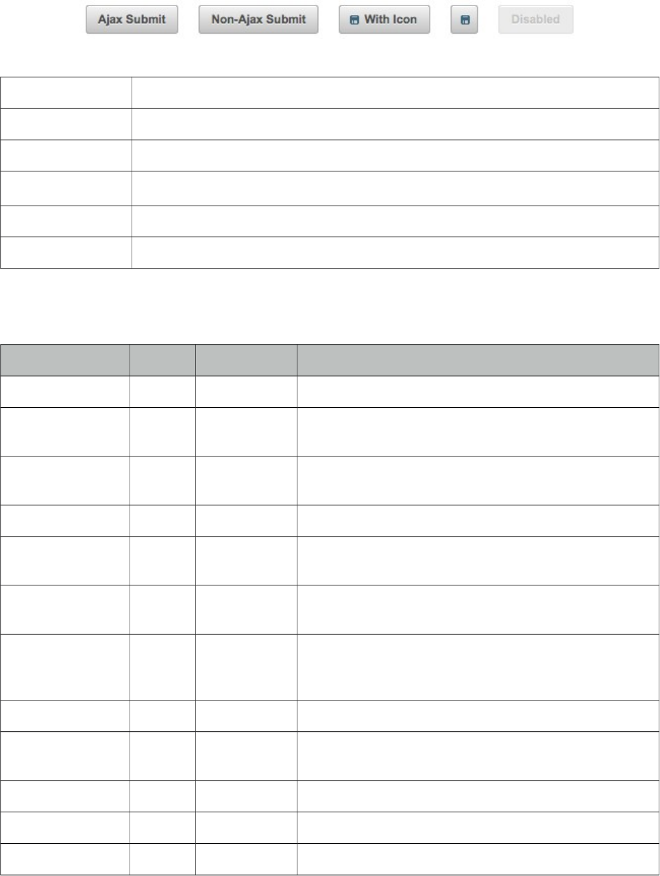
PrimeFaces User Guide
3.25 CommandButton
CommandButton is an extended version of standard commandButton with ajax and theming.
Info
Tag commandButton
Component Class org.primefaces.component.commandbutton.CommandButton
Component Type org.primefaces.component.CommandButton
Component Family org.primefaces.component
Renderer Type org.primefaces.component.CommandButtonRenderer
Renderer Class org.primefaces.component.commandbutton.CommandButtonRenderer
Attributes
Name Default Type Description
id null String Unique identifier of the component
rendered true Boolean Boolean value to specify the rendering of the component,
when set to false component will not be rendered.
binding null Object An el expression that maps to a server side UIComponent
instance in a backing bean
value null String Label for the button
action null MethodExpr/
String
A method expression or a String outcome that’d be
processed when button is clicked.
actionListener null MethodExpr An actionlistener that’d be processed when button is
clicked.
immediate false Boolean Boolean value that determines the phaseId, when true
actions are processed at apply_request_values, when
false at invoke_application phase.
type submit String Sets the behavior of the button.
ajax true Boolean Specifies the submit mode, when set to true(default),
submit would be made with Ajax.
async false Boolean When set to true, ajax requests are not queued.
process null String Component(s) to process partially instead of whole view.
update null String Component(s) to be updated with ajax.
115
PrimeFaces User Guide
Name Default Type Description
onstart null String Client side callback to execute before ajax request is
begins.
oncomplete null String Client side callback to execute when ajax request is
completed.
onsuccess null String Client side callback to execute when ajax request
succeeds.
onerror null String Client side callback to execute when ajax request fails.
global true Boolean Defines whether to trigger ajaxStatus or not.
delay null String If less than delay milliseconds elapses between calls to
request() only the most recent one is sent and all other
requests are discarded. If this option is not specified, or if
the value of delay is the literal string 'none' without the
quotes, no delay is used.
partialSubmit false Boolean Enables serialization of values belonging to the partially
processed components only.
partialSubmitFilter null String Selector to use when partial submit is on, default is
":input" to select all descendant inputs of a partially
processed components.
resetValues false Boolean If true, local values of input components to be updated
within the ajax request would be reset.
ignoreAutoUpdate false Boolean If true, components which autoUpdate="true" will not be
updated for this request. If not specified, or the value is
false, no such indication is made.
timeout 0 Integer Timeout for the ajax request in milliseconds.
style null String Inline style of the button element.
styleClass null String StyleClass of the button element.
onblur null String Client side callback to execute when button loses focus.
onchange null String Client side callback to execute when button loses focus
and its value has been modified since gaining focus.
onclick null String Client side callback to execute when button is clicked.
ondblclick null String Client side callback to execute when button is double
clicked.
onfocus null String Client side callback to execute when button receives
focus.
onkeydown null String Client side callback to execute when a key is pressed
down over button.
onkeypress null String Client side callback to execute when a key is pressed and
released over button.
116
PrimeFaces User Guide
Name Default Type Description
onkeyup null String Client side callback to execute when a key is released
over button.
onmousedown null String Client side callback to execute when a pointer button is
pressed down over button.
onmousemove null String Client side callback to execute when a pointer button is
moved within button.
onmouseout null String Client side callback to execute when a pointer button is
moved away from button.
onmouseover null String Client side callback to execute when a pointer button is
moved onto button.
onmouseup null String Client side callback to execute when a pointer button is
released over button.
onselect null String Client side callback to execute when text within button is
selected by user.
accesskey null String Access key that when pressed transfers focus to the
button.
alt null String Alternate textual description of the button.
dir null String Direction indication for text that does not inherit
directionality. Valid values are LTR and RTL.
disabled false Boolean Disables the button.
image null String Style class for the button icon. (deprecated: use icon)
label null String A localized user presentable name.
lang null String Code describing the language used in the generated
markup for this component.
tabindex null Integer Position of the button element in the tabbing order.
title null String Advisory tooltip information.
icon null String Icon of the button as a css class.
iconPos left String Position of the icon.
inline false String Used by PrimeFaces mobile only.
escape true Boolean Defines whether label would be escaped or not.
widgetVar null String Name of the client side widget.
form null String Form to serialize for an ajax request. Default is the
enclosing form.
RenderDisabled
Click
true Boolean When enabled, click event can be added to disabled
button.
117
PrimeFaces User Guide
Getting started with CommandButton
CommandButton usage is similar to standard commandButton, by default commandButton submits
its enclosing form with ajax.
<p:commandButton value="Save" actionListener="#{bookBean.saveBook}" />
public class BookBean {
public void saveBook() {
//Save book
}
}
Reset Buttons
Reset buttons do not submit the form, just resets the form contents.
<p:commandButton type="reset" value="Reset" />
Push Buttons
Push buttons are used to execute custom javascript without causing an ajax/non-ajax request. To
create a push button set type as "button".
<p:commandButton type="button" value="Alert" onclick="alert(‘Prime’)" />
AJAX and Non-AJAX
CommandButton has built-in ajax capabilities, ajax submit is enabled by default and configured
using ajax attribute. When ajax attribute is set to false, form is submitted with a regular full page
refresh.
The update attribute is used to partially update other component(s) after the ajax response is
received. Update attribute takes a comma or white-space separated list of JSF component ids to be
updated. Basically any JSF component, not just PrimeFaces components should be updated with the
Ajax response. In the following example, form is submitted with ajax and display outputText is
updated with the ajax response.
<h:form>
<h:inputText value="#{bean.text}" />
<p:commandButton value="Submit" update="display"/>
<h:outputText value="#{bean.text}" id="display" />
</h:form>
Tip: You can use the ajaxStatus component to notify users about the ajax request.
118
PrimeFaces User Guide
Icons
An icon on a button is provided using icon option. iconPos is used to define the position of the
button which can be “left” or “right”.
<p:commandButton value="With Icon" icon="disk"/>
<p:commandButton icon="disk"/>
.disk is a simple css class with a background property;
.disk {
background-image: url(‘disk.png’) !important;
}
You can also use the pre-defined icons from ThemeRoller like ui-icon-search.
Client Side API
Widget: PrimeFaces.widget.CommandButton
Method Params Return Type Description
disable() - void Disables button
enable() - void Enables button
Skinning
CommandButton renders a button tag which style and styleClass applies. Following is the list of
structural style classes;
Style Class Applies
.ui-button Button element
.ui-button-text-only Button element when icon is not used
.ui-button-text Label of button
As skinning style classes are global, see the main theming section for more information.
119
PrimeFaces User Guide
3.26 CommandLink
CommandLink extends standard JSF commandLink with Ajax capabilities.
Info
Tag commandLink
Component Class org.primefaces.component.commandlink.CommandLink
Component Type org.primefaces.component.CommandLink
Component Family org.primefaces.component
Renderer Type org.primefaces.component.CommandLinkRenderer
Renderer Class org.primefaces.component. commandlink.CommandLinkRenderer
Attributes
Name Default Type Description
id null String Unique identifier of the component
rendered true Boolean Boolean value to specify the rendering of the
component, when set to false component will not be
rendered.
binding null Object An el expression that maps to a server side
UIComponent instance in a backing bean
value null String Href value of the rendered anchor.
action null MethodExpr/
String
A method expression or a String outcome that’d be
processed when link is clicked.
actionListener null MethodExpr An actionlistener that’d be processed when link is
clicked.
immediate false Boolean Boolean value that determines the phaseId, when true
actions are processed at apply_request_values, when
false at invoke_application phase.
async false Boolean When set to true, ajax requests are not queued.
process null String Component(s) to process partially instead of whole
view.
ajax true Boolean Specifies the submit mode, when set to true(default),
submit would be made with Ajax.
update null String Component(s) to be updated with ajax.
onstart null String Client side callback to execute before ajax request is
begins.
120
PrimeFaces User Guide
Name Default Type Description
oncomplete null String Client side callback to execute when ajax request is
completed.
onsuccess null String Client side callback to execute when ajax request
succeeds.
onerror null String Client side callback to execute when ajax request fails.
global true Boolean Defines whether to trigger ajaxStatus or not.
delay null String If less than delay milliseconds elapses between calls to
request() only the most recent one is sent and all other
requests are discarded. If this option is not specified, or
if the value of delay is the literal string 'none' without
the quotes, no delay is used.
partialSubmit false Boolean Enables serialization of values belonging to the partially
processed components only.
partialSubmitFilter null String Selector to use when partial submit is on, default is
":input" to select all descendant inputs of a partially
processed components.
resetValues false Boolean If true, local values of input components to be updated
within the ajax request would be reset.
ignoreAutoUpdate false Boolean If true, components which autoUpdate="true" will not
be updated for this request. If not specified, or the value
is false, no such indication is made.
timeout 0 Integer Timeout for the ajax request in milliseconds.
style null String Style to be applied on the anchor element
styleClass null String StyleClass to be applied on the anchor element
onblur null String Client side callback to execute when link loses focus.
onclick null String Client side callback to execute when link is clicked.
ondblclick null String Client side callback to execute when link is double
clicked.
onfocus null String Client side callback to execute when link receives
focus.
onkeydown null String Client side callback to execute when a key is pressed
down over link.
onkeypress null String Client side callback to execute when a key is pressed
and released over link.
onkeyup null String Client side callback to execute when a key is released
over link.
121
PrimeFaces User Guide
Name Default Type Description
onmousedown null String Client side callback to execute when a pointer button is
pressed down over link.
onmousemove null String Client side callback to execute when a pointer button is
moved within link.
onmouseout null String Client side callback to execute when a pointer button is
moved away from link.
onmouseover null String Client side callback to execute when a pointer button is
moved onto link.
onmouseup null String Client side callback to execute when a pointer button is
released over link.
accesskey null String Access key that when pressed transfers focus to the link.
charset null String Character encoding of the resource designated by this
hyperlink.
coords null String Position and shape of the hot spot on the screen for
client use in image maps.
dir null String Direction indication for text that does not inherit
directionality. Valid values are LTR and RTL.
disabled null Boolean Disables the link
hreflang null String Languae code of the resource designated by the link.
rel null String Relationship from the current document to the anchor
specified by the link, values are provided by a space-
separated list of link types.
rev null String A reverse link from the anchor specified by this link to
the current document, values are provided by a space-
separated list of link types.
shape null String Shape of hot spot on the screen, valid values are default,
rect, circle and poly.
tabindex null Integer Position of the button element in the tabbing order.
target null String Name of a frame where the resource targeted by this
link will be displayed.
title null String Advisory tooltip information.
type null String Type of resource referenced by the link.
form null String Form to serialize for an ajax request. Default is the
enclosing form.
Getting Started with CommandLink
CommandLink is used just like the standard h:commandLink, difference is form is submitted with
ajax by default.
122
PrimeFaces User Guide
public class BookBean {
public void saveBook() {
//Save book
}
}
<p:commandLink actionListener="#{bookBean.saveBook}">
<h:outputText value="Save" />
</p:commandLink>
Skinning
CommandLink renders an html anchor element that style and styleClass attributes apply.
123
PrimeFaces User Guide
3.27 Confirm
Confirm is a behavior element used to integrate with global confirm dialog.
Info
Tag confirm
Behavior Id org.primefaces.behavior.ConfirmBehavior
Attributes
Name Default Type Description
header null String Header of confirm dialog.
message null String Message to display in confirm dialog.
icon null String Icon to display next to message.
disabled null Boolean Disables confirm behavior when true.
Getting started with Confirm
See global confirm dialog topic in next section for details.
124
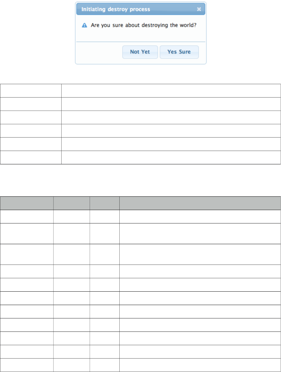
PrimeFaces User Guide
3.28 ConfirmDialog
ConfirmDialog is a replacement to the legacy javascript confirmation box. Skinning, customization
and avoiding popup blockers are notable advantages over classic javascript confirmation.
Info
Tag confirmDialog
Component Class org.primefaces.component.confirmdialog.ConfirmDialog
Component Type org.primefaces.component.ConfirmDialog
Component Family org.primefaces.component
Renderer Type org.primefaces.component.ConfirmDialogRenderer
Renderer Class org.primefaces.component.confirmdialog.ConfirmDialogRenderer
Attributes
Name Default Type Description
id null String Unique identifier of the component
rendered true Boolean Boolean value to specify the rendering of the component,
when set to false component will not be rendered.
binding null Object An el expression that maps to a server side UIComponent
instance in a backing bean
widgetVar null String Name of the client side widget.
message null String Text to be displayed in body.
header null String Text for the header.
severity null String Message severity for the displayed icon.
width auto Integer Width of the dialog in pixels
height auto Integer Width of the dialog in pixels
style null String Inline style of the dialog container.
styleClass null String Style class of the dialog container
125
PrimeFaces User Guide
Name Default Type Description
closable true Boolean Defines if close icon should be displayed or not
appendTo null String Appends the dialog to the element defined by the given
search expression.
visible false Boolean Whether to display confirm dialog on load.
showEffect null String Effect to use on showing dialog.
hideEffect null String Effect to use on hiding dialog.
closeOnEscape false Boolean Defines if dialog should hide on escape key.
dir ltr String Defines text direction, valid values are ltr and rtl.
global false Boolean When enabled, confirmDialog becomes a shared for other
components that require confirmation.
responsive false Boolean In responsive mode, dialog adjusts itself based on screen
width.
Getting started with ConfirmDialog
ConfirmDialog has two modes; global and non-global. Non-Global mode is almost same as the
dialog component used with a simple client side api, show() and hide().
<h:form>
<p:commandButton type="button" onclick="PF('cd').show()" />
<p:confirmDialog message="Are you sure about destroying the world?"
header="Initiating destroy process" severity="alert"
widgetVar="cd">
<p:commandButton value="Yes Sure" actionListener="#{buttonBean.destroyWorld}"
update="messages" oncomplete="PF('cd').hide()"/>
<p:commandButton value="Not Yet" onclick="PF('cd').hide();" type="button" />
</p:confirmDialog>
</h:form>
Message and Severity
Message can be defined in two ways, either via message option or message facet. Message facet is
useful if you need to place custom content instead of simple text. Note that header can also be
defined using the header attribute or the header facet. Severity defines the icon to display next to
the message, default severity is alert and the other option is info.
<p:confirmDialog widgetVar="cd" header=”Confirm”>
<f:facet name="message">
<h:outputText value="Are you sure?" />
</f:facet>
//content
</p:confirmDialog>
126
PrimeFaces User Guide
Global
Creating a confirmDialog for a specific action is a repetitive task, to solve this global confirmDialog
which is a singleton has been introduced. Trigger components need to have p:confirm behavior to
use the confirm dialog. Component that trigger the actual command in dialog must have ui-confirm-
dialog-yes style class, similarly component to cancel the command must have ui-confirm-dialog-no.
At the moment p:confirm is supported by p:commandButton, p:commandLink and p:menuitem.
<p:growl id="messages" />
<p:commandButton value="Save" actionListener="#{bean.save}" update="messages">
<p:confirm header="Confirmation" message="Sure?" icon="ui-icon-alert"/>
</p:commandButton>
<p:confirmDialog global="true">
<p:commandButton value="Yes" type="button" styleClass="ui-confirmdialog-yes"
icon="ui-icon-check"/>
<p:commandButton value="No" type="button" styleClass="ui-confirmdialog-no"
icon="ui-icon-close"/>
</p:confirmDialog>
Client Side API
Widget: PrimeFaces.widget.ConfirmDialog
Method Params Return Type Description
show() - void Displays dialog.
hide() - void Closes dialog.
Skinning
ConfirmDialog resides in a main container element which style and styleClass options apply. As
skinning style classes are global, see the main theming section for more information. Following is
the list of structural style classes;
Style Class Applies
.ui-dialog Container element of dialog
.ui-dialog-titlebar Title bar
.ui-dialog-title Header text
.ui-dialog-titlebar-close Close icon
.ui-dialog-content Dialog body
.ui-dialog-buttonpane Footer button panel
127
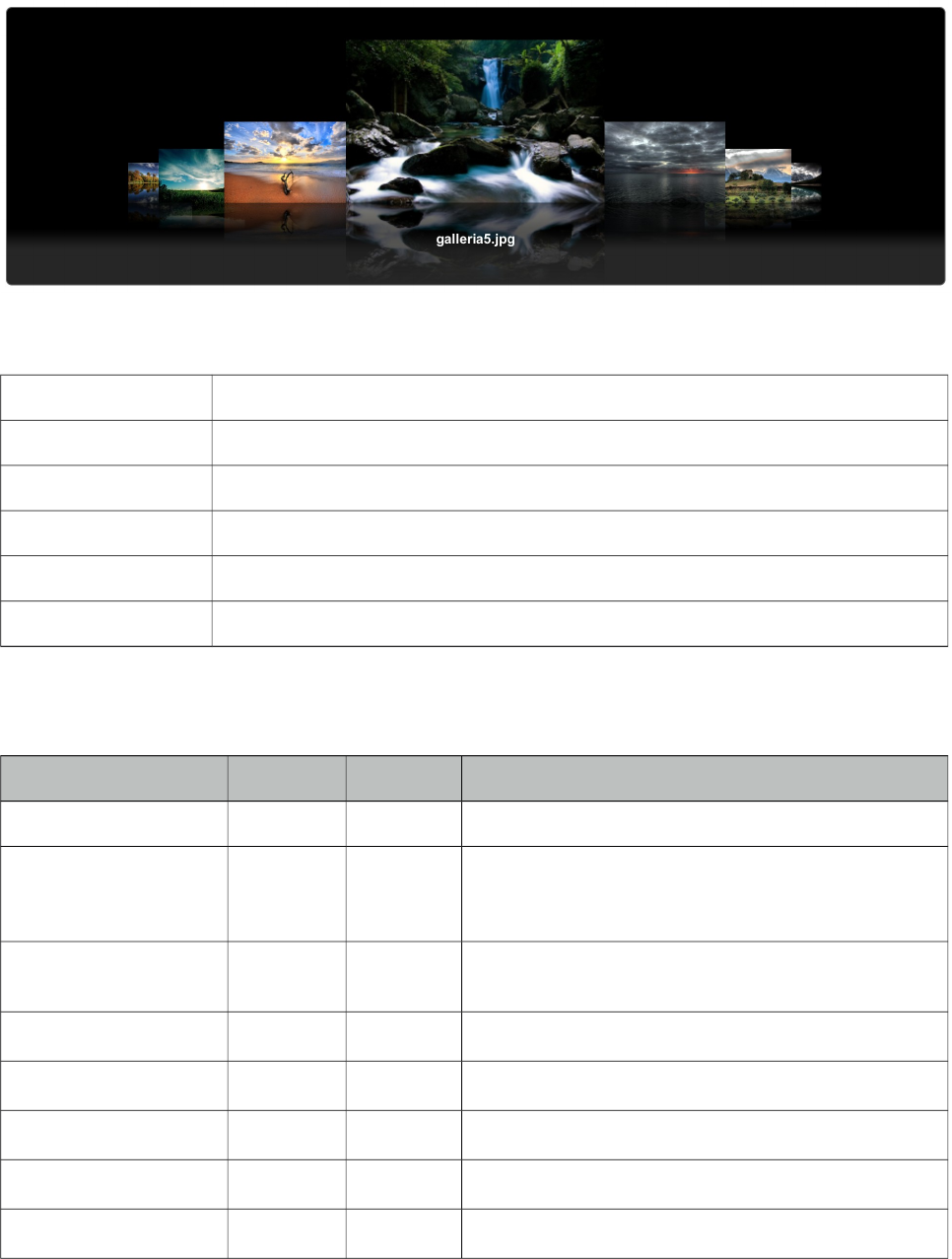
PrimeFaces User Guide
3.29 ContentFlow
ContentFlow is a horizontal content gallery component with a slide animation.
Info
Tag contentFlow
Component Class org.primefaces.component.contentflow.ContentFlow
Component Type org.primefaces.component.ContentFlow
Component Family org.primefaces.component
Renderer Type org.primefaces.component.ContentFlowRenderer
Renderer Class org.primefaces.component.contentflow.ContentFlowRenderer
Attributes
Name Default Type Description
id null String Unique identifier of the component.
rendered true Boolean Boolean value to specify the rendering of the
component, when set to false component will not be
rendered.
binding null Object An el expression that maps to a server side
UIComponent instance in a backing bean.
widgetVar null String Name of the client side widget.
value null String Collection of items to display.
var null String Name of the iterator to display an item.
style null String Inline style of the component.
styleClass null String Style class of the component.
128
PrimeFaces User Guide
Getting Started with ContentFlow
ContentFlow requires content as children that can either be defined dynamically using iteration or
one by one. Each item must have the content style class applied as well.
Static Images
<p:contentFlow>
<p:graphicImage value="/images/photo1.jpg" styleClass="content" />
<p:graphicImage value="/images/photo2.jpg" styleClass="content" />
<p:graphicImage value="/images/photo2.jpg" styleClass="content" />
</p:contentFlow>
Dynamic Images
<p:contentFlow var="image" value="#{bean.images}">
<p:graphicImage value="/images/#{image}" styleClass="content" />
</p:contentFlow>
Caption
To present a caption along with an item, embed a div with "caption" style class inside.
<p:contentFlow var="image" value="#{bean.images}">
<p:graphicImage value="#{image.path}" styleClass="content" />
<div class="caption">#{image.title}</div>
</p:contentFlow>
Skinning
ContentFlow resides in a container element which style and styleClass options apply. As skinning
style classes are global, see the main theming section for more information. Following is the list of
structural style classes;
Style Class Applies
.ui-contentflow Container element.
.flow Container of item list
.item Item container
.caption Caption element
129
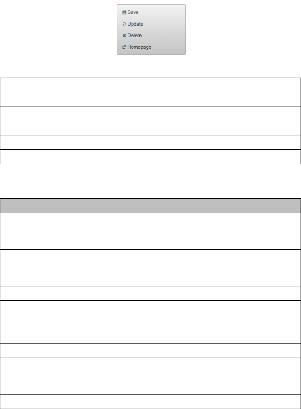
PrimeFaces User Guide
3.30 ContextMenu
ContextMenu provides an overlay menu displayed on mouse right-click event.
Info
Tag contextMenu
Component Class org.primefaces.component.contextmenu.ContextMenu
Component Type org.primefaces.component.ContextMenu
Component Family org.primefaces.component
Renderer Type org.primefaces.component.ContextMenuRenderer
Renderer Class org.primefaces.component.contextmenu.ContextMenuRenderer
Attributes
Name Default Type Description
id null String Unique identifier of the component
rendered true Boolean Boolean value to specify the rendering of the component,
when set to false component will not be rendered.
binding null Object An el expression that maps to a server side UIComponent
instance in a backing bean
widgetVar null String Name of the client side widget.
for null String Id of the component to attach to
style null String Style of the main container element
styleClass null String Style class of the main container element
model null MenuModel Menu model instance to create menu programmatically.
nodeType null String Specific type of tree nodes to attach to.
event null String Event to bind contextMenu display, default is
contextmenu aka right click.
beforeShow null String Client side callback to execute before showing.
selectionMode multiple String Defines the selection behavior, e.g "single" or "multiple".
130
PrimeFaces User Guide
Name Default Type Description
targetFilter null String Selector to filter the elements to attach the menu.
Getting started with ContextMenu
ContextMenu is created with submenus and menuitems. Optional for attribute defines which
component the contextMenu is attached to. When for is not defined, contextMenu is attached to the
page meaning, right-click on anywhere on page will display the menu.
<p:contextMenu>
<p:menuitem value="Save" actionListener="#{bean.save}" update="msg"/>
<p:menuitem value="Delete" actionListener="#{bean.delete}" ajax="false"/>
<p:menuitem value="Go Home" url=" www.primefaces.org " target="_blank"/>
</p:contextMenu
ContextMenu example above is attached to the whole page and consists of three different
menuitems with different use cases. First menuitem triggers an ajax action, second one triggers a
non-ajax action and third one is used for navigation.
Attachment
ContextMenu can be attached to any JSF component, this means right clicking on the attached
component will display the contextMenu. Following example demonstrates an integration between
contextMenu and imageSwitcher, contextMenu here is used to navigate between images.
<p:imageSwitch id="images" widgetVar="gallery" slideshowAuto="false">
<p:graphicImage value="/images/nature1.jpg" />
<p:graphicImage value="/images/nature2.jpg" />
<p:graphicImage value="/images/nature3.jpg" />
<p:graphicImage value="/images/nature4.jpg" />
</p:imageSwitch>
<p:contextMenu for="images">
<p:menuitem value="Previous" url="#" onclick="PF('gallery').previous()" />
<p:menuitem value="Next" url="#" onclick="PF('gallery').next()" />
</p:contextMenu>
Now right-clicking anywhere on an image will display the contextMenu like;
131
PrimeFaces User Guide
Data Components
Data components like datatable, tree and treeTable has special integration with context menu, see
the documentation of these component for more information.
Dynamic Menus
ContextMenus can be created programmatically as well, see the dynamic menus part in menu
component section for more information and an example.
Skinning
ContextMenu resides in a main container which style and styleClass attributes apply. Following is
the list of structural style classes;
Style Class Applies
.ui-contextmenu Container element of menu
.ui-menu-list List container
.ui-menuitem Each menu item
.ui-menuitem-link Anchor element in a link item
.ui-menuitem-text Text element in an item
As skinning style classes are global, see the main theming section for more information.
132
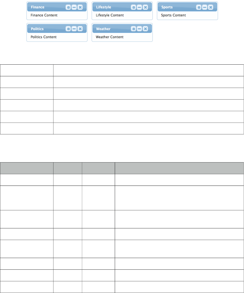
PrimeFaces User Guide
3.31 Dashboard
Dashboard provides a portal like layout with drag&drop based reorder capabilities.
Info
Tag dashboard
Component Class org.primefaces.component.dashboard.Dashboard
Component Type org.primefaces.component.Dashboard
Component Family org.primefaces.component
Renderer Type org.primefaces.component.DashboardRenderer
Renderer Class org.primefaces.component.dashboard.DashboardRenderer
Attributes
Name Default Type Description
id null String Unique identifier of the component
rendered true Boolean Boolean value to specify the rendering of the
component, when set to false component will not be
rendered.
binding null Object An el expression that maps to a server side
UIComponent instance in a backing bean
widgetVar null String Name of the client side widget
model null Dashboard
Model
Dashboard model instance representing the layout of
the UI.
disabled false Boolean Disables reordering feature.
style null String Inline style of the dashboard container
styleClass null String Style class of the dashboard container
133

PrimeFaces User Guide
Getting started with Dashboard
Dashboard is backed by a DashboardModel and consists of panel components.
<p:dashboard model="#{bean.model}">
<p:panel id="sports">
//Sports Content
</p:panel>
<p:panel id="finance">
//Finance Content
</p:panel>
//more panels like lifestyle, weather, politics...
</p:dashboard>
Dashboard model simply defines the number of columns and the widgets to be placed in each
column. See the end of this section for the detailed Dashboard API.
public class Bean {
private DashboardModel model;
public Bean() {
model = new DefaultDashboardModel();
DashboardColumn column1 = new DefaultDashboardColumn();
DashboardColumn column2 = new DefaultDashboardColumn();
DashboardColumn column3 = new DefaultDashboardColumn();
column1.addWidget("sports");
column1.addWidget("finance");
column2.addWidget("lifestyle");
column2.addWidget("weather");
column3.addWidget("politics");
model.addColumn(column1);
model.addColumn(column2);
model.addColumn(column3);
}
}
State
Dashboard is a stateful component, whenever a widget is reordered dashboard model will be
updated, by persisting the user changes so you can easily create a stateful dashboard.
Ajax Behavior Events
“reorder” is the one and only ajax behavior event provided by dashboard, this event is fired when
dashboard panels are reordered. A defined listener will be invoked by passing an
org.primefaces.event.DashboardReorderEvent instance containing information about reorder.
Following dashboard displays a message about the reorder event
134
PrimeFaces User Guide
<p:dashboard model="#{bean.model}">
<p:ajax event=”reorder” update=”messages” listener=”#{bean.handleReorder}” />
//panels
</p:dashboard>
<p:growl id="messages" />
public class Bean {
...
public void handleReorder(DashboardReorderEvent event) {
String widgetId = event.getWidgetId();
int widgetIndex = event.getItemIndex();
int columnIndex = event.getColumnIndex();
int senderColumnIndex = event.getSenderColumnIndex();
//Add facesmessage
}
}
If a widget is reordered in the same column, senderColumnIndex will be null. This field is
populated only when a widget is transferred to a column from another column. Also when the
listener is invoked, dashboard has already updated it’s model.
Disabling Dashboard
If you’d like to disable reordering feature, set disabled option to true.
<p:dashboard disabled="true" ...>
//panels
</p:dashboard>
Toggle, Close and Options Menu
Widgets presented in dashboard can be closable, toggleable and have options menu as well,
dashboard doesn’t implement these by itself as these features are already provided by the panel
component. See panel component section for more information.
<p:dashboard model="#{dashboardBean.model}">
<p:panel id="sports" closable="true" toggleable="true">
//Sports Content
</p:panel>
</p:dashboard>
New Widgets
Draggable component is used to add new widgets to the dashboard. This way you can add new
panels from outside of the dashboard.
135
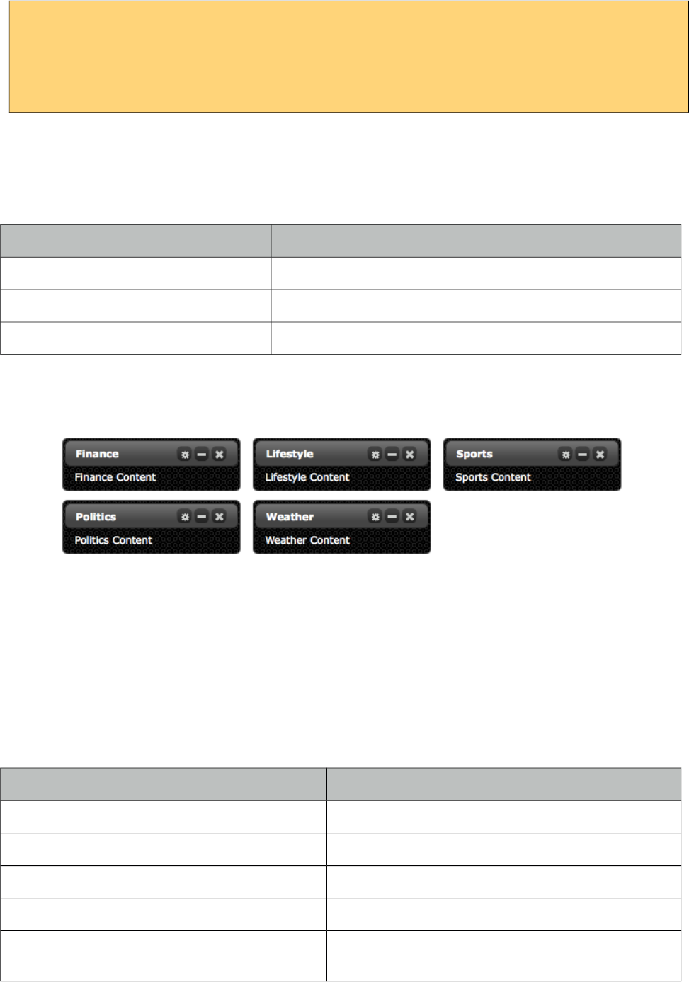
PrimeFaces User Guide
<p:dashboard model="#{dashboardBean.model}" id="board">
//panels
</p:dashboard>
<p:panel id="newwidget" />
<p:draggable for="newwidget" helper="clone" dashboard="board" />
Skinning
Dashboard resides in a container element which style and styleClass options apply. Following is the
list of structural style classes;
Style Class Applies
.ui-dashboard Container element of dashboard
.ui-dashboard-column Each column in dashboard
div.ui-state-hover Placeholder
As skinning style classes are global, see the main theming section for more information. Here is an
example based on a different theme;
Tips
•Provide a column width using ui-dashboard-column style class otherwise empty columns might
not receive new widgets.
Dashboard Model API
org.primefaces.model.DashboardModel (org.primefaces.model.map.DefaultDashboardModel is the
default implementation)
Method Description
void addColumn(DashboardColumn column) Adds a column to the dashboard
List<DashboardColumn> getColumns() Returns all columns in dashboard
int getColumnCount() Returns the number of columns in dashboard
DashboardColumn getColumn(int index) Returns the dashboard column at given index
void transferWidget(DashboardColumn from,
DashboardColumn to, String widgetId, int index)
Relocates the widget identifed with widget id to the
given index of the new column from old column.
136
PrimeFaces User Guide
org.primefaces.model.DashboardColumn (org.primefaces.model.map.DefaultDashboardModel is
the default implementation)
Method Description
void removeWidget(String widgetId) Removes the widget with the given id
List<String> getWidgets() Returns the ids of widgets in column
int getWidgetCount() Returns the count of widgets in column
String getWidget(int index) Returns the widget id with the given index
void addWidget(String widgetId) Adds a new widget with the given id
void addWidget(int index, String widgetId) Adds a new widget at given index
void reorderWidget(int index, String widgetId) Updates the index of widget in column
137
PrimeFaces User Guide
3.32 DataExporter
DataExporter is handy for exporting data listed using a Primefaces Datatable to various formats
such as excel, pdf, csv and xml.
Info
Tag dataExporter
Tag Class org.primefaces.component.export.DataExporterTag
ActionListener Class org.primefaces.component.export.DataExporter
Attributes
Name Default Type Description
type null String Export type: "xls","pdf","csv", "xml"
target null String Search expression to resolve one or multiple
datatables.
fileName null String Filename of the generated export file, defaults to
datatable id.
pageOnly 0 String Exports only current page instead of whole dataset
preProcessor null MethodExpr PreProcessor for the exported document.
postProcessor null MethodExpr PostProcessor for the exported document.
encoding UTF-8 Boolean Character encoding to use
selectionOnly fale Boolean When enabled, only selection would be exported.
repeat false Boolean Set to true if target is a datatable that is rendered
multiple times in a repeating component.
options null ExporterOptions Options object to customize document.
Getting Started with DataExporter
DataExporter is nested in a UICommand component such as commandButton or commandLink. For
pdf exporting itext and for xls exporting poi libraries are required in the classpath. Target must
point to a PrimeFaces Datatable. Assume the table to be exported is defined as;
<p:dataTable id="tableId" ...>
//columns
</p:dataTable>
Excel export (type="xls | xlsx | xlsxstream")
138

PrimeFaces User Guide
<p:commandButton value="Export as Excel" ajax="false">
<p:dataExporter type="xls" target="tableId" fileName="cars"/>
</p:commandButton>
PDF export (type="pdf")
<p:commandButton value="Export as PDF" ajax="false" >
<p:dataExporter type="pdf" target="tableId" fileName="cars"/>
</p:commandButton>
CSV export (type="csv")
<p:commandButton value="Export as CSV" ajax="false" >
<p:dataExporter type="csv" target="tableId" fileName="cars"/>
</p:commandButton>
XML export (type="xml")
<p:commandButton value="Export as XML" ajax="false" >
<p:dataExporter type="xml" target="tableId" fileName="cars"/>
</p:commandLink>
PageOnly
By default dataExporter works on whole dataset, if you’d like export only the data displayed on
current page, set pageOnly to true.
<p:dataExporter type="pdf" target="tableId" fileName="cars" pageOnly="true"/>
Excluding Columns
In case you need one or more columns to be ignored set exportable option of column to false.
<p:column exportable="false">
//...
</p:column>
Monitor Status
DataExport is a non-ajax process so ajaxStatus component cannot apply. See FileDownload
Monitor Status section to find out how monitor export process. Same solution applies to data export
as well.
Custom Export
If you need to provide a custom way to retrieve the string value of a column in export, use
exportFunction property of a column that resolves to a method expression. This method takes the
column instance and should return a string to be included exported document.
139
PrimeFaces User Guide
Pre and Post Processors
Processors are handy to customize the exported document (e.g. add logo, caption ...). PreProcessors
are executed before the data is exported and PostProcessors are processed after data is included in
the document. Processors are simple java methods taking the document as a parameter.
Change Excel Table Header
First example of processors changes the background color of the exported excel’s headers.
<h:commandButton value="Export as XLS">
<p:dataExporter type="xls" target="tableId" fileName="cars"
postProcessor="#{bean.postProcessXLS}"/>
</h:commandButton>
public void postProcessXLS(Object document) {
HSSFWorkbook wb = (HSSFWorkbook) document;
HSSFSheet sheet = wb.getSheetAt(0);
HSSFRow header = sheet.getRow(0);
HSSFCellStyle cellStyle = wb.createCellStyle();
cellStyle.setFillForegroundColor(HSSFColor.GREEN.index);
cellStyle.setFillPattern(HSSFCellStyle.SOLID_FOREGROUND);
for(int i=0; i < header.getPhysicalNumberOfCells();i++) {
header.getCell(i).setCellStyle(cellStyle);
}
}
Add Logo to PDF
This example adds a logo to the PDF before exporting begins.
<h:commandButton value="Export as PDF">
<p:dataExporter type="pdf" target="tableId" fileName="cars"
preProcessor="#{bean.preProcessPDF}"/>
</h:commandButton>
public void preProcessPDF(Object document) throws IOException,
BadElementException, DocumentException {
Document pdf = (Document) document;
ServletContext servletContext = (ServletContext)
FacesContext.getCurrentInstance().getExternalContext().getContext();
String logo = servletContext.getRealPath("") + File.separator + "images" +
File.separator + "prime_logo.png";
pdf.add(Image.getInstance(logo));
}
Customization
Excel and PDF documents can be further customized using exporterOptions property that takes a
configuration object that implements ExporterOptions.
140
PrimeFaces User Guide
<h:commandButton value="Export as XLS">
<p:dataExporter type="xls" target="tableId" fileName="cars"
options="#{customizedDocumentsView.excelOpt}"/>
</h:commandButton>
public class CustomizedDocumentsView implements Serializable {
private ExcelOptions excelOpt;
@PostConstruct
public void init() {
excelOpt = new ExcelOptions();
excelOpt.setFacetBgColor("#F88017");
excelOpt.setFacetFontSize("10");
excelOpt.setFacetFontColor("#0000ff");
excelOpt.setFacetFontStyle("BOLD");
excelOpt.setCellFontColor("#00ff00");
excelOpt.setCellFontSize("8");
}
public ExcelOptions getExcelOpt() {
return excelOpt;
}
}
141
PrimeFaces User Guide
3.33 DataGrid
DataGrid displays a collection of data in a grid layout.
Info
Tag dataGrid
Component Class org.primefaces.component.datagrid.DataGrid
Component Type org.primefaces.component.DataGrid
Component Family org.primefaces.component
Renderer Type org.primefaces.component.DataGridRenderer
Renderer Class org.primefaces.component.datagrid.DataGridRenderer
Attributes
Name Default Type Description
id null String Unique identifier of the component
rendered true Boolean Boolean value to specify the rendering of the
component, when set to false component will
not be rendered.
binding null Object An el expression that maps to a server side
UIComponent instance in a backing bean
142
PrimeFaces User Guide
Name Default Type Description
value null Object Data to display.
var null String Name of the request-scoped variable used to
refer each data.
rows null Integer Number of rows to display per page.
first 0 Integer Index of the first row to be displayed
widgetVar null String Name of the client side widget.
columns 3 Integer Number of columns in grid.
paginator false boolean Enables pagination.
paginatorTemplate null String Template of the paginator.
rowsPerPageTemplate null String Template of the rowsPerPage dropdown.
currentPageReportTemplate null String Template of the currentPageReport UI.
pageLinks 10 Integer Maximum number of page links to display.
paginatorPosition both String Position of the paginator.
paginatorAlwaysVisible true Boolean Defines if paginator should be hidden if total
data count is less than number of rows per page.
style null String Inline style of the datagrid.
styleClass null String Style class of the datagrid.
rowIndexVar null String Name of the iterator to refer each row index.
lazy false Boolean Defines if lazy loading is enabled for the data
component.
emptyMessage No records
found.
String Text to display when there is no data to display.
layout tabular String Layout approach to use, valid values are
"tabular" and "grid" for responsive grid.
Getting started with the DataGrid
A list of cars will be used throughout the datagrid, datalist and datatable examples.
public class Car {
private String model;
private int year;
private String manufacturer;
private String color;
...
}
143
PrimeFaces User Guide
The code for CarBean that would be used to bind the datagrid to the car list.
public class CarBean {
private List<Car> cars;
public CarBean() {
cars = new ArrayList<Car>();
cars.add(new Car("myModel",2005,"ManufacturerX","blue"));
//add more cars
}
public List<Car> getCars() {
return cars;
}
}
<p:dataGrid var="car" value="#{carBean.cars}" columns="3" rows="12">
<p:column>
<p:panel header="#{car.model}">
<h:panelGrid columns="1">
<p:graphicImage value="/images/cars/#{car.manufacturer}.jpg"/>
<h:outputText value="#{car.year}" />
</h:panelGrid>
</p:panel>
</p:column>
</p:dataGrid>
This datagrid has 3 columns and 12 rows. As datagrid extends from standard UIData, rows
correspond to the number of data to display not the number of rows to render so the actual number
of rows to render is rows/columns = 4. As a result datagrid is displayed as;
144
PrimeFaces User Guide
Ajax Pagination
DataGrid has a built-in paginator that is enabled by setting paginator option to true.
<p:dataGrid var="car" value="#{carBean.cars}" columns="3" rows="12"
paginator="true">
...
</p:dataGrid>
Paginator Template
Paginator is customized using paginatorTemplateOption that accepts various keys of UI controls.
Note that this section applies to dataGrid, dataList and dataTable.
• FirstPageLink
• LastPageLink
• PreviousPageLink
• NextPageLink
• PageLinks
• CurrentPageReport
• RowsPerPageDropdown
• JumpToPageDropdown
Note that {RowsPerPageDropdown} has it’s own template, options to display is provided via
rowsPerPageTemplate attribute (e.g. rowsPerPageTemplate="9,12,15").
Also {CurrentPageReport} has it’s own template defined with currentPageReportTemplate option.
You can use {currentPage},{totalPages},{totalRecords},{startRecord},{endRecord} keyword
within currentPageReportTemplate. Default is {currentPage} of{totalPages}. Default UI is;
which corresponds to the following template.
"{FirstPageLink} {PreviousPageLink} {PageLinks} {NextPageLink} {LastPageLink}"
Here are more examples based on different templates;
" {CurrentPageReport} {FirstPageLink} {PreviousPageLink} {PageLinks} {NextPageLink}
{LastPageLink} {RowsPerPageDropdown}"
" {PreviousPageLink} {CurrentPageReport} {NextPageLink}"
Paginator Position
Paginator can be positoned using paginatorPosition attribute in three different locations, "top",
"bottom" or "both" (default).
145

PrimeFaces User Guide
Custom Content in Paginator
Custom content can be placed inside a paginator using a facet name matching a token in the
template.
<p:dataTable paginatorTemplate="{CurrentPageReport} {MyContent} ...">
<f:facet name="{MyContent}">
//Any content here
</f:facet>
//...
</p:dataTable>
Selecting Data
Selection of data displayed in datagrid is very similar to row selection in datatable, you can access
the current data using the var reference. Here is an example to demonstrate how to select data from
datagrid and display within a dialog with ajax.
<h:form id="carForm">
<p:dataGrid var="car" value="#{carBean.cars}" columns="3" rows="12">
<p:panel header="#{car.model}">
<p:commandLink update=":carForm:display" oncomplete="PF('dlg').show()">
<f:setPropertyActionListener value="#{car}"
target="#{carBean.selectedCar}"
<h:outputText value="#{car.model}" />
</p:commandLink>
</p:panel>
</p:dataGrid>
<p:dialog modal="true" widgetVar="dlg">
<h:panelGrid id="display" columns="2">
<f:facet name="header">
<p:graphicImage value="/images/cars/#{car.manufacturer}.jpg"/>
</f:facet>
<h:outputText value="Model:" />
<h:outputText value="#{carBean.selectedCar.year}" />
//more selectedCar properties
</h:panelGrid>
</p:dialog>
</h:form>
public class CarBean {
private List<Car> cars;
private Car selectedCar;
//getters and setters
}
146
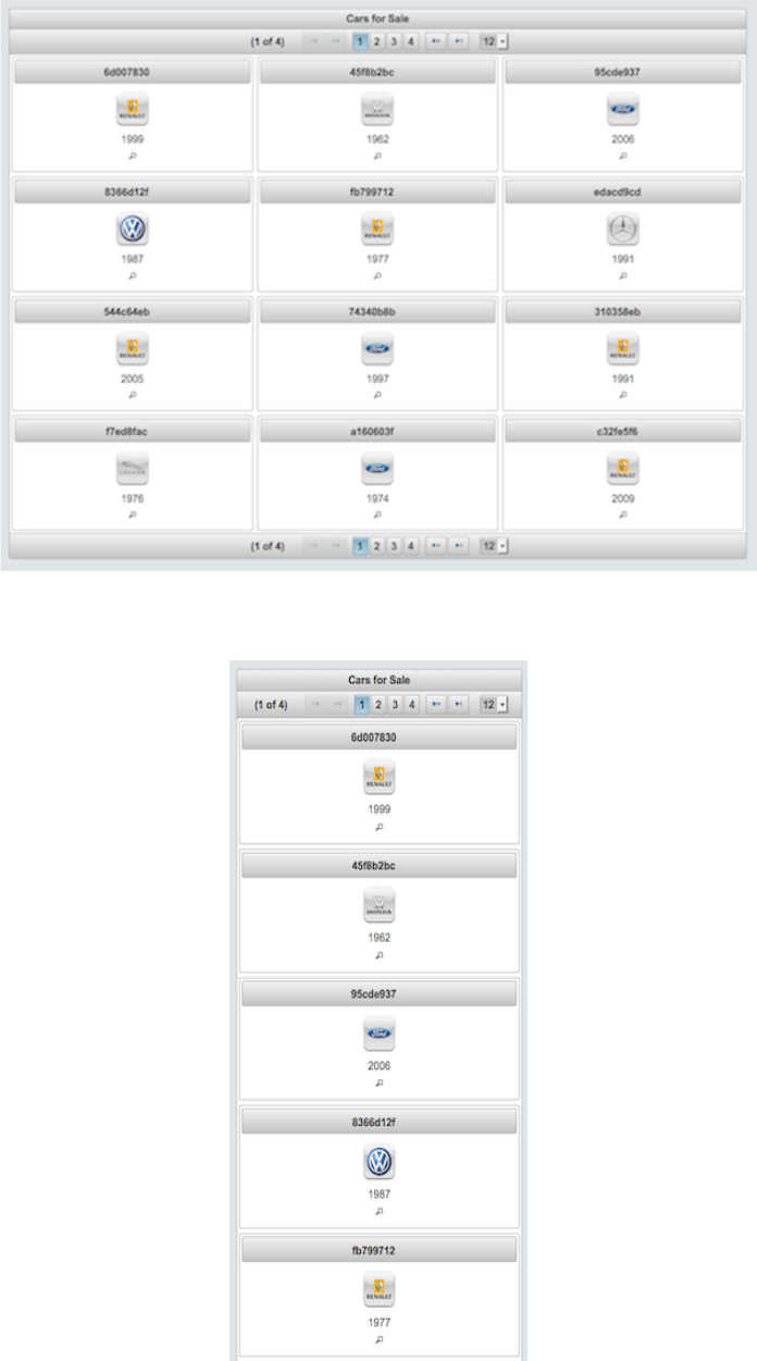
PrimeFaces User Guide
Layout Modes
DataGrid has two layout modes, "tabular" mode uses a table element and "grid" mode uses
PrimeFaces Grid CSS create a responsive ui.
On a smaller screen, grid mode adjusts the content for the optimal view.
147
PrimeFaces User Guide
Ajax Behavior Events
Event Listener Parameter Fired
page org.primefaces.event.data.PageEvent On pagination.
<p:dataGrid var="car" value="#{carBean.model}">
<p:ajax event="page" update=”anothercomponent" />
//content
</p:dataGrid>
Client Side API
Widget: PrimeFaces.widget.DataGrid
Method Params Return Type Description
getPaginator() - Paginator Returns the paginator widget.
Skinning
DataGrid resides in a main div container which style and styleClass attributes apply. Following is
the list of structural style classes;
Class Applies
.ui-datagrid Main container element
.ui-datagrid-content Content container.
.ui-datagrid-data Table element containing data
.ui-datagrid-row A row in grid
.ui-datagrid-column A column in grid
As skinning style classes are global, see the main theming section for more information.
Tips
• DataGrid supports lazy loading data via LazyDataModel, see DataTable lazy loading section.
•DataGrid provides two facets named header and footer that you can use to provide custom content
at these locations.
148
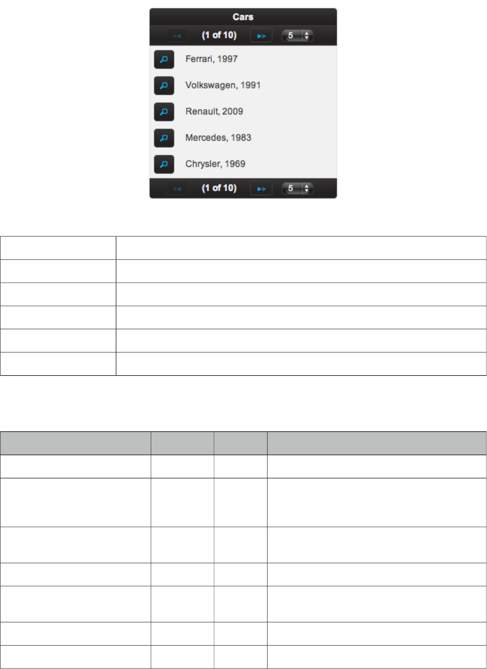
PrimeFaces User Guide
3.34 DataList
DataList presents a collection of data in list layout with several display types.
Info
Tag dataList
Component Class org.primefaces.component.datalist.DataList
Component Type org.primefaces.component.DataList
Component Family org.primefaces.component
Renderer Type org.primefaces.component.DataListRenderer
Renderer Class org.primefaces.component.datalist.DataListRenderer
Attributes
Name Default Type Description
id null String Unique identifier of the component
rendered true boolean Boolean value to specify the rendering of the
component, when set to false component will
not be rendered.
binding null Object An el expression that maps to a server side
UIComponent instance in a backing bean
value null Object Data to display.
var null String Name of the request-scoped variable used to
refer each data.
rows null Integer Number of rows to display per page.
first 0 Integer Index of the first row to be displayed
149
PrimeFaces User Guide
Name Default Type Description
type unordered String Type of the list, valid values are "unordered",
"ordered", "definition" and "none".
itemType null String Specifies the list item type.
widgetVar null String Name of the client side widget.
paginator false boolean Enables pagination.
paginatorTemplate null String Template of the paginator.
rowsPerPageTemplate null String Template of the rowsPerPage dropdown.
currentPageReportTemplate null String Template of the currentPageReport UI.
pageLinks 10 Integer Maximum number of page links to display.
paginatorPosition both String Position of the paginator.
paginatorAlwaysVisible true Boolean Defines if paginator should be hidden if total
data count is less than number of rows per
page.
style null String Inline style of the main container.
styleClass Null String Style class of the main container.
rowIndexVar null String Name of the iterator to refer each row index.
varStatus null String Name of the exported request scoped variable
to represent state of the iteration same as in
ui:repeat varStatus.
lazy false Boolean Defines if lazy loading is enabled for the data
component.
emptyMessage No records
found.
String Text to display when there is no data to
display.
itemStyleClass null String Style class of an item in list.
Getting started with the DataList
Since DataList is a data iteration component, it renders it’s children for each data represented with
var option. See itemType section for more information about the possible values.
<p:dataList value="#{carBean.cars}" var="car" itemType="disc">
#{car.manufacturer}, #{car.year}
</p:dataList>
Ordered Lists
DataList displays the data in unordered format by default, if you’d like to use ordered display set
type option to "ordered".
150
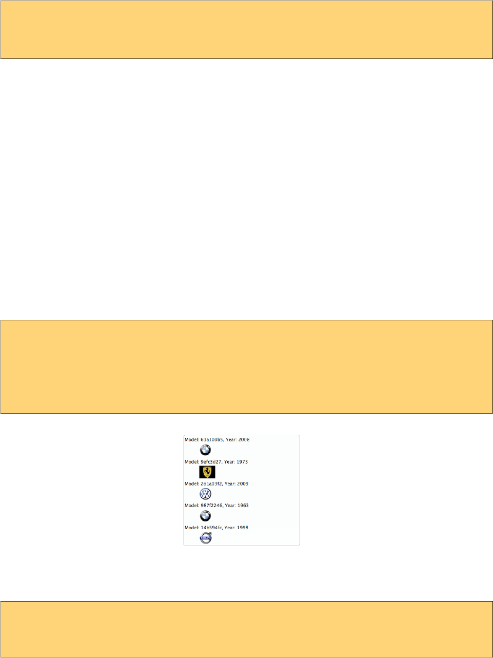
PrimeFaces User Guide
<p:dataList value="#{carBean.cars}" var="car" type="ordered">
#{car.manufacturer}, #{car.year}
</p:dataList>
Item Type
itemType defines the bullet type of each item. For ordered lists, in addition to commonly used
decimal type, following item types are available;
- A
- a
- i
And for unordered lists, available values are;
- disc
- circle
- square
Definition Lists
Third type of dataList is definition lists that display inline description for each item, to use
definition list set type option to "definition". Detail content is provided with the facet called
"description".
<p:dataList value="#{carBean.cars}" var="car" type="definition">
Model: #{car.model}, Year: #{car.year}
<f:facet name="description">
<p:graphicImage value="/images/cars/#{car.manufacturer}.jpg"/>
</f:facet>
</p:dataList>
Ajax Pagination
DataList has a built-in paginator that is enabled by setting paginator option to true.
<p:dataList value="#{carBean.cars}" var="car" paginator="true" rows="10">
#{car.manufacturer}, #{car.year}
</p:dataList>
Pagination configuration and usage is same as dataGrid, see pagination section in dataGrid
documentation for more information and examples.
151
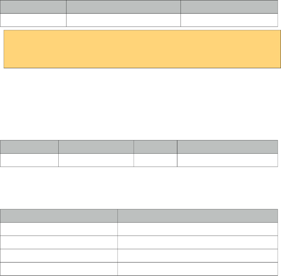
PrimeFaces User Guide
Ajax Behavior Events
Event Listener Parameter Fired
page org.primefaces.event.data.PageEvent On pagination.
<p:dataList var="car" value="#{carBean.model}">
<p:ajax event="page" update=”anothercomponent" />
//content
</p:dataList>
Selecting Data
Data selection can be implemented same as in dataGrid, see selecting data section in dataGrid
documentation for more information and an example.
Client Side API
Widget: PrimeFaces.widget.DataList
Method Params Return Type Description
getPaginator() - Paginator Returns the paginator widget.
Skinning
DataList resides in a main div container which style and styleClass attributes apply. Following is the
list of structural style classes;
Class Applies
.ui-datalist Main container element
.ui-datalist-content Content container
.ui-datalist-data Data container
.ui-datalist-item Each item in list
As skinning style classes are global, see the main theming section for more information.
Tips
• DataList supports lazy loading data via LazyDataModel, see DataTable lazy loading section.
•If you need full control over list type markup, set type to “none”. With this setting, datalist does
not render item tags like li and behaves like ui:repeat.
•DataList provides two facets named header and footer that you can use to provide custom content
at these locations.
152
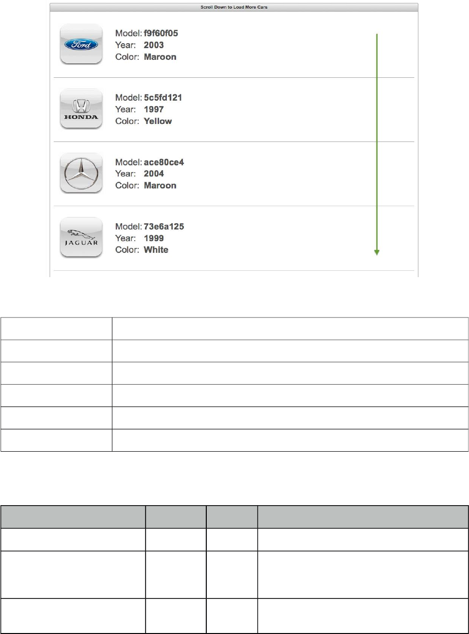
PrimeFaces User Guide
3.35 DataScroller
DataScroller displays a collection of data with on demand loading using scrolling.
Info
Tag dataScroller
Component Class org.primefaces.component.datascroller.DataScroller
Component Type org.primefaces.component.DataScroller
Component Family org.primefaces.component
Renderer Type org.primefaces.component.DataScrollerRenderer
Renderer Class org.primefaces.component.datascroller.DataScrollerRenderer
Attributes
Name Default Type Description
id null String Unique identifier of the component
rendered true Boolean Boolean value to specify the rendering of the
component, when set to false component will
not be rendered.
binding null Object An el expression that maps to a server side
UIComponent instance in a backing bean
153
PrimeFaces User Guide
Name Default Type Description
value null Object Data to display.
var null String Name of the request-scoped variable used to
refer each data.
rows null Integer Number of rows to display per page.
first 0 Integer Index of the first row to be displayed
widgetVar null String Name of the client side widget.
style null String Inline style of the main container.
styleClass Null String Style class of the main container.
chunkSize 0 int Number of items to fetch in each load.
rowIndexVar null String Name of iterator to refer each row index.
mode document String Defines the target to listen for scroll event,
valid values are "document" (default) and
"inline".
scrollHeight null String Defines pixel height of the viewport in inline
mode.
lazy false Boolean Defines if lazy loading is enabled for the data
component.
buffer 10 Integer Percentage height of the buffer between the
bottom of the page and the scroll position to
initiate the load for the new chunk. Value is
defined in integer and default is 10 meaning
load would happen after 90% of the viewport
is scrolled down.
Getting started with the DataScroller
DataScroller requires a collection of data to display, when the page is scrolled down, datascroller
will do a request with ajax to fetch the new chunk of data and append them at the bottom.
<p:dataScroller value="#{carBean.cars}" var="car" chunkSize="10">
#{car.manufacturer}
//more content
</p:dataScroller>
Scroll Mode
Default element whose scrollbar is monitored is page itself, mode option is used to customize the
scroll target. Two possible options for the mode attribute are “document” and “inline”. Document
mode is default and inline mode listens to the scroll event of the datascroller container itself.
154
PrimeFaces User Guide
<p:dataScroller value="#{carBean.cars}" var="car" mode="inline" chunkSize="10">
#{car.manufacturer}
//more content
</p:dataScroller>
Loader
In case of scrolling, a UI element such as button can defined as the loader so that new data is loaded
when the loader element is clicked. Loader component is defined using "loader" facet.
<p:dataScroller value="#{carBean.cars}" var="car" mode="inline" chunkSize="10">
#{car.manufacturer}
//more content
<f:facet name="loader">
<p:commandButton type="button" value="View More" />
</f:facet>
</p:dataScroller>
Lazy Loading
Lazy loading is enabled by enabling the lazy attribute and providing a LazyDataModel instance as
the value. Refer to lazy load example in DataTable for an example about LazyDataModel.
<p:dataScroller value="#{carBean.lazyModel}" var="car" lazy="true">
#{car.manufacturer}
//more content
</p:dataScroller>
Header
Header of the component is defined using header facet.
<p:dataScroller value="#{carBean.lazyModel}" var="car">
<f:facet name="header">Cars</f:facet>
#{car.manufacturer}
//more content
</p:dataScroller>
Client Side API
Widget: PrimeFaces.widget.DataScroller
Method Params Return Type Description
load() - void Loads the next chunk.
155
PrimeFaces User Guide
Skinning
DataScroller resides in a main div container which style and styleClass attributes apply. Following
is the list of structural style classes;
Class Applies
.ui-datascroller Main container element
.ui-datascroller-inline Main container element in inline mode
.ui-datalist-header Header element
.ui-datalist-content Content element
.ui-datascroller-list List element container
.ui-datascroller-item Container of each item in the list
.ui-datascroller-loader Container of custom loader element.
.ui-datascroller-loading Built-in load status indicator
As skinning style classes are global, see the main theming section for more information.
156
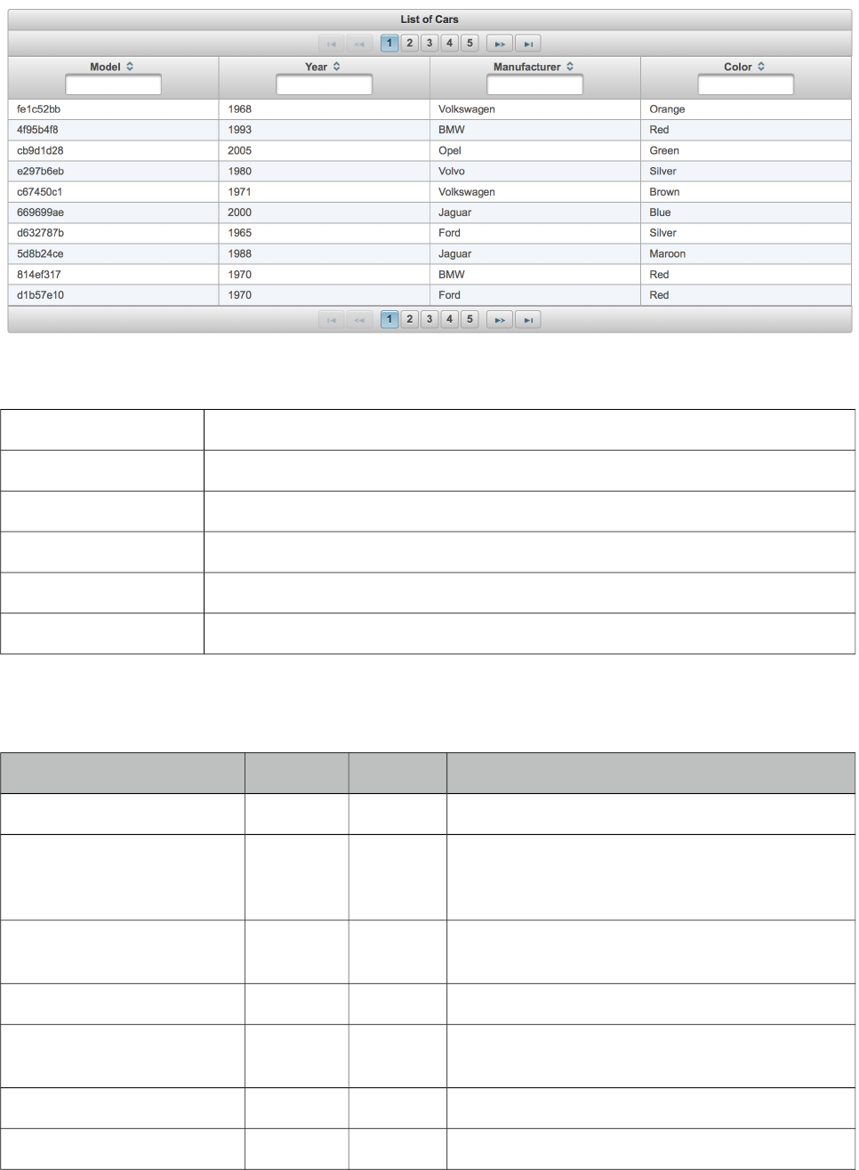
PrimeFaces User Guide
3.36 DataTable
DataTable displays data in tabular format.
Info
Tag dataTable
Component Class org.primefaces.component.datatable.DataTable
Component Type org.primefaces.component.DataTable
Component Family org.primefaces.component
Renderer Type org.primefaces.component.DataTableRenderer
Renderer Class org.primefaces.component.datatable.DataTableRenderer
Attributes
Name Default Type Description
id null String Unique identifier of the component
rendered false Boolean Boolean value to specify the rendering of the
component, when set to false component will not
be rendered.
binding null Object An el expression that maps to a server side
UIComponent instance in a backing bean
value null Object Data to display.
var null String Name of the request-scoped variable used to refer
each data.
rows null Integer Number of rows to display per page.
first 0 Integer Index of the first row to be displayed
157
PrimeFaces User Guide
Name Default Type Description
widgetVar null String Name of the client side widget.
paginator false Boolean Enables pagination.
paginatorTemplate null String Template of the paginator.
rowsPerPageTemplate null String Template of the rowsPerPage dropdown.
rowsPerPageLabel null String Label for the rowsPerPage dropdown.
currentPageReportTemplate null String Template of the currentPageReport UI.
pageLinks 10 Integer Maximum number of page links to display.
paginatorPosition both String Position of the paginator.
paginatorAlwaysVisible true Boolean Defines if paginator should be hidden if total data
count is less than number of rows per page.
scrollable false Boolean Makes data scrollable with fixed header.
scrollHeight null Integer Scroll viewport height.
scrollWidth null Integer Scroll viewport width.
selectionMode null String Enables row selection, valid values are “single”
and “multiple”.
selection null Object Reference to the selection data.
rowIndexVar null String Name of iterator to refer each row index.
emptyMessage No
records
found.
String Text to display when there is no data to display.
Alternative is emptyMessage facet.
style null String Inline style of the component.
styleClass null String Style class of the component.
dblClickSelect false Boolean Enables row selection on double click.
liveScroll false Boolean Enables live scrolling.
rowStyleClass null String Style class for each row.
onExpandStart null String Client side callback to execute before expansion.
resizableColumns false Boolean Enables column resizing.
sortBy null Object Property to be used for default sorting.
sortOrder ascending String “ascending” or “descending”.
scrollRows 0 Integer Number of rows to load on live scroll.
rowKey null String Unique identifier of a row.
tableStyle null String Inline style of the table element.
158
PrimeFaces User Guide
Name Default Type Description
tableStyleClass null String Style class of the table element.
filterEvent keyup String Event to invoke filtering for input filters.
filterDelay 300 Integer Delay in milliseconds before sending an ajax
filter query.
draggableColumns false Boolean Columns can be reordered with dragdrop when
enabled.
editable false Boolean Controls incell editing.
lazy false Boolean Controls lazy loading.
filteredValue null List List to keep filtered data.
sortMode single String Defines sorting mode, valid values are single and
multiple.
editMode row String Defines edit mode, valid values are row and cell.
editingRow false Boolean Defines if cell editors of row should be displayed
as editable or not.
cellSeparator null String Separator text to use in output mode of editable
cells with multiple components.
summary null String Summary attribute for WCAG.
frozenRows null Object Collection to display as fixed in scrollable mode.
dir ltr String Defines text direction, valid values are ltr and rtl.
liveResize false Boolean Columns are resized live in this mode without
using a resize helper.
stickyHeader false Boolean Sticky header stays in window viewport during
scrolling.
expandedRow false Boolean Defines if row should be rendered as expanded
by default.
disabledSelection false Boolean Disables row selection when true.
rowSelectMode new String Defines row selection mode for multiple
selection. Valid values are "new", "add" and
"checkbox".
rowExpandMode new String Defines row expand mode, valid values are
"single" and "multiple" (default).
dataLocale null Object Locale to be used in features such as filtering and
sorting, defaults to view locale.
nativeElements false Boolean Uses native radio-checkbox elements for row
selection.
frozenColumns 0 Integer Number of columns to freeze from start index 0.
159
PrimeFaces User Guide
Name Default Type Description
draggableRows false Boolean When enabled, rows can be reordered using
dragdrop.
caseSensitiveSort false Boolean Case sensitivity for sorting, insensitive by
default.
skipChildren false Boolean Ignores processing of children during lifecycle,
improves performance if table only has output
components.
disabledTextSelection true Boolean Disables text selection on row click.
sortField null String Name of the field to pass lazy load method for
sorting. If not specified, sortBy expression is
used to extract the name.
initMode load String Defines when the datatable is initiated at client
side, valid values are "load" (default) and
"immediate".
nullSortOrder 1 Integer Defines where the null values are placed in
ascending sort order. Default value is "1"
meaning null values are placed at the end in
ascending mode and at beginning in descending
mode. Set to "-1" for the opposite behavior.
tabindex null String Position of the element in the tabbing order.
reflow false Boolean Reflow mode is a responsive mode to display
columns as stacked depending on screen size.
liveScrollBuffer 0 Integer Percentage height of the buffer between the
bottom of the page and the scroll position to
initiate the load for the new chunk. Value is
defined in integer and default is 0.
rowHover false Boolean Adds hover effect to rows, default is false. Hover
is always on when selection is enabled.
rowStatePreserved false Boolean Keeps state of its children on a per-row basis.
Default is false.
resizeMode fit String Defines the resize behavior, valid values are "fit"
(default) and expand.
ariaRowLabel null String Label to read by screen readers on checkbox
selection.
saveOnCellBlur true Boolean Saves the changes in cell editing on blur, when
set to false changes are discarded..
clientCache false Boolean Caches the next page asynchronously, default is
false.
multiViewState false Boolean Whether to keep table state across views, defaults
to false.
160
PrimeFaces User Guide
Name Default Type Description
filterBy false List List of FilterState objects to filter table by
default.
globalFilter null String Value of the global filter to use when filtering by
default.
cellEditMode eager String Defines the cell edit behavior, valid values are
"eager" (default) and "lazy".
expandableRowGroups false Boolean Makes row groups toggleable, default is false.
virtualScroll false Boolean Loads data on demand as the scrollbar gets close
to the bottom. Default is false.
Getting started with the DataTable
We will be using the same Car and CarBean classes described in DataGrid section.
<p:dataTable var="car" value="#{carBean.cars}">
<p:column>
<f:facet name="header">
<h:outputText value="Model" />
</f:facet>
<h:outputText value="#{car.model}" />
</p:column>
//more columns
</p:dataTable>
Header and Footer
Both datatable itself and columns can have custom content in their headers and footers using header
and footer facets respectively. Alternatively for columns there are headerText and footerText
shortcuts to display simple texts.
161

PrimeFaces User Guide
<p:dataTable var="car" value="#{carBean.cars}">
<f:facet name="header">
List of Cars
</f:facet>
<p:column>
<f:facet name="header">
Model
</f:facet>
#{car.model}
<f:facet name="footer">
8 digit code
</f:facet>
</p:column>
<p:column headerText="Year" footerText="1960-2010">
#{car.year}
</p:column>
//more columns
<f:facet name="footer">
In total there are #{fn:length(carBean.cars)} cars.
</f:facet>
</p:dataTable>
Pagination
DataTable has a built-in ajax based paginator that is enabled by setting paginator option to true, see
pagination section in dataGrid documentation for more information about customization options.
<p:dataTable var="car" value="#{carBean.cars}" paginator="true" rows="10">
//columns
</p:dataTable>
Optionally enabling clientCache property loads the next page asynchronously so that when user
clicks the second page, data is displayed instantly from client side.
Sorting
Defining sortBy attribute enables ajax based sorting on that particular column.
<p:dataTable var="car" value="#{carBean.cars}">
<p:column sortBy="#{car.model}" headerText="Model">
<h:outputText value="#{car.model}" />
</p:column>
...more columns
</p:dataTable>
Instead of using the default sorting algorithm which uses a java comparator, you can plug-in your
own sort method as well.
public int sortByModel(Object car1, Object car2) {
//return -1, 0 , 1 if car1 is less than, equal to or greater than car2
}
162

PrimeFaces User Guide
<p:dataTable var="car" value="#{carBean.cars}">
<p:column sortBy="#{car.model}" sortFunction="#{carBean.sortByModel}"
headerText="Model">
<h:outputText value="#{car.model}" />
</p:column>
...more columns
</p:dataTable>
Multiple sorting is enabled by setting sortMode to multiple. In this mode, clicking a sort column
while metakey is on adds sort column to the order group.
<p:dataTable var="car" value="#{carBean.cars}" sortMode="multiple">
//columns
</p:dataTable>
DataTable can display data sorted by default, to implement this use the sortBy option of datatable
and the optional sortOrder. Table below would be initially displayed as sorted by model.
<p:dataTable var="car" value="#{carBean.cars}" sortBy="#{car.model}">
<p:column sortBy="#{car.model}" headerText=”Model”>
<h:outputText value="#{car.model}" />
</p:column>
<p:column sortBy="#{car.year}" headerText="Year">
<h:outputText value="#{car.year}" />
</p:column>
...more columns
</p:dataTable>
Filtering
Ajax based filtering is enabled by setting filterBy at column level and providing a list to keep the
filtered sublist. It is suggested to use a scope longer than request like viewscope to keep the
filteredValue so that filtered list is still accessible after filtering.
<p:dataTable var="car" value="#{carBean.cars}"
filteredValue="#{carBean.filteredCars}">
<p:column filterBy="#{car.model}" headerText="Model">
<h:outputText value="#{car.model}" />
</p:column>
...more columns
</p:dataTable>
Filtering is triggered with keyup event and filter inputs can be styled using filterStyle,
filterStyleClass attributes. If you’d like to use a dropdown instead of an input field to only allow
predefined filter values use filterOptions attribute and a collection/array of selectitems as value. In
addition, filterMatchMode defines the built-in matcher which is startsWith by default.
Following is a basic filtering datatable with these options demonstrated;
163

PrimeFaces User Guide
<p:dataTable var="car" value="#{carBean.cars}"
filteredValue="#{carBean.filteredCars}" widgetVar="carsTable">
<f:facet name="header">
<p:outputPanel>
<h:outputText value="Search all fields:" />
<h:inputText id="globalFilter" onkeyup="PF('carsTable').filter()" />
</p:outputPanel>
</f:facet>
<p:column filterBy="#{car.model}" headerText="Model" filterMatchMode="contains">
<h:outputText value="#{car.model}" />
</p:column>
<p:column filterBy="#{car.year}" headerText="Year" footerText="startsWith">
<h:outputText value="#{car.year}" />
</p:column>
<p:column filterBy="#{car.manufacturer}" headerText="Manufacturer"
filterOptions="#{carBean.manufacturerOptions}" filterMatchMode="exact">
<h:outputText value="#{car.manufacturer}" />
</p:column>
<p:column filterBy="#{car.color}" headerText="Color" filterMatchMode="endsWith">
<h:outputText value="#{car.color}" />
</p:column>
<p:column filterBy="#{car.price}" headerText="Price" filterMatchMode="exact">
<h:outputText value="#{car.price}" />
</p:column>
</p:dataTable>
Filter located at header is a global one applying on all fields, this is implemented by calling client
side API method called filter(), important part is to specify the id of the input text as globalFilter
which is a reserved identifier for datatable.
In addition to default filtering with generated elements, custom elements can also be used as a filter
facet. Example below uses custom filter components in combination with generated elements.
When a custom component is used as a filter facet, filtering needs to be called manually from a
preferred event such as onchange="PF('carsTable').filter()". Also defining a converter might be
necessary if the value of the filter facet is not defined.
164

PrimeFaces User Guide
<p:dataTable id="dataTable" var="car" value="#{tableBean.carsSmall}"
widgetVar="carsTable" filteredValue="#{tableBean.filteredCars}">
<p:column id="modelColumn" filterBy="#{car.model}" headerText="Model"
footerText="contains" filterMatchMode="contains">
<h:outputText value="#{car.model}" />
</p:column>
<p:column id="yearColumn" filterBy="#{car.year}" headerText="Year"
footerText="lte" filterMatchMode="lte">
<f:facet name="filter">
<p:spinner onchange="PF('carsTable').filter()" min="1960" max="2010">
<f:converter converterId="javax.faces.Integer" />
</p:spinner>
</f:facet>
<h:outputText value="#{car.year}" />
</p:column>
<p:column id="manufacturerColumn" filterBy="#{car.manufacturer}"
headerText="Manufacturer" footerText="exact" filterMatchMode="exact">
<f:facet name="filter">
<p:selectOneMenu onchange="PF('carsTable').filter()" >
<f:selectItems value="#{tableBean.manufacturerOptions}" />
</p:selectOneMenu>
</f:facet>
<h:outputText value="#{car.manufacturer}" />
</p:column>
<p:column id="colorColumn" filterBy="#{car.color}" headerText="Color"
footerText="in" filterMatchMode="in">
<f:facet name="filter">
<p:selectCheckboxMenu label="Colors"
onchange="PF('carsTable').filter()">
<f:selectItems value="#{tableBean.colors}" />
</p:selectCheckboxMenu>
</f:facet>
<h:outputText value="#{car.color}" />
</p:column>
<p:column id="soldColumn" filterBy="#{car.sold}" headerText="Status"
footerText="equals" filterMatchMode="equals">
<f:facet name="filter">
<p:selectOneButton onchange="PF('carsTable').filter()">
<f:converter converterId="javax.faces.Boolean" />
<f:selectItem itemLabel="All" itemValue="" />
<f:selectItem itemLabel="Sold" itemValue="true" />
<f:selectItem itemLabel="Sale" itemValue="false" />
</p:selectOneButton>
</f:facet>
<h:outputText value="#{car.sold ? 'Sold': 'Sale'}" />
</p:column>
</p:dataTable>
165
PrimeFaces User Guide
filterMatchMode defines which built-in filtering algorithm would be used per column, valid values
for this attribute are;
- startsWith: Checks if column value starts with the filter value.
- endsWith: Checks if column value ends with the filter value.
- contains: Checks if column value contains the filter value.
- exact: Checks if string representations of column value and filter value are same.
- lt: Checks if column value is less than the filter value.
- lte: Checks if column value is less than or equals the filter value.
- gt: Checks if column value is greater than the filter value.
- gte: Checks if column value is greater than or equals the filter value.
- equals: Checks if column value equals the filter value.
- in: Checks if column value is in the collection of the filter value.
In case the built-in methods do not suffice, custom filtering can be implemented using
filterFunction approach.
<p:column filterBy="#{car.price}" filterFunction="#{tableBean.filterByPrice}">
<h:outputText value="#{car.price}">
<f:convertNumber currencySymbol="$" type="currency"/>
</h:outputText>
</p:column>
filterFunction should be a method with three parameters; column value, filter value and locale.
Return value is a boolean, true accepts the value and false rejects it.
public boolean filterByPrice(Object value, Object filter, Locale locale) {
//return true or false
}
Locale is provided as optional in case you need to use a locale aware method like
toLowerCase(Locale locale). Note that String based filters like startsWith, endsWith uses
toLowerCase already and dataLocale attribute is used to provide the locale to use when filtering.
Row Selection
There are several ways to select row(s) from datatable. Let’s begin by adding a Car reference for
single selection and a Car array for multiple selection to the CarBean to hold the selected data.
public class CarBean {
private List<Car> cars;
private Car selectedCar;
private Car[] selectedCars;
public CarBean() {
cars = new ArrayList<Car>();
//populate cars
}
//getters and setters
}
Single Selection with a Command Component
This method is implemented with a command component such as commandLink or
commandButton. Selected row can be set to a server side instance by passing as a parameter if you
are using EL 2.2 or using f:setPropertyActionListener.
166
PrimeFaces User Guide
<p:dataTable var="car" value="#{carBean.cars}">
<p:column>
<p:commandButton value="Select">
<f:setPropertyActionListener value="#{car}"
target="#{carBean.selectedCar}" />
</p:commandButton>
</p:column>
...columns
</p:dataTable>
Single Selection with Row Click
Previous method works when the button is clicked, if you’d like to enable selection wherever the
row is clicked, use selectionMode option.
<p:dataTable var="car" value="#{carBean.cars}" selectionMode="single"
selection="#{carBean.selectedCar}" rowKey="#{car.id}">
...columns
</p:dataTable>
Multiple Selection with Row Click
Multiple row selection is similar to single selection but selection should reference an array or a list
of the domain object displayed and user needs to use press modifier key(e.g. ctrl) during selection *.
<p:dataTable var="car" value="#{carBean.cars}" selectionMode="multiple"
selection="#{carBean.selectedCars}" rowKey="#{car.id}" >
...columns
</p:dataTable>
Single Selection with RadioButton
Selection a row with a radio button placed on each row is a common case, datatable has built-in
support for this method so that you don’t need to deal with h:selectOneRadios and low level bits. In
order to enable this feature, define a column with selectionMode set as single.
<p:dataTable var="car" value="#{carBean.cars}" selection="#{carBean.selectedCar}"
rowKey="#{car.id}">
<p:column selectionMode="single"/>
...columns
</p:dataTable>
Multiple Selection with Checkboxes
Similar to how radio buttons are enabled, define a selection column with a multiple selectionMode.
DataTable will also provide a selectAll checkbox at column header.
<p:dataTable var="car" value="#{carBean.cars}" selection="#{carBean.selectedCars}"
rowKey="#{car.id}" >
<p:column selectionMode="multiple"/>
...columns
</p:dataTable>
167

PrimeFaces User Guide
* Use rowSelectMode option to customize the default behavior on row click of a multiple
selection enabled datatable. Default value is "new" that clears previous selections, "add" mode
keeps previous selections same as selecting a row with mouse click when metakey is on and
"checkbox" mode allows row selection with checkboxes only.
RowKey
RowKey should a unique identifier from your data model and used by datatable to find the selected
rows. You can either define this key by using the rowKey attribute or by binding a data model
which implements org.primefaces.model.SelectableDataModel.
Dynamic Columns
Dynamic columns is handy in case you can’t know how many columns to render. Columns
component is used to define the columns programmatically. It requires a collection as the value, two
iterator variables called var and columnIndexVar.
<p:dataTable var="cars" value="#{tableBean.cars}">
<p:columns value="#{tableBean.columns}" var="column"
sortBy="#{column.property}" filterBy="#{column.property}">
<f:facet name="header">
#{column.header}
</f:facet>
<h:outputText value="#{cars[column.property]}" />
</p:columns>
</p:dataTable>
168
PrimeFaces User Guide
public class CarBean {
private List<ColumnModel> columns = new ArrayList<ColumnModel>();
private List<Car> cars;
public CarBean() {
populateColumns();
cars = //populate cars;
}
public void populateColumns() {
String[] columnKeys = new String[]{"model","year","color"};
for(String columnKey : columnKeys) {
columns.add(new ColumnModel(columnKey.toUpperCase(), columnKey));
}
}
//getters and setters
static public class ColumnModel implements Serializable {
private String header;
private String property;
public ColumnModel(String header, String property) {
this.header = header;
this.property = property;
}
public String getHeader() {
return header;
}
public String getProperty() {
return property;
}
}
}
Column Grouping
Grouping is defined by ColumnGroup component used to combine datatable header and footers.
169

PrimeFaces User Guide
<p:dataTable var="sale" value="#{carBean.sales}">
<p:columnGroup type="header">
<p:row>
<p:column rowspan="3" headerText="Manufacturer" />
<p:column colspan="4" headerText="Sales" />
</p:row>
<p:row>
<p:column colspan="2" headerText="Sales Count" />
<p:column colspan="2" headerText="Profit" />
</p:row>
<p:row>
<p:column headerText="Last Year" />
<p:column headerText="This Year" />
<p:column headerText="Last Year" />
<p:column headerText="This Year" />
</p:row>
</p:columnGroup>
<p:column>
#{sale.manufacturer}
</p:column>
<p:column>
#{sale.lastYearProfit}%
</p:column>
<p:column>
#{sale.thisYearProfit}%
</p:column>
<p:column>
#{sale.lastYearSale}$
</p:column>
<p:column>
#{sale.thisYearSale}$
</p:column>
<p:columnGroup type="footer">
<p:row>
<p:column colspan="3" style="text-align:right" footerText="Totals:"/>
<p:column footerText="#{tableBean.lastYearTotal}$" />
<p:column footerText="#{tableBean.thisYearTotal}$" />
</p:row>
</p:columnGroup>
</p:dataTable>
public class CarBean {
private List<Sale> sales;
public CarBean() {
sales = //create a list of BrandSale objects
}
public List<Sale> getSales() {
return this.sales;
}
}
For frozen columns, use frozenHeader, frozenFooter, scrollableHeader and scrollableFooter types.
170

PrimeFaces User Guide
Row Grouping
Rows can be grouped in two ways, using headerRow, summaryRow components or with groupRow
attribute on a column.
<p:dataTable var="car" value="#{dtRowGroupView.cars}" sortBy="#{car.brand}">
<p:headerRow>
<p:column colspan="3">
<h:outputText value="#{car.brand}" />
</p:column>
</p:headerRow>
<p:column headerText="Year">
<h:outputText value="#{car.year}" />
</p:column>
<p:column headerText="Color">
<h:outputText value="#{car.color}" />
</p:column>
<p:column headerText="Id">
<h:outputText value="#{car.id}" />
</p:column>
<p:summaryRow>
<p:column colspan="2" style="text-align:right">
<h:outputText value="Total:" />
</p:column>
<p:column>
<h:outputText value="#{dtRowGroupView.randomPrice}">
<f:convertNumber type="currency" currencySymbol="$" />
</h:outputText>
</p:column>
</p:summaryRow>
</p:dataTable>
Optionally rows can be made toggleable using expandableRowGroups property.
Alternative approach is using row spans where a row can group multiple rows within the same
group. To enable this method, set groupRow to true on the grouping column.
<p:dataTable var="car" value="#{dtRowGroupView.cars}" sortBy="#{car.brand}">
<p:column headerText="Brand" groupRow="true">
<h:outputText value="#{car.brand}" />
</p:column>
<p:column headerText="Year">
<h:outputText value="#{car.year}" />
</p:column>
<p:column headerText="Color">
<h:outputText value="#{car.color}" />
</p:column>
<p:column headerText="Id">
<h:outputText value="#{car.id}" />
</p:column>
</p:dataTable>
171
PrimeFaces User Guide
Scrolling
Scrolling makes the header-footer of the table fixed and the body part scrollable. Scrolling is
enabled using scrollable property and has 3 modes; x, y and x-y scrolling that are defined by
scrollHeight and scrollWidth. These two scroll attributes can be specified using integer values
indicating fixed pixels or percentages relative to the container dimensions.
<p:dataTable var="car" value="#{bean.data}" scrollable="true" scrollHeight="150">
<p:column />
//columns
</p:dataTable>
Simple scrolling renders all data to client whereas virtual scrolling combined with lazy loading is
useful to deal with huge data, in this case data is fetched on-demand. Set virtualScroll to enable this
option and provide LazyDataModel;
<p:dataTable var="car" value="#{bean.data}" scrollable="true" scrollHeight="150"
virtual="true">
<p:column />
//columns
</p:dataTable>
Frozen Rows
Certain rows can be fixed in a scrollable table by using the frozenRows attribute that defines the
number of rows to freeze from the start.
<p:dataTable var="car" value="#{bean.data}" scrollable="true" scrollHeight="150"
frozenRows="2">
<p:column />
//columns
</p:dataTable>
Frozen Columns
Specific columns can be fixed while the rest of them remain as scrollable. frozenColumns defines
the number of columns to freeze from the start.
172
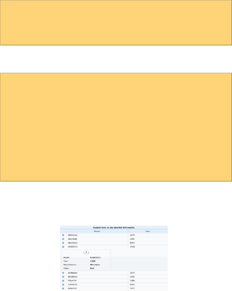
PrimeFaces User Guide
<p:dataTable var="car" value="#{bean.data}" scrollable="true" scrollWidth="200"
frozenColumns="2">
<p:column />
//columns
</p:dataTable>
Expandable Rows
RowToggler and RowExpansion facets are used to implement expandable rows.
<p:dataTable var="car" value="#{carBean.cars}">
<f:facet name="header">
Expand rows to see detailed information
</f:facet>
<p:column>
<p:rowToggler />
</p:column>
//columns
<p:rowExpansion>
//Detailed content of a car
</p:rowExpansion>
</p:dataTable>
p:rowToggler component places an expand/collapse icon, clicking on a collapsed row loads
expanded content with ajax. If you need to display a row as expanded by default, use expandedRow
attribute which is evaluated before rendering of each row so value expressions are supported.
Additionally, rowExpandMode attribute defines if multiple rows can be expanded at the same time
or not, valid values are "single" and "multiple" (default).
Editing
Incell editing provides an easy way to display editable data. p:cellEditor is used to define the cell
editor of a particular column. There are two types of editing, row and cell. Row editing is the
default mode and used by adding a p:rowEditor component as row controls.
173
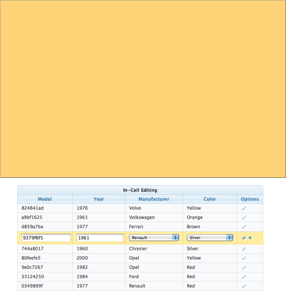
PrimeFaces User Guide
<p:dataTable var="car" value="#{carBean.cars}" editable="true">
<f:facet name="header">
In-Cell Editing
</f:facet>
<p:column headerText="Model">
<p:cellEditor>
<f:facet name="output">
<h:outputText value="#{car.model}" />
</f:facet>
<f:facet name="input">
<h:inputText value="#{car.model}"/>
</f:facet>
</p:cellEditor>
</p:column>
//more columns with cell editors
<p:column>
<p:rowEditor />
</p:column>
</p:dataTable>
When pencil icon is clicked, row is displayed in editable mode meaning input facets are displayed
and output facets are hidden. Clicking tick icon only saves that particular row and cancel icon
reverts the changes, both options are implemented with ajax interaction.
Another option for incell editing is cell editing, in this mode a cell switches to edit mode when it is
clicked, losing focus triggers an ajax event to save the change value.
Lazy Loading
Lazy Loading is an approach to deal with huge datasets efficiently, regular ajax based pagination
works by rendering only a particular page but still requires all data to be loaded into memory. Lazy
loading datatable renders a particular page similarly but also only loads the page data into memory
not the whole dataset. In order to implement this, you’d need to bind a
org.primefaces.model.LazyDataModel as the value and implement load method and enable lazy
option. Also it is required to implement getRowData and getRowKey if you have selection enabled.
174

PrimeFaces User Guide
<p:dataTable var="car" value="#{carBean.model}" paginator="true" rows="10"
lazy="true">
//columns
</p:dataTable>
public class CarBean {
private LazyDataModel model;
public CarBean() {
model = new LazyDataModel() {
@Override
public void load(int first, int pageSize, String sortField,
SortOrder sortOrder, Map<String,Object> filters) {
//load physical data
}
};
int totalRowCount = //logical row count based on a count query
model.setRowCount(totalRowCount);
}
public LazyDataModel getModel() {
return model;
}
}
DataTable calls your load implementation whenever a paging, sorting or filtering occurs with
following parameters;
• first: Offset of first data to start from
• pageSize: Number of data to load
• sortField: Name of sort field
• sortOrder: SortOrder enum.
• filter: Filter map with field name as key (e.g. "model" for filterBy="#{car.model}") and value.
In addition to load method, totalRowCount needs to be provided so that paginator can display itself
according to the logical number of rows to display.
It is suggested to use field attribute of column component to define the field names passed as
sortField and filterFields, otherwise these fields would be tried to get extracted from the value
expression which is not possible in cases like composite components.
Sticky Header
Sticky Header feature makes the datatable header visible on page scrolling.
<p:dataTable var="car" value="#{carBean.model}" stickyHeader="true">
//columns
</p:dataTable>
175
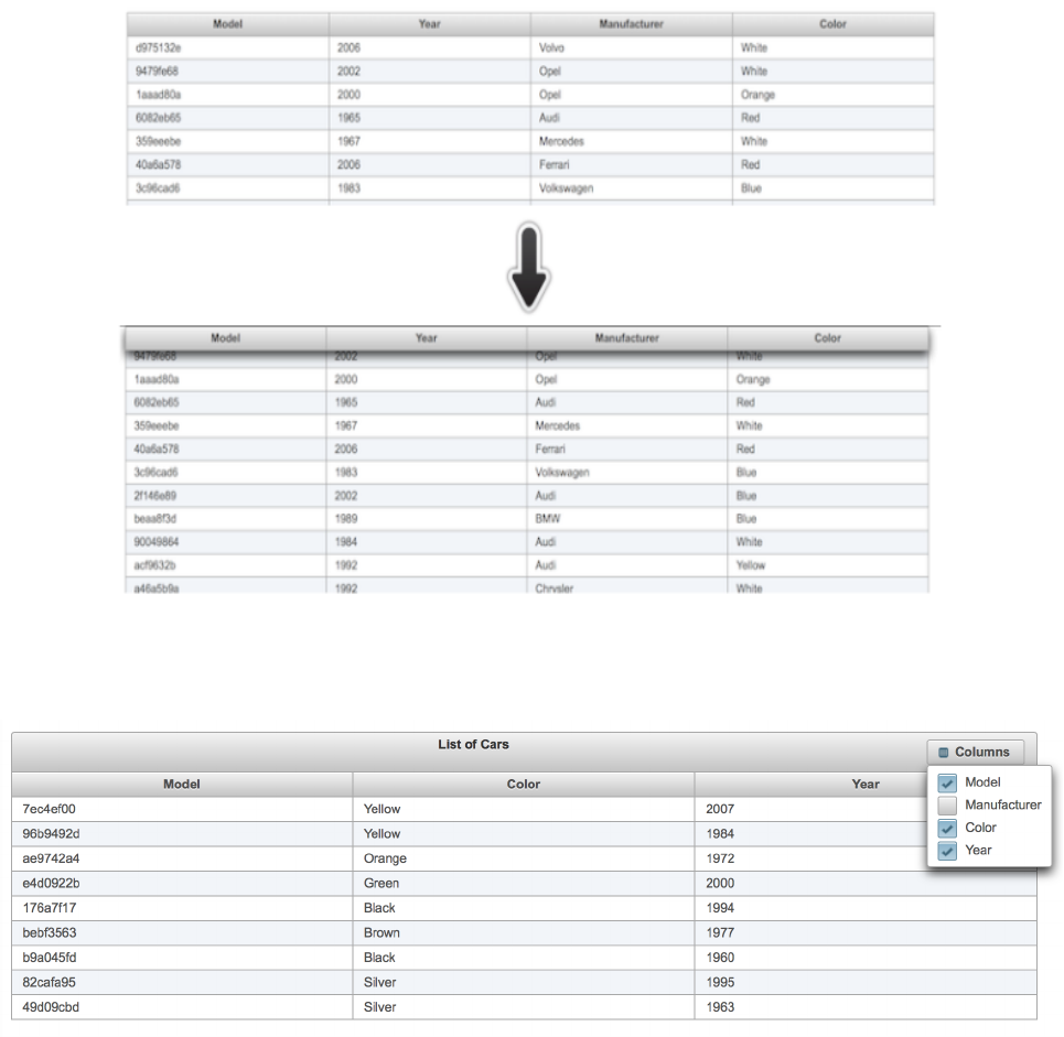
PrimeFaces User Guide
Column Toggler
Visibility of columns can be toggled using the column toggler helper component.
176

PrimeFaces User Guide
<p:dataTable var="car" value="#{tableBean.cars}">
<f:facet name="header">
List of Cars
<p:commandButton id="toggler" type="button" value="Columns"
style="float:right" icon="ui-icon-calculator" />
<p:columnToggler datasource="cars" trigger="toggler" />
</f:facet>
<p:column headerText="Model">
#{car.model}
</p:column>
<p:column headerText="Year" sortBy="year">
#{car.year}
</p:column>
<p:column headerText="Manufacturer" sortBy="manufacturer">
#{car.manufacturer}
</p:column>
<p:column headerText="Color" sortBy="color">
#{car.color}
</p:column>
</p:dataTable>
On page load, column chooser finds all columns of datatable and generates the ui. If you'd like
some of the columns to be ignored, set toggleable option of a column as false and for certain ones to
be hidden by default, set visible as false. Optional toggle ajax behavior is provided by
columnChooser component to listen to toggle events at server side. Listener of this behavior gets an
org.primefaces.event.ToggleEvent as a parameter that gives the visibility and index of the column
being toggled.
Add Row
When a new data needs to be added to the datatable, instead of updating the whole table to show it,
just call addRow() client side method and it will append the tr element only.
<p:dataTable var="car" value="#{dtBasicView.cars}" widgetVar="dt">
<p:column headerText="Id">
<h:inputText value="#{car.id}" />
</p:column>
<p:column headerText="Year">
<h:inputText value="#{car.year}" />
</p:column>
<p:column headerText="Brand">
<h:inputText value="#{car.brand}" />
</p:column>
</p:dataTable>
<p:commandButton value="Add" actionListener="#{dtBasicView.addCar}"
oncomplete="PF('dt').addRow()" process="@this"/>
177
PrimeFaces User Guide
Reordering Rows
Rows of the table can be reordered using drag&drop. Set draggableRows attribute to true to enable
this feature.
Optional rowReorder ajax behavior is provided to listen to reorder events at server side. Listener of
this behavior gets an org.primefaces.event.ReorderEvent as a parameter that gives the past and
current index of the row being moved.
<p:dataTable var="car" value="#{tableBean.cars}" draggableRows="true">
<p:ajax event="rowReorder" listener="#{tableBean.onRowReorder}" />
<p:column headerText="Model">
#{car.model}
</p:column>
//columns
</p:dataTable>
public class TableBean {
//...
public void onRowReorder(ReorderEvent event) {
//int from = event.getFromIndex();
//int end = event.getEndIndex();
}
}
Reordering Columns
Columns of the table can be reordered using drag&drop as well. Set draggableColumns attribute to
true to enable this feature. Optional colReorder ajax behavior is provided to listen to reorder events
at server side.
<p:dataTable var="car" value="#{tableBean.cars}" draggableColumns="true">
<p:column headerText="Model">
#{car.model}
</p:column>
//columns
</p:dataTable>
Responsive DataTable
DataTable has two responsive modes; priority and reflow. In priority mode, responsiveness is based
on column priorities that vary between 1 and 6. Lower value means higher priority. On the other
hand in reflow mode that is enabled by setting reflow to true, all columns will be visible but
displayed as stacked.
178
PrimeFaces User Guide
Ajax Behavior Events
Event Listener Parameter Fired
page org.primefaces.event.data.PageEvent On pagination.
sort org.primefaces.event.data.SortEvent When a column is sorted.
filter org.primefaces.event.data.FilterEvent On filtering.
rowSelect org.primefaces.event.SelectEvent When a row is being selected.
rowUnselect org.primefaces.event.UnselectEvent When a row is being unselected.
rowEdit org.primefaces.event.RowEditEvent When a row is edited.
rowEditInit org.primefaces.event.RowEditEvent When a row switches to edit mode
rowEditCancel org.primefaces.event.RowEditEvent When row edit is cancelled.
colResize org.primefaces.event.ColumnResizeEvent When a column is being selected.
toggleSelect org.primefaces.event.ToggleSelectEvent When header checkbox is toggled.
colReorder - When columns are reordered.
rowSelectRadio org.primefaces.event.SelectEvent Row selection with radio.
rowSelectCheckbox org.primefaces.event.SelectEvent Row selection with checkbox.
rowUnselectCheckbox org.primefaces.event.UnselectEvent Row unselection with checkbox.
rowDblselect org.primefaces.event.SelectEvent Row selection with double click.
rowToggle org.primefaces.event.ToggleEvent Row expand or collapse.
contextMenu org.primefaces.event.SelectEvent ContextMenu display.
cellEdit org.primefaces.event.CellEditEvent When a cell is edited.
cellEditInit org.primefaces.event.CellEditEvent When a cell edit begins.
cellEditCancel org.primefaces.event.CellEditEvent When a cell edit is cancelled e.g.
with escape key
rowReorder org.primefaces.event.ReorderEvent On row reorder.
For example, datatable below makes an ajax request when a row is selected with a click on row.
<p:dataTable var="car" value="#{carBean.model}">
<p:ajax event=”rowSelect” update=”another_component” />
//columns
</p:dataTable>
Moreover org.primefaces.event.data.PostSortEvent, org.primefaces.event.data.PostFilterEvent and
org.primefaces.event.data.PostPageEvent, are available to be used with f:event tag.
179
PrimeFaces User Guide
Client Side API
Widget: PrimeFaces.widget.DataTable
Method Params Return Type Description
getPaginator() - Paginator Returns the paginator insance.
clearFilters() - void Clears all column filters
getSelectedRowsCount() Number Returns number of selected rows.
selectRow(r, silent) r: number or tr
element as jQuery
object,
silent: flag to fire row
select ajax behavior
void Selects the given row.
unselectRow(r, silent) r: number or tr
element as jQuery
object,
silent: flag to fire row
select ajax behavior
void Unselects the given row.
unselectAllRows() -void Unselects all rows.
toggleCheckAll() -void Toggles header checkbox state.
filter() -Void Filters the data.
selectAllRows() -void Select all rows.
selectAllRowsOnPage() -void Select all rows on current page.
unselectAllRowsOnPage() -void Unselect all rows on current page.
Skinning
DataTable resides in a main container element which style and styleClass options apply. As skinning
style classes are global, see the main theming section for more information. Following is the list of
structural style classes;
Class Applies
.ui-datatable Main container element
.ui-datatable-data Table body
.ui-datatable-empty-message Empty message row
.ui-datatable-header Table header
.ui-datatable-footer Table footer
.ui-sortable-column Sortable columns
.ui-sortable-column-icon Icon of a sortable icon
.ui-expanded-row-content Content of an expanded row
180
PrimeFaces User Guide
Class Applies
.ui-row-toggler Row toggler for row expansion
.ui-editable-column Columns with a cell editor
.ui-cell-editor Container of input and output controls of an editable cell
.ui-cell-editor-input Container of input control of an editable cell
.ui-cell-editor-output Container of output control of an editable cell
.ui-datatable-even Even numbered rows
.ui-datatable-odd Odd numbered rows
.ui-datatable-scrollable Main container element of a scrollable table.
.ui-datatable-scrollable-header Header wrapper of a scrollable table.
.ui-datatable-scrollable-header-box Header container of a scrollable table.
.ui-datatable-scrollable-body Body container of a scrollable table.
.ui-datatable-scrollable-footer Footer wrapper of a scrollable table.
.ui-datatable-scrollable-footer-box Footer container of a scrollable table.
.ui-datatable-resizable Main container element of a resizable table.
.ui-datatable-frozencolumn Frozen columns.
181
PrimeFaces User Guide
3.37 DefaultCommand
Which command to submit the form with when enter key is pressed a common problem in web apps
not just specific to JSF. Browsers tend to behave differently as there doesn’t seem to be a standard
and even if a standard exists, IE probably will not care about it. There are some ugly workarounds
like placing a hidden button and writing javascript for every form in your app. DefaultCommand
solves this problem by normalizing the command(e.g. button or link) to submit the form with on
enter key press.
Info
Tag defaultCommand
Component Class org.primefaces.component.defaultcommand.DefaultCommand
Component Type org.primefaces.component.DefaultCommand
Component Family org.primefaces.component
Renderer Type org.primefaces.component.DefaultCommandRenderer
Renderer Class org.primefaces.component.defaultcommand.DefaultCommandRenderer
Attributes
Name Default Type Description
id null String Unique identifier of the component
rendered true Boolean Boolean value to specify the rendering of the
component, when set to false component will not be
rendered.
binding null Object An el expression that maps to a server side
UIComponent instance in a backing bean
widgetVar null String Name of the client side widget
target null String Identifier of the default command component.
scope null String Identifier of the ancestor component to enable
multiple default commands in a form.
Getting Started with the DefaultCommand
DefaultCommand must be nested inside a form requires target option to reference a clickable
command. Example below triggers btn2 when enter key is pressed. Note that an input must have
focused due to browser nature.
182

PrimeFaces User Guide
<h:form id="form">
<h:panelGrid columns="3" cellpadding="5">
<h:outputLabel for="name" value="Name:" style="font-weight:bold"/>
<p:inputText id="name" value="#{defaultCommandBean.text}" />
<h:outputText value="#{defaultCommandBean.text}" id="display" />
</h:panelGrid>
<p:commandButton value="Button1" id="btn1" actionListener="#{bean.submit1}"
ajax="false"/>
<p:commandButton value="Button2" id="btn2" actionListener="#{bean.submit2}" />
<h:commandButton value="Button3" id="btn3" actionListener="#{bean.submit3}" />
<p:defaultCommand target="bt2" />
</h:form>
Scope
If you need multiple default commands on same page use scope attribute that refers to the ancestor
component of the target input.
183
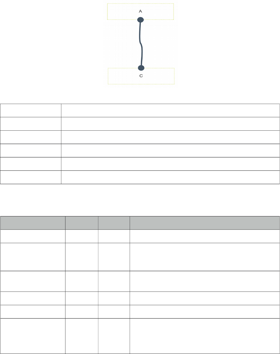
PrimeFaces User Guide
3.38 Diagram
Diagram is generic component to create visual elements and connect them on a web page. SVG is
used on modern browsers and VML on IE 8 and below. Component is highly flexible in terms of
api, events and theming.
Info
Tag diagram
Component Class org.primefaces.component.diagram.Diagram
Component Type org.primefaces.component.Diagram
Component Family org.primefaces.component
Renderer Type org.primefaces.component.DiagramRenderer
Renderer Class org.primefaces.component.diagram.DiagramRenderer
Attributes
Name Default Type Description
id null String Unique identifier of the component
rendered true Boolean Boolean value to specify the rendering of the
component, when set to false component will not be
rendered.
binding null Object An el expression that maps to a server side
UIComponent instance in a backing bean
widgetVar null String Name of the client side widget
value null String Model of the diagram.
converter null Converter
/String
An el expression or a literal text that defines a converter
for the component. When it’s an EL expression, it’s
resolved to a converter instance. In case it’s a static text,
it must refer to a converter id.
184
PrimeFaces User Guide
Name Default Type Description
style null String Inline style of the diagram.
styleClass null String Style class of the diagram.
Getting started with the Diagram
Diagram requires a backend model to display.
<p:diagram value="#{diagramBasicView.model}" style="height:400px" />
There are various concepts in diagram model;
- Element: Main type to be connected.
- EndPoint: Ports of elements to be used in connection.
- Connector: Connector to join elements.
- Overlay: Decorators over connectors and endpoints.
public class BasicView {
private DefaultDiagramModel model;
@PostConstruct
public void init() {
model = new DefaultDiagramModel();
model.setMaxConnections(-1);
Element elementA = new Element("A", "20em", "6em");
elementA.addEndPoint(new DotEndPoint(EndPointAnchor.BOTTOM));
Element elementB = new Element("B", "10em", "18em");
elementB.addEndPoint(new DotEndPoint(EndPointAnchor.TOP));
Element elementC = new Element("C", "40em", "18em");
elementC.addEndPoint(new DotEndPoint(EndPointAnchor.TOP));
model.addElement(elementA);
model.addElement(elementB);
model.addElement(elementC);
model.connect(new Connection(elementA.getEndPoints().get(0),
elementB.getEndPoints().get(0)));
model.connect(new Connection(elementA.getEndPoints().get(0),
elementC.getEndPoints().get(0)));
}
public DiagramModel getModel() {
return model;
}
}
In diagram above, there are 3 elements each having endpoints of dot type. After adding them to the
model, 2 connections are made, first one being A to B and second one from A to C.
185
PrimeFaces User Guide
Elements
Elements are the main part of diagram. Styling is done with css and positioning can be done using
model. An element should have at least width and height defined to be displayed on page. They can
be styled globally using .ui-diagram-element style class or individually using the styleClass
property on DiagramElement class.
EndPoints
EndPoints are the ports available on an element that can be used for connections. An endpoint has a
location defined by EndPointAnchor. Anchors can be static like "TopLeft" or dynamic like
"AutoDefault". There are 4 types of EndPoints differentiated by their shapes;
- BlankEndPoint
- DotEndPoint
- RectangleEndPoint
- ImagEndPoint
An endpoint is added to an element using addEndPoint api;
element.addEndPoint(new DotEndPoint(EndPointAnchor.TOP));
Connections
A connection requires two endpoints, connector and optional decorators like overlays. There are
four connector types;
- Bezier
- FlowChart
- Straight
- StateMachine
Default is bezier and it can be customized using default connector method globally in model or at
connection level.
Global
DiagramModel model = new DefaultDiagramModel();
FlowChartConnector connector = new FlowChartConnector();
connector.setPaintStyle("{strokeStyle:'#C7B097',lineWidth:3}");
model.setDefaultConnector(connector);
Per Connection
model.connect(new Connection(elementA.getEndPoints().get(0),
elementB.getEndPoints().get(0), new FlowChartConnector()));
Overlays
Overlays are decorators for connectors and endpoints. Available ones are;
186
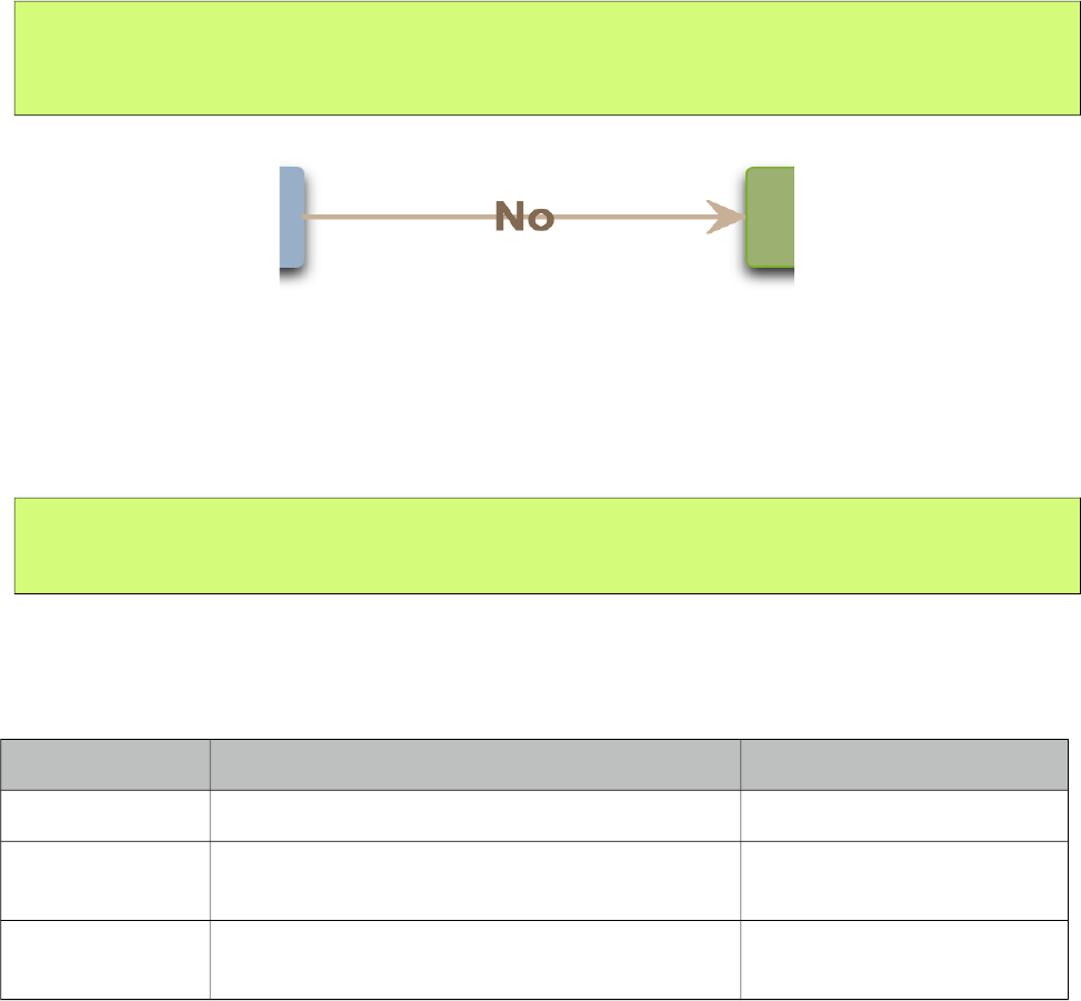
PrimeFaces User Guide
- ArrowOverlay
- DiamondOverlay
- LabelOverlay
Example below adds label and arrow for the connector;
Connection conn = new Connection(from, to);
conn.getOverlays().add(new ArrowOverlay(20, 20, 1, 1));
conn.getOverlays().add(new LabelOverlay(label, "flow-label", 0.5));
Dynamic Diagrams
A diagram can be edited after being initialized, to create new connections an element should be set
as source and to receive new connections it should be a target. Ajax event callbacks such as
"connect", "disconnect" and "connectionChange" are available.
ElementA.setSource(true);
ElementB.setTarget(true);
Ajax Behavior Events
Diagram provides ajax behavior event callbacks invoked by interactive diagrams.
Event Listener Parameter Fired
connect org.primefaces.event.diagram.ConnectEvent On new connection.
disconnect org.primefaces.event.diagram.DisconnectEvent When a connection is
removed.
connectionChange org.primefaces.event.diagram.ConnectionChange When a connection has
changed.
187
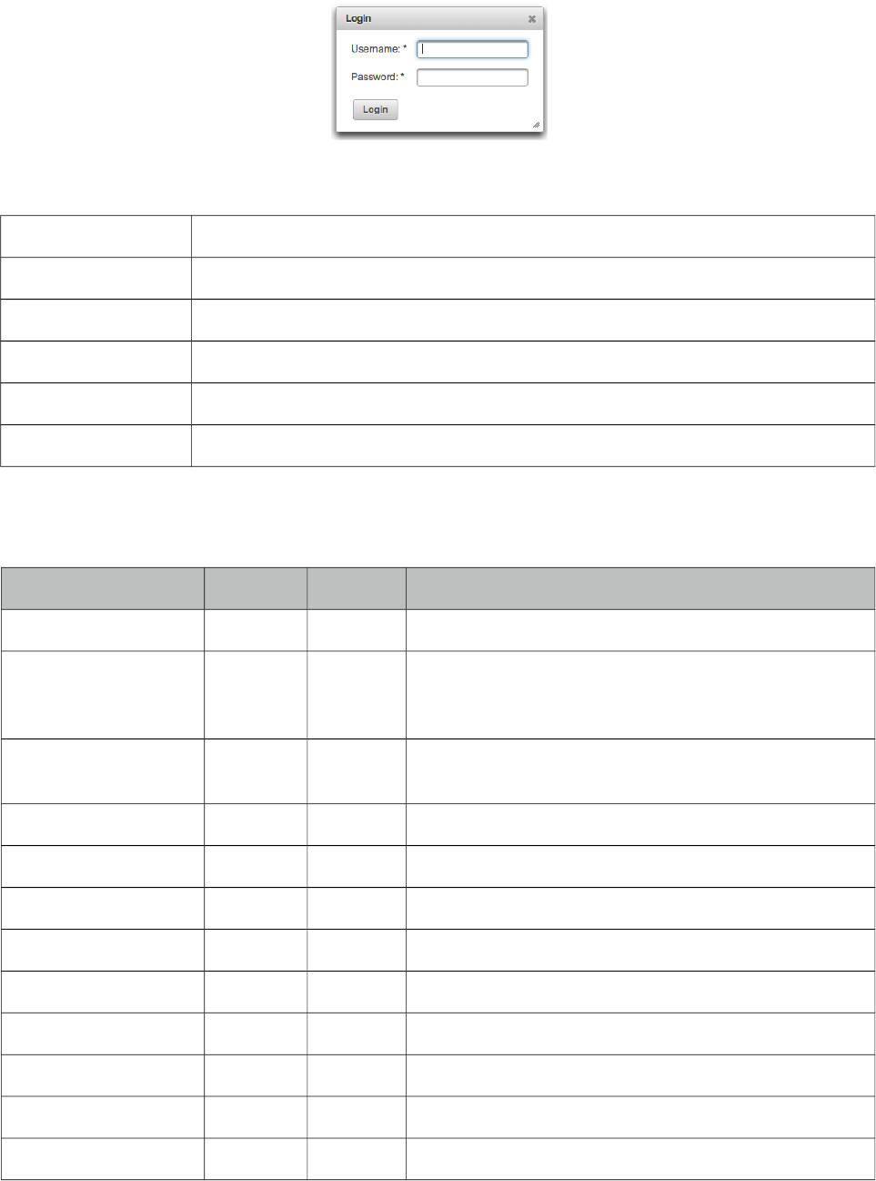
PrimeFaces User Guide
3.39 Dialog
Dialog is a panel component that can overlay other elements on page.
Info
Tag dialog
Component Class org.primefaces.component.dialog.Dialog
Component Type org.primefaces.component.Dialog
Component Family org.primefaces.component
Renderer Type org.primefaces.component.DialogRenderer
Renderer Class org.primefaces.component.dialog.DialogRenderer
Attributes
Name Default Type Description
id null String Unique identifier of the component
rendered true Boolean Boolean value to specify the rendering of the
component, when set to false component will not be
rendered.
binding null Object An el expression that maps to a server side
UIComponent instance in a backing bean
widgetVar null String Name of the client side widget
header null String Text of the header
draggable true Boolean Specifies draggability
resizable true Boolean Specifies resizability
modal false Boolean Enables modality.
visible false Boolean When enabled, dialog is visible by default.
width auto Integer Width of the dialog
height auto Integer Height of the dialog
minWidth 150 Integer Minimum width of a resizable dialog.
188
PrimeFaces User Guide
Name Default Type Description
minHeight 0 Integer Minimum height of a resizable dialog.
style null String Inline style of the dialog.
styleClass null String Style class of the dialog
showEffect null String Effect to use when showing the dialog
hideEffect null String Effect to use when hiding the dialog
position null String Defines where the dialog should be displayed
closable true Boolean Defines if close icon should be displayed or not
onShow null String Client side callback to execute when dialog is
displayed.
onHide null String Client side callback to execute when dialog is hidden.
appendTo null String Appends the dialog to the element defined by the given
search expression.
showHeader true Boolean Defines visibility of the header content.
footer null String Text of the footer.
dynamic false Boolean Enables lazy loading of the content with ajax.
minimizable false Boolean Whether a dialog is minimizable or not.
maximizable false Boolean Whether a dialog is maximizable or not.
closeOnEscape false Boolean Defines if dialog should close on escape key.
dir ltr String Defines text direction, valid values are ltr and rtl.
focus null String Defines which component to apply focus.
fitViewport false Boolean Dialog size might exceeed viewport if content is bigger
than viewport in terms of height. fitViewport option
automatically adjusts height to fit dialog within the
viewport.
positionType fixed String Defines whether dialog will be kept in viewport on
scroll (fixed) or keep its position (absolute).
responsive false Boolean In responsive mode, dialog adjusts itself based on
screen width.
Getting started with the Dialog
Dialog is a panel component containing other components, note that by default dialog is not visible.
189

PrimeFaces User Guide
<p:dialog>
<h:outputText value="Resistance to PrimeFaces is Futile!" />
//Other content
</p:dialog>
Show and Hide
Showing and hiding the dialog is easy using the client side api.
<p:dialog header="Header Text" widgetVar="dlg">//Content</p:dialog>
<p:commandButton value="Show" type="button" onclick="PF('dlg').show()" />
<p:commandButton value="Hide" type="button" onclick="PF('dlg').hide()" />
Effects
There are various effect options to be used when displaying and closing the dialog. Use showEffect
and hideEffect options to apply these effects; blind, bounce, clip, drop, explode, fade, fold,
highlight, puff, pulsate, scale, shake, size, slide and transfer.
<p:dialog showEffect="fade" hideEffect="explode" ...>
//...
</p:dialog>
Position
By default dialog is positioned at center of the viewport and position option is used to change the
location of the dialog. Possible values are;
•Single string value like ‘center’, ‘left’, ‘right’, ‘top’, ‘bottom’ representing the position within
viewport.
•Comma separated x and y coordinate values like 200, 500
•Comma separated position values like ‘top’,‘right’. (Use single quotes when using a combination)
Some examples are described below;
<p:dialog position="top" ...>
<p:dialog position="left,top" ...>
<p:dialog position="200,50" ...>
Focus
Dialog applies focus on first visible input on show by default which is useful for user friendliness
however in some cases this is not desirable. Assume the first input is a popup calendar and opening
the dialog shows a popup calendar. To customize default focus behavior, use focus attribute.
190
PrimeFaces User Guide
Ajax Behavior Events
close event is one of the ajax behavior events provided by dialog that is fired when the dialog is
hidden. If there is a listener defined it’ll be executed by passing an instance of
org.primefaces.event.CloseEvent.
Example below adds a FacesMessage when dialog is closed and updates the messages component to
display the added message.
<p:dialog>
<p:ajax event="close" listener="#{dialogBean.handleClose}" update="msg" />
//Content
</p:dialog>
<p:messages id="msg" />
public class DialogBean {
public void handleClose(CloseEvent event) {
//Add facesmessage
}
}
Other provided ajax behavior events are maximize, minimize, move, restoreMinimize,
restoreMaximize and open.
Client Side Callbacks
Similar to close listener, onShow and onHide are handy callbacks for client side in case you need to
execute custom javascript.
<p:dialog onShow="alert(‘Visible’)" onHide="alert(‘Hidden’)">
//Content
</p:dialog>
Client Side API
Widget: PrimeFaces.widget.Dialog
Method Params Return Type Description
show() - void Displays dialog.
hide() - void Closes dialog.
isVisible() - void Returns visibility as a boolean.
Skinning
Dialog resides in a main container element which styleClass option apply. Following is the list of
structural style classes;
191
PrimeFaces User Guide
Style Class Applies
.ui-dialog Container element of dialog
.ui-dialog-titlebar Title bar
.ui-dialog-title-dialog Header text
.ui-dialog-titlebar-close Close icon
.ui-dialog-content Dialog body
As skinning style classes are global, see the main theming section for more information.
Tips
• Use appendTo with care as the page definition and html dom would be different, for example if
dialog is inside an h:form component and appendToBody is enabled, on the browser dialog would
be outside of form and may cause unexpected results. In this case, nest a form inside a dialog.
• Do not place dialog inside tables, containers likes divs with relative positioning or with non-
visible overflow defined, in cases like these functionality might be broken. This is not a limitation
but a result of DOM model. For example dialog inside a layout unit, tabview, accordion are a
couple of examples. Same applies to confirmDialog as well.
• A facet called “header” is available to provide custom content inside header instead of using
header attribute.
192
PrimeFaces User Guide
3.40 Drag&Drop
Drag&Drop utilities of PrimeFaces consists of two components; Draggable and Droppable.
3.40.1 Draggable
Info
Tag draggable
Component Class org.primefaces.component.dnd.Draggable
Component Type org.primefaces.component.Draggable
Component Family org.primefaces.component
Renderer Type org.primefaces.component.DraggableRenderer
Renderer Class org.primefaces.component.dnd.DraggableRenderer
Attributes
Name Default Type Description
id null String Unique identifier of the component
rendered true boolean Boolean value to specify the rendering of the
component, when set to false component will not be
rendered.
binding null Object An el expression that maps to a server side
UIComponent instance in a backing bean
widgetVar null String Name of the client side widget
proxy false Boolean Displays a proxy element instead of actual element.
dragOnly false Boolean Specifies a draggable that can’t be dropped.
for null String Id of the component to add draggable behavior
disabled false Boolean Disables draggable behavior when true.
axis null String Specifies drag axis, valid values are ‘x’ and ‘y’.
containment null String Constraints dragging within the boundaries of
containment element
helper null String Helper element to display when dragging
revert false Boolean Reverts draggable to it’s original position when not
dropped onto a valid droppable
snap false Boolean Draggable will snap to edge of near elements
snapMode null String Specifies the snap mode. Valid values are ‘both’,
‘inner’ and ‘outer’.
193
PrimeFaces User Guide
Name Default Type Description
snapTolerance 20 Integer Distance from the snap element in pixels to trigger
snap.
zindex null Integer ZIndex to apply during dragging.
handle null String Specifies a handle for dragging.
opacity 1 Double Defines the opacity of the helper during dragging.
stack null String In stack mode, draggable overlap is controlled
automatically using the provided selector, dragged
item always overlays other draggables.
grid null String Dragging happens in every x and y pixels.
scope null String Scope key to match draggables and droppables.
cursor crosshair String CSS cursor to display in dragging.
dashboard null String Id of the dashboard to connect with.
appendTo null String A search expression to define which element to
append the draggable helper to.
Getting started with Draggable
Any component can be enhanced with draggable behavior, basically this is achieved by defining the
id of component using the for attribute of draggable.
<p:panel id="pnl" header="Draggable Panel">
<h:outputText value="This is actually a regular panel" />
</p:panel>
<p:draggable for="pnl"/>
If you omit the for attribute, parent component will be selected as the draggable target.
<h:graphicImage id="campnou" value="/images/campnou.jpg">
<p:draggable />
</h:graphicImage>
Handle
By default any point in dragged component can be used as handle, if you need a specific handle,
you can define it with handle option. Following panel is dragged using it’s header only.
<p:panel id="pnl" header="Draggable Panel">
<h:outputText value="I can only be dragged using my header" />
</p:panel>
<p:draggable for="pnl" handle="div.ui-panel-titlebar"/>
194

PrimeFaces User Guide
Drag Axis
Dragging can be limited to either horizontally or vertically.
<p:panel id="pnl" header="Draggable Panel">
<h:outputText value="I am dragged on an axis only" />
</p:panel>
<p:draggable for="pnl" axis="x or y"/>
Clone
By default, actual component is used as the drag indicator, if you need to keep the component at it’s
original location, use a clone helper.
<p:panel id="pnl" header="Draggable Panel">
<h:outputText value="I am cloned" />
</p:panel>
<p:draggable for="pnl" helper="clone"/>
Revert
When a draggable is not dropped onto a matching droppable, revert option enables the component
to move back to it’s original position with an animation.
<p:panel id="pnl" header="Draggable Panel">
<h:outputText value="I will be reverted back to my original position" />
</p:panel>
<p:draggable for="pnl" revert="true"/>
Opacity
During dragging, opacity option can be used to give visual feedback, helper of following panel’s
opacity is reduced in dragging.
<p:panel id="pnl" header="Draggable Panel">
<h:outputText value="My opacity is lower during dragging" />
</p:panel>
<p:draggable for="pnl" opacity="0.5"/>
Grid
Defining a grid enables dragging in specific pixels. This value takes a comma separated dimensions
in x,y format.
<p:panel id="pnl" header="Draggable Panel">
<h:outputText value="I am dragged in grid mode" />
</p:panel>
<p:draggable for="pnl" grid="20,40"/>
195

PrimeFaces User Guide
Containment
A draggable can be restricted to a certain section on page, following draggable cannot go outside of
it’s parent.
<p:outputPanel layout="block" style="width:400px;height:200px;">
<p:panel id="conpnl" header="Restricted">
<h:outputText value="I am restricted to my parent's boundaries" />
</p:panel>
</p:outputPanel>
<p:draggable for="conpnl" containment="parent" />
196
PrimeFaces User Guide
3.40.2 Droppable
Info
Tag droppable
Component Class org.primefaces.component.dnd.Droppable
Component Type org.primefaces.component.Droppable
Component Family org.primefaces.component
Renderer Type org.primefaces.component.DroppableRenderer
Renderer Class org.primefaces.component.dnd.DroppableRenderer
Attributes
Name Default Type Description
id null String Unique identifier of the component
rendered true Boolean Boolean value to specify the rendering of the
component, when set to false component will not be
rendered.
binding null Object An el expression that maps to a server side
UIComponent instance in a backing bean
widgetVar null String Variable name of the client side widget
for null String Id of the component to add droppable behavior
disabled false Boolean Disables of enables droppable behavior
hoverStyleClass null String Style class to apply when an acceptable draggable is
dragged over.
activeStyleClass null String Style class to apply when an acceptable draggable is
being dragged.
onDrop null String Client side callback to execute when a draggable is
dropped.
accept null String Selector to define the accepted draggables.
scope null String Scope key to match draggables and droppables.
tolerance null String Specifies the intersection mode to accept a draggable.
datasource null String Id of a UIData component to connect with.
197
PrimeFaces User Guide
Getting Started with Droppable
Usage of droppable is very similar to draggable, droppable behavior can be added to any component
specified with the for attribute.
<p:outputPanel id="slot" styleClass="slot" />
<p:droppable for="slot" />
slot styleClass represents a small rectangle.
<style type="text/css">
.slot {
background:#FF9900;
width:64px;
height:96px;
display:block;
}
</style>
If for attribute is omitted, parent component becomes droppable.
<p:outputPanel id="slot" styleClass="slot">
<p:droppable />
</p:outputPanel>
Ajax Behavior Events
drop is the only and default ajax behavior event provided by droppable that is processed when a
valid draggable is dropped. In case you define a listener it’ll be executed by passing an
org.primefaces.event.DragDrop event instance parameter holding information about the dragged
and dropped components.
Following example shows how to enable draggable images to be dropped on droppables.
<p:graphicImage id="messi" value="barca/messi_thumb.jpg" />
<p:draggable for="messi"/>
<p:outputPanel id="zone" styleClass="slot" />
<p:droppable for="zone">
<p:ajax listener="#{ddController.onDrop}" />
</p:droppable>
public void onDrop(DragDropEvent ddEvent) {
String draggedId = ddEvent.getDragId(); //Client id of dragged component
String droppedId = ddEvent.getDropId(); //Client id of dropped component
Object data = ddEvent.getData(); //Model object of a datasource
}
198
PrimeFaces User Guide
onDrop
onDrop is a client side callback that is invoked when a draggable is dropped, it gets two parameters
event and ui object holding information about the drag drop event.
<p:outputPanel id="zone" styleClass="slot" />
<p:droppable for="zone" onDrop="handleDrop"/>
function handleDrop(event, ui) {
var draggable = ui.draggable, //draggable element, a jQuery object
helper = ui.helper, //helper element of draggable, a jQuery object
position = ui.position, //position of draggable helper
offset = ui.offset; //absolute position of draggable helper
}
DataSource
Droppable has special care for data elements that extend from UIData(e.g. datatable, datagrid), in
order to connect a droppable to accept data from a data component define datasource option as the
id of the data component. Example below show how to drag data from datagrid and drop onto a
droppable to implement a dragdrop based selection. Dropped cars are displayed with a datatable.
public class TableBean {
private List<Car> availableCars;
private List<Car> droppedCars;
public TableBean() {
availableCars = //populate data
}
//getters and setters
public void onCarDrop(DragDropEvent event) {
Car car = ((Car) ddEvent.getData());
droppedCars.add(car);
availableCars.remove(car);
}
}
199

PrimeFaces User Guide
<h:form id="carForm">
<p:fieldset legend="AvailableCars">
<p:dataGrid id="availableCars" var="car"
value="#{tableBean.availableCars}" columns="3">
<p:column>
<p:panel id="pnl" header="#{car.model}" style="text-align:center">
<p:graphicImage value="/images/cars/#{car.manufacturer}.jpg" />
</p:panel>
<p:draggable for="pnl" revert="true" handle=".ui-panel-titlebar"
stack=".ui-panel"/>
</p:column>
</p:dataGrid>
</p:fieldset>
<p:fieldset id="selectedCars" legend="Selected Cars" style="margin-top:20px">
<p:outputPanel id="dropArea">
<h:outputText value="!!!Drop here!!!"
rendered="#{empty tableBean.droppedCars}" style="font-size:24px;" />
<p:dataTable var="car" value="#{tableBean.droppedCars}"
rendered="#{not empty tableBean.droppedCars}">
<p:column headerText="Model">
<h:outputText value="#{car.model}" />
</p:column>
<p:column headerText="Year">
<h:outputText value="#{car.year}" />
</p:column>
<p:column headerText="Manufacturer">
<h:outputText value="#{car.manufacturer}" />
</p:column>
<p:column headerText="Color">
<h:outputText value="#{car.color}" />
</p:column>
</p:dataTable>
</p:outputPanel>
</p:fieldset>
<p:droppable for="selectedCars" tolerance="touch"
activeStyleClass="ui-state-highlight" datasource="availableCars"
onDrop="handleDrop"/>
<p:ajax listener="#{tableBean.onCarDrop}" update="dropArea availableCars" />
</p:droppable>
</h:form>
<script type="text/javascript">
function handleDrop(event, ui) {
ui.draggable.fadeOut(‘fast’); //fade out the dropped item
}
</script>
200
PrimeFaces User Guide
Tolerance
There are four different tolerance modes that define the way of accepting a draggable.
Mode Description
fit draggable should overlap the droppable entirely
intersect draggable should overlap the droppable at least 50%
pointer pointer of mouse should overlap the droppable
touch droppable should overlap the droppable at any amount
Acceptance
You can limit which draggables can be dropped onto droppables using scope attribute which a
draggable also has. Following example has two images, only first image can be accepted by
droppable.
<p:graphicImage id="messi" value="barca/messi_thumb.jpg" />
<p:draggable for="messi" scope="forward"/>
<p:graphicImage id="xavi" value="barca/xavi_thumb.jpg" />
<p:draggable for="xavi" scope="midfield"/>
<p:outputPanel id="forwardsonly" styleClass="slot" scope="forward" />
<p:droppable for="forwardsonly" />
Skinning
hoverStyleClass and activeStyleClass attributes are used to change the style of the droppable when
interacting with a draggable.
201
PrimeFaces User Guide
3.41 Dock
Dock component mimics the well known dock interface of Mac OS X.
Info
Tag dock
Component Class org.primefaces.component.dock.Dock
Component Type org.primefaces.component.Dock
Component Family org.primefaces.component
Renderer Type org.primefaces.component.DockRenderer
Renderer Class org.primefaces.component.dock.DockRenderer
Attributes
Name Default Type Description
id null String Unique identifier of the component
rendered true Boolean Boolean value to specify the rendering of the
component, when set to false component will not
be rendered.
binding null Object An el expression that maps to a server side
UIComponent instance in a backing bean
model null MenuModel MenuModel instance to create menus
programmatically
position bottom String Position of the dock, bottom or top.
itemWidth 40 Integer Initial width of items.
maxWidth 50 Integer Maximum width of items.
proximity 90 Integer Distance to enlarge.
halign center String Horizontal alignment,
widgetVar null String Name of the client side widget.
202
PrimeFaces User Guide
Getting started with the Dock
A dock is composed of menuitems.
<p:dock>
<p:menuitem value="Home" icon="/images/dock/home.png" url="#" />
<p:menuitem value="Music" icon="/images/dock/music.png" url="#" />
<p:menuitem value="Video" icon="/images/dock/video.png" url="#"/>
<p:menuitem value="Email" icon="/images/dock/email.png" url="#"/>
<p:menuitem value="Link" icon="/images/dock/link.png" url="#"/>
<p:menuitem value="RSS" icon="/images/dock/rss.png" url="#"/>
<p:menuitem value="History" icon="/images/dock/history.png" url="#"/>
</p:dock>
Position
Dock can be located in two locations, top or bottom (default). For a dock positioned at top set
position to top.
Dock Effect
When mouse is over the dock items, icons are zoomed in. The configuration of this effect is done
via the maxWidth and proximity attributes.
Dynamic Menus
Menus can be created programmatically as well, see the dynamic menus part in menu component
section for more information and an example.
Skinning
Following is the list of structural style classes, {positon} can be top or bottom.
Style Class Applies
.ui-dock-{position} Main container.
.ui-dock-container-{position} Menu item container.
.ui-dock-item-{position} Each menu item.
As skinning style classes are global, see the main theming section for more information.
203
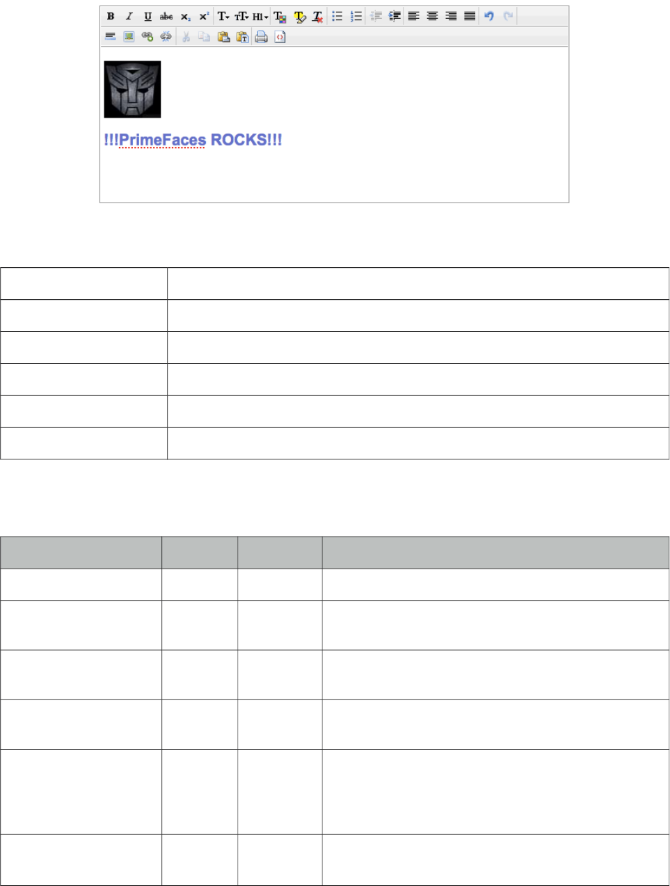
PrimeFaces User Guide
3.42 Editor
Editor is an input component with rich text editing capabilities. (Deprecated: Use TextEditor
instead)
Info
Tag editor
Component Class org.primefaces.component.editor.Editor
Component Type org.primefaces.component.Editor
Component Family org.primefaces.component
Renderer Type org.primefaces.component.EditorRenderer
Renderer Class org.primefaces.component.editor.EditorRenderer
Attributes
Name Default Type Description
id null String Unique identifier of the component.
rendered true Boolean Boolean value to specify the rendering of the
component.
binding null Object An el expression that maps to a server side
UIComponent instance in a backing bean.
value null Object Value of the component than can be either an EL
expression of a literal text.
converter null Converter/
String
An el expression or a literal text that defines a
converter for the component. When it’s an EL
expression, it’s resolved to a converter instance. In
case it’s a static text, it must refer to a converter id.
immediate false Boolean When set true, process validations logic is executed at
apply request values phase for this component.
204
PrimeFaces User Guide
Name Default Type Description
required false Boolean Marks component as required.
validator null Method
Expr
A method expression that refers to a method
validationg the input.
valueChangeListener null Method
Expr
A method expression that refers to a method for
handling a valuchangeevent.
requiredMessage null String Message to be displayed when required field
validation fails.
converterMessage null String Message to be displayed when conversion fails.
validatorMessage null String Message to be displayed when validation fails.
widgetVar null String Name of the client side widget.
controls null String List of controls to customize toolbar.
height null Integer Height of the editor.
width null Integer Width of the editor.
disabled false Boolean Disables editor.
style null String Inline style of the editor container.
styleClass null String Style class of the editor container.
onchange null String Client side callback to execute when editor data
changes.
maxlength null Integer Maximum length of the raw input.
Getting started with the Editor
Rich Text entered using the Editor is passed to the server using value expression.
public class Bean {
private String text;
//getter and setter
}
<p:editor value="#{bean.text}" />
Custom Toolbar
Toolbar of editor is easy to customize using controls option;
<p:editor value="#{bean.text}" controls="bold italic underline strikethrough" />
205
PrimeFaces User Guide
Here is the full list of all available controls;
• bold
• italic
• underline
• strikethrough
• subscript
• superscript
• font
• size
• style
• color
• highlight
• bullets
• numbering
• alignleft
• center
• alignright
• justify
• undo
• redo
• rule
• image
• link
• unlink
• cut
• copy
• paste
• pastetext
• print
• source
• outdent
• indent
• removeFormat
Client Side API
Widget: PrimeFaces.widget.Editor
Method Params Return Type Description
init() - void Initializes a lazy editor, subsequent calls do not
reinit the editor.
saveHTML() - void Saves html text in iframe back to the textarea.
clear() - void Clears the text in editor.
enable() - void Enables editing.
disable() - void Disables editing.
focus() - void Adds cursor focus to edit area.
selectAll() - void Selects all text in editor.
getSelectedHTML() - String Returns selected text as HTML.
206
PrimeFaces User Guide
Method Params Return Type Description
getSelectedText() - String Returns selected text in plain format.
Skinning
Following is the list of structural style classes.
Style Class Applies
.ui-editor Main container.
.ui-editor-toolbar Toolbar of editor.
.ui-editor-group Button groups.
.ui-editor-button Each button.
.ui-editor-divider Divider to separate buttons.
.ui-editor-disabled Disabled editor controls.
.ui-editor-list Dropdown lists.
.ui-editor-color Color picker.
.ui-editor-popup Popup overlays.
.ui-editor-prompt Overlays to provide input.
.ui-editor-message Overlays displaying a message.
Editor is not integrated with ThemeRoller as there is only one icon set for the controls.
207
PrimeFaces User Guide
3.43 Effect
Effect component is based on the jQuery UI effects library.
Info
Tag effect
Tag Class org.primefaces.component.effect.EffectTag
Component Class org.primefaces.component.effect.Effect
Component Type org.primefaces.component.Effect
Component Family org.primefaces.component
Renderer Type org.primefaces.component.EffectRenderer
Renderer Class org.primefaces.component.effect.EffectRenderer
Attributes
Name Default Type Description
id null String Unique identifier of the component
rendered 1 Boolean Boolean value to specify the rendering of the
component, when set to false component will not
be rendered.
binding null Object An el expression that maps to a server side
UIComponent instance in a backing bean
widgetVar null String Name of the client side widget.
event null String Dom event to attach the event that executes the
animation
type null String Specifies the name of the animation
for null String Component that is animated
speed 1000 Integer Speed of the animation in ms
delay null Integer Time to wait until running the effect.
queue true Boolean Specifies if effects should be queued.
Getting started with Effect
Effect component needs a trigger and target which is effect’s parent by default. In example below
clicking outputText (trigger) will run the pulsate effect on outputText(target) itself.
208

PrimeFaces User Guide
<h:outputText value="#{bean.value}">
<p:effect type="pulsate" event="click" />
</h:outputText>
Effect Target
There may be cases where you want to display an effect on another target on the same page while
keeping the parent as the trigger. Use for option to specify a target.
<h:outputLink id="lnk" value="#">
<h:outputText value="Show the Barca Temple" />
<p:effect type="appear" event="click" for="img" />
</h:outputLink>
<p:graphicImage id="img" value="/ui/barca/campnou.jpg" style="display:none"/>
With this setting, outputLink becomes the trigger for the effect on graphicImage. When the link is
clicked, initially hidden graphicImage comes up with a fade effect.
Note: It’s important for components that have the effect component as a child to have an
assigned id because some components do not render their clientId’s if you don’t give them an id
explicitly.
List of Effects
Following is the list of effects;
• blind
• clip
• drop
• explode
• fold
• puff
• slide
• scale
• bounce
• highlight
• pulsate
• shake
• size
• transfer
209
PrimeFaces User Guide
Effect Configuration
Each effect has different parameters for animation like colors, duration and more. In order to change
the configuration of the animation, provide these parameters with the f:param tag.
<h:outputText value="#{bean.value}">
<p:effect type="scale" event="mouseover">
<f:param name="percent" value="90"/>
</p:effect>
</h:outputText>
It’s important to provide string options with single quotes.
<h:outputText value="#{bean.value}">
<p:effect type="blind" event="click">
<f:param name="direction" value="'horizontal'" />
</p:effect>
</h:outputText>
For the full list of configuration parameters for each effect, please see the jquery documentation;
http://docs.jquery.com/UI/Effects
Effect on Load
Effects can also be applied to any JSF component when page is loaded for the first time or after an
ajax request is completed by using load as the event name. Following example animates messages
with pulsate effect after ajax request completes.
<p:messages id="messages">
<p:effect type="pulsate" event="load" delay=”500”>
<f:param name="mode" value="'show'" />
</p:effect>
</p:messages>
<p:commandButton value="Save" actionListener="#{bean.action}" update="messages"/>
210
PrimeFaces User Guide
3.44 FeedReader
FeedReader is used to display content from a feed.
Info
Tag feedReader
Component Class org.primefaces.component.feedreader.FeedReader
Component Type org.primefaces.component.FeedReader
Component Family org.primefaces.component
Renderer Type org.primefaces.component.FeedReaderRenderer
Renderer Class org.primefaces.component.feedreader.FeedReaderRenderer
Attributes
Name Default Type Description
id null String Unique identifier of the component
rendered true Boolean Boolean value to specify the rendering of the
component, when set to false component will not
be rendered.
binding null Object An el expression that maps to a server side
UIComponent instance in a backing bean
value null String URL of the feed.
var null String Iterator to refer each item in feed.
size Unlimited Integer Number of items to display.
Getting started with FeedReader
FeedReader requires a feed url to display and renders its content for each feed item.
<p:feedReader value="http://rss.news.yahoo.com/rss/sports" var="feed">
<h:outputText value="#{feed.title}" style="font-weight: bold"/>
<h:outputText value="#{feed.description.value}" escape="false"/>
<p:separator />
<f:facet name="error">
Something went wrong.
</f:facet>
</p:feedReader>
Note that you need the ROME library in your classpath to make feedreader work.
211
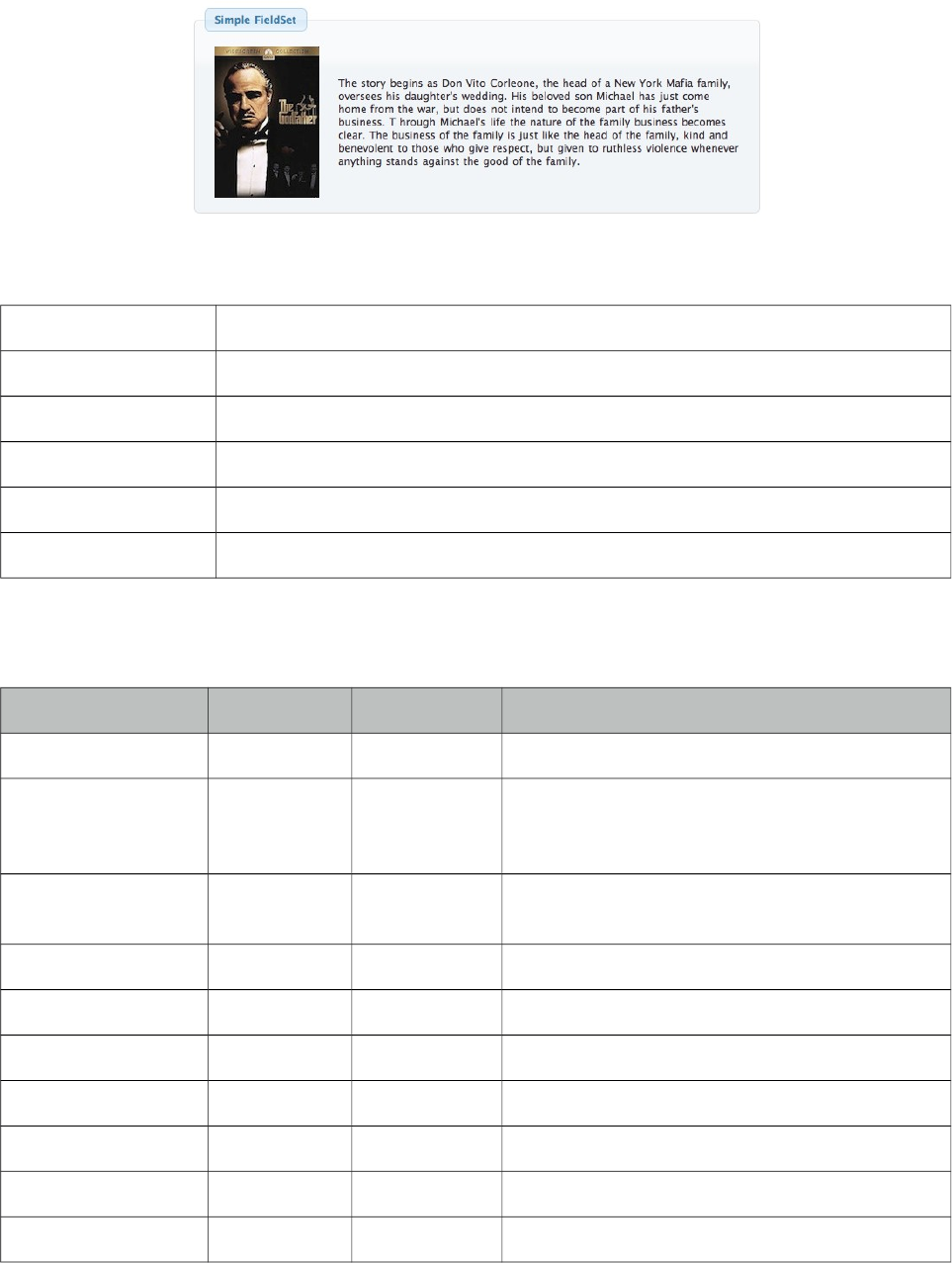
PrimeFaces User Guide
3.45 Fieldset
Fieldset is a grouping component as an extension to html fieldset.
Info
Tag fieldset
Component Class org.primefaces.component.fieldset.Fieldset
Component Type org.primefaces.component.Fieldset
Component Family org.primefaces.component
Renderer Type org.primefaces.component.FieldsetRenderer
Renderer Class org.primefaces.component.fieldset.FieldsetRenderer
Attributes
Name Default Type Description
id null String Unique identifier of the component
rendered true Boolean Boolean value to specify the rendering of the
component, when set to false component will not
be rendered.
binding null Object An el expression that maps to a server side
UIComponent instance in a backing bean
widgetVar null String Name of the client side widget.
legend null String Title text.
style null String Inline style of the fieldset.
styleClass null String Style class of the fieldset.
toggleable false Boolean Makes content toggleable with animation.
toggleSpeed 500 Integer Toggle duration in milliseconds.
collapsed false Boolean Defines initial visibility state of content.
212
PrimeFaces User Guide
Getting started with Fieldset
Fieldset is used as a container component for its children.
<p:fieldset legend="Simple Fieldset">
<h:panelGrid column="2">
<p:graphicImage value="/images/godfather/1.jpg" />
<h:outputText value="The story begins as Don Vito Corleone ..." />
</h:panelGrid>
</p:fieldset>
Legend
Legend can be defined in two ways, with legend attribute as in example above or using legend
facet. Use facet way if you need to place custom html other than simple text.
<p:fieldset>
<f:facet name="legend">
</f:facet>
//content
</p:fieldset>
When both legend attribute and legend facet are present, facet is chosen.
Toggleable Content
Clicking on fieldset legend can toggle contents, this is handy to use space efficiently in a layout. Set
toggleable to true to enable this feature.
<p:fieldset legend="Toggleable Fieldset" toggleable="true">
<h:panelGrid column="2">
<p:graphicImage value="/images/godfather/2.jpg" />
<h:outputText value="Francis Ford Coppolas’ legendary ..." />
</h:panelGrid>
</p:fieldset>
Ajax Behavior Events
toggle is the default and only ajax behavior event provided by fieldset that is processed when the
content is toggled. In case you have a listener defined, it will be invoked by passing an instance of
org.primefaces.event.ToggleEvent.
213
PrimeFaces User Guide
Here is an example that adds a facesmessage and updates growl component when fieldset is
toggled.
<p:growld id="messages" />
<p:fieldset legend="Toggleable Fieldset" toggleable="true"
<p:ajax listener="#{bean.onToggle}" update="messages">
//content
</p:fieldset>
public void onToggle(ToggleEvent event) {
Visibility visibility = event.getVisibility();
FacesMessage msg = new FacesMessage();
msg.setSummary("Fieldset " + event.getId() + " toggled");
msg.setDetail("Visibility: " + visibility);
FacesContext.getCurrentInstance().addMessage(null, msg);
}
Client Side API
Widget: PrimeFaces.widget.Fieldset
Method Params Return Type Description
toggle() - void Toggles fieldset content.
Skinning
style and styleClass options apply to the fieldset. Following is the list of structural style classes;
Style Class Applies
.ui-fieldset Main container
.ui-fieldset-toggleable Main container when fieldset is toggleable
.ui-fieldset .ui-fieldset-legend Legend of fieldset
.ui-fieldset-toggleable .ui-fieldset-legend Legend of fieldset when fieldset is toggleable
.ui-fieldset .ui-fieldset-toggler Toggle icon on fieldset
As skinning style classes are global, see the main theming section for more information.
Tips
• A collapsed fieldset will remain collapsed after a postback since fieldset keeps its toggle state
internally, you don’t need to manage this using toggleListener and collapsed option.
214
PrimeFaces User Guide
3.46 FileDownload
The legacy way to present dynamic binary data to the client is to write a servlet or a filter and
stream the binary data. FileDownload presents an easier way to do the same.
Info
Tag fileDownload
ActionListener Class org.primefaces.component.filedownload.FileDownloadActionListener
Attributes
Name Default Type Description
value null StreamedContent A streamed content instance
contextDisposition attachment String Specifies display mode.
monitorKey null String Optional key to support monitoring
multiple filedownloads on same page.
Getting started with FileDownload
A user command action is required to trigger the filedownload process. FileDownload can be
attached to any command component like a commandButton or commandLink. The value of the
FileDownload must be an org.primefaces.model.StreamedContent instance. We suggest using the
built-in DefaultStreamedContent implementation. First parameter of the constructor is the binary
stream, second is the mimeType and the third parameter is the name of the file.
public class FileBean {
private StreamedContent file;
public FileDownloadController() {
InputStream stream = this.getClass().getResourceAsStream("yourfile.pdf");
file = new DefaultStreamedContent(stream, "application/pdf",
"downloaded_file.pdf");
}
public StreamedContent getFile() {
return this.file;
}
}
This streamed content should be bound to the value of the fileDownload.
<h:commandButton value="Download">
<p:fileDownload value="#{fileBean.file}" />
</h:commandButton>
215

PrimeFaces User Guide
Similarly a more graphical presentation would be to use a commandlink with an image.
<h:commandLink value="Download">
<p:fileDownload value="#{fileBean.file}"/>
<h:graphicImage value="pdficon.gif" />
</h:commandLink>
If you’d like to use PrimeFaces commandButton and commandLink, disable ajax option as
fileDownload requires a full page refresh to present the file.
<p:commandButton value="Download" ajax="false">
<p:fileDownload value="#{fileBean.file}" />
</p:commandButton>
<p:commandLink value="Download" ajax="false">
<p:fileDownload value="#{fileBean.file}"/>
<h:graphicImage value="pdficon.gif" />
</p:commandLink>
ContentDisposition
By default, content is displayed as an attachment with a download dialog box, another alternative is
the inline mode, in this case browser will try to open the file internally without a prompt. Note that
content disposition is not part of the http standard although it is widely implemented.
Monitor Status
As fileDownload process is non-ajax, ajaxStatus cannot apply. Still PrimeFaces provides a feature
to monitor file downloads via client side monitorDownload(startFunction, endFunction) method.
Example below displays a modal dialog when dowload begins and hides it on complete.
<script type="text/javascript">
function showStatus() {
PF('statusDialog').show();
}
function hideStatus() {
PF('statusDialog').hide();
}
</script>
216

PrimeFaces User Guide
<h:form>
<p:dialog modal="true" widgetVar="statusDialog" header="Status" draggable="false"
closable="false">
<p:graphicImage value="/design/ajaxloadingbar.gif" />
</p:dialog>
<p:commandButton value="Download" ajax="false"
onclick="PrimeFaces.monitorDownload(showStatus, hideStatus)">
<p:fileDownload value="#{fileDownloadController.file}"/>
</p:commandButton>
</h:form>
Cookies must be enabled for monitoring.
217
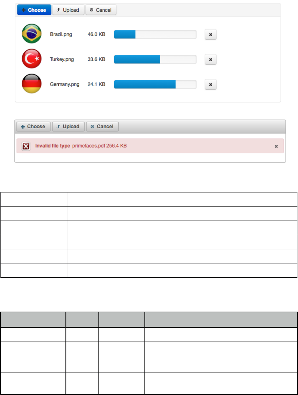
PrimeFaces User Guide
3.47 FileUpload
FileUpload goes beyond the browser input type="file" functionality and features an HTML5
powered rich solution with graceful degradation for legacy browsers.
Info
Tag fileUpload
Component Class org.primefaces.component.fileupload.FileUpload
Component Type org.primefaces.component.FileUpload
Component Family org.primefaces.component
Renderer Type org.primefaces.component.FileUploadRenderer
Renderer Class org.primefaces.component.fileupload.FileUploadRenderer
Attributes
Name Default Description
id null String Unique identifier of the component.
rendered true boolean Boolean value to specify the rendering of the
component, when set to false component will not be
rendered.
binding null Object An el expression that maps to a server side
UIComponent instance in a backing bean.
218
PrimeFaces User Guide
Name Default Description
value null Object Value of the component than can be either an EL
expression of a literal text.
converter null Converter
/String
An el expression or a literal text that defines a
converter for the component. When it’s an EL
expression, it’s resolved to a converter instance. In
case it’s a static text, it must refer to a converter id.
immediate false Boolean When set true, process validations logic is executed
at apply request values phase for this component.
required false Boolean Marks component as required.
validator null MethodExpr A method expression that refers to a method
validationg the input.
valueChangeListener null MethodExpr A method expression that refers to a method for
handling a valuchangeevent.
requiredMessage null String Message to be displayed when required field
validation fails.
converterMessage null String Message to be displayed when conversion fails.
validatorMessage null String Message to be displayed when validation fails.
widgetVar null String Name of the client side widget.
update null String Component(s) to update after fileupload completes.
process null String Component(s) to process in fileupload request.
fileUploadListener null MethodExpr Method to invoke when a file is uploaded.
multiple false Boolean Allows choosing of multi file uploads from native
file browse dialog
auto false Boolean When set to true, selecting a file starts the upload
process implicitly.
label Choose String Label of the browse button.
allowTypes null String Regular expression for accepted file types,
e.g. /(\.|\/)(gif|jpe?g|png)$/
sizeLimit null Integer Individual file size limit in bytes.
fileLimit null Integer Maximum number of files allowed to upload.
style null String Inline style of the component.
styleClass null String Style class of the component.
mode advanced String Mode of the fileupload, can be simple or advanced.
uploadLabel Upload String Label of the upload button.
cancelLabel Cancel String Label of the cancel button.
219
PrimeFaces User Guide
Name Default Description
invalidSizeMessage null String Message to display when size limit exceeds.
invalidFileMessage null String Message to display when file is not accepted.
fileLimitMessage null String Message to display when file limit exceeds.
dragDropSupport true Boolean Specifies dragdrop based file selection from
filesystem, default is true and works only on
supported browsers.
onstart null String Client side callback to execute when upload begins.
onerror null String Callback to execute if fileupload request fails.
oncomplete null String Client side callback to execute when upload ends.
disabled false Boolean Disables component when set true.
messageTemplate {name}
{size}
String Message template to use when displaying file
validation errors.
previewWidth 80 Integer Width for image previews in pixels.
skinSimple false Boolean Applies theming to simple uploader.
accept null String Filters files in native file browser dialog.
sequential false Boolean Uploads are concurrent by default, set this option to
true for sequential uploads.
Getting started with FileUpload
FileUpload engine on the server side can either be servlet 3.0 or commons fileupload. PrimeFaces
selects the most appropriate uploader engine by detection and it is possible to force one or the other
usign an optional configuration param.
<context-param>
<param-name>primefaces.UPLOADER</param-name>
<param-value>auto|native|commons</param-value>
</context-param>
auto: This is the default mode and PrimeFaces tries to detect the best method by checking the
runtime environment, if JSF runtime is at least 2.2 native uploader is selected, otherwise commons.
native: Native mode uses servlet 3.x Part API to upload the files and if JSF runtime is less than 2.2
and exception is being thrown.
commons: This option chooses commons fileupload regardless of the environment, advantage of
this option is that it works even on a Servlet 2.5 environment.
If you have decided to choose commons fileupload, it requires the following filter configration in
your web deployment descriptior.
220
PrimeFaces User Guide
<filter>
<filter-name>PrimeFaces FileUpload Filter</filter-name>
<filter-class>
org.primefaces.webapp.filter.FileUploadFilter
</filter-class>
</filter>
<filter-mapping>
<filter-name>PrimeFaces FileUpload Filter</filter-name>
<servlet-name>Faces Servlet</servlet-name>
</filter-mapping>
Note that the servlet-name should match the configured name of the JSF servlet which is Faces
Servlet in this case. Alternatively you can do a configuration based on url-pattern as well.
Simple File Upload
Simple file upload mode works in legacy mode with a file input whose value should be an
UploadedFile instance. Ajax uploads are not supported in simple upload.
<h:form enctype="multipart/form-data">
<p:fileUpload value="#{fileBean.file}" mode="simple" />
<p:commandButton value="Submit" ajax="false"/>
</h:form>
import org.primefaces.model.UploadedFile;
public class FileBean {
private UploadedFile file;
//getter-setter
}
Enable skinSimple option to style the simple uploader to have a themed look that works the same
across different environments.
Advanced File Upload
FileUploadListener is the way to access the uploaded files in this mode, when a file is uploaded
defined fileUploadListener is processed with a FileUploadEvent as the parameter.
<p:fileUpload fileUploadListener="#{fileBean.handleFileUpload}" />
public class FileBean {
public void handleFileUpload(FileUploadEvent event) {
UploadedFile file = event.getFile();
//application code
}
}
221
PrimeFaces User Guide
Multiple Uploads
Multiple uploads can be enabled using the multiple attribute so that multiple files can be selected
from browser dialog. Multiple uploads are not supported in legacy browsers. Note that multiple
mode is for selection only, it does not send all files in one request. FileUpload component always
uses a new request for each file.
<p:fileUpload fileUploadListener="#{fileBean.handleFileUpload}" multiple="true" />
Auto Upload
Default behavior requires users to trigger the upload process, you can change this way by setting
auto to true. Auto uploads are triggered as soon as files are selected from the dialog.
<p:fileUpload fileUploadListener="#{fileBean.handleFileUpload}" auto="true" />
Partial Page Update
After the fileUpload process completes you can use the PrimeFaces PPR to update any component
on the page. FileUpload is equipped with the update attribute for this purpose. Following example
displays a "File Uploaded" message using the growl component after file upload.
<p:fileUpload fileUploadListener="#{fileBean.handleFileUpload}" update="msg" />
<p:growl id="msg" />
public class FileBean {
public void handleFileUpload(FileUploadEvent event) {
//add facesmessage to display with growl
//application code
}
}
File Filters
Users can be restricted to only select the file types you’ve configured, example below demonstrates
how to accept images only.
<p:fileUpload fileUploadListener="#{fileBean.handleFileUpload}"
allowTypes="/(\.|\/)(gif|jpe?g|png)$/"/>
Size Limit
Most of the time you might need to restrict the file upload size for a file, this is as simple as setting
the sizeLimit configuration. Following fileUpload limits the size to 1000 bytes for each file.
<p:fileUpload fileUploadListener="#{fileBean.handleFileUpload}" sizeLimit="1000" />
222
PrimeFaces User Guide
File Limit
FileLimit restricts the number of maximum files that can be uploaded.
<p:fileUpload fileUploadListener="#{fileBean.handleFileUpload}" fileLimit="3" />
Validation Messages
invalidFileMessage, invalidSizeMessage and fileLimitMessage options are provided to display
validation messages to the users. Similar to the FacesMessage message API, these message define
the summary part, the detail part is retrieved from the messageTemplate option where default value
is “{name} {size}”.
Skinning
FileUpload resides in a container element which style and styleClass options apply. As skinning
style classes are global, see the main theming section for more information. Following is the list of
structural style classes
Class Applies
.ui-fileupload Main container element
.ui-fileupload-buttonbar Button bar
.ui-fileupload-choose Browse button
.ui-fileupload-upload Upload button
.ui-fileupload-cancel Cancel button
ui-fileupload-content Content container
Browser Compatibility
Advanced uploader is implemented with HTML5 and provides far more features compared to single
version. For legacy browsers that do not support HMTL5 features like canvas or file api, fileupload
uses graceful degradation so that iframe is used for transport, detailed file information is not shown
and a gif animation is displayed instead of progress bar. It is suggested to offer simple uploader as a
fallback.
Filter Configuration
Filter configuration is required if you are using commons uploader only. Two configuration options
exist, threshold size and temporary file upload location.
Parameter Name Description
thresholdSize Maximum file size in bytes to keep uploaded files in memory. If a file
exceeds this limit, it’ll be temporarily written to disk.
uploadDirectory Disk repository path to keep temporary files that exceeds the threshold size.
By default it is System.getProperty("java.io.tmpdir")
223

PrimeFaces User Guide
An example configuration below defined thresholdSize to be 50kb and uploads to users temporary
folder.
<filter>
<filter-name>PrimeFaces FileUpload Filter</filter-name>
<filter-class>
org.primefaces.webapp.filter.FileUploadFilter
</filter-class>
<init-param>
<param-name>thresholdSize</param-name>
<param-value>51200</param-value>
</init-param>
<init-param>
<param-name>uploadDirectory</param-name>
<param-value>/Users/primefaces/temp</param-value>
</init-param>
</filter>
Note that uploadDirectory is used internally, you always need to implement the logic to save the file
contents yourself in your backing bean.
224
PrimeFaces User Guide
3.48 Focus
Focus is a utility component that makes it easy to manage the element focus on a JSF page.
Info
Tag focus
Component Class org.primefaces.component.focus.Focus
Component Type org.primefaces.component.Focus.FocusTag
Component Family org.primefaces.component
Renderer Type org.primefaces.component.FocusRenderer
Renderer Class org.primefaces.component.focus.FocusRenderer
Attributes
Name Default Type Description
id null String Unique identifier of the component
rendered true boolean Boolean value to specify the rendering of the
component, when set to false component will not
be rendered.
binding null Object An el expression that maps to a server side
UIComponent instance in a backing bean
for null String Specifies the exact component to set focus
context null String The root component to start first input search.
minSeverity error String Minimum severity level to be used when finding
the first invalid component
Getting started with Focus
By default focus will find the first enabled and visible input component on page and apply focus.
Input component can be any element such as input, textarea and select.
<p:focus />
<p:inputText ... />
<h:inputText ... />
<h:selectOneMenu ... />
Following is a simple example;
225

PrimeFaces User Guide
<h:form>
<p:panel id="panel" header="Register">
<p:focus />
<p:messages />
<h:panelGrid columns="3">
<h:outputLabel for="firstname" value="Firstname: *" />
<h:inputText id="firstname" value="#{pprBean.firstname}"
required="true" label="Firstname" />
<p:message for="firstname" />
<h:outputLabel for="surname" value="Surname: *" />
<h:inputText id="surname" value="#{pprBean.surname}"
required="true" label="Surname"/>
<p:message for="surname" />
</h:panelGrid>
<p:commandButton value="Submit" update="panel"
actionListener="#{pprBean.savePerson}" />
</p:panel>
</h:form>
When this page initially opens up, input text with id "firstname" will receive focus as it is the first
input component.
Validation Aware
Another useful feature of focus is that when validations fail, first invalid component will receive a
focus. So in previous example if firstname field is valid but surname field has no input, a validation
error will be raised for surname, in this case focus will be set on surname field implicitly. Note that
for this feature to work on ajax requests, you need to update p:focus component as well.
Explicit Focus
Additionally, using for attribute focus can be set explicitly on an input component which is useful
when using a dialog.
<p:focus for="text"/>
<h:inputText id="text" value="{bean.value}" />
226
PrimeFaces User Guide
3.49 Fragment
Fragment component is used to define automatically partially process and update sections whenever
ajax request is triggered by a descendant component.
Info
Tag fragment
Component Class org.primefaces.component.fragment.Fragment
Component Type org.primefaces.component.Fragment
Component Family org.primefaces.component
Renderer Type org.primefaces.component.FragmentRenderer
Renderer Class org.primefaces.component.fragment.FragmentRenderer
Attributes
Name Default Type Description
id null String Unique identifier of the component
rendered true Boolean Boolean value to specify the rendering of the component, when
set to false component will not be rendered.
binding null Object An el expression that maps to a server side UIComponent instance
in a backing bean
autoUpdate false Boolean Updates the fragment automatically.
Getting started with Fragment
In the following case, required input field outside the fragment is ignored and only the contents of
the fragment are processed-updated automatically on button click since button is inside the
fragment. Fragment makes it easy to define partial ajax process and update without explicitly
defining component identifiers.
227

PrimeFaces User Guide
<h:form>
<h:panelGrid columns="2">
<p:outputLabel for="ign" value="Required:" />
<p:inputText id="ign" required="true" />
</h:panelGrid>
<p:fragment autoUpdate="true">
<h:panelGrid columns="4" cellpadding="5">
<h:outputLabel for="name" value="Name:" />
<p:inputText id="name" value="#{pprBean.firstname}" />
<p:commandButton value="Submit"/>
<h:outputText value="#{pprBean.firstname}" />
</h:panelGrid>
</p:fragment>
</h:form>
AutoUpdate has different notion compared to autoUpdate of message, growl and outputPanel. The
fragment is updated automatically after an ajax request if the source is a descendant. In other
mentioned components, there is no such restriction as they are updated for every ajax request
regardless of the source.
228
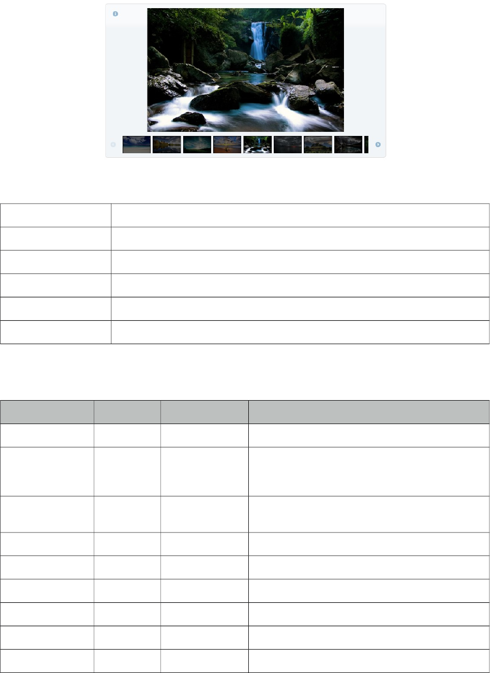
PrimeFaces User Guide
3.50 Galleria
Galleria is used to display a set of images.
Info
Tag galleria
Component Class org.primefaces.component.galleria.Galleria
Component Type org.primefaces.component.Galleria
Component Family org.primefaces.component
Renderer Type org.primefaces.component.GalleriaRenderer
Renderer Class org.primefaces.component.galleria.GalleriaRenderer
Attributes
Name Default Type Description
id null String Unique identifier of the component
rendered true boolean Boolean value to specify the rendering of the
component, when set to false component will not
be rendered.
binding null Object An el expression that maps to a server side
UIComponent instance in a backing bean
widgetVar null String Name of the client side widget.
value null Collection Collection of data to display.
var null String Name of variable to access an item in collection.
style null String Inline style of the container element.
styleClass null String Style class of the container element.
effect fade String Name of animation to use.
229
PrimeFaces User Guide
Name Default Type Description
effectSpeed 700 Integer Duration of animation in milliseconds.
panelWidth 600 Integer Width of the viewport.
panelHeight 400 Integer Height of the viewport.
frameWidth 60 Integer Width of the frames.
frameHeight 40 Integer Height of the frames.
showFilmstrip true Boolean Defines visibility of filmstrip.
showCaption false Boolean Defines visibility of captions.
transitionInterval 4000 Integer Defines interval of slideshow.
autoPlay true Boolean Images are displayed in a slideshow in autoPlay.
Getting Started with Galleria
Images to displayed are defined as children of galleria;
<p:galleria effect="slide" effectDuration="1000">
<p:graphicImage value="/images/image1.jpg" title="image1" alt="image1 desc" />
<p:graphicImage value="/images/image2.jpg" title="image1" alt=" image2 desc" />
<p:graphicImage value="/images/image3.jpg" title="image1" alt=" image3 desc" />
<p:graphicImage value="/images/image4.jpg" title="image1" alt=" image4 desc" />
</p:galleria>
Galleria displays the details of an image using an overlay which is displayed by clicking the
information icon. Title of this popup is retrieved from the image title attribute and description from
alt attribute so it is suggested to provide these attributes as well.
Dynamic Collection
Most of the time, you would need to display a dynamic set of images rather than defining each
image declaratively. For this you can use built-in data iteration feature.
<p:galleria value="#{galleriaBean.images}" var="image" >
<p:graphicImage value="#{image.path}"
title="#{image.title}" alt="#{image.description}" />
</p:galleria>
Effects
There are various effect options to be used in transitions; blind, bounce, clip, drop, explode, fade,
fold, highlight, puff, pulsate, scale, shake, size, slide and transfer.
By default animation takes 500 milliseconds, use effectSpeed option to tune this.
230
PrimeFaces User Guide
<p:galleria effect="slide" effectSpeed="1000">
//images
</p:galleria>
Skinning
Galleria resides in a main container element which style and styleClass options apply. As skinning
style classes are global, see the main theming section for more information. Following is the list of
structural style classes
Style Class Applies
.ui-galleria Container element for galleria.
.ui-galleria-panel-wrapper Container of panels.
.ui-galleria-panel Container of each image.
.ui-galleria-caption Caption element.
.ui-galleria-nav-prev, .ui-galleria-nav-next Navigators of filmstrip.
.ui-galleria-filmstrip-wrapper Container of filmstrip.
.ui-galleria-filmstrip Filmstrip element.
.ui-galleria-frame Frame element in a filmstrip.
.ui-galleria-frame-content Content of a frame.
.ui-galleria-frame-image Thumbnail image.
231
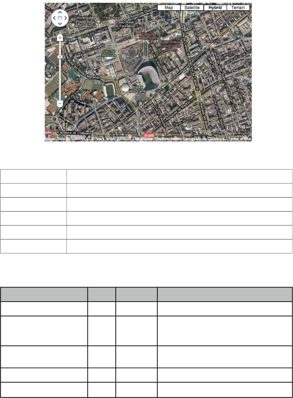
PrimeFaces User Guide
3.51 GMap
GMap is a map component integrated with Google Maps API V3.
Info
Tag gmap
Component Class org.primefaces.component.gmap.GMap
Component Type org.primefaces.component.Gmap
Component Family org.primefaces.component
Renderer Type org.primefaces.component.GmapRenderer
Renderer Class org.primefaces.component.gmap.GmapRenderer
Attributes
Name Default Type Description
id null String Unique identifier of the component.
rendered true Boolean Boolean value to specify the rendering of the
component, when set to false component will
not be rendered.
binding null Object An el expression that maps to a server side
UIComponent instance in a backing bean.
widgetVar null String Name of the client side widget.
model null MapModel An org.primefaces.model.MapModel instance.
232
PrimeFaces User Guide
Name Default Type Description
style null String Inline style of the map container.
styleClass null String Style class of the map container.
type null String Type of the map.
center null String Center point of the map.
zoom 8 Integer Defines the initial zoom level.
streetView false Boolean Controls street view support.
disableDefaultUI false Boolean Disables default UI controls
navigationControl true Boolean Defines visibility of navigation control.
mapTypeControl true Boolean Defines visibility of map type control.
draggable true Boolean Defines draggability of map.
disabledDoubleClickZoom false Boolean Disables zooming on mouse double click.
onPointClick null String Javascript callback to execute when a point on
map is clicked.
fitBounds true Boolean Defines if center and zoom should be calculated
automatically to contain all markers on the
map.
scrollWheel false Boolean Controls scrollwheel zooming on the map.
Getting started with GMap
First thing to do is placing V3 of the Google Maps API that the GMap is based on. Ideal location is
the head section of your page.
<script src="http://maps.google.com/maps/api/js?sensor=true|false"
type="text/javascript"></script>
As Google Maps api states, mandatory sensor parameter is used to specify if your application
requires a sensor like GPS locator. Four options are required to place a gmap on a page, these are
center, zoom, type and style.
<p:gmap center="41.381542, 2.122893" zoom="15" type="hybrid"
style="width:600px;height:400px" />
center: Center of the map in lat, lng format
zoom: Zoom level of the map
type: Type of map, valid values are, "hybrid", "satellite", "hybrid" and "terrain".
style: Dimensions of the map.
233
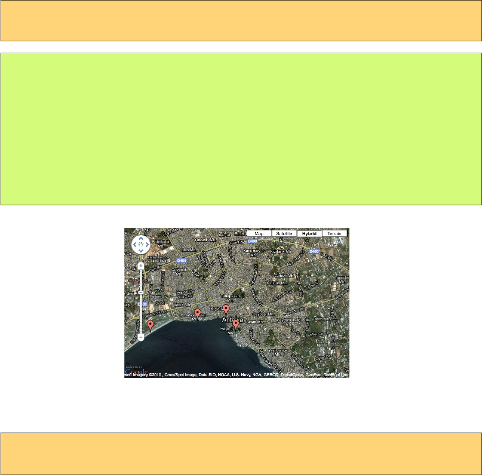
PrimeFaces User Guide
MapModel
GMap is backed by an org.primefaces.model.map.MapModel instance, PrimeFaces provides
org.primefaces.model.map.DefaultMapModel as the default implementation. API Docs of all GMap
related model classes are available at the end of GMap section and also at javadocs of PrimeFaces.
Markers
A marker is represented by org.primefaces.model.map.Marker.
<p:gmap center="41.381542, 2.122893" zoom="15" type="hybrid"
style="width:600px;height:400px" model="#{mapBean.model}"/>
public class MapBean {
private MapModel model = new DefaultMapModel();
public MapBean() {
model.addOverlay(new Marker(new LatLng(36.879466, 30.667648), "M1"));
//more overlays
}
public MapModel getModel() { return this.model; }
}
Polylines
A polyline is represented by org.primefaces.model.map.Polyline.
<p:gmap center="41.381542, 2.122893" zoom="15" type="hybrid"
style="width:600px;height:400px" model="#{mapBean.model}"/>
234
PrimeFaces User Guide
public class MapBean {
private MapModel model;
public MapBean() {
model = new DefaultMapModel();
Polyline polyline = new Polyline();
polyline.getPaths().add(new LatLng(36.879466, 30.667648));
polyline.getPaths().add(new LatLng(36.883707, 30.689216));
polyline.getPaths().add(new LatLng(36.879703, 30.706707));
polyline.getPaths().add(new LatLng(36.885233, 37.702323));
model.addOverlay(polyline);
}
public MapModel getModel() { return this.model; }
}
Polygons
A polygon is represented by org.primefaces.model.map.Polygon.
<p:gmap center="41.381542, 2.122893" zoom="15" type="hybrid"
style="width:600px;height:400px" model="#{mapBean.model}"/>
public class MapBean {
private MapModel model;
public MapBean() {
model = new DefaultMapModel();
Polygon polygon = new Polygon();
polyline.getPaths().add(new LatLng(36.879466, 30.667648));
polyline.getPaths().add(new LatLng(36.883707, 30.689216));
polyline.getPaths().add(new LatLng(36.879703, 30.706707));
model.addOverlay(polygon);
}
public MapModel getModel() { return this.model; }
}
Circles
A circle is represented by org.primefaces.model.map.Circle.
<p:gmap center="41.381542, 2.122893" zoom="15" type="hybrid"
style="width:600px;height:400px" model="#{mapBean.model}"/>
235
PrimeFaces User Guide
public class MapBean {
private MapModel model;
public MapBean() {
model = new DefaultMapModel();
Circle circle = new Circle(new LatLng(36.879466, 30.667648), 500);
model.addOverlay(circle);
}
public MapModel getModel() { return this.model; }
}
Rectangles
A circle is represented by org.primefaces.model.map.Rectangle.
<p:gmap center="41.381542, 2.122893" zoom="15" type="hybrid"
style="width:600px;height:400px" model="#{mapBean.model}"/>
public class MapBean {
private MapModel model;
public MapBean() {
model = new DefaultMapModel();
LatLng coord1 = new LatLng(36.879466, 30.667648);
LatLng coord2 = new LatLng(36.883707, 30.689216);
Rectangle rectangle = new Rectangle(coord1, coord2);
model.addOverlay(circle);
}
public MapModel getModel() { return this.model; }
}
GeoCoding
Geocoding support is provided by client side api. Results are then passed to the backing bean using
GeocodeEvent and ReverseGeocodeEvent instances via ajax behavior callbacks.
<p:gmap widgetVar="pmap">
<p:ajax event="geocode" listener="#{bean.onGeocode}" />
</p:map>
<script>
PF('pmap').geocode('Barcelona');
</script>
public void onGeocode(GeocodeEvent event) {
List<GeocodeResult> results = event.getResults();
}
236
PrimeFaces User Guide
Ajax Behavior Events
GMap provides many custom ajax behavior events for you to hook-in to various features.
Event Listener Parameter Fired
overlaySelect org.primefaces.event.map.OverlaySelectEvent When an overlay is selected.
stateChange org.primefaces.event.map.StateChangeEvent When map state changes.
pointSelect org.primefaces.event.map.PointSelectEvent When an empty point is selected.
markerDrag org.primefaces.event.map.MarkerDragEvent When a marker is dragged.
Following example displays a FacesMessage about the selected marker with growl component.
<h:form>
<p:growl id="growl" />
<p:gmap center="41.381542, 2.122893" zoom="15" type="hybrid"
style="width:600px;height:400px" model="#{mapBean.model}">
<p:ajax event="overlaySelect" listener="#{mapBean.onMarkerSelect}"
update="growl" />
</p:gmap>
</h:form>
public class MapBean {
private MapModel model;
public MapBean() {
model = new DefaultMapModel();
//add markers
}
public MapModel getModel() {
return model
}
public void onMarkerSelect(OverlaySelectEvent event) {
Marker selectedMarker = (Marker) event.getOverlay();
//add facesmessage
}
}
InfoWindow
A common use case is displaying an info window when a marker is selected. gmapInfoWindow is
used to implement this special use case. Following example, displays an info window that contains
an image of the selected marker data.
237
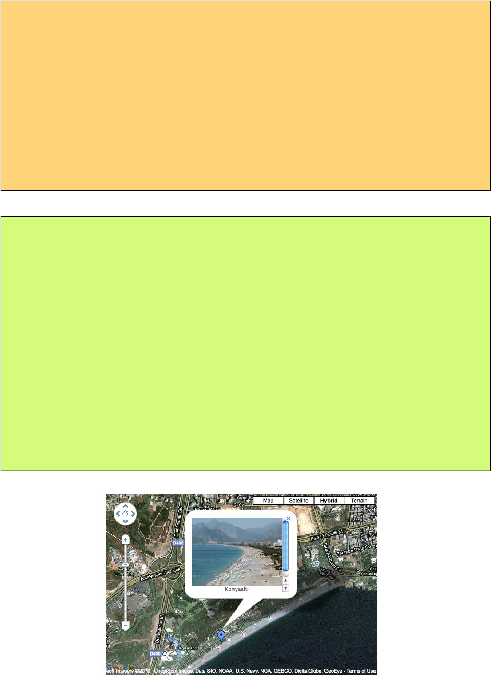
PrimeFaces User Guide
<h:form>
<p:gmap center="41.381542, 2.122893" zoom="15" type="hybrid"
style="width:600px;height:400px" model="#{mapBean.model}">
<p:ajax event="overlaySelect" listener="#{mapBean.onMarkerSelect}" />
<p:gmapInfoWindow>
<p:graphicImage value="/images/#{mapBean.marker.data.image}" />
<h:outputText value="#{mapBean.marker.data.title}" />
</p:gmapInfoWindow>
</p:gmap>
</h:form>
public class MapBean {
private MapModel model;
private Marker marker;
public MapBean() {
model = new DefaultMapModel();
//add markers
}
public MapModel getModel() { return model; }
public Marker getMarker() { return marker; }
public void onMarkerSelect(OverlaySelectEvent event) {
this.marker = (Marker) event.getOverlay();
}
}
Street View
StreeView is enabled simply by setting streetView option to true.
238
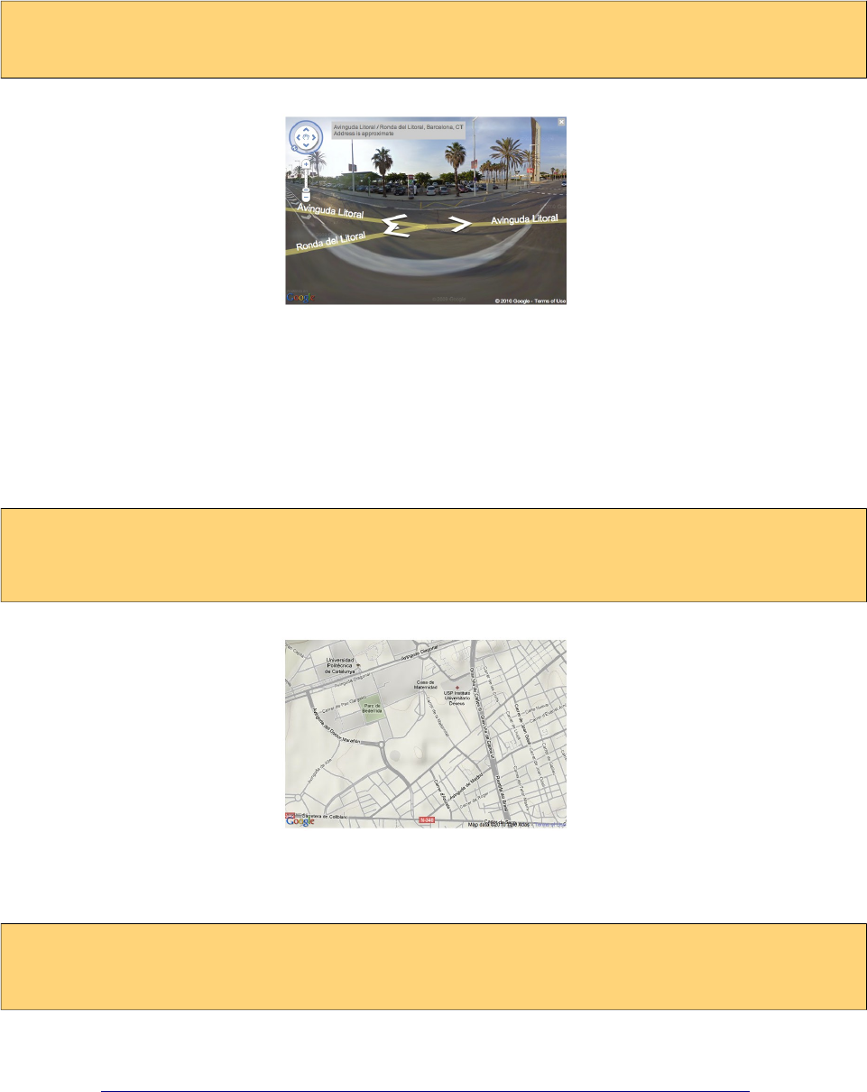
PrimeFaces User Guide
<p:gmap center="41.381542, 2.122893" zoom="15" type="hybrid"
style="width:600px;height:400px" streetView="true" />
Map Controls
Controls on map can be customized via attributes like navigationControl and mapTypeControl.
Alternatively setting disableDefaultUI to true will remove all controls at once.
<p:gmap center="41.381542, 2.122893" zoom="15" type="terrain"
style="width:600px;height:400px"
mapTypeControl="false" navigationControl="false" />
Native Google Maps API
In case you need to access native google maps api with javascript, use provided getMap() method.
var gmap = PF('yourWidgetVar').getMap();
//gmap is a google.maps.Map instance
Full map api is provided at;
http://code.google.com/apis/maps/documentation/javascript/reference.html
GMap API
org.primefaces.model.map.MapModel (org.primefaces.model.map.DefaultMapModel is the default
implementation)
239
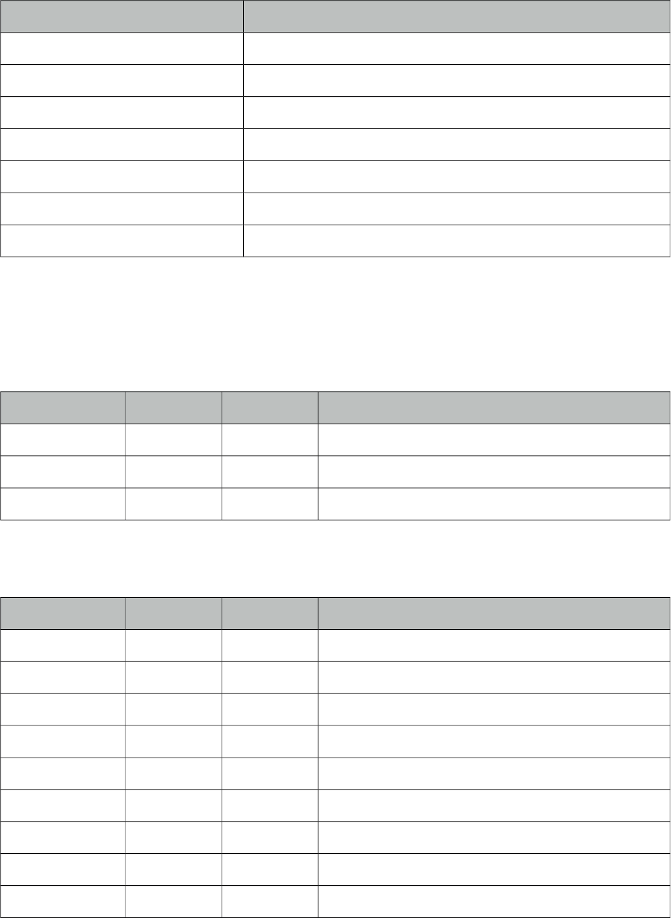
PrimeFaces User Guide
Method Description
addOverlay(Overlay overlay) Adds an overlay to map
List<Marker> getMarkers() Returns the list of markers
List<Polyline> getPolylines() Returns the list of polylines
List<Polygon> getPolygons() Returns the list of polygons
List<Circle> getCircles() Returns the list of circles
List<Rectangle> getRectangles() Returns the list of rectangles.
Overlay findOverlay(String id) Finds an overlay by it’s unique id
org.primefaces.model.map.Overlay
Property Default Type Description
id null String Id of the overlay, generated and used internally
data null Object Data represented in marker
zindex null Integer Z-Index of the overlay
org.primefaces.model.map.Marker extends org.primefaces.model.map.Overlay
Property Default Type Description
title null String Text to display on rollover
latlng null LatLng Location of the marker
icon null String Icon of the foreground
shadow null String Shadow image of the marker
cursor pointer String Cursor to display on rollover
draggable 0 Boolean Defines if marker can be dragged
clickable 1 Boolean Defines if marker can be dragged
flat 0 Boolean If enabled, shadow image is not displayed
visible 1 Boolean Defines visibility of the marker
org.primefaces.model.map.Polyline extends org.primefaces.model.map.Overlay
240
PrimeFaces User Guide
Property Default Type Description
paths null List List of coordinates
strokeColor null String Color of a line
strokeOpacity 1 Double Opacity of a line
strokeWeight 1 Integer Width of a line
org.primefaces.model.map.Polygon extends org.primefaces.model.map.Overlay
Property Default Type Description
paths null List List of coordinates
strokeColor null String Color of a line
strokeOpacity 1 Double Opacity of a line
strokeWeight 1 Integer Weight of a line
fillColor null String Background color of the polygon
fillOpacity 1 Double Opacity of the polygon
org.primefaces.model.map.Circle extends org.primefaces.model.map.Overlay
Property Default Type Description
center null LatLng Center of the circle
radius null Double Radius of the circle.
strokeColor null String Stroke color of the circle.
strokeOpacity 1 Double Stroke opacity of circle.
strokeWeight 1 Integer Stroke weight of the circle.
fillColor null String Background color of the circle.
fillOpacity 1 Double Opacity of the circle.
org.primefaces.model.map.Rectangle extends org.primefaces.model.map.Overlay
Property Default Type Description
bounds null LatLngBounds Boundaries of the rectangle.
strokeColor null String Stroke color of the rectangle.
strokeOpacity 1 Double Stroke opacity of rectangle.
241
PrimeFaces User Guide
Property Default Type Description
strokeWeight 1 Integer Stroke weight of the rectangle.
fillColor null String Background color of the rectangle.
fillOpacity 1 Double Opacity of the rectangle.
org.primefaces.model.map.LatLng
Property Default Type Description
lat null double Latitude of the coordinate
lng null double Longitude of the coordinate
org.primefaces.model.map.LatLngBounds
Property Default Type Description
center null LatLng Center coordinate of the boundary
northEast null LatLng NorthEast coordinate of the boundary
southWest null LatLng SouthWest coordinate of the boundary
org.primefaces.model.map.GeocodeResult
Property Default Type Description
address null String String representation of the address.
latLng null LatLng Coordinates of the address.
GMap Event API
All classes in event api extends from javax.faces.event.FacesEvent.
org.primefaces.event.map.MarkerDragEvent
Property Default Type Description
marker null Marker Dragged marker instance
org.primefaces.event.map.OverlaySelectEvent
Property Default Type Description
overlay null Overlay Selected overlay instance
242
PrimeFaces User Guide
org.primefaces.event.map.PointSelectEvent
Property Default Type Description
latLng null LatLng Coordinates of the selected point
org.primefaces.event.map.StateChangeEvent
Property Default Type Description
bounds null LatLngBounds Boundaries of the map
zoomLevel 0 Integer Zoom level of the map
org.primefaces.event.map.GeocodeEvent
Property Default Type Description
query null String Query of the geocode search.
results null List<GeocodeResult> List of results represented as GeocodeResult.
org.primefaces.event.map.ReverseGeocodeEvent
Property Default Type Description
latlng null LatLng Coordinates of the reverse geocode query.
addresses null List<String> List of results represented as strings.
243
PrimeFaces User Guide
3.52 GMapInfoWindow
GMapInfoWindow is used with GMap component to open a window on map when an overlay is
selected.
Info
Tag gmapInfoWindow
Tag Class org.primefaces.component.gmap.GMapInfoWindowTag
Component Class org.primefaces.component.gmap.GMapInfoWindow
Component Type org.primefaces.component.GMapInfoWindow
Component Family org.primefaces.component
Attributes
Name Default Type Description
id null String Unique identifier of the component
rendered true Boolean Boolean value to specify the rendering of the
component, when set to false component will not
be rendered.
binding null Object An el expression that maps to a server side
UIComponent instance in a backing bean
maxWidth null Integer Maximum width of the info window
Getting started with GMapInfoWindow
See GMap section for more information about how gmapInfoWindow is used.
244
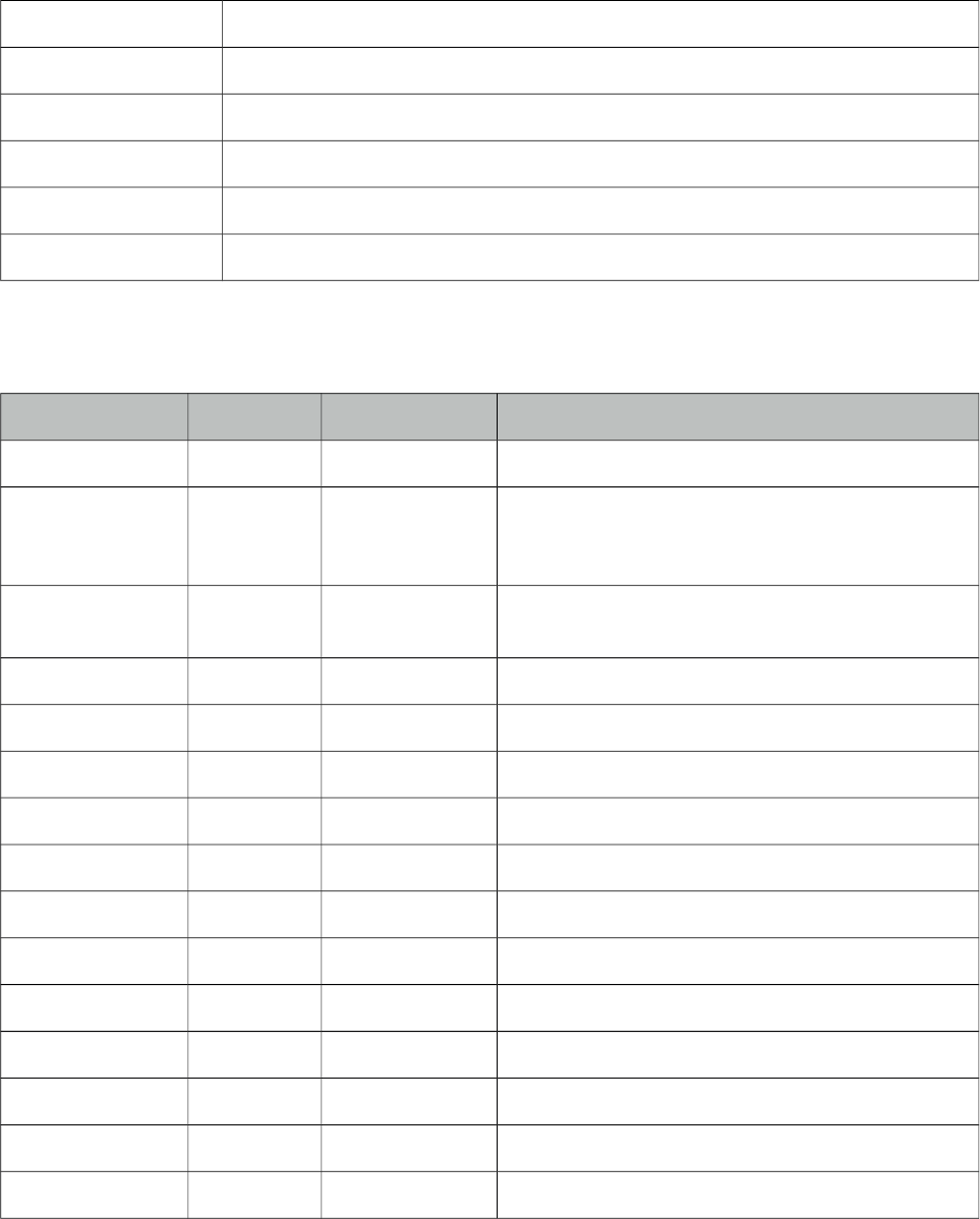
PrimeFaces User Guide
3.53 GraphicImage
GraphicImage extends standard JSF graphic image component with the ability of displaying binary
data like an inputstream. Main use cases of GraphicImage is to make displaying images stored in
database or on-the-fly images easier. Legacy way to do this is to come up with a Servlet that does
the streaming, GraphicImage does all the hard work without the need of a Servlet.
Info
Tag graphicImage
Component Class org.primefaces.component.graphicimage.GraphicImage
Component Type org.primefaces.component.GraphicImage
Component Family org.primefaces.component
Renderer Type org.primefaces.component.GraphicImageRenderer
Renderer Class org.primefaces.component.graphicimage.GraphicImageRenderer
Attributes
Name Default Type Description
id null String Unique identifier of the component
rendered true boolean Boolean value to specify the rendering of the
component, when set to false component will not
be rendered.
binding null Object An el expression that maps to a server side
UIComponent instance in a backing bean
value null Object Binary data to stream or context relative path.
alt null String Alternate text for the image
url null String Alias to value attribute
width null String Width of the image
height null String Height of the image
title null String Title of the image
dir null String Direction of the text displayed
lang null String Language code
ismap false Boolean Specifies to use a server-side image map
usemap null String Name of the client side map
style null String Style of the image
styleClass null String Style class of the image
245
PrimeFaces User Guide
Name Default Type Description
onclick null String onclick dom event handler
ondblclick null String ondblclick dom event handler
onkeydown null String onkeydown dom event handler
onkeypress null String onkeypress dom event handler
onkeyup null String onkeyup dom event handler
onmousedown null String onmousedown dom event handler
onmousemove null String onmousemove dom event handler
onmouseout null String onmouseout dom event handler
onmouseover null String onmouseover dom event handler
onmouseup null String onmouseup dom event handler
cache true String Enables/Disables browser from caching the image
name null String Name of the image.
library null String Library name of the image.
stream true Boolean Defines if the image is streamed or rendered
directly as data uri / base64 with ViewScoped
support.
Getting started with GraphicImage
GraphicImage requires an org.primefaces.model.StreamedContent content as it’s value for dynamic
images. StreamedContent is an interface and PrimeFaces provides a built-in implementation called
DefaultStreamedContent. Following examples loads an image from the classpath.
<p:graphicImage value="#{imageBean.image}" />
public class ImageBean {
private StreamedContent image;
public DynamicImageController() {
InputStream stream = this.getClass().getResourceAsStream("barcalogo.jpg");
image = new DefaultStreamedContent(stream, "image/jpeg");
}
public StreamedContent getImage() {
return this.image;
}
}
DefaultStreamedContent gets an inputstream as the first parameter and mime type as the second.
246
PrimeFaces User Guide
In a real life application, you can create the inputstream after reading the image from the database.
For example java.sql.ResultsSet API has the getBinaryStream() method to read blob files stored in
database.
Displaying Charts with JFreeChart
See static images section at chart component for a sample usage of graphicImage with jFreeChart.
Displaying a Barcode
Similar to the chart example, a barcode can be generated as well. This sample uses barbecue project
for the barcode API.
<p:graphicImage value="#{backingBean.barcode}" />
public class BarcodeBean {
private StreamedContent barcode;
public BackingBean() {
try {
File barcodeFile = new File("dynamicbarcode");
BarcodeImageHandler.saveJPEG(
BarcodeFactory.createCode128("PRIMEFACES"), barcodeFile);
barcode = new DefaultStreamedContent(
new FileInputStream(barcodeFile), "image/jpeg");
} catch (Exception e) {
e.printStackTrace();
}
}
public BarcodeBean getBarcode() {
return this.barcode;
}
}
Displaying Regular Images
As GraphicImage extends standard graphicImage component, it can also display regular non
dynamic images just like standard graphicImage component using name and optional library.
<p:graphicImage name="barcalogo.jpg" library="yourapp" />
How It Works
Default dynamic image display works as follows;
• Streamed content is put in http session with an encrypted key
• This key is appended to the image url that points to JSF resource handler.
247
PrimeFaces User Guide
• Custom PrimeFaces ResourceHandler gets the key from the url, decrypts it to get the instance of
StreamedContent from session, evaluates the content and streams it to client. Finally key is
removed from http session.
As a result there will be 2 requests to display an image, at first browser will make a request to load
the page initially and then another one to the dynamic image url that points to JSF resource handler.
Note that you cannot use viewscope beans in this way as they are not available in resource loading
request. See Data URI section below for an alternative to support view scope.
You can pass request parameters to the graphicImage via f:param tags, as a result the actual request
rendering the image can have access to these values. This is extremely handy to display dynamic
images if your image is in a data iteration component like datatable or ui:repeat.
ViewScope Support via Data URI
Setting stream attribute to false uses an alternative approach by converting the value to base64 and
displays the image via data uri. In this approach, only one request is required so view scope is
supported.
StreamedContent
There are two StreamedContent implementations out of the box; DefaultStreamedContent is not
uses an InputStream and not serializable whereas the serializable ByteArrayContent uses a byte
array.
248
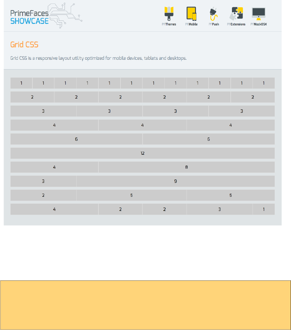
PrimeFaces User Guide
3.54 Grid CSS
Grid CSS is a lightweight responsive layout utility optimized for mobile devices, tablets and
desktops. Up to 12 columns are supported based on fluid layout.
Getting Started with Grid
Grid CSS is based on a 12 column layout. Columns are prefixed with ui-g-* and they should be a
descendant of a container having ui-g class. A simple 3 column layout can be defined as;
<div class="ui-g">
<div class="ui-g-4">Col1</div>
<div class="ui-g-4">Col2</div>
<div class="ui-g-4">Col3</div>
</div>
249

PrimeFaces User Guide
Multi Line
When the number of columns exceed 12, columns wrap to a new line.
<div class="ui-g">
<div class="ui-g-6">Col1</div>
<div class="ui-g-6">Col2</div>
<div class="ui-g-6">Col3</div>
<div class="ui-g-6">Col4</div>
</div>
Same can also be achieved by having two ui-g containers to semantically define a row.
<div class="ui-g">
<div class="ui-g-6">Col1</div>
<div class="ui-g-6">Col2</div>
</div>
<div class="ui-g">
<div class="ui-g-6">Col3</div>
<div class="ui-g-6">Col4</div>
</div>
Nested
Columns can be nested to create more complex layouts.
<div class="ui-g">
<div class="ui-g-8 ui-g-nopad">
<div class="ui-g-6">6</div>
<div class="ui-g-6">6</div>
<div class="ui-g-12">12</div>
</div>
<div class="ui-g-4">4</div>
</div>
Direct children of ui-g has the same height automatically, in example above if the inside columns is
likely to have different height with different content.
<div class="ui-g">
<div class="ui-g-8 ui-g-nopad">
<div class="ui-g-6">6 <br /><br /><br /> Content </div>
<div class="ui-g-6">6</div>
<div class="ui-g-12">12</div>
</div>
<div class="ui-g-4">4</div>
</div>
250
PrimeFaces User Guide
Solution is wrapping the internal divs inside a ui-g as well.
<div class="ui-g">
<div class="ui-g-8 ui-g-nopad">
<div class="ui-g">
<div class="ui-g-6">6 <br /><br /><br /> Content </div>
<div class="ui-g-6">6</div>
<div class="ui-g-12">12</div>
</div>
</div>
<div class="ui-g-4">4</div>
</div>
Responsive
Responsive layout is achieved by applying additional classes to the columns whereas ui-g-* define
the default behavior. Four screen sizes are supported with different breakpoints.
Prefix Devices Media Query Example
ui-sm-* Phones max-width: 40em (640px) ui-sm-6, ui-sm-4
ui-md-* Tablets min-width: 40.063em (641px) ui-md-2, ui-sm-8
ui-lg-* Desktops min-width: 64.063em (1025px) ui-lg-6, ui-sm-12
ui-xl-* Big screen monitors min-width: 90.063em (1441px) ui-xl-2, ui-sm-10
Most of the time, ui-md-* styles are used with default ui-g-* classes, to customize small or large
screens apply ui-sm, ui-lg and ui-xl can be utilized.
In example below, large screens display 4 columns, medium screens display 2 columns in 2 rows
and default behavior gets only displayed in a mobile phone where each column is rendered in a
separate row.
<div class="ui-g">
<div class="ui-g-12 ui-md-6 ui-lg-3">ui-g-12 ui-md-6 ui-lg-3</div>
<div class="ui-g-12 ui-md-6 ui-lg-3">ui-g-12 ui-md-6 ui-lg-3</div>
<div class="ui-g-12 ui-md-6 ui-lg-3">ui-g-12 ui-md-6 ui-lg-3</div>
<div class="ui-g-12 ui-md-6 ui-lg-3">ui-g-12 ui-md-6 ui-lg-3</div>
</div>
In this second example below, 3 columns are displayed in large screens and in medium screens first
two columns are placed side by side where the last column displayed below them. In a mobile
phone, they all get displayed in a separate row.
<div class="ui-g">
<div class="ui-g-12 ui-md-6 ui-lg-4">ui-g-12 ui-md-6 ui-lg-4</div>
<div class="ui-g-12 ui-md-6 ui-lg-4">ui-g-12 ui-md-6 ui-lg-4</div>
<div class="ui-g-12 ui-lg-4">ui-g-12 ui-lg-4</div>
</div>
Note: A column has a default padding by default, to remove it you may apply ui-g-nopad style class.
251
PrimeFaces User Guide
3.55 Growl
Growl is based on the Mac’s growl notification widget and used to display FacesMessages in an
overlay.
Info
Tag growl
Component Class org.primefaces.component.growl.Growl
Component Type org.primefaces.component.Growl
Component Family org.primefaces.component
Renderer Type org.primefaces.component.GrowlRenderer
Renderer Class org.primefaces.component.growl.GrowlRenderer
Attributes
Name Default Type Description
id null String Unique identifier of the component
rendered true Boolean Boolean value to specify the rendering of the
component, when set to false component will not be
rendered.
binding null Object An el expression that maps to a server side
UIComponent instance in a backing bean
sticky false Boolean Specifies if the message should stay instead of hidden
automatically.
showSummary true Boolean Specifies if the summary of message should be
displayed.
showDetail false Boolean Specifies if the detail of message should be displayed.
globalOnly false Boolean When true, only facesmessages without clientids are
displayed.
life 6000 Integer Duration in milliseconds to display non-sticky
messages.
252
PrimeFaces User Guide
Name Default Type Description
autoUpdate false Boolean Specifies auto update mode.
redisplay true Boolean Defines if already rendered messaged should be
displayed.
for null String Name of associated key, takes precedence when used
with globalOnly.
escape true Boolean Defines whether html would be escaped or not.
severity null String Comma separated list of severities to display only.
Getting Started with Growl
Growl usage is similar to standard h:messages component. Simply place growl anywhere on your
page, since messages are displayed as an overlay, the location of growl in JSF page does not matter.
<p:growl />
Lifetime of messages
By default each message will be displayed for 6000 ms and then hidden. A message can be made
sticky meaning it’ll never be hidden automatically.
<p:growl sticky="true" />
If growl is not working in sticky mode, it’s also possible to tune the duration of displaying
messages. Following growl will display the messages for 5 seconds and then fade-out.
<p:growl life="5000" />
Growl with Ajax Updates
If you need to display messages with growl after an ajax request you just need to update it. Note
that if you enable autoUpdate, growl will be updated automatically with each ajax request anyway.
<p:growl id="messages"/>
<p:commandButton value="Submit" update="messages" />
Positioning
Growl is positioned at top right corner by default, position can be controlled with a CSS selector
called ui-growl. With the below setting growl will be located at top left corner.
.ui-growl {
left:20px;
}
253
PrimeFaces User Guide
Targetable Messages
There may be times where you need to target one or more messages to a specific message
component, for example suppose you have growl and messages on same page and you need to
display some messages on growl and some on messages. Use for attribute to associate messages
with specific components.
<p:messages for="somekey" />
<p:growl for="anotherkey" />
FacesContext context = FacesContext.getCurrentInstance();
context.addMessage("somekey", facesMessage1);
context.addMessage("somekey", facesMessage2);
context.addMessage("anotherkey", facesMessage3);
In sample above, messages will display first and second message and growl will only display the
3rd message.
Severity Levels
Using severity attribute, you can define which severities can be displayed by the component. For
instance, you can configure growl to only display infos and warnings.
<p:growl severity="info,warn" />
Escaping
Growl escapes html content in messages, in case you need to display html via growl set escape
option to false.
<p:growl escape="false" />
Skinning
Following is the list of structural style classes;
Style Class Applies
.ui-growl Main container element of growl
.ui-growl-item-container Container of messages
.ui-growl-item Container of a message
.ui-growl-message Text message container
.ui-growl-title Summary of the message
.ui-growl-message p Detail of the message
.ui-growl-image Severity icon
254
PrimeFaces User Guide
Style Class Applies
.ui-growl-image-info Info severity icon
.ui-growl-image-warn Warning severity icon
.ui-growl-image-error Error severity icon
.ui-growl-image-fatal Fatal severity icon
As skinning style classes are global, see the main theming section for more information.
255
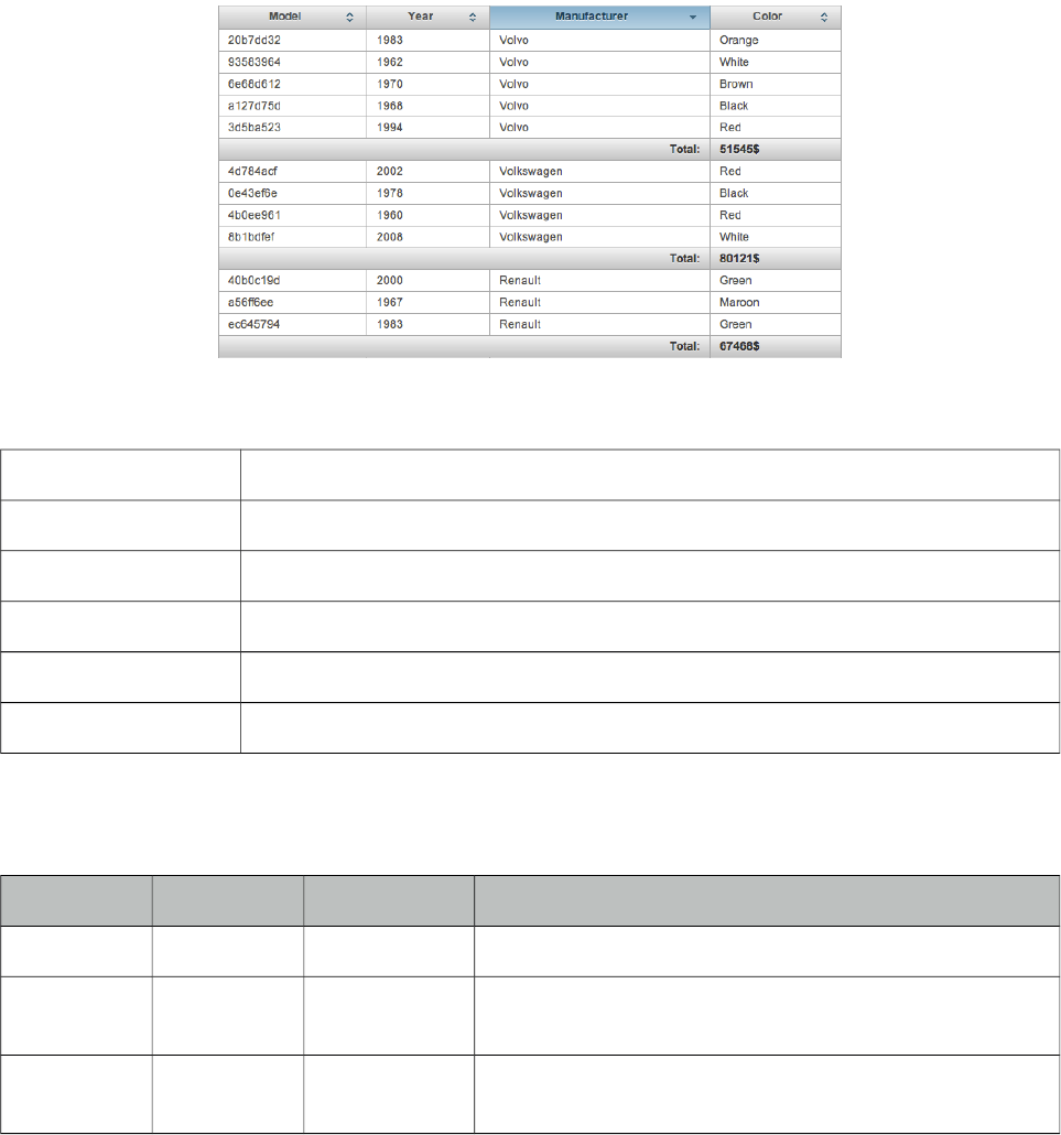
PrimeFaces User Guide
3.56 HeaderRow
HeaderRow is a helper component of datatable used for dynamic grouping.
Info
Tag headerRow
Component Class org.primefaces.component.headerrow.HeaderRow
Component Type org.primefaces.component.HeaderRow
Component Family org.primefaces.component
Renderer Type org.primefaces.component.HeaderRowRenderer
Renderer Class org.primefaces.component.headerrow.HeaderRowRenderer
Attributes
Name Default Type Description
id null String Unique identifier of the component
rendered true Boolean Boolean value to specify the rendering of the component,
when set to false component will not be rendered.
binding null Object An el expression that maps to a server side UIComponent
instance in a backing bean
Getting started with HeaderRow
See DataTable section for more information.
256
PrimeFaces User Guide
3.57 HotKey
HotKey is a generic key binding component that can bind any formation of keys to javascript event
handlers or ajax calls.
Info
Tag hotkey
Component Class org.primefaces.component.hotkey.HotKey
Component Type org.primefaces.component.HotKey
Component Family org.primefaces.component
Renderer Type org.primefaces.component.HotKeyRenderer
Renderer Class org.primefaces.component.hotkey.HotKeyRenderer
Attributes
Name Default Type Description
id null String Unique identifier of the component.
rendered true Boolean Boolean value to specify the rendering of the
component, when set to false component will not
be rendered.
binding null Object An el expression that maps to a server side
UIComponent instance in a backing bean
bind null String The Key binding.
handler null String Javascript event handler to be executed when the
key binding is pressed.
action null MethodExpr A method expression that’d be processed in the
partial request caused by uiajax.
actionListener null MethodExpr An actionlistener that’d be processed in the partial
request caused by uiajax.
immediate false Boolean Boolean value that determines the phaseId, when
true actions are processed at apply_request_values,
when false at invoke_application phase.
async false Boolean When set to true, ajax requests are not queued.
process null String Component id(s) to process partially instead of
whole view.
update null String Client side id of the component(s) to be updated
after async partial submit request.
onstart null String Javascript handler to execute before ajax request is
257
PrimeFaces User Guide
Name Default Type Description
begins.
oncomplete null String Javascript handler to execute when ajax request is
completed.
onsuccess null String Javascript handler to execute when ajax request
succeeds.
onerror null String Javascript handler to execute when ajax request
fails.
global true Boolean Global ajax requests are listened by ajaxStatus
component, setting global to false will not trigger
ajaxStatus.
delay null String If less than delay milliseconds elapses between
calls to request() only the most recent one is sent
and all other requests are discarded. If this option
is not specified, or if the value of delay is the
literal string 'none' without the quotes, no delay is
used.
partialSubmit false Boolean Enables serialization of values belonging to the
partially processed components only.
partialSubmitFilter null String Selector to use when partial submit is on, default is
":input" to select all descendant inputs of a
partially processed components.
resetValues false Boolean If true, local values of input components to be
updated within the ajax request would be reset.
ignoreAutoUpdate false Boolean If true, components which autoUpdate="true" will
not be updated for this request. If not specified, or
the value is false, no such indication is made.
timeout 0 Integer Timeout for the ajax request in milliseconds.
form null String Form to serialize for an ajax request. Default is the
enclosing form.
Getting Started with HotKey
HotKey is used in two ways, either on client side with the event handler or with ajax support.
Simplest example would be;
<p:hotkey bind="a" handler="alert(‘Pressed a’);" />
When this hotkey is on page, pressing the a key will alert the ‘Pressed key a’ text.
Key combinations
Most of the time you’d need key combinations rather than a single key.
258

PrimeFaces User Guide
<p:hotkey bind="ctrl+s" handler="alert(‘Pressed ctrl+s’);" />
<p:hotkey bind="ctrl+shift+s" handler="alert(‘Pressed ctrl+shift+s’)" />
Integration
Here’s an example demonstrating how to integrate hotkeys with a client side api. Using left and
right keys will switch the images displayed via the p:imageSwitch component.
<p:hotkey bind="left" handler="PF('switcher').previous();" />
<p:hotkey bind="right" handler="PF('switcher').next();" />
<p:imageSwitch widgetVar="switcher">
//content
</p:imageSwitch>
Ajax Support
Ajax is a built-in feature of hotKeys meaning you can do ajax calls with key combinations.
Following form can be submitted with the ctrl+shift+s combination.
<h:form>
<p:hotkey bind="ctrl+shift+s" update="display" />
<h:panelGrid columns="2">
<h:outputLabel for="name" value="Name:" />
<h:inputText id="name" value="#{bean.name}" />
</h:panelGrid>
<h:outputText id="display" value="Hello: #{bean.firstname}" />
</h:form>
Note that hotkey will not be triggered if there is a focused input on page.
259
PrimeFaces User Guide
3.58 IdleMonitor
IdleMonitor watches user actions on a page and notify callbacks in case they go idle or active again.
Info
Tag idleMonitor
Component Class org.primefaces.component.idlemonitor.IdleMonitor
Component Type org.primefaces.component.IdleMonitor
Component Family org.primefaces.component
Renderer Type org.primefaces.component.IdleMonitorRenderer
Renderer Class org.primefaces.component.idlemonitor.IdleMonitor
Attributes
Name Default Type Description
id null String Unique identifier of the component
rendered true Boolean Boolean value to specify the rendering of the
component, when set to false component will not be
rendered.
binding null Object An el expression that maps to a server side
UIComponent instance in a backing bean
timeout 300000 Integer Time to wait in milliseconds until deciding if the user
is idle. Default is 5 minutes.
onidle null String Client side callback to execute when user goes idle.
onactive null String Client side callback to execute when user goes idle.
widgetVar null String Name of the client side widget.
Getting Started with IdleMonitor
To begin with, you can hook-in to client side events that are called when a user goes idle or
becomes active again. Example below toggles visibility of a dialog to respond these events.
<p:idleMonitor onidle="PF('idleDialog').show();"
onactive="PF('idleDialog').hide();"/>
<p:dialog header="What's happening?" widgetVar="idleDialog" modal="true">
<h:outputText value="Dude, are you there?" />
</p:dialog>
260
PrimeFaces User Guide
Controlling Timeout
By default, idleMonitor waits for 5 minutes (300000 ms) until triggering the onidle event. You can
customize this duration with the timeout attribute.
Ajax Behavior Events
IdleMonitor provides two ajax behavior events which are idle and active that are fired according to
user status changes. Example below displays messages for each event;
<p:idleMonitor timeout="5000" update="messages">
<p:ajax event="idle" listener="#{bean.idleListener}" update="msg" />
<p:ajax event="active" listener="#{bean.activeListener}" update="msg" />
</p:idleMonitor>
<p:growl id=”msg” />
public class Bean {
public void idleListener() {
//Add facesmessage
}
public void idle() {
//Add facesmessage
}
}
Client Side API
Widget: PrimeFaces.widget.IdleMonitor
Method Params Return Type Description
pause() - void Pauses the monitor.
resume() - void Resumes monitoring
reset() - void Resets the timer of monitor.
261
PrimeFaces User Guide
3.59 ImageCompare
ImageCompare provides a user interface to compare two images.
Info
Tag imageCompare
Component Class org.primefaces.component.imagecompare.ImageCompare
Component Type org.primefaces.component.ImageCompare
Component Family org.primefaces.component
Renderer Type org.primefaces.component.ImageCompareRenderer
Renderer Class org.primefaces.component.imagecompare.ImageCompareRenderer
Attributes
Name Default Type Description
id null String Unique identifier of the component
rendered true Boolean Boolean value to specify the rendering of the
component, when set to false component will not
be rendered.
binding null Object An el expression that maps to a server side
UIComponent instance in a backing bean
widgetVar null String Name of the client side widget.
262
PrimeFaces User Guide
Name Default Type Description
leftImage null String Source of the image placed on the left side
rightImage null String Source of the image placed on the right side
width null String Width of the images
height null String Height of the images
style null String Inline style of the container element
styleClass null String Style class of the container element
Getting started with ImageCompare
ImageCompare is created with two images with same height and width. It is required to set width
and height of the images as well.
<p:imageCompare leftImage="xbox.png" rightImage="ps3.png"
width="438" height="246"/>
Skinning
Both images are placed inside a div container element, style and styleClass attributes apply to this
element.
263
PrimeFaces User Guide
3.60 ImageCropper
ImageCropper allows cropping a certain region of an image. A new image is created containing the
cropped area and assigned to a CroppedImage instanced on the server side.
Info
Tag imageCropper
Component Class org.primefaces.component. imagecropper.ImageCropper
Component Type org.primefaces.component.ImageCropper
Component Family org.primefaces.component
Renderer Type org.primefaces.component.ImageCropperRenderer
Renderer Class org.primefaces.component.imagecropper.ImageCropperRenderer
Attributes
Name Default Type Description
id null String Unique identifier of the component
rendered true Boolean Boolean value to specify the rendering of the
component, when set to false component will not be
rendered.
binding null Object An el expression that maps to a server side
UIComponent instance in a backing bean
value null Object Value of the component than can be either an EL
expression of a literal text
converter null Converter
/String
An el expression or a literal text that defines a
converter for the component. When it’s an EL
expression, it’s resolved to a converter instance. In
case it’s a static text, it must refer to a converter id
immediate false Boolean When set true, process validations logic is executed
at apply request values phase for this component.
required false Boolean Marks component as required
264
PrimeFaces User Guide
Name Default Type Description
validator null Method
Expr
A method binding expression that refers to a method
validationg the input
valueChangeListener null Method
Expr
A method binding expression that refers to a method
for handling a valuchangeevent
requiredMessage null String Message to be displayed when required field
validation fails.
converterMessage null String Message to be displayed when conversion fails.
validatorMessage null String Message to be displayed when validation fields.
widgetVar null String Name of the client side widget.
image null String Context relative path to the image.
alt null String Alternate text of the image.
aspectRatio null Double Aspect ratio of the cropper area.
minSize null String Minimum size of the cropper area.
maxSize null String Maximum size of the cropper area.
backgroundColor null String Background color of the container.
backgroundOpacity 0,6 Double Background opacity of the container
initialCoords null String Initial coordinates of the cropper area.
boxWidth 0 Integer Maximum box width of the cropping area.
boxHeight 0 Integer Maximum box height of the cropping area.
Getting started with the ImageCropper
ImageCropper is an input component and image to be cropped is provided via the image attribute.
The cropped area of the original image is used to create a new image, this new image can be
accessed on the backing bean by setting the value attribute of the image cropper. Assuming the
image is at %WEBAPP_ROOT%/campnou.jpg
<p:imageCropper value="#{cropper.croppedImage}" image="/campnou.jpg" />
public class Cropper {
private CroppedImage croppedImage;
//getter and setter
}
org.primefaces.model.CroppedImage belongs a PrimeFaces API and contains handy information
about the crop process. Following table describes CroppedImage properties.
265
PrimeFaces User Guide
Property Type Description
originalFileName String Name of the original file that’s cropped
bytes byte[] Contents of the cropped area as a byte array
left int Left coordinate
right int Right coordinate
width int Width of the cropped image
height int Height of the cropped image
External Images
ImageCropper has the ability to crop external images as well.
<p:imageCropper value="#{cropper.croppedImage}"
image=" http://primefaces.prime.com.tr/en/images/schema.png ">
</p:imageCropper>
Context Relative Path
For local images, ImageCropper always requires the image path to be context relative. So to
accomplish this simply just add slash ("/path/to/image.png") and imagecropper will recognize it at
%WEBAPP_ROOT%/path/to/image.png. Action url relative local images are not supported.
Initial Coordinates
By default, user action is necessary to initiate the cropper area on an image, you can specify an
initial area to display on page load using initialCoords option in x,y,w,h format.
<p:imageCropper value="#{cropper.croppedImage}" image="/campnou.jpg"
initialCoords="225,75,300,125"/>
Boundaries
minSize and maxSize attributes are control to limit the size of the area to crop.
<p:imageCropper value="#{cropper.croppedImage}" image="/campnou.jpg"
minSize="50,100" maxSize="150,200"/>
Saving Images
Below is an example to save the cropped image to file system.
<p:imageCropper value="#{cropper.croppedImage}" image="/campnou.jpg" />
<p:commandButton value="Crop" actionListener="#{myBean.crop}" />
266

PrimeFaces User Guide
public class Cropper {
private CroppedImage croppedImage;
//getter and setter
public String crop() {
ServletContext servletContext = (ServletContext)
FacesContext.getCurrentInstance().getExternalContext().getContext();
String newFileName = servletContext.getRealPath("") + File.separator +
"ui" + File.separator + "barca" + File.separator+ croppedImage.getOriginalFileName()
+ "cropped.jpg";
FileImageOutputStream imageOutput;
try {
imageOutput = new FileImageOutputStream(new File(newFileName));
imageOutput.write(croppedImage.getBytes(), 0,
croppedImage.getBytes().length);
imageOutput.close();
} catch (Exception e) {
e.printStackTrace();
}
return null;
}
}
267
PrimeFaces User Guide
3.61 ImageSwitch
Imageswitch component is a simple image gallery component.
Info
Tag imageSwitch
Component Class org.primefaces.component.imageswitch.ImageSwitch
Component Type org.primefaces.component.ImageSwitch
Component Family org.primefaces.component
Renderer Type org.primefaces.component.ImageSwitchRenderer
Renderer Class org.primefaces.component.imageswitch.ImageSwitchRenderer
Attributes
Name Default Type Description
id null String Unique identifier of the component
rendered true Boolean Boolean value to specify the rendering of the component,
when set to false component will not be rendered.
binding null Object An el expression that maps to a server side UIComponent
instance in a backing bean
widgetVar null String Name of the client side widget.
effect null String Name of the effect for transition.
speed 500 Integer Speed of the effect in milliseconds.
slideshowSpeed 3000 Integer Slideshow speed in milliseconds.
slideshowAuto true Boolean Starts slideshow automatically on page load.
style null String Style of the main container.
styleClass null String Style class of the main container.
activeIndex 0 Integer Index of the first image.
268
PrimeFaces User Guide
Getting Started with ImageSwitch
ImageSwitch component needs a set of images to display. Provide the image collection as a set of
children components.
<p:imageSwitch effect="FlyIn">
<p:graphicImage value="/images/nature1.jpg" />
<p:graphicImage value="/images/nature2.jpg" />
<p:graphicImage value="/images/nature3.jpg" />
<p:graphicImage value="/images/nature4.jpg" />
</p:imageSwitch>
Most of the time, images could be dynamic, ui:repeat is supported to implement this case.
<p:imageSwitch>
<ui:repeat value="#{bean.images}" var="image">
<p:graphicImage value="#{image}" />
</ui:repeat>
</p:imageSwitch>
Slideshow or Manual
ImageSwitch is in slideShow mode by default, if you’d like manual transitions disable slideshow
and use client side api to create controls.
<p:imageSwitch effect="FlyIn" widgetVar="imageswitch">
//images
</p:imageSwitch>
<span onclick="PF('imageswitch').previous();">Previous</span>
<span onclick="PF('imageswitch').next();">Next</span>
Client Side API
Widget: PrimeFaces.widget.ImageSwitch
Method Params Return Type Description
resumelideshow() - void Starts slideshow mode.
stopSlideshow() - void Stops slideshow mode.
toggleSlideshow() - void Toggles slideshow mode.
pauseSlideshow() - void Pauses slideshow mode.
next() - void Switches to next image.
previous() - void Switches to previous image.
switchTo(index) index void Displays image with given index.
269

PrimeFaces User Guide
Effect Speed
The speed is considered in terms of milliseconds and specified via the speed attribute.
<p:imageSwitch effect="FlipOut" speed="150">
//set of images
</p:imageSwitch>
List of Effects
ImageSwitch supports a wide range of transition effects. Following is the full list, note that values
are case sensitive.
• blindX
• blindY
• blindZ
• cover
• curtainX
• curtainY
• fade
• fadeZoom
• growX
• growY
• none
• scrollUp
• scrollDown
• scrollLeft
• scrollRight
• scrollVert
• shuffle
• slideX
• slideY
• toss
• turnUp
• turnDown
• turnLeft
• turnRight
• uncover
• wipe
• zoom
270
PrimeFaces User Guide
3.62 ImportConstants
In older EL versions (< 3.0), it's not possible to use constants or any other static fields/methods in
an EL expression. As it is not really a good practive to create beans with getter/setter for each
constants class. ImportConstant is an utility tag which allows to import constant fields in a page.
The constants can be accessed via the name of the class (default setting) or via a custom name (var
attribute).
Info
Tag importConstants
Handler org.primefaces.component.importconstants.ImportConstantsTagHandler
Attributes
Name Default Type Description
type null String Name of the class containing the constants.
var null String Variable name to expose to EL.
Getting Started with ImportConstants
Class whose constants would be imported is defined with type property and the var property
specifies the variable name to use via EL.
package org.primefaces.util;
public class Constants {
public static final String DOWNLOAD_COOKIE = "primefaces.download";
public final static String LIBRARY = "primefaces";
public final static String PUSH_PATH = "/primepush";
}
<p:importConstants type="org.primefaces.util.Constants" var="PFConstants" />
<h:outputText value="#{PFConstants.LIBRARY}" />
<h:outputText value="#{PFConstants.DOWNLOAD_COOKIE}" />
271
PrimeFaces User Guide
3.63 ImportEnum
In older EL versions (< 3.0), it's not possible to use enum constants or any other static
fields/methods in an EL expression. As it is not really a good practive to create beans with
getter/setter for each constants class, we provide an utils tag which allows to import enum values in
a page.
The enum values can be accessed via the name of the class (default setting) or via a custom name
(var attribute). It also possible to get all enum values of the class with the "ALL_VALUES" suffix
or a custom prefix via the "allSuffix" attribute.
Info
Tag importEnums
Handler org.primefaces.component.importenum.ImportEnumTagHandler
Attributes
Name Default Type Description
type null String Name of the class containing the constants.
var null String Variable name to expose to EL.
allSuffix null String Suffix name to retrieve all values.
Getting Started with ImportEnum
Class whose enums would be imported is defined with type property and the var property specifies
the variable name to use via EL.
<p:importEnum type="javax.faces.application.ProjectStage" var="JsfProjectStages"
allSuffix="ALL_ENUM_VALUES" />
Development: \#{JsfProjectStages.Development}
ALL:
<ui:repeat var="current" value="#{JsfProjectStages.ALL_ENUM_VALUES}">
<h:outputText value="#{current}" />
</ui:repeat>>
272
PrimeFaces User Guide
3.64 Inplace
Inplace provides easy inplace editing and inline content display. Inplace consists of two members,
display element is the initial clickable label and inline element is the hidden content that is
displayed when display element is toggled.
Info
Tag inplace
Component Class org.primefaces.component.inplace.Inplace
Component Type org.primefaces.component.Inplace
Component Family org.primefaces.component
Renderer Type org.primefaces.component.InplaceRenderer
Renderer Class org.primefaces.component.inplace.InplaceRenderer
Attributes
Name Default Type Description
id null String Unique identifier of the component
rendered true Boolean Boolean value to specify the rendering of the
component, when set to false component will not be
rendered.
binding null Object An el expression that maps to a server side
UIComponent instance in a backing bean
widgetVar null String Name of the client side widget.
label null String Label to be shown in display mode.
emptyLabel null String Label to be shown in display mode when value is
empty.
effect fade String Effect to be used when toggling.
effectSpeed normal String Speed of the effect.
disabled false Boolean Prevents hidden content to be shown.
style null String Inline style of the main container element.
styleClass null String Style class of the main container element.
editor false Boolean Specifies the editor mode.
saveLabel Save String Tooltip text of save button in editor mode.
273
PrimeFaces User Guide
Name Default Type Description
cancelLabel Cancel String Tooltip text of cancel button in editor mode.
event click String Name of the client side event to display inline
content.
toggleable true Boolean Defines if inplace is toggleable or not.
Getting Started with Inplace
The inline component needs to be a child of inplace.
<p:inplace>
<h:inputText value="Edit me" />
</p:inplace>
Custom Labels
By default inplace displays its first childs value as the label, you can customize it via the label
attribute.
<h:outputText value="Select One:" />
<p:inplace label="Cities">
<h:selectOneMenu>
<f:selectItem itemLabel="Istanbul" itemValue="Istanbul" />
<f:selectItem itemLabel="Ankara" itemValue="Ankara" />
</h:selectOneMenu>
</p:inplace>
Facets
For advanced customization, output and input facets are provided.
<p:inplace id="checkboxInplace">
<f:facet name="output">
Yes or No
</f:facet>
<f:facet name="input">
<h:selectBooleanCheckbox />
</f:facet>
</p:inplace>
274
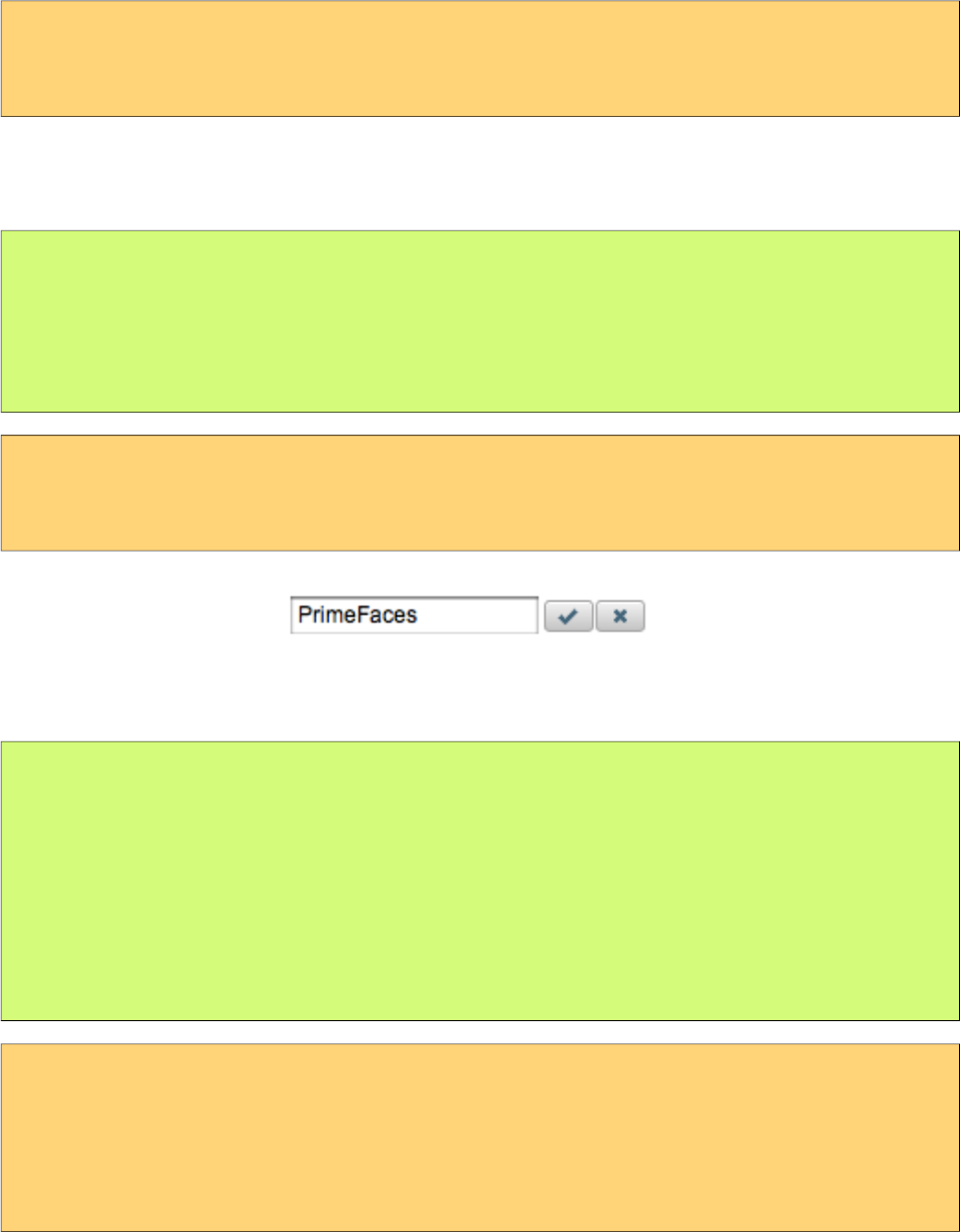
PrimeFaces User Guide
Effects
Default effect is fade and other possible effect is slide, also effect speed can be tuned with values
slow, normal and fast.
<p:inplace label="Show Image" effect="slide" effectSpeed="fast">
<p:graphicImage value="/images/nature1.jpg" />
</p:inplace>
Editor
Inplace editing is enabled via the editor option.
public class InplaceBean {
private String text;
//getter-setter
}
<p:inplace editor="true">
<h:inputText value="#{inplaceBean.text}" />
</p:inplace>
save and cancel are two provided ajax behaviors events you can use to hook-in the editing process.
public class InplaceBean {
private String text;
public void handleSave() {
//add faces message with update text value
}
//getter-setter
}
<p:inplace editor="true">
<p:ajax event="save" listener="#{inplaceBean.handleSave}" update="msgs" />
<h:inputText value="#{inplaceBean.text}" />
</p:inplace>
<p:growl id="msgs" />
275
PrimeFaces User Guide
Client Side API
Widget: PrimeFaces.widget.Inplace
Method Params Return Type Description
show() - void Shows content and hides display element.
hide() - void Shows display element and hides content.
toggle() - void Toggles visibility of between content and display
element.
save() - void Triggers an ajax request to process inplace input.
cancel() - void Triggers an ajax request to revert inplace input.
Skinning
Inplace resides in a main container element which style and styleClass options apply. Following is
the list of structural style classes;
Style Class Applies
.ui-inplace Main container element.
.ui-inplace-disabled Main container element when disabled.
.ui-inplace-display Display element.
.ui-inplace-content Inline content.
.ui-inplace-editor Editor controls container.
.ui-inplace-save Save button.
.ui-inplace-cancel Cancel button.
As skinning style classes are global, see the main theming section for more information.
276
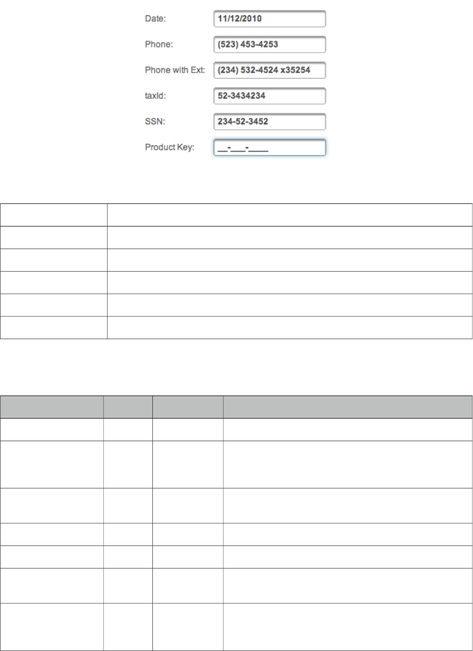
PrimeFaces User Guide
3.65 InputMask
InputMask forces an input to fit in a defined mask template.
Info
Tag inputMask
Component Class org.primefaces.component.inputmask.InputMask
Component Type org.primefaces.component.InputMask
Component Family org.primefaces.component
Renderer Type org.primefaces.component.InputMaskRenderer
Renderer Class org.primefaces.component.inputmask.InputMaskRenderer
Attributes
Name Default Type Description
id null String Unique identifier of the component
rendered true Boolean Boolean value to specify the rendering of the
component, when set to false component will not be
rendered.
binding null Object An el expression that maps to a server side
UIComponent instance in a backing bean
mask null String Mask template
slotChar null String PlaceHolder in mask template.
value null Object Value of the component than can be either an EL
expression of a literal text
converter null Converter/Str
ing
An el expression or a literal text that defines a
converter for the component. When it’s an EL
277
PrimeFaces User Guide
Name Default Type Description
expression, it’s resolved to a converter instance. In
case it’s a static text, it must refer to a converter id
immediate false Boolean When set true, process validations logic is executed at
apply request values phase for this component.
required false Boolean Marks component as required
validator null MethodExpr A method binding expression that refers to a method
validationg the input
valueChangeListener null MethodExpr A method binding expression that refers to a method
for handling a valuchangeevent
requiredMessage null String Message to be displayed when required field
validation fails.
converterMessage null String Message to be displayed when conversion fails.
validatorMessage null String Message to be displayed when validation fields.
widgetVar null String Name of the client side widget.
accesskey null String Access key that when pressed transfers focus to the
input element.
alt null String Alternate textual description of the input field.
autocomplete null String Controls browser autocomplete behavior.
dir null String Direction indication for text that does not inherit
directionality. Valid values are LTR and RTL.
disabled false Boolean Disables input field
label null String A localized user presentable name.
lang null String Code describing the language used in the generated
markup for this component.
maxlength null Integer Maximum number of characters that may be entered in
this field.
onblur null String Client side callback to execute when input element
loses focus.
onchange null String Client side callback to execute when input element
loses focus and its value has been modified since
gaining focus.
onclick null String Client side callback to execute when input element is
clicked.
ondblclick null String Client side callback to execute when input element is
double clicked.
onfocus null String Client side callback to execute when input element
receives focus.
278
PrimeFaces User Guide
Name Default Type Description
onkeydown null String Client side callback to execute when a key is pressed
down over input element.
onkeypress null String Client side callback to execute when a key is pressed
and released over input element.
onkeyup null String Client side callback to execute when a key is released
over input element.
onmousedown null String Client side callback to execute when a pointer button
is pressed down over input element
onmousemove null String Client side callback to execute when a pointer button
is moved within input element.
onmouseout null String Client side callback to execute when a pointer button
is moved away from input element.
onmouseover null String Client side callback to execute when a pointer button
is moved onto input element.
onmouseup null String Client side callback to execute when a pointer button
is released over input element.
onselect null String Client side callback to execute when text within input
element is selected by user.
placeholder null String Specifies a short hint.
readonly false Boolean Flag indicating that this component will prevent
changes by the user.
size null Integer Number of characters used to determine the width of
the input element.
style null String Inline style of the input element.
styleClass null String Style class of the input element.
tabindex null Integer Position of the input element in the tabbing order.
title null String Advisory tooltip informaton.
autoClear true Boolean Clears the field on blur when incomplete input is
entered.
Getting Started with InputMask
InputMask below enforces input to be in 99/99/9999 date format.
<p:inputMask value="#{bean.field}" mask="99/99/9999" />
279

PrimeFaces User Guide
Mask Samples
Here are more samples based on different masks;
<h:outputText value="Phone: " />
<p:inputMask value="#{bean.phone}" mask="(999) 999-9999"/>
<h:outputText value="Phone with Ext: " />
<p:inputMask value="#{bean.phoneExt}" mask="(999) 999-9999? x99999"/>
<h:outputText value="SSN: " />
<p:inputMask value="#{bean.ssn}" mask="999-99-9999"/>
<h:outputText value="Product Key: " />
<p:inputMask value="#{bean.productKey}" mask="a*-999-a999"/>
Skinning
style and styleClass options apply to the displayed input element. As skinning style classes are
global, see the main theming section for more information.
280
PrimeFaces User Guide
3.66 InputNumber
InputNumber formats input fields with numeric Strings. It supports currency symbols, minimum
and maximum value, negative numbers, and a lot of round methods.
Info
Tag inputNumber
Component Class org.primefaces.component.inputnumber.InputNumber
Component Type org.primefaces.component.InputNumber
Component Family org.primefaces.component
Renderer Type org.primefaces.component.InputNumberRenderer
Renderer Class org.primefaces.component.inputnumber.InputNumberRenderer
Attributes
Name Default Type Description
id null String Unique identifier of the component
rendered true Boolean Boolean value to specify the rendering of the component,
when set to false component will not be rendered.
binding null Object An el expression that maps to a server side UIComponent
instance in a backing bean
value null Object Value of the component than can be either an EL expression
of a literal text
converter null Converter
/String
An el expression or a literal text that defines a converter for
the component. When it’s an EL expression, it’s resolved to
a converter instance. In case it’s a static text, it must refer to
a converter id
immediate false Boolean When set true, process validations logic is executed at
apply request values phase for this component.
required false Boolean Marks component as required
validator null Method
Expr
A method binding expression that refers to a method
validationg the input
valueChangeListener null Method
Expr
A method binding expression that refers to a method for
handling a valuchangeevent
requiredMessage null String Message to be displayed after failed validation.
converterMessage null String Message to be displayed when conversion fails.
validatorMessage null String Message to be displayed when validation fields.
281
PrimeFaces User Guide
Name Default Type Description
widgetVar null String Name of the client side widget.
accesskey null String Access key that when pressed transfers focus to the input
element.
alt null String Alternate textual description of the input field.
autocomplete null String Controls browser autocomplete behavior.
dir null String Direction indication for text that does not inherit
directionality. Valid values are LTR and RTL.
disabled 0 Boolean Disables input field
label null String A localized user presentable name.
lang null String Code describing the language used in the generated markup
for this component.
maxlength null Integer Maximum number of characters that may be entered in this
field.
onblur null String Client side callback to execute when input element loses
focus.
onchange null String Client side callback to execute when input element loses
focus and its value has been modified since gaining focus.
onclick null String Client side callback to execute when input element is
clicked.
ondblclick null String Client side callback to execute when input element is
double clicked.
onfocus null String Client side callback to execute on input element focus.
onkeydown null String Client side callback to execute when a key is pressed down
over input element.
onkeypress null String Client side callback to execute when a key is pressed and
released over input element.
onkeyup null String Client side callback to execute when a key is released over
input element.
onmousedown null String Client side callback to execute when a pointer button is
pressed down over input element
onmousemove null String Client side callback to execute when a pointer button is
moved within input element.
onmouseout null String Client side callback to execute when a pointer button is
moved away from input element.
onmouseover null String Client side callback to execute when a pointer button is
moved onto input element.
onmouseup null String Client side callback to execute when a pointer button is
282
PrimeFaces User Guide
Name Default Type Description
released over input element.
onselect null String Client side callback to execute when text within input
element is selected by user.
placeholder null String Specifies a short hint.
readonly 0 Boolean Flag indicating that this component will prevent changes by
the user.
size null Integer Number of characters used to determine the width of the
input element.
style null String Inline style of the input element.
styleClass null String Style class of the input element.
tabindex null Integer Position of the input element in the tabbing order.
title null String Advisory tooltip informaton.
type text String Input field type.
decimalSeparator . String Decimal separator char.
thousandSeparator , String Thousand separator char.
symbol none String Desired symbol or unit.
symbolPosition prefix String Position of the symbol.
minValue 0.00 String Minimum value allowed
maxValue 999999
999.99
String Minimum values allowed.
roundMethod Round-
Half-
Up
Symme
tric
String Controls the rounding method.
decimalPlaces Number of decimal places. Default are taken from
minValue and MaxValue.
emptyValue empty String Controls empty input display behavior, options are empty,
zero, sign.
inputStyle null String Inline style of the input element.
inputStyleClass null String Style class of the input element.
padControl true Boolean Controls padding of the decimal places. If true, always pads
the decimal with zeros.
283

PrimeFaces User Guide
Getting Started with InputNumber
Without any configuration, input number will parse the value and format it as a number using
decimal and thousand separator.
<p:inputNumber value="#{bean.propertyName}" />
Examples
Here are some examples demonstrating various cases;
Suffix currency symbol and comma for decimal separator
<p:inputNumber id="input2" value="0.0" symbol=" CHF" symbolPosition="s"
decimalSeparator="," thousandSeparator="." />
Maximum and minimum values (-1000.999 to 1000.000)
<p:inputNumber id="input3" value="0.0" minValue="-1000.999" maxValue="1000" />
Custom decimal places
<p:inputNumber id="input4" value="0.0" decimalPlaces="6" />
Empty value (empty) and required
<p:inputNumber id="input5" value="251.31" symbol="%"
symbolPosition="s" required="true" emptyValue="empty" />
Empty value (zero)
<p:inputNumber id="input6" value="60.0" symbol="%" symbolPosition="s"
emptyValue="zero" />
Empty value (sign)
<p:inputNumber id="Input7" value="" symbol="%" symbolPosition="s"
emptyValue="sign" />
15 Decimals using BigDecimal
284

PrimeFaces User Guide
<p:inputNumber id="Input8" value="1234.000000001" decimalPlaces="15" />
285
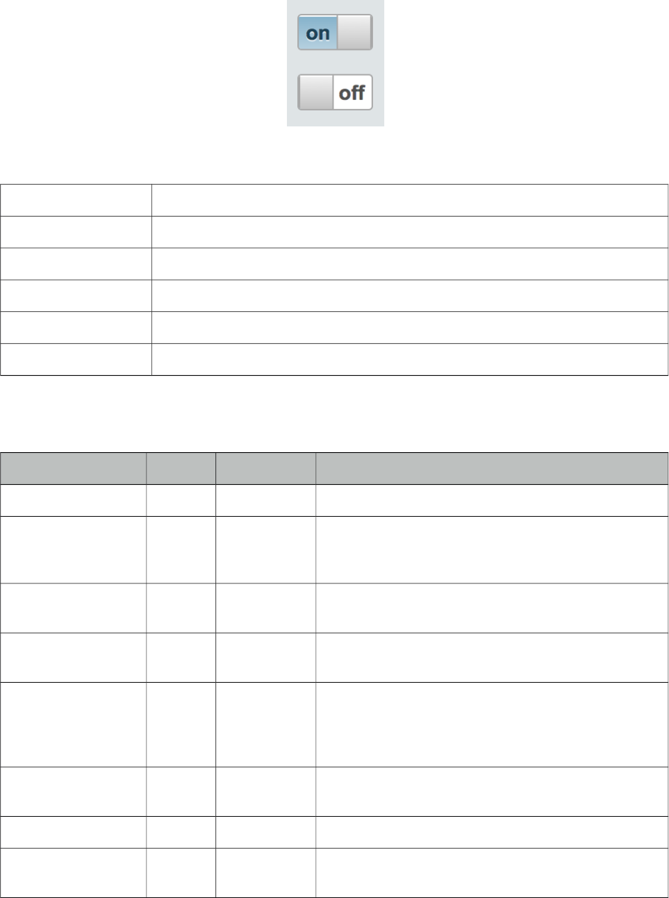
PrimeFaces User Guide
3.67 InputSwitch
InputSwitch is used to select a boolean value.
Info
Tag inputSwitch
Component Class org.primefaces.component.inputswitch.InputSwitch
Component Type org.primefaces.component.InputSwitch
Component Family org.primefaces.component
Renderer Type org.primefaces.component.InputSwitchRenderer
Renderer Class org.primefaces.component.inputswitch.InputSwitchRenderer
Attributes
Name Default Type Description
id null String Unique identifier of the component
rendered true Boolean Boolean value to specify the rendering of the
component, when set to false component will not be
rendered.
binding null Object An el expression that maps to a server side
UIComponent instance in a backing bean
value null Object Value of the component than can be either an EL
expression of a literal text
converter null Converter
/String
An el expression or a literal text that defines a
converter for the component. When it’s an EL
expression, it’s resolved to a converter instance. In
case it’s a static text, it must refer to a converter id
immediate false Boolean When set true, process validations logic is executed at
apply request values phase for this component.
required false Boolean Marks component as required
validator null MethodExpr A method binding expression that refers to a method
validating the input
286
PrimeFaces User Guide
Name Default Type Description
valueChangeListener null MethodExpr A method binding expression that refers to a method
for handling a valuchangeevent
requiredMessage null String Message to be displayed when required field
validation fails.
converterMessage null String Message to be displayed when conversion fails.
validatorMessage null String Message to be displayed when validation fields.
widgetVar null String Name of the client side widget.
onLabel on String Label for on state.
offLabel off String Label for off state.
label null String User presentable name.
disabled null String Disables or enables the switch.
onchange false Boolean Client side callback to execute on value change event.
style null String Inline style of the main container.
styleClass null String Style class of the main container.
tabindex null Integer The tabindex attribute specifies the tab order of an
element when the "tab" button is used for navigating.
showLabels null String Controls the visibility of the labels, defaults to true.
onfocus null String Client side callback to execute when component
receives focus.
onblur null Sring Client side callback to execute when component loses
focus.
Getting started with InputSwitch
InputSwitch requires a boolean reference as the value.
<p:inputSwitch value="#{bean.propertyName}" />
public class Bean {
private boolean propertyName;
//getter and setter
}
Labels
Labels are customized using onLabel and offLabel options. Setting showLabels as false, turns off
labels altogether.
287
PrimeFaces User Guide
<p:inputSwitch value="#{bean.propertyName}" onLabel="yes" offLabel="no"/>
Client Side API
Widget: PrimeFaces.widget.InputSwitch
Method Params Return Type Description
toggle() - void Toggles the state.
check() - void Switches to on state.
uncheck() - void Switches to off state.
Skinning
InputSwitch resides in a main container element which style and styleClass options apply.
Following is the list of structural style classes;
Style Class Applies
.ui-inputswitch Main container element.
.ui-inputswitch-off Off state element.
.ui-inputswitch-on On state element.
.ui-inputswitch-handle Switch handle.
As skinning style classes are global, see the main theming section for more information.
288
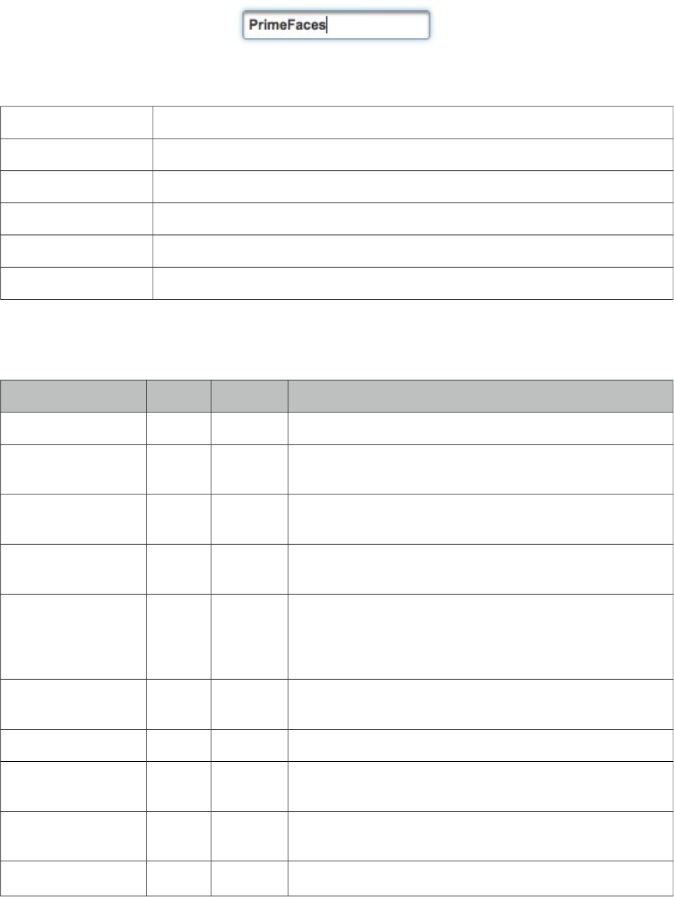
PrimeFaces User Guide
3.68 InputText
InputText is an extension to standard inputText with skinning capabilities.
Info
Tag inputText
Component Class org.primefaces.component.inputtext.InputText
Component Type org.primefaces.component.InputText
Component Family org.primefaces.component
Renderer Type org.primefaces.component.InputTextRenderer
Renderer Class org.primefaces.component.inputtext.InputTextRender
Attributes
Name Default Type Description
id null String Unique identifier of the component
rendered true Boolean Boolean value to specify the rendering of the component,
when set to false component will not be rendered.
binding null Object An el expression that maps to a server side UIComponent
instance in a backing bean
value null Object Value of the component than can be either an EL expression
of a literal text
converter null Converter
/String
An el expression or a literal text that defines a converter for
the component. When it’s an EL expression, it’s resolved to
a converter instance. In case it’s a static text, it must refer to
a converter id
immediate false Boolean When set true, process validations logic is executed at
apply request values phase for this component.
required false Boolean Marks component as required
validator null Method
Expr
A method binding expression that refers to a method
validationg the input
valueChangeListener null Method
Expr
A method binding expression that refers to a method for
handling a valuchangeevent
requiredMessage null String Message to be displayed after failed validation.
289
PrimeFaces User Guide
Name Default Type Description
converterMessage null String Message to be displayed when conversion fails.
validatorMessage null String Message to be displayed when validation fields.
widgetVar null String Name of the client side widget.
accesskey null String Access key that when pressed transfers focus to the input
element.
alt null String Alternate textual description of the input field.
autocomplete null String Controls browser autocomplete behavior.
dir null String Direction indication for text that does not inherit
directionality. Valid values are LTR and RTL.
disabled 0 Boolean Disables input field
label null String A localized user presentable name.
lang null String Code describing the language used in the generated markup
for this component.
maxlength null Integer Maximum number of characters that may be entered in this
field.
onblur null String Client side callback to execute when input element loses
focus.
onchange null String Client side callback to execute when input element loses
focus and its value has been modified since gaining focus.
onclick null String Client side callback to execute when input element is
clicked.
ondblclick null String Client side callback to execute when input element is
double clicked.
onfocus null String Client side callback to execute on input element focus.
onkeydown null String Client side callback to execute when a key is pressed down
over input element.
onkeypress null String Client side callback to execute when a key is pressed and
released over input element.
onkeyup null String Client side callback to execute when a key is released over
input element.
onmousedown null String Client side callback to execute when a pointer button is
pressed down over input element
onmousemove null String Client side callback to execute when a pointer button is
moved within input element.
onmouseout null String Client side callback to execute when a pointer button is
moved away from input element.
290
PrimeFaces User Guide
Name Default Type Description
onmouseover null String Client side callback to execute when a pointer button is
moved onto input element.
onmouseup null String Client side callback to execute when a pointer button is
released over input element.
onselect null String Client side callback to execute when text within input
element is selected by user.
placeholder null String Specifies a short hint.
readonly 0 Boolean Flag indicating that this component will prevent changes by
the user.
size null Integer Number of characters used to determine the width of the
input element.
style null String Inline style of the input element.
styleClass null String Style class of the input element.
tabindex null Integer Position of the input element in the tabbing order.
title null String Advisory tooltip informaton.
type text String Input field type.
Getting Started with InputText
InputText usage is same as standard inputText;
<p:inputText value="#{bean.propertyName}" />
public class Bean {
private String propertyName;
//getter and setter
}
Client Side API
Widget: PrimeFaces.widget.InputText
Method Params Return Type Description
enable() - void Enables the input field.
disable() - void Disables the input field.
291
PrimeFaces User Guide
3.69 InputTextarea
InputTextarea is an extension to standard inputTextarea with autoComplete, autoResize, remaining
characters counter and theming features.
Info
Tag inputTextarea
Component Class org.primefaces.component.inputtextarea.InputTextarea
Component Type org.primefaces.component.InputTextarea
Component Family org.primefaces.component
Renderer Type org.primefaces.component.InputTextareaRenderer
Renderer Class org.primefaces.component.inputtextarea.InputTextareaRender
Attributes
Name Default Type Description
id null String Unique identifier of the component
rendered true Boolean Boolean value to specify the rendering of the component,
when set to false component will not be rendered.
binding null Object An el expression that maps to a server side UIComponent
instance in a backing bean
value null Object Value of the component than can be either an EL
expression of a literal text
converter null Converter/
String
An el expression or a literal text that defines a converter
for the component. When it’s an EL expression, it’s
resolved to a converter instance. In case it’s a static text,
it must refer to a converter id
immediate false Boolean When set true, process validations logic is executed at
apply request values phase for this component.
required false Boolean Marks component as required
292
PrimeFaces User Guide
Name Default Type Description
validator null Method
Expr
A method binding expression that refers to a method
validationg the input
valueChangeListener null Method
Expr
A method binding expression that refers to a method for
handling a valuchangeevent
requiredMessage null String Message to be displayed when required field validation
fails.
converterMessage null String Message to be displayed when conversion fails.
validatorMessage null String Message to be displayed when validation fields.
widgetVar null String Name of the client side widget.
accesskey null String Access key that when pressed transfers focus to the input
element.
alt null String Alternate textual description of the input field.
autocomplete null String Controls browser autocomplete behavior.
dir null String Direction indication for text that does not inherit
directionality. Valid values are LTR and RTL.
disabled false Boolean Disables input field
label null String A localized user presentable name.
lang null String Code describing the language used in the generated
markup for this component.
onblur null String Client side callback to execute when input element loses
focus.
onchange null String Client side callback to execute when input element loses
focus and its value has been modified since gaining
focus.
onclick null String Client side callback to execute when input element is
clicked.
ondblclick null String Client side callback to execute when input element is
double clicked.
onfocus null String Client side callback to execute when input element
receives focus.
onkeydown null String Client side callback to execute when a key is pressed
down over input element.
onkeypress null String Client side callback to execute when a key is pressed and
released over input element.
onkeyup null String Client side callback to execute when a key is released
over input element.
onmousedown null String Client side callback to execute when a pointer button is
293

PrimeFaces User Guide
Name Default Type Description
pressed down over input element
onmousemove null String Client side callback to execute when a pointer button is
moved within input element.
onmouseout null String Client side callback to execute when a pointer button is
moved away from input element.
onmouseover null String Client side callback to execute when a pointer button is
moved onto input element.
onmouseup null String Client side callback to execute when a pointer button is
released over input element.
onselect null String Client side callback to execute when text within input
element is selected by user.
readonly false Boolean Flag indicating that this component will prevent changes
by the user.
size null Integer Number of characters used to determine the width of the
input element.
style null String Inline style of the input element.
styleClass null String Style class of the input element.
tabindex null Integer Position of the input element in the tabbing order.
title null String Advisory tooltip informaton.
autoResize true Boolean Specifies auto growing when being typed.
maxlength null Integer Maximum number of characters that may be entered in
this field.
counter null String Id of the output component to display remaining chars.
counterTemplate {0} String Template text to display in counter.
completeMethod null Method
Expr
Method to provide suggestions.
minQueryLength 3 Integer Number of characters to be typed to run a query.
queryDelay 700 Integer Delay in ms before sending each query.
scrollHeight null Integer Height of the viewport for autocomplete suggestions.
294
PrimeFaces User Guide
Getting Started with InputTextarea
InputTextarea usage is same as standard inputTextarea;
<p:inputTextarea value="#{bean.propertyName}" />
AutoResize
While textarea is being typed, if content height exceeds the allocated space, textarea can grow
automatically. Use autoResize option to turn on/off this feature.
<p:inputTextarea value="#{bean.propertyName}" autoResize="true|false"/>
Remaining Characters
InputTextarea can limit the maximum allowed characters with maxLength option and display the
remaining characters count as well.
<p:inputTextarea value="#{bean.propertyName}" counter="display"
maxlength="20" counterTemplate="{0} characters remaining" />
<h:outputText id="display" />
AutoComplete
InputTextarea supports ajax autocomplete functionality as well. You need to provide a
completeMethod to provide the suggestions to use this feature. In sample below, completeArea
method will be invoked with the query being the four characters before the caret.
public class AutoCompleteBean {
public List<String> completeArea(String query) {
List<String> results = new ArrayList<String>();
if(query.equals("PrimeFaces")) {
results.add("PrimeFaces Rocks!!!");
results.add("PrimeFaces has 100+ components.");
results.add("PrimeFaces is lightweight.");
results.add("PrimeFaces is easy to use.");
results.add("PrimeFaces is developed with passion!");
}
else {
for(int i = 0; i < 10; i++) {
results.add(query + i);
}
}
return results;
}
}
295
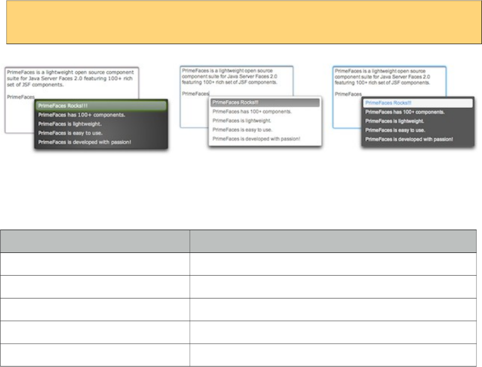
PrimeFaces User Guide
<p:inputTextarea rows="10" cols="50" minQueryLength="4"
completeMethod="#{autoCompleteBean.completeArea}" />
Skinning
InputTextarea renders a textarea element which style and styleClass options apply. Following is the
list of structural style classes;
Style Class Applies
ui-inputtextarea Textarea element.
ui-inputfield Textarea element.
.ui-autocomplete-panel Overlay for suggestions.
.ui-autocomplete-items Suggestions container.
.ui-autocomplete-item Each suggestion.
As skinning style classes are global, see the main theming section for more information.
296
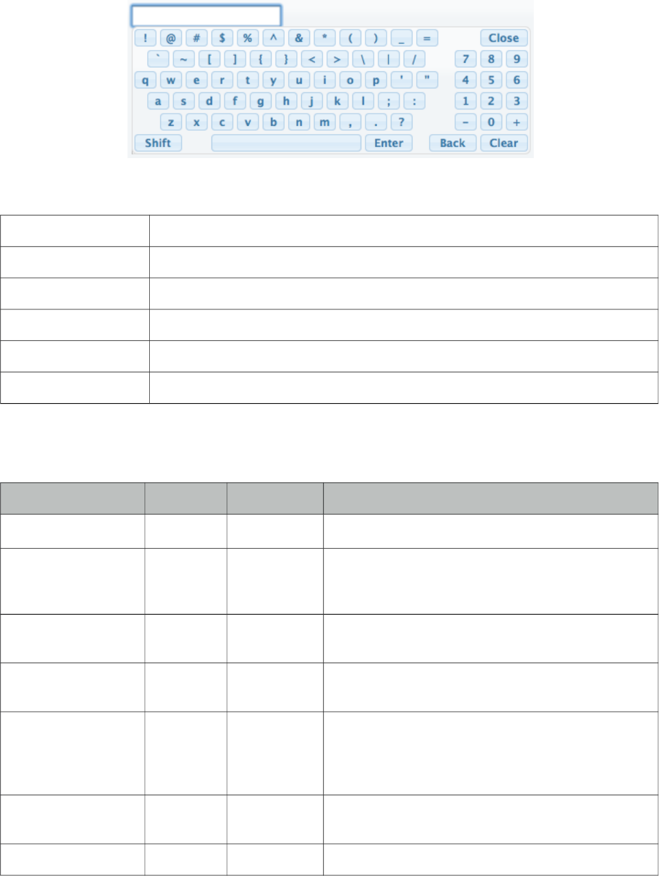
PrimeFaces User Guide
3.70 Keyboard
Keyboard is an input component that uses a virtual keyboard to provide the input. Notable features
are the customizable layouts and skinning capabilities.
Info
Tag keyboard
Component Class org.primefaces.component.keyboard.Keyboard
Component Type org.primefaces.component.Keyboard
Component Family org.primefaces.component
Renderer Type org.primefaces.component.KeyboardRenderer
Renderer Class org.primefaces.component.keyboard.KeyboardRenderer
Attributes
Name Default Type Description
id null String Unique identifier of the component
rendered true Boolean Boolean value to specify the rendering of the
component, when set to false component will not be
rendered.
binding null Object An el expression that maps to a server side
UIComponent instance in a backing bean
value null Object Value of the component than can be either an EL
expression of a literal text
converter null Converter/Str
ing
An el expression or a literal text that defines a
converter for the component. When it’s an EL
expression, it’s resolved to a converter instance. In
case it’s a static text, it must refer to a converter id
immediate false Boolean When set true, process validations logic is executed
at apply request values phase for this component.
required false Boolean Marks component as required
297
PrimeFaces User Guide
Name Default Type Description
validator null MethodExpr A method binding expression that refers to a method
validationg the input
valueChangeListener null MethodExpr A method binding expression that refers to a method
for handling a valuchangeevent
requiredMessage null String Message to be displayed when required field
validation fails.
converterMessage null String Message to be displayed when conversion fails.
validatorMessage null String Message to be displayed when validation fields.
password false Boolean Makes the input a password field.
showMode focus String Specifies the showMode, ‘focus’, ‘button’, ‘both’
buttonImage null String Image for the button.
buttonImageOnly false boolean When set to true only image of the button would be
displayed.
effect fadeIn String Effect of the display animation.
effectDuration null String Length of the display animation.
layout qwerty String Built-in layout of the keyboard.
layoutTemplate null String Template of the custom layout.
keypadOnly focus Boolean Specifies displaying a keypad instead of a keyboard.
promptLabel null String Label of the prompt text.
closeLabel null String Label of the close key.
clearLabel null String Label of the clear key.
backspaceLabel null String Label of the backspace key.
accesskey null String Access key that when pressed transfers focus to the
input element.
alt null String Alternate textual description of the input field.
autocomplete null String Controls browser autocomplete behavior.
dir null String Direction indication for text that does not inherit
directionality. Valid values are LTR and RTL.
disabled false Boolean Disables input field
label null String A localized user presentable name.
lang null String Code describing the language used in the generated
markup for this component.
maxlength null Integer Maximum number of characters that may be entered
in this field.
298
PrimeFaces User Guide
Name Default Type Description
onblur null String Client side callback to execute when input element
loses focus.
onchange null String Client side callback to execute when input element
loses focus and its value has been modified since
gaining focus.
onclick null String Client side callback to execute when input element is
clicked.
ondblclick null String Client side callback to execute when input element is
double clicked.
onfocus null String Client side callback to execute when input element
receives focus.
onkeydown null String Client side callback to execute when a key is pressed
down over input element.
onkeypress null String Client side callback to execute when a key is pressed
and released over input element.
onkeyup null String Client side callback to execute when a key is
released over input element.
onmousedown null String Client side callback to execute when a pointer button
is pressed down over input element
onmousemove null String Client side callback to execute when a pointer button
is moved within input element.
onmouseout null String Client side callback to execute when a pointer button
is moved away from input element.
onmouseover null String Client side callback to execute when a pointer button
is moved onto input element.
onmouseup null String Client side callback to execute when a pointer button
is released over input element.
onselect null String Client side callback to execute when text within
input element is selected by user.
placeholder null String Specifies a short hint.
readonly false Boolean Flag indicating that this component will prevent
changes by the user.
size null Integer Number of characters used to determine the width of
the input element.
style null String Inline style of the input element.
styleClass null String Style class of the input element.
tabindex null Integer Position of the input element in the tabbing order.
title null String Advisory tooltip informaton.
299
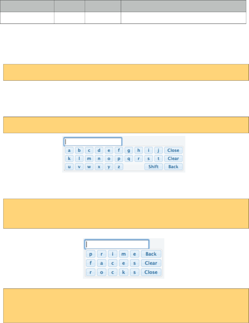
PrimeFaces User Guide
Name Default Type Description
widgetVar null String Name of the client side widget.
Getting Started with Keyboard
Keyboard is used just like a simple inputText, by default when the input gets the focus a keyboard is
displayed.
<p:keyboard value="#{bean.value}" />
Built-in Layouts
There’re a couple of built-in keyboard layouts these are ‘qwerty’, ‘qwertyBasic’ and ‘alphabetic’. For
example keyboard below has the alphabetic layout.
<p:keyboard value="#{bean.value}" layout="alphabetic"/>
Custom Layouts
Keyboard has a very flexible layout mechanism allowing you to come up with your own layout.
<p:keyboard value="#{bean.value}"
layout="custom"
layoutTemplate="prime-back,faces-clear,rocks-close"/>
Another example;
<p:keyboard value="#{bean.value}"
layout="custom"
layoutTemplate="create-space-your-close,owntemplate-shift,easily-space-
spacebar"/>
300
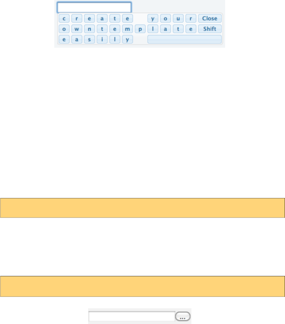
PrimeFaces User Guide
A layout template basically consists of built-in keys and your own keys. Following is the list of all
built-in keys.
• back
• clear
• close
• shift
• spacebar
• space
• halfspace
All other text in a layout is realized as seperate keys so "prime" would create 5 keys as "p" "r" "i"
"m" "e". Use dash to seperate each member in layout and use commas to create a new row.
Keypad
By default keyboard displays whole keys, if you only need the numbers use the keypad mode.
<p:keyboard value="#{bean.value}" keypadOnly="true"/>
ShowMode
There’re a couple of different ways to display the keyboard, by default keyboard is shown once
input field receives the focus. This is customized using the showMode feature which accept values
‘focus’, ‘button’, ‘both’. Keyboard below displays a button next to the input field, when the button is
clicked the keyboard is shown.
<p:keyboard value="#{bean.value}" showMode="button"/>
Button can also be customized using the buttonImage and buttonImageOnly attributes.
301
PrimeFaces User Guide
3.71 KeyFilter
KeyFilter is used to filter keyboard input on specified input components.
Info
Tag keyFilter
Component Class org.primefaces.component.keyfilter.KeyFilter
Component Type org.primefaces.component.KeyFilter
Component Family org.primefaces.component
Renderer Type org.primefaces.component.KeyFilter
Renderer Class org.primefaces.component.keyfilter.KeyFilterRenderer
Attributes
Name Default Type Description
id null String Unique identifier of the component
rendered true Boolean Boolean value to specify the rendering of the component,
when set to false component will not be rendered.
binding null Object An el expression that maps to a server side UIComponent
instance in a backing bean
value null Object Value of the component than can be either an EL expression
of a literal text
widgetVar null String Name of the client side widget.
for null String The target input expression, defaults to parent.
regEx null String Defines the regular expression which should be used for
filtering the input.
inputRegEx null String Defines the regular expression which should be used to test
the complete input text content.
mask null String Defines the predefined mask which should be used (pint,
int, pnum, num, hex, email, alpha, alphanum).
testFunction null String Defines a javascript code or function which should be used
for filtering.
preventPaste true Boolean Boolean value to specify if the component also should
prevent paste.
302
PrimeFaces User Guide
Getting Started with KeyFilter
KeyFilter can either be attached to an input using for property or by being nested inside the target
input component. Filtering is applied using regex, mask or testFunction properties.
<h:form>
<h:panelGrid columns="2">
<h:outputText value="KeyFilter with regEx on a p:inputText"/>
<p:inputText id="text1">
<p:keyFilter regEx="/[ABC]/i"/>
</p:inputText>
<h:outputText value="KeyFilter with mask on a h:inputText"/>
<h:inputText id="text2" />
<h:outputText value="KeyFilter with testFunction on a p:autoComplete" />
<p:autoComplete id="autoComplete1" value="#{autoCompleteView.txt1}"
completeMethod="#{autoCompleteView.completeText}" />
</h:panelGrid>
<p:keyFilter for="text2" mask="num" />
<p:keyFilter for="autoComplete1" testFunction="return c == 'z';" />
</h:form>
There are also predefined masks for common formats;
Mask Pattern
pint /[\d]/
int /[\d\-]/
pnum /[\d\.]/
money /[\d\.\s,]
num /[\d\-\.]/
hex /[0-9a-f]/i
email /[a-z0-9_\.\-@]/i
alpha /[a-z_]/i
alphanum /[a-z0-9_]/i
303
PrimeFaces User Guide
3.72 Knob
Knob is an input component to insert numeric values in a range.
Info
Tag knob
Component Class org.primefaces.component.knob.Knob
Component Type org.primefaces.component.Knob
Component Family org.primefaces.component
Renderer Type org.primefaces.component.KnobRenderer
Renderer Class org.primefaces.component.knob.KnobRenderer
Attributes
Name Default Type Description
id null String Unique identifier of the component
rendered true Boolean Boolean value to specify the rendering of the component,
when set to false component will not be rendered.
binding null Object An el expression that maps to a server side UIComponent
instance in a backing bean
value null Object Value of the component than can be either an EL expression
of a literal text
converter null Converter
/String
An el expression or a literal text that defines a converter for
the component. When it’s an EL expression, it’s resolved to
a converter instance. In case it’s a static text, it must refer to
a converter id
immediate false Boolean When set true, process validations logic is executed at
apply request values phase for this component.
required false Boolean Marks component as required
304
PrimeFaces User Guide
Name Default Type Description
validator null Method
Expr
A method binding expression that refers to a method
validationg the input
valueChangeListener null Method
Expr
A method binding expression that refers to a method for
handling a valuchangeevent
requiredMessage null String Message to be displayed after failed validation.
converterMessage null String Message to be displayed when conversion fails.
validatorMessage null String Message to be displayed when validation fields.
widgetVar null String Name of the client side widget.
min 0 Integer Min valid value of the component.
max 100 Integer Max valid value of the component.
step 1 Integer Increment/decrement step of the component.
thickness null Float Thickness of the bar.
width auto String Width of the component.
height auto String Height of the component.
foregroundColor null Object Foreground color of the component, you can use an hex
value, a css constant or a java.awt.Color object
backgroundColor null Object Background color of the component, you can use an hex
value, a css constant or a java.awt.Color object.
colorTheme null String Theme of the knob.
disabled false Boolean Disables the input element
showLabel true Boolean Set false to hide the label.
cursor false Boolean Set true to show only a cursor instead of the full bar.
labelTemplate {value} String Template of the progress value e.g. "{value}%"
onchange null String Client side callback to invoke when value changes.
Getting Started with Knob
Knob is used as an input component with a value.
<p:knob value="#{bean.propertyName}" />
Boundaries and Step
Boundaries and step can be customized using min, max and step properties.
<p:knob value="#{bean.propertyName}" min="100" max="1000" step="50"/>
305
PrimeFaces User Guide
Label
Label at the center is visible by default and can be hidden by setting showLabel to false. In addition
it can be customized using labelTemplate option.
<p:knob value="#{bean.propertyName}" labelTemplate="{value}%"/>
Colors
Color scheme of the know are changed with foregroundColor and backgroundColor options.
<p:knob foregroundColor="red" backgroundColor="#00000" value="25"/>
Client Side API
Widget: PrimeFaces.widget.Know
Method Params Return Type Description
setValue(value) value void Updates the value with given value
getValue() - number Returns the current knob value.
increment() - void Increments current value by step factor.
Decrement/( - void Decremenets current value by step factor.
306
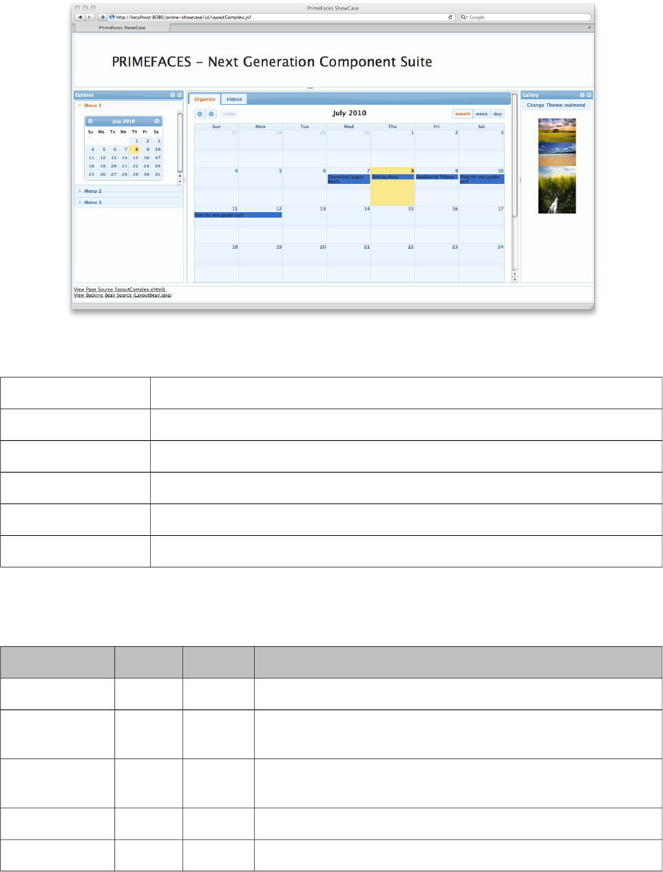
PrimeFaces User Guide
3.73 Layout
Layout component features a highly customizable borderLayout model making it very easy to
create complex layouts even if you’re not familiar with web design.
Info
Tag layout
Component Class org.primefaces.component.layout.Layout
Component Type org.primefaces.component.Layout
Component Family org.primefaces.component
Renderer Type org.primefaces.component.LayoutRenderer
Renderer Class org.primefaces.component.layout.LayoutRenderer
Attributes
Name Default Type Description
id null String Unique identifier of the component
rendered true Boolean Boolean value to specify the rendering of the component, when
set to false component will not be rendered.
binding null Object An el expression that maps to a server side UIComponent
instance in a backing bean
widgetVar null String Name of the client side widget.
fullPage false Boolean Specifies whether layout should span all page or not.
307
PrimeFaces User Guide
Name Default Type Description
style null String Style to apply to container element, this is only applicable to
element based layouts.
styleClass null String Style class to apply to container element, this is only applicable
to element based layouts.
onResize null String Client side callback to execute when a layout unit is resized.
onClose null String Client side callback to execute when a layout unit is closed.
onToggle null String Client side callback to execute when a layout unit is toggled.
resizeTitle null String Title label of the resize button.
collapseTitle null String Title label of the collapse button.
expandTitle null String Title label of the expand button.
closeTitle null String Title label of the close button.
Getting started with Layout
Layout is based on a borderLayout model that consists of 5 different layout units which are top, left,
center, right and bottom. This model is visualized in the schema below;
Full Page Layout
Layout has two modes, you can either use it for a full page layout or for a specific region in your
page. This setting is controlled with the fullPage attribute which is false by default.
The regions in a layout are defined by layoutUnits, following is a simple full page layout with all
possible units. Note that you can place any content in each layout unit.
308

PrimeFaces User Guide
<p:layout fullPage="true">
<p:layoutUnit position="north" size="50">
<h:outputText value="Top content." />
</p:layoutUnit>
<p:layoutUnit position="south" size="100">
<h:outputText value="Bottom content." />
</p:layoutUnit>
<p:layoutUnit position="west" size="300">
<h:outputText value="Left content" />
</p:layoutUnit>
<p:layoutUnit position="east" size="200">
<h:outputText value="Right Content" />
</p:layoutUnit>
<p:layoutUnit position="center">
<h:outputText value="Center Content" />
</p:layoutUnit>
</p:layout>
Forms in Full Page Layout
When working with forms and full page layout, avoid using a form that contains layoutunits as
generated dom may not be the same. So following is invalid.
<p:layout fullPage="true">
<h:form>
<p:layoutUnit position="west" size="100">
h:outputText value="Left Pane" />
</p:layoutUnit>
<p:layoutUnit position="center">
<h:outputText value="Right Pane" />
</p:layoutUnit>
</h:form>
</p:layout>
A layout unit must have it’s own form instead, also avoid trying to update layout units because of
same reason, update it’s content instead.
Dimensions
Except center layoutUnit, other layout units must have dimensions defined via size option.
Element based layout
Another use case of layout is the element based layout. This is the default case actually so just
ignore fullPage attribute or set it to false. Layout example below demonstrates creating a split panel
implementation.
309
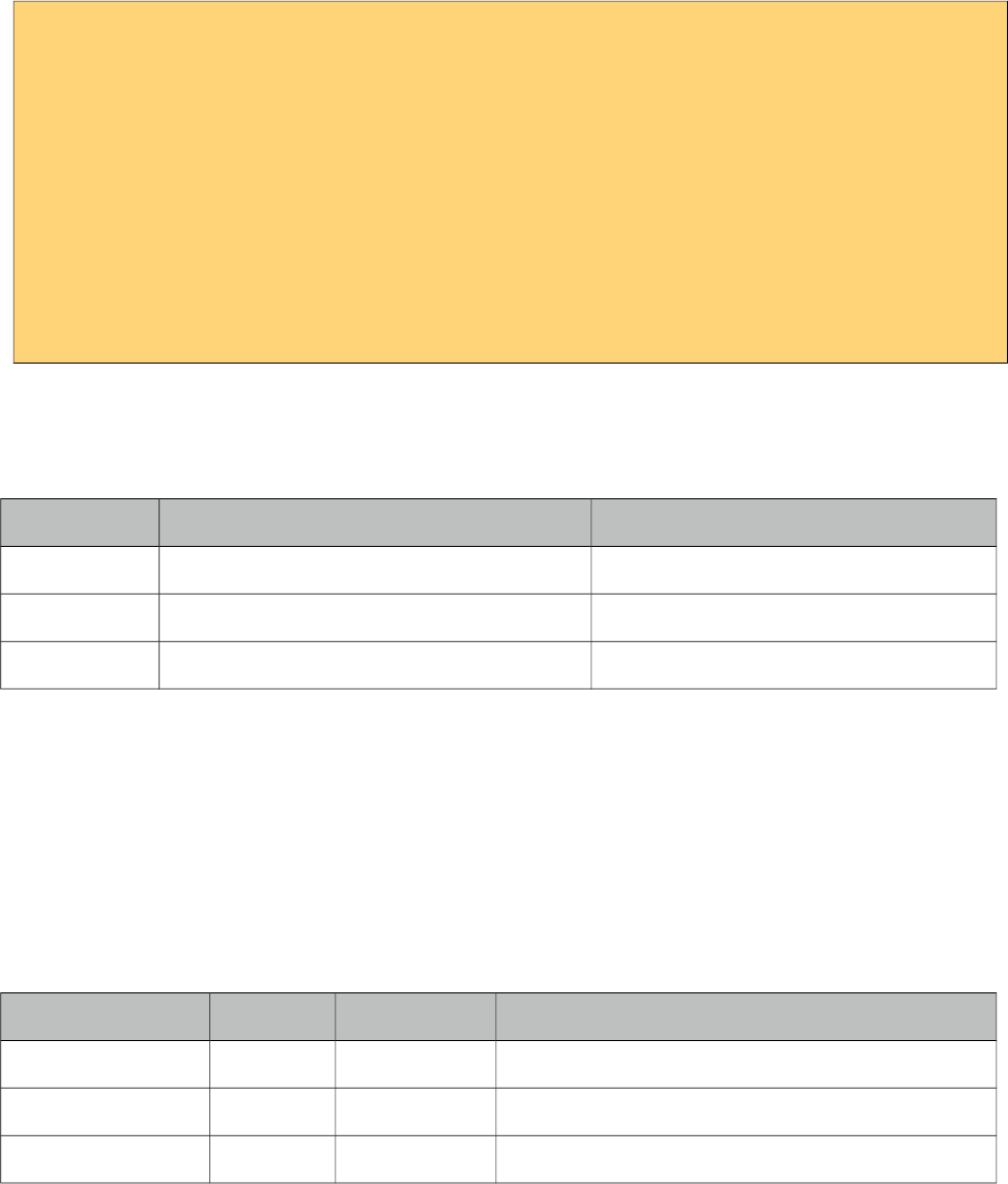
PrimeFaces User Guide
<p:layout style="width:400px;height:200px">
<p:layoutUnit position="west" size="100">
<h:outputText value="Left Pane" />
</p:layoutUnit>
<p:layoutUnit position="center">
<h:outputText value="Right Pane" />
</p:layoutUnit>
//more layout units
</p:layout>
Ajax Behavior Events
Layout provides custom ajax behavior events for each layout state change.
Event Listener Parameter Fired
toggle org.primefaces.event.ToggleEvent When a unit is expanded or collapsed.
close org.primefaces.event.CloseEvent When a unit is closed.
resize org.primefaces.event.ResizeEvent When a unit is resized.
Stateful Layout
Making layout stateful would be easy, once you create your data to store the user preference, you
can update this data using ajax event listeners provided by layout. For example if a layout unit is
collapsed, you can save and persist this information. By binding this persisted information to the
collapsed attribute of the layout unit layout will be rendered as the user left it last time.
Client Side API
Widget: PrimeFaces.widget.Layout
Method Params Return Type Description
toggle(position) position void Toggles layout unit.
show(position) position void Shows layout unit.
hide(unit) position void Hides layout unit.
310
PrimeFaces User Guide
Skinning
Following is the list of structural style classes;
Style Class Applies
.ui-layout Main wrapper container element
.ui-layout-doc Layout container
.ui-layout-unit Each layout unit container
.ui-layout-{position} Position based layout unit
.ui-layout-unit-header Layout unit header
.ui-layout-unit-content Layout unit body
As skinning style classes are global, see the main theming section for more information.
311
PrimeFaces User Guide
3.74 LayoutUnit
LayoutUnit represents a region in the border layout model of the Layout component.
Info
Tag layoutUnit
Component Class org.primefaces.component.layout.LayoutUnit
Component Type org.primefaces.component.LayoutUnit
Component Family org.primefaces.component
Renderer Type org.primefaces.component.LayoutUnitRenderer
Renderer Class org.primefaces.component.layout.LayoutUnitRenderer
Attributes
Name Default Type Description
id null String Unique identifier of the component
rendered true Boolean Boolean value to specify the rendering of the
component, when set to false component will not
be rendered.
binding null Object An el expression that maps to a server side
UIComponent instance in a backing bean
position null String Position of the unit.
size null String Size of the unit.
resizable false Boolean Makes the unit resizable.
closable false Boolean Makes the unit closable.
collapsible fale Boolean Makes the unit collapsible.
header null String Text of header.
footer null String Text of footer.
minSize null Integer Minimum dimension for resize.
maxSize null Integer Maximum dimension for resize.
gutter 4px String Gutter size of layout unit.
visible true Boolean Specifies default visibility
collapsed false Boolean Specifies toggle status of unit
collapseSize null Integer Size of the unit when collapsed
312
PrimeFaces User Guide
Name Default Type Description
style null String Inline style of the component.
styleClass null String Style class of the component.
effect null String Effect name of the layout transition.
effectSpeed null String Effect speed of the layout transition.
Getting started with LayoutUnit
See layout component documentation for more information regarding the usage of layoutUnits.
Facets
In addition to header and footer attributes to display text at these locations, facets are also provided
with the same name to display custom content.
313
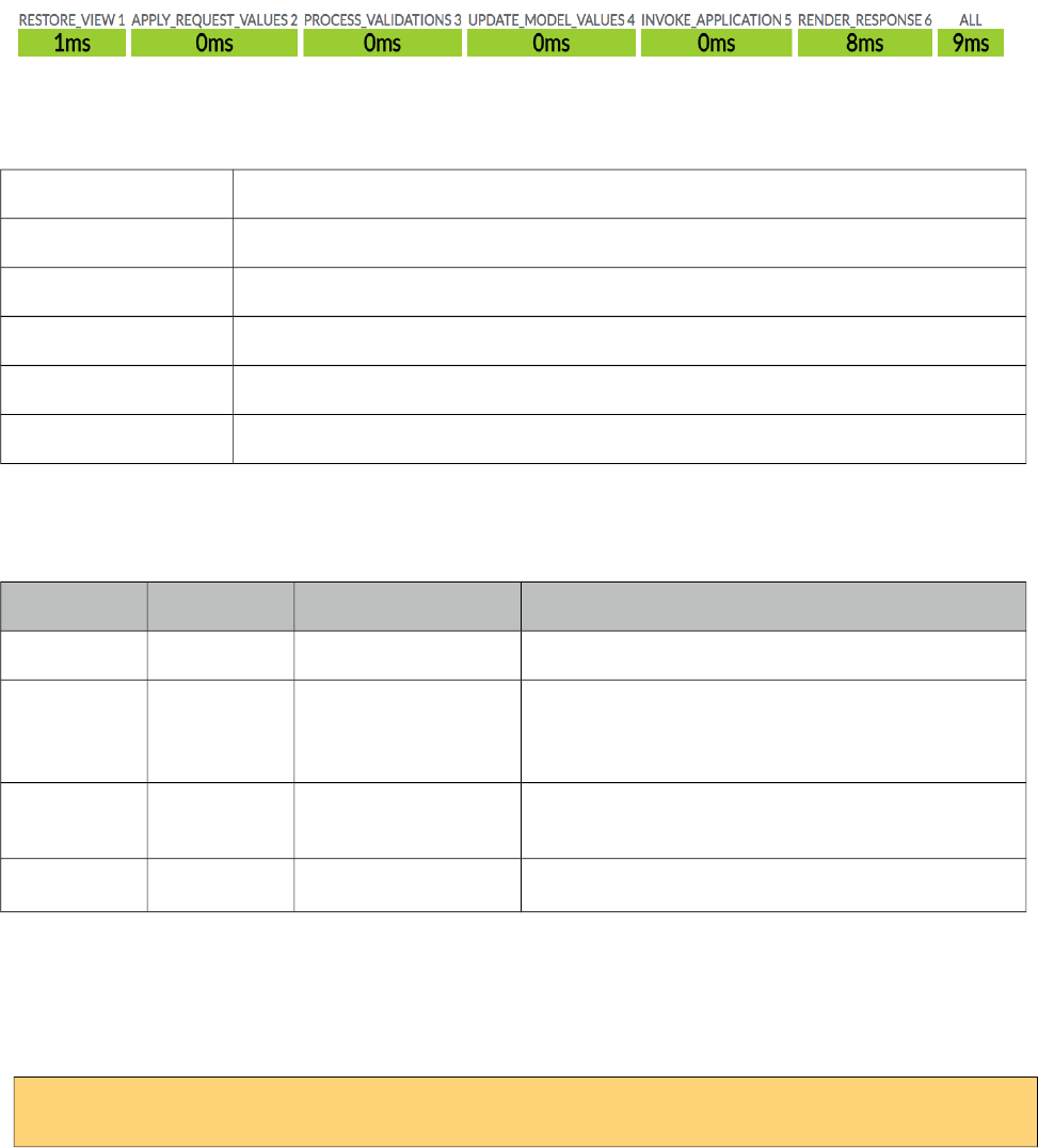
PrimeFaces User Guide
3.75 Lifecycle
Lifecycle is a utility component which displays the execution time of each JSF phase. It also
synchronizes automatically after each AJAX request.
Info
Tag lifecycle
Component Class org.primefaces.component.lifecycle.Lifecycle
Component Type org.primefaces.component.Lifecycle
Component Family org.primefaces.component
Renderer Type org.primefaces.component.LifecycleRenderer
Renderer Class org.primefaces.component.lifecycle.LifecycleRenderer
Attributes
Name Default Type Description
id null String Unique identifier of the component
rendered true Boolean Boolean value to specify the rendering of the
component, when set to false component will not
be rendered.
binding null Object An el expression that maps to a server side
UIComponent instance in a backing bean
widgetVar null String Name of the client side widget.
Getting started with Lifecycle
Lifecycle component is used simply as adding the component to the page.
<p:lifecycle />
314
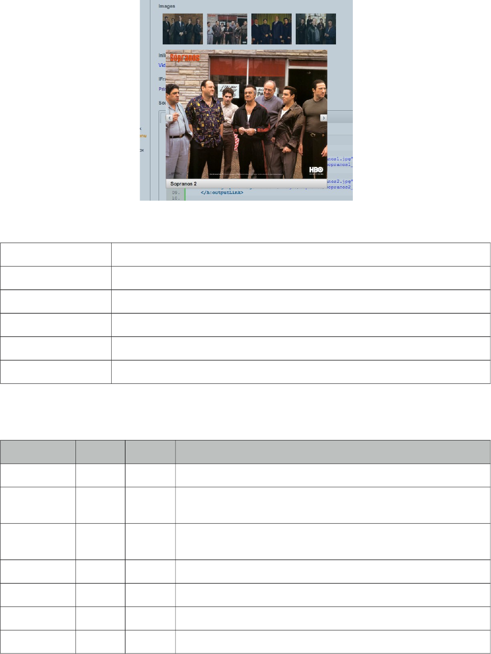
PrimeFaces User Guide
3.76 LightBox
Lightbox is a powerful overlay that can display images, multimedia content, custom content and
external urls.
Info
Tag lightBox
Component Class org.primefaces.component lightbox.LightBox
Component Type org.primefaces.component.LightBox
Component Family org.primefaces.component
Renderer Type org.primefaces.component.LightBoxRenderer
Renderer Class org.primefaces.component.lightbox.LightBoxRenderer
Attributes
Name Default Type Description
id null String Unique identifier of the component
rendered true Boolean Boolean value to specify the rendering of the component, when set
to false component will not be rendered.
binding null Object An el expression that maps to a server side UIComponent instance
in a backing bean
widgetVar null String Name of the client side widget.
style null String Style of the container element not the overlay element.
styleClass null String Style class of the container element not the overlay element.
width null String Width of the overlay in iframe mode.
315
PrimeFaces User Guide
Name Default Type Description
height null String Height of the overlay in iframe mode.
iframe false Boolean Specifies an iframe to display an external url in overlay.
iframeTitle null String Title of the iframe element.
visible false Boolean Displays lightbox without requiring any user interaction by default.
onHide null String Client side callback to execute when lightbox is displayed.
onShow null String Client side callback to execute when lightbox is hidden.
Images
The images displayed in the lightBox need to be nested as child outputLink components. Following
lightBox is displayed when any of the links are clicked.
<p:lightBox>
<h:outputLink value="sopranos/sopranos1.jpg" title="Sopranos 1">
<h:graphicImage value="sopranos/sopranos1_small.jpg/>
</h:outputLink>
<h:outputLink value="sopranos/sopranos2.jpg" title="Sopranos 2">
<h:graphicImage value="sopranos/sopranos2_small.jpg/>
</h:outputLink>
<h:outputLink value="sopranos/sopranos3.jpg" title="Sopranos 3">
<h:graphicImage value="sopranos/sopranos3_small.jpg/>
</h:outputLink>
//more
</p:lightBox>
IFrame Mode
LightBox also has the ability to display iframes inside the page overlay, following lightbox displays
the PrimeFaces homepage when the link inside is clicked.
<p:lightBox iframe="true">
<h:outputLink value="http://www.primefaces.org" title="PrimeFaces HomePage">
<h:outputText value="PrimeFaces HomePage"/>
</h:outputLink>
</p:lightBox>
Clicking the outputLink will display PrimeFaces homepage within an iframe.
Inline Mode
Inline mode acts like a modal dialog, you can display other JSF content on the page using the
lightbox overlay. Simply place your overlay content in the "inline" facet. Clicking the link in the
example below will display the panelGrid contents in overlay.
316
PrimeFaces User Guide
<p:lightBox>
<h:outputLink value="#" title="Leo Messi" >
<h:outputText value="The Messiah"/>
</h:outputLink>
<f:facet name="inline">
//content here
</f:facet>
</p:lightBox>
Lightbox inline mode doesn’t support advanced content like complex widgets. Use a dialog instead
for advanced cases involving custom content.
Client Side API
Widget: PrimeFaces.widget.LightBox
Method Params Return Type Description
show() - void Displays lightbox.
hide() - void Hides lightbox.
showURL(opt) opt void Displays a URL in a iframe. opt parameter has three
variables. width and height for iframe dimensions
and src for the page url.
Skinning
Lightbox resides in a main container element which style and styleClass options apply. Following is
the list of structural style classes;
Style Class Applies
.ui-lightbox Main container element.
.ui-lightbox-content-wrapper Content wrapper element.
.ui-lightbox-content Content container.
.ui-lightbox-nav-right Next image navigator.
.ui-lightbox-nav-left Previous image navigator.
.ui-lightbox-loading Loading image.
.ui-lightbox-caption Caption element.
317
PrimeFaces User Guide
3.77 Link
Link is an extension to standard h:link component.
Info
Tag link
Component Class org.primefaces.component.link.Link
Component Type org.primefaces.component.Link
Component Family org.primefaces.component
Renderer Type org.primefaces.component.LinkRenderer
Renderer Class org.primefaces.component.link.LinkRenderer
Attributes
Name Default Type Description
id null String Unique identifier of the component.
rendered true Boolean Boolean value to specify the rendering of the component.
binding null Object An el expression that maps to a server side UIComponent
instance in a backing bean.
value null Object Value of the component than can be either an EL expression
of a literal text.
outcome null String Used to resolve a navigation case.
includeViewParams false Boolean Whether to include page parameters in target URI
fragment null String Identifier of the target page which should be scrolled to.
disabled false Boolean Disables button.
disableClientWindow false Boolean Disable appending the ClientWindow on the rendering of
this element.
accesskey null String Access key that when pressed transfers focus to button.
charset null String Character encoding of the resource designated by this
hyperlink.
coords null String Position and shape of the hot spot on the screen for client
use in image maps.
dir null String Direction indication for text that does not inherit
directionality. Valid values are LTR and RTL.
hreflang null String Language code of the resource designated by the link.
318
PrimeFaces User Guide
Name Default Type Description
rel null String Relationship from the current document to the anchor
specified by the link, values are provided by a space-
separated list of link types.
rev null String A reverse link from the anchor specified by this link to the
current document, values are provided by a space-separated
list of link types.
shape null String Shape of hot spot on the screen, valid values are default,
rect, circle and poly.
tabindex null String Position of the element in the tabbing order.
target null String Name of a frame where the resource targeted by this link
will be displayed.
title null String Advisory tooltip informaton.
type null String Type of resource referenced by the link.
style null String Inline style of the component.
styleClass null String Style class of the component.
onblur null String Client side callback to execute when button loses focus.
onclick null String Client side callback to execute when button is clicked.
ondblclick null String Client side callback to execute when button is double
clicked.
onfocus null String Client side callback to execute when button receives focus.
onkeydown null String Client side callback to execute when a key is pressed down
over button.
onkeypress null String Client side callback to execute when a key is pressed and
released over button.
onkeyup null String Client side callback to execute when a key is released over
button.
onmousedown null String Client side callback to execute when a pointer button is
pressed down over button.
onmousemove null String Client side callback to execute when a pointer button is
moved within button
onmouseout null String Client side callback to execute when a pointer button is
moved away from button.
onmouseover null String Client side callback to execute when a pointer button is
moved onto button.
onmouseup null String Client side callback to execute when a pointer button is
released over button.
href null String Inline style of the button.
319
PrimeFaces User Guide
Name Default Type Description
escape true Boolean Defines if label of the component is escaped or not.
Getting Started with Link
p:link usage is same as standard h:link, an outcome is necessary to navigate using GET requests.
Assume you are at source.xhtml and need to navigate target.xhtml.
<p:link outcome="target" value="Navigate"/>
To navigate without outcome based approach, use href attribute.
<p:link href="http://www.primefaces.org" value="Navigate"/>
320
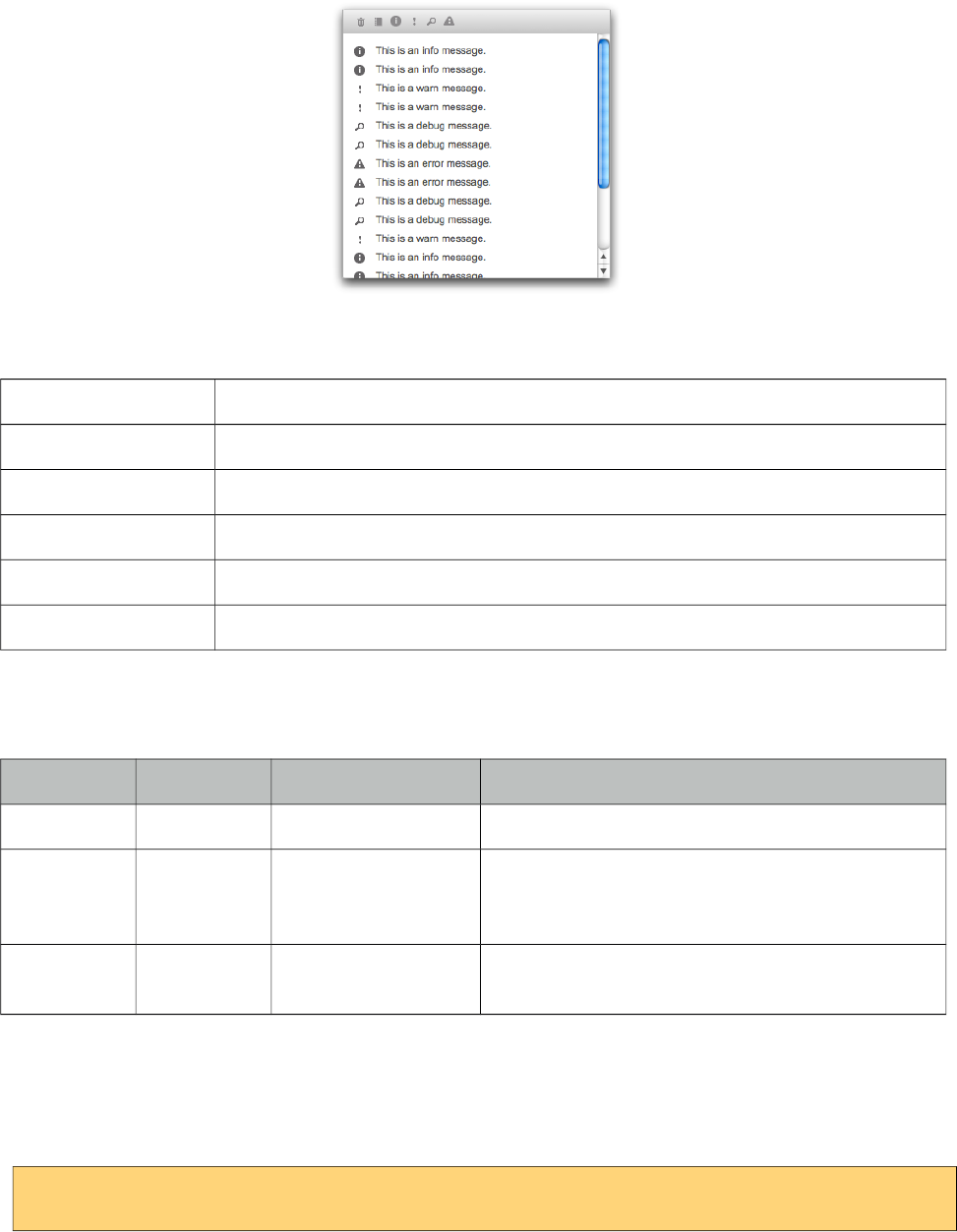
PrimeFaces User Guide
3.78 Log
Log component is a visual console to display logs on JSF pages.
Info
Tag log
Component Class org.primefaces.component.log.Log
Component Type org.primefaces.component.Log
Component Family org.primefaces.component
Renderer Type org.primefaces.component.LogRenderer
Renderer Class org.primefaces.component.log.LogRenderer
Attributes
Name Default Type Description
id null String Unique identifier of the component
rendered true Boolean Boolean value to specify the rendering of the
component, when set to false component will not
be rendered.
binding null Object An el expression that maps to a server side
UIComponent instance in a backing bean
Getting started with Log
Log component is used simply as adding the component to the page.
<p:log />
321
PrimeFaces User Guide
Log API
PrimeFaces uses client side log apis internally, for example you can use log component to see
details of an ajax request. Log API is also available via global PrimeFaces object in case you’d like
to use the log component to display your logs.
<script type=”text/javascript”>
PrimeFaces.info(‘Info message’);
PrimeFaces.debug(‘Debug message’);
PrimeFaces.warn(‘Warning message’);
PrimeFaces.error(‘Error message’);
</script>
If project stage is development, log messages are also available at browser console.
Client Side API
Widget: PrimeFaces.widget.Log
Method Params Return Type Description
show() - void Show the container element.
hide() - void Hides the container element.
322
PrimeFaces User Guide
3.79 Media
Media component is used for embedding multimedia content.
Info
Tag media
Component Class org.primefaces.component.media.Media
Component Type org.primefaces.component.Media
Component Family org.primefaces.component
Renderer Type org.primefaces.component.MediaRenderer
Renderer Class org.primefaces.component.media.MediaRenderer
Attributes
Name Default Type Description
id null String Unique identifier of the component.
rendered true Boolean Boolean value to specify the rendering of the
component, when set to false component will not be
rendered.
binding null Object An el expression that maps to a server side
UIComponent instance in a backing bean.
value null String Media source to play.
player null String Type of the player, possible values are
"quicktime","windows","flash","real" and "pdf".
width null String Width of the player.
height null String Height of the player.
style null String Style of the player.
styleClass null String StyleClass of the player.
cache true Boolean Controls browser caching mode of the resource.
Getting started with Media
In its simplest form media component requires a source to play;
<p:media value="/media/ria_with_primefaces.mov" />
323
PrimeFaces User Guide
Player Types
By default, players are identified using the value extension so for instance mov files will be played
by quicktime player. You can customize which player to use with the player attribute.
<p:media value="http://www.youtube.com/v/ABCDEFGH" player="flash"/>
Following is the supported players and file types.
Player Types
windows asx, asf, avi, wma, wmv
quicktime aif, aiff, aac, au, bmp, gsm, mov, mid, midi, mpg, mpeg, mp4, m4a, psd, qt, qtif, qif,
qti, snd, tif, tiff, wav, 3g2, 3pg
flash flv, mp3, swf
real ra, ram, rm, rpm, rv, smi, smil
pdf pdf
Parameters
Different proprietary players might have different configuration parameters, these can be specified
using f:param tags.
<p:media value="/media/ria_with_primefaces.mov">
<f:param name="param1" value="value1" />
</p:media>
StreamedContent Support
Media component can also play binary media content, example for this use case is storing media
files in database using binary format. In order to implement this, bind a StreamedContent.
<p:media value="#{mediaBean.media}" width="250" height="225" player="quicktime"/>
public class MediaBean {
private StreamedContent media;
public MediaController() {
InputStream stream = //Create binary stream from database
media = new DefaultStreamedContent(stream, "video/quicktime");
}
public StreamedContent getMedia() { return media; }
}
324
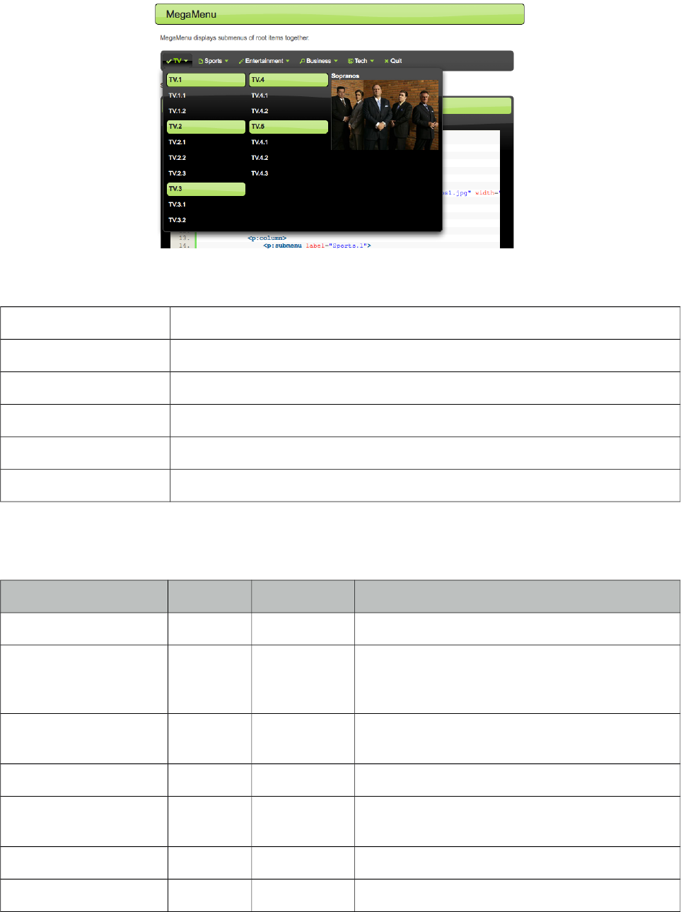
PrimeFaces User Guide
3.80 MegaMenu
MegaMenu is a horizontal navigation component that displays submenus together.
Info
Tag megaMenu
Component Class org.primefaces.component.megamenu.MegaMenu
Component Type org.primefaces.component.MegaMenu
Component Family org.primefaces.component
Renderer Type org.primefaces.component.MegaMenuRenderer
Renderer Class org.primefaces.component.megamenu.MegaMenuRenderer
Attributes
Name Default Type Description
id null String Unique identifier of the component.
rendered true Boolean Boolean value to specify the rendering of the
component, when set to false component will not
be rendered.
binding null Object An el expression that maps to a server side
UIComponent instance in a backing bean.
widgetVar null String Name of the client side widget
model null MenuModel MenuModel instance to create menus
programmatically
style null String Inline style of the component.
styleClass null String Style class of the component.
325
PrimeFaces User Guide
Name Default Type Description
autoDisplay true Boolean Defines whether submenus will be displayed on
mouseover or not. When set to false, click event
is required to display.
activeIndex null Integer Index of the active root menu to display as
highlighted. By default no root is highlighted.
orientation horizontal String Defines the orientation of the root menuitems,
valid values are "horizontal" and "vertical".
Getting Started with MegaMenu
Layout of MegaMenu is grid based and root items require columns as children.
<p:megaMenu>
<p:submenu label="TV" icon="ui-icon-check">
<p:column>
<p:submenu label="TV.1">
<p:menuitem value="TV.1.1" url="#" />
<p:menuitem value="TV.1.2" url="#" />
</p:submenu>
<p:submenu label="TV.2">
<p:menuitem value="TV.2.1" url="#" />
<p:menuitem value="TV.2.2" url="#" />
<p:menuitem value="TV.2.3" url="#" />
</p:submenu>
<p:submenu label="TV.3">
<p:menuitem value="TV.3.1" url="#" />
<p:menuitem value="TV.3.2" url="#" />
</p:submenu>
</p:column>
<p:column>
<p:submenu label="TV.4">
<p:menuitem value="TV.4.1" url="#" />
<p:menuitem value="TV.4.2" url="#" />
</p:submenu>
<p:submenu label="TV.5">
<p:menuitem value="TV.5.1" url="#" />
<p:menuitem value="TV.5.2" url="#" />
<p:menuitem value="TV.5.3" url="#" />
</p:submenu>
<p:submenu label="TV.6">
<p:menuitem value="TV.6.1" url="#" />
<p:menuitem value="TV.6.2" url="#" />
<p:menuitem value="TV.6.3" url="#" />
</p:submenu>
</p:column>
</p:submenu>
//more root items
</p:megaMenu>
326
PrimeFaces User Guide
Custom Content
Any content can be placed inside columns.
<p:column>
<strong>Sopranos</strong>
<p:graphicImage value="/images/sopranos/sopranos1.jpg" width="200"/>
</p:column>
Root Menuitem
MegaMenu supports menuitem as root menu options as well. Following example allows a root
menubar item to execute an action to logout the user.
<p:megaMenu>
//submenus
<p:menuitem label="Logout" action="#{bean.logout}"/>
</p:megaMenu>
Dynamic Menus
Menus can be created programmatically as well, see the dynamic menus part in menu component
section for more information and an example.
Skinning
MegaMenu resides in a main container which style and styleClass attributes apply. Following is the
list of structural style classes;
Style Class Applies
.ui-megamenu Container element of menubar.
.ui-menu-list List container
.ui-menuitem Each menu item
.ui-menuitem-link Anchor element in a link item
.ui-menuitem-text Text element in an item
As skinning style classes are global, see the main theming section for more information.
327
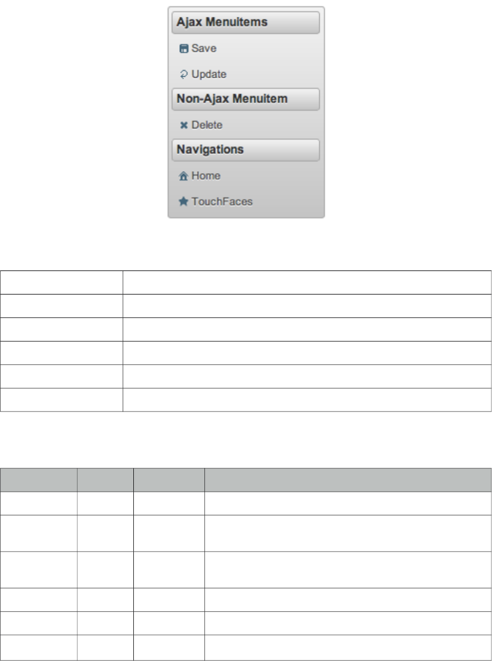
PrimeFaces User Guide
3.81 Menu
Menu is a navigation component with submenus and menuitems.
Info
Tag menu
Component Class org.primefaces.component.menu.Menu
Component Type org.primefaces.component.Menu
Component Family org.primefaces.component
Renderer Type org.primefaces.component.MenuRenderer
Renderer Class org.primefaces.component.menu.MenuRenderer
Attributes
Name Default Type Description
id null String Unique identifier of the component.
rendered true Boolean Boolean value to specify the rendering of the component,
when set to false component will not be rendered.
binding null Object An el expression that maps to a server side UIComponent
instance in a backing bean.
widgetVar null String Name of the client side widget.
model null MenuModel A menu model instance to create menu programmatically.
trigger null String Target component to attach the overlay menu.
328
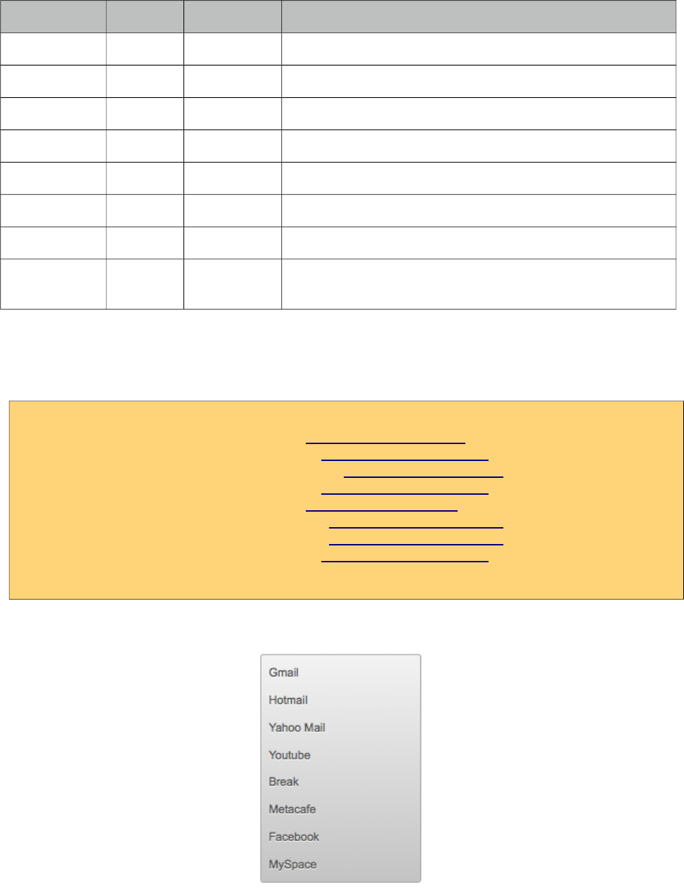
PrimeFaces User Guide
Name Default Type Description
my null String Corner of menu to align with trigger element.
at null String Corner of trigger to align with menu element.
overlay false Boolean Defines positioning type of menu, either static or overlay.
style null String Inline style of the main container element.
styleClass null String Style class of the main container element.
triggerEvent click String Event to show the dynamic positioned menu.
tabindex 0 String Position of the element in the tabbing order. Default is 0.
toggleable false Boolean Defines whether clicking the header of a submenu toggles
the visibility of children menuitems.
Getting started with the Menu
A menu is composed of submenus and menuitems.
<p:menu>
<p:menuitem value="Gmail" url="http://www.google.com" />
<p:menuitem value="Hotmail" url="http://www.hotmail.com" />
<p:menuitem value="Yahoo Mail" url="http://mail.yahoo.com" />
<p:menuitem value="Youtube" url="http://www.youtube.com" />
<p:menuitem value="Break" url="http://www.break.com" />
<p:menuitem value="Metacafe" url="http://www.metacafe.com" />
<p:menuitem value="Facebook" url="http://www.facebook.com" />
<p:menuitem value="MySpace" url="http://www.myspace.com" />
</p:menu>
329
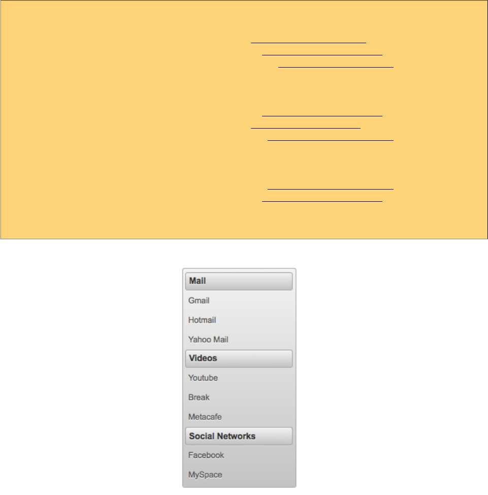
PrimeFaces User Guide
Submenus are used to group menuitems;
<p:menu>
<p:submenu label="Mail">
<p:menuitem value="Gmail" url="http://www.google.com" />
<p:menuitem value="Hotmail" url="http://www.hotmail.com" />
<p:menuitem value="Yahoo Mail" url="http://mail.yahoo.com" />
</p:submenu>
<p:submenu label="Videos">
<p:menuitem value="Youtube" url="http://www.youtube.com" />
<p:menuitem value="Break" url="http://www.break.com" />
<p:menuitem value="Metacafe" url="http://www.metacafe.com" />
</p:submenu>
<p:submenu label="Social Networks">
<p:menuitem value="Facebook" url="http://www.facebook.com" />
<p:menuitem value="MySpace" url="http://www.myspace.com" />
</p:submenu>
</p:menu>
Overlay Menu
Menu can be positioned on a page in two ways; "static" and "dynamic". By default it’s static
meaning the menu is in normal page flow. In contrast dynamic menus is not on the normal flow of
the page allowing them to overlay other elements.
A dynamic menu is created by setting overlay option to true and defining a trigger to show the
menu. Location of menu on page will be relative to the trigger and defined by my and at options
that take combination of four values;
• left
• right
• bottom
• top
330
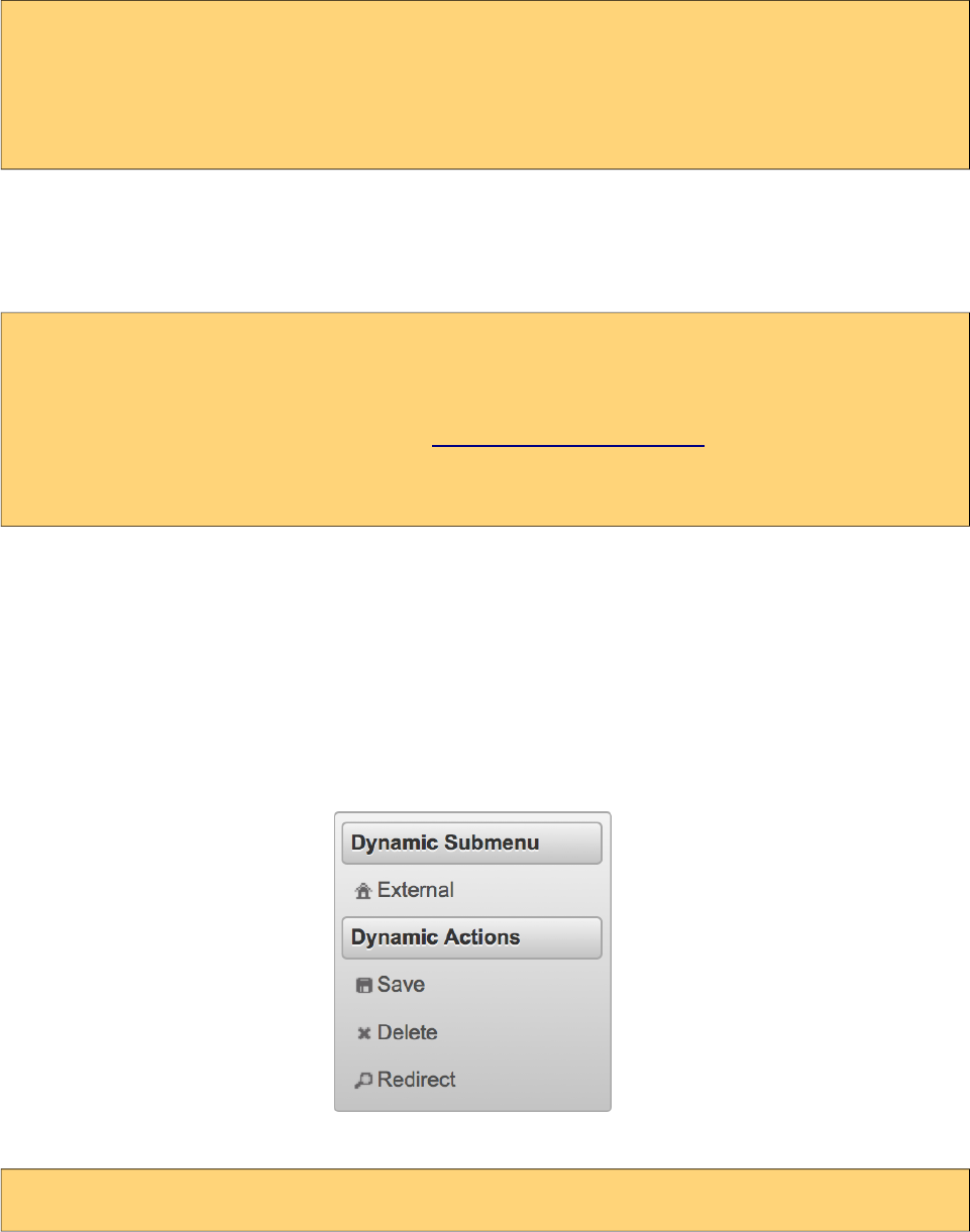
PrimeFaces User Guide
For example, clicking the button below will display the menu whose top left corner is aligned with
bottom left corner of button.
<p:menu overlay="true" trigger="btn" my="left top" at="bottom left">
...submenus and menuitems
</p:menu>
<p:commandButton id="btn" value="Show Menu" type="button"/>
Ajax and Non-Ajax Actions
As menu uses menuitems, it is easy to invoke actions with or without ajax as well as navigation. See
menuitem documentation for more information about the capabilities.
<p:menu>
<p:submenu label="Options">
<p:menuitem value="Save" actionListener="#{bean.save}" update="comp"/>
<p:menuitem value="Update" actionListener="#{bean.update}" ajax="false"/>
<p:menuitem value="Navigate" url="http://www.primefaces.org"/>
</p:submenu>
</p:menu>
Dynamic Menus
Menus can be created programmatically as well, this is more flexible compared to the declarative
approach. Menu metadata is defined using an org.primefaces.model.MenuModel instance,
PrimeFaces provides the built-in org.primefaces.model.DefaultMenuModel implementation.
For further customization you can also create and bind your own MenuModel implementation. (e.g.
One with JPA @Entity annotation to able able to persist to a database).
<p:menu model="#{menuBean.model}" />
331

PrimeFaces User Guide
public class MenuBean {
private MenuModel model;
public MenuBean() {
model = new DefaultMenuModel();
//First submenu
DefaultSubMenu firstSubmenu = new DefaultSubMenu("Dynamic Submenu");
DefaultMenuItem item = new DefaultMenuItem("External");
item.setUrl("http://www.primefaces.org");
item.setIcon("ui-icon-home");
firstSubmenu.addElement(item);
model.addElement(firstSubmenu);
//Second submenu
DefaultSubMenu secondSubmenu = new DefaultSubMenu("Dynamic Actions");
item = new DefaultMenuItem("Save");
item.setIcon("ui-icon-disk");
item.setCommand("#{menuBean.save}");
item.setUpdate("messages");
secondSubmenu.addElement(item);
item = new DefaultMenuItem("Delete");
item.setIcon("ui-icon-close");
item.setCommand("#{menuBean.delete}");
item.setAjax(false);
secondSubmenu.addElement(item);
item = new DefaultMenuItem("Redirect");
item.setIcon("ui-icon-search");
item.setCommand("#{menuBean.redirect}");
secondSubmenu.addElement(item);
model.addElement(secondSubmenu);
}
public MenuModel getModel() { return model; }
}
For all UI component counterpart such as p:menuitem, p:submenu, p:separator a corresponding
interface with a default implementation exists in MenuModel API. Regarding actions, if you need to
pass parameters in ajax or non-ajax commands, use setParam(key, value) method.
MenuModel API is supported by all menu components that have model attribute.
332
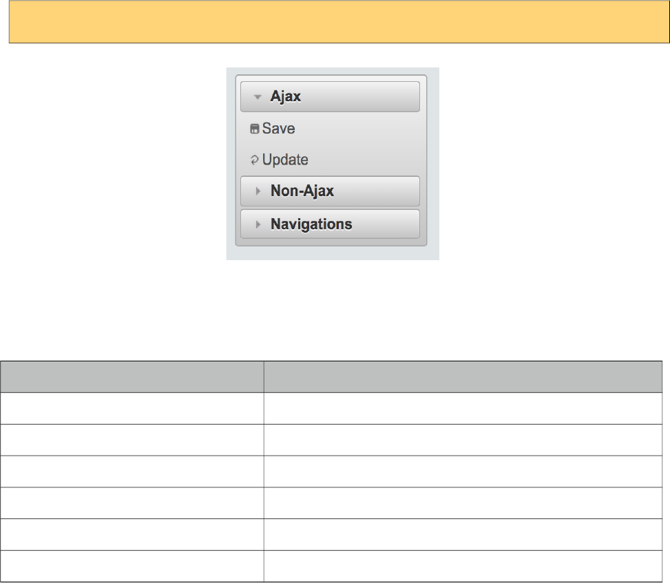
PrimeFaces User Guide
Toggleable
Enabling toggleable option makes the header of submenus clickable to expand and collapse their
content.
<p:menu toggleable="true">
Skinning
Menu resides in a main container element which style and styleClass attributes apply. Following is
the list of structural style classes;
Style Class Applies
.ui-menu Container element of menu
.ui-menu-list List container
.ui-menuitem Each menu item
.ui-menuitem-link Anchor element in a link item
.ui-menuitem-text Text element in an item
.ui-menu-sliding Container of ipod like sliding menu
As skinning style classes are global, see the main theming section for more information.
333
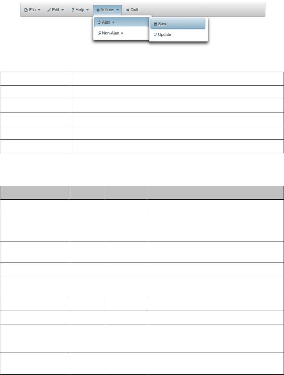
PrimeFaces User Guide
3.82 Menubar
Menubar is a horizontal navigation component.
Info
Tag menubar
Component Class org.primefaces.component.menubar.Menubar
Component Type org.primefaces.component.Menubar
Component Family org.primefaces.component
Renderer Type org.primefaces.component.MenubarRenderer
Renderer Class org.primefaces.component.menubar.MenubarRenderer
Attributes
Name Default Type Description
id null String Unique identifier of the component.
rendered true Boolean Boolean value to specify the rendering of the
component, when set to false component will not
be rendered.
binding null Object An el expression that maps to a server side
UIComponent instance in a backing bean.
widgetVar null String Name of the client side widget
model null MenuModel MenuModel instance to create menus
programmatically
style null String Inline style of menubar
styleClass null String Style class of menubar
autoDisplay false Boolean Defines whether the first level of submenus will
be displayed on mouseover or not. When
set to false, click event is required to display.
tabindex 0 String Position of the element in the tabbing order.
334
PrimeFaces User Guide
Name Default Type Description
toggleEvent hover String Event to toggle the submenus, valid values are
"hover" and "click".
Getting started with Menubar
Submenus and menuitems as child components are required to compose the menubar.
<p:menubar>
<p:submenu label="Mail">
<p:menuitem value="Gmail" url="http://www.google.com" />
<p:menuitem value="Hotmail" url="http://www.hotmail.com" />
<p:menuitem value="Yahoo Mail" url="http://mail.yahoo.com" />
</p:submenu>
<p:submenu label="Videos">
<p:menuitem value="Youtube" url="http://www.youtube.com" />
<p:menuitem value="Break" url="http://www.break.com" />
</p:submenu>
</p:menubar>
Nested Menus
To create a menubar with a higher depth, nest submenus in parent submenus.
<p:menubar>
<p:submenu label="File">
<p:submenu label="New">
<p:menuitem value="Project" url="#"/>
<p:menuitem value="Other" url="#"/>
</p:submenu>
<p:menuitem value="Open" url="#"></p:menuitem>
<p:menuitem value="Quit" url="#"></p:menuitem>
</p:submenu>
<p:submenu label="Edit">
<p:menuitem value="Undo" url="#"></p:menuitem>
<p:menuitem value="Redo" url="#"></p:menuitem>
</p:submenu>
<p:submenu label="Help">
<p:menuitem label="Contents" url="#" />
<p:submenu label="Search">
<p:submenu label="Text">
<p:menuitem value="Workspace" url="#" />
</p:submenu>
<p:menuitem value="File" url="#" />
</p:submenu>
</p:submenu>
</p:menubar>
335
PrimeFaces User Guide
Root Menuitem
Menubar supports menuitem as root menu options as well;
<p:menubar>
<p:menuitem label="Logout" action="#{bean.logout}"/>
</p:menubar>
Ajax and Non-Ajax Actions
As menu uses menuitems, it is easy to invoke actions with or without ajax as well as navigation. See
menuitem documentation for more information about the capabilities.
<p:menubar>
<p:submenu label="Options">
<p:menuitem value="Save" actionListener="#{bean.save}" update="comp"/>
<p:menuitem value="Update" actionListener="#{bean.update}" ajax="false"/>
<p:menuitem value="Navigate" url="http://www.primefaces.org"/>
</p:submenu>
</p:menubar>
Dynamic Menus
Menus can be created programmatically as well, see the dynamic menus part in menu component
section for more information and an example.
Skinning
Menubar resides in a main container which style and styleClass attributes apply. Following is the
list of structural style classes;
Style Class Applies
.ui-menubar Container element of menubar.
.ui-menu-list List container
.ui-menuitem Each menu item
.ui-menuitem-link Anchor element in a link item
.ui-menuitem-text Text element in an item
As skinning style classes are global, see the main theming section for more information.
336
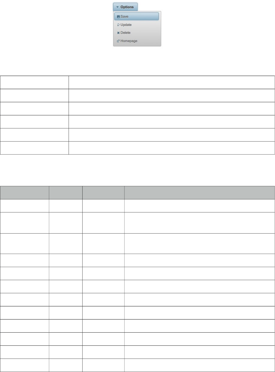
PrimeFaces User Guide
3.83 MenuButton
MenuButton displays different commands in a popup menu.
Info
Tag menuButton
Component Class org.primefaces.component.menubutton.MenuButton
Component Type org.primefaces.component.MenuButton
Component Family org.primefaces.component
Renderer Type org.primefaces.component.MenuButtonRenderer
Renderer Class org.primefaces.component.menubutton.MenuButtonRenderer
Attributes
Name Default Type Description
id null String Unique identifier of the component.
rendered true Boolean Boolean value to specify the rendering of the component,
when set to false component will not be rendered.
binding null Object An el expression that maps to a server side
UIComponent instance in a backing bean.
value null String Label of the button
style null String Style of the main container element
styleClass null String Style class of the main container element
widgetVar null String Name of the client side widget
model null MenuModel MenuModel instance to create menus programmatically
disabled false Boolean Disables or enables the button.
icon null String Icon of the menu button.
iconPos left String Position of the icon, valid values are left and right.
appendTo null String Appends the overlay to the element defined by search
337
PrimeFaces User Guide
Name Default Type Description
expression. Defaults to document body.
menuStyleClass null String Style class of the overlay menu element.
Getting started with the MenuButton
MenuButton consists of one ore more menuitems. Following menubutton example has three
menuitems, first one is used triggers an action with ajax, second one does the similar but without
ajax and third one is used for redirect purposes.
<p:menuButton value="Options">
<p:menuitem value="Save" actionListener="#{bean.save}" update="comp" />
<p:menuitem value="Update" actionListener="#{bean.update}" ajax="false" />
<p:menuitem value="Go Home" url="/home.jsf" />
</p:menuButton>
Dynamic Menus
Menus can be created programmatically as well, see the dynamic menus part in menu component
section for more information and an example.
Skinning
MenuButton resides in a main container which style and styleClass attributes apply. As skinning
style classes are global, see the main theming section for more information. Following is the list of
structural style classes;
Style Class Applies
.ui-menu Container element of menu.
.ui-menu-list List container
.ui-menuitem Each menu item
.ui-menuitem-link Anchor element in a link item
.ui-menuitem-text Text element in an item
.ui-button Button element
.ui-button-text Label of button
338
PrimeFaces User Guide
3.84 MenuItem
MenuItem is used by various menu components.
Info
Tag menuItem
Tag Class org.primefaces.component.menuitem.MenuItemTag
Component Class org.primefaces.component.menuitem.MenuItem
Component Type org.primefaces.component.MenuItem
Component Family org.primefaces.component
Attributes
Name Default Type Description
id null String Unique identifier of the component.
rendered true Boolean Boolean value to specify the rendering of the component,
when set to false component will not be rendered.
binding null Object An el expression that maps to a server side UIComponent
instance in a backing bean.
value null String Label of the menuitem
actionListener null Method
Expr
Action listener to be invoked when menuitem is clicked.
action null Method
Expr
Action to be invoked when menuitem is clicked.
immediate false Boolean When true, action of this menuitem is processed after
apply request phase.
url null String Url to be navigated when menuitem is clicked
target null String Target type of url navigation
style null String Style of the menuitem label
styleClass null String StyleClass of the menuitem label
onclick null String Javascript event handler for click event
async false Boolean When set to true, ajax requests are not queued.
process null String Components to process partially instead of whole view.
update null String Components to update after ajax request.
disabled false Boolean Disables the menuitem.
339
PrimeFaces User Guide
Name Default Type Description
onstart null String Javascript handler to execute before ajax request is begins.
oncomplete null String Javascript handler to execute when ajax request is
completed.
onsuccess null String Javascript handler to execute when ajax request succeeds.
onerror null String Javascript handler to execute when ajax request fails.
global true Boolean Global ajax requests are listened by ajaxStatus component,
setting global to false will not trigger ajaxStatus.
delay null String If less than delay milliseconds elapses between calls to
request() only the most recent one is sent and all other
requests are discarded. If this option is not specified, or if
the value of delay is the literal string 'none' without the
quotes, no delay is used.
partialSubmit false Boolean Enables serialization of values belonging to the partially
processed components only.
partialSubmitFilter null String Selector to use when partial submit is on, default is
":input" to select all descendant inputs of a partially
processed components.
resetValues false Boolean If true, local values of input components to be updated
within the ajax request would be reset.
ignoreAutoUpdate false Boolean If true, components which autoUpdate="true" will not be
updated for this request. If not specified, or the value is
false, no such indication is made.
timeout 0 Integer Timeout for the ajax request in milliseconds.
ajax true Boolean Specifies submit mode.
icon null String Path of the menuitem image.
title null String Advisory tooltip information.
outcome null String Navigation case outcome.
includeViewParams false Boolean Defines if page parameters should be in target URI.
fragment null String Identifier of the target page element to scroll to.
disableClientWindow false Boolean Disable appending the ClientWindow on the rendering of
this element.
containerStyle null String Inline style of the menuitem container.
containerStyleClass null String Style class of the menuitem container.
form null String Form to serialize for an ajax request. Default is the
enclosing form.
escape true Boolean Defines whether value would be escaped or not
340
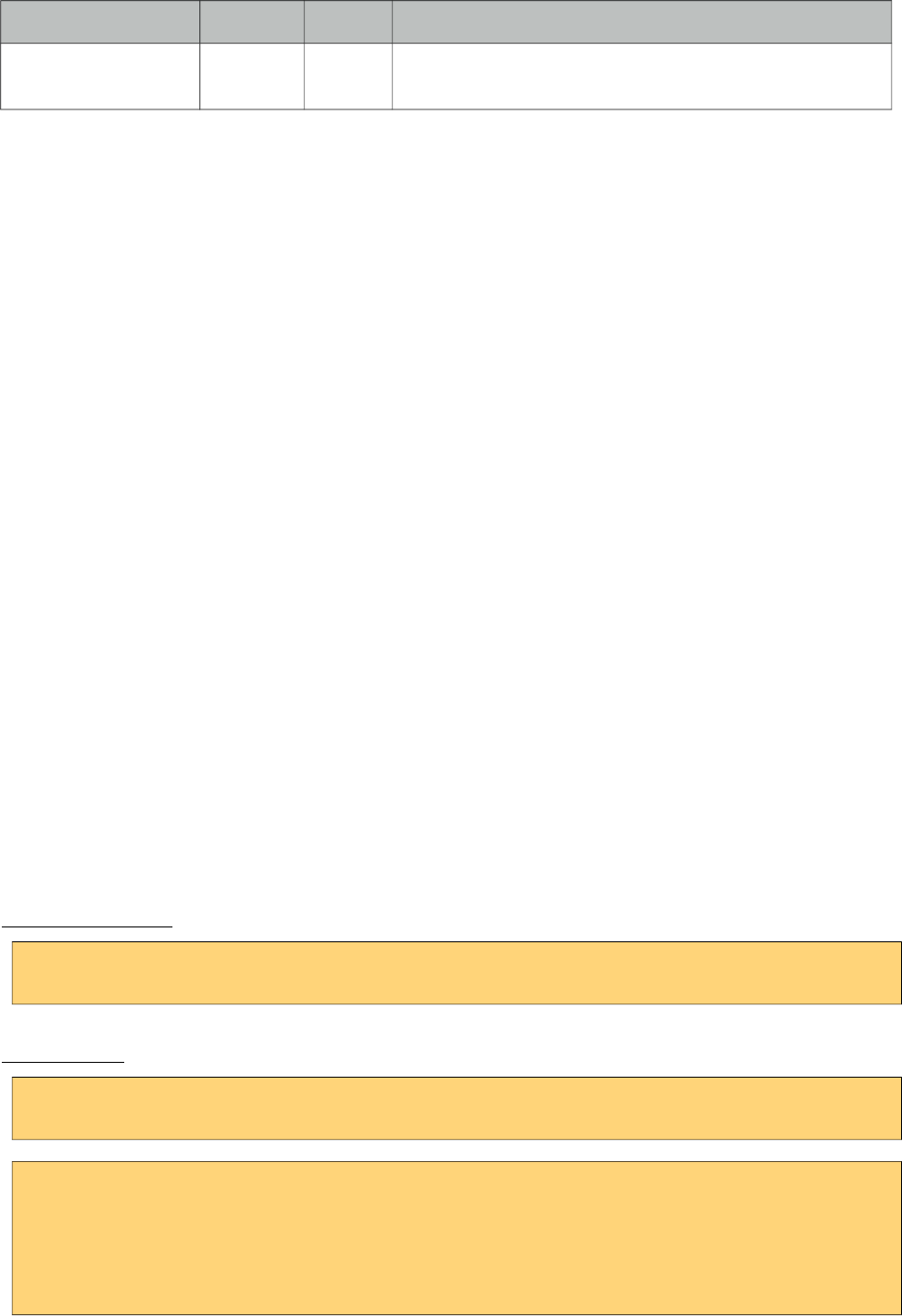
PrimeFaces User Guide
Name Default Type Description
rel null String Defines the relationship between the current document
and the linked document.
Getting started with MenuItem
MenuItem is a generic component used by the following components.
• Menu
• MenuBar
• MegaMenu
• Breadcrumb
• Dock
• Stack
• MenuButton
• SplitButton
• PanelMenu
• TabMenu
• SlideMenu
• TieredMenu
Note that some attributes of menuitem might not be supported by these menu components. Refer to
the specific component documentation for more information.
Navigation vs Action
Menuitem has two use cases, directly navigating to a url with GET or doing a POST to execute an
action. This is decided by url or outcome attributes, if either one is present menuitem does a GET
request, if not parent form is posted with or without ajax decided by ajax attribute.
Icons
There are two ways to specify an icon of a menuitem, you can either use bundled icons within
PrimeFaces or provide your own via css.
ThemeRoller Icons
<p:menuitem icon="ui-icon-disk" ... />
Custom Icons
<p:menuitem icon="barca" ... />
.barca {
background: url(barca_logo.png) no-repeat;
height:16px;
width:16px;
}
341
PrimeFaces User Guide
3.85 Message
Message is a pre-skinned extended version of the standard JSF message component.
Info
Tag message
Component Class org.primefaces.component.message.Message
Component Type org.primefaces.component.Message
Component Family org.primefaces.component
Renderer Type org.primefaces.component.MessageRenderer
Renderer Class org.primefaces.component.message.MessageRenderer
Attributes
Name Default Type Description
id null String Unique identifier of the component.
rendered true Boolean Boolean value to specify the rendering of the component,
when set to false component will not be rendered.
binding null Object An el expression that maps to a server side UIComponent
instance in a backing bean.
showSummary false Boolean Specifies if the summary of the FacesMessage should be
displayed.
showDetail true Boolean Specifies if the detail of the FacesMessage should be
displayed.
for null String Id of the component whose messages to display.
redisplay true Boolean Defines if already rendered messages should be displayed
display both String Defines the display mode.
escape true Boolean Defines whether html would be escaped or not.
severity null String Comma separated list of severities to display only.
style null String Inline style of the component.
styleClass null String Style class of the component.
342
PrimeFaces User Guide
Getting started with Message
Message usage is exactly same as standard message.
<h:inputText id="txt" value="#{bean.text}" />
<p:message for="txt" />
Display Mode
Message component has three different display modes;
• text : Only message text is displayed.
• icon : Only message severity is displayed and message text is visible as a tooltip.
• both (default) : Both icon and text are displayed.
Severity Levels
Using severity attribute, you can define which severities can be displayed by the component. For
instance, you can configure messages to only display infos and warnings.
<p:message severity="info,warn" for="txt"/>
Escaping
Component escapes html content in messages by default, in case you need to display html, disable
escape option.
<p:message escape="false" for="txt" />
Skinning
Full list of CSS selectors of message is as follows;
Style Class Applies
ui-message-{severity} Container element of the message
ui-message-{severity}-summary Summary text
ui-message-{severity}-detail Detail text
{severity} can be ‘info’, ‘error’, ‘warn’ and error.
343
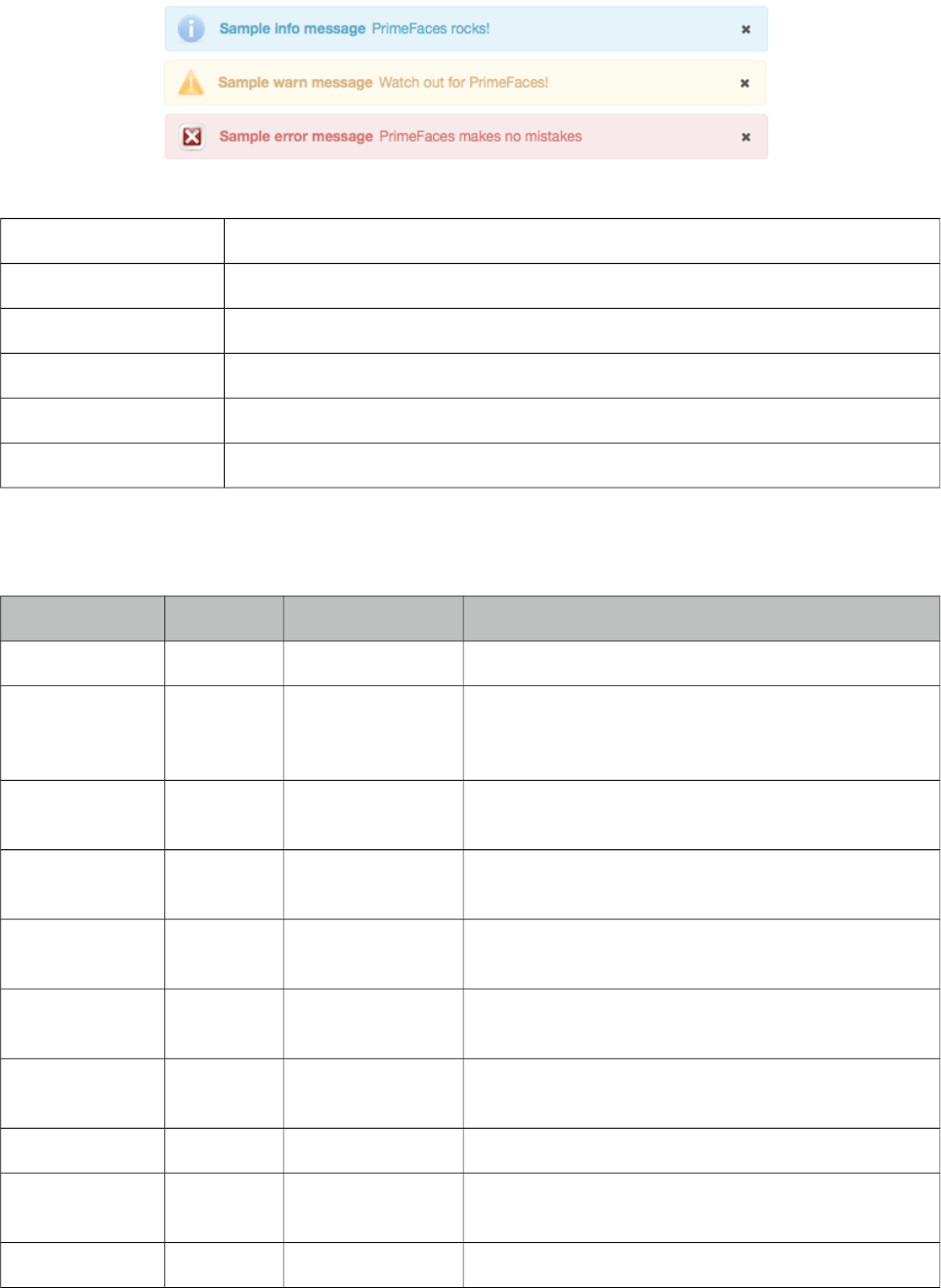
PrimeFaces User Guide
3.86 Messages
Messages is a pre-skinned extended version of the standard JSF messages component.
Info
Tag messages
Component Class org.primefaces.component.messages.Messages
Component Type org.primefaces.component.Messages
Component Family org.primefaces.component
Renderer Type org.primefaces.component.MessagesRenderer
Renderer Class org.primefaces.component.messages.MessagesRenderer
Attributes
Name Default Type Description
id null String Unique identifier of the component.
rendered true Boolean Boolean value to specify the rendering of the
component, when set to false component will not be
rendered.
binding null Object An el expression that maps to a server side
UIComponent instance in a backing bean.
showSummary true Boolean Specifies if the summary of the FacesMessages
should be displayed.
showDetail false Boolean Specifies if the detail of the FacesMessages should
be displayed.
globalOnly false String When true, only facesmessages with no clientIds are
displayed.
redisplay true Boolean Defines if already rendered messages should be
displayed
autoUpdate false Boolean Enables auto update mode if set true.
for null String Name of associated key, takes precedence when used
with globalOnly.
escape true Boolean Defines whether html would be escaped or not.
344
PrimeFaces User Guide
Name Default Type Description
severity null String Comma separated list of severities to display only.
closable false Boolean Adds a close icon to hide the messages.
style null String Inline style of the component.
styleClass null String Style class of the component.
showIcon true Boolean Defines if severity icons would be displayed.
Getting started with Messages
Message usage is exactly same as standard messages.
<p:messages />
AutoUpdate
When auto update is enabled, messages component is updated with each ajax request automatically.
Targetable Messages
There may be times where you need to target one or more messages to a specific message
component, for example suppose you have growl and messages on same page and you need to
display some messages on growl and some on messages. Use for attribute to associate messages
with specific components.
<p:messages for="somekey" />
<p:growl for="anotherkey" />
FacesContext context = FacesContext.getCurrentInstance();
context.addMessage("somekey", facesMessage1);
context.addMessage("somekey", facesMessage2);
context.addMessage("anotherkey", facesMessage3);
In sample above, messages will display first and second message and growl will only display the
3rd message.
Severity Levels
Using severity attribute, you can define which severities can be displayed by the component. For
instance, you can configure messages to only display infos and warnings.
<p:messages severity="info,warn" />
Escaping
Messages escapes html content in messages, disable escape option to display content as html.
345
PrimeFaces User Guide
<p:messages escape="false" />
Skinning
Full list of CSS selectors of message is as follows;
Style Class Applies
ui-messages-{severity} Container element of the message
ui-messages-{severity}-summary Summary text
ui-messages-{severity}-detail Detail text
ui-messages-{severity}-icon Icon of the message.
{severity} can be ‘info’, ‘error’, ‘warn’ and error.
346
PrimeFaces User Guide
3.87 Mindmap
Mindmap is an interactive tool to visualize mindmap data featuring lazy loading, callbacks,
animations and more.
Info
Tag mindmap
Component Class org.primefaces.component.mindmap.Mindmap
Component Type org.primefaces.component.Mindmap
Component Family org.primefaces.component
Renderer Type org.primefaces.component.MindmapRenderer
Renderer Class org.primefaces.component.mindmap.MindmapRenderer
Attributes
Name Default Type Description
id null String Unique identifier of the component
rendered true Boolean Boolean value to specify the rendering of the
component, when set to false component will not
be rendered.
347
PrimeFaces User Guide
Name Default Type Description
binding null Object An el expression that maps to a server side
UIComponent instance in a backing bean
value null MindmapNode MenuModel instance to build menu dynamically.
style null String Inline style of the component.
styleClass null String Style class of the component.
effectSpeed 300 Integer Speed of the animations in milliseconds.
widgetVar null String Name of the client side widget.
Getting started with Mindmap
Mindmap requires an instance of org.primefaces.model.mindmap.MindmapNode as the root. Due to
it’s lazy nature, a select ajax behavior must be provided to load children of selected node on the fly
with ajax.
public class MindmapBean {
private MindmapNode root;
public MindmapBean() {
root = new DefaultMindmapNode("google.com", "Google", "FFCC00", false);
MindmapNode ips = new DefaultMindmapNode("IPs", "IP Nos", "6e9ebf", true);
MindmapNode ns = new DefaultMindmapNode("NS(s)", "Names", "6e9ebf", true);
MindmapNode mw = new DefaultMindmapNode("Mw", "Malicious ", "6e9ebf", true);
root.addNode(ips);
root.addNode(ns);
root.addNode(malware);
}
public MindmapNode getRoot() {
return root;
}
public void onNodeSelect(SelectEvent event) {
MindmapNode node = (MindmapNode) event.getObject();
//load children of select node and add via node.addNode(childNode);
}
}
<p:mindmap value="#{mindmapBean.root}" style="width:100%;height:600px">
<p:ajax event="select" listener="#{mindmapBean.onNodeSelect}" />
</p:mindmap>
348
PrimeFaces User Guide
DoubleClick Behavior
Selecting a node with single click is used to load subnodes, double click behavior is also provided
for further customization. Following sample, displays the details of the subnode in a dialog.
<p:mindmap value="#{mindmapBean.root}" style="width:100%;height:600px;">
<p:ajax event="select" listener="#{mindmapBean.onNodeSelect}" />
<p:ajax event="dblselect" listener="#{mindmapBean.onNodeDblselect}"
update="output" oncomplete="PF('details').show()"/>
</p:mindmap>
<p:dialog widgetVar="details" header="Node Details" resizable="false" modal="true"
showEffect="fade" hideEffect="fade">
<h:outputText id="output" value="#{mindmapBean.selectedNode.data}" />
</p:dialog>
public void onNodeDblselect(SelectEvent event) {
this.selectedNode = (MindmapNode) event.getObject();
}
MindmapNode API
org.primefaces.model.mindmap.MindmapNode
Property Default Type Description
label null String Label of the node.
data null Object Optional data associated with the node.
fill null String Color code of the node.
selectable 1 Boolean Flag to define if node is clickable.
parent null MindmapNode Parent node instance.
Tips
• IE 7 and IE 8 are not supported due to technical limitations, IE 9 is supported.
349
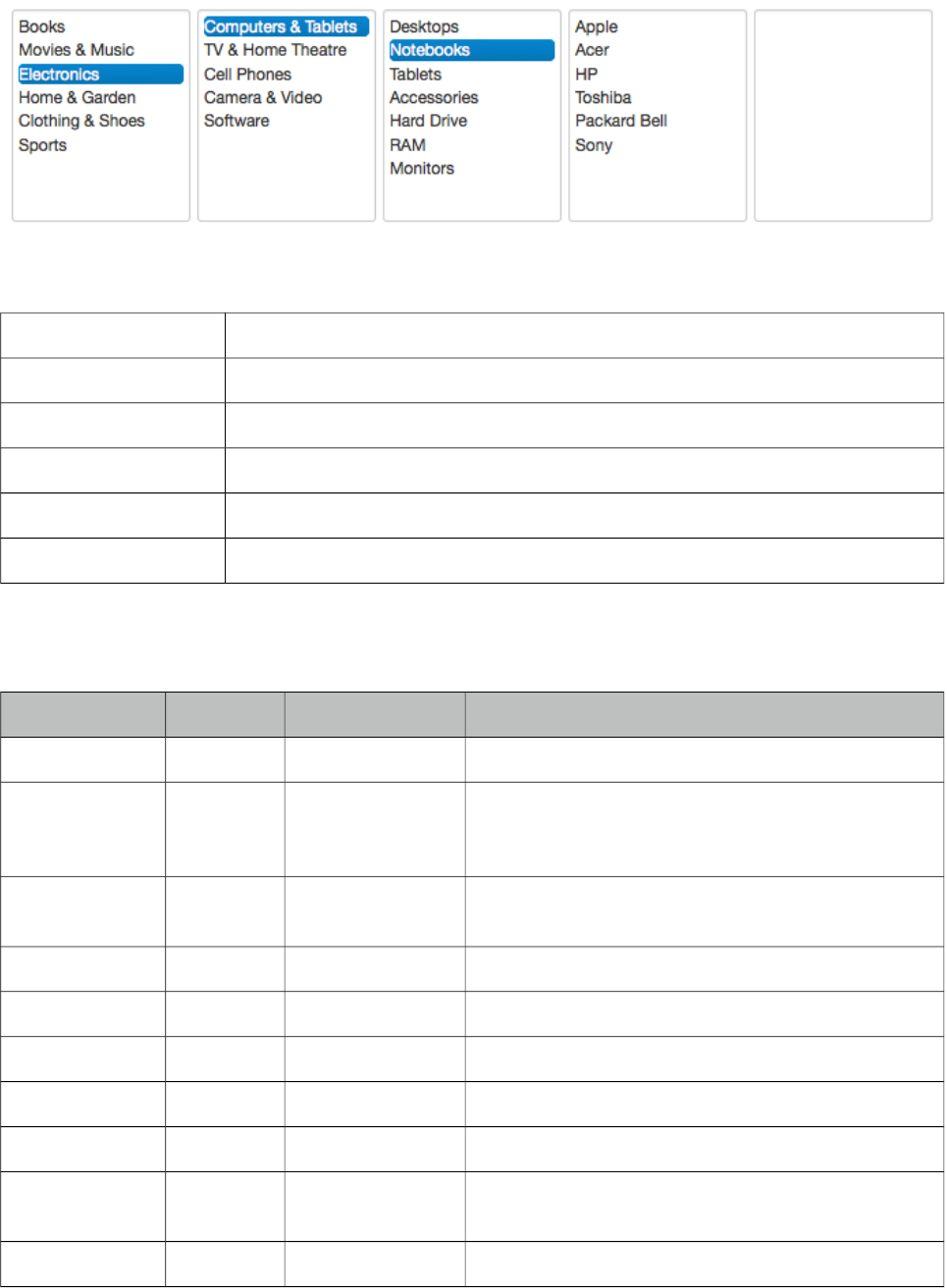
PrimeFaces User Guide
&&#-)
MultiSelectListbox is used to select an item from a collection of listboxes that are in parent-child
relationship.
Info
Tag multiSelectListbox
Component Class org.primefaces.component.multiselectlistbox.MultiSelectListbox
Component Type org.primefaces.component.MultiSelectListbox
Component Family org.primefaces.component
Renderer Type org.primefaces.component.MultiSelectListboxRenderer
Renderer Class org.primefaces.component.multiselectlistbox.MultiSelectListboxRenderer
Attributes
Name Default Type Description
id null String Unique identifier of the component.
rendered true Boolean Boolean value to specify the rendering of the
component, when set to false component will not be
rendered.
binding null Object An el expression that maps to a server side
UIComponent instance in a backing bean.
widgetVar null String Name of the client side widget.
style null String Inline style of the component.
styleClass null String Style class of the component.
disabled false Boolean If true, disables the component.
effect null String Effect to use when showing a group of items.
showHeaders false Boolean Displays label of a group at header section of the
children items.
header null String Label of the root group items.
350

PrimeFaces User Guide
Getting started with MultiSelectListbox
MultiSelectListbox needs a collection of SelectItemGroups.
public class MultiSelectListboxBean {
private List<SelectItem> categories;
private String selection;
@PostConstruct
public void init() {
categories = new ArrayList<SelectItem>();
SelectItemGroup group1 = new SelectItemGroup("Group 1");
SelectItemGroup group2 = new SelectItemGroup("Group 2");
SelectItemGroup group3 = new SelectItemGroup("Group 3");
SelectItemGroup group4 = new SelectItemGroup("Group 4");
SelectItemGroup group11 = new SelectItemGroup("Group 1.1");
SelectItemGroup group12 = new SelectItemGroup("Group 1.2");
SelectItemGroup group21 = new SelectItemGroup("Group 2.1");
SelectItem option31 = new SelectItem("Option 3.1", "Option 3.1");
SelectItem option32 = new SelectItem("Option 3.2", "Option 3.2");
SelectItem option33 = new SelectItem("Option 3.3", "Option 3.3");
SelectItem option34 = new SelectItem("Option 3.4", "Option 3.4");
SelectItem option41 = new SelectItem("Option 4.1", "Option 4.1");
SelectItem option111 = new SelectItem("Option 1.1.1");
SelectItem option112 = new SelectItem("Option 1.1.2");
group11.setSelectItems(new SelectItem[]{option111, option112});
SelectItem option121 = new SelectItem("Option 1.2.1", "Option 1.2.1");
SelectItem option122 = new SelectItem("Option 1.2.2", "Option 1.2.2");
SelectItem option123 = new SelectItem("Option 1.2.3", "Option 1.2.3");
group12.setSelectItems(new SelectItem[]{option121, option122, option123});
SelectItem option211 = new SelectItem("Option 2.1.1", "Option 2.1.1");
group21.setSelectItems(new SelectItem[]{option211});
group1.setSelectItems(new SelectItem[]{group11, group12});
group2.setSelectItems(new SelectItem[]{group21});
group3.setSelectItems(new SelectItem[]{option31, option32, option33,
option34});
group4.setSelectItems(new SelectItem[]{option41});
categories.add(group1);
categories.add(group2);
categories.add(group3);
categories.add(group4);
}
//getters-setters of categories and selection
}
351
PrimeFaces User Guide
<p:multiSelectListbox value="#{multiSelectListboxBean.selection}">
<f:selectItems value="#{multiSelectListboxBean.categories}" />
</p:multiSelectListbox>
Note that SelectItemGroups are not selectable, only values of SelectItems can be passed to the bean.
Effects
An animation is executed during toggling of a group, following options are available for effect
attribute; blind, bounce, clip, drop, explode, fold, highlight, puff, pulsate, scale, shake, size, slide
(suggested).
Client Side API
Widget: PrimeFaces.widget.MultiSelectListbox
Method Params Return Type Description
enable() - void Enables the component.
disable() - void Disables the component.
showItemGroup(item) li element as
jQuery object
void Shows subcategories of a given item.
Skinning
MultiSelectListbox resides in a main container which style and styleClass attributes apply. As
skinning style classes are global, see the main theming section for more information. Following is
the list of structural style classes;
Style Class Applies
.ui-multiselectlistbox Main container element.
.ui-multiselectlistbox-list List container.
.ui-multiselectlistbox-item Each item in a list.
352
PrimeFaces User Guide
3.89 NotificationBar
NotificationBar displays a multipurpose fixed positioned panel for notification.
Info
Tag notificationBar
Component Class org.primefaces.component.notificationbar.NotificationBar
Component Type org.primefaces.component.NotificatonBar
Component Family org.primefaces.component
Renderer Type org.primefaces.component.NotificationBarRenderer
Renderer Class org.primefaces.component.notificationbar.NotificationBarRenderer
Attributes
Name Default Type Description
id null String Unique identifier of the component
rendered true Boolean Boolean value to specify the rendering of the
component, when set to false component will not
be rendered.
binding null Object An el expression that maps to a server side
UIComponent instance in a backing bean
style null String Style of the container element
styleClass null String StyleClass of the container element
position top String Position of the bar, "top" or "bottom".
effect fade String Name of the effect, "fade", "slide" or "none".
effectSpeed normal String Speed of the effect, "slow", "normal" or "fast".
autoDisplay false Boolean When true, panel is displayed on page load.
widgetVar null String Name of the client side widget.
Getting started with NotificationBar
As notificationBar is a panel component, any content can be placed inside.
<p:notificationBar>
//Content
</p:notificationBar>
353
PrimeFaces User Guide
Showing and Hiding
To show and hide the content, notificationBar provides an easy to use client side api that can be
accessed through the widgetVar. show() displays the bar and hide() hides it. isVisible() and toggle()
are additional client side api methods.
<p:notificationBar widgetVar="nv">
//Content
</p:notificationBar>
<h:outputLink value="#" onclick="PF('nv').show()">Show</h:outputLink>
<h:outputLink value="#" onclick="PF('nv').hide()">Hide</h:outputLink>
Note that notificationBar has a default built-in close icon to hide the content.
Effects
Default effect to be used when displaying and hiding the bar is "fade", another possible effect is
"slide".
<p:notificationBar effect="slide">
//Content
</p:notificationBar>
If you’d like to turn off animation, set effect name to "none". In addition duration of the animation is
controlled via effectSpeed attribute that can take "normal", "slow" or "fast" as it’s value.
Position
Default position of bar is "top", other possibility is placing the bar at the bottom of the page. Note
that bar positioning is fixed so even page is scrolled, bar will not scroll.
<p:notificationBar position="bottom">
//Content
</p:notificationBar>
Skinning
style and styleClass attributes apply to the main container element. Additionally there are two pre-
defined css selectors used to customize the look and feel.
Selector Applies
.ui-notificationbar Main container element
354
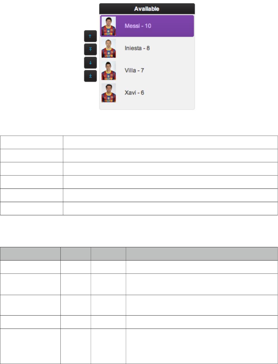
PrimeFaces User Guide
3.90 OrderList
OrderList is used to sort a collection featuring drag&drop based reordering, transition effects and
pojo support.
Info
Tag orderList
Component Class org.primefaces.component.orderlist.OrderList
Component Type org.primefaces.component.OrderList
Component Family org.primefaces.component
Renderer Type org.primefaces.component.OrderListRenderer
Renderer Class org.primefaces.component.orderlist.OrderListRenderer
Attributes
Name Default Type Description
id null String Unique identifier of the component
rendered True Boolean Boolean value to specify the rendering of the component,
when set to false component will not be rendered.
binding null Object An el expression that maps to a server side
UIComponent instance in a backing bean
value null Object Value of the component referring to a List.
converter null Converter
/String
An el expression or a literal text that defines a converter
for the component. When it’s an EL expression, it’s
resolved to a converter instance. In case it’s a static text,
it must refer to a converter id
355
PrimeFaces User Guide
Name Default Type Description
immediate 0 Boolean When set true, process validations logic is executed at
apply request values phase for this component.
required 0 Boolean Marks component as required
validator null Method
Expr
A method expression that refers to a method validationg
the input
valueChangeListener null Method
Expr
A method expression that refers to a method for handling
a valuechangeevent
requiredMessage null String Message to be displayed when required field validation
fails.
converterMessage null String Message to be displayed when conversion fails.
validatorMessage null String Message to be displayed when validation fields.
widgetVar null String Name of the client side widget.
var null String Name of the iterator.
itemLabel null String Label of an item.
itemValue null String Value of an item.
style null String Inline style of container element.
styleClass null String Style class of container element.
disabled 0 Boolean Disables the component.
effect fade String Name of animation to display.
moveUpLabel Move Up String Label of move up button.
moveTopLabel Move
Top
String Label of move top button.
moveDownLabel Move
Down
String Label of move down button.
moveBottomLabel Move
Bottom
String Label of move bottom button.
controlsLocation left String Location of the reorder buttons, valid values are “left”,
“right” and “none”.
responsive false Boolean In responsive mode, orderList adjusts itself based on
screen width.
356
PrimeFaces User Guide
Getting started with OrderList
A list is required to use OrderList component.
public class OrderListBean {
private List<String> cities;
public OrderListBean() {
cities = new ArrayList<String>();
cities.add("Istanbul");
cities.add("Ankara");
cities.add("Izmir");
cities.add("Antalya");
cities.add("Bursa");
}
//getter&setter for cities
}
<p:orderList value="#{orderListBean.cities}" var="city"
itemLabel="#{city}" itemValue="#{city}""/>
Advanced OrderList
OrderList supports displaying custom content instead of simple labels by using columns. In
addition, pojos are supported if a converter is defined.
public class OrderListBean {
private List<Player> players;
public OrderListBean() {
players = new ArrayList<Player>();
players.add(new Player("Messi", 10, "messi.jpg"));
players.add(new Player("Iniesta", 8, "iniesta.jpg"));
players.add(new Player("Villa", 7, "villa.jpg"));
players.add(new Player("Xavi", 6, "xavi.jpg"));
}
//getter&setter for players
}
<p:orderList value="#{orderListBean.players}" var="player" itemValue="#{player}"
converter="player">
<p:column style="width:25%">
<p:graphicImage value="/images/barca/#{player.photo}" />
</p:column>
<p:column style="width:75%;">
#{player.name} - #{player.number}
</p:column>
</p:orderList>
357
PrimeFaces User Guide
Ajax Behavior Events
Event Listener Parameter Fired
select org.primefaces.event.SelectEvent When an item selected.
unselect org.primefaces.event.UnselectEvent When an item unselected.
reorder javax.faces.event.AjaxBehaviorEvent When list is reordered.
Header
A facet called “caption” is provided to display a header content for the orderlist.
Effects
An animation is executed during reordering, default effect is fade and following options are
available for effect attribute; blind, bounce, clip, drop, explode, fold, highlight, puff, pulsate, scale,
shake, size and slide.
Skinning
OrderList resides in a main container which style and styleClass attributes apply. As skinning style
classes are global, see the main theming section for more information. Following is the list of
structural style classes;
Style Class Applies
.ui-orderlist Main container element.
.ui-orderlist-list Container of items.
.ui-orderlist-item Each item in the list.
.ui-orderlist-caption Caption of the list.
358
PrimeFaces User Guide
3.91 Organigram
Organigram is a data component to display an organizational hierarchy.
Info
Tag organigram
Component Class org.primefaces.component.organigram.Organigram
Component Type org.primefaces.component.Organigram
Component Family org.primefaces.component
Renderer Type org.primefaces.component.OrganigramRenderer
Renderer Class org.primefaces.component.organigram.OrganigramRenderer
Attributes
Name Default Type Description
id null String Unique identifier of the component
rendered true Boolean Boolean value to specify the rendering of the
component, when set to false component will not
be rendered.
binding null Object An el expression that maps to a server side
UIComponent instance in a backing bean
value null Organigram
Node
Model instance.
var null String Name of the request-scoped variable that'll be
used to refer each treenode data during rendering.
selection null Organigram
Node
OrganigramNode to reference the selection.
LeafNodeConnectorHeight 10 Integer The height of the connector line for leaf nodes.
zoom false Boolean Defines if zoom controls are rendered.
autoScrollToSelection false Boolean Auto scroll to the selected node on rendering if
enabled.
style null String Style of the main container element of
organigram.
styleClass null String Style class of the main container element of
organigram.
widgetVar null String Name of the client side widget.
359

PrimeFaces User Guide
Getting Started with Organigram
Organigram requires an instance of OrganigramNode interface as its value to define the root, a
default implementation DefaultOrganigramNode is provided. Each node has a type where each
node at the backend needs to match the p:organigramNode helper component.
public class OrganigramView implements Serializable {
private OrganigramNode rootNode;
private OrganigramNode selection;
private boolean zoom = false;
private String style = "width: 800px";
private int leafNodeConnectorHeight = 0;
private boolean autoScrollToSelection = false;
private String employeeName;
@PostConstruct
public void init() {
selection = new DefaultOrganigramNode(null, "Ridvan Agar", null);
rootNode = new DefaultOrganigramNode("root", "CommerceBay GmbH", null);
rootNode.setCollapsible(false);
rootNode.setDroppable(true);
OrganigramNode softwareDevelopment = addDivision(rootNode, "Software Development",
"Ridvan Agar");
OrganigramNode teamJavaEE = addDivision(softwareDevelopment, "Team JavaEE");
addDivision(teamJavaEE, "JSF", "Thomas Andraschko");
addDivision(teamJavaEE, "Backend", "Marie Louise");
OrganigramNode teamMobile = addDivision(softwareDevelopment, "Team Mobile");
addDivision(teamMobile, "Android", "Andy Ruby");
addDivision(teamMobile, "iOS", "Stevan Jobs");
addDivision(rootNode, "Managed Services", "Thorsten Schultze", "Sandra Becker");
OrganigramNode marketing = addDivision(rootNode, "Marketing");
addDivision(marketing, "Social Media", "Ali Mente", "Lisa Boehm");
addDivision(marketing, "Press", "Michael Gmeiner", "Hans Peter");
addDivision(rootNode, "Management", "Hassan El Manfalouty");
}
protected OrganigramNode addDivision(OrganigramNode parent, String name, String...
employees) {
OrganigramNode divisionNode = new DefaultOrganigramNode("division", name, parent);
divisionNode.setDroppable(true);
divisionNode.setDraggable(true);
divisionNode.setSelectable(true);
if (employees != null) {
for (String employee : employees) {
OrganigramNode employeeNode = new DefaultOrganigramNode("employee", employee,
divisionNode);
employeeNode.setDraggable(true);
employeeNode.setSelectable(true);
}
}
return divisionNode;
}
}
employeeNode.setDraggable(true);
360
PrimeFaces User Guide
<p:organigram id="organigram"
widgetVar="organigram"
value="#{organigramView.rootNode}"
var="node"
leafNodeConnectorHeight="#{organigramView.leafNodeConnectorHeight}"
autoScrollToSelection="#{organigramView.autoScrollToSelection}"
zoom="#{organigramView.zoom}"
selection="#{organigramView.selection}"
style="#{organigramView.style}">
<p:organigramNode>
<h:outputText value="#{node.data}" />
</p:organigramNode>
<p:organigramNode type="root"
style="border-radius: 10px;">
<h:outputText value="#{node.data}" />
</p:organigramNode>
<p:organigramNode type="division"
styleClass="division"
icon="ui-icon-suitcase"
iconPos="left">
<h:outputText value="#{node.data}" />
</p:organigramNode>
<p:organigramNode type="employee"
styleClass="employee"
icon="ui-icon-person">
<h:outputText value="#{node.data}" />
</p:organigramNode>
</p:organigram>
Ajax Behavior Events
Organigram provides the following custom ajax behavior events.
Event Listener Parameter Fired
dragdrop org.primefaces.event.organigram.
OrganigramNodeDragDropEvent
When a node is reordered with drag-drop.
select org.primefaces.event.organigram.
OrganigramNodeSelectEvent
When a node is selected.
contextmenu org.primefaces.event.organigram.
OrganigramNodeSelectEvent
When a node is selected with right click.
collapse org.primefaces.event.organigram.
OrganigramNodeCollapseEvent
When a node is collapsed.
expand org.primefaces.event.organigram.
OrganigramNodeExpandEvent
When a node is expanded.
Organigram Model API
Refer to JavaDocs for more information about Organigram Model API.
361
PrimeFaces User Guide
3.92 OrganigramNode
Represents a node in an Organigram model.
Info
Tag organigramNode
Component Class org.primefaces.component.organigramnode.OrganigramNode
Component Type org.primefaces.component.OrganigramNode
Component Family org.primefaces.component
Attributes
Name Default Type Description
id null String Unique identifier of the component
rendered true Boolean Boolean value to specify the rendering of the
component, when set to false component will not
be rendered.
binding null Object An el expression that maps to a server side
UIComponent instance in a backing bean
type default String Type of the node to match in model.
icon null String The icon to be displayed
iconPos null Organigram
Node
The icon position. Empty, "right" or "left".
expandedIcon null String Icon of the expanded state.
collapsedIcon null String Icon of the collapsed state.
skipLeafHandling false Boolean If the leaf handling should be skipped.
style null String Inline style of the element.
styleClass null String Style class of the element.
Getting Started with OrganigramNode
Refer to Organigram for details.
362
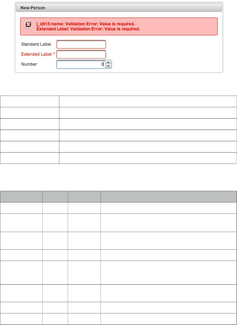
PrimeFaces User Guide
3.93 OutputLabel
OutputLabel is a an extension to the standard outputLabel component.
Info
Tag outputLabel
Component Class org.primefaces.component.outputlabel.OutputLabel
Component Type org.primefaces.component.OutputLabel
Component Family org.primefaces.component
Renderer Type org.primefaces.component.OutputLabelRenderer
Renderer Class org.primefaces.component.outputlabel.OutputLabelRenderer
Attributes
Name Default Type Description
id null String Unique identifier of the component
rendered true Boolean Boolean value to specify the rendering of the component,
when set to false component will not be rendered.
binding null Object An el expression that maps to a server side UIComponent
instance in a backing bean
value null String Label to display.
accesskey null String The accesskey attribute is a standard HTML attribute that
sets the access key that transfers focus to this element when
pressed.
dir null String Direction indication for text that does not inherit
directionality. Valid values are LTR and RTL.
escape true Boolean Defines if value should be escaped or not.
for null String Component to attach the label to.
363
PrimeFaces User Guide
Name Default Type Description
tabindex null String Position in tabbing order.
title null String Advisory tooltip information.
style null String Inline style of the component.
styleClass null String Style class of the component.
onblur null String Client side callback to execute when component loses
focus.
onclick null String Client side callback to execute when component is clicked.
ondblclick null String Client side callback to execute when component is double
clicked.
onfocus null String Client side callback to execute when component receives
focus.
onkeydown null String Client side callback to execute when a key is pressed down
over component.
onkeypress null String Client side callback to execute when a key is pressed and
released over component.
onkeyup null String Client side callback to execute when a key is released over
component.
onmousedown null String Client side callback to execute when a pointer is pressed
down over component.
onmouseout null String Client side callback to execute when a pointer is moved
away from component.
onmouseover null String Client side callback to execute when a pointer is moved
onto component.
onmouseup null String Client side callback to execute when a pointer is released
over component.
indicateRequired true Boolean Displays * symbol if the input is required.
Getting Started with OutputLabel
Usage is same as standard outputLabel, an input component is associated with for attribute.
<p:outputLabel for="input" value="Label" />
<p:inputText id="input" value="#{bean.text}" />
364
PrimeFaces User Guide
Auto Label
OutputLabel sets its value as the label of the target component to be displayed in validation errors
so the target component does not need to define the label attribute again.
<h:outputLabel for="input" value="Field" />
<p:inputText id="input" value="#{bean.text}" label="Field"/>
can be rewritten as;
<p:outputLabel for="input" value="Field" />
<p:inputText id="input" value="#{bean.text}" />
Support for Advanced Components
Some PrimeFaces input components like spinner, autocomplete does not render just basic inputs so
standard outputLabel component cannot apply focus to these, however PrimeFaces outputLabel can.
<h:outputLabel for="input" value="Can’t apply focus" />
<p:outputLabel for="input" value="Can apply focus" />
<p:spinner id="input" value="#{bean.text}" />
Validations
When the target input is required, outputLabel displays * symbol next to the value. In case any
validation fails on target input, label will also be displayed with theme aware error styles.
Skinning
Label renders a label element that style and styleClass attributes apply. Following is the list of
structural style classes;
Style Class Applies
.ui-outputlabel Label element
.ui-state-error Label element when input is invalid
.ui-outputlabel-rfi Required field indicator.
365
PrimeFaces User Guide
3.94 OutputPanel
OutputPanel is a panel component with the ability to auto update.
Info
Tag outputPanel
Component Class org.primefaces.component.outputpanel.OutputPanel
Component Type org.primefaces.component.OutputPanel
Component Family org.primefaces.component
Renderer Type org.primefaces.component.OutputPanelRenderer
Renderer Class org.primefaces.component.output.OutputPanelRenderer
Attributes
Name Default Type Description
id null String Unique identifier of the component
rendered true Boolean Boolean value to specify the rendering of the component,
when set to false component will not be rendered.
binding null Object An el expression that maps to a server side UIComponent
instance in a backing bean
style null String Style of the html container element
styleClass null String StyleClass of the html container element
layout block String Shortcut for the css display property, valid values are block
(default) and inline.
autoUpdate false Boolean Enables auto update mode if set true.
deferred false Boolean Deferred mode loads the contents after page load to speed
up page load.
deferredMode load String Defines deferred loading mode, valid values are "load"
(after page load) and "visible" (once the panel is visible on
scroll).
global false Boolean Global ajax requests are listened by ajaxStatus component,
setting global to false will not trigger ajaxStatus on
deferred loading.
delay none String Delay in milliseconds to wait before initiating a deferred
loading, default value is "none".
366

PrimeFaces User Guide
PlaceHolder
When a JSF component is not rendered, no markup is rendered so for components with conditional
rendering, regular update mechanism may not work since the markup to update on page does not
exist. OutputPanel is useful in this case to be used as a placeholder.
Suppose the rendered condition on bean is false when page if loaded initially and search method on
bean sets the condition to be true meaning datatable will be rendered after a page submit. The
problem is although partial output is generated, the markup on page cannot be updated since it
doesn’t exist.
<p:dataTable id="tbl" rendered="#{bean.condition}" ...>
//columns
</p:dataTable>
<p:commandButton update="tbl" actionListener="#{bean.search}" />
Solution is to use the outputPanel as a placeHolder.
<p:outputPanel id="out">
<p:dataTable id="tbl" rendered="#{bean.condition}" ...>
//columns
</p:dataTable>
</p:outputPanel>
<p:commandButton update="out" actionListener="#{bean.list}" />
Note that you won’t need an outputPanel if commandButton has no update attribute specified, in
this case parent form will be updated partially implicitly making an outputPanel use obselete.
Deferred Loading
When this feature option is enabled, content of panel is not loaded along with the page but loaded
after the page on demand. Initially panel displays a loading animation after page load to indicate
more content is coming up and displays content with ajax update. Using deferredMode option, it is
possible to load contents not just after page load (default mode) but when it becomes visible on
page scroll as well. This feature is very useful to increase page load performance, assume you have
one part of the page that has components dealing with backend and taking time, with deferred mode
on, rest of the page is loaded instantly and time taking process is loaded afterwards with ajax.
Layout
OutputPanel has two layout modes;
• block (default): Renders a div
• inline: Renders a span
AutoUpdate
When auto update is enabled, outputPanel component is updated with each ajax request
automatically.
Skinning
style and styleClass attributes are used to style the outputPanel, by default .ui-outputpanel css class
is added to element and .ui-outputpanel-loading when content is loading in deferred loading case.
367
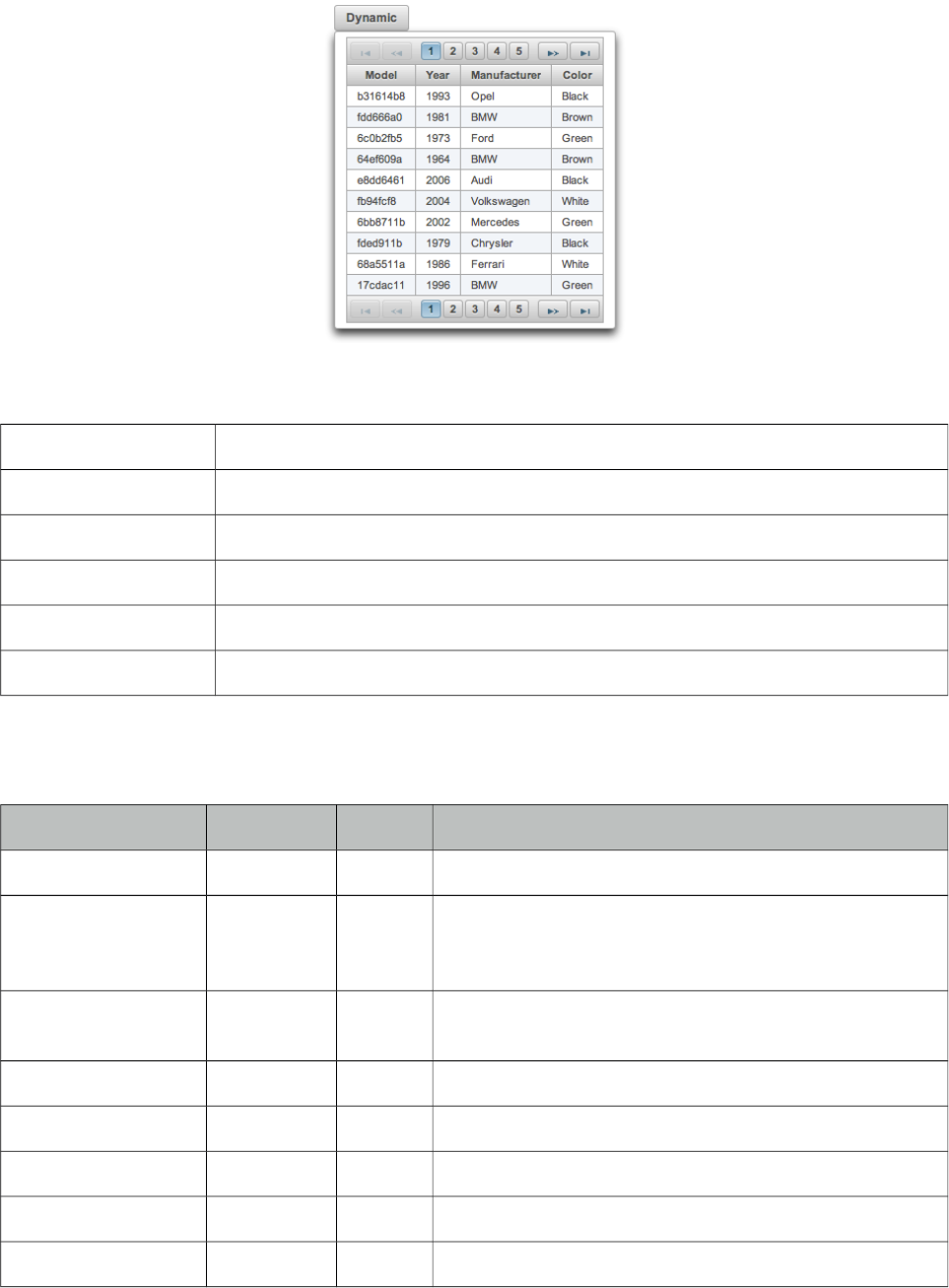
PrimeFaces User Guide
3.95 OverlayPanel
OverlayPanel is a generic panel component that can be displayed on top of other content.
Info
Tag overlayPanel
Component Class org.primefaces.component.overlaypanel.OverlayPanelRenderer
Component Type org.primefaces.component.OverlayPanel
Component Family org.primefaces.component
Renderer Type org.primefaces.component.OverlayPanelRenderer
Renderer Class org.primefaces.component.overlaypanel.OverlayPanelRenderer
Attributes
Name Default Type Description
id null String Unique identifier of the component
rendered true Boolean Boolean value to specify the rendering of the
component, when set to false component will not be
rendered.
binding null Object An el expression that maps to a server side
UIComponent instance in a backing bean
widgetVar null String Name of the client side widget.
style null String Inline style of the panel.
styleClass null String Style class of the panel.
for null String Target component to display panel next to.
showEvent click String Event on target to show the panel.
368
PrimeFaces User Guide
Name Default Type Description
hideEvent click String Event on target to hide the panel.
showEffect null String Animation to display when showing the panel.
hideEffect null String Animation to display when hiding the panel.
appendToBody 0 Boolean When true, panel is appended to document body.
onShow null String Client side callback to execute when panel is shown.
onHide null String Client side callback to execute when panel is hidden.
my left top String Position of the panel relative to the target.
at left bottom String Position of the target relative to the panel.
dynamic false Boolean Defines content loading mode.
dismissable true Boolean When set true, clicking outside of the panel hides the
overlay.
showCloseIcon false Boolean Displays a close icon to hide the overlay, default is false.
modal false Boolean Boolean value that specifies whether the document
should be shielded with a partially transparent mask to
require the user to close the Panel before being able to
activate any elements in the document.
Getting started with OverlayPanel
OverlayPanel needs a component as a target in addition to the content to display. Example below
demonstrates an overlayPanel attached to a button to show a chart in a popup.
<p:commandButton id="chartBtn" value="Basic" type="button" />
<p:overlayPanel for="chartBtn">
<p:pieChart value="#{chartBean.pieModel}" legendPosition="w"
title="Sample Pie Chart" style="width:400px;height:300px" />
</p:overlayPanel>
Events
Default event on target to show and hide the panel is mousedown. These are customized using
showEvent and hideEvent options.
<p:commandButton id="chartBtn" value="Basic" type="button" />
<p:overlayPanel showEvent="mouseover" hideEvent="mousedown">
//content
</p:overlayPanel>
369
PrimeFaces User Guide
Effects
blind, bounce, clip, drop, explode, fold, highlight, puff, pulsate, scale, shake, size, slide are
available values for showEffect and hideEffect options if you’d like display animations.
Positioning
By default, left top corner of panel is aligned to left bottom corner of the target if there is enough
space in window viewport, if not the position is flipped on the fly to find the best location to
display. In order to customize the position use my and at options that takes combinations of left,
right, bottom and top e.g. “right bottom”.
Dynamic Mode
Dynamic mode enables lazy loading of the content, in this mode content of the panel is not rendered
on page load and loaded just before panel is shown. Also content is cached so consecutive displays
do not load the content again. This feature is useful to reduce the page size and reduce page load
time.
Standalone
OverlayPanel is positioned relative to its target based on a one-to-one relationship, this causes
limitations when used inside a data iteration because every row needs an overlaypanel which is far
from ideal, requires client side memory and slows down page performance. Instead a single
overlayPanel can be used by calling show passing the client id of the component to be relatively
positioned. See overlayPanel demo in showcase for an example.
Skinning
Panel resides in a main container which style and styleClass attributes apply. Following is the list of
structural style classes;
Style Class Applies
.ui-overlaypanel Main container element of panel
As skinning style classes are global, see the main theming section for more information.
Tips
• Enable appendToBody when overlayPanel is in other panel components like layout, dialog ...
•If there is a component with a popup like calendar, autocomplete placed inside the overlay panel,
popup part might exceed the boundaries of panel and clicking the outside hides the panel. This is
undesirable so in cases like this use overlayPanel with dismissable false and optional
showCloseIcon settings.
370
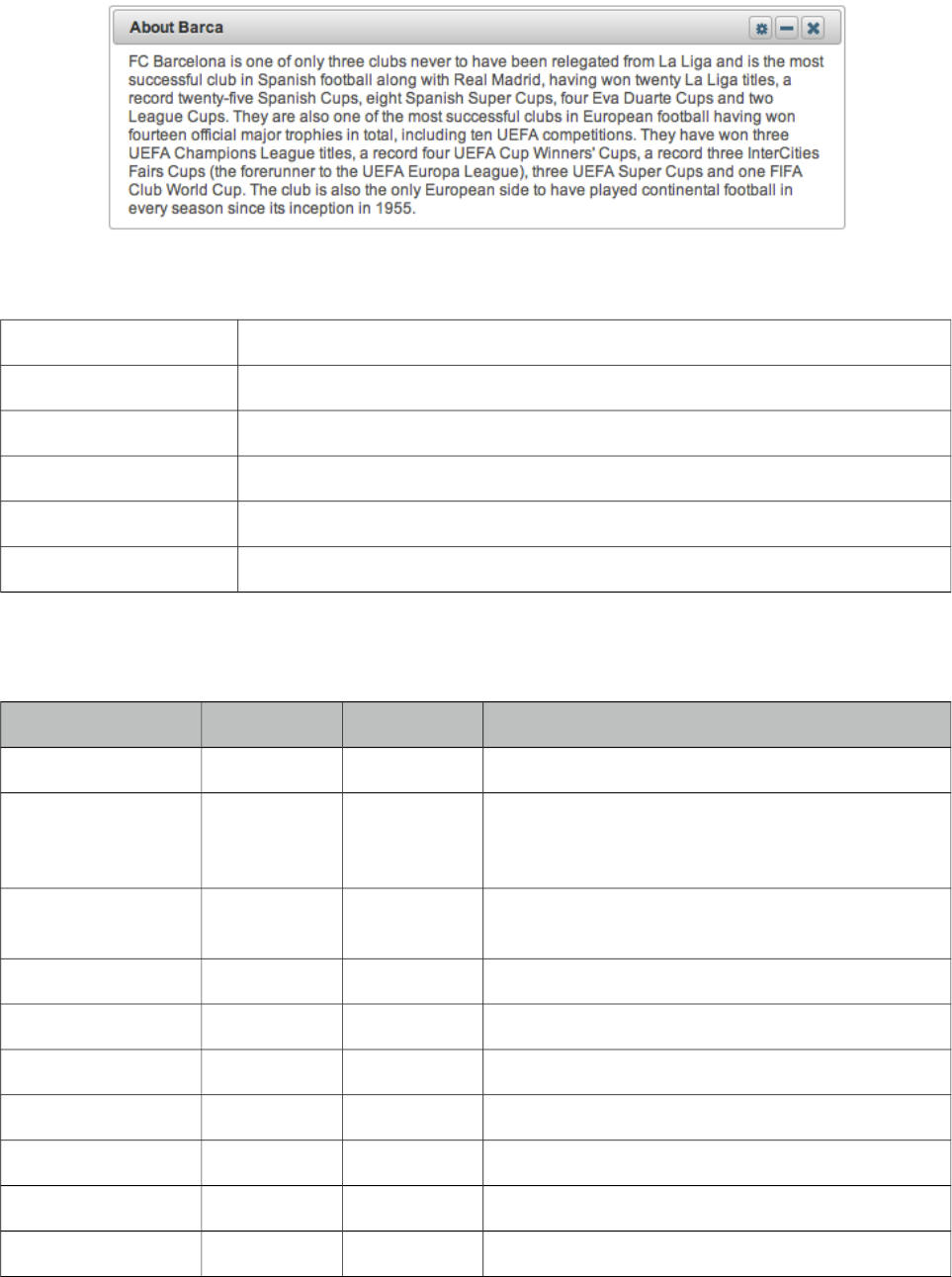
PrimeFaces User Guide
3.96 Panel
Panel is a grouping component with content toggle, close and menu integration.
Info
Tag panel
Component Class org.primefaces.component.panel.Panel
Component Type org.primefaces.component.Panel
Component Family org.primefaces.component
Renderer Type org.primefaces.component.PanelRenderer
Renderer Class org.primefaces.component.panel.PanelRenderer
Attributes
Name Default Type Description
id null String Unique identifier of the component
rendered true Boolean Boolean value to specify the rendering of the
component, when set to false component will not
be rendered.
binding null Object An el expression that maps to a server side
UIComponent instance in a backing bean
header null String Header text
footer null String Footer text
toggleable false Boolean Makes panel toggleable.
toggleSpeed 1000 Integer Speed of toggling in milliseconds
collapsed false Boolean Renders a toggleable panel as collapsed.
style null String Style of the panel
styleClass null String Style class of the panel
371
PrimeFaces User Guide
Name Default Type Description
closable false Boolean Make panel closable.
closeSpeed 1000 Integer Speed of closing effect in milliseconds
visible true Boolean Renders panel as visible.
closeTitle null String Tooltip for the close button.
toggleTitle null String Tooltip for the toggle button.
menuTitle null String Tooltip for the menu button.
toggleOrientation vertical String Defines the orientation of the toggling, valid
values are vertical and horizontal.
widgetVar null String Name of the client side widget
Getting started with Panel
Panel encapsulates other components.
<p:panel>
//Child components here...
</p:panel>
Header and Footer
Header and Footer texts can be provided by header and footer attributes or the corresponding facets.
When same attribute and facet name are used, facet will be used.
<p:panel header="Header Text">
<f:facet name="footer">
<h:outputText value="Footer Text" />
</f:facet>
//Child components here...
</p:panel>
Ajax Behavior Events
Panel provides custom ajax behavior events for toggling and closing features.
Event Listener Parameter Fired
toggle org.primefaces.event.ToggleEvent When panel is expanded or collapsed.
close org.primefaces.event.CloseEvent When panel is closed.
372
PrimeFaces User Guide
Popup Menu
Panel has built-in support to display a fully customizable popup menu, an icon to display the menu
is placed at top-right corner. This feature is enabled by defining a menu component and defining it
as the options facet.
<p:panel closable="true">
//Child components here...
<f:facet name="options">
<p:menu>
//Menuitems
</p:menu>
</f:facet>
</p:panel>
Custom Action
If you’d like to add custom actions to panel titlebar, use actions facet with icon markup;
<p:panel>
<f:facet name="actions">
<h:commandLink styleClass="ui-panel-titlebar-icon
ui-corner-all ui-state-default">
<h:outputText styleClass="ui-icon ui-icon-help" />
</h:commandLink>
</f:facet>
//content
</p:panel>
Skinning Panel
Panel resides in a main container which style and styleClass attributes apply. Following is the list of
structural style classes;
Style Class Applies
.ui-panel Main container element of panel
.ui-panel-titlebar Header container
.ui-panel-title Header text
.ui-panel-titlebar-icon Option icon in header
.ui-panel-content Panel content
.ui-panel-footer Panel footer
As skinning style classes are global, see the main theming section for more information.
373
PrimeFaces User Guide
3.97 PanelGrid
PanelGrid is an extension to the standard panelGrid component with additional features such as
theming and colspan-rowspan.
Info
Tag panelGrid
Component Class org.primefaces.component.panelgrid.PanelGridRenderer
Component Type org.primefaces.component.PanelGrid
Component Family org.primefaces.component
Renderer Type org.primefaces.component.PanelGridRenderer
Renderer Class org.primefaces.component.panelgrid.PanelGridRenderer
Attributes
Name Default Type Description
id null String Unique identifier of the component
rendered true Boolean Boolean value to specify the rendering of the
component, when set to false component will not be
rendered.
binding null Object An el expression that maps to a server side
UIComponent instance in a backing bean
columns false Integer Number of columns in grid.
374
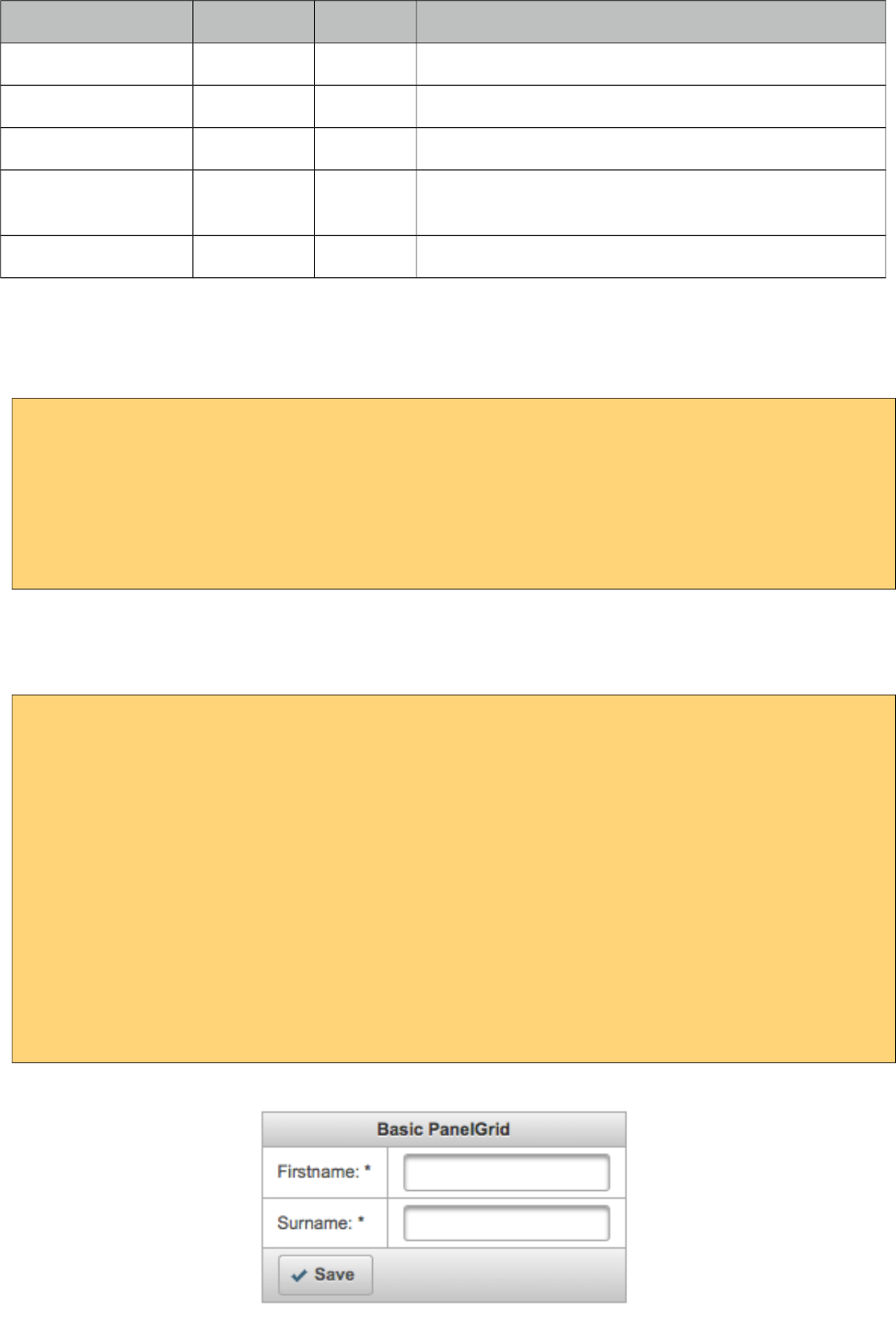
PrimeFaces User Guide
Name Default Type Description
style null String Inline style of the panel.
styleClass null String Style class of the panel.
columnClasses null String Comma separated list of column style classes.
layout tabular String Displays data in a 'table' layout or 'grid' layout. The
grid layout is a responsive layout.
role grid String Role for aria.
Getting started with PanelGrid
Basic usage of panelGrid is same as the standard one.
<p:panelGrid columns="2">
<h:outputLabel for="firstname" value="Firstname:" />
<p:inputText id="firstname" value="#{bean.firstname}" label="Firstname" />
<h:outputLabel for="surname" value="Surname:" />
<p:inputText id="surname" value="#{bean.surname}" label="Surname"/>
</p:panelGrid>
Header and Footer
PanelGrid provides facets for header and footer content.
<p:panelGrid columns="2">
<f:facet name="header">
Basic PanelGrid
</f:facet>
<h:outputLabel for="firstname" value="Firstname: *" />
<p:inputText id="firstname" value="#{bean.firstname}" label="Firstname" />
<h:outputLabel for="surname" value="Surname: *" />
<p:inputText id="surname" value="#{bean.surname}" label="Surname"/>
<f:facet name="footer">
<p:commandButton type="button" value="Save" icon="ui-icon-check" />
</f:facet>
</p:panelGrid>
375
PrimeFaces User Guide
Rowspan and Colspan
PanelGrid supports rowspan and colspan options as well, in this case row and column markup
should be defined manually.
<p:panelGrid>
<p:row>
<p:column rowspan="3">AAA</p:column>
<p:column colspan="4">BBB</p:column>
</p:row>
<p:row>
<p:column colspan="2">CCC</p:column>
<p:column colspan="2">DDD</p:column>
</p:row>
<p:row>
<p:column>EEE</p:column>
<p:column>FFF</p:column>
<p:column>GGG</p:column>
<p:column>HHH</p:column>
</p:row>
</p:panelGrid>
* Note that this approach does not support grid layout.
Blank Mode
To remove borders add ui-noborder style class to the component using styleClass attribute and to
remove borders plus background color, apply ui-panelgrid-blank style.
Skinning
PanelGrid resides in a main container which style and styleClass attributes apply. Following is the
list of structural style classes;
Style Class Applies
.ui-panelgrid Main container element of panelGrid.
.ui-panelgrid-header Header.
.ui-panelgrid-footer Footer.
.ui-panelgrid-even Even numbered rows.
.ui-panelgrid-odd Odd numbered rows.
As skinning style classes are global, see the main theming section for more information.
376
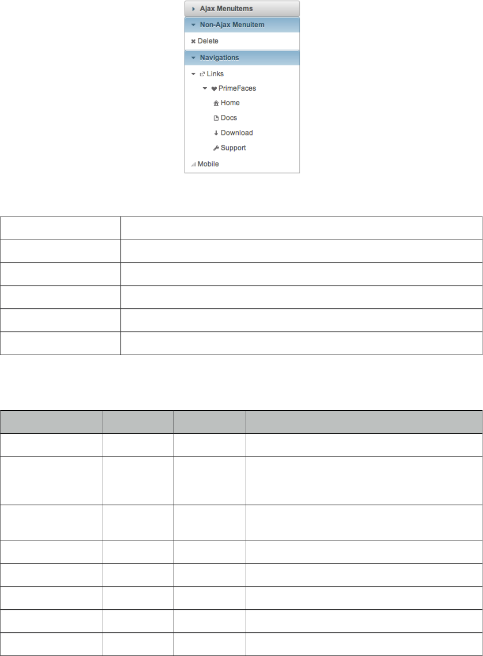
PrimeFaces User Guide
3.98 PanelMenu
PanelMenu is a hybrid component of accordionPanel and tree components.
Info
Tag panelMenu
Component Class org.primefaces.component.panelmenu.PanelMenu
Component Type org.primefaces.component.PanelMenu
Component Family org.primefaces.component
Renderer Type org.primefaces.component.PanelMenuRenderer
Renderer Class org.primefaces.component.panelmenu.PanelMenuRenderer
Attributes
Name Default Type Description
id null String Unique identifier of the component
rendered true Boolean Boolean value to specify the rendering of the
component, when set to false component will not
be rendered.
binding null Object An el expression that maps to a server side
UIComponent instance in a backing bean
model null MenuModel MenuModel instance to build menu dynamically.
style null String Inline style of the component.
styleClass null String Style class of the component.
widgetVar null String Name of the client side widget.
stateful true Boolean Menu state is saved in a cookie
377
PrimeFaces User Guide
Getting started with PanelMenu
PanelMenu consists of submenus and menuitems. First level of submenus are rendered as accordion
panels and descendant submenus are rendered as tree nodes. Just like in any other menu component,
menuitems can be utilized to do ajax requests, non-ajax requests and simple GET navigations.
<p:panelMenu style="width:200px">
<p:submenu label="Ajax Menuitems">
<p:menuitem value="Save" actionListener="#{buttonBean.save}" />
<p:menuitem value="Update" actionListener="#{buttonBean.update}" />
</p:submenu>
<p:submenu label="Non-Ajax Menuitem">
<p:menuitem value="Delete" actionListener="#{buttonBean.delete}"
ajax="false"/>
</p:submenu>
<p:submenu label="Navigations" >
<p:submenu label="Links" icon="ui-icon-extlink">
<p:submenu label="PrimeFaces" icon="ui-icon-heart">
<p:menuitem value="Home" url="http://www.primefaces.org" />
<p:menuitem value="Docs" url="http://www.primefaces.org/..." />
<p:menuitem value="Support" url="http://www.primefaces.org/..." />
</p:submenu>
</p:submenu>
<p:menuitem value="Mobile" outcome="/mobile/index" />
</p:submenu>
</p:panelMenu>
Default State
By default, all submenus are collapsed, set expanded on a submenu to true to initially display a
submenu as expanded.
Skinning
PanelMenu resides in a main container which style and styleClass attributes apply. Following is the
list of structural style classes;
Style Class Applies
.ui-panelmenu Main container element.
.ui-panelmenu-header Header of a panel.
.ui-panelmenu-content Footer of a panel.
.ui-panelmenu .ui-menu-list Tree container.
.ui-panelmenu .ui-menuitem A menuitem in tree.
As skinning style classes are global, see the main theming section for more information.
378
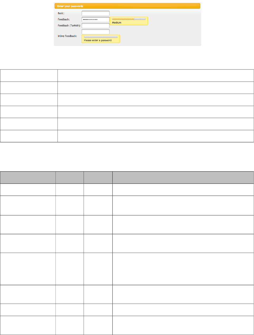
PrimeFaces User Guide
3.99 Password
Password component is an extended version of standard inputSecret component with theme
integration and strength indicator.
Info
Tag password
Component Class org.primefaces.component.password.Password
Component Type org.primefaces.component.Password
Component Family org.primefaces.component
Renderer Type org.primefaces.component.PasswordRenderer
Renderer Class org.primefaces.component.password.PasswordRenderer
Attributes
Name Default Type Description
id null String Unique identifier of the component
rendered true Boolean Boolean value to specify the rendering of the component,
when set to false component will not be rendered.
binding null Object An el expression that maps to a server side UIComponent
instance in a backing bean
value null Object Value of the component than can be either an EL
expression of a literal text
converter null Converter
/String
An el expression or a literal text that defines a converter
for the component. When it’s an EL expression, it’s
resolved to a converter instance. In case it’s a static text, it
must refer to a converter id
immediate false Boolean When set true, process validations logic is executed at
apply request values phase for this component.
required false boolean Marks component as required
validator null Method
Expr
A method expression that refers to a method validationg
the input.
379
PrimeFaces User Guide
Name Default Type Description
valueChangeListener null Method
Expr
A method binding expression that refers to a method for
handling a valuechangeevent
requiredMessage null String Message to be displayed when required field validation
fails.
converterMessage null String Message to be displayed when conversion fails.
validatorMessage null String Message to be displayed when validation fields.
feedback false Boolean Enables strength indicator.
inline false boolean Displays feedback inline rather than using a popup.
promptLabel Please
enter a
password
String Label of prompt.
weakLabel Weak String Label of weak password.
goodLabel Good String Label of good password.
strongLabel Strong String Label of strong password.
redisplay false Boolean Whether or not to display previous value.
match null String Id of another password component to match value against.
widgetVar null String Name of the client side widget.
accesskey null String Access key that when pressed transfers focus to the input
element.
alt null String Alternate textual description of the input field.
autocomplete null String Controls browser autocomplete behavior.
dir null String Direction indication for text that does not inherit
directionality. Valid values are LTR and RTL.
disabled false Boolean Disables input field
label null String A localized user presentable name.
lang null String Code describing the language used in the generated
markup for this component.
maxlength null Integer Maximum number of characters that may be entered in
this field.
onblur null String Client side callback to execute when input element loses
focus.
onchange null String Client side callback to execute when input element loses
focus and its value has been modified since gaining focus.
onclick null String Client side callback to execute when input element is
clicked.
380
PrimeFaces User Guide
Name Default Type Description
ondblclick null String Client side callback to execute when input element is
double clicked.
onfocus null String Client side callback to execute when input element
receives focus.
onkeydown null String Client side callback to execute when a key is pressed
down over input element.
onkeypress null String Client side callback to execute when a key is pressed and
released over input element.
onkeyup null String Client side callback to execute when a key is released
over input element.
onmousedown null String Client side callback to execute when a pointer button is
pressed down over input element
onmousemove null String Client side callback to execute when a pointer button is
moved within input element.
onmouseout null String Client side callback to execute when a pointer button is
moved away from input element.
onmouseover null String Client side callback to execute when a pointer button is
moved onto input element.
onmouseup null String Client side callback to execute when a pointer button is
released over input element.
onselect null String Client side callback to execute when text within input
element is selected by user.
placeholder null String Specifies a short hint.
readonly false Boolean Flag indicating that this component will prevent changes
by the user.
size null Integer Number of characters used to determine the width of the
input element.
style null String Inline style of the input element.
styleClass null String Style class of the input element.
tabindex null Integer Position of the input element in the tabbing order.
title null String Advisory tooltip informaton.
Getting Started with Password
Password is an input component and used just like a standard input text. When feedback option is
enabled a password strength indicator is displayed.
<p:password value="#{bean.password}" feedback="true|false" />
381
PrimeFaces User Guide
public class Bean {
private String password;
public String getPassword() { return password; }
public void setPassword(String password) { this.password = password;}
}
I18N
Although all labels are in English by default, you can provide custom labels as well. Following
password gives feedback in Turkish.
<p:password value="#{bean.password}" promptLabel="Lütfen şifre giriniz"
weakLabel="Zayıf" goodLabel="Orta seviye" strongLabel="Güçlü" feedback= "true"/>
Inline Strength Indicator
By default strength indicator is shown in an overlay, if you prefer an inline indicator just enable
inline mode.
<p:password value="#{mybean.password}" inline="true" feedback= "true"/>
Confirmation
Password confirmation is a common case and password provides an easy way to implement. The
other password component’s id should be used to define the match option.
<p:password id="pwd1" value="#{passwordBean.password6}" feedback="false"
match="pwd2" label="Password 1" required="true"/>
<p:password id="pwd2" value="#{passwordBean.password6}" feedback="false"
label="Password 2" required="true"/>
Skinning
Structural selectors for password are;
Name Applies
.ui-password Input element.
.ui-password-panel Overlay panel of strength indicator.
.ui-password-meter Strength meter.
.ui-password-info Strength label.
As skinning style classes are global, see the main theming section for more information.
382
PrimeFaces User Guide
3.100 PhotoCam
PhotoCam is used to take photos with webcam and send them to the JSF backend model.
Info
Tag photoCam
Component Class org.primefaces.component.photocam.PhotoCam
Component Type org.primefaces.component.PhotoCam
Component Family org.primefaces.component
Renderer Type org.primefaces.component.PhotoCamRenderer
Renderer Class org.primefaces.component.photocam.PhotoCamRenderer
Attributes
Name Default Type Description
id null String Unique identifier of the component
rendered false Boolean Boolean value to specify the rendering of the component,
when set to false component will not be rendered.
binding null Object An el expression that maps to a server side
UIComponent instance in a backing bean
value null Object Value of the component than can be either an EL
expression of a literal text
converter null Converter/
String
An el expression or a literal text that defines a converter
for the component. When it’s an EL expression, it’s
resolved to a converter instance. In case it’s a static text,
it must refer to a converter id
immediate 0 Boolean When set true, process validations logic is executed at
apply request values phase for this component.
required 0 boolean Marks component as required
validator null Method
Expr
A method binding expression that refers to a method
validationg the input
valueChangeListener null Method
Expr
A method binding expression that refers to a method for
handling a valuechangeevent
requiredMessage null String Message to be displayed when required field validation
fails.
converterMessage null String Message to be displayed when conversion fails.
validatorMessage null String Message to be displayed when validation fields.
383
PrimeFaces User Guide
Name Default Type Description
widgetVar null String Name of the client side widget.
style null String Inline style of the component.
styleClass null String Style class of the component.
process null String Identifiers of components to process during capture.
update null String Identifiers of components to update during capture.
listener null Method
Expr
Method expression to listen to capture events.
width 320 Integer Width of the camera viewport.
height 240 Integer Height of the camera viewport.
photoWidth 320 Integer Width of the captured photo, defaults to width.
photoHeight 240 Integer Height of the captured photo, defaults to height.
format jpeg Boolean Format of the image, valid values are "jpeg" default and
png.
jpegQuality 90 Integer Quality of the image between 0 and 100 when the format
is jpeg, default value is 90.
forceFlash false Boolean Enables always using flash fallback even in an HTML5
environment.
Getting started with PhotoCam
Capture is triggered via client side api’s capture method. Also a method expression is necessary to
invoke when an image is captured. Sample below captures an image and saves it to a directory.
<h:form>
<p:photoCam widgetVar="pc" listener="#{photoCamBean.oncapture}" update="photos"/>
<p:commandButton type="button" value="Capture" onclick="PF('pc').capture()"/>
</h:form>
384

PrimeFaces User Guide
public class PhotoCamBean {
public void oncapture(CaptureEvent captureEvent) {
byte[] data = captureEvent.getData();
ServletContext servletContext = (ServletContext)
FacesContext.getCurrentInstance().getExternalContext().getContext();
String newFileName = servletContext.getRealPath("") + File.separator +
"photocam" + File.separator + "captured.png";
FileImageOutputStream imageOutput;
try {
imageOutput = new FileImageOutputStream(new File(newFileName));
imageOutput.write(data, 0, data.length);
imageOutput.close();
}
catch(Exception e) {
throw new FacesException("Error in writing captured image.");
}
}
}
385
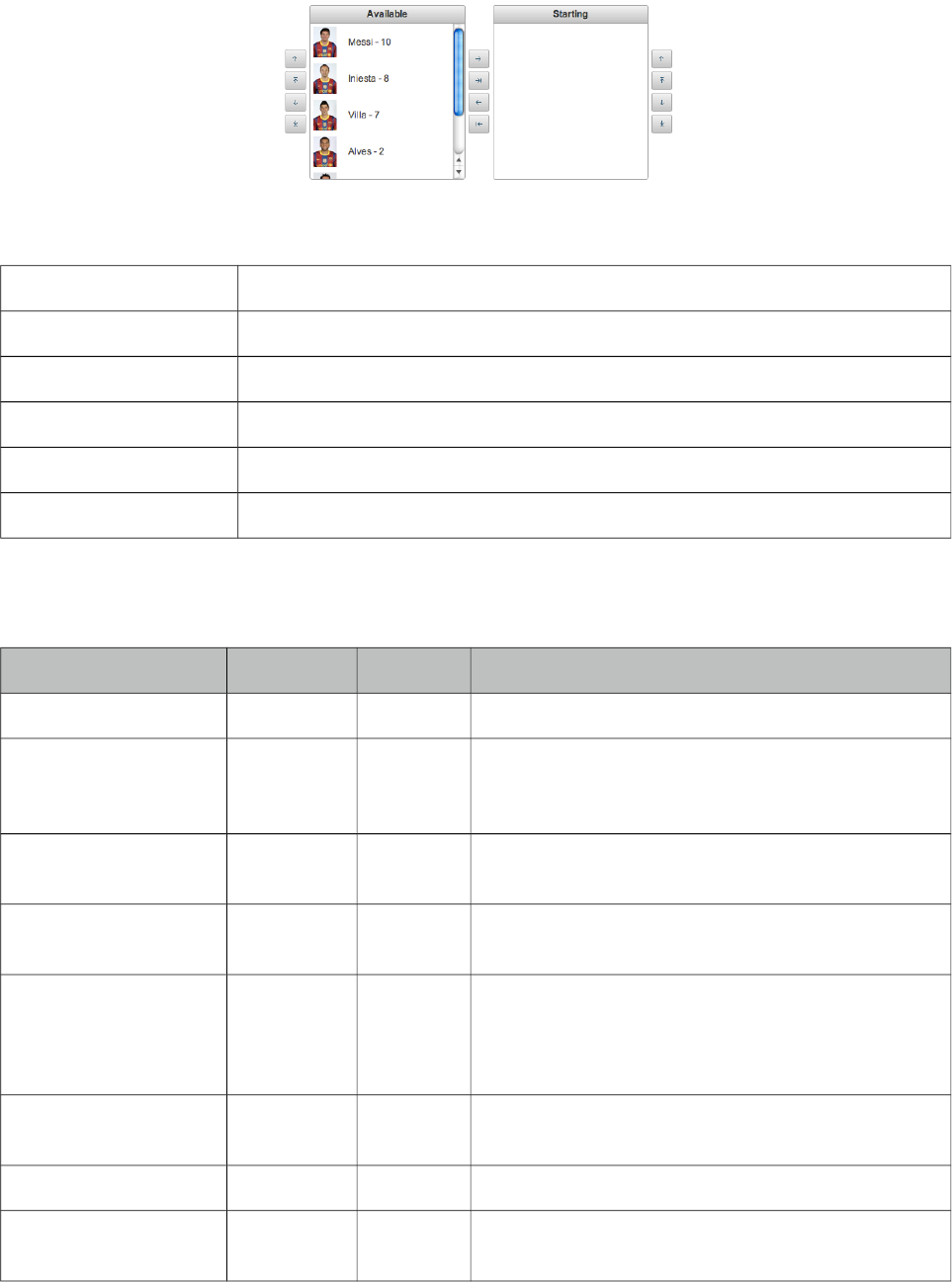
PrimeFaces User Guide
3.101 PickList
PickList is used for transferring data between two different collections.
Info
Tag pickList
Component Class org.primefaces.component.picklist.Panel
Component Type org.primefaces.component.PickList
Component Family org.primefaces.component
Renderer Type org.primefaces.component.PickListRenderer
Renderer Class org.primefaces.component.picklist.PickListRenderer
Attributes
Name Default Type Description
id null String Unique identifier of the component
rendered true Boolean Boolean value to specify the rendering of the
component, when set to false component will not be
rendered.
binding null Object An el expression that maps to a server side
UIComponent instance in a backing bean
value null Object Value of the component than can be either an EL
expression of a literal text
converter null Converter/
String
An el expression or a literal text that defines a
converter for the component. When it’s an EL
expression, it’s resolved to a converter instance. In
case it’s a static text, it must refer to a converter id
immediate false Boolean When set true, process validations logic is executed
at apply request values phase for this component.
required false Boolean Marks component as required
validator null Method
Expr
A method binding expression that refers to a method
validationg the input
386
PrimeFaces User Guide
Name Default Type Description
valueChangeListener null Method
Expr
A method binding expression that refers to a method
for handling a valuchangeevent
requiredMessage null String Message to be displayed when required field
validation fails.
converterMessage null String Message to be displayed when conversion fails.
validatorMessage null String Message to be displayed when validation fields.
var null String Name of the iterator.
itemLabel null String Label of an item.
itemValue null Object Value of an item.
style null String Style of the main container.
styleClass null String Style class of the main container.
widgetVar null String Name of the client side widget.
disabled false Boolean Disables the component.
effect null String Name of the animation to display.
effectSpeed null String Speed of the animation.
addLabel Add String Title of add button.
addAllLabel Add All String Title of add all button.
removeLabel Remove String Title of remove button.
removeAllLabel Remove All String Title of remove all button.
moveUpLabel Move Up String Title of move up button.
moveTopLabel Move Top String Title of move top button.
moveDownLabel Move Down String Title of move down button.
moveButtomLabel Move
Buttom
String Title of move bottom button.
showSourceControls false String Specifies visibility of reorder buttons of source list.
showTargetControls false String Specifies visibility of reorder buttons of target list.
onTransfer null String Client side callback to execute when an item is
transferred from one list to another.
label null String A localized user presentable name.
itemDisabled false Boolean Specified if an item can be picked or not.
showSourceFilter false Boolean Displays and input filter for source list.
showTargetFilter false Boolean Displays and input filter for target list.
387
PrimeFaces User Guide
Name Default Type Description
filterMatchMode startsWith String Match mode for filtering, valid values are
startsWith, contains, endsWith and custom.
filterFunction null String Name of the javascript function for custom filtering.
showCheckbox false Boolean When true, a checkbox is displayed next to each
item.
labelDisplay tooltip String Defines how the button labels displayed, valid
values are "tooltip" (default) and "inline".
orientation horizontal String Defines layout orientation, valid values are
"vertical" and "horizontal".
responsive false Boolean In responsive mode, picklist adjusts itself based on
screen width.
Getting started with PickList
You need to create custom model called org.primefaces.model.DualListModel to use PickList. As
the name suggests it consists of two lists, one is the source list and the other is the target. As the first
example we’ll create a DualListModel that contains basic Strings.
public class PickListBean {
private DualListModel<String> cities;
public PickListBean() {
List<String> source = new ArrayList<String>();
List<String> target = new ArrayList<String>();
citiesSource.add("Istanbul");
citiesSource.add("Ankara");
citiesSource.add("Izmir");
citiesSource.add("Antalya");
citiesSource.add("Bursa");
//more cities
cities = new DualListModel<String>(citiesSource, citiesTarget);
}
public DualListModel<String> getCities() {
return cities;
}
public void setCities(DualListModel<String> cities) {
this.cities = cities;
}
}
And bind the cities dual list to the picklist;
388

PrimeFaces User Guide
<p:pickList value="#{pickListBean.cities}" var="city"
itemLabel="#{city}" itemValue="#{city}">
When the enclosed form is submitted, the dual list reference is populated with the new values and
you can access these values with DualListModel.getSource() and DualListModel.getTarget() api.
POJOs
Most of the time you would deal with complex pojos rather than simple types like String.
This use case is no different except the addition of a converter. Following pickList displays a list of
players(name, age ...).
<p:pickList value="#{pickListBean.players}" var="player"
itemLabel="#{player.name}" itemValue="#{player}" converter="player">
PlayerConverter in this case should implement javax.faces.convert.Converter contract and
implement getAsString, getAsObject methods. Note that a converter is always necessary for
primitive types like long, integer, boolean as well.
In addition custom content instead of simple strings can be displayed by using columns.
<p:pickList value="#{pickListBean.players}"
var="player" iconOnly="true" effect="bounce"
itemValue="#{player}" converter="player"
showSourceControls="true" showTargetControls="true">
<p:column style="width:25%">
<p:graphicImage value="/images/barca/#{player.photo}"/>
</p:column>
<p:column style="width:75%";>
#{player.name} - #{player.number}
</p:column>
</p:pickList>
Reordering
PickList support reordering of source and target lists, these are enabled by showSourceControls and
showTargetControls options.
Effects
An animation is displayed when transferring when item to another or reordering a list, default effect
is fade and following options are available to be applied using effect attribute; blind, bounce, clip,
drop, explode, fold, highlight, puff, pulsate, scale, shake, size and slide. effectSpeed attribute is used
to customize the animation speed, valid values are slow, normal and fast.
Captions
Caption texts for lists are defined with facets named sourceCaption and targetCaption;
389
PrimeFaces User Guide
<p:pickList value="#{pickListBean.cities}" var="city"
itemLabel="#{city}" itemValue="#{city}" onTransfer="handleTransfer(e)">
<f:facet name="sourceCaption">Available</f:facet>
<f:facet name="targetCaption">Selected</f:facet>
</p:pickList>
Filtering
PickList provides built-in client side filtering. Filtering is enabled by setting the corresponding
filtering attribute of a list. For source list this is showSourceFilter and for target list it is
showTargetFilter. Default match mode is startsWith and contains, endsWith are also available
options.
When you need to a custom match mode set filterMatchMode to custom and write a javascript
function that takes itemLabel and filterValue as parameters. Return false to hide an item and true to
display.
<p:pickList value="#{pickListBean.cities}" var="city"
itemLabel="#{city}" itemValue="#{city}"
showSourceFilter="true" showTargetFilter="true"
filterMatchMode="custom" filterFunction="myfilter">
</p:pickList>
function myfilter(itemLabel, filterValue) {
//return true or false
}
onTransfer
If you’d like to execute custom javascript when an item is transferred, bind your javascript function
to onTransfer attribute.
<p:pickList value="#{pickListBean.cities}" var="city"
itemLabel="#{city}" itemValue="#{city}" onTransfer="handleTransfer(e)">
<script type="text/javascript">
function handleTransfer(e) {
//item = e.item
//fromList = e.from
//toList = e.toList
//type = e.type (type of transfer; command, dblclick or dragdrop)
}
</script>
Ajax Behavior Events
Event Listener Parameter Fired
select org.primefaces.event.SelectEvent When an item selected.
unselect org.primefaces.event.UnselectEvent When an item unselected.
390
PrimeFaces User Guide
Event Listener Parameter Fired
reorder javax.faces.event.AjaxBehaviorEvent When list is reordered.
transfer Org.primefaces.event.TransferEvent When an item is moved to another list.
<p:pickList value="#{pickListBean.cities}" var="city"
itemLabel="#{city}" itemValue="#{city}">
<p:ajax event="transfer" listener="#{pickListBean.handleTransfer}" />
</p:pickList>
public class PickListBean {
//DualListModel code
public void handleTransfer(TransferEvent event) {
//event.getItems() : List of items transferred
//event.isAdd() : Is transfer from source to target
//event.isRemove() : Is transfer from target to source
}
}
Skinning
PickList resides in a main container which style and styleClass attributes apply. Following is the list
of structural style classes;
Style Class Applies
.ui-picklist Main container element(table) of picklist
.ui-picklist-list Lists of a picklist
.ui-picklist-list-source Source list
.ui-picklist-list-target Target list
.ui-picklist-source-controls Container element of source list reordering controls
.ui-picklist-target-controls Container element of target list reordering controls
.ui-picklist-button Buttons of a picklist
.ui-picklist-button-move-up Move up button
.ui-picklist-button-move-top Move top button
.ui-picklist-button-move-down Move down button
.ui-picklist-button-move-bottom Move bottom button
.ui-picklist-button-add Add button
.ui-picklist-button-add-all Add all button
391
PrimeFaces User Guide
Style Class Applies
.ui-picklist-button-remove-all Remove all button
.ui-picklist-button-add Add button
.ui-picklist-vertical Container element of a vertical picklist
As skinning style classes are global, see the main theming section for more information.
392
PrimeFaces User Guide
3.102 Poll
Poll is an ajax component that has the ability to send periodical ajax requests.
Info
Tag poll
Component Class org.primefaces.component.poll.Poll
Component Type org.primefaces.component.Poll
Component Family org.primefaces.component
Renderer Type org.primefaces.component.PollRenderer
Renderer Class org.primefaces.component.poll.PollRenderer
Attributes
Name Default Type Description
id null String Unique identifier of the component.
rendered true Boolean Boolean value to specify the rendering of the component,
when set to false component will not be rendered.
binding null Object An el expression that maps to a server side UIComponent
instance in a backing bean.
widgetVar null String Name of the client side widget.
interval 2 Integer Interval in seconds to do periodic ajax requests.
update null String Component(s) to be updated with ajax.
listener null MethodExpr A method expression to invoke by polling.
immediate false Boolean Boolean value that determines the phaseId, when true
actions are processed at apply_request_values, when false
at invoke_application phase.
async false Boolean When set to true, ajax requests are not queued.
process null String Component id(s) to process partially instead of whole
view.
onstart null String Javascript handler to execute before ajax request is begins.
oncomplete null String Javascript handler to execute when ajax request is
completed.
onsuccess null String Javascript handler to execute when ajax request succeeds.
onerror null String Javascript handler to execute when ajax request fails.
393
PrimeFaces User Guide
Name Default Type Description
global true Boolean Global ajax requests are listened by ajaxStatus
component, setting global to false will not trigger
ajaxStatus.
delay null String If less than delay milliseconds elapses between calls to
request() only the most recent one is sent and all other
requests are discarded. If this option is not specified, or if
the value of delay is the literal string 'none' without the
quotes, no delay is used.
partialSubmit false Boolean Enables serialization of values belonging to the partially
processed components only.
partialSubmitFilter null String Selector to use when partial submit is on, default is
":input" to select all descendant inputs of a partially
processed components.
autoStart true Boolean In autoStart mode, polling starts automatically on page
load, to start polling on demand set to false.
stop false Boolean Stops polling when true.
resetValues false Boolean If true, local values of input components to be updated
within the ajax request would be reset.
ignoreAutoUpdate false Boolean If true, components which autoUpdate="true" will not be
updated for this request. If not specified, or the value is
false, no such indication is made.
timeout 0 Integer Timeout for the ajax request in milliseconds.
form null String Form to serialize for an ajax request. Default is the
enclosing form.
Getting started with Poll
Poll below invokes increment method on CounterBean every 2 seconds and txt_count is updated
with the new value of the count variable. Note that poll must be nested inside a form.
<h:outputText id="txt_count" value="#{counterBean.count}" />
<p:poll listener="#{counterBean.increment}" update="txt_count" />
394
PrimeFaces User Guide
public class CounterBean {
private int count;
public void increment() {
count++;
}
public int getCount() {
return this.count;
}
public void setCount(int count) {
this.count = count;
}
}
Tuning timing
By default the periodic interval is 2 seconds, this is changed with the interval attribute. Following
poll works every 5 seconds.
<h:outputText id="txt_count" value="#{counterBean.count}" />
<p:poll listener="#{counterBean.increment}" update="txt_count" interval="5" />
Start and Stop
Poll can be started and stopped using client side api;
<h:form>
<h:outputText id="txt_count" value="#{counterBean.count}" />
<p:poll interval="5" actionListener="#{counterBean.increment}"
update="txt_count" widgetVar="myPoll" autoStart="false" />
<a href="#" onclick="PF('myPoll').start();">Start</a>
<a href="#" onclick="PF('myPoll').stop();">Stop</a>
</h:form>
Or bind a boolean variable to the stop attribute and set it to false at any arbitrary time.
395
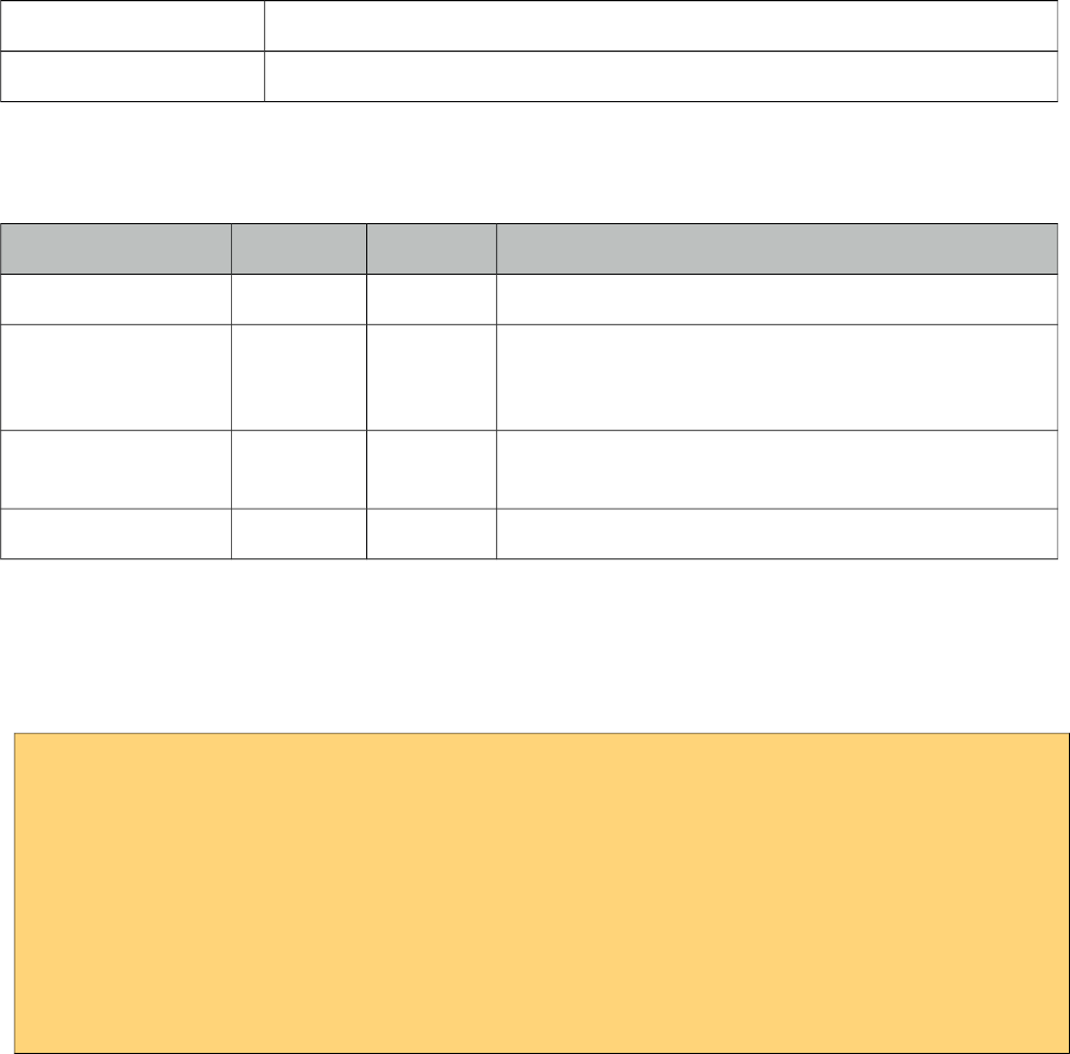
PrimeFaces User Guide
3.103 Printer
Printer allows sending a specific JSF component to the printer, not the whole page.
Info
Tag printer
Behavior Class org.primefaces.component.behavior.Printer
Attributes
Name Default Type Description
id null String Unique identifier of the component
rendered true Boolean Boolean value to specify the rendering of the
component, when set to false component will not be
rendered.
binding null Object An el expression that maps to a server side
UIComponent instance in a backing bean
target null String Target component to print.
Getting started with the Printer
Printer is attached to any command component like a button or a link. Examples below
demonstrates how to print a simple output text or a particular image on page;
<h:commandButton id="btn" value="Print">
<p:printer target="output" />
</h:commandButton>
<h:outputText id="output" value="PrimeFaces Rocks!" />
<h:outputLink id="lnk" value="#">
<p:printer target="image" />
<h:outputText value="Print Image" />
</h:outputLink>
<p:graphicImage id="image" value="/images/nature1.jpg" />
396
PrimeFaces User Guide
3.104 ProgressBar
ProgressBar is a process status indicator that can either work purely on client side or interact with
server side using ajax.
Info
Tag propressBar
Component Class org.primefaces.component.progressbar.ProgressBar
Component Type org.primefaces.component.Progressbar
Component Family org.primefaces.component
Renderer Type org.primefaces.component.ProgressBarRenderer
Renderer Class org.primefaces.component.progressbar.ProgressBarRenderer
Attributes
Name Default Type Description
id null String Unique identifier of the component
rendered true Boolean Boolean value to specify the rendering of the
component, when set to false component will not be
rendered.
binding null Object An el expression that maps to a server side
UIComponent instance in a backing bean
widgetVar null String Name of the client side widget
value 0 Integer Value of the progress bar
disabled false Boolean Disables or enables the progressbar
ajax false Boolean Specifies the mode of progressBar, in ajax mode
progress value is retrieved from a backing bean.
interval 3000 Integer Interval in seconds to do periodic requests in ajax
mode.
397
PrimeFaces User Guide
Name Default Type Description
style null String Inline style of the main container element.
styleClass null String Style class of the main container element.
labelTemplate {value} String Template of the progress label.
displayOnly false Boolean Enables static display mode.
global true Boolean Global ajax requests are listened by ajaxStatus
component, setting global to false will not trigger
ajaxStatus.
Getting started with the ProgressBar
ProgressBar has two modes, "client"(default) or "ajax". Following is a pure client side progressBar.
<p:progressBar widgetVar="pb" />
<p:commandButton value="Start" type="button" onclick="start()" />
<p:commandButton value="Cancel" type="button" onclick="cancel()" />
<script type="text/javascript">
function start() {
this.progressInterval = setInterval(function(){
PF('pb').setValue(PF('pb').getValue() + 10);
}, 2000);
}
function cancel() {
clearInterval(this.progressInterval);
PF('pb').setValue(0);
}
</script>
Ajax Progress
Ajax mode is enabled by setting ajax attribute to true, in this case the value defined on a managed
bean is retrieved periodically and used to update the progress.
<p:progressBar ajax="true" value="#{progressBean.progress}" />
public class ProgressBean {
private int progress;
//getter-setter
}
398
PrimeFaces User Guide
Interval
ProgressBar is based on polling and 3000 milliseconds is the default interval for ajax progress bar
meaning every 3 seconds progress value will be recalculated. In order to set a different value, use
the interval attribute.
<p:progressBar interval="5000" />
Ajax Behavior Events
ProgressBar provides complete as the default and only ajax behavior event that is fired when the
progress is completed. Example below demonstrates how to use this event.
public class ProgressBean {
private int progress;
public void handleComplete() {
//Add a faces message
}
public int getProgress() {
return progress;
}
public void setProgress(int progress) {
this.progress = progress;
}
}
<p:progressBar value="#{progressBean.progress}" ajax="true">
<p:ajax event="complete" listener="#{progressBean.handleComplete}"
update="messages" />
</p:progressBar>
<p:growl id="messages" />
Display Only
Assume you have a process like a ticket purchase that spans various pages where each page has
different use cases such as customer info, seat selection, billing, payment and more. In order to
display static value of the process on each page, you can use a static progressBar.
<p:progressBar value="50" displayOnly="true" />
Client Side API
Widget: PrimeFaces.widget.ProgressBar
Method Params Return Type Description
getValue() - Number Returns current value
399
PrimeFaces User Guide
Method Params Return Type Description
setValue(value) value: Value to display void Sets current value
start() - void Starts ajax progress bar
cancel() - void Stops ajax progress bar
Skinning
ProgressBar resides in a main container which style and styleClass attributes apply. Following is the
list of structural style classes;
Style Class Applies
.ui-progressbar Main container.
.ui-progressbar-value Value of the progressbar
.ui-progressbar-label Progress label.
As skinning style classes are global, see the main theming section for more information.
400

PrimeFaces User Guide
3.105 RadioButton
RadioButton is a helper component of SelectOneRadio to implement custom layouts.
Info
Tag radioButton
Component Class org.primefaces.component.radiobutton.RadioButton
Component Type org.primefaces.component.RadioButton
Component Family org.primefaces.component
Renderer Type org.primefaces.component.RadioButtonRenderer
Renderer Class org.primefaces.component.radiobutton.RadioButtonRenderer
Attributes
Name Default Type Description
id null String Unique identifier of the component
rendered true Boolean Boolean value to specify the rendering of the
component, when set to false component will not be
rendered.
binding null Object An el expression that maps to a server side
UIComponent instance in a backing bean
disabled false Boolean Disabled the component.
itemIndex null Integer Index of the selectItem of selectOneRadio.
onchange null String Client side callback to execute on state change.
for null String Id of the selectOneRadio to attach to.
style null String Inline style of the component.
styleClass null String Style class of the container.
tabindex null String Specifies the tab order of element in tab navigation.
Getting started with RadioButton
See custom layout part in SelectOneRadio section for more information.
401
PrimeFaces User Guide
3.106 Rating
Rating component features a star based rating system.
Info
Tag rating
Component Class org.primefaces.component.rating.Rating
Component Type org.primefaces.component.Rating
Component Family org.primefaces.component
Renderer Type org.primefaces.component.RatingRenderer
Renderer Class org.primefaces.component.rating.RatingRenderer
Attributes
Name Default Type Description
id null String Unique identifier of the component
rendered true Boolean Boolean value to specify the rendering of the
component, when set to false component will not
be rendered.
binding null Object An el expression that maps to a server side
UIComponent instance in a backing bean
value null Object Value of the component than can be either an EL
expression of a literal text
converter null Converter/
String
An el expression or a literal text that defines a
converter for the component. When it’s an EL
expression, it’s resolved to a converter instance. In
case it’s a static text, it must refer to a converter id
immediate 0 Boolean Boolean value that specifies the lifecycle phase
the valueChangeEvents should be processed,
when true the events will be fired at "apply
request values", if immediate is set to false,
valueChange Events are fired in "process
validations"
phase
402
PrimeFaces User Guide
Name Default Type Description
required false Boolean Marks component as required
validator null MethodExpr A method binding expression that refers to a
method validationg the input
valueChangeListener null MethodExpr A method binding expression that refers to a
method for handling a valuchangeevent
requiredMessage null String Message to be displayed when required field
validation fails.
converterMessage null String Message to be displayed when conversion fails.
validatorMessage null String Message to be displayed when validation fields.
widgetVar null String Name of the client side widget.
stars 5 Integer Number of stars to display
disabled false Boolean Disables user interaction
readonly false Boolean Disables user interaction without disabled visuals.
onRate null String Client side callback to execute when rate happens.
style null String Inline style of the component.
styleClass null String Style class of the component.
cancel true Boolean When enabled, displays a cancel icon to reset.
Getting Started with Rating
Rating is an input component that takes an integer variable as its value.
public class RatingBean {
private Integer rating;
//getter-setter
}
<p:rating value="#{ratingBean.rating}" />
Number of Stars
Default number of stars is 5, if you need less or more stars use the stars attribute. Following rating
consists of 10 stars.
<p:rating value="#{ratingBean.rating}" stars="10"/>
403
PrimeFaces User Guide
Display Value Only
In cases where you only want to use the rating component to display the rating value and disallow
user interaction, set readonly to true. Using disabled attribute does the same but adds disabled
visual styles.
Ajax Behavior Events
Rating provides rate and cancel as ajax behavior events. A defined listener for rate event will be
executed by passing an org.primefaces.event.RateEvent as a parameter and cancel event will be
invoked with no parameter.
<p:rating value="#{ratingBean.rating}">
<p:ajax event="rate" listener="#{ratingBean.handleRate}" update="msgs" />
<p:ajax event="cancel" listener="#{ratingBean.handleCancel}" update="msgs" />
</p:rating>
<p:messages id="msgs" />
public class RatingBean {
private Integer rating;
public void handleRate(RateEvent rateEvent) {
Integer rate = (Integer) rateEvent.getRating();
//Add facesmessage
}
public void handleCancel() {
//Add facesmessage
}
//getter-setter
}
Client Side Callbacks
onRate is called when a star is selected with value as the only parameter.
<p:rating value="#{ratingBean.rating}" onRate="alert('You rated: ' + value)" />
Client Side API
Widget: PrimeFaces.widget.Rating
Method Params Return Type Description
getValue() - Number Returns the current value
setValue(value) value: Value to set void Updates rating value with provided one.
disable() - void Disables component.
enable() - void Enables component.
reset() - void Clears the rating.
404
PrimeFaces User Guide
Skinning
Rating resides in a main container which style and styleClass attributes apply. Following is the list
of structural style classes;
Style Class Applies
.ui-rating Main container element.
.ui-rating-cancel Cancel icon
.ui-rating Default star
.ui-rating-on Active star
405
PrimeFaces User Guide
3.107 RemoteCommand
RemoteCommand provides a way to execute backing bean methods directly from javascript.
Info
Tag remoteCommand
Component Class org.primefaces.component.remotecommand.RemoteCommand
Component Type org.primefaces.component.RemoteCommand
Component Family org.primefaces.component
Renderer Type org.primefaces.component.RemoteCommandRenderer
Renderer Class org.primefaces.component.remotecommand.RemoteCommandRenderer
Attributes
Name Default Type Description
id null String Unique identifier of the component.
rendered true Boolean Boolean value to specify the rendering of the component,
when set to false component will not be rendered.
binding null Object An el expression that maps to a server side UIComponent
instance in a backing bean
action null Method
Expr
A method expression that’d be processed in the partial
request caused by uiajax.
actionListener null Method
Expr
An actionlistener that’d be processed in the partial request
caused by uiajax.
immediate false Boolean Boolean value that determines the phaseId, when true
actions are processed at apply_request_values, when false
at invoke_application phase.
name null String Name of the command
async false Boolean When set to true, ajax requests are not queued.
process null String Component(s) to process partially instead of whole view.
update null String Component(s) to update with ajax.
onstart null String Javascript handler to execute before ajax request is begins.
oncomplete null String Javascript handler to execute when ajax request is
completed.
onsuccess null String Javascript handler to execute when ajax request succeeds.
onerror null String Javascript handler to execute when ajax request fails.
406
PrimeFaces User Guide
Name Default Type Description
global true Boolean Global ajax requests are listened by ajaxStatus component,
setting global to false will not trigger ajaxStatus.
delay null String If less than delay milliseconds elapses between calls to
request() only the most recent one is sent and all other
requests are discarded. If this option is not specified, or if
the value of delay is the literal string 'none' without the
quotes, no delay is used.
partialSubmit false Boolean Enables serialization of values belonging to the partially
processed components only.
partialSubmitFilter null String Selector to use when partial submit is on, default is ":input"
to select all descendant inputs of a partially processed
components.
autoRun false Boolean When enabled command is executed on page load.
resetValues false Boolean If true, local values of input components to be updated
within the ajax request would be reset.
ignoreAutoUpdate false Boolean If true, components which autoUpdate="true" will not be
updated for this request. If not specified, or the value is
false, no such indication is made.
timeout 0 Integer Timeout for the ajax request in milliseconds.
form null String Form to serialize for an ajax request. Default is the
enclosing form.
Getting started with RemoteCommand
RemoteCommand is used by invoking the command from your javascript code.
<p:remoteCommand name="increment" actionListener="#{counter.increment}"
out="count" />
<h:outputText id="count" value="#{counter.count}" />
<script type="text/javascript">
function customfunction() {
//your custom code
increment(); //makes a remote call
}
</script>
That’s it whenever you execute your custom javascript function(eg customfunction()), a remote call
will be made, actionListener is processed and output text is updated. Note that remoteCommand
must be nested inside a form.
407

PrimeFaces User Guide
Passing Parameters
Remote command can send dynamic parameters in the following way;
increment([{name:'x', value:10}, {name:'y', value:20}]);
408
PrimeFaces User Guide
3.108 Repeat
Repeat is an extension to the standard ui:repeat component to provide compatibility between
Mojarra and MyFaces. There are no additonal features and usage is same as ui:repeat.
409
PrimeFaces User Guide
3.109 ResetInput
Input components keep their local values at state when validation fails. ResetInput is used to clear
the cached values from state so that components retrieve their values from the backing bean model
instead.
Info
Tag resetInput
ActionListener Class org.primefaces.component.resetinput.ResetInputActionListener
Attributes
Name Default Type Description
target null String Comma or white space separated list of component
identifiers.
clearModel false Boolean When enabled, reset input also sets null values to the
bound values so it reset inputs values and model values.
Getting started with ResetInput
ResetInput is attached to action source components like commandButton and commandLink.
<h:form id="form">
<p:panel id="panel" header="New User" style="margin-bottom:10px;">
<p:messages id="messages" />
<h:panelGrid columns="2">
<h:outputLabel for="firstname" value="Firstname: *" />
<p:inputText id="firstname" value="#{pprBean.firstname}"
required="true" label="Firstname">
<f:validateLength minimum="2" />
</p:inputText>
<h:outputLabel for="surname" value="Surname: *" />
<p:inputText id="surname" value="#{pprBean.surname}"
required="true" label="Surname"/>
</h:panelGrid>
</p:panel>
<p:commandButton value="Submit" update="panel"
actionListener="#{pprBean.savePerson}" />
<p:commandButton value="Reset Tag" update="panel" process="@this">
<p:resetInput target="panel" />
</p:commandButton>
<p:commandButton value="Reset Non-Ajax"
actionListener="#{pprBean.reset}" immediate="true" ajax="false">
<p:resetInput target="panel" />
</p:commandButton>
</h:form>
410
PrimeFaces User Guide
ResetInput supports both ajax and non-ajax actions, for non-ajax actions set immediate true on the
source component so lifecycle jumps to render response after resetting. To reset multiple
components at once, provide a list of ids or just provide an ancestor component like the panel in
sample above.
Reset Programmatically
ResetInput tag is the declarative way to reset input components, another way is resetting
programmatically. This is also handy if inputs should get reset based on a condition. Following
sample demonstrates how to use RequestContext to do the reset within an ajaxbehavior listener.
Parameter of the reset method can be a single clientId or a collection of clientIds.
<p:inputText value="#{bean.value}">
<p:ajax event="blur" listener="#{bean.listener}" />
</p:inputText>
public void listener() {
RequestContext context = RequestContext.getCurrentInstance();
context.reset("form:panel");
}
Tip
p:ajax has built-in resetValues attribute to reset values of processed components during a request.
411
PrimeFaces User Guide
3.110 Resizable
Resizable component is used to make another JSF component resizable.
Info
Tag resizable
Component Class org.primefaces.component.resizable.Resizable
Component Type org.primefaces.component.Resizable
Component Family org.primefaces.component
Renderer Type org.primefaces.component.ResizableRenderer
Renderer Class org.primefaces.component.resizable.ResizableRenderer
Attributes
Name Default Type Description
id null String Unique identifier of the component
rendered true Boolean Boolean value to specify the rendering of the component, when
set to false component will not be rendered.
binding null Object An el expression that maps to a server side UIComponent
instance in a backing bean
widgetVar null String Name of the client side widget.
for null String Identifier of the target component to make resizable.
aspectRatio false Boolean Defines if aspectRatio should be kept or not.
proxy false Boolean Displays proxy element instead of actual element.
handles null String Specifies the resize handles.
ghost false Boolean In ghost mode, resize helper is displayed as the original
element with less opacity.
animate false Boolean Enables animation.
effect swing String Effect to use in animation.
effectDuration normal String Effect duration of animation.
maxWidth null Integer Maximum width boundary in pixels.
maxHeight null Integer Maximum height boundary in pixels.
minWidth 10 Integer Minimum width boundary in pixels.
minHeight 10 Integer Maximum height boundary in pixels.
412
PrimeFaces User Guide
Name Default Type Description
containment false Boolean Sets resizable boundaries as the parents size.
grid 1 Integer Snaps resizing to grid structure.
onStart null String Client side callback to execute when resizing begins.
onResize null String Client side callback to execute during resizing.
onStop null String Client side callback to execute after resizing end.
Getting started with Resizable
Resizable is used by setting for option as the identifier of the target.
<p:graphicImage id="img" value="campnou.jpg" />
<p:resizable for="img" />
Another example is the input fields, if users need more space for a textarea, make it resizable by;
<h:inputTextarea id="area" value="Resize me if you need more space" />
<p:resizable for="area" />
Boundaries
To prevent overlapping with other elements on page, boundaries need to be specified. There’re 4
attributes for this minWidth, maxWidth, minHeight and maxHeight. The valid values for these
attributes are numbers in terms of pixels.
<h:inputTextarea id="area" value="Resize me if you need more space" />
<p:resizable for="area" minWidth="20" minHeight="40" maxWidth="50" maxHeight="100"/>
Handles
Resize handles to display are customize using handles attribute with a combination of n, e, s, w, ne,
se, sw and nw as the value. Default value is "e, s, se".
<h:inputTextarea id="area" value="Resize me if you need more space" />
<p:resizable for="area" handles="e,w,n,se,sw,ne,nw"/>
Visual Feedback
Resize helper is the element used to provide visual feedback during resizing. By default actual
element itself is the helper and two options are available to customize the way feedback is provided.
Enabling ghost option displays the element itself with a lower opacity, in addition enabling proxy
option adds a css class called .ui-resizable-proxy which you can override to customize.
413
PrimeFaces User Guide
<h:inputTextarea id="area" value="Resize me if you need more space" />
<p:resizable for="area" proxy="true" />
.ui-resizable-proxy {
border: 2px dotted #00F;
}
Effects
Resizing can be animated using animate option and setting an effect name. Animation speed is
customized using effectDuration option "slow", "normal" and "fast" as valid values.
<h:inputTextarea id="area" value="Resize me if you need more space" />
<p:resizable for="area" animate="true" effect="swing" effectDuration="normal" />
Following is the list of available effect names;
• swing
• easeInQuad
• easeOutQuad
• easeInOutQuad
• easeInCubic
• easeOutCubic
• easeInOutCubic
• easeInQuart
• easeOutQuart
• easeInOutQuart
• easeInQuint
• easeOutQuint
• easeInOutQuint
• easeInSine
• easeOutSine
• easeInExpo
• easeOutExpo
• easeInOutExpo
• easeInCirc
• easeOutCirc
• easeInOutCirc
• easeInElastic
• easeOutElastic
• easeInOutElastic
• easeInBack
• easeOutBack
• easeInOutBack
• easeInBounce
• easeOutBounce
• easeInOutBounce
Ajax Behavior Events
Resizable provides default and only resize event that is called on resize end. In case you have a
listener defined, it will be called by passing an org.primefaces.event.ResizeEvent instance as a
parameter.
<h:inputTextarea id="area" value="Resize me if you need more space" />
<p:resizable for="area">
<p:ajax listener="#{resizeBean.handleResize}">
</p:resizable>
public class ResizeBean {
public void handleResize(ResizeEvent event) {
int width = event.getWidth();
int height = event.getHeight();
}
}
414
PrimeFaces User Guide
Client Side Callbacks
Resizable has three client side callbacks you can use to hook-in your javascript; onStart, onResize
and onStop. All of these callbacks receive two parameters that provide various information about
resize event.
<h:inputTextarea id="area" value="Resize me if you need more space" />
<p:resizable for="area" onStop="handleStop(event, ui)" />
function handleStop(event, ui) {
//ui.helper = helper element as a jQuery object
//ui.originalPosition = top, left position before resizing
//ui.originalSize = width, height before resizing
//ui.positon = top, left after resizing
//ui.size = width height of current size
}
Skinning
Style Class Applies
.ui-resizable Element that is resizable
.ui-resizable-handle Handle element
.ui-resizable-handle-{handlekey} Particular handle element identified by handlekey like e, s, ne
.ui-resizable-proxy Proxy helper element for visual feedback
415
PrimeFaces User Guide
3.111 Ribbon
Ribbon is container component to group different sets of controls in a tabbed layout. Special styling
is applied to inner components for a unified look.
Info
Tag ribbon
Component Class org.primefaces.component.ribbon.Ribbon
Component Type org.primefaces.component.Ribbon
Component Family org.primefaces.component
Renderer Type org.primefaces.component.RibbonRenderer
Renderer Class org.primefaces.component.ribbon.RibbonRenderer
Attributes
Name Default Type Description
id null String Unique identifier of the component
rendered true Boolean Boolean value to specify the rendering of the
component, when set to false component will not
be rendered.
binding null Object An el expression that maps to a server side
UIComponent instance in a backing bean
widgetVar null String Name of the client side widget.
style null String Inline style of the container element.
styleClass null String Style class of the container element.
activeIndex 0 Integer Index of the active tab.
Getting started with Ribbon
Tab and RibbonGroup components are used when building the Ribbon.
416

PrimeFaces User Guide
<p:ribbon>
<p:tab title="File">
<p:ribbonGroup label="Options">
<p:commandButton value="New" icon="ui-ribbonicon-new"
styleClass="ui-ribbon-bigbutton" type="button"/>
<p:commandButton value="Save" icon="ui-ribbonicon-save"
styleClass="ui-ribbon-bigbutton" type="button"/>
</p:ribbonGroup>
<p:ribbonGroup label="Clipboard" style="width:120px">
<p:selectManyButton>
<p:commandButton value="Paste" icon="ui-ribbonicon-paste"
styleClass="ui-ribbon-bigbutton" type="button"/>
<p:commandButton value="Cut" icon="ui-ribbonicon-cut"
style="width:64px" type="button"/>
<p:commandButton value="Print" icon="ui-ribbonicon-print"
style="width:64px" type="button"/>
</p:selectManyButton>
</p:ribbonGroup>
<p:ribbonGroup label="Fonts" style="width:220px">
<p:selectOneMenu appendTo="@this">
<f:selectItem itemLabel="Arial" itemValue="0" />
<f:selectItem itemLabel="Comis Sans" itemValue="1" />
<f:selectItem itemLabel="Helvetica" itemValue="2" />
<f:selectItem itemLabel="Times New Roman" itemValue="3" />
<f:selectItem itemLabel="Verdana" itemValue="4" />
</p:selectOneMenu>
<p:colorPicker />
</p:ribbonGroup>
</p:tab>
<p:tab title="View">
<p:ribbonGroup label="Zoom">
<p:commandButton value="In" icon="ui-ribbonicon-zoomin"
styleClass="ui-ribbon-bigbutton" type="button" />
<p:commandButton value="Out" icon="ui-ribbonicon-zoomout"
styleClass="ui-ribbon-bigbutton" type="button"/>
</p:ribbonGroup>
</p:tab>
</p:ribbon>
Styling
Following components have special styling applied inside ribbon;
•Button
•CommandButton
•SelectOneButton
•SelectManyButton
•SelectOneMenu
•InputText
Default PrimeFaces icons are 16px, in case you need bigger icons add ui-ribbon-bigbutton style
class to the button.
417
PrimeFaces User Guide
Skinning
Ribbon resides in a main container which style and styleClass attributes apply. Following is the list
of structural style classes.
Style Class Applies
.ui-ribbon Main container element.
.ui-ribbon-groups Container of ribbon groups in a tab.
.ui-ribbon-group Ribbon group element.
.ui-ribbon-group-content Content of a group.
.ui-ribbon-group-label Label of a group.
Ribbon shares the same structure with TabView for the tabbing functionality, refer to TabView for
the styles of the Tabs.
418
PrimeFaces User Guide
3.112 RibbonGroup
RibbonGroup is a helper component for Ribbon to define groups in a tab.
Info
Tag ribbonGroup
Component Class org.primefaces.component.ribbon.RibbonGroup
Component Type org.primefaces.component.RibbonGroup
Component Family org.primefaces.component
Renderer Type org.primefaces.component.RibbonGroupRenderer
Renderer Class org.primefaces.component.ribbon.RibbonGroupRenderer
Attributes
Name Default Type Description
id null String Unique identifier of the component
rendered true Boolean Boolean value to specify the rendering of the
component, when set to false component will not
be rendered.
binding null Object An el expression that maps to a server side
UIComponent instance in a backing bean
style null String Inline style of the container element.
styleClass null String Style class of the container element.
label null String Label of the group.
Getting started with RibbonGroup
Refer to Ribbon component documentation for more information.
419
PrimeFaces User Guide
3.113 Ring
Ring is a data display component with a circular animation.
Info
Tag ring
Component Class org.primefaces.component.ring.Ring
Component Type org.primefaces.component.Ring
Component Family org.primefaces.component
Renderer Type org.primefaces.component.RingRenderer
Renderer Class org.primefaces.component.ring.RingRenderer
Attributes
Name Default Type Description
id null String Unique identifier of the component
rendered true Boolean Boolean value to specify the rendering of the
component, when set to false component will not be
rendered.
binding null Object An el expression that maps to a server side
UIComponent instance in a backing bean
widgetVar null String Name of the client side widget.
value null Object Collection to display.
var null String Name of the data iterator.
style null String Inline style of the container element.
styleClass null String Style class of the container element.
easing swing String Type of easing to use in animation.
autoplay false Boolean When true, Ring will automatically advance the
moving elements to the next child at a regular
interval.
autoplayDuration 1000 Integer Time in milliseconds between animation triggers
when a Ring's autoplay is playing.
autoplayPauseOnHover false Boolean When true, Ring will pause autoPlay when the user
420
PrimeFaces User Guide
Name Default Type Description
mouseover the Ring container.
autoplayInitialDelay 0 Integer Time in milliseconds to delay the start of Ring's
configured autoplay option.
Getting started with Ring
A collection is required to use the Ring component.
<p:ring value="#{ringBean.players}" var="player”>
<p:graphicImage value="/images/barca/#{player.photo}"/>
</p:ring>
public class RingBean {
private List<Player> players;
public RingBean() {
players = new ArrayList<Player>();
players.add(new Player("Messi", 10, "messi.jpg", "CF"));
players.add(new Player("Iniesta", 8, "iniesta.jpg", "CM"));
//more players
}
//getter&setter for players
}
Item Selection
A column is required to process item selection from ring properly.
<p:ring value="#{ringBean.players}" var="player">
<p:column>
//UI to select an item e.g. commandLink
</p:column>
</p:ring>
Easing
Following is the list of available options for easing animation.
• swing
• easeInQuad
• easeOutQuad
• easeInOutQuad
• easeInCubic
• easeOutCubic
• easeInOutCubic
• easeInQuart
• easeOutQuart
• easeInOutQuart
• easeInQuint
• easeOutQuint
• easeInOutQuint
• easeInSine
• easeOutSine
• easeInExpo
• easeOutExpo
• easeInOutExpo
• easeInCirc
• easeOutCirc
• easeInOutCirc
• easeInElastic
• easeOutElastic
• easeInOutElastic
• easeInBack
• easeOutBack
• easeInOutBack
• easeInBounce
• easeOutBounce
• easeInOutBounce
421
PrimeFaces User Guide
Skinning
Ring resides in a main container which style and styleClass attributes apply. Following is the list of
structural style classes.
Style Class Applies
.ui-ring Main container element.
.ui-ring-item Each item in the list.
422
PrimeFaces User Guide
3.114 Row
Row is a helper component for datatable.
Info
Tag row
Component Class org.primefaces.component.row.Row
Component Type org.primefaces.component.Row
Component Family org.primefaces.component
Attributes
Name Default Type Description
id null String Unique identifier of the component
rendered true Boolean Boolean value to specify the rendering of the
component, when set to false component will not
be rendered.
binding null Object An el expression that maps to a server side
UIComponent instance in a backing bean
style null String Inline style of the component.
styleClas null String Style class of the component.
Getting Started with Row
See datatable grouping section for more information about how row is used.
423
PrimeFaces User Guide
3.115 RowEditor
RowEditor is a helper component for datatable.
Info
Tag rowEditor
Component Class org.primefaces.component.roweditor.RowEditor
Component Type org.primefaces.component.RowEditor
Component Family org.primefaces.component
Renderer Type org.primefaces.component.RowEditorRenderer
Renderer Class org.primefaces.component.roweditor.RowEditorRenderer
Attributes
Name Default Type Description
id null String Unique identifier of the component
rendered true Boolean Boolean value to specify the rendering of the
component, when set to false component will not
be rendered.
binding null Object An el expression that maps to a server side
UIComponent instance in a backing bean
style null String Inline style of the component.
styleClass null String Style class of the component.
editTitle null String Title attribute for edit icon.
cancelTitle null String Title attribute for cancel icon.
saveTitle null String Title attribute for save icon.
Getting Started with RowEditor
See inline editing section in datatable documentation for more information about usage.
424
PrimeFaces User Guide
3.116 RowExpansion
RowExpansion is a helper component of datatable used to implement expandable rows.
Info
Tag rowExpansion
Component Class org.primefaces.component.rowexpansion.RowExpansion
Component Type org.primefaces.component.RowExpansion
Component Family org.primefaces.component
Attributes
Name Default Type Description
id null String Unique identifier of the component
rendered true Boolean Boolean value to specify the rendering of the
component, when set to false component will not
be rendered.
binding null Object An el expression that maps to a server side
UIComponent instance in a backing bean
styleClass null String Style class of the component.
Getting Started with RowExpansion
See datatable expandable rows section for more information about how rowExpansion is used.
425
PrimeFaces User Guide
3.117 RowToggler
RowToggler is a helper component for datatable.
Info
Tag rowToggler
Component Class org.primefaces.component.rowtoggler.RowToggler
Component Type org.primefaces.component.RowToggler
Component Family org.primefaces.component
Renderer Type org.primefaces.component.RowTogglerRenderer
Renderer Class org.primefaces.component.rowtoggler.RowTogglerRenderer
Attributes
Name Default Type Description
id null String Unique identifier of the component
rendered true Boolean Boolean value to specify the rendering of the
component, when set to false component will not
be rendered.
binding null Object An el expression that maps to a server side
UIComponent instance in a backing bean
Getting Started with Row
See expandable rows section in datatable documentation for more information about usage.
426
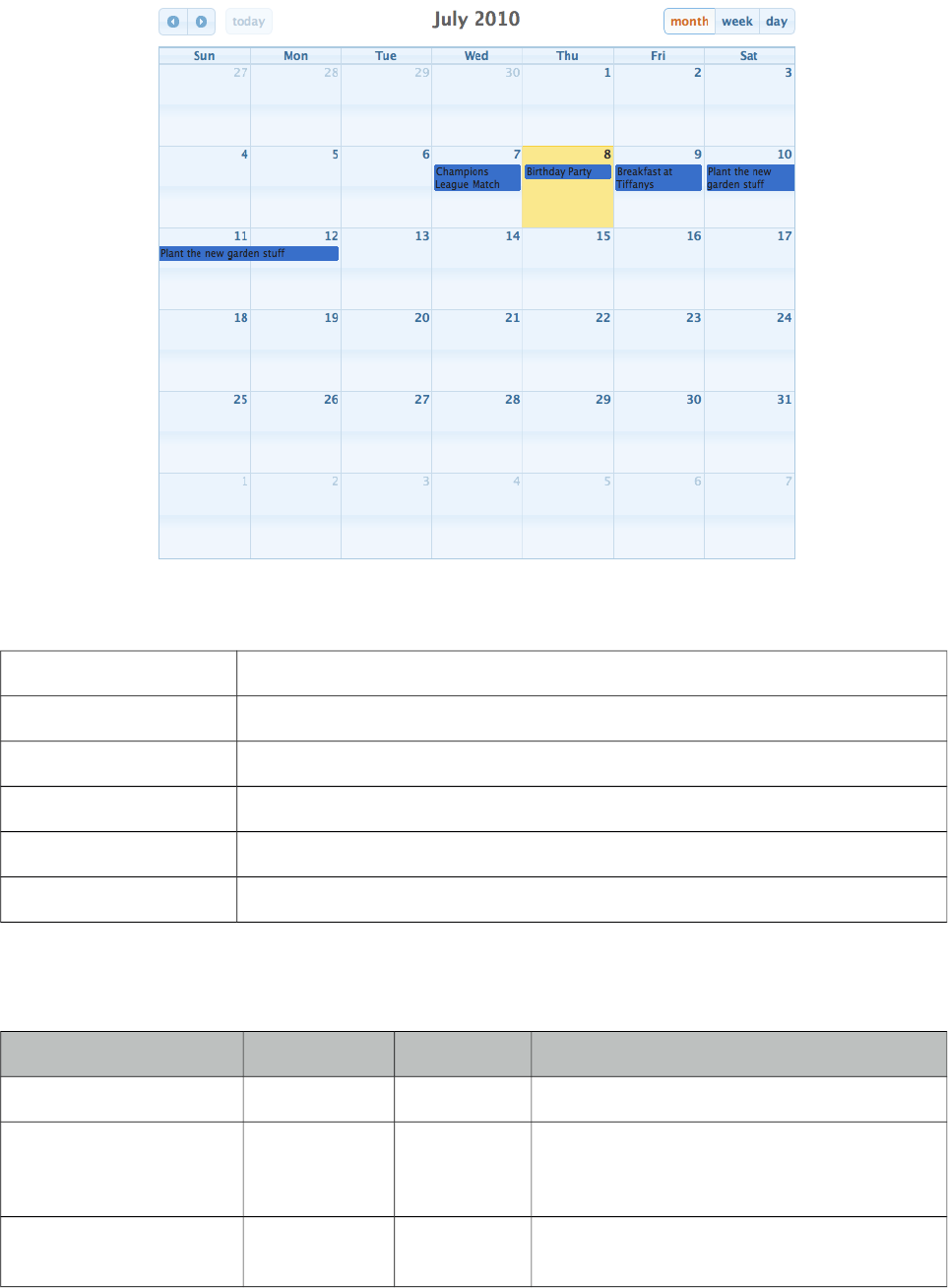
PrimeFaces User Guide
3.118 Schedule
Schedule provides an Outlook Calendar, iCal like JSF component to manage events.
Info
Tag schedule
Component Class org.primefaces.component.schedule.Schedule
Component Type org.primefaces.component.Schedule
Component Family org.primefaces.component
Renderer Type org.primefaces.component.ScheduleRenderer
Renderer Class org.primefaces.component.schedule.ScheduleRenderer
Attributes
Name Default Type Description
id null String Unique identifier of the component
rendered true Boolean Boolean value to specify the rendering of the
component, when set to false component will
not be rendered.
binding null Object An el expression that maps to a server side
UIComponent instance in a backing bean
427
PrimeFaces User Guide
Name Default Type Description
widgetVar null String Name of the client side widget.
value null Object An org.primefaces.model.ScheduleModel
instance representing the backed model
locale null Object Locale for localization, can be String or a
java.util.Locale instance
aspectRatio null Float Ratio of calendar width to height, higher the
value shorter the height is
view month String The view type to use, possible values are
'month', 'agendaDay', 'agendaWeek',
'basicWeek', 'basicDay'
initialDate null Object The initial date that is used when schedule
loads. If ommitted, the schedule starts on the
current date
showWeekends true Boolean Specifies inclusion Saturday/Sunday
columns in any of the views
style null String Style of the main container element of
schedule
styleClass null String Style class of the main container element of
schedule
draggable true Boolean When true, events are draggable.
resizable true Boolean When true, events are resizable.
showHeader true Boolean Specifies visibility of header content.
leftHeaderTemplate prev, next
today
String Content of left side of header.
centerHeaderTemplate title String Content of center of header.
rightHeaderTemplate month,
agendaWeek,
agendaDay
String Content of right side of header.
allDaySlot true Boolean Determines if all-day slot will be displayed
in agendaWeek or agendaDay views
slotMinutes 30 Integer Interval in minutes in an hour to create a slot.
firstHour 6 Integer First hour to display in day view.
minTime null String Minimum time to display in a day view.
maxTime null String Maximum time to display in a day view.
axisFormat null String Determines the time-text that will be
displayed on the vertical axis of the agenda
views.
428
PrimeFaces User Guide
Name Default Type Description
timeFormat null String Determines the time-text that will be
displayed on each event.
columnFormat null String Format for column headers.
timeZone null Object String or a java.util.TimeZone instance to
specify the timezone used for date
conversion.
ignoreTimezone true Boolean When parsing dates, whether UTC offsets
should be ignored while processing event
data.
tooltip false Boolean Displays description of events on a tooltip.
clientTimeZone null String Timezone to define how to interpret the dates
at browser. Valid values are "false", "local",
"UTC" and ids like "America/Chicago".
showWeekNumbers false Boolean Display week numbers in schedule.
extender null String Name of javascript function to extend the
options of the underlying fullcalendar plugin.
displayEventEnd null String Whether or not to display an event's end time
text when it is rendered on the calendar.
Value can be a boolean to globally configure
for all views or a comma separated list such
as "month:false,basicWeek:true" to configure
per view.
weekNumberCalculation local String The method for calculating week numbers
that are displayed. Valid values are "local"
(default), "ISO" and "custom".
weekNumberCalculator null String Client side function to use in custom
weekNumberCalculation.
nextDayThreshold 09:00:00 String When an event's end time spans into another
day, the minimum time it must be in order for
it to render as if it were on that day. Default
is 09:00:00.
urlTarget _blank String Target for events with urls. Clicking on such
events in the schedule will not trigger the
selectEvent but open the url using this target
instead. Default is "_blank".
Getting started with Schedule
Schedule needs to be backed by an org.primefaces.model.ScheduleModel instance, a schedule
model consists of org.primefaces.model.ScheduleEvent instances.
429
PrimeFaces User Guide
public class ScheduleBean {
private ScheduleModel model;
public ScheduleBean() {
eventModel = new ScheduleModel<ScheduleEvent>();
eventModel.addEvent(new DefaultScheduleEvent("title", new Date(),
new Date()));
}
public ScheduleModel getModel() {
return model;
}
}
<p:schedule value="#{scheduleBean.model}" />
DefaultScheduleEvent is the default implementation of ScheduleEvent interface. Mandatory
properties required to create a new event are the title, start date and end date. Other properties such
as allDay get sensible default values.
Table below describes each property in detail.
Property Description
id Used internally by PrimeFaces, auto generated.
title Title of the event.
startDate Start date of type java.util.Date.
endDate End date of type java.util.Date.
allDay Flag indicating event is all day.
styleClass Visual style class to enable multi resource display.
data Optional data you can set to be represented by Event.
editable Whether the event is editable or not.
description Tooltip text to display on mouseover of an event.
Ajax Behavior Events
Schedule provides various ajax behavior events to respond user actions.
Event Listener Parameter Fired
dateSelect org.primefaces.event.SelectEvent When a date is selected.
eventSelect org.primefaces.event.SelectEvent When an event is selected.
eventMove org.primefaces.event.ScheduleEntryMoveEvent When an event is moved.
430
PrimeFaces User Guide
Event Listener Parameter Fired
eventResize org.primefaces.event.ScheduleEntryResizeEvent When an event is resized.
viewChange org.primefaces.event.SelectEvent When a view is changed.
Ajax Updates
Schedule has a quite complex UI which is generated on-the-fly by the client side
PrimeFaces.widget.Schedule widget to save bandwidth and increase page load performance. As a
result when you try to update schedule like with a regular PrimeFacess PPR, you may notice a UI
lag as the DOM will be regenerated and replaced. Instead, Schedule provides a simple client side
api and the update method.
Whenever you call update, schedule will query its server side ScheduleModel instance to check for
updates, transport method used to load events dynamically is JSON, as a result this approach is
much more effective then updating with regular PPR. An example of this is demonstrated at editable
schedule example, save button is calling PF('widgetvar').update() at oncomplete event handler.
TimeZone
By default, timezone offsets are ignored. Set ignoreTimezone to false so that schedule takes care of
timezone differences by calculating the client browser timezone and the event date so that events
are displayed at the clients local time.
Editable Schedule
Let’s put it altogether to come up a fully editable and complex schedule.
431

PrimeFaces User Guide
<h:form>
<p:schedule value="#{bean.eventModel}" editable="true" widgetVar="myschedule">
<p:ajax event="dateSelect" listener="#{bean.onDateSelect}"
update="eventDetails" oncomplete="eventDialog.show()" />
<p:ajax event="eventSelect" listener="#{bean.onEventSelect}"
</p:schedule>
<p:dialog widgetVar="eventDialog" header="Event Details">
<h:panelGrid id="eventDetails" columns="2">
<h:outputLabel for="title" value="Title:" />
<h:inputText id="title" value="#{bean.event.title}" required="true"/>
<h:outputLabel for="from" value="From:" />
<p:inputMask id="from" value="#{bean.event.startDate}" mask="99/99/9999">
<f:convertDateTime pattern="dd/MM/yyyy" />
</p:inputMask>
<h:outputLabel for="to" value="To:" />
<p:inputMask id="to" value="#{bean.event.endDate}" mask="99/99/9999">
<f:convertDateTime pattern="dd/MM/yyyy" />
</p:inputMask>
<h:outputLabel for="allDay" value="All Day:" />
<h:selectBooleanCheckbox id="allDay" value="#{bean.event.allDay}" />
<p:commandButton type="reset" value="Reset" />
<p:commandButton value="Save" actionListener="#{bean.addEvent}"
oncomplete="PF('myschedule').update();PF('eventDialog').hide();"/>
</h:panelGrid>
</p:dialog>
</h:form>
432

PrimeFaces User Guide
public class ScheduleBean {
private ScheduleModel<ScheduleEvent> model;
private ScheduleEventImpl event = new DefaultScheduleEvent();
public ScheduleBean() {
eventModel = new ScheduleModel<ScheduleEvent>();
}
public ScheduleModel<ScheduleEvent> getModel() { return model; }
public ScheduleEventImpl getEvent() { return event; }
public void setEvent(ScheduleEventImpl event) { this.event = event; }
public void addEvent() {
if(event.getId() == null)
eventModel.addEvent(event);
else
eventModel.updateEvent(event);
event = new DefaultScheduleEvent(); //reset dialog form
}
public void onEventSelect(SelectEvent e) {
event = (ScheduleEvent) e.getObject();
}
public void onDateSelect(SelectEvent e) {
Date date = (Date) e.getObject();
event = new DefaultScheduleEvent("", date, date);
}
}
Lazy Loading
Schedule assumes whole set of events are eagerly provided in ScheduleModel, if you have a huge
data set of events, lazy loading features would help to improve performance. In lazy loading mode,
only the events that belong to the displayed time frame are fetched whereas in default eager more
all events need to be loaded.
<p:schedule value="#{scheduleBean.lazyModel}" />
To enable lazy loading of Schedule events, you just need to provide an instance of
org.primefaces.model.LazyScheduleModel and implement the loadEvents methods. loadEvents
method is called with new boundaries every time displayed timeframe is changed.
433

PrimeFaces User Guide
public class ScheduleBean {
private ScheduleModel lazyModel;
public ScheduleBean() {
lazyModel = new LazyScheduleModel() {
@Override
public void loadEvents(Date start, Date end) {
//addEvent(...);
//addEvent(...);
}
};
}
public ScheduleModel getLazyModel() {
return lazyModel;
}
}
Customizing Header
Header controls of Schedule can be customized based on templates, valid values of template options
are;
• title: Text of current month/week/day information
• prev: Button to move calendar back one month/week/day.
• next: Button to move calendar forward one month/week/day.
• prevYear: Button to move calendar back one year
• nextYear: Button to move calendar forward one year
• today: Button to move calendar to current month/week/day.
•viewName: Button to change the view type based on the view type.
These controls can be placed at three locations on header which are defined with
leftHeaderTemplate, rightHeaderTemplate and centerTemplate attributes.
<p:schedule value="#{scheduleBean.model}"
leftHeaderTemplate"today"
rightHeaderTemplate="prev,next"
centerTemplate="month, agendaWeek, agendaDay"
</p:schedule>
434
PrimeFaces User Guide
Views
5 different views are supported, these are "month", "agendaWeek", "agendaDay", "basicWeek" and
"basicDay".
agendaWeek
<p:schedule value="#{scheduleBean.model}" view="agendaWeek"/>
agendaDay
<p:schedule value="#{scheduleBean.model}" view="agendaDay"/>
basicWeek
<p:schedule value="#{scheduleBean.model}" view="basicWeek"/>
435
PrimeFaces User Guide
basicDay
<p:schedule value="#{scheduleBean.model}" view="basicDay"/>
Locale Support
By default locale information is retrieved from the view’s locale and can be overridden by the locale
attribute. Locale attribute can take a locale key as a String or a java.util.Locale instance. Default
language of labels are English and you need to add the necessary translations to your page manually
as PrimeFaces does not include language translations. PrimeFaces Wiki Page for
PrimeFacesLocales is a community driven page where you may find the translations you need.
Please contribute to this wiki with your own translations.
http://wiki.primefaces.org/display/Components/PrimeFaces+Locales
Translation is a simple javascript object, we suggest adding the code to a javascript file and include
in your application. Following is a Turkish calendar.
<p:schedule value="#{scheduleBean.model}" locale="tr"/>
Event Limit
To display a link when there are too many events on a slot, use setEventLimit(true) on model.
Skinning
Schedule resides in a main container which style and styleClass attributes apply. As skinning style
classes are global, see the main theming section for more information.
436
PrimeFaces User Guide
3.119 ScrollPanel
ScrollPanel is used to display scrollable content with theme aware scrollbars instead of native
browser scrollbars.
Info
Tag scrollPanel
Component Class org.primefaces.component.scrollpanel.ScrollPanel
Component Type org.primefaces.component.ScrollPanel
Component Family org.primefaces.component
Renderer Type org.primefaces.component.ScrollPanelRenderer
Renderer Class org.primefaces.component.scrollpanel.ScrollPanelRenderer
Attributes
Name Default Type Description
id null String Unique identifier of the component
rendered true Boolean Boolean value to specify the rendering of the
component, when set to false component will not
be rendered.
binding null Object An el expression that maps to a server side
UIComponent instance in a backing bean
style null String Inline style of the container element.
styleClass null String Style class of the container element.
mode default String Scrollbar display mode, valid values are default
and native.
437
PrimeFaces User Guide
Getting started with ScrollPanel
In order to get scrollable content, width and/or height should be defined.
<p:scrollPanel style="width:250px;height:200px">
//any content
</p:scrollPanel>
Native ScrollBars
By default, scrollPanel displays theme aware scrollbars, setting mode option to native displays
browser scrollbars.
<p:scrollPanel style="width:250px;height:200px" mode="native">
//any content
</p:scrollPanel>
Skinning
ScrollPanel resides in a main container which style and styleClass attributes apply. As skinning style
classes are global, see the main theming section for more information. Following is the list of
structural style classes;
Style Class Applies
.ui-scrollpanel Main container element.
.ui-scrollpanel-container Overflow container.
.ui-scrollpanel-content Content element.
.ui-scrollpanel-hbar Horizontal scrollbar container.
.ui-scrollpanel-vbar Vertical scrollbar container.
.ui-scrollpanel-track Track element.
.ui-scrollbar-drag Drag element.
438
PrimeFaces User Guide
3.120 SelectBooleanButton
SelectBooleanButton is used to select a binary decision with a toggle button.
Info
Tag selectBooleanButton
Component Class org.primefaces.component.selectbooleanbutton.SelectBooleanButton
Component Type org.primefaces.component.SelectBooleanButton
Component Family org.primefaces.component
Renderer Type org.primefaces.component.SelectBooleanButtonRenderer
Renderer Class org.primefaces.component.selectbooleanbutton.SelectBooleanButtonRenderer
Attributes
Name Default Type Description
id null String Unique identifier of the component
rendered true Boolean Boolean value to specify the rendering of the component,
when set to false component will not be rendered.
binding null Object An el expression that maps to a server side
UIComponent instance in a backing bean
value null Object Value of the component referring to a List.
converter null Converter/
String
An el expression or a literal text that defines a converter
for the component. When it’s an EL expression, it’s
resolved to a converter instance. In case it’s a static text,
it must refer to a converter id
immediate false Boolean When set true, process validations logic is executed at
apply request values phase for this component.
required false Boolean Marks component as required
validator null Method
Expr
A method expression that refers to a method validationg
the input
valueChangeListener null Method
Expr
A method expression that refers to a method for handling
a valuechangeevent
requiredMessage null String Message to be displayed when required field validation
fails.
439
PrimeFaces User Guide
Name Default Type Description
converterMessage null String Message to be displayed when conversion fails.
validatorMessage null String Message to be displayed when validation fields.
widgetVar null String Name of the client side widget.
disabled false Boolean Disables the component.
label null String User presentable name.
onchange null String Callback to execute on value change.
style null String Inline style of the component.
styleClass null String Style class of the container.
onLabel null String Label to display when button is selected.
offLabel null String Label to display when button is unselected.
onIcon null String Icon to display when button is selected.
offIcon null String Icon to display when button is unselected.
tabindex 0 String Position of the element in the tabbing order.
title null String Advisory tooltip information.
onfocus null String Client side callback to execute when button receives
focus.
onblur null String Client side callback to execute when button loses focus.
Getting started with SelectBooleanButton
SelectBooleanButton usage is similar to selectBooleanCheckbox.
<p:selectBooleanButton id="value2" value="#{bean.value}" onLabel="Yes"
offLabel="No" onIcon="ui-icon-check" offIcon="ui-icon-close" />
public class Bean {
private boolean value;
//getter and setter
}
Skinning
SelectBooleanButton resides in a main container which style and styleClass attributes apply. As
skinning style classes are global, see the main theming section for more information. Following is
the list of structural style classes;
Style Class Applies
.ui-selectbooleanbutton Main container element.
440
PrimeFaces User Guide
3.121 SelectBooleanCheckbox
SelectBooleanCheckbox is an extended version of the standard checkbox with theme integration.
Info
Tag selectBooleanCheckbox
Component Class org.primefaces.component.selectbooleancheckbox.SelectBooleanCheckbox
Component Type org.primefaces.component.SelectBooleanCheckbox
Component Family org.primefaces.component
Renderer Type org.primefaces.component.SelectBooleanCheckboxRenderer
Renderer Class org.primefaces.component.selectbooleancheckbox.SelectBooleanCheckbox
Renderer
Attributes
Name Default Type Description
id null String Unique identifier of the component
rendered true Boolean Boolean value to specify the rendering of the component,
when set to false component will not be rendered.
binding null Object An el expression that maps to a server side UIComponent
instance in a backing bean
value null Object Value of the component referring to a List.
converter null Convert
er/
String
An el expression or a literal text that defines a converter for
the component. When it’s an EL expression, it’s resolved to
a converter instance. In case it’s a static text, it must refer to
a converter id
immediate false Boolean When set true, process validations logic is executed at
apply request values phase for this component.
required false Boolean Marks component as required
validator null Method
Expr
A method expression that refers to a method validationg the
input
valueChangeListener null Method
Expr
A method expression that refers to a method for handling a
valuechangeevent
requiredMessage null String Message to be displayed when required field validation
fails.
converterMessage null String Message to be displayed when conversion fails.
441
PrimeFaces User Guide
Name Default Type Description
validatorMessage null String Message to be displayed when validation fields.
widgetVar null String Name of the client side widget.
disabled false Boolean Disables the component.
label null String User presentable name.
onchange null String Callback to execute on value change.
style null String Inline style of the component.
styleClass null String Style class of the container.
itemLabel null String Label displayed next to checkbox.
tabindex null String Specifies tab order for tab key navigation.
onfocus null String Client side callback to execute when checkbox receives
focus.
onblur null String Client side callback to execute when checkbox loses focus.
title null String Advisory tooltip information.
Getting started with SelectBooleanCheckbox
SelectBooleanCheckbox usage is same as the standard one.
Client Side API
Widget: PrimeFaces.widget.SelectBooleanCheckbox
Method Params Return Type Description
check() - void Checks the checkbox.
uncheck() - void Unchecks the checkbox.
toggle() - void Toggles check state.
Skinning
SelectBooleanCheckbox resides in a main container which style and styleClass attributes apply. As
skinning style classes are global, see the main theming section for more information. Following is
the list of structural style classes;
Style Class Applies
.ui-chkbox Main container element.
.ui-chkbox-box Container of checkbox icon.
.ui-chkbox-icon Checkbox icon.
442

PrimeFaces User Guide
Style Class Applies
.ui-chkbox-icon Checkbox label.
443
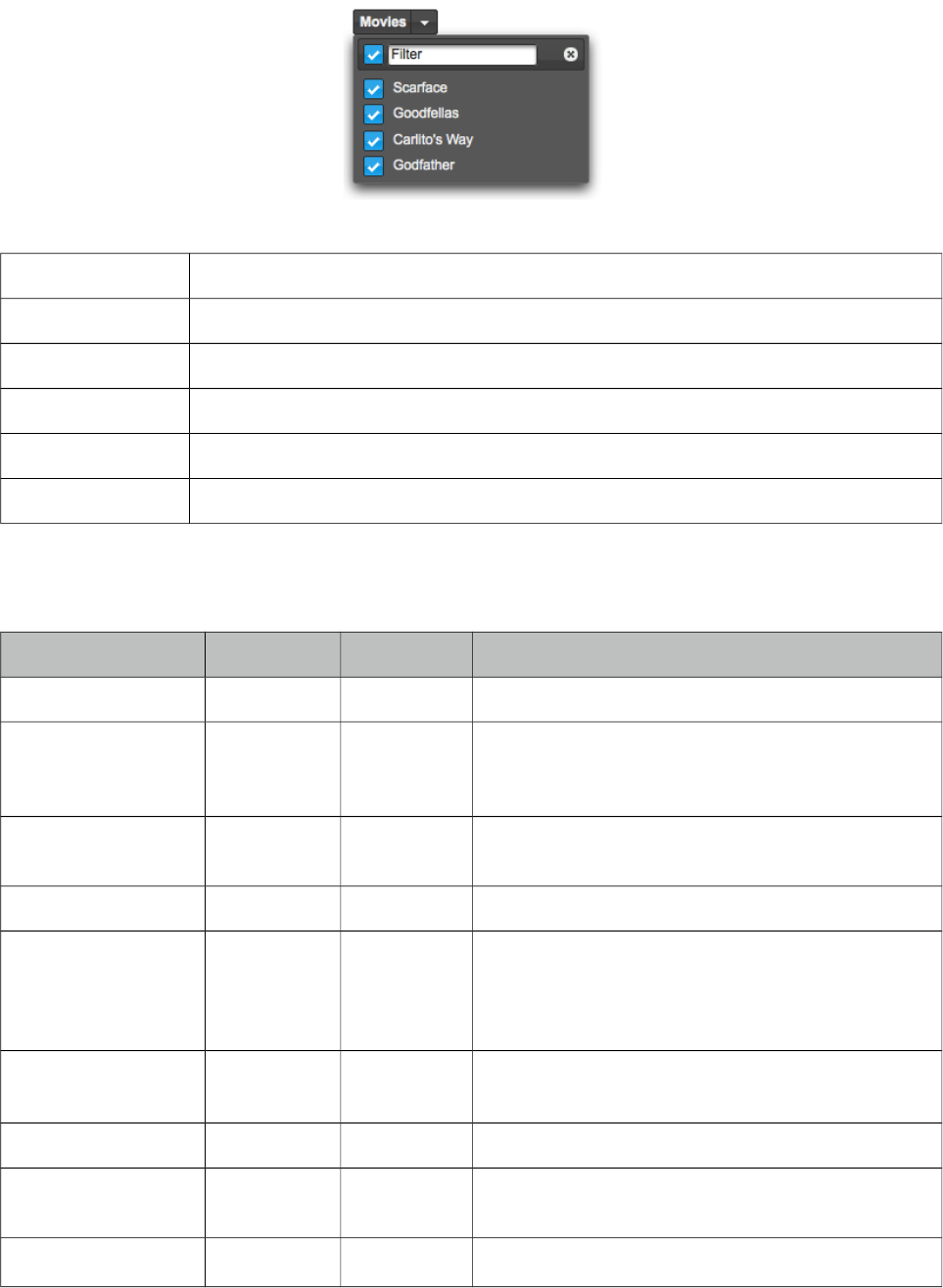
PrimeFaces User Guide
3.122 SelectCheckboxMenu
SelectCheckboxMenu is a multi select component that displays options in an overlay.
Info
Tag selectCheckboxMenu
Component Class org.primefaces.component.selectcheckboxmenu.SelectCheckboxMenu
Component Type org.primefaces.component.SelectCheckboxMenu
Component Family org.primefaces.component
Renderer Type org.primefaces.component.SelectCheckboxMenuRenderer
Renderer Class org.primefaces.component.selectcheckboxmenu.SelectCheckboxMenuRenderer
Attributes
Name Default Type Description
id null String Unique identifier of the component
rendered true Boolean Boolean value to specify the rendering of the
component, when set to false component will not be
rendered.
binding null Object An el expression that maps to a server side
UIComponent instance in a backing bean
value null Object Value of the component referring to a List.
converter null Converter/
String
An el expression or a literal text that defines a
converter for the component. When it’s an EL
expression, it’s resolved to a converter instance. In
case it’s a static text, it must refer to a converter id
immediate false Boolean When set true, process validations logic is executed
at apply request values phase for this component.
required false Boolean Marks component as required
validator null MethodExpr A method expression that refers to a method
validationg the input
valueChangeListener null MethodExpr A method expression that refers to a method for
444
PrimeFaces User Guide
Name Default Type Description
handling a valuechangeevent
requiredMessage null String Message to be displayed when required field
validation fails.
converterMessage null String Message to be displayed when conversion fails.
validatorMessage null String Message to be displayed when validation fields.
widgetVar null String Name of the client side widget.
disabled false Boolean Disables the component.
label null String User presentable name.
onchange null String Callback to execute on value change.
style null String Inline style of the component.
styleClass null String Style class of the container.
scrollHeight null Integer Height of the overlay.
onShow null String Client side callback to execute when overlay is
displayed.
onHide null String Client side callback to execute when overlay is
hidden.
filter false Boolean Renders an input field as a filter.
filterMatchMode startsWith String Match mode for filtering, valid values are
startsWith, contains, endsWith and custom.
filterFunction null String Client side function to use in custom filtering.
caseSensitive false Boolean Defines if filtering would be case sensitive.
panelStyle null String Inline style of the overlay.
panelStyleClass null String Style class of the overlay.
appendTo null String Appends the overlay to the element defined by
search expression. Defaults to document body.
tabindex null String Position of the element in the tabbing order.
title null String Advisory tooltip information.
showHeader true Boolean When enabled, the header of panel is displayed.
updateLabel false Boolean When enabled, the selected items are displayed on
label.
multiple false Boolean Whether to show selected items as multiple labels.
445
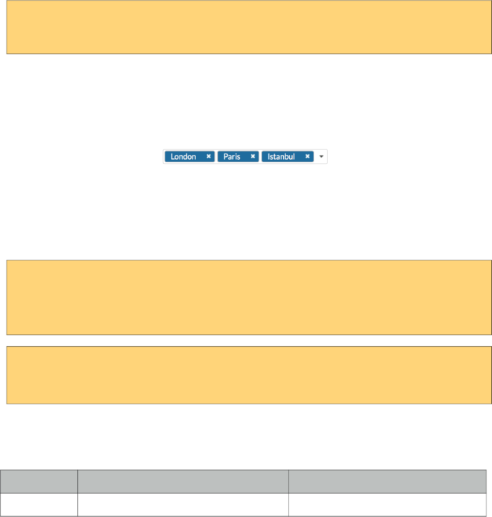
PrimeFaces User Guide
Getting started with SelectCheckboxMenu
SelectCheckboxMenu usage is same as the standard selectManyCheckbox or PrimeFaces
selectManyCheckbox components.
<p:selectCheckboxMenu value="#{bean.selectedOptions}" label="Movies">
<f:selectItems value="#{bean.options}" />
</p:selectCheckboxMenu>
Labels
Selected items are not displayed as the component label by default, setting updateLabel to true
displays item as a comma separated list and for an advanced display use multiple property instead
which renders the items as separate tokens similar to the chips component.
Filtering
When filtering is enabled with setting filter on, an input field is rendered at overlay header and on
keyup event filtering is executed on client side using filterMatchMode. Default modes of
filterMatchMode are startsWith, contains, endsWith and custom. Custom mode requires a javascript
function to do the filtering.
<p:selectCheckboxMenu value="#{bean.selectedOptions}" label="Movies"
filterMatchMode="custom" filterFunction="customFilter" filter="on">
<f:selectItems value="#{bean.options}" />
</p:selectCheckboxMenu>
function customFilter(itemLabel, filterValue) {
//return true to accept and false to reject
}
Ajax Behavior Events
In addition to common dom events like change, selectCheckboxMenu provides toggleSelect event.
Event Listener Parameter Fired
toggleSelect org.primefaces.event.ToggleSelectEvent When toggle all checkbox changes.
Skinning
SelectCheckboxMenu resides in a main container which style and styleClass attributes apply. As
skinning style classes are global, see the main theming section for more information. Following is
the list of structural style classes;
446
PrimeFaces User Guide
Style Class Applies
.ui-selectcheckboxmenu Main container element.
.ui-selectcheckboxmenu-label-container Label container.
.ui-selectcheckboxmenu-label Label.
.ui-selectcheckboxmenu-trigger Dropdown icon.
.ui-selectcheckboxmenu-panel Overlay panel.
.ui-selectcheckboxmenu-items Option list container.
.ui-selectcheckboxmenu-item Each options in the collection.
.ui-chkbox Container of a checkbox.
.ui-chkbox-box Container of checkbox icon.
.ui-chkbox-icon Checkbox icon.
447
PrimeFaces User Guide
3.123 SelectManyButton
SelectManyButton is a multi select component using button UI.
Info
Tag selectManyButton
Component Class org.primefaces.component.selectmanybutton.SelectManyButton
Component Type org.primefaces.component.SelectManyButton
Component Family org.primefaces.component
Renderer Type org.primefaces.component.SelectManyButton
Renderer Class org.primefaces.component.selectmanybutton.SelectManyButton
Attributes
Name Default Type Description
id null String Unique identifier of the component
rendered true Boolean Boolean value to specify the rendering of the
component, when set to false component will not be
rendered.
binding null Object An el expression that maps to a server side
UIComponent instance in a backing bean
value null Object Value of the component referring to a List.
converter null Converter/
String
An el expression or a literal text that defines a
converter for the component. When it’s an EL
expression, it’s resolved to a converter instance. In
case it’s a static text, it must refer to a converter id
immediate false Boolean When set true, process validations logic is executed
at apply request values phase for this component.
required false Boolean Marks component as required
validator null MethodExpr A method expression that refers to a method
validationg the input
valueChangeListener null MethodExpr A method expression that refers to a method for
handling a valuechangeevent
requiredMessage null String Message to be displayed when required field
validation fails.
448
PrimeFaces User Guide
Name Default Type Description
converterMessage null String Message to be displayed when conversion fails.
validatorMessage null String Message to be displayed when validation fields.
widgetVar null String Name of the client side widget.
disabled false Boolean Disables the component.
label null String User presentable name.
onchange null String Callback to execute on value change.
style null String Inline style of the component.
styleClass null String Style class of the container.
Getting started with SelectManyButton
SelectManyButton usage is same as selectManyCheckbox, buttons just replace checkboxes.
Skinning
SelectManyButton resides in a main container which style and styleClass attributes apply. As
skinning style classes are global, see the main theming section for more information. Following is
the list of structural style classes;
Style Class Applies
.ui-selectmanybutton Main container element.
449
PrimeFaces User Guide
3.124 SelectManyCheckbox
SelectManyCheckbox is an extended version of the standard SelectManyCheckbox.
Info
Tag selectManyCheckbox
Component Class org.primefaces.component.selectmanycheckbox.SelectManyCheckbox
Component Type org.primefaces.component.SelectManyCheckbox
Component Family org.primefaces.component
Renderer Type org.primefaces.component.SelectManyCheckboxRenderer
Renderer Class org.primefaces.component.selectmanycheckbox.SelectManyCheckboxRenderer
Attributes
Name Default Type Description
id null String Unique identifier of the component
rendered true Boolean Boolean value to specify the rendering of the
component, when set to false component will
not be rendered.
binding null Object An el expression that maps to a server side
UIComponent instance in a backing bean
value null Object Value of the component referring to a List.
converter null Converter/String An el expression or a literal text that defines
a converter for the component. When it’s an
EL expression, it’s resolved to a converter
instance. In case it’s a static text, it must refer
to a converter id
immediate false Boolean When set true, process validations logic is
executed at apply request values phase for
this component.
required false Boolean Marks component as required
validator null MethodExpr A method expression that refers to a method
validationg the input
valueChangeListener null MethodExpr A method expression that refers to a method
for handling a valuechangeevent
requiredMessage null String Message to be displayed when required field
450
PrimeFaces User Guide
Name Default Type Description
validation fails.
converterMessage null String Message to be displayed when conversion
fails.
validatorMessage null String Message to be displayed when validation
fields.
widgetVar null String Name of the client side widget.
disabled false Boolean Disables the component.
label null String User presentable name.
layout lineDirection String Layout of the checkboxes, valid values are
lineDirection, pageDirection, grid,
responsive and custom.
columns 0 Integer Number of columns in grid layout.
onchange null String Callback to execute on value change.
style null String Inline style of the component.
styleClass null String Style class of the container.
tabindex null String Position of the component in the tabbing
order.
Getting started with SelectManyCheckbox
SelectManyCheckbox usage is same as the standard one.
Layouts
There are five layouts options for the checkboxes;
•lineDirection: Checkboxes are displayed horizontally
•pageDirection: Checkboxes are displayed vertically
•grid: Checkboxes are displayed in grid with given columns value.
•responsive: This is same as grid except, checkboxes are displayed vertically after a certain
screen breakpoint.
•custom: In this mode, selectManyCheckbox leaves the layout to you using p:checkbox
components. Next section provides more detail about this mode.
Custom Layout
Custom layout is defined using the standalone checkbox components that match the selectItems of
the selectManyCheckbox by their itemIndex option. Note that in this mode selectManyCheckbox
does not render anything visible.
Following example uses customizable Grid CSS layout.
451
PrimeFaces User Guide
<p:selectManyCheckbox id="custom" value="#{checkboxView.selectedConsoles2}"
layout="custom">
<f:selectItem itemLabel="Xbox One" itemValue="Xbox One" />
<f:selectItem itemLabel="PS4" itemValue="PS4" />
</p:selectManyCheckbox>
<div class="ui-grid ui-grid-responsive">
<div class="ui-grid-row">
<div class="ui-grid-col-6">
<p:outputLabel for="opt1" value="Xbox One" style="display:block"/>
<p:checkbox id="opt1" for="custom" itemIndex="0" />
</div>
<div class="ui-grid-col-6">
<p:outputLabel for="opt2" value="PS4" style="display:block"/>
<p:checkbox id="opt2" for="custom" itemIndex="1" />
</div>
</div>
</div>
Skinning
SelectManyCheckbox resides in a main container which style and styleClass attributes apply. As
skinning style classes are global, see the main theming section for more information. Following is
the list of structural style classes;
Style Class Applies
.ui-selectmanycheckbox Main container element.
.ui-chkbox Container of a checkbox.
.ui-chkbox-box Container of checkbox icon.
.ui-chkbox-icon Checkbox icon.
452
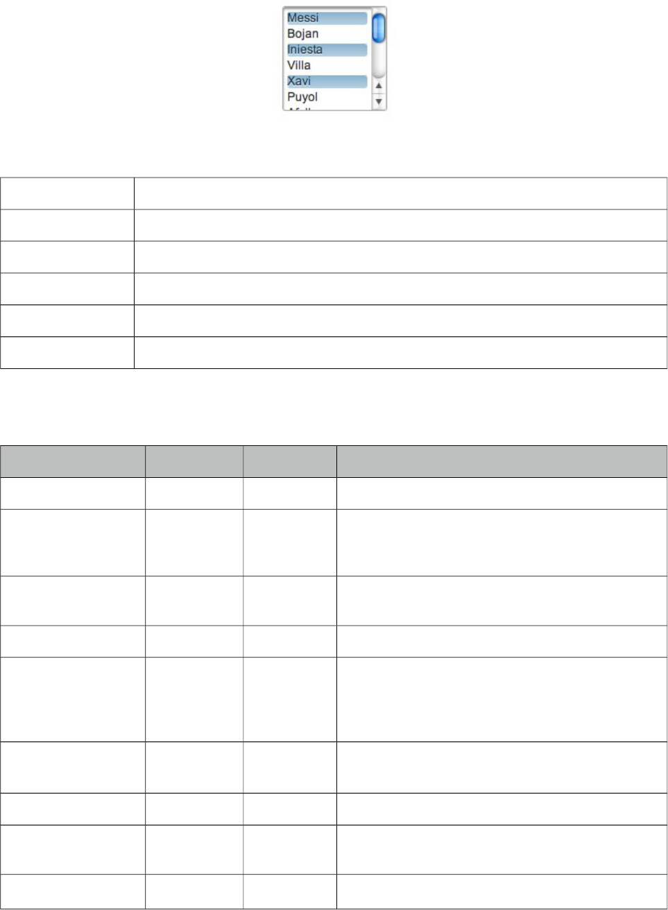
PrimeFaces User Guide
3.125 SelectManyMenu
SelectManyMenu is an extended version of the standard SelectManyMenu.
Info
Tag selectManyMenu
Component Class org.primefaces.component.selectmanymenu.SelectManyMenu
Component Type org.primefaces.component.SelectManyMenu
Component Family org.primefaces.component
Renderer Type org.primefaces.component.SelectManyMenuRenderer
Renderer Class org.primefaces.component.selectmanymenu.SelectManyMenuRenderer
Attributes
Name Default Type Description
id null String Unique identifier of the component
rendered true Boolean Boolean value to specify the rendering of the
component, when set to false component will not
be rendered.
binding null Object An el expression that maps to a server side
UIComponent instance in a backing bean
value null Object Value of the component referring to a List.
converter null Converter/
String
An el expression or a literal text that defines a
converter for the component. When it’s an EL
expression, it’s resolved to a converter instance. In
case it’s a static text, it must refer to a converter id
immediate false Boolean When set true, process validations logic is executed
at apply request values phase for this component.
required false Boolean Marks component as required
validator null MethodExpr A method expression that refers to a method
validationg the input
valueChangeListener null MethodExpr A method expression that refers to a method for
453
PrimeFaces User Guide
Name Default Type Description
handling a valuechangeevent
requiredMessage null String Message to be displayed when required field
validation fails.
converterMessage null String Message to be displayed when conversion fails.
validatorMessage null String Message to be displayed when validation fields.
widgetVar null String Name of the client side widget.
disabled false Boolean Disables the component.
label null String User presentable name.
onchange null String Callback to execute on value change.
onclick null String Callback for click event.
ondblclick null String Callback for dblclick event.
style null String Inline style of the component.
styleClass null String Style class of the container.
tabindex null String Position of the input element in the tabbing order.
var null String Name of iterator to be used in custom content
display.
showCheckbox false Boolean When true, a checkbox is displayed next to each
item.
filter false Boolean Displays an input filter for the list.
filterMatchMode null String Match mode for filtering, valid values are
startsWith (default), contains, endsWith and
custom.
filterFunction null String Client side function to use in custom
filterMatchMode.
caseSensitive false Boolean Defines if filtering would be case sensitive.
scrollHeight null Integer Defines the height of the scrollable area
Getting started with SelectManyMenu
SelectManyMenu usage is same as the standard one.
Custom Content
Custom content can be displayed for each item using column components.
454
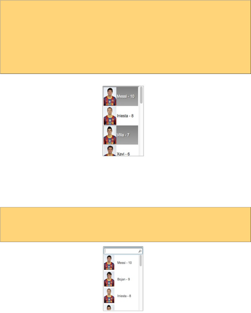
PrimeFaces User Guide
<p:selectManyMenu value="#{bean.selectedPlayers}" converter="player" var="p">
<f:selectItems value="#{bean.players}" var="player"
itemLabel="#{player.name}" itemValue="#{player}" />
<p:column>
<p:graphicImage value="/images/barca/#{p.photo}" width="40"/>
</p:column>
<p:column>
#{p.name} - #{p.number}
</p:column>
</p:selectManyMenu>
Filtering
Filtering is enabled by setting filter attribute to true. There are four filter modes; startsWith,
contains, endsWith and custom. In custom mode, filterFunction must be defined as the name of the
javascript function that takes the item value and filter as parameters to return a boolean to accept or
reject a value. To add a filter to previous example;
<p:selectManyMenu value="#{menuBean.selectedPlayer}" converter="player" var="p"
filter="true" filterMatchMode="contains">
...
</p:selectManyMenu>
Checkbox
SelectManyMenu has built-in support for checkbox based multiple selection, when enabled by
showCheckbox option, checkboxes are displayed next to each column.
455

PrimeFaces User Guide
Skinning
SelectManyMenu resides in a container that style and styleClass attributes apply. As skinning style
classes are global, see the main theming section for more information. Following is the list of
structural style classes;
Style Class Applies
.ui-selectmanymenu Main container element.
.ui-selectlistbox-item Each item in list.
456
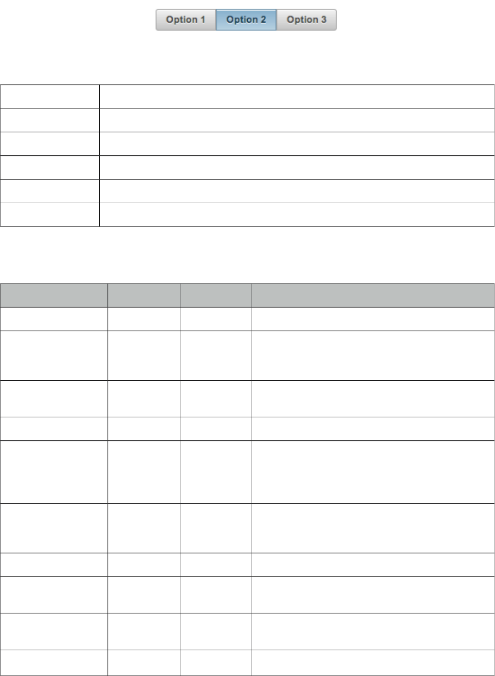
PrimeFaces User Guide
3.126 SelectOneButton
SelectOneButton is an input component to do a single select.
Info
Tag selectOneButton
Component Class org.primefaces.component.selectonebutton.SelectOneButton
Component Type org.primefaces.component.SelectOneButton
Component Family org.primefaces.component
Renderer Type org.primefaces.component.SelectOneButtonRenderer
Renderer Class org.primefaces.component.selectonebutton.SelectOneButtonRenderer
Attributes
Name Default Type Description
id null String Unique identifier of the component
rendered true Boolean Boolean value to specify the rendering of the
component, when set to false component will not
be rendered.
binding null Object An el expression that maps to a server side
UIComponent instance in a backing bean
value null Object Value of the component referring to a List.
converter null Converter/St
ring
An el expression or a literal text that defines a
converter for the component. When it’s an EL
expression, it’s resolved to a converter instance. In
case it’s a static text, it must refer to a converter id
immediate false Boolean When set true, process validations logic is
executed at apply request values phase for this
component.
required false Boolean Marks component as required
validator null MethodExpr A method expression that refers to a method
validationg the input
valueChangeListener null MethodExpr A method expression that refers to a method for
handling a valuechangeevent
requiredMessage null String Message to be displayed when required field
457
PrimeFaces User Guide
Name Default Type Description
validation fails.
converterMessage null String Message to be displayed when conversion fails.
validatorMessage null String Message to be displayed when validation fields.
widgetVar null String Name of the client side widget.
disabled false Boolean Disables the component.
label null String User presentable name.
onchange null String Callback to execute on value change.
style null String Inline style of the component.
styleClass null String Style class of the container.
tabindex 0 String Position of the element in the tabbing order.
unselectable true Boolean. Whether selection can be cleared.
Getting started with SelectOneButton
SelectOneButton usage is same as selectOneRadio component, buttons just replace the radios.
Skinning
SelectOneButton resides in a main container which style and styleClass attributes apply. As
skinning style classes are global, see the main theming section for more information. Following is
the list of structural style classes;
Style Class Applies
.ui-selectonebutton Main container element.
458
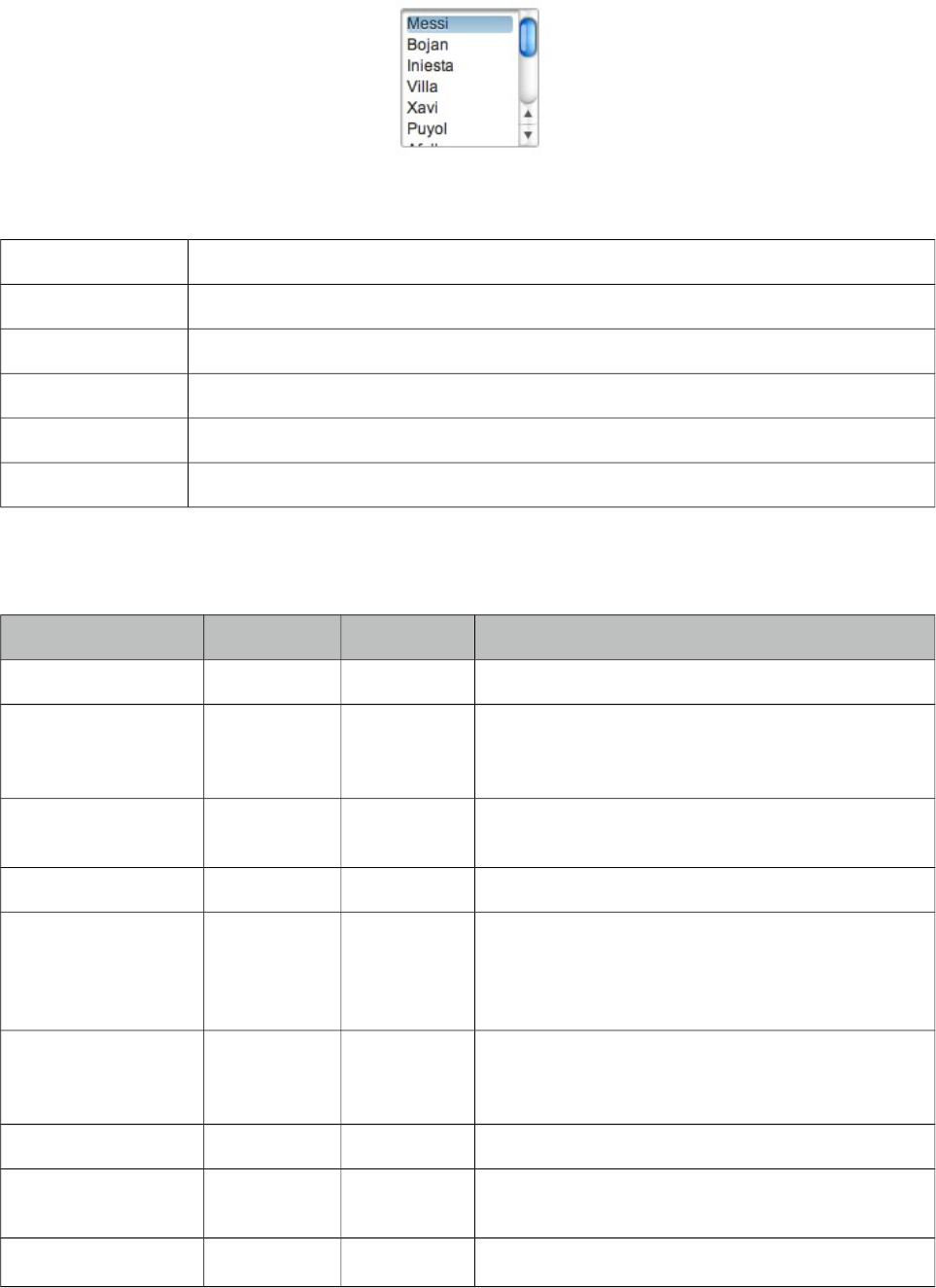
PrimeFaces User Guide
3.127 SelectOneListbox
SelectOneListbox is an extended version of the standard selectOneListbox component.
Info
Tag selectOneListbox
Component Class org.primefaces.component.selectonelistbox.SelectOneListbox
Component Type org.primefaces.component.SelectOneListbox
Component Family org.primefaces.component
Renderer Type org.primefaces.component.SelectOneListboxRenderer
Renderer Class org.primefaces.component.selectonelistbox.SelectOneListBoxRenderer
Attributes
Name Default Type Description
id null String Unique identifier of the component
rendered true Boolean Boolean value to specify the rendering of the
component, when set to false component will not
be rendered.
binding null Object An el expression that maps to a server side
UIComponent instance in a backing bean
value null Object Value of the component referring to a List.
converter null Converter/
String
An el expression or a literal text that defines a
converter for the component. When it’s an EL
expression, it’s resolved to a converter instance. In
case it’s a static text, it must refer to a converter id
immediate false Boolean When set true, process validations logic is
executed at apply request values phase for this
component.
required false Boolean Marks component as required
validator null MethodExpr A method expression that refers to a method
validationg the input
valueChangeListener null MethodExpr A method expression that refers to a method for
459
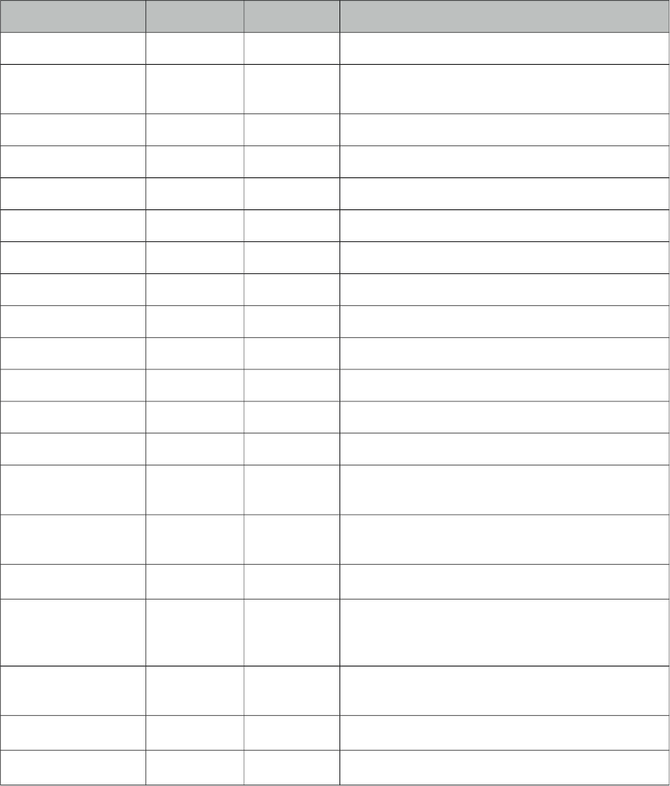
PrimeFaces User Guide
Name Default Type Description
handling a valuechangeevent
requiredMessage null String Message to be displayed when required field
validation fails.
converterMessage null String Message to be displayed when conversion fails.
validatorMessage null String Message to be displayed when validation fields.
widgetVar null String Name of the client side widget.
disabled false Boolean Disables the component.
label null String User presentable name.
onchange null String Callback to execute on value change.
onclick null String Callback for click event.
ondblclick null String Callback for dblclick event.
style null String Inline style of the component.
styleClass null String Style class of the container.
tabindex null String Position of the input element in the tabbing order.
value null String Name of iterator to be used in custom content
display.
var null String Name of iterator to be used in custom content
display.
filter false Boolean Displays an input filter for the list.
filterMatchMode null String Match mode for filtering, valid values are
startsWith (default), contains, endsWith and
custom.
filterFunction null String Client side function to use in custom
filterMatchMode.
caseSensitive false Boolean Defines if filtering would be case sensitive.
scrollHeight null Integer Defines the height of the scrollable area.
Getting started with SelectOneListbox
SelectOneListbox usage is same as the standard one.
Custom Content
Custom content can be displayed for each item using column components.
460
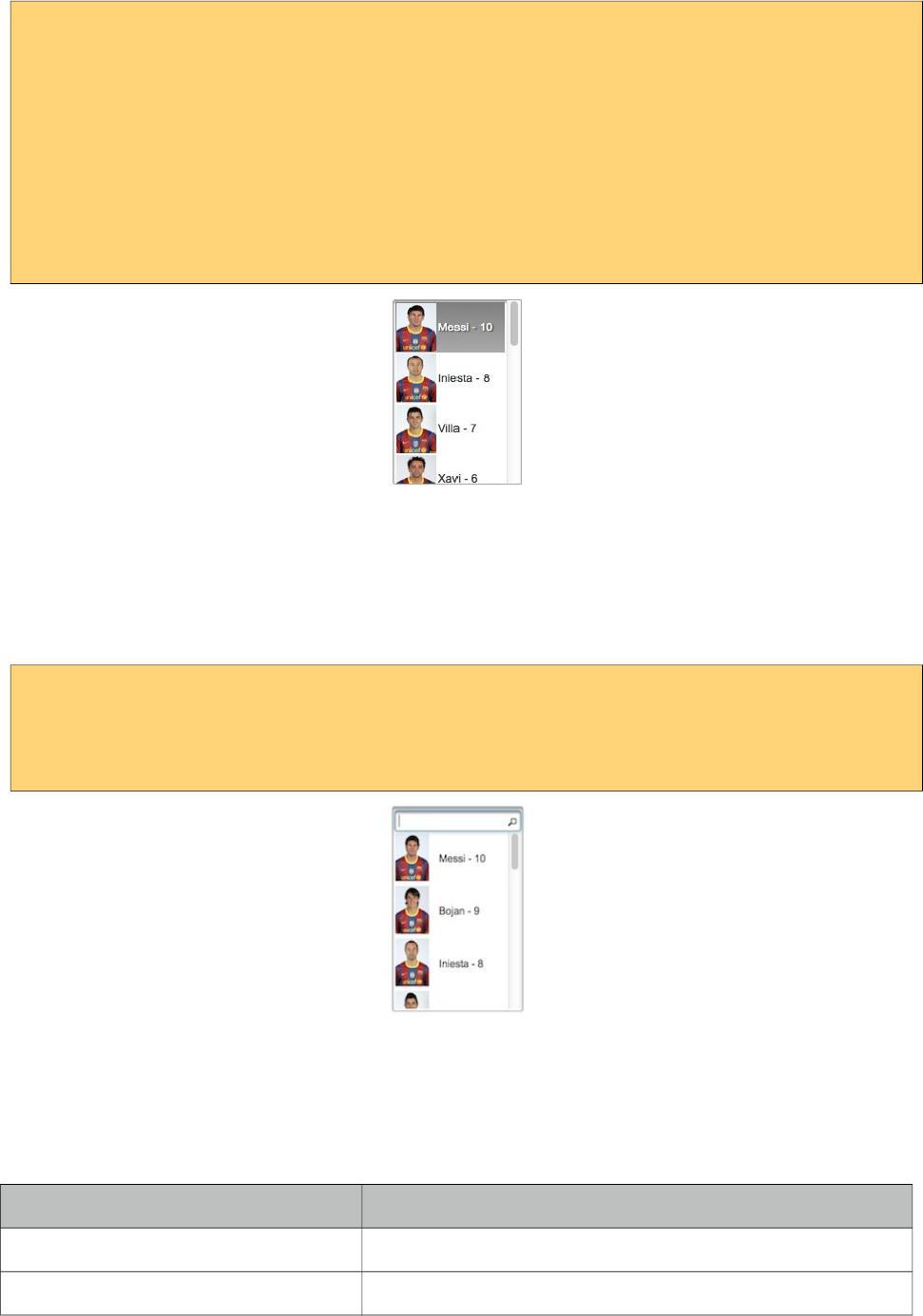
PrimeFaces User Guide
<p:selectOneListbox value="#{bean.player}" converter="player" var="p">
<f:selectItems value="#{bean.players}" var="player"
itemLabel="#{player.name}" itemValue="#{player}" />
<p:column>
<p:graphicImage value="/images/barca/#{p.photo}" width="40"/>
</p:column>
<p:column>
#{p.name} - #{p.number}
</p:column>
</p:selectOneListbox>
Filtering
Filtering is enabled by setting filter attribute to true. There are four filter modes; startsWith,
contains, endsWith and custom. In custom mode, filterFunction must be defined as the name of the
javascript function that takes the item value and filter as parameters to return a boolean to accept or
reject a value. To add a filter to previous example;
<p:selectOneListbox value="#{menuBean.selectedPlayer}" converter="player" var="p"
filter="true" filterMatchMode="contains">
...
</p:selectOneListbox>
Skinning
SelectOneListbox resides in a main container which style and styleClass attributes apply. As
skinning style classes are global, see the main theming section for more information. Following is
the list of structural style classes;
Style Class Applies
.ui-selectonelistbox Main container element.
.ui-selectlistbox-item Each item in list.
461
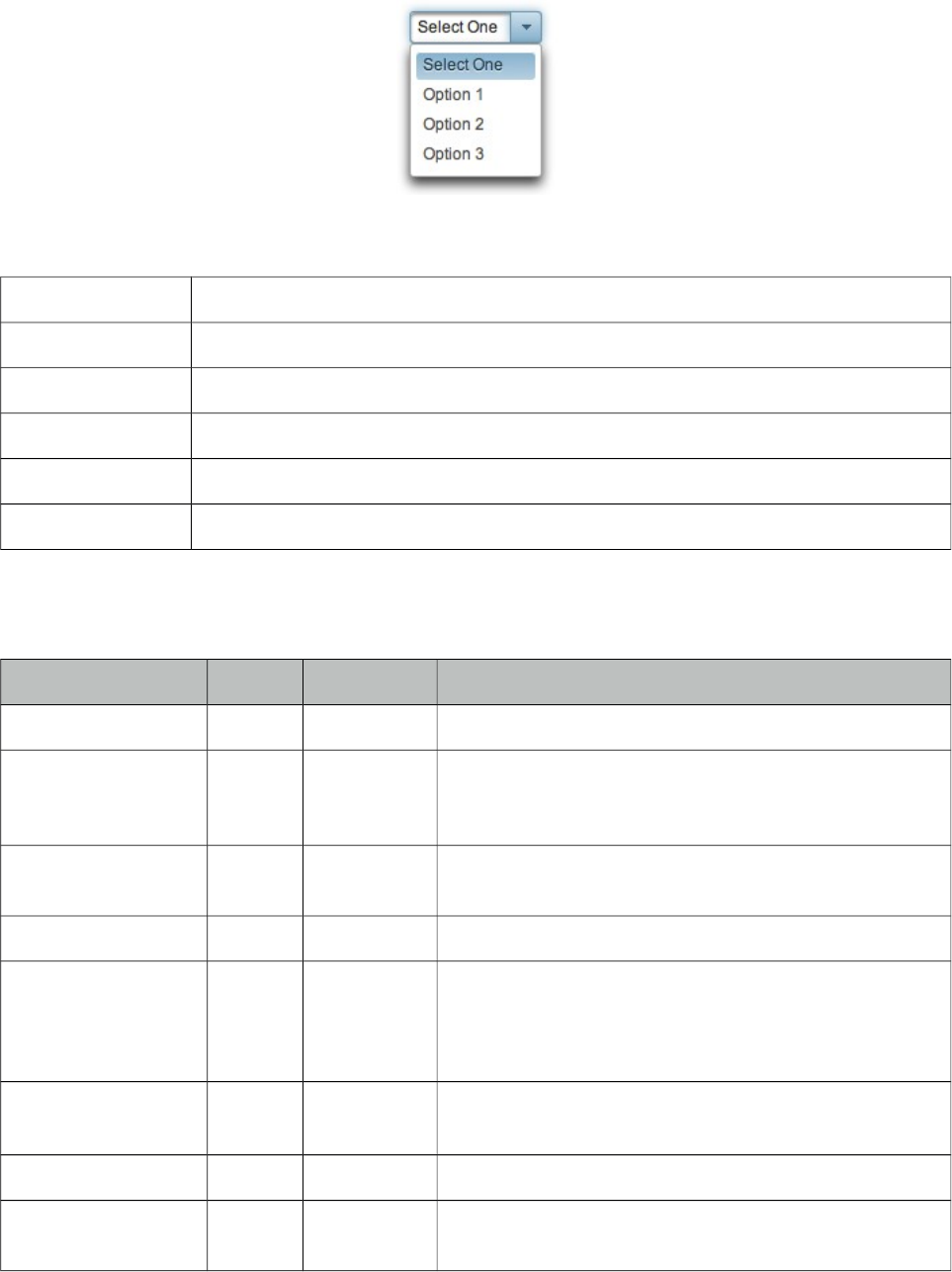
PrimeFaces User Guide
3.128 SelectOneMenu
SelectOneMenu is an extended version of the standard SelectOneMenu.
Info
Tag selectOneMenu
Component Class org.primefaces.component.selectonemenu.SelectOneMenu
Component Type org.primefaces.component.SelectOneMenu
Component Family org.primefaces.component
Renderer Type org.primefaces.component.SelectOneMenuRenderer
Renderer Class org.primefaces.component.selectonemenu.SelectOneMenuRenderer
Attributes
Name Default Type Description
id null String Unique identifier of the component
rendered true Boolean Boolean value to specify the rendering of the
component, when set to false component will not be
rendered.
binding null Object An el expression that maps to a server side
UIComponent instance in a backing bean
value null Object Value of the component.
converter null Converter/
String
An el expression or a literal text that defines a converter
for the component. When it’s an EL expression, it’s
resolved to a converter instance. In case it’s a static text,
it must refer to a converter id
immediate 0 Boolean When set true, process validations logic is executed at
apply request values phase for this component.
required 0 Boolean Marks component as required
validator null MethodExpr A method expression that refers to a method validationg
the input
462
PrimeFaces User Guide
Name Default Type Description
valueChangeListener null MethodExpr A method expression that refers to a method for
handling a valuechangeevent
requiredMessage null String Message to be displayed when required field validation
fails.
converterMessage null String Message to be displayed when conversion fails.
validatorMessage null String Message to be displayed when validation fields.
widgetVar null String Name of the client side widget.
effect blind String Name of the toggle animation.
effectSpeed normal String Duration of toggle animation, valid values are "slow",
"normal" and "fast".
disabled false Boolean Disables the component.
label null String User presentable name.
onchange null String Client side callback to execute on value change.
onkeyup null String Client side callback to execute on keyup.
onkeydown null String Client side callback to execute on keydown.
style null String Inline style of the component.
styleClass null String Style class of the container.
var null String Name of the item iterator.
height auto Integer Height of the overlay.
tabindex null String Tabindex of the input.
editable false Boolean When true, input becomes editable.
filter false Boolean Renders an input field as a filter.
filterMatchMode starts
With
String Match mode for filtering, valid values are startsWith,
contains, endsWith and custom.
filterFunction null String Client side function to use in custom filtering.
caseSensitive false Boolean Defines if filtering would be case sensitive.
maxlength null Integer Number of maximum characters allowed in editable
selectOneMenu.
appendTo null String Appends the overlay to the element defined by search
expression. Defaults to document body.
title null String Advisory tooltip information.
syncTooltip false Boolean Updates the title of the component with the description
of the selected item.
463
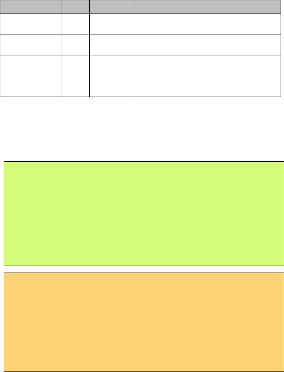
PrimeFaces User Guide
Name Default Type Description
labelTemplate null String Displays label of the element in a custom template.
Valid placeholder is {0}.
onfocus null String Client side callback to execute when element receives
focus.
onblur null String Client side callback to execute when element loses
focus.
autoWidth true Boolean Calculates a fixed width based on the width of the
maximum option label. Set to false for custom width.
Getting started with SelectOneMenu
Basic SelectOneMenu usage is same as the standard one.
Custom Content
SelectOneMenu can display custom content in overlay panel by using column component and the
var option to refer to each item.
public class MenuBean {
private List<Player> players;
private Player selectedPlayer;
public OrderListBean() {
players = new ArrayList<Player>();
players.add(new Player("Messi", 10, "messi.jpg"));
//more players
}
//getters and setters
}
<p:selectOneMenu value="#{menuBean.selectedPlayer}" converter="player" var="p">
<f:selectItem itemLabel="Select One" itemValue="" />
<f:selectItems value="#{menuBean.players}" var="player"
itemLabel="#{player.name}" itemValue="#{player}"/>
<p:column>
<p:graphicImage value="/images/barca/#{p.photo}" width="40" height="50"/>
</p:column>
<p:column>
#{p.name} - #{p.number}
</p:column>
</p:selectOneMenu>
464
PrimeFaces User Guide
Effects
An animation is executed to show and hide the overlay menu, default effect is fade and following
options are available for effect attribute; blind, bounce, clip, drop, explode, fold, highlight, puff,
pulsate, scale, shake, size, slide and none.
Editable
Editable SelectOneMenu provides a UI to either choose from the predefined options or enter a
manual input. Set editable option to true to use this feature.
Filtering
When filtering is enabled with setting filter on, an input field is rendered at overlay header and on
keyup event filtering is executed on client side using filterMatchMode. Default modes of
filterMatchMode are startsWith, contains, endsWith and custom. Custom mode requires a javascript
function to do the filtering.
<p:selectOneMenu value="#{bean.selectedOptions}"
filterMatchMode="custom" filterFunction="customFilter">
<f:selectItems value="#{bean.options}" />
</p:selectOneMenu>
function customFilter(itemLabel, filterValue) {
//return true to accept and false to reject
}
465
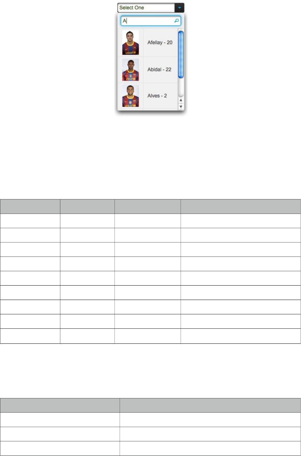
PrimeFaces User Guide
Ajax Behavior Events
In addition to the standard events like "change", custom "itemSelect" event is also available to
invoke when an item is selected from dropdown.
Client Side API
Widget: PrimeFaces.widget.SelectOneMenu
Method Params Return Type Description
show() - void Shows overlay menu.
hide() - void Hides overlay menu.
blur() - void Invokes blur event.
focus() - void Invokes focus event.
enable() - void Enables component.
disable() - void Disabled component.
selectValue() value: itemValue void Selects given value.
getSelectedValue() - Object Returns value of selected item.
getSelectedLabel() String Returns label of selected item.
Skinning
SelectOneMenu resides in a container element that style and styleClass attributes apply. As skinning
style classes are global, see the main theming section for more information. Following is the list of
structural style classes;
Style Class Applies
.ui-selectonemenu Main container.
.ui-selectonemenu-label Label of the component.
.ui-selectonemenu-trigger Container of dropdown icon.
466
PrimeFaces User Guide
Style Class Applies
.ui-selectonemenu-items Items list.
.ui-selectonemenu-items Each item in the list.
467
PrimeFaces User Guide
3.129 SelectOneRadio
SelectOneRadio is an extended version of the standard SelectOneRadio with theme integration.
Info
Tag selectOneRadio
Component Class org.primefaces.component.selectoneradio.SelectOneRadio
Component Type org.primefaces.component.SelectOneRadio
Component Family org.primefaces.component
Renderer Type org.primefaces.component.SelectOneRadioRenderer
Renderer Class org.primefaces.component.selectoneradio.SelectOneRadioRenderer
Attributes
Name Default Type Description
id null String Unique identifier of the component
rendered true Boolean Boolean value to specify the rendering of the
component, when set to false component will not be
rendered.
binding null Object An el expression that maps to a server side
UIComponent instance in a backing bean
value null Object Value of the component referring to a List.
converter null Converter/
String
An el expression or a literal text that defines a
converter for the component. When it’s an EL
expression, it’s resolved to a converter instance. In
case it’s a static text, it must refer to a converter id
immediate 0 Boolean When set true, process validations logic is executed at
apply request values phase for this component.
required 0 Boolean Marks component as required
validator null MethodExpr A method expression that refers to a method
validationg the input
valueChangeListener null MethodExpr A method expression that refers to a method for
handling a valuechangeevent
requiredMessage null String Message to be displayed when required field
validation fails.
468
PrimeFaces User Guide
Name Default Type Description
converterMessage null String Message to be displayed when conversion fails.
validatorMessage null String Message to be displayed when validation fields.
widgetVar null String Name of the client side widget.
disabled false Boolean Disables the component.
label null String User presentable name.
layout line
Direction
String Layout of the radiobuttons, valid values are
lineDirection, pageDirection, custom, responsive and
grid.
columns 0 Integer Number of columns in grid layout.
onchange null String Callback to execute on value change.
onclick null String Callback to execute on click of a radio.
style null String Inline style of the component.
styleClass null String Style class of the container.
tabindex null String Specifies the tab order of element in tab navigation.
plain false Boolean Plain mode displays radiobuttons using native
browser rendering instead of themes.
Getting started with SelectOneRadio
SelectOneRadio usage is same as the standard one.
Custom Layout
Standard selectOneRadio component only supports horizontal and vertical rendering of the radio
buttons with a strict table markup. PrimeFaces SelectOneRadio on the other hand provides a
flexible layout option so that radio buttons can be located anywhere on the page. This is
implemented by setting layout option to custom and with standalone radioButton components. Note
that in custom mode, selectOneRadio itself does not render any output.
<p:selectOneRadio id="customRadio" value="#{formBean.option}" layout="custom">
<f:selectItem itemLabel="Option 1" itemValue="1" />
<f:selectItem itemLabel="Option 2" itemValue="2" />
<f:selectItem itemLabel="Option 3" itemValue="3" />
</p:selectOneRadio>
469
PrimeFaces User Guide
<h:panelGrid columns="3">
<p:radioButton id="opt1" for="customRadio" itemIndex="0"/>
<h:outputLabel for="opt1" value="Option 1" />
<p:spinner />
<p:radioButton id="opt2" for="customRadio" itemIndex="1"/>
<h:outputLabel for="opt2" value="Option 2" />
<p:inputText />
<p:radioButton id="opt3" for="customRadio" itemIndex="2"/>
<h:outputLabel for="opt3" value="Option 3" />
<p:calendar />
</h:panelGrid>
RadioButton’s for attribute should refer to a selectOneRadio component and itemIndex points to the
index of the selectItem. When using custom layout option, selectOneRadio component should be
placed above any radioButton that points to the selectOneRadio.
Client Side API
Widget: PrimeFaces.widget.SelectOneRadio
Method Params Return Type Description
enable() - void Enables component.
disable() - void Disables component.
Skinning
SelectOneRadio resides in a main container which style and styleClass attributes apply. As skinning
style classes are global, see the main theming section for more information. Following is the list of
structural style classes;
Style Class Applies
.ui-selectoneradio Main container element.
.ui-radiobutton Container of a radio button.
.ui-radiobutton-box Container of radio button icon.
.ui-radiobutton-icon Radio button icon.
470
PrimeFaces User Guide
3.130 Separator
Separator displays a horizontal line to separate content.
Info
Tag separator
Component Class org.primefaces.component.separator.Separator
Component Type org.primefaces.component.Separator
Component Family org.primefaces.component
Renderer Type org.primefaces.component.SeparatorRenderer
Renderer Class org.primefaces.component.separator.SeparatorRenderer
Attributes
Name Default Type Description
id null String Unique identifier of the component
rendered true Boolean Boolean value to specify the rendering of the
component, when set to false component will not
be rendered.
binding null Object An el expression that maps to a server side
UIComponent instance in a backing bean
title null String Advisory tooltip informaton.
style null String Inline style of the separator.
styleClass null String Style class of the separator.
Getting started with Separator
In its simplest form, separator is used as;
//content
<p:separator />
//content
Dimensions
Separator renders a <hr /> tag which style and styleClass options apply.
471
PrimeFaces User Guide
<p:separator style="width:500px;height:20px" />
Special Separators
Separator can be used inside other components such as menu when supported.
<p:menu>
//submenu or menuitem
<p:separator />
//submenu or menuitem
</p:menu>
Skinning
As mentioned in dimensions section, style and styleClass options can be used to style the separator.
Following is the list of structural style classes;
Class Applies
.ui-separator Separator element
As skinning style classes are global, see the main theming section for more information.
472
PrimeFaces User Guide
3.131 Signature
Signature is used to draw a signature as an input. Various options such as background color,
foreground color, thickness are available for customization. Signature also supports touch enabled
devices and legacy browsers without canvas support.
Info
Tag signature
Component Class org.primefaces.component.signature.Signature
Component Type org.primefaces.component.Signature
Component Family org.primefaces.component
Renderer Type org.primefaces.component.SignatureRenderer
Renderer Class org.primefaces.component.signature.SignatureRenderer
Attributes
Name Default Type Description
id null String Unique identifier of the component
rendered true Boolean Boolean value to specify the rendering of the
component, when set to false component will not
be rendered.
binding null Object An el expression that maps to a server side
UIComponent instance in a backing bean
value null Object Value of the component than can be either an EL
expression of a literal text
converter null Converter/
String
An el expression or a literal text that defines a
converter for the component. When it’s an EL
expression, it’s resolved to a converter instance. In
case it’s a static text, it must refer to a converter id
immediate false Boolean Boolean value that specifies the lifecycle phase the
valueChangeEvents should be processed, when true
473
PrimeFaces User Guide
Name Default Type Description
the events will be fired at "apply request values", if
immediate is set to false, valueChange Events are
fired in "process validations"
phase
required False Boolean Marks component as required
validator null Method
Expr
A method binding expression that refers to a
method validationg the input
valueChangeListener null Method
Expr
A method binding expression that refers to a
method for handling a valuchangeevent
requiredMessage null String Message to be displayed when required field
validation fails.
converterMessage null String Message to be displayed when conversion fails.
validatorMessage null String Message to be displayed when validation fields.
widgetVar null String Name of the client side widget
backgroundColor #ffffff String Background color as hex value
color #000000 String Foreground color as hex value
thickness 2 Integer Thickness of the lines
style null String Inline style of the component
styleClass null String Style class of the component.
readonly false Boolean When enabled, signature is used for display
purposes only.
guideline false Boolean Adds a guideline when enabled
guidelineColor #a0a0a0 String Color of the guideline
guidelineOffset 25 String Offset of guideline from bottom
guidelineIndent 10 Boolean Guide line indent from the edges
onchange null String Client side callback to execute when signature
changes.
base65Value null String Write-only value used to pass the value in base64
to backing bean
Getting started with Signature
Value is interpreted as JSON so at backing bean should be a string value.
<p:signature style="width:400px;height:200px" value="#{signatureView.value}" />
474

PrimeFaces User Guide
public class SignatureView {
private String value;
public String getValue() {
return value;
}
public void setValue(String value) {
this.value = value;
}
}
Guideline
Guideline adds a horizontal line to indicate the area to sign, attributes such as guidelineColor,
guidelineOffset and guidelineIndent can be used to customize this area.
Convert to Binary
Signature value is represented as a JSON array at client side and this value is also passed as a java
string to backend bean, however if you need to convert this to a byte[] or write it to an outputStream
following helper class can be used.
475

PrimeFaces User Guide
import java.awt.BasicStroke;
import java.awt.Color;
import java.awt.Graphics2D;
import java.awt.RenderingHints;
import java.awt.image.BufferedImage;
import java.io.ByteArrayOutputStream;
import java.io.IOException;
import java.io.OutputStream;
import java.util.ArrayList;
import java.util.List;
import java.util.regex.Matcher;
import java.util.regex.Pattern;
import javax.imageio.ImageIO;
public class SigGen {
private static final String IMAGE_FORMAT = "png";
private static final int SIGNATURE_HEIGHT = 200;
private static final int SIGNATURE_WIDTH = 400;
/**
* A point along a line within a signature.
*/
private static class Point {
private int x;
private int y;
public Point(float x, float y) {
this.x = Math.round(x);
this.y = Math.round(y);
}
}
476

PrimeFaces User Guide
/**
* Extract a signature from its JSON encoding and redraw it as an image.
*
* @param jsonEncoding the JSON representation of the signature
* @param output the destination stream for the image
* @throws IOException if a problem writing the signature
*/
public static void generateSignature(String jsonEncoding, OutputStream output)
throws IOException {
output.write(redrawSignature(extractSignature(jsonEncoding)));
output.close();
}
/**
* Extract the signature lines and points from the JSON encoding.
*
* @param jsonEncoding the JSON representation of the signature
* @return the retrieved lines and points
*/
private static List<List<Point>> extractSignature(String jsonEncoding) {
List<List<Point>> lines = new ArrayList<List<Point>>();
Matcher lineMatcher =
Pattern.compile("(\\[(?:,?\\[-?[\\d\\.]+,-?[\\d\\.]+\\])+\\])").
matcher(jsonEncoding);
while (lineMatcher.find()) {
Matcher pointMatcher =
Pattern.compile("\\[(-?[\\d\\.]+),(-?[\\d\\.]+)\\]").
matcher(lineMatcher.group(1));
List<Point> line = new ArrayList<Point>();
lines.add(line);
while (pointMatcher.find()) {
line.add(new Point(Float.parseFloat(pointMatcher.group(1)),
Float.parseFloat(pointMatcher.group(2))));
}
}
return lines;
}
/**
* Redraw the signature from its lines definition.
*
* @param lines the individual lines in the signature
* @return the corresponding signature image
* @throws IOException if a problem generating the signature
*/
private static byte[] redrawSignature(List<List<Point>> lines) throws IOException {
BufferedImage signature = new BufferedImage(
SIGNATURE_WIDTH, SIGNATURE_HEIGHT, BufferedImage.TYPE_BYTE_GRAY);
Graphics2D g = (Graphics2D)signature.getGraphics();
g.setColor(Color.WHITE);
g.fillRect(0, 0, signature.getWidth(), signature.getHeight());
g.setColor(Color.BLACK);
g.setStroke(new BasicStroke(2, BasicStroke.CAP_ROUND, BasicStroke.JOIN_ROUND));
g.setRenderingHint(
RenderingHints.KEY_ANTIALIASING, RenderingHints.VALUE_ANTIALIAS_ON);
Point lastPoint = null;
for (List<Point> line : lines) {
for (Point point : line) {
if (lastPoint != null) {
g.drawLine(lastPoint.x, lastPoint.y, point.x, point.y);
}
lastPoint = point;
}
lastPoint = null;
}
ByteArrayOutputStream output = new ByteArrayOutputStream();
ImageIO.write(signature, IMAGE_FORMAT, output);
ImageIO.write(signature, IMAGE_FORMAT, output);
return output.toByteArray();
}
}
return output.toByteArray();
477
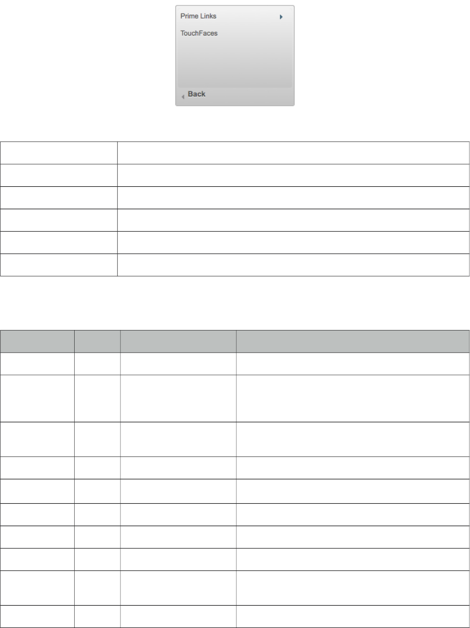
PrimeFaces User Guide
3.132 SlideMenu
SlideMenu is used to display nested submenus with sliding animation.
Info
Tag slideMenu
Component Class org.primefaces.component.slidemenu.SlideMenu
Component Type org.primefaces.component.SlideMenu
Component Family org.primefaces.component
Renderer Type org.primefaces.component.SlideMenuRenderer
Renderer Class org.primefaces.component.slidemenu.SlideMenuRenderer
Attributes
Name Default Type Description
id null String Unique identifier of the component
rendered true Boolean Boolean value to specify the rendering of the
component, when set to false component will not
be rendered.
binding null Object An el expression that maps to a server side
UIComponent instance in a backing bean
widgetVar null String Name of the client side widget.
model null MenuModel MenuModel instance for programmatic menu.
style null String Inline style of the component.
styleClass null String Style class of the component.
backLabel Back String Text for back link.
trigger null String Id of the component whose triggerEvent will show
the dynamic positioned menu.
my null String Corner of menu to align with trigger element.
478
PrimeFaces User Guide
Name Default Type Description
at null String Corner of trigger to align with menu element.
overlay false Boolean Defines positioning, when enabled menu is
displayed with absolute position relative to the
trigger. Default is false, meaning static positioning.
triggerEvent click String Event name of trigger that will show the dynamic
positioned menu.
Getting started with the SlideMenu
SlideMenu consists of submenus and menuitems, submenus can be nested and each nested submenu
will be displayed with a slide animation.
<p:slideMenu>
<p:submenu label="Ajax Menuitems" icon="ui-icon-refresh">
<p:menuitem value="Save" actionListener="#{buttonBean.save}"
update="messages" icon="ui-icon-disk" />
<p:menuitem value="Update" actionListener="#{buttonBean.update}"
update="messages" icon="ui-icon-arrowrefresh-1-w" />
</p:submenu>
<p:submenu label="Non-Ajax Menuitem" icon="ui-icon-newwin">
<p:menuitem value="Delete" actionListener="#{buttonBean.delete}"
update="messages" ajax="false" icon="ui-icon-close"/>
</p:submenu>
<p:separator />
<p:submenu label="Navigations" icon="ui-icon-extlink">
<p:submenu label="Prime Links">
<p:menuitem value="Prime" url="http://www.prime.com.tr" />
<p:menuitem value="PrimeFaces" url="http://www.primefaces.org" />
</p:submenu>
<p:menuitem value="Mobile" url="/mobile" />
</p:submenu>
</p:slideMenu>
Overlay
SlideMenu can be positioned relative to a trigger component, following sample attaches a
slideMenu to the button so that whenever the button is clicked menu will be displayed in an overlay
itself.
<p:commandButton type="button" value="Show" id="btn" />
<p:slideMenu trigger="btn" my="left top" at="left bottom">
//content
</p:slideMenu>
479
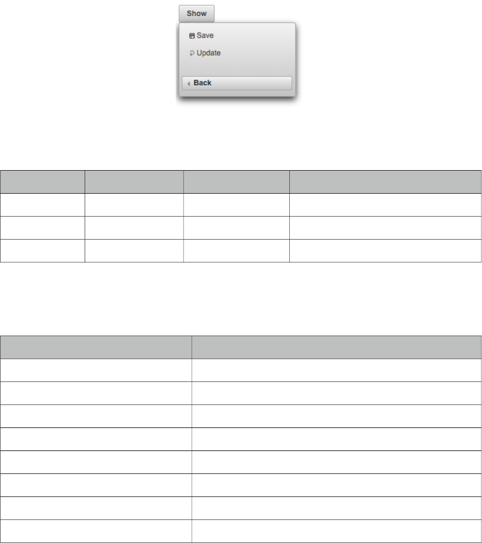
PrimeFaces User Guide
Client Side API
Widget: PrimeFaces.widget.SlideMenu
Method Params Return Type Description
show() - void Shows overlay menu.
hide() - void Hides overlay menu.
align() - void Aligns overlay menu with trigger.
Skinning
SlideMenu resides in a main container which style and styleClass attributes apply. Following is the
list of structural style classes;
Style Class Applies
.ui-menu .ui-slidemenu Container element of menu.
.ui-slidemenu-wrapper Wrapper element for content.
.ui-slidemenu-content Content container.
.ui-slidemenu-backward Back navigator.
.ui-menu-list List container
.ui-menuitem Each menu item
.ui-menuitem-link Anchor element in a link item
.ui-menuitem-text Text element in an item
As skinning style classes are global, see the main theming section for more information.
480
PrimeFaces User Guide
3.133 Slider
Slider is used to provide input with various customization options like orientation, display modes
and skinning.
Info
Tag slider
Component Class org.primefaces.component.slider.Slider
Component Type org.primefaces.component.Slider
Component Family org.primefaces.component
Renderer Type org.primefaces.component.SliderRenderer
Renderer Class org.primefaces.component.slider.SliderRenderer
Attributes
Name Default Type Description
id null String Unique identifier of the component
rendered true Boolean Boolean value to specify the rendering of the component,
when set to false component will not be rendered.
binding null Object An el expression that maps to a server side UIComponent
instance in a backing bean
for null String Id of the input text that the slider will be used for
display null String Id of the component to display the slider value.
minValue 0 Integer Minimum value of the slider
maxValue 100 Integer Maximum value of the slider
style null String Inline style of the container element
styleClass null String Style class of the container element
animate true Boolean Boolean value to enable/disable the animated move when
background of slider is clicked
type horizontal String Sets the type of the slider, "horizontal" or "vertical".
step 1 Integer Fixed pixel increments that the slider move in
disabled 0 Boolean Disables or enables the slider.
onSlideStart null String Client side callback to execute when slide begins.
481
PrimeFaces User Guide
Name Default Type Description
onSlide null String Client side callback to execute during sliding.
onSlideEnd null String Client side callback to execute when slide ends.
range false Boolean When enabled, two handles are provided for selection a
range.
displayTemplate null String String template to use when updating the display. Valid
placeholders are {value}, {min} and {max}.
Getting started with Slider
Slider requires an input component to work with, for attribute is used to set the id of the input
component whose input will be provided by the slider.
public class SliderBean {
private int number;
public int getNumber() {
return number;
}
public void setNumber(int number) {
this.number = number;
}
}
<h:inputText id="number" value="#{sliderBean.number}" />
<p:slider for="number" />
Display Value
Using display feature, you can present a readonly display value and still use slider to provide input,
in this case for should refer to a hidden input to bind the value.
<h:inputHidden id="number" value="#{sliderBean.number}" />
<h:outputText value="Set ratio to %" />
<h:outputText id="output" value="#{sliderBean.number}" />
<p:slider for="number" display="output" />
482
PrimeFaces User Guide
Vertical Slider
By default slider’s orientation is horizontal, vertical sliding is also supported and can be set using
the type attribute.
<h:inputText id="number" value="#{sliderController.number}" />
<p:slider for="number" type="vertical" minValue="0" maxValue="200"/>
Step
Step factor defines the interval between each point during sliding. Default value is one and it is
customized using step option.
<h:inputText id="number" value="#{sliderBean.number}" />
<p:slider for="number" step="10" />
Animation
Sliding is animated by default, if you want to turn it of animate attribute set the animate option to
false.
Boundaries
Maximum and minimum boundaries for the sliding is defined using minValue and maxValue
attributes. Following slider can slide between -100 and +100.
<h:inputText id="number" value="#{sliderBean.number}" />
<p:slider for="number" minValue="-100" maxValue="100"/>
Range Slider
Selecting a range with min-max values are supported by slider. To enable this feature, set range
attribute to true and provide a comma separate pair of input fields to attach min-max values.
Following sample demonstrates a range slider along with the display template feature for feedback;
483

PrimeFaces User Guide
<h:outputText id="displayRange"
value="Between #{sliderBean.number6} and #{sliderBean.number7}"/>
<p:slider for="txt6,txt7" display="displayRange" style="width:400px" range="true"
displayTemplate="Between {min} and {max}"/>
<h:inputHidden id="min" value="#{sliderBean.min}" />
<h:inputHidden id="max" value="#{sliderBean.max}" />
Client Side Callbacks
Slider provides three callbacks to hook-in your custom javascript, onSlideStart, onSlide and
onSlideEnd. All of these callbacks receive two parameters; slide event and the ui object containing
information about the event.
<h:inputText id="number" value="#{sliderBean.number}" />
<p:slider for="number" onSlideEnd="handleSlideEnd(event, ui)"/>
function handleSlideEnd(event, ui) {
//ui.helper = Handle element of slider
//ui.value = Current value of slider
}
Ajax Behavior Events
Slider provides one ajax behavior event called slideEnd that is fired when the slide completes. If
you have a listener defined, it will be called by passing org.primefaces.event.SlideEndEvent
instance. Example below adds a message and displays it using growl component when slide ends.
<h:inputText id="number" value="#{sliderBean.number}" />
<p:slider for="number">
<p:ajax event="slideEnd" listener="#{sliderBean.onSlideEnd}" update="msgs" />
</p:slider>
<p:messages id="msgs" />
484
PrimeFaces User Guide
public class SliderBean {
private int number;
public int getNumber() {
return number;
}
public void setNumber(int number) {
this.number = number;
}
public void onSlideEnd(SlideEndEvent event) {
int value = event.getValue();
//add faces message
}
}
Client Side API
Widget: PrimeFaces.widget.Slider
Method Params Return Type Description
getValue() - Number Returns the current value
setValue(value) value: Value to set void Updates slider value with
provided one.
disable() index: Index of tab to disable void Disables slider.
enable() index: Index of tab to enable void Enables slider.
Skinning
Slider resides in a main container which style and styleClass attributes apply. These attributes are
handy to specify the dimensions of the slider. Following is the list of structural style classes;
Class Applies
.ui-slider Main container element
.ui-slider-horizontal Main container element of horizontal slider
.ui-slider-vertical Main container element of vertical slider
.ui-slider-handle Slider handle
As skinning style classes are global, see the main theming section for more information.
485
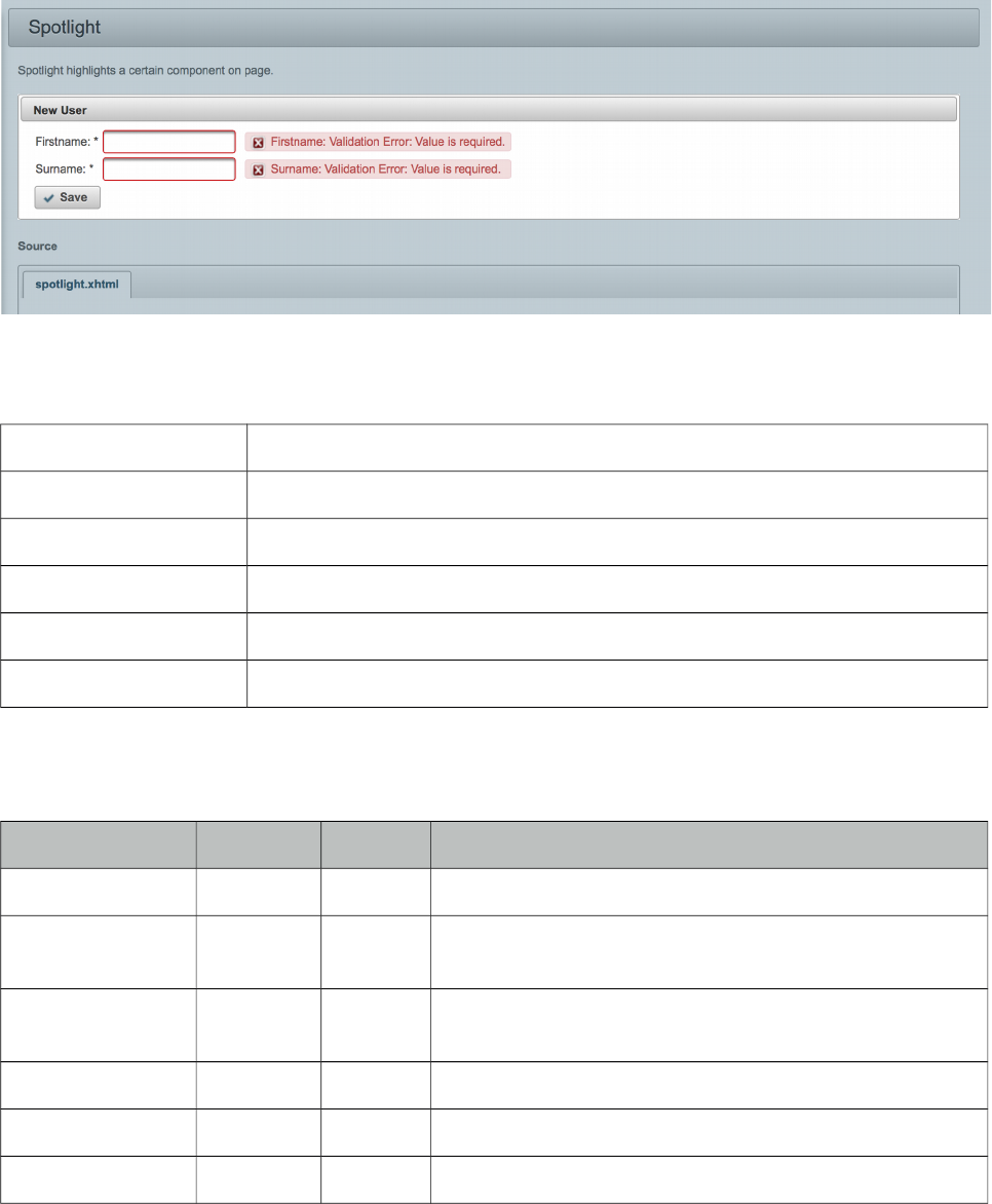
PrimeFaces User Guide
3.134 Spotlight
Spotlight highlights a certain component on page.
Info
Tag spotlight
Component Class org.primefaces.component.spotlight.Spotlight
Component Type org.primefaces.component.Spotlight
Component Family org.primefaces.component
Renderer Type org.primefaces.component.SpotlightRenderer
Renderer Class org.primefaces.component.spotlight.SpotlightRenderer
Attributes
Name Default Type Description
id null String Unique identifier of the component
rendered false Boolean Boolean value to specify the rendering of the component,
when set to false component will not be rendered.
binding null Object An el expression that maps to a server side UIComponent
instance in a backing bean
widgetVar null String Name of the client side widget.
target null String Component to highlight.
active false Boolean When true, spotlight is activated initially.
486
PrimeFaces User Guide
Getting started with Spotlight
Spotlight is accessed using client side api. Clicking the button highlights the panel below;
<p:panel id="pnl" header="Panel">
//content
</p:panel>
<p:commandButton value="Highlight" onclick="PF('spot').show()" />
<p:spotlight target="pnl" widgetVar="spot" />
Client Side API
Widget: PrimeFaces.widget.Spotlight
Method Params Return Type Description
show() - void Highlights target.
hide() - void Removes highlight.
Skinning
Slider resides in a main container which style and styleClass attributes apply. These attributes are
handy to specify the dimensions of the slider. As skinning style classes are global, see the main
theming section for more information. Following is the list of structural style classes;
Class Applies
.ui-spotlight Mask element, common to all regions.
.ui-spotlight-top Top mask element.
.ui-spotlight-bottom Bottom mask element.
.ui-spotlight-left Left mask element.
.ui-spotlight-right Right mask element.
487
PrimeFaces User Guide
3.135 Socket
Socket component is an agent that creates a push channel between the server and the client.
Info
Tag socket
Component Class org.primefaces.component.socket.Socket
Component Type org.primefaces.component.Socket
Component Family org.primefaces.component
Renderer Type org.primefaces.component.SocketRenderer
Renderer Class org.primefaces.component.socket.SocketRenderer
Attributes
Name Default Type Description
id null String Unique identifier of the component
rendered true Boolean Boolean value to specify the rendering of the
component, when set to false component will not be
rendered.
binding null Object An el expression that maps to a server side
UIComponent instance in a backing bean
channel null Object Channel name of the connection.
transport websocket String Desired protocol to be used valid values are
websocket (default), sse, streaming, long-polling,
jsonp.
fallbackTransport long-polling String Fallback protocol to be used when desired transport
is not supported in environment, valid values are
websocket, sse, streaming, long-polling (default),
jsonp.
onMessage null String Javascript event handler that is processed when
server publishes data.
onError null String Javascript event handler that is processed when
there is an error.
onClose null String Javascript event handler for onClose callback of
atmosphere.
onOpen null String Javascript event handler for onOpen callback of
atmosphere.
onReconnect null String Javascript event handler for onReconnect callback
of atmosphere.
488
PrimeFaces User Guide
Name Default Type Description
onMessagePublished null String Javascript event handler for onMessagePublished
callback of atmosphere.
onTransportFailure null String Javascript event handler for onTransportFailure
callback of atmosphere.
onLocalMessage null String Javascript event handler for onLocalMessage
callback of atmosphere.
autoConnect true Boolean Connects to channel on page load when enabled.
Getting Started with the Socket
See chapter 5, "PrimeFaces Push" for detailed information.
489
PrimeFaces User Guide
3.136 Spacer
Spacer is used to put spaces between elements.
Info
Tag spacer
Component Class org.primefaces.component.spacer.Spacer
Component Type org.primefaces.component.Spacer
Component Family org.primefaces.component
Renderer Type org.primefaces.component.SpacerRenderer
Renderer Class org.primefaces.component.spacer.SpacerRenderer
Attributes
Name Default Type Description
id null String Unique identifier of the component
rendered true Boolean Boolean value to specify the rendering of the
component, when set to false component will not
be rendered.
binding null Object An el expression that maps to a server side
UIComponent instance in a backing bean
title null String Advisory tooltip informaton.
style null String Inline style of the spacer.
styleClass null String Style class of the spacer.
width null String Width of the space.
height null String Height of the space.
Getting started with Spacer
Spacer is used by either specifying width or height of the space.
Spacer in this example separates this text <p:spacer width="100" height="10"> and
<p:spacer width="100" height="10"> this text.
490
PrimeFaces User Guide
3.137 Spinner
Spinner is an input component to provide a numerical input via increment and decrement buttons.
Info
Tag spinner
Component Class org.primefaces.component.spinner.Spinner
Component Type org.primefaces.component.Spinner
Component Family org.primefaces.component
Renderer Type org.primefaces.component.SpinnerRenderer
Renderer Class org.primefaces.component.spinner.SpinnerRenderer
Attributes
Name Default Type Description
id null String Unique identifier of the component
rendered true Boolean Boolean value to specify the rendering of the
component, when set to false component will not
be rendered.
binding null Object An el expression that maps to a server side
UIComponent instance in a backing bean
value null Object Value of the component than can be either an EL
expression of a literal text
converter null Converter/
String
An el expression or a literal text that defines a
converter for the component. When it’s an EL
expression, it’s resolved to a converter instance. In
case it’s a static text, it must refer to a converter id
immediate false Boolean Boolean value that specifies the lifecycle phase the
valueChangeEvents should be processed, when true
the events will be fired at "apply request values", if
immediate is set to false, valueChange Events are
fired in "process validations"
phase
required False Boolean Marks component as required
validator null Method
Expr
A method binding expression that refers to a
method validationg the input
valueChangeListener null Method A method binding expression that refers to a
491
PrimeFaces User Guide
Name Default Type Description
Expr method for handling a valuchangeevent
requiredMessage null String Message to be displayed when required field
validation fails.
converterMessage null String Message to be displayed when conversion fails.
validatorMessage null String Message to be displayed when validation fields.
widgetVar null String Name of the client side widget.
stepFactor 1 Double Stepping factor for each increment and decrement
min null Double Minimum boundary value
max null Double Maximum boundary value
prefix null String Prefix of the input
suffix null String Suffix of the input
accesskey null String Access key that when pressed transfers focus to the
input element.
alt null String Alternate textual description of the input field.
autocomplete null String Controls browser autocomplete behavior.
dir null String Direction indication for text that does not inherit
directionality. Valid values are LTR and RTL.
disabled false Boolean Disables input field
label null String A localized user presentable name.
lang null String Code describing the language used in the generated
markup for this component.
maxlength null Integer Maximum number of characters that may be
entered in this field.
onblur null String Client side callback to execute when input element
loses focus.
onchange null String Client side callback to execute when input element
loses focus and its value has been modified since
gaining focus.
onclick null String Client side callback to execute when input element
is clicked.
ondblclick null String Client side callback to execute when input element
is double clicked.
onfocus null String Client side callback to execute when input element
receives focus.
onkeydown null String Client side callback to execute when a key is
pressed down over input element.
492
PrimeFaces User Guide
Name Default Type Description
onkeypress null String Client side callback to execute when a key is
pressed and released over input element.
onkeyup null String Client side callback to execute when a key is
released over input element.
onmousedown null String Client side callback to execute when a pointer
button is pressed down over input element
onmousemove null String Client side callback to execute when a pointer
button is moved within input element.
onmouseout null String Client side callback to execute when a pointer
button is moved away from input element.
onmouseover null String Client side callback to execute when a pointer
button is moved onto input element.
onmouseup null String Client side callback to execute when a pointer
button is released over input element.
onselect null String Client side callback to execute when text within
input element is selected by user.
placeholder null String Specifies a short hint.
readonly false Boolean Flag indicating that this component will prevent
changes by the user.
size null Integer Number of characters used to determine the width
of the input element.
style null String Inline style of the input element.
styleClass null String Style class of the input element.
tabindex null Integer Position of the input element in the tabbing order.
title null String Advisory tooltip informaton.
Getting Started with Spinner
Spinner is an input component and used just like a standard input text.
public class SpinnerBean {
private int number;
//getter and setter
}
<p:spinner value="#{spinnerBean.number}" />
493
PrimeFaces User Guide
Step Factor
Other than integers, spinner also support decimals so the fractional part can be controller with
spinner as well. For decimals use the stepFactor attribute to specify stepping amount. Following
example uses a stepFactor 0.25.
<p:spinner value="#{spinnerBean.number}" stepFactor="0.25"/>
public class SpinnerBean {
private double number;
//getter and setter
}
Output of this spinner would be;
After an increment happens a couple of times.
Prefix and Suffix
Prefix and Suffix options enable placing fixed strings on input field. Note that you would need to
use a converter to avoid conversion errors since prefix/suffix will also be posted.
<p:spinner value="#{spinnerBean.number}" prefix="$" />
Boundaries
In order to restrict the boundary values, use min and max options.
<p:spinner value="#{spinnerBean.number}" min="0" max="100"/>
Ajax Spinner
Spinner can be ajaxified using client behaviors like f:ajax or p:ajax. In example below, an ajax
request is done to update the outputtext with new value whenever a spinner button is clicked.
<p:spinner value="#{spinnerBean.number}">
<p:ajax update="display" />
</p:spinner>
<h:outputText id="display" value="#{spinnerBean.number}" />
494
PrimeFaces User Guide
Skinning
Spinner resides in a container element that using style and styleClass applies. Following is the list of
structural style classes;
Class Applies
.ui-spinner Main container element of spinner
.ui-spinner-input Input field
.ui-spinner-button Spinner buttons
.ui-spinner-button-up Increment button
.ui-spinner-button-down Decrement button
As skinning style classes are global, see the main theming section for more information.
495
PrimeFaces User Guide
3.138 SplitButton
SplitButton displays a command by default and additional ones in an overlay.
Info
Tag splitButton
Component Class org.primefaces.component.splitbutton.SplitButton
Component Type org.primefaces.component.SplitButton
Component Family org.primefaces.component
Renderer Type org.primefaces.component.SplitButtonRenderer
Renderer Class org.primefaces.component.splitbutton.SplitButtonRenderer
Attributes
Name Default Type Description
id null String Unique identifier of the component
rendered true Boolean Boolean value to specify the rendering of the component,
when set to false component will not be rendered.
binding null Object An el expression that maps to a server side UIComponent
instance in a backing bean
value null String Label for the button
action null MethodE
xpr/String
A method expression or a String outcome that’d be processed
when button is clicked.
actionListener null MethodE
xpr
An actionlistener that’d be processed when button is clicked.
immediate false Boolean Boolean value that determines the phaseId, when true actions
are processed at apply_request_values, when false at
invoke_application phase.
type submit String Sets the behavior of the button.
ajax true Boolean Specifies the submit mode, when set to true(default), submit
would be made with Ajax.
496
PrimeFaces User Guide
Name Default Type Description
async false Boolean When set to true, ajax requests are not queued.
process null String Component(s) to process partially instead of whole view.
update null String Component(s) to be updated with ajax.
onstart null String Client side callback to execute before ajax request is begins.
oncomplete null String Client side callback to execute when ajax request is
completed.
onsuccess null String Client side callback to execute when ajax request succeeds.
onerror null String Client side callback to execute when ajax request fails.
global true Boolean Defines whether to trigger ajaxStatus or not.
delay null String If less than delay milliseconds elapses between calls to
request() only the most recent one is sent and all other
requests are discarded. If this option is not specified, or if the
value of delay is the literal string 'none' without the quotes,
no delay is used.
partialSubmit false Boolean Enables serialization of values belonging to the partially
processed components only.
partialSubmitFilter null String Selector to use when partial submit is on, default is ":input"
to select all descendant inputs of a partially processed
components.
resetValues false Boolean If true, local values of input components to be updated within
the ajax request would be reset.
ignoreAutoUpdate false Boolean If true, components which autoUpdate="true" will not be
updated for this request. If not specified, or the value is false,
no such indication is made.
timeout 0 Integer Timeout for the ajax request in milliseconds.
style null String Inline style of the button element.
styleClass null String StyleClass of the button element.
onblur null String Client side callback to execute when button loses focus.
onchange null String Client side callback to execute when button loses focus and
its value has been modified since gaining focus.
onclick null String Client side callback to execute when button is clicked.
ondblclick null String Client side callback to execute when button is double clicked.
onfocus null String Client side callback to execute when button receives focus.
onkeydown null String Client side callback to execute when a key is pressed down
over button.
497
PrimeFaces User Guide
Name Default Type Description
onkeypress null String Client side callback to execute when a key is pressed and
released over button.
onkeyup null String Client side callback to execute when a key is released over
button.
onmousedown null String Client side callback to execute when a pointer button is
pressed down over button.
onmousemove null String Client side callback to execute when a pointer button is
moved within button.
onmouseout null String Client side callback to execute when a pointer button is
moved away from button.
onmouseover null String Client side callback to execute when a pointer button is
moved onto button.
onmouseup null String Client side callback to execute when a pointer button is
released over button.
onselect null String Client side callback to execute when text within button is
selected by user.
accesskey null String Access key that when pressed transfers focus to the button.
alt null String Alternate textual description of the button.
dir null String Direction indication for text that does not inherit
directionality. Valid values are LTR and RTL.
disabled false Boolean Disables the button.
image null String Style class for the button icon. (deprecated: use icon)
label null String A localized user presentable name.
lang null String Code describing the language used in the generated markup
for this component.
tabindex null Integer Position of the button element in the tabbing order.
title null String Advisory tooltip information.
readonly false Boolean Flag indicating that this component will prevent changes by
the user.
icon null String Icon of the button as a css class.
iconPos left String Position of the icon.
widgetVar null String Name of the client side widget.
appendTo null String Appends the overlay to the element defined by search
expression. Defaults to document body.
form null String Form to serialize for an ajax request. Default is the enclosing
form.
498
PrimeFaces User Guide
Name Default Type Description
menuStyleClass null Strimg Style class of the overlay menu element.
Getting started with SplitButton
SplitButton usage is similar to a regular commandButton. Additional commands are placed inside
the component and displayed in an overlay. In example below, clicking the save button invokes save
method of the bean and updates messages. Nested options defined as menuitems do ajax, non-ajax
requests as well as regular navigation to an external url.
<p:splitButton value="Save" actionListener="#{buttonBean.save}" update="messages"
icon="ui-icon-disk">
<p:menuitem value="Update" actionListener="#{buttonBean.update}"
update="messages" icon="ui-icon-arrowrefresh-1-w"/>
<p:menuitem value="Delete" actionListener="#{buttonBean.delete}" ajax="false"
icon="ui-icon-close"/>
<p:separator />
<p:menuitem value="Homepage" url="http://www.primefaces.org"
icon="ui-icon-extlink"/>
</p:splitButton>
Client Side API
Widget: PrimeFaces.widget.SplitButton
Method Params Return Type Description
show() - void Displays overlay.
hide() - void Hides overlay.
Skinning
SplitButton renders a container element which style and styleClass applies. Following is the list of
structural style classes;
Style Class Applies
.ui-splitbutton Container element.
.ui-button Button element
.ui-splitbutton-menubutton Dropdown button
.ui-button-text-only Button element when icon is not used
.ui-button-text Label of button
.ui-menu Container element of menu
.ui-menu-list List container
.ui-menuitem Each menu item
.ui-menuitem-link Anchor element in a link item
499

PrimeFaces User Guide
Style Class Applies
.ui-menuitem-text Text element in an item
As skinning style classes are global, see the main theming section for more information.
500
PrimeFaces User Guide
3.139 Submenu
Submenu is nested in menu components and represents a sub menu items.
Info
Tag submenu
Component Class org.primefaces.component.submenu.Submenu
Component Type org.primefaces.component.Submenu
Component Family org.primefaces.component
Attributes
Name Default Type Description
id null String Unique identifier of the component.
rendered true Boolean Boolean value to specify the rendering of the
component, when set to false component will not be
rendered.
binding null Object An el expression that maps to a server side
UIComponent instance in a backing bean.
label null String Label of the submenu header.
icon null String Icon of a submenu, see menuitem to see how it is used
style null String Inline style of the submenu.
styleClass null String Style class of the submenu.
expanded false Boolean Defines the state of submenu.
Getting started with Submenu
Please see Menu or Menubar section to find out how submenu is used with the menus.
501
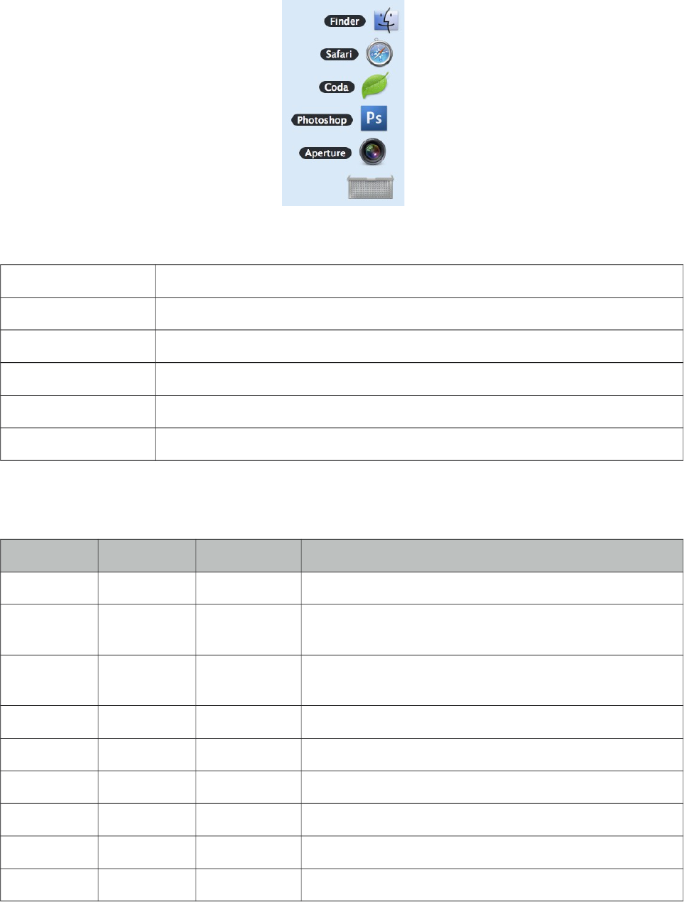
PrimeFaces User Guide
3.140 Stack
Stack is a navigation component that mimics the stacks feature in Mac OS X.
Info
Tag stack
Component Class org.primefaces.component.stack.Stack
Component Type org.primefaces.component.Stack
Component Family org.primefaces.component
Renderer Type org.primefaces.component.StackRenderer
Renderer Class org.primefaces.component.stack.StackRenderer
Attributes
Name Default Type Description
id null String Unique identifier of the component.
rendered true Boolean Boolean value to specify the rendering of the component,
when set to false component will not be rendered.
binding null Object An el expression that maps to a server side UIComponent
instance in a backing bean.
icon null String An optional image to contain stacked items.
openSpeed 300 String Speed of the animation when opening the stack.
closeSpeed 300 Integer Speed of the animation when opening the stack.
widgetVar null String Name of the client side widget.
model null MenuModel MenuModel instance to create menus programmatically
expanded false Boolean Whether to display stack as expanded or not.
502
PrimeFaces User Guide
Getting started with Stack
Each item in the stack is represented with menuitems. Stack below has five items with different
icons and labels.
<p:stack icon="/images/stack/stack.png">
<p:menuitem value="Aperture" icon="/images/stack/aperture.png" url="#"/>
<p:menuitem value="Photoshop" icon="/images/stack/photoshop.png" url="#"/>
//...
</p:stack>
Initially stack will be rendered in collapsed mode;
Location
Stack is a fixed positioned element and location can be change via css. There’s one important css
selector for stack called .ui-stack. Override this style to change the location of stack.
.ui-stack {
bottom: 28px;
right: 40px;
}
Dynamic Menus
Menus can be created programmatically as well, see the dynamic menus part in menu component
section for more information and an example.
Skinning
Class Applies
.ui-stack Main container element of stack
.ui-stack ul li Each item in stack
.ui-stack ul li img Icon of a stack item
.ui-stack ul li span Label of a stack item
503
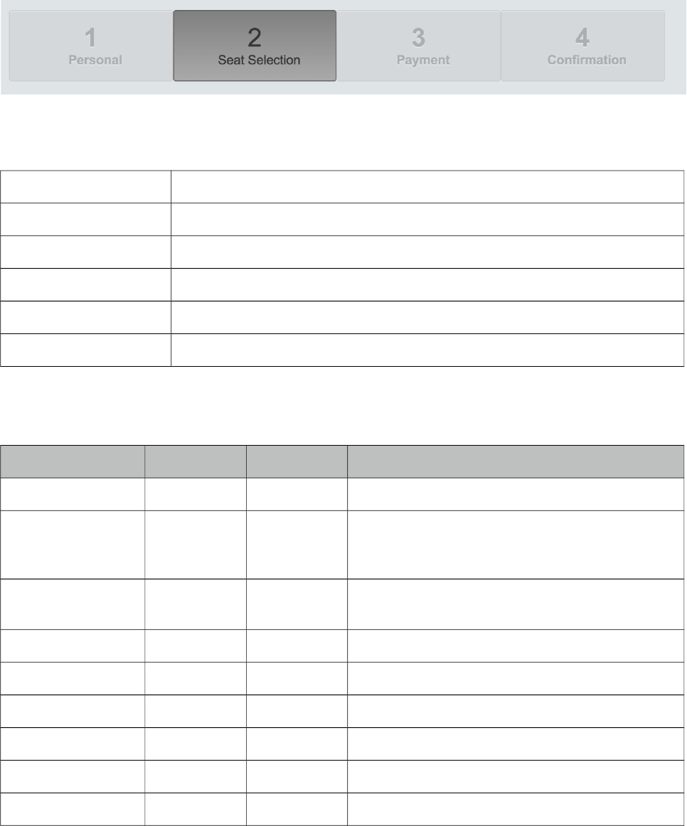
PrimeFaces User Guide
3.141 Steps
Steps components is an indicator for the steps in a workflow. Layout of steps component is
optimized for responsive design.
Info
Tag steps
Component Class org.primefaces.component.steps.Steps
Component Type org.primefaces.component.Steps
Component Family org.primefaces.component
Renderer Type org.primefaces.component.StepsRenderer
Renderer Class org.primefaces.component.steps.StepsRenderer
Attributes
Name Default Type Description
id null String Unique identifier of the component
rendered true Boolean Boolean value to specify the rendering of the
component, when set to false component will not
be rendered.
binding null Object An el expression that maps to a server side
UIComponent instance in a backing bean
model null MenuModel MenuModel instance to build menu dynamically.
style null String Inline style of the component.
styleClass null String Style class of the component.
activeIndex 0 Integer Index of the active tab.
widgetVar null String Name of the client side widget.
readonly true Boolean Defines whether items would be clickable or not.
504
PrimeFaces User Guide
Getting started with Steps
Steps requires menuitems as children components, each menuitem is rendered as a step. Just like in
any other menu component, menuitems can be utilized to do ajax requests, non-ajax requests and
simple GET navigations.
<p:steps activeIndex="1">
<p:menuitem value="Personal" />
<p:menuitem value="Seat Selection" />
<p:menuitem value="Payment" />
<p:menuitem value="Confirmation" />
</p:steps>
Skinning Steps
Steps resides in a main container which style and styleClass attributes apply. Following is the list of
structural style classes;
Style Class Applies
.ui-steps Main container element.
.ui-steps-item Step element.
.ui-steps-name Name of the step.
.ui-steps-item Number of the step.
As skinning style classes are global, see the main theming section for more information. Here is an
example of a styled steps having "custom" as its styleClass;
.ui-steps.custom {
margin-bottom: 30px;
}
.ui-steps.custom .ui-steps-item .ui-menuitem-link {
height: 10px;
padding: 0 1em;
}
.ui-steps.custom .ui-steps-item .ui-steps-number {
background-color: #0081c2;
color: #FFFFFF;
display: inline-block;
width: 30px;
border-radius: 10px;
margin-top: -10px;
margin-bottom: 10px;
margin-bottom: 10px;
}
505
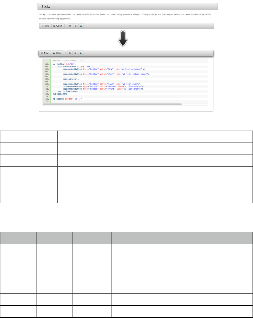
PrimeFaces User Guide
3.142 Sticky
Sticky component positions other components as fixed so that these components stay in window
viewport during scrolling.
Info
Tag sticky
Component Class org.primefaces.component.sticky.Sticky
Component Type org.primefaces.component.Sticky
Component Family org.primefaces.component
Renderer Type org.primefaces.component.StickyRenderer
Renderer Class org.primefaces.component.sticky.StickyRenderer
Attributes
Name Default Type Description
id null String Unique identifier of the component.
rendered true Boolean Boolean value to specify the rendering of the component,
when set to false component will not be rendered.
binding null Object An el expression that maps to a server side UIComponent
instance in a backing bean.
target null String Component to make sticky.
margin 0 Integer Margin to the top of the page during fixed scrolling.
506

PrimeFaces User Guide
Getting started with Sticky
Sticky requires a target to keep in viewport on scroll. Here is a sticky toolbar;
<p:toolbar id="tb">
<p:toolbarGroup align="left">
<p:commandButton type="button" value="New" icon="ui-icon-document" />
<p:commandButton type="button" value="Open" icon="ui-icon-folder-open"/>
<p:separator />
<p:commandButton type="button" title="Save" icon="ui-icon-disk"/>
<p:commandButton type="button" title="Delete" icon="ui-icon-trash"/>
<p:commandButton type="button" title="Print" icon="ui-icon-print"/>
</p:toolbarGroup>
</p:toolbar>
<p:sticky target="tb" />
Skinning
There are no visual styles of sticky however, ui-sticky class is applied to the target when the position
is fixed. When target is restored to its original location this is removed.
507
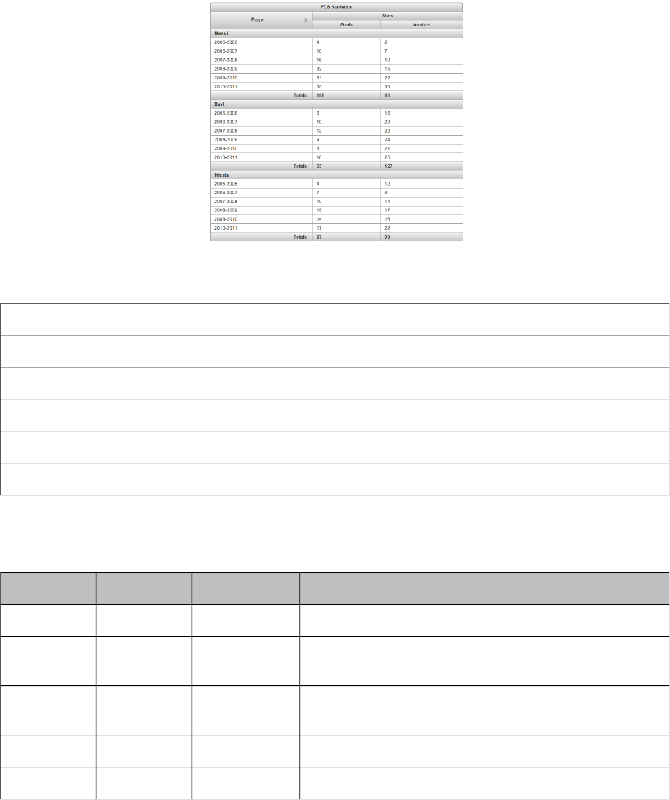
PrimeFaces User Guide
3.143 SubTable
SubTable is a helper component of datatable used for grouping.
Info
Tag subTable
Component Class org.primefaces.component.subtable.SubTable
Component Type org.primefaces.component.SubTable
Component Family org.primefaces.component
Renderer Type org.primefaces.component.SubTableRenderer
Renderer Class org.primefaces.component.subtable.SubTableRenderer
Attributes
Name Default Type Description
id null String Unique identifier of the component
rendered true Boolean Boolean value to specify the rendering of the component,
when set to false component will not be rendered.
binding null Object An el expression that maps to a server side UIComponent
instance in a backing bean
value null Object Data of the component.
var null String Name of the data iterator.
Getting started with SubTable
See DataTable section for more information.
508
PrimeFaces User Guide
3.144 SummaryRow
SummaryRow is a helper component of datatable used for dynamic grouping.
Info
Tag summaryRow
Component Class org.primefaces.component.summaryrow.SummaryRow
Component Type org.primefaces.component.SummaryRow
Component Family org.primefaces.component
Renderer Type org.primefaces.component.SummaryRowRenderer
Renderer Class org.primefaces.component.summaryrow.SummaryRowRenderer
Attributes
Name Default Type Description
id null String Unique identifier of the component
rendered true Boolean Boolean value to specify the rendering of the component,
when set to false component will not be rendered.
binding null Object An el expression that maps to a server side UIComponent
instance in a backing bean
listener null MethodExpr Method expression to execute before rendering summary
row. (e.g. to calculate totals).
Getting started with SummaryRow
See DataTable section for more information.
509
PrimeFaces User Guide
3.145 Tab
Tab is a generic container component used by other PrimeFaces components such as tabView and
accordionPanel.
Info
Tag tab
Component Class org.primefaces.component.TabView.Tab
Component Type org.primefaces.component.Tab
Component Family org.primefaces.component
Attributes
Name Default Type Description
id null String Unique identifier of the component.
rendered true Boolean Boolean value to specify the rendering of the
component, when set to false component will not
be rendered.
binding null Object An el expression that maps to a server side
UIComponent instance in a backing bean.
title null Boolean Title text of the tab
titleStyle null String Inline style of the tab.
titleStyleClass null String Style class of the tab.
disabled false Boolean Disables tab element.
closable false Boolean Makes the tab closable when enabled.
titletip null String Tooltip of the tab header.
Getting started with the Tab
See the sections of components who utilize tab component for more information. As tab is a shared
component, not all attributes may apply to the components that use tab.
510
PrimeFaces User Guide
3.146 TabMenu
TabMenu is a navigation component that displays menuitems as tabs.
Info
Tag tabMenu
Component Class org.primefaces.component.tabmenu.TabMenu
Component Type org.primefaces.component.TabMenu
Component Family org.primefaces.component
Renderer Type org.primefaces.component.TabMenuRenderer
Renderer Class org.primefaces.component.tabmenu.TabMenuRenderer
Attributes
Name Default Type Description
id null String Unique identifier of the component
rendered true Boolean Boolean value to specify the rendering of the
component, when set to false component will not
be rendered.
binding null Object An el expression that maps to a server side
UIComponent instance in a backing bean
model null MenuModel MenuModel instance to build menu dynamically.
style null String Inline style of the component.
styleClass null String Style class of the component.
activeIndex 0 Integer Index of the active tab.
widgetVar null String Name of the client side widget.
Getting started with TabMenu
TabMenu requires menuitems as children components, each menuitem is rendered as a tab. Just like
in any other menu component, menuitems can be utilized to do ajax requests, non-ajax requests and
simple GET navigations.
511
PrimeFaces User Guide
<p:tabMenu activeIndex="0">
<p:menuitem value="Overview" outcome="main" icon="ui-icon-star"/>
<p:menuitem value="Demos" outcome="demos" icon="ui-icon-search" />
<p:menuitem value="Documentation" outcome="docs" icon="ui-icon-document"/>
<p:menuitem value="Support" outcome="support" icon="ui-icon-wrench"/>
<p:menuitem value="Social" outcome="social" icon="ui-icon-person" />
</p:tabMenu>
Skinning TabMenu
TabMenu resides in a main container which style and styleClass attributes apply. Following is the
list of structural style classes;
Style Class Applies
.ui-tabmenu Main container element.
.ui-tabmenu-nav Container for tabs.
.ui-tabmenuitem Menuitem container.
.ui-menuitem Anchor of a menuitem.
As skinning style classes are global, see the main theming section for more information.
512
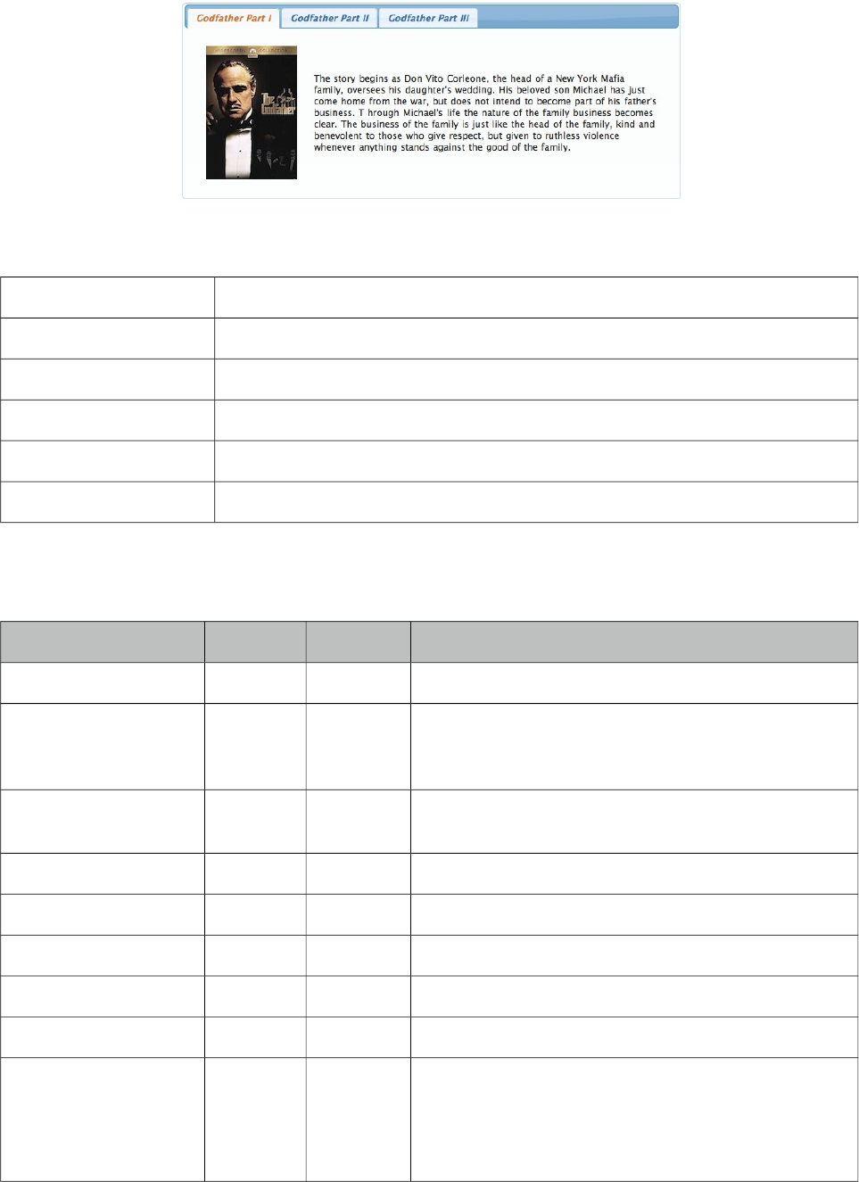
PrimeFaces User Guide
3.147 TabView
TabView is a container component to group content in tabs.
Info
Tag tabView
Component Class org.primefaces.component. tabview.TabView
Component Type org.primefaces.component.TabView
Component Family org.primefaces.component
Renderer Type org.primefaces.component.TabViewRenderer
Renderer Class org.primefaces.component.tabview.TabViewRenderer
Attributes
Name Default Type Description
id null String Unique identifier of the component.
rendered true Boolean Boolean value to specify the rendering of the
component, when set to false component will not be
rendered.
binding null Object An el expression that maps to a server side
UIComponent instance in a backing bean.
widgetVar null String Variable name of the client side widget.
activeIndex 0 Integer Index of the active tab.
effect null String Name of the transition effect.
effectDuration null String Duration of the transition effect.
dynamic false Boolean Enables lazy loading of inactive tabs.
cache true Boolean When tab contents are lazy loaded by ajax
toggleMode, caching only retrieves the tab contents
once and subsequent toggles of a cached tab does not
communicate with server. If caching is turned off, tab
513
PrimeFaces User Guide
Name Default Type Description
contents are reloaded from server each time tab is
clicked.
onTabChange null String Client side callback to execute when a tab is clicked.
onTabShow null String Client side callback to execute when a tab is shown.
onTabClose null String Client side callback to execute on tab close.
style null String Inline style of the main container.
styleClass null String Style class of the main container.
var null String Name of iterator to refer an item in collection.
value null Object Collection model to display dynamic tabs.
orientation top String Orientation of tab headers.
dir ltr String Defines text direction, valid values are ltr and rtl.
scrollable false Boolean When enabled, tab headers can be scrolled
horizontally instead of wrapping.
prependId true Boolean TabView is a naming container thus prepends its id to
its children by default, a false value turns this
behavior off except for dynamic tabs.
tabindex 0 String Position of the element in the tabbing order.
Getting started with the TabView
TabView requires one more child tab components to display. Titles can also be defined by using
“title” facet.
<p:tabView>
<p:tab title="Tab One">
<h:outputText value="Lorem" />
</p:tab>
<p:tab title="Tab Two">
<h:outputText value="Ipsum" />
</p:tab>
<p:tab title="Tab Three">
<h:outputText value="Dolor" />
</p:tab>
</p:tabView>
Dynamic Tabs
There’re two toggleModes in tabview, non-dynamic (default) and dynamic. By default, all tab
contents are rendered to the client, on the other hand in dynamic mode, only the active tab contents
are rendered and when an inactive tab header is selected, content is loaded with ajax. Dynamic
mode is handy in reducing page size, since inactive tabs are lazy loaded, pages will load faster. To
enable dynamic loading, simply set dynamic option to true.
514
PrimeFaces User Guide
<p:tabView dynamic="true">
//tabs
</p:tabView>
Content Caching
Dynamically loaded tabs cache their contents by default, by doing so, reactivating a tab doesn’t
result in an ajax request since contents are cached. If you want to reload content of a tab each time a
tab is selected, turn off caching by cache to false.
Effects
Content transition effects are controlled with effect and effectDuration attributes. EffectDuration
specifies the speed of the effect, slow, normal (default) and fast are the valid options.
<p:tabView effect="fade" effectDuration="fast">
//tabs
</p:tabView>
Ajax Behavior Events
tabChange and tabClose are the ajax behavior events of tabview that are executed when a tab is
changed and closed respectively. Here is an example of a tabChange behavior implementation;
<p:tabView>
<p:ajax event=”tabChange” listener=”#{bean.onChange}” />
//tabs
</p:tabView>
public void onChange(TabChangeEvent event) {
//Tab activeTab = event.getTab();
//...
}
Your listener(if defined) will be invoked with an org.primefaces.event.TabChangeEvent instance
that contains a reference to the new active tab and the accordion panel itself. For tabClose event,
listener will be passed an instance of org.primefaces.event.TabCloseEvent.
Dynamic Number of Tabs
When the tabs to display are not static, use the built-in iteration feature similar to ui:repeat.
<p:tabView value="#{bean.list}" var="listItem">
<p:tab title="#{listItem.propertyA}">
<h:outputText value= "#{listItem.propertyB}"/>
...More content
</p:tab>
</p:tabView>
515
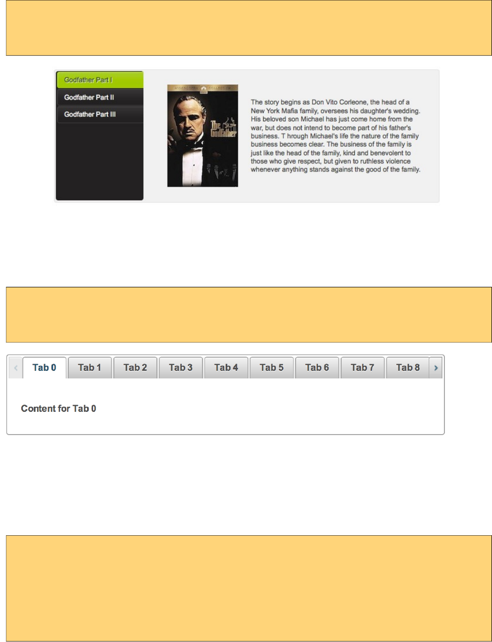
PrimeFaces User Guide
Orientations
Four different orientations are available; top(default), left, right and bottom.
<p:tabView orientation="left">
//tabs
</p:tabView>
Scrollable Tabs
Tab headers wrap to the next line in case there is not enough space at header area by default. Using
scrollable feature, it is possible to keep headers aligned horizontally and use navigation buttons to
access hidden headers.
<p:tabView scrollable="true">
//tabs
</p:tabView>
Client Side Callbacks
Tabview has three callbacks for client side. onTabChange is executed when an inactive tab is
clicked, onTabShow is executed when an inactive tab becomes active to be shown and onTabClose
when a closable tab is closed. All these callbacks receive index parameter as the index of tab.
<p:tabView onTabChange="handleTabChange(index)">
//tabs
</p:tabView>
function handleTabChange(i) {
//i = Index of the new tab
}
Client Side API
Widget: PrimeFaces.widget.TabView
516
PrimeFaces User Guide
Method Params Return Type Description
select(index) index: Index of tab to display void Activates tab with given index
selectTab(index) index: Index of tab to display void (Deprecated, use select instead)
Activates tab with given index
disable(index) index: Index of tab to disable void Disables tab with given index
enable(index) index: Index of tab to enable void Enables tab with given index
remove(index) index: Index of tab to remove void Removes tab with given index
getLength() - Number Returns the number of tabs
getActiveIndex() - Number Returns index of current tab
Skinning
As skinning style classes are global, see the main theming section for more information. Following
is the list of structural style classes.
Class Applies
.ui-tabs Main tabview container element
.ui-tabs-{orientation} Orientation specific (top, bottom, righ, left) container.
.ui-tabs-nav Main container of tab headers
.ui-tabs-panel Each tab container
.ui-tabs-scrollable Container element of a scrollable tabview.
517
PrimeFaces User Guide
3.148 TagCloud
TagCloud displays a collection of tag with different strengths.
Info
Tag tagCloud
Component Class org.primefaces.component.tagcloud.TagCloud
Component Type org.primefaces.component.TagCloud
Component Family org.primefaces.component
Renderer Type org.primefaces.component.TagCloudRenderer
Renderer Class org.primefaces.component.tagcloud.TagCloudRenderer
Attributes
Name Default Type Description
id null String Unique identifier of the component
rendered true Boolean Boolean value to specify the rendering of the
component, when set to false component will not be
rendered.
binding null Object An el expression that maps to a server side
UIComponent instance in a backing bean
widgetVar null String Name of the client side widget.
model null TagCloudModel Backing tag cloud model.
style null String Inline style of the container element.
styleClass null String Style class of the container element.
Getting started with the TagCloud
TagCloud requires a backend TagCloud model to display.
<p:tagCloud model="#{tagCloudBean.model}" />
518
PrimeFaces User Guide
public class TagCloudBean {
private TagCloudModel model;
public TagCloudBean() {
model = new DefaultTagCloudModel();
model.addTag(new DefaultTagCloudItem("Transformers", "#", 1));
//more
}
//getter
}
Selecting Tags
An item is tagCloud can be selected using select ajax behavior. Note that only items with null urls
can be selected.
<h:form>
<p:growl id="msg" showDetail="true" />
<p:tagCloud model="#{tagCloudBean.model}">
<p:ajax event="select" update="msg" listener="#{tagCloudBean.onSelect}" />
</p:tagCloud>
</h:form>
public class TagCloudBean {
//model, getter and setter
public void onSelect(SelectEvent event) {
TagCloudItem item = (TagCloudItem) event.getObject();
FacesMessage msg = new FacesMessage(FacesMessage.SEVERITY_INFO,
"Item Selected", item.getLabel());
FacesContext.getCurrentInstance().addMessage(null, msg);
}
}
TagCloud API
org.primefaces.model.tagcloud.TagCloudModel
Method Description
List<TagCLoudItem> getTags() Returns all tags in model.
void addTag(TagCloudItem item) Adds a tag.
void removeTag(TagCloudItem item) Removes a tag.
void clear() Removes all tags.
PrimeFaces provides org.primefaces.model.tagcloud.DefaultTagCloudModel as the default
implementation.
519
PrimeFaces User Guide
org.primefaces.model.tagcloud.TagCloudItem
Method Description
String getLabel() Returns label of the tag.
String getUrl() Returns url of the tag.
int getStrength() Returns strength of the tag between 1 and 5.
org.primefaces.model.tagcloud.DefaultTagCloudItem is provided as the default implementation.
Skinning
TagCloud resides in a container element that style and styleClass attributes apply. .ui-tagcloud
applies to main container and .ui-tagcloud-strength-[1,5] applies to each tag. As skinning style
classes are global, see the main theming section for more information.
520
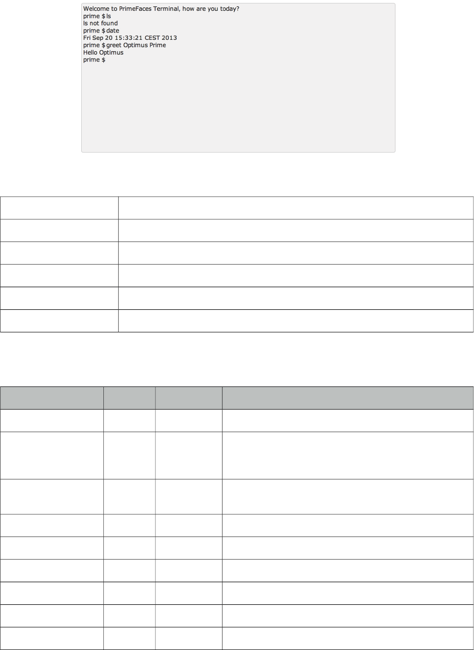
PrimeFaces User Guide
3.149 Terminal
Terminal is an ajax powered web based terminal that brings desktop terminals to JSF.
Info
Tag terminal
Component Class org.primefaces.component.terminal.Terminal
Component Type org.primefaces.component.Terminal
Component Family org.primefaces.component
Renderer Type org.primefaces.component.TerminalRenderer
Renderer Class org.primefaces.component.terminal.TerminalRenderer
Attributes
Name Default Type Description
id null String Unique identifier of the component
rendered true Boolean Boolean value to specify the rendering of the
component, when set to false component will not be
rendered.
binding null Object An el expression that maps to a server side
UIComponent instance in a backing bean
style null String Inline style of the component.
styleClass null String Style class of the component.
welcomeMessage null String Welcome message to be displayed on initial load.
prompt prime $ String Primary prompt text.
commandHandler null MethodExpr Method to be called with arguments to process.
widgetVar null String Name of the client side widget.
521
PrimeFaces User Guide
Getting started with the Terminal
A command handler is required to interpret commands entered in terminal.
<p:terminal commandHandler="#{terminalBean.handleCommand}" />
public class TerminalBean {
public String handleCommand(String command, String[] params) {
if(command.equals("greet"))
return "Hello " + params[0];
else if(command.equals("date"))
return new Date().toString();
else
return command + " not found";
}
}
Whenever a command is sent to the server, handleCommand method is invoked with the command
name and the command arguments as a String array.
Client Side API
Client side widget exposes clear() and focus() methods. Following shows how to add focus on a
terminal nested inside a dialog;
<p:commandButton type="button" Value="Apply Focus" onclick="PF('term').focus();"/>
<p:terminal widgetVar="term" commandHandler="#{terminalBean.handleCommand}" />
Skinning
Terminal resides in a main container which style and styleClass attributes apply. Following is the
list of structural style classes;
Style Class Applies
.ui-terminal Main container element.
.ui-terminal-content Content display of previous commands with responses.
.ui-terminal-prompt Prompt text.
522
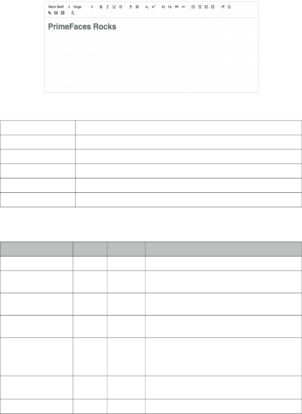
PrimeFaces User Guide
3.150 TextEditor
Editor is an input component with rich text editing capabilities based on Quill.
Info
Tag textEditor
Component Class org.primefaces.component.texteditor.TextEditor
Component Type org.primefaces.component.TextEditor
Component Family org.primefaces.component
Renderer Type org.primefaces.component.TextEditorRenderer
Renderer Class org.primefaces.component.texteditor.TextEditorRenderer
Attributes
Name Default Type Description
id null String Unique identifier of the component.
rendered true Boolean Boolean value to specify the rendering of the
component.
binding null Object An el expression that maps to a server side
UIComponent instance in a backing bean.
value null Object Value of the component than can be either an EL
expression of a literal text.
converter null Converter/
String
An el expression or a literal text that defines a
converter for the component. When it’s an EL
expression, it’s resolved to a converter instance. In
case it’s a static text, it must refer to a converter id.
immediate false Boolean When set true, process validations logic is executed at
apply request values phase for this component.
required false Boolean Marks component as required.
523
PrimeFaces User Guide
Name Default Type Description
validator null Method
Expr
A method expression that refers to a method
validationg the input.
valueChangeListener null Method
Expr
A method expression that refers to a method for
handling a valuchangeevent.
requiredMessage null String Message to be displayed when required field
validation fails.
converterMessage null String Message to be displayed when conversion fails.
validatorMessage null String Message to be displayed when validation fails.
widgetVar null String Name of the client side widget.
height null Integer Height of the editor.
readonly false Boolean Whether to instantiate the editor to read-only mode.
style null String Inline style of the editor container.
styleClass null String Style class of the editor container.
placeholder null String Placeholder text to show when editor is empty
Getting started with the Editor
Rich Text entered using the Editor is passed to the server using value expression.
public class Bean {
private String text;
//getter and setter
}
<p:textEditor value="#{bean.text}" />
Custom Toolbar
Toolbar of editor is easy to customize using toolbar facet;
524
PrimeFaces User Guide
<p:textEditor widgetVar="editor2" value="#{editorView.text2}" height="300">
<f:facet name="toolbar">
<span class="ql-formats">
<button class="ql-bold"></button>
<button class="ql-italic"></button>
<button class="ql-underline"></button>
<button class="ql-strike"></button>
</span>
<span class="ql-formats">
<select class="ql-font"></select>
<select class="ql-size"></select>
</span>
</f:facet>
</p:textEditor>
Refer to QuillJS documentation for avialable list of formats.
Client Side API
Widget: PrimeFaces.widget.Editor
Method Params Return Type Description
getEditorValue() - void Initializes a lazy editor, subsequent calls do not
reinit the editor.
clear() - void Clears the text in editor.
Skinning
Refer to QuillJS documentation for styling;
https://quilljs.com/guides/how-to-customize-quill/
525
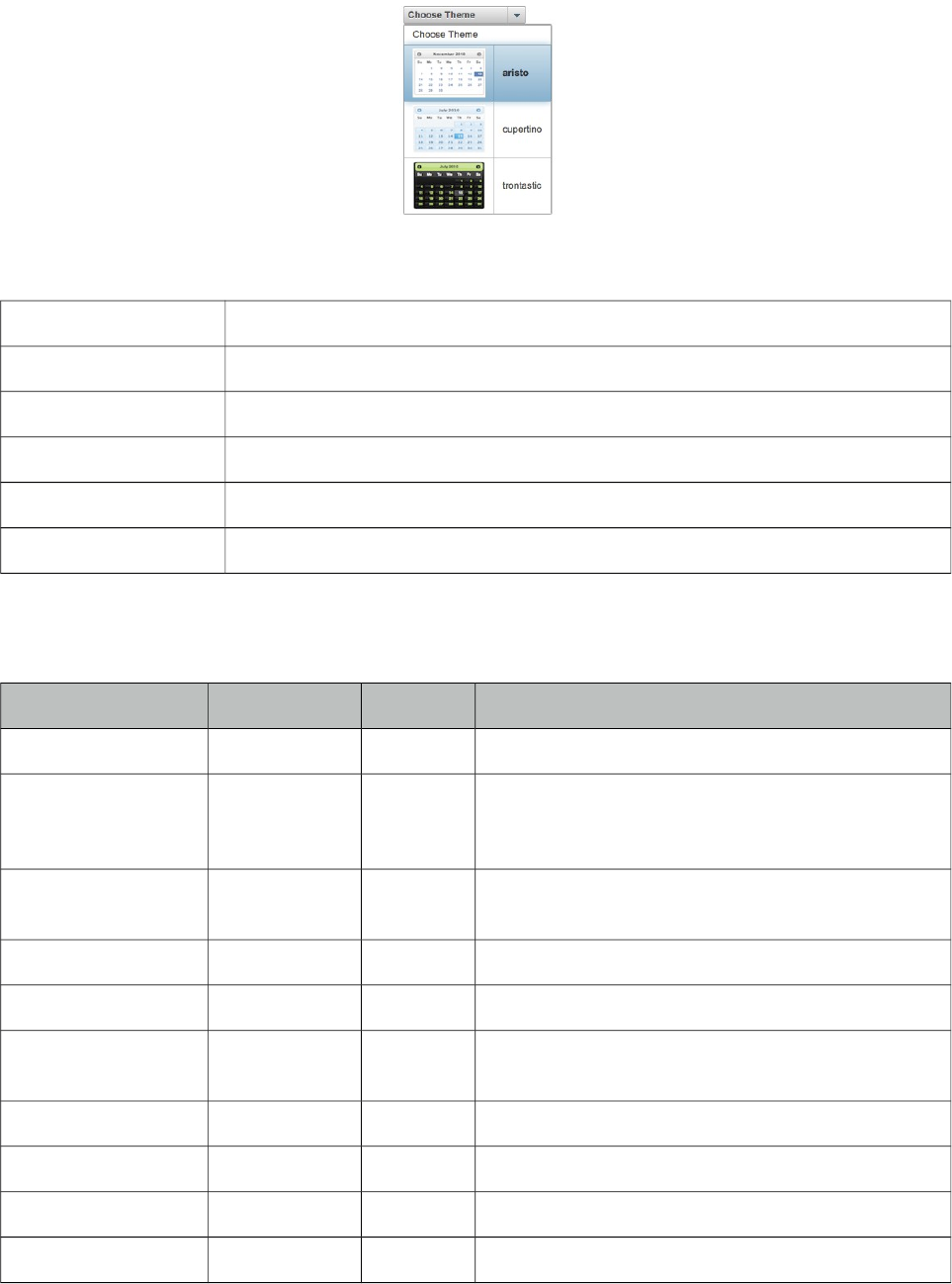
PrimeFaces User Guide
3.151 ThemeSwitcher
ThemeSwitcher enables switching PrimeFaces themes on the fly with no page refresh.
Info
Tag themeSwitcher
Component Class org.primefaces.component.themeswitcher.ThemeSwitcher
Component Type org.primefaces.component.ThemeSwitcher
Component Family org.primefaces.component
Renderer Type org.primefaces.component.ThemeSwitcherRenderer
Renderer Class org.primefaces.component.themeswitcher.ThemeSwitcherRenderer
Attributes
Name Default Type Description
id null String Unique identifier of the component
rendered true Boolean Boolean value to specify the rendering of the
component, when set to false component will not be
rendered.
binding null Object An el expression that maps to a server side
UIComponent instance in a backing bean
widgetVar null String Name of the client side widget.
effect fade String Name of the animation.
effectSpeed normal String Duration of the toggle animation, valid values are
"slow", "normal" and "fast".
disabled false Boolean Disables the component.
label null String User presentable name.
onchange null String Client side callback to execute on theme change.
style null String Inline style of the component.
526
PrimeFaces User Guide
Name Default Type Description
styleClass null String Style class of the component.
var null String Variable name to refer to each item.
height null Integer Height of the panel.
tabindex null Integer Position of the element in the tabbing order.
Getting Started with the ThemeSwitcher
ThemeSwitcher usage is very similar to selectOneMenu.
<p:themeSwitcher style="width:150px">
<f:selectItem itemLabel="Choose Theme" itemValue="" />
<f:selectItems value="#{bean.themes}" />
</p:themeSwitcher>
Stateful ThemeSwitcher
By default, themeswitcher just changes the theme on the fly with no page refresh, in case you’d like
to get notified when a user changes the theme (e.g. to update user preferences), you can use an ajax
behavior.
<p:themeSwitcher value="#{bean.theme}" effect="fade">
<f:selectItem itemLabel="Choose Theme" itemValue="" />
<f:selectItems value="#{themeSwitcherBean.themes}" />
<p:ajax listener="#{bean.saveTheme}" />
</p:themeSwitcher>
Advanced ThemeSwitcher
ThemeSwitcher supports displaying custom content so that you can show theme previews.
<p:themeSwitcher>
<f:selectItem itemLabel="Choose Theme" itemValue="" />
<f:selectItems value="#{themeSwitcherBean.advancedThemes}" var="theme"
itemLabel="#{theme.name}" itemValue="#{theme}"/>
<p:column>
<p:graphicImage value="/images/themes/#{t.image}"/>
</p:column>
<p:column>
#{t.name}
</p:column>
</p:themeSwitcher>
527
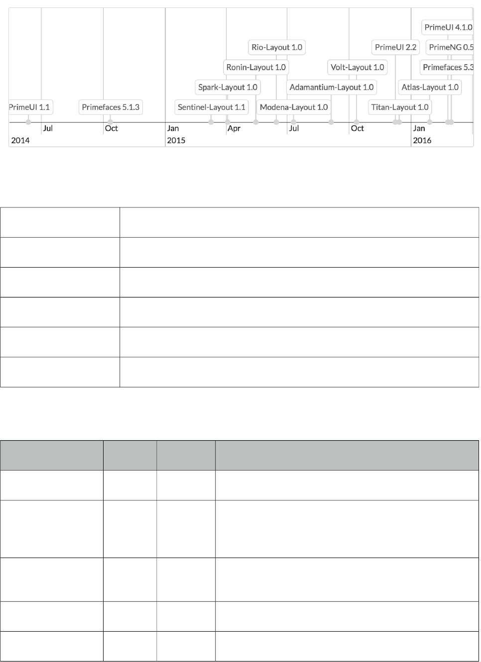
PrimeFaces User Guide
/'
Timeline is an interactive graph to visualize events in time.
Info
Tag timeLine
Component Class org.primefaces.component.timeline.TimeLine
Component Type org.primefaces.component.TimeLine
Component Family org.primefaces.component
Renderer Type org.primefaces.component.TimeLineRenderer
Renderer Class org.primefaces.component.timeline.TimeLineRenderer
Attributes
Name Default Type Description
id null String Unique identifier of the component
rendered true Boolean Boolean value to specify the rendering of the
component, when set to false component will not be
rendered.
binding null Object An el expression that maps to a server side
UIComponent instance in a backing bean
widgetVar null String Name of the client side widget.
style null String Inline style of the component.
528
PrimeFaces User Guide
Name Default Type Description
styleClass null String Style class of the component.
var null String Name of the request-scoped variable for underlaying
object in the TimelineEvent for each iteration.
value null Timeline
Model
An instance of TimelineModel representing the
backing model.
varGroup null String Name of the request-scoped variable for underlaying
object in the TimelineGroup for each iteration.
locale null Object User locale for i18n messages. The attribute can be
either a String or Locale object.
timeZone null Object Target time zone to convert start / end dates for
displaying. This time zone is the time zone the user
would like to see dates in UI. The attribute can be
either a String or TimeZone object or null. If null,
timeZone defaults to the server's time zone the
application is running in.
browserTimeZone null Object Time zone the user's browser / PC is running in.
This time zone allows to correct the conversion of
start / end dates to the target timeZone for
displaying. The attribute can be either a String or
TimeZone object or null. Note: browserTimeZone
should be provided if the target timeZone is
provided. If null, browserTimeZone defaults to the
server's timeZone.
height auto auto The height of the timeline in pixels, as a percentage,
or "auto". When the height is set to "auto", the
height of the timeline is automatically adjusted to fit
the contents. If not, it is possible that events get
stacked so high, that they are not visible in the
timeline. When height is set to "auto", a minimum
height can be specified with the option minHeight.
Default is "auto".
minHeight 0 Integer Specifies a minimum height for the Timeline in
pixels. Useful when height is set to "auto".
width 100% String The width of the timeline in pixels or as a
percentage.
responsive true Boolean Check if the timeline container is resized, and if so,
resize the timeline. Useful when the webpage
(browser window) or a layout pane / unit containing
529
PrimeFaces User Guide
Name Default Type Description
the timeline component is resized.
axisOnTop false Boolean If false, the horizontal axis is drawn at the bottom. If
true, the axis is drawn on top.
dragAreaWidth 10 Integer The width of the drag areas in pixels. When an event
with date range is selected, it has a drag area on the
left and right side, with which the start or end dates
of the event can be manipulated.
editable false Boolean If true, the events can be edited, changed, created
and deleted. Events can only be editable when the
option selectable is true (default). When editable is
true, the timeline can fire AJAX events "change",
"edit", "add", "delete", "drop". This global setting
"editable" can be overwritten for individual events
by setting a value in field "editable".
selectable true Boolean If true, events on the timeline are selectable.
Selectable events can fire AJAX "select" events.
unselectable true Boolean If true, you can unselect an item by clicking in the
empty space of the timeline. If false, you cannot
unselect an item, there will be always one item
selected.
zoomable true Boolean If true, the timeline is zoomable. When the timeline
is zoomed, AJAX "rangechange" events are fired.
moveable true Boolean If true, the timeline is movable. When the timeline is
moved, AJAX "rangechange" events are fired.
start null Date The initial start date for the axis of the timeline. If
not provided, the earliest date present in the events
is taken as start date.
end null Date The initial end date for the axis of the timeline. If
not provided, the latest date present in the events is
taken as end date.
min null Date Set a minimum Date for the visible range. It will not
be possible to move beyond this minimum.
max null Date Set a maximum Date for the visible range. It will not
be possible to move beyond this maximum.
zoomMin 10L Long Set a minimum zoom interval for the visible range in
530
PrimeFaces User Guide
Name Default Type Description
milliseconds. It will not be possible to zoom in
further than this minimum.
zoomMax 3153600
0000000
0L
Long Set a maximum zoom interval for the visible range
in milliseconds. It will not be possible to zoom out
further than this maximum. Default value equals
315360000000000 ms (about 10000 years).
preloadFactor 0.0f Float Preload factor is a positive float value or 0 which
can be used for lazy loading of events. When the
lazy loading feature is active, the calculated time
range for preloading will be multiplicated by the
preload factor. The result of this multiplication
specifies the additional time range which will be
considered for the preloading during moving /
zooming too. For example, if the calculated time
range for preloading is 5 days and the preload factor
is 0.2, the result is 5 * 0.2 = 1 day. That means, 1
day backwards and / or 1 day onwards will be added
to the original calculated time range. The event's
area to be preloaded is wider then. This helps to
avoid frequently, time-consuming fetching of events.
Default value is 0.
eventMargin 10 Integer The minimal margin in pixels between events.
eventMarginAxis 10 Integer The minimal margin in pixels between events and
the horizontal axis.
eventStyle box String Specifies the style for the timeline events. Choose
from "dot" or "box".
groupsChangeable true Boolean If true, items can be moved from one group to
another. Only applicable when groups are used.
groupsOnRight false Boolean If false, the groups legend is drawn at the left side of
the timeline. If true, the groups legend is drawn on
the right side.
groupsOrder true Boolean Allows to customize the way groups are ordered.
When true (default), groups will be ordered by
content alphabetically (when the list of groups is
missing) or by native ordering of TimelineGroup
object in the list of groups (when the list of groups is
available). When false, groups will not be ordered at
all.
groupsWidth null String By default, the width of the groups legend is
531
PrimeFaces User Guide
Name Default Type Description
adjusted to the group names. A fixed width can be
set for the groups legend by specifying the
"groupsWidth" as a string, for example "200px".
groupMinHeight 0 Integer The minimum height of each individual group even
if they have no items. The group height is set as the
greatest value between items height and the
groupMinHeight. Default is 0.
snapEvents true Boolean If true, the start and end of an event will be snapped
nice integer values when moving or resizing the
event. Default is true.
stackEvents true Boolean If true, the start and end of an event will be snapped
nice integer values when moving or resizing the
event.
showCurrentTime true Boolean If true, the timeline shows a red, vertical line
displaying the current time.
showMajorLabels true Boolean By default, the timeline shows both minor and major
date labels on the horizontal axis. For example the
minor labels show minutes and the major labels
show hours. When "showMajorLabels" is false, no
major labels are shown.
showMinorLabels true Boolean By default, the timeline shows both minor and major
date labels on the horizontal axis. For example the
minor labels show minutes and the major labels
show hours. When "showMinorLabels" is false, no
minor labels are shown.
When both "showMajorLabels" and
"showMinorLabels" are false, no horizontal axis will
be visible.
showButtonNew false Boolean Show the button "Create new event" in the a
navigation menu.
showNavigation false Boolean Show a navigation menu with buttons to move and
zoom the timeline.
timeChangeable true Boolean If false, items can not be moved or dragged
horizontally (neither start time nor end time is
changable). This is useful when items should be
editable but can only be changed regarding group or
content (typical use case: scheduling events).
532
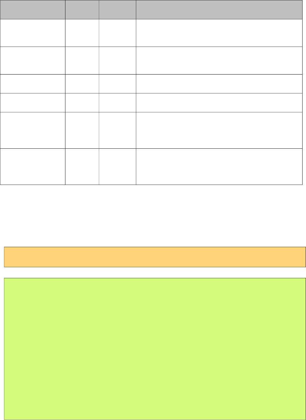
PrimeFaces User Guide
Name Default Type Description
dropHoverStyleCla
ss
null String Style class to apply when an acceptable draggable is
dragged over.
dropActiveStyleCl
ass
null String Style class to apply when an acceptable draggable is
being dragged over.
dropAccept null String Selector to define the accepted draggables.
dropScope null String Scope key to match draggables and droppables.
animate true Boolean When true, events are moved animated when
resizing or moving them. This is very pleasing for
the eye, but does require more computational power.
animateZoom true Boolean When true, events are moved animated when
zooming the Timeline. This looks cool, but does
require more computational power.
Getting started with the TimeLine
TimeLine requires a value of org.primefaces.model.timeline.TimelineModel type. An event should
be an instance of org.primefaces.model.timeline.TimelineEvent and included in model via add
method.
<p:timeline id="timeline" value="#{basicTimelineView.model}" height="250px" />
public class BasicTimelineView implements Serializable {
private TimelineModel model;
@PostConstruct
protected void initialize() {
model = new TimelineModel();
Calendar cal = Calendar.getInstance();
cal.set(2014, Calendar.JUNE, 12, 0, 0, 0);
model.add(new TimelineEvent("PrimeUI 1.1", cal.getTime()));
cal.set(2014, Calendar.OCTOBER, 11, 0, 0, 0);
model.add(new TimelineEvent("Primefaces 5.1.3", cal.getTime()));
}
}
Examples
For examples on editing, grouping, styling, ranges, linked timelines and lazy loading please visit;
533
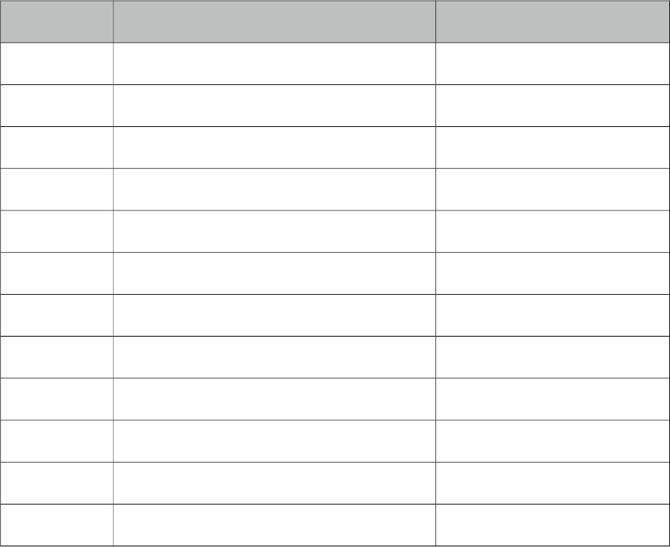
PrimeFaces User Guide
http://www.primefaces.org/showcase-ext/sections/timeline/basic.jsf
Ajax Behavior Events
Event Listener Parameter Fired
page org.primefaces.event.data.PageEvent On pagination.
sort org.primefaces.event.data.SortEvent When a column is sorted.
add TimelineAddEvent On event add.
change TimelineModificationEvent On event change.
changed TimelineModificationEvent On event change complete.
edit TimelineModificationEvent On event edit.
delete TimelineModificationEvent On event delete.
select TimelineSelectEvent On event select.
rangechange TimelineRangeEvent On range change.
rangechanged TimelineRangeEvent On range change complete.
lazyload TimelineLazyLoadEvent On lazy load.
drop TimelineDragDropEvent On drop from outside.
* All events are under org.primefaces.event.timeline.* package.
534
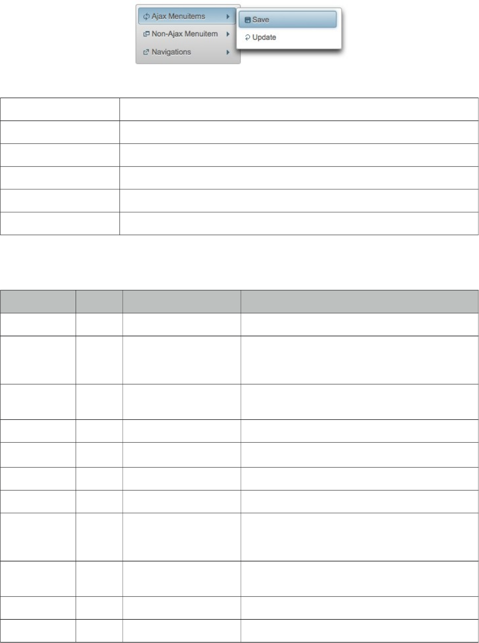
PrimeFaces User Guide
3.153 TieredMenu
TieredMenu is used to display nested submenus with overlays.
Info
Tag tieredMenu
Component Class org.primefaces.component.tieredmenu.TieredMenu
Component Type org.primefaces.component.TieredMenu
Component Family org.primefaces.component
Renderer Type org.primefaces.component.TieredMenuRenderer
Renderer Class org.primefaces.component.tieredmenu.TieredMenuRenderer
Attributes
Name Default Type Description
id null String Unique identifier of the component
rendered true Boolean Boolean value to specify the rendering of the
component, when set to false component will not
be rendered.
binding null Object An el expression that maps to a server side
UIComponent instance in a backing bean
widgetVar null String Name of the client side widget.
model null MenuModel MenuModel instance for programmatic menu.
style null String Inline style of the component.
styleClass null String Style class of the component.
autoDisplay true Boolean Defines whether the first level of submenus will be
displayed on mouseover or not. When set to false,
click event is required to display.
trigger null String Id of the component whose triggerEvent will show
the dynamic positioned menu.
my null String Corner of menu to align with trigger element.
at null String Corner of trigger to align with menu element.
535
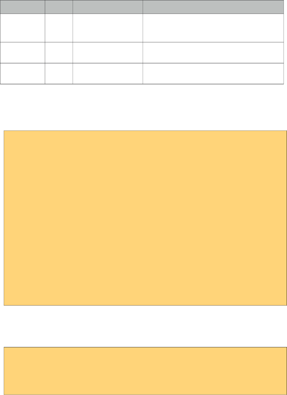
PrimeFaces User Guide
Name Default Type Description
overlay false Boolean Defines positioning, when enabled menu is
displayed with absolute position relative to the
trigger. Default is false, meaning static positioning.
triggerEvent click String Event name of trigger that will show the dynamic
positioned menu.
toggleEvent hover String Event to toggle the submenus, valid values are
"hover" and "click".
Getting started with the TieredMenu
TieredMenu consists of submenus and menuitems, submenus can be nested and each nested
submenu will be displayed in an overlay.
<p:tieredMenu>
<p:submenu label="Ajax Menuitems" icon="ui-icon-refresh">
<p:menuitem value="Save" actionListener="#{buttonBean.save}"
update="messages" icon="ui-icon-disk" />
<p:menuitem value="Update" actionListener="#{buttonBean.update}"
update="messages" icon="ui-icon-arrowrefresh-1-w" />
</p:submenu>
<p:submenu label="Non-Ajax Menuitem" icon="ui-icon-newwin">
<p:menuitem value="Delete" actionListener="#{buttonBean.delete}"
update="messages" ajax="false" icon="ui-icon-close"/>
</p:submenu>
<p:separator />
<p:submenu label="Navigations" icon="ui-icon-extlink">
<p:submenu label="Prime Links">
<p:menuitem value="Prime" url="http://www.prime.com.tr" />
<p:menuitem value="PrimeFaces" url="http://www.primefaces.org" />
</p:submenu>
<p:menuitem value="Mobile" url="/mobile" />
</p:submenu>
</p:tieredMenu>
AutoDisplay
By default, submenus are displayed when mouse is over root menuitems, set autoDisplay to false to
require a click on root menuitems to enable autoDisplay mode.
<p:tieredMenu autoDisplay="false">
//content
</p:tieredMenu>
536
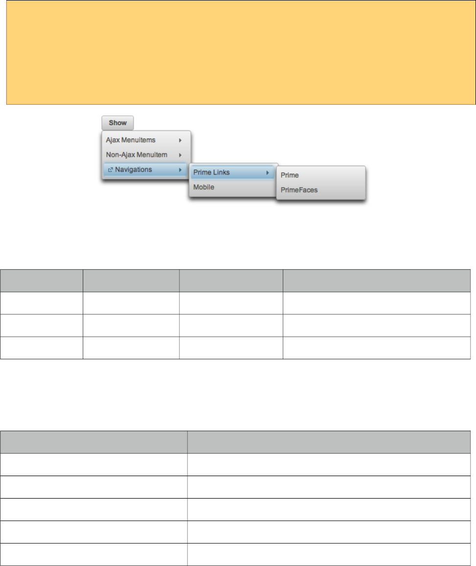
PrimeFaces User Guide
Overlay
TieredMenu can be positioned relative to a trigger component, following sample attaches a
tieredMenu to the button so that whenever the button is clicked tieredMenu will be displayed in an
overlay itself.
<p:commandButton type="button" value="Show" id="btn" />
<p:tieredMenu autoDisplay="false" trigger="btn" my="left top" at="left bottom">
//content
</p:tieredMenu>
Client Side API
Widget: PrimeFaces.widget.TieredMenu
Method Params Return Type Description
show() - void Shows overlay menu.
hide() - void Hides overlay menu.
align() - void Aligns overlay menu with trigger.
Skinning
TieredMenu resides in a main container which style and styleClass attributes apply. Following is the
list of structural style classes;
Style Class Applies
.ui-menu .ui-tieredmenu Container element of menu.
.ui-menu-list List container
.ui-menuitem Each menu item
.ui-menuitem-link Anchor element in a link item
.ui-menuitem-text Text element in an item
As skinning style classes are global, see the main theming section for more information.
537
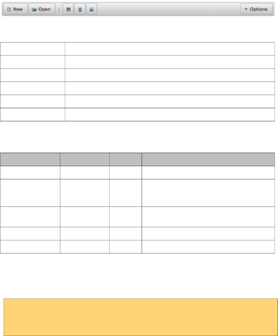
PrimeFaces User Guide
3.154 Toolbar
Toolbar is a horizontal grouping component for commands and other content.
Info
Tag toolbar
Component Class org.primefaces.component.toolbar.Toolbar
Component Type org.primefaces.component.Toolbar
Component Family org.primefaces.component
Renderer Type org.primefaces.component.ToolbarRenderer
Renderer Class org.primefaces.component.toolbar.ToolbarRenderer
Attributes
Name Default Type Description
id null String Unique identifier of the component
rendered true Boolean Boolean value to specify the rendering of the
component, when set to false component will not
be rendered.
binding null Object An el expression that maps to a server side
UIComponent instance in a backing bean
style null String Inline style of the container element.
styleClass null String Style class of the container element.
Getting Started with the Toolbar
Toolbar has two placeholders(left and right) that are defined with facets. You can also use
toolbarGroup as an alternative to facets.
<p:toolbar>
<f:facet name="left"></f:facet>
<f:facet name="right"></f:facet>
</p:toolbar>
Any content can be placed inside toolbar.
538
PrimeFaces User Guide
<p:toolbar>
<f:facet name="left">
<p:commandButton type="push" value="New" image="ui-icon-document" />
<p:commandButton type="push" value="Open" image="ui-icon-folder-open"/>
<span class="ui-separator">
<span class="ui-icon ui-icon-grip-dotted-vertical" />
</span>
<p:commandButton type="push" title="Save" image="ui-icon-disk"/>
<p:commandButton type="push" title="Delete" image="ui-icon-trash"/>
<p:commandButton type="push" title="Print" image="ui-icon-print"/>
</f:facet>
<f:facet name="right">
<p:menuButton value="Navigate">
<p:menuitem value="Home" url="#" />
<p:menuitem value="Logout" url="#" />
</p:menuButton>
</f:facet>
</p:toolbar>
Skinning
Toolbar resides in a container element which style and styleClass options apply. Following is the list
of structural style classes;
Style Class Applies
.ui-toolbar Main container
.ui-toolbar .ui-separator Divider in a toolbar
.ui-toolbar-group-left Left toolbarGroup container
.ui-toolbar-group-right Right toolbarGroup container
As skinning style classes are global, see the main theming section for more information.
539
PrimeFaces User Guide
3.155 ToolbarGroup
ToolbarGroup is a helper component for Toolbar component to define placeholders.
Info
Tag toolbarGroup
Component Class org.primefaces.component.toolbar.ToolbarGroup
Component Type org.primefaces.component.ToolbarGroup
Component Family org.primefaces.component
Attributes
Name Default Type Description
id null String Unique identifier of the component
rendered true Boolean Boolean value to specify the rendering of the
component, when set to false component will not
be rendered.
binding null Object An el expression that maps to a server side
UIComponent instance in a backing bean
align null String Defines the alignment within toolbar, valid values
are left and right.
style null String Inline style of the container element.
styleClass null String Style class of the container element.
Getting Started with the ToolbarGroup
See toolbar documentation for more information about how Toolbar Group is used.
540
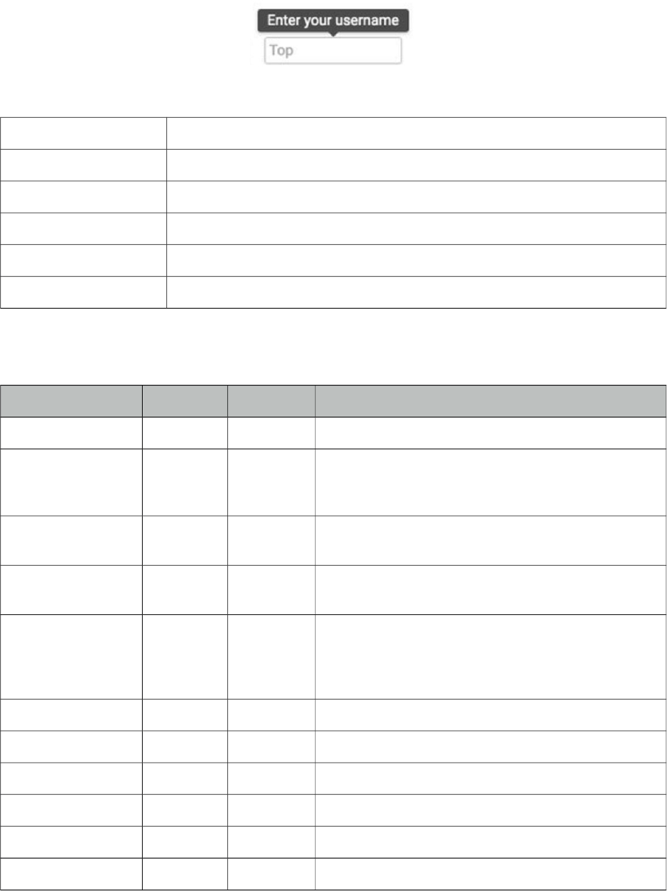
PrimeFaces User Guide
3.156 Tooltip
Tooltip goes beyond the legacy html title attribute by providing custom effects, events, html content
and advance theme support.
Info
Tag tooltip
Component Class org.primefaces.component.tooltip.Tooltip
Component Type org.primefaces.component.Tooltip
Component Family org.primefaces.component
Renderer Type org.primefaces.component.TooltipRenderer
Renderer Class org.primefaces.component.tooltip.TooltipRenderer
Attributes
Name Default Type Description
id null String Unique identifier of the component
rendered true Boolean Boolean value to specify the rendering of the
component, when set to false component will not be
rendered.
binding null Object An el expression that maps to a server side
UIComponent instance in a backing bean
value null Object Value of the component than can be either an EL
expression of a literal text
converter null Converter/
String
An el expression or a literal text that defines a
converter for the component. When it’s an EL
expression, it’s resolved to a converter instance. In
case it’s a static text, it must refer to a converter id
widgetVar null String Name of the client side widget.
showEvent mouseover String Event displaying the tooltip.
showEffect fade String Effect to be used for displaying.
hideEvent mouseout String Event hiding the tooltip.
hideEffect fade String Effect to be used for hiding.
showDelay 150 Integer Delay time to show tooltip in milliseconds.
541
PrimeFaces User Guide
Name Default Type Description
hideDelay 0 Integer Delay time to hide tooltip in milliseconds.
for null String Component to attach the tooltip.
style null String Inline style of the tooltip.
styleClass null String Style class of the tooltip.
globalSelector null String jquery selector for global tooltip, defaults to
"a,:input,:button".
escape true Boolean Defines whether html would be escaped or not.
trackMouse false Boolean Tooltip position follows pointer on mousemove.
beforeShow null String Client side callback to execute before tooltip is shown.
Returning false will prevent display.
onHide null String Client side callback to execute after tooltip is shown.
onShow null String Client side callback to execute after tooltip is shown.
position right String Position of the tooltip, valid values are right, left, top
and bottom.
Getting started with the Tooltip
Tooltip can be used by attaching it to a target component. Tooltip value can also be retrieved from
target’s title, so following are same;
<h:inputSecret id="pwd" value="#{myBean.password}" />
<p:tooltip for="pwd" value="Only numbers"/>
<h:inputSecret id="pwd" value="#{myBean.password}" title="Only numbers"/>
<p:tooltip for="pwd"/>
Global Tooltip
Global tooltip binds to elements with title attributes. Ajax updates are supported as well, meaning if
target component is updated with ajax, tooltip can still bind. As global tooltips are more efficient
since only one instance of tooltip is used across all tooltip targets, it is suggested to be used instead
of explicit tooltips unless you have a custom case e.g. different options, custom content.
<p:tooltip />
<p:inputText id="focus" title="Tooltip for an input"/>
<h:outputLink id="fade" value="#" title="Tooltip for a link">
<h:outputText value="Fade Effect" />
</h:outputLink>
<p:commandButton value="Up" title="Up" />
542

PrimeFaces User Guide
IE10 Issue
Due to a bug, IE10 always displays the title text in a native popup when the element receives focus
via tabbing and two tooltips might be displayed at once. Solution is to use passthrough data-tooltip
attribute instead of title.
<html xmlns="http://www.w3.org/1999/xhtml"
xmlns:h="http://xmlns.jcp.org/jsf/html"
xmlns:pt="http://xmlns.jcp.org/jsf/passthrough"
xmlns:p="http://primefaces.org/ui">
<h:head></h:head>
<h:body>
<p:inputText pt:data-tooltip="Title here"/>
<p:inputText title="Works fine except tabbed on IE10"/>
</h:body>
</html>
Position
Tooltip has four possible position, default is right and other valid values are left, top and bottom.
Events and Effects
A tooltip is shown on mouseover event and hidden when mouse is out by default. If you need to
change this behavior use the showEvent and hideEvent feature. Tooltip below is displayed when the
input gets the focus and hidden with onblur.
<h:inputSecret id="pwd" value="#{myBean.password}" />
<p:tooltip for="pwd" value="Password must contain only numbers"
showEvent="focus" hideEvent="blur" showEffect="blind" hideEffect="explode" />
Available options for effects are; blind, bounce, clip, drop, explode, fold, highlight, puff, pulsate,
scale, shake, size and slide.
Html Content
Another powerful feature of tooltip is the ability to display custom content as a tooltip.
<h:outputLink id="lnk" value="#">
<h:outputText value="PrimeFaces Home" />
</h:outputLink>
<p:tooltip for="lnk">
<p:graphicImage value="/images/prime_logo.png" />
<h:outputText value="Visit PrimeFaces Home" />
</p:tooltip>
Skinning
Tooltip has only .ui-tooltip as a style class and is styled with global skinning selectors, see main
skinning section for more information.
543
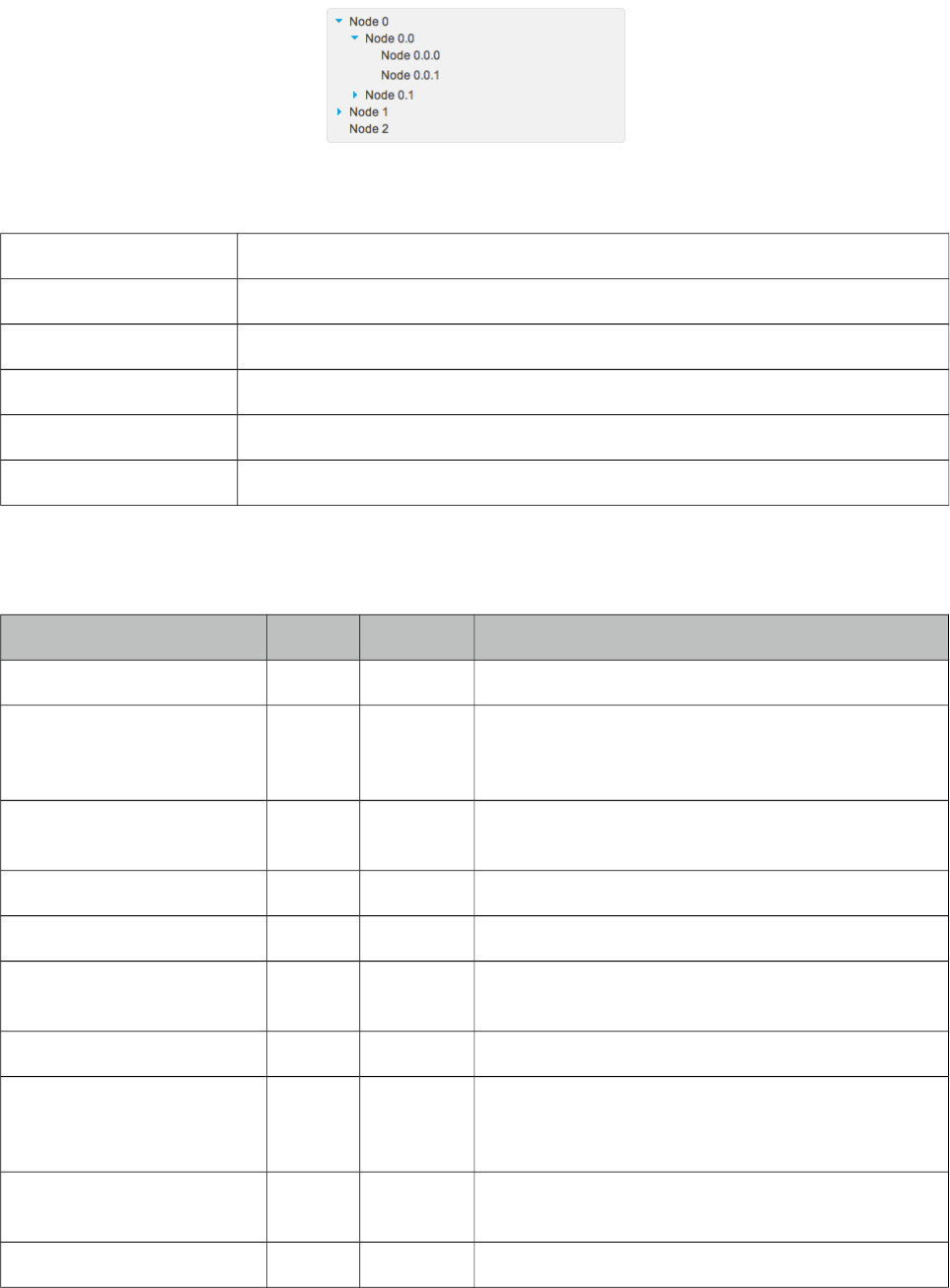
PrimeFaces User Guide
3.157 Tree
Tree is used for displaying hierarchical data and creating site navigations.
Info
Tag tree
Component Class org.primefaces.component.tree.Tree
Component Type org.primefaces.component.Tree
Component Family org.primefaces.component
Renderer Type org.primefaces.component.TreeRenderer
Renderer Class org.primefaces.component.tree.TreeRenderer
Attributes
Name Default Type Description
id null String Unique identifier of the component
rendered true Boolean Boolean value to specify the rendering of the
component, when set to false component will not be
rendered.
binding null Object An el expression that maps to a server side
UIComponent instance in a backing bean
widgetVar null String Name of the client side widget.
value null Object A TreeNode instance as the backing model.
var null String Name of the request-scoped variable that'll be used
to refer each treenode data.
dynamic false Boolean Specifies the ajax/client toggleMode
cache true Boolean Specifies caching on dynamically loaded nodes.
When set to true expanded nodes will be kept in
memory.
onNodeClick null String Javascript event to process when a tree node is
clicked.
selection null Object TreeNode array to reference the selections.
544
PrimeFaces User Guide
Name Default Type Description
style null String Style of the main container element of tree
styleClass null String Style class of the main container element of tree
selectionMode null String Defines the selectionMode
highlight true Boolean Highlights nodes on hover when selection is
enabled.
datakey null Object Unique key of the data presented by nodes.
animate false Boolean When enabled, displays slide effect on toggle.
orientation vertical String Orientation of layout, vertical or horizontal.
propagateSelectionUp true Boolean Defines upwards selection propagation for
checkbox mode.
propagateSelectionDown true Boolean Defines downwards selection propagation for
checkbox mode.
dir ltr String Defines text direction, valid values are ltr and rtl.
draggable false Boolean Makes tree nodes draggable.
droppable false Boolean Makes tree droppable.
dragdropScope null String Scope key to group a set of tree components for
transferring nodes using drag and drop.
dragMode self String Defines parent-child relationship when a node is
dragged, valid values are self (default), parent and
ancestor.
dropRestrict none String Defines parent-child restrictions when a node is
dropped valid values are none (default) and sibling.
required false Boolean Validation constraint for selection.
requiredMessage null String Message for required selection validation.
skipChildren false Boolean Ignores processing of children during lifecycle,
improves performance if table only has output
components.
showUnselectableCheckbox false Boolean Defines if in checkbox selection mode, a readonly
checkbox should be displayed for an unselectable
node.
tabindex 0 String Position of the element in the tabbing order.
nodeVar null String Name of the request-scoped variable that'll be used
to refer current treenode using EL.
filterBy null Object Value expression to be used in filtering.
filterMatchMode starts
With
String Match mode for filtering.
545
PrimeFaces User Guide
Getting started with the Tree
Tree is populated with a org.primefaces.model.TreeNode instance which corresponds to the root.
<p:tree value="#{treeBean.root}" var="node">
<p:treeNode>
<h:outputText value="#{node}"/>
</p:treeNode>
</p:tree>
public class TreeBean {
private TreeNode root;
public TreeBean() {
root = new TreeNode("Root", null);
TreeNode node0 = new TreeNode("Node 0", root);
TreeNode node1 = new TreeNode("Node 1", root);
TreeNode node2 = new TreeNode("Node 2", root);
TreeNode node00 = new TreeNode("Node 0.0", node0);
TreeNode node01 = new TreeNode("Node 0.1", node0);
TreeNode node10 = new TreeNode("Node 1.0", node1);
TreeNode node11 = new TreeNode("Node 1.1", node1);
TreeNode node000 = new TreeNode("Node 0.0.0", node00);
TreeNode node001 = new TreeNode("Node 0.0.1", node00);
TreeNode node010 = new TreeNode("Node 0.1.0", node01);
TreeNode node100 = new TreeNode("Node 1.0.0", node10);
}
//getter of root
}
TreeNode vs p:TreeNode
TreeNode API is used to create the node model and consists of org.primefaces.model.TreeNode
instances, on the other hand <p:treeNode /> represents a component of type
org.primefaces.component.tree.UITreeNode. You can bind a TreeNode to a particular p:treeNode
using the type name. Document Tree example in upcoming section demonstrates a sample usage.
TreeNode API
TreeNode has a simple API to use when building the backing model. For example if you call
node.setExpanded(true) on a particular node, tree will render that node as expanded.
Property Type Description
type String type of the treeNode name, default type name is "default".
data Object Encapsulated data
546
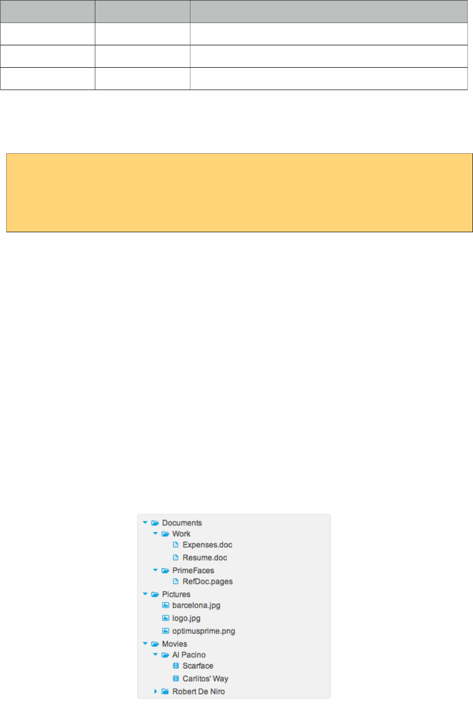
PrimeFaces User Guide
Property Type Description
children List<TreeNode> List of child nodes
parent TreeNode Parent node
expanded Boolean Flag indicating whether the node is expanded or not
Dynamic Tree
Tree is non-dynamic by default and toggling happens on client-side. In order to enable ajax toggling
set dynamic setting to true.
<p:tree value="#{treeBean.root}" var="node" dynamic="true">
<p:treeNode>
<h:outputText value="#{node}"/>
</p:treeNode>
</p:tree>
Non-Dynamic: When toggling is set to client all the treenodes in model are rendered to the client
and tree is created, this mode is suitable for relatively small datasets and provides fast user
interaction. On the otherhand it’s not suitable for large data since all the data is sent to the client also
client side tree is stateless.
Dynamic: Dynamic mode uses ajax to fetch the treenodes from server side on demand, compared to
the client toggling, dynamic mode has the advantage of dealing with large data because only the
child nodes of the root node is sent to the client initially and whole tree is lazily populated. When a
node is expanded, tree only loads the children of the particular expanded node and send to the client
for display.
Multiple TreeNode Types
It’s a common requirement to display different TreeNode types with a different UI (eg icon).
Suppose you’re using tree to visualize a company with different departments and different
employees, or a document tree with various folders, files each having a different formats (music,
video). In order to solve this, you can place more than one <p:treeNode /> components each having
a different type and use that "type" to bind TreeNode’s in your model. Following example
demonstrates a document explorer. Here is the final output to achieve;
547

PrimeFaces User Guide
Document Explorer is implemented with four different <p:treeNode /> components and additional
CSS skinning to visualize expanded/closed folder icons.
<p:tree value="#{bean.root}" var="doc">
<p:treeNode expandedIcon="ui-icon ui-icon-folder-open"
collapsedIcon="ui-icon ui-icon-folder-collapsed">
<h:outputText value="#{doc.name}"/>
</p:treeNode>
<p:treeNode type="document" icon="ui-icon ui-icon-document">
<h:outputText value="#{doc.name}" />
</p:treeNode>
<p:treeNode type="picture" icon="ui-icon ui-icon-image">
<h:outputText value="#{doc.name}" />
</p:treeNode>
<p:treeNode type="mp3" icon="ui-icon ui-icon-video">
<h:outputText value="#{doc.name}" />
</p:treeNode>
</p:tree>
548

PrimeFaces User Guide
public class Bean {
private TreeNode root;
public Bean() {
root = new DefaultTreeNode("root", null);
TreeNode documents = new DefaultTreeNode("Documents", root);
TreeNode pictures = new DefaultTreeNode("Pictures", root);
TreeNode music = new DefaultTreeNode("Music", root);
TreeNode work = new DefaultTreeNode("Work", documents);
TreeNode primefaces = new DefaultTreeNode("PrimeFaces", documents);
//Documents
TreeNode expenses = new DefaultTreeNode("document", "Expenses.doc", work);
TreeNode resume = new DefaultTreeNode("document", "Resume.doc", work);
TreeNode refdoc = new DefaultTreeNode("document", "RefDoc.pages", primefaces);
//Pictures
TreeNode barca = new DefaultTreeNode("picture", "barcelona.jpg", pictures);
TreeNode primelogo = new DefaultTreeNode("picture", "logo.jpg", pictures);
TreeNode optimus = new DefaultTreeNode("picture", "optimus.png", pictures);
//Music
TreeNode turkish = new DefaultTreeNode("Turkish", music);
TreeNode cemKaraca = new DefaultTreeNode("Cem Karaca", turkish);
TreeNode erkinKoray = new DefaultTreeNode("Erkin Koray", turkish);
TreeNode mogollar = new DefaultTreeNode("Mogollar", turkish);
TreeNode nemalacak = new DefaultTreeNode("mp3", "Nem Alacak Felek Benim",
cemKaraca);
TreeNode resimdeki = new DefaultTreeNode("mp3", "Resimdeki Goz Yaslari",
cemKaraca);
TreeNode copculer = new DefaultTreeNode("mp3", "Copculer", erkinKoray);
TreeNode oylebirgecer = new DefaultTreeNode("mp3", "Oyle Bir Gecer", erkinKoray);
TreeNode toprakana = new DefaultTreeNode("mp3", "Toprak Ana", mogollar);
TreeNode bisiyapmali = new DefaultTreeNode("mp3", "Bisi Yapmali", mogollar);
}
//getter of root
}
Integration between a TreeNode and a p:treeNode is the type attribute, for example music files in
document explorer are represented using TreeNodes with type "mp3", there’s also a p:treeNode
component with same type "mp3". This results in rendering all music nodes using that particular
p:treeNode representation which displays a note icon. Similarly document and pictures have their
own p:treeNode representations.
Folders on the other hand have two states whose icons are defined by expandedIcon and
collapsedIcon attributes.
Filtering
Tree has built-in support for filtering that is enabled by using filterBy property.
549
PrimeFaces User Guide
<p:tree value="#{treeBean.root}" var="node" filterBy="#{node.name}">
<p:treeNode>
<h:outputText value="#{node}"/>
</p:treeNode>
</p:tree>
startsWith is the default filter method and filterMatchMode is used to customize this. Valid values
are startsWith, endsWidth, contains, exact, lt, lte, gt, gte, equals and in.
Ajax Behavior Events
Tree provides various ajax behavior events.
Event Listener Parameter Fired
expand org.primefaces.event.NodeExpandEvent When a node is expanded.
collapse org.primefaces.event.NodeCollapseEvent When a node is collapsed.
select org.primefaces.event.NodeSelectEvent When a node is selected.
unselect org.primefaces.event.NodeUnselectEvent When a node is unselected.
Following tree has three listeners;
<p:tree value="#{treeBean.model}" dynamic="true">
<p:ajax event="select" listener="#{treeBean.onNodeSelect}" />
<p:ajax event="expand" listener="#{treeBean.onNodeExpand}" />
<p:ajax event="collapse" listener="#{treeBean.onNodeCollapse}" />
...
</p:tree>
public void onNodeSelect(NodeSelectEvent event) {
String node = event.getTreeNode().getData().toString();
}
public void onNodeExpand(NodeExpandEvent event) {
String node = event.getTreeNode().getData().toString();
}
public void onNodeCollapse(NodeCollapseEvent event) {
String node = event.getTreeNode().getData().toString();
}
Event listeners are also useful when dealing with huge amount of data. The idea for implementing
such a use case would be providing only the root and child nodes to the tree, use event listeners to
get the selected node and add new nodes to that particular tree at runtime.
Selection
Node selection is a built-in feature of tree and it supports three different modes. Selection should be
a TreeNode for single case and an array of TreeNodes for multiple and checkbox cases, tree finds
the selected nodes and assign them to your selection model.
550
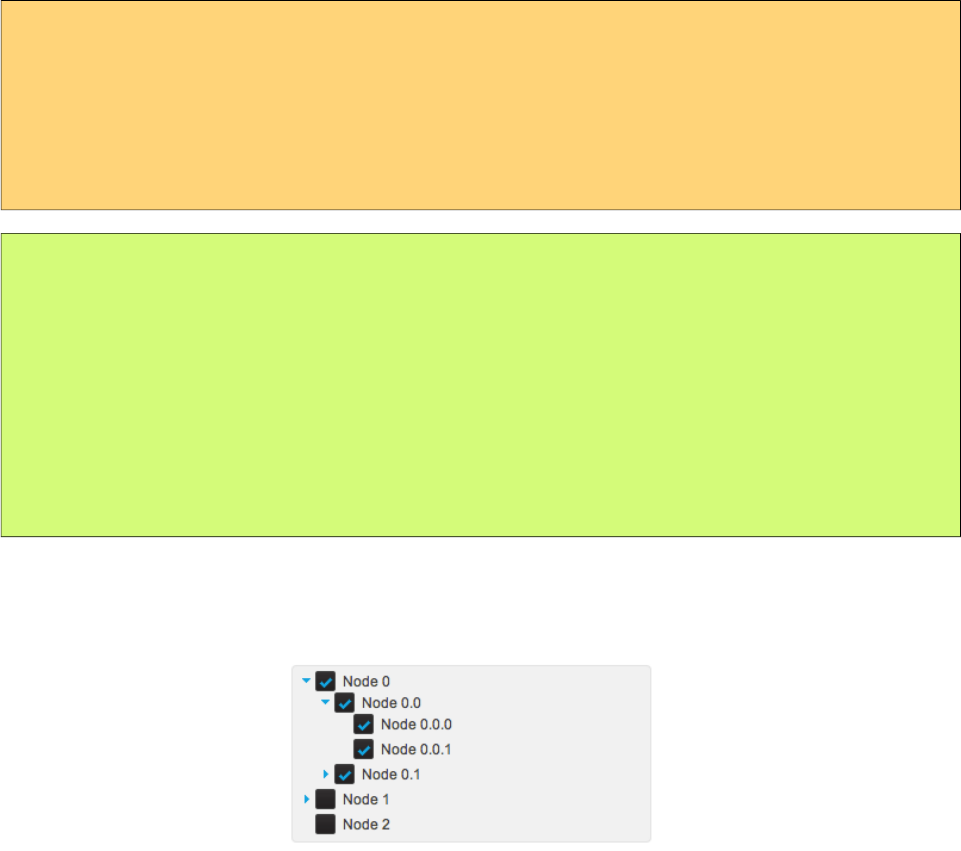
PrimeFaces User Guide
single: Only one at a time can be selected, selection should be a TreeNode reference.
multiple: Multiple nodes can be selected, selection should be a TreeNode[] reference.
checkbox: Multiple selection is done with checkbox UI, selection should be a TreeNode[] reference.
<p:tree value="#{treeBean.root}" var="node"
selectionMode="checkbox"
selection="#{treeBean.selectedNodes}">
<p:treeNode>
<h:outputText value="#{node}"/>
</p:treeNode>
</p:tree>
public class TreeBean {
private TreeNode root;
private TreeNode[] selectedNodes;
public TreeBean() {
root = new CheckboxTreeNode("Root", null);
//populate nodes
}
//getters and setters
}
That’s it, now the checkbox based tree looks like below. When the form is submitted with a
command component like a button, selected nodes will be populated in selectedNodes property of
TreeBean. As checkbox selection have a special hierarchy, use CheckboxTreeNode instead.
Node Caching
When caching is turned on by default, dynamically loaded nodes will be kept in memory so re-
expanding a node will not trigger a server side request. In case it’s set to false, collapsing the node
will remove the children and expanding it later causes the children nodes to be fetched from server
again.
Handling Node Click
If you need to execute custom javascript when a treenode is clicked, use the onNodeClick attribute.
Your javascript method will be invoked with passing the html element of the node and the click
event as parameters. In case you have datakey defined, you can access datakey on client side by
using node.attr(‘data-datakey’) that represents the data represented by the backing tree model.
DragDrop
Tree nodes can be reordered within a single tree and can even be transferred between multiple trees
using dragdrop. For a single tree enable draggable and droppable options.
551
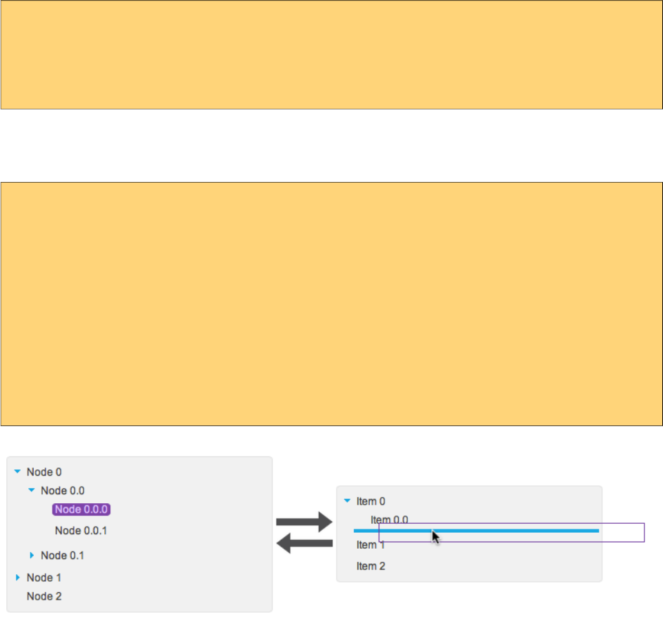
PrimeFaces User Guide
<p:tree value="#{treeBean.root}" var="node" draggable="true" droppable="true">
<p:treeNode>
<h:outputText value="#{node}"/>
</p:treeNode>
</p:tree>
For multiple trees, use a scope attribute to match them and configure dragdrop options depending
on your case, following example has 2 trees where one is the source and other is the target. Target
can also be reordered within itself.
<p:tree value="#{treeBean.root1}" var="node" draggable="true" droppable="false"
dragdropScope="myscope">
<p:treeNode>
<h:outputText value="#{node}"/>
</p:treeNode>
</p:tree>
<p:tree value="#{treeBean.root2}" var="node" draggable="true" droppable="true"
dragdropScope="myscope">
<p:treeNode>
<h:outputText value="#{node}"/>
</p:treeNode>
</p:tree>
Two additional options exist for further configuration, dragMode defines the target node that would
be dropped, default value is self and other values are parent and ancestor. dropRestrict on the other
hand, can restrict the drop target to be within the parent by setting it to sibling.
Horizontal Tree
Default orientation of tree is vertical, setting it to horizontal displays nodes in an horizontal layout.
All features of vertical tree except dragdrop is available for horizontal tree as well.
552
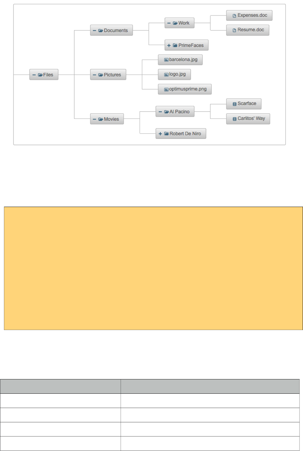
PrimeFaces User Guide
ContextMenu
Tree has special integration with context menu, you can even match different context menus with
different tree nodes using nodeType option of context menu that matches the tree node type. Note
that selection must be enabled in tree component for context menu integration.
<p:contextMenu for="tree">
<p:menuitem value="View" update="messages"
actionListener="#{bean.view}" icon="ui-icon-search" />
<p:menuitem value="View" update="tree"
actionListener="#{bean.delete}" icon="ui-icon-close" />
</p:contextMenu>
<p:tree id="tree" value="#{bean.root}" var="node"
selectionMode="single" selection="#{bean.selectedNode}">
<p:treeNode>
<h:outputText value="#{node}" />
</p:treeNode>
</p:tree>
Skinning
Tree resides in a container element which style and styleClass options apply. Following is the list of
structural style classes;
Style Class Applies
.ui-tree Main container
.ui-tree-container Root node container.
.ui-treenode Tree node
.ui-treenode-content Tree node content
553
PrimeFaces User Guide
Style Class Applies
.ui-treenode-icon Tree node icon
.ui-tree-toggler Toggle icon
.ui-treenode-label Tree node label
.ui-treenode-parent Nodes with children
.ui-treenode-leaf Nodes without children
As skinning style classes are global, see the main theming section for more information.
554
PrimeFaces User Guide
3.158 TreeNode
TreeNode is used with Tree component to represent a node in tree.
Info
Tag treeNode
Component Class org.primefaces.component.tree.UITreeNode
Component Type org.primefaces.component.UITreeNode
Component Family org.primefaces.component
Attributes
Name Default Type Description
id null String Unique identifier of the component
rendered true Boolean Boolean value to specify the rendering of the
component, when set to false component will not be
rendered.
binding null Object An el expression that maps to a server side
UIComponent instance in a backing bean
type default String Type of the tree node
styleClass null String Style class to apply a particular tree node type
icon null String Icon of the node.
expandedIcon null String Expanded icon of the node.
collapsedIcon null String Collapsed icon of the node.
Getting started with the TreeNode
TreeNode is used by Tree and TreeTable components, refer to sections of these components for
more information.
555
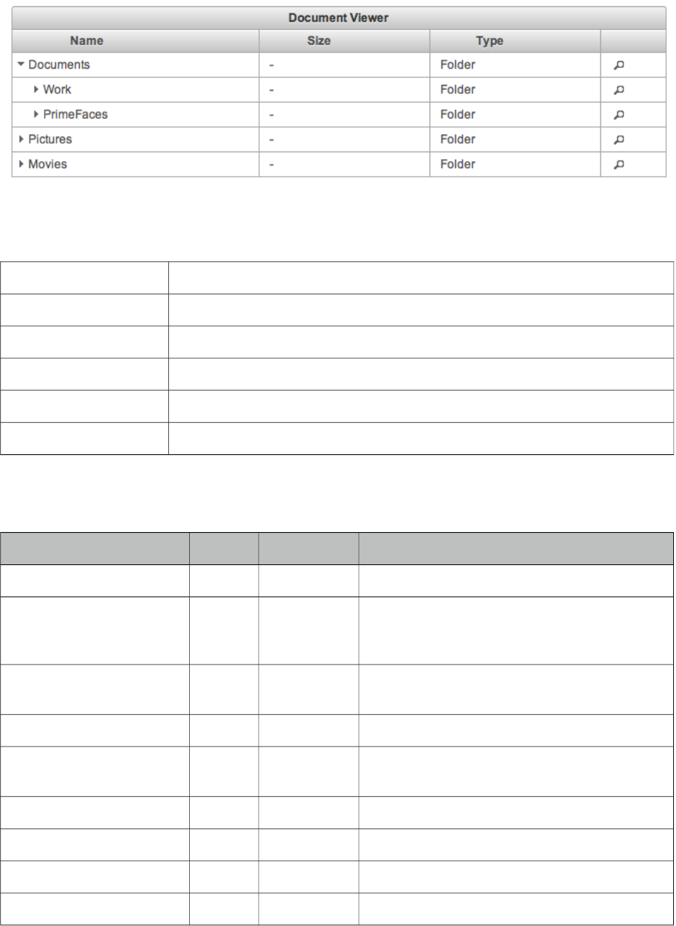
PrimeFaces User Guide
3.159 TreeTable
Treetable is is used for displaying hierarchical data in tabular format.
Info
Tag treeTable
Component Class org.primefaces.component.treetable.TreeTable
Component Type org.primefaces.component.TreeTable
Component Family org.primefaces.component
Renderer Type org.primefaces.component.TreeTableRenderer
Renderer Class org.primefaces.component.treetable.TreeTableRenderer
Attributes
Name Default Type Description
id null String Unique identifier of the component
rendered true Boolean Boolean value to specify the rendering of the
component, when set to false component will
not be rendered.
binding null Object An el expression that maps to a server side
UIComponent instance in a backing bean
value null Object A TreeNode instance as the backing model.
var null String Name of the request-scoped variable used to
refer each treenode.
widgetVar null String Name of the client side widget.
style null String Inline style of the container element.
styleClass null String Style class of the container element.
selection null Object Selection reference.
556
PrimeFaces User Guide
Name Default Type Description
selectionMode null String Type of selection mode.
scrollable false Boolean Whether or not the data should be scrollable.
scrollHeight null Integer Height of scrollable data.
scrollWidth null Integer Width of scrollable data.
tableStyle null String Inline style of the table element.
tableStyleClass null String Style class of the table element.
emptyMessage No
records
found
String Text to display when there is no data to display.
resizableColumns false Boolean Defines if colums can be resized or not.
rowStyleClass null String Style class for each row.
liveResize false Boolean Columns are resized live in this mode without
using a resize helper.
required false Boolean Validation constraint for selection.
requiredMessage null String Message for required selection validation.
sortBy null ValueExpr Expression for default sorting.
sortOrder ascendin
g
String Defines default sorting order.
sortFunction null MethodExpr Custom pluggable sortFunction for default
sorting.
nativeElements false Boolean In native mode, treetable uses native
checkboxes.
dataLocale null Object Locale to be used in features such as sorting,
defaults to view locale.
caseSensitiveSort false Boolean Case sensitivity for sorting, insensitive by
default.
skipChildren false Boolean Ignores processing of children during lifecycle,
improves performance if table only has output
components.
showUnselectableCheckbox false Boolean Defines if in checkbox selection mode, a
readonly checkbox should be displayed for an
unselectable node.
nodeVar null String Name of the request-scoped variable that'll be
used to refer current treenode using EL.
expandMode children String Updates children only when set to “children” or
the node itself with children when set to “self”
on node expand.
557
PrimeFaces User Guide
Name Default Type Description
stickyHeader false Boolean Sticky header stays in window viewport during
scrolling.
editable false Boolean Controls incell editing.
editMode row String Defines edit mode, valid values are "row"
(default) and "cell".
editingRow false Boolean Defines if cell editors of row should be
displayed as editable or not. Default is false
meaning display mode
cellSeparator null String Separator text to use in output mode of editable
cells with multiple components.
paginatorTemplate null String Template of the paginator.
rowsPerPageTemplate null String Template of the rowsPerPage dropdown.
currentPageReportTemplate null String Template of the currentPageReport UI.
pageLinks 10 Integer Maximum number of page links to display.
paginatorPosition both String Position of the paginator.
paginatorAlwaysVisible true Boolean Defines if paginator should be hidden if total
data count is less than number of rows per page.
rows 0 Integer Number of rows to display per page. Default
value is 0 meaning to display all data available.
first 0 Integer Index of the first data to display.
disabledTextSelection true Boolean Disables text selection on row click.
Getting started with the TreeTable
Similar to the Tree, TreeTable is populated with an org.primefaces.model.TreeNode instance that
corresponds to the root node. TreeNode API has a hierarchical data structure and represents the data
to be populated in tree. For an example, model to be displayed is a collection of documents similar
as in tree section.
public class Document {
private String name;
private String size;
private String type;
//getters, setters
}
558
PrimeFaces User Guide
<p:treeTable value="#{bean.root}" var="document">
<p:column>
<f:facet name="header">
Name
</f:facet>
<h:outputText value="#{document.name}" />
</p:column>
//more columns
</p:treeTable>
Selection
Node selection is a built-in feature of tree and it supports two different modes. Selection should be a
TreeNode for single case and an array of TreeNodes for multiple case, tree finds the selected nodes
and assign them to your selection model.
single: Only one at a time can be selected, selection should be a TreeNode reference.
multiple or checkbox: Multiple nodes can be selected, selection should be a TreeNode[] reference.
As checkbox selection have a special hierarchy, use CheckboxTreeNode in checkbox mode.
Paginator
Node hierarchy can be displayed as paged using paginator. Usage is similar to DataTable, DataList
and DataGrid where paginator is enabled by setting paginator=”true” and defining a rows property
to define the number of nodes to be displayed per page.
Ajax Behavior Events
TreeTable provides various ajax behavior events to respond user actions.
Event Listener Parameter Fired
expand org.primefaces.event.NodeExpandEvent When a node is expanded.
collapse org.primefaces.event.NodeCollapseEvent When a node is collapsed.
select org.primefaces.event.NodeSelectEvent When a node is selected.
unselect org.primefaces.event.NodeUnselectEvent When a node is unselected.
colResize org.primefaces.event.ColumnResizeEvent When a column is resized.
sort org.primefaces.event.SortEvent When data is sorted
rowEdit org.primefaces.event.RowEditEvent On row edit.
rowEditInit org.primefaces.event.RowEditEvent When row edit is initialized.
rowEditCancel org.primefaces.event.RowEditEvent When row edit is cancelled.
cellEdit org.primefaces.event.CellEditEvent On cell edit.
559

PrimeFaces User Guide
ContextMenu
TreeTable has special integration with context menu, you can even match different context menus
with different tree nodes using nodeType option of context menu that matches the tree node type.
Scrolling
Scrollable TreeTable implementation is same as DataTable Scrollable, refer to scrolling part in
DataTable section for detailed information.
Dynamic Columns
TreeTable supports dynamic columns via p:columns component, refer to dynamic columns in
DataTable section for detailed information.
Colum Priorities
Similar to DataTable, TreeTable columns can also be hidden depending on their priorities with
respect to screen size.
Sorting
Sorting is enabled by setting sortBy expressions at column level.
<p:treeTable value="#{bean.root}" var="document">
<p:column sortBy="#{document.name}">
<h:outputText value="#{document.name}" />
</p:column>
//more columns
</p:treeTable>
In case you'd like to display treeTable as sorted on page load use sortBy attribute of treeTable,
optional sortOrder and sortFunction attributes are provided to define the default sort order
(ascending or descinding) and a java method to do the actual sorting respectively. Refer to datatable
sorting section for an example usage of sortFunction.
Editing
Similar to DataTable, TreeTable supports row and cell based editing. Refer to datatable for more
information.
Skinning
TreeTable content resides in a container element which style and styleClass attributes apply.
Following is the list of structural style classes;
Class Applies
.ui-treetable Main container element.
.ui-treetable-header Header of treetable.
.ui-treetable-data Body element of the table containing data
As skinning style classes are global, see the main theming section for more information.
560
PrimeFaces User Guide
3.160 TriStateCheckbox
TriStateCheckbox adds a new state to a checkbox value.
Info
Tag triStateCheckbox
Component Class org.primefaces.component.triStateCheckbox.TriStateCheckbox
Component Type org.primefaces.component.TriStateCheckbox
Component Family org.primefaces.component
Renderer Type org.primefaces.component.TriStateCheckboxRenderer
Renderer Class org.primefaces.component.triStateCheckbox.TriStateCheckboxRenderer
Attributes
Name Default Type Description
id null String Unique identifier of the component
rendered true Boolean Boolean value to specify the rendering of the component,
when set to false component will not be rendered.
binding null Object An el expression that maps to a server side UIComponent
instance in a backing bean
value null Object Value of the component referring to a List.
converter null Convert
er/
String
An el expression or a literal text that defines a converter for
the component. When it’s an EL expression, it’s resolved to
a converter instance. In case it’s a static text, it must refer to
a converter id
immediate false Boolean When set true, process validations logic is executed at
apply request values phase for this component.
required false Boolean Marks component as required
validator null Method
Expr
A method expression that refers to a method validationg the
input
valueChangeListener null Method
Expr
A method expression that refers to a method for handling a
valuechangeevent
requiredMessage null String Message to be displayed when required field validation
fails.
converterMessage null String Message to be displayed when conversion fails.
561
PrimeFaces User Guide
Name Default Type Description
validatorMessage null String Message to be displayed when validation fields.
widgetVar null String Name of the client side widget.
disabled false Boolean Disables the component.
stateOneIcon null String Icon of the state one.
stateTwoIcon null String Icon of the state two.
stateThreeIcon null String Icon of the state three.
stateOneTitle null String Title for state one.
stateTwoTitle null String Title for state two
stateThreeTitle null String Title for state three.
itemLabel null String Label displayed next to checkbox.
tabindex null String Specifies tab order for tab key navigation.
onchange null String Client side callback to execute on state change.
style null String Inline style of the component.
styleClass null String Style class of the component.
label null String A localized user presentable name.
Getting started with TriStateCheckbox
TriStateCheckbox passes values “0”, “1”, “2” by default for each state and this can be customized
using a converter.
<p:triStateCheckbox value="#{bean.value}"/>
public class Bean {
private String value;
//getter-setter
}
Client Side API
Widget: PrimeFaces.widget.TriStateCheckbox
Method Params Return Type Description
toggle() - void Switches to next state.
562
PrimeFaces User Guide
Skinning
TriStateCheckbox resides in a main container which style and styleClass attributes apply. As
skinning style classes are global, see the main theming section for more information. Following is
the list of structural style classes;
Style Class Applies
.ui-chkbox Main container element.
.ui-chkbox-box Container of checkbox icon.
.ui-chkbox-icon Checkbox icon.
.ui-chkbox-label Checkbox label.
563
PrimeFaces User Guide
3.161 Watermark
Watermark displays a hint on an input field.
Info
Tag watermark
Component Class org.primefaces.component.watermark.Watermark
Component Type org.primefaces.component.Watermark
Component Family org.primefaces.component
Renderer Type org.primefaces.component.WatermarkRenderer
Renderer Class org.primefaces.component.watermark.WatermarkRenderer
Attributes
Name Default Type Description
id null String Unique identifier of the component.
rendered true Boolean Boolean value to specify the rendering of the
component, when set to false component will not
be rendered.
binding null Object An el expression that maps to a server side
UIComponent instance in a backing bean
value null Object Text of watermark.
for null String Component to attach the watermark
Getting started with Watermark
Watermark requires a target of the input component. In case you don't need to support legacy
browsers, prefer placeholder attribute of input components over watermark.
<h:inputText id="txt" value="#{bean.searchKeyword}" />
<p:watermark for="txt" value="Search with a keyword" />
564

PrimeFaces User Guide
Form Submissions
Watermark is set as the text of an input field which shouldn’t be sent to the server when an
enclosing for is submitted. This would result in updating bean properties with watermark values.
Watermark component is clever enough to handle this case, by default in non-ajax form
submissions, watermarks are cleared. However ajax submissions requires a little manual effort.
Please note that this only applies to legacy browsers, as watermark uses HTML5 placeholder option
when available.
<h:inputText id="txt" value="#{bean.searchKeyword}" />
<p:watermark for="txt" value="Search with a keyword" />
<p:commandButton value="Submit" onclick="PrimeFaces.cleanWatermarks()"
oncomplete="PrimeFaces.showWatermarks()" />
Skinning
For browsers that do not support placeholder, there’s only one css style class applying watermark
which is ‘.ui-watermark’, you can override this class to bring in your own style.
565
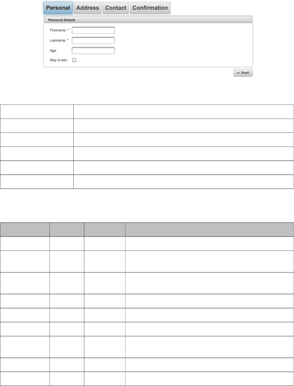
PrimeFaces User Guide
3.162 Wizard
Wizard provides an ajax enhanced UI to implement a workflow easily in a single page. Wizard
consists of several child tab components where each tab represents a step in the process.
Info
Tag wizard
Component Class org.primefaces.component.wizard.Wizard
Component Type org.primefaces.component.Wizard
Component Family org.primefaces.component
Renderer Type org.primefaces.component.WizardRenderer
Renderer Class org.primefaces.component.wizard.WizardRenderer
Attributes
Name Default Type Description
id null String Unique identifier of the component.
rendered true Boolean Boolean value to specify the rendering of the component,
when set to false component will not be rendered.
binding null Object An el expression that maps to a server side UIComponent
instance in a backing bean
step 0 String Id of the current step in flow
style null String Style of the main wizard container element.
styleClass null String Style class of the main wizard container element.
flowListener null MethodExpr Server side listener to invoke when wizard attempts to go
forward or back.
showNavBar true Boolean Specifies visibility of default navigator arrows.
showStepStatus true Boolean Specifies visibility of default step title bar.
566
PrimeFaces User Guide
Name Default Type Description
onback null String Javascript event handler to be invoked when flow goes
back.
onnext null String Javascript event handler to be invoked when flow goes
forward.
nextLabel null String Label of next navigation button.
backLabel null String Label of back navigation button.
widgetVar null String Name of the client side widget
Getting Started with Wizard
Each step in the flow is represented with a tab. As an example following wizard is used to create a
new user in a total of 4 steps where last step is for confirmation of the information provided in first
3 steps. To begin with create your backing bean, it’s important that the bean lives across multiple
requests so avoid a request scope bean. Optimal scope for wizard is viewScope.
public class UserWizard {
private User user = new User();
public User getUser() {
return user;
}
public void setUser(User user) {
this.user = user;
}
public void save(ActionEvent actionEvent) {
//Persist user
FacesMessage msg = new FacesMessage("Successful",
"Welcome :" + user.getFirstname());
FacesContext.getCurrentInstance().addMessage(null, msg);
}
}
User is a simple pojo with properties such as firstname, lastname, email and etc. Following wizard
requires 3 steps to get the user data; Personal Details, Address Details and Contact Details. Note
that last tab contains read-only data for confirmation and the submit button.
567

PrimeFaces User Guide
<h:form>
<p:wizard>
<p:tab id="personal">
<p:panel header="Personal Details">
<h:messages errorClass="error"/>
<h:panelGrid columns="2">
<h:outputText value="Firstname: *" />
<h:inputText value="#{userWizard.user.firstname}" required="true"/>
<h:outputText value="Lastname: *" />
<h:inputText value="#{userWizard.user.lastname}" required="true"/>
<h:outputText value="Age: " />
<h:inputText value="#{userWizard.user.age}" />
</h:panelGrid>
</p:panel>
</p:tab>
<p:tab id="address">
<p:panel header="Adress Details">
<h:messages errorClass="error"/>
<h:panelGrid columns="2" columnClasses="label, value">
<h:outputText value="Street: " />
<h:inputText value="#{userWizard.user.street}" />
<h:outputText value="Postal Code: " />
<h:inputText value="#{userWizard.user.postalCode}" />
<h:outputText value="City: " />
<h:inputText value="#{userWizard.user.city}" />
</h:panelGrid>
</p:panel>
</p:tab>
<p:tab id="contact">
<p:panel header="Contact Information">
<h:messages errorClass="error"/>
<h:panelGrid columns="2">
<h:outputText value="Email: *" />
<h:inputText value="#{userWizard.user.email}" required="true"/>
<h:outputText value="Phone: " />
<h:inputText value="#{userWizard.user.phone}"/>
<h:outputText value="Additional Info: " />
<h:inputText value="#{userWizard.user.info}"/>
</h:panelGrid>
</p:panel>
</p:tab>
568

PrimeFaces User Guide
<p:tab id="confirm">
<p:panel header="Confirmation">
<h:panelGrid id="confirmation" columns="6">
<h:outputText value="Firstname: " />
<h:outputText value="#{userWizard.user.firstname}"/>
<h:outputText value="Lastname: " />
<h:outputText value="#{userWizard.user.lastname}"/>
<h:outputText value="Age: " />
<h:outputText value="#{userWizard.user.age}" />
<h:outputText value="Street: " />
<h:outputText value="#{userWizard.user.street}" />
<h:outputText value="Postal Code: " />
<h:outputText value="#{userWizard.user.postalCode}"/>
<h:outputText value="City: " />
<h:outputText value="#{userWizard.user.city}"/>
<h:outputText value="Email: " />
<h:outputText value="#{userWizard.user.email}" />
<h:outputText value="Phone " />
<h:outputText value="#{userWizard.user.phone}"/>
<h:outputText value="Info: " />
<h:outputText value="#{userWizard.user.info}"/>
<h:outputText />
<h:outputText />
</h:panelGrid>
<p:commandButton value="Submit" actionListener="#{userWizard.save}" />
</p:panel>
</p:tab>
</p:wizard>
</h:form>
AJAX and Partial Validations
Switching between steps is based on ajax, meaning each step is loaded dynamically with ajax.
Partial validation is also built-in, by this way when you click next, only the current step is validated,
if the current step is valid, next tab’s contents are loaded with ajax. Validations are not executed
when flow goes back.
Navigations
Wizard provides two icons to interact with; next and prev. Please see the skinning wizard section to
know more about how to change the look and feel of a wizard.
569
PrimeFaces User Guide
Custom UI
By default wizard displays right and left arrows to navigate between steps, if you need to come up
with your own UI, set showNavBar to false and use the provided the client side api.
<p:wizard showNavBar="false" widgetVar="wiz">
...
</p:wizard>
<h:outputLink value="#" onclick="PF('wiz').next();">Next</h:outputLink>
<h:outputLink value="#" onclick="PF('wiz').back();">Back</h:outputLink>
FlowListener
If you’d like get notified on server side when wizard attempts to go back or forward, define a
flowListener.
<p:wizard flowListener="#{userWizard.handleFlow}">
...
</p:wizard>
public String handleFlow(FlowEvent event) {
String currentStepId = event.getCurrentStep();
String stepToGo = event.getNextStep();
if(skip)
return "confirm";
else
return event.getNextStep();
}
Steps here are simply the ids of tab, by using a flowListener you can decide which step to display
next so wizard does not need to be linear always. If you need to update other component(s) on page
within a flow, use RequestContext.update(String clientId) api.
Client Side Callbacks
Wizard is equipped with onback and onnext attributes, in case you need to execute custom
javascript after wizard goes back or forth. You just need to provide the names of javascript functions
as the values of these attributes.
<p:wizard onnext="alert(‘Next’)" onback="alert(‘Back’)">
...
</p:wizard>
Client Side API
Widget: PrimeFaces.widget.Wizard
570
PrimeFaces User Guide
Method Params Return Type Description
next() - void Proceeds to next step.
back() - void Goes back in flow.
getStepIndex() - Number Returns the index of current step.
showNextNav() - void Shows next button.
hideNextNav() - void Hides next button.
showBackNav() - void Shows back button.
hideBackNav() - void Hides back button.
Skinning
Wizard resides in a container element that style and styleClass attributes apply. Following is the list
of structural css classes.
Selector Applies
.ui-wizard Main container element.
.ui-wizard-content Container element of content.
.ui-wizard-step-titles Container of step titles.
.ui-wizard-step-title Each step title.
.ui-wizard-navbar Container of navigation controls.
.ui-wizard-nav-back Back navigation control.
.ui-wizard-nav-next Forward navigation control.
As skinning style classes are global, see the main theming section for more information.
571

PrimeFaces User Guide
4. Partial Rendering and Processing
PrimeFaces provides a partial rendering and view processing feature based on standard JSF 2 APIs
to enable choosing what to process in JSF lifecyle and what to render in the end with ajax.
4.1 Partial Rendering
In addition to components like autoComplete, datatable, slider with built-in ajax capabilities,
PrimeFaces also provides a generic PPR (Partial Page Rendering) mechanism to update JSF
components with ajax. Several components are equipped with the common PPR attributes (e.g.
update, process, onstart, oncomplete).
4.1.1 Infrastructure
PrimeFaces Ajax Framework is based on standard server side APIs of JSF 2. There are no additional
artfacts like custom AjaxViewRoot, AjaxStateManager, AjaxViewHandler, Servlet Filters,
HtmlParsers, PhaseListeners and so on. PrimeFaces aims to keep it clean, fast and lightweight.
On client side rather than using client side API implementations of JSF implementations like
Mojarra and MyFaces, PrimeFaces scripts are based on the most popular javascript library; jQuery
which is far more tested, stable regarding ajax, dom handling, dom tree traversing than a JSF
implementations scripts.
4.1.2 Using IDs
Getting Started
When using PPR you need to specify which component(s) to update with ajax. If the component
that triggers PPR request is at the same namingcontainer (eg. form) with the component(s) it
renders, you can use the server ids directly. In this section although we’ll be using commandButton,
same applies to every component that’s capable of PPR such as commandLink, poll,
remoteCommand and etc.
<h:form>
<p:commandButton update="display" />
<h:outputText id="display" value="#{bean.value}"/>
</h:form>
PrependId
Setting prependId setting of a form has no effect on how PPR is used.
<h:form prependId="false">
<p:commandButton update="display" />
<h:outputText id="display" value="#{bean.value}"/>
</h:form>
572

PrimeFaces User Guide
ClientId
It is also possible to define the client id of the component to update.
<h:form id="myform">
<p:commandButton update="myform:display" />
<h:outputText id="display" value="#{bean.value}"/>
</h:form>
Different NamingContainers
If your page has different naming containers (e.g. two forms), you also need to add the container id
to search expression so that PPR can handle requests that are triggered inside a namingcontainer
that updates another namingcontainer. Following is the suggested way using separator char as a
prefix, note that this uses same search algorithm as standard JSF 2 implementation;
<h:form id="form1">
<p:commandButton update=":form2:display" />
</h:form>
<h:form id="form2">
<h:outputText id="display" value="#{bean.value}"/>
</h:form>
Please read findComponent algorithm described in link below used by both JSF core and
PrimeFaces to fully understand how component referencing works.
http://docs.oracle.com/javaee/6/api/javax/faces/component/UIComponent.html
JSF h:form, datatable, composite components are naming containers, in addition tabView,
accordionPanel, dataTable, dataGrid, dataList, carousel, galleria, ring, sheet and subTable are
PrimeFaces component that implement NamingContainer.
Multiple Components
Multiple components to update can be specified with providing a list of ids separated by a comma,
whitespace or even both.
<h:form>
<p:commandButton update="display1,display2" />
<p:commandButton update="display1 display2" />
<h:outputText id="display1" value="#{bean.value1}"/>
<h:outputText id="display2" value="#{bean.value2}"/>
</h:form>
573

PrimeFaces User Guide
4.1.3 Notifying Users
ajaxStatus is the component to notify the users about the status of global ajax requests. See the
ajaxStatus section to get more information about the component.
Global vs Non-Global
By default ajax requests are global, meaning if there is an ajaxStatus component present on page, it
is triggered.
If you want to do a "silent" request not to trigger ajaxStatus instead, set global to false. An example
with commandButton would be;
<p:commandButton value="Silent" global="false" />
<p:commandButton value="Notify" global="true" />
4.1.4 Bits&Pieces
PrimeFaces Ajax Javascript API
See the javascript section to learn more about the PrimeFaces Javascript Ajax API.
574

PrimeFaces User Guide
4.2 Partial Processing
In Partial Page Rendering, only specified components are rendered, similarly in Partial Processing
only defined components are processed. Processing means executing Apply Request Values,
Process Validations, Update Model and Invoke Application JSF lifecycle phases only on defined
components.
This feature is a simple but powerful enough to do group validations, avoiding validating unwanted
components, eliminating need of using immediate and many more use cases. Various components
such as commandButton, commandLink are equipped with process attribute, in examples we’ll be
using commandButton.
4.2.1 Partial Validation
A common use case of partial process is doing partial validations, suppose you have a simple
contact form with two dropdown components for selecting city and suburb, also there’s an inputText
which is required. When city is selected, related suburbs of the selected city is populated in suburb
dropdown.
<h:form>
<h:selectOneMenu id="cities" value="#{bean.city}">
<f:selectItems value="#{bean.cityChoices}" />
<p:ajax listener="#{bean.populateSuburbs}" update="suburbs"
process="@all"/>
</h:selectOneMenu>
<h:selectOneMenu id="suburbs" value="#{bean.suburb}">
<f:selectItems value="#{bean.suburbChoices}" />
</h:selectOneMenu>
<h:inputText value="#{bean.email}" required="true"/>
</h:form>
When the city dropdown is changed an ajax request is sent to execute populateSuburbs method
which populates suburbChoices and finally update the suburbs dropdown. Problem is
populateSuburbs method will not be executed as lifecycle will stop after process validations phase
to jump render response as email input is not provided. Reason is p:ajax has @all as the value
stating to process every component on page but there is no need to process the inputText.
The solution is to define what to process in p:ajax. As we’re just making a city change request, only
processing that should happen is cities dropdown.
575

PrimeFaces User Guide
<h:form>
<h:selectOneMenu id="cities" value="#{bean.city}">
<f:selectItems value="#{bean.cityChoices}" />
<p:ajax actionListener="#{bean.populateSuburbs}"
event="change" update="suburbs" process="@this"/>
</h:selectOneMenu>
<h:selectOneMenu id="suburbs" value="#{bean.suburb}">
<f:selectItems value="#{bean.suburbChoices}" />
</h:selectOneMenu>
<h:inputText value="#{bean.email}" required="true"/>
</h:form>
That is it, now populateSuburbs method will be called and suburbs list will be populated. Note that
default value for process option is @this already for p:ajax as stated in AjaxBehavior
documentation, it is explicitly defined here to give a better understanding of how partial processing
works.
4.2.2 Using Ids
Partial Process uses the same technique applied in partial updates to specify component identifiers
to process.
576
PrimeFaces User Guide
4.3 Search Expression Framework
Core JSF component referencing is based on component identifiers only with basic keyword
support. PrimeFaces Search Expression Framework (SEF) provides both server side and client side
extensions to make it easier to reference components. SEF is utilized in partial update, process and
whenever a component references another component.
4.3.1 Keywords
Keywords are the easier way to reference components, they resolve to ids so that if an id changes,
the reference does not need to change. Core JSF provides a couple of keywords and PrimeFaces
provides more along with composite expression support.
Keyword Type Description
@this Standard Current component.
@all Standard Whole view.
@form Standard Closest ancestor form of current component.
@none Standard No component.
@namingcontainer PrimeFaces Closest ancestor naming container of current component.
@parent PrimeFaces Parent of the current component.
@composite PrimeFaces Closest composite component ancestor.
@child(n) PrimeFaces nth child.
@row(n) PrimeFaces nth row.
@previous PrimeFaces Previous sibling.
@next PrimeFaces Next sibling.
@widgetVar(name) PrimeFaces Component with given widgetVar.
@root PrimeFaces UIViewRoot instance of the view, can be used to start
searching from the root instead the current component.
@id PrimeFaces Used to search components by their id ignoring the component
tree structure and naming containers.
Consider the following case where ids are used for referencing;
<h:form id="form1">
<p:commandButton id="btn" update="form1" process="btn" />
<h:outputText value="#{bean.value}"/>
</h:form>
Using keywords, same can be written as;
577

PrimeFaces User Guide
<h:form id="form1">
<p:commandButton id="btn" update="@form" process="@this" />
<h:outputText value="#{bean.value}"/>
</h:form>
Composite Expressions
Multiple keywords can be combined in a single expression using colon;
• @form:@parent
• @composite:mybuttonid
• @this:@parent:@parent
• @form:@child(2)
Usage Scenarios
SEF is not just at partial process and update, they are also available whenever a component is
referencing another.
<h:form>
<p:commandButton id="dynaButton" value="Show" type="button" />
<p:menu overlay="true" trigger="@parent:dynaButton">
//items
</p:menu>
</h:form>
4.3.2 PrimeFaces Selectors (PFS)
PFS integrates jQuery Selector API with JSF component referencing model so that referencing can
be done using jQuery Selector API instead of core id based JSF model. Best way to explain the
power of PFS is examples;
Update all forms
update="@(form)"
Update first form
update="@(form:first)"
Update all components that has styleClass named mystyle
update="@(.mystyle)"
Update and process all inputs
update="@(:input)" process="@(:input)"
578
PrimeFaces User Guide
Update all datatables
update="@(.ui-datatable)"
Process input components inside any panel and update all panels
process="@(.ui-panel :input)" update="@(.ui-panel)"
Process input components but not select components
process="@(:input:not(select))"
Update input components that are disabled
update="@(:input:disabled)"
PFS can be used with other referencing approaches as well;
update="compId :form:compId @(:input) @parent:@child(2)"
<h:form>
<p:commandButton id="dynaButton" value="Show" type="button" styleClass="btn"/>
<p:menu overlay="true" trigger="@(.btn)">
//items
</p:menu>
</h:form>
PFS provides an alternative, flexible, grouping based approach to reference components to partially
process and update. There is less CPU server load compared to regular referencing because JSF
component tree is not traversed on server side to find a component and figure out the client id as
PFS is implemented on client side by looking at dom tree. Another advantage is avoiding naming
container limitations, just remember the times you’ve faced with cannot find component exception
since the component you are looking for is in a different naming container like a form or a
datatable. PFS can help you out in tricky situations by following jQuery’s “write less do more” style.
For PFS to function properly and not to miss any component, it is required to have explicitly
defined ids on the matched set as core JSF components usually do not render auto ids. So even
though manually defined ids won't be referenced directly, they are still required for PFS to be
collected and send in the request.
For full reference of jQuery selector api, see;
http://api.jquery.com/category/selectors/
579
PrimeFaces User Guide
4.4 PartialSubmit
Core JSF Ajax implementation and by default PrimeFaces serializes the whole form to build the
post data in ajax requests so the same data is posted just like in a non-ajax request. This has a
downside in large views where you only need to process/execute a minor part of the view. Assume
you have a form with 100 input fields, there is an input field with ajaxbehavior attached processing
only itself(@this) and then updates another field onblur. Although only a particular input field is
processed, whole form data will be posted with the unnecessary information that would be ignored
during server side processing but consume resources.
PrimeFaces provides partialSubmit feature to reduce the network traffic and computing on client
side. When partialSubmit is enabled, only data of components that will be partially processed on the
server side are serialized. By default partialSubmit is disabled and you can enable it globally using a
context parameter.
<context-param>
<param-name>primefaces.SUBMIT</param-name>
<param-value>partial</param-value>
</context-param>
Components like buttons and behaviors like p:ajax are equipped with partialSubmit option so you
can override the global setting per component.
<p:commandButton value="Submit" partialSubmit="true|false" />
580
PrimeFaces User Guide
5. Javascript API
PrimeFaces renders unobstrusive javascript which cleanly separates behavior from the html. Client
side engine is powered by jQuery version 1.8.1 which is the latest at the time of the writing.
5.1 PrimeFaces Namespace
PrimeFaces is the main javascript object providing utilities and namespace.
Method Description
escapeClientId(id) Escaped JSF ids with semi colon to work with jQuery.
addSubmitParam(el, name, param) Adds request parameters dynamically to the element.
getCookie(name) Returns cookie with given name.
setCookie(name, value, cfg) Sets a cookie with given name, value and options. e.g.
PrimeFaces.setCookie('name', 'test');
PrimeFaces.setCookie('name','test',{expires:7,
path:'/'})
Second example creates cookie for entire site that
expires in 7 days.
deleteCookie(name, cfg) Deletes a cookie with given and and options.
skinInput(input) Progressively enhances an input element with theming.
info(msg), debug(msg), warn(msg), error(msg) Client side log API.
changeTheme(theme) Changes theme on the fly with no page refresh.
cleanWatermarks() Watermark component extension, cleans all
watermarks on page before submitting the form.
showWatermarks() Shows watermarks on form.
getWidgetById(clientid) Returns the widget instance from the client id
To be compatible with other javascript entities on a page, PrimeFaces defines two javascript
namespaces;
PrimeFaces.widget.*
Contains custom PrimeFaces widgets like;
- PrimeFaces.widget.DataTable
- PrimeFaces.widget.Tree
- PrimeFaces.widget.Poll
- and more...
Most of the components have a corresponding client side widget with same name.
PrimeFaces.ajax.*
581
PrimeFaces User Guide
PrimeFaces.ajax namespace contains the ajax API which is described in next section.
582
PrimeFaces User Guide
5.2 Ajax API
PrimeFaces Ajax Javascript API is powered by jQuery and optimized for JSF. Whole API consists
of three properly namespaced simple javascript functions.
PrimeFaces.ajax.Request
Sends ajax requests that execute JSF lifecycle and retrieve partial output. Function signature is as
follows;
PrimeFaces.ajax.Request.handle(cfg);
Configuration Options
Option Description
formId Id of the form element to serialize, if not defined parent form of
source is used.
async Flag to define whether request should go in ajax queue or not, default
is false.
global Flag to define if p:ajaxStatus should be triggered or not, default is
true.
update Component(s) to update with ajax.
process Component(s) to process in partial request.
source Client id of the source component causing the request.
params Additional parameters to send in ajax request.
onstart() Javascript callback to process before sending the ajax request, return
false to cancel the request.
onsuccess(data, status, xhr) Javascript callback to process when ajax request returns with success
code. Takes three arguments, xml response, status code and
xmlhttprequest.
onerror(xhr, status, error) Javascript callback to process when ajax request fails. Takes three
arguments, xmlhttprequest, status string and exception thrown if any.
oncomplete(xhr, status, args) Javascript callback to process when ajax request completes. Takes
three arguments, xmlhttprequest, status string and optional arguments
provided by RequestContext API.
583
PrimeFaces User Guide
Examples
Suppose you have a JSF page called createUser with a simple form and some input components.
<h:form id="userForm">
<h:inputText id="username" value="#{userBean.user.name}" />
... More components
</h:form>
You can post all the information with ajax using;
PrimeFaces.ajax.Request.handle({
formId:’userForm’
,source:’userForm’
,process:’userForm’
});
More complex example with additional options;
PrimeFaces.ajax.Request.handle({
formId: 'userForm',
source: 'userForm',
process: 'userForm',
update: 'msgs',
params:{
'param_name1':'value1',
'param_name2':'value2'
},
oncomplete:function(xhr, status) {alert('Done');}
});
We highly recommend using p:remoteComponent instead of low level javascript api as it generates
the same with much less effort and less possibility to do an error.
PrimeFaces.ajax.Response
PrimeFaces.ajax.Response.handle() updates the specified components if any and synchronizes the
client side JSF state. DOM updates are implemented using jQuery which uses a very fast algorithm.
Abort
Use the abort API in case you'd like to cancel all the ongoing requests;
PrimeFaces.ajax.Queue.abortAll()
584
PrimeFaces User Guide
6. Dialog Framework
Dialog Framework (DF) is used to open an external xhtml page in a dialog that is generated
dynamically on runtime. This is quite different to regular usage of dialogs with declarative p:dialog
components as DF is based on a programmatic API where dialogs are created and destroyed at
runtime. Note that DF and the declarative approach are two different ways and both can even be
used together. Usage is quite simple, RequestContext has openDialog and closeDialog methods;
/**
* Open a view in dialog.
* @param outcome The logical outcome used to resolve a navigation case.
*/
public abstract void openDialog(String outcome);
/**
* Open a view in dialog.
* @param outcome The logical outcome used to resolve a navigation case.
* @param options Configuration options for the dialog.
* @param params Parameters to send to the view displayed in a dialog.
*/
public abstract void openDialog(String outcome, Map<String,Object> options,
Map<String,List<String>> params);
/**
* Close a dialog.
* @param data Optional data to pass back to a dialogReturn event.
*/
public abstract void closeDialog(Object data);
Configuration
DF requires the following configuration to be present in faces config file.
<application>
<action-listener>
org.primefaces.application.DialogActionListener
</action-listener>
<navigation-handler>
org.primefaces.application.DialogNavigationHandler
</navigation-handler>
<view-handler>
org.primefaces.application.DialogViewHandler
</view-handler>
</application>
Getting Started
Simplest use case of DF is opening an xhtml view like cars.xhtml in a dialog;
585
PrimeFaces User Guide
<!DOCTYPE html>
<html xmlns="http://www.w3.org/1999/xhtml" xmlns:h="http://java.sun.com/jsf/html"
xmlns:p="http://primefaces.org/ui">
<h:head>
<title>Cars</title>
</h:head>
<h:body>
<p:dataTable var="car" value="#{tableBean.cars}">
//columns
</p:dataTable>
</h:body>
</html>
On the host page, call RequestContext.openDialog("viewname");
<p:commandButton value="View Cars" actionListener="#{hostBean.view}" />
public void view() {
RequestContext.getCurrentInstance().openDialog("viewCars");
}
Once the response is received from the request caused by command button a dialog would be
generated with the contents of viewCars.xhtml. Title of the dialog is retrieved from the title element
of the viewCars, in this case, Cars.
Dialog Configuration
Overloaded openDialog method provides advanced configuration regarding the visuals of dialog
along with parameters to send to the dialog content.
<p:commandButton value="View Cars" actionListener="#{hostBean.viewCustomized}" />
public void view() {
Map<String,Object> options = new HashMap<String, Object>();
options.put("modal", true);
options.put("draggable", false);
options.put("resizable", false);
options.put("contentHeight", 320);
RequestContext.getCurrentInstance().openDialog("viewCars", options, null);
}
586
PrimeFaces User Guide
Here is the full list of configuration options;
Name Default Type Description
modal false Boolean Controls modality of the dialog.
resizable true Boolean When enabled, makes dialog resizable.
draggable true Boolean When enabled, makes dialog draggable.
width auto String Width of the dialog.
height auto String Height of the dialog.
contentWidth 640 String Width of the dialog content.
contentHeight auto String Height of the dialog content.
closable true Boolean Whether the dialog can be closed or not.
includeViewParams false Boolean When enabled, includes the view parameters.
headerElement null String Client id of the element to display inside header.
minimizable false Boolean Makes dialog minimizable.
maximizable false Boolean Makes dialog maximizable.
Data Communication
Page displayed in the dialog can pass data back to the parent page. The trigger component needs to
have dialogReturn ajax behavior event to hook-in when data is returned from dialog.
<!DOCTYPE html>
<html xmlns="http://www.w3.org/1999/xhtml" xmlns:h="http://java.sun.com/jsf/html"
xmlns:p="http://primefaces.org/ui">
<h:head>
<title>Cars</title>
</h:head>
<h:body>
<p:dataTable var="car" value="#{tableBean.cars}">
//columns
<p:column headerText="Select">
<p:commandButton icon="ui-icon-search"
actionListener="#{tableBean.selectCarFromDialog(car)}" />
</p:column>
</p:dataTable>
</h:body>
</html>
public void selectCarFromDialog(Car car) {
RequestContext.getCurrentInstance().closeDialog(car);
}
587
PrimeFaces User Guide
At host page, the button that triggered the dialog should have dialogReturn event.
<p:commandButton value="View Cars" actionListener="#{hostBean.viewCars}">
<p:ajax event="dialogReturn" listener="#{hostBean.handleReturn}"
</p:commandButton>
public void view() {
RequestContext.getCurrentInstance().openDialog("viewCars");
}
public void handleReturn(SelectEvent event) {
Car car = (Car) event.getObject();
}
Remarks on Dialog Framework
• Calls to DialogFramework API within a non-ajax are ignored.
• Content Width and Height can take percentage value like 100%.
Dialog Messages
Displaying FacesMessages in a Dialog is a common case where a facesmessage needs to be added
to the context first, dialog content containing a message component needs to be updated and finally
dialog gets shown with client side api. DF has a simple utility to bypass this process by providing a
shortcut;
/**
* Displays a message in a dialog.
* @param message FacesMessage to be displayed.
*/
public abstract void showMessageInDialog(FacesMessage message);
Using this shortcut it is just one line to implement the same functionality;
<p:commandButton value="Show" actionListener="#{bean.save}" />
public void save() {
//business logic
RequestContext.getCurrentInstance().showMessageInDialog(new
FacesMessage(FacesMessage.SEVERITY_INFO,
"What we do in life", "Echoes in eternity."););
}
588

PrimeFaces User Guide
7. Client Side Validation
PrimeFaces Client Side Validation (CSV) Framework is the most complete and advanced CSV
solution for JavaServer Faces and Java EE. CSV support for JSF is not an easy task, it is not simple
as integrating a 3rd party javascript plugin as JSF has its own lifecycle, concepts like conversion
and then validation, partial processing, facesmessages and many more. Real CSV for JSF should be
compatible with server side implementation, should do what JSF does, so that users do not
experience difference behaviors on client side and server side.
• Compatible with Server Side Implementation.
• Conversion and Validation happens at client side.
• Partial Process&Update support for Ajax.
• I18n support along with component specific messages.
• Client side Renderers for message components.
• Easy to write custom client converters and validators.
• Global or Component based enable/disable.
• Advanced Bean Validation Integration.
• Little footprint using HTML5.
7.1 Configuration
CVS is disabled by default and a global parameter is required to turn it on.
<context-param>
<param-name>primefaces.CLIENT_SIDE_VALIDATION</param-name>
<param-value>true</param-value>
</context-param>
At page level, enable validateClient attribute of commandButton and commandLink components.
<h:form>
<p:messages />
<p:inputText required="true" />
<p:inputTextarea required="true" />
<p:commandButton value="Save" validateClient="true" ajax="false"/>
</h:form>
That is all for the basics, clicking the button validates the form at client side and displays the errors
using messages component.
CSV works for PrimeFaces components only, standard h: * components are not supported.
7.2 Ajax vs Non-Ajax
CSV works differently depending on the request type of the trigger component to be compatible
with cases where CVS is not enabled.
589

PrimeFaces User Guide
Non-Ajax
In non-ajax case, all visible and editable input components in the form are validated and message
components must be placed inside the form.
Ajax
CSV supports partial processing and updates on client side as well, if process attribute is enabled,
the components that would be processed at server side gets validated at client side. Similary if
update attribute is defined, only message components inside the updated parts gets rendered. Whole
process happens at client side.
7.3 Events
CSV provides a behavior called p:clientValidator to do instant validation in case you do not want to
wait for the users to fill in the form and hit commandButton/commandLink. Using clientBehavior
and custom events, CSV for a particular component can run with events such as change (default),
blur, keyup.
<h:form>
<p:panel header="Validate">
<h:panelGrid columns="4" cellpadding="5">
<h:outputLabel for="text" value="Text: (Change)" />
<p:inputText id="text" value="#{validationBean.text}" required="true">
<f:validateLength minimum="2" maximum="5" />
<p:clientValidator />
</p:inputText>
<p:message for="text" display="icon" />
<h:outputText value="#{validationBean.text}" />
<h:outputLabel for="integer" value="Integer: (Keyup)" />
<p:inputText id="integer" value="#{validationBean.integer}">
<p:clientValidator event="keyup"/>
</p:inputText>
<p:message for="integer" display="icon" />
<h:outputText value="#{validationBean.integer}" />
</h:panelGrid>
<p:commandButton value="Save" ajax="false" icon="ui-icon-check"
validateClient="true"/>
</p:panel>
</h:form>
7.4 Messages
Validation errors are displayed as the same way in server side validation, texts are retrieved from a
client side bundle and message components are required for the displays.
I18N
Default language is English for the CSV messages and for other languages or to customize the
default messages, PrimeFaces Locales bundle needs to be present at the page if you'd like to provide
translations. For more info on PrimeFaces Locales, visit
http://code.google.com/p/primefaces/wiki/PrimeFacesLocales.
590

PrimeFaces User Guide
Rendering
PrimeFaces message components have client side renderers for CSV support, these are p:message,
p:messages and p:growl. Component options like showSummary, showDetail, globalOnly, mode are
all implemented by client side renderer for compatibility.
MyFaces vs Mojarra
Bean validation messages between implementations have a slight difference regarding labels,
mojarra do not the label of the field but myfaces does. For example;
Mojarra:
javax.faces.validator.BeanValidator.MESSAGE={0}
MyFaces:
javax.faces.validator.BeanValidator.MESSAGE={1}: {0}
Default CSV messages follow the convention of Mojarra however if you prefer to display the label
along with the message, override can be done by adding {1} to the message;
Default:
PrimeFaces.locales['en_US'].messages['javax.faces.validator.BeanValidator.MESSAGE'] =
'{0}';
With Label:
PrimeFaces.locales['en_US'].messages['javax.faces.validator.BeanValidator.MESSAGE'] =
'{1}: {0}';
7.5 Bean Validation
CSV has built-in integration with Bean Validation by validating the constraints defined with
annotations at client side.
<h:form>
<p:growl />
<h:panelGrid>
<h:outputLabel for="name" value="Name:" />
<p:inputText id="name" value="#{bean.name}" label="Name"/>
<p:message for="name" />
<h:outputLabel for="age" value="Age: (@Min(10) @Max(20))" />
<p:inputText id="age" value="#{bean.age}" label="Age"/>
<p:message for="age" />
</h:panelGrid>
<p:commandButton value="Save" validateClient="false" ajax="false" />
</h:form>
591

PrimeFaces User Guide
public class Bean {
@Size(min=2,max=5)
private String name;
@Min(10) @Max(20)
private Integer age;
}
All of the standard constraints are supported.
7.6 Extending CSV
Using CSV APIs, it is easy to write your own custom converters and validators.
Email Validator with JSF
Your custom validator must implement ClientValidator interface to provide the client validator id
and the optional metadata.
592

PrimeFaces User Guide
package org.primefaces.examples.validate;
import java.util.Map;
import java.util.regex.Pattern;
import javax.faces.application.FacesMessage;
import javax.faces.component.UIComponent;
import javax.faces.context.FacesContext;
import javax.faces.validator.FacesValidator;
import javax.faces.validator.Validator;
import javax.faces.validator.ValidatorException;
import org.primefaces.validate.ClientValidator;
@FacesValidator("custom.emailValidator")
public class EmailValidator implements Validator, ClientValidator {
private Pattern pattern;
private static final String EMAIL_PATTERN = "^[_A-Za-z0-9-\\+]+(\\.[_A-Za-z0-
9-]+)*@" + "[A-Za-z0-9-]+(\\.[A-Za-z0-9]+)*(\\.[A-Za-z]{2,})$";
public EmailValidator() {
pattern = Pattern.compile(EMAIL_PATTERN);
}
public void validate(FacesContext context, UIComponent component, Object value)
throws ValidatorException {
if(value == null) {
return;
}
if(!pattern.matcher(value.toString()).matches()) {
throw new ValidatorException(new
FacesMessage(FacesMessage.SEVERITY_ERROR, "Validation Error",
value + " is not a valid email;"));
}
}
public Map<String, Object> getMetadata() {
return null;
}
public String getValidatorId() {
return "custom.emailValidator";
}
}
Validator is plugged-in using the standard way.
<h:form>
<p:messages />
<p:inputText id="email" value="#{bean.value}">
<f:validator validatorId="custom.emailValidator" />
</p:inputText>
<p:message for="email" />
<p:commandButton value="Save" validateClient="true" ajax="false"/>
</h:form>
593
PrimeFaces User Guide
Last step is implementing the validator at client side and configuring it.
PrimeFaces.validator['custom.emailValidator'] = {
pattern: /\S+@\S+/,
validate: function(element, value) {
//use element.data() to access validation metadata, in this case there is
none.
if(!this.pattern.test(value)) {
throw {
summary: 'Validation Error',
detail: value + ' is not a valid email.'
}
}
}
};
In some cases your validator might need metadata, for example LengthValidator requires min and
max constraints to validate against. Server side validator can pass these by overriding the
getMetadata() method by providing a map of name,value pairs. At client side, these are accessed via
element.data(key).
public Map<String, Object> getMetadata() {
Map<String,Object> data = new HashMap<String,Object>();
data.put("data-prime", 10);
return data;
}
validate: function(element, value) {
var prime = element.data("prime"); //10
//validate
}
Similarly a client side converter can be written by implementing ClientConverter API and
overriding convert: function(element, submittedValue) {} method to return a javascript object.
Email Validator with Bean Validation
Bean Validation is also supported for extensions, here is an example of a @Email validator.
//imports
import org.primefaces.validate.bean.ClientConstraint;
@Target({METHOD,FIELD,ANNOTATION_TYPE})
@Retention(RUNTIME)
@Constraint(validatedBy=EmailConstraintValidator.class)
@ClientConstraint(resolvedBy=EmailClientValidationConstraint.class)
@Documented
public @interface Email {
String message() default "{org.primefaces.examples.primefaces}";
Class<?>[] groups() default {};
Class<? extends Payload>[] payload() default {};
}
594

PrimeFaces User Guide
@Constraint is the regular validator from Bean Validation API and @ClientConsraint is from CSV
API to resolve metadata.
public class EmailConstraintValidator
implements ConstraintValidator<Email, String>{
private Pattern pattern;
private static final String EMAIL_PATTERN = "^[_A-Za-z0-9-\\+]+(\\.[_A-Za-z0-
9-]+)*@"
+ "[A-Za-z0-9-]+(\\.[A-Za-z0-
9]+)*(\\.[A-Za-z]{2,})$";
public void initialize(Email a) {
pattern = Pattern.compile(EMAIL_PATTERN);
}
public boolean isValid(String value, ConstraintValidatorContext cvc) {
if(value == null)
return true;
else
return pattern.matcher(value.toString()).matches();
}
}
public class EmailClientValidationConstraint implements ClientValidationConstraint {
public static final String MESSAGE_METADATA = "data-p-email-msg";
public Map<String, Object> getMetadata(ConstraintDescriptor constraintDescriptor)
{
Map<String,Object> metadata = new HashMap<String, Object>();
Map attrs = constraintDescriptor.getAttributes();
Object message = attrs.get("message");
if(message != null) {
metadata.put(MESSAGE_METADATA, message);
}
return metadata;
}
public String getValidatorId() {
return Email.class.getSimpleName();
}
}
595
PrimeFaces User Guide
Final part is implementing the client side validator;
PrimeFaces.validator['Email'] = {
pattern: /\S+@\S+/,
MESSAGE_ID: 'org.primefaces.examples.validate.email.message',
validate: function(element, value) {
var vc = PrimeFaces.util.ValidationContext;
if(!this.pattern.test(value)) {
var msgStr = element.data('p-email-msg'),
msg = msgStr ? {summary:msgStr, detail: msgStr} :
vc.getMessage(this.MESSAGE_ID);
throw msg;
}
}
};
Usage is same as using standard constraints;
<h:form>
<p:messages />
<p:inputText id="email" value="#{bean.value}" />
<p:message for="email" />
<p:commandButton value="Save" validateClient="true" ajax="false"/>
</h:form>
public class Bean {
@Email
private String value;
//getter-setter
}
3rd Party Annotations
When using 3rd party constraints like Hibernate Validator specific annotations, use
BeanValidationMetadataMapper to define a ClientValidationConstraint for them.
BeanValidationMetadataMapper.registerConstraintMapping(Class<? extends Annotation>
constraint, ClientValidationConstraint clientValidationConstraint);
BeanValidationMetadataMapper.removeConstraintMapping(Class<? extends Annotation>
constraint);
596
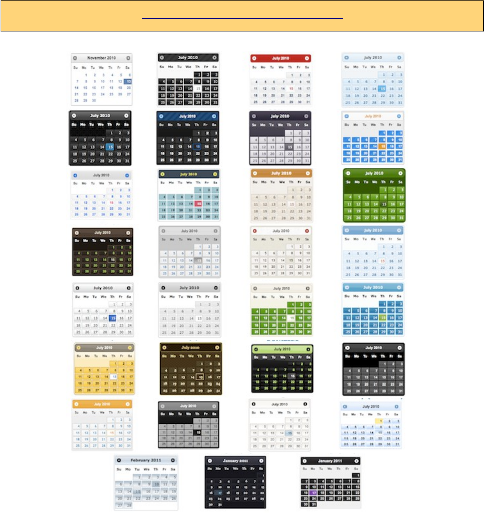

PrimeFaces User Guide
8.1 Applying a Theme
Applying a theme to your PrimeFaces project is very easy. Each theme is packaged as a jar file,
download the theme you want to use, add it to the classpath of your application and then define
primefaces.THEME context parameter at your deployment descriptor (web.xml) with the theme
name as the value.
Download
Each theme is available for manual download at PrimeFaces Theme Gallery. If you are a maven
user, define theme artifact as;
<dependency>
<groupId>org.primefaces.themes</groupId>
<artifactId>cupertino</artifactId>
<version>1.0.8</version>
</dependency>
artifactId is the name of the theme as defined at Theme Gallery page.
Configure
Once you've downloaded the theme, configure PrimeFaces to use it.
<context-param>
<param-name>primefaces.THEME</param-name>
<param-value>aristo</param-value>
</context-param>
That's it, you don't need to manually add any css to your pages or anything else, PrimeFaces will
handle everything for you.
In case you’d like to make the theme dynamic, define an EL expression as the param value.
<context-param>
<param-name>primefaces.THEME</param-name>
<param-value>#{loggedInUser.preferences.theme}</param-value>
</context-param>
598

PrimeFaces User Guide
8.2 Creating a New Theme
If you’d like to create your own theme instead of using the pre-defined ones, that is easy as well
because ThemeRoller provides a powerful and easy to use online visual tool.
Applying your own custom theme is same as applying a pre-built theme however you need to
migrate the downloaded theme files from ThemeRoller to PrimeFaces Theme Infrastructure.
PrimeFaces Theme convention is the integrated way of applying your custom themes to your
project, this approach requires you to create a jar file and add it to the classpath of your application.
Jar file must have the following folder structure. You can have one or more themes in same jar.
-jar
-META-INF
-resources
-primefaces-yourtheme
-theme.css
-images
1) The theme package you've downloaded from ThemeRoller will have a css file and images folder.
Make sure you have “deselect all components” option on download page so that your theme only
includes skinning styles. Extract the contents of the package and rename jquery-ui-
{version}.custom.css to theme.css.
2) Image references in your theme.css must also be converted to an expression that JSF resource
loading can understand, example would be;
url("images/ui-bg_highlight-hard_100_f9f9f9_1x100.png")
should be;
url("#{resource['primefaces-yourtheme:images/ui-bg_highlight-hard_100_f9f9f9_1x100.png']}")
Once the jar of your theme is in classpath, you can use your theme like;
<context-param>
<param-name>primefaces.THEME</param-name>
<param-value>yourtheme</param-value>
</context-param>
599
PrimeFaces User Guide
8.3 How Themes Work
Powered by ThemeRoller, PrimeFaces separates structural css from skinning css.
Structural CSS
These style classes define the skeleton of the components and include css properties such as margin,
padding, display type, dimensions and positioning.
Skinning CSS
Skinning defines the look and feel properties like colors, border colors, background images.
Skinning Selectors
ThemeRoller features a couple of skinning selectors, most important of these are;
Selector Applies
.ui-widget All PrimeFaces components
.ui-widget-header Header section of a component
.ui-widget-content Content section of a component
.ui-state-default Default class of a clickable
.ui-state-hover Hover class of a clickable
.ui-state-active When a clickable is selected
.ui-state-disabled Disabled elements.
.ui-state-highlight Highlighted elements.
.ui-icon An element to represent an icon.
These classes are not aware of structural css like margins and paddings, mostly they only define
colors. This clean separation brings great flexibility in theming because you don’t need to know
each and every skinning selectors of components to change their style.
For example Panel component’s header section has the .ui-panel-titlebar structural class, to change
the color of a panel header you don’t need to about this class as .ui-widget-header also that defines
the panel colors also applies to the panel header.
600

PrimeFaces User Guide
8.4 Theming Tips
• Default font size of themes might be bigger than expected, to change the font-size of PrimeFaces
components globally, use the .ui-widget style class. An example of smaller fonts;
.ui-widget, .ui-widget .ui-widget {
font-size: 90% !important;
}
• When creating your own theme with themeroller tool, select one of the pre-designed themes that
is close to the color scheme you want and customize that to save time.
•If you are using Apache Trinidad or JBoss RichFaces, PrimeFaces Theme Gallery includes
Trinidad’s Casablanca and RichFaces’s BlueSky theme. You can use these themes to make
PrimeFaces look like Trinidad or RichFaces components during migration.
• To change the style of a particular component instead of all components of same type use
namespacing, example below demonstrates how to change header of all panels.
.ui-panel-titlebar {
//css
}
or
.ui-panel-titlebar.ui-widget-header {
//css
}
To apply css on a particular panel;
<p:panel styleClass="custom">
...
</p:panel>
.custom .ui-panel-titlebar {
//css
}
601
PrimeFaces User Guide
8.5 FontAwesome
Font Awesome gives you scalable vector icons that can instantly be customized — size, color, drop
shadow, and anything that can be done with the power of CSS. PrimeFaces bundles FontAwesome
4.6.1 and provides the CSS tuning of components for the icons. Any component that provides an
icon attribute such as buttons or menuitems can accept one of the icons of Font Awesome. In order
to enable this feature, a context param is required to be enabled.
<context-param>
<param-name>primefaces.FONT_AWESOME</param-name>
<param-value>true</param-value>
</context-param>
Icons should be prefixed by "fa" in a component;
<p:commandButton value="Edit" icon="fa fa-edit" type="button" />
For a full list of available icons please visit;
http://www.primefaces.org/showcase/ui/misc/fa.xhtml
602
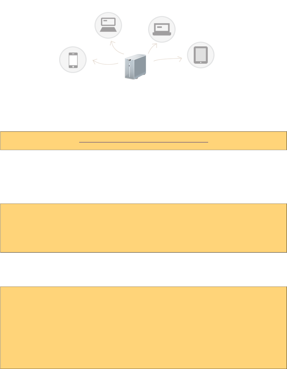
PrimeFaces User Guide
9. PrimeFaces Push
PrimeFaces Push (PFP) is a push framework built on top of Atmosphere. Atmospheres creator
AsyncIO is a partner company of PrimeTek and the developer of PFP. Atmosphere is highly
scalable, supports several containers and browsers, utilizes various transports such as websockets,
see, long-polling, streaming and jsonp. For more information please visit;
https://github.com/Atmosphere/atmosphere
9.1 Setup
Atmosphere
Atmosphere is required to run PrimeFaces Push, in your pom.xml define the dependency as;
<dependency>
<groupId>org.atmosphere</groupId>
<artifactId>atmosphere-runtime</artifactId>
<version>2.4.6</version>
</dependency>
Push Servlet
Push Servlet is used as a gateway for clients.
<servlet>
<servlet-name>Push Servlet</servlet-name>
<servlet-class>org.primefaces.push.PushServlet</servlet-class>
<async-supported>true</async-supported>
</servlet>
<servlet-mapping>
<servlet-name>Push Servlet</servlet-name>
<url-pattern>/primepush/*</url-pattern>
</servlet-mapping>
603

PrimeFaces User Guide
9.2 Annotations
Design of PFP is annotation driven centralized around the main @PushEndPoint.
@PushEndPoint
The easiest way to create PFP application is by using the @PushEndPoint annotation. This
annotation simplifies the process to build an application using PFP avoding the need to interact with
Atmospheres more sophisticated API. This annotation significantly reduces the number of code
required to build a powerful real time application by transparently installing Atmospheres
components like heartbeat, idle connections detections, disconnect state recovery etc. It also allows
the use of external dependency injection framework like CDI, Spring or Guice. Annotation provides
one attribute called path to define the resource path.
path: The path to the resource.
The default is "/" so if your have mapped the PushServlet to "/*", all request will be delivered to
your annotated class. You can also customize the path. The path value will be used to map an
incoming request uris path to an annotated PushEndpoint class.
@PushEndPoint("/chat")
@Singleton
Singleton annotation is used to force creating a single, thread safe instance of a PushEndpoint
annotated classes. For example, if your application set the @PushEndpoint’s path attribute with a
path, by default a new instance of the annotated classes will be created. When annotated with
Singleton however, a single class will be created.
@OnOpen
The OnOpen() will be invoked when the underlying connection is ready to be used, e.g for write
operations. Annotated method needs to take the form of;
@OnOpen
public void onOpen();
@OnOpen
public void onOpen(RemoteEndpoint r);
@OnOpen
public void onOpen(RemoteEndpoint r, EventBus e);
The RemoteEndpoint represents the physical connection and can be used to write some data back to
the browser. The EventBus can be used to fire messages to one or more RemoteEndpoints using
regex expressions.
@OnMessage
The OnMessage() will be invoked when a message is ready to be deliver, e.g as a result of a
EventBus publish operation or when a browser is POSTing some bytes. The annotation’s attributes
available are;
604

PrimeFaces User Guide
encoders: A list of [Encoder]() that will be used to encode the annotated method return value. The
returned value of an annotated OnMessage method will be broadcasted to all resource associated
with the Broadcaster, associated with this annotated classes.
decoders: A list of [Decoder]() used to decode a broadcasted messages into an object matching the
methods signature.
Both of the encoders and decoders can be chained, meaning the returned value of an encoder-
decoder can be used as an input for the next one.
@OnMessage(encoders = {JSONEncoder.class})
public String onMessage(String count) {
return count;
}
Out of the box, PrimeFaces PUSH provides JSON implementations that are;
- org.primefaces.push.impl.JSONEncoder
- org.primefaces.push.impl.JSONDecoder
It is also easy to create your own encoders-decoders by implementing org.primefaces.push.Encoder
and org.primefaces.push.Decoder interfaces.
@OnClose
The @OnClose() will be invoked when the client disconnect, e.g close the connection, when a
network outage happens or when a proxy close the connection. Annotated method needs to take the
form of;
@OnClose
public void onClose();
@OnClose
public void onClose(RemoteEndpoint r);
@OnClose
public void onClose(RemoteEndpoint r, EventBus e);
Only one method in a class can be annotated with @OnClose.
@PathParam
@PathParam is used to automatically parse the path and assign path tokens to class variables.
@PushEndpoint("/somepath/{room}/{user}")
@Singleton
public class ChatResource {
@PathParam("room")
private String room;
@PathParam("user")
private String username;
//...
605
PrimeFaces User Guide
9.3 API
RemoteEndPoint
The RemoteEndpoint() class represents the remote connection, e.g the Browser. An instance of
RemoteEndpoint hold information about the headers, queryString, body, uri, path and path segments
that can be used for manipulating the incoming request. If you are familiar with the Servlets
"HttpServletRequest", the RemoteEndpoint can be seen as an improved version. You can also use a
RemoteEndpoint#write to write back messages that will be delivered uniquely to the browser.
EventBus
A distributed lightweight event bus which can encompass multiple PushEndpoint instances. The
event bus implements publish / subscribe and point to point messaging. Messages sent over the
event bus can be of any type. For publish / subscribe, messages can be published to a Java class
annotated with the [PushEndpoint#value]() using one of the method annotated with [OnMessage]().
The EventBus is the recommended way for delivering messages. EventBus is retrieved via;
EventBus eventBus = EventBusFactory.getDefault().eventBus();
Once an EventBus instance is available, publishing data to subscribers is done with overloaded
publish methods.
publish(Object o): Fires given object to all connected RemoteEndPoints.
publish(String path, Object o): Fires given object to RemoteEndPoints that connected to the path.
publish(String path, Object o, Reply reply): Fires given object to RemoteEndPoints that
connected to the path by passing a Reply instance. Reply is an interface with a callback called
completed(String path) that is invoked when the EventBus delivered the message to the
PushEndPoint that matches the path used to initiate the publish operation.
9.4 Socket Component
Socket is a PrimeFaces component that handles the connection between the server and the browser,
common way to use socket is by defining a path and a callback to handle broadcasts.
<p:socket channel="/chat" onmessage="handlePublish"/>
See Socket component documentation for the full list of available options.
Client Side API
Widget: PrimeFaces.widget.Socket
Method Params Return Type Description
connect(uri) uri void Connects to given uri.
push(json) json void Pushes data from client side.
disconnect - void Disconnects from channel.
606

PrimeFaces User Guide
9.5 Putting It All Together
PrimeFaces Showcase has various push demos, in this section two of them are covered.
9.5.1 Counter
Counter is a global counter where each button click increments the count value and new value is
pushed to all subscribers.
View page has an outputText to display the value, a button to increment current value to push, a
socket component to connect to /counter channel and finally the onMessage client side callback to
update the UI.
<h:form>
<h:outputText value="#{counterView.count}" styleClass="display" />
<p:commandButton value="Click" actionListener="#{counterView.increment}" />
</h:form>
<p:socket onMessage="handleMessage" channel="/counter" />
<script type="text/javascript">
function handleMessage(data) {
$('.display').text(data);
}
</script>
package org.primefaces.examples.push.counter;
import java.io.Serializable;
import javax.faces.bean.ApplicationScoped;
import javax.faces.bean.ManagedBean;
import org.primefaces.push.EventBus;
import org.primefaces.push.EventBusFactory;
@ManagedBean
@ApplicationScoped
public class CounterView implements Serializable{
private volatile int count;
public int getCount() {
return count;
}
public void setCount(int count) {
this.count = count;
}
public void increment() {
count++;
EventBus eventBus = EventBusFactory.getDefault().eventBus();
eventBus.publish("/counter", String.valueOf(count));
}
}
607

PrimeFaces User Guide
increment button actionlistener first adds one to the counter value, gets an EventBus and then
pushes the new value to all connected clients. Final piece is writing the CounterResource to handle
messages whenever a data is pushed.
package org.primefaces.examples.push.counter;
import org.primefaces.push.annotation.OnMessage;
import org.primefaces.push.annotation.PushEndpoint;
import org.primefaces.push.impl.JSONEncoder;
@PushEndpoint("/counter")
public class CounterResource {
@OnMessage(encoders = {JSONEncoder.class})
public String onMessage(String count) {
return count;
}
}
In case you’d like to update components and/or invoke listeners in your backing bean on broadcast,
you can use the optional message ajax behavior to implement the same functionality but with an
extra request.
<h:form id="form">
<h:outputText id="out" value="#{globalCounter.count}" />
<p:commandButton value="Click" actionListener="#{globalCounter.increment}" />
</h:form>
<p:socket channel="/counter">
<p:ajax event="message" update="form:out" />
</p:socket>
608

PrimeFaces User Guide
9.5.2 FacesMessage
This sample shows how to push FacesMessages from one client to all others and display them using
Growl Component.
<p:growl widgetVar="growl" showDetail="true" />
<h:form>
<p:panel header="Growl">
<h:panelGrid columns="2">
<p:outputLabel for="summary" value="Summary: " />
<p:inputText id="summary" value="#{growlBean.summary}" required="true" />
<p:outputLabel for="detail" value="Detail: " />
<p:inputText id="detail" value="#{growlBean.detail}" required="true" />
</h:panelGrid>
<p:commandButton value="Send" actionListener="#{growlBean.send}" />
</p:panel>
</h:form>
<p:socket onMessage="handleMessage" channel="/notify" />
<script type="text/javascript">
function handleMessage(facesmessage) {
facesmessage.severity = 'info';
PF('growl').show([facesmessage]);
}
</script>
package org.primefaces.examples.view;
import javax.faces.application.FacesMessage;
import javax.faces.bean.ManagedBean;
import javax.faces.bean.RequestScoped;
import javax.faces.context.FacesContext;
import javax.faces.event.ActionEvent;
import org.primefaces.push.EventBus;
import org.primefaces.push.EventBusFactory;
@ManagedBean
@RequestScoped
public class GrowlBean {
private final static String CHANNEL = "/notify";
private String text, summary, detail;
//getters-setters
public void send() {
EventBus eventBus = EventBusFactory.getDefault().eventBus();
eventBus.publish(CHANNEL, new FacesMessage(summary, detail));
}
}
609

PrimeFaces User Guide
NotifyResource simply encodes the pushed messages as JSON.
package org.primefaces.examples.push.notify;
import javax.faces.application.FacesMessage;
import org.primefaces.push.annotation.OnMessage;
import org.primefaces.push.annotation.PushEndpoint;
import org.primefaces.push.impl.JSONEncoder;
@PushEndpoint("/notify")
public class NotifyResource {
@OnMessage(encoders = {JSONEncoder.class})
public FacesMessage onMessage(FacesMessage message) {
return message;
}
}
610

PrimeFaces User Guide
9.6 Tips and Tricks
Dynamic Paths
Client side API would be handy to create dynamic channels, channel name of the socket does not
need to be static and you can create dynamic channels on runtime since a channel is basically a path
name. @PathParam is very handy to automatically parse the Path and assign the path tokens to
variables.
See chat sample in showcase for an example of dynamic channels used to send private messages.
Proxies
Proxies are problematic not just for PrimeFaces Push - Atmosphere solution but in all solutions. If
your proxy supports websockets, make sure to add the necessary configuration. Another solution
that is considered as a workaround is to override the default uri of the push server. Default uri is
protocol://contextPath/primepush/channel, for example PrimeFaces online showcase is running on
jetty that is behind an apache mod proxy which doesn’t support websockets at time of the writing.
Solution is to configure PrimeFaces to use another push server like;
<context-param>
<param-name>primefaces.PUSH_SERVER_URL</param-name>
<param-value>http://www.primefaces.org:8080</param-value>
</context-param>
So that socket component bypasses the proxy and directly communicates with the application.
Supported Server and Client Environments
Atmosphere does a agreat job in supporting different servers and browsers. See the detailed list at;
https://github.com/Atmosphere/atmosphere/wiki/Supported-WebServers-and-Browsers
Scalability
Atmosphere is build to scale via plugins such as JMS, Redix, XMPP, Hazelcast and more. Refer to
atmosphere documentation to see how to configure atmosphere in more than one server.
PushServlet extends from AtmosphereServlet so any configuration option for AtmosphereServlet
also applies PushServlet.
611

PrimeFaces User Guide
10. PrimeFaces Mobile
PrimeFaces Mobile (PFM) is a UI Kit to create JSF applications optimized for mobile devices. PFM
is built on top of jQuery Mobile, a touch-optimized HTML5 UI framework providing support for
various platforms.
In addition to the seamless integration with jQuery Mobile, PFM features a Mobile Renderkit for
popular PrimeFaces components, ajax framework extensions, mobile ajax behavior events,
integrated navigation model, lazy loading of pages, responsive widgets and more.
*-
Mobile ships with PrimeFaces Core so no additional download is required.
Configuration
A mobile navigation handler is necessary inside faces configuration to enable navigations support.
<application>
<navigation-handler>
org.primefaces.mobile.application.MobileNavigationHandler
</navigation-handler>
</application>
Taglib
PFM provides mobile specific components with the following taglib.
xmlns:pm="http://primefaces.org/mobile"
RenderKit
RenderKit is the core part of PFM featuring optimized renderers for mobile environments. There
are two main ways to enable PFM RenderKit.
Core view tag has a renderKitId attribute to set the renderer kit of the page.
<f:view renderKitId="PRIMEFACES_MOBILE" />
If your application fully consists of mobile pages, then a global configuration in faces configuration
file should be preferred instead of per page configuration.
<application>
<default-render-kit-id>PRIMEFACES_MOBILE</application>
</application>
612

PrimeFaces User Guide
*%)
A mobile page is a regular facelets xhtml file with mobile page containers defined with pm:page.
<!DOCTYPE html>
<html xmlns="http://www.w3.org/1999/xhtml"
xmlns:h="http://java.sun.com/jsf/html"
xmlns:f="http://java.sun.com/jsf/core"
xmlns:p="http://primefaces.org/ui"
xmlns:pm="http://primefaces.org/mobile">
<f:view renderKitId="PRIMEFACES_MOBILE" />
<h:head>
</h:head>
<h:body>
<pm:page>
<pm:header title="Basic Page"></pm:header>
<pm:content></pm:content>
</pm:page>
</h:body>
</html>
A single page xhtml view can have more than one page. By default the first page is visible on load.
<!DOCTYPE html>
<html xmlns="http://www.w3.org/1999/xhtml"
xmlns:h="http://java.sun.com/jsf/html"
xmlns:f="http://java.sun.com/jsf/core"
xmlns:p="http://primefaces.org/ui"
xmlns:pm="http://primefaces.org/mobile">
<f:view renderKitId="PRIMEFACES_MOBILE" />
<h:head>
</h:head>
<h:body>
<pm:page id="main">
<pm:header title="Main Page"></pm:header>
<pm:content></pm:content>
</pm:page>
<pm:page id="second">
<pm:header title="Second Page"></pm:header>
<pm:content></pm:content>
</pm:page>
</h:body>
</html>
613
PrimeFaces User Guide
*0,%)
PFM supports all kinds of standard navigations with the addition of a custom navigation model.
Internal
Internal navigation is between pages in the same xhtml view. Outcome should have the pm: prefix
for this kind of navigation. Using the multi page sample at section 10.1;
<p:button outcome="pm:second" />
<p:link outcome="pm:second" />
Button and Link components displays the page whose id is second. In case you'd like to navigate
after a POST request, usage would be similar.
<p:commandButton value="Go to Second" action="#{bean.go}" />
public String go() {
return "pm:second";
}
External
External navigations to another xhtml in same domain or a resource in another domain is same as
standard approach.
<p:button outcome="/ui/home" value="Home" />
<p:button href="http://www.primefaces.org" value="Home" />
Transitions
Various animations are available to run during the navigation. Name of the effect is appended to the
outcome. In addition, reverse option is provided for back navigations.
<p:button outcome="pm:second?transition=pop" />
<p:link outcome="pm:second?transition=flip&reverse=true" />
List of possible transitions is fade, pop, flip, turn, flow, slide, slidefade, slideup and slidedown. Fade
is the default transition and to turn off animation, set none as the value.
Client API
A client side API is available to navigate manually from a custom javascript code. Signature is;
PrimeFaces.Mobile.navigate(to, cfg);
PrimeFaces.Mobile.navigate('#second', {
reverse: true|false,
transition: 'fade'
});
614
PrimeFaces User Guide
*')
10.3.1 Content
Content is container component for the content area of a page.
Info
Tag content
Component Class org.primefaces.mobile.component.content.Content
Component Type org.primefaces.mobile.Content
Component Family org.primefaces.mobile.component
Renderer Type org.primefaces.mobile.component.ContentRenderer
Renderer Class org.primefaces.mobile.component.content.ContentRenderer
Attributes
Name Default Type Description
id null String Unique identifier of the component
rendered true Boolean Boolean value to specify the rendering of the
component, when set to false component will not
be rendered.
binding null Object An el expression that maps to a server side
UIComponent instance in a backing bean
style null String Inline style of the component.
styleClass null String Style class of the component.
Getting Started with the Content
Content is a children component of a page.
<pm:page>
<pm:content>
//page content
</pm:content>
</pm:page>
615
PrimeFaces User Guide
10.3.2 Field
Field is a responsive layout component for label-input pairs.
Info
Tag field
Component Class org.primefaces.mobile.component.field.Field
Component Type org.primefaces.mobile.Field
Component Family org.primefaces.mobile.component
Renderer Type org.primefaces.mobile.component.FieldRenderer
Renderer Class org.primefaces.mobile.component.field.FieldRenderer
Attributes
Name Default Type Description
id null String Unique identifier of the component
rendered true Boolean Boolean value to specify the rendering of the
component, when set to false component will not
be rendered.
binding null Object An el expression that maps to a server side
UIComponent instance in a backing bean
Getting Started with the Field
Field is used as the container of a label and an input component. As a responsive component, field
displays the optimal placement for its children based on available width.
<pm:field>
<p:outputLabel for="text" value="Text:" />
<p:inputText id="txt" />
</pm:field>
616
PrimeFaces User Guide
10.3.3 Footer
Footer is container component for the bottom area of a page.
Info
Tag footer
Component Class org.primefaces.mobile.component.footer.Footer
Component Type org.primefaces.mobile.Footer
Component Family org.primefaces.mobile.component
Renderer Type org.primefaces.mobile.component.FooterRenderer
Renderer Class org.primefaces.mobile.component.footer.FooterRenderer
Attributes
Name Default Type Description
id null String Unique identifier of the component
rendered true Boolean Boolean value to specify the rendering of the component, when set
to false component will not be rendered.
binding null Object An el expression that maps to a server side UIComponent instance
in a backing bean
title null String Title text of the footer.
fixed false Boolean Positions the footer as fixed on scroll.
theme null String Swatch of the component.
tapToggle true Boolean For fixed footers, sets whether the fixed toolbar's visibility can be
toggled by tapping on the page.
style null String Inline style of the component.
styleClass null String Style class of the component.
Getting Started with the Footer
Footer is a children component of a page.
<pm:page>
<pm:footer title="Footer"></pm:footer>
</pm:page>
617
PrimeFaces User Guide
10.3.4 Header
Header is container component for the top area of a page.
Info
Tag header
Component Class org.primefaces.mobile.component.header.Header
Component Type org.primefaces.mobile.Header
Component Family org.primefaces.mobile.component.Header
Renderer Type org.primefaces.mobile.component.HeaderRenderer
Renderer Class org.primefaces.mobile.component.header.HeaderRenderer
Attributes
Name Default Type Description
id null String Unique identifier of the component
rendered true Boolean Boolean value to specify the rendering of the component, when set
to false component will not be rendered.
binding null Object An el expression that maps to a server side UIComponent instance
in a backing bean
title null String Title text of the header.
fixed false Boolean Positions the header as fixed on scroll.
theme null String Swatch of the component.
style null String Inline style of the component.
styleClass null String Style class of the component.
Getting Started with the Header
Header is a children component of a page.
<pm:page>
<pm:header title="Footer"></pm:header>
</pm:page>
618
PrimeFaces User Guide
10.3.5 InputSlider
InputSlider is an input component with a touch enabled slider.
Info
Tag inputSlider
Component Class org.primefaces.mobile.component.inputslider.InputSlider
Component Type org.primefaces.mobile.InputSlider
Component Family org.primefaces.mobile.component.
Renderer Type org.primefaces.mobile.component.InputSliderRenderer
Renderer Class org.primefaces.mobile.component.inputslider.InputSliderRenderer
Attributes
Name Default Type Description
id null String Unique identifier of the component
rendered true Boolean Boolean value to specify the rendering of the
component, when set to false component will not be
rendered.
binding null Object An el expression that maps to a server side
UIComponent instance in a backing bean
value null Object Value of the component.
converter null Object An el expression or a literal text that defines a converter
for the component. When it’s an EL expression, it’s
resolved to a converter instance. In case it’s a static
text, it must refer to a converter id.
immediate false Boolean When set true, process validations logic is executed at
apply request values phase for this component.
required false Boolean Marks component as required
validator null Object A method binding expression that refers to a method
validationg the input.
valueChangeListener null Object A method binding expression that refers to a method for
handling a valuechangeevent.
requiredMessage null String Message to be displayed when required field validation
fails.
619
PrimeFaces User Guide
Name Default Type Description
converterMessage null String Message to be displayed when conversion fails.
validatorMessage null String Message to be displayed when validation fields.
minValue 0 Integer Minimum value of the slider.
maxValue 100 Integer Maximum value of the slider.
style null String Inline style of the component.
styleClass null String Style class of the component.
step 1 String Step factor to apply on slider move.
disabled false Boolean Disables or enables the slider.
label null String User presentable name.
highlight false Boolean Highlights the value range when enabled.
Getting Started with the InputSlider
InputSlider requires an integer as its value.
<pm:inputSlider value="50" />
<pm:inputSlider value="#{backingView.integerProperty}" />
Boundaries
0 and 100 are the default boundaries, these can be customized using minValue and maxValue.
<pm:inputSlider minValue="100" maxValue="200" value="#{backingView.intProperty}"/>
620
PrimeFaces User Guide
10.3.6 Page
Page is main component to define an internal page within an xhtml.
Info
Tag page
Component Class org.primefaces.mobile.component.page.Page
Component Type org.primefaces.mobile.Page
Component Family org.primefaces.mobile.component
Renderer Type org.primefaces.mobile.component.PageRenderer
Renderer Class org.primefaces.mobile.component.page.PageRenderer
Attributes
Name Default Type Description
id null String Unique identifier of the component
rendered true Boolean Boolean value to specify the rendering of the component, when set
to false component will not be rendered.
binding null Object An el expression that maps to a server side UIComponent instance
in a backing bean
title null String Title text of the page.
theme null String Swatch of the page.
style null String Inline style of the component.
styleClass null String Style class of the component.
lazy false Boolean Lazy loading views are not rendered on initial page load to improve
performance and instead lazily loaded on demand when there are
first navigated to.
Getting Started with the Page
Please see section 10.1 Pages for the usage and more information.
621
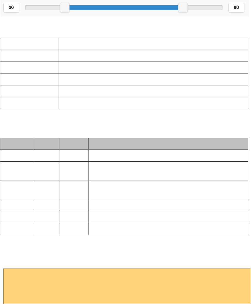
PrimeFaces User Guide
10.3.7 RangeSlider
RangeSlider is a grouping component for dual sliders to create a range selection.
Info
Tag rangeSlider
Component Class org.primefaces.mobile.component.rangeslider.RangeSlider
Component Type org.primefaces.mobile.RangeSlider
Component Family org.primefaces.mobile.component
Renderer Type org.primefaces.mobile.component.RangeSlider
Renderer Class org.primefaces.mobile.component.rangeslider.RangeSlider
Attributes
Name Default Type Description
id null String Unique identifier of the component
rendered true Boolean Boolean value to specify the rendering of the component, when set
to false component will not be rendered.
binding null Object An el expression that maps to a server side UIComponent instance
in a backing bean
style null String Inline style of the component.
styleClass null String Style class of the component.
highlight false Boolean Highlights the value range when enabled.
Getting Started with the RangeSlider
RangeSlider needs two sliders as children, first slider is for the start of range and second for the end.
<pm:rangeSlider>
<pm:inputSlider value="#{backingView.start}"/>
<pm:inputSlider value="#{backingView.end}"/>
</pm:rangeSlider>
622
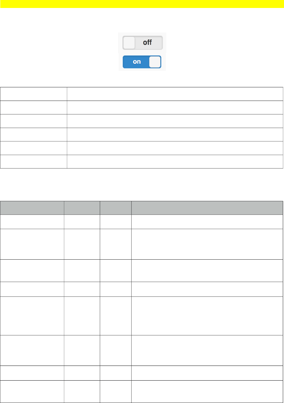
PrimeFaces User Guide
10.3.8 Switch (Deprecated)
Switch is deprecated, use p:inputSwitch instead.
Switch is an input component to select a boolean value.
Info
Tag switch
Component Class org.primefaces.mobile.component.uiswitch.UISwitch
Component Type org.primefaces.mobile.UISwitch
Component Family org.primefaces.mobile.component
Renderer Type org.primefaces.mobile.component.UISwitchRenderer
Renderer Class org.primefaces.mobile.component.uiswitch.UISwitchRenderer
Attributes
Name Default Type Description
id null String Unique identifier of the component
rendered true Boolean Boolean value to specify the rendering of the
component, when set to false component will not
be rendered.
binding null Object An el expression that maps to a server side
UIComponent instance in a backing bean
value null Object Value of the component.
converter null Object An el expression or a literal text that defines a
converter for the component. When it’s an EL
expression, it’s resolved to a converter instance. In
case it’s a static text, it must refer to a converter id.
immediate false Boolean When set true, process validations logic is
executed at apply request values phase for this
component.
required false Boolean Marks component as required
validator null Object A method binding expression that refers to a
method validationg the input.
623
PrimeFaces User Guide
Name Default Type Description
valueChangeListener null Object A method binding expression that refers to a
method for handling a valuechangeevent.
requiredMessage null String Message to be displayed when required field validation
fails.
converterMessage null String Message to be displayed when conversion fails.
validatorMessage null String Message to be displayed when validation fields.
onLabel on Integer Minimum value of the slider.
offLabel off Integer Maximum value of the slider.
label null String User presentable name.
style null String Inline style of the component.
styleClass null String Style class of the component.
label null String User presentable name.
disabled false Boolean Disables or enables the switch.
onchange false String Client side callback to execute on change event.
Getting Started with the Switch
Value of switch should be a boolean property, if the value is false offLabel would be displayed and
onLabel would be used otherwise.
<pm:switch value="#{backingView.booleanProperty}" />
624
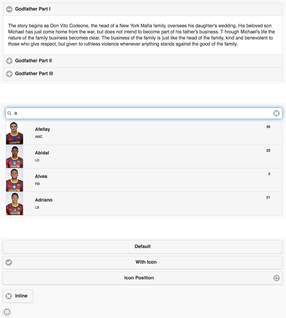
PrimeFaces User Guide
*12
In addition to the mobile components, various core components have been enhanced with touch
optimized mobile renderers so that same component can be optimized for a mobile browser. Since
usage is same in desktop and mobile environments, refer to chapter 3 for documentation about these
components.
*
*'
*
625
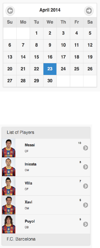
PrimeFaces User Guide
10.4.4 Calendar
*3'%
* )
Additional supported ajax events are swiperight, swiperight, tap and taphold.
626
PrimeFaces User Guide
10.4.7 DataGrid
10.4.8 DataTable
Additional supported ajax events are swiperight, swiperight, tap and taphold.
10.4.9 Dialog
627
PrimeFaces User Guide
10.4.10 FileUpload
10.4.11 Growl
10.4.12 InputText
10.4.13 InputTextarea
10.4.14 Link
10.4.15 Menu
10.4.16 Panel
628
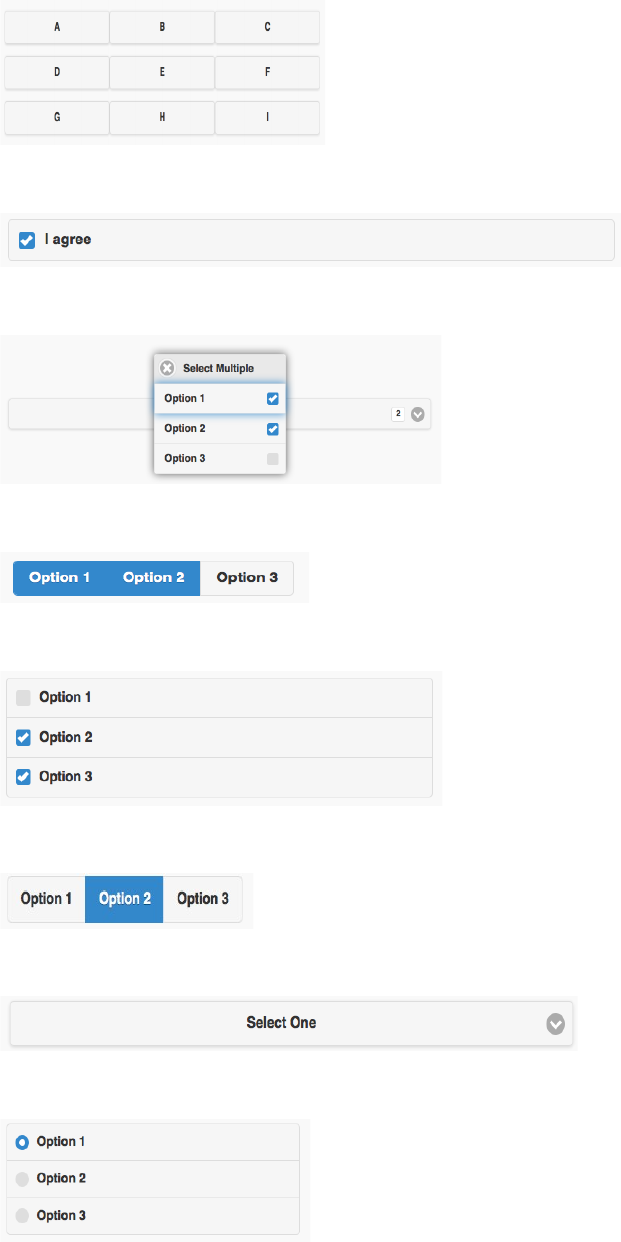
PrimeFaces User Guide
10.4.17 PanelGrid
10.4.17 SelectBooleanCheckbox
10.4.18 SelectCheckboxMenu
10.4.18 SelectManyButton
10.4.19 SelectManyCheckbox
10.4.20 SelectOneButton
10.4.21 SelectOneMenu
10.4.22 SelectOneRadio
629
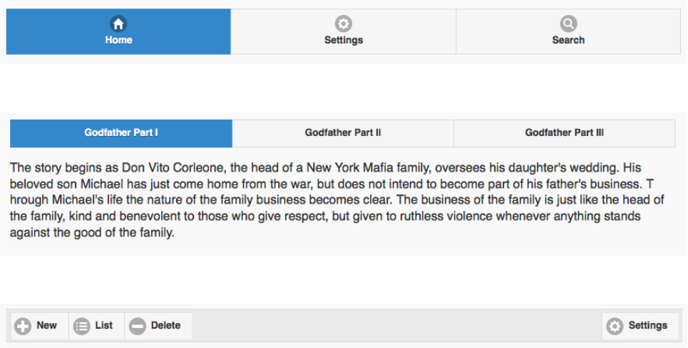
PrimeFaces User Guide
10.4.23 TabMenu
10.4.24 TabView
10.4.25 Toolbar
630
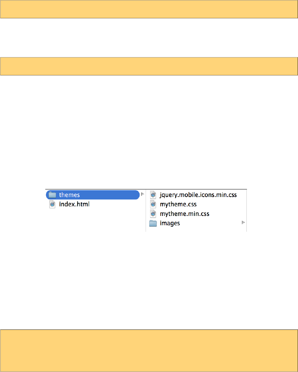
PrimeFaces User Guide
*/')
Mobile theming is similar to the core theming documented at chapter 8. Main difference is the
swatch concept of mobile themes where one theme can contain multiple swatches. Default theme
has two swatches a and b. A swatch can be applied using swatch attribute when available.
<pm:header title="Header" swatch="b"></pm:header>
Custom Theme
There is a mobile themeroller application to create a custom theme.
http://themeroller.jquerymobile.com
After creating the theme and downloading it as a zip file, a jar file has to be created to install the
theme with the same folder structure as a desktop theme.
-jar
-META-INF
-resources
-primefaces-mytheme
-theme.css
-images
1) The theme package downloaded from ThemeRoller will have a themename.css file and images
folder. Extract the contents of the package and rename themename.css to theme.css.
2) Image references in your theme.css must also be converted to an expression that JSF resource
loading can understand, example would be;
url("images/ui-bg_highlight-hard_100_f9f9f9_1x100.png")
should be;
url("#{resource['primefaces-mytheme:images/ui-bg_highlight-hard_100_f9f9f9_1x100.png']}")
Once the jar of your theme is in classpath, you can enable the theme by the following configuration.
<context-param>
<param-name>primefaces.mobile.THEME</param-name>
<param-value>mytheme</param-value>
</context-param>
param-value can be an EL expression as well to implement dynamic theming.
631

PrimeFaces User Guide
* 4'5.
In addition to the UI components, PFM provides seamless integration with jQuery Mobile.
* 6)
Plain jQuery Mobile UI elements use progressive enhancement approach that runs once on page
load, this breaks JSF ajax updates since the updated parts cannot be enhanced again. PFM takes care
of this problem under the hood.
As an example, the plain jquery mobile datalist and inputtext will lose all styling and functionality
when updated with standard ajax commandbutton whereas PFM commandButton will properly
update the datalist and inputtext.
<h:commandButton value="Standard">
<f:ajax render="panel1" />
</h:commandButton>
<p:commandButton value="PFM" update="panel2" icon="ui-icon-refresh"/>
<h:panelGroup id="panel1">
<ul data-role="listview" data-inset="true">
<li><a href="#">Item 1</a></li>
<li><a href="#">Item 2</a></li>
<li><a href="#">Item 3</a></li>
</ul>
<h:inputText />
</h:panelGroup>
<p:outputPanel id="panel2">
<p:menu styleClass="ui-listview-inset ui-corner-all">
<p:menuitem value="Item1" url="#" />
<p:menuitem value="Item2" url="#" />
<p:menuitem value="Item3" url="#" />
</p:menu>
<p:inputText />
</p:outputPanel>
* ))/%')
jQM is data attribute driven, thanks to JSF 2.2's dynamic attributes support, PrimeFaces
Components can have mobile specific options easily. Example below adds inset setting to a datalist.
<p:dataList value="#{ringBean.players}" var="player" pt:data-inset="true">
//content
</p:dataList>
Note that pt is the standard taglib; xmlns:pt="http://xmlns.jcp.org/jsf/passthrough". For the full list
of available data attributes, consult the jQuery Mobile documentation.
632

PrimeFaces User Guide
* 78%)
For a mobile device with bandwith concerns, loading all the pages in same xhtml at once in an
eager fashion is not optimal and might cause performance issues if the page size is big. PFM
supports lazy loading pages where a page content is not rendered at first but loaded with ajax just
before accessed for the first time. Lazy loading is disabled and activated by setting lazy option on
page component.
<!DOCTYPE html>
<html xmlns="http://www.w3.org/1999/xhtml"
xmlns:h="http://java.sun.com/jsf/html"
xmlns:f="http://java.sun.com/jsf/core"
xmlns:p="http://primefaces.org/ui"
xmlns:pm="http://primefaces.org/mobile">
<f:view renderKitId="PRIMEFACES_MOBILE" />
<h:head></h:head>
<h:body>
<pm:page id="main">
<pm:header title="Main Page"></pm:header>
<pm:content>
<p:link outcome="pm:second" value="Go" />
</pm:content>
</pm:page>
<pm:page id="second" lazy="true">
<pm:header title="Second Page"></pm:header>
<pm:content>
//Lazy loaded content
</pm:content>
</pm:page>
</h:body>
</html>
At first page load, second page contents are not available on page, clicking the link first makes an
ajax request to fetch the contents, create the UI and then finally navigate to it.
* /,)
Touch events like swipe are enabled in some components. In following, items in the list can be
removed by swipeleft or swiperight and detail is displayed with taphold.
<h:form id="form">
<p:growl id="msgs" showDetail="true" />
<p:dataList value="#{tableBean.carsSmall}" var="car" pt:data-inset="true">
<p:ajax event="swipeleft" listener="#{tableBean.swipeCar}"
update=":form:msgs @this"/>
<p:ajax event="swiperight" listener="#{tableBean.swipeCar}"
update=":form:msgs @this"/>
<p:ajax event="taphold" listener="#{tableBean.onRowSelect}"
update=":form:msgs"/>
<h:outputText value="#{car.manufacturer} - #{car.color}" />
</p:dataList>
</h:form>
633

PrimeFaces User Guide
public void onRowSelect(SelectEvent event) {
FacesMessage msg = new FacesMessage("Car Selected",
((Car) event.getObject()).getModel());
FacesContext.getCurrentInstance().addMessage(null, msg);
}
public void swipeCar(SwipeEvent event) {
Car car = (Car) event.getData();
carsSmall.remove(car);
FacesContext.getCurrentInstance().addMessage(null,
new FacesMessage(FacesMessage.SEVERITY_INFO,
"Car Swiped", "Removed: " + car.getModel()));
}
Sections 10.4 and 10.5 contains supported mobile events for a component when available.
634
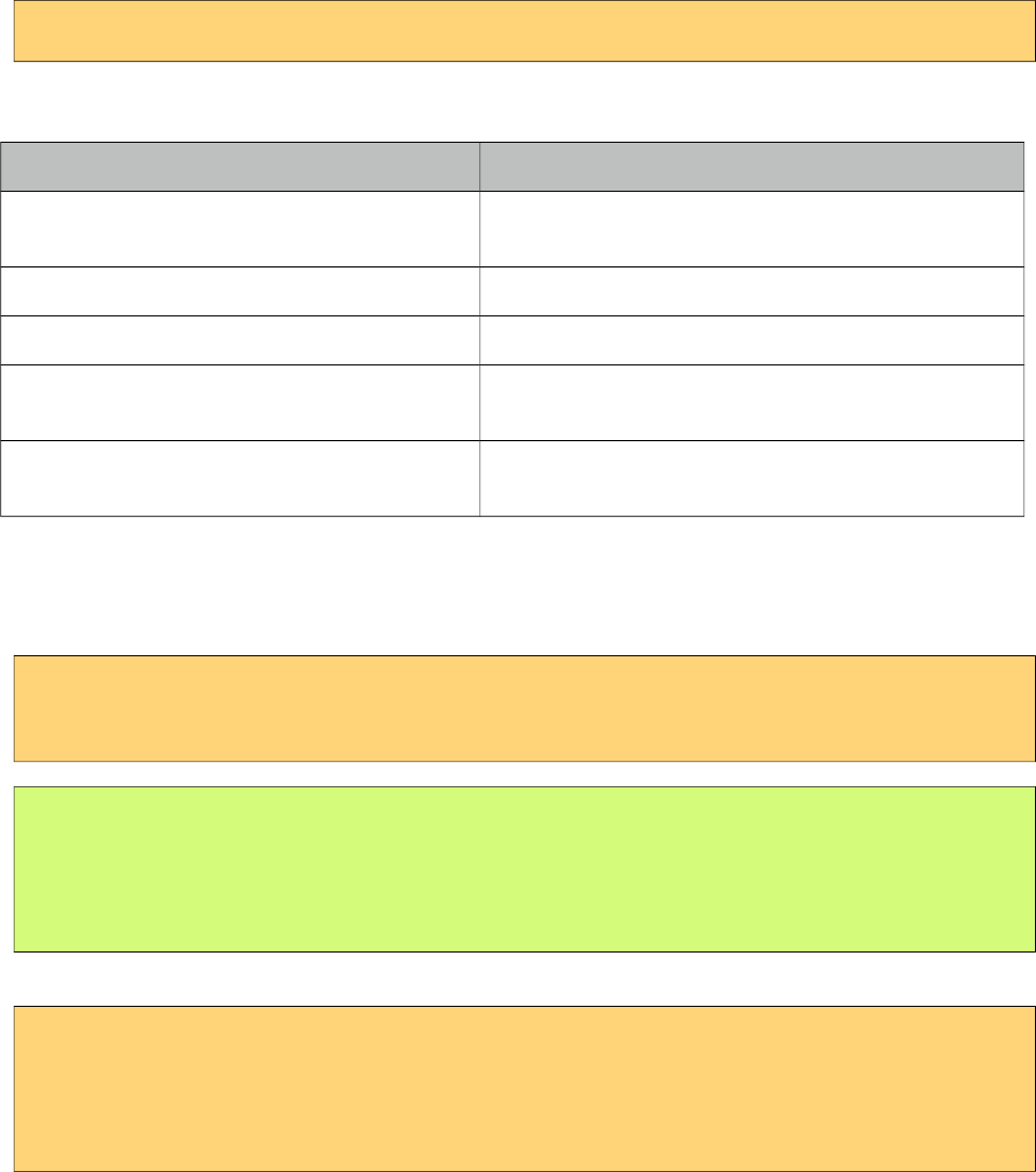
PrimeFaces User Guide
11. Misc
11.1 RequestContext
RequestContext is a simple utility that provides useful goodies such as adding parameters to ajax
callback functions. RequestContext is available in both ajax and non-ajax requests.
RequestContext can be obtained similarly to the FacesContext.
RequestContext requestContext = RequestContext.getCurrentInstance();
RequestContext API
Method Description
isAjaxRequest() Returns a boolean value if current request is a
PrimeFaces ajax request.
addCallBackParam(String name, Object value) Adds parameters to ajax callbacks like oncomplete.
update(String clientId); Specifies component(s) to update at runtime.
execute(String script) Executes script after ajax request completes or on page
load.
scrollTo(String clientId) Scrolls to the component with given clientId after ajax
request completes.
Callback Parameters
There may be cases where you need values from backing beans in ajax callbacks. Callback
parameters are serialized to JSON and provided as an argument in ajax callbacks for this.
<p:commandButton actionListener="#{bean.validate}"
oncomplete="handleComplete(xhr, status, args)" />
public void validate() {
//isValid = calculate isValid
RequestContext requestContext = RequestContext.getCurrentInstance();
requestContext.addCallbackParam("isValid", true or false);
}
isValid parameter will be available in handleComplete callback as;
<script type="text/javascript">
function handleComplete(xhr, status, args) {
var isValid = args.isValid;
}
</script>
You can add as many callback parameters as you want with addCallbackParam API. Each parameter
is serialized as JSON and accessible through args parameter so pojos are also supported just like
635
PrimeFaces User Guide
primitive values. Following example sends a pojo called User that has properties like firstname and
lastname to the client in addition to isValid boolean value.
public void validate() {
//isValid = calculate isValid
RequestContext requestContext = RequestContext.getCurrentInstance();
requestContext.addCallbackParam("isValid", true or false);
requestContext.addCallbackParam("user", user);
}
<script type="text/javascript">
function handleComplete(xhr, status, args) {
var firstname = args.user.firstname;
var lastname = args.user.lastname;
}
</script>
By default validationFailed callback parameter is added implicitly if validation fails.
Runtime Updates
Conditional UI update is quite common where different parts of the page need to be updated based
on a dynamic condition. In this case, it is not efficient to use declarative update and defined all
update areas since this will cause unncessary updates.There may be cases where you need to define
which component(s) to update at runtime rather than specifying it declaratively. update method is
added to handle this case. In example below, button actionListener decides which part of the page to
update on-the-fly.
<p:commandButton value="Save" actionListener="#{bean.save}" />
<p:panel id="panel"> ... </p:panel>
<p:dataTable id="table"> ... </p:panel>
public void save() {
//boolean outcome = ...
RequestContext requestContext = RequestContext.getCurrentInstance();
if(outcome)
requestContext.update("panel");
else
requestContext.update("table");
}
When the save button is clicked, depending on the outcome, you can either configure the datatable
or the panel to be updated with ajax response.
Execute Javascript
RequestContext provides a way to execute javascript when the ajax request completes, this
approach is easier compared to passing callback params and execute conditional javascript.
Example below hides the dialog when ajax request completes;
636
PrimeFaces User Guide
public void save() {
RequestContext requestContext = RequestContext.getCurrentInstance();
requestContext.execute(“dialog.hide()”);
}
637
PrimeFaces User Guide
11.2 EL Functions
PrimeFaces provides built-in EL extensions that are helpers to common use cases.
Common Functions
Function Description
component('id') Returns clientId of the component with provided server id parameter. This function
is useful if you need to work with javascript.
widgetVar('id') Provides the widgetVar of a component in PF('') format.
Component
<h:form id="form1">
<h:inputText id="name" />
</h:form>
//#{p:component(‘name’)} returns ‘form1:name’
WidgetVar
<p:dialog id="dlg">
//contents
</p:dialog>
<p:commandButton type="button" value="Show" onclick="#{p:widgetVar(‘dlg’)}.show()" />
Page Authorization
Authorization function use HttpServletRequest API for the backend information.
Function Description
ifGranted(String role) Returns true if user has the given role, else false.
ifAllGranted(String roles) Returns true if user has all of the given roles, else false.
ifAnyGranted(String roles) Returns true if user has any of the given roles, else false.
ifNotGranted(String roles) Returns true if user has none of the given roles, else false.
remoteUser() Returns the name of the logged in user.
userPrincipal() Returns the principal instance of the logged in user.
<p:commandButton rendered="#{p:ifGranted('ROLE_ADMIN')}" />
<h:inputText disabled="#{p:ifGranted('ROLE_GUEST')}" />
<p:inputMask rendered="#{p:ifAllGranted('ROLE_EDITOR, ROLE_READER')}" />
638

PrimeFaces User Guide
11.3 Exception Handler
PrimeFaces provides a built-in exception handler to take care of exceptions in ajax and non-ajax
requests easily.
Configuration
ExceptionHandler and an ElResolver configured is required in faces configuration file.
<application>
<el-resolver>
org.primefaces.application.exceptionhandler.PrimeExceptionHandlerELResolver
</el-resolver>
</application>
<factory>
<exception-handler-factory>
org.primefaces.application.exceptionhandler.PrimeExceptionHandlerFactory
</exception-handler-factory>
</factory>
Error Pages
ExceptionHandler is integrated with error-page mechanism of Servlet API. At application startup,
PrimeFaces parses the error pages and uses this information to find the appropriate page to redirect
to based on the exception type. Here is an example web.xml configuration with a generic page for
exceptions and a special page for ViewExpiredException type.
<?xml version="1.0" encoding="UTF-8"?>
<web-app version="2.5"
xmlns="http://java.sun.com/xml/ns/javaee"
xmlns:xsi="http://www.w3.org/2001/XMLSchema-instance"
xsi:schemaLocation="http://java.sun.com/xml/ns/javaee
http://java.sun.com/xml/ns/javaee/web-app_2_5.xsd" >
<!-- Other application configuration -->
<error-page>
<exception-type>java.lang.Throwable</exception-type>
<location>/ui/error/error.jsf</location>
</error-page>
<error-page>
<exception-type>javax.faces.application.ViewExpiredException</exception-type>
<location>/ui/error/viewExpired.jsf</location>
</error-page>
</web-app>
639

PrimeFaces User Guide
Exception Information
In the error page, information about the exception is provided via the pfExceptionHandler EL
keyword. Here is the list of exposed properties.
- exception: Throwable instance.
- type: Type of the exception.
- message: Exception message:
- stackTrace: An array of java.lang.StackTraceElement instances.
- formattedStackTrace: Stack trace as presentable string.
- timestamp: Timestamp as date.
- formattedTimestamp: Timestamp as presentable string.
In error page, exception metadata is accessed using EL;
<h:outputText value="Message:#{pfExceptionHandler.message}" />
<h:outputText value="#{pfExceptionHandler.formattedStackTrace}" escape="false" />
Ajax Exception Handler Component
A specialized exception handler component provides a way to execute callbacks on client side,
update other components on the same page. This is quite useful in case you don't want to create a
separate error page. Following example shows the exception in a dialog on the same page.
<p:ajaxExceptionHandler type="javax.faces.application.ViewExpiredException"
update="exceptionDialog" onexception="PF('exceptionDialog').show();" />
<p:dialog id="exceptionDialog" header="Exception: #{pfExceptionHandler.type}
occured!" widgetVar="exceptionDialog" height="500px">
Message: #{pfExceptionHandler.message} <br/>
StackTrace: <h:outputText value="#{pfExceptionHandler.formattedStackTrace}"
escape="false" />
<p:button onclick="document.location.href = document.location.href;"
value="Reload!"/>
</p:dialog>
Ideal location for p:ajaxExceptionHandler component is the facelets template so that it gets
included in every page. Refer to component documentation of p:ajaxExceptionHandler for the
available attributes.
Render Response Exceptions
To support exception handling in the RENDER_RESPONSE phase, it's required to set the
javax.faces.FACELETS_BUFFER_SIZE parameter. Otherwise you will probably see a
ServletException with "Response already committed" message.
640

PrimeFaces User Guide
11.4 BeanValidation Transformation
Since JavaEE 6, validation metadata is already available for many components via the value
reference and BeanValidation (e.g. @NotNull, @Size). The JSF Implementations use this
information for server side validation and PrimeFaces enhances this feature with client side
validation framework.
PrimeFaces makes use of these metadata by transforming them to component and html attributes.
For example sometimes it’s required to manually maintain the required or maxlength attribute for
input components. The required attribute also controls the behavior of p:outputLabel to show or
hide the required indicator (*) whereas the maxlength attribute is used to limit the characters on
input fields. BeanValidation transformation features enables avoiding manually maintaining these
attributes anymore by implicility handling them behind the scenes.
Configuration
To start with, transformation should be enabled.
<context-param>;
<param-name>primefaces.TRANSFORM_METADATA</param-name>
<param-value>true</param-value>
</context-param>
Usage
Define constraints at bean level.
@NotNull
@Max(30)
private String firstname;
Component at view does not have any constraints;
<p:inputText value="#{bean.firstname}" />
Final output has html maxlength attribute generated from the @Max annotation, also the component
instance has required enabled.
<input type="text" maxlength="30" … />
641

PrimeFaces User Guide
11.5 PrimeFaces Locales
Components may require translations and other settings based on different locales. This is handled
with a client side api called PrimeFaces Locales. A client side locale is basically a javascript object
with various settings, en_US is the default locale provided out of the box. In case you need to
support another locale, settings should be extended with the new information.
A wiki page is available for user contributed settings, the list is community driven and a good
starting point although it might be incomplete.
https://code.google.com/p/primefaces/wiki/PrimeFacesLocales
Default Locale
Here is the list of all key-value pairs for en_US locale that is provided by PrimeFaces. DateTime
related properties are utilized by components such as calendar and schedule. If you are using Client
Side Validation, messages property is used as the bundle for the locale.
{
closeText: 'Close',
prevText: 'Previous',
nextText: 'Next',
monthNames: ['January', 'February', 'March', 'April', 'May', 'June', 'July', 'August', 'September',
'October', 'November', 'December' ],
monthNamesShort: ['Jan', 'Feb', 'Mar', 'Apr', 'May', 'Jun', 'Jul', 'Aug', 'Sep', 'Oct', 'Nov', 'Dec' ],
dayNames: ['Sunday', 'Monday', 'Tuesday', 'Wednesday', 'Thursday', 'Friday', 'Saturday'],
dayNamesShort: ['Sun', 'Mon', 'Tue', 'Wed', 'Tue', 'Fri', 'Sat'],
dayNamesMin: ['S', 'M', 'T', 'W ', 'T', 'F ', 'S'],
weekHeader: 'Week',
firstDay: 0,
isRTL: false,
showMonthAfterYear: false,
yearSuffix:'',
timeOnlyTitle: 'Only Time',
timeText: 'Time',
hourText: 'Time',
minuteText: 'Minute',
secondText: 'Second',
currentText: 'Current Date',
ampm: false,
month: 'Month',
week: 'week',
day: 'Day',
allDayText: 'All Day',
messages: {
'javax.faces.component.UIInput.REQUIRED': '{0}: Validation Error: Value is required.',
'javax.faces.converter.IntegerConverter.INTEGER': '{2}: \'{0}\' must be a number
consisting of one or more digits.',
'javax.faces.converter.IntegerConverter.INTEGER_detail': '{2}: \'{0}\' must be a number
between -2147483648 and 2147483647 Example: {1}',
642
PrimeFaces User Guide
'javax.faces.converter.DoubleConverter.DOUBLE': '{2}: \'{0}\' must be a number
consisting of one or more digits.',
'javax.faces.converter.DoubleConverter.DOUBLE_detail': '{2}: \'{0}\' must be a number
between 4.9E-324 and 1.7976931348623157E308 Example: {1}',
'javax.faces.converter.BigDecimalConverter.DECIMAL': '{2}: \'{0}\' must be a signed
decimal number.',
'javax.faces.converter.BigDecimalConverter.DECIMAL_detail': '{2}: \'{0}\' must be a
signed decimal number consisting of zero or more digits, that may be followed by a decimal point
and fraction. Example: {1}',
'javax.faces.converter.BigIntegerConverter.BIGINTEGER': '{2}: \'{0}\' must be a number
consisting of one or more digits.',
'javax.faces.converter.BigIntegerConverter.BIGINTEGER_detail': '{2}: \'{0}\' must be a
number consisting of one or more digits. Example: {1}',
'javax.faces.converter.ByteConverter.BYTE': '{2}: \'{0}\' must be a number between 0 and
255.',
'javax.faces.converter.ByteConverter.BYTE_detail': '{2}: \'{0}\' must be a number between
0 and 255. Example: {1}',
'javax.faces.converter.CharacterConverter.CHARACTER': '{1}: \'{0}\' must be a valid
character.',
'javax.faces.converter.CharacterConverter.CHARACTER_detail': '{1}: \'{0}\' must be a
valid ASCII character.',
'javax.faces.converter.ShortConverter.SHORT': '{2}: \'{0}\' must be a number consisting of
one or more digits.',
'javax.faces.converter.ShortConverter.SHORT_detail': '{2}: \'{0}\' must be a number
between -32768 and 32767 Example: {1}',
'javax.faces.converter.BooleanConverter.BOOLEAN': '{1}: \'{0}\' must be \'true\'
or \'false\'',
'javax.faces.converter.BooleanConverter.BOOLEAN_detail': '{1}: \'{0}\' must be \'true\'
or \'false\'. Any value other than \'true\' will evaluate to \'false\'.',
'javax.faces.validator.LongRangeValidator.MAXIMUM': '{1}: Validation Error: Value is
greater than allowable maximum of \'{0}\'',
'javax.faces.validator.LongRangeValidator.MINIMUM': '{1}: Validation Error: Value is
less than allowable minimum of \'{0}\'',
'javax.faces.validator.LongRangeValidator.NOT_IN_RANGE': '{2}: Validation Error:
Specified attribute is not between the expected values of {0} and {1}.',
'javax.faces.validator.LongRangeValidator.TYPE={0}': 'Validation Error: Value is not of the
correct type.',
'javax.faces.validator.DoubleRangeValidator.MAXIMUM': '{1}: Validation Error: Value is
greater than allowable maximum of \'{0}\'',
'javax.faces.validator.DoubleRangeValidator.MINIMUM': '{1}: Validation Error: Value is
less than allowable minimum of \'{0}\'',
'javax.faces.validator.DoubleRangeValidator.NOT_IN_RANGE': '{2}: Validation Error:
Specified attribute is not between the expected values of {0} and {1}',
'javax.faces.validator.DoubleRangeValidator.TYPE={0}': 'Validation Error: Value is not of
the correct type',
'javax.faces.converter.FloatConverter.FLOAT': '{2}: \'{0}\' must be a number consisting of
one or more digits.',
'javax.faces.converter.FloatConverter.FLOAT_detail': '{2}: \'{0}\' must be a number
between 1.4E-45 and 3.4028235E38 Example: {1}',
'javax.faces.converter.DateTimeConverter.DATE': '{2}: \'{0}\' could not be understood as a
date.',
643
PrimeFaces User Guide
'javax.faces.converter.DateTimeConverter.DATE_detail': '{2}: \'{0}\' could not be
understood as a date. Example: {1}',
'javax.faces.converter.DateTimeConverter.TIME': '{2}: \'{0}\' could not be understood as a
time.',
'javax.faces.converter.DateTimeConverter.TIME_detail': '{2}: \'{0}\' could not be
understood as a time. Example: {1}',
'javax.faces.converter.DateTimeConverter.DATETIME': '{2}: \'{0}\' could not be
understood as a date and time.',
'javax.faces.converter.DateTimeConverter.DATETIME_detail': '{2}: \'{0}\' could not be
understood as a date and time. Example: {1}',
'javax.faces.converter.DateTimeConverter.PATTERN_TYPE': '{1}: A \'pattern\' or \'type\'
attribute must be specified to convert the value \'{0}\'',
'javax.faces.converter.NumberConverter.CURRENCY': '{2}: \'{0}\' could not be
understood as a currency value.',
'javax.faces.converter.NumberConverter.CURRENCY_detail': '{2}: \'{0}\' could not be
understood as a currency value. Example: {1}',
'javax.faces.converter.NumberConverter.PERCENT': '{2}: \'{0}\' could not be understood
as a percentage.',
'javax.faces.converter.NumberConverter.PERCENT_detail': '{2}: \'{0}\' could not be
understood as a percentage. Example: {1}',
'javax.faces.converter.NumberConverter.NUMBER': '{2}: \'{0}\' could not be understood
as a date.',
'javax.faces.converter.NumberConverter.NUMBER_detail': '{2}: \'{0}\' is not a number.
Example: {1}',
'javax.faces.converter.NumberConverter.PATTERN': '{2}: \'{0}\' is not a number pattern.',
'javax.faces.converter.NumberConverter.PATTERN_detail': '{2}: \'{0}\' is not a number
pattern. Example: {1}',
'javax.faces.validator.LengthValidator.MINIMUM': '{1}: Validation Error: Length is less
than allowable minimum of \'{0}\'',
'javax.faces.validator.LengthValidator.MAXIMUM': '{1}: Validation Error: Length is
greater than allowable maximum of \'{0}\'',
'javax.faces.validator.RegexValidator.PATTERN_NOT_SET': 'Regex pattern must be set.',
'javax.faces.validator.RegexValidator.PATTERN_NOT_SET_detail': 'Regex pattern must
be set to non-empty value.',
'javax.faces.validator.RegexValidator.NOT_MATCHED': 'Regex Pattern not matched',
'javax.faces.validator.RegexValidator.NOT_MATCHED_detail': 'Regex pattern of \'{0}\'
not matched',
'javax.faces.validator.RegexValidator.MATCH_EXCEPTION': 'Error in regular
expression.',
'javax.faces.validator.RegexValidator.MATCH_EXCEPTION_detail': 'Error in regular
expression, \'{0}\''
}
}
Usage
To add another locale to the API, first create the locale object first with settings and assign it as a
property of PrimeFaces.locales javascript object such as;
PrimeFaces.locales['de'] = {//settings}
It is suggested to put this code in a javascript file and include the file into your pages.
644
PrimeFaces User Guide
11.6 Right to Left
Right-To-Left language support in short RTL is provided out of the box by a subset of PrimeFaces
components. Any component equipped with dir attribute has the official support and there is also a
global setting to switch to RTL mode globally.
Here is an example of an RTL AccordionPanel enabled via dir setting.
<p:accordionPanel dir="rtl">
//tabs
</p:accordionPanel>
Global Configuration
Using primefaces.DIR global setting to rtl instructs PrimeFaces RTL aware components such as
datatable, accordion, tabview, dialog, tree to render in RTL mode.
<context-param>
<param-name>primefaces.DIR</param-name>
<param-value>rtl</param-value>
</context-param>
Parameter value can also be an EL expression for dynamic values.
In upcoming PrimeFaces releases, more components will receive built-in RTL support. Until then if
the component you use doesn’t provide it, overriding css and javascript in your application would be
the solution.
645

PrimeFaces User Guide
11.7 Responsive Design
There are three ingridients to make a responsive page with PrimeFaces.
Page Layout
Page layout typically consists of the menus, header, footer and the content section. A responsive
page layout should optimize these sections according to the screen size. You may create your own
layout with CSS, pick one from a responsive css framework or choose PrimeFaces Premium
Layouts such as Sentinel, Spark, Modena, Rio and more.
Grid Framework
Grid framework is used to define container where you place the content and the components. A
typical grid framework usually consists of columns with varying widths and since they are also
responsive, containers adjust themselves according to the screen size. There are 3rd party grid
frameworks you can use whereas PrimeFaces also provides Grid CSS as a solution.
Components
Components also must be flexible enough to use within a responsive layout, if a component has
fixed width, it will not work well with a responsive page layout and grid framework as it does not
adjust its dimensions based on its container. There are two important points in PrimeFaces
components related to responsive design.
First is the fluid mode support for components where component gets 100% width meaning when
used within a grid, it will take the width of the grid. Fluid usually effects the form components. To
enable fluid mode, add ui-fluid to a container element.
<div class="ui-fluid">
<p:panelGrid columns="2" layout="grid">
<p:outputLabel for="input" value="Input"/>
<p:inputText id="input"/>
</p:panelGrid>
</div>
Second is the built-in responsive modes for complex components such Dialog, Charts, Carousel and
PickList. These types of components get a responsive attribute, when enabled they hook-in to
screen size change to optimize their content.
<p:dialog responsive="true"...
For a detailed example of a responsive page that uses all of the parts above, visit;
http://www.primefaces.org/showcase/ui/misc/responsive.xhtml
Source code is available at GitHub.
646
PrimeFaces User Guide
11.8 WAI-ARIA
WAI-ARIA (Web Accessibility Initiative – Accessible Rich Internet Applications) is a technical
specification published by the World Wide Web Consortium (W3C) that specifies how to increase
the accessibility of web pages, in particular, dynamic content and user interface components
developed with Ajax, HTML, JavaScript and related technologies. – Wikipedia
ARIA compatibility is an important goal of PrimeFaces as a result keyboard support as well as
screen reader support are available to many components. Many of these features are built-in and
does not require any configuration to use them. However for screen readers, localized texts might
be necessary so that component can read the aria labels and messages from a bundle. PrimeFaces
provides English translations by default and you may use the following keys in your JSF message
bundle to provide your own values.
•primefaces.datatable.aria.FILTER_BY = Filter by {0}
•primefaces.paginator.aria.HEADER = Pagination
•primefaces.paginator.aria.FIRST_PAGE = First Page
•primefaces.paginator.aria.PREVIOUS_PAGE = Previous Page
•primefaces.paginator.aria.NEXT_PAGE = Next Page
•primefaces.paginator.aria.LAST_PAGE = Last Page
•primefaces.paginator.aria.ROWS_PER_PAGE = Rows Per Page
•primefaces.datatable.aria.HEADER_CHECKBOX_ALL = Select All
•primefaces.dialog.aria.CLOSE = Close
•primefaces.rowtoggler.aria.ROW_TOGGLER = Toggle Row
•primefaces.datatable.SORT_LABEL = Sort
•primefaces.datatable.SORT_ASC = Ascending
•primefaces.datatable.SORT_DESC = Descending
647
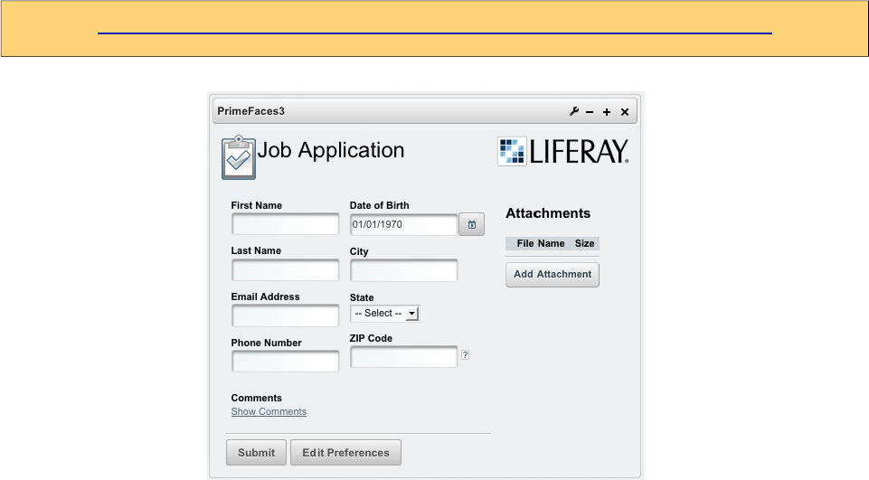
PrimeFaces User Guide
12. Portlets
PrimeFaces supports portlet environments based on JSF 2 and Portlet 2 APIs. A portlet bridge is
necessary to run a JSF application as a portlet and we suggest LiferayFaces bridge as the
implementation. Both teams work together time to time to make sure PrimeFaces runs well on
liferay. A kickstart example with necessary configuration is available at LiferayFaces Demos;
http://www.liferay.com/community/liferay-projects/liferay-faces/demos
Demo contains a single "Job Application" portlet within the WAR that demonstrates several of the
key features of JSF 2 and PrimeFaces;
- Uses the PrimeFaces <p:calendar/> tag for a popup date selector
- Uses the JSF 2 <f:ajax /> tag on the postal (zip) code field in order to provide the ability to auto-
fill fields via Ajax
- Uses the JSF 2 <f:ajax /> tag on the show/hide comments links in order to show/hide the
comments field via Ajax
- Model managed-bean is marked with the JSF 2 @ViewScoped annotation in order to support a
rich UI with the <f:ajax /> tag
- Uses the JSF 2 <f:ajax /> tag to show navigation-rules executing without full page refreshes
- File upload capabilities via <h:form enctype="multipart/form-data">
- Managed-beans defined by marking POJOs with the JSF 2 @ManagedBean annotation
- Dependency injection of managed-beans done via the JSF 2 @ManagedProperty annotation
- Uses the PrimeFaces p:fileUpload tag for multi-file Ajax-based file upload
- Uses the PrimeFaces p:dataTable tag to list the uploaded files
- Uses the PrimeFaces p:confirmDialog tag to popup a yes/no dialog to verify file deletion
648
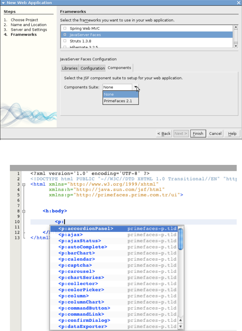
PrimeFaces User Guide
13. IDE Support
13.1 NetBeans
NetBeans 7.0+ bundles PrimeFaces, when creating a new project you can select PrimeFaces from
components tab;
Code completion is supported by NetBeans 6.9+ ;
649
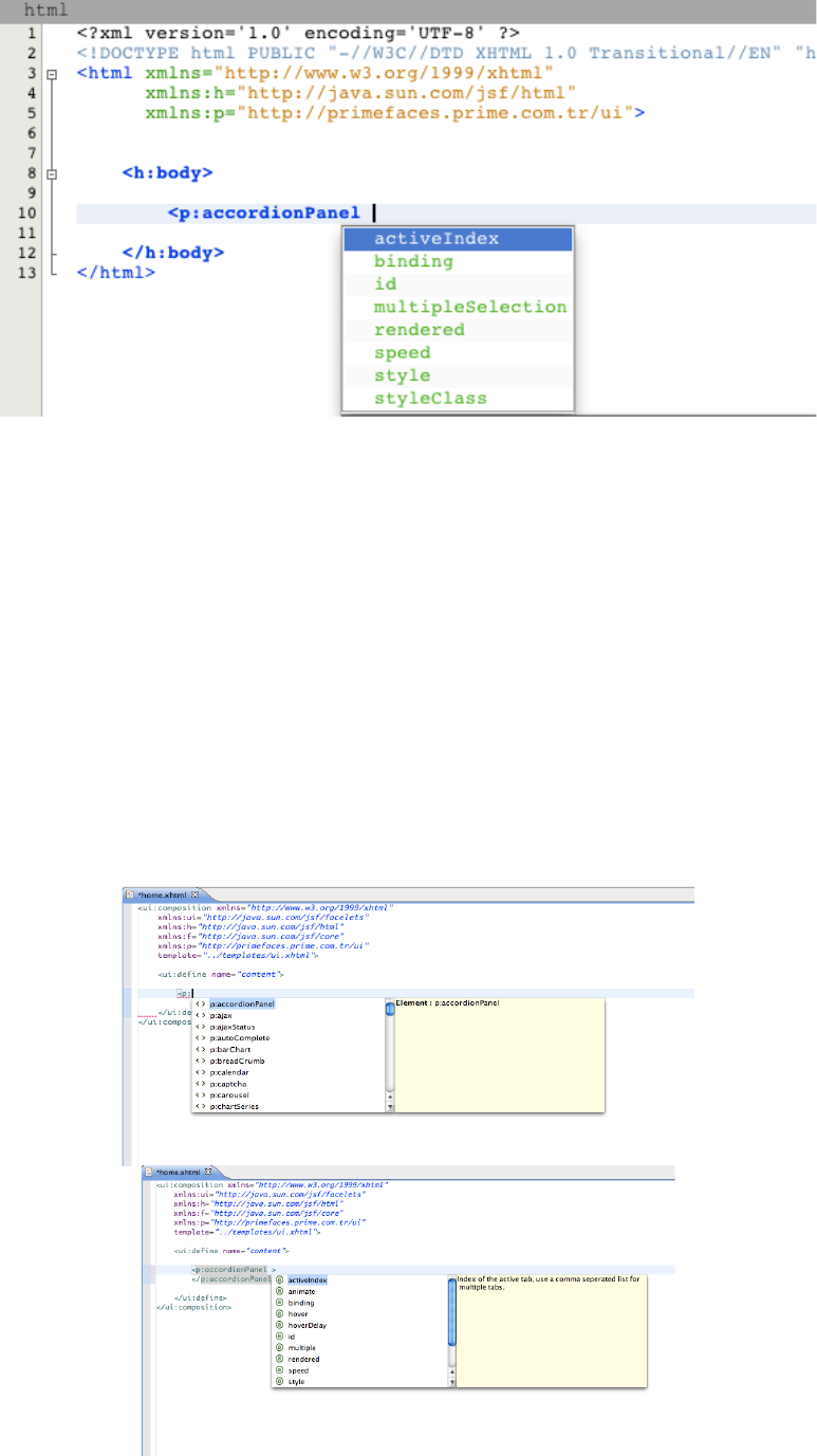
PrimeFaces User Guide
PrimeFaces and NetBeans teams are in communication to discuss the next step of PrimeFaces
integration in NetBeans at the time of writing.
PrimeFaces CRUD Plugin
Starting with NetBeans 8, the IDE provides a built-in CRUD plugin for PrimeFaces out of the box.
www.youtube.com/watch?v=5aTFiNxzXF4
There is also another 3rd party plugin for NetBeans called PrimeFaces CRUD Generator.
http://sourceforge.net/projects/nbpfcrudgen/
13.2 Eclipse
Code completion works out of the box for Eclipse when JSF facet is enabled.
650
PrimeFaces User Guide
14. Project Resources
Documentation
This guide is the main resource for documentation, for additional documentation like apidocs, taglib
docs, wiki and more please visit;
http://www.primefaces.org/documentation
Support Forum
PrimeFaces discussions take place at the support forum. Forum is public to everyone and
registration is required to do a post.
http://forum.primefaces.org
Source Code
PrimeFaces source is at google code subversion repository.
https://github.com/primefaces/primefaces
Issue Tracker
PrimeFaces issue tracker uses google code’s issue management system. Please use the forum
beforecreating an issue instead.
https://github.com/primefaces/primefaces/issues
WIKI
PrimeFaces Wiki is a community driven additional documentation resource.
https://github.com/primefaces/primefaces/wiki
Showcase
Showcase is a great resource as a live documentation.
http://www.primefaces.org/showcase
Social Networks
You can follow PrimeFaces on twitter using @primefaces and join the Facebook group for news
and more.
651

PrimeFaces User Guide
15. FAQ
1. Who develops PrimeFaces?
PrimeFaces is developed and maintained by PrimeTek, a software development company
specialized in UI solutions.
2. How can I get support?
Support forum is the main area to ask for help, it’s publicly available and free registration is
required before posting. Please do not email the developers of PrimeFaces directly and use support
forum instead.
3. Is Enterprise support available?
Yes, enterprise support is also available. Please visit support page on PrimeFaces website for more
information.
http://www.primefaces.org/support
4. Where is the source for the example demo applications?
Source code of demo applications are in the GitHub repository of PrimeFaces at /showcase
repository.
5. Some components like charts do not work in Safari or Chrome but there9s no problem with
Firefox.
The common reason is the response mimeType when using with PrimeFaces. You need to make
sure responseType is "text/html". You can use the <f:view contentType="text/html"> to enforce this.
6. What is the license of PrimeFaces?
PrimeFaces is free to use and licensed under Apache License V2, Elite versions are licensed under
Elite License.
7. Can I use PrimeFaces in a commercial software?
Yes, Apache V2 License is a commercial friendly library. PrimeFaces does not bundle any third
party software that conflicts with Apache. Same goes for Elite Releases for ELITE and PRO users.
8. Which browsers are supported by PrimeFaces?
IE 8-9-10-11, Safari, Firefox, Chrome and Opera.
652
PrimeFaces User Guide
THE END
653
