Yamaha ProVisionaire Touch Setup Guide Pro Visionaire Pv En Sg E0
User Manual: Yamaha ProVisionaire Touch Setup Guide
Open the PDF directly: View PDF  .
.
Page Count: 71
- Contents
- What you can do using ProVisionaire Touch
- Operating requirements of the software
- Terms and concepts to understand
- Installation procedure
- Startup
- Basic process
- Operations for common settings
- About the menu bar
- Settings file management — the File Management button
- Selecting multiple widgets — Multi Select button
- Creating a custom panel — the Page Edit button
- Widget design
- Assigning parameters
- Switching pages — the Page Selection button (Control mode)
- Managing pages — the Page Management button (Design mode)
- Registering devices to control — the Device Management button
- Control panel settings — the Setup button
- Control panel information — the Information button
- Preparations before you make connections
- Troubleshooting
- About the software license
1
ProVisionaire Touch V1.3
Setup Guide
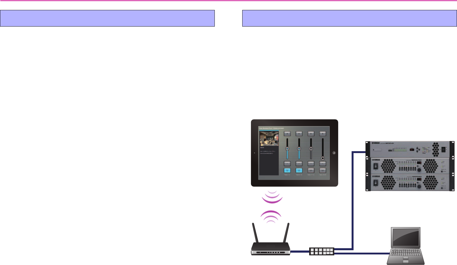
Thank you for downloading Yamaha ProVisionaire Touch.
ProVisionaire Touch is an application for remotely controlling a
system (a system consisting of devices that can be controlled by
this application, such as MusicCast devices or Disklavier units
and an MTX/MRX system) from a tablet (iPad) via a Wi-Fi net-
work.
You can design a control panel by freely arranging widgets, allow-
ing you to create custom panels that suit the needs of your system.
Note
• All copyrights for this software and setup guide are the property of Yamaha
Corporation.
• Unauthorized copying or modification of this software or setup guide in part
or in whole is prohibited.
• Please be aware that Yamaha Corporation accepts no responsibility for any
results or consequences that may follow from the use of this software and
setup guide.
• All of the illustrations and screen shots in this setup guide are provided for
the purpose of explaining operations.
For this reason, they may differ from the actual specifications.
• Apple, the Apple logo, and iPad are registered trademarks of Apple Inc. in
the United States and in other countries.
• IOS is a trademark or registered trademark of Cisco in the U.S. and other
countries and is used under license.
• Google Analytics is a registered trademark of Google Inc. in the United
States and other countries.
• Windows is a registered trademark of Microsoft(R) Corporation in the United
States and other countries.
• Please be aware of copyright when using audio sources for a commercial pur-
pose. Infringement of copyright is prohibited by law.
• Company names and product names appearing in this document are the
trademarks or registered trademarks of their respective owners.
• The application software may be updated without notice for improvement.
The latest application software can be downloaded from the App Store.
Who should read this document
This is a guidebook intended for those who design, produce,
and set up custom control panels using this application.
It is not a guidebook for general users.
EN
Manual Development Group
© 2015 Yamaha Corporation
Published 09/2017 PO-E0

2
Contents
What you can do using ProVisionaire Touch ...........................................................3
Operating requirements of the software ..................................................................4
Terms and concepts to understand .........................................................................5
Installation procedure ..............................................................................................7
Startup.....................................................................................................................7
Basic process ........................................................................................................ 10
Operations for common settings............................................................................20
About the menu bar...............................................................................................23
Settings file management — the File Management button....................................25
Selecting multiple widgets — Multi Select button ..................................................27
Creating a custom panel — the Page Edit button..................................................28
Widget design........................................................................................................33
Assigning parameters............................................................................................45
Switching pages — the Page Selection button (Control mode) .............................54
Managing pages — the Page Management button (Design mode)....................... 55
Registering devices to control — the Device Management button ........................59
Control panel settings — the Setup button ............................................................62
Control panel information — the Information button ..............................................64
Preparations before you make connections...........................................................65
Troubleshooting .....................................................................................................69
About the software license ....................................................................................71

3
What you can do using ProVisionaire Touch
• Using ProVisionaire Touch, you can use your tablet device to intuitively place widgets such as sliders, buttons,
and photos on the page (screen) to create an original touch control panel that fits the requirements of your
installation and your needs, all without requiring any special programming.
• Since you can create multiple design pages, a separate control panel could be created for each area and user,
or you can create design pages for specific presets or parameter states.
You can restrict access to control panels and design pages, ensuring secure and convenient operation of the
controller.
• Data for a completed control panel can be exported as a file, allowing you to use the same controller for multiple
units, or you can save the data as a template and use or share it with other systems. This lets you create con-
trollers efficiently and conveniently.
• Since connection with the target system occurs via Wi-Fi, the tablet device does not have to be mounted on the
wall; it can be operated while held in the hand, and used as a convenient remote controller.
• You can create a settings file for ProVisionaire Touch Kiosk, which is optimized for remote control (subsequently
referred to as Kiosk).
When reading this document
The term “preset” appearing in explanations of the screens and functions of this
application is used in two different senses: “images and materials provided for you to
use in a color palette” and “preset data managed by the processors of the MTX/MRX
system.” For clarity, the word “preset” is used to denote the first sense (provided
materials), and [Preset] denotes the second (preset data of the MTX/MRX system).
Keep this in mind as you read.
4
Operating requirements of the software
• Tablet device
• Hardware: Apple iPad (except for first-generation)
• OS: iOS 9.0 or later
* For the latest information about devices and OS versions that are
known to work, refer to the following website.
http://www.yamahaproaudio.com
* This software does not work on iOS devices other than the iPad.
• Remotely controlling a system*
* Refer to the following site for details on products that are compatible
with ProVisionaire Touch and ProVisionaire Touch Kiosk.
http://www.yamahaproaudio.com
• Wi-Fi access point (802.11n/5 GHz is recommended)
• Cat5e cable (for connection between the target system
and the Wi-Fi access point)
-Systems that can be controlled
• For one MTX/MRX system device, up to eight controllers can be
connected, including Wireless DCP or AMX/Crestron units.
-Settings
• Three access control levels can be specified:
Power User, Administrator, and Screen Lock.
• The Monitor Device function can be used to monitor the target
system.
• An iPad can be set up as a dedicated terminal for this applica-
tion (controller).
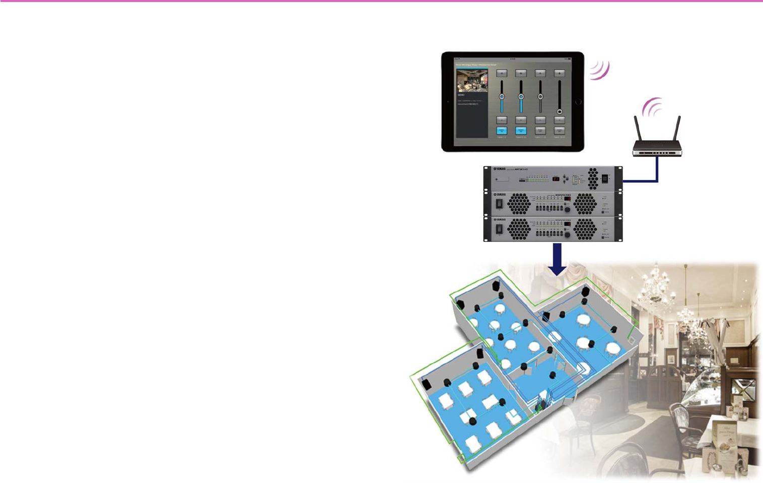
Tablet device (iPad) with ProVisionaire Touch
or ProVisionaire Touch Kiosk installed
Wireless LAN
connection
Wi-Fi access
point
CAT5e cable
Target system
5
Terms and concepts to understand
Roles
ProVisionaire Touch uses the following roles.
• Administrator
The person who designs and edits the control panel (mainly the installa-
tion contractor.)
This is the person reading this setup guide.
A four-digit Administrator Code is used to lift restrictions on functions.
•Power User
Someone such as a manager of the facility.
This person uses a four-digit Power User Code to access a restricted
page or to edit a settings file.
•Staff
A person who operates the parameters.
This person uses a four-digit Unlock Code to unlock the screen lock.
• Guest
A person who has no operating privileges.
Each role can perform the following actions.
Pages
In ProVisionaire Touch, a screen consisting of multiple widgets (such as
buttons and sliders) is called a “page.”
Using this application, you can design up to 50 pages of different screens
that are suitable for the installed location or the users who use the system.
There are also the following pages for special purposes.
•Home Page
This page is shown when a monitor device has not been specified, or
when offline.
If the [Auto-load this file on next launch] switch is turned on when you
load the file, this page appears when you start ProVisionaire Touch.
• Fallback Page
This page is shown when a [Preset] recall automatically switches the
page (when an Auto Page Change occurs).
Although it is not a page, you can also specify the screen that is shown in
the screen-locked state.
Adminis-
trator
Power
User Staff Guest
Unlock the screen lock — — —
Operate parameters —
Edit settings files ——
Edit design pages ———
6
Files
ProVisionaire Touch uses the following files.
• Settings file (extension .ypvt)
This file contains all the settings of ProVisionaire Touch. It contains data
and images for multiple pages, and information on the devices being
controlled (including the contents of the Remote Control Setup List).
Settings files can be sent to another iPad via AirDrop or email, or shared
via iTunes on a computer.
• Settings files for ProVisionaire Touch Kiosk (extension .ypvk)
This is a settings file only for loading into ProVisionaire Touch Kiosk.
Settings files can be sent to another iPad via AirDrop or email, or shared
via iTunes on a computer.
• Remote Control Setup List (extension .rcsl)
This file can be exported from MRX Designer’s “Remote Control Setup
List” dialog.
It allows ProVisionaire Touch to load MRX parameter assignments.
When this file is placed in the Documents folder of P.V. Touch, it can be
read by ProVisionaire Touch.
Modes
ProVisionaire Touch has the following modes.
•Design Mode
In this mode you can create and edit pages. You must have Administra-
tor privileges to use this mode. In this mode, ProVisionaire Touch is not
online with the target system.
• Control Mode
In this mode you can load settings files, and go online with the target
system. You must have Administrator or Power User privileges to use
this mode. This mode is also used to verify operation while designing a
page.
• Initial Mode
This is the mode in which no settings file has been loaded. From this
mode, loading a settings file takes you to Design Mode or Control Mode.
Other
This setup guide also uses the following terms.
•Widget
Parts such as sliders, buttons, images, and rectangles used in the graphi-
cal user interface (GUI). You can assign parameters of the devices to
these parts, and synchronize them to the faders or on/off parameters.
•AirDrop
Wireless file transfer technology provided on iOS7 or later devices.
Devices that support AirDrop can share data directly between iPad units
without going through an access point (P2P).
•Kiosk
This is used as an abbreviation for ProVisionaire Touch Kiosk.
7
Installation procedure
Download “ProVisionaire Touch” from the App Store.
You will find a link on the MTX/MRX product page of the Yamaha
Pro Audio website.
http://www.yamahaproaudio.com/
Startup
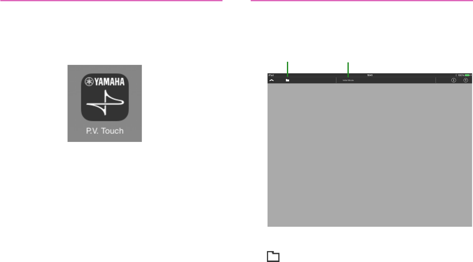
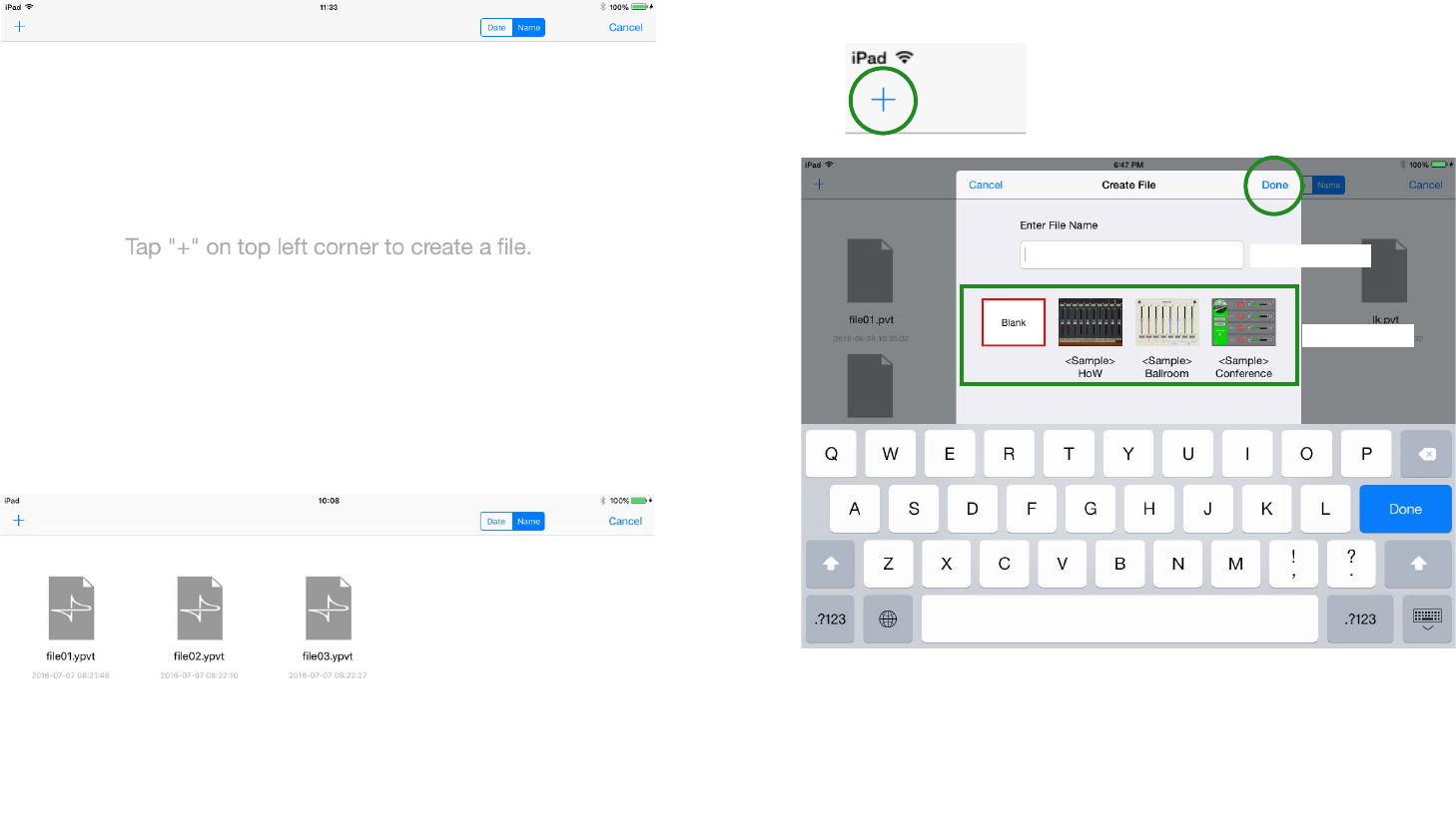
1. Tap the “ProVisionaire Touch” icon.
2. The app starts in [Initial Mode].
3. On the menu bar, tap the File Management button
.
File Management
button Initial Mode
8
-If there is no settings file, the following screen
appears.
-If there are already some settings files, a list of
those files appears.
* If you want to edit an existing settings file, select the file and then
[Load] it.
4. To create a new file, tap the [+] button in the upper left
corner of the screen.
The following dialog appears.
5. Enter the file name, select the “Blank” template, and
tap [Done].
* You can enter a file name of up to 32 characters, excluding the extension
name.
* Several <Sample> files are provided as templates. You can edit and save
these, so use them to get ideas for your own setup.
* If you tap the [+] button while in Control mode, the confirmation message
“Creating a new file will replace the current file. Are you sure?” appears.
File name
Te mp l a te
9
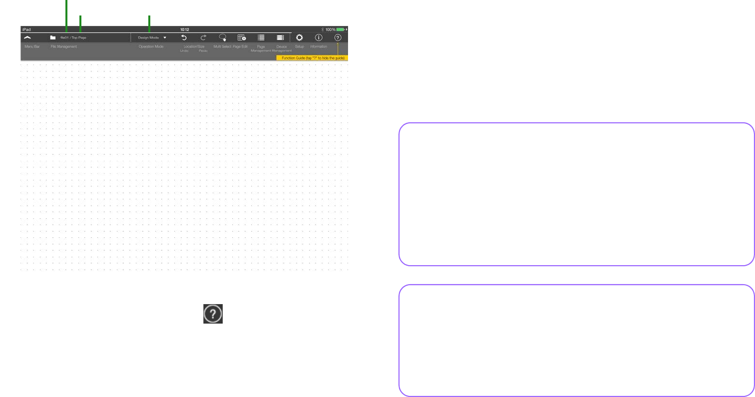
6. In [Design Mode], which is the mode where you
design a custom control panel, the page (named Page
1) is shown.
* If you don’t want the Function Guide (yellow popup hint) to appear on the
screen, tap the Function Guide button .
This completes preparations for creating a control panel.
You can create a custom control panel for the target system by plac-
ing widgets such as sliders and buttons in this screen and assigning
parameters to them.
In the next step we use a simple example to explain the process of
creating a control panel, making settings, connecting to the network,
and delivering the completed system.
File name
Design Mode
Page name
What if the screen goes blank?
In some cases, the page you’ve prepared in step 6 will disappear
from view if no further steps are performed for several seconds, and
will become inoperable. This is a function called Screen Lock,
which prevents an unauthorized person from performing operations.
Tap the screen to make the screen unlock code input screen appear.
By default, the code is “0000.” When you input the code, the previ-
ous page reappears. To disable this function, refer to Screen Lock.
How do I stop or resume file editing?
If you stopped editing a file and then want to resume editing it, but
you don’t want to repeat the process of selecting a file, loading it,
and entering the access code, you can use the “Auto Load” setting.
When the app is started, the specified file will open in the state in
which it was last closed.
10
Basic process
Using the creation of a simple control panel as an example, this sec-
tion explains the process of creating a panel and using it to control
the system.
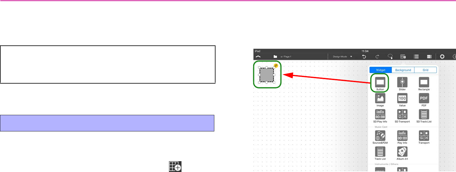
First place the buttons that you want to use as on/off switches.
1. In the menu bar, tap the Page Edit button .
2. In the widget menu, tap the button icon.
The button is placed on the panel.
* To close the widget menu, tap the panel background.
3. Move the button where you want it.
A dotted line and white circles appear around the button that you
placed. You can move the button by dragging a portion of it that’s not
a white circle. You can change the size by dragging a white circle.
* If the dotted line and white circles are not shown, long-press the button to
make them appear.
* You can specify “Grid” for convenience when changing the size or loca-
tion.
* If you specify “Fixed Size,” the size will be fixed and cannot be changed.
Saving data
In this app, the changes you make to the page are automati-
cally saved in the settings file.
1. Place buttons
Ta p
Placed
11
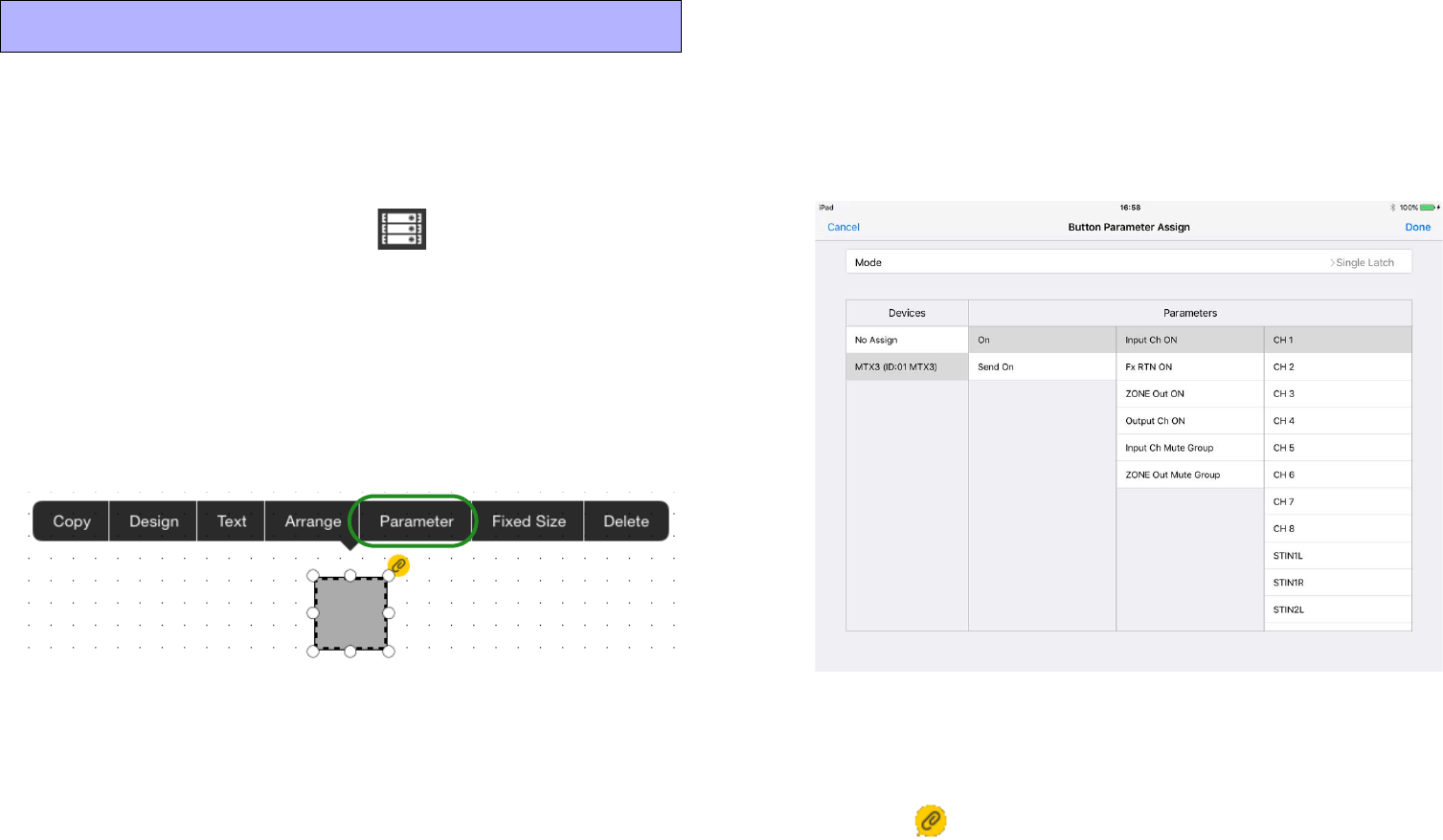
Now let’s specify a device and a parameter that will be controlled by
this button.
1. In the [Devices] screen that appears when you tap the
Device Management button in the menu bar,
specify the device that will be controlled. Register-
ing a device
For this example, set [Model] to “MTX3,” and [Unit ID] to “01.”
Assign a [Name] as you please. If there is a specific device that you
want to specify, read “Registering a device” and also specify the
appropriate monitor device.
2. Tap the button to access the following context menu.
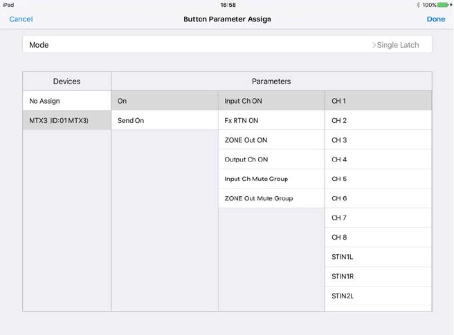
3. Tap [Parameter].
The [Button Parameter Assign] screen appears.
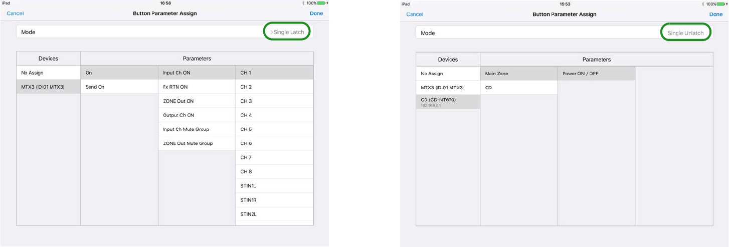
4. To assign one parameter to the button, tap the func-
tion name of the button at the right edge of the [Mode]
field, and choose [Single Latch] from the menu that
appears.
The function name for an on/off switch will be [Single Latch].
5. In the [Devices] list, tap “the device that you specified
in step 1.”
A list of the assignable parameters appears.
Select the parameter that you want this button to turn on/off. For
example if you want the button to turn the channel 1 input on/off,
make the setting shown in the screen below.
* The setting screen differs depending on the selected button Mode.
* For details, refer to “Assigning parameters.”
6. Tap [Done] to complete the assignment.
* The icon which indicates that parameter assignment is incomplete
disappears when the parameter has been assigned.
2. Specify devices and parameters
12
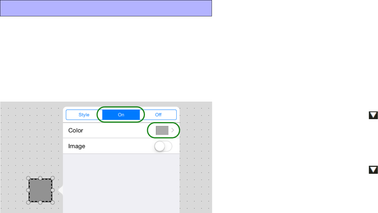
Let’s make the button change color to indicate its on/off state.
1. Tap the button to access the context menu, and tap
[Design].
2. In the upper part of the screen, tap the [On] tab.
The following screen appears.
3. Tap the [Color] field to access the color setting
screen. Switch the [Color] tab and [Preset] tab, and
specify the color of the button in the On state.
For details on color settings, refer to “Specifying a color.”
4. Tap [Back] to return to the previous screen.
5. In the same way, use the [Off] tab to specify the color
of the button in the Off state.
Now let’s verify that the button changes color between On and Off.
6. Tap the operation mode button to switch to “Con-
trol Mode.”
7. Tap the button, and verify that the button changes
color as you specified.
8. Tap the operation mode button to switch to
“Design Mode.”
In addition to the button’s color, you can change things such as the
rounding of its corners and the design, thickness, and color of its
border. For details, refer to “Widget design.”
3. Specify the button on/off indication
13
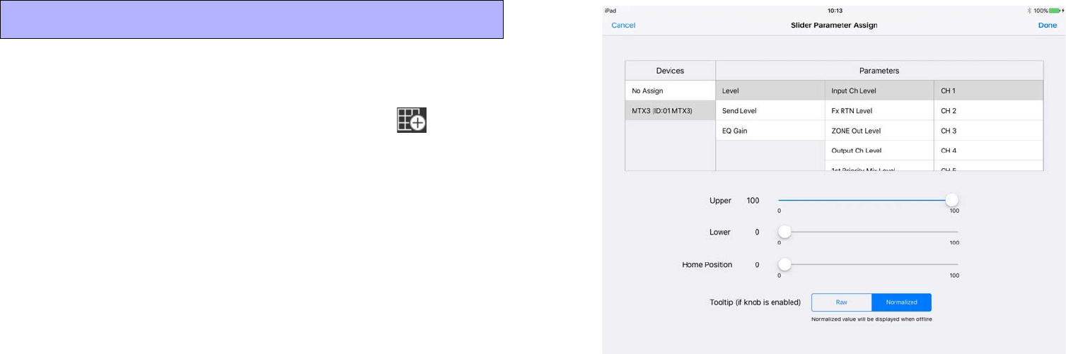
Let’s place a slider that controls the volume.
1. In the menu bar, tap the Page Edit button .
2. In the widget menu, tap the slider icon and then move
it where you like.
3. The device that will be controlled is the same as the
one you specified for the button, so there’s no need to
specify it again.
Of course you are also free to specify a different device.
4. Tap the slider, and tap [Parameter] in the context
menu.
The [Slider Parameter Assign] screen appears.
5. In the [Devices] list, tap the “device” that you speci-
fied in step 1 of “2. Specify devices and parameters.”
A list of the assignable parameters appears.
Select the volume parameter that you want to control using this slider.
For example if you want the slider to adjust the channel 1 input level,
make the setting shown in the screen below.
* For more about [Upper], [Lower], [Home Position],and [Tooltip], refer to
“Assigning parameters.”
6. Tap [Done] to complete the assignment.
Move to control mode, and operate the slider to check it.
You can also change the design of the slider as you did for the but-
ton. For details, refer to “Widget design.”
4. Place a slider
14
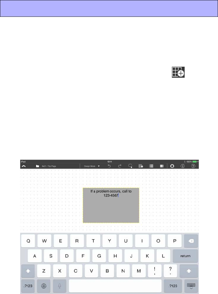
Let’s place a rectangle, and add text such as an operation guide, cau-
tion, or button or slider name.
* A rectangle does not have a device setting or parameter assignment.
1. In the menu bar, tap the Page Edit button .
2. In the widget menu, tap the rectangle icon, and then
change its location and size.
3. Double-tap the rectangle.
Enter text using the on-screen keyboard, and then tap somewhere
other than the rectangle to complete the entry.
* You can also enter Japanese.
* If you want to change the font type or size, tap the rectangle, and then tap
[Text] in the context menu.
5. Place a text panel
15
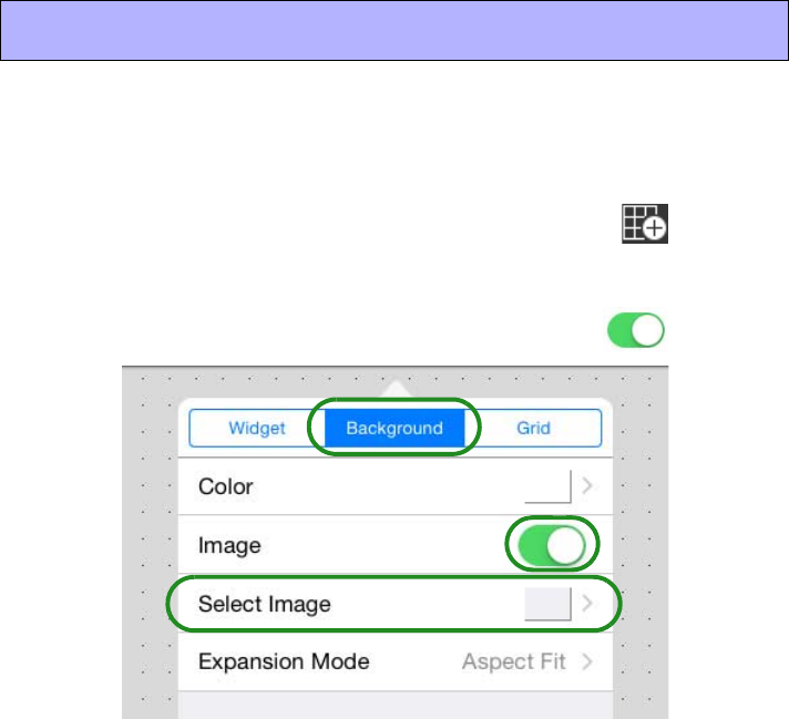
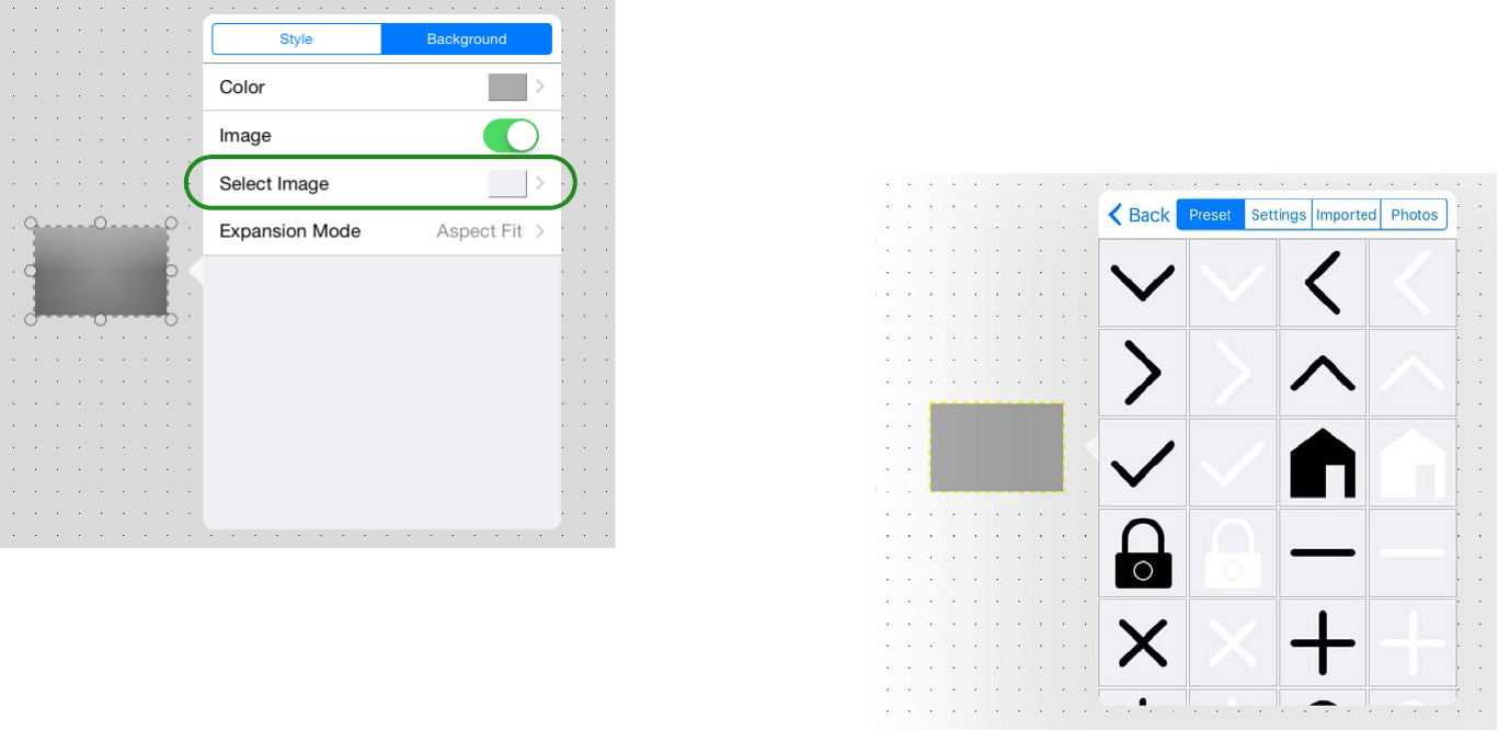
Let’s place an image as the panel background. In advance, place the
image that you want to use in the “Photos” app of the iPad.
1. In the menu bar, tap the Page Edit button .
2. Tap [Background] to access the background menu
screen, and turn the [Image] screen On ( ).
3. Tap the [Select Image] field, and in the screen that
appears, tap the [Photos] tab.
The image data in the “Photos” app of the iPad is shown.
If you want to use image data from the “Images” folder inside the
Documents folder of PV Touch, tap the [Imported] tab.
4. When you select the background image, it is immedi-
ately placed as the background.
Use [Expansion Mode] to specify how the image fits the background.
Specifying an image.
This completes one page of a control panel.
When controlling a target system, you will often want to have multi-
ple control panels for different uses or setups of the building. To
explain how to handle multiple pages, let’s create one more page.
6. Set the background
16
1. On the menu bar, tap the Page Management button
.
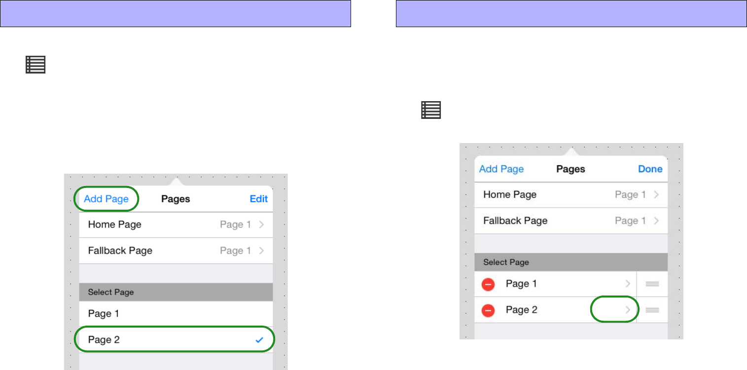
2. Tap [Add Page]; the new page name input screen
appears. Enter the page name and tap [Done]; the new
page is created, and you can place widgets on it to
create the page.
* You can also Duplicate the existing Page 1 and edit it.
In Control mode, you can tap the Page Selection icon in the menu
bar to switch the page that is displayed.
* For more about the Home Page and Fallback Page, refer to “Managing
pages.”
Let’s specify access so that no authentication is required for Page 1
and authentication with a power user is required for Page 2.
1. On the menu bar, tap the Page Management button
, and then tap [Edit].
The page management screen appears.
2. In [Select Page], in the [Page 2] field, tap [>].
The Page 2 settings screen appears.
7. Create one more page 8. Specify an access code for the page
17
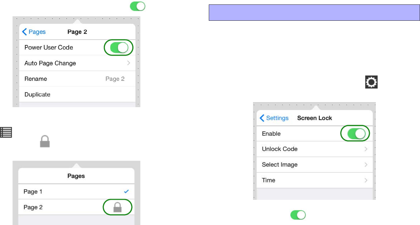
3. Turn the [Power User Code] switch On ( ).
4. Move to Control mode, and tap the Page Selection but-
ton .
Verify that an icon is shown to indicate that authentication is
specified for Page 2.
* For a newly created file, the power user code is unset (blank). Make this
setting in “Edit Power User Code.”
Screen lock is a function that prevents operation by people with no
operating privileges after a specified time has elapsed since the last
operation.
* Screen lock settings can be made from either Design mode or Control mode.
1. On the menu bar, tap the Setup button , and then
tap [Screen Lock].
2. Turn [Enable] On ( ), and set [Unlock Code] and
[Time] as necessary. You can also use [Select Image]
and [Expansion Mode] to specify an image that is dis-
played when the screen is locked.
* For details, refer to “Screen Lock.”
9. Specify screen lock settings

18
This completes settings for the control panel.
To finish the procedure, specify or check the following items.
• Administrator code
• Enter information about the project
• Image files you used
1. Specify the administrator code. This will be unset
(blank) for a newly created file, but be sure to specify
an administrator code before you deliver the project.
For details on how to specify this, refer to “Edit
Administrator Code.”
2. Enter the project history for the settings file in the
[Information] field. Enter information such as the date
the project was created, the hardware and software
environment, and a contact in the event that there is a
problem. For details on entering this information, refer
to “Control panel information.”
3. As necessary, export the settings as a Kiosk settings
file.
Send the settings file to the iPad that will take delivery of the project.
* In advance, install this app or Kiosk to the destination iPad.
1. On the menu bar, tap the File Management button
.
2. Tap the settings file that you want to deliver; when the
context menu appears, tap [Send].
The Mail, AirDrop, Copy to P.V.Touch-K, and File Transfer icon
appears. Pass the settings file to the recipient iPad via email attach-
ment, via AirDrop, or via direct communication between iPad units
(P2P). The file is saved in the Documents folder of the destination
iPad. For details, refer to “Send.”
10. Complete the settings file 11. Send the settings file to another iPad
19
Here we explain how you can use an iPad as a dedicated controller
for a target system. Make these settings as necessary.
* If you specify Guided Access, this app will be the only app that can be used
on the iPad; it will not be possible to select other applications by pressing the
home button.
1.
Start this app or Kiosk, and specify the auto load setting.
“Load”
2. In the home screen of the iPad, tap the [Settings] icon;
in the settings menu, tap [General].
3. In the General menu, choose [Accessibility]
[Guided Access], and turn the guided access switch
On ( ).
4. After this app or Kiosk has started, click the home but-
ton three times.
The Homepage of this app (control panel) appears. If there is a region
for which you want to disable screen touch, use your finger to outline
that area. You can also disable the hardware button or specify a time
limit.
5. In the upper right corner of the screen, tap [Start]; a
passcode setting screen appears. Enter a four-digit
passcode; guided access is enabled.
If Guided Access is enabled, pressing the home button does not close
this app (control panel).
To close the app, click the home button three times and enter the pass-
code to end Guided Access.
This ends the explanation of the basic workflow.
Start the iPad, and verify that you can control the target system from
the control panel that you created.
* When you start ProVisionaire Touch or Kiosk, the app automatically searches
for a Wi-Fi access point and the target system, and connects to them.
For details on making connections, refer to “Preparations before
you make connections.”
12. Dedicating an iPad as a control panel
20
Operations for common settings
Here we explain settings and operations that you will frequently
encounter while using this app. Even if the contents of the display
are slightly different, the basic operations are the same.
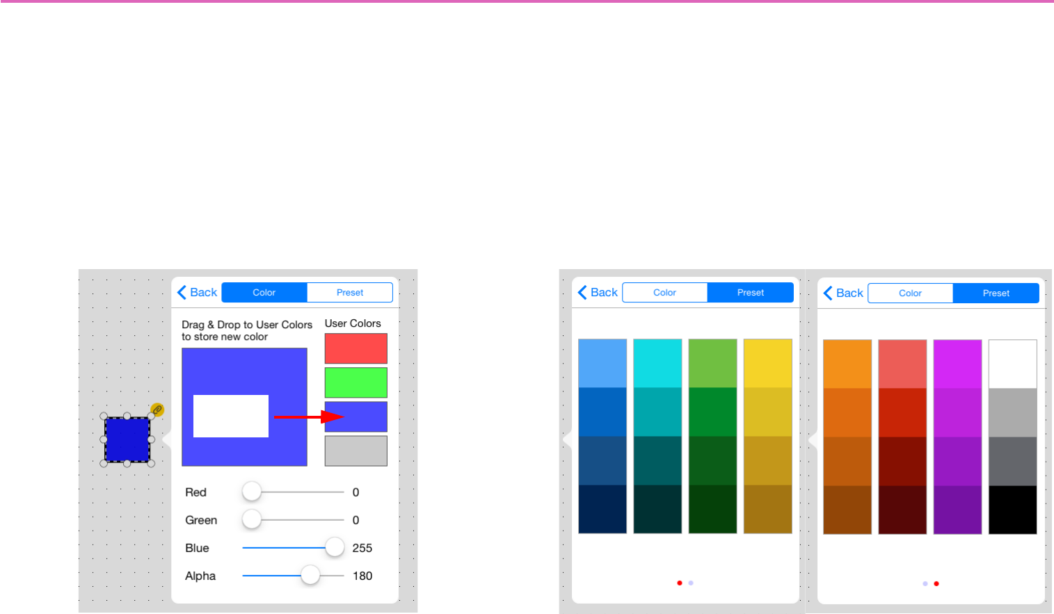
Specifying a color
In the [Color] tab you can specify a desired color by adjusting the
sliders in the lower part of the screen. After creating a color, you can
drag it to one of the four palettes at the right to store it as a user
color.
In the [Preset] tab, you can choose a desired color from 32 colors (8
colors 4 hues).
Storing
a color
21
Specifying an image
When placing an image on a widget or background, the following
setting screen appears.
* Widget Image directly accesses the screen shown at right.
Tap the [Select Image] field, and from the source image groups that
appear, select the desired image.
The following four source image groups are shown.
•Preset: Preset images of this app
•Settings: Images saved in a settings file that was sent via Air-
Drop or email.
* You can delete an image by choosing [Delete] select the image
trash can icon.
• Imported: Images saved by iTunes etc. in the “Images” folder
•Photos: Image files of the iOS “Photos” app
Use the tabs to switch groups, select the desired image, and use
[Back] to return to the screen shown at left.
22
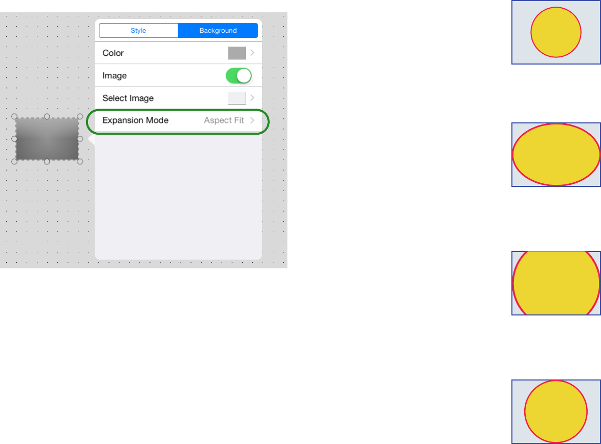
Tap the [Expansion Mode] field, and in the menu that appears,
specify how the image is shown in the display area.
•None: The image is placed in the center of the area without any
change in size
•Full: The image is resized to fill the entire area vertically and
horizontally.
•Aspect Fill: The image is resized so that the shorter dimension
(height or width) fits the full area.
•Aspect Fit: The image is resized so that the longer dimension
(height or width) fits the full area.
23
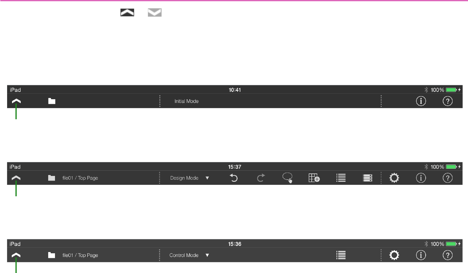
About the menu bar
In any mode, there is a menu button ( or ) in the upper left
corner of the screen.
Tap this menu button to show or hide the menu bar.
* In Control mode, you’ll need to authenticate with an administrator code or
power user code in order to view the menu bar.
* In Control mode, you can make the menu bar hidden when a certain time has
elapsed after the menu button was last operated. To specify the time after
which the menu bar is hidden, use “Time until menu closes.”
* You can also hide the menu button. (Transparent Menu Button)
• Initial mode
• Design mode
• Control mode
Menu button
q!1 !2
Menu button
!1 !2qw
er yu
to!0
Menu button
qwi!1 !2!0
24
qFile Management button
Displays a list of the files. You can switch the display order by [Name/
Date]. To create a new file, use the [+] at the top of this list screen.
Settings file management
wOperation Mode button
Switches between Control mode and Design mode. This button is
shown when you’re creating a new file and when you’ve authenticated
the file with an administrator code.
* This button is not shown if you’ve authenticated with a power user code
and entered Control mode.
eUndo button [shown only in Design mode]
Cancels the previously executed operation, returning to the state prior
to that operation. Up to 20 operations are remembered.
This applies to the following operations.
Newly adding, moving, resizing, deleting, pasting, or specifying the
overlap arrange order of a widget.
rRedo button [shown only in Design mode]
Executes the operation that was canceled by the Undo button, return-
ing to the state that preceded that cancellation.
tMulti Select button [shown only in Design mode]
Switches between selecting a single widget or multiple widgets
when selecting widgets. Selecting multiple widgets
yPage Edit button [shown only in Design mode]
When designing a panel, this button displays a menu that lets you
select widgets, specify the background, and specify the grid.
Creating a custom panel
uPage Management button [shown only in Design mode]
Allows you to add a new page, assign a home page, assign a fallback
page, change the page display order, or delete a page.
Managing pages
iPage Selection button [shown only in Control mode]
Switches the displayed page. Switching pages
oDevice Management button
[shown only in Design mode]
Registers a device in the target system controlled by this app.
The monitor device is also specified here. Registering devices to
control
!0 Setup button
Allows you to change the authentication code, make screen lock set-
tings, specify the menu bar display time, or show/hide the menu but-
ton. Control panel settings
!1 Information button
Shows the version of this app, and information about the currently
selected file. You can also enter information for the settings file.
Control panel information
!2 Function Guide button
Shows/hides the function guide.
25
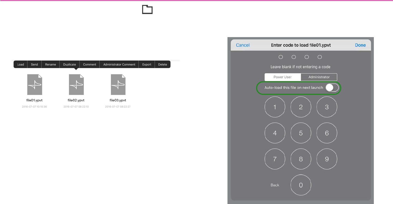
Settings file management — the File Management button
On the menu bar, touch the File Management button to access a
list of the settings files in this app.
* The currently opened settings file is indicated by a check mark.
Tap a file icon to see a context menu for the file. You can use the
context menu to load, send, rename, or delete the settings file.
-Load
Loads the selected settings file (extension .ypvt).
When loading, an authentication screen appears, requiring either a
Power User code or an Administrator code.
If you turn on the [Auto-load this file on next launch] switch, this
settings file is automatically loaded the next time the app is started.
If only one file will be used, enabling this switch means that the user
will not need to select a file.
* For a newly created file, the power user code and administrator code will be
unset (blank). In the authentication screen, simply select Power User or
Administrator without entering a code, and tap [Done].
* If the currently opened file is loaded, the original screen is shown without per-
forming authentication.
* If a file is already open, you will be asked whether it is OK to close that file.
26
-Send
Sends the selected settings file to another computer or tablet.
Mail: When you tap the [Mail] icon, the mail app starts, and a new
email with the selected file attached is created. Send the email to the
desired recipient.
If the email recipient has installed this app, they can tap the received
file and specify this app as the app that opens. The received file is
saved in the Documents folder.
AirDrop: When you tap the [AirDrop] icon, the iOS AirDrop func-
tion shows a list of recipients. Select the desired recipient and trans-
mit the file.
On the receiving device, specify this app as the app that will open.
The received file is saved in the Documents folder.
* iOS devices that do not support AirDrop are not shown in the list of recipients.
File Transfer: When you tap the [File Transfer] icon, a list of recip-
ients connected to the same network appears. Select the desired
recipient and transmit the file.
Copy to P.V. Touch-K: Select a Kiosk settings file (extension
.ypvk); if Kiosk is installed on the same terminal, the selected file is
copied to the Documents folder of Kiosk.
-Rename
Renames the selected settings file. Edit the file name shown in the
input field, and tap [Done].
* The currently loaded file can also be renamed.
-Duplicate
Duplicates a settings file. When you tap [Duplicate], a duplicate file
is created with an “_1” appended to the end of its name.
* If an identically named file already exists, the number is automatically incre-
mented as “_2” or “_3” etc.
-Comment
Displays a comment for the selected settings file.
* To enter or edit the comment, load the file, press the information button, and
use the [About File] menu item [Comment].
-Administrator Comment
Displays an administrator comment for the selected settings file.
* To enter or edit the comment, load the file, press the information button, and
use the [About File] menu item [Administrator Comment].
-Export
Creates a Kiosk settings file. A Kiosk settings file cannot be loaded
or edited in this application. If you want to edit it, edit the settings
file and then export it again.
-Delete
Deletes the selected settings file.
* The currently loaded file can also be deleted. In this case, the system moves
to initial mode after deletion.
27
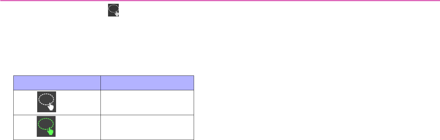
Selecting multiple widgets — Multi Select button
By tapping the Multi Select button on the menu bar, you can
switch between single-select mode (select a single widget) and
multi-select mode (select multiple widgets).
The color of the Multi Select button indicates whether you are in sin-
gle-select mode or multi-select mode.
In the multi-select state, you can select multiple widgets by perform-
ing the following operations.
• In a location where there is no widget, stroke the screen to
enclose multiple widgets.
The widgets included in the area you enclosed are selected.
• Tap a widget.
The widget you tapped is selected.
* If multiple widgets are selected, design or parameter changes you make or
text you enter will apply to each instance of the same type of widgets.
If you perform the following operations while in the multi-select
state, the selection is canceled.
• Tap a selected widget.
The widget you tap is un-selected.
• Tap where there is no widget.
All widgets are un-selected.
Multi Select button Mode
(White) Single-select mode
(Green) Multi-select mode
28
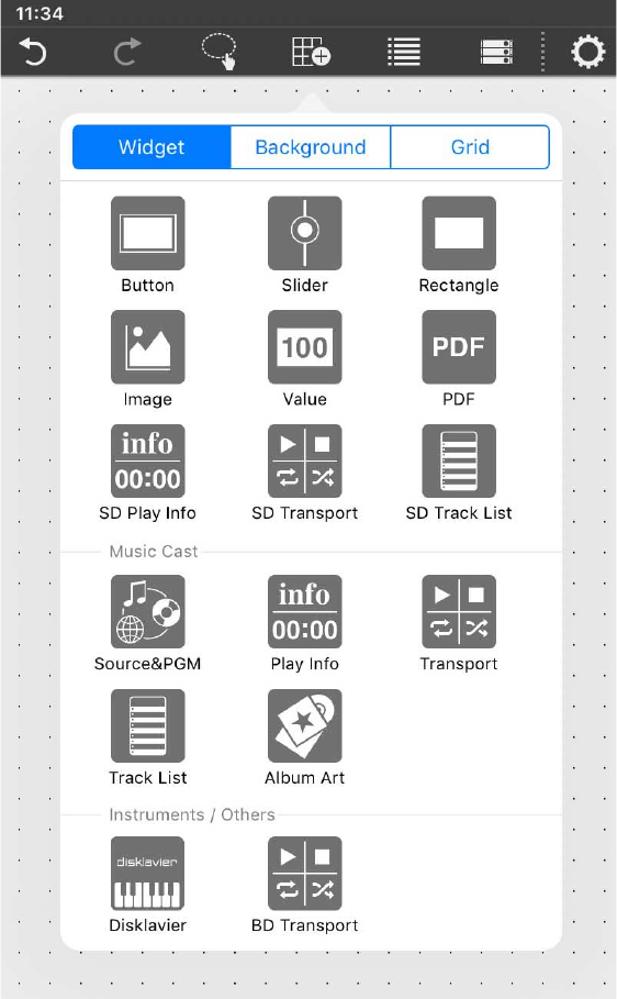
Creating a custom panel — the Page Edit button
In the menu bar, tap the Page Edit button (shown in Design
mode) to see the Widget/Background/Grid menu used for a custom
panel. You’ll use these to design a custom panel.
Tap a part in the custom panel to place it.
•Button
Widgets used as switches. Switching parameters such as On/Off,
Inc/Dec, or [Preset] recall can be assigned to these widgets. Page
switching can also be assigned.
•Slider
Widgets used as faders. These can control a continuously variable
numeric value.
•Rectangle
These are rectangular parts that are convenient for placing a button
or slider name, title, or comment. In addition to text, you can also
assign a logo or other image.
* Parameters cannot be assigned.
•Image
Use these to place images such as icons or patterns.
You can place images from the iOS “Photos” app library.
* Parameters cannot be assigned.
•Value
Widgets used to display the numeric value of a slider. This lets you
check the current numeric value without having to tap the slider wid-
get.
•PDF
Widgets used to display a PDF file. You can use this to display a
manual that will not fit in a rectangle. Select the PDF file that is dis-
played when this widget is placed. The file can be changed in Design
mode.
Widget
29
• SD Play Info/Play Info
Widgets used to display information about the selected content.
• SD Transport/BD Transport/Transport
Widgets used to control the selected content. BD Transport appears
as a remote control recall button at the right side when the system is
online with a Blu-ray player.
• SD Track List/Track List
Widgets used to select the content that plays back. A list pops up
when you tap.
A list is shown if the device is online.
• Source&PGM
Widgets used to select the input source or sound program of a Mus-
icCast device. A list pops up when you tap.
•Album Art
Widgets used to display an image for the song being played by the
MusicCast device.
• Disklavier
Widgets for a Disklavier ENSPIRE. This controls the playback of an
automatic performance.
Controls are shown if the Disklavier ENSPIRE is online.
30
Editing a widget
When you press a widget, a context menu appears. Use the context
menu to change the design of the widget or to assign a parameter to
it.
* Depending on the widget, some items might not be shown.
-Copy
Tap [Copy], and then tap the location at which you want to paste it;
the [Paste] context menu appears.
-Design
Changes the design of the widget.
The dialog that appears depends on the type of widget. For details,
refer to “Widget design.”
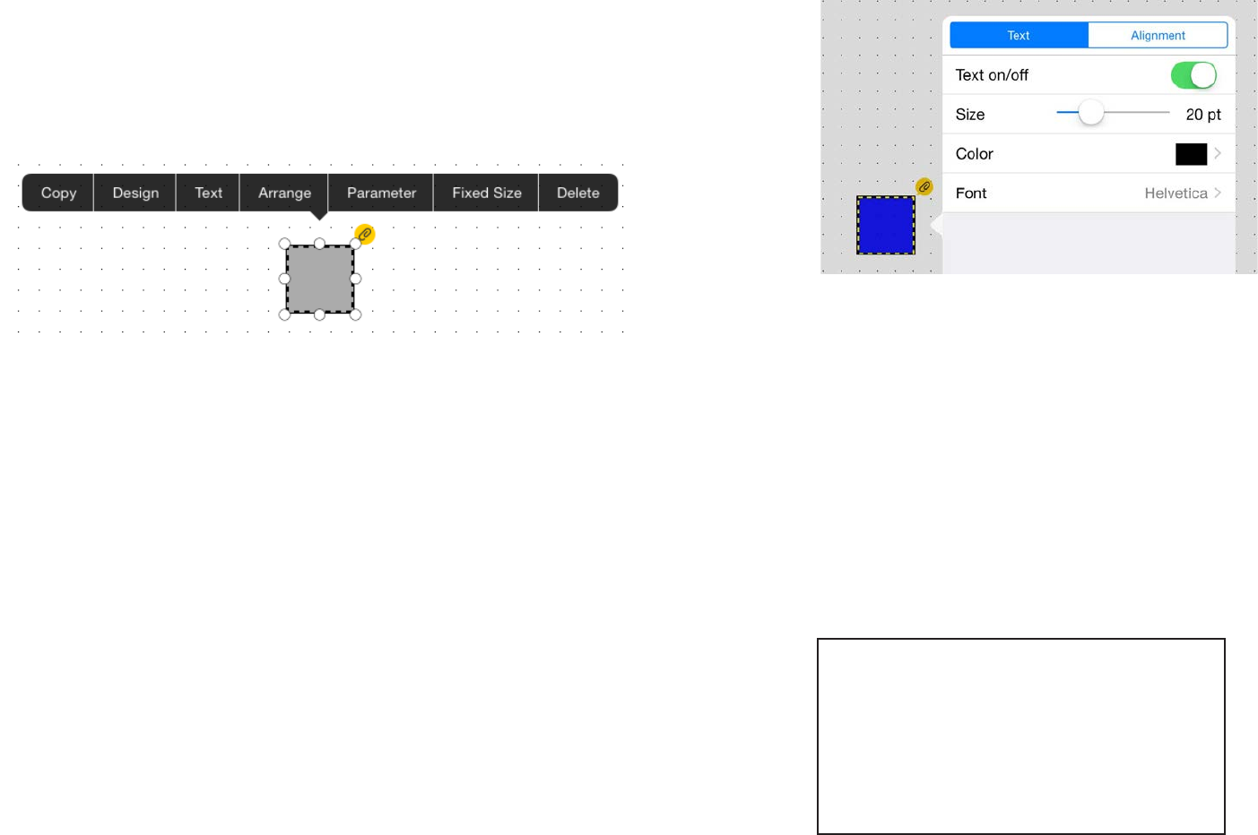
-Text
Places text on the widget.
* This is not shown in the context menu of a slider.
[Text] tab
Text on/off: Shows/hides the text.
Size: Specifies the text size.
Color: Specifies the text color. Specifying a color
Font: Specifies the text font. A list of the fonts provided by the
OS is displayed.
* To enter text, double-tap the widget.
[Alignment] tab
Specifies where the text is placed.
Top Left Top Center Top Right
Center Left Center Center Center Right
Bottom Left Bottom Center Bottom Right
31
-Arrange
Specifies the order in which widgets overlap.
The currently selected widget can be moved to the foreground
(Bring to Front), moved forward one place (Bring Forward), moved
backward one place (Send Backward), or moved to the rear (Send to
Back).
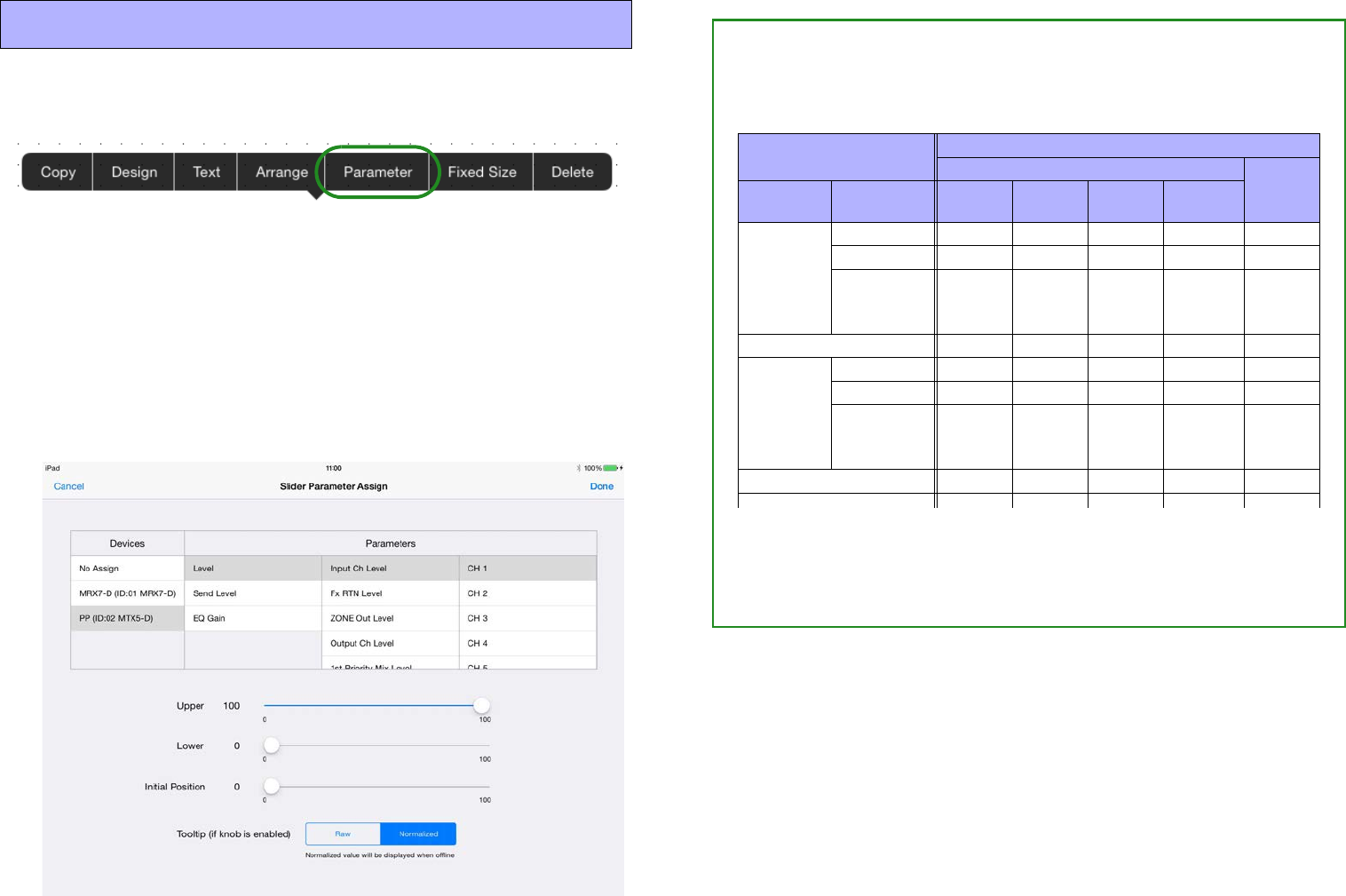
-Parameter
Assigns the parameter that will be controlled when this widget is
operated.
* This is not shown in the context menu of a rectangle, an image, or a PDF.
For details on assigning a parameter, refer to “Assigning parame-
ters.”
-Alignment (Shown only when multiple widgets selected)
Specifies where the selected widgets are placed.
Left: Aligns the left edges of the widgets.
Right: Aligns the right edges of the widgets.
Horizontal centering:
Horizontally aligns the midpoints of the widgets.
Horizontal equal:
Spaces the widgets horizontally at equal intervals.
Top: Aligns the top edges of the widgets.
Bottom: Aligns the bottom edges of the widgets.
Vertical centering:
Vertically aligns the midpoints of the widgets.
Vertical equal: Spaces the widgets vertically at equal intervals.
-Fixed Size
Specifies whether the widget’s size is fixed (True) or not fixed
(False). This setting lets you avoid unintentionally resizing a widget
when you only intended to move it.
-Delete
Deletes the widget.
32
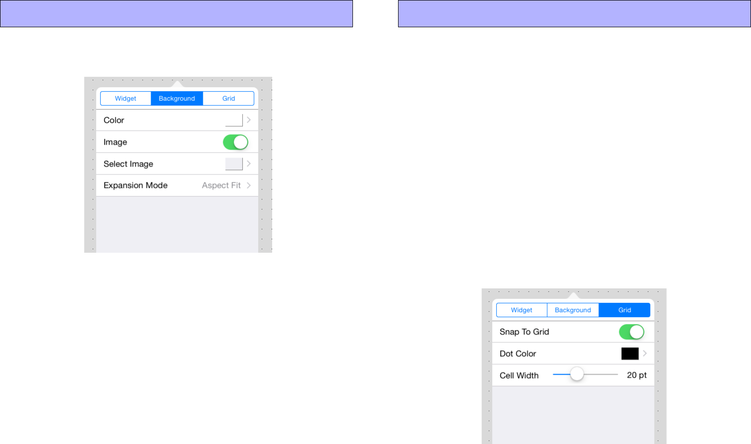
These settings specify the background of the page.
-Color
Tap the [Color] field, and in the screen that appears, specify the color
of the background. Specifying a color
-Image
If this switch is On, the Select Image and Expansion Mode items are
shown, allowing you to place an image on the background. Spec-
ifying an image
Shows a grid on the background of the page.
If Grid is On, widgets that you place are neatly aligned to the grid.
-Snap To Grid
If this switch is On, the grid is enabled, and the widget’s upper left
point is aligned to the grid.
When you change the size of a widget, the point that you tap to
expand or contract the widget will align to the grid.
-Dot Color
Changes the color of the dots in the grid.
-Cell Width
Specifies the spacing of the dots in the grid.
Background Grid
33
Widget design
Here we explain how you can change the design of a widget that’s
placed on the panel.
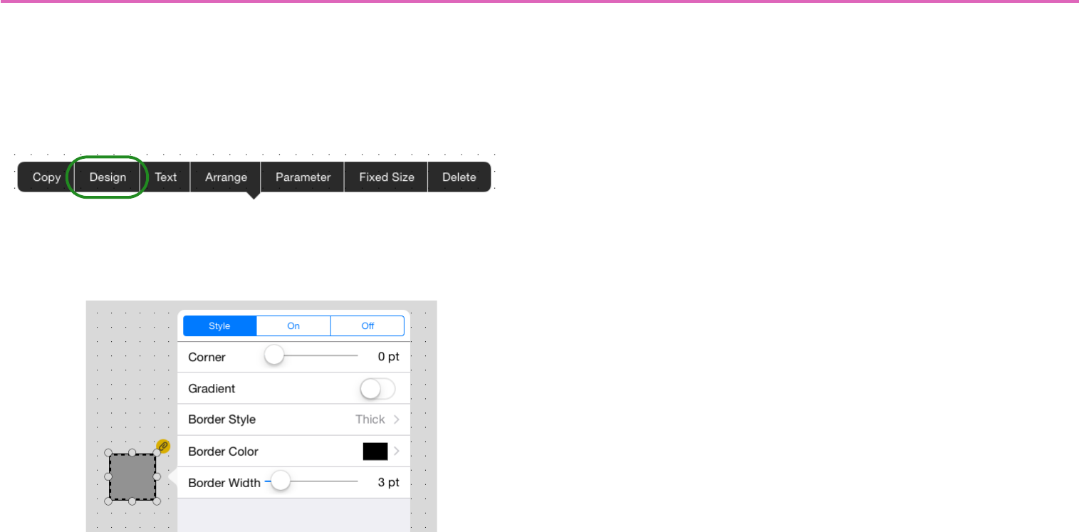
Tap the widget whose design you want to change; a context menu
appears. In the menu, tap [Design]; a dialog for changing the design
of that widget appears.
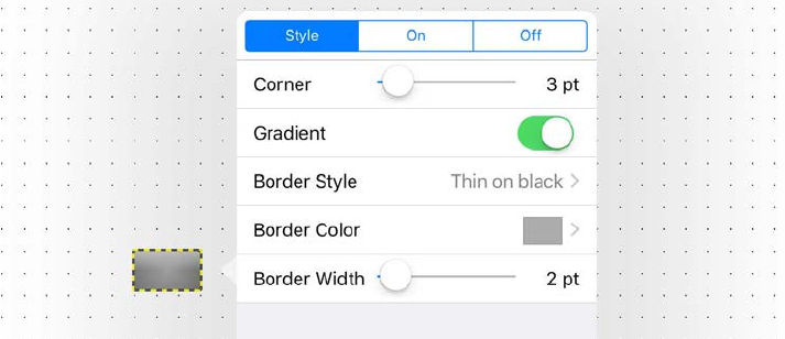
For a Button
[Style] tab
Corner: Specifies the rounding of the corners.
Gradient: Adds a gradient to the button surface.
Border Style: Specifies the style of the border.
Border Color: Specifies the color of the border. Specifying a
color
Border Width: Specifies the thickness of the border.
[On] tab
Color: Specifies the color of the button when the button is On.
Specifying a color
Image: Places an image such as an icon or pattern on the surface
of the button. If this switch is On, the Select Image and Expansion
Mode items are shown.
Select Image: Selects an image.
Expansion Mode: Specifies how the image is expanded relative
to the surface of the button.
* For details on how to select an image, refer to “Specifying an image.”
[Off] tab
Specifies the surface of the button when the button is Off.
The setting items are the same as for the [On] tab.
34
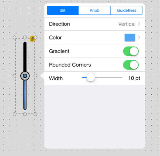
For a Slider
[Slit] tab
Direction: Specifies the slider’s direction (Vertical/Horizontal 1/
Horizontal 2).
Color: Specifies the color of the slide meter.
Specifying a color
Gradient: Adds a gradient effect.
Round Corners: Rounds the corners of the slit.
Width: Specifies the width of the slit.
[Knob] tab
Style: Specifies the style of knob (None/Circle/Ring/Fader A/
Fader B/Fader C/Fader D).
* If you specify None (no knob), the fader cannot be operated (meter dis-
play only).
Tooltip: Shows/hides the parameter value when the knob is oper-
ated.
* The value indication can be switched between Raw or Normalized.
Assigning parameters
Width: Specifies the knob size.
[Guidelines] tab
Type: Specifies the style of guidelines: None, Normalized, 0 dB,
or 10 dB.
Position: Specifies the location in which the guidelines are dis-
played (Left/Right/Full).
Color: Specifies the color of the guidelines. Specifying a color
35
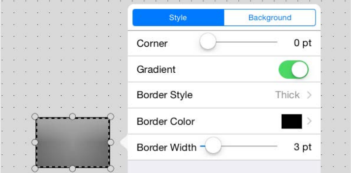
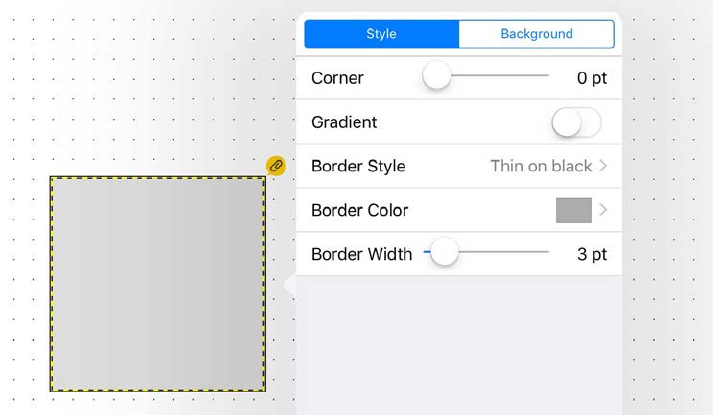
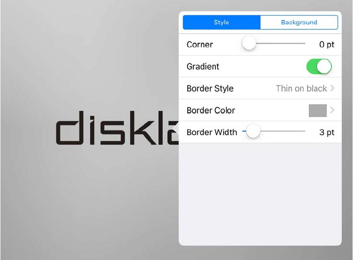
For a Rectangle
[Style] tab
Corner: Specifies the rounding of the corners.
Gradient: Adds a gradation effect to the rectangle’s surface.
Border Style: Specifies the style of the border.
Border Color: Specifies the color of the border.
Specifying a color
Border Width: Specifies the thickness of the border.
[Background] tab
Color: Specifies the color of the rectangle’s surface.
Specifying a color
Image: Places an image such as an icon or pattern on the surface
of the rectangle. If this switch is On, the Select Image and Expan-
sion Mode items are shown.
Select Image: Selects an image.
Expansion Mode: Specifies how the image is expanded relative
to the surface of the rectangle.
* For details on how to select an image, refer to “Specifying an image.”
36
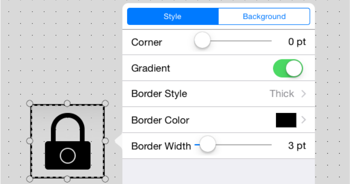
For an Image
[Style] tab
Corner: Specifies the rounding of the corners.
Gradient: Adds a gradation effect to the image’s surface.
Border Style: Specifies the style of the border.
Border Color: Specifies the color of the border.
Specifying a color
Border Width: Specifies the thickness of the border.
[Background] tab
Color: Specifies the color of the image’s surface.
Specifying a color
Image: Places an image such as an icon or pattern on the surface
of the image. If this switch is On, the Select Image and Expansion
Mode items are shown.
Select Image: Selects an image.
Expansion Mode: Specifies how the image is expanded relative
to the surface of the image.
* For details on how to select an image, refer to “Specifying an image.”
37
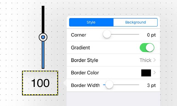
For a Value
[Style] tab
Corner: Specifies the rounding of the corners.
Gradient: Adds a gradation effect to the value’s surface.
Border Style: Specifies the style of the border.
Border Color: Specifies the color of the border.
Specifying a color
Border Width: Specifies the thickness of the border.
[Background] tab
Color: Specifies the color of the value’s surface.
Specifying a color
Image: Places an image such as an icon or pattern on the surface
of the value. If this switch is On, the Select Image and Expansion
Mode items are shown.
Select Image: Selects an image.
Expansion Mode: Specifies how the image is expanded relative
to the surface of the value.
* For details on how to select an image, refer to “Specifying an image.”
38
For a PDF
[Style] tab
Corner: Specifies the rounding of the corners.
Gradient: Adds a gradation effect to the PDF’s surface.
Border Style: Specifies the style of the border.
Border Color: Specifies the color of the border.
Specifying a color
Border Width: Specifies the thickness of the border.
[PDF] tab
Select PDF: Specifies a PDF file inside the PDFs folder in Docu-
ments of P.V. Touch, or that was sent via email or AirDrop.
Background Color: Specifies the color when a PDF is not
shown.
Specifying a color
Pinch to Zoom: If this switch is on, pinch operations can be per-
formed on the PDF.
39
For SD Play Info/Play Info
[Style] tab
Corner: Specifies the rounding of the corners.
Gradient: Adds a gradation effect to the play info’s surface.
Border Style: Specifies the style of the border.
Border Color: Specifies the color of the border.
Specifying a color
Border Width: Specifies the thickness of the border.
[Background] tab
Color: Specifies the color of the play info’s surface.
Specifying a color
Image: Places an image such as an icon or pattern on the surface
of the play info. If this switch is On, the Select Image and Expan-
sion Mode items are shown.
Select Image: Selects an image.
Expansion Mode: Specifies how the image is expanded relative
to the surface of the play info.
* For details on how to select an image, refer to “Specifying an image.”
40
For SD Transport/BD Transport/Transport
[Style] tab
Corner: Specifies the rounding of the corners.
Gradient: Adds a gradation effect to the transport’s surface.
Border Style: Specifies the style of the border.
Border Color: Specifies the color of the border.
Specifying a color
Border Width: Specifies the thickness of the border.
[Background] tab
Color: Specifies the color of the transport’s surface.
Specifying a color
Image: Places an image such as an icon or pattern on the surface
of the transport. If this switch is On, the Select Image and Expan-
sion Mode items are shown.
Select Image: Selects an image.
Expansion Mode: Specifies how the image is expanded relative
to the surface of the transport.
* For details on how to select an image, refer to “Specifying an image.”
[Buttons] tab
Color: Specifies the color of the buttons of transport.
Specifying a color
* For details on how to select an image, refer to “Specifying an image.”
41
For SD Track List/Track List
[Style] tab
Corner: Specifies the rounding of the corners.
Gradient: Adds a gradation effect to the track list's surface.
Border Style: Specifies the style of the border.
Border Color: Specifies the color of the border.
Specifying a color
Border Width: Specifies the thickness of the border.
[On] tab
Specifies the setting when the widget is touched.
Color: Specifies the color of the track list surface when the
source is On.
Specifying a color
Image: Places an image such as an icon or pattern on the surface
of the track list. If this switch is On, the Select Image and Expan-
sion Mode items are shown.
Select Image: Selects an image.
Expansion Mode: Specifies how the image is expanded relative
to the surface of the track list.
* For details on how to select an image, refer to “Specifying an image.”
[Off] tab
Specifies settings for when the widget is not being touched. The
setting items are the same as for the [On] tab.
42
For a Source&PGM
[Style] tab
Corner: Specifies the rounding of the corners.
Gradient: Adds a gradation effect to the source&PGM’s surface.
Border Style: Specifies the style of the border.
Border Color: Specifies the color of the border.
Specifying a color
Border Width: Specifies the thickness of the border.
[On] tab
Specifies the setting when the widget is touched.
Color: Specifies the color of the source surface when the source
is On.
Specifying a color
Image: Places an image such as an icon or pattern on the surface
of the source&PGM. If this switch is On, the Select Image and
Expansion Mode items are shown.
Select Image: Selects an image.
Expansion Mode: Specifies how the image is expanded relative
to the surface of the source&PGM.
* For details on how to select an image, refer to “Specifying an image.”
[Off] tab
Specifies settings for when the widget is not being touched. The set-
ting items are the same as for the [On] tab.
43
For an Album Art
[Style] tab
Corner: Specifies the rounding of the corners.
Gradient: Adds a gradation effect to the album art’s surface.
Border Style: Specifies the style of the border.
Border Color: Specifies the color of the border.
Specifying a color
Border Width: Specifies the thickness of the border.
[Background] tab
Color: Specifies the color of the album art’s surface.
Specifying a color
Image: Places an image such as an icon or pattern on the surface
of the album art. If this switch is On, the Select Image and Expan-
sion Mode items are shown.
Select Image: Selects an image.
Expansion Mode: Specifies how the image is expanded relative
to the surface of the play info.
* For details on how to select an image, refer to “Specifying an image.”
44
For a Disklavier
[Style] tab
Corner: Specifies the rounding of the corners.
Gradient: Adds a gradation effect to the disklavier’s surface.
Border Style: Specifies the style of the border.
Border Color: Specifies the color of the border.
Specifying a color
Border Width: Specifies the thickness of the border.
[Background] tab
Color: Specifies the color when the Disklavier is not connected.
Specifying a color
45
Assigning parameters
Here we explain how to assign the parameters that will be controlled
when you operate a widget.
* If no parameter is assigned to a widget, is shown.
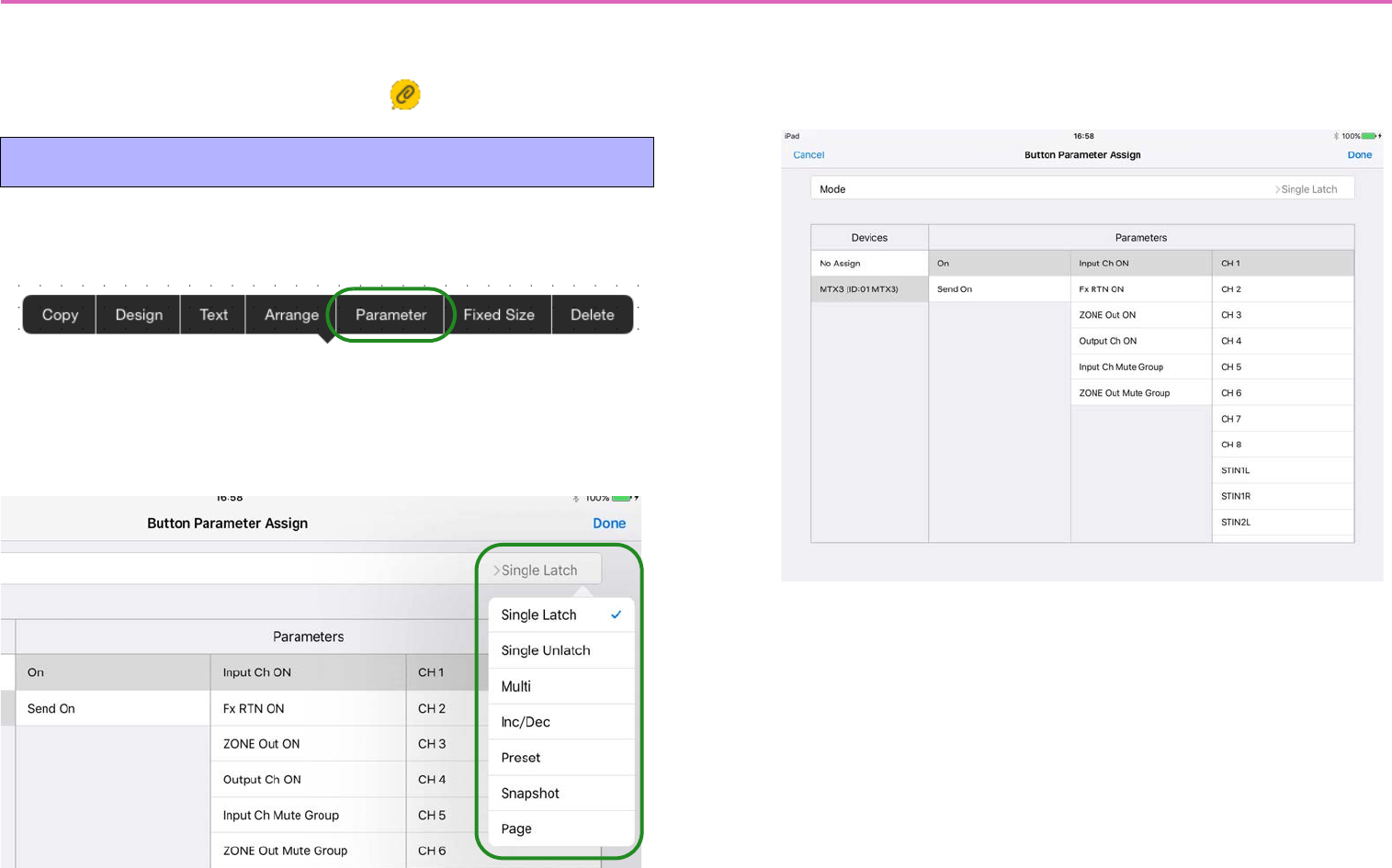
1. Tap the button that you want to assign; in the context
menu that appears, tap [Parameter].
2. The [Button Parameter Assign] screen appears. In the
far right of the [Mode] field, tap the button function
name; a menu appears, allowing you to select the but-
ton’s function.
3. A setting screen for the selected button function
appears. In [Devices] and [Parameters], select the
parameter that you want to assign, and tap [Done].
Assigning parameters to a button
46
Button functions (Mode) and their set-
ting screens
Single Latch: Assign an on/off-type parameter. The parameter is
switched On or Off.
Single Unlatch: Assigns a parameter such as Tray Open that takes
effect only while tapped.
47
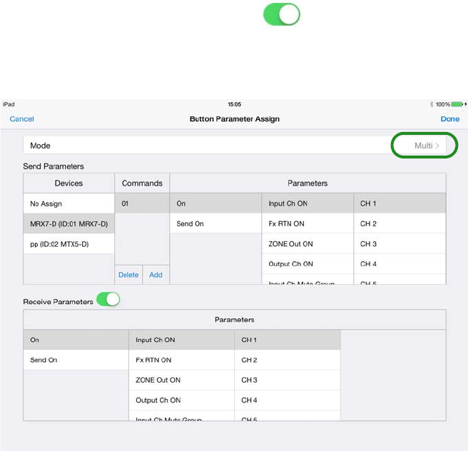
Multi: Multiple parameters can be individually switched on/off; for
example, multiple sources (input channels) can be switched on/off
simultaneously.
In the [Send Parameters] list, choose [Devices]; in the [Commands]
field, use [Add] to add commands and then assign a parameter to
each command. You can specify up to 16 commands; in other words,
up to 16 parameters can be controlled.
If [Receive Parameters] switch is On ( ), one parameter can be
monitored, and its state (whether On or Off) will be reflected on the
button.
48
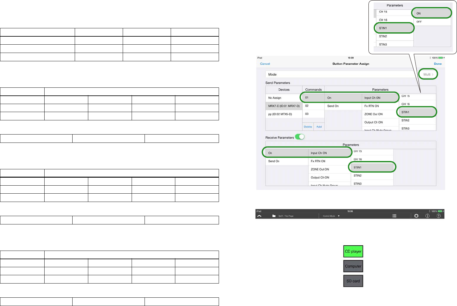
Example settings when Mode = Multi
Switching background music sources
Operation: Use buttons to switch combinations of ST IN on/off
• Settings for button 1 (play from CD player)
Send Parameters
Receive Parameters
• Settings for button 2 (play from computer)
Send Parameters
Receive Parameters
• Settings for button 3 (play from SD card)
Send Parameters
Receive Parameters
STIN (source) Button 1 Button 2 Button 3
1 (CD player) ON OFF OFF
2 (computer) OFF ON OFF
3 (SD card) OFF OFF ON
Commands Parameters
01 On Input Ch ON STIN1 ON
02 On Input Ch ON STIN2 OFF
03 On Input Ch ON STIN3 OFF
On Input Ch ON STIN1
Commands Parameters
01 On Input Ch ON STIN1 OFF
02 On Input Ch ON STIN2 ON
03 On Input Ch ON STIN3 OFF
On Input Ch ON STIN2
Commands Parameters
01 On Input Ch ON STIN1 OFF
02 On Input Ch ON STIN2 OFF
03 On Input Ch ON STIN3 ON
On Input Ch ON STIN3
-Example of Commands=01 settings
for button 1
-Example of control panel design
Button 1
Button 2
Button 3
49
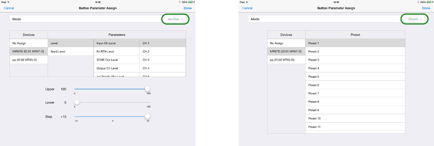
Inc/Dec: Send volume up/down commands to the device. Use
[Upper] and [Lower] to specify the direction and range of increase or
decrease, and use [Step] to specify the number of steps in that range.
Each time you tap the button, a command is sent to increase (or
decrease) the parameter by the amount specified in [Step].
Preset: Send [Preset] recall commands to the device. When you tap
the button, the [Preset] of the assigned preset number is recalled on
the specified device.
50
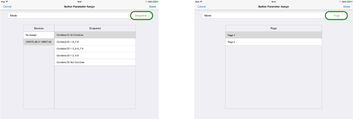
Snapshot: Sends a command to change snapshots. In the [Devices]
field, you can only select an MRX7-D for which snapshots are
included in the index. In the [Snapshot] field, specify an Index num-
ber that was registered in the processor’s snapshots (including a
snapshot group).
Page: This command switches to a different page of this control
panel. You can choose from all the created pages that are listed in the
[Page] field.
* If power user authentication has been specified for the page to be selected,
an authentication dialog appears when you operate the button.
51
1. Tap the slider that you want to assign; in the context
menu that appears, tap [Parameter].
2. The [Slider Parameter Assign] screen appears.
You can assign continuously variable parameters such as volume. In
[Upper] and [Lower], specify the range of change. In [Home Posi-
tion], specify an offset for the home position of the slider. Use this
when assigning a parameter (such as EQ Gain) that has a default
value mid-way through its range of change. In [Tooltip], select
whether the parameter value shown when the knob is operated will be
Raw or Normalized.
Assigning parameters to a slider • Assigning a parameter of the MRX7-D
If the MRX7-D is the device being controlled, the index that can
be specified depends on the type of widget.
*: Can be set
* If the index has changed to something that cannot be specified for the
widget, for example because the Remote Control Setup List was
reloaded, the connection between the two is canceled.
Remote Control
Setup List
Widget
Button Slider/
Value
Function Type Single
Latch Multi Inc/Dec
Snapshot
Parameter
On/Off type
Level type
Variable
other than
level type
Level Meter
Link
Group
On/Off type
Level type
Variable
other than
level type
Snapshot
Snapshot Group
52
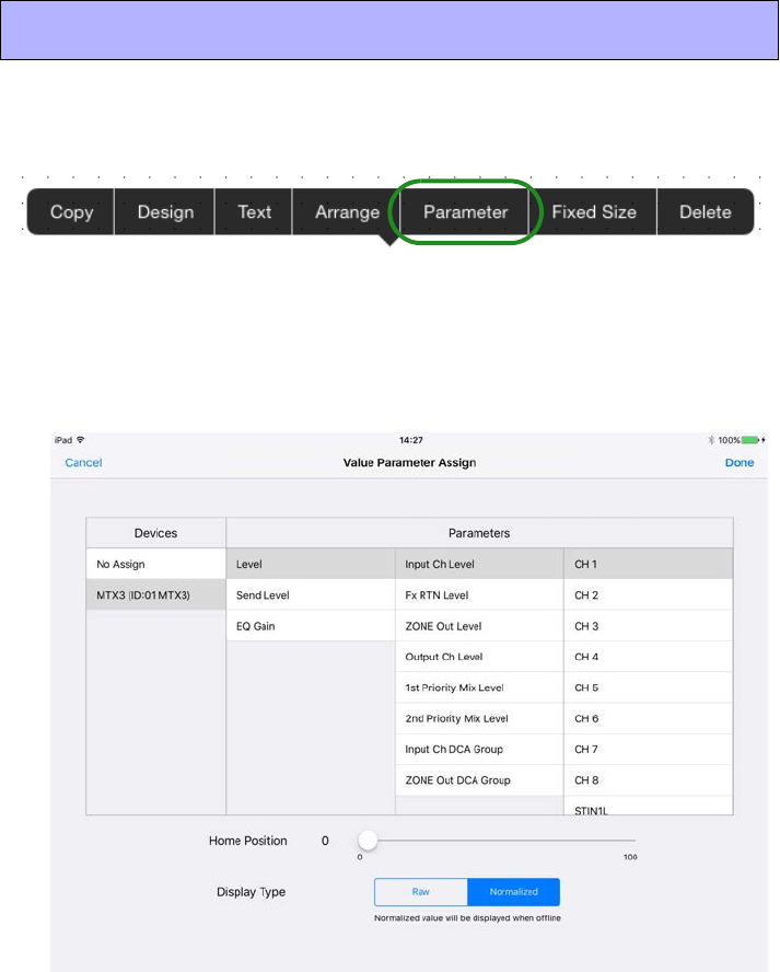
1. Tap the value that you want to assign; in the context
menu that appears, tap [Parameter].
2. The [Value Parameter Assign] screen appears.
You can assign continuously variable parameters such as volume. If the
same parameter as a slider is assigned, you can check the current value
without having to tap the slider.
3. In [Home Position], specify an offset for the home
position of the label.
Use this when assigning a parameter (such as EQ Gain) that has a
default value mid-way through its range of change.
In Display Type, choose Raw (actual value) or Normalized (normal-
ized value).
Assigning parameters to a value
53
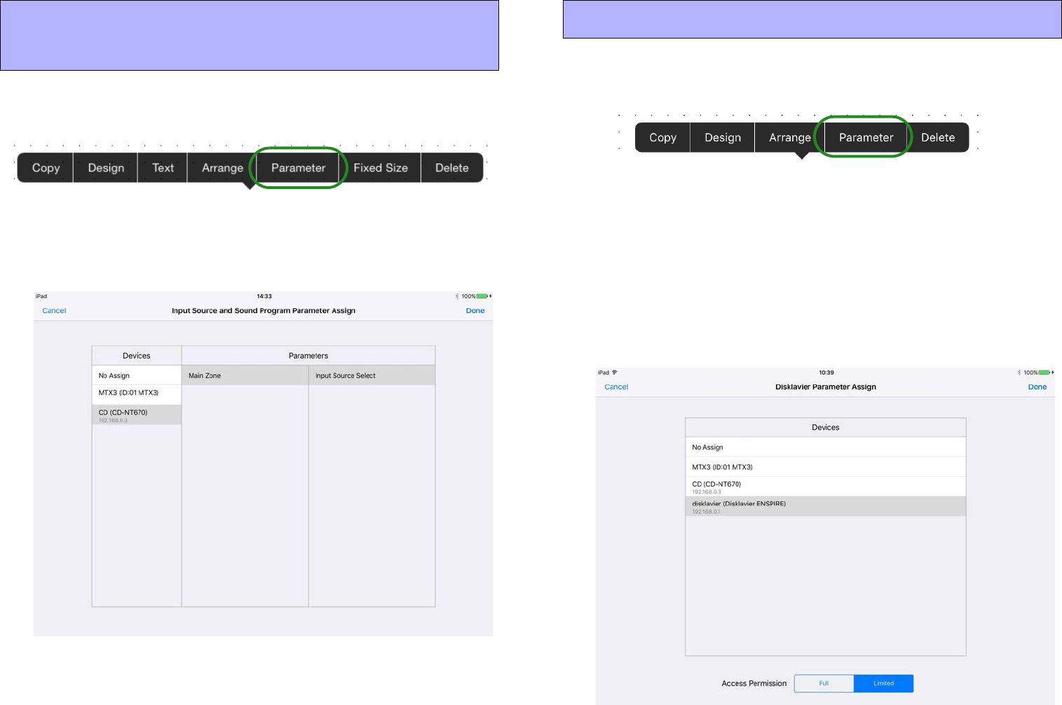
1. Tap the widget that you want to assign; in the context
menu that appears, tap [Parameter].
2. A screen for assigning the parameter appears.
You can assign the information to be obtained or the device to be con-
trolled.
1. Tap the Disklavier that you want to assign; in the con-
text menu that appears, tap [Parameter].
2. The [Disklavier Parameter Assign] screen appears.
Specify the parameter type for the Disklavier.
If you specify [Full], a screen with nearly all the functions of ENSPIRE
Controller is shown.
If you specify [Limited], a screen with only the ENSPIRE Controller
functions for power, recording, and playback is shown.
For an explanation of the functions, refer to “ENSPIRE Controller Opera-
tion Manual.”
Assigning to source&PGM, play info, trans-
port, track list, or album art
Assigning to a Disklavier
54
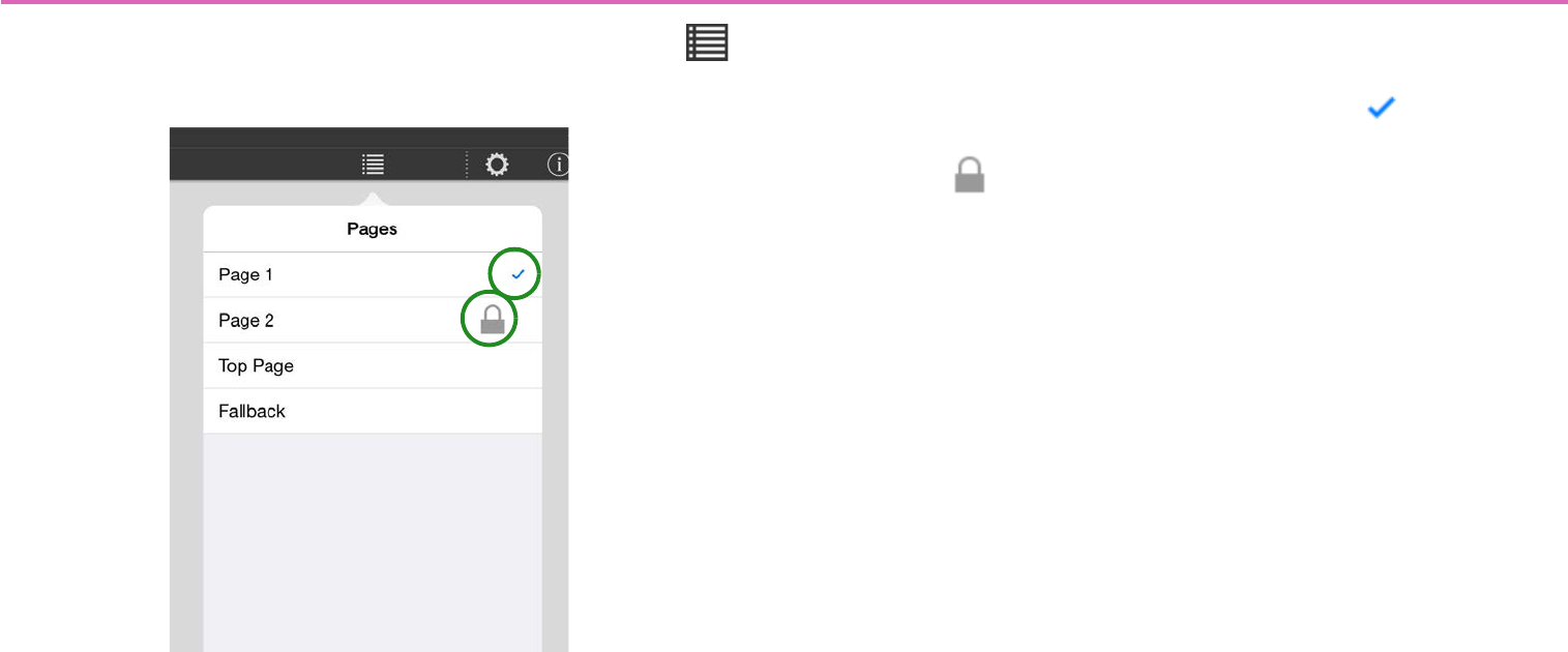
Switching pages — the Page Selection button (Control mode)
In Control mode, tapping the menu bar’s Page Selection button
shows the following page selection screen.
Of the pages included in the currently selected settings file, the
pages specified in the device’s [Preset] are shown.
The currently displayed page is indicated by a mark.
Pages for which power user code authentication is specified are indi-
cated by a icon.
To open a page, tap the field of the page that you want to open. If
authentication is specified for a page, it opens after power user
authentication.
If you move from a page that requires power user authentication to a
page that requires power user authentication, authentication is deter-
mined to have already occurred, and power user authentication is not
requested.
55
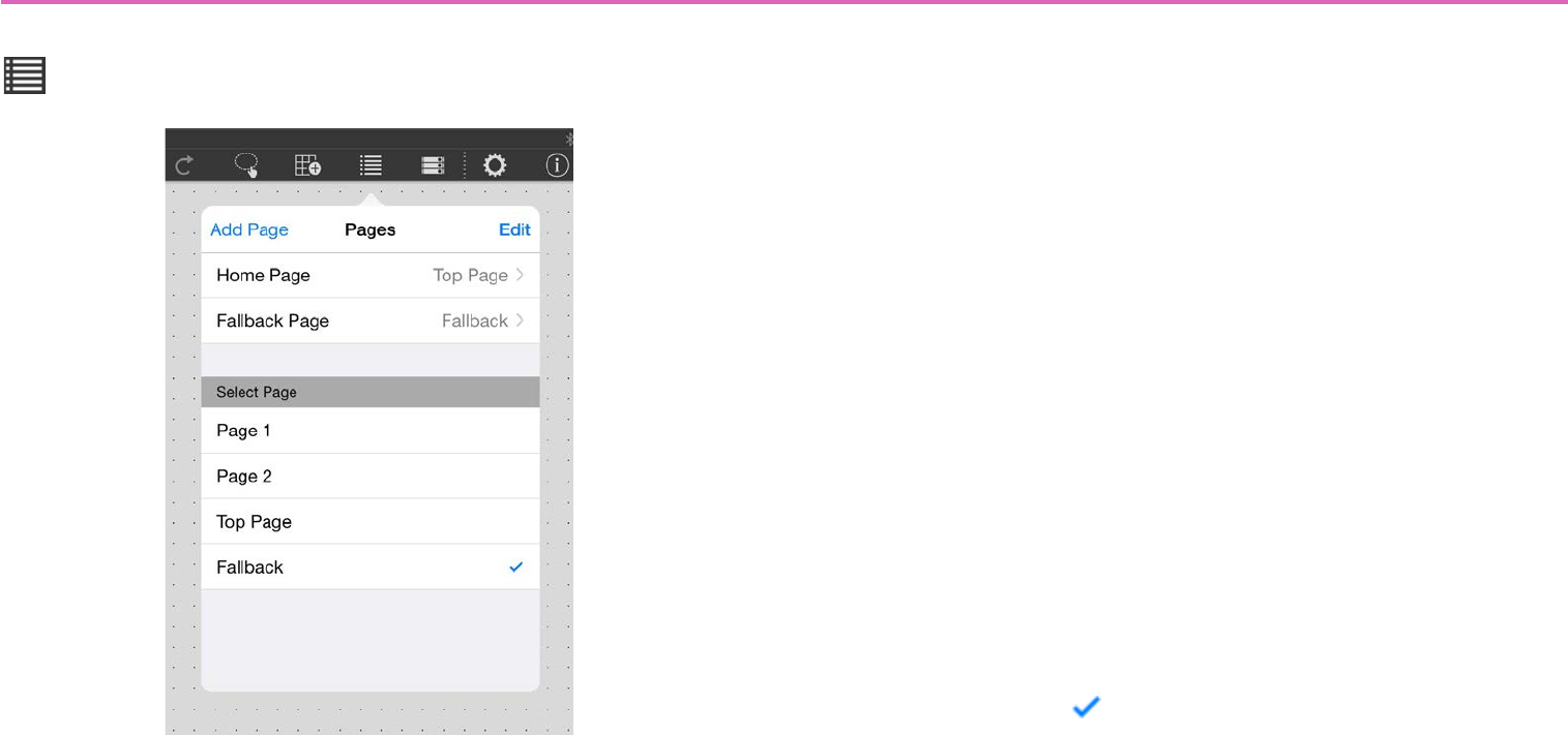
Managing pages — the Page Management button (Design mode)
In Design mode, tapping the menu bar’s Page Management button
shows the following page management screen.
Add Page: Adds a new page. Tap [Add Page], and in the dialog that
appears, enter a name for the page. Tap [Done], and a blank page
appears.
* The previously opened page before you used Add Page is saved automati-
cally.
* Up to 50 pages can be created in one settings file.
Edit: Lets you delete or reorder pages. You can also make additional
settings in the sub-screen of each page.
Home Page: Specifies the page that is shown when offline or when a
monitor device is not specified. Tap the Home Page field, and choose
from the list that appears.
Fallback Page: Specifies the page (fallback page) that is shown
when authentication fails when [Preset] recall causes an automatic
page change. Tap the Fallback Page field, and choose from the list
that appears.
Select Page: Shows all pages you created. The currently displayed
page is indicated by a mark. To open a page, tap the field of the
page that you want to open.
* Even if power user authentication is specified for a page, it opens without
authentication.
56
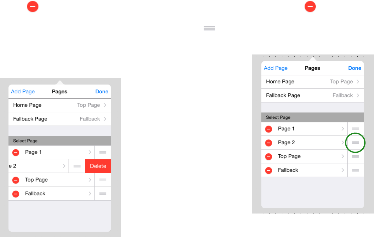
When you tap [Edit], a icon appears at the left of the page
name. If you tap this icon and then tap [Delete] that appears at the
right edge of the field, that page is deleted.
* The currently-loaded page cannot be deleted.
* A page that is specified as the Home Page or Fallback Page cannot be
deleted.
After tapping [Edit] so that the icon appears at the left of the
page name, you can move the position of a page by holding down the
icon at the right edge of the page field and dragging and drop-
ping it in the desired position.
57
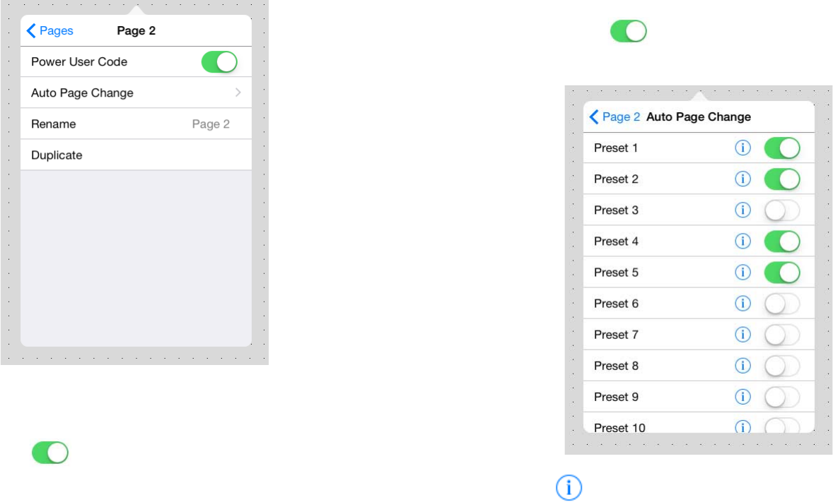
After tapping [Edit] so that the [>] icon appears at the left of the
page name, tap the page name to access a sub-screen where you can
edit settings for that page.
Power User Code: Specifies authentication by power user code for
the selected screen ( enables). When opening the specified
page in Control mode, authentication by power user code is required.
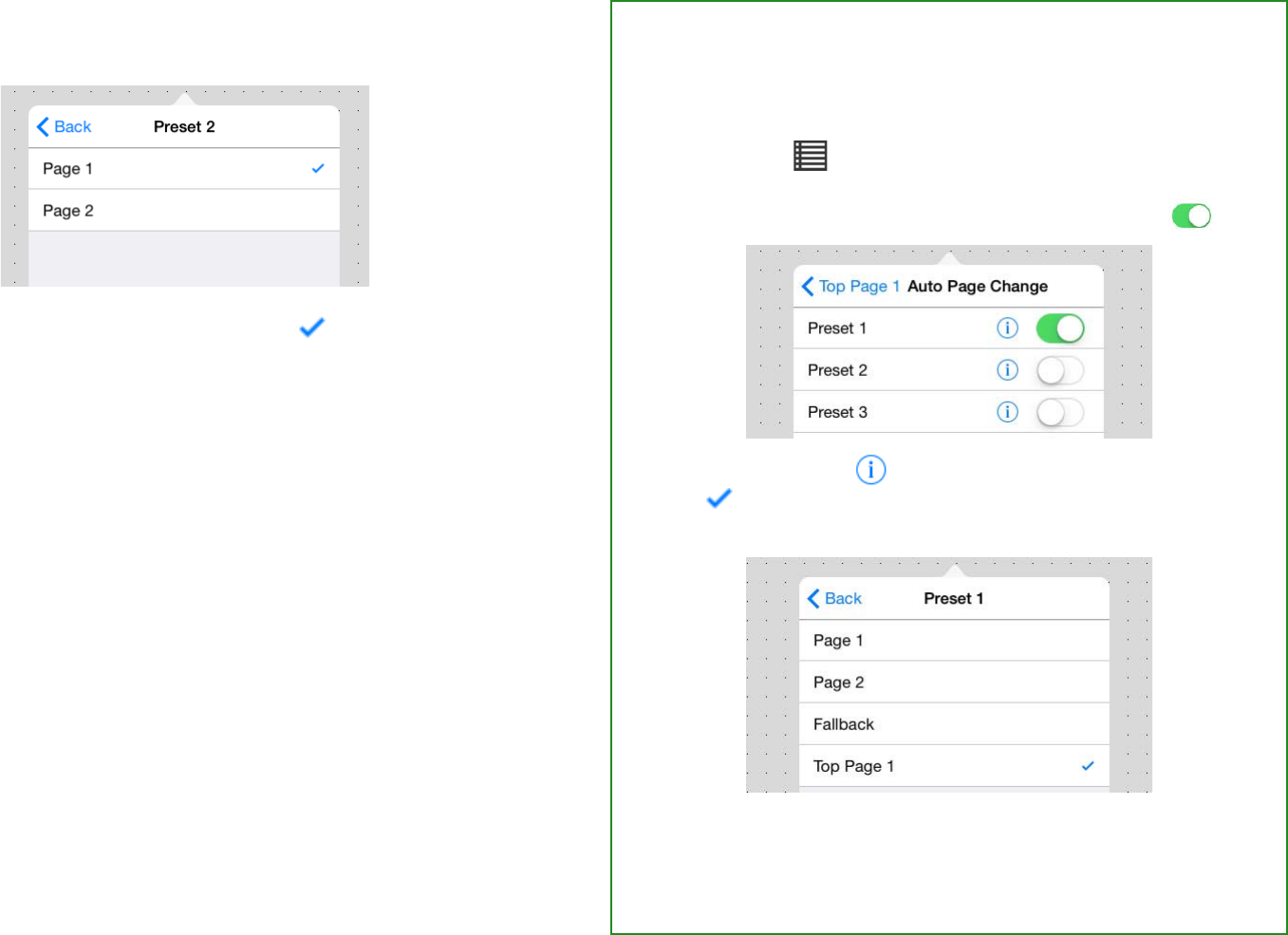
Auto Page Change: Specifies the association between a [Preset] of
a monitor device (a processor of the MTX/MRX system being con-
trolled) and the selected page. This function lets you automatically
switch the page that is displayed for each [Preset].
Tap the Auto Page Change field to display a [Preset] list for the mon-
itor device. Turn On ( ) each [Preset] switch for which the
selected page will be included in the page list.
When you tap , a list of the pages associated with that [Preset] is
displayed.
58
* If a monitor device is not specified, the page of this app does not change
even if you switch the [Preset] on the device. To associate a device with a
[Preset], make settings in Monitor Device.
The initially displayed page is indicated by a mark. You can tap
to change the initially displayed page.
* You can specify a different initially displayed page for each [Preset] (see the
box at right).
Rename: Renames the selected page. Edit the page name shown in
the input field, and tap [Done].
Duplicate: Duplicates the selected page. When you tap [Duplicate],
a duplicate page is created with an “_1” appended to the end of the
selected page name. The attributes of the page (such as the authenti-
cation code setting and Auto Page Change setting) are also dupli-
cated.
* If an identically named page already exists, the number is automatically incre-
mented as “_2” or “_3” etc.
Example) Setting a different initially displayed page
for [Preset 1], [Preset 2], and [Preset 3]
1. In advance, prepare three pages for use as the initially
displayed pages.
2. Choose [Edit] page for initial display with Pre-
set 1 [Auto Page Change] to access the following
screen, and then turn the Preset 1 switch On ( ).
3. Tap Preset 1’s ; in the screen that appears, tap the
indication of the initially displayed screen for Preset
1 (in this example, Top Page 1).
With these settings when [Preset 1] is selected, the initially dis-
played screen is set to “Top Page 1.”
In the same way, assign the initially displayed screen for Preset
2 and Preset 3.
59
Registering devices to control — the Device Management button
Here’s how to register a device of the target system that will be con-
trolled from the custom panel you created.
The device/parameter that’s controlled by a widget in the custom
panel is determined by the Model and Unit ID or IP address that you
register here.
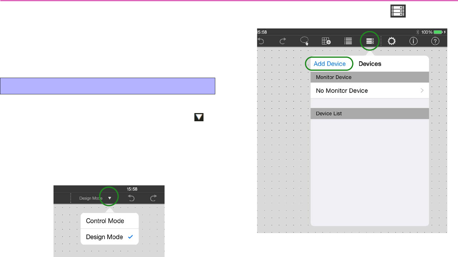
1. You’ll use Design mode to register a device. If you’re
in Control mode, use the Operation Mode button to
switch to Design mode.
* If the menu bar is hidden, unhide it in either of the following ways.
• Touch the upper left of the screen, and authenticate using an adminis-
trator code.
• Close ProVisionaire Touch and then re-open it; then authenticate the
applicable file with an administrator code and reload it.
2. Tap the Device Management button .
3. Tap [Add Device].
Registering a device
60
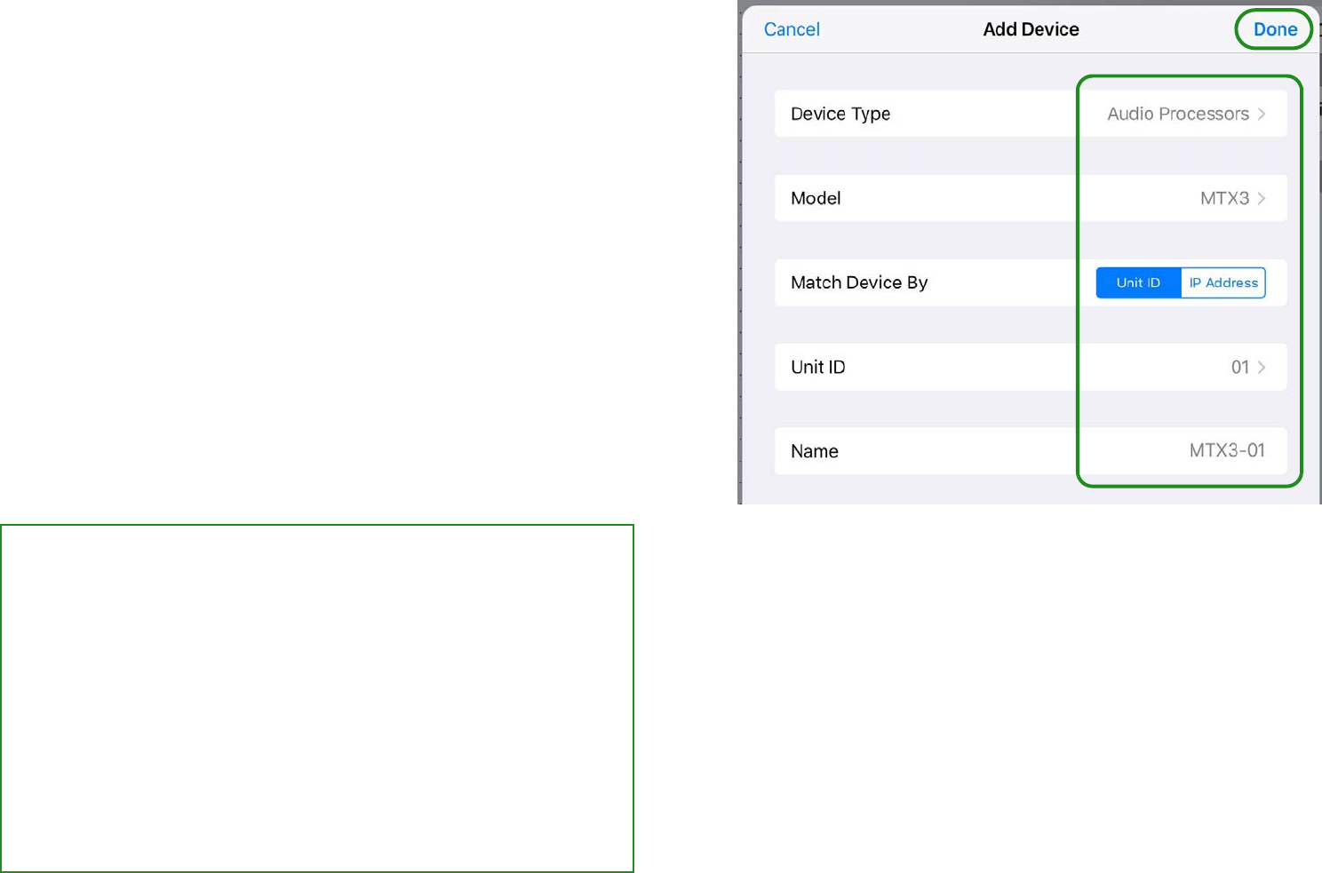
4. Enter each item, and tap [Done].
•Type: Tap [Select], and in the list that appears, select the type
of device that you want to register.
•Model: Tap [Select], and in the list that appears, select the
model name of the device that you want to register. The con-
tent of the list differs depending on the type selected in Type.
•Match Device By:
Choose whether to identify devices by
UNIT ID (in the case of the MRX, by RCSL) or by IP address.
If you specify a device whose UNIT ID cannot be set, this is
not shown, since only IP address is available. If you want to
control a device on a different subnet, select [IP Address].
•Unit ID: Tap [Select], and in the list that appears, select the
appropriate ID.
•IP Address: Enter the IP address that is assigned to the
device.
•Name: Tap [Enter device name], and enter a name (friendly
name) so you can identify the device.
• If you choose “MRX7-D” as the Model
The “Match Device By” field will be a choice of either RCSL or
IP Address. RCSL stands for “Remote Control Setup List”; if
you choose RCSL, the UNIT ID within the file is used to identify
the device.
The [Import from Remote Control Setup List] button appears.
Tapping the button displays the Remote Control Setup List in
the Documents folder.
From this list, select the file that you want to associate.
Use MRX Designer to create the Remote Control Setup List.
For details on creating the list, refer to the MRX Designer User
Guide.
61
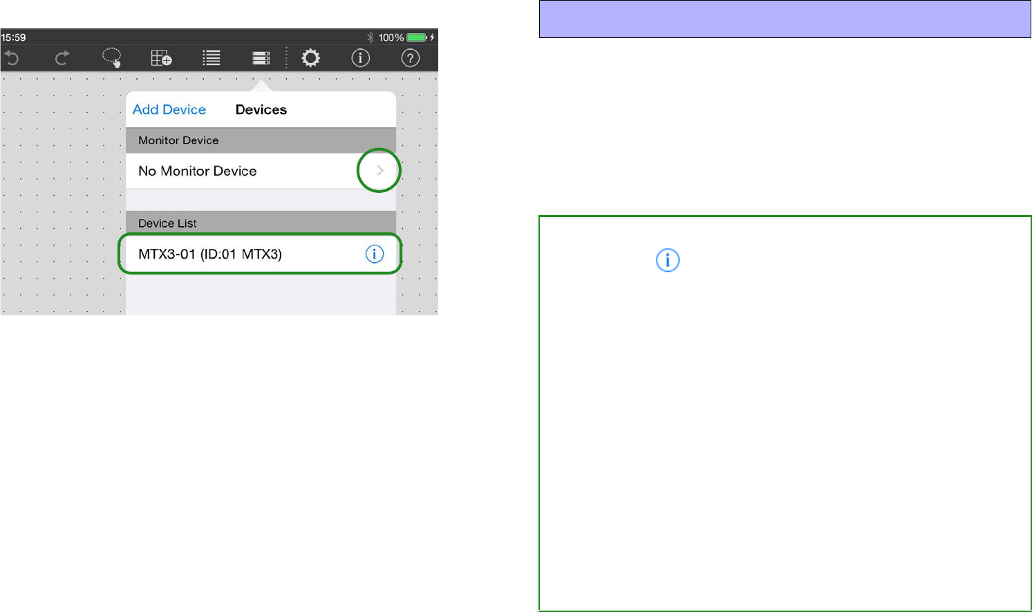
5. The registered device is added to the [Device List].
6. Using the same procedure, register all of the target
system’s devices that you want to control.
* A maximum of 20 devices can be registered.
The monitor device is also specified in this screen.
Tap the [Monitor Device] field’s [>] to see a list of the registered
devices.
From this list, select one monitor device to specify it.
* If a monitor device is not specified (No Monitor Device), the page of this app
does not change even if you switch the [Preset] on the device.
Monitor device settings
• Editing information for a registered device
If you tap the icon shown at the right of a registered device
name in the [Device List], you can edit the Unit ID or IP
address and friendly name of that device, or delete its registra-
tion.
When you do so, devices whose parameters are already
assigned to widgets will change as follows.
• Change Unit ID or IP address Automatically changed to
the new Unit ID or the new IP address.
• Delete registration Parameter data is cleared.
For the MRX7-D, the [UNIT ID] field shows the Remote Control
Setup List(RCSL), allowing you to change it. When you do so,
the index is carried over without change, but if the newly
loaded index attribute cannot be used by the widget, or if it is
[No Assign], the association is canceled.
If you choose RCSL, the UNIT ID within the file is used to iden-
tify the device.
62
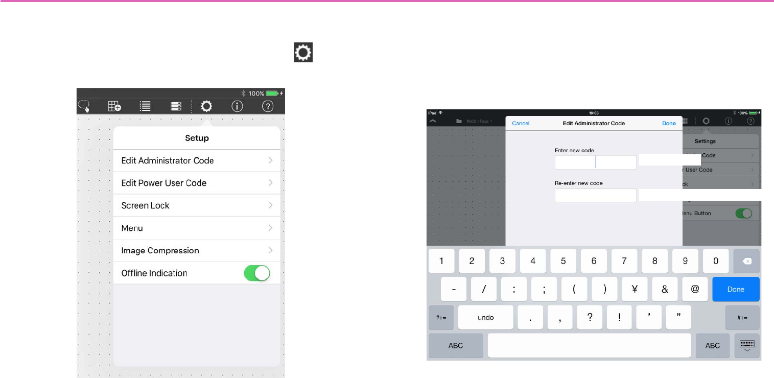
Control panel settings — the Setup button
Here you can make settings for the app, such as changing the access
code or specifying the screen lock setting.
In Design mode or Control mode, tap the Setup button in the
menu bar to access the following setup screen.
* If you use power user authentication to enter Control mode, [Edit Administra-
tor Code] is not shown.
Edit Administrator Code: Sets or changes the administrator code.
The administrator code is specified only as a four-digit number.
* For a newly created file, the administrator code is unset (blank).
* If you are editing the administrator code that you specified, the screen shows
a field for entering the current administrator code.
New code
New code (for confirmation)
63
Edit Power User Code: Specify or edit the power user code.
The power user code is specified only as a four-digit number, using
the same type of setting screen as for the administrator code.
* For a newly created file, the power user code is unset (blank).
Screen Lock: Lets you lock the screen and disable further opera-
tions when no operation has been performed for a specified period of
time in Control mode. Tap the [Screen Lock] field to access the
screen lock setting screen.
Enable: Turns the screen lock function on/off. If this is On
( ), the settings items are shown.
Unlock Code: Specifies the unlock code (a four-digit number) for
screen lock. Overwrite the default value of “0000” to set this.
Select Image: Lets you specify the screen that is shown when the
screen is locked. Specifies the style. Specifying an image
Time: Specifies the time until screen lock occurs.
Menu: When the menu button has not been operated for a certain
length of time in Control mode, the menu can be automatically hid-
den (menu auto close).
Transparent Menu Button: This function makes the closed state
of the menu button ( ) invisible in Control mode.
* Invisible: The menu button exists in its usual position, but cannot be seen
(is not shown). Tapping on that position opens the menu.
* The menu button is invisible only in Control mode; it is always visible in
Design mode and Initial mode regardless of this setting.
Enable Auto-Close: Turns the menu auto close function on/off. If
this is On ( ), the [Time Until Menu Closes] field appears.
Time Until Menu Closes: Specifies the time until auto-close
occurs.
Image Compression: Specifies the compression when loading an
icon or pattern.
Compression: Turns image compression on/off. If this is On
( ), the [Ratio] field is shown.
Ratio: Specifies the image compression ratio (1–100%) for the
Compression setting above.
* This can be edited only if the Compression setting is On.
Offline indication: Specifies whether, when the device is offline, an
indicator is shown at the upper right of the widget to which the
device’s parameter is assigned.
f this is On ( ), an indicator is shown when the device is offline
().
64
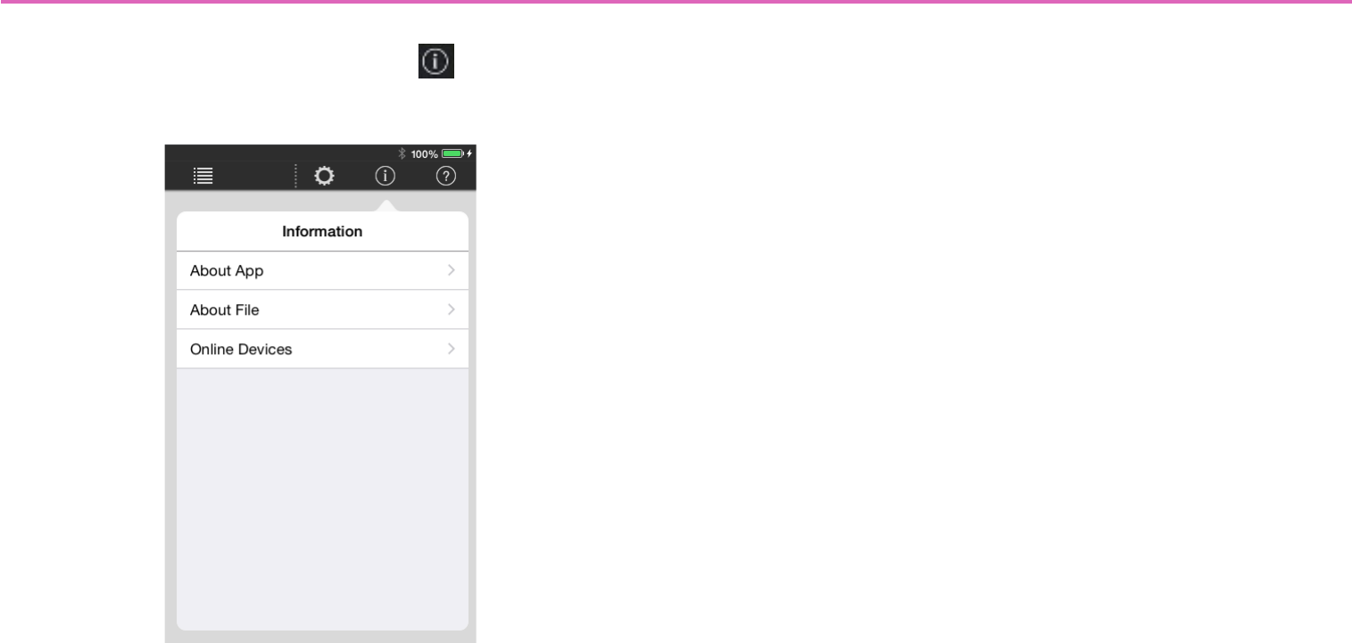
Control panel information — the Information button
This lets you view various settings.
On the menu bar, tap the Information button to see the follow-
ing information screen.
* In Initial mode, items other than [About App] are not shown.
* In Design mode, [Online Devices] is not shown.
About App: Shows the information of this app.
App Version: Shows the version of this application, and copy-
right information.
Google Analytics: Shows an explanation of Google Analytics,
and turns the function on/off.
Privacy Policy: Shows the privacy policy.
License: Shows license information, such as open-source notices.
About File: Shows information on the currently loaded settings file.
Version: The version of this app when the settings file was cre-
ated.
Comment: Allows you to enter/edit a comment for the settings
file.
Administrator Comment: A comment can be entered/edited
only if you authenticated with an administrator code.
* The Administrator Comment can be viewed in the file browser.
Online Devices (shown only in Control mode): Lists currently
online devices. The displayed contents are the model name, UNIT
ID (only for an MTX/MRX system device), friendly name, and IP
address.
About This Page (shown only in Design mode): Shows the total
number of widgets included in the currently displayed page.
A maximum of 150 widgets can be used on one page.
65
Preparations before you make connections
Specify the Wi-Fi access point as described in the owner’s manual of
each device.
Although there is no need to make special settings, we recommend
that you use security such as WPA in order to prevent unauthorized
access to the network from outside.
Guidelines for settings are provided below.
1. Specify the name of the Wi-Fi network.
2. Specify the security mode (e.g., WPA2) and password.
3. Select the wireless mode. (such as 802.11n or 802.11g)
4. If possible, enable “Auto Channel Selection.”
The wireless channel with the least interference will be selected.
For the fastest communication between the iPad and the Wi-Fi
access point, we recommend that you select an 802.11n network. If
you use multiple external antennas, it will be easier to connect to the
Wi-Fi access point.
In addition, we recommend that you make stealth mode and MAC
address filter settings to increase security.
Use CAT5e cables to connect the target system with the Wi-Fi
access point.
Include an Ethernet switch in the system if necessary.
To convey audio signals, connect the ST IN of the MTX or MRX to
the AUX OUT or ANALOG OUT of the MusicCast device or to the
OMNI OUT of the Disklavier.
Wi-Fi access point settings Connecting to the target system
iPad with ProVisionaire Touch or
ProVisionaire Touch Kiosk installed
Target system
CAT5e cable
Wi-Fi access
point
Ethernet
switch Computer
66
-Example network settings for other than the iPad
1. Check the IP address setting (IP SETTING) of the
devices in the target system.
On the rear panel of the unit, make sure that DIP switch 6 is set to
UNIT ID (upward position).
The IP address will be specified by the UNIT ID, and will be
“192.168.0.(UNIT ID).”
2. On the computer that’s using MTX-MRX Editor, make
settings so that the IP address will be obtained auto-
matically (DHCP).
3. Change the IP address of the Wi-Fi access point.
Set the Wi-Fi access point to the same network (subnet) as the target
system. We recommend that you use “192.168.0.254” as the IP
address of the Wi-Fi access point. Connect the computer to the Wi-Fi
access point, and change it from the computer’s web browser. For
details on how to make this change, refer to the manual of the Wi-Fi
access point.
4. Set the router to automatically assign IP addresses
(DHCP).
Make sure that the IP addresses do not conflict with the devices of the
MTX/MRX system. The recommended range is “192.168.0.150” –
”192.168.0.200.” For details on how to make this change, refer to the
manual of the router built into the Wi-Fi access point.
5. Connect devices other than the MTX/MRX system to
the network.
6. Specify the IP addresses of devices other than the
MTX/MRX system.
When making settings in Windows, use the following method.
Make sure that the IP addresses do not conflict with the IP addresses
of other devices. The recommended range is “192.168.0.100”--
“192.168.0.149.”
For a Blu-ray disc player, connect it to a television etc., and in the
“SETUP” screen's [Network] section, set [IP Address] to [Manual]
and specify the IP address and subnet mask.
1 Hold down the <Windows> key and press the <E> key.
The Explorer opens.
2 In the left side of the Explorer, click “Network.”
The devices connected to the network are shown.
3 Double-click the icon of a device that is shown in the
“Media Devices” or “Other Devices” area.
The browser starts, letting you make settings for the device.
4 Specify the IP address.
•For a MusicCast device: In the network settings screen,
select “Wired” or “Wired LAN,” turn [DHCP] off, and spec-
ify the IP address and subnet mask.
•For a Disklavier: Go to [Settings] [Network] [Wired
Network] [Use DHCP] to specify manual settings,
specify the IP address and subnet mask, and click [Send].
[Send] might not be visible unless you scroll.
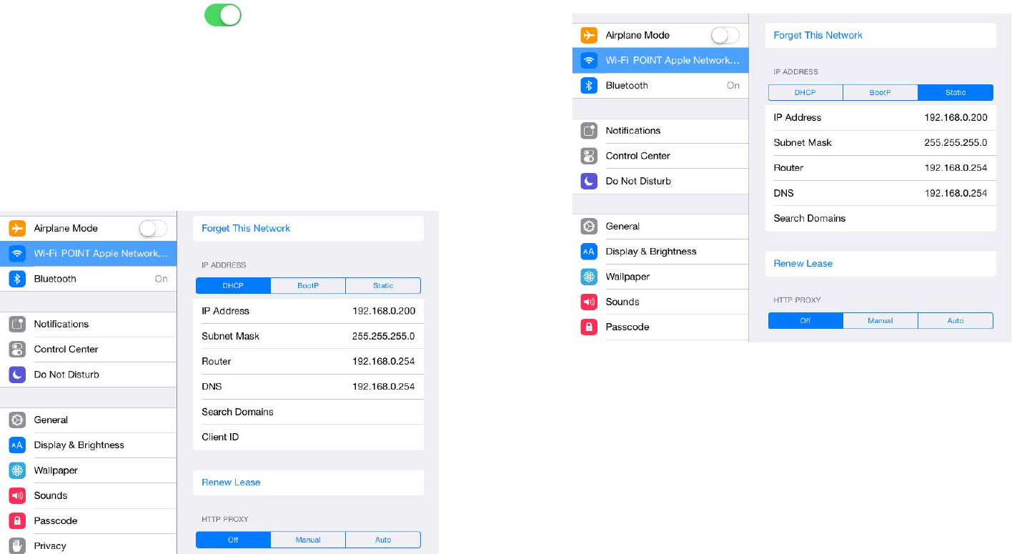
67
-Example network settings for the iPad
1. In the home screen of the iPad, tap [Settings] [Wi-Fi].
2. Turn the [Wi-Fi] switch On ( ), and from the access
point list that appears, select the access point of the
target system.
3. Enter the password of the Wi-Fi access point.
4. Make network settings.
-If obtaining the IP address automatically
1. Select [DHCP].
2. Verify that “IP Address,” “Subnet Mask,” “Router,” and “DNS”
are set.
3. Click the home button to complete the settings.
-If specifying the IP address manually (when it can-
not be obtained automatically)
1. Select [Static].
2. In “IP Address,” enter the IP address of the target system,
changing only the fourth octet (in the illustration above,
“200”).
3. In “Subnet Mask,” enter “255.255.255.0.”
4. In “Router,” enter the IP address of the router or the IP
address of the Wi-Fi access point.
5. In “DNS,” enter the IP address of the DNS or the IP address
of the Wi-Fi access point.
6. Click the home button to complete the settings.

68
-Tips for network settings
1. The IP addresses of the devices you’re connecting must be
set to the same subnetwork.
*1 If the Wi-Fi access point does not have router functionality, specify the IP
address for accessing the Wi-Fi access point device.
2. Connect the target system to a LAN port of the Wi-Fi access
point.
If you connect it to the Ethernet port (WAN port), it will be
impossible to communicate correctly between the smart
device and the target system.
3. Start ProVisionaire Touch.
ProVisionaire Touch detects the target system and connects
automatically.
Example of a cor-
rect combination
of settings
Example of an
incorrect combi-
nation of settings
The Wi-Fi access point device’s
internal router and DNS *1 192.168.0.254 192.168.11.1
Target system 192.168.0.1 192.168.0.1
iPad 192.168.0.200 192.168.11.50
Computer 192.168.0.253 192.168.11.253
69
Troubleshooting
Problem Cause Action
Can’t communicate with the
target system.
Wi-Fi settings are incorrect. Make settings that are appropriate for the access point that’s connected
to the target system.
Can’t disable the settings file
auto-load setting.
There is only one settings file, and
the setting cannot be disabled by
switching files.
In the iOS “Settings” window, choose “P.V. Touch”; then in “P.V. Touch
Settings” that appears at the right, disable the “Auto-load this file on next
launch” switch.
The message “Can’t connect
to the Internet” appears on the
iPad screen, and ProVisionaire
Touch can’t connect to the tar-
get system.
This is because iOS6 and later
may attempt to connect to the
Internet when you select a Wi-Fi
network.
You will need to make the appropriate setting on the Wi-Fi device
(access point/router) so that this message does not appear. One
method of changing the setting of the Wi-Fi device is to disable the
“redirect function”; contact the manufacturer of the device for details.
Can’t operate more than four
widgets simultaneously.
Multitask gestures are turned on. When using ProVisionaire Touch, we recommend that you turn multi-
tasking gestures off.
1. On the iPad, tap [Settings].
2. Choose [General]>[Multitasking Gestures]>[Off].
Can’t operate more than three
widgets simultaneously.
In the accessibility functions, the
zoom function is turned on.
When using ProVisionaire Touch, we recommend that you turn the
zoom function off.
1. On the iPad, tap [Settings].
2. Choose [General]>[Accessibility]>[Zoom Function]>[Off].
A dialog says that there is
insufficient memory.
The memory within the app has
been overwhelmed by a PDF,
photo, or other image.
To reduce the amount of memory occupied, delete an image that you’re
using. If you ignore this message and add a photo etc., the app may
crash.

70
Can’t connect eight iPad units
to one XMV/EXi8/EXo8.
Of the eight sessions simultane-
ously connected to the XMV/EXi8/
EXo8, one session is used for
communication between the MTX/
MRX and the XMV/EXi8/EXo8.
For this reason, a maximum of
seven external control devices
can be connected.
Use a maximum of seven iPad units to control the XMV/EXi8/EXo8.
A file won’t open. You’re attempting to load a Kiosk
file into ProVisionaire Touch.
Specify a settings file with the correct .ypvt extension.
Nothing is shown for Disklavier
or track list.
The assigned device is not con-
nected to the network.
Connect the assigned device to the network.
Can’t delete an unneeded
RCSL file, etc.
Using the iPad itself, it is not pos-
sible to delete files in “shared
files.”
Use iTunes to delete the file.
1. Connect the iPad to your computer.
2. Click the iPad button that appears in iTunes, and then click [App].
3. In “shared files,” in the list shown at right, select the file that you want
to delete.
4. Press the <Delete> key and then click [Delete].
Problem Cause Action

71
About the software license
The following devices use open source software code.
You can obtain details of the license content as follows.
• MusicCast device
Refer to the following website.
http://download.yamaha.com/sourcecodes/musiccast/
• Blu-ray disc player
Connect the unit to a television etc., and in the “SETUP” screen’s [System] section, refer to [Software License].
• Disklavier ENSPIRE
Refer to [Information] in the “Information screen” of the ENSPIRE Controller app.
