Adobe Developing Flex Applications 3.0 Developer Guide 3 Dev
User Manual: adobe Adobe Flex - 3.0 - Developer Guide Free User Guide for Adobe Flex Software, Manual
Open the PDF directly: View PDF  .
.
Page Count: 1328 [warning: Documents this large are best viewed by clicking the View PDF Link!]
- Chapter 1: Developing Applications in MXML
- About MXML
- Developing applications
- Laying out a user interface using containers
- Adding user interface controls
- Using the id property with MXML tags
- Using XML namespaces
- Using MXML to trigger run-time code
- Binding data between components
- Using RPC services
- Storing data in a data model
- Validating data
- Formatting data
- Using Cascading Style Sheets (CSS)
- Using skins
- Using effects
- Defining custom MXML components
- Chapter 2: MXML Syntax
- Basic MXML syntax
- Setting component properties
- Setting scalar properties
- Setting properties using constants
- Setting the default property
- Escaping characters using the backslash character
- Setting String properties using the backslash character
- Including a newline character in a String value
- Setting Arrays of scalar values
- Setting Object properties
- Populating an Object with an Array
- Populating Arrays of objects
- Setting properties that contain XML data
- Setting style and effect properties in MXML
- Setting event properties in MXML
- Specifying a URL value
- Specifying a RegExp value
- Using compiler tags
- MXML tag rules
- Chapter 3: Using ActionScript
- Chapter 4: Using Events
- Chapter 5: Flex Data Access
- Chapter 6: Using Flex Visual Components
- Chapter 7: Using Data Providers and Collections
- Chapter 8: Sizing and Positioning Components
- Chapter 9: Controls
- About controls
- Working with controls
- Button control
- PopUpButton control
- ButtonBar and ToggleButtonBar controls
- LinkBar control
- TabBar control
- CheckBox control
- RadioButton control
- NumericStepper control
- DateChooser and DateField controls
- About the DateChooser control
- About the DateField control
- Creating a DateChooser or DateField control
- Using the Date class
- Specifying header, weekday, and today’s day text styles
- Specifying selectable dates
- Setting DateChooser and DateField properties in ActionScript
- Formatting dates with the DateField control
- User interaction
- LinkButton control
- HSlider and VSlider controls
- SWFLoader control
- Image control
- VideoDisplay control
- ColorPicker control
- Alert control
- ProgressBar control
- HRule and VRule controls
- ScrollBar control
- Chapter 10: Using Text Controls
- Chapter 11: Using Menu-Based Controls
- Chapter 12: Using Data-Driven Controls
- Chapter 13: Introducing Containers
- Chapter 14: Application Container
- Chapter 15: Using Layout Containers
- About layout containers
- Canvas layout container
- Box, HBox, and VBox layout containers
- ControlBar layout container
- ApplicationControlBar layout container
- DividedBox, HDividedBox, and VDividedBox layout containers
- Form, FormHeading, and FormItem layout containers
- Grid layout container
- Panel layout container
- Tile layout container
- TitleWindow layout container
- Chapter 16: Using Navigator Containers
- Chapter 17: Using Behaviors
- About behaviors
- Applying behaviors in MXML
- Applying behaviors in ActionScript
- Working with effects
- Setting effect durations
- Using embedded fonts with effects
- Creating composite effects
- Using the AnimateProperty effect
- Delaying effect start
- Repeating effects
- Using Dissolve and Fade effects with the Panel, TitleWindow, and Accordion containers
- Using a sound effect
- Using a mask effect
- Handling effect events
- Suspending background processing
- Using an easing function
- Using data effects
- Disabling container layout for effects
- Improving performance when resizing Panel containers
- Setting UIComponent.cachePolicy on the effect target
- Chapter 18: Using Styles and Themes
- Chapter 19: Using Fonts
- Chapter 20: Creating Skins
- Chapter 21: Using Drag and Drop
- Chapter 22: Using Item Renderers and Item Editors
- About item renderers
- Creating an item renderer and item editor
- Using a drop-in item renderer or item editor
- Using an inline item renderer or item editor
- Using a component as an item renderer or item editor
- Using editable controls in an item renderer
- Setting the itemRenderer or itemEditor property in ActionScript
- About the item renderer and item editor life cycle
- Accessing the listData property
- Handling data binding warnings from the compiler
- Creating drop-in item renderers and item editors
- Creating inline item renderers and editors
- Creating item renderers and item editor components
- Working with item renderers
- Chapter 23: Working with Item Editors
- Chapter 24: Using View States
- Chapter 25: Using Transitions
- Chapter 26: Using ToolTips
- Chapter 27: Using the Cursor Manager
- Chapter 28: Dynamically Repeating Controls and Containers
- Chapter 29: Embedding Assets
- Chapter 30: Creating Modular Applications
- Chapter 31: Printing
- Chapter 32: Communicating with the Wrapper
- Chapter 33: Using the Flex Ajax Bridge
- Chapter 34: Deep Linking
- Chapter 35: Using Shared Objects
- Chapter 36: Localizing Flex Applications
- Chapter 37: Creating Accessible Applications
- Chapter 38: Accessing Server-Side Data with Flex
- Chapter 39: Representing Data
- Chapter 40: Binding Data
- Chapter 41: Storing Data
- Chapter 42: Validating Data
- Chapter 43: Formatting Data

ADOBE®FLEX®3
DEVELOPER GUIDE
© 2008 Adobe Systems Incorporated. All rights reserved.
Adobe® Flex® 3 Developer Guide
If this guide is distributed with software that includes an end-user agreement, this guide, as well as the software described in it, is furnished under license
and may be used or copied only in accordance with the terms of such license. Except as permitted by any such license, no part of this guide may be
reproduced, stored in a retrieval system, or transmitted, in any form or by any means, electronic, mechanical, recording, or otherwise, without the prior
written permission of Adobe Systems Incorporated. Please note that the content in this guide is protected under copyright law even if it is not distributed
with software that includes an end-user license agreement.
The content of this guide is furnished for informational use only, is subject to change without notice, and should not be construed as a commitment by
Adobe Systems Incorporated. Adobe Systems Incorporated assumes no responsibility or liability for any errors or inaccuracies that may appear in the
informational content contained in this guide.
Please remember that existing artwork or images that you may want to include in your project may be protected under copyright law. The unauthorized
incorporation of such material into your new work could be a violation of the rights of the copyright owner. Please be sure to obtain any permission
required from the copyright owner.
Any references to company names in sample templates are for demonstration purposes only and are not intended to refer to any actual organization.
Adobe, the Adobe logo, ActionScript, Adobe AIR, ColdFusion, Fireworks, Flash, Flex, Illustrator, LiveCycle, and Photoshop are either registered
trademarks or trademarks of Adobe Systems Incorporated in the United States and/or other countries.
Java is a trademark or registered trademark of Sun Microsystems, Inc. in the United States and other countries. Linux is a registered trademark of Linus
Torvalds. Macintosh is a trademark of Apple Inc., registered in the United States and other countries. Microsoft, OpenType, Windows, Windows ME,
and Windows Vista are either registered trademarks or trademarks of Microsoft Corporation in the United States and/or other countries. Sun is a
registered trademark or trademark of Sun Microsystems, Inc. in the United States and other countries. All other trademarks are the property of their
respective owners.
This product includes software developed by the Apache Software Foundation (http://www.apache.org/)
This product contains either BISAFE and/or TIPEM software by RSA Data Security, Inc.
The Flex Builder 3 software contains code provided by the Eclipse Foundation (“Eclipse Code”). The source code for the Eclipse Code as contained in
Flex Builder 3 software (“Eclipse Source Code”) is made available under the terms of the Eclipse Public License v1.0 which is provided herein, and is
also available at http://www.eclipse.org/legal/epl-v10.html.
Adobe Systems Incorporated, 345 Park Avenue, San Jose, CA 95110-2704, USA.
Notice to U.S. government end users. The software and documentation are “Commercial Items,” as that term is defined at 48 C.F.R. §2.101, consisting
of “Commercial Computer Software” and “Commercial Computer Software Documentation,” as such terms are used in 48 C.F.R. §12.212 or 48 C.F.R.
§227.7202, as applicable. Consistent with 48 C.F.R. §12.212 or 48 C.F.R. §§227.7202-1 through 227.7202-4, as applicable, the Commercial Computer
Software and Commercial Computer Software Documentation are being licensed to U.S. Government end users (a) only as Commercial items and (b)
with only those rights as are granted to all other end users pursuant to the terms and conditions herein. Unpublished-rights reserved under the
copyright laws of the United States. For U.S. Government End Users, Adobe agrees to comply with all applicable equal opportunity laws including, if
appropriate, the provisions of Executive Order 11246, as amended, Section 402 of the Vietnam Era Veterans Readjustment Assistance Act of 1974 (38
USC 4212), and Section 503 of the Rehabilitation Act of 1973, as amended, and the regulations at 41 CFR Parts 60-1 through 60-60, 60-250 ,and 60-
741. The affirmative action clause and regulations contained in the preceding sentence shall be incorporated by reference.
Part Number: 90085057 (01/08)

iii
Contents
Part 1: Flex Programming Elements
Chapter 1: Developing Applications in MXML
About MXML . . . . . . . . . . . . . . . . . . . . . . . . . . . . . . . . . . . . . . . . . . . . . . . . . . . . . . . . . . . . . . . . . . . . . . . . . . . . . 3
Developing applications . . . . . . . . . . . . . . . . . . . . . . . . . . . . . . . . . . . . . . . . . . . . . . . . . . . . . . . . . . . . . . . . . . 7
Chapter 2: MXML Syntax
Basic MXML syntax . . . . . . . . . . . . . . . . . . . . . . . . . . . . . . . . . . . . . . . . . . . . . . . . . . . . . . . . . . . . . . . . . . . . . . . 23
Setting component properties . . . . . . . . . . . . . . . . . . . . . . . . . . . . . . . . . . . . . . . . . . . . . . . . . . . . . . . . . . . 24
Chapter 3: Using ActionScript
Using ActionScript in Flex applications . . . . . . . . . . . . . . . . . . . . . . . . . . . . . . . . . . . . . . . . . . . . . . . . . . . . 37
Working with Flex components . . . . . . . . . . . . . . . . . . . . . . . . . . . . . . . . . . . . . . . . . . . . . . . . . . . . . . . . . . . 42
Comparing, including, and importing ActionScript code . . . . . . . . . . . . . . . . . . . . . . . . . . . . . . . . . . 49
Techniques for separating ActionScript from MXML . . . . . . . . . . . . . . . . . . . . . . . . . . . . . . . . . . . . . . . 53
Creating ActionScript components . . . . . . . . . . . . . . . . . . . . . . . . . . . . . . . . . . . . . . . . . . . . . . . . . . . . . . . 55
Performing object introspection . . . . . . . . . . . . . . . . . . . . . . . . . . . . . . . . . . . . . . . . . . . . . . . . . . . . . . . . . . 56
Chapter 4: Using Events
About events . . . . . . . . . . . . . . . . . . . . . . . . . . . . . . . . . . . . . . . . . . . . . . . . . . . . . . . . . . . . . . . . . . . . . . . . . . . . 61
Using events . . . . . . . . . . . . . . . . . . . . . . . . . . . . . . . . . . . . . . . . . . . . . . . . . . . . . . . . . . . . . . . . . . . . . . . . . . . . . 65
Manually dispatching events . . . . . . . . . . . . . . . . . . . . . . . . . . . . . . . . . . . . . . . . . . . . . . . . . . . . . . . . . . . . . 83
Event propagation . . . . . . . . . . . . . . . . . . . . . . . . . . . . . . . . . . . . . . . . . . . . . . . . . . . . . . . . . . . . . . . . . . . . . . . 86
Event priorities . . . . . . . . . . . . . . . . . . . . . . . . . . . . . . . . . . . . . . . . . . . . . . . . . . . . . . . . . . . . . . . . . . . . . . . . . . . 94
Using event subclasses . . . . . . . . . . . . . . . . . . . . . . . . . . . . . . . . . . . . . . . . . . . . . . . . . . . . . . . . . . . . . . . . . . . 95
About keyboard events . . . . . . . . . . . . . . . . . . . . . . . . . . . . . . . . . . . . . . . . . . . . . . . . . . . . . . . . . . . . . . . . . . 97
Chapter 5: Flex Data Access
About data access . . . . . . . . . . . . . . . . . . . . . . . . . . . . . . . . . . . . . . . . . . . . . . . . . . . . . . . . . . . . . . . . . . . . . . . 103
Comparing Flex data access to other technologies . . . . . . . . . . . . . . . . . . . . . . . . . . . . . . . . . . . . . . . 108

CONTENTS
iv
Part 2: User Interfaces
Chapter 6: Using Flex Visual Components
About visual components . . . . . . . . . . . . . . . . . . . . . . . . . . . . . . . . . . . . . . . . . . . . . . . . . . . . . . . . . . . . . . . 113
Class hierarchy for visual components . . . . . . . . . . . . . . . . . . . . . . . . . . . . . . . . . . . . . . . . . . . . . . . . . . . 114
Using the UIComponent class . . . . . . . . . . . . . . . . . . . . . . . . . . . . . . . . . . . . . . . . . . . . . . . . . . . . . . . . . . . 115
Sizing visual components . . . . . . . . . . . . . . . . . . . . . . . . . . . . . . . . . . . . . . . . . . . . . . . . . . . . . . . . . . . . . . . 121
Handling events . . . . . . . . . . . . . . . . . . . . . . . . . . . . . . . . . . . . . . . . . . . . . . . . . . . . . . . . . . . . . . . . . . . . . . . . 124
Applying styles . . . . . . . . . . . . . . . . . . . . . . . . . . . . . . . . . . . . . . . . . . . . . . . . . . . . . . . . . . . . . . . . . . . . . . . . . 128
Applying behaviors . . . . . . . . . . . . . . . . . . . . . . . . . . . . . . . . . . . . . . . . . . . . . . . . . . . . . . . . . . . . . . . . . . . . . 131
Applying skins . . . . . . . . . . . . . . . . . . . . . . . . . . . . . . . . . . . . . . . . . . . . . . . . . . . . . . . . . . . . . . . . . . . . . . . . . . 132
Changing the appearance of a component at run time . . . . . . . . . . . . . . . . . . . . . . . . . . . . . . . . . . . 132
Extending components . . . . . . . . . . . . . . . . . . . . . . . . . . . . . . . . . . . . . . . . . . . . . . . . . . . . . . . . . . . . . . . . . 134
Chapter 7: Using Data Providers and Collections
About collections and data provider components . . . . . . . . . . . . . . . . . . . . . . . . . . . . . . . . . . . . . . . . 137
Using simple data access properties and methods . . . . . . . . . . . . . . . . . . . . . . . . . . . . . . . . . . . . . . . 149
Working with data views . . . . . . . . . . . . . . . . . . . . . . . . . . . . . . . . . . . . . . . . . . . . . . . . . . . . . . . . . . . . . . . . 151
Collection events and manual change notification . . . . . . . . . . . . . . . . . . . . . . . . . . . . . . . . . . . . . . . 161
Hierarchical data objects . . . . . . . . . . . . . . . . . . . . . . . . . . . . . . . . . . . . . . . . . . . . . . . . . . . . . . . . . . . . . . . . 167
Remote data in data provider components . . . . . . . . . . . . . . . . . . . . . . . . . . . . . . . . . . . . . . . . . . . . . . 180
Data providers and the uid property . . . . . . . . . . . . . . . . . . . . . . . . . . . . . . . . . . . . . . . . . . . . . . . . . . . . . 181
Chapter 8: Sizing and Positioning Components
About sizing and positioning . . . . . . . . . . . . . . . . . . . . . . . . . . . . . . . . . . . . . . . . . . . . . . . . . . . . . . . . . . . . 185
Sizing components . . . . . . . . . . . . . . . . . . . . . . . . . . . . . . . . . . . . . . . . . . . . . . . . . . . . . . . . . . . . . . . . . . . . .192
Positioning and laying out controls . . . . . . . . . . . . . . . . . . . . . . . . . . . . . . . . . . . . . . . . . . . . . . . . . . . . . . 208
Using constraints to control component layout . . . . . . . . . . . . . . . . . . . . . . . . . . . . . . . . . . . . . . . . . .213
Chapter 9: Controls
About controls . . . . . . . . . . . . . . . . . . . . . . . . . . . . . . . . . . . . . . . . . . . . . . . . . . . . . . . . . . . . . . . . . . . . . . . . . . 224
Working with controls . . . . . . . . . . . . . . . . . . . . . . . . . . . . . . . . . . . . . . . . . . . . . . . . . . . . . . . . . . . . . . . . . . . 230
Button control . . . . . . . . . . . . . . . . . . . . . . . . . . . . . . . . . . . . . . . . . . . . . . . . . . . . . . . . . . . . . . . . . . . . . . . . . . 233
PopUpButton control . . . . . . . . . . . . . . . . . . . . . . . . . . . . . . . . . . . . . . . . . . . . . . . . . . . . . . . . . . . . . . . . . . . 237
ButtonBar and ToggleButtonBar controls . . . . . . . . . . . . . . . . . . . . . . . . . . . . . . . . . . . . . . . . . . . . . . . . 240
LinkBar control . . . . . . . . . . . . . . . . . . . . . . . . . . . . . . . . . . . . . . . . . . . . . . . . . . . . . . . . . . . . . . . . . . . . . . . . . . 243
TabBar control . . . . . . . . . . . . . . . . . . . . . . . . . . . . . . . . . . . . . . . . . . . . . . . . . . . . . . . . . . . . . . . . . . . . . . . . . . 244
CheckBox control . . . . . . . . . . . . . . . . . . . . . . . . . . . . . . . . . . . . . . . . . . . . . . . . . . . . . . . . . . . . . . . . . . . . . . . 248

v
RadioButton control . . . . . . . . . . . . . . . . . . . . . . . . . . . . . . . . . . . . . . . . . . . . . . . . . . . . . . . . . . . . . . . . . . . . 249
NumericStepper control . . . . . . . . . . . . . . . . . . . . . . . . . . . . . . . . . . . . . . . . . . . . . . . . . . . . . . . . . . . . . . . . . 253
DateChooser and DateField controls . . . . . . . . . . . . . . . . . . . . . . . . . . . . . . . . . . . . . . . . . . . . . . . . . . . . . 255
LinkButton control . . . . . . . . . . . . . . . . . . . . . . . . . . . . . . . . . . . . . . . . . . . . . . . . . . . . . . . . . . . . . . . . . . . . . . 265
HSlider and VSlider controls . . . . . . . . . . . . . . . . . . . . . . . . . . . . . . . . . . . . . . . . . . . . . . . . . . . . . . . . . . . . . 267
SWFLoader control . . . . . . . . . . . . . . . . . . . . . . . . . . . . . . . . . . . . . . . . . . . . . . . . . . . . . . . . . . . . . . . . . . . . . . 274
Image control . . . . . . . . . . . . . . . . . . . . . . . . . . . . . . . . . . . . . . . . . . . . . . . . . . . . . . . . . . . . . . . . . . . . . . . . . . . 278
VideoDisplay control . . . . . . . . . . . . . . . . . . . . . . . . . . . . . . . . . . . . . . . . . . . . . . . . . . . . . . . . . . . . . . . . . . . . 287
ColorPicker control . . . . . . . . . . . . . . . . . . . . . . . . . . . . . . . . . . . . . . . . . . . . . . . . . . . . . . . . . . . . . . . . . . . . . . 294
Alert control . . . . . . . . . . . . . . . . . . . . . . . . . . . . . . . . . . . . . . . . . . . . . . . . . . . . . . . . . . . . . . . . . . . . . . . . . . . . 301
ProgressBar control . . . . . . . . . . . . . . . . . . . . . . . . . . . . . . . . . . . . . . . . . . . . . . . . . . . . . . . . . . . . . . . . . . . . . 306
HRule and VRule controls . . . . . . . . . . . . . . . . . . . . . . . . . . . . . . . . . . . . . . . . . . . . . . . . . . . . . . . . . . . . . . . . 309
ScrollBar control . . . . . . . . . . . . . . . . . . . . . . . . . . . . . . . . . . . . . . . . . . . . . . . . . . . . . . . . . . . . . . . . . . . . . . . . 312
Chapter 10: Using Text Controls
About text controls . . . . . . . . . . . . . . . . . . . . . . . . . . . . . . . . . . . . . . . . . . . . . . . . . . . . . . . . . . . . . . . . . . . . . 315
Using the text property . . . . . . . . . . . . . . . . . . . . . . . . . . . . . . . . . . . . . . . . . . . . . . . . . . . . . . . . . . . . . . . . . 317
Using the htmlText property . . . . . . . . . . . . . . . . . . . . . . . . . . . . . . . . . . . . . . . . . . . . . . . . . . . . . . . . . . . . 321
Selecting and modifying text . . . . . . . . . . . . . . . . . . . . . . . . . . . . . . . . . . . . . . . . . . . . . . . . . . . . . . . . . . . . 330
Label control . . . . . . . . . . . . . . . . . . . . . . . . . . . . . . . . . . . . . . . . . . . . . . . . . . . . . . . . . . . . . . . . . . . . . . . . . . . . 334
TextInput control . . . . . . . . . . . . . . . . . . . . . . . . . . . . . . . . . . . . . . . . . . . . . . . . . . . . . . . . . . . . . . . . . . . . . . . 336
Text control . . . . . . . . . . . . . . . . . . . . . . . . . . . . . . . . . . . . . . . . . . . . . . . . . . . . . . . . . . . . . . . . . . . . . . . . . . . . . 337
TextArea control . . . . . . . . . . . . . . . . . . . . . . . . . . . . . . . . . . . . . . . . . . . . . . . . . . . . . . . . . . . . . . . . . . . . . . . . 339
RichTextEditor control . . . . . . . . . . . . . . . . . . . . . . . . . . . . . . . . . . . . . . . . . . . . . . . . . . . . . . . . . . . . . . . . . . . 340
Chapter 11: Using Menu-Based Controls
About menu-based controls . . . . . . . . . . . . . . . . . . . . . . . . . . . . . . . . . . . . . . . . . . . . . . . . . . . . . . . . . . . . . 347
Defining menu structure and data . . . . . . . . . . . . . . . . . . . . . . . . . . . . . . . . . . . . . . . . . . . . . . . . . . . . . . . 348
Menu-based control events . . . . . . . . . . . . . . . . . . . . . . . . . . . . . . . . . . . . . . . . . . . . . . . . . . . . . . . . . . . . . 353
Menu control . . . . . . . . . . . . . . . . . . . . . . . . . . . . . . . . . . . . . . . . . . . . . . . . . . . . . . . . . . . . . . . . . . . . . . . . . . . 362
MenuBar control . . . . . . . . . . . . . . . . . . . . . . . . . . . . . . . . . . . . . . . . . . . . . . . . . . . . . . . . . . . . . . . . . . . . . . . .365
PopUpMenuButton control . . . . . . . . . . . . . . . . . . . . . . . . . . . . . . . . . . . . . . . . . . . . . . . . . . . . . . . . . . . . . . 367
Chapter 12: Using Data-Driven Controls
List control . . . . . . . . . . . . . . . . . . . . . . . . . . . . . . . . . . . . . . . . . . . . . . . . . . . . . . . . . . . . . . . . . . . . . . . . . . . . . . 373
HorizontalList control . . . . . . . . . . . . . . . . . . . . . . . . . . . . . . . . . . . . . . . . . . . . . . . . . . . . . . . . . . . . . . . . . . . 382
TileList control . . . . . . . . . . . . . . . . . . . . . . . . . . . . . . . . . . . . . . . . . . . . . . . . . . . . . . . . . . . . . . . . . . . . . . . . . . 385

CONTENTS
vi
ComboBox control . . . . . . . . . . . . . . . . . . . . . . . . . . . . . . . . . . . . . . . . . . . . . . . . . . . . . . . . . . . . . . . . . . . . . . 388
DataGrid control . . . . . . . . . . . . . . . . . . . . . . . . . . . . . . . . . . . . . . . . . . . . . . . . . . . . . . . . . . . . . . . . . . . . . . . . 395
Tree control . . . . . . . . . . . . . . . . . . . . . . . . . . . . . . . . . . . . . . . . . . . . . . . . . . . . . . . . . . . . . . . . . . . . . . . . . . . . . 405
Chapter 13: Introducing Containers
About containers . . . . . . . . . . . . . . . . . . . . . . . . . . . . . . . . . . . . . . . . . . . . . . . . . . . . . . . . . . . . . . . . . . . . . . . 419
Using containers . . . . . . . . . . . . . . . . . . . . . . . . . . . . . . . . . . . . . . . . . . . . . . . . . . . . . . . . . . . . . . . . . . . . . . . .421
Using scroll bars . . . . . . . . . . . . . . . . . . . . . . . . . . . . . . . . . . . . . . . . . . . . . . . . . . . . . . . . . . . . . . . . . . . . . . . . 433
Using Flex coordinates . . . . . . . . . . . . . . . . . . . . . . . . . . . . . . . . . . . . . . . . . . . . . . . . . . . . . . . . . . . . . . . . . . 436
Creating and managing component instances at run time . . . . . . . . . . . . . . . . . . . . . . . . . . . . . . . . 441
Chapter 14: Application Container
About the Application container . . . . . . . . . . . . . . . . . . . . . . . . . . . . . . . . . . . . . . . . . . . . . . . . . . . . . . . . . 451
About the Application object . . . . . . . . . . . . . . . . . . . . . . . . . . . . . . . . . . . . . . . . . . . . . . . . . . . . . . . . . . . . 457
Showing the download progress of an application . . . . . . . . . . . . . . . . . . . . . . . . . . . . . . . . . . . . . . . 462
Chapter 15: Using Layout Containers
About layout containers . . . . . . . . . . . . . . . . . . . . . . . . . . . . . . . . . . . . . . . . . . . . . . . . . . . . . . . . . . . . . . . . . 471
Canvas layout container . . . . . . . . . . . . . . . . . . . . . . . . . . . . . . . . . . . . . . . . . . . . . . . . . . . . . . . . . . . . . . . . . 472
Box, HBox, and VBox layout containers . . . . . . . . . . . . . . . . . . . . . . . . . . . . . . . . . . . . . . . . . . . . . . . . . . . 476
ControlBar layout container . . . . . . . . . . . . . . . . . . . . . . . . . . . . . . . . . . . . . . . . . . . . . . . . . . . . . . . . . . . . .478
ApplicationControlBar layout container . . . . . . . . . . . . . . . . . . . . . . . . . . . . . . . . . . . . . . . . . . . . . . . . . . 479
DividedBox, HDividedBox, and VDividedBox layout containers . . . . . . . . . . . . . . . . . . . . . . . . . . . 481
Form, FormHeading, and FormItem layout containers . . . . . . . . . . . . . . . . . . . . . . . . . . . . . . . . . . . .484
Grid layout container . . . . . . . . . . . . . . . . . . . . . . . . . . . . . . . . . . . . . . . . . . . . . . . . . . . . . . . . . . . . . . . . . . . . 504
Panel layout container . . . . . . . . . . . . . . . . . . . . . . . . . . . . . . . . . . . . . . . . . . . . . . . . . . . . . . . . . . . . . . . . . . 509
Tile layout container . . . . . . . . . . . . . . . . . . . . . . . . . . . . . . . . . . . . . . . . . . . . . . . . . . . . . . . . . . . . . . . . . . . . 513
TitleWindow layout container . . . . . . . . . . . . . . . . . . . . . . . . . . . . . . . . . . . . . . . . . . . . . . . . . . . . . . . . . . . 516
Chapter 16: Using Navigator Containers
About navigator containers . . . . . . . . . . . . . . . . . . . . . . . . . . . . . . . . . . . . . . . . . . . . . . . . . . . . . . . . . . . . .529
ViewStack navigator container . . . . . . . . . . . . . . . . . . . . . . . . . . . . . . . . . . . . . . . . . . . . . . . . . . . . . . . . . . 529
TabNavigator container . . . . . . . . . . . . . . . . . . . . . . . . . . . . . . . . . . . . . . . . . . . . . . . . . . . . . . . . . . . . . . . . . 535
Accordion navigator container . . . . . . . . . . . . . . . . . . . . . . . . . . . . . . . . . . . . . . . . . . . . . . . . . . . . . . . . . . 538
Chapter 17: Using Behaviors
About behaviors . . . . . . . . . . . . . . . . . . . . . . . . . . . . . . . . . . . . . . . . . . . . . . . . . . . . . . . . . . . . . . . . . . . . . . . . 545
Applying behaviors in MXML . . . . . . . . . . . . . . . . . . . . . . . . . . . . . . . . . . . . . . . . . . . . . . . . . . . . . . . . . . . . 554

vii
Applying behaviors in ActionScript . . . . . . . . . . . . . . . . . . . . . . . . . . . . . . . . . . . . . . . . . . . . . . . . . . . . . . 557
Working with effects . . . . . . . . . . . . . . . . . . . . . . . . . . . . . . . . . . . . . . . . . . . . . . . . . . . . . . . . . . . . . . . . . . . . 566
Chapter 18: Using Styles and Themes
About styles . . . . . . . . . . . . . . . . . . . . . . . . . . . . . . . . . . . . . . . . . . . . . . . . . . . . . . . . . . . . . . . . . . . . . . . . . . . . 589
Using external style sheets . . . . . . . . . . . . . . . . . . . . . . . . . . . . . . . . . . . . . . . . . . . . . . . . . . . . . . . . . . . . . . 617
Using local style definitions . . . . . . . . . . . . . . . . . . . . . . . . . . . . . . . . . . . . . . . . . . . . . . . . . . . . . . . . . . . . . 619
Using the StyleManager class . . . . . . . . . . . . . . . . . . . . . . . . . . . . . . . . . . . . . . . . . . . . . . . . . . . . . . . . . . . . 621
Using the setStyle() and getStyle() methods . . . . . . . . . . . . . . . . . . . . . . . . . . . . . . . . . . . . . . . . . . . . . . 627
Using inline styles . . . . . . . . . . . . . . . . . . . . . . . . . . . . . . . . . . . . . . . . . . . . . . . . . . . . . . . . . . . . . . . . . . . . . . . 631
Loading style sheets at run time . . . . . . . . . . . . . . . . . . . . . . . . . . . . . . . . . . . . . . . . . . . . . . . . . . . . . . . . . 633
Using filters in Flex . . . . . . . . . . . . . . . . . . . . . . . . . . . . . . . . . . . . . . . . . . . . . . . . . . . . . . . . . . . . . . . . . . . . . . 642
About themes . . . . . . . . . . . . . . . . . . . . . . . . . . . . . . . . . . . . . . . . . . . . . . . . . . . . . . . . . . . . . . . . . . . . . . . . . . 645
Chapter 19: Using Fonts
About fonts . . . . . . . . . . . . . . . . . . . . . . . . . . . . . . . . . . . . . . . . . . . . . . . . . . . . . . . . . . . . . . . . . . . . . . . . . . . . . 653
Using device fonts . . . . . . . . . . . . . . . . . . . . . . . . . . . . . . . . . . . . . . . . . . . . . . . . . . . . . . . . . . . . . . . . . . . . . . 655
Using embedded fonts . . . . . . . . . . . . . . . . . . . . . . . . . . . . . . . . . . . . . . . . . . . . . . . . . . . . . . . . . . . . . . . . . . 656
Using multiple typefaces . . . . . . . . . . . . . . . . . . . . . . . . . . . . . . . . . . . . . . . . . . . . . . . . . . . . . . . . . . . . . . . . 668
About the font managers . . . . . . . . . . . . . . . . . . . . . . . . . . . . . . . . . . . . . . . . . . . . . . . . . . . . . . . . . . . . . . . . 672
Setting character ranges . . . . . . . . . . . . . . . . . . . . . . . . . . . . . . . . . . . . . . . . . . . . . . . . . . . . . . . . . . . . . . . . 673
Embedding double-byte fonts . . . . . . . . . . . . . . . . . . . . . . . . . . . . . . . . . . . . . . . . . . . . . . . . . . . . . . . . . . . 676
Embedding fonts from SWF files . . . . . . . . . . . . . . . . . . . . . . . . . . . . . . . . . . . . . . . . . . . . . . . . . . . . . . . . . 677
Troubleshooting fonts in Flex applications . . . . . . . . . . . . . . . . . . . . . . . . . . . . . . . . . . . . . . . . . . . . . . . 686
Chapter 20: Creating Skins
About skinning . . . . . . . . . . . . . . . . . . . . . . . . . . . . . . . . . . . . . . . . . . . . . . . . . . . . . . . . . . . . . . . . . . . . . . . . . 689
Applying skins . . . . . . . . . . . . . . . . . . . . . . . . . . . . . . . . . . . . . . . . . . . . . . . . . . . . . . . . . . . . . . . . . . . . . . . . . . 700
Creating graphical skins . . . . . . . . . . . . . . . . . . . . . . . . . . . . . . . . . . . . . . . . . . . . . . . . . . . . . . . . . . . . . . . . . 708
Creating programmatic skins . . . . . . . . . . . . . . . . . . . . . . . . . . . . . . . . . . . . . . . . . . . . . . . . . . . . . . . . . . . . 713
Creating stateful skins . . . . . . . . . . . . . . . . . . . . . . . . . . . . . . . . . . . . . . . . . . . . . . . . . . . . . . . . . . . . . . . . . . . 727
Creating advanced programmatic skins . . . . . . . . . . . . . . . . . . . . . . . . . . . . . . . . . . . . . . . . . . . . . . . . . . 735
Chapter 21: Using Drag and Drop
About drag and drop . . . . . . . . . . . . . . . . . . . . . . . . . . . . . . . . . . . . . . . . . . . . . . . . . . . . . . . . . . . . . . . . . . . . 741
Using drag-and-drop with list-based controls . . . . . . . . . . . . . . . . . . . . . . . . . . . . . . . . . . . . . . . . . . . . 743
Manually adding drag-and-drop support . . . . . . . . . . . . . . . . . . . . . . . . . . . . . . . . . . . . . . . . . . . . . . . . 750
Using drag and drop with Flex applications running in AIR . . . . . . . . . . . . . . . . . . . . . . . . . . . . . . . 761

CONTENTS
viii
Drag and drop examples . . . . . . . . . . . . . . . . . . . . . . . . . . . . . . . . . . . . . . . . . . . . . . . . . . . . . . . . . . . . . . . . 763
Moving and copying data . . . . . . . . . . . . . . . . . . . . . . . . . . . . . . . . . . . . . . . . . . . . . . . . . . . . . . . . . . . . . . . 770
Chapter 22: Using Item Renderers and Item Editors
About item renderers . . . . . . . . . . . . . . . . . . . . . . . . . . . . . . . . . . . . . . . . . . . . . . . . . . . . . . . . . . . . . . . . . . . 779
Creating an item renderer and item editor . . . . . . . . . . . . . . . . . . . . . . . . . . . . . . . . . . . . . . . . . . . . . . . 788
Creating drop-in item renderers and item editors . . . . . . . . . . . . . . . . . . . . . . . . . . . . . . . . . . . . . . . .797
Creating inline item renderers and editors . . . . . . . . . . . . . . . . . . . . . . . . . . . . . . . . . . . . . . . . . . . . . . . 800
Creating item renderers and item editor components . . . . . . . . . . . . . . . . . . . . . . . . . . . . . . . . . . . . 807
Working with item renderers . . . . . . . . . . . . . . . . . . . . . . . . . . . . . . . . . . . . . . . . . . . . . . . . . . . . . . . . . . . . 813
Chapter 23: Working with Item Editors
The cell editing process . . . . . . . . . . . . . . . . . . . . . . . . . . . . . . . . . . . . . . . . . . . . . . . . . . . . . . . . . . . . . . . . . 821
Creating an editable cell . . . . . . . . . . . . . . . . . . . . . . . . . . . . . . . . . . . . . . . . . . . . . . . . . . . . . . . . . . . . . . . . . 822
Returning data from an item editor . . . . . . . . . . . . . . . . . . . . . . . . . . . . . . . . . . . . . . . . . . . . . . . . . . . . . . 823
Sizing and positioning an item editor . . . . . . . . . . . . . . . . . . . . . . . . . . . . . . . . . . . . . . . . . . . . . . . . . . . . 826
Creating an item editor that responds to the Enter key . . . . . . . . . . . . . . . . . . . . . . . . . . . . . . . . . . . 828
Using cell editing events . . . . . . . . . . . . . . . . . . . . . . . . . . . . . . . . . . . . . . . . . . . . . . . . . . . . . . . . . . . . . . . . 829
Item editor examples . . . . . . . . . . . . . . . . . . . . . . . . . . . . . . . . . . . . . . . . . . . . . . . . . . . . . . . . . . . . . . . . . . . 836
Examples using item editors with the list-based controls . . . . . . . . . . . . . . . . . . . . . . . . . . . . . . . . . 846
Chapter 24: Using View States
About view states . . . . . . . . . . . . . . . . . . . . . . . . . . . . . . . . . . . . . . . . . . . . . . . . . . . . . . . . . . . . . . . . . . . . . . . 853
Create and apply view states . . . . . . . . . . . . . . . . . . . . . . . . . . . . . . . . . . . . . . . . . . . . . . . . . . . . . . . . . . . . 860
Defining view state overrides . . . . . . . . . . . . . . . . . . . . . . . . . . . . . . . . . . . . . . . . . . . . . . . . . . . . . . . . . . . . 867
Defining view states in custom components . . . . . . . . . . . . . . . . . . . . . . . . . . . . . . . . . . . . . . . . . . . . . 880
Using view states with a custom item renderer . . . . . . . . . . . . . . . . . . . . . . . . . . . . . . . . . . . . . . . . . . . 881
Using view states with history management . . . . . . . . . . . . . . . . . . . . . . . . . . . . . . . . . . . . . . . . . . . . . 884
Creating your own override classes . . . . . . . . . . . . . . . . . . . . . . . . . . . . . . . . . . . . . . . . . . . . . . . . . . . . . . 886
Chapter 25: Using Transitions
About transitions . . . . . . . . . . . . . . . . . . . . . . . . . . . . . . . . . . . . . . . . . . . . . . . . . . . . . . . . . . . . . . . . . . . . . . . 889
Defining transitions . . . . . . . . . . . . . . . . . . . . . . . . . . . . . . . . . . . . . . . . . . . . . . . . . . . . . . . . . . . . . . . . . . . . . 892
Handling events when using transitions . . . . . . . . . . . . . . . . . . . . . . . . . . . . . . . . . . . . . . . . . . . . . . . . . 898
Using action effects in a transition . . . . . . . . . . . . . . . . . . . . . . . . . . . . . . . . . . . . . . . . . . . . . . . . . . . . . . . 899
Filtering effects . . . . . . . . . . . . . . . . . . . . . . . . . . . . . . . . . . . . . . . . . . . . . . . . . . . . . . . . . . . . . . . . . . . . . . . . . 902
Transition tips and troubleshooting . . . . . . . . . . . . . . . . . . . . . . . . . . . . . . . . . . . . . . . . . . . . . . . . . . . . . . 913

ix
Chapter 26: Using ToolTips
About ToolTips . . . . . . . . . . . . . . . . . . . . . . . . . . . . . . . . . . . . . . . . . . . . . . . . . . . . . . . . . . . . . . . . . . . . . . . . . . 915
Creating ToolTips . . . . . . . . . . . . . . . . . . . . . . . . . . . . . . . . . . . . . . . . . . . . . . . . . . . . . . . . . . . . . . . . . . . . . . . 916
Using the ToolTip Manager . . . . . . . . . . . . . . . . . . . . . . . . . . . . . . . . . . . . . . . . . . . . . . . . . . . . . . . . . . . . . . 922
Using error tips . . . . . . . . . . . . . . . . . . . . . . . . . . . . . . . . . . . . . . . . . . . . . . . . . . . . . . . . . . . . . . . . . . . . . . . . . 932
Reskinning ToolTips . . . . . . . . . . . . . . . . . . . . . . . . . . . . . . . . . . . . . . . . . . . . . . . . . . . . . . . . . . . . . . . . . . . . . 935
Chapter 27: Using the Cursor Manager
About the Cursor Manager . . . . . . . . . . . . . . . . . . . . . . . . . . . . . . . . . . . . . . . . . . . . . . . . . . . . . . . . . . . . . . 939
Creating and removing a cursor . . . . . . . . . . . . . . . . . . . . . . . . . . . . . . . . . . . . . . . . . . . . . . . . . . . . . . . . . 939
Using a busy cursor . . . . . . . . . . . . . . . . . . . . . . . . . . . . . . . . . . . . . . . . . . . . . . . . . . . . . . . . . . . . . . . . . . . . . 942
Chapter 28: Dynamically Repeating Controls and Containers
About Repeater components . . . . . . . . . . . . . . . . . . . . . . . . . . . . . . . . . . . . . . . . . . . . . . . . . . . . . . . . . . . . 947
Using the Repeater component . . . . . . . . . . . . . . . . . . . . . . . . . . . . . . . . . . . . . . . . . . . . . . . . . . . . . . . . . 948
Considerations when using a Repeater component . . . . . . . . . . . . . . . . . . . . . . . . . . . . . . . . . . . . . . 965
Part 3: Advanced Flex Programming
Chapter 29: Embedding Assets
About embedding assets . . . . . . . . . . . . . . . . . . . . . . . . . . . . . . . . . . . . . . . . . . . . . . . . . . . . . . . . . . . . . . . . 969
Syntax for embedding assets . . . . . . . . . . . . . . . . . . . . . . . . . . . . . . . . . . . . . . . . . . . . . . . . . . . . . . . . . . . . 972
Embedding asset types . . . . . . . . . . . . . . . . . . . . . . . . . . . . . . . . . . . . . . . . . . . . . . . . . . . . . . . . . . . . . . . . . 976
Chapter 30: Creating Modular Applications
Modular applications overview . . . . . . . . . . . . . . . . . . . . . . . . . . . . . . . . . . . . . . . . . . . . . . . . . . . . . . . . . . 985
Writing modules . . . . . . . . . . . . . . . . . . . . . . . . . . . . . . . . . . . . . . . . . . . . . . . . . . . . . . . . . . . . . . . . . . . . . . . . 989
Compiling modules . . . . . . . . . . . . . . . . . . . . . . . . . . . . . . . . . . . . . . . . . . . . . . . . . . . . . . . . . . . . . . . . . . . . . 991
Loading and unloading modules . . . . . . . . . . . . . . . . . . . . . . . . . . . . . . . . . . . . . . . . . . . . . . . . . . . . . . . . 993
Using ModuleLoader events . . . . . . . . . . . . . . . . . . . . . . . . . . . . . . . . . . . . . . . . . . . . . . . . . . . . . . . . . . . . . 999
Passing data . . . . . . . . . . . . . . . . . . . . . . . . . . . . . . . . . . . . . . . . . . . . . . . . . . . . . . . . . . . . . . . . . . . . . . . . . . .1006
Chapter 31: Printing
About printing by using Flex classes . . . . . . . . . . . . . . . . . . . . . . . . . . . . . . . . . . . . . . . . . . . . . . . . . . . .1019
Using the FlexPrintJob class . . . . . . . . . . . . . . . . . . . . . . . . . . . . . . . . . . . . . . . . . . . . . . . . . . . . . . . . . . . .1020
Using a print-specific output format . . . . . . . . . . . . . . . . . . . . . . . . . . . . . . . . . . . . . . . . . . . . . . . . . . . .1024
Printing multipage output . . . . . . . . . . . . . . . . . . . . . . . . . . . . . . . . . . . . . . . . . . . . . . . . . . . . . . . . . . . . .1028

CONTENTS
x
Chapter 32: Communicating with the Wrapper
About exchanging data with Flex applications . . . . . . . . . . . . . . . . . . . . . . . . . . . . . . . . . . . . . . . . . .1039
Passing request data with flashVars properties . . . . . . . . . . . . . . . . . . . . . . . . . . . . . . . . . . . . . . . . . .1043
Accessing JavaScript functions from Flex . . . . . . . . . . . . . . . . . . . . . . . . . . . . . . . . . . . . . . . . . . . . . . . .1047
Accessing Flex from JavaScript . . . . . . . . . . . . . . . . . . . . . . . . . . . . . . . . . . . . . . . . . . . . . . . . . . . . . . . . .1056
About ExternalInterface API security in Flex . . . . . . . . . . . . . . . . . . . . . . . . . . . . . . . . . . . . . . . . . . . . .1061
Chapter 33: Using the Flex Ajax Bridge
About the Flex Ajax Bridge . . . . . . . . . . . . . . . . . . . . . . . . . . . . . . . . . . . . . . . . . . . . . . . . . . . . . . . . . . . . .1063
Integrating with the Flex Ajax Bridge . . . . . . . . . . . . . . . . . . . . . . . . . . . . . . . . . . . . . . . . . . . . . . . . . . .1064
Chapter 34: Deep Linking
About deep linking . . . . . . . . . . . . . . . . . . . . . . . . . . . . . . . . . . . . . . . . . . . . . . . . . . . . . . . . . . . . . . . . . . . .1069
Using the BrowserManager . . . . . . . . . . . . . . . . . . . . . . . . . . . . . . . . . . . . . . . . . . . . . . . . . . . . . . . . . . . . .1072
Setting the title of the HTML wrapper . . . . . . . . . . . . . . . . . . . . . . . . . . . . . . . . . . . . . . . . . . . . . . . . . . .1079
Passing request data with URL fragments . . . . . . . . . . . . . . . . . . . . . . . . . . . . . . . . . . . . . . . . . . . . . . .1080
Using deep linking with navigator containers . . . . . . . . . . . . . . . . . . . . . . . . . . . . . . . . . . . . . . . . . . .1082
Accessing information about the current URL . . . . . . . . . . . . . . . . . . . . . . . . . . . . . . . . . . . . . . . . . . .1086
Using the HistoryManager . . . . . . . . . . . . . . . . . . . . . . . . . . . . . . . . . . . . . . . . . . . . . . . . . . . . . . . . . . . . . .1088
Chapter 35: Using Shared Objects
About shared objects . . . . . . . . . . . . . . . . . . . . . . . . . . . . . . . . . . . . . . . . . . . . . . . . . . . . . . . . . . . . . . . . . .1095
Creating a shared object . . . . . . . . . . . . . . . . . . . . . . . . . . . . . . . . . . . . . . . . . . . . . . . . . . . . . . . . . . . . . . .1096
Destroying shared objects . . . . . . . . . . . . . . . . . . . . . . . . . . . . . . . . . . . . . . . . . . . . . . . . . . . . . . . . . . . . . .1102
SharedObject example . . . . . . . . . . . . . . . . . . . . . . . . . . . . . . . . . . . . . . . . . . . . . . . . . . . . . . . . . . . . . . . . .1102
Chapter 36: Localizing Flex Applications
Introduction to localization . . . . . . . . . . . . . . . . . . . . . . . . . . . . . . . . . . . . . . . . . . . . . . . . . . . . . . . . . . . . .1105
Creating resources . . . . . . . . . . . . . . . . . . . . . . . . . . . . . . . . . . . . . . . . . . . . . . . . . . . . . . . . . . . . . . . . . . . . .1107
Using resources . . . . . . . . . . . . . . . . . . . . . . . . . . . . . . . . . . . . . . . . . . . . . . . . . . . . . . . . . . . . . . . . . . . . . . . .1113
Using resource modules . . . . . . . . . . . . . . . . . . . . . . . . . . . . . . . . . . . . . . . . . . . . . . . . . . . . . . . . . . . . . . . .1123
Creating resource bundles at run time . . . . . . . . . . . . . . . . . . . . . . . . . . . . . . . . . . . . . . . . . . . . . . . . . .1130
Formatting dates, times, and currencies . . . . . . . . . . . . . . . . . . . . . . . . . . . . . . . . . . . . . . . . . . . . . . . . .1137
Adding styles and fonts to localized resources . . . . . . . . . . . . . . . . . . . . . . . . . . . . . . . . . . . . . . . . . .1139
Editing framework resource properties . . . . . . . . . . . . . . . . . . . . . . . . . . . . . . . . . . . . . . . . . . . . . . . . .1140
Chapter 37: Creating Accessible Applications
Accessibility overview . . . . . . . . . . . . . . . . . . . . . . . . . . . . . . . . . . . . . . . . . . . . . . . . . . . . . . . . . . . . . . . . . .1143

xi
About screen reader technology . . . . . . . . . . . . . . . . . . . . . . . . . . . . . . . . . . . . . . . . . . . . . . . . . . . . . . . .1145
Configuring Flex applications for accessibility . . . . . . . . . . . . . . . . . . . . . . . . . . . . . . . . . . . . . . . . . . .1146
Accessible components and containers . . . . . . . . . . . . . . . . . . . . . . . . . . . . . . . . . . . . . . . . . . . . . . . . .1147
Creating tab order and reading order . . . . . . . . . . . . . . . . . . . . . . . . . . . . . . . . . . . . . . . . . . . . . . . . . . .1154
Creating accessibility with ActionScript . . . . . . . . . . . . . . . . . . . . . . . . . . . . . . . . . . . . . . . . . . . . . . . . .1157
Accessibility for hearing-impaired users . . . . . . . . . . . . . . . . . . . . . . . . . . . . . . . . . . . . . . . . . . . . . . . . .1158
Testing accessible content . . . . . . . . . . . . . . . . . . . . . . . . . . . . . . . . . . . . . . . . . . . . . . . . . . . . . . . . . . . . . .1158
Part 4: Data Access and Interconnectivity
Chapter 38: Accessing Server-Side Data with Flex
Using HTTPService components . . . . . . . . . . . . . . . . . . . . . . . . . . . . . . . . . . . . . . . . . . . . . . . . . . . . . . . .1163
Using WebService components . . . . . . . . . . . . . . . . . . . . . . . . . . . . . . . . . . . . . . . . . . . . . . . . . . . . . . . . .1172
Using RemoteObject components . . . . . . . . . . . . . . . . . . . . . . . . . . . . . . . . . . . . . . . . . . . . . . . . . . . . . .1190
Explicit parameter passing and parameter binding . . . . . . . . . . . . . . . . . . . . . . . . . . . . . . . . . . . . . .1206
Handling service results . . . . . . . . . . . . . . . . . . . . . . . . . . . . . . . . . . . . . . . . . . . . . . . . . . . . . . . . . . . . . . . .1213
Chapter 39: Representing Data
About data representation . . . . . . . . . . . . . . . . . . . . . . . . . . . . . . . . . . . . . . . . . . . . . . . . . . . . . . . . . . . . .1223
Chapter 40: Binding Data
About data binding . . . . . . . . . . . . . . . . . . . . . . . . . . . . . . . . . . . . . . . . . . . . . . . . . . . . . . . . . . . . . . . . . . . .1229
Data binding examples . . . . . . . . . . . . . . . . . . . . . . . . . . . . . . . . . . . . . . . . . . . . . . . . . . . . . . . . . . . . . . . . .1234
Binding to functions, Objects, and Arrays . . . . . . . . . . . . . . . . . . . . . . . . . . . . . . . . . . . . . . . . . . . . . . .1236
Using ActionScript in data binding expressions . . . . . . . . . . . . . . . . . . . . . . . . . . . . . . . . . . . . . . . . .1243
Using an E4X expression in a data binding expression . . . . . . . . . . . . . . . . . . . . . . . . . . . . . . . . . . .1245
Defining data bindings in ActionScript . . . . . . . . . . . . . . . . . . . . . . . . . . . . . . . . . . . . . . . . . . . . . . . . . .1247
Using the Bindable metadata tag . . . . . . . . . . . . . . . . . . . . . . . . . . . . . . . . . . . . . . . . . . . . . . . . . . . . . . .1249
Considerations for using the binding feature . . . . . . . . . . . . . . . . . . . . . . . . . . . . . . . . . . . . . . . . . . . .1254
Chapter 41: Storing Data
About data models . . . . . . . . . . . . . . . . . . . . . . . . . . . . . . . . . . . . . . . . . . . . . . . . . . . . . . . . . . . . . . . . . . . . .1257
Defining a data model . . . . . . . . . . . . . . . . . . . . . . . . . . . . . . . . . . . . . . . . . . . . . . . . . . . . . . . . . . . . . . . . .1257
Specifying an external source for an <mx:Model> tag or <mx:XML> tag . . . . . . . . . . . . . . . . .1261
Using validators with a data model . . . . . . . . . . . . . . . . . . . . . . . . . . . . . . . . . . . . . . . . . . . . . . . . . . . . .1262
Using a data model as a value object . . . . . . . . . . . . . . . . . . . . . . . . . . . . . . . . . . . . . . . . . . . . . . . . . . .1263
Binding data into an XML data model . . . . . . . . . . . . . . . . . . . . . . . . . . . . . . . . . . . . . . . . . . . . . . . . . . .1265

CONTENTS
xii
Chapter 42: Validating Data
Validating data . . . . . . . . . . . . . . . . . . . . . . . . . . . . . . . . . . . . . . . . . . . . . . . . . . . . . . . . . . . . . . . . . . . . . . . . .1267
Using validators . . . . . . . . . . . . . . . . . . . . . . . . . . . . . . . . . . . . . . . . . . . . . . . . . . . . . . . . . . . . . . . . . . . . . . . .1271
General guidelines for validation . . . . . . . . . . . . . . . . . . . . . . . . . . . . . . . . . . . . . . . . . . . . . . . . . . . . . . .1284
Working with validation errors . . . . . . . . . . . . . . . . . . . . . . . . . . . . . . . . . . . . . . . . . . . . . . . . . . . . . . . . . .1287
Working with validation events . . . . . . . . . . . . . . . . . . . . . . . . . . . . . . . . . . . . . . . . . . . . . . . . . . . . . . . . .1290
Using standard validators . . . . . . . . . . . . . . . . . . . . . . . . . . . . . . . . . . . . . . . . . . . . . . . . . . . . . . . . . . . . . .1293
Chapter 43: Formatting Data
Using formatters . . . . . . . . . . . . . . . . . . . . . . . . . . . . . . . . . . . . . . . . . . . . . . . . . . . . . . . . . . . . . . . . . . . . . . .1305
Writing an error handler function . . . . . . . . . . . . . . . . . . . . . . . . . . . . . . . . . . . . . . . . . . . . . . . . . . . . . . .1307
Using the standard formatters . . . . . . . . . . . . . . . . . . . . . . . . . . . . . . . . . . . . . . . . . . . . . . . . . . . . . . . . . .1308

1
Part 1: Flex Programming Elements
Topics
Developing Applications in MXML . . . . . . . . . . . . . . . . . . . . . . . . . . . . . . . . . . . . . . . . . . . . . . . . . . . . . . . . . . . . . . . . . . 3
MXML Syntax . . . . . . . . . . . . . . . . . . . . . . . . . . . . . . . . . . . . . . . . . . . . . . . . . . . . . . . . . . . . . . . . . . . . . . . . . . . . . . . . . . . 23
Using ActionScript . . . . . . . . . . . . . . . . . . . . . . . . . . . . . . . . . . . . . . . . . . . . . . . . . . . . . . . . . . . . . . . . . . . . . . . . . . . . . . . 37
Using Events . . . . . . . . . . . . . . . . . . . . . . . . . . . . . . . . . . . . . . . . . . . . . . . . . . . . . . . . . . . . . . . . . . . . . . . . . . . . . . . . . . . . 61
Flex Data Access . . . . . . . . . . . . . . . . . . . . . . . . . . . . . . . . . . . . . . . . . . . . . . . . . . . . . . . . . . . . . . . . . . . . . . . . . . . . . . . .103

2PART 1

3
Chapter 1: Developing Applications
in MXML
MXML is an XML language that you use to lay out user interface components for Adobe® Flex® applications. You
also use MXML to declaratively define nonvisual aspects of an application, such as access to server-side data
sources and data bindings between user interface components and server-side data sources.
For information on MXML syntax, see “MXML Syntax” on page 23.
Topics
About MXML . . . . . . . . . . . . . . . . . . . . . . . . . . . . . . . . . . . . . . . . . . . . . . . . . . . . . . . . . . . . . . . . . . . . . . . . . . . . . . . . . . . . 3
Developing applications. . . . . . . . . . . . . . . . . . . . . . . . . . . . . . . . . . . . . . . . . . . . . . . . . . . . . . . . . . . . . . . . . . . . . . . . . . . . 7
About MXML
You use two languages to write Flex applications: MXML and ActionScript. MXML is an XML markup language
that you use to lay out user interface components. You also use MXML to declaratively define nonvisual aspects
of an application, such as access to data sources on the server and data bindings between user interface compo-
nents and data sources on the server.
Like HTML, MXML provides tags that define user interfaces. MXML will seem very familiar if you have worked
with HTML. However, MXML is more structured than HTML, and it provides a much richer tag set. For example,
MXML includes tags for visual components such as data grids, trees, tab navigators, accordions, and menus, as
well as nonvisual components that provide web service connections, data binding, and animation effects. You can
also extend MXML with custom components that you reference as MXML tags.
One of the biggest differences between MXML and HTML is that MXML-defined applications are compiled into
SWF files and rendered by Adobe® Flash® Player or Adobe® AIR™, which provides a richer and more dynamic user
interface than page-based HTML applications.
You can write an MXML application in a single file or in multiple files. MXML also supports custom components
written in MXML and ActionScript files.

4CHAPTER 1
Writing a simple application
Because MXML files are ordinary XML files, you have a wide choice of development environments. You can write
MXML code in a simple text editor, a dedicated XML editor, or an integrated development environment (IDE)
that supports text editing. Flex supplies a dedicated IDE, called Adobe® Flex™ Builder™, that you can use to develop
your applications.
The following example shows a simple “Hello World” application that contains just an <mx:Application> tag
and two child tags, the <mx:Panel> tag and the <mx:Label> tag. The <mx:Application> tag defines the Appli-
cation container that is always the root tag of a Flex application. The <mx:Panel> tag defines a Panel container
that includes a title bar, a title, a status message, a border, and a content area for its children. The <mx:Label> tag
represents a Label control, a very simple user interface component that displays text.
<?xml version="1.0"?>
<!-- mxml\HellowWorld.mxml -->
<mx:Application xmlns:mx="http://www.adobe.com/2006/mxml">
<mx:Panel title="My Application"
paddingTop="10"
paddingBottom="10"
paddingLeft="10"
paddingRight="10"
>
<mx:Label text="Hello World!" fontWeight="bold" fontSize="24"/>
</mx:Panel>
</mx:Application>
Save this code to a file named hello.mxml. MXML filenames must end in a lowercase .mxml file extension.
The following image shows the “Hello World” application rendered in a web browser window:
About XML encoding
The first line of the document specifies an optional declaration of the XML version. It is good practice to include
encoding information that specifies how the MXML file is encoded. Many editors let you select from a range of
file encoding options. On North American operating systems, ISO-8859-1 is the dominant encoding format, and
most programs use that format by default. You can use the UTF-8 encoding format to ensure maximum platform
compatibility. UTF-8 provides a unique number for every character in a file, and it is platform-, program-, and
language-independent.
If you specify an encoding format, it must match the file encoding you use. The following example shows an XML
declaration tag that specifies the UTF-8 encoding format:
<?xml version="1.0" encoding="utf-8"?>

5ADOBE FLEX 3
Adobe Flex 3 Developer Guide
About the <mx:Application> tag
In addition to being the root tag of a Flex application, the <mx:Application> tag represents an Application
container. A container is a user-interface component that contains other components and has built-in layout rules
for positioning its child components. By default, an Application container lays out its children vertically from top
to bottom. You can nest other types of containers inside an Application container, such as the Panel container
shown above, to position user interface components according to other rules. For more information, see “Using
Flex Visual Components” on page 113.
About MXML tag properties
The properties of an MXML tag, such as the text, fontWeight, and fontSize properties of the <mx:Label> tag,
let you declaratively configure the initial state of the component. You can use ActionScript code in an
<mx:Script> tag to change the state of a component at run time. For more information, see “Using ActionScript”
on page 37.
Compiling MXML to SWF Files
You can deploy your application as a compiled SWF file or as a SWF fuke included in an AIR application, or if you
have Adobe LiveCycle Data Services ES, you can deploy your application as a set of MXML and AS files.
If you are using Flex Builder, you compile and run the compiled SWF file from within Flex Builder. After your
application executes correctly, you deploy it by copying it to a directory on your web server or application server.
Users then access the deployed SWF file by making an HTTP request in the form:
http://hostname/path/filename.html
Flex also provides a command-line MXML compiler, mxmlc, that lets you compile MXML files. You can use
mxmlc to compile hello.mxml from a command line, as the following example shows:
cd flexInstallDir/bin
mxmlc --show-actionscript-warnings=true --strict=true c:/appDir/hello.mxml
In this example, flexInstallDir is the Flex installation directory, and appDir is the directory containing hello.mxml.
The resultant SWF file, hello.swf, is written to the same directory as hello.mxml.
For more information about mxmlc, see “Using the Flex Compilers” on page 125 in Building and Deploying Adobe
Flex 3 Applications. For more information about the debugger version of Flash Player, see “Logging” on page 227
in Building and Deploying Adobe Flex 3 Applications.

CHAPTER 1
6
The relationship of MXML tags to ActionScript classes
Adobe implemented Flex as an ActionScript class library. That class library contains components (containers and
controls), manager classes, data-service classes, and classes for all other features. You develop applications by
using the MXML and ActionScript languages with the class library.
MXML tags correspond to ActionScript classes or properties of classes. Flex parses MXML tags and compiles a
SWF file that contains the corresponding ActionScript objects. For example, Flex provides the ActionScript
Button class that defines the Flex Button control. In MXML, you create a Button control by using the following
MXML statement:
<mx:Button label="Submit"/>
When you declare a control using an MXML tag, you create an instance object of that class. This MXML statement
creates a Button object, and initializes the label property of the Button object to the string “Submit”.
An MXML tag that corresponds to an ActionScript class uses the same naming conventions as the ActionScript
class. Class names begin with an uppercase letter, and uppercase letters separate the words in class names. Every
MXML tag attribute corresponds to a property of the ActionScript object, a style applied to the object, or an event
listener for the object. For a complete description of the Flex class library and MXML tag syntax, see the Adobe
Flex Language Reference.
Understanding a Flex application structure
You can write an MXML application in a single file or in multiple files. You typically define a main file that
contains the <mx:Application> tag. From within your main file, you can then reference additional files written
in MXML, ActionScript, or a combination of the two languages.
A common coding practice is to divide your Flex application into functional units, or modules, where each
module performs a discrete task. In Flex, you can divide your application into separate MXML files and Action-
Script files, where each file corresponds to a different module. By dividing your application into modules, you
provide many benefits, including the following:
Ease of development Different developers or development groups can develop and debug modules indepen-
dently of each other.
Reusability You can reuse modules in different applications so that you do not have to duplicate your work.
Maintainability You can isolate and debug errors faster than if your application is developed in a single file.
In Flex, a module corresponds to a custom component implemented either in MXML or in ActionScript. These
custom components can reference other custom components. There is no restriction on the level of nesting of
component references in Flex. You define your components as required by your application.

7ADOBE FLEX 3
Adobe Flex 3 Developer Guide
Developing applications
MXML development is based on the same iterative process used for other types of web application files such as
HTML, JavaServer Pages (JSP), Active Server Pages (ASP), and ColdFusion Markup Language (CFML). Devel-
oping a useful Flex application is as easy as opening your favorite text editor, typing some XML tags, saving the
file, requesting the file’s URL in a web browser, and then repeating the same process.
Flex also provides tools for code debugging. For more information, see “Using the Command-Line Debugger” on
page 245 in Building and Deploying Adobe Flex 3 Applications.
Laying out a user interface using containers
In the Flex model-view design pattern, user interface components represent the view. The MXML language
supports two types of user interface components: controls and containers. Controls are form elements, such as
buttons, text fields, and list boxes. Containers are rectangular regions of the screen that contain controls and other
containers.
You use container components for laying out a user interface, and for controlling user navigation through the
application. Examples of layout containers include the HBox container for laying out child components horizon-
tally, the VBox container for laying out child components vertically, and the Grid container for laying out child
components in rows and columns. Examples of navigator containers include the TabNavigator container for
creating tabbed panels, the Accordion navigator container for creating collapsible panels, and the ViewStack
navigator container for laying out panels on top of each other.
The Container class is the base class of all Flex container classes. Containers that extend the Container class add
their own functionality for laying out child components. Typical properties of a container tag include id, width,
and height. For more information about the standard Flex containers, see “Introducing Containers” on page 419.
CHAPTER 1
8
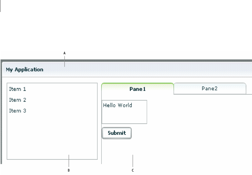
The following image shows an example Flex application that contains a List control on the left side of the user
interface and a TabNavigator container on the right side. Both controls are enclosed in a Panel container.
A. Panel container B. List control C. TabNavigator container
Use the following code to implement this application:
<?xml version="1.0"?>
<!-- mxml/LayoutExample.mxml -->
<mx:Application xmlns:mx="http://www.adobe.com/2006/mxml">
<mx:Panel title="My Application"
paddingTop="10"
paddingBottom="10"
paddingLeft="10"
paddingRight="10"
>
<mx:HBox>
<!-- List with three items -->
<mx:List>
<mx:dataProvider>
<mx:Array>
<mx:String>Item 1</mx:String>
<mx:String>Item 2</mx:String>
<mx:String>Item 3</mx:String>
</mx:Array>
</mx:dataProvider>
</mx:List>
<!-- First pane of TabNavigator -->

9ADOBE FLEX 3
Adobe Flex 3 Developer Guide
<mx:TabNavigator borderStyle="solid">
<mx:VBox label="Pane1" width="300" height="150">
<mx:TextArea text="Hello World"/>
<mx:Button label="Submit"/>
</mx:VBox>
<!-- Second pane of TabNavigator -->
<mx:VBox label="Pane2" width="300" height="150">
<!-- Stock view goes here -->
</mx:VBox>
</mx:TabNavigator>
</mx:HBox>
</mx:Panel>
</mx:Application>
The List control and TabNavigator container are laid out side by side because they are in an HBox container. The
controls in the TabNavigator container are laid out from top to bottom because they are in a VBox container.
For more information about laying out user interface components, see “Using Flex Visual Components” on
page 113.
Adding user interface controls
Flex includes a large selection of user interface components, such as Button, TextInput, and ComboBox controls.
After you define the layout and navigation of your application by using container components, you add the user
interface controls.
The following example contains an HBox (horizontal box) container with two child controls, a TextInput control
and a Button control. An HBox container lays out its children horizontally.
<?xml version="1.0"?>
<!-- mxml/AddUIControls.mxml -->
<mx:Application xmlns:mx="http://www.adobe.com/2006/mxml">
<mx:Script>
<![CDATA[
private function storeZipInDatabase(s:String):void {
// event handler code here
}
]]>
</mx:Script>
<mx:HBox>
<mx:TextInput id="myText"/>
<mx:Button click="storeZipInDatabase(myText.text)"/>
</mx:HBox>
</mx:Application>
Typical properties of a control tag include id, width, height, fontSize, color, event listeners for events such as
click and change, and effect triggers such as showEffect and rollOverEffect. For information about the
standard Flex controls, see “Controls” on page 223.

CHAPTER 1
10
Using the id property with MXML tags
With a few exceptions (see “MXML tag rules” on page 34), an MXML tag has an optional id property, which must
be unique within the MXML file. If a tag has an id property, you can reference the corresponding object in Action-
Script.
In the following example, results from a web-service request are traced in the writeToLog function:
<?xml version="1.0"?>
<!-- mxml/UseIDProperty.mxml -->
<mx:Application xmlns:mx="http://www.adobe.com/2006/mxml">
<mx:VBox>
<mx:TextInput id="myText" text="Hello World!" />
<mx:Button id="mybutton" label="Get Weather" click="writeToLog();"/>
</mx:VBox>
<mx:Script>
<![CDATA[
private function writeToLog():void {
trace(myText.text);
}
]]>
</mx:Script>
</mx:Application>
This code causes the MXML compiler to autogenerate a public variable named myText that contains a reference
to that Te xt Inp ut instance. This autogenerated variable lets you access the component instance in ActionScript.
You can explicitly refer to the TextInput control’s instance with its id instance reference in any ActionScript class
or script block. By referring to a component’s instance, you can modify its properties and call its methods.
Because each id value in an MXML file is unique, all objects in a file are part of the same flat namespace. You do
not qualify an object by referencing its parent with dot notation, as in myVBox.myText.text.
For more information, see “Referring to Flex components” on page 42.
Using XML namespaces
In an XML document, tags are associated with a namespace. XML namespaces let you refer to more than one set
of XML tags in the same XML document. The xmlns property in an MXML tag specifies an XML namespace. To
use the default namespace, specify no prefix. To use additional tags, specify a tag prefix and a namespace.
For example, the xmlns property in the following <mx:Application> tag indicates that tags in the MXML
namespace use the prefix mx:. The Universal Resource Identifier (URI) for the MXML namespace is
http://www.adobe.com/2006/mxml.
<mx:Application xmlns:mx="http://www.adobe.com/2006/mxml">

11ADOBE FLEX 3
Adobe Flex 3 Developer Guide
XML namespaces give you the ability to use custom tags that are not in the MXML namespace. The following
example shows an application that contains a custom tag called CustomBox. The namespace value
containers.boxes.* indicates that an MXML component called CustomBox is in the containers/boxes
directory.
<?xml version="1.0"?>
<!-- mxml/XMLNamespaces.mxml -->
<mx:Application xmlns:mx="http://www.adobe.com/2006/mxml"
xmlns:MyComps="containers.boxes.*"
>
<mx:Panel title="My Application"
paddingTop="10"
paddingBottom="10"
paddingLeft="10"
paddingRight="10"
>
<MyComps:CustomBox/>
</mx:Panel>
</mx:Application>
The containers/boxes directory can be a subdirectory of the directory that contains the application file, or it can
be a subdirectory of one of the ActionScript source path directories assigned in the flex-config.xml file. If copies
of the same file exist in both places, Flex uses the file in the application file directory. The prefix name is arbitrary,
but it must be used as declared.
When using a component contained in a SWC file, the package name and the namespace must match, even
though the SWC file is in the same directory as the MXML file that uses it. A SWC file is an archive file for Flex
components. SWC files make it easy to exchange components among Flex developers. You exchange only a single
file, rather than the MXML or ActionScript files and images, along with other resource files. Also, the SWF file
inside a SWC file is compiled, which means that the code is obfuscated from casual view. For more information
on SWC files, see “Using the Flex Compilers” on page 125 in Building and Deploying Adobe Flex 3 Applications.
Using MXML to trigger run-time code
Flex applications are driven by run-time events, such as when a user selects a Button control. You can specify event
listeners, which consist of code for handling run-time events, in the event properties of MXML tags. For example,
the <mx:Button> tag has a click event property in which you can specify ActionScript code that executes when
the Button control is clicked at run time. You can specify simple event listener code directly in event properties.
To use more complex code, you can specify the name of an ActionScript function defined in an <mx:Script> tag.
The following example shows an application that contains a Button control and a Te x tA re a control. The click
property of the Button control contains a simple event listener that sets the value of the TextArea control’s text
property to the text Hello World.
<?xml version="1.0"?>
<!-- mxml/TriggerCodeExample.mxml -->
<mx:Application xmlns:mx="http://www.adobe.com/2006/mxml">

CHAPTER 1
12
<mx:Panel title="My Application"
paddingTop="10"
paddingBottom="10"
paddingLeft="10"
paddingRight="10"
>
<mx:TextArea id="textarea1"/>
<mx:Button label="Submit" click="textarea1.text='Hello World';"/>
</mx:Panel>
</mx:Application>
The following image shows the application rendered in a web browser window:
[
The following example shows the code for a version of the application in which the event listener is contained in
an ActionScript function in an <mx:Script> tag:
<?xml version="1.0"?>
<!-- mxml/TriggerCodeExample2.mxml -->
<mx:Application xmlns:mx="http://www.adobe.com/2006/mxml">
<mx:Script>
<![CDATA[
private function hello():void {
textarea1.text="Hello World";
}
]]>
</mx:Script>
<mx:Panel title="My Application"
paddingTop="10"
paddingBottom="10"
paddingLeft="10"
paddingRight="10"
>
<mx:TextArea id="textarea1"/>
<mx:Button label="Submit" click="hello();"/>
</mx:Panel>
</mx:Application>
For more information about using ActionScript with MXML, see “Using ActionScript” on page 37.
13ADOBE FLEX 3
Adobe Flex 3 Developer Guide
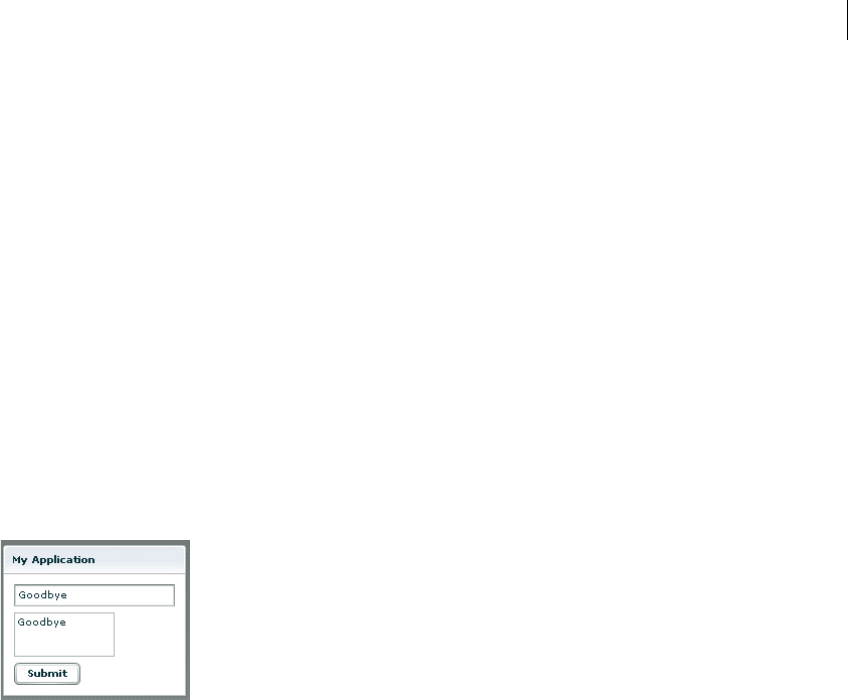
Binding data between components
Flex provides simple syntax for binding the properties of components to each other. In the following example, the
value inside the curly braces ({ }) binds the text property of a Te x t Are a control to the text property of a
TextInput control. When the application initializes, both controls display the text Hello. When the user clicks the
Button control, both controls display the text Goodbye.
<?xml version="1.0"?>
<!-- mxml/BindingExample.mxml -->
<mx:Application xmlns:mx="http://www.adobe.com/2006/mxml">
<mx:Panel title="My Application"
paddingTop="10"
paddingBottom="10"
paddingLeft="10"
paddingRight="10"
>
<mx:TextInput id="textinput1" text="Hello"/>
<mx:TextArea id="textarea1" text="{textinput1.text}"/>
<mx:Button label="Submit" click="textinput1.text='Goodbye';"/>
</mx:Panel>
</mx:Application>
The following image shows the application rendered in a web browser window after the user clicks the Submit
button:
As an alternative to the curly braces ({ }) syntax, you can use the <mx:Binding> tag, in which you specify the
source and destination of a binding. For more information about data binding, see “Storing Data” on page 1257.
Using RPC services
Remote-procedure-call (RPC) services let your application interact with remote servers to provide data to your
applications, or for your application to send data to a server.
Flex is designed to interact with several types of RPC services that provide access to local and remote server-side
logic. For example, a Flex application can connect to a web service that uses the Simple Object Access Protocol
(SOAP), a Java object residing on the same application server as Flex using AMF, or an HTTP URL that returns
XML.

CHAPTER 1
14
The MXML components that provide data access are called RPC components. MXML includes the following
types of RPC components:
•WebService provides access to SOAP-based web services.
•HTTPService provides access to HTTP URLs that return data.
•RemoteObject provides access to Java objects using the AMF protocol (Adobe LiveCycle Data Services ES
only).
The following example shows an application that calls a web service that provides weather information, and
displays the current temperature for a given ZIP code. The application binds the ZIP code that a user enters in a
TextInput control to a web service input parameter. It binds the current temperature value contained in the web
service result to a TextArea control.
<?xml version="1.0"?>
<!-- mxml/RPCExample.mxml -->
<mx:Application xmlns:mx="http://www.adobe.com/2006/mxml">
<!-- Define the web service connection
(the specified WSDL URL is not functional). -->
<mx:WebService id="WeatherService"
wsdl="http:/example.com/ws/WeatherService?wsdl"
useProxy="false">
<!-- Bind the value of the ZIP code entered in the TextInput control
to the ZipCode parameter of the GetWeather operation. -->
<mx:operation name="GetWeather">
<mx:request>
<ZipCode>{zip.text}</ZipCode>
</mx:request>
</mx:operation>
</mx:WebService>
<mx:Panel title="My Application" paddingTop="10" paddingBottom="10"
paddingLeft="10" paddingRight="10" >
<!-- Provide a ZIP code in a TextInput control. -->
<mx:TextInput id="zip" width="200" text="Zipcode please?"/>
<!-- Call the web service operation with a Button click. -->
<mx:Button width="60" label="Get Weather"
click="WeatherService.GetWeather.send();"/>
<!-- Display the location for the specified ZIP code. -->
<mx:Label text="Location:"/>
<mx:TextArea text="{WeatherService.GetWeather.lastResult.Location}"/>
<!-- Display the current temperature for the specified ZIP code. -->
<mx:Label text="Temperature:"/>
<mx:TextArea
text="{WeatherService.GetWeather.lastResult.CurrentTemp}"/>
</mx:Panel>
</mx:Application>
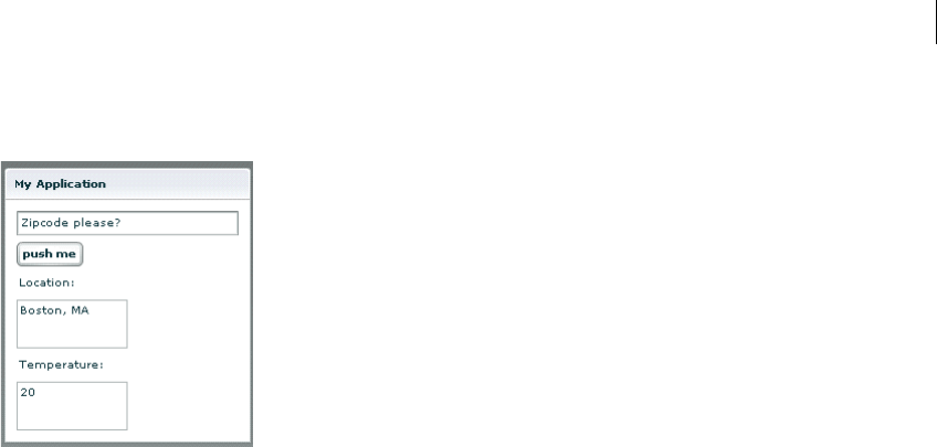
15ADOBE FLEX 3
Adobe Flex 3 Developer Guide
The following image shows the application rendered in a web browser window:
For more information about using RPC services, see “Accessing Server-Side Data with Flex” on page 1163.
Storing data in a data model
You can use a data model to store application-specific data. A data model is an ActionScript object that provides
properties for storing data, and optionally contains methods for additional functionality. Data models provide a
way to store data in the Flex application before it is sent to the server, or to store data sent from the server before
using it in the application.
You can declare a simple data model that does not require methods in an <mx:Model>, <mx:XML>, or
<mx:XMLList> tag. The following example shows an application that contains Te x tIn put controls for entering
personal contact information and a data model, represented by the <mx:Model> tag, for storing the contact infor-
mation:
<?xml version="1.0"?>
<!-- mxml/StoringData.mxml -->
<mx:Application xmlns:mx="http://www.adobe.com/2006/mxml">
<!-- A data model called "contact" stores contact information.
The text property of each TextInput control shown above
is passed to a field of the data model. -->
<mx:Model id="contact">
<info>
<homePhone>{homePhoneInput.text}</homePhone>
<cellPhone>{cellPhoneInput.text}</cellPhone>
<email>{emailInput.text}</email>
</info>
</mx:Model>
<mx:Panel title="My Application" paddingTop="10" paddingBottom="10"
paddingLeft="10" paddingRight="10" >
<!-- The user enters contact information in TextInput controls. -->

CHAPTER 1
16
<mx:TextInput id="homePhoneInput"
text="This isn't a valid phone number."/>
<mx:TextInput id="cellPhoneInput" text="(999)999-999"/>
<mx:TextInput id="emailInput" text="me@somewhere.net"/>
</mx:Panel>
</mx:Application>
Validating data
You can use validator components to validate data stored in a data model, or in a Flex user interface component.
Flex includes a set of standard validator components. You can also create your own.
The following example uses validator components for validating that the expected type of data is entered in the
Te xt In pu t fields. Validation is triggered automatically when the user edits a TextInput control. If validation fails,
the user receives immediate visual feedback.
<?xml version="1.0"?>
<!-- mxml/ValidatingExample.mxml -->
<mx:Application xmlns:mx="http://www.adobe.com/2006/mxml">
<!-- A data model called "contact" stores contact information.
The text property of each TextInput control shown above
is passed to a field of the data model. -->
<mx:Model id="contact">
<info>
<homePhone>{homePhoneInput.text}</homePhone>
<cellPhone>{cellPhoneInput.text}</cellPhone>
<email>{emailInput.text}</email>
</info>
</mx:Model>
<!-- Validator components validate data entered into the TextInput controls. -->
<mx:PhoneNumberValidator id="pnV"
source="{homePhoneInput}" property="text"/>
<mx:PhoneNumberValidator id="pnV2"
source="{cellPhoneInput}" property="text"/>
<mx:EmailValidator id="emV" source="{emailInput}" property="text" />
<mx:Panel title="My Application" paddingTop="10" paddingBottom="10"
paddingLeft="10" paddingRight="10" >
<!-- The user enters contact information in TextInput controls. -->
<mx:TextInput id="homePhoneInput"
text="This isn't a valid phone number."/>
<mx:TextInput id="cellPhoneInput" text="(999)999-999"/>
<mx:TextInput id="emailInput" text="me@somewhere.net"/>
</mx:Panel>
</mx:Application>
17ADOBE FLEX 3
Adobe Flex 3 Developer Guide
The following image shows the application rendered in a web browser window:
For more information about using data models, see “Storing Data” on page 1257. For more information on
validators, see “Validating Data” on page 1267.
Formatting data
Formatter components are ActionScript components that perform a one-way conversion of raw data to a
formatted string. They are triggered just before data is displayed in a text field. Flex includes a set of standard
formatters. You can also create your own formatters. The following example shows an application that uses the
standard ZipCodeFormatter component to format the value of a variable:
<?xml version="1.0"?>
<!-- mxml/FormatterExample.mxml -->
<mx:Application xmlns:mx="http://www.adobe.com/2006/mxml">
<!-- Declare a ZipCodeFormatter and define parameters. -->
<mx:ZipCodeFormatter id="ZipCodeDisplay" formatString="#####-####"/>
<mx:Script>
<![CDATA[
[Bindable]
private var storedZipCode:Number=123456789;
]]>
</mx:Script>
<mx:Panel title="My Application"
paddingTop="10"
paddingBottom="10"
paddingLeft="10"
paddingRight="10"
>
<!-- Trigger the formatter while populating a string with data. -->
<mx:TextInput text="{ZipCodeDisplay.format(storedZipCode)}"/>
</mx:Panel>
</mx:Application>

CHAPTER 1
18
The following image shows the application rendered in a web browser window:
For more information about formatter components, see “Formatting Data” on page 1305.
Using Cascading Style Sheets (CSS)
You can use style sheets based on the CSS standard to declare styles to Flex components. The MXML <mx:Style>
tag contains inline style definitions or a reference to an external file that contains style definitions.
The <mx:Style> tag must be an immediate child of the root tag of the MXML file. You can apply styles to an
individual component using a class selector, or to all components of a certain type using a type selector.
The following example defines a class selector and a type selector in the <mx:Style> tag. Both the class selector
and the type selector are applied to the Button control.
<?xml version="1.0"?>
<!-- mxml/CSSExample.mxml -->
<mx:Application xmlns:mx="http://www.adobe.com/2006/mxml">
<mx:Style>
.myClass { color: Red } /* class selector */
Button { font-size: 18pt} /* type selector */
</mx:Style>
<mx:Panel title="My Application"
paddingTop="10"
paddingBottom="10"
paddingLeft="10"
paddingRight="10"
>
<mx:Button styleName="myClass" label="This is red 18 point text."/>
</mx:Panel>
</mx:Application>
A class selector in a style definition, defined as a label preceded by a period, defines a new named style, such as
myClass in the preceding example. After you define it, you can apply the style to any component using the
styleName property. In the preceding example, you apply the style to the Button control to set the font color to
red.
A type selector applies a style to all instances of a particular component type. In the preceding example, you set
the font size for all Button controls to 18 points.

19ADOBE FLEX 3
Adobe Flex 3 Developer Guide
The following image shows the application rendered in a web browser window:
For more information about using Cascading Style Sheets, see “Using Styles and Themes” on page 589.
Using skins
Skinning is the process of changing the appearance of a component by modifying or replacing its visual elements.
These elements can be made up of bitmap images, SWF files, or class files that contain drawing methods that
define vector images. Skins can define the entire appearance, or only a part of the appearance, of a component in
various states. For more information about using skins, see “Creating Skins” on page 689.
Using effects
An effect is a change to a component that occurs over a brief period of time. Examples of effects are fading,
resizing, and moving a component. An effect is combined with a trigger, such as a mouse click on a component, a
component getting focus, or a component becoming visible, to form a behavior. In MXML, you apply effects as
properties of a control or container. Flex provides a set of built-in effects with default properties.
The following example shows an application that contains a Button control with its rollOverEffect property set
to use the WipeLeft effect when the user moves the mouse over it:
<?xml version="1.0"?>
<!-- mxml/WipeLeftEffect.mxml -->
<mx:Application xmlns:mx="http://www.adobe.com/2006/mxml">
<!-- Define the effect. -->
<mx:WipeLeft id="myWL" duration="1000"/>
<mx:Panel title="My Application"
paddingTop="10"
paddingBottom="10"
paddingLeft="10"
paddingRight="10"
>
<!-- Assign effect to targets. -->
<mx:Button id="myButton" rollOverEffect="{myWL}"/>
</mx:Panel>
</mx:Application>
For more information about effects, see “Using Behaviors” on page 545.
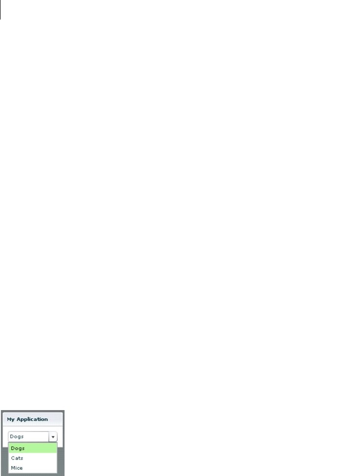
CHAPTER 1
20
Defining custom MXML components
Custom MXML components are MXML files that you create and use as custom MXML tags in other MXML files.
They encapsulate and extend the functionality of existing Flex components. Just like MXML application files,
MXML component files can contain a mix of MXML tags and ActionScript code. The name of the MXML file
becomes the class name with which you refer to the component in another MXML file.
Note: You cannot access custom MXML component URLs directly in a web browser.
The following example shows a custom ComboBox control that is prepopulated with list items:
<?xml version="1.0"?>
<!-- mxml/containers/boxes/MyComboBox.mxml -->
<mx:VBox xmlns:mx="http://www.adobe.com/2006/mxml">
<mx:ComboBox >
<mx:dataProvider>
<mx:String>Dogs</mx:String>
<mx:String>Cats</mx:String>
<mx:String>Mice</mx:String>
</mx:dataProvider>
</mx:ComboBox>
</mx:VBox>
The following example shows an application that uses the MyComboBox component as a custom tag. The value
containers.boxes.* assigns the MyComps namespace to the containers/boxes sub-directory. To run this
example, store the MyComboBox.mxml file in that sub-directory.
<?xml version="1.0"?>
<!-- mxml/CustomMXMLComponent.mxml -->
<mx:Application xmlns:mx="http://www.adobe.com/2006/mxml"
xmlns:MyComps="containers.boxes.*">
<mx:Panel title="My Application"
paddingTop="10"
paddingBottom="10"
paddingLeft="10"
paddingRight="10"
>
<MyComps:MyComboBox/>
</mx:Panel>
</mx:Application>
The following image shows the application rendered in a web browser window:

21ADOBE FLEX 3
Adobe Flex 3 Developer Guide
For more information about MXML components, see “Simple MXML Components” on page 63 in Creating and
Extending Adobe Flex 3 Components.
You can also define custom Flex components in ActionScript. For more information, see “Simple Visual Compo-
nents in ActionScript” on page 105 in Creating and Extending Adobe Flex 3 Components.

CHAPTER 1
22

23
Chapter 2: MXML Syntax
MXML is an XML language that you use to lay out user-interface components for Adobe® Flex® applications.
Topics
Basic MXML syntax . . . . . . . . . . . . . . . . . . . . . . . . . . . . . . . . . . . . . . . . . . . . . . . . . . . . . . . . . . . . . . . . . . . . . . . . . . . . . . 23
Setting component properties. . . . . . . . . . . . . . . . . . . . . . . . . . . . . . . . . . . . . . . . . . . . . . . . . . . . . . . . . . . . . . . . . . . . . . 24
Basic MXML syntax
Most MXML tags correspond to ActionScript 3.0 classes or properties of classes. Flex parses MXML tags and
compiles a SWF file that contains the corresponding ActionScript objects.
ActionScript 3.0 uses syntax based on the ECMAScript edition 4 draft language specification. ActionScript 3.0
includes the following features:
•Formal class definition syntax
•Formal packages structure
•Typing of variables, parameters, and return values (compile-time only)
•Implicit getters and setters that use the get and set keywords
•Inheritance
•Public and private members
•Static members
•Cast operator
For more information about ActionScript 3.0, see “Using ActionScript” on page 37.
Naming MXML files
MXML filenames must adhere to the following naming conventions:
•Filenames must be valid ActionScript identifiers, which means they must start with a letter or underscore
character (_), and they can only contain letters, numbers, and underscore characters after that.
•Filenames must not be the same as ActionScript class names, component id values, or the word application.
Do not use filenames that match the names of MXML tags that are in the mx namespace.
•Filenames must end with a lowercase .mxml file extension.

24 CHAPTER 2
Using tags that represent ActionScript classes
An MXML tag that corresponds to an ActionScript class uses the same naming conventions as the ActionScript
class. Class names begin with a capital letter, and capital letters separate the words in class names. For example,
when a tag corresponds to an ActionScript class, its properties correspond to the properties and events of that
class.
Setting component properties
In MXML, a component property uses the same naming conventions as the corresponding ActionScript property.
A property name begins with a lowercase letter, and capital letters separate words in the property names.
You can set most component properties as tag attributes, in the form:
<mx:Label width="50" height="25" text="Hello World"/>
You can set all component properties as child tags, in the form:
<mx:Label>
<mx:width>50</mx:width>
<mx:height>25</mx:height>
<mx:text>Hello World</mx:text>
</mx:Label>
You often use child tags when setting the value of a property to a complex Object because it is not possible to
specify a complex Object as the value of tag attribute. In the following example, you use child tags to set the data
provider of a ComboBox control of an ArrayCollection object:
<mx:ComboBox>
<mx:dataProvider>
<mx:ArrayCollection>
<mx:String>AK</mx:String>
<mx:String>AL</mx:String>
<mx:String>AR</mx:String>
</mx:ArrayCollection>
<mx:dataProvider>
</mx:ComboBox>
The one restriction on setting properties that use child tags is that the namespace prefix of a child tag, mx: in the
previous example, must match the namespace prefix of the component tag.
Each of a component’s properties is one of the following types:
•Scalar properties, such as a number or string
•Array of scalar values, such as an array of numbers or strings
•ActionScript object
•Array of ActionScript objects

25ADOBE FLEX 3
Adobe Flex 3 Developer Guide
•ActionScript properties
•XML data
Adobe recommends that you assign scalar values using tag attributes, and that you assign complex types, such as
ActionScript objects, by using child tags.
Setting scalar properties
You usually specify the value of a scalar property as a property of a component tag, as the following example
shows:
<mx:Label width="50" height="25" text="Hello World"/>
Setting properties using constants
The valid values of many component properties are defined by static constants, where these static constants are
defined in an ActionScript class. In MXML, you can either use the static constant to set the property value, or use
the value of the static constant, as the following example shows:
<!-- Set the property using the static constant. -->
<mx:HBox width="200" horizontalScrollPolicy="{ScrollPolicy.OFF}">
...
</mx:HBox>
<!-- Set the property using the value of the static constant. -->
<mx:HBox width="200" horizontalScrollPolicy="off">
...
</mx:HBox>
The HBox container defines a property named horizontalScrollPolicy that defines the operation of the
container’s horizontal scroll bar. In this example, you explicitly set the horizontalScrollPolicy property to
disable the horizontal scroll bar.
In the first example, you set the horizontalScrollPolicy property using a static constant named OFF, which is
defined in the ScrollPolicy class. In MXML, you must use data binding syntax when setting a property value to a
static constant. The advantage of using the static constant is that the Flex compiler recognizes incorrect property
values, and issues an error message at compile time.
Alternatively, you can set the value of the horizontalScrollPolicy property to the value of the static constant.
The value of the OFF static constant is "off". When you use the value of the static constant to set the property
value, the Flex compiler cannot determine if you used an unsupported value. If you incorrectly set the property,
you will not know until you get a run-time error.
In ActionScript, you should always use static constants to set property values, as the following example shows:
var myHBox:HBox = new HBox();
myHBox.horizontalScrollPolicy=ScrollPolicy.OFF;

CHAPTER 2
26
Setting the default property
Many Flex components define a single default property. The default property is the MXML tag property that is
implicit for content inside of the MXML tag if you do not explicitly specify a property. For example, consider the
following MXML tag definition:
<mx:SomeTag>
anything here
</mx:SomeTag>
If this tag defines a default property named default_property, the preceding tag definition is equivalent to the
following code:
<mx:SomeTag>
<default_property>
anything here
</default_property>
</mx:SomeTag>
It is also equivalent to the following code:
<mx:SomeTag default_property="anything here"/>
The default property provides a shorthand mechanism for setting a single property. For a ComboBox, the default
property is the dataProvider property. Therefore, the two ComboBox definitions in the following code are
equivalent:
<?xml version="1.0"?>
<!-- mxml\DefProp.mxml -->
<mx:Application xmlns:mx="http://www.adobe.com/2006/mxml" >
<!-- Omit the default property. -->
<mx:ComboBox>
<mx:ArrayCollection>
<mx:String>AK</mx:String>
<mx:String>AL</mx:String>
<mx:String>AR</mx:String>
</mx:ArrayCollection>
</mx:ComboBox>
<!-- Explicitly speficy the default property. -->
<mx:ComboBox>
<mx:dataProvider>
<mx:ArrayCollection>
<mx:String>AK</mx:String>
<mx:String>AL</mx:String>
<mx:String>AR</mx:String>
</mx:ArrayCollection>
</mx:dataProvider>
</mx:ComboBox>
</mx:Application>
Not all Flex components define a default property. To determine the default property for each component, see the
Adobe Flex Language Reference.

27ADOBE FLEX 3
Adobe Flex 3 Developer Guide
You can also define a default property when you create a custom component. For more information, see “Metadata
Tags in Custom Components” on page 33 in Creating and Extending Adobe Flex 3 Components.
Escaping characters using the backslash character
When setting a property value in MXML, you can escape a reserved character by prefixing it with the backslash
character (\), as the following example shows:
<?xml version="1.0"?>
<!-- mxml\EscapeChar.mxml -->
<mx:Application xmlns:mx="http://www.adobe.com/2006/mxml" >
<mx:Label text="\{\}"/>
</mx:Application>
In this example, you want to use literal curly brace characters ({ }) in a text string. But Flex uses curly braces to
indicate a data binding operation. Therefore, you prefix each curly brace with the backslash character to cause the
MXML compiler to interpret them as literal characters.
Setting String properties using the backslash character
The MXML compiler automatically escapes the backslash character in MXML when the character is part of the
value specified for a property of type String. Therefore, it always converts "\" to "\\".
This is necessary because the ActionScript compiler recognizes "\\" as the character sequence for a literal "\"
character, and strips out the leading backslash when it initializes the property value.
Note: Do not use the backslash character (\) as a separator in the path to an application asset. You should always use
a forward slash character (/) as the separator.
Including a newline character in a String value
For properties of type String, you can insert a newline character in the String in two ways:
•By inserting the code in your String value in MXML
•By inserting "\n" in an ActionScript String variable used to initialize the MXML property
To use the code to insert a newline character, include that code in the property value in MXML, as the
following example shows:
<mx:TextArea width="100%" text="Display Content"/>
To use an ActionScript String variable to insert a newline character, create an ActionScript variable, and then use
data binding to set the property in MXML, as the following example shows:
<mx:Script>

CHAPTER 2
28
<![CDATA[
[Bindable]
public var myText:String = "Display" + "\n" + "Content";
]]>
</mx:Script>
<mx:TextArea width="100%" text="{myText}"/>
In this example, you set the text property of the Te x tA re a control to a value that includes a newline character.
Notice that this example includes the [Bindable] metadata tag before the property definition. This metadata tag
specifies that the myText property can be used as the source of a data binding expression. Data binding automat-
ically copies the value of a source property of one object to the destination property of another object at run time
when the source property changes.
If you omit this metadata tag, the compiler issues a warning message specifying that the property cannot be used
as the source for data binding. For more information, see “Binding Data” on page 1229.
Setting Arrays of scalar values
When a class has a property that takes an Array as its value, you can represent the property in MXML using child
tags. The component in the following example has a dataProvider property that contains an Array of numbers:
<mx:List width="150">
<mx:dataProvider>
<mx:Array>
<mx:Number>94062</mx:Number>
<mx:Number>14850</mx:Number>
<mx:Number>53402</mx:Number>
</mx:Array>
</mx:dataProvider>
</mx:List>
The <mx:Array> and </mx:Array> tags around the Array elements are optional. Therefore, you can also write
this example as the following code shows:
<mx:List width="150">
<mx:dataProvider>
<mx:Number>94062</mx:Number>
<mx:Number>14850</mx:Number>
<mx:Number>53402</mx:Number>
</mx:dataProvider>
</mx:List>
In this example, since the data type of the dataProvider property is defined as Array, Flex automatically converts
the three number definitions into a three-element array.

29ADOBE FLEX 3
Adobe Flex 3 Developer Guide
Component developers may have specified additional information within the component definition that defines
the data type of the Array elements. For example, if the developer specified that the dataProvider property
supports only String elements, this example would cause a compiler error because you specified numbers to it.
The Adobe Flex Language Reference documents the Array properties that define a required data type for the Array
elements.
Setting Object properties
When a component has a property that takes an object as its value, you can represent the property in MXML using
a child tag with tag attributes, as the following example shows:
<mynamespace:MyComponent>
<mynamespace:nameOfProperty>
<mynamespace:typeOfObject prop1="val1" prop2="val2"/>
</mynamespace:nameOfProperty>
</mynamespace:MyComponent>
The following example shows an ActionScript class that defines an Address object. This object is used as a
property of the PurchaseOrder component in the next example.
class Address
{public var name:String;
public var street:String;
public var city:String;
public var state:String;
public var zip:Number;
}
The following example shows an ActionScript class that defines a PurchaseOrder component that has a property
type of Address:
import example.Address;
class PurchaseOrder {
public var shippingAddress:Address;
public var quantity:Number;
...
}
In MXML, you define the PurchaseOrder component as the following example shows:
<mynamespace:PurchaseOrder quantity="3" xmlns:e="example">
<mynamespace:shippingAddress>
<mynamespace:Address name="Fred" street="123 Elm St."/>
</mynamespace:shippingAddress>
</mynamespace:PurchaseOrder>
If the value of the shippingAddress property is a subclass of Address (such as DomesticAddress), you can
declare the property value, as the following example shows:
<mynamespace:PurchaseOrder quantity="3" xmlns:e="example">

CHAPTER 2
30
<mynamespace:shippingAddress>
<mynamespace:DomesticAddress name="Fred" street="123 Elm St."/>
</mynamespace:shippingAddress>
</mynamespace:PurchaseOrder>
If the property is explicitly typed as Object like the value property in the following example, you can specify an
anonymous object using the <mx:Object> tag.
class ObjectHolder {
public var value:Object
}
The following example shows how you specify an anonymous object as the value of the value property:
<mynamespace:ObjectHolder>
<mynamespace:value>
<mx:Object foo='bar'/>
</mynamespace:value>
</mynamespace:ObjectHolder>
Populating an Object with an Array
When a component has a property of type Object that takes an Array as its value, you can represent the property
in MXML using child tags, as the following example shows:
<mynamespace:MyComponent>
<mynamespace:nameOfObjectProperty>
<mx:Array>
<mx:Number>94062</mx:Number>
<mx:Number>14850</mx:Number>
<mx:Number>53402</mx:Number>
</mx:Array>
</mynamespace:nameOfObjectProperty>
</mynamespace:MyComponent>
In this example, you initialize the Object to a three-element array of numbers.
As described in the section “Setting Arrays of scalar values” on page 28, the <mx:Array> tag and the
</mx:Array> tag around the Array elements are optional and may be omitted, as the following example shows:
<mynamespace:MyComponent>
<mynamespace:nameOfObjectProperty>
<mx:Number>94062</mx:Number>
<mx:Number>14850</mx:Number>
<mx:Number>53402</mx:Number>
</mynamespace:nameOfObjectProperty>
</mynamespace:MyComponent>
The only exception to this rule is when you specify a single Array element for the Object property. In that case,
Flex does not create an Object containing a single-element array, but instead creates an object and sets it to the
specified value. This is a difference between the following two lines:
object=[element] // Object containing a one-element array
object=element // object equals value

31ADOBE FLEX 3
Adobe Flex 3 Developer Guide
If you want to create a single-element array, include the <mx:Array> and </mx:Array> tags around the array
element, as the following example shows:
<mynamespace:MyComponent>
<mynamespace:nameOfObjectProperty>
<mx:Array>
<mx:Number>94062</mx:Number>
</mx:Array>
</mynamespace:nameOfObjectProperty>
</mynamespace:MyComponent>
Populating Arrays of objects
When a component has a property that takes an Array of objects as its value, you can represent the property in
MXML using child tags, as the following example shows:
<mynamespace:MyComponent>
<mynamespace:nameOfProperty>
<mx:Array>
<mynamespace:objectType prop1="val1" prop2="val2"/>
<mynamespace:objectType prop1="val1" prop2="val2"/>
<mynamespace:objectType prop1="val1" prop2="val2"/>
</mx:Array>
</mynamespace:nameOfProperty>
</mynamespace:MyComponent>
The component in the following example contains an Array of ListItem objects. Each ListItem object has
properties named label and data.
<mynamespace:MyComponent>
<mynamespace:dataProvider>
<mx:Array>
<mynamespace:ListItem label="One" data="1"/>
<mynamespace:ListItem label="Two" data="2"/>
</mx:Array>
</mynamespace:dataProvider>
</mynamespace:MyComponent>
The following example shows how you specify an anonymous object as the value of the dataProvider property:
<mynamespace:MyComponent>
<mynamespace:dataProvider>
<mx:Array>
<mx:Object label="One" data="1"/>
<mx:Object label="Two" data="2"/>
</mx:Array>
</mynamespace:dataProvider>
</mynamespace:MyComponent>
As described in the section “Setting Arrays of scalar values” on page 28, the <mx:Array> tag and the
</mx:Array> tag around the Array elements are optional and may be omitted, as the following example shows:
<mynamespace:MyComponent>
<mynamespace:dataProvider>
<mx:Object label="One" data="1"/>

CHAPTER 2
32
<mx:Object label="Two" data="2"/>
</mynamespace:dataProvider>
</mynamespace:MyComponent>
Setting properties that contain XML data
If a component contains a property that takes XML data, the value of the property is an XML fragment to which
you can apply a namespace. In the following example, the value property of the MyComponent object is XML
data:
<mynamespace:MyComponent>
<mynamespace:value xmlns:a="http://www.example.com/myschema">
<mx:XML>
<a:purchaseorder>
<a:billingaddress>
...
</a:billingaddress>
...
</a:purchaseorder>
</mx:XML>
</mynamespace:value>
</mynamespace:MyComponent>
Setting style and effect properties in MXML
A style or effect property of an MXML tag differs from other properties because it corresponds to an ActionScript
style or effect, rather than to a property of an ActionScript class. You set these properties in ActionScript using the
setStyle(stylename, value) method rather than object.property=value notation.
You define style or effect properties in ActionScript classes using the [Style] or [Effect] metadata tags, rather
than defining them as ActionScript variables or setter/getter methods. For more information, see “Metadata Tags
in Custom Components” on page 33 in Creating and Extending Adobe Flex 3 Components.
For example, you can set the fontFamily style property in MXML, as the following code shows:
<mx:TextArea id="myText" text="hello world" fontFamily="Tahoma"/>
This MXML code is equivalent to the following ActionScript code:
myText.setStyle("fontFamily", "Tahoma");
Setting event properties in MXML
An event property of an MXML tag lets you specify the event listener function for an event. This property corre-
sponds to setting the event listener in ActionScript using the addEventListener() method.
You define event properties in ActionScript classes using the [Event] metadata tags, rather than defining them
as ActionScript variables or setter/getter methods. For more information, see “Metadata Tags in Custom Compo-
nents” on page 33 in Creating and Extending Adobe Flex 3 Components.

33ADOBE FLEX 3
Adobe Flex 3 Developer Guide
For example, you can set the creationComplete event property in MXML, as the following code shows:
<mx:TextArea id="myText" creationComplete="creationCompleteHandler()"/>
This MXML code is equivalent to the following ActionScript code:
myText.addEventListener("creationComplete", creationCompleteHandler);
Specifying a URL value
Some MXML tags, such as the <mx:Script> tag, have a property that takes a URL of an external file as a value.
For example, you can use the source property in an <mx:Script> tag to reference an external ActionScript file
instead of typing ActionScript directly in the body of the <mx:Script> tag.
Note: You specify a script in the source property of an <mx:Script> tag. You do not specify ActionScript classes in
the source property. For information on using ActionScript classes, see “Creating ActionScript components” on
page 55.
MXML supports the following types of URLs:
•Absolute, as in the following example:
<mx:Style source="http://www.somesite.com/mystyles.css">
•A path used at run time that is relative to the context root of the Java web application in which a Flex appli-
cation is running. For example:
<mx:HTTPService url="@ContextRoot()/directory/myfile.xml"/>
•A path used at compile time that is relative to the context root of the Java web application in which a Flex appli-
cation is running, as in the following example:
<mx:Script source="/myscript.as"/>
•Relative to the current file location, as in the following example:
<mx:Script source="../myscript.as"/>
Specifying a RegExp value
For a property of type RegExp, you can specify its value in MXML using the following format:
"/pattern/flags"
pattern Specifies the regular expression within the two slashes. Both slashes are required.
flags (Optional) Specifies any flags for the regular expression.
For example, the regExpression property of an MXML component is of type RegExp. Therefore, you can set its
value as the following example shows:
<mynamespace:MyComponent regExpression="/\Wcat/gi"/>

CHAPTER 2
34
Or set it using child tags, as the following example shows:
<mynamespace:MyComponent>
<mynamespace:regExpression>/\Wcat/gi</mynamespace:regExpression>
</mynamespace:MyComponent>
The flags portion of the regular expression is optional, so you can also specify it as the following example shows:
<mynamespace:MyComponent regExpression="/\Wcat/"/>
Using compiler tags
Compiler tags are tags that do not directly correspond to ActionScript objects or properties. The names of the
following compiler tags have just the first letter capitalized:
•<mx:Binding>
•<mx:Component>
•<mx:Metadata>
•<mx:Model>
•<mx:Script>
•<mx:Style>
•<mx:XML>
•<mx:XMLList>
The following compiler tags are in all lowercase letters:
•<mx:operation>
•<mx:request>
•<mx:method>
•<mx:arguments>
MXML tag rules
MXML has the following syntax requirements:
•The id property is not required on any tag.
•The id property is not allowed on the root tag.
•Boolean properties take only true and false values.
•The <mx:Binding> tag requires both source and destination properties.
•The <mx:Binding> tag cannot contain an id property.
•The <mx:WebService> tag requires a wsdl value or destination value, and does not allow both.

35ADOBE FLEX 3
Adobe Flex 3 Developer Guide
•The <mx:RemoteObject> tag requires a source value or a named value, and does not allow both.
•The <mx:HTTPService> tag requires a url value or a destination value, and does not allow both.
•The <mx:operation> tag requires a name value, and does not allow duplicate name entries.
•The <mx:operation> tag cannot contain an id property.
•The <mx:method> tag requires a name value and does not allow duplicate name entries.
•The <mx:method> tag cannot contain an id property.

CHAPTER 2
36

37
Chapter 3: Using ActionScript
Flex developers can use ActionScript to extend the functionality of their Adobe® Flex® applications. ActionScript
provides flow control and object manipulation features that are not available in MXML. For a complete intro-
duction to ActionScript and a reference for using the language, see Programming ActionScript 3.0 and ActionScript
3.0 Language Reference.
Topics
Using ActionScript in Flex applications . . . . . . . . . . . . . . . . . . . . . . . . . . . . . . . . . . . . . . . . . . . . . . . . . . . . . . . . . . . . .37
Working with Flex components . . . . . . . . . . . . . . . . . . . . . . . . . . . . . . . . . . . . . . . . . . . . . . . . . . . . . . . . . . . . . . . . . . . . 42
Comparing, including, and importing ActionScript code . . . . . . . . . . . . . . . . . . . . . . . . . . . . . . . . . . . . . . . . . . . . . . 49
Techniques for separating ActionScript from MXML. . . . . . . . . . . . . . . . . . . . . . . . . . . . . . . . . . . . . . . . . . . . . . . . . . 53
Creating ActionScript components . . . . . . . . . . . . . . . . . . . . . . . . . . . . . . . . . . . . . . . . . . . . . . . . . . . . . . . . . . . . . . . . . 55
Performing object introspection. . . . . . . . . . . . . . . . . . . . . . . . . . . . . . . . . . . . . . . . . . . . . . . . . . . . . . . . . . . . . . . . . . . . 56
Using ActionScript in Flex applications
Flex developers can use ActionScript to implement custom behavior within their Flex applications. You first use
MXML tags to declare things like the containers, controls, effects, formatters, validators, and web services that
your application requires, and to lay out its user interface. Each of these components provides the standard
behavior you’d expect. For example, a button automatically highlights when you roll over it, without requiring you
to write any ActionScript. But a declarative language like MXML is not appropriate for coding what you want to
happen when the user clicks a button. For that, you need to use a procedural language like ActionScript, which
offers executable methods, various types of storage variables, and flow control such as conditionals and loops. In
a general sense, MXML implements the static aspects of your application, and ActionScript implements its
dynamic aspects.
ActionScript is an object-oriented procedural programming language, based on the ECMAScript (ECMA-262)
edition 4 draft language specification. You can use a variety of methods to mix ActionScript and MXML, including
the following:
•Use ActionScript to define event listeners inside MXML event attributes.
•Add script blocks using the <mx:Script> tag.
•Include external ActionScript files.

38 CHAPTER 3
•Import ActionScript classes.
•Create ActionScript components.
ActionScript compilation
Although a simple Flex application can be written in a single MXML or ActionScript (AS) file, most applications
will be broken into multiple files. For example, it is common to move the <mx:Script> and <mx:Style> blocks
for an <mx:Application> into separate AS and CSS files which the application then includes. It is also common
for an application to import custom MXML and ActionScript components. These must be defined in other files,
and MXML components may put their own <mx:Script> blocks into yet more AS files that they include. Compo-
nents may also be imported from precompiled SWC files rather than source code. Finally, SWF files containing
executable code can also be embedded in an application. The end result of all these input files is a single SWF file.
The Flex compiler transforms the main MXML file and other files it includes into a single ActionScript class. As
a result, you cannot define classes or use statements outside of functions in the MXML files and the included
ActionScript files.
You can reference imported ActionScript classes from your MXML application files, and those classes are added
to the final SWF file. When the transformation to an ActionScript file is complete, Flex links all the ActionScript
components and includes those classes in the final SWF file.
About generated ActionScript
When you write an MXML file and compile it, the Flex compiler creates a class and generates ActionScript that
the class uses. MXML tags and ActionScript are used by the resulting class in several ways. This information is
useful for understanding what is happening in the background of the application.
An MXML application (a file that starts with the <mx:Application> tag) defines a subclass of the Application
class. Similarly, an MXML component (a file that starts with some other component’s tag, such as <mx:Button>)
defines a subclass of that component.
The name of the subclass is the name of the file. The base class is the class of the top-level tag. An MXML appli-
cation actually defines the following:
class MyApp extends Application
If MyButton.mxml starts with <mx:Button>, you are actually defining the following:
class MyButton extends Button
The variable and function declarations in an <mx:Script> block define properties and methods of the subclass.

39ADOBE FLEX 3
Adobe Flex 3 Developer Guide
Setting an id property on a component instance within a class results in a public variable being autogenerated in
the subclass that contains a reference to that component instance. For example, if the <mx:Button
id="myButton"/> tag is nested deeply inside several containers, you can still refer to it as myButton.
Event attributes become the bodies of autogenerated event listener methods in the subclass. For example:
<mx:Button id="myButton" click="foo = 1; doSomething()">
becomes
private function __myButton_click(event:MouseEvent):void {
foo = 1;
doSomething()
}
The event attributes become method bodies, so they can access the other properties and methods of the subclass.
All the ActionScript anywhere in an MXML file, whether in its <mx:Script> block or inside tags, executes with
the this keyword referring to an instance of the subclass.
The public properties and methods of the class are accessible by ActionScript code in other components, as long
as that code “dots down” (for example, myCheckoutAccordion.myAddressForm.firstNameTextInput.text)
or reaches up using parentDocument, parentApplication, or Application.application to specify which
component the property or method exists on.
Using ActionScript in MXML event handlers
One way to use ActionScript code in a Flex application is to include it within the MXML tag’s event handler, as
the following example shows:
<?xml version="1.0"?>
<!-- usingas/HelloWorldAS.mxml -->
<mx:Application xmlns:mx="http://www.adobe.com/2006/mxml" layout="absolute">
<mx:Panel title="My Application" height="128" x="226" y="24" layout="absolute">
<mx:TextArea id="textarea1" width="155" x="0" y="0"/>
<mx:Button label="Click Me"
click="textarea1.text='Hello World';"
width="92"
x="31.5"
y="56"
/>
</mx:Panel>
</mx:Application>
In this example, you include ActionScript code for the body of the click event handler of the Button control. The
MXML compiler takes the attribute click="..." and generates the following event handler method:
public function __myButton_click(event:MouseEvent):void {
textarea1.text='Hello World';
}

CHAPTER 3
40
When the user clicks the button, this code sets the value of the TextArea control’s text property to the String
“Hello World.” In most cases, you do not need to look at the generated code, but it is useful to understand what
happens when you write an inline event handler.
To see the generated code, set the value of the keep-generated-actionscript compiler option to true. The
compiler then stores the *.as helper file in the /generated directory, which is a subdirectory of the location of the
SWF file.
For more information about events, see “Using Events” on page 61. For more information on using the command-
line compilers, see “Using the Flex Compilers” on page 125 in Building and Deploying Adobe Flex 3 Applications.
Using ActionScript blocks in MXML files
You use the <mx:Script> tag to insert an ActionScript block in an MXML file. ActionScript blocks can contain
ActionScript functions and variable declarations used in MXML applications. Code inside <mx:Script> tags can
also declare constants (with the const statement) and namespaces (with namespace), include ActionScript files
(with include), import declarations (with import), and use namespaces (with use namespace).
The <mx:Script> tag must be a child of the <mx:Application> or other top-level component tag.
Statements and expressions are allowed only if they are wrapped in a function. In addition, you cannot define new
classes or interfaces in <mx:Script> blocks. Instead, you must place new classes or interfaces in separate AS files
and import them.
All ActionScript in the block is added to the enclosing file’s class when Flex compiles the application. The
following example declares a variable and sets the value of that variable inside a function:
<?xml version="1.0"?>
<!-- usingas/StatementSyntax.mxml -->
<mx:Application xmlns:mx="http://www.adobe.com/2006/mxml"
creationComplete="doSomething()">
<mx:Script><![CDATA[
public var s:Boolean;
public function doSomething():void {
// The following statements must be inside a function.
s = label1.visible;
label1.text = "label1.visible = " + String(s);
}
]]></mx:Script>
<mx:Label id="label1"/>
</mx:Application>
Most statements must be inside functions in an <mx:Script> block. However, the following statements can be
outside functions:
•import
•var

41ADOBE FLEX 3
Adobe Flex 3 Developer Guide
•include
•const
•namespace
•use namespace
When using an <mx:Script> block, you should wrap the contents in a CDATA construct. This prevents the
compiler from interpreting the contents of the script block as XML, and allows the ActionScript to be properly
generated. Adobe recommends that you write all your <mx:Script> open and close tags as the following example
shows:
<mx:Script>
<![CDATA[
...
]]>
</mx:Script>
Flex does not parse text in a CDATA construct, which means that you can use XML-parsed characters such as
angle brackets (< and >) and ampersand (&). For example, the following script that includes a less-than (<)
comparison must be in a CDATA construct:
<?xml version="1.0"?>
<!-- usingas/UsingCDATA.mxml -->
<mx:Application xmlns:mx="http://www.adobe.com/2006/mxml"
creationComplete="doSomething()">
<mx:Script><![CDATA[
public var m:Number;
public var n:Number;
public function doSomething():void {
n = 42;
m = 40;
label1.text = "42 > 40 = " + String(n > m);
}
]]></mx:Script>
<mx:Label id="label1"/>
</mx:Application>
Accessing ActionScript documentation
The ActionScript 3.0 programming language can be used from within several development environments,
including Adobe® Flash® Professional and Adobe® Flex® Builder™.
The Flex documentation includes Programming ActionScript 3.0, which describes the ActionScript language. The
ActionScript API reference is included as part of the Adobe Flex Language Reference.

CHAPTER 3
42
Working with Flex components
The primary use of ActionScript in your Flex applications is probably going to be for working with the visual
controls and containers in your application. Flex provides several techniques for doing this, including referencing
a Flex control in ActionScript and manipulating properties during the instantiation of controls and containers.
Referring to Flex components
To work with a component in ActionScript, you usually define an id property for that component in the MXML
tag. For example, the following code sets the id property of the Button control to the String "myButton":
<mx:Button id="myButton" label="Click Me"/>
This property is optional if you do not want to access the component with ActionScript.
This code causes the MXML compiler to autogenerate a public variable named myButton that contains a reference
to that Button instance. This autogenerated variable lets you access the component instance in ActionScript. You
can explicitly refer to the Button control’s instance with its id instance reference in any ActionScript class or script
block. By referring to a component’s instance, you can modify its properties and call its methods.
For example, the following ActionScript block changes the value of the Button control’s label property when the
user clicks the button:
<?xml version="1.0"?>
<!-- usingas/ButtonExample.mxml -->
<mx:Application xmlns:mx="http://www.adobe.com/2006/mxml">
<mx:Script><![CDATA[
private function setLabel():void {
if (myButton.label=="Click Me") {
myButton.label = "Clicked";
} else {
myButton.label = "Click Me";
}
}
]]></mx:Script>
<mx:Button id="myButton" label="Click Me" click="setLabel();"/>
</mx:Application>
The IDs for all tags in an MXML component, no matter how deeply nested they are, generate public variables of
the component being defined. As a result, all id properties must be unique within a document. This also means
that if you specified an ID for a component instance, you can access that component from anywhere in the appli-
cation: from functions, external class files, imported ActionScript files, or inline scripts.
You can refer to a Flex component if it does not have an id property by using methods of the component’s
container, such as the getChildAt() and getChildByName() methods.
You can refer to the current enclosing document or current object using the this keyword.

43ADOBE FLEX 3
Adobe Flex 3 Developer Guide
You can also get a reference to a component when you have a String that matches the name. To access an object
on the application, you use the this keyword, followed by square brackets, with the String inside the square
brackets. The result is a reference to the objects whose name matches the String.
The following example changes style properties on each Button control using a compound String to get a reference
to the object:
<?xml version="1.0"?>
<!-- usingas/FlexComponents.mxml -->
<mx:Application xmlns:mx="http://www.adobe.com/2006/mxml">
<mx:Script><![CDATA[
private var newFontStyle:String;
private var newFontSize:int;
public function changeLabel(s:String):void {
s = "myButton" + s;
if (this[s].getStyle("fontStyle")=="normal") {
newFontStyle = "italic";
newFontSize = 18;
} else {
newFontStyle = "normal";
newFontSize = 10;
}
this[s].setStyle("fontStyle",newFontStyle);
this[s].setStyle("fontSize",newFontSize);
}
]]></mx:Script>
<mx:Button id="myButton1"
click="changeLabel('2')"
label="Change Other Button's Styles"
/>
<mx:Button id="myButton2"
click="changeLabel('1')"
label="Change Other Button's Styles"
/>
</mx:Application>
This technique is especially useful if you use a Repeater control or when you create objects in ActionScript and do
not necessarily know the names of the objects you want to refer to prior to run time. However, when you instan-
tiate an object in ActionScript, to add that object to the properties array, you must declare the variable as public
and declare it in the class’s scope, not inside a function.
The following example uses ActionScript to declare two Label controls in the application scope. During initial-
ization, the labels are instantiated and their text properties are set. The example then gets a reference to the Label
controls by appending the passed-in variable to the String when the user clicks the Button controls.
<?xml version="1.0"?>
<!-- usingas/ASLabels.mxml -->
<mx:Application xmlns:mx="http://www.adobe.com/2006/mxml"
creationComplete="initLabels()">
<mx:Script><
CHAPTER 3
44
import mx.controls.Label;
public var label1:Label;
public var label2:Label;
// Objects must be declared in the application scope. Adds the names to
// the application's properties array.
public function initLabels():void {
label1 = new Label();
label1.text = "Change Me";
label2 = new Label();
label2.text = "Change Me";
addChild(label1);
addChild(label2);
}
public function changeLabel(s:String):void {
// Create a String that matches the name of the Label control.
s = "label" + s;
// Get a reference to the label control using the
// application's properties array.
this[s].text = "Changed";
}
]]></mx:Script>
<mx:Button id="b1" click="changeLabel('2')" label="Change Other Label"/>
<mx:Button id="b2" click="changeLabel('1')" label="Change Other Label"/>
</mx:Application>
Calling component methods
You can invoke the public methods of a component instance in your Flex application by using the following dot-
notation syntax:
componentInstance.method([parameters]);
The following example invokes the adjustThumb() method when the user clicks the button, which invokes the
public setThumbValueAt() method of the HSlider control:
<?xml version="1.0"?>
<!-- usingas/ComponentMethods.mxml -->
<mx:Application xmlns:mx="http://www.adobe.com/2006/mxml">
<mx:Script><![CDATA[
public function adjustThumb(s:HSlider):void {
var randomNumber:int = (Math.floor(Math.random() * 10));
s.setThumbValueAt(0, randomNumber);
}
]]></mx:Script>
<mx:HSlider id="slider1" tickInterval="1"
labels="[1,2,3,4,5,6,7,8,9,10]"
width="282"

45ADOBE FLEX 3
Adobe Flex 3 Developer Guide
/>
<mx:Button id="myButton"
label="Change Thumb Position"
click="adjustThumb(slider1);"
/>
</mx:Application>
To invoke a method from a child document (such as a custom MXML component), you can use the
parentApplication, parentDocument, or Application.application properties. For more information, see
“Application Container” on page 451.
Note: Because Flex invokes the initialize event before drawing the component, you cannot access size and position
information of that component from within the initialize event handler unless you use the creationComplete event
handler. For more information on the order of initialization events, see “About startup order” on page 92 in Building
and Deploying Adobe Flex 3 Applications.
Creating visual Flex components in ActionScript
You can use ActionScript to programmatically create visual Flex components using the new operator, in the same
way that you create instances of any ActionScript class. The created component has default values for its
properties, but it does not yet have a parent or any children (including any kind of internal DisplayObjects), and
it is not yet on the display list in Flash Player or Adobe® AIR™, so you can’t see it. After creating the component,
you should use standard assignment statements to set any properties whose default values aren’t appropriate.
Finally, you must add the new component to a container, by using that container’s addChild() or addChildAt()
method, so that it becomes part of the visual hierarchy of a Flex application. The first time that it is added to a
container, a component’s children are created. Children are created late in the component’s life cycle so that you
can set properties that can affect children as they are created.
When creating visual controls, you must import the appropriate package. In most cases, this is the mx.controls
package, although you should check the Adobe Flex Language Reference.
The following example creates a Button control inside the HBox:
<?xml version="1.0"?>
<!-- usingas/ASVisualComponent.mxml -->
<mx:Application xmlns:mx="http://www.adobe.com/2006/mxml">
<mx:Script><![CDATA[
import mx.controls.Button;
public var button2:Button;
public function createObject():void {
button2 = new Button();
button2.label = "Click Me";
hb1.addChild(button2);
}
]]></mx:Script>
<mx:HBox id="hb1">

CHAPTER 3
46
<mx:Button label="Create Object" click="createObject()"/>
</mx:HBox>
</mx:Application>
Flex creates the new child as the last child in the container. If you do not want the new child to be the last in the
container, use the addChildAt() method to change the order. You can the setChildIndex() method after the
call to the addChild() method, but this is less efficient.
You should declare an instance variable for each dynamically created component and store a reference to the
newly created component in it, just as the MXML compiler does when you set an id property for a component
instance tag. You can then access your dynamically created components in the same way as those declaratively
created in MXML.
To programmatically remove a control, you can use the removeChild() or removeChildAt() methods. You can
also use the removeAllChildren() method to remove all child controls from a container. Calling these methods
does not actually delete the objects. If you do not have any other references to the child, Flash Player includes it
in garbage collection at some future point. But if you stored a reference to that child on some object, the child is
not removed from memory.
In some cases, you declaratively define a component with an MXML tag. You can set the creationPolicy
property of the component’s container to none to defer the creation of the controls inside that container. Then, to
create a component that has been declared with a tag but not instantiated, you use the
createComponentFromDescriptor() and createComponentsFromDescriptors() methods. These methods
let you create a component programmatically rather than declaratively. For information on using the
creationPolicy property, see “Improving Startup Performance” on page 91 in Building and Deploying Adobe
Flex 3 Applications.
The only component you can pass to the addChild() method is a UIComponent. In other words, if you create a
new object that is not a subclass of mx.core.UIComponent, you must wrap it in a UIComponent before you can
attach it to a container. The following example creates a new Sprite object, which is not a subclass of UICom-
ponent, and adds it as a child of the UIComponent before adding it to the Panel container:
<?xml version="1.0"?>
<!-- usingas/AddingChildrenAsUIComponents.mxml -->
<mx:Application xmlns:mx="http://www.adobe.com/2006/mxml">
<mx:Script><
47ADOBE FLEX 3
Adobe Flex 3 Developer Guide
var c:UIComponent = new UIComponent();
c.addChild(circle);
panel1.addChild(c);
xLoc = xLoc + 5;
yLoc = yLoc + 1;
circleColor = circleColor + 20;
}
]]></mx:Script>
<mx:Panel id="panel1" height="250" width="300" verticalScrollPolicy="off"/>
<mx:Button id="myButton" label="Click Me" click="addChildToPanel();"/>
</mx:Application>
About scope
Scoping in ActionScript is largely a description of what the this keyword refers to at a particular point. In your
application’s core MXML file, you can access the Application object by using the this keyword. In a file defining
an MXML component, this is a reference to the current instance of that component.
In an ActionScript class file, the this keyword refers to the instance of that class. In the following example, the
this keyword refers to an instance of myClass. Because this is implicit, you do not have to include it, but it is
shown here to illustrate its meaning.
class myClass {
var _x:Number = 3;
function get x():Number {
return this._x;
}
function set x(y:Number):void {
if (y > 0) {
this._x = y;
} else {
this._x = 0;
}
}
}
However, in custom ActionScript and MXML components or external ActionScript class files, Flex executes in the
context of those objects and classes, and the this keyword refers to the current scope and not the Application
object scope.
Flex includes an Application.application property that you can use to access the root application. You can
also use the parentDocument property to access the next level up in the document chain of a Flex application, or
the parentApplication property to access the next level up in the application chain when one Application object
uses a SWFLoader component to load another Application object.

CHAPTER 3
48
If you write ActionScript in a component’s event listener, the scope is not the component but rather the appli-
cation. For example, the following code changes the label of the Button control to “Clicked” once the Button
control is pressed:
<?xml version="1.0"?>
<!-- usingas/ButtonScope.mxml -->
<mx:Application xmlns:mx="http://www.adobe.com/2006/mxml" layout="absolute">
<mx:Panel width="250" height="100" layout="absolute" x="65" y="24">
<mx:Button id="myButton"
label="Click Me"
click="myButton.label='Clicked'"
x="79.5"
y="20"
/>
</mx:Panel>
<mx:Button label="Reset"
x="158"
y="149"
click="myButton.label='Click Me'"
/>
</mx:Application>
Contrast the previous example with the following code:
<?xml version="1.0"?>
<!-- usingas/AppScope.mxml -->
<mx:Application xmlns:mx="http://www.adobe.com/2006/mxml">
<!-- The following does nothing because the app level scope does
not have a label to set -->
<mx:Button id="myButton" label="Click Me" click="label='Clicked'"/>
</mx:Application>
This code does not work because when an event listener executes, the this keyword does not refer to the Button
instance; the this keyword refers to the Application or other top-level component instance. The second example
attempts to set the label property of the Application object, not the label property of the Button.
Variables declared within a function are locally scoped to that function. These variables can share the same name
as variables in outer scopes, and they do not affect the outer-scoped variable. If a variable is just used temporarily
by a single method, make it a local variable of that method rather than an instance variable. Use instance variables
only for storing the state of an instance, because each instance variable will take up memory for the entire lifetime
of the instance. You can refer to the outer-scoped variable with the this. prefix.

49ADOBE FLEX 3
Adobe Flex 3 Developer Guide
Comparing, including, and importing ActionScript
code
To make your MXML code more readable, you can reference ActionScript files in your <mx:Script> tags, rather
than insert large blocks of script. You can either include or import ActionScript files.
There is a distinct difference between including and importing code in ActionScript. Including copies lines of code
from one file into another, as if they had been pasted at the position of the include statement. Importing adds a
reference to a class file or package so that you can access objects and properties defined by external classes. Files
that you import must be found in the source path. Files that you include must be located relative to the file using
the import statement, or you must use an absolute path.
You use the include statement or the <mx:Script source="filename"> tag to add ActionScript code to your
Flex applications.
You us e import statements in an <mx:Script> block to define the locations of ActionScript classes and packages
that your Flex applications might use.
Including ActionScript files
To include ActionScript code, you reference an external ActionScript file in your <mx:Script> tags. At compile
time, the compiler copies the entire contents of the file into your MXML application, as if you had actually typed
it. As with ActionScript in an <mx:Script> block, ActionScript statements can only be inside functions. Included
files can also declare constants and namespaces, include other ActionScript files, import declarations, and use
namespaces. You cannot define classes in included files.
Variables and functions defined in an included ActionScript file are available to any component in the MXML file.
An included ActionScript file is not the same as an imported ActionScript class. Flex provides access to the
included file’s variables and functions, but does not add a new class, because the MXML file itself is a class.
Included ActionScript files do not need to be in the same directory as the MXML file. However, you should
organize your ActionScript files in a logical directory structure.
There are two ways to include an external ActionScript file in your Flex application:
•The source attribute of the <mx:Script> tag. This is the preferred method for including external Action-
Script class files.
•The include statement inside <mx:Script> blocks.

CHAPTER 3
50
Using the source attribute to include ActionScript files
You use the source attribute of the <mx:Script> tag to include external ActionScript files in your Flex applica-
tions. This provides a way to make your MXML files less cluttered and promotes code reuse across different appli-
cations.
Do not give the script file the same name as the application file. This causes a compiler error.
The following example shows the contents of the IncludedFile.as file:
// usingas/includes/IncludedFile.as
public function computeSum(a:Number, b:Number):Number {
return a + b;
}
The following example imports the contents of the IncludedFile.as file. This file is located in the includes subdi-
rectory.
<?xml version="1.0"?>
<!-- usingas/SourceInclude.mxml -->
<mx:Application xmlns:mx="http://www.adobe.com/2006/mxml" layout="absolute">
<mx:Script source="includes/IncludedFile.as"/>
<mx:TextInput id="ta1st" text="3" width="40" x="170" y="24" textAlign="right"/>
<mx:TextInput id="ta2nd" text="3" width="40" x="170" y="52" textAlign="right"/>
<mx:TextArea id="taMain" height="25" width="78" x="132" y="82" textAlign="right"/>
<mx:Button id="b1" label="Compute Sum"
click="taMain.text=String(computeSum(Number(ta1st.text), Number(ta2nd.text)));"
x="105"
y="115"
/>
<mx:Label x="148" y="52" text="+" fontWeight="bold" fontSize="17" width="23"/>
</mx:Application>
The source attribute of the <mx:Script> tag supports both relative and absolute paths. For more information,
see “Referring to external files that have been included” on page 51.
You cannot use the source attribute of an <mx:Script> tag and wrap ActionScript code inside that same
<mx:Script> tag. To include a file and write ActionScript in the MXML file, use two <mx:Script> tags.
Using the include directive
The include directive is an ActionScript statement that copies the contents of the specified file into your MXML
file. The include directive uses the following syntax:
include "file_name";
The following example includes the myfunctions.as file:
<?xml version="1.0"?>
<!-- usingas/IncludeASFile.mxml -->
<mx:Application xmlns:mx="http://www.adobe.com/2006/mxml">

51ADOBE FLEX 3
Adobe Flex 3 Developer Guide
<mx:Script><![CDATA[
/* The myfunctions.as file defines two methods that
return Strings. */
include "includes/myfunctions.as";
]]></mx:Script>
<mx:Button id="myButton"
label="Call Methods in Included File"
click="ta1.text=doSomething();ta1.text+=doSomethingElse()"
/>
<mx:TextArea width="268" id="ta1"/>
<mx:Button label="Clear" click="ta1.text=''"/>
</mx:Application>
You can specify only a single file for each include directive, but you can use any number of include directives.
You ca n ne s t include directives; files with include directives can include files that have include directives.
The include directive supports only relative paths. For more information, see “Referring to external files that
have been included” on page 51.
You can use the include only where multiple statements are allowed. For example, the following is not allowed:
if (expr)
include "foo.as"; // First statement is guarded by IF, but rest are not.
...
The following is allowed:
if (expr) {
include "foo.as"; // All statements inside { } are guarded by IF.
}
The use of curly braces ({ }) allows multiple statements because you can add multiple statements inside the braces.
Adobe recommends that you not use the include directive if you use a large number of included ActionScript
files. You should try to break the code into separate class files where appropriate and store them in logical package
structures.
Referring to external files that have been included
The source attribute of the <mx:Script> tag and the include directive refer to files in different ways.
The following are the valid paths to external files that are referenced in an <mx:Script> tag’s source attribute:
•Relative URLs, such as ../myscript.as. A relative URL that does not start with a slash is resolved relative to the
file that uses it. If the tag <mx:Script source="../IncludedFile.as"> is included in
“mysite/myfiles/myapp.mxml,” the system searches for “mysite/IncludedFile.as”.

CHAPTER 3
52
For an ActionScript include directive, you can reference only relative URLs. Flex searches the source path for
imported classes and packages. Flex does not search the source path for files that are included using the include
directive or the source attribute of the <mx:Script> tag.
Importing classes and packages
If you create many utility classes or include multiple ActionScript files to access commonly used functions, you
might want to store them in a set of classes in their own package. You can import ActionScript classes and
packages using the import statement. By doing this, you do not have to explicitly enter the fully qualified class
names when accessing classes within ActionScript.
The following example imports the MyClass class in the MyPackage.Util package:
<?xml version="1.0"?>
<!-- usingas/AccessingPackagedClasses.mxml -->
<mx:Application xmlns:mx="http://www.adobe.com/2006/mxml">
<mx:Script><![CDATA[
import MyPackage.Util.MyClass;
private var mc:MyClass = new MyClass;
]]></mx:Script>
<mx:Button id="myButton" label="Click Me" click="myButton.label=mc.returnAString()"/>
</mx:Application>
In your ActionScript code, instead of referring to the class with its fully qualified package name
(MyPackage.Util.MyClass), you refer to it as MyClass.
You can also use the wildcard character (*) to import the entire package. For example, the following statement
imports the entire MyPackage.Util package:
import MyPackage.Util.*;
Flex searches the source path for imported files and packages, and includes only those that are used in the final
SWF file.
It is not sufficient to simply specify the fully qualified class name. You should use fully qualified class names only
when necessary to distinguish two classes with the same class name that reside in different packages.
If you import a class but do not use it in your application, the class is not included in the resulting SWF file’s
bytecode. As a result, importing an entire package with a wildcard does not create an unnecessarily large SWF file.
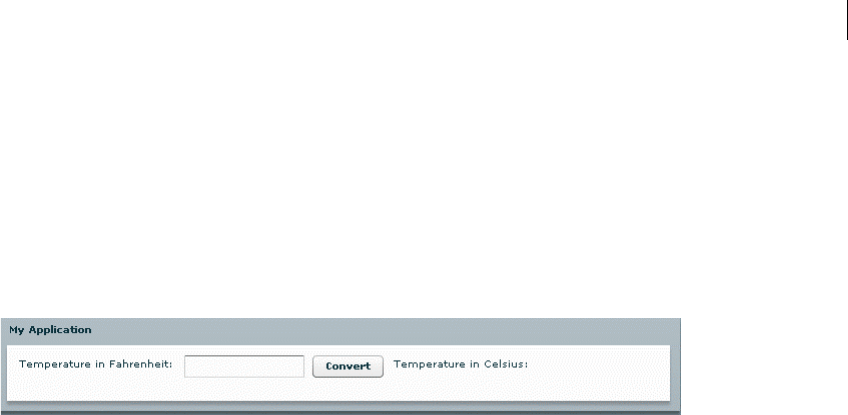
53ADOBE FLEX 3
Adobe Flex 3 Developer Guide
Techniques for separating ActionScript from MXML
The following single sample application, which calls a single function, shows several methods of separating
ActionScript from the MXML.
The Temperature application takes input from a single input field and uses a function to convert the input from
Fahrenheit to Celsius. It then displays the resulting temperature in a Label control.
The following image shows the sample Temperature application:
One MXML document (event handling logic in event attribute)
The following code shows the ActionScript event handling logic inside the MXML tag’s click event:
<?xml version="1.0"?>
<!-- usingas/ASOneFile.mxml -->
<mx:Application xmlns:mx="http://www.adobe.com/2006/mxml">
<mx:Panel title="My Application" paddingTop="10" paddingBottom="10"
paddingLeft="10" paddingRight="10">
<mx:HBox>
<mx:Label text="Temperature in Fahrenheit:"/>
<mx:TextInput id="fahrenheit" width="120"/>
<mx:Button label="Convert"
click="celsius.text=String(Math.round((Number(fahrenheit.text)-32)/1.8 *
10)/10);"/>
<mx:Label text="Temperature in Celsius:"/>
<mx:Label id="celsius" width="120" fontSize="24"/>
</mx:HBox>
</mx:Panel>
</mx:Application>
One MXML document (event handling logic in <mx:Script> block)
In this example, the logic for the function is inside an <mx:Script> block in the MXML document, and is called
from the MXML tag’s click event, as the following code shows:
<?xml version="1.0"?>
<!-- usingas/ASScriptBlock.mxml -->
<mx:Application xmlns:mx="http://www.adobe.com/2006/mxml">
<mx:Script><
CHAPTER 3
54
}
]]></mx:Script>
<mx:Panel title="My Application" paddingTop="10" paddingBottom="10"
paddingLeft="10" paddingRight="10">
<mx:HBox>
<mx:Label text="Temperature in Fahrenheit:"/>
<mx:TextInput id="fahrenheit" width="120"/>
<mx:Button label="Convert" click="calculate();" />
<mx:Label text="Temperature in Celsius:"/>
<mx:Label id="celsius" width="120" fontSize="24"/>
</mx:HBox>
</mx:Panel>
</mx:Application>
One MXML document and one ActionScript file (event handling logic in separate
script file)
Here, the function call is in an MXML event attribute, and the function is defined in a separate ActionScript file,
as the following code shows:
<?xml version="1.0"?>
<!-- usingas/ASSourceFile.mxml -->
<mx:Application xmlns:mx="http://www.adobe.com/2006/mxml">
<!-- Specify the ActionScript file that contains the function. -->
<mx:Script source="includes/Sample3Script.as"/>
<mx:Panel title="My Application" paddingTop="10" paddingBottom="10"
paddingLeft="10" paddingRight="10">
<mx:HBox>
<mx:Label text="Temperature in Fahrenheit:"/>
<mx:TextInput id="fahrenheit" width="120"/>
<mx:Button label="Convert" click="celsius.text=calculate(fahrenheit.text);"/>
<mx:Label text="Temperature in Celsius:"/>
<mx:Label id="celsius" width="120" fontSize="24"/>
</mx:HBox>
</mx:Panel>
</mx:Application>
The Sample3Script.as ActionScript file contains the following code:
// usingas/includes/Sample3Script.as
public function calculate(s:String):String {
var n:Number = Number(s);
var t:Number = Math.round((n-32)/1.8*10)/10;
return String(t);
}

55ADOBE FLEX 3
Adobe Flex 3 Developer Guide
Creating ActionScript components
You can create reusable components that use ActionScript and reference these components in your Flex applica-
tions as MXML tags. Components created in ActionScript can contain graphical elements, define custom business
logic, or extend existing Flex components. They can inherit from any components available in Flex.
Defining your own components in ActionScript has several benefits. Components let you divide your applications
into individual modules that you can develop and maintain separately. By implementing commonly used logic
within custom components, you can build a suite of reusable components that you can share among multiple Flex
applications.
Also, you can base your custom components on the set of Flex components by extending from the Flex class
hierarchy. You can create custom versions of Flex visual controls, as well as custom versions on nonvisual compo-
nents, such as data validators, formatters, and effects.
For example, you can define a custom button, derived from the Button control, in the myControls package, as the
following example shows:
package myControls {
import mx.controls.Button;
public class MyButton extends Button {
public function MyButton() {
...
}
...
}
}
In this example, you write your MyButton control to the MyButton.as file, and you store the file in the myControls
subdirectory of the root directory of your Flex application. The fully qualified class name of your component
reflects its location. In this example, the component’s fully qualified class name is myControls.MyButton.
You can reference your custom Button control from a Flex application file, such as MyApp.mxml, as the following
example shows:
<mx:Application xmlns:mx="http://www.adobe.com/2006/mxml" xmlns:cmp="myControls.*">
<cmp:MyButton label="Jack"/>
</mx:Application>
In this example, you define the cmp namespace that defines the location of your custom component in the appli-
cation’s directory structure. You then reference the component as an MXML tag using the namespace prefix.
Typically, you put custom ActionScript components in directories that are in the source path. These include any
directory that you specify in the <source-path> tag in the flex-config.xml file.
You can also create custom components using MXML. For more information, see Creating and Extending Adobe
Flex 3 Components.

CHAPTER 3
56
Types of custom components
You can create the following types of components in ActionScript:
User-interface components User-interface components contain both processing logic and visual elements. These
components usually extend the Flex component hierarchy. You can extend from the UIComponent classes, or any
of the Flex components, such as Button, ComboBox, or DataGrid. Your custom ActionScript component inherits
all of the public methods, along with public and protected properties of its base class.
Nonvisual components Nonvisual components define no visual elements. A nonvisual component is an Action-
Script class that does not extend the UIComponent class. They can provide greater efficiency at run time.
Performing object introspection
Object introspection is a technique for determining the elements of a class at run time, such as its properties and
methods. There are two ways to do introspection in ActionScript:
•Using for..in loops
•Using the introspection API
You might find object introspection a useful technique when debugging your application. For example, you might
write a method that takes a generic object of type Object as an argument. You can use introspection to output all
of the properties and methods of the Object to determine exactly what your application passed to it.
Using for..in loops
You can use a for..in loop to iterate over objects and output their properties and their values. A for..in loop
enumerates only dynamically added properties. Declared variables and methods of classes are not enumerated in
for..in loops. This means that most classes in the ActionScript API will not display any properties in a for..in
loop. However, the generic type Object is still a dynamic object and will display properties in a for..in loop.
The following example creates a generic Object, adds properties to that object, and then iterates over that object
when you click the button to inspect its properties:
<?xml version="1.0"?>
<!-- usingas/IntrospectionForIn.mxml -->
<mx:Application xmlns:mx="http://www.adobe.com/2006/mxml" creationComplete="initApp()">
<mx:Script><
57ADOBE FLEX 3
Adobe Flex 3 Developer Guide
}
public function dumpObj():void {
for (var p:String in obj) {
ta1.text += p + ":" + obj[p] + "\n";
}
}
]]></mx:Script>
<mx:TextArea id="ta1" width="400" height="200"/>
<mx:Button label="Dump Object" click="dumpObj()"/>
</mx:Application>
You can also use the mx.utils.ObjectUtil.toString() method to print all the dynamically added properties
of an object, for example:
<?xml version="1.0"?>
<!-- usingas/ObjectUtilToString.mxml -->
<mx:Application xmlns:mx="http://www.adobe.com/2006/mxml" creationComplete="initApp()">
<mx:Script><![CDATA[
import mx.utils.ObjectUtil;
private var obj:Object = new Object();
private function initApp():void {
// Create the object.
obj.a = "Schotten Totten";
obj.b = "Taj Majal";
obj.c = "Durche die Wuste";
}
public function dumpObj():void {
ta1.text = ObjectUtil.toString(obj);
}
]]></mx:Script>
<mx:TextArea id="ta1" width="400" height="200"/>
<mx:Button label="Dump Object" click="dumpObj()"/>
</mx:Application>
The mx.utils.ObjectUtil class has other useful methods such as compare(), copy(), and isSimple(). For more
information, see the Adobe Flex Language Reference.
Using the introspection API
If you want to list all the public properties and methods of a nondynamic (or sealed) class or class instance, use
the describeType() method and parse the results using the E4X API. The describeType() method is in the
flash.utils package. The method’s only parameter is the target object that you want to introspect. You can pass it
any ActionScript value, including all available ActionScript types such as object instances, primitive types such as
uint, and class objects. The return value of the describeType() method is an E4X XML object that contains an
XML description of the object’s type.

CHAPTER 3
58
The describeType() method returns only public members. The method does not return private members of the
caller’s superclass or any other class where the caller is not an instance. If you call describeType(this), the
method returns information only about nonstatic members of the class. If you call
describeType(getDefinitionByName("MyClass")), the method returns information only about the target’s
static members.
The following example introspects the Button control and prints the details to TextArea controls:
<?xml version="1.0"?>
<!-- usingas/IntrospectionAPI.mxml -->
<mx:Application xmlns:mx="http://www.adobe.com/2006/mxml"
creationComplete="getDetails()">
<mx:Script><![CDATA[
import flash.utils.*;
public function getDetails():void {
// Get the Button control's E4X XML object description.
var classInfo:XML = describeType(button1);
// Dump the entire E4X XML object into ta2.
ta2.text = classInfo.toString();
// List the class name.
ta1.text = "Class " + classInfo.@name.toString() + "\n";
// List the object's variables, their values, and their types.
for each (var v:XML in classInfo..variable) {
ta1.text += "Variable " + v.@name + "=" + button1[v.@name] +
" (" + v.@type + ")\n";
}
// List accessors as properties.
for each (var a:XML in classInfo..accessor) {
// Do not get the property value if it is write only.
if (a.@access == 'writeonly') {
ta1.text += "Property " + a.@name + " (" + a.@type +")\n";
}
else {
ta1.text += "Property " + a.@name + "=" +
button1[a.@name] + " (" + a.@type +")\n";
}
}
// List the object's methods.
for each (var m:XML in classInfo..method) {
ta1.text += "Method " + m.@name + "():" + m.@returnType + "\n";
}
}
]]></mx:Script>
<mx:Button label="This Button Does Nothing" id="button1"/>
<mx:TextArea id="ta1" width="400" height="200"/>
<mx:TextArea id="ta2" width="400" height="200"/>
</mx:Application>

59ADOBE FLEX 3
Adobe Flex 3 Developer Guide
The output displays accessors, variables, and methods of the Button control, and appears similar to the following:
Class mx.controls::Button
...
Variable id=button1 (String)
Variable __width=66 (Number)
Variable layoutWidth=66 (Number)
Variable __height=22 (Number)
Variable layoutHeight=22 (Number)
...
Property label=Submit (String)
Property enabled=true (Boolean)
Property numChildren=2 (uint)
Property enabled=true (Boolean)
Property visible=true (Boolean)
Property toolTip=null (String)
...
Method dispatchEvent():Boolean
Method hasEventListener():Boolean
Method layoutContents():void
Method getInheritingStyle():Object
Method getNonInheritingStyle():Object
Another useful method is the ObjectUtil’s getClassInfo() method. This method returns an Object with the
name and properties of the target object. The following example uses the getClassInfo() and toString()
methods to show the properties of the Button control:
<?xml version="1.0"?>
<!-- usingas/IntrospectionObjectUtil.mxml -->
<mx:Application xmlns:mx="http://www.adobe.com/2006/mxml">
<mx:Script><![CDATA[
import mx.controls.Alert;
import mx.utils.ObjectUtil;
private function showProps(b:Button):void {
var o:Object = ObjectUtil.getClassInfo(b);
ta1.text = ObjectUtil.toString(o);
}
]]></mx:Script>
<mx:Button id="b1" label="Show Properties" click="showProps(b1)"/>
<mx:TextArea id="ta1" width="300" height="500"/>
</mx:Application>
For more information about using E4X, see Programming ActionScript 3.0.

CHAPTER 3
60

61
Chapter 4: Using Events
One of the most important parts of your Adobe® Flex™ application is handling events by using controls and
ActionScript in your Flex applications.
Topics
About events . . . . . . . . . . . . . . . . . . . . . . . . . . . . . . . . . . . . . . . . . . . . . . . . . . . . . . . . . . . . . . . . . . . . . . . . . . . . . . . . . . . . 61
Using events. . . . . . . . . . . . . . . . . . . . . . . . . . . . . . . . . . . . . . . . . . . . . . . . . . . . . . . . . . . . . . . . . . . . . . . . . . . . . . . . . . . . . 65
Manually dispatching events . . . . . . . . . . . . . . . . . . . . . . . . . . . . . . . . . . . . . . . . . . . . . . . . . . . . . . . . . . . . . . . . . . . . . . . 83
Event propagation. . . . . . . . . . . . . . . . . . . . . . . . . . . . . . . . . . . . . . . . . . . . . . . . . . . . . . . . . . . . . . . . . . . . . . . . . . . . . . . . 86
Event priorities . . . . . . . . . . . . . . . . . . . . . . . . . . . . . . . . . . . . . . . . . . . . . . . . . . . . . . . . . . . . . . . . . . . . . . . . . . . . . . . . . . 94
Using event subclasses . . . . . . . . . . . . . . . . . . . . . . . . . . . . . . . . . . . . . . . . . . . . . . . . . . . . . . . . . . . . . . . . . . . . . . . . . . . . 95
About keyboard events. . . . . . . . . . . . . . . . . . . . . . . . . . . . . . . . . . . . . . . . . . . . . . . . . . . . . . . . . . . . . . . . . . . . . . . . . . . . 97
About events
Events let a developer know when something happens within a Flex application. They can be generated by user
devices, such as the mouse and keyboard, or other external input, such as the return of a web service call. Events
are also triggered when changes happen in the appearance or life cycle of a component, such as the creation or
destruction of a component or when the component is resized.
Any user interaction with your application can generate events. Events can also occur without any direct user
interaction, such as when data finishes loading from a server or when an attached camera becomes active. You can
“handle” these events in your code by adding an event handler. Event handlers are the functions or methods that
you write to respond to specific events. They are also sometimes referred to as event listeners.
The Flex event model is based on the Document Object Model (DOM) Level 3 events model. Although Flex does
not adhere specifically to the DOM standard, the implementations are very similar. The event model in Flex
comprises the Event object and its subclasses, and the event dispatching model. For a quick start in using events
in Flex, see the sample code in “Using events” on page 65.
Components generate and dispatch events and consume (listen to) other events. An object that requires infor-
mation about another object’s events registers a listener with that object. When an event occurs, the object
dispatches the event to all registered listeners by calling a function that was requested during registration. To
receive multiple events from the same object, you must register your listener for each event.

62 CHAPTER 4
Components have built-in events that you can handle in ActionScript blocks in your MXML applications. You can
also take advantage of the Flex event system’s dispatcher-listener model to define your own event listeners outside
of your applications, and define which methods of your custom listeners will listen to certain events. You can
register listeners with the target object so that when the target object dispatches an event, the listeners get called.
All visual objects, including Flex controls and containers, are subclasses of the DisplayObject class. They are in a
tree of visible objects that make up your application. The root of the tree is the Stage. Below that is the System-
Manager object, and then the Application object. Child containers and components are leaf nodes of the tree. That
tree is known as the display list. An object on the display list is analogous to a node in the DOM hierarchical
structure. The terms display list object and node are used interchangeably.
For information about each component’s events, see the component’s description in “Controls” on page 223 or the
control’s entry in ActionScript 3.0 Language Reference.
For a detailed description of a component’s startup life cycle, including major events in that life cycle, see
“Advanced Visual Components in ActionScript” on page 129 in Creating and Extending Adobe Flex 3 Components.
About the Event flow
You can instruct any container or control to listen for events dispatched by another container or control. When
Adobe® Flash® Player dispatches an Event object, that Event object makes a roundtrip journey from the root of the
display list to the target node, checking each node for registered listeners. The target node is the node in the display
list where the event occurred. For example, if a user clicks a Button control named Child1, Flash Player dispatches
an Event object with Child1 defined as the target node.
The event flow is conceptually divided into three parts: the capturing phase, the targeting phase, and the bubbling
phase, as briefly described next. For more information about the event flow, see “Event propagation” on page 86.
About the capturing phase
The first part of the event flow is called the capturing phase. This phase comprises all of the nodes from the root
node to the parent of the target node. During this phase, Flash Player examines each node, starting with the root,
to see if it has a listener registered to handle the event. If it does, Flash Player sets the appropriate values of the
Event object and then calls that listener. Flash Player stops after it reaches the target node’s parent and calls any
listeners registered on the parent. For more information, see “Capturing phase” on page 88.
About the targeting phase
The second part of the event flow, the targeting phase, consists solely of the target node. Flash Player sets the appro-
priate values on the Event object, checks the target node for registered event listeners, and then calls those
listeners. For more information, see “Targeting phase” on page 89.

63ADOBE FLEX 3
Adobe Flex 3 Developer Guide
About the bubbling phase
The third part of the event flow, the bubbling phase, comprises all of the nodes from the target node’s parent to the
root node. Starting with the target node’s parent, Flash Player sets the appropriate values on the Event object and
then calls event listeners on each of these nodes. Flash Player stops after calling any listeners on the root node. For
more information about the bubbling phase, see “Bubbling phase” on page 89.
About the Event class
The flash.events.Event class is an ActionScript class with properties that contain information about the event that
occurred. An Event object is an implicitly created object, similar to the request and response objects in a
JavaServer Page (JSP) that are implicitly created by the application server.
Flex creates an Event object each time an event is dispatched. You can use the Event object inside an event listener
to access details about the event that was dispatched, or about the component that dispatched the event. Passing
an Event object to, and using it in, an event listener is optional. However, if you want to access the Event object’s
properties inside your event listeners, you must pass the Event object to the listener.
Flex creates only one Event object when an event is dispatched. During the bubbling and capturing phases, Flex
changes the values on the Event object as it moves up or down the display list, rather than creating a new Event
object for each node.
About event subclasses
There are many classes that extend the flash.events.Event class. These classes are defined mostly in the following
two packages:
•mx.events.*
•flash.events.*
The mx.events package defines event classes that are specific to Flex controls, including the DataGridEvent,
DragEvent, and ColorPickerEvent. The flash.events package describes events that are not unique to Flex but are
instead defined by Flash Player. These event classes include MouseEvent, DataEvent, and Tex tEvent. All of these
events are commonly used in Flex applications.
In addition to these packages, some packages also define their own event objects: for example,
mx.messaging.events.ChannelEvent and mx.logging.LogEvent.
Child classes of the Event class have additional properties and methods that may be unique to them. In some cases,
you will want to use a more specific event type rather than the generic Event object so that you can access these
unique properties or methods. For example, the LogEvent class has a getLevelString() method that the Event
class does not.

CHAPTER 4
64
For information on using Event subclasses, see “Using event subclasses” on page 95.
About the EventDispatcher class
Every object in the display list can trace its class inheritance back to the DisplayObject class. The DisplayObject
class, in turn, inherits from the EventDispatcher class. The EventDispatcher class is a base class that provides
important event model functionality for every object on the display list. Because the DisplayObject class inherits
from the EventDispatcher class, any object on the display list has access to the methods of the EventDispatcher
class.
This is significant because every item on the display list can participate fully in the event model. Every object on
the display list can use its addEventListener() method—inherited from the EventDispatcher class—to listen
for a particular event, but only if the listening object is part of the event flow for that event.
Although the name EventDispatcher seems to imply that this class’s main purpose is to send (or dispatch) Event
objects, the methods of this class are used much more frequently to register event listeners, check for event
listeners, and remove event listeners.
The EventDispatcher class implements the IEventDispatcher interface. This allows developers who create custom
classes that cannot inherit from EventDispatcher or one of its subclasses to implement the IEventDispatcher
interface to gain access to its methods.
The addEventListener() method is the most commonly used method of this class. You use it to register your
event listeners. For information on using the addEventListener() method, see “Using the addEventListener()
method” on page 71.
Advanced programmers use the dispatchEvent() method to manually dispatch an event or to send a custom
Event object into the event flow. For more information, see “Manually dispatching events” on page 83.
Several other methods of the EventDispatcher class provide useful information about the existence of event
listeners. The hasEventListener() method returns true if an event listener is found for that specific event type
on a particular display list object. The willTrigger() method checks for event listeners on a particular display
list object, but it also checks for listeners on all of that display list object’s ancestors for all phases of the event flow.
The method returns true if it finds one.

65ADOBE FLEX 3
Adobe Flex 3 Developer Guide
Using events
Using events in Flex is a two-step process. First, you write a function or class method, known as an event listener
or event handler, that responds to events. The function often accesses the properties of the Event object or some
other settings of the application state. The signature of this function usually includes an argument that specifies
the event type being passed in.
The following example shows a simple event listener function that reports when a control triggers the event that
it is listening for:
<?xml version="1.0"?>
<!-- events/SimpleEventHandler.mxml -->
<mx:Application xmlns:mx="http://www.adobe.com/2006/mxml" creationComplete="initApp();">
<mx:Script><![CDATA[
import mx.controls.Alert;
private function initApp():void {
b1.addEventListener(MouseEvent.CLICK, myEventHandler);
}
private function myEventHandler(event:Event):void {
Alert.show("An event occurred.");
}
]]></mx:Script>
<mx:Button id="b1" label="Click Me"/>
</mx:Application>
As you can see in this example, you also register that function or class method with a display list object by using
the addEventListener() method.
Most Flex controls simplify listener registration by letting you specify the listener inside the MXML tag. For
example, instead of using the addEventListener() method to specify a listener function for the Button control’s
click event, you specify it in the click attribute of the <mx:Button> tag:
<?xml version="1.0"?>
<!-- events/SimplerEventHandler.mxml -->
<mx:Application xmlns:mx="http://www.adobe.com/2006/mxml">
<mx:Script><![CDATA[
import mx.controls.Alert;
private function myEventHandler(event:Event):void {
Alert.show("An event occurred.");
}
]]></mx:Script>
<mx:Button id="b1" label="Click Me" click="myEventHandler(event)"/>
</mx:Application>

CHAPTER 4
66
This is equivalent to the addEventListener() method in the previous code example. However, it is best practice
to use the addEventListener() method. This method gives you greater control over the event by letting you
configure the priority and capturing settings, and use event constants. In addition, if you use
addEventListener() to add an event handler, you can use removeEventListener() to remove the handler
when you no longer need it. If you add an event handler inline, you cannot call removeEventListener() on that
handler.
Each time a control generates an event, Flex creates an Event object that contains information about that event,
including the type of event and a reference to the dispatching control. To use the Event object, you specify it as a
parameter in the event handler function, as the following example shows:
<?xml version="1.0"?>
<!-- events/EventTypeHandler.mxml -->
<mx:Application xmlns:mx="http://www.adobe.com/2006/mxml">
<mx:Script><![CDATA[
import mx.controls.Alert;
private function myEventHandler(e:Event):void {
Alert.show("An event of type '" + e.type + "' occurred.");
}
]]></mx:Script>
<mx:Button id="b1" label="Click Me" click="myEventHandler(event)"/>
</mx:Application>
If you want to access the Event object in an event handler that was triggered by an inline event, you must add the
event keyword inside the MXML tag so that Flex explicitly passes it to the handler, as in the following:
<mx:Button id="b1" label="Click Me" click="myEventHandler(event)"/>
You are not required to use the Event object in a handler function. The following example creates two event
handler functions and registers them with the events of a ComboBox control. The first event handler, openEvt(),
takes no arguments. The second event handler, changeEvt(), takes the Event object as an argument and uses this
object to access the value and selectedIndex of the ComboBox control that triggered the event.
<?xml version="1.0"?>
<!-- events/MultipleEventHandlers.mxml -->
<mx:Application xmlns:mx="http://www.adobe.com/2006/mxml">
<mx:Script><![CDATA[
private function openEvt():void {
forChange.text="";
}
private function changeEvt(e:Event):void {
forChange.text =
"Value: " + e.currentTarget.value + "\n" +
"Index: " + e.currentTarget.selectedIndex;
}
]]></mx:Script>
<mx:ComboBox open="openEvt()" change="changeEvt(event)">

67ADOBE FLEX 3
Adobe Flex 3 Developer Guide
<mx:dataProvider>
<mx:Array>
<mx:String>AK</mx:String>
<mx:String>AL</mx:String>
<mx:String>AR</mx:String>
</mx:Array>
</mx:dataProvider>
</mx:ComboBox>
<mx:TextArea id="forChange" width="150" height="100"/>
</mx:Application>
This example shows accessing the target property of the Event object. For more information, see “Accessing the
currentTarget property” on page 67.
Specifying the Event object
You specify the object in a listener function’s signature as type Event, as the following example shows:
function myEventListener(e:Event):void { ... }
However, if you want to access properties that are specific to the type of event that was dispatched, you must
instead specify a more specific event type, such as ToolTipEvent or KeyboardEvent, as the following example
shows:
import mx.events.ToolTip
function myEventListener(e:ToolTipEvent):void { ... }
In some cases, you must import the event’s class in your ActionScript block.
Most objects have specific events that are associated with them, and most of them can dispatch more than one
type of event.
If you declare an event of type Event, you can cast it to a more specific type to access its event-specific properties.
For more information, see “Using event subclasses” on page 95.
Accessing the currentTarget property
Event objects include a reference to the instance of the dispatching component (or target), which means that you
can access all the properties and methods of that instance in an event listener. The following example accesses the
id of the Button control that triggered the event:
<?xml version="1.0"?>
<!-- events/AccessingCurrentTarget.mxml -->
<mx:Application xmlns:mx="http://www.adobe.com/2006/mxml">
<mx:Script><
CHAPTER 4
68
}
]]></mx:Script>
<mx:Button id="b1" label="Click Me" click="myEventHandler(event)"/>
</mx:Application>
You can access members of the currentTarget. If you do not cast the current target to a specific type, the
compiler assumes that it is of type Object. Objects can have any property or method because the Object type is
dynamic in ActionScript. Therefore, when accessing methods and properties of the currentTarget, it is best
practice to cast currentTarget to whatever class you anticipate will dispatch that event. This gives you strong
type checking at compile time, and helps avoid the risk of throwing a run-time error.
The following example casts the current target to a TextInput class before calling the setSelection() method,
but does not cast it before trying to set the tmesis property. The tmesis property does not exist on the TextInput
class. This illustrates that you will get a run-time error but not a compile-time error when you try to access
members that don’t exist, unless you cast currentTarget to a specific type so that type checking can occur:
<?xml version="1.0"?>
<!-- events/InvokingOnCurrentTarget.mxml -->
<mx:Application xmlns:mx="http://www.adobe.com/2006/mxml">
<mx:Script><![CDATA[
import mx.core.UIComponent;
private function tiHandler(e:Event):void {
/* The following enforces type checking: */
TextInput(e.currentTarget).setSelection(0,3);
/* The following throws a run-time error but not a compile-time error:
e.currentTarget.tmesis = 4;
*/
/*
... unless you cast it to the expected type like the following. Then
the compiler throws an error.
TextInput(e.currentTarget).tmesis = 4;
*/
}
]]></mx:Script>
<mx:TextInput id="ti1" click="tiHandler(event)"
text="This is some text. When you click on this control, the first three characters
are selected."/>
</mx:Application>
You could also cast currentTarget to UIComponent or some other more general class that still has methods of
display objects. That way, if you don’t know exactly which control will dispatch an event, at least you can ensure
there is some type checking.
You can also access methods and properties of the target property, which contains a reference to the current
node in the display list. For more information, see “About the target and currentTarget properties” on page 87.

69ADOBE FLEX 3
Adobe Flex 3 Developer Guide
Registering event handlers
There are several strategies that you can employ when you register event handlers with your Flex controls:
1Define an event handler inline. This binds a call to the handler function to the control that triggers the event.
<?xml version="1.0"?>
<!-- events/SimplerEventHandler.mxml -->
<mx:Application xmlns:mx="http://www.adobe.com/2006/mxml">
<mx:Script><![CDATA[
import mx.controls.Alert;
private function myEventHandler(event:Event):void {
Alert.show("An event occurred.");
}
]]></mx:Script>
<mx:Button id="b1" label="Click Me" click="myEventHandler(event)"/>
</mx:Application>
In this example, whenever the user clicks the Button control, Flex calls the myClickHandler() function.
For more information on defining event handlers inline, see “Defining event listeners inline” on page 70.
2Use the addEventListener() method, as follows:
<?xml version="1.0"?>
<!-- events/SimpleEventHandler.mxml -->
<mx:Application xmlns:mx="http://www.adobe.com/2006/mxml"
creationComplete="initApp();">
<mx:Script><![CDATA[
import mx.controls.Alert;
private function initApp():void {
b1.addEventListener(MouseEvent.CLICK, myEventHandler);
}
private function myEventHandler(event:Event):void {
Alert.show("An event occurred.");
}
]]></mx:Script>
<mx:Button id="b1" label="Click Me"/>
</mx:Application>
As with the previous example, whenever the user clicks the Button control, Flex calls the myClickHandler()
handler function. However, registering your event handlers using this method provides more flexibility. You
can register multiple components with this event handler, add multiple handlers to a single component, or
remove the handler. For more information, see “Using the addEventListener() method” on page 71.
3Create an event handler class and register components to use the class for event handling. This approach to
event handling promotes code reuse and lets you centralize event handling outside your MXML files. For more
information on creating custom event handler classes, see “Creating event handler classes” on page 76.

CHAPTER 4
70
Defining event listeners inline
The simplest method of defining event handlers in Flex applications is to point to a handler function in the
component’s MXML tag. To do this, you add any of the component’s events as a tag attribute followed by an
ActionScript statement or function call.
You add an event handler inline using the following syntax:
<mx:tag_name event_name="handler_function"/>
For example, to listen for a Button control’s click event, you add a statement in the <mx:Button> tag’s click
attribute. If you add a function, you define that function in an ActionScript block. The following example defines
the submitForm() function as the handler for the Button control’s click event:
<mx:Script><![CDATA[
function submitForm():void {
// Do something.
}
]]></mx:Script>
<mx:Button label="Submit" click="submitForm();"/>
Event handlers can include any valid ActionScript code, including code that calls global functions or sets a
component property to the return value. The following example calls the trace() global function:
<mx:Button label="Get Ver" click="trace('The button was clicked');"/>
There is one special parameter that you can pass in an inline event handler definition: the event parameter. If you
add the event keyword as a parameter, Flex passes the Event object and inside the handler function, you can then
access all the properties of the Event object.
The following example passes the Event object to the submitForm() handler function and specifies it as type
MouseEvent:
<?xml version="1.0"?>
<!-- events/MouseEventHandler.mxml -->
<mx:Application xmlns:mx="http://www.adobe.com/2006/mxml">
<mx:Script><![CDATA[
import mx.controls.Alert;
private function myEventHandler(event:MouseEvent):void {
// Do something with the MouseEvent object.
Alert.show("An event of type '" + event.type + "' occurred.");
}
]]></mx:Script>
<mx:Button id="b1" label="Click Me" click="myEventHandler(event)"/>
</mx:Application>
It is best practice to include the event keyword when you define all inline event listeners and to specify the most
stringent Event object type in the resulting listener function (for example, specify MouseEvent instead of Event).

71ADOBE FLEX 3
Adobe Flex 3 Developer Guide
You can use the Event object to access a reference to the target object (the object that dispatched the event), the
type of event (for example, click), or other relevant properties, such as the row number and value in a list-based
control. You can also use the Event object to access methods and properties of the target component, or the
component that dispatched the event.
Although you will most often pass the entire Event object to an event listener, you can just pass individual
properties, as the following example shows:
<?xml version="1.0"?>
<!-- events/PropertyHandler.mxml -->
<mx:Application xmlns:mx="http://www.adobe.com/2006/mxml">
<mx:Script><![CDATA[
import mx.controls.Alert;
private function myEventHandler(s:String):void {
Alert.show("Current Target: " + s);
}
]]></mx:Script>
<mx:Button id="b1" label="Click Me" click="myEventHandler(event.currentTarget.id)"/>
</mx:Application>
Registering an event listener inline provides less flexibility than using the addEventListener() method to
register event listeners. The drawbacks are that you cannot set the useCapture or priority properties on the
Event object and that you cannot remove the listener once you add it.
Using the addEventListener() method
The addEventListener() method lets you register event listener functions with the specified control or object.
The following example adds the myClickListener() function to the b1 instance of a Button control. When the
user clicks b1, Flex calls the myClickListener() method:
b1.addEventListener(MouseEvent.CLICK, myClickListener);
The addEventListener() method has the following signature:
componentInstance.addEventListener(
event_type:String,
event_listener:Function,
use_capture:Boolean,
priority:int,
weakRef:Boolean
)
The event_type argument is the kind of event that this component dispatches. This can be either the event type
String (for example, click or mouseOut) or the event type static constant (such as MouseEvent.CLICK or
MouseEvent.MOUSE_OUT). This argument is required.

CHAPTER 4
72
The constants provide an easy way to refer to specific event types. You should use these constants instead of the
strings that they represent. If you misspell a constant name in your code, the compiler catches the mistake. If you
instead use strings and make a typographical error, it can be harder to debug and could lead to unexpected
behavior.
You should use the constants wherever possible. For example, when you are testing to see whether an Event object
is of a certain type, use the following code:
if (myEventObject.type == MouseEvent.CLICK) {/* your code here */}
Do not use the following code:
if (myEventObject.type == "click") {/* your code here */}
The event_listener argument is the function that handles the event. This argument is required.
The use_capture parameter of the addEventListener() method lets you control the phase in the event flow in
which your listener will be active. It sets the value of the useCapture property of the Event object. If useCapture
is set to true, your listener is active during the capturing phase of the event flow. If useCapture is set to false,
your listener is active during the targeting and bubbling phases of the event flow, but not during the capturing
phase. The default value is determined by the type of event, but is false in most cases.
To listen for an event during all phases of the event flow, you must call addEventListener() twice, once with the
useCapture parameter set to true, and again with use_capture set to false. This argument is optional. For
more information, see “Capturing phase” on page 88.
The priority parameter sets the priority for that event listener. The higher the number, the sooner that event
handler executes relative to other event listeners for the same event. Event listeners with the same priority are
executed in the order that they were added. This parameter sets the priority property of the Event object. The
default value is 0, but you can set it to negative or positive integer values. If several event listeners are added
without priorities, the earlier a listener is added, the sooner it is executed. For more information on setting prior-
ities, see “Event priorities” on page 94.
The weakRef parameter provides you with some control over memory resources for listeners. A strong reference
(when weakRef is false) prevents the listener from being garbage collected. A weak reference (when weakRef is
true) does not. The default value is false.
When you add a listener function and that function is invoked, Flex implicitly creates an Event object for you and
passes it to the listener function. You must declare the Event object in the signature of your listener function.
If you add an event listener by using the addEventListener() method, you are required to declare an event
object as a parameter of the listener_function, as the following example shows:
b1.addEventListener(MouseEvent.CLICK, performAction);
In the listener function, you declare the Event object as a parameter, as follows:
public function performAction(e:MouseEvent):void {

73ADOBE FLEX 3
Adobe Flex 3 Developer Guide
...
}
The following example defines a new handler function myClickListener(). It then registers the click event of
the Button control with that handler. When the user clicks the button, Flex calls the myClickHandler() function.
<?xml version="1.0"?>
<!-- events/AddEventListenerExample.mxml -->
<mx:Application xmlns:mx="http://www.adobe.com/2006/mxml" initialize="createListener()">
<mx:Script><![CDATA[
import mx.controls.Alert;
private function createListener():void {
b1.addEventListener(MouseEvent.CLICK, myClickHandler, false, 0);
}
private function myClickHandler(e:MouseEvent):void {
Alert.show("The button was clicked.");
}
]]></mx:Script>
<mx:Button label="Click Me" id="b1"/>
</mx:Application>
Using addEventListener() inside an MXML tag
You can add event listeners with the addEventListener() method inline with the component definition. The
following Button control definition adds the call to the addEventListener() method inline with the Button
control’s initialize property:
<?xml version="1.0"?>
<!-- events/CallingAddEventListenerInline.mxml -->
<mx:Application xmlns:mx="http://www.adobe.com/2006/mxml">
<mx:Script><![CDATA[
import mx.controls.Alert;
private function myClickHandler(event:Event):void {
Alert.show("The button was clicked.");
}
]]></mx:Script>
<mx:Button id='b1'
label="Click Me"
initialize='b1.addEventListener(MouseEvent.CLICK, myClickHandler, false, 1);'
/>
</mx:Application>
This is the equivalent of defining the event handler inline. However, defining a handler by using the
addEventListener() method rather than setting click="handler_function" lets you set the value of the
useCapture and priority properties of the Event object. Furthermore, you cannot remove a handler added
inline, but when you use the addEventListener() method to add a handler, you can call the
removeEventListener() method to remove that handler.

CHAPTER 4
74
Using nested inner functions as event listeners
Rather than passing the name of an event listener function to the addEventListener() method, you can define
an inner function (also known as a closure).
In the following example, the nested inner function is called when the button is clicked:
<?xml version="1.0"?>
<!-- events/AddingInnerFunctionListener.mxml -->
<mx:Application xmlns:mx="http://www.adobe.com/2006/mxml" creationComplete="initApp()">
<mx:Script><![CDATA[
import mx.controls.Alert;
private function initApp():void {
b1.addEventListener("click",
function(e:Event):void {
Alert.show("The button was clicked.");
}
);
}
]]></mx:Script>
<mx:Button id='b1' label="Click Me"/>
</mx:Application>
Function closures are created any time a function is executed apart from an object or a class. They retain the scope
in which they were defined. This creates interesting results when a function is passed as an argument or a return
value into a different scope.
For example, the following code creates two functions: foo(), which returns a nested function named
rectArea() that calculates the area of a rectangle, and bar(), which calls foo() and stores the returned function
closure in a variable named myProduct. Even though the bar() function defines its own local variable x (with a
value of 2), when the function closure myProduct() is called, it retains the variable x (with a value of 40) defined
in function foo(). The bar() function therefore returns the product of the numbers in the TextInput controls,
rather than 8.
<?xml version="1.0"?>
<!-- events/FunctionReturnsFunction.mxml -->
<mx:Application xmlns:mx="http://www.adobe.com/2006/mxml" creationComplete="foo()">
<mx:Script><![CDATA[
[Bindable]
private var answer:String;
private function foo():Function {
var x:int = int(ti1.text);
function rectArea(y:int):int { // function closure defined
return x * y;
}
return rectArea;
}
private function bar():void {
var x:int = 2; // ignored
var y:int = 4; // ignored
var myProduct:Function = foo();

75ADOBE FLEX 3
Adobe Flex 3 Developer Guide
answer = myProduct(int(ti2.text)); // function closure called
}
]]></mx:Script>
<mx:Form width="107">
<mx:FormItem label="X">
<mx:TextInput id="ti1" text="10" width="37" textAlign="right"/>
</mx:FormItem>
<mx:FormItem label="Y" width="71">
<mx:TextInput id="ti2" text="20" width="38" textAlign="right"/>
</mx:FormItem>
<mx:Label id="label1" text="{answer}" width="71" textAlign="right"/>
</mx:Form>
<mx:Button id='b1' label="Compute Product" click="bar()"/>
</mx:Application>
If the listener that you pass to addEventListener() method is a nested inner function, you should not pass true
for the useWeakReference argument. For example:
addEventListener("anyEvent",
function(e:Event) { /* My listener function. */ },
false, 0, true);
In this example, passing true as the last argument can lead to unexpected results. To Flex, an inner function is
actually an object, and can be freed by the garbage collector. If you set the value of the useWeakReference
argument to true, as shown in the previous example, there are no persistent references at all to the inner function.
The next time the garbage collector runs, it might free the function, and the function will not be called when the
event is triggered.
If there are other references to the inner function (for example, if you saved it in another variable), the garbage
collector will not free it.
Regular class-level member functions are not subject to garbage collection; as a result, you can set the value of the
useWeakReference argument to true and they will not be garbage collected.
Removing event handlers
It is a good idea to remove any handlers that will no longer be used. This removes references to objects so that they
can be cleared from memory. You can use the removeEventListener() method to remove an event handler that
you no longer need. All components that can call addEventListener() can also call the
removeEventListener() method. The syntax for the removeEventListener() method is as follows:
componentInstance.removeEventListener(event_type:String, listener_function:Function,
use_capture:Boolean)
For example, consider the following code:
myButton.removeEventListener(MouseEvent.CLICK, myClickHandler);

CHAPTER 4
76
The event_type and listener_function parameters are required. These are the same as the required param-
eters for the addEventListener() method.
The use_capture parameter is also identical to the parameter used in the addEventListener() method. Recall
that you can listen for events during all event phases by calling addEventListener() twice: once with
use_capture set to true, and again with it set to false. To remove both event listeners, you must call
removeEventListener() twice: once with use_capture set to true, and again with it set to false.
You can remove only event listeners that you added with the addEventListener() method in an ActionScript
block. You cannot remove an event listener that was defined in the MXML tag, even if it was registered using a
call to the addEventListener() method that was made inside a tag attribute.
The following sample application shows what type of handler can be removed and what type cannot:
<?xml version="1.0"?>
<!-- events/RemoveEventListenerExample.mxml -->
<mx:Application xmlns:mx="http://www.adobe.com/2006/mxml"
initialize="createHandler(event)">
<mx:Script><![CDATA[
import mx.controls.Alert;
private function createHandler(e:Event):void {
b1.addEventListener(MouseEvent.CLICK, myClickHandler);
}
private function removeMyHandlers(e:Event):void {
/* Remove listener for b1's click event because it was added
with the addEventListener() method. */
b1.removeEventListener(MouseEvent.CLICK, myClickHandler);
/* Does NOT remove the listener for b2's click event because it
was added inline in an MXML tag. */
b2.removeEventListener(MouseEvent.CLICK, myClickHandler);
}
private function myClickHandler(e:Event):void {
Alert.show("The button was clicked.");
}
]]></mx:Script>
<mx:Button id="b1" label="Click Me"/>
<mx:Button label="Click Me Too" id="b2" click="myClickHandler(event)"/>
<mx:Button label="Remove Event Listeners" id="b3" click="removeMyHandlers(event)"/>
</mx:Application>
Creating event handler classes
You can create an external class file and use the methods of this class as event handlers. Objects themselves cannot
be event handlers, but methods of an object can be. By defining one class that handles all your event handlers, you
can use the same event handling logic across applications, which can make your MXML applications more
readable and maintainable.

77ADOBE FLEX 3
Adobe Flex 3 Developer Guide
To create a class that handles events, you usually import the flash.events.Event class. You also usually write an
empty constructor. The following ActionScript class file calls the Alert control’s show() method whenever it
handles an event with the handleAllEvents() method:
// events/MyEventHandler.as
package { // Empty package.
import flash.events.Event;
import mx.controls.Alert;
public class MyEventHandler {
public function MyEventHandler() {
// Empty constructor.
}
public function handleAllEvents(event:Event):void {
Alert.show("Some event happened.");
}
}
}
In your MXML file, you declare a new instance of MyEventHandler and use the addEventListener() method
to register its handleAllEvents() method as a handler to the Button control’s click event, as the following
example shows:
<?xml version="1.0"?>
<!-- events/CustomHandler.mxml -->
<mx:Application xmlns:mx="http://www.adobe.com/2006/mxml" initialize="createHandler()">
<mx:Script><![CDATA[
private var myListener:MyEventHandler = new MyEventHandler();
private function createHandler():void {
b1.addEventListener(MouseEvent.CLICK, myListener.handleAllEvents);
}
]]></mx:Script>
<mx:Button label="Submit" id="b1"/>
</mx:Application>
The best approach is to define the event handler’s method as static. When you make the event handler method
static, you are not required to instantiate the class inside your MXML application. The following
createHandler() function registers the handleAllEvents() method as an event handler without instantiating
the
MyStaticEventHandler class:
<?xml version="1.0"?>
<!-- events/CustomHandlerStatic.mxml -->
<mx:Application xmlns:mx="http://www.adobe.com/2006/mxml" initialize="createHandler()">
<mx:Script><
CHAPTER 4
78
]]></mx:Script>
<mx:Button label="Submit" id="b1"/>
</mx:Application>
In the class file, you just add the static keyword to the method signature:
// events/MyStaticEventHandler.as
package { // Empty package.
import flash.events.Event;
import mx.controls.Alert;
public class MyStaticEventHandler {
public function MyStaticEventHandler() {
// Empty constructor.
}
public static function handleAllEvents(event:Event):void {
Alert.show("Some event happened.");
}
}
}
Store your event listener class in a directory in your source path. You can also store your ActionScript class in the
same directory as your MXML file, although Adobe does not recommend this.
Defining multiple listeners for a single event
You can define multiple event handler functions for a single event in two ways. When defining events inside
MXML tags, you separate each new handler function with a semicolon. The following example adds the
submitForm() and debugMessage() functions as handlers of the click event:
<?xml version="1.0"?>
<!-- events/MultipleEventHandlersInline.mxml -->
<mx:Application xmlns:mx="http://www.adobe.com/2006/mxml">
<mx:Script><![CDATA[
[Bindable]
private var s:String = "";
private function submitForm(e:Event):void {
// Handle event here.
s += "The submitForm() method was called. ";
}
private function debugMessage(e:Event):void {
// Handle event here.
s += "The debugMessage() method was called. ";
}
]]></mx:Script>
<mx:Button id="b1"
label="Do Both Actions"
click='submitForm(event); debugMessage(event);'

79ADOBE FLEX 3
Adobe Flex 3 Developer Guide
/>
<mx:Label id="l1" text="{s}"/>
<mx:Button id="b2" label="Reset" click="s='';"/>
</mx:Application>
For events added with the addEventListener() method, you can add any number of handlers with additional
calls to the addEventListener() method. Each call adds a handler function that you want to register to the
specified object. The following example registers the submitForm() and debugMessage() handler functions
with b1’s click event:
<?xml version="1.0"?>
<!-- events/MultipleEventHandlersAS.mxml -->
<mx:Application xmlns:mx="http://www.adobe.com/2006/mxml"
creationComplete="createHandlers(event)">
<mx:Script><![CDATA[
[Bindable]
private var s:String = "";
public function createHandlers(e:Event):void {
b1.addEventListener(MouseEvent.CLICK, submitForm);
b1.addEventListener(MouseEvent.CLICK, debugMessage);
}
private function submitForm(e:Event):void {
// Handle event here.
s += "The submitForm() method was called. ";
}
private function debugMessage(e:Event):void {
// Handle event here.
s += "The debugMessage() method was called. ";
}
]]></mx:Script>
<mx:Button id="b1" label="Do Both Actions"/>
<mx:Label id="l1" text="{s}"/>
<mx:Button id="b2" label="Reset" click="s='';"/>
</mx:Application>
You can mix the methods of adding event handlers to any component; alternatively, you can add handlers inline
and with the addEventListener() method. The following example adds a click event handler inline for the
Button control, which calls the performAction() method. It then conditionally adds a second click handler to
call the logAction() method, depending on the state of the CheckBox control.
<?xml version="1.0"?>
<!-- events/ConditionalHandlers.mxml -->
<mx:Application xmlns:mx="http://www.adobe.com/2006/mxml" initialize="initApp(event)">
<mx:Script><
CHAPTER 4
80
private function initApp(e:Event):void {
cb1.addEventListener(MouseEvent.CLICK, handleCheckBoxChange);
b1.addEventListener(MouseEvent.CLICK, logAction);
}
private function handleCheckBoxChange(e:Event):void {
if (cb1.selected) {
b1.addEventListener(MouseEvent.CLICK, logAction);
ta1.text += "Added log listener." + "\n";
} else {
b1.removeEventListener(MouseEvent.CLICK, logAction);
ta1.text += "Removed log listener." + "\n";
}
}
private function performAction(e:Event):void {
Alert.show("You performed the action.");
}
private function logAction(e:Event):void {
ta1.text += "Action performed: " + e.type + ".\n";
}
]]></mx:Script>
<mx:Button label="Perform Action" id="b1" click="performAction(event)"/>
<mx:CheckBox id="cb1" label="Log?" selected="true"/>
<mx:TextArea id="ta1" height="200" width="300"/>
</mx:Application>
You can set the order in which event listeners are called by using the priority parameter of the
addEventListener() method. You cannot set a priority for a listener function if you added the event listener
using MXML inline. For more information on setting priorities, see “Event priorities” on page 94.
Registering a single listener with multiple components
You can register the same listener function with any number of events of the same component, or events of
different components. The following example registers a single listener function, submitForm(), with two
different buttons:
<?xml version="1.0"?>
<!-- events/OneHandlerTwoComponentsInline.mxml -->
<mx:Application xmlns:mx="http://www.adobe.com/2006/mxml">
<mx:Script><![CDATA[
import mx.controls.Alert;
private function submitForm(e:Event):void {
// Handle event here.
Alert.show("Current Target: " + e.currentTarget.id);
}
]]></mx:Script>

81ADOBE FLEX 3
Adobe Flex 3 Developer Guide
<mx:Button id="b1"
label="Click Me"
click="submitForm(event)"
/>
<mx:Button id="b2"
label="Click Me, Too"
click="submitForm(event)"
/>
</mx:Application>
When you use the addEventListener() method to register a single listener to handle the events of multiple
components, you must use a separate call to the addEventListener() method for each instance, as the following
example shows:
<?xml version="1.0"?>
<!-- events/OneHandlerTwoComponentsAS.mxml -->
<mx:Application xmlns:mx="http://www.adobe.com/2006/mxml"
creationComplete="createHandlers(event)">
<mx:Script><![CDATA[
import mx.controls.Alert;
public function createHandlers(e:Event):void {
b1.addEventListener(MouseEvent.CLICK, submitForm);
b2.addEventListener(MouseEvent.CLICK, submitForm);
}
private function submitForm(e:Event):void {
// Handle event here.
Alert.show("Current Target: " + e.currentTarget.id);
}
]]></mx:Script>
<mx:Button id="b1" label="Click Me"/>
<mx:Button id="b2" label="Click Me, Too"/>
</mx:Application>
When doing this, you should add logic to the event listener that processes the type of event. The event target (or
object that dispatched the event) is added to the Event object for you. No matter what triggered the event, you can
conditionalize the event processing based on the target or type properties of the Event object. Flex adds these
two properties to all Event objects.
The following example registers a single listener function (myEventHandler()) to the click event of a Button
control and the click event of a CheckBox control. To detect what type of object called the event listener, the
listener checks the className property of the target in the Event object in a case statement.
<?xml version="1.0"?>
<!-- events/ConditionalTargetHandler.mxml -->
<mx:Application xmlns:mx="http://www.adobe.com/2006/mxml" creationComplete="initApp()">
<mx:Script><
CHAPTER 4
82
button1.addEventListener(MouseEvent.CLICK, myEventHandler);
cb1.addEventListener(MouseEvent.MOUSE_DOWN, myEventHandler);
}
public function myEventHandler(event:Event):void {
switch (event.currentTarget.className) {
case "Button":
// Process Button click.
Alert.show("You clicked the Button control.");
break;
case "CheckBox":
// Process CheckBox click.
Alert.show("You clicked the CheckBox control.");
break;
}
}
]]></mx:Script>
<mx:Button label="Click Me" id="button1"/>
<mx:CheckBox label="Select Me" id="cb1"/>
</mx:Application>
Passing additional parameters to listener functions
You can pass additional parameters to listener functions depending on how you add the listeners. If you add a
listener with the addEventListener() method, you cannot pass any additional parameters to the listener
function, and that listener function can declare only a single argument, the Event object (or one of its subclasses).
For example, the following code throws an error because the clickListener() method expects two arguments:
<mx:Script>
public function addListeners():void {
b1.addEventListener(MouseEvent.CLICK,clickListener);
}
public function clickListener(e:MouseEvent, a:String):void { ... }
</mx:Script>
<mx:Button id="b1"/>
Because the second parameter of addEventListener() is a function, you cannot specify parameters of that
function in the addEventListener() call. So, to pass additional parameters to the listener function, you must
define them in the listener function and then call the final method with those parameters. If you define an event
listener inline (inside the MXML tag), you can add any number of parameters as long as the listener function’s
signature agrees with that number of parameters. The following example passes a string and the Event object to
the runMove() method:
<?xml version="1.0"?>
<!-- events/MultipleHandlerParametersInline.mxml -->
<mx:Application xmlns:mx="http://www.adobe.com/2006/mxml">
<mx:Script><
83ADOBE FLEX 3
Adobe Flex 3 Developer Guide
} else if (dir == "down") {
moveableButton.y = moveableButton.y + 5;
} else if (dir == "left") {
moveableButton.x = moveableButton.x - 5;
} else if (dir == "right") {
moveableButton.x = moveableButton.x + 5;
}
}
]]></mx:Script>
<mx:Canvas height="100%" width="100%">
<mx:Button id="moveableButton"
label="{moveableButton.x.toString()},{moveableButton.y.toString()}"
x="75"
y="100"
width="80"
/>
</mx:Canvas>
<mx:VBox horizontalAlign="center">
<mx:Button id="b1"
label="Up"
click='runMove("up",event);'
width="75"
/>
<mx:HBox horizontalAlign="center">
<mx:Button id="b2"
label="Left"
click='runMove("left",event);'
width="75"
/>
<mx:Button id="b3"
label="Right"
click='runMove("right",event);'
width="75"
/>
</mx:HBox>
<mx:Button id="b4"
label="Down"
click='runMove("down",event);'
width="75"
/>
</mx:VBox>
</mx:Application>
Manually dispatching events
You can manually dispatch events using a component instance’s dispatchEvent() method. All components that
extend UIComponent have this method. The method is inherited from the EventDispatcher class, which UICom-
ponent extends.

CHAPTER 4
84
The syntax for the dispatchEvent() method is as follows:
objectInstance.dispatchEvent(event:Event):Boolean
When dispatching an event, you must create a new Event object. The syntax for the Event object constructor is as
follows:
Event(event_type:String, bubbles:Boolean, cancelable:Boolean)
The event_type parameter is the type property of the Event object. The bubbles and cancelable parameters
are optional and both default to false. For information on bubbling and capturing, see “Event propagation” on
page 86.
You can use the dispatchEvent() method to dispatch any event you want, not just a custom event. You can
dispatch a Button control’s click event, even though the user did not click a Button control, as in the following
example:
<?xml version="1.0"?>
<!-- events/DispatchEventExample.mxml -->
<mx:Application xmlns:mx="http://www.adobe.com/2006/mxml"
initialize="createListener(event);">
<mx:Script><![CDATA[
import mx.controls.Alert;
private function createListener(e:Event):void {
b1.addEventListener(MouseEvent.MOUSE_OVER, myEventHandler);
b1.addEventListener(MouseEvent.CLICK, myClickHandler);
}
private function myEventHandler(e:Event):void {
var result:Boolean = b1.dispatchEvent(new MouseEvent(MouseEvent.CLICK, true,
false));
}
private function myClickHandler(e:Event):void {
Alert.show("The event dispatched by the MOUSE_OVER was of type '" + e.type +
"'.");
}
]]></mx:Script>
<mx:Button id="b1" label="Click Me"/>
</mx:Application>
You can also manually dispatch an event in an MXML tag. In the following example, moving the mouse pointer
over the button triggers the button’s click event:
<?xml version="1.0"?>
<!-- events/DispatchEventExampleInline.mxml -->
<mx:Application xmlns:mx="http://www.adobe.com/2006/mxml"
initialize="createListener(event);">
<mx:Script><
85ADOBE FLEX 3
Adobe Flex 3 Developer Guide
private function myClickHandler(e:Event):void {
Alert.show("The event dispatched by the MOUSE_OVER was of type '" + e.type +
"'.");
}
]]></mx:Script>
<mx:Button id="b1"
label="Click Me"
mouseOver="b1.dispatchEvent(new MouseEvent(MouseEvent.CLICK, true, false));"
/>
</mx:Application>
Your Flex application is not required to handle the newly dispatched event. If you trigger an event that has no
listeners, Flex ignores the event.
You can set properties of the Event object in ActionScript, but you cannot add new properties because the object
is not dynamic. The following example intercepts a click event. It then creates a new MouseEvent object and
dispatches it as a doubleClick event. In addition, it sets the value of the shiftKey property of the MouseEvent
object to true, to simulate a Shift-click on the keyboard.
<?xml version="1.0"?>
<!-- events/DispatchCustomizedEvent.mxml -->
<mx:Application xmlns:mx="http://www.adobe.com/2006/mxml"
creationComplete="addListeners()">
<mx:Script><![CDATA[
private function customLogEvent(e:MouseEvent):void {
l1.text = String(e.currentTarget.id);
l2.text = String(e.type);
l3.text = String(e.shiftKey);
// Remove current listener to avoid recursion.
e.currentTarget.removeEventListener("doubleClick", customLogEvent);
}
private function handleEvent(e:MouseEvent):void {
// Add new handler for custom event about to be dispatched.
e.currentTarget.addEventListener("doubleClick", customLogEvent);
// Create new event object.
var mev:MouseEvent = new MouseEvent("doubleClick");
// Customize event object.
mev.shiftKey = true;
// Dispatch custom event.
e.currentTarget.dispatchEvent(mev);
}
private function addListeners():void {
b1.addEventListener("click",handleEvent);
b2.addEventListener("click",handleEvent);
}
]]></mx:Script>

CHAPTER 4
86
<mx:Button id="b1" label="Click Me (b1)"/>
<mx:Button id="b2" label="Click Me (b2)"/>
<mx:Form>
<mx:FormItem label="Current Target:">
<mx:Label id="l1"/>
</mx:FormItem>
<mx:FormItem label="Event Type:">
<mx:Label id="l2"/>
</mx:FormItem>
<mx:FormItem label="Shift Key Pressed:">
<mx:Label id="l3"/>
</mx:FormItem>
</mx:Form>
</mx:Application>
If you want to add custom properties to an Event object, you must extend the Event object and define the new
properties in your own custom class. You can then manually dispatch your custom events with the
dispatchEvent() method, as you would any event.
If you create a custom ActionScript class that dispatches its own events but does not extend UIComponent, you
can extend the flash.events.EventDispatcher class to get access to the addEventListener(),
removeEventListener(), and dispatchEvent() methods.
For more information on creating custom classes, see Creating and Extending Adobe Flex 3 Components.
Event propagation
When events are triggered, there are three phases in which Flex checks whether there are event listeners. These
phases occur in the following order:
•Capturing
•Target ing
•Bubbling
During each of these phases, the nodes have a chance to react to the event. For example, assume the user clicks a
Button control that is inside a VBox container. During the capturing phase, Flex checks the Application object and
the VBox for listeners to handle the event. Flex then triggers the Button’s listeners in the target phase. In the
bubbling phase, the VBox and then the Application are again given a chance to handle the event but now in the
reverse order from the order in which they were checked in the capturing phase.

87ADOBE FLEX 3
Adobe Flex 3 Developer Guide
In ActionScript 3.0, you can register event listeners on a target node and on any node along the event flow. Not all
events, however, participate in all three phases of the event flow. Some types of events are dispatched directly to
the target node and participate in neither the capturing nor the bubbling phases. All events can be captured unless
they are dispatched from the top node.
Other events may target objects that are not on the display list, such as events dispatched to an instance of the
Socket class. These event objects flow directly to the target node, without participating in the capturing or
bubbling phases. You can also cancel an event as it flows through the event model so that even though it was
supposed to continue to the other phases, you stopped it from doing so. You can do this only if the cancelable
property is set to true.
Capturing and bubbling happen as the Event object moves from node to node in the display list: parent-to-child
for capturing and child-to-parent for bubbling. This process has nothing to do with the inheritance hierarchy.
Only DisplayObject objects (visual objects such as containers and controls) can have a capturing phase and a
bubbling phase in addition to the targeting phase.
Mouse events and keyboard events are among those that bubble. Any event can be captured, but no DisplayObject
objects listen during the capturing phase unless you explicitly instruct them to do so. In other words, capturing is
disabled by default.
When a faceless event dispatcher, such as a Validator, dispatches an event, there is only a targeting phase, because
there is no visual display list for the Event object to capture or bubble through.
About the target and currentTarget properties
Every Event object has a target and a currentTarget property that help you to keep track of where it is in the
process of propagation. The target property refers to the dispatcher of the event. The currentTarget property
refers to the current node that is being examined for event listeners.
When you handle a mouse event such as MouseEvent.CLICK by writing a listener on some component, the
event.target property does not necessarily refer to that component; it is often a subcomponent, such as the
Button control’s UITextField, that defines the label.
When Flash Player or Adobe® AIR™ dispatches an event, it dispatches the event from the frontmost object under
the mouse. Because children are in front of parents, that means the player or AIR might dispatch the event from
an internal subcomponent, such as the UITextField of a Button.
The event.target property is set to the object that dispatched the event (in this case, UITextField), not the object
that is being listened to (in most cases, you have a Button control listen for a click event).

CHAPTER 4
88
MouseEvent events bubble up the parent chain, and can be handled on any ancestor. As the event bubbles, the
value of the event.target property stays the same (UITextField), but the value of the event.currentTarget
property is set at each level to be the ancestor that is handling the event. Eventually, the currentTarget will be
Button, at which time the Button control’s event listener will handle the event. For this reason, you should use the
event.currentTarget property rather than the event.target property; for example:
<mx:Button label="OK" click="trace(event.currentTarget.label)"/>
In this case, in the Button event’s click event listener, the event.currentTarget property always refers to the
Button, while event.target might be either the Button or its UITextField, depending on where on the Button
control the user clicked.
Capturing phase
In the capturing phase, Flex examines an event’s ancestors in the display list to see which ones are registered as a
listener for the event. Flex starts with the root ancestor and continues down the display list to the direct ancestor
of the target. In most cases, the root ancestors are the Stage, then the SystemManager, and then the Application
object.
For example, if you have an application with a Panel container that contains a TitleWindow container, which in
turn contains a Button control, the structure appears as follows:
Application
Panel
TitleWindow
Button
If your listener is on the click event of the Button control, the following steps occur during the capturing phase
if capturing is enabled:
1Check the Application container for click event listeners.
2Check the Panel container for click event listeners.
3Check the TitleWindow container for click event listeners.
During the capturing phase, Flex changes the value of the currentTarget property on the Event object to match
the current node whose listener is being called. The target property continues to refer to the dispatcher of the
event.
By default, no container listens during the capturing phase. The default value of the use_capture argument is
false. The only way to add a listener during this phase is to pass true for the use_capture argument when
calling the addEventListener() method, as the following example shows:
myPanel.addEventListener(MouseEvent.MOUSE_DOWN, clickHandler, true);
If you add an event listener inline with MXML, Flex sets this argument to false; you cannot override it.

89ADOBE FLEX 3
Adobe Flex 3 Developer Guide
If you set the use_capture argument to true—in other words, if an event is propagated through the capturing
phase—the event can still bubble, but capture phase listeners will not react to it. If you want your event to traverse
both the capturing and bubbling phases, you must call addEventListener() twice: once with use_capture set
to true, and then again with use_capture set to false.
The capturing phase is very rarely used, and it can also be computationally intensive. By contrast, bubbling is
much more common.
Targeting phase
In the targeting phase, Flex invokes the event dispatcher’s listeners. No other nodes on the display list are
examined for event listeners. The values of the currentTarget and the target properties on the Event object
during the targeting phase are the same.
Bubbling phase
In the bubbling phase, Flex examines an event’s ancestors for event listeners. Flex starts with the dispatcher’s
immediate ancestor and continues up the display list to the root ancestor. This is the reverse of the capturing
phase.
For example, if you have an application with a Panel container that contains a TitleWindow container that
contains a Button control, the structure appears as follows:
Application
Panel
TitleWindow
Button
If your listener is on the click event of the Button control, the following steps occur during the bubble phase if
bubbling is enabled:
1Check the TitleWindow container for click event listeners.
2Check the Panel container for click event listeners.
3Check the Application container for click event listeners.
An event only bubbles if its bubbles property is set to true. Mouse events and keyboard events are among those
that bubble; it is less common for higher-level events that are dispatched by Flex to bubble. Events that can be
bubbled include change, click, doubleClick, keyDown, keyUp, mouseDown, and mouseUp. To determine
whether an event bubbles, see the event’s entry in the Adobe Flex Language Reference.
During the bubbling phase, Flex changes the value of the currentTarget property on the Event object to match
the current node whose listener is being called. The target property continues to refer to the dispatcher of the
event.

CHAPTER 4
90
When Flex invokes an event listener, the Event object might have actually been dispatched by an object deeper in
the display list. The object that originally dispatched the event is the target. The object that the event is currently
bubbling through is the currentTarget. So, you should generally use the currentTarget property instead of
the target property when referring to the current object in your event listeners.
You can only register an event listener with an object if that object dispatches the event. For example, you cannot
register a Form container to listen for a click event, even though that container contains a Button control. Form
containers do not dispatch click events. Form containers do dispatch the mouseDown event, so you could put a
mouseDown event listener on the Form container tag. If you do that, your event listener is triggered whenever the
Button control or Form container receives a mouseDown event.
If you set the useCapture property to true—in other words, if an event is propagated through the capturing
phase—then it does not bubble, regardless of its default bubbling behavior. If you want your event to traverse both
the capturing and bubbling phases, you must call addEventListener() twice: once with useCapture set to
true, and then again with useCapture set to false.
An event only bubbles up the parent’s chain of ancestors in the display list. Siblings, such as two Button controls
inside the same container, do not intercept each other’s events.
Detecting the event phase
You can determine what phase you are in by using the Event object’s eventPhase property. This property contains
an integer that represents one of the following constants:
•1 — Capturing phase (CAPTURING_PHASE)
•2 — Targeting phase (AT_TARGET)
•3 — Bubbling phase (BUBBLING_PHASE)
The following example displays the current phase and current target’s ID:
<?xml version="1.0"?>
<!-- events/DisplayCurrentTargetInfo.mxml -->
<mx:Application xmlns:mx="http://www.adobe.com/2006/mxml">
<mx:Script><![CDATA[
import mx.controls.Alert;
private function showInfo(e:MouseEvent):void {
Alert.show("Phase: " + e.eventPhase + "\n" +
"Current Target: " + e.currentTarget.id);
}
]]></mx:Script>
<mx:Button id="b1"
label="Click Me"
click="showInfo(event)"
/>
</mx:Application>

91ADOBE FLEX 3
Adobe Flex 3 Developer Guide
Stopping propagation
During any phase, you can stop the traversal of the display list by calling one of the following methods on the
Event object:
•stopPropagation()
•stopImmediatePropagation()
You can call either the event’s stopPropagation() method or the stopImmediatePropagation() method to
prevent an Event object from continuing on its way through the event flow. The two methods are nearly identical
and differ only in whether the current node’s remaining event listeners are allowed to execute. The
stopPropagation() method prevents the Event object from moving on to the next node, but only after any other
event listeners on the current node are allowed to execute.
The stopImmediatePropagation() method also prevents the Event objects from moving on to the next node,
but it does not allow any other event listeners on the current node to execute.
The following example creates a TitleWindow container inside a Panel container. Both containers are registered
to listen for a mouseDown event. As a result, if you click on the TitleWindow container, the showAlert() method
is called twice unless you add a call to the stopImmediatePropagation() method, as the following example
shows:
<?xml version="1.0"?>
<!-- events/StoppingPropagation.mxml -->
<mx:Application xmlns:mx="http://www.adobe.com/2006/mxml" initialize="init(event);">
<mx:Script><
CHAPTER 4
92
public function closeWindow(e:Event):void {
p1.removeChild(tw1);
}
]]></mx:Script>
<mx:Panel id="p1" title="Stops Propagation">
<mx:TitleWindow id="tw1"
width="300"
height="100"
showCloseButton="true"
title="Title Window 1"
>
<mx:Button label="Click Me"/>
<mx:TextArea id="ta1"/>
</mx:TitleWindow>
</mx:Panel>
<mx:Panel id="p2" title="Does Not Stop Propagation">
<mx:TitleWindow id="tw2"
width="300"
height="100"
showCloseButton="true"
title="Title Window 2"
>
<mx:Button label="Click Me"/>
<mx:TextArea id="ta2"/>
</mx:TitleWindow>
</mx:Panel>
</mx:Application>
Examples
In the following example, the parent container’s click handler disables the target control after the target handles
the event. It shows that you can reuse the logic of a single listener (click the HBox container) for multiple events
(all the clicks).
<?xml version="1.0"?>
<!-- events/NestedHandlers.mxml -->
<mx:Application xmlns:mx="http://www.adobe.com/2006/mxml">
<mx:Script><
93ADOBE FLEX 3
Adobe Flex 3 Developer Guide
}
]]></mx:Script>
<mx:HBox id="hb1" height="50" click="disableControl(event)">
<mx:Button id='b1' label="Click Me" click="doSomething(event)"/>
<mx:Button id='b2' label="Click Me" click="doSomethingElse(event)"/>
<mx:TextArea id="ta1"/>
</mx:HBox>
<mx:Button id="resetButton"
label="Reset"
click="hb1.enabled=true;b1.enabled=true;b2.enabled=true;b1.label='Click
Me';b2.label='Click Me';"
/>
</mx:Application>
By having a single listener on a parent control instead of many listeners (one on each child control), you can reduce
your code size and make your applications more efficient. Reducing the number of calls to the
addEventListener() method potentially reduces application startup time and memory usage.
The following example registers an event handler for the Panel container, rather than registering a listener for each
link. All children of the Panel container inherit this event handler. Since Flex invokes the handler on a bubbled
event, you use the target property rather than the currentTarget property. In this handler, the currentTarget
property would refer to the Panel control, whereas the target property refers to the LinkButton control, which
has the label that you want.
<?xml version="1.0"?>
<!-- events/SingleRegisterHandler.mxml -->
<mx:Application xmlns:mx="http://www.adobe.com/2006/mxml"
creationComplete="createLinkHandler();">
<mx:Script><![CDATA[
private function linkHandler(event:MouseEvent):void {
var url:URLRequest = new URLRequest("http://finance.google.com/finance?q=" +
event.target.label);
navigateToURL(url);
}
private function createLinkHandler():void {
p1.addEventListener(MouseEvent.CLICK,linkHandler);
}
]]></mx:Script>
<mx:Panel id="p1" title="Click on a stock ticker symbol">
<mx:LinkButton label="ADBE"/>
<mx:LinkButton label="GE"/>
<mx:LinkButton label="IBM"/>
<mx:LinkButton label="INTC"/>
</mx:Panel>
</mx:Application>

CHAPTER 4
94
Event priorities
You can register any number of event listeners with a single event. Flex registers event listeners in the order in
which the addEventListener() methods are called. Flex then calls the listener functions when the event occurs
in the order in which they were registered. However, if you register some event listeners inline and some with the
addEventListener() method, the order in which the listeners are called for a single event can be unpredictable.
You can change the order in which Flex calls event listeners by using the priority parameter of the
addEventListener() method. It is the fourth argument of the addEventListener() method.
Flex calls event listeners in priority order, from highest to lowest. The highest priority event is called first. In the
following example, Flex calls the verifyInputData() method before the saveInputData() function. The
verifyInputData() method has the highest priority. The last method to be called is returnResult() because
the value of its priority parameter is lowest.
<?xml version="1.0"?>
<!-- events/ShowEventPriorities.mxml -->
<mx:Application xmlns:mx="http://www.adobe.com/2006/mxml" creationComplete="initApp()">
<mx:Script><![CDATA[
private function returnResult(e:Event):void {
ta1.text += "returnResult() method called last (priority 1)\n";
}
private function verifyInputData(e:Event):void {
ta1.text += "verifyInputData() method called first (priority 3)\n";
}
private function saveInputData(e:Event):void {
ta1.text += "saveInputData() method called second (priority 2)\n";
}
private function initApp():void {
b1.addEventListener(MouseEvent.CLICK, returnResult, false, 1);
b1.addEventListener(MouseEvent.CLICK, saveInputData, false, 2);
b1.addEventListener(MouseEvent.CLICK, verifyInputData, false, 3);
}
]]></mx:Script>
<mx:Button id="b1" label="Click Me"/>
<mx:TextArea id="ta1" height="200" width="300"/>
</mx:Application>
You can set the event priority to any valid integer, positive or negative. The default value is 0. If multiple listeners
have the same priority, Flex calls them in the order in which they were registered.
If you want to change the priority of an event listener once the event listener has already been defined, you must
remove the listener by calling the removeEventListener() method. You add the event again with the new
priority.

95ADOBE FLEX 3
Adobe Flex 3 Developer Guide
The priority parameter of the addEventListener() method is not an official part of the DOM Level 3 events
model. ActionScript 3.0 provides it so that programmers can be more flexible when organizing their event
listeners.
Even if you give a listener a higher priority than other listeners, there is no way to guarantee that the listener will
finish executing before the next listener is called. You should ensure that listeners do not rely on other listeners
completing execution before calling the next listener. It is important to understand that Flash Player does not
necessarily wait until the first event listener finishes processing before proceeding with the next one.
If your listeners do rely on each other, you can call one listener function from within another, or dispatch a new
event from within the first event listener. For more information on manually dispatching events, see “Manually
dispatching events” on page 83.
Using event subclasses
Depending on the event type, the Event object can have a wide range of properties. These properties are based on
those defined in the W3C specification (www.w3.org/TR/DOM-Level-3-Events/events.html), but Flex does not
implement all of these.
When you declare an Event object in a listener function, you can declare it of type Event, or you can specify a
subclass of the Event object. In the following example, you specify the event object as type MouseEvent:
public function performAction(e:MouseEvent):void {
...
}
Most controls generate an object that is of a specific event type; for example, a mouse click generates an object of
type MouseEvent. By specifying a more specific event type, you can access specific properties without having to
cast the Event object to something else. In addition, some subclasses of the Event object have methods that are
unique to them. For example, the LogEvent has a getLevelString() method, which returns the log level as a
String. The generic Event object does not have this method.
An event object that you define at run time can be a subclass of the compile-time type. You can access the event-
specific properties inside an event listener even if you did not declare the specific event type, as long as you cast
the Event object to a specific type. In the following example, the function defines the object type as Event.
However, inside the function, in order to access the localX and localY properties, which are specific to the
MouseEvent class, you must cast the Event object to be of type MouseEvent.
<?xml version="1.0"?>
<!-- events/AccessEventSpecificProperties.mxml -->
<mx:Application xmlns:mx="http://www.adobe.com/2006/mxml" initialize="addListeners()">
<mx:Script><
CHAPTER 4
96
private function customLogEvent(e:Event):void {
var a:MouseEvent = MouseEvent(e);
Alert.show("Y: " + a.localY + "\n" + "X: " + a.localX);
}
private function addListeners():void {
b1.addEventListener(MouseEvent.CLICK, customLogEvent);
}
]]></mx:Script>
<mx:Button id="b1" label="Click Me"/>
</mx:Application>
If you declare the Event object as a specific type, you are not required to cast that object in the handler, as the
following example shows:
private function customLogEvent(e:MouseEvent):void { ... }
In the previous example, you can also cast the Event object for only the property access, using the syntax shown
in the following example:
<?xml version="1.0"?>
<!-- events/SinglePropertyAccess.mxml -->
<mx:Application xmlns:mx="http://www.adobe.com/2006/mxml" initialize="addListeners()">
<mx:Script><![CDATA[
import mx.controls.Alert;
private function customLogEvent(e:Event):void {
Alert.show("Y: " + MouseEvent(e).localY + "\n" + "X: " + MouseEvent(e).localX);
}
private function addListeners():void {
b1.addEventListener(MouseEvent.CLICK, customLogEvent);
}
]]></mx:Script>
<mx:Button id="b1" label="Click Me"/>
</mx:Application>
This approach can use less memory and system resources, but it is best to declare the event’s type as specifically
as possible.
Each of the Event object’s subclasses provides additional properties and event types that are unique to that
category of events. The MouseEvent class defines several event types related to that input device, including the
CLICK, DOUBLE_CLICK, MOUSE_DOWN, and MOUSE_UP event types.
For a list of types for each Event subclass, see the subclass’s entry in the Adobe Flex Language Reference.

97ADOBE FLEX 3
Adobe Flex 3 Developer Guide
About keyboard events
It is common for applications to respond to a key or series of keys and perform some action—for example,
Control+q to quit the application. While Flash Player supports all the basic functionality of key combinations
from the underlying operating system, it also lets you override or trap any key or combination of keys to perform
a custom action.
Handling keyboard events
In some cases, you want to trap keys globally, meaning no matter where the user is in the application, their
keystrokes are recognized by the application and the action is performed. Flex recognizes global keyboard events
whether the user is hovering over a button or the focus is inside a TextInput control.
A common way to handle global key presses is to create a listener for the KeyboardEvent.KEY_DOWN or
KeyboardEvent.KEY_UP event on the application. Listeners on the application container are triggered every time
a key is pressed, regardless of where the focus is (as long as the focus is in the application on not in the browser
controls or outside of the browser). Inside the handler, you can examine the key code or the character code using
the charCode and keyCode properties of the KeyboardEvent class, as the following example shows:
<?xml version="1.0"?>
<!-- events/TrapAllKeys.mxml -->
<mx:Application xmlns:mx="http://www.adobe.com/2006/mxml" creationComplete="initApp();">
<mx:Script><![CDATA[
private function initApp():void {
application.addEventListener(KeyboardEvent.KEY_UP, keyHandler);
}
private function keyHandler(event:KeyboardEvent):void {
t1.text = event.keyCode + "/" + event.charCode;
}
]]></mx:Script>
<mx:TextInput id="myTextInput"/>
<mx:Text id="t1"/>
</mx:Application>
To run this example, you must first set the focus to something inside the application, such as the TextInput control,
by clicking on it.
Because any class that extends UIComponent dispatches the keyUp and keyDown events, you can also trap keys
pressed when the focus is on an individual component, as in the following example:
<?xml version="1.0"?>
<!-- events/TrapKeysOnTextArea.mxml -->
<mx:Application xmlns:mx="http://www.adobe.com/2006/mxml" creationComplete="initApp();">
<mx:Script><
CHAPTER 4
98
myTextInput.addEventListener(KeyboardEvent.KEY_UP, keyHandler);
}
private function keyHandler(event:KeyboardEvent):void {
t1.text = event.keyCode + "/" + event.charCode;
}
]]></mx:Script>
<mx:TextInput id="myTextInput"/>
<mx:Text id="t1"/>
</mx:Application>
Understanding the keyCode and charCode properties
You can access the keyCode and charCode properties to determine what key was pressed and trigger other actions
as a result. The keyCode property is a numeric value that corresponds to the value of a key on the keyboard. The
charCode property is the numeric value of that key in the current character set (the default character set is UTF-
8, which supports ASCII). The primary difference between the key code and character values is that a key code
value represents a particular key on the keyboard (the 1 on a keypad is different than the 1 in the top row, but the
1 on the keyboard and the key that generates the ! are the same key), and the character value represents a particular
character (the R and r characters are different).
The mappings between keys and key codes are device and operating system dependent. ASCII values, on the other
hand, are available in the ActionScript documentation.
The following example shows the character and key code values for the keys you press. When you run this
example, you must be sure to put the focus in the application before beginning.
<?xml version="1.0"?>
<!-- charts/ShowCharAndKeyCodes.mxml -->
<mx:Application xmlns:mx="http://www.adobe.com/2006/mxml" creationComplete="init()">
<mx:Script><
99ADOBE FLEX 3
Adobe Flex 3 Developer Guide
} else if (num > 64 && num < 91) {
var strCaps:String = "ABCDEFGHIJKLMNOPQRSTUVWXYZ";
return strCaps.charAt(num - 65);
} else if (num > 96 && num < 123) {
var strLow:String = "abcdefghijklmnopqrstuvwxyz";
return strLow.charAt(num - 97);
} else {
return num.toString();
}
}
]]></mx:Script>
<mx:TextInput width="50%" id="ti1"/>
<mx:Canvas id="mainCanvas" width="100%" height="100%">
<mx:Form>
<mx:FormItem label="Char (Code)">
<mx:Label id="l1"/>
</mx:FormItem>
<mx:FormItem label="Key (Code)">
<mx:Label id="l2"/>
</mx:FormItem>
<mx:FormItem label="Key Event">
<mx:TextArea id="ta1" width="500" height="200" editable="false"/>
</mx:FormItem>
</mx:Form>
</mx:Canvas>
</mx:Application>
You can listen for specific keys or combinations of keys by using a conditional operator in the KeyboardEvent
handler. The following example listens for the combination of the Shift key plus the q key and prompts the user
to close the browser window if they press those keys at the same time:
<?xml version="1.0"?>
<!-- events/TrapQKey.mxml -->
<mx:Application xmlns:mx="http://www.adobe.com/2006/mxml" creationComplete="initApp();">
<mx:Script><
CHAPTER 4
100
}
}
}
]]></mx:Script>
<mx:TextArea id="ta1" text="Focus here so that Shift+Q will quit the browser."/>
</mx:Application>
Notice that this application must have focus when you run it in a browser so that the application can capture
keyboard events.
Understanding KeyboardEvent precedence
If you define keyUp or keyDown event listeners for both a control and its parent, you will notice that the keyboard
event is dispatched for each component because the event bubbles. The only difference is that the currentTarget
property of the KeyboardEvent object is changed.
In the following example, the application, the my_vbox container, and the my_textinput control all dispatch
keyUp events to the keyHandler() event listener function:
<?xml version="1.0"?>
<!-- events/KeyboardEventPrecedence.mxml -->
<mx:Application xmlns:mx="http://www.adobe.com/2006/mxml" creationComplete="initApp();">
<mx:Script><![CDATA[
private function initApp():void {
application.addEventListener(KeyboardEvent.KEY_UP, keyHandler);
my_vbox.addEventListener(KeyboardEvent.KEY_UP, keyHandler);
my_textinput.addEventListener(KeyboardEvent.KEY_UP, keyHandler);
// Set the focus somewhere inside the application.
my_textinput.setFocus();
}
private function keyHandler(event:KeyboardEvent):void {
ta1.text += event.target + "(" + event.currentTarget + "): " +
event.keyCode + "/" + event.charCode + "\n";
}
]]></mx:Script>
<mx:VBox id="my_vbox">
<mx:TextInput id="my_textinput"/>
</mx:VBox>
<mx:TextArea id="ta1" height="300" width="550"/>
</mx:Application>
When you examine the output, you will notice that the target property of the KeyboardEvent object stays the
same because it refers to the original dispatcher of the event (in this case, my_textinput). But the currentTarget
property changes depending on what the current node is during the bubbling (in this case, it changes from
my_textinput to my_vbox to the application itself).

101ADOBE FLEX 3
Adobe Flex 3 Developer Guide
The order of calls to the event listener is determined by the object hierarchy and not the order in which the
addEventListener() methods were called. Child controls dispatch events before their parents. In this example,
for each key pressed, the TextInput control dispatches the event first, the VBox container next, and finally the
application.
When handling a key or key combination that the underlying operating system or browser recognizes, the
operating system or browser generally processes the event first. For example, in Microsoft Internet Explorer,
pressing Control+w closes the browser window. If you trap that combination in your Flex application, Internet
Explorer users never know it, because the browser closes before the ActiveX Flash Player has a chance to react to
the event.
Handling keyboard-related mouse events
The MouseEvent class and all MouseEvent subclasses (such as ChartItemEvent, DragEvent, and LegendMou-
seEvent) have the following properties that you can use to determine if a specific key was held down when the
event occurred:
The following example deletes Button controls, based on whether the user holds down the Shift key while pressing
the mouse button:
<?xml version="1.0"?>
<!-- events/DetectingShiftClicks.mxml -->
<mx:Application xmlns:mx="http://www.adobe.com/2006/mxml" creationComplete="initApp();">
<mx:Script><
CHAPTER 4
102
if (event.shiftKey) {
vb1.removeChild(Button(event.currentTarget));
} else {
event.currentTarget.toolTip = "Shift+click to remove this button.";
}
}
]]></mx:Script>
<mx:VBox id="vb1"/>
<mx:Button id="resetButton" label="Reset" click="initApp();"/>
</mx:Application>

103
Chapter 5: Flex Data Access
You can use Adobe® Flex™ data access components in MXML or ActionScript to work with three types of services:
HTTP (REST-style) services, web services, and remote object services. You create data access components in
MXML or ActionScript.
Topics
About data access . . . . . . . . . . . . . . . . . . . . . . . . . . . . . . . . . . . . . . . . . . . . . . . . . . . . . . . . . . . . . . . . . . . . . . . . . . . . . . .103
Comparing Flex data access to other technologies . . . . . . . . . . . . . . . . . . . . . . . . . . . . . . . . . . . . . . . . . . . . . . . . . . .108
About data access
The Flex SDK contains features for accessing server-side data. Flex data access components are based on a service-
oriented architecture (SOA). These components use remote procedure calls to interact with server environments,
such as PHP, Adobe ColdFusion, and Microsoft ASP.NET, to provide data to Flex applications and send data to
back-end data sources.
Depending on the types of interfaces you have to a particular server-side application, you can connect to a Flex
application by using one of the following methods:
•HTTP GET or POST by using the HTTPService component
•Simple Object Access Protocol (SOAP) compliant web services by using the WebService component
•Adobe Action Message Format (AMF) remoting services by using the RemoteObject component
Note: Another common name for an HTTP service is a REST-style web service. REST stands for Representational
State Transfer, an architectural style for distributed hypermedia systems. For more information about REST, see
www.ics.uci.edu/~fielding/pubs/dissertation/rest_arch_style.htm.

104 CHAPTER 5
REST-style services
For REST-style services, you use a server resource such as a PHP page, JavaServer Page (JSP) or servlet, or
ColdFusion page that receives a POST or GET request from a Flex application using the HTTPService
component. That server resource then accesses a database using whatever means are traditional to the particular
server technology. The results of data access can be formatted as XML instead of HTML, as might be typical with
the server technology, and returned as the response to the Flex application. Flex, Adobe® Flash® Player, and Adobe
AIR™ have excellent XML- handling capabilities that let you manipulate the data for display in the Flex application
user interface. REST-style services provide an easy way to access a server resource without a more formalized API
such as those provided by web services or remote object services. These services can be implemented using any
number of server technologies that can get an HTTP request and return XML as the response.
Web services
SOAP-compliant web services are a standardized type of REST-style service. Rather than accessing a PHP, JSP, or
ColdFusion page specifically, a Flex application accesses a web service endpoint. Based on published specifica-
tions, a web service knows the format in which the data was sent and how to format a response. Many server
technologies provide the ability to interact with applications as web services. Because web services comply with a
standard, you don’t need to know the implementation details of the code with which a Flex application interacts.
This is particularly useful for applications, such as business-to-business applications, that require a high degree of
abstraction. However, SOAP is often very verbose and heavy across the wire, which can result in higher client-side
memory requirements and processing time than working with informal REST-style services.
Remote object services
Remote object services let you access business logic directly in its native format rather than formatting it as XML,
as you do with REST-style services or web services. This saves you the time required to expose existing logic as
XML. When using Adobe® LiveCycle™ Data Services ES, Vega, or ColdFusion, a Flex application can access a Java
object or ColdFusion component (which is a Java object internally) directly by remote invocation of a method on
a designated object. That object on the server can then deal with its native data types as arguments, query a
database from those arguments, and return its native data types as values.
Another benefit of remote object services is the speed of communication across the wire. Data exchanges still
happen over HTTP or HTTPS, but the data itself is serialized into a binary representation. This results in less data
going across the wire, reduced client-side memory usage, and reduced processing time.

105ADOBE FLEX 3
Adobe Flex 3 Developer Guide
Considerations for accessing server-side data
Consider the following key considerations when you are creating an application that must access server-side data:
•What is the best type of service to use? For more information, see “HTTPService components” on page 105,
“WebService components” on page 106, and “RemoteObject components” on page 107.
•What is the best way to pass data to a service? For more information, see “Explicit parameter passing and
parameter binding” on page 1206.
•How do you want to handle data results from a service? For more information, see “Handling service results”
on page 1213.
HTTPService components
HTTPService components let you interact with HTTP services, which can be any HTTP URI that accepts HTTP
requests and sends responses. Although you can use the HTTPService component to consume different types of
responses, it is typically used to consume XML. You can use an HTTPService component with any kind of server-
side technology, including PHP pages, ColdFusion Pages, JavaServer Pages, Java servlets, Ruby on Rails, and
Microsoft ASP pages.
HTTPService components are a good option for working server-side technologies that are accessible over HTTP
and are not available as a web service or remoting service.
HTTPService components let you send HTTP GET, POST, HEAD, OPTIONS, PUT, TRACE, and DELETE
requests and include data from HTTP responses in a Flex application. Flex does not support mulitpart form
POSTs.
You can use an HTTPService component for CGI-like interaction in which you use HTTP GET, POST, HEAD,
OPTIONS, PUT, TRACE, or DELETE to send a request to a specified URI. When you call the HTTPService
object’s send() method, it makes an HTTP request to the URI specified in the url property, and an HTTP
response is returned. Optionally, you can pass request arguments to the specified URI.
The following example shows an HTTPService component that calls a PHP page. This HTTPService component
provides two request arguments, username and emailaddress. Additional code in the application calls the PHP
page to perform database queries and inserts, and to provide the data returned from the PHP page to the user
interface of the Flex application.
<?xml version="1.0" encoding="utf-8"?>
<mx:Application>
... <mx:HTTPService id="userRequest" url="http://server/myproj/request_post2.php"
useProxy="false" method="POST">
<mx:request xmlns="">
<username>{username.text}</username>
<emailaddress>{emailaddress.text}</emailaddress>
</mx:request>

CHAPTER 5
106
</mx:HTTPService>
</mx:Application>
For more information on creating HTTP services and accessing them with HTTPService components, see “Using
HTTPService components” on page 1163.
WebService components
WebService components let you access web services, which are software modules with methods, commonly
referred to as operations. Web service interfaces are defined by using XML. Web services provide a standards-
compliant way for software modules that are running on a variety of platforms to interact with each other. For
more information about web services, see the web services section of the World Wide Web Consortium site at
www.w3.org/2002/ws/.
Flex applications can interact with web services that define their interfaces in a Web Services Description
Language (WSDL) document, which is available as a URL. WSDL is a standard format for describing the messages
that a web service understands, the format of its responses to those messages, the protocols that the web service
supports, and where to send messages.
The Flex web service API generally supports SOAP 1.1, XML Schema 1.0 (versions 1999, 2000, and 2001), WSDL
1.1 rpc-encoded, rpc-literal, and document-literal (bare and wrapped style parameters). The two most common
types of web services use RPC-encoded or document-literal SOAP bindings; the terms encoded and literal indicate
the type of WSDL-to-SOAP mapping that a service uses.
Flex applications support web service requests and results that are formatted as SOAP messages and are trans-
ported over HTTP. SOAP provides the definition of the XML-based format that you can use for exchanging struc-
tured and typed information between a web service client, such as a Flex application, and a web service.
If web services are an established standard in your environment, you can use a WebService component to connect
to a SOAP-compliant web service.
The following example shows a WebService component that calls a web service. This WebService component calls
two web service operations, returnRecords() and insertRecord(). Additional code in the application calls the
web service to perform database queries and inserts and to provide the data returned from the web service to the
user interface of the Flex application.
<?xml version="1.0" encoding="utf-8"?>
<mx:Application>
...
<mx:WebService
id="userRequest"
wsdl="http://server:8500/flexapp/returncfxml.cfc?wsdl">
<mx:operation name="returnRecords" resultFormat="object"
fault="mx.controls.Alert.show(event.fault.faultString)"
result="remotingCFCHandler(event)"/>
<mx:operation name="insertRecord"
result="insertCFCHandler()"

107ADOBE FLEX 3
Adobe Flex 3 Developer Guide
fault="mx.controls.Alert.show(event.fault.faultString)"/>
</mx:WebService>
</mx:Application>
For more information about accessing web services with WebService components, see “Using WebService compo-
nents” on page 1172.
RemoteObject components
RemoteObject components let you access the methods of server-side objects, such as ColdFusion components
(CFCs), Java objects, PHP objects, and .NET objects, without configuring the objects as web services. You can use
RemoteObject components in MXML or ActionScript.
You can use RemoteObject components with LiveCycle Data Services ES, Vega, or ColdFusion. To access a remote
object, you specify its fully qualified classname or ColdFusion component name in the RemoteObject
component’s source property, or you use the destination property to specify a logical name that is mapped to
a fully qualified Java class name in a server-side configuration file, the remoting-config.xml file.
You can also use RemoteObject components with PHP and .NET objects in conjunction with third-party
software, such as the open source projects AMFPHP and SabreAMF, and Midnight Coders WebORB. Visit the
following websites for more information:
•AMFPHP http://amfphp.sourceforge.net/
•SabreAMF http://www.osflash.org/sabreamf
•Midnight Coders WebORB http://www.themidnightcoders.com/
When you use a RemoteObject tag, data is passed between your application and the server-side object in the
binary Action Message Format (AMF).
The following example shows a RemoteObject component that calls a web service. This WebService component
calls two web service operations, returnRecords() and insertRecord(). Additional code in the application
calls the web service to perform database queries and inserts and to provide the data returned from the web
service to the user interface of the Flex application.
<?xml version="1.0" encoding="utf-8"?>
<mx:Application>
... <mx:RemoteObject
id="userRequest"
destination="ColdFusion"
source="flexapp.returncfxml">
<mx:method name="returnRecords" result="returnHandler(event)"
fault="mx.controls.Alert.show(event.fault.faultString)"/>
<mx:method name="insertRecord" result="insertHandler()"
fault="mx.controls.Alert.show(event.fault.faultString)"/>
</mx:RemoteObject>
</mx:Application>

CHAPTER 5
108
For more information about creating remoting services and accessing them with RemoteObject components, see
“Using RemoteObject components” on page 1190.
Comparing Flex data access to other technologies
The way that Flex works with data sources and data is different from other web application environments, such as
JSP, ASP, and ColdFusion. Data access in Flex applications also differs significantly from data access in applica-
tions that are created in Adobe® Flash® Professional.
Client-side processing and server-side processing
Unlike a set of HTML templates created using JSPs and servlets, ASP, or CFML, the files in a Flex application are
compiled into a binary SWF file that is sent to the client. When a Flex application makes a request to an external
service, the SWF file is not recompiled and no page refresh is required.
The following example shows MXML code for calling a web service. When a user clicks the Button control, client-
side code calls the web service, and result data is returned into the binary SWF file without a page refresh. The
result data is then available to use as dynamic content in the application.
<?xml version="1.0"?>
<!-- fds\rpc\RPCIntroExample2.mxml -->
<mx:Application xmlns:mx="http://www.adobe.com/2006/mxml">
<!-- Declare a WebService component (the specified WSDL URL is not functional). -->
<mx:WebService id="WeatherService"
destination="wsDest"/>
<mx:Button label="Get Weather"
click="WeatherService.GetWeather(input.text);"/>
<mx:TextInput id="input"/>
</mx:Application>
The following example shows JSP code for calling a web service using a JSP custom tag. When a user requests this
JSP, the web service request is made on the server instead of on the client, and the result is used to generate content
in the HTML page. The application server regenerates the entire HTML page before sending it back to the user’s
web browser.
<%@ taglib prefix="web" uri="webservicetag" %>
<% String str1="BRL";
String str2="USD";%>
<!-- Call the web service. -->
<web:invoke
url="http://www.itfinity.net:8008/soap/exrates/default.asp"
namespace="http://www.itfinity.net/soap/exrates/exrates.xsd"

109ADOBE FLEX 3
Adobe Flex 3 Developer Guide
operation="GetRate"
resulttype="double"
result="myresult">
<web:param name="fromCurr" value="<%=str1%>"/>
<web:param name="ToCurr" value="<%=str2%>"/>
</web:invoke>
<!-- Display the web service result. -->
<%= pageContext.getAttribute("myresult") %>
Data source access
Another difference between Flex and other web application technologies is that you never communicate directly
with a data source in Flex. You use a Flex service component to connect to a server-side service that interacts with
the data source.
The following example shows one way to access a data source directly in a ColdFusion page:
...
<CFQUERY DATASOURCE="Dsn"
NAME="myQuery">
SELECT * FROM table
</CFQUERY>
...
To get similar functionality in Flex, you use an HTTPService, a WebService, or a RemoteObject component to call
a server-side object that returns results from a data source.
Flash Professional data management
Flash Professional and Flex provide different data management architectures. These architectures were developed
to meet the needs of their respective authoring environments and user communities. Flash Professional provides
a set of data components designed for use in the Flash Professional authoring environment. Although some of the
functionality of these components overlaps with features found in Flex, they are not based on the same archi-
tecture.
Flash Professional also has its own data-binding feature that works in conjunction with the Flash Professional
components and is a completely different feature than Flex data binding.

CHAPTER 5
110

111
Part 2: User Interfaces
Topics
Using Flex Visual Components. . . . . . . . . . . . . . . . . . . . . . . . . . . . . . . . . . . . . . . . . . . . . . . . . . . . . . . . . . . . . . . . . . . .113
Using Data Providers and Collections . . . . . . . . . . . . . . . . . . . . . . . . . . . . . . . . . . . . . . . . . . . . . . . . . . . . . . . . . . . . . .137
Sizing and Positioning Components . . . . . . . . . . . . . . . . . . . . . . . . . . . . . . . . . . . . . . . . . . . . . . . . . . . . . . . . . . . . . . .185
Controls . . . . . . . . . . . . . . . . . . . . . . . . . . . . . . . . . . . . . . . . . . . . . . . . . . . . . . . . . . . . . . . . . . . . . . . . . . . . . . . . . . . . . . .223
Using Text Controls . . . . . . . . . . . . . . . . . . . . . . . . . . . . . . . . . . . . . . . . . . . . . . . . . . . . . . . . . . . . . . . . . . . . . . . . . . . . .315
Using Menu-Based Controls . . . . . . . . . . . . . . . . . . . . . . . . . . . . . . . . . . . . . . . . . . . . . . . . . . . . . . . . . . . . . . . . . . . . . .347
Using Data-Driven Controls . . . . . . . . . . . . . . . . . . . . . . . . . . . . . . . . . . . . . . . . . . . . . . . . . . . . . . . . . . . . . . . . . . . . . .373
Introducing Containers . . . . . . . . . . . . . . . . . . . . . . . . . . . . . . . . . . . . . . . . . . . . . . . . . . . . . . . . . . . . . . . . . . . . . . . . . .419
Application Container . . . . . . . . . . . . . . . . . . . . . . . . . . . . . . . . . . . . . . . . . . . . . . . . . . . . . . . . . . . . . . . . . . . . . . . . . . .451
Using Layout Containers . . . . . . . . . . . . . . . . . . . . . . . . . . . . . . . . . . . . . . . . . . . . . . . . . . . . . . . . . . . . . . . . . . . . . . . . .471
Using Navigator Containers . . . . . . . . . . . . . . . . . . . . . . . . . . . . . . . . . . . . . . . . . . . . . . . . . . . . . . . . . . . . . . . . . . . . . .529
Using Behaviors . . . . . . . . . . . . . . . . . . . . . . . . . . . . . . . . . . . . . . . . . . . . . . . . . . . . . . . . . . . . . . . . . . . . . . . . . . . . . . . .545
Using Styles and Themes . . . . . . . . . . . . . . . . . . . . . . . . . . . . . . . . . . . . . . . . . . . . . . . . . . . . . . . . . . . . . . . . . . . . . . . . .589
Using Fonts . . . . . . . . . . . . . . . . . . . . . . . . . . . . . . . . . . . . . . . . . . . . . . . . . . . . . . . . . . . . . . . . . . . . . . . . . . . . . . . . . . . .653
Creating Skins . . . . . . . . . . . . . . . . . . . . . . . . . . . . . . . . . . . . . . . . . . . . . . . . . . . . . . . . . . . . . . . . . . . . . . . . . . . . . . . . . .689
Using Drag and Drop . . . . . . . . . . . . . . . . . . . . . . . . . . . . . . . . . . . . . . . . . . . . . . . . . . . . . . . . . . . . . . . . . . . . . . . . . . . .741
Using Item Renderers and Item Editors . . . . . . . . . . . . . . . . . . . . . . . . . . . . . . . . . . . . . . . . . . . . . . . . . . . . . . . . . . . .779
Working with Item Editors . . . . . . . . . . . . . . . . . . . . . . . . . . . . . . . . . . . . . . . . . . . . . . . . . . . . . . . . . . . . . . . . . . . . . . .821
Using View States . . . . . . . . . . . . . . . . . . . . . . . . . . . . . . . . . . . . . . . . . . . . . . . . . . . . . . . . . . . . . . . . . . . . . . . . . . . . . . . 853
Using Transitions . . . . . . . . . . . . . . . . . . . . . . . . . . . . . . . . . . . . . . . . . . . . . . . . . . . . . . . . . . . . . . . . . . . . . . . . . . . . . . .889
Using ToolTips . . . . . . . . . . . . . . . . . . . . . . . . . . . . . . . . . . . . . . . . . . . . . . . . . . . . . . . . . . . . . . . . . . . . . . . . . . . . . . . . . 915
Using the Cursor Manager . . . . . . . . . . . . . . . . . . . . . . . . . . . . . . . . . . . . . . . . . . . . . . . . . . . . . . . . . . . . . . . . . . . . . . .939
Dynamically Repeating Controls and Containers . . . . . . . . . . . . . . . . . . . . . . . . . . . . . . . . . . . . . . . . . . . . . . . . . . . .947

112 PART 2

113
Chapter 6: Using Flex Visual
Components
You use visual components to build Adobe® Flex® applications. Visual components (often referred to as compo-
nents for brevity) have a flexible set of characteristics that let you control and configure them as necessary to meet
your application’s requirements.
Topics
About visual components . . . . . . . . . . . . . . . . . . . . . . . . . . . . . . . . . . . . . . . . . . . . . . . . . . . . . . . . . . . . . . . . . . . . . . . .113
Class hierarchy for visual components . . . . . . . . . . . . . . . . . . . . . . . . . . . . . . . . . . . . . . . . . . . . . . . . . . . . . . . . . . . . .114
Using the UIComponent class . . . . . . . . . . . . . . . . . . . . . . . . . . . . . . . . . . . . . . . . . . . . . . . . . . . . . . . . . . . . . . . . . . . .115
Sizing visual components . . . . . . . . . . . . . . . . . . . . . . . . . . . . . . . . . . . . . . . . . . . . . . . . . . . . . . . . . . . . . . . . . . . . . . . .121
Handling events . . . . . . . . . . . . . . . . . . . . . . . . . . . . . . . . . . . . . . . . . . . . . . . . . . . . . . . . . . . . . . . . . . . . . . . . . . . . . . . .124
Applying styles . . . . . . . . . . . . . . . . . . . . . . . . . . . . . . . . . . . . . . . . . . . . . . . . . . . . . . . . . . . . . . . . . . . . . . . . . . . . . . . . .128
Applying behaviors. . . . . . . . . . . . . . . . . . . . . . . . . . . . . . . . . . . . . . . . . . . . . . . . . . . . . . . . . . . . . . . . . . . . . . . . . . . . . . 131
Applying skins. . . . . . . . . . . . . . . . . . . . . . . . . . . . . . . . . . . . . . . . . . . . . . . . . . . . . . . . . . . . . . . . . . . . . . . . . . . . . . . . . .132
Changing the appearance of a component at run time . . . . . . . . . . . . . . . . . . . . . . . . . . . . . . . . . . . . . . . . . . . . . . . .132
Extending components . . . . . . . . . . . . . . . . . . . . . . . . . . . . . . . . . . . . . . . . . . . . . . . . . . . . . . . . . . . . . . . . . . . . . . . . . .134
About visual components
Flex includes a component-based development model that you use to develop your application and its user
interface. You can use the prebuilt visual components included with Flex, extend components to add new
properties and methods, and create components as required by your application.
Visual components are extremely flexible and provide you with a great deal of control over the component’s
appearance, how the component responds to user interactions, the font and size of any text included in the
component, the size of the component in the application, and many other characteristics.
114 CHAPTER 6
The characteristics of visual components include the following:
Size Height and width of a component. All visual components have a default size. You can use the default size,
specify your own size, or let Flex resize a component as part of laying out your application.
Events Application or user actions that require a component response. Events include component creation,
mouse actions such as moving the mouse over a component, and button clicks.
Styles Characteristics such as font, font size, and text alignment. These are the same styles that you define and use
with Cascading Style Sheets (CSS).
Behaviors Visible or audible changes to the component triggered by an application or user action. Examples of
behaviors are moving or resizing a component based on a mouse click.
Skins Classes that control a visual component’s appearance.
Class hierarchy for visual components
Flex visual components are implemented as a class hierarchy in ActionScript. Therefore, each visual component
in your application is an instance of an ActionScript class. The following image shows this hierarchy in detail up
to the Object class:
Object
EventDispatcher
DisplayObject
InteractiveObject
DisplayObjectContainer
Sprite
UIComponent
All components
115ADOBE FLEX 3
Adobe Flex 3 Developer Guide
All visual components are derived from the UIComponent class and its superclasses, the Flash Sprite through
Object classes, and inherit the properties and methods of their superclasses. In addition, visual components
inherit other characteristics of the superclasses, including event, style, and behavior definitions.
Using the UIComponent class
The UIComponent class is the base class for all Flex visual components. For detailed documentation, see UICom-
ponent in the Adobe Flex Language Reference.
Commonly used UIComponent properties
The following table lists only the most commonly used properties of components that extend the UIComponent
class:
Property Type Description
doubleClickEnabled Boolean Setting to true lets the component dispatch a doubleClickEvent when a user presses and
releases the mouse button twice in rapid succession over the component.
enabled Boolean Setting to true lets the component accept keyboard focus and mouse input. The default value is
true.
If you set enabled to false for a container, Flex dims the color of the container and all of its chil-
dren, and blocks user input to the container and to all its children.
height Number The height of the component, in pixels.
In MXML tags, but not in ActionScript, you can set this property as a percentage of available space
by specifying a value such as 70%; in ActionScript, you must use the percentHeight property.
The property always returns a number of pixels. In ActionScript, you use the perCent
id String Specifies the component identifier. This value identifies the specific instance of the object and
should not contain any white space or special characters. Each component in a Flex document
must have a unique id value. For example, if you have two custom components, each component
can include one, and only one Button control with the id "okButton".
percentHeight Number The height of the component as a percentage of its parent container, or for <mx:Application>
tags, the full height of the browser. Returns NaN if a percent-based width has never been set or if
a width property was set after the percentWidth was set.
percentWidth Number The width of the component as a percentage of its parent container, or for <mx:Application>
tags, the full span of the browser. Returns NaN if a percent-based width has never been set or if a
width property was set after the percentWidth was set.
CHAPTER 6
116
Using components in MXML and ActionScript
Every Flex component has an MXML API and an ActionScript API. A component’s MXML tag attributes are
equivalent to its ActionScript properties, styles, behaviors, and events. You can use both MXML and ActionScript
when working with components.
Configure a component
1Set the value of a component property, event, style, or behavior declaratively in an MXML tag, or at run time
in ActionScript code.
2Call a component’s methods at run time in ActionScript code. The methods of an ActionScript class are not
exposed in the MXML API.
The following example creates a Button control in MXML. When the user clicks the Button control, it updates the
text of a TextArea control by using an ActionScript function.
<?xml version="1.0"?>
<!-- components\ButtonApp.mxml -->
<mx:Application xmlns:mx="http://www.adobe.com/2006/mxml">
<mx:Script>
<![CDATA[
public function handleClick():void {
text1.text="Thanks for the click!";
}
]]>
</mx:Script>
styleName String Specifies the style class selector to apply to the component.
toolTip String Specifies the text string displayed when the mouse pointer hovers over that component.
visible Boolean Specifies whether the container is visible or invisible. The default value is true, which specifies
that the container is visible.
width Number The width of the component, in pixels.
In MXML tags, but not in ActionScript, you can set this property as a percentage of available space
by specifying a value such as 70%; in ActionScript, you must use the percentWidth property.
The property always returns a number of pixels.
xNumber The component’s x position within its parent container. Setting this property directly has an
effect only if the parent container uses absolute positioning.
yNumber The component’s y position within its parent container. Setting this property directly has an effect
only if the parent container uses absolute positioning.
Property Type Description

117ADOBE FLEX 3
Adobe Flex 3 Developer Guide
<mx:Button id="button1"
label="Click here!"
width="100"
fontSize="12"
click="handleClick();"/>
<mx:TextArea id="text1"/>
</mx:Application>
This example has the following elements:
•The id property is inherited by the Button control from the UIComponent class. You use it to specify an
identifier for the component. This property is optional, but you must specify it if you want to access the
component in ActionScript.
•The label property is defined by the Button control. It specifies the text that appears in the button.
•The width property is inherited from the UIComponent class. It optionally specifies the width of the button,
in pixels.
•The Button control dispatches a click event when a user presses and releases the main mouse button. The
MXML click attribute specifies the ActionScript code to execute in response to the event.
•The fontSize style is inherited from the UIComponent class. It specifies the font size of the label text, in
pixels.
Note: The numeric values specified for font size in Flex are actual character sizes in the chosen units. These values are
not equivalent to the relative font size specified in HTML by using the <font> tag.
The click event attribute can also take ActionScript code directly as its value, without your having to specify it
in a function. Therefore, you can rewrite this example as the following code shows:
<?xml version="1.0"?>
<!-- components\ButtonAppAS.mxml -->
<mx:Application xmlns:mx="http://www.adobe.com/2006/mxml">
<mx:Button id="button1"
label="Click here!"
width="100"
fontSize="12"
click="text1.text='Thanks for the click!';"/>
<mx:TextArea id="text1"/>
</mx:Application>
Both of these examples result in the following image, after the button is clicked:

CHAPTER 6
118
Note: Although you can specify multiple lines of ActionScript code (separated by semicolons) as the value of the click
event attribute, for readability you should limit the click event to only one or two lines of code.
Initializing components at run time
Flex uses MXML property attributes to initialize your components. However, you might want to use some logic
to determine initial values at run time. For example, you might want to initialize a component with the current
date or time. Flex must calculate this type of information when the application executes.
Every component dispatches several events during its life cycle. In particular, all components dispatch the
following events that let you specify ActionScript to initialize a component:
preInitialize Dispatched when a component has been created in a rough state, and no children have been created.
initialize Dispatched when a component and all its children have been created, but before the component size has
been determined.
creationComplete Dispatched when the component has been laid out and the component is visible (if appro-
priate).
Note: For more information on how components are created, see “About the component instantiation life cycle” on
page 126.
You can use the initialize event to configure most component characteristics; in particular, use it to configure
any value that affects the component’s size. Use the creationComplete event if your initialization code must get
information about the component layout.
The following example configures Flex to call the initDate() function when it initializes the Label control.
When Flex finishes initializing the Label control, and before the application appears, Flex calls the initDate()
function.
<?xml version="1.0"?>
<!-- components\LabelInit.mxml -->
<mx:Application xmlns:mx="http://www.adobe.com/2006/mxml">
<mx:Script>
<![CDATA[
private function initDate():void {
label1.text += new Date();
}
]]>
</mx:Script>
<mx:Box borderStyle="solid">
<mx:Label id="label1"
text="Today's Date: "
initialize="initDate();"/>
</mx:Box>
</mx:Application>

119ADOBE FLEX 3
Adobe Flex 3 Developer Guide
This example produces the following image:
You can also express the previous example without a function call by adding the ActionScript code in the
component’s definition. The following example does the same thing, but without an explicit function call:
<?xml version="1.0"?>
<!-- components\LabelInitAS.mxml -->
<mx:Application xmlns:mx="http://www.adobe.com/2006/mxml">
<mx:Box borderStyle="solid">
<mx:Label id="label1"
text="Today's Date:"
initialize="label1.text += new Date();"/>
</mx:Box>
</mx:Application>
As with other calls that are embedded within component definitions, you can add multiple ActionScript state-
ments to the initialize MXML attribute by separating each function or method call with a semicolon. The
following example calls the initDate() function and writes a message in the flexlog.txt file when the label1
component is instantiated:
<?xml version="1.0"?>
<!-- components\LabelInitASAndEvent.mxml -->
<mx:Application xmlns:mx="http://www.adobe.com/2006/mxml">
<mx:Script>
<![CDATA[
private function initDate():void {
label1.text += new Date();
}
]]>
</mx:Script>
<mx:Box borderStyle="solid">
<mx:Label id="label1"
text="Today's Date:"
initialize="initDate(); trace('The label is initialized!');"/>
</mx:Box>
</mx:Application>
CHAPTER 6
120
Configuring components: syntax summary
The following table summarizes the MXML and ActionScript component APIs that you use to configure compo-
nents:
MXML example ActionScript example
Read-write
property
<mx:Tile id="tile1"
label="My Tile"
visible="true"/>
tile1.label="My Tile";
tile1.visible=true;
Read-only
property
You cannot use a read-only property as an
attribute in MXML.
To get the value of a read-only property:
var theClass:String=mp1.className;
Method Methods are not available in MXML. myList.sortItemsBy("data", "DESC");
Event <mx:Accordion id="myAcc"
change="changeHandler
(event);"/>
You must also define a changeHandler()
function as shown in the ActionScript
example.
private function
changeHandler(event:MouseEvent):void {
...
}
myButton.addEventListener("click", changeHandler);
Style <mx:Tile id="tile1"
paddingTop="12"
paddingBottom="12"/>
To set th e style:
tile1.setStyle("paddingTop", 12);
tile1.setStyle("paddingBottom", 12);
To get the style:
var currentPaddingTop:Number =
tile1.getStyle("paddingTop");.
Behavior <mx:Tile id="tile1"
showEffect="{AWipeEffect}"/>
To set th e beh avior :
myButton.setStyle('showEffect',
AWipeEffect);
To get the behavior:
var currentShowEffect:String =
tile1.getStyle("showEffect");

121ADOBE FLEX 3
Adobe Flex 3 Developer Guide
Sizing visual components
The Flex sizing and layout mechanisms provide several ways for you to control the size of visual components:
Default sizing Automatically determines the sizes of controls and containers. To use default sizing, you do not
specify the component’s dimensions or layout constraints.
Explicit sizing Yo u s e t t h e height and width properties to pixel values. When you do this, you set the
component dimension to absolute sizes, and Flex does not override these values. The following
<mx:Application> tag, for example, sets explicit Application dimensions:
<mx:Application xmlns:mx="http://www.adobe.com/2006/mxml"
height="300"
width="600">
Percentage-based sizing You specify the component size as a percentage of its container size. To do this, you
specify the percentHeight and percentWidth properties, or, in an MXML tag, set the height and width
properties to percentage values such as 100%. The following code, for example, sets percentage-based dimensions
for an HBox container:
<mx:HBox id="hBox1" xmlns:mx="http://www.adobe.com/2006/mxml"
height="30%" width="90%"/>
The following ActionScript line resets the HBox width to a different percentage value:
hBox1.percentWidth=40;
Constraint-based layout You can control s iz e and position by anchoring components sides, centers, or baselines
to locations in their container by specifying the top, bottom, left, right, baseline, horizontalCenter, and
verticalCenter styles. You can use constraint-based layout only for the children of a container that uses
absolute layout; the Application and Panel containers can optionally use this layout, and the Canvas container
always uses it. The following example uses constraint-based layout to position an HBox horizontally, and explicit
sizing and positioning to determine the vertical width and position:
<mx:HBox id="hBox2" xmlns:mx="http://www.adobe.com/2006/mxml"
left="30"right="30"
y="150"
height="100"/>
You can mix sizing techniques; however, you must ensure that the mix is appropriate. Do not specify more than
one type of sizing for a component dimension; for example, do not specify a height and a percentHeight for a
component. Also, ensure that the resulting sizes are appropriate; for example, if you do not want scroll bars or
clipped components, ensure that the sizes of a container’s children do not exceed the container size.
For detailed information on how Flex sizes components, and how you can specify sizing, see “Sizing and
Positioning Components” on page 185.

CHAPTER 6
122
Examples of component sizing
The following example shows sizing within an explicitly sized container when some of the container’s child
controls are specified with explicit widths and some with percentage-based widths. It shows the flexibility and the
complexities involved in determining component sizes. The application logs the component sizes to flashlog.txt,
so you can confirm the sizing behavior.
<?xml version="1.0"?>
<!-- components\CompSizing.mxml -->
<mx:Application xmlns:mx="http://www.adobe.com/2006/mxml"
creationComplete="logSizes();">
<mx:Script>
<![CDATA[
private function logSizes():void {
trace("HBox: "+ hb1.width);
trace("Label: "+ lb1.width);
trace("Image: "+ img1.width);
trace("Button: "+ b1.width);
}
]]>
</mx:Script>
<mx:HBox id="hb1" width="250">
<mx:Label id="lb1"
text="Hello"
width="50"/>
<mx:Image id="img1"
source="@Embed(source='assets/flexlogo.jpg')"
width="75%"/>
<mx:Button id="b1"
label="Button"
width="25%"/>
</mx:HBox>
</mx:Application>
The application consists of a 250-pixel-wide HBox container that contains a 50-pixel-wide label, an image that
requests 75% of the container width, and a button that requests 25% of the container width. The component sizes
are determined as follows:
1Flex reserves 50 pixels for the explicitly sized Label control.
2Flex puts an 8-pixel gap between components by default, so it reserves 16 pixels for the gaps; this leaves 184
pixels available for the two percentage-based components.
3The minimum width of the Button component, if you do not specify an explicit width, fits the label text plus
padding around it. In this case, the minimum size is 65 pixels. This value is larger than 25% of the component, so
Flex does not use the percentage request, and reserves 65 pixels for the Button control.
4The percentage-based image requests 75% of 250 pixels, or 187 pixels, but the available space is only 119
pixels, which it takes.

123ADOBE FLEX 3
Adobe Flex 3 Developer Guide
If you change the button and image size properties to 50%, the minimum button size is smaller than the
requested size, so the percentage-sized controls each get 50% of the available space, or 92 pixels.
The following example uses explicit sizing for the Image control and default sizing for the Button control, and
yields the same results as the initial example:
<?xml version="1.0"?>
<!-- components\CompSizingExplicit.mxml -->
<mx:Application xmlns:mx="http://www.adobe.com/2006/mxml"
creationComplete="logSizes();">
<mx:Script>
<![CDATA[
private function logSizes():void {
trace("HBox: "+ hb1.width);
trace("Label: "+ lb1.width);
trace("Image: "+ img1.width);
trace("Button: "+ b1.width);
}
]]>
</mx:Script>
<mx:HBox id="hb1" width="250">
<mx:Label id="lb1"
text="Hello"
width="50"/>
<mx:Image id="img1"
source="@Embed(source='assets/flexlogo.jpg')"
width="119" />
<mx:Button id="b1"
label="Button"/>
</mx:HBox>
</mx:Application>
Percentage-based sizing removes the need to explicitly consider the gaps and margins of a container in sizing
calculations, but its greatest benefit applies when containers resize. Then, the percentage-based children resize
automatically based on the available container size. In the following example, the series of controls on the left
resize as you resize your browser, but the corresponding controls on the right remain a fixed size because their
container is fixed. Click the first Button control to log the component sizes to flashlog.txt.
<?xml version="1.0"?>
<!-- components\CompSizingPercent.mxml -->
<mx:Application xmlns:mx="http://www.adobe.com/2006/mxml">
<mx:Script>
<![CDATA[
private function logSizes():void {
trace("HBox: "+ hb1.width);
trace("Label: "+ lb1.width);
trace("Image: "+ img1.width);
trace("Button: "+ b1.width);
}
]]>
</mx:Script>

CHAPTER 6
124
<mx:HBox width="100%">
<mx:HBox id="hb1" width="40%" borderStyle="solid">
<mx:Label id="lb1"
text="Hello"
width="50"/>
<mx:Image id="img1"
source="@Embed(source='assets/flexlogo.jpg')"
width="60%"/>
<mx:Button id="b1"
label="Button"
width="40%"
click="logSizes();"/>
</mx:HBox>
<mx:HBox width="260" borderStyle="solid">
<mx:Label
text="Hello"
width="50"/>
<mx:Image
source="@Embed(source='assets/flexlogo.jpg')"
width="119" />
<mx:Button
label="Button"/>
</mx:HBox>
</mx:HBox>
</mx:Application>
For more information about sizing considerations, see “Sizing components” on page 192.
Handling events
Flex applications are event driven. Events let a programmer know when the user has interacted with an interface
component, and also when important changes have happened in the appearance or life cycle of a component, such
as the creation or destruction of a component or its resizing.
When an instance of a component dispatches an event, objects that have registered as listeners for that event are
notified. You define event listeners, also called event handlers, in ActionScript to process events. You register event
listeners for events either in the MXML declaration for the component or in ActionScript. For additional examples
of the event handling, see “Initializing components at run time” on page 118.
The following example registers an event listener in MXML that is processed when you change views in an
Accordion container.
<?xml version="1.0"?>
<!-- components\CompIntroEvent.mxml -->
<mx:Application xmlns:mx="http://www.adobe.com/2006/mxml"
width="300"
height="280">
<mx:Script>
125ADOBE FLEX 3
Adobe Flex 3 Developer Guide
<![CDATA[
import mx.controls.Alert;
private function handleAccChange():void {
Alert.show("You just changed views.");
}
]]>
</mx:Script>
<!-- The Accordion control dispatches a change event when the
selected child container changes. -->
<mx:Accordion id="myAcc"
height="60"
width="200"
change="handleAccChange();">
<mx:HBox label="Box 1">
<mx:Label text="This is one view."/>
</mx:HBox>
<mx:HBox label="Box 2">
<mx:Label text="This is another view."/>
</mx:HBox>
</mx:Accordion>
</mx:Application>
This example produces the following image:
You can pass an event object, which contains information about the event, from the component to the event
listener.
For the Accordion container, the event object passed to the event listener for the change event is of class Index-
ChangedEvent. You can write your event listener to access the event object, as the following example shows:
<?xml version="1.0"?>
<!-- components\CompIntroEventAcc.mxml -->
<mx:Application xmlns:mx="http://www.adobe.com/2006/mxml"
width="300"
height="280">
<mx:Script>
<
CHAPTER 6
126
// Import the class that defines the event object.
import mx.events.IndexChangedEvent;
import mx.controls.Alert;
private function handleChange(event:IndexChangedEvent):void {
var currentIndex:int=event.newIndex;
Alert.show("You just changed views.\nThe new index is "
+ event.newIndex + ".");
}
]]>
</mx:Script>
<!-- The Accordion control dispatches a change event when the
selected child container changes. -->
<mx:Accordion id="myAcc"
height="60"
width="200"
change="handleChange(event);">
<mx:HBox label="Box 1">
<mx:Label text="This is one view."/>
</mx:HBox>
<mx:HBox label="Box 2">
<mx:Label text="This is another view."/>
</mx:HBox>
</mx:Accordion>
</mx:Application>
In this example, you access the newIndex property of the IndexChangedEvent object to determine the index of
the new child of the Accordion container. For more information on events, see “Using Events” on page 61.
About the component instantiation life cycle
The component instantiation life cycle describes the sequence of steps that occur when you create a component
object from a component class. As part of that life cycle, Flex automatically calls component methods, dispatches
events, and makes the component visible.
The following example creates a Button control and adds it to a container:
<?xml version="1.0"?>
<!-- components\AddButtonToContainer.mxml -->
<mx:Application xmlns:mx="http://www.adobe.com/2006/mxml">
<mx:Box id="box1" width="200">
<mx:Button id="button1" label="Submit"/>
</mx:Box>
</mx:Application>
The following ActionScript is equivalent to the portion of the MXML code. Flex executes the same sequence of
steps in both examples.
// Create a Box container.
var box1:Box = new Box();
// Configure the Box container.
box1.width=200;

127ADOBE FLEX 3
Adobe Flex 3 Developer Guide
// Create a Button control.
var button1:Button = new Button()
// Configure the Button control.
button1.label = "Submit";
// Add the Button control to the Box container.
box1.addChild(button1);
The following steps show what occurs when you execute the ActionScript code to create the Button control, and
add it to the Box container. When you create the component in MXML, Flex SDK generates equivalent code.
1You call the component’s constructor, as the following code shows:
// Create a Button control.
var button1:Button = new Button()
2You configure the component by setting its properties, as the following code shows:
// Configure the button control.
button1.label = "Submit";
3You call the addChild() method to add the component to its parent, as the following code shows:
// Add the Button control to the Box container.
box1.addChild(button1);
Flex performs the following actions to process this line:
aFlex sets the parent property for the component to reference its parent container.
bFlex computes the style settings for the component.
cFlex dispatches the add event from the button.
dFlex dispatches the childAdd event from the parent container.
eFlex dispatches the preinitialize event on the component. The component is in a very raw state when
this event is dispatched. Many components, such as the Button control, create internal child components to
implement functionality; for example, the Button control creates an internal UITextField component to
represent its label text. When Flex dispatches the preinitialize event, the children (including the internal
children, of a component) have not yet been created.
fFlex creates and initializes the component’s children, including the component’s internal children.
gFlex dispatches the initialize event on the component. At this time, all of the component’s children
have been initialized, but the component has not been fully processed. In particular, it has not been sized for
layout.
4Later, to display the application, a render event gets triggered, and Flex does the following:
aFlex completes all processing required to display the component, including laying out the component.
bFlex makes the component visible by setting the visible property to true.

CHAPTER 6
128
cFlex dispatches the creationComplete event on the component. The component has been sized and
processed for layout and all properties are set. This event is dispatched only once when the component is
created.
dFlex dispatches the updateComplete event on the component. Flex dispatches additional
updateComplete events whenever the position, size, or other visual characteristic of the component changes
and the component has been updated for display.
You can later remove a component from a container by using the removeChild() method. The removed child’s
parent property is set to null. If you add the removed child to another container, it retains its last known state.
If there are no references to the component, it is eventually deleted from memory by the garbage collection
mechanism of Adobe® Flash® Player.
Given this sequence of actions, you should use the events as follows:
•The preinitialize event occurs too early in the component life cycle for most initialization activities. It is
useful, however, in the rare situations where you must set the properties on a parent before the children are
created.
•To configure a component before Flex has determined its visual appearance, use the initialize event. For
example, use this for setting properties that affect its appearance, height, or width.
•Use the creationComplete event for actions that rely on accurate values for the component’s size or position
when the component is created. If you use this event to perform an action that changes the visual appearance of
the component, Flex must recalculate its layout, which adds unnecessary processing overhead to your application.
•Use the updateComplete event for actions that must be performed each time a component’s characteristics
change, not just when the component is created.
Applying styles
Flex defines styles for setting some of the characteristics of components, such as fonts, padding, and alignment.
These are the same styles as those defined and used with Cascading Style Sheets (CSS). Each visual component
inherits many of the styles of its superclasses, and can define its own styles. Some styles in a superclass might not
be used in a subclass. To determine the styles that a visual component supports, see the styles section of the page
for the component in the Adobe Flex Language Reference.
You can set all styles in MXML as tag attributes. Therefore, you can set the padding between the border of a Box
container and its contents by using the paddingTop and paddingBottom properties, as the following example
shows:
<?xml version="1.0"?>
<!-- components\MXMLStyles.mxml -->

129ADOBE FLEX 3
Adobe Flex 3 Developer Guide
<mx:Application xmlns:mx="http://www.adobe.com/2006/mxml">
<mx:VBox id="myVBox1" borderStyle="solid">
<mx:Button label="Submit"/>
</mx:VBox>
<mx:VBox id="myVBox2"
borderStyle="solid"
paddingTop="12"
paddingBottom="12" >
<mx:Button label="Submit"/>
</mx:VBox>
</mx:Application>
You can also configure styles in ActionScript by using the setStyle() method, or in MXML by using the
<mx:Style> tag. The setStyle() method takes two arguments: the style name and the value. The following
example is functionally identical to the previous example:
<?xml version="1.0"?>
<!-- components\ComponentsASStyles.mxml -->
<mx:Application xmlns:mx="http://www.adobe.com/2006/mxml">
<mx:Script>
<![CDATA[
private function initVBox():void {
myVBox2.setStyle("paddingTop", 12);
myVBox2.setStyle("paddingBottom", 12);
}
]]>
</mx:Script>
<mx:VBox id="myVBox1" borderStyle="solid">
<mx:Button label="Submit"/>
</mx:VBox>
<mx:VBox id="myVBox2"
borderStyle="solid"
initialize="initVBox();">
<mx:Button label="Submit"/>
</mx:VBox>
</mx:Application>
When you use the <mx:Style> tag, you set the styles by using CSS syntax or a reference to an external file that
contains style declarations, as the following example shows:
<?xml version="1.0"?>
<!-- components\TagStyles.mxml -->
<mx:Application xmlns:mx="http://www.adobe.com/2006/mxml">
<mx:Style>
.myStyle {paddingTop: 12; paddingBottom: 12;}
</mx:Style>
<mx:VBox id="myVBox1" borderStyle="solid">
<mx:Button label="Submit"/>

CHAPTER 6
130
</mx:VBox>
<mx:VBox id="myVBox2"
styleName="myStyle"
borderStyle="solid">
<mx:Button label="Submit"/>
</mx:VBox>
</mx:Application>
A class selector in a style definition, defined as a label preceded by a period, defines a new named style, such as
myClass in the preceding example. After you define it, you can apply the style to any component by using the
styleName property. In the preceding example, you apply the style to the second VBox container.
A type selector applies a style to all instances of a particular component type.
The following example defines the top and bottom margins for all Box containers:
<?xml version="1.0"?>
<!-- components\TypeSelStyles.mxml -->
<mx:Application xmlns:mx="http://www.adobe.com/2006/mxml">
<mx:Style>
Box {paddingTop: 12; paddingBottom: 12;}
</mx:Style>
<mx:VBox id="myVBox" borderStyle="solid">
<mx:Button label="Submit"/>
</mx:VBox>
<mx:Box id="myBox" borderStyle="solid">
<mx:Button label="Submit"/>
</mx:Box>
</mx:Application>
In Flex, some, but not all, styles are inherited from parent containers to their children and across style types and
classes. Because the borderStyle style is not inherited by the VBox container, this example yields results that are
identical to the previous examples. All of these examples result in the following application:
For more information on styles, see “Using Styles and Themes” on page 589.
131ADOBE FLEX 3
Adobe Flex 3 Developer Guide
Applying behaviors
A behavior is a combination of a trigger paired with an effect. A trigger is an action similar to an event, such as a
mouse click on a component, a component getting focus, or a component becoming visible. An effect is a visible
or audible change to the component that occurs over a period of time, measured in milliseconds. Examples of
effects are fading, resizing, or moving a component. You can define multiple effects for a single trigger.
Flex trigger properties are implemented as CSS styles. In the Adobe Flex Language Reference, triggers are listed
under the heading “Effects.” Flex effects are classes, such as the mx.effects.Fade class.
Behaviors let you add animation, motion, and sound to your application in response to some user or program-
matic action. For example, you can use behaviors to cause a dialog box to bounce slightly when it receives focus,
or to play a sound when the user enters an invalid value.
Because effect triggers are implemented as CSS styles, you can set the trigger properties as tag attributes in MXML,
in <mx:Style> tags, or in ActionScript by using the setStyle function.
To create the behavior, you define a specific effect with a unique ID and bind it to the trigger. For example, the
following code creates a fade effect named myFade and uses an MXML attribute to bind the effect to the
creationCompleteEffect trigger of an Image control:
<?xml version="1.0"?>
<!-- components\CompIntroBehaviors.mxml -->
<mx:Application xmlns:mx="http://www.adobe.com/2006/mxml"
width="110"
height="100"
backgroundImage="">
<mx:Fade id="myFade" duration="5000"/>
<mx:Image
creationCompleteEffect="{myFade}"
source="@Embed(source='assets/flexlogo.jpg')"/>
</mx:Application>
In this example, the Image control fades-in over 5000 milliseconds. The following images show the fade-in over
the course of time:
For detailed information on using behaviors, see “Using Behaviors” on page 545.

CHAPTER 6
132
Applying skins
Skins are graphical style elements that a component uses to control its appearance. Flex components can have one
or more skins. For example, the Button component has eight skins, each for a different button state, such as up,
down, disabled, selected, down, and so on. A control can also have different skins for different subcomponents:
for example, the scroll bar has several skins each for the down arrow, up arrow, and thumb.
For more information on skinning, see “Creating Skins” on page 689.
Changing the appearance of a component at run time
You can modify the look, size, or position of a component at run time by using several component properties,
styles, or ActionScript methods, including the following:
•x and y
•width and height
•styles, by using setStyle(stylename, value)
You can set the x and y properties of a component only when the component is in a container that uses absolute
positioning; that is, in a Canvas container, or in an Application or Panel container that has the layout property
set to absolute. All other containers perform automatic layout to set the x and y properties of their children by
using layout rules.
For example, you could use the x and y properties to reposition a Button control 15 pixels to the right and 15 pixels
down in response to a Button control click, as the following example shows:
<?xml version="1.0"?>
<!-- components\ButtonMove.mxml -->
<mx:Application xmlns:mx="http://www.adobe.com/2006/mxml"
width="150"
height="120"
layout="absolute">
<mx:Script>
<![CDATA[
public function moveButton():void {
myButton.x += 15;
myButton.y += 15;
}
]]>
</mx:Script>
<mx:Button id="myButton"
x="15"
y="15"
133ADOBE FLEX 3
Adobe Flex 3 Developer Guide
label="Move"
click="moveButton();"/>
</mx:Application>
The following example shows the initial image and the results after the user clicks the button each of two times:
In this application, you can move the Button control without concern for other components. However, moving a
component in an application that contains multiple components, or modifying one child of a container that
contains multiple children, can cause one component to overlap another, or in some other way affect the layout of
the application. Therefore, you should be careful when you perform run-time modifications to container layout.
You can set the width and height properties for a component in any type of container. The following example
increases the width and height of a Button control by 15 pixels each time the user selects it:
<?xml version="1.0"?>
<!-- components\ButtonSize.mxml -->
<mx:Application xmlns:mx="http://www.adobe.com/2006/mxml"
width="150"
height="150">
<mx:Script>
<![CDATA[
public function resizeButton():void {
myButton.height = myButton.height + 15;
myButton.width = myButton.width + 15;
}
]]>
</mx:Script>
<mx:VBox
borderStyle="solid"
height="80"
width="100" >
<mx:Button id="myButton"
label="Resize"
click="resizeButton();"/>
</mx:VBox>
</mx:Application>
CHAPTER 6
134
This example results in the following progression when the user clicks the button:
If the container that holds the Button does not use absolute positioning, it repositions its children based on the
new size of the Button control. The Canvas container and Panel and Application containers with
layout="absolute" perform no automatic layout, so changing the size of one of their children does not change
the position or size of any of the other children.
Note: The stored values of width and height are always in pixels regardless of whether the values were originally set
as fixed values, as percentages, or not set at all.
Extending components
Flex SDK provides several ways for you to extend existing components or to create components. By extending a
component, you can add new properties or methods to it.
For example, the following MXML component, defined in the file MyComboBox.mxml, extends the standard
ComboBox control to initialize it with the postal abbreviations of the states in New England:
<?xml version="1.0"?>
<!-- components\myComponents\MyComboBox.mxml -->
<mx:ComboBox xmlns:mx="http://www.adobe.com/2006/mxml">
<mx:dataProvider>
<mx:String>CT</mx:String>
<mx:String>MA</mx:String>
<mx:String>ME</mx:String>
<mx:String>NH</mx:String>
<mx:String>RI</mx:String>
<mx:String>VT</mx:String>
</mx:dataProvider>
</mx:ComboBox>
This example also shows how the MXML compiler lets you use some coding shortcuts. Flex expects the dataPro-
vider to be an array, so you do not have to specify a <mx:Array> tag.
After you create it, you can use your new component anywhere in your application by specifying its filename as
its MXML tag name, as the following example shows:
<?xml version="1.0"?>
<!-- components\MainMyComboBox.mxml -->

135ADOBE FLEX 3
Adobe Flex 3 Developer Guide
<mx:Application xmlns:mx="http://www.adobe.com/2006/mxml"
xmlns:MyComps="myComponents.*"
width="150"
height="150">
<MyComps:MyComboBox id="stateNames"/>
</mx:Application>
In this example, the new component is in the myComponents subdirectory. The myComponents.* namespace is
mapped to the MyComps identifier.
Flex lets you create custom components by using either of the following methods. The method you choose
depends on your application and the requirements of your component:
•Create components as MXML files and use them as custom tags in other MXML files. MXML components
provide an easy way to extend an existing component, particularly to modify the behavior of an existing
component or add a basic feature to an existing component.
•Create components as ActionScript files by subclassing the UIComponent class or any of its subclasses, and
use the resulting classes as custom tags. ActionScript components provide a powerful tool for creating new visual
or nonvisual components.
For detailed information on creating custom components, see Creating and Extending Adobe Flex 3 Components.

CHAPTER 6
136

137
Chapter 7: Using Data Providers and
Collections
A collection object contains a data object, such as an Array or an XMList object, and provides a set of methods that
let you access, sort, filter, and modify the data items in that data object. Several Adobe® Flex® controls, known as
data provider controls, have a dataProvider property that you populate with a collection.
The mx.collections.ArrayCollection and mx.collections.XMLListCollection classes are specific collection imple-
mentations that you can use with any data provider control in the Flex framework.
For more information on Flex controls that use data providers, see “Using Data-Driven Controls” on page 373 and
“Using Menu-Based Controls” on page 347.
Topics
About collections and data provider components . . . . . . . . . . . . . . . . . . . . . . . . . . . . . . . . . . . . . . . . . . . . . . . . . . . .137
Using simple data access properties and methods . . . . . . . . . . . . . . . . . . . . . . . . . . . . . . . . . . . . . . . . . . . . . . . . . . . .149
Working with data views . . . . . . . . . . . . . . . . . . . . . . . . . . . . . . . . . . . . . . . . . . . . . . . . . . . . . . . . . . . . . . . . . . . . . . . . .151
Collection events and manual change notification . . . . . . . . . . . . . . . . . . . . . . . . . . . . . . . . . . . . . . . . . . . . . . . . . . .161
Hierarchical data objects . . . . . . . . . . . . . . . . . . . . . . . . . . . . . . . . . . . . . . . . . . . . . . . . . . . . . . . . . . . . . . . . . . . . . . . . .167
Remote data in data provider components . . . . . . . . . . . . . . . . . . . . . . . . . . . . . . . . . . . . . . . . . . . . . . . . . . . . . . . . . .180
Data providers and the uid property . . . . . . . . . . . . . . . . . . . . . . . . . . . . . . . . . . . . . . . . . . . . . . . . . . . . . . . . . . . . . . .181
About collections and data provider components
Data provider components require data for display or user interaction. To provide this data, you assign a
collection, which is usually an ArrayCollection object or XMLListCollection object, to the data provider
component’s dataProvider property. Optionally, you can assign a raw data object such as an Array, XML, or
XMLList object to the data provider component’s dataProvider property; however, this is not considered a best
practice because of the limitations noted in “About data provider components” on page 140.
The source of data in a collection object can be local or a remote source, such as a web service or a PHP page that
you call with a Flex data access component. When you use an Array, the data provider control automatically wraps
it in an ArrayCollection object. When you use an XML or XMLList object, the data provider control automatically
wraps it in an XMLListCollection object.

138 CHAPTER 7
About collections
Collections are objects that provide a uniform way to access and represent the data contained in a data source
object, such as an Array or an XMLList object. Collections provide a level of abstraction between Flex components
and the data objects that you use to populate them.
The standard collection types in the Flex framework, the ArrayCollection and the XMLListCollection classes,
extend the mx.collections.ListCollectionView class, which implements the mx.collections.ICollectionView and
mx.collections.IList interfaces. These interfaces provide the underlying functionality for viewing and modifying
data objects. An ArrayCollection object takes an Array as its source object. An XMLListCollection object take an
XMLList object as its source object.
Collections provide the following features:
•Ensure that a component is properly updated when the underlying data changes. Components are not
updated when noncollection data objects change. (They are updated to reflect the new data the next time they are
refreshed.) If the data provider is a collection, the components are updated immediately after the collection
change occurs.
•Provide mechanisms for handling paged data from remote data sources that may not initially be available and
may arrive over a period of time.
•Provide a consistent set of operations on the data, independent of those provided by the raw data source. For
example, you can insert and delete objects by using an index into the collection, independently of whether the
underlying data is, for example, in an Array or an Object.
•Provide a specific view of the data that can be in sorted order, or filtered by a developer-supplied method. This
is only a view of the data; it does not change the data.
•Use a single collection to populate multiple components from the same data source.
•Use collections to switch data sources for a component at run time, and to modify the content of the data
source so that changes are reflected by all components that use the data source.
•Use collection methods to access data in the underlying data source.
Note: If you use a raw data object, such as an Array, as a control’s data provider, Flex automatically wraps the object
in a collection wrapper. The control does not automatically detect changes that are made directly to the raw object. A
change in the length of an array, for example, does not result in an update of the control. You can, however, use an
object proxy, a listener interface, or the itemUpdated property to notify the view of certain changes.
139ADOBE FLEX 3
Adobe Flex 3 Developer Guide
Collection interfaces
Collections use the following interfaces to define how a collection represents data and provides access to it. The
standard Flex framework collections, the ArrayCollection and XMLListCollection classes, implement both the
ICollectionView interface and the IList interface. The IList and ICollectionView interfaces provide alternate
methods for accessing and changing data. The IList interface is simpler; it provides add, set, get, and remove
operations that operate directly on linear data.
The ICollectionView interface (also called the collection view) provides a more complex set of operations than the
IList interface, and is appropriate when the underlying data is not organized linearly. Its data access techniques,
however, are more complex than those of the IList interface, so you should use the IList interface if you need only
simple, indexed access to a linear collection. The collection view can represent a subset of the underlying data, as
determined by a sort or filter operation.
Interface Description
IList A direct representation of items organized in an ordinal fashion. The interface presents the data from the source
object in the same order as it exists in that object, and provides access and manipulation methods based on an
index. The IList class does not provide sorting, filtering, or cursor functionality.
ICollectionView A view of a collection of items. You can modify the view to show the data in sorted order and to show a subset
of the items in the source object, as specified by a filter function. A class that implements this interface can use
an IList interface as the underlying collection.
The interface provides access to an IViewCursor object for access to the items.
IViewCursor Enumerates an object that implements the ICollectionView interface bidirectionally. The view cursor provides
find, seek, and bookmarking capabilities, and lets you modify the underlying data (and the view) by inserting
and removing items.
CHAPTER 7
140
Collection classes
The following table describes the public classes in the mx.collections package. It does not include constant, event,
and error classes. For complete reference information on collection-related classes, see the collections and collec-
tions.errors packages, and the CollectionEvent and CollectionEventKind classes in the Adobe Flex Language
Reference.
About data provider components
Several Flex framework components, including all List-based controls, are called data provider components
because they have a dataProvider property that consumes data from an ArrayCollection object, an XMLListC-
ollection object, or a custom collection. For example, the value of a Tree control’s dataProvider property deter-
mines the structure of the tree and any associated data assigned to each tree node, and a ComboBox control’s
dataProvider property determines the items in the control’s drop-down list. Many standard controls, including
the ColorPicker and MenuBar controls, also have a dataProvider property.
Each of the following components has a dataProvider property:
•ButtonBar
•ColorPicker
•ComboBox
•DataGrid
•DateField
Class Description
ArrayCollection A standard collection for working with Arrays. Implements the IList and ICollectionView interfaces.
XMLListCollection A standard collection for working with XMLList objects. Implements the IList and ICollectionView interfaces,
and a subset of XMLList methods.
CursorBookmark Represents the position of a view cursor within a collection.
You can save a view cursor position in a CursorBookmark object and use the object to return the view cursor
to the position at a later time.
Sort Provides the information and methods required to sort a collection.
SortField Provides properties and methods that determine how a specific field affects data sorting in a collection.
ItemResponder (Used only if the data source is remote.) Handles cases when requested data is not yet available.
ListCollectionView Superclass of the ArrayCollection and XMLListCollection classes. Adapts an object that implements the IList
interface to the ICollectionView interface so that it can be passed to anything that expects an IList or an ICol-
lectionView.

141ADOBE FLEX 3
Adobe Flex 3 Developer Guide
•HorizontalList
•LinkBar
•List
•Menu
•MenuBar
•PopUpMenuButton
•Repeater
•Tab B ar
•TileList
•ToggleButtonBar
•Tree
Although raw data objects, such as an Array of strings or objects, are wrapped in collections when you use them
as the value of a dataProvider property, using collections explicitly is a better practice. Using collections
explicitly ensures data synchronization and provides both simpler and more sophisticated data access and manip-
ulation tools than are available when you are using raw objects directly as data providers. Collections can also
provide a consistent interface for accessing and managing data of different types. For more information about
collections, see “About collections and data provider components” on page 137.
Although raw data objects are automatically wrapped in an ArrayCollection object or XMLListCollection object
when used as the value of a data provider component’s dataProvider property, they are subject to the following
limitations:
•Raw objects are often not sufficient if you have data that changes, because the data provider component does
not receive a notification of any changes to the base object. The component therefore does not get updated until
it must be redrawn due to other changes in the application, or if the data provider is reassigned. At that time, it
gets the data again from the updated raw object.
•Raw objects do not provide advanced tools for accessing, sorting, or filtering data. For example, if you use an
Array as the data provider, you must use the native Adobe® Flash® Array methods to manipulate the data.
For detailed descriptions of the individual controls, see the pages for the controls in the Adobe Flex Language
Reference. For information on programming with many of the data provider components, see “Using Data-Driven
Controls” on page 373.

CHAPTER 7
142
Data objects
The Flex framework supports the following types of data objects for populating data provider components:
Linear or list-based data objects are flat data structures consisting of some number of objects, each of which has
the same structure; they are often one-dimensional Arrays or ActionScript object graphs, or simple XML struc-
tures. You can specify one of these data structures in an ArrayCollection object’s or XMLListCollection object’s
source property or as the value of a data provider control’s dataProvider property.
You can use list-based data objects with all data provider controls, but you do not typically use them with Tree and
most menu-based controls, which typically use hierarchical data structures. For data that can change dynamically,
you typically use an ArrayCollection object or XMLListCollection object to represent and manipulate these data
objects rather than the raw data object. You can also use a custom object that implements the ICollectionView and
IList interfaces.
Hierarchical data objects consist of cascading levels of often asymmetrical data. Often, the source of the data is
an XML object, but the source can be a generic Object tree or trees of typed objects. You typically use hierarchical
data objects with Flex controls that are designed to display hierarchical data:
•Tree
•Menu
•MenuBar
•PopUpMenuButton
A hierarchical data object matches the layout of a tree or cascading menu. For example, a tree often has a root
node, with one or more branch or leaf child nodes. Each branch node can hold additional child branch or leaf
nodes, but a leaf node is an endpoint of the tree.
The Flex hierarchical data provider controls use data descriptor interfaces to access and manipulate hierarchical
data objects, and the Flex framework provides one class, the DefaultDataDescriptor class, which implements the
required interfaces. If your data object does not conform to the structural requirements of the default data
descriptor, you can create your own data descriptor class that implements the required interfaces.
You can use an ArrayCollection object or XMLListCollection object, or a custom object that implements the
ICollectionView and IList interfaces to access and manipulate dynamic hierarchical data.
You can also use a hierarchical data object with controls that take linear data, such as the List control and the
DataGrid control, by extracting specific data for linear display.
For more information on using hierarchical data providers, see “Hierarchical data objects” on page 167.

143ADOBE FLEX 3
Adobe Flex 3 Developer Guide
Specifying data providers in MXML applications
The Flex framework lets you specify and access data for data provider components in many ways. For example,
you can bind a collection that contains data from a remote source to the dataProvider property of a data
provider component; you can define the data provider in a <mx:dataProvider> child tag of a data provider
component; or you can define the data provider in ActionScript.
All access techniques belong to one of the following patterns, whether data is local or is provided from a remote
source:
•Using a collection implementation, such as an ArrayCollection object or XMLListCollection object, directly.
This pattern is particularly useful for collections where object reusability is not important.
•Using a collection interface. This pattern provides the maximum of independence from the underlying
collection implementation.
•Using a raw data object, such as an Array. This pattern is discouraged unless data is completely static.
Using a collection object explicitly
You can use a collection, such as an ArrayCollection object or an XMLListCollection object, as a data provider
explicitly in an MXML control by assigning it to the component’s dataProvider property. This technique is more
direct than using an interface and is appropriate if the data provider is always of the same collection type.
For list-based controls, you often use an ArrayCollection object as the data provider, and populate the ArrayCol-
lection object by using an Array that is local or from a remote data source. The following example shows an Array-
Collection object declared in line in a ComboBox control:
<?xml version="1.0"?>
<!-- dpcontrols\ArrayCollectionInComboBox.mxml -->
<mx:Application xmlns:mx="http://www.adobe.com/2006/mxml">
<mx:ComboBox id="myCB">
<mx:ArrayCollection id="stateArray">
<mx:Object label="AL" data="Montgomery"/>
<mx:Object label="AK" data="Juneau"/>
<mx:Object label="AR" data="Little Rock"/>
</mx:ArrayCollection>
</mx:ComboBox>
</mx:Application>
In this example, the default property of the ComboBox control, dataProvider, defines an ArrayCollection
object. Because dataProvider is the default property of the ComboBox control, it is not declared. The default
property of the ArrayCollection object, source, is an Array of Objects, each of which has a label and a data field.
Because the ArrayCollection object’s source property takes an Array object, it is not necessary to declare the
<mx:Array> tag as the parent of the <mx:Object> tags.
The following example uses ActionScript to declare and create an ArrayCollection object:
<?xml version="1.0"?>
<!-- dpcontrols\ArrayCollectionInAS.mxml -->

CHAPTER 7
144
<mx:Application xmlns:mx="http://www.adobe.com/2006/mxml" initialize="initData()">
<mx:Script>
<![CDATA[
import mx.collections.*;
[Bindable]
public var stateArray:ArrayCollection;
public function initData():void {
stateArray=new ArrayCollection(
[{label:"AL", data:"Montgomery"},
{label:"AK", data:"Juneau"},
{label:"AR", data:"Little Rock"}]);
}
]]>
</mx:Script>
<mx:ComboBox id="myComboBox" dataProvider="{stateArray}"/>
</mx:Application>
After you define the ComboBox control, the dataProvider property of the ComboBox control provides access
to the collection that represents the underlying source object, and you can use the property to modify the data
provider. If you add the following button to the preceding code, for example, you can click the button to add the
label and data for Arizona to the end of the list in the ComboBox control, as in the following example:
<mx:Button label="Add AZ"click="stateArray.addItem({'label':'AZ', 'data':'Phoenix'});"/>
The following example shows an ArrayCollection object that is populated from a remote data source, in this case
a remote object, as the data provider of a DataGrid control. Note that the ArrayUtil.toArray() method is used
to ensure that the data sent to the ArrayCollection object is an Array.
<?xml version="1.0"?>
<!-- fds\rpc\ROParamBind2.mxml -->
<mx:Application xmlns:mx="http://www.adobe.com/2006/mxml" verticalGap="10">
<mx:Script>
<![CDATA[
import mx.controls.Alert;
import mx.utils.ArrayUtil;
]]>
</mx:Script>
<mx:RemoteObject
id="employeeRO"
destination="roDest"
showBusyCursor="true"
fault="Alert.show(event.fault.faultString, 'Error');">
<mx:method name="getList">
<mx:arguments>
<deptId>{dept.selectedItem.data}</deptId>
</mx:arguments>
</mx:method>
</mx:RemoteObject>
<mx:ArrayCollection id="employeeAC"
source="{ArrayUtil.toArray(employeeRO.getList.lastResult)}"/>
<mx:HBox>
<mx:Label text="Select a department:"/>
<mx:ComboBox id="dept" width="150">

145ADOBE FLEX 3
Adobe Flex 3 Developer Guide
<mx:dataProvider>
<mx:ArrayCollection>
<mx:source>
<mx:Object label="Engineering" data="ENG"/>
<mx:Object label="Product Management" data="PM"/>
<mx:Object label="Marketing" data="MKT"/>
</mx:source>
</mx:ArrayCollection>
</mx:dataProvider>
</mx:ComboBox>
<mx:Button label="Get Employee List"
click="employeeRO.getList.send()"/>
</mx:HBox>
<mx:DataGrid dataProvider="{employeeAC}" width="100%">
<mx:columns>
<mx:DataGridColumn dataField="name" headerText="Name"/>
<mx:DataGridColumn dataField="phone" headerText="Phone"/>
<mx:DataGridColumn dataField="email" headerText="Email"/>
</mx:columns>
</mx:DataGrid>
</mx:Application>
Accessing data by using collection interfaces
If you know that a control’s data can always be represented by a specific collection class, use an ArrayCollection
object or an XMLListCollection object explicitly, as shown in “Using a collection object explicitly” on page 143. If
your code might be used with different types of collections—for example, if you might switch between object-
based data and XML data from a remote data service—then you should use the ICollectionView interface in your
application code, as the following example shows:
public var myICV:ICollectionView = indeterminateCollection;
<mx:ComboBox id="cb1" dataProvider="{myICV}" initialize="sortICV()"/>
You can then manipulate the interface as needed to select data for viewing, or to get and modify the data in the
underlying data object.
Using a raw data object as a data provider
When the data is static, you can use a raw data object, such as an Array object, directly as a data provider. For
example, you could use an array for a static list of U.S. Postal Service state designators. Do not use the data object
directly as the dataProvider property of a control if the object contents can change dynamically, for example in
response to user input or programmatic processing.
The result returned by an HTTP service or web service is often an Array, and if you treat that data as read-only,
you can use the Array directly as a data provider. However, it is a better practice to use a collection explicitly. List-
based controls turn Array-based data providers into collections internally, so there is no performance advantage
to using an Array directly as the data provider. If you pass an Array to multiple controls, it is more efficient to
convert the Array into a collection when the data is received, and then pass the collection to the controls.

CHAPTER 7
146
The following example shows a ComboBox control that takes a static Array as its dataProvider value. As noted
previously, using raw objects as data providers is not a best practice and should be considered only for data objects
that will not change.
<?xml version="1.0"?>
<!-- dpcontrols/StaticComboBox.mxml -->
<mx:Application xmlns:mx="http://www.adobe.com/2006/mxml">
<mx:Script>
<![CDATA[
[Bindable]
public var myArray:Array = ["AL", "AK", "AR"];
]]>
</mx:Script>
<mx:ComboBox id="myCB0" dataProvider="{myArray}"/>
</mx:Application>
In the preceding example, because the Array specified as the dataProvider is automatically wrapped in an
ArrayCollection object but the ArrayCollection does not have an id property, you can use ArrayCollection
methods and properties directly through the dataProvider property, as the following example shows:
<mx:Button label="Add AZ"
click="myCBO.dataProvider.addItem({'label':'AZ','data':'Phoenix'});"/>
Setting a data providers in ActionScript
You may s et t h e dataProvider property of a control in ActionScript, as well as in MXML, as the following
example shows:
<?xml version="1.0"?>
<!-- dpcontrols/DataGridValidateNow.mxml -->
<mx:Application xmlns:mx="http://www.adobe.com/2006/mxml"
initialize="initData();">
<mx:Script>
<![CDATA[
import mx.collections.ArrayCollection;
[Bindable]
private var DGArray:ArrayCollection = new ArrayCollection([
{Artist:'Pavement', Album:'Slanted and Enchanted', Price:11.99},
{Artist:'Pavement', Album:'Brighten the Corners', Price:11.99}]);
// Initialize initDG ArrayCollection variable from the ArrayCollection.
public function initData():void {
myGrid.dataProvider = DGArray;
}
]]>
</mx:Script>
<mx:DataGrid id="myGrid">
<mx:columns>
<mx:DataGridColumn dataField="Album"/>
<mx:DataGridColumn dataField="Price"/>

147ADOBE FLEX 3
Adobe Flex 3 Developer Guide
</mx:columns>
</mx:DataGrid>
</mx:Application>
In this example, you use the intialize event to set the dataProvider property of the DataGrid control.
In some situations, you might set the dataProvider property, and then immediately attempt to perform an action
on the control based on the setting of the dataProvider property, as the following example shows:
<?xml version="1.0"?>
<!-- dpcontrols/DataGridValidateNowSelindex.mxml -->
<mx:Application xmlns:mx="http://www.adobe.com/2006/mxml"
initialize="initData();">
<mx:Script>
<![CDATA[
import mx.collections.ArrayCollection;
[Bindable]
private var DGArray:ArrayCollection = new ArrayCollection([
{Artist:'Pavement', Album:'Slanted and Enchanted', Price:11.99},
{Artist:'Pavement', Album:'Brighten the Corners', Price:11.99}]);
// Initialize initDG ArrayCollection variable from the ArrayCollection.
public function initData():void {
myGrid.dataProvider = DGArray;
myGrid.validateNow();
myGrid.selectedIndex=1;
}
]]>
</mx:Script>
<mx:DataGrid id="myGrid">
<mx:columns>
<mx:DataGridColumn dataField="Album"/>
<mx:DataGridColumn dataField="Price"/>
</mx:columns>
</mx:DataGrid>
</mx:Application>
In this example, setting the selectedindex to 1 might fail because the DataGrid control is in the process of
setting the dataProvider property. Therefore, you insert the validateNow() method after setting the data
provider. The validateNow() method validates and updates the properties and layout of the control, and then
redraws it, if necessary.
Do not insert the validateNow() method every time you set the dataProvider property because it can affect
the performance of your application; it is only required in some situations when you attempt to perform an
operation on the control immediately after setting its dataProvider property.

CHAPTER 7
148
Example: Using a collection
The following sample code shows how you can use a standard collection, an ArrayCollection object, to represent
and manipulate an Array for use in a control. This example shows the following features:
•Using an ArrayCollection to represent data in an Array
•Sorting the ArrayCollection
•Inserting data in the ArrayCollection
This example also shows the insertion’s effect on the Array and the ArrayCollection representation of the Array:
<?xml version="1.0"?>
<!-- dpcontrols\SimpleDP.mxml -->
<mx:Application xmlns:mx="http://www.adobe.com/2006/mxml" width="600"
initialize="sortAC()">
<mx:Script>
<![CDATA[
import mx.collections.*;
// Function to sort the ArrayCollection in descending order.
public function sortAC():void {
var sortA:Sort = new Sort();
sortA.fields=[new SortField("label")];
myAC.sort=sortA;
//Refresh the collection view to show the sort.
myAC.refresh();
}
// Function to add an item in the ArrayCollection.
// Data added to the view is also added to the underlying Array.
// The ArrayCollection must be sorted for this to work.
public function addItemToMyAC():void {
myAC.addItem({label:"MD", data:"Annapolis"});
}
]]>
</mx:Script>
<!-- An ArrayCollection with an array of objects -->
<mx:ArrayCollection id="myAC">
<!-- Use an mx:Array tag to associate an id with the array. -->
<mx:Array id="myArray">
<mx:Object label="MI" data="Lansing"/>
<mx:Object label="MO" data="Jefferson City"/>
<mx:Object label="MA" data="Boston"/>
<mx:Object label="MT" data="Helena"/>
<mx:Object label="ME" data="Augusta"/>
<mx:Object label="MS" data="Jackson"/>
<mx:Object label="MN" data="Saint Paul"/>
</mx:Array>
</mx:ArrayCollection>
<mx:HBox width="100%">
<!-- A ComboBox populated by the underlying Array object.
This control shows that Array retains its original order
and MD is inserted at the end of the Array. -->
<mx:ComboBox id="cb2" rowCount="10" dataProvider="{myArray}"/>

149ADOBE FLEX 3
Adobe Flex 3 Developer Guide
<!-- A ComboBox populated by the collection view of the Array. -->
<mx:ComboBox id="cb1" rowCount="10" dataProvider="{myAC}"/>
<mx:Button id="b1" label="Add MD" click="addItemToMyAC();"/>
</mx:HBox>
</mx:Application>
Using simple data access properties and methods
Collections provide simple properties and methods for indexed access to linear data. These properties and
methods are defined in the IList interface, which provides a direct representation of the underlying data object.
Any operation that changes the collection also changes the data provider in a similar manner: if you insert an item
as the third item in the collection, it is also the third item in the underlying data object, which is an Array or an
XMLList object when working with ArrayCollection objects and XMLListCollection objects, respectively.
Note: If you use the ICollectionView interface to sort or filter a collection, do not use the IList interface to manipulate
the data, because the results are indeterminate.
Simple data access properties and methods let you do the following:
•Get, set, add, or remove an item at a specific index into the collection
•Add an item at the end of the collection
•Get the index of a specific item in the collection
•Remove all items in the collection
•Get the length of the collection
You can use this functionality directly on ArrayCollection and XMLListCollection objects and also on the
dataProvider property of any standard Flex data provider component.
The following sample code uses an ArrayCollection object to display an Array of elements in a ComboBox
control. For an example that shows how to manage an ArrayCollection of objects with multiple fields, see
“Example: Modifying data in a DataGrid control” on page 165.
In the following example the Array data source initially consists of the following elements:
"AZ", "MA", "MZ", "MN", "MO", "MS"
When you click the Button control, the application uses the length property of the ArrayCollection and several
of its methods to do the following:
1Change the data in the Array and the displayed data in the ComboBox control to a correct alphabetical list of
the U.S. state abbreviations for states that start with M:
MA, ME, MI, MN, MO, MS, MT
2Display in a TextArea control information about the tasks it performed and the resulting Array.

CHAPTER 7
150
The code includes comments that describe the changes to the data object.
<?xml version="1.0"?>
<!-- dpcontrols\UseIList.mxml -->
<mx:Application xmlns:mx="http://www.adobe.com/2006/mxml"
initialize="initData()">
<mx:Script>
<![CDATA[
import mx.collections.*;
// The data provider is an Array of Strings
public var myArray:Array = ["AZ", "MA", "MZ", "MN", "MO", "MS"];
// Declare an ArrayCollection that represents the Array.
[Bindable]
public var myAC:ArrayCollection;
//Initialize the ArrayCollection.
public function initData():void {
myAC = new ArrayCollection(myArray);
}
// The function to change the collection, and therefore
// the Array.
public function changeCollection():void {
// Get the original collection length.
var oldLength:int=myAC.length;
// Remove the invalid first item, AZ.
var removedItem:String=String(myAC.removeItemAt(0));
// Add ME as the second item. (ILists used 0-based indexing.)
myAC.addItemAt("ME", 1);
// Add MT at the end of the Array and collection.
myAC.addItem("MT");
// Change the third item from MZ to MI.
myAC.setItemAt("MI", 2);
// Get the updated collection length.
var newLength:int=myAC.length;
// Get the index of the item with the value ME.
var addedItemIndex:int=myAC.getItemIndex("ME");
// Get the fifth item in the collection.
var index4Item:String=String(myAC.getItemAt(4));
// Display the information in the TextArea control.
ta1.text="Start Length: " + oldLength + ". New Length: " +
newLength;
ta1.text+=".\nRemoved " + removedItem;
ta1.text+=".\nAdded ME at index " + addedItemIndex;
ta1.text+=".\nThe item at index 4 is " + index4Item + ".";
// Show that the base Array has been changed.
ta1.text+="\nThe base Array is: " + myArray.join();
}
]]>
</mx:Script>
<mx:ComboBox id="myCB" rowCount="7" dataProvider="{myAC}"/>
<mx:TextArea id="ta1" height="75" width="300"/>
<mx:Button label="rearrange list" click="changeCollection();"/>

151ADOBE FLEX 3
Adobe Flex 3 Developer Guide
</mx:Application>
Working with data views
Collections provide a view of the underlying data object as a collection of items. This functionality is defined in
the ICollectionView interface. Although they are more complex, data views give you more flexibility than the
simple data access methods and properties that are defined in the IList interface. Data views provide the following
features:
•You can modify the data view to show the data in sorted order or to show a subset of the items in the data
provider without changing the underlying data. For more information, see “Sorting and filtering data for viewing”
on page 151.
•You can access the collection data by using a cursor, which lets you move through the collection, use
bookmarks to save specific locations in the collection, and insert and delete items in the collection (and therefore
in the underlying data source). For more information, see “Using a view cursor” on page 154.
•You can represent remote data that might not initially be available, or parts of the data set that might become
available at different times. For more information, see “Collection change notification” on page 163 and “Remote
data in data provider components” on page 180.
You can use data views directly on ArrayCollection and XMLListCollection objects and also on the
dataProvider property of standard Flex data provider components except those that are subclasses of the NavBar
class (ButtonBar, LinkBar, TabBar, and ToggleButtonBar). It is a better practice to work directly on the collection
objects than on the dataProvider property.
Sorting and filtering data for viewing
Collections let you sort and filter data in the data view so that the data in the collection is a reordered subset of
the underlying data. Data view operations have no effect on the underlying data object content, only on the subset
of data that the collection view represents, and therefore on what is displayed by any control that uses the
collection.
Sorting
A Sort object lets you sort data in a collection. You can specify multiple fields to use in sorting the data, require
that the resulting entries be unique, and specify a custom comparison function to use for ordering the sorted
output. You can also use a Sort object to find items in a collection. When you create a Sort object, or change its
properties, you must call the refresh() method on the collection to show the results.

CHAPTER 7
152
You use SortField objects to specify the fields to use in the sort. You create SortField objects and put them in the
Sort class object’s fields array.
The following example shows a function to sort a collection. In this example, myAC is an ArrayCollection that
contains an Array with label and name fields. The primary sort is a descending, case-insensitive sort on the area
field, and the secondary sort is an ascending, case-sensitive sort on the label field. You might call it as the initialize
event handler for a control that must display a specific sorted view of a collection.
//Sort the collection in descending order.
public function sortAC():void {
//Create a Sort object.
var sortA:Sort = new Sort();
// Sort first on the area field, then the label field.
// The second parameter specifies that the sort is case-insensitive.
// A true third parameter specifies a descending sort.
sortA.fields=[new SortField("area", true, true),
new SortField("label")];
myAC.sort=sortA;
//Refresh the collection to show the sort.
myAC.refresh();
}
Filtering
You use a filter function to limit the data view in the collection to a subset of the source data object. The function
must take a single Object parameter, which corresponds to a collection item, and must return a Boolean value
specifying whether to include the item in the view. As with sorting, when you specify or change the filter function,
you must call the refresh() method on the collection to show the filtered results. To limit a collection view of
an array of strings to contain only strings starting with M, for example, use the following filter function:
public function stateFilterFunc(item:Object):Boolean
{
return item >= "M" && item < "N";
}
Example: Sorting and filtering an ArrayCollection
The following example shows the use of the filter function and a sort together. You can use the buttons to sort the
collection, to filter the collection, or to do both. Use the Reset button to restore the collection view to its original
state.
<?xml version="1.0"?>
<!-- dpcontrols\SortFilterArrayCollection.mxml -->
<mx:Application xmlns:mx="http://www.adobe.com/2006/mxml" width="600">
<mx:Script>
<
153ADOBE FLEX 3
Adobe Flex 3 Developer Guide
sortA.fields=[new SortField("label")];
myAC.sort=sortA;
//Refresh the collection view to show the sort.
myAC.refresh();
}
/* Function to filter out all items with labels
that are not in the range of M-N. */
public function stateFilterFunc(item:Object):Boolean {
return item.label >= "M" && item.label < "O";
}
/* Function to apply the filter function the ICollectionView. */
public function filterAC():void {
myAC.filterFunction=stateFilterFunc;
/* Refresh the collection view to apply the filter. */
myAC.refresh();
}
/* Function to Reset the view to its original state. */
public function resetAC():void {
myAC.filterFunction=null;
myAC.sort=null;
//Refresh the collection view.
myAC.refresh();
}
]]>
</mx:Script>
<!-- An ArrayCollection with an array of objects. -->
<mx:ArrayCollection id="myAC">
<mx:Array id="myArray">
<mx:Object label="LA" data="Baton Rouge"/>
<mx:Object label="NH" data="Concord"/>
<mx:Object label="TX" data="Austin"/>
<mx:Object label="MA" data="Boston"/>
<mx:Object label="AZ" data="Phoenix"/>
<mx:Object label="OR" data="Salem"/>
<mx:Object label="FL" data="Tallahassee"/>
<mx:Object label="MN" data="Saint Paul"/>
<mx:Object label="NY" data="Albany"/>
</mx:Array>
</mx:ArrayCollection>
<!-- Buttons to filter, sort, or reset the view in the second ComboBox
control. -->
<mx:HBox width="100%">
<mx:Button id="sortButton" label="Sort" click="sortAC();"/>
<mx:Button id="filterButton" label="Filter" click="filterAC();"/>
<mx:Button id="resetButton" label="Reset" click="resetAC();"/>
</mx:HBox>
<mx:VBox width="550" height="143" borderStyle="solid" paddingTop="10"
paddingLeft="10">
<mx:Label text="This box retains original order and contents of the Array:"/>
<!-- A ComboBox populated by the underlying Array object.
This control shows that Array retains its original order. -->
<mx:ComboBox id="cb2" rowCount="10" dataProvider="{myArray}"/>

CHAPTER 7
154
<mx:HRule/>
<mx:Label text="This box reflects the changes to the Array:"/>
<!-- A ComboBox populated by the collection view of the Array. -->
<mx:ComboBox id="cb1" rowCount="10" dataProvider="{myAC}"/>
</mx:VBox>
</mx:Application>
For a more complex example of sorting a DataGrid control, which does both an initial sort of the data and a
custom sort when you click a column heading, see “Example: Sorting a DataGrid on multiple columns” on
page 402.
Using a view cursor
You use a view cursor to traverse the items in a collection’s data view and to access and modify data in the
collection. A cursor is a position indicator; it points to a particular item in the collection. Collections have a
createCursor() method that returns a view cursor. View cursor methods and properties are defined in the
IViewCursor interface.
You can use view cursor methods and properties to perform the following operations:
•Move the cursor backward or forward
•Move the cursor to specific items
•Get the item at a cursor location
•Add, remove, and change items
•Save a cursor position by using a bookmark, and return to it later
When you use standard Flex collection classes, ArrayCollection and XMLListCollection, you use the IViewCursor
interface directly; as the following code snippet shows, you do not reference an object instance:
public var myAC:ICollectionView = new ArrayCollection(myArray);
public var myCursor:IViewCursor;
.
.
myCursor=myAC.createCursor();
Manipulating the view cursor
A view cursor object includes the following methods and properties for moving the cursor:
1The moveNext() and movePrevious() methods move the cursor forward and backward by one item. Use
the beforeFirst and afterLast properties to check whether you’ve reached the bounds of the view. The
following example moves the cursor to the last item in the view:
while (! myCursor.afterLast) {
myCursor.moveNext();
}

155ADOBE FLEX 3
Adobe Flex 3 Developer Guide
2The findAny(), findFirst(), and findLast() methods move the cursor to an item that matches the
parameter. Before you can use these methods, you must apply a Sort to the collection (because the functions use
Sort methods).
If it is not important to find the first occurrence of an item or the last occurrence of an item in a nonunique index,
the findAny() method can be somewhat more efficient than either the findFirst() or the findLast()
method.
If the associated data is from a remote source, and not all of the items are cached locally, the find methods begin
an asynchronous fetch from the remote source; if a fetch is already in progress, they wait for it to complete before
making another fetch request.
The following example finds an item inside a collection of simple objects—in this case, an ArrayCollection of state
ZIP code strings. It creates a default Sort object, applies it to an ArrayCollection object, and finds the first instance
of the string "MZ" in a simple array of strings:
var sortD:Sort = new Sort();
// The null first parameter on the SortField constructor specifies a
// collection of simple objects (String, numeric, or Boolean values).
// The true second parameter specifies a case-insensitive sort.
sortD.fields = [new SortField(null, true)];
myAC.sort=sortD;
myAC.refresh();
myCursor.findFirst("MZ");
To find a complex object, you can use the findFirst() method to search on multiple sort fields. You cannot,
however, skip fields in the parameter of any of the find methods. If an object has three fields, for example, you can
specify any of the following field combinations in the parameter: 1, 1,2, or 1,2,3, but you cannot specify only fields
1 and 3.
Both of the following lines find an object with the label value "ME" and data value "Augusta":
myCursor.findFirst({label:"ME"});
myCursor.findFirst({label:"ME", data:"Augusta"});
3The seek() method moves the cursor to a position relative to a bookmark. You use this method to move the
cursor to the first or last item in a view, or to move to a bookmark position that you have saved. For more infor-
mation on using bookmarks and the seek() method, see “Using bookmarks” on page 156.
Getting, adding, and removing data items
A view cursor object includes the following methods and properties for accessing and changing data in the view:
•The current property is a reference to the item at the current cursor location.
•The insert() method inserts an item before the current cursor location. However, if the collection is sorted
(for example, to do a find() operation, the sort moves the item to the sorted order location, not to the cursor
location.

CHAPTER 7
156
•The remove() method removes the item at the current cursor location; if the removed item is not the last
item, the cursor points to the location after the removed item.
The following example shows the results of using insert() and remove() on the current property:
<?xml version="1.0"?>
<!-- dpcontrols\GetAddRemoveItems.mxml -->
<mx:Application xmlns:mx="http://www.adobe.com/2006/mxml"
initialize="initData();">
<mx:Script>
<![CDATA[
import mx.collections.*;
public var myArray:Array = [{label:"MA", data:"Massachusetts"},
{label:"MN", data:"Minnesota"}, {label:"MO", data:"Missouri"}];
[Bindable]
public var myAC:ArrayCollection;
public var myCursor:IViewCursor;
/* Initialize the ArrayCollection when you
initialize the application. */
public function initData():void {
myAC = new ArrayCollection(myArray);
}
/* The function to change the collection,
and therefore the Array. */
public function testCollection():void {
/* Get an IViewCursor object for accessing the collection data. */
myCursor=myAC.createCursor();
ta1.text="At start, the cursor is at: " + myCursor.current.label + ".";
var removedItem:String=String(myCursor.remove());
ta1.text+="\nAfter removing the current item, the cursor is at: "
+ myCursor.current.label + ".";
myCursor.insert({label:"ME", data:"Augusta"});
ta1.text+="\nAfter adding an item, the cursor is at: "
+ myCursor.current.label + ".";
}
]]>
</mx:Script>
<mx:ComboBox id="myCB" rowCount="7" dataProvider="{myAC}"/>
<mx:TextArea id="ta1" height="75" width="350"/>
<mx:Button label="Run Test" click="testCollection();"/>
</mx:Application>
Using bookmarks
You use a bookmark to save a cursor location for later use. You can also use the built-in FIRST and LAST bookmark
properties to move the cursor to the first or last item in the data view.

157ADOBE FLEX 3
Adobe Flex 3 Developer Guide
Create and use a bookmark
1Move the cursor to a desired location in the data view.
2Assign the current value of the bookmark property to a variable, as in the following line:
var myBookmark:CursorBookmark=myCursor.bookmark;
3Do some operations that might move the cursor.
4When you must return to the bookmarked cursor location (or to a specific offset from the bookmarked
location), call the IViewCursor seek() method, as in the following line:
myCursor.seek(myBookmark);
The following example counts the number of items in a collection between the selected item in a ComboBox
control and the end of the collection, and then returns the cursor to the initial location:
<?xml version="1.0"?>
<!-- dpcontrols\UseBookmarks.mxml -->
<mx:Application xmlns:mx="http://www.adobe.com/2006/mxml"
initialize="run();">
<mx:Script>
<![CDATA[
import mx.collections.*;
private var myCursor:IViewCursor;
// Initialize variables.
public function run():void {
// Initialize the cursor.
myCursor=myAC.createCursor();
// The findFirst() method, used in
// countFromSelection() requires a
// sorted view.
var sort:Sort = new Sort();
sort.fields=[new SortField("label")];
myAC.sort=sort;
//You must refresh the view to apply the sort.
myAC.refresh();
}
// Count the items following the current
// cursor location.
public function countLast(theCursor:IViewCursor):int {
var counter:int=0;
// Set a bookmark at the current cursor location.
var mark:CursorBookmark=theCursor.bookmark;
// Move the cursor to the end of the Array.
// The moveNext() method returns false when the cursor
// is after the last item.
while (theCursor.moveNext()) {
counter++;
}
// Return the cursor to the initial location.
theCursor.seek(mark);
return counter;
}

CHAPTER 7
158
// Function triggered by ComboBox change event.
// Calls the countLast() function to count the
// number of items to the end of the collection.
public function countFromSelection():void {
myCursor.findFirst(myCB.selectedItem);
var count:int = countLast(myCursor);
ta1.text += myCursor.current.label + " is " + count +
" from the last item.\n";
}
]]>
</mx:Script>
<!-- The data provider, an ArrayCollection with an array of objects. -->
<mx:ArrayCollection id="myAC">
<mx:Object label="MA" data="Boston"/>
<mx:Object label="ME" data="Augusta"/>
<mx:Object label="MI" data="Lansing"/>
<mx:Object label="MN" data="Saint Paul"/>
<mx:Object label="MO" data="Jefferson City"/>
<mx:Object label="MS" data="Jackson"/>
<mx:Object label="MT" data="Helena"/>
</mx:ArrayCollection>
<mx:ComboBox id="myCB" rowCount="7" dataProvider="{myAC}"
change="countFromSelection();"/>
<mx:TextArea id="ta1" height="200" width="175"/>
</mx:Application>
Example: Updating an Array by using data view methods and properties
The following example uses the data view methods and properties of an ArrayCollection object to display an
Array with the following elements in a ComboBox control:
"AZ", "MA", "MZ", "MN", "MO", "MS"
When you click the Update View button, the application uses the length property and several methods of the
ICollectionView interface to do the following:
•Change the data in the array and the displayed data in the ComboBox control to a correct alphabetical list of
the U.S. state abbreviations for the following states that start with the letter M:
MA, ME, MI, MN, MO, MS, MT
•Save a bookmark that points to the ME item that it adds, and later restores the cursor to this position.
•Display in a TextArea control information about the tasks it performed and the resulting array.
When you click the Sort button, the application reverses the order of the items in the view, and limits the viewed
range to ME–MO.
When you click the Reset button, the application resets the data provider array and the collection view.
<?xml version="1.0"?>
<!-- dpcontrols\UpdateArrayViaICollectionView.mxml -->
<mx:Application xmlns:mx="http://www.adobe.com/2006/mxml"

159ADOBE FLEX 3
Adobe Flex 3 Developer Guide
initialize="initData();">
<mx:Script>
<![CDATA[
import mx.collections.*;
// The data provider is an array of Strings.
public var myArray:Array = ["AZ", "MA", "MZ", "MN", "MO", "MS"];
// Declare an ArrayCollection that represents the Array.
// The variable must be bindable so the ComboBox can update properly.
[Bindable]
public var myAC:ArrayCollection;
//Boolean flag to ensure the update routine hasn't been run before.
public var runBefore:Boolean=false;
//Initialize the ArrayCollection the application initializes.
public function initData():void {
myAC = new ArrayCollection(myArray);
}
// The function to change the collection.
public function changeCollection():void {
//Running this twice without resetting causes an error.
if (! runBefore) {
runBefore=true;
// Get an IViewCursor object for accessing the collection data.
var myCursor:IViewCursor=myAC.createCursor();
// Get the original collection length.
var oldLength:int=myAC.length;
// The cursor is initially at the first item; delete it.
var removedItem:String=String(myCursor.remove());
// Add ME as the second item.
// The cursor is at the (new) first item;
// move it to the second item.
myCursor.moveNext();
// Insert ME before the second item.
myCursor.insert("ME");
// Add MT at the end of the collection.
//Use the LAST bookmark property to go to the end of the view.
// Add an offset of 1 to position the cursor after the last item.
myCursor.seek(CursorBookmark.LAST, 1);
myCursor.insert("MT");
// Change MZ to MI.
// The findFirst() method requires a sorted view.
var sort:Sort = new Sort();
myAC.sort=sort;
// Refresh the collection view to apply the sort.
myAC.refresh();
// Make sure there is a MZ item, and no MI in the array.
if (myCursor.findFirst("MZ") && !myCursor.findFirst("MI")) {
// The IViewCursor does not have a replace operation.
// First, remove "MZ".
myCursor.remove();
// Because the view is now sorted, the insert puts this item
// in the right place in the sorted view, but at the end of
// the underlying Array data provider.

CHAPTER 7
160
myCursor.insert("MI");
}
// Get the updated collection length.
var newLength:int=myAC.length;
// Set a bookmark at the item with the value ME,
myCursor.findFirst("ME");
var MEMark:CursorBookmark=myCursor.bookmark;
// Move the cursor to the last item in the Array.
myCursor.seek(CursorBookmark.LAST);
// Get the last item in the collection.
var lastItem:String=String(myCursor.current);
// Return the cursor to the bookmark position.
myCursor.seek(MEMark);
// Get the item at the cursor location.
var MEItem:String=String(myCursor.current);
// Display the information in the TextArea control.
ta1.text="Start Length: " + oldLength + ". End Length: "
+ newLength;
ta1.text+=".\nRemoved " + removedItem;
ta1.text+=".\nLast Item is " + lastItem;
ta1.text+=".\nItem at MEMark is " + MEItem;
// Show that the base Array has been changed.
// Notice that the Array is NOT in sorted order.
ta1.text+="\nThe base Array is: " + myArray.join();
} // End runBefore condition
}
// Filter function used in the sortICV method to limit the range.
public function MEMOFilter(item:Object):Boolean {
return item >= "ME" && item <= "MO";
}
// Sort the collection view in descending order,
// and limit the items to the range ME - MO.
public function sortICV():void {
var sort:Sort = new Sort();
sort.fields=[new SortField(null, false, true)];
myAC.filterFunction=MEMOFilter;
myAC.sort=sort;
// Refresh the ArrayCollection to apply the sort and filter
// function.
myAC.refresh();
//Call the ComboBox selectedIndex() method to replace the "MA"
//in the display with the first item in the sorted view.
myCB.selectedIndex=0;
ta1.text="Sorted";
}
//Reset the Array and update the display to run the example again.
public function resetView():void {
myArray = ["AZ", "MA", "MZ", "MN", "MO", "MS"];
myAC = new ArrayCollection(myArray);
ta1.text="Reset";
runBefore=false;
}

161ADOBE FLEX 3
Adobe Flex 3 Developer Guide
]]>
</mx:Script>
<mx:ComboBox id="myCB" rowCount="7" dataProvider="{myAC}"/>
<mx:TextArea id="ta1" height="75" width="300"/>
<mx:HBox>
<mx:Button label="Update View" click="changeCollection();"/>
<mx:Button label="Sort View" click="sortICV();"/>
<mx:Button label="Reset View" click="resetView();"/>
</mx:HBox>
</mx:Application>
Collection events and manual change notification
Collections use events to indicate changes to the collection. You can use these events to monitor changes and
update the display accordingly.
Collection events
Collections use CollectionEvent, PropertyChangeEvent, and FlexEvent objects in the following ways:
•Collections dispatch a CollectionEvent (mx.events.CollectionEvent) event whenever the collection changes.
All collection events have the type property value CollectionEvent.COLLECTION_CHANGE.
•The CollectionEvent object includes a kind property that indicates the way in which the collection changed.
You can determine the change by comparing the kind property value with the CollectionEventKind constants; for
example, UPDATE.
•The CollectionEvent object includes an items property that is an Array of objects whose type varies
depending on the event kind. For ADD and REMOVE kind events, the array contains the added or removed
items. For UPDATE events, the items property contains an Array of PropertyChangeEvent event objects. This
object’s properties indicate the type of change and the property value before and after the change.
•The PropertyChangeEvent class kind property indicates the way in which the property changed. You can
determine the change type by comparing the kind property value with the PropertyChangeEventKind constants;
for example, UPDATE.
•View cursor objects dispatch a FlexEvent class event with the type property value of
mx.events.FlexEvent.CURSOR_UPDATE when the cursor position changes.
You use collection events to monitor changes to a collection to update the display. For example, if a custom control
uses a collection as its data provider, and you want the control to be updated dynamically and to display the revised
data each time the collection changes, the control can monitor the collection events and update accordingly.

CHAPTER 7
162
You could, for example, build a simple rental-car reservation system that uses collection events. This application
uses COLLECTION_CHANGE event type listeners for changes to its reservations and cars data collections.
The CollectionEvent listener method, named reservationsChanged, tests the event kind field and does the
following:
•If the event kind property is ADD, iterates through the objects in the event’s items property and calls a function
to update the reservation information display with boxes that display the time span of each reservation.
•If the event kind property is REMOVE, iterates through the objects in the event’s items property and calls a
function to remove the reservation box for each item.
•If the event kind property is UPDATE, iterates through the PropertyChangeEvent objects in the event’s items
property and calls the update function to update each item.
•If the event kind property is RESET, calls a function to reset the reservation information.
The following example shows the reservationsChanged CollectionEvent event listener function:
private function reservationsChanged(event:CollectionEvent):void {
switch (event.kind) {
case CollectionEventKind.ADD:
for (var i:uint = 0; i < event.items.length; i++) {
updateReservationBox(Reservation(event.items[i]));
}
break;
case CollectionEventKind.REMOVE:
for (var i:uint = 0; i < event.items.length; i++) {
removeReservationBox(Reservation(event.items[i]));
}
break;
case CollectionEventKind.UPDATE:
for (var i:uint = 0; i < event.items.length; i++) {
if (event.items[i] is PropertyChangeEvent) {
if (PropertyChangeEvent(event.items[i]) != null) {
updateReservationBox(Reservation(PropertyChangeEvent(
event.items[i]).source));
}
}
else if (event.items[i] is Reservation) {
updateReservationBox(Reservation(event.items[i]));
}
}
break;
case CollectionEventKind.RESET:
refreshReservations();
break;
}
}

163ADOBE FLEX 3
Adobe Flex 3 Developer Guide
The updateReservationBox() method either shows or hides a box that shows the time span of the reservation.
The removeReservationBox() method removes a reservation box. The refreshReservations() method
redisplays all current reservation information.
For more information on the application and the individual methods, see the sample code.
Collection change notification
Collections include the itemUpdated() method, which notifies a collection that the underlying data has changed
and ensures that the collection’s data view is up to date when items in the underlying data object do not implement
the IEventDispatcher interface. This method takes the item that was modified, the property in the item that was
updated, and its old and new values as parameters. Collections also provide the enableAutoUpdate() and
disableAutoUpdate() methods, which enable and disable the automatic updating of the data view when the
underlying data provider changes.
Using the itemUpdated() method
Use the itemUpdated() method to notify the collection of changes to a data provider object if the object does not
implement the IEventDispatcher interface; in this case the object is not monitorable. Adobe Flash and Flex
Objects and other basic data types do not implement this interface. Therefore you must use the itemUpdated()
method to update the collection when you modify the properties of a data provider such as an Array or through
the display object.
You can also use the itemUpdated() method if you must use an Array, rather than a collection, as a control’s data
provider. Then the component wraps the Array in a collection wrapper. The wrapper must be manually notified
of any changes made to the underlying Array data object, and you can use the itemUpdated()method for that
notification.
You do not have to use the itemUpdated() method if you add or remove items directly in a collection or use any
of the ICollectionView or IList methods to modify the collection.
Also, specifying the [Bindable] metadata tag above a class definition, or above a variable declaration within the
class, ensures that the class implements the IEventDispatcher interface, and causes the class to dispatch property-
Change events. If you specify the [Bindable] tag above the class declaration, the class dispatches property-
Change events for all properties; if you mark only specific properties as [Bindable], the class dispatches events
for only those properties. The collection listens for the propertyChange events. Therefore, if you have a collection
called myCollection that consists of instances of a class that has a [Bindable] myVariable variable, an
expression such as myCollection.getItemAt(0).myVariable="myText" causes the item to dispatch an event,
and you do not have to use the itemUpdated() method. (For more information on the [Bindable] metadata tag
and its use, see “Binding Data” on page 1229.)

CHAPTER 7
164
The most common use of t he itemUpdate() method is to notify a collection of changes to a custom class data
source that you cannot make bindable or modify to implement the IEventDispatcher interface. The following
schematic example shows how you could use the itemUpdated() method in such a circumstance.
Assume you have a class that you do not control or edit and that looks like the following:
public class ClassICantEdit {
public var field1:String;
public var field2:String;
}
You have an ArrayCollection that uses these objects, such as the following, which you populate with
classICantEdit objects:
public var myCollection:ArrayCollection = new ArrayCollection();
You have a DataGrid control such as the following:
<mx:DataGrid dataProvider="{myCollection}"/>
When you update a field in the myCollection ArrayCollection, as follows, the DataGrid control is not automat-
ically updated:
myCollection.getItemAt(0).field1="someOtherValue";
To update the DataGrid control, you must use the collection’s itemUpdated() method:
myCollection.itemUpdated(collectionOfThoseClasses.getItemAt(0));
Disabling and enabling automatic updating
A collection’s disableAutoUpdate() method prevents events that represent changes to the underlying data from
being broadcast by the view. It also prevents the collection from being updated as a result of these changes.
Use this method to prevent the collection, and therefore the control that uses it as a data provider, from showing
intermediate changes in a set of multiple changes. The DataGrid class, for example, uses the
disableAutoUpdate() method to prevent updates to the collection while a specific item is selected. When the
item is no longer selected, the DataGrid control calls the enableAutoUpdate() method. Doing this ensures that,
if a DataGrid control uses a sorted collection view, items that you edit do not jump around while you’re editing.
You can also use the disableAutoUpdate() method to optimize performance in cases where multiple items in a
collection are being edited at once. By disabling the auto update until all changes are made, a control like the
DataGrid control can receive an update event as a single batch instead of reacting to multiple events.
The following code snippet shows the use of the disableAutoUpdate() and enableAutoUpdate() methods:
var obj:myObject = myCollection.getItemAt(0);
myCollection.disableAutoUpdate();
obj.prop1 = 'foo';
obj.prop2 = 'bar';
myCollection.enableAutoUpdate();

165ADOBE FLEX 3
Adobe Flex 3 Developer Guide
Example: Modifying data in a DataGrid control
The following example lets you add, remove, or modify data in a DataGrid control:
<?xml version="1.0"?>
<!-- dpcontrols\ModifyDataGridData.mxml -->
<mx:Application xmlns:mx="http://www.adobe.com/2006/mxml" width="500"
height="600" >
<mx:Script>
<
CHAPTER 7
166
}
// The change event listener for the DataGrid.
// Clears the text input controls and updates them with the contents
// of the selected item.
public function dgChangeHandler():void {
clearInputs();
firstInput.text = dg.selectedItem.first;
lastInput.text = dg.selectedItem.last;
emailInput.text = dg.selectedItem.email;
}
// Clear the text from the input controls.
public function clearInputs():void {
firstInput.text = "";
lastInput.text = "";
emailInput.text = "";
}
// The labelFunction for the ComboBox;
// Puts first and last names in the ComboBox.
public function myLabelFunc(item:Object):String {
return item.first + " " + item.last;
}
]]>
</mx:Script>
<!-- The ArrayCollection used by the DataGrid and ComboBox. -->
<mx:ArrayCollection id="ac"
collectionChange="collectionEventHandler(event)">
<mx:source>
<mx:Object first="Matt" last="Matthews" email="matt@myco.com"/>
<mx:Object first="Sue" last="Sanderson" email="sue@myco.com"/>
<mx:Object first="Harry" last="Harrison" email="harry@myco.com"/>
</mx:source>
</mx:ArrayCollection>
<mx:DataGrid width="450" id="dg" dataProvider="{ac}"
change="dgChangeHandler()">
<mx:columns>
<mx:DataGridColumn dataField="first" headerText="First Name"/>
<mx:DataGridColumn dataField="last" headerText="Last Name"/>
<mx:DataGridColumn dataField="email" headerText="Email"/>
</mx:columns>
</mx:DataGrid>
<!-- The ComboBox and DataGrid controls share an ArrayCollection as their
data provider.
The ComboBox control uses the labelFunction property to construct the
labels from the dataProvider fields. -->
<mx:ComboBox id="cb" dataProvider="{ac}" labelFunction="myLabelFunc"/>
<!-- Form for data to add or change in the ArrayCollection. -->
<mx:Form>
<mx:FormItem label="First Name">
<mx:TextInput id="firstInput"/>
</mx:FormItem>
<mx:FormItem label="Last Name">

167ADOBE FLEX 3
Adobe Flex 3 Developer Guide
<mx:TextInput id="lastInput"/>
</mx:FormItem>
<mx:FormItem label="Email">
<mx:TextInput id="emailInput"/>
</mx:FormItem>
</mx:Form>
<mx:HBox>
<!-- Buttons to initiate operations on the collection. -->
<mx:Button label="Add New" click="addPerson()"/>
<mx:Button label="Update Selected" click="updatePerson()"/>
<mx:Button label="Remove Selected" click="removePerson()"/>
<!-- Clear the text input fields. -->
<mx:Button label="Clear" click="clearInputs()"/>
</mx:HBox>
<!-- The application displays event information here -->
<mx:Label text="Log"/>
<mx:TextArea id="log" width="100" height="100%"/>
</mx:Application>
Hierarchical data objects
You use hierarchical data objects with the controls that display a nested hierarchy of nodes and subnodes, such as
tree branches and leaves, as well as Menu submenus and items. The following controls use hierarchical data
objects:
•Menu
•MenuBar
•PopUpMenuButton
•Tree
The hierarchical components all use the same mechanism to work with the data provider. The following examples
use the Tree control, but the examples apply to the other components.
About hierarchical data objects
The Flex framework, by default, supports two types of hierarchical data objects.
XML can be any of the following: Strings containing well-formed XML; or XML, XMLList, or XMLListCollection
objects, including objects generated by the <mx:XML> and <mx:XMLList> compile-time tags. (These tags support
data binding, which you cannot do directly in ActionScript.) Flex can automatically structure a Tree or menu-
based control to reflect the nesting hierarchy of well-formed XML.

CHAPTER 7
168
Objects can be any set of nested Objects or Object subclasses (including Arrays or ArrayCollection objects) that
have a structure where the children of a node are in a children field. For more information, see “Creating a
custom data descriptor” on page 172. You can also use the <mx:Model> compile-time tag to create nested objects
that support data binding, but you must follow the structure defined in “Using the <mx:Model> tag with Tree and
menu-based controls” on page 171.
You can add support for other hierarchical data provider structures, such as nested Objects where the children
might be in fields with varying names.
Data descriptors and hierarchical data structure
Hierarchical data used in Tree and menu-based controls must be in a form that can be parsed and manipulated
by using a data descriptor class. A data descriptor is a class that provides an interface between the hierarchical
control and the data provider object. It implements a set of control-specific methods to determine the data
provider contents and structure; to get, add, and remove data; and to change control-specific data properties.
Flex defines two data descriptor interfaces for hierarchical controls:
ITreeDataDescriptor Methods used by Tree controls
IMenuDataDescriptor Methods for Menu, MenuBar, and PopUpMenuButton controls
The Flex framework provides a DefaultDataDescriptor class that implements both interfaces. You can use the
dataDescriptor property to specify a custom data descriptor class that handles data models that do not conform
to the default descriptor structure.
169ADOBE FLEX 3
Adobe Flex 3 Developer Guide
Data descriptor methods and source requirements
The following table describes the methods of both interfaces, and the behavior of the DefaultDataDescriptor class.
The first line of each interface/method entry indicates whether the method belongs to the ITreeDataDescriptor
interface, the IMenuDataDescriptor interface, or both interfaces, and therefore indicates whether the method is
used for trees, menus, or both.
Method Returns DefaultDataDescriptor behavior
hasChildren(node, [model]) A Boolean value indicating
whether the node is a
branch with children.
For XML, returns true if the node has at least one child element.
For other objects, returns true if the node has a nonempty children field.
getChildren(node, [collection])A node’s children. For XML, returns an XMLListCollection with the child elements.
For other Objects, returns the contents of the node’s children field.
isBranch(node, [collection])Whether a node is a
branch.
For XML, returns true if the node has at least one child, or if it has an
isBranch attribute.
For other Objects, returns true if the node has an isBranch field.
getData(node, [collection])The node data. Returns the node.
addChildAt(node, child, index,
[model])
A Boolean value indicating
whether the operation
succeeded.
For all cases, inserts the node as a child object before the node currently in the
index location.
removeChildAt
(node, index, [model])
A Boolean value indicating
whether the operation
succeeded.
For all cases, removes the child of the node in the index location.
getType(node)
(IMenuDataDescriptor only)
A String with the menu
node type. Meaningful
values are check, radio,
and separator.
For XML, returns the value of the type attribute of the node.
For other Objects, returns the contents of the node’s type field.
isEnabled(node)
(IMenuDataDescriptor only)
A Boolean value indicating
whether a menu node is
enabled.
For XML, returns the value of the enabled attribute of the node.
For other Objects, returns the contents of the node’s enabled field.
setEnabled(node, value)
(IMenuDataDescriptor only)
For XML, sets the value of the enabled attribute of the node to true or
false.
For other Objects, sets the contents of the node’s enabled field.

CHAPTER 7
170
The following example Object follows the default data provider structure for a Tree control, and is correctly
handled by the DefaultDataDescriptor class:
[Bindable]
public var fileSystemStructure:Object =
{label:"mx", children: [
{label:"Containers", children: [
{label:"Accordian", children:[]},
{label:"DividedBox", children: [
{label:"BoxDivider.as", data:"BoxDivider.as"},
{label:"BoxUniter.as", data:"BoxUniter.as"}]},
{label: "Grid", children:[]}]},
{label: "Controls", children: [
{label: "Alert", data: "Alert.as"},
{label: "Styles", children: [
{label: "AlertForm.as", data:"AlertForm.as"}]},
{label: "Tree", data: "Tree.as"},
{label: "Button", data: "Button.as"}]},
{label: "Core", children:[]}
]};
For objects, the root is the Object instance, so there must always be a single root (as with XML). You could also
use an Array containing nested Arrays as the data provider. In this case the provider has no root; each element in
the top level array appears at the top level of the control.
The DefaultDataDescriptor can properly handle well-formed XML nodes. The isBranch() method, however,
returns true only if the parameter node has child nodes or if the node has an isBranch attribute with the value
true. Therefore, if your XML object uses any technique other than a true isBranch attribute to indicate empty
branches, you must create a custom data descriptor.
The DefaultDataDescriptor handles collections properly. For example, if a node’s children property is an
ICollectionView instance, the getChildren() method returns the children as an ICollectionView object.
isToggled(node)
(IMenuDataDescriptor only)
A Boolean value indicating
whether a menu node is
selected
Returns the value of the node’s toggled attribute.
setToggled(node, value)
(IMenuDataDescriptor only)
For XML, sets the value of the selected attribute of the node to true or
false.
For other Objects, sets the contents of the node’s enabled field.
getGroupName(node)
(IMenuDataDescriptor only)
The name of the radio
button group to which the
node belongs.
For XML, returns the value of the groupName attribute of the node.
For other Objects, returns the contents of the node’s groupName field.
Method Returns DefaultDataDescriptor behavior

171ADOBE FLEX 3
Adobe Flex 3 Developer Guide
Using the <mx:Model> tag with Tree and menu-based controls
The <mx:Model> tag lets you define a data provider structure in MXML. The Flex compiler converts the contents
of the tag into a hierarchical graph of ActionScript Objects. The <mx:Model> tag has two advantages over defining
an Object data provider in ActionScript:
•You can define the structure by using an easily read, XML-like format.
•You can bind structure entries to ActionScript variables, so that you can use <mx:Model> to create an object-
based data provider that gets its data from multiple dynamic sources.
To use an <mx:Model> tag with a control that uses a data descriptor, the object generated by the compiler must
conform to the data descriptor requirements, as discussed in “Data descriptors and hierarchical data structure”
on page 168. Also, as with an XML object, the tag must have a single root element.
In most situations, you should consider using an <mx:XML> or <mx:XMLList> tag, as described in “XML-based
data objects” on page 177, instead of using an <mx:Model> tag. The XML-based tags support data binding to
elements, and the DefaultDataDescriptor class supports all well-structured XML. Therefore you can use a more
natural structure, where node names can represent their function, and you do not have to artificially name nodes
“children.”
To use an <mx:Model> tag as the data provider for a control that uses the DefaultDataDescriptor class, all child
nodes must be named “children.” This requirement differs from the structure that you use with an Object, where
the array that contains the child objects is named "children".
The following example shows the use of an <mx:Model> tag with data binding as a data provider for a menu, and
shows how you can change the menu structure dynamically:
<?xml version="1.0"?>
<!-- dpcontrols\ModelWithMenu.mxml -->
<mx:Application xmlns:mx="http://www.adobe.com/2006/mxml" xmlns="*">
<mx:Script>
<![CDATA[
import mx.controls.Menu;
public var productMenu:Menu;
public function initMenu(): void
{
productMenu = Menu.createMenu(null, Products.Department);
productMenu.setStyle("disabledColor", 0xCC3366);
productMenu.show(10,10);
}
]]>
</mx:Script>
<mx:Model id="Products">
<Root>
<Department label="Toys">
<children label="Teddy Bears"/>
<children label="Action Figures"/>

CHAPTER 7
172
<children label="Building Blocks"/>
</Department>
<Department label="Kitchen">
<children label="Electronics">
<children label="Crock Pot"/>
<children label="Panini Grill"/>
</children>
<children label="Cookware">
<children label="Grill Pan"/>
<children label="Iron Skillet" enabled="false"/>
</children>
</Department>
<!-- The items in this entry are bound to the form data -->
<Department label="{menuName.text}">
<children label="{item1.text}"/>
<children label="{item2.text}"/>
<children label="{item3.text}"/>
</Department>
</Root>
</mx:Model>
<mx:Button label="Show Products" click="initMenu()"/>
<!-- If you change the contents of the form, the next time you
display the Menu, it will show the updated data in the last
main menu item. -->
<mx:Form>
<mx:FormItem label="Third Submenu title">
<mx:TextInput id="menuName" text="Clothing"/>
</mx:FormItem>
<mx:FormItem label="Item 1">
<mx:TextInput id="item1" text="Sweaters"/>
</mx:FormItem>
<mx:FormItem label="Item 2">
<mx:TextInput id="item2" text="Shoes"/>
</mx:FormItem>
<mx:FormItem label="Item 3">
<mx:TextInput id="item3" text="Jackets"/>
</mx:FormItem>
</mx:Form>
</mx:Application>
Creating a custom data descriptor
If your hierarchical data does not fit the formats supported by the DefaultDataDescriptor class—for example, if
your data is in an object that does not use a children field—you can write a custom data descriptor and specify it
in your Tree control’s dataDescriptor property. The custom data descriptor must implement all methods of the
ITreeDataDescriptor interface.
The following example shows how you can create a custom data descriptor—in this case, for use with a Tree
control. This data descriptor correctly handles a data provider that consists of nested ArrayCollection objects.

173ADOBE FLEX 3
Adobe Flex 3 Developer Guide
The following code shows the MyCustomTreeDataDescriptor class, which implements only the ITreeDataDe-
scriptor interface, so it supports Tree controls but not menu-based controls. The custom class supports tree nodes
whose children field is either an ArrayCollection or an Object. When getting a node’s children, if the children
object is an ArrayCollection, it returns the object; otherwise, it wraps the children object in an ArrayCollection
before returning it. When adding a node, it uses a different method to add the node, depending on the children
field type.
package myComponents
// myComponents/MyCustomTreeDataDescriptor.as
{
import mx.collections.ArrayCollection;
import mx.collections.CursorBookmark;
import mx.collections.ICollectionView;
import mx.collections.IViewCursor;
import mx.events.CollectionEvent;
import mx.events.CollectionEventKind;
import mx.controls.treeClasses.*;
public class MyCustomTreeDataDescriptor implements ITreeDataDescriptor
{
// The getChildren method requires the node to be an Object
// with a children field.
// If the field contains an ArrayCollection, it returns the field
// Otherwise, it wraps the field in an ArrayCollection.
public function getChildren(node:Object,
model:Object=null):ICollectionView
{
try
{
if (node is Object) {
if(node.children is ArrayCollection){
return node.children;
}else{
return new ArrayCollection(node.children);
}
}
}
catch (e:Error) {
trace("[Descriptor] exception checking for getChildren");
}
return null;
}
// The isBranch method simply returns true if the node is an
// Object with a children field.
// It does not support empty branches, but does support null children
// fields.
public function isBranch(node:Object, model:Object=null):Boolean {
try {
if (node is Object) {
if (node.children != null) {
return true;
}
}

CHAPTER 7
174
}
catch (e:Error) {
trace("[Descriptor] exception checking for isBranch");
}
return false;
}
// The hasChildren method Returns true if the
// node actually has children.
public function hasChildren(node:Object, model:Object=null):Boolean {
if (node == null)
return false;
var children:ICollectionView = getChildren(node, model);
try {
if (children.length > 0)
return true;
}
catch (e:Error) {
}
return false;
}
// The getData method simply returns the node as an Object.
public function getData(node:Object, model:Object=null):Object {
try {
return node;
}
catch (e:Error) {
}
return null;
}
// The addChildAt method does the following:
// If the parent parameter is null or undefined, inserts
// the child parameter as the first child of the model parameter.
// If the parent parameter is an Object and has a children field,
// adds the child parameter to it at the index parameter location.
// It does not add a child to a terminal node if it does not have
// a children field.
public function addChildAt(parent:Object, child:Object, index:int,
model:Object=null):Boolean {
var event:CollectionEvent = new CollectionEvent(CollectionEvent.COLLECTION_CHANGE);
event.kind = CollectionEventKind.ADD;
event.items = [child];
event.location = index;
if (!parent) {
var iterator:IViewCursor = model.createCursor();
iterator.seek(CursorBookmark.FIRST, index);
iterator.insert(child);
}
else if (parent is Object) {
if (parent.children != null) {
if(parent.children is ArrayCollection) {
parent.children.addItemAt(child, index);
if (model){
model.dispatchEvent(event);
model.itemUpdated(parent);
}
return true;

175ADOBE FLEX 3
Adobe Flex 3 Developer Guide
}
else {
parent.children.splice(index, 0, child);
if (model)
model.dispatchEvent(event);
return true;
}
}
}
return false;
}
// The removeChildAt method does the following:
// If the parent parameter is null or undefined,
// removes the child at the specified index
// in the model.
// If the parent parameter is an Object and has a children field,
// removes the child at the index parameter location in the parent.
public function removeChildAt(parent:Object, child:Object, index:int,
model:Object=null):Boolean
{
var event:CollectionEvent = new CollectionEvent(CollectionEvent.COLLECTION_CHANGE);
event.kind = CollectionEventKind.REMOVE;
event.items = [child];
event.location = index;
//handle top level where there is no parent
if (!parent)
{
var iterator:IViewCursor = model.createCursor();
iterator.seek(CursorBookmark.FIRST, index);
iterator.remove();
if (model)
model.dispatchEvent(event);
return true;
}
else if (parent is Object)
{
if (parent.children != undefined)
{
parent.children.splice(index, 1);
if (model)
model.dispatchEvent(event);
return true;
}
}
return false;
}
}
}

CHAPTER 7
176
The following example uses the MyCustomTreeDataDescriptor to handle hierarchical nested ArrayCollections
and objects. When you click the button, it adds a node to the tree by calling the data descriptor’s addChildAt()
method. Notice that you would not normally use the addChildAt() method directly. Instead, you would use the
methods of a Tree or menu-based control, which in turn use the data descriptor methods to modify the data
provider.
<?xml version="1.0" encoding="iso-8859-1"?>
<!-- dpcontrols\CustDataDescriptor.mxml -->
<mx:Application xmlns:mx="http://www.adobe.com/2006/mxml" xmlns="*"
creationComplete="initCollections()">
<mx:Script>
<![CDATA[
import mx.collections.*;
import mx.controls.treeClasses.*;
import myComponents.*;
/* Variables used to construct the ArrayCollection data provider
First top-level node and its children. */
public var nestArray1:Array = [
{label:"item1", children: [
{label:"item1 child", children: [
{label:"item 1 child child", data:"child data"}
]}
]}
];
/* Second top-level node and its children. */
public var nestArray2:Array = [
{label:"item2", children: [
{label:"item2 child", children: [
{label:"item 2 child child", data:"child data"}
]}
]}
];
/* Second top-level node and its children. */
public var nestArray3:Array = [
{label:"item3", children: [
{label:"item3 child", children: [
{label:"item 3 child child", data:"child data"}
]}
]}
];
/* Variable for the tree array. */
public var treeArray:Array
/* Variables for the three Array collections that correspond to the
top-level nodes. */
public var col1:ArrayCollection;
public var col2:ArrayCollection;
public var col3:ArrayCollection;
/* Variable for the ArrayCollection used as the Tree data provider. */
[Bindable]
public var ac:ArrayCollection;
/* Build the ac ArrayCollection from its parts. */

177ADOBE FLEX 3
Adobe Flex 3 Developer Guide
public function initCollections():void{
/* Wrap each top-level node in an ArrayCollection. */
col1 = new ArrayCollection(nestArray1);
col2 = new ArrayCollection(nestArray2);
col3 = new ArrayCollection(nestArray3);
/* Put the three top-level node
ArrayCollections in the treeArray. */
treeArray = [
{label:"first thing", children: col1},
{label:"second thing", children: col2},
{label:"third thing", children: col3},
];
/* Wrap the treeArray in an ArrayCollection. */
ac = new ArrayCollection(treeArray);
}
/* Adds a child node as the first child of the selected node,
if any. The default selectedItem is null, which causes the
data descriptor addChild method to add it as the first child
of the ac ArrayCollection. */
public function clickAddChildren():void {
var newChild:Object = new Object();
newChild.label = "New Child";
newChild.children = new ArrayCollection();
tree.dataDescriptor.addChildAt(tree.selectedItem, newChild, 0, ac);
}
]]>
</mx:Script>
<mx:Tree width="200" id="tree" dataProvider="{ac}"
dataDescriptor="{new MyCustomTreeDataDescriptor()}"/>
<mx:Button label="Add Child" click="clickAddChildren()"/>
</mx:Application>
XML-based data objects
The data for a tree is often retrieved from a server in the form of XML, but it can also be well-formed XML defined
within the <mx:Tree> tag. The DefaultDataDescriptor class can handle well-formed XML data structures.
You can use an <mx:XML> or <mx:XMLList> tag to define an XML or XMLList object in MXML. Unlike the XML
and XMLList classes in ActionScript, these tags let you use MXML binding expressions in the XML text to extract
node contents from variable data. For example, you can bind a node's name attribute to a text input value, as in
the following example:
<mx:XMLList id="myXMLList">
<child name="{textInput1.text}"/>
<child name="{textInput2.text}"/>
</mx:XMLList>
You can use an XML object directly as a data provider to a hierarchical data control. However, if the object changes
dynamically, you should do the following:

CHAPTER 7
178
1Convert the XML or XMLList object to an XMLListCollection object.
2Make all updates to the data by modifying the XMLListCollection object.
Doing this ensures that the component represents the dynamic data. The XMLListCollection class supports the
use of all IList and ICollectionView interface methods, and adds many of the most commonly used XMLList class
methods. For more information on using XMLListCollections, see “XMLListCollection objects” on page 179.
The following code example defines two Tree controls. The first uses an XML object directly, and the second uses
an XMLListCollection object as the data source:
<?xml version="1.0"?>
<!-- dpcontrols\UseXMLDP.mxml -->
<mx:Application xmlns:mx="http://www.adobe.com/2006/mxml">
<mx:XML id="capitals">
<root>
<Capitals label="U.S. State Capitals">
<capital label="AL" value="Montgomery"/>
<capital label="AK" value="Juneau"/>
<capital label="AR" value="Little Rock"/>
<capital label="AZ" value="Phoenix"/>
</Capitals>
<Capitals label="Canadian Province Capitals">
<capital label="AB" value="Edmonton"/>
<capital label="BC" value="Victoria"/>
<capital label="MB" value="Winnipeg"/>
<capital label="NB" value="Fredericton"/>
</Capitals>
</root>
</mx:XML>
<!-- Create an XMLListCollection representing the Tree nodes.
capitals.Capitals is an XMLList with both Capitals elements. -->
<mx:XMLListCollection id="capitalColl" source="{capitals.Capitals}"/>
<mx:Label text="These two Tree controls appear identical, although their data sources
are different."/>
<mx:HBox>
<!-- When you use an XML-based data provider with a tree
you must specify the label field, even if it
is "label". The XML object includes the root,
so you must set showRoot="false". Remember that
the Tree will not, by default, reflect dynamic changes
to the XML object. -->
<mx:Tree id="Tree1" dataProvider="{capitals}" labelField="@label"
showRoot="false" width="300"/>
<!-- The XMLListCollection does not include the XML root. -->
<mx:Tree id="Tree2" dataProvider="{capitalColl}" labelField="@label"
width="300"/>
</mx:HBox>
</mx:Application>
This example shows two important features of using a hierarchical data provider with a Tree control:

179ADOBE FLEX 3
Adobe Flex 3 Developer Guide
•ECMAScript for XML (E4X) objects must have a single root node, which might not be appropriate for
displaying in the Tree. Also, trees can have multiple elements at their highest level. To prevent the tree from
displaying the root node, set the showRoot property to false. (The default showRoot value for the Tree control
is true.) XMLList collections, however, do not have a single root, and you typically do not need to use the
showRoot property.
•When you use an XML, XMLList, or XMLListCollection object as the tree data provider, you must specify the
labelField property, even if it is “label”, if the field is an XML attribute. You must do this because you must use
the @ sign to signify an attribute.
XMLListCollection objects
XMLListCollection objects provide collection functionality to an XMLList object and make available some of the
XML manipulation methods of the native XMLList class, such as the attributes(), children(), and
elements() methods. For details of the supported methods, see XMLListCollection in the Adobe Flex Language
Reference.
The following simple example uses an XMLListCollection object as the data provider for a List control. It uses
XMLListCollection methods to dynamically add items to and remove them from the data provider and its repre-
sentation in the List control. The example uses a Tree control to represent a selection of shopping items and a List
collection to represent a shopping list.
Users add items to the List control by selecting an item in a Tree control (which uses a static XML object as its data
provider) and clicking a button. When the user clicks the button, the event listener uses the XMListCollection
addItem() method to add the selected XML node to the XMLListCollection. Because the data provider is a
collection, the List control is updated to show the new data.
Users remove items in a similar manner, by selecting an item in the list and clicking the Remove button. The event
listener uses the XMListCollection removeItemAt() method to remove the item from the data provider and its
representation in the List control.
<?xml version="1.0"?>
<!-- dpcontrols\XMLListCollectionWithList.mxml -->
<mx:Application xmlns:mx="http://www.adobe.com/2006/mxml">
<mx:Script>
<![CDATA[
import mx.collections.XMLListCollection;
import mx.collections.ArrayCollection;
/* An XML object with categorized produce. */
[Bindable]
public var myData:XML=
<catalog>
<category name="Meat">
<product name="Buffalo"/>
<product name="T Bone Steak"/>

CHAPTER 7
180
<product name="Whole Chicken"/>
</category>
<category name="Vegetables">
<product name="Broccoli"/>
<product name="Vine Ripened Tomatoes"/>
<product name="Yellow Peppers"/>
</category>
<category name="Fruit">
<product name="Bananas"/>
<product name="Grapes"/>
<product name="Strawberries"/>
</category>
</catalog>;
/* An XMLListCollection representing the data
for the shopping List. */
[Bindable]
public var listDP:XMLListCollection = new XMLListCollection(new XMLList());
/* Add the item selected in the Tree to the List XMLList data provider. */
private function doTreeSelect():void {
if (prodTree.selectedItem)
listDP.addItem(prodTree.selectedItem.copy());
}
/* Remove the selected in the List from the XMLList data provider. */
private function doListRemove():void {
if (prodList.selectedItem)
listDP.removeItemAt(prodList.selectedIndex);
}
]]>
</mx:Script>
<mx:HBox>
<mx:Tree id="prodTree" dataProvider="{myData}" width="200"
showRoot="false" labelField="@name"/>
<mx:VBox>
<mx:Button id="treeSelect" label="Add to List"
click="doTreeSelect()"/>
<mx:Button id="listRemove" label="Remove from List"
click="doListRemove()"/>
</mx:VBox>
<mx:List id="prodList" dataProvider="{listDP}" width="200"
labelField="@name"/>
</mx:HBox>
</mx:Application>
Remote data in data provider components
You use Flex data access components: HTTPService, WebS er vi ce, and RemoteObject, to supply data to Flex data
provider components. For more information, see “Accessing Server-Side Data with Flex” on page 1163.

181ADOBE FLEX 3
Adobe Flex 3 Developer Guide
To use a remote data source to provide data, you represent the result of the remote service with the appropriate
object, as follows:
•A RemoteObject component automatically returns an ArrayCollection for any data that is represented on the
server as a java.util.List object, and you can use the returned object directly.
•For HTTPService and WebService results, cast the result data to a collection class if the data changes or if you
use the same result in multiple places (the latter case is more efficient). As a general rule, use an ArrayCollection
for serialized (list-based) objects and an XMLListCollection for XML data.
The following code snippet shows this use, casting a list returned by a web service to an Array in an ArrayCol-
lection:
<mx:WebService id="employeeWS" wsdl"http://server.com/service.wsdl"
showBusyCursor="true"
fault="alert(event.fault.faultstring)">
<mx:operation name="getList">
<mx:request>
<deptId>{dept.selectedItem.data}</deptId>
</mx:request>
</mx:operation>
.
.</mx:WebService>
<mx:ArrayCollection id="ac"
source="mx.utils.ArrayUtil.toArray(employeeWS.getList.lastResult)"/>
<mx:DataGrid dataProvider="{ac}" width="100%">
For more information on using data access component, see “Accessing Server-Side Data with Flex” on page 1163.
Data providers and the uid property
Flex data provider controls use a unique identifier (UID) to track data items. Flex can automatically create and
manage UIDs. However, there are circumstances when you must supply your own uid property by implementing
the IUID interface, and there are circumstances when supplying your own uid property improves processing
efficiency.
Because the Object and Array classes are dynamic, you normally do not do anything special for data objects whose
items belong to these classes. However, you should consider implementing the IUID if your data object items
belong to custom classes that you define.

CHAPTER 7
182
Note: When Flex creates a UID for an object, such as an item in an ArrayCollection, it adds the UID as an
mx_internal_uid property of the item. Flex creates mx_internal_uid properties for any objects that are dynamic
and do not have bindable properties. To avoid having Flex create mx_internal_uid properties, the object class
should do any of the following things: have at least one property with a [Bindable] metadata tag; implement the
IUID interface; or have a uid property with a value.
If Flex must consider two or more different objects to be identical, the objects must implement the IUID interface
so that you can assign the same uid value to multiple objects. A typical case where you must implement the IUID
interface is an application that uses paged collections. As the cursor moves through the collection, a particular
item might be pulled down from the server and released from memory repeatedly. Every time the item is pulled
into memory, a new object is created to represent the item. If you need to compare items for equality, Flex should
consider all objects that represent the same item to be the same “thing.”
More common than the case where you must implement the IUID interface is the case where you can improve
processing efficiency by doing so. As a general rule, you do not implement the IUID interface if the data provider
elements are members of dynamic classes. Flex can automatically create a uid property for these classes. There is
still some inefficiency, however, so you might consider implementing the IUID interface if processing efficiency
is particularly important.
In all other cases, Flex uses the Dictionary mechanism to manage the uid, which might not be as efficient as
supplying your own UID.
The IUID interface contains a single property, uid, which is a unique identifier for the class member, and no
methods. Flex provides a UIDUtil class that uses a pseudo-random-number generator to create an identifier that
conforms to the standard GUID format. Although this identifier is not guaranteed to be universally unique, it
should be unique among all members of your class. To implement a class that uses the UIDUtil class, such as a
Person class that has fields for a first name, last name, and ID, you can use the following pattern:
package {
import mx.core.IUID;
import mx.utils.UIDUtil;
[Bindable]
public class Person implements IUID {
public var id:String;
public var firstName:String;
public var lastName:String;
private var _uid:String;
public function Person() {
_uid = UIDUtil.createUID();
}
public function get uid():String {
return _uid;
}
public function set uid(value:String):void {

183ADOBE FLEX 3
Adobe Flex 3 Developer Guide
// Do nothing, the constructor created the uid.
}
}
}
You do not need to use the UIDUtil class in a case where the objects contain a uniquely-identifying field such as
an employee ID. In this case, you can use the person’s ID as the uid property, because the uid property values
uniquely identify the object only in the data provider. The following example implements this approach:
package
{import mx.core.IUID;
[Bindable]
public class Person implements IUID {
public var employee_id:String;
public var firstName:String;
public var lastName:String;
public function get uid(): String {
return employee_id;
}
public function set uid(value: String): void {
employee_id=value;
}
}
}
Note: Object cloning does not manage or have a relationship with UIDs, so if you clone something that has an internal
UID you must also change that internal UID. UIDs are stored on mx_internal_uid only for dynamic Objects.
Instances of data classes that implement IUID store their UIDs in a uid property, so that is the property that must be
changed after cloning.

CHAPTER 7
184

185
Chapter 8: Sizing and Positioning
Components
Adobe® Flex™ lays out components by determining their sizes and positions; it provides you with multiple options
for controlling both sizes and positions.
Topics
About sizing and positioning . . . . . . . . . . . . . . . . . . . . . . . . . . . . . . . . . . . . . . . . . . . . . . . . . . . . . . . . . . . . . . . . . . . . .185
Sizing components . . . . . . . . . . . . . . . . . . . . . . . . . . . . . . . . . . . . . . . . . . . . . . . . . . . . . . . . . . . . . . . . . . . . . . . . . . . . . . 192
Positioning and laying out controls . . . . . . . . . . . . . . . . . . . . . . . . . . . . . . . . . . . . . . . . . . . . . . . . . . . . . . . . . . . . . . . .208
Using constraints to control component layout . . . . . . . . . . . . . . . . . . . . . . . . . . . . . . . . . . . . . . . . . . . . . . . . . . . . . .213
About sizing and positioning
Flex controls the layout of components by using a set of rules. The layout rules are a combination of sizing rules
for individual components, and sizing and positioning rules for containers. Flex supports automatic layout, so you
often do not have to initially set the size or position of components. Instead, you can concentrate on building the
logic of your application and let Flex control the layout. Later, you can adjust the dimensions of instances, if
necessary.
Each container has its own rules for controlling layout. For example, the VBox container lays out its children in a
single column. A Grid container lays out its children in rows and columns of cells. The Application container has
24-pixel padding, and many other containers have 0-pixel padding.
Although Flex has built-in default layout rules, you can use the component’s properties and methods to customize
the layout. All components have several properties, including height and width, for specifying the component’s
size in absolute or container-relative terms. Each container also has properties and styles that you can use to
configure aspects of layout. You can use settings such as the verticalGap and horizontalGap styles of a Tile
container to set the spacing between children, and the direction property to specify a row or column layout. You
can also use different positioning techniques for laying out components in a container; some containers, for
example, support absolute x- and y-coordinate–based positioning.

186 CHAPTER 8
About layout in Flex
The Layout Manager controls layout in Flex. The manager uses the following three-stage process to determine the
size and position of each component in an application:
Stage 1 - Commitment pass Determines the property settings of the application’s components. This phase allows
components whose contents depend on property settings to configure themselves before Flex determines their
sizes and positions.
During the commitment pass, the Layout Manager causes each component to run its commitProperties()
method, which determines the property values.
Stage 2 - Measurement pass Calculates the default size of every component in the application. This pass starts
from the most deeply nested components and works out toward the Application container. The measurement pass
determines the measured, or default, size of each component. The default size of each container is based on the
default or explicit (if specified) sizes of its children. For example, the Box container’s default width is equal to the
sum of the default or explicit widths of all of its children, plus the thickness of the borders, plus the padding, plus
the gaps between the children.
During the measurement pass, the Layout Manager causes each component to run its measureSizes() method
(a private method that calls the measure() method) to determine the component’s default size.
Stage 3 - Layout pass Lays out your application, including moving and resizing any components. This pass starts
from the outermost container and works in toward the innermost component. The layout pass determines the
actual size and placement of each component. It also does any programmatic drawing, such as calls to the
lineTo() or drawRect() methods.
During the layout pass, Flex determines whether any component’s sizing properties specify dimensions that are a
percentage of the parent, and uses the setting to determine the child component’s actual size. The Layout Manager
causes each component to run its updateDisplayList() method to lay out the component’s children; for this
reason, this pass is also referred to as the update pass.
About Flex frames of reference
Flex uses several frames of reference in determining positions and sizes:
•The local area and local coordinate system are relative to the outer edges of the component. The component’s
visual elements, such as borders and scroll bars, are included in the local coordinates.
•The viewable area is the region of a component that is inside the component’s visual elements; that is, it is the
part of the component that is being displayed and can contain child controls, text, images, or other contents. Flex
does not have a separate coordinate system for this area.

187ADOBE FLEX 3
Adobe Flex 3 Developer Guide
•The content area and content coordinate system include all of the component’s contents, and do not include
the visual elements. They include any regions that are currently clipped from view and must be accessed by
scrolling the component. The content area of a scrolling TextArea control, for example, includes the region of text
that is currently scrolled off the screen.
Flex uses the viewable area when it determines percentage-based sizes and when it performs constraint-based
layout.
Flex component x and y properties, which you use to specify absolute positioning, are in the content coordinate
system.
Note: Flex coordinates increase from the upper-left corner of the frame of reference. Thus, an x,y position of 100,300
in the local coordinate system is 100 pixels to the right and 300 pixels down from the component’s upper-left corner.
For more information on Flex coordinate systems, see “Using Flex coordinates” on page 436.
About component sizing
The measurement and layout passes determine a component’s height and width. You can get these dimensions by
using the height and width properties; you can use these properties and others to control the component’s size.
Flex provides several ways for you to control the size of controls and containers:
Default sizing Automatically determines the sizes of controls and containers.
Explicit sizing Yo u s e t t h e height and width properties to absolute values.
Percentage-based sizing You specify the component size as a percentage of its container size.
Constraint-based layout You control size and position by anchoring component’s sides to locations in their
container.
For details on controlling component sizes, see “Sizing components” on page 192.
About component positioning
Flex positions components when your application initializes. Flex also performs a layout pass and positions or
repositions components when the application or a user does something that could affect the sizes or positions of
visual elements, such as the following situations:
•The application changes properties that specify sizing, such as x, y, width, height, scaleX, and scaleY.
•A change affects the calculated width or height of a component, such as when the label text for a Button
control changes, or the user resizes a component.
•A child is added or removed from a container, a child is resized, or a child is moved. For example, if your appli-
cation can change the size of a component, Flex updates the layout of the container to reposition its children, based
on the new size of the child.

CHAPTER 8
188
•A property or style that requires measurement and drawing, such as horizontalScrollPolicy or
fontFamily, changes.
There are very few situations where an application programmer must force the layout of a component; for more
information, see “Manually forcing layout” on page 191.
Flex provides two mechanisms for positioning and laying out controls:
Automatic positioning Flex automatically positions a container’s children according to a set of container- and
component-specific rules. Most containers, such as Box, Grid, or Form, use automatic positioning. Automatic
positioning is sometimes referred to as automatic layout.
Absolute positioning You specify each child’s x and y properties, or use a constraint-based layout that specifies
the distance between one or more of the container’s sides and the child’s sides, baseline, or center. Absolute
positioning is sometimes referred to as absolute layout.
Three containers support absolute positioning:
•The Application and Panel containers use automatic positioning by default, and absolute positioning if you
specify the layout property as "absolute".
•The Canvas container always uses absolute positioning.
For details on controlling the positions of controls, see “Positioning and laying out controls” on page 208.

189ADOBE FLEX 3
Adobe Flex 3 Developer Guide
Component layout patterns
Flex uses different patterns to lay out different containers and their children. These patterns generally fit in the
type categories listed in the following table. The table describes the general layout behavior for each type, how the
default size of the container is determined, and how Flex sizes percentage-based children.
Container type Default layout behavior
Absolute positioning:
Canvas, container or
Application or Panel
container with
layout="absolute"
General layout: Children of the container do not interact. That is, children can overlap and the position of
one child does not affect the position of any other child. You specify the child positions explicitly or use
constraints to anchor the sides, baselines, or centers of the children relative to the parent container.
Default sizing: The measurement pass finds the child with the lowest bottom edge and the child with the
rightmost edge, and uses these values to determine the container size.
Percentage-based children: Sizing uses different rules depending on whether you use constraint-based
layout or x- and y- coordinate positioning. See “Sizing percentage-based children of a container with abso-
lute positioning” on page 201.
Controls that arrange all
children linearly, such as
Box, HBox, VBox
General layout: All children of the container are arranged in a single row or column. Each child’s height
and width can differ from all other children’s heights or widths.
Default sizing: The container fits the default or explicit sizes of all children and all gaps, borders, and
padding.
Percentage based children: If children with percentage-based sizing request more than the available
space, the actual sizes are set to fit in the space, proportionate to the requested percentages.
CHAPTER 8
190
Basic layout rules and considerations
Flex performs layout according to the following basic rules. If you remember these rules, you should be able to
easily understand the details of Flex layout. These rules should help you determine why Flex lays out your appli-
cation as it does and to determine how to modify your application appearance.
For a detailed description of how Flex sizes components, see “Determining and controlling component sizes” on
page 194. For detailed information on component positioning, see “Positioning and laying out controls” on
page 208.
Grid General layout: The container is effectively a VBox control with rows of HBox child controls, where all items
are constrained to align with each other. The heights of all the cells in a single row are the same, but each row
can have a different height. The widths of all cells in a single column are the same, but each column can have
a different width. You can define a different number of cells for each row or each column of the Grid container,
and individual cells can span columns or rows.
Default sizing: The grid fits the individual rows and children at their default sizes.
Percentage-based children: If children use percentage-based sizing, the sizing rules fit the children Grid-
Item components within their rows, and GridRow components within the grid size according to linear
container sizing rules.
Tile General layout: The container is a grid of equal-sized cells. The cells can be in row-first or column-first
order.
If you do not specify explicit or percentage-based dimensions, the control has as close as possible to an equal
number of rows and columns, with the direction property determining the orientation with the larger
number of items, if necessary.
Default sizing: If you do not specify tileWidth and tileHeight properties, the container uses the
measured or explicit size of the largest child cell for the size of each child cell.
Percentage based children: The percentage-based sizes of a child component specify a percentage of the
individual cell, not of the Tile container.
Navigators: ViewStack,
Accordion, TabNavigator
General layout: The container displays one child at a time.
Default sizing: The container size is determined by the measured or explicit dimensions of the initially
selected child, and thereafter, all children are forced to be that initial size. If you set the resizeToChild
property to true the container resizes to accommodate the measured or explicit size of each child, as that
child appears.
Percentage based children: As a general rule, you either use 100% for both height and width, which
causes the children to fill the navigator bounds, or do not use percentage-based sizing.
Container type Default layout behavior

191ADOBE FLEX 3
Adobe Flex 3 Developer Guide
•Flex first determines all components’ measured (default) or explicitly set sizes up, from the innermost child
controls to the outermost (Application) control. This is done in the measurement pass.
•After the measurement pass, Flex determines all percentage-based sizes and lays out components down, from
the outermost container to the innermost controls. This is done in the layout pass.
•Sizes that you set to a pixel value are mandatory and fixed, and override any maximum or minimum size
specifications that you set for the component.
•The default sizes determined in the measurement pass specify the sizes of components that do not have
explicit or percentage-based sizes (or use constraint-based layout), and are fixed.
•Percentage-based size specifications are advisory. The layout algorithms satisfy the request if possible, and use
the percentage values to determine proportional sizes, but the actual sizes can be less than the requested sizes.
Percentage-based sizes are always within the component’s maximum and minimum sizes, and, subject to those
bounds, don’t cause a container’s children to exceed the container size.
Manually forcing layout
Sometimes, you must programmatically cause Flex to lay out components again. Flex normally delays processing
properties that require substantial computation until the script that causes them to be set finishes executing. For
example, setting the width property is delayed, because it may require recalculating the widths of the object’s
children or its parent. Delaying processing prevents it from being repeated multiple times if the script sets the
object’s width property more than once. However, in some situations, you might have to force the layout before
the script completes.
Situations where you must force a layout include the following circumstances:
•When printing multiple page data grids by using the PrintDataGrid class.
•Before playing an effect, if the start values have just been set on the target.
•When capturing bitmap data after making property changes.
To force a layout, call the validateNow() method of the component that needs to be laid out. This method causes
Flex to validate and update the properties, sizes, and layout of the object and all its children, and to redraw them,
if necessary. Because this method is computation-intensive, you should be careful to call it only when it is
necessary.
For an example of using the validateNow() method, see “Updating the PrintDataGrid layout” on page 1030.

CHAPTER 8
192
Sizing components
Flex provides several ways for controlling the size of components. You can do the following tasks:
•SetFlex to automatically determine and use default component sizes.
•Specify pixel sizes.
•Specify component size as a percentage of the parent container.
•Combine layout and sizing by specifying a constraint-based layout.
For information on constraint-based layout, see “Using constraints to control component layout” on page 213.
Flex sizing properties
Several Flex properties affect the size of components. As a general rule, you use only a few properties for most
applications, but a more complete understanding of these properties can help you understand the underlying Flex
sizing mechanism and how Flex sizing properties interrelate. For information on the rules that Flex applies to
determine the sizes of components based on the properties, see “Determining and controlling component sizes”
on page 194.
Commonly used sizing properties
If you are not creating custom components, you typically use the following basic properties to specify how a
component is sized:
•The height, width, percentHeight, and percentWidth properties specify the height and width of a
component. In MXML tags, you use the height and width properties to specify the dimensions in pixels or as
percentages of the parent container size. In ActionScript, you use the height and width properties to specify the
dimensions in pixels, and use the percentHeight and percentWidth properties to specify the dimensions as a
percentage of the parent container.
•The minHeight, minWidth, maxHeight, and maxWidth properties specify the minimum and maximum
dimensions that a component can have if Flex determines the component size. These properties have no effect if
you explicitly set the width or height in pixels.
The following tables include some properties that are only used by developers of custom components, particularly
those who must implement a custom measure() method.
193ADOBE FLEX 3
Adobe Flex 3 Developer Guide
Basic sizing characteristics and properties
The following characteristics and their associated properties determine the size of the component:
Characteristic Associated properties Description
Actual dimensions Returned by the height and
width properties.
The height and width of the displayed control, in pixels, as determined by
the layout phase.
If you set any explicit values, they determine the corresponding actual
values.
Explicit dimensions explicitHeight,
explicitWidth
Setting the height and width
properties to integer values also
sets the explicitHeight and
explicitWidth properties.
A dimension that you specifically set as a number of pixels. These dimen-
sions cannot be overridden.
Application developers typically use the height and width properties to
set explicit dimensions.
You cannot have both an explicit dimension and a percentage-based
dimension; setting one unsets the other.
Percentage-based
dimensions
percentHeight,
percentWidth
In MXML tags only, setting the
height and width properties to
percentage string values, such as
“50%”, also sets the
percentHeight and
percentWidth properties.
A dimension that you specifically set as a number in the range 0-100, as a
percentage of the viewable area of the parent container.
If you set a percentage-based dimension, the component is resizable, and
grows or shrinks if the parent dimension changes.
Default dimensions measuredHeight,
measuredWidth
Not used directly by application developers.
The dimensions of the component, as determined by the measure()
method of the component.
These values cannot be outside the range determined by the component’s
maximum and minimum height and width values. For more information on
maximum and minimum default sizes, see “Maximum and minimum
dimensions” on page 194.
CHAPTER 8
194
Maximum and minimum dimensions
The following characteristics determine the minimum and maximum default and percentage-based dimensions
that a component can have. They do not affect values that you set explicitly or dimensions determined by using
constraint-based layout.
Determining and controlling component sizes
Flex determines the sizes of controls and containers based on the components and their properties and how you
can use Flex properties to control the sizes.
Note: For a summary of the basic rules for component sizing, see “Basic layout rules and considerations” on page 190.
Basic sizing property rules
The following rules describe how you can use Flex sizing properties to specify the size of a component:
•Any dimension property that you set overrides the corresponding default value; for example, an explicitly set
height property overrides any default height.
•Setting the width, height, maxWidth, maxHeight, minWidth, or minHeight property to a pixel value in
MXML or ActionScript also sets the corresponding explicit property, such as explicitHeight or
explicitMinHeight.
•The explicit height and width and the percentage-based height and width are mutually exclusive. Setting one
value sets the other to NaN; for example, if you set height or explicitHeight to 50 and then set percentHeight
to 33, the value of the explicitHeight property is NaN, not 50, and the height property returns a value that is
determined by the percentHeight setting.
Characteristic Associated Properties Description
Minimum dimen-
sions
minHeight, minWidth Setting
the explicit minimum dimensions
also sets the minHeight and
minWidth properties.
The minimum dimensions a component can have.
By default, Flex sets these dimensions to the values of the minimum default
dimensions.
Maximum dimen-
sions
maxHeight, maxWidth Setting
the explicit maximum dimensions
also sets the maxHeight and
maxWidth properties.
The maximum dimensions a component can have.
The default values of these properties are component-specific, but often are
10000 pixels.
Minimum default
dimensions
measuredMinHeight,
measuredMinWidth
Not used by application developers.
The minimum valid dimensions, as determined by the measure() method.
The default values for these properties are component-specific; for many
controls, the default values are 0.

195ADOBE FLEX 3
Adobe Flex 3 Developer Guide
•If you set the height or width property to a percentage value in an MXML tag, you actually set the
percentage-based value, that is, the percentHeight or percentWidth property, not the explicit value. In Action-
Script, you cannot set the height or width property to a percentage value; instead, you must set the
percentHeight or percentWidth property.
•When you get the height and width properties, the value is always the actual height or width of the control.
Determining component size
During the measurement pass, Flex determines the components’ default (also called measured) sizes. During the
layout pass, Flex determines the actual sizes of the components, based on the explicit or default sizes and any
percentage-based size specifications.
The following list describes sizing rules and behaviors that apply to all components, including both controls and
containers. For container-specific sizing rules, see “Determining container size” on page 196. For detailed infor-
mation on percentage-based sizing, see “Using percentage-based sizing” on page 200.
•If you specify an explicit size for any component (that is not outside the component’s minimum or maximum
bounds), Flex always uses that size.
•If you specify a percentage-based size for any component, Flex determines the component’s actual size as part
of the parent container’s sizing procedure, based on the parent’s size, the component’s requested percentage, and
the container-specific sizing and layout rules.
•The default and percentage-based sizes are always at least as large as any minimum size specifications.
•If you specify a component size by using a percentage value and do not specify an explicit or percentage-based
size for its container, the component size is the default size. Flex ignores the percentage specification. (Otherwise,
an infinite recursion might result.)
•If a child or set of children require more space than is available in the parent container, the parent clips the
children at the parent’s boundaries, and, by default, displays scroll bars on the container so users can scroll to the
clipped content. Set the clipContent property to false to configure a parent to let the child extend past the
parent’s boundaries. Use the scrollPolicy property to control the display of the scroll bars.
•If you specify a percentage-based size for a component, Flex uses the viewable area of the container in deter-
mining the sizes.
•When sizing and positioning components, Flex does not distinguish between visible and invisible compo-
nents. By default, an invisible component is sized and positioned as if it were visible. To prevent Flex from consid-
ering an invisible component when it sizes and positions other components, set the component’s
includeInLayout property to false. This property affects the layout of the children of all containers except
Accordion, FormItem, or ViewStack. For more information, see “Preventing layout of hidden controls” on
page 211.

CHAPTER 8
196
Note: Setting a component’s includeInLayout property to false does not prevent Flex from laying out or
displaying the component; it only prevents Flex from considering the component when it lays out other components.
As a result, the next component or components in the display list overlap the component. To prevent Flex from
displaying the component, also set the visible property to false.
Determining container size
Flex uses the following basic rules, in addition to the basic component sizing rules, to determine the size of a
container:
•Flex determines all components’ default dimensions during the measurement pass, and uses these values
when it calculates container size during the layout pass.
•If you specify an explicit size for a container, Flex always uses that size, as with any component.
•If you specify a percentage-based size for a container, Flex determines the container’s actual size as part of the
parent container’s sizing procedure, as with any component.
•A percentage-based container size is advisory. Flex makes the container large enough to fit its children at their
minimum sizes. For more information on percentage-based sizing, see “Using percentage-based sizing” on
page 200.
•If you do not specify an explicit or percentage-based size for a container, Flex determines the container size
by using explicit sizes that you specify for any of its children, and the default sizes for all other children.
•Flex does not consider any percentage-based settings of a container’s children when sizing the container;
instead, it uses the child’s default size.
•If a container uses automatic scroll bars, Flex does not consider the size of the scroll bars when it determines
the container’s default size in its measurement pass. Thus, if a scroll bar is required, a default-sized container
might be too small for proper appearance.
Each container has a set of rules that determines the container’s default size. For information on default sizes of
each control and container, see the specific container sections in the Adobe Flex Language Reference, and in “A p p l i -
cation Container” on page 451; “Using Layout Containers” on page 471; and “Using Navigator Containers” on
page 529.
Example: Determining an HBox container and child sizes
The following example code shows how Flex determines the sizes of an HBox container and its children. In this
example, the width of the HBox container is the sum of the default width of the first and third buttons, the
minimum width of the second button (because the default width would be smaller), and 16 for the two gaps. The
default width for buttons is based on the label text width; in this example it is 66 pixels for all three buttons. The
HBox width, therefore, is 66 + 70 + 66 + 16 = 218. If you change the minWidth property of the second button to
50, the calculation uses the button’s default width, 66, so the HBox width is 214.

197ADOBE FLEX 3
Adobe Flex 3 Developer Guide
When Flex lays out the application, it sets the first and third button widths to the default values, 66, and the second
button size to the minimum width, 70. It ignores the percentage-based specifications when calculating the final
layout.
<?xml version="1.0"?>
<!-- components\HBoxSize.mxml -->
<mx:Application xmlns:mx="http://www.adobe.com/2006/mxml">
<mx:HBox id="hb1">
<mx:Button id="b1"
label="Label 1"
width="50%"/>
<mx:Button id="b2"
label="Label 2"
width="40%"
minWidth="70"/>
<mx:Button id="b3"
label="Label 3"/>
</mx:HBox>
<mx:Form>
<mx:FormItem label="HBox:">
<mx:Label text="{hb1.width}"/>
</mx:FormItem>
<mx:FormItem label="Button #1:">
<mx:Label text="{b1.width}"/>
</mx:FormItem>
<mx:FormItem label="Button #2:">
<mx:Label text="{b2.width}"/>
</mx:FormItem>
<mx:FormItem label="Button #3">
<mx:Label text="{b3.width}"/>
</mx:FormItem>
</mx:Form>
</mx:Application>
In the following example, the HBox width is now 276 pixels, 50% of 552 pixels, where 552 is the Application
container width of 600 minus 48 pixels for the 24-pixel left and right container padding. The button sizes are 106,
85, and 66 pixels, respectively. The third button uses the default size. The variable width button sizes are five-
ninths and four-ninths of the remaining available space after deducting the default-width button and the gaps, and
the 1-pixel-wide border.
If you set the HBox width property to 20%, however, the HBox width is not 120 pixels, 20% of the Application
container width, because this value is too small to fit the HBox container’s children. Instead it is 200, the sum of
66 pixels (the default size) for buttons 1 and 3, 50 pixels (the specified minimum size) for button 2, 16 pixels for
the gaps between buttons, and 2 pixels for the border. The buttons are 66, 50, and 66 pixels wide, respectively.
<?xml version="1.0"?>
<!-- components\HBoxSizePercent.mxml -->
<mx:Application xmlns:mx="http://www.adobe.com/2006/mxml" width="600">
<mx:HBox id="hb1" width="50%" borderStyle="solid">
<mx:Button id="b1"
label="Label 1"
width="50%"/>

CHAPTER 8
198
<mx:Button id="b2"
label="Label 2"
width="40%"
minWidth="50"/>
<mx:Button id="b3"
label="Label 3"/>
</mx:HBox>
<mx:Form>
<mx:FormItem label="HBox:">
<mx:Label text="{hb1.width}"/>
</mx:FormItem>
<mx:FormItem label="Button #1:">
<mx:Label text="{b1.width}"/>
</mx:FormItem>
<mx:FormItem label="Button #2:">
<mx:Label text="{b2.width}"/>
</mx:FormItem>
<mx:FormItem label="Button #3">
<mx:Label text="{b3.width}"/>
</mx:FormItem>
</mx:Form>
</mx:Application>
For more information and examples showing sizing of containers and children, see “Flex component sizing
techniques” on page 198. For detailed information on percentage-based sizing, see “Using percentage-based
sizing” on page 200.
Flex component sizing techniques
You can use default sizing, explicit sizing, and percentage-based sizing techniques to control the size of compo-
nents. For information on using constraint-based layout for component sizing, see “Using constraints to control
component layout” on page 213.
Using default sizing
If you do not otherwise specify sizes, the component’s measure() method calculates a size based on the default
sizing characteristics of the particular component and the default or explicit sizes of the component’s child
controls.
As a general rule, you should determine whether a component’s default size (as listed for the component in the
Adobe Flex Language Reference) is appropriate for your application. If it is, you do not have to specify an explicit
or percentage-based size.
The following example shows how you can use default sizing for Button children of an HBox container. In this
example, none of the children of the HBox container specify a width value:
<?xml version="1.0"?>
<!-- components\DefaultButtonSize.mxml -->
<mx:Application xmlns:mx="http://www.adobe.com/2006/mxml">

199ADOBE FLEX 3
Adobe Flex 3 Developer Guide
<mx:HBox width="400" borderStyle="solid">
<mx:Button label="Label 1"/>
<mx:Button label="Label 2"/>
<mx:Button label="Label 3"/>
</mx:HBox>
</mx:Application>
Flex, therefore, uses the default sizes of the buttons, which accommodate the button label and default padding,
and draws this application as the following image shows:
Notice the empty space to the right of the third button, because the sum of the default sizes is less than the available
space.
Specifying an explicit size
You use the width and height properties of a component to explicitly set its size, as follows:
<?xml version="1.0"?>
<!-- components\ExplicitTextSize.mxml -->
<mx:Application xmlns:mx="http://www.adobe.com/2006/mxml">
<mx:HBox id="myHBox">
<mx:TextInput id="myInput"
text="This TextInput control is 200 by 40 pixels."
width="200"
height="40"/>
</mx:HBox>
</mx:Application>
In this example, Flex sets the component sizes to 200 by 40 pixels.
The following example shows setting the sizes of a container and its child:
<?xml version="1.0"?>
<!-- components\ExplicitHBoxSize.mxml -->
<mx:Application xmlns:mx="http://www.adobe.com/2006/mxml">
<mx:HBox id="myHBox"
width="150"
height="150"
borderStyle="solid" paddingLeft="5" paddingTop="5" paddingRight="5"
>
<mx:TextInput id="myInput"
text="Enter the zip code"
width="200"
height="40"
/>
</mx:HBox>
</mx:Application>

CHAPTER 8
200
Because the specified TextInput control size is larger than that of its parent HBox container, Flex clips the
TextInput control at the container boundary and displays a scroll bar (if you do not disable it) so that you can scroll
the container to the clipped content. For more information on scroll bar sizing considerations, see “Dealing with
components that exceed their container size” on page 205.
Using percentage-based sizing
Percentage-based sizing dynamically determines and maintains a component’s size relative to its container; for
example, you can specify that the component’s width is 75% of the container. This sizing technique has several
advantages over default or explicit fixed sizing:
•You only have to specify a size relative to the container; you don’t have to determine exact measurements.
•The component size changes dynamically when the container size changes.
•The sizing mechanism automatically takes into account the remaining available space and fits components
even if their requested size exceeds the space.
To specify a percentage value, use one of the following coding techniques:
1In an MXML tag, set the height or width property to a percentage value; for example:
<mx:TextArea id="ta1" width="70%" height="40%"/>
2In an MXML tag or an ActionScript statement, set the percentHeight or percentWidth property to a
numeric value; for example:
ta1.percentWidth=70;
The exact techniques Flex uses to determine the dimensions of a component that uses percentage-based sizing
depend on the type of container. For example, a Tile container has cells that are all the largest default or explicit
dimensions of the largest child. Child control percentage values specify a percentage of the tile cell size, not of the
Tile control size. The percentage sizes of the Box, HBox, and VBox containers, on the other hand, are relative to
the container size.
Sizing percentage-based children of a linear container with automatic positioning
When Flex sizes children of a container that uses automatic positioning to lay out children in a single direction,
such as a HBox or VBox container, Flex does the following:
1Determines the size of the viewable area of the parent container, and uses the corresponding dimensions as
the container dimensions for sizing calculations. The viewable area is the part of the component that is being
displayed and can contain child controls, text, images, or other contents. For more information on calculating the
size of containers, see “Determining component size” on page 195.
2Determines the desired sizes of children with percentage-based sizes by multiplying the decimal value by the
size of the viewable area of the container, minus any padding and inter-child gaps.
3Reserves space for all children with explicit or default sizes.

201ADOBE FLEX 3
Adobe Flex 3 Developer Guide
4If available space (parent container size minus all reserved space, including borders, padding, and gaps)
cannot accommodate the percentage requests, divides the available space in proportion to the specified
percentages.
5If a minimum or maximum height or width specification conflicts with a calculated value, uses the minimum
or maximum value, and recalculates all other percentage-based components based on the reduced available space.
6Rounds the size down to the next integer.
The following examples show how the requested percentage can differ from the size when the component is laid
out:
•Suppose that 50% of a HBox parent is available after reserving space for all explicit-sized and default-sized
components, and for all gaps and padding. If one component requests 20% of the parent, and another component
requests 60%, the first component is sized to 12.5% ((20 / 20+ 60) * 50%) of the parent container and the second
component is sized to 37.5% of the parent container.
•If any component, for example, a Tile container, requests 100% of its parent Application container’s space, it
occupies all of the container except for the Application’s 24-pixel-wide top, bottom, left, and right padding, unless
you explicitly change the padding settings of the Application container.
Sizing percentage-based children of a container with absolute positioning
When Flex sizes children of a container that uses absolute positioning, it does the following:
1Determines the viewable area of the parent container, and uses the corresponding dimensions as the container
dimensions for sizing calculations. For more information on calculating the size of containers, see “Determining
component size” on page 195.
2Determines the sizes of children with percentage-based sizes by multiplying the decimal value by the
container dimension minus the position of the control in the dimension’s direction. For example, if you specify
x="10" and width="100%" for a child, the child size extends only to the edge of the viewable area, not beyond.
Because controls can overlay other controls or padding, the sizing calculations do not consider padding or any
other children when determining the size of a child.
3If a minimum or maximum height or width specification conflicts with a calculated value, uses the minimum
or maximum value.
4Rounds the size down to the next integer.
The following code shows the percentage-based sizing behavior with absolute positioning:
<?xml version="1.0"?>
<!-- components\PercentSizeAbsPosit.mxml -->
<mx:Application xmlns:mx="http://www.adobe.com/2006/mxml"
backgroundGradientColors="[#FFFFFF, #FFFFFF]"
verticalGap="25">
<mx:Canvas

CHAPTER 8
202
width="200" height="75"
borderStyle="solid">
<mx:HBox
x="20" y="10"
width="100%" height="25"
backgroundColor="#666666"/>
</mx:Canvas>
<mx:Canvas
width="200" height="75"
borderStyle="solid">
<mx:HBox
left="20" top="10"
width="100%" height="25"
backgroundColor="#666666"/>
</mx:Canvas>
</mx:Application>
Flex draws the following application:
Examples: Using percentage-based children of an HBox container
The following example specifies percentage-based sizes for the first two of three buttons in an HBox container:
<?xml version="1.0"?>
<!-- components\PercentHBoxChildren.mxml -->
<mx:Application xmlns:mx="http://www.adobe.com/2006/mxml">
<mx:HBox width="400">
<mx:Button label="Label 1" width="25%"/>
<mx:Button label="Label 2" width="40%"/>
<mx:Button label="Label 3"/>
</mx:HBox>
</mx:Application>
In this example, the default width of the third button is 66 pixels. The HBox container has no padding by default,
but it does put a 8-pixel horizontal gap between each component. Because this application has three components,
these gaps use 16 pixels, so the available space is 384. The first button requests 25% of the available space, or 96
pixels. The second button requests 40% of 384 pixels, rounded down to 153 pixels. There is still unused space to
the right of the third button.
203ADOBE FLEX 3
Adobe Flex 3 Developer Guide
Flex draws the following application:
Now change the percentage values requested to 50% and 40%, respectively:
<?xml version="1.0"?>
<!-- components\PercentHBoxChildren5040.mxml -->
<mx:Application xmlns:mx="http://www.adobe.com/2006/mxml">
<mx:HBox width="400">
<mx:Button label="Label 1"
width="50%"/>
<mx:Button label="Label 2"
width="40%"/>
<mx:Button label="Label 3"/>
</mx:HBox>
</mx:Application>
In this example, the first button requests 50% of the available HBox space, or 192 pixels. The second button still
requests 40%, or 153 pixels, for a total of 345 pixels. However, the HBox only has 318 pixels free after reserving 66
pixels for the default-width button and 16 pixels for the gaps between components. Flex divides the available space
proportionally between the two buttons, giving .5/(.5 + .4) * 318 = 176 pixels, to the first button and .4/(.5 + .4) *
318 = 141 pixels, to the second button. (All calculated values are rounded down to the nearest pixel.)
Flex draws the following application:
Using minimum or maximum dimensions
You can also use the minWidth, minHeight, maxWidth, and maxHeight properties with a percentage-based
component to constrain its size. Consider the following example:
<?xml version="1.0"?>
<!-- components\PercentHBoxChildrenMin.mxml -->
<mx:Application xmlns:mx="http://www.adobe.com/2006/mxml">
<mx:HBox width="400">
<mx:Button label="Label 1"
width="50%"/>
<mx:Button label="Label 2"
width="40%"
minWidth="150"/>
<mx:Button label="Label 3"/>
</mx:HBox>
</mx:Application>
CHAPTER 8
204
To determine the widths of the percentage-based button sizes, Flex first determines the sizes as described in the
second example in “Examples: Using percentage-based children of an HBox container” on page 202, which results
in requested values of 176 for the first button and 141 for the second button. However, the minimum width of the
second button is 150, so Flex sets its size to 150 pixels, and reduces the size of the first button to occupy the
remaining available space, which results in a width of 168 pixels.
Flex draws the following application:
Sizing containers and components toolbox
You can control sizing, including setting the Application container size, handling components that exceed the
container size, and using padding and custom gaps.
Setting the Application container size
When you size an application, you often start by setting the size of the Application container. The Application
container determines the boundaries of your application in the Adobe® Flash® Player or Adobe® AIR™.
If you are using Adobe® Flex® Builder™, or are compiling your MXML application on the server, an HTML wrapper
page is generated automatically. The width and height properties specified in the <mx:Application> tag are
used to set the width and height of the <object> and <embed> tags in the HTML wrapper page. Those numbers
determine the portion of the HTML page that is allocated to the Adobe Flash plug-in.
If you are not autogenerating the HTML wrapper, set the <mx:Application> tag’s width and height properties
to 100%. That way, the Flex application scales to fit the space that is allocated to the Flash plug-in.
You set the Application container size by using the <mx:Application> tag, as the following example shows:
<?xml version="1.0"?>
<!-- components\AppExplicit.mxml -->
<mx:Application xmlns:mx="http://www.adobe.com/2006/mxml"
height="100"
width="150"
>
<!-- Application children go here. -->
</mx:Application>
In this example, you set the Application container size to 100 by 150 pixels. Anything in the application larger than
this window is clipped at the window boundaries. Therefore, if you define a 200 pixel by 200 pixel DataGrid
control, it is clipped, and the Application container displays scroll bars. (You can disable, or always display, scroll
bars by setting the container’s horizontalScrollPolicy and verticalScrollPolicy properties.)
For more information on sizing the Application container, see “Application Container” on page 451.
205ADOBE FLEX 3
Adobe Flex 3 Developer Guide
Dealing with components that exceed their container size
If the sum of the actual sizes of a container’s children, plus the gaps and padding, exceed the dimensions of the
container, by default, the container’s contents are clipped at the container boundaries, and Flex displays scroll bars
on the container so you can scroll to the remaining content. If you set the horizontalScrollPolicy and
verticalScrollPolicy properties to ScrollPolicy.OFF, the scroll bars do not appear, but users do not have
access to the clipped contents. If you set the clipContent property to false, container content can extend
beyond the container boundary.
Using Scroll bars
If Flex cannot fit all of the components into the container, it uses scroll bars, unless you disable them by setting
the horizontalScrollPolicy or verticalScrollPolicy property to ScrollPolicy.OFF or by setting
clipContent to false. Consider the following example:
<?xml version="1.0"?>
<!-- components\ScrollHBox.mxml -->
<mx:Application xmlns:mx="http://www.adobe.com/2006/mxml">
<mx:HBox width="400">
<mx:Button label="Label 1"
width="50%"
minWidth="200"/>
<mx:Button label="Label 2"
width="40%"
minWidth="150"/>
<mx:Button label="Label 3"/>
</mx:HBox>
</mx:Application>
In this example, the default width of the fixed-size button is 66 pixels, so there are 324 pixels of space available for
the percentage-based buttons after accounting for the gap between components. The minimum widths of the first
and second buttons are greater than the percentage-based values, so Flex assigns those buttons the set widths of
200 and 150 pixels, even though the HBox container only has 324 pixels free. The HBox container uses scroll bars
to provide access to its contents because they now consume more space than the container itself.
Notice that the addition of the scroll bar doesn’t increase the height of the container from its initial value. Flex
considers scroll bars in its sizing calculations only if you explicitly set the scroll policy to ScrollPolicy.ON. So,
if you use an auto scroll policy (the default), the scroll bar overlaps the buttons. To prevent this behavior, you can
set the height property for the HBox container or allow the HBox container to resize by setting a percentage-
based width. Remember that changing the height of the HBox container causes other components in your appli-
cation to move and resize according to their own sizing rules. The following example adds an explicit height and
permits you to see the buttons and the scroll bar:
CHAPTER 8
206
<?xml version="1.0"?>
<!-- components\ScrollHBoxExplicitHeight.mxml -->
<mx:Application xmlns:mx="http://www.adobe.com/2006/mxml">
<mx:HBox width="400" height="42">
<mx:Button label="Label 1"
width="50%"
minWidth="200"/>
<mx:Button label="Label 2"
width="40%"
minWidth="150"/>
<mx:Button label="Label 3"/>
</mx:HBox>
</mx:Application>
Flex draws the following application:
Alternatively, you can set the HBox control’s horizontalScrollPolicy property to ScrollPolicy.ON. This
reserves space for the scroll bar during the initial layout pass, so it fits without overlapping the buttons or setting
an explicit height. This also correctly handles the situation where the scroll bars change their size when you change
skinning or styles. This technique places an empty scroll bar area on the container if it does not need scrolling,
however.
Using the clipContent property
If you set the clipContent property for the parent container to false, the content can extend beyond the
container’s boundaries and no scroll bars appear, as the following example shows:
<?xml version="1.0"?>
<!-- components\ClipHBox.mxml -->
<mx:Application xmlns:mx="http://www.adobe.com/2006/mxml"
width="600"
height="400"
backgroundGradientColors="[#FFFFFF, #FFFFFF]">
<mx:HBox id="myHBox"
width="150"
height="150"
borderStyle="solid"
backgroundColor="#996666"
clipContent="false">
<mx:TextInput id="myInput"
width="200" height="40"
backgroundColor="#99FF99"/>
</mx:HBox>
</mx:Application>

207ADOBE FLEX 3
Adobe Flex 3 Developer Guide
The following image shows the application, with the TextInput control extending past the right edge of the HBox
control:
To ensure that components fit in the container, reduce the sizes of the child components. You can do this by setting
explicit sizes that fit in the container, or by specifying percentage-based sizes. If you set percentage-based sizes,
Flex shrinks the children to fit the space, or their minimum sizes, whichever is larger. By default, Flex sets the
minimum height and width of most components to 0. You can set these components’ minimum properties to
nonzero values to ensure that they remain readable.
Using padding and custom gaps
There may be situations where you want your containers to have padding around the edges. (Previous Flex
releases used the term margins; Flex 2 uses the term padding for consistency with cascading style sheet conven-
tions.) Some containers, such as the Application container, have padding by default; others, such as the HBox
container, have padding values of 0 by default. Also, some containers have gaps between children, which you
might want to change from the default values. If your application has nonzero padding and gaps, Flex reserves the
necessary pixels before it sizes any percentage-based components. Consider the following example:
<?xml version="1.0"?>
<!-- components\PadHBox.mxml -->
<mx:Application xmlns:mx="http://www.adobe.com/2006/mxml">
<mx:HBox
width="400"
borderStyle="solid"
paddingLeft="5"
paddingRight="5"
horizontalGap="5">
<mx:Button label="Label 1"
width="50%"/>
<mx:Button label="Label 2"
width="40%"
minWidth="150"/>
<mx:Button label="Label 3"/>
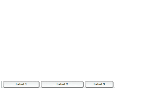
CHAPTER 8
208
</mx:HBox>
</mx:Application>
The default width of the fixed-size button is 66 pixels. All horizontal padding and gaps in the HBox control are 5
pixels wide, so the Flex application reserves 5 pixels for the left padding, 5 pixels for the right padding, and 10
pixels total for the two gaps between components, which leaves 314 pixels free for the two percentage-based
components. Flex reserves 66 pixels for the default-sized (third) button; the second button requires its minimum
size, 150 pixels; and the padding and gap take 20 pixels; this leaves 164 pixels available for the first button. The
first button requests 200 pixels; therefore, it uses all available pixels and is 164 pixels wide.
Flex draws the following application:
Positioning and laying out controls
By default, Flex automatically positions all components, except for the children of a Canvas container. If you have
a Canvas container, or an Application or Panel container with the layout property set to absolute, you specify
absolute positions for its children, or use constraint-based layout. You can use automatic positions and absolute
positioning by using x and y properties. For information on using constraint-based layout, which can control both
positioning and sizing, see “Using constraints to control component layout” on page 213.
Automatic positioning
For most containers, Flex automatically positions the container children according to the container’s layout rules,
such as the layout direction, the container padding, and the gaps between children of that container.
For containers that use automatic positioning, setting the x or y property directly or calling move() has no effect,
or only a temporary effect, because the layout calculations set the x position to the calculation result, not the
specified value. You can, however, specify absolute positions for the children of these containers under some
circumstances; for more information, see “Disabling automatic positioning temporarily” on page 209.
You can control aspects of the layout by specifying container properties; for details on the properties, see the
property descriptions for the container in the Adobe Flex Language Reference. You also control the layout by
controlling component sizes and by using techniques such as adding spacers.
Using the Spacer control to control layout
Flex includes a Spacer control that helps you lay out children within a parent container. The Spacer control is
invisible, but it does allocate space within its parent.

209ADOBE FLEX 3
Adobe Flex 3 Developer Guide
In the following example, you use a percentage-based Spacer control to push the Button control to the right so
that it is aligned with the right edge of the HBox container:
<?xml version="1.0"?>
<!-- components\SpacerHBox.mxml -->
<mx:Application xmlns:mx="http://www.adobe.com/2006/mxml">
<mx:Script>
<![CDATA[
[Embed(source="assets/flexlogo.jpg")]
[Bindable]
public var imgCls:Class;
]]>
</mx:Script>
<mx:HBox width="400">
<mx:Image source="{imgCls}"/>
<mx:Label text="Company XYZ"/>
<mx:Spacer width="100%"/>
<mx:Button label="Close"/>
</mx:HBox>
</mx:Application>
In this example, the Spacer control is the only percentage-based component in the HBox container. Flex sizes the
Spacer control to occupy all available space in the HBox container that is not required for other components. By
expanding the Spacer control, Flex pushes the Button control to the right edge of the container.
You can use all sizing and positioning properties with the Spacer control, such as width, height, maxWidth,
maxHeight, minWidth, and minHeight.
Disabling automatic positioning temporarily
You can use effects, such as the Move and Zoom effects, to modify the size or position of a child in response to a
user action. For example, you might define a child so that when the user selects it, the child moves to the top of
the container and doubles in size. These effects modify the x and y properties of the child as part of the effect.
Similarly, you might want to change the position of a control by changing its x or y coordinate value, for example,
in response to a button click.
Containers that use automatic positioning ignore the values of the x and y properties of their children during a
layout update. Therefore, the layout update cancels any modifications to the x and y properties performed by the
effect, and the child does not remain in its new location.
You can prevent Flex from performing automatic positioning updates that conflict with the requested action of
your application by setting the autoLayout property of a container to false. Setting this property to false
prevents Flex from laying out the container’s contents when a child moves or resizes. Flex defines the autoLayout
property in the Container class, and all containers inherit it; its default value is true, which enables Flex to update
layouts.

CHAPTER 8
210
Even when you set the autoLayout property of a container to false, Flex updates the layout when you add or
remove a child. Application initialization, deferred instantiation, and the <mx:Repeater> tag add or remove
children, so layout updates always occur during these processes, regardless of the value of the autoLayout
property. Therefore, during container initialization, Flex defines the initial layout of the container children
regardless of the value of the autoLayout property.
The following example disables layout updates for a VBox container:
<?xml version="1.0"?>
<!-- components\DisableVBoxLayout.mxml -->
<mx:Application xmlns:mx="http://www.adobe.com/2006/mxml">
<mx:VBox autoLayout="false"
width="200"
height="200"
>
<mx:Button id="b1"
label="Button 1"
/>
<mx:Button id="b2"
label="Button 2"
click="b2.x += 10;"
/>
<mx:Button id="b3"
label="Button 3"
creationComplete="b3.x = 100; b3.y = 75;"
/>
</mx:VBox>
</mx:Application>
In this example, Flex initially lays out all three Button controls according to the rules of the VBox container. The
creationComplete event listener for the third button is dispatched after the VBox control has laid out its children,
but before Flex displays the buttons. Therefore, when the third button appears, it is at the x and y positions
specified by the creationComplete listener. After the buttons appear, Flex shifts the second button 10 pixels to the
right each time a user clicks it.
Setting the autoLayout property of a container to false prohibits Flex from updating a container’s layout after
a child moves or resizes, so you should set it to false only when absolutely necessary. You should always test your
application with the autoLayout property set to the default value of true, and set it to false only as necessary
for the specific container and specific actions of the children in that container.
For more information on effects, see “Using Behaviors” on page 545.

211ADOBE FLEX 3
Adobe Flex 3 Developer Guide
Preventing layout of hidden controls
By default, Flex lays out and reserves space for all components, including hidden components, but it does not
display the hidden controls. You see blank spots where the hidden controls will appear when you make them
visible. In place of the hidden controls, you see their container’s background. However, if the container is any of
the following components, you can prevent Flex from considering the child component when it lays out the
container’s other children by setting the child component’s includeInLayout property of the component to
false:
•Box, or any of its subclasses: HBox, VBox, DividedBox, HDividedBox, VdividedBox, Grid, GridItem,
GridRow, ControlBar, and ApplicationControlBar
•Form
•Tile and its subclass, Legend
•To o lB ar
When a component’s includeInLayout property is false, Flex does not include it in the layout calculations for
other components, but still lays it out. In other words, Flex does not reserve space for the component, but still
draws it. As a result, the component can appear underneath the components that follow it in the layout order. To
prevent Flex from drawing the component, you must also set its visible property to false.
The following example shows the effects of the includeInLayout and visible properties. It lets you toggle each
of these properties independently on the middle of three Panel controls in a VBox control:
<?xml version="1.0"?>
<!-- components\HiddenBoxLayout.mxml -->
<mx:Application xmlns:mx="http://www.adobe.com/2006/mxml">
<mx:VBox>
<mx:Panel id="p1"
title="Panel 1"
backgroundColor="#FF0000"/>
<mx:Panel id="p2"
title="Panel 2"
backgroundColor="#00FF00"/>
<mx:Panel id="p3"
title="Panel 3"
backgroundColor="#0000FF"/>
</mx:VBox>
<mx:HBox>
<mx:Button label="Toggle Panel 2 Visible"
click="{p2.visible=!p2.visible;}"/>
<mx:Button label="Toggle Panel 2 in Layout"
click="{p2.includeInLayout=!p2.includeInLayout;}"/>
</mx:HBox>
</mx:Application>
Run this application and click the buttons to see the results of different combinations of visible and
includeInLayout properties. The example shows the following behaviors:

CHAPTER 8
212
•If you include the second Panel control in the layout and make it invisible, Flex reserves space for it; you see
the background of its VBox container in its place.
•If you do not include the second Panel control in the layout, the VBox resizes and the HBox with the buttons
moves up. If you then include it in the layout, the VBox resizes again, and the HBox and buttons move down.
•If you do not include the second Panel control in the layout and make it visible, Flex still draws it, but does
not consider it in laying out the third Panel control, so the two panels overlap. Because the title of a Panel control
has a default alpha of 0.5, you see the combination of the second and third Panel controls in the second Panel
position.
Absolute positioning
Three containers support absolute positioning:
•Application and Panel controls use absolute positioning if you specify the layout property as "absolute"
(ContainerLayout.ABSOLUTE).
•The Canvas container always uses absolute positioning.
With absolute positioning, you specify the child control position by using its x and y properties, or you specify a
constraint-based layout; otherwise, Flex places the child at position 0,0 of the parent container. When you specify
the x and y coordinates, Flex repositions the controls only when you change the property values. The following
example uses absolute positioning to place a VBox control inside a Canvas control:
<?xml version="1.0"?>
<!-- components\CanvasLayout.mxml -->
<mx:Application xmlns:mx="http://www.adobe.com/2006/mxml"
backgroundGradientColors="[#FFFFFF, #FFFFFF]">
<mx:Canvas
width="100" height="100"
backgroundColor="#999999">
<mx:VBox id="b1"
width="80" height="80"
x="20" y="20"
backgroundColor="#A9C0E7">
</mx:VBox>
</mx:Canvas>
</mx:Application>
This example produces the following image:

213ADOBE FLEX 3
Adobe Flex 3 Developer Guide
When you use absolute positioning, you have full control over the locations of the container’s children. This lets
you overlap components. The following example adds a second VBox to the previous example so that it partially
overlaps the initial box.
<?xml version="1.0"?>
<!-- components\CanvasLayoutOverlap.mxml -->
<mx:Application xmlns:mx="http://www.adobe.com/2006/mxml"
backgroundGradientColors="[#FFFFFF, #FFFFFF]">
<mx:Canvas
width="100" height="100"
backgroundColor="#999999">
<mx:VBox id="b1"
width="80" height="80"
x="20" y="20"
backgroundColor="#A9C0E7">
</mx:VBox>
<mx:VBox id="b2"
width="50" height="50"
x="0" y="50"
backgroundColor="#FF0000">
</mx:VBox>
</mx:Canvas>
</mx:Application>
This example produces the following image:
Note: If you use percentage-based sizing for the children of a control that uses absolute positioning, the percentage-
based components resize when the parent container resizes, and the result may include unwanted overlapping of
controls.
Using constraints to control component layout
You can manage a child component’s size and position simultaneously by using constraint-based layout, or by
using constraint rows and columns. Constraint-based layout lets you anchor the sides or center of a component
to positions relative to the viewable region of the component’s container. The viewable region is the part of the
component that is being displayed, and it can contain child controls, text, images, or other contents.

CHAPTER 8
214
Constraint rows and columns let you subdivide a container into vertical and horizontal constraint regions to
control the size and positioning of child components with respect to each other and within the parent container.
Creating a constraint-based layout
You can use constraint-based layout to determine the position and size of the immediate children of any container
that supports absolute positioning. With constraint-based layout you can do the following:
•Anchor one or more edges of a component at a pixel offset from the corresponding edge of its container’s
viewable region. The anchored child edge stays at the same distance from the parent edge when the container
resizes. If you anchor both edges in a dimension, such as top and bottom, the component resizes if the container
resizes.
•Anchor the child’s horizontal or vertical center (or both) at a pixel offset from the center of the container’s
viewable region. The child does not resize in the specified dimension unless you also use percentage-based sizing.
•Anchor the baseline of a component at a pixel offset from the top edge of its parent container.
You can specify a constraint-based layout for any Flex framework component (that is, any component that extends
the UIComponent class). The following rules specify how to position and size components by using constraint-
based layout:
•Place the component directly inside a Canvas container, or directly inside an Application or Panel container
with the layout property set to absolute.
•Specify the constraints by using the top, bottom, left, right, horizontalCenter, or verticalCenter
styles.
The top, bottom, left, and right styles specify the distances between the component sides and the corre-
sponding container sides.
The baseline constraint specifies the distance between the baseline position of a component and the upper
edge of its parent container. Every component calculates its baseline position as the y-coordinate of the
baseline of the first line of text of the component. The baseline of a UIComponent object that does not contain
any text is calculated as if the UIComponent object contained a UITextField object that uses the component's
styles, and the top of the UITextField object coincides with the component's top.
The horizontalCenter and verticalCenter styles specify distance between the component’s center point
and the container’s center, in the specified direction; a negative number moves the component left or up from
the center.
The following example anchors the Form control’s left and right sides 20 pixels from its container’s sides:
<mx:Form id="myForm" left="20" right="20"/>
•Do not specify a top or bottom style with a verticalCenter style; the verticalCenter value overrides the
other properties. Similarly, do not specify a left or right style with a horizontalCenter style.

215ADOBE FLEX 3
Adobe Flex 3 Developer Guide
•A size determined by constraint-based layout overrides any explicit or percentage-based size specifications. If
you specify left and right constraints, for example, the resulting constraint-based width overrides any width
set by a width or percentWidth property.
Precedence rules for constraint-based components
•If you specify a single edge constraint (left, right, top, or bottom) without any other sizing or
positioning parameter, the component size is the default size and its position is determined by the constraint
value. If you specify a size parameter (width or height), the size is determined by that parameter.
•If you specify a pair of constraints (left-right or top-bottom), the size and position of the component is
determined by those constraint values. If you also specify a center constraint (horizontalCenter or
verticalCenter), the size of the component is calculated from the edge constraints and its position is deter-
mined by the center constraint value.
•Component size determined by a pair of constraint-based layout properties (left-right or top-bottom)
overrides any explicit or percentage-based size specifications. For example, if you specify both left and right
constraints, the calculated constraint-based width overrides the width set by a width or percentWidth property.
•Edge constraints override baseline constraints.
Example: Using constraint-based layout for a form
The following example code shows how you can use constraint-based layout for a form. In this example, the Form
control uses a constraint-based layout to position its top just inside the canvas padding. The form left and right
edges are 20 pixels from the Canvas container’s left and right edges. The HBox that contains the buttons uses a
constraint-based layout to place itself 20 pixels from the Canvas right edge and 10 pixels from the Canvas bottom
edge.
If you change the size of your browser, stand-alone Flash Player, or AIR application, you can see the effects of
dynamically resizing the Application container on the Form layout. The form and the buttons overlap as the appli-
cation grows smaller, for example. In general, you should include the buttons in the last FormItem of the form.
However, in the following example, the buttons are separated in an HBox container to better show the effects of
resizing:
<?xml version="1.0"?>
<!-- components\ConstraintLayout.mxml -->
<mx:Application xmlns:mx="http://www.adobe.com/2006/mxml">
<!-- Use a Canvas container in the Application to prevent
unnecessary scroll bars on the Application. -->
<mx:Canvas width="100%" height="100%">
<!-- Anchor the top of the form at the top of the canvas.
Anchor the form sides 20 pixels from the canvas sides. -->
<mx:Form id="myForm"
backgroundColor="#DDDDDD"

CHAPTER 8
216
top="0"
left="20"
right="20">
<mx:FormItem label="Product:" width="100%">
<!-- Specify a fixed width to keep the ComboBox control from
resizing as you change the application size. -->
<mx:ComboBox width="200"/>
</mx:FormItem>
<mx:FormItem label="User" width="100%">
<mx:ComboBox width="200"/>
</mx:FormItem>
<mx:FormItem label="Date">
<mx:DateField/>
</mx:FormItem>
<mx:FormItem width="100%"
direction="horizontal"
label="Hours:">
<mx:TextInput width="75"/>
<mx:Label text="Minutes" width="48"/>
<mx:TextInput width="75"/>
</mx:FormItem>
</mx:Form>
<!-- Anchor the box with the buttons 20 pixels from the canvas
right edge and 10 pixels from the bottom. -->
<mx:HBox id="okCancelBox"
right="20"
bottom="10">
<mx:Button label="OK"/>
<mx:Button label="Cancel"/>
</mx:HBox>
</mx:Canvas>
</mx:Application>
Using constraint rows and columns
You can subdivide a container that supports absolute positioning into vertical and horizontal constraint regions
to control the size and positioning of child components with respect to each other, or with respect to the parent
container.
You define the horizontal and vertical constraint regions of a container by using the constraintRows and
constraintColumns properties. These properties contain Arrays of constraint objects that partition the
container horizontally (ConstraintColumn objects) and vertically (ConstraintRow objects). ConstraintRow
objects are laid out in the order they are defined, from top to bottom in their container; ConstraintColumn objects
are laid out from left to right in the order they are defined.

217ADOBE FLEX 3
Adobe Flex 3 Developer Guide
The following example shows a Canvas container partitioned into two vertical regions and two horizontal regions.
The first constraint column occupies 212 pixels from the leftmost edge of the Canvas. The second constraint
column occupies 100% of the remaining Canvas width. The rows in this example occupy 80% and 20% of the
Canvas container’s height from top to bottom, respectively.
<?xml version="1.0"?>
<!-- constraints\BasicRowColumn.mxml -->
<mx:Application xmlns:mx="http://www.adobe.com/2006/mxml">
<mx:Canvas>
<mx:constraintColumns>
<mx:ConstraintColumn id="col1" width="212"/>
<mx:ConstraintColumn id="col2" width="100%"/>
</mx:constraintColumns>
<mx:constraintRows>
<mx:ConstraintRow id="row1" height="80%"/>
<mx:ConstraintRow id="row2" height="20%"/>
</mx:constraintRows>
<!-- Position child components based on
the constraint columns and rows. -->
</mx:Canvas>
</mx:Application>
Constraint rows and columns do not have to occupy 100% of the available area in a container. The following
example shows a single constraint column that occupies 20% of the Canvas width; 80% of the container is unallo-
cated:
<?xml version="1.0"?>
<!-- constraints\BasicColumn_20Percent.mxml -->
<mx:Application xmlns:mx="http://www.adobe.com/2006/mxml">
<mx:Canvas>
<mx:constraintColumns>
<mx:ConstraintColumn id="col1" width="20%"/>
</mx:constraintColumns>
</mx:Canvas>
<!-- Position child components based on
the constraint column. -->
</mx:Application>
Creating constraint rows and columns
Constraint columns and rows have three sizing options: fixed, percent, and content. These options dictate the
amount of space that the constraint region occupies in the container. As child components are added to or
removed from the parent container, the space allocated to each ConstraintColumn and ConstraintRow instance
is computed according to its sizing option.

CHAPTER 8
218
•Fixed size means the space allocated to the constraint region is a fixed pixel size. In the following example, you
set the fixed with of a ConstraintColumn instance to 100 pixels:
<mx:ConstraintColumn id="col1" width="100"/>
As the parent container grows or shrinks, the ConstraintColumn instance remains 100 pixels wide.
•Percent size means that the space allocated to the constraint row or column is calculated as a percentage of the
space remaining in the parent container after the space allocated to fixed and content size child objects has been
deducted from the available space.
In the following example, you set the with of a ConstraintColumn instance to 80%:
<mx:ConstraintColumn id="col1" width="80%"/>
As the parent container grows or shrinks, the ConstraintColumn always takes up 80% of the available width.
A best practice in specifying percent constraints is to ensure that the sum of all percent constraints is less than
or equal to 100%. However, if the total value of percent specifications is greater than 100%, the actual allocated
percentages are calculated so that the proportional values for all constraints total 100%. For example, if the
percentages for two constraint objects are specified as 100% and 50%, the values are adjusted to 66.6% and
33.3% (two-thirds for the first value and one-third for the second).
•Content size (default) means that the space allocated to the region is dictated by the size of the child objects in
that space. As the size of the content changes, so does the size of the region. Content sizing is the default when you
do not specify either fixed or percentage sizing parameters.
In the following example, you specify content size by omitting any explicit width setting:
<mx:ConstraintColumn id="col1"/>
The width of this ConstraintColumn is determined by the width of its largest child. When children span
multiple content sized constraint rows or constraint columns, Flex divides the space consumed by the children
among the rows and columns.
For the ConstraintColumn class, you can also use the maxWidth and minWidth properties to limit the width of
the column. For the ConstraintRow class, you can use the maxHeight and minHeight properties to limit the
height of the row. Minimum and maximum sizes for constraint columns and rows limit how much the constraint
regions grow or shrink when you resize their parent containers. If the parent container with a constraint region
shrinks to less than the minimum size for that region when you resize the container, scrollbars appear to show
clipped content.
Note: Minimum and maximum limits are only applicable to percentage and content sized constraint regions. For
fixed size constraint regions, minimum and maximum values, if specified, are ignored.

219ADOBE FLEX 3
Adobe Flex 3 Developer Guide
Positioning child components based on constraint rows and constraint columns
Anchor a child component to a constraint row or constraint column by prepending the constraint region’s ID to
any of the child’s constraint parameters. For example, if the ID of a ConstraintColumn is "col1", you can specify a
set of child constraints as left="col1:10", right="col1:30", horizontalCenter="col1:0".
If you do not qualify constraint parameters (left, right, top, and bottom) a constraint region ID, the
component is constrained relative to the edges of its parent container. Components can occupy a single constraint
region (row or column) or can span multiple regions.
The following example uses constraint rows and constraint columns to position three Button controls in a Canvas
container:
<?xml version="1.0"?>
<!-- constraints\ConstrainButtons.mxml -->
<mx:Application xmlns:mx="http://www.adobe.com/2006/mxml">
<mx:Canvas id="myCanvas" backgroundColor="0x6699FF">
<mx:constraintColumns>
<mx:ConstraintColumn id="col1" width="100"/>
<mx:ConstraintColumn id="col2" width="100"/>
</mx:constraintColumns>
<mx:constraintRows>
<mx:ConstraintRow id="row1" height="100"/>
<mx:ConstraintRow id="row2" height="100"/>
</mx:constraintRows>
<mx:Button label="Button 1"
top="row1:10" bottom="row1:10"
left="10"/>
<mx:Button label="Button 2"
left="col2:10" right="col2:10"/>
<mx:Button label="Button 3"
top="row2:10" bottom="row2:10"
left="col1:10" right="10"/>
</mx:Canvas>
<mx:Label text="canvas width:{myCanvas.width}"/>
<mx:Label text="canvas height:{myCanvas.height}"/>
</mx:Application>
The next example defines the constraint rows and columns by using percentages. As you resize the application,
the Button controls resize accordingly.
<?xml version="1.0"?>
<!-- constraints\ConstrainButtonsPercent.mxml -->
<mx:Application xmlns:mx="http://www.adobe.com/2006/mxml">
<mx:Canvas id="myCanvas"
backgroundColor="0x6699FF"
width="100%" height="100%">
<mx:constraintColumns>
<mx:ConstraintColumn id="col1" width="30%"/>

CHAPTER 8
220
<mx:ConstraintColumn id="col2" width="40%"/>
<mx:ConstraintColumn id="col3" width="30%"/>
</mx:constraintColumns>
<mx:constraintRows>
<mx:ConstraintRow id="row1" height="35%"/>
<mx:ConstraintRow id="row2" height="55%"/>
</mx:constraintRows>
<mx:Button label="Button 1"
top="row1:10" bottom="row2:10"
left="10"/>
<mx:Button label="Button 2"
left="col2:10" right="col3:10"/>
<mx:Button label="Button 3"
top="row2:10" bottom="row2:10"
left="col3:10" right="col3:10"/>
</mx:Canvas>
<mx:Label text="canvas width:{myCanvas.width}"/>
<mx:Label text="canvas height:{myCanvas.height}"/>
</mx:Application>
While you may specify any combination of qualified and unqualified constraints, some constraint properties may
be overridden. The priority of sizing and positioning constraints are as follows:
1Center constraint specifications override all other constraint values when determining the position of a
control.
2Next, left edge and top positions are determined.
3Finally, right edge and bottom positions are calculated to best fit the component.
The following table defines the behavior of constrained components when they are contained in a single
constraint region. Edge 1 is the first specified edge constraint for a child component (left, right, top, or
bottom). Edge 2 is the second specified edge constraint of a pair (left and right, top and bottom). Size is an
explicit size for a child component (width, height). Center is the positioning constraint to center the child object
(horizontalCenter or verticalCenter).
Constraint Parameters Behavior
Edge 1 Edge 2 Size Center Size Position
xDefault component size Relative to specified edge constraint
x x Calculated from specified edge constraints Relative to specified edge constraints
x x x Determined from specified edge
constraints. Explicit size is overridden
Relative to specified edge constraints
xxSpecified size Relative to specified edge
221ADOBE FLEX 3
Adobe Flex 3 Developer Guide
x x Default component size Centered in constraint region; edge constraint
is ignored
x x x Calculated from edge constraints Centered in constraint region
x x x Explicit size Centered in constraint region; single edge
constraint is ignored
xDefault size of component Centered in constraint region
Constraint Parameters Behavior
Edge 1 Edge 2 Size Center Size Position

CHAPTER 8
222

223
Chapter 9: Controls
Controls are user-interface components such as Button, TextArea, and ComboBox controls. Adobe® Flex® has two
types of controls: basic and data provider. For information on data provider controls, see “Using Data-Driven
Controls” on page 373.
Topics
About controls. . . . . . . . . . . . . . . . . . . . . . . . . . . . . . . . . . . . . . . . . . . . . . . . . . . . . . . . . . . . . . . . . . . . . . . . . . . . . . . . . .224
Working with controls . . . . . . . . . . . . . . . . . . . . . . . . . . . . . . . . . . . . . . . . . . . . . . . . . . . . . . . . . . . . . . . . . . . . . . . . . . .230
Button control . . . . . . . . . . . . . . . . . . . . . . . . . . . . . . . . . . . . . . . . . . . . . . . . . . . . . . . . . . . . . . . . . . . . . . . . . . . . . . . . . .233
PopUpButton control . . . . . . . . . . . . . . . . . . . . . . . . . . . . . . . . . . . . . . . . . . . . . . . . . . . . . . . . . . . . . . . . . . . . . . . . . . . .237
ButtonBar and ToggleButtonBar controls . . . . . . . . . . . . . . . . . . . . . . . . . . . . . . . . . . . . . . . . . . . . . . . . . . . . . . . . . . .240
LinkBar control . . . . . . . . . . . . . . . . . . . . . . . . . . . . . . . . . . . . . . . . . . . . . . . . . . . . . . . . . . . . . . . . . . . . . . . . . . . . . . . . .243
TabBar control. . . . . . . . . . . . . . . . . . . . . . . . . . . . . . . . . . . . . . . . . . . . . . . . . . . . . . . . . . . . . . . . . . . . . . . . . . . . . . . . . .244
CheckBox control . . . . . . . . . . . . . . . . . . . . . . . . . . . . . . . . . . . . . . . . . . . . . . . . . . . . . . . . . . . . . . . . . . . . . . . . . . . . . . .248
RadioButton control. . . . . . . . . . . . . . . . . . . . . . . . . . . . . . . . . . . . . . . . . . . . . . . . . . . . . . . . . . . . . . . . . . . . . . . . . . . . .249
NumericStepper control . . . . . . . . . . . . . . . . . . . . . . . . . . . . . . . . . . . . . . . . . . . . . . . . . . . . . . . . . . . . . . . . . . . . . . . . .253
DateChooser and DateField controls. . . . . . . . . . . . . . . . . . . . . . . . . . . . . . . . . . . . . . . . . . . . . . . . . . . . . . . . . . . . . . .255
LinkButton control . . . . . . . . . . . . . . . . . . . . . . . . . . . . . . . . . . . . . . . . . . . . . . . . . . . . . . . . . . . . . . . . . . . . . . . . . . . . . .265
HSlider and VSlider controls. . . . . . . . . . . . . . . . . . . . . . . . . . . . . . . . . . . . . . . . . . . . . . . . . . . . . . . . . . . . . . . . . . . . . .267
SWFLoader control . . . . . . . . . . . . . . . . . . . . . . . . . . . . . . . . . . . . . . . . . . . . . . . . . . . . . . . . . . . . . . . . . . . . . . . . . . . . .274
Image control. . . . . . . . . . . . . . . . . . . . . . . . . . . . . . . . . . . . . . . . . . . . . . . . . . . . . . . . . . . . . . . . . . . . . . . . . . . . . . . . . . .278
VideoDisplay control . . . . . . . . . . . . . . . . . . . . . . . . . . . . . . . . . . . . . . . . . . . . . . . . . . . . . . . . . . . . . . . . . . . . . . . . . . . .287
ColorPicker control . . . . . . . . . . . . . . . . . . . . . . . . . . . . . . . . . . . . . . . . . . . . . . . . . . . . . . . . . . . . . . . . . . . . . . . . . . . . .294
Alert control . . . . . . . . . . . . . . . . . . . . . . . . . . . . . . . . . . . . . . . . . . . . . . . . . . . . . . . . . . . . . . . . . . . . . . . . . . . . . . . . . . .301
ProgressBar control . . . . . . . . . . . . . . . . . . . . . . . . . . . . . . . . . . . . . . . . . . . . . . . . . . . . . . . . . . . . . . . . . . . . . . . . . . . . .306
HRule and VRule controls. . . . . . . . . . . . . . . . . . . . . . . . . . . . . . . . . . . . . . . . . . . . . . . . . . . . . . . . . . . . . . . . . . . . . . . . 309
ScrollBar control . . . . . . . . . . . . . . . . . . . . . . . . . . . . . . . . . . . . . . . . . . . . . . . . . . . . . . . . . . . . . . . . . . . . . . . . . . . . . . . .312

224 CHAPTER 9
About controls
Controls are user-interface components, such as Button, Te xt A re a , and ComboBox controls. You place controls in
containers, which are user-interface components that provide a hierarchical structure for controls and other
containers. Typically, you define a container, and then insert controls or other containers in it.
At the root of a Flex application is the <mx:Application> tag, which represents a base container that covers the
entire Adobe® Flash® Player or Adobe AIR™ drawing surface. You can place controls or containers directly under
the <mx:Application> tag or in other containers. For more information on containers, see “Introducing
Containers” on page 419.
Most controls have the following characteristics:
•MXML API for declaring the control and the values of its properties and events
•ActionScript API for calling the control’s methods and setting its properties at run time
•Customizable appearance by using styles, skins, and fonts
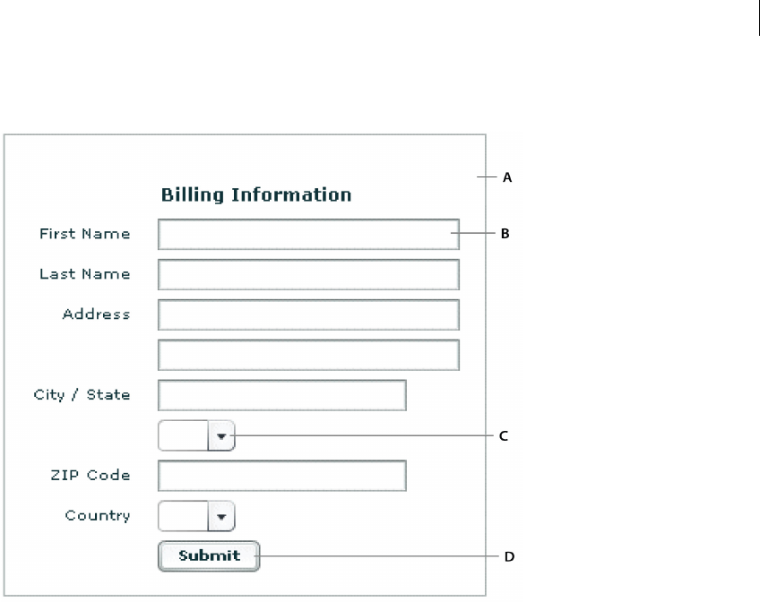
225ADOBE FLEX 3
Adobe Flex 3 Developer Guide
The following image shows several controls used in a Form container:
A. Form container B. Te xt Inp ut co nt ro l s C. ComboBox control D. Button control
The MXML and ActionScript APIs let you create and configure a control. The following MXML code example
creates a TextInput control in a Form container:
<?xml version="1.0"?>
<!-- controls\TextInputInForm.mxml -->
<mx:Application xmlns:mx="http://www.adobe.com/2006/mxml">
<mx:Form width="300" height="100">
<mx:FormItem label="Card Name">
<mx:TextInput id="cardName"/>
</mx:FormItem>
</mx:Form>
</mx:Application>
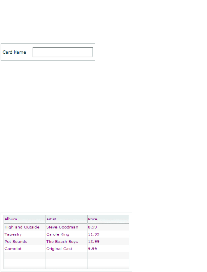
CHAPTER 9
226
This example produces the following image:
Although you commonly use MXML as the language for building Flex applications, you can also use ActionScript
to configure controls. For example, the following code example populates a DataGrid control by providing an
Array of items as the value of the DataGrid control’s dataProvider property:
<?xml version="1.0"?>
<!-- controls\DataGridConfigAS.mxml -->
<mx:Application xmlns:mx="http://www.adobe.com/2006/mxml">
<mx:Script>
<![CDATA[
private function myGrid_initialize():void {
myGrid.dataProvider = [
{Artist:'Steve Goodman', Album:'High and Outside', Price:8.99},
{Artist:'Carole King', Album:'Tapestry', Price:11.99},
{Artist:'The Beach Boys', Album:'Pet Sounds', Price:13.99},
{Artist:'Original Cast', Album:'Camelot', Price:9.99} ];
}
]]>
</mx:Script>
<mx:DataGrid id="myGrid"
width="350" height="150"
color="#7B0974"
creationComplete="myGrid_initialize();"/>
</mx:Application>
This example produces the following image:
227ADOBE FLEX 3
Adobe Flex 3 Developer Guide
Tex t controls
Several Flex components display text or take text input, as the following table shows:
These controls can display plain text that all has the same appearance. The controls can also display rich text
formatted by using a subset of the standard HTML formatting tags. For information on using text controls, see
“Using Text Controls” on page 315.
Data provider controls
Several Flex components, such as the DataGrid, Tree, and ComboBox controls, take input data from a data
provider. A data provider is a collection of objects, similar to an array. For example, a Tree control reads data from
the data provider to define the structure of the tree and any associated data assigned to each tree node.
The data provider creates a level of abstraction between Flex components and the data that you use to populate
them. You can populate multiple components from the same data provider, switch data providers for a component
at run time, and modify the data provider so that changes are reflected by all components that use the data
provider.
Consider that the data provider is the model, and the Flex components are the view onto the model. By separating
the model from the view, you can change one without changing the other.
Control Type of text
Label Noneditable, single-line text field
Text Noneditable, multiline text field
TextInpu t (Optional) Editable, single-line text field
TextArea (Optional) Editable, multiline text field
RichTextEditor Compound control that contains a multiline text field and controls that let you format text by selecting such char-
acteristics as font, size, weight, and alignment
CHAPTER 9
228
Menu controls
Several Flex controls create or interact with menus, as the following table shows:
For information on menu controls, see “Using Menu-Based Controls” on page 347.
Flex controls
The following table lists all the controls available with Flex:
Control Description
Menu A visual menu that can have cascading submenus
MenuBar A horizontal bar with multiple submenus
PopUpMenuButton A Menu control that opens when you click a button
Control Description For more information
Alert Displays a pop-up alert “Alert control” on page 301
Button Displays a variable-size button that can include a
label, an icon image, or both.
“Button control” on page 233
ButtonBar Displays a row of related buttons with a common
appearance.
“ButtonBar and ToggleButtonBar controls” on page 240
CheckBox Shows whether a particular Boolean value is true
(checked) or false (unchecked).
“CheckBox control” on page 248
ComboBox Displays a drop-down list attached to a text field that
contains a set of values.
“ComboBox control” on page 388
ColorPicker Displays a selectable drop-down color swatch panel
(palette).
“DateChooser and DateField controls” on page 255
DataGrid Displays data in a tabular format. “DataGrid control” on page 395
DateChooser Displays a full month of days to let you select a date. “DateChooser and DateField controls” on page 255
DateField Displays the date with a calendar icon on its right
side. When a user clicks anywhere inside the control,
a DateChooser control pops up and displays a
month of dates.
“DateChooser and DateField controls” on page 255
HorizontalList Displays a horizontal list of items. “HorizontalList control” on page 382
229ADOBE FLEX 3
Adobe Flex 3 Developer Guide
HRule/VRule Displays a single horizontal rule (HRule) or vertical
rule (VRule).
“HRule and VRule controls” on page 309
HSlider/VSlider Lets users select a value by moving a slider thumb
between the end points of the slider track.
“HSlider and VSlider controls” on page 267
Image Imports GIF, JPEG, PNG, SVG, and SWF files. “Image control” on page 278
Label Displays a noneditable single-line field label. “LinkButton control” on page 265
LinkBar Displays a horizontal row of LinkButton controls that
designate a series of link destinations.
“LinkBar control” on page 243
LinkButton Displays a simple hypertext link. “LinkButton control” on page 265
List Displays a scrollable array of choices. “List control” on page 373
Menu Displays a pop-up menu of individually selectable
choices, much like the File or Edit menu of most soft-
ware applications.
“Menu control events” on page 354
MenuBar Displays a horizontal menu bar that contains one or
more submenus of Menu controls.
“MenuBar control” on page 365
NumericStepper Displays a dual button control that you can use to
increase or decrease the value of the underlying vari-
able.
“NumericStepper control” on page 253
ProgressBar Provides visual feedback of how much time remains
in the current operation.
“ProgressBar control” on page 306
RadioButton Displays a set of buttons of which exactly one is
selected at any time.
“RadioButton control” on page 249
RadioButton Group Displays a group of RadioButton controls with a
single click event listener.
“Creating a group by using the <mx:RadioButtonGroup>
tag” on page 251
RichTextEditor Includes a multiline editable text field and controls
for specifying text formatting.
“RichTextEditor control” on page 340
ScrollBar
(HScrollBar and
VScrollBar)
Displays horizontal and vertical scroll bars. “ScrollBar control” on page 312
SWFLoader Displays the contents of a specified SWF file or JPEG
file.
“SWFLoader control” on page 274
TabBar Displays a horizontal row of tabs. “TabBar control” on page 244
Control Description For more information
CHAPTER 9
230
Working with controls
Flex controls share a common class hierarchy. Therefore, you use a similar procedure to configure all controls.
Class hierarchy of controls
Flex controls are ActionScript objects derived from the flash.display.Sprite and mx.core.UIComponent classes, as
the following example shows. Controls inherit the properties, methods, events, styles, and effects of these super-
classes:
Text Displays a noneditable multiline text field. “TextInput control” on page 336
TextArea Displays an editable text field for user input that can
accept more than a single line of input.
“Using Text Controls” on page 315
TextInput Displays an editable text field for a single line of user
input. Can contain alphanumeric data, but input is
interpreted as a String data type.
“TextInput control” on page 336
TileList Displays a tiled list of items. The items are tiled in
vertical columns or horizontal rows.
“TileList control” on page 385
ToggleButtonBar Displays a row of related buttons with a common
appearance.
“ButtonBar and ToggleButtonBar controls” on page 240
Tree Displays hierarchical data arranged as an expand-
able tree.
“Tree control” on page 405
VideoDisplay Incorporates streaming media into Flex applications. “VideoDisplay control” on page 287
Control Description For more information
Sprite
UIComponent
Controls

231ADOBE FLEX 3
Adobe Flex 3 Developer Guide
The Sprite and UIComponent classes are the base classes for all Flex components. Subclasses of the UIComponent
class can have shape, draw themselves, and be invisible. Each subclass can participate in tabbing, accept low-level
events like keyboard and mouse input, and be disabled so that it does not receive mouse and keyboard input.
For information on the interfaces inherited by controls from the Sprite and UIComponent classes, see “Using Flex
Visual Components” on page 113.
Sizing controls
All controls define rules for determining their size in a Flex application. For example, a Button control sizes itself
to fit its label text and optional icon image, while an Image control sizes itself to the size of the imported image.
Each control has a default height and a default width. The default size of each standard control is specified in the
description of each control.
The default size of a control is not necessarily a fixed value. For example, for a Button control, the default size is
large enough to fit its label text and optional icon image. At run time, Flex calculates the default size of each control
and, by default, does not resize a control from its default size.
Set the height and width attributes in MXML to percentages, such as 50%, or the percentHeight and
percentWidth properties in ActionScript to percentage values, such as 50, to allow Flex to resize the control in
the corresponding direction. Flex attempts to fit the control to the percentage of its parent container that you
specify. If there isn’t enough space available, the percentages are scaled, while retaining their relative values.
For example, you can set the width of a comments box to scale with its parent container as the parent container
changes size:
<mx:TextInput id="comments" width="100%" height ="20"/>
You can also specify explicit sizes for a control. In MXML or ActionScript by setting the its height and width
properties to numeric pixel values. The following example sets the height and width of the addr2 TextInput
control to 20 pixels and 100 pixels, respectively:
<mx:TextInput id="addr2" width="100" height ="20"/>
To resize a control at run time, use ActionScript to set its width and height properties. For example, the click
event listener for the following Button control sets the width property of the addr2 TextInput control to increase
its width by 10 pixels:
<mx:Button id="button1" label="Slide" height="20"
click="addr2.width+=10;"/>
Note: The preceding technique works even if the width property was originally set as a percentage value. The stored
values of the width and height properties are always in pixels.

CHAPTER 9
232
Many components have arbitrarily large maximum sizes, which means that Flex can make them as large as
necessary to fit the requirements of your application. While some components have a defined nonzero minimum
size, most have a minimum size of 0. You can use the maxHeight, maxWidth, minHeight, and minWidth
properties to set explicit size ranges for each component.
For more information on sizing components, see “Sizing and Positioning Components” on page 185.
Positioning controls
You place controls inside containers. Most containers have predefined layout rules that automatically determine
the position of their children. The Canvas container absolutely positions its children, and the Application and
Panel containers optionally let you use absolute or container-relative positioning.
To absolutely position a control, you set its x and y properties to specific horizontal and vertical pixel coordinates
within the container. These coordinates are relative to the upper-left corner of the container, where the upper-left
corner is at coordinates (0,0). Values for x and y can be positive or negative integers. You can use negative values
to place a control outside of the visible area of the container, and then use ActionScript to move the child to the
visible area, possibly as a response to an event.
The following example places the Te xt Inp ut control 150 pixels to the right and 150 pixels down from the upper-
left corner of a Canvas container:
<mx:TextInput id="addr2" width="100" height ="20" x="150" y="150"/>
To reposition a control within an absolutely-positioned container at run time, you set its x and y properties. For
example, the click event listener for the following Button control moves the TextInput control down 10 pixels
from its current position:
<mx:Button id="button1" label="Slide" height="20" x="0" y="250"click="addr2.y =
addr2.y+10;"/>
For detailed information about control positioning, including container-relative positioning, see “Sizing and
Positioning Components” on page 185.
Changing the appearance of controls
Styles, skins, and fonts let you customize the appearance of controls. They describe aspects of components that
you want components to have in common. Each control defines a set of styles, skins, and fonts that you can set;
some are specific to a particular type of control, and others are more general.
Flex provides several different ways for you to configure the appearance of your controls. For example, you can
set styles for a specific control in the control’s MXML tag, by using ActionScript, or globally for all instances of a
specific control in an application by using the <mx:Style> tag.
233ADOBE FLEX 3
Adobe Flex 3 Developer Guide
A theme defines the look and feel of a Flex application. A theme can define something as simple as the color
scheme or common font for an application, or it can be a complete reskinning of all the Flex components. The
current theme for your application defines the styles that you can set on the controls within it. That means some
style properties might not always be settable. For more information, see “Using Styles and Themes” on page 589.
Button control
The Button control is a commonly used rectangular button. Button controls look like they can be pressed, and
have a text label, an icon, or both on their face. You can optionally specify graphic skins for each of several Button
states.
You can create a normal Button control or a toggle Button control. A normal Button control stays in its pressed
state for as long as the mouse button is down after you select it. A toggle Button controls stays in the pressed state
until you select it a second time.
Buttons typically use event listeners to perform an action when the user selects the control. When a user clicks the
mouse on a Button control, and the Button control is enabled, it dispatches a click event and a buttonDown
event. A button always dispatches events such as the mouseMove, mouseOver, mouseOut, rollOver, rollOut,
mouseDown, and mouseUp events whether enabled or disabled.
The following example shows a Button control:
You can use customized graphic skins to customize your buttons to match your application’s look and function-
ality. You can give the Button control different image skins for the up, down, and disabled states, and the skins for
these states can differ depending on whether the button is selected or not selected. The control can change the
image skins dynamically.
The following example shows seven Button controls to control video recording and playback arranged in an HBox
layout container. All buttons are in their up state:
CHAPTER 9
234
Creating a Button control
You de fi ne a Button control in MXML by using the <mx:Button> tag, as the following example shows. Specify an
id value if you intend to refer to a component elsewhere in your MXML, either in another tag or in an Action-
Script block. The following code creates a Button control with the label “Hello world!”:
<?xml version="1.0"?>
<!-- controls\button\ButtonLabel.mxml -->
<mx:Application xmlns:mx="http://www.adobe.com/2006/mxml">
<mx:Button id="button1" label="Hello world!" width="100"/>
</mx:Application>
A Button control’s icon, if specified, and label are centered within the bounds of the Button control. You can
position the text label in relation to the icon by using the labelPlacement property, which accepts the values
right, left, bottom, and top.
Embedding an icon in a Button control
Button icons must be embedded at compile time. You cannot reference a Button icon at run time. You can use the
@Embed syntax in the icon property value to embed any GIF, JPEG, PNG, SVG, or SWF file, or you can bind to
an image that you defined within a script block by using [Embed] metadata. If you must reference your button
graphic at run time, you can use an <mx:Image> tag instead of an <mx:Button> tag.
For more information on embedding resources, see “Embedding Assets” on page 969.
The following code example creates a Button control with a label and an icon:
<?xml version="1.0"?>
<!-- controls\button\ButtonLabelIcon.mxml -->
<mx:Application xmlns:mx="http://www.adobe.com/2006/mxml">
<mx:Button
label="Icon Button"
icon="@Embed(source='assets/logo.jpg')"
height="36"
/>
</mx:Application>
The icon is in the assets subdirectory of the directory containing the application file. This results in a button with
the icon displayed to the left of the label text:
For an overview of resource embedding, see “Embedding Assets” on page 969.

235ADOBE FLEX 3
Adobe Flex 3 Developer Guide
Sizing a Button control
By default, Flex stretches the Button control width to fit the size of its label, any icon, plus 6 pixels of padding
around the icon. You can override this default width by explicitly setting the width property of the Button control
to a specific value or to a percentage of its parent container. If you specify a percentage value, the button resizes
between its minimum and maximum widths as the size of its parent container changes.
If you explicitly size a Button control so that it is not large enough to accommodate its label, the label is truncated
and terminated by an ellipsis (...). The full label displays as a tooltip when you move the mouse over the Button
control. If you have also set a tooltip by using the tooltip property, the tooltip is displayed rather than the label
text.
Text that is vertically larger than the Button control is also clipped. If you explicitly size a Button control so that it
is not large enough to accommodate its icon, icons larger than the Button control extend outside the Button
control’s bounding box.
Button control user interaction
When a user clicks the mouse on a Button control, the Button control dispatches a click event, as the following
example shows:
<?xml version="1.0"?>
<!-- controls\button\ButtonClick.mxml -->
<mx:Application xmlns:mx="http://www.adobe.com/2006/mxml">
<!-- Input field. -->
<mx:TextInput id="myInput" width="150" text=""/>
<!-- Button control that triggers the copy. -->
<mx:Button id="myButton" label="Copy Text"
click="myText.text=myInput.text;"/>
<!-- Output text box. -->
<mx:TextArea id="myText" text="" width="150" height="20"/>
</mx:Application>
In this example, clicking the Button control copies the text from the TextInput control to the TextArea control.
If a Button control is enabled, it behaves as follows:
•When the user moves the mouse pointer over the Button control, the Button control displays its rollover
appearance.
•When the user clicks the Button control, focus moves to the control and the Button control displays its pressed
appearance. When the user releases the mouse button, the Button control returns to its rollover appearance.
•If the user moves the mouse pointer off the Button control while pressing the mouse button, the control’s
appearance returns to the original state and it retains focus.
•If the toggle property is set to true, the state of the Button control does not change until the user releases
the mouse button over the control.

CHAPTER 9
236
If a Button control is disabled, it displays its disabled appearance, regardless of user interaction. In the disabled
state, all mouse or keyboard interaction is ignored.
Skinning a Button control
You can specify a set of up to eight different image skin properties, where each property corresponds to a different
button state. These skins determine the basic appearance of the buttons. You can specify images for each of the
following button states:
•Up (the mouse is not over the control)
•Down (the mouse is over the control and the mouse button is pressed)
•Over (the mouse hovers over the control)
•Disabled
•Selected and up
•Selected and down
•Selected and over
•Selected and disabled
You specify the default appearance of a Button control by specifying an up state image (the upSkin property). All
other states use the up state image or the image from another state as their default. For example, if you do not
specify an image for the down state, Flex uses the image specified for the over state; if you don’t specify an image
for the over state, Flex uses the image for the up state. The selected states are used only for toggle buttons that are
selected (pressed).
The skin image determines the appearance of the button, including its shape. The image can be GIF, JPEG, PNG,
SVG, or SWF file. You can create the skins as independent image files, or incorporate multiple images in a single
SWF file.
Flex must embed the button images in the application’s SWF file at compile time; you cannot download images
from the server at run time. To embed the image, use the @Embed MXML compiler directive. The following code
example shows how to use a GIF file as the up (default) button image:
upSkin="@Embed(source='assets/buttonUp.gif')"
The following code example creates a toggle button with an image for up, down, over, and disabled states. The
button has both a label and an icon:
<?xml version="1.0"?>
<!-- controls\button\ButtonSkin.mxml -->
<mx:Application xmlns:mx="http://www.adobe.com/2006/mxml">
<mx:Button label="Image Button"
toggle="true"
color="0xFFFFAA"
237ADOBE FLEX 3
Adobe Flex 3 Developer Guide
textRollOverColor="0xAAAA55"
textSelectedColor="0xFFFF00"
upSkin="@Embed(source='assets/buttonUp.gif')"
overSkin="@Embed(source='assets/buttonOver.gif')"
downSkin="@Embed(source='assets/buttonDown.gif')"
disabledSkin="@Embed(source='assets/buttonDisabled.gif')"
icon="@Embed(source='assets/logo.gif')"/>
</mx:Application>
PopUpButton control
The PopUpButton control consists of two horizontal buttons: a main button, and a smaller button called the pop-
up button, which only has an icon. The main button is a Button control.
The pop-up button, when clicked, opens a second control called the pop-up control. Clicking anywhere outside
the PopUpButton control, or in the pop-up control, closes the pop-up control
The PopUpButton control adds a flexible pop-up control interface to a Button control. One common use for the
PopUpButton control is to have the pop-up button open a List control or a Menu control that changes the function
and label of the main button, as the following example shows by using a Menu control:
A. Main button B. Pop-up button
In this example, the user can choose whether the button puts mail in the Inbox, the Sent Items folder, or the Trash
folder, by selecting from the pop-up menu that appears when the user clicks the small pop-up button to the right
of the main button. The text on the main button indicates the action it performs, and the text changes each time
the user selects a different item from the menu.
The PopUpButton control is not limited to displaying menus; it can display any Flex control as the pop-up control.
A workflow application that lets users send a document for review, for example, could use a Tree control as a visual
indication of departmental structure. The PopUpButton control’s pop-up button would display the tree, from
which the user could pick the message recipients.

CHAPTER 9
238
The control that pops up does not have to affect the main button’s appearance or action; it can have an
independent action instead. You could create an undo PopUpButton control, for example, where the main button
undoes only the last action, and the pop-up control is a List control that lets users undo multiple actions by
selecting them.
The PopUpButton control is a subclass of the Button control and inherits all of its properties, styles, events, and
methods, with the exception of the toggle property and the styles used for a selected button.
The control has the following characteristics:
•The popUp property specifies the pop-up control (for example, List or Menu).
•The open() and close() methods lets you open and close the pop-up control programmatically, rather than
by using the pop-up button.
•The open and close events are dispatched when the pop-up control opens and closes.
•You use the popUpSkin and arrowButtonWidth style properties to define the PopUpButton control’s
appearance.
For detailed descriptions, see PopUpButton in Adobe Flex Language Reference.
Creating a PopUpButton control
You use the <mx:PopUpButton> tag to define aPopUpButton control in MXML, as the following example shows.
Specify an id value if you intend to refer to a component elsewhere in your MXML, either in another tag or in an
ActionScript block.
In the following example, you use the PopUpButton control to open a Menu control. Once opened, the Menu
control, or any pop-up control, functions just as it would normally. You define an event listener for the Menu
control’s change event to recognize when the user selects a menu item, as the following example shows:
<?xml version="1.0"?>
<!-- controls\button\PopUpButtonMenu.mxml -->
<mx:Application xmlns:mx="http://www.adobe.com/2006/mxml"
height="600" width="600">
<mx:Script>
<
239ADOBE FLEX 3
Adobe Flex 3 Developer Guide
{label: "Sent Items"},
{label: "Inbox"}
];
myMenu.dataProvider = dp;
myMenu.addEventListener("itemClick", changeHandler);
popB.popUp = myMenu;
}
// Define the event listener for the Menu control's change event.
private function changeHandler(event:MenuEvent):void {
var label:String = event.label;
popTypeB.text=String("Moved to " + label);
popB.label = "Put in: " + label;
popB.close();
}
]]>
</mx:Script>
<mx:VBox>
<mx:Label text="Main button mimics the last selected menuItem."/>
<mx:PopUpButton id="popB"
label="Edit"
width="135"
creationComplete="initMenu();"/>
<mx:Spacer height="50"/>
<mx:TextInput id="popTypeB"/>
</mx:VBox>
</mx:Application>
User interaction
You navigate the PopUpButton control in the following ways:
•Moving the mouse over any part of the PopUpButton control highlights the button border and the main
button or the pop-up button.
•Clicking the button dispatches the click event.
•Clicking the pop-up button pops up the pop-up control and dispatches an open event.
•Clicking anywhere outside the PopUpButton control, or in the pop-up control, closes the pop-up control and
dispatches a close event.
The following keystrokes let users navigate the PopUpButton control:
Key Use
Spacebar Behaves like clicking the main button.
Control+Down Arrow Opens the pop-up control and initiates an open event. The pop-up control’s keyboard handling takes
effect.
Control+Up Arrow Closes the pop-up control and initiates a close event.

CHAPTER 9
240
Note: You cannot use the Tab key to leave an opened pop-up control; you must make a selection or close the control
with the Control+Up Arrow key combination.
ButtonBar and ToggleButtonBar controls
The ButtonBar and ToggleButtonBar controls define a horizontal or vertical row of related buttons with a
common appearance. The controls define a single event, the itemClick event, that is dispatched when any button
in the control is selected.
The ButtonBar control defines group of buttons that do not retain a selected state. When you select a button in a
ButtonBar control, the button changes its appearance to the selected state; when you release the button, it returns
to the deselected state.
The ToggleButtonBar control defines a group buttons that maintain their state, either selected or deselected. Only
one button in the ToggleButtonBar control can be in the selected state. That means when you select a button in a
ToggleButtonBar control, the button stays in the selected state until you select a different button.
If you set the toggleOnClick property of the ToggleButtonBar control to true, selecting the currently selected
button deselects it. By default the toggleOnClick property is false.
The following image shows an example of a ButtonBar control that defines a set of buttons:
The following image shows an example of a ToggleButtonBar control that defines a set of buttons, where the
Dreamweaver button is the currently selected button in the control:
Creating a ButtonBar control
You create a ButtonBar control in MXML by using the <mx:ButtonBar> tag, as the following example shows:
<?xml version="1.0"?>
<!-- controls\bar\BBarSimple.mxml -->
<mx:Application xmlns:mx="http://www.adobe.com/2006/mxml" >
<mx:ButtonBar borderStyle="solid" horizontalGap="5">
<mx:dataProvider>
<mx:String>Flash</mx:String>
<mx:String>Director</mx:String>
<mx:String>Dreamweaver</mx:String>

241ADOBE FLEX 3
Adobe Flex 3 Developer Guide
<mx:String>ColdFusion</mx:String>
</mx:dataProvider>
</mx:ButtonBar>
</mx:Application>
This example creates a row of four Button controls, as shown in the image in “ButtonBar and ToggleButtonBar
controls” on page 240.
To create a ToggleButtonBar control, replace the <mx:ButtonBar> tag with the <mx:ToggleButtonBar> tag. For
the ToggleButtonBar control, the selectedIndex property determines which button is selected when the control
is created. The default value for selectedIndex is 0 and selects the leftmost button in the bar. Setting the
selectedIndex property to -1 deselects all buttons in the bar. Otherwise, the syntax is the same for both controls.
The dataProvider property specifies the labels of the four buttons. You can also populate the dataProvider
property with an Array of Objects, where each object can have up to three fields: label, icon, and toolTip.
In the following example, an Array of Objects specifies a label and icon for each button:
<?xml version="1.0"?>
<!-- controls\bar\BBarLogo.mxml -->
<mx:Application xmlns:mx="http://www.adobe.com/2006/mxml">
<mx:ButtonBar borderStyle="solid" horizontalGap="5">
<mx:dataProvider>
<mx:Object label="Flash"
icon="@Embed(source='assets/Flashlogo.gif')"/>
<mx:Object label="Director"
icon="@Embed(source='assets/Dirlogo.gif')"/>
<mx:Object label="Dreamweaver"
icon="@Embed(source='assets/Dlogo.gif')"/>
<mx:Object label="ColdFusion"
icon="@Embed(source='assets/CFlogo.gif')"/>
</mx:dataProvider>
</mx:ButtonBar>
</mx:Application>
A ButtonBar or ToggleButtonBar control creates Button controls based on the value of its dataProvider
property. Even though ButtonBar and ToggleButtonBar are subclasses of Container, do not use the methods
Container.addChild() and Container.removeChild() to add or remove Button controls. Instead, use
methods addItem() and removeItem() to manipulate the dataProvider property. A ButtonBar or ToggleBut-
tonBar control automatically adds or removes children based on changes to the dataProvider property.
Handling ButtonBar events
The ButtonBar and ToggleButtonBar controls dispatch an itemClick event when you select a button. The event
object passed to the event listener is of type ItemClickEvent. From within the event listener, you access properties
of the event object to determine the index of the selected button and other information. The index of the first
button is 0. For more information about the event object, see the description of the ItemClickEvent class in the
Adobe Flex Language Reference.

CHAPTER 9
242
The ToggleButtonBar control in the following example defines an event listener, named clickHandler(), for the
itemClick event.
<?xml version="1.0"?>
<!-- controls\bar\BBarEvent.mxml -->
<mx:Application xmlns:mx="http://www.adobe.com/2006/mxml" >
<mx:Script>
<![CDATA[
import mx.events.ItemClickEvent;
private var savedIndex:int = 99999;
private function clickHandler(event:ItemClickEvent):void {
if (event.index == savedIndex) {
myTA.text=""
}
else {
savedIndex = event.index;
myTA.text="Selected button index: " +
String(event.index) + "\n" +
"Selected button label: " +
event.label;
}
}
]]>
</mx:Script>
<mx:ToggleButtonBar
borderStyle="solid"
horizontalGap="5"
itemClick="clickHandler(event);"
toggleOnClick="true"
selectedIndex="-1">
<mx:dataProvider>
<mx:String>Flash</mx:String>
<mx:String>Director</mx:String>
<mx:String>Dreamweaver</mx:String>
<mx:String>ColdFusion</mx:String>
</mx:dataProvider>
</mx:ToggleButtonBar>
<mx:TextArea id="myTA" width="250" height="100"/>
</mx:Application>
In this example, the click handler displays the index and label of the selected button in a TextArea control in
response to an itemClick event. If you press the selected button a second time, the button is deselected, and the
sample click handler clears the text area.
243ADOBE FLEX 3
Adobe Flex 3 Developer Guide
LinkBar control
A LinkBar control defines a horizontal or vertical row of LinkButton controls that designate a series of link desti-
nations. You typically use a LinkBar control to control the active child container of a ViewStack container, or to
create a standalone set of links.
The following shows an example of a LinkBar control that defines a set of links:
Creating a LinkBar control
One of the most common uses of a LinkBar control is to control the active child of aViewStack container. For an
example, see “ViewStack navigator container” on page 529.
You can also use a LinkBar control on its own to create a set of links in your application. In the following example,
you define an itemClick handler for the LinkBar control to respond to user input, and use the dataProvider
property of the LinkBar to specify its label text. Use the following example code to create the LinkBar control
shown in the previous image:
<?xml version="1.0"?>
<!-- controls\bar\LBarSimple.mxml -->
<mx:Application xmlns:mx="http://www.adobe.com/2006/mxml">
<mx:LinkBar borderStyle="solid"
itemClick="navigateToURL(new URLRequest('http://www.adobe.com/' +
String(event.label).toLowerCase()), '_blank');">
<mx:dataProvider>
<mx:String>Flash</mx:String>
<mx:String>Director</mx:String>
<mx:String>Dreamweaver</mx:String>
<mx:String>ColdFusion</mx:String>
</mx:dataProvider>
</mx:LinkBar>
</mx:Application>
In this example, you use the <mx:dataProvider> and <mx:Array> tags to define the label text. The event object
passed to the itemClick handler contains the label selected by the user. The handler for the itemClick event
constructs an HTTP request to the Adobe website based on the label, and opens that page in a new browser
window.
You can also bind data to the <mx:dataProvider> tag to populate the LinkBar control, as the following example
shows:
<?xml version="1.0"?>
<!-- controls\bar\LBarBinding.mxml -->
<mx:Application xmlns:mx="http://www.adobe.com/2006/mxml">

CHAPTER 9
244
<mx:Script>
<![CDATA[
import mx.collections.ArrayCollection;
[Bindable]
private var linkData:ArrayCollection = new ArrayCollection([
"Flash", "Director", "Dreamweaver", "ColdFusion"
]);
]]>
</mx:Script>
<mx:LinkBar
horizontalAlign="right"
borderStyle="solid"
itemClick="navigateToURL(new URLRequest('http://www.adobe.com/' +
String(event.label).toLowerCase()), '_blank');">
<mx:dataProvider>
{linkData}
</mx:dataProvider>
</mx:LinkBar>
</mx:Application>
In this example, you define the data for the LinkBar control as a variable in ActionScript, and then you bind that
variable to the <mx:dataProvider> tag. You could also bind to the <mx:dataProvider> tag from a Flex data
model, from a web service response, or from any other type of data model.
A LinkBar control creates LinkButton controls based on the value of its dataProvider property. Even though
LinkBar is a subclass of Container, do not use methods such as Container.addChild() and
Container.removeChild() to add or remove LinkButton controls. Instead, use methods such as addItem()
and removeItem() to manipulate the dataProvider property. A LinkBar control automatically adds or removes
the necessary children based on changes to the dataProvider property.
TabBar control
A TabB ar control defines a horizontal or vertical row of tabs. The following shows an example of a TabBar control:
As with the LinkBar control, you can use a TabBar control to control the active child container of a ViewStack
container. The syntax for using a TabBar control to control the active child of a ViewStack container is the same
as for a LinkBar control. For an example, see “ViewStack navigator container” on page 529.
While a TabBar control is similar to a TabNavigator container, it does not have any children. For example, you use
the tabs of a TabNavigator container to select its visible child container. You can use a TabBar control to set the
visible contents of a single container to make that container’s children visible or invisible based on the selected tab.

245ADOBE FLEX 3
Adobe Flex 3 Developer Guide
Creating a TabBar control
You use the <mx:TabBar> tag to define aTabBar control in MXML. Specify an id value if you intend to refer to a
component elsewhere in your MXML, either in another tag or in an ActionScript block.
You specify the data for the TabBar control by using the <mx:dataProvider> and <mx:Array> child tags of the
<mx:TabBar> tag. The <mx:dataProvider> tag lets you specify data in several different ways. In the simplest
case for creating a TabBar control, you use the <mx:dataProvider>, <mx:Array>, and <mx:String> tags to
specify the text for each tab, as the following example shows:
<?xml version="1.0"?>
<!-- controls\bar\TBarSimple.mxml -->
<mx:Application xmlns:mx="http://www.adobe.com/2006/mxml">
<mx:TabBar>
<mx:dataProvider>
<mx:String>Alabama</mx:String>
<mx:String>Alaska</mx:String>
<mx:String>Arkansas</mx:String>
</mx:dataProvider>
</mx:TabBar>
</mx:Application>
The <mx:String> tags define the text for each tab in the TabBar control.
You can also use the <mx:Object> tag to define the entries as an array of objects, where each object contains a
label property and an associated data value, as the following example shows:
<?xml version="1.0"?>
<!-- controls\bar\TBarObject.mxml -->
<mx:Application xmlns:mx="http://www.adobe.com/2006/mxml">
<mx:TabBar>
<mx:dataProvider>
<mx:Object label="Alabama" data="Montgomery"/>
<mx:Object label="Alaska" data="Juneau"/>
<mx:Object label="Arkansas" data="Little Rock"/>
</mx:dataProvider>
</mx:TabBar>
</mx:Application>
The label property contains the state name and the data property contains the name of its capital. The data
property lets you associate a data value with the text label. For example, the label text could be the name of a
color, and the associated data value could be the numeric representation of that color.
By default, Flex uses the value of the label property to define the tab text. If the object does not contain a label
property, you can use the labelField property of the TabBar control to specify the property name containing the
tab text, as the following example shows:
<?xml version="1.0"?>
<!-- controls\bar\TBarLabel.mxml -->
<mx:Application xmlns:mx="http://www.adobe.com/2006/mxml">
<mx:TabBar labelField="state">

CHAPTER 9
246
<mx:dataProvider>
<mx:Object state="Alabama" data="Montgomery"/>
<mx:Object state="Alaska" data="Juneau"/>
<mx:Object state="Arkansas" data="Little Rock"/>
</mx:dataProvider>
</mx:TabBar>
</mx:Application>
Passing data to a TabBar control
Flex lets you populate a TabB ar control from an ActionScript variable definition or from a Flex data model. When
you use a variable, you can define it to contain one of the following:
•A label (string)
•A label (string) paired with data (scalar value or object)
The following example populates a TabBar control from a variable:
<?xml version="1.0"?>
<!-- controls\bar\TBarVar.mxml -->
<mx:Application xmlns:mx="http://www.adobe.com/2006/mxml">
<mx:Script>
<![CDATA[
import mx.collections.ArrayCollection;
[Bindable]
private var STATE_ARRAY:ArrayCollection = new ArrayCollection([
{label:"Alabama", data:"Montgomery"},
{label:"Alaska", data:"Juneau"},
{label:"Arkansas", data:"LittleRock"}
]);
]]>
</mx:Script>
<mx:TabBar >
<mx:dataProvider>
{STATE_ARRAY}
</mx:dataProvider>
</mx:TabBar>
</mx:Application>
You can also bind a Flex data model to the dataProvider property. For more information on using data models,
see “Storing Data” on page 1257.

247ADOBE FLEX 3
Adobe Flex 3 Developer Guide
Handling TabBar control events
The TabB ar control defines an itemClick event that is broadcast when a user selects a tab. The event object
contains the following properties:
•label String containing the label of the selected tab.
•index Number containing the index of the selected tab. Indexes are numbered from 0 to n - 1, where n is
the total number of tabs. The default value is 0, corresponding to the first tab.
The following example code shows a handler for the itemClick event for this TabBar control:
<?xml version="1.0"?>
<!-- controls\bar\TBarEvent.mxml -->
<mx:Application xmlns:mx="http://www.adobe.com/2006/mxml">
<mx:Script>
<![CDATA[
import mx.events.ItemClickEvent;
import mx.controls.TabBar;
import mx.collections.ArrayCollection;
[Bindable]
private var STATE_ARRAY:ArrayCollection = new ArrayCollection([
{label:"Alabama", data:"Montgomery"},
{label:"Alaska", data:"Juneau"},
{label:"Arkansas", data:"LittleRock"}
]);
private function clickEvt(event:ItemClickEvent):void {
// Access target TabBar control.
var targetComp:TabBar = TabBar(event.currentTarget);
forClick.text="label is: " + event.label + "\nindex is: " +
event.index + "\ncapital is: " +
targetComp.dataProvider[event.index].data;
}
]]>
</mx:Script>
<mx:TabBar id="myTB" itemClick="clickEvt(event);">
<mx:dataProvider>
{STATE_ARRAY}
</mx:dataProvider>
</mx:TabBar>
<mx:TextArea id="forClick" width="250" height="100"/>
</mx:Application>
In this example, every itemClick event updates the TextArea control with the tab label, selected index, and the
selected data from the TabBar control’s dataProvider Array.

CHAPTER 9
248
CheckBox control
The CheckBox control is a commonly used graphical control that can contain a check mark or be unchecked
(empty). You can use CheckBox controls wherever you need to gather a set of true or false values that aren’t
mutually exclusive.
You can add a text label to a CheckBox control and place it to the left, right, top, or bottom. Flex clips the label of
a CheckBox control to fit the boundaries of the control.
The following image shows a checked CheckBox control:
For the code used to generate this example, see “Creating a CheckBox control” on page 248.
When a user clicks a CheckBox control or its associated text, the CheckBox control changes its state from checked
to unchecked, or from unchecked to checked.
A CheckBox control can have one of two disabled states, checked or unchecked. By default, a disabled CheckBox
control displays a different background and check mark color than an enabled CheckBox control.
Creating a CheckBox control
You use the <mx:CheckBox> tag to define a CheckBox control in MXML, as the following example shows. Specify
an id value if you intend to refer to a component elsewhere in your MXML, either in another tag or in an Action-
Script block:
<?xml version="1.0"?>
<!-- controls\checkbox\CBSimple.mxml -->
<mx:Application xmlns:mx="http://www.adobe.com/2006/mxml">
<mx:VBox>
<mx:CheckBox width="100" label="Employee?"/>
</mx:VBox>
</mx:Application>
You can also use the selected property to generate a checkbox that is checked by default:
<?xml version="1.0"?>
<!-- controls\checkbox\CBSelected.mxml -->
<mx:Application xmlns:mx="http://www.adobe.com/2006/mxml">
<mx:VBox>
<mx:CheckBox width="100" label="Employee?" selected="true"/>
</mx:VBox>
</mx:Application>
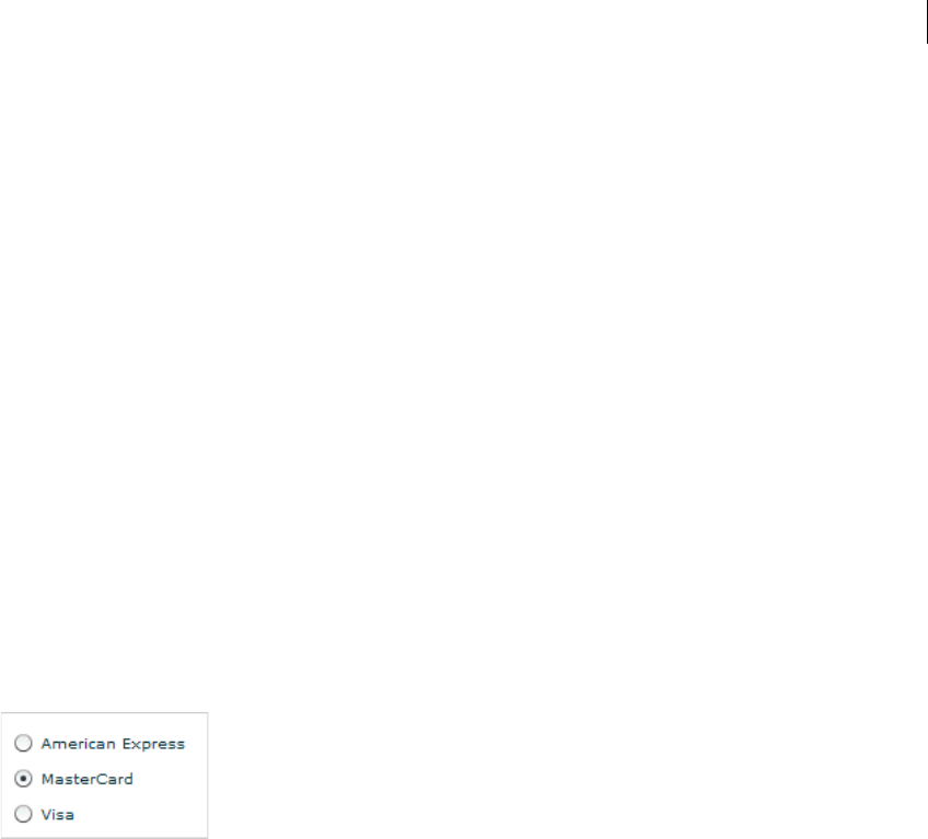
249ADOBE FLEX 3
Adobe Flex 3 Developer Guide
CheckBox control user interaction
When a CheckBox control is enabled and the user clicks it, the control receives focus and displays its checked or
unchecked appearance, depending on its initial state. The entire area of the CheckBox control is the click area; if
the CheckBox control’s text is larger than its icon, the clickable regions are above and below the icon.
If the user moves the mouse pointer outside the area of the CheckBox control or its label while pressing the mouse
button, the appearance of the CheckBox control returns to its original state and the control retains focus. The state
of the CheckBox control does not change until the user releases the mouse button over the control.
Users cannot interact with a CheckBox control when it is disabled.
RadioButton control
The RadioButton control is a single choice in a set of mutually exclusive choices. A RadioButton group is
composed of two or more RadioButton controls with the same group name. Only one member of the group can
be selected at any given time. Selecting an unselected group member deselects the currently selected RadioButton
control in the group.
About the RadioButton control
The following example shows a RadioButton group with three RadioButton controls:
For the code used to generate this example, see “Creating a RadioButton control” on page 249.
Creating a RadioButton control
You define a RadioButton control in MXML by using the <mx:RadioButton> tag, as the following example
shows. Specify an id value if you intend to refer to a component elsewhere in your MXML, either in another tag
or in an ActionScript block.
<?xml version="1.0"?>
<!-- controls\button\RBSimple.mxml -->
<mx:Application xmlns:mx="http://www.adobe.com/2006/mxml">

CHAPTER 9
250
<mx:RadioButton groupName="cardtype"
id="americanExpress"
label="American Express"
width="150"/>
<mx:RadioButton groupName="cardtype"
id="masterCard"
label="MasterCard"
width="150"/>
<mx:RadioButton groupName="cardtype"
id="visa"
label="Visa"
width="150"/>
</mx:Application>
This code results in the application shown in “About the RadioButton control” on page 249.
For each RadioButton control in the group, you can optionally define an event listener for the button’s click
event. When a user selects a RadioButton control, Flex calls the event listener associated with the button for the
click event, as the following code example shows:
<?xml version="1.0"?>
<!-- controls\button\RBEvent.mxml -->
<mx:Application xmlns:mx="http://www.adobe.com/2006/mxml">
<mx:Script>
<![CDATA[
import flash.events.Event;
private function handleAmEx(event:Event):void {
// Handle event.
myTA.text="Got Amex";
}
private function handleMC(event:Event):void {
// Handle event.
myTA.text="Got MasterCard";
}
private function handleVisa(event:Event):void {
// Handle event.
myTA.text="Got Visa";
}
]]>
</mx:Script>
<mx:RadioButton groupName="cardtype"
id="americanExpress"
label="American Express"
width="150"
click="handleAmEx(event);"/>
<mx:RadioButton groupName="cardtype"
id="masterCard"
label="MasterCard"
width="150"
click="handleMC(event);"/>
251ADOBE FLEX 3
Adobe Flex 3 Developer Guide
<mx:RadioButton groupName="cardtype"
id="visa"
label="Visa"
width="150"
click="handleVisa(event);"/>
<mx:TextArea id="myTA"/>
</mx:Application>
RadioButton user interaction
If a RadioButton control is enabled, when the user moves the mouse pointer over an unselected RadioButton
control, the button displays its rollover appearance. When the user clicks an unselected RadioButton control, the
input focus moves to the control and the button displays its false pressed appearance. When the mouse button is
released, the button displays the true state appearance. The previously selected RadioButton control in the group
returns to its false state appearance.
If the user moves the mouse pointer off the RadioButton control while pressing the mouse button, the control’s
appearance returns to the false state and the control retains input focus.
If a RadioButton control is not enabled, the RadioButton control and RadioButton group display the disabled
appearance, regardless of user interaction. In the disabled state, all mouse or keyboard interaction is ignored.
The RadioButton and RadioButtonGroup controls have the following keyboard navigation features:
Creating a group by using the <mx:RadioButtonGroup> tag
The previous example created a RadioButton group by using the groupName property of each RadioButton
control. You can also create a RadioButton group by using the RadioButtonGroup control, as the following
example shows:
<?xml version="1.0"?>
<!-- controls\button\RBGroupSimple.mxml -->
<mx:Application xmlns:mx="http://www.adobe.com/2006/mxml">
<mx:Script>
<
CHAPTER 9
252
]]>
</mx:Script>
<mx:RadioButtonGroup id="cardtype" itemClick="handleCard(event);"/>
<mx:RadioButton groupName="cardtype"
id="americanExpress"
value="AmEx"
label="American Express"
width="150"/>
<mx:RadioButton groupName="cardtype"
id="masterCard"
value="MC"
label="MasterCard"
width="150"/>
<mx:RadioButton groupName="cardtype"
id="visa"
value="Visa"
label="Visa"
width="150"/>
</mx:Application>
In this example, you use the id property of the <mx:RadioButtonGroup> tag to define the group name and the
single itemClick event listener for all buttons in the group. The id property is required when you use the
<mx:RadioButtonGroup> tag. The itemClick event listener for the group can determine which button was
selected, as the following example shows:
<?xml version="1.0"?>
<!-- controls\button\RBGroupEvent.mxml -->
<mx:Application xmlns:mx="http://www.adobe.com/2006/mxml">
<mx:Script>
<![CDATA[
import mx.controls.Alert;
import mx.events.ItemClickEvent;
private function handleCard(event:ItemClickEvent):void {
if (event.currentTarget.selectedValue == "AmEx") {
Alert.show("You selected American Express.");
} else if (event.currentTarget.selectedValue == "MC") {
Alert.show("You selected MasterCard.");
} else {
Alert.show("You selected Visa.");
}
}
]]>
</mx:Script>
<mx:RadioButtonGroup id="cardtype" itemClick="handleCard(event);"/>
<mx:RadioButton groupName="cardtype"
id="americanExpress"
value="AmEx"
label="American Express"
width="150"/>
<mx:RadioButton groupName="cardtype"
id="masterCard"
value="MC"
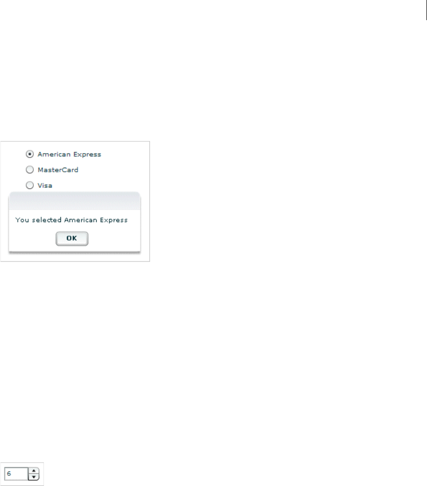
253ADOBE FLEX 3
Adobe Flex 3 Developer Guide
label="MasterCard"
width="150"/>
<mx:RadioButton groupName="cardtype"
id="visa"
value="Visa"
label="Visa"
width="150"/>
</mx:Application>
This code results in the following output when you select the American Express button:
In the itemClick event listener, the selectedValue property of the RadioButtonGroup control in the event
object is set to the value of the value property of the selected RadioButton control. If you omit the value property,
Flex sets the selectedValue property to the value of the label property.
You can still define a click event listener for the individual buttons, even though you also define one for the
group.
NumericStepper control
You can use the NumericStepper control to select a number from an ordered set. The NumericStepper control
consists of a single-line input text field and a pair of arrow buttons for stepping through the valid values; you can
also use the Up Arrow and Down Arrow keys to cycle through the values.
The following example shows a NumericStepper control:
For the code used to create this image, see “Creating a NumericStepper control” on page 254.

CHAPTER 9
254
If the user clicks the up arrow, the value displayed is increased by one unit of change. If the user holds down the
arrow, the value increases or decreases until the user releases the mouse button. When the user clicks the arrow,
it is highlighted to provide feedback to the user.
Users can also type a legal value directly into the text field. Although editable ComboBox controls provide similar
functionality, NumericStepper controls are sometimes preferred because they do not require a drop-down list that
can obscure important data.
NumericStepper control arrows always appear to the right of the text field.
Creating a NumericStepper control
You def in e a NumericStepper control in MXML by using the <mx:NumericStepper> tag, as the following
example shows. Specify an id value if you intend to refer to a component elsewhere in your MXML, either in
another tag or in an ActionScript block:
<?xml version="1.0"?>
<!-- controls\numericstepper\NumStepSimple.mxml -->
<mx:Application xmlns:mx="http://www.adobe.com/2006/mxml">
<mx:NumericStepper id="nstepper1" value="6" stepSize="2" maximum="100"/>
</mx:Application>
Sizing a NumericStepper control
The up and down arrow buttons in the NumericStepper control do not change size when the control is resized. If
the NumericStepper control is sized greater than the default height, the associated stepper buttons appear pinned
to the top and the bottom of the control.
User interaction
If the user clicks the up or down arrow button, the value displayed is increased by one unit of change. If the user
presses either of the arrow buttons for more than 200 milliseconds, the value in the input field increases or
decreases, based on step size, until the user releases the mouse button or the maximum or minimum value is
reached.
255ADOBE FLEX 3
Adobe Flex 3 Developer Guide
Keyboard navigation
The NumericStepper control has the following keyboard navigation features:
In order to use the keyboard to navigate through the stepper, it must have focus.
DateChooser and DateField controls
The DateChooser and DateField controls let users select dates from graphical calendars. The DateChooser
control user interface is the calendar. The DateField control has a text field that uses a date chooser popup to select
the date as a result. The DateField properties are a superset of the DateChooser properties.
For complete reference information, see DateChooser and DateField in the Adobe Flex Language Reference.
About the DateChooser control
The DateChooser control displays the name of a month, the year, and a grid of the days of the month, with
columns labeled for the days of the week. This control is useful in applications where you want a continually visible
calendar. The user can select a single date from the grid. The control contains forward and back arrow buttons to
let you change the month and year. You can disable the selection of certain dates, and limit the display to a range
of dates.
Key Description
Down Arrow Value decreases by one unit.
Up Arrow Value increases by one unit.
Left Arrow Moves the insertion point to the left within the NumericStepper control’s text field.
Right Arrow Moves the insertion point to the right within the Numeric Stepper control’s text field.
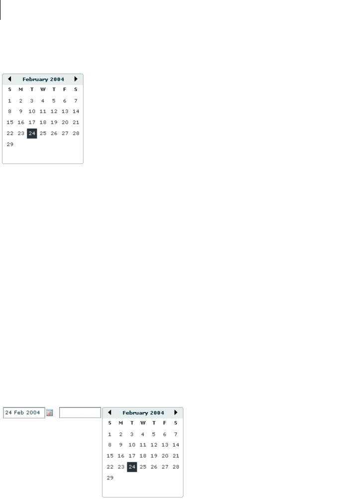
CHAPTER 9
256
The following image shows a DateChooser control:
Changing the displayed month does not change the selected date. Therefore, the currently selected date might not
always be visible. The DateChooser control resizes as necessary to accommodate the width of the weekday
headings. Therefore, if you use day names, instead of letters, as headings, the calendar will be wide enough to show
the full day names.
About the DateField control
The DateField control is a text field that displays the date with a calendar icon on its right side. When a user clicks
anywhere inside the bounding box of the control, a date chooser that is identical to the DateChooser control pops
up. If no date has been selected, the text field is blank and the current month is displayed in the date chooser.
When the date chooser is open, users can click the month scroll buttons to scroll through months and years, and
select a date. When the user selects a date, the date chooser closes and the text field displays the selected date.
This control is useful in applications where you want a calendar selection tool, but want to minimize the space
that the date information takes up.
The following example shows two images of a DateField control. On the left is a control with the date chooser
closed; the calendar icon appears on the right side of the text box. To the right is a DateField control with the date
chooser open:

257ADOBE FLEX 3
Adobe Flex 3 Developer Guide
You can use the DateField control anywhere you want a user to select a date. For example, you can use a DateField
control in a hotel reservation system, with certain dates selectable and others disabled. You can also use the
DateField control in an application that displays current events, such as performances or meetings, when a user
selects a date.
Creating a DateChooser or DateField control
You de fi ne a DateChooser control in MXML by using the <mx:DateChooser> tag. You define a DateField control
in MXML by using the <mx:DateField> tag. Specify an id value if you intend to refer to a component elsewhere
in your MXML, either in another tag or an ActionScript block.
The following example creates a DateChooser control; to create a DateField control, simply change
<mx:DateChooser> to <mx:DateField>. The example uses the change event of the DateChooser control to
display the selected date in several different formats.
<?xml version="1.0"?>
<!-- controls\date\DateChooserEvent.mxml -->
<mx:Application xmlns:mx="http://www.adobe.com/2006/mxml">
<mx:Script>
<![CDATA[
import mx.events.CalendarLayoutChangeEvent;
private function useDate(eventObj:CalendarLayoutChangeEvent):void {
// Make sure selectedDate is not null.
if (eventObj.currentTarget.selectedDate == null) {
return
}
//Access the Date object from the event object.
day.text=eventObj.currentTarget.selectedDate.getDay();
date.text=eventObj.currentTarget.selectedDate.getDate();
month.text=eventObj.currentTarget.selectedDate.getMonth() + 1;
year.text=eventObj.currentTarget.selectedDate.getFullYear();
wholeDate.text= (eventObj.currentTarget.selectedDate.getMonth() + 1) +
"/" + (eventObj.currentTarget.selectedDate.getDate() +
"/" + eventObj.currentTarget.selectedDate.getFullYear());
}
]]>
</mx:Script>
<mx:DateChooser id="date1" change="useDate(event)"/>
<mx:Form>
<mx:FormItem label="Day of week">
<mx:TextInput id="day" width="100"/>
</mx:FormItem>
<mx:FormItem label="Day of month">
<mx:TextInput id="date" width="100"/>
</mx:FormItem>

CHAPTER 9
258
<mx:FormItem label="Month">
<mx:TextInput id="month" width="100"/>
</mx:FormItem>
<mx:FormItem label="Year">
<mx:TextInput id="year" width="100"/>
</mx:FormItem>
<mx:FormItem label="Date">
<mx:TextInput id="wholeDate" width="100"/>
</mx:FormItem>
</mx:Form>
</mx:Application>
Notice that the first line of the event listener determines if the selectedDate property is null. This check is
necessary because selecting the currently selected date while holding down the Control key deselects it, sets the
selectedDate property to null, then dispatches the change event.
Note: The code that determines the value of the wholeDate field adds 1 to the month number because the
DateChooser control uses a zero-based month system, where January is month 0 and December is month 11.
Using the Date class
The DateChooser and DateField controls use the selectedDate property to store the currently selected date, as
an object of type Date. You can create Date objects to represent date and time values, or access the Date in the
selectedDate property.
The Date class has many methods that you can use to manipulate a date. For more information on the Date class,
see the Adobe Flex Language Reference.
In MXML you can create and configure a Date object by using the <mx:Date> tag. This tag exposes the setter
methods of the Date class as MXML properties so that you can initialize a Date object. For example, the following
code creates a DateChooser control, and sets the selected date to April 10, 2005 (notice that months are indexed
starting at 0 for the DateChooser control):
<mx:DateChooser id="date1">
<mx:selectedDate>
<mx:Date month="3" date="10" fullYear="2005"/>
</mx:selectedDate>
</mx:DateChooser>
The following example uses inline ActionScript to set the initial selected date for a DateField control:
<mx:DateField id="date3" selectedDate="{new Date (2005, 3, 10)}"/>
You can also set the selectedDate property in a function, as the following example shows:
<mx:Script>
<![CDATA[
private function initDC():void {
date2.selectedDate=new Date (2005, 3, 10);
}
]]>

259ADOBE FLEX 3
Adobe Flex 3 Developer Guide
</mx:Script>
<mx:DateChooser id="date2" creationComplete="initDC();"/>
You can use property notation to access the ActionScript setter and getter methods of the selectedDate property
Date object. For example, the following line displays the four-digit year of the selected date in a text box:
<mx:TextInput text="{date1.selectedDate.fullYear}"/>
Specifying header, weekday, and today’s day text styles
The following date chooser properties let you specify text styles for regions of the control:
•headerStyleName
•weekDayStyleName
•todayStyleName
These properties let you specify styles for the text in the header, week day list and today’s date. You cannot use
these properties to set non-text styles such as todayColor.
The following example defines a DateChooser control that has bold, blue header text in a 16-pixel Times New
Roman font. The day of week headers are in bold, italic, green, 15-pixel Courier text, and today’s date is bold,
orange, 12-pixel Times New Roman text. Today’s date background color is grey, and is set directly in the
mx:DateChooser tag.
<?xml version="1.0"?>
<!-- controls\date\DateChooserStyles.mxml -->
<mx:Application xmlns:mx="http://www.adobe.com/2006/mxml">
<mx:Style>
.myHeaderStyle{
color:#6666CC;
font-family:Times New Roman, Times, serif;
font-size:16px; font-weight:bold;}
.myTodayStyle{
color:#CC6633;
font-family:Times New Roman, Times, serif;
font-size:12px; font-weight:bold;}
.myDayStyle{
color:#006600;
font-family:Courier New, Courier, mono;
font-size:15px; font-style:italic; font-weight:bold;}
</mx:Style>
<mx:DateChooser
headerStyleName="myHeaderStyle"
todayStyleName="myTodayStyle"
todayColor="#CCCCCC"
weekDayStyleName="myDayStyle"/>
</mx:Application>
CHAPTER 9
260
Specifying selectable dates
The DateChooser control has the following properties that let you specify which dates a user can select:
The following example shows a DateChooser control that has the following characteristics:
•The selectableRange property limits users to selecting dates in the range January 1 - March 15, 2006. Users
can only navigate among the months of January through March 2006.
•The disabledRanges property prevents users from selecting January 11 or any day in the range January 23 -
February 10.
•The disabledDays property prevents users from selecting Saturdays or Sundays.
<?xml version="1.0"?>
<!-- controls\date\DateChooserSelectable.mxml -->
<mx:Application xmlns:mx="http://www.adobe.com/2006/mxml">
<mx:DateChooser
selectableRange="{{rangeStart: new Date(2006,0,1),
rangeEnd: new Date(2006,2,15)}}"
disabledRanges="{[new Date(2006,0,11),
{rangeStart: new Date(2006,0,23), rangeEnd: new Date(2006,1,10)}]}"
disabledDays="{[0,6]}"/>
</mx:Application>
Setting DateChooser and DateField properties in ActionScript
Properties of the DateChooser and DateField controls take values that are scalars, Arrays, and Date objects. While
you can set most of these properties in MXML, it can be easier to set some in ActionScript.
For example, the following code example uses an array to set the disabledDays property so that Saturday and
Sunday are disabled, which means that they cannot be selected in the calendar. This example sets the
disabledDays property in two different ways, by using tags and by using tag attributes:
<?xml version="1.0"?>
<!-- controls\date\DateChooserDisabledOption.mxml -->
<mx:Application xmlns:mx="http://www.adobe.com/2006/mxml">
<!-- Use tags.-->
<mx:DateField>
Property Description
disabledDays An array of days of the week that the user cannot select. Often used to disable weekend days.
disabledRange An array of dates that the user cannot select. The array can contain individual Date objects, objects specifying date
ranges, or both.
selectableRange A single range of dates that the user can select. The user can navigate only among the months that include this
range; in these months any dates outside the range are disabled. Use the disabledRange property to disable
dates within the selectable range.

261ADOBE FLEX 3
Adobe Flex 3 Developer Guide
<mx:disabledDays>
<mx:Number>0</mx:Number>
<mx:Number>6</mx:Number>
</mx:disabledDays>
</mx:DateField>
<!-- Use tag attributes.-->
<mx:DateField disabledDays="[0,6]"/>
</mx:Application>
The following example sets the dayNames, firstDayOfWeek, headerColor, and selectableRange properties of
a DateChooser control by using an initialize event:
<?xml version="1.0"?>
<!-- controls\date\DateChooserInitializeEvent.mxml -->
<mx:Application xmlns:mx="http://www.adobe.com/2006/mxml">
<mx:Script>
<![CDATA[
import mx.events.DateChooserEvent;
private function dateChooser_init():void {
myDC.dayNames=['Sun', 'Mon', 'Tue',
'Wed', 'Th', 'Fri', 'Sat'];
myDC.firstDayOfWeek = 3;
myDC.setStyle("headerColor", 0xff0000);
myDC.selectableRange = {rangeStart: new Date(2004,0,1),
rangeEnd: new Date(2007,0,10)};
}
private function onScroll():void {
myDC.setStyle("fontStyle", "italic");
}
]]>
</mx:Script>
<mx:DateChooser id="myDC"
width="200"
creationComplete="dateChooser_init();"
scroll="onScroll();"/>
</mx:Application>
To set the selectableRange property, the code creates two Date objects that represent the first date and last date
of the range. Users can only select dates within the specified range. This example also changes the fontStyle of
the DateChooser control to italics after the first time the user scrolls it.
You can select multiple dates in a DateChooser control by using the selectedRanges property. This property
contains an Array of objects. Each object in the Array contains two dates: a start date and an end date. By setting
the dates within each object to the same date, you can select any number of individual dates in the DateChooser.
The following example uses an XML object to define the date for the DateChooser control. It then iterates over
the XML object and creates a new object for each date. These objects are then used to determine what dates to
select in the DateChooser:

CHAPTER 9
262
<?xml version="1.0" encoding="utf-8"?>
<!-- controls\date\ProgrammaticDateChooserSelector.mxml -->
<mx:Application xmlns:mx="http://www.adobe.com/2006/mxml" creationComplete="init()">
<mx:Script>
<![CDATA[
private function init():void {
dc1.displayedMonth = 1;
dc1.displayedYear = 2008;
}
public function displayDates():void {
var dateRanges:Array = [];
for (var i:int=0; i<shows.show.length(); i++) {
var cDate:Date =
new Date(shows.show[i].showDate.toString());
var cDateObject:Object =
{rangeStart:cDate, rangeEnd:cDate};
dateRanges.push(cDateObject);
}
dc1.selectedRanges = dateRanges;
}
]]>
</mx:Script>
<!-- Define the data for the DateChooser -->
<mx:XML id="shows" format="e4x">
<data>
<show>
<showID>1</showID>
<showDate>02/28/2008</showDate>
<showTime>10:45am/11:15am</showTime>
</show>
<show>
<showID>2</showID>
<showDate>02/23/2008</showDate>
<showTime>7:00pm</showTime>
</show>
</data>
</mx:XML>
<mx:DateChooser id="dc1"
showToday="false"
creationComplete="displayDates()"
/>
</mx:Application>
Formatting dates with the DateField control
You can use the formatString property of the DateField control to format the string in the control’s text field.
The formatString property can contain any combination of "MM", "DD", "YY", “YYYY”, delimiter, and punctu-
ation characters. The default value is "MM/DD/YYYY".

263ADOBE FLEX 3
Adobe Flex 3 Developer Guide
In the following example, you select a value for the formatString property from the drop-down list:
<?xml version="1.0"?>
<!-- controls\date\DateFieldFormat.mxml -->
<mx:Application xmlns:mx="http://www.adobe.com/2006/mxml" >
<mx:HBox>
<mx:ComboBox id="cb1">
<mx:ArrayCollection>
<mx:String>MM/DD/YY</mx:String>
<mx:String>MM/DD/YYYY</mx:String>
<mx:String>DD/MM/YY</mx:String>
<mx:String>DD/MM/YYYY</mx:String>
<mx:String>DD MM, YYYY</mx:String>
</mx:ArrayCollection>
</mx:ComboBox>
<mx:DateField id="date2"
editable="true"
width="100"
formatString="{cb1.selectedItem}"
/>
</mx:HBox>
</mx:Application>
The DateField control also lets you specify a formatter function that converts the date to a string in your preferred
format for display in the control’s text field. The DateField labelFunction property and the DateFormatter class
help you format dates.
By default, the date in the DateField control text field is formatted in the form "MM/DD/YYYY". You use the
labelFunction property of the DateField control to specify a function to format the date displayed in the text
field, and return a String containing the date. The function has the following signature:
public function formatDate(currentDate:Date):String {
...
return dateString;
}
You can choose a different name for the function, but it must take a single argument of type Date and return the
date as a String for display in the text field. The following example defines the function formatDate() to display
the date in the form yyyy/mm/dd, such as 2005/11/24. This function uses a DateFormatter object to do the
formatting:
<?xml version="1.0"?>
<!-- controls\date\DateChooserFormatter.mxml -->
<mx:Application xmlns:mx="http://www.adobe.com/2006/mxml">
<mx:Script>
<![CDATA[
private function formatDate(date:Date):String {
return dfconv.format(date);
}
]]>
</mx:Script>
<mx:DateFormatter id="dfconv" formatString="YYYY/MM/DD"/>

CHAPTER 9
264
<mx:DateField id="df" labelFunction="formatDate" parseFunction="null"/>
</mx:Application>
The parseFunction property specifies a function that parses the date entered as text in the text field of the
DateField control and returns a Date object to the control. If you do not allow the user to enter a date in the text
field, set the parseFunction property to null when you set the labelFunction property.
If you want to let the user enter a date in the control’s text field, you should specify a function to the
parseFunction property that converts the text string to a Date object for use by the DateField control. If you set
the parseFunction property, it should typically perform the reverse of the function specified to the
labelFunction property.
The function specified to the parseFunction property has the following signature:
public function parseDate(valueString:String, inputFormat:String):Date {
...
return newDate
}
Where the valueString argument contains the text string entered by the user in the text field, and the
inputFormat argument contains the format of the string. For example, if you only allow the user to enter a text
string by using two characters for month, day, and year, then pass "MM/DD/YY" to the inputFormat argument.
User interaction
The date chooser includes arrow buttons that let users move between months. Users can select a date with the
mouse by clicking the desired date.
Clicking a forward month arrow advances a month; clicking the back arrow displays the previous month. Clicking
forward a month on December, or back on January, moves to the next (or previous) year. Clicking a date selects
it. By default, the selected date is indicated by a green background around the date and the current day is indicated
by a black background with the date in white. Clicking the currently selected date deselects it.
The following keystrokes let users navigate DateChooser and DateField controls:
Key Use
Left Arrow Moves the selected date to the previous enabled day in the month. Does not move to the previous month.
Right Arrow Moves the selected date to the next enabled day in the month. Does not move to the next month.
Up Arrow Moves the selected date up the current day of week column to the previous enabled day. Does not move
to the previous month.
Down Arrow Moves the selected date down the current day of week column to next enabled day. Does not move to the
next month.
Page Up Displays the calendar for the previous month.
Page Down Displays the calendar for the next month.
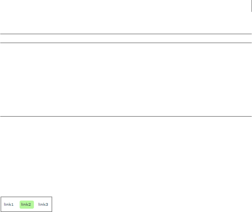
265ADOBE FLEX 3
Adobe Flex 3 Developer Guide
Note: The user must select the control before using navigation keystrokes. In a DateField control, all listed keystrokes
work only when the date chooser is displayed.
LinkButton control
The LinkButton control creates a single-line hypertext link that supports an optional icon. You can use a
LinkButton control to open a URL in a web browser.
The following example shows three LinkButton controls:
Creating a LinkButton control
You def i n e a LinkButton control in MXML by using the <mx:LinkButton> tag, as the following example shows.
Specify an id value if you intend to refer to a component elsewhere in your MXML, either in another tag or in an
ActionScript block:
<?xml version="1.0"?>
<!-- controls\button\LBSimple.mxml -->
<mx:Application xmlns:mx="http://www.adobe.com/2006/mxml">
<mx:HBox>
<mx:LinkButton label="link1"/>
<mx:LinkButton label="link2"/>
<mx:LinkButton label="link3"/>
</mx:HBox>
</mx:Application>
The following code contains a single LinkButton control that opens a URL in a web browser window:
Home Moves the selection to the first enabled day of the month.
End Moves the selection to the last enabled day of the month.
+Move to the next year.
-Move to the previous year.
Control+Down Arrow DateField only: open the DateChooser control.
Control+Up Arrow DateField only: close the DateChooser control.
Escape DateField only: cancel operation.
Enter DateField only: selects the date and closes the DateChooser control.
Key Use

CHAPTER 9
266
<?xml version="1.0"?>
<!-- controls\button\LBURL.mxml -->
<mx:Application xmlns:mx="http://www.adobe.com/2006/mxml">
<mx:LinkButton label="ADBE"
width="100"
click="navigateToURL(new URLRequest('http://quote.yahoo.com/q?s=ADBE'),
'quote')"/>
</mx:Application>
This example uses the navigateToURL() method to open the URL.
The LinkButton control automatically provides visual cues when you move your mouse pointer over or click the
control. The previous code example contains no link handling logic but does change color when you move your
mouse pointer over or click a link.
The following code example contains LinkButton controls for navigating in a ViewStack navigator container:
<?xml version="1.0"?>
<!-- controls\button\LBViewStack.mxml -->
<mx:Application xmlns:mx="http://www.adobe.com/2006/mxml">
<mx:VBox>
<!-- Put the links in an HBox container across the top. -->
<mx:HBox>
<mx:LinkButton label="Link1"
click="viewStack.selectedIndex=0;"/>
<mx:LinkButton label="Link2"
click="viewStack.selectedIndex=1;"/>
<mx:LinkButton label="Link3"
click="viewStack.selectedIndex=2;"/>
</mx:HBox>
<!-- This ViewStack container has three children. -->
<mx:ViewStack id="viewStack">
<mx:VBox width="150">
<mx:Label text="One"/>
</mx:VBox>
<mx:VBox width="150">
<mx:Label text="Two"/>
</mx:VBox>
<mx:VBox width="150">
<mx:Label text="Three"/>
</mx:VBox>
</mx:ViewStack>
</mx:VBox>
</mx:Application>
A LinkButton control’s label is centered within the bounds of the LinkButton control. You can position the text
label in relation to the icon by using the labelPlacement property, which accepts the values right, left,
bottom, and top.

267ADOBE FLEX 3
Adobe Flex 3 Developer Guide
LinkButton control user interaction
When a user clicks a LinkButton control, the LinkButton control dispatches a click event. If a LinkButton control
is enabled, the following happens:
•When the user moves the mouse pointer over the LinkButton control, the LinkButton control changes its
rollover appearance.
•When the user clicks the LinkButton control, the input focus moves to the control and the LinkButton control
displays its pressed appearance. When the user releases the mouse button, the LinkButton control returns to its
rollover appearance.
•If the user moves the mouse pointer off the LinkButton control while pressing the mouse button, the control’s
appearance returns to its original state and the control retains input focus.
•If the toggle property is set to true, the state of the LinkButton control does not change until the mouse button
is released over the control.
If a LinkButton control is disabled, it appears as disabled, regardless of user interaction. In the disabled state, the
control ignores all mouse or keyboard interaction.
HSlider and VSlider controls
You can use the slider controls to select a value by moving a slider thumb between the end points of the slider
track. The current value of the slider is determined by the relative location of the thumb between the end points
of the slider, corresponding to the slider’s minimum and maximum values.
By default, the minimum value of a slider is 0 and the maximum value is 10. The current value of the slider can
be any value in a continuous range between the minimum and maximum values, or it can be one of a set of discrete
values, depending on how you configure the control.
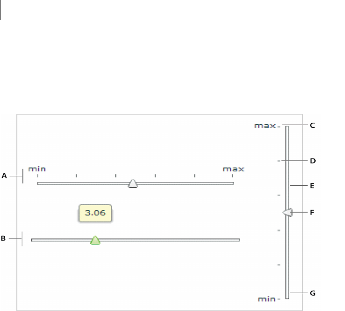
CHAPTER 9
268
About Slider controls
Flex provides two sliders: the HSlider (Horizontal Slider) control, which creates a horizontal slider, and the
VSlider (Vertical Slider) control, which creates a vertical slider. The following example shows the HSlider and
VSlider controls:
A. HSlider control B. HSlider control with data tip C. Label D. Tick mark E. Track F. Thumb G. VSlider control
This example includes the data tip, slider thumb, track, tick marks, and labels. You can optionally show or hide
data tips, tick marks, and labels.
The following code example reproduces this image (without annotations):
<?xml version="1.0"?>
<!-- controls\slider\HSliderSimple.mxml -->
<mx:Application xmlns:mx="http://www.adobe.com/2006/mxml">
<mx:HBox>
<mx:VBox>
<mx:HSlider
tickInterval="2"
labels="['min', 'max']" height="150"/>
<mx:HSlider/>
</mx:VBox>
<mx:VSlider
tickInterval="2"
labels="['min', 'max']"/>

269ADOBE FLEX 3
Adobe Flex 3 Developer Guide
</mx:HBox>
</mx:Application>
Creating a Slider control
You define an HSlider control in MXML by using the <mx:HSlider> tag and a VSlider control by using the
<mx:VSlider> tag. You must specify an id value if you intend to refer to a component elsewhere, either in another
tag or in an ActionScript block.
The following code example creates four HSlider controls:
•The first slider has a maximum value of 100, and lets the user move the slider thumb to select a value in the
continuous range between 0 and 100.
•The second slider uses the snapInterval property to define the discrete values between the minimum and
maximum that the user can select. In this example, the snapInterval is 5, which means that the user can select
the values 0, 5, 10, 15, and so on.
•The third slider uses the tickInterval property to add tick marks and set the interval between the tick
marks to 25, so that Flex displays a tick mark along the slider corresponding to the values 0, 25, 50, 75, and 100.
Flex displays tick marks whenever you set the tickInterval property to a nonzero value.
•The fourth slider uses the labels property to add labels and set them at each tick mark. The labels property
accepts an array of values to display. It automatically distributes them evenly along the slider. The first value always
corresponds to the leftmost edge of the slider and the last value always corresponds to the rightmost edge of the
slider.
<?xml version="1.0"?>
<!-- controls\slider\HSlider4Sliders.mxml -->
<mx:Application xmlns:mx="http://www.adobe.com/2006/mxml">
<mx:VBox>
<mx:HSlider
maximum="100"/>
<mx:HSlider
maximum="100"
snapInterval="5"/>
<mx:HSlider
maximum="100"
snapInterval="5"
tickInterval="25"/>
<mx:HSlider
maximum="100"
snapInterval="5"
tickInterval="25"
labels="[0,25,50,75,100]"/>
</mx:VBox>
</mx:Application>
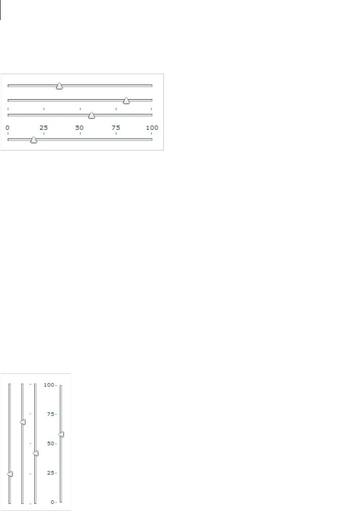
CHAPTER 9
270
This example produces the following image:
You can do a similar thing by using VSlider controls:
<?xml version="1.0"?>
<!-- controls\slider\VSlider4Sliders.mxml -->
<mx:Application xmlns:mx="http://www.adobe.com/2006/mxml">
<mx:HBox>
<mx:VSlider
maximum="100"/>
<mx:VSlider
maximum="100"
snapInterval="5"/>
<mx:VSlider
maximum="100"
snapInterval="5"
tickInterval="25"/>
<mx:VSlider
maximum="100"
snapInterval="5"
tickInterval="25"
labels="[0,25,50,75,100]"/>
</mx:HBox>
</mx:Application>
This code results in the following application:
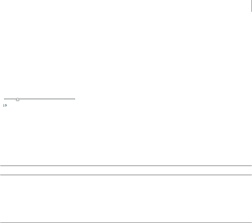
271ADOBE FLEX 3
Adobe Flex 3 Developer Guide
You ca n bi nd th e value property of a slider to another control to display the current value of the slider. The
following example binds the value property to a Text control:
<?xml version="1.0"?>
<!-- controls\slider\HSliderBinding.mxml -->
<mx:Application xmlns:mx="http://www.adobe.com/2006/mxml">
<mx:HSlider id="mySlider" maximum="100"/>
<mx:Text text="{Math.round(mySlider.value)}"/>
</mx:Application>
This code produces the following image:
Using slider events
The slider controls let the user select a value by moving the slider thumb between the minimum and maximum
values of the slider. You use an event with the slider to recognize when the user has moved the thumb, and to
determine the current value associated with the slider.
The slider controls can dispatch the events described in the following table:
The following code example uses a change event to show the current value of the slider in a TextArea control
when the user releases the slider thumb:
<?xml version="1.0"?>
<!-- controls\slider\HSliderEvent.mxml -->
<mx:Application xmlns:mx="http://www.adobe.com/2006/mxml">
<mx:Script>
<
CHAPTER 9
272
}
]]>
</mx:Script>
<mx:HSlider change="sliderChange(event);"/>
<mx:TextArea id="thumb"/>
</mx:Application>
By default, the liveDragging property of the slider control is set to false, which means that the control
dispatches the change event when the user releases the slider thumb. If you set liveDragging to true, the
control dispatches the change event continuously as the user moves the thumb, as the following example shows:
<?xml version="1.0"?>
<!-- controls\slider\HSliderEventLiveDrag.mxml -->
<mx:Application xmlns:mx="http://www.adobe.com/2006/mxml">
<mx:Script>
<![CDATA[
import mx.events.SliderEvent;
import mx.controls.sliderClasses.Slider;
private function sliderChangeLive(event:SliderEvent):void {
var currentSlider:Slider=Slider(event.currentTarget);
thumbLive.text=String(currentSlider.value);
}
]]>
</mx:Script>
<mx:HSlider
liveDragging="true"
change="sliderChangeLive(event);"/>
<mx:TextArea id="thumbLive"/>
</mx:Application>
Using multiple thumbs
You can configure a slider control to have one thumb or two thumbs. If you configure the slider to use a single
thumb, you can move the thumb anywhere between the end points of the slider. If you configure it to have two
thumbs, you cannot drag one thumb across the other thumb.
When you configure a slider control to have two thumbs, you use the values property of the control to access the
current value of each thumb. The values property is a two-element array that contains the current value of the
thumbs, as the following example shows:
<?xml version="1.0"?>
<!-- controls\slider\HSliderMultThumb.mxml -->
<mx:Application xmlns:mx="http://www.adobe.com/2006/mxml">
<mx:Script>
<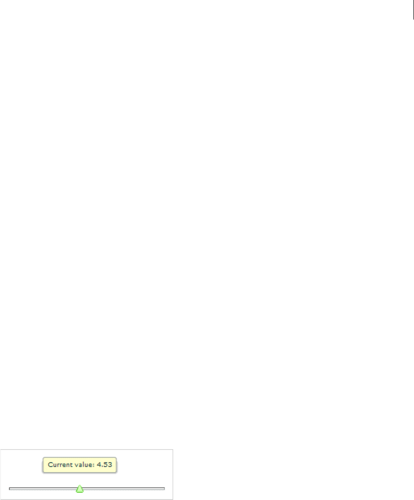
273ADOBE FLEX 3
Adobe Flex 3 Developer Guide
var ct:Slider=Slider(event.currentTarget);
thumbTwoA.text=String(ct.values[0]);
thumbTwoB.text=String(ct.values[1]);
thumbIndex.text=String(event.thumbIndex);
}
]]>
</mx:Script>
<mx:HSlider thumbCount="2"
change="sliderChangeTwo(event);"/>
<mx:TextArea id="thumbTwoA"/>
<mx:TextArea id="thumbTwoB"/>
<mx:TextArea id="thumbIndex"/>
</mx:Application>
This example also uses the thumbIndex property of the event object. This property has a value of 0 if the user
modified the position of the first thumb, and a value of 1 if the user modified the position of the second thumb.
Using data tips
By default, when you select a slider thumb, a data tip appears, showing the current value of the slider. As you move
the selected thumb, the data tip shows the new slider value. You can disable data tips by setting the showDataTip
property to false.
You can use the dataTipFormatFunction property to specify a callback function to format the data tip text. This
function takes a single String argument containing the data tip text, and returns a String containing the new data
tip text, as the following example shows:
<?xml version="1.0"?>
<!-- controls\slider\HSliderDataTip -->
<mx:Application xmlns:mx="http://www.adobe.com/2006/mxml">
<mx:Script>
<![CDATA[
private function myDataTipFunc(val:String):String {
return "Current value: " + String(val);
}
]]>
</mx:Script>
<mx:HSlider
height="80"
dataTipFormatFunction="myDataTipFunc"/>
</mx:Application>
This code produces the following image:
CHAPTER 9
274
In this example, the data tip function prepends the data tip text with the String "Current value:". You can modify
this example to insert a dollar sign ($) prefix on the data tip for a slider that controls the price of an item.
Keyboard navigation
The HSlider and VSlider controls have the following keyboard navigation features when the slider control has
focus:
SWFLoader control
The SWFLoader control lets you load one Flex application into another Flex application as a SWF file. It has
properties that let you scale its contents. It can also resize itself to fit the size of its contents. By default, content is
scaled to fit the size of the SWFLoader control. The SWFLoader control can also load content on demand
programmatically, and monitor the progress of a load operation.
The SWFLoader control also lets you load the contents of a GIF, JPEG, PNG, SVG, or SWF file into your appli-
cation, where the SWF file does not contain a Flex application, or a ByteArray representing a SWF, GIF, JPEG, or
PNG.
Note: For more information on the Image control, see “Image control” on page 278. For more information on using
the SWFLoader control to load a Flex application, see “Externalizing application classes” on page 277.
Note: Flex also includes the Image control for loading GIF, JPEG, PNG, SVG, or SWF files. You typically use the Image
control for loading static graphic files and SWF files, and use the SWFLoader control for loading Flex applications as
SWF files. The Image control is also designed to be used in custom cell renderers and item editors.
Key Description
Left Arrow Decrement the value of an HSlider control by 1 snap interval or, if you do not specify a snap interval, by 1 pixel.
Right Arrow Increment the value of a HSlider control by 1 snap interval or, if you do not specify a snap interval, by 1 pixel.
Home Moves the thumb of an HSlider control to its minimum value.
End Moves the thumb of an HSlider control to its maximum value.
Up Arrow Increment the value of an VSlider control by 1 snap interval or, if you do not specify a snap interval, by 1 pixel.
Down Arrow Decrement the value of a VSlider control by 1 snap interval or, if you do not specify a snap interval, by 1 pixel.
Page Down Moves the thumb of a VSlider control to its minimum value.
Page Up Moves the thumb of a VSlider control to its maximum value.

275ADOBE FLEX 3
Adobe Flex 3 Developer Guide
A SWFLoader control cannot receive focus. However, content loaded into the SWFLoader control can accept
focus and have its own focus interactions.
Creating a SWFLoader control
You de fin e a SWFLoader control in MXML by using the <mx:SWFLoader> tag, as the following example shows.
Specify an id value if you intend to refer to a component elsewhere in your MXML, either in another tag or in an
ActionScript block:
<?xml version="1.0"?>
<!-- controls\swfloader\SWFLoaderSimple.mxml-->
<mx:Application xmlns:mx="http://www.adobe.com/2006/mxml">
<mx:SWFLoader id="loader1" source="FlexApp.swf"/>
</mx:Application>
Like the Image control, you can also use the Embed statement with the SWFLoader control to embed the image
in your application, as the following example shows:
<?xml version="1.0"?>
<!-- controls\swfloader\SWFLoaderSimpleEmbed.mxml-->
<mx:Application xmlns:mx="http://www.adobe.com/2006/mxml">
<mx:SWFLoader id="loader1" source="@Embed(source='flexapp.swf')"/>
</mx:Application>
When using the SWFLoader control with an SVG file, you can only load it by using an Embed statement; you
cannot load an SVG file at run time. For more information about embedding resources, see the description for the
Image control at “About importing images” on page 278, and “Embedding Assets” on page 969.
This technique works well with SWF files that add graphics or animations to an application but are not intended
to have a large amount of user interaction. If you import SWF files that require a large amount of user interaction,
you should build them as custom components. For more information on custom components, see Creating and
Extending Adobe Flex 3 Components.
Interacting with a loaded Flex application
The following example, in the file FlexApp.mxml, shows a simple Flex application that defines two Label controls,
a variable, and a method to modify the variable:
<?xml version="1.0"?>
<!-- controls\swfloader\FlexApp.mxml -->
<mx:Application xmlns:mx="http://www.adobe.com/2006/mxml"
height="200" width="200">
<mx:Script>
<![CDATA[
[Bindable]
public var varOne:String = "This is a public variable.";

CHAPTER 9
276
public function setVarOne(newText:String):void {
varOne=newText;
}
]]>
</mx:Script>
<mx:Label id="lblOne" text="I am here."/>
<mx:Label text="{varOne}"/>
<mx:Button label="Nested Button" click="setVarOne('Nested button pressed.');"/>
</mx:Application>
You compile this example into the file FlexApp.SWF, and then use the SWFLoader control to load it into another
Flex application, as the following example shows:
<?xml version="1.0"?>
<!-- controls\swfloader\SWFLoaderInteract.mxml -->
<mx:Application xmlns:mx="http://www.adobe.com/2006/mxml">
<mx:Script>
<![CDATA[
import mx.managers.SystemManager;
import mx.controls.Label;
[Bindable]
public var loadedSM:SystemManager;
// Initialize variables with information from
// the loaded application.
private function initNestedAppProps():void {
loadedSM = SystemManager(myLoader.content);
}
// Update the Label control in the outer application
// from the Label control in the loaded application.
public function updateLabel():void {
lbl.text=loadedSM.application["lblOne"].text;
}
// Write to the Label control in the loaded application.
public function updateNestedLabels():void {
loadedSM.application["lblOne"].text = "I was just updated.";
loadedSM.application["varOne"] = "I was just updated.";
}
// Write to the varOne variable in the loaded application
// using the setVarOne() method of the loaded application.
public function updateNestedVarOne():void {
FlexApp(loadedSM.application).setVarOne("Updated varOne!");
}
]]>
</mx:Script>
<mx:Label id="lbl"/>
<mx:SWFLoader id="myLoader" width="300"
source="FlexApp.swf"

277ADOBE FLEX 3
Adobe Flex 3 Developer Guide
creationComplete="initNestedAppProps();"/>
<mx:Button label="Update Label Control in Outer Application"
click="updateLabel();"/>
<mx:Button label="Update Nested Controls"
click="updateNestedLabels();"/>
<mx:Button label="Update Nexted varOne"
click="updateNestedVarOne();"/>
</mx:Application>
Notice that this application loads the SWF file at run time; it does not embed it. For information on embedding a
Flex application by using the SWFLoader tag, see “Embedding Assets” on page 969.
In the preceding example, you use the creationComplete event of the SWFLoader control to initialize two
variables; the first contains a reference to the SystemManager object for the loaded Flex application, and the
second contains a reference to the Label control in the loaded application.
When a user clicks the first Button control in the outer application, Flex copies the text from the Label control in
the loaded application to the Label control in the outer application.
When a user clicks the second Button control, Flex writes the text to the Label control and to the varOne variable
defined in the loaded application.
When a user clicks the third Button control, Flex uses the setVarOne() method of the loaded application to write
to the varOne variable defined in the loaded application.
Externalizing application classes
To reduce the size of the applications that you load by using the SWFLoader control, you can instruct the loaded
application to externalize framework classes that are also included by the loading application. The result is that
the loaded application is smaller because it only includes the classes it requires, while the framework code and
other dependencies are included in the loading application.
To externalize framework classes, you generate a linker report from the loading application by using link-
report option to the mxmlc command. You then use the load-externs option to the mxmlc compiler to specify
this report when you compile the loaded application.
Externalize framework classes
1Generate the linker report for the loading application:
mxmlc -link-report=report.xml MyApplication.mxml
2Compile the loaded application by using the link report:
mxmlc -load-externs=report.xml MyLoadedApplication.mxml
3Compile the loading application:
mxmlc MyApplication.mxml

CHAPTER 9
278
Note: If you externalize the loaded application’s dependencies by using the load-externs option, your loaded appli-
cation might not be compatible with future versions of Adobe Flex. Therefore, you might be required to recompile the
application. To ensure that a future Flex application can load you application, compile that module with all the classes
it requires.
For more information, see “Using the Flex Compilers” on page 125 in Building and Deploying Adobe Flex 3 Appli-
cations.
Sizing a SWFLoader control
You use the SWFLoader control’s scaleContent property to control the sizing behavior of the SWFLoader
control. When the scaleContent property is set to true, Flex scales the content to fit within the bounds of the
control. However, images will still retain their aspect ratio by default.
Image control
Adobe Flex supports several image formats, including GIF, JPEG, PNG, SVG, and SWF files. You can import these
images into your applications by using the Image control.
Note: Flex also includes the SWFLoader control for loading Flex applications. You typically use the Image control for
loading static graphic files and SWF files, and use the SWFLoader control for loading Flex applications. The Image
control is also designed to be used in custom item renderers and item editors. For more information on the
SWFLoader control, see “SWFLoader control” on page 274.
About importing images
Flex supports importing GIF, JPEG, PNG, and SWF files at run time, and embedding GIF, JPEG, PNG, SVG, and
SWF at compile time. The method you choose depends on the file types of your images and your application
parameters.
Embedded images load immediately, because they are already part of the Flex SWF file. However, they add to the
size of your application and slow down the application initialization process. Embedded images also require you
to recompile your applications whenever your image files change. For an overview of resource embedding, see
“Embedding Assets” on page 969.

279ADOBE FLEX 3
Adobe Flex 3 Developer Guide
The alternative to embedding a resource is to load the resource at run time. You can load a resource from the local
file system in which the SWF file runs, or you can access a remote resource, typically though an HTTP request
over a network. These images are independent of your Flex application, so you can change them without causing
a recompile operation as long as the names of the modified images remain the same. The referenced images add
no additional overhead to an application’s initial loading time. However, you might experience a delay when you
use the images and load them into Adobe Flash Player or AIR.
A SWF file can access one type of external resource only, either local or over a network; it cannot access both types.
You determine the type of access allowed by the SWF file by using the use-network flag when you compile your
application. When use-network flag is set to false, you can access resources in the local filesystem, but not over
the network. The default value is true, which allows you to access resources over the network, but not in the local
filesystem.
For more information on the use-network flag, see “Using the Flex Compilers” on page 125 in Building and
Deploying Adobe Flex 3 Applications.
When you load images at run time, you should be aware of the security restrictions of Flash Player or AIR. For
example, you can reference an image by using a URL, but the default security settings only permit Flex applica-
tions to access resources stored on the same domain as your application. To access images on other servers, you
must use a crossdomain.xml file.
For more information on application security, see “Applying Flex Security” on page 29 in Building and Deploying
Adobe Flex 3 Applications.
SVG drawing restrictions
You should be aware of the following restrictions when working with SVG files in Flex:
•You can only embed an SVG file in an application; you cannot load one at run time
•SMIL and animation are not supported
•Masking and filters are not supported
•Pattern Fill and some advanced Gradients are not supported
•Interactivity and scripting is not supported
•SVG text is rendered as nonsearchable and nonselectable SWF shape outlines, meaning it is not rendered as
native text in Flash Player or AIR
Controlling image importing with the Image control
The Image control supports the following actions when you import an image:
•Specifying the image path

CHAPTER 9
280
•Sizing an image
•Positioning the image in a Canvas container
•Setting visibility
Specifying the image path
The value of the source property of an Image control specifies a relative or absolute path, or URL to the imported
image file. If the value is relative, it is relative to the directory that contains the file that uses the tag. For more
examples, see “Specifying the image path” on page 280.
The source property has the following forms:
1source="@Embed(source='relativeOrAbsolutePath')"
The referenced image is packaged within the generated SWF file at compile-time when Flex creates the SWF
file for your application. You can embed GIF, JPEG, PNG, SVG, and SWF files. When you embed an image,
the value of the source property must be a relative or absolute path to a file on your local file system; it cannot
be a URL.
The following example embeds a JPEG image into a Flex application:
<?xml version="1.0"?>
<!-- controls\image\ImageSimpleEmbed.mxml -->
<mx:Application xmlns:mx="http://www.adobe.com/2006/mxml">
<mx:Image id="loader1" source="@Embed(source='logo.jpg')"/>
</mx:Application>
In this example, the size of the image is the default size of the image file.
2source="relativeOrAbsolutePathOrURL"
Flex loads the referenced image file at run time; it is not packaged as part of the generated SWF file. You can
only reference GIF, JPEG, PNG, and SWF files. When use-network flag is set to false, you can access
resources in the local filesystem, but not over the network. The default value is true, which allows you to
access resources over the network, but not in the local filesystem.
The following example accesses a JPEG image at run time:
<?xml version="1.0"?>
<!-- controls\image\ImageSimple.mxml -->
<mx:Application xmlns:mx="http://www.adobe.com/2006/mxml">
<mx:Image id="loader1" source="logo.jpg"/>
</mx:Application>
Because you did not use @Embed in the source property, Flex loads the image at run time.
In many applications, you create a directory to hold your application images. Commonly, that directory is a subdi-
rectory of your main application directory. The source property supports relative paths to images, which lets you
specify the location of an image file relative to your application directory.

281ADOBE FLEX 3
Adobe Flex 3 Developer Guide
The following example stores all images in an assets subdirectory of the application directory:
<?xml version="1.0"?>
<!-- controls\image\ImageSimpleAssetsDir.mxml -->
<mx:Application xmlns:mx="http://www.adobe.com/2006/mxml">
<mx:Image id="loader1" source="@Embed(source='assets/logo.jpg')"/>
</mx:Application>
The following example uses a relative path to reference an image in an assets directory at the same level as the
application’s root directory:
<?xml version="1.0"?>
<!-- controls\image\ImageSimpleAssetsDirTop.mxml -->
<mx:Application xmlns:mx="http://www.adobe.com/2006/mxml">
<mx:Image id="loader1" source="@Embed(source='../assets/logo.jpg')"/>
</mx:Application>
You can also reference an image by using a URL, but the default security settings only permit Flex applications to
access resources stored on the same domain as your application. To access images on other servers, you must use
a crossdomain.xml file.
The following example shows how to reference an image by using a URL:
<?xml version="1.0"?>
<!-- controls\image\ImageSimpleAssetsURL.mxml -->
<mx:Application xmlns:mx="http://www.adobe.com/2006/mxml">
<mx:Image id="image1"
source="http://localhost:8100/flex/assets/logo.jpg"/>
</mx:Application>
Note: You can use relative URLs for images hosted on the same web server as the Flex application, but you must load
these images over the Internet rather than access them locally.
Using an image multiple times
You can use the same image multiple times in your application by using the normal image import syntax each
time. Flex only loads the image once, and then references the loaded image as many times as necessary.
Sizing an image
Flex sets the height and width of an imported image to the height and width settings in the image file. By default,
Flex does not resize the image.

CHAPTER 9
282
To set an explicit height or width for an imported image, set its height and width properties of the Image control.
Setting the height or width property prevents the parent from resizing it. The scaleContent property has a
default value of true; therefore, Flex scales the image as it resizes it to fit the specified height and width. The aspect
ratio is maintained by default, so the image may not completely fill the designated space. Set the scaleContent
property to false to disable scaling. Set the maintainAspectRatio property to false to allow an image to fill
all available space regardless of its dimensions. For more information about image aspect ratios, see “Maintaining
aspect ratio when sizing” on page 282.
To let Flex resize the image as part of laying out your application, set the height and width properties to a
percentage value. Flex attempts to resize components with percentage values for these properties to the specified
percentage of their parent container. You can also use the maxHeight and maxWidth and minHeight and
minWidth properties to limit resizing. For more information on resizing, see “Introducing Containers” on
page 419.
One common use for resizing an image is to create image thumbnails. In the following example, the image has an
original height and width of 100 by 100 pixels. By specifying a height and width of 20 by 20 pixels, you create a
thumbnail of the image.
<?xml version="1.0"?>
<!-- controls\image\ImageSimpleThumbnail.mxml -->
<mx:Application xmlns:mx="http://www.adobe.com/2006/mxml">
<mx:Image id="image1"
source="@Embed(source='logo.jpg')"
width="20" height="20"/>
<mx:Image id="image2"
source="@Embed(source='logo.jpg')"/>
</mx:Application>
Maintaining aspect ratio when sizing
The aspect ratio of an image is the ratio of its width to its height. For example, a standard NTSC television set uses
an aspect ratio of 4:3, and an HDTV set uses an aspect ratio of 16:9. A computer monitor with a resolution of 640
by 480 pixels also has an aspect ratio of 4:3. A square has an aspect ratio of 1:1.
All images have an inherent aspect ratio. When you use the height and width properties of the Image control to
resize an image, by default Flex preserves the aspect ratio of the image so that it does not appear distorted.
By preserving the aspect ratio of the image, Flex might not draw the image to fill the entire height and width
specified for the <mx:Image> tag. For example, if your original image is a square 100 by 100 pixels, which means
it has an aspect ratio of 1:1, and you use the following statement to load the image:
<mx:Image source="myImage.jpg" height="200" width="200"/>
The image increases to four times its original size and fills the entire 200 x 200 pixel area.
The following example sets the height and width of the same image to 150 by 200 pixels, an aspect ratio of 3:4:
<mx:Image source="myImage.jpg" height="150" width="200"/>

283ADOBE FLEX 3
Adobe Flex 3 Developer Guide
In this example, you do not specify a square area for the resized image. Flex maintains the aspect ratio of an image
by default; therefore, Flex sizes the image to 150 by 150 pixels, the largest possible image that maintains the aspect
ratio and conforms to the size constraints. The other 50 by 150 pixels remain empty. However, the <mx:Image>
tag reserves the empty pixels and makes them unavailable to other controls and layout elements.
You can use a Resize effect to change the width and height of an image in response to a trigger. As part of config-
uring the Resize effect, you specify a new height and width for the image. Flex maintains the aspect ratio of the
image by default, so it resizes the image as much as possible to conform to the new size, while maintaining the
aspect ratio. For example, place your mouse pointer over the image in this example to enlarge it, and then move
the mouse off the image to shrink it to its original size:
<?xml version="1.0"?>
<!-- controls\image\ImageResize.mxml -->
<mx:Application xmlns:mx="http://www.adobe.com/2006/mxml">
<mx:Resize id="resizeBig"
widthFrom="22" widthTo="44"
heightFrom="27" heightTo="54"
/>
<mx:Resize id="resizeSmall"
widthFrom="44" widthTo="22"
heightFrom="54" heightTo="27"
/>
<mx:Image width="22" height="27"
source="@Embed('logo.jpg')"
rollOverEffect="{resizeBig}"
rollOutEffect="{resizeSmall}"
/>
</mx:Application>
For more information on the Resize effect, see “Using Behaviors” on page 545.
If you do not want to preserve the aspect ratio when you resize an image, you can set the maintainAspectRatio
property to false. By default, maintainAspectRatio is set to true to enable the preservation of the aspect ratio.
The following example resizes the Flex logo to the exact values of the height and width properties without regard
for its aspect ratio:
<?xml version="1.0"?>
<!-- controls\image\ImageResizeMaintainAR.mxml -->
<mx:Application xmlns:mx="http://www.adobe.com/2006/mxml">
<mx:Image id="image1"
source="@Embed('logo.jpg')"
width="250" height="100"
maintainAspectRatio="false"/>
</mx:Application>

CHAPTER 9
284
By choosing not to maintain the aspect ratio, you allow for the possibility of a distorted image. For example, the
Adobe logo is 136 by 47 pixels by default. In the following example, it is distorted because the aspect ratio is not
maintained when the image is resized:
Positioning the image in a Canvas container
A Canvas container, and the Panel and Application containers with the layout property set to absolute, let you
specify the location of its children within the container. To specify the absolute position of an image, you use the
x and y properties of the Image control.
Note: In all other containers, the container controls the positioning of its children and ignores the x and y properties.
The x and y properties specify the location of the upper-left corner of the image in the Canvas container. In the
following example, you set the position of the image at (40,40), 40 pixels down and 40 pixels to the right of the
upper-left corner of the Canvas container:
<?xml version="1.0"?>
<!-- controls\image\ImageCanvas.mxml -->
<mx:Application xmlns:mx="http://www.adobe.com/2006/mxml">
<mx:Canvas id="canvas0"
borderStyle="solid"
width="200"
height="200">
<mx:Image id="img0"
source="@Embed('logo.jpg')"
x="40" y="40"/>
</mx:Canvas>
</mx:Application>
Setting visibility
The visible property of the Image control lets you load an image but render it invisible. By default, the image is
visible. To make an image invisible, set the visible property to false. The following example loads an image but
does not make it visible:
<?xml version="1.0"?>
<!-- controls\image\ImageVisible.mxml -->
<mx:Application xmlns:mx="http://www.adobe.com/2006/mxml">
<mx:VBox id="vbox0" borderStyle="solid">
<mx:Image id="img0"
visible="{cb1.selected}"
source="@Embed(source='logo.jpg')"
/>

285ADOBE FLEX 3
Adobe Flex 3 Developer Guide
</mx:VBox>
<mx:CheckBox id="cb1" label="Visible"/>
</mx:Application>
The VBox container still allocates space for the image when it lays out its children. Thus, the VBox is the same
size as the image file and, if your application contained a Button control after the <mx:Image> tag, the button
would appear in the same location as if the image were visible.
If you want to make the image invisible, and have its parent container ignore the image when sizing and
positioning its other children, set the includeInLayout property of the Image control to false. By default, the
includeInLayout property is true, so that even when the image is invisible, the container sizes and positions it
as if it were visible.
Often, you use the visible property to mark all images invisible, except one image. For example, assume that you
have an area of your application dedicated to showing one of three possible images based on some user action.
You set the visible property set to true for only one of the possible images; you set the visible property set
to false for all other images, which makes them invisible.
You can use ActionScript to set image properties. In the following example, when the user clicks the button, the
action sets the visible property of the image to true to make it appear:
<?xml version="1.0"?>
<!-- controls\image\ImageAS.mxml -->
<mx:Application xmlns:mx="http://www.adobe.com/2006/mxml">
<mx:Script>
<![CDATA[
private function toggleImage():void {
if (image1.visible)
image1.visible=false
else
image1.visible=true;
}
]]>
</mx:Script>
<mx:VBox id="vbox0">
<mx:Image id="image1"
visible="false"
source="@Embed(source='logo.jpg')"/>
<mx:Button id="myButton"
label="Toggle Image" click="toggleImage();"/>
</mx:VBox>
</mx:Application>
If you set the visible property, you can control when images are loaded. By allocating space but making images
invisible when a page loads, you ensure that any slower performance occurs during the initialization stage when
users expect it, rather than as they interact with the application and perform actions that require the image. By
setting the visible property, you can also prevent resizing and relayout within your application at seemingly
random intervals.

CHAPTER 9
286
Techniques for using the Image control
Often in a product catalog, when a user clicks an item, the catalog displays an image of the item. One strategy for
building a catalog is to load the catalog images into your application, but make them all invisible. When a user
selects a product, you make that image visible.
However, this strategy requires that you add an Image control for all the images in your catalog and load the
images, even if they are invisible, when the application starts. The resulting SWF file would be unnecessarily large,
because it would contain all the images and the start-up time would be negatively affected by loading invisible
images.
A better strategy is to dynamically load the images from your server, as necessary. In this way, your SWF file stays
small, because it does not have to contain invisible images, and your start-up time improves.
As part of its implementation, the ActionScript class that defines the <mx:Image> tag is a subclass of the
SWFLoader class. After creating an image, you can use the properties and methods of the SWFLoader control
with your image, including the load() method, which loads an image file dynamically.
Note: The load() method of the SWFLoader control only works with GIF, JPEG, PNG, and SWF files; you cannot
use it to load SVG files.
The following example uses the load() method to replace the logo.jpg image with the logowithtext.gif image
when the user clicks a button:
<?xml version="1.0"?>
<!-- controls\image\ImageLoad.mxml -->
<mx:Application xmlns:mx="http://www.adobe.com/2006/mxml"
creationComplete="toggleImage()">
<mx:Script>
<![CDATA[
private var imageSmall:String = "logo.jpg";
private var imageLarge:String = "logowithtext.jpg";
private function toggleImage():void {
// Runtime location of the images is in ../assets.
if (image1.source == imageSmall) {
image1.load("../assets" + imageLarge);
} else {
image1.load("../assets" + imageSmall);
}
}
]]>
</mx:Script>
<mx:VBox id="vbox0">
<mx:Button id="myButton"
label="Toggle Image"
click="toggleImage();"
/>
<mx:Image id="image1"/>

287ADOBE FLEX 3
Adobe Flex 3 Developer Guide
</mx:VBox>
</mx:Application>
Notice in this example that the application accesses the images in the local file system; they are not embedded or
accessed by URL. Therefore, you have to compile this application with the use-network flag set to false.
The container that holds the image does not adjust the layout of its children when you call the load() method.
Therefore, you typically replace one image with another image of the same size. If the new image is significantly
larger than the original, it can overlay other components in the container.
You can make the selection of the replacement image based on a user action in your application. For example, you
might want to load an image based on a user selection in a list box or data grid.
In the next example, you use the index number of the selected item in a data grid to determine the image to load.
In this example, images are named 1.jpg, 2.jpg, 3.jpg, and so on, corresponding to items in the grid.
// Retrieve the image associated with the item selected in the grid
private function getImage():void {
var cartGrid:DataGrid = dgrid;
var imageSource:String = 'images/' + cartGrid.getSelectedIndex() + '.jpg';
image1.load(imageSource);
}
In this example, the images are stored in the images directory. The complete path to an image is the directory
name, the index number, and the file suffix .jpg.
You register this function as the event listener for a change event in the data grid, as follows:
<mx:DataGrid id="dgrid" height="200" width="350" change="getImage();"/>
When a user changes the currently selected item in the data grid, Flex calls the getImage() function to update
the displayed image.
You could modify this example to use information about the selected item to determine the image to load, rather
than by using the selected item’s index. For example, the grid could contain a list of objects, where each object has
a property that contains the image name associated with it.
In addition to the load() method, you can also access other properties of the SWFLoader control, including
percentLoaded. The percentLoaded property is particularly useful because it lets you to display a progress bar
so users know that the application did not become unresponsive. For a complete list of the SWFLoader properties
and methods, see the Adobe Flex Language Reference.
VideoDisplay control
Flex supports the VideoDisplay control to incorporate streaming media into Flex applications. Flex supports the
Flash Video File (FLV) file format with this control.

CHAPTER 9
288
Using media in Flex
Media, such as movie and audio clips, are used more and more to provide information to web users. As a result,
you need to provide users with a way to stream the media, and then control it. The following examples are usage
scenarios for media controls:
•Showing a video message from the CEO of your company
•Streaming movies or movie previews
•Streaming songs or song snippets
•Providing learning material in the form of media
The Flex streaming VideoDisplay control makes it easy to incorporate streaming media into Flash presentations.
Flex supports the Flash Video File (FLV) file format with this control. You can use this control with video and
audio data. When you use the VideoDisplay control by itself, your application provides no mechanism for its users
to control the media files.
Note: The VideoDisplay control does not support scan forward and scan backward functionality. Also, the Video-
Display control does not support accessibility or styles.
About the VideoDisplay control
Flex creates a VideoDisplay control with no visible user interface. It is simply a control to hold and play media.
Note: The user cannot see anything unless some video media is playing.
The playheadTime property of the control holds the current position of the playhead in the video file, measured
in seconds. Most events dispatched by the control include the playhead position in the associated event object.
One use of the playhead position is to dispatch an event when the video file reaches a specific position. For more
information, see “Adding a cue point” on page 290.
The VideoDisplay control also supports the volume property. This property takes a value from 0.0 to 1.00; 0.0 is
mute and 1.00 is the maximum volume. The default value is 0.75.
Setting the size of a media component
The appearance of any video media playing in a VideoDisplay control is affected by the following properties:
•maintainAspectRatio
•height
•width
When you set maintainAspectRatio to true (the default), the control adjusts the size of the playing media after
the control size has been set. The size of the media is set to maintain its aspect ratio.

289ADOBE FLEX 3
Adobe Flex 3 Developer Guide
If you omit both width and height properties for the control, Flex makes the control the size of the playing
media. If you specify only one property, and the maintainAspectRatio property is false, the size of the playing
media determines the value of the other property. If the maintainAspectRatio property is true, the media
retains its aspect ratio when resizing.
The following example creates a VideoDisplay control:
<?xml version="1.0"?>
<!-- controls\videodisplay\VideoDisplaySimple.mxml -->
<mx:Application xmlns:mx="http://www.adobe.com/2006/mxml">
<mx:VBox>
<mx:VideoDisplay
source="../assets/MyVideo.flv"
height="250"
width="250"
/>
</mx:VBox>
</mx:Application>
By default, Flex sizes the VideoDisplay control to the size of the media. If you specify the width or height
property of the control, and either is smaller than the media’s dimensions, Flex does not change the size of the
component. Instead, Flex sizes the media to fit within the component. If the control’s playback area is smaller than
the default size of the media, Flex shrinks the media to fit inside the control.
Using methods of the VideoDisplay control
You can use the following methods of the VideoDisplay control in your application: close(), load(), pause(),
play(), and stop(). The following example uses the pause() and play() methods in event listener for two
Button controls to pause or play an FLV file:
<?xml version="1.0"?>
<!-- controls\videodisplay\VideoDisplayStopPlay.mxml -->
<mx:Application xmlns:mx="http://www.adobe.com/2006/mxml"
creationComplete="myVid.pause();"
>
<mx:VBox>
<mx:VideoDisplay id="myVid"
source="../assets/MyVideo.flv"
height="250"
width="250"
/>
<mx:HBox>
<mx:Button label="||" click="myVid.pause();"/>
<mx:Button label=">" click="myVid.play();"/>
</mx:HBox>
</mx:VBox>
</mx:Application>

CHAPTER 9
290
Adding a cue point
You can use cue points to trigger events when the playback of your media reaches a specified location. To use cue
points, you set the cuePointManagerClass property to mx.controls.videoClasses.CuePointManager to enable
cue point management, and then pass an Array of cue points to the cuePoints property of the VideoDisplay
control. Each element of the Array contains two fields. The name field contains an arbitrary name of the cue point.
The time field contains the playhead location, in seconds, of the VideoDisplay control with which the cue point
is associated.
When the playhead of the VideoDisplay control reaches a cue point, it dispatches a cuePoint event, as the
following example shows:
<?xml version="1.0"?>
<!-- controls\videodisplay\VideoDisplayCP.mxml -->
<mx:Application xmlns:mx="http://www.adobe.com/2006/mxml"
creationComplete="myVid.pause();"
>
<mx:Script>
<![CDATA[
import mx.events.CuePointEvent;
import mx.controls.videoClasses.CuePointManager;
private function cpHandler(event:CuePointEvent):void {
cp.text+="Got to " + event.cuePointName + " cuepoint @ " +
String(event.cuePointTime) + " seconds in.\n";
}
]]>
</mx:Script>
<mx:VBox>
<mx:VideoDisplay id="myVid"
source="../assets/MyVideo.flv"
cuePointManagerClass="mx.controls.videoClasses.CuePointManager"
cuePoint="cpHandler(event);"
height="250"
width="250"
>
<mx:cuePoints>
<mx:Object name="first" time="5"/>
<mx:Object name="second" time="10"/>
</mx:cuePoints>
</mx:VideoDisplay>
<mx:Label text="{myVid.playheadTime}"/>
<mx:TextArea id="cp" height="100" width="250"/>
</mx:VBox>
<mx:HBox>
<mx:Button label="||" click="myVid.pause();"/>
<mx:Button label=">" click="myVid.play();"/>
</mx:HBox>
</mx:Application>
In this example, the event listener writes a String to the TextArea control when the control reaches a cue point.
The String contains the name and time of the cue point.

291ADOBE FLEX 3
Adobe Flex 3 Developer Guide
Adding a cue point by using the CuePointManager class
You can set cue points for the VideoDisplay control by using the cuePointManager property. This property is of
type CuePointManager, where the CuePointManager class defines methods that you use to programmatically
manipulate cue points, as the following example shows:
<?xml version="1.0"?>
<!-- controls\videodisplay\VideoDisplayCPManager.mxml -->
<mx:Application xmlns:mx="http://www.adobe.com/2006/mxml"
creationComplete="myVid.pause();">
<mx:Script>
<![CDATA[
import mx.events.CuePointEvent;
[Bindable]
private var myCuePoints:Array = [
{ name: "first", time: 5},
{ name: "second", time: 10}
];
// Set cue points using methods of the CuePointManager class.
private function initCP():void {
myVid.cuePointManager.setCuePoints(myCuePoints);
}
private var currentCP:Object=new Object();
private function cpHandler(event:CuePointEvent):void {
cp.text += "Got to " + event.cuePointName + " cuepoint @ " +
String(event.cuePointTime) + " seconds in.\n";
// Remove cue point.
currentCP.name=event.cuePointName;
currentCP.time=event.cuePointTime;
myVid.cuePointManager.removeCuePoint(currentCP);
// Display the number of remaining cue points.
cp.text += "# cue points remaining: " +
String(myVid.cuePointManager.getCuePoints().length) + ".\n";
}
]]>
</mx:Script>
<mx:VBox>
<mx:VideoDisplay id="myVid"
cuePointManagerClass="mx.controls.videoClasses.CuePointManager"
source="../assets/MyVideo.flv"
cuePoint="cpHandler(event);"
height="250"
width="250"
/>
<mx:Label text="{myVid.playheadTime}"/>
<mx:TextArea id="cp" height="100" width="250"/>
</mx:VBox>
<mx:HBox>
<mx:Button label=">" click="cp.text='';initCP();myVid.play();"/>
</mx:HBox>
</mx:Application>

CHAPTER 9
292
Streaming video from a camera
You can use the VideoDisplay.attachCamera() method to configure the control to display a video stream from
a camera, as the following example shows:
<?xml version="1.0"?>
<!-- controls\videodisplay\VideoDisplayCamera.mxml -->
<mx:Application xmlns:mx="http://www.adobe.com/2006/mxml">
<mx:Script>
<![CDATA[
// Define a variable of type Camera.
import flash.media.Camera;
public var cam:Camera;
public function initCamera():void {
// Initialize the variable.
cam = Camera.getCamera();
myVid.attachCamera(cam)
}
]]>
</mx:Script>
<mx:VideoDisplay id="myVid"
width="320" height="240"
creationComplete="initCamera();"/>
</mx:Application>
In this example, you create a Camera object in the event handler for the creationComplete event of the Video-
Display control, then pass the Camera object as the argument to the attachCamera() method.
Using the VideoDisplay control with Flash Media Server 2
You can use the VideoDisplay control to import a media stream from Adobe® Flash® Media Server 2, as the
following example shows:
<?xml version="1.0"?>
<!-- controls\videodisplay\VideoDisplayFMS.mxml -->
<mx:Application xmlns:mx="http://www.adobe.com/2006/mxml">
<mx:HBox>
<mx:Label text="RTMP FMS 2.0"/>
<mx:VideoDisplay
autoBandWidthDetection="false"
source="rtmp://localhost/videodisplay/bike.flv"/>
</mx:HBox>
</mx:Application>
In this example, you place the bike.flv file in the directory Flash Media Server 2\applications\video-
display\streams\_definst_.

293ADOBE FLEX 3
Adobe Flex 3 Developer Guide
Notice that you explicitly set the autoBandWidthDetection property to false, its default value. When the
autoBandWidthDetection property is true, you must create the server-side file main.asc in the directory Flash
Media Server 2\applications\videodisplay\scripts, which implements the following functions:
application.onConnect = function(p_client, p_autoSenseBW) {}
application.calculateClientBw = function(p_client) {}
Client.prototype.getStreamLength = function(p_streamName) {}
The following example shows an implementation of main.asc:
application.onConnect = function(p_client, p_autoSenseBW) {
//Add security code here.
this.acceptConnection(p_client);
if (p_autoSenseBW)
this.calculateClientBw(p_client);
elsep_client.call("onBWDone");
}
Client.prototype.getStreamLength = function(p_streamName) {
return Stream.length(p_streamName);
}
application.calculateClientBw = function(p_client) {
// Add code to set the clients BandWidth.
// Use p_client.getStats() which returns bytes_in
// and bytes_Out and check your bandWidth using
// p_client.call("onBWCheck", result, p_client.payload).
p_client.call("onBWDone");
}
For more information on main.asc, see the Flash Media Server 2 documentation.
Specifying the AMF version for Flash Media Server
When you read from or write to a NetConnection, NetStream, or SharedObject object as binary data, the
objectEncoding property of the object indicates which Action Message Format (AMF) version to use: the
ActionScript 3.0 format or the ActionScript 1.0 or ActionScript 2.0 format. The possible values of the
objectEncoding property include the following:
AMF0 Objects are serialized by using the AMF format for ActionScript 1.0 and 2.0.
AMF3 Objects are serialized by using the AMF format for ActionScript 3.0.
DEFAULT Objects are serialized by using the default format for your version of Flash Player.
All versions of Flash Media Server use the AMF0 encoding. Therefore, Flex applications must set the
objectEncoding property of all NetConnection and SharedObject objects used with Flash Media Server to AMF0.
For NetStream, the objectEncoding property is read only. Any FAP connections or RTMP connections to your
own server can use AMF3.
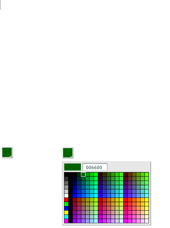
CHAPTER 9
294
ColorPicker control
The ColorPicker control lets users select a color from a drop-down swatch panel (palette). It initially appears as a
preview sample with the selected color. When a user selects the control, a color swatch panel appears. The panel
includes a sample of the selected color and a color swatch panel. By default, the swatch panel displays the web-safe
colors (216 colors, where each of the three primary colors has a value that is a multiple of 33, such as #CC0066).
For complete reference information, see ColorPicker in the Adobe Flex Language Reference.
About the ColorPicker control
When you open the ColorPicker control, the swatch panel expands over other controls on the application, and
normally opens downwards. If the swatch panel would hit the lower boundary of the application, but could fit
above color picker button, it opens upward.
If you set the showTextField property to true (the default), the panel includes a text box with a label for the
selected color. If you display a text box and set the editable property to true (the default), the user can specify
a color by entering a hexadecimal value.
The following example shows a collapsed and expanded ColorPicker control that uses the default settings of the
mx:ColorPicker tag:
Flex populates the color swatch panel and the text box from a data provider. By default, the control uses a data
provider that includes all the web-safe colors. If you use your own data provider you can specify the following:
The colors to display Yo u must specify the colors if you use your own dataProvider.
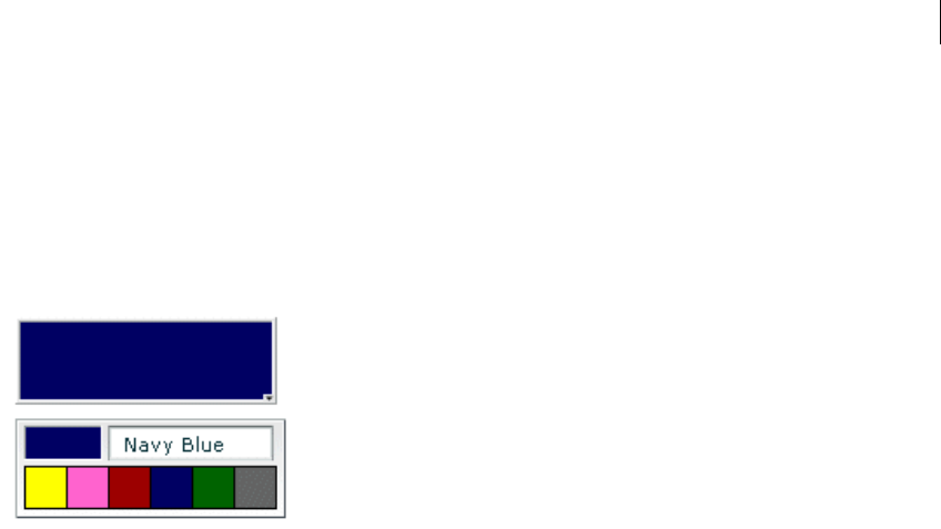
295ADOBE FLEX 3
Adobe Flex 3 Developer Guide
Labels to display in the text box for the colors If you do not specify text labels, Flex uses the hexadecimal color
values.
Additional information for each color This information can include any information that is of use to your appli-
cation, such as IDs or descriptive comments.
The following image shows an expanded ColorPicker control that uses a custom data provider that includes color
label values. It also uses styles to set the sizes of the display elements:
Creating a ColorPicker control
You use the <mx:ColorPicker> tag to define a ColorPicker control in MXML. Specify an id value if you intend
to refer to a component elsewhere in your MXML, either in another tag or in an ActionScript block. For example,
the ColorPicker control in the image was generated by using the following, minimal, code:
<mx:ColorPicker id="cp"/>
The ColorPicker control uses a list-based data provider for the colors. For more information on this type of data
provider, see “Using Data Providers and Collections” on page 137. If you omit the data provider, the control uses
a default data provider with the web-safe colors. The data provider can be an array of colors or an array of objects.
The following example populates a ColorPicker with a simple array of colors. For information on using a more
complex dataProvider, see “Using Objects to populate a ColorPicker control” on page 297.
<?xml version="1.0"?>
<!-- controls\colorpicker\CPSimple.mxml -->
<mx:Application xmlns:mx="http://www.adobe.com/2006/mxml">
<mx:Script>
<![CDATA[
[Bindable]
public var simpleDP:Array = ['0x000000', '0xFF0000', '0xFF8800',
'0xFFFF00', '0x88FF00', '0x00FF00', '0x00FF88', '0x00FFFF',
'0x0088FF', '0x0000FF', '0x8800FF', '0xFF00FF', '0xFFFFFF'];
]]>
</mx:Script>
<mx:ColorPicker id="cp" dataProvider="{simpleDP}"/>
</mx:Application>

CHAPTER 9
296
Note: You can also specify the data for the ColorPicker control by using a <mx:dataProvider> child tag; for an
example, see “Using custom field names” on page 298.
You typically use events to handle user interaction with a ColorPicker control. The following example adds an
event listener for a change event and an open event to the previous example ColorPicker control:
<?xml version="1.0"?>
<!-- controls\colorpicker\CPEvents.mxml -->
<mx:Application xmlns:mx="http://www.adobe.com/2006/mxml">
<mx:Script>
<![CDATA[
//Import the event classes.
import mx.events.DropdownEvent;
import mx.events.ColorPickerEvent;
[Bindable]
public var simpleDP:Array = ['0x000000', '0xFF0000', '0xFF8800',
'0xFFFF00', '0x88FF00', '0x00FF00', '0x00FF88', '0x00FFFF',
'0x0088FF', '0x0000FF', '0x8800FF', '0xFF00FF', '0xFFFFFF'];
public function openEvt(event:DropdownEvent):void {
forChange.text="Opened";
}
public function changeEvt(event:ColorPickerEvent):void {
forChange.text="Selected Item: "
+ event.currentTarget.selectedItem + " Selected Index: "
+ event.currentTarget.selectedIndex;
}
]]>
</mx:Script>
<mx:VBox>
<mx:TextArea id="forChange"
width="150"/>
<mx:ColorPicker id="cp"
dataProvider="{simpleDP}"
open="openEvt(event);"
change="changeEvt(event);"/>
</mx:VBox>
</mx:Application>
The ColorPicker control dispatches open event when the swatch panel opens and Dispatches a change event
when the value of the control changes due to user interaction. The currentTarget property of the object passed
to the event listener contains a reference to the ColorPicker control. In this example, the event listeners use two
properties of the ColorPicker control, selectedItem and selectedIndex. Every change event updates the
TextArea control with the selected item and the item’s index in the control, and an open event displays the word
Opened.
If you populate the ColorPicker control from an array of color values, the target.selectedItem field contains
the hexadecimal color value. If you populate it from an array of Objects, the target.selectedItem field contains
a reference to the object that corresponds to the selected item.

297ADOBE FLEX 3
Adobe Flex 3 Developer Guide
The index of items in the ColorPicker control is zero-based, which means that values are 0, 1, 2, ... , n - 1, where
n is the total number of items; therefore, the target.selectedIndex value is zero-based, and a value of 2 in the
preceding example refers to the data provider entry with color 0xFF8800.
Using Objects to populate a ColorPicker control
You can populate a ColorPicker control with an Array of Objects. By default, the ColorPicker uses two fields in
the Objects: one named color, and another named label. The label field value determines the text in the swatch
panel’s text field. If the Objects do not have a label field, the control uses the color field value in the text field.
You can use the ColorPicker control’s colorField and labelField properties to specify different names for the
color and label fields. The Objects can have additional fields, such as a color description or an internal color ID,
that you can use in your ActionScript.
Example: ColorPicker control that uses Objects
The following example shows a ColorPicker that uses an Array of Objects with three fields: color, label, and
descript:
<?xml version="1.0"?>
<!-- controls\colorpicker\CPObjects.mxml -->
<mx:Application xmlns:mx="http://www.adobe.com/2006/mxml">
<mx:Script>
<![CDATA[
import mx.events.ColorPickerEvent;
import mx.events.DropdownEvent;
[Bindable]
public var complexDPArray:Array = [
{label:"Yellow", color:"0xFFFF00",
descript:"A bright, light color."},
{label:"Hot Pink", color:"0xFF66CC",
descript:"It's HOT!"},
{label:"Brick Red", color:"0x990000",
descript:"Goes well with warm colors."},
{label:"Navy Blue", color:"0x000066",
descript:"The conservative favorite."},
{label:"Forest Green", color:"0x006600",
descript:"Great outdoorsy look."},
{label:"Grey", color:"0x666666",
descript:"An old reliable."}]
public function openEvt(event:DropdownEvent):void {
descriptBox.text="";
}
public function changeEvt(event:ColorPickerEvent):void {
descriptBox.text=event.currentTarget.selectedItem.label
+ ": " + event.currentTarget.selectedItem.descript;
}
]]>
</mx:Script>

CHAPTER 9
298
<mx:Style>
.myStyle {
swatchWidth:25;
swatchHeight:25;
textFieldWidth:95;
}
</mx:Style>
<!-- Convert the Array to an ArrayCollection. Do this if
you might change the colors in the panel dynamically. -->
<mx:ArrayCollection id="complexDP" source="{complexDPArray}"/>
<mx:VBox>
<mx:TextArea id="descriptBox"
width="150" height="50"/>
<mx:ColorPicker id="cp"
height="50" width="150"
dataProvider="{complexDP}"
change="changeEvt(event);"
open="openEvt(event);"
editable="false"/>
</mx:VBox>
</mx:Application>
In this example, the selectedItem property contains a reference to the object defining the selected item. The
example uses selectedItem.label to access the object’s label property (the color name), and
selectedItem.descript to access the object’s descript property (the color description). Every change event
updates the TextArea control with the label property of the selected item and the item’s description. The open
event clears the current text in the TextArea control each time the user opens up the ColorPicker to display the
swatch panel.
This example also uses several of the ColorPicker properties and styles to specify the control’s behavior and
appearance. The editable property prevents users from entering a value in the color label box (so they can only
select the colors from the dataProvider). The swatchWidth and swatchHeight styles control the size of the color
samples in the swatch panel, and the textFieldWidth style ensures that the text field is long enough to accom-
modate the longest color name.
Using custom field names
In some cases, you might want to use custom names for the color and label fields; for example, if the data comes
from an external data source with custom column names. The following code changes the previous example to
use custom color and label fields called cName and cVal. It also shows how to use an <mx:dataProvider> tag to
populate the data provider:
<?xml version="1.0"?>
<!-- controls\colorpicker\CPCustomFieldNames.mxml -->
<mx:Application xmlns:mx="http://www.adobe.com/2006/mxml">
<mx:Script>

299ADOBE FLEX 3
Adobe Flex 3 Developer Guide
<![CDATA[
import mx.events.ColorPickerEvent;
import mx.events.DropdownEvent;
public function openEvt(event:DropdownEvent):void {
descriptBox.text="";
}
public function changeEvt(event:ColorPickerEvent):void {
descriptBox.text=event.currentTarget.selectedItem.cName
+ ": " + event.currentTarget.selectedItem.cDescript;
}
]]>
</mx:Script>
<mx:Style>
.myStyle {
swatchWidth:25;
swatchHeight:25;
textFieldWidth:95;
}
</mx:Style>
<mx:VBox>
<mx:TextArea id="descriptBox"
width="150" height="50"/>
<mx:ColorPicker id="cp"
height="50" width="150"
labelField="cName"
colorField="cVal"
change="changeEvt(event)"
open="openEvt(event)"
swatchPanelStyleName="myStyle"
editable="false">
<mx:dataProvider>
<mx:ArrayCollection>
<mx:source>
<mx:Object cName="Yellow" cVal="0xFFFF00"
cDescript="A bright, light color."/>
<mx:Object cName="Hot Pink" cVal="0xFF66CC"
cDescript="It's HOT!"/>
<mx:Object cName="Brick Red" cVal="0x990000"
cDescript="Goes well with warm colors."/>
<mx:Object cName="Navy Blue" cVal="0x000066"
cDescript="The conservative favorite."/>
<mx:Object cName="Forest Green" cVal="0x006600"
cDescript="Great outdoorsy look."/>
<mx:Object cName="Grey" cVal="0x666666"
cDescript="An old reliable."/>
</mx:source>
</mx:ArrayCollection>
</mx:dataProvider>
</mx:ColorPicker>
</mx:VBox>
</mx:Application>
CHAPTER 9
300
User interaction
A ColorPicker control can be editable or noneditable. In a noneditable ColorPicker control, the user must select
a color from among the swatch panel options. In an editable ColorPicker control, a user can select swatch panel
items or enter a hexadecimal color value directly into the label text field at the top of the swatch panel. Users can
type numbers and uppercase or lowercase letters in the ranges a-f and A-F in the text box; it ignores all other non-
numeric characters.
Mouse interaction
You can use the mouse to navigate and select from the control:
•Click the collapsed control to display or hide the swatch panel.
•Click any swatch in the swatch panel to select it and close the panel.
•Click outside the panel area to close the panel without making a selection.
•Click in the text field to move the text entry cursor.
Keyboard interaction
If the ColorPicker is editable, and the swatch panel has the focus, alphabetic keys in the range A-F and a-f, numeric
keys, and the Backspace and Delete keys enter and remove text in the color text box. You can also use the following
keystrokes to control the ColorPicker:
Key Description
Control+Down Arrow Opens the swatch panel and puts the focus on the selected swatch.
Control+Up Arrow Closes the swatch panel, if open.
Home Moves the selection to the first color in a row of the swatch panel. Has no effect if there is a single column.
End Moves the selection to the last color in a row of the swatch panel. Has no effect if there is a single column.
Page Up Moves the selection to the top color in a column of the swatch panel. Has no effect if there is a single row.
Page Down Moves the selection to the bottom color in a column of the swatch panel. Has no effect if there is a single
row.
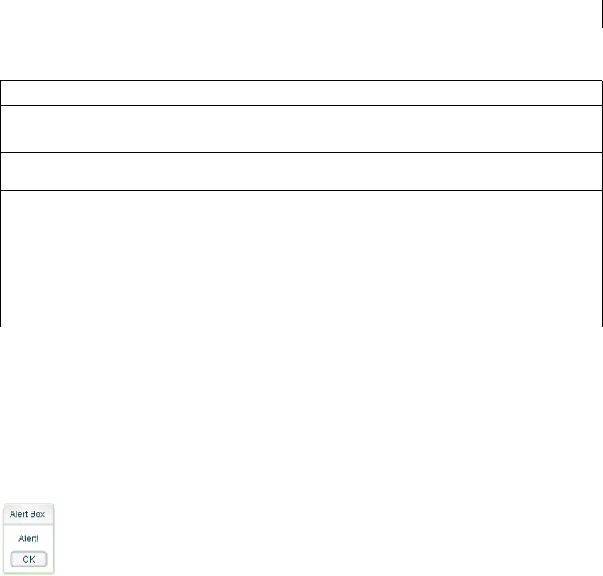
301ADOBE FLEX 3
Adobe Flex 3 Developer Guide
Note: When the swatch panel is open, you cannot use the Tab and Shift+Tab keys to move the focus to another object.
Alert control
All Flex components can call the static show() method of the Alert class to open a pop-up modal dialog box with
a message and an optional title, buttons, and icons. The following example shows an Alert control pop-up dialog
box:
The Alert control closes when you select a button in the control, or press the Escape key.
The Alert.show() method has the following syntax:
public static show(
text:String,
title:String=null,
flags:uint=mx.controls.Alert.OK,
parent:Sprite=null,
clickListener:Function=null,
iconClass:Class=null,
Escape Closes the swatch panel without changing the color in the color picker.
Most Web browsers do not support using this key.
Enter Selects the current color from the swatch panel and closes the swatch panel; equivalent to clicking a color
swatch. If the focus is on the text field of an editable ColorPicker, selects the color specified by the field text.
Arrows When the swatch panel is open, moves the focus to the next color left, right, up, and down in the swatch
grid. On a single-row swatch panel, Up and Right Arrow keys are equivalent, and Down and Left Arrow keys
are equivalent.
On a multirow swatch panel, the selection wraps to the beginning or end of the next or previous line. On a
single-row swatch panel, pressing the key past the beginning or end of the row loops around on the row.
When the swatch panel is closed, but has the focus, the Up and Down Arrow keys have no effect. The Left
and Right Arrow keys change the color picker selection, moving through the colors as if the panel were
open.
Key Description
CHAPTER 9
302
defaultButton:uint=mx.controls.Alert.OK
):Alert
This method returns an Alert control object.
The following table describes the arguments of the show() method:
To use the Alert control, you first import the Alert class into your application, then call the show() method, as the
following example shows:
<?xml version="1.0"?>
<!-- controls\alert\AlertSimple.mxml -->
<mx:Application xmlns:mx="http://www.adobe.com/2006/mxml">
<mx:Script>
<![CDATA[
import mx.controls.Alert;
]]>
</mx:Script>
Argument Description
text (Required) Specifies the text message displayed in the dialog box.
title Specifies the dialog box title. If omitted, displays a blank title bar.
flags Specifies the button(s) to display in the dialog box. The options are as follows:
mx.controls.Alert.OK OK button
mx.controls.Alert.YES Yes button
mx.controls.Alert.NO No button
mx.controls.Alert.CANCEL Cancel button
Each option is a bit value and can be combined with other options by using the pipe '|' operator. The buttons
appear in the order listed here regardless of the order specified in your code. The default value is
mx.controls.Alert.OK.
parent The parent object of the Alert control.
clickListener Specifies the listener for click events from the buttons.
The event object passed to this handler is an instance of the CloseEvent class. The event object contains the
detail field, which is set to the button flag that was clicked (mx.controls.Alert.OK,
mx.controls.Alert.CANCEL, mx.controls.Alert.YES, or mx.controls.Alert.NO).
iconClass Specifies an icon to display to the left of the message text in the dialog box.
defaultButton Specifies the default button by using one of the valid values for the flags argument. This is the button that is
selected when the user presses the Enter key. The default value is Alert.OK.
Pressing the Escape key triggers the Cancel or No button just as if you clicked it.

303ADOBE FLEX 3
Adobe Flex 3 Developer Guide
<mx:TextInput id="myInput"
width="150"
text=""/>
<mx:Button id="myButton"
label="Copy Text"
click="myText.text = myInput.text;
Alert.show('Text Copied!', 'Alert Box', mx.controls.Alert.OK);"/>
<mx:TextInput id="myText"/>
</mx:Application>
In this example, selecting the Button control copies text from the TextInput control to the TextArea control, and
displays the Alert control.
You can also define an event listener for the Button control, as the following example shows:
<?xml version="1.0"?>
<!-- controls\alert\AlertSimpleEvent.mxml -->
<mx:Application xmlns:mx="http://www.adobe.com/2006/mxml">
<mx:Script>
<![CDATA[
import mx.controls.Alert;
private function alertListener():void {
myText.text = myInput.text;
Alert.show("Text Copied!", "Alert Box", Alert.OK);
}
]]>
</mx:Script>
<mx:TextInput id="myInput"
width="150"
text=""/>
<mx:Button id="myButton"
label="Copy Text"
click="alertListener();"/>
<mx:TextInput id="myText"/>
</mx:Application>
Note: After the show() method creates the dialog box, Flex continues processing of your application; it does not wait
for the user to close the dialog box.
Sizing the Alert control
The Alert control automatically sizes itself to fit its text, buttons, and icon. You can explicitly size an Alert control
by using the Alert object returned from the show() method, as the following example shows:
<?xml version="1.0"?>
<!-- controls\alert\AlertSize.mxml -->
<mx:Application xmlns:mx="http://www.adobe.com/2006/mxml">
<mx:Script>
<
CHAPTER 9
304
// Define variable to hold the Alert object.
public var myAlert:Alert;
private function openAlert():void {
myAlert = Alert.show("Copy Text?", "Alert",
Alert.OK | Alert.CANCEL);
// Set the height and width of the Alert control.
myAlert.height=150;
myAlert.width=150;
}
]]>
</mx:Script>
<mx:TextInput id="myInput"
width="150"
text=""/>
<mx:Button id="myButton"
label="Copy Text"
click="openAlert();"/>
<mx:TextInput id="myText"/>
</mx:Application>
In this example, you set the height and width properties of the Alert object to explicitly size the control.
Using event listeners with the Alert control
The next example adds an event listener to the Alert control pop-up dialog box. An event listener lets you perform
processing when the user selects a button of the Alert control. The event object passed to the event listener is of
type CloseEvent.
In the next example, you only copy the text when the user selects the OK button in the Alert control:
<?xml version="1.0"?>
<!-- controls\alert\AlertEvent.mxml -->
<mx:Application xmlns:mx="http://www.adobe.com/2006/mxml">
<mx:Script>
<![CDATA[
import mx.controls.Alert;
import mx.events.CloseEvent;
private function alertListener(eventObj:CloseEvent):void {
// Check to see if the OK button was pressed.
if (eventObj.detail==Alert.OK) {
myText.text = myInput.text;
}
}
]]>
</mx:Script>
<mx:TextInput id="myInput"
width="150"
text="" />
<mx:Button id="myButton"

305ADOBE FLEX 3
Adobe Flex 3 Developer Guide
label="Copy Text"
click='Alert.show("Copy Text?", "Alert",
Alert.OK | Alert.CANCEL, this,
alertListener, null, Alert.OK);'/>
<mx:TextInput id="myText"/>
</mx:Application>
In this example, you define an event listener for the Alert control. Within the body of the event listener, you
determine which button was pressed by examining the detail property of the event object. The event object is
an instance of the CloseEvent class. If the user pressed the OK button, copy the text. If the user pressed any other
button, or pressed the Escape key, do not copy the text.
Specifying an Alert control icon
You can include an icon in the Alert control that appears to the left of the Alert control text. This example modifies
the example from the previous section to add the Embed metadata tag to import the icon. For more information
on importing resources, see “Using ActionScript” on page 37.
<?xml version="1.0"?>
<!-- controls\alert\AlertIcon.mxml -->
<mx:Application xmlns:mx="http://www.adobe.com/2006/mxml">
<mx:Script>
<![CDATA[
import mx.controls.Alert;
import mx.events.CloseEvent;
[Embed(source="assets/alertIcon.jpg")]
[Bindable]
public var iconSymbol:Class;
private function alertListener(eventObj:CloseEvent):void {
// Check to see if the OK button was pressed.
if (eventObj.detail==Alert.OK) {
myText.text = myInput.text;
}
}
]]>
</mx:Script>
<mx:TextInput id="myInput"
width="150"
text=""/>
<mx:Button id="myButton"
label="Copy Text"
click='Alert.show("Copy Text?", "Alert",
Alert.OK | Alert.CANCEL, this,
alertListener, iconSymbol, Alert.OK );'/>
<mx:TextInput id="myText"/>
</mx:Application>
CHAPTER 9
306
ProgressBar control
The ProgressBar control provides a visual representation of the progress of a task over time. There are two types
of ProgressBar controls: determinate and indeterminate. A determinate ProgressBar control is a linear represen-
tation of the progress of a task over time. You can use this when the user is required to wait for an extended period
of time, and the scope of the task is known.
An indeterminate ProgressBar control represents time-based processes for which the scope is not yet known. As
soon as you can determine the scope, you should use a determinate ProgressBar control.
The following example shows both types of ProgressBar controls:
To p. Determinate ProgressBar control Bottom. Indeterminate ProgressBar control
Use the ProgressBar control when the user is required to wait for completion of a process over an extended period
of time. You can attach the ProgressBar control to any kind of loading content. A label can display the extent of
loaded contents when enabled.
ProgressBar control modes
You use the mode property to specify the operating mode of the ProgressBar control. The ProgressBar control
supports the following modes of operation:
event Use the source property to specify a loading process that emits progress and complete events. For
example, the SWFLoader and Image controls emit these events as part of loading a file. You typically use a deter-
minate ProgressBar in this mode. The ProgressBar control only updates if the value of the source property
extends the EventDispatcher class. This is the default mode.
You also use this mode if you want to measure progress on multiple loads; for example, if you reload an image, or
use the SWFLoader and Image controls to load multiple images.
polled Use the source property to specify a loading process that exposes the bytesLoaded and bytesTotal
properties. For example, the SWFLoader and Image controls expose these properties. You typically use a deter-
minate ProgressBar in this mode.
manual Set the maximum, minimum, and indeterminate properties along with calls to the setProgress()
method. You typically use an indeterminate ProgressBar in this mode.

307ADOBE FLEX 3
Adobe Flex 3 Developer Guide
Creating a ProgressBar control
You use the <mx:ProgressBar> tag to define a ProgressBar control in MXML, as the following example shows.
Specify an id value if you intend to refer to a component elsewhere in your MXML, either in another tag or in an
ActionScript block.
The following example uses the default event mode to track the progress of loading an image by using the Image
control:
<?xml version="1.0"?>
<!-- controls\pbar\PBarSimple.mxml -->
<mx:Application xmlns:mx="http://www.adobe.com/2006/mxml">
<mx:Script>
<![CDATA[
public function initImage():void {
image1.load('../assets/DSC00034.JPG');
}
]]>
</mx:Script>
<mx:VBox id="vbox0"
width="600" height="600">
<mx:Canvas>
<mx:ProgressBar width="200" source="image1"/>
</mx:Canvas>
<mx:Button id="myButton"
label="Show"
click="initImage();"
/>
<mx:Image id="image1"
height="500" width="600"
autoLoad="false"
visible="true"
/>
</mx:VBox>
</mx:Application>
After you run this example the first time, the large image will typically be stored in your browser’s cache. Before
running this example a second time, clear your browser’s cache so that you can see the ProgressBar control
complete. If you do not clear your browser’s cache, Flash Player loads the image from the cache and the
ProgressBar control might go from 0% to 100% too quickly to see it tracking any progress in between.
In this mode, the Image control issues progress events during the load, and a complete event when the load
completes.
The <mx:Image> tag exposes the bytesLoaded and bytesTotal properties, so you could also use polled mode,
as the following example shows:
<mx:ProgressBar width="200" source="image1" mode="polled"/>

CHAPTER 9
308
In manual mode, mode="manual", you use an indeterminate ProgressBar control with the maximum and minimum
properties and the setProgress() method. The setProgress() method has the following method signature:
setProgress(Number completed, Number total)
completed Specifies the progress made in the task, and must be between the maximum and minimum values. For
example, if you were tracking the number of bytes to load, this would be the number of bytes already loaded.
total Specifies the total task. For example, if you were tracking bytes loaded, this would be the total number of
bytes to load. Typically, this is the same value as maximum.
To measure progress, you make explicit calls to the setProgress() method to update the ProgressBar control.
Defining the label of a ProgressBar control
By default, the ProgressBar displays the label LOADING xx%, where xx is the percent of the image loaded. You
use the label property to specify a different text string to display.
The label property lets you include the following special characters in the label text string:
%1 Corresponds to the current number of bytes loaded.
%2 Corresponds to the total number of bytes.
%3 Corresponds to the percent loaded.
%% Corresponds to the % sign.
For example, to define a label that displays as
Loading Image 1500 out of 78000 bytes, 2%
use the following code:
<?xml version="1.0"?>
<!-- controls\pbar\PBarLabel.mxml -->
<mx:Application xmlns:mx="http://www.adobe.com/2006/mxml">
<mx:Script>
<![CDATA[
public function initImage():void {
image1.load('../assets/DSC00034.JPG');
}
]]>
</mx:Script>
<mx:VBox id="vbox0"
width="600" height="600">
<mx:Canvas>
<mx:ProgressBar
width="300"
source="image1"
mode="polled"
label="Loading Image %1 out of %2 bytes, %3%%"
labelWidth="400"
309ADOBE FLEX 3
Adobe Flex 3 Developer Guide
/>
</mx:Canvas>
<mx:Button id="myButton"
label="Show"
click="initImage();"
/>
<mx:Image id="image1"
height="500" width="600"
autoLoad="false"
visible="true"
/>
</mx:VBox>
</mx:Application>
As with the previous example, be sure to clear your browser’s cache before running this example a second time.
HRule and VRule controls
The HRule (Horizontal Rule) control creates a single horizontal line and the VRule (Vertical Rule) control creates
a single vertical line. You typically use these controls to create dividing lines within a container.
The following image shows an HRule and a VRule control:
Creating HRule and VRule controls
You define HRule and VRule controls in MXML by using the <mx:HRule> and <mx:VRule> tags, as the following
example shows. Specify an id value if you intend to refer to a component elsewhere in your MXML, either in
another tag or an ActionScript block.
<?xml version="1.0"?>
<!-- controls\rule\RuleSimple.mxml -->
<mx:Application xmlns:mx="http://www.adobe.com/2006/mxml">
CHAPTER 9
310
<mx:VBox>
<mx:Label text="Above"/>
<mx:HRule/>
<mx:Label text="Below"/>
</mx:VBox>
<mx:HBox>
<mx:Label text="Left"/>
<mx:VRule/>
<mx:Label text="Right"/>
</mx:HBox>
</mx:Application>
This example creates the output shown in the preceding image.
You can also use properties of the HRule and VRule controls to specify line width, stroke color, and shadow color,
as the following example shows:
<?xml version="1.0"?>
<!-- controls\rule\RuleProps.mxml -->
<mx:Application xmlns:mx="http://www.adobe.com/2006/mxml">
<mx:VBox>
<mx:Label text="Above"/>
<mx:HRule shadowColor="0xEEEEEE"/>
<mx:Label text="Below"/>
</mx:VBox>
<mx:HBox>
<mx:Label text="Left"/>
<mx:VRule strokeWidth="10" strokeColor="0xC4CCCC"/>
<mx:Label text="Right"/>
</mx:HBox>
</mx:Application>
This code produces the following image:
Sizing HRule and VRule controls
For the HRule and VRule controls, the strokeWidth property determines how Flex draws the line, as follows:
•If you set the strokeWidth property to 1, Flex draws a 1-pixel-wide line.
311ADOBE FLEX 3
Adobe Flex 3 Developer Guide
•If you set the strokeWidth property to 2, Flex draws the rule as two adjacent 1-pixel-wide lines, horizontal
for an HRule control or vertical for a VRule control. This is the default value.
•If you set the strokeWidth property to a value greater than 2, Flex draws the rule as a hollow rectangle with
1-pixel-wide edges.
The following example shows all three options:
A. strokeWidth = 1 B. default strokeWidth = 2 C. strokeWidth = 10
If you set the height property of an HRule control to a value greater than the strokeWidth property, Flex draws
the rule within a rectangle of the specified height, and centers the rule vertically within the rectangle. The height
of the rule is the height specified by the strokeWidth property.
If you set the width property of a VRule control to a value greater than the strokeWidth property, Flex draws the
rule within a rectangle of the specified width, and centers the rule horizontally within the rectangle. The width of
the rule is the width specified by the strokeWidth property.
If you set the height property of an HRule control or the width property of a VRule control to a value smaller
than the strokeWidth property, the rule is drawn as if it had a strokeWidth property equal to the height or
width property.
Note: If the height and width properties are specified as percentage values, the actual pixel values are calculated
before the height and width properties are compared to the strokeWidth property.
The strokeColor and shadowColor properties determine the colors of the HRule and VRule controls. The
strokeColor property specifies the color of the line as follows:
•If you set the strokeWidth property to 1, specifies the color of the entire line.
•If you set the strokeWidth property to 2, specifies the color of the top line for an HRule control, or the left
line for a VRule control.
•If you set the strokeWidth property to a value greater than 2, specifies the color of the top and left edges of
the rectangle.

CHAPTER 9
312
The shadowColor property specifies the shadow color of the line as follows:
•If you set the strokeWidth property to 1, does nothing.
•If you set the strokeWidth property to 2, specifies the color of the bottom line for an HRule control, or the
right line for a VRule control.
•If you set the strokeWidth property to a value greater than 2, specifies the color of the bottom and right edges
of the rectangle.
Setting style properties
The strokeWidth, strokeColor, and shadowColor properties are style properties. Therefore, you can set them
in MXML as part of the tag definition, set them by using the <mx:Style> tag in MXML, or set them by using the
setStyle() method in ActionScript.
The following example uses the <mx:Style> tag to set the default value of the strokeColor property of all HRule
controls to #00FF00 (lime green), and the default value of the shadowColor property to #0000FF (blue). This
example also defines a class selector, called thickRule, with a strokeWidth of 5 that you can use with any
instance of an HRule control or VRule control:
<?xml version="1.0"?>
<!-- controls\rule\RuleStyles.mxml -->
<mx:Application xmlns:mx="http://www.adobe.com/2006/mxml">
<mx:Style>
.thickRule {strokeWidth:5}
HRule {strokeColor:#00FF00; shadowColor:#0000FF}
</mx:Style>
<mx:HRule styleName="thickRule"/>
</mx:Application>
This example produces the following image:
ScrollBar control
The VScrollBar (vertical ScrollBar) control and HScrollBar (horizontal ScrollBar) controls let the user control the
portion of data that is displayed when there is too much data to fit in the display area.
Although you can use the VScrollBar control and HScrollBar control as stand-alone controls, they are usually
combined with other components as part of a custom component to provide scrolling functionality. For more
information, see Creating and Extending Adobe Flex 3 Components.

313ADOBE FLEX 3
Adobe Flex 3 Developer Guide
ScrollBar controls consists of four parts: two arrow buttons, a track, and a thumb. The position of the thumb and
display of the buttons depends on the current state of the ScrollBar control. The width of the control is equal to
the largest width of its subcomponents (arrow buttons, track, and thumb). Every subcomponent is centered in the
scroll bar.
The ScrollBar control uses four parameters to calculate its display state:
•Minimum range value
•Maximum range value
•Current position; must be within the minimum and maximum range values
•Viewport size; represents the number of items in the range that can be displayed at once and must be equal to
or less than the range
Creating a ScrollBar control
You de fin e a ScrollBar control in MXML by using the <mx:VScrollbar> tag for a vertical ScrollBar or the
<mx:HScrollBar> tag for a horizontal ScrollBar, as the following example shows. Specify an id value if you
intend to refer to a component elsewhere in your MXML, either in another tag or in an ActionScript block.
<?xml version="1.0"?>
<!-- controls\bar\SBarSimple.mxml -->
<mx:Application xmlns:mx="http://www.adobe.com/2006/mxml">
<mx:Script>
<![CDATA[
import mx.events.ScrollEvent;
// Event handler function to display the scroll location.
private function myScroll(event:ScrollEvent):void {
showPosition.text = "VScrollBar properties summary:" + '\n' +
"------------------------------------" + '\n' +
"Current scroll position: " +
event.currentTarget.scrollPosition + '\n' +
"The maximum scroll position: " +
event.currentTarget.maxScrollPosition + '\n' +
"The minimum scroll position: " +
event.currentTarget.minScrollPosition;
}
]]>
</mx:Script>
<mx:Label
width="100%"
color="blue"
text="Click on the ScrollBar control to view its properties."/>
<mx:VScrollBar id="bar"
height="100%"
minScrollPosition="0"

CHAPTER 9
314
maxScrollPosition="{this.width - 20}"
lineScrollSize="50"
pageScrollSize="100"
repeatDelay="1000"
repeatInterval="500"
scroll="myScroll(event);"/>
<mx:TextArea id="showPosition"
height="100%" width="100%"
color="blue"/>
</mx:Application>
Sizing a ScrollBar control
The ScrollBar control does not display correctly if it is sized smaller than the height of the up arrow and down
arrow buttons. There is no error checking for this condition. Adobe recommends that you hide the ScrollBar
control in such a condition. If there is not enough room for the thumb, the thumb is made invisible.
User interaction
Use the mouse to click the various portions of the ScrollBar control, which dispatches events to listeners. The
object listening to the ScrollBar control is responsible for updating the portion of data displayed. The ScrollBar
control updates itself to represent the new state after the action has taken place.
315
Chapter 10: Using Text Controls
Text controls in an Adobe® Flex® application can display text, let the user enter text, or do both.
Topics
About text controls . . . . . . . . . . . . . . . . . . . . . . . . . . . . . . . . . . . . . . . . . . . . . . . . . . . . . . . . . . . . . . . . . . . . . . . . . . . . . .315
Using the text property . . . . . . . . . . . . . . . . . . . . . . . . . . . . . . . . . . . . . . . . . . . . . . . . . . . . . . . . . . . . . . . . . . . . . . . . . .317
Using the htmlText property. . . . . . . . . . . . . . . . . . . . . . . . . . . . . . . . . . . . . . . . . . . . . . . . . . . . . . . . . . . . . . . . . . . . . .321
Selecting and modifying text. . . . . . . . . . . . . . . . . . . . . . . . . . . . . . . . . . . . . . . . . . . . . . . . . . . . . . . . . . . . . . . . . . . . . .330
Label control . . . . . . . . . . . . . . . . . . . . . . . . . . . . . . . . . . . . . . . . . . . . . . . . . . . . . . . . . . . . . . . . . . . . . . . . . . . . . . . . . . . 334
TextInput control . . . . . . . . . . . . . . . . . . . . . . . . . . . . . . . . . . . . . . . . . . . . . . . . . . . . . . . . . . . . . . . . . . . . . . . . . . . . . . .336
Text control . . . . . . . . . . . . . . . . . . . . . . . . . . . . . . . . . . . . . . . . . . . . . . . . . . . . . . . . . . . . . . . . . . . . . . . . . . . . . . . . . . . .337
TextArea control . . . . . . . . . . . . . . . . . . . . . . . . . . . . . . . . . . . . . . . . . . . . . . . . . . . . . . . . . . . . . . . . . . . . . . . . . . . . . . . .339
RichTextEditor control. . . . . . . . . . . . . . . . . . . . . . . . . . . . . . . . . . . . . . . . . . . . . . . . . . . . . . . . . . . . . . . . . . . . . . . . . . .340
About text controls
You use Flex text-based controls to display text and to let users enter text into your application. The following table
lists the controls, and indicates whether the control can have multiple lines of input instead of a single line of text,
and whether the control can accept user input:
Control Multiline Allows user Input
Label No No
TextInpu t No Ye s
Text Yes No
TextArea Yes Yes
RichTextEditor Yes Yes
316 CHAPTER 10
All controls except the RichTextEditor control are single components with a simple text region; for example, the
following image shows a TextInput control in a simple form:
The following code produces the preceding image:
<?xml version="1.0"?>
<!-- textcontrols/FormItemLabel.mxml -->
<mx:Application xmlns:mx="http://www.adobe.com/2006/mxml" >
<mx:Form id="myForm" width="500" backgroundColor="#909090">
<!-- Use a FormItem to label the field. -->
<mx:FormItem label="First Name">
<mx:TextInput id="ti1" width="150"/>
</mx:FormItem>
</mx:Form>
</mx:Application>
The RichTextEditor control is a compound control; it consists of a Panel control that contains a TextArea control
and a ControlBar with several controls for specifying the text format and HTTP links. The following image shows
a RichTextEditor control:
The following code produces the preceding image:
<?xml version="1.0"?>
<!-- textcontrols/RTECDATA.mxml -->
<mx:Application xmlns:mx="http://www.adobe.com/2006/mxml" >
<mx:RichTextEditor id="rte1" title="Rich Text Editor">
<mx:htmlText>
<
317ADOBE FLEX 3
Adobe Flex 3 Developer Guide
</p>This paragraph has <font color='#006666'><b>bold teal text.
</b></font>
]]>
</mx:htmlText>
</mx:RichTextEditor>
</mx:Application>
Flex text-based controls let you set and get text by using the following properties:
text Plain text without formatting information. For information on using the text property, see “Using the text
property” on page 317.
htmlText Rich text that represents formatting by using a subset of HTML tags, and can include bulleted text
and URL links. For information on using the htmlText property, see “Using the htmlText property” on page 321.
Both properties set the same underlying text, but you can use different formats. For example, you can do the
following to set, modify, and get text:
•You can set formatted text by using the htmlText property, and get it back as a plain text string by using the
text property.
•You can set formatted text in user-editable text controls (TextInput, TextArea, RichTextEditor) by setting the
text string with the text property and formatting a section of this text by using the TextRange class. If you get the
text back by using the htmlText property, the property string includes HTML tags for the formatting. For more
information on using the TextRange class, see “Selecting and modifying text” on page 330.
Using the text property
You can use the text property to specify the text string that appears in a text control or to get the text in the control
as a plain text String. When you set this property, any HTML tags in the text string appear in the control as literal
text.
You cannot specify text formatting when you set the text property, but you can format the text in the control. You
can use the text control styles to format all of the text in the control, and you can use the TextR ang e class to format
ranges of text. (For more information on using the TextRange class, see “Selecting and modifying text” on
page 330.)
The following code line uses a text property to specify label text:
<mx:Label text="This is a simple text label"/>
The way you specify special characters, including quotation marks, greater than and less than signs, and
apostrophes, depends on whether you use them in MXML tags or in ActionScript. It also depends on whether you
specify the text directly or wrap the text in a CDATA section.

CHAPTER 10
318
Note: If you specify the value of the text property by using a string directly in MXML, Flex collapses white space
characters. If you specify the value of the text property in ActionScript, Flex does not collapse white space characters.
Specifying special characters in the text property
The following rules specify how to include special characters in the text property of a text control MXML tag,
either in a property assignment, such as text="the text", or in the body of an <mx:text> subtag.
In standard text The following rules determine how you use special characters if you do not use a CDATA
section:
•To use the special characters left angle bracket (<), right angle bracket (>), and ampersand (&), insert the XML
character entity equivalents of <, >, and &, respectively. You can also use " and ' for
double-quotation marks (") and single-quotation marks ('), and you can use numeric character references, such
as ¥ for the Yen mark (¥). Do not use any other named character entities; Flex treats them as literal text.
•You cannot use the character that encloses the property text string inside the string. If you surround the string
in double-quotation marks ("), use the escape sequence \" for any double-quotation marks in the string. If you
surround the string in single-quotation marks (') use the escape sequence \' for any single-quotation marks in
the string. You can use single-quotation marks inside a string that is surrounded in double-quotation marks, and
double-quotation marks inside a string that is surrounded in single-quotation marks.
•Flex text controls ignore escape characters such as \t or \n in the text property. They ignore or convert to
spaces, tabs and line breaks, depending on whether you are specifying a property assignment or an <mx:text>
subtag. To include line breaks, put the text in a CDATA section. In the Text control text="string" attribute speci-
fications, you can also specify them as numeric character entities, such as 
 for a Return character or 	
for a Tab character, but you cannot do this in an <mx:text> subtag.
The following code example uses the text property with standard text:
<?xml version="1.0"?>
<!-- textcontrols/StandardText.mxml -->
<mx:Application xmlns:mx="http://www.adobe.com/2006/mxml" height="400">
<mx:Text width="400" text="This string contains a less than, <,
greater than, >, ampersand, &, apostrophe, ', and
quotation mark "."/>
<mx:Text width="400" text='This string contains a less than, <,
greater than, >, ampersand, &, apostrophe, ', and
quotation mark, ".'/>
<mx:Text width="400">
<mx:text>
This string contains a less than, <, greater than,
>, ampersand, &, apostrophe, ', and quotation mark, ".
</mx:text>
</mx:Text>

319ADOBE FLEX 3
Adobe Flex 3 Developer Guide
</mx:Application>
The resulting application contains three almost identical text controls, each with the following text. The first two
controls, however, convert any tabs in the text to spaces.
This string contains a less than, <, greater than, >, ampersand, &,apostrophe, ',
and quotation mark, ".
In a CDATA section If you wrap the text string in the CDATA tag, the following rules apply:
•You cannot use a CDATA section in a property assignment statement in the text control opening tag; you must
define the property in an <mx:text> child tag.
•Text inside the CDATA section appears as it is entered, including white space characters. Use literal characters,
such as " or < for special characters, and use standard return and tab characters. Character entities, such as >,
and backslash-style escape characters, such as \n, appear as literal text.
The following code example follows these CDATA section rules. The second and third lines of text in the
<mx:text> tag are not indented because any leading tab or space characters would appear in the displayed text.
<?xml version="1.0"?>
<!-- textcontrols/TextCDATA.mxml -->
<mx:Application xmlns:mx="http://www.adobe.com/2006/mxml" width="500">
<mx:Text width="100%">
<mx:text>
<![CDATA[This string contains a less than, <, greater than, >,
ampersand, &, apostrophe, ', return,
tab. and quotation mark, ".]]>
</mx:text>
</mx:Text>
</mx:Application>
The displayed text appears on three lines, as follows:
This string contains a less than, <, greater than, >,
ampersand, &, apostrophe, ', return,
tab. and quotation mark, ".
Specifying special characters in ActionScript
The following rules specify how to include special characters in a text control when you specify the control’s text
property value in ActionScript; for example, in an initialization function, or when assigning a string value to a
variable that you use to populate the property:
•You cannot use the character that encloses the text string inside the string. If you surround the string in
double-quotation marks ("), use the escape sequence \" for any double-quotation marks in the string. If you
surround the string in single-quotation marks ('), use the escape sequence \' for any single-quotation marks in the
string.

CHAPTER 10
320
•Use backslash escape characters for special characters, including \t for the tab character, and \n or \r for a
return/line feed character combination. You can use the escape character \" for the double-quotation mark and \'
for the single-quotation mark.
•In standard text, but not in CDATA sections, you can use the special characters left angle bracket (<), right
angle bracket (>), and ampersand (&), by inserting the XML character entity equivalents of <, >, and
&, respectively. You can also use " and ' for double-quotation marks ("), and single-quotation
marks ('), and you can use numeric character references, such as ¥ for the Yen mark (¥). Do not use any
other named character entities; Flex treats them as literal text.
•In CDATA sections only, do not use character entities or references, such as < or ¥ because Flex
treats them as literal text. Instead, use the actual character, such as <.
The following example uses an initialization function to set the text property to a string that contains these
characters:
<?xml version="1.0"?>
<!-- textcontrols/InitText.mxml -->
<mx:Application xmlns:mx="http://www.adobe.com/2006/mxml" initialize="initText()">
<mx:Script>
public function initText():void {
//The following is on one line.
myText.text="This string contains a return, \n, tab, \t, and quotation mark, \". " +
"This string also contains less than, <, greater than, >, " +
"ampersand, &, and apostrophe, ', characters.";
}
</mx:Script>
<mx:Text width="450" id="myText" initialize="initText();"/>
</mx:Application>
The following example uses an <mx:Script> tag with a variable in a CDATA section to set the text property:
<?xml version="1.0"?>
<!-- textcontrols/VarText.mxml -->
<mx:Application xmlns:mx="http://www.adobe.com/2006/mxml">
<mx:Script>
<![CDATA[
[Bindable]
//The following is on one line.
public var myText:String ="This string contains a return, \n, tab, \t, and
quotation mark, \". This string also contains less than, <, greater than, <, ampersand,
<;, and apostrophe, ', characters.";
]]>
</mx:Script>
<mx:Text width="450" text="{myText}"/>
</mx:Application>
The displayed text for each example appears on three lines. The first line ends at the return specified by the \n
character. The remaining text wraps onto a third line because it is too long to fit on a single line. (Note: Although
the tab character may be noticeable in the following output, it is included in the right location.)
This string contains a return,
, tab, , and quotation mark, ". This string also contains less than, <,
greater than, >, ampersand, &, and apostrophe, ', characters.
321ADOBE FLEX 3
Adobe Flex 3 Developer Guide
Using the htmlText property
You use the htmlText property to set or get an HTML-formatted text string. You can also use one tag that is not
part of standard HTML, the textFormat tag. For details of supported tags and attributes, see “Using tags in
HTML text” on page 324.
You can also specify text formatting by using Flex styles. You can set a base style, such as the font characteristics
or the text weight, by using a style, and override the base style in sections of your text by using tags, such as the
<font> tag. In the following example, the <mx:Text> tag styles specify blue, italic, 14 point text, and the
<mx:htmlText> tag includes HTML tags that override the color and point size.
<?xml version="1.0"?>
<!-- textcontrols/HTMLTags.mxml -->
<mx:Application xmlns:mx="http://www.adobe.com/2006/mxml"
backgroundGradientColors="[#FFFFFF, #FFFFFF]"
>
<mx:Text width="100%" color="blue" fontStyle="italic" fontSize="14">
<mx:htmlText>
<![CDATA[
This is 14 point blue italic text.<br>
<b><font color="#000000" size="10">This text is 10 point black, italic,
and bold.</font></b>
]]>
</mx:htmlText>
</mx:Text>
</mx:Application>
This code results in the following output:
Specifying HTML tags and text
To prevent the Flex compiler from generating errors when it encounters HTML tags in the text, use one of the
following techniques:
•Wrap your text in a CDATA tag.
•Specify HTML markup by using the <, >, and & character entities in place of the left angle bracket
(<), right angle bracket (>), and ampersand (&) HTML delimiters.
Adobe recommends using CDATA sections for all but simple HTML markup, because the character entity
technique has significant limitations:
•Extensive HTML markup can be cumbersome to write and difficult to read.
•You must use a complex escape sequence to include the less than and ampersand characters in your text.

CHAPTER 10
322
For example, to display the following string:
A less than character < and bold text.
without using a CDATA section, you must use the following text:
A less than character &c#060; and <b>bold text</b>.
In a CDATA section, you use the following text:
A less than character < and <b>bold text</b>.
Specifying HTML text
When you specify HTML text for a text control, the following rules apply:
•You cannot use a CDATA section directly in an inline htmlText property in an <mx:Text> tag. You must put
the text in an <mx:htmlText> subtag, or in ActionScript code.
•Flex collapses consecutive white space characters, including return, space, and tab characters, in text that you
specify in MXML property assignments or ActionScript outside of a CDATA section.
•If you specify the text in a CDATA section, you can use the text control’s condenseWhite property to control
whether Flex collapses white space. By default, the condenseWhite property is false, and Flex does not collapse
white space.
•Use HTML <p> and <br> tags for breaks and paragraphs. In ActionScript CDATA sections you can also use
\n escape characters.
•If your HTML text string is surrounded by single- or double-quotation marks because it is in an assignment
statement (in other words, if it is not in an <mx:htmlText> tag), you must escape any uses of that quotation
character in the string:
•If you use double-quotation marks for the assignment delimiters, use " for the double-quotation
mark (") character in your HTML. In ActionScript, you can also use the escape sequence \".
Note: You do not need to escape double-quotation marks if you’re loading text from an external file; it is only
necessary if you’re assigning a string of text in ActionScript.
•If you use single-quotation marks for the assignment delimiters, use ' for the single-quotation mark
character (') in your HTML. In ActionScript, you can also use the escape sequence \’.
•When you enter HTML-formatted text, you must include attributes of HTML tags in double- or single-
quotation marks. Attribute values without quotation marks can produce unexpected results, such as improper
rendering of text. You must follow the escaping rules for quotation marks within quotation marks, as described in
“Escaping special characters in HTML text” on page 323.
The following example shows some simple HTML formatted text, using MXML and ActionScript to specify the
text:
<?xml version="1.0"?>

323ADOBE FLEX 3
Adobe Flex 3 Developer Guide
<!-- textcontrols/HTMLFormattedText.mxml -->
<mx:Application xmlns:mx="http://www.adobe.com/2006/mxml" width="500">
<mx:Script><![CDATA[
//The following is on one line.
[Bindable]
public var myHtmlText:String="This string contains <b>less than </b>, <, <b>greater
than</b>, >, <b>ampersand</b>, &, and <b>double quotation mark</b>, ",
characters.";
]]></mx:Script>
<mx:Text id="htmltext2" width="450" htmlText="{myHtmlText}" />
<mx:Text width="450">
<mx:htmlText>
<!-- The following is on one line. Line breaks would appear in the output. -->
<![CDATA[
This string contains <b>less than</b>, <, <b>greater than </b>, >,
<b>ampersand</b>, &, and <b>double quotation mark</b>,", characters.
]]>
</mx:htmlText>
</mx:Text>
</mx:Application>
Each Text control displays the following text:
This string contains less than, <, greater than, >, ampersand, &, and double
quotation mark, " characters.
Escaping special characters in HTML text
The rules for escaping special characters in HTML text differ between CDATA sections and standard text.
In CDATA sections When you specify the htmlText string, the following rules apply:
•In ActionScript, but not in an <mx:htmlText> tag, you can use standard backslash escape sequences for
special characters, such as \t for tab and \n for a newline character. You can also use the backslash character to
escape many special characters, such as \’ and \" for single- and double-quotation marks. You cannot use the
combination \<, and a backslash before a return character has no effect on displayed text; it allows you to break
the assignment statement across multiple text lines.
•In both ActionScript and the <mx:htmlText> tag, you can use HTML tags and numeric character entities; for
example in place of \n, you can use a <br> tag.
•To include a left angle bracket (<), right angle bracket (>), or ampersand (&) character in displayed text, use
the corresponding character entities: <, >, and &, respectively. You can also use the " and
' entities for single- and double-quotation marks. These are the only named character entities that Adobe®
Flash® Player and Adobe® AIR™ recognize. They recognize numeric entities, such as ¥ for the Yen mark
(¥),;however, they do not recognize the corresponding character entity, ¥.
The following code example uses the htmlText property to display formatted text:
<?xml version="1.0"?>
<!-- textcontrols/HTMLTags2.mxml -->
<mx:Application xmlns:mx="http://www.adobe.com/2006/mxml" width="500">
<mx:Text width="100%">

CHAPTER 10
324
<mx:htmlText><![CDATA[<p>This string contains a <b>less than</b>, <.
</p><p>This text is in a new paragraph.<br>This is a new line.</p>]]>
</mx:htmlText>
</mx:Text>
</mx:Application>
This code displays the following text:
This string contains a less than, <.
This text is in a new paragraph.
This is a new line.
In standard text The following rules apply:
•You must use character entities, as described in “Using the htmlText property” on page 321, to use the left
angle bracket (<), right angle bracket (>), or ampersand (&) character in HTML; for example, when you open a
tag or start a character entity.
•You must use the & named entity combined with an HTML numeric character entity to display the less
than character (use &#060;) and ampersand character (use &#038;). You can use the standard
character entities, >, ", and ', for the greater than, double-quotation mark and single-quotation
mark characters, respectively. For all other character entities, use numeric entity combinations, such as
&#165;, for the Yen mark (¥).
•In ActionScript, but not in an <mx:htmlText> tag or inline htmlText property, you can use a backslash
character to escape special characters, including the tab, newline, and quotation mark characters (but not the
ampersand). In all cases, you can use (properly escaped) HTML tags and numeric character entities; for example
in place of \n, you can use a <br> tag or &#013; entity.
Using tags in HTML text
When you use the htmlText property, you use a subset of HTML that is supported by Flash Player and AIR, which
support the following tags:
•Anchor tag (<a>)
•Bold tag (<b>)
•Break tag (<br>)
•Font tag (<font>)
•Image tag (<img>)
•Italic tag (<i>)
•List item tag (<li>)
•Paragraph tag (<p>)

325ADOBE FLEX 3
Adobe Flex 3 Developer Guide
•Text format tag (<textformat>)
•Underline tag (<u>)
Anchor tag (<a>)
The anchor <a> tag creates a hyperlink and supports the following attributes:
href Specifies the URL of the page to load in the browser. The URL can be absolute or relative to the location
of the SWF file that is loading the page.
target Specifies the name of the target window to load the page into.
For example, the following HTML snippet creates the link “Go Home” to the Adobe Web site.
<a href='http://www.adobe.com' target='_blank'>Go Home</a>
You can also define a:link, a:hover, and a:active styles for anchor tags by using style sheets.
The <a> tag does not make the link text blue. You must apply formatting tags to change the text format. You can
also define a:link, a:hover, and a:active styles for anchor tags by using style sheets.
The Label, Text, and TextA rea controls can dispatch a link event when the user selects a hyperlink in the
htmlText property. To generate the link event, prefix the hyperlink destination with event:, as the following
example shows:
<?xml version="1.0"?>
<!-- textcontrols/LabelControlLinkEvent.mxml -->
<mx:Application xmlns:mx="http://www.adobe.com/2006/mxml"
borderStyle="solid"
backgroundGradientColors="[#FFFFFF, #FFFFFF]">
<mx:Script>
<![CDATA[
import flash.events.TextEvent;
public function linkHandler(event:TextEvent):void {
myTA.text="The link was clicked.";
// Open the link in a new browser window.
navigateToURL(new URLRequest(event.text), '_blank')
}
]]>
</mx:Script>
<mx:Label selectable="true" link="linkHandler(event);">
<mx:htmlText>
<![CDATA[<a href='event:http://www.adobe.com'>Navigate to Adobe.com.</a>]]>
</mx:htmlText>
</mx:Label>
<mx:TextArea id="myTA"/>
</mx:Application>
The Label control must have the selectable property set to true to generate the link event.

CHAPTER 10
326
When you use the link event, the event is generated and the text following event: in the hyperlink destination
is included in the text property of the event object. However, the hyperlink is not automatically executed; you
must execute the hyperlink from within your event handler. This allows you to modify the hyperlink, or even
prohibit it from occurring, in your application.
Bold tag (<b>)
The bold <b> tag renders text as bold. If you use embedded fonts, a boldface font must be available for the font or
no text appears. If you use fonts that you expect to reside on the local system of your users, their system may
approximate a boldface font if none exists, or it may substitute the normal font face instead of boldface. In either
case, the text inside the bold tags will appear.
The following snippet applies boldface to the word bold:
This word is <b>bold</b>.
You cannot use the </b> end tag to override bold formatting that you set for all text in a control by using the
fontWeight style.
Break tag (<br>)
The break <br> tag creates a line break in the text. This tag has no effect in Label or TextInput controls.
The following snippet starts a new line after the word line:
The next sentence is on a new line.<br>Hello there.
Font tag (<font>)
The <font> tag specifies the following font characteristics: color, face, and size.
The font tag supports the following attributes:
color Specifies the text color. You must use hexadecimal (#FFFFFF) color values. Other formats are not
supported.
face Specifies the name of the font to use. You can also specify a list of comma-separated font names, in which
case Flash Player and AIR choose the first available font. If the specified font is not installed on the playback
system, or isn’t embedded in the SWF file, Flash Player and AIR choose a substitute font. The following example
shows how to set the font face.
size Specifies the size of the font in points. You can also use relative sizes (for example, +2 or -4).
The following example shows the use of the <font> tag:
<?xml version="1.0"?>
<!-- textcontrols/FontTag.mxml -->
<mx:Application xmlns:mx="http://www.adobe.com/2006/mxml"
backgroundGradientColors="[#FFFFFF, #FFFFFF]">
<mx:TextArea height="100" width="250">
<mx:htmlText>
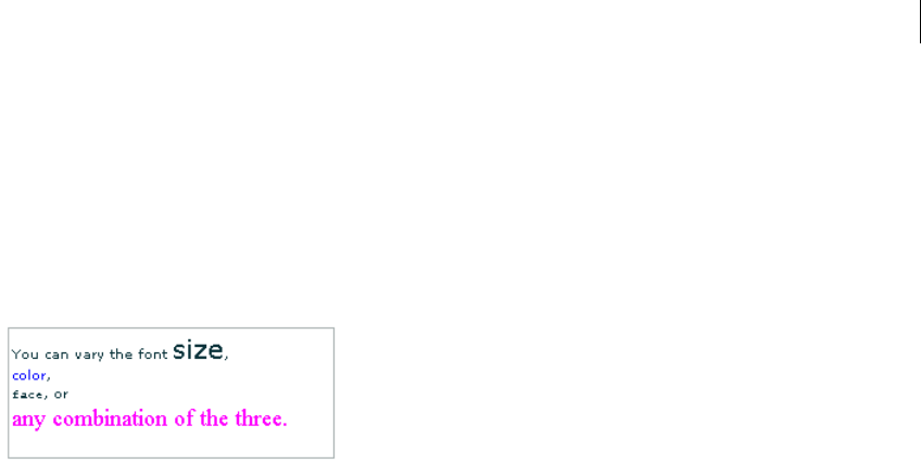
327ADOBE FLEX 3
Adobe Flex 3 Developer Guide
<![CDATA[
You can vary the <font size='20'>font size</font>,<br><font
color="#0000FF">color</font>,<br><font face="CourierNew, Courier,
Typewriter">face</font>, or<br><font size="18" color="#FF00FF"face="Times, Times New
Roman, _serif">any combination of the three.</font>
]]>
</mx:htmlText>
</mx:TextArea>
</mx:Application>
This code results in the following output:
Image tag (<img>)
Note: The <img> tag is not fully supported, and might not work in some cases.
The image <img> tag lets you embed external JPEG, GIF, PNG, and SWF files inside text fields. Text automatically
flows around images you embed in text fields. This tag is supported only in dynamic and input text fields that are
multiline and wrap their text.
By default, Flash displays media embedded in a text field at full size. To specify dimensions for embedded media,
use the <img> tag’s height and width attributes.
In general, an image embedded in a text field appears on the line following the <img> tag. However, when the
<img> tag is the first character in the text field, the image appears on the first line of the text field.
The <img> tag has one required attribute, src, which specifies the path to an image file. All other attributes are
optional.
The <img> tag supports the following attributes:
src Specifies the URL to a GIF, JPEG, PNG, or SWF file. This attribute is required; all other attributes are
optional. External files are not displayed until they have downloaded completely.
align Specifies the horizontal alignment of the embedded image within the text field. Valid values are left and
right. The default value is left.
height Specifies the height of the image, in pixels.
hspace Specifies the amount of horizontal space that surrounds the image where no text appears. The default
value is 8.

CHAPTER 10
328
id Specifies the identifier for the imported image. This is useful if you want to control the embedded content
with ActionScript.
vspace Specifies the amount of vertical space that surrounds the image where no text.
width Specifies the width of the image, in pixels. The default value is 8.
The following example shows the use of the <img> tag and how text can flow around the image:
<?xml version="1.0"?>
<!-- textcontrols/ImgTag.mxml -->
<mx:Application xmlns:mx="http://www.adobe.com/2006/mxml"
backgroundGradientColors="[#FFFFFF, #FFFFFF]" width="300" height="300">
<mx:Text height="100%" width="100%">
<mx:htmlText>
<![CDATA[
<p>You can include an image in your HTML text with the <img> tag.</p>
<p><img src='assets/butterfly.gif' width='30' height='30' align='left'
hspace='10' vspace='10'>
Here is text that follows the image. I'm extending the text by lengthening this
sentence until it's long enough to show wrapping around the bottom of the image.</p>
]]>
</mx:htmlText>
</mx:Text>
</mx:Application>
Making hyperlinks out of embedded images
To make a hyperlink out of an embedded image, enclose the <img> tag in an <a> tag, as the following example
shows:
<?xml version="1.0"?>
<!-- textcontrols/ImgTagWithHyperlink.mxml -->
<mx:Application xmlns:mx="http://www.adobe.com/2006/mxml" borderStyle="solid">
<mx:TextArea width="100%" height="100%">
<mx:htmlText>
<![CDATA[
<a href='http://www.adobe.com'><img src='assets/butterfly.gif'/></a>
Click the image to go to the Adobe home page.
]]>
</mx:htmlText>
</mx:TextArea>
</mx:Application>
When the user moves the mouse pointer over an image that is enclosed by <a> tags, the mouse pointer does not
change automatically to a hand icon, as with standard hyperlinks. To display a hand icon, specify
buttonMode="true" for the TextArea (or Text) control. Interactivity, such as mouse clicks and key presses, do
not register in SWF files that are enclosed by <a> tags.

329ADOBE FLEX 3
Adobe Flex 3 Developer Guide
Italic tag (<i>)
The italic <i> tag displays the tagged text in italic font. If you’re using embedded fonts, an italic font must be
available or no text appears. If you use fonts that you expect to reside on the local system of your users, their system
may approximate an italic font if none exists, or it may substitute the normal font face instead of italic. In either
case, the text inside the italic tags appears.
The following snippet applies italic font to the word italic:
The next word is in <i>italic</i>.
You cannot use the </i> end tag to override italic formatting that you set for all text in a control by using the
fontStyle style.
List item tag (<li>)
The list item <li> tag ensures that the text that it encloses starts on a new line with a bullet in front of it. You
cannot use it for any other type of HTML list item. The ending </li> tag ensures a line break (but </li><li>
generates a single line break). Unlike in HTML, you do not surround <li> tags in <ul> tags. For example, the
following Flex code generates a bulleted list with two items:
<?xml version="1.0"?>
<!-- textcontrols/BulletedListExample.mxml -->
<mx:Application xmlns:mx="http://www.adobe.com/2006/mxml">
<mx:Text>
<mx:htmlText >
<![CDATA[
<p>This is a bulleted list:<li>First Item</li><li>Second Item</li></p>
]]>
</mx:htmlText>
</mx:Text>
</mx:Application>
Note: The <li> tag does not work properly with Label controls. With TextInput controls, it must be put before the first
character in the text.
Paragraph tag (<p>)
The paragraph <p> tag creates a new paragraph. The opening <p> tag does not force a line break, but the closing
</p> tag does. Unlike in HTML, the <p> tag does not force a double space between paragraphs; the spacing is the
same as that generated by the <br> tag.
The <p> tag supports the following attribute:
align Specifies alignment of text in the paragraph; valid values are left, right, center, and justify.
The following snippet generates two centered paragraphs:
<p align="center">This is a first centered paragraph</p>
<p align="center">This is a second centered paragraph</p>

CHAPTER 10
330
Text format tag (<textformat>)
The text format <textformat> tag lets you use a subset of paragraph formatting properties of the TextFormat
class in HTML text fields, including line leading, indentation, margins, and tab stops. You can combine text format
tags with the built-in HTML tags. The text format tag supports the following attributes:
•blockindent Specifies the indentation, in points, from the left margin to the text in the <textformat> tag
body.
•indent Specifies the indentation, in points, from the left margin or the block indent, if any, to the first
character in the <textformat> tag body.
•leading Specifies the amount of leading (vertical space) between lines.
•leftmargin Specifies the left margin of the paragraph, in points.
•rightmargin Specifies the right margin of the paragraph, in points.
•tabstops Specifies custom tab stops as an array of nonnegative integers.
Underline tag (<u>)
The underline <u> tag underlines the tagged text.
The following snippet underlines the word underlined:
The next word is <u>underlined</u>.
You cannot use the </u> end tag to override underlining that you set for all text in a control by using the
textDecoration style.
Selecting and modifying text
You can select and modify text in TextArea, TextInput, and RichTextEditor controls. To change a Label or Text
control’s text, assign a new value to the control’s text or HTMLtext property. For more information on the
HTMLText property, see “Using the htmlText property” on page 321.
Selecting text
The Flex editable controls provide properties and methods to select text regions and get selections. You can
modify the contents of the selection as described in “Modifying text” on page 332.

331ADOBE FLEX 3
Adobe Flex 3 Developer Guide
Creating a selection
The TextInput and TextArea controls, including the RichTextEditor control’s TextArea subcontrol, provide the
following text selection properties and method:
•setSelection() method selects a range of text. You specify the zero-based indexes of the start character and
the position immediately after the last character in the text.
•selectionBeginIndex and selectionEndIndex set or return the zero-based location in the text of the start
and position immediately after the end of a selection.
To select the first 10 characters of the myTextArea TextArea control, for example, use the following method:
myTextArea.setSelection(0, 10);
To change the last character of this selection to be the twenty-fifth character in the TextArea control, use the
following statement:
myTextArea.endIndex=25;
To select text in a RichTextEditor control, use the control’s TextArea subcontrol, which you access by using the
textArea id. To select the first 10 characters in the myRTE RichTextEditor control, for example, use the following
code:
myRTE.textArea.setSelection(0, 10);
Getting a selection
You get a text control’s selection by getting a TextR ang e object with the selected text. You can then use the
TextRange object to modify the selected text, as described in “Modifying text” on page 332. The technique you
use to get the selection depends on the control type.
Get the selection in a TextArea or TextInput control
Use the TextRange class constructor to get a TextRange object with the currently selected text in a TextArea or
TextInput control. For example, to get the current selection of the myTextArea control, use the following line:
var mySelectedTextRange:TextRange = new TextRange(myTextArea, true);
The second parameter, true, tells the constructor to return a TextRange object with the selected text.
Get the selection in a RichTextEditor control
Use the selection read-only property of the RichTextEditor to get a TextRange object with the currently selected
text in its TextArea subcontrol. You can use the TextRange object to modify the selected text, as described in
Modifying text. For example, to get the current selection of the MyRTE RichTextEditor control, us the following
line:
public var mySelectedTextRange:TextRange = myRTE.selection;

CHAPTER 10
332
Modifying text
You use the TextRange class to modify the text in a TextArea, TextInput, or RichTextEditor control. This class lets
you affect the following text characteristics:
•text or htmltext property contents
•text color, decoration (underlining), and alignment
•font family, size, style (italics), and weight (bold)
•URL of an HTML <a> link
Getting a TextRange object
To get a Tex tR ange object you use the following techniques:
•Get a TextRange object that contains the current text selection, as described in “Getting a selection” on
page 331.
•Create a TextRange object that contains a specific range of text.
To create a TextRange object with a specific range of text, use a TextRange constructor with the following format:
new TextRange(control, modifiesSelection, beginIndex, endIndex)
Specify the control that contains the text, whether the TextRange object corresponds to a selection (that is, repre-
sents and modifies selected text), and the zero-based indexes in the text of the first and last character of the range.
As a general rule, do not use the TextRange constructor to set a selection; use the setSelection() method, as
described in “Creating a selection” on page 331. For this reason, the second parameter should always be false
when you specify the begin and end indexes.
To get a TextRange object with the fifth through twenty-fifth characters of a TextAre a control named myTextArea,
for example, use the following line:
var myTARange:TextRange = new TextRange(myTextArea, false, 4, 25);
Changing text
After you get a TextRange object, use its properties to modify the text in the range. The changes you make to the
TextRange appear in the text control.
You can get or set the text in a TextRange object as HTML text or as a plain text, independent of any property that
you might have used to initially set the text. If you created a TextArea control, for example, and set its text
property, you can use the TextRange htmlText property to get and change the text. The following example shows
this usage, and shows using the TextRange class to access a range of text and change its properties. It also shows
using String properties and methods to get text indexes.
<?xml version="1.0"?>
<!-- textcontrols/TextRangeExample.mxml -->
<mx:Application xmlns:mx="http://www.adobe.com/2006/mxml">

333ADOBE FLEX 3
Adobe Flex 3 Developer Guide
<mx:Script><![CDATA[
import mx.controls.textClasses.TextRange
private function resetText():void {
ta1.text = "This is a test of the emergency broadcast system. It is only a test.";
}
public function alterText():void {
// Create a TextRange object starting with "the" and ending at the
// first period. Replace it with new formatted HTML text.
var tr1:TextRange = new TextRange(
ta1, false, ta1.text.indexOf("the", 0), ta1.text.indexOf(".", 0)
);
tr1.htmlText="<i>italic HTML text</i>"
// Create a TextRange object with the remaining text.
// Select the text and change its formatting.
var tr2:TextRange = new TextRange(
ta1, true, ta1.text.indexOf("It", 0), ta1.text.length-1
);
tr2.color=0xFF00FF;
tr2.fontSize=18;
tr2.fontStyle = "italic"; // any other value turns italic off
tr2.fontWeight = "bold"; // any other value turns bold off
ta1.setSelection(0, 0);
}
]]></mx:Script>
<mx:TextArea id="ta1" fontSize="12" fontWeight="bold" width="100%" height="100">
<mx:text>
This is a test of the emergency broadcast system. It is only a test.
</mx:text>
</mx:TextArea>
<mx:HBox>
<mx:Button label="Alter Text" click="alterText();"/>
<mx:Button label="Reset" click="resetText();"/>
</mx:HBox>
</mx:Application>
Example: Changing selected text in a RichTextEditor control
The following example shows how you can use the selectedText property of the RichTextEditor control to get
a TextRange when a user selects some text, and use TextRange properties to get and change the characteristics of
the selected text. To use the example, select a range of text with your mouse. When you release the mouse button,
the string “This is replacement text. ”, formatted in fuchsia Courier 20-point font replaces the selection and the
text area reports on the original and replacement text.
<?xml version="1.0"?>
<!-- textcontrols/TextRangeSelectedText.mxml -->
<mx:Application xmlns:mx="http://www.adobe.com/2006/mxml" width="600" height="500">
<mx:Script><
CHAPTER 10
334
[Bindable]
public var htmlData:String="<textformat leading='2'><p align='center'><b><font
size='20'>HTML Formatted Text</font></b></p></textformat><br><textformat leading='2'><p
align='left'><font face='_sans' size='12' color='#000000'>This paragraph contains
<b>bold</b>, <i>italic</i>, <u>underlined</u>, and <b><i><u>bold italic underlined
</u></i></b>text. </font></p></textformat><br><p><u><font face='arial' size='14'
color='#ff0000'>This a red underlined 14-point arial font with no alignment
set.</font></u></p><p align='right'><font face='verdana' size='12'
color='#006666'><b>This a teal bold 12-pt. Verdana font with alignment set to
right.</b></font></p>";
public function changeSelectionText():void {
//Get a TextRange with the selected text and find its length.
var sel:TextRange = rte1.selection;
var selLength:int = sel.endIndex - sel.beginIndex;
//Do the following only if the user made a selection.
if (selLength) {
//Display the selection size and font color, size, and family.
t1.text="Number of characters selected: " + String(selLength);
t1.text+="\n\nOriginal Font Family: " + sel.fontFamily;
t1.text+="\nOriginal Font Size: " + sel.fontSize;
t1.text+="\nOriginal Font Color: " + sel.color;
//Change font color, size, and family and replace selected text.
sel.text="This is replacement text. "
sel.color="fuchsia";
sel.fontSize=20;
sel.fontFamily="courier"
//Show the new font color, size, and family.
t1.text+="\n\nNew text length: " + String(sel.endIndex - sel.beginIndex);
t1.text+="\nNew Font Family: " + sel.fontFamily;
t1.text+="\nNew Font Size: " + sel.fontSize;
t1.text+="\nNew Font Color: " + sel.color;
}
}
]]></mx:Script>
<!-- The text area. When you release the mouse after selecting text,
it calls the func1 function. -->
<mx:RichTextEditor id="rte1" htmlText="{htmlData}" width="100%" height="100%"
mouseUp="changeSelectionText()"/>
<mx:TextArea editable="false" id="t1" fontSize="12" fontWeight="bold" width="300"
height="180"/>
</mx:Application>
Label control
The Label control is a noneditable single-line text label. It has the following characteristics:
•The user cannot change the text, but the application can modify it.
•You can specify text formatting by using styles or HTML text.
335ADOBE FLEX 3
Adobe Flex 3 Developer Guide
•You can control the alignment and sizing.
•The control is transparent and does not have a backgroundColor property, so the background of the
component’s container shows through.
•The control has no borders, so the label appears as text written directly on its background.
•The control cannot take the focus.
For complete reference information, see the Adobe Flex Language Reference.
To create a multiline, noneditable text field, use a Text control. For more information, see “Text control” on
page 337. To create user-editable text fields, use TextInput or TextArea controls. For more information, see
“TextInput control” on page 336 and “TextArea control” on page 339.
The following image shows a Label control:
For the code used to create this sample, see Creating a Label control.
Creating a Label control
You define a Label control in MXML by using the <mx:Label> tag, as the following example shows. Specify an id
value if you intend to refer to a component elsewhere in your MXML, either in another tag or an ActionScript
block.
<?xml version="1.0"?>
<!-- textcontrols/LabelControl.mxml -->
<mx:Application xmlns:mx="http://www.adobe.com/2006/mxml"
width="150" height="80"
borderStyle="solid"
backgroundGradientColors="[#FFFFFF, #FFFFFF]">
<mx:Label text="Label1"/>
</mx:Application>
You use the text property to specify a string of raw text, and the htmlText property to specify an
HTML-formatted string. For more information on using these properties, see “Using the text property” on
page 317 and “Using the htmlText property” on page 321.

CHAPTER 10
336
Sizing a Label control
If you do not specify a width, the Label control automatically resizes when you change the value of the text or
htmlText property.
If you explicitly size a Label control so that it is not large enough to accommodate its text, the text is truncated and
terminated by an ellipsis (...). The full text displays as a tooltip when you move the mouse over the Label control.
If you also set a tooltip by using the tooltip property, the tooltip is displayed rather than the text.
TextInput control
The Te xtInput control is a single-line text field that is optionally editable. The TextInput control supports the
HTML rendering capabilities of Adobe Flash Player.
For complete reference information, see the Adobe Flex Language Reference.
The following image shows a TextInput control:
To create a multiline, editable text field, use a TextArea control. For more information, see “TextArea control” on
page 339. To create noneditable text fields, use Label and Text controls. For more information, see “Label control”
on page 334 and “Text control” on page 337.
The TextInput control does not include a label, but you can add one by using a Label control or by nesting the
TextInput control in a FormItem container in a Form layout container, as shown in the example in “A b o u t t e x t
controls” on page 315. TextInput controls dispatch change, textInput, and enter events.
If you disable a TextInput control, it displays its contents in a different color, represented by the disabledColor
style. You can set a TextInput control’s editable property to false to prevent editing of the text. You can set a
TextInput c ontrol’s displayAsPassword property to conceal the input text by displaying characters as asterisks.
Creating a TextInput control
You define a TextInput control in MXML by using the <mx:TextInput> tag, as the following example shows.
Specify an id value if you intend to refer to a control elsewhere in your MXML, either in another tag or in an
ActionScript block.
<?xml version="1.0"?>
<!-- textcontrols/TextInputControl.mxml -->
<mx:Application xmlns:mx="http://www.adobe.com/2006/mxml">

337ADOBE FLEX 3
Adobe Flex 3 Developer Guide
<mx:TextInput id="text1" width="100"/>
</mx:Application>
Just as you can for the Label control, you use the text property to specify a string of raw text, and the htmlText
property to specify an HTML-formatted string. For more information, see “Using the text property” on page 317
and “Using the htmlText property” on page 321.
Sizing a TextInput control
If you do not specify a width, the TextInput control automatically resizes when you change the value of the text
or htmlText property. It does not resize in response to typed user input.
Binding to a TextInput control
In some cases, you might want to bind a variable to the text property of a TextInput control so that the control
represents a variable value, as the following example shows:
<?xml version="1.0"?>
<!-- textcontrols/BoundTextInputControl.mxml -->
<mx:Application xmlns:mx="http://www.adobe.com/2006/mxml">
<mx:Script><![CDATA[
[Bindable]
public var myProp:String="This is the initial String myProp.";
]]></mx:Script>
<mx:TextInput text="{myProp}"/>
</mx:Application>
In this example, the TextInput control displays the value of the myProp variable. Remember that you must use the
[Bindable] metadata tag if the variable changes value and the control must track the changed values; also, the
compiler generates warnings if you do not use this metadata tag.
Text control
The Text control displays multiline, noneditable text. The control has the following characteristics:
•The user cannot change the text, but the application can modify it.
•The control does not support scroll bars. If the text exceeds the control size, users can use keys to scroll the
text.
•The control is transparent so that the background of the component’s container shows through.
•The control has no borders, so the label appears as text written directly on its background.
•The control supports HTML text and a variety of text and font styles.
•The text always word-wraps at the control boundaries, and is always aligned to the top of the control.
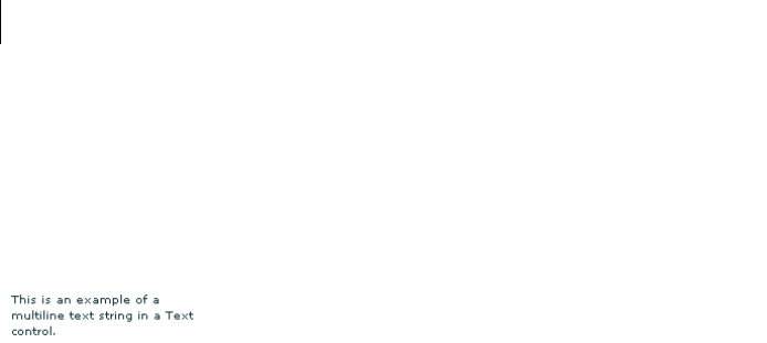
CHAPTER 10
338
For complete reference information, see the Adobe Flex Language Reference.
To create a single-line, noneditable text field, use the Label control. For more information, see “Label control” on
page 334. To create user-editable text fields, use the TextInput or TextArea controls. For more information, see
“TextInput control” on page 336 and “TextArea control” on page 339.
The following image shows an example of a Text control with a width of 175 pixels:
Creating a Text control
You define a Text control in MXML by using the <mx:Text> tag, as the following example shows. Specify an id
value if you intend to refer to a component elsewhere in your MXML, either in another tag or in an ActionScript
block.
<?xml version="1.0"?>
<!-- textcontrols/TextControl.mxml -->
<mx:Application xmlns:mx="http://www.adobe.com/2006/mxml">
<mx:Text width="175" text="This is an example of a multiline text string in a Text
control."/>
</mx:Application>
You use the text property to specify a string of raw text, and the htmlText property to specify an HTML-
formatted string. For more information, see “Using the text property” on page 317 and “Using the htmlText
property” on page 321.
This control does not support a backgroundColor property; its background is always the background of the
control’s container.
Sizing a Text control
Flex sizes the Text control as follows:
•If you specify a pixel value for both the height and width properties, any text that exceeds the size of the
control is clipped at the border.
•If you specify an explicit pixel width, but no height, Flex wraps the text to fit the width and calculates the
height to fit the required number of lines.
•If you specify a percentage-based width and no height, Flex does not wrap the text, and the height equals the
number of lines as determined by the number of Return characters.
•If you specify only a height and no width, the height value does not affect the width calculation, and Flex sizes
the control to fit the width of the maximum line.

339ADOBE FLEX 3
Adobe Flex 3 Developer Guide
As a general rule, if you have long text, you should specify a pixel-based width property. If the text might change
and you want to ensure that the Text control always takes up the same space in your application, set explicit
height and width properties that fit the largest expected text.
TextArea control
The TextArea control is a multiline, editable text field with a border and optional scroll bars. The TextArea control
supports the HTML and rich text rendering capabilities of Flash Player and AIR. The TextArea control dispatches
change and textInput events.
For complete reference information, see the Adobe Flex Language Reference.
The following image shows a TextArea control:
To create a single-line, editable text field, use the TextInput control. For more information, see “TextInput control”
on page 336. To create noneditable text fields, use the Label and Text controls. For more information, see “Label
control” on page 334 and “Text control” on page 337.
If you disable a TextArea control, it displays its contents in a different color, represented by the disabledColor
style. You can set a TextArea control’s editable property to false to prevent editing of the text. You can set a
TextArea control’s displayAsPassword property to conceal input text by displaying characters as asterisks.
Creating a TextArea control
You define a TextArea control in MXML by using the <mx:TextArea> tag, as the following example shows.
Specify an id value if you intend to refer to a control elsewhere in your MXML, either in another tag or in an
ActionScript block.
<?xml version="1.0"?>
<!-- textcontrols/TextAreaControl.mxml -->
<mx:Application xmlns:mx="http://www.adobe.com/2006/mxml">
<mx:TextArea id="textConfirm" width="300" height="100" text="Please enter your thoughts
here."/>
</mx:Application>
Just as you can for the Text control, you use the text property to specify a string of raw text, and the htmlText
property to specify an HTML-formatted string. For more information, see “Using the text property” on page 317
and “Using the htmlText property” on page 321.

CHAPTER 10
340
Sizing the TextArea control
The TextArea control does not resize to fit the text that it contains. If the new text exceeds the capacity of the
TextArea control and the horizontalScrollPolicy is true (the default value), the control adds a scrollbar.
RichTextEditor control
The RichTextEditor control lets users enter, edit, and format text. Users apply text formatting and URL links by
using subcontrols that are located at the bottom of the RichTextEditor control.
For complete reference information, see the Adobe Flex Language Reference.
About the RichTextEditor control
The RichTextEditor control consists of a Panel control with two direct children:
•A Tex t Ar ea control in which users can enter text
•A tool bar container with format controls that let a user specify the text characteristics. Users can use the tool
bar subcontrols to apply the following text characteristics:
•Font family
•Font size
Note: When using the RichTextEditor control, you specify the actual pixel value for the font size. This size is
not equivalent to the relative font sizes specified in HTML by using the size attribute of the HTML <font>
tag.
•Any combination of bold, italic and underline font styles
•Text color
•Text alignment: left, center, right, or justified
•Bullets
•URL links
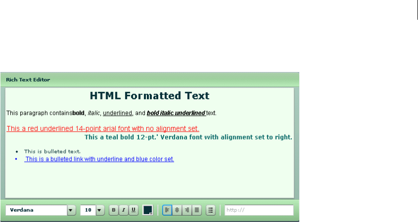
341ADOBE FLEX 3
Adobe Flex 3 Developer Guide
The following image shows a RichTextEditor control with some formatted text:
For the source for this example, see “Creating a RichTextEditor control” on page 341.
You use the RichTextEditor interactively as follows:
•Text that you type is formatted as specified by the control settings.
•To apply new formatting to existing text, select the text and set the controls to the required format.
•To create a link, select a range of text, enter the link target in the text box on the right, and press Enter. You
can only specify the URL; the link always opens in a _blank target. Also, creating the link does not change the
appearance of the link text; you must separately apply any color and underlining.
•You can cut, copy, and paste rich text within and between Flash HTML text fields, including the RichTextE-
ditor control’s TextArea subcontrol, by using the normal keyboard commands. You can copy and paste plain text
between the TextArea and any other text application, such as your browser or a text editor.
Creating a RichTextEditor control
You define a RichTextEditor control in MXML by using the <mx:RichTextEditor> tag, as the following example
shows. Specify an id value if you intend to refer to a control elsewhere in your MXML, either in another tag or in
an ActionScript block.
<?xml version="1.0"?>
<!-- textcontrols/RichTextEditorControl.mxml -->
<mx:Application xmlns:mx="http://www.adobe.com/2006/mxml">
<mx:RichTextEditor id="myRTE" text="Congratulations, winner!" />
</mx:Application>

CHAPTER 10
342
You can use the text property to specify an unformatted text string, or the htmlText property to specify an
HTML-formatted string. For more information on using these properties, see “Using the text property” on
page 317, and “Using the htmlText property” on page 321. For information on selecting, replacing, and formatting
text that is in the control, see “Selecting and modifying text” on page 330.
The following example shows the code used to create the image in “About the RichTextEditor control” on
page 340:
<?xml version="1.0"?>
<!-- textcontrols/RichTextEditorControlWithFormattedText.mxml -->
<mx:Application xmlns:mx="http://www.adobe.com/2006/mxml">
<!-- The HTML text string used to populate the RichTextEditor control's
TextArea subcontrol. The text is on a single line. -->
<mx:Script><![CDATA[
[Bindable]
public var htmlData:String="<textformat leading='2'><p align='center'><b><font
size='20'>HTML Formatted Text</font></b></p></textformat><br><textformat leading='2'><p
align='left'><font face='_sans' size='12' color='#000000'>This paragraph
contains<b>bold</b>, <i>italic</i>, <u>underlined</u>, and <b><i><u>bold italic
underlined </u></i></b>text.</font></p></textformat><br><p><u><font face='arial'
size='14' color='#ff0000'>This a red underlined 14-point arial font with no alignment
set.</font></u></p><p align='right'><font face='verdana' size='12'
color='#006666'><b>This a teal bold 12-pt.' Verdana font with alignment set to
right.</b></font></p><br><li>This is bulleted text.</li><li><font face='arial' size='12'
color='#0000ff'><u> <a href='http://www.adobe.com'>This is a bulleted link with underline
and blue color set.</a></u></font></li>";
]]></mx:Script>
<!-- The RichTextEditor control. To reference a subcontrol prefix its ID with the
RichTextEditor control ID. -->
<mx:RichTextEditor id="rte1"
backgroundColor="#ccffcc"
width="500"
headerColors="[#88bb88, #bbeebb]"
footerColors="[#bbeebb, #88bb88]"
title="Rich Text Editor"
htmlText="{htmlData}"
initialize="rte1.textArea.setStyle('backgroundColor', '0xeeffee')"
/>
</mx:Application>
Sizing the RichTextEditor control
The control does not resize in response to the size of the text in the TextArea control. If the text exceeds the
viewable space, by default, the TextArea control adds scroll bars. If you specify a value for either the height or
width property but not both, the control uses the default value for the property that you do not set.
If you set a width value that results in a width less than 605 pixels wide, the RichTextEditor control stacks the
subcontrols in rows.

343ADOBE FLEX 3
Adobe Flex 3 Developer Guide
Programming RichTextEditor subcontrols
Your application can control the settings of any of the RichTextEditor subcontrols, such as the Te x tA re a , the
ColorPicker, or any of the ComboBox or Button controls that control text formatting. To refer to a RichTextEditor
subcontrol, prefix the requested control’s ID with the RichTextEditor control ID. For example, to refer to the
ColorPicker control in a RichTextEditor control that has the ID rte1, use rte1.colorPicker.
Inheritable styles that you apply directly to a RichTextEditor control affect the underlying Panel control and the
subcontrols. Properties that you apply directly to a RichTextEditor control affect the underlying Panel control
only.
For more information, see the RichTextEditor in the Adobe Flex Language Reference.
Setting RichTextEditor subcontrol properties and styles
The following simple code example shows how you can set and change the properties and styles of the RichTex-
tEditor control and its subcontrols. This example uses styles that the RichTextEditor control inherits from the
Panel class to set the colors of the Panel control header and the tool bar container, and sets the TextArea control’s
background color in the RichTextEditor control’s creationComplete event member. When users click the buttons,
their click event listeners change the TextArea control’s background color and the selected color of the Color-
Picker control.
<?xml version="1.0"?>
<!-- textcontrols/RTESubcontrol.mxml -->
<mx:Application xmlns:mx="http://www.adobe.com/2006/mxml"
height="420">
<!-- The RichTextEditor control. To set the a subcontrol's style or property, fully
qualify the control ID. The footerColors style sets the ControlBar colors. -->
<mx:RichTextEditor id="rte1"
backgroundColor="#ccffcc"
headerColors="[#88bb88, #bbeebb]"
footerColors="[#bbeebb, #88bb88]"
title="Rich Text Editor"
creationComplete="rte1.textArea.setStyle('backgroundColor','0xeeffee')"
text="Simple sample text"
/>
<!-- Button to set a white TextArea background. -->
<mx:Button
label="Change appearance"
click="rte1.textArea.setStyle('backgroundColor',
'0xffffff');rte1.colorPicker.selectedIndex=27;"
/>
<!-- Button to reset the display to its original appearance. -->
<mx:Button
label="Reset Appearance"
click="rte1.textArea.setStyle('backgroundColor',
'0xeeffee');rte1.colorPicker.selectedIndex=0;"
/>
</mx:Application>

CHAPTER 10
344
Removing and adding RichTextEditor subcontrols
You can remove any of the standard RichTextEditor subcontrols, such as the alignment buttons. You can also add
your own subcontrols, such as a button that pops up a find-and-replace dialog box.
Remove an existing subcontrol
1Create a function that calls the removeChildAt method of the editor’s tool bar Container subcontrol, speci-
fying the control to remove.
2Call the method in the RichTextEditor control’s initialize event listener.
The following example removes the alignment buttons from a RichTextEditor control, and shows the default
appearance of a second RichTextEditor control:
<?xml version="1.0"?>
<!-- textcontrols/RTERemoveAlignButtons.mxml -->
<mx:Application xmlns:mx="http://www.adobe.com/2006/mxml">
<mx:Script><![CDATA[
public function removeAlignButtons():void {
rt1.toolbar.removeChild(rt1.alignButtons);
}
]]></mx:Script>
<mx:HBox>
<mx:RichTextEditor id="rt1"
title="RichTextEditor With No Align Buttons"
creationComplete="removeAlignButtons()"
/>
<mx:RichTextEditor id="rt2"
title="Default RichTextEditor"
/>
</mx:HBox>
</mx:Application>
Add a new subcontrol
1Create an ActionScript function that defines the subcontrol. Also create any necessary methods to support the
control’s function.
2Call the method in the RichTextEditor control’s initialize event listener, as in the following tag:
<mx:RichTextEditor id="rt" initialize="addMyControl()"
The following example adds a find-and-replace dialog box to a RichTextEditor control. It consists of two files: the
application, and a custom TitleWindow control that defines the find-and-replace dialog (which also performs the
find-and-replace operation on the text). The application includes a function that adds a button to pop up the
TitleWindow, as follows:
<?xml version="1.0"?>
<!-- textcontrols/CustomRTE.mxml -->
<mx:Application xmlns:mx="http://www.adobe.com/2006/mxml">

345ADOBE FLEX 3
Adobe Flex 3 Developer Guide
<mx:Script>
<![CDATA[
import mx.controls.*;
import mx.containers.*;
import flash.events.*;
import mx.managers.PopUpManager;
import mx.core.IFlexDisplayObject;
/* The variable for the pop-up dialog box. */
public var w:IFlexDisplayObject;
/* Add the Find/Replace button to the Rich Text Editor control's
tool bar container. */
public function addFindReplaceButton():void {
var but:Button = new Button();
but.label = "Find/Replace";
but.addEventListener("click",findReplaceDialog);
rt.toolbar.addChild(but);
}
/* The event listener for the Find/Replace button's click event
creates a pop-up with a MyTitleWindow custom control. */
public function findReplaceDialog(event:Event):void {
var w:MyTitleWindow = MyTitleWindow(
PopUpManager.createPopUp(this, MyTitleWindow, true)
);
w.height=200;
w.width=340;
/* Pass the a reference to the textArea subcontrol
so that the custom control can replace the text. */
w.RTETextArea = rt.textArea;
PopUpManager.centerPopUp(w);
}
]]>
</mx:Script>
<mx:RichTextEditor id="rt" width="95%"
title="RichTextEditor"
text="This is a short sentence."
initialize="addFindReplaceButton();"
/>
</mx:Application>
The following MyTitleWindow.mxml file defines the custom myTitleWindow control that contains the find-and-
replace interface and logic:
<?xml version="1.0"?>
<!-- A TitleWindow that displays the X close button. Clicking the close button
only generates a CloseEvent event, so it must handle the event to close the control. -->
<mx:TitleWindow xmlns:mx="http://www.adobe.com/2006/mxml"
title="Find/Replace"
showCloseButton="true"
close="closeDialog();"
>
<mx:Script>
<
CHAPTER 10
346
import mx.controls.TextArea;
import mx.managers.PopUpManager;
/* Reference to the RichTextArea textArea subcontrol.
It is set by the application findReplaceDialog method
and used in the replaceAndClose method, below. */
public var RTETextArea:TextArea;
/* The event handler for the Replace button's click event.
Replace the text in the RichTextEditor TextArea and
close the dialog box. */
public function replaceAndClose():void{
RTETextArea.text = RTETextArea.text.replace(ti1.text, ti2.text);
PopUpManager.removePopUp(this);
}
/* The event handler for the TitleWindow close button. */
public function closeDialog():void {
PopUpManager.removePopUp(this);
}
]]>
</mx:Script>
<!-- The TitleWindow subcontrols: the find and replace inputs,
their labels, and a button to initiate the operation. -->
<mx:Label text="Find what:"/>
<mx:TextInput id="ti1"/>
<mx:Label text="Replace with:"/>
<mx:TextInput id="ti2"/>
<mx:Button label="Replace" click="replaceAndClose();"/>
</mx:TitleWindow>

347
Chapter 11: Using Menu-Based Controls
There are three Adobe® Flex® Framework controls that you can use to create or interact with menus.
Topics
About menu-based controls . . . . . . . . . . . . . . . . . . . . . . . . . . . . . . . . . . . . . . . . . . . . . . . . . . . . . . . . . . . . . . . . . . . . . .347
Defining menu structure and data . . . . . . . . . . . . . . . . . . . . . . . . . . . . . . . . . . . . . . . . . . . . . . . . . . . . . . . . . . . . . . . . .348
Menu-based control events . . . . . . . . . . . . . . . . . . . . . . . . . . . . . . . . . . . . . . . . . . . . . . . . . . . . . . . . . . . . . . . . . . . . . . .353
Menu control. . . . . . . . . . . . . . . . . . . . . . . . . . . . . . . . . . . . . . . . . . . . . . . . . . . . . . . . . . . . . . . . . . . . . . . . . . . . . . . . . . .362
MenuBar control. . . . . . . . . . . . . . . . . . . . . . . . . . . . . . . . . . . . . . . . . . . . . . . . . . . . . . . . . . . . . . . . . . . . . . . . . . . . . . . .365
PopUpMenuButton control. . . . . . . . . . . . . . . . . . . . . . . . . . . . . . . . . . . . . . . . . . . . . . . . . . . . . . . . . . . . . . . . . . . . . . .367
About menu-based controls
Flex framework includes three controls that present hierarchical data in a cascading menu format. All menu
controls can have icons and labels for each menu item, and dispatch events of the mx.events.MenuEvent class in
response to user actions. You can use the following menu-based controls:
Menu control A visual menu that can have cascading submenus. You typically display a menu control in response
to some user action, such as clicking a button. You cannot define a Menu control by using an MXML tag; you must
define it, display it, and hide it by using ActionScript.
MenuBar control A horizontal bar of menu items. Each item in the menu bar can have a submenu that displays
when you click the MenuBar item. The MenuBar control is effectively a static (non-pop-up) menu that displays
the top level of the menu as the bar items.
PopUpMenuButton control A subclass of the PopUpButton control that displays a Menu control when you click
the secondary button. The primary button label changes when you select an item from the pop-up menu.

348 CHAPTER 11
Defining menu structure and data
All menu-based controls use data providers with the following characteristics to specify the structure and contents
of the menus:
•The data providers are often hierarchical, but you can also have a single-level menu.
•Individual menu items include fields that determine the menu item appearance and behavior. Menu-based
controls support fields that define the label text, an icon, the menu item type, and item status. For information on
meaningful fields, see “Specifying and using menu entry information” on page 349.
About menu data providers
The dataProvider property of a menu-based control specifies an object that defines the structure and contents
of the menu. If a menu’s contents are dynamic, you change the menu by modifying its data provider.
Menu-based controls typically get their data from hierarchical data providers, such as nested arrays of objects or
XML. If the menu represents dynamically changing data, you use an object that implements the ICollectionView
interface, such as ArrayCollection or XMLListCollection.
Menu-based controls use a data descriptor to parse and manipulate the data provider contents. By default, menu-
based controls use a DefaultDataDescriptor class descriptor, but you can create your own class and specify it in
the Menu control’s dataDescriptor property.
The DefaultDataDescriptor class supports the following types of data:
XML A string that contains valid XML text, or any of the following objects containing valid E4X format XML data:
an <mx:XML> or <mx:XMLList> compile-time tag, or an XML or XMLList object.
Other objects An array of items, or an object that contains an array of items, where a node’s children are contained
in an item named children. You can also use the <mx:Model> compile-time tag to create nested objects that
support data binding, but you must follow the structure defined in “Using the <mx:Model> tag with Tree and
menu-based controls” on page 171.
Collections An object that implements the ICollectionView interface (such as the ArrayCollection or XMLList-
Collection classes) and whose data source conforms to the structure specified in either of the previous bullets. The
DefaultDataDescriptor class includes code to handle collections efficiently. Always use a collection as the data
provider if the data in the menu changes dynamically; otherwise, the Menu displays obsolete data.
For more information on hierarchical objects and data descriptors, including a detailed description of the formats
supported by the DefaultDataDescriptor, see “Data descriptors and hierarchical data structure” on page 168.

349ADOBE FLEX 3
Adobe Flex 3 Developer Guide
As with all data-driven controls, if the data provider contents can change dynamically, and you want the Menu to
update with the changes, ensure that the data source is a collection, such as an ArrayCollection or XMLListCol-
lection object. To modify the menu, change the underlying collection, and the menu will update its appearance
accordingly.
Node (menu item) tags in the XML data can have any name. Many examples in this topic use tags such as <node>
for all menu items, or <menuItem> for top-level items and <subMenuItem> for submenu items, but it might be
more realistic to use tag names that identify the data, such as <person>, <address>, and so on. The menu-
handling code reads through the XML and builds the display hierarchy based on the nested relationship of the
nodes. For more information, see “Specifying and using menu entry information” on page 349.
Most menus have multiple items at the top level, not a single root item. XML objects, such as the XML object
created by the <mx:XML> tag, must have a single root node. To display a menu that uses a data provider that has a
root that you do not want to display, set the Menu, PopUpMenuButton, or MenuBar showRoot property to false.
Specifying and using menu entry information
Information in menu-based control data providers determines how each menu entry appears and is used. To
access or change the menu contents, you modify the contents of the data provider.
The menu-based classes use the methods of the IMenuDataDescriptor interface to access and manipulate infor-
mation in the data provider that defines the menu behavior and contents. Flex provides a DefaultDataDescriptor
class that implements this interface. The menu-based controls use the DefaultDataDescriptor class if you do not
set the dataDescriptor property.
Menu entry types
Each data provider entry can specify an item type and type-specific information about the menu item. Menu-
based classes support the following item types (type field values):
normal (the default) Selecting an item with the normal type triggers a change event, or, if the item has children,
opens a submenu.
check Selecting an item with the check type toggles the menu item’s toggled property between true and false
values. When the menu item is in the true state, it displays a check mark in the menu next to the item’s label.
radio Items with the radio type operate in groups, much like RadioButton controls; you can select only one
radio menu item in each group at a time. The example in this section defines three submenu items as radio buttons
within the group “one”.
When a radio button is selected, the radio item’s toggled property is set to true, and the toggled properties of
all other radio items in the group are set to false. The Menu control displays a solid circle next to the radio button
that is currently selected. The selection property of the radio group is set to the label of the selected menu item.
CHAPTER 11
350
separator Items with the separator type provide a simple horizontal line that divides the items in a menu into
different visual groups.
Menu attributes
Menu items can specify several attributes that determine how the item is displayed and behaves. The following
table lists the attributes you can specify, their data types, their purposes, and how the data provider must represent
them if the menu uses the DefaultDataDescriptor class to parse the data provider:
Menu-based controls ignore all other object fields or XML attributes, so you can use them for application-specific
data.
Attribute Type Description
enabled Boolean Specifies whether the user can select the menu item (true), or not (false). If not specified, Flex treats the
item as if the value were true.
If you use the default data descriptor, data providers must use an enabled XML attribute or object field to
specify this characteristic.
groupName String (Required, and meaningful, for radio type only) The identifier that associates radio button items in a radio
group. If you use the default data descriptor, data providers must use a groupName XML attribute or object
field to specify this characteristic.
icon Class Specifies the class identifier of an image asset. This item is not used for the check, radio, or separator
types. You can use the checkIcon and radioIcon styles to specify the icons used for radio and check box
items that are selected.
The menu’s iconField or iconFunction property determines the name of the field in the data that
specifies the icon, or a function for determining the icons.
label String Specifies the text that appears in the control. This item is used for all menu item types except separator.
The menu’s labelField or labelFunction property determines the name of the field in the data that
specifies the label, or a function for determining the labels. (If the data provider is in E4X XML format, you
must specify one of these properties to display a label.) If the data provider is an array of strings, Flex uses
the string value as the label.
toggled Boolean Specifies whether a check or radio item is selected. If not specified, Flex treats the item as if the value
were false and the item is not selected.
If you use the default data descriptor, data providers must use a toggled XML attribute or object field to
specify this characteristic.
type String Specifies the type of menu item. Meaningful values are separator, check, or radio. Flex treats all other
values, or nodes with no type entry, as normal menu entries.
If you use the default data descriptor, data providers must use a type XML attribute or object field to
specify this characteristic.

351ADOBE FLEX 3
Adobe Flex 3 Developer Guide
Example: An Array menu data provider
The following example displays a Menu that uses an Array data provider and shows how you define the menu
characteristics in the data provider. For an application that specifies an identical menu structure in XML, see
“Example: Creating a simple Menu control” on page 363.
<?xml version="1.0"?>
<!-- menus/ArrayDataProvider.mxml -->
<mx:Application xmlns:mx="http://www.adobe.com/2006/mxml"
layout="absolute">
<mx:Script>
<![CDATA[
import mx.controls.Menu;
// Method to create an Array-based menu.
private function createAndShow():void {
// The third parameter sets the showRoot property to false.
// You must set this property in the createMenu method,
// not later.
var myMenu:Menu = Menu.createMenu(null, menuData, true);
myMenu.show(10, 10);
}
// The Array data provider
[Bindable]
public var menuData:Array = [
{label: "MenuItem A", children: [
{label: "SubMenuItem A-1", enabled: false},
{label: "SubMenuItem A-2", type: "normal"}
]},
{label: "MenuItem B", type: "check", toggled: true},
{label: "MenuItem C", type: "check", toggled: false},
{type: "separator"},
{label: "MenuItem D", children: [
{label: "SubMenuItem D-1", type: "radio",
groupName: "g1"},
{label: "SubMenuItem D-2", type: "radio",
groupName: "g1", toggled: true},
{label: "SubMenuItem D-3", type: "radio",
groupName: "g1"}
]}
];
]]>
</mx:Script>
<!-- Button control to create and open the menu. -->
<mx:Button x="300" y="10"
label="Open Menu"
click="createAndShow();"/>
</mx:Application>
CHAPTER 11
352
The following image shows the resulting control, with MenuItem D open; notice that check item B and radio item
D-2 are selected:
Example: An XML menu data provider with icons
The following example displays a menu control that uses XML as the data provider, and specifies custom icons for
the items in the control:
<?xml version="1.0"?>
<!-- SimpleMenuControlIcon.mxml -->
<mx:Application xmlns:mx="http://www.adobe.com/2006/mxml" >
<mx:Script>
<![CDATA[
// Import the Menu control.
import mx.controls.Menu;
[Bindable]
[Embed(source="assets/topIcon.jpg")]
public var myTopIcon:Class;
[Bindable]
[Embed(source="assets/radioIcon.jpg")]
public var myRadioIcon:Class;
[Bindable]
[Embed(source="assets/checkIcon.gif")]
public var myCheckIcon:Class;
// Create and display the Menu control.
private function createAndShow():void {
var myMenu:Menu = Menu.createMenu(null, myMenuData, false);
myMenu.labelField="@label";
// Specify the check icon.
myMenu.setStyle('checkIcon', myCheckIcon);
// Specify the radio button icon.
myMenu.setStyle('radioIcon', myRadioIcon);
// Specify the icon for the topmenu items.
myMenu.iconField="@icon";
myMenu.show(10, 10);
}

353ADOBE FLEX 3
Adobe Flex 3 Developer Guide
]]>
</mx:Script>
<!-- Define the menu data. -->
<mx:XML format="e4x" id="myMenuData">
<root>
<menuitem label="MenuItem A" icon="myTopIcon">
<menuitem label="SubMenuItem A-1" enabled="false"/>
<menuitem label="SubMenuItem A-2"/>
</menuitem>
<menuitem label="MenuItem B" type="check" toggled="true"/>
<menuitem label="MenuItem C" type="check" toggled="false"
icon="myTopIcon"/>
<menuitem type="separator"/>
<menuitem label="MenuItem D" icon="myTopIcon">
<menuitem label="SubMenuItem D-1" type="radio"
groupName="one"/>
<menuitem label="SubMenuItem D-2" type="radio"
groupName="one" toggled="true"/>
<menuitem label="SubMenuItem D-3" type="radio"
groupName="one"/>
</menuitem>
</root>
</mx:XML>
<mx:VBox>
<!-- Define a Button control to open the menu -->
<mx:Button id="myButton"
label="Open Menu"
click="createAndShow();"/>
</mx:VBox>
</mx:Application>
Menu-based control events
User interaction with a Menu or menu-based control is event-driven; that is, applications typically handle events
generated when the user opens, closes, or selects within a menu, or submenu or rolls over or out of menu items.
For detailed information on events and how to use them, see “Using Events” on page 61.
The Menu and MenuBar controls dispatch an identical set of menu-specific events. Event handling with PopUp-
MenuButton controls differs from the other two controls, but shares many elements in common with the others.
CHAPTER 11
354
Menu control events
The Menu control defines the following menu-specific event types, of the MenuEvent class:
change (MenuEvent.CHANGE) Dispatched when a user changes current menu selection by using the keyboard
or mouse.
itemClick (MenuEvent.ITEM_CLICK) Dispatched when a user selects an enabled menu item of type normal,
check, or radio. This event is not dispatched when a user selects a menu item of type separator, a menu item
that opens a submenu, or a disabled menu item.
itemRollOut (MenuEvent.ITEM_ROLL_OUT) Dispatched when the mouse pointer rolls off of a Menu item.
itemRollOver (MenuEvent.ITEM_ROLL_OVER) Dispatched when the mouse pointer rolls onto a Menu item.
menuHide (MenuEvent.MENU_HIDE) Dispatched when the entire menu or a submenu closes.
menuShow (MenuEvent.MENU_SHOW) Dispatched when the entire menu or a submenu opens.
The event object passed to the event listener is of type MenuEvent and contains one or more of the following
menu-specific properties:
To access properties and fields of an object-based menu item, you specify the menu item field name, as follows:
ta1.text = event.item.label
To access attributes of an E4X XML-based menu item, you specify the menu item attribute name in E4X syntax,
as follows:
ta1.text = event.item.@label
Note: If you set an event listener on a submenu of a menu-based control, and the menu data provider’s structure
changes (for example, an element is removed), the event listener might no longer exist. To ensure that the event listener
is available when the data provider structure changes, either listen on events of the menu-based control, not a
submenu, or add the event listener each time an event occurs that changes the data provider’s structure.
The following example shows a menu with a simple event listener. For a more complex example, see “Example:
Using Menu control events” on page 358.
Property Description
item The item in the data provider for the menu item associated with the event.
index The index of the item in the menu or submenu that contains it.
label The label of the item.
menu A reference to the Menu control where the event occurred.
menuBar The MenuBar control instance that is the parent of the menu, or undefined when the menu does not belong
to a MenuBar. For more information, see “MenuBar control” on page 365.

355ADOBE FLEX 3
Adobe Flex 3 Developer Guide
<?xml version="1.0"?>
<!-- menus/EventListener.mxml -->
<mx:Application xmlns:mx="http://www.adobe.com/2006/mxml"
layout="absolute">
<mx:Script>
<![CDATA[
import mx.controls.Menu;
import mx.events.MenuEvent;
// Function to create and show a menu.
private function createAndShow():void {
var myMenu:Menu = Menu.createMenu(null, myMenuData, false);
myMenu.labelField="@label"
// Add an event listener for the itemClick event.
myMenu.addEventListener(MenuEvent.ITEM_CLICK,
itemClickInfo);
// Show the menu.
myMenu.show(225, 10);
}
// The event listener for the itemClick event.
private function itemClickInfo(event:MenuEvent):void {
ta1.text="event.type: " + event.type;
ta1.text+="\nevent.index: " + event.index;
ta1.text+="\nItem label: " + event.item.@label
ta1.text+="\nItem selected: " + event.item.@toggled;
ta1.text+= "\nItem type: " + event.item.@type;
}
]]>
</mx:Script>
<!-- The XML-based menu data provider. -->
<mx:XML id="myMenuData">
<xmlRoot>
<menuitem label="MenuItem A" >
<menuitem label="SubMenuItem A-1" enabled="false"/>
<menuitem label="SubMenuItem A-2"/>
</menuitem>
<menuitem label="MenuItem B" type="check" toggled="true"/>
<menuitem label="MenuItem C" type="check" toggled="false"/>
<menuitem type="separator"/>
<menuitem label="MenuItem D" >
<menuitem label="SubMenuItem D-1" type="radio"
groupName="one"/>
<menuitem label="SubMenuItem D-2" type="radio"
groupName="one" toggled="true"/>
<menuitem label="SubMenuItem D-3" type="radio"
groupName="one"/>
</menuitem>
</xmlRoot>
</mx:XML>
<!-- Button controls to open the menus. -->
<mx:Button x="10" y="5"
label="Open Menu"
click="createAndShow();"/>
<!-- Text area to display the event information -->
CHAPTER 11
356
<mx:TextArea x="10" y="40"
width="200" height="100"
id="ta1"/>
</mx:Application>
MenuBar events
The following figure shows a MenuBar control:
For the menu bar, the following events occur:
change (MenuEvent.CHANGE) Dispatched when a user changes current menu bar selection by using the
keyboard or mouse. This event is also dispatched when the user changes the current menu selection in a pop-up
submenu. When the event occurs on the menu bar, the menu property of the MenuEvent object is null.
itemRollOut (MenuEvent.ITEM_ROLL_OUT) Dispatched when the mouse pointer rolls off of a menu bar
item.
itemRollOver (MenuEvent.ITEM_ROLL_OVER) Dispatched when the mouse pointer rolls onto a menu bar
item.
menuHide (MenuEvent.MENU_HIDE) Dispatched when a pop-up submenu closes.
menuShow (MenuEvent.MENU_SHOW) Dispatched when a pop-up submenu opens, or the user selects a menu
bar item with no drop-down menu.
Note: The MenuBar control does not dispatch the itemClick event when you select an item on the menu bar; it only
dispatches the itemClick event when you select an item on a pop-up submenu.
For each pop-up submenu, the MenuBar dispatches the change, itemClick, itemRollOut, itemRollOver,
menuShow, and menuHide events in the same way it does for the Menu control. Handle events triggered by the pop-
up menus as you would handle events from Menu controls. For more information, see “Menu control events” on
page 354.
The following example handles events for the menu bar and for the pop-up submenus.
<?xml version="1.0"?>
<!-- menus/MenuBarEventInfo.mxml -->
<mx:Application xmlns:mx="http://www.adobe.com/2006/mxml"
creationComplete="initCollections();">
<mx:Script>

357ADOBE FLEX 3
Adobe Flex 3 Developer Guide
<![CDATA[
import mx.events.MenuEvent;
import mx.controls.Alert;
import mx.collections.*;
[Bindable]
public var menuBarCollection:XMLListCollection;
private var menubarXML:XMLList =<>
<menuitem label="Menu1">
<menuitem label="MenuItem 1-A" data="1A"/>
<menuitem label="MenuItem 1-B" data="1B"/>
</menuitem>
<menuitem label="Menu2">
<menuitem label="MenuItem 2-A" data="2A"/>
<menuitem label="MenuItem 2-B" data="2B"/>
</menuitem>
<menuitem label="Menu3" data="M3"/>
</>
// Event handler to initialize the MenuBar control.
private function initCollections():void {
menuBarCollection = new XMLListCollection(menubarXML);
}
// Event handler for the MenuBar control's change event.
private function changeHandler(event:MenuEvent):void {
// Only open the Alert for a selection in a pop-up submenu.
// The MenuEvent.menu property is null for a change event
// dispatched by the menu bar.
if (event.menu != null) {
Alert.show("Label: " + event.item.@label + "\n" +
"Data: " + event.item.@data, "Clicked menu item");
}
}
// Event handler for the MenuBar control's itemRollOver event.
private function rollOverHandler(event:MenuEvent):void {
rollOverTextArea.text = "type: " + event.type + "\n";
rollOverTextArea.text += "target menuBarIndex: " +
event.index + "\n";
}
// Event handler for the MenuBar control's itemClick event.
private function itemClickHandler(event:MenuEvent):void {
itemClickTextArea.text = "type: " + event.type + "\n";
itemClickTextArea.text += "target menuBarIndex: " +
event.index + "\n";
}
]]>
</mx:Script>
<mx:Panel title="MenuBar Control Example"
height="75%" width="75%"
paddingTop="10" paddingLeft="10">
<mx:Label
width="100%"

CHAPTER 11
358
color="blue"
text="Select a menu item."/>
<mx:MenuBar labelField="@label"
dataProvider="{menuBarCollection}"
change="changeHandler(event);"
itemClick="itemClickHandler(event);"
itemRollOver="rollOverHandler(event);"/>
<mx:TextArea id="rollOverTextArea"
width="200" height="100"/>
<mx:TextArea id="itemClickTextArea"
width="200" height="100"/>
</mx:Panel>
</mx:Application>
Example: Using Menu control events
The following example lets you experiment with Menu control events. It lets you display two menus, one with an
XML data provider and one with an Array data provider. A TextArea control displays information about each
event as a user opens the menus, moves the mouse, and selects menu items. It shows some of the differences in
how you handle XML and object-based menus, and indicates some of the types of information that are available
about each Menu event.
<?xml version="1.0"?>
<!-- menus/ExtendedMenuExample.mxml -->
<mx:Application xmlns:mx="http://www.adobe.com/2006/mxml" layout="absolute">
<mx:Script>
<
359ADOBE FLEX 3
Adobe Flex 3 Developer Guide
ta1.text="event.type: " + event.type;
ta1.text+="\nevent.label: " + event.label;
/* The index value is -1 for menuShow and menuHide events. */
ta1.text+="\nevent.index: " + event.index;
/* The item field is null for show and hide events. */
if (event.item) {
ta1.text+="\nItem label: " + event.item.@label
ta1.text+="\nItem selected: " + event.item.@toggled;
ta1.text+= "\nItem type: " + event.item.@type;
}
}
/* The event listener that creates an object-based menu
and adds event listeners for the menu. */
private function createAndShow2():void {
/* Show the top (root) level objects in the menu. */
myMenu = Menu.createMenu(null, menuData, true);
myMenu.addEventListener(MenuEvent.ITEM_CLICK, menuShowInfo2);
myMenu.addEventListener(MenuEvent.MENU_SHOW, menuShowInfo2);
/* The following line is commented out so that you can see the
results of an ITEM_CLICK event.
(The menu hides immediately after the click.)
myMenu.addEventListener(MenuEvent.MENU_HIDE, menuShowInfo2); */
myMenu.addEventListener(MenuEvent.ITEM_ROLL_OVER, menuShowInfo2);
myMenu.addEventListener(MenuEvent.ITEM_ROLL_OUT, menuShowInfo2);
myMenu.show(275, 10);
}
/* The event listener for the object-based Menu events. */
private function menuShowInfo2(event:MenuEvent):void {
ta1.text="event.type: " + event.type;
ta1.text+="\nevent.label: " + event.label;
/* The index value is -1 for menuShow and menuHide events. */
ta1.text+="\nevent.index: " + event.index;
/* The item field is null for show and hide events. */
if (event.item) {
ta1.text+="\nItem label: " + event.item.label
ta1.text+="\nItem selected: " + event.item.toggled;
ta1.text+= "\ntype: " + event.item.type;
}
}
/* The object-based data provider, an Array of objects.
Its contents is identical to that of the XML data provider. */
[Bindable]
public var menuData:Array = [
{label: "MenuItem A", children: [
{label: "SubMenuItem A-1", enabled: false},
{label: "SubMenuItem A-2", type: "normal"}
]},
{label: "MenuItem B", type: "check", toggled: true},
{label: "MenuItem C", type: "check", toggled: false},
{type: "separator"},
{label: "MenuItem D", children: [
{label: "SubMenuItem D-1", type: "radio", groupName: "g1"},
{label: "SubMenuItem D-2", type: "radio", groupName: "g1", toggled: true},
{label: "SubMenuItem D-3", type: "radio", groupName: "g1"}
]}

CHAPTER 11
360
];
]]>
</mx:Script>
<!-- The XML-based menu data provider. The XML tag requires a single root. -->
<mx:XML id="myMenuData">
<xmlRoot>
<menuitem label="MenuItem A" >
<menuitem label="SubMenuItem A-1" enabled="false"/>
<menuitem label="SubMenuItem A-2"/>
</menuitem>
<menuitem label="MenuItem B" type="check" toggled="true"/>
<menuitem label="MenuItem C" type="check" toggled="false"/>
<menuitem type="separator"/>
<menuitem label="MenuItem D" >
<menuitem label="SubMenuItem D-1" type="radio" groupName="one"/>
<menuitem label="SubMenuItem D-2" type="radio" groupName="one"
toggled="true"/>
<menuitem label="SubMenuItem D-3" type="radio" groupName="one"/>
</menuitem>
</xmlRoot>
</mx:XML>
<!-- Text area to display the event information. -->
<mx:TextArea id="ta1" width="264" height="168" x="11" y="38"/>
<!-- Button controls to open the menus. -->
<mx:Button id="b1"
label="Open XML Popup"
click="createAndShow();" x="10" y="10"
/>
<mx:Button id="b2"
label="Open Object Popup"
click="createAndShow2();" x="139" y="10"
/>
</mx:Application>
PopUpMenuButton control events
Because the PopUpMenuButton is a subclass of the PopUpButton control, it supports all of that control’s events.
When the user clicks the main button, the PopUpMenuButton control dispatches a click (MouseEvent.CLICK)
event.
When the user clicks the PopUpMenuButton main button, the control dispatches an itemClick
(MenuEvent.ITEM_CLICK) event that contains information about the selected menu item. Therefore, the same
itemClick event is dispatched when the user clicks the main button or selects the current item from the pop-up
menu. Because the same event is dispatched in both cases, clicking on the main button produces the same
behavior as clicking on the last selected menuItem, so the main button plays the role of a frequently used menu
item.
The following example shows how the PopUpMenuButton generates events and how an application can handle
them.

361ADOBE FLEX 3
Adobe Flex 3 Developer Guide
When the user selects an item from the pop-up menu, the following things occur:
•The PopUpMenuButton dispatches an itemClick event.
•The application’s itemClickHandler() event listener function handles the itemClick event and displays the
information about the event in an Alert control.
When the user clicks the main button, the following things occur:
•The PopUpMenuButton control dispatches a click event.
•The PopUpMenuButton control dispatches an itemClick event.
•The application’s itemClickHandler() event listener function handles the itemClick event and displays
information about the selected Menu item in an Alert control.
•The application’s clickHandler() event listener function also handles the MouseEvent.CLICK event, and
displays the Button label in an Alert control.
<?xml version="1.0"?>
<!-- menus/PopUpMenuButtonEvents.mxml -->
<mx:Application xmlns:mx="http://www.adobe.com/2006/mxml"
height="600" width="600"
creationComplete="initData();">
<mx:Script>
<![CDATA[
import mx.events.*;
import mx.controls.*;
// Set the Inbox (fourth) item in the menu as the button item.
private function initData():void {
Menu(p1.popUp).selectedIndex=3;
}
// itemClick event handler, invoked when you select from the menu.
// Shows the event's label, index properties, and the values of the
// label and data fields of the data provider entry specified by
// the event's item property.
public function itemClickHandler(event:MenuEvent):void {
Alert.show("itemClick event label: " + event.label
+ " \nindex: " + event.index
+ " \nitem.label: " + event.item.label
+ " \nitem.data: " + event.item.data);
}
//Click event handler for the main button.
public function clickHandler(event:MouseEvent):void {
Alert.show(" Click Event currentTarget.label: "
+ event.currentTarget.label);
}
//The menu data provider
[Bindable]
public var menuDP:Array = [
{label: "Inbox", data: "inbox"},
{label: "Calendar", data: "calendar"},
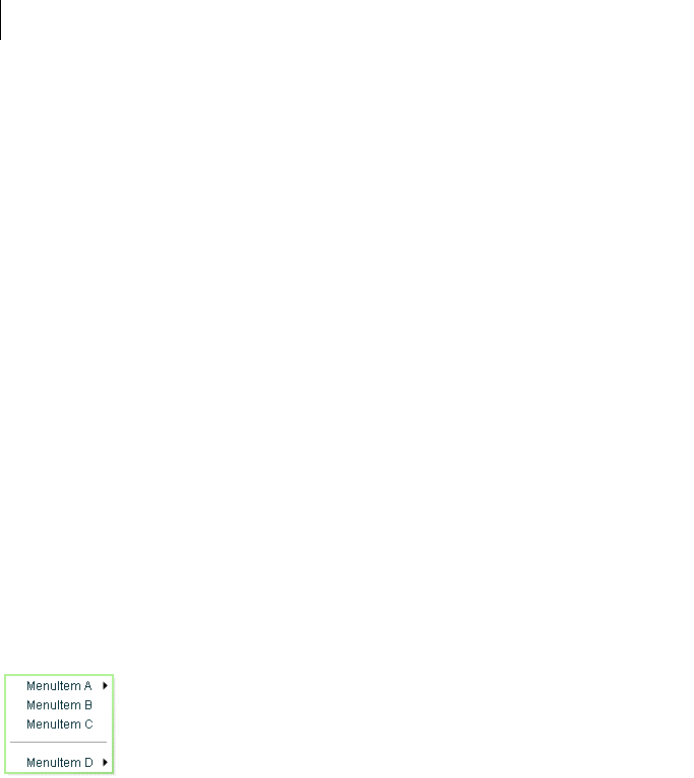
CHAPTER 11
362
{label: "Sent", data: "sent"},
{label: "Deleted Items", data: "deleted"},
{label: "Spam", data: "spam"}
];
]]></mx:Script>
<mx:PopUpMenuButton id="p1"
showRoot="true"
dataProvider="{menuDP}"
click="clickHandler(event)"
itemClick="itemClickHandler(event);"
/>
</mx:Application>
Menu control
The Menu control is a pop-up control that contains a menu of individually selectable choices. You use Action-
Script to create a Menu control that pops up in response to a user action, typically as part of an event listener.
Because you create a Menu control in response to an event, it does not have an MXML tag; you can create Menu
controls in ActionScript only.
For complete reference information, see the Adobe Flex Language Reference.
About the Menu Control
The following example shows a Menu control:
In this example, the MenuItem A and MenuItem D items open submenus. Submenus open when the user moves
the mouse pointer over the parent item or accesses the parent item by using keyboard keys.
The default location of the Menu control is the upper-left corner of your application, at x, y coordinates 0,0. You
can pass x and y arguments to the show() method to control the position relative to the application.
After a Menu opens, it remains visible until the user selects an enabled menu item, the user selects another
component in the application, or a script closes the menu.

363ADOBE FLEX 3
Adobe Flex 3 Developer Guide
To create a static menu that stays visible all the time, use the MenuBar control or PopUpMenuButton control. For
more information on the MenuBar control, see “MenuBar control” on page 365. For more information on the
PopUpMenuButton control, see “PopUpMenuButton control” on page 367.
Create a Menu control
You cannot create a Menu control by using an MXML tag; you must create it in ActionScript.
1Create an instance of the Menu control by calling the static ActionScript Menu.createMenu() method and
passing the method an instance of the data provider that contains the information that populates the control as
the second parameter; for example:
var myMenu:Menu = Menu.createMenu(null, myMenuData);
(The first parameter can optionally specify the parent container of the menu.)
If you do not display the root node of the data provider, for example, if the data provider is an XML document
in E4X format, use a third parameter with the value false. This parameter sets the menu’s showRoot
property. The following example creates a menu that does not show the data provider root:
var myMenu:Menu = Menu.createMenu(null, myMenuData, false);
Note: To hide the root node, you must set the showRoot property in the createMenu method. Setting the property
after you create the menu has no effect.
2Display the Menu instance by calling the ActionScript Menu.show() method; for example:
myMenu.show(10, 10);
Note: Menus displayed by using the Menu.popUpMenu() method are not removed automatically; you must call the
PopUpManager.removePopUp() method on the Menu object. The show() method automatically adds the Menu
object to the display list, and the hide() method automatically removes it from the display list. Clicking outside the
menu (or pressing Escape) also hides the Menu object and removes it from the display list.
Example: Creating a simple Menu control
The following example uses the <mx:XML> tag to define the data for the Menu control and a Button control to
trigger the event that opens the Menu control:
<?xml version="1.0"?>
<!-- menus/SimpleMenuControl.mxml -->
<mx:Application xmlns:mx="http://www.adobe.com/2006/mxml" >
<mx:Script>
<
CHAPTER 11
364
myMenu.labelField="@label";
myMenu.show(10, 10);
}
]]>
</mx:Script>
<!-- Define the menu data. -->
<mx:XML format="e4x" id="myMenuData">
<root>
<menuitem label="MenuItem A" >
<menuitem label="SubMenuItem A-1" enabled="false"/>
<menuitem label="SubMenuItem A-2"/>
</menuitem>
<menuitem label="MenuItem B" type="check" toggled="true"/>
<menuitem label="MenuItem C" type="check" toggled="false"/>
<menuitem type="separator"/>
<menuitem label="MenuItem D" >
<menuitem label="SubMenuItem D-1" type="radio"
groupName="one"/>
<menuitem label="SubMenuItem D-2" type="radio"
groupName="one" toggled="true"/>
<menuitem label="SubMenuItem D-3" type="radio"
groupName="one"/>
</menuitem>
</root>
</mx:XML>
<mx:VBox>
<!-- Define a Button control to open the menu -->
<mx:Button id="myButton"
label="Open Menu"
click="createAndShow();"/>
</mx:VBox>
</mx:Application>
You can assign any name to node tags in the XML data. In the previous sample, each node is named with the
generic <menuitem> tag, but you can have used <node>, <subNode>, <person>, <address> and so on.
Because this example uses an E4X XML data source, you must specify the label field by using the E4X @ attribute
specifier syntax, and you tell the control not to show the data provider root node.
Several attributes or fields, such as the type attribute, have meaning to the Menu control. For information on how
Flex interprets and uses the data provider data, see “Specifying and using menu entry information” on page 349.
Menu control user interaction
You can use the mouse or the keyboard to interact with a Menu control. Clicking selects a menu item and closes
the menu, except with the following types of menu items:
Disabled items or separators Rolling over or clicking menu items has no effect and the menu remains visible.
Submenu anchors Rolling over the items activates the submenu; clicking them has no effect; rolling onto any
menu item other than one of the submenu items closes the submenu.
365ADOBE FLEX 3
Adobe Flex 3 Developer Guide
When a Menu control has focus, you can use the following keys to control it:
MenuBar control
A MenuBar control displays the top level of a menu as a horizontal bar of menu items, where each item on the bar
can pop up a submenu. The MenuBar control interprets the data provider in the same way as the Menu control,
and supports the same events as the Menu control. Unlike the Menu control, a MenuBar control is static; that is,
it does not function as a pop-up menu, but is always visible in your application. Because the MenuBar is static,
you can define it directly in MXML.
For complete reference information, see the Adobe Flex Language Reference. For more information on the Menu
control, see “Menu control events” on page 354.
About the MenuBar control
The following example shows a MenuBar control:
The control shows the labels of the top level of the data provider menu. When a user selects a top-level menu item,
the MenuBar control opens a submenu. The submenu stays open until the user selects another top-level menu
item, selects a submenu item, or clicks outside the MenuBar area.
Key Description
Down Arrow
Up Arrow
Moves the selection down and up the rows of the menu. The selection loops at the top or bottom row.
Right Arrow Opens a submenu, or moves the selection to the next menu in a menu bar.
Left Arrow Closes a submenu and returns focus to the parent menu (if a parent menu exists), or moves the selection to the
previous menu in a menu bar (if the menu bar exists).
Enter Opens a submenu, has the effect of clicking and releasing the mouse on a row if a submenu does not exist.
Escape Closes a menu level.

CHAPTER 11
366
Creating a MenuBar control
You define a MenuBar control in MXML by using the <mx:MenuBar> tag. Specify an id value if you intend to refer
to a component elsewhere in your MXML application, either in another tag or in an ActionScript block.
You specify the data for the MenuBar control by using the dataProvider property. The MenuBar control uses
the same types of data providers as does the Menu control. For more information on data providers for Menu and
MenuBar controls, see “Defining menu structure and data” on page 348. For more information on hierarchical
data providers, see “Hierarchical data objects” on page 167.
In a simple case for creating a MenuBar control, you might use an <mx:XML> or <mx:XMLList> tag and standard
XML node syntax to define the menu data provider. When you used an XML-based data provider, you must keep
the following rules in mind:
•With the <mx:XML> tag you must have a single root node, and you set the showRoot property of the MenuBar
control to false. (otherwise, your MenuBar would have only the root as a button). With the <mx:XMLList> tag
you define a list of XML nodes, and the top level nodes define the bar buttons.
•If your data provider has a label attribute (even if it is called “label”), you must set the MenuBar control’s
labelField property and use the E4X @ notation for the label; for example:
labelField=”@label”
The dataProvider property is the default property of the MenuBar control, so you can define the XML or
XMLList object as a direct child of the <mx:MenuBar> tag, as the following example shows:
<?xml version="1.0"?>
<!-- menus/MenuBarControl.mxml -->
<mx:Application xmlns:mx="http://www.adobe.com/2006/mxml" >
<!-- Define the menu; dataProvider is the default MenuBar property.
Because this uses an XML data provider, specify the labelField and
showRoot properties. -->
<mx:MenuBar id="myMenuBar" labelField="@label">
<mx:XMLList>
<menuitem label="MenuItem A">
<menuitem label="SubMenuItem A-1" enabled="false"/>
<menuitem label="SubMenuItem A-2"/>
</menuitem>
<menuitem label="MenuItem B"/>
<menuitem label="MenuItem C"/>
<menuitem label="MenuItem D">
<menuitem label="SubMenuItem D-1"
type="radio" groupName="one"/>
<menuitem label="SubMenuItem D-2"
type="radio" groupName="one"
selected="true"/>
<menuitem label="SubMenuItem D-3"
type="radio" groupName="one"/>
</menuitem>
</mx:XMLList>
</mx:MenuBar>
</mx:Application>

367ADOBE FLEX 3
Adobe Flex 3 Developer Guide
The top-level nodes in the MenuBar control correspond to the buttons on the bar. Therefore, in this example, the
MenuBar control displays the four labels shown in the preceding image.
You can assign any name to node tags in the XML data. In the previous example, each node is named with the
generic <menuitem> tag, but you can use <node>, <subNode>, <person>, <address>, and so on. Several
attributes or fields, such as the type attribute, have meaning to the MenuBar control. For information on how Flex
interprets and uses the data provider data, see “Specifying and using menu entry information” on page 349.
MenuBar control user interaction
The user interaction of the MenuBar is the same as for the Menu control, with the following difference: when the
MenuBar control has the focus, the left arrow opens the previous menu. If the current menu bar item has a closed
pop-up menu, the right arrow opens the current menu; if the pop-up menu is open, the right arrow opens the next
menu. (The behavior wraps around the ends of the MenuBar control.)
For more information, see “Menu control user interaction” on page 364.
PopUpMenuButton control
The PopUpMenuButton is a PopUpButton control whose secondary button pops up a Menu control. When the
user selects an item from the pop-up menu, the main button of the PopUpButton changes to show the icon and
label of the selected menu item. Unlike the Menu and MenuBar controls, the PopUpMenuButton supports only a
single-level menu.
For complete reference information, see the Adobe Flex Language Reference. For more information on the Menu
control, see “Menu control events” on page 354. For more information on PopUpButton controls, see “PopUp-
Button control” on page 237.
CHAPTER 11
368
About the PopUpMenuButton control
The following example shows a PopUpMenuButton control before and after clicking the secondary pop-up
button:
The PopUpMenuButton works as follows.
•When you click the smaller button, which by default displays a v icon, the control displays a pop-up menu
below the button.
•When you select an item from the pop-up menu, the main PopUpMenuButton button label changes to show
the selected item’s label and the PopUpMenuButton control dispatches a MenuEvent.CHANGE event.
•When you click the main button, the PopUpMenuButton control dispatches a MenuEvent.CHANGE event and
a MouseEvent.ITEM_CLICK event.
For information on handling PopUpMenuButton events, see “PopUpMenuButton control events” on page 360.
The PopUpMenuButton control lets users change the function of the main button by selecting items from the pop-
up menu. The most recently selected item becomes the main button item.
This behavior is useful for buttons when there are a number of user actions, users tend to select the same option
frequently, and the application developer cannot assume which option should be the default. Text editors often
use such controls in their control bar for options, such as spacing, for which a user is likely to have a preferred
setting, but the developer cannot determine it in advance. Microsoft Word, for example, uses such controls for
specifying line spacing, borders, and text and highlight color.
You can use the PopUpButton control to create pop-up menu buttons with behaviors that differ from those of the
PopUpMenuButton; for example, buttons that do not change the default action of the main button when the user
selects a menu item. For more information, see “PopUpButton control” on page 237.

369ADOBE FLEX 3
Adobe Flex 3 Developer Guide
Creating a PopUpMenuButton control
You de fin e a PopUpMenuButton control in MXML by using the <mx:PopUpMenuButton> tag. Specify an id value
if you intend to refer to a component elsewhere in your MXML application, either in another tag or in an Action-
Script block.
You specify the data for the PopUpMenuButton control by using the dataProvider property. For information on
valid data providers, including their structure and contents, see “Defining menu structure and data” on page 348.
By default, the initially selected item is the first item in the pop-up menu dataProvider, and the default main
button label is the item’s label, as determined by the labelField or labelFunction property. To set the initial
main button label to a specific item’s label and functionality, write a listener for the PopUpMenuButton control’s
creationComplete event that sets the selectedIndex property of the Menu subcontrol, as follows:
Menu(MyPopUpControl.popUp).selectedIndex=2;
You must cast the PopUpMenuButton control’s popUp property to a Menu because the property type is IUICom-
ponent, not Menu.
You can also use the label property of the PopUpMenuButton control to set the main button label, as described
in “Using the label property” on page 370.
When a popped up menu closes, it loses its selection and related properties.
Note: You must use the PopUpMenuButton’s creationComplete event, not the initialize event, to set the main
button label from the data provider.
Example: Creating a PopUpMenuButton control
The following example creates a PopUpMenuButton control by using an E4X XML data provider.
<?xml version="1.0"?>
<!-- menus/PopUpMenuButtonControl.mxml -->
<mx:Application xmlns:mx="http://www.adobe.com/2006/mxml">
<mx:Script>
<![CDATA[
import mx.controls.Menu
// The initData function sets the initial value of the button
// label by setting the Menu subcontrol's selectedIndex property.
// You must cast the popUp property to a Menu.
private function initData():void {
Menu(pb2.popUp).selectedIndex=2;
}
]]>
</mx:Script>
<mx:XML format="e4x" id="dp2">
<root>
<editItem label="Cut"/>
<editItem label="Copy"/>

CHAPTER 11
370
<editItem label="Paste"/>
<separator type="separator"/>
<editItem label="Delete"/>
</root>
</mx:XML>
<mx:PopUpMenuButton id="pb2"
dataProvider="{dp2}"
labelField="@label"
showRoot="false"
creationComplete="initData();"/>
</mx:Application>
Because this example uses an E4X XML data source, you must specify the label field by using the E4X @ attribute
specifier syntax, and you must tell the control not to show the data provider root node.
Using the label property
The label property of the PopUpMenuButton control specifies the contents of the label on the main button, and
overrides any label from the pop-up menu that is determined by the labelField or labelFunction property.
The label property is useful for creating a main button label with fixed and a variable parts; for example, a mail
“Send to:” button where only the destination text is controlled by the pop-up menu, so the main button could say
“Send to: Inbox” or “Send to: Trash” based on the selection from a menu that lists “Menu” and “Trash.”
To use a dynami c label property, use a PopUpMenuButton control change event listener to set the label based
on the event’s label property, as in the following example:
<?xml version="1.0"?>
<!-- menus/PopUpMenuButtonLabel.mxml -->
<mx:Application xmlns:mx="http://www.adobe.com/2006/mxml"
height="600" width="600">
<mx:Script>
<![CDATA[
import mx.events.MenuEvent;
public function itemClickHandler(event:MenuEvent):void {
event.currentTarget.label= "Send to: " + event.label;
}
[Bindable]
public var menuData:Array = [
{label: "Inbox", data: "inbox"},
{label: "Calendar", data: "calendar"},
{label: "Sent", data: "sent"},
{label: "Deleted Items", data: "deleted"},
{label: "Spam", data: "spam"}
];
]]>
</mx:Script>
<mx:PopUpMenuButton id="p1"
showRoot="true"
dataProvider="{menuData}"

371ADOBE FLEX 3
Adobe Flex 3 Developer Guide
label="Send to: Inbox"
itemClick="itemClickHandler(event);"/>
</mx:Application>
PopUpMenuButton user interaction
The user interaction of the PopUpMenuButton control main button and secondary button is the same as for the
PopUpButton control. The user interaction with the pop-up menu is the same as for the Menu control. For more
information on the PopUpButton user interaction, see “User interaction” on page 239. For more information on
Menu control user interaction, see “Menu control user interaction” on page 364.

CHAPTER 11
372

373
Chapter 12: Using Data-Driven Controls
Several Adobe® Flex® controls take input from a data provider, an object that contains data. For example, a Tree
control reads data from a data provider to define the structure of the tree and any associated data assigned to each
tree node.
Several of the controls that use a data provider let you visualize complex data, and there are different ways to
populate these controls by using a data provider. The following topics also provide information on data providers
and controls that use data providers:
•“Using Data Providers and Collections” on page 137 contains details on data providers and how to use collec-
tions as data providers.
•“Using Menu-Based Controls” on page 347 contains information on using Menu, MenuBar, and PopUp-
MenuButton controls.
•“Using the AdvancedDataGrid Control” on page 275 in Adobe Flex 3 Data Visualization Developer Guide
contains information on using the AdvancedDataGrid control, which expands on the functionality of the
standard DataGrid control to add data visualization features to your Adobe Flex application.
•“Creating OLAP Data Grids” on page 322 in Adobe Flex 3 Data Visualization Developer Guide contains infor-
mation on using the OLAPDataGrid control, which lets you aggregate large amounts of data for easy display and
interpretation.
Topics
List control. . . . . . . . . . . . . . . . . . . . . . . . . . . . . . . . . . . . . . . . . . . . . . . . . . . . . . . . . . . . . . . . . . . . . . . . . . . . . . . . . . . . .373
HorizontalList control . . . . . . . . . . . . . . . . . . . . . . . . . . . . . . . . . . . . . . . . . . . . . . . . . . . . . . . . . . . . . . . . . . . . . . . . . . .382
TileList control . . . . . . . . . . . . . . . . . . . . . . . . . . . . . . . . . . . . . . . . . . . . . . . . . . . . . . . . . . . . . . . . . . . . . . . . . . . . . . . . .385
ComboBox control . . . . . . . . . . . . . . . . . . . . . . . . . . . . . . . . . . . . . . . . . . . . . . . . . . . . . . . . . . . . . . . . . . . . . . . . . . . . . .388
DataGrid control. . . . . . . . . . . . . . . . . . . . . . . . . . . . . . . . . . . . . . . . . . . . . . . . . . . . . . . . . . . . . . . . . . . . . . . . . . . . . . . .395
Tree control . . . . . . . . . . . . . . . . . . . . . . . . . . . . . . . . . . . . . . . . . . . . . . . . . . . . . . . . . . . . . . . . . . . . . . . . . . . . . . . . . . . .405
List control
The List control displays a vertical list of items. Its functionality is very similar to that of the SELECT form element
in HTML. It often contains a vertical scroll bar that lets users access the items in the list. An optional horizontal
scroll bar lets users view items when the full width of the list items is unlikely to fit. The user can select one or
more items from the list.

374 CHAPTER 12
Note: The HorizontalList, TileList, DataGrid, Menu, and Tre e controls are derived from the List control or its
immediate parent, the ListBase class. As a result, much of the information for the List control applies to these controls.
For complete reference information, see the Adobe Flex Language Reference.
The following image shows a List control:
List control sizing
If you specify horizontalScrollPolicy="on", the default width of a List control does not change; it is still large
enough to display the widest visible label. If you set horizontalScrollPolicy="on", and specify a List control
pixel width, you can use the measureWidthOfItems() method to ensure that the scroll bar rightmost position
corresponds to the right edge of the content, as the following example shows. Notice that the additional 5 pixels
ensures that the rightmost character of the text displays properly.
<mx:List id="li2"
width="200" horizontalScrollPolicy="on"
maxHorizontalScrollPosition="{li2.measureWidthOfItems() - li2.width +5}"
>
The preceding line ensures that the rightmost position of the scroll bar puts the end of the longest measured list
item near the right edge of the List control. Using this technique, however, can reduce application efficiency, so
you might consider using explicit sizes instead.
Lists, and all subclasses of the ListBase class, determine their sizes when a style changes or the data provider
changes.
If you set a width property that is less than the width of the longest label and specify the
horizontalScrollPolicy="off", labels that exceed the control width are clipped.
Creating a List control
You use the <mx:List> tag to define a List control. Specify an id value if you intend to refer to a component
elsewhere in your MXML, either in another tag or in an ActionScript block.
The List control uses a list-based data provider. For more information, see “Using Data Providers and Collections”
on page 137.

375ADOBE FLEX 3
Adobe Flex 3 Developer Guide
You specify the data for the List control by using the dataProvider property of the control. However, because
dataProvider is the List control’s default property, you do not have to specify a <mx:dataProvider> child tag
of the <mx:List> tag. In the simplest case for creating a static List control, you need only put <mx:String> tags
in the control body, because Flex also automatically interprets the multiple tags as an Array of Strings, as the
following example shows:
<?xml version="1.0"?>
<!-- dpcontrols/ListDataProvider.mxml -->
<mx:Application xmlns:mx="http://www.adobe.com/2006/mxml">
<mx:List>
<mx:dataProvider>
<mx:String>AK</mx:String>
<mx:String>AL</mx:String>
<mx:String>AR</mx:String>
</mx:dataProvider>
</mx:List>
</mx:Application>
Because the data in this example is inline static data, it is not necessary to explicitly wrap it in an ArrayCollection
object. However, when working with data that could change, it is always best to specify a collection explicitly; for
more information, see “Using Data Providers and Collections” on page 137.
The index of items in the List control is zero-based, which means that values are 0, 1, 2, ... , n - 1, where n is the
total number of items. The value of the item is its label text.
You typically use events to handle user interaction with a List control. The following example code adds a handler
for a change event to the List control. Flex broadcasts a mx.ListEvent.CHANGE event when the value of the
control changes due to user interaction.
<?xml version="1.0"?>
<!-- dpcontrols/ListChangeEvent.mxml -->
<mx:Application xmlns:mx="http://www.adobe.com/2006/mxml">
<mx:Script>
<![CDATA[
import flash.events.Event;
public function changeEvt(event:Event):void {
forChange.text=event.currentTarget.selectedItem.label + " " +
event.currentTarget.selectedIndex;
}
]]>
</mx:Script>
<mx:List width="35" change="changeEvt(event)">
<mx:Object label="AL" data="Montgomery"/>
<mx:Object label="AK" data="Juneau"/>
<mx:Object label="AR" data="Little Rock"/>
</mx:List>
<mx:TextArea id="forChange" width="150"/>
</mx:Application>

CHAPTER 12
376
In this example, you use two properties of the List control, selectedItem and selectedIndex, in the event
handler. Every change event updates the TextArea control with the label of the selected item and the item’s index
in the control.
The target property of the object passed to the event handler contains a reference to the List control. You can
reference any control property by using the event’s currentTarget property. The
currentTarget.selectedItem field contains a copy of the selected item. If you populate the List control with
an Array of Strings, the currentTarget.selectedItem field contains a String. If you populate it with an Array
of Objects, the currentTarget.selectedItem field contains the Object that corresponds to the selected item,
so, in this case, currentTarget.selectedItem.label refers to the selected item’s label field.
Using a label function
You can pass a label function to the List control to provide logic that determines the text that appears in the
control. The label function must have the following signature:
labelFunction(item:Object):String
The item parameter passed in by the Label control contains the list item object. The function must return the
string to display in the List control.
Note: Most subclasses of ListBase also take a labelFunction property with the signature described above. For the
DataGrid and DataGridColumn controls, the method signature is labelFunction(item:Object,
dataField:DataGridColumn):String, where item contains the DataGrid item object, and dataField specifies
the DataGrid column.
The following example uses a function to combine the values of the label and data fields for each item for display
in the List control:
<?xml version="1.0"?>
<!-- dpcontrols/ListLabelFunction.mxml -->
<mx:Application xmlns:mx="http://www.adobe.com/2006/mxml" >
<mx:Script><![CDATA[
public function myLabelFunc(item:Object):String {
return item.data + ", " + item.label;
}
]]></mx:Script>
<mx:ArrayCollection id="myDP">
<mx:source>
<mx:Object label="AL" data="Montgomery"/>
<mx:Object label="AK" data="Juneau"/>
<mx:Object label="AR" data="Little Rock"/>
</mx:source>
</mx:ArrayCollection>
<mx:List dataProvider="{myDP}" labelFunction="myLabelFunc"/>
</mx:Application>
377ADOBE FLEX 3
Adobe Flex 3 Developer Guide
This example creates the following List control:
Note: This example uses an ArrayCollection object as the data provider. You should always use a collection as the
data provider when the data can change at run time. For more information, see “Using Data Providers and Collec-
tions” on page 137.
Displaying DataTips
DataTips are similar to ToolTips, but display text when the mouse pointer hovers over a row in a List control. Text
in a List control that is longer than the control width is clipped on the right side (or requires scrolling, if the control
has scroll bars). DataTips can solve that problem by displaying all of the text, including the clipped text, when the
mouse pointer hovers over a cell. If you enable data tips, they only appear for fields where the data is clipped. To
display DataTips, set the showDataTips property of a List control to true.
Note: To use DataTips with a DataGrid control, you must set the showDataTips property on the individual
DataGridColumns of the DataGrid.
The default behavior of the showDataTips property is to display the label text. However, you can use the
dataTipField and dataTipFunction properties to determine what is displayed in the DataTip. The
dataTipField property behaves like the labelField property; it specifies the name of the field in the data
provider to use as the DataTip for cells in the column. The dataTipFunction property behaves like the
labelFunction property; it specifies the DataTip string to display for list items.
The following example sets the showDataTips property for a List control:
<mx:List id="myList" dataProvider="{myDP}" width="220" height="200" showDataTips="true"/>
This example creates the following List control:
CHAPTER 12
378
Displaying ScrollTips
You use ScrollTips to give users context about where they are in a list as they scroll through the list. The tips appear
only when you scroll; they don’t appear if you only hover the mouse over the scroll bar. ScrollTips are useful when
live scrolling is disabled (the liveScrolling property is false) so scrolling does not occur until you release the
scroll thumb. The default value of the showScrollTips property is false.
The default behavior of the showScrollTips property is to display the index number of the top visible item. You
can use the scrollTipFunction property to determine what is displayed in the ScrollTip. The
scrollTipFunction property behaves like the labelFunction property; it specifies the ScrollTip string to
display for list items. You should avoid going to the server to fill in a ScrollTip.
The following example sets the showScrollTips and scrollTipFunction properties of a HorizontalList
control, which shares many of the same properties and methods as the standard List control; for more information
about the HorizontalList control, see “HorizontalList control” on page 382. The scrollTipFunction property
specifies a function that gets the value of the description property of the current list item.
<mx:HorizontalList id="list" dataProvider="{album.photo}" width="100%"
itemRenderer="Thumbnail" columnWidth="108" height="100"
selectionColor="#FFCC00" liveScrolling="false" showScrollTips="true"
scrollTipFunction="scrollTipFunc"
change="currentPhoto=album.photo[list.selectedIndex]"/>
This code produces the following HorizontalList control:
Vertically aligning text in List control rows
You can use the verticalAlign style to vertically align text at the top, middle, or bottom of a List row. The default
value is top. You can also specify a value of middle or bottom.
The following example sets the verticalAlign property for a List control to bottom:
<mx:List id="myList" dataProvider="{myDP}" width="220" height="200"
verticalAlign="bottom"/>
Setting variable row height and wrapping List text
You can use the variableRowHeight property to make the height of List control rows variable based on their
content. The default value is false. If you set the variableRowHeight property to true, the rowHeight property
is ignored and the rowCount property is read-only.
379ADOBE FLEX 3
Adobe Flex 3 Developer Guide
The following example sets the variableRowHeight property for a List control to true:
<mx:List id="myList" dataProvider="{myDP}" width="220" height="200"
variableRowHeight="true"/>
You can use the wordWrap property in combination with the variableRowHeight property to wrap text to
multiple lines when it exceeds the width of a List row.
The following example sets the wordWrap and variableRowHeight properties to true:
<mx:List id="myList" dataProvider="{myDP}" width="220" height="200"
variableRowHeight="true" wordWrap="true"/>
This code produces the following List control:
Alternating row colors in a List control
You can use the alternatingItemColors style property to specify an Array that defines the color of each row in
the List control. The Array must contain two or more colors. After using all the entries in the Array, the List
control repeats the color scheme.
The following example defines an Array with two entries, #66FFFF for light blue and #33CCCC for a blue-gray.
Therefore, the rows of the List control alternate between these two colors. If you specify a three-color array, the
rows alternate among the three colors, and so on.
<mx:List alternatingItemColors="[#66FFFF, #33CCCC]".../ >
Using a custom item renderer
An item renderer is the object that displays a List control’s data items. The simplest way to use a custom item
renderer is to specify an MXML component as the value of the itemRenderer property. When you use an MXML
component as a item renderer, it can contain multiple levels of containers and controls. You can also use an
ActionScript class as a custom item renderer. For detailed information on custom item renderers, see “Using Item
Renderers and Item Editors” on page 779
The following example sets the itemRenderer property to an MXML component named FancyCellRenderer. It
also sets the variableRowHeight property to true because the MXML component exceeds the default row
height:

CHAPTER 12
380
<mx:List id="myList1" dataProvider="{myDP}" width="220" height="200"
itemRenderer="FancyItemRenderer" variableRowHeight="true"/>
Specifying an icon to the List control
You can specify an icon to display with each List item, as the following example shows:
<?xml version="1.0"?>
<!-- dpcontrols/ListIcon.mxml -->
<mx:Application xmlns:mx="http://www.adobe.com/2006/mxml">
<mx:Script>
<![CDATA[
[Embed(source="assets/radioIcon.jpg")]
public var iconSymbol1:Class;
[Embed(source="assets/topIcon.jpg")]
public var iconSymbol2:Class;
]]>
</mx:Script>
<mx:List iconField="myIcon">
<mx:dataProvider>
<mx:Array>
<mx:Object label="AL" data="Montgomery" myIcon="iconSymbol1"/>
<mx:Object label="AK" data="Juneau" myIcon="iconSymbol2"/>
<mx:Object label="AR" data="Little Rock" myIcon="iconSymbol1"/>
</mx:Array>
</mx:dataProvider>
</mx:List>
</mx:Application>
In this example, you use the iconField property to specify the field of each item containing the icon. You use the
Embed metadata to import the icons, and then reference them in the List control definition.
You can also use the iconFunction property to specify a function that determines the icon, similar to the way
that you can use the labelFunction property to specify a function that determines the label text. The icon
function must have the following signature:
iconFunction(item:Object):Class
The item parameter passed in by the Label control contains the list item object. The function must return the icon
class to display in the List control.
The following example shows a List control that uses the iconFunction property to determine the icon to display
for each item in the list:
<?xml version="1.0"?>
<!-- dpcontrols/ListIconFunction.mxml -->
<mx:Application xmlns:mx="http://www.adobe.com/2006/mxml" >
<mx:Script>
<![CDATA[
// Embed icons.
[Embed(source="assets/radioIcon.jpg")]
public var pavementSymbol:Class;
[Embed(source="assets/topIcon.jpg")]
public var normalSymbol:Class;

381ADOBE FLEX 3
Adobe Flex 3 Developer Guide
// Define data provider.
private var myDP: Array;
private function initList():void {
myDP = [
{Artist:'Pavement', Album:'Slanted and Enchanted', Price:11.99},
{Artist:'Pavarotti', Album:'Twilight', Price:11.99},
{Artist:'Other', Album:'Other', Price:5.99}];
list1.dataProvider = myDP;
}
// Determine icon based on artist. Pavement gets a special icon.
private function myiconfunction(item:Object):Class{
var type:String = item.Artist;
if (type == "Pavement") {
return pavementSymbol;
}
return normalSymbol;
}
]]>
</mx:Script>
<mx:VBox >
<mx:List id="list1" initialize="initList()" labelField="Artist"
iconFunction="myiconfunction" />
</mx:VBox>
</mx:Application>
List control user interaction
The user clicks individual list items to select them, and holds down the Control and Shift keys while clicking to
select multiple items. (You must set the allowMultipleSelection property to true to allow multiple selecton.)
All mouse or keyboard selections broadcast a change event. For mouse interactions, the List control broadcasts
this event when the mouse button is released.
If you set the allowDragSelection property to true, the control scrolls up or down when the user presses the
mouse button over the one or more rows, holds the mouse button down, drags the mouse outside the control, and
then moves the mouse up and down.
A List control shows the number of records that fit in the display. Paging down through the data displayed by a
10-line List control shows records 0-10, 9-18, 18-27, and so on, with one line overlapping from one page to the
next.
CHAPTER 12
382
The List control has the following keyboard navigation features:
HorizontalList control
The HorizontalList control displays a horizontal list of items. The HorizontalList control is particularly useful in
combination with a custom item renderer for displaying a list of images and other data. For more information
about custom item renderers, see “Using Item Renderers and Item Editors” on page 779.
For complete reference information, see HorizontalList in the Adobe Flex Language Reference.
About HorizontaList controls
The contents of a HorizontalList control can look very similar to the contents of an HBox container in which a
Repeater object repeats components. However, performance of a HorizontalList control can be better than the
combination of an HBox container and a Repeater object because the HorizontalList control only instantiates the
objects that fit in its display area. Scrolling in a HorizontalList can be slower than it is when using a Repeater
object. For more information about the Repeater object, see “Dynamically Repeating Controls and Containers”
on page 947.
Key Action
Up Arrow Moves selection up one item.
Down Arrow Moves selection down one item.
Page Up Moves selection up one page.
Page Down Moves selection down one page.
Home Moves selection to the top of the list.
End Moves selection to the bottom of the list.
Alphanumeric keys Jumps to the next item with a label that begins with the character typed.
Control Toggle key. Allows for multiple (noncontiguous) selection and deselection. Works with key presses, click selec-
tion, and drag selection.
Shift Contiguous selection key. Allows for contiguous selections. Works with key presses, click selection, and drag
selection.
383ADOBE FLEX 3
Adobe Flex 3 Developer Guide
The HorizontalList control always displays items from left to right. The control usually contains a horizontal scroll
bar, which lets users access all items in the list. An optional vertical scroll bar lets users view items when the full
height of the list items is unlikely to fit. The user can select one or more items from the list, depending on the value
of the allowMultipleSelection property.
The following image shows a HorizontalList control:
For complete reference information, see HorizontalList in the Adobe Flex Language Reference.
Creating a HorizontalList control
You use the <mx:HorizontalList> tag to define a HorizontalList control. Specify an id value if you intend to
refer to a component elsewhere in your MXML, either in another tag or in an ActionScript block.
The HorizontalList control shares many properties and methods with the List control; see “List control” on
page 373 for information on how to use several of these shared properties. The HorizontalList control uses a list-
based data provider. For more information, see “Using Data Providers and Collections” on page 137.
You specify the data for a HorizontalList control by using the dataProvider property of the
<mx:HorizontalList> tag, as the following example shows:
<?xml version="1.0"?>
<!-- dpcontrols/HListDataProvider.mxml -->
<mx:Application xmlns:mx="http://www.adobe.com/2006/mxml" width="450">
<mx:Script>
<![CDATA[
import mx.collections.*;
import mx.controls.Image;
private var catalog:ArrayCollection;
private static var cat:Array = [
"../assets/Nokia_6820.gif", "../assets/Nokia_3595.gif",
"../assets/Nokia_3650.gif", "../assets/Nokia_6010.gif"
];
/* Initialize the HorizontalList control by setting its dataProvider
property to an ArrayCollection containing the items parameter. */
private function initCatalog(items:Array):void {
catalog = new ArrayCollection(items);
myList.dataProvider = catalog;
CHAPTER 12
384
}
]]>
</mx:Script>
<!-- A four-column HorizontalList. The itemRenderer is a Flex Image control.
When the control is created, pass the cat array to the initialization routine. -->
<mx:HorizontalList id="myList"
columnWidth="100"
rowHeight="100"
columnCount="4"
itemRenderer="mx.controls.Image"
creationComplete="initCatalog(cat)"
/>
</mx:Application>
In this example, you use the creationComplete event to populate the data provider with an ArrayCollection of
image files, and the itemRenderer property to specify the Image control as the item renderer. (Note that you use
the full package name of the control in the assignment because the code does not import the mx.controls
package.) The HorizontalList control then displays the four images specified by the data provider.
HorizontalList control user interaction
The user clicks individual list items to select them, and holds down the Control and Shift keys while clicking to
select multiple items.
All mouse or keyboard selections broadcast a change event. For mouse interactions, the HorizontalList control
broadcasts this event when the mouse button is released. When the user drags the mouse over the items and then
outside the control, the control scrolls up or down.
A HorizontalList control shows the number of records that fit in the display. Paging through a four list shows
records 0-4, 5-8, and so on, with no overlap from one page to the next.
Keyboard navigation
The HorizontalList control has the following keyboard navigation features:
Key Action
Page Up Moves selection to the left one page.
Left Arrow Moves selection to the left one item.
Down Arrow Moves selection right one item.
Page Down Moves selection to the right one page.
Home Moves selection to the beginning of the list.
385ADOBE FLEX 3
Adobe Flex 3 Developer Guide
TileList control
The TileList control displays a tiled list of items. The items are tiled in vertical columns or horizontal rows. The
TileList control is particularly useful in combination with a custom item renderer for displaying a list of images
and other data. The default item renderer for the TileList control is TileListItemRenderer, which, by default,
displays text of the data provider’s label field and any icon. For more information about custom item renderers,
see “Using Item Renderers and Item Editors” on page 779.
For complete reference information, see the Adobe Flex Language Reference.
About the TileList control
The contents of a TileList control can look very similar to the contents of a Tile container in which a Repeater
object repeats components. However, performance of a TileList control can be better than the combination of a
Tile container and a Repeater object because the TileList control only instantiates the objects that fit in its display
area. Scrolling in a TileList can be slower than it is when using a Repeater object. For more information about the
Repeater object, see “Dynamically Repeating Controls and Containers” on page 947.
The TileList control displays a number of items laid out in equally sized tiles. It often contains a scroll bar on one
of its axes to access all items in the list depending on the direction orientation of the list. The user can select one
or more items from the list depending on the value of the allowMultipleSelection property.
The TileList control lays out its children in one or more vertical columns or horizontal rows, starting new rows or
columns as necessary. The direction property determines the primary direction of the layout. The valid values
for the direction property are and horizontal (default) and vertical for a layout. In a horizontal layout the
tiles are filled in row by row with each row filling the available space in the control. If there are more tiles than fit
in the display area, the horizontal control has a vertical scroll. In a vertical layout, the tiles are filled in column
by column in the available vertical space, and the control may have a horizontal scroll bar.
End Moves selection to the end of the list.
Control Toggle key. Allows for multiple (noncontiguous) selection and deselection when the
allowMultipleSelection property is set to true. Works with key presses, click selection, and drag selection.
Shift Contiguous selection key. Allows for contiguous selections when allowMultipleSelection is set to true.
Works with key presses, click selection, and drag selection.
Key Action
CHAPTER 12
386
The following image shows a TileList control:
Creating a TileList control
You use the <mx:TileList> tag to define a TileList control. Specify an id value if you intend to refer to a
component elsewhere in your MXML, either in another tag or in an ActionScript block.
The TileList control shares many properties and methods with the List control; see “List control” on page 373 for
information on how to use several of these shared properties. The TileList control uses a list-based data provider.
For more information, see “Using Data Providers and Collections” on page 137.
You specify the data for a TileList control by using the dataProvider property of the <mx:TileList> tag, as the
following example shows:
<?xml version="1.0"?>
<!-- dpcontrols/TileListDataProvider.mxml -->
<mx:Application xmlns:mx="http://www.adobe.com/2006/mxml"
initialize="initData();" >
<mx:Script>
<![CDATA[
import mx.controls.Button;
import mx.collections.*;
private var listArray:Array=[
{label: "item0", data: 0},{label: "item1", data: 1},
{label: "item2", data: 2},{label: "item3", data: 3},
{label: "item4", data: 4},{label: "item5", data: 5},
{label: "item6", data: 6},{label: "item7", data: 7},
{label: "item8", data: 8}];
[Bindable]
public var TileListdp:ArrayCollection;
private function initData():void {
387ADOBE FLEX 3
Adobe Flex 3 Developer Guide
TileListdp = new ArrayCollection(listArray);
}
]]>
</mx:Script>
<mx:TileList dataProvider="{TileListdp}"
itemRenderer="mx.controls.Button"/>
</mx:Application>
In this example, you populate the data provider with an ArrayCollection that contains an Array of strings defining
labels and data values. You then use the itemRenderer property to specify a Button control as the item renderer.
The Button controls display the data provider label values. The TileList control displays nine Button controls with
the specified labels.
TileList control user interaction
The user clicks individual list items to select them, and holds down the Control and Shift keys while clicking to
select multiple items.
All mouse or keyboard selections broadcast a change event. For mouse interactions, the TileList control broad-
casts this event when the mouse button is released. When the user drags the mouse over the items and then outside
the control, the control scrolls up or down.
Keyboard navigation
The TileList control has the following keyboard navigation features:
Key Action
Up Arrow Moves selection up one item. If the control direction is vertical, and the current item is at the top of a column,
moves to the last item in the previous column; motion stops at the first item in the first column.
Down Arrow Moves selection down one item. If the control direction is vertical, and the current item is at the bottom of a
column, moves to the first item in the next column; motion stops at the last item in the last column.
Right Arrow Moves selection to the right one item. If the control direction is horizontal, and the current item is at the end of
a row, moves to the first item in the next row; motion stops at the last item in the last column.
Left Arrow Moves selection to the left one item. If the control direction is horizontal, and the current item is at the begin-
ning of a row, moves to the last item in the previous row; motion stops at the first item in the first row.
Page Up Moves selection up one page. For a single-page control, moves the selection to the beginning of the list.
Page Down Moves selection down one page. For a single-page control, moves the selection to the end of the list.
Home Moves selection to the beginning of the list.
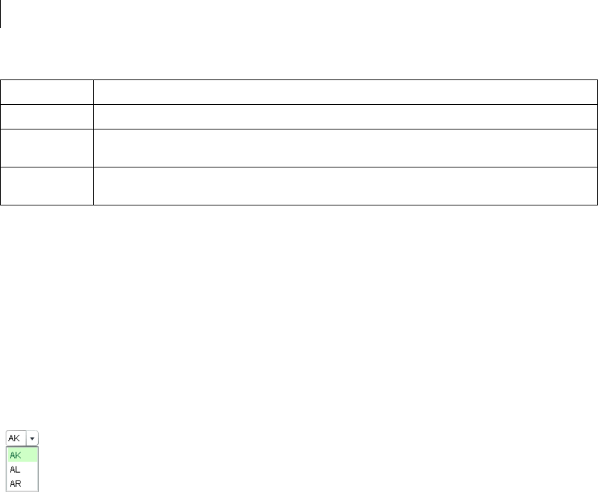
CHAPTER 12
388
ComboBox control
The ComboBox control is a drop-down list from which the user can select a single value. Its functionality is very
similar to that of the SELECT form element in HTML.
For complete reference information, see the Adobe Flex Language Reference.
About the ComboBox control
The following image shows a ComboBox control:
In its editable state, the user can type text directly into the top of the list, or select one of the preset values from
the list. In its noneditable state, as the user types a letter, the drop-down list opens and scrolls to the value that
most closely matches the one being entered; matching is only performed on the first letter that the user types.
If the drop-down list hits the lower boundary of the application, it opens upward. If a list item is too long to fit in
the horizontal display area, it is truncated to fit. If there are too many items to display in the drop-down list, a
vertical scroll bar appears.
Creating a ComboBox control
You use the <mx:ComboBox> tag to define a ComboBox control in MXML. Specify an id value if you intend to
refer to a component elsewhere in your MXML, either in another tag or in an ActionScript block.
End Moves selection to the end of the list.
Control Toggle key. Allows for multiple (noncontiguous) selection and deselection when allowMultipleSelection is
set to true. Works with key presses, click selection, and drag selection.
Shift Contiguous selection key. Allows for contiguous selections when allowMultipleSelection is set to true.
Works with key presses, click selection, and drag selection.
Key Action

389ADOBE FLEX 3
Adobe Flex 3 Developer Guide
The ComboBox control uses a list-based data provider. For more information, see “Using Data Providers and
Collections” on page 137.
You specify the data for the ComboBox control by using the dataProvider property of the <mx:ComboBox> tag.
The data provider should be a collection; the standard collection implementations are the ArrayCollection and
XMLListCollection classes, for working with Array-based and XML-based data, respectively. You can also use a
raw data object, such as Array or XMLList object, as a data provider; however, it is always better to specify a
collection explicitly for data that could change. For more information on data providers and collections see “Using
Data Providers and Collections” on page 137.
In a simple case for creating a ComboBox control, you specify the property by using an <mx:dataProvider>
child tag, and use an <mx:ArrayCollection> tag to define the entries as an ArrayCollection whose source is an
Array of Strings, as the following example shows:
<?xml version="1.0"?>
<!-- dpcontrols/ComboBoxSimple.mxml -->
<mx:Application xmlns:mx="http://www.adobe.com/2006/mxml">
<mx:ComboBox>
<mx:ArrayCollection>
<mx:String>AK</mx:String>
<mx:String>AL</mx:String>
<mx:String>AR</mx:String>
</mx:ArrayCollection>
</mx:ComboBox>
</mx:Application>
This example shows how you can take advantages of MXML defaults. You do not have to use an
<mx:dataProvider> tag, because dataProvider is the default property of the ComboBox control. Similarly, you
do not have to use an <mx:source> tag inside the <mx:ArrayCollection> tag because source is the default
property of the ArrayCollection class. Finally, you do not have to specify an <mx:Array> tag for the source array.
The data provider can also contain objects with multiple fields, as in the following example:
<?xml version="1.0"?>
<!-- dpcontrols/ComboBoxMultiple.mxml -->
<mx:Application xmlns:mx="http://www.adobe.com/2006/mxml">
<mx:ComboBox>
<mx:ArrayCollection>
<mx:Object label="AL" data="Montgomery"/>
<mx:Object label="AK" data="Juneau"/>
<mx:Object label="AR" data="Little Rock"/>
</mx:ArrayCollection>
</mx:ComboBox>
</mx:Application>
If the data source is an array of strings, as in the first example, the ComboBox displays strings as the items in the
drop-down list. If the data source consists of objects, the ComboBox, by default, uses the contents of the label field.
You can, however, override this behavior, as described in “Specifying ComboBox labels” on page 391.
The index of items in the ComboBox control is zero-based, which means that values are 0, 1, 2, ... , n - 1, where n
is the total number of items. The value of the item is its label text.

CHAPTER 12
390
Using events with ComboBox controls
You typically use events to handle user interaction with a ComboBox control.
The ComboBox control broadcasts a change event (flash.events.Event class with a type property value of
flash.events.Event.CHANGE) when the value of the control’s selectedIndex or selectedItem property
changes due to the following user actions:
•If the user closes the drop-down list by using a mouse click, Enter key, or Control+Up key, and the selected
item is different from the previously selected item.
•If the drop-down list is currently closed, and the user presses the Up, Down, Page Up, or Page Down key to
select a new item.
•If the ComboBox control is editable, and the user types into the control, Flex broadcasts a change event each
time the text field of the control changes.
The ComboBox control broadcasts an mx.events.DropdownEvent with a type mx.events.DropdownEvent.OPEN
(open) and mx.events.DropdownEvent.CLOSE (close) when the ComboBox control opens and closes. For
detailed information on these and other ComboBox events, see ComboBox in the Adobe Flex Language Reference.
The following example displays information from ComboBox events:
<?xml version="1.0"?>
<!-- dpcontrols/ComboBoxEvent.mxml -->
<mx:Application xmlns:mx="http://www.adobe.com/2006/mxml" >
<mx:Script>
<![CDATA[
import flash.events.Event;
import mx.events.DropdownEvent;
// Display the type of event for open and close events.
private function dropEvt(event:DropdownEvent):void {
forChange.text+=event.type + "\n";
}
// Display a selected item's label field and index for change events.
private function changeEvt(event:Event):void {
forChange.text+=event.currentTarget.selectedItem.label + " " +
event.currentTarget.selectedIndex + "\n";
}
]]>
</mx:Script>
<mx:ComboBox open="dropEvt(event)" close="dropEvt(event)"
change="changeEvt(event)" >
<mx:ArrayCollection>
<mx:Object label="AL" data="Montgomery"/>
<mx:Object label="AK" data="Juneau"/>
<mx:Object label="AR" data="Little Rock"/>
</mx:ArrayCollection>
</mx:ComboBox>
<mx:TextArea id="forChange" width="150" height="100%"/>
</mx:Application>

391ADOBE FLEX 3
Adobe Flex 3 Developer Guide
If you populate the ComboBox control with an Array of Strings, the currentTarget.selectedItem field
contains a String. If you populate it with an Array of Objects, the currentTarget.selectedItem field contains
the Object that corresponds to the selected item, so, in this case, currentTarget.selectedItem.label refers
to the selected item object’s label field.
In this example, you use two properties of the ComboBox control, selectedItem and selectedIndex, in the
event handlers. Every change event updates the TextArea control with the label of the selected item and the item’s
index in the control, and every open or close event appends the event type.
Specifying ComboBox labels
If the ComboBox data source is an array of strings, the control displays the string for each item. If the data source
is contains Objects, by default, the ComboBox control expects each object to contain a property named label that
defines the text that appears in the ComboBox control for the item. If each Object does not contain a label
property, you can use the labelField property of the ComboBox control to specify the property name, as the
following example shows:
<mx:ComboBox open="dropEvt(event)" close="dropEvt(event)"
change="changeEvt(event)" labelField="state">
<mx:ArrayCollection>
<mx:Object state="AL" capital="Montgomery"/>
<mx:Object state="AK" capital="Juneau"/>
<mx:Object state="AR" capital="Little Rock"/>
</mx:ArrayCollection>
</mx:ComboBox>
To make the event handler in the section “Using events with ComboBox controls” on page 390 display the state
ID and capital, you would modify the change event handler to use a property named state, as the following
example shows:
private function changeEvt(event) {
forChange.text=event.currentTarget.selectedItem.state + " " +
event.currentTarget.selectedItem.capital + " " +
event.currenttarget.selectedIndex;
}
You can also specify the ComboBox labels by using a label function, as described in “Using a label function” on
page 376.
Populating a ComboBox control by using variables and models
Flex lets you populate the data provider of a ComboBox control from an ActionScript variable definition or from
a Flex data model. Each element of the data provider must contain a string label, and can contain one or more
fields with additional data. The following example populates two ComboBox controls; one from an ArrayCol-
lection variable that it populates directly from an Array, the other from an ArrayCollection that it populates from
an array of items in an <MX:Model> tag.
<?xml version="1.0"?>

CHAPTER 12
392
<!-- dpcontrols/ComboBoxVariables.mxml -->
<mx:Application xmlns:mx="http://www.adobe.com/2006/mxml"
initialize="initData();">
<mx:Script>
<![CDATA[
import mx.collections.*
private var COLOR_ARRAY:Array=
[{label:"Red", data:"#FF0000"},
{label:"Green", data:"#00FF00"},
{label:"Blue", data:"#0000FF"}];
// Declare an ArrayCollection variable for the colors.
// Make it Bindable so it can be used in bind
// expressions ({colorAC}).
[Bindable]
public var colorAC:ArrayCollection;
// Initialize colorAC ArrayCollection variable from the Array.
// Use an initialize event handler to initialize data variables
// that do not rely on components, so that the initial values are
// available when the controls that use them are constructed.
//See the mx:ArrayCollection tag, below, for a second way to
//initialize an ArrayCollection.
private function initData():void {
colorAC=new ArrayCollection(COLOR_ARRAY);
}
]]>
</mx:Script>
<!-- This example shows two different ways to
structure a Model. -->
<mx:Model id="myDP">
<obj>
<item label="AL" data="Montgomery"/>
<item>
<label>AK</label>
<data>Juneau</data>
</item>
<item>
<label>AR</label>
<data>Little Rock</data>
</item>
</obj>
</mx:Model>
<!-- Create a stateAC ArrayCollection that uses as its source an Array of
the item elements from the myDP model.
This technique and the declaration and initialization code used for
the colorAC variable are alternative methods of creating and
initializing the ArrayCollection. -->
<mx:ArrayCollection id="stateAC" source="{myDP.item}"/>
<mx:ComboBox dataProvider="{colorAC}"/>
<mx:ComboBox dataProvider="{stateAC}"/>
</mx:Application>
393ADOBE FLEX 3
Adobe Flex 3 Developer Guide
This example uses a simple model. However, you can populate the model from an external data source or define
a custom data model class in ActionScript. For more information on using data models, see “Storing Data” on
page 1257.
You can use remote data providers to supply data to your ComboBox control. For example, when a web service
operation returns an Array of strings, you can use the following format to display each string as a row of a
ComboBox control:
<mx:ArrayCollection id=”resultAC”
source=”mx.utils.ArrayUtil.toArray(service.operation.lastResult);”
<mx:ComboBox dataProvider="{resultAC}" />
For more information on using remote data providers, see “Remote data in data provider components” on
page 180.
ComboBox control user interaction
A ComboBox control can be noneditable or editable, as specified by the Boolean editable property. In a noned-
itable ComboBox control, a user can make a single selection from a drop-down list. In an editable ComboBox
control, the portion button of the control is a text field that the user can enter text directly into or can populate by
selecting an item from the drop-down list. When the user makes a selection in the ComboBox control list, the
label of the selection is copied to the text field at the top of the ComboBox control.
When a ComboBox control (and not the drop-down box) has focus and is editable, all keystrokes go to the text
field and are handled according to the rules of the TextInput control (see “TextInput control” on page 336), with
the exception of the Control+Down key combination, which opens the drop-down list. When the drop-down list
is open, you can use the Up and Down keys to navigate in the list and the Enter key to select an item from the list.
When a ComboBox control has focus and is noneditable, alphanumeric keystrokes move the selection up and
down the data provider to the next item with the same first character and display the label in the text field. If the
drop-down list is open, the visible selection moves to the selected item.
You can also use the following keys to control a noneditable ComboBox control when the drop-down list is not
open:
Key Description
Control+Down Opens the drop-down list and gives it focus.
Down Moves the selection down one item.
End Moves the selection to the bottom of the collection.
Home Moves the selection to the top of the collection.
CHAPTER 12
394
When the drop-down list of a noneditable ComboBox control has focus, alphanumeric keystrokes move the
selection up and down the drop-down list to the next item with the same first character. You can also use the
following keys to control a drop-down list when it is open:
Page Down Displays the item that would be at the end bottom of the drop-down list. If the current selection is a multiple
of the rowCount value, displays the item that rowCount -1 down the list, or the last item. If the current selec-
tion is the last item in the data provider, does nothing.
Page Up Displays the item that would be at the top of the drop-down. If the current selection is a multiple of the
rowCount value, displays the item that rowCount -1 up the list, or the first item. If the current selection is the
first item in the data provider, does nothing.
Up Moves the selection up one item.
Key Description
Control+Up Closes the drop-down list and returns focus to the ComboBox control.
Down Moves the selection down one item.
End Moves the selection to the bottom of the collection.
Enter Closes the drop-down list and returns focus to the ComboBox control.
Escape Closes the drop-down list and returns focus to the ComboBox control.
Home Moves the selection to the top of the collection.
Page Down Moves to the bottom of the visible list. If the current selection is at the bottom of the list, moves the current selec-
tion to the top of the displayed list and displays the next rowCount-1 items, if any. If there current selection is the
last item in the data provider, does nothing.
Page Up Moves to the top of the visible list. If the current selection is at the top of the list, moves the current selection to
the bottom of the displayed list and displays the previous rowCount-1 items, if any. If the current selection is the
first item in the data provider, does nothing.
Shift+Tab Closes the drop-down list and moves the focus to the previous object in the DisplayList.
Tab Closes the drop-down list and moves the focus to the next object in the DisplayList.
Up Moves the selection up one item.
Key Description
395ADOBE FLEX 3
Adobe Flex 3 Developer Guide
DataGrid control
The DataGrid control is a list that can display more than one column of data. It is a formatted table of data that
lets you set editable table cells, and is the foundation of many data-driven applications.
For information on the following topics, which are often important for creating advanced data grid controls, see:
•How to format the information in each DataGrid cell and control how users enter data in the cells; see “Using
Item Renderers and Item Editors” on page 779.
•How to drag objects to and from the data grid; see “Using Drag and Drop” on page 741.
For complete reference information, see the Adobe Flex Language Reference.
About the DataGrid control
The DataGrid control provides the following features:
•Resizable, sortable, and customizable column layouts, including hidable columns
•Optional customizable column and row headers, including optionally wrapping header text
•Columns that the user can resize and reorder at run time
•Selection events
•Ability to use a custom item renderer for any column
•Support for paging through data
•Locked rows and columns that do not scroll
The following image shows a DataGrid control:
Rows are responsible for rendering items. Each row is laid out vertically below the previous one. Columns are
responsible for maintaining the state of each visual column; columns control width, color, and size.

CHAPTER 12
396
Creating a DataGrid control
You use the <mx:DataGrid> tag to define a DataGrid control in MXML. Specify an id value if you intend to refer
to a component elsewhere in your MXML, either in another tag or in an ActionScript block.
The DataGrid control uses a list-based data provider. For more information, see “Using Data Providers and
Collections” on page 137.
You specify the data for the DataGrid control by using the dataProvider property. You can specify data in several
different ways. In the simplest case for creating a DataGrid control, you use the <mx:dataProvider> property
subtag with <mx:ArrayCollection>, and <mx:Object> tags to define the entries as an ArrayCollection of
Objects. Each Object defines a row of the DataGrid control, and properties of the Object define the column entries
for the row, as the following example shows:
<?xml version="1.0"?>
<!-- dpcontrols/DataGridSimple.mxml -->
<mx:Application xmlns:mx="http://www.adobe.com/2006/mxml">
<mx:DataGrid>
<mx:ArrayCollection>
<mx:Object>
<mx:Artist>Pavement</mx:Artist>
<mx:Price>11.99</mx:Price>
<mx:Album>Slanted and Enchanted</mx:Album>
</mx:Object>
<mx:Object>
<mx:Artist>Pavement</mx:Artist>
<mx:Album>Brighten the Corners</mx:Album>
<mx:Price>11.99</mx:Price>
</mx:Object>
</mx:ArrayCollection>
</mx:DataGrid>
</mx:Application>
This example shows how you can take advantages of MXML defaults. You do not have to use an
<mx:dataProvider> tag, because dataProvider is the default property of the DataGrid control. Similarly, you
do not have to use an <mx:source> tag inside the <mx:ArrayCollection> tag because source is the default
property of the ArrayCollection class. Finally, you do not have to specify an <mx:Array> tag for the source array.
You can also define the objects by using properties directly in the Object tags, as the following example shows:
<?xml version="1.0"?>
<!-- dpcontrols/DataGridSimpleAttributes.mxml -->
<mx:Application xmlns:mx="http://www.adobe.com/2006/mxml">
<mx:DataGrid>
<mx:ArrayCollection>
<mx:Object Artist="Pavement"
Album="Slanted and Enchanted" Price="11.99" />
<mx:Object Artist="Pavement"
Album="Brighten the Corners" Price="11.99" />
</mx:ArrayCollection>
</mx:DataGrid>
</mx:Application>

397ADOBE FLEX 3
Adobe Flex 3 Developer Guide
The column names displayed in the DataGrid control are the property names of the Array Objects. By default, the
columns are in alphabetical order by the property names. Different Objects can define their properties in differing
orders. If an Array Object omits a property, the DataGrid control displays an empty cell in that row.
Specifying columns
Each column in a DataGrid control is represented by a DataGridColumn object. You use the columns property
of the DataGrid control and the <mx:DataGridColumn> tag to select the DataGrid columns, specify the order in
which to display them, and set additional properties. You can also use the DataGridColumn class visible
property to hide and redisplay columns, as described in “Hiding and displaying columns” on page 398.
For complete reference information for the <mx:DataGridColumn> tag, see DataGridColumn in the Adobe Flex
Language Reference.
You specify an Array element to the <mx:columns> child tag of the <mx:DataGrid> tag, as the following example
shows:
<?xml version="1.0"?>
<!-- dpcontrols/DataGridSpecifyColumns.mxml -->
<mx:Application xmlns:mx="http://www.adobe.com/2006/mxml" >
<mx:DataGrid>
<mx:ArrayCollection>
<mx:Object Artist="Pavement" Price="11.99"
Album="Slanted and Enchanted" />
<mx:Object Artist="Pavement"
Album="Brighten the Corners" Price="11.99" />
</mx:ArrayCollection>
<mx:columns>
<mx:DataGridColumn dataField="Album" />
<mx:DataGridColumn dataField="Price" />
</mx:columns>
</mx:DataGrid>
</mx:Application>
In this example, you only display the Album and Price columns in the DataGrid control. You can reorder the
columns as well, as the following example shows:
<mx:columns>
<mx:DataGridColumn dataField="Price" />
<mx:DataGridColumn dataField="Album" />
</mx:columns>
In this example, you specify that the Price column is the first column in the DataGrid control, and that the Album
column is the second.
You can also use the <mx:DataGridColumn> tag to set other options. The following example uses the headerText
property to set the name of the column to a value different than the default name of Album, and uses the width
property to set the album name column wide enough to display the full album names:
<mx:columns>
<mx:DataGridColumn dataField="Album" width="200" />

CHAPTER 12
398
<mx:DataGridColumn dataField="Price" headerText="List Price" />
</mx:columns>
Hiding and displaying columns
If you might display a column at some times, but not at others, you can specify the DataGridColumn class
visible property to hide or show the column. The following example lets you hide or show the album price by
clicking a button:
<?xml version="1.0"?>
<!-- dpcontrols/DataGridVisibleColumn.mxml -->
<mx:Application xmlns:mx="http://www.adobe.com/2006/mxml" >
<mx:DataGrid id="myDG" width="350">
<mx:dataProvider>
<mx:ArrayCollection>
<mx:source>
<mx:Object Artist="Pavement" Price="11.99"
Album="Slanted and Enchanted" />
<mx:Object Artist="Pavement"
Album="Brighten the Corners" Price="11.99" />
</mx:source>
</mx:ArrayCollection>
</mx:dataProvider>
<mx:columns>
<mx:DataGridColumn dataField="Artist" />
<mx:DataGridColumn dataField="Album" />
<mx:DataGridColumn id="price" dataField="Price" visible="false"/>
</mx:columns>
</mx:DataGrid>
<!-- The column id property specifies the column to show.-->
<mx:Button label="Toggle Price Column"
click="price.visible = !price.visible;" />
</mx:Application>
Passing data to a DataGrid control
Flex lets you populate a DataGrid control from an ActionScript variable definition or from a Flex data model. The
following example populates a DataGrid control by using a variable:
<?xml version="1.0"?>
<!-- dpcontrols/DataGridPassData.mxml -->
<mx:Application xmlns:mx="http://www.adobe.com/2006/mxml"
initialize="initData()">
<mx:Script>
<![CDATA[
import mx.collections.*;
private var DGArray:Array = [
{Artist:'Pavement', Album:'Slanted and Enchanted', Price:11.99},
{Artist:'Pavement', Album:'Brighten the Corners', Price:11.99}];
[Bindable]
public var initDG:ArrayCollection;
//Initialize initDG ArrayCollection variable from the Array.
//You can use this technique to convert an HTTPService,

399ADOBE FLEX 3
Adobe Flex 3 Developer Guide
//WebService, or RemoteObject result to ArrayCollection.
public function initData():void {
initDG=new ArrayCollection(DGArray);
}
]]>
</mx:Script>
<mx:DataGrid id="myGrid" width="350" height="200"
dataProvider="{initDG}" >
<mx:columns>
<mx:DataGridColumn dataField="Album" />
<mx:DataGridColumn dataField="Price" />
</mx:columns>
</mx:DataGrid>
</mx:Application>
In this example, you bind the variable initDG to the <mx:dataProvider> property. You can still specify a column
definition event when using data binding. For a description of using a model as a data provider, see “Populating
a ComboBox control by using variables and models” on page 391
Handling events in a DataGrid control
The DataGrid control and the DataGridEvent class define several event types that let you respond to user inter-
action. For example, Flex broadcasts mx.events.ListEvent class event with a type property value of
mx.events.ListEvent.ITEM_CLICK ("itemClick") when a user clicks an item in a DataGrid control. You can
handle this event as the following example shows:
<?xml version="1.0"?>
<!-- dpcontrols/DataGridEvents.mxml -->
<mx:Application xmlns:mx="http://www.adobe.com/2006/mxml" layout="vertical">
<mx:Script>
<![CDATA[
import mx.events.ListEvent;
private function itemClickEvent(event:ListEvent):void {
clickColumn.text=String(event.columnIndex);
clickRow.text=String(event.rowIndex);
eventType.text=event.type;
}
]]>
</mx:Script>
<mx:DataGrid id="myGrid" width="350" height="150"
itemClick="itemClickEvent(event);">
<mx:ArrayCollection>
<mx:Object Artist="Pavement" Price="11.99"
Album="Slanted and Enchanted" />
<mx:Object Artist="Pavement" Album="Brighten the Corners"
Price="11.99" />
</mx:ArrayCollection>
</mx:DataGrid>
<mx:Form>
<mx:FormItem label="Column Index:">
<mx:Label id="clickColumn"/>
</mx:FormItem>

CHAPTER 12
400
<mx:FormItem label="Row Index:">
<mx:Label id="clickRow"/>
</mx:FormItem>
<mx:FormItem label="Type:">
<mx:Label id="eventType"/>
</mx:FormItem>
</mx:Form>
</mx:Application>
In this example, you use the event handler to display the column index, row index, and event type in three
TextAre a contro l s .
The index of columns in the DataGrid control is zero-based, meaning values are 0, 1, 2, ... , n - 1, where n is the
total number of columns. Row items are also indexed starting at 0. Therefore, if you select the first item in the
second row, this example displays 0 in the TextArea for the column index, and 1 in the TextArea for the row index.
To access the selected item in the event handler, you can use the currentTarget property of the event object, and
the selectedItem property of the DataGrid control, as the following code shows:
var selectedArtist:String=event.currentTarget.selectedItem.Artist;
The currentTarget property of the object passed to the event handler contains a reference to the DataGrid
control. You can reference any control property by using currentTarget followed by a period and the property
name. The currentTarget.selectedItem field contains the selected item.
Sorting data in DataGrid controls
The DataGrid control supports displaying sorted data in two ways:
•By default, the control displays data in the sorted order of its underlying data provider collection. Therefore
you can use the collection Sort and SortField classes to control the order of the rows.
•By default, users can sort the display by clicking the column headers. Clicking the column header initially
sorts the display in descending order of the entries in the selected column, and clicking the header again reverses
the sort order. You can disable sorting an entire DataGrid Control or individual columns.
For detailed information on using the Sort and SortField classes, see “Sorting and filtering data for viewing” on
page 151.
Determining the initial DataGrid sort order
To specify the initial DataGrid sort order, you sort the data provider. While a number of approaches can work, the
following technique takes best advantage of the built in features of Flex collections:
•Use an object that implements the ICollectionView interface, such as an ArrayCollection, in the
dataProvider property of your DataGrid. Specify a Sort object in the data provider object’s the sort field.
•Use the Sort object to control the order of the rows in the dataProvider object.

401ADOBE FLEX 3
Adobe Flex 3 Developer Guide
For an example that sets an initial, multicolumn sort on a DataGrid, see “Example: Sorting a DataGrid on multiple
columns” on page 402.
Controlling user sorting of DataGrid displays
The following DataGrid and DataGridColumn properties control how users can sort data:
•The DataGrid sortableColumns property is a global switch that enables user sorting of the DataGrid display
by clicking column headings. The default this property is true.
•The DataGridColumn sortable property specifies whether users can sort an individual column. The default
this property is true.
•The DataGridColumn sortCompareFunction property lets you specify a custom comparison function. This
property sets the compare property of the default SortField class object that the DataGrid uses to sort the grid
when users click the headers. It lets you specify the function that compares two objects and determines which
would be higher in the sort order, without requiring you to explicitly create a Sort object on your data provider.
For detailed information on the comparison function signature and behavior, see sortCompareFunction in the
Adobe Flex Language Reference.
By default, the DataGrid class uses its own sort code to control how the data gets sorted when the user clicks a
column. To override this behavior, you create a headerRelease event handler to handle the DataGridEvent event
that is generated when the user clicks the column header. This event handler must do the following:
1Use the event object’s columnIndex property to determine the clicked column.
2Create a Sort object with a set of SortField objects based on the clicked column and any other rules that you
need to control the sorting order. For more information on using Sort objects, see “Sorting and filtering data for
viewing” on page 151.
3Apply the Sort object to the collection assigned as the data provider.
4Call the DataGridEvent class event object’s preventDefault() method to prevent the DataGrid from doing
a default column sort.
Note: If you specify a labelFunction property, you must also specify a sortCompareFunction function. The
Computed Columns example in Flex Explorer shows this use.
The following example shows how to use the headerRelease event handler to do multi-column sorting when a user
clicks a DataGrid column header.

CHAPTER 12
402
Example: Sorting a DataGrid on multiple columns
The following example shows how you can use a collection with a Sort object to determine an initial multi-column
sort and to control how the columns sort when you click the headers. The data grid is initially sorted by in-stock
status first, artist second, and album name, third. If you click any heading, that column becomes the primary sort
criterion, the previous primary criterion becomes the second criterion, and the previous secondary criterion
becomes the third criterion.
<?xml version="1.0"?>
<!-- dpcontrols/DataGridSort.mxml -->
<mx:Application xmlns:mx="http://www.adobe.com/2006/mxml"
initialize="initDP();" width="550" height="400">
<mx:Script>
<![CDATA[
import mx.events.DataGridEvent;
import mx.collections.*;
// Declare storage variables and initialize the simple variables.
// The data provider collection.
private var myDPColl:ArrayCollection;
// The Sort object used to sort the collection.
[Bindable]
private var sortA:Sort;
// The sort fields used to determine the sort.
private var sortByInStock:SortField;
private var sortByArtist:SortField;
private var sortByAlbum:SortField;
private var sortByPrice:SortField;
// The data source that populates the collection.
private var myDP:Array = [
{Artist:'Pavement', Album:'Slanted and Enchanted',
Price:11.99, InStock: true},
{Artist:'Pavement', Album:'Crooked Rain, Crooked Rain',
Price:10.99, InStock: false},
{Artist:'Pavement', Album:'Wowee Zowee',
Price:12.99, InStock: true},
{Artist:'Asphalt', Album:'Brighten the Corners',
Price:11.99, InStock: false},
{Artist:'Asphalt', Album:'Terror Twilight',
Price:11.99, InStock: true},
{Artist:'Asphalt', Album:'Buildings Meet the Sky',
Price:14.99, InStock: true},
{Artist:'Other', Album:'Other', Price:5.99, InStock: true}
];
//Initialize the DataGrid control with sorted data.
private function initDP():void {
//Create an ArrayCollection backed by the myDP array of data.
myDPColl = new ArrayCollection(myDP);
//Create a Sort object to sort the ArrrayCollection.
sortA = new Sort();
//Initialize SortField objects for all valid sort fields:
// A true second parameter specifies a case-insensitive sort.
// A true third parameter specifies descending sort order.
// A true fourth parameter specifies a numeric sort.

403ADOBE FLEX 3
Adobe Flex 3 Developer Guide
sortByInStock = new SortField("InStock", true, true);
sortByArtist = new SortField("Artist", true);
sortByAlbum = new SortField("Album", true);
sortByPrice = new SortField("Price", true, false, true);
// Sort the grid using the InStock, Artist, and Album fields.
sortA.fields=[sortByInStock, sortByArtist, sortByAlbum];
myDPColl.sort=sortA;
// Refresh the collection view to show the sort.
myDPColl.refresh();
// Initial display of sort fields
tSort0.text = "First Sort Field: InStock";
tSort1.text = "Second Sort Field: Artist";
tSort2.text = "Third Sort Field: Album";
// Set the ArrayCollection as the DataGrid data provider.
myGrid.dataProvider=myDPColl;
// Set the DataGrid row count to the array length,
// plus one for the header.
myGrid.rowCount=myDPColl.length +1;
}
// Re-sort the DataGrid control when the user clicks a header.
private function headRelEvt(event:DataGridEvent):void {
// The new third priority was the old second priority.
sortA.fields[2] = sortA.fields[1];
tSort2.text = "Third Sort Field: " + sortA.fields[2].name;
// The new second priority was the old first priority.
sortA.fields[1] = sortA.fields[0];
tSort1.text = "Second Sort Field: " + sortA.fields[1].name;
// The clicked column determines the new first priority.
if (event.columnIndex==0) {
sortA.fields[0] = sortByArtist;
} else if (event.columnIndex==1) {
sortA.fields[0] = sortByAlbum;
} else if (event.columnIndex==2) {
sortA.fields[0] = sortByPrice;
} else {
sortA.fields[0] = sortByInStock;}
tSort0.text = "First Sort Field: " + sortA.fields[0].name;
// Apply the updated sort fields and re-sort.
myDPColl.sort=sortA;
// Refresh the collection to show the sort in the grid.
myDPColl.refresh();
// Prevent the DataGrid from doing a default column sort.
event.preventDefault();
}
]]>
</mx:Script>
<!-- The Data Grid control.
By default the grid and its columns can be sorted by clicking.
The headerRelease event handler overrides the default sort
behavior. -->
<mx:DataGrid id="myGrid" width="100%" headerRelease="headRelEvt(event);">
<mx:columns>
<mx:DataGridColumn minWidth="120" dataField="Artist" />
<mx:DataGridColumn minWidth="200" dataField="Album" />
<mx:DataGridColumn width="75" dataField="Price" />
CHAPTER 12
404
<mx:DataGridColumn width="75" dataField="InStock"
headerText="In Stock"/>
</mx:columns>
</mx:DataGrid>
<mx:VBox>
<mx:Label id="tSort0" text="First Sort Field: "/>
<mx:Label id="tSort1" text="Second Sort Field: "/>
<mx:Label id="tSort2" text="Third Sort Field: "/>
</mx:VBox>
</mx:Application>
DataGrid control user interaction
The DataGrid control responds to mouse and keyboard activity. The response to a mouse click or key press
depends on whether a cell is editable. A cell is editable when the editable properties of the DataGrid control and
the DataGridColumn containing the cell are both true. Clicking within an editable cell directs focus to that cell.
Clicking a noneditable cell has no effect on the focus.
Users can modify the DataGrid control appearance in the following ways:
•If the value of the sortableColumns property is true, the default value, clicking within a column header
causes the DataGrid control to be sorted based on the column’s cell values.
•If the value of the draggableColumns property is true, the default value, clicking and holding the mouse
button within a column header, dragging horizontally, and releasing the mouse button moves the column to new
location.
•If the value of the resizableColumns property is true, the default value, clicking in the area between
columns permits column resizing.
Keyboard navigation
The DataGrid control has the following keyboard navigation features:
Key Action
Enter
Return
Shift+Enter
When a cell is in editing state, commits change, and moves editing to the cell on the same column, next row down or
up, depending on whether Shift is pressed.
Tab Moves focus to the next editable cell, traversing the cells in row order. If at the end of the last row, advances to the
next element in the parent container that can receive focus.
Shift+Tab Moves focus to the previous editable cell. If at the beginning of a row, advances to the end of the previous row. If at
the beginning of the first row, advances to the previous element in the parent container that can receive focus.
405ADOBE FLEX 3
Adobe Flex 3 Developer Guide
Tree control
The Tree control lets a user view hierarchical data arranged as an expandable tree.
For complete reference information, see the Adobe Flex Language Reference. For information on hierarchical data
providers, see “Hierarchical data objects” on page 167.
For information on the following topics, which are often important for using advanced Tree controls, see:
•How to format the information in each Tree node and control how users enter data in the nodes; see “Using
Item Renderers and Item Editors” on page 779.
•How to drag objects to and from the Tree control; see “Using Drag and Drop” on page 741.
About Tree controls
A Tree control is a hierarchical structure of branch and leaf nodes. Each item in a tree is called a node and can be
either a leaf or a branch. A branch node can contain leaf or branch nodes, or can be empty (have no children). A
leaf node is an end point in the tree.
By default, a leaf is represented by a text label beside a file icon and a branch is represented by a text label beside
a folder icon with a disclosure triangle that a user can open to expose children.
Up Arrow Home
Page Up
If editing a cell, shifts the cursor to the beginning of the cell’s text. If the cell is not editable, moves selection up one
item.
Down Arrow
End
Page Down
If editing a cell, shifts the cursor to the end of the cell’s text. If the cell is not editable, moves selection down one item.
Control Toggle key. If you set the DataGrid control allowMultipleSelection property to true, allows for multiple
(noncontiguous) selection and deselection. Works with key presses, click selection, and drag selection.
Shift Contiguous select key. If you set the DataGrid control allowMultipleSelection property to true, allows for
contiguous selections. Works with key presses, click selection, and drag selection.
Key Action
CHAPTER 12
406
The following image shows a Tree control:
Creating a Tree control
You define a Tree control in MXML by using the <mx:Tree> tag. The Tree class extends the List class and Tree
controls take all of the properties and methods of the List control. For more information about using the List
control, see “List control” on page 373. Specify an id value if you intend to refer to a control elsewhere in your
MXML, either in another tag or in an ActionScript block.
The Tree control normally gets its data from a hierarchical data provider, such as an XML structure. If the Tree
represents dynamically changing data, you should use a collection, such as the standard ArrayCollection or
XMLListCollection object, as the data provider.
The Tree control uses a data descriptor to parse and manipulate the data provider content. By default, the Tree
control uses a DefaultDataDescriptor instance, but you can create your own class and specify it in the Tree
control’s dataDescriptor property.
The DefaultDataDescriptor class supports the following types of data:
Collections A collection implementation, such as an XMLListCollection or ArrayCollection object. The
DefaultDataDescriptor class includes code to handle collections efficiently. Always use a collection as the data
provider if the data in the menu changes dynamically; otherwise the Tree control might display obsolete data.
XML A string containing valid XML text, or any of the following objects containing valid E4X format XML data:
<mx:XML> or <mx:XMLList> compile-time tag, or an XML or XMLList object.
Other objects An array of items, or an object that contains an array of items, where a node’s children are contained
in an item named children.
The DefaultDataDescriptor class also supports using an <mx:Model> tag as a data provider for a menu, but all leaf
nodes must have the name children; As a general rule, it is a better programming practice to use the <mx:XML>
or <mx:XMLList> tags when you need a Tree data provider that uses binding.
For more information on hierarchical objects and data descriptors, including a detailed description of the formats
supported by the DefaultDataDescriptor, see “Data descriptors and hierarchical data structure” on page 168.

407ADOBE FLEX 3
Adobe Flex 3 Developer Guide
The following code contains a single Tree control that defines the tree shown in the image in “Tree control” on
page 405. This uses an XMLListCollection wrapper around an <mx:XMLList> tag. By using an XMLListCol-
lection, you can modify the underlying XML data provider by changing the contents of the MailBox XMLListC-
ollection, and the Tree control will represent the changes to the data. This example also does not use the
<mx:dataProvider> tag because dataProvider is the default property of the Tree control.
<?xml version="1.0"?>
<!-- dpcontrols/TreeSimple.mxml -->
<mx:Application xmlns:mx="http://www.adobe.com/2006/mxml">
<mx:Tree id="tree1" labelField="@label" showRoot="true" width="160">
<mx:XMLListCollection id="MailBox">
<mx:XMLList>
<folder label="Mail">
<folder label="INBOX"/>
<folder label="Personal Folder">
<Pfolder label="Business" />
<Pfolder label="Demo" />
<Pfolder label="Personal" isBranch="true" />
<Pfolder label="Saved Mail" />
</folder>
<folder label="Sent" />
<folder label="Trash" />
</folder>
</mx:XMLList>
</mx:XMLListCollection>
</mx:Tree>
</mx:Application>
The tags that represent tree nodes in the XML data can have any name. The Tree control reads the XML and builds
the display hierarchy based on the nested relationship of the nodes. For information on valid XML structure, see
“Hierarchical data objects” on page 167.
Some data providers have a single top level node, called a root node. Other data providers are lists of nodes and
do not have a root node. In some cases, you might not want to display the root node as the Tree root. To prevent
the tree from displaying the root node, specify the showRoot property to false; doing this does not affect the
data provider contents, only the Tree display. You can only specify a false showRoot property for data providers
that have roots, that is, XML and Object-based data providers.
A branch node can contain multiple child nodes, and, by default, appears as a folder icon with a disclosure triangle
that lets users open and close the folder. Leaf nodes appear by default as file icons and cannot contain child nodes.
When a Tree control displays a node of a non-XML data provider, by default, it displays the value of the label
property of the node as the text label. When you use an E4X XML-based data provider, however, you must specify
the label field, even if the label is identified by an attribute named “label”. To specify the label field, use the
labelField property; for example, if the label field is the label attribute, specify labelField="@label".

CHAPTER 12
408
Handling Tree control events
You typically use events to respond to user interaction with a Tree control. Since the Tree control is derived from
the List control, you can use all of the events defined for the List control. The Tree control also dispatches several
Event and TreeEvent class events, including Event.change and TreeEvent.itemOpen. The following example
defines event handlers for the change and itemOpen events:
<?xml version="1.0"?>
<!-- dpcontrols/TreeEvents.mxml -->
<mx:Application xmlns:mx="http://www.adobe.com/2006/mxml">
<mx:Script>
<![CDATA[
import flash.events.*;
import mx.events.*;
import mx.controls.*;
private function changeEvt(event:Event):void {
var theData:String = ""
if (event.currentTarget.selectedItem.@data) {
theData = " Data: " + event.currentTarget.selectedItem.@data;
}
forChange.text = event.currentTarget.selectedItem.@label + theData;
}
private function itemOpenEvt(event:TreeEvent):void {
forOpen.text = event.item.@label;
}
]]>
</mx:Script>
<mx:Tree id="XMLtree1" width="150" height="170"
labelField="@label" itemOpen="itemOpenEvt(event);"
change="changeEvt(event);">
<mx:XMLListCollection id="MailBox">
<mx:XMLList>
<node label="Mail" data="100">
<node label="Inbox" data="70"/>
<node label="Personal Folder" data="10">
<node label="Business" data="2"/>
<node label="Demo" data="3"/>
<node label="Personal" data="0" isBranch="true" />
<node label="Saved Mail" data="5" />
</node>
<node label="Sent" data="15"/>
<node label="Trash" data="5"/>
</node>
</mx:XMLList>
</mx:XMLListCollection>
</mx:Tree>
<mx:Form>
<mx:FormItem label="Change Event:">
<mx:Label id="forChange" width="150"/>
</mx:FormItem>
<mx:FormItem label="Open Event:">
<mx:Label id="forOpen" width="150"/>

409ADOBE FLEX 3
Adobe Flex 3 Developer Guide
</mx:FormItem>
</mx:Form>
</mx:Application>
In this example, you define event listeners for the change and itemOpen events. The Tree control broadcasts the
change event when the user selects a tree item, and broadcasts the itemOpen event when a user opens a branch
node. For each event, the event handler displays the label and the data property, if any, in a TextArea control.
Expanding a tree node
By default, the Tree control displays the root node or nodes of the tree when it first opens. If you want to expand
a node of the tree when the tree opens, you can use the expandItem() method of the Tree control. The following
change to the example in “Handling Tree control events” on page 408 calls the expandItem() method as part of
the Tree control’s creationComplete event listener to expand the root node of the tree:
<mx:Script>
<![CDATA[
.
.
.private function initTree():void {
XMLTree1.expandItem(MailBox.getItemAt(0), true);
forOpen.text=XMLTree1.openItems[0].@label;
}
]]>
</mx:Script>
<mx:Tree id="tree1" ... creationComplete="initTree();" >
...
</mx:Tree>
This example must use the Tree control’s creationComplete event, not the initialize event, because the data
provider is not fully initialized and available until the creationComplete event.
Note: .For a complete example that opens nodes when the tree displays, see Opening a Tree control to a specific node.
The Tree control openItems property is an Array containing all expanded tree nodes. The following line in the
example code displays the label of the first (and only) open item in the tree:
forOpen.text=XMLTree1.openItems[0].@label;
In this example, however, you could also get the openItems box to indicate the initial open item by setting the
expandItem() method to dispatch an itemOpen event. You can do this by specifying the fourth, optional
parameter of the expandItem() method to true. The true fourth parameter causes the tree to dispatch an open
event when the item opens. The following example shows the use of the fourth parameter:
XMLTree1.expandItem(MailBox.getItemAt(0), true, false, true);

CHAPTER 12
410
You can programmatically walk down a Tree control’s nodes and open a node without knowing what depth you
are at in the Tree’s data provider. One way to do this is by using the children() method of a node’s XML object
to test whether the node has any children; you can use the expandItem() method to open the node.
The following example opens nodes in the Tree control based on the values of query string parameters. For
example, if you pass app_url?0=1&1=2&2=0 to the application, then Flex opens the second item at the top level
of the tree, the third item at the next level, and the first item at the third level of the tree (nodes are zero-based).
<?xml version="1.0"?>
<!-- dpcontrols/DrillIntoTree.mxml -->
<mx:Application
xmlns:mx="http://www.adobe.com/2006/mxml"
layout="absolute"
creationComplete="initApp();">
<mx:Script>
<![CDATA[
import mx.collections.XMLListCollection;
[Bindable]
private var treeData:XML =
<root>
<node label="Monkeys">
<node label="South America">
<node label="Coastal"/>
<node label="Inland"/>
</node>
<node label="Africa" isBranch="true"/>
<node label="Asia" isBranch="true"/>
</node>
<node label="Sharks">
<node label="South America" isBranch="true"/>
<node label="Africa" isBranch="true"/>
<node label="Asia" >
<node label="Coastal"/>
<node label="Inland"/>
</node>
</node>
</root>;
private var openSequence:Array = [];
private function initApp():void {
/* Parse URL and place values into openSequence Array.
This lets you pass any integers on the query string,
in any order. So:
http://localhost/flex/flex2/DrillIntoTree.swf?0=1&1=2&2=0
results in an array of selections like this:
0:1
1:2
2:0
Non-ints are ignored.
The Array is then used to drill down into the tree.
*/
var paramLength:int = 0;

411ADOBE FLEX 3
Adobe Flex 3 Developer Guide
for (var s:String in Application.application.parameters) {
if (!isNaN(Number(s))) {
openSequence[s] = Application.application.parameters[s];
paramLength += 1;
}
}
openTree();
}
private function openTree():void {
var nodeList:XMLListCollection =
myTree.dataProvider as XMLListCollection;
var node:XMLList = nodeList.source;
for(var i:int=0; i < openSequence.length; i++) {
var j:int = openSequence[i];
var n:XML = node[j];
if( n.children() != null ) {
myTree.expandItem(n,true,false);
node = n.children();
} else {
break;
}
}
if( n != null ) myTree.selectedItem = n;
}
]]>
</mx:Script>
<mx:Tree id="myTree"
y="50"
width="221"
height="257"
horizontalCenter="0"
dataProvider="{treeData.node}"
labelField="@label"/>
</mx:Application>
Specifying Tree control icons
The Tree control provides four techniques for specifying node icons:
•The folderOpenIcon, folderClosedIcon, and defaultLeafIcon properties
•Data provider node icon fields
•The setItemItcon() method
•The iconFunction property
Using icon properties
You can use the folderOpenIcon, folderClosedIcon, and defaultLeafIcon properties to control the Tree
control icons. For example, the following code specifies a default leaf icon, and icons for the open and closed states
of branch nodes:

CHAPTER 12
412
<mx:Tree
folderOpenIcon="@Embed(source='open.jpg')"folderClosedIcon="@Embed(source='closed.jpg')"
defaultLeafIcon="@Embed(source='def.jpg')">
Using icon fields
You can specify an icon displayed with each Tree leaf when you populate it by using XML, as the following example
shows:
<?xml version="1.0"?>
<!-- dpcontrols/TreeIconField.mxml -->
<mx:Application xmlns:mx="http://www.adobe.com/2006/mxml">
<mx:Script>
<![CDATA[
[Bindable]
[Embed(source="assets/radioIcon.jpg")]
public var iconSymbol1:Class;
[Bindable]
[Embed(source="assets/topIcon.jpg")]
public var iconSymbol2:Class;
]]>
</mx:Script>
<mx:Tree iconField="@icon" labelField="@label" showRoot="false"
width="160">
<mx:XMLList>
<node label="New">
<node label="HTML Document" icon="iconSymbol2"/>
<node label="Text Document" icon="iconSymbol2"/>
</node>
<node label="Close" icon="iconSymbol1"/>
</mx:XMLList>
</mx:Tree>
</mx:Application>
In this example, you use the iconField property to specify the field of each item containing the icon. You use the
Embed metadata to import the icons, then reference them in the XML definition. You cannot use icon fields to
specify icons for individual branch nodes; instead you must use the Tree control’s folderOpenIcon,
folderClosedIcon properties, each of which specifies an icon to use for all open or closed branches, or use the
setItemIcon() method to set individual node icons.
Using the setItemIcon() method
You can use the setItemIcon() method to specify the icon, or both the open and closed icons for a tree item.
This method lets you dynamically specify and change icons for individual branches and nodes. For details on this
function see setItemIcon() in ActionScript 3.0 Language Reference. The following example sets the open and closed
node icon for the first branch node and the icon for the second branch (which does not have any leaves):
<?xml version="1.0"?>
<!-- dpcontrols/TreeItemIcon.mxml -->
<mx:Application xmlns:mx="http://www.adobe.com/2006/mxml">

413ADOBE FLEX 3
Adobe Flex 3 Developer Guide
<mx:Script>
<![CDATA[
[Bindable]
[Embed(source="assets/radioIcon.jpg")]
public var iconSymbol1:Class;
[Bindable]
[Embed(source="assets/topIcon.jpg")]
public var iconSymbol2:Class;
private function setIcons():void {
myTree.setItemIcon(myTree.dataProvider.getItemAt(0),
iconSymbol1, iconSymbol2);
myTree.setItemIcon(myTree.dataProvider.getItemAt(1),
iconSymbol2, null);
}
]]>
</mx:Script>
<mx:Tree id="myTree" labelField="@label" showRoot="false"
width="160" initialize="setIcons();">
<mx:XMLList>
<node label="New">
<node label="HTML Document"/>
<node label="Text Document"/>
</node>
<node label="Close"/>
</mx:XMLList>
</mx:Tree>
</mx:Application>
Using an icon function
You can use the Tree control iconFunction property to specify a function that dynamically sets all icons for the
tree. For information on using the iconFunction property in Flex controls, see “Specifying an icon to the List
control” on page 380.
Opening a Tree control to a specific node
By default, a Tree control is collapsed when it initializes, but you can initialize it so that it is expanded with a
specific node selected, as the following example shows. In this application, the initTree() method is called after
the Tree control is created. This method expands the root node of the Tree control and sets its selectedIndex
property to the index number of a specific node.
<?xml version="1.0"?>
<!-- dpcontrols/TreeOpenNode.mxml -->
<mx:Application xmlns:mx="http://www.adobe.com/2006/mxml">
<mx:Script>
<
CHAPTER 12
414
XMLTree1.selectedIndex = 2;
}
]]>
</mx:Script>
<mx:Tree id="XMLTree1" width="150" height="170"
labelField="@label" creationComplete="initTree();">
<mx:XMLListCollection id="MailBox">
<mx:XMLList>
<node label="Mail" data="100">
<node label="Inbox" data="70"/>
<node label="Personal Folder" data="10">
<node label="Business" data="2"/>
<node label="Demo" data="3"/>
<node label="Saved Mail" data="5" />
</node>
<node label="Sent" data="15"/>
<node label="Trash" data="5"/>
</node>
</mx:XMLList>
</mx:XMLListCollection>
</mx:Tree>
</mx:Application>
Adding and removing leaf nodes at run time
You can add and remove leaf nodes from a Tree control at run time. The following example contains code for
making these changes. The application initializes with predefined branches and leaf nodes that represent company
departments and employees. You can dynamically add leaf (employee) nodes to the Operations department
branch at run time. You can also remove any leaf node, including any you create at run time.
The XML in this example contains two different element names, department and employee. The Tree control's
label function, treeLabel(), determines what text is displayed for these types of elements. It uses E4X syntax to
return either the title of a department or the name of an employee. Those values are then used in the
addEmployee()and removeEmployee()methods.
To add employees to the Operations department, the addEmployee() method uses E4X syntax to get the Opera-
tions department node based on the value of its title attribute, and stores it in the dept variable, which is of type
XMLList. It then appends a child node to the Operations node by calling dept.appendChild().
The removeEmployee() method stores the currently selected item in the node variable, which is of type XML.
The method calls the node.localName() method to determine if the selected item is an employee node. If the
item is an employee node, it is deleted.
<?xml version="1.0"?>
<!-- dpcontrols/TreeAddRemoveNode.mxml -->
<mx:Application xmlns:mx="http://www.adobe.com/2006/mxml">
<mx:Script>
<
415ADOBE FLEX 3
Adobe Flex 3 Developer Guide
import mx.collections.XMLListCollection;
[Bindable]
private var company:XML =
<list>
<department title="Finance" code="200">
<employee name="John H"/>
<employee name="Sam K"/>
</department>
<department title="Operations" code="400">
<employee name="Bill C"/>
<employee name="Jill W"/>
</department>
<department title="Engineering" code="300">
<employee name="Erin M"/>
<employee name="Ann B"/>
</department>
</list>;
[Bindable]
private var companyData:XMLListCollection =
new XMLListCollection(company.department);
private function treeLabel(item:Object):String {
var node:XML = XML(item);
if( node.localName() == "department" )
return node.@title;
else
return node.@name;
}
private function addEmployee():void {
var newNode:XML = <employee/>;
newNode.@name = empName.text;
var dept:XMLList =company.department.(@title == "Operations");
if( dept.length() > 0 ) {
dept[0].appendChild(newNode);
empName.text = "";
}
}
private function removeEmployee():void {
var node:XML = XML(tree.selectedItem);
if( node == null ) return;
if( node.localName() != "employee" ) return;
var children:XMLList = XMLList(node.parent()).children();
for(var i:Number=0; i < children.length(); i++) {
if( children[i].@name == node.@name ) {
delete children[i];
}
}
}
]]>
</mx:Script>
<mx:Tree id="tree"
top="72" left="50"
CHAPTER 12
416
dataProvider="{companyData}"
labelFunction="treeLabel"
height="225" width="300"
/>
<mx:VBox>
<mx:HBox>
<mx:Button label="Add Operations Employee" click="addEmployee();"/>
<mx:TextInput id="empName"/>
</mx:HBox>
<mx:Button label="Remove Selected Employee" click="removeEmployee();"/>
</mx:VBox>
</mx:Application>
Tree user interaction
You can let users edit tree control labels. The controls also support several keyboard navigation and editing keys.
Editing a node label at run time
Set the editable property of the Tree control to true to make node labels editable at run time. To edit a node
label, the user selects the label, and then enters a new label or edits the existing label text.
To support label editing, the Tree control’s List superclass uses the following events. These events belong to the
ListEvent class:
These events are commonly used in custom item editors. For more information see “Using Item Renderers and
Item Editors” on page 779.
Event Description
itemEditBegin Dispatched when the editedItemPosition property has been set and the cell can be edited.
itemEditEnd Dispatched when cell editing session ends for any reason.
itemFocusIn Dispatched when tree node gets the focus: when a user selects the label or tabs to it.
itemFocusOut Dispatched when a label loses focus.
itemClick Dispatched when a user clicks on an item in the control.
417ADOBE FLEX 3
Adobe Flex 3 Developer Guide
Using the keyboard to edit labels
If you set the Tree editable property to true, you can use the following keys to edit labels:
Tree Navigation keys
When a Tree control is not editable and has focus from clicking or tabbing, you use the following keys to control it:
Key Description
Down Arrow
Page Down
End
Moves the caret to the end of the label.
Up Arrow
Page Up
Home
Moves the caret to the beginning of the label.
Right Arrow Moves the caret forward one character.
Left Arrow Moves the caret backward one character.
Enter Ends editing and moves selection to the next visible node, which can then be edited. At the last node, selects the
label.
Shift Enter Ends editing and moves selection to the previous visible node, which can then be edited. At the first node, selects
the label.
Escape Cancels the edit, restores the text, and changes the row state from editing to selected.
TAB When in editing mode, accepts the current changes, selects the row below, and goes into editing mode with the
label text selected. If at the last element in the tree or not in editing mode, sends focus to the next control.
Shift-TAB When in editing mode, accepts the current changes, selects the row above, and goes into editing mode. If at the
first element in the tree or not in editing mode, sends focus to the previous control.
Key Description
Down Arrow Moves the selection down one. When the Tree control gets focus, use the Down arrow to move focus to the
first node.
Up Arrow Moves the selection up one item.
Right Arrow Opens a selected branch node. If a branch is already open, moves to the first child node.
Left Arrow Closes a selected branch node. If a leaf node or a closed branch node is currently selected, selects the parent
node.
CHAPTER 12
418
Spacebar or * (Asterisk on
numeric keypad)
Opens or closes a selected branch node (toggles the state).
+ (Plus sign on numeric
keypad)
Opens a selected branch node.
- (Minus sign on numeric
keypad)
Closes a selected branch node.
Control + Arrow keys Moves the focus, but does not select a node. Use the Spacebar to select a node.
End Moves the selection to the bottom of the list.
Home Moves the selection to the top of the list.
Page down Moves the selection down one page.
Page up Moves the selection up one page.
Control If the allowMultipleSelection property is true, allows multiple noncontiguous selections.
Shift If the allowMultipleSelection property is true, allows multiple contiguous selections.
Key Description

419
Chapter 13: Introducing Containers
Containers provide a hierarchical structure that lets you control the layout characteristics of child components.
You can use containers to control sizing and positioning of all children, and to control navigation among multiple
child containers. There are two types of containers: layout and navigator.
Topics
About containers. . . . . . . . . . . . . . . . . . . . . . . . . . . . . . . . . . . . . . . . . . . . . . . . . . . . . . . . . . . . . . . . . . . . . . . . . . . . . . . .419
Using containers . . . . . . . . . . . . . . . . . . . . . . . . . . . . . . . . . . . . . . . . . . . . . . . . . . . . . . . . . . . . . . . . . . . . . . . . . . . . . . . .421
Using scroll bars . . . . . . . . . . . . . . . . . . . . . . . . . . . . . . . . . . . . . . . . . . . . . . . . . . . . . . . . . . . . . . . . . . . . . . . . . . . . . . . .433
Using Flex coordinates. . . . . . . . . . . . . . . . . . . . . . . . . . . . . . . . . . . . . . . . . . . . . . . . . . . . . . . . . . . . . . . . . . . . . . . . . . .436
Creating and managing component instances at run time. . . . . . . . . . . . . . . . . . . . . . . . . . . . . . . . . . . . . . . . . . . . .441
About containers
A container defines a rectangular region of the drawing surface of Adobe® Flash® Player. Within a container, you
define the components, both controls and containers, that you want to appear within the container. Components
defined within a container are called children of the container. Adobe® Flex® provides a wide variety of containers,
ranging from simple boxes through panels and forms, to elements such as accordions or tabbed navigators that
provide built-in navigation among child containers.
At the root of a Flex application is a single container, called the Application container, that represents the entire
Flash Player drawing surface. This Application container holds all other containers and components.
A container has predefined rules to control the layout of its children, including sizing and positioning. Flex defines
layout rules to simplify the design and implementation of rich Internet applications, while also providing enough
flexibility to let you create a diverse set of applications.
About container layout
Containers have predefined navigation and layout rules, so you do not have to spend time defining these. Instead,
you can concentrate on the information that you deliver, and the options that you provide for your users, and not
worry about implementing all the details of user action and application response. In this way, Flex provides the
structure that lets you quickly and easily develop an application with a rich set of features and interactions.

420 CHAPTER 13
Predefined layout rules also offer the advantage that your users soon grow accustomed to them. That is, by
standardizing the rules of user interaction, your users do not have to think about how to navigate the application,
but can instead concentrate on the content that the application offers.
Different containers support different layout rules:
•All containers, except the Canvas container, support automatic layout. With this type of layout you do not
specify the position of the children of the container. Instead, you control the positions by selecting the container
type; by setting the order of the container’s children; and by specifying properties, such as gaps, and controls, such
as Spacers. For example, to lay out children horizontally in a box, you use the HBox container.
•The Canvas container, and optionally the Application and Panel containers, use absolute layout, where you
explicitly specify the children’s x and y positions. Alternatively, you can use constraint-based layout to anchor the
sides, baseline, or center of the children relative to the parent.
Absolute layout provides a greater level of control over sizing and positioning than does automatic layout; for
example, you can use it to overlay one control on another. But absolute layout provides this control at the cost of
making you specify positions in detail.
For more information on layout, see “Sizing and Positioning Components” on page 185.
About layout containers and navigator containers
Flex defines two types of containers:
Layout containers Control the sizing and positioning of the child controls and child containers defined within
them. For example, a Grid layout container sizes and positions its children in a layout similar to an HTML table.
Layout containers also include graphical elements that give them a particular style or reflect their function. The
DividedBox container, for example, has a bar in the center that users can drag to change the relative sizes of the
two box divisions. The TitleWindow control has an initial bar that can contain a title and status information. For
more information on these containers, see “Using Layout Containers” on page 471.
Navigator containers Control user movement, or navigation, among multiple child containers. The individual
child containers, not the navigator container, control the layout and positioning of their children. For example, an
Accordion navigator container lets you construct a multipage form from multiple Form layout containers. For
more information, see “Using Navigator Containers” on page 529.
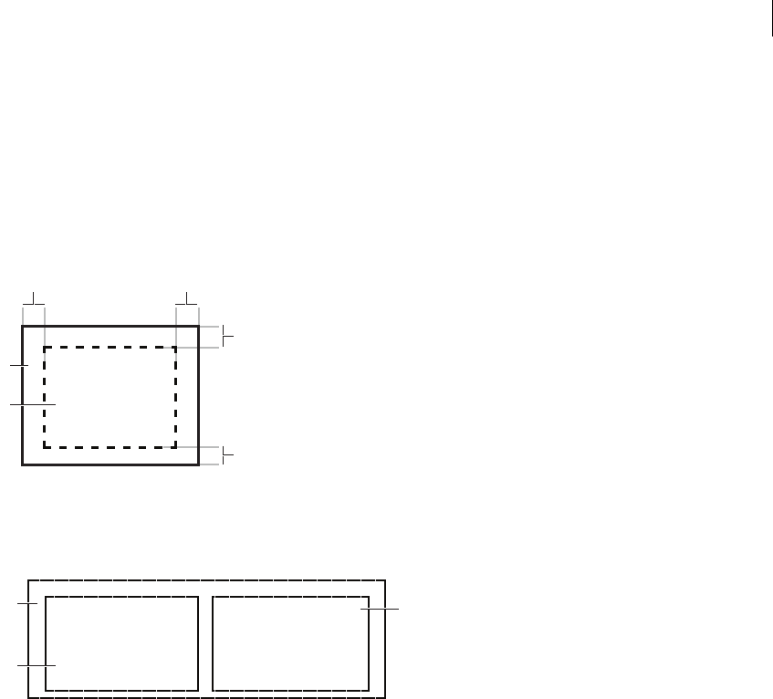
421ADOBE FLEX 3
Adobe Flex 3 Developer Guide
Using containers
The rectangular region of a container encloses its content area, the area that contains its child components. The
size of the region around the content area is defined by the container padding and the width of the container
border. A container has top, bottom, left, and right padding, each of which you can set to a pixel width. A container
also has properties that let you specify the type and pixel width of the border. The following image shows a
container and its content area, padding, and borders:
A. Left padding B. Right padding C. Container D. Content area E. Top padding F. Bottom padding
Although you can create an entire Flex application by using a single container, typical applications use multiple
containers. For example, the following image shows an application that uses three layout containers:
A. Parent HBox layout container B. Child VBox layout container
In this example, the two VBox (vertical box) layout containers are nested within an HBox (horizontal box) layout
container and are referred to as children of the HBox container.
The HBox container arranges its children in a single horizontal row and oversees the sizing and positioning
characteristics of the VBox containers. For example, you can control the distance, or gap, between children in a
container by using the horizontalGap and verticalGap properties.
A
D
C
F
E
B
Components
Components
A
B
B
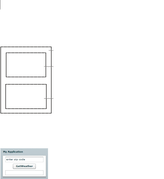
CHAPTER 13
422
A VBox container arranges its children in a single vertical stack, or column, and oversees the layout of its own
children. The following image shows the preceding example with the outermost container changed to a VBox
layout container:
A. Parent VBox layout container B. Child VBox layout container
In this example, the outer container is a VBox container, so it arranges its children in a vertical column.
The primary use of a layout container is to arrange its children, where the children are either controls or other
containers. The following image shows a simple VBox container that has three child components:
In this example, a user enters a ZIP code into the TextInput control, and then clicks the Button control to see the
current temperature for the specified ZIP code in the TextArea control.
Components
Components
A
B
B
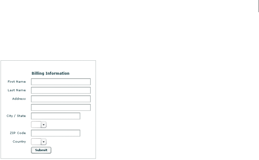
423ADOBE FLEX 3
Adobe Flex 3 Developer Guide
Flex supports form-based applications through its Form layout container. In a Form container, Flex can automat-
ically align labels, uniformly size TextInput controls, and display input error notifications. The following image
shows a Form container:
Form containers can take advantage of the Flex validation mechanism to detect input errors before the user
submits the form. By detecting the error, and letting the user correct it before submitting the form to a server, you
eliminate unnecessary server connections. The Flex validation mechanism does not preclude you from
performing additional validation on the server. For more information on Form containers, see “Form,
FormHeading, and FormItem layout containers” on page 484. For more information on validators, see “Validating
Data” on page 1267.
CHAPTER 13
424
Navigator containers, such as the TabNavigator and Accordion containers, have built-in navigation controls that
let you organize information from multiple child containers in a way that makes it easy for a user to move through
it. The following image shows an Accordion container:
A. Accordion buttons
You use the Accordion buttons to move among the different child containers. The Accordion container defines a
sequence of child panels, but displays only one panel at a time. To navigate a container, the user clicks on the
navigation button that corresponds to the child panel that they want to access.
Accordion containers support the creation of multistep procedures. The preceding image shows an Accordion
container that defines four panels of a complex form. To complete the form, the user enters data into all four
panels. Accordion containers let users enter information in the first panel, click the Accordion button to move to
the second panel, and then move back to the first if they want to edit the information. For more information, see
“Accordion navigator container” on page 538.
425ADOBE FLEX 3
Adobe Flex 3 Developer Guide
Flex containers
The following table describes the Flex containers:
Container Type Description For more information
Accordion Navigator Organizes information in a series of child panels,
where one panel is active at any time.
“Accordion navigator container” on page 538
Application
ControlBar
Layout Holds components that provide global naviga-
tion and application commands. Can be docked
at the top of an Application container.
“ApplicationControlBar layout container” on
page 479
Box (HBox and VBox) Layout Displays content in a uniformly spaced row or
column. An HBox container horizontally aligns
its children; a VBox container vertically aligns its
children.
“Box, HBox, and VBox layout containers” on
page 476
Canvas Layout Defines a container in which you must explicitly
position its children.
“Canvas layout container” on page 472
ControlBar Layout Places controls at the lower edge of a Panel or
TitleWindow container.
“ControlBar layout container” on page 478
DividedBox (HDivid-
edBox and VDivid-
edBox)
Layout Lays out its children horizontally or vertically,
much like a Box container, except that it inserts
an adjustable divider between the children.
“DividedBox, HDividedBox, and VDividedBox
layout containers” on page 481
Form Layout Arranges its children in a standard form format. “Form, FormHeading, and FormItem layout
containers” on page 484
Grid Layout Arranges children as rows and columns of cells,
much like an HTML table.
“Grid layout container” on page 504
Panel Layout Displays a title bar, a caption, a border, and its
children.
“Panel layout container” on page 509
TabNavigator Navigator Displays a container with tabs to let users switch
between different content areas.
“TabNavigator container” on page 535
Tile Layout Defines a layout that arranges its children in
multiple rows or columns.
“Tile layout container” on page 513
TitleWindow Layout Displays a popup window that contains a title
bar, a caption, border, a close button, and its
children. The user can move the container.
“TitleWindow layout container” on page 516
ViewStack Navigator Defines a stack of containers that displays a
single container at a time.
“ViewStack navigator container” on page 529
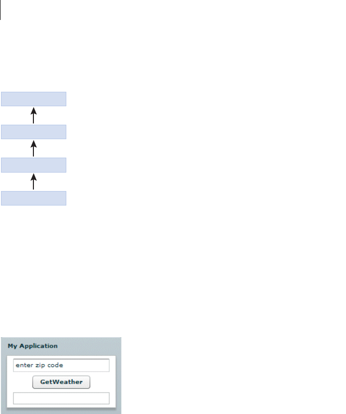
CHAPTER 13
426
Class hierarchy for containers
Flex containers are implemented as a hierarchy in an ActionScript class library, as the following image shows:
All containers are derived from the ActionScript classes Sprite, UIComponent, and Container, and therefore
inherit the properties, methods, styles, effects, and events of their superclasses. Some containers are subclasses of
other containers; for example, the ApplicationControlBar is a subclass of the ControlBar container. For complete
reference information, see the Adobe Flex Language Reference.
Container example
The following image shows a Flex application that uses a Panel container with three child controls, where the
Panel container lays out its children vertically:
The following MXML code creates this example:
<?xml version="1.0"?>
<!-- containers\intro\Panel3Children.mxml -->
<mx:Application xmlns:mx="http://www.adobe.com/2006/mxml">
<mx:Panel title="My Application"
layout="vertical" horizontalAlign="center"
paddingLeft="10" paddingRight="10"
paddingTop="10" paddingBottom="10">
Sprite
UIComponent
Container
All Containers
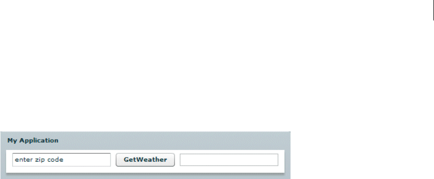
427ADOBE FLEX 3
Adobe Flex 3 Developer Guide
<mx:TextInput id="myinput" text="enter zip code"/>
<mx:Button id="mybutton" label="GetWeather"/>
<mx:TextArea id="mytext" height="20"/>
</mx:Panel>
</mx:Application>
The following image shows the preceding example implemented by using a Panel container with a horizontal
layout:
The only difference between these examples is the container type and the increased width of the Application
container caused by the horizontal layout, as the following code shows:
<?xml version="1.0"?>
<!-- containers\intro\Panel3ChildrenHoriz.mxml -->
<mx:Application xmlns:mx="http://www.adobe.com/2006/mxml">
<mx:Panel title="My Application"
layout="horizontal"
paddingLeft="10" paddingRight="10"
paddingTop="10" paddingBottom="10">
<mx:TextInput id="myinput" text="enter zip code"/>
<mx:Button id="mybutton" label="GetWeather"/>
<mx:TextArea id="mytext" height="20"/>
</mx:Panel>
</mx:Application>
To actually retrieve weather information, you must set up a web service, pass it the entered ZIP code from a click
event, and use the returned information to populate the TextArea control.
Using container events
All containers and components support events.
Event overview
The following events are dispatched only by containers:
•childAdd Dispatched after a child is added to the container.
•childRemove Dispatched before a child is removed from the container.
•childIndexChange Dispatched after a child’s index in the container has changed.
•scroll Dispatched when the user manually scrolls the container.

CHAPTER 13
428
The first three events are dispatched for each of the container’s children, and the last is dispatched when the
container scrolls. For detailed information on these events, see Container in the Adobe Flex Language Reference.
The following events are dispatched only by Application containers:
•applicationComplete Dispatched after the application has been initialized, processed by the Layout-
Manager, and attached to the display list. This is the last event dispatched during an application’s startup sequence.
It is later than the application’s creationComplete event, which gets dispatched before the preloader has been
removed and the application has been attached to the display list.
•error Dispatched when an uncaught error occurs anywhere in the application.
The following events are dispatched by all components after they are added to or removed from a container:
•add Dispatched by a component after the component has been added to its container and the parent and the
child are in a consistent state. This event is dispatched after the container has dispatched the childAdd event and
all changes that need to be made as result of the addition have happened.
•remove Dispatched by a component after the component has been removed from its parent container. This
event is dispatched after the container has dispatched the childRemove event and all changes that need to be
made as result of the removal have happened.
Several events are dispatched for all components, but need special consideration for containers, particularly
navigator containers such as TabNavigator, where some children might not be created when the container is
created. These events include the following:
•preinitialize Dispatched when the component has been attached to its parent container, but before the
component has been initialized, or any of its children have been created. In most cases, this event is dispatched
too early for an application to use to configure a component.
•initialize Dispatched when a component has finished its construction and its initialization properties
have been set. At this point, all of the component’s immediate children have been created (they have at least
dispatched their preinitialize event), but they have not been laid out. Exactly when initialize events are
dispatched depends on the container’s creation policy.
•creationComplete Dispatched when the component, and all of its child components, and all of their
children, and so on have been created, laid out, and are visible.
For information on the initialize and creationComplete events, see “About the initialize and creationCom-
plete events” on page 429. For information on the remaining events, see Container in the Adobe Flex Language
Reference.

429ADOBE FLEX 3
Adobe Flex 3 Developer Guide
About the creation policy
Containers have a creationPolicy property that specifies when its children are created. By default, containers
have a creation policy of ContainerCreationPolicy.AUTO, which means that the container delays creating
descendants until they are needed, a process which is known as deferred instantiation. (A container’s default
creation policy is derived from its parent’s instantiation policy, and the Application container has a default policy
of ContainerCreationPolicy.AUTO.)
An auto creation policy produces the best startup time because fewer components are created initially. For
navigator containers such as the ViewStack, TabNavigator, and Accordion, an ContainerCreationPolicy.AUTO
creation policy means that the container creates its direct children immediately, but waits to create the descen-
dants of each child until the child needs to be displayed. As a result, only the initially required child or children of
a container get processed past the preinitialization stage.
A creation policy of ContainerCreationPolicy.ALL requires all of a container’s children to be fully created and
initialized before the container is initialized. For detailed information on creation policies, see “Improving Startup
Performance” on page 91 in Building and Deploying Adobe Flex 3 Applications.
About the initialize and creationComplete events
Flex dispatches the initialize event for a container after it attaches all the container’s direct child controls and
the container’s initially required children have dispatched a preinitialize event.
When a container or control dispatches the initialize event, its initial properties have been set, but its width
and height have not yet been calculated, and its position has not been calculated. The initialize event is useful
for configuring a container’s children. For example, you can use the a container’s initialize event to program-
matically add children or set a container scroll bar’s styles. You can use a container or component’s initialize
event to initialize the data provider for a control.
Flex dispatches the creationComplete event for a container when those children that are initially required are
fully processed and drawn on the screen, including all required children of the children and so on. Create a listener
for the creationComplete event, for example, if you must have the children’s dimensions and positions in your
event handler. Do not use the creationComplete event for actions that set layout properties, as doing so results
in excess processing time.
To better understand the order in which Flex dispatches events, consider the following application outline.
Application
OuterVBox
InnerVBox1
InnerVBoxLabel1
InnerVBox2
InnerVBoxLabel2
The preinitialize, initialize, and creationComplete events for the containers and controls are dispatched
in the following order. The indentation corresponds to the indentation in the previous outline:

CHAPTER 13
430
OuterVBoxpreinitialize
InnerVBox1preinitialize
InnerVBox1Labelpreinitialize
InnerVBox1Labelinitialize
InnerVBox1initialize
InnerVBox2preinitialize
InnerVBox2Labelpreinitialize
InnerVBox2Labelinitialize
InnerVBox2initialize
OuterVBoxinitialize
InnerBox1LabelcreationComplete
InnerVBox2LabelcreationComplete
InnerVBox1creationComplete
InnerVBox2creationComplete
OuterVBoxcreationComplete
Notice that for the terminal controls, such as the Label controls, the controls are preinitialized and then immedi-
ately initialized. For containers, preinitialization starts with the outermost container and works inward on the first
branch, and then initialization works outward on the same branch. This process continues until all initialization
is completed. Then, the creationComplete event is dispatched first by the leaf components, and then by their
parents, and so on until the application dispatches the creationComplete event.
If you change the OuterVBox container to a ViewStack with a creationPolicy property set to auto, the events
would look as follows:
OuterViewStackpreinitialize
InnerVBox1preinitialize
InnerVBox2preinitialize
OuterViewStackinitialize
InnerBox1Labelpreinitialize
InnerBox1Labelinitialize
InnerVBox1initialize
InnerBox1LabelcreationComplete
InnerVBox1creationComplete
OuterViewStackcreationComplete
In this case, the second VBox is preinitialized only, because it does not have to be displayed. Notice that when a
navigator container dispatches the initialize event, its children exist and have dispatched the preinitialize
event, but its children have not dispatched the initialize event because they have not yet created their own
children. For more information on the creationPolicy property, see “Improving Startup Performance” on
page 91 in Building and Deploying Adobe Flex 3 Applications.
The initialize event is useful with a container that is an immediate child of a navigator container with an
ContainerCreationPolicy.AUTO creation policy. For example, by default, when a ViewStack is initialized, the
first visible child container dispatches an initialize event. Then, as the user moves to each additional child of
the container, the event gets dispatched for that child container.
The following example defines an event listener for the initialize event, which is dispatched when the user first
navigates to panel 2 of an Accordion container:
<?xml version="1.0"?>

431ADOBE FLEX 3
Adobe Flex 3 Developer Guide
<!-- containers\intro\AccordionInitEvent.mxml -->
<mx:Application xmlns:mx="http://www.adobe.com/2006/mxml">
<mx:Script>
<![CDATA[
import mx.controls.Alert;
public function pane2_initialize():void {
Alert.show("Pane 2 has been created.");
}
]]>
</mx:Script>
<mx:Accordion width="200" height="100">
<mx:VBox id="pane1" label="Pane 1">
<mx:Label text="This is pane 1."/>
</mx:VBox>
<mx:VBox id="pane2"
label="Pane 2"
initialize="pane2_initialize();">
<mx:Label text="This is pane 2."/>
</mx:VBox>
</mx:Accordion>
</mx:Application>
Disabling containers
All containers support the enabled property. By default, this property is set to true to enable user interaction
with the container and with the container’s children. If you set enabled to false, Flex dims the color of the
container and of all of its children, and blocks user input to the container and to all of its children.
Using the Panel container
One container that you often use in a Flex application is the Panel container. The Panel container consists of a title
bar, a caption, a status message, a border, and a content area for its children. Typically, you use a Panel container
to wrap self-contained application modules. For example, you can define several Panel containers in your appli-
cation where one Panel container holds a form, a second holds a shopping cart, and a third holds a shopping
catalog. The Flex RichTextEditor control is a Panel control that contains a TextArea control and a ControlBar
control that has editing controls.
CHAPTER 13
432
The following image shows a Panel container with a Form container as its child:
For more information on the Panel container, see “Panel layout container” on page 509.
You can also define a ControlBar control as part of a Panel container. A ControlBar control defines an area at the
lower edge of the Panel container, below any children in the Panel container.
You can use the ControlBar container to hold components that might be shared by the other children in the Panel
container, or for controls that operate on the content of the Panel container. For example, you can use the
ControlBar container to display the subtotal of a shopping cart, where the shopping cart is defined in the Panel
container. For a product catalog, the ControlBar container can hold the Flex controls to specify quantity and to
add an item to a shopping cart. For more information on the ControlBar container, see “ControlBar layout
container” on page 478.
Defining a default button
You use the defaultButton property of a container to define a default Button control within a container. Pressing
the Enter key while focus is on any control activates the Button control as if it was explicitly selected.
For example, a login form displays TextInput controls for a user name and password and a submit Button control.
Typically, the user types a user name, tabs to the password field, types the password, and presses the Enter key to
submit the login information without explicitly selecting the Button control. To define this type of interaction, set
the defaultButton property of the Form control to the id of the submit Button control, as the following example
shows:
433ADOBE FLEX 3
Adobe Flex 3 Developer Guide
<?xml version="1.0"?>
<!-- containers\intro\ContainerDefaultB.mxml -->
<mx:Application xmlns:mx="http://www.adobe.com/2006/mxml">
<mx:Script>
<![CDATA[
public function submitLogin():void {
text1.text="You just tried to log in.";
}
]]>
</mx:Script>
<mx:Panel title="Default Button Example">
<mx:Form defaultButton="{mySubmitBtn}">
<mx:FormItem label="Username:">
<mx:TextInput id="username" width="100"/>
</mx:FormItem>
<mx:FormItem label="Password:">
<mx:TextInput id="password" width="100" displayAsPassword="true"/>
</mx:FormItem>
<mx:FormItem>
<mx:Button id="mySubmitBtn" label="Login" click="submitLogin();"/>
</mx:FormItem>
</mx:Form>
<mx:Text id="text1" width="150"/>
</mx:Panel>
</mx:Application>
Note: The Enter key has a special purpose in the ComboBox control. When the drop-down list of a ComboBox control
is open, pressing Enter selects the currently highlighted item in the ComboBox control; it does not activate the default
button. Also, when the cursor is in a TextArea control, pressing Enter adds a newline; it does not activate the default
button.
Using scroll bars
Flex containers support scroll bars, which let you display an object that is larger than the available screen space or
display more objects than fit in the current size of the container, as the following image shows:
A. Image at full size B. Image in an HBox container
A B

CHAPTER 13
434
In this example, you use an HBox container to let users scroll an image, rather than rendering the complete image
at its full size:
<?xml version="1.0"?>
<!-- containers\intro\HBoxScroll.mxml -->
<mx:Application xmlns:mx="http://www.adobe.com/2006/mxml">
<mx:HBox width="75" height="75">
<mx:Image source="@Embed(source='assets/logo.jpg')"/>
</mx:HBox>
</mx:Application>
In this example, you explicitly set the size of the HBox container to 75 by 75 pixels, a size smaller than the imported
image. If you omit the sizing restrictions on the HBox container, it attempts to use its default size, which is a size
large enough to hold the image.
By default, Flex draws scroll bars only when the contents of a container are larger than that container. To force the
container to draw scroll bars, you can set the horizontalScrollPolicy and verticalScrollPolicy
properties to on.
The following example creates an HBox container with scroll bars even though the image inside is large enough
to display fully without them:
<?xml version="1.0"?>
<!-- containers\intro\HBoxScrollOn.mxml -->
<mx:Application xmlns:mx="http://www.adobe.com/2006/mxml">
<mx:HBox horizontalScrollPolicy="on" verticalScrollPolicy="on">
<mx:Image source="@Embed(source='assets/logo.jpg')"/>
</mx:HBox>
</mx:Application>
Using container scroll properties
The following container properties and styles control scroll bar appearance and behavior:
•The horizontalScrollPolicy and verticalScrollPolicy properties control the display of scroll bars.
By default, both properties are set to auto, which configures Flex to include scroll bars only when necessary. You
can set these properties to on to configure Flex to always include scroll bars, or set the properties to off to
configure Flex to never include scroll bars. In ActionScript, you can use constants in the ScrollPolicy class, such
as ScrollPolicy.ON, to represent these values.
•The horizontalLineScrollSize and verticalLineScrollSize properties determine how many pixels to
scroll when the user selects the scroll bar arrows. The verticalLineScrollSize property also controls the
amount of scrolling when using the mouse wheel. The default value is 5 pixels.
•The horizontalPageScrollSize and verticalPageScrollSize properties determine how many pixels to
scroll when the user selects the scroll bar track. The default value is 20 pixels.

435ADOBE FLEX 3
Adobe Flex 3 Developer Guide
Note: If the clipContent property is false, a container lets its child extend past its boundaries. Therefore, no scroll
bars are necessary, and Flex never displays them, even if you set horizontalScrollPolicy and
verticalScrollPolicy to on.
Scroll bar layout considerations
Your configuration of scroll bars can affect the layout of your application. For example, if you set the
horizontalScrollPolicy and verticalScrollPolicy properties to on, the container always includes scroll
bars, even if they are not necessary. Each scroll bar is 16 pixels wide. Therefore, turning them on when they are
not needed is similar to increasing the size of the right and bottom padding of the container by 16 pixels.
If you keep the default values of auto for the horizontalScrollPolicy and verticalScrollPolicy
properties, Flex lays out the application just as if the properties are set to off. That is, the scroll bars are not
counted as part of the layout.
If you do not keep this behavior in mind, your application might have an inappropriate appearance. For example,
if you have an HBox container that is 30 pixels high and 100 pixels wide and has two buttons that are each 22 pixels
high and 40 pixels wide, the children are contained fully inside the HBox container, and no scroll bars appear.
However, if you add a third button, the children exceed the width of the HBox container, and Flex adds a
horizontal scroll bar at the bottom of the container. The scroll bar is 16 pixels high, which reduces the height of
the content area of the container from 30 pixels to 14 pixels. This means that the Button controls, which are 22
pixels high, are too tall for the HBox, and Flex, by default, adds a vertical scroll bar.
Controlling scroll delay and interval
Scroll bars have two styles that affect how they scroll:
•The repeatDelay style specifies the number of milliseconds to wait after the user selects a scroll button
before repeating scrolling.
•The repeatInterval style specifies the number of milliseconds to wait between each repeated scroll while
the user keeps the scroll arrows selected.
These settings are styles of the scroll bar subcontrol, not of the container, and, therefore, require a different
treatment than properties such as horizontalScrollPolicy. The following example sets the scroll policy
consistently for all scroll bars in the application:
<?xml version="1.0"?>
<!-- containers\intro\HBoxScrollDelay.mxml -->
<mx:Application xmlns:mx="http://www.adobe.com/2006/mxml">
<mx:Style>
HScrollBar, VScrollBar {
repeatDelay: 2000;
repeatInterval:1000;

CHAPTER 13
436
}
</mx:Style>
<mx:HBox id="hb1" width="75" height="75">
<mx:Image source="@Embed(source='assets/logo.jpg')"/>
</mx:HBox>
</mx:Application>
This example results in the same scrollable logo as shown in “Using scroll bars” on page 433, but the scroll bars
behave differently. When the user clicks and holds the mouse button down over any of the scroll bar arrows or the
scroll bar track, the image initially scrolls once, waits two seconds, and then scrolls at a rate of one line or page a
second.
To set a style on a single scroll bar, use a line such as the following in the event listener for the initialize event
for the application or the control with the scroll bar:
ScrollBar(hb1.horizontalScrollBar).setStyle("repeatDelay", 2000);
In this case, hb1 is an HBox control. All containers have horizontalScrollBar and verticalScrollBar
properties that represent the container’s ScrollBar subcontrols, if they exist. You must cast these properties to the
ScrollBar class, because their type is the IScrollBar interface, not the ScrollBar class.
Using Flex coordinates
Adobe Flash and Flex support three coordinate systems for different purposes:
•global
•local
•content
You can use Flex properties and methods to convert between coordinate systems.
437ADOBE FLEX 3
Adobe Flex 3 Developer Guide
About the coordinate systems
The following table describes the coordinate systems:
Coordinate
system
Description
global Coordinates are relative to the upper-left corner of the Stage in Adobe Flash Player and Adobe® AIR™, that is, the outer-
most edge of the application.
The global coordinate system provides a universal set of coordinates that are independent of the component context.
Uses for this coordinate system include determining distances between objects and as an intermediate point in
converting between coordinates relative to a subcontrol into coordinates relative to a parent control.
The MouseEvent class includes stageX and stageY properties that are in the global coordinate system.
local Coordinates are relative to the upper-left corner of the component.
Flex uses the local coordinate system for mouse pointer locations; all components have mouseX and mouseY proper-
ties that use the local coordinate system.
The MouseEvent class includes localX and localY properties that are in the local coordinate system. Also, the Drag
Manager uses local coordinates in drag-and-drop operations. The doDrag() method’s xOffset and yOffset prop-
erties, for example, are offsets relative to the local coordinates.
content Coordinates are relative to the upper-left corner of the component’s content. Unlike the local and global coordinates,
the content coordinates include all of the component’s content area, including any regions that are currently clipped
and must be accessed by scrolling the component. Thus, if you scrolled down a Canvas container by 100 pixels, the
upper-left corner of the visible content is at position 0, 100 in the content coordinates.
You use the content coordinate system to set and get the positions of children of a container that uses absolute posi-
tioning. (For more information on absolute positioning, see “About component positioning” on page 187.)
The UIComponent contentMouseX and contentMouseY properties report the mouse pointer location in the
content coordinate system.
CHAPTER 13
438
The following image shows these coordinate systems and how they relate to each other.
A. Content bounds B. Component bounds C. Stage bounds
Using coordinate properties and methods
In some cases, you have to convert positions between coordinate systems. Examples where you convert between
coordinates include the following:
•The MouseEvent class has properties that provide the mouse position in the global coordinate system and the
local coordinates of the event target. You use the content coordinates to specify the locations in a Canvas
container, or Application or Panel container that uses absolute positioning. To determine the location of the
mouse event within the Canvas container contents, not just the visible region, you must determine the position in
the content coordinate system.
•Custom drag-and-drop handlers might have to convert between the local coordinate system and the content
coordinate system when determining an object-specific drag action; for example, if you have a control with scroll
bars and you want to know the drag (mouse) location over the component contents. The example in “Example:
Using the mouse position in a Canvas container” on page 439 shows this use.
•Custom layout containers, where you include both visual elements, such as scroll bars or dividers, and content
elements. For example, if you have a custom container that draws lines between its children, you have to know
where each child is in the container’s content coordinates to draw the lines.
Often, you use mouse coordinates in event handlers; when you do, you should keep the following considerations
in mind:
A
B
C
content 0, 0
local 0, 0
global 0, 0
439ADOBE FLEX 3
Adobe Flex 3 Developer Guide
•When you handle mouse events, it is best to use the coordinates from the MouseEvent object whenever
possible, because they represent the mouse coordinates at the time the event was generated. Although you can use
the container’s contentMouseX and contentMouseY properties to get the mouse pointer locations in the content
coordinate system, you should, instead, get the local coordinate values from the event object and convert them to
the content coordinate system.
•When you use local coordinates that are reported in an event object, such as the MouseEvent localX and
localY properties, you must remember that the event properties report the local coordinates of the mouse relative
to the event target. The target component can be a subcomponent of the component in which you determine the
position, such as a UITextField inside a Button component, not the component itself. In such cases, you must
convert the local coordinates into the global coordinate system first, and then convert the global coordinates into
the content coordinates container.
All Flex components provide two read-only properties and six methods that enable you to use and convert
between coordinate systems. The following table describes these properties and methods:
Example: Using the mouse position in a Canvas container
The following example shows the use of the localToGlobal() and globalToContent() methods to determine
the location of a mouse pointer within a Canvas container that contains multiple child Canvas containers.
Property or method Description
contentMouseX Returns the x position of the mouse, in the content coordinates of the component.
contentMouseY Returns the y position of the mouse, in the content coordinates of the component.
contentToGlobal
(point:Point):Point
Converts a Point object with x and y coordinates from the content coordinate system to the global
coordinate system.
contentToLocal
(point:Point):Point
Converts a Point object from the content coordinate system to the local coordinate system of the
component.
globalToContent
(point:Point):Point
Converts a Point object from the global coordinate system to the content coordinate system of the
component.
globalToLocal
(point:Point):Point
Converts a Point object from the global coordinate system to the local coordinate system of the
component.
localToContent
(point:Point):Point
Converts a Point object from the local coordinate system to the content coordinate system of the
component.
localToGlobal
(point:Point):Point
Converts a Point object from the local coordinate system to the global coordinate system.

CHAPTER 13
440
This example is somewhat artificial, in that production code would use the MouseEvent class stageX and stageY
properties, which represent the mouse position in the global coordinate system. The example uses the localX and
localY properties, instead, to show how you can convert between local and content coordinates, including how
first converting to using the global coordinates ensures the correct coordinate frame of reference.
<?xml version="1.0"?>
<!-- containers\intro\MousePosition.mxml -->
<mx:Application xmlns:mx="http://www.adobe.com/2006/mxml"
backgroundColor="white">
<mx:Script>
<![CDATA[
import mx.controls.Alert;
// Handle the mouseDown event generated
// by clicking in the application.
private function handleMouseDown(event:MouseEvent):void {
// Convert the mouse position to global coordinates.
// The localX and localY properties of the mouse event contain
// the coordinates at which the event occurred relative to the
// event target, typically one of the
// colored internal Canvas controls.
// A production version of this example could use the stageX
// and stageY properties, which use the global coordinates,
// and avoid this step.
// This example uses the localX and localY properties only to
// illustrate conversion between different frames of reference.
var pt:Point = new Point(event.localX, event.localY);
pt = event.target.localToGlobal(pt);
// Convert the global coordinates to the content coordinates
// inside the outer c1 Canvas control.
pt = c1.globalToContent(pt);
// Figure out which quadrant was clicked.
var whichColor:String = "border area";
if (pt.x < 150) {
if (pt.y < 150)
whichColor = "red";
else
whichColor = "blue";
}
else {
if (pt.y < 150)
whichColor = "green";
else
whichColor = "magenta";
}
Alert.show("You clicked on the " + whichColor);
}
]]>
</mx:Script>

441ADOBE FLEX 3
Adobe Flex 3 Developer Guide
<!-- Canvas container with four child Canvas containers -->
<mx:Canvas id="c1"
borderStyle="none"
width="300" height="300"
mouseDown="handleMouseDown(event);">
<mx:Canvas
width="150" height="150"
x="0" y="0"
backgroundColor="red">
<mx:Button label="I'm in Red"/>
</mx:Canvas>
<mx:Canvas
width="150" height="150"
x="150" y="0"
backgroundColor="green">
<mx:Button label="I'm in Green"/>
</mx:Canvas>
<mx:Canvas
width="150" height="150"
x="0" y="150"
backgroundColor="blue">
<mx:Button label="I'm in Blue"/>
</mx:Canvas>
<mx:Canvas
width="150" height="150"
x="150" y="150"
backgroundColor="magenta">
<mx:Button label="I'm in Magenta"/>
</mx:Canvas>
</mx:Canvas>
</mx:Application>
Creating and managing component instances at run
time
You typically use MXML to lay out the user interface of your application, and use ActionScript for event handling
and run-time control of the application. You can also use ActionScript to create component instances at run time.
For example, you could use MXML to define an empty Accordion container and use ActionScript to add panels
to the container in response to user actions.

CHAPTER 13
442
About the display list and container children
Flash Player maintains a tree of visible (or potentially visible) objects that make up your application. The root of
the tree is the Application object, and child containers and components are branches and leaf nodes of the tree.
That tree is known as the display list. When you add child components to a container or remove child components
from a container, you are adding and removing them from the display list. You can also change their relative
positions by changing their positions in the display list.
Although the display list is a tree rooted at the top of the application, when you manipulate a container’s children
in ActionScript by using the container’s methods and properties, you only access the container’s direct children,
and you treat them as items in a list with an index that starts at 0 for the container’s first child in the display list.
The Container class includes the numChildren property, which contains a count of the number of direct child
components that the container has in the display list. The following HBox container, for example, includes two
child components, so the value of its numChildren property is 2:
<mx:HBox id="myContainer">
<mx:Button click="clickHandler();"/>
<mx:TextInput/>
</mx:HBox>
You can access and modify a container’s child components at run time by using the addChild(), addChildAt(),
getChildren(), getChildAt(), getChildByName(), removeAllChildren(), removeChild(), and
removeChildAt() methods of the Container class. For example, you can iterate over all of the child componens
of a container, as the following example shows:
private function clickHandler():void {
var numChildren:Number = myContainer.numChildren;
for (var i:int = 0; i < numChildren; i++) {
trace(myContainer.getChildAt(i));
}
}
The Container class also defines the rawChildren property that contains the full display list of all of the children
of a container. This list includes all the container’s children, plus the DisplayObjects that implement the
container’s chrome (display elements), such as its border and the background image. For more information, see
“Accessing display-only children” on page 443.
Obtaining the number of child components in a container or application
To get the number of direct child components in a container, get the value of the container’s numChildren
property. The following application gets the number of children in the application and a VBox container. The
VBox control has five label controls, and therefore has five children. The Application container has the VBox and
Button controls as its children, and therefore has two children.

443ADOBE FLEX 3
Adobe Flex 3 Developer Guide
<?xml version="1.0"?>
<!-- containers\intro\VBoxNumChildren.mxml -->
<mx:Application xmlns:mx="http://www.adobe.com/2006/mxml">
<mx:Script>
<![CDATA[
// Import the Alert class.
import mx.controls.Alert;
public function calculateChildren():void {
var myText:String = new String();
myText="The VBox container has " +
myVBox.numChildren + " children.";
myText+="\nThe Application has " +
numChildren + " children.";
Alert.show(myText);
}
]]>
</mx:Script>
<mx:VBox id="myVBox" borderStyle="solid">
<mx:Label text="This is label 1."/>
<mx:Label text="This is label 2."/>
<mx:Label text="This is label 3."/>
<mx:Label text="This is label 4."/>
<mx:Label text="This is label 5."/>
</mx:VBox>
<mx:Button label="Show Children" click="calculateChildren();"/>
</mx:Application>
In the main MXML application file, the file that contains the <mx:Application> tag, the current scope is always
the Application object. Therefore, the reference to the numChildren property without an object prefix refers to
the numChildren property of the Application object. For more information on accessing the root application, see
“About scope” on page 47.
Accessing display-only children
The numChildren property and getChildAt() method let you count and access only child components. Also,
the container may contain style elements and skins, such as the border and background. The container’s
rawChildren property lets you access all children of a container, including the component “content children” and
the skin and style “display children.” The object returned by the rawChildren property implements the IChildList
interface. You then use methods and properties of this interface, such as getChildAt(), to access and manipulate
all the container’s children.
Creating and removing components at run time
To create a component instance at run time, you define it, set any properties, and then add it as a child of a parent
container by calling the addChild() method on the parent container. This method has the following signature:
addChild(child:DisplayObject):DisplayObject
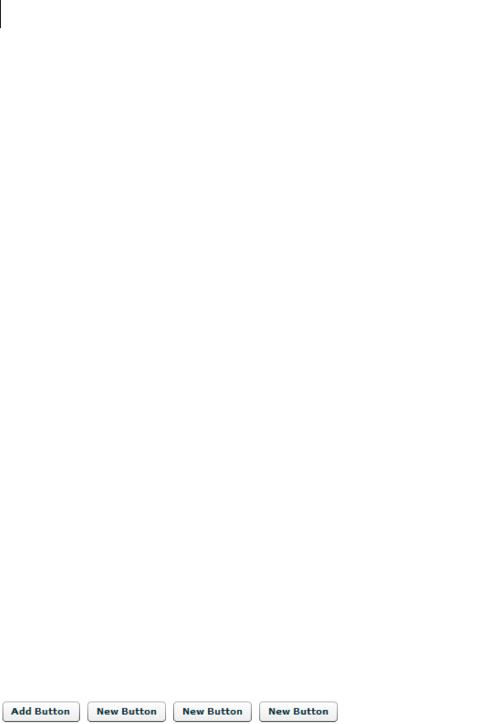
CHAPTER 13
444
The child argument specifies the component to add to the container.
Note: Although the child argument of the method is specified as type DisplayObject, the argument must implement
the IUIComponent interface to be added as a child of a container. All Flex components implement this interface.
For example, the following application creates an HBox container with a Button control called myButton:
<?xml version="1.0"?>
<!-- containers\intro\ContainerAddChild.mxml -->
<mx:Application xmlns:mx="http://www.adobe.com/2006/mxml">
<mx:Script>
<![CDATA[
import mx.controls.Button;
public function addButton():void {
var myButton:Button = new Button();
myButton.label = "New Button";
myHBox.addChild(myButton);
}
]]>
</mx:Script>
<mx:HBox id="myHBox" initialize="addButton();"/>
</mx:Application>
This example creates the control when the application is loaded rather than in response to any user action.
However, you could add a new button when the user presses an existing button, as the following example shows:
<?xml version="1.0"?>
<!-- containers\intro\ContainerAddChild2.mxml -->
<mx:Application xmlns:mx="http://www.adobe.com/2006/mxml"
horizontalAlign="left">
<mx:Script>
<![CDATA[
import mx.controls.Button;
public function addButton():void {
var myButton:Button = new Button();
myButton.label = "New Button";
myHBox.addChild(myButton);
}
]]>
</mx:Script>
<mx:HBox id="myHBox">
<mx:Button label="Add Button" click="addButton();"/>
</mx:HBox>
</mx:Application>
The following image shows the resulting application after the user presses the original (leftmost) button three
times:

445ADOBE FLEX 3
Adobe Flex 3 Developer Guide
You use the removeChild() method to remove a control from a container. Flex sets the parent property of the
removed child. If the child is no longer referenced anywhere else in your application after the call to the
removeChild() method, it gets destroyed by a garbage collection process. The following example removes a
button from the application when the user presses it:
<?xml version="1.0"?>
<!-- containers\intro\ContainerRemoveChild.mxml -->
<mx:Application xmlns:mx="http://www.adobe.com/2006/mxml">
<mx:Script>
<![CDATA[
public function removeButton():void {
myHBox.removeChild(myButton);
}
private function resetApp():void {
if (myHBox.numChildren == 0) {
myHBox.addChild(myButton);
}
}
]]>
</mx:Script>
<mx:HBox id="myHBox">
<mx:Button id="myButton"
label="Remove Me"
click="removeButton();"
/>
</mx:HBox>
<mx:Button label="Reset" click="resetApp();"/>
</mx:Application>
For additional methods that you can use with container children, see the Container class in the Adobe Flex
Language Reference.
Example: Creating and removing a child of a VBox container
The following example uses MXML to define a VBox container that contains two Button controls. You use one
Button control to add a CheckBox control to the VBox container, and one Button control to delete it.
<?xml version="1.0"?>
<!-- containers\intro\ContainerComponentsExample.mxml -->
<mx:Application xmlns:mx="http://www.adobe.com/2006/mxml">
<mx:Script>
<
CHAPTER 13
446
public function addCB():void {
// Make sure the check box isn't being displayed.
if(checkBoxDisplayed==false){
// Create the check box if it does not exist.
if (!myCheckBox) {
myCheckBox = new CheckBox();
}
// Add the check box.
myCheckBox.label = "New CheckBox";
myVBox.addChild(myCheckBox);
checkBoxDisplayed=true;
}
}
public function delCB():void {
// Make sure a CheckBox control exists.
if(checkBoxDisplayed){
myVBox.removeChild(myCheckBox);
checkBoxDisplayed=false;
}
}
]]>
</mx:Script>
<mx:VBox id="myVBox">
<mx:Button label="Add CheckBox"
click="addCB();"/>
<mx:Button label="Remove CheckBox"
click="delCB();"/>
</mx:VBox>
</mx:Application>
The following image shows the resulting application after the user presses the Add CheckBox button:
Example: Creating and removing children of an Accordion container
The following example adds panels to and removes them from an Accordion container. The Accordion container
initially contains one panel. Each time you select the Add HBox button, it adds a new HBox container to the
Accordion container.
<?xml version="1.0"?>
<!-- containers\intro\ContainerComponentsExample2.mxml -->
<mx:Application xmlns:mx="http://www.adobe.com/2006/mxml">
<mx:Script>
<
447ADOBE FLEX 3
Adobe Flex 3 Developer Guide
import mx.containers.HBox;
/* Array of created containers. */
private var hBoxes:Array = [];
public function addHB():void {
/* Create new HBox container. */
var newHB:HBox = new HBox();
newHB.label="Label: " + String(hBoxes.length);
/* Add it to the Accordion container, and to the
Array of HBox containers. */
hBoxes.push(myAcc.addChild(newHB));
}
public function delHB():void {
/* If there is at least one HBox container in the Array,
remove it. */
if (hBoxes.length>= 1) {
myAcc.removeChild(hBoxes.pop());
}
}
]]>
</mx:Script>
<mx:VBox>
<mx:Accordion id="myAcc" height="150" width="150">
<mx:HBox label="Initial HBox"/>
</mx:Accordion>
<mx:Button label="Add HBox" click="addHB();"/>
<mx:Button label="Remove HBox" click="delHB();"/>
</mx:VBox>
</mx:Application>
Controlling child order
You can control the order of children by adding them in a specific order. You can also control them as follows:
•By using the addChildAt() method to specify where among the component’s children to add a child
•By using the setChildIndex() method to specify the location of a specific child among a component’s
children in the display list
Note: As with the addChild() method, although the child argument of the addChildAt() method is specified as
type DisplayObject, the argument must implement the IUIComponent interface to be added as a child of a container.
All Flex components implement this interface.

CHAPTER 13
448
The following example modifies the example in “Example: Creating and removing a child of a VBox container”
on page 445. It uses the addChildAt() method to add the CheckBox control as the first child (index 0) of the
VBox. It also has a Reorder children button that uses the setChildIndex() method to move a CheckBox control
down the display list until it is the last the child in the VBox container. Boldface text indicates the lines that are
added to or changed from the previous example.
<?xml version="1.0"?>
<!-- containers\intro\ContainerComponentsReorder.mxml -->
<mx:Application xmlns:mx="http://www.adobe.com/2006/mxml">
<mx:Script>
<
449ADOBE FLEX 3
Adobe Flex 3 Developer Guide
// Increment the checkBoxIndex variable and use it to
// set the index of the check box among the VBox children.
myVBox.setChildIndex(myCheckBox,
myVBox.getChildIndex(myCheckBox) + 1);
}
}
else {
Alert.show("Add the check box before you can move it");
}
}
]]>
</mx:Script>
<mx:VBox id="myVBox">
<mx:Button label="Add CheckBox" click="addCB();"/>
<mx:Button label="Remove CheckBox" click="delCB();"/>
<mx:Button label="Reorder children" click="reorder();"/>
</mx:VBox>
</mx:Application>

CHAPTER 13
450
451
Chapter 14: Application Container
Adobe® Flex® defines a default Application container that lets you start adding content to your application without
having to explicitly define another container.
Flex defines any MXML file that contains an <mx:Application> tag as an Application object. For more infor-
mation, see “About the Application object” on page 457.
The Application container supports an application preloader that uses a progress bar to show the download
progress of an application SWF file. You can override the default progress bar to define your own custom progress
bar. For more information, see “Showing the download progress of an application” on page 462.
Topics
About the Application container . . . . . . . . . . . . . . . . . . . . . . . . . . . . . . . . . . . . . . . . . . . . . . . . . . . . . . . . . . . . . . . . . . 451
About the Application object . . . . . . . . . . . . . . . . . . . . . . . . . . . . . . . . . . . . . . . . . . . . . . . . . . . . . . . . . . . . . . . . . . . . .457
Showing the download progress of an application. . . . . . . . . . . . . . . . . . . . . . . . . . . . . . . . . . . . . . . . . . . . . . . . . . . .462
About the Application container
Flex defines an Application container that serves as the default container for any content that you add to your
application. Flex creates this container from the <mx:Application> tag, which must be the first tag in an MXML
application file. The Application object is the default scope for any ActionScript code in the file, and the
<mx:Application> tag defines the initial size of the application.
Although you may find it convenient to use the Application container as the only container in your application,
usually you explicitly define at least one more container before you add any controls to your application. Often,
you use a Panel container as the first container after the <mx:Application> tag.
The Application container has the following default layout characteristics:
Property Default value
Default size The size of the browser window.
Child alignment Vertical column arrangement of children.
Child horizontal alignment Centered.
Default padding 24 pixels for the top, bottom, left, and right properties.

452 CHAPTER 14
Sizing an Application container and its children
An Application container arranges its children in a single vertical column. You can set the height and width of the
Application container by using explicit pixel values or by using percentage values, where the percentage values are
relative to the size of the browser window. By default, the Application container has a height and width of 100%,
which means that it fills the entire browser window.
The following example sets the size of the Application container to one-half of the width and height of the browser
window:
<?xml version="1.0"?>
<mx:Application xmlns:mx="http://www.adobe.com/2006/mxml" height="50%" width="50%">
...
</mx:Application>
The advantage of using percentages to specify the size is that Flex can resize your application as the user resizes
the browser window. Flex maintains the Application container size as a percentage of the browser window as the
user resizes it.
If you set the width and height properties of the child components MXML tags to percentage values, your
components can also resize as your application resizes, as the following example shows:
<?xml version="1.0"?>
<!-- containers\application\AppSizePercent.mxml -->
<mx:Application xmlns:mx="http://www.adobe.com/2006/mxml"
width="100%" height="100%">
<mx:Panel title="Main Application" width="100%" height="100%">
<mx:HDividedBox width="100%" height="100%">
<mx:TextArea width="50%" height="100%"/>
<mx:VDividedBox width="50%" height="100%">
<mx:DataGrid width="100%" height="25%"/>
<mx:TextArea width="100%" height="75%"/>
</mx:VDividedBox>
</mx:HDividedBox>
</mx:Panel>
</mx:Application>
The following example uses explicit pixel values to size the Application container:
<?xml version="1.0"?>
<!-- containers\application\AppSizePixel.mxml -->
<mx:Application xmlns:mx="http://www.adobe.com/2006/mxml"
height="100" width="150">
<mx:Panel title="Main Application">
<mx:TextInput id="mytext" text="Hello"/>
<mx:Button id="mybutton" label="Get Weather"/>
</mx:Panel>
</mx:Application>
If the children of the Application container are sized or positioned such that some or all of the component is
outside of the visible area of the Application container, Flex adds scroll bars to the container, as the preceding
example shows.

453ADOBE FLEX 3
Adobe Flex 3 Developer Guide
If you want to set a child container to fill the entire Application container, the easiest method is to set the child’s
MXML tag width and height properties to 100% (or, in ActionScript, set the percentWidth and
percentHeight properties to 100), and set the Application container padding to 0. If you base the child
container’s width and height properties on those of the Application container, you must subtract the Application
container’s padding, or your child container will be larger than the available space, and the application will have
scroll bars.
In the following example, the VBox container expands to fill all of the available space, except for the area defined
by the Application container padding:
<?xml version="1.0"?>
<!-- containers\application\AppVBoxSize.mxml -->
<mx:Application xmlns:mx="http://www.adobe.com/2006/mxml"
width="100" height="100">
<mx:VBox width="100%" height="100%" backgroundColor="#A9C0E7">
<!-- ... -->
</mx:VBox>
</mx:Application>
In the following example, the VBox container is larger than the available space within the Application container,
which results in scroll bars:
<?xml version="1.0"?>
<!-- containers\application\AppVBoxSizeScroll.mxml -->
<mx:Application xmlns:mx="http://www.adobe.com/2006/mxml"
width="100" height="100">
<mx:VBox width="200" height="200" backgroundColor="#A9C0E7">
<!-- ... -->
</mx:VBox>
</mx:Application>
In the following example, the Application container has no padding, which lets its child VBox container fill the
entire window:
<?xml version="1.0"?>
<!-- containers\application\AppNoPadding.mxml -->
<mx:Application xmlns:mx="http://www.adobe.com/2006/mxml"
width="100" height="100"
paddingTop="0" paddingBottom="0"
paddingLeft="0" paddingRight="0">
<mx:VBox width="100" height="100" backgroundColor="#A9C0E7">
<!-- ... -->
</mx:VBox>
</mx:Application>
CHAPTER 14
454
Overriding the default Application container styles
By default, the Application container has the following default style properties that define the following visual
aspects of a Flex application and differ from the default container values:
You can override these default values in your application to define your own default style properties.
Changing the Application background
The Application container backgroundGradientAlphas, backgroundGradientColors, and
backgroundImage styles control the container background. By default, these properties define an opaque grey
gradient background.
You specify an image for the application background by using the backgroundImage property. If you set both the
backgroundImage property and the backgroundGradientColors property, Flex ignores
backgroundGradientColors.
Property Default value
backgroundColor The color of the Stage area of Adobe® Flash® Player or Adobe® AIR™, which is visible during application
loading and initialization. This color is also visible if the application background is transparent. The
default value is 0x869CA7.
backgroundGradientAlphas [1.0, 1.0], a fully opaque background.
backgroundGradientColors [0x9CBOBA, 0x68808C], a grey background that is slightly darker at the bottom.
backgroundImage A gradient controlled by the backgroundGradientAlphas and backgroundGradientColors
styles. The default value is mx.skins.halo.ApplicationBackground.
backgroundSize 100%. When you set this property at 100%, the background image takes up the entire Application
container.
horizontalAlign Centered.
paddingBottom 24 pixels.
paddingLeft 24 pixels.
paddingRight 24 pixels.
paddingTop 24 pixels.

455ADOBE FLEX 3
Adobe Flex 3 Developer Guide
You can specify a gradient background for the application in two ways:
1Set the backgroundGradientColors property to two values, as in the following example:
<mx:Application
xmlns:mx="http://www.adobe.com/2006/mxml"backgroundGradientColors="[0x0000FF,
0xCCCCCC]">
Flex calculates the gradient pattern between the two specified values.
2Set the backgroundColor property to the desired value, as in the following example:
<mx:Application xmlns:mx="http://www.adobe.com/2006/mxml"backgroundColor="red">
Flex calculates the gradient pattern between a color slightly darker than red, and a color slightly lighter than
red.
To set a solid background to the application, specify the same two values to the backgroundGradientColors
property, as the following example shows:
<mx:Application
xmlns:mx="http://www.adobe.com/2006/mxml"backgroundGradientColors="[#FFFFFF, #FFFFFF]">
This example defines a solid white background.
The backgroundColor property specifies the background color of the Stage area in Flash Player, which is visible
during application loading and initialization, and a background gradient while the application is running. By
default, the backgroundColor property is set to 0x869CA7, which specifies a dark blue-grey color.
If you use the backgroundGradientColors property to set the application background, you should also set the
backgroundColor property to compliment the backgroundGradientColors property, as the following example
shows:
<mx:Application xmlns:mx="http://www.adobe.com/2006/mxml"
backgroundGradientColors="[0x0000FF, 0xCCCCCC]"
backgroundColor="0x0000FF">
In this example, you use the backgroundGradientColors property to set a gradient pattern from a dark blue to
grey, and the backgroundColor property to set the Stage area in Flash Player to dark blue, which will be visible
during application loading and initialization.
Using the plain style
The Flex default style sheet defines a plain style name that sets all padding to 0 pixels, removes the default
background image, sets the background color to white, and left-aligns the children. The following example shows
how you can set this style:
<mx:Application xmlns:mx="http://www.adobe.com/2006/mxml" styleName="plain">
You can override individual values in the plain setting, as the following example shows:
<mx:Application xmlns:mx="http://www.adobe.com/2006/mxml"styleName="plain"
horizontalAlign="center"/>

CHAPTER 14
456
Overriding styles with the Style tag
You can also use the <mx:Style> tag in your application to specify alternative style values, as the following
example shows:
<?xml version="1.0"?>
<!-- containers\application\AppStyling.mxml -->
<mx:Application xmlns:mx="http://www.adobe.com/2006/mxml">
<!-- Style definition for the entire application. -->
<mx:Style>
Application {
paddingLeft: 10px;
paddingRight: 10px;
paddingTop: 10px;
paddingBottom: 10px;
horizontalAlign: "left";
backgroundImage: "";
backgroundColor: #AAAACC;
}
</mx:Style>
<mx:Panel title="Main Application">
<mx:TextInput id="mytext" text="Hello"/>
<mx:Button id="mybutton" label="Get Weather"/>
</mx:Panel>
</mx:Application>
This example removes the background image, sets all padding to 10 pixels, left-aligns children, and sets the
background color to a light blue.
For more information on using styles, see “Using Styles and Themes” on page 589.
Viewing the application source code
You can use the viewSourceURL property of the Application container to specify a URL to the application’s source
code. If you set this property, Flex adds a View Source menu item to the application’s context menu, which you
open by right-clicking anywhere in your application. Select the View Source menu item to open the URL specified
by the viewSourceURL property in a new browser window.
You mu s t s e t t h e viewSourceURL property by using MXML, not ActionScript, as the following example shows:
<?xml version="1.0"?>
<!-- containers\application\AppSourceURL.mxml -->
<mx:Application xmlns:mx="http://www.adobe.com/2006/mxml"
viewSourceURL="../assets/AppSourceURL.txt">
<mx:Button label="Click Me"/>
</mx:Application>
You typically deploy your source code not as an MXML file, but as a text or HTML file. In this example, the source
code is in the file AppSourceURL.txt. If you use an HTML file to represent your source code, you can add
formatting and coloring to make it easier to read.
457ADOBE FLEX 3
Adobe Flex 3 Developer Guide
Specifying options of the Application container
You can specify several options of the <mx:Application> tag to control your application. The following table
describes these options:
Note: Properties frameRate, pageTitle, preloader, scriptRecursionLimit, and usePreloader, cannot be set in
ActionScript; they must be set in MXML code.
About the Application object
Flex compiles your application into a SWF file that contains a single Application object, defined by the
<mx:Application> tag. In most cases, your Flex application has one Application object. Some applications use
the SWFLoader control to add more applications.
Option Type Description
frameRate Number Specifies the frame rate of the application, in frames per second. The default value is 24.
pageTitle String Specifies a String that appears in the title bar of the browser. This property provides the same
functionality as the HTML <title> tag.
preloader Path Specifies the path of a SWC component class or ActionScript component class that defines a
custom progress bar.
A SWC component must be in the same directory as the MXML file or in the WEB-
INF/flex/user_classes directory of your Flex web application.
For more information, see “Showing the download progress of an application” on page 462.
scriptRecursionLimit Number Specifies the maximum depth of the Flash Player or AIR call stack before Flash Player or AIR
stops. This is essentially the stack overflow limit.
The default value is 1000.
scriptTimeLimit Number Specifies the maximum duration, in seconds, that an ActionScript event listener can execute
before Flash Player or AIR assumes that it has stopped processing and aborts it.
The default value is 60 seconds, which is also the maximum allowable value that you can set.
usePreloader Boolean Specifies whether to disable the application preloader (false) or not (true). The default
value is true. To use the default preloader, your application must be at least 160 pixels wide.
For more information, see “Showing the download progress of an application” on page 462.

CHAPTER 14
458
An Application object has the following characteristics:
•Application objects are MXML files with an <mx:Application> tag.
•Most Flex applications have a single Application object.
•The Application file is the first file loaded.
•An Application object is also a Document object, but a Document object is not always an Application object.
For more information on the Document object, see “About the Document object” on page 458.
•You can refer to the Application object as mx.core.Application.application from anywhere in the Flex
application.
•If you load multiple nested applications by using the SWFLoader control, you can access the scope of each
higher application in the nesting hierarchy by using parentApplication,
parentApplication.parentApplication, and so on.
About the Document object
Flex creates a Document object for every MXML file used in a Flex application. For example, you can have a
document, which is also an Application object, and from there, use other MXML files that define custom controls.
A Document object has the following characteristics:
•All MXML files that a Flex application uses are Document objects, including the Application object’s file.
•Custom ActionScript component files are Document objects.
•The Flex compiler cannot compile a SWF file from a file that does not contain an <mx:Application> tag.
•Documents usually consist of MXML custom controls that you use in your Flex application.
•You can access the scope of a document’s parent document by using parentDocument,
parentDocument.parentDocument, and so on.
•Flex provides a UIComponent.isDocument property so that you can detect if any given object is a Document
object.
Accessing Document and Application object scopes
In your application’s main MXML file, the file that contains the <mx:Application> tag, you can access the
methods and properties of the Application object by using the this keyword. However, in custom ActionScript
and MXML components, event listeners, or external ActionScript class files, Flex executes in the context of those
components and classes, and the this keyword refers to the current Document object and not the Application
object. You cannot refer to a control or method in the application from one of these child documents without
specifying the location of the parent document.

459ADOBE FLEX 3
Adobe Flex 3 Developer Guide
Flex provides the following properties that you can use to access parent documents:
mx.core.Application.application The top-level Application object, regardless of where in the document tree
your object executes.
mx.core.UIComponent.parentDocument The parent document of the current document. You can use
parentDocument.parentDocument to walk up the tree of multiple documents.
mx.core.UIComponent.parentApplication The Application object in which the current object exists. Flex
applications can load applications into applications, therefore, you can access the immediate parent application by
using this property. You can use parentApplication.parentApplication to walk up the tree of multiple appli-
cations.
Using the mx.core.Application.application property
To access properties and methods of the top-level Application object from anywhere in your application, you can
use the application property of the Application class. For example, you define an application that contains the
method, as the following code shows:
<?xml version="1.0"?>
<!-- containers\application\AppDoSomething.mxml -->
<mx:Application xmlns:mx="http://www.adobe.com/2006/mxml"
xmlns:MyComps="myComponents.*"
>
<mx:Script>
<![CDATA[
import mx.controls.Alert;
// Open an Alert control.
public function doSomething():void {
Alert.show("The doSomething() method was called.");
}
]]>
</mx:Script>
<!-- Include the ButtonMXML.mxml component. -->
<MyComps:ButtonMXML/>
</mx:Application>
You can then use the Application.application property in the ButtonMXML.mxml component to reference
the doSomething() method, as the following example shows:
<?xml version="1.0"?>
<!-- containers\application\myComponents\ButtonMXML.mxml -->
<mx:HBox xmlns:mx="http://www.adobe.com/2006/mxml">
<mx:Script>
<![CDATA[
// To refer to the members of the Application class,
// you must import mx.core.Application.
import mx.core.Application;
]]>
</mx:Script>

CHAPTER 14
460
<mx:Button label="MXML Button"
click="Application.application.doSomething();"/>
</mx:HBox>
The application property is especially useful in applications that have one or more custom MXML or Action-
Script components that each use a shared set of data. At the application level, you often store shared information
and provide utility functions that any of the components can access.
For example, suppose that you store the user’s name at the application level and implement a utility function,
getSalutation(), which returns the string “Hi, userName”. The following example MyApplication.mxml file
shows the application source that defines the getSalutation() method:
<?xml version="1.0"?>
<!-- containers\application\AppSalutation.mxml -->
<mx:Application xmlns:mx="http://www.adobe.com/2006/mxml"
xmlns:MyComps="myComponents.*"
>
<mx:Script>
<![CDATA[
public var userName:String="SMG";
public function getSalutation():String {
return "Hi, " + userName;
}
]]>
</mx:Script>
<!-- Include the ButtonGetSalutation.mxml component. -->
<MyComps:ButtonGetSalutation/>
</mx:Application>
To ac cess t h e userName and call the getSalutation() method in your MXML components, you can use the
application property, as the following example from the MyComponent.mxml component shows:
<?xml version="1.0"?>
<!-- containers\application\myComponents\ButtonGetSalutation.mxml -->
<mx:VBox xmlns:mx="http://www.adobe.com/2006/mxml" width="100%" height="100%">
<mx:Script>
<![CDATA[
/* To refer to the members of the Application class,
you must import mx.core.Application. */
import mx.core.Application;
]]>
</mx:Script>
<mx:Label id="myL"/>
<mx:Button label="Click Me"
click="myL.text=Application.application.getSalutation();"/>
</mx:VBox>
In this example, clicking the Button control executes the getSalutation() function to populate the Label
control.

461ADOBE FLEX 3
Adobe Flex 3 Developer Guide
Using the parentDocument property
To access the parent document of an object, you can use the parentDocument property. The parent document is
the object that contains the current object. All classes that inherit from the UIComponent class have a
parentDocument property.
In the following example, the application references the custom AccChildObject.mxml component:
<?xml version="1.0"?>
<!-- containers\application\AppParentDocument.mxml -->
<mx:Application xmlns:mx="http://www.adobe.com/2006/mxml"
xmlns:MyComps="myComponents.*">
<!-- Include the AccChildObject.mxml component. -->
<MyComps:AccChildObject/>
</mx:Application>
In this example, the application is the parent document of the AccChildObject.mxml component. The following
code from the AccChildObject.mxml component uses the parentDocument property to define an Accordion
container that is slightly smaller than the Application container:
<?xml version="1.0"?>
<!-- containers\application\myComponents\AccChildObject.mxml -->
<mx:Accordion xmlns:mx="http://www.adobe.com/2006/mxml"
width="{parentDocument.width*.80}"
height="{parentDocument.height*.50}">
<mx:HBox/>
</mx:Accordion>
You use the parentDocument property in MXML scripts to go up a level in the chain of parent documents. You
can use the parentDocument to walk this chain by using multiple parentDocument properties, as the following
example shows:
parentDocument.parentDocument.doSomething();
The parentDocument property of the Application object is a reference to the application.
The parentDocument is typed as Object so that you can access properties and methods on ancestor Document
objects without casting.
Every UIComponent class has an isDocument property that is set to true if that UIComponent class is a
Document object, and false if it is not.
If a UIComponent class is a Document object, it has a documentDescriptor property. This is a reference to the
descriptor at the top of the generated descriptor tree in the generated Document class.
For example, suppose that AddressForm.mxml component creates a subclass of the Form container to define an
address form, and the MyApp.mxml component creates two instances of it: <AddressForm id="shipping"> and
<AddressForm id="billing">.

CHAPTER 14
462
In this example, the shipping object is a Document object. Its documentDescriptor property corresponds to the
<mx:Form> tag at the top of the AddressForm.mxml file (the definition of the component), while its descriptor
corresponds to the <AddressForm id="shipping"> tag in MyApp.mxml file (an instance of the component).
Walking the document chain by using the parentDocument property is similar to walking the application chain
by using the parentApplication property.
Using the parentApplication property
Applications can load other applications; therefore, you can have a hierarchy of applications, similar to the
hierarchy of documents within each application. Every UIComponent class has a parentApplication read-only
property that references the Application object in which the object exists. The parentApplication property of
an Application object is never itself; it is either the Application object into which it was loaded, or it is null (for
the Application object).
Walking the application chain by using the parentApplication property is similar to walking the document
chain by using the parentDocument property.
Showing the download progress of an application
The Application class supports an application preloader that uses a download progress bar to show the download
progress of an application SWF file. By default, the application preloader is enabled. The preloader keeps track of
how many bytes have been downloaded and continually updates the progress bar.
The download progress bar displays information about two different phases of the application: the download
phase and the initialization phase. The Application.creationComplete event dismisses the preloader.
The following example shows the download progress bar during the initialization phase:
The download progress bar is not displayed if the SWF file is on your local host or if it is already cached. If the
SWF file is not on your local host and is not cached, the progress bar is displayed if less than half of the application
is downloaded after 700 milliseconds of downloading.

463ADOBE FLEX 3
Adobe Flex 3 Developer Guide
Disabling the download progress bar
To disable the download progress bar, you set the usePreloader property of the Application container to false,
as the following example shows:
<mx:Application xmlns:mx="http://www.adobe.com/2006/mxml" usePreloader="false">
Creating a custom progress bar
By default, the application preloader uses the DownloadProgressBar class in the mx.preloaders package to display
the download progress bar. To create a custom download progress bar, you can either create a subclass of the
DownloadProgressBar class, or create a subclass of the flash.display.Sprite class that implements the
mx.preloaders.IPreloaderDisplay interface.
You can implement a download progress bar component as a SWC component or an ActionScript component. A
custom download progress bar component that extends the Sprite class should not use any of the standard Flex
components because it would load too slowly to be effective. Do not implement a download progress bar as an
MXML component because it also would load too slowly.
To use a custom download progress bar class, you set the preloader property of the Application container to the
path of a SWC component class or ActionScript component class. A SWC component must be in the same
directory as the MXML file or in a directory on the classpath of your Flex application. An ActionScript component
can be in one of those directories or in a subdirectory of one of those directories. When a class is in a subdirectory,
you specify the subdirectory location as the package name in the preloader value; otherwise, you specify the
class name.
The code in the following example specifies a custom download progress bar called CustomBar that is located in
the mycomponents/mybars directory below the application’s root directory:
<mx:Application xmlns:mx="http://www.adobe.com/2006/mxml"
preloader="mycomponents.mybars.CustomBar">
Download progress bar events
The operation of the download progress bar is defined by a set of events. These events are dispatched by the
Preloader class. A custom download progress bar must handle these events.
CHAPTER 14
464
The following table describes the download progress bar events:
The DownloadProgressBar class defines an event listener for all of these events. Within your override of the
DownloadProgressBar class, you can optionally override the default behavior of the event listener. If you create a
custom download progress bar as a subclass of the Sprite class, you must define an event listener for each of these
events.
Creating a simple subclass of the DownloadProgressBar class
The easiest way to create your own download progress bar is to create a subclass of the mx.preloaders.Download-
ProgressBar class, and then modify it for your application requirements.
Event Description
ProgressEvent.PROGRESS Dispatched when the application SWF file is being downloaded. The first PROGRESS event signifies
the beginning of the download process.
Event.COMPLETE Dispatched when the SWF file has finished downloading. Either zero or one COMPLETE event is
dispatched.
FlexEvent.INIT_COMPLETE Dispatched when the Flex application finishes initialization. This event is always dispatched once,
and is the last event that the Preloader dispatches.
The download progress bar must dispatch a COMPLETE event after it has received an
INIT_COMPLETE event. The COMPLETE event informs the Preloader that the download progress bar
has completed all operations and can be dismissed.
The download progress bar can perform additional tasks, such as playing an animation, after
receiving an INIT_COMPLETE event, and before dispatching the COMPLETE event. Dispatching the
COMPLETE event should be the last action of the download progress bar.
FlexEvent.INIT_PROGRESS Dispatched when the Flex application completes an initialization phase, as defined by calls to the
measure(), commitProperties(), or updateDisplayList() methods. This event describes
the progress of the application in the initialization phase.
RslEvent.RSL_ERROR Dispatched when a Runtime Shared Library (RSL) fails to load.
RslEvent.RSL_LOADED Dispatched when an RSL finishes loading. The total bytes and total loaded bytes are included in the
event object. This event is dispatched for every RSL that is successfully loaded.
RSLEvent.RSL_PROGRESS Dispatched when an RSL is being downloaded. The first progress event signifies the beginning of the
RSL download.
The event object for this event is of type RSLEvent.

465ADOBE FLEX 3
Adobe Flex 3 Developer Guide
Your example might define custom strings for the download progress bar, or set the minimum time that it appears,
as the following example shows:
package myComponents
{
import mx.preloaders.*;
import flash.events.ProgressEvent;
public class DownloadProgressBarSubClassMin extends DownloadProgressBar
{
public function DownloadProgressBarSubClassMin()
{
super();
// Set the download label.
downloadingLabel="Downloading app..."
// Set the initialization label.
initializingLabel="Initializing app..."
// Set the minimum display time to 2 seconds.
MINIMUM_DISPLAY_TIME=2000;
}
// Override to return true so progress bar appears
// during initialization.
override protected function showDisplayForInit(elapsedTime:int,
count:int):Boolean {
return true;
}
// Override to return true so progress bar appears during download.
override protected function showDisplayForDownloading(
elapsedTime:int, event:ProgressEvent):Boolean {
return true;
}
}
}
You can use your custom class in a Flex application, as the following example shows:
<?xml version="1.0"?>
<!-- containers\application\MainDPBMin.mxml -->
<mx:Application xmlns:mx="http://www.adobe.com/2006/mxml"
preloader="myComponents.DownloadProgressBarSubClassMin">
<!-- Add a couple of controls that don't do anything. -->
<mx:Button label="Click Me"/>
<mx:TextInput text="This is a TextInput control."/>
</mx:Application>
Creating a subclass of the DownloadProgressBar class
In the following example, you create a subclass of the DownloadProgressBar class to display text messages that
describe the status of the downloading and initialization of the application. This example defines event listeners
for the events dispatched by the download progress bar to write the messages to flash.text.TextField objects.

CHAPTER 14
466
package myComponents
{
import flash.display.*;
import flash.text.*;
import flash.utils.*;
import flash.events.*;
import mx.preloaders.*;
import mx.events.*;
public class MyDownloadProgressBar extends DownloadProgressBar
{
// Define a TextField control for text messages
// describing the download progress of the application.
private var progressText:TextField;
// Define a TextField control for the final text message.
// after the application initializes.
private var msgText:TextField;
public function MyDownloadProgressBar()
{
super();
// Configure the TextField for progress messages.
progressText = new TextField();
progressText.x = 10;
progressText.y = 90;
progressText.width = 400;
progressText.height = 400;
addChild(progressText);
// Configure the TextField for the final message.
msgText = new TextField();
msgText.x = 10;
msgText.y = 10;
msgText.width = 400;
msgText.height = 75;
addChild(msgText);
}
// Define the event listeners for the preloader events.
override public function set preloader(preloader:Sprite):void {
// Listen for the relevant events
preloader.addEventListener(
ProgressEvent.PROGRESS, myHandleProgress);
preloader.addEventListener(
Event.COMPLETE, myHandleComplete);
preloader.addEventListener(
FlexEvent.INIT_PROGRESS, myHandleInitProgress);
preloader.addEventListener(
FlexEvent.INIT_COMPLETE, myHandleInitEnd);
}
// Event listeners for the ProgressEvent.PROGRESS event.

467ADOBE FLEX 3
Adobe Flex 3 Developer Guide
private function myHandleProgress(event:ProgressEvent):void {
progressText.appendText("\n" + "Progress l: " +
event.bytesLoaded + " t: " + event.bytesTotal);
}
// Event listeners for the Event.COMPLETE event.
private function myHandleComplete(event:Event):void {
progressText.appendText("\n" + "Completed");
}
// Event listeners for the FlexEvent.INIT_PROGRESS event.
private function myHandleInitProgress(event:Event):void {
progressText.appendText("\n" + "App Init Start");
}
// Event listeners for the FlexEvent.INIT_COMPLETE event.
private function myHandleInitEnd(event:Event):void {
msgText.appendText("\n" + "App Init End");
var timer:Timer = new Timer(2000,1);
timer.addEventListener(TimerEvent.TIMER, dispatchComplete);
timer.start();
}
// Event listener for the Timer to pause long enough to
// read the text in the download progress bar.
private function dispatchComplete(event:TimerEvent):void {
dispatchEvent(new Event(Event.COMPLETE));
}
}
}
You can use your custom class in a Flex application, as the following example shows:
<?xml version="1.0"?>
<!-- containers\application\MainDPB.mxml -->
<mx:Application xmlns:mx="http://www.adobe.com/2006/mxml"
preloader="myComponents.MyDownloadProgressBar">
<!-- Add a couple of controls that don't do anything. -->
<mx:Button label="Click Me"/>
<mx:TextInput text="This is a TextInput control."/>
</mx:Application>
Creating a subclass of Sprite
You can define a custom download progress bar as a subclass of the Sprite class. By implementing your download
progress bar as a subclass of Sprite, you can create a completely custom look and feel to it, rather than overriding
the behavior built into the DownloadProgressBar class.
One common use for this type of download progress bar is to have it display a SWF file during application initial-
ization. For example, you could display a SWF file that shows a running clock, or other type of image.

CHAPTER 14
468
The following example displays a SWF file as the download progress bar. This class must implement the IPreloa-
derDisplay interface.
package myComponents
{
import flash.display.*;
import flash.utils.*;
import flash.events.*;
import flash.net.*;
import mx.preloaders.*;
import mx.events.*;
public class MyDownloadProgressBarSWF extends Sprite
implements IPreloaderDisplay
{
// Define a Loader control to load the SWF file.
private var dpbImageControl:flash.display.Loader;
public function MyDownloadProgressBarSWF() {
super();
}
// Specify the event listeners.
public function set preloader(preloader:Sprite):void {
// Listen for the relevant events
preloader.addEventListener(
ProgressEvent.PROGRESS, handleProgress);
preloader.addEventListener(
Event.COMPLETE, handleComplete);
preloader.addEventListener(
FlexEvent.INIT_PROGRESS, handleInitProgress);
preloader.addEventListener(
FlexEvent.INIT_COMPLETE, handleInitComplete);
}
// Initialize the Loader control in the override
// of IPreloaderDisplay.initialize().
public function initialize():void {
dpbImageControl = new flash.display.Loader();
dpbImageControl.contentLoaderInfo.addEventListener(
Event.COMPLETE, loader_completeHandler);
dpbImageControl.load(new URLRequest("assets/dpbSWF.swf"));
}
// After the SWF file loads, set the size of the Loader control.
private function loader_completeHandler(event:Event):void
{
addChild(dpbImageControl);
dpbImageControl.width = 50;
dpbImageControl.height= 50;
dpbImageControl.x = 100;
dpbImageControl.y = 100;
}
// Define empty event listeners.
private function handleProgress(event:ProgressEvent):void {

469ADOBE FLEX 3
Adobe Flex 3 Developer Guide
}
private function handleComplete(event:Event):void {
}
private function handleInitProgress(event:Event):void {
}
private function handleInitComplete(event:Event):void {
var timer:Timer = new Timer(2000,1);
timer.addEventListener(TimerEvent.TIMER, dispatchComplete);
timer.start();
}
private function dispatchComplete(event:TimerEvent):void {
dispatchEvent(new Event(Event.COMPLETE));
}
// Implement IPreloaderDisplay interface
public function get backgroundColor():uint {
return 0;
}
public function set backgroundColor(value:uint):void {
}
public function get backgroundAlpha():Number {
return 0;
}
public function set backgroundAlpha(value:Number):void {
}
public function get backgroundImage():Object {
return undefined;
}
public function set backgroundImage(value:Object):void {
}
public function get backgroundSize():String {
return "";
}
public function set backgroundSize(value:String):void {
}
public function get stageWidth():Number {
return 200;
}
public function set stageWidth(value:Number):void {
}
public function get stageHeight():Number {
return 200;
}

CHAPTER 14
470
public function set stageHeight(value:Number):void {
}
}
}

471
Chapter 15: Using Layout Containers
In Adobe® Flex®, layout containers provide a hierarchical structure to arrange and configure the components, such
as Button and ComboBox controls, of a Flex application.
For detailed information on how Flex lays out containers and their children, see “Sizing and Positioning Compo-
nents” on page 185.
Topics
About layout containers. . . . . . . . . . . . . . . . . . . . . . . . . . . . . . . . . . . . . . . . . . . . . . . . . . . . . . . . . . . . . . . . . . . . . . . . . . 471
Canvas layout container. . . . . . . . . . . . . . . . . . . . . . . . . . . . . . . . . . . . . . . . . . . . . . . . . . . . . . . . . . . . . . . . . . . . . . . . . .472
Box, HBox, and VBox layout containers . . . . . . . . . . . . . . . . . . . . . . . . . . . . . . . . . . . . . . . . . . . . . . . . . . . . . . . . . . . .476
ControlBar layout container . . . . . . . . . . . . . . . . . . . . . . . . . . . . . . . . . . . . . . . . . . . . . . . . . . . . . . . . . . . . . . . . . . . . . .478
ApplicationControlBar layout container . . . . . . . . . . . . . . . . . . . . . . . . . . . . . . . . . . . . . . . . . . . . . . . . . . . . . . . . . . . .479
DividedBox, HDividedBox, and VDividedBox layout containers. . . . . . . . . . . . . . . . . . . . . . . . . . . . . . . . . . . . . . .481
Form, FormHeading, and FormItem layout containers . . . . . . . . . . . . . . . . . . . . . . . . . . . . . . . . . . . . . . . . . . . . . . .484
Grid layout container . . . . . . . . . . . . . . . . . . . . . . . . . . . . . . . . . . . . . . . . . . . . . . . . . . . . . . . . . . . . . . . . . . . . . . . . . . . .504
Panel layout container . . . . . . . . . . . . . . . . . . . . . . . . . . . . . . . . . . . . . . . . . . . . . . . . . . . . . . . . . . . . . . . . . . . . . . . . . . .509
Tile layout container. . . . . . . . . . . . . . . . . . . . . . . . . . . . . . . . . . . . . . . . . . . . . . . . . . . . . . . . . . . . . . . . . . . . . . . . . . . . .513
TitleWindow layout container . . . . . . . . . . . . . . . . . . . . . . . . . . . . . . . . . . . . . . . . . . . . . . . . . . . . . . . . . . . . . . . . . . . .516
About layout containers
A layout container defines a rectangular region of the Adobe® Flash® Player drawing surface and controls the
sizing and positioning of the child controls and child containers defined within it. For example, a Form layout
container sizes and positions its children in a layout similar to an HTML form.
To use a layout container, you create the container, and then add the components that define your application.
Flex provides the following layout containers:
•Canvas layout container
•Box, HBox, and VBox layout containers
•ControlBar layout container
•ApplicationControlBar layout container

472 CHAPTER 15
•DividedBox, HDividedBox, and VDividedBox layout containers
•Form, FormHeading, and FormItem layout containers
•Grid layout container
•Panel layout container
•Tile layout container
•TitleWindow layout container
Canvas layout container
A Canvas layout container defines a rectangular region in which you place child containers and controls. Unlike
all other components, you cannot let Flex lay child controls out automatically. You must use absolute or constraint-
based layout to position child components. With absolute layout you specify the x and y positions of the children;
with constraint-based layout you specify side, baseline, or center anchors. For detailed information on using these
layout techniques, see “Sizing and Positioning Components” on page 185.
For complete reference information, see the Adobe Flex Language Reference.
Creating and using a Canvas control
You define a canvas control in MXML by using the <mx:Canvas> tag. Specify an id value if you intend to refer to
a component elsewhere in your MXML, either in another tag or an ActionScript block.
Creating a Canvas Control by using absolute positioning
You can use the x and y properties of each child to specify the child’s location in the Canvas container. These
properties specify the x and y coordinates of a child relative to the upper-left corner of the Canvas container, where
the upper-left corner is at coordinates (0,0). Values for the x and y coordinates can be positive or negative integers.
You can use negative values to place a child outside the visible area of the container, and then use ActionScript to
move the child to the visible area, possibly as a response to an event.
473ADOBE FLEX 3
Adobe Flex 3 Developer Guide
The following example shows a Canvas container with three LinkButton controls and three Image controls:
The following MXML code creates this Canvas container:
<?xml version="1.0"?>
<!-- containers\layouts\CanvasSimple.mxml -->
<mx:Application xmlns:mx="http://www.adobe.com/2006/mxml">
<mx:Canvas id="myCanvas"
height="200" width="200"
borderStyle="solid"
backgroundColor="white">
<mx:LinkButton label="Search"
x="10" y="30"
click="navigateToURL(new
URLRequest('http://www.adobe.com/cfusion/search/index.cfm'))"/>
<mx:Image
height="50" width="50"
x="100" y="10"
source="@Embed(source='assets/search.jpg')"
click="navigateToURL(new
URLRequest('http://www.adobe.com/cfusion/search/index.cfm'))"/>
<mx:LinkButton label="Help"
x="10" y="100"
click="navigateToURL(new URLRequest('http://www.adobe.com/go/gn_supp'))"/>
<mx:Image
height="50" width="50"
x="100" y="75"
source="@Embed(source='assets/help.jpg')"
click="navigateToURL(new URLRequest('http://www.adobe.com/go/gn_supp'))"/>
<mx:LinkButton label="Complaints"
x="10" y="170"
click="navigateToURL(
new URLRequest('http://www.adobe.com/go/gn_contact'))"/>
<mx:Image
height="50" width="50"
x="100" y="140"
source="@Embed(source='assets/complaint.jpg')"
click="navigateToURL(
new URLRequest('http://www.adobe.com/go/gn_contact'))"/>

CHAPTER 15
474
</mx:Canvas>
</mx:Application>
Creating a Canvas container by using constraint-based layout
You ca n a l s o u s e constraint-based layout to anchor any combination of the top, left, right, bottom sides, and
baseline of a child at a specific distance from the Canvas edges, or to anchor the horizontal or vertical center of
the child at a specific (positive or negative) pixel distance from the Canvas center. To specify a constraint-based
layout, use the top, bottom, left, right, baseline, horizontalCenter, and verticalCenter styles. When
you anchor the top and bottom, or the left and right sides of the child container to the Canvas sides, if the Canvas
control resizes, the children also resize. The following example uses constraint-based layout to position an HBox
horizontally, and uses absolute values to specify the vertical width and position:
<?xml version="1.0"?>
<!-- containers\layouts\CanvasConstraint.mxml -->
<mx:Application xmlns:mx="http://www.adobe.com/2006/mxml">
<mx:Canvas
width="150" height="150"
backgroundColor="#FFFFFF">
<mx:HBox id="hBox2"
left="30"
right="30"
y="50"
height="50"
backgroundColor="#A9C0E7">
</mx:HBox>
</mx:Canvas>
</mx:Application>
The example produces the following image:
Preventing overlapping children
When you use a Canvas container, some of your components may overlap, because the Canvas container ignores
its children’s sizes when it positions them. Similarly, children components may overlap any borders or padding,
because the Canvas container does not adjust the coordinate system to account for them.

475ADOBE FLEX 3
Adobe Flex 3 Developer Guide
In the following example, the size and position of each component is carefully calculated to ensure that none of
the components overlap:
<?xml version="1.0"?>
<!-- containers\layouts\CanvasOverlap.mxml -->
<mx:Application xmlns:mx="http://www.adobe.com/2006/mxml"
width="100" height="100"
backgroundGradientColors="[0xFFFFFF, 0xFFFFFF]">
<mx:Script>
<![CDATA[
[Embed(source="assets/BlackBox.jpg")]
[Bindable]
public var imgCls:Class;
]]>
</mx:Script>
<mx:Canvas id="chboard" backgroundColor="#FFFFFF">
<mx:Image source="{imgCls}"
width="10" height="10" x="0" y="0"/>
<mx:Image source="{imgCls}"
width="10" height="10" x="20" y="0"/>
<mx:Image source="{imgCls}"
width="10" height="10" x="40" y="0"/>
<mx:Image source="{imgCls}"
width="10" height="10" x="10" y="10"/>
<mx:Image source="{imgCls}"
width="10" height="10" x="30" y="10"/>
<mx:Image source="{imgCls}"
width="10" height="10" x="0" y="20"/>
<mx:Image source="{imgCls}"
width="10" height="10" x="20" y="20"/>
<mx:Image source="{imgCls}"
width="10" height="10" x="40" y="20"/>
<mx:Image source="{imgCls}"
width="10" height="10" x="10" y="30"/>
<mx:Image source="{imgCls}"
width="10" height="10" x="30" y="30"/>
<mx:Image source="{imgCls}"
width="10" height="10" x="0" y="40"/>
<mx:Image source="{imgCls}"
width="10" height="10" x="20" y="40"/>
<mx:Image source="{imgCls}"
width="10" height="10" x="40" y="40"/>
</mx:Canvas>
</mx:Application>
This example produces the following image:

CHAPTER 15
476
If you set the width and height properties of one of the images to 20 pixels but don’t change the positions accord-
ingly, that image overlaps other images in the checkerboard. For example, if you replace the seventh <mx:Image>
tag in the preceding example with the following line, the resulting image looks like the following image:
<mx:Image source="{imgCls}" width="10" height="10" x="20" y="20"/>
Repositioning children at run time
You can build logic into your application to reposition a child of a Canvas container at run time. For example, in
response to a button click, the following code repositions an input text box that has the id value text1 to the
position x=110, y=110:
<?xml version="1.0"?>
<!-- containers\layouts\CanvasRepos.mxml -->
<mx:Application xmlns:mx="http://www.adobe.com/2006/mxml">
<mx:Canvas
width="300" height="185"
backgroundColor="#FFFFFF">
<mx:TextInput id="text1"
text="Move me"
x="10" y="10"
/>
<mx:Button id="button1"
label="Move text1"
x="10" y="150"
click="text1.x=110; text1.y=110;"
/>
<mx:Button label="Reset" click="text1.x=10; text1.y=10;" x="111" y="150"/>
</mx:Canvas>
</mx:Application>
Box, HBox, and VBox layout containers
The Box layout container lays out its children in a single vertical column or a single horizontal row. You use the
direction property of a Box container to determine either vertical (default) or horizontal layout. The HBox and
VBox containers are Box containers with horizontal and vertical direction property values.
Note: To lay out children in multiple rows or columns, use a Tile or Grid container. For more information, see “Tile
layout container” on page 513 and “Grid layout container” on page 504.
477ADOBE FLEX 3
Adobe Flex 3 Developer Guide
The following example shows one Box container with a horizontal layout and one with a vertical layout:
For complete reference information, see the Adobe Flex Language Reference.
Creating a Box, HBox, or VBox container
You use the <mx:Box>, <mx:VBox>, and <mx:HBox> tags to define Box containers. Use the VBox (vertical box)
and HBox (horizontal box) containers as shortcuts so you do not have to specify the direction property in the
Box container. Specify an id value if you intend to refer to a component elsewhere in your MXML, either in
another tag or in an ActionScript block.
The following example creates a Box container with a vertical layout:
<?xml version="1.0"?>
<!-- containers\layouts\BoxSimple.mxml -->
<mx:Application xmlns:mx="http://www.adobe.com/2006/mxml">
<mx:Box direction="vertical"
borderStyle="solid"
paddingTop="10"
paddingBottom="10"
paddingLeft="10"
paddingRight="10">
<mx:Button id="fname" label="Button 1"/>
<mx:Button id="lname" label="Button 2"/>
<mx:Button id="addr1" label="Button 3"/>
<mx:ComboBox id="state">
<mx:ArrayCollection>
<mx:String>ComboBox 1</mx:String>
</mx:ArrayCollection>
</mx:ComboBox>
</mx:Box>
</mx:Application>
The following code example is equivalent to the previous example, except that this example defines a vertical Box
container by using the <mx:VBox> tag:
<?xml version="1.0"?>
<!-- containers\layouts\VBoxSimple.mxml -->
<mx:Application xmlns:mx="http://www.adobe.com/2006/mxml">
<mx:VBox borderStyle="solid"
CHAPTER 15
478
paddingTop="10"
paddingBottom="10"
paddingLeft="10"
paddingRight="10">
<mx:Button id="fname" label="Button 1"/>
<mx:Button id="lname" label="Button 2"/>
<mx:Button id="addr1" label="Button 3"/>
<mx:ComboBox id="state">
<mx:ArrayCollection>
<mx:String>ComboBox 1</mx:String>
</mx:ArrayCollection>
</mx:ComboBox>
</mx:VBox>
</mx:Application>
ControlBar layout container
You use the ControlBar container with a Panel or TitleWindow container to hold components that can be shared
by the other children in the Panel or TitleWindow container. For a product catalog, the ControlBar container can
hold the Flex controls to specify quantity and to add an item to a shopping cart, as the following example shows:
A. Panel container B. ControlBar container
For complete reference information, see the Adobe Flex Language Reference.

479ADOBE FLEX 3
Adobe Flex 3 Developer Guide
Creating a ControlBar container
You use the <mx:ControlBar> tag to define a ControlBar control in MXML. Specify an id value if you intend to
refer to a component elsewhere in your MXML code, either in another tag or in an ActionScript block. You specify
the <mx:ControlBar> tag as the last child tag of an <mx:Panel> tag, as the following example shows:
<?xml version="1.0"?>
<!-- containers\layouts\CBarSimple.mxml -->
<mx:Application xmlns:mx="http://www.adobe.com/2006/mxml">
<mx:Script>
<![CDATA[
private function addToCart():void {
// Handle event.
}
]]>
</mx:Script>
<mx:Panel title="My Application"
paddingTop="10" paddingBottom="10"
paddingLeft="10" paddingRight="10">
<mx:HBox width="250" height="200">
<!-- Area for your catalog. -->
</mx:HBox>
<mx:ControlBar width="250">
<mx:Label text="Quantity"/>
<mx:NumericStepper/>
<!-- Use Spacer to push Button control to the right. -->
<mx:Spacer width="100%"/>
<mx:Button label="Add to Cart"
click="addToCart();"/>
</mx:ControlBar>
</mx:Panel>
</mx:Application>
ApplicationControlBar layout container
You use the ApplicationControlBar container to hold components that provide access to application navigation
elements and commands. An ApplicationControlBar container for an editor, for example, could include Button
controls for setting the font weight, a ComboBox to select the font, and a MenuBar control to select the edit mode.
The ApplicationControlBar is a sublcass of the ControlBar class; however, it has a different look and feel.
CHAPTER 15
480
Typically, you place an ApplicationControlBar container at the top of the application, as the following example
shows:
If you dock the ApplicationControlBar container at the top of an application, it does not scroll with the application
contents.
For complete reference information, see the Adobe Flex Language Reference.
Creating an ApplicationControlBar container
You use the <mx:ApplicationControlBar> tag to define a ControlBar control in MXML. Specify an id value if
you intend to refer to a component elsewhere in your MXML code, either in another tag or in an ActionScript
block.
The ApplicationControlBar container can be in either of the following modes:
Docked mode The bar is always at the top of the application’s drawing area. Any application-level scroll bars don’t
apply to the container, so it always remains at the top of the visible area, and the bar expands to fill the width of
the application. To created a docked ApplicationControlBar container, set its dock property to true.
Normal mode The bar can be placed anywhere in the application, is sized and positioned just like any other
component, and scrolls with the application. The ApplicationControlBar floats if its dock property is false. The
default value is false.
Note: In contrast to the ControlBar container, it is possible to set the backgroundColor style for an instance of the
ApplicationControlBar. The ApplicationControlBar container has two styles, fillColors and fillAlpha, that are
not supported by the ControlBar container.
The following example shows an application with a simple docked ApplicationControlBar that includes a
MenuBar. The Application also includes an HBox control that exceeds the application size; when you scroll the
application to view the bottom of the HBox control, the ApplicationControlBar control does not scroll.
<?xml version="1.0"?>
<!-- containers\layouts\AppCBarSimple.mxml -->
<mx:Application xmlns:mx="http://www.adobe.com/2006/mxml">
<mx:Script>
<![CDATA[
import mx.controls.Alert;
]]>
</mx:Script>
<mx:XMLList id="menuXML">
<menuitem label="File">

481ADOBE FLEX 3
Adobe Flex 3 Developer Guide
<menuitem label="New" data="New"/>
<menuitem label="Open" data="Open"/>
<menuitem label="Save" data="Save"/>
<menuitem label="Exit" data="Exit"/>
</menuitem>
<menuitem label="Edit">
<menuitem label="Cut" data="Cut"/>
<menuitem label="Copy" data="Copy"/>
<menuitem label="Paste" data="Paste"/>
</menuitem>
<menuitem label="View"/>
</mx:XMLList>
<mx:Array id="cmbDP">
<mx:String>Item 1</mx:String>
<mx:String>Item 2</mx:String>
<mx:String>Item 3</mx:String>
</mx:Array>
<mx:ApplicationControlBar id="dockedBar"
dock="true">
<mx:MenuBar height="100%"
dataProvider="{menuXML}"
labelField="@label"
showRoot="true"/>
<mx:HBox paddingBottom="5"
paddingTop="5">
<mx:ComboBox dataProvider="{cmbDP}"/>
<mx:Spacer width="100%"/>
<mx:TextInput id="myTI" text=""/>
<mx:Button id="srch1"
label="Search"
click="Alert.show('Searching')"/>
</mx:HBox>
</mx:ApplicationControlBar>
<mx:TextArea width="300" height="200"/>
</mx:Application>
DividedBox, HDividedBox, and VDividedBox layout
containers
The DividedBox layout container lays out its children horizontally or vertically, similar to a Box container, except
that it inserts a divider between each child. You can use a mouse pointer to move the dividers in order to resize
the area of the container allocated to each child. You use the direction property of a DividedBox container to
determine vertical (default) or horizontal layout. The HDividedBox and VDividedBox containers are DividedBox
containers with horizontal and vertical direction property values.
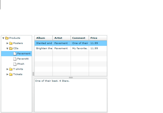
CHAPTER 15
482
The following example shows a DividedBox container:
In this example, the outermost container is a horizontal DividedBox container. The horizontal divider marks the
border between a Tree control and a vertical DividedBox container.
The vertical DividedBox container holds a DataGrid control (top) and a TextArea control (bottom). The vertical
divider marks the border between these two controls.
For complete reference information, see the Adobe Flex Language Reference.
Creating a DividedBox, HDividedBox, or VDividedBox container
You use the <mx:DividedBox>, <mx:VDividedBox>, and <mx:HDividedBox> tags to define DividedBox
containers. Specify an id value if you intend to refer to a component elsewhere in your MXML, either in another
tag or in an ActionScript block. Typically, you use the VDividedBox (vertical DividedBox) and HDividedBox
(horizontal DividedBox) containers as shortcuts so that you do not have to specify the direction property.
The following code example creates the image shown in “DividedBox, HDividedBox, and VDividedBox layout
containers” on page 481:
<?xml version="1.0"?>
<!-- containers\layouts\HDivBoxSimple.mxml -->
<mx:Application xmlns:mx="http://www.adobe.com/2006/mxml"
backgroundColor="white">
<mx:Script>
<
483ADOBE FLEX 3
Adobe Flex 3 Developer Guide
{Artist:'Pavement', Album:'Slanted and Enchanted',
Price:11.99, Comment:'One of their best. 4 Stars.'},
{Artist:'Pavement', Album:'Brighten the Corners',
Price:11.99, Comment:'My favorite.'}
];
}
]]>
</mx:Script>
<mx:HDividedBox width="100%" height="100%">
<mx:Tree id="tree1"
width="30%" height="100%"
labelField="@label"
showRoot="true">
<mx:XMLList>
<menuitem label="Products">
<menuitem label="Posters" isBranch="true"/>
<menuitem label="CDs">
<menuitem label="Pavement"/>
<menuitem label="Pavarotti"/>
<menuitem label="Phish"/>
</menuitem>
<menuitem label="T-shirts" isBranch="true"/>
<menuitem label="Tickets" isBranch="true"/>
</menuitem>
</mx:XMLList>
</mx:Tree>
<mx:VDividedBox width="70%" height="100%">
<mx:DataGrid id="myGrid"
width="100%" height="100%"
initialize="myGrid_initialize();"
change="currentMessage.text=
event.currentTarget.selectedItem.Comment;"/>
<mx:TextArea id="currentMessage"
width="100%"
height="60"
text="One of their best. 4 Stars."/>
</mx:VDividedBox>
</mx:HDividedBox>
</mx:Application>
Notice that this example does not implement the logic to change the top area of the VDividedBox container when
you select a node in the Tree control.
Using the dividers
The dividers of a DividedBox container let you resize the area of the container allocated for a child. However, for
the dividers to function, the child has to be resizable; that is, it must specify a percentage-based size. So, a child
with an explicit or default height or width cannot be resized in the corresponding direction by using a divider.
Therefore, when you use the DividedBox container, you typically use percentage sizing for its children to make
them resizable.

CHAPTER 15
484
When you specify a percentage value for the height or width properties of a child to make it resizable, Flex
initially sizes the child to the specified percentage, if possible. Then Flex can resize the child to take up all available
space.
You can use the dividers to resize a percentage-sized child up to its maximum size, or down to its minimum size.
To constrain the minimum size or maximum size of an area of the DividedBox, set an explicit value for the
minWidth and minHeight properties or the maxWidth and maxHeight properties of the children in that area.
Using live dragging
By default, the DividedBox container disables live dragging. This means that the DividedBox container does not
update the layout of its children until the user finishes dragging the divider, when the user releases the mouse
button on a selected divider.
You can configure the DividedBox container to use live dragging by setting the liveDragging property to true.
With live dragging enabled, the DividedBox container updates its layout as the user moves a divider. In some
cases, you may encounter decreased performance if you enable live dragging.
Form, FormHeading, and FormItem layout containers
Forms are one of the most common methods that web applications use to collect information from users. Forms
are used for collecting registration, purchase, and billing information, and for many other data collection tasks.
About forms
Flex supports form development by using the Form layout container and several child components of the Form
container. The Form container lets you control the layout of a form, mark form fields as required or optional,
handle error messages, and bind your form data to the Flex data model to perform data checking and validation.
Also, you can apply style sheets to configure the appearance of your forms.
485ADOBE FLEX 3
Adobe Flex 3 Developer Guide
You use three different components to create your forms, as the following example shows:
A. Form container B. FormHeading control C. FormItem containers
For complete reference information, see Form, FormHeading, and FormItem in the Adobe Flex Language
Reference.
Creating forms
You typically create a form by defining the following elements:
•The Form control
•FormHeading components, nested inside the Form control
•FormItem containers, nested inside the Form control
•Form fields, such as ComboBox and TextInput controls, nested inside the FormItem containers
You can also include other components inside a form, such as HRule controls, as needed.

CHAPTER 15
486
Creating the Form container
The Form container is the outermost container of a Flex form. The primary use of the Form container is to control
the sizing and layout of the contents of the form, including the size of labels and the gap between items. The Form
container always arranges its children vertically and left-aligns them in the form. The form container contains one
or more FormHeading and FormItem containers.
You use the <mx:Form> tag to define the Form container. Specify an id value if you intend to refer to the entire
form elsewhere in your MXML, either in another tag or in an ActionScript block.
The following code example shows the Form container definition for the form shown in the previous image in
“About forms” on page 484:
<?xml version="1.0"?>
<!-- containers\layouts\FormSimple.mxml -->
<mx:Application xmlns:mx="http://www.adobe.com/2006/mxml">
<mx:Form id="myForm" width="400" height="100">
<!-- Define FormHeading and FormItem components here -->
</mx:Form>
</mx:Application>
For complete reference information, see the Adobe Flex Language Reference.
Creating a FormHeading control
A FormHeading control specifies an optional label for a group of FormItem containers. The left side of the label
is aligned with the left side of the controls in the form. You can have multiple FormHeading controls in your form
to designate multiple content areas. You can also use FormHeading controls with a blank label to create vertical
space in your form.
You use the <mx:FormHeading> tag to define a FormHeading container. Specify an id value if you intend to refer
to the heading elsewhere in your MXML, either in another tag or in an ActionScript block.
The following code example defines the FormHeading control for the image shown in “A b o u t f o r m s ” o n p a g e 4 8 4 :
<?xml version="1.0"?>
<!-- containers\layouts\FormHeadingSimple.mxml -->
<mx:Application xmlns:mx="http://www.adobe.com/2006/mxml">
<mx:Form id="myForm" width="400" height="100">
<mx:FormHeading label="Billing Information"/>
<!--Define FormItem containers here. -->
</mx:Form>
</mx:Application>
For complete reference information, see the Adobe Flex Language Reference.
487ADOBE FLEX 3
Adobe Flex 3 Developer Guide
Creating a FormItem container
A FormItem container specifies a form element consisting of the following parts:
•A single label
•One or more child controls or containers, such as input controls
The label is vertically aligned with the first child in the FormItem container and is right-aligned in the region to
the left of the container.
You use the <mx:FormItem> tag to define a FormItem container. Specify an id value if you intend to refer to the
item elsewhere in your MXML, either in another tag or in an ActionScript block.
Form containers typically contain multiple FormItem containers, as the following example shows:
In this example, you define three FormItem containers: one with the label First Name, one with the label Last
Name, and one with the label Address. The Address FormItem container holds two controls to let a user enter two
lines of address information. Each of the other two FormItem containers includes a single control.
For complete reference information, see FormItem in the Adobe Flex Language Reference.
Specifying form item direction
When you create a FormItem container, you specify its direction by using the value vertical (default)
or horizontal for the direction property:
vertical Flex positions children vertically to the right of the FormItem label.
horizontal Flex positions children horizontally to the right of the FormItem label. If all children do not fit on a
single row, they are divided into multiple rows with equal-sized columns. You can ensure that all children fit on a
single line by using percentage-based widths or by specifying explicit widths wide enough for all of the compo-
nents.
Controlling form item label style
You control the style of a FormItem label by setting the labelStyleName style property. The following example
sets the FormItem label color to dark blue and its font size to 20 pixels:
<?xml version="1.0"?>
<!-- containers\layouts\FormItemStyle.mxml -->
<mx:Application xmlns:mx="http://www.adobe.com/2006/mxml">

CHAPTER 15
488
<mx:Style>
.myFormItemLabelStyle {
color: #333399;
fontSize: 20;
}
</mx:Style>
<mx:Script>
<![CDATA[
private function processValues(zip:String, pn:String):void {
// Validate and process data.
}
]]>
</mx:Script>
<mx:Form id="myForm" defaultButton="{mySubmitButton}">
<mx:FormItem label="Zip Code"
labelStyleName="myFormItemLabelStyle">
<mx:TextInput id="zipCode"/>
</mx:FormItem>
<mx:FormItem label="Phone Number">
<mx:TextInput id="phoneNumber"/>
</mx:FormItem>
<mx:FormItem>
<mx:Button label="Submit" id="mySubmitButton"
click="processValues(zipCode.text, phoneNumber.text);"/>
</mx:FormItem>
</mx:Form>
</mx:Application>
Example: A simple form
The following example shows the FormItem container definitions for the example form:
<?xml version="1.0"?>
<!-- containers\layouts\FormComplete.mxml -->
<mx:Application xmlns:mx="http://www.adobe.com/2006/mxml">
<mx:Script>
<![CDATA[
private function submitForm():void {
// Handle the form submission.
}
]]>
</mx:Script>
<mx:Form id="myForm" width="400">
<mx:FormHeading label="Billing Information"/>
<mx:FormItem label="First Name">
<mx:TextInput id="fname" width="100%"/>

489ADOBE FLEX 3
Adobe Flex 3 Developer Guide
</mx:FormItem>
<mx:FormItem label="Last Name">
<mx:TextInput id="lname" width="100%"/>
</mx:FormItem>
<mx:FormItem label="Address">
<mx:TextInput id="addr1" width="100%"/>
<mx:TextInput id="addr2" width="100%"/>
</mx:FormItem>
<mx:FormItem label="City / State" direction="vertical">
<mx:TextInput id="city"/>
<mx:ComboBox id="st" width="75">
<mx:ArrayCollection>
<mx:String>MA</mx:String>
<mx:String>NH</mx:String>
<mx:String>RI</mx:String>
</mx:ArrayCollection>
</mx:ComboBox>
</mx:FormItem>
<mx:FormItem label="ZIP Code">
<mx:TextInput id="zip" width="100"/>
</mx:FormItem>
<mx:FormItem label="Country">
<mx:ComboBox id="cntry">
<mx:ArrayCollection>
<mx:String>USA</mx:String>
<mx:String>UAE</mx:String>
<mx:String>UAW</mx:String>
</mx:ArrayCollection>
</mx:ComboBox>
</mx:FormItem>
<mx:FormItem>
<mx:HRule width="200" height="1"/>
<mx:Button label="Submit Form" click="submitForm();"/>
</mx:FormItem>
</mx:Form>
</mx:Application>
Laying out forms
Flex determines the default size of a form in the following ways:
•The default height is large enough to hold the default or explicit heights of all the container children, plus the
Form container top and bottom padding and the gaps between children.
•The default width is large enough to accommodate the widest FormItem label, plus the indicatorGap
between the labels and the child controls, plus the widest default or explicit width among the child controls in the
FormItems.
CHAPTER 15
490
Aligning and spacing Form container children
All Form container labels are right-aligned, and all children are left-aligned in the container. You cannot override
this alignment.
The following example shows the spacing of Form container children that you can control:
A. Form container: labelWidth B. Form container: verticalGap = 6 C. FormItem container: verticalGap = 6 D. Form container: indica-
torGap = 14
A
C
B
D
491ADOBE FLEX 3
Adobe Flex 3 Developer Guide
The following table describes the style properties that you use to control spacing and their default values:
Component Style Description Default value
Form verticalGap Vertical space between Form container chil-
dren
6 pixels
horizontalGap Horizontal space between Form container
children
8 pixels
labelWidth Width of labels Calculated by the container based on the child
labels
paddingTop
paddingBottom
paddingLeft
paddingRight
Border spacing around children 16 pixels on all sides
indicatorGap Gap between the end of the area in the form
reserved for labels and the FormItem children
or FormHeading heading
14 pixels
FormHeading indicatorGap Overrides the indicator gap set by the
<mx:Form> tag
14 pixels
paddingTop Gap between the top of the component and
the label text
16 pixels
FormItem direction Direction of FormItem children: vertical or
horizontal
vertical
horizontalGap Horizontal spacing between children in a
FormItem container
8 pixels
labelWidth The width for the FormItem heading The width of the label text
paddingTop
paddingBottom
paddingLeft
paddingRight
Border spacing around the FormItem 0 pixels on all sides
verticalGap Vertical spacing between children in a
FormItem container
6 pixels
indicatorGap Overrides the indicator gap set by the
<mx:Form> tag
Determined by the <mx:Form> tag

CHAPTER 15
492
Sizing and positioning Form container children
The Form layout container arranges children in a vertical column. The area of the Form container that is desig-
nated for children does not encompass the entire Form container. Instead, it starts at the right of the area defined
by any labels and the gap defined by the indicatorGap property. For example, if the width of the Form container
is 500 pixels, and the labels and indicatorGap property allocate 100 pixels of that width, the width of the child
area is 400 pixels.
By default, Flex sizes the Form layout children vertically to their default height. Flex then determines the default
width of each child, and stretches the child’s width to the next highest quarter of the child area—that is, to one-
quarter, one-half, three-quarters, or full width of the child area.
For example, if a container has a child area 400 pixels wide, and the default width of a TextArea control is 125
pixels, Flex stretches the TextArea control horizontally to the next higher quarter of the child area, the 200-pixel
boundary, which is one-half of the child area. This sizing algorithm applies only to components without an
explicitly specified width. It prevents your containers from having ragged right edges caused by controls with
different widths.
You can also explicitly set the height or width of any control in the form to either a pixel value or a percentage of
the Form size by using the height and width properties of the child.
Defining a default button
You use the defaultButton property of a container to define a default Button control. Pressing the Enter key
while the focus is on any form control activates the Button control just as if it was explicitly selected.
For example, a login form displays user name and password inputs and a submit Button control. Typically, the user
types a user name, tabs to the password field, types the password, and presses the Enter key to submit the login
information without explicitly selecting the Button control. To define this type of interaction, set the
defaultButton to the id of the submit Button control. In the following example, the event listener for the click
event of submit button displays an Alert control, to show that Flex triggers this event if the user presses the Enter
key when any form field has the focus. The commented-out line in the example would perform the more realistic
action of invoking a web service to let the user log in.
<?xml version="1.0"?>
<!-- containers\layouts\FormDefButton.mxml -->
<mx:Application xmlns:mx="http://www.adobe.com/2006/mxml">
<mx:Script>
<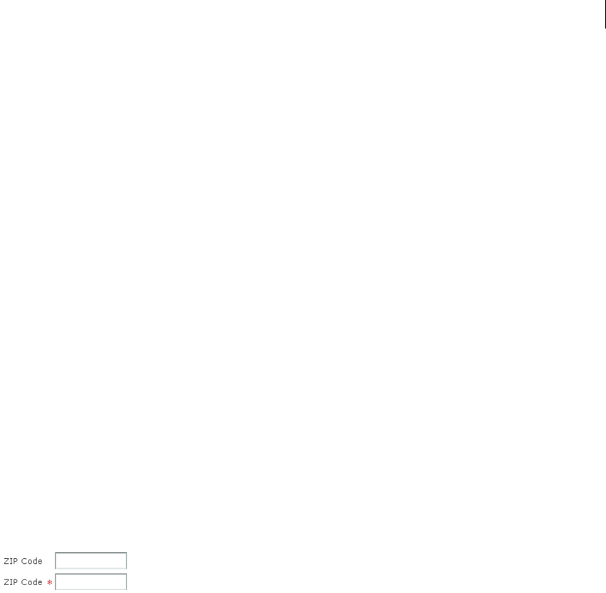
493ADOBE FLEX 3
Adobe Flex 3 Developer Guide
// Commented out to work without a web service.
//myWebService.Login.send();
}
]]>
</mx:Script>
<mx:Form defaultButton="{mySubmitButton}">
<mx:FormItem label="Username">
<mx:TextInput id="username"
width="100"/>
</mx:FormItem>
<mx:FormItem label="Password">
<mx:TextInput id="password"
width="100"
displayAsPassword="true"/>
</mx:FormItem>
<mx:FormItem>
<mx:Button id="mySubmitButton"
label="Login"
click="submitLogin(event);"/>
</mx:FormItem>
</mx:Form>
</mx:Application>
Note: When the drop-down list of a ComboBox control is open, pressing Enter selects the currently highlighted item
in the ComboBox control; it does not activate the default button.
Specifying required fields
Flex includes support for defining required input fields of a form. To define a required field, you specify the
required property of the FormItem container. If this property is specified, all the children of the FormItem
container are marked as required.
Flex inserts a red asterisk (*) character as a separator between the FormItem label and the FormItem child to
indicate a required field. For example, the following example shows an optional ZIP code field and a required ZIP
code field:
The following code example defines these fields:
<?xml version="1.0"?>
<!-- containers\layouts\FormReqField.mxml -->
<mx:Application xmlns:mx="http://www.adobe.com/2006/mxml">
<mx:Form>
<mx:FormItem label="ZIP Code">
<mx:TextInput id="zipOptional"
width="100"/>

CHAPTER 15
494
</mx:FormItem>
<mx:FormItem label="ZIP Code" required="true">
<mx:TextInput id="zipRequired"
width="100"/>
</mx:FormItem>
</mx:Form>
</mx:Application>
You can enable the required indicator of a FormItem child at run time. This could be useful when the user input
in one form field makes another field required. For example, you might have a form with a CheckBox control that
the user selects to subscribe to a newsletter. Checking the box could make the user e-mail field required, as the
following example shows:
<?xml version="1.0"?>
<!-- containers\layouts\FormReqFieldRuntime.mxml -->
<mx:Application xmlns:mx="http://www.adobe.com/2006/mxml">
<mx:Form>
<mx:FormItem label="Subscribe">
<mx:CheckBox label="Subscribe?"
click="emAddr.required=!emAddr.required;"/>
</mx:FormItem>
<mx:FormItem id="emAddr" label="E-mail Address">
<mx:TextInput id="emailAddr"/>
</mx:FormItem>
</mx:Form>
</mx:Application>
Flex does not perform any automatic enforcement of a required field; it only marks fields as required. You must
add validation logic to your form to enforce it. As part of your enforcement logic, you can use Flex validators. All
Flex validators have a required property, which is true by default. You can use validators in several ways,
depending on how you enforce required fields and validation. For details, see “Validating Data” on page 1267. For
one example of using validators with forms, see “Using a Flex data model to store form data” on page 497.
Storing and validating form data
As part of designing your form, you must consider how you want to store your form data. In Flex, you have the
following choices.
•Store the data within the form controls.
•Create a Flex data model to store your data.
Your decision about how to represent your data also affects how you perform input error detection or data
validation, one of the primary tasks of a robust and stable form. You typically validate user input before you submit
the data to the server. You can validate the user input within a submit function, or when a user enters data into
the form.

495ADOBE FLEX 3
Adobe Flex 3 Developer Guide
Flex provides a set of data validators for the most common types of data collected by a form. You can use Flex
validators with the following types of data.
•Credit card information
•Dates
•E-mail addresses
•Numbers
•Phone numbers
•Social Security Numbers
•Strings
•ZIP codes
As part of building your form, you can perform data validation by using your own custom logic, take advantage
of the Flex data validation mechanism, or use a combination of custom logic and Flex data validation.
The following sections include information on how to initiate validation in a form; for detailed information on
how to use Flex data validation, see “Validating Data” on page 1267.
Using Form controls to hold your form data
The following example uses Form controls to store the form data:
<?xml version="1.0"?>
<!-- containers\layouts\FormData.mxml -->
<mx:Application xmlns:mx="http://www.adobe.com/2006/mxml">
<mx:Script>
<![CDATA[
private function processValues(zip:String, pn:String):void {
// Validate and process data.
}
]]>
</mx:Script>
<mx:Form id="myForm" defaultButton="{mySubmitButton}">
<mx:FormItem label="ZIP Code">
<mx:TextInput id="zipCode"/>
</mx:FormItem>
<mx:FormItem label="Phone Number">
<mx:TextInput id="phoneNumber"/>
</mx:FormItem>
<mx:FormItem>
<mx:Button label="Submit" id="mySubmitButton"
click="processValues(zipCode.text, phoneNumber.text);"/>
</mx:FormItem>

CHAPTER 15
496
</mx:Form>
</mx:Application>
This example form defines two form controls: one for a ZIP code and one for a phone number. When you submit
the form, you call a function that takes the two arguments that correspond to the data stored in each control. Your
submit function can then perform any data validation on its inputs before processing the form data.
You don’t have to pass the data to the submit function. The submit function can access the form control data
directly, as the following example shows:
<?xml version="1.0"?>
<!-- containers\layouts\FormDataSubmitNoArg.mxml -->
<mx:Application xmlns:mx="http://www.adobe.com/2006/mxml">
<mx:Script>
<![CDATA[
private function processValues():void {
var inputZip:String = zipCode.text;
var inputPhone:String = phoneNumber.text;
// Check to see if pn is a number.
// Check to see if zip is less than 4 digits.
// Process data.
}
]]>
</mx:Script>
<mx:Form id="myForm" defaultButton="{mySubmitButton}">
<mx:FormItem label="ZIP Code">
<mx:TextInput id="zipCode"/>
</mx:FormItem>
<mx:FormItem label="Phone Number">
<mx:TextInput id="phoneNumber"/>
</mx:FormItem>
<mx:FormItem>
<mx:Button label="Submit" id="mySubmitButton"
click="processValues();"/>
</mx:FormItem>
</mx:Form>
</mx:Application>
The technique of using the form fields directly, however, has the problem that the function is specific to the form
and cannot easily be used by other forms.
Validating form control contents data on user entry
To validate form data upon user input, you can add Flex data validators to your application. The following
example uses the ZipCodeValidator and PhoneNumbervalidator to perform validation.
<?xml version="1.0"?>
<!-- containers\layouts\FormDataValidate.mxml -->
<mx:Application xmlns:mx="http://www.adobe.com/2006/mxml">

497ADOBE FLEX 3
Adobe Flex 3 Developer Guide
<mx:Script>
<![CDATA[
private function processValues():void {
var inputZip:String = zipCode.text;
var inputPhone:String = phoneNumber.text;
// Perform any additional validation.
// Process data.
}
]]>
</mx:Script>
<mx:ZipCodeValidator id="zcVal"
source="{zipCode}" property="text"
domain="US or Canada"/>
<mx:PhoneNumberValidator id="pnVal"
source="{phoneNumber}" property="text"/>
<mx:Form id="myForm" defaultButton="{mySubmitButton}">
<mx:FormItem label="ZIP Code">
<mx:TextInput id="zipCode"/>
</mx:FormItem>
<mx:FormItem label="Phone Number">
<mx:TextInput id="phoneNumber"/>
</mx:FormItem>
<mx:FormItem>
<mx:Button label="Submit" id="mySubmitButton"
click="processValues();"/>
</mx:FormItem>
</mx:Form>
</mx:Application>
If you validate the input data every time the user enters it, you might not have to do so again in your submit
function. However, some validation in your submit function might still be necessary, especially if you want to
ensure that two fields are valid when compared with each other.
For example, you can use Flex validators to validate a ZIP code field and state field individually. But you might
want to validate that the ZIP code is valid for the specified state before submitting the form data. To do so, you
perform a second validation in the submit function.
For detailed information on using validators, see “Validating Data” on page 1267.
Using a Flex data model to store form data
You can use a Flex data model to structure and store your form data and provide a framework for data validation.
A data model stores data in fields that represent each part of a specific data set. For example, a person model might
store information such as a person’s name, age, and phone number. You can then validate the data in the model
based on the type of data stored in each model field.

CHAPTER 15
498
The following example defines a Flex data model that contains two values. The two values correspond to the two
input fields of a form.
<?xml version="1.0"?>
<!-- containers\layouts\FormDataModel.mxml -->
<mx:Application xmlns:mx="http://www.adobe.com/2006/mxml">
<!-- Define the submit function that validates and
processes the data. -->
<mx:Script>
<![CDATA[
private function processValues():void {
var inputZip:String = myFormModel.zipCodeModel;
var inputPhone:String = myFormModel.phoneNumberModel;
// Process data.
}
]]>
</mx:Script>
<!-- Define data model. -->
<mx:Model id="myFormModel">
<info>
<zipCodeModel>{zipCode.text}</zipCodeModel>
<phoneNumberModel>{phoneNumber.text}</phoneNumberModel>
</info>
</mx:Model>
<!-- Define the form. -->
<mx:Form borderStyle="solid">
<mx:FormItem label="ZIP Code">
<mx:TextInput id="zipCode"/>
</mx:FormItem>
<mx:FormItem label="Phone Number">
<mx:TextInput id="phoneNumber"/>
</mx:FormItem>
<mx:FormItem>
<mx:Button id="b1"
label="Submit"
click="processValues();"/>
</mx:FormItem>
</mx:Form>
</mx:Application>
You use the <mx:Model> tag to define the data model. Each child tag of the data model defines one field of the
model. The tag body of each child tag in the model defines a binding to a form control. In this example, you bind
the zipCodeModel model field to the text value of the zipCode TextInput control, and you bind the
phoneNumberModel field to the text value of the phoneNumber TextInput control. For more information on data
models, see “Storing Data” on page 1257.
When you bind a control to a data model, Flex automatically copies data from the control to the model upon user
input. In this example, your submit function accesses the data from the model, not directly from the form controls.

499ADOBE FLEX 3
Adobe Flex 3 Developer Guide
Using Flex validators with form models
The following example modifies the example in “Using a Flex data model to store form data” on page 497 by
inserting two data validators—one for the ZIP code field and one for the phone number field:
<?xml version="1.0"?>
<!-- containers\layouts\FormDataModelVal.mxml -->
<mx:Application xmlns:mx="http://www.adobe.com/2006/mxml">
<!-- Define the submit function that validates and processes the data -->
<mx:Script>
<![CDATA[
private function processValues():void {
var inputZip:String = myFormModel.zipCodeModel;
var inputPhone:String = myFormModel.phoneNumberModel;
// Process data.
}
]]>
</mx:Script>
<!-- Define data model. -->
<mx:Model id="myFormModel">
<info>
<zipCodeModel>{zipCode.text}</zipCodeModel>
<phoneNumberModel>{phoneNumber.text}</phoneNumberModel>
</info>
</mx:Model>
<!-- Define validators. -->
<mx:ZipCodeValidator
source="{myFormModel}" property="zipCodeModel"
trigger="{zipCode}"
listener="{zipCode}"/>
<mx:PhoneNumberValidator
source="{myFormModel}" property="phoneNumberModel"
trigger="{b1}"
listener="{phoneNumber}"
triggerEvent="click"/>
<!-- Define the form. -->
<mx:Form borderStyle="solid">
<mx:FormItem label="ZIP Code">
<mx:TextInput id="zipCode"/>
</mx:FormItem>
<mx:FormItem label="Phone Number">
<mx:TextInput id="phoneNumber"/>
</mx:FormItem>
<mx:FormItem>
<mx:Button id="b1"
label="Submit"
click="processValues();"/>
</mx:FormItem>
</mx:Form>
</mx:Application>

CHAPTER 15
500
When the user enters data into the zipCode form field, Flex automatically copies that data to the data model. The
ZipCodeValidator validator gets invoked when the user exits the zipCode form field, as specified by the
validator’s trigger property and the default value of the triggerEvent property, valueCommit. Flex then draws
a red box around the zipCode field, as specified by the listener property.
When the user enters data into the phoneNumber form field, Flex automatically copies that data to the data model.
The PhoneNumberValidator validator gets invoked when the user clicks the Button control, as specified by the
validator’s trigger and triggerEvent properties. Flex then draws a red box around the phoneNumber field, as
specified by the listener property.
For detailed information on using validators, see “Validating Data” on page 1267.
Populating a Form control from a data model
Another use for data models is to include data in the model to populate form fields with values. The following
example shows a form that reads static data from a data model to obtain the value for a form field:
<?xml version="1.0"?>
<!-- containers\layouts\FormDataFromModel.mxml -->
<mx:Application xmlns:mx="http://www.adobe.com/2006/mxml">
<!-- Define data model. -->
<mx:Model id="myFormModel">
<info>
<fName>{firstName.text}</fName>
<lName>{lastName.text}</lName>
<department>Accounting</department>
</info>
</mx:Model>
<mx:Form>
<mx:FormItem label="First and Last Names">
<mx:TextInput id="firstName"/>
<mx:TextInput id="lastName"/>
</mx:FormItem>
<mx:FormItem label="Department">
<mx:TextInput id="dept" text="{myFormModel.department}"/>
</mx:FormItem>
</mx:Form>
</mx:Application>
This department data is considered static because the form always shows the same value in the field. You could
also create a dynamic data model that takes the value of the department field from a web service, or calculates it
based on user input.
For more information on data models, see “Storing Data” on page 1257.

501ADOBE FLEX 3
Adobe Flex 3 Developer Guide
Submitting data to a server
Form data is typically processed on a server, not locally on the client. Therefore, the submit event listener must
have a mechanism for packing the form data for transfer to the server, and then handling any results returned
from the server. In Flex, you typically use a web service, HTTP service, or remote Java object to pass data to the
server.
You can also build logic into your submit function to control navigation of your application when the submit
succeeds and when it fails. When the submit succeeds, you typically navigate to an area of your application that
displays the results. If the submit fails, you can return control to the form so that the user can fix any errors.
The following example adds a web service to process form input data. In this example, the user enters a ZIP code,
and then selects the Submit button. After performing any data validation, the submit event listener calls the web
service to obtain the city name, current temperature, and forecast for the ZIP code.
<?xml version="1.0"?>
<!-- containers\layouts\FormDataSubmitServer.mxml -->
<mx:Application xmlns:mx="http://www.adobe.com/2006/mxml">
<!-- Define the web service connection.
The specified WSDL URI is not functional. -->
<mx:WebService id="WeatherService"
wsdl="/ws/WeatherService?wsdl">
<mx:operation name="GetWeather">
<mx:request>
<ZipCode>{zipCode.text}</ZipCode>
</mx:request>
</mx:operation>
</mx:WebService>
<mx:Script>
<![CDATA[
private function processValues():void {
// Check to see if ZIP code is valid.
WeatherService.GetWeather.send();
}
]]>
</mx:Script>
<mx:Form>
<mx:FormItem label="ZIP Code">
<mx:TextInput id="zipCode"
width="200"
text="ZIP code please."/>
<mx:Button
width="60"
label="Submit"
click="processValues();"/>
</mx:FormItem>
</mx:Form>
<mx:VBox>
<mx:TextArea
text=

CHAPTER 15
502
"{WeatherService.GetWeather.lastResult.CityShortName}"/>
<mx:TextArea
text=
"{WeatherService.GetWeather.lastResult.CurrentTemp}"/>
<mx:TextArea
text=
"{WeatherService.GetWeather.lastResult.DayForecast}"/>
</mx:VBox>
</mx:Application>
This example binds the form’s input zipCode field directly to the ZipCode field of the web service request. To
display the results from the web service, you bind the results to controls in a VBox container.
You have a great deal of flexibility when passing data to a web service. For example, you might modify this example
to bind the input form field to a data model, and then bind the data model to the web service request. For more
information on using web services, see “Accessing Server-Side Data with Flex” on page 1163.
You can also add event listeners for the web service to handle both a successful call to the web service, by using
the result event, and a call that generates an error, by using the fault event. An error condition might cause you
to display a message to the user with a description of the error. For a successful result, you might navigate to
another section of your application.
The following example adds a load event and a fault event to the form. In this example, the form is defined as
one child of a ViewStack container, and the form results are defined as a second child of the ViewStack container:
<?xml version="1.0"?>
<!-- containers\layouts\FormDataSubmitServerEvents.mxml -->
<mx:Application xmlns:mx="http://www.adobe.com/2006/mxml">
<!-- Define the web service connection.
The specified WSDL URI is not functional. -->
<mx:WebService id="WeatherService"
wsdl="/ws/WeatherService?wsdl"
result="successfulCall();"
fault="errorCall();">
<mx:operation name="GetWeather">
<mx:request>
<ZipCode>{zipCode.text}</ZipCode>
</mx:request>
</mx:operation>
</mx:WebService>
<mx:Script>
<
503ADOBE FLEX 3
Adobe Flex 3 Developer Guide
private function errorCall():void {
Alert.show("Web service failed!", "Alert Box", Alert.OK);
}
]]>
</mx:Script>
<mx:ViewStack id="vs1">
<mx:Form>
<mx:FormItem label="ZIP Code">
<mx:TextInput id="zipCode"
width="200"
text="ZIP code please."/>
<mx:Button width="60"
label="Submit"
click="processValues();"/>
</mx:FormItem>
</mx:Form>
<mx:VBox>
<mx:TextArea
text=
"{WeatherService.GetWeather.lastResult.CityShortName}"/>
<mx:TextArea
text=
"{WeatherService.GetWeather.lastResult.CurrentTemp}"/>
<mx:TextArea
text=
"{WeatherService.GetWeather.lastResult.DayForecast}"/>
</mx:VBox>
</mx:ViewStack>
</mx:Application>
When a call to the web service succeeds, the successfulCall() function switches the current ViewStack child
to the VBox container to show the returned results. An error from the web service displays an Alert box, but does
not change the current child of the ViewStack container; the form remains visible, which lets the user fix any input
errors.
You have many options for handling navigation in your application based on the results of the submit function.
The previous example used a ViewStack container to handle navigation. You might also choose to use a TabNav-
igator container or Accordion container for this same purpose.
In some applications, you might choose to embed the form in a TitleWindow container. A TitleWindow container
is a pop-up window that appears above the Adobe Flash Player drawing surface. In this scenario, users enter form
data and submit the form from the TitleWindow container. If a submit succeeds, the TitleWindow container
closes and displays the results in another area of your application. If a submit fails, Flex displays an error message
and leaves the TitleWindow container visible.
Another type of application might use a dashboard layout, where you have multiple panels open on the dashboard.
Submitting the form could cause another area of the dashboard to update with results, while a failure could display
an error message.
CHAPTER 15
504
For more information on the TabNavigator, Accordion, and TitleWindow containers, see “Using Navigator
Containers” on page 529.
Grid layout container
You use a Grid layout container to arrange children as rows and columns of cells, much like an HTML table. The
following example shows a Grid container that consists of nine cells arranged in a three-by-three pattern:
You can put zero or one child in each cell of a Grid container. If you include multiple children in a cell, put a
container in the cell, and then add children to the container. The height of all cells in a row is the same, but each
row can have a different height. The width of all cells in a column is the same, but each column can have a different
width.
You can define a different number of cells for each row or each column of the Grid container. In addition, a cell
can span multiple columns and/or multiple rows of the container.
If the default or explicit size of the child is larger than the size of an explicitly sized cell, the child is clipped at the
cell boundaries.
If the child’s default width or default height is smaller than the cell, the default horizontal alignment of the child
in the cell is left and the default vertical alignment is top. You can use the horizontalAlign and
verticalAlign properties of the <mx:GridItem> tag to control positioning of the child.
For complete reference information, see the Adobe Flex Language Reference. For information on the Tile
container, which creates a layout where all cells have the same size, see “Tile layout container” on page 513.
Creating a Grid layout container
You create a Grid layout container as follows:
•You use the <mx:Grid> tag to define a Grid container; it can hold any number of <mx:GridRow> child tags.
•You use the <mx:GridRow> tag to define each row. It must be a child of the <mx:Grid> tag and can hold any
number of <mx:GridItem> child tags.
•You use the <mx:GridItem> tag to define each row cell; it must be a child of the <mx:GridRow> tag.
505ADOBE FLEX 3
Adobe Flex 3 Developer Guide
The <mx:GridItem> tag takes the following optional properties that control how the item is laid out:
The following image shows a Grid container with three rows and three columns:
On the left, you see how the Grid container appears in Flash Player. On the right, you see the Grid container with
borders overlaying it to illustrate the configuration of the rows and columns. In this example, the buttons in the
first (top) row each occupy a single cell. The button in the second row spans three columns, and the button in the
third row spans the second and third columns.
You do not have to define the same number of cells for every row of a Grid container, as the following image shows.
The Grid container defines five cells in row one; row two has one item that spans three cells; and row 3 has one
empty cell, followed by an item that spans two cells.
The following MXML code creates the Grid container with three rows and three columns shown in the first image
in this section:
<?xml version="1.0"?>
<!-- containers\layouts\GridSimple.mxml -->
<mx:Application xmlns:mx="http://www.adobe.com/2006/mxml">
<mx:Grid id="myGrid">
<!-- Define Row 1. -->
<mx:GridRow id="row1">
<!-- Define the first cell of Row 1. -->
Property Type Use Descriptions
rowSpan Number Property Specifies the number of rows of the Grid container spanned by the cell. The default value is 1. You
cannot extend a cell past the number of rows in the Grid container.
colSpan Number Property Specifies the number of columns of the Grid container spanned by the cell. The default value is 1.
You cannot extend a cell past the number of columns in the Grid container.

CHAPTER 15
506
<mx:GridItem>
<mx:Button label="Button 1"/>
</mx:GridItem>
<!-- Define the second cell of Row 1. -->
<mx:GridItem>
<mx:Button label="2"/>
</mx:GridItem>
<!-- Define the third cell of Row 1. -->
<mx:GridItem>
<mx:Button label="Button 3"/>
</mx:GridItem>
</mx:GridRow>
<!-- Define Row 2. -->
<mx:GridRow id="row2">
<!-- Define a single cell to span three columns of Row 2. -->
<mx:GridItem colSpan="3" horizontalAlign="center">
<mx:Button label="Long-Named Button 4"/>
</mx:GridItem>
</mx:GridRow>
<!-- Define Row 3. -->
<mx:GridRow id="row3">
<!-- Define an empty first cell of Row 3. -->
<mx:GridItem/>
<!-- Define a cell to span columns 2 and 3 of Row 3. -->
<mx:GridItem colSpan="2" horizontalAlign="center">
<mx:Button label="Button 5"/>
</mx:GridItem>
</mx:GridRow>
</mx:Grid>
</mx:Application>
To modify the preceding example to include five buttons across the top row, you modify the first <mx:GridRow>
tag as follows:
<?xml version="1.0"?>
<!-- containers\layouts\Grid5Button.mxml -->
<mx:Application xmlns:mx="http://www.adobe.com/2006/mxml">
<mx:Grid id="myGrid">
<!-- Define Row 1. -->
<mx:GridRow id="row1">
<!-- Define the first cell of Row 1. -->
<mx:GridItem>
<mx:Button label="Button 1"/>
</mx:GridItem>
<mx:GridItem>
<mx:Button label="2"/>
</mx:GridItem>
<mx:GridItem>
<mx:Button label="Button 3"/>
</mx:GridItem>
<mx:GridItem>
<mx:Button label="Button 3a"/>
</mx:GridItem>
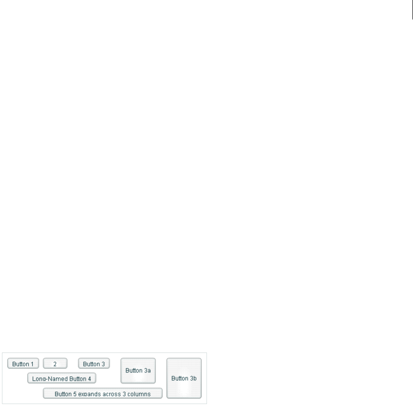
507ADOBE FLEX 3
Adobe Flex 3 Developer Guide
<mx:GridItem>
<mx:Button label="Button 3b"/>
</mx:GridItem>
</mx:GridRow>
<!-- Define Row 2. -->
<mx:GridRow id="row2">
<!-- Define a single cell to span three columns of Row 2. -->
<mx:GridItem colSpan="3" horizontalAlign="center">
<mx:Button label="Long-Named Button 4"/>
</mx:GridItem>
</mx:GridRow>
<!-- Define Row 3. -->
<mx:GridRow id="row3">
<!-- Define an empty first cell of Row 3. -->
<mx:GridItem/>
<!-- Define a cell to span columns 2 and 3 of Row 3. -->
<mx:GridItem colSpan="2" horizontalAlign="center">
<mx:Button label="Button 5"/>
</mx:GridItem>
</mx:GridRow>
</mx:Grid>
</mx:Application>
Setting the row and column span
The colSpan and rowSpan properties of the GridItem container let you create grid items that occupy multiple
grid rows and columns. Making an item span multiple rows or columns does not necessarily make its child control
or container larger; you must size the child so it fits the space appropriately, as the following example shows.
The following image shows a modification to the example in Creating a Grid layout container, where Button 3a
now spans two rows, Button 3b spans three rows, and Button 5 spans three columns:
The following code shows the changes that were made to produce these results:
<?xml version="1.0"?>
<!-- containers\layouts\GridRowSpan.mxml -->
<mx:Application xmlns:mx="http://www.adobe.com/2006/mxml">
<mx:Grid id="myGrid">
<!-- Define Row 1. -->
<mx:GridRow id="row1" height="33%">

CHAPTER 15
508
<!-- Define the first cell of Row 1. -->
<mx:GridItem>
<mx:Button label="Button 1"/>
</mx:GridItem>
<mx:GridItem>
<mx:Button label="2"/>
</mx:GridItem>
<mx:GridItem>
<mx:Button label="Button 3"/>
</mx:GridItem>
<mx:GridItem rowSpan="2">
<mx:Button label="Button 3a" height="100%"/>
</mx:GridItem>
<mx:GridItem rowSpan="3">
<mx:Button label="Button 3b" height="100%"/>
</mx:GridItem>
</mx:GridRow>
<!-- Define Row 2. -->
<mx:GridRow id="row2" height="33%">
<!-- Define a single cell to span three columns of Row 2. -->
<mx:GridItem colSpan="3" horizontalAlign="center">
<mx:Button label="Long-Named Button 4"/>
</mx:GridItem>
</mx:GridRow>
<!-- Define Row 3. -->
<mx:GridRow id="row3" height="33%">
<!-- Define an empty first cell of Row 3. -->
<mx:GridItem/>
<!-- Define a cell to span columns 2 and 3 and 4 of Row 3. -->
<mx:GridItem colSpan="3">
<mx:Button
label="Button 5 expands across 3 columns"
width="75%"/>
</mx:GridItem>
</mx:GridRow>
</mx:Grid>
</mx:Application>
This example makes several changes with the following effects:
•It sets the height of each row to 33% of the grid, ensuring that the rows have equal heights.
•It sets the rowSpan properties of the items with Buttons 3a and 3b to make them span two and three rows,
respectively.
•It sets the height properties of Buttons 3a and 3b to 100% to make these buttons fill all rows that they span.
If you omit this property on these buttons, Flex sets the buttons to their default height, so they do not appear to
span the rows.

509ADOBE FLEX 3
Adobe Flex 3 Developer Guide
•It sets Button 5 to span three rows and sets a percentage-based width of 75%. In this example, the text requires
the button to fill the available width of the three columns, so Flex sizes the button to the default size that fits the
text, not the requested 75%. If you omit the width property, the result is identical. To see the effect of the
percentage width specification, keep the specification and shorten the label text; the button then spans three-
quarters of the three columns, centered on the middle column.
The resulting grid has the several additional characteristics. Although the second row definition specifies only a
single <mx:GridItem> tag that defines a cell spanning three columns, Flex automatically creates two additional
cells to allow Buttons 3a and 3b to expand into the row. The third row also has five cells. The first cell is defined
by the empty <mx:gridItem/> tag. The second through fourth cells are defined by the GridItem that contains
Button 5, which spans three columns. The fifth column is created because the last item in the first row spans all
three rows.
Panel layout container
A Panel layout container includes a title bar, a title, a status message area (in the title bar), a border, and a content
area for its children. Typically, you use Panel containers to wrap self-contained application modules. For example,
you could define several Panel containers in your application where one Panel container holds a form, a second
holds a shopping cart, and a third holds a catalog.
The Panel container has a layout property that lets you specify one of three types of layout: horizontal,
vertical (default), or absolute layout. Horizontal and vertical layout use the Flex automatic layout rules to lay
out children horizontally or vertically. Absolute layout requires you to specify each child’s x and y position relative
to the panel contents area, or to use constraint-based layout styles to anchor one or more sides or the container
horizontal or vertical center relative to the panel content area. For examples of using absolute and constraint-
based layout in a container, see “Creating and using a Canvas control” on page 472. For detailed information on
using these layout techniques, see “Sizing and Positioning Components” on page 185.

CHAPTER 15
510
The following example shows a Panel container with a Form container as its child:
For complete reference information, see the Adobe Flex Language Reference.
Creating a Panel layout container
You def in e a Panel container in MXML by using the <mx:Panel> tag. Specify an id value if you intend to refer to
a component elsewhere in your MXML, either in another tag or in an ActionScript block.
The following example defines a Panel container that contains a form as the top-level container in your appli-
cation. In this example, the Panel container provides you with a mechanism for including a title bar, as in a
standard GUI window.
<?xml version="1.0"?>
<!-- containers\layouts\PanelSimple.mxml -->
<mx:Application xmlns:mx="http://www.adobe.com/2006/mxml">
<mx:Panel id="myPanel" title="My Application">
<mx:Form width="300">
<mx:FormHeading label="Billing Information"/>
<!-- Form contents goes here -->
</mx:Form>
</mx:Panel>
</mx:Application>
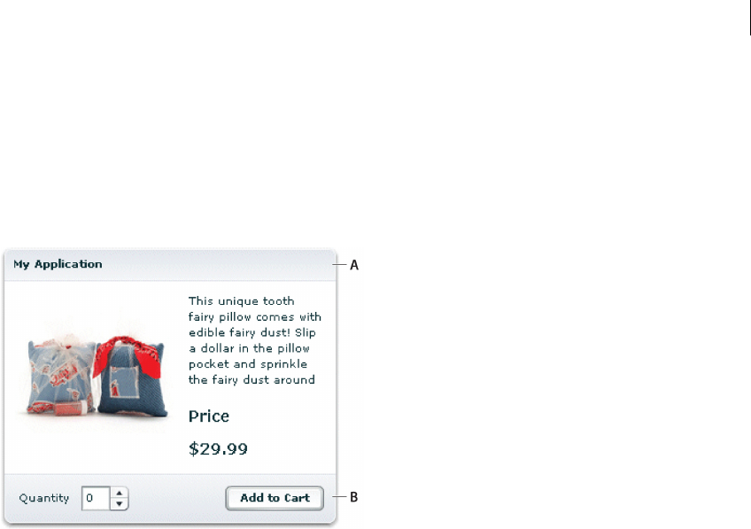
511ADOBE FLEX 3
Adobe Flex 3 Developer Guide
Adding a ControlBar container to a Panel container
You can use the ControlBar container with a Panel container to hold components that can be shared by the other
children in the Panel container. The RichTextEditor control, for example, consists of a Panel control with a
TextArea control and a custom ControlBar for the text formatting controls. For a product catalog, the ControlBar
container can hold the Flex controls to specify quantity and to add an item to a shopping cart, as the following
example shows:
A. Panel container B. ControlBar container
You specify the <mx:ControlBar> tag as the last child tag of an <mx:Panel> tag, as the following example shows:
<?xml version="1.0"?>
<!-- containers\layouts\PanelCBar.mxml -->
<mx:Application xmlns:mx="http://www.adobe.com/2006/mxml">
<mx:Panel title="My Application"
paddingTop="10" paddingBottom="10"
paddingLeft="10" paddingRight="10"
width="300">
<mx:Script>
<![CDATA[
private function addToCart():void {
// Handle event.
}
]]>
</mx:Script>
<mx:HBox width="100%">
<!-- Area for your catalog. -->
</mx:HBox>
<mx:ControlBar width="100%">

CHAPTER 15
512
<mx:Label text="Quantity"/>
<mx:NumericStepper id="myNS"/>
<!-- Use Spacer to push Button control to the right. -->
<mx:Spacer width="100%"/>
<mx:Button label="Add to Cart" click="addToCart();"/>
</mx:ControlBar>
</mx:Panel>
</mx:Application>
For more information on the ControlBar container, see “ControlBar layout container” on page 478.
You can also add the ControlBar container dynamically to a Panel container, as the following example shows:
<?xml version="1.0"?>
<!-- containers\layouts\PanelCBarDynamicAdd.mxml -->
<mx:Application xmlns:mx="http://www.adobe.com/2006/mxml">
<mx:Script>
<
513ADOBE FLEX 3
Adobe Flex 3 Developer Guide
}
}
private function addToCart(event:MouseEvent):void {
Alert.show("ControlBar Button clicked.");
}
]]>
</mx:Script>
<mx:Panel id="myPanel"
title="My Application"
paddingTop="10" paddingBottom="10"
paddingLeft="10" paddingRight="10"
width="300">
<mx:HBox width="100%">
<!-- Area for your catalog. -->
</mx:HBox>
<mx:Button label="Add ControlBar" click="addCBHandler();"/>
</mx:Panel>
</mx:Application>
Tile layout container
A Tile layout container lays out its children in one or more vertical columns or horizontal rows, starting new rows
or columns as necessary. The direction property determines the layout. The valid values for the direction
property are vertical for a column layout and horizontal (default) for a row layout.
All Tile container cells have the same size, unlike the cells of a Grid layout container (see “Grid layout container”
on page 504). Flex arranges the cells of a Tile container in a square grid, where each cell holds a single child
component. For example, if you define 16 children in a Tile layout container, Flex lays it out four cells wide and
four cells high. If you define 13 children, Flex still lays it out four cells wide and four cells high, but leaves the last
three cells in the fourth row empty.
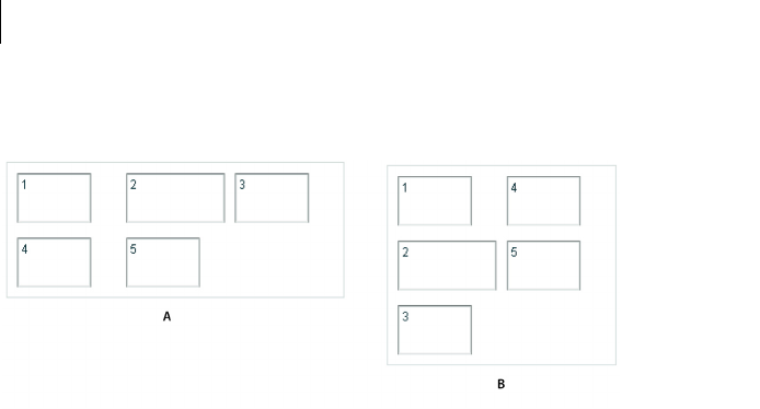
CHAPTER 15
514
The following image shows examples of horizontal and vertical Tile containers:
A. Horizontal (default) B. Ver tical
For complete reference information, see Tile in the Adobe Flex Language Reference.
Creating a Tile layout container
You de f i ne a Tile container in MXML by using the <mx:Tile> tag. Specify an id value if you intend to refer to a
component elsewhere in your MXML, either in another tag or in an ActionScript block. You can use the
tileHeight and tileWidth properties to specify explicit tile dimensions.
The following example creates the horizontal Tile container shown in the image in “Tile layout container” on
page 513. All cells have the height and width of the largest child, 50 pixels high and 100 pixels wide.
<?xml version="1.0"?>
<!-- containers\layouts\TileSimple.mxml -->
<mx:Application xmlns:mx="http://www.adobe.com/2006/mxml">
<mx:Tile id="myFlow"
direction="horizontal"
borderStyle="solid"
paddingTop="10" paddingBottom="10"
paddingRight="10" paddingLeft="10"
verticalGap="15" horizontalGap="10">
<mx:TextInput id="text1" text="1" height="50" width="75"/>
<mx:TextInput id="text2" text="2" height="50" width="100"/>
<mx:TextInput id="text3" text="3" height="50" width="75"/>
<mx:TextInput id="text4" text="4" height="50" width="75"/>
<mx:TextInput id="text5" text="5" height="50" width="75"/>
</mx:Tile>
</mx:Application>

515ADOBE FLEX 3
Adobe Flex 3 Developer Guide
Sizing and positioning a child in a Tile container
Flex sets the default size of each Tile cell to the height of the tallest child and the width of the widest child. All cells
have the same default size. If the default size of a child is larger than the cell because, for example, you used the
tileHeight and tileWidth properties to explicitly size the cells, Flex automatically sizes the child to fit inside
the cell boundaries. This, in turn, may clip the content inside the control; for instance, the label of a button might
be clipped even though the button itself fits into the cell. If you specify an explicit child dimension that is greater
than the tileHeight or tileWidth property, Flex clips the child.
If the child’s default width or default height is smaller than the cell, the default horizontal alignment of the child
in the cell is left and the default vertical alignment is top. You can use the horizontalAlign and
verticalAlign properties of the <mx:Tile> tag to control the positioning of the child.
If the child uses percentage-based sizing, the child is enlarged or shrunk to the specified percentage of the cell. In
the example in “Creating a Tile layout container” on page 514, the TextInput control named text2 has a width of
100 pixels; therefore, the default width of all Tile cells is 100 pixels, so most children are smaller than the cell size.
If you want all child controls to increase in size to the full width of the cells, set the width property of each child
to 100%, as the following example shows. The example also shows how to use the Tile control’s tileWidth
property to specify the width of the tiles:
<?xml version="1.0"?>
<!-- containers\layouts\TileSizing.mxml -->
<mx:Application xmlns:mx="http://www.adobe.com/2006/mxml">
<mx:Tile id="myFlow"
direction="horizontal"
borderStyle="solid"
paddingTop="10" paddingBottom="10"
paddingRight="10" paddingLeft="10"
verticalGap="15" horizontalGap="10"
tileWidth="100">
<mx:TextInput id="fname" text="1" height="50" width="100%"/>
<mx:TextInput id="lname" text="2" height="50" width="100%"/>
<mx:TextInput id="addr1" text="3" height="50" width="100%"/>
<mx:TextInput id="addr2" text="4" height="50" width="100%"/>
<mx:TextInput id="addr3" text="5" height="50" width="100%"/>
</mx:Tile>
</mx:Application>
Note: When you set the child’s width and height properties to percentages, the percentage is based on the size of the
tile cell, not on the size of the Tile container itself. Even though it isn’t an explicitly defined container, the cell acts as
the parent of the components in the Tile container.
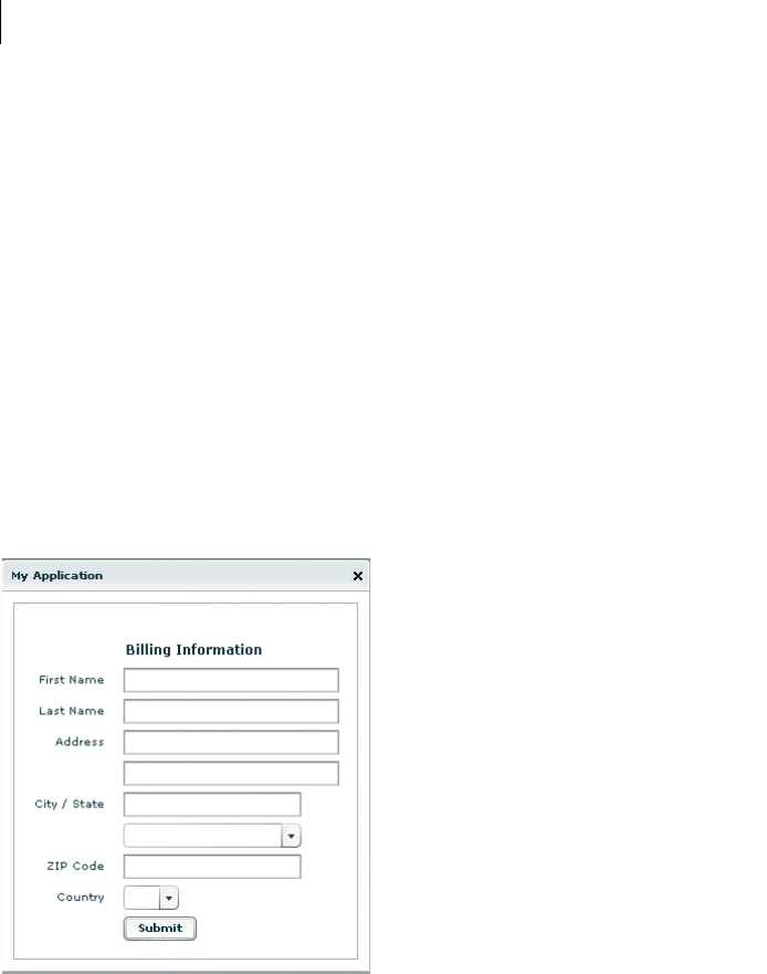
CHAPTER 15
516
TitleWindow layout container
A TitleWindow layout container is a Panel container that is optimized for use as a pop-up window. The container
consists of a title bar, a caption and status area in the title bar, a border, and a content area for its children. Unlike
the Panel container, it can display a Close button, and is designed to work as a pop-up window that users can drag
around the screen the application window.
A pop-up TitleWindow container can be modal, which means that it takes all keyboard and mouse input until it
is closed, or nonmodal, which means other windows can accept input while the pop-up window is still open.
One typical use for a TitleWindow container is to hold a form. When the user completes the form, you can close
the TitleWindow container programmatically, or let the user request the application to close it by using the close
icon (a box with an x inside it) in the upper-right corner of the window.
Because you pop up a Title window, you do not create it directly in MXML, as you do most controls; instead you
use the PopUpManager.
The following example shows a TitleWindow container with a Form container as its child:
For complete reference information, see TitleWindow in the Adobe Flex Language Reference.
517ADOBE FLEX 3
Adobe Flex 3 Developer Guide
Using the PopUpManager to create a TitleWindow container
To create and remove a pop-up TitleWindow container, you use methods of the PopUpManager. The PopUp-
Manager is in the mx.managers package.
Creating a pop-up window
To create a pop-up window, use the PopUpManager createPopUp() method. The createPopUp() method has
the following signature:
public static createPopUp(parent:DisplayObject, class:Class,
modal:Boolean = false):IFlexDisplayObject
The method has the following arguments.
Note: Flex continues executing code in the parent even after you create a modal pop-up window.
You can also create a pop-up window by passing an instance of a TitleWindow class or custom component to the
PopUpManager addPopUp() method. For more information, see “Using the addPopUp() method” on page 527.
Defining a custom TitleWindow component
One of the most common ways of creating a TitleWindow container is to define it as a custom MXML component.
•You define the TitleWindow container, its event handlers, and all of its children in the custom component.
•You use the PopUpManager createPopUp() and removePopUp() methods to create and remove the
TitleWindow container.
The following example code defines a custom MyLoginForm TitleWindow component that is used as a pop-up
window:
<?xml version="1.0"?>
<!-- containers\layouts\myComponents\MyLoginForm.mxml -->
<mx:TitleWindow xmlns:mx="http://www.adobe.com/2006/mxml">
<mx:Script>
<
CHAPTER 15
518
private function processLogin():void {
// Check credentials (not shown) then remove pop up.
PopUpManager.removePopUp(this);
}
]]>
</mx:Script>
<mx:Form>
<mx:FormItem label="User Name">
<mx:TextInput id="username" width="100%"/>
</mx:FormItem>
<mx:FormItem label="Password">
<mx:TextInput id="password"
displayAsPassword="true"
width="100%"/>
</mx:FormItem>
</mx:Form>
<mx:HBox>
<mx:Button click="processLogin();" label="OK"/>
<mx:Button
label="Cancel"
click="PopUpManager.removePopUp(this);"/>
</mx:HBox>
</mx:TitleWindow>
This file, named MyLoginForm.mxml, defines a TitleWindow container by using the <mx:TitleWindow> tag.
The TitleWindow container defines two TextInput controls, for user name and password, and two Button
controls, for submitting the form and for closing the TitleWindow container. This example does not include the
code for verifying the user name and password in the submitForm() event listener.
In this example, you process the form data in an event listener of the MyLoginForm.mxml component. To make
this component more reusable, you can define the event listeners in your main application. This lets you create a
generic form that leaves the data handling to the application that uses the form. For an example that defines the
event listeners in the main application, see “Using TitleWindow and PopUpManager events” on page 520.
Using the PopUpManager to create the pop-up TitleWindow
To create a pop-up window, you call the PopUpManager createPopUp() method and pass it the parent, the name
of the class that creates the pop-up, and the modal Boolean value. The following main application code creates the
TitleWindow container defined in Defining a custom TitleWindow component:
<?xml version="1.0"?>
<!-- containers\layouts\MainMyLoginForm.mxml -->
<mx:Application xmlns:mx="http://www.adobe.com/2006/mxml">
<mx:Script>
<
519ADOBE FLEX 3
Adobe Flex 3 Developer Guide
var helpWindow:IFlexDisplayObject =
PopUpManager.createPopUp(this, MyLoginForm, false);
}
]]>
</mx:Script>
<mx:VBox width="300" height="300">
<mx:Button click="showLogin();" label="Login"/>
</mx:VBox>
</mx:Application>
In this example, when the user selects the Login button, the event listener for the click event uses the
createPopUp() method to create a TitleWindow container, passing to it the name of the MyLoginForm.mxml
file as the class name.
Often, you cast the return value of the createPopUp() method to TitleWindow so that you can manipulate the
properties of the pop-up TitleWindow container, as the following version of the showLogin() method from the
preceding example shows:
<?xml version="1.0"?>
<!-- containers\layouts\MainMyLoginFormCast.mxml -->
<mx:Application xmlns:mx="http://www.adobe.com/2006/mxml">
<mx:Script>
<![CDATA[
import mx.managers.PopUpManager;
import mx.core.IFlexDisplayObject;
import myComponents.MyLoginForm;
// Additional import statement to use the TitleWindow container.
import mx.containers.TitleWindow;
private function showLogin():void {
// Create the TitleWindow container.
var helpWindow:TitleWindow =
TitleWindow(PopUpManager.createPopUp(this, MyLoginForm, false));
// Add title to the title bar.
helpWindow.title="Enter Login Information";
// Make title bar slightly transparent.
helpWindow.setStyle("borderAlpha", 0.9);
// Add a close button.
// To close the container, your must also handle the close event.
helpWindow.showCloseButton=true;
}
]]>
</mx:Script>
<mx:VBox width="300" height="300">
<mx:Button click="showLogin();" label="Login"/>
</mx:VBox>
</mx:Application>

CHAPTER 15
520
Removing a pop-up window
To remove a pop-up TitleWindow, use the PopUpManager removePopUp() method. You pass the object created
with the PopUpManager.createPopUp() method to the removePopUp() method. The following modification to
the example from “Using the PopUpManager to create the pop-up TitleWindow” on page 518 removes the pop-
up when the user clicks the Done button:
<?xml version="1.0"?>
<!-- containers\layouts\MainMyLoginFormRemove.mxml -->
<mx:Application xmlns:mx="http://www.adobe.com/2006/mxml">
<mx:Script>
<![CDATA[
import mx.managers.PopUpManager;
import myComponents.MyLoginForm;
import mx.core.IFlexDisplayObject;
private var helpWindow:IFlexDisplayObject;
private function showLogin():void {
// Create the TitleWindow container.
helpWindow = PopUpManager.createPopUp(this, MyLoginForm, false);
}
private function removeForm():void {
PopUpManager.removePopUp(helpWindow);
}
]]>
</mx:Script>
<mx:VBox width="300" height="300">
<mx:Button click="showLogin();" label="Login"/>
<mx:Button id="b2" label="Remove Form" click="removeForm();"/>
</mx:VBox>
</mx:Application>
You commonly call the removePopUp() method from a TitleWindow close event and the PopUpManager
mouseDownOutside event, as described in “Passing data using events” on page 525.
Using TitleWindow and PopUpManager events
You can add a close icon (a small x in the upper-right corner of the TitleWindow title bar) to make it appear
similar to dialog boxes in a GUI environment. You do this by setting the showCloseButton property to true, as
the following example shows:
<mx:TitleWindow xmlns:mx="http://www.adobe.com/2006/mxml" showCloseButton="true">
The default value for showCloseButton is false.
The TitleWindow broadcasts a close event when the user clicks the close icon. You must create a handler for that
event and close the TitleWindow from within that event handler. Flex does not close the window automatically.
In the simplest case, you can call the PopUpManager removePopUp() method directly in the TitleWindow close
event property specify, as the following line shows:

521ADOBE FLEX 3
Adobe Flex 3 Developer Guide
<mx:TitleWindow xmlns:mx="http://www.adobe.com/2006/mxml"showCloseButton="true"
close="PopUpManager.removePopUp(this);">
If you need to clean up, before closing the TitleWindow control, create an event listener function for the close
event and close the TitleWindow from within that handler, as the following example shows:
<?xml version="1.0"?>
<!-- containers\layouts\myComponents\MyLoginFormRemoveMe.mxml -->
<mx:TitleWindow xmlns:mx="http://www.adobe.com/2006/mxml"
showCloseButton="true"
close="removeMe();">
<mx:Script>
<![CDATA[
import mx.managers.PopUpManager;
private function removeMe():void {
// Put any clean-up code here.
PopUpManager.removePopUp(this);
}
]]>
</mx:Script>
</mx:TitleWindow>
You can also use the PopUpManager mouseDownOutside event to close the pop-up window when a user clicks
the mouse outside the TitleWindow. To do this, you add an event listener to the TitleWindow instance for the
mouseDownOutside event, as the following example shows:
<?xml version="1.0"?>
<!-- containers\layouts\MainMyLoginFormMouseDown.mxml -->
<mx:Application xmlns:mx="http://www.adobe.com/2006/mxml">
<mx:Script>
<![CDATA[
import mx.managers.PopUpManager;
import mx.containers.TitleWindow;
import myComponents.MyLoginForm;
import mx.events.FlexMouseEvent;
private var helpWindow:TitleWindow;
private function showLogin():void {
// Create the TitleWindow container.
helpWindow = TitleWindow(PopUpManager.createPopUp(this,
MyLoginForm, false));
helpWindow.addEventListener("mouseDownOutside", removeForm);
}
private function removeForm(event:FlexMouseEvent):void {
PopUpManager.removePopUp(helpWindow);
}
]]>
</mx:Script>
<mx:VBox width="300" height="300">
<mx:Button click="showLogin();" label="Login"/>

CHAPTER 15
522
</mx:VBox>
</mx:Application>
You define the event listener in the main application, and then assign it to the pop-up window when you create it.
This technique lets you use a generic pop-up window, defined by the component MyLoginForm.mxml, and then
modify the behavior of the component by assigning event listeners to it from the main application.
Centering a pop-up window
Call the centerPopUp() method of the PopUpManager to center the pop-up within another container. The
following custom MXML component centers itself in its parent container:
<?xml version="1.0"?>
<!-- containers\layouts\myComponents\MyLoginFormCenter.mxml -->
<mx:TitleWindow xmlns:mx="http://www.adobe.com/2006/mxml"
creationComplete="handleCreationComplete();">
<mx:Script>
<![CDATA[
import mx.managers.PopUpManager;
private function handleCreationComplete():void {
// Center the TitleWindow container
// over the control that created it.
PopUpManager.centerPopUp(this);
}
private function processLogin():void {
// Check credentials (not shown) then remove pop up.
PopUpManager.removePopUp(this);
}
]]>
</mx:Script>
<mx:Form>
<mx:FormItem label="User Name">
<mx:TextInput id="username" width="100%"/>
</mx:FormItem>
<mx:FormItem label="Password">
<mx:TextInput id="password"
width="100%"
displayAsPassword="true"/>
</mx:FormItem>
</mx:Form>
<mx:HBox>
<mx:Button click="processLogin();" label="OK"/>
<mx:Button
label="Cancel"
click="PopUpManager.removePopUp(this);"/>
</mx:HBox>
</mx:TitleWindow>

523ADOBE FLEX 3
Adobe Flex 3 Developer Guide
Creating a modal pop-up window
The createPopUp() method takes an optional modal parameter. You can set this parameter to true to make the
window modal. When a TitleWindow is modal, you cannot select any other component while the window is open.
The default value of modal is false.
The following example creates a modal pop-up window:
var pop1:IFlexDisplayObject = PopUpManager.createPopUp(this, MyLoginForm,
true);
Passing data to and from a pop-up window
To make your pop-up window more flexible, you might want to pass data to it or return data from it. To do this,
use the following guidelines:
•Create a custom component to be your pop-up. In most circumstances, this component is a TitleWindow
container.
•Declare variables in your pop-up that you will set in the application that creates the pop-up.
•Cast the pop-up to be the same type as your custom component.
•Pass a reference to that component to the pop-up window, if the pop-up window is to set a value on the appli-
cation or one of the application’s components.
For example, the following application populates a ComboBox in the pop-up window with an Array defined in
the main application.
When creating the pop-up, the application casts the pop-up to be of type ArrayEntryForm, which is the name of
the custom component that defines the pop-up window. If you do not do this, the application cannot access the
properties that you create.
The application passes a reference to the TextInput component in the Application container to the pop-up window
so that the pop-up can write its results back to the container. The application also passes the Array of file exten-
sions for the pop-up ComboBox control’s data provider, and sets the pop-up window’s title. By setting these in the
application, you can reuse the pop-up window in other parts of the application without modification, because it
does not have to know the name of the component it is writing back to or the data that it is displaying, only that
its data is in an Array and it is writing to a TextArea.
<?xml version="1.0"?>
<!-- containers\layouts\MainArrayEntryForm.mxml -->
<mx:Application xmlns:mx="http://www.adobe.com/2006/mxml">
<mx:Script>
<
CHAPTER 15
524
public function displayForm():void {
/* Array with data for the custom control ComboBox control. */
var doctypes:Array = ["*.as", "*.mxml", "*.swc"]
/* Create the pop-up and cast the
return value of the createPopUp()
method to the ArrayEntryForm custom component. */
var pop1:ArrayEntryForm = ArrayEntryForm(
PopUpManager.createPopUp(this, ArrayEntryForm, true));
/* Set TitleWindow properties. */
pop1.title="Select File Type";
pop1.showCloseButton=true;
/* Set properties of the ArrayEntryForm custom component. */
pop1.targetComponent = ti1;
pop1.myArray = doctypes;
PopUpManager.centerPopUp(pop1);
}
]]>
</mx:Script>
<mx:TextInput id="ti1" text=""/>
<mx:Button id="b1" label="Select File Type" click="displayForm();"/>
</mx:Application>
The following custom component, ArrayEntryForm.mxml, declares two variables. The first one is for the Array
that the parent application passes to the pop-up window. The second holds a reference to the parent application’s
TextInput control. The component uses that reference to update the parent application:
<?xml version="1.0"?>
<!-- containers\layouts\myComponents\ArrayEntryForm.mxml -->
<mx:TitleWindow xmlns:mx="http://www.adobe.com/2006/mxml"
showCloseButton="true"
width="200" borderAlpha="1"
close="removeMe();">
<mx:Script>
<![CDATA[
import mx.controls.TextInput;
import mx.managers.PopUpManager;
// Variables whose values are set by the main application.
// Data provider array for the component's ComboBox control.
[Bindable]
public var myArray:Array;
// A reference to the TextInput control
// in which to put the result.
public var targetComponent:TextInput;
// OK button click event listener.
// Sets the target component in the application to the
// selected ComboBox item value.
private function submitData():void {
targetComponent.text = String(cb1.selectedItem);
removeMe();

525ADOBE FLEX 3
Adobe Flex 3 Developer Guide
}
// Cancel button click event listener.
private function removeMe():void {
PopUpManager.removePopUp(this);
}
]]>
</mx:Script>
<mx:ComboBox id="cb1" dataProvider="{myArray}"/>
<mx:HBox>
<mx:Button label="OK" click="submitData();"/>
<mx:Button label="Cancel" click="removeMe();"/>
</mx:HBox>
</mx:TitleWindow>
From within a pop-up custom component, you can also access properties of the parent application by using the
parentApplication property. For example, if the application has a Button control named b1, you can get the
label of that Button control, as the following example shows:
myLabel = parentApplication.b1.label;
This technique, however, uses a hard-coded value in the pop-up component for both the target component id in
the parent and the property in the component.
Passing data using events
The following example modifies the example from the previous section to use event listeners defined in the main
application to handle the passing of data back from the pop-up window to the main application. This example
shows the ArrayEntryFormEvents.mxml file with no event listeners defined within it.
<?xml version="1.0"?>
<!-- containers\layouts\myComponents\ArrayEntryFormEvents.mxml -->
<mx:TitleWindow xmlns:mx="http://www.adobe.com/2006/mxml"
showCloseButton="true"
width="200"
borderAlpha="1">
<mx:Script>
<![CDATA[
import mx.managers.PopUpManager;
// Variables whose values are set by the main application.
// Data provider array for the component's ComboBox control.
[Bindable]
public var myArray:Array;
]]>
</mx:Script>
<mx:ComboBox id="cb1" dataProvider="{myArray}"/>
<mx:HBox>
<mx:Button id="okButton" label="OK"/>
<mx:Button id="cancelButton" label="Cancel"/>
</mx:HBox>

CHAPTER 15
526
</mx:TitleWindow>
The main application defines the event listeners and registers them with the controls defined within the pop-up
window:
<?xml version="1.0"?>
<!-- containers\layouts\MainArrayEntryFormEvents.mxml -->
<mx:Application xmlns:mx="http://www.adobe.com/2006/mxml">
<mx:Script>
<![CDATA[
import mx.managers.PopUpManager;
import flash.events.Event;
import myComponents.ArrayEntryFormEvents;
public var pop1:ArrayEntryFormEvents;
public function displayForm():void {
// Array with data for the custom control ComboBox control.
var doctypes:Array = ["*.as", "*.mxml", "*.swc"]
// Create the pop-up and cast the return value
// of the createPopUp()
// method to the ArrayEntryFormEvents custom component.
pop1 = ArrayEntryFormEvents(
PopUpManager.createPopUp(this, ArrayEntryFormEvents, true));
// Set TitleWindow properties.
pop1.title="Select File Type";
pop1.showCloseButton=true;
// Set the event listeners for
// the ArrayEntryFormEvents component.
pop1.addEventListener("close", removeMe);
pop1["cancelButton"].addEventListener("click", removeMe);
pop1["okButton"].addEventListener("click", submitData);
// Set properties of the ArrayEntryFormEvents custom control.
pop1.myArray = doctypes;
PopUpManager.centerPopUp(pop1);
}
// OK button click event listener.
// Sets the target component in the application to the
// selected ComboBox item value.
private function submitData(event:Event):void {
ti1.text = String(pop1.cb1.selectedItem);
removeMe(event);
}
// Cancel button click event listener.
private function removeMe(event:Event):void {
PopUpManager.removePopUp(pop1);
}
]]>
</mx:Script>
<mx:VBox>
<mx:TextInput id="ti1" text=""/>

527ADOBE FLEX 3
Adobe Flex 3 Developer Guide
</mx:VBox>
<mx:Button id="b1" label="Select File Type" click="displayForm();"/>
</mx:Application>
Using the addPopUp() method
You can use the addPopUp() method of the PopUpManager to create a pop-up window without defining a custom
component. This method takes an instance of any class that implements IFlexDisplayObject. Because it takes a
class instance, not a class, you can use ActionScript code in an <mx:Script> block to create the component
instance to pop up, rather than as a separate custom component.
Using the addPopUp() method may be preferable to using the createPopUp() method if you have to pop up a
simple dialog box that is never reused elsewhere. However, it is not the best coding practice if the pop-up is
complex or cannot be reused elsewhere.
The following example creates a pop-up with addPopUp() method and adds a Button control to that window that
closes the window when you click it:
<?xml version="1.0"?>
<!-- containers\layouts\MyPopUpButton.mxml -->
<mx:Application xmlns:mx="http://www.adobe.com/2006/mxml"
height="600" width="600" >
<mx:Script>
<
CHAPTER 15
528
btn1.label="close";
btn1.addEventListener(MouseEvent.CLICK, closeTitleWindow);
myTitleWindow.addChild(btn1);
}
// The method to close the TitleWindow container.
public function closeTitleWindow(event:MouseEvent):void {
PopUpManager.removePopUp(event.currentTarget.parent);
}
]]>
</mx:Script>
<mx:Button label="Open Window" click="openWindow(event);"/>
</mx:Application>
You can make any component pop up. The following example pops up a TextArea control. The example resizes
the control, and listens for a Shift-click to determine when to close the TextArea. Whatever text you type in the
TextArea is stored in a Label control in the application when the pop-up window is removed.
<?xml version="1.0"?>
<!-- containers\layouts\MyPopUpTextArea.mxml -->
<mx:Application xmlns:mx="http://www.adobe.com/2006/mxml">
<mx:Script>
<![CDATA[
import mx.managers.PopUpManager;
import mx.controls.TextArea;
import mx.core.IFlexDisplayObject;
public var myPopUp:TextArea
public function openWindow(event:MouseEvent):void {
myPopUp = new TextArea();
myPopUp.width= 220;
myPopUp.height= 150;
myPopUp.text = "Hold down the Shift key, and " +
"click in the TextArea to close it.";
myPopUp.addEventListener(MouseEvent.CLICK, closeWindow);
PopUpManager.addPopUp(myPopUp, this, true);
PopUpManager.centerPopUp(myPopUp);
}
public function closeWindow(event:MouseEvent):void {
if (event.shiftKey) {
label1.text = myPopUp.text;
PopUpManager.removePopUp(IFlexDisplayObject(event.currentTarget));
}
}
]]>
</mx:Script>
<mx:VBox>
<mx:Button id="b1" label="Create TextArea Popup"
click="openWindow(event);"/>
<mx:Label id="label1"/>
</mx:VBox>
</mx:Application>

529
Chapter 16: Using Navigator Containers
Navigator containers control user movement, or navigation, among multiple children where the children are other
containers. The individual child containers of the navigator container oversee the layout and positioning of their
children; the navigator container does not oversee layout and positioning.
Topics
About navigator containers . . . . . . . . . . . . . . . . . . . . . . . . . . . . . . . . . . . . . . . . . . . . . . . . . . . . . . . . . . . . . . . . . . . . . . .529
ViewStack navigator container . . . . . . . . . . . . . . . . . . . . . . . . . . . . . . . . . . . . . . . . . . . . . . . . . . . . . . . . . . . . . . . . . . . .529
TabNavigator container . . . . . . . . . . . . . . . . . . . . . . . . . . . . . . . . . . . . . . . . . . . . . . . . . . . . . . . . . . . . . . . . . . . . . . . . . . 535
Accordion navigator container . . . . . . . . . . . . . . . . . . . . . . . . . . . . . . . . . . . . . . . . . . . . . . . . . . . . . . . . . . . . . . . . . . . . 538
About navigator containers
A navigator container controls user movement through a group of child containers. For example, a TabNavigator
container lets you select the visible child container by using a set of tabs.
Note: The direct children of a navigator container must be containers, either layout or navigator containers. You
cannot directly nest a control within a navigator; controls must be children of a child container of the navigator
container.
Adobe® Flex® provides the following navigator containers:
•ViewStack
•Tab N av i ga tor
•Accordion
ViewStack navigator container
A ViewStack navigator container is made up of a collection of child containers that are stacked on top of each
other, with only one container visible, or active, at a time. The ViewStack container does not define a built-in
mechanism for users to switch the currently active container; you must use a LinkBar, Tab B ar, ButtonBar, or
ToggleButtonBar control or build the logic yourself in ActionScript to let users change the currently active child.
For example, you can define a set of Button controls that switch among the child containers.
530 CHAPTER 16
The following image shows the stacked child containers in a ViewStack container:
A. Child container 1 active B. Child container 0 active
On the left, you see a ViewStack container with the first child active. The index of a child in a ViewStack container
is numbered from 0 to n - 1, where n is the number of child containers. The container on the right is a ViewStack
container with the second child container active.
For complete reference information, see ViewStack in the Adobe Flex Language Reference.
Creating a ViewStack container
You use the < mx:ViewStack> tag to define a ViewStack container, and you define the child containers in the tag
body. You use the following properties of the ViewStack container to control the active child container:
1selectedIndex The index of the currently active container if one or more child containers are defined. The
value of this property is -1 if no child containers are defined. The index is numbered from 0 to numChildren - 1,
where numChildren is the number of child containers in the ViewStack container. Set this property to the index
of the container that you want active.
You can use the selectedIndex property of the <mx:ViewStack> tag to set the default active container when
your application starts. The following example sets the index of the default active container to 1:
<mx:ViewStack id="myViewStack" selectedIndex="1">
The following example uses ActionScript to set the selectedIndex property so that the active child container
is the second container in the stack:
myViewStack.selectedIndex=1;
2selectedChild The currently active container if one or more child containers are defined. The value of this
property is null if no child containers are defined. Set this property in ActionScript to the identifier of the
container that you want active.
You can set this property only in an ActionScript statement, not in MXML.
AB

531ADOBE FLEX 3
Adobe Flex 3 Developer Guide
The following example uses ActionScript to set the selectedChild property so that the active child container
is the child container with an identifier of search:
myViewStack.selectedChild=search;
3numChildren Contains the number of child containers in the ViewStack container.
The following example uses the numChildren property in an ActionScript statement to set the active child
container to the last container in the stack:
myViewStack.selectedIndex=myViewStack.numChildren-1;
Note: The default creation policy for all containers, except the Application container, is the policy of the parent
container. The default policy for the Application container is auto. In most cases, therefore, the View Stack control’s
children are not created until they are selected. You cannot set the selectedChild property to a child that is not yet
created.
The following example creates a ViewStack container with three child containers. The example also defines three
Button controls that when clicked, select the active child container:
<?xml version="1.0"?>
<!-- containers\navigators\VSSimple.mxml -->
<mx:Application xmlns:mx="http://www.adobe.com/2006/mxml">
<!-- Create a VBox container so the container for
the buttons appears above the ViewStack container. -->
<mx:VBox>
<!-- Create an HBox container to hold the three buttons. -->
<mx:HBox borderStyle="solid">
<!-- Define the three buttons.
Each uses the child container identifier
to set the active child container. -->
<mx:Button id="searchButton"
label="Search Screen"
click="myViewStack.selectedChild=search;"/>
<mx:Button id="cInfoButton"
label="Customer Info Screen"
click="myViewStack.selectedChild=custInfo;"/>
<mx:Button id="aInfoButton"
label="Account Info Screen"
click="myViewStack.selectedChild=accountInfo;"/>
</mx:HBox>
<!-- Define the ViewStack and the three child containers and have it
resize up to the size of the container for the buttons. -->
<mx:ViewStack id="myViewStack"
borderStyle="solid" width="100%">
<mx:Canvas id="search" label="Search">
<mx:Label text="Search Screen"/>
</mx:Canvas>
CHAPTER 16
532
<mx:Canvas id="custInfo" label="Customer Info">
<mx:Label text="Customer Info"/>
</mx:Canvas>
<mx:Canvas id="accountInfo" label="Account Info">
<mx:Label text="Account Info"/>
</mx:Canvas>
</mx:ViewStack>
</mx:VBox>
</mx:Application>
When this example loads, the three Button controls appear, and the first child container defined in the ViewStack
container is active. Select a Button control to change the active container.
You can also use a LinkBar, TabBar, ButtonBar, or ToggleButtonBar control to set the active child of a ViewStack
container. These classes are subclasses of the NavBar class, so they are collectively called navigator bar controls.
Navigator bar controls can determine the number of child containers in a ViewStack container, and then create a
horizontal or vertical set of links, tabs, or buttons that let the user select the active child, as the following image
shows:
The items in the LinkBar control correspond to the values of the label property of each child of the ViewStack
container, as the following example shows:
<?xml version="1.0"?>
<!-- containers\navigators\VSLinkBar.mxml -->
<mx:Application xmlns:mx="http://www.adobe.com/2006/mxml">
<mx:VBox>
<!-- Create a LinkBar control to navigate
the ViewStack container. -->
<mx:LinkBar dataProvider="{myViewStack}" borderStyle="solid"/>
<!-- Define the ViewStack and the three child containers. -->
<mx:ViewStack id="myViewStack"
borderStyle="solid"
width="100%">
<mx:Canvas id="search" label="Search">
<mx:Label text="Search Screen"/>
</mx:Canvas>
<mx:Canvas id="custInfo" label="Customer Info">
<mx:Label text="Customer Info"/>

533ADOBE FLEX 3
Adobe Flex 3 Developer Guide
</mx:Canvas>
<mx:Canvas id="accountInfo" label="Account Info">
<mx:Label text="Account Info"/>
</mx:Canvas>
</mx:ViewStack>
</mx:VBox>
</mx:Application>
You provide only a single property to the navigator bar control, dataProvider, to specify the name of the
ViewStack container associated with it. For more information on the LinkBar control, see “LinkBar control” on
page 243. For more information on the TabBar control, see “TabBar control” on page 244. For more information
on the ButtonBar and ToggleButtonBar controls, see “ButtonBar and ToggleButtonBar controls” on page 240.
Sizing the children of a ViewStack container
The default width and height of a ViewStack container is the width and height of the first child. A ViewStack
container does not change size every time you change the active child.
You can use the following techniques to control the size of a ViewStack container so that it displays all the compo-
nents inside its children:
•Set explicit width and height properties for all children to the same fixed values.
•Set percentage-based width and height properties for all children to the same fixed values.
•Set width and height properties for the ViewStack container to a fixed or percentage-based value.
The technique that you use is based on your application and the content of your ViewStack container.
Applying behaviors to a ViewStack container
You can assign effects to the ViewStack container or to its children. For example, if you assign the WipeRight effect
to the creationCompleteEffect property of the ViewStack control, Flex plays the effect once when the
ViewStack first appears.
To specify the effects that run when the ViewStack changes children, use the children’s hideEffect and
showEffect properties. The effect specified by the hideEffect property plays as a container is being hidden, and
the effect specified by the showEffect property plays as the newly visible child appears. The ViewStack container
waits for the completion of the effect specified by the hideEffect property for the container that is being hidden
before it reveals the new child container.
The following example runs a WipeRight effect when the ViewStack container is first created, and runs a
WipeDown effect when each child is hidden and a WipeUp effect when a new child appears.
<?xml version="1.0"?>
<!-- containers\navigators\VSLinkEffects.mxml -->
<mx:Application xmlns:mx="http://www.adobe.com/2006/mxml">

CHAPTER 16
534
<mx:WipeUp id="myWU" duration="300"/>
<mx:WipeDown id="myWD" duration="300"/>
<mx:WipeRight id="myWR" duration="300"/>
<mx:VBox>
<mx:LinkBar dataProvider="{myViewStack}"
borderStyle="solid"
backgroundColor="#EEEEFF"/>
<mx:ViewStack id="myViewStack"
borderStyle="solid"
width="100%"
creationCompleteEffect="{myWR}">
<mx:Canvas id="search"
label="Search"
hideEffect="{myWD}"
showEffect="{myWU}">
<mx:Label text="Search Screen"/>
</mx:Canvas>
<mx:Canvas id="custInfo"
label="Customer Info"
hideEffect="{myWD}"
showEffect="{myWU}">
<mx:Label text="Customer Info"/>
</mx:Canvas>
<mx:Canvas id="accountInfo"
label="Account Info"
hideEffect="{myWD}"
showEffect="{myWU}">
<mx:Label text="Account Info"/>
</mx:Canvas>
</mx:ViewStack>
</mx:VBox>
</mx:Application>
Notice that the showEffect property of a container is only triggered when the container’s visibility changes from
false to true. Therefore, you use the creationCompleteEffect property to trigger the effect when Flex first
creates the component.
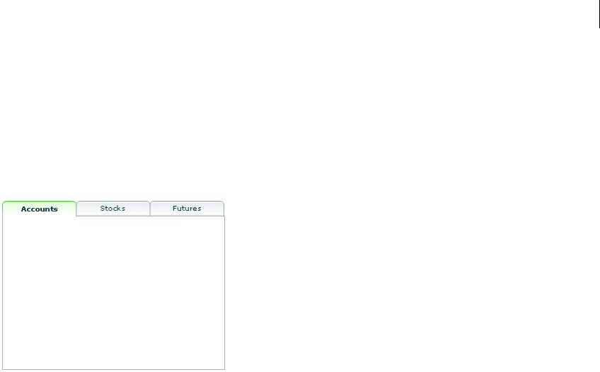
535ADOBE FLEX 3
Adobe Flex 3 Developer Guide
TabNavigator container
A TabNavigator container creates and manages a set of tabs, which you use to navigate among its children. The
children of a TabNavigator container are other containers. The TabNavigator container creates one tab for each
child. When the user selects a tab, the TabNavigator container displays the associated child, as the following image
shows:
The TabNavigator container is a child class of the ViewStack container and inherits much of its functionality. For
complete reference information, see the Adobe Flex Language Reference.
Creating a TabNavigator container
You use the <mx:TabNavigator> tag to define a TabNavigator container. Only one child of the TabNavigator
container is visible at a time. Users can make any child the selected child by selecting its associated tab or by using
keyboard navigation controls. Whenever the user changes the current child, the TabNavigator container broad-
casts a change event.
The TabNavigator container automatically creates a tab for each of its children and determines the tab text from
the label property of the child, and the tab icon from the icon property of the child. The tabs are arranged left
to right in the order determined by the child indexes. All tabs are visible, unless they do not fit within the width
of the TabNavigator container.
If you disable a child of a TabNavigator container by setting its enabled property to false, you also disable the
associated tab.
The following code creates the TabNavigator container in the image in “TabNavigator container” on page 535:
<?xml version="1.0"?>
<!-- containers\navigators\TNSimple.mxml -->
<mx:Application xmlns:mx="http://www.adobe.com/2006/mxml">

CHAPTER 16
536
<mx:TabNavigator borderStyle="solid" >
<mx:VBox label="Accounts"
width="300"
height="150">
<!-- Accounts view goes here. -->
</mx:VBox>
<mx:VBox label="Stocks"
width="300"
height="150">
<!-- Stocks view goes here. -->
</mx:VBox>
<mx:VBox label="Futures"
width="300"
height="150">
<!-- Futures view goes here. -->
</mx:VBox>
</mx:TabNavigator>
</mx:Application>
You can also set the currently active child by using the selectedChild and selectedIndex properties inherited
from the ViewStack container as follows:
•numChildren The index of the currently active container if one or more child containers are defined. The
index is numbered from 0 to numChildren - 1, where numChildren is the number of child containers in the
TabNavigator container. Set this property to the index of the container that you want active.
•selectedChild The currently active container, if one or more child containers are defined. This property
is null if no child containers are defined. Set this property to the identifier of the container that you want active.
You can set this property only in an ActionScript statement, not in MXML.
For more information on the selectedChild and selectedIndex properties, including examples, see
“ViewStack navigator container” on page 529.
You use the showEffect and hideEffect properties of the children of a TabNavigator container to specify an
effect to play when the user changes the currently active child. The following example plays the WipeLeft effect
each time the selected tab changes:
<?xml version="1.0"?>
<!-- containers\navigators\TNEffect.mxml -->
<mx:Application xmlns:mx="http://www.adobe.com/2006/mxml">
<mx:WipeLeft id="myWL"/>
<mx:TabNavigator>
<mx:VBox label="Accounts"
width="300"
height="150"
showEffect="{myWL}">

537ADOBE FLEX 3
Adobe Flex 3 Developer Guide
<!-- Accounts view goes here. -->
<mx:Text text="This is a text control."/>
</mx:VBox>
<mx:VBox label="Stocks"
width="300"
height="150"
showEffect="{myWL}">
<!-- Stocks view goes here. -->
<mx:Text text="This is a text control."/>
</mx:VBox>
<mx:VBox label="Futures"
width="300"
height="150"
showEffect="{myWL}">
<!-- Futures view goes here. -->
<mx:Text text="This is a text control."/>
</mx:VBox>
</mx:TabNavigator>
</mx:Application>
Sizing the children of a TabNavigator container
The default width and height of a TabNavigator container is the width and height of the first child. A TabNavigator
container does not change size every time you change the active child.
You can use the following techniques to control the size of a TabNavigator container so that it displays all the
components inside its children:
•Set explicit width and height properties for all children to the same fixed values.
•Set percentage-based width and height properties for all children to the same fixed values.
•Set explicit or percentage-based width and height properties for the TabNavigator container.
The method that you use is based on your application and the content of your TabNavigator container.
CHAPTER 16
538
TabNavigator container Keyboard navigation
When a TabNavigator container has focus, Flex processes keystrokes as the following table describes:
Accordion navigator container
Forms are a basic component of many applications. However, users have difficulty navigating through complex
forms, or moving back and forth through multipage forms. Sometimes, forms can be so large that they do not fit
onto a single screen.
Key Action
Down Arrow
Right Arrow
Gives focus to the next tab, wrapping from last to first, without changing the selected child.
Up Arrow
Left Arrow
Gives focus to the previous tab, wrapping from first to last, without changing the selected child.
Page Down Selects the next child, wrapping from last to first.
Page Up Selects the previous child, wrapping from first to last.
Home Selects the first child.
End Selects the last child.
Enter
Spacebar
Selects the child associated with the tab displaying focus.
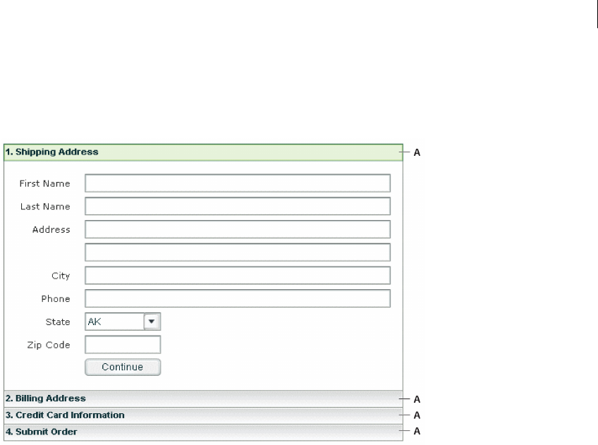
539ADOBE FLEX 3
Adobe Flex 3 Developer Guide
Flex includes the Accordion navigator container, which can greatly improve the look and navigation of a form.
The Accordion container defines a sequence of child panels, but displays only one panel at a time. The following
image shows an example of an Accordion container:
A. Accordion container navigation button
To navigate a container, the user clicks the navigation button that corresponds to the child panel that they want to
access. Accordion containers let users access the child panels in any order to move back and forth through the
form. For example, when the user is in the Credit Card Information panel, they might decide to change the infor-
mation in the Billing Address panel. To do so, they navigate to the Billing Address panel, edit the information, and
then navigate back to the Credit Card Information panel.
In HTML, a form that contains shipping address, billing address, and credit card information is often imple-
mented as three separate pages, which requires the user to submit each page to the server before moving on to the
next. An Accordion container can organize the information on three child panels with a single Submit button.
This architecture minimizes server traffic and lets the user maintain a better sense of progress and context.
Note: An empty Accordion container with no child panels cannot take focus.
Although Accordion containers are useful for working with forms and Form containers, you can use any Flex
component within a child panel of an Accordion container. For example, you could create a catalog of products
in an Accordion container, where each panel contains a group of similar products.

CHAPTER 16
540
For complete reference information, see Accordion in the Adobe Flex Language Reference.
Creating an Accordion container
You use the <mx:Accordion> tag to define an Accordion container. In the Accordion container, you define one
container for each child panel. For example, if the Accordion container has four child panels that the correspond
to four parts of a form, you define each child panel by using the Form container, as the following example shows:
<?xml version="1.0"?>
<!-- containers\navigators\AccordionSimple.mxml -->
<mx:Application xmlns:mx="http://www.adobe.com/2006/mxml">
<mx:Accordion id="accordion1" height="250">
<mx:Form id="shippingAddress" label="1. Shipping Address">
<mx:FormItem id="sfirstNameItem" label="First Name">
<mx:TextInput id="sfirstName"/>
</mx:FormItem>
<!-- Additional contents goes here. -->
</mx:Form>
<mx:Form id="billingAddress" label="2. Billing Address">
<!-- Form contents goes here. -->
</mx:Form>
<mx:Form id="creditCardInfo" label="3. Credit Card Information">
<!-- Form contents goes here. -->
</mx:Form>
<mx:Form id="submitOrder" label="4. Submit Order">
<!-- Form contents goes here. -->
</mx:Form>
</mx:Accordion>
</mx:Application>
This example defines each child panel by using a Form container. However, you can use any container to define a
child panel.
Note: You can use any container to define child panels. However, some containers do not belong in child panels, such
as a TabNavigator container because it has no child components, or an Accordion container.
541ADOBE FLEX 3
Adobe Flex 3 Developer Guide
Accordion container Keyboard navigation
When an Accordion container has focus, Flex processes keystrokes as the following table describes:
Using Button controls to navigate an Accordion container
The simplest way for users to navigate the panels of an Accordion container is to click the navigator button for the
desired panel. However, you can create additional navigation Button controls, such as Back and Next, to make it
easier for users to navigate.
Navigation Button controls use the following properties of the Accordion container to move among the child
panels:
For more information on these properties, see “ViewStack navigator container” on page 529.
Key Action
Down Arrow
Right Arrow
Gives focus to the next button, wrapping from last to first, without changing the selected child.
Up Arrow
Left Arrow
Gives focus to the previous button, wrapping from first to last, without changing the selected child.
Page Up Moves to the previous child panel, wrapping from first to last.
Page Down Moves to the next child panel, wrapping from last to first.
Home Moves to the first child panel.
End Moves to the last child panel.
Enter
Spacebar
Selects the child associated with the tab displaying focus.
Property Description
numChildren Contains the total number of child panels defined in an Accordion container.
selectedIndex The index of the currently active child panel. Child panels are numbered from 0 to numChildren - 1. Setting the
selectedIndex property changes the currently active panel.
selectedChild The currently active child container if one or more child containers are defined. This property is null if no child
containers are defined. Set this property to the identifier of the container that you want active. You can set this
property only in an ActionScript statement, not in MXML.

CHAPTER 16
542
You can use the following two Button controls, for example, in the second panel of an Accordion container, panel
number 1, to move back to panel number 0 or ahead to panel number 2:
<?xml version="1.0"?>
<!-- containers\navigators\AccordionButtonNav.mxml -->
<mx:Application xmlns:mx="http://www.adobe.com/2006/mxml">
<mx:Accordion id="accordion1" height="250">
<mx:Form id="shippingAddress" label="1. Shipping Address">
<mx:FormItem id="sfirstNameItem" label="First Name">
<mx:TextInput id="sfirstName"/>
</mx:FormItem>
</mx:Form>
<mx:Form id="billingAddress" label="2. Billing Address">
<mx:Button id="backButton"
label="Back"
click="accordion1.selectedIndex=0;"/>
<mx:Button id="nextButton"
label="Next"
click="accordion1.selectedIndex=2;"/>
</mx:Form>
<mx:Form id="creditCardInfo" label="3. Credit Card Information">
</mx:Form>
</mx:Accordion>
</mx:Application>
You can also use relative location with navigation buttons. The following Button controls move forward and
backward through Accordion container panels based on the current panel number:
<mx:Button id="backButton" label="Back"click="accordion1.selectedIndex =
accordion1.selectedIndex - 1;"/>
<mx:Button id="nextButton" label="Next"click="accordion1.selectedIndex =
accordion1.selectedIndex + 1;"/>
For the Next Button control, you also can use the selectedChild property to move to the next panel based on
the value of the id property of the panel’s container, as the following code shows:
<mx:Button id="nextButton" label="Next"
click="accordion1.selectedChild=creditCardInfo;"/>
The following Button control opens the last panel in the Accordion container:
<mx:Button id="lastButton" label="Last" click="accordion1.selectedIndex =
accordion1.numChildren - 1;"/>

543ADOBE FLEX 3
Adobe Flex 3 Developer Guide
Handling child button events
The Accordion container can recognize an event when the user changes the current panel. The Accordion
container broadcasts a change event when the user changes the child panel, either by clicking a button or pressing
a key, such as the Page Down key.
Note: A change event is not dispatched when the child panel changes programmatically; for example, the change
event is not dispatched when you use the buttons in change panels (see “Using Button controls to navigate an
Accordion container” on page 541). However, the valueCommit event is dispatched.
You can register an event handler for the change event by using the change property of the <mx:Accordion> tag,
or by registering the handler in ActionScript. The following example logs the change event to flashlog.txt each
time the user changes panels:
<mx:Accordion id="accordion1" height="450" change="trace('change');">
Controlling the appearance of accordion buttons
The buttons on an Accordion container are rendered by the AccordionHeader class, which is a subclass of Button,
and has the same style properties as the Button class.
To change the style of an Accordion button, call the Accordion class getHeaderAt() method to get a reference to
a child container’s button, and then call the button’s setStyle() method to set the style. The following example
uses this technique to set a different text color for each of the Accordion buttons:
<?xml version="1.0"?>
<!-- containers\navigators\AccordionStyling.mxml -->
<mx:Application xmlns:mx="http://www.adobe.com/2006/mxml"
width="600"
height="600"
creationComplete="setButtonStyles();">
<mx:Script>
<![CDATA[
public function setButtonStyles():void {
comp.getHeaderAt(0).setStyle('color', 0xAA0000);
comp.getHeaderAt(1).setStyle('color', 0x00AA00);
}
]]>
</mx:Script>
<mx:Accordion id="comp">
<mx:VBox label="First VBox">
<mx:TextInput/>
<mx:Button label="Button 1"/>
</mx:VBox>
<mx:VBox label="Second VBox">
<mx:TextInput/>
<mx:Button label="Button 2"/>
</mx:VBox>

CHAPTER 16
544
</mx:Accordion>
</mx:Application>
You can also control the appearance of the buttons by using the headerStyleName style property of the
Accordion class. For more information, see Accordion in the Adobe Flex Language Reference.

545
Chapter 17: Using Behaviors
Behaviors let you add animation and motion to your application in response to user or programmatic action. For
example, you can use behaviors to cause a dialog box to bounce slightly when it receives focus, or to slowly fade
in when it becomes visible. You build behaviors into your applications by using MXML and ActionScript, and the
two parts of a behavior: triggers and effects.
Topics
About behaviors . . . . . . . . . . . . . . . . . . . . . . . . . . . . . . . . . . . . . . . . . . . . . . . . . . . . . . . . . . . . . . . . . . . . . . . . . . . . . . . .545
Applying behaviors in MXML . . . . . . . . . . . . . . . . . . . . . . . . . . . . . . . . . . . . . . . . . . . . . . . . . . . . . . . . . . . . . . . . . . . .554
Applying behaviors in ActionScript . . . . . . . . . . . . . . . . . . . . . . . . . . . . . . . . . . . . . . . . . . . . . . . . . . . . . . . . . . . . . . . .557
Working with effects . . . . . . . . . . . . . . . . . . . . . . . . . . . . . . . . . . . . . . . . . . . . . . . . . . . . . . . . . . . . . . . . . . . . . . . . . . . .566
About behaviors
A behavior is a combination of a trigger paired with an effect. A trigger is an action, such as a mouse click on a
component, a component getting focus, or a component becoming visible. An effect is a visible or audible change
to the target component that occurs over a period of time, measured in milliseconds. Examples of effects are
fading, resizing, or moving a component.
You can define multiple effects to play in response to a single trigger. For example, a pet store application might
contain a Button control to select a pet category. When the user clicks the Button control, a window that contains
breed names becomes visible. As the window becomes visible, it moves to the bottom-left corner of the screen,
and it resizes from 100 by 100 pixels to 300 by 300 pixels (the effects).
By default, Adobe® Flex® components do not play an effect when a trigger occurs. To configure a component to
use an effect, you associate an effect with a trigger.
Note: Triggers are not the same as events. For example, a Button control has both a mouseDown event and a
mouseDownEffect trigger. The event initiates the corresponding effect trigger when a user clicks on a component.
You use the mouseDown event property to specify the event listener that executes when the user clicks on the
component. You use the mouseDownEffect trigger property to associate an effect with the trigger.

546 CHAPTER 17
About applying behaviors
You create, configure, and apply effects to Flex components by using both MXML and ActionScript. With MXML,
you associate effects with triggers as part of defining the basic behavior for your application, as the following
example shows:
<?xml version="1.0"?>
<!-- behaviors\ButtonWL.mxml -->
<mx:Application xmlns:mx="http://www.adobe.com/2006/mxml">
<!-- Define effect. -->
<mx:WipeLeft id="myWL" duration="1000"/>
<!-- Assign effect to targets. -->
<mx:Button id="myButton" label="Click Me" mouseDownEffect="{myWL}"/>
<mx:Button id="myOtherButton" label="Click Me" mouseDownEffect="{myWL}"/>
</mx:Application>
In this example, the effect is a WipeLeft effect with a duration of 1000 milliseconds (ms). That means it takes 1000
ms for the effect to play from start to finish.
You use data binding to assign the effect to the mouseDownEffect property of each Button control. The
mouseDownEffect property is the effect trigger that specifies to play the effect when the user clicks the control
using the mouse pointer. In the previous example, the effect makes the Button control appear as if it is being wiped
onto the screen from right to left.
Using ActionScript, you can create, modify, or play an effect. With ActionScript, you can configure the effect to
play in response to an effect trigger, or you can explicitly invoke it by calling the play() method of the effect’s
class. ActionScript gives you control of effects so that you can configure them as part of a user preferences setting,
or modify them based on user actions. The following example creates the WipeLeft effect in ActionScript:
<?xml version="1.0"?>
<!-- behaviors\AsEffect.mxml -->
<mx:Application xmlns:mx="http://www.adobe.com/2006/mxml"
creationComplete="createEffect(event);" >
<!-- Define effect. -->
<mx:Script>
<
547ADOBE FLEX 3
Adobe Flex 3 Developer Guide
// Assign the effects to the targets.
myButton.setStyle('mouseDownEffect', myWL);
myOtherButton.setStyle('mouseDownEffect', myWL);
}
]]>
</mx:Script>
<mx:Button id="myButton" label="Click Me"/>
<mx:Button id="myOtherButton" label="Click Me"/>
</mx:Application>
This example still uses an event to invoke the effect. To play an effect programmatically, you call the effect’s
play() method. For information on using ActionScript to configure and invoke effects, and for more information
on using MXML, see “Applying behaviors in MXML” on page 554.
About factory and instance classes
Flex implements effects using an architecture in which each effect is represented by two classes: a factory class and
an instance class.
Factory class The factory class creates an object of the instance class to perform the effect on the target. You create
a factory class instance in your application, and configure it with the necessary properties to control the effect,
such as the zoom size or effect duration. You then assign the factory class instance to an effect trigger of the target
component, as the following example shows:
<!-- Define factory class. -->
<mx:WipeDown id="myWD" duration="1000"/>
<!-- Assign factory class to effect targets. -->
<mx:Button id="myButton" mouseDownEffect="{myWD}"/>
<mx:Button id="myOtherButton" mouseDownEffect="{myWD}"/>
By convention, the name of a factory class is the name of the effect, such as Zoom or Fade.
Instance class The instance class implements the effect logic. When an effect trigger occurs, or when you call the
play() method to invoke an effect, the factory class creates an object of the instance class to perform the effect
on the target. When the effect ends, Flex destroys the instance object. If the effect has multiple target components,
the factory class creates multiple instance objects, one per target.
By convention, the name of an instance class is the name of the effect with the suffix Instance, such as ZoomIn-
stance or FadeInstance.
CHAPTER 17
548
The following diagram shows the class hierarchy of the Flex effect classes:
As this diagram shows, there is a corresponding instance class for each factory class.
When you use effects, you perform the following steps.
1Create a factory class object.
2Configure the factory class object.
When Flex plays an effect, Flex performs the following actions:
3Creates one object of the instance class for each target component of the effect.
4Copies configuration information from the factory object to the instance object.
5Plays the effect on the target using the instance object.
6Deletes the instance object when the effect completes.
Any changes that you make to the factory object are not propagated to a currently playing instance object.
However, the next time the effect plays, the instance object uses your new settings.
Eect
MaskEect TweenEect CompositeEect
eect classeseect classes eect classes
EectInstance
MaskEectInstance TweenEectInstance CompositeEectInstance
eect instance classeseect instance classes eect instance classes
Factory classes
Instance classes
549ADOBE FLEX 3
Adobe Flex 3 Developer Guide
When you use effects in your application, you are concerned only with the factory class; the instance class is an
implementation detail. However, if you want to create custom effects classes, you must implement a factory and
an instance class. For more information, see “Effects” on page 199 in Creating and Extending Adobe Flex 3 Compo-
nents.
Available effects
The following table lists the effects that Flex supports:
Effect Description
AnimateProperty Animates a numeric property of a component, such as height, width, scaleX, or scaleY. You specify the prop-
erty name, start value, and end value of the property to animate. The effect first sets the property to the start
value, and then updates the property value over the duration of the effect until it reaches the end value.
For example, if you want to change the width of a Button control, you can specify width as the property to
animate, and starting and ending width values to the effect.
Blur Applies a blur visual effect to a component. A Blur effect softens the details of an image. You can produce blurs
that range from a softly unfocused look to a Gaussian blur, a hazy appearance like viewing an image through
semi-opaque glass.
The Blur effect uses the Flash BlurFilter class as part of its implementation. For more information, see
flash.filters.BlurFilter in the Adobe Flex Language Reference.
If you apply a Blur effect to a component, you cannot apply a BlurFilter or a second Blur effect to the component.
Dissolve Modifies the alpha property of an overlay to gradually have to target component appear or disappear.
The Dissolve effect has the following properties:
•alphaFrom Specifies the initial alpha level (0.0= transparent, 1.0 =fully opaque). If omitted, Flex uses the
component’s current alpha level.
•alphaTo Specifies the final alpha level.
•color Value that represents the color of the overlay rectangle that the effect displays over the target
object. The default value is the color specified by the target component’s backgroundColor style property,
or 0xFFFFFF, if backgroundColor is not set.
If the target object is a container, only the children of the container dissolve. The container borders do not
dissolve.
Note: To use the Dissolve effect with the creationCompleteEffect trigger of a DataGrid control, you must
define the data provider of the control inline using a child tag of the DataGrid control, or using data binding. This
issue is a result of the data provider not being set until the creationComplete event is dispatched. Therefore,
when the effect starts playing, Flex has not completed the sizing of the DataGrid control.

CHAPTER 17
550
Fade Animate the component from transparent to opaque, or from opaque to transparent.
The Fade effect has the following properties:
•alphaFrom Specifies the initial alpha level (0.0= transparent, 1.0 =fully opaque). If omitted, Flex uses the
component’s current alpha level.
•alphaTo Specifies the final alpha level.
If you specify the Fade effect for the showEffect or hideEffect trigger, and if you omit the alphaFrom and
alphaTo properties, the effect automatically transitions from 0.0 to the targets’ current alpha value for a show
trigger, and from the targets’ current alpha value to 0.0 for a hide trigger.
Note: To use the Fade effect with text, you must use an embedded font, not a device font. For more information,
see “Using Styles and Themes” on page 589.
Glow Applies a glow visual effect to a component. The Glow effect uses the Flash GlowFilter class as part of its imple-
mentation. For more information, see the flash.filters.GlowFilter class in the Adobe Flex Language Reference.
If you apply a Glow effect to a component, you cannot apply a GlowFilter or a second Glow effect to the compo-
nent.
Iris Animates the effect target by expanding or contracting a rectangular mask centered on the target. The effect can
either grow the mask from the center of the target to expose the target, or contract it toward the target center to
obscure the component.
For more information, see “Using a mask effect” on page 573.
Effect Description
551ADOBE FLEX 3
Adobe Flex 3 Developer Guide
Move Changes the position of a component over a specified time interval. You typically apply this effect to a target in a
container that uses absolute positioning, such as Canvas, or one with "layout=absolute", such as Application
or Panel. If you apply it to a target in a container that performs automatic layout, such as a VBox or Grid container,
the move occurs, but the next time the container updates its layout, it moves the target back to its original posi-
tion. You can set the container's autoLayout property to false to disable the move back, but that disables
layout for all controls in the container.
The Move effect has the following properties:
•xFrom and yFrom Specifies the initial position of the component. If omitted, Flex uses the current position.
•xTo and yTo Specifies the destination position.
•xBy and yBy Specifies the number of pixels to move the component in the x and y directions. Values can
be positive or negative.
For the xFrom, xTo, and xBy properties, you can specify any two of the three values; Flex calculates the third. If
you specify all three properties, Flex ignores the xBy property. The same is true for the yFrom, yTo, and yBy prop-
erties.
If you specify a Move effect for a trigger, and if you do not set the six From, To, and By properties, Flex sets them
to create a smooth transition between the object’s old position and its new position.
When the Move effect runs, the layout around the component that is moving does not readjust. Setting a
container’s autoLayout property to true has no effect on this behavior.
Pause Does nothing for a specified period of time. This effect is useful when you need to composite effects. For more
information, see “Creating composite effects” on page 567.
Resize Changes the width and height of a component over a specified time interval.
The Resize effect has the following properties:
•widthFrom and heightFrom Specifies the initial width and height. If omitted, Flex uses the current size.
•widthTo and heightTo Specifies the final width and height.
•widthBy and heightBy Specifies the number of pixels to modify the size as either a positive or negative
number relative to the initial width and height.
For widthFrom, widthTo, and widthBy, you can specify any two of the three values, and Flex calculates the
third. If you specify all three, Flex ignores widthBy. The same is true for heightFrom, heightTo, and heightBy.
If you specify a Resize effect for a resize trigger, and if you do not set the six From, To, and By properties, Flex sets
them to create a smooth transition between the object’s old size and its new size.
When you apply a Resize effect, the layout manager resizes neighboring components based on the size changes
to the target component. To run the effect without resizing other components, place the target component in a
Canvas container.
When you use the Resize effect with Panel containers, you can hide Panel children to improve performance. For
more information, see “Improving performance when resizing Panel containers” on page 586.
Effect Description
CHAPTER 17
552
Rotate Rotates a component around a specified point. You can specify the coordinates of the center of the rotation, and
the starting and ending angles of rotation. You can specify positive or negative values for the angles.
The Resize effect has the following properties:
•angleFrom and angleTo Specifies the initial rotation and final rotation angles.
•originX and originY Specifies coordinate of the center point of the rotation.
Note: To use the Rotate effect with text, you must use an embedded font, not a device font. For more information,
see “Using Styles and Themes” on page 589.
SoundEffect Plays an MP3 audio file. For example, you could play a sound when a user clicks a Button control. This effect lets
you repeat the sound, select the source file, and control the volume and pan.
You specify the MP3 file using the source property. If you have already embedded the MP3 file, using the
Embed keyword, then you can pass the Class object of the MP3 file to the source property. Otherwise, specify the
full URL to the MP3 file.
For more information, see “Using a sound effect” on page 572.
WipeLeft
WipeRight
WipeUp
WipeDown
Defines a bar Wipe effect. The before or after state of the component must be invisible.
These effects have the following property:
•showTarget If true, causes the component to appear. If false, causes the component to disappear. The
default value is true.
If you specify a Wipe effect for a showEffect or hideEffect trigger, by default, Flex sets the showTarget
property to true if the component is invisible, and false if the component is visible.
For more information, see “Using a mask effect” on page 573.
Zoom Zooms a component in or out from its center point.
The Zoom effect has the following properties:
•zoomHeightFrom, zoomWidthFrom Specifies a number that represents the scale at which to start the
zoom. The default value is 0.0.
•zoomHeightTo, zoomWidthTo Specifies a number to zoom to. The default value is 1.00. Specify a value
of 2.0 to double the size of the target.
•originX, originY The x-position and y-position of the origin, or registration point, of the zoom. The
default value is the coordinates of the center of the effect target.
Note: When you apply a Zoom effect to text rendered using a system font, Flex scales the text between whole
point sizes. Although you do not have to use embedded fonts when you apply a Zoom effect to text, the Zoom
will appear smoother when you apply it to embedded fonts. For more information, see “Using Styles and Themes”
on page 589.
Effect Description
553ADOBE FLEX 3
Adobe Flex 3 Developer Guide
Available triggers
You use a trigger name to assign an effect to a target component. You can reference a trigger name as a property
of an MXML tag, in the <mx:Style> tag, or in an ActionScript setStyle() and getStyle() function. Trigger
names use the following naming convention:
triggerEventEffect
where triggerEvent is the event that invokes the effect. For example, the focusIn event occurs when a
component gains focus; you use the focusInEffect trigger property to specify the effect to invoke for the
focusIn event. The focusOut event occurs when a component loses focus; the corresponding trigger property is
focusOutEffect.
The following table lists the effect name that corresponds to each trigger:
Trigger name Triggering event
addedEffect Component is added as a child to a container.
creationCompleteEffect Component is created.
focusInEffect Component gains keyboard focus.
focusOutEffect Component loses keyboard focus.
hideEffect Component becomes invisible by changing the visible property of the component from true
to false.
mouseDownEffect User presses the mouse button while the mouse pointer is over the component.
mouseUpEffect User releases the mouse button.
moveEffect Component is moved.
removedEffect Component is removed from a container.
resizeEffect Component is resized.
rollOutEffect User rolls the mouse pointer off the component.
rollOverEffect User rolls the mouse pointer over the component.
showEffect Component becomes visible by changing the visible property of the component from false
to true.

CHAPTER 17
554
Applying behaviors in MXML
In MXML, you use a trigger name as a property of a component’s MXML tag to configure an effect for the
component. For example, to configure a Button control to use the WipeLeft effect when the user clicks the control,
you use the mouseDownEffect trigger property in an <mx:Button> tag, as the following example shows:
<?xml version="1.0"?>
<!-- behaviors\ButtonWL.mxml -->
<mx:Application xmlns:mx="http://www.adobe.com/2006/mxml">
<!-- Define effect. -->
<mx:WipeLeft id="myWL" duration="1000"/>
<!-- Assign effect to targets. -->
<mx:Button id="myButton" label="Click Me" mouseDownEffect="{myWL}"/>
<mx:Button id="myOtherButton" label="Click Me" mouseDownEffect="{myWL}"/>
</mx:Application>
In the next example, you create two Resize effects for a Button control. One Resize effect expands the size of the
button by 10 pixels when the user clicks down on the button, and the second resizes it back to its original size when
the user releases the mouse button. The duration of each effect is 200 ms.
<?xml version="1.0"?>
<!-- behaviors\ButtonResize.mxml -->
<mx:Application xmlns:mx="http://www.adobe.com/2006/mxml" >
<mx:Resize id="myResizeUp"
widthBy="50" heightBy="50"
duration="200"
/>
<mx:Resize id="myResizeDown"
widthBy="-50" heightBy="-50"
duration="200"
/>
<mx:Button id="myButton"
label="Click Me"
mouseDownEffect="{myResizeUp}"
mouseUpEffect="{myResizeDown}"
/>
</mx:Application>
Applying behaviors in MXML using data binding
You can use data binding in MXML to set properties of an effect. For example, the following example lets the user
set the zoomHeightTo and zoomWidthTo properties of the Zoom effect using a Te xt Inp ut control. The
zoomHeightTo and zoomWidthTo properties specify a number that represents the scale at which to complete the
zoom, as a value between 0.0 and 1.0. The default value is 1.0, which is the object's normal size.
<?xml version="1.0"?>

555ADOBE FLEX 3
Adobe Flex 3 Developer Guide
<!-- behaviors\DatabindingEffects.mxml -->
<mx:Application xmlns:mx="http://www.adobe.com/2006/mxml" >
<mx:Zoom id="mZoom"
zoomHeightTo="{Number(zoomHeightInput.text)}"
zoomWidthTo="{Number(zoomWidthInput.text)}"
/>
<mx:Form>
<mx:FormItem label="Zoom Height:">
<mx:TextInput id="zoomHeightInput" text="1.0" width="30"/>
</mx:FormItem>
<mx:FormItem label="Zoom Width:">
<mx:TextInput id="zoomWidthInput" text="1.0" width="30"/>
</mx:FormItem>
</mx:Form>
<mx:Button label="Mouse Over Me" rollOverEffect="{mZoom}"/>
</mx:Application>
By default, the text property of the TextInput controls is set to 1.0. The user can edit the TextInput controls to
specify a different zoom value.
Applying behaviors in MXML using styles
All MXML properties corresponding to effect triggers are implemented as CSS styles. Therefore, you can also
apply an effect using the <mx:Style> tag. For example, to set the mouseDownEffect property for all TextArea
controls in an application, you can use a CSS type selector, as the following example shows:
<?xml version="1.0"?>
<!-- behaviors\MxmlTypeSel.mxml-->
<mx:Application xmlns:mx="http://www.adobe.com/2006/mxml">
<mx:Style>
TextArea { mouseDownEffect: slowWipe; }
</mx:Style>
<mx:WipeLeft id="slowWipe" duration="5000"/>
<mx:TextArea id="myTA"
text="This TextArea slowly wipes in."
/>
<mx:TextArea id="myTA2"
text="This TextArea control has no effect."
mouseDownEffect="none"
/>
</mx:Application>
Setting the mouseDownEffect property in a component tag overrides any settings that you make in an
<mx:Style> tag. If you want to remove the associated effect defined in a type selector, you can explicitly set the
value of any trigger to none, as the following example shows:

CHAPTER 17
556
<mx:TextArea id="myTA" mouseDownEffect="none"/>
You can also use a class selector to apply effects, as the following example shows:
<?xml version="1.0"?>
<!-- behaviors\ButtonWLClassSel.mxml -->
<mx:Application xmlns:mx="http://www.adobe.com/2006/mxml" >
<!-- Define a class selector for a TextArea control -->
<mx:Style>
.textAreaStyle { mouseDownEffect: WipeLeft; }
</mx:Style>
<mx:WipeLeft id="slowWipe" duration="5000"/>
<mx:TextArea id="myTA"
styleName="textAreaStyle"
text="This TextArea control quickly wipes in."
/>
</mx:Application>
Using setStyle() and getStyle() with behaviors defined in MXML
Trigger properties are implemented as styles; therefore, you can use the setStyle() and getStyle() methods
to manipulate triggers and their associated effects. The setStyle() method has the following signature:
setStyle("trigger_name", effect)
trigger_name String indicating the name of the trigger property; for example, mouseDownEffect or
focusInEffect.
effect The effect associated with the trigger. The data type of effect is an Effect object, or an object of a subclass
of the Effect class.
The getStyle() method has the following signature:
getStyle("trigger_name"):return_type
trigger_name String indicating the name of the trigger property.
return_type An Effect object, or an object of a subclass of the Effect class.
The following scenarios show how to use getStyle() with behaviors defined in MXML:
When you use MXML tag properties or the <mx:Style> tag to apply effects to a target, getStyle() returns an
Effect object. The type of the object depends on the type of the effect that you specified, as the following example
shows:
<?xml version="1.0"?>
<!-- behaviors\ButtonWLGetStyleMXML.mxml -->
<mx:Application xmlns:mx="http://www.adobe.com/2006/mxml" >
<mx:Script>
<
557ADOBE FLEX 3
Adobe Flex 3 Developer Guide
}
private function changeStyle(n:Number):void {
myB.getStyle('mouseDownEffect').duration = n;
}
]]>
</mx:Script>
<!-- Set the behavior in MXML. -->
<mx:WipeLeft id="slowWipe" duration="5000"/>
<mx:Button id="myB" label="Click Me" mouseDownEffect="{slowWipe}"/>
<mx:TextArea id="myTA" width="200"/>
<!-- Call getStyle() to return an object of type WipeLeft. -->
<mx:HBox>
<mx:Button label="Get Style" click="displayStyle();"/>
<mx:Button label="Change Style" click="changeStyle(1000);"/>
<mx:Button label="Reset" click="changeStyle(5000);"/>
</mx:HBox>
</mx:Application>
For more information on working with styles, see “Using Styles and Themes” on page 589.
Applying behaviors in ActionScript
You can declare and play effects in ActionScript, often as part of an event listener. To invoke the effect, you call
the effect’s play() method.
This technique is useful for using one control to invoke an effect on another control. The following example uses
the event listener of a Button control’s click event to invoke a Resize effect on an TextAre a control:
<?xml version="1.0"?>
<!-- behaviors\ASplayVBox.mxml -->
<mx:Application xmlns:mx="http://www.adobe.com/2006/mxml"
creationComplete="createEffect(event);"
>
<mx:Script>
<
CHAPTER 17
558
resizeLarge.heightTo=150;
resizeLarge.duration=750;
}
]]>
</mx:Script>
<mx:VBox borderStyle="solid">
<mx:HBox>
<mx:Button label="Start" click="resizeLarge.end();resizeLarge.play();"/>
<mx:Button label="Reset" click="myTA.width=100;myTA.height=100;"/>
</mx:HBox>
<mx:TextArea id="myTA" height="100" width="100" text="Here is some text."/>
</mx:VBox>
</mx:Application>
In this example, use the application’s creationComplete event to configure the effect, and then invoke it by
calling the play() method in response to a user clicking the Button control. Because you invoke the effect
programmatically, you do not need an event trigger to invoke it.
Notice that this example first calls the Effect.end() method before it calls the play() method. You call the
end() method before you call the play() method to ensure that any previous instance of the effect has ended
before you start a new one.
This example also defines the effect using ActionScript. You are not required to define the effect in ActionScript.
You could rewrite this code using MXML to define the effect, as the following example shows:
<?xml version="1.0"?>
<!-- behaviors\MxmlPlay.mxml -->
<mx:Application xmlns:mx="http://www.adobe.com/2006/mxml" >
<mx:Resize id="resizeLarge"
target="{myTA}"
widthTo="150"
heightTo="150"
duration="750"
/>
<mx:Canvas height="300" width="400" borderStyle="solid">
<mx:Button label="Start"
x="50" y="50"
click="resizeLarge.end();resizeLarge.play();"
/>
<mx:TextArea id="myTA"
x="100" y="100"
height="100"
width="100"
text="Here is some text."
/>
<mx:Button label="Reset"
x="135" y="50"
click="myTA.height=100;myTA.width=100;"
/>
</mx:Canvas>
</mx:Application>

559ADOBE FLEX 3
Adobe Flex 3 Developer Guide
Optionally, you can pass an Array of targets to the play() method to invoke the effect on all components specified
in the Array, as the following example shows:
resizeLarge.play([comp1, comp2, comp3]);
This example invokes the Zoom effect on three components. Notice that the end() method does not take an effect
target as an argument but an effect instance. Therefore, you end this effect by calling the end() method on the
effect itself, as the following example shows:
resizeLarge.end();
When you call the play() method, you essentially replace the effect trigger with the method call. You use the
Effect.target or Effect.targets properties to specify the target components of an effect when you invoke
them using the play() method. This example uses the target property of the effect to specify the single target
component. If you want to play the effect on multiple components, you can use the Effects.targets property
to specify an array of target components. For more information, see “Applying behaviors using the Effect.target
and Effect.targets properties” on page 563.
Rather than using the target property to specify the target component of the effect, you can also pass the target
component to the constructor, as the following example shows:
// Create a Resize effect.
var resizeLarge = new mx.effects.Resize(myTA);
Playing an effect backward
You can pass an optional argument to the play() method to play the effect backward, as the following example
shows:
resizeLarge.play([comp1, comp2, comp3], true);
In this example, you specify true as the second argument to play the effect backward. The default value is false.
You can also use the Effect.pause() method to pause an effect, the Effect.resume() method to resume a
paused effect, and the Effect.reverse() method to play an effect backward.
Ending an effect
You can use the end() method to terminate an effect at any time, as the following example shows:
<?xml version="1.0"?>
<!-- behaviors\ASend.mxml -->
<mx:Application xmlns:mx="http://www.adobe.com/2006/mxml"
creationComplete="createEffect(event);"
>
<mx:Script>
<
CHAPTER 17
560
private var resizeLarge:Resize = new Resize();
private function createEffect(eventObj:Event):void {
// Set the TextArea as the effect target.
resizeLarge.target=myTA;
// Set resized width and height, and effect duration.
resizeLarge.widthTo = 150;
resizeLarge.heightTo = 150;
// Set a long duration.
resizeLarge.duration = 5000;
}
]]>
</mx:Script>
<mx:Canvas height="228" width="328" borderStyle="solid">
<mx:Button label="Start"
x="10" y="10"
click="resizeLarge.end();resizeLarge.play();"
/>
<mx:Button label="End"
x="86" y="10"
click="resizeLarge.end();"
/>
<mx:Button label="Reset"
click="myTA.height=100;myTA.width=100;"
x="151" y="10"
/>
<mx:TextArea id="myTA"
x="10" y="40"
height="100"
width="100"
text="Here is some text."
/>
</mx:Canvas>
</mx:Application>
In this example, you set the duration property of the Resize effect to 10 seconds, and add a new Button control
that uses the end() method to terminate the effect when the user clicks the button.
When you call the end() method, the effect jumps to its end state and then terminates. In the case of the Resize
effect, the effect sets the final size of the expanded Te xt A re a control before it terminates, just as if you had let the
effect finish playing. If the effect was a Move effect, the target component moves to its final position before termi-
nating.
You can end all effects on a component by calling the UIComponent.endEffectsStarted() method on the
component. The endEffectsStarted() method calls the end() method on every effect currently playing on the
component.
If you defined a listener for the effectEnd event, that listener gets invoked by the end() method, just as if you
had let the effect finish playing. For more information on working with effect events, see “Handling effect events”
on page 576.

561ADOBE FLEX 3
Adobe Flex 3 Developer Guide
You can also use the stop() method with an effect. The stop() method halts the effect in its current state, but
does not jump to the end state. A call to the stop() method dispatches the effectEnd event. Unlike a call to the
pause() method, you cannot call the resume() method after calling the stop() method. However, you can call
the play() method to restart the effect.
Creating a reusable effect
The next example creates a reusable function that takes three arguments corresponding to the target of a Move
effect and the coordinates of the move. The function then creates the Move effect and plays it on the target:
<?xml version="1.0" encoding="utf-8"?>
<!-- behaviors\PlayEffectPassParams.mxml -->
<mx:Application xmlns:mx="http://www.adobe.com/2006/mxml">
<mx:Script>
<![CDATA[
import flash.events.Event;
import mx.effects.Effect;
import mx.effects.Move;
private var myMove:Move = new Move();
/* Click event listener that passes the target component
and the coordinates of the center of the parent container
to the function that creates the effect. */
private function playMove(target:Object,
newX:Number, newY:Number):void {
myMove.end();
myMove.target=target;
myMove.duration = 1000;
myMove.xTo = newX - target.width/2;
myMove.yTo = newY - target.height/2;
myMove.play();
}
/* Create the Move effect and play it on the target
component passed to the function. */
private function handleClick(eventObj:Event):void {
var targetComponent:Object = eventObj.currentTarget;
var parentCont:Object = targetComponent.parent;
playMove(eventObj.target, parentCont.width/2,
parentCont.height/2);
}
]]>
</mx:Script>
<mx:Canvas width="200" height="200" borderStyle="solid">
<mx:Button id="myButton"
label="Center me"
x="0"
y="0"
click="handleClick(event);"
/>
</mx:Canvas>
<mx:Button label="Reset" click="myButton.x=0;myButton.y=0;"/>

CHAPTER 17
562
</mx:Application>
Applying behaviors in ActionScript using styles
Because Flex implements the properties corresponding to effect triggers as styles, you can use style sheets and the
setStyle() and getStyle() methods to apply effects. Therefore, you can create an effect in ActionScript, and
then use the setStyle() method to associate it with a trigger, as the following example shows:
<?xml version="1.0"?>
<!-- behaviors\BehaviorsASStyles.mxml -->
<mx:Application xmlns:mx="http://www.adobe.com/2006/mxml" creationComplete="initApp()">
<mx:Script>
<![CDATA[
import mx.effects.Zoom;
// Define a new Zoom effect.
private var zEffect:Zoom = new Zoom();
private function initApp():void {
// Set duration of zoom effect.
zEffect.duration = 1000;
// Define zoom in ratio.
zEffect.zoomHeightTo = 1.0;
zEffect.zoomWidthTo = 1.0;
}
private function applyZoomEffect(newZoom:Number):void {
zEffect.zoomHeightTo = newZoom;
zEffect.zoomWidthTo = newZoom;
// Apply or re-apply the Zoom effect to the Button control.
b1.setStyle("mouseDownEffect", zEffect);
}
private function resizeButton():void {
var newZoom:Number;
var n:Number = zEffect.zoomHeightTo;
if (n == 1.0) {
newZoom = 2.0;
} else {
newZoom = 1.0;
}
applyZoomEffect(newZoom);
}
]]>
</mx:Script>
<mx:HBox>
<mx:Button id="b1" label="Click Me" click="resizeButton();"/>
</mx:HBox>
</mx:Application>
You can also define the effect in MXML, then use ActionScript to apply it, as the following example shows:
<?xml version="1.0"?>
<!-- behaviors\ASStylesMXML.mxml -->

563ADOBE FLEX 3
Adobe Flex 3 Developer Guide
<mx:Application xmlns:mx="http://www.adobe.com/2006/mxml"
creationComplete="initializeEffect(event);"
>
<mx:Script>
<![CDATA[
import flash.events.Event;
private function initializeEffect(eventObj:Event):void {
myB.setStyle("mouseDownEffect", myWL);
}
]]>
</mx:Script>
<mx:WipeLeft id="myWL" duration="1000"/>
<mx:Button id="myB" label="Click Me"/>
</mx:Application>
The code in the following example alternates the WipeRight and WipeLeft effects for the mouseDownEffect style
of a Button control:
<?xml version="1.0"?>
<!-- behaviors\ASStyleGetStyleMXML.mxml -->
<mx:Application xmlns:mx="http://www.adobe.com/2006/mxml">
<mx:Script>
<![CDATA[
private function changeEffect():void {
if (myButton.getStyle("mouseUpEffect") == myWR) {
myButton.setStyle("mouseUpEffect", myWL);
}
else if (myButton.getStyle("mouseUpEffect") == myWL) {
myButton.setStyle("mouseUpEffect", myWR);
}
}
]]>
</mx:Script>
<mx:WipeRight id="myWR" duration="1000"/>
<mx:WipeLeft id="myWL" duration="1000"/>
<mx:Button id="myButton"
label="Click Me"
click="changeEffect();"
mouseUpEffect="{myWL}"/>
</mx:Application>
Applying behaviors using the Effect.target and Effect.targets properties
You can use the Effect.target or Effect.targets properties to specify the effect targets, typically when you
use the play() method to invoke the effect, rather than a trigger. You use the Effect.target property in MXML
to specify a single target, and the Effect.targets property to specify an array of targets, as the following
example shows:

CHAPTER 17
564
<?xml version="1.0"?>
<!-- behaviors\TargetProp.mxml -->
<mx:Application xmlns:mx="http://www.adobe.com/2006/mxml">
<mx:Zoom id="myZoom"
zoomHeightFrom="0.10" zoomWidthFrom="0.10"
zoomHeightTo="1.00" zoomWidthTo="1.00"
target="{myButton}"/>
<mx:Button id="myButton"
label="Zoom target"
click="myZoom.end();myZoom.play();"/>
</mx:Application>
In this example, you use data binding to the target property to specify that the Button control is the target of the
Zoom effect. However, you do not associate the effect with a trigger, so you must call the effect’s play() method
to invoke it.
In the next example, you apply a Zoom effect to multiple Button controls by using data binding with the effect’s
targets property:
<?xml version="1.0"?>
<!-- behaviors\TargetProp3Buttons.mxml -->
<mx:Application xmlns:mx="http://www.adobe.com/2006/mxml">
<mx:Zoom id="myZoom"
zoomHeightFrom="0.10"
zoomWidthFrom="0.10"
zoomHeightTo="1.00"
zoomWidthTo="1.00"
targets="{[myButton1, myButton2, myButton3]}"
/>
<mx:Button id="myButton1" label="Button 1"/>
<mx:Button id="myButton2" label="Button 2"/>
<mx:Button id="myButton3" label="Button 3"/>
<mx:Button id="myButton4"
label="Zoom targets"
click="myZoom.end();myZoom.play();"
/>
</mx:Application>
You do not define a trigger to invoke the effect, so you must call the effect’s play() method to invoke it. Because
you specified three targets to the effect, the play() method invokes the effect on all three Button controls.
You can also set the target and targets properties in ActionScript, as the following example shows:
<?xml version="1.0"?>
<!-- behaviors\TargetPropAS.mxml -->
<mx:Application xmlns:mx="http://www.adobe.com/2006/mxml"
creationComplete="createEffect(event);"
>
<mx:Script>
<
565ADOBE FLEX 3
Adobe Flex 3 Developer Guide
private var myFade:Fade = new Fade();
private function createEffect(eventObj:Event):void {
myFade.duration=5000;
/* Pass Array of targets to play(). */
myFade.play([myPanel1, myPanel2]);
/* Alternatively, set targets to an array of components.
myFade.targets = [myPanel1, myPanel2];
myFade.play(); */
}
private function playZoom(eventObj:Event):void {
myZoom.end();
/* Alternatively, pass Array of targets to play().
myZoom.play([myTA]); */
// Set target to a single component.
myZoom.target = myTA;
myZoom.play();
}
]]>
</mx:Script>
<mx:Zoom id="myZoom"
duration="2000"
zoomHeightFrom="0.10"
zoomWidthFrom="0.10"
zoomHeightTo="1.00"
zoomWidthTo="1.00"
/>
<mx:Panel id="myPanel1">
<mx:TextArea id="myTA"/>
</mx:Panel>
<mx:Panel id="myPanel2">
<mx:Button id="myButton" label="Click Me" click="playZoom(event);"/>
</mx:Panel>
</mx:Application>
In this example, you use the targets property of the Fade effect to specify the two Panel containers as the effect
target, and the target property of the Zoom effect to specify the Button control as the single target.
If you use the targets property to define multiple event targets, and you want to later use the end() method to
terminate the effect, you must save the return value of the play() method and pass it as an argument to the end()
method, as the following example shows:
var myFadeArray:Array = myFade.play();
Then you can pass the array to the end() method to end the effect on all targets, as the following example shows:
myFade.end(myFadeArray);

CHAPTER 17
566
Working with effects
Setting effect durations
All effects take the duration property that you can use to specify the time, in milliseconds, during which the
effect occurs. The following example creates two new versions of the WipeLeft effect. The SlowWipe effect uses a
two-second duration; the ReallySlowWipe effect uses an eight-second duration:
<?xml version="1.0"?>
<!-- behaviors\WipeDuration.mxml -->
<mx:Application xmlns:mx="http://www.adobe.com/2006/mxml">
<mx:WipeLeft id="SlowWipe" duration="2000"/>
<mx:WipeLeft id="ReallySlowWipe" duration="8000"/>
<mx:Button label="Slow Wipe"
mouseDownEffect="{SlowWipe}"/>
<mx:Button label="Really Slow Wipe"
mouseDownEffect="{ReallySlowWipe}"/>
</mx:Application>
Using embedded fonts with effects
The Fade and Rotate effects only work with text rendered using an embedded font. If you apply these effects to a
control that uses a system font, nothing happens to the text.
When you apply a Zoom effect to text rendered using a system font, Flex scales the text between whole point sizes.
While you do not have to use embedded fonts when you apply a Zoom effect to text, the Zoom will appear
smoother when you apply it to embedded fonts.
The following example uses two Label controls, one that uses an embedded font and one that does not. Therefore,
when you apply the Rotate effect to the Label control using the system font, nothing happens:
<?xml version="1.0"?>
<!-- behaviors\EmbedFont.mxml -->
<mx:Application xmlns:mx="http://www.adobe.com/2006/mxml">
<mx:Style>
@font-face {
src:url("../assets/MyriadWebPro.ttf");
font-family: myMyriadWebPro;
}
</mx:Style>
<mx:Rotate id="rotateForward" angleFrom="0" angleTo="180"/>
<mx:Rotate id="rotateBack" angleFrom="180" angleTo="0"/>
<mx:VBox>
<mx:VBox borderStyle="solid">
<mx:Label id="l1"

567ADOBE FLEX 3
Adobe Flex 3 Developer Guide
fontFamily="myMyriadWebPro"
mouseDownEffect="{rotateForward}"
mouseUpEffect="{rotateBack}"
text="Embedded font. This text will rotate."
/>
</mx:VBox>
<mx:VBox borderStyle="solid">
<mx:Label id="l2"
mouseDownEffect="{rotateForward}"
mouseUpEffect="{rotateBack}"
text="System font. This text will not rotate."
/>
</mx:VBox>
</mx:VBox>
</mx:Application>
Creating composite effects
Flex supports two ways to combine, or composite, effects:
Parallel The effects play at the same time.
Sequence One effect must complete before the next effect starts.
To define a Parallel or Sequence effect, you use the <mx:Parallel> or <mx:Sequence> tag. The following
example defines the Parallel effect ZoomRotateShow, which combines the Zoom and Rotate effects in parallel, and
ZoomRotateHide, which combines the Zoom and Rotate effects in sequence:
<?xml version="1.0"?>
<!-- behaviors\CompositeEffects.mxml -->
<mx:Application xmlns:mx="http://www.adobe.com/2006/mxml">
<mx:Parallel id="ZoomRotateShow">
<mx:Zoom id="myZoomShow"
zoomHeightFrom="0.0"
zoomWidthFrom="0.0"
zoomHeightTo="1.0"
zoomWidthTo="1.0"
/>
<mx:Rotate id="myRotateShow"/>
</mx:Parallel>
<mx:Sequence id="ZoomRotateHide">
<mx:Rotate id="myRotateHide"/>
<mx:Zoom id="myZoomHide"
zoomHeightFrom="1.0"
zoomWidthFrom="1.0"
zoomHeightTo="0.0"
zoomWidthTo="0.0"
/>
</mx:Sequence>
<mx:VBox id="myBox" height="100" width="200">
<mx:TextArea id="aTextArea"

CHAPTER 17
568
text="Hello world."
hideEffect="{ZoomRotateHide}"
showEffect="{ZoomRotateShow}"
/>
</mx:VBox>
<mx:Button id="myButton1"
label="Show!"
click="aTextArea.visible=true;"
/>
<mx:Button id="myButton2"
label="Hide!"
click="aTextArea.visible=false;"
/>
</mx:Application>
The event listenr for the click event for the Button control alternates making the VBox container visible and
invisible. When the VBox container becomes invisible, it uses the ZoomRotateShow effect as its hide effect, and
when it becomes invisible, it uses the ZoomRotateHide effect.
Notice that the VBox container sets the autoLayout property to false. This setting prevents Flex from updating
the layout of the container while the effect is playing. For more information, see “Disabling container layout for
effects” on page 584.
You ca n n es t <mx:Parallel> and <mx:Sequence> tags inside each other. For example, two effects can run in
parallel, followed by a third effect running in sequence.
In a Parallel or Sequence effect, the duration property sets the duration of each effect. For example, if the a
Sequence effect has its duration property set to 3000, then each effect in the Sequence will take 3000 ms to play.
You can also create an event listener that combines effects into a composite effect, and then plays the composite
effect, as the following example shows:
<?xml version="1.0"?>
<!-- behaviors\CompositeEffectsAS.mxml -->
<mx:Application xmlns:mx="http://www.adobe.com/2006/mxml"
creationComplete="createEffect(event);">
<mx:Script>
<
569ADOBE FLEX 3
Adobe Flex 3 Developer Guide
// Initialize a Rotate effect.
myRotateShow=new Rotate(aTextArea);
// Initialize a Parallel effect.
ZRShow=new Parallel();
ZRShow.addChild(myZoomShow);
ZRShow.addChild(myRotateShow);
}
]]>
</mx:Script>
<mx:VBox id="myBox" height="100" width="200">
<mx:TextArea id="aTextArea" text="Hello world." visible="false"/>
</mx:VBox>
<mx:Button id="myButton1"
label="Show!"
click="aTextArea.visible=true; ZRShow.end(); ZRShow.play();"/>
</mx:Application>
In this example, you use the Parallel.addChild() method to add each effect to the Parallel effect, and you then
invoke the effect using the Effect.play() method.
Using the AnimateProperty effect
You use the AnimateProperty effect to animate a numeric property of a component. For example, you can use this
effect to animate the scaleX property of a control, as the following example shows:
<?xml version="1.0"?>
<!-- behaviors\AnimateHScrollPos.mxml -->
<mx:Application xmlns:mx="http://www.adobe.com/2006/mxml">
<mx:Sequence id="animateScaleXUpDown" >
<mx:AnimateProperty
property="scaleX"
fromValue="1.0"
toValue="1.5"/>
<mx:AnimateProperty
property="scaleX"
fromValue="1.5"
toValue="1.0"/>
</mx:Sequence>
<mx:Button label="Scale Button"
mouseDownEffect="{animateScaleXUpDown}"/>
</mx:Application>
In this example, clicking on the Button control starts the Sequence effect, which is made up of two AnimatePro-
perty effects. The first AnimateProperty effect scales the control to 150% of its width, and the second scrolls it
back to its original width.

CHAPTER 17
570
Delaying effect start
The Effect.startDelay property specifies a value, in milliseconds, that the effect will wait once it is triggered
before it begins. You can specify an integer value greater than or equal to 0. If you have used the
Effect.repeatCount property to specify the number of times to repeat the effect, the startDelay property is
applied only to the first time the effect plays, but not to the repeated playing of the effect.
If you set the startDelay property for a Parallel effect, Flex inserts the delay between each effect of the parallel
effect.
Repeating effects
All effects support the Effect.repeatCount and Effect.repeatDelay properties that let you configure
whether effects repeat, where:
•repeatCount Specifies the number of times to play the effect. A value of 0 means to play the effect indefi-
nitely until stopped by a call to the end() method. The default value is 1. For a repeated effect, the duration
property specifies the duration of a single instance of the effect. Therefore, if an effect has a duration property
set to 2000, and a repeatCount property set to 3, then the effect takes a total of 6000 ms (6 seconds) to play.
•repeatDelay Specifies the amount of time, in milliseconds, to pause before repeating the effect. The default
value is 0.
For example, the following example repeats the Rotate effect until the user clicks a Button control:
<?xml version="1.0"?>
<!-- behaviors\RepeatEff.mxml -->
<mx:Application xmlns:mx="http://www.adobe.com/2006/mxml" >
<mx:Rotate id="myRotate"
repeatCount="0"/>
<mx:Label text="Click the image to start rotation."/>
<mx:Image
source="@Embed(source=’../assets/myImage.jpg’)"
mouseDownEffect="{myRotate}"/>
<mx:Button id="myButton" label="Stop Rotation"
click="myRotate.end();"/>
</mx:Application>
All effects dispatch an effectEnd event when the effect completes. If you repeat the effect, the effect dispatches
the effectEnd event after the final repetition.
If the effect is a tween effect, such as a Fade or Move effect, the effect dispatches both the tweenEnd effect and the
endEffect when the effect completes. If you configure the tween effect to repeat, the tweenEnd effect occurs at
the end of every repetition of the effect, and the endEffect event occurs after the final repetition.

571ADOBE FLEX 3
Adobe Flex 3 Developer Guide
The ViewStack and TabNavigator containers are each made up of a collection of child containers that let you select
the currently visible child container. When you change the currently visible child container, you can use the
hideEffect property of the container being hidden and the showEffect property of the newly visible child
container to apply effects to the child containers.
The ViewStack or TabNavigator container waits for the hideEffect of the child container being hidden to
complete before it reveals the new child container. You can interrupt a currently playing effect if you change the
selectedIndex property of the ViewStack or TabNavigator container while an effect is playing.
For more information on the ViewStack and TabNavigator container, see “Using Navigator Containers” on
page 529.
Using Dissolve and Fade effects with the Panel, TitleWindow, and Accordion
containers
The Fade and Dissolve effects are only applied to the content area of the Panel, TitleWindow, and Accordion
containers. Therefore, the title bar of the Panel and TitleWindow containers, and the navigation buttons of the
Accordion container are not modified by these effects.
To apply the Fade or Dissolve effect to the entire container, create a RoundedRectange instance that is the same
size as the container, and then use the targetArea property of the effect to specify the area on which to apply the
effect. In the following example, you apply a Dissolve effect to the first Panel container, and apply a Dissolve effect
to a RoundedRectange instance overlaid on top of the second Panel container:
<?xml version="1.0" encoding="utf-8"?>
<!-- behaviors\PanelDissolve.mxml -->
<mx:Application xmlns:mx="http://www.adobe.com/2006/mxml"
creationComplete="init();">
<mx:Script>
<![CDATA[
import mx.graphics.*;
// Define a bounding box for the target area of the effect.
[Bindable]
public var tArea:RoundedRectangle;
// Size the bounding box to the size of Panel 2.
private function init():void
{
tArea = new RoundedRectangle(0,0, panel2.width, panel2.height, 5);
}
]]>
</mx:Script>
<mx:Dissolve id="dissolveP1"
duration="1000"
target="{panel1}"
alphaFrom="1.0" alphaTo="0.0"/>

CHAPTER 17
572
<!-- Apply the effect to the bounding box, not to Panel 2. -->
<mx:Dissolve id="dissolveP2"
duration="1000"
target="{panel2}"
alphaFrom="1.0" alphaTo="0.0"
targetArea="{tArea}"/>
<mx:Panel id="panel1" title="Panel 1"
width="100" height="140" >
<mx:Button label="Orange" />
</mx:Panel>
<mx:Panel id="panel2" title="Panel 2"
width="100" height="140" >
<mx:Button label="Red" />
</mx:Panel>
<mx:Button label="Dissolve Panel 1"
click="dissolveP1.end();dissolveP1.play();"/>
<mx:Button label="Dissolve Panel 2"
click="dissolveP2.end();dissolveP2.play();"/>
</mx:Application>
Using a sound effect
You use the SoundEffect class to play a sound represented as an MP3 file. You specify the MP3 file using the
source property. If you have already embedded the MP3 file, using the Embed keyword, you can pass the Class
object of the MP3 file to the source property. Otherwise, specify the full URL to the MP3 file.
The following example shows both methods of specifying the MP3 file:
<?xml version="1.0"?>
<!-- behaviors\Sound.mxml -->
<mx:Application xmlns:mx="http://www.adobe.com/2006/mxml">
<mx:Script>
<![CDATA[
// Embed MP3 file.
[Bindable]
[Embed(source="../assets/sound1.mp3")]
public var soundClass:Class;
]]>
</mx:Script>
<mx:SoundEffect id="soundEmbed"
useDuration="false"
loops="0"
source="{soundClass}"/>
<mx:Button id="myButton2"
label="Sound Embed"
mouseDownEffect="{soundEmbed}"/>
</mx:Application>

573ADOBE FLEX 3
Adobe Flex 3 Developer Guide
In this example, you embed the sound1.mp3 file in your application. That means the file is compiled into the SWF
file.
The SoundEffect class has several properties that you can use to control the playback of the MP3 file, including
useDuration and loops. The useDuration property specifies whether to use the duration property to control
the play time of the MP3 file. If the useDuration property is true, the MP3 file will play for as long as the time
specified by the duration property, which defaults to 500 ms. If you set useDuration to false, the MP3 file
plays to completion.
The loops property specifies the number of times to repeat the MP3 file, where a value of 0 means play the effect
once, a value of 1 means play the effect twice, and so on. If you repeat the MP3 file, it still uses the setting of the
useDuration property to determine the playback time.
The duration property takes precedence over the loops property. If the effect duration is not long enough to play
the sound at least once, then the sound will not loop.
The SoundEffect class also defines the following events:
complete Dispatched when the sound file completes loading.
id3 Dispatched when ID3 data is available for an MP3 sound file.
ioError Dispatched when an error occurs during the loading of the sound file.
progress Dispatched periodically as the sound file loads. Within the event object, you can access the number of
bytes currently loaded and the total number of bytes to load. The event is not guaranteed to be dispatched, which
means that the complete event might be dispatched without any progress events being dispatched.
For more information, see the Adobe Flex Language Reference.
Using a mask effect
A mask effect is any effect that is a subclass of the MaskEffect class, which includes the wipe effects and the Iris
effect. A mask effect uses an overlay, called a mask, to perform the effect. By default, for the wipe effects, the mask
is a rectangle with the same size as the target component. For the Iris effect, the default mask is a rectangle
centered on the component.
The before or after state of the target component of a mask effect must be invisible. That means a mask effect
always makes a target component appear on the screen, or disappear from the screen.
To control the mask effect, you set the MaskEffect.showTarget property to correspond to the action of the
component. If the target component is becoming visible, set showTarget to true. If the target is becoming
invisible, set showTarget to false. The default value is true.
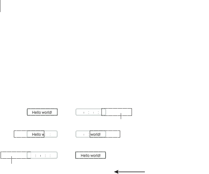
CHAPTER 17
574
Often, you use these effects with the showEffect and hideEffect triggers. The showEffect trigger occurs when
a component becomes visible by changing its visible property from false to true. The hideEffect trigger
occurs when the component becomes invisible by changing its visible property from true to false. When
using a mask effect with the showEffect or hideEffect triggers, you can ignore the showTarget property; Flex
sets it for you automatically.
As the mask effect executes, the effect either covers the target component or uncovers it, based on the setting of
the showTarget property. The following diagram shows the action of the WipeLeft effect for the two different
settings of the showTarget property:
You can use several properties of the MaskEffect class to control the location and size of the mask, including the
following:
scaleXFrom, scaleYFrom, scaleXTo, and scaleX Specify the initial and final scale of the mask where a value of 1.0
corresponds to scaling the mask to the size of the target component, 2.0 scales the mask to twice the size of the
component, 0.5 scales the mask to half the size of the component, and so on. To use any one of these properties,
you must specify all four.
xFrom, yFrom, xTo, and yTo Specify the coordinates of the initial position and final position of the mask relative
to the target component, where (0, 0) corresponds to the upper-left corner of the target. To use any one of these
properties, you must specify all four.
The coordinates of the initial and final position of the mask depend on the type of effect and whether the
showTarget property is true or false. For example, for the WipeLeft effect with a showTarget value of false,
the coordinates of the initial mask position are (0, 0), corresponding to the upper-left corner of the target, and the
coordinates of the final position are the upper-right corner of the target (-width, 0), where width is the width of
the target.
For a showTarget value of true for the WipeLeft effect, the coordinates of the initial mask position are (width,
0), and the coordinates of the final position are (0, 0).
showTarget=trueshowTarget=false
mask
mask
initial mask
halfway through eect
mask direction
eect completed

575ADOBE FLEX 3
Adobe Flex 3 Developer Guide
Creating a custom mask function
You can supply a custom mask function to a mask effect using the createMaskFunction property. A custom
mask function lets you create a mask with a custom shape, color, or other attributes for your application require-
ments.
The custom mask function has the following signature:
public function funcName(targ:Object, bounds:Rectangle):Shape
var myMask:Shape = new Shape();
// Create mask.
return myMask;
}
Your custom mask function takes an argument that corresponds to the target component of the effect, and a
second argument that defines the dimensions of the target so that you can correctly size the mask. The function
returns a single Shape object that defines the mask.
The following example uses a custom mask with a WipeLeft effect:
<?xml version="1.0"?>
<!-- behaviors\CustomMaskSimple.mxml -->
<mx:Application xmlns:mx="http://www.adobe.com/2006/mxml" >
<mx:Script>
<![CDATA[
// Import the effect class.
import mx.effects.*;
public function createLargeMask(targ:Object,
bounds:Rectangle):Shape {
// Create the Shape object.
var largeMask:Shape = new Shape();
// Access the Graphics object of the
// Shape object to draw the mask.
largeMask.graphics.beginFill(0x00FFFF, 0.5);
largeMask.graphics.drawRoundRect(0, 0, bounds.width + 10,
bounds.height - 10, 3);
largeMask.graphics.endFill();
// Return the mask.
return largeMask;
}
]]>
</mx:Script>
<mx:WipeLeft id="customWL"
createMaskFunction="createLargeMask"
showTarget="false"/>
<mx:WipeLeft id="standardWL"
showTarget="false"/>

CHAPTER 17
576
<mx:HBox borderStyle="solid"
paddingLeft="10" paddingRight="10"
paddingTop="10" paddingBottom="10">
<mx:Button label="Custom Mask"
mouseDownEffect="{customWL}"
height="100" width="150"/>
</mx:HBox>
</mx:Application>
Handling effect events
Every effect class supports the following events:
•effectStart Dispatched when the effect starts playing. The type property of the event object for this event
is set to EffectEvent.EFFECT_START.
•effectEnd Dispatched after the effect has stopped playing, either when the effect finishes playing or when
the effect has been interrupted by a call to the end() method. The type property of the event object for this event
is set to EffectEvent.EFFECT_END.
Flex dispatches one event for each target of an effect. Therefore, if you define a single target for an effect, Flex
dispatches a single effectStart event, and a single effectEnd event. If you define three targets for an effect,
Flex dispatches three effectStart events, and three effectEnd events.
The event object passed to the event listener for these events is of type EffectEvent. The EffectEvent class is a
subclass of the Event class, and contains all of the properties inherited from Event, including target, and type,
and defines a new property named effectInstance, where:
target Contains a reference to the Effect object that dispatched the event. This is the factory class of the effect.
type Either EffectEvent.EFFECT_END or EffectEvent.EFFECT_START, depending on the event.
effectInstance Contains a reference to the EffectInstance object. This is the object defined by the instance class
for the effect. Flex creates one object of the instance class for each target of the effect. You access the target
component of the effect using the effectInstance.target property.
The following example defines an event listener for the endEffect event:
<?xml version="1.0"?>
<!-- behaviors\EventEffects2.mxml -->
<mx:Application xmlns:mx="http://www.adobe.com/2006/mxml" >
<mx:Script>
<
577ADOBE FLEX 3
Adobe Flex 3 Developer Guide
// Access the effect object.
var effectObj:Effect = Effect(eventObj.target);
// Access the target component of the effect.
var effectTarget:UIComponent =
UIComponent(eventObj.effectInstance.target);
myTA.text = effectTarget.id;
myTA.text = myTA.text + " " + eventObj.type;
}
]]>
</mx:Script>
<mx:Fade id="myFade" effectEnd="endEffectListener(event);"/>
<mx:Button id="myButton" label="Click Me" mouseUpEffect="{myFade}"/>
<mx:TextArea id="myTA" />
</mx:Application>
If the effect has multiple targets, Flex dispatches an effectStart event and effectEnd event once per target, as
the following example shows:
<?xml version="1.0"?>
<!-- behaviors\EventEffects.mxml -->
<mx:Application xmlns:mx="http://www.adobe.com/2006/mxml" >
<mx:Script>
<![CDATA[
import mx.effects.*;
import mx.events.EffectEvent;
import mx.core.UIComponent;
private function endSlowFadeEffectListener(eventObj:EffectEvent):void
{
// Access the effect object.
var effectObj:Effect = Effect(eventObj.target);
// Access the target component of the effect.
var effectTarget:UIComponent =
UIComponent(eventObj.effectInstance.target);
myTA.text = myTA.text + effectTarget.id + ' : ';
myTA.text = myTA.text + " " + eventObj.type + '\n';
}
]]>
</mx:Script>
<mx:Fade id="slowFade"
duration="2000"
effectEnd="endSlowFadeEffectListener(event);"/>
<mx:Button id="myButton1" label="Button 1" creationCompleteEffect="{slowFade}"/>
<mx:Button id="myButton2" label="Button 2" creationCompleteEffect="{slowFade}"/>
<mx:Button id="myButton3" label="Button 3" creationCompleteEffect="{slowFade}"/>
<mx:Button id="myButton4" label="Button 4" creationCompleteEffect="{slowFade}"/>

CHAPTER 17
578
<mx:TextArea id="myTA" height="125" width="250"/>
</mx:Application>
Flex dispatches an effectEnd event once per target; therefore, the endSlowFadeEffectListener() event
listener is invoked four times, once per Button control.
Handling tween effect events
Every effect class that is a subclass of the TweenEffect class, such as the Fade and Move effects, supports the
following events:
•tweenStart Dispatched when the tween effect starts. The type property of the event object for this event
is set to TweenEvent.TWEEN_START. The Effect.effectStart event is dispatched before the tweenStart
event.
•tweenUpdate Dispatched every time a TweenEffect class calculates a new value. The type property of the
event object for this event is set to TweenEvent.TWEEN_UPDATE.
•tweenEnd Dispatched when the tween effect ends. The type property of the event object for this event is set
to TweenEvent.TWEEN_END.
The event object passed to the event listener for these events is of type TweenEvent. The TweenEvent class is a
subclass of the Event class, and contains all of the properties inherited from Event, including target, and type,
and defines the following new property:
value Contains the tween value calculated by the effect. For example, for the Fade effect, the value property
contains a single Number between the values of the Fade.alphaFrom and Fade.alphaTo properties. For the
Move effect, the value property contains a two item Array, where the first value is the current x value of the effect
target and the second value is the current y value of the effect target. For more information on the value property,
see the instance class for each effect that is a subclass of the TweenEffect class.
Suspending background processing
To improve the performance of effects, you can disable background processing in your application for the
duration of the effect by setting the Effect.suspendBackgroundProcessing property to true. The
background processing that is blocked includes component measurement and layout, and responses to data
services for the duration of the effect.
The default value of the suspendBackgroundProcessing property is false. You can set it to true in most cases.
However, you should set it to false if either of the following conditions is true for your application:
•User input may arrive while the effect is playing, and the application must respond to the user input before
the effect finishes playing.

579ADOBE FLEX 3
Adobe Flex 3 Developer Guide
•A response may arrive from the server while the effect is playing, and the application must process the
response while the effect is still playing.
Using an easing function
You can change the speed of an animation by defining an easing function for an effect. With easing, you can create
a more realistic rate of acceleration and deceleration. You can also use an easing function to create a bounce effect
or control other types of motion.
Flex supplies predefined easing functions in the mx.effects.easing package. This package includes functions for
the most common types of easing, including Bounce, Linear, and Sine easing. For more information on using
these functions, see the Adobe Flex Language Reference.
The following code shows the basic format of an easing function:
function myEasingFunction(t:Number, b:Number, c:Number, d:Number):Number {
...
}
You specify the following arguments of an easing function:
•t specifies time.
•b specifies the initial position of a component.
•c specifies the total change in position of the component.
•d specifies the duration of the effect, in milliseconds.
Using a Flex easing function
You specify an easing function to a component by passing a reference to the function to a component property.
You pass only the name of the easing function; Flex automatically sets the values for the arguments of the easing
function.
All tween effects, meaning effect classes that are child classes of the TweenEffect class, support the
easingFunction property, which lets you specify an easing function to the effect. Mask effects—those effect
classes that are child classes of the MaskEffect class—also support easing functions. Other components support
easing functions as well. For example, the Accordion and Tree components let you use the openEasingFunction
style property to specify an easing function, and the ComboBox component supports a closeEasingFunction
style property.
For example, you can specify the mx.effects.easing.Bounce.easeOut() method to the Accordion container
using the openEasingFunction property, as the following code shows.
<?xml version="1.0"?>
<!-- behaviors\EasingFuncExample.mxml -->
<mx:Application xmlns:mx="http://www.adobe.com/2006/mxml"
height="550">

CHAPTER 17
580
<mx:Script>
import mx.effects.easing.*;
</mx:Script>
<mx:Accordion
openEasingFunction="{Bounce.easeOut}"
openDuration="2000">
<mx:VBox label="Pane 1" width="400" height="400"/>
<mx:VBox label="Pane 2" width="400" height="400"/>
</mx:Accordion>
</mx:Application>
Creating a custom easing function
In the following example, you create a custom easing function that creates a bounce motion when combined with
the Flex Move effect:
<?xml version="1.0"?>
<!-- behaviors\Easing.mxml -->
<mx:Application xmlns:mx="http://www.adobe.com/2006/mxml" >
<mx:Script>
<![CDATA[
private function myEasingFunction(t:Number, b:Number,
c:Number, d:Number):Number {
if ((t /= d) < (1 / 2.75)) {
return c * (7.5625 * t * t) + b;
}
else if (t < (2 / 2.75)) {
return c * (7.5625 * (t-=(1.5/2.75)) * t + .75) + b;
}
else if (t < (2.5 / 2.75)) {
return c * (7.5625 * (t-=(2.25/2.75)) * t + .9375) + b;
}
else {
return c * (7.5625 * (t-=(2.625/2.75)) * t + .984375) + b;
}
};
]]>
</mx:Script>
<mx:Move id="moveLeftShow"
xFrom="600" xTo="0" yTo="0"
duration="3000"
easingFunction="myEasingFunction"/>
<mx:Move id="moveRightHide"
xFrom="0" xTo="600"
duration="3000"
easingFunction="myEasingFunction"/>
<mx:LinkBar dataProvider="myVS"/>
<mx:ViewStack id="myVS" borderStyle="solid">
<mx:Canvas id="Canvas0" label="Canvas0"
creationCompleteEffect="{moveLeftShow}"
showEffect="{moveLeftShow}"
hideEffect="{moveRightHide}" >

581ADOBE FLEX 3
Adobe Flex 3 Developer Guide
<mx:Box height="300" width="600" backgroundColor="#00FF00">
<mx:Label text="Screen 0" color="#FFFFFF" fontSize="40"/>
</mx:Box>
</mx:Canvas>
<mx:Canvas id="Canvas1" label="Canvas1"
showEffect="{moveLeftShow}" hideEffect="{moveRightHide}" >
<mx:Box height="300" width="600" backgroundColor="#0033CC">
<mx:Label text="Screen 1" color="#FFFFFF" fontSize="40"/>
</mx:Box>
</mx:Canvas>
</mx:ViewStack>
</mx:Application>
In this example, you use the custom effects in the showEffect and hideEffect properties of the children of a
ViewStack container. When you click a label in the LinkBar control, the corresponding child of the ViewStack
container slides in from the right, and bounces to a stop against the left margin of the ViewStack container, while
the previously visible child of the ViewStack container slides off to the right.
The custom effect for the showEffect property is only triggered when the child’s visibility changes from false
to true. Therefore, the first child of the ViewStack container also includes a creationCompleteEffect property.
This is necessary to trigger the effect when Flex first creates the component. If you omit the
creationCompleteEffect property, you do not see the moveLeftShow effect when the application starts.
Using data effects
The List and TileList controls take input from a data provider, an object that contains the data displayed by the
control. To provide this data, you assign a collection, which is usually an ArrayCollection or XMLListCollection
object, to the control’s dataProvider property. Each item in the control is then displayed by using an item
renderer.
Data effects make it possible to apply effects to the item renderers in List and TileList controls when the data
provider for the control changes. For example, when an item is deleted from the data provider of a List control,
the item renderer for that item might fade out and shrink.
For more information about data providers and controls that use data providers, see “Using Data Providers and
Collections” on page 137. For more information about item renderers, see “Using Item Renderers and Item
Editors” on page 779.
By default, the List and TileList control do not use a data effect. To specify the effect to apply to the control, use
the control’s itemsChangeEffect style property. For the List control, use the DefaultListEffect class to configure
the data effect. For the TileList control, use the DefaultTileListEffect class.
You can also create custom data effects. For more information, see “Effects” on page 199 in Creating and Extending
Adobe Flex 3 Components.

CHAPTER 17
582
Example: Applying a data effect
The following example applies the DefaultListEffect effect to the List control when items are added to or removed
from the control. When an item in the List control is removed, this effect first fades out the item, then collapses
the size of the item to 0. When you add an item to the List control, this effect expands the slot for the item, then
fades in the new item.
Because the DefaultListEffect effect grows and shrinks item renderers as it plays, you must set the
List.variableRowHeight property to true to enable the List control to dynamically change its row height, as
the following example shows:
<?xml version="1.0"?>
<!-- dataEffects\ListEffectCustomDefaultEffect.mxml -->
<mx:Application xmlns:mx="http://www.adobe.com/2006/mxml">
<mx:Script>
<![CDATA[
import mx.effects.DefaultListEffect;
import mx.collections.ArrayCollection;
[Bindable]
private var myDP:ArrayCollection = new ArrayCollection(
['A','B','C','D','E']);
private function deleteItem():void {
// As each item is removed, the index of the other items changes.
// So first get the items to delete, and then determine their indices
// as you remove them.
var toRemove:Array = [];
for (var i:int = 0; i < list0.selectedItems.length; i++)
toRemove.push(list0.selectedItems[i]);
for (i = 0; i < toRemove.length; i++)
myDP.removeItemAt(myDP.getItemIndex(toRemove[i]));
}
private var zcount:int = 0;
private function addItem():void {
// Always add the new item after the third item,
// or after the last item if the length is less than 3.
myDP.addItemAt("Z"+zcount++,Math.min(3,myDP.length));
}
]]>
</mx:Script>
<!-- Define an instance of the DefaultListEffect effect,
and set its fadeOutDuration and color properties. -->
<mx:DefaultListEffect id="myDLE"
fadeOutDuration="1000"
/>
<mx:List id="list0"
width="150"
dataProvider="{myDP}"
variableRowHeight="true"
fontSize="24"

583ADOBE FLEX 3
Adobe Flex 3 Developer Guide
allowMultipleSelection="true"
itemsChangeEffect="{myDLE}"
/>
<mx:Button
label="Delete Item"
click="deleteItem();"
/>
<mx:Button
label="Add Item"
click="addItem();"
/>
</mx:Application>
To use a data effect with the TileList class, apply the DefaultTileListEffect effect to the control. When an item in
the TileList control is removed, this effect first fades out the item, and then moves the remaining items to their
new position. When you add an item to the TileList control, this effect moves the existing items to their new
position, and then fades in the new item.
You typically set the offscreenExtraRowsOrColumns property of the TileList control when you apply a data
effect. This property specifies the number of extra rows or columns of offscreen item renderers used in the layout
of the control. This property is useful because data effects work by first determining a before layout of the list-
based control, then determining an after layout, and finally setting the properties of the effect to create an
animation from the before layout to the after layout. Because many effects cause currently invisible items to
become visible, or currently visible items to become invisible, this property configures the control to create the
offscreen item renderers so that they already exist when the data effect plays.
You typically set the offscreenExtraRowsOrColumns property to a nonzero, even value, such as 2 or 4, for a
TileList control, as the following example shows:
<?xml version="1.0"?>
<!-- dataEffects\TileListEffectCustomDefaultEffect.mxml -->
<mx:Application xmlns:mx="http://www.adobe.com/2006/mxml">
<mx:Script>
<![CDATA[
import mx.effects.DefaultTileListEffect;
import mx.effects.easing.Elastic;
import mx.collections.ArrayCollection;
import mx.effects.Move;
[Bindable]
private var myDP:ArrayCollection = new ArrayCollection(
["A","B",'C','D','E','F','G','H','I','J','K','L','M','N','O','P']);
private function deleteItems():void {
// As each item is removed, the index of the other items changes.
// So first get the items to delete, and then determine their indices
// as you remove them.
var toRemove:Array = [];
for (var i:int = 0; i < tlist0.selectedItems.length; i++)
toRemove.push(tlist0.selectedItems[i]);
for (i = 0; i < toRemove.length; i++)

CHAPTER 17
584
myDP.removeItemAt(myDP.getItemIndex(toRemove[i]));
}
private var zcount:int = 0;
private function addItems():void {
myDP.addItemAt("Z"+zcount++,Math.min(2,myDP.length));
}
]]>
</mx:Script>
<!-- Define an instance of the DefaultTileListEffect effect,
and set its moveDuration and color properties. -->
<mx:DefaultTileListEffect id="myDTLE"
moveDuration="100"/>
<mx:TileList id="tlist0"
height="400" width="400"
columnCount="4" rowCount="4"
fontSize="30" fontWeight="bold"
direction="horizontal"
dataProvider="{myDP}"
allowMultipleSelection="true"
offscreenExtraRowsOrColumns="2"
itemsChangeEffect="{myDTLE}" />
<mx:Button
label="Delete Selected Item(s)"
click="deleteItems();"/>
<mx:Button
label="Add Item"
click="addItems();"/>
</mx:Application>
Disabling container layout for effects
By default, Flex updates the layout of a container’s children when a new child is added to it, when a child is
removed from it, when a child is resized, and when a child is moved. Because the Move effect modifies a child’s
position, and the Zoom effect modifies a child’s size and position, they both cause the container to update its
layout.
However, when the container updates its layout, it can actually reverse the results of the effect. For example, you
use the Move effect to reposition a container child. At some time later, you change the size of another container
child, which forces the container to update its layout. This layout update can cause the child that moved to be
returned to its original position.
To prevent Flex from performing layout updates, you can set the autoLayout property of a container to false.
Its default value is true, which configures Flex so that it always updates layouts. You always set the autoLayout
property on the parent container of the component that uses the effect. For example, if you want to control the
layout of a child of a Grid container, you set the autoLayout property for the parent GridItem container of the
child, not for the Grid container.

585ADOBE FLEX 3
Adobe Flex 3 Developer Guide
You set the autoLayout property to false when you use a Move effect in parallel with a Resize or Zoom effect.
You must do this because the Resize or Zoom effect can cause an update to the container’s layout, which can return
the child to its original location.
When you use the Zoom effect on its own, you can set the autoLayout property to false, or you may leave it
with its default value of true. For example, if you use a Zoom effect with the autoLayout property set to true,
as the child grows or shrinks, Flex automatically updates the layout of the container to reposition its children
based on the new size of the child. If you use a Zoom effect with the autoLayout property set to false, the child
resizes around its center point, and the remaining children do not change position.
The HBox container in the following example uses the default vertical alignment of top and the default horizontal
alignment of left. If you apply a Zoom effect to the image, the HBox container resizes to hold the image, and the
image remains aligned with the upper-left corner of the container:
<mx:HBox>
<mx:Image source="myImage.jpg"/>
</mx:HBox>
In the next example, the image is centered in the HBox container. If you apply a Zoom effect to the image, as it
resizes, it remains centered in the HBox container.
<mx:HBox horizontalAlign="center" verticalAlign="middle">
<mx:Image source="myImage.jpg"/>
</mx:HBox>
By default, the size of the HBox container is big enough to hold the image at it original size. If you disable layout
updates, and use the Zoom effect to enlarge the image, or use the Move effect to reposition the image, the image
might extend past the boundaries of the HBox container, as the following example shows:
<mx:HBox autoLayout="false">
<mx:Image source="myImage.jpg"/>
</mx:HBox>
You set the autoLayout property to false, so the HBox container does not resize as the image resizes. If the
image grows to a size so that it extends beyond the boundaries of the HBox container, the container adds scroll
bars and clips the image at its boundaries.
To prevent the scroll bars from appearing, you can use the height and width properties to explicitly size the
HBox container so that it is large enough to hold the modified image. Alternatively, you can set the clipContent
property of the container to false so that the image can extend past its boundaries.

CHAPTER 17
586
Improving performance when resizing Panel containers
When you apply a Resize effect to a Panel container, the measurement and layout algorithm for the effect executes
repeatedly over the duration of the effect. When a Panel container has many children, the animation can be jerky
because Flex cannot update the screen quickly enough. Also, resizing one Panel container often causes other Panel
containers to resize.
To solve this problem, you can use the Resize effect’s hideChildrenTargets property to hide the children of
Panel containers while the Resize effect is playing. The value of the hideChildrenTargets property is an Array
of Panel containers that should include the Panel containers that resize during the animation. Before the Resize
effect plays, Flex iterates through the Array and hides the children of each of the specified Panel containers.
In the following example, the children of the panelOne and panelTwo Panel containers are hidden while the Panel
containers resize:
<?xml version="1.0"?>
<!-- behaviors\PanelResize.mxml -->
<mx:Application xmlns:mx="http://www.adobe.com/2006/mxml" >
<mx:Resize id="myResize" heightTo="300"
hideChildrenTargets="{[panelOne, panelTwo]}"/>
<mx:Button id="b1"
label="Reset"
click="panelOne.height=200;panelTwo.height=200;panelThree.height=200"
/>
<mx:HBox>
<mx:Panel id="panelOne" title="Panel 1" height="200" mouseDownEffect="{myResize}">
<mx:Button label="Click Me"/>
<mx:Button label="Click Me"/>
<mx:Button label="Click Me"/>
<mx:Button label="Click Me"/>
<mx:Button label="Click Me"/>
</mx:Panel>
<mx:Panel id="panelTwo" title="Panel 2" height="200" mouseDownEffect="{myResize}">
<mx:Button label="Click Me"/>
<mx:Button label="Click Me"/>
<mx:Button label="Click Me"/>
<mx:Button label="Click Me"/>
<mx:Button label="Click Me"/>
</mx:Panel>
<mx:Panel id="panelThree" title="Panel 3" height="200"
mouseDownEffect="{myResize}">
<mx:Button label="Click Me"/>
<mx:Button label="Click Me"/>
<mx:Button label="Click Me"/>
<mx:Button label="Click Me"/>
<mx:Button label="Click Me"/>
</mx:Panel>
</mx:HBox>
</mx:Application>

587ADOBE FLEX 3
Adobe Flex 3 Developer Guide
For each Panel container in the hideChildrenTargets Array, the following effect triggers execute:
•resizeStartEffect Delivered before the Resize effect begins playing.
•resizeEndEffect Delivered after the Resize effect finishes playing.
If the resizeStartEffect trigger specifies an effect to play, the Resize effect is delayed until the effect finishes
playing.
The default value for the Panel container’s resizeStartEffect and resizeEndEffect triggers is Dissolve,
which plays the Dissolve effect. For more information about the Dissolve effect, see “Av a i l a b l e e f f e c t s” o n
page 549.
To disable the Dissolve effect so that a Panel container’s children are hidden immediately, you must set the value
of the resizeStartEffect and resizeEndEffect triggers to none.
Setting UIComponent.cachePolicy on the effect target
An effect can use the bitmap caching feature in Adobe® Flash® Player to speed up animations. An effect typically
uses bitmap caching when the target component’s drawing does not change while the effect is playing.
For example, the Fade effect works by modifying the alpha property of the target component. Changing the
alpha property does not change the way the target component is drawn on the screen. Therefore, caching the
target component as a bitmap can speed up the performance of the effect. The Move effect modifies the x and y
properties of the target component. Modifying the values of these properties does not alter the way the target
component is drawn, so it can take advantage of bitmap caching.
Not all effects can use bitmap caching. Effects such as Zoom, Resize, and the wipe effects modify the target
component in a way that alters the way it is drawn on the screen. The Zoom effect modifies the scale properties
of the component, which changes its size. Caching the target component as a bitmap for such an effect would be
counterproductive because the bitmap changes continuously while the effect plays.
The UIComponent.cachePolicy property controls the caching operation of a component during an effect. The
cachePolicy property can have the following values:
CachePolicy.ON Specifies that the effect target is always cached.
CachePolicy.OFF Specifies that the effect target is never cached.
CachePolicy.AUTO Specifies that Flex determines whether the effect target should be cached. This is the default
value. Flex uses the following rules to set the cacheAsBitmap property:
•When at least one effect that does not support bitmap caching is playing on a target, set the target's
cacheAsBitmap property to false.
•When one or more effects that supports bitmap caching are playing on a target, set the target's
cacheAsBitmap property to true.

CHAPTER 17
588
Typically, you leave the cachePolicy property with its default value of CachePolicy.AUTO. However, you might
want to set the property to CachePolicy.OFF because bitmap caching is interfering with your user interface, or
because you know something about your application’s behavior such that disabling bitmap caching will have a
beneficial effect on it.

589
Chapter 18: Using Styles and Themes
Styles are useful for defining the look and feel of your Adobe® Flex® applications. You can use them to change the
appearance of a single component, or apply them across all components.
Topics
About styles . . . . . . . . . . . . . . . . . . . . . . . . . . . . . . . . . . . . . . . . . . . . . . . . . . . . . . . . . . . . . . . . . . . . . . . . . . . . . . . . . . . . 589
Using external style sheets. . . . . . . . . . . . . . . . . . . . . . . . . . . . . . . . . . . . . . . . . . . . . . . . . . . . . . . . . . . . . . . . . . . . . . . . 617
Using local style definitions. . . . . . . . . . . . . . . . . . . . . . . . . . . . . . . . . . . . . . . . . . . . . . . . . . . . . . . . . . . . . . . . . . . . . . .619
Using the StyleManager class . . . . . . . . . . . . . . . . . . . . . . . . . . . . . . . . . . . . . . . . . . . . . . . . . . . . . . . . . . . . . . . . . . . . .621
Using the setStyle() and getStyle() methods . . . . . . . . . . . . . . . . . . . . . . . . . . . . . . . . . . . . . . . . . . . . . . . . . . . . . . . . .627
Using inline styles . . . . . . . . . . . . . . . . . . . . . . . . . . . . . . . . . . . . . . . . . . . . . . . . . . . . . . . . . . . . . . . . . . . . . . . . . . . . . . .631
Loading style sheets at run time . . . . . . . . . . . . . . . . . . . . . . . . . . . . . . . . . . . . . . . . . . . . . . . . . . . . . . . . . . . . . . . . . . . 633
Using filters in Flex. . . . . . . . . . . . . . . . . . . . . . . . . . . . . . . . . . . . . . . . . . . . . . . . . . . . . . . . . . . . . . . . . . . . . . . . . . . . . .642
About themes . . . . . . . . . . . . . . . . . . . . . . . . . . . . . . . . . . . . . . . . . . . . . . . . . . . . . . . . . . . . . . . . . . . . . . . . . . . . . . . . . .645
About styles
You modify the appearance of Flex components through style properties. These properties can define the size of
a font used in a Label control, or the background color used in the Tree control. In Flex, some styles are inherited
by children from their parent containers, and across style types and classes. This means that you can define a style
once, and then have that style apply to all controls of a single type or to a set of controls. In addition, you can
override individual properties for each control at a local, component, or global level, giving you great flexibility in
controlling the appearance of your applications.
This section introduces you to applying styles to controls. It also provides a primer for using Cascading Style
Sheets (CSS), an overview of the style value formats (Length, Color, and Time), and describes style inheritance.
Subsequent sections provide detailed information about different ways of applying styles in Flex.
Flex does not support controlling all aspects of component layout with CSS. Properties such as x, y, width, and
height are properties, not styles, of the UIComponent class, and therefore cannot be set in CSS. Other properties,
such as left, right, top, and bottom, are style properties and are used to manipulate a component’s location in
a container.

590 CHAPTER 18
Using styles in Flex
There are many ways to apply styles in Flex. Some provide more granular control and can be approached program-
matically. Others are not as flexible, but can require less computation.
To determine if an object’s properties can be styled by using CSS, check to see if the class or its parent implements
the IStyleClient interface. If it does, you can set the values of the object’s style properties with CSS. If it does not,
the class does not participate in the styles subsystem and you therefore cannot set its properties with CSS. In that
case, the properties are public properties of the class and not style properties.
When applying styles, you must be aware of which properties your theme supports. The default theme in Flex does
not support all style properties. For more information, see “About supported styles” on page 614.
External style sheets
Use CSS to apply styles to a document or across entire applications. You can point to a style sheet without invoking
ActionScript. This is the most concise method of applying styles, but can also be the least flexible. Style sheets can
define global styles that are inherited by all controls, or individual classes of styles that only certain controls use.
The following example applies the external style sheet myStyle.css to the current document:
<mx:Style source="myStyle.css"/>
For more information, see “Using external style sheets” on page 617.
Flex includes a global style sheet, defaults.css, inside the framework.swc file. This file contains style definitions for
the global class selector, and type selectors for most Flex components. For more information about defaults.css,
see “About the default style sheet” on page 618.
Flex also includes several other style sheets that each have a unique look and feel. For more information, see
“About the included theme files” on page 647.
Local style definitions
Use the <mx:Style> tag to define styles that apply to the current document and its children. You define styles in
the <mx:Style> tag using CSS syntax and can define styles that apply to all instances of a control or to individual
controls. The following example defines a new style and applies it to only the myButton control:
<?xml version="1.0"?>
<!-- styles/ClassSelector.mxml -->
<mx:Application xmlns:mx="http://www.adobe.com/2006/mxml">
<mx:Style>
.myFontStyle {
fontSize: 15;
color: #9933FF;
}
</mx:Style>

591ADOBE FLEX 3
Adobe Flex 3 Developer Guide
<!-- This button has the custom style applied to it. -->
<mx:Button id="myButton" styleName="myFontStyle" label="Click Me"/>
<!-- This button uses default styles. -->
<mx:Button id="myButton2" label="Click Me"/>
</mx:Application>
The following example defines a new style that applies to all instances of the Button class:
<?xml version="1.0"?>
<!-- styles/TypeSelector.mxml -->
<mx:Application xmlns:mx="http://www.adobe.com/2006/mxml">
<mx:Style>
Button {
fontSize: 15;
color: #9933FF;
}
</mx:Style>
<mx:Button id="myButton" label="Click Me"/>
<mx:Button id="myButton2" label="Click Me"/>
</mx:Application>
For more information, see “Using local style definitions” on page 619.
StyleManager class
Use the StyleManager class to apply styles to all classes or all instances of specified classes. The following example
sets the fontSize style to 15 and the color to 0x9933FF on all Button controls:
<?xml version="1.0"?>
<!-- styles/StyleManagerExample.mxml -->
<mx:Application xmlns:mx="http://www.adobe.com/2006/mxml" creationComplete="initApp()">
<mx:Script><![CDATA[
public function initApp():void {
StyleManager.getStyleDeclaration("Button").setStyle("fontSize",15);
StyleManager.getStyleDeclaration("Button").setStyle("color",0x9933FF);
}
]]></mx:Script>
<mx:Button id="myButton" label="Click Me"/>
<mx:Button id="myButton2" label="Click Me"/>
</mx:Application>
You can also use the CSSStyleDeclaration object to build run-time style sheets, and then apply them with the
StyleManager’s setStyleDeclaration() method.
For more information, see “Using the StyleManager class” on page 621.

CHAPTER 18
592
getStyle() and setStyle() methods
Use the setStyle() and getStyle() methods to manipulate style properties on instances of controls. Using
these methods to apply styles requires a greater amount of processing power on the client than using style sheets
but provides more granular control over how styles are applied.
The following example sets the fontSize to 15 and the color to 0x9933FF on only the myButton instance:
<?xml version="1.0"?>
<!-- styles/SetStyleExample.mxml -->
<mx:Application xmlns:mx="http://www.adobe.com/2006/mxml" creationComplete="initApp()">
<mx:Script><![CDATA[
public function initApp():void {
myButton.setStyle("fontSize",15);
myButton.setStyle("color",0x9933FF);
}
]]></mx:Script>
<mx:Button id="myButton" label="Click Me"/>
<mx:Button id="myButton2" label="Click Me"/>
</mx:Application>
For more information, see “Using the setStyle() and getStyle() methods” on page 627.
Inline styles
Use attributes of MXML tags to apply style properties. These properties apply only to the instance of the control.
This is the most efficient method of applying instance properties because no ActionScript code blocks or method
calls are required.
The following example sets the fontSize to 15 and the color to 0x9933FF on the myButton instance:
<?xml version="1.0"?>
<!-- styles/InlineExample.mxml -->
<mx:Application xmlns:mx="http://www.adobe.com/2006/mxml">
<!-- This button uses custom inline styles. -->
<mx:Button id="myButton" color="0x9933FF" fontSize="15" label="Click Me"/>
<!-- This button uses default styles. -->
<mx:Button id="myOtherButton" label="Click Me"/>
</mx:Application>
In an MXML tag, you must use the camel-case version of the style property. For example, you must use
“fontSize” rather than “font-size” (the CSS convention) in the previous example. For more information on
style property names, see “About property and selector names” on page 601.
As with other style properties, you can bind inline style properties to variables.
For more information, see “Using inline styles” on page 631.

593ADOBE FLEX 3
Adobe Flex 3 Developer Guide
Setting global styles
Most text and color styles, such as fontSize and color, are inheritable. When you apply an inheritable style to a
container, all the children of that container inherit the value of that style property. If you set the color of a Panel
container to green, all buttons in the Panel container are also green, unless those buttons override that color.
Many styles, however, are not inheritable. If you apply them to a parent container, only the container uses that
style. Children of that container do not use the values of noninheritable styles.
By using global styles, you can apply noninheritable styles to all controls that do not explicitly override that style.
Flex provides the following ways to apply styles globally:
•StyleManager global style
•CSS global selector
The StyleManager lets you apply styles to all controls using the global style. For more information, see “Using
the StyleManager class” on page 621.
You can also apply global styles using the global selector in your CSS style definitions. These are located either
in external CSS style sheets or in an <mx:Style> tag. For more information, see “Using the global selector” on
page 620.
About style value formats
Style properties can be of types String or Number. They can also be Arrays of these types. In addition to a type,
style properties also have a format (Length, Time, or Color) that describes the valid values of the property. Some
properties appear to be of type Boolean (taking a value of true or false), but these are Strings that are interpreted
as Boolean values. This section describes these formats.
Length format
The Length format applies to any style property that takes a size value, such as the size of a font (or fontSize).
Length is of type Number.
The Length type has the following syntax:
length[length_unit]
The following example defines the fontSize property with a value of 20 pixels:
<?xml version="1.0"?>
<!-- styles/LengthFormat.mxml -->
<mx:Application xmlns:mx="http://www.adobe.com/2006/mxml">
<mx:Style>
.myFontStyle {
fontSize: 20px;
color: #9933FF;
}
CHAPTER 18
594
</mx:Style>
<mx:Button id="myButton" styleName="myFontStyle" label="Click Here"/>
</mx:Application>
If you do not specify a unit, the unit is assumed to be pixels. The following example defines two styles with the
same font size:
<?xml version="1.0"?>
<!-- styles/LengthFormat2.mxml -->
<mx:Application xmlns:mx="http://www.adobe.com/2006/mxml">
<mx:Style>
.myFontStyle {
fontSize: 20px;
color: #9933FF;
}
.myOtherFontStyle {
fontSize: 20;
color: #9933FF;
}
</mx:Style>
<mx:Button id="myButton" styleName="myFontStyle" label="Click Here"/>
<mx:Button id="myButton2" styleName="myOtherFontStyle" label="Click Here"/>
</mx:Application>
Note: Spaces are not allowed between the length value and the unit.
The following table describes the supported length units:
Note: The numeric values specified for font size in Flex are actual character sizes in the chosen units. These values are
not equivalent to the relative font size specified in HTML using the <font> tag.
Flex does not support the em and ex units. You can convert these to px units by using the following scales:
1em = 10.06667px
1ex = 6px
In Flex, all lengths are converted to pixels prior to being displayed. In this conversion, Flex assumes that an inch
equals 72 pixels. All other lengths are based on that assumption. For example, 1 cm is equal to 1/2.54 of an inch.
To get the number of pixels in 1 cm, multiply 1 by 72, and divide by 2.54.
Unit Scale Description
px Relative Pixels.
in Absolute Inches.
cm Absolute Centimeters.
mm Absolute Millimeters.
pt Absolute Points.
pc Absolute Picas.

595ADOBE FLEX 3
Adobe Flex 3 Developer Guide
When you use inline styles, Flex ignores units and uses pixels as the default.
The fontSize style property allows a set of keywords in addition to numbered units. You can use the following
keywords when setting the fontSize style property. The exact sizes are defined by the client browser:
•xx-small
•x-small
•small
•medium
•large
•x-large
•xx-large
The following example class selector defines the fontSize as x-small:
<?xml version="1.0"?>
<!-- styles/SmallFont.mxml -->
<mx:Application xmlns:mx="http://www.adobe.com/2006/mxml">
<mx:Style>
.smallFont {
fontFamily: Arial, Helvetica, "_sans";
fontSize: x-small;
fontStyle: oblique;
}
</mx:Style>
<mx:Button id="myButton" styleName="smallFont" label="Click Here"/>
</mx:Application>
Time format
You use the Time format for component properties that move or have built-in effects, such as the ComboBox
component when it drops down and pops up. The Time format is of type Number and is represented in milli-
seconds. Do not specify the units when entering a value in the Time format.
The following example sets the openDuration style property of the myTree control to 1000 milliseconds. The
default value is 250, so this example opens the tree nodes considerably more slowly than normal.
<?xml version="1.0"?>
<!-- styles/TimeFormat.mxml -->
<mx:Application xmlns:mx="http://www.adobe.com/2006/mxml" creationComplete="initApp()">
<mx:Script><![CDATA[
public function initApp():void {
myTree.setStyle("openDuration", 1000);
}
]]></mx:Script>
<mx:XMLList id="treeData">
CHAPTER 18
596
<node label="Mail Box">
<node label="Inbox">
<node label="Marketing"/>
<node label="Product Management"/>
<node label="Personal"/>
</node>
<node label="Outbox">
<node label="Professional"/>
<node label="Personal"/>
</node>
<node label="Spam"/>
<node label="Sent"/>
</node>
</mx:XMLList>
<mx:Panel title="Tree Control Example" width="100%">
<mx:Tree id="myTree" width="100%" labelField="@label" dataProvider="{treeData}"/>
</mx:Panel>
</mx:Application>
Color format
You def in e Color in several formats. You can use most of the formats only in the CSS style definitions. The
following table describes the recognized Color formats for a style property:
Color formats are of type Number. When you specify a format such as a VGA color name, Flex converts that String
to a Number.
Format Description
hexadecimal Hexadecimal colors are represented by a six-digit code preceded by either a zero and small x (0x) or a pound sign (#).
The range of valid values is 0x000000 to 0xFFFFFF (or #000000 to #FFFFFF).
You use the 0x prefix when defining colors in calls to the setStyle() method and in MXML tags. You use the # prefix
in CSS style sheets and in <mx:Style> tag blocks.
RGB RGB colors are a mixture of the colors red, green, and blue, and are represented in percentages of the color’s saturation.
The format for setting RGB colors is color:rgb(x%, y%, z%), where the first value is the percentage of red satura-
tion, the second value is the percentage of green saturation, and the third value is the percentage of blue saturation.
You can use the RGB format only in style sheet definitions.
VGA color
names
VGA color names are a set of 16 basic colors supported by all browsers that support CSS. The available color names are
Aqua, Black, Blue, Fuchsia, Gray, Green, Lime, Maroon, Navy, Olive, Purple, Red, Silver, Teal, White,
Yellow.
You can use the VGA color names format in style sheet definitions and inline style declarations.
VGA color names are not case-sensitive.

597ADOBE FLEX 3
Adobe Flex 3 Developer Guide
CSS style definitions and the <mx:Style> tag support the following color value formats:
<?xml version="1.0"?>
<!-- styles/ColorFormatCSS.mxml -->
<mx:Application xmlns:mx="http://www.adobe.com/2006/mxml">
<mx:Style>
.myStyle {
themeColor: #6666CC; /* CSS hexadecimal format */
color: Blue; /* VGA color name */
}
</mx:Style>
<mx:Button id="myButton" styleName="myStyle" label="Click Here"/>
</mx:Application>
You can use the following color value formats when setting the styles inline or using the setStyle() method:
<?xml version="1.0"?>
<!-- styles/ColorFormatStyleManager.mxml -->
<mx:Application xmlns:mx="http://www.adobe.com/2006/mxml" creationComplete="initApp()">
<mx:Script><![CDATA[
public function initApp():void {
StyleManager.getStyleDeclaration("Button").
setStyle("themeColor",0x6666CC);
StyleManager.getStyleDeclaration("Button").
setStyle("color","Blue");
}
public function changeStyles(e:Event):void {
// Check against "255" here, because that is the numeric value of "Blue".
if (e.currentTarget.getStyle("color") == 255) {
e.currentTarget.setStyle("themeColor", 0xFF0099);
e.currentTarget.setStyle("color", "Red");
} else {
e.currentTarget.setStyle("themeColor", 0x6666CC);
e.currentTarget.setStyle("color", "Blue");
}
}
]]></mx:Script>
<mx:Button id="myButton"
label="Click Here"
click="changeStyles(event)"
/>
</mx:Application>
Using Arrays for style properties
Some controls accept arrays of colors. For example, the Tree control’s depthColors style property can use a
different background color for each level in the tree. To assign colors to a property in an Array, add the items in a
comma-separated list to the property’s definition. The index is assigned to each entry in the order that it appears
in the list.
The following example defines Arrays of colors for properties of the Tree type selector:
<?xml version="1.0"?>
<!-- styles/ArraysOfColors.mxml -->
<mx:Application xmlns:mx="http://www.adobe.com/2006/mxml">

CHAPTER 18
598
<mx:Style>
Tree {
depthColors: #FFCC33, #FFCC99, #CC9900;
alternatingItemColors: red, green;
}
</mx:Style>
<mx:XMLList id="treeData">
<node label="Mail Box">
<node label="Inbox">
<node label="Marketing"/>
<node label="Product Management"/>
<node label="Personal"/>
</node>
<node label="Outbox">
<node label="Professional"/>
<node label="Personal"/>
</node>
<node label="Spam"/>
<node label="Sent"/>
</node>
</mx:XMLList>
<mx:Panel title="Tree Control Example" width="100%">
<mx:Tree id="myTree" width="100%" labelField="@label" dataProvider="{treeData}"/>
</mx:Panel>
</mx:Application>
In this example, only depthColors will be seen. The alternatingItemColors property is visible only if
depthColors is not set. Both are presented here for illustrative purposes only.
You can define the Array in ActionScript by using a comma-separated list of values surrounded by braces, as the
following example shows:
<?xml version="1.0"?>
<!-- styles/SetStyleArray.mxml -->
<mx:Application xmlns:mx="http://www.adobe.com/2006/mxml" creationComplete="initApp()">
<mx:Script><![CDATA[
public function initApp():void {
myTree.setStyle("depthColors",[0xFFCC33, 0xFFCC99, 0xCC9900]);
myTree.setStyle("alternatingItemColors",["red", "green"]);
}
]]></mx:Script>
<mx:XMLList id="treeData">
<node label="Mail Box">
<node label="Inbox">
<node label="Marketing"/>
<node label="Product Management"/>
<node label="Personal"/>
</node>
<node label="Outbox">
<node label="Professional"/>
<node label="Personal"/>
</node>
<node label="Spam"/>
<node label="Sent"/>
</node>

599ADOBE FLEX 3
Adobe Flex 3 Developer Guide
</mx:XMLList>
<mx:Panel title="Tree Control Example" width="100%">
<mx:Tree id="myTree"
width="100%"
labelField="@label"
dataProvider="{treeData}"
/>
<mx:Tree id="myOtherTree"
width="100%"
labelField="@label"
dataProvider="{treeData}"
depthColors="[0xFFCC33, 0xFFCC99, 0xCC9900]"
alternatingItemColors="['red', 'green']"
/>
</mx:Panel>
</mx:Application>
This example also shows that you can set the properties that use Arrays inline.
Finally, you can set the values of the Array in MXML syntax and apply those values inline, as the following
example shows:
<?xml version="1.0"?>
<!-- styles/ArrayOfColorsMXML.mxml -->
<mx:Application xmlns:mx="http://www.adobe.com/2006/mxml">
<mx:Array id="myDepthColors">
<mx:Object>0xFFCC33</mx:Object>
<mx:Object>0xFFCC99</mx:Object>
<mx:Object>0xCC9900</mx:Object>
</mx:Array>
<mx:Array id="myAlternatingRowColors">
<mx:Object>red</mx:Object>
<mx:Object>green</mx:Object>
</mx:Array>
<mx:XMLList id="treeData">
<node label="Mail Box">
<node label="Inbox">
<node label="Marketing"/>
<node label="Product Management"/>
<node label="Personal"/>
</node>
<node label="Outbox">
<node label="Professional"/>
<node label="Personal"/>
</node>
<node label="Spam"/>
<node label="Sent"/>
</node>
</mx:XMLList>
<mx:Panel title="Tree Control Example" width="100%">
<mx:Tree id="myTree"
width="100%"

CHAPTER 18
600
labelField="@label"
dataProvider="{treeData}"
depthColors="{myDepthColors}"
alternatingItemColors="{myAlternatingRowColors}"
/>
</mx:Panel>
</mx:Application>
Using Cascading Style Sheets
Cascading Style Sheets (CSS) are a standard mechanism for declaring text styles in HTML and most scripting
languages. A style sheet is a collection of formatting rules for types of components or classes that include sets of
components. Flex supports the use of CSS syntax and styles to apply styles to Flex components.
In CSS syntax, each declaration associates a style name, or selector, with one or more style properties and their
values. You define multiple style properties in each selector by separating each property with a semicolon. For
example, the following style defines a selector named myFontStyle:
<?xml version="1.0"?>
<!-- styles/ClassSelector.mxml -->
<mx:Application xmlns:mx="http://www.adobe.com/2006/mxml">
<mx:Style>
.myFontStyle {
fontSize: 15;
color: #9933FF;
}
</mx:Style>
<!-- This button has the custom style applied to it. -->
<mx:Button id="myButton" styleName="myFontStyle" label="Click Me"/>
<!-- This button uses default styles. -->
<mx:Button id="myButton2" label="Click Me"/>
</mx:Application>
In this example, myFontStyle defines a new class of styles, so it is called a class selector. In the markup, you can
explicitly apply the myFontStyle style to a control or class of controls.
A type selector implicitly applies itself to all components of a particular type, as well as all subclasses of that type.
The following example defines a type selector named Button:
<?xml version="1.0"?>
<!-- styles/TypeSelector.mxml -->
<mx:Application xmlns:mx="http://www.adobe.com/2006/mxml">
<mx:Style>
Button {
fontSize: 15;
color: #9933FF;
}
</mx:Style>
<mx:Button id="myButton" label="Click Me"/>

601ADOBE FLEX 3
Adobe Flex 3 Developer Guide
<mx:Button id="myButton2" label="Click Me"/>
</mx:Application>
Flex applies this style to all Button controls, and all subclasses of Button controls. If you define a type selector on
a container, that style applies to all children of that container if the style is an inheriting style.
When determining styles for a new component instance, Flex examines all the parent classes looking for type
selectors. Flex applies settings in all type selectors, not just the exact match. For example, suppose that class
MyButton extends Button. For an instance of MyButton, Flex first checks for a MyButton type selector. Flex
applies styles in the MyButton type selector, and then checks for a Button type selector. Flex applies styles in the
Button selector, and then checks for a UIComponent type selector. Flex stops at UIComponent. Flex does not
continue up the parent chain past UIComponent because Flex does not support type selectors for Sprite (the
parent of UIComponent) or any of Sprite’s parent classes, up to the base Object class.
Note: The names of class selectors cannot include hyphens in Flex. If you use a hyphenated class selector name, such
as my-class-selector, Flex ignores the style.
You can programmatically define new class and type selectors using the StyleManager class. For more infor-
mation, see “Using the StyleManager class” on page 621.
About property and selector names
When applying style properties with CSS in a <mx:Style> block or in an external style sheet, the best practice is
to use camel-case for the style property, as in fontWeight and fontFamily.
To make development easier, Flex supports both the camel-case and hyphenated syntax in style sheets, as the
following example shows:
<?xml version="1.0"?>
<!-- styles/CamelCase.mxml -->
<mx:Application xmlns:mx="http://www.adobe.com/2006/mxml">
<mx:Style>
.myFontStyle {
fontSize: 15; /* Note the camelCase. */
}
.myOtherFontStyle {
font-size: 15; /* Note the hyphen. */
}
</mx:Style>
<mx:Button id="myButton" styleName="myFontStyle" label="Click Me"/>
<mx:Button id="myButton2" styleName="myOtherFontStyle" label="Click Me"/>
</mx:Application>

CHAPTER 18
602
In ActionScript or an MXML tag, you cannot use hyphenated style property names, so you must use the camel-
case version of the style property. For the style name in a style sheet, you cannot use a hyphenated name, as the
following example shows:
.myClass { ... } /* Valid style name */
.my-class { ... } /* Not a valid style name */
About inheritance in CSS
Some style properties are inherited. If you set an inheritable style property on a parent container, its children
inherit that style property. For example, if you define fontFamily as Times for a Panel container, all children of
that container will also use Times for fontFamily, unless they override that property. If you set a noninheritable
style on a parent container, only the parent container uses that style; the children do not use that style. For more
information on inheritable style properties, see “About style inheritance” on page 609.
In general, color and text styles are inheritable, regardless of how they are set (by using style sheets or the setStyle()
method). All other styles are not inheritable unless otherwise noted.
The following are exceptions to the rules of inheritance:
•If you use the global selector in a CSS style definition, Flex applies those style properties to all controls,
regardless of whether the properties are inheritable. For more information, see “Using the global selector” on
page 620.
•The values set in type selectors apply to the target class as well as its subclasses, even if the style properties are
not inheritable. For example, Flex applies all styles in a VBox type selector, as well as styles in a Container type
selector, to VBox containers.
CSS differences
There are some major differences in Flex between support of CSS and the CSS specification:
•Flex supports a subset of the style properties that are available in CSS. Flex controls also have unique style
properties that are not defined by the CSS specification. For a list of styles that you can apply to your Flex controls,
see “Supported CSS properties” on page 607.
•Flex controls only support styles that are defined by the current theme. If a theme does not use a particular
style, applying that style to a control or group of controls has no effect. For example, the default theme, Halo Aeon,
does not support styles such as symbolColor and symbolBackgroundColor. For more information, see “A b o u t
themes” on page 645.
•Flex style sheets can define skins for controls using the Embed keyword. For more information, see “Creating
Skins” on page 689.

603ADOBE FLEX 3
Adobe Flex 3 Developer Guide
About class selectors
Class selectors define a set of styles (or a class) that you can apply to any component. You define the style class,
and then point to the style class using the styleName property of the component’s MXML tag. All Flex compo-
nents that are a subclass of the UIComponent class support the styleName property.
The following example defines a new style myFontStyle and applies that style to a Button component by
assigning the Button to the myFontStyle style class:
<?xml version="1.0"?>
<!-- styles/ClassSelector.mxml -->
<mx:Application xmlns:mx="http://www.adobe.com/2006/mxml">
<mx:Style>
.myFontStyle {
fontSize: 15;
color: #9933FF;
}
</mx:Style>
<!-- This button has the custom style applied to it. -->
<mx:Button id="myButton" styleName="myFontStyle" label="Click Me"/>
<!-- This button uses default styles. -->
<mx:Button id="myButton2" label="Click Me"/>
</mx:Application>
Class selector names must start with a period when you access them with the getStyleDeclaration() method,
as the following example shows:
<?xml version="1.0"?>
<!-- styles/ClassSelectorStyleManager.mxml -->
<mx:Application xmlns:mx="http://www.adobe.com/2006/mxml">
<mx:Style>
.myFontStyle {
fontSize: 15;
color: #9933FF;
}
</mx:Style>
<mx:Script><![CDATA[
public function changeStyles(e:Event):void {
StyleManager.getStyleDeclaration('.myFontStyle').setStyle('color',0x3399CC);
}
]]></mx:Script>
<mx:Button id="myButton" label="Click Here" styleName="myFontStyle"
click="changeStyles(event)"/>
</mx:Application>
You do not precede the class selector with a period when you use the styleName property for inline styles.

CHAPTER 18
604
About type selectors
Type selectors assign styles to all components of a particular type. When you define a type selector, you are not
required to explicitly apply that style. Instead, Flex applies the style to all classes of that type. Flex also applies the
style properties defined by a type selector to all subclasses of that type.
The following example shows a type selector for Button controls:
<?xml version="1.0"?>
<!-- styles/TypeSelector.mxml -->
<mx:Application xmlns:mx="http://www.adobe.com/2006/mxml">
<mx:Style>
Button {
fontSize: 15;
color: #9933FF;
}
</mx:Style>
<mx:Button id="myButton" label="Click Me"/>
<mx:Button id="myButton2" label="Click Me"/>
</mx:Application>
In this example, Flex applies the color style to all Button controls in the current document, and all Button
controls in all the child documents. In addition, Flex applies the color style to all subclasses of Button.
You can set the same style declaration for multiple component types by using a comma-separated list of compo-
nents. The following example defines style information for all Button, TextInput, and Label components:
<?xml version="1.0"?>
<!-- styles/MultipleTypeSelector.mxml -->
<mx:Application xmlns:mx="http://www.adobe.com/2006/mxml">
<mx:Style>
Button, TextInput, Label {
fontStyle: italic;
fontSize: 24;
}
</mx:Style>
<mx:Button id="myButton" label="Click Here"/>
<mx:Label id="l1" text="My Label"/>
<mx:TextInput id="ti1" text="Input text here"/>
</mx:Application>
You can use multiple type selectors of the same name at different levels to set different style properties. In an
external CSS file, you can set all Label components to use the Blue color for the fonts, as the following example
shows:
/* assets/SimpleTypeSelector.css */
Button {
fontStyle: italic;
color: #99FF00;
}

605ADOBE FLEX 3
Adobe Flex 3 Developer Guide
Then, in a local style declaration, you can set all Labels to use the font size 10, as the following example shows:
<?xml version="1.0"?>
<!-- styles/TypeSelectorWithExternalCSS.mxml -->
<mx:Application xmlns:mx="http://www.adobe.com/2006/mxml">
<mx:Style source="../assets/SimpleTypeSelector.css"/>
<mx:Style>
Button {
fontSize: 15;
}
</mx:Style>
<mx:Button id="myButton" label="Click Here"/>
</mx:Application>
The local style declaration does not interfere with external style declarations. Flex applies only the style properties
that you specified. The result of this example is that Label controls that are children of the current document use
Blue for the color and 10 for the font size.
All styles are shared across all documents in an application and across all applications that are loaded inside the
same application. For example, if you load two SWF files inside separate tabs in a TabNavigator container, both
SWF files share the external style definitions.
Using compound selectors
You can mix class and type selectors to create a component that has styles based on compound style declarations.
For example, you can define the color in a class selector and the font size in a type selector, and then apply both
to the component:
<?xml version="1.0"?>
<!-- styles/CompoundSelectors.mxml -->
<mx:Application xmlns:mx="http://www.adobe.com/2006/mxml">
<mx:Style>
Label {
fontSize: 10pt;
}
.myLabel {
color: Blue;
}
</mx:Style>
<mx:Label styleName="myLabel" text="This label is 10pt Blue"/>
</mx:Application>
If you later remove one of the selectors (for example, call the StyleManager class’ clearStyleDeclaration()
method on the type or class selector), the other selector’s style settings remain.

CHAPTER 18
606
About selector precedence
Class selectors take precedence over type selectors. In the following example, the text for the first button (with the
class selector) is red, and the text of the second button (with the implicit type selector) is yellow:
<?xml version="1.0"?>
<!-- styles/SelectorPrecedence.mxml -->
<mx:Application xmlns:mx="http://www.adobe.com/2006/mxml">
<mx:Style>
.myclass {
color: Red;
}
Button {
fontSize: 10pt;
color: Yellow;
}
</mx:Style>
<mx:VBox width="500" height="200">
<mx:Button styleName="myclass" label="Red Button"/>
<mx:Button label="Yellow Button"/>
</mx:VBox>
</mx:Application>
The font size of both buttons is 10. When a class selector overrides a type selector, it does not override all values,
just those that are explicitly defined.
Type selectors apply to a particular class, as well as its subclasses and child components. In the following example,
the color property for a VBox control is blue. This means that the color property for the Button and Label
controls, which are direct children of the VBox control, is blue.
<?xml version="1.0"?>
<!-- styles/BasicInheritance.mxml -->
<mx:Application xmlns:mx="http://www.adobe.com/2006/mxml">
<mx:Style>
VBox {
color:blue
}
</mx:Style>
<mx:VBox width="500" height="200">
<mx:Label text="This is a label."/>
<mx:Button label="Click Me"/>
</mx:VBox>
</mx:Application>
If the same style property is applied in multiple type selectors that apply to a class, the closest type to that class
takes precedence. For example, the VBox class is a subclass of Box, which is a subclass of Container. If there were
Box and Container type selectors rather than a VBox type selector, then the value of the VBox control’s color
property would come from the Box type selector rather than the Container type selector, as the following example
shows:

607ADOBE FLEX 3
Adobe Flex 3 Developer Guide
<?xml version="1.0"?>
<!-- styles/ContainerInheritance.mxml -->
<mx:Application xmlns:mx="http://www.adobe.com/2006/mxml">
<mx:Style>
Container {
color:red
}
Box {
color:green
}
</mx:Style>
<mx:VBox width="500" height="200">
<mx:Label text="This is a green label."/>
<mx:Button label="Click Me"/>
</mx:VBox>
</mx:Application>
Not all style properties are inheritable. For more information, see “About style inheritance” on page 609.
Supported CSS properties
Flex supports the following subset of the CSS style properties as defined by the CSS specification:
•color
•fontFamily
•fontSize
•fontStyle
•fontWeight
•paddingBottom
•paddingLeft
•paddingRight
•paddingTop
•textAlign
•textDecoration
•textIndent
Flex also supports properties that you can define by using CSS syntax and inheritance rules, but the properties are
not part of the CSS property library. For a list of style properties for each control, view that control’s entry in the
Adobe Flex Language Reference.

CHAPTER 18
608
Embedding resources in style sheets
You can use embedded resources in your <mx:Style> blocks. This is useful for style properties such as
backgroundImage, which you can apply to an embedded resource such as an image file. The following example
embeds an image as myImage. The style declaration references this resource:
<?xml version="1.0"?>
<!-- styles/EmbedInCSS.mxml -->
<mx:Application xmlns:mx="http://www.adobe.com/2006/mxml">
<mx:Style>
.style1 {
backgroundImage: Embed("../assets/butterfly.gif");
}
</mx:Style>
<mx:HBox>
<mx:TextArea width="200" height="200" styleName="style1"/>
</mx:HBox>
</mx:Application>
For graphical skins, you use the Embed statement directly in the style sheet, as the following example shows:
<?xml version="1.0"?>
<!-- skins/EmbedImagesTypeSelector.mxml -->
<mx:Application xmlns:mx="http://www.adobe.com/2006/mxml">
<mx:Style>
Button {
overSkin: Embed("../assets/orb_over_skin.gif");
upSkin: Embed("../assets/orb_up_skin.gif");
downSkin: Embed("../assets/orb_down_skin.gif");
}
</mx:Style>
<mx:Button id="b1" label="Click Me"/>
</mx:Application>
For programmatic skins, you use the ClassReference statement, as the following example shows:
<?xml version="1.0"?>
<!-- skins/ApplyButtonStatesSkin.mxml -->
<mx:Application xmlns:mx="http://www.adobe.com/2006/mxml">
<mx:Style>
Button {
overSkin: ClassReference("ButtonStatesSkin");
upSkin: ClassReference("ButtonStatesSkin");
downSkin: ClassReference("ButtonStatesSkin");
}
</mx:Style>
<mx:Button id="b1" label="Click Me"/>
</mx:Application>
For more information about using Embed, see “Embedding Assets” on page 969. For more information about
skinning, see “Creating Skins” on page 689.

609ADOBE FLEX 3
Adobe Flex 3 Developer Guide
About style inheritance
If you define a style in only one place in a document, Flex uses that definition to set a property’s value. However,
an application can have several style sheets, local style definitions, external style properties, and style properties
set directly on component instances. In such a situation, Flex determines the value of a property by looking for its
definition in all these places in a specific order.
Lower-level styles take precedence over higher-level or external styles. If you set a style on an instance, and then
set the style globally, the global style does not override the local style, even if you set it after you set the local style.
Style inheritance order
The order in which Flex looks for styles is important to understand so that you know which style properties apply
to which controls.
Flex looks for a style property that was set inline on the component instance. If no style was set on the instance
using an inline style, Flex checks if a style was set using an instance’s setStyle() method. If it did not directly set
the style on the instance, Flex examines the styleName property of the instance to see if a style declaration is
assigned to it.
If you did not assign the styleName property to a style declaration, Flex looks for the property on type selector
style declarations. If there are no type selector declarations, Flex checks the global selector. If all of these checks
fail, the property is undefined, and Flex applies the default style.
In the early stages of checking for a style, Flex also examines the control’s parent container for style settings. If the
style property is not defined and the property is inheritable, Flex looks for the property on the instance’s parent
container. If the property isn’t defined on the parent container, Flex checks the parent’s parent, and so on. If the
property is not inheritable, Flex ignores parent container style settings.
The order of precedence for style properties, from first to last, is as follows:
•Inline
•Class selector
•Type selectors (most immediate class takes precedence when multiple selectors apply the same style property)
•Ancestor class’s type selector
•Parent chain (inheriting styles only)
•global selector
If you later call the setStyle() method on a component instance, that method takes precedence over all style
settings, including inline.

CHAPTER 18
610
Style definitions in <mx:Style> tags, external style sheets, and the defaults.css style sheet follow an order of prece-
dence. The same style definition in defaults.css is overridden by an external style sheet that is specified by an
<mx:Style source="stylesheet"/> tag, which is overridden by a style definition within an <mx:Style> tag.
The following example defines a type selector for Panel that sets the fontFamily property to Times and the
fontSize property to 24. As a result, all controls inside the Panel container, as well as all subclasses such as Button
and TextArea, inherit those styles. However, button2 overrides the inherited styles by defining them inline. When
the application renders, button2 uses Arial for the font and 12 for the font size.
<?xml version="1.0"?>
<!-- skins/MoreContainerInheritance.mxml -->
<mx:Application xmlns:mx="http://www.adobe.com/2006/mxml">
<mx:Style>
Panel {
fontFamily: Times, "_serif";
fontSize: 24;
}
</mx:Style>
<mx:Panel title="My Panel">
<mx:Button id="button1" label="Button 1"/>
<mx:Button id="button2" label="Button 2" fontFamily="Arial" fontSize="12"/>
<mx:TextArea text="Flex has is own set of style properties which are
extensible so you can add to that list when you create a custom
component." width="425" height="400"/>
</mx:Panel>
</mx:Application>
Subcomponent styles
Some Flex controls are made up of other components. For example, the DateField control includes a DateChooser
subcomponent, the calendar that pops up when you click on the DateField’s icon. The DateChooser subcom-
ponent itself contains Button subcomponents for navigation and TextField subcomponents for labels.
Inheritable styles are passed from the parent control to the subcomponent. These include all text styles like color
and textDecoration, as well as other inheritable styles. If you set the color style property on a DateField
control, Flex applies that color to the text in the DateChooser subcomponent, too.
If you do not want an inheritable style property to be applied to the subcontrol, you can override the parent’s style
by defining a custom class selector. For example, to apply styles to the subcomponents of a ComboBox control,
you can use the dropdownStyleName or textInputStyleName style properties to define custom selectors.
Most controls that have subcomponents have custom class selectors that apply styles to their subcomponents. In
some cases, controls have multiple custom class selectors so that you can set style properties on more than one
subcomponent.

611ADOBE FLEX 3
Adobe Flex 3 Developer Guide
The following example sets the color style property on the DateField control. To prevent this color from being
applied to the DateChooser subcomponent, the DCStyle custom class selector overrides the value of the color
style property. This custom class selector is applied to the DateField control with the dateChooserStyleName
property.
<?xml version="1.0" encoding="utf-8"?>
<!-- styles/SubComponentStylesSelector.mxml -->
<mx:Application xmlns:mx="http://www.adobe.com/2006/mxml">
<mx:Style>
.DCStyle {
color:blue;
}
</mx:Style>
<mx:VBox>
<mx:VBox>
<mx:Label text="Overrides the color property of the subcontrol:"/>
<mx:DateField
id="dateField1"
yearNavigationEnabled="true"
color="red"
dateChooserStyleName="DCStyle"
/>
</mx:VBox>
<mx:HRule width="200" height="1"/>
<mx:VBox>
<mx:Label text="Applies the color property to the subcontrol:"/>
<mx:DateField
id="dateField2"
yearNavigationEnabled="true"
color="red"
/>
</mx:VBox>
</mx:VBox>
</mx:Application>
Noninheritable style properties are not passed from the parent component to the subcomponent. For example, if
you customize the value of the cornerRadius property on the DateChooser control, the property does not affect
the buttons that are subcomponents of the calendar. To pass that value to the subcomponent, you can modify the
control’s filter. Filters specify which style properties to pass to their subcomponents. A filter is an Array of objects
that define the style properties that the parent control passes through to the subcomponent. Inheritable style
properties are always passed; they cannot be filtered.
Most controls with subcomponents have at least one filter. For example, the ComboBox subcontrol has a
dropDownStyleFilters property that defines which style properties the ComboBox passes through to the drop
down List subcomponent.

CHAPTER 18
612
Some controls with subcomponents have multiple filters. For example, the DateChooser control has separate
filters for each of the buttons on the calendar: the previous month button (prevMonthStyleFilters), the next
month button (nextMonthStyleFilters), the previous year button (prevYearStyleFilters), and the next
year button (nextYearStyleFilters).
The filters properties are read-only, but you can customize them by subclassing the control and adding or
removing objects in the filter Array.
The following example includes two DateField controls. The first DateField control does not use a custom filter.
The second DateField control is a custom class that uses two custom filters (one for the properties of the next
month button and one for the properties of the previous month button).
<?xml version="1.0" encoding="utf-8"?>
<!-- versioning/StyleFilterOverride.mxml -->
<mx:Application xmlns:mx="http://www.adobe.com/2006/mxml" xmlns:comps="*">
<mx:HBox>
<mx:VBox>
<mx:Text width="200" text="Standard DateChooser control. Does not pass the
cornerRadius property to the button subcomponents:"/>
<mx:DateChooser cornerRadius="10"/>
</mx:VBox>
<mx:VBox>
<mx:Text width="200">
<mx:text>
Custom DateChooser control. Passes the cornerRadius property
to the button subcomponents:
</mx:text>
</mx:Text>
<comps:MyDateChooser cornerRadius="10"/>
</mx:VBox>
</mx:HBox>
</mx:Application>
The following class extends DateChooser and defines custom filters Arrays for two of the button subcomponents:
package {
import mx.controls.DateChooser;
public class MyDateChooser extends DateChooser {
private static var myNextMonthStyleFilters:Object = {
"highlightAlphas" : "highlightAlphas",
"nextMonthUpSkin" : "nextMonthUpSkin",
"nextMonthOverSkin" : "nextMonthOverSkin",
"nextMonthDownSkin" : "nextMonthDownSkin",
"nextMonthDisabledSkin" : "nextMonthDisabledSkin",
"nextMonthSkin" : "nextMonthSkin",
"repeatDelay" : "repeatDelay",
"repeatInterval" : "repeatInterval",
"cornerRadius" : "cornerRadius" // This property is not normally included.
}

613ADOBE FLEX 3
Adobe Flex 3 Developer Guide
override protected function get nextMonthStyleFilters():Object {
return myNextMonthStyleFilters;
}
private static var myPrevMonthStyleFilters:Object = {
"highlightAlphas" : "highlightAlphas",
"prevMonthUpSkin" : "prevMonthUpSkin",
"prevMonthOverSkin" : "prevMonthOverSkin",
"prevMonthDownSkin" : "prevMonthDownSkin",
"prevMonthDisabledSkin" : "prevMonthDisabledSkin",
"prevMonthSkin" : "prevMonthSkin",
"repeatDelay" : "repeatDelay",
"repeatInterval" : "repeatInterval",
"cornerRadius" : "cornerRadius"
}
override protected function get prevMonthStyleFilters():Object {
return myPrevMonthStyleFilters;
}
}
}
The custom filters each include the following additional entry in the Array:
"cornerRadius" : "cornerRadius"
The cornerRadius property is not normally listed in the nextMonthStyleFilters and
myPrevMonthStyleFilters Arrays. By adding it to these filter Arrays, you ensure that the property is passed
from the parent control to the subcontrol, and is applied to the previous month and next month buttons.
You can also use filters to exclude properties that are normally passed through the subcomponent. You do this by
removing those properties from the filter Array in the subclass.
<?xml version="1.0"?>
<!-- skins/SubComponentInheritance.mxml -->
<mx:Application xmlns:mx="http://www.adobe.com/2006/mxml">
<mx:Style>
TextInput {
fontSize:15;
}
</mx:Style>
<mx:RichTextEditor/>
<mx:ComboBox>
<mx:dataProvider>
<mx:String>2005</mx:String>
<mx:String>2006</mx:String>
<mx:String>2007</mx:String>
</mx:dataProvider>
</mx:ComboBox>
<mx:NumericStepper/>
</mx:Application>

CHAPTER 18
614
Inheritance exceptions
Not all styles are inheritable, and not all styles are supported by all components and themes. In general, color and
text styles are inheritable, regardless of how they are set (using CSS or style properties). All other styles are not
inheritable unless otherwise noted.
A style is inherited only if it meets the following conditions:
•The style is inheritable. You can see a list of inherited style for each control by viewing that control’s entry in
the Adobe Flex Language Reference. You can programmatically determine if a style is inheritable using the static
isInheritingStyle() or isInheritingTextFormatStyle() methods on the StyleManager class.
•The style is supported by the theme. For a list of styles supported by the default Flex theme, see “A b o u t
supported styles” on page 614.
•The style is supported by the control. For information about which controls support which styles, see the
control’s description in the Adobe Flex Language Reference.
•The style is set on the control’s parent container or the container’s parent. A style is not inherited from another
class, unless that class is a parent container of the control, or a parent container of the control’s parent container.
(The exception to this condition is if you use type selectors to apply the style property. In that case, Flex applies
properties of the class’s type selector, as well as any properties set in the base class’s type selector.)
•The style is not overridden at a lower level. For example, if you define a style type selector (such as Button {
color:red }), but then set an instance property on a control (such as <mx:Button color="blue"/>), the type
selector style will not override the style instance property even if the style is inheritable.
You can apply noninheritable styles to all controls by using the global selector. For more information, see “Using
the global selector” on page 620.
About supported styles
All themes support the inheritable and noninheritable text styles, but not all styles are supported by all themes. If
you try to set a style property on a control but the current theme does not support that style, Flex does not apply
the style.

615ADOBE FLEX 3
Adobe Flex 3 Developer Guide
Some styles are only used by skins in the theme, while others are used by the component code itself. The display
text of components is not skinnable, so support for text styles is theme-independent.
Themes Style type Style
All Inheritable color
fontFamily
fontSize
fontStyle
fontWeight
leading
textAlign
textDecoration
textIndent
All Noninheritable paddingLeft
paddingRight

CHAPTER 18
616
For more information, “About themes” on page 645.
About the themeColor property
Many assets in the default Halo theme support a property called themeColor. You can set this property on the
Application tag, and the color is applied throughout the Flex application on component assets, such as the Button
control’s border, the headers of an Accordion control, and the default shading of a ToolTip control’s background.
All Component-defined disabledColor
headerHeight
horizontalAlign
horizontalGap
paddingBottom
paddingLeft
paddingRight
paddingTop
rollOverColor
selectionColor
tabHeight
tabWidth
textRollOverColor
textSelectedColor
verticalAlign
verticalGap
Halo Aeon Component-dependent and all text styles backgroundGradientAlphas
backgroundGradientColors
borderAlpha
borderColor
borderSides
borderThickness
cornerRadius
dateHeaderColor
dateRollOverColor
dropShadowEnabled
fillAlphas
fillColors
footerColors
headerColors
highlightAlphas
highlightColor
roundedBottomCorners
selectedDateColor
shadowDirection
shadowDistance
strokeWidth
themeColor
todayColor
Themes Style type Style

617ADOBE FLEX 3
Adobe Flex 3 Developer Guide
In addition to color values such as 0xCCCCCC (for silver) or 0x0066FF (for blue), the following values for the
themeColor property are valid:
•haloOrange
•haloBlue
•haloSilver
•haloGreen
The default value is haloBlue. The following example sets the value of themeColor to haloOrange:
<?xml version="1.0"?>
<!-- styles/ThemeColorExample.mxml -->
<mx:Application xmlns:mx="http://www.adobe.com/2006/mxml" themeColor="haloOrange">
<mx:Script>
<![CDATA[
import mx.collections.ArrayCollection;
[Bindable]
public var themes:ArrayCollection = new ArrayCollection(
[ "haloOrange", "haloBlue", "haloSilver", "haloGreen"]);
private function closeHandler(e:Event):void {
Application.application.setStyle("themeColor",
ComboBox(e.target).selectedItem);
}
]]>
</mx:Script>
<mx:ComboBox dataProvider="{themes}" width="150" close="closeHandler(event);"/>
<mx:Button id="myButton" label="Click Me" toolTip="Click me"/>
</mx:Application>
Using external style sheets
Flex supports external CSS style sheets. You can declare the location of a local style sheet or use the external style
sheet to define the styles that all applications use. To apply a style sheet to the current document and its child
documents, use the source property of the <mx:Style> tag.
Note: You should try to limit the number of style sheets used in an application, and set the style sheet only at the top-
level document in the application (the document that contains the <mx:Application> tag). If you set a style sheet
in a child document, unexpected results can occur.
The following example points to the MyStyleSheet.css file in the flex_app_root/assets directory:
<?xml version="1.0"?>
<!-- styles/ExternalCSSExample.mxml -->
<mx:Application xmlns:mx="http://www.adobe.com/2006/mxml">

CHAPTER 18
618
<mx:Style source="../assets/SimpleTypeSelector.css"/>
<mx:Button id="myButton" label="Click Me"/>
</mx:Application>
The value of the source property is the URL of a file that contains style declarations. When you use the source
property, the contents of that <mx:Style> tag must be empty. You can use additional <mx:Style> tags to define
other styles. Do not add <mx:Style> tags to your included file; it should follow standard CSS file syntax.
The external style sheet file can contain both type and class selectors.
If you are using Adobe® Flex® Builder™, you can generate style sheets from existing component definitions by using
the Convert to CSS button in the Style pop-up menu in the Flex Properties view. You can export a custom style
sheet for a single component type or class of components, or use that component’s style properties to create a
global style sheet. For more information, see “Using the CSS editor in Design mode” on page 81 in Using Adobe
Flex Builder 3.
You can also compile CSS files into SWF files and load them at run time. For more information, see “Loading style
sheets at run time” on page 633.
You can specify a CSS file as an argument to the source-path compiler argument. This lets you toggle among
style sheets with that compiler argument.
About the default style sheet
Flex includes a default style sheet that is used across all applications. This style sheet applies a consistent style
across all Flex components. This file is defaults.css and is located inside the framework.swc file in the /frame-
works/libs directory. The programmatic skin classes that it embeds are in the mx.skins.halo package. The
graphical skins that it uses are also in the framework.swc file.
This default style sheet makes up the Halo theme. For more information, see “About themes” on page 645.
Flex implicitly loads the defaults.css file and applies it to the Flex application during compilation. You can
explicitly point to another file for the default styles by using the defaults-css-url compiler option. You can also
rename the defaults.css file or remove it from the framework.swc file to disable it.
The defaults.css file defines the look and feel for all Flex components. If you apply additional themes or CSS files
to your application, Flex still uses the styles in defaults.css, but only for the components that your custom styles
do not override. To completely eliminate the default theme from Flex, you must remove or override all styles
defined in defaults.css.
Flex also includes other style sheets that let you apply a theme quickly and easily. For more information, see “A b ou t
the included theme files” on page 647.

619ADOBE FLEX 3
Adobe Flex 3 Developer Guide
Using local style definitions
The <mx:Style> tag contains style sheet definitions that adhere to the CSS 2.0 syntax. These definitions apply to
the current document and all children of the current document. The <mx:Style> tag uses the following syntax
to define local styles:
<mx:Style>
selector_name {
style_property: value;
[...]
}
</mx:Style>
The following example defines a class and a type selector in the <mx:Style> tag:
<?xml version="1.0"?>
<!-- styles/CompoundLocalStyle.mxml -->
<mx:Application xmlns:mx="http://www.adobe.com/2006/mxml">
<mx:Style>
.myFontStyle {
fontSize: 15;
color: #9933FF;
}
Button {
fontStyle: italic;
}
</mx:Style>
<mx:Button id="myButton" styleName="myFontStyle" label="Click Me"/>
</mx:Application>
Using the Application type selector
The Application container is the top-most container in a Flex application. Styles defined on the Application type
selector that are inheritable are inherited by all of the container’s children as well as the container’s subclasses.
Styles that are not inheritable are only applied to the Application container itself and not its children.
Styles applied with the Application type selector are not inherited by the Application object’s children if those
styles are noninheritable. To use CSS to apply a noninheritable style globally, you can use the global selector. For
more information, see “Using the global selector” on page 620.
When you define the styles for the Application type selector, you are not required to declare a style for each
component, because the components are children of these classes and inherit the Application type selector styles.
Use the following syntax to define styles for the Application type selector:
<mx:Style>
Application { style_definition }
</mx:Style>

CHAPTER 18
620
You can use the Application type selector to set the background image and other display settings that define the
way the Flex application appears in a browser. The following sample Application style definition aligns the appli-
cation file to the left, removes margins, and sets the background image to be empty:
<?xml version="1.0"?>
<!-- styles/ApplicationTypeSelector.mxml -->
<mx:Application xmlns:mx="http://www.adobe.com/2006/mxml">
<mx:Style>
Application {
paddingLeft: 0px;
paddingRight: 0px;
paddingTop: 0px;
paddingBottom: 0px;
horizontalAlign: "left";
backgroundColor: #FFFFFF; /* Change color of background to white. */
backgroundImage: " "; /* The empty string sets the image to nothing. */
}
</mx:Style>
<mx:Button id="myButton" styleName="myFontStyle" label="Click Me"/>
</mx:Application>
When the background image is set to the empty string, Flex does not draw the default gray gradient.
You can programmatically define values in the Application type selector using the StyleManager class. For more
information, see “Using the StyleManager class” on page 621.
Using the global selector
Flex includes a global selector that you can use to apply styles to all controls. Properties defined by a global
selector apply to every control unless that control explicitly overrides it. Because the global selector is like a type
selector, you do not preface its definition with a period in CSS.
The following example defines fontSize and textDecoration to the global selector:
<?xml version="1.0"?>
<!-- styles/GlobalTypeSelector.mxml -->
<mx:Application xmlns:mx="http://www.adobe.com/2006/mxml">
<mx:Style>
global {
fontSize:22;
textDecoration: underline;
}
</mx:Style>
<mx:Button id="myButton" label="Click Me"/>
<mx:Label id="myLabel" text="This is a label."/>
</mx:Application>

621ADOBE FLEX 3
Adobe Flex 3 Developer Guide
You can also use the getStyleDeclaration() method to apply the styles with the global selector, as the
following example shows:
<?xml version="1.0"?>
<!-- styles/GlobalTypeSelectorAS.mxml -->
<mx:Application xmlns:mx="http://www.adobe.com/2006/mxml"
creationComplete="initApp(event)">
<mx:Script><![CDATA[
public function initApp(e:Event):void {
StyleManager.getStyleDeclaration("global").setStyle("fontSize", 22);
StyleManager.getStyleDeclaration("global").setStyle("textDecoration",
"underline");
}
]]></mx:Script>
<mx:Button id="myButton" label="Click Me"/>
<mx:Label id="myLabel" text="This is a label."/>
</mx:Application>
Class selectors, type selectors, and inline styles all override the global selector.
Using the StyleManager class
The StyleManager class lets you access class selectors and type selectors in ActionScript. It also lets you apply
inheritable and noninheritable properties globally. Using the StyleManager, you can define new CSS style decla-
rations and apply them to controls in your Flex applications.
Setting styles with the StyleManager
To set a value using the StyleManager, use the following syntax:
mx.styles.StyleManager.getStyleDeclaration(style_name).setStyle("property", value);
The style_name can be the literal global, a type selector such as Button or TextArea, or a class selector that you
define in either the <mx:Style> tag or an external style sheet. Global styles apply to every object that does not
explicitly override them.
The getStyleDeclaration() method is useful if you apply a noninheritable style to many classes at one time.
This property refers to an object of type CSSStyleDeclaration. Type selectors and external style sheets are assumed
to already be of type CSSStyleDeclaration. Flex internally converts class selectors that you define to this type of
object.

CHAPTER 18
622
The following examples illustrate applying style properties to the Button, myStyle, and global style names:
<?xml version="1.0"?>
<!-- styles/UsingStyleManager.mxml -->
<mx:Application xmlns:mx="http://www.adobe.com/2006/mxml"
creationComplete="initApp(event)">
<mx:Style>
.myStyle {
color: red;
}
</mx:Style>
<mx:Script><![CDATA[
import mx.styles.StyleManager;
public function initApp(e:Event):void {
/* Type selector; applies to all Buttons and subclasses of Button. */
StyleManager.getStyleDeclaration("Button").setStyle("fontSize",24);
/* Class selector; applies to controls using the style
named myStyle. Note that class selectors must be prefixed
with a period. */
StyleManager.getStyleDeclaration(".myStyle").setStyle("color",0xCC66CC);
/* Global style: applies to all controls. */
StyleManager.getStyleDeclaration("global").setStyle("fontStyle","italic");
}
]]></mx:Script>
<mx:Button id="myButton" label="Click Me" styleName="myStyle"/>
<mx:Label id="myLabel" text="This is a label." styleName="myStyle"/>
</mx:Application>
Note: If you set either an inheritable or noninheritable style to the global style, Flex applies it to all controls,
regardless of their location in the hierarchy.
Accessing selectors with the StyleManager
You can access a list of all the class and type selectors that are currently registered with the StyleManager by using
the StyleManager’s selectors property. The selectors listed include the global selector, default selectors, and all
user-defined selectors. This property is a read-only property.
You can use the name of a selector as the argument to the StyleManager’s getStyleDeclaration() method.
The following example stores the names of all the selectors that are registered with the StyleManager in an Array.
It then iterates over that Array and displays values for another Array of style properties by passing the selector
name to the getStyleDeclaration() method.
<?xml version="1.0" encoding="utf-8"?>
<!-- styles/SelectorsTest.mxml -->
<mx:Application xmlns:mx="http://www.adobe.com/2006/mxml" layout="vertical">

623ADOBE FLEX 3
Adobe Flex 3 Developer Guide
<mx:Style>
.unusedStyleTest {
fontSize:17;
color:green;
}
</mx:Style>
<mx:Script>
<![CDATA[
import mx.styles.StyleManager;
private var stylesList:Array = [
'fontSize', 'color', 'fontWeight', 'fontFamily', 'fontStyle'
];
public function showSelectors():void {
msg.text = "List all selectors, and show when they explicitly define the
following:\n";
msg.text += stylesList.toString();
var selectors:Array = StyleManager.selectors;
for (var i:int = 0; i < selectors.length; i++) {
msg.text += "\n\n" + selectors[i] + " {"
for (var j:int = 0; j < stylesList.length; j++) {
var s:String =
CSSStyleDeclaration(StyleManager.getStyleDeclaration(selectors[i])).getStyle(stylesList[
j]);
if (s != null) {
msg.text += "\n " + stylesList[j] + ":" + s + ";";
}
}
msg.text += "\n}";
}
}
]]>
</mx:Script>
<mx:Button label="Show Selectors" click="showSelectors()"/>
<mx:TextArea id="msg" width="100%" height="100%"/>
</mx:Application>
Creating style declarations with the StyleManager
You can create CSS style declarations by using ActionScript with the CSSStyleDeclaration class. This lets you
create and edit style sheets at run time and apply them to classes in your Flex applications. To change the definition
of the styles or to apply them during run time, you use the setStyle() method.
The StyleManager also includes a setStyleDeclaration() method that lets you apply a CSSStyleDeclaration
object as a selector, so you can apply a style sheet to all components of a type. The selector can be a class or type
selector.

CHAPTER 18
624
The following example creates a new CSSStyleDeclaration object, applies several style properties to the object, and
then applies the new style to all Button controls with the StyleManager’s setStyleDeclaration() method:
<?xml version="1.0"?>
<!-- styles/StyleDeclarationTypeSelector.mxml -->
<mx:Application xmlns:mx="http://www.adobe.com/2006/mxml" creationComplete="initApp()">
<mx:Script><![CDATA[
import mx.styles.StyleManager;
private var myDynStyle:CSSStyleDeclaration;
private function initApp():void {
myDynStyle = new CSSStyleDeclaration('myDynStyle');
myDynStyle.setStyle('color', 'blue');
myDynStyle.setStyle('fontFamily', 'georgia');
myDynStyle.setStyle('themeColor', 'green');
myDynStyle.setStyle('fontSize', 24);
/* Apply the new style to all Buttons. By using a type
selector, this CSSStyleDeclaration object will replace
all style properties, causing potentially unwanted
results. */
StyleManager.setStyleDeclaration("Button", myDynStyle, true);
}
]]></mx:Script>
<mx:Button id="myButton" label="Click Me"/>
</mx:Application>
When you set a new CSSStyleDeclaration on a type selector, you are replacing the entire existing type selector with
your own selector. All style properties that you do not explicitly define in the new CSSStyleDeclaration are set to
null. This can remove skins, margins, and other properties that are defined in the defaults.css file or other style
sheet that you may have applied already.
To avoid nullifying all style properties, you can use a class selector to apply the new CSSStyleDeclaration object.
Because a class selector’s style properties do not replace existing type selector properties, the components
maintain their default settings, as the following example shows:
<?xml version="1.0"?>
<!-- styles/StyleDeclarationClassSelector.mxml -->
<mx:Application xmlns:mx="http://www.adobe.com/2006/mxml" creationComplete="initApp()">
<mx:Script><
625ADOBE FLEX 3
Adobe Flex 3 Developer Guide
/* Apply the new style using a class selector.
This maintains the values of the existing style
properties that are not over-ridden by the new
CSSStyleDeclaration. */
StyleManager.setStyleDeclaration(".myButtonStyle", myDynStyle, true);
/* You can also apply the new style by setting the
value of the styleName property in ActionScript. */
myOtherButton.styleName=myDynStyle;
}
]]></mx:Script>
<mx:Button id="myButton" label="Click Me" styleName="myButtonStyle"/>
<mx:Button id="myOtherButton" label="Click Me"/>
</mx:Application>
To remove a CSSStyleDeclaration object, use the StyleManager’s clearStyleDeclaration() method, as the
following example shows:
<?xml version="1.0"?>
<!-- styles/ClearStyleDeclarationExample.mxml -->
<mx:Application xmlns:mx="http://www.adobe.com/2006/mxml" creationComplete="initApp()">
<mx:Script><![CDATA[
import mx.styles.StyleManager;
private var myDynStyle:CSSStyleDeclaration;
private function initApp():void {
myDynStyle = new CSSStyleDeclaration('myDynStyle');
myDynStyle.setStyle('color', 'blue');
myDynStyle.setStyle('fontFamily', 'georgia');
myDynStyle.setStyle('themeColor', 'green');
myDynStyle.setStyle('fontSize', 24);
StyleManager.setStyleDeclaration(".myButtonStyle", myDynStyle, true);
}
private function resetStyles():void {
StyleManager.clearStyleDeclaration(".myButtonStyle", true);
}
]]></mx:Script>
<mx:Button id="myButton"
label="Click Me"
styleName="myButtonStyle"
click="resetStyles()"
/>
</mx:Application>

CHAPTER 18
626
Using the clearStyleDeclaration() method removes only the specified selector’s styles. If you apply a class
selector to a component, and then call the method on that component’s class selector, the component’s type
selector styles remain.
The setStyleDeclaration() and clearStyleDeclaration() methods are computationally expensive. You
can prevent Flash Player from applying or clearing the new styles immediately by setting the update parameter
to false.
The following example sets new class selectors on different targets, but does not trigger the update until the last
style declaration is applied:
<?xml version="1.0"?>
<!-- styles/UpdateParameter.mxml -->
<mx:Application xmlns:mx="http://www.adobe.com/2006/mxml" creationComplete="initApp()">
<mx:Script><![CDATA[
import mx.styles.StyleManager;
private var myButtonStyle:CSSStyleDeclaration =
new CSSStyleDeclaration('myButtonStyle');
private var myLabelStyle:CSSStyleDeclaration =
new CSSStyleDeclaration('myLabelStyle');
private var myTextAreaStyle:CSSStyleDeclaration =
new CSSStyleDeclaration('myTextAreaStyle');
private function initApp():void {
myButtonStyle.setStyle('color', 'blue');
myLabelStyle.setStyle('color', 'blue');
myTextAreaStyle.setStyle('color', 'blue');
}
private function applyStyles():void {
StyleManager.setStyleDeclaration("Button", myButtonStyle, false);
StyleManager.setStyleDeclaration("Label", myLabelStyle, false);
StyleManager.setStyleDeclaration("TextArea", myTextAreaStyle, true);
}
]]></mx:Script>
<mx:Button id="myButton" label="Click Me" click="applyStyles()"/>
<mx:Label id="myLabel" text="This is a label."/>
<mx:TextArea id="myTextArea" text="This is a TextArea control."/>
</mx:Application>
When you pass false for the update parameter, Adobe® Flash® Player stores the selector but does not apply the
style. When you pass true for the update parameter, Flash Player recomputes the styles for every visual
component in the application.

627ADOBE FLEX 3
Adobe Flex 3 Developer Guide
Using the setStyle() and getStyle() methods
You cannot get or set style properties directly on a component as you can with other properties. Instead, you set
style properties at run time by using the getStyle() and setStyle() ActionScript methods. When you use the
getStyle() and setStyle() methods, you can access the style properties of instances of objects or of style
sheets.
Every Flex component exposes these methods. When you are instantiating an object and setting the styles for the
first time, you should try to apply style sheets rather than use the setStyle() method because it is computa-
tionally expensive. This method should be used only when you are changing an object’s styles during run time.
For more information, see “Improving performance with the setStyle() method” on page 631.
Setting styles
The getStyle() method has the following signature:
var:return_type componentInstance.getStyle(property_name)
The return_type depends on the style that you access. Styles can be of type String, Number, Boolean, or, in the
case of skins, Class. The property_name is a String that indicates the name of the style property—for example,
fontSize.
The setStyle() method has the following signature:
componentInstance.setStyle(property_name, property_value)
The property_value sets the new value of the specified property. To determine valid values for properties, see
the Adobe Flex Language Reference.
The following example uses the getStyle() and setStyle() methods to change the Button’s fontSize style and
display the new size in the TextInput:
<?xml version="1.0"?>
<!-- styles/SetSizeGetSize.mxml -->
<mx:Application xmlns:mx="http://www.adobe.com/2006/mxml" creationComplete="initApp()">
<mx:Script><![CDATA[
[Bindable]
private var curSize:int = 10;
private function initApp():void {
ip1.setStyle("fontSize", curSize);
b1.setStyle("fontSize", curSize);
b2.setStyle("fontSize", curSize);
}
public function showStyles():void {
mx.controls.Alert.show("Font size is " + ip1.getStyle("fontSize") + ".");
}

CHAPTER 18
628
public function setNewStyles():void {
curSize = Number(ip2.text);
ip1.setStyle("fontSize", curSize);
b1.setStyle("fontSize", curSize);
b2.setStyle("fontSize", curSize);
}
]]></mx:Script>
<mx:VBox id="vb">
<mx:TextInput id="ip1"
styleName="myClass"
text="This is a TextInput control."
width="400"
/>
<mx:Label id="lb1" text="Current size: {curSize}" width="400"/>
<mx:Button id="b1" label="Get Style" click="showStyles();"/>
<mx:Form>
<mx:FormItem label="Enter new size:">
<mx:HBox>
<mx:TextInput text="{curSize}" id="ip2" width="50"/>
<mx:Button id="b2" label="Set Style" click="setNewStyles();"/>
</mx:HBox>
</mx:FormItem>
</mx:Form>
</mx:VBox>
</mx:Application>
You can use the getStyle() method to access style properties regardless of how they were set. If you defined a
style property as a tag property inline rather than in an <mx:Style> tag, you can get and set this style. You can
override style properties that were applied in any way, such as in an <mx:Style> tag or in an external style sheet.
The following example sets a style property inline, and then reads that property with the getStyle() method:
<?xml version="1.0"?>
<!-- styles/GetStyleInline.mxml -->
<mx:Application xmlns:mx="http://www.adobe.com/2006/mxml">
<mx:Script><![CDATA[
private function readStyle():void {
myLabel.text = "Label style is: " + myLabel.getStyle("fontStyle");
}
]]></mx:Script>
<mx:VBox width="500" height="200">
<mx:Button id="b1" click="readStyle()" label="Get Style"/>
<mx:Label id="myLabel" fontStyle="italic"/>
</mx:VBox>
</mx:Application>

629ADOBE FLEX 3
Adobe Flex 3 Developer Guide
When setting color style properties with the setStyle() method, you can use the hexadecimal format or the
VGA color name, as the following example shows:
<?xml version="1.0"?>
<!-- styles/ColorFormatStyleManager.mxml -->
<mx:Application xmlns:mx="http://www.adobe.com/2006/mxml" creationComplete="initApp()">
<mx:Script><![CDATA[
public function initApp():void {
StyleManager.getStyleDeclaration("Button").
setStyle("themeColor",0x6666CC);
StyleManager.getStyleDeclaration("Button").
setStyle("color","Blue");
}
public function changeStyles(e:Event):void {
// Check against "255" here, because that is the numeric value of "Blue".
if (e.currentTarget.getStyle("color") == 255) {
e.currentTarget.setStyle("themeColor", 0xFF0099);
e.currentTarget.setStyle("color", "Red");
} else {
e.currentTarget.setStyle("themeColor", 0x6666CC);
e.currentTarget.setStyle("color", "Blue");
}
}
]]></mx:Script>
<mx:Button id="myButton"
label="Click Here"
click="changeStyles(event)"
/>
</mx:Application>
When you get a color style property with the getStyle() method, Flex returns an integer that represents the
hexadecimal value of the style property. To convert this to its hexadecimal format, you use the color variable’s
toString() method and pass it the value 16 for the radix (or base):
<?xml version="1.0"?>
<!-- styles/ColorFormatNumericValue.mxml -->
<mx:Application xmlns:mx="http://www.adobe.com/2006/mxml" creationComplete="initApp()">
<mx:Style>
Button {
color: #66CCFF;
}
</mx:Style>
<mx:Script><![CDATA[
[Bindable]
private var n:Number;
private function initApp():void {
n = myButton.getStyle("color");
}
public function changeStyles(e:Event):void {
if (myButton.getStyle("color").toString(16) == "ff0000") {
myButton.setStyle("color", 0x66CCFF);
} else {

CHAPTER 18
630
myButton.setStyle("color", "Red");
}
n = myButton.getStyle("color"); // Returns 16711680
}
]]></mx:Script>
<mx:Button id="myButton" label="Click Me" click="changeStyles(event)"/>
<mx:Label id="myLabel" text="0x{n.toString(16).toUpperCase()}"/>
</mx:Application>
When you use the setStyle() method to change an existing style (for example, to set the color property of a
Button control to something other than 0x000000, the default), Flex does not overwrite the original style setting.
You can return to the original setting by setting the style property to null. The following example toggles the color
of the Button control between blue and the default by using this technique:
<?xml version="1.0"?>
<!-- styles/ResetStyles.mxml -->
<mx:Application xmlns:mx="http://www.adobe.com/2006/mxml">
<mx:Script>
<![CDATA[
public function toggleStyle():void {
if (cb1.selected == true) {
b1.setStyle("color","blue");
//b1.setStyle("fontSize", 8);
} else {
b1.setStyle("color", null);
//b1.setStyle("fontSize", null);
}
}
]]>
</mx:Script>
<mx:Style>
Button {
color: red;
/*fontSize: 25;*/
}
</mx:Style>
<mx:Button id="b1" label="Click Me"/>
<mx:CheckBox id="cb1"
label="Set Style/Unset Style"
click="toggleStyle()"
selected="false"
color="Black"
/>
</mx:Application>

631ADOBE FLEX 3
Adobe Flex 3 Developer Guide
Improving performance with the setStyle() method
Run-time cascading styles are very powerful, but you should use them sparingly and in the correct context.
Dynamically setting styles on an instance of an object means accessing the UIComponent’s setStyle() method.
The setStyle() method is one of the most resource-intensive calls in the Flex framework because the call
requires notifying all the children of the newly styled object to do another style lookup. The resulting tree of
children that must be notified can be quite large.
A common mistake that impacts performance is overusing or unnecessarily using the setStyle() method. In
general, you need the setStyle() method only when you want to change styles on existing objects. Do not use
it when setting up styles for an object for the first time. Instead, set styles in an <mx:Style> block, through an
external CSS style sheet, or as global styles. It is important to initialize your objects with the correct style infor-
mation if you do not expect these styles to change while your program executes (whether it is your application, a
new view in a navigator container, or a dynamically created component).
Some applications must call the setStyle() method during the application or object instantiation. If this is the
case, call the setStyle() method early in the instantiation phase. Early in the instantiation phase means setting
styles from the component or application's preinitialize event, instead of the creationComplete or other
event. By setting the styles as early as possible during initialization, you avoid unnecessary style notification and
lookup. For more information about the component startup life cycle, see “Improving Startup Performance” on
page 91 in Building and Deploying Adobe Flex 3 Applications.
Using inline styles
You can set style properties as properties of the component in the MXML tag. Inline style definitions take prece-
dence over any other style definitions. The following example defines a type selector for Button components, but
then overrides the color with an inline definition:
<?xml version="1.0"?>
<!-- styles/InlineOverride.mxml -->
<mx:Application xmlns:mx="http://www.adobe.com/2006/mxml">
<mx:Style>
Button {
fontSize: 10pt;
fontStyle: italic;
color: #FF0000;
}
</mx:Style>
<mx:Button label="Button Type Selector Color"/>
<mx:Button color="0x999942" label="Inline Color"/>
</mx:Application>

CHAPTER 18
632
When setting style properties inline, you must adhere to the ActionScript style property naming syntax rather
than the CSS naming syntax. For example, you can set a Button control’s fontSize property as font-size or
fontSize in an <mx:Style> declaration, but you must set it as fontSize in a tag definition:
<?xml version="1.0"?>
<!-- styles/CamelCase.mxml -->
<mx:Application xmlns:mx="http://www.adobe.com/2006/mxml">
<mx:Style>
.myFontStyle {
fontSize: 15; /* Note the camelCase. */
}
.myOtherFontStyle {
font-size: 15; /* Note the hyphen. */
}
</mx:Style>
<mx:Button id="myButton" styleName="myFontStyle" label="Click Me"/>
<mx:Button id="myButton2" styleName="myOtherFontStyle" label="Click Me"/>
</mx:Application>
For more information, see “About property and selector names” on page 601.
When setting color style properties inline, you can use the hexadecimal format or the VGA color name, as the
following example shows:
<?xml version="1.0"?>
<!-- styles/ColorFormatInline.mxml -->
<mx:Application xmlns:mx="http://www.adobe.com/2006/mxml">
<mx:Button id="myButton" themeColor="0x6666CC" color="Blue" label="Click Here"/>
</mx:Application>
You can remove an inline style definition by using the clearStyle() method.
You can bind inline style properties to variables, as long as you tag the variable as [Bindable]. The following
example binds the value of the backgroundColor property of the HBox controls to the value of the colorValue
variable:
<?xml version="1.0"?>
<!-- styles/PropertyBinding.mxml -->
<mx:Application xmlns:mx="http://www.adobe.com/2006/mxml">
<mx:Script><![CDATA[
[Bindable]
public var colorValue:int = 0x333999;
public function changeHBoxStyle():void {
colorValue = cp.selectedColor;
}
]]></mx:Script>
<mx:HBox width="100" height="100" backgroundColor="{colorValue}"/>

633ADOBE FLEX 3
Adobe Flex 3 Developer Guide
<mx:ColorPicker id="cp" showTextField="true" change="changeHBoxStyle()"
selectedColor="0x333999"/>
</mx:Application>
Binding a style property can be a computationally expensive operation. You should use this method of applying
style properties only when absolutely necessary.
Loading style sheets at run time
You can load style sheets at run time by using the StyleManager. These style sheets take the form of SWF files that
are dynamically loaded while your Flex application runs.
By loading style sheets at run time, you can load images (for graphical skins), fonts, type and class selectors, and
programmatic skins into your Flex application without embedding them at compile time. This lets skins and fonts
be partitioned into separate SWF files, away from the main application. As a result, the application’s SWF file size
is smaller, which reduces the initial download time. However, the first time a run-time style sheet is used, it takes
longer for the styles and skins to be applied than if you load styles by using the <mx:Style> tag. This is because
Flex must download the necessary CSS-based SWF file while the application is starting up or running.
Loading style sheets at run time is a three-step process:
1Write a CSS file for your application.
2Compile the CSS file into a SWF file.
3Call the StyleManager.loadStyleDeclarations() method in your Flex application. This method loads
the CSS-based SWF file into your application. When this method executes, Flex loads the new CSSStyleDeclara-
tions into the StyleManager.
You can load multiple style sheets that define the same styles. After you set a style, subsequent style sheets can
overwrite previous ones if they have common selectors. Styles loaded with run-time style sheets do not completely
replace compile-time styles, however. They just override them until the run-time style sheets are unloaded. At that
point, Flex reverts to the compile-time style settings. Compile-time style settings include any default styles sheets
that were loaded at compile time, theme files loaded by using the theme compiler option, and styles set by using
the <mx:Style> block inside an MXML file.
You cannot load an uncompiled CSS file into your Flex application at run time. You must compile it into a SWF
file before loading it.

CHAPTER 18
634
Creating a run-time style sheet
To load style sheets at run time, you must first create a style sheet that is compiled into a SWF file. A run-time
style sheet is like any other style sheet. It can be a simple style sheet that sets basic style properties, as the following
example shows:
/* styles/runtime/assets/BasicStyles.css */
Button {
fontSize: 24;
color: #FF9933;
}
Label {
fontSize: 24;
color: #FF9933;
}
Or the style sheet can be a complex style sheet that embeds programmatic and graphical skins, fonts, and other
style properties, and uses type and class selectors, as the following example shows:
/* styles/runtime/assets/ComplexStyles.css */
Application {
backgroundImage: "greenBackground.gif";
theme-color: #9DBAEB;
}
Button {
fontFamily: Tahoma;
color: #000000;
fontSize: 11;
fontWeight: normal;
text-roll-over-color: #000000;
upSkin: Embed(source="orb_up_skin.gif");
overSkin: Embed(source="orb_over_skin.gif");
downSkin: Embed(source="orb_down_skin.gif");
}
.noMargins {
margin-right: 0;
margin-left: 0;
margin-top: 0;
margin-bottom: 0;
horizontal-gap: 0;
vertical-gap: 0;
}
To create a new style sheet in Flex Builder, you select File > New > CSS File. Create the CSS file in the project’s
main directory or another subdirectory that is not the bin directory. You should not create the CSS file in the bin
directory. Flex Builder will compile the SWF file to the bin directory for you.
Compiling the CSS-based SWF file
Before you can load a style sheet at run time, you must compile the style sheet into a SWF file. The style sheet that
you compile into a SWF file must use a .css filename extension.

635ADOBE FLEX 3
Adobe Flex 3 Developer Guide
To compile the CSS file into a SWF file, you use the mxmlc command-line compiler or Flex Builder’s compiler.
The default result of the compilation is a SWF file with the same name as the CSS file, but with the .swf extension.
The following example produces the BasicStyles.swf file by using the mxmlc command-line compiler:
mxmlc BasicStyles.css
To compile the SWF file with Flex Builder, right-click the CSS file and select Compile CSS to SWF. Flex Builder
saves the SWF file in the project’s bin directory. If the original CSS file is in the bin directory, you cannot compile
it into a SWF file. You must move it to a different directory before you can compile it.
When you compile your Flex application, the compiler does not perform any compile-time link checking against
the CSS-based SWF files used by the application. This means that you are not required to create the SWF file
before you compile your main application. This also means that if you mistype the name or location of the SWF
file, or if the SWF file does not exist, the application will fail silently. The application will not throw an error at run
time.
Loading style sheets at run time
You load a CSS-based SWF file at run time by using the StyleManager’s loadStyleDeclarations() method. To
use this method, you must import the mx.core.StyleManager class.
The following example shows loading a style sheet SWF file:
StyleManager.loadStyleDeclarations("../assets/MyStyles.swf");
The first parameter of the loadStyleDeclarations() method is the location of the style sheet SWF file to load.
The location can be local or remote.
The second parameter is update. You set this to true or false, depending on whether you want the style sheets
to immediately update in the application. For more information, see “Updating CSS-based SWF files” on
page 637.
The next parameter, trustContent, is optional and obsolete. If you do specify a value, set this to false.
The final two parameters are applicationDomain and securityDomain. These parameters specify the domains
into which the style sheet SWF file is loaded. In most cases, you should accept the default values (null) for these
parameters. The result is that the style sheet’s SWF file is loaded into child domains of the current domains. For
information on when you might use something other than the default for these parameters, see “Using run-time
style sheets with modules” on page 640.
The following example loads a style sheet when you click the button:
<?xml version="1.0"?>
<!-- styles/BasicApp.mxml -->
<mx:Application xmlns:mx="http://www.adobe.com/2006/mxml">
<mx:Script>
<
CHAPTER 18
636
import mx.styles.StyleManager;
public function applyRuntimeStyleSheet():void {
StyleManager.loadStyleDeclarations("assets/BasicStyles.swf")
}
]]>
</mx:Script>
<mx:Label text="Click the button to load a new CSS-based SWF file"/>
<mx:Button id="b1" label="Click Me" click="applyRuntimeStyleSheet()"/>
</mx:Application>
Loading a remote style sheet typically requires a crossdomain.xml file that gives the loading application
permission to load the SWF file. You can do without a crossdomain.xml file if your application is in the local-
trusted sandbox, but this is usually restricted to SWF files that have been installed as applications on the local
machine. For more information about crossdomain.xml files, see “Using cross-domain policy files” on page 40 in
Building and Deploying Adobe Flex 3 Applications.
Also, to use remote style sheets, you must compile the loading application with network access (have the use-
network compiler property set to true, the default). If you compile and run the application on a local file system,
you might not be able to load a remotely accessible SWF file.
The loadStyleDeclarations() method is asynchronous. It returns an instance of the IEventDispatcher class.
You can use this object to trigger events based on the success of the style sheet’s loading. You have access to the
StyleEvent.PROGRESS, StyleEvent.COMPLETE, and StyleEvent.ERROR events of the loading process.
The following application calls a method when the style sheet finishes loading:
<?xml version="1.0"?>
<!-- styles/StylesEventApp.mxml -->
<mx:Application xmlns:mx="http://www.adobe.com/2006/mxml" creationComplete="init()">
<mx:Script>
<![CDATA[
import mx.styles.StyleManager;
import mx.events.StyleEvent;
public function init():void {
var myEvent:IEventDispatcher =
StyleManager.loadStyleDeclarations("assets/ACBStyles.swf");
myEvent.addEventListener(StyleEvent.COMPLETE, getImage);
}
private function getImage(event:StyleEvent):void {
map1.source = acb.getStyle("dottedMap");
}
]]>
</mx:Script>
<mx:ApplicationControlBar id="acb" width="100%" styleName="homeMap">
<mx:Image id="map1"/>
<mx:Button label="Submit"/>
</mx:ApplicationControlBar>
</mx:Application>

637ADOBE FLEX 3
Adobe Flex 3 Developer Guide
The style sheet used in this example embeds a PNG file:
/* styles/runtime/assets/ACBStyles.css */
ApplicationControlBar {
borderStyle: "solid";
cornerRadius: 10;
backgroundColor: #FF9933;
alpha: 1;
dottedMap: Embed(source="beige_dotted_map.png");
}
Updating CSS-based SWF files
You can force an immediate update of all styles in the application when you load a new CSS-based SWF file. You
can also delay the update if you want.
The second parameter of the loadStyleDeclarations() method is update. Set the update parameter to true
to force an immediate update of the styles. Set it to false to avoid an immediate update of the styles in the appli-
cation. The styles are updated the next time you call this method or the unloadStyleDeclarations() method
with the update property set to true.
Each time you call the loadStyleDeclarations() method with the update parameter set to true, Adobe® Flash
Player and Adobe AIR™ reapply all styles to the display list, which can degrade performance. If you load multiple
CSS-based SWF files at the same time, you should set the update parameter to false for all but the last call to
this method. As a result, Flash Player and AIR apply the styles only once for all new style SWF files rather than
once for each new style SWF.
The following example loads three style SWF files, but does not apply them until the third one is loaded:
<?xml version="1.0"?>
<!-- styles/DelayUpdates.mxml -->
<mx:Application xmlns:mx="http://www.adobe.com/2006/mxml" creationComplete="init()">
<mx:Script>
<![CDATA[
import mx.styles.StyleManager;
import mx.events.StyleEvent;
public function init():void {
StyleManager.loadStyleDeclarations("assets/ButtonStyles.swf", false);
var myEvent:IEventDispatcher =
StyleManager.loadStyleDeclarations("assets/LabelStyles.swf", false);
myEvent.addEventListener(StyleEvent.COMPLETE, doUpdate);
}
public function doUpdate(event:StyleEvent):void {
StyleManager.loadStyleDeclarations("assets/ACBStyles.swf", true);
}
]]>
</mx:Script>
<mx:Label text="This is a label."/>

CHAPTER 18
638
<mx:ApplicationControlBar id="acb" width="100%">
<mx:Button label="Submit"/>
</mx:ApplicationControlBar>
</mx:Application>
Unloading style sheets at run time
You can unload a style sheet that you loaded at run time. You do this by using the StyleManager’s
unloadStyleDeclarations() method. The result of this method is that all style properties set by the specified
style SWF files are returned to their defaults.
The following example loads and unloads a style SWF when you toggle the check box:
<?xml version="1.0"?>
<!-- styles/UnloadStyleSheets.mxml -->
<mx:Application xmlns:mx="http://www.adobe.com/2006/mxml">
<mx:Script>
<![CDATA[
import mx.styles.StyleManager;
public function toggleStyleSheet():void {
if (cb1.selected == true) {
StyleManager.loadStyleDeclarations("assets/ButtonStyles.swf", true);
StyleManager.loadStyleDeclarations("assets/LabelStyles.swf", true);
} else {
StyleManager.unloadStyleDeclarations("assets/ButtonStyles.swf", true);
StyleManager.unloadStyleDeclarations("assets/LabelStyles.swf", true);
}
}
]]>
</mx:Script>
<mx:Button id="b1" label="Click Me"/>
<mx:Label id="l1" text="Click the button"/>
<mx:CheckBox id="cb1"
label="Load style sheet"
click="toggleStyleSheet()"
selected="false"
/>
</mx:Application>
The unloadStyleDeclarations() method takes a second parameter, update. As with loading style sheets,
Flash Player and AIR do not reapply the styles (in this case, reapply default styles when the loaded styles are
unloaded) if you set the value of the update parameter to false. For more information about the update
parameter, see “Loading style sheets at run time” on page 635.

639ADOBE FLEX 3
Adobe Flex 3 Developer Guide
Using run-time style sheets in custom components
You can use run-time style sheets in custom components. To do this, you generally call the
loadStyleDeclaration() method after the component is initialized. If the style sheet contains class selectors,
you then apply them by setting the styleName property.
The following example defines style properties and skins in a class selector named specialStyle:
/* styles/runtime/assets/CustomComponentStyles.css */
.specialStyle {
fontSize: 24;
color: #FF9933;
upSkin: Embed(source="SubmitButtonSkins.swf", symbol="MyUpSkin");
overSkin: Embed(source="SubmitButtonSkins.swf", symbol="MyOverSkin");
downSkin: Embed(source="SubmitButtonSkins.swf", symbol="MyDownSkin");
}
The following example custom component loads this style sheet and applies the specialStyle class selector to
itself during initialization:
// styles/runtime/MyButton.as -->
package {
import mx.controls.Button;
import mx.events.*;
import mx.styles.StyleManager;
public class MyButton extends Button {
public function MyButton() {
addEventListener(FlexEvent.INITIALIZE, initializeHandler);
}
// Gets called when the component has been initialized
private function initializeHandler(event:FlexEvent):void {
StyleManager.loadStyleDeclarations("assets/CustomComponentStyles.swf");
this.styleName = "specialStyle";
}
}
}
The following sample application uses this custom button:
<?xml version="1.0"?>
<!-- styles/MyButtonApp.mxml -->
<mx:Application xmlns:mx="http://www.adobe.com/2006/mxml" xmlns:custom="*">
<custom:MyButton/>
</mx:Application>

CHAPTER 18
640
Using theme SWC files as run-time style sheets
If you have an existing theme SWC file, you can use it as a run-time style sheet. To do this, you must extract the
CSS file from the theme SWC file. You then compile the style SWF file by passing the remaining SWC file as a
library.
The following steps show this process using the command line:
1Extract the CSS file from the SWC file using PKZip or similar archiving utility, as in the following example:
$ unzip haloclassic.swc defaults.css
2(Optional) Rename the CSS file to a meaningful name. This is the name of your style SWF file. The following
example renames the defaults.css file to haloclassic.css:
$ mv defaults.css haloclassic.css
3Compile the style SWF file. Add the theme SWC file to the style SWF file by using the include-libraries
option, as the following example shows:
$ mxmlc -include-libraries=haloclassic.swc haloclassic.css
If you have multiple CSS files inside a theme SWC file, you must extract all of them before compiling the style
SWF file.
Using run-time style sheets with modules
You can use the StyleManager class in a module or child application just as you would use it in the main appli-
cation. You can apply run-time style sheets that are loaded by modules to the main application as well as to the
module. To do this, you must load the style sheet into the current application domain by specifying the
applicationDomain parameter to be ApplicationDomain.currentDomain in the
loadStyleDeclarations() method. The StyleManager is owned by the main application, so even though you
are calling its methods from the module, the current application domain is the main application’s domain.
The following example loads the Style.swf file in the module into the current application domain:
StyleManager.loadStyleDeclaration("Style.swf",true,false,
ApplicationDomain.currentDomain)
By loading the SWF file into the same application domain, you can access its classes directly. In this case, by
loading the run-time style sheet into the same application domain as the main application, the styles can be
applied to the main application as well as the module.
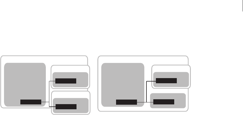
641ADOBE FLEX 3
Adobe Flex 3 Developer Guide
The following example illustrates loading the run-time style sheet into a child application domain and the current
application domain:
In the first approach, the module and the run-time style sheet are loaded into separate child application domains
(application domains 2 and 3). The styles can be applied only to the applications within the parent domain and
that child domain, so the styles will not be properly applied to the module, which is in a separate child domain.
The second approach loads the module into a child application domain and the run-time style sheet into the same
domain as the main application. In this case, the styles can be applied to the module and the main application
properly.
The reason you must use the second approach is that the ModuleManager class is responsible for loading all
modules, including CSS SWF files. This class is a Singleton that is defined by the main application. Even though
you call methods on the ModuleManager from within the module, you are calling those methods from within the
context of the main application. As a result, the default domain that the ModuleManager loads SWF files into is a
child of the main application’s domain and not a child domain of whatever SWF file the methods happen to be
executed in.
Because SWF files in sibling application domains cannot communicate, styles loaded into one child application
domain will not be applied properly to SWF files loaded into another child application domain. By specifying the
ApplicationDomain.currentDomain in the loadStyleDeclarations() method, you instruct the ModuleM-
anager to not load the CSS SWF file into a new child application domain, but instead to load it into the main appli-
cation’s application domain so it can be used by your main application and the module.
For more information about application domains, see “Using the ApplicationDomain class” on page 550 in
Programming ActionScript 3.0.
ModuleLoader
CSS SWF
Application domain 1
Styles.swf
Main_Application.swf
CSS SWF le in child domain CSS SWF le in application domain
Application domain 3
Module
Child_App.swf
Application domain 2
ModuleLoader CSS SWF
Application domain 1
Styles.swf
Main_Application.swf
Module
Child_App.swf
Application domain 2

CHAPTER 18
642
Using filters in Flex
You can use Adobe Flash filters to apply style-like effects to Flex components, such as Labels and Text. You can
apply filters to any visual Flex component that is derived from UIComponent. Filters are not styles because you
cannot apply them with a style sheet or the setStyle() method. The result of a filter, though, is often thought of
as a style.
Filters are in the flash.filters.* package, and include the DropShadowFilter, GlowFilter, and BlurFilter classes. To
apply a filter to a component with MXML, you add the filter class to the component’s filters Array. The
filters Array is a property inherited from the DisplayObject class. It contains any number of filters you want to
apply to the component.
The following example applies a drop shadow to a Label control by using expanded MXML syntax and inline
syntax:
<?xml version="1.0"?>
<!-- styles/ApplyFilterInline.mxml -->
<mx:Application xmlns:mx="http://www.adobe.com/2006/mxml">
<!-- Apply filter using MXML syntax to set properties. -->
<mx:Label text="DropShadowFilter" fontSize="20">
<mx:filters>
<mx:DropShadowFilter distance="10" angle="45"/>
</mx:filters>
</mx:Label>
<!-- Apply filter and set properties inline. -->
<mx:Label
text="DropShadowFilter (inline)"
fontSize="20"
filters="{[new DropShadowFilter(10, 45)]}"
/>
</mx:Application>
You can apply filters in ActionScript. You do this by importing the flash.filters.* package, and then adding the new
filter to the filters Array of the Flex control. The following example applies a white shadow to the Label control
when the user clicks the button:
<?xml version="1.0"?>
<!-- styles/ApplyFilterAS.mxml -->
<mx:Application xmlns:mx="http://www.adobe.com/2006/mxml">
<mx:Script><
643ADOBE FLEX 3
Adobe Flex 3 Developer Guide
label1.filters = null;
}
}
]]></mx:Script>
<mx:Label id="label1" text="ActionScript-applied filter."/>
<mx:Button id="b1" label="Toggle Filter" click="toggleFilter()"/>
</mx:Application>
You cannot bind the filter properties to other values.
If you change a filter, you must reassign it to the component so that the changes take effect. The following example
changes the color of the filters when you click the button:
<?xml version="1.0"?>
<!-- styles/FilterChange.mxml -->
<mx:Application xmlns:mx="http://www.adobe.com/2006/mxml"
creationComplete="createFilters()">
<mx:Script><![CDATA[
import flash.filters.*;
private var myBlurFilter:BlurFilter;
private var myGlowFilter:GlowFilter;
private var myBevelFilter:BevelFilter;
private var myDropShadowFilter:DropShadowFilter;
private var color:Number = 0xFF33FF;
public function createFilters():void {
myBlurFilter = new BlurFilter(4, 4, 1);
myGlowFilter = new GlowFilter(color, .8, 6, 6, 2, 1,
false, false);
myDropShadowFilter = new DropShadowFilter(15, 45,
color, 0.8, 8, 8, 0.65, 1, false, false);
myBevelFilter = new BevelFilter(5, 45, color, 0.8,
0x333333, 0.8, 5, 5, 1, BitmapFilterQuality.HIGH,
BitmapFilterType.INNER, false);
applyFilters();
}
public function applyFilters():void {
rte1.filters = [myGlowFilter];
b1.filters = [myDropShadowFilter];
dc1.filters = [myBevelFilter];
hs1.filters = [myBlurFilter];
}
public function changeFilters():void {
color = 0x336633;
createFilters();
}
]]></mx:Script>
<mx:RichTextEditor id="rte1"/>

CHAPTER 18
644
<mx:DateChooser id="dc1"/>
<mx:HSlider id="hs1"/>
<mx:Button id="b1" label="Click me" click="changeFilters()"/>
</mx:Application>
Some Flex containers and controls have a dropShadowEnabled property. You can set this property to true to add
a drop shadow filter to those components. However, when you use this property, the Flex components draw their
own drop shadows for performance reasons. They copy the edges of the target and then draw the shadow onto a
bitmap, which is then attached the target. If the target component is rotated, the drop shadow might appear jagged
because of the way rotated vectors are rendered.
To avoid this and have smooth drop shadow filters on rotated components, you use the DropShadowFilter class,
as described in the examples in this section.
The following example shows the difference between drawing a filter with the dropShadowEnabled property and
using the DropShadowFilter class:
<?xml version="1.0" encoding="utf-8"?>
<!-- styles/SmoothFilter.mxml -->
<mx:Application xmlns:mx="http://www.adobe.com/2006/mxml"
backgroundColor="0xFFFFFF"
layout="absolute"
>
<mx:Style>
Canvas {
borderStyle:solid;
cornerRadius:10;
borderColor:#000000;
backgroundColor:#FFFFFF;
}
</mx:Style>
<mx:Script>
<![CDATA[
private function getBitmapFilter():DropShadowFilter {
var distance:Number = 3;
var angle:Number = 90;
var color:Number = 0x000000;
var alpha:Number = 1;
var blurX:Number = 8;
var blurY:Number = 8;
var strength:Number = 0.65;
var quality:Number = BitmapFilterQuality.LOW;
var inner:Boolean = false;
var knockout:Boolean = false;
return new DropShadowFilter(distance, angle, color, alpha,
blurX, blurY, strength, quality, inner, knockout);
}
]]>
</mx:Script>
<!-- This rotated canvas applies a filter using the dropShadowEnabled
property. As a result, the edges are slightly jagged. -->
<mx:Canvas id="canvas1"

645ADOBE FLEX 3
Adobe Flex 3 Developer Guide
dropShadowEnabled="true"
creationComplete="canvas1.rotation=-10"
x="50" y="80"
width="400"
height="300"
/>
<!-- This rotated canvas applies a bitmap filter. As a result,
the edges are smoother. -->
<mx:Canvas id="canvas2"
filters="{[getBitmapFilter()]}"
creationComplete="canvas2.rotation=-10"
x="50" y="420"
width="400"
height="300"
/>
</mx:Application>
For information about using filters with chart controls, see “Using filters with chart controls” on page 116 in Adobe
Flex 3 Data Visualization Developer Guide.
About themes
A theme defines the look and feel of a Flex application. A theme can define something as simple as the color
scheme or common font for an application, or it can be a complete reskinning of all the components used by the
application.
Themes usually take the form of a SWC file. However, themes can also be a CSS file and embedded graphical
resources, such as symbols from a SWF file. Theme SWC files can also be compiled into style SWF files so that
they can be loaded at run time. For more information, see “Using theme SWC files as run-time style sheets” on
page 640.
The default theme, Halo, is a combination of graphical and programmatic skins in a SWC file. It is defined by the
defaults.css file in the framework.swc file. This file sets many properties of the Flex components. In some cases it
uses classes in the mx.skins.halo package. Flex also includes several predefined themes that you can apply to your
applications. For more information, see “About the included theme files” on page 647.
To apply the contents of a SWC file to your Flex application, use the instructions in “Using themes” on page 646.
To create your own theme, use the instructions in “Creating a theme SWC file” on page 647. You can affect the
theme of a Flex application without creating a new theme. You do this with the themeColor property. For more
information, see “Creating themes” on page 698.

CHAPTER 18
646
Using themes
Themes generally take the form of a theme SWC file. These SWC files contain style sheets and skinning assets.
You use the assets inside theme SWC files for programmatic skins or graphical assets, such as SWF, GIF, or JPEG
files. Themes can also contain just stand-alone CSS files.
Packaging a theme as a SWC file rather than as a loose collection of files has the following benefits:
•SWC files are easier to distribute.
•SWC files cannot be modified and reapplied to the application without recompiling.
•SWC files are precompiled. This reduces application compile time, compared to compile time for skin classes
that are not in a SWC file.
You apply a theme to your Flex application by specifying the SWC or CSS file with the theme compiler option.
The following example uses the mxmlc command-line compiler to compile an application that uses the Bully-
Buster theme SWC file:
mxmlc -theme c:/theme/BullyBuster.swc c:/myfiles/flex/misc/MainApp.mxml
When compiling an application by using options in the flex-config.xml file, you specify the theme as follows:
<compiler>
<theme>
<filename>c:/theme/BullyBuster.swc</filename>
</theme>
</compiler>
When you add a SWC file to the list of themes, the compiler adds the classes in the SWC file to the application’s
library-path, and applies any CSS files contained in the SWC file to your application. The converse is not true,
however. If you add a SWC file to the library-path, but do not specify that SWC file with the theme option, the
compiler does not apply CSS files in that SWC file to the application.
For more information, see “Using the Flex Compilers” on page 125 in Building and Deploying Adobe Flex 3 Appli-
cations.
You can specify more than one theme file to be applied to the application. If there are no overlapping styles, both
themes are applied completely. The ordering of the theme files is important, though. If you specify the same style
property in more than one theme file, Flex uses the property from the last theme in the list. In the following
example, style properties in the Wooden.css file take precedence, but unique properties in the first two theme files
are also applied:
<compiler>
<theme>
<filename>../themes/Institutional.css</filename>
<filename>../themes/Ice.css</filename>
<filename>../themes/Wooden.css</filename>
</theme>
</compiler>

647ADOBE FLEX 3
Adobe Flex 3 Developer Guide
About the included theme files
Flex includes several themes that you can use without making any changes. With the exception of the default Halo
theme, all of these themes are located in the flex_install_dir/frameworks/themes directory for the SDK. For Flex
Builder, the themes are located in the flex_install_dir/sdks/sdk_version/frameworks/themes directory.
The following table describes these themes:
Creating a theme SWC file
To build a theme SWC file, you create a CSS file, and include that file plus the graphical and programmatic assets
in the SWC file. To do this, you use the include-file option of the compc utility.
A good starting point for creating a new theme is to customize the defaults.css file in the framework.swc file. The
following sections describe these steps in detail.
Creating a theme style sheet
A theme typically consists of a style sheet and any assets that the style sheet uses. These assets can be graphic files
or programmatic skin classes.
Theme Description
Aeon Graphical Contains the AeonGraphical.css file and the AeonGraphical.swf file. This is the graphical version of the default Halo
theme
The source FLA file for the graphical assets is in the AeonGraphical Source directory. You change the graphical assets in
this file by using the Flash IDE. You must ensure that you export the SWF file, which is used by the theme in Flex.
This theme is provided as a starting point for graphically reskinning your application. While it might be more efficient,
you lose some ability to apply run-time styles if you use it.
The Halo theme uses the defaults.css file in the framework.swc file and the classes in the mx.skins.halo package. For more
information about the default theme assets, see “About the default style sheet” on page 618.
HaloClassic Provides the look and feel of previous versions of Flex. This theme comprises the haloclassic.swc file. Included in this file
are the CSS file and SWF file that provide graphical assets.
Ice Contains the Ice.css file.
Institutional Contains the Institutional.css file.
Smoke Contains the Smoke.css file and a background JPEG file.
Wooden Contains the Wooden.css file and a background JPEG file.

CHAPTER 18
648
To add graphic files to the theme’s CSS file, you use the Embed statement. The following example defines new
graphical skins for the Button class:
Button {
upSkin: Embed("upIcon.jpg");
downSkin: Embed("downIcon.jpg");
overSkin: Embed("overIcon.jpg");
}
The name you provide for the Embed keyword is the same name that you use for the skin asset when compiling
the SWC file.
To add programmatic skin classes to the theme’s CSS file, you use the ClassReference statement to specify the
class name (not the file name), as the following example shows:
Button {
upSkin:ClassReference('myskins.ButtonSkin');
downSkin:ClassReference('myskins.ButtonSkin');
overSkin:ClassReference('myskins.ButtonSkin');
}
In the preceding example, all skins are defined by a single programmatic skin class file. For more information, see
“Creating programmatic skins” on page 713.
The CSS file can include any number of class selectors, as well as type selectors. Style definitions for your theme
do not have to use skins. You can simply set style properties in the style sheet, as the following example shows:
ControlBar {
disabledOverlayAlpha: 0;
paddingBottom: 10;
paddingLeft: 10;
paddingRight: 10;
paddingTop: 10;
verticalAlign: "middle";
}
This type selector for ControlBar components is taken from the default style sheet, defaults.css, inside the
framework.swc file. It can be a good place to start when designing a theme. For more information about
defaults.css, see “About the default style sheet” on page 618.
Compiling a theme SWC file
You compile a theme SWC file by using the include-file and include-classes options of the Flex component
compiler. This is the same compiler that creates component libraries and Runtime Shared Libraries (RSLs).
You invoke the component compiler either with the compc command line utility or when creating a Library
Project in Adobe Flex Builder.

649ADOBE FLEX 3
Adobe Flex 3 Developer Guide
You use the include-file option to add the CSS file and graphics files to the theme SWC file. This is described
in “Using the include-file option to compile theme SWC files” on page 649. You use the include-classes option
to add programmatic skin classes to the theme SWC file. This is described in “Using the include-classes option to
compile theme SWC files” on page 649.
To simplify the commands for compiling theme SWC files, you can use configuration files. For more information,
see “Using a configuration file to compile theme SWC files” on page 650.
Using the include-file option to compile theme SWC files
The include-file option takes two arguments: a name and a path. The name is the name that you use to refer
to that asset as in the CSS file. The path is the file system path to the asset. When using include-file, you are
not required to add the resources to the source path. The following command line example includes the
upIcon.jpg asset in the theme SWC file:
-include-file upIcon.jpg c:/myfiles/themes/assets/upIcon.jpg
You also specify the CSS file as a resource to include in the theme SWC file. You must include the .css extension
when you provide the name of the CSS file; otherwise, Flex does not recognize it as a style sheet and does not apply
it to your application.
You use the component compiler to compile theme assets, such as a style sheet and graphical skins, into a SWC
file. The following example compiles a theme by using the compc command-line compiler:
compc -include-file mycss.css c:/myfiles/themes/mycss.css
-include-file upIcon.jpg c:/myfiles/themes/assets/upIcon.jpg
-include-file downIcon.jpg c:/myfiles/themes/assets/downIcon.jpg
-include-file overIcon.jpg c:/myfiles/themes/assets/overIcon.jpg
-o c:/myfiles/themes/MyTheme.swc
You cannot pass a list of assets to the include-file option. Each pair of arguments must be preceded by
-include-file. Most themes use many skin files and style sheets, which can be burdensome to enter each time
you compile. To simplify this, you can use the load-config option to specify a file that contains configuration
options, such as multiple include-file options. For more information, see “Using a configuration file to
compile theme SWC files” on page 650.
Using the include-classes option to compile theme SWC files
The include-classes option takes a single argument: the name of the class to include in the SWC file. You pass
the class name and not the class filename (for example, MyButtonSkin rather than MyButtonSkin.as). The class
must be in your source path when you compile the SWC file.

CHAPTER 18
650
The following command-line example compiles a theme SWC file that includes the CSS file and a single program-
matic skin class, MyButtonSkin, which is in the themes directory:
compc -source-path c:/myfiles/flex/themes
-include-file mycss.css c:/myfiles/flex/themes/mycss.css
-include-classes MyButtonSkin -o c:/myfiles/flex/themes/MyTheme.swc
You can pass a list of classes to the include-classes option by space-delimiting each class, as the following
example shows:
-include-classes MyButtonSkin MyControlBarSkin MyAccordionHeaderSkin
For more information about creating skin classes, see “Creating Skins” on page 689.
Using a configuration file to compile theme SWC files
Using a configuration file is generally more verbose than passing options on the command line, but it can make
the component compiler options easier to read and maintain. For example, you could replace a command line
with the following entries in a configuration file:
<?xml version="1.0"?>
<flex-config xmlns="http://www.adobe.com/2006/flex-config">
<output>MyTheme.swc</output>
<include-file>
<name>mycss.css</name>
<path>c:/myfiles/themes/mycss.css</path>
</include-file>
<include-file>
<name>upIcon.jpg</name>
<path>c:/myfiles/themes/assets/upIcon.jpg</path>
</include-file>
<include-file>
<name>downIcon.jpg</name>
<path>c:/myfiles/themes/assets/downIcon.jpg</path>
</include-file>
<include-file>
<name>overIcon.jpg</name>
<path>c:/myfiles/themes/assets/overIcon.jpg</path>
</include-file>
<include-classes>
<class>MyButtonSkin</class>
<class>MyAccordionHeaderSkin</class>
<class>MyControlBarSkin</class>
</include-classes>
</flex-config>
You can use the configuration file with compc by using the load-config option, as the following example shows:
compc -load-config myconfig.xml
You can also pass a configuration file to the Flex Builder component compiler. For more information on using the
component compilers, see “Using the Flex Compilers” on page 125 in Building and Deploying Adobe Flex 3 Appli-
cations.

651ADOBE FLEX 3
Adobe Flex 3 Developer Guide

CHAPTER 18
652

653
Chapter 19: Using Fonts
You can include fonts in your Adobe® Flex® applications. Although it is easier to use the default device fonts, you
can embed other fonts so that you can apply special effects to text-based controls, such as rotating and fading.
Topics
About fonts . . . . . . . . . . . . . . . . . . . . . . . . . . . . . . . . . . . . . . . . . . . . . . . . . . . . . . . . . . . . . . . . . . . . . . . . . . . . . . . . . . . .653
Using device fonts. . . . . . . . . . . . . . . . . . . . . . . . . . . . . . . . . . . . . . . . . . . . . . . . . . . . . . . . . . . . . . . . . . . . . . . . . . . . . . .655
Using embedded fonts . . . . . . . . . . . . . . . . . . . . . . . . . . . . . . . . . . . . . . . . . . . . . . . . . . . . . . . . . . . . . . . . . . . . . . . . . . .656
Using multiple typefaces . . . . . . . . . . . . . . . . . . . . . . . . . . . . . . . . . . . . . . . . . . . . . . . . . . . . . . . . . . . . . . . . . . . . . . . . .668
About the font managers . . . . . . . . . . . . . . . . . . . . . . . . . . . . . . . . . . . . . . . . . . . . . . . . . . . . . . . . . . . . . . . . . . . . . . . . .672
Setting character ranges . . . . . . . . . . . . . . . . . . . . . . . . . . . . . . . . . . . . . . . . . . . . . . . . . . . . . . . . . . . . . . . . . . . . . . . . . .673
Embedding double-byte fonts. . . . . . . . . . . . . . . . . . . . . . . . . . . . . . . . . . . . . . . . . . . . . . . . . . . . . . . . . . . . . . . . . . . . .676
Embedding fonts from SWF files . . . . . . . . . . . . . . . . . . . . . . . . . . . . . . . . . . . . . . . . . . . . . . . . . . . . . . . . . . . . . . . . . .677
Troubleshooting fonts in Flex applications . . . . . . . . . . . . . . . . . . . . . . . . . . . . . . . . . . . . . . . . . . . . . . . . . . . . . . . . . .686
About fonts
When you compile a Flex application, the application stores the names of the fonts that you used to create the text.
Adobe® Flash® Player 9 uses the font names to locate identical or similar fonts on the user’s system when the Flex
application runs. You can also embed fonts in the Flex application so that the exact font is used, regardless of
whether the client’s system has that font.
You define the font that appears in each of your components by using the fontFamily style property. You can set
this property in an external style sheet, a <mx:Style> block, or inline. This property can take a list of fonts, as the
following example shows:
.myClass {
fontFamily: Arial, Helvetica;
color: Red;
fontSize: 22;
fontWeight: bold;
}
If the client’s system does not have the first font in the list, Flash Player attempts to find the second, and so on,
until it finds a font that matches. If no fonts match, Flash Player makes a best guess to determine which font the
client uses.

654 CHAPTER 19
Fonts are inheritable style properties. So, if you set a font style on a container, all controls inside that container
inherit that style, as the following example shows:
<?xml version="1.0"?>
<!-- fonts/InheritableExample.mxml -->
<mx:Application xmlns:mx="http://www.adobe.com/2006/mxml">
<mx:Style>
VBox {
fontFamily: Helvetica;
fontSize: 13pt;
}
HBox {
fontFamily: Times;
fontSize: 13pt;
}
Panel {
paddingLeft: 10;
paddingTop: 10;
paddingBottom: 10;
paddingRight: 10;
}
</mx:Style>
<mx:Panel title="Styles Inherited from VBox Type Selector">
<mx:VBox>
<mx:Button label="This Button uses Helvetica"/>
<mx:Label text="This label is in Helvetica."/>
<mx:TextArea height="75">
<mx:text>
The text in this TextArea control uses the Helvetica font
because it is inherited from the VBox style.
</mx:text>
</mx:TextArea>
</mx:VBox>
</mx:Panel>
<mx:Panel title="Styles Inherited from HBox Type Selector">
<mx:HBox>
<mx:Button label="This Button uses Times"/>
<mx:Label text="This label is in Times."/>
<mx:TextArea height="75">
<mx:text>
The text in this TextArea control uses the Times font
because it is inherited from the HBox style.
</mx:text>
</mx:TextArea>
</mx:HBox>
</mx:Panel>
</mx:Application>
This example defines the HBox and VBox type selectors’ fontSize and fontFamily properties. Flex applies these
styles to all components in the container that support those properties; in these cases, the Button, Label, and
TextFi eld contro l s.

655ADOBE FLEX 3
Adobe Flex 3 Developer Guide
Using device fonts
You can specify any font for the fontFamily property. However, not all systems have all font faces, which can
result in an unexpected appearance of your controls. The safest course when specifying font faces is to include a
device font as a default at the end of the font list. Device fonts do not export font outline information and are not
embedded in the SWF file. Instead, Flash Player uses whatever font on the local computer most closely resembles
the device font.
The following example specifies the device font _sans to use if Flash Player cannot find either of the other fonts
on the client machine:
<?xml version="1.0"?>
<!-- fonts/DeviceFont.mxml -->
<mx:Application xmlns:mx="http://www.adobe.com/2006/mxml">
<mx:Style>
.myClass {
fontFamily: Arial, Helvetica, "_sans";
color: Red;
fontSize: 12;
fontWeight: bold;
}
Panel {
paddingLeft: 10;
paddingTop: 10;
paddingBottom: 10;
paddingRight: 10;
}
</mx:Style>
<mx:Panel title="myClass Class Selector with Device Font">
<mx:VBox styleName="myClass">
<mx:Button label="Click Me"/>
<mx:Label text="This is a label."/>
<mx:TextArea width="200">
<mx:text>
The text in the TextArea control uses the myClass class selector.
</mx:text>
</mx:TextArea>
</mx:VBox>
</mx:Panel>
</mx:Application>
Note: You must surround device font names with quotation marks when defining them with style declarations.
CHAPTER 19
656
Flash Player supports three device fonts. The following table describes these fonts:
Using device fonts does not affect the size of the SWF file because the fonts reside on the client. However, using
device fonts can affect performance of the application because it requires that Flash Player interact with the local
operating system. Also, if you use only device fonts, your selection is limited to three fonts.
Using embedded fonts
Rather than rely on a client machine to have the fonts you specify, you can embed TrueType font (TTF) or
OpenType font (OTF) families in your Flex application. This means that the font is always available to Flash Player
when the application is running, and you do not have to consider the implications of a missing font.
Embedded fonts have the following benefits:
•Client environment does not need the font to be installed.
•Embedded fonts are anti-aliased, which means that their edges are smoothed for easier readability. This is
especially apparent when the text size is large.
•Embedded fonts can be partially or fully transparent.
•Embedded fonts can be rotated.
•Embedded fonts provide smoother playback when zooming.
•Text appears exactly as you expect when you use embedded fonts.
•When you embed a font, you can use the advanced anti-aliasing information that provides clear, high-quality
text rendering in SWF files. Using advanced anti-aliasing greatly improves the readability of text, particularly
when it is rendered at smaller font sizes. For more information about advanced anti-aliasing, see “Using advanced
anti-aliasing” on page 663.
Font name Description
_sans The _sans device font is a sans-serif typeface; for example, Helvetica or Arial.
_serif The _serif device font is a serif typeface; for example, Times Roman.
_typewriter The _typewriter device font is a monospace font; for example, Courier.

657ADOBE FLEX 3
Adobe Flex 3 Developer Guide
Using embedded fonts is not always the best solution, however. Embedded fonts have the following limitations
and drawbacks:
•Embed only TrueType or OpenType fonts. To embed other font types such as Type 1 PostScript fonts, embed
that font in a SWF file that you create in Flash 8, and then embed that SWF file in your Flex application. For more
information, see “Embedding fonts from SWF files” on page 677.
•Embedded fonts increase the file size of your application, because the document must contain font outlines
for the text. This can result in longer download times for your users.
•Embedded fonts, in general, decrease the legibility of the text at sizes smaller than 10 points. All embedded
fonts use anti-aliasing to render the font information on the client screen. As a result, fonts may look fuzzy or
illegible at small sizes. To avoid this fuzziness, you can use advanced anti-aliasing to render fonts in Flex applica-
tions. For more information, see “Using advanced anti-aliasing” on page 663.
•In some cases, embedded fonts can be truncated when they are used in visual components. In these cases, you
might be required to change the padding properties of the component by using style properties or subclassing it.
This only occurs with some fonts.
You typically use Cascading Style Sheets (CSS) syntax for embedding fonts in Flex applications. You use the
@font-face “at-rule” declaration to specify the source of the embedded font and then define the name of the font
by using the fontFamily property. You must specify the @font-face declaration for each face of the font for the
same family that you use. The source can be a local Java Runtime Environment (JRE) font or one that is accessible
by using a file path. You use this font family name in your MXML code to refer to the embedded font.
Note: Check your font licenses before embedding any font files in your Flex applications. Fonts might have licensing
restrictions that preclude them from being stored as vector information.
If you attempt to embed a font that the Flex compiler cannot find, Flex throws an error and your application does
not compile.
Embedded font syntax
To embed TrueType or OpenType fonts, you use the following syntax in your style sheet or <mx:Style> tag:
@font-face {
src: url("location") | local("name");
fontFamily: alias;
[fontStyle: normal | italic | oblique;]
[fontWeight: normal | bold | heavy;]
[advancedAntiAliasing: true | false;]
}

CHAPTER 19
658
The src property specifies how the compiler should look for the font and the name of the font to look for. You
can load a font either by its filename (by using src:url) or by its system font name (by using src:local). This
property is required. For more information, see “Locating embedded fonts” on page 660. The src property also
helps determine which font manager the compiler will use; for more information, see “A b o u t t h e f o n t m a n a g e rs”
on page 672.
The fontFamily property sets the alias for the font that you use to apply the font in style sheets. This property is
required. If you embed a font with a family name that matches the family name of a system font, the Flex compiler
gives you a warning. You can disable this warning by setting the show-shadows-system-font-warnings
compiler option to false.
The fontStyle and fontWeight properties set the type face values for the font. These properties are optional.
The default values are normal.
The advancedAntiAliasing property determines whether to include the advanced anti-aliasing information
when embedding the font. This property is optional. The default value is true. You cannot use this option when
embedding fonts from a SWF file (see “Embedding fonts from SWF files” on page 677). For more information on
using advanced anti-aliasing, see “Using advanced anti-aliasing” on page 663.
The following example embeds the MyriadWebPro.ttf font file:
@font-face {
src: url("../assets/MyriadWebPro.ttf");
fontFamily: myFontFamily;
advancedAntiAliasing: true;
}
The following example embeds that same font, but by using its system font name:
@font-face {
src: local("Myriad Web Pro");
fontFamily: myFontFamily;
advancedAntiAliasing: true;
}
After you embed a font with an @font-face declaration, you can use the value of the fontFamily property, or
alias, in a type or class selector. The following example uses myFontFamily, the value of the fontFamily property,
as the font in the VBox type selector:
<?xml version="1.0"?>
<!-- fonts/EmbeddedFontFace.mxml -->
<mx:Application xmlns:mx="http://www.adobe.com/2006/mxml">
<mx:Style>
@font-face {
src:url("../assets/MyriadWebPro.ttf");
fontFamily: myFontFamily;
advancedAntiAliasing: true;
}
VBox {
fontFamily: myFontFamily;

659ADOBE FLEX 3
Adobe Flex 3 Developer Guide
fontSize: 15;
}
Panel {
paddingLeft: 10;
paddingTop: 10;
paddingBottom: 10;
paddingRight: 10;
}
</mx:Style>
<mx:Panel title="Embedded Font Applied With Type Selector">
<mx:VBox>
<!-- This button attempts to use the font of the VBox container. -->
<mx:Button label="Click Me"/>
<mx:Label text="This is a label."/>
<mx:TextArea width="250">
<mx:text>
The text in this TextArea control uses the
myClass class selector.
</mx:text>
</mx:TextArea>
</mx:VBox>
</mx:Panel>
<!-- This button uses the default font because it is not in
the VBox. -->
<mx:Button label="Click Me"/>
</mx:Application>
You can also apply the embedded font inline by specifying the alias as the value of the control’s fontFamily
property, as the following example shows:
<?xml version="1.0"?>
<!-- fonts/EmbeddedFontFaceInline.mxml -->
<mx:Application xmlns:mx="http://www.adobe.com/2006/mxml">
<mx:Style>
@font-face {
src:url("../assets/MyriadWebPro.ttf");
fontFamily: myFontFamily;
advancedAntiAliasing: true;
}
Panel {
paddingLeft: 10;
paddingTop: 10;
paddingBottom: 10;
paddingRight: 10;
}
</mx:Style>
<mx:Panel title="Embedded Font Applied Inline">
<mx:VBox fontFamily="myFontFamily">
<mx:Button label="Click Me"/>
<mx:Label text="This is a label."/>
<mx:TextArea width="200">
CHAPTER 19
660
<mx:text>
The text in the TextArea control is Myriad Web Pro.
</mx:text>
</mx:TextArea>
</mx:VBox>
</mx:Panel>
</mx:Application>
When you run this example, you might notice that the Button control’s label uses a system font. This is because
the default style of a Button control’s label uses a bold typeface. However, the embedded font’s typeface (Myriad
Web Pro) does not contain a definition for the bold typeface. To have the Button control’s label use the proper
typeface, you must either embed a font’s bold typeface so that the label of a Button control is rendered with the
correct font, or change the Button control’s typeface to be non-bold. For information on embedding bold
typefaces, see “Using multiple typefaces” on page 668.
Locating embedded fonts
The src property in the @font-face declaration specifies the location of the font family. You can specify a url
or a local function. The following table describes these functions:
You must specify the url or local function of the src property in the @font-face declaration. All other
properties are optional. In general, you should use url rather than local, because pointing to a file is more
reliable than using a reference controlled by the operating system.
Do not mix embedded and nonembedded fonts in the same fontFamily property.
Attribute Description
url Embeds a TrueType or OpenType font by location by specifying a valid URI to the font. The URI can be relative (for example,
../fontfolder/akbar.ttf) or absolute (for example, c:/myfonts/akbar.ttf ).
local Embeds a locally accessible TrueType or OpenType font by name rather than location. You use the font name, and not the
filename, for the font. For example, you specify “Akbar Bold Italic” rather than “AkbarBI.ttf”.
You can embed fonts that are locally accessible by the application server’s Java Runtime Environment (JRE). These fonts
include the *.ttf files in the jre/lib/fonts folder, fonts that are mapped in the jre/lib/font.properties file, and fonts that are
made available to the JRE by the operating system (OS).
On Windows, TTF files in the /windows/fonts directory (or /winnt/fonts) are available to the local function. On Solaris or
Linux, fonts that are registered with a font server, such as xfs, are available.
The font name that you specify is determined by the operating system. In general, you do not include the font file’s extension,
but this is OS-dependent. For more information, consult your operating system documentation.

661ADOBE FLEX 3
Adobe Flex 3 Developer Guide
Embedding fonts in ActionScript
You can embed TrueType or OTF font files or system fonts by location or by name by using the [Embed] metadata
tag in ActionScript. To embed a font by location, you use the source property in the [Embed] metadata tag. To
embed a font by name, you use the systemFont property in the [Embed] metadata tag.
The following examples embed fonts by location by using the [Embed] tag syntax:
<?xml version="1.0"?>
<!-- fonts/EmbeddedFontFaceActionScriptByLocation.mxml -->
<mx:Application xmlns:mx="http://www.adobe.com/2006/mxml">
<mx:Style>
.mystyle1 {
fontFamily:myMyriadFont;
fontSize: 32pt;
}
.mystyle2 {
fontFamily:myBoldMyriadFont;
fontSize: 32pt;
fontWeight: bold;
}
</mx:Style>
<mx:Script>
/*
* Embed a font by location.
*/
[Embed(source='../assets/MyriadWebPro.ttf',
fontName='myMyriadFont',
mimeType='application/x-font'
)]
// You do not use this variable directly. It exists so that
// the compiler will link in the font.
private var font1:Class;
/*
* Embed a font with bold typeface by location.
*/
[Embed(source='../assets/MyriadWebPro-Bold.ttf',
fontWeight='bold',
fontName='myBoldMyriadFont',
mimeType='application/x-font',
advancedAntiAliasing='true'
)]
private var font2:Class;
</mx:Script>
<mx:Panel title="Embedded Fonts Using ActionScript">
<mx:VBox>
<mx:Label
width="100%"
height="75"
styleName="mystyle1"
text="This text uses the MyriadWebPro font."
rotation="15"
/>

CHAPTER 19
662
<mx:Label
width="100%"
height="75"
styleName="mystyle2"
text="This text uses the MyriadWebPro-Bold font."
rotation="15"
/>
</mx:VBox>
</mx:Panel>
</mx:Application>
You use the value of the fontName property that you set in the [Embed] tag as the alias (fontFamily) in your style
definition.
To embed a font with a different typeface (such as bold or italic), you specify the fontWeight or fontStyle
properties in the [Embed] statement and in the style definition. For more information on embedding different
typefaces, see “Using multiple typefaces” on page 668.
To show you that the example runs correctly, the Label controls are rotated. If the fonts were not correctly
embedded, the text in the Label controls would disappear when you rotated the text.
To embed local or system fonts, you use the system font name rather than the filename for the font. You also
specify that name using the systemFont property in the [Embed] tag rather than the source attribute. Otherwise,
you use the same syntax, as the following example shows:
<?xml version="1.0"?>
<!-- fonts/EmbeddedFontFaceActionScriptByName.mxml -->
<mx:Application xmlns:mx="http://www.adobe.com/2006/mxml">
<mx:Style>
.mystyle1 {
fontFamily:myPlainFont;
fontSize: 32pt;
}
.mystyle2 {
fontFamily:myItalicFont;
fontSize: 32pt;
fontStyle: italic;
}
</mx:Style>
<mx:Script>
/*
* Embed a font by name.
*/
[Embed(systemFont='Myriad Web Pro',
fontName='myPlainFont',
mimeType='application/x-font'
)]
// You do not use this variable directly. It exists so that
// the compiler will link in the font.
private var font1:Class;
/*
* Embed a font with italic typeface by name.
*/

663ADOBE FLEX 3
Adobe Flex 3 Developer Guide
[Embed(systemFont='Myriad Web Pro',
fontStyle='italic',
fontName='myItalicFont',
mimeType='application/x-font',
advancedAntiAliasing='true'
)]
private var font2:Class;
</mx:Script>
<mx:Panel title="Embedded Fonts Using ActionScript">
<mx:VBox>
<mx:Label
width="100%"
height="75"
styleName="mystyle1"
text="This text uses the plain typeface."
rotation="15"
/>
<mx:Label
width="100%"
height="75"
styleName="mystyle2"
text="This text uses the italic typeface."
rotation="15"
/>
</mx:VBox>
</mx:Panel>
</mx:Application>
To get the system font name in Windows, install the Font properties extension. Then right-click the font’s file in
Windows Explorer and select the Names tab. Use the value under Font Family Name as the systemFont value.
You can specify a subset of the font’s character range by specifying the unicodeRange parameter in the [Embed]
metadata tag or the @font-face declaration. Embedding a range of characters rather than using the default of all
characters can reduce the size of the embedded font and, therefore, reduce the final output size of your SWF file.
For more information, see “Setting character ranges” on page 673.
Using advanced anti-aliasing
When you embed fonts, you can use advanced anti-aliasing to provide those fonts with additional information
about the font. Embedded fonts that use the advanced anti-aliasing information are typically clearer and appear
sharper at smaller font sizes.
By default, fonts that you embed in Flex applications use the advanced anti-aliasing information. This default is
set by the fonts.advanced-anti-aliasing compiler option in the flex-config.xml file (the default value is
true). You can override this default value by setting the value in your style sheets or changing it in the configu-
ration file. To disable advanced anti-aliasing in style sheets, you set the advancedAntiAliasing style property to
false in your @font-face rule, as the following example shows:
@font-face {

CHAPTER 19
664
src:url("../assets/MyriadWebPro.ttf");
fontFamily: myFontFamily;
advancedAntiAliasing: false;
}
Using advanced anti-aliasing can degrade the performance of your compiler. This is not a run-time concern, but
can be noticeable if you compile your applications frequently or use the web-tier compiler. Using advanced anti-
aliasing can also cause a slight delay when you load SWF files. You notice this delay especially if you are using
several different character sets, so be aware of the number of fonts that you use. The presence of advanced anti-
aliasing information may also cause an increase in the memory usage in Flash Player and Adobe® AIR™. Using four
or five fonts, for example, can increase memory usage by approximately 4 MB.
When you embed fonts that use advanced anti-aliasing in your Flex applications, the fonts function exactly as
other embedded fonts. They are anti-aliased, you can rotate them, and you can make them partially or wholly
transparent.
Font definitions that use advanced anti-aliasing support several additional styles properties:
fontAntiAliasType, fontGridFitType, fontSharpness, and fontThickness. These properties are all inher-
iting styles.
Because the advanced anti-aliasing-related style properties are CSS styles, you can use them in the same way that
you use standard style properties, such as fontFamily and fontSize. For example, a text-based component
could use subpixel-fitted advanced anti-aliasing of New Century 14 at sharpness 50 and thickness -35, while all
Button controls could use pixel-fitted advanced anti-aliasing of Tahoma 10 at sharpness 0 and thickness 0. These
styles apply to all the text in a TextField control; you cannot apply them to some characters and not others.
The default values for the advanced anti-aliasing styles properties are defined in the defaults.css file. If you replace
this file or use another style sheet that overrides these properties, Flash Player and AIR use the standard font
renderer to render the fonts that use advanced anti-aliasing. If you embed fonts that use advanced anti-aliasing,
you must set the fontAntiAliasType property to advanced, or you lose the benefits of the advanced anti-
aliasing information.

665ADOBE FLEX 3
Adobe Flex 3 Developer Guide
The following table describes these properties:
Detecting embedded fonts
You can use the SystemManager class’s isFontFaceEmbedded() method to determine whether the font is
embedded or whether it has been registered globally with the register() method of the Font class. The
isFontFaceEmbedded() method takes a single argument—the object that describes the font’s TextFormat—and
returns a Boolean value that indicates whether the font family you specify is embedded, as the following example
shows:
<?xml version="1.0"?>
<!-- fonts/DetectingEmbeddedFonts.mxml -->
<mx:Application xmlns:mx="http://www.adobe.com/2006/mxml"
creationComplete="determineIfFontFaceIsEmbedded()">
<mx:Style>
Style property Description
fontAntiAliasType Sets the antiAliasType property of internal TextField controls. The valid values are normal and
advanced. The default value is advanced, which enables advanced anti-aliasing for the font.
Set this property to normal to prevent the compiler from using advanced anti-aliasing.
This style has no effect for system fonts or fonts embedded without the advanced anti-aliasing information.
fontGridFitType Sets the gridFitType property of internal TextField controls. The valid values are none, pixel, and
subpixel. The default value is pixel. For more information, see the Tex tField and GridFitType classes in
the Adobe Flex Language Reference.
This property has the same effect as the gridFitType style property of the TextField control for system
fonts, only it applies when you embed fonts with advanced anti-aliasing.
Changing the value of this property has no effect unless the fontAntiAliasType property is set to
advanced.
fontSharpness Sets the sharpness property of internal TextField controls. The valid values are numbers from -400 to 400.
The default value is 0.
This property has the same effect as the fontSharpness style property on the TextField control for system
fonts, only it applies when you embed fonts with advanced anti-aliasing.
Changing the value of this property has no effect unless the fontAntiAliasType property is set to
advanced.
fontThickness Sets the thickness property of internal TextField controls. The valid values are numbers from -200 to 200.
The default value is 0.
This property has the same effect as the fontThickness style property on the TextField control for system
fonts, only it applies when you embed fonts with advanced anti-aliasing.
Changing the value of this property has no effect unless the fontAntiAliasType property is set to
advanced.

CHAPTER 19
666
@font-face {
src: url(../assets/MyriadWebPro.ttf);
fontFamily: myPlainFont;
advancedAntiAliasing: true;
}
.myStyle1 {
fontFamily: myPlainFont;
fontSize:12pt
}
</mx:Style>
<mx:Script><![CDATA[
import mx.managers.SystemManager;
import flash.text.TextFormat;
public function determineIfFontFaceIsEmbedded():void {
var tf1:TextFormat = new TextFormat();
tf1.font = "myPlainFont";
var tf2:TextFormat = new TextFormat();
tf2.font = "Arial";
var b1:Boolean = Application.application.systemManager.
isFontFaceEmbedded(tf1);
var b2:Boolean = Application.application.systemManager.
isFontFaceEmbedded(tf2);
l1.text = tf1.font + " (" + b1 + ")";
l2.text = tf2.font + " (" + b2 + ")";
}
]]></mx:Script>
<mx:Text id="text1" styleName="myStyle1" text="Rotate Me"/>
<mx:HBox>
<mx:Button label="Rotate +1" click="++text1.rotation;"/>
<mx:Button label="Rotate -1" click="--text1.rotation;"/>
</mx:HBox>
<mx:Form>
<mx:FormItem label="isFontFaceEmbedded:">
<mx:Label id="l1"/>
</mx:FormItem>
<mx:FormItem label="isFontFaceEmbedded:">
<mx:Label id="l2"/>
</mx:FormItem>
</mx:Form>
</mx:Application>
You can use the Font class’s enumerateFonts() method to output information about device or embedded fonts.
The following example lists embedded fonts:
<?xml version="1.0"?>
<!-- fonts/EnumerateFonts.mxml -->
<mx:Application xmlns:mx="http://www.adobe.com/2006/mxml"
creationComplete="listFonts()">
<mx:Style>
@font-face {
src:url("../assets/MyriadWebPro.ttf");
fontFamily: myFont;

667ADOBE FLEX 3
Adobe Flex 3 Developer Guide
advancedAntiAliasing: true;
}
@font-face {
src:url("../assets/MyriadWebPro-Bold.ttf");
fontFamily: myFont;
fontWeight: bold;
advancedAntiAliasing: true;
}
@font-face {
src:url("../assets/MyriadWebPro-Italic.ttf");
fontFamily: myFont;
fontStyle: italic;
advancedAntiAliasing: true;
}
.myPlainStyle {
fontSize: 20;
fontFamily: myFont;
}
.myBoldStyle {
fontSize: 20;
fontFamily: myFont;
fontWeight: bold;
}
.myItalicStyle {
fontSize: 20;
fontFamily: myFont;
fontStyle: italic;
}
</mx:Style>
<mx:Script><![CDATA[
private function listFonts():void {
var fontArray:Array = Font.enumerateFonts(false);
for(var i:int = 0; i < fontArray.length; i++) {
var thisFont:Font = fontArray[i];
if (thisFont.fontType == "embedded") {
ta1.text += "FONT " + i + ":: name: " + thisFont.fontName + "; typeface: " +
thisFont.fontStyle + "; type: " + thisFont.fontType + "\n";
}
}
}
]]></mx:Script>
<mx:HBox borderStyle="solid">
<mx:Label text="Plain Label" styleName="myPlainStyle"/>
<mx:Label text="Bold Label" styleName="myBoldStyle"/>
<mx:Label text="Italic Label" styleName="myItalicStyle"/>
</mx:HBox>
<mx:TextArea id="ta1" height="200" width="400"/>
</mx:Application>

CHAPTER 19
668
The following list shows the output.
name: myFont; typeface: regular; type: embedded
name: myFont; typeface: bold; type: embedded
name: myFont; typeface: italic; type: embedded
The enumerateFonts() method takes a single Boolean argument: enumerateDeviceFonts. The default value
of the enumerateDeviceFonts property is false, which means it returns an Array of embedded fonts by default.
If you set the enumerateDeviceFonts argument to true, the enumerateFonts() method returns an array of
available device fonts on the client system, but only if the client’s mms.cfg file sets the
DisableDeviceFontEnumeration property to 0, the default value. If you set the
DisableDeviceFontEnumeration property to 1, Flash Player cannot list device fonts on a client computer unless
you explicitly configure the client to allow it. For more information about configuring the client with the mms.cfg
file, see the Flash Player documentation.
Using multiple typefaces
Most fonts have four typeface styles: plain, boldface, italic, and bold-italic. You can embed any number of typeface
styles in your Flex applications. If you embed only the boldface typeface in your application, you cannot use the
normal (or plain) typeface unless you also embed that typeface. For each typeface that you use, you must add a
new @font-face declaration to your style sheet.
Note: Some Flex controls, such as Button, use the boldface typeface style by default, rather than the plain style. If you
use an embedded font for a Button label, you must either embed the boldface font style for that font, or set the default
typeface for the Button label to match a typeface that you embed.
The following example embeds the boldface, oblique, and plain typefaces of the Myriad Web Pro font. After you
define the font face, you define selectors for the font by using the same alias as the fontFamily. You define one
for the boldface, one for the oblique, and one for the plain face. To apply the font styles, this example applies the
class selectors to the Label controls inline:
<?xml version="1.0"?>
<!-- fonts/MultipleFaces.mxml -->
<mx:Application xmlns:mx="http://www.adobe.com/2006/mxml">
<mx:Style>
@font-face {
src:url("../assets/MyriadWebPro.ttf");
fontFamily: myFont;
advancedAntiAliasing: true;
}
@font-face {
/* Note the different filename for boldface. */
src:url("../assets/MyriadWebPro-Bold.ttf");

669ADOBE FLEX 3
Adobe Flex 3 Developer Guide
fontFamily: myFont; /* Notice that this is the same alias. */
fontWeight: bold;
advancedAntiAliasing: true;
}
@font-face {
/* Note the different filename for italic face. */
src:url("../assets/MyriadWebPro-Italic.ttf");
fontFamily: myFont; /* Notice that this is the same alias. */
fontStyle: italic;
advancedAntiAliasing: true;
}
.myPlainStyle {
fontSize: 32;
fontFamily: myFont;
}
.myBoldStyle {
fontSize: 32;
fontFamily: myFont;
fontWeight: bold;
}
.myItalicStyle {
fontSize: 32;
fontFamily: myFont;
fontStyle: italic;
}
</mx:Style>
<mx:VBox>
<mx:Label text="Plain Label" styleName="myPlainStyle"/>
<mx:Label text="Italic Label" styleName="myItalicStyle"/>
<mx:Label text="Bold Label" styleName="myBoldStyle"/>
</mx:VBox>
</mx:Application>
Optionally, you can apply the boldface or oblique type to controls inline, as the following example shows:
<?xml version="1.0"?>
<!-- fonts/MultipleFacesAppliedInline.mxml -->
<mx:Application xmlns:mx="http://www.adobe.com/2006/mxml">
<mx:Style>
@font-face {
src:url("../assets/MyriadWebPro.ttf");
fontFamily: myFont;
advancedAntiAliasing: true;
}
@font-face {
src:url("../assets/MyriadWebPro-Bold.ttf");
fontFamily: myFont;
fontWeight: bold;
advancedAntiAliasing: true;
}

CHAPTER 19
670
@font-face {
src:url("../assets/MyriadWebPro-Italic.ttf");
fontFamily: myFont;
fontStyle: italic;
advancedAntiAliasing: true;
}
.myStyle1 {
fontSize: 32;
fontFamily: myFont;
}
</mx:Style>
<mx:VBox styleName="myStyle1">
<mx:Label text="Plain Label"/>
<mx:Label text="Italic Label" fontStyle="italic"/>
<mx:Label text="Bold Label" fontWeight="bold"/>
</mx:VBox>
</mx:Application>
If you embed a system font by name rather than by a font file by location, you use the font’s family name (such as
Myriad Web Pro) in the @font-face rule and not the typeface name (such as MyriadWebPro-Bold). The
following example embeds a plain typeface and an italic typeface by using the system font names:
<?xml version="1.0"?>
<!-- fonts/EmbeddedFontFaceCSSByName.mxml -->
<mx:Application xmlns:mx="http://www.adobe.com/2006/mxml">
<mx:Style>
@font-face {
src:local("Myriad Web Pro");
fontFamily: myPlainFont;
advancedAntiAliasing: true;
}
@font-face {
src:local("Myriad Web Pro");
fontFamily: myItalicFont;
fontStyle: italic;
advancedAntiAliasing: true;
}
.mystyle1 {
fontFamily:myPlainFont;
fontSize: 32pt;
}
.mystyle2 {
fontFamily:myItalicFont;
fontSize: 32pt;
fontStyle: italic;
}
</mx:Style>
<mx:Panel title="Embedded Fonts Using CSS">
<mx:VBox>
<mx:Label
width="100%"

671ADOBE FLEX 3
Adobe Flex 3 Developer Guide
height="75"
styleName="mystyle1"
text="This text uses the plain typeface."
rotation="15"
/>
<mx:Label
width="100%"
height="75"
styleName="mystyle2"
text="This text uses the italic typeface."
rotation="15"
/>
</mx:VBox>
</mx:Panel>
</mx:Application>
Flex also supports using the <b> and <i> HTML tags in text-based controls, such as Label, to apply the boldface
or italic font to the text.
If you use a bold-italic font, the font must have a separate typeface for that font. You specify both properties
(fontWeight and fontStyle) in the @font-face and selector blocks, as the following example shows:
@font-face {
src:url("../assets/KNIZIA-BI.TTF");
fontStyle: italic;
fontWeight: bold;
fontFamily: myFont;
advancedAntiAliasing: true;
}
.myBoldItalicStyle {
fontFamily:myFont;
fontWeight:bold;
fontStyle:italic;
fontSize: 32;
}
In the @font-face definition, you can specify whether the font is boldface or italic font by using the fontWeight
and fontStyle properties. For a bold font, you can set fontWeight to bold or an integer greater than or equal
to 700. You can specify the fontWeight as plain or normal for a nonboldface font. For an italic font, you can set
fontStyle to italic or oblique. You can specify the fontStyle as plain or normal for a nonitalic face. If you
do not specify a fontWeight or fontStyle, Flex assumes you embedded the plain or regular font face.
You can also add any other properties for the embedded font, such as fontSize, to the selector, as you would with
any class or type selector.
By default, Flex includes the entire font definition for each embedded font in the application, so you should limit
the number of fonts that you use to reduce the size of the application. You can limit the size of the font definition
by defining the character range of the font. For more information, see “Setting character ranges” on page 673.

CHAPTER 19
672
About the font managers
Flex includes several font managers to handle embedded fonts. The font managers take embedded font definitions
and draw each character in Flash Player. This process is known as transcoding. The font managers are Batik, JRE,
and AFE (Adobe Font Engine), represented by the BatikFontManager, JREFontManager, and AFEFontManager
classes, respectively.
The Batik and JRE font managers can transcode TrueType fonts. The AFE font manager adds support for
OpenType fonts.
The Batik font manager transcodes only TrueType URL fonts (embedded by using src:url). It does not
transcode system fonts. If you specify the font location when you embed the font, the compiler will use the Batik
font manager. In general, the Batik font manager provides smoother rendering and more accurate line metrics
(which affect multiline text and line-length calculations) than the JRE font manager.
The JRE font manager transcodes TrueType system fonts (embedded by using src:local), but the quality of
output is generally not as good as the Batik font manager. If you install the font on your system, the compiler will
use the JRE font manager because the Batik font manager does not support system fonts.
The AFE font manager is the only font manager that you can use to transcode OpenType fonts. It can also
transcode TrueType fonts, but the fonts can only be URL fonts, not system fonts. If you embed an OpenType font,
the compiler will use the AFE font manager to transcode the font because the other font managers do not support
OpenType fonts, unless that OpenType font is a system font, in which case, the compiler will throw an error. None
of the font managers can transcode OpenType fonts that are embedded as system fonts.
The following table shows which fonts are supported by which font managers:
You determine which font managers the compiler can use in the flex-config.xml file. The default setting is to use
all of them, as the following example shows:
<fonts>
<managers>
<manager-class>flash.fonts.JREFontManager</manager-class>
<manager-class>flash.fonts.AFEFontManager</manager-class>
<manager-class>flash.fonts.BatikFontManager</manager-class>
</managers>
</fonts>
Batik AFE JRE
Font type TrueType TrueType, OpenType TrueType
Method of embedding URL URL System

673ADOBE FLEX 3
Adobe Flex 3 Developer Guide
The preference of <manager> elements is in reverse order. This means that by default the Batik font manager is
the preferred font manager; the compiler checks to see if a font can be transcoded using it first. If not, then the
compiler checks to see whether the font can be transcoded using the AFE font manager. Finally, if the other font
managers fail, the compiler checks to see whether the JRE font manager can transcode the font.
If you experience compilation or transcoding errors related to fonts, you should first try changing the order of the
font managers in the flex-config.xml file or by using the command-line compiler arguments.
Setting character ranges
By specifying a range of symbols that compose the face of an embedded font, you reduce the size of an embedded
font. Each character in a font must be described; removing some of these characters reduces the overall size of the
description information that Flex must include for each embedded font.
You can set the range of glyphs in the flex-config.xml file or in the font-face declaration in each MXML file. You
specify individual characters or ranges of characters using the Unicode values for the characters, and you can set
multiple ranges for each font declaration.
If you use a character that is outside of the declared range, Flex displays nothing for that character. For more infor-
mation on setting character ranges in Flex applications, see the CSS-2 Fonts specification at
www.w3.org/TR/1998/REC-CSS2-19980512/fonts.html#descdef-unicode-range.
If you embed a font from a SWF file, you can restrict the character range in Flash. For more information, see
“Embedding fonts from SWF files” on page 677.
Setting ranges in font-face declarations
You can set the range of allowable characters in an MXML file by using the unicodeRange property of the
@font-face declaration. The following example embeds the Myriad Web Pro font and defines the range of
characters for the font in the <mx:Style> tag:
<?xml version="1.0"?>
<!-- fonts/EmbeddedFontCharacterRange.mxml -->
<mx:Application xmlns:mx="http://www.adobe.com/2006/mxml">
<mx:Style>
@font-face {
src:url("../assets/MyriadWebPro.ttf");
fontFamily: myFontFamily;
advancedAntiAliasing: true;
unicodeRange:
U+0041-U+005A, /* Upper-Case [A..Z] */
U+0061-U+007A, /* Lower-Case a-z */
U+0030-U+0039, /* Numbers [0..9] */
U+002E-U+002E; /* Period [.] */

CHAPTER 19
674
}
TextArea {
fontFamily: myFontFamily;
fontSize: 32;
}
</mx:Style>
<mx:Panel title="Embedded Font Character Range">
<mx:TextArea width="400" height="150">
<mx:text>
The Text Uses Only Some of Available Characters
0 1 2 3 4 5 6 7 8 9.
</mx:text>
</mx:TextArea>
</mx:Panel>
</mx:Application>
Setting ranges in flex-config.xml
You can specify the language and character range for embedded fonts in the flex-config.xml file by using the
<language-range> child tag. This lets you define the range once and use it across multiple @font-face blocks.
The following example creates an englishRange and an otherRange named ranges in the flex-config.xml file:
<fonts>
<languages>
<language-range>
<lang>englishRange</lang>
<range>U+0020-U+007E</range>
</language-range>
<language-range>
<lang>otherRange</lang>
<range>U+00??</range>
</language-range>
<languages>
</fonts>
In your MXML file, you point to the defined ranges by using the unicodeRange property of the @font-face
declaration, as the following example shows:
@font-face {
fontFamily: myPlainFont;
src: url("../assets/MyriadWebPro.ttf");
advancedAntiAliasing: true;
unicodeRange: "englishRange";
}
Flex includes a file that lists convenient mappings of the Flash UnicodeTable.xml character ranges for use in the
Flex configuration file. For Adobe LiveCycle Data Services ES, the file is located at flex_app_root/WEB-
INF/flex/flash-unicode-table.xml; for Adobe Flex SDK, the file is located at flex_install_dir/frameworks/flash-
unicode-table.xml.

675ADOBE FLEX 3
Adobe Flex 3 Developer Guide
The following example shows the predefined range Latin 1:
<language-range>
<lang>Latin I</lang>
<range>U+0020,U+00A1-U+00FF,U+2000-U+206F,U+20A0-U+20CF,U+2100-U+2183</range>
</language-range>
To make ranges listed in the flash-unicode-table.xml file available in your Flex applications, copy the ranges from
this file and add them to the flex-config.xml files.
Detecting available ranges
You can use the Font class to detect the available characters in a font. You do this with the hasGlyphs() method.
The following example embeds the same font twice, each time restricting the font to different character ranges.
The first font includes support only for the letters A and B. The second font family includes all 128 glyphs in the
Basic Latin block.
<?xml version="1.0"?>
<!-- charts/CharacterRangeDetection.mxml -->
<mx:Application xmlns:mx="http://www.adobe.com/2006/mxml"
creationComplete="checkCharacterSupport();"
>
<mx:Style>
@font-face{
font-family: myABFont;
advancedAntiAliasing: true;
src:url("../assets/MyriadWebPro.ttf");
/*
* Limit range to the letters A and B.
*/
unicodeRange: U+0041-U+0042;
}
@font-face{
font-family: myWideRangeFont;
advancedAntiAliasing: true;
src:url("../assets/MyriadWebPro.ttf");
/*
* Set range to the 128 characters in
* the Basic Latin block.
*/
unicodeRange: U+0041-U+007F;
}
</mx:Style>
<mx:Script><![CDATA[
public function checkCharacterSupport():void {
var fontArray:Array = Font.enumerateFonts(false);
for(var i:int = 0; i < fontArray.length; i++) {
var thisFont:Font = fontArray[i];
if (thisFont.hasGlyphs("DHARMA")) {
ta1.text += "The font '" + thisFont.fontName +

CHAPTER 19
676
"' supports these glyphs.\n";
} else {
ta1.text += "The font '" + thisFont.fontName +
"' does not support these glyphs.\n";
}
}
}
]]></mx:Script>
<mx:Text>
<mx:text>
myABFont unicodeRange: U+0041-U+0042 (letters A and B)
</mx:text>
</mx:Text>
<mx:Text>
<mx:text>
myWideRangeFont unicodeRange: U+0041-U+007F (Basic Latin chars)
</mx:text>
</mx:Text>
<mx:Label text="Glyphs: DHARMA"/>
<mx:TextArea id="ta1" height="150" width="300"/>
</mx:Application>
Embedding double-byte fonts
When using double-byte fonts in Flex, you should embed the smallest possible set of characters. If you embed a
font’s entire character set, the size of your application’s SWF file can be very large. You can define sets of Unicode
character ranges in the flex-config.xml file and then reference the name of that range in your style’s @font-face
declaration.
Flex provides predefined character ranges for common double-byte languages such as Thai, Kanji, Hangul, and
Hebrew in the flash-unicode-table.xml file. This file is not processed by Flex, but is included to provide you with
ready definitions for various character ranges. For example, the following character range for Thai is listed in the
flash-unicode-table.xml file:
<language-range>
<lang>Thai</lang>
<range>U+0E01-U+0E5B</range>
</language-range>
To use this language in your Flex application, copy the character range to the flex-config.xml file or pass it on the
command line by using the fonts.languages.language-range option. Add the full definition as a child tag to
the <languages> tag, as the following example shows:
<flex-config>
<fonts>

677ADOBE FLEX 3
Adobe Flex 3 Developer Guide
<languages>
<language-range>
<lang>thai</lang>
<range>U+0E01-U+0E5B</range>
</language-range>
</languages>
</fonts>
...
</flex-config>
You can change the value of the <lang> element to anything you want. When you embed the font by using CSS,
you refer to the language by using this value in the unicodeRange property of the @font-face declaration, as the
following example shows:
@font-face {
fontFamily:"Thai_font";
src: url("../assets/THAN.TTF"); /* Embed from file */
advancedAntiAliasing: true;
unicodeRange:"thai"
}
Embedding fonts from SWF files
You can embed fonts that are embedded in SWF files into your Flex applications. This lets you embed fonts in a
Flex application that the Flex application compilers do not normally support.
When you embed a font in a SWF file that you use in your Flex application, you can embed any font that is
supported by Flash 8. This includes Type 1 PostScript and bitmap (Macintosh only) fonts, as well as fonts with
advanced anti-aliasing. To do this, you create a SWF file in Flash 8 that contains the fonts you want. You then
reference that SWF file’s font contents so that it is embedded into your Flex application.
In general, you should include the four primary typefaces for each font that you want to embed (plain, bold, italic,
and bold italic). You should do this even if the font you are embedding does not have separate TTF for OTF files
for each typeface. One reason to do this is that some Flex controls use one of the nonplain typefaces.
For example, the label on a Button control uses the bold typeface of the font that it uses. If you embedded a
typeface and tried to use it on a Button, it would not be applied because the Button control requires the bold
typeface.

CHAPTER 19
678
Creating Flash 8 SWF files with embedded fonts
The first step in embedding fonts from SWF files in your Flex applications is to create a SWF file in Flash that
contains those fonts.
1Create a document in Flash 8.
2Select the Text Tool, and create a text area on the Stage by dragging the mouse.
3In the Properties panel, select the font that you want to embed from the font drop-down list.
4Enter at least one character of text in the text area. If you are embedding more than one font, it is helpful to
enter the name of the font and its typeface; for example:
5In the Properties panel, select Dynamic Text from the drop-down list to make this text dynamic.
6If you use advanced anti-aliasing in your fonts, ensure that either the Anti-Alias for Readability or Custom
Anti-Alias option is the selected anti-aliasing mode. If you select any other option, Flash does not include
advanced anti-aliasing information with your fonts’ SWF file. For more information about using advanced anti-
aliasing, see “Using advanced anti-aliasing” on page 663.

679ADOBE FLEX 3
Adobe Flex 3 Developer Guide
7In the Properties panel, click the Embed button.
The Character Embedding dialog box appears:
8Select one or more character ranges to use. Select only the ranges that are necessary.
You should select All only if it is absolutely necessary. The more glyphs that you add to the SWF file, the
greater its size. For example, if you select All for Century Gothic, the final SWF file size is about 270 KB. If
you select Uppercase, Lowercase, and Punctuation only, the final SWF file size is about 14 KB.
Do not select Auto Fill unless you know exactly which characters you are going to use in your Flex application.
9Create additional text-based controls, one for each of the typefaces you want (such as bold and italic). For the
bold control, apply the bold typeface. For the italic control, apply the italic typeface. For the bold and italic control
(if applicable), apply the bold and italic typefaces. For each typeface, select the range of glyphs to include in the
SWF file.
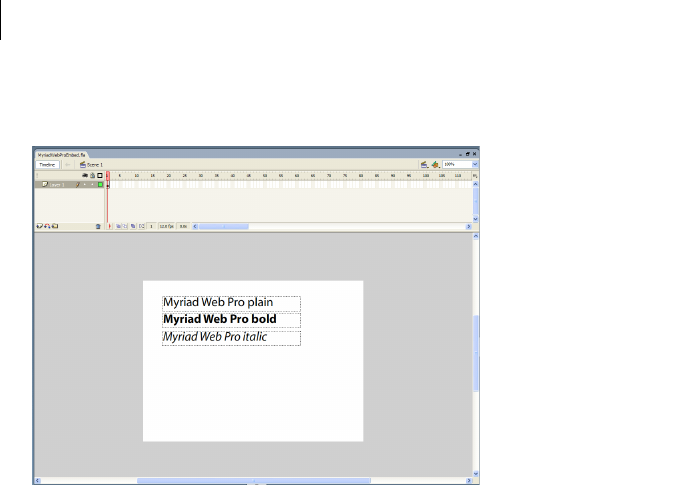
CHAPTER 19
680
Your final Stage might appear like the following example:
10 Select File > Export > Export Movie.
Flash generates a SWF file that you import into your Flex application.
Embedding fonts from SWF files into Flex applications
Before performing the following steps, you must create a SWF file in Flash that embeds the fonts (see “Creating
Flash 8 SWF files with embedded fonts” on page 678).
1Embed each typeface with an @font-face declaration, as the following example shows:
/* assets/FlashTypeStyles.css */
@font-face {
src:url("../assets/MyriadWebProEmbed.swf");
fontFamily: "Myriad Web Pro";
}
@font-face {
src:url("../assets/MyriadWebProEmbed.swf");
fontFamily: "Myriad Web Pro";
fontWeight: bold;
}
@font-face {
src:url("../assets/MyriadWebProEmbed.swf");
fontFamily: "Myriad Web Pro";
fontStyle: italic;
}

681ADOBE FLEX 3
Adobe Flex 3 Developer Guide
You specify the location of the SWF file by using the src property. You set the value of the fontFamily
property to the name of the font as it appears in the list of available fonts in Flash. You must specify a new
@font-face entry for each of the typeface properties if the font face is not plain. For more information on
using the @font-face declaration, see “Embedded font syntax” on page 657.
Do not specify a value for the advancedAntiAliasing property in the @font-face declaration. This is
because anti-aliasing settings in Flash determine whether to include the advanced anti-aliasing information.
After a SWF file that contains fonts has been generated, you cannot add the hinting information to the SWF
file by using the Flex compiler or from within the Flex application. For more information on using advanced
anti-aliasing, see “Using advanced anti-aliasing” on page 663.
2Define a style for each embedded font typeface. You can define this style as an external style sheet or in a
<mx:Style> block, as the following example shows:
/* assets/FlashTypeClassSelectors.css */
.myPlainStyle {
fontFamily: "Myriad Web Pro";
fontSize: 24;
}
.myItalicStyle {
fontFamily: "Myriad Web Pro";
fontSize: 24;
fontStyle: italic;
}
.myBoldStyle {
fontFamily: "Myriad Web Pro";
fontSize: 24;
fontWeight: bold;
}
You must specify the fontFamily property in the style definition, and it must match the fontFamily
property set in the @font-face declaration. Regardless of which typeface you are defining, the value of the
fontFamily property is the same. For example, if the typeface is boldface, you do not set the fontFamily
property to Myriad Web Pro Bold, but just Myriad Web Pro.
You must also specify all typeface properties in the style definition, just as you did in the @font-face decla-
ration.
3Apply the new style to your Flex controls, as the following example shows:
<?xml version="1.0"?>
<!-- fonts/EmbedAntiAliasedFonts.mxml -->
<mx:Application xmlns:mx="http://www.adobe.com/2006/mxml">
<mx:Style source="../assets/FlashTypeStyles.css"/>
<mx:Style source="../assets/FlashTypeClassSelectors.css"/>
<mx:Panel title="Embedded Font" width="220">
<mx:VBox>
<mx:Label text="Plain Label" styleName="myPlainStyle"/>
<mx:Label text="Bold Label" styleName="myBoldStyle"/>
<mx:Label text="Italic Label" styleName="myItalicStyle"/>
</mx:VBox>

CHAPTER 19
682
</mx:Panel>
</mx:Application>
You can also define and apply the styles inline, rather than define them in a style sheet and apply them with
the styleName property. The following example sets the value of the fontFamily and fontStyle properties
inline to apply the Myriad Web Pro font’s italic and bold typefaces to the Label controls:
<?xml version="1.0"?>
<!-- fonts/EmbedAntiAliasedFontsInline.mxml -->
<mx:Application xmlns:mx="http://www.adobe.com/2006/mxml">
<mx:Style source="../assets/FlashTypeStyles.css"/>
<mx:Panel title="Embedded FlashType Font" width="220">
<mx:VBox>
<mx:Label text="Plain Label" fontFamily="Myriad Web Pro" fontSize="24"/>
<mx:Label text="Italic Label" fontFamily="Myriad Web Pro" fontStyle="italic"
fontSize="24"/>
<mx:Label text="Bold Label" fontFamily="Myriad Web Pro" fontWeight="bold"
fontSize="24"/>
</mx:VBox>
</mx:Panel>
</mx:Application>
The following example embeds the Myriad Web Pro font into the Flex application. It embeds each typeface,
defines the styles for them, and applies those styles to Text controls.
<?xml version="1.0"?>
<!-- fonts/EmbedAntiAliasedFontsFull.mxml -->
<mx:Application xmlns:mx="http://www.adobe.com/2006/mxml">
<mx:Style>
@font-face {
src:url("../assets/MyriadWebProEmbed.swf");
fontFamily: "Myriad Web Pro";
}
@font-face {
src:url("../assets/MyriadWebProEmbed.swf");
fontFamily: "Myriad Web Pro";
fontWeight: bold;
}
@font-face {
src:url("../assets/MyriadWebProEmbed.swf");
fontFamily: "Myriad Web Pro";
fontStyle: italic;
}
.myPlainStyle {
fontFamily: "Myriad Web Pro";
fontSize: 24;
}
.myItalicStyle {
fontFamily: "Myriad Web Pro";
fontSize: 24;
fontStyle: italic;
}
.myBoldStyle {
fontFamily: "Myriad Web Pro";
fontSize: 24;

683ADOBE FLEX 3
Adobe Flex 3 Developer Guide
fontWeight: bold;
}
</mx:Style>
<mx:Panel title="Embedded SWF-based Font">
<mx:VBox>
<!-- Apply each custom style to Text controls. -->
<mx:Text id="text1" styleName="myPlainStyle" text="Plain Text"/>
<mx:Text id="text2" styleName="myBoldStyle" text="Bold Text"/>
<mx:Text id="text3" styleName="myItalicStyle" text="Italic Text"/>
</mx:VBox>
</mx:Panel>
<!-- Rotate the Text controls. If the text disappears when the control is
rotated, then the font is not properly embedded. -->
<mx:Button label="Rotate +1" click="++text1.rotation;++text2.rotation;
++text3.rotation;"/>
<mx:Button label="Rotate -1" click="--text1.rotation;--text2.rotation;
--text3.rotation;"/>
</mx:Application>
When you run the example, click the Button controls to rotate the text. This ensures that the fonts were properly
embedded; if the fonts were not properly embedded, the text disappears when rotated.
Instead of using the @font-face CSS syntax, you can use the [Embed] metadata keyword to embed fonts from
SWF files in your Flex application. This can give you greater control over the font in ActionScript. To do it, you
use the same SWF file that you created in previous examples. In your Flex application, you associate each font face
with its own variable, as the following example shows:
<?xml version="1.0"?>
<!-- fonts/EmbedAntiAliasedFontsActionScriptSimple.mxml -->
<mx:Application xmlns:mx="http://www.adobe.com/2006/mxml">
<mx:Style>
.myPlainStyle {
fontFamily: "Myriad Web Pro";
fontSize: 24;
}
.myItalicStyle {
fontFamily: "Myriad Web Pro";
fontSize: 24;
fontStyle: italic;
}
.myBoldStyle {
fontFamily: "Myriad Web Pro";
fontSize: 24;
fontWeight: bold;
}
</mx:Style>
<mx:Script><![CDATA[
[Embed(source='../assets/MyriadWebProEmbed.swf',
fontName='Myriad Web Pro'
)]
private static var plainFont:Class;

CHAPTER 19
684
[Embed(source='../assets/MyriadWebProEmbedWithFontSymbols.swf',
fontName='Myriad Web Pro',
fontStyle='italic'
)]
private static var italicFont:Class;
[Embed(source='../assets/MyriadWebProEmbedWithFontSymbols.swf',
fontName='Myriad Web Pro',
fontWeight='bold'
)]
private static var boldFont:Class;
]]></mx:Script>
<mx:Panel title="Embedded SWF-Based Font">
<mx:VBox>
<!-- Apply each custom style to Text controls. -->
<mx:Text id="text1" styleName="myPlainStyle" text="Plain Text"/>
<mx:Text id="text2" styleName="myBoldStyle" text="Bold Text"/>
<mx:Text id="text3" styleName="myItalicStyle" text="Italic Text"/>
</mx:VBox>
</mx:Panel>
<!-- Rotate the Text controls. If the text disappears when the control is
rotated, then the font is not properly embedded. -->
<mx:Button
label="Rotate +1"
click="++text1.rotation;++text2.rotation;++text3.rotation;"
/>
<mx:Button
label="Rotate -1"
click="--text1.rotation;--text2.rotation;--text3.rotation;"
/>
</mx:Application>
You must define a variable of type Class so that the compiler links the fonts into the final Flex application SWF
file. This example sets the value of the static plainFont, boldFont, and italicFont variables, but they are not
used in the rest of the application.
When you use the [Embed] statement to embed fonts in your Flex application, you must still define styles for those
fonts so that those styles can be applied to Flex components, as you would if you embedded the fonts with the
@font-face declaration.
You can also access fonts from SWF files as a font symbol. You can do this only if you embed the fonts in your Flex
application with the [Embed] metadata syntax.
Use fonts from SWF files that are Font Symbols
1Create a new Flash 8 FLA file.
2In Flash 8, select Window > Library to show the contents of the library. It should be empty.
3Right-click the mouse when it is over the library, and select New Font to create a new font symbol.

685ADOBE FLEX 3
Adobe Flex 3 Developer Guide
4In the Font Symbol Properties dialog box, give the new font symbol a name and select the applicable font
symbol properties (such as bold or italic). You use the symbol name you specify here in your [Embed] statement.
Do this for each font typeface (such as plain, bold, italic, and bold italic).
Note: Do not set the value of the symbol name to be the same as the font name in the Font Symbol Properties
dialog box. For example, if you are creating a new symbol for the font named Myriad Web Pro, set the symbol
name to something other than Myriad Web Pro.
5After you create a font symbol in the library, right-click the symbol in the library and select Linkage.
6In the Linkage Properties dialog box, select Export for ActionScript, and click OK. The Identifier in this dialog
box should match the symbol name you specified in the previous step. Do this for each font symbol in the library.
7In your Flex application’s [Embed] statement, point to the font symbol using the symbol attribute. Do not
specify any other characteristics of the font such as the MIME type, fontStyle, fontWeight, or fontName in the
[Embed] statement.
The following example embeds the Myriad Web Pro font that was exported from Flash 8 with font symbols in the
library:
<?xml version="1.0"?>
<!-- fonts/EmbedAntiAliasedFontsActionScript.mxml -->
<mx:Application xmlns:mx="http://www.adobe.com/2006/mxml">
<mx:Style>
.myPlainStyle {
fontFamily: "Myriad Web Pro";
fontSize: 24;
}
.myItalicStyle {
fontFamily: "Myriad Web Pro";
fontSize: 24;
fontStyle: italic;
}
.myBoldStyle {
fontFamily: "Myriad Web Pro";
fontSize: 24;
fontWeight: bold;
}
</mx:Style>
<mx:Script><![CDATA[
[Embed(source='../assets/MyriadWebProEmbedWithFontSymbols.swf',
symbol='MyriadPlain'
)]
private var font1:Class;
[Embed(source='../assets/MyriadWebProEmbedWithFontSymbols.swf',
symbol='MyriadBold'
)]
private var font2:Class;
[Embed(source='../assets/MyriadWebProEmbedWithFontSymbols.swf',
symbol='MyriadItalic'

CHAPTER 19
686
)]
private var font3:Class;
]]></mx:Script>
<mx:Panel title="Embedded SWF-based Font">
<mx:VBox>
<!-- Apply each custom style to Text controls. -->
<mx:Text id="text1"
styleName="myPlainStyle"
text="Plain Text"
/>
<mx:Text id="text2"
styleName="myBoldStyle"
text="Bold Text"
/>
<mx:Text id="text3"
styleName="myItalicStyle"
text="Italic Text"
/>
</mx:VBox>
</mx:Panel>
<!-- Rotate the Text controls. If the text disappears when the control is
rotated, then the font is not properly embedded. -->
<mx:Button
label="Rotate +1"
click="++text1.rotation;++text2.rotation;++text3.rotation;"
/>
<mx:Button
label="Rotate -1"
click="--text1.rotation;--text2.rotation;--text3.rotation;"
/>
</mx:Application>
Troubleshooting fonts in Flex applications
There are some techniques that you can use to successfully embed fonts into your Flex applications.
In many cases, you can resolve the error by changing the font manager. This is set in the configuration file; for
example:
<fonts>
<managers>
<manager-class>flash.fonts.JREFontManager</manager-class>
<manager-class>flash.fonts.AFEFontManager</manager-class>
<manager-class>flash.fonts.BatikFontManager</manager-class>
</managers>
</fonts>

687ADOBE FLEX 3
Adobe Flex 3 Developer Guide
You can try changing the order of font managers, as the following example shows:
<fonts>
<managers>
<manager-class>flash.fonts.AFEFontManager</manager-class>
<manager-class>flash.fonts.BatikFontManager</manager-class>
<manager-class>flash.fonts.JREFontManager</manager-class>
</managers>
</fonts>
Resolving compiler errors
The following table describes common compiler errors and their solutions:
Resolving run-time errors
To ensure that the fonts are properly embedded, try rotating the controls that use the fonts. You can view rotated
fonts only if they are embedded, so if the text disappears when you rotate the control, the font is not properly
embedded.
To properly embed your fonts, try the following techniques:
•If one type of control is not correctly displaying its text, ensure that you are embedding the appropriate
typeface. For example, the Button control’s text labels require the bold typeface. If you do not embed the bold
typeface, the Button control does not display the embedded font.
Error Solution
Unable to resolve
‘swf_file_name’ for
transcoding
Indicates that the font was not found by the compiler. Ensure that the path to the font is
correct in the @font-face declaration or the [Embed] tag and that the path is accessible by
the compiler.
If you are using the local property to specify the location of the font in the @font-face
declaration, ensure that the font is locally accessible. Check that it is an entry in the fonts.prop-
erties file or that the font is in the system font search path. For more information, see
“Embedded font syntax” on page 657.
Font ‘font_name’ with
style_description not found
Indicates that the fontName property used in the [Embed] statement might not match the
name of the font.
For fonts in SWF files, ensure that the spelling and word spacing of the font name in the list of
available fonts in Flash is the same as the fontName property in your [Embed] statement and
the fontFamily property that you use in your style definitions.
This error can also mean that the font’s style was not properly embedded in Flash. Open the
FLA file and ensure that there is a text area with the font and style described, that the text is
dynamic, and that you selected a character range for that text.

CHAPTER 19
688
•In your Flex application, ensure that you set all properties for each font typeface in the @font-face decla-
ration or [Embed] statement. To embed a bold typeface, you must set the fontWeight property to bold, as the
following example shows:
@font-face {
src: url(../assets/MyriadWebProEmbed.ttf);
fontFamily: "Myriad Web Pro";
fontWeight: bold;
}
You also must set the fontWeight style property in your style definition:
.myStyle2 {
fontFamily:"Myriad Web Pro";
fontWeight:bold;
fontSize:12pt;
}
If you use the [Embed] statement, you must set the fontWeight property to bold as the following example
shows:
[Embed(source="MyriadWebProEmbed.ttf", fontName="Myriad Web Pro",fontWeight="bold")]
•For fonts in SWF files, open the FLA file in Flash and ensure that all of the typefaces were added properly.
Select each text area and do the following:
•Check that the font name is correct. Ensure that the spelling and word spacing of the font name in the list
of available fonts in Flash is the same as the fontFamily property in the @font-face declaration or the
fontName property in your [Embed] statement. This value must also match the fontFamily property that
you use in your style definitions.
If you did not select an anti-aliasing option for the font in Flash 8 (for example, you chose Bitmap Text
(no anti-alias)), you might need to change the value of the font name to a format that matches
fontName_fontSizept_st (for example, "Wingdings_8pt_st"). In the CSS for that bitmap font, be sure to set
fontAntiAliasType to normal.
To determine the exact font name exported by Flash (which you must match as the value of the
fontFamily property in your Flex application), open the SWF file in Flash 8 and select Debug > Variables.
•Check that the style is properly applied. For example, select the bold text area and check that the typeface
really is bold.
•Click the Embed button and ensure that the range of embedded characters includes the characters that
you use in your Flex application.
•Check that each text area is set to Dynamic Text and not Static Text or Input Text. The type of text is
indicated by the first drop-down box in the text’s Properties tab.
•For fonts in SWF files, ensure that you are using the latest SWF file that contains your fonts and was generated
in Flash. Regenerate the SWF file in Flash if necessary.
689
Chapter 20: Creating Skins
You add skins to Adobe® Flex® components by using ActionScript classes, MXML components, and image files.
Image files can contain JPEG, GIF, and PNG images or SWF files.
Topics
About skinning . . . . . . . . . . . . . . . . . . . . . . . . . . . . . . . . . . . . . . . . . . . . . . . . . . . . . . . . . . . . . . . . . . . . . . . . . . . . . . . . .689
Applying skins. . . . . . . . . . . . . . . . . . . . . . . . . . . . . . . . . . . . . . . . . . . . . . . . . . . . . . . . . . . . . . . . . . . . . . . . . . . . . . . . . .700
Creating graphical skins. . . . . . . . . . . . . . . . . . . . . . . . . . . . . . . . . . . . . . . . . . . . . . . . . . . . . . . . . . . . . . . . . . . . . . . . . .708
Creating programmatic skins . . . . . . . . . . . . . . . . . . . . . . . . . . . . . . . . . . . . . . . . . . . . . . . . . . . . . . . . . . . . . . . . . . . . .713
Creating stateful skins . . . . . . . . . . . . . . . . . . . . . . . . . . . . . . . . . . . . . . . . . . . . . . . . . . . . . . . . . . . . . . . . . . . . . . . . . . . 727
Creating advanced programmatic skins . . . . . . . . . . . . . . . . . . . . . . . . . . . . . . . . . . . . . . . . . . . . . . . . . . . . . . . . . . . .735
About skinning
Skinning is the process of changing the appearance of a component by modifying or replacing its visual elements.
These elements can be made up of bitmap images, SWF files, or class files that contain drawing methods that
define vector images.
Skins can define the entire appearance, or only a part of the appearance, of a component in various states. For
example, a Button control has eight possible states, and eight associated skin properties, as the following example
shows:
State Skin property Default skin class
down downSkin mx.skins.halo.ButtonSkin
over overSkin mx.skins.halo.ButtonSkin
up upSkin mx.skins.halo.ButtonSkin
disabled disabledSkin mx.skins.halo.ButtonSkin
selectedDisabled selectedDisabledSkin mx.skins.halo.ButtonSkin
690 CHAPTER 20
The default skins for the up, over, and down states appear as follows:
A. up B. over C. down
Other controls have similar states with associated skins. For example, RadioButton controls, which are subclasses
of Button, also have up, down, and over skins. The ComboBox control has skins the define the appearance of the
control when it is in the disabled, down, and over states.
You create a skin by using a bitmap image, a SWF file, or a class defined in ActionScript or in MXML. All Flex
components have a default skin class that can represent more than one state of the component. As you can see in
the previous table, the eight states of the Button control use the same default skin class, mx.skins.halo.ButtonSkin,
to draw the skin. Logic within the class determines the appearance of the Button control based on its current state.
You assign a skin to a component by using style properties. You can set a style property by using MXML tag
properties, the StyleManager class, <mx:Style> blocks, or style sheets. Most Flex application use style sheets to
organize and apply skins. Style sheets can be loaded at compile time or at run time. For information on loading
style sheets at run time, see “Loading style sheets at run time” on page 633.
Types of skins
You typically define a skin as a bitmap graphic or as a vector graphic. Bitmap graphics, called graphical skins in
Flex, are made up of individual pixels that together form an image. The downside of a bitmap graphic is that it is
typically defined for a specific resolution and, if you scale or transform the image, you might notice a degradation
in image quality.
A vector graphic, called a programmatic skin in Flex, consists of a set of line definitions that specify a line’s starting
and end point, thickness, color, and other information required by Adobe® Flash® Player to draw the line. When
a vector graphic is scaled, rotated, or modified in some other way, it is relatively simple for Flash Player to calculate
the new layout of the vector graphic by transforming the line definitions. Therefore, you can perform many types
of modifications to vector graphics without noticing any degradation in quality.
selectedDown selectedDownSkin mx.skins.halo.ButtonSkin
selectedOver selectedOverSkin mx.skins.halo.ButtonSkin
selectedUp selectedUpSkin mx.skins.halo.ButtonSkin
State Skin property Default skin class
A B C
691ADOBE FLEX 3
Adobe Flex 3 Developer Guide
One advantage of programmatic skins is you can create vector graphics that allow you a great deal of program-
matic control over the skin. For example, you can control the radius of a Button control’s corners by using
programmatic skins, something you cannot do with graphical skins. You can develop programmatic skins directly
in your Flex authoring environment or any text editor, without using a graphics tool such as Adobe Flash.
Programmatic skins also tend to use less memory because they contain no external image files.
The following table describes the different types of skins:
Creating graphical skins
When using graphical skins, you must embed the image file for the skin in your application. To specify your skin,
you can use the setStyle() method, set it inline, or use Cascading Style Sheets (CSS), as the following example
shows:
<?xml version="1.0"?>
<!-- skins/SimpleButtonGraphicSkin.mxml -->
<mx:Application xmlns:mx="http://www.adobe.com/2006/mxml">
<mx:Style>
Button {
upSkin: Embed("../assets/orb_up_skin.gif");
}
</mx:Style>
<mx:Button id="b1" label="Click Me"/>
</mx:Application>
For information on setting skins by using the setStyle() method or by setting them inline, see “Applying skins”
on page 700.
Skin type Description
Graphical skins Images that define the appearance of the skin. These images can JPEG, GIF, or PNG files, or they can be
symbols embedded in SWF files. Typically you use drawing software such as Adobe® PhotoShop® or Adobe®
Illustrator® to create graphical skins.
For more information, see “Creating graphical skins” on page 708.
Programmatic skins ActionScript or MXML classes that define a skin. To change the appearance of controls that use programmatic
skins, you edit an ActionScript or MXML file. You can use a single class to define multiple skins.
For more information, see “Creating programmatic skins” on page 713.
Stateful skins A type of programmatic skin that uses view states, where each view state corresponds to a state of the compo-
nent. The definition of the view state controls the look of the skin. Since you can have multiple view states in
a component, you can use a single component to define multiple skins.
For more information, see “Creating stateful skins” on page 727.

CHAPTER 20
692
You can assign the same graphic or programmatic skin to two or more skins so that the skins display the same
image, as the following example shows:
<?xml version="1.0"?>
<!-- skins/SimpleButtonGraphicSkinTwoSkins.mxml -->
<mx:Application xmlns:mx="http://www.adobe.com/2006/mxml">
<mx:Style>
Button {
upSkin: Embed("../assets/orb_up_skin.gif");
overSkin: Embed("../assets/orb_up_skin.gif");
}
</mx:Style>
<mx:Button id="b1" label="Click Me"/>
</mx:Application>
For more information, see “Creating graphical skins” on page 708.
Creating programmatic skins
You can define programmatic skins in either MXML or ActionScript. When using programmatic skins, you can
define a class for each state of the component, or define a single class for multiple skins. In the following example
you create a custom ActionScript skin to define the skin for the up state of the Button control:
package {
// skins\ButtonUpSkinAS.as
import mx.skins.ProgrammaticSkin;
public class ButtonUpSkinAS extends ProgrammaticSkin {
// Constructor.
public function ButtonUpSkinAS() {
super();
}
override protected function updateDisplayList(unscaledWidth:Number,
unscaledHeight:Number):void
{
graphics.lineStyle(1, 0x0066FF);
graphics.beginFill(0x00FF00, 0.50);
graphics.drawRoundRect(0, 0, unscaledWidth, unscaledHeight, 10, 10);
}
}
}
In ActionScript, you typically use the ProgrammaticSkin class as the base class for your skin. In the skin class, you
must override the updateDisplayList() method to draw the skin. You then assign the skin component to the
appropriate skin property of the Button control using a style sheet, as the following example shows:
<?xml version="1.0"?>
<!-- skins/ApplySimpleButtonSkinAS.mxml -->
<mx:Application xmlns:mx="http://www.adobe.com/2006/mxml">

693ADOBE FLEX 3
Adobe Flex 3 Developer Guide
<mx:Style>
Button {
upSkin: ClassReference("ButtonUpSkinAS");
}
</mx:Style>
<mx:Button id="b1" label="Click Me"/>
</mx:Application>
For information on applying skins, see “Applying skins” on page 700.
In the following example you create a custom MXML component to define the skin for the up state of the Button
control. In MXML, you use ProgrammaticSkin as the base class of your skin. This is the same skin defined above
in ActionScript:
<?xml version="1.0"?>
<!-- skins\ButtonUpMXMLSkin.mxml -->
<skins:ProgrammaticSkin xmlns:mx="http://www.adobe.com/2006/mxml"
xmlns:skins="mx.skins.*">
<mx:Script>
<![CDATA[
override protected function updateDisplayList(unscaledWidth:Number,
unscaledHeight:Number):void
{
graphics.lineStyle(1, 0x0066FF);
graphics.beginFill(0x00FF00, 0.50);
graphics.drawRoundRect(0, 0, unscaledWidth, unscaledHeight, 10, 10);
}
]]>
</mx:Script>
</skins:ProgrammaticSkin>
Notice that you have to include the xmlns:skins="mx.skins.*" namespace declaration in MXML. This is
necessary because by default you cannot use the ProgrammaticSkin class as the base class of an MXML
component.
In the following example, you create a component that defines skins for multiple Button states. In this example,
you use a case statement to determine the current state of the Button control based on the name property of the
skin, where the name property contains the current name of the skin. For example, if you define a programmatic
skin for a Button control, the name property could be any of the skin states: downSkin, upSkin, overSkin,
disabledSkin, selectedDisabledSkin, selectedDownSkin, selectedOverSkin, or selectedUpSkin.
package {
// skins\ButtonUpAndOverSkinAS.as
import mx.skins.ProgrammaticSkin;
public class ButtonUpAndOverSkinAS extends ProgrammaticSkin {
// Constructor.
public function ButtonUpAndOverSkinAS() {
super();
}

CHAPTER 20
694
override protected function updateDisplayList(unscaledWidth:Number,
unscaledHeight:Number):void
{
switch (name)
{
case "upSkin": {
graphics.lineStyle(1, 0x0066FF);
graphics.beginFill(0x00FF00, 0.50);
graphics.drawRoundRect(0, 0, unscaledWidth, unscaledHeight, 10, 10);
}
case "overSkin": {
graphics.lineStyle(1, 0x0066FF);
graphics.beginFill(0x00CCFF, 0.50);
graphics.drawRoundRect(0, 0, unscaledWidth, unscaledHeight, 10, 10);
}
}
}
}
}
You then assign the ActionScript class to the appropriate skin properties:
<?xml version="1.0"?>
<!-- skins/ApplyButtonUpOverSkinAS.mxml -->
<mx:Application xmlns:mx="http://www.adobe.com/2006/mxml">
<mx:Style>
Button {
upSkin: ClassReference("ButtonUpAndOverSkinAS");
overSkin: ClassReference("ButtonUpAndOverSkinAS");
}
</mx:Style>
<mx:Button id="b1" label="Click Me"/>
</mx:Application>
For more information on creating programmatic skins, see “Creating programmatic skins” on page 713.
Creating stateful skins
When using a stateful skin, you define a skin that defines a view state for each state of a component. In the
following example, you define a view state for the up and over states of a Button control:
<?xml version="1.0"?>
<!-- skins\ButtonUpStatefulSkin.mxml -->
<mx:UIComponent xmlns:mx="http://www.adobe.com/2006/mxml">
<mx:Script>
<
695ADOBE FLEX 3
Adobe Flex 3 Developer Guide
public function set rectFill(value:uint):void {
_rectFill = value;
invalidateDisplayList();
}
override protected function updateDisplayList(unscaledWidth:Number,
unscaledHeight:Number):void
{
graphics.lineStyle(1, 0x0066FF);
graphics.beginFill(rectFill, 0.50);
graphics.drawRoundRect(0, 0, unscaledWidth, unscaledHeight, 10, 10);
}
]]>
</mx:Script>
<mx:states>
<mx:State name="up"/>
<mx:State name="over">
<mx:SetProperty target="{this}"
name="rectFill" value="0x00CCFF"/>
</mx:State>
</mx:states>
</mx:UIComponent>
You typically define a stateful skin as a subclass of UIComponent, in ActionScript or in MXML, because the view
state mechanism is built into the UIComponent class. For more information, see “Creating stateful skins” on
page 727.
You can create a stateful skin in either ActionScript or MXML. This examples uses MXML because it requires
fewer lines of code to define view states. You then assign the MXML component to the skin property of the
Button control, as the following example shows:
<?xml version="1.0"?>
<!-- skins/SimpleButtonStatefulSkin.mxml -->
<mx:Application xmlns:mx="http://www.adobe.com/2006/mxml">
<mx:Style>
Button {
skin: ClassReference("ButtonUpStatefulSkin");
downSkin: ClassReference("mx.skins.halo.ButtonSkin");
disabledSkin: ClassReference("mx.skins.halo.ButtonSkin");
selectedUpSkin: ClassReference("mx.skins.halo.ButtonSkin");
selectedOverSkin: ClassReference("mx.skins.halo.ButtonSkin");
selectedDownSkin: ClassReference("mx.skins.halo.ButtonSkin");
selectedDisabledSkin: ClassReference("mx.skins.halo.ButtonSkin");
}
</mx:Style>
<mx:Button id="b1" label="Click Me"/>
</mx:Application>
When using stateful skins, you must explicitly specify the default skin for all states not defined by the stateful skin
component.

CHAPTER 20
696
Sizing skins
Before a component applies a skin, it first determines its size without the skin. The component then examines the
skin to determine whether the skin defines a specific size. If not, the component scales the skin to fit. If the skin
defines a size, the component sizes itself to the skin.
Most skins do not define any size constraints, which allows the component to scale the skin as necessary. For more
information on writing skins that contain size information, see “Implementing measuredWidth and measured-
Height getters” on page 724.
Skinning subcomponents
In some cases, you want to reskin subcomponents. The following example reskins the vertical ScrollBar control
that appears in List controls:
<?xml version="1.0"?>
<!-- skins/SubComponentSkins.mxml -->
<mx:Application xmlns:mx="http://www.adobe.com/2006/mxml">
<mx:Script><![CDATA[
[Bindable]
private var theText:String = "Lorem ipsum dolor sit amet, consectetur " +
"adipisicing elit, sed do eiusmod tempor incididunt ut labore et dolore " +
"magna aliqua. Ut enim ad minim veniam, quis nostrud exercitation ullamco " +
"laboris nisi ut aliquip ex ea commodo consequat. Duis aute irure dolor " +
"in reprehenderit in voluptate velit esse cillum dolore eu fugiat " +
"nulla pariatur. Excepteur sint occaecat cupidatat non proident, sunt " +
"in culpa qui officia deserunt mollit anim id est laborum.";
]]></mx:Script>
<mx:Style>
.myScrollStyle {
upArrowUpSkin: Embed("../assets/uparrow_up_skin.gif");
downArrowUpSkin: Embed("../assets/downarrow_up_skin.gif");
}
</mx:Style>
<mx:TextArea id="ta1"
width="400"
height="50"
verticalScrollPolicy="on"
verticalScrollBarStyleName="myScrollStyle"
text="{theText}"
/>
</mx:Application>
By setting the value of the verticalScrollBarStyleName property in the List type selector, all vertical ScrollBar
controls in List components have a custom skin. The ScrollBar controls in other parts of the application do not
have the custom skin.

697ADOBE FLEX 3
Adobe Flex 3 Developer Guide
As with all style sheets, you can define the skins in a separate CSS file and use the source property of the
<mx:Style> tag to point to that file; for example:
<mx:Style source="../stylesheets/MySkins.css"/>
Creating themes
A theme is a collection of style definitions and skins that define the look and feel of a Flex application. Theme files
can include both graphical and programmatic skins, as well as style sheets.
A theme takes the form of a SWC file that can be applied to a Flex application. You compile a SWC file using the
compc command-line compiler utility.
By compiling a SWC file and then using that SWC file as a theme in your application, you remove the burden of
compiling all the skin files when you compile your main application. This can make compilation faster and make
problems with the application code easier to debug. In addition, a SWC file is easier to transplant onto another
application than are a set of classes and image files.
Halo, the default theme set that ships with Flex, is almost entirely made up of programmatic skins, although there
are some static graphic elements. Flex includes programmatic and graphical skins that use the Halo look and feel.
You can edit the skins by using either the programmatic or graphical technique to reskin Halo components.
For more information on creating and applying themes, see “About themes” on page 645.
Skin resources
Flex includes the following graphical and programmatic source files for skins:
Base skin classes in the mx.skins package These abstract skin classes define the basic functionality of skin classes
in Flex. For more information, see “Creating programmatic skins” on page 713.
Programmatic Halo skins in the mx.skins.halo package These concrete skin classes extend the base skin classes in
the mx.skins package. You can extend or edit these skins to create new programmatic skins based on the default
Flex look and feel. For more information, see “Creating programmatic skins” on page 713.
HaloClassic skins These skins were used in Flex 1.x. You can retain the look of Flex 1.x applications by using these
skins. The HaloClassic.swc file is located in the framework/themes directory. For more information, see “A b o u t
themes” on page 645.
Graphical Aeon theme The Aeon theme includes the AeonGraphical.css file and the AeonGraphical.swf file that
defines the skin symbols. These are in the framework/themes directory. In addition, Flex includes the FLA source
file for the AeonGraphical.swf file. For more information, see “About themes” on page 645.
You use these files to create skins based on the Flex look and feel, or create your own.

CHAPTER 20
698
Creating skins using Adobe tools
You can create graphical, programmatic, and stateful skins for Adobe Flex applications by using Adobe® Flash®
CS3, Adobe Illustrator CS3, Adobe Photoshop CS3, and Adobe® Fireworks® CS3. To create skins by using these
tools, first download and install extensions that simplify the skinning process. These extensions include the skin
templates for all Flex components. For more information on using these tools to create skins, and to download the
required extensions, see http://www.adobe.com/go/flex3_cs3_skinning_extensions.
Creating skins in Adobe Flash CS3
While the Flex skinning extensions provide tools that make it easy to create skins in Flash CS3, such as the
template of all Flex skins, you are not required to use them to create skins in Flash CS3. Flex lets you use the
[Embed] metadata tag to import a skin class into a Flex application from a SWC file created in Flash CS3.
Creating a skin class in Flash CS3
1In Flash CS3, select File > New to open the New Document dialog box.
2Select Flash File (ActionScript 3.0) as the file type.
3Create a movie clip symbol for the skin. The symbol name, for example Button_upSkin, becomes the class
name of the skin.
Set the following properties on the movie clip symbol:
•Set the Type to Movie clip.
•Set the Base class to flash.display.MovieClip.
•Set the Export for ActionScript option.
•Set the Export in first frame option.
•Set the Class name to be the same as the symbol name.
•Optionally set Enable guides for 9-slice scaling.
4Save the .fla file.
5Use File > Publish Settings to open the Publish Settings dialog box.
6Select Export SWC in the Flash tab in the Publish Settings dialog box.
7Select File > Publish to publish your skin as a SWC file in the same directory as the .fla file.

699ADOBE FLEX 3
Adobe Flex 3 Developer Guide
Embed the skin class in a Flex application
1Add the SWC file to the library path of your application:
•In Flex Builder, use the Projects > Properties command to specify the location of the SWC file, or copy it
to the libs directory of your Flex Builder project.
•For the mxmlc command-line compiler, use the library-path option to specify the location of the SWC
file.
2Use the [Embed] metadata tag to embed the skin in your Flex application. You can use the [Embed] tag in an
<mx:Style> block of an MXML file, or in a CSS file.
The [Embed] metadata tag has the following syntax for skin classes created in Flash CS3:
[Embed(skinClass="className")]
For example, if you create a skin named Button_upSkin for the up skin of the Flex Button control, embed the
skin as the following example shows:
<mx:Style>
Button
{upSkin: [Embed(skinClass="Button_upSkin")]
}
</mx:Style>
3Compile and run your Flex application.
Applying skins
You apply skins by using CSS, by specifying them inline in MXML, by calling the setStyle() method, or by using
the StyleManager class.
Applying graphical skins inline
When you apply a skin inline, you specify it as the value of a skin style in MXML.
To apply a graphical skin inline, you embed the skin by using the appropriate skin property of the control, as the
following example shows:
<?xml version="1.0"?>
<!-- skins/EmbedImagesInline.mxml -->
<mx:Application xmlns:mx="http://www.adobe.com/2006/mxml">
<mx:Button id="b1"
label="Click Me"
overSkin="@Embed(source='../assets/orb_over_skin.gif')"
upSkin="@Embed(source='../assets/orb_up_skin.gif')"

CHAPTER 20
700
downSkin="@Embed(source='../assets/orb_down_skin.gif')"/>
</mx:Application>
The location of the skin asset is relative to the location of the MXML file that embeds it.
When embedding inline, you use @Embed (with an at [@] sign prefix) rather than Embed, which you use in CSS
files.
Applying programmatic skins inline
For programmatic skins, you specify the class name for each state that you reskin and enclose the class name with
curly braces { }. The skin’s class definition must be in your source path when you compile the application. If the
class file is in the same directory as the Flex application, then you do not need to add it to your source path.
The following example applies the SampleButtonSkin.mxml programmatic skin to the Button control’s upSkin,
overSkin, downSkin, and disabledSkin states:
<?xml version="1.0"?>
<!-- skins/ApplyProgrammaticSkinsInline.mxml -->
<mx:Application xmlns:mx="http://www.adobe.com/2006/mxml">
<mx:Button id="b1"
label="Click Me"
overSkin="{ButtonStatesSkin}"
upSkin="{ButtonStatesSkin}"
downSkin="{ButtonStatesSkin}"
disabledSkin="{ButtonStatesSkin}"/>
</mx:Application>
In this example, the SampleButtonSkin.mxml file is in the same directory as the application. If the skin class is in
another directory, you must import the class into the application so that the compiler can resolve the class name,
as the following example shows:
<?xml version="1.0"?>
<!-- skins/ApplyProgrammaticSkinsInlinePackage.mxml -->
<mx:Application xmlns:mx="http://www.adobe.com/2006/mxml">
<mx:Script>
import myComponents.*;
</mx:Script>
<mx:Button id="b1"
label="Click Me"
overSkin="{myComponents.ButtonStatesSkin}"
upSkin="{myComponents.ButtonStatesSkin}"
downSkin="{myComponents.ButtonStatesSkin}"
disabledSkin="{myComponents.ButtonStatesSkin}"/>
</mx:Application>
When you define stateful skin, you set the skin style property of the control to the class name of your skin
component, as the following example shows:
<?xml version="1.0"?>
<!-- skins/ApplyButtonStatefulSkinInlineAll.mxml -->

701ADOBE FLEX 3
Adobe Flex 3 Developer Guide
<mx:Application xmlns:mx="http://www.adobe.com/2006/mxml">
<mx:Script>
import myComponents.*;
</mx:Script>
<mx:Button id="b"
label="Hello"
skin="{myComponents.MyButtonStatefulSkinAll}"/>
</mx:Application>
Applying skins by using CSS
When applying skins with CSS, you can use type or class selectors so that you can apply skins to one component
or to all components of the same type. You can define the style sheet in the body of the <mx:Style> tag or
reference an external style sheet, as the following example shows:
<?xml version="1.0"?>
<!-- skins/UseHaloSkinsStyleSheet.mxml -->
<mx:Application xmlns:mx="http://www.adobe.com/2006/mxml">
<mx:Style source="../assets/UseHaloSkins.css"/>
<mx:CheckBox id="cb1" label="Click Me"/>
<mx:RadioButton id="rb1" label="Click Me"/>
</mx:Application>
You can apply skins to a single instance of a component by defining a class selector. The following example applies
the custom style to the second button only:
<?xml version="1.0"?>
<!-- skins/EmbedImagesClassSelector.mxml -->
<mx:Application xmlns:mx="http://www.adobe.com/2006/mxml">
<mx:Style>
.myButtonStyle {
overSkin: Embed("../assets/orb_over_skin.gif");
upSkin: Embed("../assets/orb_up_skin.gif");
downSkin: Embed("../assets/orb_down_skin.gif");
}
</mx:Style>
<mx:Button id="b1" label="Click Me"/>
<mx:Button id="b2" label="Click Me" styleName="myButtonStyle"/>
</mx:Application>
You can load style sheets at run time by compiling them into a SWF file. You then use the StyleManager class’s
loadStyleDeclarations() method to load the CSS-based SWF file at run time, as the following example shows:
<?xml version="1.0"?>
<!-- styles/BasicApp.mxml -->
<mx:Application xmlns:mx="http://www.adobe.com/2006/mxml">
<mx:Script>
<
CHAPTER 20
702
public function applyRuntimeStyleSheet():void {
StyleManager.loadStyleDeclarations("assets/BasicStyles.swf")
}
]]>
</mx:Script>
<mx:Label text="Click the button to load a new CSS-based SWF file"/>
<mx:Button id="b1" label="Click Me" click="applyRuntimeStyleSheet()"/>
</mx:Application>
For more information, see “Loading style sheets at run time” on page 633.
Using CSS to apply graphical skins
You typically embed graphical skins as properties of a CSS file in the <mx:Style> tag or in an external style sheet,
just as you would apply any style property, such as color or fontSize. The following example defines skins on
the Button type selector. In this example, all Buttons controls get the new skin definitions.
<?xml version="1.0"?>
<!-- skins/EmbedImagesTypeSelector.mxml -->
<mx:Application xmlns:mx="http://www.adobe.com/2006/mxml">
<mx:Style>
Button {
overSkin: Embed("../assets/orb_over_skin.gif");
upSkin: Embed("../assets/orb_up_skin.gif");
downSkin: Embed("../assets/orb_down_skin.gif");
}
</mx:Style>
<mx:Button id="b1" label="Click Me"/>
</mx:Application>
When you embed the graphical skin, you embed it into your application’s SWF file. For more information on
embedding assets, see “Embedding Assets” on page 969.
Using CSS to apply programmatic skins
You apply programmatic skins in a CSS file by using the ClassReference directive. This directive takes a class
name as the argument, where the class name corresponds to the ActionScript or MXML file containing your skin
definition. The skin’s class must be in your source path when you compile the application.
When using programmatic skins, you assign the component name to the associated skin property. In the following
example, the skin is in the file myComponents/MyButtonSkin.as where myComponents is a subdirectory of the
directory containing your application:
<?xml version="1.0"?>
<!-- skins/ApplyButtonSkin.mxml -->
<mx:Application xmlns:mx="http://www.adobe.com/2006/mxml">
<mx:Style>
Button {
upSkin: ClassReference("myComponents.MyButtonSkin");
}
</mx:Style>

703ADOBE FLEX 3
Adobe Flex 3 Developer Guide
<mx:Button label="Hello" id="b" />
</mx:Application>
When you define stateful skin, you set the skin style property of the control to the class name of your skin
component, as the following example shows:
<?xml version="1.0"?>
<!-- skins/ApplyButtonStatefulSkinAll.mxml -->
<mx:Application xmlns:mx="http://www.adobe.com/2006/mxml">
<mx:Style>
Button {
skin: ClassReference("myComponents.MyButtonStatefulSkinAll");
}
</mx:Style>
<mx:Button label="Hello" id="b" />
</mx:Application>
Applying skins by using the setStyle() method
Skins are defined as style properties, therefore, you can access them with the setStyle() and getStyle()
methods. This lets you change skins during run time, or dynamically define them, as long as you embed the
graphical asset at compile time.
For more information on using the setStyle() method, see “Using the setStyle() and getStyle() methods” on
page 627.
Using the setStyle() method to apply graphical skins
To embed an image so that you can use it with the setStyle() method, you use the [Embed] metadata tag and
assign a reference to a variable. You can then use the setStyle() method to apply that image as a skin to a
component.
The following example embeds three images and applies those images as skins to an instance of a Button control:
<?xml version="1.0"?>
<!-- skins/EmbedWithSetStyle.mxml -->
<mx:Application xmlns:mx="http://www.adobe.com/2006/mxml"
initialize="init();">
<mx:Script>
<![CDATA[
[Embed("../assets/orb_over_skin.gif")]
public var os:Class;
[Embed("../assets/orb_down_skin.gif")]
public var ds:Class;
[Embed("../assets/orb_up_skin.gif")]
public var us:Class;
private function init():void {

CHAPTER 20
704
b1.setStyle("upSkin", us);
b1.setStyle("overSkin", os);
b1.setStyle("downSkin", ds);
}
]]>
</mx:Script>
<mx:Button label="Click Me" id="b1"/>
</mx:Application>
Using the setStyle() method to apply programmatic skins
For programmatic skins, you apply a skin to a control by using the setStyle() method. The skin component
must be in your source path when you compile the application. The following example applies the ButtonSta-
tesSkin.as component to a Button by using the setStyle() method:
<?xml version="1.0"?>
<!-- skins/ApplyProgrammaticSkinsSetStyle.mxml -->
<mx:Application xmlns:mx="http://www.adobe.com/2006/mxml">
<mx:Script>
<![CDATA[
public function changeSkins():void {
if (cb1.selected) {
b1.setStyle("upSkin", ButtonStatesSkin);
b1.setStyle("downSkin", ButtonStatesSkin);
b1.setStyle("overSkin", ButtonStatesSkin);
b1.setStyle("disabledSkin", ButtonStatesSkin);
} else {
b1.setStyle("upSkin", null);
b1.setStyle("downSkin", null);
b1.setStyle("overSkin", null);
b1.setStyle("disabledSkin", null);
}
}
]]>
</mx:Script>
<mx:Button id="b1" label="Click Me"/>
<mx:CheckBox id="cb1" label="Apply custom skin class" click="changeSkins();"/>
</mx:Application>
The reference to the ButtonStatesSkin class in the setStyle() method causes the compiler to link in the entire
ButtonStatesSkin class at compile time. The resulting SWF file will be larger than if there were no reference to this
class, even if the changeSkins() method is never called.
In the previous example, the SampleButtonSkin.mxml file is in the same directory as the application. If the skin
class is in another directory, you must import the class into the application so that the compiler can resolve the
class name, as the following example shows:
<?xml version="1.0"?>
<!-- skins/ApplyProgrammaticSkinsSetStylePackage.mxml -->

705ADOBE FLEX 3
Adobe Flex 3 Developer Guide
<mx:Application xmlns:mx="http://www.adobe.com/2006/mxml">
<mx:Script>
<![CDATA[
import myComponents.*;
public function changeSkins():void {
if (cb1.selected) {
b1.setStyle("upSkin", myComponents.ButtonStatesSkin);
b1.setStyle("downSkin", myComponents.ButtonStatesSkin);
b1.setStyle("overSkin", myComponents.ButtonStatesSkin);
b1.setStyle("disabledSkin", myComponents.ButtonStatesSkin);
} else {
b1.setStyle("upSkin", null);
b1.setStyle("downSkin", null);
b1.setStyle("overSkin", null);
b1.setStyle("disabledSkin", null);
}
}
]]>
</mx:Script>
<mx:Button id="b1" label="Click Me"/>
<mx:CheckBox id="cb1" label="Apply custom skin class" click="changeSkins();"/>
</mx:Application>
When you define stateful skin, you use the setStyle() method to set the skin style property of the control to
the class name of your skin component. For more information on applying stateful skins, see “Creating stateful
skins” on page 727.
Applying skins by using the Style Manager
To apply skins to all instances of a control, you can use the StyleManager class, as the following example shows:
<?xml version="1.0"?>
<!-- skins/EmbedWithStyleManager.mxml -->
<mx:Application xmlns:mx="http://www.adobe.com/2006/mxml" initialize="init()">
<mx:Script>
<![CDATA[
import mx.styles.StyleManager;
[Embed("../assets/orb_over_skin.gif")]
public var os:Class;
[Embed("../assets/orb_down_skin.gif")]
public var ds:Class;
[Embed("../assets/orb_up_skin.gif")]
public var us:Class;
private function init():void {
StyleManager.getStyleDeclaration("Button").setStyle("upSkin", us);
CHAPTER 20
706
StyleManager.getStyleDeclaration("Button").setStyle("overSkin", os);
StyleManager.getStyleDeclaration("Button").setStyle("downSkin", ds);
}
]]>
</mx:Script>
<mx:Button label="Click Me" id="b1"/>
</mx:Application>
For more information on using the StyleManager class, see “Using the StyleManager class” on page 621.
Creating graphical skins
To use graphical skins, you embed image files in your Flex application. These images can be JPEG, GIF, or PNG
files, or they can be symbols embedded in SWF files.
When using SWF files for skins, you can use static assets, which are SWF files that contain symbol definitions but
no ActionScript 3.0 code, or use dynamic assets. Dynamic assets correspond to Flex components and contain
ActionScript 3.0 code. These components are designed to work with Flex features such as view states and transi-
tions. To use dynamic assets in a Flex application, you export the symbols in the SWF file to a SWC file, and then
link the SWC file to your Flex application.
For more information on embedding assets into a Flex application, see “Embedding Assets” on page 969.
Using JPEG, GIF, and PNG files as skins
To use a JPEG, GIF, or PNG file as a skin, you must embed the file in your Flex application. For example, to change
the appearance of a Button control, you might create three image files called orb_up_skin.gif, orb_down_skin.gif,
and orb_over_skin.gif:
A. orb_down_skin.gif B. orb_over_skin.gif C. orb_up_skin.gif
The following example uses graphical skins for the up, over, and down states of the Button control:
<?xml version="1.0"?>
<!-- skins/EmbedImagesTypeSelector.mxml -->
<mx:Application xmlns:mx="http://www.adobe.com/2006/mxml">
<mx:Style>
Button {
overSkin: Embed("../assets/orb_over_skin.gif");
A B C

707ADOBE FLEX 3
Adobe Flex 3 Developer Guide
upSkin: Embed("../assets/orb_up_skin.gif");
downSkin: Embed("../assets/orb_down_skin.gif");
}
</mx:Style>
<mx:Button id="b1" label="Click Me"/>
</mx:Application>
The reason that you must embed the file is that in order to determine a component’s minimum and preferred sizes,
skin assets must be present as soon as the component is created. If you reference external assets at run time, Flex
does not have the sizing information and, therefore, cannot render the skins properly.
Because skins are embedded, if you change the graphics files that comprise one or more skins, you must recompile
your Flex application for the changes to take effect. For more information on embedding assets, see “Embedding
Assets” on page 969.
One drawback to embedding images as skins is that they can become distorted if you resize the component that
has a skin. You can use a technique called 9-slice scaling to create skins that do not become distorted when the
component is resized. For information on the 9-slice scaling technique, see “Using 9-slice scaling with embedded
images” on page 981.
Using static SWF assets as skins
Static SWF files created in Flash 8 or Flash 9 contain artwork or skins, but do not contain any ActionScript 3.0
code. You can use the entire SWF file as a single skin, or you can use one or more symbols inside the SWF file as
a skin. To embed an entire SWF file, you point to the location of the SWF file with the source property in the
Embed statement, as follows:
<?xml version="1.0"?>
<!-- skins/EmbedSWFSource.mxml -->
<mx:Application xmlns:mx="http://www.adobe.com/2006/mxml">
<mx:Style>
Button {
upSkin: Embed(source="../assets/SubmitButtonUpSkin.swf");
}
</mx:Style>
<mx:Button id="b1"/>
</mx:Application>
To import a symbol from a SWF file, you use the symbol property to specify the symbol name that you want to
use in addition to pointing to the location of the SWF file with the source property. You must separate each
property of the Embed statement with a comma. The following example replaces the Button control’s up, over, and
down skins with individual symbols from a SWF file:
<?xml version="1.0"?>
<!-- skins/EmbedSymbolsCSS.mxml -->
<mx:Application xmlns:mx="http://www.adobe.com/2006/mxml">
<mx:Style>
Button {
upSkin: Embed(source='../assets/SubmitButtonSkins.swf',
symbol='MyUpSkin');
CHAPTER 20
708
overSkin: Embed(source='../assets/SubmitButtonSkins.swf',
symbol='MyOverSkin');
downSkin: Embed(source='../assets/SubmitButtonSkins.swf',
symbol='MyDownSkin');
}
</mx:Style>
<mx:Button id="b1"/>
</mx:Application>
You use the same syntax when embedding skin symbols inline, as follows:
<?xml version="1.0"?>
<!-- skins/EmbedSymbolsInline.mxml -->
<mx:Application xmlns:mx="http://www.adobe.com/2006/mxml">
<mx:Button id="b1"
overSkin="@Embed(source='../assets/SubmitButtonSkins.swf',
symbol='MyOverSkin')"
upSkin="@Embed(source='../assets/SubmitButtonSkins.swf',
symbol='MyUpSkin')"
downSkin="@Embed(source='../assets/SubmitButtonSkins.swf',
symbol='MyDownSkin')"/>
</mx:Application>
In the source FLA file, all symbols that you use must meet the following conditions:
•The symbol must be on the Stage. After you create an image file and convert it to a symbol, you must drag it
from the library to the Stage. Flash does not export symbols that are not on the Stage. Alternatively, you can select
the Export in First Frame option in the Linkage Properties dialog box.
•The symbol must have been exported for ActionScript with a linkage name. In Flash, you select the Export for
ActionScript option in the symbol’s Linkage Properties dialog box, as the following example shows:
The linkage name is the name used by Flex. Symbol names are ignored.

709ADOBE FLEX 3
Adobe Flex 3 Developer Guide
•The FLA files cannot contain any ActionScript.
•The symbol must have an upper-left registration point that you select in the Convert to Symbol dialog box.
The following example shows an upper-left registration point:
1You can use 9-slice scaling with image files (a grid with nine regions) so that the skin scales well when the
component’s size changes. You define the properties for 9-slice scaling of images when you apply the skin in CSS,
as the following example shows:
Button {
overSkin: Embed(
"../assets/orb_over_skin.gif",
scaleGridTop=6,
scaleGridLeft=12,
scaleGridBottom=44,
scaleGridRight=49
);
}
For information on embedding assets that use the 9-slice scaling technique, see “Using 9-slice scaling with
embedded images” on page 981.
Using dynamic SWF assets as skins
Dynamic SWF assets are Flex components that you create in Flash CS3 and then import into your Flex appli-
cation. Since these assets are Flex components, you can use them just as you would a component shipped with
Flex or as you would a custom component that you created as an MXML file or as an ActionScript class.
To create a Flash component, you define the symbol in your FLA file and specify the base class of the symbol as
mx.flash.UIMovieClip. To integrate components from a dynamic SWF asset created in Flash CS3, you publish
your FLA file as a SWC file.
For more information on creating dynamic SWF assets and using them as skins, see
http://www.adobe.com/go/flex3_cs3_skinning_extensions and http://www.adobe.com/go/flex3_cs3_swfkit.
Creating programmatic skins
You create programmatic skins as ActionScript classes or as MXML components, use the basic drawing methods
of the Flash Graphics (flash.display.Graphics) package, and apply those skins to your Flex controls.

CHAPTER 20
710
You can modify programmatic skins that come with Flex or create your own. The programmatic skins used by
Flex components are in the mx.skins.halo package. All of the skins extend one of the following classes: UICom-
ponent, ProgrammaticSkin, Border, or RectangularBorder.
For information on creating your own skins, see “Programmatic skins recipe” on page 713.
One type of programmatic skin, called a stateful skin, uses view states. For information on creating stateful skins,
see “Creating stateful skins” on page 727.
Creating ActionScript and MXML skins
You create programmatic skins as ActionScript classes or as MXML components. Flex handles much of the
overhead of class definition when you use an MXML component, so in some cases you might find it easier to
define your skins as MXML components, The only restriction on MXML components is that you cannot define a
constructor. Instead, you use an event handler for the preinitialize event to perform the work that you do in
an ActionScript constructor.
For general information on creating ActionScript classes and MXML components, see Creating and Extending
Adobe Flex 3 Components.
Programmatic skins recipe
At a minimum, a programmatic skin consists of a constructor (for an ActionScript class), an updateDis-
playList() method, and a set of getters and setters for the skin’s properties. Programmatic skins generally extend
one of the classes in the mx.skins package or the UIComponent class.
To see examples of skins that follow the programmatic skin recipe, look at the concrete classes in the mx.skins.halo
package. These are the skins that the Flex components use. Those skins follow the same recipe presented here.
The following example is a typical outline of a programmatic skin:
package { // Use unnamed package if this skin is not in its own package.
// skins/MySkinOutline.as
// Import necessary classes here.
import flash.display.Graphics;
import mx.skins.Border;
import mx.skins.ProgrammaticSkin;
import mx.styles.StyleManager;
// Extend ProgrammaticSkin.
public class MySkinOutline extends ProgrammaticSkin {
// Constructor.
public function MySkinOutline() {
// Set default values here.
}

711ADOBE FLEX 3
Adobe Flex 3 Developer Guide
// Override updateDisplayList().
override protected function updateDisplayList(w:Number,
h:Number):void {
// Add styleable properties here.
// Add logic to detect components state and set properties here.
// Add drawing methods here.
}
}
} // Close unnamed package.
In your Flex application, you can apply a programmatic skin using the ClassReference statement in CSS:
<?xml version="1.0"?>
<!-- skins/ApplyMySkinOutline.mxml -->
<mx:Application xmlns:mx="http://www.adobe.com/2006/mxml">
<mx:Style>
Button {
overSkin: ClassReference("MySkinOutline");
upSkin: ClassReference("MySkinOutline");
downSkin: ClassReference("MySkinOutline");
}
</mx:Style>
<mx:Button id="b1" label="Click Me"/>
</mx:Application>
Selecting an interface or base class for your skin
Skin classes must implement one or more interfaces. When you create a programmatic skin, you can either create
a class that implements the required interfaces, or you can create a subclass of a class that already implements the
required interfaces.
Your decision on which interface to implement, or which class to use as the base class of your skin, might depend
on the type of skin that you want to create. For example, if you want to create a skin that defines a border, you
might create a subclass of Border. If you want to create a stateful skin, you can create subclass of UIComponent or
create a class that implement the IStateClient interface.
You can extend the abstract base classes in the mx.skins package or the concrete classes in the mx.skins.halo
package. Extending the former gives you greater control over the look and feel of your skins. Extending the latter
is a good approach if you use the default behaviors of the Flex components but also want to add extra styling to
them.
Some rules to consider:
•A stateful skin must implement either the IStateClient interface or the IProgrammaticSkin interface. The
UIComponent class implements the IStateClient interface. The ProgrammaticSkin class implements the
IProgrammaticSkin interface.
•A skin passed to any skin property other than a stateful skin property, such as Button.upSkin or
NumericStepper.upArrowOverSkin, must implement the IFlexDisplayObject interface. The UIComponent
class and the ProgrammaticSkin class implement the IFlexDisplayObject interface.

CHAPTER 20
712
Most skins extend the mx.skins.ProgrammaticSkin class, but you can select any one of the following as a super-
class for your skin:
•The ProgrammaticSkin class implements the IFlexDisplayObject, ILayoutManagerClient, IInvalidating, and
ISimpleStyleClient interfaces, so it is the easiest and most common superclass to use.
•The Border class extends the ProgrammaticSkin class and adds support for the borderMetrics property. Use
this class or the RectangularBorder class if your skin defines the component’s border.
•The RectangularBorder class extends the Border class and adds support for the backgroundImage style.
•The UIComponent class implements the IStateCleint interface, making it easy to use for stateful skins. It is
also the component that you use when implementing skins in MXML.
Use the following list of steps to create programmatic skins for your Flex controls. Each step is explained in more
detail in the following sections.
Create programmatic skins for Flex controls
1Select one of the following base classes as a superclass for your programmatic skin:
•Border or a subclass of Border
•ProgrammaticSkin or a subclass of ProgrammaticSkin
•RectangularBorder or a subclass of RectangularBorder
•UIComponent or a subclass of UIComponent
You can also extend one of the concrete classes in the mx.skins.Halo package. For more information, see
“Selecting an interface or base class for your skin” on page 714.
2Implement the updateDisplayList() method. Put all the drawing and styling calls in this method.
For more information, see “Implementing the updateDisplayList() method” on page 717.
3For an ActionScript class, implement the constructor.
4(Optional) Implement getters for the measuredWidth and measuredHeight properties.
For more information, see “Implementing measuredWidth and measuredHeight getters” on page 724.
5If the skin is a subclass of Border or RectangularBorder, implement a getter for the borderMetrics property.
For more information, see “Implementing a getter for the borderMetrics property” on page 725.
6(Optional) Make properties styleable.
If you create a skin that has properties that you want users to be able to set with CSS or with calls to the
setStyle() method, you must add code to your skin class. For more information, see “Making properties
styleable” on page 737.

713ADOBE FLEX 3
Adobe Flex 3 Developer Guide
Compiling programmatic skins
When you compile an application that uses programmatic skins, you treat programmatic skins as you would treat
any ActionScript class or MXML component, which means that you must add the skins to the source-path
argument of the compiler. If the skins are in the same directory as the MXML file that you are compiling, you set
the source-path to a period. The following example shows this with the mxmlc command-line compiler:
$ ./mxmlc -source-path=. c:/flex/MyApp.mxml
If the programmatic skins are not in a package, you must add them to the unnamed package to make them exter-
nally visible. Otherwise, mxmlc throws a compiler error. To do this, you surround the class with a package
statement, as the following example shows:
package { // Open unnamed package.
import flash.display.*;
import mx.skins.ProgrammaticSkin;
public class MySkin extends ProgrammaticSkin {
...
}
} // Close unnamed package.
Implementing the updateDisplayList() method
The updateDisplayList() method defines the look of the skin. It is called after the skin’s construction to initially
draw the skin, and then is subsequently called whenever the component is resized, restyled, moved, or is inter-
acted with in some way.
You use the Flash Player drawing methods to draw the programmatic skin in the updateDisplayList() method.
For more information on the drawing methods, see “Drawing programmatically” on page 720.
When you implement the updateDisplayList() method, you must do the following:
•Use the override keyword to override the superclass’s implementation.
•Set the return type to void.
•Declare the method as protected.
The updateDisplayList() method takes the height and width of the component as arguments. You use the
values of these arguments as the boundaries for the region in which you can draw. The method returns void.
You use methods of the Graphics class (such as the lineTo() and drawRect() methods) to render the skin. To
ensure that the area is clear before adding the component’s shapes, you should call the clear() method before
drawing. This method erases the results of previous calls to the updateDisplayList() method and removes all
the images that were created by using previous draw methods. It also resets any line style that was specified with
the lineStyle() method.

CHAPTER 20
714
To use the methods of the Graphics package, you must import the flash.display.Graphics class, and any other
classes in the flash.display package that you use, such as GradientType or Font. The following example imports all
classes in the flash.display package:
import flash.display.*;
The following example draws a rectangle as a border around the component with the drawRect() method:
g.drawRect(0, 0, width, height);
The following example draws an X with a border around it:
package { // Use unnamed package if this skin is not in its own package.
// skins/CheckboxSkin.as
// Import necessary classes here.
import flash.display.Graphics;
import mx.skins.Border;
import mx.skins.ProgrammaticSkin;
import mx.styles.StyleManager;
public class CheckboxSkin extends ProgrammaticSkin {
// Constructor.
public function CheckboxSkin() {
// Set default values here.
}
override protected function updateDisplayList(w:Number, h:Number):void {
var g:Graphics = graphics;
g.clear();
g.beginFill(0xFFFFFF,1.0);
g.lineStyle(2, 0xFF0000);
g.drawRect(0, 0, w, h);
g.endFill();
g.moveTo(0, 0);
g.lineTo(w, h);
g.moveTo(0, h);
g.lineTo(w, 0);
}
}
} // Close unnamed package.
For a description of common methods of the Graphics package, see “Drawing programmatically” on page 720.
For details about these methods, see the Adobe Flex Language Reference.
One common task performed in the updateDisplayList() method is to change properties of the skin,
depending on the current state of the control. For example, if you define a programmatic skin for a Button control,
you can change the border thickness or color of the background when the user moves the mouse over or clicks the
Button control.

715ADOBE FLEX 3
Adobe Flex 3 Developer Guide
You check the state by using the name property of the skin. The name is the current name of the skin. For example,
if you define a programmatic skin for a Button control, the name property could be any of the skin states:
downSkin, upSkin, overSkin, disabledSkin, selectedDisabledSkin, selectedDownSkin,
selectedOverSkin, or selectedUpSkin.
The following example checks which state the Button control is in and adjusts the line thickness and background
fill color appropriately. The result is that when the user clicks the Button control, Flex redraws the skin to change
the line thickness to 2 points. When the user releases the mouse button, the skin redraws again and the line
thickness returns to its default value of 4. The background fill color also changes depending on the Button
control’s state.
package { // Use unnamed package if this skin is not in its own package.
// skins/ButtonStatesSkin.as
// Import necessary classes here.
import flash.display.Graphics;
import mx.skins.Border;
import mx.skins.ProgrammaticSkin;
import mx.styles.StyleManager;
public class ButtonStatesSkin extends ProgrammaticSkin {
public var backgroundFillColor:Number;
public var lineThickness:Number;
// Constructor.
public function ButtonStatesSkin() {
// Set default values.
backgroundFillColor = 0xFFFFFF;
lineThickness = 4;
}
override protected function updateDisplayList(w:Number, h:Number):void {
// Depending on the skin's current name, set values for this skin.
switch (name) {
case "upSkin":
lineThickness = 4;
backgroundFillColor = 0xFFFFFF;
break;
case "overSkin":
lineThickness = 4;
backgroundFillColor = 0xCCCCCC;
break;
case "downSkin":
lineThickness = 2;
backgroundFillColor = 0xFFFFFF;
break;
case "disabledSkin":
lineThickness = 2;
backgroundFillColor = 0xCCCCCC;
break;
}
// Draw the box using the new values.

CHAPTER 20
716
var g:Graphics = graphics;
g.clear();
g.beginFill(backgroundFillColor,1.0);
g.lineStyle(lineThickness, 0xFF0000);
g.drawRect(0, 0, w, h);
g.endFill();
g.moveTo(0, 0);
g.lineTo(w, h);
g.moveTo(0, h);
g.lineTo(w, 0);
}
}
} // Close unnamed package.
If you use a single programmatic skin class to define multiple states of a control, you must apply the skin to all
appropriate states of that control in your Flex application; for example:
<?xml version="1.0"?>
<!-- skins/ApplyButtonStatesSkin.mxml -->
<mx:Application xmlns:mx="http://www.adobe.com/2006/mxml">
<mx:Style>
Button {
overSkin: ClassReference("ButtonStatesSkin");
upSkin: ClassReference("ButtonStatesSkin");
downSkin: ClassReference("ButtonStatesSkin");
}
</mx:Style>
<mx:Button id="b1" label="Click Me"/>
</mx:Application>
If the skin is a subclass of RectangularBorder, you must also call super.updateDisplayList() from within the
body of the updateDisplayList() method.
Drawing programmatically
You use the drawing methods of the Graphics class to draw the parts of a programmatic skin. These methods let
you describe fills or gradient fills, define line sizes and shapes, and draw lines. By combining these very simple
drawing methods, you can create complex shapes that make up your component skins.
717ADOBE FLEX 3
Adobe Flex 3 Developer Guide
The following table briefly describes the most commonly used drawing methods in the Graphics package:
Method Summary
beginFill() Begins drawing a fill; for example:
beginFill(0xCCCCFF,1);
If an open path exists (that is, if the current drawing position does not equal the previous position that you
specified in a moveTo() method) and it has a fill associated with it, that path is closed with a line, and then
filled.
beginGradientFill() Begins drawing a gradient fill. If an open path exists (that is, if the current drawing position does not equal
the previous position that you specified in a moveTo() method), and it has a fill associated with it, that path
is closed with a line, and then filled.
clear() Removes all the drawing output associated with the current object. The clear() method takes no argu-
ments.
curveTo() Draws a curve using the current line style; for example:
moveTo(500, 500);
curveTo(600, 500, 600, 400);
curveTo(600, 300, 500, 300);
curveTo(400, 300, 400, 400);
curveTo(400, 500, 500, 500);
drawCircle() Draws a circle after you set the line style and fill. You pass the method the x and y positions of the circle, as
well as the radius, as the following example shows:
drawCircle(10,10,50);
drawRect() Draws a rectangle once you set the line style and fill. You pass the method the x and y positions of the rect-
angle, as well as the length and width of the rectangle, as the following example shows:
drawRect(10,10,100,20);
drawRoundRect() Draws a rectangle with rounded corners, after you set the line and fill. You pass the method the x and y posi-
tion of the rectangle, length and height of the rectangle, and the width and height of the ellipse that is used
to draw the rounded corners, as the following example shows:
drawRoundRect(10,10,100,20,9,5)
endFill() Ends the fill specified by the beginFill() or beginGradientFill() methods. The endFill()
method takes no arguments. If the current drawing position does not equal the previous position that you
specified in a moveTo() method and a fill is defined, the path is closed with a line, and then filled.
lineStyle() Defines the stroke of lines created with subsequent calls to the lineTo() and curveTo() methods. The
following example sets the line style to a 2-point gray line with 100% opacity:
lineStyle(2,0xCCCCCC,1)
You can call the lineStyle() method in the middle of drawing a path to specify different styles for
different line segments within a path. Calls to the clear() method reset line styles back to undefined.
CHAPTER 20
718
The following example draws a triangle:
package { // Use unnamed package if this skin is not in its own package.
// skins/CheckBoxAsArrowSkin.as
// Import necessary classes here.
import flash.display.Graphics;
import mx.skins.Border;
import mx.skins.ProgrammaticSkin;
import mx.styles.StyleManager;
public class CheckBoxAsArrowSkin extends ProgrammaticSkin {
// Constructor.
public function CheckBoxAsArrowSkin() {
// Set default values.
}
override protected function updateDisplayList(w:Number, h:Number):void {
var unscaledHeight:Number = 2;
var unscaledWidth:Number = 2;
var arrowColor:Number;
var g:Graphics = graphics;
g.clear();
switch (name) {
case "upIcon":
case "selectedUpIcon": {
arrowColor = 0x666666;
break;
}
case "overIcon":
case "downIcon":
case "selectedOverIcon":
case "selectedDownIcon": {
arrowColor = 0xCCCCCC;
break;
}
}
lineTo() Draws a line using the current line style. The following example draws a triangle:
moveTo (200, 200);
lineTo (300, 300);
lineTo (100, 300);
lineTo (200, 200);
If you call the lineTo() method before any calls to the moveTo() method, the current drawing position
returns to the default value of (0, 0).
moveTo() Moves the current drawing position to the specified coordinates; for example:
moveTo(100,10);
Method Summary

719ADOBE FLEX 3
Adobe Flex 3 Developer Guide
// Draw an arrow.
graphics.lineStyle(1, 1, 1);
graphics.beginFill(arrowColor);
graphics.moveTo(unscaledWidth, unscaledHeight-20);
graphics.lineTo(unscaledWidth-30, unscaledHeight+20);
graphics.lineTo(unscaledWidth+30, unscaledHeight+20);
graphics.lineTo(unscaledWidth, unscaledHeight-20);
graphics.endFill();
}
}
} // Close unnamed package.
The ProgrammaticSkin class also defines drawing methods, the most common of which is the drawRoundRect()
method. This method programmatically draws a rectangle and lets you set the corner radius, gradients, and other
properties. You can use this method to customize borders of containers so that they might appear as the following
example shows:
The following code uses the drawRoundRect() method to draw this custom VBox border:
package { // Use unnamed package if this skin is not in its own package.
// skins/CustomContainerBorderSkin.as
// Import necessary classes here.
import flash.display.Graphics;
import mx.graphics.RectangularDropShadow;
import mx.skins.RectangularBorder;
public class CustomContainerBorderSkin extends RectangularBorder {
private var dropShadow:RectangularDropShadow;
// Constructor.
public function CustomContainerBorderSkin() {
}
override protected function updateDisplayList(unscaledWidth:Number,
unscaledHeight:Number):void
{
super.updateDisplayList(unscaledWidth, unscaledHeight);
var cornerRadius:Number = getStyle("cornerRadius");
var backgroundColor:int = getStyle("backgroundColor");
var backgroundAlpha:Number = getStyle("backgroundAlpha");
graphics.clear();
// Background
drawRoundRect(0, 0, unscaledWidth, unscaledHeight,
{tl: 0, tr:cornerRadius, bl: cornerRadius, br: 0},

CHAPTER 20
720
backgroundColor, backgroundAlpha);
// Shadow
if (!dropShadow)
dropShadow = new RectangularDropShadow();
dropShadow.distance = 8;
dropShadow.angle = 45;
dropShadow.color = 0;
dropShadow.alpha = 0.4;
dropShadow.tlRadius = 0;
dropShadow.trRadius = cornerRadius;
dropShadow.blRadius = cornerRadius;
dropShadow.brRadius = 0;
dropShadow.drawShadow(graphics, 0, 0, unscaledWidth, unscaledHeight);
}
}
}
In your Flex application, you apply this skin as the following example shows:
<?xml version="1.0"?>
<!-- skins/ApplyContainerBorderSkin.mxml -->
<mx:Application xmlns:mx="http://www.adobe.com/2006/mxml">
<mx:VBox id="vb1"
borderSkin="CustomContainerBorderSkin"
backgroundColor="0xCCCC99"
backgroundAlpha="0.8"
cornerRadius="14"
paddingLeft="20"
paddingTop="20"
paddingRight="20"
paddingBottom="20"
>
<mx:Label text="This is a VBox with a custom skin."/>
</mx:VBox>
</mx:Application>
The unscaledWidth and unscaledHeight properties in the previous examples refer to the measurements of the
skin as the skin itself understands them. These measurements ignore the fact that external components might
have changed the dimensions of the skin. When working inside the component, it is best to use the unscaled
measurements.
Implementing measuredWidth and measuredHeight getters
The measuredWidth and measuredHeight properties define the default width and height of a component. You
can implement getter methods for the measuredWidth and measuredHeight properties of your skin, but it is not
required by most skins. Some skins such as the skins that define the ScrollBar arrows do require that you
implement these getters. If you do implement these getters, you must specify the override keyword when imple-
menting the superclass’s getter methods, and you must make the getters public.

721ADOBE FLEX 3
Adobe Flex 3 Developer Guide
The measuredWidth and measuredHeight getters typically return a constant number. The Flex application
usually honors the measured sizes, but not always. If these getters are omitted, the values of measuredWidth and
measuredHeight are set to the default value of 0.
The following example sets the measuredWidth and measuredHeight properties to 10, and then overrides the
getters:
package { // Use unnamed package if this skin is not in its own package.
// skins/ButtonStatesWithMeasuredSizesSkin.as
// Import necessary classes here.
import flash.display.Graphics;
import mx.skins.Border;
import mx.skins.ProgrammaticSkin;
import mx.styles.StyleManager;
public class ButtonStatesWithMeasuredSizesSkin extends ProgrammaticSkin {
public var backgroundFillColor:Number;
public var lineThickness:Number;
private var _measuredWidth:Number;
private var _measuredHeight:Number;
// Constructor.
public function ButtonStatesWithMeasuredSizesSkin() {
// Set default values.
backgroundFillColor = 0xFFFFFF;
lineThickness = 4;
_measuredHeight = 100;
_measuredWidth = 150;
}
override public function get measuredWidth():Number {
return _measuredWidth;
}
override public function get measuredHeight():Number {
return _measuredHeight;
}
override protected function updateDisplayList(w:Number, h:Number):void {
// Depending on the skin's current name, set values for this skin.
switch (name) {
case "upSkin":
lineThickness = 4;
backgroundFillColor = 0xFFFFFF;
break;
case "overSkin":
lineThickness = 4;
backgroundFillColor = 0xCCCCCC;
break;
case "downSkin":
lineThickness = 2;
backgroundFillColor = 0xFFFFFF;

CHAPTER 20
722
break;
case "disabledSkin":
lineThickness = 2;
backgroundFillColor = 0xCCCCCC;
break;
}
// Draw the box using the new values.
var g:Graphics = graphics;
g.clear();
g.beginFill(backgroundFillColor,1.0);
g.lineStyle(lineThickness, 0xFF0000);
g.drawRect(0, 0, w, h);
g.endFill();
g.moveTo(0, 0);
g.lineTo(w, h);
g.moveTo(0, h);
g.lineTo(w, 0);
}
}
} // Close unnamed package.
Implementing a getter for the borderMetrics property
The borderMetrics property defines the thickness of the border on all four sides of a programmatic skin. If the
programmatic skin is a subclass of Border or RectangularBorder, you must implement a getter for the
borderMetrics property. Otherwise, this step is optional. This property is of type EdgeMetrics, so your getter
must set EdgeMetrics as the return type.
The following example gets the borderThickness style and uses that value to define the width of the four sides
of the border, as defined in the EdgeMetrics constructor:
package { // Use unnamed package if this skin is not in its own package.
// skins/ButtonStatesWithBorderMetricsSkin.as
// Import necessary classes here.
import flash.display.Graphics;
import mx.skins.Border;
import mx.skins.ProgrammaticSkin;
import mx.styles.StyleManager;
import mx.core.EdgeMetrics;
public class ButtonStatesWithBorderMetricsSkin extends ProgrammaticSkin {
public var backgroundFillColor:Number;
public var lineThickness:Number;
private var _borderMetrics:EdgeMetrics;
// Constructor.
public function ButtonStatesWithBorderMetricsSkin() {
// Set default values.
backgroundFillColor = 0xFFFFFF;
lineThickness = 4;
}

723ADOBE FLEX 3
Adobe Flex 3 Developer Guide
public function get borderMetrics():EdgeMetrics {
if (_borderMetrics) {
return _borderMetrics;
}
var borderThickness:Number = getStyle("borderThickness");
_borderMetrics = new EdgeMetrics(borderThickness,
borderThickness, borderThickness, borderThickness);
return _borderMetrics;
}
override protected function updateDisplayList(w:Number, h:Number):void
{
// Depending on the skin's current name, set values for this skin.
switch (name) {
case "upSkin":
lineThickness = 4;
backgroundFillColor = 0xFFFFFF;
break;
case "overSkin":
lineThickness = 4;
backgroundFillColor = 0xCCCCCC;
break;
case "downSkin":
lineThickness = 2;
backgroundFillColor = 0xFFFFFF;
break;
case "disabledSkin":
lineThickness = 2;
backgroundFillColor = 0xCCCCCC;
break;
}
// Draw the box using the new values.
var g:Graphics = graphics;
g.clear();
g.beginFill(backgroundFillColor,1.0);
g.lineStyle(lineThickness, 0xFF0000);
g.drawRect(0, 0, w, h);
g.endFill();
g.moveTo(0, 0);
g.lineTo(w, h);
g.moveTo(0, h);
g.lineTo(w, 0);
}
}
} // Close unnamed package.

CHAPTER 20
724
Creating stateful skins
Many Flex components, such as Button, Slider, and NumericStepper, support stateful skins. A stateful skin uses
view states to specify the skins for the different states of the component. For more information on view states, see
“Using View States” on page 853.
You can determine whether a skin property supports stateful skins from its description in the Adobe Flex Language
Reference. For example, all stateful skin properties contain a sentence in the form shown below for the
TitleWindow.closeButtonSkin property:
You can use the closeButtonSkin style to assign the skin for the following skin states: disabled, down, over,
up.
To function as a stateful skin, the skin must implement the IStateClient interface. Since that interface is imple-
mented by the UIComponent class, you can use any subclass of UIComponent to define a stateful skin. You then
assign the stateful skin class to a stateful skin property of the component.
For example, a Button control has eight possible states, and eight associated skins. To create a single skin class that
defines the skins for all eight states, you create a skin based on the UIComponent control. You then define eight
view states within your skin where the name of each view state corresponds to a state of the Button control, as the
following example shows:
<?xml version="1.0"?>
<mx:UIComponent xmlns:mx="http://www.adobe.com/2006/mxml">
<mx:states>
<mx:State name="down">
</mx:State>
<mx:State name="over">
</mx:State>
...
<mx:State name="selectedUp">
</mx:State>
</mx:states>
<mx:Script>
<![CDATA[
<!-- Define the skin by using the Flash drawing API. -->
]]>
</mx:Script>
</mx:UIComponent>
Note: You can create a stateful skin in either ActionScript or MXML. The examples in this section use MXML because
it requires fewer lines of code to define view states.

725ADOBE FLEX 3
Adobe Flex 3 Developer Guide
After defining your stateful skin, you assign it to the skin style property of the control. You can assign the stateful
control by using CSS, the setStyle() method, by using inline styles, or by using the StyleManager class. The
following example sets it by using CSS:
<?xml version="1.0"?>
<!-- skins/ApplyButtonStatefulSkinAll.mxml -->
<mx:Application xmlns:mx="http://www.adobe.com/2006/mxml">
<mx:Style>
Button {
skin: ClassReference("myComponents.MyButtonStatefulSkinAll");
}
</mx:Style>
<mx:Button label="Hello" id="b" />
</mx:Application>
For more information, see “Applying skins” on page 700.
You do not have to define all eight skins; you only define the skins that you want to create. For all others, you use
the default skins supplied with Flex. The following stateful skin component only defines skins for the up and over
states of the Button control:
<?xml version="1.0"?>
<mx:UIComponent xmlns:mx="http://www.adobe.com/2006/mxml">
<mx:states>
<mx:State name="up">
</mx:State>
<mx:State name="over">
</mx:State>
</mx:states>
...
</mx:UIComponent>
You then specify this component as the value of the skin style property, and specify the default skins for the
remaining six properties, as the following example shows:
<?xml version="1.0"?>
<!-- skins/SimpleButtonStatefulSkin.mxml -->
<mx:Application xmlns:mx="http://www.adobe.com/2006/mxml">
<mx:Style>
Button {
skin: ClassReference("ButtonUpStatefulSkin");
downSkin: ClassReference("mx.skins.halo.ButtonSkin");
disabledSkin: ClassReference("mx.skins.halo.ButtonSkin");
selectedUpSkin: ClassReference("mx.skins.halo.ButtonSkin");
selectedOverSkin: ClassReference("mx.skins.halo.ButtonSkin");
selectedDownSkin: ClassReference("mx.skins.halo.ButtonSkin");
selectedDisabledSkin: ClassReference("mx.skins.halo.ButtonSkin");
}
</mx:Style>
<mx:Button id="b1" label="Click Me"/>
</mx:Application>

CHAPTER 20
726
Example: Creating a stateful skin
A stateful skin is a programmatic skin, so you have to define it using the rules defined in the section “Program-
matic skins recipe” on page 713. That means you have to define an override of the updateDisplayList()
method, and for an ActionScript class, you also define a constructor.
To create a view state, you define a base view state, and then define a set of changes, or overrides, that modify the
base view state to define each new view state. Each new view state can modify the base state by adding or removing
child components, by setting style and property values, or by defining state-specific event handlers.
One of the most common ways to define stateful skins is to define the skin with several properties or styles that
can be modified by each view state. For example, the following stateful skin defines a property to control the line
weight, fill color, and drop shadow for a skin used by the Button control:
<?xml version="1.0"?>
<!-- skins/myComponents/MyButtonStatefulSkin.mxml -->
<mx:UIComponent xmlns:mx="http://www.adobe.com/2006/mxml">
<mx:Script>
<![CDATA[
import flash.filters.DropShadowFilter;
// Define a drop shadow for the over and down states.
[Bindable]
private var myFilter:DropShadowFilter = new DropShadowFilter(0);
// Define a private var for line weight.
private var _lineWeight:Number = 1;
// Define public setter and getter for line weight.
public function get lineWeight():Number
{
return _lineWeight;
}
public function set lineWeight(value:Number):void
{
_lineWeight = value;
invalidateDisplayList();
}
// Define a private var for the fill color.
private var _rectFill:uint = 0x00FF00;
// Define public setter and getter for fill color.
public function get rectFill():uint
{
return _rectFill;
}
public function set rectFill(value:uint):void
{
_rectFill = value;
invalidateDisplayList();

727ADOBE FLEX 3
Adobe Flex 3 Developer Guide
}
override protected function updateDisplayList(unscaledWidth:Number,
unscaledHeight:Number):void
{
graphics.lineStyle(lineWeight, 0x0066FF);
graphics.beginFill(rectFill, 0.50);
graphics.drawRoundRect(0, 0, unscaledWidth, unscaledHeight, 10, 10);
filters = [myFilter];
}
]]>
</mx:Script>
<mx:states>
<mx:State name="up">
</mx:State>
<mx:State name="over">
<mx:SetProperty target="{this}"
name="rectFill" value="0x00CC33"/>
<mx:SetProperty target="{myFilter}"
name="distance" value="4"/>
</mx:State>
<mx:State name="down">
<mx:SetProperty target="{this}"
name="rectFill" value="0x00CC33"/>
<mx:SetProperty target="{myFilter}"
name="inner" value="true"/>
<mx:SetProperty target="{myFilter}"
name="distance" value="2"/>
</mx:State>
</mx:states>
</mx:UIComponent>
This examples defines skins the for following states:
up Does not define any changes; therefore, the base view state defines the skin for the up state.
over Changes the fill color to 0x00CC33, sets the line width to 2 pixels, and creates a 2-pixel wide drop shadow.
down Changes the fill color to 0x00CC33, sets the drop shadow type to inner, and creates a 2-pixel wide drop
shadow.
The following application uses this skin:
<?xml version="1.0"?>
<!-- skins/ApplyButtonStatefulSkin.mxml -->
<mx:Application xmlns:mx="http://www.adobe.com/2006/mxml">
<mx:Style>
Button {
skin: ClassReference("myComponents.MyButtonStatefulSkin");
disabledSkin: ClassReference("mx.skins.halo.ButtonSkin");
selectedUpSkin: ClassReference("mx.skins.halo.ButtonSkin");
selectedOverSkin: ClassReference("mx.skins.halo.ButtonSkin");
selectedDownSkin: ClassReference("mx.skins.halo.ButtonSkin");
selectedDisabledSkin: ClassReference("mx.skins.halo.ButtonSkin");
}
</mx:Style>

CHAPTER 20
728
<mx:Button label="Hello" id="b" />
</mx:Application>
Creating stateful skin using images
You can use images in a stateful skin where a change of state causes the skin to display a different image. One issue
when using images is that the base view state must contain the image so that when the skin is first created it has
values for the measuredWidth and measuredHeight properties, otherwise Flex sets the height and width of the
skin to 0.
In the following example, you embed images for the up, over, down, and disabled states of the Button control:
<?xml version="1.0" encoding="utf-8"?>
<!-- skins/myComponents/MyButtonStatefulSkinImages.mxml -->
<mx:Canvas xmlns:mx="http://www.adobe.com/2006/mxml">
<mx:Script>
<![CDATA[
// Embed the skin images.
[Bindable]
[Embed(source="../../assets/orb_up_skin.gif")]
private var buttonUp:Class;
[Bindable]
[Embed(source="../../assets/orb_over_skin.gif")]
private var buttonOver:Class;
[Bindable]
[Embed(source="../../assets/orb_down_skin.gif")]
private var buttonDown:Class;
[Bindable]
[Embed(source="../../assets/orb_disabled_skin.gif")]
private var buttonDisabled:Class;
]]>
</mx:Script>
<mx:states>
<mx:State name="up"/>
<mx:State name="notBase">
<mx:RemoveChild target="{baseButton}"/>
</mx:State>
<mx:State name="over" basedOn="notBase">
<mx:AddChild creationPolicy="all">
<mx:Image source="{buttonOver}"
maintainAspectRatio="false"
width="100%" height="100%"/>
</mx:AddChild>
</mx:State>
<mx:State name="down" basedOn="notBase">
<mx:AddChild creationPolicy="all">
<mx:Image source="{buttonDown}"
maintainAspectRatio="false"
width="100%" height="100%"/>

729ADOBE FLEX 3
Adobe Flex 3 Developer Guide
</mx:AddChild>
</mx:State>
<mx:State name="disabled" basedOn="notBase">
<mx:AddChild creationPolicy="all">
<mx:Image source="{buttonDisabled}"
maintainAspectRatio="false"
width="100%" height="100%"/>
</mx:AddChild>
</mx:State>
</mx:states>
<mx:Image id="baseButton"
width="100%" height="100%"
source="{buttonUp}"
maintainAspectRatio="false"/>
</mx:Canvas>
In this example the skin performs the following actions:
•Defines no changes from the base view state to create the up view state.
•Defines the notBase view state to remove the image defined by the base view state. All other view states, except
for the up view state, are based on the notBase view state.
•Sets the creationPolicy property to all for each AddChild tag. This property specifies to create the child
instance at application startup, rather than on the first change to the view state. This prevents flickering when
viewing a view state for the first time. For more information, see “Using View States” on page 853.
•Sets the width and height properties to 100% for the Image tags because the Canvas container is what is
being resized by the skin parent, not the individual Image controls. This setting configures the Image control to
size itself to its parent.
•Sets the maintainAspectRatio property to false on each Image tag so that the image stretches to fill the
full size of the Canvas container.
Using transitions with a stateful skin
View states let you change appearance of a component, typically in response to a user action. Transitions define
how a change of view state looks as it occurs on the screen. You define a transition by using the effect classes, in
combination with several effects designed explicitly for handling transitions. For more information on transitions,
see “Using Transitions” on page 889.
In the following example, you add a transition to the stateful skin definition from the previous section. In this
example, the transition defines a 100 ms animation to occur when changing the fill color of the skin:
<?xml version="1.0"?>
<!-- skins/myComponents/MyButtonStatefulSkinTrans.mxml -->
<mx:UIComponent xmlns:mx="http://www.adobe.com/2006/mxml">
<mx:Script>
<
CHAPTER 20
730
import flash.filters.DropShadowFilter;
// Define a drop shadow for the over and down states.
[Bindable]
private var myFilter:DropShadowFilter = new DropShadowFilter(0);
// Define a private var for line weight.
private var _lineWeight:Number = 1;
// Define public setter and getter for line weight.
public function get lineWeight():Number
{
return _lineWeight;
}
public function set lineWeight(value:Number):void
{
_lineWeight = value;
invalidateDisplayList();
}
// Define a private var for the fill color.
private var _rectFill:uint = 0x00FF00;
// Define public setter and getter for fill color.
public function get rectFill():uint
{
return _rectFill;
}
public function set rectFill(value:uint):void
{
_rectFill = value;
invalidateDisplayList();
}
override protected function updateDisplayList(unscaledWidth:Number,
unscaledHeight:Number):void
{
graphics.lineStyle(lineWeight, 0x0066FF);
graphics.beginFill(rectFill, 0.50);
graphics.drawRoundRect(0, 0, unscaledWidth, unscaledHeight, 10, 10);
filters = [myFilter];
}
]]>
</mx:Script>
<mx:states>
<mx:State name="up">
</mx:State>
<mx:State name="over">
<mx:SetProperty target="{this}"
name="rectFill" value="0x00CC33"/>
<mx:SetProperty target="{myFilter}"
name="distance" value="4"/>
</mx:State>
<mx:State name="down">
<mx:SetProperty target="{this}"

731ADOBE FLEX 3
Adobe Flex 3 Developer Guide
name="rectFill" value="0x00CC33"/>
<mx:SetProperty target="{myFilter}"
name="inner" value="true"/>
<mx:SetProperty target="{myFilter}"
name="distance" value="2"/>
</mx:State>
</mx:states>
<mx:transitions>
<mx:Transition>
<mx:AnimateProperty target="{this}"
property="rectFill" duration="100"/>
</mx:Transition>
</mx:transitions>
</mx:UIComponent>
Creating advanced programmatic skins
Accessing the parent component
It is possible to get a reference to the parent of the programmatic skin from within the programmatic skin class.
You can use this reference to access properties of the parent component or call methods on it.
You can access the parent from the updateDisplayList() method by using the skin’s parent property. You
cannot access the parent in the skin’s constructor because the skin has not yet been added to the parent control.
The value of the skin’s parent property is set when the parent component calls the addChild() method to add
the skin as a child.
When instantiating components with programmatic skins, the order of events is as follows:
1Create an instance of the parent component.
2Create an instance of the skin class.
3Call the addChild() method on the parent component to add the skin class.
To get a reference to the skin’s parent, you must cast the skin’s parent property to a UIComponent. The skin
inherits this read-only property from the IFlexDisplayObject interface. You should also confirm that the parent is
a UIComponent by using the is operator, because Flex throws a run-time error if the cast cannot be made.
The following example gets the class name of the parent control and draws the border and fill, depending on the
type of component the parent is:
package {
import flash.display.GradientType;
import flash.display.Graphics;
import mx.skins.Border;
import mx.styles.StyleManager;

CHAPTER 20
732
import mx.utils.ColorUtil;
import mx.skins.halo.HaloColors;
import mx.core.UIComponent;
public class IconSkin extends Border {
public function IconSkin() {
//super();
}
override public function get measuredWidth():Number {
return 14;
}
override public function get measuredHeight():Number {
return 14;
}
override protected function updateDisplayList(w:Number, h:Number):void {
super.updateDisplayList(w, h);
// User-defined styles
var borderColor:uint = getStyle("borderColor");
var fillAlphas:Array = getStyle("fillAlphas");
var fillColors:Array = getStyle("fillColors");
StyleManager.getColorNames(fillColors);
var highlightAlphas:Array = getStyle("highlightAlphas");
var themeColor:uint = getStyle("themeColor");
var r:Number = width / 2;
var upFillColors:Array;
var upFillAlphas:Array;
var disFillColors:Array;
var disFillAlphas:Array;
var g:Graphics = graphics;
g.clear();
var myParent:String;
switch (name) {
case "upIcon": {
upFillColors = [ fillColors[0], fillColors[1] ];
upFillAlphas = [ fillAlphas[0], fillAlphas[1] ];
if (parent is UIComponent) {
myParent = String(UIComponent(parent).className);
}
if (myParent=="RadioButton") {
// RadioButton border
g.beginGradientFill(GradientType.LINEAR,
[ borderColor, 0x000000 ],
[100,100], [0,0xFF],
verticalGradientMatrix(0,0,w,h));
g.drawCircle(r,r,r);
g.drawCircle(r,r,(r-1));

733ADOBE FLEX 3
Adobe Flex 3 Developer Guide
g.endFill();
// RadioButton fill
g.beginGradientFill(GradientType.LINEAR,
upFillColors,
upFillAlphas,
[0,0xFF],
verticalGradientMatrix(1,1,w-2,h-2));
g.drawCircle(r,r,(r-1));
g.endFill();
} else if (myParent=="CheckBox") {
// CheckBox border
drawRoundRect(0,0,w,h,0,
[borderColor, 0x000000], 1,
verticalGradientMatrix(0,0,w,h),
GradientType.LINEAR,
null, {x: 1,y:1,w:w-2,h:h-2,r:0});
// CheckBox fill
drawRoundRect(1, 1, w-2, h-2, 0,
upFillColors, upFillAlphas,
verticalGradientMatrix(1,1,w-2,h-2));
}
// top highlight
drawRoundRect(1, 1, w-2,
(h-2)/2, {tl:r,tr:r,bl:0,br:0},
[0xFFFFFF, 0xFFFFFF],
highlightAlphas,
verticalGradientMatrix(0,0,w-2,(h-2)/2));
}
// Insert other cases such as downIcon and overIcon here.
}
}
}
}
Making properties styleable
In many cases, you define a programmatic skin that defines style properties, such as the background color of the
skin, the border thickness, or the roundness of the corners. You can make these properties styleable so that your
users can change their values in a CSS file or with the setStyle() method from inside their Flex applications.
You cannot set styles that are defined in programmatic skins by using inline syntax.
To make a custom property styleable, add a call to the getStyle() method in the updateDisplayList()
method and specify that property as the method’s argument. When Flex renders the skin, it calls getStyle() on
that property to find a setting in CSS or on the display list. You can then use the value of the style property when
drawing the skin.

CHAPTER 20
734
You should wrap this call to the getStyle() method in a check to see if the style exists. If the property was not
set, the result of the getStyle() method can be unpredictable.
The following example verifies if the property is defined before assigning it a value:
if (getStyle("lineThickness")) {
_lineThickness = getStyle("lineThickness");
}
You must define a default value for the skin’s styleable properties. You usually do this in the skin’s constructor
function. If you do not define a default value, the style property is set to NaN or undefined if the Flex application
does not define that style. This can cause a run-time error.
The following example of the MyButtonSkin programmatic skin class defines default values for the
_lineThickness and _backgroundFillColor styleable properties in the skin’s constructor. It then adds calls to
the getStyle() method in the updateDisplayList() method to make these properties styleable:
package { // Use unnamed package if this skin is not in its own package.
// skins/ButtonStylesSkin.as
// Import necessary classes here.
import flash.display.Graphics;
import mx.skins.Border;
import mx.skins.ProgrammaticSkin;
import mx.styles.StyleManager;
public class ButtonStylesSkin extends ProgrammaticSkin {
public var _backgroundFillColor:Number;
public var _lineThickness:Number;
// Constructor.
public function ButtonStylesSkin() {
// Set default values.
_backgroundFillColor = 0xFFFFFF;
_lineThickness=2;
}
override protected function updateDisplayList(w:Number, h:Number):void {
if (getStyle("lineThickness")) {
// Get value of lineThickness style property.
_lineThickness = getStyle("lineThickness");
}
if (getStyle("backgroundFillColor")) {
// Get value of backgroundFillColor style property.
_backgroundFillColor = getStyle("backgroundFillColor");
}
// Draw the box using the new values.
var g:Graphics = graphics;
g.clear();
g.beginFill(_backgroundFillColor,1.0);
g.lineStyle(_lineThickness, 0xFF0000);
g.drawRect(0, 0, w, h);
g.endFill();

735ADOBE FLEX 3
Adobe Flex 3 Developer Guide
g.moveTo(0, 0);
g.lineTo(w, h);
g.moveTo(0, h);
g.lineTo(w, 0);
}
}
} // Close unnamed package.
In your Flex application, you can set the values of styleable properties by using CSS or the setStyle() method.
The following example sets the value of styleable properties on all Button controls with a CSS:
<?xml version="1.0"?>
<!-- skins/ApplyButtonStylesSkin.mxml -->
<mx:Application xmlns:mx="http://www.adobe.com/2006/mxml" width="600" height="600">
<mx:Style>
Button {
upSkin:ClassReference('ButtonStylesSkin');
downSkin:ClassReference('ButtonStylesSkin');
overSkin:ClassReference('ButtonStylesSkin');
disabledSkin:ClassReference('ButtonStylesSkin');
lineThickness:4;
backgroundFillColor:#CCCCCC;
}
</mx:Style>
<mx:Script><![CDATA[
public function changeLineThickness(e:Event):void {
var t:int = Number(b1.getStyle("lineThickness"));
if (t == 4) {
b1.setStyle("lineThickness",1);
} else {
b1.setStyle("lineThickness",4);
}
}
]]></mx:Script>
<mx:Button id="b1" label="Change Line Thickness" click="changeLineThickness(event)"/>
<mx:Button id="b2"/>
</mx:Application>
When using the setStyle() method to set the value of a style property in your Flex application, you can set the
value of a styleable property on a single component instance (as in the previous example) or on all instances of a
component. The following example uses the setStyle() method to set the value of a styleable property on all
instances of the control (in this case, all Button controls):
<?xml version="1.0"?>
<!-- skins/ApplyGlobalButtonStylesSkin.mxml -->
<mx:Application xmlns:mx="http://www.adobe.com/2006/mxml" width="600" height="600">
<mx:Style>
Button {
upSkin:ClassReference('ButtonStylesSkin');
downSkin:ClassReference('ButtonStylesSkin');
overSkin:ClassReference('ButtonStylesSkin');
disabledSkin:ClassReference('ButtonStylesSkin');
lineThickness:4;

CHAPTER 20
736
backgroundFillColor:#CCCCCC;
}
</mx:Style>
<mx:Script><![CDATA[
public function changeLineThickness(e:Event):void {
var t:int = Number(b1.getStyle("lineThickness"));
if (t == 4) {
StyleManager.getStyleDeclaration("Button").setStyle("lineThickness", 1);
} else {
StyleManager.getStyleDeclaration("Button").setStyle("lineThickness", 4);
}
}
]]></mx:Script>
<mx:Button id="b1" label="Change Line Thickness" click="changeLineThickness(event)"/>
</mx:Application>
If you do not set the values of these properties using either CSS or the setStyle() method, Flex uses the default
values of the properties that you set in the skin’s constructor.
To get the value of an existing style property, such as color or fontSize, you do not have to wrap the call to the
getStyle() method in a check for the property’s existence. This is because Flex creates a CSSStyleDeclaration
that defines the default values of all of a component’s styles. Preexisting style properties are never undefined. Style
properties that you add to a custom skin are not added to this CSSStyleDeclaration because the component does
not know that the property is a style property.
Custom skin properties that you define as styleable are noninheritable. So, subclasses or children of that
component do not inherit the value of that property.

741
Chapter 21: Using Drag and Drop
The drag-and-drop operation lets you move data from one place in an Adobe® Flex® application to another. It is
especially useful in a visual application where you can drag data between two lists, drag controls in a container to
reposition them, or drag Flex components between containers.
Topics
About drag and drop . . . . . . . . . . . . . . . . . . . . . . . . . . . . . . . . . . . . . . . . . . . . . . . . . . . . . . . . . . . . . . . . . . . . . . . . . . . .741
Using drag-and-drop with list-based controls . . . . . . . . . . . . . . . . . . . . . . . . . . . . . . . . . . . . . . . . . . . . . . . . . . . . . . .743
Manually adding drag-and-drop support . . . . . . . . . . . . . . . . . . . . . . . . . . . . . . . . . . . . . . . . . . . . . . . . . . . . . . . . . . .750
Using drag and drop with Flex applications running in AIR . . . . . . . . . . . . . . . . . . . . . . . . . . . . . . . . . . . . . . . . . . .761
Drag and drop examples . . . . . . . . . . . . . . . . . . . . . . . . . . . . . . . . . . . . . . . . . . . . . . . . . . . . . . . . . . . . . . . . . . . . . . . . .763
Moving and copying data . . . . . . . . . . . . . . . . . . . . . . . . . . . . . . . . . . . . . . . . . . . . . . . . . . . . . . . . . . . . . . . . . . . . . . . .770
About drag and drop
Visual development environments typically let you manipulate objects in an application by selecting them with a
mouse and moving them around the screen. Drag and drop lets you select an object, such as an item in a List
control, or a Flex control such as an Image control, and then drag it over another component to add it to that
component.
You can add support for drag and drop to all Flex components. Flex also includes built-in support for the drag-
and-drop operation for certain controls such as List, Tree, and DataGrid, that automate much of the processing
required to support drag and drop.
About the drag-and-drop operation
The drag-and-drop operation has three main stages: initiation, dragging, and dropping:
Initiation User initiates a drag-and-drop operation by using the mouse to select a Flex component, or an item in
a Flex component, and then moving the component or item while holding down the mouse button. For example,
a user selects an item in a List control with the mouse and, while holding down the mouse button, moves the
mouse several pixels. The selected component, the List control in this example, is the drag initiator.
742 CHAPTER 21
Dragging While still holding down the mouse button, the user moves the mouse around the Flex application. Flex
displays an image during the drag, called the drag proxy. A drag source object (an object of type DragSource)
contains the data being dragged.
Dropping When the user moves the drag proxy over another Flex component, that component becomes a
possible drop target. The drop target inspects the drag source object to determine whether the data is in a format
that the target accepts and, if so, allows the user to drop the data onto it. If the drop target determines that the data
is not in an acceptable format, the drop target disallows the drop.
A drag-and-drop operation either copies or moves data from the drag initiator to the drop target. Upon a
successful drop, Flex adds the data to the drop target and, optionally, deletes it from the drag initiator in the case
of a move.
The following figure shows one List control functioning as the drag initiator and a second List control functioning
as the drop target. In this example, you use drag and drop to move the ’Television’ list item from the drag initiator
to the drop target:
A single Flex component can function as both the drag initiator and the drop target. This lets you move the data
within the component. The following example shows a List control functioning as both the drag initiator and the
drop target:
By specifying the List control as both the drag initiator and the drop target, you can use drag and drop to rearrange
the items in the control. For example, if you use a Canvas container as the drag initiator and the drop target, you
can then use drag and drop to move controls in the Canvas container to rearrange them.
Reading
Television
Movies
List control
(drag initiator)
Television
List control
(drop target)
Television
(drag proxy)
Reading
Television
Movies
List control
(drag initiator and drop target)
Television (drag proxy)

743ADOBE FLEX 3
Adobe Flex 3 Developer Guide
Performing a drag and drop
Drag and drop is event driven. To configure a component as a drag initiator or as a drop target, you have to write
event handlers for specific events, such as the dragDrop and dragEnter events. For more information, see
“Manually adding drag-and-drop support” on page 750.
For some components that you often use with drag and drop, Flex provides built-in event handlers to automate
much of the drag and drop operation. These controls are all subclasses of the ListBase class, and are referred to as
list-based controls. For more information, see “Using drag-and-drop with list-based controls” on page 743.
For a move operation, meaning you move the drag data from the drag initiator to the drop target, the list-based
controls can handle all of the events required by a drag-and-drop operation. However, if you want to copy the drag
data to the drop target, you have to write an event handler for both list-based and nonlist-based controls. For more
information, see “Moving and copying data” on page 770.
Using drag-and-drop with list-based controls
The following controls include built-in support for the drag-and-drop operation:
•DataGrid
•HorizontalList
•List
•PrintDataGrid
•TileList
•Tree
The built-in support for these controls lets you move items by dragging them from a drag-enabled control to a
drop-enabled control. However, to copy items, you must add additional logic. For more information, see “Moving
and copying data” on page 770.
The following drag-and-drop example lets you move items from one List control to another:
<?xml version="1.0"?>
<!-- dragdrop\SimpleListToListMove.mxml -->
<mx:Application xmlns:mx="http://www.adobe.com/2006/mxml"
creationComplete="initApp();">
<mx:Script>
<![CDATA[
import mx.collections.ArrayCollection;
private function initApp():void {
srclist.dataProvider =
new ArrayCollection(['Reading', 'Television', 'Movies']);

CHAPTER 21
744
destlist.dataProvider = new ArrayCollection([]);
}
]]>
</mx:Script>
<mx:HBox>
<mx:VBox>
<mx:Label text="Available Activities"/>
<mx:List id="srclist"
allowMultipleSelection="true"
dragEnabled="true"
dragMoveEnabled="true"/>
</mx:VBox>
<mx:VBox>
<mx:Label text="Activities I Like"/>
<mx:List id="destlist"
dropEnabled="true"/>
</mx:VBox>
</mx:HBox>
<mx:Button id="b1"
label="Reset"
click="initApp()"
/>
</mx:Application>
By setting the dragEnabled property to true on the first List and the dropEnabled property to true on the
second List control, you enabled users to drag items from the first list to the second without worrying about any
of the underlying event processing.
For all list classes except the Tree control, the default value of the dragMoveEnabled property is false, so you
can only copy elements from one control to the other. By setting the dragMoveEnabled to true in the first List
control, you can move and copy data. For the Tree control, the default value of the dragMoveEnabled property is
true.
When the dragMoveEnabled property is set to true, the default drag-and-drop action is to move the drag data.
To perform a copy, hold down the Control key during the drag-and-drop operation.
The only requirement on the drag and drop operation is that the structure of the data providers must match for
the two controls. In this example, the data provider for srclist is an Array of Strings, and the data provider for the
destination List control is an empty Array. If the data provider for destlist is an Array of some other type of data,
destlist might not display the dragged data correctly.
You can modify the dragged data as part of a drag-and-drop operation to make the dragged data compatible with
the destination. For an example of dragging data from one control to another when the data formats do not match,
see “Example: Copying data from a List control to a DataGrid control” on page 773.

745ADOBE FLEX 3
Adobe Flex 3 Developer Guide
You can allow two-way drag and drop by setting the dragEnabled, dropEnabled, and dragMoveEnabled
properties to true for both list-based controls, as the following example shows for two DataGrid controls. In this
example, you can drag and drop rows from either DataGrid control to the other:
<?xml version="1.0"?>
<!-- dragdrop\SimpleDGToDG.mxml -->
<mx:Application xmlns:mx="http://www.adobe.com/2006/mxml"
creationComplete="initApp();">
<mx:Script>
<![CDATA[
import mx.collections.ArrayCollection;
private function initApp():void {
srcgrid.dataProvider = new ArrayCollection([
{Artist:'Carole King', Album:'Tapestry', Price:11.99},
{Artist:'Paul Simon', Album:'Graceland', Price:10.99},
{Artist:'Original Cast', Album:'Camelot', Price:12.99},
{Artist:'The Beatles', Album:'The White Album', Price:11.99}
]);
destgrid.dataProvider = new ArrayCollection([]);
}
]]>
</mx:Script>
<mx:HBox>
<mx:VBox>
<mx:Label text="Available Albums"/>
<mx:DataGrid id="srcgrid"
allowMultipleSelection="true"
dragEnabled="true"
dropEnabled="true"
dragMoveEnabled="true">
<mx:columns>
<mx:DataGridColumn dataField="Artist"/>
<mx:DataGridColumn dataField="Album"/>
<mx:DataGridColumn dataField="Price"/>
</mx:columns>
</mx:DataGrid>
</mx:VBox>
<mx:VBox>
<mx:Label text="Buy These Albums"/>
<mx:DataGrid id="destgrid"
allowMultipleSelection="true"
dragEnabled="true"
dropEnabled="true"
dragMoveEnabled="true">
<mx:columns>
<mx:DataGridColumn dataField="Artist"/>
<mx:DataGridColumn dataField="Album"/>
<mx:DataGridColumn dataField="Price"/>
</mx:columns>
</mx:DataGrid>
</mx:VBox>

CHAPTER 21
746
</mx:HBox>
<mx:Button id="b1"
label="Reset"
click="initApp()"
/>
</mx:Application>
Dragging and dropping in the same control
One use of drag and drop is to let you reorganize the items in a list-based control by dragging the items and then
dropping them in the same control. In the next example, you define a Tree control, and let the user reorganize the
nodes of the Tree control by dragging and dropping them. In this example, you set the dragEnabled and
dropEnabled to true for the Tree control (the dragMoveEnabled property defaults to true for the Tree control):
<?xml version="1.0"?>
<!-- dragdrop\SimpleTreeSelf.mxml -->
<mx:Application xmlns:mx="http://www.adobe.com/2006/mxml">
<mx:Script>
<![CDATA[
// Initialize the data provider for the Tree.
private function initApp():void {
firstList.dataProvider = treeDP;
}
]]>
</mx:Script>
<mx:XML id="treeDP">
<node label="Mail">
<node label="Inbox"/>
<node label="Personal Folder">
<node label="Demo"/>
<node label="Personal"/>
<node label="Saved Mail"/>
<node label="bar"/>
</node>
<node label="Calendar"/>
<node label="Sent"/>
<node label="Trash"/>
</node>
</mx:XML>
<mx:Tree id="firstList"
showRoot="false"
labelField="@label"
dragEnabled="true"
dropEnabled="true"
allowMultipleSelection="true"
creationComplete="initApp();"/>
</mx:Application>
747ADOBE FLEX 3
Adobe Flex 3 Developer Guide
Drag and drop properties for list-based controls
List-based controls provide properties and methods for managing the drag-and-drop operation. The following
table lists these properties and methods:
Property/Method Description
dropIndicatorSkin Specifies the name of the skin to use for the drop-insert indicator which shows where the dragged data will
be inserted.
The default value is ListDropIndicator.
dragEnabled A Boolean value that specifies whether the control is a drag initiator. The default value is false. When true,
users can drag selected items from the control. When a user drags items from the control, Flex creates a Drag-
Source object that contains the following data objects:
•A copy of the selected item or items in the control.
For all controls except for Tree, the format string is "items" and the items implement the IDataProvider
interface.
For Tree controls the format string is "treeItems" and the items implement the ITreeDataProvider API inter-
face.
•A copy of the initiator, with a format String of "source".
dropEnabled A Boolean value that specifies whether the control can be a drop target that uses default values for handling
items dropped onto it. The default value is false, which means that you must write event handlers for the
drag events. When the value is true, you can drop items onto the control by using the default drop behavior.
When you set dropEnabled to true, Flex automatically calls the showDropFeedback() and
hideDropFeedback() methods to display the drop indicator.
dragMoveEnabled If the value is true, and the dragEnabled property is true, specifies that you can move or copy items from
the drag initiator to the drop target. When you move an item, the item is deleted from the drag initiator when
you add it to the drop target.
If the value is false, you can only copy an item to the drop target. For a copy, the item in the drag initiator is
not affected by the drop.
When the dragMoveEnabled property is true, you must hold down the Control key during the drop oper-
ation to perform a copy.
The default value is false for all list controls except the Tree control, and true for the Tree control.
CHAPTER 21
748
Maintaining type information during a copy
When you use the built-in support of the list-based controls to copy data from one list-based control to another
list-based control, you might run into an occasion where you lose the data-type information of the copied data.
The loss of data-type information can occur when:
•You perform a copy operation between two list-based controls; it does not occur during a move operation
•The data type of the copied item is not a basic ActionScript data type, such as Date, Number, Object, or String
•The data type of the copied item is not DisplayObject, or a subclass of DisplayObject
For example, you define the following class, Car.as, that you use to populate the data provider of a List control:
package
{
// dragdrop/Car.as
[RemoteClass]
public class Car extends Object
{
// Constructor.
public function Car()
{
super();
}
// Class properties.
public var numWheels:int;
public var model:String;
public var make:String;
public function get label():String
{
return make + " " + model;
}
calculateDropIndex Returns the item index in the drop target where the item will be dropped. Used by the dragDrop event
handler to add the items in the correct location.
Not available in the TileList or HorizontalList controls.
hideDropFeedback() Hides drop target feedback and removes the focus rectangle from the target. You typically call this method
from within the handler for the dragExit and dragDrop events.
showDropFeedback() Specifies to display the focus rectangle around the target control and positions the drop indicator where the
drop operation should occur. If the control has active scroll bars, hovering the mouse pointer over the control’s
top or bottom scrolls the contents.
You typically call this method from within the handler for the dragOver event.
Property/Method Description

749ADOBE FLEX 3
Adobe Flex 3 Developer Guide
}
}
Notice that the Car.as file includes the [RemoteClass] metadata tag. This metadata tag is required to register the
Car data type with Flex so that its type information is preserved during the copy operation. If you omit the
[RemoteClass] metadata tag, type information is lost.
You then use that class in your application, as the following example shows:
<?xml version="1.0"?>
<!-- dragdrop\DandDRemoteClassListUpdated.mxml -->
<mx:Application xmlns:mx="http://www.adobe.com/2006/mxml"
layout="absolute" xmlns="*">
<mx:Script>
<![CDATA[
public function changeit():void
{
if (list2.dataProvider != null)
{
msg.text += list2.dataProvider[0]
if(list2.dataProvider[0] is Car)
msg.text += " Is Car\n";
else
msg.text += " Is NOT Car\n";
}
}
]]>
</mx:Script>
<mx:List id="list1"
x="10" y="45"
width="160" height="120"
dragEnabled="true"
dragMoveEnabled="true">
<mx:dataProvider>
<mx:Array>
<Car model="Camry" make="Toyota" numWheels="4"/>
<Car model="Prius" make="Toyota" numWheels="4"/>
</mx:Array>
</mx:dataProvider>
</mx:List>
<mx:List id="list2"
x="200" y="45"
width="160" height="120"
dropEnabled="true"/>
<mx:Button label="Access it as button" click="changeit();"/>
<mx:TextArea id="msg"
x="10" y="200"
width="400" height="100"/>
</mx:Application>
CHAPTER 21
750
Manually adding drag-and-drop support
The list-based controls have built-in support for drag and drop, but you can use drag and drop with any Flex
component. To support drag-and-drop operations with non-list-based components, or to explicitly control drag
and drop with list-based controls, you must handle the drag and drop events.
Classes used in drag-and-drop operations
You use the following classes to implement the drag-and-drop operation:
Drag-and-drop events for a drag initiator
A component that acts as a drag initiator handles the following events to manage the drag-and-drop operation:
Class Function
DragManager Manages the drag-and-drop operations; for example, its doDrag() method starts the drag operation.
DragSource Contains the data being dragged. It also provides additional drag management features, such as the ability to add
a handler that is called when data is requested.
DragEvent Represents the event object for all drag-and-drop events.
Drag initiator
event
Description Handler
required
Implemented
by list controls
mouseDown and
mouseMove
The mouseDown event is dispatched when the user selects a control
with the mouse and holds down the mouse button. The mouseMove
event is dispatched when the mouse moves.
For most controls, you initiate the drag-and-drop operation in
response to one of these events. For an example, see “Example:
Handling the dragOver and dragExit events for the drop target” on
page 767.
Yes, for nonlist
controls
No

751ADOBE FLEX 3
Adobe Flex 3 Developer Guide
When adding drag-and-drop support to a component, you must implement an event handler for either the
mouseDown or mouseMove event, and optionally for the dragComplete event. When you set the dragEnabled
property to true for a list-based control, Flex automatically adds event handlers for the dragStart and
dragComplete events.
Note: Do not add an event handler for the dragStart event. That is an internal event handled by Flex.
dragStart Dispatched by a list-based component when a drag operation starts.
This event is used internally by the list-based controls; you do not
handle it when implementing drag and drop.
If you want to control the start of a drag-and-drop operation, use the
mouseDown or mouseMove event.
Yes, for list
controls
Yes
dragComplete Dispatched when a drag operation completes, either when the drag
data drops onto a drop target, or when the drag-and-drop operation
ends without performing a drop operation.
You can use this event to perform any final cleanup of the drag-and-
drop operation. For example, if a user moves data from one compo-
nent to another, you can use this event to delete the item from the
drag initiator. For an example, see “Example: Moving and copying
data for a nonlist-based control” on page 774.
No Yes
Drag initiator
event
Description Handler
required
Implemented
by list controls
CHAPTER 21
752
Drag-and-drop events for a drop target
To use a component as a drop target, you handle the following events:
Drop target
event
Description Handler
required
Implemented
by list controls
dragEnter Dispatched when a drag proxy moves over the drop target from
outside the drop target.
A component must define an event handler for this event to be a drop
target. The event handler determines whether the data being
dragged is in an accepted format. To accept the drop, the event
handler calls the DragManager.acceptDragDrop() method. You
must call the DragManager.acceptDragDrop() method for the
drop target to receive the dragOver, dragExit, and dragDrop
events.
In the handler, you can change the appearance of the drop target to
provide visual feedback to the user that the component can accept
the drag operation. For example, you can draw a border around the
drop target, or give focus to the drop target. For an example, see
“Example: Simple drag-and-drop operation for a nonlist-based
control” on page 755.
Yes Yes
dragOver Dispatched while the user moves the mouse over the target, after the
dragEnter event.
You can handle this event to perform additional logic before allowing
the drop operation, such as dropping data to various locations within
the drop target, reading keyboard input to determine if the drag-and-
drop operation is a move or copy of the drag data, or providing
different types of visual feedback based on the type of drag-and-drop
operation. For an example, see “Example: Handling the dragOver and
dragExit events for the drop target” on page 767.
No Yes
dragDrop Dispatched when the user releases the mouse over the drop target.
Use this event handler to add the drag data to the drop target. For an
example, see “Example: Simple drag-and-drop operation for a
nonlist-based control” on page 755.
Yes Yes
dragExit Dispatched when the user moves the drag proxy off of the drop
target, but does not drop the data onto the target.
You can use this event to restore the drop target to its normal appear-
ance if you modified its appearance in response to a dragEnter
event or other event. For an example, see “Example: Handling the
dragOver and dragExit events for the drop target” on page 767.
No Yes

753ADOBE FLEX 3
Adobe Flex 3 Developer Guide
When adding drag-and-drop support to a nonlist-based component, you must implement an event handler for
the dragEnter and dragDrop events, and optionally for the other events. When you set the dropEnabled
property to true for a list-based control, Flex automatically adds event handlers for all events.
The drag-and-drop operation
The following steps define the drag-and-drop operation.
1A component becomes a drag-and-drop initiator in either of the following ways:
•List-based components with dragEnabled=true
Flex automatically makes the component an initiator when the user clicks and moves the mouse on the
component.
•Nonlist-based components, or list-based components with dragEnabled=false
The component must detect the user’s attempt to start a drag operation and explicitly become an initiator.
Typically, you use the mouseMove or mouseDown event to start the drag-and-drop operation.
The component then creates an instance of the mx.core.DragSource class that contains the data to be
dragged, and specifies the format for the data.
The component then calls the mx.managers.DragManager.doDrag() method, to initiate the drag-and-
drop operation.
2While the mouse button is still pressed, the user moves the mouse around the application. Flex displays the
drag proxy image in your application. The DragManager.defaultDragImageSkin property defines the default
drag proxy image.
You can define your own drag proxy image. For more information, see “Example: Specifying the drag proxy”
on page 765.
Note: Releasing the mouse button when the drag proxy is not over a target ends the drag-and-drop operation. Flex
generates a DragComplete event on the drag initiator, and the DragManager.getFeedback() method returns
DragManager.NONE.
3If the user moves the drag proxy over a Flex component, Flex dispatches a dragEnter event for the
component.
•List-based components with dropEnabled=true
Flex checks to see if the component can be a drop target.
•Nonlist-based components, or list-based components with dropEnabled=false
The component must define an event handler for the dragEnter event to be a drop target.

CHAPTER 21
754
The dragEnter event handler can examine the DragSource object to determine whether the data being
dragged is in an accepted format. To accept the drop, the event handler calls the
DragManager.acceptDragDrop() method. You must call the DragManager.acceptDragDrop() method
for the drop target to receive the dragOver, dragExit, and dragDrop events.
•If the drop target does not accept the drop, the drop target component’s parent chain is examined to
determine if any component in the chain accepts the drop data.
•If the drop target or a parent component accepts the drop, Flex dispatches the dragOver event as the user
moves the proxy over the target.
4(Optional) The drop target can handle the dragOver event. For example, the drop target can use this event
handler to set the focus on itself.
5(Optional) If the user decides not to drop the data onto the drop target and moves the drag proxy outside of
the drop target without releasing the mouse button, Flex dispatches a dragExit event for the drop target. The
drop target can optionally handle this event; for example, to undo any actions made in the dragOver event
handler.
6If the user releases the mouse while over the drop target, Flex dispatches a dragDrop event on the drop target.
•List-based components with dropEnabled=true
Flex automatically adds the drag data to the drop target. If this is a copy operation, you have to implement
the event handler for the dragDrop event for a list-based control. For more information, see “Example:
Copying data from one List control to another List control” on page 771.
•Nonlist-based components, or list-based components with dropEnabled=false
The drop target must define an event listener for the dragDrop event handler to add the drag data to the
drop target.
7(Optional) When the drop operation completes, Flex dispatches a dragComplete event. The drag initiator
can handle this event; for example, to delete the drag data from the drag initiator in the case of a move.
•List-based components with dragEnabled=true
If this is a move operation, Flex automatically removes the drag data from the drag initiator.
•Nonlist-based components, or list-based components with dragEnabled=false
The drag initiator completes any final processing required. If this was a move operation, the event handler
must remove the drag data from the drag initiator. For an example of writing the event handler for the
dragComplete event, see “Example: Moving and copying data for a nonlist-based control” on page 774.

755ADOBE FLEX 3
Adobe Flex 3 Developer Guide
Example: Simple drag-and-drop operation for a nonlist-based control
The following example lets you set the background color of a Canvas container by dropping either of two colors
onto it. You are not copying or moving any data; instead, you are using the two drag initiators as a color palette.
You then drag the color from one palette onto the drop target to set its background color.
The drag initiators, two Canvas containers, implement an event handler for the mouseDown event to initiate the
drag and drop operation. This is the only event required to be handled by the drag initiator. The drop target is
required to implement event handlers for the dragEnter and dragDrop events.
<?xml version="1.0"?>
<!-- dragdrop\DandDCanvas.mxml -->
<mx:Application xmlns:mx="http://www.adobe.com/2006/mxml"
backgroundColor="white">
<mx:Script>
<
CHAPTER 21
756
// Called if the target accepts the dragged object and the user
// releases the mouse button while over the Canvas container.
private function dragDropHandler(event:DragEvent):void {
// Get the data identified by the color format
// from the drag source.
var data:Object = event.dragSource.dataForFormat('color');
// Set the canvas color.
myCanvas.setStyle("backgroundColor", data);
}
]]>
</mx:Script>
<!-- A horizontal box with red and green canvases that the user can drag. -->
<mx:HBox>
<mx:Canvas
width="30" height="30"
backgroundColor="red"
borderStyle="solid"
mouseMove="mouseMoveHandler(event);"/>
<mx:Canvas
width="30" height="30"
backgroundColor="green"
borderStyle="solid"
mouseMove="mouseMoveHandler(event);"/>
</mx:HBox>
<mx:Label text="Drag a color onto the Canvas container."/>
<!-- Handles dragEnter and dragDrop events to allow dropping. -->
<mx:Canvas id="myCanvas"
width="100" height="100"
backgroundColor="#FFFFFF"
borderStyle="solid"
dragEnter="dragEnterHandler(event);"
dragDrop="dragDropHandler(event);"/>
<mx:Button id="b1"
label="Clear Canvas"
click="myCanvas.setStyle('backgroundColor', '0xFFFFFF');"
/>
</mx:Application>
The following sections describe the event handlers for the mouseDown, dragEnter, and dragDrop events.
Writing the mouseDown event handler
The event handler that initiates a drag-and-drop operation must do two things.
1Create a DragSource object and initialize it with the drag data and the data format.
The DragSource object contains the drag data and a description of the drag data, called the data format. The
event object for the dragEnter and dragDrop events contains a reference to this object in their dragSource
property, which allows the event handlers to access the drag data.

757ADOBE FLEX 3
Adobe Flex 3 Developer Guide
You use the DragSource.addData() method to add the drag data and format to the DragSource object,
where the addData() method has the following signature:
addData(data:Object, format:String):void
The format argument is a text string such as "color", "list data", or "employee record". In the event
handler for the dragEnter event, the drop target examines this string to determine whether the data format
matches the type of data that the drop target accepts. If the format matches, the drop target lets users drop the
data on the target; if the format does not match, the target does not enable the drop operation.
One example of using the format string is when you have multiple components in your application that
function as drop targets. Each drop target examines the DragSource object during its dragEnter event to
determine if the drop target supports that format. For more information, see “Handling the dragEnter event”
on page 757.
Note: List controls have predefined values for the format argument. For all list controls other than the Tree
control, the format String is "items". For the Tree control, the format String is "treeItems". For more infor-
mation, see “Using drag-and-drop with list-based controls” on page 743.
If you drag large or complex data items, consider creating a handler to copy the data, and specify it by calling
the DragSource.addListener() method instead of using the DragSource.addData() method. If you do
this, the data does not get copied until the user drops it, which avoids the processing overhead of copying the
data if a user starts dragging data but never drops it. The implementation of the list-based classes use this
technique.
2Call the DragManager.doDrag() method to start the drag-and-drop operation.
The doDrag() method has the following signature:
doDrag(dragInitiator:IUIComponent, dragSource:DragSource, mouseEvent:MouseEvent,
dragImage:IFlexDisplayObject = null, xOffset:Number = 0, yOffset:Number = 0,
imageAlpha:Number = 0.5, allowMove:Boolean = true):void
The doDrag() method requires three arguments: a reference to the component that initiates the drag
operation (identified by the event.currentTarget object); the DragSource object that you created in step
1, and the event object passed to the event handler.
Optional arguments specify the drag proxy image and the characteristics of the image. For an example that
specifies a drag proxy, see “Example: Specifying the drag proxy” on page 765.
Handling the dragEnter event
Flex generates a dragEnter event when the user moves the drag proxy over any control. A control must define a
handler for a dragEnter event to be a drop target. The event handler typically performs the following actions:
•Use the format information in the DragSource object to determine whether the drag data is in a format
accepted by the drop target.

CHAPTER 21
758
•If the drag data is in a compatible format, the handler must call the DragManager.acceptDragDrop()
method to enable the user to drop the data on the drop target. If the event handler does not call this method, the
user cannot drop the data and the drop target will not receive the dragOver, dragExit, and dragDrop events.
•Optionally, perform any other actions necessary when the user first drags a drag proxy over a drop target.
The value of the action property of the event object for the dragEnter event is DragManager.MOVE, even if you
are doing a copy. This is because the dragEnter event occurs before the drop target recognizes that the Control
key is pressed to signal a copy.
The Flex default event handler for the dragOver event for a list-based control automatically sets the action
property. For nonlist-based controls, or if you explicitly handle the dragOver event for a list-based control, use
the DragManager.showFeedback() method to set the action property to a value that signifies the type of drag
operation: DragManager.COPY, DragManager.LINK, DragManager.MOVE, or DragManager.NONE. For more
information on the dragOver event, see “Example: Handling the dragOver and dragExit events for the drop
target” on page 767.
Handling the dragDrop event
The dragDrop event occurs when the user releases the mouse to drop data on a target, and the dragEnter event
handler has called the DragManager.acceptDragDrop() method to accept the drop. You must define a handler
for the event to add the drag data to the drop target.
The event handler uses the DragSource.dataForFormat() method to retrieve the drag data. In the previous
example, the drag data contains the new background color of the drop target. The event handler then calls
setStyle() to set the background color of the drop target.
Example: Handling drag and drop events in a list-based control
Flex automatically defines default event handlers for the drag-and-drop events when you set dragEnabled or
dropEnabled property to true for a list-based control. You can either use these default event handlers, which
requires you to do no additional work in your application, or define your own event handlers.
There are three common scenarios for using event handlers with the list-based controls:
Use the default event handlers When you set dragEnabled to true for a drag initiator, or when you set
dropEnabled to true for a drop target, Flex handles all drag-and-drop events for you for a move. You only have
to define your own dragDrop event handler when you want to copy data as part of the drag-and-drop operation.
For more information, see “Moving and copying data” on page 770.

759ADOBE FLEX 3
Adobe Flex 3 Developer Guide
Define your own event handlers If you want to control the drag-and-drop operation for a list-based control, you
can explicitly handle the drag-and-drop events, just as you can for any component. In this scenario, set the
dragEnabled property to false for a drag initiator, or set the dropEnabled property to false for a drop target.
For more information on handling these events, see “Example: Simple drag-and-drop operation for a nonlist-
based control” on page 755.
Define your own event handlers and use the default event handlers You might want to add your own event
handler for a drag-and-drop event, and also use the build in drag-and-drop handlers. In this case, your event
handler executes first, then the default event handler provided by Flex executes. If, for any reason, you want to
explicitly prohibit the execution of the default event handler, call the Event.preventDefault() method from
within your event handler.
Note: If you call Event.preventDefault() in the event handler for the dragComplete or dragDrop event for a
Tree control when dragging data from one Tree control to another, it prevents the drop.
Because of the way data to a Tree control is structured, the Tree control handles drag and drop differently from
the other list-based controls. For the Tree control, the event handler for the dragDrop event only performs an
action when you move or copy data in the same Tree control, or copy data to another Tree control. If you drag data
from one Tree control and drop it onto another Tree control to move the data, the event handler for the
dragComplete event actually performs the work to add the data to the destination Tree control, rather than the
event handler for the dragDrop event, and also removes the data from the source Tree control. This is necessary
because to reparent the data being moved, Flex must remove it first from the source Tree control.
Therefore, if you call Event.preventDefault() in the event handler for the dragDrop or dragComplete events,
you implement the drop behavior yourself. For more information, see “Example: Moving and copying data for a
nonlist-based control” on page 774.
The following example modifies the example shown in the section “Example: Moving and copying data for a
nonlist-based control” on page 774 to define an event handler for the dragDrop event that accesses the data
dragged from one DataGrid control to another. This event handler is executed before the default event handler for
the dragDrop event to display in an Alert control the Artist field of each DataGrid row dragged from the drag
initiator to the drop target:
<?xml version="1.0"?>
<!-- dragdrop\SimpleDGToDGAlert.mxml -->
<mx:Application xmlns:mx="http://www.adobe.com/2006/mxml"
creationComplete="initApp();">
<mx:Script>
<
CHAPTER 21
760
{Artist:'Carole King', Album:'Tapestry', Price:11.99},
{Artist:'Paul Simon', Album:'Graceland', Price:10.99},
{Artist:'Original Cast', Album:'Camelot', Price:12.99},
{Artist:'The Beatles', Album:'The White Album', Price:11.99}
]);
destgrid.dataProvider = new ArrayCollection([]);
}
// Define the event listener.
public function dragDropHandler(event:DragEvent):void {
// dataForFormat() always returns an Array
// for the list-based controls
// in case multiple items were selected.
var dragObj:Array=
event.dragSource.dataForFormat("items") as Array;
// Get the Artist for all dragged albums.
var artistList:String='';
for (var i:Number = 0; i < dragObj.length; i++) {
artistList+='Artist: ' + dragObj[i].Artist + '\n';
}
Alert.show(artistList);
}
]]>
</mx:Script>
<mx:HBox>
<mx:VBox>
<mx:Label text="Available Albums"/>
<mx:DataGrid id="srcgrid"
allowMultipleSelection="true"
dragEnabled="true"
dropEnabled="true"
dragMoveEnabled="true">
<mx:columns>
<mx:DataGridColumn dataField="Artist"/>
<mx:DataGridColumn dataField="Album"/>
<mx:DataGridColumn dataField="Price"/>
</mx:columns>
</mx:DataGrid>
</mx:VBox>
<mx:VBox>
<mx:Label text="Buy These Albums"/>
<mx:DataGrid id="destgrid"
allowMultipleSelection="true"
dragEnabled="true"
dropEnabled="true"
dragMoveEnabled="true"
dragDrop="dragDropHandler(event);">
<mx:columns>
<mx:DataGridColumn dataField="Artist"/>
<mx:DataGridColumn dataField="Album"/>
<mx:DataGridColumn dataField="Price"/>
</mx:columns>
</mx:DataGrid>

761ADOBE FLEX 3
Adobe Flex 3 Developer Guide
</mx:VBox>
</mx:HBox>
<mx:Button id="b1"
label="Reset"
click="initApp()"
/>
</mx:Application>
Notice that the dataForFormat() method specifies an argument value of "items". This is because the list-based
controls have predefined values for the data format of drag data. For all list controls other than the Tree control,
the format String is "items". For the Tree control, the format String is "treeItems".
Notice also that the return value of the dataForFormat() method is an Array. The dataForFormat() method
always returns an Array for a list-based control, even if you are only dragging a single item, because list-based
controls let you select multiple items.
Using drag and drop with Flex applications running in
AIR
When a Flex application runs in Adobe® AIR™, you can control whether the application uses the Flex drag
manager or the AIR drag manager. These drag managers are implemented by the classes
mx.managers.DragManager (Flex drag manager) and flash.desktop.NativeDragManager (AIR drag manager).
Internally, the Flex mx.managers.DragManager class uses an implementation class to determine which drag
manager to use. It uses either the Flex mx.managers.DragManagerImpl class, or the AIR mx.managers.Native-
DragManagerImpl class.
By default, a Flex application defined by the <mx:Application> tag uses the Flex drag-and-drop manager, even
when the Flex application runs in AIR. If you run your Flex application in AIR, and you want to take advantage
of the AIR drag-and-drop manager to drag and drop items from outside of AIR, then you must configure the Flex
mx.managers.DragManager class to use the AIR drag-and-drop manager.
There are three scenarios that determine which drag-and-drop manager your Flex application uses when running
in AIR:
1Your main application file uses the <mx:Application> tag. In this scenario, you use the Flex drag-and-drop
manager, and cannot drag and drop items from outside of AIR.
2Your main application file uses the <mx:WindowedApplication> tag. In this scenario, you use the AIR drag-
and-drop manager, and can drag and drop items from outside of AIR.

CHAPTER 21
762
3Your main application file uses the <mx:Application> tag, but loads the AIR drag-and-drop manager as
represented by the mx.managers.NativeDragManagerImpl class. In this scenario, you use the AIR drag-and-drop
manager, and can drag and drop items from outside of AIR.
For the third scenario, to use the AIR drag-and-drop manager in your Flex application, you must write your appli-
cation to link to mx.managers.NativeDragManagerImpl class, and to load it at runtime, as the following example
shows:
<mx:Application xmlns:mx="http://www.adobe.com/2006/mxml"
initialize="initDandD();">
<mx:Script>
<![CDATA[
// Ensure that the NativeDragManagerImpl class is linked in to your
application.import mx.managers.NativeDragManagerImpl;
var placeholder:NativeDragManagerImpl;
// Handle the initialize event to load the DragManager.
public function initDandD():void
{// Ensure the DragManager is loaded, so that dragging in an AIR works.
DragManager.isDragging;
}
]]>
</mx:Script>
...
</mx:Application>
Two drag-and-drop events work differently depending on whether your application runs in Adobe® Flash® Player
or AIR, as the following table shows:
Event Flash Player AIR
dragEnter Triggers many times when you move the mouse
pointer over any component during a drag and drop
operation.
The default value of the DragEvent.action prop-
erty is DragEvent.MOVE.
Triggers once when you move the mouse pointer over any compo-
nent during a drag and drop operation.
The default value of the DragEvent.action property is
DragEvent.COPY.
dragOver Triggers many times when you drag an item over a
valid drop target.
Triggers many times when you drag an item over any component,
even if the component is not a valid drop target.

763ADOBE FLEX 3
Adobe Flex 3 Developer Guide
There are several other differences between the Flex and AIR drag managers, as described below:
Drag and drop examples
Example: Using a container as a drop target
To use a container as a drop target, you must use the backgroundColor property of the container to set a color.
Otherwise, the background color of the container is transparent, and the Drag and Drop Manager is unable to
detect that the mouse pointer is on a possible drop target.
In the following example, you use the <mx:Image> tag to load a draggable image into a Canvas container. You then
add event handlers to let the user drag the Image control within the Canvas container to reposition it:
<?xml version="1.0"?>
<!-- dragdrop\DandDImage.mxml -->
<mx:Application xmlns:mx="http://www.adobe.com/2006/mxml">
<mx:Script>
<
CHAPTER 21
764
// Embed icon image.
[Embed(source='assets/globe.jpg')]
public var globeImage:Class;
// The mouseMove event handler for the Image control
// initiates the drag-and-drop operation.
private function mouseMoveHandler(event:MouseEvent):void
{
var dragInitiator:Image=Image(event.currentTarget);
var ds:DragSource = new DragSource();
ds.addData(dragInitiator, "img");
DragManager.doDrag(dragInitiator, ds, event);
}
// The dragEnter event handler for the Canvas container
// enables dropping.
private function dragEnterHandler(event:DragEvent):void {
if (event.dragSource.hasFormat("img"))
{
DragManager.acceptDragDrop(Canvas(event.currentTarget));
}
}
// The dragDrop event handler for the Canvas container
// sets the Image control's position by
// "dropping" it in its new location.
private function dragDropHandler(event:DragEvent):void {
Image(event.dragInitiator).x =
Canvas(event.currentTarget).mouseX;
Image(event.dragInitiator).y =
Canvas(event.currentTarget).mouseY;
}
]]>
</mx:Script>
<!-- The Canvas is the drag target -->
<mx:Canvas id="v1"
width="500" height="500"
borderStyle="solid"
backgroundColor="#DDDDDD"
dragEnter="dragEnterHandler(event);"
dragDrop="dragDropHandler(event);">
<!-- The image is the drag initiator. -->
<mx:Image id="myimg"
source="@Embed(source='assets/globe.jpg')"
mouseMove="mouseMoveHandler(event);"/>
</mx:Canvas>
</mx:Application>

765ADOBE FLEX 3
Adobe Flex 3 Developer Guide
Example: Specifying the drag proxy
In the event handler for the mouseDown or mouseUp event, you can optionally specify a drag proxy in the doDrag()
method of the DragManager class. If you do not specify a drag proxy, Flex uses a default proxy image. The
doDrag() method takes the following optional arguments to specify the drag proxy and its properties.
You must specify a size for the drag proxy image, otherwise it does not appear. The following example modifies
the example in “Example: Using a container as a drop target” on page 763 to use a 15 pixel by 15 pixel Image
control as the drag proxy:
<?xml version="1.0"?>
<!-- dragdrop\DandDImageProxy.mxml -->
<mx:Application xmlns:mx="http://www.adobe.com/2006/mxml">
<mx:Script>
<![CDATA[
//Import classes so you don't have to use full names.
import mx.managers.DragManager;
import mx.core.DragSource;
import mx.events.DragEvent;
import flash.events.MouseEvent;
// Embed icon image.
[Embed(source='assets/globe.jpg')]
public var globeImage:Class;
// The mouseMove event handler for the Image control
// initiates the drag-and-drop operation.
private function mouseOverHandler(event:MouseEvent):void
{
var dragInitiator:Image=Image(event.currentTarget);
var ds:DragSource = new DragSource();
Argument Description
dragImage The image that specifies the drag proxy.
To specify a symbol, such as a JPEG image of a product that a user wants to order, use a string that specifies the symbol’s
name, such as myImage.jpg.
To specify a component, such as a Flex container or control, create an instance of the control or container, configure and
size it, and then pass it as an argument to the doDrag() method.
xOffset Number that specifies the x offset, in pixels, for the dragImage. This argument is optional. If omitted, the drag proxy is
shown at the upper-left corner of the drag initiator. The offset is expressed in pixels from the left edge of the drag proxy
to the left edge of the drag initiator, and is usually a negative number.
yOffset Number that specifies the y offset, in pixels, for the dragImage. This argument is optional. If omitted, the drag proxy is
shown at the upper-left corner of the drag initiator. The offset is expressed in pixels from the top edge of the drag proxy
to the top edge of the drag initiator, and is usually a negative number.
imageAlpha A Number that specifies the alpha value used for the drag proxy image. If omitted, Flex uses an alpha value of 0.5. A value
of 0 corresponds to transparent and a value of 1.0 corresponds to fully opaque.

CHAPTER 21
766
ds.addData(dragInitiator, "img");
// The drag manager uses the Image control
// as the drag proxy and sets the alpha to 1.0 (opaque),
// so it appears to be dragged across the Canvas.
var imageProxy:Image = new Image();
imageProxy.source = globeImage;
imageProxy.height=15;
imageProxy.width=15;
DragManager.doDrag(dragInitiator, ds, event,
imageProxy, -15, -15, 1.00);
}
// The dragEnter event handler for the Canvas container
// enables dropping.
private function dragEnterHandler(event:DragEvent):void {
if (event.dragSource.hasFormat("img"))
{
DragManager.acceptDragDrop(Canvas(event.currentTarget));
}
}
// The dragDrop event handler for the Canvas container
// sets the Image control's position by
// "dropping" it in its new location.
private function dragDropHandler(event:DragEvent):void {
Image(event.dragInitiator).x =
Canvas(event.currentTarget).mouseX;
Image(event.dragInitiator).y =
Canvas(event.currentTarget).mouseY;
}
]]>
</mx:Script>
<!-- The Canvas is the drag target -->
<mx:Canvas id="v1"
width="500" height="500"
borderStyle="solid"
backgroundColor="#DDDDDD"
dragEnter="dragEnterHandler(event);"
dragDrop="dragDropHandler(event);">
<!-- The image is the drag initiator. -->
<mx:Image id="myimg"
source="@Embed(source='assets/globe.jpg')"
mouseMove="mouseOverHandler(event);"/>
</mx:Canvas>
</mx:Application>
To use a control with specific contents, such as a VBox control with a picture and label, you must create a custom
component that contains the control or controls, and use an instance of the component as the dragProxy
argument.
767ADOBE FLEX 3
Adobe Flex 3 Developer Guide
Example: Handling the dragOver and dragExit events for the drop target
The dragOver event occurs when the user moves the mouse over a drag-and-drop target whose dragEnter event
handler has called the DragManager.acceptDragDrop() method. This event is dispatched continuously as the
user drags the mouse over the target. The dragOver event handler is optional; you do not have to define it to
perform a drag-and-drop operation.
The dragOver event is useful for specifying the visual feedback that the user gets when the mouse is over a drop
target. For example, you can use the DragManager.showFeedback() method to specify the drag-feedback
indicator that appears within the drag proxy image. This method uses four constant values for the argument, as
the following table shows:
You typically show the feedback indicator based on the keys pressed by the user during the drag-and-drop
operation. The DragEvent object for the dragOver event contains Boolean properties that indicate whether the
Control or Shift keys are pressed at the time of the event: ctrlKey and shiftKey, respectively. No key pressed
indicates a move, the Control key indicates a copy, and the Shift key indicates a link. You then call the
showFeedback() method as appropriate for the key pressed.
Another use of the showFeedback() method is that it determines the value of the action property of the
DragEvent object for the dragDrop, dragExit, and dragComplete events. If you do not call the
showFeedback() method in the dragOver event handler, the action property of the DragEvent is always set to
DragManager.MOVE.
The dragExit event is dispatched when the user drags the drag proxy off the drop target, but does not drop the
data onto the target. You can use this event to restore any visual changes that you made to the drop target in the
dragOver event handler.
In the following example, you set the dropEnabled property of a List control to true to configure it as a drop
target and to use the default event handlers. However, you want to provide your own visual feedback, so you also
define event handlers for the dragEnter, dragExit, and dragDrop events. The dragOver event handler
completely overrides the default event handler, so you call the Event.preventDefault() method to prohibit the
default event handler from execution.
Argument value Icon
DragManager.COPY A green circle with a white plus sign indicating that you can perform the drop.
DragManager.LINK A grey circle with a white arrow sign indicating that you can perform the drop.
DragManager.MOVE A plain arrow indicating that you can perform the drop.
DragManager.NONE A red circle with a white x appears indicating that a drop is prohibited. This is the same image that appears
when the user drags over an object that is not a drag target.

CHAPTER 21
768
The dragOver event handler determines whether the user is pressing a key while dragging the proxy over the
target, and sets the feedback appearance based on the key that is pressed. The dragOver event handler also sets
the border color of the drop target to green to indicate that it is a viable drop target, and uses the dragExit event
handler to restore the original border color.
For the dragExit and dragDrop handlers, you only want to remove any visual changes that you made in the
dragOver event handlers, but otherwise you want to rely on the default Flex event handlers. Therefore, these event
handlers do not call the Event.preventDefault() method:
<?xml version="1.0"?>
<!-- dragdrop\DandDListToListShowFeedback.mxml -->
<mx:Application xmlns:mx="http://www.adobe.com/2006/mxml"
creationComplete="initApp();">
<mx:Script>
<![CDATA[
import mx.managers.DragManager;
import mx.events.DragEvent;
import mx.collections.ArrayCollection;
private function initApp():void {
firstList.dataProvider = new ArrayCollection([
{label:"First", data:"1"},
{label:"Second", data:"2"},
{label:"Third", data:"3"},
{label:"Fourth", data:"4"}
]);
secondList.dataProvider = new ArrayCollection([]);
}
// Variable to store original border color.
private var tempBorderColor:uint;
// Flag to indicate that tempBorderColor has been set.
private var borderColorSet:Boolean = false;
private function dragOverHandler(event:DragEvent):void {
// Explpicitly handle the dragOver event.
event.preventDefault();
// Since you are explicitly handling the dragOver event,
// call showDropFeedback(event) to have the drop target
// display the drop indicator.
// The drop indicator is removed
// automatically for the list controls by the built-in
// event handler for the dragDrop event.
event.currentTarget.showDropFeedback(event);
if (event.dragSource.hasFormat("items"))
{
// Set the border to green to indicate that
// this is a drop target.
// Since the dragOver event is dispatched continuosly
// as you move over the drop target, only set it once.

769ADOBE FLEX 3
Adobe Flex 3 Developer Guide
if (borderColorSet == false) {
tempBorderColor =
event.currentTarget.getStyle('borderColor');
borderColorSet = true;
}
// Set the drag-feedback indicator based on the
// type of drag-and-drop operation.
event.currentTarget.setStyle('borderColor', 'green');
if (event.ctrlKey) {
DragManager.showFeedback(DragManager.COPY);
return;
}
else if (event.shiftKey) {
DragManager.showFeedback(DragManager.LINK);
return;
}
else {
DragManager.showFeedback(DragManager.MOVE);
return;
}
}
// Drag not allowed.
DragManager.showFeedback(DragManager.NONE);
}
private function dragDropHandler(event:DragEvent):void {
dragExitHandler(event);
}
// Restore the border color.
private function dragExitHandler(event:DragEvent):void {
event.currentTarget.setStyle('borderColor', tempBorderColor);
borderColorSet = true;
}
]]>
</mx:Script>
<mx:HBox id="myHB">
<mx:List id="firstList"
dragEnabled="true"
dragMoveEnabled="true"/>
<mx:List id="secondList"
borderThickness="2"
dropEnabled="true"
dragOver="dragOverHandler(event);"
dragDrop="dragExitHandler(event);"
dragExit="dragExitHandler(event);"/>
</mx:HBox>
<mx:Button id="b1"
label="Reset"
click="initApp()"
/>
</mx:Application>

CHAPTER 21
770
Moving and copying data
You implement a move and a copy as part of a drag-and-drop operation.
About moving data
When you move data, you add it to the drop target and delete it from the drag initiator. You use the dragDrop
event for the drop target to add the data, and the dragComplete event for the drag initiator to remove the data.
How much work you have to do to implement the move depends on whether the drag initiator and drop target
are list-based controls or nonlist-based controls:
list based control You do not have to do any additional work; list-based controls handle all of the processing
required to move data from one list-based control to another list-based control. For an example, see “Performing
a drag and drop” on page 743.
nonlist-based control If the drag initiator is a nonlist-based control, you have to implement the event handler for
the dragComplete event to delete the drag data from the drag initiator. If the drop target is a nonlist-based
control, you have to implement the event handler for the dragDrop event to add the data to the drop target. For
an example, see “Example: Moving and copying data for a nonlist-based control” on page 774.
About copying data
The list-based controls can automate all of the drag-and-drop operation except for when you copy the drag data
to the drop target, rather than move it. If you want to copy data when using a list-based control as the drop target,
you must explicitly handle the dragDrop event for the drop target.
When using a nonlist-based control as the drop target, you always have to write an event handler for the dragDrop
event, regardless of whether you are performing a move or copy.
Copying data in an object-oriented environment is not a trivial task. An object may contain pointers to other
objects that themselves contain pointers to even more objects. Rather than try to define a universal object copy as
part of the drag-and-drop operation, Flex leaves it to you to implement object copying because you will have first-
hand knowledge of your data format and requirements.
In some circumstances, you may have objects that implement a clone method that makes it easy to create a byte
copy of the object. In other cases, you will have to perform the copy yourself by copying individual fields of the
source object to the destination object.

771ADOBE FLEX 3
Adobe Flex 3 Developer Guide
Example: Copying data from one List control to another List control
The following example lets you copy items from one List control to another. In this example, even though you set
the dropEnabled property to true in the drop target, you still write an event handler for the dragDrop event. The
event handler calls Event.preventDefualt() to explicitly prohibit the default event handler from executing.
The reason to set the dropEnabled property to true in the drop target is so that Flex automatically handles all of
the other events (dragEnter, dragOver, and dragExit) on the drop target.
Note: You call Event.preventDefault() because the drop target is a List control, one of the list-based controls that
defines a default dragDrop handler. In the case of a copy, you want to explicitly handle the dragDrop event, but use
all the other default event handlers. For a nonlist-based component, you do not have to call
Event.preventDefault() because only list-based controls define default drag-and-drop event handlers.
The default value of the dragMoveEnabled property is false, so that you can only copy elements from one List
control to the other. If you modify the example to set dragMoveEnabled to true in the drag initiator, you can
move and copy elements. To copy a list element, hold down the Control key during the drag-and-drop operation:
<?xml version="1.0"?>
<!-- dragdrop\DandDListToListCopy.mxml -->
<mx:Application xmlns:mx="http://www.adobe.com/2006/mxml"
creationComplete="initApp();">
<mx:Script>
<![CDATA[
import mx.events.DragEvent;
import mx.managers.DragManager;
import mx.core.DragSource;
import mx.collections.IList;
import mx.collections.ArrayCollection;
private function initApp():void {
firstList.dataProvider = new ArrayCollection([
{label:"First", data:"1"},
{label:"Second", data:"2"},
{label:"Third", data:"3"},
{label:"Fourth", data:"4"},
]);
secondList.dataProvider = new ArrayCollection([]);
}
private function dragDropHandler(event:DragEvent):void {
if (event.dragSource.hasFormat("items"))
{
// Explicitly handle the dragDrop event.
event.preventDefault();
// Since you are explicitly handling the dragDrop event,
// call hideDropFeedback(event) to have the drop target
// hide the drop indicator.
// The drop indicator is created
// automatically for the list controls by the built-in
// event handler for the dragOver event.
event.currentTarget.hideDropFeedback(event);

CHAPTER 21
772
// Get drop target.
var dropTarget:List=List(event.currentTarget);
// Get the dragged item from the drag initiator.
// The List control always writes an Array
// to the dragSource object,
// even if there is only one item being dragged.
var itemsArray:Array =
event.dragSource.dataForFormat("items") as Array;
// Copy the dragged data into a new Object.
var tempItem:Object =
{label: itemsArray[0].label, data: itemsArray[0].data};
// Get the drop location in the destination.
var dropLoc:int = dropTarget.calculateDropIndex(event);
// Add the new object to the drop target.
IList(dropTarget.dataProvider).addItemAt(tempItem, dropLoc);
}
}
]]>
</mx:Script>
<mx:HBox>
<mx:List id="firstList"
dragEnabled="true"/>
<mx:List id="secondList"
dropEnabled="true"
dragDrop="dragDropHandler(event);"/>
</mx:HBox>
<mx:Button id="b1"
label="Reset"
click="initApp()"
/>
</mx:Application>
To perform the copy, the event handler creates a new Object, then copies the individual data fields of the drag data
into the new Object. Then, the event handler adds the new Object to the drop target’s data provider.
Unlike the example in the section “Example: Moving and copying data for a nonlist-based control” on page 774,
you do not have to write the dragOver or dragComplete event handlers. While Flex cannot perform the copy,
Flex does recognize when you perform a copy or a move, and automatically removes the data from the drag
initiator for you on a move.

773ADOBE FLEX 3
Adobe Flex 3 Developer Guide
Example: Copying data from a List control to a DataGrid control
You can use drag and drop to copy data between two different types of controls, or between controls that use
different data formats. To handle this situation, you write an event handler for the dragDrop event that converts
the data from the format of the drag initiator to the format required by the drop target.
In the following example, you can move or copy data from a List control to a DataGrid control. The event handler
for the dragDrop event adds a new field to the dragged data that contains the date:
<?xml version="1.0"?>
<!-- dragdrop\DandDListToDG.mxml -->
<mx:Application xmlns:mx="http://www.adobe.com/2006/mxml"
creationComplete="initApp();">
<mx:Script>
<![CDATA[
import mx.events.DragEvent;
import mx.managers.DragManager;
import mx.core.DragSource;
import mx.collections.IList;
import mx.collections.ArrayCollection;
private function initApp():void {
srcList.dataProvider = new ArrayCollection([
{label:"First", data:"1"},
{label:"Second", data:"2"},
{label:"Third", data:"3"},
{label:"Fourth", data:"4"},
]);
destDG.dataProvider = new ArrayCollection([]);
}
private function dragDropHandler(event:DragEvent):void {
if (event.dragSource.hasFormat("items"))
{
// Explicitly handle the dragDrop event.
event.preventDefault();
// Since you are explicitly handling the dragDrop event,
// call hideDropFeedback(event) to have the drop target
// hide the drop indicator.
// The drop indicator is created
// automatically for the list controls by the built-in
// event handler for the dragOver event.
event.currentTarget.hideDropFeedback(event);
// Get drop target.
var dropTarget:DataGrid =
DataGrid(event.currentTarget);
var itemsArray:Array =
event.dragSource.dataForFormat('items') as Array;
var tempItem:Object =
{ label: itemsArray[0].label,
data: itemsArray[0].data,

CHAPTER 21
774
date: new Date()
};
// Get the drop location in the destination.
var dropLoc:int = dropTarget.calculateDropIndex(event);
IList(dropTarget.dataProvider).addItemAt(tempItem, dropLoc);
}
}
]]>
</mx:Script>
<mx:HBox>
<mx:List id="srcList"
dragEnabled="true"
dragMoveEnabled="true"/>
<mx:DataGrid id="destDG"
dropEnabled="true"
dragDrop="dragDropHandler(event);">
<mx:columns>
<mx:DataGridColumn dataField="label"/>
<mx:DataGridColumn dataField="data"/>
<mx:DataGridColumn dataField="date"/>
</mx:columns>
</mx:DataGrid>
</mx:HBox>
<mx:Button id="b1"
label="Reset"
click="initApp()"
/>
</mx:Application>
Example: Moving and copying data for a nonlist-based control
The dragComplete event occurs on the drag initiator when a drag operation completes, either when the drag data
drops onto a drop target, or when the drag-and-drop operation ends without performing a drop operation. The
drag initiator can specify a handler to perform cleanup actions when the drag finishes, or when the target does
not accept the drop.
One use of the dragComplete event handler is to remove from the drag initiator the objects that you move to the
drop target. The items that you drag from a control are copies of the original items, not the items themselves.
Therefore, when you drop items onto the drop target, you use the dragComplete event handler to delete them
from the drag initiator.
To determine the type of drag operation (copy or move), you use the action property of the event object passed
to the event handler. This method returns the drag feedback set by the dragOver event handler. For more infor-
mation, see “Example: Handling the dragOver and dragExit events for the drop target” on page 767.

775ADOBE FLEX 3
Adobe Flex 3 Developer Guide
In the following example, you drag an Image control from one Canvas container to another. As part of the drag-
and-drop operation, you can move the Image control, or copy it by holding down the Control key. If you perform
a move, the dragComplete event handler removes the Image control from its original parent container:
<?xml version="1.0"?>
<!-- dragdrop\DandDImageCopyMove.mxml -->
<mx:Application xmlns:mx="http://www.adobe.com/2006/mxml"
layout="horizontal">
<mx:Script>
<![CDATA[
import mx.managers.DragManager;
import mx.core.DragSource;
import mx.events.DragEvent;
import flash.events.MouseEvent;
// Embed icon image.
[Embed(source='assets/globe.jpg')]
public var globeImage:Class;
// The mouseMove event handler for the Image control
// functioning as the drag initiator.
private function mouseOverHandler(event:MouseEvent):void
{
var dragInitiator:Image=Image(event.currentTarget);
var ds:DragSource = new DragSource();
ds.addData(dragInitiator, "img");
// The drag manager uses the image as the drag proxy
// and sets the alpha to 1.0 (opaque),
// so it appears to be dragged across the canvas.
var imageProxy:Image = new Image();
imageProxy.source = globeImage;
imageProxy.height=10;
imageProxy.width=10;
DragManager.doDrag(dragInitiator, ds, event,
imageProxy, -15, -15, 1.00);
}
// The dragEnter event handler for the Canvas container
// functioning as the drop target.
private function dragEnterHandler(event:DragEvent):void {
if (event.dragSource.hasFormat("img"))
DragManager.acceptDragDrop(Canvas(event.currentTarget));
}
// The dragOver event handler for the Canvas container
// sets the type of drag-and-drop
// operation as either copy or move.
// This information is then used in the
// dragComplete event handler for the source Canvas container.
private function dragOverHandler(event:DragEvent):void
{
if (event.dragSource.hasFormat("img")) {
if (event.ctrlKey) {
DragManager.showFeedback(DragManager.COPY);

CHAPTER 21
776
return;
}
else {
DragManager.showFeedback(DragManager.MOVE);
return;
}
}
DragManager.showFeedback(DragManager.NONE);
}
// The dragDrop event handler for the Canvas container
// sets the Image control's position by
// "dropping" it in its new location.
private function dragDropHandler(event:DragEvent):void {
if (event.dragSource.hasFormat("img")) {
var draggedImage:Image =
event.dragSource.dataForFormat('img') as Image;
var dropCanvas:Canvas = event.currentTarget as Canvas;
// Since this is a copy, create a new object to
// add to the drop target.
var newImage:Image=new Image();
newImage.source = draggedImage.source;
newImage.x = dropCanvas.mouseX;
newImage.y = dropCanvas.mouseY;
dropCanvas.addChild(newImage);
}
}
// The dragComplete event handler for the source Canvas container
// determines if this was a copy or move.
// If a move, remove the dragged image from the Canvas.
private function dragCompleteHandler(event:DragEvent):void {
var draggedImage:Image =
event.dragInitiator as Image;
var dragInitCanvas:Canvas =
event.dragInitiator.parent as Canvas;
if (event.action == DragManager.MOVE)
dragInitCanvas.removeChild(draggedImage);
}
]]>
</mx:Script>
<!-- Canvas holding the Image control that is the drag initiator. -->
<mx:Canvas
width="250" height="500"
borderStyle="solid"
backgroundColor="#DDDDDD">
<!-- The Image control is the drag initiator and the drag proxy. -->
<mx:Image id="myimg"
source="@Embed(source='assets/globe.jpg')"
mouseMove="mouseOverHandler(event);"
dragComplete="dragCompleteHandler(event);"/>
</mx:Canvas>

777ADOBE FLEX 3
Adobe Flex 3 Developer Guide
<!-- This Canvas is the drop target. -->
<mx:Canvas
width="250" height="500"
borderStyle="solid"
backgroundColor="#DDDDDD"
dragEnter="dragEnterHandler(event);"
dragOver="dragOverHandler(event);"
dragDrop="dragDropHandler(event);">
</mx:Canvas>
</mx:Application>

CHAPTER 21
778

779
Chapter 22: Using Item Renderers and
Item Editors
You can customize the appearance and behavior of cells in list-based data provider controls that you use in Adobe®
Flex® applications, including the DataGrid, HorizontalList, List, Menu, MenuBar, TileList, and Tree controls. To
control the appearance of cells in list controls, you create custom item renderers and item editors.
For more information about creating more advanced item editors, see “Working with Item Editors” on page 821.
Topics
About item renderers . . . . . . . . . . . . . . . . . . . . . . . . . . . . . . . . . . . . . . . . . . . . . . . . . . . . . . . . . . . . . . . . . . . . . . . . . . . .779
Creating an item renderer and item editor . . . . . . . . . . . . . . . . . . . . . . . . . . . . . . . . . . . . . . . . . . . . . . . . . . . . . . . . . .788
Creating drop-in item renderers and item editors . . . . . . . . . . . . . . . . . . . . . . . . . . . . . . . . . . . . . . . . . . . . . . . . . . . .797
Creating inline item renderers and editors . . . . . . . . . . . . . . . . . . . . . . . . . . . . . . . . . . . . . . . . . . . . . . . . . . . . . . . . . .800
Creating item renderers and item editor components. . . . . . . . . . . . . . . . . . . . . . . . . . . . . . . . . . . . . . . . . . . . . . . . .807
Working with item renderers . . . . . . . . . . . . . . . . . . . . . . . . . . . . . . . . . . . . . . . . . . . . . . . . . . . . . . . . . . . . . . . . . . . . .813
About item renderers
Flex supports several controls that you can use to represent lists of items. These controls let the application user
scroll through the item list and select one or more items from the list. All Flex list components are derived from
the ListBase class, and include the following controls:
•DataGrid
•HorizontalList
•List
•Menu
•MenuBar
•TileList
•Tree

780 CHAPTER 22
A list control gets its data from a data provider. A data provider is a collection that contains a data object such as
an Array or XMLList object. For example, a Tree control reads data from a data provider to define the structure
of the tree and any associated data that is assigned to each tree node. Collections are objects that contain a set of
methods that let you access, sort, filter, and modify the data items in a data object. The standard collection types
are the ArrayCollection and XMLListCollection classes, for working with Array-based and XMLList-based data,
respectively.
Collections provide a level of abstraction between Flex components and the data that you use to populate them.
You can populate multiple components from the same collection, switch the collection that a component uses as
a data provider at run time, or modify a collection so that changes are reflected by all components that use it as a
data provider.
You can think of the data provider as the model, and the Flex components as the view of the model. By separating
the model from the view, you can change one without changing the other. Each list control has a default
mechanism for controlling the display of data, or view, and lets you override that default. To override the default
view, you create a custom item renderer.
In addition to controlling the display of data using an item renderer, the DataGrid, List, and Tree controls let users
edit the data. For example, you could let users update the Quantity column of a DataGrid control if you are using
it for a shopping cart. As with the display of data, the list controls have a default mechanism for letting users edit
data that you can override by creating a custom item editor.
Default item rendering and cell editing
Each list-based control has a default item renderer defined for it. The simplest item renderer is the DataGridItem-
Renderer class, which defines the item renderer for the DataGrid control. This item renderer assumes that each
element in a data provider is a text string.
Other item renderers include the ListItemRenderer, MenuItemRenderer, MenuBarItem, TileListItemRenderer,
and TreeItemRenderer. By default, these item renderers combine an image with text.
For example, the following image shows a List control that displays three items using its default item renderer:
In this example, the List control uses the default item renderer to display each of the three strings that represent
postal codes for Alaska, Alabama, and Arkansas. You use the following code to create this List control:
<?xml version="1.0"?>
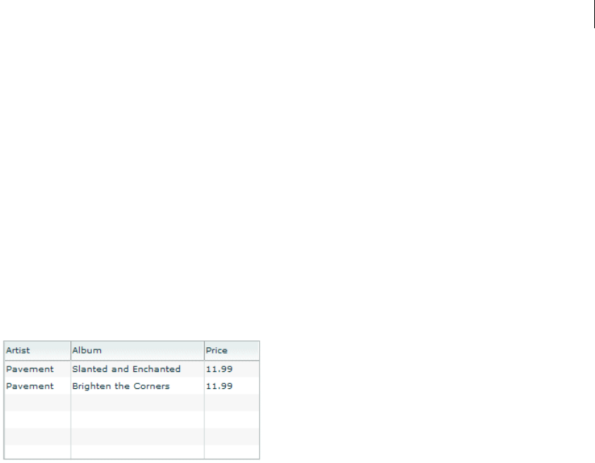
781ADOBE FLEX 3
Adobe Flex 3 Developer Guide
<!-- itemRenderers\list\ListDefaultRenderer.mxml -->
<mx:Application xmlns:mx="http://www.adobe.com/2006/mxml">
<mx:List width="50" height ="75">
<mx:dataProvider>
<mx:String>AK</mx:String>
<mx:String>AL</mx:String>
<mx:String>AR</mx:String>
</mx:dataProvider>
</mx:List>
</mx:Application>
Because the data in this example is inline static data, it is not necessary to explicitly wrap it in an ArrayCollection
instance. However, when you work with data that could change, it is always best to specify a collection explicitly;
for more information, see “Using Data Providers and Collections” on page 137.
In the next example, the data provider for the DataGrid control contains fields for an artist, album name, and
price. Each of these fields appears in the DataGrid control using the default item renderer, which displays data as
text.
The following code creates the example shown in the previous image:
<?xml version="1.0"?>
<!-- itemRenderers\dataGrid\DGDefaultRenderer.mxml -->
<mx:Application xmlns:mx="http://www.adobe.com/2006/mxml" >
<mx:Script>
<![CDATA[
import mx.collections.ArrayCollection;
[Bindable]
private var initDG:ArrayCollection = new ArrayCollection([
{Artist:'Pavement', Album:'Slanted and Enchanted', Price:11.99},
{Artist:'Pavement', Album:'Brighten the Corners', Price:11.99}
]);
]]>
</mx:Script>
<mx:Panel paddingTop="10" paddingBottom="10"
paddingLeft="10" paddingRight="10">
<mx:DataGrid id="myGrid" dataProvider="{initDG}"
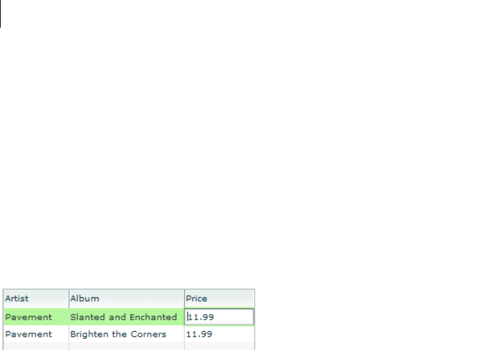
CHAPTER 22
782
width="100%" editable="true">
<mx:columns>
<mx:DataGridColumn dataField="Artist" resizable="true"/>
<mx:DataGridColumn dataField="Album" resizable="true"/>
<mx:DataGridColumn dataField="Price" resizable="true"/>
</mx:columns>
</mx:DataGrid>
</mx:Panel>
</mx:Application>
An editable component lets the user modify the data in the list control, and propagates the changes in the data
back to the underlying data provider of the control. The DataGrid, List, and Tree controls have a property named
editable that, if set to true, lets you edit the contents of a cell. By default, the list controls use a TextInput control
as the item editor. That means when you select a cell in the list control, Flex opens a TextInput control that
contains the current contents of the cell and lets you edit it, as the following image shows:
In this image, you use the default item editor to edit the price of the first album in the DataGrid control.
For more information on item editors, see “Working with Item Editors” on page 821.
Using custom item renderers and item editors
To control the display of a list component, you write a custom item renderer or custom item editor. Your custom
item renderers and item editors still use the underlying functionality of the list control, but let you control the
display and editing of the data. Custom item renderers and item editors provide you with several advantages:
•You can create a more compelling user interface by replacing the display of text with a more user-intuitive
appearance.
•You can combine multiple elements in a single list item, such as a label and an image.
•You can programmatically control the display of the data.
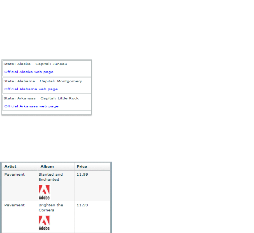
783ADOBE FLEX 3
Adobe Flex 3 Developer Guide
The following List control is a modification of the List control in the section “Default item rendering and cell
editing” on page 780. In this example, you use a custom item renderer to display the state name, capital, and a URL
to the state’s official website in each list item:
For the code for this example, see “Example: Using an item renderer with a List control” on page 816.
In the next image, you use a default item renderer for the first and third columns of the DataGrid control. You use
a custom item renderer for the second column to display the album cover along with the album title in the
DataGrid control.
For the code for this example, see “Creating a complex inline item renderer or item editor” on page 802.
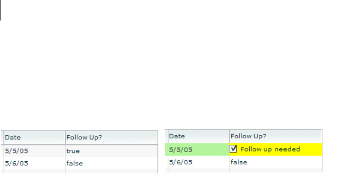
CHAPTER 22
784
Just as you can define a custom item renderer to control the display of a cell, you can use a custom item editor to
edit the contents of the cell. For example, if the custom item renderer displays an image, you could define a custom
item editor that uses a ComboBox control that lets users select an image from a list of available images. Or you
could use a CheckBox control to let the user set a true or false value for a cell, as the right side of the following
example shows:
For the code for this example, see “Creating a simple item editor component” on page 810.
Using an item renderer does not imply that the control also has an item editor. Often, you do not allow your
controls to be edited; that is, they are for display only.
You can also use an item editor without a corresponding item renderer. For example, you could display infor-
mation such as a male/female or true/false as text using the default item renderer. But, you could then use a custom
item editor with a ComboBox control that provides the user only a limited set of options to enter into the cell when
changing the value.
Item renderer and item editor architecture
In order for an item renderer or item editor to work with the contents of a list control, the list control must be able
to pass information to the item renderer or item editor. An item editor must also be able to pass updated infor-
mation back to the list control.
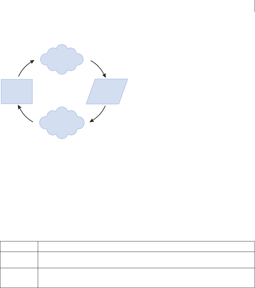
785ADOBE FLEX 3
Adobe Flex 3 Developer Guide
The following image shows the relationship of a list control to an item renderer or item editor:
To pass information to an item renderer or item editor, Flex sets the data property of the item renderer or item
editor to the cell data. In the previous image, you can see the data property that is used to pass the data to the item
renderer or item editor.
By default, an item editor can pass back a single value to the list control that becomes the new value of the edited
cell. To return more than one value, you must write additional code to return the data back to the list control. For
more information, see “Example: Passing multiple values back from an item editor” on page 840.
Any Flex component that you want to use in an item renderer or item editor, and that requires access to the cell
data of the list control, must implement the IDataRenderer interface to support the data property. You can use
additional components in an item renderer that do not support the data property, if those components do not
need to access data passed from the list control.
The contents of the data property depend on the type of control, as the following table shows:
Control Contents of the data property
DataGrid Contains the data provider element for the entire row of the DataGrid control. That means if you use a different item
renderer for each cell of the DataGrid control, each cell in a row receives the same information in the data property.
Tree
List
Contains the data provider element for the node of the List or Tree control.
list control item renderer
Item editor
data property
DataGrid, List, and
Tree controls only

CHAPTER 22
786
For more information about item editors, see “Working with Item Editors” on page 821.
About item renderer and item editor interfaces
The Flex item renderer and item editor architecture is defined by several interfaces. Flex components that you can
use as item renderers and item editors implement one or more of these interfaces. If you create your own custom
component to use as an item renderer or item editor, your component must implement one or more of these inter-
faces, depending on how you intend to use it.
HorizontalList
TileList
Contains the data provider element for the cell.
Menu Contains the data provider element for the menu item.
MenuBar Contains the data provider element for the menu bar item.
Control Contents of the data property
787ADOBE FLEX 3
Adobe Flex 3 Developer Guide
The following table describes the interfaces that you use with item renderers and item editors:
Application layout with item renderers and item editors
All list controls, with the exception of the TileList and HorizontalList controls, ignore item renderers when calcu-
lating the default height and width of their contents. By default, item renderers are sized to the full width of a
control, or the width of the column for a DataGrid control. Therefore, if you define a custom item renderer that
requires a size other than its default, you should explicitly size the control.
Vertical controls such as the List and Tree controls use the rowHeight property to determine the default cell
height. You can also set the variableRowHeight property to true if each row has a different height. Otherwise,
Flex sets the height of each cell to 20 pixels.
Interface Use
IDataRenderer Defines the data property used to pass information to an item renderer or item editor. All item
renderers and item editors must implement this interface.
Many Flex components implement this interface, such as the chart renderer classes and many Flex
controls.
IDropInListItemRenderer Defines the listData property required by drop-in item renderers and item editors. All drop-in item
renderers and item editors must implement this interface. For more information, see “Creating drop-in
item renderers and item editors” on page 797.
The listData property is of type BaseListData, where the BaseListData class has three subclasses:
DataGridListData, ListData, TreeListData. The actual data type of the value of the listData property
depends on the control using the drop-in item renderer or item editor. For a DataGrid control, the value
is of type DataGridListData; for a List control, the value is of type ListData; and for a Tree control, the
value is of type TreeListData.
IListItemRenderer Defines the complete set of interfaces that an item renderer or item editor must implement to be used
with any Flex control other than a Chart control. A renderer for a Chart control has to implement only
the IDataRenderer interface.
The set of interfaces includes the following:
IDataRenderer, IFlexDisplayObject, ILayoutClient, IStyleable, and IUIComponent.
The UIComponent class implements all of these interfaces, except the IDataRenderer interface. There-
fore, if you create a custom item renderer or item editor as a subclass of the UIComponent class, you
have to implement only the IDataRenderer interface. If you implement a drop-in item renderer or item
editor as a subclass of the UIComponent class, you have to implement only the IDataRenderer and
IDropInListItemRenderer interfaces.

CHAPTER 22
788
For the HorizontalList control, Flex can use the value of the columnWidth property, if specified. For the TileList
control, Flex uses the values of the columnWidth and rowHeight properties. If you omit these properties, Flex
examines the control’s data provider to determine the default size of each cell, including an item renderer, if
specified. Otherwise, Flex sets the height and width of each cell to 50 pixels.
Creating an item renderer and item editor
One of the first decisions that you must make when using custom item renderers and item editors is how to
implement them. Flex lets you define item renderers and item editors in three different ways:
Drop-in item renderers and item editors Insert a single component to define an item renderer or item editor. For
more information, see “Using a drop-in item renderer or item editor” on page 788.
Inline item renderers and item editors Define one or more components using child tags of the list control to
define an item renderer or item editor. For more information, see “Using an inline item renderer or item editor”
on page 789.
Item renderer and item editor components Define an item renderer or item editor as a reusable component. For
more information, see “Using a component as an item renderer or item editor” on page 790.
The following sections describe each technique.
Using a drop-in item renderer or item editor
For simple item renderers and item editors, such as using a NumericStepper control to edit a field of a DataGrid
control, you can use a drop-in item editor. A drop-in item renderer or drop-in item editor is a Flex component that
you specify as the value of the itemRenderer or itemEditor property of a list control.
In the following example, you specify the NumericStepper control as the item editor for a column of the DataGrid
control:
<?xml version="1.0"?>
<!-- itemRenderers\dropin\DropInNumStepper.mxml -->
<mx:Application xmlns:mx="http://www.adobe.com/2006/mxml">
<mx:Script>
<![CDATA[
import mx.collections.ArrayCollection;
[Bindable]
private var myDP:ArrayCollection = new ArrayCollection([
{label1:"Order #2314", quant:3, Sent:true},
{label1:"Order #2315", quant:3, Sent:false}
]);
]]>

789ADOBE FLEX 3
Adobe Flex 3 Developer Guide
</mx:Script>
<mx:DataGrid id="myDG" dataProvider="{myDP}"
variableRowHeight="true"
editable="true" >
<mx:columns>
<mx:DataGridColumn dataField="label1" headerText="Order #"/>
<mx:DataGridColumn dataField="quant"
headerText="Qty"
itemEditor="mx.controls.NumericStepper"
editorDataField="value"
/>
</mx:columns >
</mx:DataGrid>
</mx:Application>
In this example, when the user selects a cell of the column to edit it, Flex displays the NumericStepper control in
that cell. Flex automatically uses the data property to populate the NumericStepper control with the current value
of the column.
You use the editorDataField property to specify the property of the item editor that returns the new data for
the cell. By default, the list control uses the text field of the TextInput control to supply the new value; therefore,
the default value of the editorDataField property is "text". In this example, you specify that the value field
of the NumericStepper supplies the new value for the cell.
You can use only a subset of the Flex components as drop-in item renderers and item editors—those components
that implement the IDropInListItemRenderer interface. For more information on using drop-in item renderers
and item editors, and for a list of controls that support drop-in item renderers and item editors, see “Creating
drop-in item renderers and item editors” on page 797.
Using an inline item renderer or item editor
In the section “Using a drop-in item renderer or item editor” on page 788, the example shows how easy it is to use
drop-in item renderers and item editors. The only drawback to using them is that you cannot configure them. You
can specify the drop-in item renderers and item editors only as the values of a list control property.
To create more flexible item renderers and item editors, you develop your item renderer or item editor as an inline
component. In the next example, you modify the previous example to use a NumericStepper control as an inline
item editor. With an inline item editor, you can configure the NumericStepper control just as if you used it as a
stand-alone control.
<?xml version="1.0"?>
<!-- itemRenderers\inline\InlineNumStepper.mxml -->
<mx:Application xmlns:mx="http://www.adobe.com/2006/mxml">
<mx:Script>
<
CHAPTER 22
790
[Bindable]
private var myDP:ArrayCollection = new ArrayCollection([
{label1:"Order #2314", quant:3, Sent:true},
{label1:"Order #2315", quant:3, Sent:false}
]);
]]>
</mx:Script>
<mx:DataGrid id="myDG" dataProvider="{myDP}"
variableRowHeight="true"
editable="true" >
<mx:columns>
<mx:DataGridColumn dataField="label1" headerText="Order #"/>
<mx:DataGridColumn dataField="quant" editorDataField="value" headerText="Qty">
<mx:itemEditor>
<mx:Component>
<mx:NumericStepper stepSize="1" maximum="50"/>
</mx:Component>
</mx:itemEditor>
</mx:DataGridColumn>
</mx:columns>
</mx:DataGrid>
</mx:Application>
In this example, you define the NumericStepper control as the item editor for the column, and specify a maximum
value of 50 and a step size of 1 for the NumericStepper control.
For more information on creating inline item renderers and item editors, see “Creating inline item renderers and
editors” on page 800.
Using a component as an item renderer or item editor
One disadvantage of using drop-in and inline item renderers and editors is that you define the item renderer or
editor in the application file; therefore, it is not reusable in another location in the application, or in another appli-
cation. You can create a reusable item renderer or item editor as a Flex component, and then use that component
anywhere in an application that requires the item renderer.
For example, the following code uses a NumericStepper control to define a custom item editor as an MXML
component:
<?xml version="1.0"?>
<!-- itemRenderers\component\myComponents\NSEditor.mxml -->
<mx:NumericStepper xmlns:mx="http://www.adobe.com/2006/mxml"
stepSize="1"
maximum="50"/>
The custom MXML component defines the item editor as a NumericStepper control. In this example, the custom
item editor is named NSEditor and is implemented as an MXML component in the NSEditor.mxml file. You place
the file NSEditor.mxml in the myComponents directory beneath your main application directory.
You can then use this component anywhere in an application, as the following example shows:
<?xml version="1.0"?>

791ADOBE FLEX 3
Adobe Flex 3 Developer Guide
<!-- itemRenderers\component\MainNSEditor.mxml -->
<mx:Application xmlns:mx="http://www.adobe.com/2006/mxml">
<mx:Script>
<![CDATA[
import mx.collections.ArrayCollection;
[Bindable]
private var myDP:ArrayCollection = new ArrayCollection([
{label1:"Order #2314", quant:3, Sent:true},
{label1:"Order #2315", quant:3, Sent:false}
]);
]]>
</mx:Script>
<mx:DataGrid id="myDG" dataProvider="{myDP}"
variableRowHeight="true"
editable="true" >
<mx:columns>
<mx:DataGridColumn dataField="label1"
headerText="Order #"/>
<mx:DataGridColumn dataField="quant"
itemEditor="myComponents.NSEditor"
editorDataField="value"/>
</mx:columns >
</mx:DataGrid>
</mx:Application>
When the user selects a cell in the quant column of the DataGrid control, Flex displays a NumericStepper control
with the current cell value.
You might have several locations in your application where users can modify a numeric value. You defined this
item editor as a custom component; therefore, you can reuse it anywhere in your application.
For more information on creating item renderers and item editors as components, see “Creating item renderers
and item editor components” on page 807.
Using editable controls in an item renderer
Item renderers do not impose restrictions on the types of Flex components that you can use in them. For example,
you can use controls, such as the Label, LinkButton, Button, and Text controls, to display data, but these controls
do not let the user modify the contents of the control.
Or you can use controls such as the CheckBox, ComboBox, and TextInput controls that both display data and let
users interact with the control to modify or change it. For example, you could use a CheckBox control to display
a selected (true value) or unselected (false value) cell in a DataGrid control.
When the user selects the cell of the DataGrid control that contains the CheckBox control, the user can interact
with the control to change its state. To the user, it appears that the DataGrid control is editable.

CHAPTER 22
792
However, an item renderer by default is not connected to the editing mechanism of the list control; it does not
propagate changes to the list control’s data provider, nor does it dispatch an event when the user modifies the cell.
Although the list control appears to the user to be editable, it really is not.
In another example, the user changes the value of the CheckBox control, and then sorts the DataGrid column. But
the DataGrid sorts the cell by the value in the data provider, not the value in the CheckBox control, so the user
perceives that the sort works incorrectly.
You can manage this situation in several ways, including the following:
•In your item renderer, do not use controls that let users modify them (CheckBox, ComboBox, and others).
•Create custom versions of these controls to prohibit user interaction with them.
•Use the rendererIsEditor property of the list control to specify that the item renderer is also an item editor.
For more information, see “Example: Using an item renderer as an item editor” on page 844.
•Write your own code for the item renderer and hosting control to pass data back from the item renderer when
you do let users interact with it. For more information and an example, see “Example: Passing multiple values back
from an item editor” on page 840.
Setting the itemRenderer or itemEditor property in ActionScript
The itemRenderer and itemEditor properties are of type IFactory. When you set these properties in MXML,
the MXML compiler automatically casts the property value to the type ClassFactory, a class that implements the
IFactory interface.
When you set these properties in ActionScript, you must explicitly cast the property value to ClassFactory, as the
following example shows:
<?xml version="1.0"?>
<!-- itemRenderers\list\AppListStateRendererEditorAS.mxml -->
<mx:Application xmlns:mx="http://www.adobe.com/2006/mxml">
<mx:Script>
<![CDATA[
import mx.core.ClassFactory;
// Cast the value of the itemRenderer property
// to ClassFactory.
public function initCellEditor():void {
myList.itemRenderer=new ClassFactory(RendererState);
}
]]>
</mx:Script>
<mx:List id="myList" variableRowHeight="true"
height="180" width="250"
backgroundColor="white"
initialize="initCellEditor();">
<mx:dataProvider>

793ADOBE FLEX 3
Adobe Flex 3 Developer Guide
<mx:Object label="Alaska"
data="Juneau"
webPage="http://www.state.ak.us/"/>
<mx:Object label="Alabama"
data="Montgomery"
webPage="http://www.alabama.gov/" />
<mx:Object label="Arkansas"
data="Little Rock"
webPage="http://www.state.ar.us/"/>
</mx:dataProvider>
</mx:List>
</mx:Application>
Shown below is the code for the RenderState.mxml item renderer:
<?xml version="1.0"?>
<!-- itemRenderers\list\RendererState.mxml -->
<mx:VBox xmlns:mx="http://www.adobe.com/2006/mxml" >
<mx:Script>
<![CDATA[
// Import Event and URLRequest classes.
import flash.events.Event;
import flash.net.URLRequest;
private var u:URLRequest;
// Event handler to open URL using navigateToURL().
private function handleClick(eventObj:Event):void {
u = new URLRequest(data.webPage);
navigateToURL(u);
}
]]>
</mx:Script>
<mx:HBox >
<!-- Use Label controls to display state and capital names. -->
<mx:Label id="State" text="State: {data.label}"/>
<mx:Label id="Statecapital" text="Capital: {data.data}" />
</mx:HBox>
<!-- Define the Link control to open a URL. -->
<mx:LinkButton id="webPage" label="Official {data.label} web page"
click="handleClick(event);" color="blue" />
</mx:VBox>
About the item renderer and item editor life cycle
Flex creates instances of item renderers and item editors as needed by your application for display and
measurement purposes. Therefore, the number of instances of an item renderer or item editor in your application
is not necessarily directly related to the number of visible item renderers. Also, if the list control is scrolled or
resized, a single item renderer instance may be reused to represent more than one data item. Thus, you should not
make assumptions about how many instances of your item renderer and item editor are active at any time.
CHAPTER 22
794
Because Flex can reuse an item renderer, ensure that you fully define its state. For example, you use a CheckBox
control in an item renderer to display a true (checked) or false (unchecked) value based on the current value of
the data property. A common mistake is to assume that the CheckBox control in the item renderer is always in
its default state of unchecked. Developers then write an item renderer to inspect the data property for a value of
true and set the CheckBox control to checked if found.
However, you must take into account that the CheckBox may already be checked. So, you must inspect the data
property for a value of false, and explicitly uncheck the control if it is checked.
Accessing the listData property
If a component implements the IDropInListItemRenderer interface, you can use its listData property to obtain
information about the data passed to the component when you use the component in an item renderer or item
editor. The listData property is of type BaseListData, where the BaseListData class defines the following
properties:
The BaseListData class has three subclasses: DataGridListData, ListData, TreeListData that define additional
properties. For example, the DataGridListData class adds the columnIndex and dataField properties that you
can access from an item renderer or item editor.
The data type of the value of the listData property depends on the control that uses the item renderer or item
editor. For a DataGrid control, the value is of type DataGridListData; for a List control, the value is of type
ListData; and for a Tree control, the value is of type TreeListData.
The Te x tA re a control is one of the Flex controls that implements the IDropInListItemRenderer interface The item
renderer in the following example uses the listData property of the TextArea control to display the row and
column of each item renderer in the DataGrid control:
<?xml version="1.0"?>
<!-- itemRenderers\dataGrid\myComponents\RendererDGListData.mxml -->
<mx:TextArea xmlns:mx="http://www.adobe.com/2006/mxml"
preinitialize="initTA();">
<mx:Script>
<
795ADOBE FLEX 3
Adobe Flex 3 Developer Guide
import flash.events.Event;
public function initTA():void {
addEventListener("dataChange", handleDataChanged);
}
public function handleDataChanged(event:Event):void {
// Cast listData to DataGridListData.
var myListData:DataGridListData =
DataGridListData(listData);
// Access information about the data passed
// to the cell renderer.
text="row index: " + String(myListData.rowIndex) +
" column index: " + String(myListData.columnIndex);
}
]]>
</mx:Script>
</mx:TextArea>
Because you use this item renderer in a DataGrid control, the data type of the value of the listData property is
DataGridListData. You use the dataChange event in this example to set the contents of the TextArea control every
time the data property changes.
The DataGrid control in the following example uses this item renderer:
<?xml version="1.0"?>
<!-- itemRenderers\dataGrid\MainDGListDataRenderer.mxml -->
<mx:Application xmlns:mx="http://www.adobe.com/2006/mxml">
<mx:Script>
<![CDATA[
import mx.collections.ArrayCollection;
[Bindable]
public var initDG:ArrayCollection = new ArrayCollection([
{ Company: 'Acme', Contact: 'Bob Jones',
Phone: '413-555-1212', Date: '5/5/05'},
{ Company: 'Allied', Contact: 'Jane Smith',
Phone: '617-555-3434', Date: '5/6/05'}
]);
]]>
</mx:Script>
<mx:Panel paddingTop="10" paddingBottom="10"
paddingLeft="10" paddingRight="10" >
<mx:DataGrid id="myGrid" dataProvider="{initDG}"
variableRowHeight="true">
<mx:columns>
<mx:DataGridColumn dataField="Company"
itemRenderer="myComponents.RendererDGListData"/>
<mx:DataGridColumn dataField="Contact"
itemRenderer="myComponents.RendererDGListData"/>
<mx:DataGridColumn dataField="Phone"
itemRenderer="myComponents.RendererDGListData"/>
<mx:DataGridColumn dataField="Date"
CHAPTER 22
796
itemRenderer="myComponents.RendererDGListData"/>
</mx:columns>
</mx:DataGrid>
</mx:Panel>
</mx:Application>
This code produces the following image of the DataGrid control:
As you can see in this image, each cell of the DataGrid control displays its column and row index.
Handling data binding warnings from the compiler
Many of the following examples, and those in “Working with Item Editors” on page 821, define the application
data as an ArrayCollection of Objects. However, you might get compiler warning for these examples because the
Object class does not support data binding. That does not matter with these examples because the data is static.
If your data is dynamic, and you want it to support data binding, you can instead define your own data class that
supports binding. For example, you could create the following subclass of Object that supports data binding, and
use it instead:
package
{
[Bindable]
public class MyBindableObj extends Object
{
public function MyBindableObj() {
super();
}
public var Artist:String = new String();
public var Album:String = new String();
public var Price:Number = new Number();
public var Cover:String = new String();
}
}

797ADOBE FLEX 3
Adobe Flex 3 Developer Guide
By inserting the [Bindable] metadata tag before the class definition, you specify that all public properties
support data binding. For more information on data binding, see “Binding Data” on page 1229 and “Metadata
Tags in Custom Components” on page 33 in Creating and Extending Adobe Flex 3 Components.
Creating drop-in item renderers and item editors
Several Flex controls are designed to work as item renderers and item editors. This lets you specify these controls
as values of the itemRenderer or itemEditor property. When you specify one of these controls as a property
value, it is called a drop-in item renderer or drop-in item editor.
To use a component as a drop-in item renderer or drop-in item editor, a component must implement the IDropIn-
ListItemRenderer interface. The following controls implement the IDropInListItemRenderer interface, making
them usable directly as a drop-in item renderer or drop-in item editor:
•Button
•CheckBox
•DateField
•Image
•Label
•NumericStepper
•Text
•TextAre a
•TextInp ut
You can define your own components for use as drop-in item renderers or drop-in item editors. The only
requirement is that they, too, implement the IDropInListItemRenderer interface.
Using drop-in item renderers and item editors
When you use a control as a drop-in item renderer, Flex sets the control’s default property to the current value of
the cell. When you use a control as an item editor, the initial value of the cell becomes the current value of the
control. Any edits made to the cell are copied back to the data provider of the list control.
CHAPTER 22
798
The following table lists the components that you can use as drop-in item renderers and item editors, and the
default property of the component:
In the following example, you use the NumericStepper, DateField, and CheckBox controls as the drop-in item
renderers and item editors for a DataGrid control:
<?xml version="1.0"?>
<!-- itemRenderers\inline\CBInlineCellEditor.mxml -->
<mx:Application xmlns:mx="http://www.adobe.com/2006/mxml">
<mx:Script>
<![CDATA[
import mx.collections.ArrayCollection;
[Bindable]
private var myDP:ArrayCollection = new ArrayCollection([
{label1:"Order #2314", contact:"John Doe",
quant:3, solddate:new Date(2005, 0, 1), Sent:true},
{label1:"Order #2315", contact:"Jane Doe",
quant:3, solddate:new Date(2005, 0, 5), Sent:false}
]);
]]>
</mx:Script>
<mx:DataGrid id="myDG"
dataProvider="{myDP}"
variableRowHeight="true"
width="500" height="250"
editable="true">
<mx:columns>
<mx:DataGridColumn dataField="label1"
Control Default property Notes
Button selected Cannot specify a label for the Button control.
CheckBox selected If used as a drop-in item renderer in a Tree control, the Tree displays only check boxes
with no text.
DateField selectedDate Requires that the data provider of the list control has a field of type Date.
Image source Set an explicit row height by using the rowHeight property, or set the
variableRowHeight property to true to size the row correctly.
Label text
NumericStepper value
Text text
TextArea text
TextInput text

799ADOBE FLEX 3
Adobe Flex 3 Developer Guide
headerText="Order #"
editable="false"/>
<mx:DataGridColumn dataField="quant"
headerText="Quantity"
itemEditor="mx.controls.NumericStepper"
editorDataField="value"/>
<mx:DataGridColumn dataField="solddate"
headerText="Date"
itemRenderer="mx.controls.DateField"
rendererIsEditor="true"
editorDataField="selectedDate"/>
<mx:DataGridColumn dataField="Sent"
itemRenderer="mx.controls.CheckBox"
rendererIsEditor="true"
editorDataField="selected"/>
</mx:columns >
</mx:DataGrid>
</mx:Application>
To determine the field of the data provider used to populate the drop-in item renderer, Flex uses the value of the
dataField property for the <mx:DataGridColumn> tag. In this example, you do the following:
•You se t t he dataField property of the second column to quant, and define the NumericStepper control as
the item editor. Therefore, the column displays the cell value as text, and opens the NumericStepper control when
you select the cell to edit it. The NumericStepper control displays the current value of the cell, and any changes
you make to it are copied back to the data provider of the DataGrid control.
•You set the dataField property of the third column to solddate, and define the DateField control as the item
renderer and item editor by setting the rendererIsEditor property to true. The data provider defines the data
as an object of type Date, which is required to use the DateField control as the item renderer or item editor.
Therefore, the column displays the date value using the DateField control, and also uses the DateField control to
edit the cell value.
•You se t t he dataField property of the fourth column to Sent, and define the CheckBox control as the item
renderer and item editor. Typically, you use itemEditor property to specify a different class as the item editor,
and specify to use the same control as both the item renderer and item editor by setting the rendererIsEditor
property to true. The CheckBox control displays a check mark in the cell if the Sent field for the row is set to true,
and an empty check box if the field is set to false.
For more information on using an item renderer as an item editor, see “Creating an editable cell” on page 822.
Note: When you use a CheckBox control as a drop-in item renderer, the control appears flush against the left cell
border. To center a CheckBox control, or any drop-in item renderer, create a custom item renderer that wraps the
control in a container, such as the HBox container. However, the addition of the container can affect application
performance when you are rendering large amounts of data. For more information, see “Creating item renderers and
item editor components” on page 807.
When you use the Image control as a drop-in item renderer, you usually have to set the row height to accom-
modate the image, as the following example shows:

CHAPTER 22
800
<?xml version="1.0"?>
<!-- itemRenderers\DGDropInImageRenderer.mxml -->
<mx:Application xmlns:mx="http://www.adobe.com/2006/mxml" >
<mx:Script>
<![CDATA[
import mx.collections.ArrayCollection;
[Bindable]
private var initDG:ArrayCollection = new ArrayCollection([
{Artist:'Pavement', Album:'Slanted and Enchanted',
Price:11.99, Cover:'../assets/slanted.jpg'},
{Artist:'Pavement', Album:'Brighten the Corners',
Price:11.99, Cover:'../assets/brighten.jpg'}
]);
]]>
</mx:Script>
<mx:DataGrid id="myGrid" dataProvider="{initDG}" rowHeight="50">
<mx:columns>
<mx:DataGridColumn dataField="Artist"/>
<mx:DataGridColumn dataField="Album"/>
<mx:DataGridColumn dataField="Cover"
itemRenderer="mx.controls.Image"/>
<mx:DataGridColumn dataField="Price"/>
</mx:columns>
</mx:DataGrid>
</mx:Application>
In this example, you use the Image control to display the album cover in a cell of the DataGrid control.
Requirements of a drop-in item renderer in a List control
When you use the itemRenderer property of the List control to specify a drop-in item renderer, the data in the
data provider must be of the type expected by the item renderer control. For example, if you use an Image control
as a drop-in item renderer, the data provider for the List control must have String data in the field.
Creating inline item renderers and editors
You define inline item renderers and item editors in the MXML definition of a component. Inline item renderers
and item editors give you complete control over item rendering and cell editing.

801ADOBE FLEX 3
Adobe Flex 3 Developer Guide
Creating a simple inline item renderer or item editor
A simple inline item renderer contains a single control that supports the data property. Flex automatically copies
the current cell data to the item renderer, as the following example shows:
<?xml version="1.0"?>
<!-- itemRenderers\InlineImageRenderer.mxml -->
<mx:Application xmlns:mx="http://www.adobe.com/2006/mxml" >
<mx:Script>
<![CDATA[
import mx.collections.ArrayCollection;
[Bindable]
private var initDG:ArrayCollection = new ArrayCollection([
{Artist:'Pavement', Album:'Slanted and Enchanted',
Price:11.99, Cover: '../assets/slanted.jpg'},
{Artist:'Pavement', Album:'Brighten the Corners',
Price:11.99, Cover: '../assets/brighten.jpg'}
]);
]]>
</mx:Script>
<mx:DataGrid id="myGrid" dataProvider="{initDG}" rowHeight="50">
<mx:columns>
<mx:DataGridColumn dataField="Artist"/>
<mx:DataGridColumn dataField="Album"/>
<mx:DataGridColumn dataField="Cover">
<mx:itemRenderer>
<mx:Component>
<mx:Image height="45"/>
</mx:Component>
</mx:itemRenderer>
</mx:DataGridColumn>
<mx:DataGridColumn dataField="Price"/>
</mx:columns>
</mx:DataGrid>
</mx:Application>
In this example, you use an Image control to display the album cover.
A simple inline item editor contains a single control that supports the data property. Flex automatically copies
the current cell data to the item renderer or item editor, and copies the new cell data back to the list control based
on the value of the editorDataField property, as the following example item editor shows:
<?xml version="1.0"?>
<!-- itemRenderers\inline\InlineNumStepper.mxml -->
<mx:Application xmlns:mx="http://www.adobe.com/2006/mxml">
<mx:Script>
<![CDATA[
import mx.collections.ArrayCollection;
[Bindable]
private var myDP:ArrayCollection = new ArrayCollection([
{label1:"Order #2314", quant:3, Sent:true},
{label1:"Order #2315", quant:3, Sent:false}

CHAPTER 22
802
]);
]]>
</mx:Script>
<mx:DataGrid id="myDG" dataProvider="{myDP}"
variableRowHeight="true"
editable="true" >
<mx:columns>
<mx:DataGridColumn dataField="label1" headerText="Order #"/>
<mx:DataGridColumn dataField="quant" editorDataField="value" headerText="Qty">
<mx:itemEditor>
<mx:Component>
<mx:NumericStepper stepSize="1" maximum="50"/>
</mx:Component>
</mx:itemEditor>
</mx:DataGridColumn>
</mx:columns>
</mx:DataGrid>
</mx:Application>
In this example, you return the new cell value by using the value property of the NumericStepper control.
Creating a complex inline item renderer or item editor
A complex item renderer or item editor defines multiple controls. For example, the section “Default item
rendering and cell editing” on page 780 showed a DataGrid control that displayed information about albums by
using three text fields. You could add a visual element to your DataGrid control to make it more compelling. To
do that, you modify the data provider so that it contains a reference to a JPEG image of the album cover.
Rather than displaying the album name and album image in separate cells of the DataGrid control, you can use
an inline item renderer to make them appear in a single cell, as the following example shows:
<?xml version="1.0"?>
<!-- itemRenderers\InlineDGRenderer.mxml -->
<mx:Application xmlns:mx="http://www.adobe.com/2006/mxml">
<mx:Script>
<![CDATA[
import mx.collections.ArrayCollection;
// Variable in the Application scope.
public var localVar:String="Application localVar";
// Data includes URL to album cover.
[Bindable]
private var initDG:ArrayCollection = new ArrayCollection([
{Artist:'Pavement', Album:'Slanted and Enchanted',
Price:11.99, Cover:'../assets/slanted.jpg'},
{Artist:'Pavement', Album:'Brighten the Corners',
Price:11.99, Cover:'../assets/brighten.jpg'}
]);
]]>
</mx:Script>

803ADOBE FLEX 3
Adobe Flex 3 Developer Guide
<mx:DataGrid id="myGrid" dataProvider="{initDG}"
variableRowHeight="true">
<mx:columns>
<mx:DataGridColumn dataField="Artist"/>
<mx:DataGridColumn dataField="Album">
<mx:itemRenderer>
<mx:Component>
<mx:VBox>
<mx:Text id="albumName"
width="100%" text="{data.Album}"/>
<mx:Image id="albumImage"
height="45" source="{data.Cover}"/>
</mx:VBox>
</mx:Component>
</mx:itemRenderer>
</mx:DataGridColumn>
<mx:DataGridColumn dataField="Price"/>
</mx:columns>
</mx:DataGrid>
</mx:Application>
In the preceding example, you define three columns in the DataGrid control, and assign your item renderer to the
second column. For an image that shows the output of this application, see “Using custom item renderers and item
editors” on page 782.
Notice that the Text and Image controls in the item renderer both use the data property to initialize their values.
This is necessary because you defined multiple controls in the item renderer, and Flex cannot automatically
determine which data element in the data provider is associated with each control of the item renderer.
Even if the top-level container of an inline item renderer has a single child control, you must use the data property
to initialize the child control, as the following example shows:
<mx:DataGridColumn dataField="Cover">
<mx:itemRenderer>
<mx:Component>
<mx:VBox horizontalAlign="center">
<mx:Image height="45" source="{data.Cover}"/>
</mx:VBox>
</mx:Component>
</mx:itemRenderer>
</mx:DataGridColumn>
In the preceding example, you make the Image control a child of a VBox container so that you can align the image
in the cell. Because the Image control is now a child of the VBox container, you must initialize it by using the data
property.
You can define multiple controls in a complex inline item editor, which lets you edit multiple values of the data
provider for the list control. Alternatively, you can define a complex inline item editor so it returns a value other
than a String. For more information, see “Working with Item Editors” on page 821.

CHAPTER 22
804
Items allowed in an inline component
The only restriction on what you can and cannot do in an inline item renderer or editor is that you cannot create
an empty <mx:Component></mx:Component> tag. For example, you can combine effect and style definitions in
an inline item renderer or editor along with your rendering and editing logic.
You can include the following items in an inline item renderer or editor:
•Binding tags
•Effect tags
•Metadata tags
•Model tags
•Scripts tags
•Service tags
•State tags
•Styles tags
•XML tags
•id attributes, except for the top-most component
Using the Component tag
You use the <mx:Component> tag to define an inline item renderer or item editor in an MXML file.
Defining the scope in an Component tag
The <mx:Component> tag defines a new scope in an MXML file, where the local scope of the item renderer or item
editor is defined by the MXML code block delimited by the <mx:Component> and </mx:Component> tags. To
access elements outside of the local scope of the item renderer or item editor, you prefix the element name with
the outerDocument keyword.
For example, you define one variable named localVar in the scope of the main application, and another variable
with the same name in the scope of the item renderer. From within the item renderer, you access the application’s
localVar by prefixing it with outerDocument keyword, as the following example shows:
<?xml version="1.0"?>
<!-- itemRenderers\InlineDGImageScope.mxml -->
<mx:Application xmlns:mx="http://www.adobe.com/2006/mxml">
<mx:Script>
<![CDATA[
import mx.collections.ArrayCollection;
// Variable in the Application scope.
[Bindable]

805ADOBE FLEX 3
Adobe Flex 3 Developer Guide
public var localVar:String="Application localVar";
// Data includes URL to album cover.
[Bindable]
private var initDG:ArrayCollection = new ArrayCollection([
{ Artist:'Pavement', Album:'Slanted and Enchanted',
Price:11.99, Cover:'../assets/slanted.jpg'},
{ Artist:'Pavement', Album:'Brighten the Corners',
Price:11.99, Cover:'../assets/brighten.jpg'}
]);
]]>
</mx:Script>
<mx:DataGrid id="myGrid" dataProvider="{initDG}" width="100%"
variableRowHeight="true">
<mx:columns>
<mx:DataGridColumn dataField="Artist"/>
<mx:DataGridColumn dataField="Album"/>
<mx:DataGridColumn dataField="Cover">
<mx:itemRenderer>
<mx:Component>
<mx:VBox>
<mx:Script>
<![CDATA[
// Variable in the renderer scope.
[Bindable]
public var localVar:String="Renderer localVar";
]]>
</mx:Script>
<mx:Text id="albumName"
width="100%"
selectable="false"
text="{data.Album}"/>
<mx:Image id="albumImage"
height="45"
source="{data.Cover}"/>
<mx:TextArea
text="{'Renderer localVar= ' + localVar}"/>
<mx:TextArea
text="{'Application localVar= ' + outerDocument.localVar}"/>
</mx:VBox>
</mx:Component>
</mx:itemRenderer>
</mx:DataGridColumn>
<mx:DataGridColumn dataField="Price"/>
</mx:columns>
</mx:DataGrid>
</mx:Application>
One use of the outerDocument keyword is to initialize the data provider of a control in the inline item editor. For
example, you can use a web service, or other mechanism, to pass data into the application, such as the list of U.S.
states. You can then initialize all ComboBox controls that are used as item editors from a single property of the
application that contains the list of U.S. states.

CHAPTER 22
806
Specifying a class name to the inline component
You can optionally specify the className property of the <mx:Component> tag to explicitly name the class
generated by Flex for the inline component. By naming the class, you define a way to reference the elements in the
inline component.
For an example using the className property, see “Example: Passing multiple values back from an item editor”
on page 840.
Creating a reusable inline item renderer or item editor
Rather than defining an inline item renderer or item editor in the definition of a component, you can define a
reusable inline item renderer or item editor for use in multiple locations in your application.
For example, you use the <mx:Component> tag to define an inline item editor that consists of a ComboBox control
for selecting the state portion of an address. You then use that inline item editor in two different DataGrid
controls, as the following example shows:
<?xml version="1.0"?>
<!-- itemRenderers\inline\InlineDGEditorCBReUse.mxml -->
<mx:Application xmlns:mx="http://www.adobe.com/2006/mxml"
width="700" >
<mx:Script>
<![CDATA[
import mx.collections.ArrayCollection;
[Bindable]
public var initDG:ArrayCollection = new ArrayCollection([
{Company: 'Acme', Contact: 'Bob Jones',
Phone: '413-555-1212', City: 'Boston', State: 'MA'},
{Company: 'Allied', Contact: 'Jane Smith',
Phone: '617-555-3434', City: 'SanFrancisco', State: 'CA'}
]);
]]>
</mx:Script>
<mx:Component id="inlineEditor">
<mx:ComboBox>
<mx:dataProvider>
<mx:String>AL</mx:String>
<mx:String>AK</mx:String>
<mx:String>AR</mx:String>
</mx:dataProvider>
</mx:ComboBox>
</mx:Component>
<mx:DataGrid id="myGrid"
variableRowHeight="true"
dataProvider="{initDG}"
editable="true" >
<mx:columns>
<mx:DataGridColumn dataField="Company" editable="false"/>
<mx:DataGridColumn dataField="Contact"/>

807ADOBE FLEX 3
Adobe Flex 3 Developer Guide
<mx:DataGridColumn dataField="Phone"/>
<mx:DataGridColumn dataField="City"/>
<mx:DataGridColumn dataField="State"
width="150"
editorDataField="selectedItem"
itemEditor="{inlineEditor}"/>
</mx:columns>
</mx:DataGrid>
<mx:DataGrid id="myGrid2"
variableRowHeight="true"
dataProvider="{initDG}"
editable="true">
<mx:columns>
<mx:DataGridColumn dataField="Company" editable="false"/>
<mx:DataGridColumn dataField="Contact"/>
<mx:DataGridColumn dataField="Phone"/>
<mx:DataGridColumn dataField="City"/>
<mx:DataGridColumn dataField="State"
width="150"
editorDataField="selectedItem"
itemEditor="{inlineEditor}"/>
</mx:columns>
</mx:DataGrid>
</mx:Application>
In this example, you specify the id property of the inline item editor defined by the <mx:Component> tag. You
then use data binding to specify the editor as the value of the itemEditor property for the two DataGrid controls.
The inline item editor or item renderer defined in the <mx:Component> tag appears only where you use it in the
DataGrid control; otherwise, Flex ignores it when laying out your application.
Creating item renderers and item editor components
Defining a custom item renderer or item editor by using an MXML component gives you greater flexibility and
functionality than using a drop-in item renderer or item editor. Many of the rules for defining item renderers and
item editors as custom components are the same as for using inline item renderers and editors. For more infor-
mation, see “Creating inline item renderers and editors” on page 800.
For more information on working with custom components, see Creating and Extending Adobe Flex 3 Compo-
nents.

CHAPTER 22
808
Creating an item renderer component
The section “Default item rendering and cell editing” on page 780 shows a DataGrid control that displays infor-
mation about albums by using three text fields. You could add a visual element to your DataGrid control to make
it more compelling. To do that, you modify the data provider so that it contains a URL for a JPEG image of the
album cover.
The default item renderer for a DataGrid control displays data as text. To get the DataGrid control to display the
image of the album cover, you use the custom item renderer defined in the RendererDGImage.mxml file, as the
following example shows:
<?xml version="1.0"?>
<!-- itemRenderers\myComponents\RendererDGImage.mxml -->
<mx:HBox xmlns:mx="http://www.adobe.com/2006/mxml"
horizontalAlign="center" >
<mx:Image id="albumImage" height="175" source="{data.Cover}"/>
</mx:HBox>
The item renderer contains an Image control in an HBox container. The HBox container specifies to center the
image in the container; otherwise, the image appears flush left in the cell. The Image control specifies the height
of the image as 75 pixels. By default, an image has a height of 0 pixels; therefore, if you omit the height, the image
does not appear.
You use data binding to associate fields of a data property with the controls in an item renderer or item editor. In
this example, the data property that is passed to the item renderer contains the element of the data provider for
the entire row of the DataGrid control. You then bind the Cover field of the data property to the Image control.
The following example illustrates using a custom item renderer with the DataGrid control:
<?xml version="1.0"?>
<!-- itemRenderers\MainDGImageRenderer.mxml -->
<mx:Application xmlns:mx="http://www.adobe.com/2006/mxml">
<mx:Script>
<![CDATA[
import mx.collections.ArrayCollection;
[Bindable]
private var initDG:ArrayCollection = new ArrayCollection([
{Artist:'Pavement', Album:'Slanted and Enchanted',
Price:11.99, Cover: '../assets/slanted.jpg'},
{Artist:'Pavement', Album:'Brighten the Corners',
Price:11.99, Cover: '../assets/brighten.jpg'}
]);
]]>
</mx:Script>
<mx:DataGrid id="myGrid"
dataProvider="{initDG}"
variableRowHeight="true">
<mx:columns>
<mx:DataGridColumn dataField="Artist"/>

809ADOBE FLEX 3
Adobe Flex 3 Developer Guide
<mx:DataGridColumn dataField="Album"/>
<mx:DataGridColumn dataField="Cover"
itemRenderer="myComponents.RendererDGImage"/>
<mx:DataGridColumn dataField="Price"/>
</mx:columns>
</mx:DataGrid>
</mx:Application>
The DataGrid control contains a column for the album cover that uses the itemRenderer property to specify the
name of the MXML file that contains the item renderer for that column. Now, when you run this example, the
DataGrid control uses your custom item renderer for the Cover column to display an image of the album cover.
Rather than having the album name and album image in separate cells of the DataGrid control, you can use an
item renderer to make them appear in a single cell, as the following example shows:
<?xml version="1.0"?>
<!-- itemRenderers\inline\myComponents\RendererDGTitleImage.mxml -->
<mx:VBox xmlns:mx="http://www.adobe.com/2006/mxml"
horizontalAlign="center" height="75">
<mx:Text id="albumName"
width="100%"
selectable="false"
text="{data.Album}"/>
<mx:Image id="albumImage"
source="{data.Cover}"/>
</mx:VBox>
You save this item renderer to the RendererDGTitleImage.mxml file. The DataGrid control in the main appli-
cation references the item renderer, as the following example shows:
<?xml version="1.0"?>
<!-- itemRenderers\MainDGTitleRenderer.mxml -->
<mx:Application xmlns:mx="http://www.adobe.com/2006/mxml">
<mx:Script>
<![CDATA[
import mx.collections.ArrayCollection;
[Bindable]
private var initDG:ArrayCollection = new ArrayCollection([
{Artist:'Pavement', Album:'Slanted and Enchanted',
Price:11.99, Cover: '../assets/slanted.jpg'},
{Artist:'Pavement', Album:'Brighten the Corners',
Price:11.99, Cover: '../assets/brighten.jpg'}
]);
]]>
</mx:Script>
<mx:DataGrid id="myGrid"
dataProvider="{initDG}"
variableRowHeight="true">
<mx:columns>
<mx:DataGridColumn dataField="Artist" />
<mx:DataGridColumn dataField="Album"
itemRenderer="myComponents.RendererDGTitleImage" />
<mx:DataGridColumn dataField="Price" />

CHAPTER 22
810
</mx:columns>
</mx:DataGrid>
</mx:Application>
In the preceding example, you define three columns in the DataGrid control, and assign your item renderer to the
second column. For an image that shows the output of this application, see “Using custom item renderers and item
editors” on page 782.
Creating a simple item editor component
A simple item editor component defines a single control that you use to edit a cell, and returns a single value to
the list control. For an example of a simple item editor component, see “Using a component as an item renderer
or item editor” on page 790.
A complex item editor can contain multiple components, or can return something other than a single value to the
list control. For more information, see “Working with Item Editors” on page 821.
Overriding the data property
All components that you use in a custom item renderer or item editor that require access to the data passed to the
renderer must implement the mx.core.IDataRenderer interface to define the data property. All Flex containers
and many Flex components support this property.
Classes implement the mx.core.IDataRenderer interface by defining the data property as a setter and getter
method, with the following signature:
override public function set data(value:Object):void
public function get data():Object
In the setter method, value is the data property passed to the item renderer.
If you define a custom component and you want to support the data property, your component must implement
the mx.core.IDataRenderer interface. If your component is a subclass of a class that already implements the
mx.core.IDataRenderer interface, you do not have to reimplement the interface.
To add programmatic logic to the controls in your item renderer or item editor that already implement the data
property, you can override the setter or getter method for the data property. Typically, you override the setter
method so that you can perform some operation based on the value that is passed to it.
For example, the following DataGrid control uses true and false for the values of the SalePrice field of the data
provider. Although you could display these values in your DataGrid control, you can create a more compelling
DataGrid control by displaying images instead, as the following item renderer shows:
<?xml version="1.0"?>
<!-- itemRenderers\component\myComponents\RendererDGImageSelect.mxml -->
<mx:HBox xmlns:mx="http://www.adobe.com/2006/mxml"
horizontalAlign="center">

811ADOBE FLEX 3
Adobe Flex 3 Developer Guide
<mx:Script>
<![CDATA[
import mx.events.FlexEvent;
[Embed(source="saleIcon.jpg")]
[Bindable]
public var sale:Class;
[Embed(source="noSaleIcon.jpg")]
[Bindable]
public var noSale:Class;
override public function set data(value:Object):void {
if(value != null) {
super.data = value;
if (value.SalePrice == true) onSale.source=new sale();
else onSale.source=new noSale();
}
// Dispatch the dataChange event.
dispatchEvent(new FlexEvent(FlexEvent.DATA_CHANGE));
}
]]>
</mx:Script>
<mx:Image id="onSale" height="20"/>
</mx:HBox>
In this example, you override the setter method for the HBox container. In the override, use super.data to set
the data property for the base class, and then set the source property of the Image control based on the value of
the SalePrice field. If the field is true, which indicates that the item is on sale, you display one icon. If the item is
not on sale, you display a different icon.
The override also dispatches the dataChange event to indicate that the data property has changed. You typically
dispatch this event from the setter method.
About using the creationComplete and dataChange events
Flex dispatches the creationComplete event once for a component after the component is created and
initialized. Many custom components define an event listener for the creationComplete event to handle any
postprocessing tasks that must be performed after the component is completely created and initialized.
However, although for an item renderer or item editor, Flex might reuse an instance of the item renderer or item
editor, a reused instance of an item renderer or item editor does not redispatch the creationComplete event.
Instead, you can use the dataChange event with an item renderer or item editor. Flex dispatches the dataChange
event every time the data property changes. The example in the section “Accessing the listData property” on
page 794 uses the dataChange event to update the TextArea in an item renderer for a DataGrid control.

CHAPTER 22
812
Creating an item renderer in ActionScript
Although you commonly create item renderers and editors in MXML, you can also create them in ActionScript,
as the following example item renderer shows:
package myComponents {
// myComponents/CellField.as
import mx.controls.*;
import mx.core.*;
import mx.controls.dataGridClasses.DataGridListData;
public class CellField extends TextInput
{
// Define the constructor and set properties.
public function CellField() {
super();
height=60;
width=80;
setStyle("borderStyle", "none");
editable=false;
}
// Override the set method for the data property.
override public function set data(value:Object):void {
super.data = value;
if (value != null)
{
text = value[DataGridListData(listData).dataField];
if(Number(text) > 100)
{
setStyle("backgroundColor", 0xFF0000);
}
}
else
{
// If value is null, clear text.
text= "";
}
super.invalidateDisplayList();
}
}
}
In the preceding example, you create a subclass of the TextInput control as your item renderer. The class must be
public to be used as an item renderer or editor. This item renderer displays a red background if the value of the
DataGrid cell is greater than 100.
You can use this item renderer in a DataGrid control, as the following example shows:
<?xml version="1.0" encoding="iso-8859-1"?>
<!-- itemRenderers\asRenderer\MainASItemRenderer.mxml -->
<mx:Application xmlns:mx="http://www.adobe.com/2006/mxml"

813ADOBE FLEX 3
Adobe Flex 3 Developer Guide
width="600" height="600">
<mx:Script>
<![CDATA[
import mx.collections.ArrayCollection;
[Bindable]
private var initDG:ArrayCollection = new ArrayCollection([
{Monday: 12, Tuesday: 22, Wednesday: 452, Thursday: 90},
{Monday: 258, Tuesday: 22, Wednesday: 45, Thursday: 46},
{Monday: 4, Tuesday: 123, Wednesday: 50, Thursday: 95},
{Monday: 12, Tuesday: 52, Wednesday: 111, Thursday: 20},
{Monday: 22, Tuesday: 78, Wednesday: 4, Thursday: 51}
]);
]]>
</mx:Script>
<mx:Text text="All cells over 100 are red" />
<mx:DataGrid id="myDataGrid"
dataProvider="{initDG}"
variableRowHeight="true">
<mx:columns>
<mx:DataGridColumn dataField="Monday"
itemRenderer="myComponents.CellField" />
<mx:DataGridColumn dataField="Tuesday"
itemRenderer="myComponents.CellField" />
<mx:DataGridColumn dataField="Wednesday"
itemRenderer="myComponents.CellField" />
<mx:DataGridColumn dataField="Thursday"
itemRenderer="myComponents.CellField" />
</mx:columns>
</mx:DataGrid>
</mx:Application>
Working with item renderers
Example: Using an item renderer with the TileList and HorizontalList controls
The TileList and HorizontalList controls display a tiled list of items. The TileList control displays items in vertical
columns. The HorizontalList control displays items in horizontal rows. The TileList and HorizontalList controls
are particularly useful in combination with a custom item renderer for displaying a list of images and other data.
CHAPTER 22
814
The following image shows a HorizontalList control that is used to display a product catalog:
Each item in the HorizontalList control contains an image, a descriptive text string, and a price. The following
code shows the application that displays the catalog. The item renderer for the HorizontalList control is an MXML
component named Thumbnail.
<?xml version="1.0"?>
<!-- itemRenderers\MainTlistThumbnailRenderer.mxml -->
<mx:Application xmlns:mx="http://www.adobe.com/2006/mxml">
<mx:Model id="catalog" source="catalog.xml"/>
<mx:HorizontalList id="myList"
columnWidth="125"
rowHeight="125"
columnCount="4"
dataProvider="{catalog.product}"
itemRenderer="myComponents.Thumbnail"/>
</mx:Application>
The file catalog.xml defines the data provider for the HorizontalList control:
<?xml version="1.0"?>
<catalog>
<product id="1">
<name>Nokia Model 3595</name>
<price>129.99</price>
<image>../assets/products/Nokia_3595.gif</image>
<thumbnail>../assets/products/Nokia_3595_sm.gif</thumbnail>
</product>
<product id="2">
<name>Nokia Model 3650</name>
<price>99.99</price>
<image>../assets/products/Nokia_3650.gif</image>
<thumbnail>../assets/products/Nokia_3650_sm.gif</thumbnail>
</product>
<product id="3">
<name>Nokia Model 6010</name>
<price>49.99</price>
<image>../assets/products/Nokia_6010.gif</image>
<thumbnail>../assets/products/Nokia_6010_sm.gif</thumbnail>
</product>
<product id="4">
<name>Nokia Model 6360</name>
<price>19.99</price>
<image>../assets/products/Nokia_6360.gif</image>

815ADOBE FLEX 3
Adobe Flex 3 Developer Guide
<thumbnail>../assets/products/Nokia_6360_sm.gif</thumbnail>
</product>
<product id="5">
<name>Nokia Model 6680</name>
<price>19.99</price>
<image>../assets/products/Nokia_6680.gif</image>
<thumbnail>../assets/products/Nokia_6680_sm.gif</thumbnail>
</product>
<product id="6">
<name>Nokia Model 6820</name>
<price>49.99</price>
<image>../assets/products/Nokia_6820.gif</image>
<thumbnail>../assets/products/Nokia_6820_sm.gif</thumbnail>
</product>
</catalog>
The following example shows the Thumbnail.mxml MXML component. In this example, you define the item
renderer to contain three controls: an Image control and two Label controls. These controls examine the data
property that is passed to the item renderer to determine the content to display.
<?xml version="1.0" ?>
<!-- itemRenderers\htlist\myComponents\Thumbnail.mxml -->
<mx:VBox xmlns:mx="http://www.adobe.com/2006/mxml"
horizontalAlign="center"
verticalGap="0" borderStyle="none" backgroundColor="white" >
<mx:Image id="image" width="60" height="60" source="{data.image}"/>
<mx:Label text="{data.name}" width="120" textAlign="center"/>
<mx:Label text="${data.price}" fontWeight="bold"/>
</mx:VBox>
For more information on the TileList and HorizontalList controls, see “Using Data-Driven Controls” on page 373.
Example: Using an item renderer with a DataGrid control
The DataGrid control works with the DataGridColumn class to configure the grid. For a DataGrid control, you
can specify two types of renderers: one for the cells of each column, and one for the header cell at the top of each
column. To specify an item renderer for a column of a DataGrid control, you use the
DataGridColumn.itemRenderer property. To specify an item renderer for a column header cell, you use the
DataGridColumn.headerRenderer property.
For example, to highlight a column in the DataGrid control, you can use using an icon in the column header cell
to indicate a sale price, as the following item renderer shows:
<?xml version="1.0"?>
<!-- itemRenderers\dataGrid\myComponents\RendererDGHeader.mxml -->
<mx:HBox xmlns:mx="http://www.adobe.com/2006/mxml">
<mx:Script>
<![CDATA[
[Embed(source="saleIcon.jpg")]
[Bindable]
public var sale:Class;

CHAPTER 22
816
]]>
</mx:Script>
<mx:Label text="Sale Price!"/>
<mx:Image height="20" source="{sale}"/>
</mx:HBox>
This item renderer uses a Label control to insert the text “Sale Price!” and an Image control to insert an icon in
the column header.
The following example shows the main application:
<?xml version="1.0"?>
<!-- itemRenderers\dataGrid\MainDGHeaderRenderer.mxml -->
<mx:Application xmlns:mx="http://www.adobe.com/2006/mxml">
<mx:Script>
<![CDATA[
import mx.collections.ArrayCollection;
[Bindable]
private var initDG:ArrayCollection = new ArrayCollection([
{Artist:'Pavement', Album:'Slanted and Enchanted',
Price:11.99, SalePrice: true },
{Artist:'Pavement', Album:'Brighten the Corners',
Price:11.99, SalePrice: false }
]);
]]>
</mx:Script>
<mx:DataGrid id="myGrid"
dataProvider="{initDG}"
variableRowHeight="true">
<mx:columns>
<mx:DataGridColumn dataField="Artist"/>
<mx:DataGridColumn dataField="Album"/>
<mx:DataGridColumn dataField="Price"/>
<mx:DataGridColumn width="150" dataField="SalePrice"
headerRenderer="myComponents.RendererDGHeader"/>
</mx:columns>
</mx:DataGrid>
</mx:Application>
In this example, the DataGrid control displays the String true or false in the column to indicate that the price
is a sale price. You can also define an item renderer for that column to display a more compelling icon rather than
text. For an example that uses an item renderer with a DataGrid control, see “Using custom item renderers and
item editors” on page 782.
Example: Using an item renderer with a List control
When you use a custom item renderer with a List control, you specify it using the List.itemRenderer property,
as the following example shows:

817ADOBE FLEX 3
Adobe Flex 3 Developer Guide
<?xml version="1.0"?>
<!-- itemRenderers\list\MainListStateRenderer.mxml -->
<mx:Application xmlns:mx="http://www.adobe.com/2006/mxml"
height="700" width="700">
<mx:List id="myList"
height="180" width="250"
variableRowHeight="true"
itemRenderer="myComponents.RendererState"
backgroundColor="white" >
<mx:dataProvider>
<mx:Object label="Alaska"
data="Juneau"
webPage="http://www.state.ak.us/"/>
<mx:Object label="Alabama"
data="Montgomery"
webPage="http://www.alabama.gov/" />
<mx:Object label="Arkansas"
data="Little Rock"
webPage="http://www.state.ar.us/"/>
</mx:dataProvider>
</mx:List>
</mx:Application>
The previous example sets the rowHeight property to 75 pixels because the item renderer displays content that
exceeds the default row height of the List control. To see an image that shows this application, see “Using custom
item renderers and item editors” on page 782.
The following item renderer, RendererState.mxml, displays the parts of each List item, and creates a LinkButton
control which lets you open the state’s website:
<?xml version="1.0"?>
<!-- itemRenderers\list\myComponents\RendererState.mxml -->
<mx:VBox xmlns:mx="http://www.adobe.com/2006/mxml" >
<mx:Script>
<![CDATA[
// Import Event and URLRequest classes.
import flash.events.Event;
import flash.net.URLRequest;
private var u:URLRequest;
// Event handler to open URL using
// the navigateToURL() method.
private function handleClick(eventObj:Event):void {
u = new URLRequest(data.webPage);
navigateToURL(u);
}
]]>
</mx:Script>
<mx:HBox >
<!-- Use Label controls to display state and capital names. -->
<mx:Label id="State" text="State: {data.label}"/>
<mx:Label id="Statecapital" text="Capital: {data.data}" />
</mx:HBox>

CHAPTER 22
818
<!-- Define the Link control to open a URL. -->
<mx:LinkButton id="webPage" label="Official {data.label} web page"
click="handleClick(event);" color="blue" />
</mx:VBox>
Example: Using an item renderer with a Tree control
For the Tree control, you use the itemRenderer property to specify a single renderer for all nodes of the tree. If
you define a custom item renderer, you are responsible for handling the display of the entire node, including the
text and icon.
One option is to define an item renderer as a subclass of the default item renderer class, the TreeItemRenderer
class. You can then modify the item renderer as required by your application without implementing the entire
renderer, as the following example shows:
package myComponents
{
// itemRenderers/tree/myComponents/MyTreeItemRenderer.as
import mx.controls.treeClasses.*;
import mx.collections.*;
public class MyTreeItemRenderer extends TreeItemRenderer
{
// Define the constructor.
public function MyTreeItemRenderer() {
super();
}
// Override the set method for the data property
// to set the font color and style of each node.
override public function set data(value:Object):void {
super.data = value;
if(TreeListData(super.listData).hasChildren)
{
setStyle("color", 0xff0000);
setStyle("fontWeight", 'bold');
}
else
{
setStyle("color", 0x000000);
setStyle("fontWeight", 'normal');
}
}
// Override the updateDisplayList() method
// to set the text for each tree node.
override protected function updateDisplayList(unscaledWidth:Number,
unscaledHeight:Number):void {
super.updateDisplayList(unscaledWidth, unscaledHeight);
if(super.data)
{
if(TreeListData(super.listData).hasChildren)

819ADOBE FLEX 3
Adobe Flex 3 Developer Guide
{
var tmp:XMLList =
new XMLList(TreeListData(super.listData).item);
var myStr:int = tmp[0].children().length();
super.label.text = TreeListData(super.listData).label +
"(" + myStr + ")";
}
}
}
}
}
For each node that has a child node, this item renderer displays the node text in red and includes the count of the
number of child nodes in parentheses. The following example uses this item renderer in an application.
<?xml version="1.0" encoding="iso-8859-1"?>
<!-- itemRenderers\tree\MainTreeItemRenderer.mxml -->
<mx:Application xmlns:mx="http://www.adobe.com/2006/mxml"
initialize="initCollections();">
<mx:Script>
<![CDATA[
import mx.collections.*;
public var xmlBalanced:XMLList =
<>
<node label="Containers">
<node label="DividedBoxClasses">
<node label="BoxDivider" data="BoxDivider.as"/>
</node>
<node label="GridClasses">
<node label="GridRow" data="GridRow.as"/>
<node label="GridItem" data="GridItem.as"/>
<node label="Other File" data="Other.as"/>
</node>
</node>
<node label="Data">
<node label="Messages">
<node label="DataMessage"
data="DataMessage.as"/>
<node label="SequenceMessage"
data="SequenceMessage.as"/>
</node>
<node label="Events">
<node label="ConflictEvents"
data="ConflictEvent.as"/>
<node label="CommitFaultEvent"
data="CommitFaultEvent.as"/>
</node>
</node>
</>;
[Bindable]
public var xlcBalanced:XMLListCollection;
private function initCollections():void {
xlcBalanced = new XMLListCollection(xmlBalanced);

CHAPTER 22
820
}
]]>
</mx:Script>
<mx:Text width="400"
text="The nodes with children are in bold red text, with the number of children
in parenthesis.)"/>
<mx:Tree id="compBalanced"
width="400" height="500"
dataProvider="{xlcBalanced}"
labelField="@label"
itemRenderer="myComponents.MyTreeItemRenderer"/>
</mx:Application>

821
Chapter 23: Working with Item Editors
Adobe® Flex™ item editors let you modify the value of a cell of a list-based control. The DataGrid, List, and Tree
controls support item editors.
For an introduction to item renderers and item editors, see “Using Item Renderers and Item Editors” on page 779.
Topics
The cell editing process . . . . . . . . . . . . . . . . . . . . . . . . . . . . . . . . . . . . . . . . . . . . . . . . . . . . . . . . . . . . . . . . . . . . . . . . . .821
Creating an editable cell. . . . . . . . . . . . . . . . . . . . . . . . . . . . . . . . . . . . . . . . . . . . . . . . . . . . . . . . . . . . . . . . . . . . . . . . . .822
Returning data from an item editor . . . . . . . . . . . . . . . . . . . . . . . . . . . . . . . . . . . . . . . . . . . . . . . . . . . . . . . . . . . . . . . .823
Sizing and positioning an item editor . . . . . . . . . . . . . . . . . . . . . . . . . . . . . . . . . . . . . . . . . . . . . . . . . . . . . . . . . . . . . .826
Creating an item editor that responds to the Enter key. . . . . . . . . . . . . . . . . . . . . . . . . . . . . . . . . . . . . . . . . . . . . . . .828
Using cell editing events . . . . . . . . . . . . . . . . . . . . . . . . . . . . . . . . . . . . . . . . . . . . . . . . . . . . . . . . . . . . . . . . . . . . . . . . .829
Item editor examples . . . . . . . . . . . . . . . . . . . . . . . . . . . . . . . . . . . . . . . . . . . . . . . . . . . . . . . . . . . . . . . . . . . . . . . . . . . .836
Examples using item editors with the list-based controls . . . . . . . . . . . . . . . . . . . . . . . . . . . . . . . . . . . . . . . . . . . . . .846
The cell editing process
The following sequence of steps occurs when a cell in a list-based control is edited:
1User releases the mouse button while over a cell, tabs to a cell, or in another way attempts to edit a cell.
2Flex dispatches the itemEditBeginning event. You can use this event to disable editing of a specific cell or
cells. For more information, see “Example: Preventing a cell from being edited” on page 836.
3Flex dispatches the itemEditBegin event to open the item editor. You can use this event to modify the data
passed to the item editor. For more information, see “Example: Modifying data passed to or received from an item
editor” on page 837.
4The user edits the cell.
5The user ends the editing session. Typically the cell editing session ends when the user removes focus from
the cell.
822 CHAPTER 23
6Flex dispatches the itemEditEnd event to close the item editor and update the list-based control with the new
cell data. You can use this event to modify the data returned to the cell, validate the new data, or return data in a
format other than the format returned by the item editor. For more information, see “Example: Modifying data
passed to or received from an item editor” on page 837.
7The new data value appears in the cell.
Creating an editable cell
The DataGrid, List, and Tree controls include an editable property that you set to true to let users edit the
contents of the control. By default, the value of the editable property is false, which means that you cannot edit
the cells. For a DataGrid control, setting the editable property to true enables editing for all columns of the grid.
You can disable editing for any column by setting the DatagridColumn.editable property to false.
Your list-based controls can use the default item editor (TextInput control), a custom item editor, or a custom item
renderer as an editor. The rendererIsEditor property of the list-based controls determines whether you can use
an item renderer as an item editor, as the following table shows:
As this table shows, the state of the rendererIsEditor property defines whether to use a custom item renderer
as the item editor, or a custom item editor. If you set the rendererIsEditor property to true, Flex uses the item
renderer as an item editor, and ignores the itemEditor property.
For an example, see “Example: Using an item renderer as an item editor” on page 844.
rendererIsEditor property itemRenderer property itemEditor property
false (default) Specifies the item renderer. Specifies the item editor.
Selecting the cell opens the item editor as defined by the
itemEditor property. If the itemEditor property is undefined,
use the default item editor (TextInput control).
true Specifies the item renderer to
display the cell contents. You can
use the item renderer as an item
editor.
Ignored.

823ADOBE FLEX 3
Adobe Flex 3 Developer Guide
Returning data from an item editor
By default, Flex expects an item editor to return a single value to the list-based control. You use the
editorDataField property of the list-based control to specify the property of the item editor that contains the
new data. Flex converts the value to the appropriate data type for the cell.
The default item editor is a TextInp ut control. Therefore, the default value of the editorDataField property is
"text", which corresponds to the text property of the TextInput control. If you specify a custom item editor, you
also set the editorDataField property to the appropriate property of the item editor, as the following example
shows:
<?xml version="1.0"?>
<!-- itemRenderers\dropin\DropInNumStepper.mxml -->
<mx:Application xmlns:mx="http://www.adobe.com/2006/mxml">
<mx:Script>
<![CDATA[
import mx.collections.ArrayCollection;
[Bindable]
private var myDP:ArrayCollection = new ArrayCollection([
{label1:"Order #2314", quant:3, Sent:true},
{label1:"Order #2315", quant:3, Sent:false}
]);
]]>
</mx:Script>
<mx:DataGrid id="myDG" dataProvider="{myDP}"
variableRowHeight="true"
editable="true" >
<mx:columns>
<mx:DataGridColumn dataField="label1" headerText="Order #"/>
<mx:DataGridColumn dataField="quant"
headerText="Qty"
itemEditor="mx.controls.NumericStepper"
editorDataField="value"
/>
</mx:columns >
</mx:DataGrid>
</mx:Application>
In the preceding example, you use a NumericStepper control as the item editor, and therefore set the
editorDataField property to "value", the property of the NumericStepper control that contains the new cell
data.
For information about returning multiple values from an item editor, see “Example: Passing multiple values back
from an item editor” on page 840.

CHAPTER 23
824
Defining a property to return data
An item editor can contain more than a single component. For example, the following item editor contains a
parent VBox container with a child CheckBox control used to edit the cell:
<?xml version="1.0"?>
<!-- itemRenderers\dataGrid\myComponents\EditorDGCheckBox.mxml -->
<mx:VBox xmlns:mx="http://www.adobe.com/2006/mxml"
backgroundColor="yellow">
<mx:Script>
<![CDATA[
// Define a property for returning the new value to the cell.
public var cbSelected:Boolean;
]]>
</mx:Script>
<mx:CheckBox id="followUpCB" label="Follow up needed"
height="100%" width="100%"
selected="{data.FollowUp}"
click="cbSelected=followUpCB.selected"
updateComplete="cbSelected=followUpCB.selected;"/>
</mx:VBox>
In the preceding example, when the user selects the cell, Flex displays the CheckBox control in a yellow
background, as defined by the parent VBox container. The user then selects or deselects the CheckBox control to
set the new value for the cell.
To return a value to the list-based control, the VBox container defines a new property named cbSelected. This
is necessary because you can only set the editorDataField property to a property of the top-level component of
the item editor. That means you cannot set editorDataField to the selected property of the CheckBox control
when it is a child of the VBox container.
You use the updateComplete event to set the value of the cbSelected property in case the user selects the cell
to open the CheckBox control, but does not change the state of the CheckBox control.
In the following example, you use this item editor in a DataGrid control that displays a list of customer contacts.
The list includes the company name, contact name, and phone number, and a column that indicates whether you
must follow up with that contact.
<?xml version="1.0"?>
<!-- itemRenderers\dataGrid\MainDGCheckBoxEditor.mxml -->
<mx:Application xmlns:mx="http://www.adobe.com/2006/mxml">
<mx:Script>
<![CDATA[
import mx.collections.ArrayCollection;
[Bindable]
private var initDG:ArrayCollection = new ArrayCollection([
{Company: 'Acme', Contact: 'Bob Jones',
Phone: '413-555-1212', Date: '5/5/05' , FollowUp: true },
{Company: 'Allied', Contact: 'Jane Smith',

825ADOBE FLEX 3
Adobe Flex 3 Developer Guide
Phone: '617-555-3434', Date: '5/6/05' , FollowUp: false}
]);
]]>
</mx:Script>
<mx:DataGrid id="myGrid"
dataProvider="{initDG}"
editable="true" >
<mx:columns>
<mx:DataGridColumn dataField="Company" editable="false"/>
<mx:DataGridColumn dataField="Contact"/>
<mx:DataGridColumn dataField="Phone"/>
<mx:DataGridColumn dataField="Date"/>
<mx:DataGridColumn dataField="FollowUp"
width="150"
headerText="Follow Up?"
itemEditor="myComponents.EditorDGCheckBox"
editorDataField="cbSelected"/>
</mx:columns>
</mx:DataGrid>
</mx:Application>
Notice that the editorDataField property is set to cbSelected, the new property of the VBox container.
You also use this same mechanism with an inline item renderer that contains multiple controls. For example, you
can modify the previous DataGrid example to use an inline item editor, rather than an item editor component, as
the following code shows:
<?xml version="1.0"?>
<!-- itemRenderers\inline\InlineDGCheckBoxEditor.mxml -->
<mx:Application xmlns:mx="http://www.adobe.com/2006/mxml">
<mx:Script>
<![CDATA[
import mx.collections.ArrayCollection;
[Bindable]
private var initDG:ArrayCollection = new ArrayCollection([
{Company: 'Acme', Contact: 'Bob Jones',
Phone: '413-555-1212', Date: '5/5/05' , FollowUp: true },
{Company: 'Allied', Contact: 'Jane Smith',
Phone: '617-555-3434', Date: '5/6/05' , FollowUp: false}
]);
]]>
</mx:Script>
<mx:DataGrid id="myGrid"
dataProvider="{initDG}"
editable="true">
<mx:columns>
<mx:DataGridColumn dataField="Company" editable="false"/>
<mx:DataGridColumn dataField="Contact"/>
<mx:DataGridColumn dataField="Phone"/>
<mx:DataGridColumn dataField="Date"/>
<mx:DataGridColumn dataField="FollowUp"
width="150"
headerText="Follow Up?"
CHAPTER 23
826
editorDataField="cbSelected">
<mx:itemEditor>
<mx:Component>
<mx:VBox backgroundColor="yellow">
<mx:Script>
<![CDATA[
// Define a property for returning
// the new value to the cell.
[Bindable]
public var cbSelected:Boolean;
]]>
</mx:Script>
<mx:CheckBox id="followUpCB"
label="Follow up needed"
height="100%" width="100%"
selected="{data.FollowUp}"
click="cbSelected=followUpCB.selected"/>
</mx:VBox>
</mx:Component>
</mx:itemEditor>
</mx:DataGridColumn>
</mx:columns>
</mx:DataGrid>
</mx:Application>
Sizing and positioning an item editor
When an item editor appears, it appears as a pop-up control above the selected cell of the list-based control. The
list-based control also hides the current value of the cell.
The CheckBox control in the previous example, “Defining a property to return data” on page 824, sizes itself to
100% for both width and height, and the VBox container sets its backgroundColor style property to yellow. By
sizing the item editor to the size of the cell, and by setting the background color of the container, you completely
cover the underlying cell.
The following table describes the properties of the list-based controls that you can use to size the item editor:
Property Description
editorHeightOffset Specifies the height of the item editor, in pixels, relative to the size of the cell for a DataGridColumn control,
or the text field of a Tree control.
827ADOBE FLEX 3
Adobe Flex 3 Developer Guide
The following code modifies the definition of the DataGridColumn control from the previous section to use the
editorXOffset and editorYOffset properties to move the item editor down and to the right by 15 pixels so
that it has a more prominent appearance in the DataGrid control:
<?xml version="1.0"?>
<!-- itemRenderers\inline\InlineDGCheckBoxEditorWithOffsets.mxml -->
<mx:Application xmlns:mx="http://www.adobe.com/2006/mxml">
<mx:Script>
<![CDATA[
import mx.collections.ArrayCollection;
[Bindable]
private var initDG:ArrayCollection = new ArrayCollection([
{Company: 'Acme', Contact: 'Bob Jones',
Phone: '413-555-1212', Date: '5/5/05' , FollowUp: true },
{Company: 'Allied', Contact: 'Jane Smith',
Phone: '617-555-3434', Date: '5/6/05' , FollowUp: false}
]);
]]>
</mx:Script>
<mx:DataGrid id="myGrid"
dataProvider="{initDG}"
editable="true" >
<mx:columns>
<mx:DataGridColumn dataField="Company" editable="false"/>
<mx:DataGridColumn dataField="Contact"/>
<mx:DataGridColumn dataField="Phone"/>
<mx:DataGridColumn dataField="Date"/>
<mx:DataGridColumn dataField="FollowUp"
width="150"
headerText="Follow Up?"
editorDataField="cbSelected"
editorXOffset="15"
editorYOffset="15">
<mx:itemEditor>
<mx:Component>
<mx:VBox backgroundColor="yellow">
<mx:Script>
<
CHAPTER 23
828
// the new value to the cell.
[Bindable]
public var cbSelected:Boolean;
]]>
</mx:Script>
<mx:CheckBox id="followUpCB"
label="Follow up needed"
height="100%" width="100%"
selected="{data.FollowUp}"
click="cbSelected=followUpCB.selected"/>
</mx:VBox>
</mx:Component>
</mx:itemEditor>
</mx:DataGridColumn>
</mx:columns>
</mx:DataGrid>
</mx:Application>
Creating an item editor that responds to the Enter key
When you use the default item editor in a list-based control, you can edit the cell value, and then press the Enter
key to move focus to the next cell in the control. When you create a simple item editor that contains only a single
component, and that component implements the IFocusable interface, the item editor also responds to the Enter
key. The following components implement the IFocusable interface: Accordion, Button, ButtonBar, ComboBase,
DateChooser, DateField, ListBase, MenuBar, NumericStepper, TabNavigator, TextArea, and Te xt Inp ut .
In the following example, you define a complex item renderer with a VBox container as the top-level component
and a CheckBox control as its child component:
<?xml version="1.0"?>
<!-- itemRenderers\dataGrid\myComponents\EditorDGCheckBox.mxml -->
<mx:VBox xmlns:mx="http://www.adobe.com/2006/mxml"
backgroundColor="yellow">
<mx:Script>
<![CDATA[
// Define a property for returning the new value to the cell.
public var cbSelected:Boolean;
]]>
</mx:Script>
<mx:CheckBox id="followUpCB" label="Follow up needed"
height="100%" width="100%"
selected="{data.FollowUp}"
click="cbSelected=followUpCB.selected"
updateComplete="cbSelected=followUpCB.selected;"/>
</mx:VBox>

829ADOBE FLEX 3
Adobe Flex 3 Developer Guide
When this item editor opens, the CheckBox control can obtain focus for editing, but pressing the Enter key does
not move focus to the next cell because the parent VBox container does not implement the IFocusManagerCom-
ponent interface. You can modify this example to implement the IFocusManagerComponent interface, as the
following code shows:
<?xml version="1.0"?>
<!-- itemRenderers\dataGrid\myComponents\EditorDGCheckBoxFocusable.mxml -->
<mx:VBox xmlns:mx="http://www.adobe.com/2006/mxml"
backgroundColor="yellow"
implements="mx.managers.IFocusManagerComponent" >
<mx:Script>
<![CDATA[
// Define a property for returning the new value to the cell.
public var cbSelected:Boolean;
// Implement the drawFocus() method for the VBox.
override public function drawFocus(isFocused:Boolean):void {
// This method can be empty, or you can use it
// to make a visual change to the component.
}
]]>
</mx:Script>
<mx:CheckBox id="followUpCB"
label="Follow up needed"
height="100%" width="100%"
selected="{data.FollowUp}"
click="cbSelected=followUpCB.selected"
updateComplete="cbSelected=followUpCB.selected;"/>
</mx:VBox>
While the IFocusManagerComponent interface defines several properties and methods, the UIComponent class
defines or inherits implementations for all of them except for the drawFocus() method. Therefore, you only have
to implement that one method so that your item editor responds to the Enter key.
Using cell editing events
A list component dispatches the following events as part of the cell editing process: the itemEditBeginning,
itemEditBegin, and the itemEditEnd events. The list-based controls define default event listeners for all three
of these events.
You can write your own event listeners for one or more of these events to customize the editing process. When
you write your own event listener, it executes before the default event listener, which is defined by the component,
and then the default listener executes. For example, you can modify the data passed to or returned from an item
editor. You can modify the data in the event listener for the itemEditBegin event. When it completes, the default
event listener runs to continue the editing process.

CHAPTER 23
830
However, you can replace the default event listener for the component with your own event listener. To prevent
the default event listener from executing, you call the preventDefault() method from anywhere in your event
listener.
Use the following events when you create an item editor:
1itemEditBeginning
Dispatched when the user releases the mouse button while over a cell, tabs to a cell, or in any way attempts to
edit a cell.
The list-based controls have a default listener for the itemEditBeginning event that sets the
editedItemPosition property of the list-based control to the cell that has focus.
You typically write your own event listener for this event to prevent editing of a specific cell or cells. To prevent
editing, call the preventDefault() method from within your event listener, which stops the default event
listener from executing, and prevents any editing from occurring on the cell. For more information, see
“Example: Preventing a cell from being edited” on page 836.
2itemEditBegin
Dispatched before an item editor opens.
The list components have a default listener for the itemEditBegin event that calls the createItemEditor()
method to perform the following actions:
•Creates an item editor object, and copies the data property from the cell to the editor. By default, the item
editor object is an instance of the TextInput control. You use the itemEditor property of the list-based
control to specify a custom item editor class.
•Sets the itemEditorInstance property of the list-based control to reference the item editor object.
You can write an event listener for this event to modify the data passed to the item editor. For example, you
might modify the data, its format, or other information used by the item editor. For more information, see
“Example: Modifying data passed to or received from an item editor” on page 837.
You can also create an event listener to determine which item editor you use to edit the cell. For example, you
might have two different item editors. Within the event listener, you can examine the data to be edited, open
the appropriate item editor by setting the itemEditor property to the appropriate editor, and then call the
createItemEditor() method. In this case, first you call preventDefault() to stop Flex from calling the
createItemEditor() method as part of the default event listener.
You can call the createItemEditor() method only from within the event listener for the itemEditBegin
event. To create an editor at other times, set the editedItemPosition property to generate the
itemEditBegin event.
831ADOBE FLEX 3
Adobe Flex 3 Developer Guide
3itemEditEnd
Dispatched when the cell editing session ends, typically when focus is removed from the cell.
The list components have a default listener for this event that copies the data from the item editor to the data
provider of the list-based control. The default event listener performs the following actions:
•Uses the editorDataField property of the list-based control to determine the property of the item editor
that contains the new data. The default item editor is the TextInput control, so the default value of the
editorDataField property is "text" to specify that the text property of the TextInput control contains the
new cell data.
•Depending on the reason for ending the editing session, the default event listener calls the
destroyItemEditor() method to close the item editor. For more information, see “Determining the reason
for an itemEditEnd event” on page 833.
You typically write an event listener for this event to perform the following actions:
•Modify the data returned from the item editor.
In your event listener, you can modify the data returned by the editor to the list-based control. For
example, you can reformat the data before returning it to the list-based control. By default, an item editor
can return only a single value. You must write an event listener for the itemEditEnd event if you want to
return multiple values.
•Examine the data entered into the item editor:
In your event listener, you can examine the data entered into the item editor. If the data is incorrect, you
can call the preventDefault() method to stop Flex from passing the new data back to the list-based
control and from closing the editor.
Cell editing event classes
Each editable list-based control has a corresponding class that defines the event object for the cell editing events,
as the following table shows:
Notice that the event class for the List and Tree controls is ListEvent.
List class Event class
DataGrid DataGridEvent
List ListEvent
Tree ListEvent

CHAPTER 23
832
When defining the event listener for a list-based control, ensure that you specify the correct type for the event
object passed to the event listener, as the following example shows for a DataGrid control:
public function myCellEndEvent(event:DataGridEvent):void {
// Define event listener.
}
Accessing cell data and the item editor in an event listener
From within an event listener, you can access the current value of the cell being edited, the new value entered by
the user, or the item editor used to edit the cell.
To access the current value of a cell, you use the editedItemRenderer property of the list-based control. The
editedItemRenderer property contains the data that corresponds to the cell being edited. For List and Tree
controls, this property contains the data provider element for the cell. For a DataGrid control, it contains the data
provider element for the entire row of the DataGrid.
To access the new cell value and the item editor, you use the itemEditorInstance property of the list-based
control. The itemEditorInstance property is not initialized until after the event listener for the
cellBeginEvent listener executes. Therefore, you typically access the itemEditorInstance property only from
within the event listener for the itemEditEnd event.
The following example shows an event listener for the itemEditEnd event that uses these properties:
<?xml version="1.0"?>
<!-- itemRenderers\events\EndEditEventAccessEditor.mxml -->
<mx:Application xmlns:mx="http://www.adobe.com/2006/mxml">
<mx:Script>
<![CDATA[
import mx.controls.TextInput;
import mx.events.DataGridEvent;
import mx.collections.ArrayCollection;
[Bindable]
private var initDG:ArrayCollection = new ArrayCollection([
{Artist:'Pavement', Album:'Slanted and Enchanted',
Price:11.99},
{Artist:'Pavement', Album:'Brighten the Corners',
Price:11.99 }
]);
// Define event listener for the itemEditEnd event.
private function getCellInfo(event:DataGridEvent):void {
// Get the cell editor and cast it to TextInput.
var myEditor:TextInput =
TextInput(event.currentTarget.itemEditorInstance);
// Get the new value from the editor.
var newVal:String = myEditor.text;

833ADOBE FLEX 3
Adobe Flex 3 Developer Guide
// Get the old value.
var oldVal:String =
event.currentTarget.editedItemRenderer.data[event.dataField];
// Write out the cell coordinates, new value,
// and old value to the TextArea control.
cellInfo.text = "cell edited.\n";
cellInfo.text += "Row, column: " + event.rowIndex + ", " +
event.columnIndex + "\n";
cellInfo.text += "New value: " + newVal + "\n";
cellInfo.text += "Old value: " + oldVal;
}
]]>
</mx:Script>
<mx:TextArea id="cellInfo" width="300" height="150" />
<mx:DataGrid id="myGrid"
dataProvider="{initDG}"
editable="true"
itemEditEnd="getCellInfo(event);" >
<mx:columns>
<mx:DataGridColumn dataField="Artist"/>
<mx:DataGridColumn dataField="Album"/>
<mx:DataGridColumn dataField="Price"/>
</mx:columns>
</mx:DataGrid>
</mx:Application>
In this example, you access the item editor, and cast it to the correct editor class. The default item editor is a
TextInput control, so you cast it to TextInput. If you had defined a custom item editor, you would cast it to that
class. After you have a reference to the item editor, you can access its properties to obtain the new cell value.
To access the old value of the cell, you use the editedItemRenderer property of the DataGrid control. You then
use the dataField property of the event object to access the data property for the edited column.
Determining the reason for an itemEditEnd event
A user can end a cell editing session in several ways. In the body of the event listener for the itemEditEnd event,
you can determine the reason for the event, and then handle it accordingly.
CHAPTER 23
834
Each event class for a list-based control defines the reason property, which contains a value that indicates the
reason for the event. The reason property has the following values:
The following example uses the itemEditEnd event to ensure that the user did not enter an empty String in a cell.
If there is an empty String, the itemEditEnd event calls preventDefault() method to prohibit the user from
removing focus from the cell until the user enters a valid value. However, if the reason property for the
itemEditEnd event has the value CANCELLED, the event listener does nothing:
<?xml version="1.0"?>
<!-- itemRenderers\events\EndEditEventFormatter.mxml -->
<mx:Application xmlns:mx="http://www.adobe.com/2006/mxml">
<mx:Script>
<![CDATA[
import mx.controls.TextInput;
import mx.events.DataGridEvent;
import mx.events.DataGridEventReason;
import mx.formatters.NumberFormatter;
import mx.collections.ArrayCollection;
[Bindable]
private var initDG:ArrayCollection = new ArrayCollection([
{Artist:'Pavement', Album:'Slanted and Enchanted',
Price:11.99},
{Artist:'Pavement', Album:'Brighten the Corners',
Price:11.99 }
]);
private var myFormatter:NumberFormatter=new NumberFormatter();
Value Description
CANCELLED Specifies that the user canceled editing and that they do not want to save the edited data. Even if you call the
preventDefault() method from within your event listener for the itemEditEnd event, Flex still calls the
destroyItemEditor() method to close the editor.
NEW_COLUMN (DataGrid only) Specifies that the user moved focus to a new column in the same row. In an event listener, you can let
the focus change occur, or prevent it.
For example, your event listener might check that the user entered a valid value for the cell currently being edited. If
not, you can prevent the user from moving to a new cell by calling the preventDefault() method. In this case, the
item editor remains open, and the user continues to edit the current cell. If you call the preventDefault() method
and also call the destroyItemEditor() method, you block the move to the new cell, but the item editor closes.
NEW_ROW Specifies that the user moved focus to a new row. You handle this value for the reason property similar to the way
you handle the NEW_COLUMN value.
OTHER Specifies that the list-based control lost focus, was scrolled, or is somehow in a state where editing is not allowed.
Even if you call the preventDefault() method from within your event listener for the itemEditEnd event, Flex
still calls the destroyItemEditor() method to close the editor.

835ADOBE FLEX 3
Adobe Flex 3 Developer Guide
public function formatData(event:DataGridEvent):void {
// Check the reason for the event.
if (event.reason == DataGridEventReason.CANCELLED)
{
// Do not update cell.
return;
}
// Get the new data value from the editor.
var newData:String=
TextInput(event.currentTarget.itemEditorInstance).text;
if(newData == "")
{
// Prevent the user from removing focus,
// and leave the cell editor open.
event.preventDefault();
// Write a message to the errorString property.
// This message appears when the user
// mouses over the editor.
TextInput(myGrid.itemEditorInstance).errorString=
"Enter a valid string.";
}
}
]]>
</mx:Script>
<mx:DataGrid id="myGrid"
dataProvider="{initDG}"
editable="true"
itemEditEnd="formatData(event);">
<mx:columns>
<mx:DataGridColumn dataField="Artist"/>
<mx:DataGridColumn dataField="Album"/>
<mx:DataGridColumn dataField="Price"/>
</mx:columns>
</mx:DataGrid>
</mx:Application>
In this example, if the user’s reason for the event is CANCELLED, the event listener does nothing.
If the reason is NEW_COLUMN, NEW_ROW, or OTHER, the event listener performs the following actions:
1Checks if the new cell value is an empty String.
2If it is an empty String, the event listener calls the preventDefault() method to prevent Flex from closing
the editor and from updating the cell with the empty String.
3Writes a message to the errorString property of the TextInput control. This message causes a red box to
appear around the TextInput control, and the message appears as a tooltip when the user moves the mouse over
the cell.

CHAPTER 23
836
Item editor examples
Example: Preventing a cell from being edited
From within an event listener for the itemEditBeginning event, you can inspect the cell being edited, and
prevent the edit from occurring. This technique is useful when you want to prevent editing of a specific cell or
cells, but allow editing of other cells.
For example, the DataGrid control uses the editable property to make all cells in the DataGrid control editable.
You can override that for a specific column, using the editable property of a DataGridColumn, but you cannot
enable or disable editing for specific cells.
To prevent cell editing, call the preventDefault() method from within your event listener for the
itemEditBeginning event, as the following example shows:
<?xml version="1.0"?>
<!-- itemRenderers\events\EndEditEventPreventEdit.mxml -->
<mx:Application xmlns:mx="http://www.adobe.com/2006/mxml">
<mx:Script>
<![CDATA[
import mx.events.DataGridEvent;
import mx.collections.ArrayCollection;
[Bindable]
private var initDG:ArrayCollection = new ArrayCollection([
{Artist:'Pavement', Album:'Slanted and Enchanted',
Price:11.99},
{Artist:'Pavement', Album:'Brighten the Corners',
Price:11.99}
]);
// Define event listener for the cellEdit event
// to prohibit editing of the Album column.
private function disableEditing(event:DataGridEvent):void {
if(event.columnIndex==1)
{
event.preventDefault();
}
}
]]>
</mx:Script>
<mx:DataGrid id="myGrid"
dataProvider="{initDG}"
editable="true"
itemEditBeginning="disableEditing(event);" >
<mx:columns>
<mx:DataGridColumn dataField="Artist"/>
<mx:DataGridColumn dataField="Album"/>

837ADOBE FLEX 3
Adobe Flex 3 Developer Guide
<mx:DataGridColumn dataField="Price"/>
</mx:columns>
</mx:DataGrid>
</mx:Application>
Although the preceding example uses the column index, you could inspect any property of the DataGrid, or of the
cell being edited, to make your decision about allowing the user to edit the cell.
Example: Modifying data passed to or received from an item editor
You can use the itemEditBegin and itemEditEnd events to examine the data passed to and from the item editor,
and modify it if necessary. For example, you could reformat the data, extract a part of the data for editing, or
examine the data to validate it.
In the next example, you use a NumericStepper control to edit the Price column of a DataGrid control. The
itemEditBegin event modifies the data passed to the NumericStepper to automatically add 20% to the price
when you edit it. Use the NumericStepper control to modify the updated price as necessary.
<?xml version="1.0"?>
<!-- itemRenderers\events\BeginEditEventAccessEditor.mxml -->
<mx:Application xmlns:mx="http://www.adobe.com/2006/mxml">
<mx:Script>
<![CDATA[
import mx.events.DataGridEvent;
import mx.controls.NumericStepper;
import mx.collections.ArrayCollection;
import mx.controls.listClasses.IDropInListItemRenderer;
[Bindable]
private var myDP:ArrayCollection = new ArrayCollection([
{Artist:'Pavement', Album:'Slanted and Enchanted', Price:11.99},
{Artist:'Pavement', Album:'Crooked Rain, Crooked Rain', Price:10.99},
{Artist:'Pavement', Album:'Wowee Zowee', Price:12.99},
{Artist:'Pavement', Album:'Brighten the Corners', Price:11.99},
{Artist:'Pavement', Album:'Terror Twilight', Price:11.99}
]);
// Handle the itemEditBegin event.
private function modifyEditedData(event:DataGridEvent):void
{
// Get the name of the column being editted.
var colName:String = myDataGrid.columns[event.columnIndex].dataField;
if(colName=="Price")
{
// Handle the event here.
event.preventDefault();
// Creates an item editor.
myDataGrid.createItemEditor(event.columnIndex,event.rowIndex);
// All item editors must implement the IDropInListItemRenderer interface
// and the listData property.

CHAPTER 23
838
// Initialize the listData property of the editor.
IDropInListItemRenderer(myDataGrid.itemEditorInstance).listData =
IDropInListItemRenderer(myDataGrid.editedItemRenderer).listData;
// Copy the cell value to the NumericStepper control.
myDataGrid.itemEditorInstance.data = myDataGrid.editedItemRenderer.data;
// Add 20 percent to the current price.
NumericStepper(myDataGrid.itemEditorInstance).value +=
0.2 * NumericStepper(myDataGrid.itemEditorInstance).value;
}
}
]]>
</mx:Script>
<mx:DataGrid id="myDataGrid" dataProvider="{myDP}"
editable="true"
itemEditBegin="modifyEditedData(event);"
rowHeight="60">
<mx:columns>
<mx:DataGridColumn dataField="Artist" />
<mx:DataGridColumn dataField="Album" width="130" />
<mx:DataGridColumn dataField="Price" editorDataField="value">
<mx:itemEditor>
<mx:Component>
<mx:NumericStepper stepSize="0.01" maximum="500"/>
</mx:Component>
</mx:itemEditor>
</mx:DataGridColumn>
</mx:columns>
</mx:DataGrid>
</mx:Application>
You could use one of the Flex formatter classes to format data returned from an item editor. In the following
example, you let the user edit the Price column of a DataGrid control. You then define an event listener for the
itemEditEnd event that uses the NumberFormatter class to format the new cell value so that it contains only two
digits after the decimal point, as the following code shows:
<?xml version="1.0"?>
<!-- itemRenderers\events\EndEditEventFormatter.mxml -->
<mx:Application xmlns:mx="http://www.adobe.com/2006/mxml" >
<mx:Script>
<![CDATA[
import mx.controls.TextInput;
import mx.events.DataGridEvent;
import mx.events.DataGridEventReason;
import mx.formatters.NumberFormatter;
import mx.collections.ArrayCollection;
[Bindable]
private var initDG:ArrayCollection = new ArrayCollection([
{Artist:'Pavement', Album:'Slanted and Enchanted',
Price:11.99},
{Artist:'Pavement', Album:'Brighten the Corners',
Price:11.99 }

839ADOBE FLEX 3
Adobe Flex 3 Developer Guide
]);
// Define the number formatter.
private var myFormatter:NumberFormatter=new NumberFormatter();
// Define the eventlistner for the itemEditEnd event.
public function formatData(event:DataGridEvent):void {
// Check the reason for the event.
if (event.reason == DataGridEventReason.CANCELLED)
{
// Do not update cell.
return;
}
// Get the new data value from the editor.
var newData:String=
TextInput(event.currentTarget.itemEditorInstance).text;
// Determine if the new value is an empty String.
if(newData == "") {
// Prevent the user from removing focus,
// and leave the cell editor open.
event.preventDefault();
// Write a message to the errorString property.
// This message appears when the user
// mouses over the editor.
TextInput(myGrid.itemEditorInstance).errorString=
"Enter a valid string.";
return;
}
// For the Price column, return a value
// with a precision of 2.
if(event.dataField == "Price") {
myFormatter.precision=2;
TextInput(myGrid.itemEditorInstance).text=
myFormatter.format(newData);
}
}
]]>
</mx:Script>
<mx:DataGrid id="myGrid"
dataProvider="{initDG}"
editable="true"
itemEditEnd="formatData(event);" >
<mx:columns>
<mx:DataGridColumn dataField="Artist"/>
<mx:DataGridColumn dataField="Album"/>
<mx:DataGridColumn dataField="Price"/>
</mx:columns>
</mx:DataGrid>
</mx:Application>

CHAPTER 23
840
Example: Passing multiple values back from an item editor
The cell editing mechanism is optimized to work with item editors that return a single value to the list-based
control. In the definition of the list-based control, you use the editorDataField property to specify the property
of the item editor that contains the new cell data.
However, you might create an item editor that returns data in a format other than a single value. You could return
multiple values, either multiple scalar values or an object containing the values.
To return data other than a single value, you write an event listener for the cellEndEvent that takes data from
the item editor and writes it directly to the editedItemRenderer property of the list-based control. Writing it to
the editedItemRenderer property also updates the corresponding data provider for the list-based control with
the new data.
The following example shows an item editor implemented as a component that uses a TextInput control and a
ComboBox control to let the user set the city and state portions of an address:
<mx:VBox xmlns:mx="http://www.adobe.com/2006/mxml"
backgroundColor="yellow">
<!-- itemRenderers\events\myComponents\CityStateEditor.mxml -->
<mx:TextInput id="setCity" width="130" text="{data.City}"/>
<mx:ComboBox id="pickState" selectedItem="{data.State}">
<mx:dataProvider>
<mx:String>AL</mx:String>
<mx:String>AK</mx:String>
<mx:String>AR</mx:String>
<mx:String>CA</mx:String>
<mx:String>MA</mx:String>
</mx:dataProvider>
</mx:ComboBox>
</mx:VBox>
In the event listener for the cellEndEvent event, you access the new data in the TextInput and ComboBox
controls by using the itemEditorInstance property of the list-based control. Then, you can write those new
values directly to the editedItemRenderer property to update the list-based control, as the following example
shows:
<?xml version="1.0"?>
<!-- itemRenderers\events\ComplexDGEditorReturnObject.mxml -->
<mx:Application xmlns:mx="http://www.adobe.com/2006/mxml"
width="700">
<mx:Script>
<![CDATA[
import mx.events.DataGridEvent;
import mx.events.DataGridEventReason;
import mx.collections.ArrayCollection;
import myComponents.CityStateEditor;
[Bindable]

841ADOBE FLEX 3
Adobe Flex 3 Developer Guide
public var initDG:ArrayCollection = new ArrayCollection([
{Company: 'Acme', Contact: 'Bob Jones',
Phone: '413-555-1212', City: 'Boston', State: 'MA'},
{Company: 'Allied', Contact: 'Jane Smith',
Phone: '617-555-3434', City: 'SanFrancisco', State: 'CA'}
]);
// Define the event listener.
public function processData(event:DataGridEvent):void {
// Check the reason for the event.
if (event.reason == DataGridEventReason.CANCELLED){
// Do not update cell.
return;
}
if(event.dataField == "City and State")
{
// Disable copying data back to the control.
event.preventDefault();
// Get new city from editor.
myGrid.editedItemRenderer.data.City =
CityStateEditor(DataGrid(event.target).itemEditorInstance).setCity.text;
// Get new state from editor.
myGrid.editedItemRenderer.data.State =
CityStateEditor(DataGrid(event.target).itemEditorInstance).pickState.selectedItem;
// Close the cell editor.
myGrid.destroyItemEditor();
// Notify the list control to update its display.
myGrid.dataProvider.itemUpdated(event.itemRenderer.data);
}
}
]]>
</mx:Script>
<mx:DataGrid id="myGrid"
rowHeight="75"
dataProvider="{initDG}"
editable="true"
itemEditEnd="processData(event);">
<mx:columns>
<mx:DataGridColumn dataField="Company" editable="false"/>
<mx:DataGridColumn dataField="Contact"/>
<mx:DataGridColumn dataField="Phone"/>
<mx:DataGridColumn dataField="City and State" width="150"
itemEditor="myComponents.CityStateEditor">
<mx:itemRenderer>
<mx:Component>
<mx:Text selectable="false" width="100%"
text="{data.City}, {data.State}"/>
</mx:Component>
</mx:itemRenderer>
</mx:DataGridColumn>
</mx:columns>
</mx:DataGrid>

CHAPTER 23
842
</mx:Application>
Notice that the preceding example uses an inline item renderer to display the city and state in a single column of
the DataGrid control.
The event listener for the itemEditEnd event determines if the column being edited is the city and state column.
If so, the event listener performs the following actions:
1Calls the preventDefault() method to prevent Flex from returning a String value.
2Obtains the new city and state values from the item editor using the itemEditorInstance property of the
list-based control.
3Calls the destroyItemEditor() method to close the item editor.
4Calls the itemUpdated() method to cause the list-based control to update its display based on the new data
passed to it. If you do not call this method, the new data does not appear until the next time the list-based control
updates its appearance.
For examples of using the List and Tree controls, see “Using Item Renderers and Item Editors” on page 779.
The following example performs the same action, but uses an inline item editor, rather than a component:
<?xml version="1.0"?>
<!-- itemRenderers\events\InlineDGEditorReturnObject.mxml -->
<mx:Application xmlns:mx="http://www.adobe.com/2006/mxml"
width="700">
<mx:Script>
<![CDATA[
import mx.events.DataGridEvent;
import mx.collections.ArrayCollection;
import mx.controls.TextInput;
public var newCity:String;
public var newState:String;
[Bindable]
public var initDG:ArrayCollection = new ArrayCollection([
{Company: 'Acme', Contact: 'Bob Jones',
Phone: '413-555-1212', City: 'Boston', State: 'MA'},
{Company: 'Allied', Contact: 'Jane Smith',
Phone: '617-555-3434', City: 'SanFrancisco', State: 'CA'}
]);
public function processData(event:DataGridEvent):void {
if(event.dataField=='City/State')
{
// Disable copying data back to the control.
event.preventDefault();
myGrid.editedItemRenderer.data.City=
myEditor(myGrid.itemEditorInstance).setCity.text;
myGrid.editedItemRenderer.data.State=
myEditor(myGrid.itemEditorInstance).pickState.selectedItem;

843ADOBE FLEX 3
Adobe Flex 3 Developer Guide
myGrid.destroyItemEditor();
// Notify the list control to update its display.
myGrid.dataProvider.itemUpdated(myGrid.editedItemRenderer);
}
}
]]>
</mx:Script>
<mx:DataGrid id="myGrid"
rowHeight="75"
dataProvider="{initDG}"
editable="true"
itemEditEnd="processData(event);">
<mx:columns>
<mx:DataGridColumn dataField="Company" editable="false"/>
<mx:DataGridColumn dataField="Contact"/>
<mx:DataGridColumn dataField="Phone"/>
<mx:DataGridColumn dataField="City/State" width="150">
<mx:itemRenderer>
<mx:Component>
<mx:Text selectable="false" width="100%"
text="{data.City}, {data.State}"/>
</mx:Component>
</mx:itemRenderer>
<mx:itemEditor>
<mx:Component className="myEditor">
<mx:VBox backgroundColor="yellow">
<mx:TextInput id="setCity" width="130"
text="{data.City}"/>
<mx:ComboBox id="pickState"
selectedItem="{data.State}">
<mx:dataProvider>
<mx:String>AL</mx:String>
<mx:String>AK</mx:String>
<mx:String>AR</mx:String>
<mx:String>CA</mx:String>
<mx:String>MA</mx:String>
</mx:dataProvider>
</mx:ComboBox>
</mx:VBox>
</mx:Component>
</mx:itemEditor>
</mx:DataGridColumn>
</mx:columns>
</mx:DataGrid>
</mx:Application>
The <mx:Component> tag includes a className property with a value of "myEditor". The className property
defines the name of the class that Flex creates to represent the inline item editor, just as the name of the MXML
file in the previous example defines the name of the class for the component item editor. In the event listener for
the itemEditEnd event, you can access the TextInput and ComboBox controls as properties of the myEditor class.

CHAPTER 23
844
Example: Using an item renderer as an item editor
If you set the rendererIsEditor property of the DataGrid, List, or Tree control to true, the control uses the
default Te x tInput control as the item editor, or the item renderer that specifies the itemRenderer property. If you
specify an item renderer, you must ensure that you include editable controls in it so that the user can edit values.
For example, the following item renderer displays information in the cell by using the TextInput control, and lets
the user edit the cell’s contents:
<?xml version="1.0"?>
<!-- itemRenderers\dataGrid\myComponents\MyContactEditable.mxml -->
<mx:VBox xmlns:mx="http://www.adobe.com/2006/mxml" >
<mx:Script>
<![CDATA[
// Define a property for returning the new value to the cell.
[Bindable]
public var newContact:String;
]]>
</mx:Script>
<mx:Label id="title" text="{data.label1}"/>
<mx:Label id="contactLabel" text="Last Contacted By:"/>
<mx:TextInput id="contactTI"
editable="true"
text="{data.Contact}"
change="newContact=contactTI.text;"/>
</mx:VBox>
You can use this item renderer with a DataGrid control, as the following example shows:
<?xml version="1.0"?>
<!-- itemRenderers\dataGrid\MainAppEditable.mxml -->
<mx:Application xmlns:mx="http://www.adobe.com/2006/mxml"
height="700" width="700">
<mx:Script>
<![CDATA[
import mx.collections.ArrayCollection;
[Bindable]
private var initDG:ArrayCollection = new ArrayCollection([
{label1: "Order #2314", Contact: "John Doe",
Confirmed: false, Photo: "john_doe.jpg", Sent: false},
{label1: "Order #2315", Contact: "Jane Doe",
Confirmed: true, Photo: "jane_doe.jpg", Sent: false}
]);
]]>
</mx:Script>
<mx:DataGrid id="myDG"
width="500" height="250"
dataProvider="{initDG}"
variableRowHeight="true"
editable="true">
<mx:columns>
<mx:DataGridColumn dataField="Photo"

845ADOBE FLEX 3
Adobe Flex 3 Developer Guide
editable="false"/>
<mx:DataGridColumn dataField="Contact"
width="200"
editable="true"
rendererIsEditor="true"
itemRenderer="myComponents.MyContactEditable"
editorDataField="newContact"/>
<mx:DataGridColumn dataField="Confirmed"
editable="true"
rendererIsEditor="true"
itemRenderer="mx.controls.CheckBox"
editorDataField="selected"/>
<mx:DataGridColumn dataField="Sent"
editable="true"
rendererIsEditor="false"
itemEditor="mx.controls.CheckBox"
editorDataField="selected"/>
</mx:columns>
</mx:DataGrid>
</mx:Application>
In the previous example, you use the item renderer as the item editor by setting the rendererIsEditor property
to true in the second and third columns of the DataGrid control.
Example: Using a data validator in a custom item editor
Just as you can validate data in other types of controls, you can validate data in the cells of list-based controls. To
do so, you can create an item renderer or item editor that incorporates a data validator. For more information
about data validators, see “Validating Data” on page 1267.
The following example shows the code for the validating item editor component. It uses a TextInput control to edit
the field. In this example, you assign a PhoneNumberValidator validator to the text property of the Te xt In pu t
control to validate the user input:
<?xml version="1.0"?>
<!-- itemRenderers\validator\myComponents\EditorPhoneValidator.mxml -->
<mx:VBox xmlns:mx="http://www.adobe.com/2006/mxml" >
<mx:Script>
<![CDATA[
// Define a property for returning the new value to the cell.
[Bindable]
public var returnPN:String;
]]>
</mx:Script>
<mx:PhoneNumberValidator id="pnV"
source="{newPN}"
property="text"
trigger="{newPN}"
triggerEvent="change"
required="true"/>
<mx:TextInput id="newPN"
text="{data.phone}"

CHAPTER 23
846
updateComplete="returnPN=newPN.text;"
change="returnPN=newPN.text;"/>
</mx:VBox>
If the user enters an incorrect phone number, the PhoneNumberValidator draws a red box around the editor and
shows a validation error message when the user moves the mouse over it.
The following example shows the code for the application that uses this item editor:
<?xml version="1.0" ?>
<!-- itemRenderers\validator\MainDGValidatorEditor.mxml -->
<mx:Application xmlns:mx="http://www.adobe.com/2006/mxml">
<mx:Script>
<![CDATA[
import mx.collections.ArrayCollection;
[Bindable]
private var initDG:ArrayCollection = new ArrayCollection([
{name: 'Bob Jones', phone: '413-555-1212',
email: 'bjones@acme.com'},
{name: 'Sally Smith', phone: '617-555-5833',
email: 'ssmith@acme.com'},
]);
]]>
</mx:Script>
<mx:DataGrid id="dg"
width="500" height="200"
editable="true"
dataProvider="{initDG}">
<mx:columns>
<mx:DataGridColumn dataField="name"
headerText="Name" />
<mx:DataGridColumn dataField="phone"
headerText="Phone"
itemEditor="myComponents.EditorPhoneValidator"
editorDataField="returnPN"/>
<mx:DataGridColumn dataField="email" headerText="Email" />
</mx:columns>
</mx:DataGrid>
</mx:Application>
Examples using item editors with the list-based
controls
Example: Using an item editor with a DataGrid control
For examples of using item editors with the DataGrid control, see “Returning data from an item editor” on
page 823.

847ADOBE FLEX 3
Adobe Flex 3 Developer Guide
Example: Using a custom item editor with a List control
You can add an item editor to a List control to let users edit the information for each state, as the following item
editor shows:
<mx:VBox xmlns:mx="http://www.adobe.com/2006/mxml">
<!-- itemRenderers\list\myComponents\EditorStateInfo.mxml -->
<mx:TextInput id="newLabel" text="{data.label}" />
<mx:TextInput id="newData" text="{data.data}" />
<mx:TextInput id="newWebPage" text="{data.webPage}" />
</mx:VBox>
You define an item editor that contains three TextInpu t controls that let the user edit the state name, capital, or
web address. This item editor returns three values, so you write an event listener for the itemEditEnd event to
write the values to the data provider of the List control, as the following example shows:
<?xml version="1.0"?>
<!-- itemRenderers\list\MainListStateRendererEditor.mxml -->
<mx:Application xmlns:mx="http://www.adobe.com/2006/mxml"
height="700" width="700">
<mx:Script>
<![CDATA[
import mx.events.ListEvent;
import myComponents.EditorStateInfo;
// Define the event listener.
public function processData(event:ListEvent):void {
// Disable copying data back to the control.
event.preventDefault();
// Get new label from editor.
myList.editedItemRenderer.data.label =
EditorStateInfo(event.currentTarget.itemEditorInstance).newLabel.text;
// Get new data from editor.
myList.editedItemRenderer.data.data =
EditorStateInfo(event.currentTarget.itemEditorInstance).newData.text;
// Get new webPage from editor.
myList.editedItemRenderer.data.webPage =
EditorStateInfo(event.currentTarget.itemEditorInstance).newWebPage.text;
// Close the cell editor.
myList.destroyItemEditor();
// Notify the list control to update its display.
myList.dataProvider.notifyItemUpdate(myList.editedItemRenderer);
}
]]>
</mx:Script>
<mx:List id="myList"
height="180" width="250"

CHAPTER 23
848
editable="true"
itemRenderer="myComponents.RendererState"
itemEditor="myComponents.EditorStateInfo"
variableRowHeight="true"
backgroundColor="white"
itemEditEnd="processData(event);">
<mx:dataProvider>
<mx:Object label="Alaska"
data="Juneau"
webPage="http://www.state.ak.us/"/>
<mx:Object label="Alabama"
data="Montgomery"
webPage="http://www.alabama.gov/" />
<mx:Object label="Arkansas"
data="Little Rock"
webPage="http://www.state.ar.us/"/>
</mx:dataProvider>
</mx:List>
</mx:Application>
This example uses the RendererState.mxml renderer. You can see that renderer in the section “Example: Using an
item renderer with a List control” on page 816.
Using a DateField or ComboBox control as a drop-in item editor
You can use a DateField or ComboBox control as a drop-in item editor with the List control. However, when the
data provider is a collection of Objects, you have to set the labelField property of the List control to the name
of the field in the data provider modified by the DateField or ComboBox control, as the following example shows:
<?xml version="1.0"?>
<!-- itemRenderers\list\ListEditorDateField.mxml -->
<mx:Application xmlns:mx="http://www.adobe.com/2006/mxml">
<mx:Script>
<![CDATA[
import mx.collections.*;
import mx.controls.DateField;
import mx.collections.ArrayCollection;
[Bindable]
private var catalog:ArrayCollection = new ArrayCollection([
{confirmed: new Date(), Location: "Spain"},
{confirmed: new Date(2006,0,15), Location: "Italy"},
{confirmed: new Date(2004,9,24), Location: "Bora Bora"},
{confirmed: new Date(), Location: "Vietnam"}
]);
]]>
</mx:Script>
<mx:List id="myList"
width="300" height="300"
rowHeight="50"
dataProvider="{catalog}"
editable="true"
labelField="confirmed"

849ADOBE FLEX 3
Adobe Flex 3 Developer Guide
itemEditor="mx.controls.DateField"
editorDataField="selectedDate"/>
</mx:Application>
In this example, you specify "confirmed" as the value of the labelField property to specify that the DateField
control modifies that field of the data provider.
Example: Using a custom item editor with a Tree control
In a Tree control, you often display a single label for each node in the tree. However, the data provider for each
node may contain additional data that is normally hidden from view.
In this example, you use the Tree control to display contact information for different companies. The Tree control
displays the company name as a branch node, and different department names within the company as leaf nodes.
Selecting any node opens a custom item editor that lets you modify the phone number or contact status of the
company or for any department in the company.
The top node in the Tree control is not editable. Therefore, this example uses the itemEditBeginning event to
determine if the user selects the top node. If selected, the event listener for the itemEditBeginning event
prevents editing from occurring, as the following example shows:
<?xml version="1.0"?>
<!-- itemRenderers\tree\MainTreeEditor.mxml -->
<mx:Application xmlns:mx="http://www.adobe.com/2006/mxml"
width="600" height="600">
<mx:Script>
<![CDATA[
import mx.events.ListEvent;
import myComponents.TreeEditor;
private var contacts1:Object =
{label: "top", children: [
{label: "Acme", status: true, phone: "243-333-5555", children: [
{label: "Sales", status: true, phone: "561-256-5555"},
{label: "Support", status: false, phone: "871-256-5555"}
]},
{label: "Ace", status: true, phone: "444-333-5555", children: [
{label: "Sales", status: true, phone: "232-898-5555"},
{label: "Support", status: false, phone: "977-296-5555"},
]},
{label: "Platinum", status: false, phone: "521-256-5555"}
]};
private function initCatalog(cat:Object):void {
myTree.dataProvider = cat;
}
// Define the event listener for the itemEditBeginning event
// to disable editing when the user selects
// the top node in the tree.
private function disableEditing(event:ListEvent):void {

CHAPTER 23
850
if(event.rowIndex==0) {
event.preventDefault();
}
}
// Define the event listener for the itemEditEnd event
// to copy the updated data back to the data provider
// of the Tree control.
public function processData(event:ListEvent):void {
// Disable copying data back to the control.
event.preventDefault();
// Get new phone number from editor.
myTree.editedItemRenderer.data.phone =
TreeEditor(event.currentTarget.itemEditorInstance).contactPhone.text;
// Get new status from editor.
myTree.editedItemRenderer.data.status =
TreeEditor(event.currentTarget.itemEditorInstance).confirmed.selected;
// Close the cell editor.
myTree.destroyItemEditor();
// Notify the list control to update its display.
myTree.dataProvider.notifyItemUpdate(myTree.editedItemRenderer);
}
]]>
</mx:Script>
<mx:Tree id="myTree"
width="400" height="400"
editable="true"
itemEditor="myComponents.TreeEditor"
editorHeightOffset="75" editorWidthOffset="-100"
editorXOffset="40" editorYOffset="30"
creationComplete="initCatalog(contacts1);"
itemEditBeginning="disableEditing(event);"
itemEditEnd="processData(event);"/>
</mx:Application>
You specify the custom item editor using the itemEditor property of a tree control. You also use the
editorHeightOffset, editorWidthOffset, editorXOffset, and editorYOffset properties to position the
item editor.
The following item editor, defined in the file TreeEditor.mxml, lets you edit the data associated with each item in
a Tree control:
<?xml version="1.0" encoding="iso-8859-1"?>
<!-- itemRenderers/tree/myComponents/TreeEditor.mxml -->
<mx:VBox xmlns:mx="http://www.adobe.com/2006/mxml">
<mx:Script>
<
851ADOBE FLEX 3
Adobe Flex 3 Developer Guide
public var newConfirmed:Boolean;
]]>
</mx:Script>
<!-- Display item label.-->
<mx:Label text="{data.label}"/>
<!-- Display the text 'Phone:' and let the user edit it.-->
<mx:HBox>
<mx:Text text="Phone:"/>
<mx:TextInput id="contactPhone"
width="150"
text="{data.phone}"
change="newPhone=contactPhone.text;"/>
</mx:HBox>
<!-- Display the status using a CheckBox control
and let the user edit it.-->
<mx:CheckBox id="confirmed"
label="Confirmed"
selected="{data.status}"
click="newConfirmed=confirmed.selected;"/>
</mx:VBox>

CHAPTER 23
852

853
Chapter 24: Using View States
View states let you vary the content and appearance of a component or application, typically in response to a user
action. For example, the base, or default, view state of the application could be the home page and include a logo,
a sidebar, and some welcome content. When the user clicks a button in the sidebar, the application dynamically
changes its appearance, meaning its view state, by replacing the main content area with a purchase order form but
leaving the logo and sidebar in place.
Transitions define how a change of view state looks as it occurs on the screen. For information on transitions, see
“Using Transitions” on page 889.
Topics
About view states . . . . . . . . . . . . . . . . . . . . . . . . . . . . . . . . . . . . . . . . . . . . . . . . . . . . . . . . . . . . . . . . . . . . . . . . . . . . . . .853
Create and apply view states . . . . . . . . . . . . . . . . . . . . . . . . . . . . . . . . . . . . . . . . . . . . . . . . . . . . . . . . . . . . . . . . . . . . . . 860
Defining view state overrides . . . . . . . . . . . . . . . . . . . . . . . . . . . . . . . . . . . . . . . . . . . . . . . . . . . . . . . . . . . . . . . . . . . . . 867
Defining view states in custom components. . . . . . . . . . . . . . . . . . . . . . . . . . . . . . . . . . . . . . . . . . . . . . . . . . . . . . . . .880
Using view states with a custom item renderer . . . . . . . . . . . . . . . . . . . . . . . . . . . . . . . . . . . . . . . . . . . . . . . . . . . . . .881
Using view states with history management. . . . . . . . . . . . . . . . . . . . . . . . . . . . . . . . . . . . . . . . . . . . . . . . . . . . . . . . .884
Creating your own override classes . . . . . . . . . . . . . . . . . . . . . . . . . . . . . . . . . . . . . . . . . . . . . . . . . . . . . . . . . . . . . . . .886
About view states
In many rich Internet applications, the interface changes based on the task the user is performing. A simple
example is an image that changes when the user rolls the mouse over it. More complex examples include user
interfaces whose contents change depending on the user’s progress through a task, such as changing from a browse
view to a detail view. View states let you easily implement such applications.

854 CHAPTER 24
At its simplest, a view state defines a particular view of a component. For example, a product thumbnail could have
two view states; a base state with minimal information, and a “rich” state with links for more information or to
add the item to a shopping cart, as the following figure shows:
A. Base view state B. Rich view state
To create a view state, you define a base state, and then define a set of changes, or overrides, that modify the base
state to define the new view state. Each additional view state can modify the base state by adding or removing child
components, by setting style and property values, or by defining state-specific event handlers.
A view state does not have to modify the base state. A view state can specify modifications to any other view state.
This lets you create a set of view states that share common functionality while adding the overrides specific to each
view state. For more information, see “Basing a view state on another view state” on page 863.
Defining a login interface by using view states
One use of view states is to implement a login and registration form. In this example, the base view state prompts
the user to log in, and includes a LinkButton control that lets the user register, if necessary, as the following image
shows:
A. LinkButton control
855ADOBE FLEX 3
Adobe Flex 3 Developer Guide
If the user selects the Need to Register link, the form changes view state to display registration information, as the
following image shows:
A. Modified title of Panel container B. New form item C. Modified label of Button control D. New LinkButton control
Notice the following changes to the base view state to create this new view state:
•The title of the Panel container is set to Register
•The Form container has a new TextInput control for confirming the password
•The label of the Button control is set to Register
•The LinkButton control has been replaced with a new LinkButton control that lets the user change state back
to the base view state
When the user clicks the Return to Login link, the view state changes back to base view state to display the Login
form, reversing all of the changes made when changing to the register view state.
The following table shows the classes that you use to define view states:
Class Description
AddChild and RemoveChild Adds or removes a child component as part of a change of view state. For more information, see
“Adding and removing components by using overrides” on page 870.
SetEventHandler Adds an event handler as part of a change of view state. For more information, see “Setting over-
rides on event handlers” on page 877.
SetProperty Sets a component property as part of a change of view state. For more information, see “Setting
overrides on component properties” on page 868.
SetStyle Sets a style property on a component as part of a change of view state. For more information, see
“Setting overrides on component styles” on page 869.

CHAPTER 24
856
Example: Login form application
The base view state of an application or component is the default view state. If you omit any view state specifica-
tions, you can consider your application to have a singe view state: the base state. To add additional view states to
the base view state, you use the <mx:states> tag. Within the body of the <mx:states> tag, you can add one or
more <mx:State> tags, one for each additional view state.
The UIComponent class defines the currentState property that you use to set the view state. In the previous
example, you use Button controls to set the currentState property of the Application object to either
"NewButton", the name of the view state specified by the <mx:State> tag, or an empty String, "", corresponding
to the base view state. When the application starts, the default value of the currentState property is ''.
An application or component can set the initial view state to a non-base view state. To use a view state other than
the base state as the initial view state, set the currentState property to the specific view state. Use code such as
the following, for example, to specify that a component is initially in its collapsed state:
<myComps:CollapsePanel currentState="collapsed">
The following example creates the Login and Register forms shown in “Example: Login form application” on
page 856. This application has the following features:
•When the user clicks the Need to Register LinkButton control, the event handler for the click event sets the
view state to Register.
•The Register state code adds a TextInput control, changes properties of the Panel container and Button
control, removes the existing LinkButton controls, and adds a new LinkButton control.
•When the user clicks the Return to Login LinkButton control, the event handler for the click event resets the
view state to the base view state.
Note: For an example that adds a transition to animate the change between view states, see “Example: Using transi-
tions with a login form” on page 890.
<?xml version="1.0"?>
<!-- states\LoginExample.mxml -->
<mx:Application xmlns:mx="http://www.adobe.com/2006/mxml"
verticalAlign="middle">
<!-- The Application class states property defines the view states.-->
<mx:states>
<mx:State name="Register">
<!-- Add a TextInput control to the form. -->
<mx:AddChild relativeTo="{loginForm}"
position="lastChild">
<mx:FormItem id="confirm" label="Confirm:">
<mx:TextInput/>
</mx:FormItem>
</mx:AddChild>
<!-- Set properties on the Panel container and Button control.-->
<mx:SetProperty target="{loginPanel}"

857ADOBE FLEX 3
Adobe Flex 3 Developer Guide
name="title" value="Register"/>
<mx:SetProperty target="{loginButton}"
name="label" value="Register"/>
<!-- Remove the existing LinkButton control.-->
<mx:RemoveChild target="{registerLink}"/>
<!-- Add a new LinkButton control to change view state
back to the login form.-->
<mx:AddChild relativeTo="{spacer1}" position="before">
<mx:LinkButton label="Return to Login"
click="currentState=''"/>
</mx:AddChild>
</mx:State>
</mx:states>
<mx:Panel id="loginPanel"
title="Login"
horizontalScrollPolicy="off"
verticalScrollPolicy="off">
<mx:Form id="loginForm">
<mx:FormItem label="Username:">
<mx:TextInput/>
</mx:FormItem>
<mx:FormItem label="Password:">
<mx:TextInput/>
</mx:FormItem>
</mx:Form>
<mx:ControlBar>
<!-- Use the LinkButton to change to the Register view state.-->
<mx:LinkButton id="registerLink"
label="Need to Register?"
click="currentState='Register'"/>
<mx:Spacer width="100%" id="spacer1"/>
<mx:Button label="Login" id="loginButton"/>
</mx:ControlBar>
</mx:Panel>
</mx:Application>
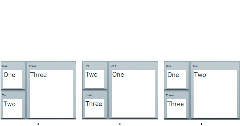
CHAPTER 24
858
Example: Controlling layout using view states
In this example, you define an application with three Panel containers and three view states, as the following
example shows:
A. Base view state B. One view state C. Two view state
To change view state, click on the Panel container that you want to display in the expanded size. For a version of
this example that adds a transition to animate the view state change, see “Defining transitions” on page 892.
<?xml version="1.0"?>
<!-- states/ThreePanel.mxml -->
<mx:Application xmlns:mx="http://www.adobe.com/2006/mxml" width="400">
<!-- Define the two view states, in addition to the base state.-->
<mx:states>
<mx:State name="One">
<mx:SetProperty target="{p1}" name="x" value="110"/>
<mx:SetProperty target="{p1}" name="y" value="0"/>
<mx:SetProperty target="{p1}" name="width" value="200"/>
<mx:SetProperty target="{p1}" name="height" value="210"/>
<mx:SetProperty target="{p2}" name="x" value="0"/>
<mx:SetProperty target="{p2}" name="y" value="0"/>
<mx:SetProperty target="{p2}" name="width" value="100"/>
<mx:SetProperty target="{p2}" name="height" value="100"/>
<mx:SetProperty target="{p3}" name="x" value="0"/>
<mx:SetProperty target="{p3}" name="y" value="110"/>
<mx:SetProperty target="{p3}" name="width" value="100"/>
<mx:SetProperty target="{p3}" name="height" value="100"/>
</mx:State>
<mx:State name="Two">
<mx:SetProperty target="{p2}" name="x" value="110"/>
<mx:SetProperty target="{p2}" name="y" value="0"/>
<mx:SetProperty target="{p2}" name="width" value="200"/>
<mx:SetProperty target="{p2}" name="height" value="210"/>
<mx:SetProperty target="{p3}" name="x" value="0"/>
<mx:SetProperty target="{p3}" name="y" value="110"/>
<mx:SetProperty target="{p3}" name="width" value="100"/>
<mx:SetProperty target="{p3}" name="height" value="100"/>
</mx:State>
</mx:states>

859ADOBE FLEX 3
Adobe Flex 3 Developer Guide
<!-- Define the Canvas container holding the three Panel containers.-->
<mx:Canvas id="pm" width="100%" height="100%">
<mx:Panel id="p1" title="One"
x="0" y="0" width="100" height="100"
click="currentState='One'">
<mx:Label fontSize="24" text="One"/>
</mx:Panel>
<mx:Panel id="p2" title="Two"
x="0" y="110" width="100" height="100"
click="currentState='Two'">
<mx:Label fontSize="24" text="Two"/>
</mx:Panel>
<mx:Panel id="p3" title="Three"
x="110" y="0" width="200" height="210"
click="currentState=''">
<mx:Label fontSize="24" text="Three"/>
</mx:Panel>
</mx:Canvas>
</mx:Application>
Comparing view states to navigator containers
View states give you one way to change the appearance of an application or component in response to a user
action. You can also use navigator containers, such as the Accordion, Tab Navigator, and ViewStack containers
when you perform changes that affect several components.
Your choice of using navigator containers or states depends on your application requirements and user-interface
design. For example, if you want to use a tabbed interface, use a TabNavigator container. You might decide to use
the Accordion container to let the user navigate through a complex form, rather than using view states to perform
this action.
When comparing view states to ViewStack containers, one thing to consider is that you cannot easily share
components between the different views of a ViewStack container. That means you will have to recreate a
component each time you change views. For example, if you want to show a search component in all views of a
View Stack container, you have to define it in each view.
When using view states, you can easily share components across multiple view states by defining the component
once, and then including it in each view state. For more information about sharing components among view
states, see “Adding and removing components by using overrides” on page 870.
For more information on navigator containers, see “Using Navigator Containers” on page 529.

CHAPTER 24
860
Additional state-based application techniques
Consider the following additional techniques for structuring and implementing a state-based applications:
•Create cascading view state definitions, where you use the basedOn property to explicitly base one view state
on another view state. Use this technique when you have multiple view states that all include some common
elements. You separate all the common elements into one view state on which you base the other view states. For
more information, see “Basing a view state on another view state” on page 863.
•Use view states that replace major sections of the display. For example, a shopping application could use view
states to control whether the main part of the display shows a product selector panel or a checkout accordion. For
an example, see “Example: Controlling layout using view states” on page 858.
•Use transitions to control the changes between view states; for example, you can add a resize effect to any
component that changes size when the view state changes. For more information on transitions, see “Using Transi-
tions” on page 889.
Create and apply view states
Creating view states
The properties, styles, event handlers, and child components that you define for an application or component
specify its base, or default, view state. Each view state specifies changes to the base view state, or to another view
state.
Consider the following when you define a view state.
•You can only define view states at the root of an application or at the root of a custom component; that is, as
a property of the <mx:Application> tag of an application file, or of the root tag of an MXML component.
•You define states by using the component’s states property, normally as an <mx:states> tag in MXML.
•You populate the states property with an Array of one or more State objects, where each State object corre-
sponds to a view state.
•You use the name property of the State object to specify its identifier. To change to that view state, you set a
component’s currentState property to the value of the name property.
The following MXML code shows this structure:
<mx:Application>
<!-- Define the view states.
The <mx:states> tag can also be a child tag of
the root tag of a custom component.
-->
<mx:states>

861ADOBE FLEX 3
Adobe Flex 3 Developer Guide
<mx:State name="State1">
<mx:AddChild/>
.
<mx:SetStyle/>
.
<mx:SetProperty/>
.
<mx:SetEventHandler/>
.
</mx:State>
<mx:State name="State2">
.
.
</mx:State>
.
.
</mx:states>
<!-- Application definition that defines the base view state. -->
.
.
</mx:Application>
View state overrides
A view state is defined by a set of changes, or overrides, to the base view state. You can define the following types
of overrides in a view state:
1Setting the following component characteristics:
Properties by using the SetProperty class. The following line disables the button1 Button control as part of a view
state:
<mx:SetProperty target="{button1}" name="enabled" value="false"/>
For more information, see “Setting overrides on component properties” on page 868.
Styles by using the SetStyle class. The following line sets the color property of the button1 Button control as part
of a view state:
<mx:SetStyle target="{button1}" name="color" value="0xAAAAAA"/>
For more information, see “Setting overrides on component styles” on page 869.
2Adding or removing child objects, by using the AddChild and RemoveChild classes. For example, the
following lines add a Button child control to the v1 VBox control as part of a view state:
<mx:AddChild relativeTo="{v1}">
<mx:Button label="New Button"/>
</mx:AddChild>
For more information, see “Adding and removing components by using overrides” on page 870.
3Setting or changing event handlers by using the SetEventHandler class. The following line sets the click
event handler of the button1 Button control as part of a view state:

CHAPTER 24
862
<mx:SetEventHandler target="{button1}" name="click"handler="newClickHandler()"/>
For more information, see “Setting overrides on event handlers” on page 877.
4Using a custom class that you define by implementing the IOverride interface. For information on creating
and using custom overrides, see “Creating your own override classes” on page 886.
Applying view states
You can set the view state of any Adobe® Flex® component, including the Application container, by using the
component’s currentState property. A component can have different view states at different times, but is in only
one view state at a time. To specify the base view state, set the currentState property to "", an empty String.
You can also change a component’s view state by calling the setCurrentState() method of the UIComponent
class. Use this method when you do not want to apply a transition that you have defined between two view states.
For more information on transitions, see “Using Transitions” on page 889.
The following example code lets the user change between two view states by clicking Button controls; button b1
sets the view state to the newButton state, and button b2 sets the view state to the base state.
<mx:Button id="b1" label="Add a Button" click="currentState='newButton';"/>
<mx:Button id="b2" label="Remove Added Button" click="currentState='';"/>
Example: Creating a simple view state
The following example shows an application with a base view state, and one additional view state named
"NewButton":
<?xml version="1.0"?>
<!-- states\StatesSimple.mxml -->
<mx:Application xmlns:mx="http://www.adobe.com/2006/mxml">
<mx:states>
<!-- Define the new view state. -->
<mx:State name="NewButton">
<!-- Add a new child control to the VBox. -->
<mx:AddChild relativeTo="{v1}">
<mx:Button id="b2" label="New Button"/>
</mx:AddChild>
<!-- Disable Button b1. -->
<mx:SetProperty target="{b1}"
name="enabled" value="false"/>
</mx:State>
</mx:states>
<mx:VBox id="v1">
<mx:Button id="b1" label="Click Me"/>
<!-- Define Button control to switch to NewButton view state. -->

863ADOBE FLEX 3
Adobe Flex 3 Developer Guide
<mx:Button label="Change to NewButton state"
click="currentState = 'NewButton';"/>
<!-- Define Button control to switch to default view state. -->
<mx:Button label="Change to base view state"
click="currentState = '';"/>
</mx:VBox>
</mx:Application>
In the preceding example, the <mx:AddChild> tag adds a child to the v1 VBox control, and the
<mx:SetProperty> tag disables the b1 Button control. A single view state can modify multiple components. The
following example changes the enabled property for two Button controls, setting one false, and the other true:
<?xml version="1.0"?>
<!-- states\StatesSimple2Buttons.mxml -->
<mx:Application xmlns:mx="http://www.adobe.com/2006/mxml">
<mx:states>
<mx:State name="NewButton">
<mx:AddChild relativeTo="{v1}">
<mx:Button id="b3" label="New Button"/>
</mx:AddChild>
<!-- Disable Button b1, enable Button b2. -->
<mx:SetProperty target="{b1}"
name="enabled" value="false"/>
<mx:SetProperty target="{b2}"
name="enabled" value="true"/>
</mx:State>
</mx:states>
<mx:VBox id="v1">
<mx:Button id="b1" label="Click Me"/>
<mx:Button id="b2" label="Click Me" enabled="false"/>
<!-- Define Button control to switch to NewButton view state. -->
<mx:Button label="Change to NewButton state"
click="currentState = 'NewButton';"/>
<!-- Define Button control to switch to default view state. -->
<mx:Button label="Change to base view state"
click="currentState = '';"/>
</mx:VBox>
</mx:Application>
Basing a view state on another view state
By default, a view state specifies a set of overrides that define the changes from the base view state to the new view
state. However, you might have a set of view states that build on each other, where the first view state defines
changes relative to the base view state, and the second view state defines changes relative to the first view state,
rather than to the base view state.

CHAPTER 24
864
To define the view state relative to another view state rather than to the base view state, use the State.basedOn
property. When Flex changes to the new view state, it restores the base state, applies any changes from the state
determined by the basedOn property, and then applies the changes defined in the new state.
In the following example, you define a NewButton view state that adds a Button control to the application, and a
NewButton2 view state based on the NewButton state that adds another Button control:
<?xml version="1.0"?>
<!-- states\StatesSimpleBasedOn.mxml -->
<mx:Application xmlns:mx="http://www.adobe.com/2006/mxml">
<mx:states>
<mx:State name="NewButton">
<mx:AddChild relativeTo="{v1}">
<mx:Button id="b2" label="New Button B2"/>
</mx:AddChild>
<mx:SetProperty target="{b1}"
name="enabled" value="false"/>
</mx:State>
<!-- Define a view state based on the NewButton state. -->
<mx:State name="NewButton2" basedOn="NewButton">
<mx:AddChild relativeTo="{v1}">
<mx:Button id="b3" label="New Button B3"/>
</mx:AddChild>
</mx:State>
</mx:states>
<mx:VBox id="v1">
<mx:Button id="b1" label="Initial Button"/>
<mx:Button label="Change to NewButton state"
click="currentState = 'NewButton';"/>
<mx:Button label="Change to New Button 2 State"
click="currentState = 'NewButton2';"/>
<mx:Button label="Change to base view state"
click="currentState = '';"/>
</mx:VBox>
</mx:Application>
Using view state events
When a component’s currentState property changes, the State object for the states being exited and entered
dispatch the following events:
enterState Dispatched when a view state is entered, but not fully applied. Dispatched by a State object after it has
been entered, and by a component after it returns to the base view state.
exitState Dispatched when a view state is about to be exited. It is dispatched by a State object before it is exited,
and by a component before it exits the base view state.

865ADOBE FLEX 3
Adobe Flex 3 Developer Guide
The component on which you modify the currentState property to cause the state change dispatches the
following events:
currentStateChanging Dispatched when the view state is about to change. It is dispatched by a component after
its currentState property changes, but before the view state changes. You can use this event to request any data
from the server required by the new view state.
currentStateChange Dispatched after the view state has completed changing. It is dispatched by a component
after its currentState property changes. You can use this event to send data back to a server indicating the user’s
current view state.
Create a view state in ActionScript
In the State class, the overrides property contains an Array of overrides that define the view state. The
overrides property is the default property for the States class, so you can omit it in MXML. However, you must
specify it in ActionScript.
1Import the classes of the mx.states package.
2Declare a State variable.
3Create a function that does the following:
aInstantiate a new State object.
bAssign the object to the variable you defined in Step 2.
cSet the state name.
dDeclare variables for the override class objects and assign them to new instances of the classes (such as
SetProperty).
eSpecify the properties of the override instances.
fAdd the override instances to the State object’s overrides array.
gAdd the state to the states array.
4Call the function as part of an application or custom component initialization event handler, typically in
response to the initialize event.
The following example uses ActionScript to create the Login Form that you created in MXML in the section
“Example: Login form application” on page 856:
<?xml version="1.0"?>
<!-- states\StatesAS.mxml -->
<mx:Application xmlns:mx="http://www.adobe.com/2006/mxml"
verticalAlign="middle"
initialize="createState();">
<mx:Script>
<
CHAPTER 24
866
import mx.states.*;
import mx.controls.Button;
// Variables for the ActionScript-defined view state.
private var newState:State;
private var changePropPanel:SetProperty;
private var changePropButton:SetProperty;
private var newFormItem:AddChild;
private var newLinkButton:AddChild;
private var oldLinkButton:RemoveChild;
// Variables for the new components.
private var fi:FormItem;
private var ti:TextInput;
private var lb:LinkButton;
// Initialization method to
// create a view state in ActionScript.
private function createState():void {
// Configure the AddChild class for the TextInput.
fi = new FormItem();
fi.label = "Confirm";
ti = new TextInput();
fi.addChild(ti);
newFormItem = new AddChild();
newFormItem.relativeTo = loginForm;
newFormItem.target = fi;
// Configure the Panel SetProperty class.
changePropPanel = new SetProperty();
changePropPanel.name ="title";
changePropPanel.value = "Register";
changePropPanel.target = loginPanel;
// Configure the Button SetProperty class.
changePropButton = new SetProperty();
changePropButton.name ="label";
changePropButton.value = "Register";
changePropButton.target = loginButton;
// Configure the RemoveChild class.
oldLinkButton = new RemoveChild();
oldLinkButton.target = registerLink;
// Configure the AddChild class for the LinkButton.
lb = new LinkButton();
lb.label = "Return to Login";
lb.addEventListener('click', newLBClick);
newLinkButton = new AddChild();
newLinkButton.relativeTo = spacer1;
newLinkButton.position = "before";
newLinkButton.target = lb;
// Create an instance of the State class and
// populate it with the view state overrides.
newState = new State();
newState.name = "Register";

867ADOBE FLEX 3
Adobe Flex 3 Developer Guide
newState.overrides.push(newFormItem);
newState.overrides.push(changePropPanel);
newState.overrides.push(changePropButton);
newState.overrides.push(oldLinkButton);
newState.overrides.push(newLinkButton);
// Add the view state to the states Array.
states = new Array();
states.push(newState);
}
private function newLBClick(event:Event):void {
currentState="";
}
]]>
</mx:Script>
<mx:Panel id="loginPanel"
title="Login"
horizontalScrollPolicy="off"
verticalScrollPolicy="off">
<mx:Form id="loginForm">
<mx:FormItem label="Username:">
<mx:TextInput/>
</mx:FormItem>
<mx:FormItem label="Password:">
<mx:TextInput/>
</mx:FormItem>
</mx:Form>
<mx:ControlBar>
<!-- Use the LinkButton to change to the Register view state.-->
<mx:LinkButton id="registerLink"
label="Need to Register?"
click="currentState='Register'"/>
<mx:Spacer width="100%" id="spacer1"/>
<mx:Button label="Login" id="loginButton"/>
</mx:ControlBar>
</mx:Panel>
</mx:Application>
Defining view state overrides
When you define a view state, you specify the changes, or overrides, from the base state to the new view state, or
from any other view state to the new view state. As part of the view state, you can define the following overrides:
•Set the value of object properties
•Set the value of component styles

CHAPTER 24
868
•Add or remove components
•Change the event handler assigned to an event
If you require overrides in addition to the ones supplied by Flex, you can define your own custom override class.
For more information, see “Creating your own override classes” on page 886.
Setting overrides on component properties
You use the SetProperty class to set a property value that is in effect during a specific view state. For example, the
following code sets properties of a Panel container and of a Button control when you switch to the Register view
state:
<?xml version="1.0"?>
<!-- states\StatesSetProp.mxml -->
<mx:Application xmlns:mx="http://www.adobe.com/2006/mxml">
<mx:states>
<mx:State name="Register">
<mx:SetProperty
target="{loginPanel}"
name="title" value="Register"/>
<mx:SetProperty
target="{loginButton}"
name="label" value="Register"/>
</mx:State>
</mx:states>
<mx:Panel id="loginPanel"
title="Login"
horizontalScrollPolicy="off"
verticalScrollPolicy="off">
<mx:Form id="loginForm">
<mx:Button label="Login" id="loginButton"/>
</mx:Form>
<mx:ControlBar width="100%">
<mx:Button label="Change State"
click="currentState =
currentState=='Register' ? '':'Register';"/>
</mx:ControlBar>
</mx:Panel>
</mx:Application>
You can use data binding to specify information to the value property, as the following example shows:
<?xml version="1.0"?>
<!-- states\StatesSetProp.mxml -->
<mx:Application xmlns:mx="http://www.adobe.com/2006/mxml">
<mx:Script>
<![CDATA[
// Define a variable in ActionScript.
[Bindable]

869ADOBE FLEX 3
Adobe Flex 3 Developer Guide
public var registerValue:String="Register";
]]>
</mx:Script>
<mx:states>
<mx:State name="Register">
<mx:SetProperty
target="{loginPanel}"
name="title" value="{registerValue}"/>
<mx:SetProperty
target="{loginButton}"
name="label" value="{registerValue}"/>
</mx:State>
</mx:states>
<mx:Panel id="loginPanel"
title="Login"
horizontalScrollPolicy="off"
verticalScrollPolicy="off">
<mx:Form id="loginForm">
<mx:Button label="Login" id="loginButton"/>
</mx:Form>
<mx:ControlBar width="100%">
<mx:Button label="Change State"
click="currentState =
currentState=='Register' ? '':'Register';"/>
</mx:ControlBar>
</mx:Panel>
</mx:Application>
When you switch to the Register state, the value property of the SetProperty class is determined by the current
value of the registerValue variable. However, this binding occurs only when you switch to the Register view state;
if you modify the value of the registerValue variable after switching to the Register view state, the title property
of the target component is not updated.
Setting overrides on component styles
You use the SetStyle class to set a style property value that is in effect only during a specific view state. In the
following example, you change the background color of the Panel container, and the text color of the Button
control as part of changing to the Register view state:
<?xml version="1.0"?>
<!-- states\StatesSetStyle.mxml -->
<mx:Application xmlns:mx="http://www.adobe.com/2006/mxml">
<mx:states>
<mx:State name="Register">
<mx:SetProperty
target="{loginPanel}"
name="title" value="Register"/>
<mx:SetStyle
target="{loginPanel}"

CHAPTER 24
870
name="backgroundColor" value="0x00FFFF"/>
<mx:SetProperty
target="{loginButton}"
name="label" value="Register"/>
<mx:SetStyle
target="{loginButton}"
name="color" value="0xFFFF00"/>
</mx:State>
</mx:states>
<mx:Panel id="loginPanel"
title="Login"
horizontalScrollPolicy="off"
verticalScrollPolicy="off">
<mx:Form id="loginForm">
<mx:Button label="Login" id="loginButton"/>
</mx:Form>
<mx:ControlBar width="100%">
<mx:Button label="Change State"
click="currentState =
currentState=='Register' ? '':'Register';"/>
</mx:ControlBar>
</mx:Panel>
</mx:Application>
Adding and removing components by using overrides
You use the AddChild and RemoveChild classes to add and remove components as part of a switch of view state.
When you remove a component by using the RemoveChild class, you remove the component from the appli-
cation’s display list, which means that it no longer appears on the screen. Even though the component is no longer
visible, the component still exists and you can access it from within your application. For more information, see
“Removing a child component” on page 871.
When you add a component as part of a change of view state by using the AddChild class, you can either create
the component before the first switch to the view state, or create it at the time of the first switch. If you create the
component before the first switch, you can access the component from within your application even though you
have not yet switched view states. If you create the component when you perform the first switch to the view state,
you cannot access it until you perform that first switch.
Regardless of when you create a component by using the AddChild class, the component remains in memory after
you switch out of the view state that creates it. Therefore, after the first switch to a view state, you can always access
the component even if that view state is no longer the current view state. For more information, see “Controlling
when to create added children” on page 872.

871ADOBE FLEX 3
Adobe Flex 3 Developer Guide
Removing a child component
You use the RemoveChild class to remove a child component from a container as part of a change of view state.
When you remove a child, you can use the target property to specify the component to remove. Removing a
child does not delete it, so you can redisplay it later without recreating it.
For an example using the RemoveChild class, see “Example: Login form application” on page 856.
Adding a child component
You use the AddChild class to add a child component to a container as part of a change of view state. When you
add a child, you can use the relativeTo property to specify the container relative to which you are placing the
new child; the default value is the application or custom component that defines the view state. For example, to
add a Button control to an HBox container, you specify the container as the value of the relativeTo property.
You can use the position property to specify the child’s location within the container. Valid values are before,
after, firstChild, and lastChild. The default value is lastChild.
The following example adds a Button control as the first child of an HBox container named h1:
<?xml version="1.0"?>
<!-- states\StatesAddRelative.mxml -->
<mx:Application xmlns:mx="http://www.adobe.com/2006/mxml">
<mx:states>
<mx:State name="NewButton">
<mx:AddChild relativeTo="{h1}" position="firstChild">
<mx:Button id="buttonNew" label="New Button"/>
</mx:AddChild>
</mx:State>
</mx:states>
<mx:HBox id="h1">
<mx:Button label="Change State"
click=
"currentState = currentState=='NewButton' ? '':'NewButton';"/>
</mx:HBox>
</mx:Application>
You can add multiple child components, or a container that contains multiple child components, as the following
example shows:
<?xml version="1.0"?>
<!-- states\StatesAddRelativeMultiple.mxml -->
<mx:Application xmlns:mx="http://www.adobe.com/2006/mxml">
<mx:states>
<mx:State name="NewVBox">
<mx:AddChild relativeTo="{v1}">
<mx:VBox id="v2">
<mx:Button id="buttonNew1" label="New Button"/>
<mx:Button id="buttonNew2" label="New Button"/>
<mx:Button id="buttonNew3" label="New Button"/>
</mx:VBox>

CHAPTER 24
872
</mx:AddChild>
</mx:State>
</mx:states>
<mx:VBox id="v1">
<mx:Button label="Change State"
click=
"currentState = currentState=='NewVBox' ? '':'NewVBox';"/>
</mx:VBox>
</mx:Application>
In the previous example, you use a single <mx:AddChild> tag to add the VBox container and its children. The
following example performs the same action, but uses multiple <mx:AddChild> tags:
<?xml version="1.0"?>
<!-- states\StatesAddRelativeMultipleAlt.mxml -->
<mx:Application xmlns:mx="http://www.adobe.com/2006/mxml">
<mx:states>
<mx:State name="NewVBox">
<mx:AddChild relativeTo="{v1}">
<mx:VBox id="v2"/>
</mx:AddChild>
<mx:AddChild relativeTo="{v2}">
<mx:Button id="buttonNew1" label="New Button"/>
</mx:AddChild>
<mx:AddChild relativeTo="{v2}">
<mx:Button id="buttonNew2" label="New Button"/>
</mx:AddChild>
<mx:AddChild relativeTo="{v2}">
<mx:Button id="buttonNew3" label="New Button"/>
</mx:AddChild>
</mx:State>
</mx:states>
<mx:VBox id="v1">
<mx:Button label="Change State"
click=
"currentState = currentState=='NewVBox' ? '':'NewVBox';"/>
</mx:VBox>
</mx:Application>
Controlling when to create added children
By default Flex creates container children when they are first required as part of a change of view state. However,
if a child requires a long time to create, users might see a delay when the view state changes. Therefore, you can
choose to create the child before the state changes to improve your application’s apparent speed and respon-
siveness.
Flex lets you choose among three ways of creating a child component added by a view state:
•Automatically create it when it is first needed by a change of view state.
•Automatically create it when the application first loads.
•Explicitly create the child when you want it.

873ADOBE FLEX 3
Adobe Flex 3 Developer Guide
The specification of when the child is created is called its creation policy. For more general information on creation
policies and controlling how children are created, see “Improving Startup Performance” on page 91 in Building
and Deploying Adobe Flex 3 Applications.
The AddChild class has two mutually exclusive properties that you use to specify the child to add and the child’s
creation policy:
target Always creates the child when the applications starts. You cannot change the creation policy when using
this property. When you use this property, you can access the component before the first change to the view state
that defines it.
targetFactory Lets you control the creation policy of the child.
About the target property
The target property specifies the component to add. When you use this property, Flex creates the child when the
applications starts. You cannot use any other creation policy with this property.
The child does not dispatch the creationComplete event until it is added to a container. Therefore, in the
previous example, the Button control does not dispatch the creationComplete event until you change state. If
the AddChild class defines both the Button and a container, such as a Canvas container, then the Button control
dispatches the creationComplete event at startup.
One use of the target property is to modify components that already exist in your application. For example, if
you want to move a component from one parent container to another, you use the RemoveChild class to remove
the child from its parent container, and then use the AddChild class to add the component to a different container.
Since the component already exists in the application, you do not have to worry about its creation policy, as the
following example shows to move a Button control from one VBox container to another:
<?xml version="1.0"?>
<!-- states\StatesAddRemove.mxml -->
<mx:Application xmlns:mx="http://www.adobe.com/2006/mxml">
<mx:states>
<mx:State name="NewParent">
<mx:RemoveChild target="{button1}"/>
<mx:AddChild target="{button1}" relativeTo="{v2}"/>
</mx:State>
</mx:states>
<mx:VBox id="v1" borderStyle="solid">
<mx:Label text = "VBox v1"/>
<mx:Button id="button1" label="Click Me"/>
</mx:VBox>
<mx:VBox id="v2" borderStyle="solid">
<mx:Label text = "VBox v2"/>
<mx:Button label="Change Parent"
click="currentState =
currentState=='NewParent' ? '':'NewParent';"/>

CHAPTER 24
874
</mx:VBox>
</mx:Application>
About the targetFactory property
The targetFactory property is the default property of the AddChild class, so if you specify the child by using an
MXML tag in the <mx:AddChild> tag body, as shown in the following code example, Flex automatically uses the
targetFactory property and creates the required factory class:
<mx:AddChild relativeTo="{v1}">
<mx:Button id="b0" label="New Button"/>
</mx:AddChild>
Because targetFactory property is the default property of the AddChild class, the previous example is equiv-
alent to the following:
<mx:AddChild relativeTo="{v1}">
<mx:targetFactory>
<mx:Button id="b0" label="New Button"/>
</mx:targetFactory>
</mx:AddChild>
You can specify either of the following items to the targetFactory property:
•A Flex component (that is, any class that is a subclass of the UIComponent class), such as the Button control.
If you use a Flex component, the Flex compiler automatically wraps the component in a factory class.
•A factory class that implements the IDeferredInstance interface and creates the child instance or instances.
“Example: Adding a Button control using the IDeferredInstance interface” on page 876.
When you use the targetFactory property to specify the child, you can optionally use the creationPolicy
property to specify the creation policy. The creationPolicy property supports the following values:
auto Creates the child instance when it is first added by a change to the view state. This is the default value. In
ActionScript, specify this property by using the mx.core.ContainerCreationPolicy.AUTO constant.
all Creates the child instance at application startup. In ActionScript, specify this property by using the
ContainerCreationPolicy.ALL constant. This is equivelant to using the target property.
none Requires your application to call the AddChild.createInstance() method to create an instance of the
child. In ActionScript, specify this property by using the mx.core.ContainerCreationPolicy.NONE constant.
You can call the createInstance() method with any creation policy, but if the child has already been created, it
does nothing. For example, if you have a creationPolicy value of auto, but need to access a child before the
view state is entered, you can call the createInstance() method to ensure that the child has been created.
The following example adds a child and has Flex create a child when the application first starts. The application
does not display the child until the view state with the AddChild tag is activated.
<mx:AddChild relativeTo="{v1}" position="lastChild" creationPolicy="all">
<mx:Button id="b0" label="New Button"/>
</mx:AddChild>

875ADOBE FLEX 3
Adobe Flex 3 Developer Guide
Example: Using different creation policies
The following example lets you change between a base view state, a view state that adds a Button control created
at application startup, and a view state that adds a Button control created using the
AddChild.createInstance() method:
<?xml version="1.0"?>
<!-- states\StatesCreationPolicy.mxml -->
<mx:Application xmlns:mx="http://www.adobe.com/2006/mxml"
creationComplete="initButton();">
<mx:Script>
<![CDATA[
// Because the cpAll view state creates the Button control
// at application startup, you can access the control to
// set the label before the first switch
// to the cpAll view state.
public function initButton():void {
newButton.label="cpAll Button";
}
]]>
</mx:Script>
<mx:states>
<!-- Create the Button control at application startup. -->
<mx:State name="cpAll">
<mx:AddChild relativeTo="{myPanel}" creationPolicy="all">
<mx:Button id="newButton"/>
</mx:AddChild>
</mx:State>
<!-- Create the Button control when you want to create it. -->
<mx:State name="cpNone">
<mx:AddChild id="noCP"
relativeTo="{myPanel}" creationPolicy="none">
<mx:Button label="cpNone button"/>
</mx:AddChild>
</mx:State>
</mx:states>
<mx:Panel id="myPanel"
title="Static and dynamic states"
width="300" height="150">
<!-- Change to the cpAll view state. -->
<mx:Button label="Change to cpAll state"
click="currentState = currentState == 'cpAll' ? '' : 'cpAll';"/>
<!-- Create the Button control for the noCP state that
uses creationPolicy=none.
If you do not click this button before changing to the
cpNone view state, the view state does nothing
because the Button control does not exist. -->
<mx:Button label="Explicitly create a button control"
click="noCP.createInstance();"/>

CHAPTER 24
876
<!-- Change to the cpNone view state. -->
<mx:Button label="Change to noCP state"
click="currentState = currentState == 'cpNone' ? '' : 'cpNone';"/>
</mx:Panel>
</mx:Application>
Example: Adding a Button control using the IDeferredInstance interface
The following example uses DeferredInstanceFromFunction, a subclass of DeferredInstance, to create the child
instance for the AddChild class:
<?xml version="1.0"?>
<!-- states\StatesDefInstan.mxml -->
<mx:Application xmlns:mx="http://www.adobe.com/2006/mxml">
<mx:Script>
<![CDATA[
import mx.core.*;
import mx.states.*;
[Bindable]
public var defInst:DeferredInstanceFromFunction =
new DeferredInstanceFromFunction(createMyButton);
// Function to create a new Button control.
public function createMyButton():Object {
var newButton:Button = new Button();
newButton.label = "New Dynamic Button";
return newButton;
}
]]>
</mx:Script>
<mx:states>
<mx:State name="deferredButton">
<mx:AddChild relativeTo="{myPanel}" targetFactory="{defInst}"/>
</mx:State>
</mx:states>
<mx:Panel id="myPanel"
title="Static and dynamic states"
width="300" height="150">
<mx:Button id="myButton2"
label="Toggle Deferred Button"
click="currentState =
currentState == 'deferredButton' ? '' : 'deferredButton';"/>
</mx:Panel>
</mx:Application>

877ADOBE FLEX 3
Adobe Flex 3 Developer Guide
Setting overrides on event handlers
Flex lets you define state-specific event handlers in your application. A state-specific event handler is only active
during a specific view state. For example, you might define a Button control that uses one event handler in the
base view state, but uses a different event handler when you change view state.
You can set state-specific event handlers in either of two ways:
•In ActionScript or MXML, use the handlerFunction property of the SetEventHandler class to specify the
event handler.
•In MXML use the handler event of the SetEventHandler class to specify the event handler.
When using the SetEventHandler class, any existing event handler that is defined in MXML is removed from the
target component. The following example defines a view state that adds an event handler to a Button control:
<mx:states>
<mx:State name="State1">
<mx:SetEventHandler target="{b1}"
name="click" handler="trace('goodbye');"/>
</mx:states>
...
<mx:Button id="b1" click="trace('hello');"/>
In this example, the trace('hello'); handler is removed when the trace('goodbye'); handler is added as
part of the State 1 view state. However, if you add an event handler in ActionScript by calling the
addEventListener() method, the event handler is not removed by the SetEventHandler class.
Using the handlerFunction property
You can use the handlerFunction property in ActionScript or MXML. It lets you specify an event handler that
must take a single argument of type flash.events.Event. The following example code sets an event handler as part
of a view state:
<mx:SetEventHandler target="{myButton1}"
name="click" handlerFunction="handler2"/>
You use the SetEventHandler.name property to specify the event name for the associated event handler. Notice
that you only specify the name of the event handler to the handlerFunction property because that event handler
is required to take a single argument of type flash.events.Event. Therefore, the function handler2 must have the
following declaration:
private function handler2(event:Event):void
{
...
}
Using the handler event type
The handler event has the following advantages over the handlerFunction property:

CHAPTER 24
878
•You can specify ActionScript code directly in the <mx:SetEventHandler> tag, without having to define a
separate function for the event handler. This technique is useful for very simple event handlers, such as when you
want to pop up an Alert dialog box.
•The event handler can take multiple arguments, of any type. If you use the handlerFunction property, the
handler function can take only an Event object as an argument.
You can use the handler event in MXML only.
You use the SetEventHandler.name property to specify the event name for the associated event handler. The
following example shows how to use the handler property to specify the event handler code directly in the
<mx:SetEventHandler> tag for the click event of a Button control:
<mx:SetEventHandler target="{myButton1}"
name="click" handler="Alert.show(’Hello World.’)"/>
The following example shows how you specify a handler function that takes two arguments; the Event object and
a user ID String variable:
<mx:SetEventHandler target="{myButton1}"
name="click" handler="myAlert(event, userID)"/>
The function myAlert must have the following declaration:
private function myAlert(eventObj:Event, idString:String):void
{...
}
Example: Setting event handlers
The following example creates the base view state and three additional view states. Each state uses the
SetEventHandler class to define a different event handler for the click event for the Button control named b1:
<?xml version="1.0"?>
<!-- states\StatesEventHandlersSimple.mxml -->
<mx:Application xmlns:mx="http://www.adobe.com/2006/mxml">
<mx:Script>
<
879ADOBE FLEX 3
Adobe Flex 3 Developer Guide
private function handlerState3(theString:String):void {
ta1.text =
"Use the handler property to specify the function" +
"\nArgument String: " + theString;
}
]]>
</mx:Script>
<mx:states>
<mx:State name="State1">
<mx:SetEventHandler target="{b1}"
name="click"
handlerFunction="handlerState1"/>
<mx:SetProperty target="{b1}"
name="label" value="Click Me: State 1"/>
</mx:State>
<mx:State name="State2">
<mx:SetEventHandler target="{b1}"
name="click"
handler="ta1.text='Specify an inline event listener';"/>
<mx:SetProperty target="{b1}"
name="label" value="Click Me: State 2"/>
</mx:State>
<mx:State name="State3">
<mx:SetEventHandler target="{b1}"
name="click"
handler="handlerState3('Event listener arg');"/>
<mx:SetProperty target="{b1}"
name="label" value="Click Me: State 3"/>
</mx:State>
</mx:states>
<mx:Button id="b1"
label="Click Me: Base State"
click="handlerBase();"/>
<mx:TextArea id="ta1" height="100" width ="50%"/>
<mx:VBox>
<mx:Button
label="Set state 1, use handlerFunction property"
click="currentState='State1';"/>
<mx:Button
label="Set state 2, specify inline handler"
click="currentState='State2';"/>
<mx:Button
label="Set state 3, specify handler function"
click="currentState='State3';"/>
<mx:Button
label="Set base state"
click="currentState='';"/>
</mx:VBox>
</mx:Application>

CHAPTER 24
880
Defining view states in custom components
If one or more view states apply to a single component or set of components, you define a custom component that
comprises this component or components, and specify the view states in the component definition, rather than at
the Application tag level. For example, if a view state adds a Button control to an HBox container, consider making
the HBox a custom component and defining a state in the component that adds the button. You should consider
doing this particularly if you have multiple states that do nothing but modify the HBox container.
Similarly, if a custom component has multiple view states, define the view states in the component code, not in
the main application. For example, if a custom TitleWindow component has a collapsed view state and a expanded
view state, you should define these view states in the panel MXML component, not in the main application file.
This way, you segregate the view state definitions into the specific components to which they apply. An item
renderer is one example of good use of a multiple view state MXML component.
The following example shows a custom component for a TitleWindow component that has two view states,
collapsed and expanded:
<?xml version="1.0"?>
<mx:TitleWindow xmlns:mx="http://www.adobe.com/2006/mxml"
close="checkCollapse();" headerHeight="40" showCloseButton="true">
<mx:Script>
<![CDATA[
// Skins for the close button when the
// TitleWindow container is collapsed.
[Embed(source="closeButtonUpSkin.jpg")]
[Bindable]
public var closeBUp:Class;
[Embed(source="closeButtonDownSkin.jpg")]
[Bindable]
public var closeBDown:Class;
[Embed(source="closeButtonOverSkin.jpg")]
[Bindable]
public var closeBOver:Class;
private function checkCollapse():void {
currentState =
currentState == "collapsed" ? "" : "collapsed";
}
]]>
</mx:Script>
<mx:states>
<mx:State name="collapsed">
<mx:SetProperty
name="height"
value="{getStyle('headerHeight')}"/>
<mx:SetStyle

881ADOBE FLEX 3
Adobe Flex 3 Developer Guide
name="closeButtonUpSkin"
value="{closeBUp}"/>
<mx:SetStyle
name="closeButtonDownSkin"
value="{closeBDown}"/>
<mx:SetStyle
name="closeButtonOverSkin"
value="{closeBOver}"/>
</mx:State>
</mx:states>
</mx:TitleWindow>
This example replaces the default close icon for a TitleWindow when the component is in the collapsed state.
You can then use this component in an application, as the following example shows:
<?xml version="1.0"?>
<!-- states\StatesTitleWindowMain.mxml -->
<mx:Application xmlns:mx="http://www.adobe.com/2006/mxml"
xmlns:MyComp="myComponents.*">
<MyComp:StateTitleWindow id="myP" title="My Application">
<mx:HBox width="100%">
<mx:Button label="Click Me"/>
<mx:TextArea/>
</mx:HBox>
<mx:ControlBar width="100%">
<mx:Label text="Quantity"/>
<mx:NumericStepper/>
<!-- Use Spacer to push Button control to the right. -->
<mx:Spacer width="100%"/>
<mx:Button label="Add to Cart"/>
</mx:ControlBar>
</MyComp:StateTitleWindow>
</mx:Application>
Using view states with a custom item renderer
A shopping application that displays multiple items on a page might have a custom thumbnail item renderer with
two view states. In the base view state, the item cell might look the following image:

CHAPTER 24
882
When the user rolls the mouse over the item, the view state changes: the thumbnail no longer has the availability
and rating information, but now has buttons that let the user get more information or add the item to the wish list
or cart. In the new state, the cell also has a border and a drop shadow, as the following image shows:
In this example, the application item renderer’s two view states have different child components and have different
component styles. The summary state, for example, includes an availability label and a star rating image, and has
no border. The rolled-over state replaces the label and rating components with three buttons, and has an outset
border.
For information on item renderers, see “Using Item Renderers and Item Editors” on page 779.
Example: Using view states with a custom item renderer
The following code shows an application that uses a custom item renderer to display catalog items. When the user
moves the mouse over an item, the item renderer changes to a state where the picture is slightly enlarged, the price
appears in the cell, and the application’s text box shows a message about the item. All changes are made by the item
renderer’s state, including the change in the parent application.
<?xml version="1.0"?>
<!-- states\StatesRendererMain.mxml -->
<mx:Application xmlns:mx="http://www.adobe.com/2006/mxml"
width="450" height="500">
<mx:Script>
<![CDATA[
import mx.controls.listClasses.*;
import mx.controls.Image;
import mx.collections.ArrayCollection;
//The data to display in the TileList control.
[Bindable]
public var catArray:ArrayCollection = new ArrayCollection([
{ name: "Nokia 3595",
data: "1",
price: "129.99",
image: "../assets/Nokia_3595.gif",
description: "Kids love it." },
{ name: "Nokia 3650",
data: "1",
price: "99.99",
image: "../assets/Nokia_3650.gif",

883ADOBE FLEX 3
Adobe Flex 3 Developer Guide
description: "Impress your friends." },
{ name: "Nokia 6010",
data: "1",
price: "49.99",
image: "../assets/Nokia_6010.gif",
description: "Good for everyone." },
{ name: "Nokia 6360",
data: "1",
price: "19.99",
image: "../assets/Nokia_6360.gif",
description: "Great deal!"},
]);
]]>
</mx:Script>
<mx:TileList id="myList"
dataProvider="{catArray}"
columnWidth="150"
rowHeight="150"
width="310"
height="310"
itemRenderer="myComponents.ImageComp"/>
<!-- The item renderer fills in the TextArea control. -->
<mx:HBox>
<mx:Label text="Description"/>
<mx:TextArea id="t1" width="200" height="30" wordWrap="true"/>
</mx:HBox>
</mx:Application>
The following code defines the item renderer, in the file ImageComp.mxml:
<?xml version="1.0" encoding="utf-8"?>
<!-- states\myComponents\ImageComp.mxml
When the mouse pointer goes over a cell,
this component changes its state to showdesc.
When the mouse pointer goes out of the cell,
the component returns to the base state. -->
<mx:VBox xmlns:mx="http://www.adobe.com/2006/mxml"
horizontalAlign="center"
verticalAlign="top"
mouseOver="currentState='showdesc'"
mouseOut="currentState=''">
<!-- In the base state, display the image and the label. -->
<mx:Image id="img1"
source="{data.image}"
width="75"
height="75"/>
<mx:Label text="{data.name}"/>
<mx:states>
<mx:State name="showdesc">
<!-- In the showdesc state, add the price, make the image bigger,
and put the description in the parent application's TextArea.-->
<mx:AddChild>
<mx:Text text="{data.price}"/>

CHAPTER 24
884
</mx:AddChild>
<mx:SetProperty target="{img1}" name="width" value="85"/>
<mx:SetProperty target="{img1}" name="height" value="85"/>
<mx:SetProperty target="{parentApplication.t1}" name="text"
value="{data.description}"/>
</mx:State>
</mx:states>
</mx:VBox>
Using view states with history management
The Flex History Manager lets users navigate through a Flex application by using the web browser’s back and
forward navigation commands. The History Manager can track when the application enters a state so that users
can use the browser to navigate between states, such as states that correspond to different stages in an application
process.
To enable history management to track application states, your application must do the following:
•Implement the IHistoryState interface by defining loadState and saveState methods.
•Register the application with the History Manager.
•Each time the state changes, call the HistoryManager.save method.
The following code shows how you can code a search interface so that the History Manager keeps track of your
search. For more information on history management, including another example of tracking states, see “Using
the HistoryManager” on page 1088.
<?xml version="1.0"?>
<!-- states\StatesHistoryManager.mxml -->
<mx:Application xmlns:mx="http://www.adobe.com/2006/mxml"
implements="mx.managers.IHistoryManagerClient"
creationComplete="initApp();">
<mx:Script>
<
885ADOBE FLEX 3
Adobe Flex 3 Developer Guide
// Save the current state and the searchString value.
public function saveState():Object {
var state:Object = {};
state.currentState = currentState;
state.searchString = searchString;
return state;
}
/////////////////////////
// App-specific scripts
/////////////////////////
// The search string value.
[Bindable]
public var searchString:String;
// Register the application with the history manager
// when the application is created.
public function initApp():void {
HistoryManager.register(this);
}
// The method for doing the search.
// For the sake of simplicity it doesn't do any searching.
// It does change the state to display the results box,
// and save the new state in the history manager.
public function doSearch():void {
currentState = "results";
searchString = searchInput.text;
HistoryManager.save();
}
// Method to revert the state to the base state.
// Saves the new state in the history manager.
public function reset():void {
currentState = '';
searchInput.text = "";
searchString = "";
HistoryManager.save();
}
]]>
</mx:Script>
<mx:states>
<!-- The state for displaying the search results -->
<mx:State name="results">
<mx:SetProperty target="{p}" name="width" value="100%" />
<mx:SetProperty target="{p}" name="height" value="100%" />
<mx:SetProperty target="{p}" name="title" value="Results" />
<mx:AddChild relativeTo="{searchFields}">
<mx:Button label="Reset" click="reset()" />
</mx:AddChild>
<mx:AddChild relativeTo="{p}">
<mx:Label text="Search results for {searchString}" />
</mx:AddChild>
</mx:State>
</mx:states>
<!-- In the base state, just show a panel
with a search text input and button. -->
CHAPTER 24
886
<mx:Panel id="p" title="Search" resizeEffect="Resize">
<mx:HBox id="searchFields" defaultButton="{b}">
<mx:TextInput id="searchInput" />
<mx:Button id="b" label="Go" click="doSearch();" />
</mx:HBox>
</mx:Panel>
</mx:Application>
Creating your own override classes
Flex lets you create a view state by specifying overrides to add or remove child components, to set style and
property values, or to set state-specific event handlers. However, your application may require you to define your
own overrides in addition to the ones supplied by Flex.
You can define custom overrides by creating a class that implements the IOverride interface. You can then use
your override class in the same way that you use AddChild, RemoveChild, SetProperty, and the other override
classes. For example, you can create a class that adds a bitmap filter, such as a filter that blurs an object.
The IOverride interface contains the following methods:
The following example shows an AddBlur override class that applies the Flash BlurFilter class to blur the target
component.
package myOverrides
{
import flash.display.*;
import flash.filters.*;
import mx.core.*;
import mx.states.*;
/* State override that adds a Blur effect to a component. */
public class AddBlur implements IOverride
{
/* Constructor. */
public function AddBlur(
target:DisplayObject = null)
{
this.target = target;
}
Method Description
initialize() Initializes the override.
apply() Saves the original value and applies the override.
remove() Restores the original value.

887ADOBE FLEX 3
Adobe Flex 3 Developer Guide
/* The object to blur. */
public var target:DisplayObject;
/* The initialize() method is empty for this example. */
public function initialize():void {
}
/* The apply() method adds a BlurFilter to the filters array. */
public function apply(parent:UIComponent):void {
var obj:DisplayObject = target ? target : parent;
var filters:Array = obj.filters;
filters.push(new BlurFilter());
obj.filters = filters;
}
/* The remove() method removes the BlurFilter
from the filters array. */
public function remove(parent:UIComponent):void {
var obj:DisplayObject = target ? target : parent;
var filters:Array = obj.filters;
filters.pop();
obj.filters = filters;
}
}
}
You can then use your custom override class in an application, as the following example shows:
<?xml version="1.0"?>
<!-- states\AddBlurApp.mxml -->
<mx:Application xmlns:mx="http://www.adobe.com/2006/mxml"
xmlns:myOverride="myOverrides.*">
<mx:states>
<mx:State name="State1">
<myOverride:AddBlur target="{b1}"/>
</mx:State>
</mx:states>
<mx:Button id="b1"
label="Click Me: Base State"/>
<mx:Button
label="Set State 1"
click="currentState='State1';"/>
<mx:Button
label="Set Base State"
click="currentState='';"/>
</mx:Application>

CHAPTER 24
888

889
Chapter 25: Using Transitions
View states let you change the appearance of an application, typically in response to a user action. Transitions
define how a change of view state looks as it occurs on the screen. You define a transition by using the effect
classes, in combination with several effects designed explicitly for handling transitions.
To use transitions, you should be familiar with how effects and view states work. For more information on effects,
see “Using Behaviors” on page 545. For more information on view states, see “Using View States” on page 853.
Topics
About transitions . . . . . . . . . . . . . . . . . . . . . . . . . . . . . . . . . . . . . . . . . . . . . . . . . . . . . . . . . . . . . . . . . . . . . . . . . . . . . . . 889
Defining transitions . . . . . . . . . . . . . . . . . . . . . . . . . . . . . . . . . . . . . . . . . . . . . . . . . . . . . . . . . . . . . . . . . . . . . . . . . . . . .892
Handling events when using transitions . . . . . . . . . . . . . . . . . . . . . . . . . . . . . . . . . . . . . . . . . . . . . . . . . . . . . . . . . . . .898
Using action effects in a transition. . . . . . . . . . . . . . . . . . . . . . . . . . . . . . . . . . . . . . . . . . . . . . . . . . . . . . . . . . . . . . . . .899
Filtering effects . . . . . . . . . . . . . . . . . . . . . . . . . . . . . . . . . . . . . . . . . . . . . . . . . . . . . . . . . . . . . . . . . . . . . . . . . . . . . . . . . 902
Transition tips and troubleshooting. . . . . . . . . . . . . . . . . . . . . . . . . . . . . . . . . . . . . . . . . . . . . . . . . . . . . . . . . . . . . . . .913
About transitions
View states let you vary the content and appearance of an application, typically in response to a user action. To use
view states, you define the base view state of an application, and one or more additional view states.
When you change view states, Adobe® Flex® performs all the visual changes to the application at the same time.
That means when you resize, move, or in some other way alter the appearance of the application, the application
appears to jump from one view state to the next.
Instead, you might want to define a smooth visual change from one view state to the next, in which the change
occurs over a period of time. A transition is one or more effects grouped together to play when a view state change
occurs.
For example, your application defines a form that in its base view state shows only a few fields, but in an expanded
view state shows additional fields. Rather than jumping from the base version of the form to the expanded version,
you define a Flex transition that uses the Resize effect to expand the form, and then uses the Fade effect to slowly
make the new form elements appear on the screen.
When a user changes back to the base version of the form, your transition uses a Fade effect to make the fields of
the expanded form disappear, and then uses the Resize effect to slowly shrink the form back to its original size.

890 CHAPTER 25
By using a transition, you can apply one or more effects to the form, to the fields added to the form, and to fields
removed from the form. You can apply the same effects to each form field, or apply different effects. You can also
define one set of effects to play when you change state to the expanded form, and a different set of effects to play
when changing from the expanded state back to the base state.
Example: Using transitions with a login form
The topic “Using View States” on page 853 contains an example of a login form with two states: a base state and a
register state. The following example adds a transition to this form to use a Blur effect and a Resize effect with an
easing function to animate the transition from view state to view state:
<?xml version="1.0" ?>
<!-- transitions\LoginFormTransition.mxml -->
<mx:Application xmlns:mx="http://www.adobe.com/2006/mxml"
verticalAlign="middle">
<mx:Script>
<![CDATA[
// Import easing classes if you use them only in MXML.
import mx.effects.easing.Bounce;
]]>
</mx:Script>
<!-- Define the transition to animate the change of view state. -->
<mx:transitions>
<mx:Transition>
<mx:Parallel
targets="{[loginPanel, registerLink, loginButton, confirm]}">
<mx:Resize duration="500" easingFunction="Bounce.easeOut"/>
<mx:Sequence target="{confirm}">
<mx:Blur duration="200" blurYFrom="1.0" blurYTo="20.0"/>
<mx:Blur duration="200" blurYFrom="20.0" blurYTo="1"/>
</mx:Sequence>
</mx:Parallel>
</mx:Transition>
</mx:transitions>
<mx:states>
<mx:State name="Register">
<mx:AddChild relativeTo="{loginForm}"
position="lastChild">
<mx:FormItem id="confirm" label="Confirm:">
<mx:TextInput/>
</mx:FormItem>
</mx:AddChild>
<mx:SetProperty target="{loginPanel}"
name="title" value="Register"/>
<mx:SetProperty target="{loginButton}"
name="label" value="Register"/>
<mx:RemoveChild target="{registerLink}"/>
<mx:AddChild relativeTo="{spacer1}" position="before">
<mx:LinkButton label="Return to Login"
click="currentState=''"/>

891ADOBE FLEX 3
Adobe Flex 3 Developer Guide
</mx:AddChild>
</mx:State>
</mx:states>
<mx:Panel
title="Login" id="loginPanel"
horizontalScrollPolicy="off" verticalScrollPolicy="off">
<mx:Form id="loginForm">
<mx:FormItem label="Username:">
<mx:TextInput/>
</mx:FormItem>
<mx:FormItem label="Password:">
<mx:TextInput/>
</mx:FormItem>
</mx:Form>
<mx:ControlBar>
<mx:LinkButton id="registerLink"
label="Need to Register?"
click="currentState='Register'"/>
<mx:Spacer width="100%" id="spacer1"/>
<mx:Button label="Login" id="loginButton"/>
</mx:ControlBar>
</mx:Panel>
</mx:Application>
Comparing transitions to effects
Transitions do not replace effects; that is, you can still apply a single effect to a component, and invoke that effect
by using an effect trigger, or the playEffect() method.
Transitions give you the ability to group multiple effects so that the effects are triggered together as part of a
change of view states. Transitions are designed to work specifically with a change between view states, because a
view state change typically means multiple components are modified at the same time.
Transitions also support effect filters. A filter lets you conditionalize an effect so that it plays an effect only when
the effect target changes in a certain way. For example, as part of the change to the view state, one or more compo-
nents may change size. You can use a filter with an effect so that you apply the effect only to the components being
resized. For an example using a filter, see “Filtering effects” on page 902.
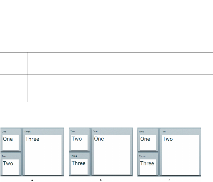
CHAPTER 25
892
Defining transitions
You use the Transition class to create a transition. The following table defines the properties of the Transition class:
You can define multiple Transition objects in an application. The UIComponent class includes a transitions
property that you set to an Array of Transition objects. For example, you define an application with three Panel
containers and three view states, as the following example shows:
A. Base view state B. One view state C. Two view state
You define the transitions for this example in MXML using the <mx:transitions> tag, as the following example
shows:
<?xml version="1.0" ?>
<!-- transitions/DefiningTrans.mxml -->
<mx:Application xmlns:mx="http://www.adobe.com/2006/mxml" width="400" >
<!-- Define the two view states, in addition to the base state.-->
<mx:states>
<mx:State name="One">
<mx:SetProperty target="{p1}" name="x" value="110"/>
<mx:SetProperty target="{p1}" name="y" value="0"/>
<mx:SetProperty target="{p1}" name="width" value="200"/>
<mx:SetProperty target="{p1}" name="height" value="210"/>
<mx:SetProperty target="{p2}" name="x" value="0"/>
Property Definition
fromState A String that specifies the view state that you are changing from when you apply the transition. The default value is an
asterisk, "*", which means any view state.
toState A String that specifies the view state that you are changing to when you apply the transition. The default value is an
asterisk, "*", which means any view state.
effect The Effect object to play when you apply the transition. Typically, this is a composite effect, such as the Parallel or
Sequence effect, that contains multiple effects.

893ADOBE FLEX 3
Adobe Flex 3 Developer Guide
<mx:SetProperty target="{p2}" name="y" value="0"/>
<mx:SetProperty target="{p2}" name="width" value="100"/>
<mx:SetProperty target="{p2}" name="height" value="100"/>
<mx:SetProperty target="{p3}" name="x" value="0"/>
<mx:SetProperty target="{p3}" name="y" value="110"/>
<mx:SetProperty target="{p3}" name="width" value="100"/>
<mx:SetProperty target="{p3}" name="height" value="100"/>
</mx:State>
<mx:State name="Two">
<mx:SetProperty target="{p2}" name="x" value="110"/>
<mx:SetProperty target="{p2}" name="y" value="0"/>
<mx:SetProperty target="{p2}" name="width" value="200"/>
<mx:SetProperty target="{p2}" name="height" value="210"/>
<mx:SetProperty target="{p3}" name="x" value="0"/>
<mx:SetProperty target="{p3}" name="y" value="110"/>
<mx:SetProperty target="{p3}" name="width" value="100"/>
<mx:SetProperty target="{p3}" name="height" value="100"/>
</mx:State>
</mx:states>
<!-- Define Transition array with one Transition object.-->
<mx:transitions>
<!-- A transition for changing from any state to any state. -->
<mx:Transition id="myTransition" fromState="*" toState="*">
<!-- Define a Parallel effect as the top-level effect.-->
<mx:Parallel id="t1" targets="{[p1,p2,p3]}">
<!-- Define a Move and Resize effect.-->
<mx:Move duration="400"/>
<mx:Resize duration="400"/>
</mx:Parallel>
</mx:Transition>
</mx:transitions>
<!-- Define the Canvas container holding the three Panel containers.-->
<mx:Canvas id="pm" width="100%" height="100%" >
<mx:Panel id="p1" title="One"
x="0" y="0" width="100" height="100"
click="currentState='One'" >
<mx:Label fontSize="24" text="One"/>
</mx:Panel>
<mx:Panel id="p2" title="Two"
x="0" y="110" width="100" height="100"
click="currentState='Two'" >
<mx:Label fontSize="24" text="Two"/>
</mx:Panel>
<mx:Panel id="p3" title="Three"
x="110" y="0" width="200" height="210"
click="currentState=''" >
<mx:Label fontSize="24" text="Three"/>
</mx:Panel>
</mx:Canvas>
</mx:Application>

CHAPTER 25
894
In this example:
1You use the click event of each Panel container to change the view state.
2When the application changes view state, Flex searches for a Transition object that matches the current and
destination view state. In this example, you set the fromState and toState properties to "*". Therefore, Flex
applies myTransition to all state changes. For more information on setting the fromState and toState
properties, see “Defining multiple transitions” on page 894.
3After Flex determines the transition that matches the change of view state, Flex applies the Move and Resize
effects defined by the transition to the effect targets. In this example, you use the specification of the top-level
Parallel effect in the transition to specify the targets as the three Panel containers. For more information on setting
the effect targets, see “Defining effect targets” on page 895.
The Move and Resize effects play in parallel on all effect targets, so the three Panel containers move to a new
position and change size simultaneously. You can also define the top-level effect as a Sequence effect to make the
Move and Resize effects occur sequentially, rather than in parallel.
Flex determines the start and end property values of the Move and Resize effect by using information from any
properties that you specified to the effect, the current view state, and the destination view state. In this example,
you omit any property specifications in the effect definitions, so Flex uses the current size and position of each
Panel container to determine the values of the Move.xFrom, Move.yFrom, Resize.widthFrom, and
Resize.heightFrom properties. Flex uses the destination view state to determine the values of the Move.xTo,
Move.yTo, Resize.widthTo, and Resize.heightTo properties. For more information, see “Defining the effect
start and end values” on page 896.
Defining multiple transitions
You can define multiple transitions in your application so that you can associate a specific transition with a specific
change to the view state. To specify the transition associated with a change to the view states, you use the
fromState and toState properties.
By default, both the fromState and toState properties are set to "*", which indicates that the transition should
be applied to any changes in the view state. You can set either property to an empty string, "", which corresponds
to the base view state.
You use the fromState property to explicitly specify the view state that your are changing from, and the toState
property to explicitly specify the view state that you are changing to, as the following example shows:
<mx:transitions>
<!-- Play for a change to the login view state from any view state. -->
<mx:Transition id="toLoginFromAny" fromState="*" toState="login">
...
</mx:Transition>
<!-- Play for a change to the login view state from the details view state. -->

895ADOBE FLEX 3
Adobe Flex 3 Developer Guide
<mx:Transition id="toLoginFromDetails" fromState="details" toState="login">
...
</mx:Transition>
<!-- Play for a change from any view state to any other view state. -->
<mx:Transition id="toAnyFromAny" fromState="*" toState="*">
...
</mx:Transition>
</mx:transitions>
<!-- Go to the login view state, transition toLoginFromAny plays. -->
<mx:Button click="currentState="login";/>
<!-- Go to the details view state, transition toAnyFromAny plays. -->
<mx:Button click="currentState="details";/>
<!-- Go to the login view state, transition toLoginFromDetails plays because you
transitioned from the details to the login view state. -->
<mx:Button click="currentState="login";/>
<!-- Go to the base view state, transition toAnyFromAny plays. -->
<mx:Button click="currentState='';/>
If a state change matches two transitions, the toState property takes precedence over the fromState property.
If more than one transition matches, Flex uses the first matching definition detected in the transition Array.
Defining effect targets
The <mx:Transition> tag shown in the section “Defining transitions” on page 892 defines the effects that make
up a transition. The top-level effect defines the target components of the effects in the transition when the effect
does not explicitly define a target. In that example, the transition is performed on all three Panel containers in the
application. If you want the transition to play only on the first two panels, you define the Parallel effects as the
following example shows:
<mx:Transition fromState="*" toState="*">
<!-- Define a Parallel effect as the top most effect.-->
<mx:Parallel id="t1" targets="{[p1,p2]}">
<mx:Move duration="400"/>
<mx:Resize duration="400"/>
</mx:Parallel>
</mx:Transition>
You removed the third panel from the transition, so it is no longer a target of the Move and Resize effects.
Therefore, the third panel appears to jump to its new position and size during the change in view state. The other
two panels show a smooth change in size and position for the 400-millisecond (ms) duration of the effects.
You can also use the target or targets properties of the effects within the transition to explicitly specify the
effect target, as the following example shows:
<mx:Parallel id="t1" targets="{[p1,p2,p3]}">
<mx:Move targets="{[p1,p2]}" duration="400"/>
<mx:Resize duration="400"/>

CHAPTER 25
896
</mx:Parallel>
In this example, the Resize effect plays on all three panels, while the Move effect plays only on the first two panels.
You could also write this example as the following code shows:
<mx:Parallel id="t1" targets="{[p1,p2]}">
<mx:Move duration="400"/>
<mx:Resize targets="{[p1,p2,p3]}" duration="400"/>
</mx:Parallel>
Defining the effect start and end values
Like any effect, an effect within a transition has properties that you use to configure it. For example, most effects
have properties that define starting and ending information for the target component, such as the xFrom, yFrom,
xTo, and yTo properties of the Move effect.
Effects defined in a transition must determine their property values for the effect to execute. Flex uses the
following rules to determine the start and end values of effect properties of a transition:
1If the effect explicitly defines the values of any properties, use them in the transition, as the following example
shows:
<mx:Transition fromState="*" toState="*">
<mx:Sequence id="t1" targets="{[p1,p2,p3]}">
<mx:Blur duration="100" blurXFrom="0.0" blurXTo="10.0" blurYFrom="0.0"
blurYTo="10.0"/>
<mx:Parallel>
<mx:Move duration="400"/>
<mx:Resize duration="400"/>
</mx:Parallel>
<mx:Blur duration="100" blurXFrom="10.0" blurXTo="0.0" blurYFrom="10.0"
blurYTo="0.0"/>
</mx:Sequence>
</mx:Transition>
In this example, the two Blur filters explicitly define the properties of the effect.
2If the effect does not explicitly define the start values of the effect, Flex determines them from the current
settings of the target component, as defined by the current view state.
In the example in rule 1, notice that the Move and Resize effects do not define start values. Therefore, Flex
determines them from the current size and position of the effect targets in the current view state.
3If the effect does not explicitly define the end values of the effect, Flex determines them from the settings of
the target component in the destination view state.
In the example in rule 1, the Move and Resize effects determine the end values from the size and position of
the effect targets in the destination view state. In some cases, the destination view state explicitly defines these
values. If the destination view state does not define the values, Flex determines them from the settings of the
base view state.

897ADOBE FLEX 3
Adobe Flex 3 Developer Guide
4If there are no explicit values, and Flex cannot determine values from the current or destination view states,
the effect uses its default property values.
The following example modifies the three-panel example shown in “Defining transitions” on page 892 by adding
Blur effects to the transition, where the Blur effect explicitly defines the values of the blurXFrom, blurXTo,
blurYFrom, and blurYTo properties:
<?xml version="1.0" ?>
<!-- transitions\DefiningTransWithBlurs.mxml -->
<mx:Application xmlns:mx="http://www.adobe.com/2006/mxml" width="400" >
<!-- Define the two view states, in addition to the base state.-->
<mx:states>
<mx:State name="One">
<mx:SetProperty target="{p1}" name="x" value="110"/>
<mx:SetProperty target="{p1}" name="y" value="0"/>
<mx:SetProperty target="{p1}" name="width" value="200"/>
<mx:SetProperty target="{p1}" name="height" value="210"/>
<mx:SetProperty target="{p2}" name="x" value="0"/>
<mx:SetProperty target="{p2}" name="y" value="0"/>
<mx:SetProperty target="{p2}" name="width" value="100"/>
<mx:SetProperty target="{p2}" name="height" value="100"/>
<mx:SetProperty target="{p3}" name="x" value="0"/>
<mx:SetProperty target="{p3}" name="y" value="110"/>
<mx:SetProperty target="{p3}" name="width" value="100"/>
<mx:SetProperty target="{p3}" name="height" value="100"/>
</mx:State>
<mx:State name="Two">
<mx:SetProperty target="{p2}" name="x" value="110"/>
<mx:SetProperty target="{p2}" name="y" value="0"/>
<mx:SetProperty target="{p2}" name="width" value="200"/>
<mx:SetProperty target="{p2}" name="height" value="210"/>
<mx:SetProperty target="{p3}" name="x" value="0"/>
<mx:SetProperty target="{p3}" name="y" value="110"/>
<mx:SetProperty target="{p3}" name="width" value="100"/>
<mx:SetProperty target="{p3}" name="height" value="100"/>
</mx:State>
</mx:states>
<!-- Define the single transition for all view state changes.-->
<mx:transitions>
<mx:Transition fromState="*" toState="*">
<mx:Sequence id="t1" targets="{[p1,p2,p3]}">
<mx:Blur duration="100" blurXFrom="0.0" blurXTo="10.0"
blurYFrom="0.0" blurYTo="10.0"/>
<mx:Parallel>
<mx:Move duration="400"/>
<mx:Resize duration="400"/>
</mx:Parallel>
<mx:Blur duration="100" blurXFrom="10.0" blurXTo="0.0"
blurYFrom="10.0" blurYTo="0.0"/>
</mx:Sequence>
</mx:Transition>
</mx:transitions>
<!-- Define the Canvas container holding the three Panel containers.-->

CHAPTER 25
898
<mx:Canvas id="pm" width="100%" height="100%" >
<mx:Panel id="p1" title="One"
x="0" y="0" width="100" height="100"
click="currentState='One'" >
<mx:Label fontSize="24" text="One"/>
</mx:Panel>
<mx:Panel id="p2" title="Two"
x="0" y="110" width="100" height="100"
click="currentState='Two'" >
<mx:Label fontSize="24" text="Two"/>
</mx:Panel>
<mx:Panel id="p3" title="Three"
x="110" y="0" width="200" height="210"
click="currentState=''" >
<mx:Label fontSize="24" text="Three"/>
</mx:Panel>
</mx:Canvas>
</mx:Application>
Handling events when using transitions
You can handle view state events, such as currentStateChange and currentStateChanging, as part of an
application that defines transitions. Changes to the view state, dispatching events, and playing transition effects
occur in the following order:
1You set the currentState property to the destination view state.
2Flex dispatches the currentStateChanging event.
3Flex examines the list of transitions to determine the one that matches the change of the view state.
4Flex examines the components to determine the start values of any effects.
5Flex applies the destination view state to the application.
6Flex dispatches the currentStateChange event.
7Flex plays the effects that you defined in the transition.
If you change state again while a transition plays, Flex jumps to the end of the transition before starting any
transition associated with the new change of view state.
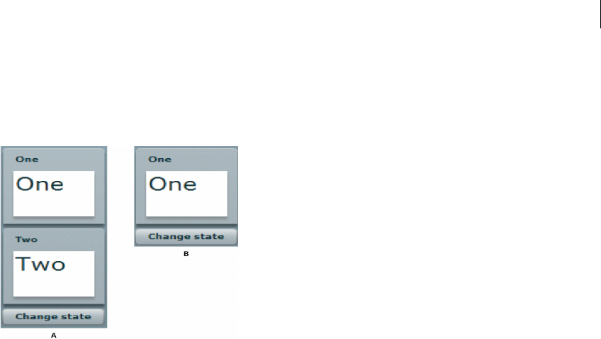
899ADOBE FLEX 3
Adobe Flex 3 Developer Guide
Using action effects in a transition
In the following example, you define an application that has two view states:
A. Base view state B. OneOnly view state
To move from the base view state to the OneOnly view state, you create the following view state definition:
<mx:states>
<mx:State name="OneOnly">
<mx:SetProperty target="{p2}" name="visible" value="false"/>
<mx:SetProperty target="{p2}" name="includeInLayout" value="false"/>
</mx:State>
</mx:states>
You set the value of the visible and includeInLayout properties to false so that Flex makes the second Panel
container invisible and ignores it when laying out the application. If the visible property is false, and the
includeInLayout property is true, the container is invisible, but Flex lays out the application as if the
component were visible.
A view state defines how to change states, and the transition defines the order in which the visual changes occur.
In the example shown in the previous image, you play an Iris effect on the second panel when it disappears, and
when it reappears on a transition back to the base state.
For the change from the base state to the OneOnly state, you define the toOneOnly transition which uses the Iris
effect to make the second panel disappear, and then sets the panel’s visible and includeInLayout properties
to false. For a transition back to the base state, you define the toAnyFromAny transition that makes the second
panel visible by setting its visible and includeInLayout properties to true, and then uses the Iris effect to
make the panel appear, as the following example shows:
CHAPTER 25
900
<mx:transitions>
<mx:Transition id="toOneOnly" fromState="*" toState="OneOnly">
<mx:Sequence id="t1" targets="{[p2]}">
<mx:Iris showTarget="false" duration="350"/>
<mx:SetPropertyAction name="visible"/>
<mx:SetPropertyAction target="{p2}" name="includeInLayout"/>
</mx:Sequence>
</mx:Transition>
<mx:Transition id="toAnyFromAny" fromState="*" toState="*">
<mx:Sequence id="t2" targets="{[p2]}">
<mx:SetPropertyAction target="{p2}" name="includeInLayout"/>
<mx:SetPropertyAction name="visible"/>
<mx:Iris showTarget="true" duration="350"/>
</mx:Sequence>
</mx:Transition>
</mx:transitions>
In the toOneOnly transition, if you hide the target by setting its visible property to false, and then play the Iris
effect, you would not see the Iris effect play because the target is already invisible.
To control the order of view state changes during a transition, Flex defines several action effects. The previous
example uses the SetPropertyAction action effect to control when to set the visible and includeInLayout
properties in the transition. The following table describes the action effects:
When you create a view state, you use the SetProperty, SetStyle, AddChild, and RemoveChild classes to define the
view state. To control when a change defined by the view state property occurs in a transition, you use the corre-
sponding action effect. The action effects give you control over the order of the state change.
In the previous example, you used the following statement to define an action effect to occur when the value of
the visible property of a component changes:
<mx:SetPropertyAction name="visible"/>
Action effect Corresponding view state class Use
SetPropertyAction SetProperty Sets a property value as part of a transition.
SetStyleAction SetStyle Sets a style to a value as part of a transition.
AddChildAction AddChild Adds a child as part of a transition.
RemoveChildAction RemoveChild Removes a child as part of a transition.

901ADOBE FLEX 3
Adobe Flex 3 Developer Guide
This action effect plays when the value of the visible property changes to either true or false. You can further
control the effect using the value property of the <mx:SetPropertyAction> tag, as the following example
shows:
<mx:SetPropertyAction name="visible" value="true"/>
In this example, you specify to play the effect only when the value of the visible property changes to true.
Adding this type of information to the action effect can be useful if you want to use filters with your transitions.
For more information, see “Filtering effects” on page 902.
The action effects do not support a duration property; they only perform the specified action.
Example: Using action effects
The following example shows the complete code for the example in “Using action effects in a transition” on
page 899:
<?xml version="1.0" ?>
<!-- transitions\ActionTransitions.mxml -->
<mx:Application xmlns:mx="http://www.adobe.com/2006/mxml"
verticalAlign="middle"
layout="vertical">
<!-- Define one view state, in addition to the base state.-->
<mx:states>
<mx:State name="OneOnly">
<mx:SetProperty target="{p2}" name="visible" value="false"/>
<mx:SetProperty target="{p2}"
name="includeInLayout" value="false"/>
</mx:State>
</mx:states>
<!-- Define Transition array with one Transition object.-->
<mx:transitions>
<mx:Transition id="toOneOnly" fromState="*" toState="OneOnly">
<mx:Sequence id="t1" targets="{[p2]}">
<mx:Iris showTarget="false" duration="350"/>
<mx:SetPropertyAction name="visible"/>
<mx:SetPropertyAction target="{p2}" name="includeInLayout"/>
</mx:Sequence>
</mx:Transition>
<mx:Transition id="toAnyFromAny" fromState="*" toState="*">
<mx:Sequence id="t2" targets="{[p2]}">
<mx:SetPropertyAction target="{p2}" name="includeInLayout"/>
<mx:SetPropertyAction name="visible"/>
<mx:Iris showTarget="true" duration="350"/>
</mx:Sequence>
</mx:Transition>
</mx:transitions>
<mx:Panel id="p1" title="One"
width="100" height="100">
CHAPTER 25
902
<mx:Label fontSize="24" text="One"/>
</mx:Panel>
<mx:Panel id="p2" title="Two"
width="100" height="100">
<mx:Label fontSize="24" text="Two"/>
</mx:Panel>
<mx:Button id="b1" label="Change state"
click="currentState = currentState == 'OneOnly' ? '' : 'OneOnly';"/>
</mx:Application>
Filtering effects
By default, Flex applies all of the effects defined in a transition to all of the target components of the transition.
Therefore, in the following example, Flex applies the Move and Resize effects to all three targets:
<mx:Transition fromState="*" toState="*">
<!-- Define a Parallel effect as the top most effect.-->
<mx:Parallel id="t1" targets="{[p1,p2,p3]}">
<!-- Define a Move and Resize effect.-->
<mx:Move duration="400"/>
<mx:Resize duration="400"/>
</mx:Parallel>
</mx:Transition>
However, you might want to conditionalize an effect so that it does not apply to all target components, but only
to a subset of the components. For example, you define an application with three view states, as the following
image shows:
A. Base view state B. Two view state C. Three view state

903ADOBE FLEX 3
Adobe Flex 3 Developer Guide
Each change of view state removes the top panel, moves the bottom panel to the top, and adds the next panel to
the bottom of the screen. In this example, the third panel is invisible in the base view state.
For this example, you define a single transition that applies a WipeUp effect to the top panel as it is removed,
applies a Move effect to the bottom panel as it moves to the top position, and applies another WipeUp effect to the
panel being added to the bottom, as the following example shows:
<mx:transitions>
<mx:Transition fromState="*" toState="*">
<mx:Sequence targets="{[p1,p2,p3]}">
<mx:Sequence id="sequence1" filter="hide">
<mx:WipeUp/>
<mx:SetPropertyAction name="visible" value="false"/>
</mx:Sequence>
<mx:Move filter="move"/>
<mx:Sequence id="sequence2" filter="show">
<mx:SetPropertyAction name="visible" value="true"/>
<mx:WipeUp/>
</mx:Sequence>
</mx:Sequence>
</mx:Transition>
</mx:transitions>
The sequence1 Sequence effect uses the filter property to specify the change that a component must go through
in order for the effect to play on it. In this example, the sequence1 effect specifies a value of "hide" for the filter
property. Therefore, the WipeUp and SetPropertyAction effects only play on those components that change from
visible to invisible by setting their visible property to false.
In the sequence2 Sequence effect, you set the filter property to show. Therefore, the WipeUp and SetProperty-
Action effects only play on those components whose state changes from invisible to visible by setting their
visible property to true.
The Move effect also specifies a filter property with a value of move. Therefore, it applies to all target compo-
nents that are changing position.
The following table describes the possible values of the filter property:
Value Description
add Specifies to play the effect on all children added during the change of view state.
hide Specifies to play the effect on all children whose visible property changes from true to false during the change of view
state.
move Specifies to play the effect on all children whose x or y properties change during the change of view state.
CHAPTER 25
904
Example: Using a filter
The following example shows the complete code for the example in “Filtering effects” on page 902:
<?xml version="1.0" ?>
<!-- transitions\FilterShowHide.mxml -->
<mx:Application xmlns:mx="http://www.adobe.com/2006/mxml" width="700" >
<!-- Define two view state, in addition to the base state.-->
<mx:states>
<mx:State name="Two">
<mx:SetProperty target="{p1}" name="visible" value="false"/>
<mx:SetProperty target="{p2}" name="visible" value="true"/>
<mx:SetProperty target="{p3}" name="visible" value="true"/>
<mx:SetProperty target="{p2}" name="x" value="0"/>
<mx:SetProperty target="{p2}" name="y" value="0"/>
<mx:SetProperty target="{p3}" name="x" value="0"/>
<mx:SetProperty target="{p3}" name="y" value="110"/>
</mx:State>
<mx:State name="Three">
<mx:SetProperty target="{p1}" name="visible" value="true"/>
<mx:SetProperty target="{p2}" name="visible" value="false"/>
<mx:SetProperty target="{p3}" name="visible" value="true"/>
<mx:SetProperty target="{p1}" name="x" value="0"/>
<mx:SetProperty target="{p1}" name="y" value="110"/>
<mx:SetProperty target="{p3}" name="x" value="0"/>
<mx:SetProperty target="{p3}" name="y" value="0"/>
</mx:State>
</mx:states>
<!-- Define a single transition for all state changes.-->
<mx:transitions>
<mx:Transition fromState="*" toState="*">
<mx:Sequence targets="{[p1,p2,p3]}">
<mx:Sequence id="sequence1" filter="hide" >
<mx:WipeUp/>
<mx:SetPropertyAction name="visible" value="false"/>
</mx:Sequence>
<mx:Move filter="move"/>
<mx:Sequence id="sequence2" filter="show" >
<mx:SetPropertyAction name="visible" value="true"/>
<mx:WipeUp/>
</mx:Sequence>
</mx:Sequence>
</mx:Transition>
remove Specifies to play the effect on all children removed during the change of view state.
resize Specifies to play the effect on all children whose width or height properties change during the change of view state.
show Specifies to play the effect on all children whose visible property changes from false to true during the change of view
state.
Value Description

905ADOBE FLEX 3
Adobe Flex 3 Developer Guide
</mx:transitions>
<mx:Canvas id="pm" width="100%" height="100%">
<mx:Panel id="p1" title="One"
x="0" y="0" width="100" height="100"
click="currentState=''" >
<mx:Label fontSize="24" text="One"/>
</mx:Panel>
<mx:Panel id="p2" title="Two"
x="0" y="110" width="100" height="100"
click="currentState='Two'" >
<mx:Label fontSize="24" text="Two"/>
</mx:Panel>
<mx:Panel id="p3" title="Three"
visible="false"
width="100" height="100"
click="currentState='Three'" >
<mx:Label fontSize="24" text="Three"/>
</mx:Panel>
</mx:Canvas>
</mx:Application>
Defining a custom filter
Flex lets you use the EffectTargetFilter class to define a custom filter that is executed by each transition effect on
each target of the effect. By defining a custom filter, you can specify your own logic for controlling a transition.
The following table describes the properties of the EffectTargetFilter class:
The callback function specified by the filterFunction property has the following signature:
filterFunc(propChanges:Array, instanceTarget:Object):Boolean {
// Return true to play the effect on instanceTarget,
// or false to not play the effect.
}
Property Description
filterProperties An Array of Strings specifying component properties. If any of the properties in the Array have changed on the
target component, play the effect on the target.
filterStyles An Array of Strings specifying style properties. If any of the style properties in the Array have changed on the
target component, play the effect on the target.
filterFunction A property containing a reference to a callback function that defines custom filter logic. Flex calls this method
on every target of the effect. If the function returns true, the effect plays on the target; if it returns false, the
target is skipped by that effect.
requiredSemantics A collection of properties and associated values which must be associated with a target for the effect to be
played.

CHAPTER 25
906
The function takes the following arguments:
propChanges An Array of PropertyChanges objects, one object per target component of the effect. If a property
of a target is not modified by the transition, it is not included in this Array.
instanceTarget The specific target component of the effect that you filter.
For an example using a custom filter function, see “Example: Using a custom effect filter” on page 910.
The following example defines a custom filter that specifies to play the effect only on a target component whose
x or width property is modified as part of the change of view state:
<?xml version="1.0" ?>
<!-- transitions\EffectFilterExampleMXML.mxml -->
<mx:Application xmlns:mx="http://www.adobe.com/2006/mxml"
width="700">
<mx:states>
<mx:State name="One">
<mx:SetProperty target="{p1}" name="x" value="110"/>
<mx:SetProperty target="{p1}" name="y" value="0"/>
<mx:SetProperty target="{p1}" name="width" value="500"/>
<mx:SetProperty target="{p1}" name="height" value="210"/>
<mx:SetProperty target="{p2}" name="x" value="0"/>
<mx:SetProperty target="{p2}" name="y" value="0"/>
<mx:SetProperty target="{p2}" name="width" value="100"/>
<mx:SetProperty target="{p2}" name="height" value="100"/>
<mx:SetProperty target="{p3}" name="x" value="0"/>
<mx:SetProperty target="{p3}" name="y" value="110"/>
<mx:SetProperty target="{p3}" name="width" value="100"/>
<mx:SetProperty target="{p3}" name="height" value="100"/>
</mx:State>
<mx:State name="Two">
<mx:SetProperty target="{p2}" name="x" value="110"/>
<mx:SetProperty target="{p2}" name="y" value="0"/>
<mx:SetProperty target="{p2}" name="width" value="500"/>
<mx:SetProperty target="{p2}" name="height" value="210"/>
<mx:SetProperty target="{p3}" name="x" value="0"/>
<mx:SetProperty target="{p3}" name="y" value="110"/>
<mx:SetProperty target="{p3}" name="width" value="100"/>
<mx:SetProperty target="{p3}" name="height" value="100"/>
</mx:State>
</mx:states>
<mx:transitions>
<mx:Transition fromState="*" toState="*">
<mx:Sequence id="t1" targets="{[p1,p2,p3]}">
<mx:Blur id="myBlur" duration="100" blurXFrom="0.0"
blurXTo="10.0" blurYFrom="0.0" blurYTo="10.0">
<!-- Define the custom filter. -->
<mx:customFilter>
<mx:EffectTargetFilter
filterProperties="['width','x']"/>
</mx:customFilter>
</mx:Blur>
<mx:Parallel>
<mx:Move duration="400"/>

907ADOBE FLEX 3
Adobe Flex 3 Developer Guide
<mx:Resize duration="400"/>
</mx:Parallel>
<mx:Blur id="myUnBlur" duration="100" blurXFrom="10.0"
blurXTo="0.0" blurYFrom="10.0" blurYTo="0.0">
<!-- Define the custom filter. -->
<mx:customFilter>
<mx:EffectTargetFilter
filterProperties="['width','x']"/>
</mx:customFilter>
</mx:Blur>
</mx:Sequence>
</mx:Transition>
</mx:transitions>
<mx:Canvas id="pm" width="100%" height="100%">
<mx:Panel id="p1" title="One"
x="0" y="0" width="100" height="100"
click="currentState='One'" >
<mx:Label fontSize="24" text="One"/>
</mx:Panel>
<mx:Panel id="p2" title="Two"
x="0" y="110" width="100" height="100"
click="currentState='Two'" >
<mx:Label fontSize="24" text="Two"/>
</mx:Panel>
<mx:Panel id="p3" title="Three"
x="110" y="0" width="500" height="210"
click="currentState=''" >
<mx:Label fontSize="24" text="Three"/>
</mx:Panel>
</mx:Canvas>
</mx:Application>
You can also add the custom filter in ActionScript. To create a filter, you define an EffectTargetFilter object, and
then specify that object as the value of the Effect.customFilter property for an effect, as the following example
shows:
<mx:Application xmlns:mx="http://www.adobe.com/2006/mxml"
creationComplete="initFilter(event);" width="700">
<mx:Script>
<
CHAPTER 25
908
myBlurFilter.filterProperties=['x', 'width'];
myBlur.customFilter=myBlurFilter;
myUnBlur.customFilter=myBlurFilter;
}
]]>
</mx:Script>
<mx:transitions>
<mx:Transition fromState="*" toState="*">
<mx:Sequence id="t1" targets="{[p1,p2,p3]}">
<mx:Blur id="myBlur"/>
<mx:Parallel>
<mx:Moveduration="400"/>
<mx:Resize duration="400"/>
</mx:Parallel>
<mx:Blur id="myUnBlur"/>
</mx:Sequence>
</mx:Transition>
</mx:transitions>
...
</mx:Application>
Writing a filter function
To create a filter function, you define an EffectTargetFilter object, and then specify that object as the value of the
Effect.customFilter property for an effect. The following example uses the creationComplete event of an
application to initialize an EffectTargetFilter object, and then specify it as the value of the customFilter property
for two Blur effects:
<mx:Application xmlns:mx="http://www.adobe.com/2006/mxml"
creationComplete="initFilter(event);" width="700">
<mx:Script>
<
909ADOBE FLEX 3
Adobe Flex 3 Developer Guide
myUnBlur.customFilter=myBlurFilter;
}
]]>
</mx:Script>
<mx:transitions>
<mx:Transition fromState="*" toState="*">
<mx:Sequence id="t1" targets="{[p1,p2,p3]}">
<mx:Blur id="myBlur"/>
<mx:Parallel>
<mx:Moveduration="400"/>
<mx:Resize duration="400"/>
</mx:Parallel>
<mx:Blur id="myUnBlur"/>
</mx:Sequence>
</mx:Transition>
</mx:transitions>
...
</mx:Application>
The propChanges argument passed to the filter function contains an Array of PropertyChanges objects, one
object per target component of the effect. The following table describes the properties of the PropertyChanges
class:
Within the custom filter function, you first search the propChanges Array for the PropertyChanges object that
matches the instanceTarget argument by comparing the instanceTarget argument to the
propChanges.target property.
The following filter function examines the propChanges Array to determine if it should play the effect on the
instanceTarget. In this example, the filter function returns true only for those components being moved to a
position where the x property equals 110, as the following example shows:
Property Description
target A target component of the effect. The end and start properties of the PropertyChanges class define how the target
component is modified by the change to the view state.
start An Object that contains the starting properties of the target component, as defined by the current view state. For
example, for a target component that is both moved and resized by a change to the view state, the start property
contains the starting position and size of the component, as the following example shows:
{x:00, y:00, width:100, height:100}
end An Object that contains the ending properties of the target component, as defined by the destination view state. For
example, for a target component that is both moved and resized by a change to the view state, the end property
contains the ending position and size of the component, as the following example shows:
{x:100, y:100, width:200, height:200}

CHAPTER 25
910
// This function returns true for a target moving to x=110.
public function filterFunc(propChanges:Array, instanceTarget:Object):Boolean {
// Determine the length of the propChanges Array.
for (var i:uint=0; i < propChanges.length; i++)
{// Determine the Array element that matches the effect target.
if (propChanges[i].target == instanceTarget)
{// Check to see if the end Object contains a value for x.
if (propChanges[i].end["x"] != undefined)
{// Return true of the end value for x is 110.
return (propChanges[i].end.x == 110);
}
}
}
// Otherwise, return false.
return false;
}
Example: Using a custom effect filter
In the following example, you use a custom filter function to apply Blur effects to one of the three targets of a
transition. The other two targets are not modified by the Blur effects.
To determine the target of the Blur effects, the custom filter function examines the x property of each target. The
Blur effects play only on the component moving to x=110, as the following example shows:
<?xml version="1.0" ?>
<!-- transitions\EffectFilterExample.mxml -->
<mx:Application xmlns:mx="http://www.adobe.com/2006/mxml"
creationComplete="initFilter(event);"
width="700">
<mx:Script>
<![CDATA[
import mx.effects.EffectTargetFilter;
import flash.events.Event;
// This function returns true for the Panel moving to x=110.
public function filterFunc(propChanges:Array,
instanceTarget:Object):Boolean {
// Determine the length of the propChanges Array.
for (var i:uint=0; i < propChanges.length; i++)
{
// Determine the Array element
// that matches the effect target.
if (propChanges[i].target == instanceTarget)
{
// Check whether the end Object contains
// a value for x.
if (propChanges[i].end["x"] != undefined)
{
// Return true of the end value for x is 110.

911ADOBE FLEX 3
Adobe Flex 3 Developer Guide
return (propChanges[i].end.x == 110);
}
}
}
return false;
}
// Define the EffectTargetFilter object.
private var myBlurFilter:EffectTargetFilter;
// Initialize the EffectTargetFilter object, and set the
// customFilter property for two Blur effects.
private function initFilter(event:Event):void {
myBlurFilter = new EffectTargetFilter();
myBlurFilter.filterFunction=filterFunc;
myBlur.customFilter=myBlurFilter;
myUnBlur.customFilter=myBlurFilter;
}
]]>
</mx:Script>
<mx:states>
<mx:State name="One">
<mx:SetProperty target="{p1}" name="x" value="110"/>
<mx:SetProperty target="{p1}" name="y" value="0"/>
<mx:SetProperty target="{p1}" name="width" value="500"/>
<mx:SetProperty target="{p1}" name="height" value="210"/>
<mx:SetProperty target="{p2}" name="x" value="0"/>
<mx:SetProperty target="{p2}" name="y" value="0"/>
<mx:SetProperty target="{p2}" name="width" value="100"/>
<mx:SetProperty target="{p2}" name="height" value="100"/>
<mx:SetProperty target="{p3}" name="x" value="0"/>
<mx:SetProperty target="{p3}" name="y" value="110"/>
<mx:SetProperty target="{p3}" name="width" value="100"/>
<mx:SetProperty target="{p3}" name="height" value="100"/>
</mx:State>
<mx:State name="Two">
<mx:SetProperty target="{p2}" name="x" value="110"/>
<mx:SetProperty target="{p2}" name="y" value="0"/>
<mx:SetProperty target="{p2}" name="width" value="500"/>
<mx:SetProperty target="{p2}" name="height" value="210"/>
<mx:SetProperty target="{p3}" name="x" value="0"/>
<mx:SetProperty target="{p3}" name="y" value="110"/>
<mx:SetProperty target="{p3}" name="width" value="100"/>
<mx:SetProperty target="{p3}" name="height" value="100"/>
</mx:State>
</mx:states>
<mx:transitions>
<mx:Transition fromState="*" toState="*">
<mx:Sequence id="t1" targets="{[p1,p2,p3]}">
<mx:Blur id="myBlur" duration="100" blurXFrom="0.0"
blurXTo="10.0" blurYFrom="0.0" blurYTo="10.0"/>
<mx:Parallel>
<mx:Move duration="400"/>

CHAPTER 25
912
<mx:Resize duration="400"/>
</mx:Parallel>
<mx:Blur id="myUnBlur" duration="100" blurXFrom="10.0"
blurXTo="0.0" blurYFrom="10.0" blurYTo="0.0"/>
</mx:Sequence>
</mx:Transition>
</mx:transitions>
<mx:Canvas id="pm" width="100%" height="100%">
<mx:Panel id="p1" title="One"
x="0" y="0" width="100" height="100"
click="currentState='One'" >
<mx:Label fontSize="24" text="One"/>
</mx:Panel>
<mx:Panel id="p2" title="Two"
x="0" y="110" width="100" height="100"
click="currentState='Two'" >
<mx:Label fontSize="24" text="Two"/>
</mx:Panel>
<mx:Panel id="p3" title="Three"
x="110" y="0" width="500" height="210"
click="currentState=''" >
<mx:Label fontSize="24" text="Three"/>
</mx:Panel>
</mx:Canvas>
</mx:Application>
Using the requiredSemantics property
When working with data effects, you can use the EffectTargetFiler.requiredSemantics property to filter
effects. If you want to play a data effect on all targets of a list control that are not added by the effect, meaning
targets that are removed, replaced, moved, or affected in any other way, you can write the effect definition as
shown below:
<mx:Blur>
<mx:customFilter>
<mx:EffectTargetFilter requiredSemantics="{{'added':false}}"/>
</mx:customFilter>
</mx:Blur>
To play a data effect on all targets that are not added or not removed by the effect, you can write the effect
definition as shown below:
<mx:Blur>
<mx:customFilter>
<mx:EffectTargetFilter requiredSemantics="{{'added':false},
{'removed':false}}"/>
</mx:customFilter>
</mx:Blur>
The allowed list of properties that you can specify includes added, removed, replaced, and replacement. The
allowed values for the properties are true and false.

913ADOBE FLEX 3
Adobe Flex 3 Developer Guide
For more information on data effects, see “Using data effects” on page 581.
Transition tips and troubleshooting
Tips
Determine the type of transition you are defining:
•With dynamic transitions, you know what effects you want to play, but not which targets they will play on.
•With explicit transitions, you know exactly what happens to each individual target.
Complex transitions may consist of both dynamic and explicit elements.
Tips for dynamic transitions:
•List all possible targets in the parent composite effect.
•By default, all effects play on all specified targets. Use filtering with dynamic transitions to limit the target set.
•Dynamic transitions can be used with a wide variety of state changes.
Tips for explicit transitions:
•Specify targets on the child effects, or on a composite effect when all child effects of the composite effect have
the same targets.
•By default, all effects play on all specified targets. For explicit transitions, make sure the targets are correctly
set.
•Explicit transitions typically require a different transition for each change to the view state.
Troubleshooting
Troubleshooting a transition effect that does not play:
•Is the effect target being hidden or removed? If so, make sure you add an <mx:RemoveChild> property to the
view state definition, or an <mx:SetPropertyAction name="visible"> tag in the transition definition.
•Does the change to the view state define settings that pertain to the transition effect? For example, if you have
a Resize effect, you must change the width or height property of the target when the view state changes to trigger
the effect.
•Check that you specified the correct targets to the transition.
•Check that your filter settings on the effect and on any parent effect are not excluding the target.
Troubleshooting an effect playing on too many targets:

CHAPTER 25
914
•Add a filter for a dynamic transition, or change the targets for an explicit transition.
Troubleshooting wrong effect parameters:
•Did you specify explicit parameters on the effect? Are they correct?
•Ensure that you correctly set the showTarget property for mask effects such as the Iris effect, and the wipe
effects.
Troubleshooting a flickering or flashing target:
•Ensure that you correctly set the showTarget property for mask effects such as the Iris effect, and the wipe
effects.
•Is the effect target being hidden or removed? If so, make sure you add an <mx:RemoveChild> property to the
view state definition to remove the target, or an <mx:SetPropertyAction name="visible"> tag in the
transition definition to hide the target.
Troubleshooting when an application does not look correct after a transition:
•Some effects leave the target with changed properties. For example, a Fade effect leaves the alpha property of
the target at the alphaTo value specified to the effect. If you use the Fade effect on a target that sets alpha property
to zero, you must set the alpha property to a nonzero value before the object appears again.
•Try removing one effect at a time from the transition until it no longer leaves your application with the
incorrect appearance.
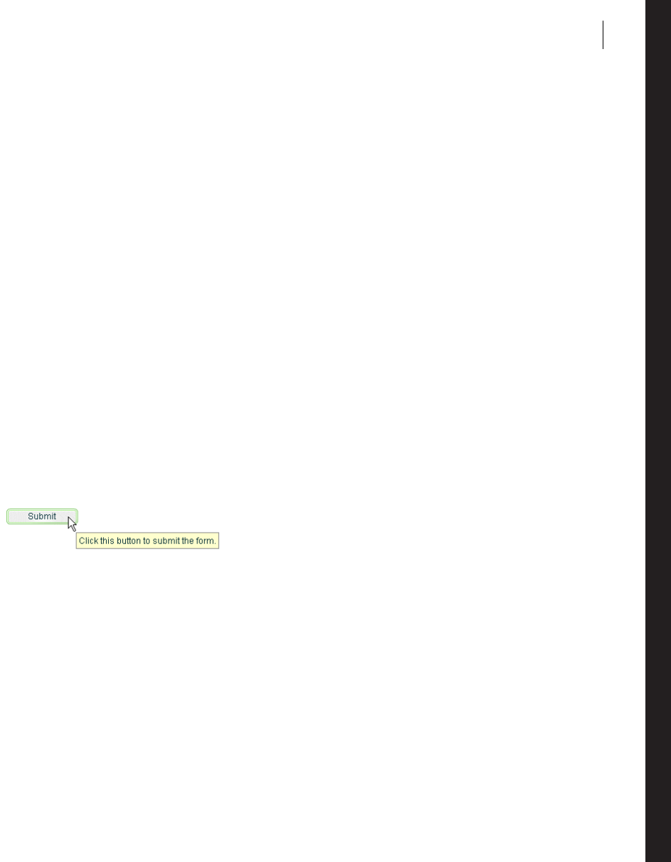
915
Chapter 26: Using ToolTips
Adobe® Flex™ ToolTips are a flexible method of providing helpful information to your users. When a user moves
the mouse pointer over graphical components, ToolTips pop up and text appears. You can use ToolTips to guide
users through working with your application or customize them to provide additional functionality.
Topics
About ToolTips . . . . . . . . . . . . . . . . . . . . . . . . . . . . . . . . . . . . . . . . . . . . . . . . . . . . . . . . . . . . . . . . . . . . . . . . . . . . . . . . . 915
Creating ToolTips . . . . . . . . . . . . . . . . . . . . . . . . . . . . . . . . . . . . . . . . . . . . . . . . . . . . . . . . . . . . . . . . . . . . . . . . . . . . . . .916
Using the ToolTip Manager. . . . . . . . . . . . . . . . . . . . . . . . . . . . . . . . . . . . . . . . . . . . . . . . . . . . . . . . . . . . . . . . . . . . . . .922
Creating custom ToolTips . . . . . . . . . . . . . . . . . . . . . . . . . . . . . . . . . . . . . . . . . . . . . . . . . . . . . . . . . . . . . . . . . . . . . . . .926
Using error tips . . . . . . . . . . . . . . . . . . . . . . . . . . . . . . . . . . . . . . . . . . . . . . . . . . . . . . . . . . . . . . . . . . . . . . . . . . . . . . . . .932
Reskinning ToolTips . . . . . . . . . . . . . . . . . . . . . . . . . . . . . . . . . . . . . . . . . . . . . . . . . . . . . . . . . . . . . . . . . . . . . . . . . . . .935
About ToolTips
ToolTips are a standard feature of many desktop applications. They make the application easier to use by
displaying messages when the user moves the mouse pointer over an onscreen element, such as a Button control.
The following image shows ToolTip text that appears when the user hovers the mouse pointer over a button:
When the user moves the mouse pointer away from the component or clicks the mouse button, the ToolTip disap-
pears. If the mouse pointer remains over the component, the ToolTip eventually disappears. The default behavior
is to display only one ToolTip at a time.
You can set the time it takes for the ToolTip to appear when a user moves the mouse pointer over the component.
You can also set the amount of time it takes for the ToolTip to disappear.
If you define a ToolTip on a container, the ToolTipManager displays the parent’s ToolTip for the children if the
child does not have one.

916 CHAPTER 26
Flex ToolTips support style sheets and the dynamic loading of ToolTip text. ToolTip text does not support
embedded HTML. For more information on using style sheets and dynamic loading of text, see “Setting styles in
ToolTips” on page 918 and “Using dynamic ToolTip text” on page 925.
Some Flex components have their own ToolTip-like “data tips.” These components include the List control, most
chart controls, and DataGrid control. For more information, see that component’s documentation.
ToolTips are the basis for the accessibility implementation within Flex. All controls that support accessibility do
so by making their ToolTip text readable by screen readers such as JAWS. For more information on accessibility,
see “Creating Accessible Applications” on page 1143.
Creating ToolTips
Every visual Flex component that extends the UIComponent class (which implements the IToolTipManager-
Client interface) supports a toolTip property. This property is inherited from the UIComponent class. You set
the value of the toolTip property to a text string, and when the mouse pointer hovers over that component, the
text string appears. The following example sets the toolTip property text for a Button control:
<?xml version="1.0"?>
<!-- tooltips/BasicToolTip.mxml -->
<mx:Application xmlns:mx="http://www.adobe.com/2006/mxml">
<mx:Button id="b1" label="Click Me" toolTip="This Button does nothing."/>
</mx:Application>
To set the value of a ToolTip in ActionScript, use the toolTip property of the component. The following example
creates a new Button and sets the toolTip property of a Button control:
<?xml version="1.0"?>
<!-- tooltips/BasicToolTipActionScript.mxml -->
<mx:Application xmlns:mx="http://www.adobe.com/2006/mxml">
<mx:Script><![CDATA[
public function createNewButton(event:MouseEvent):void {
var myButton:Button = new Button();
myButton.label = "Create Another Button";
myButton.toolTip = "Click this new button to create another button.";
myButton.addEventListener(MouseEvent.CLICK, createNewButton);
addChild(myButton);
}
]]></mx:Script>
<mx:Button id="b1" label="Create Another Button" click="createNewButton(event);"/>
</mx:Application>

917ADOBE FLEX 3
Adobe Flex 3 Developer Guide
If you do not define a ToolTip on the child of a container, the ToolTipManager displays the parent’s ToolTip. For
example, if you add a Button control to a Panel container that has a ToolTip, the user sees the Panel container’s
ToolTip text when the user moves the mouse pointer over the Panel. When the user moves the mouse pointer over
the Button control, the Panel’s ToolTip continues to be displayed. You can override the container’s ToolTip text by
setting the value of the child’s toolTip property.
The following example shows the inheritance of ToolTip text:
<?xml version="1.0"?>
<!-- tooltips/ToolTipInheritance.mxml -->
<mx:Application xmlns:mx="http://www.adobe.com/2006/mxml">
<mx:VBox toolTip="VBOX">
<mx:Button id="b1" label="Button 1" toolTip="BUTTON"/>
<mx:Button id="b2" label="Button 2"/>
</mx:VBox>
</mx:Application>
When the mouse pointer is over button b1, the ToolTip displays BUTTON. When the mouse pointer is over
button b2 or anywhere in the VBox container except over button b1, the ToolTip displays VBOX.
The TabNavigator container uses the ToolTips that are on its children. If you add a ToolTip to a child view of a
TabNavigator container, the ToolTip appears when the mouse is over the tab for that view, but not when the mouse
is over the view itself. If you add a ToolTip to the TabNavigator container, the ToolTip appears when the mouse is
over either the tab or the view, unless the ToolTip is overridden by the tab or the view. ToolTips in the following
controls also behave this way:
•Accordion
•ButtonBar
•LinkBar
•Tab B ar
•ToggleButtonBar
There is no limit to the size of the ToolTip text, although long messages can be difficult to read. When the ToolTip
text reaches the width of the ToolTip box, the text wraps to the next line. You can add line breaks in ToolTip text.
In ActionScript, you use the \n escaped newline character. In MXML tags, you use the XML entity.
The following examples show using the \n escaped newline character and the entity:
<?xml version="1.0"?>
<!-- tooltips/ToolTipNewlines.mxml -->
<mx:Application xmlns:mx="http://www.adobe.com/2006/mxml"
initialize="doSomething(event)">
<mx:Script><
CHAPTER 26
918
]]></mx:Script>
<mx:Button id="b1" label="Clear" width="100"/>
<!-- Use to force a line break in MXML tags. -->
<mx:Button id="b2" label="Submit" width="100" toolTip="Click this button to submit
the form."/>
</mx:Application>
You also have some flexibility in formatting the text of the ToolTip. You can apply styles and change other settings
for all ToolTips in your application by using the ToolTip Cascading Style Sheets (CSS) type selector. The following
sections describe how to set styles on the ToolTip text and box.
Setting styles in ToolTips
You can change the appearance of ToolTip text and the ToolTip box by using CSS syntax or the mx.styles.StyleM-
anager class. Changes to ToolTip styles apply to all ToolTips in the current application.
The default styles for ToolTips are defined by the ToolTip type selector in the defaults.css file in the
framework.swc file. You can use a type selector in the <mx:Style> tag to override the default styles of your
ToolTips. The following example sets the styles of the ToolTip type selector using CSS syntax:
<?xml version="1.0"?>
<!-- tooltips/ToolTipStyles.mxml -->
<mx:Application xmlns:mx="http://www.adobe.com/2006/mxml">
<mx:Style>
ToolTip {
fontFamily: "Arial";
fontSize: 19;
fontStyle: "italic";
color: #FF6699;
backgroundColor: #33CC99;
}
</mx:Style>
<mx:Button id="b1" label="Click Me" toolTip="This Button does nothing."/>
</mx:Application>
To use the StyleManager class to set ToolTip styles, apply a style to the ToolTip type selector with the setStyle()
method, as the following example shows:
<?xml version="1.0"?>
<!-- tooltips/ToolTipStyleManager.mxml -->
<mx:Application xmlns:mx="http://www.adobe.com/2006/mxml"
creationComplete="setToolTipStyle()">
<mx:Script><
919ADOBE FLEX 3
Adobe Flex 3 Developer Guide
}
]]></mx:Script>
<mx:Button id="b1" label="Click Me" toolTip="This Button does nothing."/>
</mx:Application>
ToolTips use inheritable styles that you set globally. For example, you can set the fontWeight of ToolTips with
the StyleManager by setting it on the global selector, as the following example shows:
<?xml version="1.0"?>
<!-- tooltips/ToolTipGlobalStyles.mxml -->
<mx:Application xmlns:mx="http://www.adobe.com/2006/mxml"
creationComplete="setToolTipStyle()">
<mx:Script><![CDATA[
import mx.styles.StyleManager;
private function setToolTipStyle():void {
StyleManager.getStyleDeclaration("global").setStyle("fontWeight","bold");
}
]]></mx:Script>
<mx:Button id="b1" label="Click Me" toolTip="This Button does nothing."/>
</mx:Application>
Styles set on the Application object typically apply to all UI objects. However, ToolTips do not inherit styles set on
the Application object.
If you set the fontWeight property on the global selector, your change affects the text of many controls in addition
to ToolTips, so be careful when using the global selector.
For a complete list of styles supported by ToolTips, see the Adobe Flex Language Reference. For more information
on using styles, see “Using Styles and Themes” on page 589.
You can reskin ToolTip controls to give them an entirely new appearance. You can do this by using the To o lT ip -
Border programmatic skin or reskin them graphically. For an example of programmatically reskinning a ToolTip
control, see “Reskinning ToolTips” on page 935.
Setting the width of ToolTips
You can set the width of the ToolTip box by changing the maxWidth property of the mx.controls.ToolTip class.
This property is static so when you set it, you are setting it for all ToolTip boxes. You cannot set it on an instance
of a ToolTip.
The maxWidth property specifies the maximum width in pixels for new ToolTips boxes. For example, the
following line changes the maximum width of the ToolTip box to 100 pixels:
<?xml version="1.0"?>
<!-- tooltips/SetMaxWidth.mxml -->
<mx:Application xmlns:mx="http://www.adobe.com/2006/mxml" creationComplete="init()">
<mx:Script><
CHAPTER 26
920
import mx.controls.ToolTip;
public function init():void {
ToolTip.maxWidth = 100;
}
public function createNewButton(event:MouseEvent):void {
var myButton:Button = new Button();
myButton.label = "Create Another Button";
myButton.toolTip = "Click this new button to create another button.";
myButton.addEventListener(MouseEvent.CLICK, createNewButton);
addChild(myButton);
}
]]></mx:Script>
<mx:Button id="b1"
label="Create Another Button"
click="createNewButton(event);"
toolTip="Click this button to create a new one."
/>
</mx:Application>
Flex wraps the text of a ToolTip onto multiple lines to ensure that the width does not exceed this value. If the text
in the ToolTip box is not as wide as the maxWidth property, Flex creates a box only wide enough for the text to fit.
The default value of maxWidth is 300. If the value of maxWidth exceeds the width of the application, Flex clips the
text in the ToolTip box.
Using ToolTip events
ToolTips trigger many events during their life cycle. These events are of type ToolTipEvent.
In addition to the type and target properties, the ToolTipEvent object references the ToolTip in its toolTip
property. With a reference to the ToolTip, you can then access the ToolTip text with the text property.
To use events of type ToolTipEvent in your <mx:Script> blocks, you must import mx.events.ToolTipEvent class.
The following example plays a sound in response to the TOOL_TIP_SHOW event:
<?xml version="1.0"?>
<!-- tooltips/ToolTipsWithSoundEffects.mxml -->
<mx:Application xmlns:mx="http://www.adobe.com/2006/mxml" initialize="init()">
<mx:Script><![CDATA[
import mx.events.ToolTipEvent;
import flash.media.Sound;
[Embed(source="../assets/sound1.mp3")]
private var beepSound:Class;
private var myClip:Sound;
public function playSound():void {
myClip.play();
}
private function myListener(event:ToolTipEvent):void {
playSound();

921ADOBE FLEX 3
Adobe Flex 3 Developer Guide
}
private function init():void {
myLabel.addEventListener(ToolTipEvent.TOOL_TIP_SHOW, myListener);
myClip = new beepSound();
}
]]></mx:Script>
<mx:Label id="myLabel" toolTip="ToolTip" text="Mouse Over Me"/>
</mx:Application>
Using ToolTips with NavBar controls
NavBar and TabBar subclasses (such as ButtonBar, LinkBar, and ToggleButtonBar) support ToolTips in their data
providers. The data provider array can contain a toolTip field that specifies the toolTip for the navigation items.
The following example creates ToolTips for each of the navigation items:
<?xml version="1.0"?>
<!-- tooltips/NavItemToolTips.mxml -->
<mx:Application xmlns:mx="http://www.adobe.com/2006/mxml">
<mx:ButtonBar>
<mx:Object label="OK" toolTip="OK Button ToolTip"/>
<mx:Object label="Cancel" toolTip="Cancel Button ToolTip"/>
</mx:ButtonBar>
</mx:Application>
You can use ToolTips on child elements in a component’s data provider. The component recognizes those
ToolTips and displays them accordingly. In the following example, the ToolTips are propagated up to the LinkBar:
<?xml version="1.0"?>
<!-- tooltips/DataProviderToolTips.mxml -->
<mx:Application xmlns:mx="http://www.adobe.com/2006/mxml">
<mx:VBox>
<!-- Create a LinkBar control to navigate the ViewStack. -->
<mx:LinkBar dataProvider="{vs1}" borderStyle="solid"/>
<!-- Define the ViewStack and the three child containers. -->
<mx:ViewStack id="vs1" borderStyle="solid" width="100%" height="150">
<mx:Canvas id="search" label="Search" toolTip="Search Screen">
<mx:Label text="Search Screen"/>
</mx:Canvas>
<mx:Canvas id="custInfo" label="Customer"
toolTip="Customer Info Screen">
<mx:Label text="Customer Info"/>
</mx:Canvas>
<mx:Canvas id="accountInfo" label="Account"
toolTip="Account Info Screen">
<mx:Label text="Account Info"/>
</mx:Canvas>
</mx:ViewStack>
</mx:VBox>
</mx:Application>
You can also set the value of the NavBar’s toolTipField property to point to the field in the data provider that
provides a ToolTip. The data provider in the following example defines ToolTips in the myToolTip field:
<?xml version="1.0"?>

CHAPTER 26
922
<!-- tooltips/ToolTipFieldExample.mxml -->
<mx:Application xmlns:mx="http://www.adobe.com/2006/mxml">
<mx:ButtonBar toolTipField="myToolTip">
<mx:Object label="OK" myToolTip="OK Button TooTip"/>
<mx:Object label="Cancel" myToolTip="Cancel Button ToolTip"/>
</mx:ButtonBar>
</mx:Application>
Using the ToolTip Manager
The ToolTipManager class lets you set basic To ol Tip functionality, such as display delay and the disabling of
ToolTips. It is located in the mx.managers package. You must import this class when using the ToolTipManager.
The ToolTipManager class also contains a reference to the current ToolTip in its currentToolTip property.
Enabling and disabling ToolTips
You can enable and disable ToolTips in your Flex applications. When you disable ToolTips, no ToolTip box
appears when the user moves the mouse pointer over a visible component, regardless of whether that component’s
toolTip property is set.
You use the enabled property of the ToolTipManager to enable or disable ToolTips. You set this property to true
to enable ToolTips or false to disable ToolTips. The default value is true.
The following example toggles ToolTips on and off when the user clicks the Toggle ToolTips button:
<?xml version="1.0"?>
<!-- tooltips/ToggleToolTips.mxml -->
<mx:Application xmlns:mx="http://www.adobe.com/2006/mxml">
<mx:Script><![CDATA[
import mx.managers.ToolTipManager;
private function toggleToolTips():void {
if (ToolTipManager.enabled) {
ToolTipManager.enabled = false;
} else {
ToolTipManager.enabled = true;
}
}
]]></mx:Script>
<mx:Button id="b1"
label="Toggle ToolTips"
width="150"
click="toggleToolTips();"
toolTip="Click me to enable/disable tooltips."
/>
</mx:Application>

923ADOBE FLEX 3
Adobe Flex 3 Developer Guide
Setting delay times
A delay time is a measurement of time that passes before something takes place. For example, after the user moves
the mouse pointer over a component, there is a brief delay before the ToolTip appears. This gives someone who
is not looking for ToolTip text enough time to move the mouse pointer away before seeing the pop-up.
The ToolTipManager lets you set the length of time that passes before the ToolTip box appears, and the length of
time that a ToolTip remains on the screen when a mouse pointer hovers over the component. You can also set the
delay between ToolTips.
You set the value of the ToolTipManager showDelay, hideDelay, and scrubDelay properties in your Action-
Script code blocks. The following table describes the time delay properties of the ToolTipManager:
The following example uses the Application control’s initialize event to set the starting values for the ToolT-
ipManager:
<?xml version="1.0"?>
Property Description
showDelay The length of time, in milliseconds, that Flex waits before displaying the ToolTip box when a user moves the mouse
pointer over a component that has a ToolTip.
To make the ToolTip appear instantly, set the showDelay property to 0.
The default value is 500 milliseconds, or half of a second.
hideDelay The length of time, in milliseconds, that Flex waits to hide the ToolTip box after it appears. This amount of time only
applies if the mouse pointer is over the target component. Otherwise the ToolTip disappears immediately when you
move the mouse pointer away from the target component. After Flex hides a ToolTip box, the user must move the mouse
pointer off the component and back onto it to see the ToolTip box again.
If you set the hideDelay property to 0, Flex does not display the ToolTip. Adobe recommends that you use the default
value of 10,000 milliseconds, or 10 seconds.
If you set the hideDelay property to Infinity, Flex does not hide the ToolTip until the user triggers an event (such as
moving the mouse pointer off the component). The following example sets the hideDelay property to Infinity:
ToolTipManager.hideDelay = Infinity;
scrubDelay The length of time, in milliseconds, that a user can take when moving the mouse between controls before Flex again
waits for the duration of showDelay to display a ToolTip box.
This setting is useful if the user moves quickly from one control to another; after displaying the first ToolTip, Flex displays
the others immediately rather than waiting for the duration of the showDelay setting. The shorter the setting for
scrubDelay, the more likely that the user must wait for an amount of time specified by the showDelay property in
order to see the next ToolTip.
A good use of this property is if you have several buttons on a toolbar, and the user will quickly scan across them to see
brief descriptions of their functionality.
The default value is 100.

CHAPTER 26
924
<!-- tooltips/ToolTipTiming.mxml -->
<mx:Application xmlns:mx="http://www.adobe.com/2006/mxml" creationComplete="initApp();">
<mx:Script><![CDATA[
import mx.managers.ToolTipManager;
private function initApp():void {
ToolTipManager.enabled = true;// Optional. Default value is true.
ToolTipManager.showDelay = 0;// Display immediately.
ToolTipManager.hideDelay = 3000; // Hide after 3 seconds of being viewed.
}
]]></mx:Script>
<mx:Button label="Click Me" toolTip="Click this Button to do something."/>
<mx:Button label="Click Me" toolTip="Click this Button to do something else."/>
<mx:Button label="Click Me" toolTip="Click this Button to do a third thing."/>
<mx:Button label="Click Me" toolTip="Click this Button to do the same thing."/>
</mx:Application>
Using effects with ToolTips
You can use a custom effect or one of the standard Flex effects with ToolTips. You set the showEffect or
hideEffect property of the ToolTipManager to define the effect that is triggered whenever a ToolTip is displayed
or is hidden.
The following example uses the Fade effect so that ToolTips fade in when the user moves the mouse pointer over
a component with a ToolTip:
<?xml version="1.0"?>
<!-- tooltips/FadeInToolTips.mxml -->
<mx:Application xmlns:mx="http://www.adobe.com/2006/mxml" width="600" height="600"
initialize="app_init();">
<mx:Script><![CDATA[
import mx.managers.ToolTipManager;
public function app_init():void {
ToolTipManager.showEffect = fadeIn;
}
]]></mx:Script>
<mx:Fade id="fadeIn" alphaFrom="0" alphaTo="1" duration="1000"/>
<mx:Button id="b1" label="Click Me" toolTip="This is a ToolTip that fades in."/>
</mx:Application>
By default, the font used in this example does not fade. You must use an embedded font to achieve the effect. For
more information on using embedded fonts, see “Using embedded fonts” on page 656.
If you set a fade out effect for the hideEffect event, the user must wait with the mouse hovering over the
component to trigger that effect; the hideToolTip event is not triggered if the user moves the mouse pointer to
a different component before the ToolTip object hides on its own.
For more information about using effects and defining custom effects, see “Using Behaviors” on page 545.

925ADOBE FLEX 3
Adobe Flex 3 Developer Guide
Using dynamic ToolTip text
You can use ToolTips for more than just displaying static help text to the user. You can also bind the ToolTip text
to data or component text. This lets you use ToolTips as a part of the user interface, showing drill-down infor-
mation, query results, or more helpful text that is customized to the user experience.
You bind the value of the ToolTip text to the value of another control’s text using curly braces ({ }) syntax.
The following example inserts the value of the TextInput control into the Button control’s ToolTip text when the
user moves the mouse pointer over the Button control:
<?xml version="1.0"?>
<!-- tooltips/BoundToolTipText.mxml -->
<mx:Application xmlns:mx="http://www.adobe.com/2006/mxml">
<mx:TextInput id="txtTo" width="300"/>
<mx:Button label="Send" toolTip="Send e-mail to {txtTo.text}"/>
</mx:Application>
In this example, if the user enters fred@fred.com in the TextInput box, and then moves the mouse pointer over
the button, Flex displays the message “Send e-mail to fred@fred.com” in the ToolTip box.
Another approach to creating dynamic text for ToolTips is to intercept the ToolTip in its toolTipShow event
handler and change the value of its text property. The following example registers the myToolTipChanger()
method as a listener for the Button control’s toolTipShow event. The code in that method changes the value of
the ToolTipManager.currentToolTip.text property to a value that is not known until run time.
<?xml version="1.0"?>
<!-- tooltips/DynamicToolTipText.mxml -->
<mx:Application xmlns:mx="http://www.adobe.com/2006/mxml" initialize="initApp()">
<mx:Script><![CDATA[
import mx.managers.ToolTipManager;
import mx.controls.ToolTip;
import mx.events.ToolTipEvent;
public function initApp():void {
b1.addEventListener(ToolTipEvent.TOOL_TIP_SHOW, myToolTipChanger)
}
public function myToolTipChanger(event:ToolTipEvent):void {
// Pass the value of myName in to your application in some way.
// For example, as a flashVar variable.
ToolTipManager.currentToolTip.text = "Click the button, " +
Application.application.parameters.myName;
}
]]> </mx:Script>
<mx:Button id="b1" label="Click Me" toolTip="Click the button."/>
</mx:Application>
You can only create text for the current ToolTip in the toolTipShow event handler if the object had a ToolTip in
the first place. For example, if the button in the previous example did not set a value for the toolTip property, no
ToolTip would appear even after the myToolTipChanger() method was called.
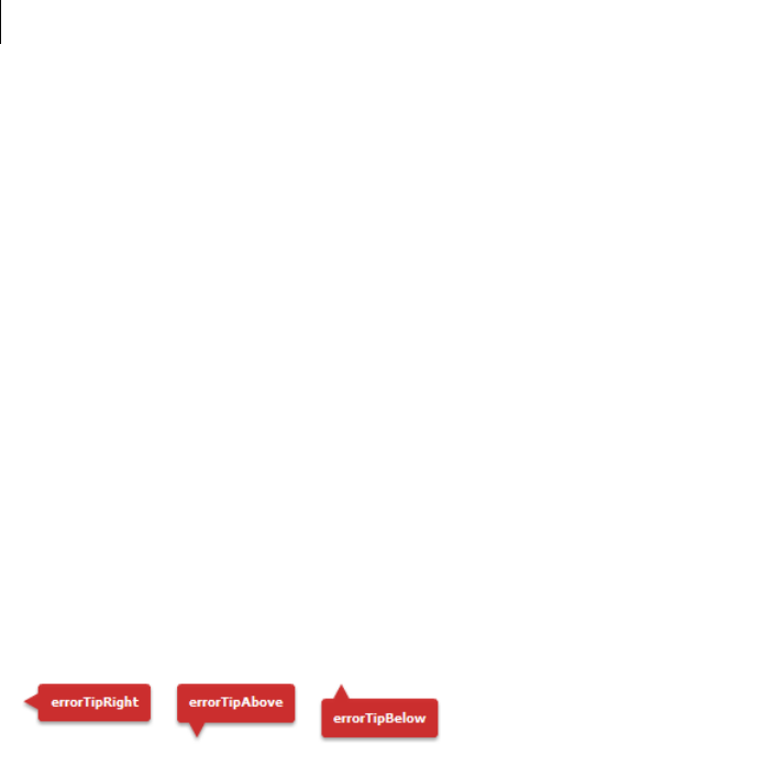
CHAPTER 26
926
For information about using the Application.application.parameters object, see “Passing request data with
flashVars properties” on page 1043.
Creating custom ToolTips
The ToolTipManager has two methods that let you programmatically use To ol Ti ps. These methods are
createToolTip() and destroyToolTip(), which you use to create and destroy new ToolTip objects. When
you create a ToolTip object, you can customize it as you would any object, with access to its properties, styles,
events, and effects.
This createToolTip() method has the following signature:
createToolTip(text:String, x:Number, y:Number, errorTipBorderStyle:String,
context:IUIComponent):IToolTip
The text parameter defines the contents of the ToolTip. The x and y parameters define the x and y coordinates
of the ToolTip, relative to the application container. The errorTipBorderStyle parameter sets the location of
the pointer on the error tip. This parameter is optional. If you specify this value in the createToolTip() method,
Flex styles the ToolTip as an error tip. The following example shows the valid values and their resulting locations
on the error tip:
The context parameter is not currently used.
The createToolTip() method returns a new ToolTip object that implements the IToolTip interface. You must
often cast the return value of this method to a ToolTip, although it is more efficient if you do not do this. To cast,
you can do one of the following:
•Use the as keyword, as the following example shows:
myTip = ToolTipManager.createToolTip(s,10,10) as ToolTip;
•Use the type(object) casting syntax, as the following example shows:
myTip = ToolTip(ToolTipManager.createToolTip(s,10,10));
These methods of casting differ only in the way they behave when a cast fails.
For more information about using error tips, see “Using error tips” on page 932.

927ADOBE FLEX 3
Adobe Flex 3 Developer Guide
Flex displays the ToolTip until you destroy it. In general, you should not display more than one ToolTip box at a
time, because it is confusing to the user.
You can use the destroyToolTip() method to destroy the specified ToolTip object. The destroyToolTip()
method has the following signature:
destroyToolTip(toolTip:IToolTip):void
The toolTip parameter is the ToolTip object that you want to destroy. This is the object returned by the
createToolTip() method.
The following example creates a custom ToolTip when you move the mouse over a Panel container that contains
three Button controls. Each Button control has its own ToolTip that appears when you mouse over that particular
control. The big ToolTip disappears only when you move the mouse away from the Panel container.
<?xml version="1.0"?>
<!-- tooltips/CreatingToolTips.mxml -->
<mx:Application xmlns:mx="http://www.adobe.com/2006/mxml">
<mx:Script><![CDATA[
import mx.managers.ToolTipManager;
import mx.controls.ToolTip;
public var myTip:ToolTip;
private function createBigTip():void {
var s:String = "These buttons let you save, exit, or continue with the current
operation."
myTip = ToolTipManager.createToolTip(s,10,10) as ToolTip;
myTip.setStyle("backgroundColor",0xFFCC00);
myTip.width = 150;
myTip.height = 200;
}
private function destroyBigTip():void {
ToolTipManager.destroyToolTip(myTip);
}
]]></mx:Script>
<mx:Style>
Panel {
paddingLeft: 5;
paddingRight: 5;
paddingTop: 5;
paddingBottom: 5;
}
</mx:Style>
<mx:Panel title="ToolTips" rollOver="createBigTip()" rollOut="destroyBigTip()">
<mx:Button label="OK" toolTip="Save your changes and exit."/>
<mx:Button label="Apply" toolTip="Apply changes and continue."/>
<mx:Button label="Cancel" toolTip="Cancel and exit."/>
</mx:Panel>
</mx:Application>

CHAPTER 26
928
You can also create a custom ToolTip by extending an existing control, such as a Panel or VBox container, and
implementing the IToolTip interface. The following example uses a Panel container as the base for a new imple-
mentation of the IToolTip interface:
<?xml version="1.0"?>
<!-- tooltips/ToolTipComponents/PanelToolTip.mxml -->
<mx:Panel xmlns:mx="http://www.adobe.com/2006/mxml"
implements="mx.core.IToolTip"
width="200"
alpha=".8"
borderThickness="2"
backgroundColor="0xCCCCCC"
dropShadowEnabled="true"
borderColor="black"
borderStyle="solid"
title="feh"
>
<mx:Script><![CDATA[
[Bindable]
public var bodyText:String = "";
// Implement required methods of the IToolTip interface; these
// methods are not used in this example, though.
public var _text:String;
public function get text():String {
return _text;
}
public function set text(value:String):void {
}
]]></mx:Script>
<mx:Text text="{bodyText}" percentWidth="100"/>
</mx:Panel>
In your application, you can create a custom ToolTip by intercepting the toolTipCreate event handler of the
target component. In the event handler, you instantiate the new ToolTip and set its properties. You then point the
toolTip property of the ToolTipEvent object to the new ToolTip.
In the following example, the first two buttons in the application use the custom PanelToolTip in the Custom-
ToolTips package. The third button uses a default ToolTip to show you how the two are different. To run this
example, store the PanelToolTip.mxml file in a subdirectory named CustomToolTips.
<?xml version="1.0"?>
<!-- tooltips/MainCustomApp.mxml -->
<mx:Application xmlns:mx="http://www.adobe.com/2006/mxml">
<mx:Script><
929ADOBE FLEX 3
Adobe Flex 3 Developer Guide
ptt.bodyText = body;
event.toolTip = ptt;
}
]]></mx:Script>
<mx:Button id="b1"
label="Delete"
toolTip=" "
toolTipCreate="createCustomTip('DELETE','Click this button to delete the report.',
event)"
/>
<mx:Button id="b2"
label="Generate"
toolTip=" "
toolTipCreate="createCustomTip('GENERATE','Click this button to generate the
report.', event)"
/>
<mx:Button id="b3"
label="Stop"
toolTip="Click this button to stop the creation of the report. This button uses a
standard ToolTip style."
/>
</mx:Application>
Positioning custom ToolTips
When you use the ToolTipManager to create a custom ToolTip, you specify the coordinates of the ToolTip on the
Stage. You do this by specifying the values of the x and y parameters of the new ToolTip in the createToolTip()
method. These coordinates are relative to the Stage. For example, a value of 0,0 creates a ToolTip at the top-left
corner of the application.
In some cases, you might not know the exact position that you want the ToolTip to be drawn in; instead, you want
the location of the ToolTip to be relative to the target component (the component that has a ToolTip on it). In
those cases, you can use the location of the target component to calculate the values of these coordinates. For
example, if you want the ToolTip to appear to a component’s right, you set the ToolTip’s x position to be the x
position of the component plus the component’s width, plus some other value for an offset.
The following image shows the results of this formula:
You also set the value of the ToolTip’s y position to be the same as the target component’s y position to line the
ToolTip and the component up horizontally.

CHAPTER 26
930
One way to get the values you need to calculate the x position of the ToolTip is to use an event handler. Event
objects passed to an event handler can give you the x position and the width of the target component.
The following example gets the value of the current target’s x, y, and width properties in the focusIn event handler,
and uses them to position the ToolTip. In this case, the current target is the TextInput control, and the ToolTip
appears to its right with a 10-pixel offset.
<?xml version="1.0"?>
<!-- tooltips/PlacingToolTips.mxml -->
<mx:Application xmlns:mx="http://www.adobe.com/2006/mxml" verticalAlign="middle"
horizontalAlign="center" height="100" width="300">
<mx:Script>
<![CDATA[
import mx.controls.ToolTip;
import mx.managers.ToolTipManager;
private var tip:ToolTip;
private var s:String;
private function showTip(event:Object):void {
s="My ToolTip";
// Position the ToolTip to the right of the current target.
tip = ToolTipManager.createToolTip(s,
event.currentTarget.x + event.currentTarget.width + 10,
event.currentTarget.y)
as ToolTip;
}
private function destroyTip(event:Object):void {
ToolTipManager.destroyToolTip(tip);
}
]]>
</mx:Script>
<mx:TextInput id="a"
width="100"
focusIn="showTip(event)"
focusOut="destroyTip(event)"
/>
<mx:TextInput id="b"
width="100"
focusIn="showTip(event)"
focusOut="destroyTip(event)"
/>
</mx:Application>

931ADOBE FLEX 3
Adobe Flex 3 Developer Guide
The previous example creates a ToolTip on a target component that is not inside any containers. However, in many
cases, your components will be inside layout containers such as a VBox or an HBox. Under these circumstances,
the coordinates you access in the event handler will be relative to the container and not the main application. But
the ToolTipManager expects global coordinates when positioning the ToolTip. This will position ToolTips in
unexpected locations.
To avoid this, you can use the contentToGlobal() method to convert the coordinates in the event handler from
local to global. All components that subclass UIComponent have this method. It takes a single Point that is relative
to the target’s enclosing container as an argument and returns a Point that is relative to the Stage.
The following example calls the TextInput control’s contentToGlobal() method to convert the control’s coordi-
nates from those that are relative to the VBox container to global coordinates.
<?xml version="1.0"?>
<!-- tooltips/PlacingToolTipsInContainers.mxml -->
<mx:Application xmlns:mx="http://www.adobe.com/2006/mxml" verticalAlign="middle"
horizontalAlign="center" height="250" width="400">
<mx:Script>
<![CDATA[
import mx.controls.ToolTip;
import mx.managers.ToolTipManager;
private var tip:ToolTip;
private var s:String;
private function showTipA(event:Object):void {
s="My Tip A";
tip = ToolTipManager.createToolTip(s,
event.currentTarget.x + event.currentTarget.width + 10,
event.currentTarget.y
) as ToolTip;
}
private function showTipB(event:Object):void {
s="My Tip B";
var pt:Point = new Point(
event.currentTarget.x,
event.currentTarget.y);
// Call this method to convert the object's
// coordinates inside its container to the stage's
// global coordinates.
pt = event.currentTarget.contentToGlobal(pt);
tip = ToolTipManager.createToolTip(s,
pt.x + event.currentTarget.width + 10,
pt.y
) as ToolTip;
}
private function destroyTip(event:Object):void {
ToolTipManager.destroyToolTip(tip);
}
]]>

CHAPTER 26
932
</mx:Script>
<!-- A ToolTip at the top level. -->
<!-- The event handler for this ToolTip does not use any special
logic to account for whether the ToolTip is inside a container.
But this ToolTip is not inside a container so it positions itself
normally. -->
<mx:TextInput id="a"
text="Good ToolTip placement"
width="175"
focusIn="showTipA(event)"
focusOut="destroyTip(event)"
/>
<mx:VBox >
<!-- A ToolTip inside a container. -->
<!-- The event handler for this ToolTip accounts for the control
being inside a container and positions the ToolTip using the
contentToGlobal() method. -->
<mx:TextInput id="b"
text="Good ToolTip placement"
width="175"
focusIn="showTipB(event)"
focusOut="destroyTip(event)"
/>
<!-- A ToolTip inside a container. -->
<!-- The event handler for this ToolTip does not use any special
logic to account for whether the ToolTip is inside a container.
As a result, it positions itself using coordinates that are relative
to the container, but that are not converted to global coordinates. -->
<mx:TextInput id="c"
text="Bad ToolTip placement"
width="175"
focusIn="showTipA(event)"
focusOut="destroyTip(event)"
/>
</mx:VBox>
</mx:Application>
Using error tips
Error tips are instances of the To ol Ti p class that get their styles from the errorTip class selector. They are most
often seen when the Flex validation mechanism displays a warning when data is invalid. But you can use the
definitions of the errorTip style and apply it to ToolTips to create a custom validation warning mechanism.
The styles of an error tip are defined in the defaults.css file, which is in the framework.swc file. It specifies the
following default settings for errorTip (notice the period preceding errorTip, which indicates that it is a class
selector):

933ADOBE FLEX 3
Adobe Flex 3 Developer Guide
.errorTip {
color: #FFFFFF;
fontSize: 9;
fontWeight: "bold";
shadowColor: #000000;
borderColor: #CE2929;
borderStyle: "errorTipRight";
paddingBottom: 4;
paddingLeft: 4;
paddingRight: 4;
paddingTop: 4;
}
You can customize the appearance of error tips by creating a new theme that overrides these styles, or by
overriding the style properties in your application. For more information on creating themes, see “About themes”
on page 645.
You can create ToolTips that look like validation error tips by applying the errorTip style to the ToolTip. The
following example does not contain any validation logic, but shows you how to use the errorTip style to create
ToolTips that look like validation error tips. When you run the example, press the Enter key after entering text
into the TextInput controls.
<?xml version="1.0"?>
<!-- tooltips/ErrorTipStyle.mxml -->
<mx:Application xmlns:mx="http://www.adobe.com/2006/mxml" verticalGap="20">
<mx:Script><
CHAPTER 26
934
// Apply the errorTip class selector.
errorTip.setStyle("styleName", "errorTip");
}
private function resetApp():void {
if (errorTip) {
ToolTipManager.destroyToolTip(errorTip);
errorTip = null;
}
}
]]></mx:Script>
<mx:TextInput id="ssn" enter="validateEntry('ssn',event)"/>
<mx:TextInput id="phone" enter="validateEntry('phone',event)"/>
<mx:Label text="Press the enter key after entering text in each text input."/>
<mx:Button id="b1" label="Reset" click="resetApp()"/>
</mx:Application>
Another way to use error tips is to set the value of the errorString property of the component. This causes the
To o lTi pM a na ge r to create an instance of a ToolTip and apply the errorTip style to that ToolTip without requiring
any coding on your part.
The following example shows how to set the value of the errorString property to create an error tip:
<?xml version="1.0"?>
<!-- tooltips/ErrorString.mxml -->
<mx:Application xmlns:mx="http://www.adobe.com/2006/mxml" verticalGap="20">
<mx:Script><![CDATA[
import mx.controls.ToolTip;
import mx.managers.ToolTipManager;
private var errorTip:ToolTip;
private var myError:String;
private function validateEntry(type:String, event:Object):void {
// NOTE: Validation logic would go here.
switch(type) {
case "ssn":
myError="Use SSN format";
break;
case "phone":
myError="Use phone format";
break;
}
event.currentTarget.errorString = myError;
}
]]></mx:Script>
<mx:TextInput id="ssn" enter="validateEntry('ssn',event)"/>
<mx:TextInput id="phone" enter="validateEntry('phone',event)"/>
</mx:Application>
You can also specify that the ToolTipManager creates an error tip when you call the createToolTip() method
by specifying the value of the errorTipBorderStyle property, as the following example shows:

935ADOBE FLEX 3
Adobe Flex 3 Developer Guide
<?xml version="1.0"?>
<!-- tooltips/CreatingErrorTips.mxml -->
<mx:Application xmlns:mx="http://www.adobe.com/2006/mxml">
<mx:Script><![CDATA[
import mx.managers.ToolTipManager;
import mx.controls.ToolTip;
public var myTip:ToolTip;
private function createBigTip(event:Event):void {
var myError:String = "These buttons let you save, exit, or continue with the current
operation.";
// By setting the fourth argument to a non-null value,
// this ToolTip is created as an error tip.
myTip = ToolTipManager.createToolTip(
myError,
event.currentTarget.x + event.currentTarget.width,
event.currentTarget.y,
"errorTipRight"
) as ToolTip;
}
private function destroyBigTip():void {
ToolTipManager.destroyToolTip(myTip);
}
]]></mx:Script>
<mx:Style>
Panel {
paddingLeft: 5;
paddingRight: 5;
paddingTop: 5;
paddingBottom: 5;
}
</mx:Style>
<mx:Panel title="ToolTips" rollOver="createBigTip(event)" rollOut="destroyBigTip()">
<mx:Button label="OK" toolTip="Save your changes and exit."/>
<mx:Button label="Apply" toolTip="Apply changes and continue."/>
<mx:Button label="Cancel" toolTip="Cancel and exit."/>
</mx:Panel>
</mx:Application>
For more information on using validators, see “Validating Data” on page 1267.
Reskinning ToolTips
You can apply a programmatic skin to ToolTip controls.
ToolTip skins are defined by the ToolTipB order programmatic skin. This file is located in the mx.skins.halo
package.

CHAPTER 26
936
To reskin ToolTips, you edit the ToolTipBorder class file, and then apply the new skin to the ToolTip by using CSS.
For more information on skinning, see “Creating Skins” on page 689.
Reskin ToolTips by using CSS
1Open the mx.skins.halo.ToolTipBorder.as file. This file is included with the source files, as described in “Skin
resources” on page 698.
2Save the ToolTipBorder.as file under another name, and in a different location. The filename must be the same
as the new class name.
3Change the package from mx.skins.halo to your package name, or to the empty package, as the following
example shows:
//package mx.skins.halo { // Old package name
package { // New, empty package
4Change the class name in the file, as the following example shows:
//public class ToolTipBorder extends RectangularBorder // Old name
public class MyToolTipBorder extends RectangularBorder // New name
5Change the constructor to reflect the new class name, as the following example shows:
//public function ToolTipBorder() // Old constructor
public function MyToolTipBorder() // New constructor
6Comment out the versioning line, as the following example shows:
//include "../../core/Version.as";
7Edit the class file to change the appearance of the ToolTip. You do this by editing the “toolTip” case in the
updateDisplayList() method. That is the method that draws the ToolTip’s border and sets the default styles.
Most commonly, you change the arguments of the drawRoundRect() method to change the appearance of the
To o lTi p.
The following example adds a red tinge to the background of the ToolTip’s box by replacing the default
backgroundColor property with an array of colors:
var highlightAlphas:Array = [0.3,0.0];
drawRoundRect(3, 1, w-6, h-4, cornerRadius, [0xFF0000, 0xFFFFBB],
backgroundAlpha);
The values of the cornerRadius and backgroundAlpha properties that are shown in the previous code
snippet are set earlier in the updateDisplayList() method.
8Save the class file.
9In your Flex application, edit the ToolTip’s borderSkin style property to point to the new skin. You can do
this in an <mx:Style> tag inside your application, or by using external CSS file or a custom theme file. The
following example sets the borderSkin property to the new skin class:
<?xml version="1.0"?>

937ADOBE FLEX 3
Adobe Flex 3 Developer Guide
<!-- skins/ApplyCustomToolTipSkin.mxml -->
<mx:Application xmlns:mx="http://www.adobe.com/2006/mxml">
<mx:Style>
ToolTip {
borderSkin: ClassReference("MyToolTipBorder");
}
</mx:Style>
<mx:Button id="b1" label="Click Me" toolTip="Click this button"/>
</mx:Application>
You must specify the full package name in the CSS reference. In this example, the file MyToolTipBorder.as is
in an empty package and, therefore, has no package designation such as mx.skins.halo.
10 Compile and run the application with the new skin file in the source path. You do this by setting the value of
the compiler’s source-path option.
If the skin class is in the same directory as the application, you do not have to add its location to the source
path. The current directory is assumed. For more information, see “Using the Flex Compilers” on page 125 in
Building and Deploying Adobe Flex 3 Applications.

CHAPTER 26
938

939
Chapter 27: Using the Cursor Manager
The Adobe® Flex® Cursor Manager lets you control the cursor image in your Flex application. You can use the
Cursor Manager to provide visual feedback to users to indicate when to wait for processing to complete, to
indicate allowable actions, or to provide other types of feedback. The cursor image can be a JPEG, GIF, PNG, or
SVG image, a Sprite object, or a SWF file.
Topics
About the Cursor Manager . . . . . . . . . . . . . . . . . . . . . . . . . . . . . . . . . . . . . . . . . . . . . . . . . . . . . . . . . . . . . . . . . . . . . . .939
Creating and removing a cursor . . . . . . . . . . . . . . . . . . . . . . . . . . . . . . . . . . . . . . . . . . . . . . . . . . . . . . . . . . . . . . . . . . . 939
Using a busy cursor . . . . . . . . . . . . . . . . . . . . . . . . . . . . . . . . . . . . . . . . . . . . . . . . . . . . . . . . . . . . . . . . . . . . . . . . . . . . .942
About the Cursor Manager
By default, Flex uses the system cursor as the application cursor. You control the system cursor by using the
settings of your operating system.
The Flex Cursor Manager lets you control the cursor image in your Flex application. For example, if your appli-
cation performs processing that requires the user to wait until the processing completes, you can change the
cursor so that it reflects the waiting period. In this case, you can change the cursor to an hourglass or other image.
You also can change the cursor to provide feedback to the user to indicate the actions that the user can perform.
For example, you can use one cursor image to indicate that user input is enabled, and another to indicate that input
is disabled.
You can use a JPEG, GIF, PNG, or SVG image, a Sprite object, or a SWF file as the cursor image.
Creating and removing a cursor
To use the Cursor Manager, you import the mx.managers.CursorManager class into your application, and then
reference its static properties and methods.
The Cursor Manager controls a prioritized list of cursors, where the cursor with the highest priority is currently
visible. If the cursor list contains more than one cursor with the same priority, the Cursor Manager displays the
most recently created cursor.
940 CHAPTER 27
You create a new cursor, and set an optional priority for the cursor, by using the static setCursor() method of
the CursorManager class. This method adds the new cursor to the cursor list. If the new cursor has the highest
priority, it is displayed immediately. If the priority is lower than a cursor already in the list, it is not displayed until
the cursor with the higher priority is removed.
To remove a cursor from the list, you use the static removeCursor() method. If the cursor is the currently
displayed cursor, the Cursor Manager displays the next cursor in the list, if one exists. If the list ever becomes
empty, the Cursor Manager displays the default system cursor.
The setCursor() method has the following signature:
public static setCursor(cursorClass:Class, priority:int = 2, xOffset:Number = 0,
yOffset:Number = 0, setter:IUIComponent = null):int
The following table describes the arguments for the setCursor() method:
This method returns the ID of the new cursor. You pass the ID to the removeCursor() method to delete the
cursor. This method has the following signature:
static removeCursor(cursorID:int):void
Note: In AIR, each mx.core.Window instance uses its own instance of the CursorManager class. In an AIR appli-
cation, instead of directly referencing the static methods and properties of the CursorManager class, use the
Window.cursorManager property to reference the CursorManager instance for the Window instance.
The following example changes the cursor to a custom wait or busy cursor while a large image file loads. After the
load completes, the application removes the busy cursor and returns the cursor to the system cursor.
Note: The Flex framework includes a default busy cursor. For information on using this cursor, see “Using a busy
cursor” on page 942.
<?xml version="1.0"?>
<!-- cursors\CursorManagerApp.mxml -->
<mx:Application xmlns:mx="http://www.adobe.com/2006/mxml">
Argument Description Req/Opt
cursorClass The class name of the cursor to display. Required
priority The priority level of the cursor. Valid values are CursorManagerPriority.HIGH,
CursorManagerPriority.MEDIUM, and CursorManagerPriority.LOW. The default value is 2, corre-
sponding to CursorManagerPriority.MEDIUM.
Optional
xOffset The x offset of the cursor relative to the mouse pointer. The default value is 0. Optional
yOffset The y offset of the cursor relative to the mouse pointer. The default value is 0. Optional
setter The IUIComponent that set the cursor. Necessary (in multi-window environments) to know which window
needs to display the cursor.
Optional

941ADOBE FLEX 3
Adobe Flex 3 Developer Guide
<mx:Script>
<![CDATA[
import mx.managers.CursorManager;
import flash.events.*;
// Define a variable to hold the cursor ID.
private var cursorID:Number = 0;
// Embed the cursor symbol.
[Embed(source="assets/wait.jpg")]
private var waitCursorSymbol:Class;
// Define event listener to display the wait cursor
// and to load the image.
private function initImage(event:MouseEvent):void {
// Set busy cursor.
cursorID = CursorManager.setCursor(waitCursorSymbol);
// Load large image.
image1.load("../assets/DSC00034.JPG");
}
// Define an event listener to remove the wait cursor.
private function loadComplete(event:Event):void {
CursorManager.removeCursor(cursorID);
}
]]>
</mx:Script>
<mx:VBox>
<!-- Image control to load the image. -->
<mx:Image id="image1"
height="50"
width="100"
scaleContent="true"
complete="loadComplete(event);"/>
<!-- Button triggers the load. -->
<mx:Button id="myButton" label="Show" click="initImage(event);"/>
</mx:VBox>
</mx:Application>
This example uses a JPEG image as the cursor image. You can also use a Sprite, or a PNG, GIF, SVG, or SWF file,
as the following example shows:
[Embed(source="assets/wait.swf")]
var waitCursorSymbol:Class;
Or you can reference a symbol from a SWF file, as the following example shows:
[Embed(source="assets/cursorList.swf", symbol="wait")]
var waitCursorSymbol:Class;
An advantage of using a SWF file is that you can create an animated cursor.
CHAPTER 27
942
Using a busy cursor
Flex defines a default busy cursor that you can use to indicate that your application is processing, and that users
should wait until that processing completes before the application will respond to inputs. The default busy cursor
is an animated clock.
You can control a busy cursor in several ways:
•You can use Cursor Manager methods to set and remove the busy cursor.
•You can use the showBusyCursor property of the SWFLoader, WebService, HttpService, and RemoteObject
classes to automatically display the busy cursor.
Setting a busy cursor
The following static Cursor Manager methods control the busy cursor:
You can modify the example in “Creating and removing a cursor” on page 939 to use the default busy cursor, as
the following example shows:
<?xml version="1.0"?>
<!-- cursors\DefBusyCursorApp.mxml -->
<mx:Application xmlns:mx="http://www.adobe.com/2006/mxml">
<mx:Script>
<![CDATA[
import mx.managers.CursorManager;
import flash.events.*;
private function initImage(event:MouseEvent):void {
CursorManager.setBusyCursor();
image1.load("../assets/DSC00034.JPG");
}
private function loadComplete(event:Event):void {
CursorManager.removeBusyCursor();
}
]]>
</mx:Script>
<mx:VBox>
<!-- Image control to load the image. -->
Method Description
setBusyCursor() Displays the busy cursor.
removeBusyCursor() Removes the busy cursor from the cursor list. If other busy cursor requests are still active in the cursor list,
which means that you called the setBusyCursor() method more than once, a busy cursor does not disap-
pear until you remove all busy cursors from the list.

943ADOBE FLEX 3
Adobe Flex 3 Developer Guide
<mx:Image id="image1"
height="50"
width="100"
scaleContent="true"
complete="loadComplete(event);"/>
<!-- Button triggers the load. -->
<mx:Button id="myButton" label="Show" click="initImage(event);"/>
</mx:VBox>
</mx:Application>
Setting the busy cursor does not prevent a user from interacting with your application; a user can still enter text
or select buttons. However, all containers support the enabled property. By default, this property is set to true to
enable user interaction with the container and with the container’s children. If you set the enabled property to
false when you display a busy cursor, Flex dims the color of the container and of all of its children, and blocks
user input to the container and to all of its children.
You can also disable user interaction for the entire application by setting the
Application.application.enabled property to false. If you are in a subclass or an ActionScript-only appli-
cation, you must either explicitly import the mx.core.Application class, or specify
mx.core.Application.application.enabled to set the property’s value.
The busy cursor has a priority of CursorManagerPriority.LOW. Therefore, if the cursor list contains a cursor
with a higher priority, the busy cursor does not appear until you remove the higher-priority cursor. To create a
default busy cursor at a higher priority level, use the setCursor() method, as the following example shows:
<?xml version="1.0"?>
<!-- cursors\ShowBusyCursorAppHighP.mxml -->
<mx:Application xmlns:mx="http://www.adobe.com/2006/mxml">
<mx:Script>
<
CHAPTER 27
944
}
]]>
</mx:Script>
<mx:VBox>
<!-- Image control to load the image. -->
<mx:Image id="image1"
height="50"
width="100"
scaleContent="true"
complete="loadComplete(event);"/>
<!-- Button triggers the load. -->
<mx:Button id="myButton" label="Show" click="initImage(event);"/>
</mx:VBox>
</mx:Application>
This statement uses the static getStyleDeclaration() method of the StyleManager class to get the CSStyle-
Declaration object for the Cursor Manager, and uses this object’s getStyle() method to get the busy cursor,
which it sets as a high priority cursor.
When you use this technique, you must also use the cursor ID in the removeCursor() method to remove the busy
cursor.
Using the showBusyCursor property
The SWFLoader and Image controls, and the <mx:WebService>, <mx:HttpService>, and <mx:RemoteObject>
tags have a showBusyCursor property that automatically displays the default busy cursor until the class completes
loading data. The default value is false for the SWFLoader control and Image, and for the <mx:WebService>,
<mx:HttpService> and <mx:RemoteObject> tags.
If you set the showBusyCursor property to true, Flex displays the busy cursor when the first progress event of
the control is triggered, and hides the busy cursor when the complete event is triggered. The following example
shows how you can simplify the example in the section “Setting a busy cursor” on page 942 by using the
showBusyCursor property:
<?xml version="1.0"?>
<!-- cursors\ShowBusyCursorApp.mxml -->
<mx:Application xmlns:mx="http://www.adobe.com/2006/mxml">
<mx:VBox>
<!-- Image control to load the image. -->
<mx:Image id="image1"
height="50"
width="100"
scaleContent="true"
showBusyCursor="true"/>
<!-- Button triggers the load. -->
<mx:Button id="myButton" label="Show"
click="image1.load('../assets/DSC00034.JPG');"/>

945ADOBE FLEX 3
Adobe Flex 3 Developer Guide
</mx:VBox>
</mx:Application>

CHAPTER 27
946

947
Chapter 28: Dynamically Repeating
Controls and Containers
Repeater components let you dynamically repeat MXML content at run time.
Adobe® Flex® also supports list controls, which provide better performance when you display large amounts of
data. For more information about the HorizontalList, TileList, and List controls, see “Using Data-Driven
Controls” on page 373.
Topics
About Repeater components. . . . . . . . . . . . . . . . . . . . . . . . . . . . . . . . . . . . . . . . . . . . . . . . . . . . . . . . . . . . . . . . . . . . . .947
Using the Repeater component. . . . . . . . . . . . . . . . . . . . . . . . . . . . . . . . . . . . . . . . . . . . . . . . . . . . . . . . . . . . . . . . . . . .948
Considerations when using a Repeater component. . . . . . . . . . . . . . . . . . . . . . . . . . . . . . . . . . . . . . . . . . . . . . . . . . .965
About Repeater components
Repeater components are useful for repeating a small set of simple user interface components, such as
RadioButton controls and other controls typically used in Form containers. Repetition is generally controlled by
an array of dynamic data, such as an Array object returned from a web service, but you can use static arrays to
emulate simple for loops.
Although Repeater components look like containers in your code, they are not containers and have none of the
automatic layout functionality of containers. Their sole purpose is to specify a series of subcomponents to include
in your application one or more times based on the contents of a specified data provider. To align items that a
repeater generates or perform any other layout task, place the Repeater component and its contents inside a
container and apply the layout to that container.
Flex also supports HorizontalList, TileList, and List controls that provide better performance when you are
displaying large amounts of data. Unlike the Repeater component, which instantiates all objects that are repeated,
the HorizontalList, TileList, and List controls instantiate only objects visible in the list. If your data extends past a
single screen or the visible space within any of its containers, you should use one of the list controls.
The HorizontalList control is a list control that displays data horizontally, much like the HBox container. The
HorizontalList control always displays items from left to right. For more information, see “HorizontalList control”
on page 382.
948 CHAPTER 28
The TileList control is a list control that displays data in a tile layout, much like the Tile container. The TileList
control provides a direction property that determines if the next item is down or to the right. For more infor-
mation, see “TileList control” on page 385.
The List control displays data in a single vertical column. For more information, see “List control” on page 373.
Using the Repeater component
You use the <mx:Repeater> tag to declare a Repeater component that handles repetition of one or more user
interface components based on dynamic or static data arrays at run time. The repeated components can be
controls or containers. Using a Repeater component requires data binding to allow for run-time-specific values.
For more information about data binding, see “Storing Data” on page 1257.
You can use the <mx:Repeater> tag anywhere a control or container tag is allowed. To repeat user interface
components, you place their tags within the <mx:Repeater> tag. All components derived from the UICom-
ponent class can be repeated with the exception of the <mx:Application> container tag. You can also use more
than one <mx:Repeater> tag in an MXML document, and you can nest <mx:Repeater> tags.
Declaring the Repeater component in MXML
You declare the Repeater component in the <mx:Repeater> tag. The following table describes the Repeater
component’s properties:
Property Description
id Instance name of the corresponding Repeater component.
dataProvider An implementation of the ICollectionView interface, IList interface, or Array class, such as an ArrayCollection
object.
You must sp ecify a dataProvider value or the Repeater component will not execute.
Generally, you specify the value of the dataProvider property as a binding expression because the value is not
known until run time.
startingIndex Number that specifies the element in the data provider at which the repetition starts. The data provider array is
zero-based, so to start at the second element of the array, specify a starting index of one. If the startingIndex
is not within the range of the dataProvider property, no repetition occurs.
count Number that specifies how many repetitions occur. If the dataProvider property has fewer items than the
number in the count property, the repetition stops with the last item.
949ADOBE FLEX 3
Adobe Flex 3 Developer Guide
The following table describes the Repeater component’s events:
Basic principles of the Repeater component
The simplest repeating structures you can create with a Repeater component are static loops that execute a set
number of times. The following Repeater component emulates a simple for loop that executes four times, printing
a simple line of text and incrementing the counter by one each time:
<?xml version="1.0"?>
<mx:Application xmlns:mx="http://www.adobe.com/2006/mxml" xmlns="*">
<mx:Script>
<![CDATA[
[Bindable]
public var myArray:Array=[1,2,3,4];
]]>
</mx:Script>
<mx:ArrayCollection id="myAC" source="{myArray}"/>
<mx:Repeater id="myrep" dataProvider="{myAC}">
<mx:Label id="Label1" text="This is loop #{myrep.currentItem}"/>
</mx:Repeater>
</mx:Application>
currentIndex Number that specifies the element of the dataProvider item currently being processed. The data provider array
is zero-based, so when the third element is being processed, the current index is two. This property changes as the
Repeater component executes, and is -1 after the execution is complete. It is a read-only property that you cannot
set in the <mx:Repeater> tag.
currentItem Reference to the item that is being processed in the dataProvider property. This property changes as the
Repeater component executes, and is null after the execution is complete. It is a read-only property that you
cannot set in the <mx:Repeater> tag.
After a Repeater component finishes repeating, you do not use the currentItem property to get the current
item. Instead, you call the getRepeaterItem() method of the repeated component itself. For more information,
see “Event handlers in Repeater components” on page 957.
recycleChildren Boolean value that, when set to true, binds new data items into existing Repeater children, incrementally creates
new children if there are more data items, and destroys extra children that are no longer required. For more infor-
mation, see “Recreating children in a Repeater component” on page 965.
Event Description
repeat Dispatched each time an item is processed and currentIndex and currentItem are updated.
repeatEnd Dispatched after all the subcomponents of a repeater are created.
repeatStart Dispatched when Flex begins processing the dataProvider property and begins creating the specified subcom-
ponents.
Property Description
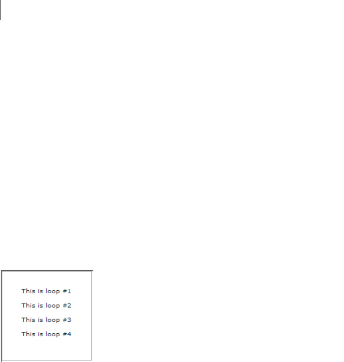
CHAPTER 28
950
In actuality, the counter is not the data within the array, but the position within the array. As long as the array
contains four elements, you can provide any data within the array itself, and the Repeater component still executes
four times. The following example illustrates this principle:
<?xml version="1.0"?>
<mx:Application xmlns:mx="http://www.adobe.com/2006/mxml">
<mx:Script>
<![CDATA[
[Bindable]
public var myArray:Array=[10,20,30,40];
]]>
</mx:Script>
<mx:ArrayCollection id="myAC" source="{myArray}"/>
<mx:Repeater id="myrep" dataProvider="{myAC}">
<mx:Label id="Label1" text="This is loop #{myrep.currentIndex+1}"/>
</mx:Repeater>
</mx:Application>
Notice that this example prints the current index plus one, not the index itself. This is because the first element of
the array is assigned an index value of zero (0).
Both of the previous examples yield the following identical result:
You can also use the startingIndex and count properties to adjust the starting point and total number of execu-
tions. The count property sets a maximum on the number of times the Repeater component executes. The count
property is often—but not always—an exact measure of the number of times that the content within the Repeater
component will execute. This number is because the Repeater component stops after the last element of the data
provider is reached, regardless of the value of the count property.
The following example shows how the count and startingIndex properties affect a Repeater component:
<?xml version="1.0"?>
<!-- repeater\StartingIndexCount.mxml -->
<mx:Application xmlns:mx="http://www.adobe.com/2006/mxml">
<mx:Script>

951ADOBE FLEX 3
Adobe Flex 3 Developer Guide
<![CDATA[
[Bindable]
public var myArray:Array=[100,200,300,400,500,600];
]]>
</mx:Script>
<mx:ArrayCollection id="myAC" source="{myArray}"/>
<mx:Repeater id="myrep" dataProvider="{myAC}" count="6">
<mx:Label id="Label1"
text="Value: {myrep.currentItem}, Loop #{myrep.currentIndex+1}
of {myrep.count}"/>
</mx:Repeater>
<mx:HRule/>
<mx:Repeater id="myrep2" dataProvider="{myAC}"
count="4" startingIndex="1">
<mx:Label id="Label2"
text="Value: {myrep2.currentItem},
Loop #{myrep2.currentIndex-myrep2.startingIndex+1}
of {myrep2.count}"/>
</mx:Repeater>
<mx:HRule/>
<mx:Repeater id="myrep3" dataProvider="{myAC}" count="6"
startingIndex="3">
<mx:Label id="Label3"
text="Value: {myrep3.currentItem},
Loop #{myrep3.currentIndex-myrep3.startingIndex+1}
of {myrep3.count}"/>
</mx:Repeater>
</mx:Application>
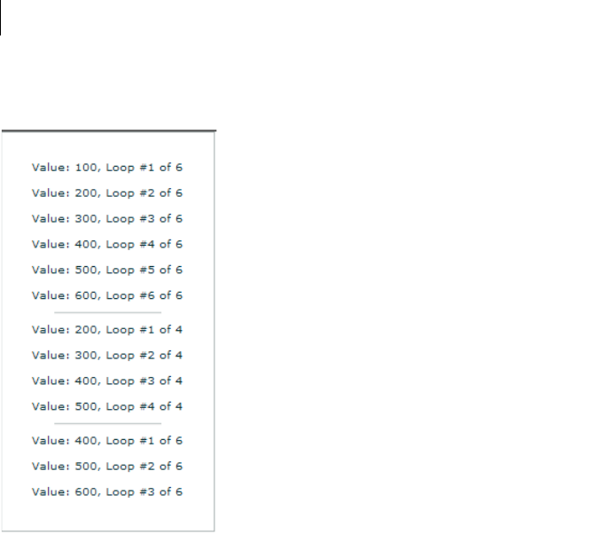
CHAPTER 28
952
This example produces the following output:
The first Repeater component loops through each element of the data provider, starting with the first and stopping
after the last. The second Repeater component starts at the second element of the data provider and iterates four
times, ending at the fifth element. The third Repeater component starts with the fourth element and continues
until the end of the data provider array, and then stops. Only three iterations occur despite the fact that the count
property is set to 6.
Creating dynamic loops with the Repeater component
The principles described in “Basic principles of the Repeater component” on page 949 work with dynamic data
providers as well. The only difference is the source of the data array; instead of a static array written directly into
your application, the array is defined in an <mx:Model> tag and drawn from an XML file, a web service, a remote
object, or some other source. The data is collected and evaluated at run time to determine the number and value
of elements in the data provider and how the Repeater component behaves.
In the following example, an <mx:Repeater> tag repeats a RadioButton control for each product in an XML file:
<?xml version="1.0"?>
<!-- repeater\DynamicLoop.mxml -->
<mx:Application xmlns:mx="http://www.adobe.com/2006/mxml"
initialize="catalogService.send();">
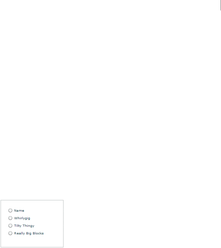
953ADOBE FLEX 3
Adobe Flex 3 Developer Guide
<mx:HTTPService id="catalogService" url="assets/repeater/catalog.xml"
resultFormat="e4x"/>
<mx:XMLListCollection id="myXC"
source="{catalogService.lastResult.product}"/>
<mx:Repeater id="r" dataProvider="{myXC}">
<mx:RadioButton id="Radio" label="{r.currentItem.name}"
width="150"/>
</mx:Repeater>
</mx:Application>
Assume that catalog.xml contains the following:
<?xml version="1.0"?>
<!-- assets\catalog.xml -->
<products>
<product>
<name>Name</name>
<price>Price</price>
<freeship>Free Shipping?</freeship>
</product>
<product>
<name>Whirlygig</name>
<price>5</price>
<freeship>false</freeship>
</product>
<product>
<name>Tilty Thingy</name>
<price>15</price>
<freeship>true</freeship>
</product>
<product>
<name>Really Big Blocks</name>
<price>25</price>
<freeship>true</freeship>
</product>
</products>
Flex displays the following output:
You can still use the count property to restrict the number of iterations performed. You can use the
startingIndex property to skip entries at the beginning of the data provider.
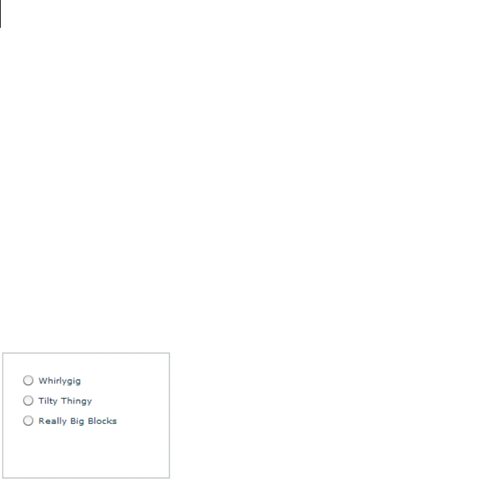
CHAPTER 28
954
In the preceding example, the first product entry in the XML file contains metadata that other applications use to
create column headers. Because it doesn’t make sense to include that entry in the radio buttons, start the Repeater
component at the second element of the data provider, as in the following code example:
<?xml version="1.0"?>
<!-- repeater\StartSecondElement.mxml -->
<mx:Application xmlns:mx="http://www.adobe.com/2006/mxml"
initialize="catalogService.send();">
<mx:HTTPService id="catalogService" url="assets/repeater/catalog.xml"
resultFormat="e4x"/>
<mx:XMLListCollection id="myXC"
source="{catalogService.lastResult.product}"/>
<mx:Repeater id="r" dataProvider="{myXC}"
startingIndex="1">
<mx:RadioButton id="Radio" label="{r.currentItem.name}"
width="150"/>
</mx:Repeater>
</mx:Application>
The preceding example produces the following output:
Referencing repeated components
To reference individual instances of a repeated component, you use indexed id references, as the following
example shows:
<?xml version="1.0"?>
<!-- repeater\RefRepeatedComponents.mxml -->
<mx:Application xmlns:mx="http://www.adobe.com/2006/mxml">
<mx:Script>
<![CDATA[
public function labelTrace():void {
for (var i:int = 0; i < nameLabel.length; i++)
trace(nameLabel[i].text);
}
]]>
</mx:Script>

955ADOBE FLEX 3
Adobe Flex 3 Developer Guide
<mx:Model id="catalog" source="../assets/repeater/catalog.xml"/>
<mx:ArrayCollection id="myAC" source="{catalog.product}"/>
<mx:Label id="title" text="Products:"/>
<mx:Repeater id="r" dataProvider="{myAC}" startingIndex="1">
<mx:Label id="nameLabel"
text="{r.currentItem.name}: ${r.currentItem.price}"
width="200"/>
</mx:Repeater>
<mx:Button label="Trace" click="labelTrace();"/>
</mx:Application>
In this example, the id of the repeated Label control is nameLabel; each nameLabel instance created has this id.
You reference the individual Label instances as nameLabel[0], nameLabel[1], and so on. You reference the total
number of nameLabel instances as nameLabel.length. The for loop traces the text property of each Label
control in the nameLabel Array object. The labelTrace() method prints the name and price of each product in
the system log, provided you’ve defined it in the mm.cfg file.
Referencing repeated child components
When a container is repeated and indexed in an array, its children are also indexed. For example, for the following
MXML code, you reference the child Label controls of the VBox container vb[0] as nameLabel[0] and
shipLabel[0]. The syntax for referencing the children is the same as the syntax for referencing the parent.
<?xml version="1.0"?>
<!-- repeater\RefRepeatedChildComponents.mxml -->
<mx:Application xmlns:mx="http://www.adobe.com/2006/mxml">
<mx:Script>
<![CDATA[
public function labelTrace():void {
for (var i:int = 0; i < nameLabel.length; i++)
trace(nameLabel[i].text);
}
]]>
</mx:Script>
<mx:Model id="catalog" source="../assets/repeater/catalog.xml"/>
<mx:Label id="title" text="Products:"/>
<mx:Repeater id="r" dataProvider="{catalog.product}"
startingIndex="1">
<mx:VBox id="vb">
<mx:Label id="nameLabel"
text="{r.currentItem.name}: ${r.currentItem.price}"
width="200"/>
<mx:Label id="shipLabel"
text="Free shipping: {r.currentItem.freeship}"/>
<mx:Spacer/>
</mx:VBox>
</mx:Repeater>

CHAPTER 28
956
<mx:Button label="Trace" click="labelTrace();"/>
</mx:Application>
Referencing nested Repeater components
When <mx:Repeater> tags are nested, the inner <mx:Repeater> tags are indexed Repeater components. For
example, for the following MXML code, you access the nested Repeater components as r2[0], r2[1], and so on.
The syntax for referencing the children is same as the syntax for referencing the parent.
<?xml version="1.0"?>
<!-- repeater\RefNestedComponents.mxml -->
<mx:Application xmlns:mx="http://www.adobe.com/2006/mxml">
<mx:Script>
<![CDATA[
public function labelTrace():void {
for (var i:int = 0; i < nameLabel.length; i++)
for (var j:int = 0; j < nameLabel[i].length; j++)
trace(nameLabel[i][j].text);
}
]]>
</mx:Script>
<mx:Model id="data">
<color>
<colorName>Red</colorName>
<colorName>Yellow</colorName>
<colorName>Blue</colorName>
</color>
</mx:Model>
<mx:Model id="catalog" source="../assets/repeater/catalog.xml"/>
<mx:ArrayCollection id="myAC1" source="{catalog.product}"/>
<mx:ArrayCollection id="myAC2" source="{data.colorName}"/>
<mx:Label id="title" text="Products:"/>
<mx:Repeater id="r" dataProvider="{myAC1}" startingIndex="1">
<mx:Repeater id="r2" dataProvider="{myAC2}">
<mx:Label id="nameLabel" text="{r2.currentItem}
{r.currentItem.name}: ${r.currentItem.price}" width="200"/>
</mx:Repeater>
</mx:Repeater>
<mx:Button label="Trace" click="labelTrace();"/>
</mx:Application>
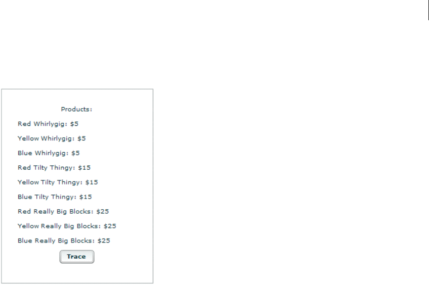
957ADOBE FLEX 3
Adobe Flex 3 Developer Guide
This application places the full list of products with color and price into the system log when you click the Button
control (provided you have defined the log file in the mm.cfg file) and yields the following on screen:
In the previous example, the instances of the Label control are multiply indexed because they are inside multiple
Repeater components. For example, the index nameLabel[1][2] contains a reference to the Label control
produced by the second iteration of r and the third iteration of r2.
Event handlers in Repeater components
When a Repeater component is busy repeating, each repeated object that it creates can bind at that moment to the
Repeater component’s currentItem property, which is changing as the Repeater component repeats. You cannot
give each instance its own event handler by writing something like click="doSomething({r.currentItem})"
because binding expressions are not allowed in event handlers, and all instances of the repeated component must
share the same event handler.
Repeated components and repeated Repeater components have a getRepeaterItem() method that returns the
item in the dataProvider property that was used to produce the object. When the Repeater component finishes
repeating, you can use the getRepeaterItem() method to determine what the event handler should do based on
the currentItem property. To do so, you pass the event.currentTarget.getRepeaterItem() method to the
event handler. The getRepeaterItem() method takes an optional index that specifies which Repeater compo-
nents you want when nested Repeater components are present; the 0 index is the outermost Repeater component.
If you do not specify the index argument, the innermost Repeater component is implied.
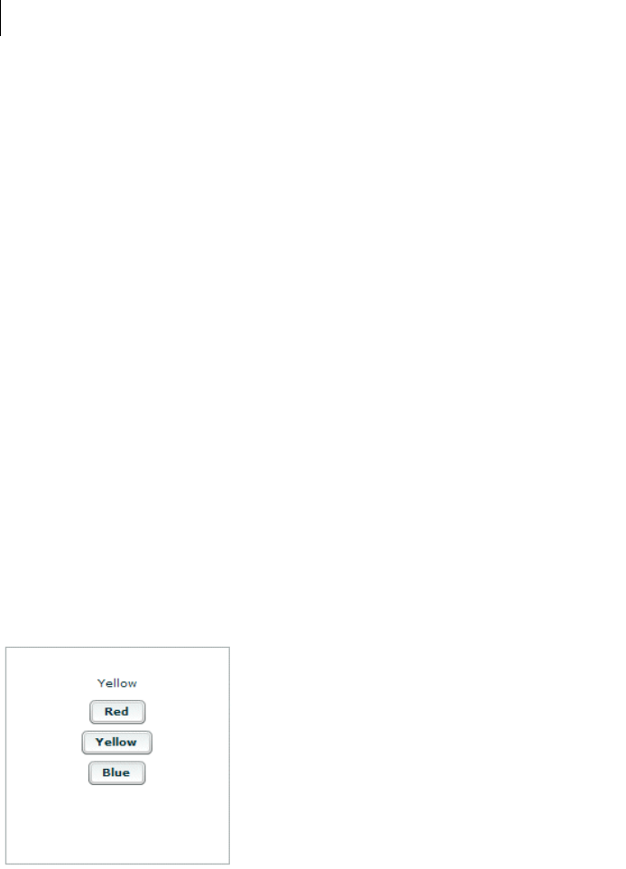
CHAPTER 28
958
Note: After a Repeater component finishes repeating, you do not use the Repeater.currentItem property to get the
current item. Instead, you call the getRepeaterItem() method of the repeated component itself.
The following example illustrates the getRepeaterItem() method. When the user clicks each repeated Button
control, the corresponding colorName value from the data model appears in the Button control label.
<?xml version="1.0"?>
<!-- repeater\GetItem.mxml -->
<mx:Application xmlns:mx="http://www.adobe.com/2006/mxml">
<mx:Script>
<![CDATA[
public function clicker(cName:String):void {
foolabel.text=cName;
}
]]>
</mx:Script>
<mx:Label id="foolabel" text="foo"></mx:Label>
<mx:Model id="data">
<color>
<colorName>Red</colorName>
<colorName>Yellow</colorName>
<colorName>Blue</colorName>
</color>
</mx:Model>
<mx:ArrayCollection id="myAC" source="{data.colorName}"/>
<mx:Repeater id="myrep" dataProvider="{myAC}">
<mx:Button click="clicker(event.currentTarget.getRepeaterItem());"
label="{myrep.currentItem}"/>
</mx:Repeater>
</mx:Application>
After the user clicks the Yellow button, the application looks like this:

959ADOBE FLEX 3
Adobe Flex 3 Developer Guide
The code in the following example uses the getRepeaterItem() method to display a specific URL for each
Button control that the user clicks. The Button controls must share a common data-driven click handler, because
you cannot use binding expressions inside event handlers. However, the getRepeaterItem() method lets you
change the functionality for each Button control.
<?xml version="1.0"?>
<!-- repeater\DisplayURL.mxml -->
<mx:Application xmlns:mx="http://www.adobe.com/2006/mxml">
<mx:Script>
<![CDATA[
[Bindable]
public var dp:Array = [ { label: "Flex",
url: "http://www.adobe.com/flex" },
{ label: "Flash", url: "http://www.adobe.com/flash" } ];
]]>
</mx:Script>
<mx:ArrayCollection id="myAC" source="{dp}"/>
<mx:Repeater id="r" dataProvider="{myAC}">
<mx:Button label="{r.currentItem.label}"
click="navigateToURL(
new URLRequest(event.currentTarget.getRepeaterItem().url), '_blank');"/>
</mx:Repeater>
</mx:Application>
When executed, this example yields two buttons: one for Flex and one for Adobe® Flash®. When you click the
button of your choice, the relevant product page loads in a new browser window.
CHAPTER 28
960
Accessing specific instances of repeated components
Repeated components and repeated Repeater components have three properties that you can use to dynamically
keep track of specific instances of repeated objects, to determine which Repeater component produced them, and
to determine which dataProvider items were used by each Repeater component. The following table describes
these properties:
The following example application uses the repeaters property to display the id value of the Repeater compo-
nents in an Alert control when the user clicks one of the Button controls labelled by the index value of the outer
Repeater component and inner Repeater component, respectively. It uses the repeaters property to get the id
value of the inner Repeater component:
<?xml version="1.0"?>
<!-- repeater\RepeatersProp.mxml -->
<mx:Application xmlns:mx="http://www.adobe.com/2006/mxml">
<mx:Script>
<![CDATA[
import mx.controls.Alert;
[Bindable]
public var myArray:Array=[1,2];
]]>
</mx:Script>
<mx:ArrayCollection id="myAC" source="{myArray}"/>
<mx:Repeater id="repeater1" dataProvider="{myAC}">
<mx:Repeater id="repeater2" dataProvider="{myAC}">
<mx:Button
label="[{repeater1.currentIndex},{repeater2.currentIndex}]"
Property Description
instanceIndices Array that contains the indices required to reference the component from its document. This Array is empty unless
the component is in one or more Repeater components. The first element corresponds to the outermost Repeater
component. For example, if the id is b and instanceIndices is [2,4], you would reference it on the document
as b[2][4].
repeaters Array that contains references to the Repeater components that produced the component. The Array is empty
unless the component is in one or more Repeater components. The first element corresponds to the outermost
Repeater component.
repeaterIndices Array that contains the indices of the items in the dataProvider properties of the Repeater components that
produced the component. The Array is empty unless the component is within one or more Repeater components.
The first element corresponds to the outermost Repeater component. For example, if repeaterIndices is
[2,4], the outer Repeater component used its dataProvider[2] data item and the inner Repeater component
used its dataProvider[4] data item.
This property differs from instanceIndices if the startingIndex of any of the Repeater components is not
0. For example, even if a Repeater component starts at dataProvider item 4, the document reference of the first
repeated component is b[0], not b[4].
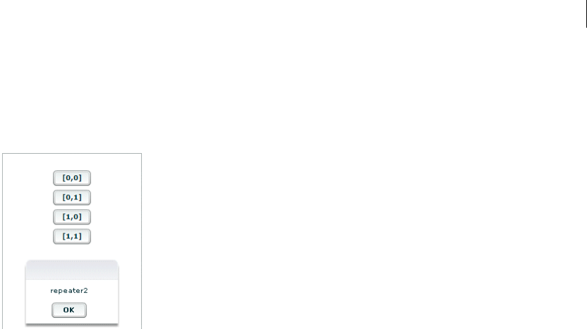
961ADOBE FLEX 3
Adobe Flex 3 Developer Guide
click="Alert.show(event.target.repeaters[1].id);"/>
</mx:Repeater>
</mx:Repeater>
</mx:Application>
The previous example produces the following results when the user clicks the third button:
The following example application uses the instanceIndices property to set the text property of a TextInput
control when the user clicks the corresponding Button control in the set of repeated Button and TextInput
controls. You need to use the instanceIndices property because you must get the correct object dynamically;
you cannot get it by its id value.
The following example shows how to use the instanceIndices property to set the text property of a TextInput
control when the user clicks a Button control. The argument event.target.instanceIndices gets the index of
the corresponding TextInput control.
<?xml version="1.0"?>
<!-- repeater\InstanceIndicesProp.mxml -->
<mx:Application xmlns:mx="http://www.adobe.com/2006/mxml">
<mx:Script>
<![CDATA[
[Bindable]
public var myArray:Array=[1,2,3,4,5,6,7,8];
]]>
</mx:Script>
<mx:ArrayCollection id="myAC" source="{myArray}"/>
<mx:Repeater id="list" dataProvider="{myAC}" count="4" startingIndex="2">
<mx:HBox>
<mx:Button label="Click Me"
click="myText[event.target.instanceIndices].text=
event.target.instanceIndices.toString();"/>
<mx:TextInput id="myText"/>
</mx:HBox>
</mx:Repeater>
</mx:Application>
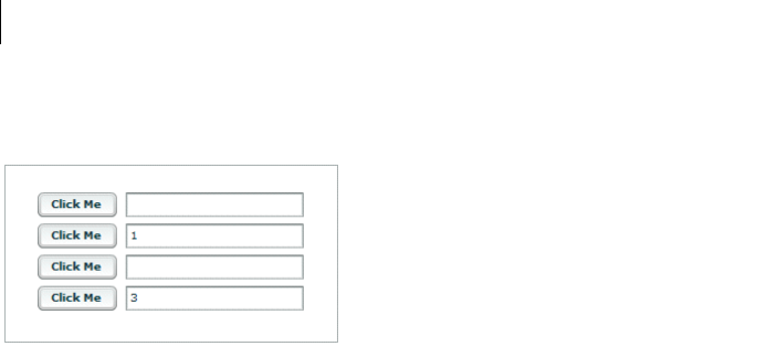
CHAPTER 28
962
This example yields the following results when the user clicks the second and fourth buttons:
The following code shows how to use the repeaterIndices property instead of the instanceIndices property
to set the text property of a TextInput control when the user clicks a Button control. The value of
event.target.repeaterIndices is based on the current index of the Repeater component. Because the
startingIndex property of the Repeater component is set to 2, it does not match the
event.target.instanceIndices value, which always starts at 0.
<?xml version="1.0"?>
<!-- repeater\RepeaterIndicesProp.mxml -->
<mx:Application xmlns:mx="http://www.adobe.com/2006/mxml">
<mx:Script>
<![CDATA[
[Bindable]
public var myArray:Array = [1,2,3,4,5,6,7,8];
]]>
</mx:Script>
<mx:Repeater id="list" dataProvider="{myArray}"
startingIndex="2" count="4">
<mx:HBox>
<mx:Button id="b" label="Click Me"
click="myText[event.target.repeaterIndices-list.startingIndex].text=
event.target.repeaterIndices.toString();"/>
<mx:TextInput id="myText"/>
</mx:HBox>
</mx:Repeater>
</mx:Application>
In this case, clicking the button prints the current element of the data provider, not the current iteration of the
loop.
Note: The value of the repeaterIndices property is equal to the startingIndex property on the first iteration of
the Repeater component. Subtracting the startingIndex value from the repeaterIndices value always yields the
instanceIndices value.
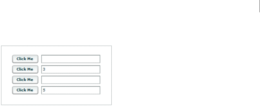
963ADOBE FLEX 3
Adobe Flex 3 Developer Guide
Either version yields the following results when the user clicks the second and fourth buttons:
Using a Repeater component in a custom MXML component
You can use the <mx:Repeater> tag in an MXML component definition in the same way that you use it in an
application file. When you use the MXML component as a tag in another MXML file, the repeated items appear.
You can access an individual repeated item by its array index number, just as you do for a repeated item defined
in the application file.
In the following example, a Button control in an MXML component called childComp is repeated for every
element in an Array object called dp:
<?xml version="1.0"?>
<!-- repeater\myComponents\CustButton.mxml -->
<mx:VBox xmlns:mx="http://www.adobe.com/2006/mxml">
<mx:Script>
<![CDATA[
[Bindable]
public var dp:Array=[1,2,3,4];
]]>
</mx:Script>
<mx:ArrayCollection id="myAC" source="{dp}"/>
<mx:Repeater id="r" dataProvider="{myAC}">
<mx:Button id="repbutton" label="button {r.currentItem}"/>
</mx:Repeater>
</mx:VBox>
The application file in the following example uses the childComp component to display four Button controls, one
for each element in the array. The getLabelRep() function displays the label text of the second Button in the
array.
<?xml version="1.0"?>
<!-- repeater\RepeatCustButton.mxml -->
<mx:Application xmlns:mx="http://www.adobe.com/2006/mxml" xmlns:MyComp="myComponents.*">
<mx:Script>
<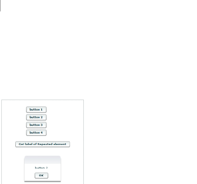
CHAPTER 28
964
import mx.controls.Alert;
public function getLabelRep():void {
Alert.show(comp.repbutton[1].label);
}
]]>
</mx:Script>
<MyComp:CustButton id="comp"/>
<mx:Button label="Get label of Repeated element" width="200"
click="getLabelRep();"/>
</mx:Application>
The previous example produces the following output when the user clicks the last button:
Dynamically creating components based on data type
You can use a Repeater component to dynamically create different types of components for specific items in a set
of data. A Repeater component broadcasts a repeat event as it executes, and this event is broadcast after the
currentIndex and currentItem properties are set. You can call an event handler function on the repeat event,
and dynamically create different types of components based on the individual data items.
How a Repeater component executes
A Repeater component executes initially when it is instantiated. If the Repeater component’s dataProvider
property exists, it proceeds to instantiate its children, and they instantiate their children, recursively.

965ADOBE FLEX 3
Adobe Flex 3 Developer Guide
The Repeater component re-executes whenever its dataProvider, startingIndex, or count properties are set
or modified either explicitly in ActionScript, or implicitly by data binding. If the dataProvider property is bound
to a web service result, the Repeater component re-executes when the web service operation returns the result. A
Repeater component also re-executes in response to paging through the dataProvider property by incremen-
tally increasing the startingIndex value, as the following example shows:
r.startingIndex += r.count;
When a Repeater component re-executes, it destroys any children that it previously created (assuming the
recycleChildren property is set to false), and then reinstantiates its children based on the current
dataProvider property. The number of children in the container might change, and the container layout changes
to accommodate any changes to the number of children.
Recreating children in a Repeater component
The recycleChildren property controls whether children of a Repeater component are recreated when the
Repeater component re-executes. When you set the recycleChildren property to false, the Repeater
component recreates all the objects when you swap one dataProvider with another, or sort, which causes a
performance lag. Only set this property to true if you are confident that modifying your dataProvider will not
recreate the Repeater component’s children.
The default value of the recycleChildren property is false, to ensure that you do not leave stale state infor-
mation in a repeated instance. For example, suppose you use a Repeater component to display photo images, and
each Image control has an associated NumericStepper control for how many prints you want to order. Some of the
state information, the image, comes from the dataProvider, while other state information, the print count, is set
by user interaction. If you set the recycleChildren property to true and page through the photos by incremen-
tally increasing the Repeater component’s startingIndex value, the Image controls bind to the new images, but
the NumericStepper controls keep the old information.
Considerations when using a Repeater component
Consider the following when you use a Repeater component:
•You cannot use a Repeater component to iterate through a two-dimensional Array object that is programmat-
ically generated. This is because the elements of an Array object do not trigger changeEvent events, and therefore
cannot function as binding sources at run time. Binding copies initial values during instantiation after variables
are declared in an <mx:Script> tag, but before initialize handlers are executed.
•Run-time changes to an array used as a data provider are not reflected in the Repeater component. Use a
collection if you need to allow run-time modification.

CHAPTER 28
966
•Forgetting curly braces ({ }) in a dataProvider property is a common mistake when using a Repeater
component. If the Repeater component doesn’t execute, make sure that the binding is correct.
•If repeated objects are displayed out of order and you are using adjacent or nested Repeater components, you
might need to place a dummy UIComponent immediately after the Repeater that is displaying objects incorrectly.
The code in the following example contains adjacent <mx:Repeater> tags and uses an <mx:Spacer> tag to
create a dummy UIComponent:
<mx:VBox>
<mx:Repeater id="r1">
...
</mx:Repeater>
<mx:Repeater id="r2">
...
</mx:Repeater>
<mx:Spacer height="0" id="dummy"/>
</mx:VBox>
The code in the following example contains nested <mx:Repeater> tags and uses an <mx:Spacer> tag to
create a dummy UIComponent:
<mx:VBox>
<mx:Repeater id="outer">
<mx:Repeater id="inner">
...
</mx:Repeater>
<mx:Spacer id="dummy" height="0">
</mx:Repeater>
</mx:VBox>

967
Part 3: Advanced Flex Programming
Topics
Embedding Assets. . . . . . . . . . . . . . . . . . . . . . . . . . . . . . . . . . . . . . . . . . . . . . . . . . . . . . . . . . . . . . . . . . . . . . . . . . . . . . .969
Creating Modular Applications . . . . . . . . . . . . . . . . . . . . . . . . . . . . . . . . . . . . . . . . . . . . . . . . . . . . . . . . . . . . . . . . . . .985
Printing . . . . . . . . . . . . . . . . . . . . . . . . . . . . . . . . . . . . . . . . . . . . . . . . . . . . . . . . . . . . . . . . . . . . . . . . . . . . . . . . . . . . . .1019
Communicating with the Wrapper . . . . . . . . . . . . . . . . . . . . . . . . . . . . . . . . . . . . . . . . . . . . . . . . . . . . . . . . . . . . . . .1039
Using the Flex Ajax Bridge . . . . . . . . . . . . . . . . . . . . . . . . . . . . . . . . . . . . . . . . . . . . . . . . . . . . . . . . . . . . . . . . . . . . . .1063
Deep Linking. . . . . . . . . . . . . . . . . . . . . . . . . . . . . . . . . . . . . . . . . . . . . . . . . . . . . . . . . . . . . . . . . . . . . . . . . . . . . . . . . .1069
Using Shared Objects . . . . . . . . . . . . . . . . . . . . . . . . . . . . . . . . . . . . . . . . . . . . . . . . . . . . . . . . . . . . . . . . . . . . . . . . . . .1095
Localizing Flex Applications . . . . . . . . . . . . . . . . . . . . . . . . . . . . . . . . . . . . . . . . . . . . . . . . . . . . . . . . . . . . . . . . . . . . .1105
Creating Accessible Applications . . . . . . . . . . . . . . . . . . . . . . . . . . . . . . . . . . . . . . . . . . . . . . . . . . . . . . . . . . . . . . . . .1143

968 PART 3

969
Chapter 29: Embedding Assets
Many Adobe® Flex™ applications use external assets like images, sounds, and fonts. Although you can reference
and load assets at run time, you often compile these assets into your applications. The process of compiling an
asset into your application is called embedding the asset. Flex lets you embed image files, movie files, MP3 files,
and TrueType fonts into your applications.
For information on embedding fonts, see “Using Fonts” on page 653.
Topics
About embedding assets . . . . . . . . . . . . . . . . . . . . . . . . . . . . . . . . . . . . . . . . . . . . . . . . . . . . . . . . . . . . . . . . . . . . . . . . .969
Syntax for embedding assets . . . . . . . . . . . . . . . . . . . . . . . . . . . . . . . . . . . . . . . . . . . . . . . . . . . . . . . . . . . . . . . . . . . . . .972
Embedding asset types. . . . . . . . . . . . . . . . . . . . . . . . . . . . . . . . . . . . . . . . . . . . . . . . . . . . . . . . . . . . . . . . . . . . . . . . . . .976
About embedding assets
When you embed an asset, you compile it into your application’s SWF file. The advantage of embedding an asset
is that it is included in the SWF file, and can be accessed faster than it can if the application has to load it from a
remote location at run time. The disadvantage of embedding an asset is that your SWF file is larger than if you
load the asset at run time.
Examples of embedding assets
One of the most common uses of the embed mechanism is to import an image for a Flex control by using the
@Embed() directive in an MXML tag definition. For example, many controls support icons or skins that you can
embed in the application. The Button control lets you specify label text, as well as an optional icon image, as the
following example shows:
<?xml version="1.0"?>
<!-- embed\ButtonIcon.mxml -->
<mx:Application xmlns:mx="http://www.adobe.com/2006/mxml">
<mx:Button label="Icon Button" icon="@Embed(source='logo.gif')"/>
</mx:Application>
Another option for embedding is to associate the embedded image with a variable by using the [Embed] metadata
tag. In this way, you can reference the embedded image from multiple locations in your application, as the
following example shows:
<?xml version="1.0"?>

970 CHAPTER 29
<!-- embed\ButtonIconClass.mxml -->
<mx:Application xmlns:mx="http://www.adobe.com/2006/mxml">
<mx:Script>
<![CDATA[
[Embed(source="logo.gif")]
[Bindable]
public var imgCls:Class;
]]>
</mx:Script>
<mx:Button label="Icon Button 1" icon="{imgCls}"/>
<mx:Button label="Icon Button 2" icon="{imgCls}"/>
</mx:Application>
For style properties, you can embed an asset as part of a style sheet definition by using the Embed() directive. One
common use for style properties is to set a component’s skins. For example, you can set skins for a Button control
by using the overSkin, upSkin, and downSkin style properties, as the following example shows:
<?xml version="1.0"?>
<!-- embed\ButtonIconCSS.mxml -->
<mx:Application xmlns:mx="http://www.adobe.com/2006/mxml">
<mx:Style>
.myCustomButton {
overSkin:Embed(source="overIconImage.gif");
upSkin:Embed(source="upIconImage.gif");
downSkin:Embed(source="downIconImage.gif");
}
</mx:Style>
<mx:Button label="Icon Button Style Def" styleName="myCustomButton"/>
</mx:Application>
Note: The equal sign (=) in the style sheet is a Flex extension that may not be supported by all CSS processors. If you
find that it is not supported, you can use the Embed(filename) syntax.
Accessing assets at run time
The alternative to embedding an asset is to load the asset at run time. You can load an asset from the local file
system in which the SWF file runs, or you can access a remote asset, typically through an HTTP request over a
network.
Embedded assets load immediately, because they are already part of the Flex SWF file. However, they add to the
size of your application and slow down the application initialization process. Embedded assets also require you to
recompile your applications whenever your asset changes.
971ADOBE FLEX 3
Adobe Flex 3 Developer Guide
Assets loaded at run time exist as separate, independent files on your web server (or elsewhere) and are not
compiled into your Flex applications. The referenced assets add no overhead to an application’s initial load time.
However, you might experience a delay when you use the asset and load it in Adobe® Flash® Player or Adobe®
AIR™. These assets are independent of your Flex application, so you can change them without causing a recompile
operation, as long as the names of the modified assets remain the same.
For examples that load an asset at run time, see “Image control” on page 278 and “SWFLoader control” on
page 274.
For security, by default Flash Player does not allow an application to access some types of remote data (such as
SWF files) at run time from a domain other than the domain from which the application was served. Therefore,
a server that hosts data must be in the same domain as the server hosting your application, or the server must
define a crossdomain.xml file. A crossdomain.xml file is an XML file that provides a way for a server to indicate
that its data and documents are available to SWF files served from specific domains, or from all domains. For
more information on application security, see “Applying Flex Security” on page 29 in Building and Deploying
Adobe Flex 3 Applications.
Supported file types
You can embed the following types of files in a Flex application.
File Type File Format MIME Type Description and Examples
Images GIF image/gif Embedding JPEG, GIF, and PNG images
.JPG, .JPEG image/jpeg
PNG image/png
SVG image/svg
image/svg-xml
Embedding SVG images
Flash SWF application/x-shockwave-flash Embedding SWF files
Symbols stored in a
SWF file
Audio MP3 audio/mpeg Embedding sounds
Font TTF (TrueType) application/x-font-truetype TBD
FON (System font) application/x-font
All other types application/octet-stream Embedding all other file types

CHAPTER 29
972
Syntax for embedding assets
The syntax that you use for embedding assets depends on where in your application you embed the asset. Flex
supports the following syntaxes:
•[Embed(parameter1, paramater2, ...)] metadata tag
You use this syntax to embed an asset in an ActionScript file, or in an <mx:Script> block in an MXML file.
For more information, see “Using the [Embed] metadata tag” on page 975.
•@Embed(parameter1, paramater2, ...) directive
You use this syntax in an MXML tag definition to embed an asset. For more information, see “Using the
@Embed() directive in MXML” on page 976.
•Embed(parameter1, paramater2, ...) directive
You use this syntax in an <mx:Style> block in an MXML file to embed an asset. For more information, see
“Embedding assets in style sheets” on page 976.
All three varieties of the embed syntax let you access the same assets; the only difference is where you use them
in your application.
Escaping the @ character
You can use the slash character (\) to escape the at sign character (@) when you want to use a literal @ character.
For example, the string “\@Embed(foo)” means the literal string “@Embed(foo)”). You use two slash characters
(\\) to escape a single backslash character. For example, use the character string “\\@” to specify the literal strings
“\@”.
Embed parameters
Each form of the embed syntax takes one or more optional parameters. The exact syntax that you use to embed
assets depends on where they are embedded. Some of these parameters are available regardless of what type of
asset you are embedding, and others are specific to a particular type of media. For example, you can use the
source and mimeType parameters with any type of media, but the scaleGridRight parameter applies only to
images.
973ADOBE FLEX 3
Adobe Flex 3 Developer Guide
The following table describes the parameters that are available for any type of embedded asset. For more infor-
mation, see “About the source parameter” on page 973 and “About the MIME type” on page 974.
The following table describes the parameters that are specific for images and Sprite objects. For more information,
see “Using 9-slice scaling with embedded images” on page 981.
The following table describes the parameter that is specific to SWF files. For more information, see “Embedding
SWF files” on page 979.
About the source parameter
In almost all cases, you must specify the source parameter, or nothing is embedded.
The source parameter is the default parameter of the [Embed] metadata tag; therefore, if you are not specifying
any other parameters, you can just supply its value without explicitly including the parameter name or assigning
it the desired value, as the following example shows:
<mx:Style>
.myCustomButton {
Parameter Description
source Specifies the name and path of the asset to embed; either an absolute path or a path relative to the file containing
the embed statement. The embedded asset must be a locally stored asset. Therefore you cannot specify a URL for
an asset to embed.
For more information on setting the path, see “About setting the path to the embedded asset” on page 974.
mimeType Specifies the mime type of the asset.
Parameter Description
scaleGridTop Specifies the distance in pixels of the upper dividing line from the top of the image in a 9-slice scaling formatting
system. The distance is relative to the original, unscaled size of the image.
scaleGridBottom Specifies the distance in pixels of the lower dividing line from the top of the image in a 9-slice scaling formatting
system. The distance is relative to the original, unscaled size of the image.
scaleGridLeft Specifies the distance in pixels of the left dividing line from the left side of the image in a 9-slice scaling formatting
system. The distance is relative to the original, unscaled size of the image.
scaleGridRight Specifies the distance in pixels of the right dividing line from the left side of the image in a 9-slice scaling format-
ting system. The distance is relative to the original, unscaled size of the image.
Parameter Description
symbol Specifies the symbol in a SWF file to embed, for use with Adobe Flash Player 8 and earlier.

CHAPTER 29
974
overSkin:Embed("overIconImage.gif");
upSkin:Embed(source="upIconImage.gif");
downSkin:Embed(source="downIconImage.gif");
}
</mx:Style>
About setting the path to the embedded asset
You can specify a fully qualified path to the image or a URL, as the following examples show:
<mx:Button label="Icon Button"
icon="@Embed(source='c:/myapp/assets/logo.gif')"/>
<mx:Button label="Icon Button"
icon="@Embed(source='http://host.com/myapp/assets/logo.gif')"/>
Note: Do not use the backslash character (\) as a separator in the path.
If the path does not start with a slash character, Flex first searches for the file relative to the file that contains the
[Embed] metadata tag. For example, the MXML file testEmbed.mxml includes the following code:
<mx:Button label="Icon Button" icon="@Embed(source='assets/logo.gif')"/>
In this example, Flex searches the subdirectory named assets in the directory that contains the testEmbed.mxml
file. If the image is not found, Flex then searches for the image in the SWC files associated with the application.
If the path starts with a slash character, Flex first searches the directory of the MXML file for the asset, and then
it searches the source path. You specify the source path to the Flex compiler by using the source-path compiler
option. For example, you set the source-path option as the following code shows:
-source-path=a1,a2,a3
The MXML file a1/testEmbed.mxml then uses the following code:
<mx:Button label="Icon Button" icon="@Embed(source='/assets/logo.gif')"/>
Flex first searches for the file in a1/assets, then in a2/assets, and then in a3/assets. If the image is not found, Flex
searches for the image in the SWC files associated with the application.
If the MXML file is in the a2 directory, as in a2/testEmbed.mxml, Flex first searches the a2 directory and then the
directories specified by the source-path option.
About the MIME type
You can optionally specify a MIME type for the imported asset by using the mimeType parameter. If you do not
specify a mimeType parameter, Flex makes a best guess about the type of the imported file based on the file
extension. If you do specify it, the mimeType parameter overrides the default guess of the asset type.
Flex supports the following MIME types.
•application/octet-stream
•application/x-font

975ADOBE FLEX 3
Adobe Flex 3 Developer Guide
•application/x-font-truetype
•application/x-shockwave-flash
•audio/mpeg
•image/gif
•image/jpeg
•image/png
•image/svg
•image/svg-xml
Using the [Embed] metadata tag
You can use the [Embed] metadata tag to import JPEG, GIF, PNG, SVG, SWF, TTF, and MP3 files.
You must use the [Embed] metadata tag before a variable definition, where the variable is of type Class. The
following example loads an image file, assigns it to the imgCls variable, and then uses that variable to set the value
of the source property of an Image control:
<?xml version="1.0"?>
<!-- embed\ImageClass.mxml -->
<mx:Application xmlns:mx="http://www.adobe.com/2006/mxml"
width="100" height="80" borderStyle="solid">
<mx:Script>
<![CDATA[
[Embed(source="logo.gif")]
[Bindable]
public var imgCls:Class;
]]>
</mx:Script>
<mx:Image source="{imgCls}"/>
</mx:Application>
Notice that Flex uses data binding to tie the imgCls variable to the source property. If you omit the [Bindable]
metadata tag preceding the imgCls variable definition, Flex can perform the data binding operation only once, at
application startup. When you include the [Bindable] metadata tag, Flex recognizes any changes to the imgCls
variable and updates any components that use that variable when a change to it occurs.
Generally, this method of embedding assets provides more flexibility than other methods because you can import
an asset once and then use it in multiple places in your application, and because you can update the asset and have
the data binding mechanism propagate that update throughout your application.

CHAPTER 29
976
Using the @Embed() directive in MXML
Many Flex components, such as Button and TabNavigator, take an icon property or other property that lets you
specify an image to the control. You can embed the image asset by specifying the property value by using the
@Embed() directive in MXML. You can use any supported graphic file with the @Embed() directive, including
SWF files and assets inside SWF files.
You can use the @Embed() directive to set an MXML tag property, or to set a property value by using a child tag.
The @Embed() directive returns a value of type Class or String. If the component’s property is of type String, the
@Embed() directive returns a String. If the component’s property is of type Class, the @Embed() directive returns
a Class. Using the @Embed() directive with a property that requires a value of any other data type results in an
error.
The following example creates a Button control and sets its icon property by using the @Embed() directive:
<?xml version="1.0"?>
<!-- embed\ButtonAtEmbed.mxml -->
<mx:Application xmlns:mx="http://www.adobe.com/2006/mxml">
<mx:Button label="Icon Button" icon="@Embed(source='logo.gif')"/>
</mx:Application>
Embedding assets in style sheets
Many style properties of Flex components support imported assets. Most frequently, you use these style properties
to set the skins for a component. Skinning is the process of changing the appearance of a component by modifying
or replacing its visual elements. These elements can be made up of images, SWF files, or class files that contain
drawing API methods.
For more information on skinning and on embedding assets by using style sheets, see “Creating Skins” on
page 689.
Embedding asset types
You can import various types of media, including images, SWF files, and sound files.
Embedding JPEG, GIF, and PNG images
Flex supports embedding JPEG, GIF, and PNG files. You can use these images for icons, skins, and other types of
application assets.

977ADOBE FLEX 3
Adobe Flex 3 Developer Guide
You might want to manipulate an embedded image at run time. To manipulate it, you determine the data type of
the object representing the image and then use the appropriate ActionScript methods and properties of the object.
For example, you use the [Embed] metadata tag in ActionScript to embed a GIF image, as the following code
shows:
[Embed(source="logo.gif")]
[Bindable]
public var imgCls:Class;
In this example, you define a class named imgCls that represents the embedded image. When embedding JPEG,
GIF, and PNG files, Flex defines imgCls as a reference to a subclass of the mx.core.BitmapAsset class, which is a
subclass of the flash.display.Bitmap class.
In ActionScript, you can create and manipulate an object that represents the embedded image before passing it to
a control. To do so, you create an object with the type of the embedded class, manipulate it, and then pass the
object to the control, as the following example shows:
<?xml version="1.0"?>
<!-- embed/EmbedAccessClassObject.mxml -->
<mx:Application xmlns:mx="http://www.adobe.com/2006/mxml">
<mx:Script>
<![CDATA[
import mx.core.BitmapAsset;
[Embed(source="logo.gif")]
[Bindable]
public var imgCls:Class;
public var varOne:String = "This is a public variable";
private function modImage():void {
// Create an object from the embed class.
// Since the embedded image is a GIF file,
// the data type is BitmapAsset.
var imgObj:BitmapAsset = new imgCls() as BitmapAsset;
// Modify the object.
imgObj.bitmapData.noise(4);
// Write the modified object to the Image control.
myImage.source=imgObj;
}
]]>
</mx:Script>
<mx:HBox>
<mx:Image id="myImageRaw" source="{imgCls}"/>
<mx:Image id="myImage" creationComplete="modImage();"/>
</mx:HBox>
</mx:Application>

CHAPTER 29
978
In this example, the first Image control displays the unaltered image and the second Image control displays the
modified image. You use the bitmapData property of the mx.core.BitmapAsset class to modify the object. The
bitmapData property is of type flash.display.BitmapData; therefore you can use all of the methods and properties
of the BitmapData class to manipulate the object.
Embedding SVG images
Flex supports importing Scalable Vector Graphics (SVG) images, or a GZip compressed SVG image in a SVGZ
file, into an application. This lets you import SVG images and use SVG images as icons for Flex controls.
Flex supports a subset of the SVG 1.1 specification to let you import static, two-dimensional scalable vector
graphics. This includes support for basic SVG document structure, Cascading Style Sheets (CSS) styling, trans-
formations, paths, basic shapes, colors, and a subset of text, painting, gradients, and fonts. Flex does not support
SVG animation, scripting, or interactivity with the imported SVG image.
For example, you use the [Embed] metadata tag in ActionScript to embed an SVG image, as the following code
shows:
[Embed(source="logo.svg")]
[Bindable]
public var imgCls:Class;
In this example, you define a class named imgCls that represents the embedded image. When embedding an SVG
image, Flex defines imgCls as a reference to a subclass of the mx.core.SpriteAsset class, which is a subclass of the
flash.display.Sprite class. Therefore, you can manipulate the image by using the methods and properties of the
SpriteAsset class. For an example that manipulates an imported image, see “Embedding JPEG, GIF, and PNG
images” on page 976.
Embedding sounds
Flex supports embedding MP3 sound files for later playback. The following example creates a simple media player
with Play and Stop buttons:
<?xml version="1.0"?>
<!-- embed/EmbedSound.mxml -->
<mx:Application xmlns:mx="http://www.adobe.com/2006/mxml">
<mx:Script>
<![CDATA[
import flash.media.*;
[Embed(source="sample.mp3")]
[Bindable]
public var sndCls:Class;
public var snd:Sound = new sndCls() as Sound;

979ADOBE FLEX 3
Adobe Flex 3 Developer Guide
public var sndChannel:SoundChannel;
public function playSound():void {
sndChannel=snd.play();
}
public function stopSound():void {
sndChannel.stop();
}
]]>
</mx:Script>
<mx:HBox>
<mx:Button label="play" click="playSound();"/>
<mx:Button label="stop" click="stopSound();"/>
</mx:HBox>
</mx:Application>
In this example, you define a class named sndCls that represents the embedded MP3 file. When embedding MP3
files, Flex defines sndCls as a reference to a subclass of the mx.core.SoundAsset, which is a subclass of the
flash.media.Sound class.
Flex can handle any legal filename, including filenames that contain spaces and punctuation marks. If the MP3
filename includes regular quotation marks, be sure to use single quotation marks around the filename.
You do not have to embed the sound file to use it with Flex. You can also use the Sound class to load a sound file
at run time. For more information, see the Sound class in the Adobe Flex Language Reference.
Embedding SWF files
Flex fully supports embedding Flash SWF files. You can embed different types of SWF files.
Embedding SWF files for Flash Player 8 and earlier
You can embed SWF files created for Flash Player 8 and earlier. When embedded, your Flex application cannot
interact with the embedded SWF file. That is, you cannot use ActionScript in a Flex application to access the
properties or methods of a SWF file created for Flash Player 8 or earlier.
Note: You can use the flash.net.LocalConnection class to communicate between a Flex application and a SWF file
created for Flash Player 8 or earlier.
For example, you use the [Embed] metadata tag in ActionScript to embed a SWF file, as the following code shows:
[Embed(source="icon.swf")]
[Bindable]
public var imgCls:Class;

CHAPTER 29
980
In this example, you define a class named imgCls that represents the embedded SWF file. Flex defines imgCls as
a reference to a subclass of the mx.core.MovieClipLoaderAsset class, which is a subclass of the
flash.display.MovieClip class. Therefore you can manipulate the image by using the methods and properties of the
MovieClipLoaderAsset class.
Embedding SWF symbols
Flex lets you reference exported symbols in an embedded SWF file. If the symbol has dependencies, Flex embeds
them also; otherwise, Flex embeds only the specified symbol from the SWF file. To reference a symbol, you specify
the symbol parameter:
[Embed(source='SWFFileName.swf', symbol='symbolName')]
Note: Flash defines three types of symbols: Button, MovieClip, and Graphic. You can embed Button and MovieClip
symbols in a Flex application, but you cannot embed a Graphic symbol because it cannot be exported for ActionScript.
This capability is useful when you have a SWF file that contains multiple exported symbols, but you want to load
only some of them into your Flex application. Loading only the symbols that your application requires makes the
resulting Flex SWF file smaller than if you imported the entire SWF file.
A Flex application can import any number of SWF files. However, if two SWF files have the same filename and
the exported symbol names are the same, you cannot reference the duplicate symbols, even if the SWF files are in
separate directories.
If the SWF file contains any ActionScript code, Flex prints a warning during compilation and then strips out the
ActionScript from the embed symbol. This means that you can only embed the symbol itself.
The following example imports a green square from a SWF file that contains a library of different shapes:
<?xml version="1.0"?>
<!-- embed\EmbedSWFSymbol.mxml -->
<mx:Application xmlns:mx="http://www.adobe.com/2006/mxml" >
<mx:VBox id="vBox0" width="300" height="300" >
<mx:Image id="image0"
source="@Embed(source='circleSquare.swf', symbol='greenSquare')"
/>
</mx:VBox>
</mx:Application>
If you use the [Embed] metadata tag in ActionScript to embed the symbol, you can access the object that repre-
sents the symbol, as the following code shows:
[Embed(source='shapes.swf', symbol='greenSquare')]
[Bindable]
public var imgCls:Class;

981ADOBE FLEX 3
Adobe Flex 3 Developer Guide
In this example, you define a class named imgCls that represents the embedded symbol. Internally, Flex defines
imgCls as a reference to a subclass of either one of the following classes:
SpriteAsset For single-frame SWF files
MovieClipLoaderAsset For multiframe SWF files
Embedding SWF files that represent Flex applications
You can embed SWF files that represent Flex applications. For example, you use the [Embed] metadata tag in
ActionScript to embed a SWF file, as the following code shows:
[Embed(source="flex2.swf")]
[Bindable]
public var flexAppCls:Class;
In this example, you define a class named flexAppCls that represents the embedded SWF file. Flex defines
flexAppCls as a reference to a subclass of the mx.core.MovieClipLoaderAsset class, which is a subclass of the
flash.display.MovieClip class. Therefore you can manipulate the embedded SWF file by using the methods and
properties of the MovieClipLoaderAsset class.
You typically embed a Flex application when you do not require the embedding application to interact with the
embedded application. If the embedding application requires interactivity with the embedded application, you
might consider implementing it as a custom component, rather than as a separate application.
Alternatively, if you use the SWFLoader control to load the Flex application at run time, the embedding appli-
cation can interact with the loaded application to access its properties and methods. For more information and
examples, see “Interacting with a loaded Flex application” on page 275.
Using 9-slice scaling with embedded images
Flex supports the 9-slice scaling of embedded images. This feature lets you define nine sections of an image that
scale independently. The nine regions are defined by two horizontal lines and two vertical lines running through
the image, which form the inside edges of a 3 by 3 grid. For images with borders or fancy corners, 9-slice scaling
provides more flexibility than full-graphic scaling.
CHAPTER 29
982
The following example show an image, and the same image with the regions defined by the 9-slice scaling borders:
When you scale an embedded image that uses 9-slice scaling, all text and gradients are scaled normally. However,
for other types of objects the following rules apply:
•Content in the center region is scaled normally.
•Content in the corners is not scaled.
•Content in the top and bottom regions is scaled only horizontally. Content in the left and right regions is
scaled only vertically.
•All fills (including bitmaps, video, and gradients) are stretched to fit their shapes.
If you rotate the image, all subsequent scaling is normal, as if you did not define any 9-slice scaling.
To use 9-slice scaling, define the following four parameters in your embed statement: scaleGridTop,
scaleGridBottom, scaleGridLeft, and scaleGridRight. For more information on these parameters, see
“Embed parameters” on page 972.
An embedded SWF file may already contain 9-slice scaling information specified by using Adobe Flash Profes-
sional. In that case, the SWF file ignores any 9-slice scaling parameters that you specify in the embed statement.
The following example uses 9-slice scaling to maintain a set border, regardless of how the image itself is resized.
<?xml version="1.0"?>
<!-- embed\Embed9slice.mxml -->
<mx:Application xmlns:mx="http://www.adobe.com/2006/mxml"
width="1200" height="600">
<mx:Script>
<![CDATA[
[Embed(source="slice_9_grid.gif",
scaleGridTop="25", scaleGridBottom="125",
scaleGridLeft="25", scaleGridRight="125")]
[Bindable]
public var imgCls:Class;
]]>
</mx:Script>
<mx:HBox>
983ADOBE FLEX 3
Adobe Flex 3 Developer Guide
<mx:Image source="{imgCls}"/>
<mx:Image source="{imgCls}" width="300" height="300"/>
<mx:Image source="{imgCls}" width="450" height="450"/>
</mx:HBox>
</mx:Application>
The original image is 30 by 30 pixels. The preceding code produces a resizable image that maintains a 5-pixel
border:
If you had omitted the 9-slice scaling, the scaled image would have appeared exactly like the unscaled image, as
the following image shows:

CHAPTER 29
984
In this example, you define a class named imgCls that represents the embedded image. If the image is a SWF file
that uses 9-slice scaling, Flex defines imgCls as a subclass of the mx.core.SpriteAsset class, which is a subclass of
the flash.display.Sprite class. Therefore you can use all of the methods and properties of the SpriteAsset class to
manipulate the object.
Embedding all other file types
You can embed any file type in a Flex application as a bit map array. However, Flex does not recognize or process
files other than those described previously. If you embed any other file type, you must provide the transcode logic
to properly present it to the application user.
To load a file type that is not specifically supported by Flex, use the [Embed] metadata tag to define the source file
and MIME type "application/octet-stream". Then define a new class variable for the embedded file. The
embedded object is a ByteArrayAsset type object.
The following code embeds a bitmap (.bmp) file and displays properties of the embedded object when you click
the Show Properties button. To display or use the object in any other way, you must provide code to create a
supported object type.
<?xml version="1.0"?>
<!-- embed\EmbedOtherFileTypes.mxml -->
<mx:Application xmlns:mx="http://www.adobe.com/2006/mxml">
<mx:Script>
<![CDATA[
import mx.core.UIComponent;
import mx.core.BitmapAsset;
[Embed(source="logo.bmp",mimeType="application/octet-stream")]
private var FileClass : Class;
private function captureEmbeddedImage():void {
var fileByteArray:Object = new FileClass();
myTA.text+= "File length: " + String(fileByteArray.length) + "\n";
myTA.text+="File type: " +
String(getQualifiedSuperclassName(fileByteArray)) + "\n";
}
]]>
</mx:Script>
<mx:Button
id="showProperties"
label="Show Properties"
click="captureEmbeddedImage();"/>
<mx:TextArea id="myTA"
width="75%"
height="100"/>
</mx:Application>

985
Chapter 30: Creating Modular
Applications
You can create modules that you dynamically load in your Adobe® Flex® applications.
Topics
Modular applications overview. . . . . . . . . . . . . . . . . . . . . . . . . . . . . . . . . . . . . . . . . . . . . . . . . . . . . . . . . . . . . . . . . . . .985
Writing modules . . . . . . . . . . . . . . . . . . . . . . . . . . . . . . . . . . . . . . . . . . . . . . . . . . . . . . . . . . . . . . . . . . . . . . . . . . . . . . . . 989
Compiling modules . . . . . . . . . . . . . . . . . . . . . . . . . . . . . . . . . . . . . . . . . . . . . . . . . . . . . . . . . . . . . . . . . . . . . . . . . . . . .991
Loading and unloading modules . . . . . . . . . . . . . . . . . . . . . . . . . . . . . . . . . . . . . . . . . . . . . . . . . . . . . . . . . . . . . . . . . .993
Using ModuleLoader events . . . . . . . . . . . . . . . . . . . . . . . . . . . . . . . . . . . . . . . . . . . . . . . . . . . . . . . . . . . . . . . . . . . . . .999
Passing data . . . . . . . . . . . . . . . . . . . . . . . . . . . . . . . . . . . . . . . . . . . . . . . . . . . . . . . . . . . . . . . . . . . . . . . . . . . . . . . . . . .1006
Modular applications overview
About modules
Modules are SWF files that can be loaded and unloaded by an application. They cannot be run independently of
an application, but any number of applications can share the modules.
Modules let you split your application into several pieces, or modules. The main application, or shell, can dynam-
ically load other modules that it requires, when it needs them. It does not have to load all modules when it starts,
nor does it have to load any modules if the user does not interact with them. When the application no longer needs
a module, it can unload the module to free up memory and resources.
Modular applications have the following benefits:
•Smaller initial download size of the SWF file.
•Shorter load time due to smaller SWF file size.
•Better encapsulation of related aspects of an application. For example, a “reporting” feature can be separated
into a module that you can then work on independently.

986 CHAPTER 30
Benefits of modules
A module is a special type of dynamically loadable SWF that contains an IFlexModuleFactory class factory. This
allows an application to load code at run time and create class instances without requiring that the class imple-
mentations be linked into the main application.
Modules are similar to Runtime Shared Libraries (RSLs) in that they separate code from an application into
separately loaded SWF files. Modules are much more flexible than RSLs because modules can be loaded and
unloaded at run time and compiled without the application.
Two common scenarios in which using modules is beneficial are a large application with different user paths and
a portal application.
An example of the first common scenario is an enormous insurance application that includes thousands of
screens, for life insurance, car insurance, health insurance, dental insurance, travel insurance, and veterinary pet
insurance.
By using a traditional approach to rich Internet application (RIA) design, you might build a monolithic appli-
cation with a hierarchical tree of MXML classes. Memory use and start-up time for the application would be
significant, and the SWF file size would grow with each new set of functionality.
When using this application, however, any user accesses only a subset of the screens. By refactoring the screens
into small groups of modules that are loaded on demand, you can improve the perceived performance of the main
application and reduce the memory use. Also, when the application is separated into modules, developers’
productivity may increase due to better encapsulation of design. When rebuilding the application, the developers
also have to recompile only the single module instead of the entire application.
An example of the second common scenario is a system with a main portal application, written in ActionScript
3.0, that provides services for numerous portlets. Portlets are configured based on data that is downloaded on a
per-user basis. By using the traditional approach, you might build an application that compiles in all known
portlets. This is inefficient, both for deployment and development.
By using modules, you can establish an interface that contains portal services, and a generic portlet interface. You
can use XML data to determine which modules to load for a given session. When the module is loaded, you obtain
a handle to a class factory inside the module, and from that you create an instance of a class that implements the
portlet interface. In this scenario, full recompilation is necessary only if the interfaces change.
Module API details
Modules implement a class factory with a standard interface. The product of that class factory implements an
interface known to the shell, or the shell implements an interface known to the modules.
987ADOBE FLEX 3
Adobe Flex 3 Developer Guide
By using shared interface definitions, these shared interfaces reduce hard dependencies between the shell and the
module. This provides type-safe communication and enforces an abstraction layer without adding significantly to
the SWF file size.
The following image shows the relationship between the shell and the module’s interfaces:
The ModuleManager manages the set of loaded modules, which are treated as a map of Singletons that are indexed
by the module URL. Loading a module triggers a series of events that let clients monitor the status of the module.
Modules are only ever loaded once, but subsequent reloads also dispatch events so that client code can be
simplified and rely on using the READY event to know that the module’s class factory is available for use.
The ModuleLoader class is a thin layer on top of the ModuleManager API that is intended to act similarly to the
mx.controls.SWFLoader class for modules that only define a single visual UIComponent. The ModuleLoader
class is the easiest class to use when implementing a module-based architecture, but the ModuleManager provides
greater control over the modules.
Module domains
By default, a module is loaded into a child domain of the current application domain. You can specify a different
application domain by using the applicationDomain property of the ModuleLoader class.
Because a module is loaded into a child domain, it owns class definitions that are not in the main application’s
domain. For example, the first module to load the PopUpManager class becomes the owner of the PopUpManager
class for the entire application because it registers the manager with the SingletonManager. If another module later
tries to use the PopUpManager, Adobe ® Flash® Player throws an exception.
ConcreteShell
AbstractProductAbstractFactory
ConcreteProductConcreteFactory
AbstractClientManager
Module
Application

CHAPTER 30
988
The solution is to ensure that managers such as PopUpManager and DragManager and any other shared services
are defined by the main application (or loaded late into the shell’s application domain). When you promote one
of those classes to the shell, the class can then be used by all modules. Typically, this is done by adding the
following to a script block:
import mx.managers.PopUpManager;
import mx.managers.DragManager;
private var popUpManager:PopUpManager;
private var dragManager:DragManager;
This technique also applies to components. The module that first uses the component owns that component’s class
definition in its domain. As a result, if another module tries to use a component that has already been used by
another module, its definition will not match the existing definition. To avoid a mismatch of component defini-
tions, create an instance of the component in the main application. The result is that the definition of the
component is owned by the main application and can be used by modules in any child domain.
Because a Flex module must be in the same security domain as the application (SWF) that loads it, when you’re
using modules in an AIR application any module SWF must be located in the same directory as the main appli-
cation SWF or one of its subdirectories, which ensures that like the main application SWF, the module SWF is in
the AIR application security sandbox. One way to verify this is to ensure that a relative URL for the module’s
location doesn’t require "../" ("up one level") notation to navigate outside the application directory or one of its
subdirectories.
For more information about application domains, see “Using the ApplicationDomain class” on page 550 in
Programming ActionScript 3.0.
Module applications
To create a modular application, you create separate classes for each module, and an application that loads the
modules. Adobe® Flex® Builder™ provides some mechanisms for making module use easier.
Create a modular application
1Create any number of modules. An MXML-based module file’s root tag is <mx:Module>. ActionScript-based
modules extend either the Module or ModuleBase class.
2Compile each module as if it were an application. You can do this by using the mxmlc command-line compiler
or the compiler built into Adobe Flex Builder.
3Create an Application class. This is typically an MXML file whose root tag is <mx:Application>, but it can
also be an ActionScript-only application.
4In the Application file, use an <mx:ModuleLoader> tag to load each of the modules. You can also load
modules by using methods of the mx.modules.ModuleLoader and mx.modules.ModuleManager classes.

989ADOBE FLEX 3
Adobe Flex 3 Developer Guide
Writing modules
Modules are classes just like application files. You can create them either in ActionScript or by extending a Flex
class by using MXML tags. You can create modules in MXML and in ActionScript.
Creating MXML-based modules
To create a module in MXML, you extend the mx.modules.Module class by creating a file whose root tag is
<mx:Module>. In that tag, ensure that you add any namespaces that are used in that module. You must also include
an XML type declaration tag at the beginning of the file, such as the following:
<?xml version="1.0"?>
The following example is a module that includes a Chart control:
<?xml version="1.0"?>
<!-- modules/ColumnChartModule.mxml -->
<mx:Module xmlns:mx="http://www.adobe.com/2006/mxml" width="100%" height="100%" >
<mx:Script><![CDATA[
import mx.collections.ArrayCollection;
[Bindable]
public var expenses:ArrayCollection = new ArrayCollection([
{Month:"Jan", Profit:2000, Expenses:1500},
{Month:"Feb", Profit:1000, Expenses:200},
{Month:"Mar", Profit:1500, Expenses:500}
]);
]]></mx:Script>
<mx:ColumnChart id="myChart" dataProvider="{expenses}">
<mx:horizontalAxis>
<mx:CategoryAxis
dataProvider="{expenses}"
categoryField="Month"
/>
</mx:horizontalAxis>
<mx:series>
<mx:ColumnSeries
xField="Month"
yField="Profit"
displayName="Profit"
/>
<mx:ColumnSeries
xField="Month"
yField="Expenses"
displayName="Expenses"
/>
</mx:series>
</mx:ColumnChart>
<mx:Legend dataProvider="{myChart}"/>
</mx:Module>
After you create a module, you compile it as if it were an application. For more information on compiling modules,
see “Compiling modules” on page 991.

CHAPTER 30
990
After you compile a module, you can load it into an application or another module. Typically, you use one of the
following techniques to load MXML-based modules:
•ModuleLoader — The ModuleLoader class provides the highest-level API for handling modules. For more
information, see “Using the ModuleLoader class to load modules” on page 993.
•ModuleManager — The ModuleManager class provides a lower-level API for handling modules than the
ModuleLoader class does. For more information, see “Using the ModuleManager class to load modules” on
page 995.
Creating ActionScript-based modules
To create a module in ActionScript, you can create a file that extends either the mx.modules.Module class or the
mx.modules.ModuleBase class.
Extending the Module class is the same as using the <mx:Module> tag in an MXML file. You should extend this
class if your module interacts with the framework; this typically means that it adds objects to the display list or
otherwise interacts with visible objects.
To see an example of an ActionScript class that extends the Module class, create an MXML file with the root tag
of <mx:Module>. When you compile this file, set the value of the keep-generated-actionscript compiler
property to true. The Flex compiler stores the generated ActionScript class in a directory called generated. You
will notice that this generated class contains code that you probably will not understand. As a result, you should
not write ActionScript-based modules that extend the Module class; instead, you should use MXML to write such
modules.
If your module does not include any framework code, you can create a class that extends ModuleBase. If you use
the ModuleBase class, your module will typically be smaller than if you use a module based on the Module class
because it does not have any framework class dependencies.
The following example creates a simple module that does not contain any framework code and therefore extends
the ModuleBase class:
// modules/asmodules/SimpleModule.as
package {
import mx.modules.ModuleBase;
public class SimpleModule extends ModuleBase {
public function SimpleModule() {
trace("SimpleModule created");
}
public function computeAnswer(a:Number, b:Number):Number {
return a + b;
}
}
}

991ADOBE FLEX 3
Adobe Flex 3 Developer Guide
To call the computeAnswer() method on the ActionScript module, you can use one of the techniques shown in
“Accessing modules from the parent application” on page 1007.
Compiling modules
The way you compile modules is similar to the way you compile Flex applications. On the command line, you use
the mxmlc command-line compiler; for example:
mxmlc MyModule.mxml
The result of compiling a module is a SWF file that you load into your application. You cannot run the module-
based SWF file as a stand-alone application or load it into a browser window. It must be loaded by an application
as a module. Modules should not be requested by the Adobe® Flash® Player or Adobe® AIR,™ or through a browser
directly.
When you compile your module, you should try to remove redundancies between the module and the application
that uses it. To do this, you create a link report for the application, and then externalize any assets in the module
that appear in that report. Flex Builder can do this for you automatically. For more information, see “Reducing
module size” on page 991.
Reducing module size
Module size varies based on the components and classes that are used in the module. By default, a module includes
all framework code that its components depend on, which can cause modules to be large by linking classes that
overlap with the application’s classes.
To reduce the size of the modules, you can optimize the module by instructing it to externalize classes that are
included by the application. This includes custom classes and framework classes. The result is that the module
includes only the classes it requires, while the framework code and other dependencies are included in the appli-
cation.
To externalize framework classes with the command-line compiler, you generate a linker report from the appli-
cation that loads the modules. You then use this report as input to the module’s load-externs compiler option.
The compiler externalizes all classes from the module for which the application contains definitions. This process
is also necessary if your modules are in a separate project from your main application in Flex Builder.
Create and use a linker report with the command-line compiler
1Generate the linker report and compile the application:
mxmlc -link-report=report.xml MyApplication.mxml

CHAPTER 30
992
The default output location of the linker report is the same directory as the compiler. In this case, it would be
in the bin directory.
2Compile the module and pass the linker report to the load-externs option:
mxmlc -load-externs=report.xml MyModule.mxml
Recompiling modules
If you change a module, you do not have to recompile the application that uses the module if that module is in the
same project. This is because the application loads the module at run time and does not check against it at compile
time. Similarly, if you make changes to the application, you do not have to recompile the module. Just as the appli-
cation does not check against the module at compile time, the module does not check against the application until
run time.
If the module is in a separate project than the application that loads it, you must recompile the module separately.
However, if you make changes that might affect the linker report or common code, you should recompile both the
application and the modules.
Note: If you externalize the module’s dependencies by using the load-externs or optimize option, your module
might not be compatible with future versions of Adobe Flex. You might be required to recompile the module. To ensure
that a future Flex application can use a module, compile that module with all the classes it requires. This also applies
to applications that you load inside other applications.
Debugging modules
To debug an application that uses modules, you set the debug compiler option to true for the modules when you
compile them. Otherwise, you will not be able to set breakpoints in the modules or gather other debugging infor-
mation from them. In Flex Builder, debugging is enabled by default. On the command line, debugging is disabled
by default. You must also set the debug option to true when you compile the application that loads the modules
that you want to debug.
A common issue that occurs when using multiple modules is that modules sometimes own the class definitions
that the other modules want to use. Because they are in sibling application domains, the module that loaded the
class definition first owns the definition for that class, but other modules will experience errors when they try to
use that class. The solution is to promote the class definition to the main application domain so that all modules
can use the class. For more information, see “Module domains” on page 987.

993ADOBE FLEX 3
Adobe Flex 3 Developer Guide
Loading and unloading modules
There are several techniques you can use to load and unload modules in your Flex applications. These techniques
include:
•ModuleLoader — The ModuleLoader class provides the highest-level API for handling modules. For more
information, see “Using the ModuleLoader class to load modules” on page 993.
•ModuleManager — The ModuleManager class provides a lower-level API for handling modules than the
ModuleLoader class does. For more information, see “Using the ModuleManager class to load modules” on
page 995.
When you’re using modules in an AIR application, the module SWF must be located in the same directory as the
main application SWF or one of its subdirectories.
Using the ModuleLoader class to load modules
You can use the ModuleLoader class to load module in an application or other module. The easiest way to do this
in an MXML application is to use the <mx:ModuleLoader> tag. You set the value of the url property to point to
the location of the module’s SWF file. The following example loads the module when the application first starts:
<?xml version="1.0"?>
<!-- modules/MySimplestModuleLoader.mxml -->
<mx:Application xmlns:mx="http://www.adobe.com/2006/mxml">
<mx:ModuleLoader url="ColumnChartModule.swf"/>
</mx:Application>
You can change when the module loads by setting the value of the url property at some other time, such as in
response to an event.
Setting the target URL of a ModuleLoader triggers a call to the loadModule() method. This occurs when you first
create a ModuleLoader with the url property set. It also occurs if you change the value of that property.
If you set the value of the url property to an empty string (""), the ModuleLoader unloads the current module.
You can have multiple ModuleLoader instances in a single application. The following example loads the modules
when the user navigates to the appropriate tabs in the TabNavigator container:
<?xml version="1.0"?>
<!-- modules/URLModuleLoaderApp.mxml -->
<mx:Application xmlns:mx="http://www.adobe.com/2006/mxml">
<mx:Panel
title="Module Example"
height="90%"
width="90%"
paddingTop="10"
paddingLeft="10"
paddingRight="10"
paddingBottom="10"

CHAPTER 30
994
>
<mx:Label width="100%" color="blue"
text="Select the tabs to change the panel."/>
<mx:TabNavigator id="tn"
width="100%"
height="100%"
creationPolicy="auto"
>
<mx:VBox id="vb1" label="Column Chart Module">
<mx:Label id="l1" text="ColumnChartModule.swf"/>
<mx:ModuleLoader url="ColumnChartModule.swf"/>
</mx:VBox>
<mx:VBox id="vb2" label="Bar Chart Module">
<mx:Label id="l2" text="BarChartModule.swf"/>
<mx:ModuleLoader url="BarChartModule.swf"/>
</mx:VBox>
</mx:TabNavigator>
</mx:Panel>
</mx:Application>
You can also use the ModuleLoader API to load and unload modules with the loadModule() and
unloadModule() methods. These methods take no parameters; the ModuleLoader loads or unloads the module
that matches the value of the current url property.
The following example loads and unloads the module when you click the button:
<?xml version="1.0"?>
<!-- modules/ASModuleLoaderApp.mxml -->
<mx:Application xmlns:mx="http://www.adobe.com/2006/mxml">
<mx:Script>
<![CDATA[
import mx.modules.*;
public function createModule(m:ModuleLoader, s:String):void {
if (!m.url) {
m.url = s;
return;
}
m.loadModule();
}
public function removeModule(m:ModuleLoader):void {
m.unloadModule();
}
]]>
</mx:Script>
<mx:Panel title="Module Example"
height="90%"
width="90%"
paddingTop="10"
paddingLeft="10"
paddingRight="10"

995ADOBE FLEX 3
Adobe Flex 3 Developer Guide
paddingBottom="10"
>
<mx:TabNavigator id="tn"
width="100%"
height="100%"
creationPolicy="auto"
>
<mx:VBox id="vb1" label="Column Chart Module">
<mx:Button
label="Load"
click="createModule(chartModuleLoader, l1.text)"
/>
<mx:Button
label="Unload"
click="removeModule(chartModuleLoader)"
/>
<mx:Label id="l1" text="ColumnChartModule.swf"/>
<mx:ModuleLoader id="chartModuleLoader"/>
</mx:VBox>
<mx:VBox id="vb2" label="Form Module">
<mx:Button
label="Load"
click="createModule(formModuleLoader, l2.text)"
/>
<mx:Button
label="Unload"
click="removeModule(formModuleLoader)"
/>
<mx:Label id="l2" text="FormModule.swf"/>
<mx:ModuleLoader id="formModuleLoader"/>
</mx:VBox>
</mx:TabNavigator>
</mx:Panel>
</mx:Application>
When you load a module, Flex ensures that there is only one copy of a module loaded, no matter how many times
you call the load() method for that module.
When two classes of the same name but different implementations are loaded, the first one loaded is the one that
is used. This can result in run-time errors. A common issue that occurs when using multiple modules is that the
modules own class definitions that other modules want to use. Because they are in sibling application domains,
the module that loaded the class definition first can use that class, but other modules will experience errors when
they try to use that class. The solution is to promote the class definition to the main application domain so that all
modules can use the class. For more information, see “Module domains” on page 987.
Using the ModuleManager class to load modules
You can use the ModuleManager class to load the module. This technique is less abstract than using the
<mx:ModuleLoader> tag, but it does provide you with greater control over how and when the module is loaded.

CHAPTER 30
996
To use the ModuleManager to load a module in ActionScript, you first get a reference to the module’s IModuleInfo
interface by using the ModuleManager getModule() method. You then call the interface’s load() method.
Finally, you use the factory property of the interface to call the create() method and cast the return value as
the module’s class.
The IModuleInfo class’s load() method optionally takes an ApplicationDomain and a SecurityDomain as
arguments. If you do not specify either of these, then the module is loaded into a new child domain.
The following example shell application loads the ColumnChartModule.swf file and then adds it to the display list
so that it appears when the application starts:
<?xml version="1.0"?>
<!-- modules/ModuleLoaderApp.mxml -->
<mx:Application xmlns:mx="http://www.adobe.com/2006/mxml" creationComplete="initApp()">
<mx:Script>
<![CDATA[
import mx.events.ModuleEvent;
import mx.modules.ModuleManager;
import mx.modules.IModuleInfo;
public var info:IModuleInfo;
private function initApp():void {
info = ModuleManager.getModule("ColumnChartModule.swf");
info.addEventListener(ModuleEvent.READY, modEventHandler);
// Load the module into memory. Calling load() makes the
// IFlexModuleFactory available. You can then get an
// instance of the class using the factory's create()
// method.
info.load();
}
private function modEventHandler(e:ModuleEvent):void {
// Add an instance of the module's class to the
// display list.
vb1.addChild(info.factory.create() as ColumnChartModule);
}
]]>
</mx:Script>
<mx:VBox id="vb1"/>
</mx:Application>
MXML-based modules can load other modules. Those modules can load other modules, and so on.
Be sure to define the module instance outside of a function, so that it is not in the function’s local scope.
Otherwise, the object might be garbage collected and the associated event listeners might never be invoked.

997ADOBE FLEX 3
Adobe Flex 3 Developer Guide
Loading modules from different servers
To load a module from one server into an application running on a different server, you must establish a trust
between the module and the application that loads it.
Access applications across domains
1In your loading application, you must call the allowDomain() method and specify the target domain from
which you load a module. So, specify the target domain in the preinitialize event handler of your application to
ensure that the application is set up before the module is loaded.
2In the cross-domain file of the remote server where your module is, add an entry that specifies the server on
which the loading application is running.
3Load the cross-domain file on the remote server in the preinitialize event handler of your loading application.
4In the loaded module, call the allowDomain() method so that it can communicate with the loader.
The following example shows the init() method of the loading application:
public function setup():void {
Security.allowDomain("remoteservername");
Security.loadPolicyFile("http://remoteservername/crossdomain.xml");
var request:URLRequest = new URLRequest("http://remoteservername/crossdomain.xml");
var loader:URLLoader = new URLLoader();
loader.load(request);
}
The following example shows the loaded module’s init() method:
public function initMod():void {
Security.allowDomain("loaderservername");
}
The following example shows the cross-domain file that resides on the remote server:
<!-- crossdomain.xml file located at the root of the server -->
<cross-domain-policy>
<allow-access-from domain="loaderservername" to-ports="*"/>
</cross-domain-policy>
For more information about using the cross-domain policy file, see “Applying Flex Security” on page 29 in
Building and Deploying Adobe Flex 3 Applications.

CHAPTER 30
998
Preloading modules
When you first start an application that uses modules, the application’s file size should be smaller than a similar
application that does not use modules. As a result, there should be a reduction in wait time because the application
can be loaded into memory and run in the Flash Player or AIR before the modules’ SWF files are even transferred
across the network. However, there will be a delay when the user navigates to a part in the application that uses
the module. This is because the modules are not by default preloaded, but rather loaded when they are first
requested.
When a module is loaded by the Flex application for the first time, the module’s SWF file is transferred across the
network and stored in the browser’s cache. If the Flex application unloads that module, but then later reloads it,
there should be less wait time because Flash Player loads the module from the cache rather than across the
network.
Module SWF files, like all SWF files, reside in the browser’s cache unless and until a user clears them. As a result,
modules can be loaded by the main application across several sessions, reducing load time; but this depends on
how frequently the browser’s cache is flushed.
You can preload modules at any time so that you can have the modules’ SWF files in memory even if the module
is not currently being used.
To preload modules on application startup, use the IModuleInfo class load() method. This loads the module into
memory but does not create an instance of the module.
The following example loads the BarChartModule.swf module when the application starts up, even though it will
not be displayed until the user navigates to the second pane of the TabNavigator. Without preloading, the user
would wait for the SWF file to be transferred across the network when they navigated to the second pane of the
TabNavigator.
<?xml version="1.0"?>
<!-- modules/PreloadModulesApp.mxml -->
<mx:Application xmlns:mx="http://www.adobe.com/2006/mxml"
creationComplete="preloadModules()">
<mx:Script>
<
999ADOBE FLEX 3
Adobe Flex 3 Developer Guide
}
private function modEventHandler(e:ModuleEvent):void {
trace("module event: " + e.type); // "ready"
}
]]>
</mx:Script>
<mx:Panel
title="Module Example"
height="90%"
width="90%"
paddingTop="10"
paddingLeft="10"
paddingRight="10"
paddingBottom="10"
>
<mx:Label width="100%" color="blue"
text="Select the tabs to change the panel."/>
<mx:TabNavigator id="tn"
width="100%"
height="100%"
creationPolicy="auto"
>
<mx:VBox id="vb1" label="Column Chart Module">
<mx:Label id="l1" text="ColumnChartModule.swf"/>
<mx:ModuleLoader url="ColumnChartModule.swf"/>
</mx:VBox>
<mx:VBox id="vb2" label="Bar Chart Module">
<mx:Label id="l2" text="BarChartModule.swf"/>
<mx:ModuleLoader url="BarChartModule.swf"/>
</mx:VBox>
</mx:TabNavigator>
</mx:Panel>
</mx:Application>
Using ModuleLoader events
The ModuleLoader class triggers several events, including setup, ready, loading, unload, progress, error,
and urlChanged. You can use these events to track the progress of the loading process, and find out when a
module has been unloaded or when the ModuleLoader target URL has changed.
The following example uses a custom ModuleLoader component. This component reports all the events of the
modules as they are loaded by the main application.
Custom ModuleLoader:
<?xml version="1.0" encoding="iso-8859-1"?>
<!-- modules/CustomModuleLoader.mxml -->

CHAPTER 30
1000
<mx:ModuleLoader xmlns:mx="http://www.adobe.com/2006/mxml" xmlns="*"
creationComplete="init()">
<mx:Script>
<
1001ADOBE FLEX 3
Adobe Flex 3 Developer Guide
if (contains(standin))
removeChild(standin);
}
public function onError(event:Event):void {
progress.label="Error loading module " + url;
unload.enabled=false;
reload.enabled=true;
}
public function onUnload(event:Event):void {
if (url == null) {
if (contains(standin))
removeChild(standin);
} else {
if (!contains(standin))
addChild(standin);
}
progress.indeterminate=true;
progress.label="Module " + url + " was unloaded!";
unload.enabled=false;
reload.enabled=true;
}
public var standin:DisplayObject;
]]>
</mx:Script>
<mx:Panel id="panel" width="100%">
<mx:ProgressBar width="100%" id="progress" source="{this}"/>
<mx:HBox width="100%">
<mx:Button id="unload"
label="Unload Module"
click="unloadModule()"
/>
<mx:Button id="reload"
label="Reload Module"
click="unloadModule();loadModule()"
/>
</mx:HBox>
</mx:Panel>
</mx:ModuleLoader>
Main application:
<?xml version="1.0"?>
<!-- modules/EventApp.mxml -->
<mx:Application xmlns="*" xmlns:mx="http://www.adobe.com/2006/mxml">
<mx:Script>
<![CDATA[
[Bindable]
public var selectedItem:Object;
]]>
</mx:Script>
<mx:ComboBox

CHAPTER 30
1002
width="215"
labelField="label"
close="selectedItem=ComboBox(event.target).selectedItem"
>
<mx:dataProvider>
<mx:Object label="Select Coverage"/>
<mx:Object
label="Life Insurance"
module="insurancemodules/LifeInsurance.swf"
/>
<mx:Object
label="Auto Insurance"
module="insurancemodules/AutoInsurance.swf"
/>
<mx:Object
label="Home Insurance"
module="insurancemodules/HomeInsurance.swf"
/>
</mx:dataProvider>
</mx:ComboBox>
<mx:Panel width="100%" height="100%">
<CustomModuleLoader id="mod"
width="100%"
url="{selectedItem.module}"
/>
</mx:Panel>
<mx:HBox>
<mx:Button label="Unload" click="mod.unloadModule()"/>
<mx:Button label="Nullify" click="mod.url = null"/>
</mx:HBox>
</mx:Application>
The insurance modules used in this example are simple forms, such as the following:
<?xml version="1.0" encoding="utf-8"?>
<!-- modules/insurancemodules/AutoInsurance.mxml -->
<mx:Module xmlns:mx="http://www.adobe.com/2006/mxml"
layout="absolute"
backgroundColor="#ffffff"
width="100%"
height="100%"
>
<mx:Label
x="147"
y="50"
text="Auto Insurance"
fontSize="28"
fontFamily="Myriad Pro"
/>
<mx:Form left="47" top="136">
<mx:FormHeading label="Coverage"/>
<mx:FormItem label="Latte Spillage">
<mx:TextInput id="latte" width="200" />
</mx:FormItem>
<mx:FormItem label="Shopping Cart to the Door">
<mx:TextInput id="cart" width="200" />
</mx:FormItem>

1003ADOBE FLEX 3
Adobe Flex 3 Developer Guide
<mx:FormItem label="Irate Moose">
<mx:TextInput id="moose" width="200" />
</mx:FormItem>
<mx:FormItem label="Color Fade">
<mx:ColorPicker />
</mx:FormItem>
</mx:Form>
</mx:Module>
Using the error event
The error event gives you an opportunity to gracefully fail when a module does not load for some reason. In the
following example, you can load and unload a module by using the Button controls. To trigger an error event,
change the URL in the TextInput control to a module that does not exist. The error handler displays a message to
the user and writes the error message to the trace log.
<?xml version="1.0"?>
<!-- modules/ErrorEventHandler.mxml -->
<mx:Application xmlns:mx="http://www.adobe.com/2006/mxml">
<mx:Script>
<![CDATA[
import mx.events.ModuleEvent;
import mx.modules.*;
import mx.controls.Alert;
private function errorHandler(e:ModuleEvent):void {
Alert.show("There was an error loading the module." +
" Please contact the Help Desk.");
trace(e.errorText);
}
public function createModule():void {
if (chartModuleLoader.url == ti1.text) {
// If they are the same, call loadModule.
chartModuleLoader.loadModule();
} else {
// If they are not the same, then change the url,
// which triggers a call to the loadModule() method.
chartModuleLoader.url = ti1.text;
}
}
public function removeModule():void {
chartModuleLoader.unloadModule();
}
]]>
</mx:Script>
<mx:Panel title="Module Example"
height="90%"
width="90%"
paddingTop="10"
paddingLeft="10"
paddingRight="10"

CHAPTER 30
1004
paddingBottom="10"
>
<mx:HBox>
<mx:Label text="URL:"/>
<mx:TextInput width="200" id="ti1" text="ColumnChartModule.swf"/>
<mx:Button label="Load" click="createModule()"/>
<mx:Button label="Unload" click="removeModule()"/>
</mx:HBox>
<mx:ModuleLoader id="chartModuleLoader" error="errorHandler(event)"/>
</mx:Panel>
</mx:Application>
Using the progress event
You can use the progress event to track the progress of a module as it loads. When you add a listener for the
progress event, Flex calls that listener at regular intervals during the module’s loading process. Each time the
listener is called, you can look at the bytesLoaded property of the event. You can compare this to the bytesTotal
property to get a percentage of completion.
The following example reports the level of completion during the module’s loading process. It also produces a
simple progress bar that shows users how close the loading is to being complete.
<?xml version="1.0"?>
<!-- modules/SimpleProgressEventHandler.mxml -->
<mx:Application xmlns:mx="http://www.adobe.com/2006/mxml">
<mx:Script>
<![CDATA[
import mx.events.ModuleEvent;
import flash.events.ProgressEvent;
import mx.modules.*;
[Bindable]
public var progBar:String = "";
[Bindable]
public var progMessage:String = "";
private function progressEventHandler(e:ProgressEvent):void {
progBar += ".";
progMessage =
"Module " +
Math.round((e.bytesLoaded/e.bytesTotal) * 100) +
"% loaded";
}
public function createModule():void {
chartModuleLoader.loadModule();
}
public function removeModule():void {
chartModuleLoader.unloadModule();
progBar = "";
progMessage = "";
}
]]>

1005ADOBE FLEX 3
Adobe Flex 3 Developer Guide
</mx:Script>
<mx:Panel title="Module Example"
height="90%"
width="90%"
paddingTop="10"
paddingLeft="10"
paddingRight="10"
paddingBottom="10"
>
<mx:HBox>
<mx:Label id="l2" text="{progMessage}"/>
<mx:Label id="l1" text="{progBar}"/>
</mx:HBox>
<mx:Button label="Load" click="createModule()"/>
<mx:Button label="Unload" click="removeModule()"/>
<mx:ModuleLoader
id="chartModuleLoader"
url="ColumnChartModule.swf"
progress="progressEventHandler(event)"
/>
</mx:Panel>
</mx:Application>
You can also connect a module loader to a ProgressBar control. The following example creates a custom
component for the ModuleLoader that includes a ProgressBar control. The ProgressBar control displays the
progress of the module loading.
<?xml version="1.0"?>
<!-- modules/MySimpleModuleLoader.mxml -->
<mx:ModuleLoader xmlns:mx="http://www.adobe.com/2006/mxml">
<mx:Script>
<![CDATA[
private function clickHandler():void {
if (!url) {
url="ColumnChartModule.swf";
}
loadModule();
}
]]>
</mx:Script>
<mx:ProgressBar
id="progress"
width="100%"
source="{this}"
/>
<mx:HBox width="100%">
<mx:Button
id="load"
label="Load"
click="clickHandler()"
/>
<mx:Button
id="unload"

CHAPTER 30
1006
label="Unload"
click="unloadModule()"
/>
<mx:Button
id="reload"
label="Reload"
click="unloadModule();loadModule();"
/>
</mx:HBox>
</mx:ModuleLoader>
You can use this module in a simple application, as the following example shows:
<?xml version="1.0"?>
<!-- modules/ComplexProgressEventHandler.mxml -->
<mx:Application xmlns:mx="http://www.adobe.com/2006/mxml" xmlns:local="*">
<mx:Panel title="Module Example"
height="90%"
width="90%"
paddingTop="10"
paddingLeft="10"
paddingRight="10"
paddingBottom="10"
>
<mx:Label text="Use the buttons below to load and unload
the module."/>
<local:MySimpleModuleLoader id="customLoader"/>
</mx:Panel>
</mx:Application>
This example does not change the ProgressBar label property for all events. For example, if you load and then
unload the module, the label property remains at "LOADING 100%". To adjust the label properly, you must
define other event handlers for the ModuleLoader events, such as unload and error.
Passing data
Communication between modules and the parent application, and among modules, is possible. You can use the
following approaches to facilitate inter-module, application-to-module, and module-to-application communi-
cation:
•ModuleLoader child, ModuleManager factory, and Application parentApplication properties — You
can use these properties to access modules and applications. However, by using these properties, you might create
a tightly-coupled design that prevents code reuse. In addition, you might also create dependencies among
modules and applications that cause class sizes to be bigger. For more information, see “Accessing modules from
the parent application” on page 1007, “Accessing the parent application from the modules” on page 1009, and
“Accessing modules from other modules” on page 1011.

1007ADOBE FLEX 3
Adobe Flex 3 Developer Guide
•Query string parameters — Modules are loaded with a URL; you can pass parameters on this URL and then
parse those parameters in the module. For more information, see “Passing data with the query string” on
page 1012.
•Interfaces — You can create ActionScript interfaces that define the methods and properties that modules and
applications can access. This gives you greater control over module and application interaction. It also prevents
you from creating dependencies between modules and applications. For more information, see “Using interfaces
for module communication” on page 1014.
The following techniques for accessing methods and properties apply to parent applications as well as modules.
Modules can load other modules, which makes the loading module similar to the parent application in the simpler
examples.
Accessing modules from the parent application
You can access the methods and properties of a module from its parent application. To do this, you must get an
instance of the module’s class.
If you use the ModuleLoader to load the module, you can call methods on a module from the parent application
by referencing the ModuleLoader child property, and casting it to the module’s class. The child property is an
instance of the module’s class. In this case, the module’s class is the name of the MXML file that defines the
module.
The following example calls the module getTitle() method from the parent application:
Parent Application:
<?xml version="1.0"?>
<!-- modules/ParentApplication.mxml -->
<mx:Application xmlns:mx="http://www.adobe.com/2006/mxml">
<mx:Script><![CDATA[
[Bindable]
private var s:String;
private function getTitle():void {
s = (m1.child as ChildModule1).getModTitle();
}
]]></mx:Script>
<mx:Label id="l1" text="{s}"/>
<mx:ModuleLoader url="ChildModule1.swf" id="m1" ready="getTitle()"/>
</mx:Application>
Module:
<?xml version="1.0"?>
<!-- modules/ChildModule1.mxml -->
<mx:Module xmlns:mx="http://www.adobe.com/2006/mxml" width="100%" height="100%">
<mx:Script><
CHAPTER 30
1008
}
]]></mx:Script>
</mx:Module>
This approach creates a tight coupling between the application and the module, and does not easily let you use the
same code when loading multiple modules. Another technique is to use an interface to define the methods and
properties on the module (or group of modules) that the application can call. For more information, see “Using
interfaces for module communication” on page 1014.
If you load the module that you want to call by using the ModuleManager API, there is some additional coding in
the shell application. You use the ModuleManager factory property to get an instance of the module’s class. You
can then call the module’s method on that instance.
The following module example defines a single method, computeAnswer():
<?xml version="1.0"?>
<!-- modules/mxmlmodules/SimpleModule.mxml -->
<mx:Module xmlns:mx="http://www.adobe.com/2006/mxml">
<mx:Script>
<![CDATA[
public function computeAnswer(a:Number, b:Number):Number {
return a + b;
}
]]>
</mx:Script>
</mx:Module>
The following example gets an instance of the SimpleModule class by using the factory property to call the
create() method. It then calls the computeAnswer() method on that instance:
<?xml version="1.0"?>
<!-- modules/mxmlmodules/SimpleMXMLApp.mxml -->
<mx:Application xmlns:mx="http://www.adobe.com/2006/mxml" creationComplete="initApp()">
<mx:Script>
<![CDATA[
import mx.modules.IModuleInfo;
import mx.modules.ModuleManager;
public var assetModule:IModuleInfo;
public var sm:Object;
[Bindable]
public var answer:Number = 0;
public function initApp():void {
// Get the IModuleInfo interface for the specified URL.
assetModule = ModuleManager.getModule("SimpleModule.swf");
assetModule.addEventListener("ready", getModuleInstance);
assetModule.load();
}
public function getModuleInstance(e:Event):void {
// Get an instance of the module.
sm = assetModule.factory.create() as SimpleModule;
}

1009ADOBE FLEX 3
Adobe Flex 3 Developer Guide
public function addNumbers():void {
var a:Number = Number(ti1.text);
var b:Number = Number(ti2.text);
// Call a method on the module.
answer = sm.computeAnswer(a, b).toString();
}
]]>
</mx:Script>
<mx:Form>
<mx:FormHeading label="Enter values to sum."/>
<mx:FormItem label="First Number">
<mx:TextInput id="ti1" width="50"/>
</mx:FormItem>
<mx:FormItem label="Second Number">
<mx:TextInput id="ti2" width="50"/>
</mx:FormItem>
<mx:FormItem label="Result">
<mx:Label id="ti3" width="100" text="{answer}"/>
</mx:FormItem>
<mx:Button id="b1" label="Compute" click="addNumbers()"/>
</mx:Form>
</mx:Application>
In this example, you should actually create a module that extends the ModuleBase class in ActionScript rather
than an MXML-based module that extends the Module class. This is because this example does not have any
visual elements and contains only a single method that computes and returns a value. A module that extends the
ModuleBase class would be more lightweight than a class that extends Module. For more information on writing
ActionScript-based modules that extend the ModuleBase class, see “Creating ActionScript-based modules” on
page 990.
Accessing the parent application from the modules
Modules can access properties and methods of the parent application by using a reference to the
parentApplication property.
The following example accesses the expenses property of the parent application when the module first loads. The
module then uses this property, an ArrayCollection, as the source for its chart’s data. When the user clicks the
button, the module calls the getNewData() method of the parent application that returns a new ArrayCollection
for the chart:
<?xml version="1.0"?>
<!-- modules/ChartChildModule.mxml -->
<mx:Module xmlns:mx="http://www.adobe.com/2006/mxml" width="100%" height="100%"
creationComplete="getDataFromParent()">
<mx:Script><![CDATA[
import mx.collections.ArrayCollection;
[Bindable]
private var expenses:ArrayCollection;

CHAPTER 30
1010
// Access properties of the parent application.
private function getDataFromParent():void {
expenses = parentApplication.expenses;
}
]]></mx:Script>
<mx:ColumnChart id="myChart" dataProvider="{expenses}">
<mx:horizontalAxis>
<mx:CategoryAxis
dataProvider="{expenses}"
categoryField="Month"
/>
</mx:horizontalAxis>
<mx:series>
<mx:ColumnSeries
xField="Month"
yField="Profit"
displayName="Profit"
/>
<mx:ColumnSeries
xField="Month"
yField="Expenses"
displayName="Expenses"
/>
</mx:series>
</mx:ColumnChart>
<mx:Legend dataProvider="{myChart}"/>
<mx:Button id="b1" click="expenses = parentApplication.getNewData();" label="Get New
Data"/>
</mx:Module>
The following example shows the parent application that the previous example module uses:
<?xml version="1.0"?>
<!-- modules/ChartChildModuleLoader.mxml -->
<mx:Application xmlns:mx="http://www.adobe.com/2006/mxml">
<mx:Script><![CDATA[
import mx.collections.ArrayCollection;
[Bindable]
public var expenses:ArrayCollection = new ArrayCollection([
{Month:"Jan", Profit:2000, Expenses:1500},
{Month:"Feb", Profit:1000, Expenses:200},
{Month:"Mar", Profit:1500, Expenses:500}
]);
public function getNewData():ArrayCollection {
return new ArrayCollection([
{Month:"Apr", Profit:1000, Expenses:1100},
{Month:"May", Profit:1300, Expenses:500},
{Month:"Jun", Profit:1200, Expenses:600}
]);
}
]]></mx:Script>
<mx:ModuleLoader url="ChartChildModule.swf" id="m1"/>

1011ADOBE FLEX 3
Adobe Flex 3 Developer Guide
</mx:Application>
You can also call methods and access properties on other modules. For more information, see “Accessing modules
from other modules” on page 1011.
The drawback to this approach is that it can create dependencies on the parent application inside the module. In
addition, the modules are no longer portable across multiple applications unless you ensure that you replicate the
behavior of the applications.
To avoid these drawbacks, you should use interfaces that secure a contract between the application and its
modules. This contract defines the methods and properties that you can access. Having an interface lets you reuse
the application and modules as long as you keep the interface updated. For more information, see “Using inter-
faces for module communication” on page 1014.
Accessing modules from other modules
You can access properties and methods of other modules by using references to the other modules through the
parent application. You do this by using the ModuleLoader child property. This property points to an instance
of the module’s class, which lets you call methods and access properties.
The following example defines a single application that loads two modules. The InterModule1 module defines a
method that returns a String. The InterModule2 module calls that method and sets the value of its Label to the
return value of that method.
Main application:
<?xml version="1.0"?>
<!-- modules/InterModuleLoader.mxml -->
<mx:Application xmlns:mx="http://www.adobe.com/2006/mxml">
<mx:Script><![CDATA[
]]></mx:Script>
<mx:ModuleLoader url="InterModule1.swf" id="m1"/>
<mx:ModuleLoader url="InterModule2.swf" id="m2"/>
</mx:Application>
Module 1:
<?xml version="1.0"?>
<!-- modules/InterModule1.mxml -->
<mx:Module xmlns:mx="http://www.adobe.com/2006/mxml" width="100%" height="100%">
<mx:Script><![CDATA[
// Defines the method that the other module calls.
public function getNewTitle():String {
return "New Module Title";
}
]]></mx:Script>
</mx:Module>
Module 2:
<?xml version="1.0"?>

CHAPTER 30
1012
<!-- modules/InterModule2.mxml -->
<mx:Module xmlns:mx="http://www.adobe.com/2006/mxml" width="100%" height="100%">
<mx:Script><![CDATA[
[Bindable]
private var title:String;
// Call method of another module.
private function changeTitle():void {
title = parentApplication.m1.child.getNewTitle();
}
]]></mx:Script>
<mx:HBox>
<mx:Label id="l1" text="Title: "/>
<mx:Label id="myTitle" text="{title}"/>
</mx:HBox>
<mx:Button id="b1" label="Change Title" click="changeTitle()"/>
</mx:Module>
The application in this example lets the two modules communicate with each other. You could, however, define
methods and properties on the application that the modules could access. For more information, see “Accessing
the parent application from the modules” on page 1009.
As with accessing the parent application’s properties and methods directly, using the technique described in this
section can make your modules difficult to reuse and also can create dependencies that can cause the module to
be larger than necessary. Instead, you should use interfaces to define the contract between modules. For more
information, see “Using interfaces for module communication” on page 1014.
Passing data with the query string
One way to pass data to a module is to append query string parameters to the URL that you use to load the module
from. You can then parse the query string by using ActionScript to access the data.
In the module, you can access the URL by using the loaderInfo property. This property points to the LoaderInfo
object of the loading SWF (in this case, the shell application). The information provided by the LoaderInfo object
includes load progress, the URLs of the loader and loaded content, the file size of the application, and the height
and width of the application.
The following example application builds a unique query string for the module that it loads. The query string
includes a firstName and lastName parameter.
<?xml version="1.0"?>
<!-- modules/QueryStringApp.mxml -->
<mx:Application xmlns:mx="http://www.adobe.com/2006/mxml" height="500" width="400">
<mx:Script><
1013ADOBE FLEX 3
Adobe Flex 3 Developer Guide
// Changing the url property of the ModuleLoader causes
// the ModuleLoader to load a new module.
m1.url = s;
}
]]></mx:Script>
<mx:Form>
<mx:FormItem id="fi1" label="First Name:">
<mx:TextInput id="ti1"/>
</mx:FormItem>
<mx:FormItem id="fi2" label="Last Name:">
<mx:TextInput id="ti2"/>
</mx:FormItem>
</mx:Form>
<mx:ModuleLoader id="m1"/>
<mx:Button id="b1" label="Submit" click="initModule()"/>
</mx:Application>
The following example module parses the query string that was used to load it. If the firstName and lastName
parameters are set, the module prints the results in a TextArea. The module also traces some additional infor-
mation available through the LoaderInfo object:
<?xml version="1.0"?>
<!-- modules/QueryStringModule.mxml -->
<mx:Module xmlns:mx="http://www.adobe.com/2006/mxml" creationComplete="parseString()">
<mx:Script>
<![CDATA[
import mx.utils.*;
[Bindable]
private var salutation:String;
public var o:Object = {};
public function parseString():void {
try {
// Remove everything before the question mark, including
// the question mark.
var myPattern:RegExp = /.*\?/;
var s:String = this.loaderInfo.url.toString();
s = s.replace(myPattern, "");
// Create an Array of name=value Strings.
var params:Array = s.split("&");
// Print the params that are in the Array.
var keyStr:String;
var valueStr:String;
var paramObj:Object = params;
for (keyStr in paramObj) {
valueStr = String(paramObj[keyStr]);
ta1.text += keyStr + ":" + valueStr + "\n";

CHAPTER 30
1014
}
// Set the values of the salutation.
for (var i:int = 0; i < params.length; i++) {
var tempA:Array = params[i].split("=");
if (tempA[0] == "firstName") {
o.firstName = tempA[1];
}
if (tempA[0] == "lastName") {
o.lastName = tempA[1];
}
}
if (StringUtil.trim(o.firstName) != "" &&
StringUtil.trim(o.lastName) != "") {
salutation = "Welcome " +
o.firstName + " " + o.lastName + "!";
} else {
salutation = "Full name not entered."
}
} catch (e:Error) {
trace(e);
}
// Show some of the information available through loaderInfo:
trace("AS version: " + this.loaderInfo.actionScriptVersion);
trace("App height: " + this.loaderInfo.height);
trace("App width: " + this.loaderInfo.width);
trace("App bytes: " + this.loaderInfo.bytesTotal);
}
]]>
</mx:Script>
<mx:Label text="{salutation}"/>
<mx:TextArea height="100" width="300" id="ta1"/>
</mx:Module>
This example uses methods of the String and StringUtil classes, plus a for-in loop to parse the URLs. You can also
use methods of the URLUtil and URLVariables classes to do this.
Modules are cached by their URL, including the query string. As a result, you will load a new module if you change
the URL or any of the query string parameters on the URL. This can be useful if you want multiple instances of a
module based on the parameters that you pass in the URL to the module loaded.
Using interfaces for module communication
You can use an interface to provide module-to-application communication. Your modules implement the
interface and your application calls its methods or sets its properties. The interface defines stubs for the methods
and properties that you want the application and module to share. The module implements an interface known
to the application, or the application implements an interface known to the module. This lets you avoid so-called
hard dependencies between the module and the application.
In the main application, when you want to call methods on the module, you cast the ModuleLoader child
property to an instance of the custom interface.

1015ADOBE FLEX 3
Adobe Flex 3 Developer Guide
The following example application lets you customize the appearance of the module that it loads by calling
methods on the custom IModuleInterface interface. The application also calls the getModuleName() method.
This method returns a value from the module and sets a local property to that value.
<?xml version="1.0"?>
<!-- modules/interfaceexample/MainModuleApp.mxml -->
<mx:Application xmlns="*" xmlns:mx="http://www.adobe.com/2006/mxml">
<mx:Script>
<![CDATA[
import mx.events.ModuleEvent;
import mx.modules.ModuleManager;
[Bindable]
public var selectedItem:Object;
[Bindable]
public var currentModuleName:String;
private function applyModuleSettings(e:Event):void {
// Cast the ModuleLoader's child to the interface.
// This child is an instance of the module.
// You can now call methods on that instance.
var ichild:* = mod.child as IModuleInterface;
if (mod.child != null) {
// Call setters in the module to adjust its
// appearance when it loads.
ichild.setAdjusterID(myId.text);
ichild.setBackgroundColor(myColor.selectedColor);
} else {
trace("Uh oh. The mod.child property is null");
}
// Set the value of a local variable by calling a method
// on the interface.
currentModuleName = ichild.getModuleName();
}
private function reloadModule():void {
mod.unloadModule();
mod.loadModule();
}
]]>
</mx:Script>
<mx:Form>
<mx:FormItem label="Current Module:">
<mx:Label id="l1" text="{currentModuleName}"/>
</mx:FormItem>
<mx:FormItem label="Adjuster ID:">
<mx:TextInput id="myId" text="Enter your ID"/>
</mx:FormItem>
<mx:FormItem label="Background Color:">
<mx:ColorPicker id="myColor"
selectedColor="0xFFFFFF"
change="reloadModule()"
/>
</mx:FormItem>

CHAPTER 30
1016
</mx:Form>
<mx:Label text="Long Shot Insurance" fontSize="24"/>
<mx:ComboBox
labelField="label"
close="selectedItem=ComboBox(event.target).selectedItem"
>
<mx:dataProvider>
<mx:Object label="Select Module"/>
<mx:Object label="Auto Insurance" module="AutoInsurance.swf"/>
</mx:dataProvider>
</mx:ComboBox>
<mx:Panel width="100%" height="100%">
<mx:ModuleLoader id="mod"
width="100%"
url="{selectedItem.module}"
ready="applyModuleSettings(event)"
/>
</mx:Panel>
<mx:Button id="b1" label="Reload Module" click="reloadModule()"/>
</mx:Application>
The following example defines a simple interface that has two getters and one setter. This interface is used by the
application in the previous example.
// modules/interfaceexample/IModuleInterface
package
{
import flash.events.IEventDispatcher;
public interface IModuleInterface extends IEventDispatcher {
function getModuleName():String;
function setAdjusterID(s:String):void;
function setBackgroundColor(n:Number):void;
}
}
The following example defines the module that is loaded by the previous example. It implements the custom
IModuleInterface interface.
<?xml version="1.0"?>
<!-- modules/interfaceexample/AutoInsurance2.mxml -->
<mx:Module xmlns:mx="http://www.adobe.com/2006/mxml" width="100%" height="100%"
implements="IModuleInterface">
<mx:Panel id="p1"
title="Auto Insurance"
width="100%"
height="100%"
backgroundColor="{bgcolor}"
>
<mx:Label id="myLabel" text="ID: {adjuster}"/>
</mx:Panel>
<mx:Script>

1017ADOBE FLEX 3
Adobe Flex 3 Developer Guide
<![CDATA[
[Bindable]
private var adjuster:String;
[Bindable]
private var bgcolor:Number;
public function setAdjusterID(s:String):void {
adjuster = s;
}
public function setBackgroundColor(n:Number):void {
// Use a bindable property to set values of controls
// in the module. This ensures that the property will be set
// even if Flex applies the property after the module is
// loaded but before it is rendered by the player.
bgcolor = n;
// Don't do this. The backgroundColor style might not be set
// by the time the ModuleLoader triggers the READY
// event:
// p1.setStyle("backgroundColor", n);
}
public function getModuleName():String {
return "Auto Insurance";
}
]]>
</mx:Script>
</mx:Module>
In general, if you want to set properties on controls in the module by using external values, you should create
variables that are bindable. You then set the values of those variables in the interface’s implemented methods. If
you try to set properties of the module’s controls directly by using external values, the controls might not be
instantiated by the time the module is loaded and the attempt to set the properties might fail.

CHAPTER 30
1018

1019
Chapter 31: Printing
Many Adobe® Flex® applications let users print from within the application. For example, you might have an appli-
cation that returns confirmation information after a user completes a purchase. Your application can allow users
to print the information on the page to keep for their records.
Note: You can also print by using the context menu in Adobe® Flash® Player 9, or the Flash ActionScript PrintJob class,
which is documented in the ActionScript 3.0 Language Reference.
Topics
About printing by using Flex classes . . . . . . . . . . . . . . . . . . . . . . . . . . . . . . . . . . . . . . . . . . . . . . . . . . . . . . . . . . . . . .1019
Using the FlexPrintJob class . . . . . . . . . . . . . . . . . . . . . . . . . . . . . . . . . . . . . . . . . . . . . . . . . . . . . . . . . . . . . . . . . . . . .1020
Using a print-specific output format . . . . . . . . . . . . . . . . . . . . . . . . . . . . . . . . . . . . . . . . . . . . . . . . . . . . . . . . . . . . . .1024
Printing multipage output . . . . . . . . . . . . . . . . . . . . . . . . . . . . . . . . . . . . . . . . . . . . . . . . . . . . . . . . . . . . . . . . . . . . . . .1028
About printing by using Flex classes
The Flex mx.printing package contains classes that facilitate the creation of printing output from Flex applica-
tions:
FlexPrintJob A class that prints one or more objects. Automatically splits large objects for printing on multiple
pages and scales the output to fit the page size.
PrintDataGrid A subclass of the DataGrid control with a default appearance that is customized for printing.
The class includes properties and a method that provide additional sizing and printing features.
PrintAdvancedDataGrid A subclass of the AdvancedDataGrid control with a default appearance that is
customized for printing. The class includes properties and a method that provide additional sizing and printing
features.
PrintOLAPDataGrid A subclass of the OLAPDataGrid control with a default appearance that is customized for
printing. The class includes properties and a method that provide additional sizing and printing features.
FlexPrintJobScaleType Defines constants used in the FlexPrintJob addObject() method.
Together, these classes give you control over how the user prints information from the application. For example,
your application can print only a selected subset of the information on the screen, or it can print information that
is not being displayed. Also, your application can reformat the information and optimize its layout and appearance
for printing.

1020 CHAPTER 31
Users can print to PostScript and non-PostScript printers, including the Adobe® PDF® and Adobe® FlashPaper™
from Adobe® printer drivers.
Using the FlexPrintJob class
You use the FlexPrintJob class to print one or more Flex objects, such as a Form or VBox container. For each object
that you specify, Flex prints the object and all objects that it contains. The objects can be all or part of the displayed
interface, or they can be components that format data specifically for printing. The FlexPrintJob class lets you
scale the output to fit the page, and automatically uses multiple pages to print an object that does not fit on a single
page.
You use the FlexPrintJob class to print a dynamically rendered document that you format specifically for printing.
This capability is especially useful for rendering and printing such information as receipts, itineraries, and other
displays that contain external dynamic content, such as database content and dynamic text.
You often use the FlexPrintJob class within an event listener. For example, you can use a Button control with an
event listener that prints some or all of the application.
Note: The FlexPrintJob class causes the operating system to display a Print dialog box. You cannot print without some
user action.
Build and send a print job
You print output by building and sending a print job.
1Create an instance of the FlexPrintJob class:
var printJob:FlexPrintJob = new FlexPrintJob();
2Start the print job:
printJob.start();
This causes the operating system to display a Print dialog box.
3Add one or more objects to the print job and specify how to scale them:
printJob.addObject(myObject, FlexPrintJobScaleType.MATCH_WIDTH);
Each object starts on a new page.
4Send the print job to the printer:
printJob.send();
5Free up any unneeded objects.

1021ADOBE FLEX 3
Adobe Flex 3 Developer Guide
Note: Because you are spooling a print job to the user’s operating system between your calls to the start() and
send() methods, you should limit the code between these calls to print-specific activities. For example, the content
should not interact with the user between the start() and send() methods.
The following sections detail the procedures to use in these steps.
Starting a print job
To start a print job, you create an instance of the FlexPrintJob class and call its start() method. This method
prompts Flash Player or Adobe® AIR™ to spool the print job to the user’s operating system, which causes the user’s
operating system to display a Print dialog box.
If the user selects an option to begin printing from the Print dialog box, the start() method returns a value of
true. If the user cancels the print job, the return value is false. After the user exits the operating system Print
dialog box, the start() method uses the printer information to set values for the FlexPrintJob object’s
pageHeight and pageWidth properties, which represent the dimensions of the printed page area.
Note: Depending on the user’s operating system, an additional dialog box might appear until spooling is complete and
the application calls the send() method.
Only one print job can be active at a time. You cannot start a second print job until one of the following has
happened with the previous print job:
•The start() method returns a value of false (the job failed).
•The send() method completes execution following a successful call to the addObject() method. Because the
send() method is synchronous, code that follows it can assume that the call completed successfully.
Adding objects to the print job
You use the addObject() method of the FlexPrintJob class to add objects to the print job. Each object starts on a
new page; therefore, the following code prints a DataGrid control and a Button control on separate pages:
printJob.addObject(myDataGrid);
printJob.addObject(myButton);
Scaling a print job
The scaleType parameter of the addObject() method determines how to scale the output. Use the following
FlexPrintJobScaleType class constants to specify the scaling method:
Constant Action
MATCH_WIDTH (Default) Scales the object to fill the available page width. If the resulting object height exceeds the page height, the
output spans multiple pages.
MATCH_HEIGHT Scales the object to fill the available page height. If the resulting object width exceeds the page width, the output spans
multiple pages.
CHAPTER 31
1022
If an object requires multiple pages, the output splits at the page boundaries. This can result in unreadable text or
inappropriately split graphics. For information on how to format your print job to avoid these problems, see
“Printing multipage output” on page 1028.
The FlexPrintJob class includes two properties that can help your application determine how to scale the print job.
These properties are read-only and are initially 0. When the application calls the start() method and the user
selects the Print option in the operating system Print dialog box, Flash Player or AIR retrieves the print settings
from the operating system. The start() method populates the following properties:
Note: A point is a print unit of measurement that is 1/72 of an inch. Flex automatically maps 72 pixels to one inch
(72 points) of printed output, based on the printer settings.
Completing the print operation
To send the print job to a printer after using the FlexPrintJob addObject() method, use the send() method,
which causes Flash Player or AIR to stop spooling the print job so that the printer starts printing.
After sending the print job to a printer, if you use print-only components to format output for printing, call
removeChild() to remove the print-specific component. For more information, see “Using a print-specific
output format” on page 1024.
Example: A simple print job
The following example prints a DataGrid object exactly as it appears on the screen, without scaling:
<?xml version="1.0"?>
<!-- printing\DGPrint.mxml -->
<mx:Application xmlns:mx="http://www.adobe.com/2006/mxml">
<mx:Script>
<
1023ADOBE FLEX 3
Adobe Flex 3 Developer Guide
import mx.printing.*;
// Create a PrintJob instance.
private function doPrint():void {
// Create an instance of the FlexPrintJob class.
var printJob:FlexPrintJob = new FlexPrintJob();
// Start the print job.
if (printJob.start() != true) return;
// Add the object to print. Do not scale it.
printJob.addObject(myDataGrid, FlexPrintJobScaleType.NONE);
// Send the job to the printer.
printJob.send();
}
]]>
</mx:Script>
<mx:VBox id="myVBox">
<mx:DataGrid id="myDataGrid" width="300">
<mx:dataProvider>
<mx:Object Product="Flash" Code="1000"/>
<mx:Object Product="Flex" Code="2000"/>
<mx:Object Product="ColdFusion" Code="3000"/>
<mx:Object Product="JRun" Code="4000"/>
</mx:dataProvider>
</mx:DataGrid>
<mx:Button id="myButton"
label="Print"
click="doPrint();"/>
</mx:VBox>
</mx:Application>
In this example, selecting the Button control invokes the doPrint() event listener. The event listener creates an
instance of the FlexPrintJob class to print the DataGrid control, adds the DataGrid control to the print job using
the addObject() method, and then uses the send() method to print the page.
To print the DataGrid and Button controls on your page, specify myVBox, the ID of the object that contains both
controls, in the addObject() method’s object parameter. If want to print the DataGrid and Button controls on
separate pages, specify each object in a separate addObject() method.
To print the DataGrid control so that it spans the page width, omit the second addObject() method parameter,
or specify FlexPrintJobScaleType.MATCH_WIDTH. To print the DataGrid control with the largest size that fits
on a single page, specify FlexPrintJobScaleType.SHOW_ALL. In the previous example,
FlexPrintJobScaleType.SHOW_ALL has the same result as FlexPrintJobScaleType.MATCH_WIDTH because
the DataGrid is short.

CHAPTER 31
1024
Using a print-specific output format
In most cases, you do not want your printed output to look like the screen display. The screen might use a horizon-
tally oriented layout that is not appropriate for paper printing. You might have display elements on the screen that
would be distracting in a printout. You might also have other reasons for wanting the printed and displayed
content to differ; for example, you might want to omit a password field.
To print your output with print-specific contents and appearance, use separate objects for the screen layout and
the print layout, and share the data used in the screen layout with the print layout. You then use the print layout
in your call or calls to the FlexPrintJob addObject() method.
If your form includes a DataGrid, AdvancedDataGrid, or OLAPDataGrid control, use the PrintDataGrid, Print-
AdvancedDataGrid, PrintOLAPDataGrid or control in your print layout. The print version of these controls have
two advantages over the normal controls for printed output:
•It has a default appearance that is designed specifically for printing.
•It has properties and methods that support printing grids that contain multiple pages of data.
The code in “Example: A simple print-specific output format” on page 1025 uses a short PrintDataGrid control.
For more information on using the PrintDataGrid control, see “Using the PrintDataGrid control for multipage
grids” on page 1028. For more information on using the PrintAdvancedDataGrid and PrintOLAPDataGrid
control, see “Using the PrintAdvancedDataGrid control” on page 1035.
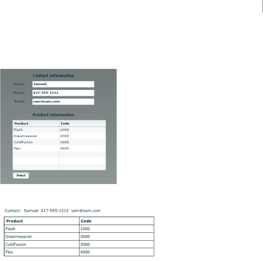
1025ADOBE FLEX 3
Adobe Flex 3 Developer Guide
Example: A simple print-specific output format
This example creates a Flex form with three text boxes for entering contact information, and a data grid that
displays several lines of product information. The following image shows how the output of this application looks
on the screen:
The following image shows how the output looks when the user clicks the Print button to print the data:
In this example, the MXML application file displays the screen and controls the printing. A separate custom
MXML component defines the appearance of the printed output.
When the user clicks the Print button, the application’s doPrint() method does the following things:
1Creates and starts the print job to display the operating system’s Print dialog box.
2After the user starts the print operation in the Print dialog box, creates a child control using the myPrintView
component.

CHAPTER 31
1026
3Sets the MyPrintView control’s data from the form data.
4Sends the print job to the printer.
5Cleans up memory by removing the print-specific child component.
The printed output does not include the labels from the screen, and the application combines the text from the
screen’s three input boxes into a single string for printing in a Label control.
The following code shows the contents of the application file:
<?xml version="1.0"?>
<!-- printing\DGPrintCustomComp.mxml -->
<mx:Application xmlns:mx="http://www.adobe.com/2006/mxml"
height="450"
width="550">
<mx:Script>
<
1027ADOBE FLEX 3
Adobe Flex 3 Developer Guide
]]>
</mx:Script>
<!-- The form to display-->
<mx:Form id="myForm">
<mx:FormHeading label="Contact Information"/>
<mx:FormItem label="Name: ">
<mx:TextInput id="custName"
width="200"
text="Samuel Smith"
fontWeight="bold"/>
</mx:FormItem>
<mx:FormItem label="Phone: ">
<mx:TextInput id="custPhone"
width="200"
text="617-555-1212"
fontWeight="bold"/>
</mx:FormItem>
<mx:FormItem label="Email: ">
<mx:TextInput id="custEmail"
width="200"
text="sam@sam.com"
fontWeight="bold"/>
</mx:FormItem>
<mx:FormHeading label="Product Information"/>
<mx:DataGrid id="myDataGrid" width="300">
<mx:dataProvider>
<mx:Object Product="Flash" Code="1000"/>
<mx:Object Product="Flex" Code="2000"/>
<mx:Object Product="ColdFusion" Code="3000"/>
<mx:Object Product="JRun" Code="4000"/>
</mx:dataProvider>
</mx:DataGrid>
<mx:Button id="myButton"
label="Print"
click="doPrint();"/>
</mx:Form>
</mx:Application>
The following MyPrintView.mxml file defines the component used by the application’s doPrint() method. The
component is a VBox container; it contains a Label control, into which the application writes the contact infor-
mation from the first three fields of the form, and a PrintDataGrid control, which displays the data from the data
source of the screen view’s DataGrid control. For more information on the PrintDataGrid control and its advan-
tages for printing, see “Using the PrintDataGrid control for multipage grids” on page 1028.
<?xml version="1.0"?>
<!-- printing\myComponents\MyPrintView.mxml -->
<mx:VBox xmlns:mx="http://www.adobe.com/2006/mxml"
backgroundColor="#FFFFFF"
height="250" width="450"
paddingTop="50" paddingLeft="50" paddingRight="50">
<!-- The controls to print, a label and a PrintDataGrid control. -->
<mx:Label id="contact"/>
<mx:PrintDataGrid id="myDataGrid" width="100%">

CHAPTER 31
1028
<mx:columns>
<mx:DataGridColumn dataField="Product"/>
<mx:DataGridColumn dataField="Code"/>
</mx:columns>
</mx:PrintDataGrid>
</mx:VBox>
Printing multipage output
You can print well-formatted multipage output under the following conditions:
•When each control fits on a print page or less. You often encounter such jobs when printing a form with fixed-
length fields.
•When the printed output includes one or more PrintDataGrid controls that are too long to print on a single
page, particularly if the control height might vary, depending on the data. A good example of this type of output
is a customer order receipt, which starts with the customer information, has an indeterminate number of order
line items, and ends with total information.
Printing known-length multipage output
If you know the length of each component in a multipage document, you can create a separate print layout
component for each page you print, and specify each layout page in a separate addObject() method, as follows:
printJob.addObject(introPrintView, "ShowAll");
printJob.addObject(finDetailPrintView, "ShowAll");
printJob.addObject(hrDetailPrintView, "ShowAll");
printJob.addObject(summaryPrintView, "ShowAll");
Using the PrintDataGrid control for multipage grids
When a DataGrid control with many rows does not fit on a single screen in your application, you typically have
scroll bars that let users view all the data. When you print the DataGrid control, the output is the same as the
screen display. Therefore, if your DataGrid control has rows or columns that are not immediately visible, they do
not print. If you replace the DataGrid control with a PrintDataGrid control that does not have a height specified
(or has a large height), you print all the rows, but some rows could be partially printed on the bottom of one page
and partially printed at the top of another, as you often see with HTML printout.
1029ADOBE FLEX 3
Adobe Flex 3 Developer Guide
You can solve these problems by using the following features of the PrintDataGrid control. These features let you
correctly print grids that contain multiple pages of data without splitting rows across pages:
sizeToPage property Makes the printed data grid contain only full rows.
nextPage() method Gets the next printable page of data.
validNextPage property Is true if printing the data requires an additional page.
Using the sizeToPage attribute to format pages
A PrintDataGrid page consists of the rows that are visible in the control’s current view. Suppose, for example, that
a PrintDataGrid control has a height of 130 pixels. The total height of each row and header is 30 pixels, and the
control’s data provider has 10 rows. In this situation, the printed PrintDataGrid page contains only three complete
data rows, plus the header. The sizeToPage property specifies whether to include a fourth and partial data row.
The sizeToPage property, which is true by default, causes the PrintDataGrid control to remove any partially
visible or empty rows and to resize itself to include only complete rows in the current view. For the data grid
described in the preceding paragraph, when this property is true, the DataGrid shrinks to show three complete
data rows, and no incomplete rows; if the attribute is false, the grid includes a partial row at the bottom.
The following properties provide information on page sizing that are affected by the sizeToPage property:
In most applications, you leave the sizeToPage attribute at its default value (true), and use the height property
to determine the grid height.
The sizeToPage property does not affect the way the page breaks when a single PrintDataGrid control page is
longer than a print page. To print multipage data grids without splitting rows, you must divide the grid items into
multiple views by using the nextPage() method, as described in “Using the nextPage() method and validNex-
tPage property to print multiple pages” on page 1029.
Using the nextPage() method and validNextPage property to print multiple pages
The validNextPage property is true if the PrintDataGrid control has data beyond the rows that fit on the
current print page. You use it to determine whether you need to format and print an additional page.
Property Description
currentPageHeight Contains the height of the grid, in pixels, that results if the sizeToPage property is true. If the sizeToPage
property is true, the currentPageHeight property equals the height property.
originalHeight Contains the grid height that results if the sizeToPage property is false. If the sizeToPage property is
false, the originalHeight property equals the height property.

CHAPTER 31
1030
The nextPage() method lets you page through the data provider contents by setting the first row of the PrintDa-
taGrid control to be the data provider row that follows the last row of the previous PrintDataGrid page. In other
words, the nextPage() method increases the grid’s verticalScrollPosition property by the value of the grid’s
rowCount property.
The following code shows a loop that prints a grid using multiple pages, without having rows that span pages:
// Queue the first page.
printJob.addObject(thePrintView);
// While there are more pages, print them.
while (thePrintView.myDataGrid.validNextPage) {
//Put the next page of data in the view.
thePrintView.myDataGrid.nextPage();
//Queue the additional page.
printJob.addObject(thePrintView);
}
The section “Example: Printing with multipage PrintDataGrid controls” on page 1030 shows how to use the
nextPage() method to print a report with a multipage data grid.
Updating the PrintDataGrid layout
When you use a PrintDataGrid control to print a single data grid across multiple pages, you queue each page of
the grid individually. If your application customizes each page beyond simply using the nextPage() method to
page through the PrintDataGrid, you must call the validateNow() method to update the page layout before you
print each page, as shown in “Print output component” on page 1034.
Example: Printing with multipage PrintDataGrid controls
The following example prints a data grid in which you can specify the number of items in the data provider. You
can, therefore, set the DataGrid control contents to print on one, two, or more pages, so that you can see the effects
of different-sized data sets on the printed result.
The example also shows how you can put header information before the grid and footer information after the grid,
as in a shipping list or receipt. It uses the technique of selectively showing and hiding the header and footer,
depending on the page being printed. To keep the code as short as possible, the example uses simple placeholder
information only.
The application consists of the following files:
•The application file displays the form to the user, including TextArea and Button controls to set the number
of lines and a Print button. The file includes the code to initialize the view, get the data, and handle the user’s print
request. It uses the FormPrintView MXML component as a template for the printed output.
•The FormPrintView.mxml file formats the printed output. It has two major elements:

1031ADOBE FLEX 3
Adobe Flex 3 Developer Guide
•The print output template includes the PrintDataGrid control and uses two MXML components to format
the header and footer contents.
•The showPage() function determines which sections of the template to include in a particular page of the
output, based on the page type: first, middle, last, or single. On the first page of multipage output, the
showPage() function hides the footer; on the middle and last pages, it hides the header. On a single page, it
shows both header and footer.
•The FormPrintHeader.mxml and formPrintFooter.mxml files specify the contents of the start and the end of
the output. To keep the application simple, the header has a single, static Label control. The footer displays a total
of the numbers in the Quantity column. In a more complete application, the header page could have, for example,
a shipping address, and the footer page could show more detail about the shipment totals.
The files include detailed comments explaining the purpose of the code.
Multipage print application file
The following code shows the multipage print application file:
<?xml version="1.0"?>
<!-- printing\MultiPagePrint.mxml -->
<mx:Application xmlns:mx="http://www.adobe.com/2006/mxml"
initialize="initData();">
<mx:Script>
<![CDATA[
import mx.printing.*;
import mx.collections.ArrayCollection;
// Import the MXML custom print view control.
import myComponents.FormPrintView;
// Declare variables and initialize simple variables.
// The dgProvider ArrayCollection is the DataGrid data provider.
// It must be bindable because you change its contents dynamically.
[Bindable]
public var dgProvider:ArrayCollection;
public var footerHeight:Number = 20;
public var prodIndex:Number;
public var prodTotal:Number = 0;
// Data initialization, called when the application initializes.
public function initData():void {
// Create the data provider for the DataGrid control.
dgProvider = new ArrayCollection;
}
// Fill the dgProvider ArrayCollection with the specified items.
public function setdgProvider(items:int):void {
// First initialize the index and clear any existing data.
prodIndex=1;
dgProvider.removeAll();
// Fill the ArrayCollection, and calculate a product total.

CHAPTER 31
1032
// For simplicity, it increases the Index field value by
// 1, and the Qty field by 7 for each item.
for (var z:int=0; z<items; z++)
{
var prod1:Object = {};
prod1.Qty = prodIndex * 7;
prod1.Index = prodIndex++;
prodTotal += prod1.Qty;
dgProvider.addItem(prod1);
}
}
// The function to print the output.
public function doPrint():void {
// Create a FlexPrintJob instance.
var printJob:FlexPrintJob = new FlexPrintJob();
// Start the print job.
if (printJob.start()) {
// Create a FormPrintView control
// as a child of the application.
var thePrintView:FormPrintView = new FormPrintView();
addChild(thePrintView);
// Set the print view properties.
thePrintView.width=printJob.pageWidth;
thePrintView.height=printJob.pageHeight;
thePrintView.prodTotal = prodTotal;
// Set the data provider of the FormPrintView
// component's DataGrid to be the data provider of
// the displayed DataGrid.
thePrintView.myDataGrid.dataProvider =
myDataGrid.dataProvider;
// Create a single-page image.
thePrintView.showPage("single");
// If the print image's DataGrid can hold all the
// data provider's rows, add the page to the print job.
if(!thePrintView.myDataGrid.validNextPage)
{
printJob.addObject(thePrintView);
}
// Otherwise, the job requires multiple pages.
else
{
// Create the first page and add it to the print job.
thePrintView.showPage("first");
printJob.addObject(thePrintView);
thePrintView.pageNumber++;
// Loop through the following code
// until all pages are queued.
while(true)
{
// Move the next page of data to the top of
// the PrintDataGrid.

1033ADOBE FLEX 3
Adobe Flex 3 Developer Guide
thePrintView.myDataGrid.nextPage();
// Try creating a last page.
thePrintView.showPage("last");
// If the page holds the remaining data, or if
// the last page was completely filled by the last
// grid data, queue it for printing.
// Test if there is data for another
// PrintDataGrid page.
if(!thePrintView.myDataGrid.validNextPage)
{
// This is the last page;
// queue it and exit the print loop.
printJob.addObject(thePrintView);
break;
}
else
// This is not the last page. Queue a middle page.
{
thePrintView.showPage("middle");
printJob.addObject(thePrintView);
thePrintView.pageNumber++;
}
}
}
// All pages are queued; remove the FormPrintView
// control to free memory.
removeChild(thePrintView);
}
// Send the job to the printer.
printJob.send();
}
]]>
</mx:Script>
<!-- The form that appears on the user's system.-->
<mx:Form id="myForm" width="80%">
<mx:FormHeading label="Product Information"/>
<mx:DataGrid id="myDataGrid" dataProvider="{dgProvider}">
<mx:columns>
<mx:DataGridColumn dataField="Index"/>
<mx:DataGridColumn dataField="Qty"/>
</mx:columns>
</mx:DataGrid>
<mx:Text width="100%"
text="Specify the number of lines and click Fill Grid first.
Then you can click Print."/>
<mx:TextInput id="dataItems" text="35"/>
<mx:HBox>
<mx:Button id="setDP"
label="Fill Grid"
click="setdgProvider(int(dataItems.text));"/>
<mx:Button id="printDG"
label="Print"
click="doPrint();"/>
</mx:HBox>

CHAPTER 31
1034
</mx:Form>
</mx:Application>
Print output component
The following lines show the FormPrintView.mxml custom component file:
<?xml version="1.0"?>
<!-- printing\myComponents\FormPrintView.mxml -->
<mx:VBox xmlns:mx="http://www.adobe.com/2006/mxml"
xmlns:MyComp="myComponents.*"
backgroundColor="#FFFFFF"
paddingTop="50" paddingBottom="50" paddingLeft="50">
<mx:Script>
<![CDATA[
import mx.core.*
// Declare and initialize the variables used in the component.
// The application sets the actual prodTotal value.
[Bindable]
public var pageNumber:Number = 1;
[Bindable]
public var prodTotal:Number = 0;
// Control the page contents by selectively hiding the header and
// footer based on the page type.
public function showPage(pageType:String):void {
if(pageType == "first" || pageType == "middle") {
// Hide the footer.
footer.includeInLayout=false;
footer.visible = false;
}
if(pageType == "middle" || pageType == "last") {
// The header won't be used again; hide it.
header.includeInLayout=false;
header.visible = false;
}
if(pageType == "last") {
// Show the footer.
footer.includeInLayout=true;
footer.visible = true;
}
//Update the DataGrid layout to reflect the results.
validateNow();
}
]]>
</mx:Script>
<!-- The template for the printed page,
with the contents for all pages. -->
<mx:VBox width="80%" horizontalAlign="left">
<mx:Label text="Page {pageNumber}"/>
</mx:VBox>
<MyComp:FormPrintHeader id="header"/>
<!-- The sizeToPage property is true by default, so the last

1035ADOBE FLEX 3
Adobe Flex 3 Developer Guide
page has only as many grid rows as are needed for the data. -->
<mx:PrintDataGrid id="myDataGrid" width="60%" height="100%">
<!-- Specify the columns to ensure that their order is correct. -->
<mx:columns>
<mx:DataGridColumn dataField="Index" />
<mx:DataGridColumn dataField="Qty" />
</mx:columns>
</mx:PrintDataGrid>
<!-- Create a FormPrintFooter control
and set its prodTotal variable. -->
<MyComp:FormPrintFooter id="footer" pTotal="{prodTotal}"/>
</mx:VBox>
Header and footer files
The following lines show the FormPrintHeader.mxml file.
<?xml version="1.0"?>
<!-- printing\myComponents\FormPrintHeader.mxml -->
<mx:VBox xmlns:mx="http://www.adobe.com/2006/mxml"
width="60%"
horizontalAlign="right" >
<mx:Label text="This is a placeholder for first page contents"/>
</mx:VBox>
The following lines show the FormPrintFooter.mxml file:
<?xml version="1.0"?>
<!-- printing\myComponents\FormPrintFooter.mxml -->
<mx:VBox xmlns:mx="http://www.adobe.com/2006/mxml"
width="60%"
horizontalAlign="right">
<!-- Declare and initialize the product total variable. -->
<mx:Script>
<![CDATA[
[Bindable]
public var pTotal:Number = 0;
]]>
</mx:Script>
<mx:Label text="Product Total: {pTotal}"/>
</mx:VBox>
Using the PrintAdvancedDataGrid control
The PrintAdvancedDataGrid and PrintOLAPDataGrid controls provide the same functionality for the Advanced-
DataGrid and OLAPDataGrid controls as the PrintDataGrid control does for the DataGrid control. For more
information, see “Using the PrintDataGrid control for multipage grids” on page 1028.
The following example uses the PrintAdvancedDataGrid control to print an instance of the AdvancedDataGrid
control.

CHAPTER 31
1036
<?xml version="1.0"?>
<!-- printing\ADGPrint.mxml -->
<mx:Application xmlns:mx="http://www.adobe.com/2006/mxml">
<mx:Script>
<![CDATA[
import mx.printing.*;
import mx.collections.ArrayCollection;
import mx.printing.PrintAdvancedDataGrid;
include "SimpleHierarchicalData.as";
// Create a PrintJob instance.
private function doPrint():void {
// Create an instance of the FlexPrintJob class.
var printJob:FlexPrintJob = new FlexPrintJob();
// Initialize the PrintAdvancedDataGrid control.
var printADG:PrintAdvancedDataGrid =
new PrintAdvancedDataGrid();
// Exclude the PrintAdvancedDataGrid control from layout.
printADG.includeInLayout = false;
printADG.source = adg;
// Add the print-specific control to the application.
addChild(printADG);
// Start the print job.
if (printJob.start() == false) {
// User cancelled print job.
// Remove the print-specific control to free memory.
removeChild(printADG);
return;
}
// Add the object to print. Do not scale it.
printJob.addObject(printADG, FlexPrintJobScaleType.NONE);
// Send the job to the printer.
printJob.send();
// Remove the print-specific control to free memory.
removeChild(printADG);
}
]]>
</mx:Script>
<mx:VBox id="myVBox"
width="100%" height="100%">
<mx:AdvancedDataGrid id="adg"
width="100%" height="100%">
<mx:dataProvider>
<mx:HierarchicalData source="{dpHierarchy}"/>
</mx:dataProvider>
<mx:columns>
<mx:AdvancedDataGridColumn dataField="Region"/>
<mx:AdvancedDataGridColumn dataField="Territory_Rep"
headerText="Territory Rep"/>
1037ADOBE FLEX 3
Adobe Flex 3 Developer Guide
<mx:AdvancedDataGridColumn dataField="Actual"/>
<mx:AdvancedDataGridColumn dataField="Estimate"/>
</mx:columns>
</mx:AdvancedDataGrid>
<mx:Button id="myButton"
label="Print"
click="doPrint();"/>
</mx:VBox>
</mx:Application>
This example uses the PrintAdvancedDataGrid.source property to initialize the PrintAdvancedDataGrid
control from the AdvancedDataGrid control.
To support the AdvancedDataGrid control, the PrintAdvancedDataGrid control adds the following properties not
available in the PrintDataGrid control:
Property Description
allowInteractions If true, allow some interactions with the control, such as column resizing, column reordering, and expanding
or collapsing nodes. The default value is false.
displayIcons If true, display the folder and leaf icons in the navigation tree. The default value is true.
source Initialize the PrintAdvancedDataGrid control and all of its properties from the specified AdvancedDataGrid
control.
validPreviousPage Indicates that the data provider contains data rows that precede the rows that the PrintAdvancedDataGrid
control currently displays.

CHAPTER 31
1038

1039
Chapter 32: Communicating with
the Wrapper
You exchange data between an Adobe® Flex® application and the HTML page that embeds that application in
several ways, depending on the type of integration that your application requires.
Topics
About exchanging data with Flex applications . . . . . . . . . . . . . . . . . . . . . . . . . . . . . . . . . . . . . . . . . . . . . . . . . . . . . .1039
Passing request data with flashVars properties. . . . . . . . . . . . . . . . . . . . . . . . . . . . . . . . . . . . . . . . . . . . . . . . . . . . . .1043
Accessing JavaScript functions from Flex . . . . . . . . . . . . . . . . . . . . . . . . . . . . . . . . . . . . . . . . . . . . . . . . . . . . . . . . . .1047
Accessing Flex from JavaScript . . . . . . . . . . . . . . . . . . . . . . . . . . . . . . . . . . . . . . . . . . . . . . . . . . . . . . . . . . . . . . . . . . .1056
About ExternalInterface API security in Flex. . . . . . . . . . . . . . . . . . . . . . . . . . . . . . . . . . . . . . . . . . . . . . . . . . . . . . .1061
About exchanging data with Flex applications
Flex applications generally exist inside larger web applications that control everything from security to state
management to the overall look and feel of the website. In this scenario it is important that the Flex application is
able to communicate with the surrounding environment, providing a deeper integration with the larger web appli-
cation. Enabling the Flex application to communicate with the environment provides a method of integration with
other technologies such as Ajax.
Often, a Flex application is loaded in a browser within a wrapper. This wrapper is often an HTML page that can
include JavaScript or other client-side logic that the Flex application can interact with. For more information
about the wrapper, see “Creating a Wrapper” on page 311 in Building and Deploying Adobe Flex 3 Applications.
There are several ways to communicate between the surrounding environment and the Flex application;
depending on the type of integration required, any combination of flashVars properties, query string param-
eters, the navigateToURL() method, and the ExternalInterface class can be employed. In addition, you can
communicate between two Flex applications on the same page by using SharedObjects.
To pass request data into your Flex applications, you can define flashVars properties inside your HTML wrapper
and access their values using either the Application.application.parameters or LoaderConfig.parameters objects.
For more information, see “Passing request data with flashVars properties” on page 1043. Using these techniques,
you can personalize a Flex application without requiring a recompilation.

1040 CHAPTER 32
Use the methods of the ExternalInterface API to call the methods of your Flex applications and vice versa. The
addCallback() method exposes methods of your Flex application to the wrapper. The call() method invokes
a method within the wrapper and returns any results. If the wrapper is HTML, the addCallback() and call()
methods enable method invocation between your Flex application and the hosted JavaScript running within the
browser. For more information, see “About the ExternalInterface API” on page 1041.
In some situations, you want to open a new browser window or navigate to a new location. You can do this with
the navigateToURL() global function. Although it is not part of the ExternalInterface API, this method is flexible
enough to let you write JavaScript inside it, and invoke JavaScript functions on the resulting HTML page. The
navigateToURL() method is a global function in the flash.net package.
Accessing environment information
Flex provides some simple mechanisms for getting information about the browser and the environment in which
the application runs. From within the Flex application, you can get the URL to the SWF file; you can also get the
context root. The following example gets the SWF file’s URL, constructs the host name from the URL, and displays
the context root, which is accessible with the @ContextRoot() token:
<?xml version="1.0"?>
<!-- wrapper/GetURLInfo.mxml -->
<mx:Application xmlns:mx="http://www.adobe.com/2006/mxml"
creationComplete="getHostName()">
<mx:Script><![CDATA[
[Bindable]
public var g_HostString:String;
[Bindable]
public var g_ContextRoot:String;
[Bindable]
public var g_BaseURL:String;
private function getHostName():void {
g_BaseURL = Application.application.url;
var pattern1:RegExp = new RegExp("http://[^/]*/");
if (pattern1.test(g_BaseURL) == true) {
g_HostString = pattern1.exec(g_BaseURL).toString();
} else{
g_HostString = "http://localhost/"
}
}
]]></mx:Script>
<mx:Form>
<mx:FormItem label="Base URL:">
<mx:Label text="{g_BaseURL}"/>
</mx:FormItem>
<mx:FormItem label="Host Name:">
<mx:Label text="{g_HostString}"/>
</mx:FormItem>
<mx:FormItem label="Context Root:">

1041ADOBE FLEX 3
Adobe Flex 3 Developer Guide
<mx:Label text="@ContextRoot()"/>
</mx:FormItem>
</mx:Form>
</mx:Application>
You can also use the flash.system.Capabilities class to access information about the client, such as Operating
System, Player version, and language. For more information, see Using Flash ActionScript.
You can access more information about the browser and the application’s environment using the Exter-
nalInterface. For more information, see “About the ExternalInterface API” on page 1041.
Enabling Netscape connections
In Netscape browsers, the <embed> tag in your wrapper must include swliveconnect=true to allow communi-
cation between the browser and your Flex application. This lets the Flex application connect with the page’s
scripting language (usually JavaScript). You add this parameter to the <embed> tags in the Flex application’s
wrapper, as the following example shows:
<embed pluginspage='http://www.adobe.com/go/getflashplayer'
width='300'
height='100'
flashvars=''
src='TitleTest.mxml.swf'
name='MyApp'
SWLIVECONNECT='true'
/>
You are not required to set the value of swliveconnect to true in the <object> tag because the <object> tag
is used by Microsoft Internet Explorer, but not Netscape browsers.
About the ExternalInterface API
You use the ExternalInterface API to let your Flex application call methods in the wrapper and to allow the
wrapper to call functions in your Flex application. The ExternalInterface API consists primarily of the call() and
addCallback() methods in the flash.external package.
The following browsers support the ExternalInterface API:
•All versions of Internet Explorer for Windows (5.0 and later)
•Embedded custom ActiveX containers, such as a desktop application embedding Adobe® Flash® Player
ActiveX control
•Any browser that supports the NPRuntime interface (which currently includes the following browsers):
•Firefox 1.0 and later
•Mozilla 1.7.5 and later

CHAPTER 32
1042
•Netscape 8.0 and later
•Safari 1.3 and later
Before you execute code that uses the ExternalInterface API, you should check whether the browser supports it.
You do this by using the available property of the ExternalInterface object in your Flex application. The
available property is a Boolean value that is true if the browser supports the ExternalInterface API and false
if the browser does not. It is a read-only property.
The following example uses the available property to detect support for the ExternalInterface API before
executing methods that use the class:
<?xml version="1.0"?>
<!-- wrapper/CheckExternalInterface.mxml -->
<mx:Application xmlns:mx="http://www.adobe.com/2006/mxml" creationComplete="checkEI()">
<mx:Script><![CDATA[
[Bindable]
public var eiStatus:String;
private function checkEI():void {
eiStatus = ExternalInterface.available.toString();
}
]]></mx:Script>
<mx:Label id="l1" text="{eiStatus}"/>
</mx:Application>
For examples of using the ExternalInterface API with Flex applications, see “Using the ExternalInterface API to
access JavaScript from Flex” on page 1047 and “Accessing Flex from JavaScript” on page 1056.
In addition to requiring that browsers meet certain version requirements, the ExternalInterface API requires that
JavaScript is enabled in the browser. You can use the <noscript> tag in the HTML page to handle a browser with
disabled JavaScript. For more information, see “Handling browsers that disable JavaScript” on page 1060.
The available property determines only if the browser can support the ExternalInterface API, based on its
version and manufacturer. If JavaScript is disabled in the browser, the available property still returns true.
The ExternalInterface API is restricted by the security sandbox in which the SWF file is running. Its use relies on
the domain-based security restrictions that the allowScriptAccess and allowNetworking parameters define.
You set the values of the allowScriptAccess and allowNetworking parameters in the SWF file’s wrapper.
For more information on these parameters, see “Creating a Wrapper” on page 311 in Building and Deploying
Adobe Flex 3 Applications.
For more information on security restrictions, see “About ExternalInterface API security in Flex” on page 1061;
also see “Applying Flex Security” on page 29 in Building and Deploying Adobe Flex 3 Applications.

1043ADOBE FLEX 3
Adobe Flex 3 Developer Guide
Passing request data with flashVars properties
You pass request data to Flex applications by defining the flashVars properties in the wrapper. You can also
access URL fragments by using the BrowserManager. For more information, see “Passing request data with URL
fragments” on page 1080.
The flashVars properties and URL fragments are read in the Flex application at run time. As a result, changing
flashVars properties or URL fragments does not require you to recompile the Flex application.
Passing request data with flashVars properties
You can pass variables to your Flex applications using the flashVars properties in the <object> and <embed>
tags in your wrapper. You do this by adding ampersand-separated sets of name-value pairs to these properties.
The following example sets the values of the firstname and lastname in the flashVars properties inside the
<object> and <embed> tags in a simple wrapper:
<html>
<head>
<title>/flex2/code/wrapper/SimplestFlashVarTestWrapper.html</title>
<style>
body { margin: 0px;
overflow:hidden }
</style>
</head>
<body scroll='no'>
<table width='100%' height='100%' cellspacing='0' cellpadding='0'><tr><td valign='top'>
<h1>Simplest FlashVarTest Wrapper</h1>
<object id='mySwf' classid='clsid:D27CDB6E-AE6D-11cf-96B8-444553540000'
codebase='http://fpdownload.macromedia.com/get/flashplayer/current/swflash.cab'
height='100%' width='100%'>
<param name='src' value='FlashVarTest.swf'/>
<param name='flashVars' value='firstName=Nick&lastName=Danger'/>
<embed name='mySwf' src='FlashVarTest.swf'
pluginspage='http://www.adobe.com/go/getflashplayer' height='100%' width='100%'
flashVars='firstName=Nick&lastName=Danger'/>
</object>
</td></tr></table>
</body>
</html>

CHAPTER 32
1044
If you are using the wrapper that is generated by the web-tier compiler or Adobe® Flex® Builder™, or one of the
wrappers that are included in the /templates directory, your wrapper will probably be very different from the
previous example. These wrappers call functions in the AC_OETags.js file to build the <object> and <embed>
tag structure in the HTML page. As a result, you pass the flashVars as parameters to the AC_FL_RunContent()
function in the wrapper. For a function call that already has a flashVars parameter, you can append your
flashVars to the end, as the following example shows:
"FlashVars","MMredirectURL="+MMredirectURL+'&MMplayerType='+MMPlayerType+'&MMdoctitle='+
MMdoctitle+'&myName=Danger&myHometown=Los%20Angeles'+"",
If the function parameters do not already include the flashVars variable, then you can insert it in the list, as the
following example shows:
AC_FL_RunContent(
"src", "TestApp",
"flashVars", "myName=Danger&myHometown=Los%20Angeles",
"width", "100%",
"height", "100%",
"align", "middle",
"id", "TestApp",
"quality", "high",
"name", "TestApp",
"allowScriptAccess","sameDomain",
"type", "application/x-shockwave-flash",
"pluginspage", "http://www.adobe.com/go/getflashplayer"
);
The value of the flashVars properties do not have to be static. If you use JSP to return the wrapper, for example,
you can use any JSP expression for the value of the flashVars properties that can be evaluated to a String.
The following example uses the values stored in the HttpServletRequest object (in this case, you can use form or
query string parameters):
<html>
<head>
<title>/flex2/code/wrapper/DynamicFlashVarTestWrapper.jsp</title>
<style>
body { margin: 0px;
overflow:hidden }
</style>
</head>
<% String fName = (String) request.getParameter("firstname");
String mName = (String) request.getParameter("middlename");
String lName = (String) request.getParameter("lastname");
%>
<body scroll='no'>
<table width='100%' height='100%' cellspacing='0' cellpadding='0'><tr><td valign='top'>
<script>
<h1>Dynamic FlashVarTest Wrapper</h1>
</script>

1045ADOBE FLEX 3
Adobe Flex 3 Developer Guide
<object id='mySwf' classid='clsid:D27CDB6E-AE6D-11cf-96B8-444553540000'
codebase='http://download.macromedia.com/pub/shockwave/cabs/flash/swflash.cab#version=9,
0,0,0' height='100%' width='100%'>
<param name='src' value='../assets/FlashVarTest.swf'/>
<param name='flashVars' value='firstname=<%= fName %>&lastname=<%= lName %>'/>
<embed name='mySwf' src='../assets/FlashVarTest.swf'
pluginspage='http://www.macromedia.com/shockwave/download/index.cgi?P1_Prod_Version=Shoc
kwaveFlash' height='100%' width='100%' flashVars='firstname=<%= fName %>&lastname=<%=
lName %>'/>
</object>
</td></tr></table>
</body>
</html>
If your user requests the SWF file directly in the browser, without a wrapper, you can access variables on the query
string without providing additional code. The following URL passes the name Nick and the hometown San
Francisco to the Flex application:
http://localhost:8100/flex/myApp.swf?myName=Nick&myHometown=San%20Francisco
For more information about the HTML wrapper, see “About the wrapper” on page 311 in Building and Deploying
Adobe Flex 3 Applications.
About flashVars properties encoding
The values of the flashVars properties must be URL encoded. The format of the string is a set of name-value
pairs separated by an ampersand (&). You can escape special and nonprintable characters with a percent symbol
(%) followed by a two-digit hexadecimal value. You can represent a single blank space using the plus sign (+).
The encoding for flashVars properties is the same as the page. Internet Explorer provides UTF-16-compliant
strings on the Windows platform. Netscape sends a UTF-8-encoded string to Flash Player.
Most browsers support a flashVars String or query string up to 64 KB (65535 bytes) in length. They can include
any number of name-value pairs.
Using the src properties to pass request data
You can append the values of properties to the <object> and <embed> tags’ src properties in the wrapper. The
src property identifies the location of the Flex application’s SWF file. You access these the same way that you
access flashVars properties.
The following example appends query string parameters to the src properties in the custom wrapper:
<object ... >
<param name='src' value='TitleTest.mxml.swf?myName=Danger'>
...
<embed src='TitleTest.mxml.swf?myName=Danger' ... />
</object>

CHAPTER 32
1046
Variables you define in this manner are accessible in the same way as flashVars properties. For more infor-
mation, see “Accessing the flashVars properties” on page 1046.
Accessing the flashVars properties
To access the values of the flashVars properties, you use the Application object’s parameters property. This
property points to a dynamic object that stores the parameters as name-value pairs. You can access variables on
the parameters object by specifying parameters.variable_name.
In your Flex application, you typically assign the values of the run-time properties to local variables. You assign
the values of these properties after the application’s creationComplete event is dispatched. Otherwise, the run-
time properties might not be available when you try to assign their values to local variables.
The following example defines the myName and myHometown variables and binds them to the text of Label controls
in the initVars() method:
<?xml version="1.0"?>
<!-- wrapper/ApplicationParameters.mxml -->
<mx:Application xmlns:mx="http://www.adobe.com/2006/mxml" creationComplete="initVars()">
<mx:Script><![CDATA[
// Declare bindable properties in Application scope.
[Bindable]
public var myName:String;
[Bindable]
public var myHometown:String;
// Assign values to new properties.
private function initVars():void {
myName = Application.application.parameters.myName;
myHometown = Application.application.parameters.myHometown;
}
]]></mx:Script>
<mx:VBox>
<mx:HBox>
<mx:Label text="Name: "/>
<mx:Label text="{myName}" fontWeight="bold"/>
</mx:HBox>
<mx:HBox>
<mx:Label text="Hometown: "/>
<mx:Label text="{myHometown}" fontWeight="bold"/>
</mx:HBox>
</mx:VBox>
</mx:Application>
When a user requests this application with the myName and myHometown parameters defined as flashVars
properties, Flex displays their values in the Label controls.
To view all the flashVars properties, you can iterate over the parameters object, as the following example shows:
<?xml version="1.0"?>
<!-- wrapper/IterateOverApplicationParameters.mxml -->
<mx:Application xmlns:mx="http://www.adobe.com/2006/mxml" creationComplete="init()">

1047ADOBE FLEX 3
Adobe Flex 3 Developer Guide
<mx:Script><![CDATA[
private function init():void {
for (var i:String in Application.application.parameters) {
ta1.text += i + ":" + Application.application.parameters[i] + "\n";
}
}
]]></mx:Script>
<mx:TextArea id="ta1" width="300" height="200"/>
</mx:Application>
Accessing JavaScript functions from Flex
You can call JavaScript functions in the enclosing HTML page from your Flex application. By allowing Flex to
communicate with the browser, you can change style settings, invoke remote processes, or perform any other
action that you can normally do from within the page’s scripts.
You can even pass data from the Flex application to the enclosing HTML page, process it, and then pass it back to
the Flex application. You do this by using the ExternalInterface API or the navigateToURL() method. For more
information, see “Using the ExternalInterface API to access JavaScript from Flex” on page 1047 and “Using the
navigateToURL() method in Flex” on page 1052.
Whenever you communicate with the enclosing page, you must determine if the browser can handle the kinds of
actions that you want to perform. Therefore, you should first determine if the browser supports the objects that
you want to use. For some general guidelines for determining browser support, see “Using the ExternalInterface
API to access JavaScript from Flex” on page 1047.
Using the ExternalInterface API to access JavaScript from Flex
The easiest way to call JavaScript functions from your Flex application is to use the ExternalInterface API. You can
use this API to call any JavaScript method on the wrapper, pass parameters, and get a return value. If the method
call fails, Flex returns an exception.
The ExternalInterface API encapsulates checks for browser support, so you are not required to do that when using
its methods. However, you can check whether the browser supports the interface by using its available property.
For more information, see “About the ExternalInterface API” on page 1041.
The ExternalInterface API consists of a single class, flash.external.ExternalInterface. This class has the call()
static method that you use to facilitate the JavaScript to Flash communication. You can also call methods in your
Flex application from the wrapper by using the ExternalInterface API’s addCallback() method. For more infor-
mation, see “About the addCallback() method” on page 1061.

CHAPTER 32
1048
To use the ExternalInterface, you must make the id and name properties in the HTML page callable. For more
information, see “Editing the Flex application’s id and name properties” on page 1059.
Calling JavaScript methods from Flex applications
The ExternalInterface API makes it very simple to call methods in the enclosing wrapper. You use the static
call() method, which has the following signature:
flash.external.ExternalInterface.call(function_name:String[, arg1, ...]):Object;
The function_name is the name of the function in the HTML page’s JavaScript. The arguments are the arguments
that you pass to the JavaScript function. You can pass one or more arguments in the traditional way of separating
them with commas, or you can pass an object that is deserialized by the browser. The arguments are optional.
The following example script block calls the JavaScript changeDocumentTitle() function in the enclosing
wrapper by using the call() method:
<?xml version="1.0"?>
<!-- wrapper/WrapperCaller.mxml -->
<mx:Application xmlns:mx="http://www.adobe.com/2006/mxml">
<mx:Script>
import flash.external.*;
public function callWrapper():void {
var s:String;
if (ExternalInterface.available) {
var wrapperFunction:String = "changeDocumentTitle";
s = ExternalInterface.call(wrapperFunction,ti1.text);
} else {
s = "Wrapper not available";
}
trace(s);
}
</mx:Script>
<mx:Form>
<mx:FormItem label="New Title:">
<mx:TextInput id="ti1"/>
</mx:FormItem>
</mx:Form>
<mx:Button label="Change Document Title" click="callWrapper()"/>
</mx:Application>
On your HTML page, you define a function as you would any other JavaScript function. You can return a value,
as the following example shows:
<html><head>
<title>wrapper/WrapperBeingCalled.html</title>
</head>
<body scroll='no'>
<SCRIPT LANGUAGE="JavaScript">
function changeDocumentTitle(a) {

1049ADOBE FLEX 3
Adobe Flex 3 Developer Guide
window.document.title=a;
alert(a);
return "successful";
}
</SCRIPT>
<h1>Wrapper Being Called</h1>
<table width='100%' height='100%' cellspacing='0' cellpadding='0'>
<tr>
<td valign='top'>
<object id='mySwf' classid='clsid:D27CDB6E-AE6D-11cf-96B8-444553540000'
codebase='http://fpdownload.macromedia.com/get/flashplayer/current/swflash.cab'
height='200' width='400'>
<param name='src' value='WrapperCaller.swf'/>
<param name='flashVars' value=''/>
<embed name='mySwf' src='WrapperCaller.swf'
pluginspage='http://www.adobe.com/go/getflashplayer' height='100%' width='100%'
flashVars=''/>
</object>
</td>
</tr>
</table>
</body></html>
Using the ExternalInterface's call() method requires that the embedded Flex application have a name in the
wrapper; you must define an id attribute on the <object> tag and a name attribute on the <embed> tag. Without
these, no call to or from your Flex application will succeed.
The call() method accepts zero or more arguments, which can be ActionScript types. Flex serializes the Action-
Script types as JavaScript numbers and strings. If you pass an object, you can access the properties of that deseri-
alized object in the JavaScript, as the following example shows:
<?xml version="1.0"?>
<!-- wrapper/DataTypeSender.mxml -->
<mx:Application xmlns:mx="http://www.adobe.com/2006/mxml">
<mx:Script><![CDATA[
import flash.external.*;
public function callWrapper():void {
var s:String;
if (ExternalInterface.available) {
var o:Object = new Object();
o.fname = "Nick";
o.lname = "Danger";
var wrapperFunction:String = "receiveComplexDataTypes";
s = ExternalInterface.call(wrapperFunction, o);
} else {
s = "Wrapper not available";
}
trace(s);
}
]]></mx:Script>
<mx:Button label="Send" click="callWrapper()"/>
</mx:Application>

CHAPTER 32
1050
Flex only serializes public, nonstatic variables and read-write properties of ActionScript objects. You can pass
numbers and strings as properties on objects, simple objects such as primitive types and arrays, or arrays of simple
objects.
The JavaScript code can then access properties of the object, as the following example shows:
<html><head>
<title>wrapper/DataTypeWrapper.html</title>
</head>
<body scroll='no'>
<SCRIPT LANGUAGE="JavaScript">
function receiveComplexDataTypes(o) {
alert("Welcome " + o.fname + " " + o.lname + "!");
return "successful";
}
</SCRIPT>
<h1>Data Type Wrapper</h1>
<table width='100%' height='100%' cellspacing='0' cellpadding='0'>
<tr>
<td valign='top'>
<object id='mySwf' classid='clsid:D27CDB6E-AE6D-11cf-96B8-444553540000'
codebase='http://fpdownload.macromedia.com/get/flashplayer/current/swflash.cab'
height='200' width='400'>
<param name='src' value='DataTypeSender.swf'/>
<param name='flashVars' value=''/>
<embed name='mySwf' src='DataTypeSender.swf'
pluginspage='http://www.macromedia.com/shockwave/download/index.cgi?P1_Prod_Version=Shoc
kwaveFlash' height='100%' width='100%' flashVars=''/>
</object>
</td>
</tr>
</table>
</body></html>
You can also embed objects within objects, such as an Array within an Object, as the following example shows.
Add the following code in your Flex application’s <mx:Script> block:
<?xml version="1.0"?>
<!-- wrapper/ComplexDataTypeSender.mxml -->
<mx:Application xmlns:mx="http://www.adobe.com/2006/mxml">
<mx:Script><
1051ADOBE FLEX 3
Adobe Flex 3 Developer Guide
s = "Wrapper not available";
}
trace(s);
}
]]></mx:Script>
<mx:Button label="Send" click="callWrapper()"/>
</mx:Application>
The code triggers the JavaScript function in the following wrapper:
<html><head>
<title>wrapper/ComplexDataTypeWrapper.html</title>
</head>
<body scroll='no'>
<SCRIPT LANGUAGE="JavaScript">
function receiveComplexDataTypes(o) {
// Get value of fname and lname properties.
var s = ("Welcome " + o.fname + " " + o.lname + "!\n");
// Iterate over embedded object's properties.
for (i=0; i<o.b.length; i++) {
s += o.b[i] + "\n";
}
alert(s);
}
</SCRIPT>
<h1>Complex Data Type Wrapper</h1>
<table width='100%' height='100%' cellspacing='0' cellpadding='0'>
<tr>
<td valign='top'>
<object id='mySwf' classid='clsid:D27CDB6E-AE6D-11cf-96B8-444553540000'
codebase='http://fpdownload.macromedia.com/get/flashplayer/current/swflash.cab'
height='200' width='400'>
<param name='src' value='ComplexDataTypeSender.swf'/>
<param name='flashVars' value=''/>
<embed name='mySwf' src='ComplexDataTypeSender.swf'
pluginspage='http://www.adobe.com/go/getflashplayer' height='100%' width='100%'
flashVars=''/>
</object>
</td>
</tr>
</table>
</body></html>
Flex and Flash Player have strict security in place to prevent cross-site scripting. By default, you cannot call script
on an HTML page if the HTML page is not in the same domain as the Flex application. However, you can expand
the sources from which scripts can be called. For more information, see “About ExternalInterface API security in
Flex” on page 1061.
You cannot pass objects or arrays that contain circular references. For example, you cannot pass the following
object:

CHAPTER 32
1052
var obj = new Object();
obj.prop = obj; // Circular reference.
Circular references cause infinite loops in both ActionScript and JavaScript.
Using the navigateToURL() method in Flex
The navigateToURL() method loads a document from a specific URL into a window or passes variables to
another application at a defined URL. You can use this method to call JavaScript functions in the HTML page that
encloses a Flex application.
You should not confuse the functionality of the navigateToURL() method with the load() method of the
URLLoader class. The URLLoader class loads a specified URL into an object for manipulation with ActionScript.
The navigateToURL() method navigates to the specified URL with a browser.
In most cases, you should use the ExternalInterface API to perform Flex-to-wrapper communication. However,
the navigateToURL() method is not part of the ExternalInterface API and, therefore, does not have as stringent
a set of requirements for which browsers support it. These requirements are described in “Ab o ut t h e E x te r -
nalInterface API” on page 1041.
The navigateToURL() method is restricted by the security sandbox in which the SWF file is running. Its use
relies on the domain-based security restrictions that the allowScriptAccess and allowNetworking parameters
define. You set the values of the allowScriptAccess and allowNetworking parameters in the SWF file’s
wrapper.
For more information on these parameters, see “Creating a Wrapper” on page 311 in Building and Deploying
Adobe Flex 3 Applications. For more information on security restrictions, see “Applying Flex Security” on page 29
in Building and Deploying Adobe Flex 3 Applications.
The navigateToURL() method syntax
The navigateToURL() method is in the flash.net package. It has the following signature:
navigateToURL(request:URLRequest, window:String):void
The request argument is a URLRequest object that specifies the destination. The window argument specifies
whether to launch a new browser window or load the new URL into the current window. The following table
describes the valid values for the window argument:
Value Description
_self Specifies the current frame in the current window.
_blank Specifies a new window. This new window acts as a pop-up window in the client’s browser, so you must be aware that
a pop-up blocker could prevent it from loading.
1053ADOBE FLEX 3
Adobe Flex 3 Developer Guide
You pass a URLRequest object to the navigateToURL() method. This object defines the URL target, variables,
method (POST or GET), window, and headers for the request. The following example defines a simple URL to
navigate to:
<?xml version="1.0"?>
<!-- wrapper/SimplestNavigateToURL.mxml -->
<mx:Application xmlns:mx="http://www.adobe.com/2006/mxml">
<mx:Script><![CDATA[
import flash.net.*;
public function openNewWindow(event:MouseEvent):void {
var u:URLRequest = new URLRequest("http://www.adobe.com/flex");
navigateToURL(u,"_blank");
}
]]></mx:Script>
<mx:Button label="Open New Window" click="openNewWindow(event)"/>
</mx:Application>
The navigateToURL() method URL encodes the value of the url argument.
To send data with a URLRequest object, you can append variables to the request string. The following example
launches a new window and passes a search term to the URL:
<?xml version="1.0"?>
<!-- wrapper/SimpleNavigateToURL.mxml -->
<mx:Application xmlns:mx="http://www.adobe.com/2006/mxml">
<mx:Script><![CDATA[
import flash.net.*;
public function executeSearch(event:MouseEvent):void {
var u:URLRequest = new URLRequest("http://www.google.com/search?hl=en&q=" +
ta1.text);
navigateToURL(u,"_blank");
}
]]></mx:Script>
<mx:TextArea id="ta1"/>
<mx:Button label="Search" click="executeSearch(event)"/>
</mx:Application>
In addition to appending strings, you can also use the data property of the URLRequest to add URL variables to
a GET or POST request. The query string parameters are of type URLVariables. Flex adds ampersand delimiters
for you in the URL request string. The following example adds name=fred to the URLRequest:
<?xml version="1.0"?>
<!-- wrapper/NavigateWithGetMethod.mxml -->
<mx:Application xmlns:mx="http://www.adobe.com/2006/mxml">
<mx:Script><
CHAPTER 32
1054
url.method = "GET";
uv.name = "fred";
url.data = uv;
navigateToURL(url,"_blank");
}
]]></mx:Script>
<mx:Button label="Open New Window" click="openNewWindow(event)"/>
</mx:Application>
To use POST data with the URLRequest object, set the value of the URLRequest object’s method property to POST.
Opening multiple windows with the navigateToURL() method
You can open any number of new browser windows with calls to the navigateToURL() method. However,
because ActionScript is asynchronous, if you tried a simple loop over the method, Flash Player would only open
the browser window for the last call. To avoid this, you use the callLater() method. This method instructs Flash
Player to open a new browser window on each new frame in your application. The following example uses the
callLater() method to open multiple browser windows with the navigateToURL() method:
<?xml version="1.0"?>
<!-- wrapper/NavigateToMultipleURLs.mxml -->
<mx:Application xmlns:mx="http://www.adobe.com/2006/mxml"
creationComplete="openWindows(0)">
<mx:Script><![CDATA[
import flash.net.navigateToURL;
private var listingData:Array=[
"http://www.google.com",
"http://www.adobe.com",
"http://www.usatoday.com"
];
private function openWindows(n: Number):void {
if (n < listingData.length) {
navigateToURL(new URLRequest(listingData[n]), '_blank');
callLater(callLater, [openWindows, [n+1]]);
}
}
]]></mx:Script>
</mx:Application>
Calling JavaScript functions with the URLRequest object
You can use the URLRequest to call a JavaScript function by embedding that function in the first parameter of the
method, as the following example shows:
public var u:URLRequest = new URLRequest("javascript:window.close()");
The previous code does not work on all browsers. You should include code that detects the browser type, and
closes the window based on the type of browser. Also, some browsers, such as Internet Explorer, behave in
unexpected ways when you invoke a URLRequest that contains JavaScript. Here are some examples:

1055ADOBE FLEX 3
Adobe Flex 3 Developer Guide
•Executes the JavaScript URLs asynchronously. This means that it is possible to have multiple calls to the
navigateToURL() method that is trying to execute JavaScript methods, and have only the last one occur. Each one
overwrites the next.
•Stops all other navigation, such as loading of images and IFRAMEs when you call a JavaScript URL.
•Displays a security warning dialog box if the URL contains ampersand (&) or question mark (?) characters.
Invoking JavaScript with the navigateToURL() method
You can use the navigateToURL() method to invoke JavaScript functions on the HTML page in which the Flex
application runs. However, when passing parameters by using the navigateToURL() method, you must enclose
each parameter in quotation marks, as the following example shows:
<?xml version="1.0"?>
<!-- wrapper/CallingJavaScriptWithNavigateToURL.mxml -->
<mx:Application xmlns:mx="http://www.adobe.com/2006/mxml">
<mx:Script><![CDATA[
import flash.net.*;
public function callWrapper(e:Event):void {
var eType:String = String(e.type);
var eName:String = String(e.currentTarget.id);
var u:URLRequest = new URLRequest("javascript:catchClick('"
+ eName + "','" + eType + "')");
navigateToURL(u,"_self");
}
]]></mx:Script>
<mx:Button id="b1" click="callWrapper(event)" label="Call Wrapper"/>
</mx:Application>
The enclosing HTML wrapper includes the JavaScript to process this call, as the following example shows:
<html><head>
<title>wrapper/NavigateToURLWrapper.html</title>
</head>
<body scroll='no'>
<SCRIPT LANGUAGE="JavaScript">
function catchClick(name, type) {
alert(name + " triggered the " + type + " event.");
}
</SCRIPT>
<h1>Navigate To URL Wrapper</h1>
<table width='100%' height='100%' cellspacing='0' cellpadding='0'>
<tr>
<td valign='top'>
<object id='mySwf' classid='clsid:D27CDB6E-AE6D-11cf-96B8-444553540000'
codebase='http://fpdownload.macromedia.com/get/flashplayer/current/swflash.cab'
height='200' width='400'>
<param name='src' value='CallingJavaScriptWithNavigateToURL.swf'/>
<param name='flashVars' value=''/>

CHAPTER 32
1056
<embed name='mySwf' src='CallingJavaScriptWithNavigateToURL.swf'
pluginspage='http://www.adobe.com/go/getflashplayer' height='100%' width='100%'
flashVars=''/>
</object>
</td>
</tr>
</table>
</body></html>
You can also use the navigateToURL() method with basic JavaScript functions in the URLRequest itself. For
example, you can launch the default e-mail client with a single line of code:
<?xml version="1.0"?>
<!-- wrapper/EmailWithNavigateToURL.mxml -->
<mx:Application xmlns:mx="http://www.adobe.com/2006/mxml">
<mx:Script>
import flash.net.*;
public function sendMail(e:Event):void {
var u:URLRequest = new URLRequest("mailto:" + ti1.text);
navigateToURL(u,"_self");
}
</mx:Script>
<mx:Button id="b1" click="sendMail(event)" label="Send Mail"/>
<mx:Form>
<mx:FormItem>
<mx:Label text="Email Address: "/>
</mx:FormItem>
<mx:FormItem>
<mx:TextInput id="ti1"/>
</mx:FormItem>
</mx:Form>
</mx:Application>
Not all browsers support invoking the javascript protocol with the navigateToURL() method. If possible, you
should use the call() method of the ExternalInterface API to invoke JavaScript methods in the enclosing HTML
page. For more information, see “Using the ExternalInterface API to access JavaScript from Flex” on page 1047.
Accessing Flex from JavaScript
You can call Flex methods from your enclosing wrapper by using the ExternalInterface API. You do this by adding
a public method in your Flex application to a list of callable methods. In your Flex application, you add a local Flex
function to the list by using the addCallback() method of the ExternalInterface API. This method registers an
ActionScript method as callable from the JavaScript or VBScript in the wrapper.
Note: This feature requires that the client is running certain browsers. For more information, see “About the Exter-
nalInterface API” on page 1041.
The signature for the addCallback() method is as follows:

1057ADOBE FLEX 3
Adobe Flex 3 Developer Guide
addCallback(function_name:String, closure:Function):void
The function_name parameter is the name by which you call the Flex function from your HTML page’s scripts.
The closure parameter is the local name of the function that you want to call. This parameter can be a method
on the application or an object instance.
The following example declares the myFunc() function to be callable by the wrapper:
<?xml version="1.0"?>
<!-- wrapper/AddCallbackExample.mxml -->
<mx:Application xmlns:mx="http://www.adobe.com/2006/mxml" creationComplete="initApp()">
<mx:Script>
import flash.external.*;
public function initApp():void {
ExternalInterface.addCallback("myFlexFunction",myFunc);
}
public function myFunc(s:String):void {
l1.text = s;
}
</mx:Script>
<mx:Label id="l1"/>
</mx:Application>
To call the Flex function from the HTML page, you get a reference to the movie object. This is the same value as
the id and name properties of the <object> and <embed> tags. In this case, it is mySwf. You then call the method
on that object, passing whatever parameters you want, as the following example shows:
<html><head>
<title>wrapper/AddCallbackWrapper.html</title>
</head>
<body scroll='no'>
<SCRIPT LANGUAGE="JavaScript">
function callApp() {
window.document.title = document.getElementById("newTitle").value;
mySwf.myFlexFunction(window.document.title);
}
</SCRIPT>
<h1>AddCallback Wrapper</h1>
<form id="f1">
Enter a new title: <input type="text" size="30" id="newTitle" onchange="callApp()">
</form>
<table width='100%' height='100%' cellspacing='0' cellpadding='0'>
<tr>
<td valign='top'>
<object id='mySwf' classid='clsid:D27CDB6E-AE6D-11cf-96B8-444553540000'
codebase='http://fpdownload.macromedia.com/get/flashplayer/current/swflash.cab'
height='200' width='400'>

CHAPTER 32
1058
<param name='src' value='AddCallbackExample.swf'/>
<param name='flashVars' value=''/>
<embed name='mySwf' src='AddCallbackExample.swf'
pluginspage='http://www.adobe.com/go/getflashplayer' height='100%' width='100%'
flashVars=''/>
</object>
</td>
</tr>
</table>
</body></html>
The default value of the id and name properties in the wrapper is mxml_filename.mxml.swf. The name that you
use to access the Flex application in your HTML page’s script cannot contain any periods, so you must change the
default values in the wrapper. For more information, see “Editing the Flex application’s id and name properties”
on page 1059.
If you do not know which browser your users will be using when they request your Flex application, you should
make your wrapper’s script browser independent. For more information, see “Handling multiple browser types”
on page 1058.
If there is no function with the appropriate name in the Flex application or that function hasn’t been made callable,
the browser throws a JavaScript error.
Flex and Flash Player have strict security in place to prevent cross-site scripting. By default, Flex functions are not
callable by HTML scripts. You must explicitly identify them as callable. You also cannot call a Flex function from
an HTML page if the HTML page is not in the same domain as the application. However, it is possible to expand
the sources from which Flex functions are called. For more information, see “About the addCallback() method”
on page 1061.
Handling multiple browser types
In most cases, you must write your HTML page’s scripts to handle multiple browser types. Getting a reference to
the application object is not the same in Internet Explorer as it is in Netscape-based browsers such as FireFox.
To write script that is browser independent, you examine the name of the navigator object and return a reference
to the application based on that. The following code gets a reference to the application in all major browsers:
<html><head>
<title>wrapper/BrowserAwareAddCallbackWrapper.html</title>
</head>
<body scroll='no'>
<SCRIPT LANGUAGE="JavaScript">
// Internet Explorer and Mozilla-based browsers refer to the Flash application
// object differently.
// This function returns the appropriate reference, depending on the browser.
function getMyApp(appName) {
if (navigator.appName.indexOf ("Microsoft") !=-1) {
return window[appName];

1059ADOBE FLEX 3
Adobe Flex 3 Developer Guide
} else {
return document[appName];
}
}
function callApp() {
window.document.title = document.getElementById("newTitle").value;
getMyApp("mySwf").myFlexFunction(window.document.title);
}
</SCRIPT>
<h1>AddCallBack Wrapper</h1>
<form id="f1">
Enter a new title: <input type="text" size="30" id="newTitle" onchange="callApp()">
</form>
<table width='100%' height='100%' cellspacing='0' cellpadding='0'>
<tr>
<td valign='top'>
<object id='mySwf' classid='clsid:D27CDB6E-AE6D-11cf-96B8-444553540000'
codebase='http://fpdownload.macromedia.com/get/flashplayer/current/swflash.cab'
height='200' width='400'>
<param name='src' value='AddCallbackExample.swf'/>
<param name='flashVars' value=''/>
<embed name='mySwf' src='AddCallbackExample.swf'
pluginspage='http://www.adobe.com/go/getflashplayer' height='100%' width='100%'
flashVars=''/>
</object>
</td>
</tr>
</table>
</body></html>
Editing the Flex application’s id and name properties
By default, the name of your Flex application’s application object is mxml_filename.mxml.swf in the wrapper.
However, periods are not allowed in JavaScript or VBScript method or object names. So, in order to use the Exter-
nalInterface API, you must edit the id property that is assigned to your Flex application in the wrapper.
You rename the object on the page by changing the values of the <embed> tag’s name property and the <object>
tag’s id property.
The following example shows the locations in the wrapper where you edit the application’s name:
<noscript>
// Set the id of the application in the <object> tag.
<object
classid='clsid:D27CDB6E-AE6D-11cf-96B8-444553540000'
codebase='http://fpdownload.macromedia.com/get/flashplayer/current/swflash.cab'
width='300'
height='100'
id='MyApp'>
<param name='flashvars' value=''>

CHAPTER 32
1060
<param name='src' value='MyApp.mxml.swf'>
// Set the name of the application in the <embed> tag.
<embed
pluginspage='http://www.adobe.com/go/getflashplayer'
width='300'
height='100'
flashvars=''
src='MyApp.mxml.swf'
name='MyApp'
/>
</object>
</noscript>
<script language='javascript' charset='utf-8'>
// Change the id and name properties in the script block, too.
...
</script>
This example shows the <object> and <embed> tags in the <noscript> block of the wrapper. You must also
change the name and id properties of the <object> and <embed> tags in the <script> block. These nearly
identical blocks are both required to run a full-featured Flex application.
After you change the name of the Flex application object, you can reference the application by name in your JavaS-
cript.
Handling browsers that disable JavaScript
In some cases, the client’s browser either does not support JavaScript or the user has purposely disabled it. You can
use the <noscript> tag in the wrapper to define what happens when this user tries to run your Flex applications.
One possible solution is to insert a message that tells the user that they cannot use some functionality of your
application because JavaScript is disabled. The following example warns users when someone with JavaScript
disabled tries to run your Flex application:
<html>
<body>
<noscript>
<EM>Your browser either does not support JavaScript or has disabled it. Some
features of this application require JavaScript. Click <A HREF="...">here</A> to continue
anyway, Otherwise, please enable JavaScript and reload this page.
</EM>
</noscript>
<script src="mysource.js"></script>
</body>
</html>

1061ADOBE FLEX 3
Adobe Flex 3 Developer Guide
About ExternalInterface API security in Flex
Allowing Flex applications to call embedded scripts on HTML pages and vice versa is subject to stringent security
constraints. By default, scripts on the HTML page can communicate only with ActionScript in a Flex application
if the page and the application are in the same domain. You can expand this restriction to include applications
outside of the domain.
About the call() method
The success of the call() method depends on the HTML page’s use of the allowScriptAccess parameter. This
parameter is not an ActionScript mechanism; it is an HTML parameter. Its value determines whether your Flex
application can call JavaScript in the HTML page, and it applies to all functions on the page. The default value of
allowScriptAccess only allows communication if the Flex application and the HTML page are in the same
domain.
You set the allowScriptAccess property of the <object> and <embed> tags on the HTML page. On the
<object> tag, set the property as follows:
<object id='SendComplexDataTypes' classid='clsid:D27CDB6E-AE6D-11cf-96B8-444553540000'
codebase='http://fpdownload.macromedia.com/get/flashplayer/current/swflash.cab'
allowScriptAccess='always' height='100%' width='100%'>
On the <embed> tag, set the property as follows:
<embed name='SendComplexDataTypes.mxml.swf'
pluginspage='http://www.adobe.com/go/getflashplayer' src='SendComplexDataTypes.mxml.swf'
allowScriptAccess='always' height='100%' width='100%' flashvars=''/>
The following table describes the valid values of the allowScriptAccess parameter:
About the addCallback() method
Flex prevents JavaScript methods from calling just any method in your application by requiring that you explicitly
make the method callable. The default for all methods is to not be callable from JavaScript. The ExternalInterface
API enables a SWF file to expose a specific interface that JavaScript can call.
Value Description
never The call() method fails.
sameDomain The call() method succeeds if the calling application is from same domain as the HTML page. This is the default
value.
always The call() method succeeds, regardless of whether the calling application is in the same domain as the HTML
page.

CHAPTER 32
1062
By default, an HTML page can only communicate with the ActionScript in your Flex application if it originates
from the same domain. You allow HTML pages outside of the Flex application’s domain to call methods of your
application using the allowDomain() method. For more information, see the Adobe Flex Language Reference.

1063
Chapter 33: Using the Flex Ajax Bridge
The Adobe® Flex™ Ajax Bridge (FABridge) is a small, unobtrusive code library that you can insert into an Flex
application, a Flex component, or an empty SWF file to expose it to scripting in the web browser.
Topics
About the Flex Ajax Bridge . . . . . . . . . . . . . . . . . . . . . . . . . . . . . . . . . . . . . . . . . . . . . . . . . . . . . . . . . . . . . . . . . . . . . .1063
Integrating with the Flex Ajax Bridge . . . . . . . . . . . . . . . . . . . . . . . . . . . . . . . . . . . . . . . . . . . . . . . . . . . . . . . . . . . . .1064
About the Flex Ajax Bridge
The Flex Ajax Bridge (FABridge) is a small code library that you can insert into an Flex application, a Flex
component, or an empty SWF file to expose it to scripting in the browser.
Rather than having to define new, simplified APIs to expose a graph of ActionScript objects to JavaScript, with
FABridge you can make your ActionScript classes available to JavaScript without any additional coding. After you
insert the library, essentially anything you can do with ActionScript, you can do with JavaScript.
Adobe Flash Player has the native ability, through the External API (the ExternalInterface class), to call JavaScript
from ActionScript, and vice versa. But ExternalInterface has some limitations:
•The ExternalInterface class requires you, the developer, to write a library of extra code in both ActionScript
and JavaScript, to expose the functionality of your Flex application to JavaScript, and vice versa.
•The ExternalInterface class also limits what you can pass across the gap – primitive types, arrays, and simple
objects are legal, but user-defined classes, with associated properties and methods, are off-limits.
•The ExternalInterface class lets you define an interface so your JavaScript can call your ActionScript.
FABridge lets you write JavaScript instead of ActionScript.
When to use the Flex Ajax Bridge
The FABridge library is useful in the following situations:
•You want to use a rich Flex component in an Ajax application but do not want to write a lot of Flex code. If
you wrap the component in a FABridge-enabled stub application, you can script it entirely from JavaScript,
including using JavaScript generated remotely by the server.
•You have only one or two people on your team who know Flex. The FABridge library lets everyone on your
team use the work produced by one or two Flex specialists.

1064 CHAPTER 33
•You are building an integrated rich Internet application (RIA) with Flex and Ajax portions.Although you
could build the integration yourself using ExternalInterface, you might find it faster to start with the FABridge.
Requirements for using the Ajax Bridge
To use the FABridge library and samples, you must have the following:
•Flex Ajax Bridge, which is included in the following directory of the Flex 3 SDK installation:
installation_dir\frameworks\javascript\fabridge
•Adobe Flex SDK
•Adobe® Flash® Player 9 or Adobe® AIR™
•Microsoft Internet Explorer, Mozilla Firefox, or Opera with JavaScript enabled
•Any HTTP server to run the samples
To run the s amples:
1Browse to the files found within the installation_dir\frameworks\javascript\fabridge
2Place the src and samples folders side by side on any HTTP server.
3Open a web browser to http://yourwebserver/samples/FABridgeSample.html and samples/SimpleSample.html
and follow the instructions there. Make sure you access the samples through http:// URLs and not file:// URLs.
The Flash Player security sandbox prevents them from working correctly when they are accessed as local files.
Integrating with the Flex Ajax Bridge
To use the FABridge library in your own Flex and Ajax applications, you can use the Create Ajax Bridge feature in
Adobe® Flex® Builder™ or complete the following manual steps:
1Add the src folder to the ActionScript classpath of your Flex application.
2If you are compiling from the command line, add the src folder to your application by specifying the --action-
script-classpath compiler option.
3Add the following tag to your application file:
<mx:Application …>
<fab:FABridge xmlns:fab="bridge.*" />
...
Use the following code to access your application instance from JavaScript:
function useBridge()
{

1065ADOBE FLEX 3
Adobe Flex 3 Developer Guide
var flexApp = FABridge.flash.root();
}
To get the value of a property, call it like a function, as the following example shows:
function getMaxPrice()
{
var flexApp = FABridge.flash.root();
var appWidth = flexApp.getWidth();
var maxPrice = flexApp.getMaxPriceSlider().getValue();
}
To set the value of a property from JavaScript, call the setPropertyName() function, as the following example
shows:
function setMaxPrice(newMaxPrice)
{
var flexApp = FABridge.flash.root();
flexApp.getMaxPriceSlider().setValue(newMaxPrice);
}
You call object methods directly, just as you would from ActionScript, as the following example shows:
function setMaxPrice(newMaxPrice)
{
var flexApp = FABridge.flash.root();
flexApp.getShoppingCart().addItem("Antique Figurine", 12.99);
}
You also pass functions, such as event handlers, from JavaScript to ActionScript, as the following example shows:
function listenToMaxPrice()
{
var flexApp = FABridge.flash.root();
var maxPriceCallback = function(event)
{
document.maxPrice = event.getNewValue();
document.loadFilteredProducts(document.minPrice, document.maxPrice);
}
flexApp.getMaxPriceSlider().addEventListener(“change”, maxPriceCallback);
}
To run initialization code on a Flex file, you must wait for it to download and initialize first. Register a callback to
be invoked when the movie is initialized, as the following example shows:
function initMaxPrice(maxPrice)
{
var initCallback = function()
{
var flexApp = FABridge.flash.root();
flexApp.getMaxPriceSlider().setValue(maxPrice);
}
FABridge.addInitializationCallback("flash",initCallback);
}

CHAPTER 33
1066
To script multiple applications on the same page, give them unique bridge names through the flashvars
mechanism. Use the bridge name to access them from the bridge, and to register for initialization callbacks, as the
following example shows:
<object ...>
<param name='flashvars' value='bridgeName=shoppingPanel'/>
<param name='src' value='app.swf'/>
<embed ... flashvars='bridgeName=shoppingPanel'/>
</object>
function initMaxPrice(maxPrice)
{
var initCallback = function()
{
var flexApp = FABridge.shoppingPanel.root();
flexApp.getMaxPriceSlider().setValue(maxPrice);
}
FABridge.addInitializationCallback("shoppingPanel",initCallback);
}
Automatic memory management
The FABridge provides automatic memory management that uses a reference counting mechanism for all objects
that are passed across the bridge. Objects created from the JavaScript side are kept in memory unless the memory
is manually released. Events and other ActionScript-initiated objects are destroyed as soon as the corresponding
JavaScript function that handles them directly completes its execution. You manually call the addRef() method
for an object to have it remain available, or call the release() method to decrease its reference counter.
If you must break the function call chain by using the setTimeout() function in JavaScript, (for example to act
on an event later on, as the following example shows), you must ensure that the event will still exist. Because the
FABridge implements a reference counting mechanism to save memory, events thrown from ActionScript exist
only for the duration of the dispatch function.
var flexApp = FABridge.flash.root();
flexApp.getMaxPriceSlider().addEventListener("change", maxPriceCallback );
function maxPriceCallback(event) {
//when the doSomethingLater function is hit, the event is no longer
//available;
//to make it work you would have to call
//FABridge.addRef(event);
//then, when you're done with it, call FABridge.release(event);
setTimeout(function() {doSomethingLater(event);},10);
}
Manually destroying objects
You can manually destroy a specific object that has been passed across the bridge, regardless of its reference count
by invoking the releaseNamedASObject(myObject) method from JavaScript. This invalidates the object over
the bridge and any future calls to it or one of its methods will throw an error.

1067
Handling exceptions
Exceptions that take place in the ActionScript of the bridge as a direct consequence of some JavaScript action are
now thrown over the bridge into JavaScript. The mechanism works as follows:
•When an exception is raised in the ActionScript section, it is caught in a try-catch block, serialized, and passed
to JavaScript.
•When the JavaScript part receives an answer from ActionScript, it checks for the exception serialization and,
if found, throws a JavaScript error with the message received from ActionScript.
Note: To catch and use the exception information, you must surround the code that calls into ActionScript with a
try-catch block. You can handle the error in the catch(e) block.
Limitations of the Flex Ajax Bridge
The FABridge library has been tested on Mozilla Firefox 2 (Windows and Linux), Microsoft Internet Explorer 6,
Opera 9, and Apple Safari 2.0.4.
Exceptions thrown across the bridge into JavaScript depend on the user having installed Flash Debug Player to
display the entire error description. Otherwise, only the error ID is thrown.
For performance reasons, when an anonymous object is sent from ActionScript to JavaScript, the bridge assumes
it contains only primitives, arrays, and other anonymous objects, and no strongly typed objects or methods.
Instances or methods sent as part of an anonymous object are not bridged correctly.

CHAPTER 33
1068

1069
Chapter 34: Deep Linking
You can use deep linking in your Adobe® Flex® applications.
Topics
About deep linking . . . . . . . . . . . . . . . . . . . . . . . . . . . . . . . . . . . . . . . . . . . . . . . . . . . . . . . . . . . . . . . . . . . . . . . . . . . . .1069
Using the BrowserManager . . . . . . . . . . . . . . . . . . . . . . . . . . . . . . . . . . . . . . . . . . . . . . . . . . . . . . . . . . . . . . . . . . . . . .1072
Setting the title of the HTML wrapper . . . . . . . . . . . . . . . . . . . . . . . . . . . . . . . . . . . . . . . . . . . . . . . . . . . . . . . . . . . .1079
Passing request data with URL fragments. . . . . . . . . . . . . . . . . . . . . . . . . . . . . . . . . . . . . . . . . . . . . . . . . . . . . . . . . .1080
Using deep linking with navigator containers . . . . . . . . . . . . . . . . . . . . . . . . . . . . . . . . . . . . . . . . . . . . . . . . . . . . . .1082
Accessing information about the current URL. . . . . . . . . . . . . . . . . . . . . . . . . . . . . . . . . . . . . . . . . . . . . . . . . . . . . .1086
Using the HistoryManager . . . . . . . . . . . . . . . . . . . . . . . . . . . . . . . . . . . . . . . . . . . . . . . . . . . . . . . . . . . . . . . . . . . . . .1088
About deep linking
One of the benefits of a Flex application is that the application can smoothly transition from state to state without
having to fetch a new page from the server and refresh the browser. By avoiding the constant refreshing of pages,
the end-user's experience is more fluid and continuous. In addition, the load on the server is greatly reduced
because it need only return the application once, rather than a new page every time the user changes views.
However one of the advantages of a browser's page-oriented model is that an application's navigational state is
usually clearly coupled to a URL. Thus, when the state of an application changes, the user can usually do the
following:
•Bookmark the URL to get back to that state in the application
•Email the URL to a friend
•Use the Back and Forward buttons to navigate to recently visited application states
Losing the ability to couple a browser-managed URL to a specific state of an application can be a fairly big
drawback when creating applications. Deep linking adds URL-mapping or “bookmarking” capabilities to Flex
applications. At the high level, deep linking lets you do the following:
•Update the URL when the application state changes. This also generates a new entry in the browser’s history.
•Read in values from the URL to change the state of the application. For example, a bookmark could load the
application at a particular state.

1070 CHAPTER 34
•Recognize when the URL in the browser’s address bar has changed. If the user clicks the Forward or Back
button, or changes the URL in the address bar, the Flex application is notified and can react to the change.
What states of your application are bookmarkable will vary by application, but possibilities include a login page,
a product page, a search result page, or a drill down view into data.
Deep linking only works with certain browsers. The following browsers support deep linking:
•Microsoft Internet Explorer version 6 or later
•FireFox for Windows and Macintosh
•Safari for Macintosh
In addition to requiring these browsers, deep linking requires that the client browser also has scripting enabled.
Deep linking does not work with the standalone Adobe® Flash® Player or Adobe AIR™.
When writing an application that uses deep linking, you cannot use the HistoryManager class, as described in
“Using the HistoryManager” on page 1088. The deep linking functionality automatically sets the application’s
historyManagementEnabled property to false.
How deep linking works
Deep linking relies on communication between the browser and the Flex application. The communication is
bidirectional: if a change occurs in the application, the browser must be notified, and if a change in the browser
occurs, then the application must be notified. This communication is handled by the BrowserManager class. This
class uses methods in the HTML wrapper’s JavaScript to handle events, update the browser’s address bar, and call
other methods. Another class, URLUtil, is provided to make it easier to parse the URL as you read it in your Flex
application and write it back to the browser.
Deep linking relies on the JavaScript and SWF files that are used by Flex’s history management feature. History
management and deep linking cannot coexist in the same application. As a result, you must disable history
management when using deep linking. If you do not disable history management, the BrowserManager will do it
for you when you initialize this class’s Singleton.
To use deep linking, you write ActionScript that sets and gets portions of the URL to determine which state the
application is in. These portions are called fragments, and occur after the pound sign (“#”) in the URL. In the
following example, view=1 is the fragment:
http://my.domain.com#view=1
If the user navigates to a new view in your application, you update the URL and set view=2 in the URL fragment.
If the user then clicks the browser’s Back button, the BrowserManager is notified of the event, and gives you a
chance to change the application’s state in respond to the URL fragment changing back to view=1.

1071ADOBE FLEX 3
Adobe Flex 3 Developer Guide
You typically use the methods of the URLUtil class to parse the URL. This class provides methods for detecting
the server name, port number, and protocol of a URL. In addition, you can use the objectToString() method
to convert an ActionScript object to a String that you then append to the end of a URL. Alternatively, you can
convert any number of name/value pairs on a query string into an object by using the URLUtil class’s
stringToObject() method. This lets you then manipulate the fragment more easily in your application logic.
Deploying applications that use deep linking
To use deep linking, your wrapper requires the following history management files:
•history.css
•history.js
•historyFrame.html
You must include the history.js and history.css files in your wrapper. The following example imports the JS and
CSS files:
<!-- BEGIN Browser History required section -->
<link rel="stylesheet" type="text/css" href="history/history.css"/>
<script src="history/history.js" language="javascript"></script>
<!-- END Browser History required section -->
You must also deploy the historyFrame.html file with your Flex application. This file must be located in the
/history sub-directory; its location is relative to your deployed application SWF file’s location.
For Adobe®Flex® Builder™, the history.css, history.js, and historyFrame.html files are located in the following
directories:
•flex_builder_install/3.0.0/templates/client-side-detection-with-history/history
•flex_builder_install/3.0.0/templates/express-installation-with-history/history
•flex_builder_install/3.0.0/templates/no-player-detection-with-history/history
For the SDK, the files are located in the same sub-directories under the sdk_install/templates directory.
Flex Builder generates the history.css, history.js, and historyFrame.html files in your project’s output directory if
you enable deep linking in your project.
Enable deep linking in Flex Builder
1Select Project > Properties.
2Select the Flex Compiler option.
3Select the "Enable integration with browser navigation" option.

CHAPTER 34
1072
If you use the multiple SDK feature in Flex Builder and change the SDK from 3 to 2.0.1, Flex Builder generates a
different set of files for history management support. For more information, see “Using multiple SDKs in Flex
Builder” on page 131 in Using Adobe Flex Builder 3.
About the HistoryManager
The Flex History Manager lets users navigate through a Flex application by using the web browser’s back and
forward navigation commands. For example, a user can navigate through several Accordion container panes in a
Flex application, and then click the browser’s Back button to return the application to its previous states.
You cannot use the HistoryManager and the BrowserManager in the same application because the two are incom-
patible. For more information about using the HistoryManager, see “Using the HistoryManager” on page 1088.
Using the BrowserManager
The BrowserManager is a Singleton class that acts as a proxy between the browser and the application. It provides
access to the URL in the browser address bar similar to accessing the document.location property in JavaScript.
When the URL changes in the browser, the BrowserManager is notified of the event. You can then change the
URL, respond to the event, or block the event.
To get a reference to the BrowserManager, you call the getInstance() method. This method returns the current
instance of the manager, which implements IBrowserManager. You can then call methods on the manager such as
setTitle() and setFragment().
You can also listen to events on that manager. The events are browserURLChange, urlChange, and
applicationURLChange. These events are described in “About BrowserManager events” on page 1078.
You can also access properties of the manager. These properties store the browser’s current title, plus the full URL
and its sub-parts, fragment and base. The properties are read-only, but you can use methods of the manager,
such as setTitle() and setFragment(), to set the values of some of them.
You typically call the getInstance() method when your application initializes. This returns an instance of the
Singleton BrowserManager. You then register an event listener for the browserURLChange event. This event is
dispatched when the user clicks the Back or Forward button in the browser. Finally, you call the init() method
to initialize the BrowserManager. The first parameter of the init() method defines the default fragment, and the
second parameter defines the title for the current page.
The following example instantiates the BrowserManager, registers the parseURL() method to listen for
browserURLChange events, and calls the init() method with a blank fragment as the default fragment. It sets
the value of the page’s title to “Test Deep Linking”:

1073ADOBE FLEX 3
Adobe Flex 3 Developer Guide
private function initApp():void {
browserManager = BrowserManager.getInstance();
browserManager.addEventListener(BrowserChangeEvent.BROWSER_URL_CHANGE, parseURL);
browserManager.init("", "Test Deep Linking");
}
Calling the BrowserManager class’s init() method also disables history management and gets the current URL
as a property in the BrowserManager.
If you set a value for the default fragment in the init() method, when the URL changes, the URL with the default
fragment will be entered in the browser’s history. This way, if the user clicks the Back button or in some other way
access this page from the browser’s history, this fragment will be used. Also, the BrowserManager returns default
fragment if there is nothing after the pound sign (“#”) in the URL.
Updating the URL
You use the BrowserManager’s setFragment() method to update the URL in the browser’s address bar. You can
only change the fragments in the URL. You cannot change the base of the URL, including the server, protocol, or
port numbers.
When you use the setFragment() method to change the URL, you trigger an applicationURLChange event.
The following example updates the URL in the browser whenever you change the active panel in the TabNavigator
container. It also keeps a record of the current URL and previous URL each time an applicationURLChange is
triggered.
<?xml version="1.0" encoding="utf-8"?>
<!-- deeplinking/UpdateURLExample.mxml -->
<mx:Application xmlns:mx="http://www.adobe.com/2006/mxml"
layout="vertical"
historyManagementEnabled="false"
creationComplete="init();"
>
<mx:Script>
<
CHAPTER 34
1074
private function updateURL(event:Event):void {
var s:String = "panel=" + event.currentTarget.selectedIndex;
browserManager.setFragment(s);
}
private function logURLChange(event:BrowserChangeEvent):void {
ta1.text += "APPLICATION_URL_CHANGE event:\n";
ta1.text += " url: " + event.url + "\n"; // Current URL in the browser.
ta1.text += " prev: " + event.lastURL + "\n"; // Previous URL.
}
]]>
</mx:Script>
<mx:TabNavigator id="tn" width="300" change="updateURL(event)">
<mx:Panel label="Personal Data">
<mx:Form>
<mx:FormItem label="Name:">
<mx:TextInput id="ti1"/>
</mx:FormItem>
<mx:FormItem label="Hometown:">
<mx:TextInput id="ti2"/>
</mx:FormItem>
<mx:Button id="b1" click="updateTitle(event)" label="Submit"/>
</mx:Form>
</mx:Panel>
<mx:Panel label="Credit Card Info">
<mx:Form>
<mx:FormItem label="Type:">
<mx:ComboBox>
<mx:dataProvider>
<mx:String>Visa</mx:String>
<mx:String>MasterCard</mx:String>
<mx:String>American Express</mx:String>
</mx:dataProvider>
</mx:ComboBox>
</mx:FormItem>
<mx:FormItem label="Number:">
<mx:TextInput id="ccnumber"/>
</mx:FormItem>
</mx:Form>
</mx:Panel>
<mx:Panel label="Check Out">
<mx:TextArea id="ta2" text="You must agree to all the following
conditions..."/>
<mx:CheckBox label="Agree"/>
</mx:Panel>
</mx:TabNavigator>
<mx:TextArea id="ta1" width="580" height="400"/>
</mx:Application>
When you click on the second panel, you trigger a change event, which causes Flash Player to call the
updateURL() method. This method calls the setFragment() method that changes the URL in the browser’s
address bar. If you cycle through the panels, the URL in the browser’s address bar will change from this:
http://localhost:8100/devapps/code/deeplinking/FragmentExample.html#panel=1

1075ADOBE FLEX 3
Adobe Flex 3 Developer Guide
To this:
http://localhost:8100/devapps/code/deeplinking/FragmentExample.html#panel=2
To this:
http://localhost:8100/devapps/code/deeplinking/FragmentExample.html#panel=0
Each time the Flex application changes the URL in the browser’s address bar, Flash Player dispatches an
applicationURLChange event. This example logs the previous and current URLs, which are properties of this
event object.
Parsing the URL
Changing the URL in the browser’s address bar does not necessarily provide you with deep linking functionality.
For example, loading a bookmarked URL that specifies the panel would not start the application on that panel.
You must add code to the application that parses the URL so that the application’s state reflects the URL.
In this case, you add a listener for the browserURLChange event. In that listener, you parse the URL and set the
application state according to the results. For example, if the URL includes a fragment such as panel=2, then you
write code that sets the current panel with the selected index of 2.
The browserURLChange event is not triggered when the application first loads. As a result, you must also check
the URL on startup with the application’s creationComplete event, and trigger the parsing before the application
finishes being rendered on the screen.
The following is a simple example that sets the value of the Accordion’s selectedIndex property to the value of
the index fragment in the URL. You request this application by setting the value of the index fragment on the
URL, as the following example shows:
http://www.myurl.com/InitFrag.html#index=1
When the application starts up, the Accordion is opened to the panel corresponding to the value of the index
fragment
<?xml version="1.0" encoding="utf-8"?>
<!-- deeplinking/InitFrag.mxml -->
<mx:Application xmlns:mx="http://www.adobe.com/2006/mxml"
layout="vertical"
historyManagementEnabled="false"
creationComplete="init(event);"
>
<mx:Script>
<
CHAPTER 34
1076
bm = BrowserManager.getInstance();
bm.init("", "Welcome!");
parseURL(e);
}
[Bindable]
private var indexFromURL:int;
private function parseURL(e:Event):void {
var o:Object = URLUtil.stringToObject(bm.fragment);
indexFromURL = o.index;
}
]]>
</mx:Script>
<mx:Accordion selectedIndex="{indexFromURL}">
<mx:VBox label="Panel 1">
<mx:Label text="Accordion container panel 1"/>
</mx:VBox>
<mx:VBox label="Panel 2">
<mx:Label text="Accordion container panel 2"/>
</mx:VBox>
<mx:VBox label="Panel 3">
<mx:Label text="Accordion container panel 3"/>
</mx:VBox>
</mx:Accordion>
</mx:Application>
The following example expands on the example from “Updating the URL” on page 1073. It reads the URL on
startup, and opens the application to the first, second, or third panel, depending on the value of the panel
fragment. It also sets the title of the HTML page according to which panel is opened.
<?xml version="1.0" encoding="utf-8"?>
<!-- deeplinking/TabNavExample.mxml -->
<mx:Application xmlns:mx="http://www.adobe.com/2006/mxml"
creationComplete="initApp()"
historyManagementEnabled="false"
height="250"
width="500"
>
<mx:Script>
<
1077ADOBE FLEX 3
Adobe Flex 3 Developer Guide
var o:Object = URLUtil.stringToObject(browserManager.fragment);
if (o.view == undefined)
o.view = 0;
tn.selectedIndex = o.view;
browserManager.setTitle((tn.selectedIndex == 0) ? "Shipping" : "Receiving");
tn.validateNow();
var details:Boolean = o.details == true;
if (tn.selectedIndex == 0)
shipDetails.selected = details;
else
recvDetails.selected = details;
parsing = false;
}
private function updateURL():void {
if (!parsing)
callLater(actuallyUpdateURL);
}
private function actuallyUpdateURL():void {
var o:Object = {};
var t:String = "";
if (tn.selectedIndex == 1) {
t = "Receiving";
o.view = tn.selectedIndex;
if (recvDetails.selected)
o.details = true;
} else {
t = "Shipping";
o.view = tn.selectedIndex;
if (shipDetails.selected)
o.details = true;
}
var s:String = URLUtil.objectToString(o);
browserManager.setFragment(s);
browserManager.setTitle(t);
}
]]>
</mx:Script>
<mx:TabNavigator id="tn" change="updateURL()" width="300">
<mx:Panel label="Shipping">
<mx:CheckBox id="shipDetails" label="Show Details" change="updateURL()" />
</mx:Panel>
<mx:Panel label="Receiving">
<mx:CheckBox id="recvDetails" label="Show Details" change="updateURL()" />
</mx:Panel>
</mx:TabNavigator>
</mx:Application>

CHAPTER 34
1078
This example has one major drawback: it does not “remember” the state of the panel that is not in the current view.
If you copy the bookmark and open it in a new browser, the view that you were last looking at, and the state of the
CheckBox on that view, are maintained. However, the CheckBox in the other view that was hidden is reset to its
original value (unchecked). There are several techniques to solve this issue. For more information, see “Using
deep linking with navigator containers” on page 1082.
About BrowserManager events
The BrowserManager triggers the following types of BrowserChangeEvent events:
•applicationURLChange
•browserURLChange
•urlChange
These changes can be triggered by the following actions:
•URL is changed programmatically, such as with the BrowserManager’s setFragment() method
(applicationURLChange)
•User clicks the Forward or Back button (browserURLChange)
•User changes the URL and clicks Enter or Go (browserURLChange)
The urlChange event is triggered whenever either applicationURLChange or browserURLChange events are
triggered.
The following example shows the properties of the change events in a DataGrid control. You can trigger an
applicationURLChange event by selecting a new value in the ComboBox control. You can trigger a
browserURLChange event by using the Forward and Back buttons in your browser. In both cases, you also trigger
a urlChange event.
<?xml version="1.0" encoding="utf-8"?>
<!-- deeplinking/URLChangeLogger.mxml -->
<mx:Application xmlns:mx="http://www.adobe.com/2006/mxml"
layout="vertical"
historyManagementEnabled="false"
creationComplete="init();"
>
<mx:Script>
<
1079ADOBE FLEX 3
Adobe Flex 3 Developer Guide
bm.addEventListener(BrowserChangeEvent.URL_CHANGE, doEvent);
bm.init("", "Base title");
}
public function doEvent(evt:BrowserChangeEvent):void {
eventDG.dataProvider.addItem(evt);
}
]]>
</mx:Script>
<mx:Array id="dp">
<mx:Object label="one"/>
<mx:Object label="two"/>
<mx:Object label="three"/>
</mx:Array>
<mx:ComboBox id="cb"
dataProvider="{dp}"
change="bm.setFragment('selectedItem=' + cb.selectedItem.label);"
/>
<mx:DataGrid id="eventDG"
dataProvider="[]"
width="100%"
variableRowHeight="true"
wordWrap="true"
height="500"
/>
</mx:Application>
Changing the URL fragments in the browser’s address bar triggers a browserURLChange event but does not
trigger a page reload in FireFox. In Internet Explorer, changing the part of the address that is to the right of the
pound sign (“#”) does trigger a page reload.
Setting the title of the HTML wrapper
You can use the BrowserManager’s setTitle() method to set the title in your HTML wrapper. This shows up as
the name of the web page in the title bar of the browser. When you first initialize the BrowserManager, you set the
value of the title in the second parameter to the init() method.
The following example sets the initial value of the title to “Welcome”. It then changes the title depending on the
name and hometown that you enter in the TextInput fields.
<?xml version="1.0" encoding="utf-8"?>
<!-- deeplinking/TitleManipulationExample.mxml -->
<mx:Application xmlns:mx="http://www.adobe.com/2006/mxml"
layout="vertical"
historyManagementEnabled="false"
creationComplete="init();"
>
<mx:Script>
<
CHAPTER 34
1080
import mx.managers.BrowserManager;
import mx.managers.IBrowserManager;
import mx.events.BrowserChangeEvent;
private var bm:IBrowserManager;
private function init():void {
bm = BrowserManager.getInstance();
bm.init("", "Welcome!");
}
public function updateTitle(e:Event):void {
bm.setTitle("Welcome " + ti1.text + " from " + ti2.text + "!");
}
]]>
</mx:Script>
<mx:Form>
<mx:FormItem label="Name:">
<mx:TextInput id="ti1"/>
</mx:FormItem>
<mx:FormItem label="Hometown:">
<mx:TextInput id="ti2"/>
</mx:FormItem>
<mx:Button id="b1" click="updateTitle(event)" label="Submit"/>
</mx:Form>
</mx:Application>
Passing request data with URL fragments
In Flex applications, there are several ways to pass values to an application with the URL. You can convert query
string parameters to flashVars variables or you can append them to the SWF file’s URL (for example,
MyApp.swf?value1=x&value2=y). You do both of these things in the HTML wrapper that embeds the Flex appli-
cation. To access the values in your Flex application, you then use the Application.application.parameters object.
For more information on passing flashVars variables, see “Passing request data with flashVars properties” on
page 1043.
The BrowserManager also provides a method of accessing values from a URL inside your Flex application. You do
this by accessing the URL fragments that deep linking uses. By default, you can append any Strings after the pound
sign (“#”) in the URL and be able to access it as semi-colon-separated name/value pairs. For example, with a URL
like the following, you can access the firstName and lastName values once you convert the fragment to an object:
http://www.mydomain.com/MyApp.html#firstName=Nick;lastName=Danger
To convert these parameters to an object, you get the URL and then use the URLUtil class’s stringToObject()
method. You then access firstName and lastName as properties on that new object.

1081ADOBE FLEX 3
Adobe Flex 3 Developer Guide
To make the URL more “URL-like”, you can separate the fragments with an ampersand (“&”). When you convert
the fragment to an object with the stringToObject() method, you specify the new delimiter.
The following example takes a URL that sets the value of the firstName and lastName query string parameters
in its fragment. It specifies an ampersand as the delimiter.
<?xml version="1.0" encoding="utf-8"?>
<!-- deeplinking/PassURLParamsAsFragments.mxml -->
<mx:Application xmlns:mx="http://www.adobe.com/2006/mxml"
layout="vertical"
historyManagementEnabled="false"
creationComplete="init(event);"
>
<mx:Script>
<![CDATA[
import mx.managers.BrowserManager;
import mx.managers.IBrowserManager;
import mx.utils.URLUtil;
private var bm:IBrowserManager;
[Bindable]
private var fName:String;
[Bindable]
private var lName:String;
private function init(e:Event):void {
bm = BrowserManager.getInstance();
bm.init("", "Welcome!");
/* The following code will parse a URL that passes firstName and lastName as
query string parameters after the "#" sign; for example:
http://www.mydomain.com/MyApp.html#firstName=Nick&lastName=Danger */
var o:Object = URLUtil.stringToObject(bm.fragment, "&");
fName = o.firstName;
lName = o.lastName;
}
]]>
</mx:Script>
<mx:Form>
<mx:FormItem label="First name:">
<mx:Label id="ti1" text="{fName}"/>
</mx:FormItem>
<mx:FormItem label="Last name:">
<mx:Label id="ti2" text="{lName}"/>
</mx:FormItem>
</mx:Form>
</mx:Application>

CHAPTER 34
1082
Using deep linking with navigator containers
A common use case is for a user to start filling out a form, and then either bookmark the form for later use, or
send the URL to someone else to take a look at the values. In many cases, forms are implemented as navigator
containers such as Tab Navigator and Accordion containers.
This can be a problem for deep linking because you might try to read properties on controls that are in views that
have not yet been viewed (and therefore, the controls have not yet been instantiated). One possible solution is to
disable deferred instantiation, and set the value of the container’s creationPolicy property to all. This instructs
Flex to instantiate all controls in all views at application startup, regardless of whether they can be viewed initially
or not. This is not a recommended solution because it creates additional overhead when the application starts, and
can end up using unnecessary amounts of processor time and memory. Depending on the complexity of the user
interface, setting the value of the creationPolicy property to all can seriously degrade performance of your
Flex application and detract from a positive user experience. For more information about creation policies, see
“About the creationPolicy property” on page 94 in Building and Deploying Adobe Flex 3 Applications.
A technique that does not rely on deferred instantiation is to bind the values of the properties you want to
maintain state on to the values in the URL. Controls that have not yet been created apply these values when they
are created. This has the benefit of keeping the URL and the application’s state in sync with each other, without
requiring that a view’s controls are first created.
You do this by setting up variables that are mapped to the URL’s values at start up and then kept in sync with the
application as the user interacts with it. When the application starts up, you set the value of the bound property
to the value taken from the URL (if there is one). Then, whenever the application’s state changes (such as when
the user navigates to a new panel or clicks on a check box), you update the bound property to the new value. You
also update the value of the property’s fragment in the URL.
By doing this, though, you must wrap your variable assignments with try/catch blocks because you will attempt
to set the values of variables with properties of components that have not yet been instantiated. This ensures that
assignment errors are caught rather than thrown as run-time errors.
The following example uses a Tab Navigator container to help the user through a payment process. Whenever the
user changes the panel, changes the value in a TextInput control, or checks the CheckBox control, the URL and
the bound properties are updated. At any time, you can bookmark the URL, close your browser, and then come
back to the application at a later time. The values of all the properties are maintained in the bookmarked URL.
<?xml version="1.0" encoding="utf-8"?>
<!-- deeplinking/ComplexMultiPanelExample.mxml -->
<mx:Application xmlns:mx="http://www.adobe.com/2006/mxml"
layout="vertical"
historyManagementEnabled="false"
creationComplete="init();parseURL(event)"
>
<mx:Script>

1083ADOBE FLEX 3
Adobe Flex 3 Developer Guide
<![CDATA[
import mx.events.BrowserChangeEvent;
import mx.managers.IBrowserManager;
import mx.managers.BrowserManager;
import mx.utils.URLUtil;
private var bm:IBrowserManager;
[Bindable]
private var agreeBoxFromURL:Boolean;
[Bindable]
private var personNameFromURL:String;
[Bindable]
private var hometownFromURL:String;
[Bindable]
private var cctypeFromURL:int;
[Bindable]
private var ccnumberFromURL:String;
private function init():void {
bm = BrowserManager.getInstance();
bm.addEventListener(BrowserChangeEvent.BROWSER_URL_CHANGE, parseURL);
bm.init("", "Welcome!");
}
/* This method is called once when application starts up. It is also
called when the browser's address bar changes, either due to user action
or user navigation with the browser's Forward and Back buttons. */
private function parseURL(event:Event):void {
var o:Object = URLUtil.stringToObject(bm.fragment, "&");
if (o.panel == undefined)
o.panel = 0;
tn.selectedIndex = o.panel;
tn.validateNow();
personNameFromURL = o.personName;
hometownFromURL = o.hometown;
ccnumberFromURL = o.ccnumber;
cctypeFromURL = o.cctype;
agreeBoxFromURL = o.agreeBox;
}
public function updateTitle(e:Event):void {
l1.text += "updateTitle()\n";
bm.setTitle("Welcome " + personName.text + " from " + hometown.text + "!");
}
private function updateURL():void {
/* Called when state changes in the application, such as when the panel changes,
or a checkbox is checked.
You must wrap the following assignments in a try/catch block, otherwise the
application tries to access components that have not yet been created.
You can circumvent this by setting the container's creationPolicy to "all",
but that is not a good solution for performance reasons. */
try {

CHAPTER 34
1084
personNameFromURL = personName.text;
hometownFromURL = hometown.text;
ccnumberFromURL = ccnumber.text;
cctypeFromURL = cctype.selectedIndex;
agreeBoxFromURL = agreeBox.selected;
} catch (e:Error) {
}
var o:Object = {};
try {
o.panel = tn.selectedIndex;
o.personName = personName.text;
o.hometown = hometown.text;
o.ccnumber = ccnumber.text;
o.cctype = cctype.selectedIndex;
o.agreeBox = agreeBox.selected;
} catch (e:Error) {
} finally {
var s:String = URLUtil.objectToString(o, "&");
bm.setFragment(s);
}
}
]]>
</mx:Script>
<mx:TabNavigator id="tn" width="300" change="updateURL()">
<mx:Panel label="Personal Data">
<mx:Form>
<mx:FormItem label="Name:">
<mx:TextInput id="personName"
text="{personNameFromURL}"
focusOut="updateURL()"
enter="updateURL()"
/>
</mx:FormItem>
<mx:FormItem label="Hometown:">
<mx:TextInput id="hometown"
text="{hometownFromURL}"
focusOut="updateURL()"
enter="updateURL()"
/>
</mx:FormItem>
<mx:Button id="b1" click="updateTitle(event)" label="Submit"/>
</mx:Form>
</mx:Panel>
<mx:Panel label="Credit Card Info">
<mx:Form>
<mx:FormItem label="Type:">
<mx:ComboBox id="cctype"
change="updateURL()"
selectedIndex="{cctypeFromURL}"
>
<mx:dataProvider>
<mx:String>Visa</mx:String>
<mx:String>MasterCard</mx:String>
<mx:String>American Express</mx:String>

1085ADOBE FLEX 3
Adobe Flex 3 Developer Guide
</mx:dataProvider>
</mx:ComboBox>
</mx:FormItem>
<mx:FormItem label="Number:">
<mx:TextInput id="ccnumber"
text="{ccnumberFromURL}"
focusOut="updateURL()"
enter="updateURL()"
/>
</mx:FormItem>
</mx:Form>
</mx:Panel>
<mx:Panel label="Check Out">
<mx:TextArea id="ta2" text="You must agree to all the following conditions..."/>
<mx:CheckBox id="agreeBox"
label="Agree"
selected="{agreeBoxFromURL}"
click="updateURL()"
/>
</mx:Panel>
</mx:TabNavigator>
<mx:TextArea id="l1" height="400" width="300"/>
</mx:Application>
Rather than update the values of the bindable variables in the updateURL() method, you can also set their values
in the event handlers. For example, when the user changes the value of the hometown TextInput control, you can
use the focusOut and enter event handlers to set the value of the hometownFromURL property:
<mx:TextInput id="hometown"
text="{hometownFromURL}"
focusOut="hometownFromURL=hometown.text;updateURL()"
enter="hometownFromURL=hometown.text;updateURL()"
/>
In this example, the controls in the view update the model when the controls’ properties change. This helps
enforce a cleaner separation between the model and the view.
Accessing information about the current URL
In some cases, it is important to get information about the current URL. You do this by using the BrowserManager
and the URLUtil class.
You use the BrowserManager to get the URL, using either the url, fragment, or base properties. You can then
use convenience methods of the URLUtil class to parse URLs. You can use these methods to extract the port,
protocol, and server name from the URL. You can also use the URLUtil class to check if the protocol is secure or
not.

CHAPTER 34
1086
The following example use the URLUtil and BrowserManager classes to get information about the URL used to
return the application.
<?xml version="1.0" encoding="utf-8"?>
<!-- deeplinking/UseURLUtil.mxml -->
<mx:Application xmlns:mx="http://www.adobe.com/2006/mxml"
historyManagementEnabled="false"
creationComplete="initApp()"
height="250"
width="500"
>
<mx:Script>
<![CDATA[
import mx.utils.URLUtil;
import mx.managers.IBrowserManager;
import mx.managers.BrowserManager;
import mx.events.BrowserChangeEvent;
public var browserManager:IBrowserManager;
private function initApp():void {
browserManager = BrowserManager.getInstance();
browserManager.addEventListener(BrowserChangeEvent.URL_CHANGE, showURLDetails);
browserManager.init("", "Welcome!");
}
[Bindable]
private var fullURL:String;
[Bindable]
private var baseURL:String;
[Bindable]
private var fragment:String;
[Bindable]
private var protocol:String;
[Bindable]
private var port:int;
[Bindable]
private var serverName:String;
[Bindable]
private var isSecure:Boolean;
[Bindable]
private var previousURL:String;
private function showURLDetails(e:BrowserChangeEvent):void {
var url:String = browserManager.url;
baseURL = browserManager.base;
fragment = browserManager.fragment;
previousURL = e.lastURL;
fullURL = mx.utils.URLUtil.getFullURL(url, url);
port = mx.utils.URLUtil.getPort(url);
protocol = mx.utils.URLUtil.getProtocol(url);
serverName = mx.utils.URLUtil.getServerName(url);
isSecure = mx.utils.URLUtil.isHttpsURL(url);
}
]]>
</mx:Script>

1087ADOBE FLEX 3
Adobe Flex 3 Developer Guide
<mx:Form>
<mx:FormItem label="Full URL:">
<mx:Label text="{fullURL}"/>
</mx:FormItem>
<mx:FormItem label="Base URL:">
<mx:Label text="{baseURL}"/>
</mx:FormItem>
<mx:FormItem label="Fragment:">
<mx:Label text="{fragment}"/>
</mx:FormItem>
<mx:FormItem label="Protocol:">
<mx:Label text="{protocol}"/>
</mx:FormItem>
<mx:FormItem label="Port:">
<mx:Label text="{port}"/>
</mx:FormItem>
<mx:FormItem label="Server name:">
<mx:Label text="{serverName}"/>
</mx:FormItem>
<mx:FormItem label="Is secure?:">
<mx:Label text="{isSecure}"/>
</mx:FormItem>
<mx:FormItem label="Previous URL:">
<mx:Label text="{previousURL}"/>
</mx:FormItem>
</mx:Form>
</mx:Application>
Using the HistoryManager
The Flex History Manager lets users navigate through a Flex application by using the web browser’s back and
forward navigation commands. For example, a user can navigate through several Accordion container panes in a
Flex application, and then click the browser’s Back button to return the application to its previous states.
The HistoryManager class provides a subset of functionality that is provided by the BrowserManager class and
deep linking. In general, you should use the BrowserManager class and deep linking for maintaining state in an
application and manipulating URLs and browser history, but the HistoryManager class can be useful under some
circumstances, such as if you are maintaining a Flex 2.x application. For more information about deep linking and
the BrowserManager class, see “About deep linking” on page 1069.
History management is implemented as a set of files that are referenced in the application’s wrapper. By default,
Adobe Flex Builder generates a wrapper that supports history management, but you can disable it. When you
deploy an application that uses the HistoryManager, you must also deploy the history management files such as
history.css, history.js, and historyFrame.html. These are the same files that are used by the BrowserManager for
deep linking support. For more information, see “Deploying applications that use deep linking” on page 1071.

CHAPTER 34
1088
History management is automatically supported by the Accordion and TabNavigator navigator containers. You
can also use the HistoryManager class in ActionScript to provide custom history management for other objects
in an application. History management is disabled by default for the ViewStack navigator container.
When history management is enabled, as the user navigates within different navigator containers in an appli-
cation, each navigation state is saved. Selecting the web browser’s Back or Forward button displays the previous
or next navigation state that was saved. History management keeps track of where you are in an application, but
it is not an undo and redo feature that remembers what you have done.
Note: When history management is enabled for a particular component, such as a navigator container, only the state
of the navigator container is saved. The state of any of the navigator container’s child components is not saved unless
history management is specifically added for that component.
Using standard history management
You can disable or enable history management for a navigator container by setting the container’s
historyManagementEnabled property to false or true, respectively. The following example shows a TabNav-
igator container with history management disabled:
<mx:TabNavigator historyManagementEnabled="false">
Note: When writing an application that uses deep linking, you cannot use the HistoryManager class. The deep linking
functionality automatically sets the application’s historyManagementEnabled property to false.
In the following example, the user’s panel selections are saved for the first Accordion container because it uses
default settings, but the second Accordion container has the historyManagementEnabled property explicitly set
to false. When the user selects the web browser’s back or forward command, the previous or next state is
displayed for the first container, but not for the second.
<?xml version="1.0"?>
<!-- historymanager/DisableHistoryManagement.mxml -->
<mx:Application xmlns:mx="http://www.adobe.com/2006/mxml" width="600" height="800">
<!-- History management is enabled by default for this Accordion. -->
<mx:Accordion width="100%" height="50%">
<mx:VBox label="History management is ENABLED">
<mx:TextInput text="View 1"/>
</mx:VBox>
<mx:VBox label="View 2">
<mx:TextInput text="View 2"/>
</mx:VBox>
</mx:Accordion>
<!-- History management is disabled for this Accordion. -->
<mx:Accordion historyManagementEnabled="false" width="100%" height="50%">
<mx:VBox label="History management is DISABLED.">
<mx:TextInput text="View 1"/>
</mx:VBox>
<mx:VBox label="View 2">

1089ADOBE FLEX 3
Adobe Flex 3 Developer Guide
<mx:TextInput text="View 2"/>
</mx:VBox>
</mx:Accordion>
</mx:Application>
You can disable history management for an entire application by setting the value of the
historyManagementEnabled property to false on the <mx:Application> tag. When you initialize the
BrowserManager to use deep linking, Flex does this for you.
Using custom history management
You can make any custom component history management-aware by performing the following operations on that
component:
1Implement the mx.managers.IHistoryManagerClient interface.
2Register the component with the HistoryManager’s register() method.
3Save the component’s state when its state has changed.
4Implement the saveState() and loadState() methods of the IHistoryManagerClient interface. These
methods have the following signatures:
public function saveState():Object
public function loadState(state:Object):void;
These steps are described in more detail in the following sections.
Implementing the IHistoryManagerClient interface
To implement the IHistoryManagerClient interface, you can use the implements tag attribute; for example:
<mx:CheckBox
xmlns:mx="http://www.adobe.com/2006/mxml"
implements="mx.managers.IHistoryManagerClient"
...
>
Registering components with the HistoryManager
To register a component with the HistoryManager class, you call the HistoryManager class’s register() method
with a reference to a component instance that implements the IHistoryManagerClient interface; for example:
<mx:CheckBox
xmlns:mx="http://www.adobe.com/2006/mxml"
implements="mx.managers.IHistoryManagerClient"
creationComplete="mx.managers.HistoryManager.register(this);"
>
You typically do this when the component has finished initialization.

CHAPTER 34
1090
Saving the component’s state
You save the state of the component when its state has changed so that the history manager has a state that it can
return to. You typically do this in an event handler by calling the static HistoryManager.save() method.
The following example calls the boxChanged() method in the change event handler:
<mx:CheckBox
xmlns:mx="http://www.adobe.com/2006/mxml"
implements="mx.managers.IHistoryManagerClient"
creationComplete="mx.managers.HistoryManager.register(this);"
change="boxChanged(event)">
<mx:Script><![CDATA[
import mx.managers.HistoryManager;
...
// Saves the box's current state.
private function boxChanged(e:Event):void {
HistoryManager.save();
}
]]></mx:Script>
</mx:CheckBox>
Implementing the loadState() and saveState() methods
To use the HistoryManager class for a registered component, you must implement the IHistoryManagerClient
interface and include saveState() and loadState() methods to save and load the state information you want.
The saveState() method returns an object that contains property:value pairs that represent the current
navigation state of a component.
The HistoryManager class contains a load() method that calls the loadState() method for each registered
component with an object identical to the one that the saveState() method returns.
Components that implement IHistoryManagerClient also must implement the loadState() method; compo-
nents that extend UIComponent automatically inherit the loadState() method. The following example imple-
ments the loadState() and saveState() methods for a custom CheckBox control:
<?xml version="1.0"?>
<!-- historymanager/MyCheckBox.mxml -->
<mx:CheckBox
xmlns:mx="http://www.adobe.com/2006/mxml"
label="Check me"
selected="false"
implements="mx.managers.IHistoryManagerClient"
creationComplete="mx.managers.HistoryManager.register(this);"
change="boxChanged(event)">
<mx:Script><
1091ADOBE FLEX 3
Adobe Flex 3 Developer Guide
}
// Sets the selected property, depending on the state.
public function loadState(state:Object):void {
var newState:Boolean = state;
if (newState != selected) {
selected = newState;
} else {
if (newState) {
selected = false;
} else {
selected = true;
}
}
}
// Saves the box's current state.
private function boxChanged(e:Event):void {
HistoryManager.save();
}
]]></mx:Script>
</mx:CheckBox>
The application that uses this control might look like the following (if the MXML files are in the same directory):
<?xml version="1.0"?>
<!-- historymanager/CheckBoxApp.mxml -->
<mx:Application xmlns:mx="http://www.adobe.com/2006/mxml" xmlns:local="*">
<local:MyCheckBox/>
</mx:Application>
When the user checks and unchecks the custom CheckBox control, they can use the browser’s forward and back
buttons to return to the previous state of the control.
An application’s total navigation state is limited to the maximum URL size supported by the user’s web browser,
so you should write the saveState() method for a component to save the least amount of data possible. For
example, you can write a saveState() method for a List control that saves just the selectedIndex property.
Using history management with a list-based control control
When using history management with a list-based control, you typically save the selected index of the control, and
use that index to determine the state.
The following example is an MXML component, HistoryList.mxml, that registers with the HistoryManager and
implements the saveState() and loadState() methods. The component lets the user browse through a List
control.
<?xml version="1.0"?>
<!-- historymanager/HistoryList.mxml -->
<mx:List xmlns:mx="http://www.adobe.com/2006/mxml"
creationComplete="initList()"

CHAPTER 34
1092
change="listChanged()"
implements="mx.managers.IHistoryManagerClient"
>
<mx:Script><![CDATA[
import mx.managers.HistoryManager;
// Register with the HistoryManager.
private function initList():void {
HistoryManager.register(this);
}
// Saves the application's current state.
private function listChanged():void {
HistoryManager.save()
}
// Save the List index.
public function saveState():Object {
return { selectedIndex: selectedIndex };
}
// Load the List index.
public function loadState(state:Object):void {
var newIndex:int = state ? int(state.selectedIndex) : -1;
if (newIndex != selectedIndex)
selectedIndex = newIndex;
}
]]></mx:Script>
</mx:List>
The following example shows an application file that uses the HistoryList.mxml component.
<?xml version="1.0"?>
<!-- historymanager/HistoryListApp.mxml -->
<mx:Application xmlns:mx="http://www.adobe.com/2006/mxml"
xmlns:local="*" width="400" height="400" verticalGap="20">
<mx:Script>
<![CDATA[
[Bindable]
private var listData:Array = ["Flex", "Dreamweaver",
"Flash", "Breeze", "Contribute"];
]]>
</mx:Script>
<local:HistoryList id="list1" dataProvider="{listData}"
width="120" height="120"/>
<mx:TextInput id="text1"
text="{list1.selectedItem? list1.selectedItem : ''}"/>
</mx:Application>
In this example, you populate the HistoryList control with an Array of Strings. As you select an item in the Histo-
ryList control, it also appears in the TextInput control. Use the browser’s back button to cycle back through your
selections.
1093ADOBE FLEX 3
Adobe Flex 3 Developer Guide
Calling the HistoryManager class’s static methods
When you use a ViewStack, Accordion, or TabNavigator container, the HistoryManager’s save() method is
invoked automatically when the user navigates through an application. When you register a component with the
HistoryManager class, you must explicitly call the HistoryManager save() method to save the state of the
component.
The save() method and the register() and unregister() methods, which let you register and unregister a
component, are static methods that you can call from your ActionScript code. The following table describes these
methods:
Method Description
register(component)Registers a component with the HistoryManager class; for example:
HistoryManager.register(myList);
save() Saves the current navigation state of all components registered with the HistoryManager class; for
example:
HistoryManager.save();
unregister(component)Unregisters a component from the HistoryManager class; for example:
HistoryManager.unregister(myList);

CHAPTER 34
1094

1095
Chapter 35: Using Shared Objects
You use the SharedObject class to store small amounts of data on the client computer.
Topics
About shared objects . . . . . . . . . . . . . . . . . . . . . . . . . . . . . . . . . . . . . . . . . . . . . . . . . . . . . . . . . . . . . . . . . . . . . . . . . . .1095
Creating a shared object. . . . . . . . . . . . . . . . . . . . . . . . . . . . . . . . . . . . . . . . . . . . . . . . . . . . . . . . . . . . . . . . . . . . . . . . .1096
Destroying shared objects . . . . . . . . . . . . . . . . . . . . . . . . . . . . . . . . . . . . . . . . . . . . . . . . . . . . . . . . . . . . . . . . . . . . . . .1102
SharedObject example . . . . . . . . . . . . . . . . . . . . . . . . . . . . . . . . . . . . . . . . . . . . . . . . . . . . . . . . . . . . . . . . . . . . . . . . . .1102
About shared objects
Shared objects function like browser cookies. You use the SharedObject class to store data on the user’s local hard
disk and call that data during the same session or in a later session. Applications can access only their own Share-
dObject data, and only if they are running on the same domain. The data is not sent to the server and is not acces-
sible by other Adobe® Flex™ applications running on other domains, but can be made accessible by applications
from the same domain.
Shared objects compared with cookies
Cookies and shared objects are very similar. Because most web programmers are familiar with how cookies work,
it might be useful to compare cookies and local SharedObjects.
Cookies that adhere to the RFC 2109 standard generally have the following properties:
•They can expire, and often do at the end of a session by default.
•They can be disabled by the client on a site-specific basis.
•There is a limit of 300 cookies total, and 20 cookies maximum per site.
•They are usually limited to a size of 4 KB each.
•They are sometimes perceived to be a security threat, and as a result, they are sometimes disabled on the client.
•They are stored in a location specified by the client browser.
•They are transmitted from client to server through HTTP.
In contrast, shared objects have the following properties:
•They do not expire by default.

1096 CHAPTER 35
•By default, they are limited to a size of 100 KB each.
•They can store simple data types (such as String, Array, and Date).
•They are stored in a location specified by the application (within the user’s home directory).
•They are never transmitted between the client and server.
About the SharedObject class
Using the SharedObject class, you can create and delete shared objects, as well as detect the current size of a Share-
dObject object that you are using. The SharedObject class consists of the following methods.
In addition to these methods, SharedObject objects have the following properties:
Creating a shared object
To cre ate a SharedObject object, use the SharedObject.getLocal() method, which has the following syntax:
SharedObject.getLocal("objectName" [, pathname]): SharedObject
The following example creates a shared object called mySO:
public var mySO:SharedObject;
mySO = SharedObject.getLocal("preferences");
This creates a file on the client’s machine called preferences.sol.
The term local refers to the location of the shared object. In this case, Adobe® Flash® Player stores the SharedObject
file locally in the client’s home directory.
Method Description
clear() Purges all of the data from the SharedObject object, and deletes the SharedObject file from the disk.
flush() Immediately writes the SharedObject file to a file on the client.
getLocal() Returns a reference to the client’s domain-specific, local SharedObject object. If none exists, this method creates a
new shared object on the client.
getSize() Gets the size of the SharedObject file, in bytes. The default size limit is 100 KB, although it can be larger if the client
allows it.
Property Description
data Read-only property that represents the collection of attributes the shared object stores.
onStatus The shared object’s event handler that is invoked for every warning, error, or informational note.

1097ADOBE FLEX 3
Adobe Flex 3 Developer Guide
When you create a shared object, Flash Player creates a new directory for the application and domain. It also
creates an empty *.sol file that stores the SharedObject data. The default location of this file is a subdirectory of
the user’s home directory. The following table shows the default locations of this directory:
For example, if you request an application named MyApp.mxml on the local host, in the Flex context, and within
a subdirectory named /sos, Flash Player stores the *.sol file in the following location on Windows:
c:/Documents and Settings/fred/localhost/Application Data/Macromedia/Flash
Player/#localhost/flex/sos/MyApp.mxml.swf/data.sol
Note: If you do not provide a name in the SharedObject.getLocal() method, Flash Player names the file
undefined.sol.
Although usually predictable, the location of the SharedObject file can be anywhere that Flash Player has access
to within its sandbox and can have any name that Flash Player assigns to it.
By default, Flash can save locally persistent SharedObject objects of up to 100 KB per domain. When the appli-
cation tries to save data to a shared object that would make it bigger than 100 KB, Flash Player displays the Local
Storage dialog box, which lets the user allow or deny local storage for the domain that is requesting access.
Specifying a path
You can use the optional pathname parameter to specify a location for the SharedObject file. This file must be a
subdirectory of that domain’s SharedObject directory. For example, if you request an application on the localhost
and specify the following:
mySO = SharedObject.getLocal("myObjectFile","/");
Flash Player writes the SharedObject file in the /#localhost directory (or /localhost if the application is offline).
This is useful if you want more than one application on the client to be able to access the same shared object. In
this case, the client could run two Flex applications, both of which specify a path to the shared object that is the
root of the domain; the client could then access the same shared object from both applications. To share data
between more than application without persistence, you can use the LocalConnection object.
Operating System Location
Windows
95/98/ME/2000/XP
c:/Documents and Settings/username/user_domain/Application
Data/Macromedia/Flash
Player/#SharedObjects/web_domain/path_to_application/application_name/object_n
ame.sol
Windows Vista c:/Users/username/user_domain/AppData/Roaming/Macromedia/Flash
Player/#SharedObjects/web_domain/path_to_application/application_name/object_n
ame.sol
Macintosh OS X /Users/username/Library/Preferences/Macromedia/Flash Player/#SharedObjects
Linux/Unix /home/username/.macromedia/Flash_Player/#SharedObjects

CHAPTER 35
1098
If you specify a directory that does not exist, Flash Player does not create a SharedObject file.
Adding data to a shared object
You add data to a SharedObject’s *.sol file using the data property of the SharedObject object. To add new data
to the shared object, use the following syntax:
sharedObject_name.data.variable = value;
The following example adds the userName, itemNumbers, and adminPrivileges properties and their values to
a SharedObject:
public var currentUserName:String = "Reiner";
public var itemsArray:Array = new Array(101,346,483);
public var currentUserIsAdmin:Boolean = true;
mySO.data.userName = currentUserName;
mySO.data.itemNumbers = itemsArray;
mySO.data.adminPrivileges = currentUserIsAdmin;
After you assign values to the data property, you must instruct Flash Player to write those values to the Share-
dObject’s file. To force Flash Player to write the values to the SharedObject’s file, use the SharedObject.flush()
method, as follows:
mySO.flush();
If you do not call the SharedObject.flush() method, Flash Player writes the values to the file when the appli-
cation quits. However, this does not provide the user with an opportunity to increase the available space that Flash
Player has to store the data if that data exceeds the default settings. Therefore, it is a good practice to call
SharedObject.flush().
Storing objects in shared objects
You can store simple objects such as Arrays or Strings in a SharedObject’s data property.
The following example is an ActionScript class that defines methods that control the interaction with the shared
object. These methods let the user add and remove objects from the shared object. This class stores an ArrayCol-
lection that contains simple objects.
package {
import mx.collections.ArrayCollection;
import flash.net.SharedObject;
public class LSOHandler {
private var mySO:SharedObject;
private var ac:ArrayCollection;
private var lsoType:String;
// The parameter is "feeds" or "sites".
public function LSOHandler(s:String) {
init(s);

1099ADOBE FLEX 3
Adobe Flex 3 Developer Guide
}
private function init(s:String):void {
ac = new ArrayCollection();
lsoType = s;
mySO = SharedObject.getLocal(lsoType);
if (getObjects()) {
ac = getObjects();
}
}
public function getObjects():ArrayCollection {
return mySO.data[lsoType];
}
public function addObject(o:Object):void {
ac.addItem(o);
updateSharedObjects();
}
private function updateSharedObjects():void {
mySO.data[lsoType] = ac;
mySO.flush();
}
}
}
The following Flex application creates an instance of the ActionScript class for each of the types of shared objects
it needs. It then calls methods on that class when the user adds or removes blogs or site URLs.
<?xml version="1.0"?>
<!-- lsos/BlogAggregator.mxml -->
<mx:Application
xmlns:local="*"
xmlns:mx="http://www.adobe.com/2006/mxml"
creationComplete="initApp()"
backgroundColor="#ffffff"
>
<mx:Script>
<![CDATA[
import mx.collections.ArrayCollection;
import mx.utils.ObjectUtil;
import flash.net.SharedObject;
[Bindable]
public var welcomeMessage:String;
[Bindable]
public var localFeeds:ArrayCollection = new ArrayCollection();
[Bindable]
public var localSites:ArrayCollection = new ArrayCollection();
public var lsofeeds:LSOHandler;
public var lsosites:LSOHandler;
private function initApp():void {

CHAPTER 35
1100
lsofeeds = new LSOHandler("feeds");
lsosites = new LSOHandler("sites");
if (lsofeeds.getObjects()) {
localFeeds = lsofeeds.getObjects();
}
if (lsosites.getObjects()) {
localSites = lsosites.getObjects();
}
}
// Adds a new feed to the feeds DataGrid.
private function addFeed():void {
// Construct an object you want to store in the
// LSO. This object can contain any number of fields.
var o:Object = {name:ti1.text, url:ti2.text, date:new Date()};
lsofeeds.addObject(o);
// Because the DataGrid's dataProvider property is
// bound to the ArrayCollection, Flex updates the
// DataGrid when you call this method.
localFeeds = lsofeeds.getObjects();
// Clear the text fields.
ti1.text = '';
ti2.text = '';
}
// Removes feeds from the feeds DataGrid.
private function removeFeed():void {
// Use a method of ArrayCollection to remove a feed.
// Because the DataGrid's dataProvider property is
// bound to the ArrayCollection, Flex updates the
// DataGrid when you call this method. You do not need
// to update it manually.
localFeeds.removeItemAt(myFeedsGrid.selectedIndex);
}
private function addSite():void {
var o:Object = {name:ti3.text, date:new Date()};
lsosites.addObject(o);
localSites = lsosites.getObjects();
ti3.text = '';
}
private function removeSite():void {
localSites.removeItemAt(mySitesGrid.selectedIndex);
}
]]>
</mx:Script>
<mx:Label text="Blog aggregator" fontSize="28"/>
<mx:Panel title="Blogs">
<mx:Form id="blogForm">
<mx:HBox>
<mx:FormItem label="Name:">

1101ADOBE FLEX 3
Adobe Flex 3 Developer Guide
<mx:TextInput id="ti1" width="100"/>
</mx:FormItem>
<mx:FormItem label="Location:">
<mx:TextInput id="ti2" width="400"/>
</mx:FormItem>
<mx:Button id="b1" label="Add Feed" click="addFeed()"/>
</mx:HBox>
<mx:FormItem label="Existing Feeds:">
<mx:DataGrid
id="myFeedsGrid"
dataProvider="{localFeeds}"
width="400"
/>
</mx:FormItem>
<mx:Button id="b2" label="Remove Feed" click="removeFeed()"/>
</mx:Form>
</mx:Panel>
<mx:Panel title="Sites">
<mx:Form id="siteForm">
<mx:HBox>
<mx:FormItem label="Site:">
<mx:TextInput id="ti3" width="400"/>
</mx:FormItem>
<mx:Button id="b3" label="Add Site" click="addSite()"/>
</mx:HBox>
<mx:FormItem label="Existing Sites:">
<mx:DataGrid
id="mySitesGrid"
dataProvider="{localSites}"
width="400"
/>
</mx:FormItem>
<mx:Button id="b4" label="Remove Site" click="removeSite()"/>
</mx:Form>
</mx:Panel>
</mx:Application>
Storing typed objects in shared objects
You can store typed ActionScript instances in shared objects. You do this by calling the
flash.net.registerClassAlias() method to register the class. If you create an instance of your class and store
it in the data member of your shared object and later read the object out, you will get a typed instance. By default,
the SharedObject objectEncoding property supports AMF3 encoding, and unpacks your stored instance from
the SharedObject object; the stored instance retains the same type you specified when you called the
registerClassAlias() method.

CHAPTER 35
1102
Creating multiple shared objects
You can create multiple shared objects for the same Flex application. To do this, you assign each of them a different
instance name, as the following example shows:
public var mySO:SharedObject = SharedObject.getLocal("preferences");
public var mySO2:SharedObject = SharedObject.getLocal("history");
This creates a preferences.sol file and a history.sol file in the Flex application’s local directory.
Destroying shared objects
To dest roy a SharedObject on the client, use the SharedObject.clear() method. This does not destroy direc-
tories in the default path for the application’s shared objects.
The following example deletes the SharedObject file from the client:
public function destroySharedObject():void {
mySO.clear();
}
SharedObject example
The following example shows that you can store simple objects, such as a Date object, in a SharedObject object
without having to manually serialize and deserialize those objects.
The following example begins by welcoming you as a first-time visitor. When you click Log Out, the application
stores the current date in a shared object. The next time you launch this application or refresh the page, the appli-
cation welcomes you back with a reminder of the time you logged out.
To see the application in action, launch the application, click Log Out, and then refresh the page. The application
displays the date and time that you clicked the Log Out button on your previous visit. At any time, you can delete
the stored information by clicking the Delete LSO button.
<?xml version="1.0"?>
<!-- lsos/WelcomeMessage.mxml -->
<mx:Application xmlns:mx="http://www.adobe.com/2006/mxml" initialize="initApp()">
<mx:Script><![CDATA[
public var mySO:SharedObject;
[Bindable]
public var welcomeMessage:String;
public function initApp():void {
mySO = SharedObject.getLocal("mydata");
if (mySO.data.visitDate==null) {

1103ADOBE FLEX 3
Adobe Flex 3 Developer Guide
welcomeMessage = "Hello first-timer!"
} else {
welcomeMessage = "Welcome back. You last visited on " +
getVisitDate();
}
}
private function getVisitDate():Date {
return mySO.data.visitDate;
}
private function storeDate():void {
mySO.data.visitDate = new Date();
mySO.flush();
}
private function deleteLSO():void {
// Deletes the SharedObject from the client machine.
// Next time they log in, they will be a 'first-timer'.
mySO.clear();
}
]]></mx:Script>
<mx:Label id="label1" text="{welcomeMessage}"/>
<mx:Button label="Log Out" click="storeDate()"/>
<mx:Button label="Delete LSO" click="deleteLSO()"/>
</mx:Application>
For more examples of using shared objects, see the Flex example applications in the samples.war file.

CHAPTER 35
1104

1105
Chapter 36: Localizing Flex Applications
Adobe® Flex® provides localization support for Flex framework and custom components and classes.
Topics
Introduction to localization. . . . . . . . . . . . . . . . . . . . . . . . . . . . . . . . . . . . . . . . . . . . . . . . . . . . . . . . . . . . . . . . . . . . . .1105
Creating resources . . . . . . . . . . . . . . . . . . . . . . . . . . . . . . . . . . . . . . . . . . . . . . . . . . . . . . . . . . . . . . . . . . . . . . . . . . . . .1107
Using resources . . . . . . . . . . . . . . . . . . . . . . . . . . . . . . . . . . . . . . . . . . . . . . . . . . . . . . . . . . . . . . . . . . . . . . . . . . . . . . . .1113
Using resource modules. . . . . . . . . . . . . . . . . . . . . . . . . . . . . . . . . . . . . . . . . . . . . . . . . . . . . . . . . . . . . . . . . . . . . . . . .1123
Creating resource bundles at run time . . . . . . . . . . . . . . . . . . . . . . . . . . . . . . . . . . . . . . . . . . . . . . . . . . . . . . . . . . . .1131
Formatting dates, times, and currencies . . . . . . . . . . . . . . . . . . . . . . . . . . . . . . . . . . . . . . . . . . . . . . . . . . . . . . . . . . .1138
Adding styles and fonts to localized resources . . . . . . . . . . . . . . . . . . . . . . . . . . . . . . . . . . . . . . . . . . . . . . . . . . . . . .1140
Editing framework resource properties. . . . . . . . . . . . . . . . . . . . . . . . . . . . . . . . . . . . . . . . . . . . . . . . . . . . . . . . . . . .1142
Introduction to localization
Localization is the process of including assets to support multiple locales. A locale is the combination of a language
and a country code; for example, en_US refers to the English language as spoken in the United States, and fr_FR
refers to the French language as spoken in France. To localize an application, you would provide two sets of assets,
one for the en_US locale and one for the fr_FR locale.
Locales can share languages. For example, en_US and en_GB (Great Britain) are different locales and therefore
use different sets of assets. In this case, both locales use the English language, but the country code indicates that
they are different locales, and might therefor use different assets. For example, an application in the en_US locale
might spell the word "color", whereas the word would be "colour" in the en_GB locale. Also, units of currency
would be represented in dollars or pounds, depending on the locale, and the format of dates and times might also
be different.
Localization goes beyond just translating Strings used in your application. It can also include any type of asset such
as audio files, images, and videos. Because the meanings of colors and images can vary based on the culture, you
can change the styles used by your application, in addition to the language used, based on the locale.

1106 CHAPTER 36
Localizing Flex applications
To localize an application, you first create properties files that define the localized assets. You must understand
the properties file syntax and know what types of resources can be added to resource bundles. For more infor-
mation, see “Creating resources” on page 1107.
You then compile these properties files into the application as resource bundles, or create resource modules from
the properties files and load them at run time.
Flex lets you change locales on the fly; if you compile more than one resource bundle into an application, you can
toggle the resource bundle based on the locale. In addition, if you compile resource modules, you can load and
unload the SWF files at run time based on the locale. You can even create new resource bundles programmatically.
How you load your resource bundles depends on how many locales your application supports. If your application
supports just one or two locales, then you typically compile all the resources into the application. For more infor-
mation, see “Using resources” on page 1113.
If your application supports many locales, you will likely want to load the appropriate resources at run time rather
than compile all supported resources into the application at compile time. To do this, you compile your resource
bundles into resource modules. For more information, see “Using resource modules” on page 1123.
Choosing a locale
To determine which locale your users will want to experience your application in, you can use one of the following
methods:
•User prompt — You can start the application in some default locale, and then ask the user to choose their
preferred locale.
•Capabilities.language — The Capabilities.language property in ActionScript provides the language
code for Adobe® Flash® Player and Adobe AIR™. On English systems, this property returns only the language code,
not the country code. This property returns the user interface language, which refers to the language used for all
menus, dialog boxes, error messages, and help files in Flash Player and AIR.
•Accept-Language header — When a browser makes an HTTP request, it send a list of languages to the server
in the Accept-Language header. You can parse this header in your HTML wrapper and pass it as a flashVars
variable into your Flex application. If you use URLLoader to load an application, you will not have access to this
header.

1107ADOBE FLEX 3
Adobe Flex 3 Developer Guide
•Browser and OS language settings — You can access the browser’s or operating system’s language settings in
the HTML wrapper by using JavaScript. You can then pass the values as flashVars variables to your application.
You can also use the ExternalInterface API to access the values from within your Flex application. The language
is typically accessible via the Navigator object’s language property. Depending on the browser, you also access the
userLanguage or systemLanguage properties. For more information on using the ExternalInterface API, see
“Using the ExternalInterface API to access JavaScript from Flex” on page 1047.
Creating resources
You define localization resources in properties files. These properties files contain key/value pairs and are in UTF-
8 format. You typically use these properties files to specify the values of Strings in your applications, such as the
label on a button or the items in a drop down list. The following example specifies the values for a form’s labels in
English:
# locale/en_US/RegistrationForm.properties
registration_title=Registration
submit_button=Submit Form
personname=Name
street_address=Street Address
city=City
state=State
zip=ZIP Code
thanks=Thank you for registering!
Resources can also reference binary assets such as audio files, video files, SWF files, and images. To reference these
assets in your properties files, you use the Embed() directive, just as you would include assets in a runtime style
sheet. The following example embeds a JPG file as a resource:
flag=Embed("images/unitedstates.jpg")
You can also extract symbols from an embedded SWF file when using the Embed() directive, as the following
example shows:
flag=Embed(source="FlagsOfTheWorld.swf", symbol="unitedstates")
To include custom classes, such as a programmatic skin, you can use the ClassReference() directive. The
following example embeds the Sorter class in the sortingClasses.en_US package:
SORTER=ClassReference("sortingClasses.en_US.Sorter")
For information on how to use these various types of resources in your application, see “Using resources” on
page 1113.

CHAPTER 36
1108
You typically store resource properties files in the locale/locale_name subdirectory. You add this directory to your
source path so that the compiler can find it when you compile your application. For information on how to
compile resources into your Flex application, see “Compiling resources into Flex applications” on page 1108.
Compiling resources into Flex applications
After you create the resource properties files, you can either compile them as resource bundles into your appli-
cation or you compile them into resource modules and load them at run time. If you compile the resources into
the application, the compiler converts them to subclasses of the ResourceBundle class, and adds them to the appli-
cation at compile time. If you compile the resources into resource modules, the compiler converts them to SWF
files that you then load at run time on an as-needed basis.
For information on compiling and using resource modules, see “Using resource modules” on page 1123.
Compile resources into the application on the command line
1Specify one or more locales to compile the application for with the locale compiler option. The value of this
option is used by the source-path option to find the resource properties files. The library-path option also
uses this value to include localized framework resources.
2Specify the location of the resources with the source-path option. You can add the resources for more than
one locale by using the {locale} token.
3Set the value of the allow-source-path-overlap compiler option to true. This is optional, but if you do
not set it, you might get a warning that the source path for the locale is a subdirectory of the project’s source path.
In the following example, the LocalizedForm.mxml application uses the resources for a single locale, en_US:
mxmlc -locale=en_US -source-path=c:\myapp\locale\{locale} -allow-source-path-overlap=true
c:\myapp\LocalizedForm.mxml
In Adobe® Flex® Builder™, you add the resource directories to the project’s source path, and then add additional
compiler options. The source-path option tells the compiler where to look for additional source files such as
properties files.
Add resource directories to the project’s source path
1Select Project > Properties.
2Select the Source Path tab.
3Click the Add Folder button. The Add Folder dialog box appears.

1109ADOBE FLEX 3
Adobe Flex 3 Developer Guide
4Navigate to the resource properties files’ parent directory. Typically, you have locales in parallel directories
under a parent directory such as /loc or /locale. For the en_US locale, you might have c:/myapp/loc/en_US
directory. You will want to generalize the source path entry so that all locales are included. In this case, append
{locale} to the end of the directory path. For example:
c:/myapp/loc/{locale}
This instructs the compiler to include all directories that match the {locale} token. In this case, en_US. If
you add other locales, you only need to add them to the locale option and not the source path, as long as the
new locale’s resources are parallel to the existing locale’s resources. For more information, see “Adding new
locales” on page 1110.
5Click OK to add this directory to your project’s source path.
You then add the locale and allow-source-path-overlap options to the Additional Compiler Arguments
field on the Flex Compiler pane in the project’s properties, as the following example shows:
-locale=en_US -allow-source-path-overlap=true
The locale option instructs the compiler which resource properties files to convert into resource bundles. By
default, the en_US locale is supported. If you want to use other locales, you must also generate the framework
resource bundles for those locales and that those locale’s to the locale option. For more information, see “A d d i n g
new locales” on page 1110.
The value of the locale option (in this case, en_US) is also used by the library-path option. If you specify
multiple locales or change the locale, you will not be required to also change the library path.
The allow-source-path-overlap option lets you avoid a warning that the MXML compiler generates. You
typically create a new subdirectory named locale under your project and then a subdirectory under that for each
locale. You must explicitly add the locale directory to your source path. The directory where the application’s
MXML file is located is implicitly added to the source path. In the default Flex Builder project layout, this folder
is the project directory and it is therefore the parent of the locale directory. By settings this option to true, you
instruct the compiler not to warn you about overlapping values in the source path.
You can specify the locales in the flex-config.xml file by using the <locale> tag, as the following example shows:
<locale>
<localeElement>en_US</localeElement>
</locale>
To add entries to your source path in the configuration file, you use the <source-path> child tag, as the following
example shows:
<source-path>
<path-element>locale/{locale}</path-element>
</source-path>
The <source-path> tag is commented out by default, so you must first uncomment the tag block.

CHAPTER 36
1110
Properties file syntax
Properties files are parsed as they are in Java. Each line typically takes the form of key=value. The following rules
apply to properties files:
•Lines in properties files are not terminated by semi-colons or other characters.
•You can use an equals sign, a colon, or whitespace to separate the key from the value; for example:
key = value
key : value
key value
•To add a comment to your properties file, start the line with a # or !. You can insert whitespace before the # or
! on a comment line. The following are examples of comments in a properties file:
! This is a comment.
# This is a comment.
•Whitespace at the beginning of a value is stripped. Trailing whitespace is not stripped from the value.
•You can use standard escape sequences such as \n (newline), \r (return), \t (tab), \u0020 (space), and \\
(backslash).
•Backslash-space is an escape sequence for a space; for example, if a value starts with a space, you must write
it as backslash-space or the compiler will interpret it as optional whitespace preceding the value. You are not
required to escape spaces within a value. The following example starts the value with a space:
key =\ value
•You can continue a line by ending it with a backslash. Leading whitespace on the next line is stripped.
•Backslashes that are not part of an escape sequence are removed. For example, \A is just A.
•You are not required to escape a double quote or a single quote.
•You can use the parsing rules from Flex 2 if you set the compatibility-version compiler option to 2.0.1.
For more information, see “Backward compatibility” on page 286 in Building and Deploying Adobe Flex 3 Appli-
cations.
•Lines that contain only whitespace are ignored.
Adding new locales
To add new locales to your projects:
1Add the locale to the locale compiler option. This is typically a comma-separated list, as the following
example shows:
-locale=en_US,es_ES
In Flex builder, you add this in the Additional Compiler Arguments field of the Flex Compiler properties
panel. If you edit the flex-config.xml file, you add locales by using the following syntax:

1111ADOBE FLEX 3
Adobe Flex 3 Developer Guide
<locale>
<locale-element>en_US</locale-element>
<locale-element>es_ES</locale-element>
</locale>
2Ensure that the new locale’s resource properties files are in the source path. The source path entry for localized
resources typically uses the {locale} token so that all new locales are automatically added to the source path, as
long as those locales’ resource directories have the same parent directory.
3Create the framework resource bundles for the new locale.
The locale option defines what locales to include on the source path. It also instructs the compiler to include the
localized framework resources for the specified locales. Framework components such as Label and Button use
resources, just like your application and custom components can use resources. The resources required by these
classes are located in the libraries like framework.swc or in separate resource bundle libraries. By default,
framework resources for the en_US locale are included in the Flex SDK. If you add a locale to your Flex appli-
cation, you must generate the framework resources for that locale.
To use the en_US locale, you do not need to do anything other than create properties files for your locale. For all
other locales, such as ja_JP, fr_FR, or es_ES, in addition to creating the new properties files, you must also create
new framework locale files before compiling your Flex application.
Typically, you begin adding a new locale by creating a new resource properties file. The following example
specifies the values for a registration form’s labels in Spanish:
# locale/es_ES/RegistrationForm.properties
registration_title=Registro
submit_button=Someta La Forma
personname=Nombre
street_address=Dirección De la Calle
city=Ciudad
state=Estado
zip=Código postal
thanks=¡Gracias por colocarse!
You create a separate properties files for each locale, and store it in a new directory under the locale directory in
your project. You name the directory the same as the new locale. For example, if the locale is es_ES, then you store
the new resources properties file in the locale/es_ES directory. If you have not already specified a source path, you
add this resource directory to the source path as described in “Compiling resources into Flex applications” on
page 1108.
When adding other locales, you must also include the framework resources for that locale. The en_US locale is
already provided. For all other locales, you must create the framework resources. To create a locale’s framework
resources, use the copylocale utility in the /sdk/bin directory. For Flex Builder, the copylocale utility is located in
flex_builder_install/sdks/3.0.0/bin. You can only execute this utility from the command line.
The syntax for the copylocale utility is as follows:
copylocale original_locale new_locale

CHAPTER 36
1112
For example, to create the framework locale files for the es_ES locale, use the following command:
copylocale en_US es_ES
This utility creates a new directory under frameworks/locale/locale_name. The name of this directory matches the
name of the new locale. This directory is parallel to the en_US directory. In this example, it creates the
locale/es_ES directory. This utility also creates the following SWC files in the new directory:
•airframework_rb.swc
•framework_rb.swc
•rpc_rb.swc
These resources must be in the library path. By default, the locale/{locale} entry is already set for your
library-path compiler option, so you do not need to change any configuration options.
When you compile your application, and add the new locale to the locale option, the compiler includes the
localized framework resources in the SWC files for that new locale.
About resource bundles
Resource bundles are classes that wrap resource properties files. They define the key/values pairs as properties of
the class.
Flex includes resource bundles for the framework. They take the form of SWC files and are located in the frame-
works/locale/locale directory. You can examine the framework resource properties files by extracting the contents
of the SWC files in that directory and opening them in a text editor. For more information, see “Editing
framework resource properties” on page 1142.
For each resource properties file, the Flex compiler generates a class that extends the ResourceBundle class, and
adds that class to the application. The name of the class is the name of the properties file, with an underscore
replacing the period in the filename.
The generated ResourceBundle class overrides a single method, getContent(), which returns an object that
defines the values in the properties file. For example, if you use the RegistrationForm.properties file, the compiler
generates the following class:
public class RegistrationForm_properties extends ResourceBundle {
override protected function getContent():Object {
var properties:Object = {};
properties["registration_button"] = "Registration";
properties["submit_button"] = "Submit Form";
properties["personname"] = "Name";
properties["street"] = "Street Address";
properties["city"] = "City";
properties["state"] = "State";
properties["zip"] = "ZIP Code";
properties["thanks"] = "Thank you for registering!";
return properties;

1113ADOBE FLEX 3
Adobe Flex 3 Developer Guide
}
}
To view the generated classes, you can set the keep-generated-actionscript compiler option to true when
you compile your application with an existing resource properties file.
You can write your own classes that extend the ResourceBundle class rather than create resource properties files
that the compiler then uses to generate the resource bundle classes. You can then use those classes if you include
them in your project. For more information, see “Creating resource bundles at run time” on page 1131.
Using resources
After you create a resource properties file, you can use it in your Flex application as a resource bundle (the
compiler converts properties files to subclasses of the ResourceBundle class when you compile your application).
You can either bind values from the resource to an expression, or you can use methods of the ResourceBundle
class to access those values.
There are two methods of accessing the values in resource bundles:
•@Resource directive
•Methods of the ResourceManager class
Using the @Resource directive to include resource bundles in your application is the simplest method. In the
directive, you specify the name of the properties file and the key that you want to use. This method is simple to
use, but is also restrictive in how it can be used. For example, you can only use the @Resource directive in MXML
and you cannot change locales at run time. In addition, this directive only returns Strings.
The other way to access resource bundles is through the ResourceManager class. You can use the methods of the
ResourceManager class in ActionScript, whereas you can only use the @Resource directive in MXML. These
methods can return data types other than Strings, such as ints, Booleans, and Numbers. You can also use this class
to switch locales at run time, so if you compiled multiple locales into the same application, you can change from
one locale to the other.
The following sections describe how to use the @Resource directive and the ResourceManager class to access
resource bundles in your Flex application.

CHAPTER 36
1114
Using the @Resource directive
In MXML, you can use the @Resource directive to access your resource bundles. You pass the @Resource
directive the name of the resource bundle (the name of the properties file without the .properties extension) and
the name of the key from the key/value pairs in the properties file. The directive returns a String of the key’s value
from your resource bundle.
The following example creates a form; the values for the labels in the form are extracted from the Registra-
tionForm.properties resource properties file.
<?xml version="1.0"?>
<!-- l10n/LocalizedForm.mxml -->
<mx:Application xmlns:mx="http://www.adobe.com/2006/mxml">
<mx:Form>
<mx:FormItem label="@Resource(key='personname', bundle='RegistrationForm')">
<mx:TextInput/>
</mx:FormItem>
<mx:FormItem label="@Resource(key='street_address', bundle='RegistrationForm')">
<mx:TextInput/>
</mx:FormItem>
<mx:FormItem label="@Resource(key='city', bundle='RegistrationForm')">
<mx:TextInput/>
</mx:FormItem>
<mx:FormItem label="@Resource(key='state', bundle='RegistrationForm')">
<mx:TextInput/>
</mx:FormItem>
<mx:FormItem label="@Resource(key='zip', bundle='RegistrationForm')">
<mx:TextInput/>
</mx:FormItem>
</mx:Form>
</mx:Application>
Because this application only uses a single locale, you compile it with the following compiler options:
-locale=en_US -allow-source-path-overlap=true -source-path=locale/{locale}
Accessing the values in a resource bundle with the @Resource directive is restrictive in that the directive can only
be used in an MXML tag. In addition, you cannot change the locale at run time.
To use a class, such as a programmatic skin, as a resource, you use the ClassReference() directive in your
properties file. The following example embeds the MyCheckBoxIcon_en_US class in the properties file:
CHECKBOXSKIN=ClassReference("MyCheckBoxIcon_en_US")
You then reference that class in your style properties, as the following example shows:
<mx:CheckBox selected="true"
selectedUpIcon="@Resource(key=’bundle1’, ’CHECKBOXSKIN’)"
selectedDownIcon="@Resource(key=’bundle1’, ’CHECKBOXSKIN’)"
selectedOverIcon="@Resource(key=’bundle1’, ’CHECKBOXSKIN’)"
/>
To use a binary asset such as an image, you embed the image in the resource properties file. You can then use the
asset anywhere that you might use an embedded image. To embed an image in the properties file, you use the
Embed directive in your properties file, as the following example shows:

1115ADOBE FLEX 3
Adobe Flex 3 Developer Guide
flag=Embed("images/unitedstates.gif")
The location of the image is relative to the location of the properties file. In this case, the images directory is under
locale/en_US.
In your application, you use the @Resource directive anywhere a String might supply the location of the image.
The following example uses the image as a source for the <mx:Image> tag:
<?xml version="1.0"?>
<!-- l10n/LocalizedFormResourceWithImage.mxml -->
<mx:Application xmlns:mx="http://www.adobe.com/2006/mxml">
<mx:Image source="@Resource(key='flag', bundle='RegistrationForm')"/>
<mx:Form>
<mx:FormItem label="@Resource(key='personname', bundle='RegistrationForm')">
<mx:TextInput/>
</mx:FormItem>
<mx:FormItem label="@Resource(key='street_address', bundle='RegistrationForm')">
<mx:TextInput/>
</mx:FormItem>
<mx:FormItem label="@Resource(key='city', bundle='RegistrationForm')">
<mx:TextInput/>
</mx:FormItem>
<mx:FormItem label="@Resource(key='state', bundle='RegistrationForm')">
<mx:TextInput/>
</mx:FormItem>
<mx:FormItem label="@Resource(key='zip', bundle='RegistrationForm')">
<mx:TextInput/>
</mx:FormItem>
</mx:Form>
</mx:Application>
Using the ResourceManager
To use resource bundles in ActionScript, you use the methods of the ResourceManager class, such as
getString() and getClass(). Using the ResourceManager is more flexible than using the @Resource directive
because it lets you dynamically rather than declaratively set the values of properties from resources. It also lets you
change locales at run time so that all localized resources in your application can be updated at once.
When using the ResourceManager, you must specify metadata that defines the resource bundles for your appli-
cation. The syntax for this metadata is as follows:
<mx:Metadata>
[ResourceBundle("Resource_file_name")]
</mx:Metadata>
For example:
<mx:Metadata>
[ResourceBundle("RegistrationForm")]
</mx:Metadata>

CHAPTER 36
1116
For multiple resource bundles, add each one on a separate line inside the same <mx:Metadata> tag, as the
following example shows:
<mx:Metadata>
[ResourceBundle("RegistrationForm")]
[ResourceBundle("StyleProperties")]
[ResourceBundle("FormatterProperties")]
</mx:Metadata>
On an ActionScript class, you apply the metadata above the class name, as the following example shows:
[ResourceBundle("RegistrationForm")]
public class MyComponent extends UIComponent {
...
}
You can also bind expressions to the ResourceManager. These expressions are updated any time the locale
changes.
The following example uses ActionScript to set the value of the Alert message, and binds the labels in the form to
resources by using the ResourceManager’s getString() method.
<?xml version="1.0"?>
<!-- l10n/LocalizedFormWithBinding.mxml -->
<mx:Application xmlns:mx="http://www.adobe.com/2006/mxml">
<mx:Script><![CDATA[
import mx.resources.ResourceBundle;
import mx.controls.Alert;
private function registrationComplete():void {
Alert.show(resourceManager.getString('RegistrationForm', 'thanks'));
}
]]></mx:Script>
<mx:Metadata>
[ResourceBundle("RegistrationForm")]
</mx:Metadata>
<mx:Form>
<mx:FormItem label="{resourceManager.getString('RegistrationForm','personname')}">
<mx:TextInput/>
</mx:FormItem>
<mx:FormItem
label="{resourceManager.getString('RegistrationForm','street_address')}">
<mx:TextInput/>
</mx:FormItem>
<mx:FormItem label="{resourceManager.getString('RegistrationForm','city')}">
<mx:TextInput/>
</mx:FormItem>
<mx:FormItem label="{resourceManager.getString('RegistrationForm','state')}">
<mx:TextInput/>
</mx:FormItem>
<mx:FormItem label="{resourceManager.getString('RegistrationForm','zip')}">
<mx:TextInput/>
</mx:FormItem>
</mx:Form>

1117ADOBE FLEX 3
Adobe Flex 3 Developer Guide
<mx:Button id="b1"
label="{resourceManager.getString('RegistrationForm','submit_button')}"
click="registrationComplete()"/>
</mx:Application>
To use a binary asset such as an image with the ResourceManager, you embed the image in the resource properties
file. You can then use the asset anywhere that you might use an embedded image. To embed an image in the
properties file, you use the Embed directive in your properties file, as the following example shows:
flag=Embed("images/unitedstates.gif")
The location of the image is relative to the location of the properties file. In this case, the images directory is under
locale/en_US.
To use the image in your application, you use the ResourceManager’s getClass() method. The following
example uses the GIF file as both a skin for the Button control and a source for the <mx:Image> tag:
<?xml version="1.0"?>
<!-- l10n/LocalizedFormBindingWithImages.mxml -->
<mx:Application xmlns:mx="http://www.adobe.com/2006/mxml" creationComplete="initApp()">
<mx:Script><![CDATA[
import mx.resources.ResourceBundle;
import mx.controls.Alert;
private function initApp():void {
b1.setStyle("downSkin", resourceManager.getClass("RegistrationForm", "flag"));
}
private function registrationComplete():void {
Alert.show(resourceManager.getString('RegistrationForm', 'thanks'));
}
]]></mx:Script>
<mx:Metadata>
[ResourceBundle("RegistrationForm")]
</mx:Metadata>
<mx:Image source="{resourceManager.getClass('RegistrationForm', 'flag')}"/>
<mx:Form>
<mx:FormItem label="{resourceManager.getString('RegistrationForm','personname')}">
<mx:TextInput/>
</mx:FormItem>
<mx:FormItem
label="{resourceManager.getString('RegistrationForm','street_address')}">
<mx:TextInput/>
</mx:FormItem>
<mx:FormItem label="{resourceManager.getString('RegistrationForm','city')}">
<mx:TextInput/>
</mx:FormItem>
<mx:FormItem label="{resourceManager.getString('RegistrationForm','state')}">
<mx:TextInput/>
</mx:FormItem>
<mx:FormItem label="{resourceManager.getString('RegistrationForm','zip')}">
<mx:TextInput/>
</mx:FormItem>

CHAPTER 36
1118
</mx:Form>
<mx:Button id="b1"
label="{resourceManager.getString('RegistrationForm','submit_button')}"
click="registrationComplete()"/>
</mx:Application>
To use a class, such as a programmatic skin, as a resource, you use the ClassReference() directive in your
properties file. The following example embeds the MyCheckBoxIcon_en_US class in the properties file:
CHECKBOXSKIN=ClassReference("MyCheckBoxIcon_en_US")
You can bind the value of the getClass() method for programmatic skins, as the following example shows:
<mx:CheckBox selected="true"
selectedUpIcon="{resourceManager.getClass('bundle1','CHECKBOXSKIN')}"
selectedDownIcon="{resourceManager.getClass('bundle1','CHECKBOXSKIN')}"
selectedOverIcon="{resourceManager.getClass('bundle1','CHECKBOXSKIN')}"
/>
For more information about the ResourceManager, see “About the ResourceManager” on page 1122.
Changing locales at run time with the ResourceManager
A common use of localization is to provide multiple locales for a single application, and to let the user switch the
locale at run time. You can compile all possible locales into the application and then choose from among them.
This solution is not very flexible because you can only select from locales that you added to the application at
compile time. This solution can also lead to larger applications because the resource properties files and all of their
dependencies must be compiled into the application.
You can also compile resource properties files into resource module SWF files, and then dynamically load those
SWF files at run time. These modules provide all the resources for the locales. The advantage to this approach is
that the application SWF file is smaller because the resources are externalized, but it requires an additional
network request for each resource module that the client loads. For information on using resource modules, see
“Using resource modules” on page 1123.
You change the locale at run time by changing the value of the ResourceManager’s localeChain property. This
property takes an Array as its value. The Array’s first element is the current locale (such as en_US or es_ES).
To be able to change the locale at run time without using resource modules, you compile all the available locales
into the application at compile time by including them as part of the locale option. This compiler option takes
a comma-separated list of locales. If you add a second locale, such as es_ES, change the locale option to the
following:
-locale=en_US,es_ES
The Flex application uses the list of locales in the localeChain property to determine precedence when getting
values from resource bundles. If a value does not exist in the first locale in the list, the Flex application looks for
that value in the next locale in the list, and so on.

1119ADOBE FLEX 3
Adobe Flex 3 Developer Guide
Before compiling additional locales into an application, you must generate the framework resources for that
locale, if they are not already created. You do this with the copylocale command-line utility. For more information,
see “Adding new locales” on page 1110.
The order of the locales on the command line can be important. The application defaults to the first locale in the
list if you do not specifically set the value of the ResourceManager’s localeChain property when the application
initializes.
The following example lets you select a new locale from the ComboBox control. When you change that value, the
application updates the localeChain property. The application’s locale-specific assets, such as the form labels,
flag image, and alert message should change to the new locale.
<?xml version="1.0"?>
<!-- l10n/BasicLocaleChain.mxml -->
<mx:Application xmlns:mx="http://www.adobe.com/2006/mxml" creationComplete="initApp()">
<mx:Script><![CDATA[
import mx.resources.ResourceBundle;
import mx.controls.Alert;
[Bindable]
private var locales:Array = [ "es_ES","en_US" ];
private function initApp():void {
b1.setStyle("downSkin", resourceManager.getClass("RegistrationForm", "flag"));
// Initialize the ComboBox to the first locale in the locales Array.
localeComboBox.selectedIndex = locales.indexOf(resourceManager.localeChain[0]);
}
private function registrationComplete():void {
Alert.show(resourceManager.getString('RegistrationForm', 'thanks'));
}
private function comboChangeHandler():void {
// Set the localeChain to either the one-element Array
// [ "en_US" ] or the one-element Array [ "es_ES" ].
resourceManager.localeChain = [ localeComboBox.selectedItem ];
// This style is not bound to the resource bundle, so it must be reset when
// the new locale is selected.
b1.setStyle("downSkin", resourceManager.getClass("RegistrationForm", "flag"));
}
]]></mx:Script>
<mx:Metadata>
[ResourceBundle("RegistrationForm")]
</mx:Metadata>
<mx:Image source="{resourceManager.getClass('RegistrationForm', 'flag')}"/>
<mx:ComboBox id="localeComboBox"
dataProvider="{locales}"
change="comboChangeHandler()"
/>

CHAPTER 36
1120
<mx:Form>
<mx:FormItem label="{resourceManager.getString('RegistrationForm','personname')}">
<mx:TextInput/>
</mx:FormItem>
<mx:FormItem
label="{resourceManager.getString('RegistrationForm','street_address')}">
<mx:TextInput/>
</mx:FormItem>
<mx:FormItem label="{resourceManager.getString('RegistrationForm','city')}">
<mx:TextInput/>
</mx:FormItem>
<mx:FormItem label="{resourceManager.getString('RegistrationForm','state')}">
<mx:TextInput/>
</mx:FormItem>
<mx:FormItem label="{resourceManager.getString('RegistrationForm','zip')}">
<mx:TextInput/>
</mx:FormItem>
</mx:Form>
<mx:Button id="b1"
label="{resourceManager.getString('RegistrationForm','submit_button')}"
click="registrationComplete()"/>
</mx:Application>
When you compile this example application, you must add both locales to the locale option, as the following list
of compiler options shows:
-locale=en_US,es_ES -allow-source-path-overlap=true -source-path=locale/{locale}
Because this application uses multiple locales, you must prepare properties files for each one. You should have the
following files in your project to use this example:
/main/BasicLocaleChain.mxml
/main/locale/en_US/RegistrationForm.properties
/main/locale/en_US/images/unitedstates.gif
/main/locale/es_ES/RegistrationForm.properties
/main/locale/es_ES/images/spain.gif
The contents of the properties files for this example should be similar to the following:
# /locale/en_US/RegistrationForm.properties
registration_title=Registration
submit_button=Submit Form
personname=Name
street_address=Street Address
city=City
state=State
zip=ZIP Code
thanks=Thank you for registering!
flag=Embed("images/unitedstates.gif")
# /locale/es_ES/RegistrationForm.properties
registration_title=Registro
submit_button=Someta La Forma
personname=Nombre
street_address=Dirección De la Calle
city=Ciudad
state=Estado

1121ADOBE FLEX 3
Adobe Flex 3 Developer Guide
zip=Código postal
thanks=¡Gracias por colocarse!
flag=Embed("images/spain.gif")
If you do not bind the properties in your application to your resources, then those values are not updated when
the locale changes.
When you compile an application for multiple locales, the ResourceManager's localeChain property is
initialized to the locales specified by the locale compiler option. For example, if the locale option is -
locale=en_US,es_ES, the application defaults to the English resources because en_US is listed first. You can
override this default initial value at run time by specifying the value of the localeChain as an application
parameter in the flashVars variable in the HTML template.
If you write your own HTML template, you can pass variables as flashVars properties in the <object> and
<embed> tags. The following example specifies that the es_ES locale is the first in the localeChain property’s
Array:
<object id=’mySwf’
classid=’clsid:D27CDB6E-AE6D-11cf-96B8-444553540000’
codebase=’http://fpdownload.macromedia.com/get/flashplayer/current/swflash.cab’
height=’100%’
width=’100%’>
<param name=’src’ value=’BasicLocaleChain.swf’/>
<param name=’flashVars’ value=’localeChain=es_ES,en_US’/>
<embed name=’mySwf’
src=’FlashVarTest.swf’
pluginspage=’http://www.adobe.com/go/getflashplayer’
height=’100%’
width=’100%’
flashVars=’localeChain=es_ES’
/>
>
If you are using the Flex SDK templates provided in the /templates directory, pass the flashVars property to the
AC_FL_RunContent() JavaScript method, as the following example shows:
AC_FL_RunContent(
"src", "BasicLocaleChain",
"flashVars", "localeChain=es_ES,en_US",
"width", "500",
"height", "500",
"align", "middle",
"id", "BasicLocaleChain",
"name", "BasicLocaleChain",
"allowScriptAccess","sameDomain",
"type", "application/x-shockwave-flash",
"pluginspage", "http://www.adobe.com/go/getflashplayer"
);
This initializes the value of the localeChain property to ["es_ES", "en_US"].

CHAPTER 36
1122
About the ResourceManager
The ResourceManager manages all resource bundles, regardless of their source. They can be loaded as resource
modules, compiled into the application, or created programmatically.
The ResourceManager class is a Singleton. All components that extend UIComponent, Formatter, or Validator
have a resourceManager property, which lets you access this manager. If you create other classes that need to use
the ResourceManager, you can call the ResourceManager.getInstance() method to get a reference to it.
Whenever you set the value of the localeChain property, the ResourceManager dispatches a change event. This
event causes values that are bound to resource properties to be updated. You can manually dispatch this event by
calling the ResourceManager’s update() method. The change event causes the following to occur:
•Binding expressions involving resource-access methods of ResourceManager such as getString() are
updated.
•Components that extend UIComponent, Formatter, or Validator execute their resourcesChanged()
method. This is how components such as CurrencyFormatter can update their default value for resource-backed
properties such as currencySymbol. If you are writing another kind of class that needs to respond to resource
changes, you can listen for change events from the ResourceManager.
The localeChain property is an Array so that the ResourceManager can support incomplete locales. For
example, suppose you localize an application for English as spoken in India (by using the "en_IN" locale). Most of
the resources are the same as for U.S. English (the en_US locale), so there is no reason to duplicate them all in the
en_IN locale’s resources. The en_IN locale’s properties files need only to have the resources that differ between
the en_US and en_IN locales. If the ResourceManager has bundles for both en_US and en_IN and you set the
value of the localeChain property to ["en_IN", "en_US"], the ResourceManager searches for a resource first
in the en_IN bundle. If the resource is not found there, then the ResourceManager searches for the resource in the
en_US bundle. If the ResourceManager does not find the resource you specify in any locale, its methods return
null.
The most commonly used method of the ResourceManager for resource access is the getString() method.
However, the ResourceManager supports other data types. You can get resources typed as Numbers, Booleans,
Uints, and ints by using other methods, as the following example shows:
resourceManager.getNumber("myResources", "PRICE"); // Returns a Number like 19.99.
resourceManager.getInt("myResources", "AGE"); // Returns an int like 21.
resourceManager.getUint("myResources", "COLOR"); // Returns a Uint like 0xFF33AA.
resourceManager.getBoolean("myResources", "SENIOR") // Returns the Boolean like true.
You can also use methods such as getClass(), getString(), getObject(), and getStringArray().

1123ADOBE FLEX 3
Adobe Flex 3 Developer Guide
Using resource modules
Resource modules are SWF files, separate from your application SWF, that contain resources bundles for a single
locale. Your application can preload one or more resource modules as it starts up, before it displays its user
interface. It can also load resource modules later, such as in response to the user selecting a new locale. The
ResourceManager interacts with all resource bundles the same, whether the bundles it manages were originally
compiled into the application or loaded from resource modules.
Resource modules can be a better approach to localization than compile-time resources because you externalize
the resource modules that can be loaded at run time. This creates a smaller application SWF file, but then requires
that you load a separate SWF file for each resource module that you use. The result can be an increased number
of network requests and an aggregate application size that is larger than if you compiled the locale resources into
the application. However, if you have many locales, then loading them separately should save resources in the long
run.
You are limited as to when you can use resources in resource modules during the application initialization
sequence. The earliest that you can access a resource bundle in a resource module is during the application’s prein-
itialize event handler. You should not try to access a resource at class initialization time or during preloading.
Creating resource modules
To create a resource module, you must do the following:
•Determine the required resource bundles
•Create the resource module SWF file
The following sections describe these tasks.
Determining the required resource bundles to include in a resource module
Before you can compile a resource module, you must know which resource bundles to put into it. In other words,
you must know which resource bundles your application — and all of its framework classes — actually require.
This includes not just the custom resource bundles that you create, but also the framework resource bundles that
are required by the application.
To determine which resource bundles an application needs, you use the resource-bundle-list compiler
option. When you compile an application, this option outputs a list of the needed bundles by examining the
[ResourceBundle] metadata on all of the classes in your application.
The resource-bundle-list option takes a filename as its argument. This filename is where the compiler writes
the list of bundles. On the Macintosh OS X, you must specify an absolute path for this option. On all other
operating systems, you can specify a relative or absolute path.

CHAPTER 36
1124
When using the resource-bundle-list option, you must also set the value of the locale option to an empty
string.
The following command-line example generates a resource bundle list for the application MyApp:
mxmlc -locale= -resource-bundle-list=myresources.txt MyApp.mxml
In this example, the compiler writes a file called myresources.txt. This file contains a list similar to the following:
bundles = RegistrationForm collections containers controls core effects skins styles
In Flex Builder, you add the locale and resource-bundle-list options to the Additional Compiler Arguments
field on the Flex Compiler pane in the project’s properties. On Windows, the output file’s location is relative to the
Flex Builder directory, not the project’s directory. You can specify an absolute path instead. On Macintosh, the
option must be an absolute path.
If you use custom resource bundles, those will be included in this list. In this example, the name of the resource
properties file is RegistrationForm. The others are bundles containing framework resources.
You use this list to instruct the compiler which resource bundles to include when you compile a resource module.
Compiling a resource module
To compile a resource module, you must use the mxmlc command-line compiler. You cannot compile resource
modules by using Flex Builder. The output is a SWF file that you can then load at run time.
To compile a resource module on the command line, use the following guidelines:
•Do not specify an MXML file to compile.
•Specify the include-resource-bundles option.
•Specify the locale by using the locale option.
•Add the locales to the source path.
The include-resource-bundles option takes a comma-separated list of resource bundles to include in the
resource module. You generated this list of required resource bundles in “Determining the required resource
bundles to include in a resource module” on page 1124.
When compiling a resource module, you must also specify the locale by using the locale option.
The following example compiles a resource module for the en_US locale:
mxmlc -locale=en_US
-source-path=locale/{locale}
-include-resource-bundles=RegistrationForm,collections,containers,controls,core,
effects,skins,styles
-output en_US_ResourceModule.swf
You can compile the resources for only a single locale into each resource module. As a result, you cannot specify
more than one locale for the locale option.

1125ADOBE FLEX 3
Adobe Flex 3 Developer Guide
You should use a common naming convention for all of your locales’ resource modules. For example, specify the
locale in the SWF file’s name, but keep the rest of the file name the same for all locales. This is because when you
load the resource module, you want to be able to dynamically determine which SWF file to load. In the previous
example, the resource module for the en_US locale is named en_US_ResourceModule.swf. If you then generated
a resource module for the es_ES locale, it would be named es_ES_ResourceModule.swf.
Loading resource modules at run time
To load a resource module at run time, you use the ResourceManager’s loadResourceModule() method. After
the resource module has finished loading, you set the value of the ResourceManager’s localeChain property to
the newly-loaded locale.
The ResourceManager’s loadResourceModule() method asynchronously loads a resource module. It works
similarly to the loadStyleDeclarations() method of the StyleManager, which loads style modules.
The loadResourceModule() method takes several parameters. The first parameter is the URL for the resource
modules’s SWF file. This is the only required parameter. The second parameter is update. You set this to true or
false, depending on whether you want the resource bundles to immediately update in the application. For more
information, see “Updating resource modules” on page 1129. The final two parameters are applicationDomain
and securityDomain. These parameters specify the domains into which the resource module is loaded. In most
cases, you should accept the default values (null) for these parameters. The result is that the resource module is
loaded into child domains of the current domains.
The loadResourceModule() method returns an instance of the IEventDispatcher class. You can use this object
to dispatch ResourceEvent types based on the success of the resource module’s loading. You have access to the
ResourceEvent.PROGRESS, ResourceEvent.COMPLETE, and ResourceEvent.ERROR events of the loading
process.
You should not call the loadResourceModule() method and then immediately try to use the resource module
because the resource module’s SWF file must be transferred across the network and then loaded by the appli-
cation. As a result, you should add a listener for the ResourceManager’s ResourceEvent.COMPLETE event. When
the ResourceEvent.COMPLETE event is dispatched, you can set the localeChain property to use the newly-
loaded resource module.
The following example loads a resource module when the user selects the locale from the ComboBox control. It
builds the name of the SWF file (in this case, it is either en_US_ResourceModule.swf or
es_ES_ResourceModule.swf), and passes that file name to the loadResourceModule() method.
<?xml version="1.0"?>
<!-- l10n/ResourceModuleApp.mxml -->
<mx:Application xmlns:mx="http://www.adobe.com/2006/mxml" creationComplete="initApp()">
<mx:Script><
CHAPTER 36
1126
import mx.events.ResourceEvent;
[Bindable]
private var locales:Array = [ "es_ES","en_US" ];
private function initApp():void {
// Set the index to -1 so that the prompt appears when the application first loads.
localeComboBox.selectedIndex = -1;
}
private function registrationComplete():void {
Alert.show(resourceManager.getString('RegistrationForm', 'thanks'));
}
private function comboChangeHandler():void {
var newLocale:String = String(localeComboBox.selectedItem);
// Ensure that you are not loading the same resource module more than once.
if (resourceManager.getLocales().indexOf(newLocale) != -1) {
completeHandler(null);
} else {
// Build the file name of the resource module.
var resourceModuleURL:String = newLocale + "_ResourceModule.swf";
var eventDispatcher:IEventDispatcher =
resourceManager.loadResourceModule(resourceModuleURL);
eventDispatcher.addEventListener(ResourceEvent.COMPLETE, completeHandler);
}
}
private function completeHandler(event:ResourceEvent):void {
resourceManager.localeChain = [ localeComboBox.selectedItem ];
// This style is not bound to the resource bundle, so it must be reset when
// the new locale is selected.
b1.setStyle("downSkin", resourceManager.getClass("RegistrationForm", "flag"));
}
]]></mx:Script>
<mx:Metadata>
[ResourceBundle("RegistrationForm")]
</mx:Metadata>
<mx:Image source="{resourceManager.getClass('RegistrationForm', 'flag')}"/>
<mx:ComboBox id="localeComboBox"
prompt="Select One..."
dataProvider="{locales}"
change="comboChangeHandler()"
/>
<mx:Form>
<mx:FormItem label="{resourceManager.getString('RegistrationForm','personname')}">
<mx:TextInput/>
</mx:FormItem>
<mx:FormItem
label="{resourceManager.getString('RegistrationForm','street_address')}">
<mx:TextInput/>

1127ADOBE FLEX 3
Adobe Flex 3 Developer Guide
</mx:FormItem>
<mx:FormItem label="{resourceManager.getString('RegistrationForm','city')}">
<mx:TextInput/>
</mx:FormItem>
<mx:FormItem label="{resourceManager.getString('RegistrationForm','state')}">
<mx:TextInput/>
</mx:FormItem>
<mx:FormItem label="{resourceManager.getString('RegistrationForm','zip')}">
<mx:TextInput/>
</mx:FormItem>
</mx:Form>
<mx:Button id="b1"
label="{resourceManager.getString('RegistrationForm','submit_button')}"
click="registrationComplete()"/>
</mx:Application>
To compile an application that uses only resource modules, do not specify any locales to be compiled into the
application. You do this by setting the value of the locale option to an empty String. For example, on the
command line, you can compile an application named MyApp.mxml with the following command:
mxmlc -locale= MyApp.mxml
In Flex Builder, you add the following option to the Additional Compiler Arguments field on the Flex Compiler
pane in the project’s properties:
-locale=
If you compile an application that uses both compiled-in resources and resource modules, then you specify the
locale(s) for the compiled-in resources with the locale option.
You should try to avoid loading the same resource module more than once in the application. To do this, you can
use the ResourceManager’s getLocales() method. This method returns an Array of locales. You can compare
this list against the resource module’s locale that you are about to load.
You can find out which resource bundles exist for a specified locale by using the getBundleNamesForLocale()
method.
You can get a reference to a particular locale’s resource bundle by calling the getResourceBundle() method.
Once you have a reference to a ResourceBundle, you can use a for-in loop to iterate over its content object. For
more information, see “Enumerating resources” on page 1137.
Loading remote resource modules
Loading a remote resource module typically requires a crossdomain.xml file that gives the loading application
permission to load the SWF file. You can do without a crossdomain.xml file if your application is in the local-
trusted sandbox, but this is usually restricted to SWF files that have been installed as applications on the local
machine. For more information about crossdomain.xml files, see “Using cross-domain policy files” on page 40 in
Building and Deploying Adobe Flex 3 Applications.

CHAPTER 36
1128
Also, to use a remote resource module, you must compile the loading application with network access (have the
use-network compiler option set to true, the default). If you compile and run the application on a local file
system, you might not be able to load a remotely accessible SWF file.
Updating resource modules
The second parameter of the loadResourceModule() method is update. Set the update parameter to true to
force an immediate update of the resource bundles in the application. Set it to false to avoid an immediate update
of the resource bundles in the application. The resources are updated the next time you call this method or the
unloadResourceModule() method with the update property set to true.
Each time you call the loadResourceModule() method with the update parameter set to true, Adobe Flash
Player and AIR reapply all resource bundles in the application, which can degrade performance. If you load
multiple resource modules at the same time, you should set the update parameter to false for all but the last call
to this method. As a result, Flash Player and AIR only apply the resource bundles once for all new resource module
SWF files rather than once for each new resource module SWF file.
Preloading resource modules at run time
You can load a resource module when the application starts up by calling the loadResourceModule() method
from your application initialization code, and then specifying the value of the localeChain property after the
module loads. This is useful if you have a default locale that you want all users to start the application with.
However, you can also specify the locale that the application should load on startup by passing flashVars
properties in the HTML wrapper. This lets you specify a locale based on some run time value such as the Accept-
Language HTTP header or the Capabilities.language property in ActionScript.
The following table describes the flashVars properties that you pass to set the preloaded resource modules:
As with URL parameters, you must separate these values with an ampersand (&). You must also ensure that the
values are URL encoded.
flashVars property Description
localeChain A comma-separated list of locales that initializes the localeChain property of the ResourceMan-
ager class. If the localeChain property is not explicitly set, then it is initialized to the list of locales
for which the application was compiled, as specified by the locale compiler option.
resourceModuleURLs A comma-separated list of URLs from which resource modules will be sequentially preloaded.
Resource modules are loaded by the same class as RSLs, but are loaded after the RSLs.
The URLs can be relative or absolute.

1129ADOBE FLEX 3
Adobe Flex 3 Developer Guide
If you write your own HTML template, you can pass variables as flashVars properties in the <object> and
<embed> tags. The following example specifies that the es_ES locale’s resource module is preloaded when the
application launches:
<object id=’mySwf’
classid=’clsid:D27CDB6E-AE6D-11cf-96B8-444553540000’
codebase=’http://fpdownload.macromedia.com/get/flashplayer/current/swflash.cab’
height=’100%’
width=’100%’>
<param name=’src’ value=’ResourceModuleApp.swf’/>
<param name=’flashVars’
value=’resourceModuleURLs=es_ES_ResourceModule.swf&localeChain=es_ES’/>
<embed name=’mySwf’
src=’ResourceModuleApp.swf’
pluginspage=’http://www.adobe.com/go/getflashplayer’
height=’100%’
width=’100%’
flashVars=’resourceModuleURLs=es_ES_ResourceModule.swf&localeChain=es_ES’
/>
>
If you are using the templates provided in the /templates directory, pass the flashVars property to the
AC_FL_RunContent() JavaScript method, as the following example shows:
AC_FL_RunContent(
"src", "ResourceModuleApp",
"flashVars", "resourceModuleURLs=es_ES_ResourceModule.swf&localeChain=es_ES",
"width", "500",
"height", "500",
"align", "middle",
"id", "ResourceModuleApp",
"name", "ResourceModuleApp",
"allowScriptAccess","sameDomain",
"type", "application/x-shockwave-flash",
"pluginspage", "http://www.adobe.com/go/getflashplayer"
);
Using a combination of compile-time resources and resource modules
You might have a default locale that you want all users of your application to start with. You can compile this
locale’s resources into the application. You can then load external resource modules if the user changes the locale.
To do this, you compile the resource module as you normally would. When you compile the application, rather
than specifying an empty String for the locale option, you set it to the locale that you want to compile into the
application. This compiled-in locale’s resource bundles become the default bundles when the application starts.
You can then load a resource module SWF file as you normally would at run time.

CHAPTER 36
1130
Unloading resource modules at run time
You can unload a resource module when you are no longer using it. For example, if the user changes to a different
locale, you can unload the resource module for one locale after loading the resource module for the new locale.
This can reduce the memory footprint used by the application.
To unload a resource module, you can use the ResourceManager’s unloadResourceModule() method. This
removes the resource module’s SWF file from memory. Its resources cannot be used until that module is reloaded.
Resource module SWF files are cached by the browser just like any other SWF file. As a result, if you unload a
resource module, and then later want to reload it, Flash Player and AIR will load it from the browser’s cache rather
than make another network request. If the browser’s cache was cleared, though, then Flash Player and AIR will
load the resource module’s SWF file with a network request again.
You can unload individual resource bundles rather than the entire resource module. You do this with the
ResourceManager’s removeResourceBundle() method. This method takes a locale and the resource bundle’s
name, which you can access with the getBundleNamesForLocale() method. Rather than iterate over the
resource bundle names, you can use the removeResourceBundlesForLocale() method, which removes all
resource bundles for a locale.
Creating resource bundles at run time
You can edit or create resource bundles programmatically. The process for creating a resource bundle is as follows:
1Create a new ResourceBundle with the new operator.
2Set the resource key/value pairs on the content object of the new ResourceBundle.
3Add the bundle to the ResourceManager with the addResourceBundle() method.
4Call the ResourceManager’s update() method to apply the new changes.
The following example creates a new resource bundle for the fr_FR locale with two values:
var moreResources:ResourceBundle = new ResourceBundle("fr_FR", "moreResources");
moreResources.content["OPEN"] = "Ouvrez";
moreResources.content["CLOSE"] = "Fermez";
resourceManager.addResourceBundle(moreResources);
resourceManager.update();
After you add the resource bundle to the ResourceManager, you can use the ResourceManager’s methods to find
the new resources; for example:
resourceManager.localeChain = [ "fr_FR" ];
trace(resourceManager.getString("moreResources", "OPEN")); // outputs "Ouvrez"

1131ADOBE FLEX 3
Adobe Flex 3 Developer Guide
If you use the addResourceBundle() method to add another bundle with the same locale and bundle name, the
new one will overwrite the old one. However, creating new bundle values does not update the application. You
must also call the ResourceManager’s update() method to update existing resource bundles.
The following example replaces some of the existing resources in the en_US locale’s RegistrationForm resource
bundle with new values.
<?xml version="1.0"?>
<!-- l10n/CreateReplacementBundle.mxml -->
<mx:Application xmlns:mx="http://www.adobe.com/2006/mxml" creationComplete="initApp()">
<mx:Script><![CDATA[
import mx.resources.ResourceBundle;
import mx.controls.Alert;
[Bindable]
private var locales:Array = [ "es_ES","en_US" ];
private function initApp():void {
// Initialize the ComboBox to the first locale in the locales Array.
localeComboBox.selectedIndex = locales.indexOf(resourceManager.localeChain[0]);
}
private function registrationComplete():void {
Alert.show(resourceManager.getString('RegistrationForm', 'thanks'));
}
private function comboChangeHandler():void {
// Set the localeChain to either the one-element Array
// [ "en_US" ] or the one-element Array [ "es_ES" ].
resourceManager.localeChain = [ localeComboBox.selectedItem ];
}
private function createReplacementBundle():void {
var newRB:ResourceBundle = new ResourceBundle("en_US", "RegistrationForm");
newRB.content["registration_title"] = "Registration Form";
newRB.content["submit_button"] = "Submit This Form";
newRB.content["personname"] = "Enter Your Name Here:";
newRB.content["street_address"] = "Enter Your Street Address Here:";
newRB.content["city"] = "Enter Your City Here:";
newRB.content["state"] = "Enter Your State Here:";
newRB.content["zip"] = "Enter Your ZIP Code Here:";
resourceManager.addResourceBundle(newRB);
resourceManager.update();
}
]]></mx:Script>
<mx:Metadata>
[ResourceBundle("RegistrationForm")]
</mx:Metadata>
<mx:Image source="{resourceManager.getClass('RegistrationForm', 'flag')}"/>
<mx:ComboBox id="localeComboBox"

CHAPTER 36
1132
dataProvider="{locales}"
change="comboChangeHandler()"
/>
<mx:Form>
<mx:FormItem label="{resourceManager.getString('RegistrationForm','personname')}">
<mx:TextInput/>
</mx:FormItem>
<mx:FormItem
label="{resourceManager.getString('RegistrationForm','street_address')}">
<mx:TextInput/>
</mx:FormItem>
<mx:FormItem label="{resourceManager.getString('RegistrationForm','city')}">
<mx:TextInput/>
</mx:FormItem>
<mx:FormItem label="{resourceManager.getString('RegistrationForm','state')}">
<mx:TextInput/>
</mx:FormItem>
<mx:FormItem label="{resourceManager.getString('RegistrationForm','zip')}">
<mx:TextInput/>
</mx:FormItem>
</mx:Form>
<mx:Button id="b1"
label="{resourceManager.getString('RegistrationForm','submit_button')}"
click="registrationComplete()"/>
<mx:Button id="b2" label="Change Bundle" click="createReplacementBundle()"/>
</mx:Application>
You can also programmatically create a new locale and new resource bundles for that locale. However, you should
only create a new locale programmatically if you compiled with that locale’s framework resources, as described in
“Adding new locales” on page 1110.
If you programmatically create your own bundles for a new locale but do not create any framework bundles for
that locale prior to compiling the application, you will get run-time exceptions when the framework components
try to access framework bundles for the new locale. For example, suppose you programmatically create bundles
for the fr_FR locale but do not compile with the fr_FR framework bundles. If you then set the localeChain
property to ["fr_FR"], you will get run-time exceptions when the framework components try to access
framework resources for the fr_FR locale. As a result, if you plan on creating bundles for the fr_FR locale at run
time, you should compile the application with the fr_FR framework bundles. You can then set the localeChain
property to ["fr_FR"] without getting run-time errors.
When programmatically creating bundles, you cannot put the class of a run-time loaded image into the bundle
because its class did not exist at compile time. Classes representing images are created only at compile time, for
embedded images. As a result, you should explicitly set the source of an image rather than get the source of that
image from a resource bundle.

1133ADOBE FLEX 3
Adobe Flex 3 Developer Guide
The following example creates a new bundle for the fr_FR locale at run time. It explicitly assigns the source of the
image when the fr_FR locale is selected rather than loading it from the resource bundle because the image’s class
was not available at compile time.
<?xml version="1.0"?>
<!-- l10n/CreateNewLocaleAndBundle.mxml -->
<mx:Application xmlns:mx="http://www.adobe.com/2006/mxml" creationComplete="initApp()">
<mx:Script><![CDATA[
import mx.resources.ResourceBundle;
import mx.controls.Alert;
import flash.display.*;
[Bindable]
private var locales:Array;
private function initApp():void {
locales = [ "es_ES","en_US" ];
/* Initialize the ComboBox to the first locale in the locales Array. */
localeComboBox.selectedIndex = locales.indexOf(resourceManager.localeChain[0]);
updateFlag();
}
private function registrationComplete():void {
Alert.show(resourceManager.getString('RegistrationForm', 'thanks'));
}
private function comboChangeHandler():void {
/* Set the localeChain to either the one-element Array
[ "en_US" ] or the one-element Array [ "es_ES" ]. */
resourceManager.localeChain = [ localeComboBox.selectedItem ];
updateFlag();
}
private var newRB:ResourceBundle;
private function updateFlag():void {
if (resourceManager.localeChain[0] == "fr_FR") {
/* Explicitly change the value of the flagImage source when the
locale is fr_FR because there was no class at compile time. */
flagImage.source = "france.gif";
} else {
/* Get the class from the resource bundle; this assumes that the classes
for all other locales were embedded in the resource bundles at
compile time. */
flagImage.source = resourceManager.getClass('RegistrationForm', 'flag');
}
}
private function createNewBundle():void {
locales.push("fr_FR");
newRB = new ResourceBundle("fr_FR", "RegistrationForm");

CHAPTER 36
1134
newRB.content["registration_title"] = "La Forme d'Enregistration";
newRB.content["submit_button"] = "Soumettez La Forme";
newRB.content["personname"] = "Nom";
newRB.content["street_address"] = "Rue";
newRB.content["city"] = "Ville";
newRB.content["state"] = "Etat";
newRB.content["zip"] = "Code postal";
newRB.content["thanks"] = "Merci de l'enregistrement!";
updateFlag();
resourceManager.addResourceBundle(newRB);
resourceManager.update();
}
private function resetApp():void {
resourceManager.removeResourceBundlesForLocale("fr_FR");
initApp();
resourceManager.update();
}
]]></mx:Script>
<mx:Metadata>
[ResourceBundle("RegistrationForm")]
</mx:Metadata>
<mx:Image id="flagImage"/>
<mx:ComboBox id="localeComboBox"
dataProvider="{locales}"
change="comboChangeHandler()"
/>
<mx:Form>
<mx:FormItem label="{resourceManager.getString('RegistrationForm','personname')}">
<mx:TextInput/>
</mx:FormItem>
<mx:FormItem
label="{resourceManager.getString('RegistrationForm','street_address')}">
<mx:TextInput/>
</mx:FormItem>
<mx:FormItem label="{resourceManager.getString('RegistrationForm','city')}">
<mx:TextInput/>
</mx:FormItem>
<mx:FormItem label="{resourceManager.getString('RegistrationForm','state')}">
<mx:TextInput/>
</mx:FormItem>
<mx:FormItem label="{resourceManager.getString('RegistrationForm','zip')}">
<mx:TextInput/>
</mx:FormItem>
</mx:Form>
<mx:Button id="b1"
label="{resourceManager.getString('RegistrationForm','submit_button')}"
click="registrationComplete()"
/>
<mx:HRule width="100%" strokeWidth="1"/>

1135ADOBE FLEX 3
Adobe Flex 3 Developer Guide
<mx:HBox>
<mx:Button id="b2" label="Add New Bundle" click="createNewBundle();"/>
<mx:Button id="b3" label="Reset" click="resetApp();"/>
</mx:HBox>
</mx:Application>
Adding, removing, or changing individual resources
You can add, remove, or change individual resources within a resource bundle in ActionScript. To do this, you
first get a reference to the ResourceBundle with the getResourceBundle() method. You pass the locale and the
name of the resource bundle to this method. You then edit the content property of the ResourceBundle, which
is an object with key/value pairs for its resources.
The following example adds a new resource to the RegistrationForm resource bundle:
var rb:ResourceBundle = resourceManager.getResourceBundle("en_US", "RegistrationForm");
rb.content["cancel_button"] = "Cancel";
You can change an existing value by specifying the key, as the following example shows:
rb.content["cancel_button"] = "Quit";
To delete a resource from a resource bundle, you use the delete keyword, followed by the key in the content
object. The following example deletes the cancel_button resource that was added in the previous example:
delete rb.content["cancel_button"];
Enumerating resources
You can enumerate all resources in a resource bundle by using a for in loop ActionScript. To do this, you get a
reference to the resource bundle, and then loop over the content object.
Methods that you might use when enumerating resources include getLocales(),
getBundleNamesForLocale(), and getResourceBundle().
The getLocales() method returns an Array such as ["en_US", "ja_JP"] which contains, in no particular
order, all of the locales for bundles that exist in the ResourceManager. The getBundleNamesForLocale()
method returns an Array such as ["controls", "containers"] which contains all of the bundle names for the
specified locale. The getResourceBundle() method takes a locale and a bundle name and returns a reference to
the specified resource bundle.
The following example prints the keys and values for all resource bundles in all locales in the ResourceManager.
This includes the framework bundles for the locales, in addition to any custom resources such as Registra-
tionForm.properties.
<?xml version="1.0"?>
<!-- l10n/EnumerateAllBundles.mxml -->

CHAPTER 36
1136
<mx:Application xmlns:mx="http://www.adobe.com/2006/mxml"
creationComplete="enumerateBundles()">
<mx:Script><![CDATA[
import mx.resources.ResourceBundle;
import mx.controls.Alert;
private function registrationComplete():void {
// Use the ResourceManager to set localized values in ActionScript.
Alert.show(resourceManager.getString('RegistrationForm', 'thanks'));
}
private function enumerateBundles():void {
for each (var locale:String in resourceManager.getLocales()) {
ta1.text += "****************************************\n";
ta1.text += "locale: " + locale + "\n";
ta1.text += "****************************************\n";
for each (var bundleName:String in
resourceManager.getBundleNamesForLocale(locale)) {
ta1.text += " --------------------------------------\n";
ta1.text += " bundleName: " + bundleName + "\n";
var bundle:ResourceBundle =
ResourceBundle(resourceManager.getResourceBundle(locale, bundleName));
for (var key:String in bundle.content) {
ta1.text += " -" + key + ":" + bundle.content[key] + "\n";
}
}
}
}
]]></mx:Script>
<mx:Metadata>
[ResourceBundle("RegistrationForm")]
</mx:Metadata>
<mx:Form>
<mx:FormItem label="@Resource(key='personname', bundle='RegistrationForm')">
<mx:TextInput/>
</mx:FormItem>
<mx:FormItem label="@Resource(key='street_address', bundle='RegistrationForm')">
<mx:TextInput/>
</mx:FormItem>
<mx:FormItem label="@Resource(key='city', bundle='RegistrationForm')">
<mx:TextInput/>
</mx:FormItem>
<mx:FormItem label="@Resource(key='state', bundle='RegistrationForm')">
<mx:TextInput/>
</mx:FormItem>
<mx:FormItem label="@Resource(key='zip', bundle='RegistrationForm')">
<mx:TextInput/>
</mx:FormItem>
</mx:Form>
<mx:Button id="b1" label="@Resource(key='submit_button', bundle='RegistrationForm')"
click="registrationComplete()"/>
<mx:TextArea id="ta1" width="100%" height="100%"/>
</mx:Application>

1137ADOBE FLEX 3
Adobe Flex 3 Developer Guide
Formatting dates, times, and currencies
The way applications present dates, times, and currencies varies greatly for each locale. For example, the U.S.
standard for representing dates is month/day/year, whereas the European standard for representing dates is
day/month/year. One of the more common uses of resource bundles is to provide the formatting values for times,
dates, and currencies. You can use values in the resource bundles to set properties on Flex controls such as the
DateFormatter and CurrencyFormatter.
The following properties file sets the values that the DateFormatter and CurrencyFormatter will use for the en_US
locale:
# locale/en_US/FormattingValues.properties
THEMECOLOR=0x0000FF
DATE_FORMAT=MM/DD/YY
TIME_FORMAT=L:NN A
CURRENCY_PRECISION=2
CURRENCY_SYMBOL=$
THOUSANDS_SEPARATOR=,
DECIMAL_SEPARATOR=.
For the Spanish locale, the properties file might appear as follows:
# locale/es_ES/FormattingValues.properties
THEMECOLOR=0xFF0000
DATE_FORMAT=DD/MM/YY
TIME_FORMAT=HH:NN
CURRENCY_PRECISION=2
CURRENCY_SYMBOL=€
THOUSANDS_SEPARATOR=.
DECIMAL_SEPARATOR=,
The following example uses these resources to set up the formatters.
<?xml version="1.0"?>
<!-- l10n/FormattingExample.mxml -->
<mx:Application xmlns:mx="http://www.adobe.com/2006/mxml"
creationComplete="initApp(event)"
themeColor="{resourceManager.getUint('FormattingValues', 'THEMECOLOR')}">
<mx:Script><![CDATA[
import mx.resources.ResourceBundle;
[Bindable]
private var locales:Array = [ "es_ES","en_US" ];
[Bindable]
private var dateValue:String;
[Bindable]
private var timeValue:String;
[Bindable]
private var currencyValue:String;
private var d:Date = new Date();
private function initApp(e:Event):void {

CHAPTER 36
1138
localeComboBox.selectedIndex = locales.indexOf(resourceManager.localeChain[0]);
applyFormats(e);
// Updating the localeChain does not reapply formatters. As a result, you must
// apply them whenever the ResourceManager's change event is triggered.
resourceManager.addEventListener(Event.CHANGE, applyFormats);
}
private function comboChangeHandler():void {
// Changing the localeChain property triggers a change event, so the
// applyFormats() method will be called whenever you select a new locale.
resourceManager.localeChain = [ localeComboBox.selectedItem ];
}
private function applyFormats(e:Event):void {
dateValue = dateFormatter.format(d);
timeValue = timeFormatter.format(d);
currencyValue = currencyFormatter.format(1000);
}
]]></mx:Script>
<mx:Metadata>
[ResourceBundle("FormattingValues")]
</mx:Metadata>
<mx:ComboBox id="localeComboBox"
dataProvider="{locales}"
change="comboChangeHandler()"
/>
<mx:DateFormatter id="dateFormatter"
formatString="{resourceManager.getString('FormattingValues', 'DATE_FORMAT')}"
/>
<mx:DateFormatter id="timeFormatter"
formatString="{resourceManager.getString('FormattingValues', 'TIME_FORMAT')}"
/>
<mx:CurrencyFormatter id="currencyFormatter"
precision="{resourceManager.getInt('FormattingValues', 'CURRENCY_PRECISION')}"
currencySymbol="{resourceManager.getString('FormattingValues',
'CURRENCY_SYMBOL')}"
thousandsSeparatorTo="{resourceManager.getString('FormattingValues',
'THOUSANDS_SEPARATOR')}"
decimalSeparatorTo="{resourceManager.getString('FormattingValues',
'DECIMAL_SEPARATOR')}"
/>
<mx:Form>
<mx:FormItem label="Date">
<mx:TextInput id="ti1" text="{dateValue}"/>
</mx:FormItem>
<mx:FormItem label="Time">
<mx:TextInput text="{timeValue}"/>
</mx:FormItem>
<mx:FormItem label="Currency">
<mx:TextInput text="{currencyValue}"/>
</mx:FormItem>
</mx:Form>
</mx:Application>

1139ADOBE FLEX 3
Adobe Flex 3 Developer Guide
Adding styles and fonts to localized resources
To localize styles, you can bind the value of the style property to a value from the resource bundle. For example,
if the resource property file defines the value of a FONTCOLOR key (FONTCOLOR=0xFF0000), you can use it by
binding its value to the style property in your application, as the following examples show:
<mx:Application xmlns:mx="http://www.adobe.com/2006/mxml"
themeColor="{resourceManager.getUint('MyStyles', 'color')}">
If you are using the ResourceManager to reference the value in the resource bundle, then be sure to use the appro-
priate method. For example, if the value is a color like 0xFF0000, use the ResourceManager’s getUint() method.
If the value is a class, like a programmatic skin, then use the getClass() method.
For color styles, you must use hex notation (such as 0xFF0000) rather than the VGA color names (such as red,
blue, or fuchsia) in the resource properties files when binding a color style to a resource.
You can also localize the fonts that an application uses. For example, if the locale is ja_JP, then you would want to
use a font that supports Japanese characters, but if the locale is en_US, then a font that supports the much smaller
English character set would be adequate.
One approach to localizing fonts in your applications is to embed all the fonts and then get the name of the font’s
class selector from the resource bundle. In the resource properties file, you could set the values of the font, as the
following example shows:
# /locale/en_US/FontProps.properties
TEXTSTYLE=myENFont
# /locale/ja_JP/FontProps.properties
TEXTSTYLE=myJAFont
In your application’s style sheet, you embed both fonts, as the following example shows:
<mx:Style>
@font-face {
src: url("ENFont.ttf");
fontFamily: EmbeddedENFont;
}@font-face {
src: url("JAFont.ttf");
fontFamily: EmbeddedJAFont;
}
.myENFont{
fontFamily: EmbeddedENFont;
}
.myJAFont{
fontFamily: EmbeddedJAFont;
}
</mx:Style>
In your MXML tags, you can use the styleName property to apply the appropriate class selector, as the following
example shows:

CHAPTER 36
1140
<mx:Text styleName="{resourceManager.getString('FontProps', 'TEXTSTYLE')}"/>
Another approach to localizing fonts is to use style modules, and load them at run time based on which locale is
selected. To do this, for each font/locale combination, you compile a style module that embeds the font and sets
any necessary selectors. The style module could be as simple as the following:
@font-face {
src:url("../assets/MyENFont.ttf");
fontFamily: myFontFamily;
advancedAntiAliasing: true;
}
.global {
fontFamily: myFontFamily;
}
When you compile the style module’s SWF file, you can name it anything you want, but if you give it a name that
contains the locale, you can then use that name programatically in your application. For example, name the style
module MyStyleSheet_en_US.swf for the en_US locale and MyStyleSheet_ja_JP.swf for the ja_JP locale.
In your application, where you handle the resource bundle update logic, you can include logic that unloads the
existing style module and loads a new one based on the current locale. You could also add the name of the style
sheet to your resource bundle and extract it from that when the locale changes.
For more information on using style modules, see “Loading style sheets at run time” on page 633.
Editing framework resource properties
You can use the framework resource bundles to define some of the global strings that show up in framework
components. For example, you can change the days of the week that show up in the DateField control, or the
default date format used by the DateFormatter control. These strings are defined by the framework resource
bundles.
The properties files that define the framework resources are uncompiled and stored in the framework resource
bundle SWC files. For Flex Builder, the SWC files are located in flex_builder_dir/sdks/sdk_version/frame-
works/locale/default_locale. For the SDK, the SWC files are located in the sdk_dir/frame-
works/locale/default_locale directory.
In many cases, these properties files define the compiler error strings that might occur when you compile your
applications. However, the SharedResources.properties file in the framework_rb.swc file defines the following:
•Day names and month names for the DateBase, DateChooser, DateField, CalendarLayout controls.
•Date formats for the DateFormatter, DateValidator, and DateField controls.
•Decimal and thousands separator characters for the CurrencyFormatter, NumberFormatter, and Slider
controls.

1141ADOBE FLEX 3
Adobe Flex 3 Developer Guide
•Currency symbols for the CurrencyFormatter and CurrencyValidator controls.
The formatters.properties in the framework_rb.swc file defines the following:
•Number formatting properties for the CurrencyFormatter and NumberFormatter controls.
•Currency precision for the CurrencyFormatter control.
•Phone formatting properties for the PhoneFormatter control.
•ZIP code format for the ZipCodeFormatter control.
•Short day names and month names for the DateBase control.
In addition, the controls.properties file in the framework_rb.swc file defines the short day names for the
DateChooser, DateField, and CalendarLayout controls.
Edit a framework resource properties file for SDK 3
1Extract the SharedResources.properties file from the framework_rb.swc file by using WinZip, PKUnzip, or
similar archiving tool.
2Open the SharedResources.properties file in a text editor.
3Make any necessary changes to the properties file. For example, to change the long day names, edit the
following line:
dayNames=Sunday,Monday,Tuesday,Wednesday,Thursday,Friday,Saturday
4To use a custom abbreviation for the day names, change the line to something like the following:
dayNames=SU,MO,TU,WE,TH,FR,SA
5Re-archive the contents of the SWC file by using WinZip, PKZip, or similar archiving tool.
6Recompile your application. The new strings should appear in your controls.
Edit a framework resource properties file for SDK 2.0.1
For SDK 2.0.1, the framework resource properties files are not compiled into the framework resource bundle SWC
files. Therefore, you can just edit the text files and recompile your application to change the global strings.

CHAPTER 36
1142

1143
Chapter 37: Creating Accessible
Applications
Adobe® Flex™ provides features that let you create applications that are accessible to users with disabilities. As you
design accessible applications, consider how your users will interact with the content.
Topics
Accessibility overview . . . . . . . . . . . . . . . . . . . . . . . . . . . . . . . . . . . . . . . . . . . . . . . . . . . . . . . . . . . . . . . . . . . . . . . . . .1143
About screen reader technology . . . . . . . . . . . . . . . . . . . . . . . . . . . . . . . . . . . . . . . . . . . . . . . . . . . . . . . . . . . . . . . . . .1145
Configuring Flex applications for accessibility. . . . . . . . . . . . . . . . . . . . . . . . . . . . . . . . . . . . . . . . . . . . . . . . . . . . . .1146
Accessible components and containers . . . . . . . . . . . . . . . . . . . . . . . . . . . . . . . . . . . . . . . . . . . . . . . . . . . . . . . . . . . .1147
Creating tab order and reading order . . . . . . . . . . . . . . . . . . . . . . . . . . . . . . . . . . . . . . . . . . . . . . . . . . . . . . . . . . . . .1154
Creating accessibility with ActionScript . . . . . . . . . . . . . . . . . . . . . . . . . . . . . . . . . . . . . . . . . . . . . . . . . . . . . . . . . . .1157
Accessibility for hearing-impaired users . . . . . . . . . . . . . . . . . . . . . . . . . . . . . . . . . . . . . . . . . . . . . . . . . . . . . . . . . . .1158
Testing accessible content . . . . . . . . . . . . . . . . . . . . . . . . . . . . . . . . . . . . . . . . . . . . . . . . . . . . . . . . . . . . . . . . . . . . . . .1158
Accessibility overview
You create accessible content by using accessibility features included with Flex, by taking advantage of Action-
Script designed to implement accessibility, and by following recommended design and development practices.
Visually impaired users, for example, might rely on assistive technology such as screen readers, which provide an
audio version of screen content, or screen magnifiers, which display a small portion of the screen at a larger size,
effectively reducing the visible screen area. Hearing-impaired users might read text and captions in the document
in place of audio content. Other considerations arise for users with mobility or cognitive impairments.
The following list of recommended practices is not exhaustive, but suggests common issues to consider.
Depending on your audience’s needs, additional requirements may arise.
Visually impaired users For visually impaired users, keep in mind the following design recommendations:
•Design and implement a logical tab order for the tabs.
•Design the document so that constant changes in content do not unnecessarily cause screen readers to refresh.
For example, you should group or hide looping elements.

1144 CHAPTER 37
•Provide captions for narrative audio. Be aware of audio in your document that might interfere with a user
being able to listen to the screen reader.
•Use percentage sizing so that your applications scale properly at smaller screen sizes. This allows users of
screen magnifiers to see more of your application at one time. Also take into account that many visually impaired
users run applications with lower screen resolutions than other users.
•Ensure that foreground and background colors contrast sufficiently to make text readable for people with low
vision.
•Ensure that controls don’t depend on the use of a specific pointer device, such as a mouse or trackball.
•Ensure that components are accessible by keyboard. All Flex components defined as accessible include
keyboard navigation. For a list of these components and the available keyboard commands for each, see “Acces-
sible components and containers” on page 1147.
Color-blind users For color-blind users, ensure that color is not the only means of conveying information.
Users with mobility impairment For users with mobility impairment, keep in mind the following design recom-
mendations:
•Ensure that controls don’t depend on the use of a specific pointer device.
•Ensure that components are accessible by keyboard. All Flex components defined as accessible include
keyboard navigation. For a list of these components and the available keyboard commands for each, see “Acces-
sible components and containers” on page 1147.
Hearing-impaired users For hearing-impaired users, ensure that you add captions to audio content.
Users with cognitive impairment For users with cognitive impairments, such as dyslexia, keep in mind the
following design recommendations:
•Ensure an uncluttered, easy-to-navigate design.
•Provide graphical imagery that helps convey the purpose and message of the application. These graphics
should enhance, not replace, textual or audio content.
•Provide more than one method to accomplish common tasks.
About worldwide accessibility standards
Many countries, including the United States, Australia, Canada, Japan, and countries in the European Union, have
adopted accessibility standards based on those developed by the World Wide Web Consortium (W3C). W3C
publishes Web Content Accessibility Guidelines, a document that prioritizes actions that designers should take to
make web content accessible. For information about the Web Accessibility Initiative, see the W3C website at
www.w3.org/WAI.

1145ADOBE FLEX 3
Adobe Flex 3 Developer Guide
In the United States, the law that governs accessibility is commonly known as Section 508, which is an amendment
to the U.S. Rehabilitation Act. Section 508 prohibits federal agencies from buying, developing, maintaining, or
using electronic technology that is not accessible to those with disabilities. In addition to mandating standards,
Section 508 lets government employees and the public sue agencies in federal court for noncompliance.
For additional information about Section 508, see the U.S. government-sponsored website at www.section508.gov.
Viewing the Flex Accessibility web page
This topic contains an introduction to the accessibility features in Flex and to developing accessible applications.
For the latest information on creating and viewing accessible Flex content, including supported platforms, known
issues, screen reader compatibility, articles, and accessible examples, see the Flex Accessibility web page at
www.adobe.com/go/flex_accessibility.
About screen reader technology
A screen reader is software designed to navigate through a website and read the web content aloud. Visually
impaired users often rely on this technology. You can create content designed for use with screen readers for
Microsoft® Windows® platforms only. Users who view your content must have Adobe® Flash® Player 9 or later, and
Internet Explorer on Windows 2000 or Windows XP or later.
JAWS, from Freedom Scientific, is one example of screen reader software. You can access the JAWS page on the
Freedom Scientific website at www.hj.com/fs_products/software_jaws.asp. Another commonly used screen
reader program is Window-Eyes, from GW Micro. To access the latest information on Window-Eyes, visit the GW
Micro website at www.gwmicro.com.
Note: Flex support is most comprehensive in the JAWS screen reader. You must have JAWS version 6.10.1006 or later.
Screen readers help users understand what is contained in a web page or Flex application. Based on the keyboard
shortcuts that you define, you can let users easily navigate through your application by using the screen reader.
Because different screen reader applications use various methods to translate information into speech, your
content will vary in how it’s presented to each user. As you design accessible applications, keep in mind that you
have no control over how a screen reader behaves. You can only mark up the content in your applications so that
you expose the text and ensure that screen reader users can activate the controls. This means that you can decide
which objects in the application are exposed to screen readers, provide descriptions for the objects, and decide the
order in which the objects are exposed to screen readers. However, you cannot force screen readers to read specific
text at specific times or control the manner in which that content is read.

CHAPTER 37
1146
To use a JAWS screen reader with a Flex application, users must download a set of scripts before invoking the Flex
application. For more information, see “Configuring a JAWS screen reader for Flex applications” on page 1147.
Flash Player and Microsoft Active Accessibility
Adobe Flash Player uses Microsoft Active Accessibility (MSAA), which provides a descriptive and standardized
way for applications and screen readers to communicate. MSAA is available for Windows operating systems only.
For more information on Microsoft Accessibility Technology, visit the Microsoft Accessibility website at
www.microsoft.com/enable/default.aspx.
The Windows ActiveX (Internet Explorer plug-in) version of Flash Player 9 supports MSAA, but the Windows
Netscape and Windows stand-alone players currently do not.
Flex supports a debugger version of Flash Player that can display debugging information during run time and
generate profiling information so that you can more easily develop applications. However, the debugger version
of Flash Player does not support accessibility.
Important: MSAA is currently not supported in the opaque windowless and transparent windowless modes. (These
modes are options in the HTML Publish Settings panel, available for use with the Windows version of Internet
Explorer 4.0 or later, with the Flash ActiveX control.) If your content must be accessible to screen readers, avoid using
these modes.
Configuring Flex applications for accessibility
Enabling accessibility in Flex
By default, Flex accessibility features are not enabled. When you enable accessibility, you enable the application to
communicate with a screen reader.
Use one of the following methods to enable accessibility:
•Enable accessibility by default for all Flex applications so that all requests return accessible content.
To enable accessibility for all Flex applications, edit the flex-config.xml file to set the accessible property to
true, as the following example shows:
<compiler>
...
<accessible>true</accessible>
...
<compiler>

1147ADOBE FLEX 3
Adobe Flex 3 Developer Guide
•Enable accessibility when you are using the mxmlc command-line compiler.
When you compile a file by using the mxmlc command-line compiler, you can use the -accessible option
to enable accessibility, as the following example shows:
mxmlc -accessible c:/dev/myapps/mywar.war/app1.mxml
For more information on the command-line compiler, see “Using the Flex Compilers” on page 125 in Building
and Deploying Adobe Flex 3 Applications.
If you edited the flex-config.xml file to enable accessibility by default, you can disable it for an individual request
by setting the accessible query parameter to false, as the following example shows:
http://www.mycompany.com/myflexapp/app1.mxml?accessible=false
For more information on the command-line compiler, see “Using the Flex Compilers” on page 125 in Building and
Deploying Adobe Flex 3 Applications.
Configuring a JAWS screen reader for Flex applications
To use the JAWS screen reader with a Flex application, users must download scripts from the Adobe accessibility
website before invoking a Flex application. Screen readers work best when in Forms mode, which lets users
interact directly with the Flex application. These scripts let users switch between Virtual Cursor mode and Forms
mode by using the Enter key from almost anywhere within a Flex application. If necessary, users can exit Forms
mode by using the standard JAWS keystrokes.
Users can download these scripts, and the installation instructions, from the Adobe website at
www.adobe.com/go/flex_accessibility.
To verify that the Flex scripts for JAWS are correctly installed, users can press the Insert+Q keys when JAWS is
running. If the scripts are installed correctly, users hear "Updated for Adobe Flex 1.5 and 2" in the voice response
to this keystroke.
It is important that you direct users with visual impairments to the script download page so that they have the
necessary scripts to use JAWS effectively.
Accessible components and containers
To accelerate building accessible applications, Adobe built support for accessibility into Flex components and
containers. These components and containers automate many of the most common accessibility practices related
to labeling, keyboard access, and testing. They also help ensure a consistent user experience across rich Internet
applications.
CHAPTER 37
1148
Flex comes with the following set of accessible components and containers.
Component Screen reader behavior
Accordion container Press the arrow keys to move the focus to a different panel, and then use the Spacebar or Enter key to select
that panel. Use the Page Up and Page Down keys to move between individual panels of the container.
When a screen reader encounters an Accordion container, it indicates each panel with the word tab. It indicates
the current panel with the word active.
For more information on keyboard navigation, see “Accordion container Keyboard navigation” on page 541.
AdvancedDataGrid
control
The AdvancedDataGrid control supports the accessibility features in the DataGrid and Tree controls and
provides additional features. For more information, see “Accessibility for the AdvancedDataGrid control” on
page 1151.
For more information on standard keyboard navigation, see “Keyboard navigation” on page 320.
Alert control In Forms mode, the text in the Alert control is announced, and the label of its default button.
When not in Forms mode, the text in the Alert control is announced twice when you press the Down Arrow.
Button control Press the Spacebar to activate the Button control. To cancel activating a button, press the Tab key to move the
focus off the Button control before releasing the Spacebar.
When a screen reader encounters a Button control, activation varies, depending on the screen reader. In JAWS
6.10, the Spacebar activates Button controls when Forms mode is active. When Forms mode is inactive, the
Spacebar or Enter key can be used to activate Button controls.
For more information on keyboard navigation, see “Button control user interaction” on page 235.
CheckBox control Press the Spacebar to activate the check box items.
For more information on keyboard navigation, see “CheckBox control user interaction” on page 249.
ColorPicker control Announced as "colorpicker combo box."
Open by using Control+Down Arrow, and close by using Control+Up Arrow. When open, you can use the four
arrow keys to move among the colors.
When open, the Enter key sets the color value to the currently selected color, as will Control+Up Arrow.
When open, the Escape key closes the drop-down area and resets the color value to the previously selected
color value.
ComboBox control For more information on keyboard navigation, see “ComboBox control user interaction” on page 393.
1149ADOBE FLEX 3
Adobe Flex 3 Developer Guide
DataGrid control Press the arrow keys to highlight the contents, and then move between the individual characters within that
field.
When using a screen reader in forms mode, use the Tab key to move between editable TextInput fields in the
DataGrid control.
For more information on keyboard navigation, see “DataGrid control user interaction” on page 404.
DateChooser control Press the Up, Down, Left, and Right Arrow keys to change the selected date. Use the Home key to reach the first
enabled date in the month and the End key to reach the last enabled date in a month. Use the Page Up and
Page Down keys to reach the previous and next months. For more information on keyboard navigation, see
“User interaction” on page 264.
DateField control Use the Control+Down Arrow keys to open the DateChooser control and select the appropriate date. When
using a screen reader in Forms mode, use the same keystrokes as for keyboard navigation.
When a screen reader encounters a DateChooser control in Forms mode, it announces the control as “Drop-
Down Calendar currentDate, to open press ControlDown, ComboBox,” where currentDate is the currently
selected date.
For more information on keyboard navigation, see “User interaction” on page 264.
Form container For information on keyboard navigation, see “Defining a default button” on page 492.
Image control An Image control with a tool tip defined is read by a screen reader only when Forms mode is inactive. The Image
control is not focusable in Forms mode, or by the keyboard.
Label control A Label control is read by a screen reader when it is associated with other controls, or when the Forms mode is
inactive. The Label control is not focusable in Forms mode, or by the keyboard.
LinkButton control LinkButton control activation when using a screen reader varies, depending on the screen reader. In JAWS 6.10,
press the Spacebar to activate a LinkButton control when in Forms mode. When Forms mode is inactive, use the
Spacebar or Enter key to activate the control.
For more information on keyboard navigation, see “LinkButton control user interaction” on page 267.
List control Screen reader navigation is the same as for keyboard navigation.
For more information on keyboard navigation, see “Keyboard navigation” on page 384.
For information on creating data tips (tool tips for individual list elements), see “Displaying DataTips” on
page 377. For information on creating scroll tips (tool tips that provide information while the user scrolls
through a list), see “Displaying ScrollTips” on page 378.
Menu control Screen reader navigation is the same as for keyboard navigation.
For more information on keyboard navigation, see “Menu control user interaction” on page 364.
Component Screen reader behavior
CHAPTER 37
1150
MenuBar control Screen reader navigation is the same as for keyboard navigation.
For more information on keyboard navigation, see “Menu control user interaction” on page 364.
Panel container Screen reader announces the panel title only when Forms mode is inactive.
RadioButton control With one radio button selected within a group, press the Enter key to enter that group. Use the arrow keys to
move between items in that group. Press the Down and Right Arrow keys to move to the next item in a group;
press the Up and Left Arrow keys to move to a previous item in the group.
When using a screen reader, select a radio button by using the Spacebar key.
For more information on keyboard navigation, see “RadioButton user interaction” on page 251.
RadioButtonGroup
control
Screen reader navigation is the same as for the RadioButton control.
Slider control In forms mode the control is announced along with the orientation of the control (left-right or up-down) and
the current value.
The control uses the following keys for a left-right slider:
•Left Arrow / Right Arrow—move slider to lower/higher value.
•Page Up / Page Down—move slider to top/ bottom of range.
The control uses the following keys for an up/down slider:
•Down Arrow/Up Arrow—move slider to lower/higher value.
•Home/End—move slider to top/ bottom of range.
TabNavigator
container
When a screen reader encounters a TabNavigator container pane, it indicates each pane with the word tab. It
indicates the current pane with the word active. When a pane is selected, the user moves to that panel by
pressing the Enter key.
Press the arrow keys to move the focus to a different panel, and then use the Spacebar or Enter key to select
that panel. Use the Page Up and Page Down keys to move between individual panels of the container.
For more information on keyboard navigation, see “TabNavigator container Keyboard navigation” on page 538.
Text control A Text control is not focusable and is read by screen readers only when Forms mode is inactive.
TextArea control Use the Home or Page Down key to move to the beginning of a line. Use the End or Page Up key to move to the
end of a line.
TextInput control Use the Home or Page Down key to move to the beginning of a line. Use the End or Page Up key to move to the
end of a line.
Component Screen reader behavior
1151ADOBE FLEX 3
Adobe Flex 3 Developer Guide
Accessibility for the AdvancedDataGrid control
The AdvancedDataGrid control supports the accessibility features in the DataGrid and Tree controls and adds
additional features to support accessibility.
Cell and header navigation
For AdvancedDataGrid header cells, each header cell is selectable and reported individually. Pressing the Up
Arrow key when in the first row of the control shifts the focus to the header cell.
When focus is moved to a header cell, the screen reader reports: "From: Column 1 press space to sort ascending
on this field. Press Control+space to add this field to sort."
The following figure shows an AdvancedDataGrid control that uses a column group for the Revenues column. If
the control defines a column group, then the screen reader reports the header information as: "Revenues: Column
1, spans 2 columns."
TitleWindow container A screen reader announces the TitleWindow control only when Forms mode is inactive.
ToolTipManager When a screen reader is used, the contents of a tool tip are read after the item to which the tool tip is attached
gets focus. Tool tips attached to nonaccessible components (other than the Image control) are not read.
Tree control Press the Up and Down Arrow keys to move between items in a Tree control. To open a group, press the Right
Arrow key or Spacebar. To close a group, press the Left Arrow key or Spacebar. For more information on
keyboard navigation, see “Editing a node label at run time” on page 416 and “Tree user interaction” on
page 416.
Component Screen reader behavior
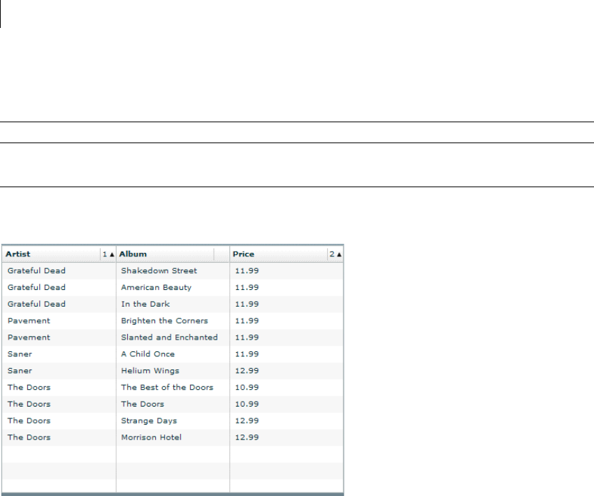
CHAPTER 37
1152
The data reported for body cells depends on the setting of the selectionMode property of the AdvancedDataGrid
control, as described in the following table:
Example navigation of flat data
The following image shows an AdvancedDataGrid control displaying flat data:
In this example:
•When you press the Tab key to move focus to the control, the screen reader reports: "ListBox."
•Pressing the Down Arrow and Up Arrow keys navigates the rows of the control.
•When the selectionMode property is set to singleRow, the screen reader reports all the data in the row,
for example: "Artist: Grateful Dead, Album: Shakedown Street, Price: 11.99."
•When the selectionMode property is set to singleCell, the screen reader reports only the selected cell's
data. For the cell in the first column of the row, the screen reader reports: "Artist: Grateful Dead, Row 1." The
row information is reported only when focus is on the first column, not for other columns in the row.
Therefore, for the second cell, the screen reader reports: "Album: ShakeDown Street."
Selection mode Screen reader output
singleRow Information corresponding to the entire row.
singleCell Information corresponding to the selected cell only.
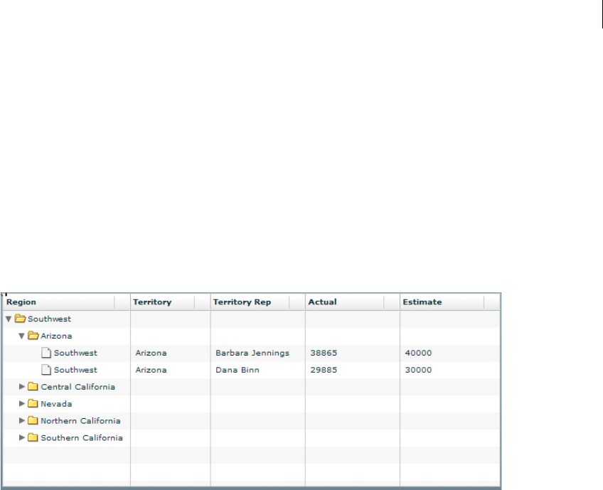
1153ADOBE FLEX 3
Adobe Flex 3 Developer Guide
•Pressing the Up Arrow key when the focus is on the first row of the control moves the focus to the header cell.
The screen reader reports: "From: Column 1 press space to sort ascending on this field. Press control space to add
this field to sort."
•Pressing the Spacebar sorts the column.
•Multicolumn sorting is supported. The sort order is reported in case of multicolumn sorting.
For example, if the Album column is sorted and the sort order is 2, the screen reader reports: "Album: Column
2 sorted ascending, sort order 2 Press space to sort descending on this field. Press Control+space to add this
field to sort."
Example navigation of hierarchical data
The following image shows an AdvancedDataGrid control displaying hierarchical data:
In this example:
•When you press the Tab key to move focus to the control, the screen reader reports: "Treeview."
•Pressing the Shift+Control+Right Arrow keys opens a node.
•Pressing the Down Arrow key moves the focus to the next row.
If you move focus to the first row under Arizona, the screen reader reports: "Level2. Region: Southwest,
Territory: Arizona, TerritoryRep: Barbara Jennings, Actual: 38865, Estimate: 40000, 1 of 2. Press
Control+Shift+Right Arrow to open, Control+Shift+Left Arrow to close. Open."

CHAPTER 37
1154
Creating tab order and reading order
There are two aspects of tab indexing order—the tab order in which a user navigates through the web content, and
the reading order in which things are read by the screen reader.
Flash Player uses a tab index order from left to right and top to bottom. However, if this is not the order you want
to use, you can customize both the tab order and the reading order by using the InteractiveObject.tabIndex
property. (In ActionScript, the tabIndex property is synonymous with the reading order.)
Tab order You can use the tabIndex property of every component to create a tab order that determines the order
in which objects receive input focus when a user presses the Tab key.
Reading order You can use the tabIndex property to control the order in which the screen reader reads infor-
mation about the object. To create a reading order, you assign a value to the tabIndex property for every
component in your application. You should set the tabIndex property for every accessible object, not just the
focusable objects. For example, you must set the tabIndex property for a Text control even though a user cannot
tab to it. If you do not set the tabIndex property for every accessible object, Flash Player puts that object at the
end of the tab order, rather than in its appropriate tab order location.
Scrolling to a component when tabbing
As a general rule, you should structure your application so that all components fit in the available screen area;
otherwise Flex adds vertical or horizontal scroll bars as necessary. Scroll bars let users move around the appli-
cation to access components outside of the screen area.
If your application uses scroll bars, tabbing through the application components does not automatically scroll the
application to make the currently selected component visible. You can add logic to your application to automati-
cally scroll to the currently selected component, as the following example shows:
<?xml version="1.0"?>
<!-- accessibility\ScrollComp.mxml -->
<mx:Application xmlns:mx="http://www.adobe.com/2006/mxml"
layout="absolute"
creationComplete="setupFocusViewportWatcher();">
<mx:Script>
<![CDATA[
import mx.core.Container;
import mx.core.EdgeMetrics;
[Bindable]
public var cards: Array = [
{label:"Visa", data:1},
{label:"Master Card", data:2},
{label:"American Express", data:3} ];

1155ADOBE FLEX 3
Adobe Flex 3 Developer Guide
[Bindable]
public var selectedItem:Object;
[Bindable]
public var forListDP:Array = [
{label:'Apple', data:10.00},
{label:'Banana', data:15.00},
{label:'Melon', data:3.50},
{label:'Kiwi', data:7.65},
{label:'123', data:12.35 },
{label:'some', data:10.01 }];
// Set up the event listener for the focusIn event.
public function setupFocusViewportWatcher():void {
addEventListener("focusIn", makeFocusedItemVisible);
}
public function makeFocusedItemVisible(event:FocusEvent):void {
// Target is the actual object that has focus.
var target:InteractiveObject = InteractiveObject(event.target);
// OriginalTarget is the component that has focus as some
// component actually delegate true focus to an internal object.
var originalTarget:InteractiveObject =
InteractiveObject(focusManager.findFocusManagerComponent(target));
// The viewable portion of a container
var viewport:Rectangle = new Rectangle();
do {
// Cycle through all parents looking for containers.
if (target.parent is Container) {
var viewportChanged:Boolean = false;
var c:Container = target.parent as Container;
// Get the viewable area in the container.
var vm:EdgeMetrics = c.viewMetrics;
viewport.x = vm.left;
viewport.y = vm.top;
viewport.width =
c.width / c.scaleX - vm.left - vm.right;
viewport.height =
c.height / c.scaleY - vm.top - vm.bottom;
// Calculate the position of the target in the container.
var topLeft:Point = new Point(0, 0);
var bottomRight:Point =
new Point(originalTarget.width, originalTarget.height);
topLeft = originalTarget.localToGlobal(topLeft);
topLeft = c.globalToLocal(topLeft);
bottomRight = originalTarget.localToGlobal(bottomRight);
bottomRight = c.globalToLocal(bottomRight);
// Figure out if we have to move the scroll bars.
// If the scroll bar moves, the position of the component
// moves as well. This algorithm makes sure the top
// left of the component is visible if the component is
// bigger than the viewport.
var delta:Number;

CHAPTER 37
1156
if (bottomRight.x > viewport.right) {
delta = bottomRight.x - viewport.right;
c.horizontalScrollPosition += delta;
topLeft.x -= delta;
viewportChanged = true;
}
if (topLeft.x < viewport.left) {
// leave it a few pixels in from the left
c.horizontalScrollPosition -=
viewport.left - topLeft.x + 2;
viewportChanged = true;
}
if (bottomRight.y > viewport.bottom) {
delta = bottomRight.y - viewport.bottom;
c.verticalScrollPosition += delta;
topLeft.y -= delta;
viewportChanged = true;
}
if (topLeft.y < viewport.top) {
// leave it a few pixels down from the top
c.verticalScrollPosition -=
viewport.top - topLeft.y + 2;
viewportChanged = true;
}
// You must the validateNow() method to get the
// container to move the component before working
// on the next parent.
// Otherwise, your calculations will be incorrect.
if (viewportChanged) {
c.validateNow();
}
}
target = target.parent;
}
while (target != this);
}
]]>
</mx:Script>
<mx:Model id="statesModel" source="assets/states.xml"/>
<mx:Panel
x="58" y="48"
width="442" height="201"
layout="absolute"
title="Tab through controls to see if focus stays in view">
<mx:VBox x="10" y="10" verticalScrollPolicy="off">
<mx:TextInput/>
<mx:TextInput/>
<mx:TextArea width="328" height="64"/>
<mx:ComboBox dataProvider="{cards}" width="150"/>
1157ADOBE FLEX 3
Adobe Flex 3 Developer Guide
<mx:DataGrid dataProvider="{forListDP}" />
<mx:DateChooser yearNavigationEnabled="true"/>
<mx:List id="source"
width="75"
dataProvider="{statesModel.state}"/>
</mx:VBox>
</mx:Panel>
</mx:Application>
Creating accessibility with ActionScript
For accessibility properties that apply to the entire document, use the flash.accessibility.AccessibilityProperties
class. For more information on this class, see the Adobe Flex Language Reference.
The following table lists some of the relevant properties of the AccessibilityProperties class.
Modifying these properties has no effect by itself. You must also use the Accessibility.updateProperties()
method to inform screen reader users of Flash Player content changes. Calling this method causes Flash Player to
reexamine all accessibility properties, update property descriptions for the screen reader, and, if necessary, send
events to the screen reader that indicate changes occurred.
When updating the accessibility properties of multiple objects at once, you must include only a single call to the
Accessiblity.updateProperties() method. (Excessive updates to the screen reader can cause some screen
readers to become too verbose.)
Property Type Description
description String Specifies a description for the component that is read by the screen reader.
forceSimple Boolean Hides the children of a component from a screen reader when set to true. The default value is
false.
name String Specifies a description of the component that is read by the screen reader. When accessible
objects do not have a specified name, a screen reader uses a generic word, such as Button.
shortcut String Indicates a keyboard shortcut associated with this display object.
silent Boolean Hides a component from a screen reader when set to true. The default value is false.

CHAPTER 37
1158
Implementing screen reader detection with the Accessibility.isActive() method
To create content that behaves in a specific way if a screen reader is active, you can use the ActionScript Acces-
sibility.active property, which is set to a value of true if a screen reader is present, and false otherwise. You
can then design your content to perform in a way that is compatible with screen reader use, such as by hiding child
elements from the screen reader.
For example, you could use the Accessibility.active property to decide whether to include unsolicited
animation. Unsolicited animation means animation that happens without the screen reader doing anything. This
can be very confusing for screen readers.
For more information on the Accessibility class, see the Adobe Flex Language Reference.
Accessibility for hearing-impaired users
To provide accessibility for hearing-impaired users, you can include captions for audio content that is integral to
the comprehension of the material presented. A video of a speech, for example, would probably require captions
for accessibility, but a quick sound associated with a button probably would not require a caption.
Testing accessible content
When you test your accessible applications, follow these recommendations:
•Ensure that you have enabled accessibility. For more information, see “Configuring Flex applications for
accessibility” on page 1146.
•Test and verify that users can navigate your interactive content effectively by using only the keyboard. This
can be an especially challenging requirement, because different screen readers work in different ways when
processing input from the keyboard, which means that your content might not receive keystrokes as you intended.
Ensure that you test all keyboard shortcuts.
•Ensure that graphic content has alternative representation by checking for tool tips on every image.
•Ensure that your content is resizable or sized to work with screen magnifiers. It should clearly present all
material at smaller sizes.
•Ensure that any substantive audio is captioned. To test for content loss, try using your application with your
sound muted or wearing headphones that pipe in unrelated music.

1159ADOBE FLEX 3
Adobe Flex 3 Developer Guide
•Ensure that you use a clean and simple interface to help screen readers and users with cognitive impairments
navigate through your application. Give your application to people who have never seen it before and watch while
they try to perform key tasks without any assistance or documentation. If they fail, consider modifying your
interface.
•Test your application with a screen reader, or have it tested by users of screen readers.

CHAPTER 37
1160

1161
Part 4: Data Access and
Interconnectivity
Topics
Accessing Server-Side Data with Flex . . . . . . . . . . . . . . . . . . . . . . . . . . . . . . . . . . . . . . . . . . . . . . . . . . . . . . . . . . . . .1163
Representing Data. . . . . . . . . . . . . . . . . . . . . . . . . . . . . . . . . . . . . . . . . . . . . . . . . . . . . . . . . . . . . . . . . . . . . . . . . . . . . .1223
Binding Data . . . . . . . . . . . . . . . . . . . . . . . . . . . . . . . . . . . . . . . . . . . . . . . . . . . . . . . . . . . . . . . . . . . . . . . . . . . . . . . . . .1229
Storing Data. . . . . . . . . . . . . . . . . . . . . . . . . . . . . . . . . . . . . . . . . . . . . . . . . . . . . . . . . . . . . . . . . . . . . . . . . . . . . . . . . . .1257
Validating Data . . . . . . . . . . . . . . . . . . . . . . . . . . . . . . . . . . . . . . . . . . . . . . . . . . . . . . . . . . . . . . . . . . . . . . . . . . . . . . . .1267
Formatting Data . . . . . . . . . . . . . . . . . . . . . . . . . . . . . . . . . . . . . . . . . . . . . . . . . . . . . . . . . . . . . . . . . . . . . . . . . . . . . . .1305

1162 CHAPTER 37

1163
Chapter 38: Accessing Server-Side Data
with Flex
Adobe® Flex™ data access components use remote procedure calls to interact with server environments, such as
PHP, Adobe ColdFusion, and Microsoft ASP.NET, to provide data to Adobe Flex applications and send data to
back-end data sources. For an introduction to data access components, see “Flex Data Access” on page 103.
Topics
Using HTTPService components . . . . . . . . . . . . . . . . . . . . . . . . . . . . . . . . . . . . . . . . . . . . . . . . . . . . . . . . . . . . . . . . .1163
Using WebService components. . . . . . . . . . . . . . . . . . . . . . . . . . . . . . . . . . . . . . . . . . . . . . . . . . . . . . . . . . . . . . . . . . .1172
Using RemoteObject components . . . . . . . . . . . . . . . . . . . . . . . . . . . . . . . . . . . . . . . . . . . . . . . . . . . . . . . . . . . . . . . .1190
Explicit parameter passing and parameter binding . . . . . . . . . . . . . . . . . . . . . . . . . . . . . . . . . . . . . . . . . . . . . . . . . .1206
Handling service results. . . . . . . . . . . . . . . . . . . . . . . . . . . . . . . . . . . . . . . . . . . . . . . . . . . . . . . . . . . . . . . . . . . . . . . . .1213
Using HTTPService components
You can use an HTTPService component with any kind of server-side technology, including PHP pages,
ColdFusion Pages, JavaServer Pages (JSPs), Java servlets, Ruby on Rails, and Microsoft ASP pages.
For API reference information about the HTTPService component, see mx.rpc.http.mxml.HTTPService.
Working with PHP and SQL data
You can use a Flex HTTPService component in conjunction with PHP and a SQL database management system
to display the results of a database query in a Flex application and to insert data into a database. You can call a PHP
page with GET or POST to perform a database query. You can then format the query result data in an XML
structure and return the XML structure to the Flex application in the HTTP response. When the result has been
returned to the Flex application, you can display it in one or more user interface controls.

1164 CHAPTER 38
MXML code
The Flex application in the following example calls a PHP page with the POST method. The PHP page queries a
MySQL database table called users. It formats the query results as XML and returns the XML to the Flex appli-
cation, where it is bound to the dataProvider property of a DataGrid control and displayed in the DataGrid
control. The Flex application also sends the user name and e-mail address of new users to the PHP page, which
performs an insert into the user database table.
<?xml version="1.0" encoding="utf-8"?>
<mx:Application xmlns:mx="http://www.adobe.com/2006/mxml" layout="absolute"
xmlns="*" creationComplete="send_data()">
<mx:Script>
<![CDATA[
private function send_data():void {
userRequest.send();
}
]]>
</mx:Script>
<mx:Form x="22" y="10" width="493">
<mx:HBox>
<mx:Label text="Username"/>
<mx:TextInput id="username"/>
</mx:HBox>
<mx:HBox>
<mx:Label text="Email Address"/>
<mx:TextInput id="emailaddress"/>
</mx:HBox>
<mx:Button label="Submit" click="send_data()"/>
</mx:Form>
<mx:DataGrid id="dgUserRequest" x="22" y="128"
dataProvider="{userRequest.lastResult.users.user}">
<mx:columns>
<mx:DataGridColumn headerText="User ID" dataField="userid"/>
<mx:DataGridColumn headerText="User Name" dataField="username"/>
</mx:columns>
</mx:DataGrid>
<mx:TextInput x="22" y="292" id="selectedemailaddress"
text="{dgUserRequest.selectedItem.emailaddress}"/>
<mx:HTTPService id="userRequest" url="http://localhost/myproj/request_post2.php"
useProxy="false" method="POST">
<mx:request xmlns="">
<username>{username.text}</username>
<emailaddress>{emailaddress.text}</emailaddress>
</mx:request>
</mx:HTTPService>
</mx:Application>
The HTTPService’s send() method makes the call to the PHP page. This call is made in the send_data()
method in the Script block of the MXML file.

1165ADOBE FLEX 3
Adobe Flex 3 Developer Guide
The resultFormat property of the HTTPService component is set to object, so the data is sent back to the Flex
application as a graph of ActionScript objects. This is the default value for the resultFormat property. Alterna-
tively, you can use a resultFormat of e4x to return data as an XMLList object on which you can perform
ECMAScript for XML (E4X) operations. Switching the resultFormat property to e4x requires the following
minor changes to the MXML code.
Note: If the result format is e4x, you do not include the root node of the XML structure in the dot notation when
binding to the DataGrid.
The XML returned in this example contains no namespace information. For information about working with
XML that does contain namespaces, see “Handling results as XML with the e4x result format” on page 1216.
...
<mx:DataGrid id="dgUserRequest" x="22" y="128"
dataProvider="{userRequest.lastResult.user}">
...
<mx:HTTPService id="userRequest" url="http://server/myproj/request_post2.php"
useProxy="false" method="POST" resultFormat="e4x">
...
When using the e4x result format, you can optionally bind the lastResult property to an XMLListCollection
object and then bind that object to the DataGrid.dataProvider property, as the following code snippet shows:
...
<mx:XMLListCollection id="xc"
source="{userRequest.lastResult.user}"/>
<mx:DataGrid id="dgUserRequest" x="22" y="128" dataProvider="{xc}">
...
MySQL database script
The PHP code for this application uses a database table called users in a MySQL database called sample. The
following MySQL script creates the table:
CREATE TABLE `users` (
`userid` int(10) unsigned NOT NULL auto_increment,
`username` varchar(255) collate latin1_general_ci NOT NULL,
`emailaddress` varchar(255) collate latin1_general_ci NOT NULL,
PRIMARY KEY (`userid`)
) ENGINE=MyISAM DEFAULT CHARSET=latin1 COLLATE=latin1_general_ci AUTO_INCREMENT=3 ;
PHP code
This application calls the following PHP page. This PHP code performs SQL database inserts and queries, and
returns query results to the Flex application in an XML structure.
<html>
<head>
<title>PHP Test</title>
</head>
<body>
<?php

CHAPTER 38
1166
define( "DATABASE_SERVER", "servername" );
define( "DATABASE_USERNAME", "username" );
define( "DATABASE_PASSWORD", "password" );
define( "DATABASE_NAME", "sample" );
//connect to the database.
$mysql = mysql_connect(DATABASE_SERVER, DATABASE_USERNAME, DATABASE_PASSWORD);
mysql_select_db( DATABASE_NAME );
// Quote variable to make safe
function quote_smart($value)
{
// Stripslashes
if (get_magic_quotes_gpc()) {
$value = stripslashes($value);
}
// Quote if not integer
if (!is_numeric($value)) {
$value = "'" . mysql_real_escape_string($value) . "'";
}
return $value;
}
if( $_POST["emailaddress"] AND $_POST["username"])
{
//add the user
$Query = sprintf("INSERT INTO users VALUES ('', %s, %s)", quote_smart($_POST['username']),
quote_smart($_POST['emailaddress']));
$Result = mysql_query( $Query );
}
//return a list of all the users
$Query = "SELECT * from users";
$Result = mysql_query( $Query );
$Return = "<users>";
while ( $User = mysql_fetch_object( $Result ) )
{
$Return .= "<user><userid>".$User->userid."</userid><username>".$User-
>username."</username><emailaddress>".$User->emailaddress."</emailaddress></user>";
}
$Return .= "</users>";
mysql_free_result( $Result );
print ($Return)
?>
</body>
</html>

1167ADOBE FLEX 3
Adobe Flex 3 Developer Guide
Working with ColdFusion and SQL data
You can use a Flex HTTPService component in conjunction with a ColdFusion page and a SQL database
management system to display the results of a database query in a Flex application and to insert data into a
database. You can call a ColdFusion page with GET or POST to perform a database query. You can then format
the query result data in an XML structure and return the XML structure to the Flex application in the HTTP
response. When the result has been returned to the Flex application, you can display it in one or more user
interface controls.
MXML code
The Flex application in the following example calls a ColdFusion page with the POST method. The ColdFusion
page queries a MySQL database table called users. It formats the query results as XML and returns the XML to the
Flex application, where it is bound to the dataProvider property of a DataGrid control and displayed in the
DataGrid control. The Flex application also sends the user name and e-mail address of new users to the
ColdFusion page, which performs an insert into the user database table.
<?xml version="1.0" encoding="utf-8"?>
<mx:Application xmlns:mx="http://www.adobe.com/2006/mxml" xmlns="*" layout="absolute"
creationComplete="userRequest.send()">
<mx:Form x="22" y="10" width="493">
<mx:HBox>
<mx:Label text="Username"/>
<mx:TextInput id="username"/>
</mx:HBox>
<mx:HBox>
<mx:Label text="Email Address"/>
<mx:TextInput id="emailaddress"/>
</mx:HBox>
<mx:Button label="Submit" click="userRequest.send()"/>
</mx:Form>
<mx:DataGrid id="dgUserRequest" x="22" y="128"
dataProvider="{userRequest.lastResult.users.user}">
<mx:columns>
<mx:DataGridColumn headerText="User ID" dataField="userid"/>
<mx:DataGridColumn headerText="User Name" dataField="username"/>
</mx:columns>
</mx:DataGrid>
<mx:TextInput x="22" y="292" id="selectedemailaddress"
text="{dgUserRequest.selectedItem.emailaddress}"/>
<mx:HTTPService id="userRequest" url="http://server:8500/flexapp/returncfxml.cfm"
useProxy="false" method="POST">
<mx:request xmlns="">
<username>{username.text}</username>
<emailaddress>{emailaddress.text}</emailaddress>
</mx:request>
</mx:HTTPService>
</mx:Application>
The HTTPService’s send() method makes the call to the ColdFusion page. This call is made in the send_data()
method in the Script block of the MXML file.

CHAPTER 38
1168
The resultFormat property of the HTTPService component is set to object, so the data is sent back to the Flex
application as a graph of ActionScript objects. This is the default value for the resultFormat property. Alterna-
tively, you can use a result format of e4x to return data as an XMLList object on which you can perform ECMAS-
cript for XML (E4X) operations. Switching the resultFormat property to e4x requires the following minor
changes to the MXML code.
Note: If the result format is e4x, you do not include the root node of the XML structure in the dot notation when
binding to the DataGrid.
The XML returned in this example contains no namespace information. For information about working with
XML that does contain namespaces, see “Handling results as XML with the e4x result format” on page 1216.
...
<mx:DataGrid id="dgUserRequest" x="22" y="128"
dataProvider="{userRequest.lastResult.user}">
...
<mx:HTTPService id="userRequest" url="http://server:8500/flexapp/returncfxml.cfm"
useProxy="false" method="POST" resultFormat="e4x">
...
When using the e4x result format, you can optionally bind the lastResult property to an XMLListCollection
object and then bind that object to the DataGrid dataProvider property, as the following code snippet shows:
...
<mx:XMLListCollection id="xc"
source="{userRequest.lastResult.user}"/>
<mx:DataGrid id="dgUserRequest" x="22" y="128" dataProvider="{xc}">
...
SQL script
The ColdFusion code for this application uses a database table called users in a MySQL database called sample.
The following MySQL script creates the table:
CREATE TABLE `users` (
`userid` int(10) unsigned NOT NULL auto_increment,
`username` varchar(255) collate latin1_general_ci NOT NULL,
`emailaddress` varchar(255) collate latin1_general_ci NOT NULL,
PRIMARY KEY (`userid`)
) ENGINE=MyISAM DEFAULT CHARSET=latin1 COLLATE=latin1_general_ci AUTO_INCREMENT=3 ;
ColdFusion code
This application calls the following ColdFusion page. This ColdFusion code performs SQL database inserts and
queries, and returns query results to the Flex application. The ColdFusion page uses the cfquery tag to insert data
into the database and query the database, and it uses the cfxml tag to format the query results in an XML
structure.
<cfprocessingdirective pageencoding = "utf-8" suppressWhiteSpace = "Yes">
<cfif isDefined("username") and isDefined("emailaddress") and username NEQ "">
<cfquery name="addempinfo" datasource="sample">

1169ADOBE FLEX 3
Adobe Flex 3 Developer Guide
INSERT INTO users (username, emailaddress) VALUES (
<cfqueryparam value="#username#" cfsqltype="CF_SQL_VARCHAR" maxlength="255">,
<cfqueryparam value="#emailaddress#" cfsqltype="CF_SQL_VARCHAR" maxlength="255">
)
</cfquery>
</cfif>
<cfquery name="alluserinfo" datasource="sample">
SELECT userid, username, emailaddress FROM users
</cfquery>
<cfxml variable="userXML">
<users>
<cfloop query="alluserinfo">
<cfoutput>
<user>
<userid>#toString(userid)#</userid>
<username>#username#</username>
<emailaddress>#emailaddress#</emailaddress>
</user>
</cfoutput>
</cfloop>
</users>
</cfxml>
<cfoutput>#userXML#</cfoutput>
</cfprocessingdirective>
Working with JavaServer Pages
You can use a Flex HTTPService component in conjunction with a JSP page and a SQL database management
system to display the results of a database query in a Flex application and insert data into a database. You can call
a JSP page with GET or POST to perform a database query. You can then format the query result data in an XML
structure and return the XML structure to the Flex application in the HTTP response. When the result has been
returned to the Flex application, you can display it in one or more user interface controls.
MXML code
The Flex application in the following example calls a JSP page that retrieves data from a SQL database. It formats
database query results as XML and returns the XML to the Flex application, where it is bound to the
dataProvider property of a DataGrid control and displayed in the DataGrid control.
<?xml version="1.0" encoding="utf-8"?>
<mx:Application xmlns:mx="http://www.adobe.com/2006/mxml">
<mx:HTTPService id="srv" url="catalog.jsp"/>
<mx:DataGrid dataProvider="{srv.lastResult.catalog.product}" width="100%"
height="100%"/>
<mx:Button label="Get Data" click="srv.send()"/>
</mx:Application>

CHAPTER 38
1170
The HTTPService’s send() method makes the call to the JSP page. This call is made in the click event of the
Button in the MXML file.
The resultFormat property of the HTTPService component is set to object, so the data is sent back to the Flex
application as a graph of ActionScript objects. This is the default value for the resultFormat property. Alterna-
tively, you can use a result format of e4x to return data as an XMLList object on which you can perform ECMAS-
cript for XML (E4X) operations. Switching the resultFormat property to e4x requires the following minor
changes to the MXML code.
Note: If the result format is e4x, you do not include the root node of the XML structure in the dot notation when
binding to the DataGrid.
The XML returned in this example contains no namespace information. For information about working with
XML that does contain namespaces, see “Handling results as XML with the e4x result format” on page 1216.
... <mx:HTTPService id="srv" url="catalog.jsp" resultFormat="e4x"/>
... <mx:DataGrid dataProvider="{srv.lastResult.product}" width="100%" height="100%"/>
When using the e4x result format, you can optionally bind the lastResult property to an XMLListCollection
object and then bind that object to the DataGrid.dataProvider property:
... <mx:XMLListCollection id="xc"
source="{userRequest.lastResult.product}"/>
<mx:DataGrid id="dgUserRequest" x="22" y="128" dataProvider="{xc}">
...
JSP code
The following example shows the JSP page used in this application. This JSP page does not call a database directly.
It gets its data from a Java class called ProductService, which in turn uses a Java class called Product to represent
individual products.
<%@page import="flex.samples.product.ProductService,
flex.samples.product.Product,
java.util.List"%>
<?xml version="1.0" encoding="utf-8"?>
<catalog>
<% ProductService srv = new ProductService();
List list = null;
list = srv.getProducts();
Product product;
for (int i=0; i<list.size(); i++)
{product = (Product) list.get(i);
%>
<product productId="<%= product.getProductId()%>">
<name><%= product.getName() %></name>

1171ADOBE FLEX 3
Adobe Flex 3 Developer Guide
<description><%= product.getDescription() %></description>
<price><%= product.getPrice() %></price>
<image><%= product.getImage() %></image>
<category><%= product.getCategory() %></category>
<qtyInStock><%= product.getQtyInStock() %></qtyInStock>
</product>
<% }
%>
</catalog>
Calling HTTP services in ActionScript
The following example shows an HTTP service call in an ActionScript script block. Calling the
useHTTPService() method declares the service, sets the destination, sets up result and fault event listeners, and
calls the service’s send() method.
<?xml version="1.0"?>
<!-- fds\rpc\HttpServiceInAS.mxml. Compiles -->
<mx:Application xmlns:mx="http://www.adobe.com/2006/mxml" verticalGap="10">
<mx:Script>
<![CDATA[
import mx.controls.Alert;
import mx.rpc.http.HTTPService;
import mx.rpc.events.ResultEvent;
import mx.rpc.events.FaultEvent;
private var service:HTTPService
public function useHttpService(parameters:Object):void {
service = new HTTPService();
service.destination = "sampleDestination";
service.method = "POST";
service.addEventListener("result", httpResult);
service.addEventListener("fault", httpFault);
service.send(parameters);
}
public function httpResult(event:ResultEvent):void {
var result:Object = event.result;
//Do something with the result.
}
public function httpFault(event:FaultEvent):void {
var faultstring:String = event.fault.faultString;
Alert.show(faultstring);
}
]]>
</mx:Script>
</mx:Application>

CHAPTER 38
1172
Using WebService components
Flex applications can interact with web services that define their interfaces in a Web Services Description
Language 1.1 (WSDL 1.1) document, which is available as a URL. WSDL is a standard format for describing the
messages that a web service understands, the format of its responses to those messages, the protocols that the web
service supports, and where to send messages. The Flex web service API generally supports Simple Object Access
Protocol (SOAP) 1.1, XML Schema 1.0 (versions 1999, 2000, and 2001), and WSDL 1.1 RPC-encoded, RPC-
literal, and document-literal (bare and wrapped style parameters). The two most common types of web services
use remote procedure call (RPC) encoded or document-literal SOAP bindings; the terms encoded and literal
indicate the type of WSDL-to-SOAP mapping that a service uses.
Flex applications support web service requests and results that are formatted as SOAP messages. SOAP provides
the definition of the XML-based format that you can use for exchanging structured and typed information
between a web service client, such as a Flex application, and a web service.
Adobe® Flash® Player operates within a security sandbox that limits what Flex applications and other applications
built with Flash can access over HTTP. Applications built with Flash are allowed HTTP access only to resources
on the same domain and by the same protocol from which they were served. This presents a problem for web
services, because they are typically accessed from remote locations. The proxy service, available in LiveCycle Data
Services ES and Vega, intercepts requests to remote web services, redirects the requests, and then returns the
responses to the client.
If you are not using LiveCycle Data Services ES or Vega, you can access web services in the same domain as your
Flex application; or a crossdomain.xml (cross-domain policy) file that allows access from your application's
domain must be installed on the web server hosting the RPC service.
For API reference information about the WebService component, see mx.rpc.soap.mxml.WebService. For infor-
mation about data type mapping between Flex and web services, see http://www.adobe.com/cfusion/knowl-
edgebase/index.cfm?id=kb401841.
Sample WebService application
The following sample code is for an application that uses a WebService component to call web service operations.
MXML code
The Flex application in the following example calls a web service that queries a SQL database table called users
and returns data to the Flex application, where it is bound to the dataProvider property of a DataGrid control
and displayed in the DataGrid control. The Flex application also sends the user name and e-mail address of new
users to the web service, which performs an insert into the user database table. The back-end implementation of
the web service is a ColdFusion component; the same ColdFusion component is accessed as a remote object in
“Using RemoteObject components” on page 1190.

1173ADOBE FLEX 3
Adobe Flex 3 Developer Guide
<?xml version="1.0" encoding="utf-8"?>
<mx:Application xmlns:mx="http://www.adobe.com/2006/mxml" xmlns="*" layout="absolute"
creationComplete="userRequest.returnRecords()">
<mx:Form x="22" y="10" width="493">
<mx:HBox>
<mx:Label text="Username"/>
<mx:TextInput id="username"/>
</mx:HBox>
<mx:HBox>
<mx:Label text="Email Address"/>
<mx:TextInput id="emailaddress"/>
</mx:HBox>
<mx:Button label="Submit" click="clickHandler()"/>
</mx:Form>
<mx:DataGrid id="dgUserRequest" x="22" y="128">
<mx:columns>
<mx:DataGridColumn headerText="User ID" dataField="USERID"/>
<mx:DataGridColumn headerText="User Name" dataField="USERNAME"/>
</mx:columns>
</mx:DataGrid>
<mx:TextInput x="22" y="292" id="selectedemailaddress"
text="{dgUserRequest.selectedItem.emailaddress}"/>
<mx:WebService
id="userRequest"
wsdl="http://localhost:8500/flexapp/returnusers.cfc?wsdl">
<mx:operation name="returnRecords" resultFormat="object"
fault="mx.controls.Alert.show(event.fault.faultString)"
result="remotingCFCHandler(event)"/>
<mx:operation name="insertRecord" result="insertCFCHandler()"
fault="mx.controls.Alert.show(event.fault.faultString)"/>
</mx:WebService>
<mx:Script>
<![CDATA[
import mx.rpc.events.ResultEvent;
private function remotingCFCHandler(e:ResultEvent):void
{
dgUserRequest.dataProvider = e.result;
}
private function insertCFCHandler():void
{
userRequest.returnRecords();
}
private function clickHandler():void
{
userRequest.insertRecord(username.text, emailaddress.text);
}
]]> </mx:Script>
</mx:Application>

CHAPTER 38
1174
WSDL document
The following example shows the WSDL document that defines the API of the web service:
<?xml version="1.0" encoding="UTF-8"?>
<wsdl:definitions targetNamespace="http://flexapp"
xmlns:apachesoap="http://xml.apache.org/xml-soap" xmlns:impl="http://flexapp"
xmlns:intf="http://flexapp" xmlns:soapenc="http://schemas.xmlsoap.org/soap/encoding/"
xmlns:tns1="http://rpc.xml.coldfusion" xmlns:wsdl="http://schemas.xmlsoap.org/wsdl/"
xmlns:wsdlsoap="http://schemas.xmlsoap.org/wsdl/soap/"
xmlns:xsd="http://www.w3.org/2001/XMLSchema">
<!--WSDL created by ColdFusion version 8,0,0,171651-->
<wsdl:types>
<schema targetNamespace="http://rpc.xml.coldfusion"
xmlns="http://www.w3.org/2001/XMLSchema">
<import namespace="http://flexapp"/>
<import namespace="http://schemas.xmlsoap.org/soap/encoding/"/>
<complexType name="CFCInvocationException">
<sequence/>
</complexType>
<complexType name="QueryBean">
<sequence>
<element name="columnList" nillable="true" type="impl:ArrayOf_xsd_string"/>
<element name="data" nillable="true" type="impl:ArrayOfArrayOf_xsd_anyType"/>
</sequence>
</complexType>
</schema>
<schema targetNamespace="http://flexapp" xmlns="http://www.w3.org/2001/XMLSchema">
<import namespace="http://rpc.xml.coldfusion"/>
<import namespace="http://schemas.xmlsoap.org/soap/encoding/"/>
<complexType name="ArrayOf_xsd_string">
<complexContent>
<restriction base="soapenc:Array">
<attribute ref="soapenc:arrayType" wsdl:arrayType="xsd:string[]"/>
</restriction>
</complexContent>
</complexType>
<complexType name="ArrayOfArrayOf_xsd_anyType">
<complexContent>
<restriction base="soapenc:Array">
<attribute ref="soapenc:arrayType" wsdl:arrayType="xsd:anyType[][]"/>
</restriction>
</complexContent>
</complexType>
</schema>
</wsdl:types>
<wsdl:message name="CFCInvocationException">
<wsdl:part name="fault" type="tns1:CFCInvocationException"/>
</wsdl:message>
<wsdl:message name="returnRecordsRequest">
</wsdl:message>
<wsdl:message name="insertRecordResponse">
</wsdl:message>

1175ADOBE FLEX 3
Adobe Flex 3 Developer Guide
<wsdl:message name="returnRecordsResponse">
<wsdl:part name="returnRecordsReturn" type="tns1:QueryBean"/>
</wsdl:message>
<wsdl:message name="insertRecordRequest">
<wsdl:part name="username" type="xsd:string"/>
<wsdl:part name="emailaddress" type="xsd:string"/>
</wsdl:message>
<wsdl:portType name="returncfxml">
<wsdl:operation name="insertRecord" parameterOrder="username emailaddress">
<wsdl:input message="impl:insertRecordRequest" name="insertRecordRequest"/>
<wsdl:output message="impl:insertRecordResponse" name="insertRecordResponse"/>
<wsdl:fault message="impl:CFCInvocationException" name="CFCInvocationException"/>
</wsdl:operation>
<wsdl:operation name="returnRecords">
<wsdl:input message="impl:returnRecordsRequest" name="returnRecordsRequest"/>
<wsdl:output message="impl:returnRecordsResponse" name="returnRecordsResponse"/>
<wsdl:fault message="impl:CFCInvocationException" name="CFCInvocationException"/>
</wsdl:operation>
</wsdl:portType>
<wsdl:binding name="returncfxml.cfcSoapBinding" type="impl:returncfxml">
<wsdlsoap:binding style="rpc" transport="http://schemas.xmlsoap.org/soap/http"/>
<wsdl:operation name="insertRecord">
<wsdlsoap:operation soapAction=""/>
<wsdl:input name="insertRecordRequest">
<wsdlsoap:body encodingStyle="http://schemas.xmlsoap.org/soap/encoding/"
namespace="http://flexapp" use="encoded"/>
</wsdl:input>
<wsdl:output name="insertRecordResponse">
<wsdlsoap:body encodingStyle="http://schemas.xmlsoap.org/soap/encoding/"
namespace="http://flexapp" use="encoded"/>
</wsdl:output>
<wsdl:fault name="CFCInvocationException">
<wsdlsoap:fault encodingStyle="http://schemas.xmlsoap.org/soap/encoding/"
name="CFCInvocationException" namespace="http://flexapp" use="encoded"/>
</wsdl:fault>
</wsdl:operation>
<wsdl:operation name="returnRecords">
<wsdlsoap:operation soapAction=""/>
<wsdl:input name="returnRecordsRequest">
<wsdlsoap:body encodingStyle="http://schemas.xmlsoap.org/soap/encoding/"
namespace="http://flexapp" use="encoded"/>
</wsdl:input>
<wsdl:output name="returnRecordsResponse">
<wsdlsoap:body encodingStyle="http://schemas.xmlsoap.org/soap/encoding/"
namespace="http://flexapp" use="encoded"/>
</wsdl:output>
<wsdl:fault name="CFCInvocationException">
<wsdlsoap:fault encodingStyle="http://schemas.xmlsoap.org/soap/encoding/"
name="CFCInvocationException" namespace="http://flexapp" use="encoded"/>
</wsdl:fault>
</wsdl:operation>
</wsdl:binding>
<wsdl:service name="returncfxmlService">
<wsdl:port binding="impl:returncfxml.cfcSoapBinding" name="returncfxml.cfc">
<wsdlsoap:address location="http://localhost:8500/flexapp/returnusers.cfc"/>
</wsdl:port>
</wsdl:service>
</wsdl:definitions>

CHAPTER 38
1176
Calling web services in ActionScript
The following example shows a web service call in an ActionScript script block. Calling the useWebService()
method declares the service, sets the destination, fetches the WSDL document, and calls the echoArgs() method
of the service.
Note: When you declare a WebService component in ActionScript, you must call the WebService.loadWSDL()
method.
<?xml version="1.0"?>
<!-- fds\rpc\WebServiceInAS.mxml -->
<mx:Application xmlns:mx="http://www.adobe.com/2006/mxml">
<mx:Script>
<![CDATA[
import mx.rpc.soap.WebService;
import mx.rpc.events.ResultEvent;
import mx.rpc.events.FaultEvent;
private var ws:WebService;
public function useWebService(intArg:int, strArg:String):void {
ws = new WebService();
ws.destination = "echoArgService";
ws.echoArgs.addEventListener("result", echoResultHandler);
ws.addEventListener("fault", faultHandler);
ws.loadWSDL();
ws.echoArgs(intArg, strArg);
}
public function echoResultHandler(event:ResultEvent):void {
var retStr:String = event.result.echoStr;
var retInt:int = event.result.echoInt;
//Do something.
}
public function faultHandler(event:FaultEvent):void {
//deal with event.fault.faultString, etc
}
]]>
</mx:Script>
</mx:Application>
Reserved Operation names
WebService operations are usually accessible by simply naming them after a service variable. However, naming
conflicts can occur if an operation name happens to match a defined method on the service. You can use the
following method in ActionScript on a WebService component to return the operation of the given name:
public function getOperation(name:String):Operation
1177ADOBE FLEX 3
Adobe Flex 3 Developer Guide
Reading WSDL documents
You can view a WSDL document in a web browser, a simple text editor, an XML editor, or a development
environment such as Adobe Dreamweaver, which contains a built-in utility for displaying WSDL documents in
an easy-to-read format.
A WSDL document contains the tags described in the following table.
RPC-oriented operations and document-oriented operations
A WSDL file can specify either RPC-oriented or document-oriented (document-literal) operations. Flex supports
both operation styles.
When calling an RPC-oriented operation, a Flex application sends a SOAP message that specifies an operation
and its parameters. When calling a document-oriented operation, a Flex application sends a SOAP message that
contains an XML document.
In a WSDL document, each <port> tag has a binding property that specifies the name of a particular
<soap:binding> tag, as the following example shows:
<binding name="InstantMessageAlertSoap" type="s0:InstantMessageAlertSoap">
<soap:binding transport="http://schemas.xmlsoap.org/soap/http"
style="document"/>
Tag Description
<binding> Specifies the protocol that clients, such as Flex applications, use to communicate with a web service. Bindings exist for
SOAP, HTTP GET, HTTP POST, and MIME. Flex supports the SOAP binding only.
<fault> Specifies an error value that is returned as a result of a problem processing a message.
<input> Specifies a message that a client, such as a Flex application, sends to a web service.
<message> Defines the data that a WebService operation transfers.
<operation> Defines a combination of <input>, <output>, and <fault> tags.
<output> Specifies a message that the web service sends to a web service client, such as a Flex application.
<port> Specifies a web service endpoint, which specifies an association between a binding and a network address.
<portType> Defines one or more operations that a web service provides.
<service> Defines a collection of <port> tags. Each service maps to one <portType> tag and specifies different ways to access
the operations in that <portType> tag.
<types> Defines data types that a web service's messages use.

CHAPTER 38
1178
The style property of the associated <soap:binding> tag determines the operation style. In this example, the
style is document.
Any operation in a service can specify the same style or override the style that is specified for the port associated
with the service, as the following example shows:
<operation name="SendMSN">
<soap:operation soapAction="http://www.bindingpoint.com/ws/imalert/
SendMSN"style="document"/>
Stateful web services
Flex uses Java server sessions to maintain the state of web service endpoints that use cookies to store session infor-
mation. This feature acts as an intermediary between Flex applications and web services. It adds an endpoint's
identity to whatever the endpoint passes to a Flex application. If the endpoint sends session information, the Flex
application receives it. This feature requires no configuration, and it is not supported for destinations that use the
RTMP channel when using the proxy service.
Working with SOAP headers
A SOAP header is an optional tag in a SOAP envelope that usually contains application-specific information, such
as authentication information.
Adding SOAP headers to web service requests
Some web services require that you pass along a SOAP header when you call an operation.
You can add a SOAP header to all web service operations or individual operations by calling a WebService or
Operation object's addHeader() method or addSimpleHeader() method in an event listener function.
When you use the addHeader() method, you first must create SOAPHeader and QName objects separately. The
addHeader() method has the following signature:
addHeader(header:mx.rpc.soap.SOAPHeader):void
To create a SOAPHeader object, use the following constructor:
SOAPHeader(qname:QName, content:Object)
To create the QName object in the first parameter of the SOAPHeader() method, use the following constructor:
QName(uri:String, localName:String)
The content parameter of the SOAPHeader() constructor is a set of name-value pairs based on the following
format:
{name1:value1, name2:value2}

1179ADOBE FLEX 3
Adobe Flex 3 Developer Guide
The addSimpleHeader() method is a shortcut for a single name-value SOAP header. When you use the
addSimpleHeader() method, you create SOAPHeader and QName objects in parameters of the method. The
addSimpleHeader() method has the following signature:
addSimpleHeader(qnameLocal:String, qnameNamespace:String, headerName:String,
headerValue:Object):void
The addSimpleHeader() method takes the following parameters:
•qnameLocal is the local name for the header QName.
•qnameNamespace is the namespace for the header QName.
•headerName is the name of the header.
•headerValue is the value of the header. This can be a string if it is a simple value, an object that will undergo
basic XML encoding, or XML if you want to specify the header XML yourself.
The code in the following example shows how to use the addHeader() method and the addSimpleHeader()
method to add a SOAP header. The methods are called in an event listener function called headers, and the event
listener is assigned in the load property of an <mx:WebService> tag:
<?xml version="1.0"?>
<!-- fds\rpc\WebServiceAddHeader.mxml -->
<mx:Application xmlns:mx="http://www.adobe.com/2006/mxml" height="600">
<mx:WebService id="ws" destination="wsDest" load="headers();"/>
<mx:Script>
<![CDATA[
import mx.rpc.soap.SOAPHeader;
private var header1:SOAPHeader;
private var header2:SOAPHeader;
public function headers():void {
// Create QName and SOAPHeader objects.
var q1:QName=new QName("http://soapinterop.org/xsd", "Header1");
header1=new SOAPHeader(q1, {string:"bologna",int:"123"});
header2=new SOAPHeader(q1, {string:"salami",int:"321"});
// Add the header1 SOAP Header to all web service requests.
ws.addHeader(header1);
// Add the header2 SOAP Header to the getSomething operation.
ws.getSomething.addHeader(header2);
// Within the addSimpleHeader method,
// which adds a SOAP header to web
//service requests, create SOAPHeader and QName objects.
ws.addSimpleHeader
("header3", "http://soapinterop.org/xsd", "foo","bar");
}
]]>
</mx:Script>
</mx:Application>

CHAPTER 38
1180
Clearing SOAP headers
You use the WebService or operation object's clearHeaders() method to remove SOAP headers that you added
to the object, as the following example shows for a WebService object. You must call clearHeaders() at the level
(WebService or operation) where the header was added.
<?xml version="1.0"?>
<!-- fds\rpc\WebServiceClearHeader.mxml -->
<mx:Application xmlns:mx="http://www.adobe.com/2006/mxml" height="600" >
<!-- The value of the destination property is for demonstration only and is not a real
destination. -->
<mx:WebService id="ws" destination="wsDest" load="headers();"/>
<mx:Script>
<![CDATA[
import mx.rpc.*;
import mx.rpc.soap.SOAPHeader;
private function headers():void {
// Create QName and SOAPHeader objects.
var q1:QName=new QName("Header1", "http://soapinterop.org/xsd");
var header1:SOAPHeader=new SOAPHeader(q1, {string:"bologna",int:"123"});
var header2:SOAPHeader=new SOAPHeader(q1, {string:"salami",int:"321"});
// Add the header1 SOAP Header to all web service request.
ws.addHeader(header1);
// Add the header2 SOAP Header to the getSomething operation.
ws.getSomething.addHeader(header2);
// Within the addSimpleHeader method, which adds a SOAP header to all
// web service requests, create SOAPHeader and QName objects.
ws.addSimpleHeader("header3","http://soapinterop.org/xsd", "foo", "bar");
}
// Clear SOAP headers added at the WebService and Operation levels.
private function clear():void {
ws.clearHeaders();
ws.getSomething.clearHeaders();
}
]]>
</mx:Script>
<mx:HBox>
<mx:Button label="Clear headers and run again" click="clear();"/>
</mx:HBox>
</mx:Application>
1181ADOBE FLEX 3
Adobe Flex 3 Developer Guide
Redirecting a web service to a different URL
Some web services require that you change to a different endpoint URL after you process the WSDL and make an
initial call to the web service. For example, suppose that you want to use a web service that requires you to pass
security credentials. When you call the web service to send login credentials, it accepts the credentials and returns
the actual endpoint URL that is required to use the service's business operations. Before calling the business
operations, you must change the endpointURI property of your WebService component.
The following example shows a result event listener that stores the endpoint URL that a web service returns in a
variable, and then passes that variable into a function to change the endpoint URL for subsequent requests:
...
public function onLoginResult(event:ResultEvent):void {
//Extract the new service endpoint from the login result.
var newServiceURL = event.result.serverUrl;
// Redirect all service operations to the URL received in the login result.
serviceName.endpointURI=newServiceURL;
}
...
A web service that requires you to pass security credentials might also return an identifier that you must attach in
a SOAP header for subsequent requests. For more information, see “Working with SOAP headers” on page 1178.
Serializing web service data
Encoding ActionScript data
The following table shows the encoding mappings from ActionScript 3 types to XML schema complex types.
XML schema definition Supported ActionScript 3 types Notes
Top-level elements
xsd:element
nillable == true
Object If input value is null, encoded output is set with the
xsi:nil attribute.
xsd:element
fixed != null
Object Input value is ignored and fixed value is used instead.
xsd:element
default != null
Object If input value is null, this default value is used instead.
Local elements
CHAPTER 38
1182
The following table shows the encoding mappings from ActionScript 3 types to XML schema built-in types.
xsd:element
maxOccurs == 0
Object Input value is ignored and omitted from encoded output.
xsd:element
maxOccurs == 1
Object Input value is processed as a single entity. If the associated
type is a SOAP-encoded array, then arrays and
mx.collection.IList implementations pass through
intact to be special cased by the SOAP encoder for that
type.
xsd:element
maxOccurs > 1
Object Input value should be iterable (such as an array or
mx.collections.IList implementation), although
noniterable values are wrapped before processing. Indi-
vidual items are encoded as separate entities according to
the definition.
xsd:element
minOccurs == 0
Object If input value is undefined or null, encoded output is
omitted.
XML schema type Supported ActionScript 3 types Notes
xsd:anyType
xsd:anySimpleType
Object Boolean -> xsd:boolean
ByteArray -> xsd:base64Binary
Date -> xsd:dateTime
int -> xsd:int
Number -> xsd:double
String -> xsd:string
uint -> xsd:unsignedInt
xsd:base64Binary flash.utils.ByteArray mx.utils.Base64Encoder is used (without line wrap-
ping).
xsd:boolean Boolean
Number
Object
Always encoded as true or false.
Number == 1 then true, otherwise false.
Object.toString() == "true" or "1" then true,
otherwise false.
xsd:byte
xsd:unsignedByte
Number
String
String first converted to Number.
1183ADOBE FLEX 3
Adobe Flex 3 Developer Guide
xsd:date Date
Number
String
Date UTC accessor methods are used.
Number used to set Date.time.
String assumed to be preformatted and encoded as is.
xsd:dateTime Date
Number
String
Date UTC accessor methods are used.
Number used to set Date.time.
String assumed to be preformatted and encoded as is.
xsd:decimal Number
String
Number.toString() is used. Note that Infinity, -
Infinity, and NaN are invalid for this type.
String first converted to Number.
xsd:double Number
String
Limited to range of Number.
String first converted to Number.
xsd:duration Object Object.toString() is called.
xsd:float Number
String
Limited to range of Number.
String first converted to Number.
xsd:gDay Date
Number
String
Date.getUTCDate() is used.
Number used directly for day.
String parsed as Number for day.
xsd:gMonth Date
Number
String
Date.getUTCMonth() is used.
Number used directly for month.
String parsed as Number for month.
xsd:gMonthDay Date
String
Date.getUTCMonth() and Date.getUTCDate()
are used.
String parsed for month and day portions.
xsd:gYear Date
Number
String
Date.getUTCFullYear() is used.
Number used directly for year.
String parsed as Number for year.
xsd:gYearMonth Date
String
Date.getUTCFullYear() and
Date.getUTCMonth() are used.
String parsed for year and month portions.
CHAPTER 38
1184
xsd:hexBinary flash.utils.ByteArray mx.utils.HexEncoder is used.
xsd:integer
and derivatives:
xsd:negativeInteger
xsd:nonNegativeInteger
xsd:positiveInteger
xsd:nonPositiveInteger
Number
String
Limited to range of Number.
String first converted to Number.
xsd:int
xsd:unsignedInt
Number
String
String first converted to Number.
xsd:long
xsd:unsignedLong
Number
String
String first converted to Number.
xsd:short
xsd:unsignedShort
Number
String
String first converted to Number.
xsd:string
and derivatives:
xsd:ID
xsd:IDREF
xsd:IDREFS
xsd:ENTITY
xsd:ENTITIES xsd:language
xsd:Name
xsd:NCName
xsd:NMTOKEN
xsd:NMTOKENS
xsd:normalizedString
xsd:token
Object Object.toString() is invoked.
xsd:time Date
Number
String
Date UTC accessor methods are used.
Number used to set Date.time.
String assumed to be preformatted and encoded as is.
xsi:nil null If the corresponding XML schema element definition has
minOccurs > 0, a null value is encoded by using xsi:nil;
otherwise the element is omitted entirely.
1185ADOBE FLEX 3
Adobe Flex 3 Developer Guide
The following table shows the mapping from ActionScript 3 types to SOAP-encoded types.
Decoding XML schema and SOAP to ActionScript 3
The following table shows the decoding mappings from XML schema built-in types to ActionScript 3 types.
SOAPENC type Supported ActionScript 3
types
Notes
soapenc:Array Array
mx.collections.IList
SOAP-encoded arrays are special cased and are supported only with
RPC-encoded style web services.
soapenc:base64 flash.utils.ByteArray Encoded in the same manner as xsd:base64Binary.
soapenc:* Object Any other SOAP-encoded type is processed as if it were in the XSD
namespace based on the localName of the type's QName.
XML schema type Decoded ActionScript 3 types Notes
xsd:anyType
xsd:anySimpleType
String
Boolean
Number
If content is empty -> xsd:string.
If content cast to Number and value is NaN; or
if content starts with "0" or "-0", or
it content ends with "E":
then, if content is "true" or "false" -> xsd:boolean
otherwise -> xsd:string.
Otherwise content is a valid Number and thus ->
xsd:double.
xsd:base64Binary flash.utils.ByteArray mx.utils.Base64Decoder is used.
xsd:boolean Boolean If content is "true" or "1" then true, otherwise false.
xsd:date Date If no timezone information is present, local time is assumed.
xsd:dateTime Date If no timezone information is present, local time is assumed.
xsd:decimal Number Content is created via Number(content) and is thus
limited to the range of Number.
xsd:double Number Content is created via Number(content) and is thus
limited to the range of Number.
xsd:duration String Content is returned with whitespace collapsed.
CHAPTER 38
1186
xsd:float Number Content is converted through Number(content) and is
thus limited to the range of Number.
xsd:gDay uint Content is converted through uint(content).
xsd:gMonth uint Content is converted through uint(content).
xsd:gMonthDay String Content is returned with whitespace collapsed.
xsd:gYear uint Content is converted through uint(content).
xsd:gYearMonth String Content is returned with whitespace collapsed.
xsd:hexBinary flash.utils.ByteArray mx.utils.HexDecoder is used.
xsd:integer
and derivatives:
xsd:byte
xsd:int
xsd:long
xsd:negativeInteger
xsd:nonNegativeInteger
xsd:nonPositiveInteger
xsd:positiveInteger
xsd:short
xsd:unsignedByte
xsd:unsignedInt
xsd:unsignedLong
xsd:unsignedShort
Number Content is decoded via parseInt().
1187ADOBE FLEX 3
Adobe Flex 3 Developer Guide
The following table shows the decoding mappings from SOAP-encoded types to ActionScript 3 types.
The following table shows the decoding mappings from custom data types to ActionScript 3 data types.
xsd:string
and derivatives:
xsd:ID
xsd:IDREF
xsd:IDREFS
xsd:ENTITY
xsd:ENTITIES xsd:language
xsd:Name
xsd:NCName
xsd:NMTOKEN
xsd:NMTOKENS
xsd:normalizedString
xsd:token
String The raw content is simply returned as a string.
xsd:time Date If no timezone information is present, local time is assumed.
xsi:nil null
SOAPENC type Decoded ActionScript type Notes
soapenc:Array Array
mx.collections.ArrayCo
llection
SOAP-encoded arrays are special cased. If makeObjectsBindable is
true, the result is wrapped in an ArrayCollection; otherwise a simple
array is returned.
soapenc:base64 flash.utils.ByteArray Decoded in the same manner as xsd:base64Binary.
soapenc:* Object Any other SOAP-encoded type is processed as if it were in the XSD
namespace based on the localName of the type's QName.
Custom type Decoded ActionScript 3 type Notes

CHAPTER 38
1188
XML Schema element support
The following XML schema structures or structure attributes are only partially implemented in Flex 3:
<choice>
<all>
<union
The following XML Schema structures or structure attributes are ignored and are not supported in Flex 3:
<attribute use="required"/>
<element
substitutionGroup="..."
unique="..."
key="..."
keyref="..."
field="..."
selector="..."/>
<simpleType>
<restriction>
<minExclusive>
<minInclusive>
<maxExclusiv>
<maxInclusive>
<totalDigits>
<fractionDigits>
<length>
<minLength>
<maxLength>
<enumeration>
<whiteSpace>
<pattern>
</restriction>
</simpleType>
<complexType
final="..."
block="..."
mixed="..."
Apache Map
http://xml.apache.org/x
ml-soap:Map
Object SOAP representation of java.util.Map. Keys must be
representable as strings.
Apache Rowset
http://xml.apache.org/x
ml-soap:Rowset
Array of objects
ColdFusion QueryBean
http://rpc.xml.coldfusi
on:QueryBean
Array of objects
mx.collections.ArrayCollectio
n of objects
If makeObjectsBindable is true, the resulting array is
wrapped in an ArrayCollection.

1189ADOBE FLEX 3
Adobe Flex 3 Developer Guide
abstract="..."/>
<any
processContents="..."/>
<annotation>
Customizing web service type mapping
When consuming data from a web service invocation, Flex usually creates untyped anonymous ActionScript
objects that mimic the XML structure in the body of the SOAP message. If you want Flex to create an instance of
a specific class, you can use an mx.rpc.xml.SchemaTypeRegistry object and register a QName object with a corre-
sponding ActionScript class.
For example, suppose you have the following class definition in a file named User.as:
package
{
public class User
{
public function User() {}
public var firstName:String;
public var lastName:String;
}
}
Next, you want to invoke a getUser operation on a webservice that returns the following XML:
<tns:getUserResponse xmlns:tns="http://example.uri">
<tns:firstName>Ivan</tns:firstName>
<tns:lastName>Petrov</tns:lastName>
</tns:getUserResponse>
To make sure you get an instance of your User class instead of a generic Object when you invoke the getUser
operation, you need the following ActionScript code inside a method in your Flex application:
SchemaTypeRegistry.getInstance().registerClass(new QName("http://example.uri",
"getUserResponse"), User);
SchemaTypeRegistry.getInstance() is a static method that returns the default instance of the type registry.
In most cases, that is all you need. However, this registers a given QName with the same ActionScript class across
all web service operations in your application. If you want to register different classes for different operations, you
need the following code in a method in your application:
var qn:QName = new QName("http://the.same", "qname");
var typeReg1:SchemaTypeRegistry = new SchemaTypeRegistry();
var typeReg2:SchemaTypeRegistry = new SchemaTypeRegistry();
typeReg1.registerClass(qn, someClass);
myWS.someOperation.decoder.typeRegistry = typeReg1;
typeReg2.registerClass(qn, anotherClass);
myWS.anotherOperation.decoder.typeRegistry = typeReg2;

CHAPTER 38
1190
Using custom web service serialization
There are two approaches to take full control over how ActionScript objects are serialized into XML and how XML
response messages are deserialized. The recommended one is to work directly with E4X.
If you pass an instance of XML as the only parameter to a web service operation, it is passed on untouched as the
child of the <SOAP:Body> node in the serialized request. Use this strategy when you need full control over the
SOAP message. Similarly, when deserializing a web service response, you can set the operation’s resultFormat
property to e4x. This returns an XMLList object with the children of the <SOAP:Body> node in the response
message. From there, you can implement the necessary custom logic to create the appropriate ActionScript
objects.
The second and more tedious approach is to provide your own implementations of mx.rpc.soap.ISOAPDecoder
and mx.rpc.soap.ISOAPEncoder. For example, if you have written a class called MyDecoder that implements
ISOAPDecoder, you can have the following in a method in your Flex application:
myWS.someOperation.decoder = new MyDecoder();
When invoking someOperation, Flex calls the decodeResponse() method of the MyDecoder class. From that
point on it is up to the custom implementation to handle the full SOAP message and produce the expected Action-
Script objects.
Using RemoteObject components
You can use a Flex RemoteObject component to call methods on a ColdFusion component or Java class. You can
also use RemoteObject components with PHP and .NET objects in conjunction with third-party software, such
as the open source projects AMFPHP and SabreAMF, and Midnight Coders WebORB. For more information, see
the following websites:
•AMFPHP http://amfphp.sourceforge.net/
•SabreAMF http://www.osflash.org/sabreamf
•Midnight Coders WebORB http://www.themidnightcoders.com/
As with HTTPService and WebService components, you can use a RemoteObject component to display the result
of a database query in a Flex application and insert data into a database. When the result has been returned to the
Flex application, you can display it in one or more user interface controls.
For API reference information about the WebService component, see mx.rpc.remoting.mxml.RemoteObject.

1191ADOBE FLEX 3
Adobe Flex 3 Developer Guide
Sample RemoteObject application
MXML code
The Flex application in the following example uses a RemoteObject component to call a ColdFusion component.
The ColdFusion component queries a MySQL database table called users. It returns the query result to the Flex
application where it is bound to the dataProvider property of a DataGrid control and displayed in the DataGrid
control. The Flex application also sends the user name and e-mail address of new users to the ColdFusion
component, which performs an insert into the user database table.
<?xml version="1.0" encoding="utf-8"?>
<mx:Application xmlns:mx="http://www.adobe.com/2006/mxml" xmlns="*" layout="absolute"
creationComplete="userRequest.returnRecords()">
<mx:Form x="22" y="10" width="493">
<mx:HBox>
<mx:Label text="Username"/>
<mx:TextInput id="username"/>
</mx:HBox>
<mx:HBox>
<mx:Label text="Email Address"/>
<mx:TextInput id="emailaddress"/>
</mx:HBox>
<mx:Button label="Submit" click="clickHandler()"/>
</mx:Form>
<mx:DataGrid id="dgUserRequest" x="22" y="128">
<mx:columns>
<mx:DataGridColumn headerText="User ID" dataField="userid"/>
<mx:DataGridColumn headerText="User Name" dataField="username"/>
</mx:columns>
</mx:DataGrid>
<mx:TextInput x="22" y="292" id="selectedemailaddress"
text="{dgUserRequest.selectedItem.emailaddress}"/>
<mx:RemoteObject
id="userRequest"
destination="ColdFusion"
source="flexapp.returnusers">
<mx:method name="returnRecords" result="returnHandler(event)"
fault="mx.controls.Alert.show(event.fault.faultString)"/>
<mx:method name="insertRecord" result="insertHandler()"
fault="mx.controls.Alert.show(event.fault.faultString)"/>
</mx:RemoteObject>
<mx:Script>
<
CHAPTER 38
1192
private function clickHandler():void
{
userRequest.insertRecord(username.text, emailaddress.text);
}
]]>
</mx:Script>
</mx:Application>
In this application, the RemoteObject component’s destination property is set to Coldfusion and the source
property is set to the fully qualified name of the ColdFusion component.
In contrast, when working with LiveCycle Data Services ES or Vega, you specify a fully qualified class name in the
source property of a remoting service destination in a configuration file, which by default is the remoting-
config.xml file. You specify the name of the destination in the RemoteObject component’s destination property.
The destination class also must have a no-args constructor. You can optionally configure a destination this way
when working with ColdFusion instead of by using the source property on the RemoteObject component.
ColdFusion component
The Flex application calls the following ColdFusion component. This ColdFusion code performs SQL database
inserts and queries and returns query results to the Flex application. The ColdFusion page uses the cfquery tag
to insert data into the database and query the database, and it uses the cfreturn tag to format the query results
as a ColdFusion query object.
<cfcomponent name="returnusers">
<cffunction name="returnRecords" access="remote" returnType="query">
<cfquery name="alluserinfo" datasource="flexcf">
SELECT userid, username, emailaddress FROM users
</cfquery>
<cfreturn alluserinfo>
</cffunction>
<cffunction name="insertRecord" access="remote" returnType="void">
<cfargument name="username" required="true" type="string">
<cfargument name="emailaddress" required="true" type="string">
<cfquery name="addempinfo" datasource="flexcf">
INSERT INTO users (username, emailaddress) VALUES (
<cfqueryparam value="#arguments.username#" cfsqltype="CF_SQL_VARCHAR"
maxlength="255">,
<cfqueryparam value="#arguments.emailaddress#" cfsqltype="CF_SQL_VARCHAR"
maxlength="255"> )
</cfquery>
<cfreturn>
</cffunction>
</cfcomponent>

1193ADOBE FLEX 3
Adobe Flex 3 Developer Guide
Calling RemoteObject components in ActionScript
In the following ActionScript example, calling the useRemoteObject() method declares the service, sets the
destination, sets up result and fault event listeners, and calls the service’s getList() method.
<?xml version="1.0"?>
<!-- fds\rpc\ROInAS.mxml -->
<mx:Application xmlns:mx="http://www.adobe.com/2006/mxml">
<mx:Script>
<![CDATA[
import mx.controls.Alert;
import mx.rpc.remoting.RemoteObject;
import mx.rpc.events.ResultEvent;
import mx.rpc.events.FaultEvent;
[Bindable]
public var empList:Object;
public var employeeRO:RemoteObject;
public function useRemoteObject(intArg:int, strArg:String):void {
employeeRO = new RemoteObject();
employeeRO.destination = "SalaryManager";
employeeRO.getList.addEventListener("result", getListResultHandler);
employeeRO.addEventListener("fault", faultHandler);
employeeRO.getList(deptComboBox.selectedItem.data);
}
public function getListResultHandler(event:ResultEvent):void {
// Do something
empList=event.result;
}
public function faultHandler (event:FaultEvent):void {
// Deal with event.fault.faultString, etc.
Alert.show(event.fault.faultString, 'Error');
}
]]>
</mx:Script>
<mx:ComboBox id="deptComboBox"/>
</mx:Application>

CHAPTER 38
1194
Accessing Java objects in the source path
The RemoteObject component lets you access stateless and stateful Java objects that are in the LiveCycle Data
Services ES, Vega, or ColdFusion web application's source path. You can place stand-alone class files in the web
application's WEB-INF/classes directory to add them to the source path. You can place classes contained in Java
Archive (JAR) files in the web application's WEB-INF/lib directory to add them to the source path. You specify
the fully qualified class name in the source property of a remoting service destination in the LiveCycle Data
Services ES, Vega, or ColdFusion services-config.xml file, or a file that it includes by reference, such as the
remoting-config.xml file. The class also must have a no-args constructor. For ColdFusion, you can optionally set
the RemoteObject component’s destination property to Coldfusion and the source property to the fully
qualified name of a ColdFusion component or Java class.
When you configure a remoting service destination to access stateless objects (the request scope), Flex creates a
new object for each method call instead of calling methods on the same object. You can set the scope of an object
to the request scope (default value), the application scope, or the session scope. Objects in the application scope
are available to the web application that contains the object. Objects in the session scope are available to the entire
client session.
When you configure a remote object destination to access stateful objects, Flex creates the object once on the
server and maintains state between method calls. If storing the object in the application or session scope causes
memory problems, you should use the request scope.
Accessing EJBs and other objects in JNDI
You can access Enterprise JavaBeans (EJBs) and other objects stored in the Java Naming and Directory Interface
(JNDI) by calling methods on a destination that is a service facade class that looks up an object in JNDI and calls
its methods.
You can use stateless or stateful objects to call the methods of Enterprise JavaBeans and other objects that use
JNDI. For an EJB, you can call a service facade class that returns the EJB object from JNDI and calls a method on
the EJB.
In your Java class, you use the standard Java coding pattern, in which you create an initial context and perform a
JNDI lookup. For an EJB, you also use the standard coding pattern in which your class contains methods that call
the EJB home object's create() method and the resulting EJB's business methods.
The following example uses a method called getHelloData() on a facade class destination:
<mx:RemoteObject id="Hello" destination="roDest">
<mx:method name="getHelloData"/>
</mx:RemoteObject>
On the Java side, the getHelloData() method could easily encapsulate everything necessary to call a business
method on an EJB. The Java method in the following example performs the following actions:

1195ADOBE FLEX 3
Adobe Flex 3 Developer Guide
•Creates new initial context for calling the EJB
•Performs a JNDI lookup that gets an EJB home object
•Calls the EJB home object's create() method
•Calls the EJB's sayHello() method
...
public void getHelloData() {
try{InitialContext ctx = new InitialContext();
Object obj = ctx.lookup("/Hello");
HelloHome ejbHome = (HelloHome)
PortableRemoteObject.narrow(obj, HelloHome.class);
HelloObject ejbObject = ejbHome.create();
String message = ejbObject.sayHello();
}
catch (Exception e);
}
...
Reserved method names
The Flex remoting library uses the following method names; do not use these as your own method names:
addHeader()
addProperty()
deleteHeader()
hasOwnProperty()
isPropertyEnumerable()
isPrototypeOf()
registerClass()
toLocaleString()
toString()
unwatch()
valueOf()
watch()
Also, you should not begin method names with an underscore (_) character.
RemoteObject methods (operations) are usually accessible by simply naming them after the service variable.
However, naming conflicts can occur if an operation name happens to match a defined method on the service.
You can use the following method in ActionScript on a RemoteObject component to return the operation of the
given name:
public function getOperation(name:String):Operation
Serializing between ActionScript and Java
LiveCycle Data Services ES and Vega serialize data between ActionScript (AMF 3) and Java and ColdFusion data
types in both directions. For information about ColdFusion data types, see the ColdFusion documentation set.
CHAPTER 38
1196
Converting data from ActionScript to Java
When method parameters send data from a Flex application to a Java object, the data is automatically converted
from an ActionScript data type to a Java data type. When LiveCycle Data Services ES or Vega searches for a
suitable method on the Java object, it uses further, more lenient conversions to find a match.
Simple data types on the client, such as Boolean and String values, typically match exactly a remote API. However,
Flex attempts some simple conversions when searching for a suitable method on a Java object.
An ActionScript array can index entries in two ways. A strict array is one in which all indexes are numbers. An
associative array is one in which at least one index is based on a string. It is important to know which type of array
you are sending to the server, because it changes the data type of parameters that are used to invoke a method on
a Java object. A dense array is one in which all numeric indexes are consecutive, with no gap, starting from 0
(zero). A sparse array is one in which there are gaps between the numeric indexes; the array is treated like an object
and the numeric indexes become properties that are deserialized into a java.util.Map object to avoid sending many
null entries.
The following table lists the supported ActionScript (AMF 3) to Java conversions for simple data types.
ActionScript type (AMF 3) Deserialization to Java Supported Java type binding
Array (dense) java.util.List java.util.Collection, Object[ ] (native array)
If the type is an interface, it is mapped to the following interface
implementations:
•List becomes ArrayList
•SortedSet becomes TreeSet
•Set becomes HashSet
•Collection becomes ArrayList
A new instance of a custom Collection implementation is bound to
that type.
Array (sparse) java.util.Map java.util.Map
Boolean
String of "true" or "false"
java.lang.Boolean Boolean, boolean, String
flash.utils.ByteArray byte []
flash.utils.IExternalizable java.io.Externalizable
1197ADOBE FLEX 3
Adobe Flex 3 Developer Guide
Date java.util.Date
(formatted for Coordinated
Universal Time (UTC))
java.util.Date, java.util.Calendar, java.sql.Timestamp, java.sql.Time,
java.sql.Date
int/uint java.lang.Integer java.lang.Double, java.lang.Long, java.lang.Float, java.lang.Integer,
java.lang.Short, java.lang.Byte, java.math.BigDecimal,
java.math.BigInteger, String, primitive types of double, long, float,
int, short, byte
null null primitives
Number java.lang.Double java.lang.Double, java.lang.Long, java.lang.Float, java.lang.Integer,
java.lang.Short, java.lang.Byte, java.math.BigDecimal,
java.math.BigInteger, String, 0 (zero)
if null is sent, primitive types of double, long, float, int, short, byte
Object (generic) java.util.Map If a Map interface is specified, creates a new java.util.HashMap for
java.util.Map and a new java.util.TreeMap for java.util.SortedMap.
String java.lang.String java.lang.String, java.lang.Boolean, java.lang.Number,
java.math.BigInteger, java.math.BigDecimal, char[], any primitive
number type
typed Object typed Object
When you use [RemoteClass]
metadata tag that specifies
remote class name. Bean type
must have a public no args
constructor.
typed Object
undefined null null for object, default values for primitives
XML org.w3c.dom.Document org.w3c.dom.Document
XMLDocument
(legacy XML type)
org.w3c.dom.Document org.w3c.dom.Document
You can enable legacy XML support for the XMLDocument type on
any channel defined in the services-config.xml file. This setting is
important only for sending data from the server back to the client; it
controls how org.w3c.dom.Document instances are sent to Action-
Script. For more information, see “Configuring AMF serialization on a
channel” on page 1201.
ActionScript type (AMF 3) Deserialization to Java Supported Java type binding

CHAPTER 38
1198
Primitive values cannot be set to null in Java. When passing Boolean and Number values from the client to a Java
object, Flex interprets null values as the default values for primitive types; for example, 0 for double, float, long,
int, short, byte, \u0000 for char, and false for Boolean. Only primitive Java types get default values.
LiveCycle Data Services ES and Vega handle java.lang.Throwable objects like any other typed object. They are
processed with rules that look for public fields and bean properties, and typed objects are returned to the client.
The rules are like normal bean rules except that they look for getters for read-only properties. This lets you get
more information from a Java exception. If you require legacy behavior for Throwable objects, you can set the
legacy-throwable property to true on a channel; for more information, see “Configuring AMF serialization
on a channel” on page 1201.
You can pass strict arrays as parameters to methods that expect an implementation of the java.util.Collection or
native Java Array APIs.
A Java Collection can contain any number of object types, whereas a Java Array requires that entries are the same
type (for example, java.lang.Object[ ], and int[ ]).
LiveCycle Data Services ES and Vega also convert ActionScript strict arrays to appropriate implementations for
common Collection API interfaces. For example, if an ActionScript strict array is sent to the Java object method
public void addProducts(java.util.Set products), LiveCycle Data Services ES and Vega convert it to a
java.util.HashSet instance before passing it as a parameter, because HashSet is a suitable implementation of the
java.util.Set interface. Similarly, LiveCycle Data Services ES and Vega pass an instance of java.util.TreeSet to
parameters typed with the java.util.SortedSet interface.
LiveCycle Data Services ES and Vega pass an instance of java.util.ArrayList to parameters typed with the
java.util.List interface and any other interface that extends java.util.Collection. Then these types are sent back to
the client as mx.collections.ArrayCollection instances. If you require normal ActionScript arrays to be sent back
to the client, you must set the legacy-collection element to true in the serialization section of a channel-
definition's properties. For more information, see “Configuring AMF serialization on a channel” on page 1201.
Explicitly mapping ActionScript and Java objects
For Java objects that LiveCycle Data Services ES and Vega do not handle implicitly, values found in public bean
properties with get/set methods and public variables are sent to the client as properties on an 0bject. Private
properties, constants, static properties, read-only properties, and so on are not serialized. For ActionScript
objects, public properties defined with the get/set accessors and public variables are sent to the server.
LiveCycle Data Services ES and Vega use the standard Java class, java.beans.Introspector, to get property
descriptors for a JavaBean class. It also uses reflection to gather public fields on a class. It uses bean properties in
preference to fields. The Java and ActionScript property names should match. Native Flash Player code deter-
mines how ActionScript classes are introspected on the client.

1199ADOBE FLEX 3
Adobe Flex 3 Developer Guide
In the ActionScript class, you use the [RemoteClass(alias=" ")] metadata tag to create an ActionScript object
that maps directly to the Java object. The ActionScript class to which data is converted must be used or referenced
in the MXML file for it to be linked into the SWF file and available at run time. A good way to do this is by casting
the result object, as the following example shows:
var result:MyClass = MyClass(event.result);
The class itself should use strongly typed references so that its dependencies are also linked.
The following examples shows the source code for an ActionScript class that uses the [RemoteClass(alias="
")] metadata tag:
package samples.contact {
[Bindable]
[RemoteClass(alias="samples.contact.Contact")]
public class Contact {
public var contactId:int;
public var firstName:String;
public var lastName:String;
public var address:String;
public var city:String;
public var state:String;
public var zip:String;
}
}
You can use the [RemoteClass] metadata tag without an alias if you do not map to a Java object on the server,
but you do send back your object type from the server. Your ActionScript object is serialized to a special Map
object when it is sent to the server, but the object returned from the server to the clients is your original Action-
Script type.
To restrict a specific property from being sent to the server from an ActionScript class, use the [Transient]
metadata tag above the declaration of that property in the ActionScript class.
CHAPTER 38
1200
Converting data from Java to ActionScript
An object returned from a Java method is converted from Java to ActionScript. LiveCycle Data Services ES and
Vega also handle objects found within objects. LiveCycle Data Services ES implicitly handles the Java data types
in the following table.
Java type ActionScript type (AMF 3)
java.lang.String String
java.lang.Boolean, boolean Boolean
java.lang.Integer, int int
If value < 0xF0000000 || value > 0x0FFFFFFF, the value is promoted to Number due to
AMF encoding requirements.
java.lang.Short, short int
If i < 0xF0000000 || i > 0x0FFFFFFF, the value is promoted to Number.
java.lang.Byte, byte[] int
If i < 0xF0000000 || i > 0x0FFFFFFF, the value is promoted to Number.
java.lang.Byte[] flash.utils.ByteArray
java.lang.Double, double Number
java.lang.Long, long Number
java.lang.Float, float Number
java.lang.Character, char String
java.lang.Character[], char[] String
java. math.BigInteger String
java.math.BigDecimal String
java.util.Calendar Date
Dates are sent in the Coordinated Universal Time (UTC) time zone. Clients and servers
must adjust time accordingly for time zones.
java.util.Date Date
Dates are sent in the UTC time zone. Clients and servers must adjust time accordingly for
time zones.
1201ADOBE FLEX 3
Adobe Flex 3 Developer Guide
Configuring AMF serialization on a channel
You can support legacy AMF type serialization used in earlier versions of Flex and configure other serialization
properties in channel definitions in the services-config.xml file.
The following table describes the properties you can set in the <serialization> element of a channel definition:
java.util.Collection (for example,
java.util.ArrayList)
mx.collections.ArrayCollection
java.lang.Object[] Array
java.util.Map Object (untyped). For example, a java.util.Map[] is converted to an array (of objects).
java.util.Dictionary Object (untyped)
org.w3c.dom.Document XML object
null null
java.lang.Object (other than previously listed
types)
Typed Object
Objects are serialized by using JavaBean introspection rules and also include public
fields. Fields that are static, transient, or nonpublic, as well as bean properties that are
nonpublic or static, are excluded.
Property Description
<ignore-property-errors>
true
</ignore-property-errors>
Default value is true. Determines if the endpoint should throw an error when an
incoming client object has unexpected properties that cannot be set on the server
object.
<log-property-errors>
false
</log-property-errors>
Default value is false. When true, unexpected property errors are logged.
<legacy-collection>false</legacy-
collection>
Default value is false. When true, instances of java.util.Collection are returned as
ActionScript arrays. When false, instances of java.util.Collection are returned as
mx.collections.ArrayCollection.
<legacy-map>false</legacy-map> Default value is false. When true, java.util.Map instances are serialized as an ECMA
array or associative array instead of an anonymous object.
<legacy-xml>false</legacy-xml> Default value is false. When true, org.w3c.dom.Document instances are serialized as
flash.xml.XMLDocument instances instead of intrinsic XML (E4X capable) instances.
<legacy-throwable>false</legacy-
throwable>
Default value is false. When true, java.lang.Throwable instances are serialized as AMF
status-info objects (instead of normal bean serialization, including read-only properties).
Java type ActionScript type (AMF 3)
CHAPTER 38
1202
Using custom serialization
If the standard mechanisms for serializing and deserializing data between ActionScript on the client and Java on
the server do not meet your needs, you can write your own serialization scheme. You implement the ActionScript-
based flash.utils.IExternalizable interface on the client and the corresponding Java-based java.io.Externalizable
interface on the server.
A typical reason to use custom serialization is to avoid passing all of the properties of either the client-side or
server-side representation of an object across the network tier. When you implement custom serialization, you
can code your classes so that specific properties that are client-only or server-only are not passed over the wire.
When you use the standard serialization scheme, all public properties are passed back and forth between the client
and the server.
On the client side, the identity of a class that implements the flash.utils.IExternalizable interface is written in the
serialization stream. The class serializes and reconstructs the state of its instances. The class implements the
writeExternal() and readExternal() methods of the IExternalizable interface to get control over the
contents and format of the serialization stream, but not the class name or type, for an object and its supertypes.
These methods supersede the native AMF serialization behavior. These methods must be symmetrical with their
remote counterpart to save the class's state.
<type-marshaller>
className
</type-marshaller>
Specifies an implementation of flex.messaging.io.TypeMarshaller that translates an
object into an instance of a desired class. Used when invoking a Java method or popu-
lating a Java instance and the type of the input object from deserialization (for example,
an ActionScript anonymous object is always deserialized as a java.util.HashMap) doesn't
match the destination API (for example, java.util.SortedMap). Thus the type can be
marshalled into the desired type.
<restore-references>
false
</restore-references>
Default value is false. An advanced switch to make the deserializer keep track of object
references when a type translation has to be made; for example, when an anonymous
object is sent for a property of type java.util.SortedMap, the object is first deserialized to
a java.util.Map as normal, and then translated to a suitable implementation of Sort-
edMap (such as java.util.TreeMap). If other objects pointed to the same anonymous
object in an object graph, this setting restores those references instead of creating Sort-
edMap implementations everywhere. Notice that setting this property to true can slow
down performance significantly for large amounts of data.
<instantiate-types>
true
</instantiate-types>
Default value is true. Advanced switch that when set to false stops the deserializer
from creating instances of strongly typed objects and instead retains the type informa-
tion and deserializes the raw properties in a Map implementation, specifically
flex.messaging.io.ASObject. Notice that any classes under flex.* package are always
instantiated.
Property Description

1203ADOBE FLEX 3
Adobe Flex 3 Developer Guide
On the server side, a Java class that implements the java.io.Externalizable interface performs functionality that is
analogous to an ActionScript class that implements the flash.utils.IExternalizable interface.
Note: If precise by-reference serialization is required, you should not use types that implement the IExternalizable
interface with the HTTPChannel. When you do this, references between recurring objects are lost and appear to be
cloned at the endpoint.
The following example shows the complete source code for the client (ActionScript) version of a Product class that
maps to a Java-based Product class on the server. The client Product implements the IExternalizable interface, and
the server Product implements the Externalizable interface.
// Product.as
package samples.externalizable {
import flash.utils.IExternalizable;
import flash.utils.IDataInput;
import flash.utils.IDataOutput;
[RemoteClass(alias="samples.externalizable.Product")]
public class Product implements IExternalizable {
public function Product(name:String=null) {
this.name = name;
}
public var id:int;
public var name:String;
public var properties:Object;
public var price:Number;
public function readExternal(input:IDataInput):void {
name = input.readObject() as String;
properties = input.readObject();
price = input.readFloat();
}
public function writeExternal(output:IDataOutput):void {
output.writeObject(name);
output.writeObject(properties);
output.writeFloat(price);
}
}
}
The client Product uses two kinds of serialization. It uses the standard serialization that is compatible with the
java.io.Externalizable interface and AMF 3 serialization. The following example shows the writeExternal()
method of the client Product, which uses both types of serialization:
public function writeExternal(output:IDataOutput):void {
output.writeObject(name);
output.writeObject(properties);
output.writeFloat(price);
}

CHAPTER 38
1204
As the following example shows, the writeExternal() method of the server Product is almost identical to the
client version of this method:
public void writeExternal(ObjectOutput out) throws IOException {
out.writeObject(name);
out.writeObject(properties);
out.writeFloat(price);
}
In the client Product’s writeExternal() method, the flash.utils.IDataOutput.writeFloat() method is
an example of standard serialization methods that meet the specifications for the Java
java.io.DataInput.readFloat() methods for working with primitive types. This method sends the price
property, which is a Float, to the server Product.
The example of AMF 3 serialization in the client Product’s writeExternal() method is the call to the
flash.utils.IDataOutput.writeObject() method, which maps to the
java.io.ObjectInput.readObject() method call in the server Product’s readExternal() method. The
flash.utils.IDataOutput.writeObject() method sends the properties property, which is an object, and
the name property, which is a string, to the server Product. This is possible because the AMFChannel endpoint
has an implementation of the java.io.ObjectInput interface that expects data sent from the writeObject()
method to be formatted as AMF 3.
In turn, when the readObject() method is called in the server Product’s readExternal() method, it uses AMF
3 deserialization; this is why the ActionScript version of the properties value is assumed to be of type Map and
name is assumed to be of type String.
The following example shows the complete source of the server Product class:
// Product.java
package samples.externalizable;
import java.io.Externalizable;
import java.io.IOException;
import java.io.ObjectInput;
import java.io.ObjectOutput;
import java.util.Map;
/**
* This Externalizable class requires that clients sending and
* receiving instances of this type adhere to the data format
* required for serialization.
*/
public class Product implements Externalizable {
private String inventoryId;
public String name;
public Map properties;
public float price;
public Product()
{
}

1205ADOBE FLEX 3
Adobe Flex 3 Developer Guide
/**
* Local identity used to track third-party inventory. This property is
* not sent to the client because it is server specific.
* The identity must start with an 'X'.
*/
public String getInventoryId() {
return inventoryId;
}
public void setInventoryId(String inventoryId) {
if (inventoryId != null && inventoryId.startsWith("X"))
{this.inventoryId = inventoryId;
}
else
{
throw new IllegalArgumentException("3rd party product
inventory identities must start with 'X'");
}
}
/**
* Deserializes the client state of an instance of ThirdPartyProxy
* by reading in String for the name, a Map of properties
* for the description, and
* a floating point integer (single precision) for the price.
*/
public void readExternal(ObjectInput in) throws IOException,
ClassNotFoundException {
// Read in the server properties from the client representation.
name = (String)in.readObject();
properties = (Map)in.readObject();
price = in.readFloat();
setInventoryId(lookupInventoryId(name, price));
}
/**
* Serializes the server state of an instance of ThirdPartyProxy
* by sending a String for the name, a Map of properties
* String for the description, and a floating point
* integer (single precision) for the price. Notice that the inventory
* identifier is not sent to external clients.
*/
public void writeExternal(ObjectOutput out) throws IOException {
// Write out the client properties from the server representation.
out.writeObject(name);
out.writeObject(properties);
out.writeFloat(price);
}
private static String lookupInventoryId(String name, float price) {
String inventoryId = "X" + name + Math.rint(price);
return inventoryId;
}
}
The following example shows the server Product’s readExternal() method:

CHAPTER 38
1206
public void readExternal(ObjectInput in) throws IOException,
ClassNotFoundException {
// Read in the server properties from the client representation.
name = (String)in.readObject();
properties = (Map)in.readObject();
price = in.readFloat();
setInventoryId(lookupInventoryId(name, price));
}
The client Product’s writeExternal() method does not send the id property to the server during serialization
because it is not useful to the server version of the Product object. Similarly, the server Product’s
writeExternal() method does not send the inventoryId property to the client because it is a server-specific
property.
Notice that the names of a Product’s properties are not sent during serialization in either direction. Because the
state of the class is fixed and manageable, the properties are sent in a well-defined order without their names, and
the readExternal() method reads them in the appropriate order.
Explicit parameter passing and parameter binding
There are two distinct ways to call HTTPService, WebService, and RemoteObject components: explicit parameter
passing and parameter binding. When you use explicit parameter passing, you provide input to a service in the
form of parameters to an ActionScript function. This way of calling a service closely resembles the way that you
call methods in Java. You cannot use Flex data validators automatically in combination with explicit parameter
passing.
Parameter binding lets you copy data from user-interface controls or models to request parameters. Parameter
binding is available only for data access components that you declare in MXML. You can apply validators to
parameter values before submitting requests to services. For more information about data binding and data
models, see “Binding Data” on page 1229 and “Storing Data” on page 1257. For more information about data
validation, see “Validating Data” on page 1267.
When you use parameter binding, you declare RemoteObject method parameter tags nested in an
<mx:arguments> tag under an <mx:method> tag, HTTPService parameter tags nested in an <mx:request> tag,
or WebService operation parameter tags nested in an <mx:request> tag under an <mx:operation> tag. You use
the send() method to send the request.

1207ADOBE FLEX 3
Adobe Flex 3 Developer Guide
Explicit parameter passing with RemoteObject and WebService components
The way you use explicit parameter passing with RemoteObject and WebService components is very similar. The
following example shows MXML code for declaring a RemoteObject component and calling a service by using
explicit parameter passing in the click event listener of a Button control. A ComboBox control provides data to
the service. Simple event listeners handle the service-level result and fault events.
<?xml version="1.0"?>
<!-- fds\rpc\RPCParamPassing.mxml -->
<mx:Application xmlns:mx="http://www.adobe.com/2006/mxml"
verticalGap="10">
<mx:Script>
<![CDATA[
import mx.controls.Alert;
[Bindable]
public var empList:Object;
]]>
</mx:Script>
<mx:RemoteObject
id="employeeRO"
destination="SalaryManager"
result="empList=event.result"
fault="Alert.show(event.fault.faultString, 'Error');"/>
<mx:ComboBox id="dept" width="150">
<mx:dataProvider>
<mx:ArrayCollection>
<mx:source>
<mx:Object label="Engineering" data="ENG"/>
<mx:Object label="Product Management" data="PM"/>
<mx:Object label="Marketing" data="MKT"/>
</mx:source>
</mx:ArrayCollection>
</mx:dataProvider>
</mx:ComboBox>
<mx:Button label="Get Employee List"
click="employeeRO.getList(dept.selectedItem.data);"/>
</mx:Application>
Explicit parameter passing with HTTPService components
Explicit parameter passing with HTTPService components is different than it is with RemoteObject and
WebService components. You always use an HTTPService component’s send() method to call a service. This is
different from RemoteObject and WebService components, on which you call methods that are client-side
versions of the methods or operations of the RPC service.
When you use explicit parameter passing, you can specify an object that contains name-value pairs as a send()
method parameter. A send() method parameter must be a simple base type; you cannot use complex nested
objects because there is no generic way to convert them to name-value pairs.

CHAPTER 38
1208
If you do not specify a parameter to the send() method, the HTTPService component uses any query parameters
specified in an <mx:request> tag.
The following examples show two ways to call an HTTP service by using the send() method with a parameter.
The second example also shows how to call the cancel() method to cancel an HTTP service call.
<?xml version="1.0"?>
<!-- fds\rpc\RPCSend.mxml -->
<mx:Application xmlns:mx="http://www.adobe.com/2006/mxml">
<mx:Script>
<![CDATA[
public function callService():void {
// Cancel all previous pending calls.
myService.cancel();
var params:Object = new Object();
params.param1 = 'val1';
myService.send(params);
}
]]>
</mx:Script>
<mx:HTTPService
id="myService"
destination="Dest"
useProxy="true"/>
<!-- HTTP service call with a send() method that takes a variable as its parameter. The
value of the variable is an Object. -->
<mx:Button click="myService.send({param1: 'val1'});"/>
<!-- HTTP service call with an object as a send() method parameter that provides query
parameters. -->
<mx:Button click="callService();"/>
</mx:Application>
Parameter binding with RemoteObject components
When you use parameter binding with RemoteObject components, you always declare methods in a
RemoteObject component’s <mx:method> tag.
An <mx:method> tag can contain an <mx:arguments> tag that contains child tags for the method parameters.
The name property of an <mx:method> tag must match one of the service’s method names. The order of the
argument tags must match the order of the service’s method parameters. You can name argument tags to match
the actual names of the corresponding method parameters as closely as possible, but this is not necessary.
Note: If argument tags inside an <mx:arguments> tag have the same name, service calls fail if the remote method is
not expecting an array as the only input source. There is no warning about this when the application is compiled.
You can bind data to a RemoteObject component’s method parameters. You reference the tag names of the param-
eters for data binding and validation.

1209ADOBE FLEX 3
Adobe Flex 3 Developer Guide
The following example shows a method with two parameters bound to the text properties of TextInput controls.
A PhoneNumberValidator validator is assigned to arg1, which is the name of the first argument tag.
<?xml version="1.0"?>
<!-- fds\rpc\ROParamBind1.mxml. -->
<mx:Application xmlns:mx="http://www.adobe.com/2006/mxml">
<mx:RemoteObject
id="ro"
destination="roDest">
<mx:method name="setData">
<mx:arguments>
<arg1>{text1.text}</arg1>
<arg2>{text2.text}</arg2>
</mx:arguments>
</mx:method>
</mx:RemoteObject>
<mx:TextInput id="text1"/>
<mx:TextInput id="text2"/>
<mx:PhoneNumberValidator source="{ro.setData.arguments}" property="arg1"/>
</mx:Application>
Flex sends the argument tag values to the method in the order that the MXML tags specify.
The following example uses parameter binding in a RemoteObject component’s <mx:method> tag to bind the data
of a selected ComboBox item to the employeeRO.getList operation when the user clicks a Button control. When
you use parameter binding, you call a service by using the send() method with no parameters.
<?xml version="1.0"?>
<!-- fds\rpc\ROParamBind2.mxml -->
<mx:Application xmlns:mx="http://www.adobe.com/2006/mxml" verticalGap="10">
<mx:Script>
<![CDATA[
import mx.controls.Alert;
import mx.utils.ArrayUtil;
]]>
</mx:Script>
<mx:RemoteObject
id="employeeRO"
destination="roDest"
showBusyCursor="true"
fault="Alert.show(event.fault.faultString, 'Error');">
<mx:method name="getList">
<mx:arguments>
<deptId>{dept.selectedItem.data}</deptId>
</mx:arguments>
</mx:method>
</mx:RemoteObject>
<mx:ArrayCollection id="employeeAC"
source="{ArrayUtil.toArray(employeeRO.getList.lastResult)}"/>
<mx:HBox>
<mx:Label text="Select a department:"/>
<mx:ComboBox id="dept" width="150">
<mx:dataProvider>

CHAPTER 38
1210
<mx:ArrayCollection>
<mx:source>
<mx:Object label="Engineering" data="ENG"/>
<mx:Object label="Product Management" data="PM"/>
<mx:Object label="Marketing" data="MKT"/>
</mx:source>
</mx:ArrayCollection>
</mx:dataProvider>
</mx:ComboBox>
<mx:Button label="Get Employee List"
click="employeeRO.getList.send()"/>
</mx:HBox>
<mx:DataGrid dataProvider="{employeeAC}" width="100%">
<mx:columns>
<mx:DataGridColumn dataField="name" headerText="Name"/>
<mx:DataGridColumn dataField="phone" headerText="Phone"/>
<mx:DataGridColumn dataField="email" headerText="Email"/>
</mx:columns>
</mx:DataGrid>
</mx:Application>
If you are unsure whether the result of a service call contains an array or an individual object, you can use the
toArray() method of the mx.utils.ArrayUtil class to convert it to an array, as this example shows. If you pass the
toArray() method to an individual object, it returns an array with that object as the only Array element. If you
pass an array to the method, it returns the same array. For information about working with ArrayCollection
objects, see “Using Data Providers and Collections” on page 137.
Parameter binding with HTTPService components
When an HTTP service takes query parameters, you can declare them as child tags of an <mx:request> tag. The
names of the tags must match the names of the query parameters that the service expects.
The following example uses parameter binding in an HTTPService component’s <mx:request> tag to bind the
data of a selected ComboBox item to the employeeSrv request when the user clicks a Button control. When you
use parameter binding, you call a service by using the send() method with no parameters. This example shows a
url property on the HTTPService component, but the way you call a service is the same whether you connect to
the service directly or go through a destination.
<?xml version="1.0"?>
<!-- fds\rpc\HttpServiceParamBind.mxml. Compiles -->
<mx:Application xmlns:mx="http://www.adobe.com/2006/mxml" verticalGap="20">
<mx:Script>
<![CDATA[
import mx.utils.ArrayUtil;
]]>
</mx:Script>
<mx:HTTPService
id="employeeSrv"
url="employees.jsp">
<mx:request>

1211ADOBE FLEX 3
Adobe Flex 3 Developer Guide
<deptId>{dept.selectedItem.data}</deptId>
</mx:request>
</mx:HTTPService>
<mx:ArrayCollection
id="employeeAC"
source=
"{ArrayUtil.toArray(employeeSrv.lastResult.employees.employee)}"/>
<mx:HBox>
<mx:Label text="Select a department:"/>
<mx:ComboBox id="dept" width="150">
<mx:dataProvider>
<mx:ArrayCollection>
<mx:source>
<mx:Object label="Engineering" data="ENG"/>
<mx:Object label="Product Management" data="PM"/>
<mx:Object label="Marketing" data="MKT"/>
</mx:source>
</mx:ArrayCollection>
</mx:dataProvider>
</mx:ComboBox>
<mx:Button label="Get Employee List" click="employeeSrv.send();"/>
</mx:HBox>
<mx:DataGrid dataProvider="{employeeAC}"
width="100%">
<mx:columns>
<mx:DataGridColumn dataField="name" headerText="Name"/>
<mx:DataGridColumn dataField="phone" headerText="Phone"/>
<mx:DataGridColumn dataField="email" headerText="Email"/>
</mx:columns>
</mx:DataGrid>
</mx:Application>
If you are unsure whether the result of a service call contains an array or an individual object, you can use the
toArray() method of the mx.utils.ArrayUtil class to convert it to an array, as the previous example shows. If you
pass the toArray() method to an individual object, it returns an array with that object as the only Array element.
If you pass an array to the method, it returns the same array. For information about working with ArrayCollection
objects, see “Using Data Providers and Collections” on page 137.
Parameter binding with WebService components
When you use parameter binding with a WebService component, you always declare operations in the
WebService component’s <mx:operation> tags. An <mx:operation> tag can contain an <mx:request> tag that
contains the XML nodes that the operation expects. The name property of an <mx:operation> tag must match
one of the web service operation names.
You can bind data to parameters of web service operations. You reference the tag names of the parameters for data
binding and validation.

CHAPTER 38
1212
The following example uses parameter binding in a WebService component’s <mx:operation> tag to bind the
data of a selected ComboBox item to the employeeWS.getList operation when the user clicks a Button control.
The <deptId> tag corresponds directly to the getList operation’s deptId parameter. When you use parameter
binding, you call a service by using the send() method with no parameters. This example shows a destination
property on the WebService component, but the way you call a service is the same whether you connect to the
service directly or go through a destination.
<?xml version="1.0"?>
<!-- fds\rpc\WebServiceParamBind.mxml -->
<mx:Application xmlns:mx="http://www.adobe.com/2006/mxml" verticalGap="10">
<mx:Script>
<![CDATA[
import mx.utils.ArrayUtil;
import mx.controls.Alert;
]]>
</mx:Script>
<mx:WebService
id="employeeWS"
destination="wsDest"
showBusyCursor="true"
fault="Alert.show(event.fault.faultString)">
<mx:operation name="getList">
<mx:request>
<deptId>{dept.selectedItem.data}</deptId>
</mx:request>
</mx:operation>
</mx:WebService>
<mx:ArrayCollection
id="employeeAC"
source="{ArrayUtil.toArray(employeeWS.getList.lastResult)}"/>
<mx:HBox>
<mx:Label text="Select a department:"/>
<mx:ComboBox id="dept" width="150">
<mx:dataProvider>
<mx:ArrayCollection>
<mx:source>
<mx:Object label="Engineering" data="ENG"/>
<mx:Object label="Product Management" data="PM"/>
<mx:Object label="Marketing" data="MKT"/>
</mx:source>
</mx:ArrayCollection>
</mx:dataProvider>
</mx:ComboBox>
<mx:Button label="Get Employee List"
click="employeeWS.getList.send()"/>
</mx:HBox>
<mx:DataGrid dataProvider="{employeeAC}" width="100%">
<mx:columns>
<mx:DataGridColumn dataField="name" headerText="Name"/>
<mx:DataGridColumn dataField="phone" headerText="Phone"/>
<mx:DataGridColumn dataField=" to email" headerText="Email"/>
</mx:columns>
</mx:DataGrid>
</mx:Application>

1213ADOBE FLEX 3
Adobe Flex 3 Developer Guide
You can also manually specify an entire SOAP request body in XML with all of the correct namespace information
defined in an <mx:request> tag. To do this, you must set the value of the format attribute of the <mx:request>
tag to xml, as the following example shows:
<?xml version="1.0"?>
<!-- fds\rpc\WebServiceSOAPRequest.mxml -->
<mx:Application xmlns:mx="http://www.adobe.com/2006/mxml" verticalGap="10">
<mx:WebService id="ws" wsdl="http://api.google.com/GoogleSearch.wsdl"
useProxy="true">
<mx:operation name="doGoogleSearch" resultFormat="xml">
<mx:request format="xml">
<ns1:doGoogleSearch xmlns:ns1="urn:GoogleSearch"
xmlns:xsi="http://www.w3.org/2001/XMLSchema-instance"
xmlns:xsd="http://www.w3.org/2001/XMLSchema">
<key xsi:type="xsd:string">XYZ123</key>
<q xsi:type="xsd:string">Balloons</q>
<start xsi:type="xsd:int">0</start>
<maxResults xsi:type="xsd:int">10</maxResults>
<filter xsi:type="xsd:boolean">true</filter>
<restrict xsi:type="xsd:string"/>
<safeSearch xsi:type="xsd:boolean">false</safeSearch>
<lr xsi:type="xsd:string" />
<ie xsi:type="xsd:string">latin1</ie>
<oe xsi:type="xsd:string">latin1</oe>
</ns1:doGoogleSearch>
</mx:request>
</mx:operation>
</mx:WebService>
</mx:Application>
Handling service results
After an RPC component calls a service, the data that the service returns is placed in a lastResult object. By default,
the resultFormat property value of HTTPService components and WebService component operations is
object, and the data that is returned is represented as a simple tree of ActionScript objects. Flex interprets the
XML data that a web service or HTTP service returns to appropriately represent base types, such as String,
Number, Boolean, and Date. To work with strongly typed objects, you must populate those objects by using the
object tree that Flex creates.
WebService and HTTPService components both return anonymous objects and arrays that are complex types. If
makeObjectsBindable is true, which it is by default, objects are wrapped in mx.utils.ObjectProxy instances and
arrays are wrapped in mx.collections.ArrayCollection instances.
Note: ColdFusion is case insensitive, so it internally uppercases all of its data. Keep this in mind when consuming a
ColdFusion web service.

CHAPTER 38
1214
Handling result and fault events
When a service call is completed, the RemoteObject method, WebService operation, or HTTPService component
dispatches a result event or a fault event. A result event indicates that the result is available. A fault event indicates
that an error occurred. The result event acts as a trigger to update properties that are bound to the lastResult. You
can handle fault and result events explicitly by adding event listeners to RemoteObject methods or WebService
operations. For an HTTPService component, you specify result and fault event listeners on the component itself
because an HTTPService component does not have multiple operations or methods.
When you do not specify event listeners for result or fault events on a RemoteObject method or a WebService
operation, the events are passed to the component level; you can specify component-level result and fault event
listeners.
In the following MXML example, the result and fault events of a WebService operation specify event listeners;
the fault event of the WebService component also specifies an event listener:
<?xml version="1.0"?>
<!-- fds\rpc\RPCResultFaultMXML.mxml -->
<mx:Application xmlns:mx="http://www.adobe.com/2006/mxml">
<mx:Script>
<![CDATA[
import mx.rpc.soap.SOAPFault;
import mx.rpc.events.ResultEvent;
import mx.rpc.events.FaultEvent;
import mx.controls.Alert;
public function showErrorDialog(event:FaultEvent):void {
// Handle operation fault.
Alert.show(event.fault.faultString, "Error");
}
public function defaultFault(event:FaultEvent):void {
// Handle service fault.
if (event.fault is SOAPFault) {
var fault:SOAPFault=event.fault as SOAPFault;
var faultElement:XML=fault.element;
// You could use E4X to traverse the raw fault element returned in
the SOAP envelope.
// ...
}
Alert.show(event.fault.faultString, "Error");
}
public function log(event:ResultEvent):void {
// Handle result.
}
]]>
</mx:Script>
<mx:WebService id="WeatherService" destination="wsDest"
fault="defaultFault(event)">
<mx:operation name="GetWeather"
fault="showErrorDialog(event)"
result="log(event)">
<mx:request>
<ZipCode>{myZip.text}</ZipCode>
</mx:request>

1215ADOBE FLEX 3
Adobe Flex 3 Developer Guide
</mx:operation>
</mx:WebService>
<mx:TextInput id="myZip"/>
</mx:Application>
In the following ActionScript example, a result event listener is added to a WebService operation; a fault event
listener is added to the WebService component:
<?xml version="1.0"?>
<!-- fds\rpc\RPCResultFaultAS.mxml -->
<mx:Application xmlns:mx="http://www.adobe.com/2006/mxml">
<mx:Script>
<![CDATA[
import mx.rpc.soap.WebService;
import mx.rpc.soap.SOAPFault;
import mx.rpc.events.ResultEvent;
import mx.rpc.events.FaultEvent;
private var ws:WebService;
public function useWebService(intArg:int, strArg:String):void {
ws = new WebService();
ws.destination = "wsDest";
ws.echoArgs.addEventListener("result", echoResultHandler);
ws.addEventListener("fault", faultHandler);
ws.loadWSDL();
ws.echoArgs(intArg, strArg);
}
public function echoResultHandler(event:ResultEvent):void {
var retStr:String = event.result.echoStr;
var retInt:int = event.result.echoInt;
//do something
}
public function faultHandler(event:FaultEvent):void {
//deal with event.fault.faultString, etc.
if (event.fault is SOAPFault) {
var fault:SOAPFault=event.fault as SOAPFault;
var faultElement:XML=fault.element;
// You could use E4X to traverse the raw fault element returned in
the SOAP envelope.
// ...
}
}
]]>
</mx:Script>
</mx:Application>
You can also use the mx.rpc.events.InvokeEvent event to indicate when a data access component request has been
invoked. This is useful if operations are queued and invoked at a later time.

CHAPTER 38
1216
Handling results as XML with the e4x result format
You can set the resultFormat property value of HTTPService components and WebService operations to e4x to
create a lastResult property of type XML. You can access the lastResult property by using ECMAScript for XML
(E4X) expressions. You do not include the root node of the XML structure in the dot notation when using an E4X
XML object in a binding expression; this is different from the syntax for a lastResult property set to object for
which you do include the root node of the XML structure in the dot notation. For example, when the lastResult
property is set to e4x, you would use {srv.lastResult.product}; when the lastResult property is set to object,
you would use {srv.lastResult.products.product}.
Using a result format of e4x is the preferred way to work directly with XML, but you can also set the
resultFormat property to xml to create a lastResult object of type flash.xml.XMLNode, which is a legacy
object for working with XML. Also, you can set the resultFormat property of HTTPService components to
flashvars or text to create results as ActionScript objects that contain name-value pairs or as raw text, respec-
tively.
Note: To use E4X syntax on service results, you must set the resultFormat property of your HTTPService or
WebService component to e4x. The default value is object.
When you set the resultFormat property of an HTTPService component or WebService operation to e4x, you
may have to handle namespace information contained in the XML that is returned. For a WebService component,
namespace information is included in the body of the SOAP envelope that the web service returns. The following
example shows part of a SOAP body that contains namespace information. This data was returned by a web
service that gets stock quotes. The namespace information is in bold text.
...
<soap:Body>
<GetQuoteResponse
xmlns="http://ws.invesbot.com/">
<GetQuoteResult><StockQuote xmlns="">
<Symbol>ADBE</Symbol>
<Company>ADOBE SYSTEMS INC</Company>
<Price><big><b>35.90</b></big></Price>
...
</soap:Body>
...
Because this soap:Body contains namespace information, if you set the resultFormat property of the
WebService operation to e4x, you must create a namespace object for the http://ws.invesbot.com/ namespace.
The following example shows an application that does this:
<?xml version="1.0"?>
<!-- fds\rpc\WebServiceE4XResult1.mxml -->
<mx:Application xmlns:mx="http://www.adobe.com/2006/mxml" xmlns="*"
pageTitle="Test" >
<mx:Script>
<
1217ADOBE FLEX 3
Adobe Flex 3 Developer Guide
private namespace invesbot = "http://ws.invesbot.com/";
use namespace invesbot;
]]>
</mx:Script>
<mx:WebService
id="WS"
destination="stockservice" useProxy="true"
fault="Alert.show(event.fault.faultString), 'Error'">
<mx:operation name="GetQuote" resultFormat="e4x">
<mx:request>
<symbol>ADBE</symbol>
</mx:request>
</mx:operation>
</mx:WebService>
<mx:HBox>
<mx:Button label="Get Quote" click="WS.GetQuote.send()"/>
<mx:Text
text="{WS.GetQuote.lastResult.GetQuoteResult.StockQuote.Price}"
/>
</mx:HBox>
</mx:Application>
Optionally, you can create a var for a namespace and access it in a binding to the service result, as the following
example shows:
<?xml version="1.0"?>
<!-- fds\rpc\WebServiceE4XResult2.mxml -->
<mx:Application xmlns:mx="http://www.adobe.com/2006/mxml" xmlns="*"
pageTitle="Test" >
<mx:Script>
<![CDATA[
import mx.controls.Alert;
public var invesbot:Namespace =
new Namespace("http://ws.invesbot.com/");
]]>
</mx:Script>
<mx:WebService
id="WS"
destination="stockservice" useProxy="true"
fault="Alert.show(event.fault.faultString), 'Error'">
<mx:operation name="GetQuote" resultFormat="e4x">
<mx:request>
<symbol>ADBE</symbol>
</mx:request>
</mx:operation>
</mx:WebService>
<mx:HBox>
<mx:Button label="Get Quote" click="WS.GetQuote.send()"/>
<mx:Text
text="{WS.GetQuote.lastResult.invesbot::GetQuoteResult.StockQuote.Price}"
/>
</mx:HBox>
</mx:Application>
You use E4X syntax to access elements and attributes of the XML that is returned in a lastResult object. You use
different syntax, depending on whether a namespace or namespaces are declared in the XML.

CHAPTER 38
1218
No namespace
The following example shows how to get an element or attribute value when no namespace is specified on the
element or attribute:
var attributes:XMLList = XML(event.result).Description.value;
The previous code returns xxx for the following XML document:
<RDF xmlns="http://www.w3.org/1999/02/22-rdf-syntax-ns#">
<Description>
<value>xxx</value>
</Description>
</RDF>
Any namespace
The following example shows how to get an element or attribute value when any namespace is specified on the
element or attribute:
var attributes:XMLList = XML(event.result).*::Description.*::value;
The previous code returns xxx for either one of the following XML documents:
XML document one:
<rdf:RDF xmlns:rdf="http://www.w3.org/1999/02/22-rdf-syntax-ns#">
<rdf:Description>
<rdf:value>xxx</rdf:value>
</rdf:Description>
</rdf:RDF>
XML document two:
<rdf:RDF xmlns:rdf="http://www.w3.org/1999/02/22-rdf-syntax-ns#"
xmlns:cm="http://www.w3.org/1999/02/22-rdf-syntax-ns#">
<cm:Description>
<rdf:value>xxx</rdf:value>
</cm:Description>
</rdf:RDF>
Specific namespace
The following example shows how to get an element or attribute value when the declared rdf namespace is
specified on the element or attribute:
var rdf:Namespace = new Namespace("http://www.w3.org/1999/02/22-rdf-syntax-ns#");
var attributes:XMLList = XML(event.result).rdf::Description.rdf::value;
The previous code returns xxx for the following XML document:
<rdf:RDF xmlns:rdf="http://www.w3.org/1999/02/22-rdf-syntax-ns#">
<rdf:Description>
<rdf:value>xxx</rdf:value>
</rdf:Description>
</rdf:RDF>

1219ADOBE FLEX 3
Adobe Flex 3 Developer Guide
The following example shows an alternate way to get an element or attribute value when the declared rdf
namespace is specified on an element or attribute:
namespace rdf = "http://www.w3.org/1999/02/22-rdf-syntax-ns#";
use namespace rdf;
var attributes:XMLList = XML(event.result).rdf::Description.rdf::value;
The previous code also returns xxx for the following XML document:
<rdf:RDF xmlns:rdf="http://www.w3.org/1999/02/22-rdf-syntax-ns#">
<rdf:Description>
<rdf:value>xxx</rdf:value>
</rdf:Description>
</rdf:RDF>
Handling web service results that contain .NET DataSets or DataTables
Web services written with the Microsoft .NET Framework can return special .NET DataSet or DataTable objects
to the client. A .NET web service provides a very basic WSDL document without information about the type of
data that it manipulates. When the web service returns a DataSet or a DataTable, data type information is
embedded in an XML Schema element in the SOAP message, which specifies how the rest of the message should
be processed. To best handle results from this type of web service, you set the resultFormat property of a Flex
WebService operation to object. You can optionally set the WebService operation’s resultFormat property to
e4x, but the XML and e4x formats are inconvenient because you must navigate through the unusual structure of
the response and implement workarounds if you want to bind the data, for example, to a DataGrid control.
When you set the resultFormat property of a Flex WebService operation to object, a DataTable or DataSet
returned from a .NET webservice is automatically converted to an object with a Tables property, which contains
a map of one or more dataTable objects. Each dataTable object from the Tables map contains two properties:
Columns and Rows. The Rows property contains the data. The event.result object gets the following properties
corresponding to DataSet and DataTable properties in .NET. Arrays of DataSets or DataTables have the same
structures described here, but are nested in a top-level Array on the result object.
The following MXML application populates a DataGrid control with DataTable data returned from a .NET web
service.
Property Description
result.Tables Map of table names to objects that contain table data.
result.Tables["someTable"].Columns Array of column names in the order specified in the DataSet or
DataTable schema for the table.
result.Tables["someTable"].Rows Array of objects that represent the data of each table row. For
example, {columnName1:value, columnName2:value,
columnName3:value}.

CHAPTER 38
1220
<?xml version="1.0" encoding="utf-8"?>
<mx:Application xmlns="*" xmlns:mx="http://www.adobe.com/2006/mxml" layout="vertical">
<mx:WebService
id="nwCL"
wsdl="http://localhost/data/CustomerList.asmx?wsdl"
result="onResult(event)"
fault="onFault(event)" />
<mx:Button label="Get Single DataTable" click="nwCL.getSingleDataTable()"/>
<mx:Button label="Get MultiTable DataSet" click="nwCL.getMultiTableDataSet()"/>
<mx:Panel id="dataPanel" width="100%" height="100%" title="Data Tables"/>
<mx:Script>
<![CDATA[
import mx.controls.Alert;
import mx.controls.DataGrid;
import mx.rpc.events.FaultEvent;
import mx.rpc.events.ResultEvent;
private function onResult(event:ResultEvent):void {
// A DataTable or DataSet returned from a .NET webservice is
// automatically converted to an object with a "Tables" property,
// which contains a map of one or more dataTables.
if (event.result.Tables != null)
{
// clean up panel from previous calls.
dataPanel.removeAllChildren();
for each (var table:Object in event.result.Tables)
{
displayTable(table);
}
// Alternatively, if a table's name is known beforehand,
// it can be accessed using this syntax:
var namedTable:Object = event.result.Tables.Customers;
//displayTable(namedTable);
}
}
private function displayTable(tbl:Object):void {
var dg:DataGrid = new DataGrid();
dataPanel.addChild(dg);
// Each table object from the "Tables" map contains two properties:
// "Columns" and "Rows". "Rows" is where the data is, so we can set
// that as the dataProvider for a DataGrid.
dg.dataProvider = tbl.Rows;
}
private function onFault(event:FaultEvent):void {
Alert.show(event.fault.toString());
}
]]>
</mx:Script>
</mx:Application>

1221ADOBE FLEX 3
Adobe Flex 3 Developer Guide
The following example shows the .NET C# class that is the backend web service implementation called by the Flex
application; this class uses the Microsoft SQL Server Northwind sample database:
:
<%@ WebService Language="C#" Class="CustomerList" %>
using System.Web;
using System.Web.Services;
using System.Web.Services.Protocols;
using System.Web.Services.Description;
using System.Data;
using System.Data.SqlClient;
using System;
public class CustomerList : WebService {
[WebMethod]
public DataTable getSingleDataTable() {
string cnStr = "[Your_Database_Connection_String]";
string query = "SELECT TOP 10 * FROM Customers";
SqlConnection cn = new SqlConnection(cnStr);
cn.Open();
SqlDataAdapter adpt = new SqlDataAdapter(new SqlCommand(query, cn));
DataTable dt = new DataTable("Customers");
adpt.Fill(dt);
return dt;
}
[WebMethod]
public DataSet getMultiTableDataSet() {
string cnStr = "[Your_Database_Connection_String]";
string query1 = "SELECT TOP 10 CustomerID, CompanyName FROM Customers";
string query2 = "SELECT TOP 10 OrderID, CustomerID, ShipCity,
ShipCountry FROM Orders";
SqlConnection cn = new SqlConnection(cnStr);
cn.Open();
SqlDataAdapter adpt = new SqlDataAdapter(new SqlCommand(query1, cn));
DataSet ds = new DataSet("TwoTableDataSet");
adpt.Fill(ds, "Customers");
adpt.SelectCommand = new SqlCommand(query2, cn);
adpt.Fill(ds, "Orders");
return ds;
}
}

CHAPTER 38
1222

1223
Chapter 39: Representing Data
Data representation is a combination of features that provide a powerful way to validate, format, store, and pass
data between objects.
Topics
About data representation . . . . . . . . . . . . . . . . . . . . . . . . . . . . . . . . . . . . . . . . . . . . . . . . . . . . . . . . . . . . . . . . . . . . . . .1223
About data representation
Adobe® Flex™ provides the following set of features for representing data in your applications: data binding,
validation, and formatting. These features work in conjunction with the Adobe® LiveCycle™ Data Services ES and
Vega features for working with remote data. Together, they allow you to perform the following tasks:
•Pass data between client-side objects.
•Store data in client-side objects.
•Validate data before passing it between client-side objects.
•Format data before displaying it.
The following steps describe a simple scenario in which a user provides input data and requests information in an
Adobe Flex application:
1The user enters data in input fields and submits a request by clicking a Button control.
2(Optional) Data binding passes data to a data model object, which provides intermediate data storage. This
allows data to be manipulated and passed to other objects in the application.
3(Optional) One or more data validator objects validate the request data. Validator objects check whether the
data meets specific criteria.
4The data is passed to a server-side object.
5The server-side object processes the request and returns data or a fault object if a valid result cannot be
returned.
6(Optional) Data binding passes data to a data model object, which provides intermediate data storage. This
allows data to be manipulated and passed to other objects in the application.
7(Optional) One or more data formatter objects format result data for display in the user interface.
8Data binding passes data into user interface controls for display.

1224 CHAPTER 39
The following diagram illustrates what happens in Flex for two different user input examples. In one example, the
user enters ZIP code data, and Flex validates the format. In the other example, the user requests the current
temperature in Celsius.
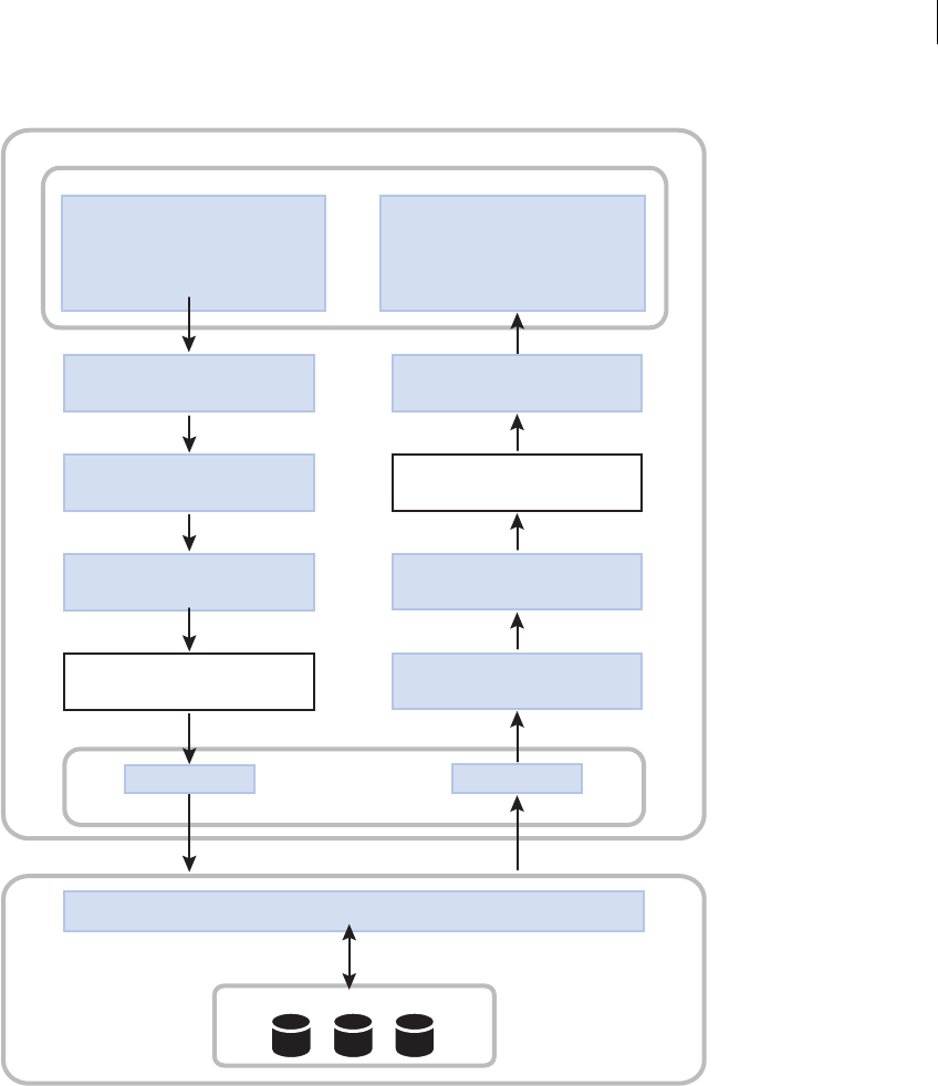
1225ADOBE FLEX 3
Adobe Flex 3 Developer Guide
UI controls
input data/send request
Ex: Enter and send
ZIP code.
UI controls
display result data
Ex: Display current Celsius
temperature.
Data binding
Copy data between objects.
Data model object
Intermediate data storage.
Data validators
Ex: Check if ZIP code is valid.
Data binding
Copy data between objects.
Request
Data formatter object
Ex: Convert temp. to Celsius.
Data binding
Copy data between objects.
Data model object
Intermediate data storage.
Data binding
Copy data between objects.
Result
Client-side data service object
Data format: AMF, SOAP, or HTTP
RPC service implementation
Resource tier
Ex: Retrieve temperature.
User interface
Client tier
Server tier
1
2
3
4
5
9
8
7
6

CHAPTER 39
1226
Data binding
The data binding feature provides a syntax for automatically copying the value of a property of one client-side
object to a property of another object at run time. Data binding is usually triggered when the value of the source
property changes. You can use data binding to pass user input data from user interface controls to a data service.
You can also use data binding to pass results returned from a data service to user interface controls.
The following example shows a Text control that gets its data from an HSlider control’s value property. The
property name inside the curly braces ({ }) is a binding expression that copies the value of the source property,
mySlider.value, into the Text control’s text property.
<mx:HSlider id="mySlider"/>
<mx:Text text="{mySlider.value}"/>
For more information, see “Binding Data” on page 1229.
Data models
The data model feature lets you store data in client-side objects. A data model is an ActionScript object that
contains properties for storing data, and that optionally contains methods for additional functionality. Data
models are useful for partitioning the user interface and data in an application.
You can use the data binding feature to bind user interface data into a data model. You can also use the data
binding feature to bind data from a data service to a data model.
You can define a simple data model in an MXML tag. When you require functionality beyond storage of untyped
data, you can use an ActionScript class as a data model.
The following example shows an MXML-based data model with properties of TextInput controls bound into its
fields:
<?xml version="1.0"?>
<!-- datarep\DatarepModelTag.mxml -->
<mx:Application xmlns:mx="http://www.adobe.com/2006/mxml">
<mx:Model id="reg">
<registration>
<name>{nme.text}</name>
<email>{email.text}</email>
<phone>{phone.text}</phone>
<zip>{zip.text}</zip>
<ssn>{ssn.text}</ssn>
</registration>
</mx:Model>
<mx:TextInput id="nme"/>
<mx:TextInput id="email"/>
<mx:TextInput id="phone"/>
<mx:TextInput id="zip"/>
<mx:TextInput id="ssn"/>
</mx:Application>
For more information about data models, see “Storing Data” on page 1257.

1227ADOBE FLEX 3
Adobe Flex 3 Developer Guide
Data validation
The data validation feature lets you ensure that data meets specific criteria before the application uses the data.
Data validators are ActionScript objects that check whether data in a component is formatted correctly. You can
apply a data validator to a property of any component. For models in a remote procedure call (RPC) component
declaration, properties to which a validator component is applied are validated just before the request is sent to an
RPC service destination. Only valid requests are sent.
The following example shows MXML code that uses the standard ZipCodeValidator component, represented by
the <mx:ZipCodeValidator> tag, to validate the format of the ZIP code that a user enters. The source property
of the ZipCodeValidator validator indicates the property that it validates.
<?xml version="1.0"?>
<!-- datarep\Validate.mxml -->
<mx:Application xmlns:mx="http://www.adobe.com/2006/mxml">
<mx:TextInput id="input" text="enter zip" width="80"/>
<mx:Model id="zipModel">
<root>
<zip>{input.text}</zip>
</root>
</mx:Model>
<mx:ZipCodeValidator source="{zipModel}" property="zip"
listener="{input}" trigger="{input}"/>
</mx:Application>
For more information about validator components, see “Validating Data” on page 1267.
Data formatting
The data formatting feature lets you change the format of data before displaying it in a user interface control. For
example, when a data service returns a string that you want to display in the (xxx)xxx-xxxx phone number format,
you can use a formatter component to ensure that the string is reformatted before it is displayed.
A data formatter component is an object that formats raw data into a customized string. You can use data formatter
components with data binding to reformat data that is returned from a data service.
The following example declares a DateFormatter component with an MM/DD/YYYY date format, and binds the
formatted version of a Date object returned by a web service to the text property of a TextInput control:
<?xml version="1.0"?>
<!-- datarep\Format.mxml -->
<mx:Application xmlns:mx="http://www.adobe.com/2006/mxml">
<mx:WebService id="myService" destination="Shop"/>
<!-- Declare a formatter and specify formatting properties. -->
<mx:DateFormatter id="StandardDateFormat" formatString="MM/DD/YYYY"/>
<!-- Trigger the formatter while populating a string with data. -->
<mx:TextInput


1229
Chapter 40: Binding Data
Data binding lets you pass data between client-side objects in an Adobe® Flex™ application. Binding automatically
copies the value of a property of a source object to a property of a destination object when the source property
changes.
Topics
About data binding. . . . . . . . . . . . . . . . . . . . . . . . . . . . . . . . . . . . . . . . . . . . . . . . . . . . . . . . . . . . . . . . . . . . . . . . . . . . .1229
Data binding examples. . . . . . . . . . . . . . . . . . . . . . . . . . . . . . . . . . . . . . . . . . . . . . . . . . . . . . . . . . . . . . . . . . . . . . . . . .1234
Binding to functions, Objects, and Arrays . . . . . . . . . . . . . . . . . . . . . . . . . . . . . . . . . . . . . . . . . . . . . . . . . . . . . . . . .1236
Using ActionScript in data binding expressions. . . . . . . . . . . . . . . . . . . . . . . . . . . . . . . . . . . . . . . . . . . . . . . . . . . . .1243
Using an E4X expression in a data binding expression . . . . . . . . . . . . . . . . . . . . . . . . . . . . . . . . . . . . . . . . . . . . . . .1245
Defining data bindings in ActionScript. . . . . . . . . . . . . . . . . . . . . . . . . . . . . . . . . . . . . . . . . . . . . . . . . . . . . . . . . . . .1247
Using the Bindable metadata tag . . . . . . . . . . . . . . . . . . . . . . . . . . . . . . . . . . . . . . . . . . . . . . . . . . . . . . . . . . . . . . . . .1249
Considerations for using the binding feature . . . . . . . . . . . . . . . . . . . . . . . . . . . . . . . . . . . . . . . . . . . . . . . . . . . . . . .1254
About data binding
Data binding is the process of tying the data in one object to another object. It provides a convenient way to pass
data between the different layers of the application. Data binding requires a source property, a destination
property, and a triggering event that indicates when to copy the data from the source to the destination. An object
dispatches the triggering event when the source property changes.
Adobe Flex provides three ways to specify data binding: the curly braces ({}) syntax in MXML, the
<mx:Binding> tag in MXML, and the BindingUtils methods in ActionScript. The following example uses the
curly braces ({}) syntax to show a Text control that gets its data from a TextInput control’s text property:
<?xml version="1.0"?>
<!-- binding/BasicBinding.mxml -->
<mx:Application xmlns:mx="http://www.adobe.com/2006/mxml">
<mx:TextInput id="myTI" text="Enter text here"/>
<mx:Text id="myText" text="{myTI.text}"/>
</mx:Application>
The property name inside the curly braces is the source property of the binding expression. When the value of the
source property changes, Flex copies the current value of the source property, myTI.text, to the destination
property, the Text control text property.

1230 CHAPTER 40
You can include ActionScript code and E4X expressions as part of the data binding expressions, as the following
example shows:
<?xml version="1.0"?>
<!-- binding/BasicBindingWithAS.mxml -->
<mx:Application xmlns:mx="http://www.adobe.com/2006/mxml">
<mx:TextInput id="myTI"/>
<mx:Text id="myText" text="{myTI.text.toUpperCase()}"/>
</mx:Application>
In this example, you use the ActionScript method String.toUpperCase() to convert the text in the source
property to upper case when Flex copies it to the destination property. For more information, see “Using Action-
Script in data binding expressions” on page 1243 and “Using an E4X expression in a data binding expression” on
page 1245.
You can use the <mx:Binding> tag as an alternative to the curly braces syntax. When you use the <mx:Binding>
tag, you provide a source property in the <mx:Binding> tag’s source property and a destination property in its
destination property. The following example uses the <mx:Binding> tag to define a data binding from a
TextInput control to a Text control:
<?xml version="1.0"?>
<!-- binding/BasicBindingMXML.mxml -->
<mx:Application xmlns:mx="http://www.adobe.com/2006/mxml">
<mx:TextInput id="myTI"/>
<mx:Text id="myText"/>
<mx:Binding source="myTI.text" destination="myText.text"/>
</mx:Application>
In contrast to the curly braces syntax, you can use the <mx:Binding> tag to completely separate the view (user
interface) from the model. The <mx:Binding> tag also lets you bind multiple source properties to the same desti-
nation property because you can specify multiple <mx:Binding> tags with the same destination. For an example,
see “Binding more than one source property to a destination property” on page 1235.
The curly braces syntax and the <mx:Binding> tag both define a data binding at compile time. You can also use
ActionScript code to define a data binding at run time, as the following example shows:
<?xml version="1.0"?>
<!-- binding/BasicBindingAS.mxml -->
<mx:Application xmlns:mx="http://www.adobe.com/2006/mxml">
<mx:Script>
<![CDATA[
import mx.binding.utils.*;
// Define data binding.
public function initBindingHandler():void {
BindingUtils.bindProperty(myText, "text", myTI, "text");
}
]]>
</mx:Script>

1231ADOBE FLEX 3
Adobe Flex 3 Developer Guide
<mx:TextInput id="myTI"/>
<mx:Text id="myText" preinitialize="initBindingHandler();"/>
</mx:Application>
In this example, you use the static BindingUtils.bindProperty() method to define the binding. You can also
use the BindingUtils.bindSetter() method to define a binding to a function. For more information, see
“Defining data bindings in ActionScript” on page 1247.
Notice in this example that you use the preinitialize event to define the data biding. This is necessary because
Flex triggers all data bindings at application startup when the source object dispatches the initialize event. For
more information, see “When data binding occurs” on page 1231.
When data binding occurs
Binding occurs under the following circumstances:
1The binding source dispatches an event because the source has been modified.
This event can occur at any time during application execution. The event triggers Flex to copy the value of the
source property to the destination property.
2At application startup when the source object dispatches the initialize event.
All data bindings are triggered once at application startup to initialize the destination property.
To monitor data binding, you can define a binding watcher that triggers an event handler when a data binding
occurs. For more information, see “Defining binding watchers” on page 1248.
The executeBindings() method of the UIComponent class executes all the bindings for which a UIComponent
object is the destination. All containers and controls, as well as the Repeater component, extend the UICom-
ponent class. The executeChildBindings() method of the Container and Repeater classes executes all of the
bindings for which the child UIComponent components of a Container or Repeater class are destinations. All
containers extend the Container class.
These methods give you a way to execute bindings that do not occur as expected. By adding one line of code, such
as a call to the executeChildBindings() method, you can update the user interface after making a change that
does not cause bindings to execute. However, you should only use the executeBindings() method when you
are sure that bindings do not execute automatically.
Properties that support data binding
You can use all properties of an object as the destination of a data binding expression. However, to use a property
as the source of a data binding expression, the source object must be implemented to support data binding, which
means that the object dispatches an event when the value of the property changes to trigger the binding. In this
topic, a property that can be used as the source of a data-binding expression is referred to as a bindable property.

CHAPTER 40
1232
In the Adobe Flex Language Reference, a property that can be used as the source of a data binding expression
includes the following statement in its description:
“This property can be used as the source for data binding.”
For more information on creating properties that can be used as the source of a data binding expression, see
“Creating properties to use as the source for data binding” on page 1232.
Using read-only properties as the source for data binding
You can use a read-only property defined by a getter method, which means no setter method, as the source for a
data-binding expression. Flex performs the data binding once when the application starts.
Using static properties as the source for data binding
You can automatically use a static constant as the source for a data-binding expression. Flex performs the data
binding once when the application starts.
You can use a static variable as the source for a data-binding expression. Flex performs the data binding once when
the application starts.
Creating properties to use as the source for data binding
When you create a property that you want to use as the source of a data binding expression, Flex can automatically
copy the value of the source property to any destination property when the source property changes. To signal to
Flex to perform the copy, you must use the [Bindable] data tag to register the property with Flex.
The [Bindable] metadata tag has the following syntax:
[Bindable]
[Bindable(event="eventname")]
If you omit the event name, Flex automatically creates an event named propertyChange, and Flex dispatches that
event when the property changes to trigger any data bindings that use the property as a data-binding source. If
you specify the event name, it is your responsibility to dispatch the event when the source property changes. For
more information and examples of using the [Bindable] metadata tag, see “Using the Bindable metadata tag” on
page 1249.
The following example makes the maxFontSize and minFontSize properties that you defined as variables usable
as the sources for data bindings expressions:
<?xml version="1.0"?>
<!-- binding/FontPropertyBinding.mxml -->
<mx:Application xmlns:mx="http://www.adobe.com/2006/mxml">
<mx:Script>
<![CDATA[
// Define public vars for tracking font size.
[Bindable]

1233ADOBE FLEX 3
Adobe Flex 3 Developer Guide
public var maxFontSize:Number = 15;
[Bindable]
public var minFontSize:Number = 5;
]]>
</mx:Script>
<mx:Text text="{maxFontSize}"/>
<mx:Text text="{minFontSize}"/>
<mx:Button click="maxFontSize=20; minFontSize=10;"/>
</mx:Application>
When you click the Button control, you update the values of the maxFontSize and minFontSize properties, and
trigger a data binding update to the Text controls.
Note: If you omit the [Bindable] metadata tag, the Flex compiler issues a warning stating that the data binding
mechanism cannot detect changes to the property.
Data binding uses
Common uses of data binding include the following:
•To bind properties of user interface controls to other user interface controls.
•To bind properties of user interface controls to a middle-tier data model, and to bind that data model’s fields
bound to a data service request (a three-tier system).
•To bind properties of user interface controls to data service requests.
•To bind data service results to properties of user interface controls.
•To bind data service results to a middle-tier data model, and to bind that data model’s fields to user interface
controls. For more information about data models, see “Storing Data” on page 1257.
•To bind an ArrayCollection or XMLListCollection object to the dataProvider property of a List-based
control.
•To bind individual parts of complex properties to properties of user interface controls. An example would be
a master-detail scenario in which clicking an item in a List control displays data in several other controls.
•To bind XML data to user interface controls by using ECMAScript for XML (E4X) expressions in binding
expressions.
Although binding is a powerful mechanism, it is not appropriate for all situations. For example, for a complex user
interface in which individual pieces must be updated based on strict timing, it would be preferable to use a method
that assigns properties in order. Also, binding executes every time a property changes, so it is not the best solution
when you want changes to be noticed only some of the time.

CHAPTER 40
1234
Data binding examples
Using data binding with data models
In the following example, a set of UI control properties act as the binding source for a data model. For more infor-
mation about data models, see “Storing Data” on page 1257.
<?xml version="1.0"?>
<!-- binding/BindingBraces.mxml -->
<mx:Application xmlns:mx="http://www.adobe.com/2006/mxml">
<!-- Data model stores registration data that user enters. -->
<mx:Model id="reg">
<registration>
<name>{fullname.text}</name>
<email>{email.text}</email>
<phone>{phone.text}</phone>
<zip>{zip.text}</zip>
<ssn>{ssn.text}</ssn>
</registration>
</mx:Model>
<!-- Form contains user input controls. -->
<mx:Form>
<mx:FormItem label="Name" required="true">
<mx:TextInput id="fullname" width="200"/>
</mx:FormItem>
<mx:FormItem label="Email" required="true">
<mx:TextInput id="email" width="200"/>
</mx:FormItem>
<mx:FormItem label="Phone" required="true">
<mx:TextInput id="phone" width="200"/>
</mx:FormItem>
<mx:FormItem label="Zip" required="true">
<mx:TextInput id="zip" width="60"/>
</mx:FormItem>
<mx:FormItem label="Social Security" required="true">
<mx:TextInput id="ssn" width="200"/>
</mx:FormItem>
</mx:Form>
</mx:Application>

1235ADOBE FLEX 3
Adobe Flex 3 Developer Guide
Binding a source property to more than one destination property
You can bind a single source property to more than one destination property by using the curly braces ({}) syntax,
the <mx:Binding> tag, or the BindingUtils methods in ActionScript. In the following example, a TextInput
control’s text property is bound to properties of two data models, and the data model properties are bound to the
text properties of two Label controls.
<?xml version="1.0"?>
<!-- binding/BindMultDestinations.mxml -->
<mx:Application xmlns:mx="http://www.adobe.com/2006/mxml">
<mx:Model id="mod1">
<data>
<part>{input1.text}</part>
</data>
</mx:Model>
<mx:Model id="mod2">
<data>
<part>{input1.text}</part>
</data>
</mx:Model>
<mx:TextInput id="input1" text="Hello" />
<mx:Label text="{mod1.part}"/>
<mx:Label text="{mod2.part}"/>
</mx:Application>
Binding more than one source property to a destination property
You can bind more than one source property to the same destination property. You can set up one of these
bindings by using curly braces, but you must set up the others by using the <mx:Binding> tag, or by using calls
to the BindingUtils.bindProperty() method or to the BindingUtils.bindSetter() method.
In the following example, the TextArea control is the binding destination, and both input1.text and
input2.text are its binding sources:
<?xml version="1.0"?>
<!-- binding/BindMultSources.mxml -->
<mx:Application xmlns:mx="http://www.adobe.com/2006/mxml">
<mx:Binding source="input2.text" destination="myTA.text"/>
<mx:TextInput id="input1"/>
<mx:TextInput id="input2"/>
<mx:TextArea id="myTA" text="{input1.text}"/>
</mx:Application>
If input1.text or input2.text is updated, the TextArea control contains the updated value.

CHAPTER 40
1236
Defining bidirectional bindings
You can define a bidirectional data binding, where the source and destination of two data bindings are reversed,
as the following example shows:
<?xml version="1.0"?>
<!-- binding/BindBiDirection.mxml -->
<mx:Application xmlns:mx="http://www.adobe.com/2006/mxml">
<mx:TextInput id="input1" text="{input2.text}"/>
<mx:TextInput id="input2" text="{input1.text}"/>
</mx:Application>
In this example, both TextInput controls are the source of a data binding expression, and both are a destination.
When you modify input1, its value is copied to input2, and when you modify input2, its value is copied to input1.
Flex ensures that bidirectional data bindings do not result in an infinite loop; that is, Flex ensures that a bidirec-
tional data binding is triggered only once when either source property is modified.
Binding to functions, Objects, and Arrays
Using functions as the source for a data binding
You can use a function as part of the source of a data binding expression. Two common techniques with functions
are to use bindable properties as arguments to the function to trigger the function, or to trigger the function in
response to a binding event.
Using functions that take bindable properties as arguments
You can use ActionScript functions as the source of data binding expressions when using a bindable property as
an argument of the function. When the bindable property changes, the function executes, and the result is written
to the destination property, as the following example shows:
<?xml version="1.0"?>
<!-- binding/ASInBraces.mxml -->
<mx:Application xmlns:mx="http://www.adobe.com/2006/mxml">
<mx:CurrencyFormatter id="usdFormatter" precision="2"
currencySymbol="$" alignSymbol="left"/>
<mx:TextInput id="myTI" text="Enter number here"/>
<mx:TextArea text="{usdFormatter.format(myTI.text)}"/>
</mx:Application>
In this example, Flex calls the CurrencyFormatter.format() method to update the TextArea control every time
the text property of the TextInput control is modified.

1237ADOBE FLEX 3
Adobe Flex 3 Developer Guide
If the function is not passed an argument that can be used as the source of a data binding expression, the function
only gets called once when the applications starts.
Binding to functions in response to a data-binding event
You can specify a function that takes no bindable arguments as the source of a data binding expression. However,
you then need a way to invoke the function to update the destination of the data binding.
In the following example, you use the [Bindable] metadata tag to specify to Flex to invoke the
isEnabled()function in response to the event myFlagChanged. When the myFlag setter gets called, it dispatches
the myFlagChanged event to trigger any data bindings that use the isEnabled()function as the source:
<?xml version="1.0"?>
<!-- binding/ASFunction.mxml -->
<mx:Application xmlns:mx="http://www.adobe.com/2006/mxml">
<mx:Script>
<![CDATA[
import flash.events.Event;
// Define a function that gets invoked
// in response to the myFlagChanged event.
[Bindable(event="myFlagChanged")]
private function isEnabled():String {
if (myFlag)
return 'true';
else
return 'false';
}
private var _myFlag:Boolean = false;
// Define a setter method that dispatches the
// myFlagChanged event to trigger the data binding.
public function set myFlag(value:Boolean):void {
_myFlag = value;
dispatchEvent(new Event("myFlagChanged"));
}
public function get myFlag():Boolean {
return _myFlag;
}
]]>
</mx:Script>
<!-- Use the function as the source of a data binding expression. -->
<mx:TextArea id="myTA" text="{isEnabled()}"/>
<!-- Modify the property, causing the setter method to
dispatch the myFlagChanged event to trigger data binding. -->
<mx:Button label="Clear MyFlag" click="myFlag=false;"/>
<mx:Button label="Set MyFlag" click="myFlag=true;"/>
</mx:Application>
For more information on the [Bindable] metadata tag, see “Using the Bindable metadata tag” on page 1249.

CHAPTER 40
1238
Using data binding with Objects
When working with Objects, you have to consider when you define a binding to the Object, or when you define
a binding to a property of the Object.
Binding to Objects
When you make an Object the source of a data binding expression, the data binding occurs when the Object is
updated, or when a reference to the Object is updated, but not when an individual field of the Object is updated.
In the following example, you create subclass of Object that defines two properties, stringProp and intProp,
but does not make the properties bindable:
package myComponents
{
// binding/myComponents/NonBindableObject.as
// Make no class properties bindable.
public class NonBindableObject extends Object {
public function NonBindableObject() {
super();
}
public var stringProp:String = "String property";
public var intProp:int = 52;
}
}
Since the properties of the class are not bindable, Flex will not dispatch an event when they are updated to trigger
data binding. You then use this class in a Flex application, as the following example shows:
<?xml version="1.0"?>
<!-- binding/WholeObjectBinding.mxml -->
<mx:Application xmlns:mx="http://www.adobe.com/2006/mxml"
creationComplete="initObj();">
<mx:Script>
<![CDATA[
import myComponents.NonBindableObject;
[Bindable]
public var myObj:NonBindableObject = new NonBindableObject();
[Bindable]
public var anotherObj:NonBindableObject =
new NonBindableObject();
public function initObj():void {
anotherObj.stringProp = 'anotherObject';
anotherObj.intProp = 8;
}
]]>
</mx:Script>

1239ADOBE FLEX 3
Adobe Flex 3 Developer Guide
<!-- Data binding updated at application startup. -->
<mx:Text id="text1" text="{myObj.stringProp}"/>
<!-- Data binding updated at application startup. -->
<mx:Text id="text2" text="{myObj.intProp}"/>
<!-- Data bindings to stringProp not updated. -->
<mx:Button label="Change myObj.stringProp"
click="myObj.stringProp = 'new string';"/>
<!-- Data bindings to intProp not updated. -->
<mx:Button label="Change myObj.intProp"
click="myObj.intProp = 10;"/>
<!-- Data bindings to myObj and to myObj properties updated. -->
<mx:Button label="Change myObj"
click="myObj = anotherObj;"/>
</mx:Application>
Because you did not make the individual fields of the NonBindableObject class bindable, the data bindings for the
two Text controls are updated at application start up, and when myObj is updated, but not when the individual
properties of myObj are updated.
When you compile the application, the compiler outputs warning messages stating that the data binding
mechanism will not be able to detect changes to stringProp and intProp.
Binding to properties of Objects
To make properties of an Object bindable, you create a new class definition for the Object, as the following
example shows:
package myComponents
{
// binding/myComponents/BindableObject.as
// Make all class properties bindable.
[Bindable]
public class BindableObject extends Object {
public function BindableObject() {
super();
}
public var stringProp:String = "String property";
public var intProp:int = 52;
}
}

CHAPTER 40
1240
By placing the [Bindable] metadata tag before the class definition, you make bindable all public properties
defined as variables, and all public properties defined by using both a setter and a getter method. You can then use
the stringProp and intProp properties as the source for a data binding, as the following example shows:
<?xml version="1.0"?>
<!-- binding/SimpleObjectBinding.mxml -->
<mx:Application xmlns:mx="http://www.adobe.com/2006/mxml"
creationComplete="initObj();">
<mx:Script>
<![CDATA[
import myComponents.BindableObject;
[Bindable]
public var myObj:BindableObject = new BindableObject();
[Bindable]
public var anotherObj:BindableObject =
new BindableObject();
public function initObj():void {
anotherObj.stringProp = 'anotherObject';
anotherObj.intProp = 8;
}
]]>
</mx:Script>
<!-- Data binding updated at application startup. -->
<mx:Text id="text1" text="{myObj.stringProp}"/>
<!-- Data binding updated at application startup. -->
<mx:Text id="text2" text="{myObj.intProp}"/>
<!-- Data bindings to stringProp updated. -->
<mx:Button label="Change myObj.stringProp"
click="myObj.stringProp = 'new string';"/>
<!-- Data bindings to intProp updated. -->
<mx:Button label="Change myObj.intProp"
click="myObj.intProp = 10;"/>
<!-- Data bindings to myObj and to myObj properties updated. -->
<mx:Button label="Change myObj"
click="myObj = anotherObj;"/>
</mx:Application>
Binding with arrays
When working with arrays, such as Array or ArrayCollection objects, you can define the array as the source or
destination of a data binding expression.

1241ADOBE FLEX 3
Adobe Flex 3 Developer Guide
Note: When defining a data binding expression that uses an array as the source of a data binding expression, the array
should be of type ArrayCollection because the ArrayCollection class dispatches an event when the array or the array
elements change to trigger data binding. For example, a call to ArrayCollection.addItem(),
ArrayCollection.addItemAt(), ArrayCollection.removeItem(), and
ArrayCollection.removeItemAt() all trigger data binding.
Binding to arrays
You often bind arrays to the dataProvider property of Flex controls, as the following example shows for the List
control:
<?xml version="1.0"?>
<!-- binding/ArrayBindingDP.mxml -->
<mx:Application xmlns:mx="http://www.adobe.com/2006/mxml">
<mx:Script>
<![CDATA[
import mx.collections.ArrayCollection;
[Bindable]
public var myAC:ArrayCollection = new ArrayCollection([
"One", "Two", "Three", "Four"]);
[Bindable]
public var myAC2:ArrayCollection = new ArrayCollection([
"Uno", "Dos", "Tres", "Quatro"]);
]]>
</mx:Script>
<!-- Data binding updated at application startup,
when myAC is modified, and when an element of
myAC is modifed. -->
<mx:List dataProvider="{myAC}"/>
<!-- Data bindings to myAC updated. -->
<mx:Button
label="Change Element"
click="myAC[0]='mod One'"/>
<!-- Data bindings to myAC updated. -->
<mx:Button
label="Add Element"
click="myAC.addItem('new element');"/>
<!-- Data bindings to myAC updated. -->
<mx:Button
label="Remove Element 0"
click="myAC.removeItemAt(0);"/>
<!-- Data bindings to myAC updated. -->
<mx:Button
label="Change ArrayCollection"
click="myAC=myAC2"/>
</mx:Application>

CHAPTER 40
1242
This example defines an ArrayCollection object, and then uses data binding to set the data provider of the List
control to the ArrayCollection. When you modify an element of the ArrayCollection object, or when you modify
a reference to the ArrayCollection object, you trigger a data binding.
Binding to array elements
You can use individual ArrayCollection elements as the source or a binding expression, as the following example
shows:
<?xml version="1.0"?>
<!-- binding/ArrayBinding.mxml -->
<mx:Application xmlns:mx="http://www.adobe.com/2006/mxml">
<mx:Script>
<![CDATA[
import mx.collections.ArrayCollection;
[Bindable]
public var myAC:ArrayCollection = new ArrayCollection([
"One", "Two", "Three", "Four"]);
[Bindable]
public var myAC2:ArrayCollection = new ArrayCollection([
"Uno", "Dos", "Tres", "Quatro"]);
]]>
</mx:Script>
<!-- Data binding updated at application startup
and when myAC modified. -->
<mx:Text id="text1" text="{myAC[0]}"/>
<!-- Data binding updated at application startup,
when myAC modified, and when myAC[0] modified. -->
<mx:Text id="text2" text="{myAC.getItemAt(0)}"/>
<mx:Button id="button1"
label="Change Element"
click="myAC[0]='new One'"/>
<mx:Button id="button2"
label="Change ArrayCollection"
click="myAC=myAC2"/>
</mx:Application>
If you specify an array element as the source of a data binding expression by using the square bracket syntax, [],
data binding is only triggered when the application starts and when the array or a reference to the array is updated;
data binding is not triggered when the individual array element is updated.
However, the data binding expression myAC.getItemAt(0) is triggered when an array element changes.
Therefore, the text2 Text control is updated when you click button1, while text1 is not. When using an array
element as the source of a data binding expression, you should use the ArrayCollection.getItemAt() method
in the binding expression.

1243ADOBE FLEX 3
Adobe Flex 3 Developer Guide
Clicking button2 copies myAC2 to myAC, and triggers all data bindings to array elements regardless of how you
implemented them.
Using ActionScript in data binding expressions
You can use ActionScript in data binding expressions defined by curly braces and by the <mx:Binding> tag;
however, you cannot use ActionScript when defining a data binding by using the
BindingUtils.bindProperty() or the BindingUtils.bindSetter() method.
Using ActionScript expressions in curly braces
Binding expressions in curly braces can contain an ActionScript expression that returns a value. For example, you
can use the curly braces syntax for the following types of binding.
•A single bindable property inside curly braces
•To cast the data type of the source property to a type that matches the destination property
•String concatenation that includes a bindable property inside curly braces
•Calculations on a bindable property inside curly braces
•Conditional operations that evaluate a bindable property value
The following example shows a data model that uses each type of binding expression:
<?xml version="1.0"?>
<!-- binding/AsInBinding.mxml -->
<mx:Application xmlns:mx="http://www.adobe.com/2006/mxml">
<mx:Model id="myModel">
<myModel>
<!-- Perform simple property binding. -->
<a>{nameInput.text}</a>
<!-- Perform string concatenation. -->
<b>This is {nameInput.text}</b>
<!-- Perform a calculation. -->
<c>{(Number(numberInput.text)) * 6 / 7}</c>
<!-- Perform a conditional operation using a ternary operator. -->
<d>{(isMale.selected) ? "Mr." : "Ms."} {nameInput.text}</d>
</myModel>
</mx:Model>
<mx:Form>
<mx:FormItem label="Last Name:">
<mx:TextInput id="nameInput"/>
</mx:FormItem>
<mx:FormItem label="Select sex:">
<mx:RadioButton id="isMale"

CHAPTER 40
1244
label="Male"
groupName="gender"
selected="true"/>
<mx:RadioButton id="isFemale"
label="Female"
groupName="gender"/>
</mx:FormItem>
<mx:FormItem label="Enter a number:">
<mx:TextInput id="numberInput" text="0"/>
</mx:FormItem>
</mx:Form>
<mx:Text
text="{'Calculation: '+numberInput.text+' * 6 / 7 = '+myModel.c}"/>
<mx:Text text="{'Conditional: '+myModel.d}"/>
</mx:Application>
Using ActionScript expressions in Binding tags
The source property of an <mx:Binding> tag can contain curly braces. When there are no curly braces in the
source property, the value is treated as a single ActionScript expression. When there are curly braces in the
source property, the value is treated as a concatenated ActionScript expression. The <mx:Binding> tags in the
following example are valid and equivalent to each other:
<?xml version="1.0"?>
<!-- binding/ASInBindingTags.mxml -->
<mx:Application xmlns:mx="http://www.adobe.com/2006/mxml">
<mx:Script>
<![CDATA[
public function whatDogAte():String {
return "homework";
}
]]>
</mx:Script>
<mx:Binding
source="'The dog ate my '+ whatDogAte()"
destination="field1.text"/>
<mx:Binding
source="{'The dog ate my '+ whatDogAte()}"
destination="field2.text"/>
<mx:Binding
source="The dog ate my {whatDogAte()}"
destination="field3.text"/>
<mx:TextArea id="field1"/>
<mx:TextArea id="field2"/>
<mx:TextArea id="field3"/>
</mx:Application>
The source property in the following example is not valid because it is not an ActionScript expression:
<mx:Binding source="The dog ate my homework" destination="field1.text"/>

1245ADOBE FLEX 3
Adobe Flex 3 Developer Guide
Using an ampersand character in a data binding expression
Because of the parsing rules of XML, if you want to use an ampersand character, &, in a data binding expression
in an MXML file, you must replace it with the hexadecimal equivalent character, &. For example, if you want
to use a logical OR expression, written in ActionScript as &&, then you have to write is as &&, as the
following example shows:
<mx:Button label="Test" enabled="{authorized && cc}" />
Using an E4X expression in a data binding expression
A binding expression in curly braces or an <mx:Binding> tag can contain an ECMAScript for XML (E4X)
expression when the source of a binding is a bindable property of type XML. You cannot use E4X when defining
a data binding by using the BindingUtils.bindProperty() or the BindingUtils.bindSetter() method.
Using an E4X expression in curly braces
A binding expression in curly braces automatically calls the toString() method when the binding destination is
a String property. A binding expression in curly braces or an <mx:Binding> tag can contain an ECMAScript for
XML (E4X) expression when the source of a binding is a bindable property of type XML; for more information,
see “Using an E4X expression in an <mx:Binding> tag” on page 1246.
In the code in the following example, there are three binding expressions in curly braces that bind data from an
XML object. The first uses . (dot) notation, the second uses .. (dot dot) notation, and the third uses || (or) notation.
<?xml version="1.0"?>
<!-- binding/E4XInBraces.mxml -->
<mx:Application xmlns:mx="http://www.adobe.com/2006/mxml">
<mx:Script>
<![CDATA[
[Bindable]
public var xdata:XML = <order>
<item id = "3456">
<description>Big Screen Television</description>
<price>1299.99</price><quantity>1</quantity>
</item>
<item id = "56789">
<description>DVD Player</description>
<price>399.99</price>
<quantity>1</quantity>
</item>
</order>;
]]>
</mx:Script>

CHAPTER 40
1246
<mx:Label text="Using .. notation."/>
<!-- Inline databinding will automatically call the
toString() method when the binding destination is a string. -->
<mx:List width="25%"
dataProvider="{xdata..description}"/>
<mx:Label text="Using . notation."/>
<mx:List width="25%"
dataProvider="{xdata.item.description}"/>
<mx:Label text="Using || (or) notation."/>
<mx:List width="25%"
dataProvider="{xdata.item.(@id=='3456'||@id=='56789').description}"/>
</mx:Application>
Using an E4X expression in an <mx:Binding> tag
Unlike an E4X expression in curly braces, when you use an E4X expression in an <mx:Binding> tag, you must
explicitly call the toString() method when the binding destination is a String property.
In the code in the following example, there are three binding expressions in curly braces that bind data from an
XML object. The first uses . (dot) notation, the second uses .. (dot dot) notation, and the third uses || (or) notation.
<?xml version="1.0"?>
<!-- binding/E4XInBindingTag.mxml -->
<mx:Application xmlns:mx="http://www.adobe.com/2006/mxml"
width="600" height="900">
<mx:Script>
<![CDATA[
[Bindable]
public var xdata:XML =
<order>
<item id = "3456">
<description>Big Screen Television</description>
<price>1299.99</price><quantity>1</quantity>
</item>
<item id = "56789">
<description>DVD Player</description>
<price>399.99</price>
<quantity>1</quantity>
</item>
</order>;
]]>
</mx:Script>
<mx:Label text="Using .. notation."/>
<!-- This will update because what is
binded is actually the String and XMLList. -->
<mx:List width="75%" id="txts"/>
<mx:Binding
source="xdata..description"
destination="txts.dataProvider"/>

1247ADOBE FLEX 3
Adobe Flex 3 Developer Guide
<mx:Label text="Using . notation."/>
<mx:List width="75%" id="txt2s"/>
<mx:Binding
source="xdata.item.description"
destination="txt2s.dataProvider"/>
<mx:Label text="Using || (or) notation."/>
<mx:List width="75%" id="txt3s"/>
<mx:Binding
source="xdata.item.(@id==’3456’||@id==’56789’).description"
destination="txt3s.dataProvider"/>
</mx:Application>
Defining data bindings in ActionScript
You can define a data binding in ActionScript by using the mx.binding.utils.BindingUtils class. This class defines
static methods that let you create a data binding to a property implemented as a variable, by using the
bindProperty() method, or to a method, by using the bindSetter() method. For an example using the
bindProperty() method, see “Data binding examples” on page 1234.
Differences between defining bindings in MXML and ActionScript
There are a few differences between defining data bindings in MXML at compile time and in defining them at
runtime in ActionScript:
•You cannot include ActionScript code in a data binding expression defined by the bindProperty() or
bindSetter() method. Instead, use the bindSetter() method to specify a method to call when the binding
occurs.
•You cannot include an E4X expression in a data binding expression defined in ActionScript.
•You cannot include functions or array elements in property chains in a data binding expression defined by the
bindProperty() or bindSetter() method. For more information on property chains, see “Working with
bindable property chains” on page 1253.
•The MXML compiler has better warning and error detection support than runtime data bindings defined by
the bindProperty() or bindSetter() method.
Example: Defining a data binding in ActionScript
The following example uses the bindSetter() method to set up a data binding. The arguments to the
bindSetter() method specify the following:

CHAPTER 40
1248
•The source object
•The name of the source property
•A method that is called when the source property changes
In the following example, as you enter text in the TextInput control, the text is converted to upper case as it is
copied to the TextArea control:
<?xml version="1.0"?>
<!-- binding/BindSetterAS.mxml -->
<mx:Application xmlns:mx="http://www.adobe.com/2006/mxml">
<mx:Script>
<![CDATA[
import mx.binding.utils.*;
import mx.events.FlexEvent;
// Method called when myTI.text changes.
public function updateMyString(val:String):void {
myTA.text = val.toUpperCase();
}
<!-- Event listener to configure binding. -->
public function mySetterBinding(event:FlexEvent):void {
var watcherSetter:ChangeWatcher =
BindingUtils.bindSetter(updateMyString, myTI, "text");
}
]]>
</mx:Script>
<mx:Label text="Bind Setter using setter method"/>
<mx:TextInput id="myTI"
text="Hello Setter" />
<mx:TextArea id="myTA"
initialize="mySetterBinding(event);"/>
</mx:Application>
Defining binding watchers
Flex includes the mx.binding.utils.ChangeWatcher class that you can use to define a data-binding watcher.
Typically, a data-binding watcher invokes an event listener when a binding occurs. To set up a data-binding
watcher, you use the static watch() method of the ChangeWatcher class, as the following example shows:
<?xml version="1.0"?>
<!-- binding/DetectWatcher.mxml -->
<mx:Application xmlns:mx="http://www.adobe.com/2006/mxml"
initialize="initWatcher();">
<mx:Script>
<
1249ADOBE FLEX 3
Adobe Flex 3 Developer Guide
public var myWatcher:ChangeWatcher;
// Define binding watcher.
public function initWatcher():void {
// Define a watcher for the text binding.
ChangeWatcher.watch(textarea, "text", watcherListener);
}
// Event listener when binding occurs.
public function watcherListener(event:Event):void {
myTA1.text="binding occurred";
// Use myWatcher.unwatch() to remove the watcher.
}
]]>
</mx:Script>
<!-- Define a binding expression to watch. -->
<mx:TextInput id="textinput" text="Hello"/>
<mx:TextArea id="textarea" text="{textinput.text}"/>
<!-- Trigger a binding. -->
<mx:Button label="Submit" click="textinput.text='Goodbye';"/>
<mx:TextArea id="myTA1"/>
</mx:Application>
You define an event listener for the data-binding watcher, where the event listener takes a single argument that
contains the event object. The data type of the event object is determined by the property being watched. Each
bindable property can dispatch a different event type and the associated event object. For more information on
determining the event type, see “Using the Bindable metadata tag” on page 1249.
Many event listeners take an event object of type PropertyChangeEvent because that is the default data type of the
event dispatched by bindable properties. You can always specify an event type of flash.events.Event, the base class
for all Flex events.
Using the Bindable metadata tag
When a property is the source of a data binding expression, Flex automatically copies the value of the source
property to any destination property when the source property changes. To signal to Flex to perform the copy, you
must use the [Bindable] metadata tag to register the property with Flex, and the source property must dispatch
an event.
The [Bindable] metadata tag has the following syntax:
[Bindable]
[Bindable(event="eventname")]

CHAPTER 40
1250
If you omit the event name, Flex automatically creates an event named propertyChange of type PropertyChan-
geEvent.
You can use the [Bindable] metadata tag in three places:
1Before a public class definition.
The [Bindable] metadata tag makes usable as the source of a binding expression all public properties that
you defined as variables, and all public properties that are defined by using both a setter and a getter method.
In this case, [Bindable] takes no parameters, as the following example shows:
[Bindable]
public class TextAreaFontControl extends TextArea {}
The Flex compiler automatically generates an event named propertyChange, of type PropertyChangeEvent,
for all public properties so that the properties can be used as the source of a data binding expression.
If the property value remains the same on a write, Flex does not dispatch the event or update the property,
where not the same translates to the following test:
(oldValue !== value)
That means if a property contains a reference to an object, and that reference is modified to reference a
different but equivalent object, the binding is triggered. If the property is not modified, but the object that it
points to changes internally, the binding is not triggered.
Note: When you use the [Bindable] metadata tag before a public class definition, it only applies to public
properties; it does not apply to private or protected properties, or to properties defined in any other namespace.
You must insert the [Bindable] metadata tag before a nonpublic property to make it usable as the source for a
data binding expression.
2Before a public, protected, or private property defined as a variable to make that specific property support
binding.
The tag can have the following forms:
[Bindable]
public var foo:String;
The Flex compiler automatically generates an event named propertyChange, of type PropertyChangeEvent,
for the property. If the property value remains the same on a write, Flex does not dispatch the event or update
the property.
You can also specify the event name, as the following example shows:
[Bindable(event="fooChanged")]
public var foo:String;
In this case, you are responsible for generating and dispatching the event, typically as part of some other
method of your class. You can specify a [Bindable] tag that includes the event specification if you want to
name the event, even when you already specified the [Bindable] tag at the class level.

1251ADOBE FLEX 3
Adobe Flex 3 Developer Guide
3Before a public, protected, or private property defined by a getter or setter method.
You must define both a setter and a getter method to use the [Bindable] tag with the property. If you define
just a setter method, you create a write-only property that you cannot use as the source of a data-binding
expression. If you define just a getter method, you create a read-only property that you can use as the source
of a data-binding expression without inserting the [Bindable] metadata tag. This is similar to the way that
you can use a variable, defined by using the const keyword, as the source for a data binding expression.
The tag can have the following forms:
[Bindable]
public function set shortNames(val:Boolean):void {
...
}
public function get shortNames():Boolean {
...
}
The Flex compiler automatically generates an event named propertyChange, of type PropertyChangeEvent,
for the property. If the property value remains the same on a write, Flex does not dispatch the event or update
the property. To determine if the property value changes, Flex calls the getter method to obtain the current
value of the property.
You can specify the event name, as the following example shows:
[Bindable(event="changeShortNames")]
public function set shortNames(val:Boolean):void {
...
// Create and dispatch event.
dispatchEvent(new Event("changeShortNames"));
}
// Get method.
public function get shortNames():Boolean {
...
}
In this case, you are responsible for generating and dispatching the event, typically in the setter method, and
Flex does not check to see if the old value and the new value are different. You can specify a [Bindable] tag
that includes the event specification to name the event, even when you already specified the [Bindable] tag
at the class level.
The following example makes the maxFontSize and minFontSize properties that you defined as variables that
can be used as the sources for data bindings:
// Define public vars for tracking font size.
[Bindable]
public var maxFontSize:Number = 15;
[Bindable]
public var minFontSize:Number = 5;

CHAPTER 40
1252
In the following example, you make a public property that you defined by using a setter and a getter method that
is usable as the source for data binding The [Bindable] metadata tag includes the name of the event broadcast
by the setter method when the property changes:
// Define private variable.
private var _maxFontSize:Number = 15;
[Bindable(event="maxFontSizeChanged")]
// Define public getter method.
public function get maxFontSize():Number {
return _maxFontSize;
}
// Define public setter method.
public function set maxFontSize(value:Number):void {
if (value <= 30) {
_maxFontSize = value;
} else _maxFontSize = 30;
// Create event object.
var eventObj:Event = new Event("maxFontSizeChanged");
dispatchEvent(eventObj);
}
In this example, the setter updates the value of the property, and then creates and dispatches an event to invoke
an update of the destination of the data binding.
In an MXML file, you can make all public properties that you defined as variables usable as the source for data
binding by including the [Bindable] metadata tag in an <mx:Metadata> block, as the following example shows:
<mx:Metadata>
[Bindable]
</mx:Metadata>
You can also use the [Bindable] metadata tag in an <mx:Script> block in an MXML file to make individual
properties that you defined as variables usable as the source for a data binding expression. Alternatively, you can
use the [Bindable] metadata tag with properties that you defined by using setter and getter methods.
Using read-only properties as the source for data binding
You can automatically use a read-only property defined by a getter method, which means no setter method, as the
source for a data-binding expression. Flex performs the data binding once when the application starts.
Because the data binding from a read-only property occurs only once at application start up, you omit the
[Bindable] metadata tag for the read-only property.
Using static properties as the source for data binding
You can use a static variable as the source for a data-binding expression. Flex performs the data binding once when
the application starts, and again when the property changes.

1253ADOBE FLEX 3
Adobe Flex 3 Developer Guide
You can automatically use a static constant as the source for a data-binding expression. Flex performs the data
binding once when the application starts. Because the data binding occurs only once at application start up, you
omit the [Bindable] metadata tag for the static constant. The following example uses a static constant as the
source for a data-binding expression:
<?xml version="1.0"?>
<!-- binding/StaticBinding.mxml -->
<mx:Application xmlns:mx="http://www.adobe.com/2006/mxml">
<mx:Script>
<![CDATA[
// This syntax casues a compiler error.
// [Bindable]
// public static var varString:String="A static var.";
public static const constString:String="A static const.";
]]>
</mx:Script>
<!-- This binding occurs once at application startup. -->
<mx:Button label="{constString}"/>
</mx:Application>
Working with bindable property chains
When you specify a property as the source of a data binding expression, Flex monitors not only that property for
changes, but also the chain of properties leading up to it. The entire chain of properties, including the source
property, is called a bindable property chain. In the following example, firstName.text is a bindable property
chain that includes both a firstName object and its text property:
<mx:Text id="myText" text="{firstName.text}"/>
You can have a fairly long bindable property chain, as the following example shows:
<mx:Text id="myText" text="{user.name.firstName.text}"/>
For the data binding mechanism to detect changes to the text property, only the text property has to be
bindable. However, if you want to assign a new value to any part of the chain at runtime, every element in the chain
must be bindable. Otherwise, modifying the user, name, or firstName property at runtime results in the data
binding mechanism no longer being able to detect changes to the text property.
When using the BindingUtils.bindProperty() or BindingUtils.bindSetter() method, you specify the
bindable property chain as an argument to the method. For example, the bindProperty() method has the
following signature:
public static function bindProperty(site:Object, prop:String, host:Object, chain:Object,
commitOnly:Boolean = false):ChangeWatcher
The host and chain arguments specify the source of the data binding expression. You can define a data binding
expression by using the bindProperty() method, as the following example shows:

CHAPTER 40
1254
bindProperty(myText, ’text’, user, ["name","firstName","text"]);
In this example, ["name","firstName","text"] defines the bindable property chain relative to the user object.
Notice that user is not part of the bindable property change in this example.
In an MXML data-binding expression, the bindable property chain is always relative to this. Therefore, to define
a data binding equivalent to the MXML data binding expression shown above, you write the bindProperty()
method as the following example shows:
bindProperty(myText, ’text’, this, ["user", "name","firstName","text"]);
Considerations for using the binding feature
Consider the following when using the binding feature:
•You cannot bind to style properties.
•If you bind a model into the dataProvider property of a component, you should not change items in the
model directly. Instead, change the items through the Collections API. Otherwise, the component to which the
model is bound is not redrawn to show the changes to the model. For example, instead of using the following:
myGrid.getItemAt(itemIndex).myField = 1;
You would use the following:
myGrid.dataProvider.editField(itemIndex, "myField", 1);
•Array elements cannot function as binding sources at run time. Arrays that are bound do not stay updated if
individual fields of a source Array change. Binding copies values during instantiation after variables are declared
in an <mx:Script> tag, but before event listeners execute.
Debugging data binding
In some situations, data binding may not appear to function correctly, and you may need to debug them. The
following list contains suggestions for resolving data binding issues:
1Pay attention to warnings.
It is easy to see a warning and think that it doesn’t matter, especially if binding appears to work at startup, but
warnings are important.
If a warning is about a missing [Bindable] on a getter/setter property, even if the binding works at startup,
subsequent changes to the property are not noticed.
If a warning is about a static variable or a built-in property, changes aren’t noticed.

1255ADOBE FLEX 3
Adobe Flex 3 Developer Guide
2Ensure that the source of the binding actually changed.
When your source is part of a larger procedure, it is easy to miss the fact that you never assigned the source.
3Ensure that the bindable event is being dispatched.
You can use the Flex command-line debugger (fdb), or the Adobe® Flex® Builder™ debugger to make sure that
the dispatchEvent() method is called. Also, you can add a normal event listener to that class to make sure
it gets called. If you want to add the event listener as a tag attribute, you must place the [Event('myEvent')]
metadata at the top of your class definition or in an <mx:Metadata> tag in your MXML.
4Create a setter function and use a <mx:Binding> tag to assign into it.
You can then put a trace or an alert or some other debugging code in the setter with the value that is being
assigned. This technique ensures that the binding itself is working. If the setter is called with the right infor-
mation, you will know that it’s your destination that is failing, and you can start debugging there.

CHAPTER 40
1256

1257
Chapter 41: Storing Data
You use the data model feature to store data in an application before it is sent to the server, or to store data sent
from the server before using it in the application.
Topics
About data models . . . . . . . . . . . . . . . . . . . . . . . . . . . . . . . . . . . . . . . . . . . . . . . . . . . . . . . . . . . . . . . . . . . . . . . . . . . . .1257
Defining a data model . . . . . . . . . . . . . . . . . . . . . . . . . . . . . . . . . . . . . . . . . . . . . . . . . . . . . . . . . . . . . . . . . . . . . . . . . .1257
Specifying an external source for an <mx:Model> tag or <mx:XML> tag . . . . . . . . . . . . . . . . . . . . . . . . . . . . . . .1261
Using validators with a data model . . . . . . . . . . . . . . . . . . . . . . . . . . . . . . . . . . . . . . . . . . . . . . . . . . . . . . . . . . . . . . .1262
Using a data model as a value object . . . . . . . . . . . . . . . . . . . . . . . . . . . . . . . . . . . . . . . . . . . . . . . . . . . . . . . . . . . . . .1263
Binding data into an XML data model . . . . . . . . . . . . . . . . . . . . . . . . . . . . . . . . . . . . . . . . . . . . . . . . . . . . . . . . . . . .1265
About data models
A data model is an ActionScript object that contains properties that you use to store application-specific data.
Communication between an Adobe® Flex™ application and the server is required only to retrieve data not yet
available to the Flex application and to update a server-side data source with new data from the Flex application.
You can use a data model for data validation, and it can contain client-side business logic. You can define a data
model in MXML or ActionScript. In the model-view-controller (MVC) design pattern, the data model represents
the model tier.
When you plan an application, you determine the kinds of data that the application must store and how that data
must be manipulated. This helps you decide what types of data models you need. For example, suppose you decide
that your application must store data about employees. A simple employee model might contain name,
department, and e-mail address properties.
Defining a data model
You can define a data model in an MXML tag, an ActionScript function, or an ActionScript class. In general, you
should use MXML-based models for simple data structures, and use ActionScript for more complex structures
and client-side business logic.

1258 CHAPTER 41
Note: The <mx:Model> and <mx:XML> tags are Flex compiler tags and do not correspond directly to ActionScript
classes. The Adobe Flex Language Reference contains information about these tags and other compiler tags. Click the
Appendixes link on the main page in the Adobe Flex Language Reference.
You can place an <mx:Model> tag or an <mx:XML> tag in a Flex application file or in an MXML component file.
The tag should have an id value, and it cannot be the root tag of an MXML component.
The <mx:Model> tag
The most common type of MXML-based model is the <mx:Model> tag, which is compiled into an ActionScript
object of type mx.utils.ObjectProxy, which contains a tree of objects when your data is in a hierarchy, with no type
information. The leaves of the Object tree are scalar values. Because models that are defined in <mx:Model> tags
contain no type information or business logic, you should use them only for the simplest cases. Define models in
ActionScript classes when you need the typed properties or you want to add business logic.
The following example shows an employee model declared in an <mx:Model> tag:
<?xml version="1.0"?>
<!-- Models\ModelsModelTag.mxml -->
<mx:Application xmlns:mx="http://www.adobe.com/2006/mxml" layout="absolute">
<mx:Model id="employeemodel">
<employee>
<name>
<first/>
<last/>
</name>
<department/>
<email/>
</employee>
</mx:Model>
</mx:Application>
An <mx:Model> child tag with no value is considered null. If you want an empty string instead, you can use a
binding expression as the value of the tag, as the following example shows:
<?xml version="1.0"?>
<!-- Models\ModelTagEmptyString.mxml -->
<mx:Application xmlns:mx="http://www.adobe.com/2006/mxml" layout="absolute">
<mx:Model id="employeemodel">
<employee>
<name>
<!--Fill the first property with empty string.-->
<first>{""}</first>
<!--Fill the last property with empty string.-->
<last>{""}</last>
</name>
<!--department is null-->
<department/>
<!--email is null-->
<email/>
</employee>

1259ADOBE FLEX 3
Adobe Flex 3 Developer Guide
</mx:Model>
</mx:Application>
The <mx:XML> tag
An <mx:XML> tag represents literal XML data. Setting the format property to e4x creates an XML object, which
implements the powerful XML-handling standards defined in the ECMAScript for XML specification (ECMA-
357 edition 2) (known as E4X). For backward compatibility, when the format property is not explicitly set to e4x,
the type of the object created is flash.xml.XMLNode.
Note: You currently cannot use a node within an <mx:XML> data model as a binding source.
Script-based models
As an alternative to using an MXML-based model, you can define a model as a variable in an <mx:Script> tag.
The following example shows a very simple model defined in an ActionScript script block. It would be easier to
declare this model in an <mx:Model> tag.
<?xml version="1.0"?>
<!-- Models\ScriptModel.mxml -->
<mx:Application xmlns:mx="http://www.adobe.com/2006/mxml" layout="absolute">
<mx:Script>
<![CDATA[
[Bindable]
public var myEmployee:Object={
name:{
first:null,
last:null
},
department:null,
email:null
};
]]>
</mx:Script>
</mx:Application>
There is no advantage to using a script-based model instead of an MXML-based model. As with MXML-based
models, you cannot type the properties of a script-based model. To type properties, you must use a class-based
model.
Class-based models
Using an ActionScript class as a model is a good option when you want to store complex data structures with typed
properties, or when you want to execute client-side business logic by using application data. Also, the type infor-
mation in a class-based model is retained on the server when the model is passed to a server-side data service.

CHAPTER 41
1260
The following example shows a model defined in an ActionScript class. This model is used to store shopping cart
items in an e-commerce application. It also provides business logic in the form of methods for adding and
removing items, getting an item count, and getting the total price. For more information on ActionScript compo-
nents, see Creating and Extending Adobe Flex 3 Components.
package
{
[Bindable]
public class ShoppingCart {
public var items:Array = [];
public var total:Number = 0;
public var shippingCost:Number = 0;
public function ShoppingCart() {
}
public function addItem(item:Object, qty:int = 1,
index:int = 0):void {
items.splice(index, 0, { id: item.id,
name: item.name,
description: item.description,
image: item.image,
price: item.price,
qty: qty });
total += parseFloat(item.price) * qty;
}
public function removeItemAt(index:Number):void {
total -= parseFloat(items[index].price) * items[index].qty;
items.splice(index, 1);
if (getItemCount() == 0)
shippingCost = 0;
}
public function getItemCount():int {
return items.length;
}
public function getTotal():Number {
return total;
}
}
}
Note: You can use properties of any recognized type in a class-based model. For example, you could create an
Employee class, and then define properties of type Employee in another class that imports Employee.
You declare a class-based model as an ActionScript component tag in an MXML file, as the following example
shows:
<local:ShoppingCart id="cart" xmlns:local="*"/>

1261ADOBE FLEX 3
Adobe Flex 3 Developer Guide
This component is in the same directory as the MXML file, as indicated by the XML namespace value *. For more
information about specifying the location of components, see Creating and Extending Adobe Flex 3 Components.
Specifying an external source for an <mx:Model> tag
or <mx:XML> tag
You can specify an external source for an <mx:Model> or <mx:XML> tag in a source property. Separating the
content of a model from the MXML that defines the user interface improves the maintainability and reusability
of an application. Adobe recommends this way of adding static XML content to a Flex application.
The external source file can contain static data and data binding expressions, just like a model defined in the body
of the <mx:Model> or <mx:XML> tag. The file referenced in a source property resides on the server and not on
the client machine. The compiler reads the source value and compiles the source into the application; the source
value is not read at run time. To retrieve XML data at run time, you can use the <mx:HTTPService> tag; for more
information, see “Accessing Server-Side Data with Flex” on page 1163.
Using <mx:Model> and <mx:XML> tags with external sources is an easy way to reuse data model structures and
data binding expressions. You can also use them to prepopulate user interface controls with static data by binding
data from the model elements into the user interface controls.
The source property accepts the names of files relative to the current web application directory, as well as URLs
with HTTP:// prefixes. In the following example, the content of the myEmployee1 data model is an XML file
named content.xml in the local web application directory. The content of the myEmployee2 data model is a
fictional HTTP URL that returns XML.
<mx:Model source="employees.xml" id="employee1"/>
<mx:Model source="http://www.somesitel.com/employees.xml" id="employee2"/>
The source file must be a valid XML document with a single root node. The following example shows an XML file
that could be used as the source of the <mx:Model source="employees.xml" id="Model1"/> tag.
<?xml version="1.0"?>
<employees>
<employee>
<name>John Doe</name>
<phone>555-777-66555</phone>
<email>jdoe@fictitious.com</email>
<active>true</active>
</employee>
<employee>
<name>Jane Doe</name>
<phone>555-777-66555</phone>
<email>jndoe@fictitious.com</email>
<active>true</active>

CHAPTER 41
1262
</employee>
</employees>
Using validators with a data model
To validate the data stored in a data model, you use validators. In the following example, the
<mx:EmailValidator>, <mx:PhoneNumberValidator>, <mx:ZipCodeValidator>, and
<mx:SocialSecurityValidator> tags declare validators that validate the email, phone, zip, and ssn fields of the
registration data model. The validators generate error messages when a user enters incorrect data in TextInput
controls that are bound to the data model fields.
<?xml version="1.0"?>
<!-- Models\ModelWithValidator.mxml -->
<mx:Application xmlns:mx="http://www.adobe.com/2006/mxml" layout="absolute">
<mx:Model id="reg">
<registration>
<name>{username.text}</name>
<email>{email.text}</email>
<phone>{phone.text}</phone>
<zip>{zip.text}</zip>
<ssn>{ssn.text}</ssn>
</registration>
</mx:Model>
<mx:Validator required="true" source="{reg}" property="name"
trigger="{submit}" triggerEvent="click" listener="{username}"/>
<mx:EmailValidator source="{reg}" property="email"
trigger="{submit}" triggerEvent="click" listener="{email}"/>
<mx:PhoneNumberValidator source="{reg}" property="phone"
trigger="{submit}" triggerEvent="click" listener="{phone}"/>
<mx:ZipCodeValidator source="{reg}"
property="zip" trigger="{submit}" triggerEvent="click" listener="{zip}"/>
<mx:SocialSecurityValidator source="{reg}" property="ssn"
trigger="{submit}" triggerEvent="click" listener="{ssn}"/>
<!-- Form contains user input controls. -->
<mx:Form>
<mx:FormItem label="Name" required="true">
<mx:TextInput id="username" width="200"/>
</mx:FormItem>
<mx:FormItem label="Email" required="true">
<mx:TextInput id="email" width="200"/>
</mx:FormItem>
<mx:FormItem label="Phone" required="true">
<mx:TextInput id="phone" width="200"/>
</mx:FormItem>
<mx:FormItem label="Zip" required="true">
<mx:TextInput id="zip" width="60"/>
</mx:FormItem>
<mx:FormItem label="Social Security" required="true">

1263ADOBE FLEX 3
Adobe Flex 3 Developer Guide
<mx:TextInput id="ssn" width="200"/>
</mx:FormItem>
<mx:FormItem>
<!-- User clicks Button to trigger validation. -->
<mx:Button id="submit" label="Validate"/>
</mx:FormItem>
</mx:Form>
</mx:Application>
This example cleanly separates the user interface and application-specific data. You could easily extend it to create
a three-tier architecture by binding data from the registration data model into an RPC service request. You could
also bind user input data directly into an RPC service request, which itself is a data model, as described in
“Accessing Server-Side Data with Flex” on page 1163.
For more information about validators, see “Validating Data” on page 1267.
Using a data model as a value object
You can use a data model as a value object, which acts as a central repository for a set of data returned from
method calls on one or more objects. This makes it easier to manage and work with data in an application.
In the following example, the tentModel data model stores the results of a web service operation. The TentDetail
component is a custom MXML component that gets its data from the tentModel data model and displays details
for the currently selected tent.
...
<!-- Data model stores data from selected tent. -->
<mx:Model id="tentModel">
<tent>
<name>{selectedTent.name}</name>
<sku>{selectedTent.sku}</sku>
<capacity>{selectedTent.capacity}</capacity>
<season>{selectedTent.seasonStr}</season>
<type>{selectedTent.typeStr}</type>
<floorarea>{selectedTent.floorArea}</floorarea>
<waterproof>{getWaterProof(selectedTent.waterProof)}</waterproof>
<weight>{getWeight(selectedTent)}</weight>
<price>{selectedTent.price}</price>
</tent>
</mx:Model>
...
<TentDetail id="detail" tent="{tentModel}"/>
...
The following example shows the MXML source code for the TentDetail component. References to the tent
property, which contains the tentModel data model, and the corresponding tentModel properties are
highlighted in boldface.

CHAPTER 41
1264
<?xml version="1.0" encoding="utf-8"?>
<mx:Panel xmlns:mx="http://www.adobe.com/2006/mxml" title="Tent Details">
<mx:Script>
<![CDATA[
[Bindable]
public var tent:Object;
]]>
</mx:Script>
<mx:Style>
.title{fontFamily:Arial;fontWeight:bold;color:#3D3D3D;fontSize:16pt;}
.flabelColor
{fontFamily:Arial;fontWeight:bold;color:#3D3D3D;fontSize:11pt}
.productSpec{fontFamily:Arial;color:#5B5B5B;fontSize:10pt}
</mx:Style>
<mx:VBox paddingLeft="10" paddingTop="10" paddingRight="10">
<mx:Form verticalGap="0" paddingLeft="10" paddingTop="10"
paddingRight="10" paddingBottom="0">
<mx:VBox width="209" height="213">
<mx:Image width="207" height="211"
source="./images/{tent.sku}_detail.jpg"/>
</mx:VBox>
<mx:FormHeading label="{tent.name}" paddingTop="1"
styleName="title"/>
<mx:HRule width="209"/>
<mx:FormItem label="Capacity" styleName="flabelColor">
<mx:Label text="{tent.capacity} person"
styleName="productSpec"/>
</mx:FormItem>
<mx:FormItem label="Season"
styleName="flabelColor">
<mx:Label text="{tent.season}"
styleName="productSpec"/>
</mx:FormItem>
<mx:FormItem label="Type" styleName="flabelColor">
<mx:Label text="{tent.type}"
styleName="productSpec"/>
</mx:FormItem>
<mx:FormItem label="Floor Area" styleName="flabelColor">
<mx:Label text="{tent.floorarea}
square feet" styleName="productSpec"/>
</mx:FormItem>
<mx:FormItem label="Weather" styleName="flabelColor">
<mx:Label text="{tent.waterproof}"
styleName="productSpec"/>
</mx:FormItem>
<mx:FormItem label="Weight" styleName="flabelColor">
<mx:Label text="{tent.weight}"
styleName="productSpec"/>
</mx:FormItem>
</mx:Form>

1265ADOBE FLEX 3
Adobe Flex 3 Developer Guide
</mx:VBox>
</mx:Panel>
Binding data into an XML data model
Flex compiles the <mx:XML> tag into literal XML data in an ActionScript xml.XMLNode or XML object. This is
different from the <mx:Model> tag, which Flex compiles into an Action object that contains a tree of ActionScript
objects. To bind data into an <mx:XML> data model, you can use the curly braces syntax the same way you do with
other data models. However, you cannot use a node within the data model as a binding source.
Adobe does not recommend using the <mx:Binding> tag for this type of binding because doing so requires you
to write an appropriate ActionScript XML command as the destination property of the <mx:Binding> tag. For
more information about the <mx:XML> tag, see “Defining a data model” on page 1257.
The following example shows an <mx:XML> data model with binding destinations in curly braces:
<?xml version="1.0"?>
<!-- Models\XMLBinding.mxml -->
<mx:Application xmlns:mx="http://www.adobe.com/2006/mxml">
<mx:XML id="myEmployee" format="e4x">
<employee>
<name>
<first>{firstName.text}</first>
<last>{lastName.text}</last>
</name>
<department>{department.text}</department>
<email>{email.text}</email>
</employee>
</mx:XML>
<mx:TextInput id="firstName"/>
<mx:TextInput id="lastName"/>
<mx:TextInput id="department"/>
<mx:TextInput id="email"/>
</mx:Application>

CHAPTER 41
1266

1267
Chapter 42: Validating Data
You use the Adobe® Flex™ data validation mechanism to validate the data in an application. Flex provides
predefined validators for many common types of user-supplied data, such as date, number, and currency values.
Topics
Validating data . . . . . . . . . . . . . . . . . . . . . . . . . . . . . . . . . . . . . . . . . . . . . . . . . . . . . . . . . . . . . . . . . . . . . . . . . . . . . . . .1267
Using validators. . . . . . . . . . . . . . . . . . . . . . . . . . . . . . . . . . . . . . . . . . . . . . . . . . . . . . . . . . . . . . . . . . . . . . . . . . . . . . . .1271
General guidelines for validation . . . . . . . . . . . . . . . . . . . . . . . . . . . . . . . . . . . . . . . . . . . . . . . . . . . . . . . . . . . . . . . . .1284
Working with validation errors. . . . . . . . . . . . . . . . . . . . . . . . . . . . . . . . . . . . . . . . . . . . . . . . . . . . . . . . . . . . . . . . . . .1287
Working with validation events . . . . . . . . . . . . . . . . . . . . . . . . . . . . . . . . . . . . . . . . . . . . . . . . . . . . . . . . . . . . . . . . . .1290
Using standard validators . . . . . . . . . . . . . . . . . . . . . . . . . . . . . . . . . . . . . . . . . . . . . . . . . . . . . . . . . . . . . . . . . . . . . . .1293
Validating data
The data that a user enters in a user interface might or might not be appropriate to the application. In Flex, you
use a validator to ensure the values in the fields of an object meet certain criteria. For example, you can use a
validator to ensure that a user enters a valid phone number value, to ensure that a String value is longer than a set
minimum length, or ensure that a ZIP code field contains the correct number of digits.
In typical client-server environments, data validation occurs on the server after data is submitted to it from the
client. One advantage of using Flex validators is that they execute on the client, which lets you validate input data
before transmitting it to the server. By using Flex validators, you eliminate the need to transmit data to and receive
error messages back from the server, which improves the overall responsiveness of your application.
Note: Flex validators do not eliminate the need to perform data validation on the server, but provide a mechanism
for improving performance by performing some data validation on the client.
Flex includes a set of validators for common types of user input data, including the following:
•Validating credit card numbers
•Va l id at ing c ur re nc y
•Validating dates
•Validating e-mail addresses
•Validating numbers
•Validating phone numbers

1268 CHAPTER 42
•Validating using regular expressions
•Validating social security numbers
•Validating strings
•Validating ZIP codes
You often use Flex validators with data models. For more information about data models, see “Storing Data” on
page 1257.
About validators
You define validators by using MXML or ActionScript. You declare a validator in MXML by using the
<mx:Validator> tag or the tag for the appropriate validator type. For example, to declare the standard Phone-
NumberValidator validator, you use the <mx:PhoneNumberValidator> tag, as the following example shows:
<?xml version="1.0"?>
<!-- validators\PNValidator.mxml -->
<mx:Application xmlns:mx="http://www.adobe.com/2006/mxml">
<!-- Define the PhoneNumberValidator. -->
<mx:PhoneNumberValidator id="pnV"
source="{phoneInput}" property="text"/>
<!-- Define the TextInput control for entering the phone number. -->
<mx:TextInput id="phoneInput"/>
<mx:TextInput id="zipCodeInput"/>
</mx:Application>
In the previous example, you enter a value into the Tex t Input control for the phone number. When you remove
focus from the TextInput control by selecting the TextInput control for the ZIP code, the validator executes.
You use the source property of the validator to specify an object, and the property property to specify a field of
the object to validate. For more information on the source and property properties, see “About the source and
property properties” on page 1269.
Validator tags must always be immediate children of the root tag of an MXML file. In the previous example, the
validator ensures that the user enters a valid phone number in the TextInput control. A valid phone number
contains at least 10 digits, plus additional formatting characters. For more information, see “Validating phone
numbers” on page 1299.
You declare validators in ActionScript either in a script block within an MXML file, or in an ActionScript file, as
the following example shows:
<?xml version="1.0"?>
<!-- validators\PNValidatorAS.mxml -->
<mx:Application xmlns:mx="http://www.adobe.com/2006/mxml">
<mx:Script>
<
1269ADOBE FLEX 3
Adobe Flex 3 Developer Guide
// Import PhoneNumberValidator.
import mx.validators.PhoneNumberValidator;
// Create the validator.
private var v:PhoneNumberValidator = new PhoneNumberValidator();
private function createValidator():void {
// Configure the validator.
v.source = phoneInput;
v.property = "text";
}
]]>
</mx:Script>
<!-- Define the TextInput control for entering the phone number. -->
<mx:TextInput id="phoneInput" creationComplete="createValidator();"/>
<mx:TextInput id="zipCodeInput"/>
</mx:Application>
About the source and property properties
Validators use the following two properties to specify the item to validate:
source Specifies the object containing the property to validate. Set this to an instance of a component or a data
model. You use data binding syntax in MXML to specify the value for the source property. This property supports
dot-delimited Strings for specifying nested properties.
property A String that specifies the name of the property of source that contains the value to validate.
You can set these properties in any of the following ways:
•In MXML when you use a validator tag.
•In ActionScript by assigning values to the properties.
•When you call the Validator.validate() method to invoke a validator programmatically. For more infor-
mation, see “Triggering validation programmatically” on page 1275.
You often specify a Flex user-interface control as the value of the source property, and a property of the control
to validate as the value of the property property, as the following example shows:
<?xml version="1.0"?>
<!-- validators\ZCValidator.mxml -->
<mx:Application xmlns:mx="http://www.adobe.com/2006/mxml">
<mx:ZipCodeValidator id="zipV"
source="{myZip}"
property="text"/>
<mx:TextInput id="phoneInput"/>
<mx:TextInput id="myZip"/>
</mx:Application>
In this example, you use the Flex ZipCodeValidator to validate the data entered in a Te x tInput control. The
TextInput control stores the input data in its text property.

CHAPTER 42
1270
About triggering validation
You trigger validation either automatically in response to an event, or programmatically by an explicit call to the
Validator.validate() method of a validator.
When you use events, you can cause the validator to execute automatically in response to a user action. For
example, you can use the click event of a Button control to trigger validation on the fields of a form, or the
valueCommit event of a Te xt Inp ut control to trigger validation after a user enters information in the control. For
more information, see “Triggering validation by using events” on page 1271.
You can also trigger a validation programmatically. For example, you might have to inspect multiple, related input
fields to perform a single validation. Or you might have to perform conditional validation based on a user input.
For example, you may allow a user to select the currency used for payment, such as U.S. dollars or Euros.
Therefore, you want to make sure that you invoke a validator configured for the specified currency. In this case,
you can make an explicit call to the validate() method to trigger the correct validator for the input value. For
more information, see “Triggering validation programmatically” on page 1275.
About validating required fields
Flex validators can determine when a user enters an incorrect value into a user-interface control. In addition, all
validators support the required property, which, if true, specifies that a missing or empty value in a user-
interface control causes a validation error. The default value is true. Therefore, a validation error occurs by
default if the user fails to enter any required data in a control associated with a validator. To disable this check, set
the required property to false. For more information, see “Validating required fields” on page 1282.
About validation errors
If a validation error occurs, by default Flex draws a red box around the component associated with the failure. If
the user moves the mouse pointer over the component, Flex displays the error message associated with the error.
You can customize the look of the component and the error message associated with the error. For more infor-
mation on validation errors, see “Working with validation errors” on page 1287.
About validation events
Validation is event driven. You can use events to trigger validation, programmatically create and configure
validators in response to events, and listen for events dispatched by validators.
For example, when a validation operation completes, a validator dispatches a valid or invalid event, depending
on the results of the validation. You can listen for these events, and then perform any additional processing that
your application requires.

1271ADOBE FLEX 3
Adobe Flex 3 Developer Guide
Alternatively, Flex components dispatch valid and invalid events, depending on the results of the validation.
This lets you listen for the events being dispatched from the component being validated, rather than listening for
events dispatched by the validator.
You are not required to listen for validation events. By default, Flex handles a failed validation by drawing a red
box around the control that is associated with the source of the data binding. For a successful validation, Flex
clears any indicator of a previous failure. For more information, see “Working with validation events” on
page 1290.
About custom validation
Although Flex supplies a number of predefined validators, you might find that you have to implement your own
validation logic. The mx.validators.Validator class is an ActionScript class that you can extend to create a subclass
that encapsulates your custom validation logic. For more information on creating custom validators, see “Custom
Validators” on page 191 in Creating and Extending Adobe Flex 3 Components.
Using validators
Triggering validation by using events
You can trigger validators automatically by associating them with an event. In the following example, the user
enters a ZIP code in a TextInput control, and then triggers validation by clicking the Button control:
<?xml version="1.0"?>
<!-- validators\ZCValidatorTriggerEvent.mxml -->
<mx:Application xmlns:mx="http://www.adobe.com/2006/mxml">
<mx:ZipCodeValidator id="zipV"
source="{myZip}"
property="text"
trigger="{mySubmit}"
triggerEvent="click"/>
<mx:TextInput id="myZip"/>
<mx:Button id="mySubmit" label="Submit"/>
</mx:Application>
This example uses the trigger and triggerEvent properties of the ZipCodeValidator class to associate an event
with the validator. These properties have the following values:
trigger Specifies the component generating the event that triggers the validator. If omitted, by default Flex uses
the value of the source property.

CHAPTER 42
1272
triggerEvent Specifies the event that triggers the validation. If omitted, Flex uses the valueCommit event. Flex
dispatches the valueCommit event whenever the value of a control changes. Usually this is when the user removes
focus from the component, or when a property value is changed programmatically. If you want a validator to
ignore all events, set triggerEvent to an empty string ("").
For information on specific validator classes, see “Using standard validators” on page 1293.
Triggering validation by using the default event
You can rewrite the example from the previous section to use default values for the trigger and triggerEvent
properties, as the following example shows:
<?xml version="1.0"?>
<!-- validators\ZCValidatorDefEvent.mxml -->
<mx:Application xmlns:mx="http://www.adobe.com/2006/mxml">
<mx:ZipCodeValidator id="zipV"
source="{myZip}"
property="text"/>
<mx:TextInput id="myZip"/>
<mx:Button id="mySubmit" label="Submit"/>
</mx:Application>
By omitting the trigger and triggerEvent properties, Flex triggers the validator when the TextInput control
dispatches the valueCommit event. Flex controls dispatch the valueCommit event when its values changes by user
interaction or programmatically.
Triggering validation for data bindings
Data binding provides a syntax for automatically copying the value of a property of one object to a property of
another object at run time. With data binding, Flex copies the source value to the destination, typically in response
to a modification to the source. The source and destination of data bindings are typically Flex components or data
models.
In the next example, you bind data entered in a Tex t Inp ut control to a data model so that the data in the TextInput
control is automatically copied to the data model:
<?xml version="1.0"?>
<!-- validators\ValWithDataBinding.mxml -->
<mx:Application xmlns:mx="http://www.adobe.com/2006/mxml">
<!-- Define a data model for storing the phone number. -->
<mx:Model id="userInfo">
<phoneInfo>
<phoneNum>{phoneInput.text}</phoneNum>
</phoneInfo>
</mx:Model>
<!-- Define the TextInput control for entering the phone number. -->
<mx:TextInput id="phoneInput"/>

1273ADOBE FLEX 3
Adobe Flex 3 Developer Guide
<mx:TextInput id="zipCodeInput"/>
</mx:Application>
You can use a validator along with a data binding to validate either the source or destination of the data binding,
as the following example shows:
<?xml version="1.0"?>
<!-- validators\ValTriggerWithDataBinding.mxml -->
<mx:Application xmlns:mx="http://www.adobe.com/2006/mxml">
<!-- Define a data model for storing the phone number. -->
<mx:Model id="userInfo">
<phoneInfo>
<phoneNum>{phoneInput.text}</phoneNum>
</phoneInfo>
</mx:Model>
<!-- Define the PhoneNumberValidator. -->
<mx:PhoneNumberValidator id="pnV"
source="{phoneInput}"
property="text"/>
<!-- Define the TextInput control for entering the phone number. -->
<mx:TextInput id="phoneInput"/>
<mx:TextInput id="zipCodeInput"/>
</mx:Application>
This example uses a PhoneNumberValidator to validate the data entered in the TextInput control. In this example,
the following occurs:
•You assign the validator to the source of the data binding.
•You use the default event, valueCommit, on the TextInput control to trigger the validator. This means the
validator executes when the user removes focus from the TextInput control by selecting the TextInput control for
the ZIP code.
•Flex updates the destination of the data binding on every change to the source. This means that the
userInfo.phoneNum field updates on every change to the TextInput control, while the validator executes only
when the user removes focus from the TextInput control to trigger the valueCommit event. You can use the
validator’s triggerEvent property to specify a different event to trigger the validation.
In a model-view-controller (MVC) design pattern, you isolate the model from the view and controller portions of
the application. In the previous example, the data model represents the model, and the TextInput control and
validator represents the view.
The TextInput control is not aware that its data is bound to the data model, or that there is any binding on it at all.
Since the validator is also assigned to the TextInput control, you have kept the model and view portions of your
application separate and can modify one without affecting the other.

CHAPTER 42
1274
However, there is nothing in Flex to prohibit you from assigning a validator to the data model, as the following
example shows:
<?xml version="1.0"?>
<!-- validators\ValTriggerWithDataBindingOnModel.mxml -->
<mx:Application xmlns:mx="http://www.adobe.com/2006/mxml">
<!-- Define a data model for storing the phone number. -->
<mx:Model id="userInfo">
<phoneInfo>
<phoneNum>{phoneInput.text}</phoneNum>
</phoneInfo>
</mx:Model>
<!-- Define the PhoneNumberValidator. -->
<mx:PhoneNumberValidator id="pnV"
source="{userInfo}"
property="phoneNum"
trigger="{phoneInput}"
listener="{phoneInput}"/>
<!-- Define the TextInput control for entering the phone number. -->
<mx:TextInput id="phoneInput"/>
<mx:TextInput id="zipCodeInput"/>
</mx:Application>
In this example, you trigger the data validator by using the valueCommit event of the TextInput control, but assign
the validator to a field of the data model, rather than to a property of the TextInput control.
This example also uses the listener property of the validator. This property configures the validator to display
validation error information on the specified object, rather than on the source of the validation. In this example,
the source of the validation is a model, so you display the visual information on the TextInput control that
provided the data to the model. For more information, see “Specifying a listener for validation” on page 1290.
If the model has a nesting structure of elements, you use dot-delimited Strings with the source property to specify
the model element to validate, as the following example shows:
<?xml version="1.0"?>
<!-- validators\ValTriggerWithDataBindingComplexModel.mxml -->
<mx:Application xmlns:mx="http://www.adobe.com/2006/mxml">
<!-- Define a data model for storing the phone number. -->
<mx:Model id="userInfo">
<user>
<phoneInfo>
<homePhoneNum>{homePhoneInput.text}</homePhoneNum>
<cellPhoneNum>{cellPhoneInput.text}</cellPhoneNum>
</phoneInfo>
</user>
</mx:Model>
<!-- Define the PhoneNumberValidator. -->
<mx:PhoneNumberValidator id="hPNV"
source="{userInfo.phoneInfo}"
property="homePhoneNum"

1275ADOBE FLEX 3
Adobe Flex 3 Developer Guide
trigger="{homePhoneInput}"
listener="{homePhoneInput}"/>
<!-- Define the PhoneNumberValidator. -->
<mx:PhoneNumberValidator id="cPNV"
source="{userInfo.phoneInfo}"
property="cellPhoneNum"
trigger="{cellPhoneInput}"
listener="{cellPhoneInput}"/>
<!-- Define the TextInput controls for entering the phone number. -->
<mx:Label text="Home Phone:"/>
<mx:TextInput id="homePhoneInput"/>
<mx:Label text="Cell Phone:"/>
<mx:TextInput id="cellPhoneInput"/>
</mx:Application>
Triggering validation programmatically
The Va lidator class, and all subclasses of Validator, include a validate() method that you can call to invoke a
validator directly, rather than triggering the validator automatically by using an event.
The validate() method has the following signature:
validate(value:Object = null, supressEvents:Boolean = false):ValidationResultEvent
The arguments have the following values:
value If value is null, use the source and property properties to specify the data to validate. If value is non-
null, it specifies a field of an object relative to the this keyword, which means an object in the scope of the
document.
You should also set the Validator.listener property when you specify the value argument. When a validation
occurs, Flex applies visual changes to the object specified by the listener property. By default, Flex sets the
listener property to the value of the source property. However, because you do not specify the source property
when you pass the value argument, you should set it explicitly. For more information, see “Specifying a listener
for validation” on page 1290.
supressEvents If false, dispatch either the valid or invalid event on completion. If true, do not dispatch
events.
This method returns an event object containing the results of the validation that is an instance of the Validation-
ResultEvent class. For more information on using the return result, see “Handling the return value of the validate()
method” on page 1276.

CHAPTER 42
1276
In the following example, you create and invoke a validator programmatically in when a user clicks a Button
control:
<?xml version="1.0"?>
<!-- validators\ValTriggerProg.mxml -->
<mx:Application xmlns:mx="http://www.adobe.com/2006/mxml">
<mx:Script>
<![CDATA[
// Import ZipCodeValidator.
import mx.validators.ZipCodeValidator;
private var v:ZipCodeValidator = new ZipCodeValidator();
private function performValidation():void {
v.domain = "US or Canada";
// Set the listener property to the component
// used to display validation errors.
v.listener=myZip;
v.validate(myZip.text);
}
]]>
</mx:Script>
<mx:TextInput id="myZip"/>
<mx:Button label="Submit" click="performValidation();"/>
</mx:Application>
Notice that you are still using an event to trigger the performValidation() function that creates and invokes the
validator, but the event itself does not automatically invoke the validator.
Any errors in the validator are shown on the associated component, just as if you had triggered the validation
directly by using an event.
Handling the return value of the validate() method
You may want to inspect the return value from the validate() method to perform some action when the
validation succeeds or fails. The validate() method returns an event object with a type defined by the Valida-
tionResultEvent class.
The ValidationResultEvent class defines several properties, including the type property. The type property of the
event object contains either ValidationResultEvent.VALID or ValidationResultEvent.INVALID, based on
the validation results. You can use this property as part of your validation logic, as the following example shows:
<?xml version="1.0"?>
<!-- validators\ValTriggerProgProcessReturnResult.mxml -->
<mx:Application xmlns:mx="http://www.adobe.com/2006/mxml">
<mx:Script>
<
1277ADOBE FLEX 3
Adobe Flex 3 Developer Guide
import mx.validators.ZipCodeValidator;
public var v:ZipCodeValidator = new ZipCodeValidator();
// Define variable for storing the validation event object.
public var vResult:ValidationResultEvent;
public function performValidation():void {
v.domain = "US or Canada";
v.listener=myZip;
vResult = v.validate(myZip.text);
if (vResult.type==ValidationResultEvent.VALID) {
// Validation succeeded.
myTA.text='OK';
}
else {
// Validation failed.
myTA.text='Fail';
}
}
]]>
</mx:Script>
<mx:TextInput id="myZip"/>
<mx:Button label="Submit" click="performValidation();"/>
<mx:TextArea id="myTA"/>
</mx:Application>
The ValidationResultEvent class has additional properties that you can use when processing validation events. For
more information, see “Working with validation events” on page 1290.
Triggering the DateValidator and CreditCardValidator
The DateValidator and CreditCardValidator can validate multiple fields by using a single validator. A CreditCard-
Validator examines one field that contains the credit card number and a second field that contains the credit card
type. The DateValidator can examine a single field that contains a date, or multiple fields that together make up a
date.
When you validate an object that contains multiple properties that are set independently, you often cannot use
events to automatically trigger the validator because no single field contains all of the information required to
perform the validation.
One way to validate a complex object is to call the validate() method of the validator based on some type of
user interaction. For example, you might want to validate the multiple fields that make up a date in response to
the click event of a Button control, as the following example shows:
<?xml version="1.0"?>
<!-- validators\DateAndCC.mxml -->
<mx:Application xmlns:mx="http://www.adobe.com/2006/mxml">
<!-- Define the data model. -->

CHAPTER 42
1278
<mx:Model id="date">
<dateInfo>
<month>{monthInput.text}</month>
<day>{dayInput.text}</day>
<year>{yearInput.text}</year>
</dateInfo>
</mx:Model>
<!-- Define the validators. -->
<mx:DateValidator id="dayV"
triggerEvent=""
daySource="{dayInput}"
dayProperty="text"
monthSource="{monthInput}"
monthProperty="text"
yearSource="{yearInput}"
yearProperty="text"/>
<!-- Define the form to populate the model. -->
<mx:Form>
<mx:TextInput id="monthInput"/>
<mx:TextInput id="dayInput"/>
<mx:TextInput id="yearInput"/>
</mx:Form>
<!-- Define the button to trigger validation. -->
<mx:Button label="Submit"
click="dayV.validate();"/>
</mx:Application>
The validator in this example examines all three input fields. If any field is invalid, validation fails. The validator
highlights only the invalid fields that failed. For more information on how validators signal validation errors, see
“Working with validation errors” on page 1287. For more information on the DateValidator and CreditCardVal-
idator, see “Using standard validators” on page 1293.
Invoking multiple validators in a function
You can invoke multiple validators programmatically from a single function. In this example, you use the
ZipCodeValidator and PhoneNumberValidator validators to validate the ZIP code and phone number input to a
data model.
<?xml version="1.0"?>
<!-- validators\ValidatorCustomFuncStaticVals.mxml -->
<mx:Application xmlns:mx="http://www.adobe.com/2006/mxml">
<mx:Script>
<
1279ADOBE FLEX 3
Adobe Flex 3 Developer Guide
// Validate the ZIP code.
vResult = zipV.validate();
// If the ZIP code is invalid,
// do not move on to the next field.
if (vResult.type==ValidationResultEvent.INVALID)
return;
// Validate the phone number.
vResult = pnV.validate();
// If the phone number is invalid,
// do not move on to the validation.
if (vResult.type==ValidationResultEvent.INVALID)
return;
}
]]>
</mx:Script>
<mx:Model id="person">
<userInfo>
<zipCode>{zipCodeInput.text}</zipCode>
<phoneNumber>{phoneNumberInput.text}</phoneNumber>
</userInfo>
</mx:Model>
<!-- Define the validators. -->
<mx:ZipCodeValidator id="zipV"
source="{zipCodeInput}"
property="text"/>
<mx:PhoneNumberValidator id="pnV"
source ="{phoneNumberInput}"
property="text"/>
<mx:Form>
<!-- Collect input data -->
<mx:TextInput id="zipCodeInput"/>
<mx:TextInput id="phoneNumberInput"/>
</mx:Form>
<mx:Button label="Validate"
click="validateZipPhone();"/>
</mx:Application>
In this example, you use the predefined ZipCodeValidator and PhoneNumberValidator to validate user infor-
mation as the user enters it. Then, when the user clicks the Submit button to submit the form, you validate that
the ZIP code is actually within the specified area code of the phone number.
You can also use the static Validator.validateAll() method to invoke all of the validators in an Array. This
method returns an Array containing one ValidationRes ultEvent object for each validator that failed, and an empty
Array if all validators succeed. The following example uses this method to invoke two validators in response to the
click event for the Button control:
<?xml version="1.0"?>
<!-- validators\ValidatorMultipleValids.mxml -->
<mx:Application xmlns:mx="http://www.adobe.com/2006/mxml"
creationComplete="initValidatorArray();">

CHAPTER 42
1280
<mx:Script>
<![CDATA[
import mx.validators.Validator;
// Define the validator Array.
private var myValidators:Array;
private function initValidatorArray():void {
myValidators=[zipV, pnV];
}
]]>
</mx:Script>
<mx:Model id="person">
<userInfo>
<zipCode>{zipCodeInput.text}</zipCode>
<phoneNumber>{phoneNumberInput.text}</phoneNumber>
</userInfo>
</mx:Model>
<!-- Define the validators. -->
<mx:ZipCodeValidator id="zipV"
source="{zipCodeInput}"
property="text"/>
<mx:PhoneNumberValidator id="pnV"
source ="{phoneNumberInput}"
property="text"/>
<mx:Form>
<!-- Collect input data -->
<mx:TextInput id="zipCodeInput"/>
<mx:TextInput id="phoneNumberInput"/>
</mx:Form>
<mx:Button label="Validate"
click="Validator.validateAll(myValidators);"/>
</mx:Application>
Creating a reusable validator
You can define a reusable validator so that you can use it to validate multiple fields. To make it reusable, you
programmatically set the source and property properties to specify the field to validate, or pass that information
to the validate() method, as the following example shows:
<?xml version="1.0"?>
<!-- validators\ReusableVals.mxml -->
<mx:Application xmlns:mx="http://www.adobe.com/2006/mxml">
<mx:Script>
<
1281ADOBE FLEX 3
Adobe Flex 3 Developer Guide
zipV.validate(eventObj.currentTarget.text);
}
]]>
</mx:Script>
<mx:ZipCodeValidator id="zipV"
triggerEvent=""/>
<mx:TextInput id="shippingZip"
focusOut="performValidation(event);"/>
<mx:TextInput id="billingZip"
focusOut="performValidation(event);"/>
</mx:Application>
In this example, you have two address areas for a customer: one for a billing address and one for a shipping
address. Both addresses have a ZIP code field, so you can reuse a single ZipCodeValidator for both fields. The
event listener for the focusOut event passes the field to validate to the validate() method.
Alternatively, you can write the performValidation() function as the following example shows:
<?xml version="1.0"?>
<!-- validators\ReusableValsSpecifySource.mxml -->
<mx:Application xmlns:mx="http://www.adobe.com/2006/mxml">
<mx:Script>
<![CDATA[
import flash.events.Event;
private function performValidation(eventObj:Event):void {
zipV.source = eventObj.currentTarget;
zipV.property = "text";
zipV.validate();
}
]]>
</mx:Script>
<mx:ZipCodeValidator id="zipV"
triggerEvent=""/>
<mx:TextInput id="shippingZip"
focusOut="performValidation(event);"/>
<mx:TextInput id="billingZip"
focusOut="performValidation(event);"/>
</mx:Application>
Conditionalizing validator execution
By invoking a validator programmatically, you can use conditional logic in your application to determine which
of several validators to invoke, set validator properties, or perform other preprocessing or postprocessing as part
of the validation.
In the next example, you use a Button control to invoke a validator, but the application first determines which
validator to execute, based on user input:

CHAPTER 42
1282
<?xml version="1.0"?>
<!-- validators\ConditionalVal.mxml -->
<mx:Application xmlns:mx="http://www.adobe.com/2006/mxml">
<mx:Script>
<![CDATA[
import mx.events.ValidationResultEvent;
private var vEvent:ValidationResultEvent;
private function validateData():void {
if (country.selectedValue == "Canada") {
vEvent = zipCN.validate(zipInput.text);
}
else {
vEvent = zipUS.validate(zipInput.text);
}
}
]]>
</mx:Script>
<mx:ZipCodeValidator id="zipUS"
domain="US Only"
listener="{zipInput}"/>
<mx:ZipCodeValidator id="zipCN"
domain="US or Canada"
listener="{zipInput}"/>
<mx:RadioButtonGroup id="country"/>
<mx:RadioButton groupName="country" label="US"/>
<mx:RadioButton groupName="country" label="Canada"/>
<mx:TextInput id="zipInput"/>
<mx:Button label="Submit" click="validateData();"/>
</mx:Application>
In this example, you use a ZipCodeValidator to validate a ZIP code entered into a Te x tI nput control. However, the
validateData() function must first determine whether the ZIP code is for the U.S. or for Canada before
performing the validation. In this example, the application uses the RadioButton controls to let the user specify
the country as part of entering the ZIP code.
Validating required fields
The Validator class, the base class for all Flex validators, contains a required property that when set to true
causes validation to fail when a field is empty. You use this property to configure the validator to fail when a user
does not enter data in a required input field.
You typically call the validate() method to invoke a validator on a required field. This is often necessary because
you cannot guarantee that an event occurs to trigger the validation— an empty input field often means that the
user never gave the input control focus.

1283ADOBE FLEX 3
Adobe Flex 3 Developer Guide
The following example performs a validation on a required input field:
<?xml version="1.0"?>
<!-- validators\RequiredVal.mxml -->
<mx:Application xmlns:mx="http://www.adobe.com/2006/mxml">
<mx:StringValidator id="reqV"
source="{inputA}"
property="text"
required="true"/>
<mx:TextInput id="inputA"/>
<mx:Button label="Submit"
click="reqV.validate();"/>
</mx:Application>
In this example, the StringValidator executes when the following occurs:
•The Te x tInput control dispatches the valueCommit event. However, to dispatch that event, the user must give
the TextInput control focus, and then remove focus. If the user never gives the TextInput control focus, the
validator does not trigger, and Flex does not recognize that the control is empty. Therefore, you must call the
validate() method to ensure that the validator checks for missing data.
•The user clicks the Button control. The validator issues a validation error when the user does not enter any
data into the TextInput control. It also issues a validation error if the user enters an invalid String value.
Enabling and disabling a validator
The Validator.enabled property lets you enable and disable a validator. When the value of the enabled
property is true, the validator is enabled; when the value is false, the validator is disabled. When a validator is
disabled, it dispatches no events, and the validate() method returns null.
For example, you can set the enabled property by using data binding, as the following code shows:
<?xml version="1.0"?>
<!-- validators\EnableVal.mxml -->
<mx:Application xmlns:mx="http://www.adobe.com/2006/mxml">
<mx:ZipCodeValidator id="zcVal"
source="{inputA}"
property="text"
required="true"
enabled="{enableV.selected}"/>
<mx:TextInput id="inputA"/>
<mx:TextInput/>
<mx:CheckBox id="enableV"
label="Validate input?"/>
</mx:Application>
In this example, you enable the validator only when the user selects the CheckBox control.

CHAPTER 42
1284
Using data binding to configure validators
You configure validators to match your application requirements. For example, the StringValidator lets you
specify a minimum and maximum length of a valid string. For a String to be considered valid, it must be at least
the minimum number of characters long, and less than or equal to the maximum number of characters.
Often, you set validator properties statically, which means that they do not change as your application executes.
For example, the following StringValidator defines that the input string must be at least one character long and no
longer than 10 characters:
<mx:StringValidator required="true" minlength="1" maxLength="10"/>
User input might also define the properties of the validator. In the following example, you let the user set the
minimum and maximum values of a NumberValidator:
<?xml version="1.0"?>
<!-- validators\ConfigWithBinding.mxml -->
<mx:Application xmlns:mx="http://www.adobe.com/2006/mxml">
<mx:NumberValidator
source="{inputA}"
property="text"
minValue="{Number(inputMin.text)}"
maxValue="{Number(inputMax.text)}"/>
<mx:TextInput id="inputA"/>
<mx:TextInput id="inputMin" text="1"/>
<mx:TextInput id="inputMax" text="10"/>
</mx:Application>
In this example, you use data binding to configure the properties of the validators.
General guidelines for validation
You should be aware of some guidelines when performing validation on forms. Typically, you associate forms with
data models. That lets you trigger validation as part of binding an input user interface control to a field of the data
model. You can also perform some of the following actions:
•If possible, assign validators to all the individual user-interface controls of the form. You can use a validator
even if all that you want to do is to ensure that the user entered a value.
•Assign validators to multiple fields when necessary. For example, use the CreditCardValidator or the DateVal-
idator with multiple fields.
•If you have any required fields, ensure that you explicitly call the validate() method on the validator. For
more information, see “Validating required fields” on page 1282.

1285ADOBE FLEX 3
Adobe Flex 3 Developer Guide
•Define a Submit button to invoke any validators before submitting data to a server. Typically, you use the
click event of the Button control to invoke validators programmatically, and then submit the data if all validation
succeeds.
The following example uses many of these guidelines to validate a form made up of several Tex tInput controls:
<?xml version="1.0"?>
<!-- validators\FullApp.mxml -->
<mx:Application xmlns:mx="http://www.adobe.com/2006/mxml">
<mx:Script>
<![CDATA[
import mx.events.ValidationResultEvent;
private var vResult:ValidationResultEvent;
// Function to validate data and submit it to the server.
private function validateAndSubmit():void {
// Validate the required fields.
vResult = fNameV.validate();
if (vResult.type==ValidationResultEvent.INVALID)
return;
vResult = lNameV.validate();
if (vResult.type==ValidationResultEvent.INVALID)
return;
// Since the date requires 3 fields, perform the validation
// when the Submit button is clicked.
vResult = dayV.validate();
if (vResult.type==ValidationResultEvent.INVALID)
return;
// Invoke any other validators or validation logic to make
// an additional check before submitting the data.
// Submit data to server.
}
]]>
</mx:Script>
<!-- Define the data model. -->
<mx:Model id="formInfo">
<formData>
<date>
<month>{monthInput.text}</month>
<day>{dayInput.text}</day>
<year>{yearInput.text}</year>
</date>
<name>
<firstName>{fNameInput.text}</firstName>
<lastName>{lNameInput.text}</lastName>
</name>
<phoneNum>{phoneInput.text}</phoneNum>
</formData>
</mx:Model>

CHAPTER 42
1286
<!-- Define the validators. -->
<mx:StringValidator id="fNameV"
required="true"
source="{fNameInput}"
property="text"/>
<mx:StringValidator id="lNameV"
required="true"
source="{lNameInput}"
property="text"/>
<mx:PhoneNumberValidator id="pnV"
source="{phoneInput}"
property="text"/>
<!-- Invoke the DataValidator programmatically. -->
<mx:DateValidator id="dayV"
triggerEvent=""
daySource="{dayInput}" dayProperty="text"
monthSource="{monthInput}" monthProperty="text"
yearSource="{yearInput}" yearProperty="text"/>
<!-- Define the form to populate the model. -->
<mx:Form>
<mx:FormItem label="Month">
<mx:TextInput id="monthInput"/>
</mx:FormItem>
<mx:FormItem label="Day">
<mx:TextInput id="dayInput"/>
</mx:FormItem>
<mx:FormItem label="Year">
<mx:TextInput id="yearInput"/>
</mx:FormItem>
<mx:FormItem label="First name">
<mx:TextInput id="fNameInput"/>
</mx:FormItem>
<mx:FormItem label="Last name">
<mx:TextInput id="lNameInput"/>
</mx:FormItem>
<mx:FormItem label="Phone">
<mx:TextInput id="phoneInput"/>
</mx:FormItem>
</mx:Form>
<!-- Define the button to trigger validation. -->
<mx:Button label="Submit"
click="validateAndSubmit();"/>
</mx:Application>
In this example the following actions occur:
•The associated validator executes whenever the TextInput control dispatches a valueCommit event.
•The click event for the Button control invokes the validateAndSubmit() function to perform final
validation before submitting data to the server.
•The validateAndSubmit() function invokes the validators for all required fields.

1287ADOBE FLEX 3
Adobe Flex 3 Developer Guide
•The validateAndSubmit() function invokes the DateValidator because it requires three different input
fields.
•Upon detecting the first validation error, the validateAndSubmit() function returns but does not submit
the data.
•When all validations succeed, the validateAndSubmit() function submits the data to the server.
Working with validation errors
Subclasses of the UIComponent base class, which include the Flex user-interface components, generally handle
validation failures by changing their border color and displaying an error message. When validation succeeds,
components hide any existing validation error message and remove any border.
You can configure the content of the error messages and the display characteristics of validation errors.
Configuring error messages
All Flex validators define default error messages. In most cases, you can override these messages with your own.
The default error messages for all validators are defined by using resource bundles so that you can easily change
them as part of localizing your application. You can override the default value of an error message for all validator
objects created from a validator class by editing the resource bundles associated with that class.
You edit the error message for a specific validator object by writing a String value to a property of the validator.
For example, the PhoneNumberValidator defines a default error message to indicate that an input phone number
has the wrong number of digits. You can override the default error message for a specific PhoneNumberValidator
object by assigning a new message string to the wrongLengthError property, as the following example shows:
<?xml version="1.0"?>
<!-- validators\PNValidatorErrMessage.mxml -->
<mx:Application xmlns:mx="http://www.adobe.com/2006/mxml">
<!-- Define the PhoneNumberValidator. -->
<mx:PhoneNumberValidator id="pnV"
source="{phoneInput}" property="text"
wrongLengthError="Please enter a 10-digit number."/>
<!-- Define the TextInput control for entering the phone number. -->
<mx:TextInput id="phoneInput"/>
<mx:TextInput id="zipCodeInput"/>
</mx:Application>

CHAPTER 42
1288
Changing the color of the validation error message
By default, the validation error message that appears when you move the mouse pointer over a user-interface
control has a red background. You can use the ErrorTip style to change the color, as the following example shows:
<?xml version="1.0"?>
<!-- validators\PNValidatorErrMessageStyle.mxml -->
<mx:Application xmlns:mx="http://www.adobe.com/2006/mxml">
<!-- Use blue for the error message. -->
<mx:Style>
.errorTip { borderColor: #0000FF}
</mx:Style>
<!-- Define the PhoneNumberValidator. -->
<mx:PhoneNumberValidator id="pnV"
source="{phoneInput}" property="text"
wrongLengthError="Please enter a 10-digit number."/>
<!-- Define the TextInput control for entering the phone number. -->
<mx:TextInput id="phoneInput"/>
<mx:TextInput id="zipCodeInput"/>
</mx:Application>
In this example, the error message appears as light green.
Showing a validation error by using errorString
The UIComponent class defines the errorString property that you can use to show a validation error for a
component, without actually using a validator class. When you write a String value to the
UIComponent.errorString property, Flex draws a red border around the component to indicate the validation
error, and the String appears in a ToolTip as the validation error message when you move the mouse over the
component, just as if a validator detected a validation error.
To clear the validation error, write an empty String, " ", to the UIComponent.errorString property.
Note: Writing a value to the UIComponent.errorString property does not trigger the valid or invalid events;
it only changes the border color and displays the validation error message.
For information on writing custom To o lT ip controls, see “Using ToolTips” on page 915.
Clearing a validation error
The errorString property is useful when you want to reset a field that is a source for validation, and prevent a
validation error from occurring when you reset the field.

1289ADOBE FLEX 3
Adobe Flex 3 Developer Guide
For example, you might provide a form to gather user input. Within your form, you might also provide a button,
or other mechanism, that lets the user reset the form. However, clearing form fields that are tied to validators could
trigger a validation error. The following example uses the errorString property as part of resetting the text
property of a TextInput control to prevent validation errors when the form resets:
<?xml version="1.0"?>
<!-- validators\ResetVal.mxml -->
<mx:Application xmlns:mx="http://www.adobe.com/2006/mxml">
<mx:Script>
<![CDATA[
import mx.events.ValidationResultEvent;
private var vResult:ValidationResultEvent;
// Function to validate data and submit it to the server.
private function validateAndSubmit():void {
// Validate the required fields.
vResult = zipV.validate();
if (vResult.type==ValidationResultEvent.INVALID)
return;
// Submit data to server.
}
<!-- Clear the input controls and the errorString property
when resetting the form. -->
private function resetForm():void {
zipInput.text = ’’;
zipInput.errorString = ’’;
}
]]>
</mx:Script>
<mx:ZipCodeValidator id="zipV"
source="{zipInput}"
property="text"/>
<mx:Form>
<mx:FormItem label="Enter ZIP code">
<mx:TextInput id="zipInput"/>
</mx:FormItem>
<mx:FormItem label="Enter Country">
<mx:TextInput id="cntryInput"/>
</mx:FormItem>
</mx:Form>
<!-- Trigger submit. -->
<mx:Button label="Submit" click="validateAndSubmit();"/>
<!-- Trigger reset. -->
<mx:Button label="Reset" click="resetForm();"/>
</mx:Application>
In this example, the function that clears the form items also clears the errorString property associated with each
item, clearing any validation errors.

CHAPTER 42
1290
Specifying a listener for validation
All validators support a listener property. When a validation occurs, Flex applies visual changes to the object
specified by the listener property.
By default, Flex sets the listener property to the value of the source property. That means that all visual changes
that occur to reflect a validation event occur on the component being validated. However, you might want to
validate one component but have validation results apply to a different component, as the following example
shows:
<?xml version="1.0"?>
<!-- validators\SetListener.mxml -->
<mx:Application xmlns:mx="http://www.adobe.com/2006/mxml">
<mx:ZipCodeValidator id="zipV"
source="{zipCodeInput}"
property="text"
listener="{errorMsg}"/>
<mx:TextInput id="zipCodeInput"/>
<mx:TextArea id="errorMsg"/>
</mx:Application>
Working with validation events
Flex gives you two ways to listen for validation events:
1Listen for validation events dispatched by the component being validated.
Flex components dispatch valid and invalid events, depending on the results of the validation. This lets
you listen for the events being dispatched from the component being validated, and perform any additional
processing on the component based on its validation result.
The event object passed to the event listener is of type Event. For more information, including an example, see
“Explicitly handling component validation events” on page 1291.
2Listen for validation events dispatched by validators.
All validators dispatch valid or invalid events, depending on the results of the validation. You can listen for
these events, and then perform any additional processing as required by your validator.
The event object passed to the event listener is of type ValidationResultEvent. For more information,
including an example, see “Explicitly handing validator validation events” on page 1291.
You are not required to listen for validation events. When these events occur, by default, Flex changes the appro-
priate border color of the target component, displays an error message for an invalid event, or hides any previous
error message for a valid event.

1291ADOBE FLEX 3
Adobe Flex 3 Developer Guide
Explicitly handling component validation events
Sometimes you might want to perform some additional processing for a component if a validation fails or
succeeds. In that case, you can handle the valid and invalid events yourself. The following example defines an
event listener for the invalid event to perform additional processing when a validation fails:
<?xml version="1.0"?>
<!-- validators\ValCustomEventListener -->
<mx:Application xmlns:mx="http://www.adobe.com/2006/mxml">
<mx:Script>
<![CDATA[
// Import event class.
import flash.events.Event;
// Define vars for storing text colors.
private var errorTextColor:Object = "red";
private var currentTextColor:Object;
// Initialization event handler for getting default text color.
private function myCreationComplete(eventObj:Event):void {
currentTextColor = getStyle('color');
}
// For an invalid event, change the text color.
private function handleInvalidVal(eventObject:Event):void {
setStyle('color', errorTextColor);
}
// For a valid event, restore the text color.
private function handleValidVal(eventObject:Event):void {
setStyle('color', currentTextColor);
}
]]>
</mx:Script>
<mx:PhoneNumberValidator source="{phoneInput}" property="text"/>
<mx:TextInput id="phoneInput"
initialize="myCreationComplete(event);"
invalid="handleInvalidVal(event);"
valid="handleValidVal(event);"/>
<mx:TextInput id="zipInput"/>
</mx:Application>
Explicitly handing validator validation events
To explicitly handle the valid and invalid events dispatched by validators, define an event listener, as the
following example shows:
<?xml version="1.0"?>
<!-- validators\ValEventListener.mxml -->
<mx:Application xmlns:mx="http://www.adobe.com/2006/mxml">

CHAPTER 42
1292
<mx:Script>
<![CDATA[
// Import event class
import mx.events.ValidationResultEvent;
private function handleValid(event:ValidationResultEvent):void {
if(event.type==ValidationResultEvent.VALID)
submitButton.enabled = true;
else
submitButton.enabled = false;
}
// Submit form is everything is valid.
private function submitForm():void {
// Handle submit.
}
]]>
</mx:Script>
<mx:ZipCodeValidator
source="{inputZip}" property="text"
valid="handleValid(event);"
invalid="handleValid(event);"/>
<mx:TextInput id="inputZip"/>
<mx:TextInput id="inputPn"/>
<mx:Button id="submitButton"
label="Submit"
enabled="false"
click="submitForm();"/>
</mx:Application>
In this example, the Button control is disabled until the Text Input field contains a valid ZIP code. The type
property of the event object is either ValidationResultEvent.VALID or ValidationResultEvent.INVALID,
based on the result of the validation.
Within the event listener, you can use all the properties of the ValidationResultEvent class, including the
following:
field A String that contains the name of the field that failed validation and triggered the event.
message A String that contains all the validator error messages created by the validation.
results An Array of ValidationResult objects, one for each field examined by the validator. For a successful
validation, the ValidationResultEvent.results Array property is empty. For a validation failure, the
ValidationResultEvent.results Array property contains one ValidationResult object for each field checked
by the validator, both for fields that failed the validation and for fields that passed. Examine the
ValidationResult.isError property to determine if the field passed or failed the validation.

1293ADOBE FLEX 3
Adobe Flex 3 Developer Guide
Using standard validators
Flex includes the Validator subclasses. You use these validators for common types of data, including credit card
numbers, dates, e-mail addresses, numbers, phone numbers, Social Security numbers, strings, and ZIP codes.
Validating credit card numbers
The CreditCardValidator class validates that a credit card number is the correct length, has the correct prefix, and
passes the Luhn mod10 algorithm for the specified card type. This validator does not check whether the credit
card is an actual active credit card account.
You typically use the cardNumberSource and cardNumberProperty properties to specify the location of the
credit card number, and the cardTypeSource and cardTypeProperty properties to specify the location of the
credit card type to validate.
The CreditCardValidator class validates that a credit card number is the correct length for the specified card type,
as follows:
•Visa: 13 or 16 digits
•MasterCard: 16 digits
•Discover: 16 digits
•American Express: 15 digits
•DinersClub: 14 digits, or 16 digits if it also functions as a MasterCard
You specify the type of credit card number to validate by assigning a constant to the cardTypeProperty property.
In MXML, valid constant values are:
•"American Express"
•"Diners Club"
•"Discover"
•"MasterCard"
•"Visa"
In ActionScript, you can use the following constants to set the cardTypeProperty property:
•CreditCardValidatorCardType.AMERICAN_EXPRESS
•CreditCardValidatorCardType.DINERS_CLUB
•CreditCardValidatorCardType.DISCOVER
•CreditCardValidatorCardType.MASTER_CARD
•CreditCardValidatorCardType.VISA

CHAPTER 42
1294
The following example validates a credit card number based on the card type that the users specifies. Any
validation errors propagate to the Application object and open an Alert window.
<?xml version="1.0"?>
<!-- validators\CCExample.mxml -->
<mx:Application xmlns:mx="http://www.adobe.com/2006/mxml">
<mx:CreditCardValidator id="ccV"
cardTypeSource="{cardTypeCombo.selectedItem}"
cardTypeProperty="data"
cardNumberSource="{cardNumberInput}"
cardNumberProperty="text"/>
<mx:Form id="creditCardForm">
<mx:FormItem label="Card Type">
<mx:ComboBox id="cardTypeCombo">
<mx:dataProvider>
<mx:Object label="American Express"
data="American Express"/>
<mx:Object label="Diners Club"
data="Diners Club"/>
<mx:Object label="Discover"
data="Discover"/>
<mx:Object label="MasterCard"
data="MasterCard"/>
<mx:Object label="Visa"
data="Visa"/>
</mx:dataProvider>
</mx:ComboBox>
</mx:FormItem>
<mx:FormItem label="Credit Card Number">
<mx:TextInput id="cardNumberInput"/>
</mx:FormItem>
<mx:FormItem>
<mx:Button label="Check Credit" click="ccV.validate();"/>
</mx:FormItem>
</mx:Form>
</mx:Application>
The following example performs a similar validation, but uses the source and property properties to specify an
object that contains the credit card information. In this example, you use the listener property to configure the
validator to display validation error information on the TextInput control:
<?xml version="1.0"?>
<!-- validators\CCExampleSource.mxml -->
<mx:Application xmlns:mx="http://www.adobe.com/2006/mxml">
<mx:Script>
<![CDATA[
[Bindable]
public var ccObj:Object = {cardType:String, cardNumber:String};
public function valCC():void
{
// Populate ccObj with the data from the form.
ccObj.cardType = cardTypeCombo.selectedItem.data;

1295ADOBE FLEX 3
Adobe Flex 3 Developer Guide
ccObj.cardNumber = cardNumberInput.text;
// Validate ccObj.
ccV.validate();
}
]]>
</mx:Script>
<mx:CreditCardValidator id="ccV"
source="{this}"
property="ccObj"
listener="{cardNumberInput}"/>
<mx:Form id="creditCardForm">
<mx:FormItem label="Card Type">
<mx:ComboBox id="cardTypeCombo">
<mx:dataProvider>
<mx:Object label="American Express"
data="American Express"/>
<mx:Object label="Diners Club"
data="Diners Club"/>
<mx:Object label="Discover"
data="Discover"/>
<mx:Object label="MasterCard"
data="MasterCard"/>
<mx:Object label="Visa"
data="Visa"/>
</mx:dataProvider>
</mx:ComboBox>
</mx:FormItem>
<mx:FormItem label="Credit Card Number">
<mx:TextInput id="cardNumberInput"/>
</mx:FormItem>
<mx:FormItem>
<mx:Button label="Check Credit" click="valCC();"/>
</mx:FormItem>
</mx:Form>
</mx:Application>
Validating currency
The CurrencyValidator class checks that a string is a valid currency expression based on a set of parameters. The
CurrencyValidator class defines the properties that let you specify the format of the currency value, whether to
allow negative values, and the precision of the values.
The following example uses the CurrencyValidator class to validate a currency value entered in U.S. dollars and
in Euros:
<?xml version="1.0"?>
<!-- validators\CurrencyExample.mxml -->
<mx:Application xmlns:mx="http://www.adobe.com/2006/mxml">
<!-- Example for US currency. -->
<mx:CurrencyValidator id="usV"
source="{priceUS}" property="text"
alignSymbol="left"

CHAPTER 42
1296
trigger="{valButton}"
triggerEvent="click"/>
<mx:Label text="Enter a US-formatted price:"/>
<mx:TextInput id="priceUS"/>
<!-- Example for European currency. -->
<mx:CurrencyValidator id="eurV"
source="{priceEU}" property="text"
alignSymbol="right"
decimalSeparator="," thousandsSeparator="."
trigger="{valButton}"
triggerEvent="click"/>
<mx:Label text="Enter a European-formatted price:"/>
<mx:TextInput id="priceEU"/>
<mx:Button id="valButton" label="Validate Currencies"/>
</mx:Application>
Validating dates
The DateValidator class validates that a String, Date, or Object contains a proper date and matches a specified
format. Users can enter a single digit or two digits for month, day, and year. By default, the validator ensures that
the following information is provided:
•The month is between 1 and 12 (or 0-11 for Date objects)
•The day is between 1 and 31
•The year is a number
If you specify a single String to validate, the String can contain digits and the formatting characters that the
allowedFormatChars property specifies, including the slash (/), backslash (\), dash (-), and period (.) characters.
By default, the input format of the date in a String is “mm/dd/yyyy” where “mm” is the month, “dd” is the day, and
“yyyy” is the year. You can use the inputFormat property to specify a different format.
You can also specify to validate a date represented by a single Object, or by multiple fields of different objects. For
example, you could use a data model that contains three fields that represent the day, month, and year portions of
a date, or three TextInput controls that let a user enter a date as three separate fields. Even if you specify a date
format that excludes a day, month, or year element, you must specify all three fields to the validator.
1297ADOBE FLEX 3
Adobe Flex 3 Developer Guide
The following table describes how to specify the date to the DateValidator:
The following example validates a date entered into a form:
<?xml version="1.0"?>
<!-- validators\DateExample.mxml -->
<mx:Application xmlns:mx="http://www.adobe.com/2006/mxml">
<mx:DateValidator id="dateV"
daySource="{dayInput}" dayProperty="text"
monthSource="{monthInput}" monthProperty="text"
yearSource="{yearInput}" yearProperty="text"/>
<mx:Form >
<mx:FormItem label="Month">
<mx:TextInput id="monthInput"/>
</mx:FormItem>
<mx:FormItem label="Day">
<mx:TextInput id="dayInput"/>
</mx:FormItem>
<mx:FormItem label="Year">
<mx:TextInput id="yearInput"/>
</mx:FormItem>
<mx:FormItem>
<mx:Button label="Check Date" click="dateV.validate();"/>
</mx:FormItem>
</mx:Form>
<!-- Alternate method for a single field containing the date. -->
<mx:Model id="alternateDate">
<dateInfo>
<date>{dateInput.text}</date>
</dateInfo>
</mx:Model>
<mx:DateValidator id="stringDateV"
source="{dateInput}" property="text"
inputFormat="dd/mm/yyyy"
allowedFormatChars="*#~/"/>
Validation source Required properties Default listener
String object containing the
date
Use the source and property
properties to specify the String.
Flex associates error messages with the field specified by the
property property.
Date object containing the
date
Use the source and property
properties to specify the Date.
Flex associates error messages with the field specified by the
property property.
Object or multiple fields
containing the day, month,
and year
Use all of the following properties
to specify the day, month, and
year inputs: daySource,
dayProperty, monthSource,
monthProperty, yearSource,
and yearProperty.
Flex associates error messages with the field specified by the
daySource, monthSource, and yearSource properties,
depending on the field that caused the validation error.

CHAPTER 42
1298
<mx:Form>
<mx:FormItem label="Date of Birth (dd/mm/yyyy)">
<mx:TextInput id="dateInput"/>
</mx:FormItem>
<mx:FormItem>
<mx:Button label="Check Date" click="stringDateV.validate();"/>
</mx:FormItem>
</mx:Form>
</mx:Application>
In the next example, you validate a Date object:
<?xml version="1.0"?>
<!-- validators\DateObjectExample.mxml -->
<mx:Application xmlns:mx="http://www.adobe.com/2006/mxml">
<mx:Script>
<![CDATA[
import mx.controls.Alert;
// myDate is set to the current date and time.
[Bindable]
public var myDate:Date = new Date();
]]>
</mx:Script>
<mx:DateValidator id="dateV"
source="{this}" property="myDate"
valid="Alert.show('Validation Succeeded!');"/>
<mx:Button label="Check Date" click="dateV.validate();"/>
</mx:Application>
Validating e-mail addresses
The EmailValidator class validates that a string has an at sign character (@) and a period character (.) in the
domain. You can use IP domain names if they are enclosed in square brackets; for example,
myname@[206.132.22.1]. You can use individual IP numbers from 0 to 255. This validator does not check
whether the domain and user name actually exist.
The following example validates an e-mail address to ensure that it is formatted correctly:
<?xml version="1.0"?>
<!-- validators\EmailExample.mxml -->
<mx:Application xmlns:mx="http://www.adobe.com/2006/mxml">
<mx:Form id="contactForm">
<mx:FormItem id="homePhoneItem" label="Home Phone">
<mx:TextInput id="homePhoneInput"/>
</mx:FormItem>
<mx:FormItem id="cellPhoneItem" label="Cell Phone">
<mx:TextInput id="cellPhoneInput"/>
</mx:FormItem>
<mx:FormItem id="emailItem" label="Email">

1299ADOBE FLEX 3
Adobe Flex 3 Developer Guide
<mx:TextInput id="emailInput"/>
</mx:FormItem>
</mx:Form>
<mx:PhoneNumberValidator id="pnVHome"
source="{homePhoneInput}" property="text"/>
<mx:PhoneNumberValidator id="pnVCell"
source="{cellPhoneInput}" property="text"/>
<mx:EmailValidator id="emV"
source="{emailInput}" property="text"/>
</mx:Application>
Validating numbers
The NumberValidator class ensures that a string represents a valid number. This validator can ensure that the
input falls within a given range (specified by the minValue and maxValue properties), is an integer (specified by
the domain property), is non-negative (specified by the allowNegative property), and does not exceed the
specified precision. The NumberValidator correctly validates formatted numbers (for example, "12,345.67"), and
you can customize its thousandsSeparator and decimalSeparator properties for internationalization.
The following example uses the NumberValidator class to ensure that an integer is between 1 and 10:
<?xml version="1.0"?>
<!-- validators\NumberExample.mxml -->
<mx:Application xmlns:mx="http://www.adobe.com/2006/mxml">
<mx:Form >
<mx:FormItem
label="Number of Widgets (max 10 per customer)">
<mx:TextInput id="quantityInput"/>
</mx:FormItem>
<mx:FormItem >
<mx:Button label="Submit"/>
</mx:FormItem>
</mx:Form>
<mx:NumberValidator id="numV"
source="{quantityInput}" property="text"
minValue="1" maxValue="10" domain="int"/>
</mx:Application>
Validating phone numbers
The PhoneNumberValidator class validates that a string is a valid phone number. A valid phone number contains
at least 10 digits, plus additional formatting characters. This validator does not check if the phone number is an
actual active phone number.
The following example uses two PhoneNumberValidator tags to ensure that the home and mobile phone numbers
are entered correctly:
<?xml version="1.0"?>

CHAPTER 42
1300
<!-- validators\PhoneExample.mxml -->
<mx:Application xmlns:mx="http://www.adobe.com/2006/mxml">
<mx:Form id="contactForm">
<mx:FormItem id="homePhoneItem" label="Home Phone">
<mx:TextInput id="homePhoneInput"/>
</mx:FormItem>
<mx:FormItem id="cellPhoneItem" label="Cell Phone">
<mx:TextInput id="cellPhoneInput"/>
</mx:FormItem>
<mx:FormItem id="emailItem" label="Email">
<mx:TextInput id="emailInput"/>
</mx:FormItem>
</mx:Form>
<mx:PhoneNumberValidator id="pnVHome"
source="{homePhoneInput}" property="text"/>
<mx:PhoneNumberValidator id="pnVCell"
source="{cellPhoneInput}" property="text"/>
<mx:EmailValidator id="emV"
source="{emailInput}" property="text"/>
</mx:Application>
Validating using regular expressions
The RegExpValidator class lets you use a regular expression to validate a field. You pass a regular expression to the
validator by using the expression property, and additional flags to control the regular expression pattern
matching by using the flags property.
The validation is successful if the validator can find a match of the regular expression in the field to validate. A
validation error occurs when the validator finds no match.
You use regular expressions with the RegExpValidator. For information on writing regular expressions, see
Programming ActionScript 3.0.
The RegExpValidator class dispatches the valid and invalid events. For an invalid event, the event object is
an instance of the ValidationResultEvent class, and it contains an Array of ValidationResult objects.
However, for a valid event, the ValidationResultEvent object contains an Array of RegExpValidationResult
objects. The RegExpValidationResult class is a child class of the ValidationResult class, and contains additional
properties that you use with regular expressions, including the following:
matchedIndex An integer that contains the starting index in the input String of the match.
matchedString A String that contains the substring of the input String that matches the regular expression.
matchedSubStrings An Array of Strings that contains parenthesized substring matches, if any. If no substring
matches are found, this Array is of length 0. Use matchedSubStrings[0] to access the first substring match.
The following example uses the regular expression ABC\d to cause the validator to match a pattern consisting of
the letters A, B, and C in sequence followed by any digit:

1301ADOBE FLEX 3
Adobe Flex 3 Developer Guide
<?xml version="1.0"?>
<!-- validators\RegExpExample.mxml -->
<mx:Application xmlns:mx="http://www.adobe.com/2006/mxml">
<mx:Script>
<![CDATA[
import mx.events.ValidationResultEvent;
import mx.validators.*;
private function handleResult(event:ValidationResultEvent):void {
if (event.type == "valid")
{
// For valid events, the results Array contains
// RegExpValidationResult objects.
var xResult:RegExpValidationResult;
myTA.text="";
for (var i:uint = 0; i < event.results.length; i++)
{
xResult = event.results[i];
myTA.text=myTA.text + xResult.matchedIndex + " " +
xResult.matchedString + "\n";
}
}
else
{
// Not necessary, but if you needed to access it,
// the results array contains ValidationResult objects.
var result:ValidationResult;
myTA.text="";
}
}
]]>
</mx:Script>
<mx:RegExpValidator id="regExpV"
source="{exp}" property="text"
flags="g"
expression="{source.text}"
valid="handleResult(event);"
invalid="handleResult(event);"/>
<mx:Form>
<mx:FormItem label="Search string">
<mx:TextInput id="exp"/>
</mx:FormItem>
<mx:FormItem label="Regular expression">
<mx:TextInput id="source" text="ABC\d"/>
</mx:FormItem>
<mx:FormItem label="Results">
<mx:TextArea id="myTA"/>
</mx:FormItem>
</mx:Form>
</mx:Application>
In this example, you specify the regular expression in the TextInput control named source, and bind it to the
expression property of the validator. You can modify the regular expression by entering a new expression in the
TextInput control. A value of g for the flags property specifies to find multiple matches in the input field.

CHAPTER 42
1302
The event handler for the valid event writes to the TextArea control the index in the input String and matching
substring of all matches of the regular expression. The invalid event handler clears the TextArea control.
Validating social security numbers
The SocialSecurityValidator class validates that a string is a valid United States Social Security Number. This
validator does not check if the number is an existing Social Security Number.
The following example validates a Social Security Number:
<?xml version="1.0"?>
<!-- validators\SSExample.mxml -->
<mx:Application xmlns:mx="http://www.adobe.com/2006/mxml">
<mx:Form id="identityForm">
<mx:FormItem id="ssnItem" label="Social Security Number">
<mx:TextInput id="ssnField"/>
</mx:FormItem>
<mx:FormItem id="licenseItem" label="Driver's License Number">
<mx:TextInput id="licenseInput"/> <!-- Not validated -->
</mx:FormItem>
</mx:Form>
<mx:SocialSecurityValidator id="ssV"
source="{ssnField}" property="text"/>
</mx:Application>
Validating strings
The StringValidator class validates that a string length is within a specified range. The following example ensures
that a string is between 6 and 12 characters long:
<?xml version="1.0"?>
<!-- validators\StringExample.mxml -->
<mx:Application xmlns:mx="http://www.adobe.com/2006/mxml">
<mx:Form id="membershipForm">
<mx:FormItem id="fullNameItem" label="Full Name">
<!-- Not validated -->
<mx:TextInput id="fullNameInput"/>
</mx:FormItem>
<mx:FormItem id="userNameItem" label="Username">
<mx:TextInput id="userNameInput"/>
</mx:FormItem>
</mx:Form>
<mx:StringValidator source="{userNameInput}" property="text"
minLength="6" maxLength="12"/>
</mx:Application>

1303ADOBE FLEX 3
Adobe Flex 3 Developer Guide
Validating ZIP codes
The ZipCodeValidator class validates that a string has the correct length for a five-digit ZIP code, a five-
digit+four-digit United States ZIP code, or a Canadian postal code.
The following example validates either a United States ZIP code or a Canadian postal code:
<?xml version="1.0"?>
<!-- validators\ZCExample.mxml -->
<mx:Application xmlns:mx="http://www.adobe.com/2006/mxml">
<mx:Form id="addressForm">
<mx:FormItem id="zipCodeItem" label="Zip Code">
<mx:TextInput id="zipInput"/>
</mx:FormItem>
<mx:FormItem id="submitArea">
<mx:Button label="Submit"/>
</mx:FormItem>
</mx:Form>
<mx:ZipCodeValidator id="zipV"
source="{zipInput}" property="text"
domain="US or Canada"/>
</mx:Application>

CHAPTER 42
1304

1305
Chapter 43: Formatting Data
Data formatters are user-configurable objects that format raw data into a customized string. You often use
formatters with data binding to create a meaningful display of the raw data bound to a component. This can save
you time by automating data formatting tasks and by letting you easily change the formatting of fields within your
applications.
Topics
Using formatters . . . . . . . . . . . . . . . . . . . . . . . . . . . . . . . . . . . . . . . . . . . . . . . . . . . . . . . . . . . . . . . . . . . . . . . . . . . . . . .1305
Writing an error handler function . . . . . . . . . . . . . . . . . . . . . . . . . . . . . . . . . . . . . . . . . . . . . . . . . . . . . . . . . . . . . . . .1307
Using the standard formatters. . . . . . . . . . . . . . . . . . . . . . . . . . . . . . . . . . . . . . . . . . . . . . . . . . . . . . . . . . . . . . . . . . . .1308
Using formatters
Adobe® Flex® formatters are components that you use to format data into strings. Formatters perform a one-way
conversion of raw data to a formatted string. You typically trigger a formatter just before displaying data in a text
field. Flex includes standard formatters that let you format currency, dates, numbers, phone numbers, and ZIP
codes.
All Flex formatters are subclasses of the mx.formatters.Formatter class. The Formatter class declares a format()
method that takes a value and returns a String value.
For most formatters, when an error occurs, an empty string is returned and a string describing the error is written
to the formatter’s error property. The error property is inherited from the Formatter class.
The following steps describe the general process for using a formatter:
1Declare a formatter in your MXML code, specifying the appropriate formatting properties.
2Call the formatter’s format() method within the curly braces ({ }) syntax for binding data, and specify the
value to be formatted as a parameter to the format() method.
The following example formats a phone number that a user inputs in an application by using the TextInput
control:
<?xml version="1.0"?>
<!-- formatters\Formatter2TextFields.mxml -->
<mx:Application xmlns:mx="http://www.adobe.com/2006/mxml">
<!-- Declare a PhoneFormatter and define formatting parameters.-->
<mx:PhoneFormatter id="phoneDisplay"
areaCode="415"

1306 CHAPTER 43
formatString="###-####" />
<!-- Declare the input control.-->
<mx:Label text="Enter 7 digit phone number (########):"/>
<mx:TextInput id="myTI"/>
<!-- Declare the control to display the formatted data.-->
<mx:TextArea text="{phoneDisplay.format(myTI.text)}"/>
</mx:Application>
In this example, you use the Flex PhoneFormatter class to display the formatted phone number in a TextArea
control. The following example shows the output of this application:
You do not have to use a format() method within curly braces ({ }) of a binding data expression; you can call this
method from anywhere in your application, typically in response to an event. The following example declares a
DateFormatter with an MM/DD/YYYY date format. The application then writes a formatted date to the text
property of a TextInput control in response to the click event of a Button control:
<?xml version="1.0"?>
<!-- formatters\FormatterDateField.mxml -->
<mx:Application xmlns:mx="http://www.adobe.com/2006/mxml">
<!-- Declare a DateFormatter and define formatting parameters.-->
<mx:DateFormatter id="dateFormatter"
formatString="month: MM, day: DD, year: YYYY"/>
<mx:Label text="Enter date (mm/dd/yyyy):"/>
<mx:TextInput id="dob" text=""/>
<mx:Label text="Formatted date: "/>
<mx:TextInput id="formattedDate"
text=""
editable="false"/>
<!-- Format and update the date.-->
<mx:Button label="Format Input"
click="formattedDate.text=dateFormatter.format(dob.text);"/>
</mx:Application>

1307ADOBE FLEX 3
Adobe Flex 3 Developer Guide
Writing an error handler function
The protocol for formatters when detecting an error is to return an empty string, and to write a string describing
the error condition to the error property of the formatter. You can check for an empty string in the return value
of the format() method, and if found, access the error property to determine the cause of the error.
Alternatively, you can write an error handler function that returns an error message for a formatting error. The
following example shows a simple error handler function:
<?xml version="1.0"?>
<!-- formatters\FormatterSimpleErrorForDevApps.mxml -->
<mx:Application xmlns:mx="http://www.adobe.com/2006/mxml">
<mx:Script>
<![CDATA[
private function formatWithError(value:Object):String {
var formatted:String = myFormatter.format(value);
if (formatted == "") {
if (myFormatter.error != null ) {
if (myFormatter.error == "Invalid value") {
formatted = ": The value is not valid.";
}
else {
formatted = ": The formatString is not valid.";
}
}
}
return formatted;
}
]]>
</mx:Script>
<!-- Declare a formatter and specify formatting properties.-->
<mx:DateFormatter id="myFormatter"
formatString="MXXXMXMXMXMXM"/>
<!-- Trigger the formatter while populating a string with data.-->
<mx:TextInput id="myTI"
width="75%"
text="Your order shipped on {formatWithError('May 23, 2005')}"/>
</mx:Application>
In this example, you define a DateFormatter with an invalid format string. You then use the formatWithError()
method to invoke the formatter in the TextInput control, rather than calling the Date formatter’s format()
method directly. In this example, if either the input string or the format string is invalid, the formatWithError()
method returns an error message instead of a formatted String value.

CHAPTER 43
1308
Using the standard formatters
Formatting currency
The CurrencyFormatter class provides the same features as the NumberFormatter class, plus a currency symbol.
It has two additional properties: currencySymbol and alignSymbol. (For more information about the Number-
Formatter class, see “Formatting numbers” on page 1314.)
The CurrencyFormatter class provides basic formatting options for numeric data, including decimal formatting,
thousands separator formatting, and negative sign formatting. The format() method accepts a Number value or
a number formatted as a String value and formats the resulting string.
When a number formatted as a String is passed to the format() method, the function parses the string from left
to right and attempts to extract the first sequence of numbers it encounters. The function parses the thousands
separators and decimal separators along with their trailing numbers. The parser searches for a comma (,) for the
thousands separator unless you set a different character in the thousandsSeparatorFrom property. The parser
searches for a period (.) for the decimal separator unless you define a different character in the
decimalSeparator property.
Note: When a number is provided to the format() method as a String value, a negative sign is recognized if it is a
dash (-) immediately preceding the first number in the sequence. A dash, space, and then a first number are not inter-
preted as a negative sign.
Example: Using the CurrencyFormatter class
The following example uses the CurrencyFormatter class in an MXML file:
<?xml version="1.0"?>
<!-- formatters\MainCurrencyFormatter.mxml -->
<mx:Application xmlns:mx="http://www.adobe.com/2006/mxml">
<mx:Script>
<![CDATA[
// Define variable to hold the price.
[Bindable]
private var todaysPrice:Number=4025;
]]>
</mx:Script>
<!-- Declare a CurrencyFormatter and define parameters.-->
<mx:CurrencyFormatter id="Price" precision="2"
rounding="none"
decimalSeparatorTo="."
thousandsSeparatorTo=","
useThousandsSeparator="true"
useNegativeSign="true"
currencySymbol="$"
alignSymbol="left"/>
1309ADOBE FLEX 3
Adobe Flex 3 Developer Guide
<!-- Trigger the formatter while populating a string with data.-->
<mx:TextInput text="Today's price is {Price.format(todaysPrice)}."/>
</mx:Application>
At run time, the following text is displayed:
Today’s price is $4,025.00.
Error handling: CurrencyFormatter class
If an error occurs, Flex returns an empty string and saves a description of the error in the error property. An error
points to a problem with the value being submitted or the format string containing the user settings, as described
in the following table:
Formatting dates
The DateFormatter class gives you a wide range of combinations for displaying date and time information. The
format() method accepts a Date object, which it converts to a String based on a user-defined pattern. The
format() method can also accept a String-formatted date, which it attempts to parse into a valid Date object prior
to formatting.
The DateFormatter class has a parseDateString() method that accepts a date formatted as a String. The
parseDateString() method examines sections of numbers and letters in the String to build a Date object. The
parser is capable of interpreting long or abbreviated (three-character) month names, time, am and pm, and
various representations of the date. If the parseDateString() method is unable to parse the String into a Date
object, it returns null.
The following examples show some of the ways strings can be parsed:
"12/31/98" or "12-31-98" or "1998-12-31" or "12/31/1998"
"Friday, December 26, 2005 8:35 am"
"Jan. 23, 1989 11:32:25"
The DateFormatter class parses strings from left to right. A date value should appear before the time and must be
included. The time value is optional. A time signature of 0:0:0 is the Date object’s default for dates that are defined
without a time. Time zone offsets are not parsed.
Value of error
property
When error occurs
Invalid value An invalid numeric value is passed to the format() method. The value should be a valid number in the form of
a Number or a String.
Invalid format One or more of the parameters contain an unusable setting.

CHAPTER 43
1310
Using Pattern strings
You provide the DateFormatter class with a string of pattern letters, which it parses to determine the appropriate
formatting. You must understand how to compose the string of pattern letters to control the formatting options
and the format of the string that is returned.
You compose a pattern string by using specific uppercase letters: for example, YYYY/MM. The DateFormatter
pattern string can contain other text in addition to pattern letters. To form a valid pattern string, you need only
one pattern letter.
When you create a pattern string, you usually repeat pattern letters. The number of repeated letters determines
the presentation. For numeric values, the number of pattern letters is the minimum number of digits; shorter
numbers are zero-padded to this amount. For example, the four-letter pattern string “YYYY” corresponds to a
four-digit year value.
In cases where there is a corresponding mapping of a text description—for instance, the name of a month—the
full form is used if the number of pattern letters is four or more; otherwise, a short or abbreviated form is used, if
available. For example, if you specify the pattern string “MMMM” for month, the formatter requires the full
month name, such as “December”, instead of the abbreviated month name, such as “Dec”.
For time values, a single pattern letter is interpreted as one or two digits. Two pattern letters are interpreted as two
digits.
1311ADOBE FLEX 3
Adobe Flex 3 Developer Guide
The following table describes each of the available pattern letters:
Pattern letter Description
YYear. If the number of pattern letters is two, the year is truncated to two digits; otherwise, it appears as four digits.
The year can be zero-padded, as the third example shows in the following set of examples:
Examples:
YY = 05
YYYY = 2005
YYYYY = 02005
MMonth in year. The format depends on the following criteria:
•If the number of pattern letters is one, the format is interpreted as numeric in one or two digits.
•If the number of pattern letters is two, the format is interpreted as numeric in two digits.
•If the number of pattern letters is three, the format is interpreted as short text.
•If the number of pattern letters is four, the format is interpreted as full text.
Examples:
M = 7
MM= 07
MMM=Jul
MMMM= July
DDay in month. While a single-letter pattern string for day is valid, you typically use a two-letter pattern string.
Examples:
D=4
DD=04
DD=10
CHAPTER 43
1312
EDay in week. The format depends on the following criteria:
•If the number of pattern letters is one, the format is interpreted as numeric in one or two digits.
•If the number of pattern letters is two, the format is interpreted as numeric in two digits.
•If the number of pattern letters is three, the format is interpreted as short text.
•If the number of pattern letters is four, the format is interpreted as full text.
Examples:
E = 1
EE = 01
EEE = Mon
EEEE = Monday
Aam/pm indicator.
JHour in day (0-23).
HHour in day (1-24).
KHour in am/pm (0-11).
LHour in am/pm (1-12).
NMinute in hour.
Examples:
N = 3
NN = 03
SSecond in minute.
Examples:
SS = 30
Other text You can add other text into the pattern string to further format the string. You can use punctuation, numbers, and
all lowercase letters. You should avoid uppercase letters because they may be interpreted as pattern letters.
Example:
EEEE, MMM. D, YYYY at L:NN A = Tuesday, Sept. 8, 2005 at 1:26 PM
Pattern letter Description
1313ADOBE FLEX 3
Adobe Flex 3 Developer Guide
The following table shows sample pattern strings and the resulting presentation:
Example: Using the DateFormatter class
The following example uses the DateFormatter class in an MXML file for formatting a Date object as a String:
<?xml version="1.0"?>
<!-- formatters\MainDateFormatter.mxml -->
<mx:Application xmlns:mx="http://www.adobe.com/2006/mxml">
<mx:Script>
<![CDATA[
// Define variable to hold the date.
[Bindable]
private var today:Date = new Date();
]]>
</mx:Script>
<!-- Declare a DateFormatter and define parameters.-->
<mx:DateFormatter id="DateDisplay"
formatString="MMMM D, YYYY"/>
<!-- Display the date in a TextArea control.-->
<mx:TextArea id="myTA" text="{DateDisplay.format(today)}"/>
</mx:Application>
At run time, the TextArea control displays the current date.
Pattern Result
YYYY.MM.DD at HH:NN:SS 2005.07.04 at 12:08:56
EEE, MMM D, 'YY Wed, Jul 4, '05
H:NN A 12:08 PM
HH o'clock A 12 o'clock PM
K:NN A 0:08 PM
YYYYY.MMMM.DD. JJ:NN A 02005.July.04. 12:08 PM
EEE, D MMM YYYY HH:NN:SS Wed, 4 Jul 2005 12:08:56
CHAPTER 43
1314
Error handling: DateFormatter class
If an error occurs, Flex returns an empty string and saves a description of the error in the error property. An error
points to a problem with the value being submitted or the format string containing the user settings, as described
in the following table:
Formatting numbers
The NumberFormatter class provides basic formatting options for numeric data, including decimal formatting,
thousands separator formatting, and negative sign formatting. The format() method accepts a number or a
number formatted as a String value, and formats the resulting string.
When a number formatted as a String value is passed to the format() method, the function parses the string from
left to right and attempts to extract the first sequence of numbers it encounters. The function parses the thousands
separators and decimal separators along with their trailing numbers. The parser searches for a comma (,) for the
thousands separator unless you set a different character in the thousandsSeparatorFrom property. The parser
searches for a period (.) for the decimal separator unless you define a different character in the
decimalSeparator property.
Note: The format() method recognizes a dash (-) immediately preceding the first number in the sequence as a
negative number. A dash, space, and then number sequence are not interpreted as a negative number.
The rounding and precision properties of the NumberFormatter class affect the formatting of the decimal in a
number. If you use both rounding and precision properties, rounding is applied first, and then the decimal
length is set by using the specified precision value. This lets you round a number and still have a trailing decimal;
for example, 303.99 = 304.00.
Example: Using the NumberFormatter class
The following example uses the NumberFormatter class in an MXML file:
<?xml version="1.0"?>
<!-- formatters\MainNumberFormatter.mxml -->
<mx:Application xmlns:mx="http://www.adobe.com/2006/mxml">
<mx:Script>
<
1315ADOBE FLEX 3
Adobe Flex 3 Developer Guide
[Bindable]
private var bigNumber:Number = 6000000000.65;
]]>
</mx:Script>
<!-- Declare and define parameters for the NumberFormatter.-->
<mx:NumberFormatter id="PrepForDisplay"
precision="0"
rounding="up"
decimalSeparatorTo="."
thousandsSeparatorTo=","
useThousandsSeparator="true"
useNegativeSign="true"/>
<!-- Trigger the formatter while populating a string with data.-->
<mx:TextInput text="{PrepForDisplay.format(bigNumber)}"/>
</mx:Application>
At run time, the following text appears:
6,000,000,001
Error handling: NumberFormatter class
If an error occurs, Flex returns an empty string and saves a description of the error in the error property. An error
refers to a problem with the value being submitted or the format string that contains the user settings, as described
in the following table:
Formatting phone numbers
The PhoneFormatter class lets you format a phone number by adjusting the format of the area code and the
subscriber code. You can also adjust the country code and configuration for international formats. The value
passed into the PhoneFormatter.format() method must be a Number object or a String object with only digits.
Value of error
property
When error occurs
Invalid value An invalid numeric value is passed to the format() method. The value should be a valid number in the form of
a Number or a String.
Invalid format One or more of the parameters contain an unusable setting.
CHAPTER 43
1316
The PhoneFormatter formatString property accepts a formatted string as a definition of the format pattern. The
following table shows common options for formatString values. The format() method for the PhoneFormatter
accepts a sequence of numbers. The numbers correspond to the number of placeholder (#) symbols in the
formatString value. The number of placeholder symbols in the formatString property and the number of
digits in the format() method value must match.
In the preceding table, dashes (-) are used as separator elements where applicable. You can substitute period (.)
characters or blank spaces for the dashes. You can change the default allowable character set as needed by using
the validPatternChars property. You can change the default character that represents a numeric placeholder by
using the numberSymbol property (for example, to change from # to $).
Note: A shortcut is provided for the United States seven-digit format. If the areaCode property contains a value and
you use the seven-digit format string, a seven-digit format entry automatically adds the area code to the string
returned. The default format for the area code is (###). You can change this by using the areaCodeFormat property.
You can format the area code any way you want as long as it contains three number placeholders.
Example: Using the PhoneFormatter class
The following example uses the PhoneFormatter class in an MXML file:
<?xml version="1.0"?>
<!-- formatters\MainPhoneFormatter.mxml -->
<mx:Application xmlns:mx="http://www.adobe.com/2006/mxml">
<mx:Script>
<![CDATA[
// Define variable to hold the phone number.
[Bindable]
private var newNumber:Number = 1234567;
]]>
</mx:Script>
<!-- Declare a PhoneFormatter and define formatting parameters.-->
<mx:PhoneFormatter id="PhoneDisplay"
areaCode="415"
formatString value Input Output
###-#### 1234567 (xxx) 456-7890
(###) ### #### 1234567890 (123) 456-7890
###-###-#### 11234567890 123-456-7890
#(###) ### #### 11234567890 1(123) 456 7890
#-###-###-#### 11234567890 1-123-456-7890
+###-###-###-#### 1231234567890 +123-123-456-7890
1317ADOBE FLEX 3
Adobe Flex 3 Developer Guide
formatString="###-####"/>
<!-- Trigger the formatter while populating a string with data-->
<mx:TextInput id="myTI"
initialize="myTI.text=PhoneDisplay.format(newNumber);"/>
</mx:Application>
At run time, the following text is displayed:
(415) 123-4567
Error handling: PhoneFormatter class
If an error occurs, Flex returns an empty string and saves a description of the error in the error property. An error
points to a problem with the value being submitted or the format string containing the user settings, as described
in the following table:
Formatting zip codes
The ZipCodeFormatter class lets you format five-digit or nine-digit United States ZIP codes and six-character
Canadian postal codes. The ZipCodeFormatter class’s formatString property accepts a formatted string as a
definition of the format pattern. The formatString property is optional. If it is omitted, the default value of
##### is used.
The number of digits in the value to be formatted and the value of the formatString property must be five or
nine for United States ZIP codes, and six for Canadian postal codes.
The following table shows common formatString values, input values, and output values:
Value of error
property
When error occurs
Invalid value •An invalid numeric value is passed to the format() method. The value should be a valid number in the form
of a Number or a String.
•The value contains a different number of digits than what is specified in the format string.
Invalid format •One or more of the characters in the formatString do not match the allowed characters specified in the
validPatternChars property.
•The areaCodeFormat property is specified but does not contain exactly three numeric placeholders.
formatString value Input Output Format
##### 94117, 941171234 94117, 94117 Five-digit U.S. ZIP code
#####-#### 941171234, 94117 94117-1234, 94117-0000 Nine-digit U.S. ZIP code
### ### A1B2C3 A1B 2C3 Six-character Canadian postal code

CHAPTER 43
1318
For United States ZIP codes, if a nine-digit format is requested and a five-digit value is supplied, -0000 is
appended to the value to make it compliant with the nine-digit format. Inversely, if a nine-digit value is supplied
for a five-digit format, the number is truncated to five digits.
For Canadian postal codes, only a six-digit value is allowed for either the formatString or the input value.
Note: For United States ZIP codes, only numeric characters are valid. For Canadian postal codes, alphanumeric
characters are allowed. Alphabetic characters must be in uppercase.
Example: Using the ZipCodeFormatter class
The following example uses the ZipCodeFormatter class in an MXML file:
<?xml version="1.0"?>
<!-- formatters\MainZipFormatter.mxml -->
<mx:Application xmlns:mx="http://www.adobe.com/2006/mxml">
<mx:Script>
<![CDATA[
// Define variable to hold the ZIP code.
[Bindable]
private var storedZipCode:Number=123456789;
]]>
</mx:Script>
<!-- Declare a ZipCodeFormatter and define parameters.-->
<mx:ZipCodeFormatter id="ZipCodeDisplay"
formatString="#####-####"/>
<!-- Trigger the formatter while populating a string with data.-->
<mx:TextInput text="{ZipCodeDisplay.format(storedZipCode)}"/>
</mx:Application>
At run time, the following text is displayed:
12345-6789
1319ADOBE FLEX 3
Adobe Flex 3 Developer Guide
Error handling: ZipCodeFormatter class
If an error occurs, Flex returns an empty string and saves a description of the error in the error property. An error
refers to a problem with the value being submitted or the format string containing the user settings, as described
in the following table:
Value of error
property
When error occurs
Invalid value •An invalid numeric value is passed to the format() method. The value should be a valid number in the form
of a Number or a String, except for Canadian postal codes, which allow alphanumeric values.
•The number of digits does not match the allowed digits from the formatString property.
Invalid format •One or more of the characters in the formatString do not match the allowed characters specified in the
validFormatChars property.
•The number of numeric placeholders does not equal 9, 5, or 6.

CHAPTER 43
1320
