Adobe GoLive CS User Guide Go Live Instruction Manual En
User Manual: adobe Adobe GoLive - CS - Instruction Manual Free User Guide for Adobe GoLive Software, Manual
Open the PDF directly: View PDF  .
.
Page Count: 498 [warning: Documents this large are best viewed by clicking the View PDF Link!]
- Using Help
- Contents
- Learning about Adobe GoLive CS
- What’s New in GoLive CS
- Tutorials
- Looking at the Work Area
- Setting up Sites and Pages
- Creating a site
- Importing sites from remote servers
- Adding files to a site
- Setting up pages
- Changing the page title
- Choosing a document window size
- Specifying page margins
- Setting view options for page layout
- Opening site pages in a particular view
- Adding elements or scripts to the head section
- About head section elements
- Adding browser-switch scripts
- Adding or changing a doctype declaration
- Creating custom sets of visible screen elements
- Saving pages
- Linking files
- Using color
- Creating Site Diagrams
- Managing and Viewing Web Sites
- Managing a site
- Specifying preferences and settings for Web sites
- Working with the site window
- About the site window
- About site files and folders
- Inspecting file properties
- Working with files and folders
- Tracking work on site files
- Deleting files
- Refreshing the site window
- Adding items in use and removing unused items from the site window
- Updating site files that are dependent on library files
- Cleaning up a site
- Providing names and paths for files
- About graphical site views
- Modifying site views
- Expanding and collapsing views
- Changing the orientation of a view
- Using the peripheral panes of the site views
- Showing and resizing peripheral panes
- Scrolling the view in the main pane
- Magnifying and reducing the view
- Centering views and displaying partial trees
- Creating and using collections in navigation or links view
- Spotlighting page groupings and collections in navigation view
- Varying the view of links
- Changing the display of the view
- Viewing and updating thumbnails
- Filtering the contents of the view
- Customizing view colors
- Refining your site map using graphical views
- Editing links and URLs sitewide
- Fixing site errors
- Finding files
- Generating queries
- Providing file status information
- Laying Out Pages
- Working with Tables
- About GoLive table features
- Creating tables
- Making table or cell selections
- Adding, deleting, and moving rows and columns
- Resizing columns, rows, and tables
- Formatting tables using table styles
- Formatting tables using the Table Inspector
- Formatting tables and table content with cascading style sheets
- Adding text to tables
- Sorting table content
- Converting tables to layout grids
- Formatting Text
- Using Cascading Style Sheets
- Adding Images and Multimedia
- About images and multimedia
- Adding pre-optimized images
- Resizing pre-optimized images
- Setting basic image options
- Choosing a format for optimized images
- Creating rollovers
- Creating self rollovers
- Creating remote rollovers
- Adding status bar messages to rollover states
- Removing rollover states
- Changing the size of rollover thumbnails
- Assigning rollover images automatically
- Viewing and editing rollover naming conventions
- Using Expert Mode for rollovers
- Importing rollovers from ImageReady
- Attaching actions to a rollover
- Adding rollover and action code for images
- Creating image maps
- Building a Web page using tracing images
- Generating low source images
- Managing color in images
- Adding multimedia to a Web page
- Adding multimedia files
- Setting basic plug-in options
- Setting additional plug-in options
- Setting plug-in attributes
- SWF plug-in options
- SWF Detect plug-in options
- Windows Media plug-in options
- RealOne plug-in options
- SVG plug-in options
- QuickTime plug-in options
- QuickTime tag options
- Setting plug-in preferences
- Working with Java applets
- Using W3CObject controls
- Adding Content from Adobe Applications
- About adding content from Adobe applications
- Working with Smart Objects
- Adding Smart Objects to the Layout Editor
- Storing Smart Object files
- Editing Smart Object source files
- Reoptimizing Smart Object target files
- Resizing Smart Objects
- Fitting Smart Objects in table cells and template regions
- Cropping Smart Objects
- Copying Smart Objects
- Changing the matte color of Smart Objects
- Converting Smart Objects into regular image objects
- Using the Save For Web dialog box
- Using preset optimization settings
- Applying optimization settings
- Optimization options for GIF and PNG-8 formats
- Optimization options for JPEG format
- Optimization options for PNG-24 format
- Using the Color Table palette
- Using the Image Size palette
- Working with slices during optimization
- Saving optimized images
- Editing output settings for optimized files
- Adding Photoshop images
- Adding Illustrator artwork
- Setting optimization options for SVG and SWF files
- Creating multiple versions of an image
- Converting text to an image
- Adding PDF pages as images
- Adding InDesign content
- Importing InDesign packages into sites
- Importing stand-alone InDesign packages
- Using the package window
- Selecting objects in the package preview
- Customizing the package preview
- Adding images from InDesign packages
- Adding text frames and tables from InDesign packages
- Importing tagged InDesign objects into co-author sections
- Working with data tables for co-author sections
- Creating Forms
- Working with Site Assets
- Transferring Files and Publishing Web Sites
- Creating and Maintaining Co-Author Sections
- About the GoLive Co-Author feature
- Creating co-author sections
- Understanding the Web designer workflow
- Understanding the co-author workflow
- Creating co-author sections and items
- Creating co-author templates
- Linking to co-author templates
- Understanding images in co-author pages
- Creating the initial co-author stories
- Generating the initial co-author Web pages
- Previewing co-author Web pages
- Updating co-author Web pages
- Working with PDF Documents
- Authoring Wireless Web Sites
- About the wireless Web
- Creating wireless content in GoLive
- Creating XHTML-Basic and XHTML-Mobile pages
- Working with cHTML/iHTML
- Configuring the Objects palette for cHTML/iHTML
- Enabling encoding for Japanese cHTML authoring
- Setting up a cHTML page
- Adding text to cHTML and iHTML pages
- Adding emoji characters to a cHTML page
- Adding images to cHTML and iHTML pages
- Creating links in cHTML and iHTML pages
- Adding form elements to cHTML and iHTML pages
- Previewing a cHTML page in a phone emulator (Windows only)
- Working with WML
- Setting WML preferences
- Creating a WML deck
- Working with WML elements
- Creating WML cards
- Using a template in a WML deck
- Adding text to WML elements
- Adding images to WML cards
- Getting user input in WML decks
- Working with events in WML decks
- Using tasks in WML decks
- Using variables in a WML deck
- Adding hypertext links toWML cards
- Adding timers
- Publishing WML pages
- Creating MMS content
- Previewing wireless pages in a phone emulator (Windows only)
- Working with Source Code
- Using the GoLive source code editors
- Setting Source preferences
- Editing HTML code in the Source Code Editor
- Automatically completing code
- Navigating through code
- Using the Highlight palette
- Setting the doctype of a document
- Checking syntax
- Rewriting source code automatically
- Using the Source Code palette
- Using the markup tree bar
- Selecting the upper block of an HTML hierarchy
- Comparing source code in files
- Using the Visual Tag Editor
- Editing source code in the Outline Editor
- Finding elements
- Adding unknown elements
- Using JavaScript
- Shifting code to an external library
- Using text macros with source code editors
- Using Actions
- Using Web Settings
- GoLive Extensibility
- Keyboard Shortcuts
- Keys for working in windows
- Keys for handling text
- Keys for handling source code
- Keys for using the site window
- Keys for using Links view or Navigation view in site window
- Keys for handling tags
- Keys for using the Timeline (DHTML)
- Keys for using Tables in Layout view
- Keys for using QuickTime editor
- Keys for working with links
- Legal Notices
- Index

U
sing H
elp
|
C
on
t
en
ts
|
Inde
x
B
ack
1
A
dob
e G
oLiv
e CS H
elp
U
sing H
elp
U
sing H
elp
|
C
on
t
en
ts
|
Inde
x
B
ack
1
U
sing Help
A
bout Help
A
dobe Systems Incorporated provides complete documentation in an Adobe PDF-based
help system. This help system includes information on all tools, commands, and features
of an application. It is designed for easy on-screen navigation and can also be printed and
used as a desktop reference. Additionally, it supports third-party screen-reader applica-
tions that run in a Windows environment.
N
avigating in Help
H
elp opens in an Adobe Acrobat window with the Bookmarks pane open. (If the
Bookmarks pane is not open, click the Bookmarks tab at the left edge of the window.)
At the top and bottom of each page is a navigation bar containing links to this page (Using
Help), the table of contents (Contents), and the index (Index).
To move through pages sequentially, you can click the Next Page and the Previous
Page arrows; click the navigation arrows at the bottom of the page; or click Back to
return to the last page you viewed.
You can navigate Help topics by using bookmarks, the table of contents, the index, or the
Search (Acrobat 6) or Find (Acrobat 5) command.
T
o find a topic using bookmarks:
1
I
n the B
ookmarks pane, click the plus sign (+) (Windows) or the right-facing arrow
(Mac OS) next to a bookmark topic to view its subtopics.
2
C
lick the b
ookmark to go to that topic.
T
o find a topic using the table of contents:
1
C
lick C
ontents in the navigation bar.
2
On the C
ontents page, click a topic to go to that topic.
3
T
o view a list of subtopics, click the plus sign (+) (Windows) or the right-facing arrow
(Mac OS) next to the topic name in the Bookmarks pane.
T
o find a topic using the index:
1
D
o one of the f
ollowing:
•
C
lick Index in the navigation bar, and then click a letter at the top of the page.
•
Ι
n the B
ookmarks pane, expand the Index bookmark to view the letter subtopics;
then click a letter.
2
L
ocate the entry you want to view, and click the page number to go to that topic.
3
T
o view other entries for the same topic, click Back to return to the same place in the
index, and then click another page number.

U
sing H
elp
|
C
on
t
en
ts
|
Inde
x
B
ack
2
A
dob
e G
oLiv
e CS H
elp
U
sing H
elp
U
sing H
elp
|
C
on
t
en
ts
|
Inde
x
B
ack
2
T
o find a topic using the Search command (Acrobat 6):
1
C
hoose Edit > Search.
2
T
ype a word or phrase in the text box and click Search. Acrobat searches the document
and displays every occurrence of the word or phrase in the Results area of the Search PDF
pane.
T
o find a topic using the Find command (Acrobat 5):
1
C
hoose Edit > Find.
2
T
ype a word or phrase in the text box and click Find. Acrobat searches the document,
starting from the current page, and displays the first occurrence.
3
T
o find the next occurrence, choose Edit > Find Again.
P
rinting Help
A
lthough Help is optimized for on-screen viewing, you can print selected pages or the
entire file.
T
o print Help:
C
hoose File > Print, or click the Print icon in the Acrobat toolbar.
U
sing H
elp
|
C
on
t
en
ts
|
Inde
x
B
ack
3
A
dob
e G
oLiv
e CS H
elp
C
on
t
en
ts
U
sing H
elp
|
C
on
t
en
ts
|
Inde
x
B
ack
3
C
ontents
L
earning about Adobe GoLive CS 4
What’s New in GoLive CS 8
Tutorials 11
Looking at the Work Area 28
Setting up Sites and Pages 46
Creating Site Diagrams 72
Managing and Viewing Web Sites 91
Laying Out Pages 134
Working with Tables 165
Formatting Text 185
Using Cascading Style Sheets 212
Adding Images and Multimedia 235
Adding Content from Adobe Applications 261
Creating Forms 294
Working with Site Assets 304
Transferring Files and Publishing Web Sites 323
Creating and Maintaining Co-Author Sections 339
Working with PDF Documents 346
Authoring Wireless Web Sites 354
Working with Source Code 375
Using Actions 414
Using Web Settings 448
GoLive Extensibility 462
Keyboard Shortcuts 463
Legal Notices 470

U
sing H
elp
|
C
on
t
en
ts
|
Inde
x
B
ack
4
A
dob
e G
oLiv
e CS H
elp
L
ear
ning ab
out A
dob
e G
oLiv
e CS
U
sing H
elp
|
C
on
t
en
ts
|
Inde
x Back 4
Learning about Adobe GoLive CS
Getting help
There are a number of ways to get the help you need in GoLive CS. The following three
tables can help you find specific resources related to GoLive features, training resources,
and support.
Finding Help for GoLive features
If you . . . Try this . . .
Want information about
installing GoLive
• Insert the Adobe GoLive CD into your CD drive, and follow the
on-screen installation instructions (you cannot run the GoLive
application from the CD).
• See the HowToInstall file on the Adobe GoLive CD.
Are new to GoLive and want
an overview of tools and
features
• Browse through the information in “Working with Adobe GoLive”
on page 6 for information on specific tasks.
• Choose Help > GoLive Help. Then select “Looking at the Work Area”
from the links on the Contents tab.
• Move the pointer over a tool or button to display the tool or button
name.
• Try the beginning tutorials in GoLive Help.
Are upgrading from a
previous version of GoLive
Go to the “What’s New in GoLive CS” chapter to get an overview of
new features, or see the NewFeatures.pdf file in the GoLive applica-
tion folder for more detailed information.
Are looking for detailed
information about a feature
In GoLive Help, use the index, or search for the feature.
Want information about
authoring QuickTime or SMIL
files.
See the Adobe GoLive CS Multimedia Authoring Guide (English only)
in the GoLive section of Adobe Studio at www.studio.adobe.com.
Want a complete list of
keyboard shortcuts
Look at the “Keyboard Shortcuts” on page 463.
Using Help | Contents | Index Back 5
Adobe GoLive CS Help Learning about Adobe GoLive CS
Using Help | Contents | Index Back 5
Finding GoLive training resources
If you . . . Try this . . .
Want to obtain in-depth
GoLive training
• See the tutorials on the Adobe Studio Web site
at www.studio.adobe.com.
• Browse the Adobe Press materials at www.adobepress.com
(English only), and the available training resources at
www.adobe.com/support/training.
• For step-by-step lessons, consider the Adobe Classroom in a
Book series.
• For in-depth reference information, consider the RealWorld series.
Are looking for background
information on Web design
See the Adobe Press section of the Adobe Web site at
www.adobe.com/misc/books.html.
Want information about
using third-party products
provided with GoLive
Look in the Partners folder on the Adobe GoLive CD.
Want information about
extending the functionality
of GoLive
Look at “GoLive Extensibility” on page 462.
Want to access the Devel-
oper Knowledgebase or soft-
ware developer kits (SDKs)
See the Adobe Solutions Network (ASN) section of the Adobe Web
site at http://partners.adobe.com/asn/golive/ (English only).
Want information about
becoming an Adobe Certi-
fied Expert
Visit the Partnering with Adobe Web site at www.part-
ners.adobe.com. Certification is available for several different geo-
graphical regions.
Want training from an Adobe
Certified Training Provider
See the Training page of the Adobe Web site
at www.adobe.com/misc/training.html
Finding support for GoLive
If you . . . Try this . . .
Want customer or
technical support
• Refer to the technical support card provided with your software.
• Register GoLive and receive technical support for up to 90 days
from the date of your first call (terms may vary depending on coun-
try of residence).
• See the Adobe GoLive support page
at www.adobe.com/support/products/golive.
• Read the ReadMe file installed with GoLive for information that
became available after this guide went to press.
Want answers to common
troubleshooting questions
Search the Adobe Support Knowledgebase and GoLive Top Issues
at www.adobe.com/support/products/golive.
Using Help | Contents | Index Back 6
Adobe GoLive CS Help Learning about Adobe GoLive CS
Using Help | Contents | Index Back 6
Working with Adobe GoLive
You can work with GoLive in many different ways. In the related topics, you’ll find direc-
tions to specific information to help you accomplish some common GoLive tasks.
If you want consistent design throughout a site
• Apply page templates to present a uniform look and feel.
(“Using page templates” on page 305.)
• Create components to automatically update navigation bars and other design
elements that appear on multiple pages. (See “Using components” on page 311.)
• Use Cascading Style Sheets (CSS) to apply identical text styles throughout a site.
(See “About cascading style sheets” on page 212.)
• Create co-author sections, which let editors and writers update content by using a
simple form-like interface. (See “Creating co-author sections” on page 339.)
If you want to increase productivity
• Add pre-built snippets of commonly used HTML and JavaScript code.
(See “Using snippets” on page 313.)
• Group files in collections to speed up common file management tasks.
(See “Using collections” on page 319.)
• Use enhanced source code features to automatically compare, find, and complete code.
(See “Using the GoLive source code editors” on page 375.)
• Update links site-wide with the In & Out Links palette.
(See “Using the In & Out Links palette to view links” on page 124.)
If you want to work with other Adobe tools
• Use Smart Objects to import and optimize native Adobe Photoshop®, Adobe Illus-
trator®, and Adobe Acrobat® files. (See “Working with Smart Objects” on page 262.)
• Import and edit Adobe ImageReady® rollovers. (See “Importing rollovers from
ImageReady” on page 244.)
Want to register your copy of
GoLive
• When you first start GoLive, you’re prompted to register online. Fill
out the form, and then submit it directly or fax a printed copy.
• Fill out and return the registration card included with your soft-
ware package.
• Access the online registration form at any time by choosing
Help > Registration.
Want access to a multitude of
GoLive specific information,
such as downloads, updates,
patches, plug-ins, and links
to user forums
Visit the GoLive pages on Adobe Studio at www.studio.adobe.com.
Finding support for GoLive
If you . . . Try this . . .
Using Help | Contents | Index Back 7
Adobe GoLive CS Help Learning about Adobe GoLive CS
Using Help | Contents | Index Back 7
• Fully integrate Adobe PDF documents into Web sites.
(See “About working with PDF documents” on page 346.)
• Import GoLive packages from Adobe InDesign® to quickly match related print and Web
designs. (See “Adding InDesign content” on page 286.)
• Manage projects with Adobe Version Cue TM to provide workgroups with powerful
version-control features. (See “Working with Adobe Version Cue managed projects” on
page 45.)
If you want to import content from non-Adobe applications
• Add GIF, JPEG, PNG, and WBMP images to Web pages. (See “Adding pre-optimized
images” on page 235.)
• Open exported HTML files by using the File > Open command.
• Create a new site from a folder of HTML files by using the Site Wizard's Import from
Folder feature. (See “Creating a single user site” on page 47.)
• Import tab-delimited text from a spreadsheet or database into a GoLive table.
(See “Adding text to tables” on page 182.)
Using Help | Contents | Index Back 8
Adobe GoLive CS Help What’s New in GoLive CS
Using Help | Contents | Index Back 8
What’s New in GoLive CS
Work with industry-leading Adobe technology
GoLive CS offers unparalleled integration with Adobe products like Adobe Acrobat, Adobe
Photoshop, Adobe InDesign, and Adobe Version Cue.
Adobe PDF Adobe Portable Document Format (PDF) is a worldwide standard for secure
and reliable transmission of electronic documents over the Web. GoLive CS offers more
comprehensive PDF support than any other Web-publishing application. You can preview
Web pages in PDF and export them with all formatting, links, and graphics intact. You can
also open existing PDF documents to create and edit PDF links and bookmarks. (See
“About working with PDF documents” on page 346.)
Smart Objects With Smart Objects, you can work with native Photoshop, Illustrator, and
Acrobat files directly in GoLive. When you modify a Smart Object, GoLive automatically
reoptimizes it for the Web, helping you work more efficiently. New Smart Object features
include cropping, site-wide updating of Smart Objects edited outside of GoLive, and full
support for ImageReady-generated JavaScript code. (See “Working with Smart Objects”
on page 262.)
Adobe InDesign You can quickly match related print and Web designs by using
InDesign’s Package for GoLive feature. These packages let you easily transfer text, graphics,
and multimedia assets from InDesign to GoLive. If a print design changes in the future,
simply re-create the package in InDesign to update related assets throughout a GoLive
site. (See “Adding InDesign content” on page 286.)
Adobe Version Cue Use Adobe Version Cue features in Adobe GoLive CS to increase your
productivity when you work alone or collaborate with others. You can integrate GoLive
design management into your existing workflows within and across the Adobe Creative
Suite applications. The Version Cue features in GoLive CS are compatible only with the
Adobe Version Cue Workspace, available only as part of the Adobe Creative Suite. (See
“Working with Adobe Version Cue managed projects” on page 45.)
Adobe color engine GoLive CS shares the color engine used by Photoshop, Illustrator,
InDesign, and Acrobat. This shared color engine lets you use one set of controls to achieve
consistent color across Adobe applications and a variety of output devices. (See
“Managing color in images” on page 248.)
Enhance your productivity
With a familiar Adobe interface and many other productivity enhancements, GoLive CS
streamlines common Web workflows.
Adobe interface GoLive CS includes a familiar interface from Adobe products like
Photoshop and Illustrator. You can zoom in to refine page layouts with pixel-level
precision, use a vertical Objects palette, and collapse palettes to free up screen space for
large, detailed Web designs.
Using Help | Contents | Index Back 9
Adobe GoLive CS Help What’s New in GoLive CS
Using Help | Contents | Index Back 9
Streamlined color workflow With the Color and Swatches palettes, you can apply color
with a single click, store commonly used colors, and search for colors by name or
hexadecimal value. (See “Using color” on page 67.)
Pre-built design elements To help you quickly complete common Web design tasks,
GoLive CS includes a large number of professionally-made design elements in a new
Library palette. Choose from pre-built Web pages, Section 508-compliant designs, CSS
styles, and JavaScript snippets for cookies, event handlers, and more.
Co-author sections In GoLive sites, Web professionals can now create special co-author
sections, which let editors and writers update content by using a simple form-like
interface. These template-driven sections ensure a consistent look and feel throughout a
site, while letting co-authors with little knowledge of Web design create sophisticated
Web content. (See “Creating co-author sections” on page 339.)
Queries Expanded search functionality lets you build and save complex queries. You can
search for items ranging from HTML elements to site assets and errors. To perform
complex searches, define nested queries; for simple searches, use predefined queries. (See
“Generating queries” on page 129.)
Collections To speed up common file management tasks, you can create site-specific
collections, which let you quickly select groups of related files. You can attach queries to
collections, ensuring that they include all files that meet specific search criteria. (See
“Using collections” on page 319.)
Use powerful tools that support industry standards
GoLive CS ensures that your sites meet the latest Web standards.
Enhanced CSS workflow In the new CSS editor, you can visually preview styles as you
change style properties, drag and re-sort style elements, and view related CSS code. You
can also quickly apply styles in the Layout Editor by using new CSS commands in the Type
menu. (See “About the GoLive CSS workflow” on page 213.)
JavaScript rollovers The new Rollovers & Actions palette lets you create sophisticated
rollovers with ease. You can combine self and remote rollovers and specify trigger objects
ranging from images to text and table cells. GoLive CS also fully supports ImageReady
JavaScript code. (See “Creating rollovers” on page 240.)
Revised source code editor GoLive CS includes a completely revised source code editor,
which lets you easily select entire HTML elements, complete code automatically, and
optimize hand-coded HTML. Customizable syntax coloring helps you easily identify
different code types. And new code compare and query features ensure consistent HTML
throughout a site. (See “Using the GoLive source code editors” on page 375.)
Publish servers With publish servers, you can maintain a site in one, central location, but
publish to multiple servers using different transfer protocols such as WebDAV or FTP. The
streamlined publish server interface lets you quickly configure and access servers, so you
can focus more energy on Web design. (See “About GoLive publish server clients” on
page 325.)

Using Help | Contents | Index Back 10
Adobe GoLive CS Help What’s New in GoLive CS
Using Help | Contents | Index Back 10
Updated QuickTime and SMIL features Among Web design applications, only GoLive
CS provides a full authoring environment for QuickTime movies. You can create interactive
content with wired actions and integrate movies with XML databases. If you own
QuickTime Pro, you can also produce 3GPP-compatible files for wireless devices. GoLive CS
provides similarly extensive support for SMIL, letting you design RealOnePlayer and MMS
documents with an intuitive, visual interface. For more information, see the Adobe GoLive
CS Multimedia Authoring Guide, available on the Adobe Web site.
Using Help | Contents | Index Back 11
Adobe GoLive CS Help Tutorials
Using Help | Contents | Index Back 11
Tutorials
About these tutorials
The following tutorials provide a quick tour of the basic Adobe GoLive CS features. Before
you get started, be sure you are familiar with the basic concepts of GoLive. (See “GoLive
basics” on page 28.)
As you work through these tutorials, you may have new ideas and questions. To assist you
with learning GoLive, Adobe provides a variety of resources. For more information, see
“Getting help” on page 4.
For more advanced GoLive tutorials, visit the Adobe Web site at www.adobe.com/
products/tips/golive.html.
Create and structure a site
Adobe GoLive CS makes it easy to create complex, multipage Web sites using the site
wizard and the site diagram feature. The site wizard walks you through the process of
setting up a new Web site, and the site diagram feature lets you quickly prototype the site,
and then convert the prototype to actual pages.
In the steps that follow, you’ll use the site wizard, diagramming tools, and the site window
to create a new Web site with multiple pages and folders.
1. Create a new blank site.
Start GoLive and click the New Site button to open the Site Wizard. Select the Single User
option, and click Next. In the next screen, select Blank Site, and then click Next. Enter a
name for your site in the Site Name text box, click Next, and then specify a location on your
hard drive to store the site files and folders. Click Finish to create the new site. That’s all
there is to creating a new site.
Using Help | Contents | Index Back 12
Adobe GoLive CS Help Tutorials
Using Help | Contents | Index Back 12
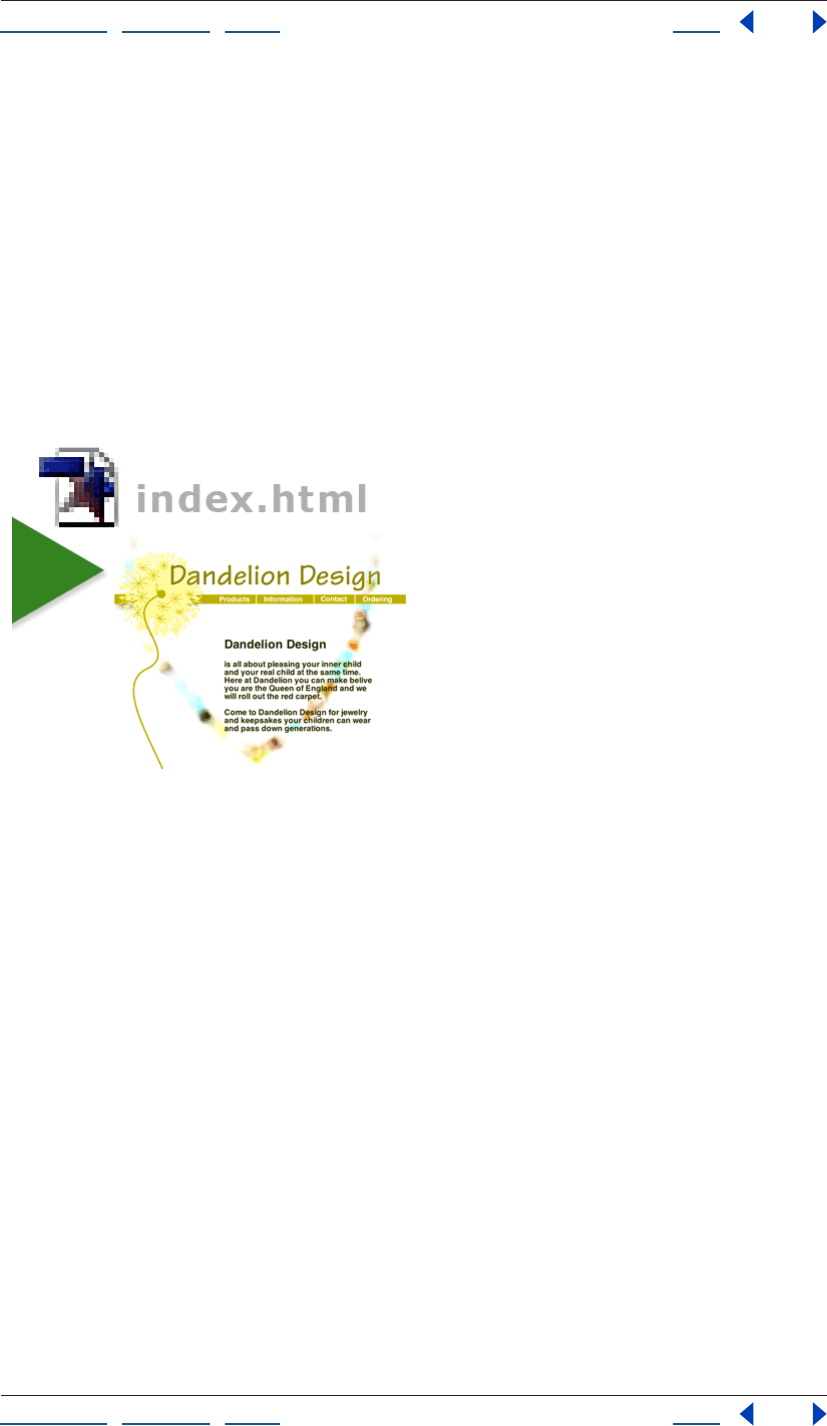
GoLive creates a project folder on your hard drive. This folder contains the site’s project
file, a web-content folder, which contains an index.html file, a web-data folder, and a web-
settings folder, which GoLive uses to manage the site and its assets.
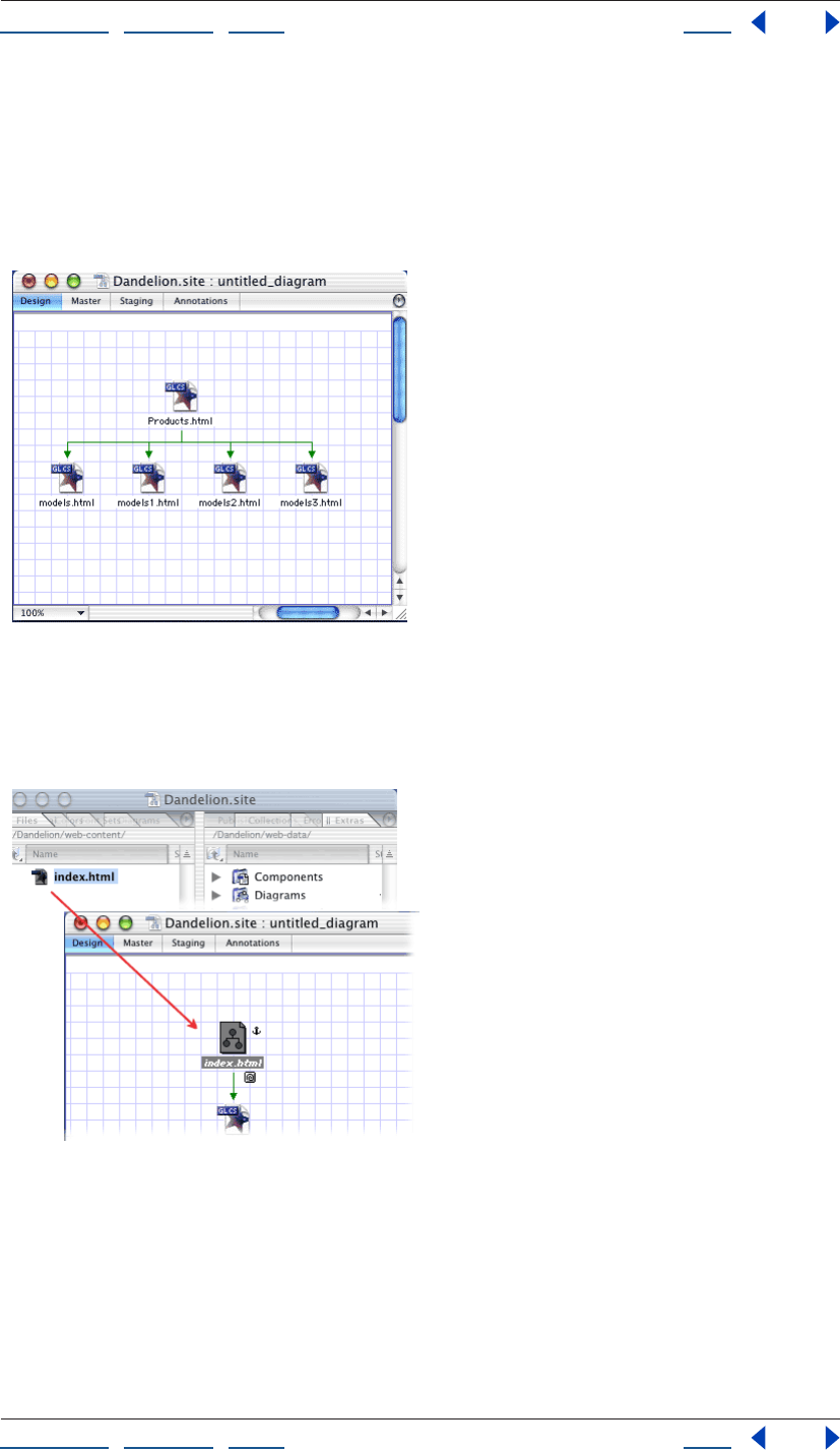
2. Create a diagram and add a page.
With the site window active, choose Diagram > New Diagram to create a new diagram.
Drag a Page icon from the Diagram set of the Objects palette to the design view to add a
new page named untitled.html. Click the page’s name, and then enter a new name, such as
Products.html.
Using Help | Contents | Index Back 13
Adobe GoLive CS Help Tutorials
Using Help | Contents | Index Back 13
3. Add new child pages.
With the page in the design view selected, choose Diagram > New Pages. In the New
Pages dialog box, enter the number of new child pages to create a base filename for the
new pages. For example, enter 4 to create four pages, and then enter Models in the
Filenames text box to add pages named Models.html, Models1.html, Models2.html, and
Models3.html. Click Create.
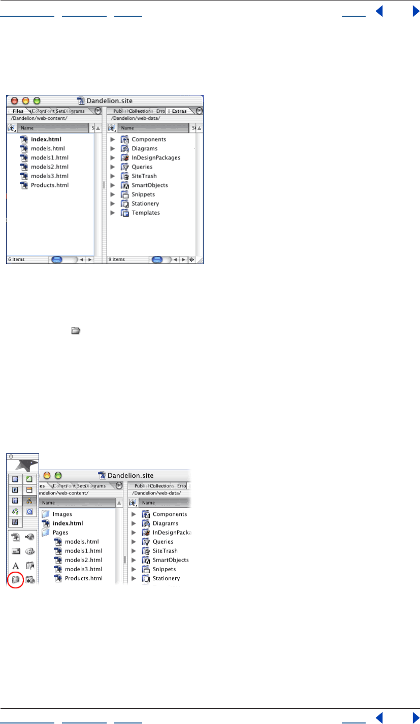
4. Anchor the diagram to a page in the site.
Drag the index.html page from the Files tab of the site window to the design view.
Index.html becomes an anchor page in the diagram and is indicated by an anchor symbol.
Anchoring the diagram specifies the diagram’s location in the site’s hierarchy.
Using Help | Contents | Index Back 14
Adobe GoLive CS Help Tutorials
Using Help | Contents | Index Back 14
5. Submit the diagram to the site.
Choose Diagram > Staging > Submit All. GoLive converts the diagram’s pages to HTML
pages in the site. In the Files tab of the site window, you can see the new pages in the site.
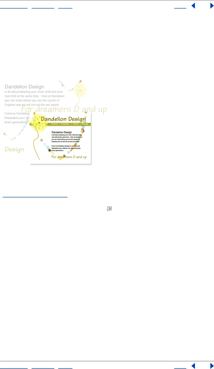
6. Structure the site.
Organize your pages and images in separate folders so that you can keep track of files and
update them easily. With the Files tab of the site window active, click the Create New
Folder button in the toolbar. Rename the new untitled folder Pages. You’ll place all your
HTML pages in this folder. Click in an empty area of the Files tab and click the Create New
Folder button. Rename the new folder Images. You’ll place all your images in this folder.
Select Products.html and its child pages (models.html, models1.html, etc.), and drag them
into the Pages folder (Shift-click to select multiple files).
If your site is very complex, you may want to create subfolders within these folders to
easily organize your files. Whenever you move, rename, or add pages, or create a new
folder in the Files tab, GoLive automatically makes the change in the site’s web-content
folder.
Using Help | Contents | Index Back 15
Adobe GoLive CS Help Tutorials
Using Help | Contents | Index Back 15
Design and lay out a Web page
Adobe GoLive makes it easy to design and lay out visually compelling Web pages. You can
create simple or complex professional-quality Web pages without writing any code.
Once you’ve designed your page, you can save it as a page template. New pages created
from a page template remain linked to the template—when you change the template,
GoLive automatically updates the pages without affecting any content that has been
added to them.
1. Set page dimensions and add a layout grid.
Open a site, and choose File > New Page. (For information about creating a site, see
“Creating a site” on page 46.) Choose 720 from the menu at the bottom right of the
document window to display the current page at 720 pixels wide, the standard width for
17-inch monitors. Drag the Layout Grid icon from the Basic set of the Objects palette to
the page. Type 720 in the Width text box in the Layout Grid Inspector to match the layout
grid to the width of the page.
Using Help | Contents | Index Back 16
Adobe GoLive CS Help Tutorials
Using Help | Contents | Index Back 16
Setting a default page size helps prevent you from adding objects, such as large graphic
banners, that are too wide to display on a standard page. Layout grids let you create table-
based designs without having to deal with rows, cells, and columns. Layout grids automat-
ically lengthen to accommodate the objects you place on them.
2. Add a background color to the page.
Click the Show Page Properties icon in the upper right corner of the document window. In
the Page tab of the Page Inspector, select Background Color and click the lower right
corner of the color field. Choose a background color for your page from the list of
swatches that appear.
You can apply a color or an image to the background of your page to visually enhance it.
Although colors that you choose for page backgrounds override the default colors used
by most Web browsers, viewers can change browser preferences to override your page
background colors. You can also select an image for the page background, but keep in
mind that Web browsers treat the image as a tile and repeat it to cover the entire page.
Using Help | Contents | Index Back 17
Adobe GoLive CS Help Tutorials
Using Help | Contents | Index Back 17
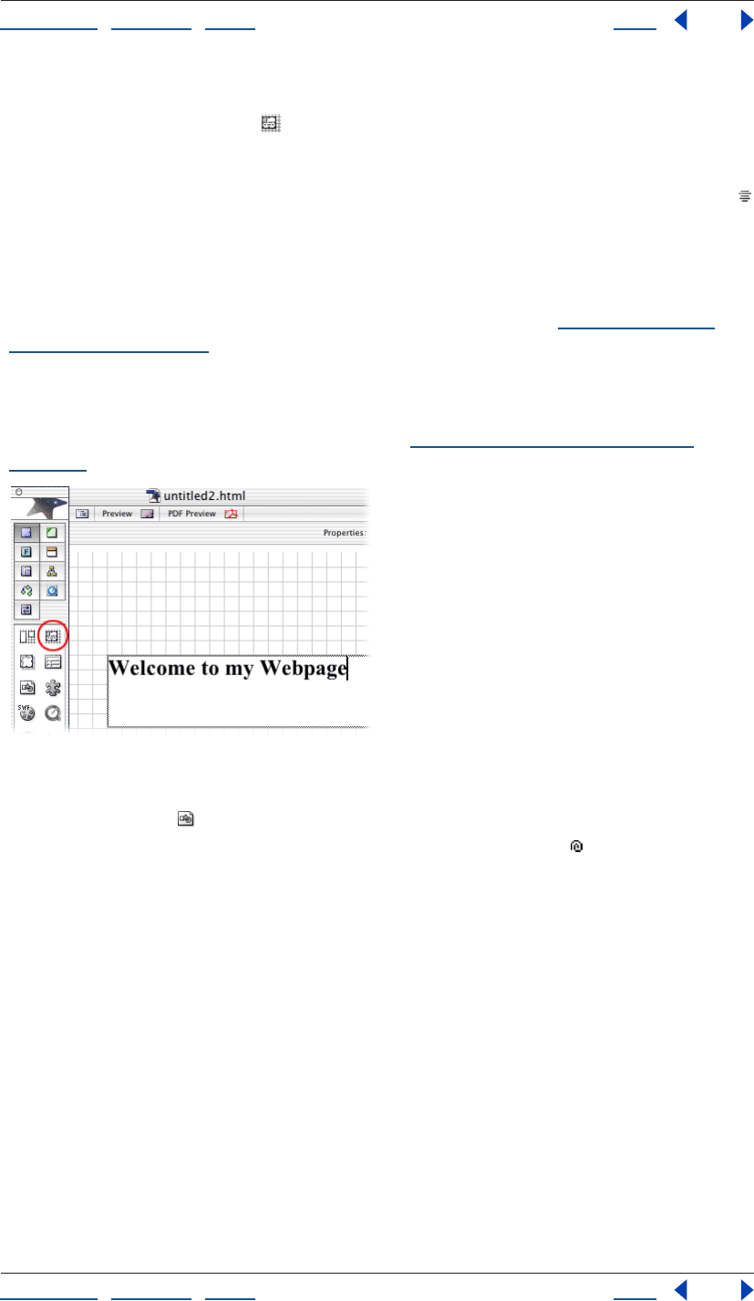
3. Add a text box and format the text.
Drag the Layout Text Box icon from the Basic set of the Objects palette to the layout
grid. Move the pointer over the edge of the text box until it changes into a double arrow,
and then drag until the box is the size you want. Click inside the layout text box to create
an insertion point and type some placeholder text. On the toolbar, click the Align Center
button, and then choose Header2 from the Set Paragraph Format menu.
In GoLive, you can format text in a variety of ways: use paragraph styles, such as Header 1
and Header 2, to format paragraphs; use physical styles, such as Bold and Italic, to
emphasize text; and use structural styles, such as Emphasis and Strong, to both emphasize
and classify text. (For more information about formatting text, see “About formatting
HTML text” on page 185.) You can also apply fonts, type sizes, and color to text using CSS
(cascading style sheets), which contain a set of stylistic rules that describe how HTML
documents should appear to viewers. If you need to update a CSS style, you simply edit
the style rule and all content that hosts the style will automatically reflect the new
properties. For more information about CSS, see “About cascading style sheets” on
page 212.
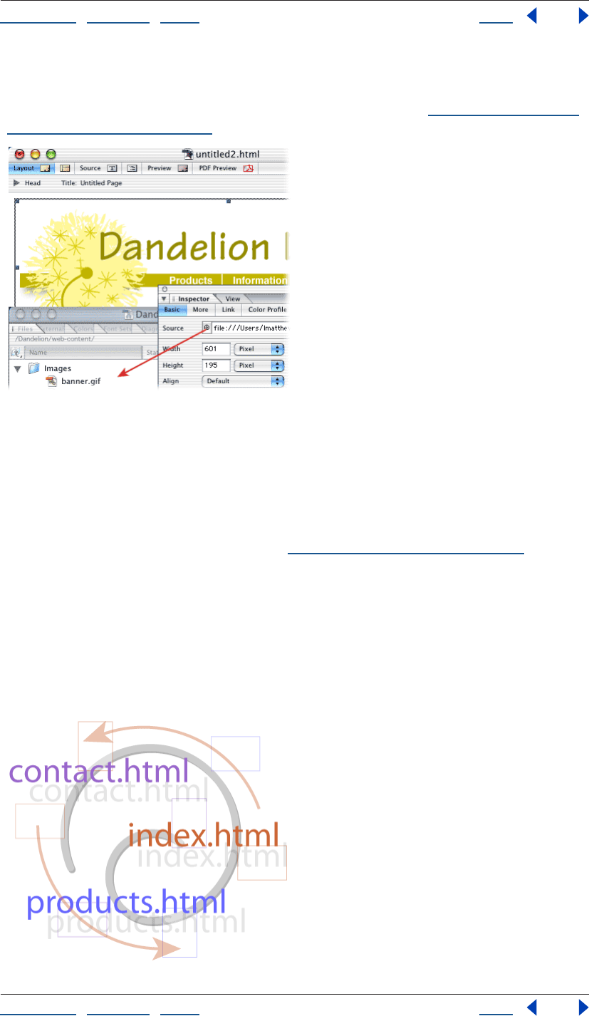
4. Add a pre-optimized image.
Drag an Image icon from the Basic set of the Objects palette to the layout grid. Select
the image object in the document window, and drag the pick whip in the Basic tab of
the Image Inspector to a GIF or JPEG file in the site window. You’ve successfully made the
connection when the line from the pick whip connects with and highlights the filename in
the site window. Don’t worry if you don’t have a GIF or JPEG file in your site: you can link an
image file to the image object in the document window at any time.
Using Help | Contents | Index Back 18
Adobe GoLive CS Help Tutorials
Using Help | Contents | Index Back 18
The standard image formats for the Web are GIF and JPEG. GIF images are typically used
for line art, and JPEGs are typically used for photographs and other images with more than
256 colors. For information about choosing an image format, see “Choosing a format for
optimized images” on page 237,
5. Save the file as a page template.
Choose Save As > Save As Template from the document window menu in the upper right
corner of the document window. Type a name for the template in the Save As dialog box,
and click Save.
Page templates are predesigned page layouts that you can use as the basis for new pages.
When you update a template, you automatically update all pages based on that template.
For more information about templates, see “Using page templates” on page 305.
Create and manage links
In this tutorial you’ll create navigational links from which viewers can jump to other pages
in your site (internal links) or to other sites on the Web (external links).
Adobe GoLive’s powerful site management features make it easy to maintain links
between pages, and because GoLive collects and updates URLs in the External tab of the
site window, you can quickly create links across the Web.
Using Help | Contents | Index Back 19
Adobe GoLive CS Help Tutorials
Using Help | Contents | Index Back 19
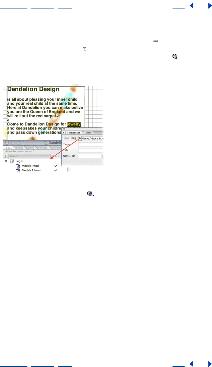
1. Create an internal link.
Open a GoLive site, and then open the page that you want to serve as the source of the
link. Select a short block of text and click the Create Link button in the toolbar. In the
Text Inspector, drag the pick whip to the destination page in the site window.
You can also create internal links by using the Inspector’s Browse button to locate a
page, or by typing the relative path to the page in the Inspector’s URL text box. It’s best,
however, to use the pick whip when creating links to avoid mistakenly linking to pages
outside of the site’s web-content folder.
2. Test the link.
Click the Preview in Browser button in the toolbar to preview the page containing the
link in your Web browser. Click the link and make sure that the destination page appears in
the browser window.
3. Update the internal link.
With the Files tab of the site window active, click the Create New Folder button in the
toolbar. Drag the link’s destination page into the new folder. GoLive displays the Move
Files dialog box, which lists the page that serves as the source of the link, and prompts you
to update the file. Click OK.
Using Help | Contents | Index Back 20
Adobe GoLive CS Help Tutorials
Using Help | Contents | Index Back 20
GoLive updates links in your site when you move or rename files in the site window. To
avoid broken links in your site, perform all such site management tasks in the GoLive site
window, not directly in your site’s web-content folder in Windows Explorer or the Mac OS
Finder.
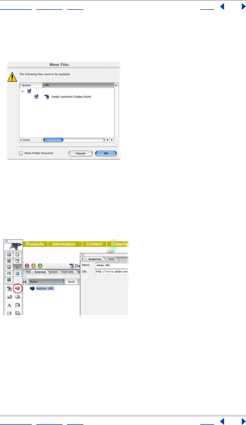
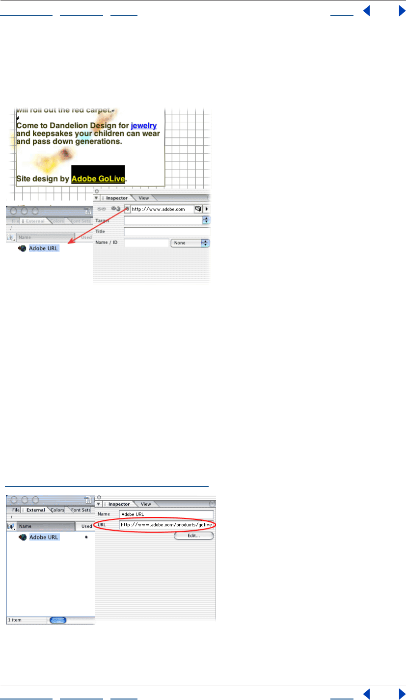
4. Add a URL to the External tab of the site window.
Drag the URL icon from the Site set of the Objects palette to the External tab of the site
window. Rename the untitled URL Adobe URL. Type http://www.adobe.com in the URL
text box of the Reference Inspector.
The External tab of the site window contains URLs and e-mail addresses. Storing a URL in
the External tab is useful when you want to use the URL on more than one page in your
site. If you later need to update a URL in the External tab, GoLive automatically updates it
wherever it appears in the site.
Using Help | Contents | Index Back 21
Adobe GoLive CS Help Tutorials
Using Help | Contents | Index Back 21
5. Create an external link.
Open the page that you want to serve as the source of the link. Select a short block of text,
and click the Create Link button in the toolbar. In the Text Inspector, drag from the pick
whip to the Adobe URL in the External tab of the site window.
6. Test the link.
Click the Preview in Browser button in the toolbar to preview the page containing the link
in your Web browser. Click the link and make sure that the Adobe Web site appears in the
browser window.
7. Update the external link.
Select the Adobe URL in the External tab of the site window. Type http://
www.adobe.com/products/golive/ main.html in the URL text box of the Reference
Inspector, and then press Enter (Windows) or Return (Mac OS). GoLive displays the Change
Reference dialog box, which lists the page that serves as the source of the link, and
prompts you to update the file. Click OK to update the reference.
GoLive provides other tools for updating internal and external links. For example, to edit
links sitewide, use the In & Out Links palette or the Change References dialog box (see
“Editing links and URLs sitewide” on page 124).
Using Help | Contents | Index Back 22
Adobe GoLive CS Help Tutorials
Using Help | Contents | Index Back 22
Create a print-friendly PDF version of a Web page
With GoLive’s PDF features, you can quickly view, edit, and export PDF files. This powerful
functionality lets you easily create interactive PDF forms, archive Web pages, and more.
In this tutorial, you’ll create a print-friendly version of a Web page, while retaining features
such as links and tables.
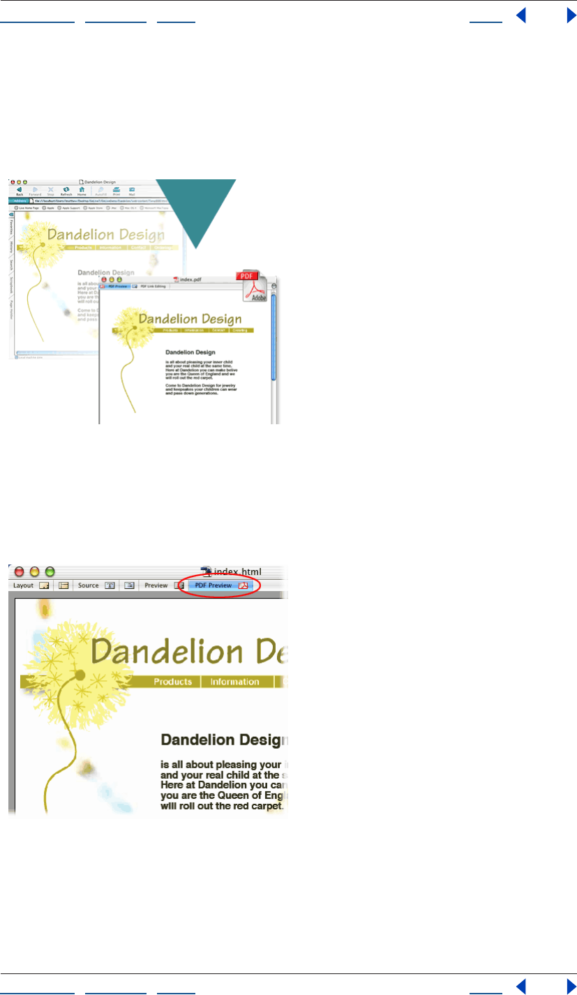
1. Preview as PDF.
In GoLive, open the Web page that you want to export to PDF, and then click the PDF
Preview tab in the document window. If you need to optimize the appearance of items
such as type or tables, click the Layout tab, make the necessary changes, and then return
to the PDF preview to see the results.
Using Help | Contents | Index Back 23
Adobe GoLive CS Help Tutorials
Using Help | Contents | Index Back 23
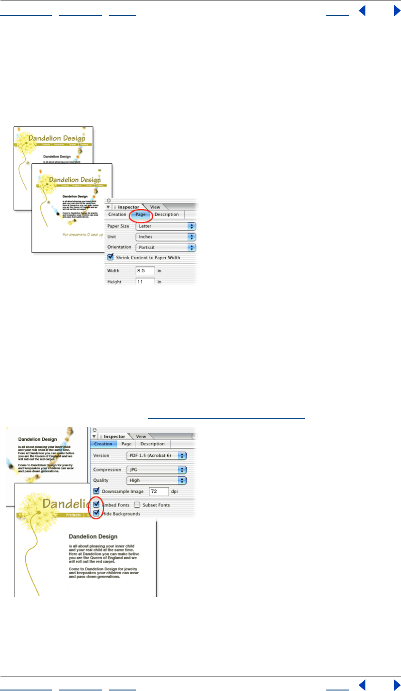
2. Format the pages.
In the PDF Creation Inspector, click the Page tab, and set the paper size, margins, and
orientation. Then select Shrink Content to Paper Width, and click re-create PDF to see the
results.
Shrink Content to Paper Width reduces Web content so it fits on the selected paper size.
3. Optimize for printing.
To ensure that the exported PDF file works well when printed, click the Creation tab and
select Embed Fonts and Hide Backgrounds. Click re-create PDF again to see the results.
Embed Fonts includes fonts in the exported file, ensuring that text always looks as
expected. Hide Backgrounds replaces Web page backgrounds with a white background,
which adds clarity to black-and-white prints. The PDF Creation Inspector contains many
additional options, which you can use to embed multimedia files, optimize file size, and
more. For more information, see “PDF creation options” on page 351.
Using Help | Contents | Index Back 24
Adobe GoLive CS Help Tutorials
Using Help | Contents | Index Back 24
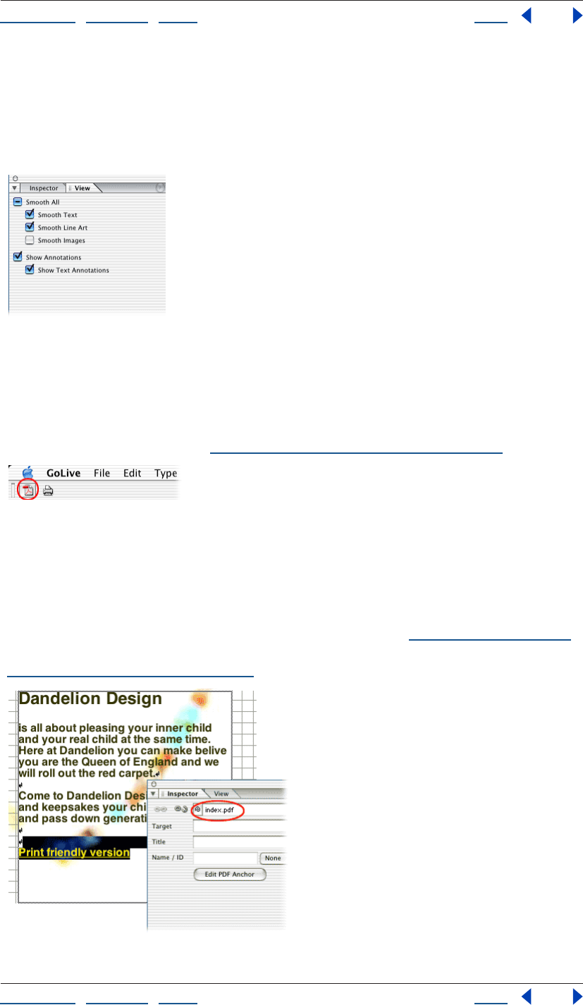
4. Smooth text, line art, and images.
To smooth jagged edges in text, line art, and images, select the appropriate Smooth
options in the View palette.
Smoothing affects only on-screen appearance in Acrobat applications and is especially
effective for large type.
5. Export the PDF file.
Click the Export button in the toolbar, and save the PDF file in your site folder.
If you plan to incorporate PDF files into a site, always save them in the site folder. In that
location, you can manage PDF links with the same site management tools used for HTML
links. For more information, see “Editing links and URLs sitewide” on page 124.
6. Link to the PDF file from the Web page.
Click the Layout tab to edit the Web page, and add the text Print-friendly version in an
appropriate location. Select the text, and link it to the PDF file by using the Text Inspector.
Then save the Web page.
You’ve successfully incorporated a print-friendly PDF into your site. In the future, you can
link from a Web page to specific PDF bookmarks or pages (see “Linking files” on page 61).
You can also link from PDF files to destinations in your site and elsewhere on the Web (see
“Editing PDF link regions” on page 351).
Using Help | Contents | Index Back 25
Adobe GoLive CS Help Tutorials
Using Help | Contents | Index Back 25
Publish a site
Before visitors can view your Web site, you need to transfer it to a publish server (a server
that hosts your site files, such as an FTP server). This tutorial demonstrates how to use
GoLive to transfer your site files to a publish server for the first time. Before you start this
tutorial, contact your Internet service provider (ISP) to determine the settings you’ll need
to access the publish server, including the publish server address, the server’s protocol,
the location of your directory on the publish server, and your user name and password.
GoLive makes it easy to transfer your site to a publish server with the Publish Server tab in
the site window. Once you’ve transferred a site, updating it is easy using modified-item
uploads and synchronized uploads. GoLive takes the guesswork out of determining which
files need updating by comparing the modification dates of local files with those on the
server.
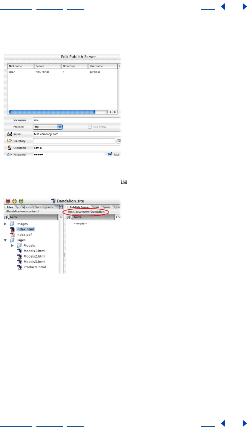
1. Configure a publish server.
Open a site and choose Edit > Server (Windows) or GoLive > Server (Mac OS). Click New in
the Edit Publish Server dialog box and type an easily recognizable nickname for your
server in the Nickname text box (this prevents confusion if you add more than one server
to the list). Choose a protocol from the Protocol menu and fill in the Server, Directory,
Username, and Password text boxes based on the publish server information you
obtained from your ISP; then click OK. Click the Site Settings button on the toolbar, and
choose Publish Server. Click Add and select the server you just configured. Click OK, and
then click OK again to add the server to the site settings.
Using Help | Contents | Index Back 26
Adobe GoLive CS Help Tutorials
Using Help | Contents | Index Back 26
Once you’ve configured a publish server in GoLive, you can use it for any site. If you
change information about the publish server in the Edit Publish Server dialog box, GoLive
updates all sites that use that server.
2. Connect to the publish server.
Click the Connect to Publish Server button in the toolbar. GoLive brings the Publish
Server tab in the site window to the front.
3. Upload a new file.
In the Files tab of the site window, select the file you want to upload and choose Site >
Publish Server > Upload Selection (don’t select the home page of the site—you’ll delete
this file later in the tutorial). GoLive uploads the file and displays it in the Publish
Server tab.
You can use the Publish Server command to upload selected files, all files in your site, or
only new files and files that have been modified locally since the last upload.
Using Help | Contents | Index Back 27
Adobe GoLive CS Help Tutorials
Using Help | Contents | Index Back 27
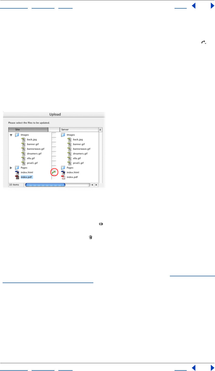
4. Upload a modified file.
In the Files tab of the site window, select and open the file you uploaded in step 3. Make a
change to the file, and then save and close it. Click the Upload Modified Files button on
the toolbar (if the button tool tip reads Upload All or Upload Selection, click the triangle at
the lower right of the button and choose Upload Modified Command from the Change
Button To menu). In the Upload dialog box, note that the file you’ve just modified is
marked with a green arrow, meaning GoLive will upload it to the publish server. Click OK
to perform the modified-item upload.
When GoLive uploads files, it saves the modification time for the local site files and the files
on the server. When you perform a modified-item upload, GoLive compares the modifi-
cation times and transfers only new files and files that have been modified locally since the
last upload.
5. Synchronize all files in the site.
In the Files tab of the site window, select the file you uploaded in step 3, and then click the
Delete Selected Item button in the toolbar. Click Yes to confirm the deletion. Click the
Synchronize with Publish Server button on the toolbar. The Synchronize dialog box
appears and displays files on the local site and on the publish server. The file you deleted
locally is marked with a Delete icon . Click OK to delete the file from the publish server
and synchronize the site.
Synchronizing a site ensures that the local site and the site on the server match. When you
synchronize a site, you can upload files to the publish server, download them from the
server to the local site, skip files completely, or delete them. You can exclude files from
upload by setting their publish state to Never in the File Inspector (see “Assigning publish
states to files and folders” on page 133).
Using Help | Contents | Index Back 28
Adobe GoLive CS Help Looking at the Work Area
Using Help | Contents | Index Back 28
Looking at the Work Area
GoLive basics
The GoLive work area includes the site window (one for every site project), document
windows for each open Web page, and a variety of editors, toolbars, and palettes for
working with everything in your site. Windows can be stacked or tiled on your screen, and
palettes can be grouped, ungrouped, rearranged on the screen, and saved as custom
workspaces.
Dragging and dropping You can drag files around in the site window just like you drag
files on your desktop—but by dragging in the site window, GoLive continually tracks the
files and updates file references in the site accordingly. You can drag files from the site
window into an open Web page to add images, Smart Objects, site assets, or hypertext
links to the page. You can drag text and objects from one page to another, and from one
site to another.
GoLive work area
A. Toolbar B. Objects palette C. Document window D. Inspector E. Library palette F. Site window
Using the Objects palette, you can drag objects representing HTML elements to an open
page. You can drag text and objects from the page into the Snippets tab of the Library
palette for storage with the site or application.
E
C
D
F
B
A
Using Help | Contents | Index Back 29
Adobe GoLive CS Help Looking at the Work Area
Using Help | Contents | Index Back 29
Using the point-and-shoot feature, you can create resource links (between object place-
holders on the page and their source files) or navigational links (between the page and
other pages or URLs) by dragging from the page or the Inspector to destinations in the site
window or another open page. (See “Creating resource and navigational links” on
page 61.)
If a window is hidden behind other windows, you can drag to the Select Window
button on the toolbar to bring the window to the front. When you drag a file or object
to a tab on a window, GoLive brings the tab to the front of the window.
Starting the application When the GoLive application starts, an Intro screen appears by
default that contains options to create a new page or a new site, open a file, or close the
Intro screen. You can deselect the option to show the screen at startup and later reselect
the option in the Preferences dialog box. (See “Setting preferences for opening pages” on
page 42.)
Working with windows, palettes, and menus
When you first start GoLive, several palettes are displayed by default in groups. You can
move palettes between groups or to their own windows, collapse them into tabs on the
side of the screen, arrange them so that multiple palettes share a single title bar, and resize
them to make better use of your work area. You can save the way palettes are displayed as
custom workspaces.
Tabs in the site window and graphical site views behave the same way as palettes; that is,
you can rearrange and organize them into new groups.
The site window (with both panes open), the Objects palette, the toolbar, and the
Inspector should always be open for building, revising, and uploading a site.
Displaying the site and document windows
You can display multiple site and document windows at a time—GoLive keeps track of the
pages with their corresponding sites—so you can easily copy things from page to page
and
site to site.
To display the document window:
Open an XHTML or HTML page, or create a new page.
To display the site window:
Open the site project file (.site).
To collapse the site window to a single pane:
Click the double-arrow button at the bottom of the window. (To expand the site
window to two panes, click the button again.)
To display the head section pane in the document window:
With the Layout tab selected, click the Toggle Head Section icon in the upper left corner
of the document window (next to the Header label).
Using Help | Contents | Index Back 30
Adobe GoLive CS Help Looking at the Work Area
Using Help | Contents | Index Back 30
To display the source code pane in the Layout Editor:
With the Layout tab selected in the document window, click the Show/Hide Split Source
icon in the lower left corner of the window.
Note: You can also display the source code pane in the Frame Editor and Outline Editor.
To display the source code pane on the sides, top, or bottom of the Layout Editor:
Alt-click (Windows) or Option-click (Mac OS) the Show/Hide Split Source icon—each time
you click, the pane moves to a new vertical or horizontal position in the window.
To display an editor or preview:
Click a tab at the top of the document window:
• Click the Layout Editor tab to add content to a document.
• Click the Frame Editor tab to create a frameset and lay out frames that display individual
Web pages.
• Click the Source Code Editor tab to work directly with your document’s source code.
• Click the Outline Editor tab to view source code in a hierarchical, structured view.
• Click the Preview tab to preview your document and test links in GoLive.
• Click the PDF Preview tab to export a Web page to PDF.
Displaying toolbars and rulers
The main toolbar appears below the command menus at the top of your screen. It
contains buttons and pop-up menus that change depending on what you have selected
in the work area. In addition to the main toolbar, the Source Code toolbar is available
when you work with source code in the document window.
Note: The Version Cue toolbar to the right of the main toolbar has buttons that are
available when you use Adobe Version Cue with GoLive. For more information, see
“Working with Adobe Version Cue managed projects” on page 45.
You can display horizontal and vertical rulers in the Layout Editor to help you place and
resize objects on a page with precision. When you place an object, white areas on the
rulers indicate the current position and size of the selected object. When you move the
pointer in the document window, lines in the rulers move along to indicate the current
position of the pointer.
To show or hide the layout rulers:
Choose View > Show Rulers or View > Hide Rulers.
To show or hide the main toolbar:
Choose Window > Main Toolbar. (A check mark next to Main Toolbar in the Window menu
indicates that it is showing.)
To move the main toolbar:
Drag the lower left corner. In Windows, drag the toolbar by its title bar once it’s moved
from its default position below the command menus at the top of your screen.
Using Help | Contents | Index Back 31
Adobe GoLive CS Help Looking at the Work Area
Using Help | Contents | Index Back 31
To show or hide the Source Code toolbar:
Right-click (Windows) or Control-click (Mac OS) the source code in the document window
and choose View > Toolbar from the context menu.
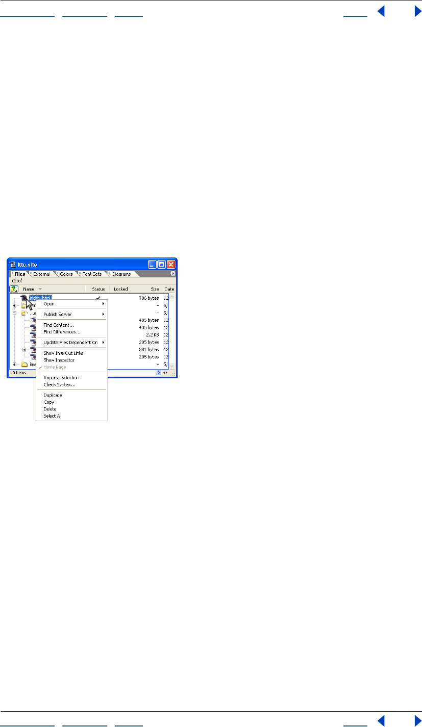
Using context menus
GoLive contains a number of context-sensitive menus that display commands relating to
the active window or selection. You can use these context menus as a quick way to choose
commonly used commands.
To use a context menu:
1 Position the pointer over the active window or selection.
2 Do one of the following:
• In Windows, click with the right mouse button.
• In Mac OS, hold down the Control key and click.
Context menu for selected file
Displaying palettes
GoLive palettes are listed in the Window menu. A check mark next to the palette’s name
indicates that the palette is showing at the front of its group.
To show a palette and any palettes in its group:
Choose the palette’s name from the Window menu. (To hide the palette and its group,
choose the name again from the Window menu.)
To bring a palette to the front of its group:
Do one of the following:
• Click the palette’s name in the group.
• Choose the palette’s name from the Window menu.
To hide all palettes:
Choose Window > Workspace > Hide Palettes.
Using Help | Contents | Index Back 32
Adobe GoLive CS Help Looking at the Work Area
Using Help | Contents | Index Back 32
To return palettes to their default sizes and positions:
Choose Window > Workspace > Default Workspace.
Note: The Default Workspace command restores only the default palettes (the Inspector
and the Objects, Color, Swatches, CSS, Layers, Table, Library, and View palettes). GoLive
will close any other open palettes.
To display the Objects palette horizontally:
In the Objects palette, click the Toggle Orientation button . Click the button again to
return the palette to vertical orientation.
Note: When the Objects palette is displayed vertically, its palette menu is in the lower right
corner, next to the Toggle Orientation button.
Rearranging palettes or tabs
All palettes can be moved from one group to another, rearranged within their group, or
separated into windows of their own. In addition, you can move and separate the tabs in
the site window, navigation view, and links view.
You can dock palettes so that multiple palettes share a single title bar. You can collapse
and expand docked palettes.
GoLive palettes
A. Grouped palettes B. Docked palettes C. Collapsed palettes
To move a palette or tab between groups:
Do one of the following:
• Drag the palette’s name in a group to another group.
• Drag the tab’s name from one pane to another in the site window or from the site
window to a graphical site view window (navigation or links view).
A
B
C
Using Help | Contents | Index Back 33
Adobe GoLive CS Help Looking at the Work Area
Using Help | Contents | Index Back 33
• Drag the Navigation tab or the Links tab to a pane in the site window.
Note: You can move the Objects palette into another group only when it is displayed
horizontally.
To move a group of palettes or tabs:
Drag the title bar of the group window.
To dock palettes:
Drag the palette’s tab to the bottom of another palette until the bottom of the target
palette is highlighted.
Note: You can dock the Objects palette only when it is displayed horizontally.
To move a docked group of palettes:
Drag the group’s title bar.
To move a palette or tab so that it appears in its own window:
Drag the palette’s name or tab’s name away from the group or site window.
To bring a tab to the front of its group in the site window:
Do one of the following:
• Click the tab.
• Choose the tab from the site window’s menu.
• Drag an appropriate item to the tab, pause while the body of the tab comes to the front,
and then continue dragging into the body itself. (For example, drag formatted text to
the Fonts tab, pause, and continue dragging into the body of the tab.)
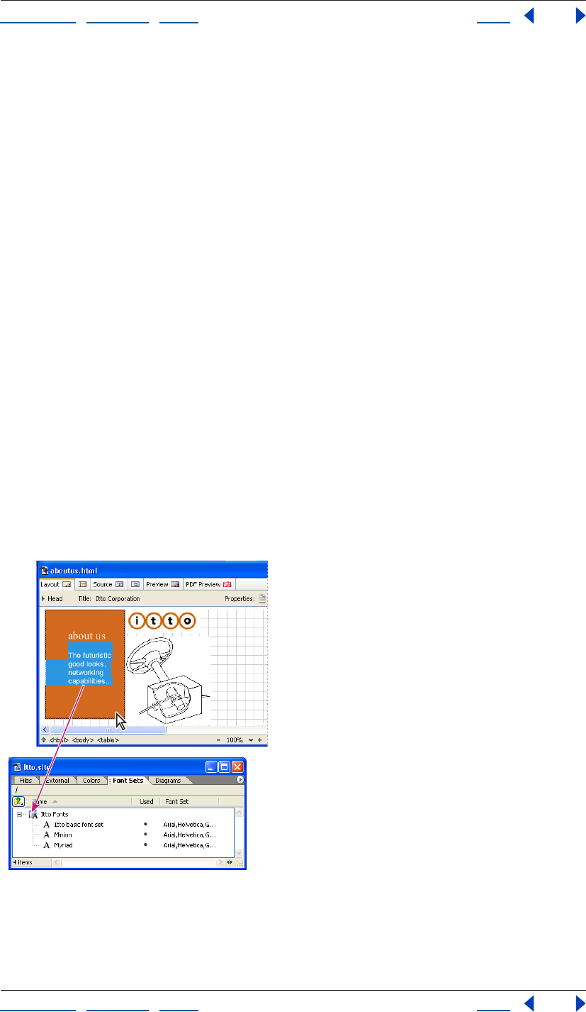
Pausing with the pointer on the Font Sets tab brings the body of the tab to the front.
Using Help | Contents | Index Back 34
Adobe GoLive CS Help Looking at the Work Area
Using Help | Contents | Index Back 34
To rearrange palettes and tabs within a group:
Drag the palette or tab name to a new position. (For example, drag a palette to the right of
another palette in its group, or drag a tab in the site window to the left of another tab in its
group.)
Collapsing palettes into side tabs
You can collapse palettes into tabs on the side of the screen to optimize desktop space,
and then quickly slide them open by clicking the tabs. Clicking the tab again collapses the
palette.
Note: You can collapse the Objects palette into a side tab only when it is displayed
horizontally.
To collapse a palette into side tabs:
Select the palette’s name and drag it to the left or right side of your computer screen.
Note: In Mac OS, you cannot drag the palette to the side of the screen that contains
the Dock.
To slide open or close the collapsed palette:
Click the side tab.
To separate the collapsed palette from the screen edge:
Drag the tab out to the center of your screen or into a palette group.
To collapse multiple palettes into a side tab:
Collapse a palette, and then drag another palette’s tab over the tab of the collapsed
palette on the edge of the screen.
To adjust the size of a collapsed palette:
Drag the bottom of the palette up or down.
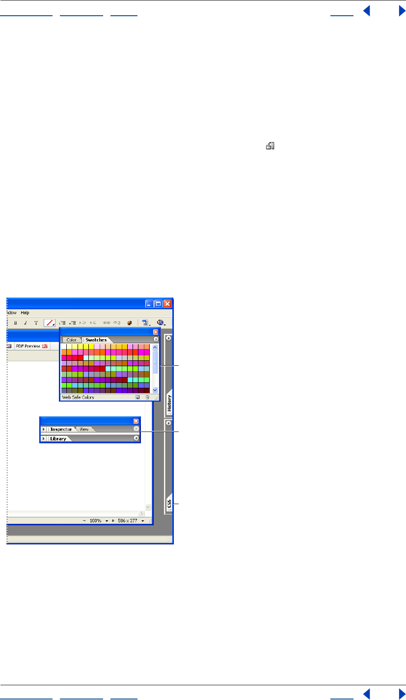
Using palette and window menus
GoLive palettes and windows include a menu in the upper right corner that displays
options specific to the palette or window. For example, the Color palette menu contains
options that correspond to the color set buttons across the top of the palette. (See “Using
the Color palette” on page 67.)
To use a palette or window menu:
Click the triangle in the upper right corner of the palette or window, and choose an
option from the menu that appears.
Arranging windows and editors
You can arrange document windows, site windows, graphical site view windows, and
editors horizontally, vertically, or in cascading order. GoLive fits the windows and editors
side by side on the screen (starting new rows or columns as necessary) or stacks them on
top of each other with just their edges showing.
To tile or stack all open windows or editors on the screen:
Choose Tile Horizontally, Tile Vertically, or Cascade from the Window > Cascade and
Tile menu.
Using Help | Contents | Index Back 35
Adobe GoLive CS Help Looking at the Work Area
Using Help | Contents | Index Back 35
Switching between windows or editors
GoLive provides several methods to switch between multiple document windows, site
windows, site design windows, and editors open on your desktop.
To switch to an open window or editor:
Do one of the following:
• Click the desired window or editor to select it.
• Choose the desired window or editor from the bottom of the Window menu.
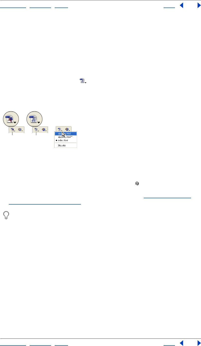
• Click the Select Window button on the toolbar to toggle between the foremost
window or editor and the site window.
• Choose the desired window or editor from the Select Window button’s pop-up menu
on the toolbar.
Different states of the Select Window button
A. Click to return to document window.
B. Click to return to site window.
C. Press and hold to display a list of open windows or editors.
• When you’re creating a reference link, drag the pick whip to the Select Window
button on the toolbar to open the pop-up menu and bring a window to the front, and
then continue to drag to the destination in the window. (See “Specifying the desti-
nation URL for a link” on page 62.)
If a window or editor is off-screen and not visible (for example, if you changed your
monitor’s resolution or dragged the window or editor off the screen edge), choose
Window > Cascade to return the window or editor to view.
Saving custom workspaces
You can save the current sizes and positions of palettes on the screen as custom
workspaces. This is useful for working on different types of pages, such as regular Web
pages or pages with Cascading Style Sheets, which require different palettes to be visible.
The names of workspaces appear in a Workspace submenu of the Window menu. You can
edit the list of names by adding, renaming, or deleting a workspace.
To save a custom workspace:
1 Open, close, resize, and arrange the palettes as desired on the screen.
2 Choose Window > Workspace > Save Workspace.
3 Do one of the following:
• Type a name for a new workspace in the text box.
• Choose the name of an existing workspace to replace from the pop-up menu.
4 Click OK.
AB
C
Using Help | Contents | Index Back 36
Adobe GoLive CS Help Looking at the Work Area
Using Help | Contents | Index Back 36
To use your custom workspace:
Choose it from the Window > Workspace submenu.
To edit the list of custom workspaces:
1 Choose Window > Workspace > Manage Workspaces.
2 Select a name in the list of workspaces and do any of the following:
• Click the New Workspace button to add a new workspace.
• Type a new name in the text box and press Enter or Return.
• Click the Remove Selected Workspaces button to remove the selected name.
3 Click OK.
Reverting and restoring changes to pages
When designing your Web page, you can use the History palette or menu commands to
revert to a previous state of a page or site. The History palette records the changes that
you make to a page in the Layout Editor or Source Code Editor and changes you make to
files in the site window. Each time that you make a change, the new state of the page or
site is added to the History palette. You can revert to a previous state of the page or site by
selecting any state in the History palette. Once you’ve reverted to a previous state, you can
restore changes that you made to that state by choosing a newer state in the History
palette.
Using the History palette
You can set the maximum number of states that the History palette displays for a page or
site (20 states by default). When you switch between open documents or site windows,
the contents of the History palette adjust accordingly. However, the content is cleared and
you lose the information when you click a different tab in the document window.
To use the History palette:
1 Choose Window > History.
The History palette lists the previous states of the document, with the oldest state at the
top of the list and the newest state at the bottom.
2 In the History palette, click the state of the document to which you want to revert.
3 To restore the changes that you made to that document state, choose a newer state in
the History palette. (The newer states of the document are dimmed.)
In Mac OS, press Shift+Command+Z to restore the changes that you made to a
document state incrementally.
To set the maximum number of states listed in the History palette:
In the History palette, choose History Options from the palette menu, enter a number
between 1 and 1600 in the Maximum History States text box, and click OK.
To clear the History palette of all states:
In the History palette, choose Clear History from the palette menu.
Using Help | Contents | Index Back 37
Adobe GoLive CS Help Looking at the Work Area
Using Help | Contents | Index Back 37
Using the Undo, Redo, and Revert to Saved commands
As an alternative to using the History palette, you can undo or redo a change that you’ve
made to a page using the Undo and Redo commands. Some palette menus contain the
Undo and Redo commands, such as the HTML Styles palette menu. You can also undo all
changes by reverting to the state of your page when you last saved it.
To use the Undo, Redo, and Revert to Saved commands:
1 To undo an action, do one of the following:
• Choose Edit > Undo. The menu command describes the last action you performed. Each
time you choose the command from the menu and undo the action, the description
changes to match what has now become the last action you performed. When no
actions remain, the menu command is dimmed.
• Choose Undo from the palette menu.
2 To redo the action, do one of the following:
• Choose Edit > Redo. The menu command describes the last action that you can redo.
Each time you choose the command from the menu and redo the action, the
description changes to match what has now become the last action you can redo.
When all of the actions are redone, the menu command is dimmed.
• Choose Redo from the palette menu.
3 To revert to the way the page was when you last saved it, choose File > Revert to Saved.
Previewing files
You can preview your Web pages and test your links directly in GoLive. You can also
preview QuickTime movies, animated GIFs, or any other plug-in media items that GoLive
supports. Using the Live Rendering window, you can preview changes you make in the
Layout Editor on the fly. Layout preview approximates what your page looks like when it’s
finally published on the Web.
You can also preview PDF files you create or open in GoLive. (See “Exporting Web
pages to PDF” on page 349.)
In addition to previewing your page in GoLive, you should always preview it using a
variety of browsers, browser versions, and platforms. You’ll need to use browsers to
determine potential browser differences and to preview JavaScript, DHTML, or other items
for which GoLive doesn’t provide native support. If desired, you can start a browser such as
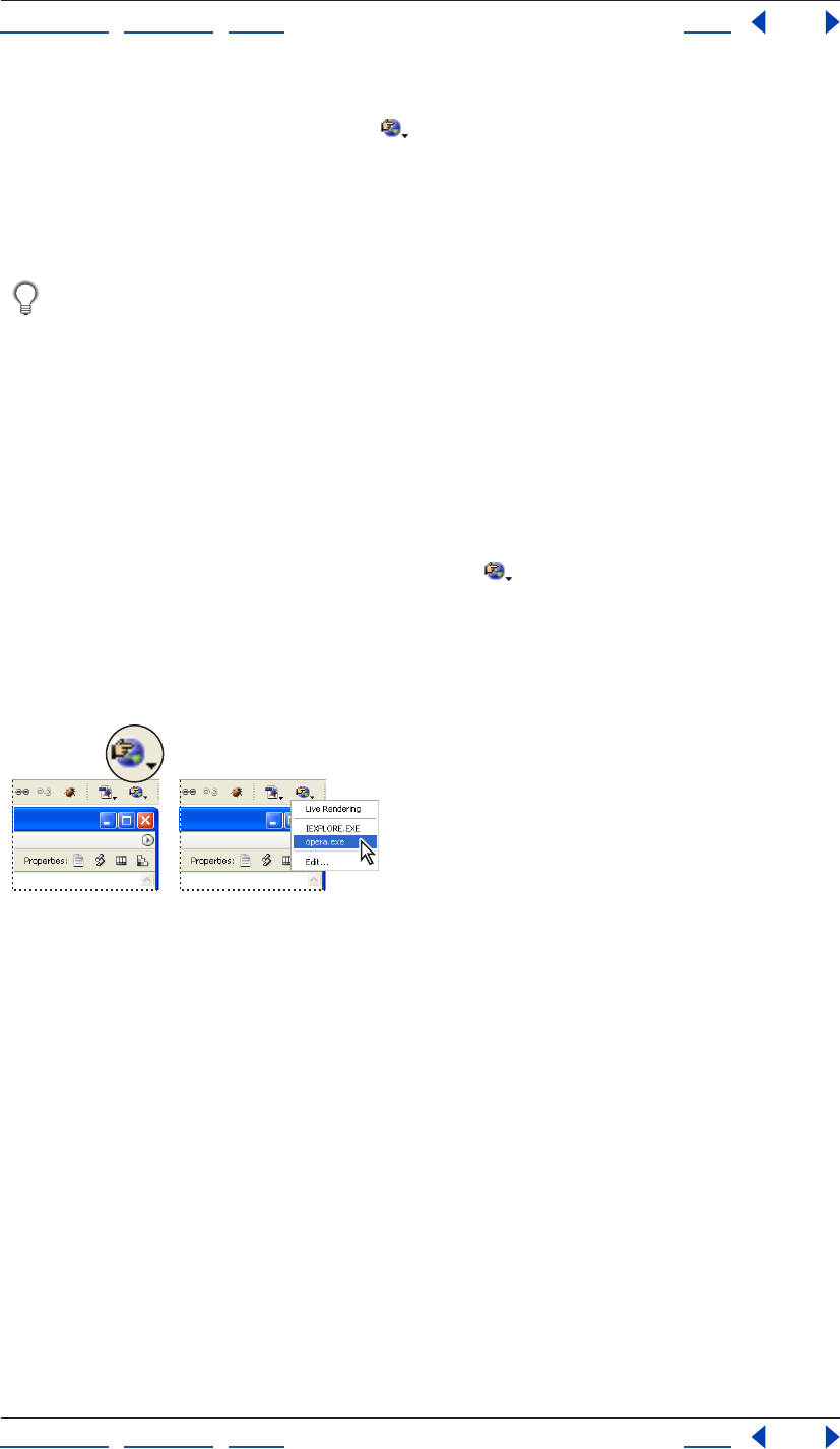
Safari, Opera, Netscape Navigator, or Microsoft Internet Explorer, from within GoLive by
first adding it to the Preview in Browser menu in the toolbar.
You can also view a browser simulation of your page in the Layout Editor by choosing
the profile of a specific Web browser in the View palette. (See “Setting view options for
page layout” on page 55.)
To preview your page in Layout Preview:
1 Make sure that Preview Mode is activated in the Modules Preferences: Choose Edit >
Preferences (Windows) or GoLive > Preferences (Mac OS), select Modules in the left pane
of the Preferences dialog box, select Preview Module in the right pane, and click OK.)
2 Click the Preview tab in the document window.
Using Help | Contents | Index Back 38
Adobe GoLive CS Help Looking at the Work Area
Using Help | Contents | Index Back 38
3 To check your page layout, scroll the document window. To test your links, click all of
the hot spots on your page. GoLive opens each referenced page in either the Preview
pane or in its own window.
Note: To use Layout Preview in Adobe GoLive for Windows, you need Microsoft Internet
Explorer installed on your computer.
To preview your page in Live Rendering:
1 Do one of the following:
• Open the page you want to preview and choose File > Preview In > Live Rendering.
• Choose File > Preview In > Live Rendering, and use the pick whip or click the Browse
button to open a page.
• Choose File > Preview In > Live Rendering, choose Load from the Live Rendering
window menu, and then select a page in the Choose File to Render dialog box.
Changes you make in the Layout Editor are reflected in the Live Rendering window after
you click in the Live Rendering window. If you have multiple document windows open,
the Live Rendering window previews the currently selected document.
To set Live Rendering window options:
Choose one of the following from the Live Rendering window menu:
• Choose Load to open a file from the Choose File to Render dialog box.
• Choose Reload to reflect changes you’ve made in the Layout Editor (use this option if
you’ve deselected Auto Update).
• Choose Auto Update to ensure that the Live Rendering window displays changes you
make in the Layout Editor when you click in the Live Rendering window (this option is
selected by default). If Auto Update isn’t selected, you’ll need to choose Reload after
you make a change in the Layout Editor.
• Choose Bound to bind the Live Rendering window to a specific document: select the
open document you want to preview, and then choose Bound from the Live Rendering
window menu.
To set up preferences for previewing in browsers:
1 Make sure that each browser is installed on your hard disk and that all plug-ins you
need for previewing are placed in the browser’s Plug-ins folder (or any other location your
browser uses for multimedia extensions).
2 Choose Edit > Preferences (Windows) or GoLive > Preferences (Mac OS), and click the
Browsers icon in the left pane of the Preferences dialog box.
3 Do one of the following:
• To add all browsers on your hard disk to the browser list, click Find All.
• To add a single browser, click Add. Then select the browser, and click Open (Windows),
or click Add and then click Done (Mac OS).
Using Help | Contents | Index Back 39
Adobe GoLive CS Help Looking at the Work Area
Using Help | Contents | Index Back 39
4 Select one or more browsers in the scrolling window that you want to be started when
you click the Preview in Browser button on the toolbar or choose File > Preview In >
Default Browser.
Note: Most browsers only allow you to open one version at a time. For example, you can
open Netscape Navigator and Microsoft Internet Explorer at the same time, but not
Netscape Navigator 4.0 and 7.0.
When two or more types of browsers are selected in the Browsers preferences, such as
Navigator and Internet Explorer, a generic browser icon appears on the toolbar. When
only a single type of browser is selected, such as Navigator 4.0, the program icon of that
browser appears on the toolbar.
5 To delete a browser from the scrolling window, select it and click Remove.
6 Click OK.
To preview your page in a browser:
Do one of the following:
• To preview the page in the browser or browsers that you have selected in the Browsers
preferences, click the Preview in Browser button on the toolbar, or choose File >
Preview In > Default Browser.
• To preview the page in a single browser that you’ve set up in the Browsers preferences,
choose the browser from the Preview in Browser menu on the toolbar. Or, choose a
browser from the File > Preview In submenu.
Preview in Browser button and pop-up menu
Getting information about documents
The Document Statistics dialog box displays information about Web pages, while the File
Info command provides metadata about a file—when, how, and by whom it was created.
The File Info command works only on non-HTML files, such as files in PDF and JPEG
formats.
Using Help | Contents | Index Back 40
Adobe GoLive CS Help Looking at the Work Area
Using Help | Contents | Index Back 40
Using the Document Statistics dialog box
You can use the Document Statistics dialog box to view general information about your
Web page, including its byte size, word count, character count, and the approximate time
it takes to download. Note that the byte sizes listed don’t include media, such as
QuickTime or sound (because they may be set to start playing before they are fully
downloaded). In addition, the download times listed are only rough estimates based on a
well-defined set of circumstances. External conditions, such as heavy traffic on the
network and Web server overload, may substantially change the real time it takes to
download the page.
You can create a query for more detailed information, such as the download time for
everything that makes up the page (images, QuickTime movies, and so on.). (See
“Generating queries” on page 129.)
To view information for the current page:
Choose Special > Document Statistics. When you have finished viewing the document
information, click OK.
Adding metadata to documents
File information—also called metadata—is increasingly important in all types of
publishing. Metadata preserves information about the contents, copyright status, origin,
and history of documents, and can be used to search for files.
You can add file information to any site file, except HTML files. The information you add is
embedded in the file using XMP (eXtensible Metadata Platform). XMP facilitates the
exchange of metadata between Adobe applications and across publishing workflows. For
example, you can save metadata from one file as a template, and then import the
metadata into other files.
Companies can use the XMP Software Development Kit to customize the creation,
processing, and interchange of metadata. For example, the XMP SDK can be used to
add fields to the File Info dialog box. More information on XMP and the XMP SDK is
available on the Adobe Solutions Network.
To add metadata to a document:
1 Choose File > File Info.
2 Select a category from the list on the left side of the dialog box, enter the desired infor-
mation, and click OK.
• Description to specify information about the document, such as title, author,
description, and keywords that can be used to search for the document. To specify
copyright information, select Copyrighted from the Copyright Status menu. Then enter
the copyright notice string and the URL of the person or company who owns the
copyright.
• Origin to provide information on the history of the artwork. To enter the current date in
a short text format, click Today. For Credit, enter the information needed in the credit
line for a copyrighted image. Transmission Reference provides the Associated Press
with information on the original transmission location of the artwork. For Urgency,
specify the editorial urgency of the file—not its handling priority.
Using Help | Contents | Index Back 41
Adobe GoLive CS Help Looking at the Work Area
Using Help | Contents | Index Back 41
• Advanced to view the XMP data for the file in a structured format.
• Raw Data to view the raw XMP data for the file.
To save metadata as a template:
1 Click the triangle icon at the top of the File Info dialog box, and choose Save
Metadata Template.
2 Enter a template name, and click Save.
To save metadata to an XMP file:
1 In the Advanced section of the File Info dialog box, click Save.
2 Type a filename, choose a location for the file, and click Save.
To import metadata into a document:
Do one of the following:
• Click the triangle icon at the top of the File Info dialog box, and choose a template name
from the top section of the pop-up menu. The metadata from the template will replace
the current metadata. To append the current metadata instead, hold down Ctrl
(Windows) or Command (Mac OS) when you choose the template name.
Note: You must save a metadata template before you can import metadata
from a template.
• In the Advanced section of the File Info dialog box, click Replace to replace the current
information with information stored in an XMP file. Locate the XMP file containing the
metadata you want to import, and click Open.
• In the Advanced section of the File Info dialog box, click Append to add information
stored in an XMP file to the current file information. For each File Info field, if the field
does not contain information then it will be updated with contents from the file.
Keywords will always be appended with the information from the file.
To delete a metadata template:
1 Click the triangle icon at the top of the File Info dialog box, and choose Delete
Metadata Template.
2 Select the name of the template you want to delete, and click Delete.
To show the location of metadata templates:
Click the triangle icon at the top of the File Info dialog box, and choose Show Templates.
Magnifying and reducing a document
You can magnify the contents of the document window to precisely place and align page
elements. Likewise, you can reduce magnification to view the overall layout of a page.
To magnify or reduce a document:
Do one of the following:
• Click the Zoom In button or the Zoom Out button at the bottom of the document
window, or choose View > Zoom In or View > Zoom Out.
Using Help | Contents | Index Back 42
Adobe GoLive CS Help Looking at the Work Area
Using Help | Contents | Index Back 42
• Choose a magnification value from the Zoom Values menu at the bottom of the
document window, or choose a value from the View > Zoom To menu.
• Choose Edit from the Zoom Values menu at the bottom of the document window, enter
a zoom value percentage in the Zoom To dialog box, and then click OK.
Referencing files
GoLive provides several methods for referencing, or specifying, files in the Inspector, the
CSS Editor, and various palettes. You can use any of these methods to reference items such
as link destinations, external style sheets, or source files for image placeholders.
To reference a file:
In the Inspector, CSS Editor, or palette, do one of the following:
• Enter the path to the file in the text box.
• Drag the pick whip to a file in a site.
• Click the Browse button , and then locate and select the file.
• Choose a recently referenced file, an HTML file, an image, a URL, or an anchor from the
pop-up menu to the right of the Browse button.
Setting preferences
Numerous program settings are stored in the GoLive preference file, located in the Appli-
cation Data/Adobe/Adobe GoLive folder (Windows) and the Mac OS X/Users/[username]/
Library/Preferences folder (Mac OS). You can change most of the program settings using
the Preferences dialog box, giving you control over the way GoLive looks and behaves. For
example, you can set display options, options for importing images, options for activating
modules, options for selecting default Web browsers that you start from GoLive, and
spelling checker options.
Some application preferences that you set in the Preferences dialog box also appear in the
Site Settings dialog box (such as URL Handling options) and can be overridden by settings
you make for a specific site. (See “Specifying preferences and settings for Web sites” on
page 91.)
To set options in the Preferences dialog box:
1 Choose Edit > Preferences (Windows) or GoLive > Preferences (Mac OS).
2 Select an icon or name in the left pane of the Preferences dialog box. If needed, click the
triangle or + symbol next to the icon to display a list of names below the icon.
3 Select options in the right pane of the Preferences dialog box. To find an explanation of
a particular preferences option or set of options, refer to the index.
4 Click OK. The new settings take affect the next time you start GoLive.
Setting preferences for opening pages
You can set General preferences for automatically opening a new page when the GoLive
application starts, and you can set which tab in the document window (such as the Source
tab) is selected when the page opens.
Using Help | Contents | Index Back 43
Adobe GoLive CS Help Looking at the Work Area
Using Help | Contents | Index Back 43
You can also set a preference to base new pages on an existing page or template. This is
useful when you’re setting up pages for your site. For example, you can set up a page with
the page title, margins, and background that you want for all the pages, and set a
preference to use this page whenever GoLive creates a new page. (See “Setting up pages”
on page 53.) To store the page with your site, save it as stationery. (See “Using stationery”
on page 312.)
To set General preferences for opening pages when GoLive starts or creates a
new page:
1 Choose Edit > Preferences (Windows) or GoLive > Preferences (Mac OS).
2 Select General in the left pane of the Preferences dialog box.
3 In the right pane of the Preferences dialog box, choose one of the following options
from the At Launch menu to customize the behavior of GoLive when it starts:
• Create New Page to create and open a new untitled document.
• Show Welcome Screen to prompt you to create a new page or site, or to open an
existing file.
• Do Nothing to start GoLive without creating a new document or displaying the
Intro screen.
4 To specify the document window tab in which a page opens, choose it from the Default
Mode pop-up menu.
5 To use an existing file as the basis for new pages that you create in GoLive, select New
Page Template, click the Select button, and select the file. If you also choose Create New
Page from the At Launch menu, GoLive creates a new document based on this file when
you start the application.
6 To add the meta information “<meta name="generator" content="Adobe GoLive ">” to
each file that you create or save, select Write “Generator Adobe GoLive.”
7 Click OK.
Setting user interface preferences
You can set preferences to customize the color of highlighted items, such as text that has
been formatted with a CSS style, and the size and thickness of selection borders and
handles. You can also enable GoLive to start other applications for editing the source files
of media embedded on a page. General User Interface preferences are applied to every
page that you open until you change them.
To set General preferences for the GoLive user interface:
1 Choose Edit > Preferences (Windows) or GoLive > Preferences (Mac OS).
2 Click the symbol next to General to expand the list, and select User Interface.
3 Select Launch Other Applications to Edit Media Files to enable GoLive to start a specific
editing application when you double-click an image or object on your page that’s linked
to an image or media source file, or when you open a source file in the Files tab of the
site window.
Using Help | Contents | Index Back 44
Adobe GoLive CS Help Looking at the Work Area
Using Help | Contents | Index Back 44
For example, GoLive maps the filename extension .psd to the Adobe Photoshop appli-
cation and starts Photoshop when you double-click an image file with that extension. The
file mappings to the editing applications are listed in the Web Settings dialog box. (See
“Using the File Mappings tab” on page 460.)
4 To modify the appearance of resize handles on selection lines, do one of the following:
• Select 3D to add a beveled edge or 2D to add a flat edge to the selection handles.
• To change the color of the handles, click the lower right corner of the color field and
select a color from the swatches that appear, and then click OK.
• To change the size of the handles, choose Large, Medium, or Small from the
pop-up menu.
5 Click OK.
Setting preferences for program modules
The Modules Preferences dialog box lets you disable or enable selected modules and
extend scripts on an as-needed basis— improving the GoLive application’s launch time,
responsiveness, and overall memory requirements. By disabling unused modules, you can
reduce the program’s memory requirements to the minimum recommended 24 MB.
To activate or deactivate program modules:
1 Choose Edit > Preferences (Windows) or GoLive > Preferences (Mac OS).
2 Click the Modules icon in the left pane of the Preferences dialog box.
3 To read a description of a module, select it in the right pane and click the triangle next
to Show Item Information.
4 Click the check boxes to select or deselect modules to activate or deactivate them.
Program modules that are currently installed are checked by default.
5 Click OK.
6 Restart GoLive.
Customizing keyboard shortcuts
You can customize the GoLive set of keyboard shortcuts or a set called My Settings that is
based on the GoLive set. You can also create additional sets of keyboard shortcuts by
copying an existing set and modifying the new set.
For example, you can modify a set to include keyboard shortcuts for the Window >
Workspace > Default Workspace menu command and your other custom workspaces, and
then use the shortcuts to switch between workspaces. (See “Saving custom workspaces”
on page 35.)
Note: My Settings is an editable version of the GoLive set and can be deleted. The GoLive
set cannot be deleted.
To customize a set of keyboard shortcuts:
1 Choose Edit > Keyboard Shortcuts.
2 Do one of the following:
• To modify an existing set of keyboard shortcuts, choose it from the Selected Set menu.
Using Help | Contents | Index Back 45
Adobe GoLive CS Help Looking at the Work Area
Using Help | Contents | Index Back 45
• To create a new set of keyboard shortcuts, click New Set. In the New Set dialog box,
enter a name for the new set, choose an existing set that you want to use as the basis
for your new set, and click OK.
3 To change a keyboard shortcut in an editable set, select the name of a menu command
and enter a new keyboard shortcut in the Press New Shortcut text box. (If the keyboard
shortcut that you entered is currently assigned to another command, the name of the
command appears below.) Then click Assign or Replace to assign the keyboard shortcut to
the selected command.
4 Click OK.
Working with Adobe Version Cue managed projects
Adobe Version CueTM is an innovative set of features designed to increase your productivity
when you work alone or collaborate with others. Version Cue integrates design
management into your existing workflows within and across the Adobe Creative Suite
applications, including Adobe GoLive CS, Adobe Illustrator CS, Adobe InDesign CS, and
Adobe Photoshop CS.
Note: The Version Cue features are compatible only with the Adobe Version Cue
Workspace, which is available only as part of the Adobe Creative Suite.
Version Cue streamlines the following tasks while you work in the Creative Suite:
• Creating file versions
• Maintaining file security
• Organizing files into private or shared projects
• Browsing with file thumbnails, and searching file information and version comments
• Reviewing file information, comments, and file statuses in private and shared projects
while you browse
In addition, you can use the Version Cue Workspace Administration for more
advanced tasks:
• Duplicate, export, backup and restore projects
• View information about projects in the workspace
• Import files to the workspace using FTP or WebDAV
• Delete file versions and remove file locks
• Create project users and define their project privileges
• Restrict access to a specific project
To view the complete Version Cue documentation, see Adobe Version Cue Help. You can
also view the Adobe Version Cue documentation as a PDF or print it by opening the
VersionCueHelp.pdf file located on the Adobe Creative Suite CD and the Adobe GoLive CD.

Using Help | Contents | Index Back 46
Adobe GoLive CS Help Setting up Sites and Pages
Using Help | Contents | Index Back 46
Setting up Sites and Pages
Creating a site
You use the GoLive site wizard to create blank sites, sites based on templates, and sites
based on imported files from other folders or Web sites. To work with sites that were
created in older versions of GoLive (4.0 or earlier) or other Web authoring applications, you
can import them into a new GoLive CS site.
You can use the site wizard to create a single user site (a site on your local computer) or a
Version Cue project site (a workgroup site managed by the Adobe Version Cue Workspace).
For information about Version Cue projects, see “Working with Adobe Version Cue
managed projects” on page 45.
About GoLive sites
When you use the site wizard to create a single user Web site, GoLive creates a site project
file (with the .site filename extension) to manage and control the site contents. GoLive also
creates three folders to hold the Web pages, media files, and other resource files needed
for building and maintaining the site. When you create a blank site, GoLive creates a blank
index.html page and a project folder that contains everything, including the three site
folders and the site project file.
If you name the new site Mysite, the site project file is named Mysite.site. The project folder
is named Mysite and contains the site project file and three folders:
• The web-content folder contains Web pages, image files, external cascading style sheets,
and other source files on the server.
• The web-data folder contains reusable GoLive site assets, such as components and page
template files.
• The web-settings folder stores settings you make in the site window and the Site
Settings dialog box. (See “Specifying preferences and settings for Web sites” on
page 91.)
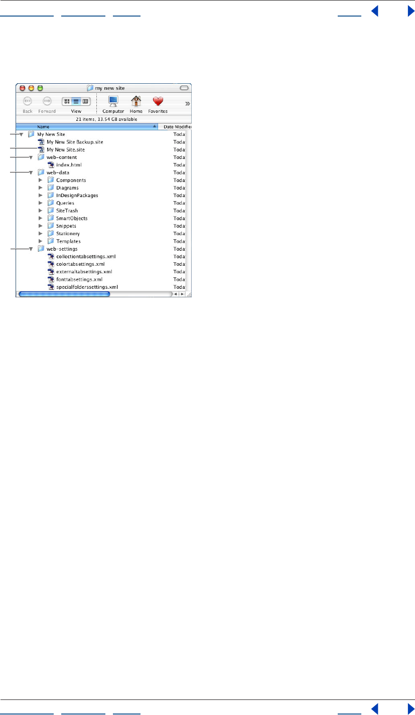
Using Help | Contents | Index Back 47
Adobe GoLive CS Help Setting up Sites and Pages
Using Help | Contents | Index Back 47
The site project file and contents of the web-data and web-settings folders are not
uploaded when you upload the site to the Web server.
GoLive site named “Mysite”
A. Project folder B. Site project file C. Web-content folder
D. Web-data folder E. Web-settings folder
Whether you create the site in Windows or Mac OS, the site project file you create can be
opened and used on both platforms.
Creating a single user site
To create a site on your local computer using the site wizard, you create a single user site.
Based on the name you specify for the new site, GoLive creates the site project file, a site
project folder, and folders for the site’s web-content, web-data, and web-settings files.
To create a single user site:
1 Choose File > New Site to open the site wizard.
2 Select Single User and click Next.
3 Do one of the following:
• Select Blank Site to create a project folder, a site project file, a web-content folder
containing a blank home page named index.html, a web-data folder containing empty
subfolders for resource files, and a web-settings folder.
• Select Import from Folder to create a new site based on a folder of existing files on your
computer. GoLive uses the folder of existing files as the basis for the new site’s web-
content folder, and adds new folders for the site’s web-data and web-settings files. You
are given the opportunity to specify a location for the site project file, name it (which
should always have the .site filename extension), and create a folder to put it in.
Note: Because GoLive uses the folder of existing files as the basis for the new site, you may
want to make a copy to import rather than use the original folder and its contents.
A
C
B
D
E
Using Help | Contents | Index Back 48
Adobe GoLive CS Help Setting up Sites and Pages
Using Help | Contents | Index Back 48
• Select Import from Server to create a new site based on a copy of a site downloaded
from an FTP or HTTP server. (See “Importing sites from remote servers” on page 48.)
• Select Copy from Template to create a new site based on a site template that you
created. (See “Using site templates” on page 321.)
4 Click Next and follow the instructions in the site wizard.
Using sites from previous versions of GoLive
If you used Adobe GoLive 5.0 or 6.0 to create a site, you can open and save the site as a
GoLive CS site. If you used Adobe GoLive 4.0 to create a site, you can import it, and then
save it as a new GoLive CS site.
To open a GoLive 5.0 or 6.0 site:
Open the site in GoLive CS. GoLive automatically updates it to a GoLive CS site, creating a
CS site project file, and backs up the site file.
Note: If you want to archive the entire previous site, not just its site project file, copy it,
archive the copy, and then open the site project file of the original.
To open a GoLive 4.0 site:
1 Choose File > New Site to open the site wizard.
2 Select Single User and click Next.
3 Select Import from Folder.
4 Click Next and follow the instructions in the site wizard.
Importing sites from remote servers
Using the site wizard, you can create GoLive sites based on other sites imported from FTP
or HTTP servers. To import sites from a remote server, you must create a single user site
and download the files to your local hard disk. Once you’ve imported a remote site, you
can create a site locator file that contains the login and character encoding information
necessary to create the site.
Accessing login information
To create sites based on files imported from an FTP server, you need valid account infor-
mation to log on to the server—this includes the name of the server, and your FTP user
name and password. The site wizard gives you the opportunity to change the port
number and to use passive mode if the site is protected by a firewall. To create sites by
importing sites from HTTP servers, you only need access set up to the Internet and a
valid home page URL. See your Internet service provider or system administrator for
login information.
Using advanced URL handling options
If you know the type of character encoding that a site uses for its URLs, you can specify it in
the site wizard before the site is imported. Unicode’s UTF16 and UTF8 encodings cover all
major languages and platforms. % HH Escaping uses hexadecimal encoding notations for
character escaping in URLs (for example, %20 is used to escape spaces, which are not
allowed in URLs). You can also check for case sensitivity in URLs.
Using Help | Contents | Index Back 49
Adobe GoLive CS Help Setting up Sites and Pages
Using Help | Contents | Index Back 49
These advanced URL handling options remain in effect for the new site. After you create
the site, you can change the URL character encoding (but not the URL case sensitive
checking) for the new site in the Site Settings dialog box. To comply with W3C standards,
you should select both URL encoding options. (See “Specifying preferences and settings
for Web sites” on page 91.)
Importing a site from an HTTP server
Using the site wizard, you can import an entire Web site into GoLive including every linked
page that branches out to multiple HTTP servers and every source file (such as images)
referenced by the pages. Because large sites can take a long time to download, you can
restrict the number of page levels in the page-link hierarchy to import.
In addition to the number of page levels, you can select Only Get Pages Under Same Path
to download only the pages that are located in the same folder (or a subfolder) that
contains the home page URL, and Stay on Same Server to download only those pages that
are on the same server as the home page URL. However, whether you select Stay on Same
Server or not, GoLive downloads from other servers any source files referenced by the
pages it downloads.
GoLive imports only the pages on the levels you specify and the source files for images
and other objects on those pages. GoLive converts any remaining page links that go to
other levels into external URLs and lists them in the External tab of the site window. After
you create the site, you can individually download the pages from these external URLs by
choosing Download from a URL’s context menu.
Downloading pages from external links
You can download a page and its source files from an external link. GoLive downloads the
page and the referenced source files (such as images) to the Files tab in the site window.
For information on other ways to download files from a server, see “Downloading a Web
page” on page 333.
To download a page from an external link:
Right-click (Windows) or Control-click (Mac OS) the external link in the External tab in the
site window or in the In & Out Links palette and choose Download from the context menu.
Importing a site from a site locator file
A site locator file describes the location of a site on a remote server and enables you to
quickly import remote sites. It contains all the login and character encoding information
necessary to create the site.
To export a site locator file:
1 Open the site you want to copy.
2 Choose File > Export > Site Locator.
3 Choose a name and location for the site locator file in the Save Site Locator File dialog
box, and then click Save.
To create a site by importing a site locator file:
1 Connect to the Internet.
2 Choose File > Import > New Site from Site Locator.
Using Help | Contents | Index Back 50
Adobe GoLive CS Help Setting up Sites and Pages
Using Help | Contents | Index Back 50
3 Select the site locator file in the Load Site Locator File dialog box, and then click Open.
4 Specify a destination folder for the site files in the Browse for Folder dialog box, and
then click OK.
5 Select files to be downloaded from the server in the Download dialog box, and click OK.
Adding files to a site
You can add Web pages, image files, and other media or resource files to your site and
GoLive keeps track of them in the site window. By dragging existing files from the desktop
(such as Windows Explorer or the Mac OS Finder) into the site window, you can add copies
of the files to the site without moving the original files. Using the site window to add files
to your site is important so GoLive can maintain all the links to pages, resource files, and
site assets.
Creating a new page as part of a site
You can choose File > New Page to create a new Web page that is not related to your site
until you save it in your site. When the site window is open, you can use a variety of
methods to create a new page that is automatically a part of your site.
When you create a new page, GoLive creates an untitled.html file and displays it in the
Layout Editor of the document window.
You can set a GoLive preference to automatically create a new page when the appli-
cation is started and display it in the editor or preview mode of your choice. (See
“Setting preferences for opening pages” on page 42.)
To create a new page as part of a site:
Do one of the following:
• Select the Files tab or Extras tab in the site window and if desired, select a folder listed in
the tab. Then choose Site > New > Page. The new page is added to the bottom of the
list in the tab or in the folder you selected. You can also select a page in the Files tab in
the site window and choose Edit > Duplicate to create a copy of the existing page.
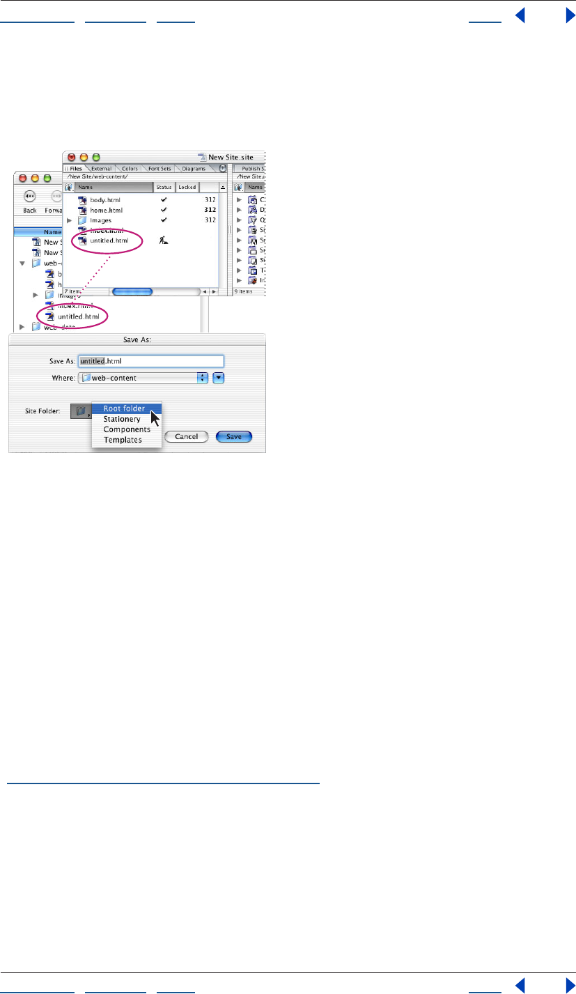
Using Help | Contents | Index Back 51
Adobe GoLive CS Help Setting up Sites and Pages
Using Help | Contents | Index Back 51
• With the site window open, choose File > New Page, and then choose File > Save As. In
the Save As dialog box, name the page, choose Root from the Site Folder menu, and
click Save. The new page is added to the contents of the site’s root folder, which appears
in the Files tab of the site window.
Saving a page in the site’s root folder
Note: The site window must be open, but not necessarily selected, before the Site Folder
menu will appear in the Save As dialog box.
• Drag a generic page icon from the Site set in the Objects palette into the Files tab or
Extras tab of the site window or next to another page in navigation view.
Creating special documents
Using GoLive, you can create documents in a variety of special formats, including XHTML,
QuickTime, Real, and SMIL. You can create a new HTML document based on a page
template or stationery that you’ve set up for the site, or create a text document, cascading
style sheet, or JavaScript file. For information about creating QuickTime, Real, and SMIL
documents, see the Adobe GoLive CS Multimedia Authoring Guide on the Adobe Web site.
Note: When you create a special HTML document, XHTML document, MMS document,
WML Deck, or SMIL document, GoLive automatically adds a doctype declaration to the
source code with a reference to the appropriate Document Type Definition (DTD). (See
“Setting the doctype of a document” on page 383.)
To create a document in a special format:
Choose a format from the File > New Special menu. A special document window or dialog
box opens depending on the format you choose. Consult the index for more information
about special document formats.
Using Help | Contents | Index Back 52
Adobe GoLive CS Help Setting up Sites and Pages
Using Help | Contents | Index Back 52
Adding existing files
To add files from other locations to your site, you can manually move the files into the site
folder on the desktop and update the site window, or you can import or drag the files into
the Files tab in the site window to have GoLive make a copy of them in the site folder and
leave the original files untouched.
Note: When you create a new page, GoLive automatically adds a meta element that
defines the character encoding for text to the head section of the page. If a page does not
contain the element, GoLive displays a dialog box when you open the page so that you
can temporarily use a default encoding or set the character encoding for the page.
To add an existing file to a site:
Do one of the following:
• Drag the file from your desktop into the Files tab in the site window.
• Move the file into the site’s root folder on your desktop. Then select the site window and
click the Refresh View button in the toolbar.
• Select the Files tab in the site window. Then choose File > Import > Files to Site. In the
dialog box, locate and select the desired file, click Add, and click Done. If prompted,
click OK to copy the file and update the site.
For information on importing files as a new GoLive site, see “Creating a site” on page 46.
Unlocking locally locked files
You can use GoLive to unlock files that were locked in the Mac OS Finder or given a Read
Only attribute in the Windows Properties dialog box. If you import a site with locally
locked files, you’ll need to unlock them before you can edit them. If the files are hidden in
Windows Explorer, you need to show them before you can edit them.
Local file locking applies only to the platform where it is applied. For example, if you create
a site in Mac OS and lock its HTML files, the files will not be locked when you upload the
site to a UNIX or Windows server.
Local file locking does not apply to files on a WebDAV server.
To unlock a locked or read-only file:
1 Select the file in the site window.
Note: You can unlock a file with this method only if it shows a padlock in the Locked
column of the Files tab. The padlock indicates that it has been locked in Mac OS or made
read-only in Windows.
2 Click the Show Information in Explorer (Windows) or Show Information in Finder
(Mac OS) button on the toolbar.
3 Do one of the following:
• In Windows, deselect Read-only and click OK.
• In Mac OS, deselect Lock and close the Get Info window.
4 Click the Refresh View button on the toolbar.
Using Help | Contents | Index Back 53
Adobe GoLive CS Help Setting up Sites and Pages
Using Help | Contents | Index Back 53
Setting up pages
Before or after you lay out text and objects on your Web pages, you can set up titles,
margins, and backgrounds for pages, and a window size that you want your page layouts
to fit within. You can add hidden instructions for Web browsers about each document by
dragging elements and scripts into the head sections (for example, keywords that are
used by search engines to find your page).
As you work in the document window, you can set options in the View palette to show or
hide certain screen elements that are hidden on pages in the browser, such as line break
symbols and comments. You can also use the View palette to set up a profile for
previewing a browser simulation of the page layout on a different platform.
Once your page is set up, you can use it as the starting point for other new pages by saving
it as stationery or a page template. (See “About site assets” on page 304.)
Changing the page title
When you create a new blank page (a new HTML or XHTML document), it is automatically
given a title—“Untitled Page.” Web browsers display page titles in their title bar and use
the titles to label a viewer’s bookmarks or favorites. Web browsers and Internet search
engines use these titles, along with keywords, to identify content in your pages. (For infor-
mation on adding keywords to a page, see “About head section elements” on page 56.)
You can set a preference to display a reminder for changing the page title whenever you
save a page.
When you’re looking at your pages in navigation view or links view, you can select an
option in the Display tab in the View palette to view them either by page title or by
filename. (See “Changing the display of the view” on page 117.)
To change the page title:
Do one of the following:
• Select the default page title Untitled Page in the Title section of the document window,
and type your new title.
• Click the Show Page Properties icon in the upper right corner of the document window
and enter the new title in the Page tab of the Page Inspector.
• Select the page in the Files tab of the site window, navigation view, or links view, and
enter the new title in the Page tab of the File Inspector.
You can create a custom page title on a blank page and set a preference to use that
page for creating new pages. (See “Setting preferences for opening pages” on
page 42.)
To add a reminder to change the title for new pages:
Choose Edit > Preferences (Windows) or GoLive > Preferences (Mac OS), select Modules on
the left side of the Preferences dialog box, scroll down to Extend Scripts on the right side,
select SetTitle, and click OK. Then restart the GoLive application. When you save a page,
GoLive automatically displays the Set Title dialog box if the page title is blank or contains
the words “Welcome to Adobe GoLive,” “Welcome to GoLive CyberStudio,” or “untitled.”
Using Help | Contents | Index Back 54
Adobe GoLive CS Help Setting up Sites and Pages
Using Help | Contents | Index Back 54
Choosing a document window size
You can choose a size for the document window to use as a guide when you’re designing
your page layout. You can choose a size for the document window in the Layout Editor or
the View as PDF Editor. For example, although many monitors have a visible display area
greater than 640 pixels, you may want to set the size of your page layout to 580 pixels or
less to accommodate viewers with 14-inch monitors, or viewers that don’t like the browser
to fill the entire screen.
The document window size is only a tool for designing the page layout—the size you
choose does not affect the size of the browser window that displays the page.
To choose a size for document windows:
Do one of the following:
• For the open document window, choose a size from the pop-up menu in the lower right
corner of the document window.
• To set a default size for all document windows, first set the open document window to
the size you want all document windows to be by default, and then choose Settings
from the pop-up menu in the lower right corner of the document window. Select
Markup Document Windows, and click OK.
• To add a size to the pop-up menu in the lower right corner of the document window,
choose Options from the pop-up menu and click the Create New Window Configu-
ration button. Enter a width, height, and annotation in the text boxes in the Window
Size Configuration dialog box, and then click OK. To remove a size from the pop-up
menu, select it in the Window Size Configuration dialog box, click the Remove Selected
Window Configurations button, and then click OK.
Specifying page margins
You can control how the contents of a Web page are offset in browser windows by speci-
fying page margins. Using the Page Inspector, you can specify the margin width (the space
between the page’s content and the left edge of the Web browser window) and the
margin height (the space between the page’s content and the top edge of the browser
window).
You can also remove the automatic margin offset that pages have in browser windows by
specifying zero for margins.
To specify page margins:
1 Choose Special > Page Properties to open the Page Inspector.
2 In the Page Inspector, click the Page tab and enter values in pixels in the Margin Width
and Margin Height text boxes.
To set the page margin offset to zero:
Right-click (Windows) or Control-click (Mac OS) in the page and choose Document > Set
Page Margins To Zero from the context menu. (See “Using context menus” on page 31.)
Using Help | Contents | Index Back 55
Adobe GoLive CS Help Setting up Sites and Pages
Using Help | Contents | Index Back 55
Setting view options for page layout
Using the View palette, you can set options that control the display of images, colors,
fonts, and certain screen elements on your page (such as table borders, layer markers, line
break symbols, and the lines in layout grids). You can choose a profile for a specific Web
browser (for example, choose Opera 7 Mac if you plan to display your pages in Opera for
Mac OS), and GoLive makes the appropriate adjustments to the page layout as it would
appear in that browser. You can also select style sheets to apply to the page. The options
that you select are only applied to the open page.
To set view options for the page in the View palette:
1 Select the Layout tab in the document window.
2 In the View palette, do any of the following:
• Choose an option from the Basic Profile menu to view a simulated preview of your page
in a Web browser for Windows or Mac OS. Profiles you’ve used recently appear beneath
the GoLive profiles at the top of the menu.
• Choose options from the User Profiles menu to set a default screen size or to show or
hide color, fonts and text, or images. Choose a user style sheet to apply it to the page, or
choose a target media option to display the page as it would appear in that media.
• Choose a style sheet from the Alternate CSS menu to apply it to the page.
• Select Negative Margins to preview how elements with negative margin values
grow in to adjacent elements.
• Select Hidden Elements to display or hide elements that are set by the CSS
display property.
• Choose Show All Items, Default Set, or a custom set from the Visibility menu to display
all or some items that don’t show in the browser window. The option or set that you
choose determines which items are displayed or hidden in GoLive when you choose
View > Hide Invisible Items or View > Show Invisible Items. (See “Creating custom sets
of visible screen elements” on page 59.)
• Choose Visited Links, Active, Hover, or Focus to preview the colors that have been
chosen for each link state. (See “Setting the default color for text or links in a page” on
page 70 and “Creating HTML element styles” on page 220.)
Opening site pages in a particular view
You can use a variety of methods to open pages from your site and specify whether they
display in the Layout Editor or a different tab in the document window.
You can set an application preference to automatically open all pages in another tab.
(See “Setting preferences for opening pages” on page 42.)
To open a page from the site in the Layout Editor:
Do one of the following:
• Double-click the page in the site window, navigation view, or links view.
• Select the page in the site window and choose Site > Explorer > Launch File (Windows)
or Site > Finder > Launch File (Mac OS).
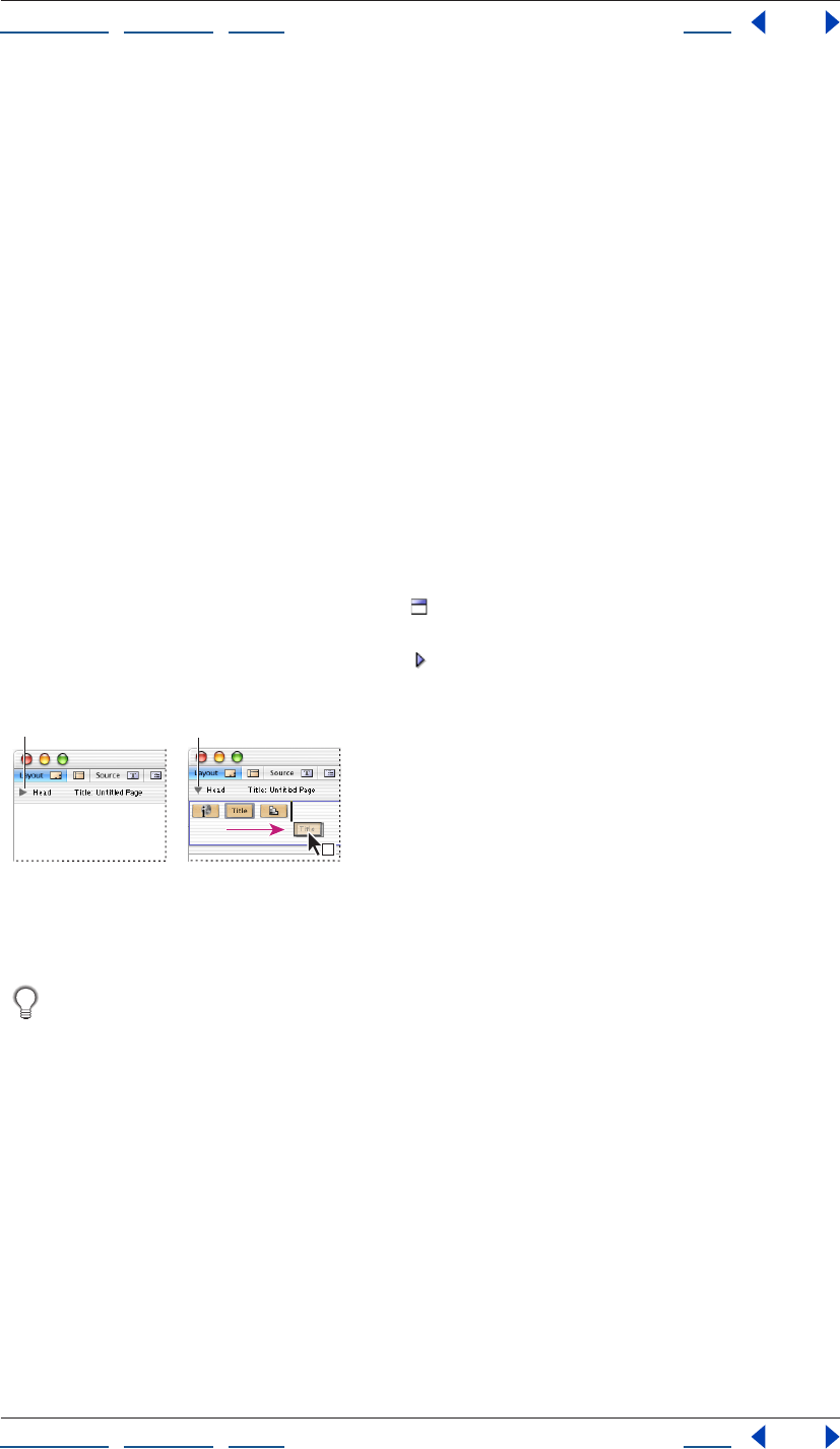
Using Help | Contents | Index Back 56
Adobe GoLive CS Help Setting up Sites and Pages
Using Help | Contents | Index Back 56
To open a page in the document window with a particular tab showing:
1 Select the file in the site window, navigation view, or links view.
2 Right-click (Windows) or Control-click (Mac OS) the file to display its context menu.
3 Choose an item from the Open in Mode submenu. The submenu lists all the tabs in the
document window.
Adding elements or scripts to the head section
An HTML page consists of two major sections: a head and a body. The Layout Editor in
GoLive mirrors this structure by providing a head section pane as part of the document
window. You can use the head section pane to store page information that’s used by Web
browsers, including the page title and keywords. The head section of each page already
contains a Title element for the page title that appears at the top of the document
window.
You use the Head set of icons in the Objects palette to add empty tags to the head section
of your Web page, and then you use the Inspector to specify the attributes for the element
or script.
To add an element to the head section of a page:
1 Drag the desired icon from the Head set in the Objects palette to the body of the
page. GoLive automatically moves it to the head section pane and opens the pane. (You
can also click the Toggle Head Section icon in the upper left corner of the document
window to open the head section pane.)
You can reposition head elements in the pane by
dragging them.
A. Closed head section pane B. Opened head section pane
You can bypass using the Objects palette to add head elements to the head section by
Right-clicking (Windows) or Control-clicking (Mac OS) in the head section pane and
choosing the object from the Insert Object > Head context menu.
2 In the Inspector, choose various options and specify attributes for the selected element
or script.
About head section elements
The options and attributes in the Inspector vary depending on the type of element that is
selected in the head section pane.
You can add any of the following elements to a page:
AB
Using Help | Contents | Index Back 57
Adobe GoLive CS Help Setting up Sites and Pages
Using Help | Contents | Index Back 57
The Keywords element You use the Keywords meta element to specify keywords for
your Web page. Internet search engines use the information in the Keywords element
when constructing their indexes. The Keywords Inspector lets you add, update, delete, and
rearrange selected keywords in a list for the element. You can also add a keyword to the
first Keywords element in the head section by selecting text in the page and choosing
Special > Add to Keywords. If no Keywords element exists in the head section, GoLive adds
it automatically. The new keyword appears in the list in the Keywords Inspector.
Internet search engines rely both on keywords and page titles to find your pages. (See
“Changing the page title” on page 53.)
Comments (head section) You use the Comment icon to add hidden comments to your
Web page, such as publishing information for future reference. To view the comments, you
need to use GoLive or another source code viewer.
Note: You can also add comments to the body of the page and refer to them as you build
the page in the Layout Editor. (See “Adding comments” on page 161.)
The Meta element You use the generic meta element to include information about the
Web page, such as a description of the page content. For each new page, GoLive automat-
ically includes the following information using meta elements: file format (for example,
text/HTML), character set used (for example, ISO-8859-1), and file creator (for example,
Adobe GoLive). The Meta Inspector lets you choose an HTTP-Equivalent option to simulate
header information that accompanies the page when it’s sent by an HTTP server to a
browser or the Name option to define a non-HTTP meta element.
Note: To prevent GoLive from writing the file creator meta element, choose Edit > Prefer-
ences (Windows) or GoLive > Preferences (Mac OS), select General, deselect Write
“Generator Adobe GoLive,” and click OK. To change the character set for a new page, select
the Encode tag in the head section of the page and select another character set in the
Encoding Inspector. To change the character set for all new pages, choose Edit > Prefer-
ences (Windows) or GoLive > Preferences (Mac OS), select Encodings, choose a new set,
and click OK. To change the encoding for selected files in a site, select files in the Files tab of
the site window, choose Edit > Document Content > Change Encoding, select a new
encoding, and click OK.
The Script element You use the Script element to add JavaScript to the head section of
your Web page. A script in the head section is executed while the visible body section of
the page is still being loaded. You use the Head Script Inspector to enter a name for the
script, choose the language or JavaScript dialect for a browser, specify the script file, and
open the JavaScript Editor to edit the script file. (See “Using JavaScript” on page 406.)
The Refresh element You use the Refresh meta element to instruct Web browsers to
refresh the contents of your Web page or replace your page with another page after a
specified interval. You may want to use this element if your page contains live material or if
it’s part of a sequential series of pages you are presenting to viewers. The Refresh
Inspector lets you enter a Delay value in seconds to specify an interval before the page is
refreshed or replaced with another page. You choose either the Target This Document
option to refresh the current page or the Target URL option to replace the page with
another page.
You can easily create a slide show by adding a Refresh element to each page that’s part of
the slide show. For example, you can add a Refresh element to the first page of the slide
show that replaces the first page with the second page, and so on.
Using Help | Contents | Index Back 58
Adobe GoLive CS Help Setting up Sites and Pages
Using Help | Contents | Index Back 58
<no edit> elements You use the Element icon to add <no edit> elements to the head
section of your Web page. These are useful for adding code that has unusual syntax or that
GoLive can’t read, and for adding new unknown elements and ensuring compatibility with
future versions of HTML and the Web browsers that support these versions. You use the
Element Inspector to edit the start and end tags, add the names and values of new
attributes, and delete attributes from the list.
Text character encoding You use the Encode icon to add a meta element that defines
the character encoding for text in a document. By default, all new pages created in GoLive
use the meta encoding element in the head section with the ISO-8859-1 character set
attribute. You can change the character encoding by selecting the Encode object in the
head section and selecting an encoding option in the Encoding Inspector. You can also
change the character set for a document by choosing a different set from the File >
Document Encoding submenu, or change the character set for selected files in a site by
choosing Edit > Document Content > Change Encoding and selecting a new encoding in
the Change Encoding dialog box. (See “Working with nonroman character sets” on
page 209.)
The Link element You use the Link element to define relationships between your current
Web page and other pages in your Web site, or on the Internet. (If you manage the pages
in your site using the GoLive site window, you don’t need to use the Link element.) You can
use the information in the Link element to keep track of links between pages in a large
site.The Link Inspector lets you specify the title, link name, and anchor name for the refer-
enced page, the relationship and reverse relationship between the current page and the
source or destination URL, a list of HTTP methods supported by the referenced page, and a
Uniform Resource Number (URN) for the page.
Note: Most Web browsers don’t use or support URNs or the Methods attribute.
The IsIndex element You use the IsIndex element both to inform Web browsers that your
Web page can be examined using a keyword search and to instruct the browsers to
display a search text box for keywords when displaying your page. The Prompt text box in
the IsIndex Inspector lets you enter the string that you want browsers to display with the
search dialog box.
Note: The IsIndex element is obsolete.
The Base element You use the Base element to specify the original location of your Web
page, also known as the base URL. The base URL is used by Web browsers to locate relative
links on your page. In the event that your page is moved away from its original location,
the browsers can correctly locate the page’s relative links using the base URL.
Adding browser-switch scripts
You can add a browser-switch script to the head section of your Web page that detects the
Web browser loading the page and automatically redirects viewers to an alternate page
based on their browser. For example, you can use this feature to have version 3.0 browsers
switch to another page if the current page contains features (such as actions, animations,
and cascading style sheets) that can only be interpreted by version 4.0 browsers and later.
Note: The browser-switch script is ignored by version 2.0 browsers and Microsoft Internet
Explorer 3.01 for Mac OS.
Using Help | Contents | Index Back 59
Adobe GoLive CS Help Setting up Sites and Pages
Using Help | Contents | Index Back 59
Since an older browser can’t read the browser-switch script, you should make sure that the
page you’re placing the script on is built for the oldest of browsers and assumes no
redirect is possible. You can also use the browser-switch script to separate Netscape from
Internet Explorer browsers based on browser-specific markup support.
To add a browser-switch script:
1 Drag the Browser Switch icon from the Smart set in the Objects palette to the body
of the page. GoLive automatically moves it to the head section and opens the head
section pane.
2 In the Browser Switch Inspector, select the browsers that support the features on
your page:
• Select Auto to have GoLive determine browser compatibility. For example, if your page
contains features that can only be interpreted by version 4.0 browsers and later, GoLive
configures the script to reroute requests from version 3.0 browsers.
• If the same browsers are supported in Windows and Mac OS, deselect Auto, choose All
from the Supported Platform menu, and select the supported browsers.
• If different browsers are supported in Windows and Mac OS, choose Windows from the
Supported Platform menu and select the supported browsers for Windows. Then
choose Mac OS from the Supported Platform menu, and select the supported browsers
for Mac OS.
Note: In the Browser Switch Inspector, you can select the infinity symbol for Netscape or
Explorer to indicate that the supported browser versions are those later than version 6.0.
3 Specify the URL to an alternate page in the Alternate Link text box. (See “Specifying the
destination URL for a link” on page 62.)
When you have finished, try viewing your page with an incompatible browser and check
whether the request is correctly rerouted.
Adding or changing a doctype declaration
You can use the document window menu to add or change a doctype declaration in your
Web page that references a W3C Document Type Definition (DTD) for a specific type of
HTML or XHTML, such as cHTML (i-mode) for wireless devices. (GoLive automatically adds
the doctype for the HTML 4.01 Transitional DTD to new HTML pages.) You can also
configure the icon sets in the Objects palette to match the doctype. (See “Setting the
doctype of a document” on page 383.)
Creating custom sets of visible screen elements
The Visibility menu in the View palette contains a default set of items that are normally
hidden on your screen, such as line break symbols. You can modify this set to show some
of the items and hide others, and you can create additional sets based on the default set.
To create custom sets of visible items for the Visibility menu:
1 Do one of the following:
• Choose Edit Set from the Visibility menu in the View palette.
• Choose Edit > Preferences (Windows) or GoLive > Preferences (Mac OS), expand the list
of General preferences in the left pane, and select Invisible Elements in the list.
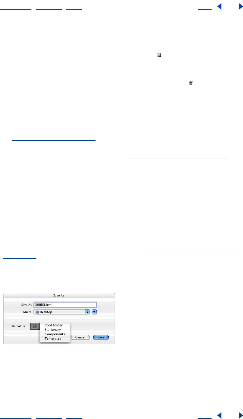
Using Help | Contents | Index Back 60
Adobe GoLive CS Help Setting up Sites and Pages
Using Help | Contents | Index Back 60
2 Select a set in the middle pane and then select check boxes in the right pane next
to items that you want hidden in the set. The default set can be edited, but not deleted
or renamed.
3 To add a set to the list, click the Create New Set button at the bottom of the
middle pane.
4 To rename a set, select it and then type a new name in the text box.
5 To delete a set, select it and click the Remove Selected Sets button .
6 Click OK.
Saving pages
You can save your Web pages directly to the site’s root folder that stores the pages and
media for your Web site. You can also save your pages as components, stationery, or page
templates for the site. For information on stationery, components, and templates,
see“About site assets” on page 304.
You can set a preference to display or hide the Set Title dialog box, which lets you change
the page titles when you save your pages. (See “Changing the page title” on page 53.)
To save a page as part of the site:
1 Open the site project file.
2 Do one of the following:
• Select the document window, and choose File > Save or choose File > Save As.
• In the document window, choose Save As from the window menu, and then choose
Save As Stationery, Save As Component, or Save As Template.
3 In the Save As dialog box, name the file, using the appropriate file-naming conventions.
(For example, it’s a good idea to use all lowercase letters and no spaces.) Make sure that
you include the appropriate suffix (.htm or .html) for the name to ensure that GoLive and
Web browsers recognize the format of the file. (See “Providing names and paths for files”
on page 101.)
4 Choose a site folder (Root, Stationery, Components, or Templates) from the Site Folder
menu in the Save As dialog box. (This step is not necessary if you chose an option from the
Save As submenu of the document window menu.)
Saving a page in the root folder of a site.
5 Click Save.
Using Help | Contents | Index Back 61
Adobe GoLive CS Help Setting up Sites and Pages
Using Help | Contents | Index Back 61
6 If the Set Title dialog box appears, enter a name for the page title in the text box or
select Set Title To Document Name to automatically enter the filename as the title. To
prevent the Set Title dialog box from appearing again, select Don’t Remind Me Again.
Then click Set.
Linking files
After you create your site and add all your resources to the site window, you can start
linking images or objects on the page to their source files, create a navigational system
between the pages in your site, and add navigational links to other sites or external URLs.
You can use GoLive’s Edit PDF Anchor feature to create links to bookmarks in PDF files.
GoLive automatically updates the site with each new link you create and continually
verifies the integrity of links as you build your site. If you move or rename a file in the site
window, GoLive updates the links to the new paths.
You can view a graphical representation of all the links in your site and the navigational
hierarchy between pages. (See “About graphical site views” on page 104.)
If a link is broken because the destination file was moved or renamed outside of the site
window, GoLive displays the orphaned or missing file in the Errors tab of the site window.
(See “Fixing site errors” on page 126.)
For information on creating links that originate from parts of an image, see “Creating
image maps” on page 245.
Creating resource and navigational links
When you add images and other types of media to a page, you create resource links from
the placeholders on the page to the source files. You can also create navigational links
from images or text on a page that users click to go to other pages in the site, other
anchored locations on the same page, or external URLs or e-mail addresses.
You can set up text or images as empty reference links and specify the destination files for
them later or attach actions to them. (See “Specifying the destination URL for a link” on
page 62 and “Setting up actions” on page 414.)
To create a resource link:
Do one of the following:
• Drag the source file (such as a GIF image, a SWF file, or a Photoshop PSD file) from the
Files tab of the site window to the page. GoLive automatically creates a resource link
between the image on the page and the source file.
• Select the placeholder object (such as an image or a Smart Object) on the page, and
specify the source file in the URL text box in the Inspector. (See “Specifying the desti-
nation URL for a link” on page 62.)
Using Help | Contents | Index Back 62
Adobe GoLive CS Help Setting up Sites and Pages
Using Help | Contents | Index Back 62
To create a navigational link:
1 Select text, or an image or object on the page.
2 In the Inspector, do one of the following:
• For selected text, specify the destination file for the navigational link in the URL text
box. If you type a URL or e-mail address in the text box, include “http://” or “mailto:” at
the beginning, respectively.
• For selected images or objects, click the Link tab (if applicable), and then click the
Create Link button and specify the destination file for the link in the URL text box.
You can also drag the destination file for a navigational link from the Files tab of the
site window onto the selection in the page. (If you drag the file to a page without
a selection in it, GoLive creates a hypertext link and uses the name of the file for the
text label.)
3 If you want the link destination to appear in a frame or a new Web browser window,
choose an option from the Target menu in the Inspector. (See “Setting up target frames”
on page 159.)
4 Enter a descriptive title for the link in the Inspector. This title appears in some browsers
when you hold the pointer over the link.
5 In the Inspector, choose an option from the Name/ID menu (choose Name & ID for
maximum browser compatibility), and then type a unique link name in the Name/ID text
box.
To create an empty reference link:
Select the text or object in the page, and click the Create Link button on the toolbar.
GoLive displays a bug icon in the site window next to pages that contain empty
reference links.
You can specify the destination file for multiple links at once by using the In & Out
Links palette. (See “Editing links and URLs sitewide” on page 124.)
To remove a link:
Select the text or object in the page, and click the Remove Link button on the toolbar.
Specifying the destination URL for a link
You use the Inspector to specify the destination file or URL for resource and navigational
links. You can type the path to the link’s destination file directly in the Inspector’s URL text
box or use any of a variety of methods to specify it, including dragging files, using the pick
whip, browsing, and reusing recently linked files. No matter which method you use, the
path to the destination file appears in the Inspector.
Note: The pick whip is also conveniently located in other windows and palettes (such as
the In & Out Links palette) when you need to link something to a file in the site. (See
“Editing links and URLs sitewide” on page 124.)
Using Help | Contents | Index Back 63
Adobe GoLive CS Help Setting up Sites and Pages
Using Help | Contents | Index Back 63
The Inspector palette menu and context menus for selected text and objects contain lists
of recently linked files you can use to specify the destination for a link. The lists are
organized by categories, including HTML, Images, Misc. URLs, Anchors, and the last five
files that have already been used as the destination for links. The Misc. URLs category
includes links made to PDF files, favorite URLs, or e-mail addresses collected in the External
tab of the site window.
To specify the link’s URL by dragging the destination file:
Do one of the following:
• For resource links, drag an image file or other media file from the Files tab in the site
window to the page. The URL to the source file appears in the Inspector.
• For navigational links, drag an HTML file from the Files tab in the site window to a
selected link or text on the page. The destination URL of the page appears in the
Inspector. (If you drag the HTML file to the page without a selection in it, GoLive creates
a hypertext link and uses the filename for the text label.)
You can also drag external URLs, e-mail addresses, and snippets from the site window
or Library palette to the page. (See “About site assets” on page 304.)
To specify the links’s destination using the pick whip:
1 Select the text, object, placeholder icon, or existing link on the page.
2 Do one of the following to specify the destination file:
• Drag a line from pick whip to the destination in the site window, which can be a file or
an anchor listed under the file in the Files tab, or a URL or an e-mail address in the
External tab. You can also drag to the Show Page Properties icon or an anchor in an
open page. (See “Using anchors for links” on page 66 and see “Using site URLs and e-
mail addresses” on page 317.)
• Alt-drag (Windows) or Command-drag (Mac OS) a line from a selection in the page to
the destination file in the site window or to a destination on the page or another open
page (creating an anchor).
If the line recoils, you have released the mouse button too soon or the link can’t
be created.
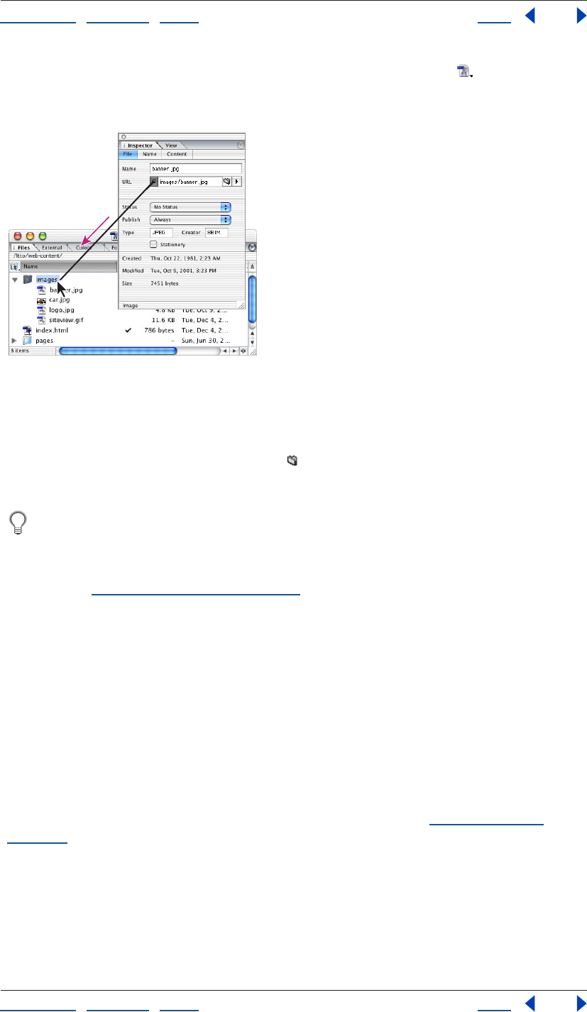
Using Help | Contents | Index Back 64
Adobe GoLive CS Help Setting up Sites and Pages
Using Help | Contents | Index Back 64
As you drag, you can hold the pointer over the Select Window button on the toolbar to
bring a window to the front or hold the pointer over a page in Files tab in the site window
to display a list of anchors under the page.
Drag the pick whip in the Inspector to a file in the site window.
To specify the link’s destination by browsing:
1 Select the text, object, placeholder icon, or existing link on the page.
2 In the Inspector, click the Browse button .
3 In the Open dialog box, select the destination file, and click Open.
If the destination file is not located in the site window, you can use the Browse button
to locate it, and link it to the selected text or object. Then you can drag the orphan file
from the Errors tab in the site window to the Files tab and click OK to copy the file and
update the site. Or, you can use the Clean Up Site command to move a copy of the file into
the site. (See “Cleaning up a site” on page 100.)
To specify the link destination using a recently linked file, e-mail address, or URL:
1 Select the text, object, placeholder icon, or existing link in the page.
2 In the Inspector, choose a recently linked file, HTML file, image, miscellaneous URL, or
anchor from the URL menu.
Editing URLs in links
You can use the Edit URL dialog box to edit the path to a link’s destination, make the path
relative or absolute, and add query parameters to the URL for Common Gateway Interface
(CGI) requests and other types of server requests.
Query parameters are used to query servers for information such as data from databases
or loading server scripts, such as Perl Script, to process forms (see “About forms” on
page 294).
When you add query parameters to the URL, GoLive inserts a question mark (?) for the
query, equal signs (=) between each parameter name and value, and ampersands (&)
between each parameter. GoLive displays the complete URL including the CGI or other
server request at the bottom of the Edit URL dialog box.
Using Help | Contents | Index Back 65
Adobe GoLive CS Help Setting up Sites and Pages
Using Help | Contents | Index Back 65
By default, GoLive uses relative URLs for the destinations of links. You can use the Edit URL
dialog box to change an individual URL to an absolute path. You can also make URLs
absolute for a specific site, or set a preference to make all URLs absolute for all sites. (See
“Setting up absolute link paths” on page 104.)
To edit a URL:
1 In the Inspector, choose Edit from the URL menu.
2 In the Edit URL dialog box, do any of the following:
• Modify or type a new URL in the Path text box.
• Click Browse to locate and select a new destination page.
• Click Make Absolute or Make Relative to use an absolute or relative path for the URL.
• Type parameter names and values in the text boxes and click Add Parameter to add
them to the list of Query Parameters.
• To remove a parameter from the list, select it and click Delete Parameter.
• To change the name or value of a parameter, select the parameter in the list, edit the
name or value in the text boxes below the list, and click Update.
The complete URL, including the parameters, appears in the Result box at the bottom of
the Edit URL dialog box.
3 Click OK.
Creating anchor links to PDF bookmarks
A PDF bookmark links to a specific location in a PDF file. You can use GoLive’s Edit PDF
Anchor feature to link from an HTML page to a PDF bookmark.
Note: Anchor links to PDF bookmarks don’t work with Acrobat 6.0 in Mac OS X.
To create an anchor link to a PDF bookmark:
1 Create a link to the PDF file (see “Creating resource and navigational links” on page 61
and “Specifying the destination URL for a link” on page 62).
2 In the Inspector, click Edit PDF Anchor.
3 In the PDF Anchor Editing dialog box, do one of the following:
• Select a bookmark in the Settings pane to open the PDF file to that bookmark.
• Select Use Page Number and enter a page number in the Use Page Number text box to
open the PDF file to a specific page.
4 Select Use Page Mode and choose bookmarks, thumbs, or none to open the PDF file
with the bookmarks pane, the thumbnail pane, or no pane visible, respectively.
5 Click OK.
Note: You can’t preview links to PDF bookmarks in GoLive for Windows. To preview the
link, upload your site to a Web server.
Using Help | Contents | Index Back 66
Adobe GoLive CS Help Setting up Sites and Pages
Using Help | Contents | Index Back 66
Using anchors for links
An anchor is a specified location on a Web page that serves as the destination of a link.
Here are some guidelines to follow when creating anchors:
• You shouldn’t place anchors directly on a layout grid. Instead, place anchors in the flow
of HTML text, a layout text box, or a table cell. When you add an anchor to a layout text
box or table cell, make sure that the box or cell has other contents. Otherwise, the
anchor will not be recognized by Netscape Navigator. To work around this problem, you
can add a nonbreaking space to the empty box or cell. To add a nonbreaking space,
click inside the box or cell, and press Shift+spacebar (Windows) or Option+spacebar
(Mac OS).
• You should place anchors near the left margin of the page, so that the anchors work
more consistently across browsers.
• You won’t be able to preview certain link and anchor combinations in Layout Preview.
• You should test links to anchors extensively in browsers before publishing your Web
site. Anchors don’t always work the same way in all browsers.
To create an anchor:
Do one of the following:
• Drag the Anchor icon from the Basic set of icons in the Objects palette to the desti-
nation on the page where you want the anchor.
• Select a link on the page, drag the pick whip in the Inspector to a location on the
page or another open page where you want to place the anchor, and release the mouse
button.
Note: You must save the destination page before you can create an anchor using the
pick whip.
To give an anchor a unique name:
1 Select the anchor marker in the page.
2 In the Anchor Inspector, choose an option from the Name/ID menu (choose Name & ID
for maximum browser compatibility), and then type a unique anchor name in the Name/
ID text box.
You can see a list of all the anchors on a page by clicking the triangle next to the page
in the Files tab in the site window.
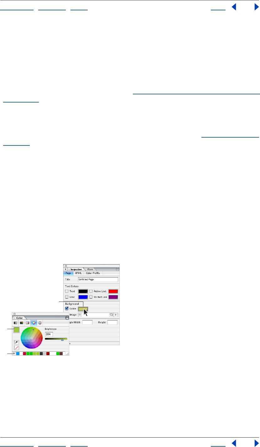
Using Help | Contents | Index Back 67
Adobe GoLive CS Help Setting up Sites and Pages
Using Help | Contents | Index Back 67
Using color
Use the Color and Swatches palettes to apply color to page backgrounds, text, and objects
on a page. Use the Color palette to mix and edit colors. Use the Swatches palette to select
colors by color swatch, name, or hexadecimal value.
Use the Eyedropper tool in the Swatches or Colors palette to extract colors from an image
or screen element.
For information on applying color to text, see “Applying fonts, type sizes, and color to text”
on page 194.
Note: When you use the Color or Swatches palette to apply color to text or objects, GoLive
inserts the color attribute inside the font element. Because the font element is deprecated
and can cause problems with Web browsers, you may want to apply color to text and
objects using CSS styles instead of the Color or Swatches palette. (See “Applying styles” on
page 233.)
Using the Color palette
The Color palette contains color models based on CMYK, RGB, HSV, HSB (for video
hardware), and Grayscale. The Color palette displays the color of the current selection in
the preview pane, as well as recently used colors in the Recent Colors List. The Hex value
text box displays the hexadecimal value of colors you’ve chosen.
Use the Color palette to edit and mix colors. When you’re done, add them to the
Swatches palette.
To display the Color palette:
Choose Window > Color.
Note: You can also open the Color palette by clicking a color field (for example, in the
Inspector or toolbar).
Clicking a color field automatically opens the Color palette.
A. A color field B. The preview pane C. Recently used colors
To change the color model:
Choose a color model from the Color palette menu, or click a color model button, located
at the top of the Color palette. (Choose Only Web Colors to display only web-safe colors.)
B
C
A
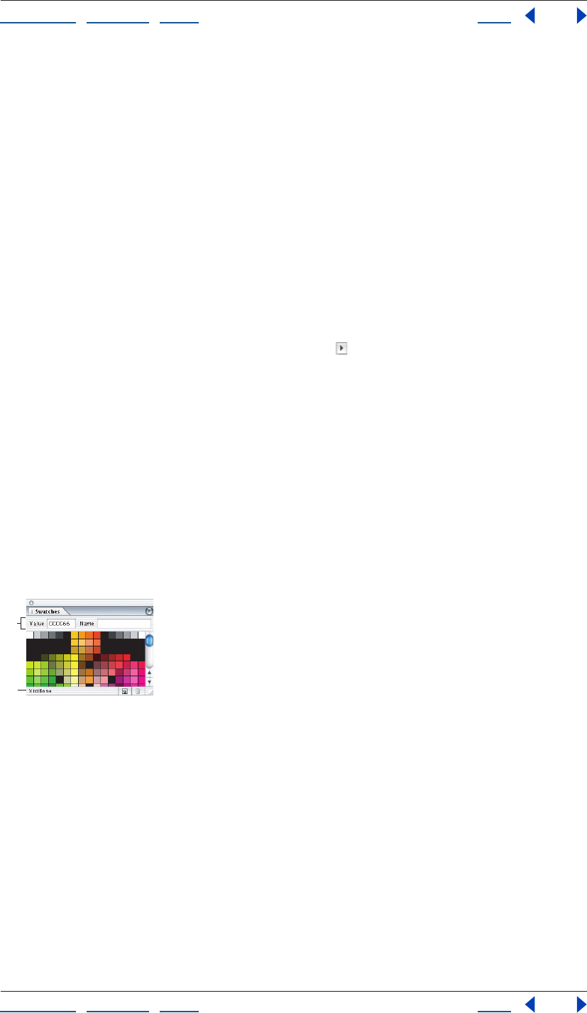
Using Help | Contents | Index Back 68
Adobe GoLive CS Help Setting up Sites and Pages
Using Help | Contents | Index Back 68
To display color values in percentages:
Choose Percent Values from the Color palette menu. Choose Percent Values again to
display colors in the 256 numerical scale.
To show or hide the color model buttons:
Choose Show Buttons from the palette menu.
To show or hide the Recent Color list:
Choose Show Recent Colors from the palette menu.
To manually add a color to the Recent Color list:
1 Do one of the following:
• Select a colored element on a page, such as colored text.
• Select a color from the Color or Swatches palette.
2 Click the Add Color to Recent Colors List button .
Using the Swatches palette
The Swatches palette contains predefined sets of colors, site colors (colors you’ve used in a
site), and recent colors (colors you’ve used recently or added to the Recent Colors list in
the Color palette). You can add or remove custom swatches. The Show Search Fields
option lets you search for colors by name or hexadecimal value.
If you click the lower right corner of a color field, GoLive displays the current swatch set
chosen in the Swatches palette, as well as any custom colors you’ve added to the Swatches
palette.
To display the Swatches palette:
Choose Window > Swatches.
The Swatches palette
A. Search fields B. Current swatch set
To change the swatch set:
Choose a swatch set from the Swatches palette menu.
To change how swatches appear:
Choose a display option from the Swatches palette menu:
• Small List to display the hexadecimal value and thumbnail of each swatch.
Note: If Web Named Colors is selected from the Swatches palette menu, GoLive also
displays the name of the swatch.
• Small Thumbnail to display a thumbnail of each swatch.
A
B
Using Help | Contents | Index Back 69
Adobe GoLive CS Help Setting up Sites and Pages
Using Help | Contents | Index Back 69
To search for a color in the Swatches palette:
1 Choose Show Search Fields from the Swatches palette menu.
2 Do one of the following, and then press Enter (Windows) or Return (Mac OS):
• Type a hexadecimal value in the Value text box.
• Type a color name in the Name text box.
Note: If the color you’re searching for doesn’t exist in the current swatches, GoLive displays
the nearest color.
To show named colors in the Swatches palette:
Choose Web Named Colors from the Swatches palette menu.
To view recently used colors:
Choose Recent Colors from the Swatches palette menu.
To view a list of site colors:
Choose Site Colors from the Swatches palette menu.
To add a custom swatch to the Swatches palette:
1 Choose a color from the Color palette.
2 Click the Create New Swatch button in the Swatches palette.
To remove a custom swatch from the Swatches palette:
Select the swatch and click the Delete Swatch button .
Applying color to objects
Use the Colors or Swatches palette to apply color to page backgrounds, text, and objects
on a page. For information on applying color to text or page backgrounds, see “Applying
fonts, type sizes, and color to text” on page 194 and “Applying images or color to the page
background” on page 70.
To apply color to an object:
1 Select the object you want to color (for example, a table cell).
2 In the Inspector, click the lower right corner of the color field and choose a color from
the swatches that appear, or click the color field and do one of the following:
• Select a color from the Color palette. To use only Web safe colors, choose Only Web
Colors from the Color palette menu, and then select a color. The sliders snap to Web-
safe colors when you drag them.
Note: Web-safe colors are the 216 colors that are used by browsers, regardless of platform.
Browsers change all colors in the image to these colors when displaying the image on an
8-bit screen. By working with Web-safe colors, you can ensure that the colors in your Web
pages will not dither on a system using a 256 color display.
• Choose a color from the Swatches palette. An alert cube next to the color rectangle
indicates a Web-safe color.
Note: Alert cubes appear only if you’re viewing Swatches using the Small List display
option.
Using Help | Contents | Index Back 70
Adobe GoLive CS Help Setting up Sites and Pages
Using Help | Contents | Index Back 70
To remove color from a selection:
1 Select the colored object.
2 Deselect Color in the Inspector.
To extract a color using the eyedropper:
Do one of the following:
• Open the Color palette and click the Eyedropper tool , then drag the eyedropper to
the color that you want to extract.
• In the Swatches palette, move the pointer over a swatch until it changes to an
eyedropper , and then click and drag the eyedropper to the color that you want
to extract.
Note: Notice that the color changes in the Color palette as you drag.
Applying images or color to the page background
You can apply an image or color to the background of your page to visually enhance the
page. When selecting an image for the background, keep in mind that GoLive and Web
browsers treat the image as a tile that is repeated to cover the page. Although colors that
you choose for page backgrounds override the default colors used by most Web browsers,
other browser preference colors can override your page background colors.
To apply an image or color to the page background:
1 Click the Show Page Properties icon in the upper right corner of the
document window.
2 In the Page Inspector, click the Page tab.
3 Under Background, do one of the following:
• Select Image and specify the image file. (See “Referencing files” on page 42.)
• Select Color and click inside the color field. Then select a color from the Color palette or
the Swatches palette. The color you select is automatically applied to the page and to
the color field in the Page Inspector.
• Select Color and click the lower right corner of the color field. Then select a color from
the swatches that appear. The color you select is automatically applied to the page and
to the color field in the Page Inspector.
Setting the default color for text or links in a page
You use the Page Inspector to set default colors for text that you type on a page and three
stages of links: normal (the normal appearance of a link in the Web browser), active (when
the mouse button is held down on a link in the browser), and visited (after a link has been
clicked in the browser).
To set default colors for text or links on the page:
1 Click the Show Page Properties icon in the upper right corner of the
document window.
2 In the Page Inspector, click the Page tab and do one of the following:

Using Help | Contents | Index Back 71
Adobe GoLive CS Help Setting up Sites and Pages
Using Help | Contents | Index Back 71
• To color all text on the page, select Text, click the color field, and select a color from the
Color or Swatches palette. Or, click the lower right corner of the color field and choose a
color from the swatches that appear.
• To color the various stages of hypertext links on the page, select Link, Active Link, or
Visited Link. Then click the color field for each type of link and select a color from the
Color or Swatches palette. Or, click the lower right corner of the color field and choose a
color from the swatches that appear.
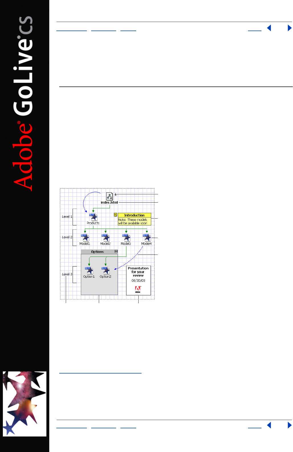
Using Help | Contents | Index Back 72
Adobe GoLive CS Help Creating Site Diagrams
Using Help | Contents | Index Back 72
Creating Site Diagrams
About diagrams
The diagram features of Adobe GoLive are powerful presentation and Web site creation
tools. A diagram shows the hierarchy of HTML pages within a site and the links between
pages, assets, and other files. It may also contain annotations, level indicators, custom
objects, and boxes that hold text or images.
A diagram lets you lay out the structure of a site before you create real pages, and helps
you manage the site creation process. You can use multiple prototype diagrams as you
build and revise a site, creating and testing designs as you need them. You can present
diagrams in print or online in Adobe PDF or SVG format. When you are ready to work with
live pages, you submit a diagram, converting its pages to actual pages in the site.
Diagram
A. Anchored section page B. Parent-child link
C. Annotation D. Page E. Hyperlink F. Level object
G. Group H. Box
Setting up a diagram When you create a diagram, a diagram window opens, displaying
an empty design view. You use the View palette to set page, grid, and canvas options for
the design view, and to specify the appearance and labels of objects in the diagram. (See
“Creating diagrams” on page 73.)
A
FG H
C
B
D
E
Using Help | Contents | Index Back 73
Adobe GoLive CS Help Creating Site Diagrams
Using Help | Contents | Index Back 73
Creating the structure of the diagram You add objects to the design view by dragging
them from the Diagram set of the Objects palette, or by using buttons or menu
commands. You can add objects that represent pages or sections (subtrees of pages), and
link them in a hierarchy to other pages or sections. You can also add and link custom
objects that represent assets, programs, and other features used in the site.
By dragging objects in the design view, you can change their location on the canvas, their
place in the site hierarchy, or both. You can group objects to manipulate them together,
and use pick whip to add diagram links. You should anchor the diagram to an existing
page in the site so that its pages will be visible in a navigation view after you submit the
diagram. (See “Developing diagrams” on page 74.)
Preparing the diagram for presentation To make objects appear on each page of a
multipage diagram, you drag them to the Master tab of the diagram window. Items on this
tab (the master view) are not part of the site design and can’t be submitted.
In the design view, you can add annotation objects to provide text commentary, or add
level objects to display brackets indicating levels of the site. You can also add box objects
that contain text or graphics. When you have finished adding objects, you can use the
Align palette to align and distribute them. You can adjust the curvature of link lines by
dragging or by using the Link Inspector. To present the diagram to reviewers, you can print
it to paper or export it to Adobe PDF or SVG format. (See “Preparing diagrams for presen-
tation” on page 84.)
Submitting the diagram You can submit an entire diagram or selected items.
Submitting converts pages in the diagram to real pages in the site, and creates scratch files
for custom objects. To reverse a submission, you recall the diagram or items. You can
submit and recall diagrams and items as often as necessary as you develop a site. (See
“Submitting diagrams” on page 88.)
Creating diagrams
When you create a diagram, a new diagram window opens to the Design tab. This tab, also
called the design view, is the canvas on which you add objects representing pages and
other items in the site you are designing. The View palette and the Inspector provide
controls for changing the look of the diagram and the appearance and behavior of objects
within it.
When a site window is open, you can create one or more diagrams for the site.
To create a new diagram:
1 Open a new or existing site.
2 Choose Diagram > New Diagram. The diagram window opens to the design view.
3 If you want to rename the diagram, click the Diagrams tab of the site window, select the
diagram name, and enter a new name.
To open an existing diagram:
Do one of the following:
• With the site window open, choose Diagram > Diagrams > diagram name.
• In the Diagrams tab of the site window, double-click the diagram.
Using Help | Contents | Index Back 74
Adobe GoLive CS Help Creating Site Diagrams
Using Help | Contents | Index Back 74
Developing diagrams
You develop a diagram by adding to the design view objects that represent pages,
sections (hierarchies of pages), and other items that can be added or linked to the site.
After adding objects, you can create new links or redefine links, group and rearrange the
objects, and anchor the diagram to an existing page in the site. You can change how
design views display using the View palette and the Layout tab of the Inspector
(see“Changing the display of design views” on page 82 and “Changing the layout of
objects in a hierarchy” on page 83).
If you expect the diagram to occupy several pages, and you want certain text or graphics
to appear on each page, you may want to set up these items in the master view before you
develop the diagram in the design view. (See “Adding master items” on page 84.)
Adding pages
You can add a single page to a diagram as a separate object, or add the page in any family
relationship—parent, child, previous sibling, or next sibling—to another page or to a
section. (See “Adding and defining sections” on page 75.) You can also add sets of child
pages to a page or section. While adding the new child pages, you can make the child
pages and their parent a section (or a subsection, if the parent page is within a section).
You can add content to pages while you are working on a diagram, or add the content
after you have submitted the pages, and they exist as live pages in the site.
Adding pages to a diagram affects its appearance and navigational logic, sometimes
changing the position of other pages and the direction of lines that connect those
pages. Before arranging a diagram for a presentation, add all pages and other objects, and
establish their hierarchical positions.
To add a page outside a hierarchy:
Drag the Page icon from the Diagram set of the Objects palette to an empty area of the
design view. After creating the page, you can define it in the Page Inspector. You can also
add other pages to the new page, creating family links, or create new hyperlinks.
To add a single page to another page or section:
Do one of the following:
• Select the page or section to which you want to add the page, and choose Next Page,
Child Page, Previous Page, or Parent Page from the toolbar or the Diagram > New
menu.
• Drag the Page icon from the Diagram set of the Objects palette to the page or section.
As you drag, a black bar appears next to the existing page or section, indicating a family
relationship to the new page. Drag the Page icon above the page or section to add a
parent, to either side of it to add a sibling, or below it to add a child.
To add a set of child pages to another page or section:
1 Select the page or section to which you want to add the child pages.
2 Choose Diagram > New Pages.
3 Specify the number of pages to create, their filenames, the stationary or template (if
any) to use in creating the pages, and the types of links to generate. (See “Adding empty
pages and pending links to a hierarchy” on page 119.)
Using Help | Contents | Index Back 75
Adobe GoLive CS Help Creating Site Diagrams
Using Help | Contents | Index Back 75
4 If you want the selected page and the child pages you are creating to be a new section
or subsection, select Make Parent a Section. (See “Adding and defining sections” on
page 75.)
5 Click Create. The child pages are created. If you selected Make Parent a Section, the
parent page becomes a section page for the new section or subsection.
To define a page in the Page Inspector:
In the Page tab of the Page Inspector, do any of the following:
• Enter a design name for the page in the Name text box. This name appears in the design
view as the label for the page only if Design Name is selected in the Display tab of the
View palette. Otherwise the label is its filename or page title. (See “Changing the
display of design views” on page 82.)
• Change the default page title.
• Specify a template, stationery, or sample file for the page.
To add content to a page in a diagram:
In the design view, double-click the page. The page opens in a document window. You can
edit the page using the same techniques used to edit pages added directly to a site.
Adding and defining sections
A section is a hierarchy of diagram pages, usually a subtree, that is part of a larger
hierarchy. The section and its children are descendents of some other object. You treat a
section as a unit to simplify file management. The pages in a section have the same base
filename, and you can put them in the same folder and create them using the same
template or stationery. Sections can contain other sections (subsections) as well as pages.
The parent page for a section or subsection is called its section page. The filename for a
newly created section page is index.html, unless you have changed the home page
filename in the site preferences. Section pages are displayed with boldface labels and the
Section icon (if diagram objects appear as icons).
To add and define a section:
1 Drag the Section icon from the Diagram set of the Object palette to the design view.
This creates a section page.
2 If necessary, do one or both of the following in the Page tab of the Section Inspector:
• Enter a design name for the page in the Name text box. This name appears in the design
view as the label for the page only if Design Name is selected in the Display tab of the
View palette. Otherwise the label is its filename or page title. (See “Changing the
display of design views” on page 82.)
• Change the default page title.
Note: For a section page, don’t use the Target Dir option on the Page tab. You set the folder
for the page and its children in the Section tab. Also, you probably don’t need to change
the default filename for the section page. Even if the home page for the site has the same
filename, the two files have different paths because the section has its own folder.
3 In the Section tab of the Section Inspector, do any of the following:
• Enter a base filename for the child pages you will place in the section and their descen-
dents. The page filenames will be provided automatically. For example, if you enter the
Using Help | Contents | Index Back 76
Adobe GoLive CS Help Creating Site Diagrams
Using Help | Contents | Index Back 76
base filename Hiking, the page filenames will be Hiking.html, Hiking1.html, Hiking
2.html, and so on.
• Specify a target folder for the section page, the child pages in the section, and their
descendents. When you submit the diagram, the pages will be placed in this folder. The
target folder should be a subfolder of the root folder, either an existing subfolder or a
new one that will be created when you submit the diagram. For example, you might
specify the folder Recreation/Hiking for the pages in the hiking section of a recreation
site. If you don’t specify a target folder, the folder used is either the root folder or the
folder for generated items specified in Site preferences.
• Specify a template or stationery for the pages.
4 If you want to add child pages to the section page at this time, do both of the following:
• Choose the types of parent and sibling links to generate between the section page and
its children. (See “Adding empty pages and pending links to a hierarchy” on page 119.)
• In the Count text box, enter the number of child pages to add to the section page.
5 Click Create New Pages.
Adding and editing pending links
You can add pending links between pages, sections, and custom objects, and change links
from one type to another. Tour links connect a series of objects, not necessarily adjacent
siblings in a sequence. In the site settings, you can change the colors of links and add new
link types.
To add a pending link of the type Hyperlink from one object to another:
1 In the design view, select the source object. The pick whip appears.
2 Drag from the pick whip to the target object. A new link appears with the link type
Hyperlink.
Using Help | Contents | Index Back 77
Adobe GoLive CS Help Creating Site Diagrams
Using Help | Contents | Index Back 77
To add pending links between already linked objects:
1 In the design view, do one of the following:
• Select two objects linked to each other.
• Select two or more objects linked in sequence, starting with the first object in the
sequence.
To select any object or link after the first object or link selected, Ctrl-click (Windows) or
Shift-click (Mac OS). Repeat to deselect the object or link.
2 Right-click (Windows) or Control-click (Mac OS) and choose a link type from the Add
Design Line submenu. Ordinarily, you add a type that complements the current link type.
For example, you would add a Child link (parent-to-child) to a Parent link (child-to-parent).
To change a link type:
1 In the design view, select a link. A small rectangle appears on the link, and the source
and target objects are highlighted.
2 If necessary, select other links. If multiple links are selected, their source and target
objects are not highlighted.
3 Choose a new link type in the Link Inspector. Normally you would choose only
Hyperlink, Tour, or a user-defined link type because the family link types (Parent, Child,
Next, and Previous) are more easily changed by dragging one of the linked objects onto
the other one. (See “Moving and copying objects” on page 79.)
Important: If you create a new family link between two objects by dragging one of them
onto the other, the link is always valid. However, if you use the Link Inspector to create it,
you may create an invalid family hierarchy—for example, a child with two parents.
To edit link types:
1 With a site view open, choose Site > Settings > Diagram Link Types.
2 Select Site Specific Settings.
3 Do one or both of the following:
• To change the color of a link type, select the type, click the lower right corner of the
color field, and then specify a new color from the swatches that appear.
• To add a link type, click the New button , type a name, and then click the lower right
corner of the color field to specify a color from the swatches that appear.
Edits to link types apply to all diagrams associated with the current site.
Adding custom objects
You can create custom objects that represent items that you might add or link to a site,
and add these objects to the Diagram set of the Objects palette. The Diagrams set of the
Objects palette contains a number of predefined custom objects representing items such
as forms, elements, databases, applets, and scripts. You can edit or delete these objects
as needed.

Using Help | Contents | Index Back 78
Adobe GoLive CS Help Creating Site Diagrams
Using Help | Contents | Index Back 78
Custom objects are images in GIF format, located in the Modules/Diagram Objects folder
in the GoLive application folder. When you add a custom object to a diagram, you can
specify whether to create a file for the object when it is submitted, and the type of file to
be created. You must create the file from a template, stationery, or sample file. For
example, you can add a movie to a site by creating a custom object that uses the movie file
as a sample file. When the diagram is submitted, a new movie file is created from the
sample file. All non-HTML files created from custom objects become scratch items.
To create a new custom object and add it to the Diagram set of the Objects palette:
1 Save an image using the following filename convention: myfilename-myextension.gif,
where myfilename is the name that appears in the Objects palette tool tip and
myextension is the default extension that is used in the filenames of the created objects. (If
you do not include a default extension and the preceding hyphen, .html is used.)
2 Place the image file in this folder:
Adobe GoLive /Modules/Diagram Objects.
3 Restart GoLive. To be available from the Objects palette, the custom object must be in
the Diagram Objects folder when GoLive starts.
To specify a sample file for a custom object:
1 Create a default sample file in the Adobe GoLive /Settings7/DocumentStore/examples
folder. The default sample file is used to create a file when you submit the object, unless
you specify another file in the Object Inspector.
2 Open the defaults.agldex file in the DocumentStore folder and copy an existing
<example></example> specification in this file. Example specifications have this format:
<example ident="myfilename" mime="mime type" ext="myextension"
group="group name">
<display name="myfilename” context="no" menu="no" sort="2020"/>
<file url="examples/mysample.myextension"/>
</example>
where ident is the filename you specified for the custom object (without the hyphen and
extension), mime is the appropriate mime type, ext is the extension you specified for the
object, group is the appropriate group in the defaults.agldex file (markup, css, media, or
misc), display name is the filename you specified (to be used in the user interface if the
next three items are set to yes), context is no unless you want the file to be listed in the
site context menu, menu is no unless you want the file to be listed in the File > New Special
menu, sort specifies the sort order for the display name in menus, and file url is the
name of your sample file (dialog is not used at this time).
3 Edit the copy of the specification and place it in the appropriate group in the
defaults.agldex file.
4 Restart GoLive. To be available as a sample file, the file must be in the examples folder
and defined in the defaults.agldex file when GoLive starts.
Using Help | Contents | Index Back 79
Adobe GoLive CS Help Creating Site Diagrams
Using Help | Contents | Index Back 79
To add a custom object to a diagram:
1 Drag the object from the Diagram set of the Objects palette to the design view. You can
add a custom object to an empty area of the design view, or drag it over an existing page,
section, or other custom object to add it as a parent, sibling, or child of the existing object.
2 In the Object tab of the Object Inspector, do any of the following:
• Enter a design name for the object in the Name text box. This name appears in the
design view as the label for the object only if Design Name is selected in the Display tab
of the View palette. Otherwise the label is its filename or page title.
• Select Create From to specify that a file will be created when the object is submitted,
and then select Stationery, Template, or Sample. You must specify a stationery,
template, or sample file in order to create a file for the custom object. To use a
stationary or template file, choose the file from a menu. To use a sample file other than
the default file in the DocumentStore folder, drag from the pick whip to the sample file.
The sample file must be located on your computer.
• Specify a filename and target folder for the file to be created when the object
is submitted.
To edit a custom object:
Do any of the following:
• Change settings for the object in the Object tab of the Object Inspector.
• Change the sample file in the Adobe GoLive /Settings7/DocumentStore/examples
folder.
• Edit the specification for the object in the Adobe GoLive/Settings7/DocumentStore/
defaults.agldex file.
• Delete the object by removing its GIF file from the Adobe GoLive/Modules/Diagram
Objects folder.
Moving and copying objects
You can treat any item in a diagram simply as an object in a drawing program, and drag it
as you would in such a program. You can also drag a page, section, or custom object onto
another page, section, or custom object to create a new family link in the logical hierarchy.
You can select a number of objects and drag them all at once. However, a better method is
to group the objects and then drag the group. (See “Grouping objects” on page 80.)
You can also copy objects in a diagram, and duplicate them along with their links.
To move an object without changing its position in the logical hierarchy:
In the design view, drag the object to a new location. If Collision Avoidance is selected, and
you drag the object near or partially over another object, the other object will move (to
avoid a collision) when the drag is completed.
Note: If you drag an object over another object and a line appears to the top, bottom, left,
or right of the other object, you have dragged too far into the center of the other object.
Decrease the overlap until the line disappears.
Any link lines connected to an object move when you drag the object. However, the
object’s descendents do not move with it as they would if you were moving the object to a
new hierarchical position.
Using Help | Contents | Index Back 80
Adobe GoLive CS Help Creating Site Diagrams
Using Help | Contents | Index Back 80
To move a page, section, or custom object into a new position in the logical
hierarchy:
1 In the design view, drag the object onto the page, section, or custom object you want it
linked to. Depending on the position of the object you are dragging, a line appears above
or below the target object or to its left or right.
2 Drop the object above, below, to the left, or to the right of the target object, depending
on the family relationship you want the two objects to have. (See “Rearranging the parts
of a hierarchy” on page 121.)
To move a copy of an object to a new location:
In the design view, Ctrl-drag (Windows) or Option-drag (Mac OS) the object to another
location. A copy of the object is created at that location. If the original object is annotated
or linked, the annotations or link lines are not copied.
To duplicate objects:
1 In the design view, select the objects you want to duplicate.
2 Choose Edit > Duplicate. The objects and their connectors and links are copied. If you
only select one object, it is duplicated along with its links.
Grouping objects
A group is a rectangle that encloses a number of objects in a diagram and lets you treat the
objects as a unit. You can move, copy, or delete the objects in a group by moving, copying,
or deleting the group. You can also close a group to temporarily unclutter the diagram.
The objects in a group must be located within the group rectangle, but they don’t have to
be in any logical relation to one another.
To group selected objects:
1 In the design view, select the objects.
2 Choose Edit > Group, or click the Layout Group button in the Transform palette.
A group rectangle encloses the selected objects. If Collision Avoidance is selected, any
unselected objects that would be enclosed by the rectangle move out of the way
automatically.
To create an empty group in a particular location:
1 Drag the Group icon from the Diagram set of the Objects palette to the design view.
If Collision Avoidance is selected, any objects at or near the icon’s position move out of the
way automatically.
2 Do one or both of the following as needed:
• Resize the group by dragging one of its corner handles.
• Reposition the group by dragging its title bar or border.
To set group options:
1 Select the group by clicking its title bar or border.
2 In the Group Inspector, do any of the following:
• Enter a name. It appears in the title bar if the title bar is displayed. You can also enter the
name directly in the title bar.
Using Help | Contents | Index Back 81
Adobe GoLive CS Help Creating Site Diagrams
Using Help | Contents | Index Back 81
• Click an Align button to left-align, center-align, or right-align the group name.
• Select or deselect Display Title Bar.
• Select or deselect Auto Resize. With Auto Resize selected, the group rectangle is only as
large as it needs to be to hold its contents, growing or shrinking as needed.
To add objects to a group:
Drag the objects into the group rectangle. If the rectangle is too small to hold the objects
and you have selected Auto Resize in the Group Inspector, the rectangle enlarges
automatically.
To ungroup grouped objects:
1 Select the group.
2 Choose Edit > Ungroup, or click the Layout Ungroup button in the Transform
palette.
To work with a group:
Do any of the following:
• To collapse or expand a group, click the Collapse/Expand button in the group’s
title bar.
• To move a group and its contents, drag its title bar or border.
• To delete a group and its contents, select it and press the Delete key.
Anchoring a diagram
When you submit a diagram, its pages become live pages in the site. To see these pages in
the site’s navigation view after you submit the diagram, you have to anchor its new pages
to an existing page in the site.
To anchor a diagram to an existing page in a site:
1 Display the page that will anchor the diagram in a navigation view, in a links view, or in
the Files tab of the site window. A navigation view gives you the best picture of how the
diagram will be anchored.
2 Open the diagram window for the diagram and display a design view.
3 Make sure that both windows are accessible, moving one or both if necessary.
4 Drag the page that will anchor the diagram from its window to the design view. The
page appears in the design view with the Anchor icon . It is also listed in the Anchor
Pages group in the Staging tab of the diagram window.
If you drag the anchor page onto a page in the diagram, establishing a family link,
make the anchor page a sibling of the page it is linked to. Parent-child links can
produce unexpected results.
Using Help | Contents | Index Back 82
Adobe GoLive CS Help Creating Site Diagrams
Using Help | Contents | Index Back 82
Changing the display of design views
The View palette works with design views in the same way it works with navigation and
links views. The Design tab of the palette has controls for viewing collections, for orien-
tation, and for the display of peripheral panes. The Display tab has controls for how
objects appear in the diagram. The Grid tab has controls for the grid, collision avoidance,
and the canvas.
Note: Collections are custom sets of page files, which can be visually identified by
spotlighting. (See “Creating and using collections in navigation or links view” on page 114
and “Using collections” on page 319.)
To specify how objects appear in a diagram:
In the Display tab of the View palette, do any of the following:
• Specify whether to display master items, which appear on each canvas page, and
whether to display breaks between pages.
• Specify whether to display staging icons next to pages. The Anchor Page icon
identifies the page used to anchor a diagram to a site. The Generic Page icon
indicates that a file for the page has been created but not edited or submitted. The Real
Page icon indicates that the page file has been created and edited, but not
submitted. The Live Page icon indicates that the page has been submitted, and that
the page file has moved to its target folder in the site.
• Specify whether to show pages, sections, and custom objects as icons, thumbnails,
frames, ovals, or icon frames. Ovals are oval if the frame size is set to Wide. Otherwise,
they are circles.
• Specify how to label pages in the diagram. You can use as labels the page titles entered
in the Page Title text box of the Page Inspector, the filenames of the pages, or design
names entered in the Name text box in the Page Inspector.
• Select Multi Line Text to allow long labels to wrap to multiple lines, or Overhang Text to
allow the labels to grow horizontally. If you select neither option, long labels are
truncated.
• Choose a frame size to set the amount of space around objects displayed as icons, or to
set the size of objects displayed as thumbnails, frames, ovals, or icon frames. If you are
using icon frames, the best choice for frame size is Wide.
• Click the Item Color box to select a custom color from the Color palette.
Note: You can also specify the background color of the design view of the Diagram
window. (See “Customizing view colors” on page 118.)
To set options for the grid or for collision avoidance:
1 In the Grid tab of the View palette, do any of the following:
• Select Visible to display horizontal or vertical grid lines, or both. You can also show or
hide the grid by choosing View > Show Grid or View > Hide Grid.
• Select Snap to snap objects in the diagram to the horizontal or vertical grid lines, or to
both.
• Select Collision Avoidance to have other objects move out of the way when you move
or insert an object in a diagram.
Using Help | Contents | Index Back 83
Adobe GoLive CS Help Creating Site Diagrams
Using Help | Contents | Index Back 83
2 If you selected the grid or collision avoidance, enter values in the Horizontal and
Vertical text boxes to specify the spacing between grid lines or the avoidance area.
If you are using both the grid and collision avoidance, make the collision avoidance
values multiples of the grid values.
To set canvas options:
In the Grid tab of the View palette, do any of the following:
• Select Canvas Is Single Page to prevent the design view canvas from expanding beyond
one page. This option deselects the other options.
• Select the Auto options to allow the canvas to expand as necessary to contain objects
added to the diagram. The canvas expands or shrinks in increments of pages.
• Enter values for Page Rows and Columns to constrain the canvas to the specified
number of rows and columns in the grid.
To expand a view of a diagram:
1 Choose Panorama Pane from the diagram window menu, or select Panorama in the
Design tab of the View palette. The panorama pane opens, showing the current design
view and any parts of the diagram that extend beyond it. (See “Using the peripheral panes
of the site views” on page 109.)
2 Move the view box in the panorama pane to view different parts of the diagram.
You can also expand a view by zooming out.
Changing the layout of objects in a hierarchy
The Layout tab of the Inspector is available when you add and select objects that can be
linked to other objects in a hierarchy—pages, sections, or custom objects. You can specify
how links appear, the alignment of parents and children, the effects of page breaks and
the grid, and the arrowhead style for links.
To specify the layout of objects in a hierarchy:
1 In the design view, select a page, section, or custom object.
2 In the Layout tab of the Inspector, do any of the following:
• Choose a Draw Links As option to specify the display of links. By default, connectors
appear as single green lines with arrowheads, lines appear as two green lines with
arrowheads, and outlines appear as single straight lines with no arrowheads.You can
change the arrowhead style for connectors and outlines.
• With a parent object selected, click a button that specifies the alignment of all child
objects with their parents.
• With a parent object selected, select Stagger to alternate offsets for each child (when
links are drawn as connectors), or to display outlines on the right in a vertical layout
(when links are drawn as outlines).
• With a parent object selected, select Auto Position to space child objects, as they are
added or removed, by using the spacing used for the parent object.
Note: When links are drawn as outlines, all child objects are automatically positioned.
Using Help | Contents | Index Back 84
Adobe GoLive CS Help Creating Site Diagrams
Using Help | Contents | Index Back 84
• With a parent object selected, select Align Children to align the first child with the
parent, or Center Children to center all children relative to the parent.
• Select Honor Page Breaks to prevent objects from straddling a page break.
• Select Honor Grid to use settings in Grid tab of the View palette when distributing
parent, child, and sibling objects.
• Enter values for the horizontal or vertical spacing between parent, child, and sibling
objects, or for both horizontal and vertical spacing. Zero specifies the default spacing.
Choose an arrowhead style for connectors and outlines.
Preparing diagrams for presentation
After creating a diagram that represents a site, you can add boxes, annotations, and level
objects to provide more information to reviewers or clients. Boxes are rectangular
containers for text and graphics. Annotations are text comments that can be displayed
along with an icon. Level objects are brackets, with optional labels, that can be used to
indicate levels in a site. If you want objects created for presentation purposes to appear on
each page of a diagram, you can add them as master items on the Master tab of the
diagram window.
You can enhance the appearance of a diagram by aligning and distributing objects and
adjusting the curvature of link lines. To publish the diagram, you print it to paper or export
it to Adobe PDF or SVG format for an online presentation.
Adding master items
The Master tab of the diagram window provides a master view with the same grid and
canvas settings as the design view. Objects added to the master view (master items)
appear on each page of a diagram, but can’t be submitted. You might use master items, for
example, to display a logo and title on each page of a diagram.
The master view shows only master items, but the design view shows both master items
and objects added to the design view. You can add master items at any time, but it may be
most convenient to set them up before beginning work in the design view. That way, you
can see the master items while you lay out the diagram in the design view.
To add master items to a diagram:
Display the Master tab of the diagram window, and drag objects from the Diagram set of
the Objects palette to the master view.
Adding boxes
Boxes are graphical containers that can hold objects, including text, graphics, and other
boxes. All contents within a box are clipped to the box boundaries, and move with the
box. You can format text within a box, and use it to present captions, titles, and other infor-
mation.
When you drag an image to the design view, a box is automatically created to contain
the image. You can display the image at its actual size by selecting Size to Image in the
Box Inspector.
To add a box to a diagram:
1 Drag the Box icon from the Diagram set of the Objects palette to the design view.
Using Help | Contents | Index Back 85
Adobe GoLive CS Help Creating Site Diagrams
Using Help | Contents | Index Back 85
2 In the Box tab of the Box Inspector, do any of the following:
• Enter text in the Text box. In the design view, you can also enter text directly in the box
by clicking in the box and typing the text.
• Select Single Line to constrain the text to a single line.
• Select Resize with Text to resize the box to fit
the text.
• Click an Align button to align the text.
• Enter width and height values for the margins within the box.
• Select font options for text: Bold, Italic, or both.
• Specify the location of any image you want to appear in the box, and select Size to
Image to size the box to fit the image.
3 In the Graphics tab of the Box Inspector, do any of the following:
• Specify the color and line width of the border of the design box.
• Specify the fill color of the design box.
• Specify the color and font size of the text.
4 Specify how to apply the settings:
• Click Default Settings to use the current settings for all subsequent boxes.
• Click Apply to All to apply the current settings to all existing boxes.
Adding, viewing, and editing annotations
You use annotations to comment on a diagram or on items in a diagram, or to provide
captions. Annotations consist of text with an optional subject line. Each annotation
appears as an annotation icon in the diagram, and you can display the subject or text
along with the icon. You can place an annotation on an object or link line, or anywhere in
the design view. Annotations added to objects stay with the objects when they are
moved. Annotations added to link lines stay with the lines when they are moved or
deflected.
The Annotations tab in the diagram window shows the subject lines and text of all annota-
tions to a diagram. You can edit annotations in the Annotations tab or in the Design tab.
To add an annotation to a diagram:
1 Drag the Annotation icon from the Diagram set of the Object palette to an object in
the design view or a blank area of the canvas.
2 Enter the subject and text by doing one of the following:
• In the design view, double-click the annotation, select the subject or text, and enter a
new subject or text.
• In the Annotation Inspector, enter the subject and annotation text.
3 In the Annotation tab of the Annotation Inspector, do any of the following:
• To display the subject line in the diagram, select Display Subject.
• To specify the alignment of the subject line, click an Align button.
• To display the text in the diagram, select Display Text. (If you select both Display Subject
and Display Text, the text appears under the subject.)
Using Help | Contents | Index Back 86
Adobe GoLive CS Help Creating Site Diagrams
Using Help | Contents | Index Back 86
• Choose a position option to specify whether the subject and text appear to the right or
left of the icon, or centered above or below the icon.
4 In the Graphics tab of the Annotation Inspector, do any of the following:
• Specify the color and line width of the annotation’s border.
• Specify the fill and header color of the annotation.
• Specify the color and font size of the text.
5 Specify how to apply the settings:
• Click Default Settings to use the current settings for all subsequent annotations.
• Click Apply to All to apply the current settings to all existing annotations.
To view the subject and text of an annotation:
Do one of the following:
• Double-click the annotation to open it.
• Click the Annotations tab of the diagram window and view it there.
• Select the annotation and view it in the Annotation Inspector.
To edit the subject or text of an annotation:
1 In the Design or Annotations tab of the diagram window, select the annotation.
2 Do one of the following:
• In the Annotation Inspector, enter a new subject or text.
• In the Design tab, display the subject or text if necessary and then select and edit the
subject or text.
• In the Annotations tab, select and edit the subject.
To delete an annotation:
In the Design or Annotations tab of the diagram window, select the annotation and
press Delete.
Adding level objects
Level objects are brackets, with optional text labels, that you can use to indicate the
hierarchy of objects in a diagram. You can place a bracket anywhere in the design view,
and resize the bracket to include all the objects at a particular level.
To add a level object to a diagram:
1 Drag the Level icon from the Diagram set of the Objects palette to the design view.
2 Position the bracket by dragging it.
3 Resize the bracket by dragging any of its handles.
4 In the Level tab of the Level Inspector, do any of the following:
• Label the level by entering text in the Text box. You can also label the level in the design
view by clicking to the left of the bracket and entering text in the text box that opens.
• Click a vertical alignment button to position your label.
• Click a text alignment button to justify the text within the brackets.
• Select Single Line to constrain the label to remain on one line.
Using Help | Contents | Index Back 87
Adobe GoLive CS Help Creating Site Diagrams
Using Help | Contents | Index Back 87
• Select Center Bracket to center the bracket within its handles.
• Enter width and height values for the label margins.
• Select font options for the label text: Bold, Italic, or both.
5 In the Graphics tab of the Level Inspector, do any of the following:
• Specify the color and line width of the bracket.
• Specify the color and font size of the text.
6 Specify how to apply the settings:
• Click Default Settings to use the current settings for all subsequent level objects.
• Click Apply to All to apply the current settings to all existing level objects.
Aligning and distributing objects in a diagram
You can use the Align palette to control the spatial relationship of objects in a diagram.
Note: When you align an object with its parent, the parent is a geometrical dominant, not
a logical parent within a hierarchy of family relationships. The geometrical parent is the
entire canvas page, or it is the group if the objects you are aligning are in a group.
To align an object with its geometrical parent:
1 Select the object.
2 In the Align palette, click one of the Align to Parent buttons.
To align objects with each other:
1 Select two or more objects.
2 In the Align palette, click one of the Align Objects buttons.
To distribute objects or spacing:
1 Select three or more objects.
2 In the Align palette, do one of the following:
• Click one of the Distribute Objects buttons.
• Click one of the Distribute Spacing buttons.
• In the Distribute Objects or Distribute Spacing section of the palette, select Use Spacing
and enter a numeric value for the spacing offset.
Changing the deflection (curve) of link lines
You can make link lines straight or deflect them from a straight line (curve them) to any
degree and in either direction. You can do this by dragging the lines or specifying a
deflection percentage.
To change the deflection of a link line:
1 Select the line.
2 Do one of the following:
• Drag the line’s selection rectangle in the direction you want its deflection to increase
or decrease.
• In the Link Inspector, choose a percentage from the Deflection menu. Positive
percentages increase the deflection to the right, negative percentages to the left.

Using Help | Contents | Index Back 88
Adobe GoLive CS Help Creating Site Diagrams
Using Help | Contents | Index Back 88
(Right and left are from the perspective of the source page—the page that the link
arrow points away from.) A deflection of zero produces a straight line.
Note: When two pages are linked by two lines, giving the lines a zero deflection merges the
lines. This effect is likely to obscure the design.
Printing and exporting diagrams
You can print a diagram for a paper presentation, or export the diagram to Adobe PDF or
SVG format for an online presentation. The exported diagram can contain live links and
annotations.
To print a diagram:
1 Open the design view for the diagram, and choose File > Print.
2 Select print options and click OK.
To export a diagram:
1 Choose File > Export > Diagram, or choose Export Diagram from the diagram
window menu.
2 Choose SVG or PDF.
3 Select Preserve Background Color to give the exported image the background color of
the design view. Otherwise, the image is exported with a white background.
4 Select Make Diagram Objects into Links and specify the root URL if you want the links to
open the files.
5 Select an annotation option:
• Static exports annotations in their current states—with their contents displayed or
closed to icons.
• Live lets you open annotations by clicking them.
Submitting diagrams
When you submit a diagram, GoLive converts its pages and sections to real, editable HTML
pages. The pages move to the Files tab, indicating that they exist as files within the site.
Files for custom objects are created if possible. When you recall a submitted diagram, you
reverse these changes. You can submit and recall a diagram repeatedly while you develop
a site. You can also submit and recall selected objects within the diagram.
Before submitting a diagram, you should check its staging and correct any errors that are
detected.
Checking the staging of diagrams
When you check the staging of a diagram, you determine whether all its pages are
connected by links to an anchor page and whether there will be folder or filename
problems when the diagram is submitted. You can then make corrections as needed.
Note: Diagrams with staging errors cannot be submitted, and a few error conditions can
be detected only when you attempt a submission. If you check a diagram, detect no errors,
but are unable to submit the diagram, check it again.
Using Help | Contents | Index Back 89
Adobe GoLive CS Help Creating Site Diagrams
Using Help | Contents | Index Back 89
To check the staging of a diagram:
1 In the diagram window, click the Staging tab. If you haven’t submitted the diagram, its
pages are listed as Design Pages, and custom objects are listed as Design Objects. If you
have submitted the diagram, the pages are listed as Live Pages.
2 Click the Check Staging button on the toolbar, or choose Diagram > Staging > Check
Staging. A check mark in the Check column opposite a page or object means that no
errors were detected. Other icons in the column indicate problems or potential problems.
To correct staging errors:
If an error icon or warning icon appears opposite a page or object in the Check column,
use the following information to correct the problem:
• The File In Use icon indicates that a page is open in a document window. Close all
pages in a diagram before submitting or recalling the diagram.
• The Target Folder icon indicates that the target folder for a page could not be created
when you tried to submit the diagram. Change the Folder setting in the Section
Inspector for the page’s section, or change the Target Dir setting in the Page Inspector if
the page doesn’t belong to a section. For custom objects, change the Target Dir setting
in the Object tab of the Object Inspector.
• The Section Name icon indicates that a section page could not be named index.html
(or another name assigned to the home page in Site preferences) because a file with
that name already exists in the target folder. Rename the page or specify another folder
for the page by changing the Folder setting in the Section Inspector.
• The Stage in Scratch icon indicates that a page is not linked directly or indirectly to an
anchor page. Unless you want the page to be treated as a scratch page when the
diagram is submitted, drag an anchor page from the navigation view to a page in the
design view or link the page to an anchored page in the diagram to create a family link.
(See “Anchoring a diagram” on page 81.)
Note: All custom objects are treated as scratch items. A custom object must have a sample
file, stationery, or template specified in the Object Inspector before the object can become
a file in the site.
• The File Rename icon indicates that the page will be renamed automatically when
the diagram is submitted. Normally this is an acceptable result.
Submitting all diagram items
You can submit a diagram for the first or only time, submit a diagram you have recalled, or
submit a nonrecalled diagram to update a previous submission.When you submit a
diagram, the following changes take place:
• In the Staging tab of the diagram window, the pages move from the Design Pages
group to the Live Pages group. (They also appear with the Live Page Staging icon in
the Design tab.) Custom objects move from the Design Objects group to the Live
Objects group.
• In the site window, the pages appear in the Files tab. The pages move from the diagram
staging folder in the site data folder to the target folder in the root folder.
• In the navigation view, pages that are directly or indirectly linked to an anchor page
appear in the central pane in the same hierarchy that they form in the design view.
Unanchored pages and custom objects appear in the scratch pane.
Using Help | Contents | Index Back 90
Adobe GoLive CS Help Creating Site Diagrams
Using Help | Contents | Index Back 90
• Pending links between pages are updated. The Pending Links palette can be used to
resolve any problems with the links.
To submit all diagram items:
1 Open the diagram in a design view.
2 Click the Submit All button on the toolbar, choose Diagram > Staging > Submit All,
or choose Submit All from the diagram window menu.
Recalling and updating all diagram items
Recalling a diagram reverses the changes that occurred when the diagram was submitted.
Recalls are often an expected part of the design process. For example, you might submit a
diagram in progress to examine it in a live context, and then recall it for further design
work. Or you might submit one of two alternative diagrams and recall it so that you can
submit the other and then choose between them.
In fact, you don’t need to recall a diagram to work on it further. You can submit an unfin-
ished diagram, leave it live, and continue to work on it in the design view. Submitting the
diagram again updates the site.
Updates involving substantial design changes can produce unexpected results. If this
happens, try recalling the updated diagram, checking and fixing it, and resubmitting
the diagram.
To recall all diagram items:
1 Open the diagram in a design view.
2 Click the Recall All button on the toolbar, choose Diagram > Staging > Recall All, or
choose Recall All from the diagram window menu.
Submitting and recalling selected items
You can perform selective submissions and recalls of items in a diagram. For example, you
might submit selected items if you are abandoning a diagram as a whole but want to
salvage parts of it. Or you might submit a complete diagram, discover that part of it needs
further design work, and recall only that part for retooling.
To submit selected items:
1 In the Design or Staging tab of the diagram window, select the items.
2 Do one of the following:
• Choose Submit Items from the Diagram > Staging menu or the diagram window menu.
• Choose Submit Items to Scratch from the Diagram > Staging menu or the diagram
window menu.
To recall selected items:
1 In the Design or Staging tab of the diagram window, select the items.
2 Choose Recall Items from the Diagram > Staging menu or the diagram window menu.

Using Help | Contents | Index Back 91
Adobe GoLive CS Help Managing and Viewing Web Sites
Using Help | Contents | Index Back 91
Managing and Viewing Web Sites
Managing a site
A Web site is built from a collection of linked files. These files can contain objects such as
HTML, images and media, and scripts. Maintaining properly linked files and organizing the
files into a logical hierarchy are important for managing a site. GoLive offers several tools
for managing and viewing sites.
Site window For viewing and manipulating files and folders within your site, GoLive has a
site window that gives you access to all of the site files and assets. (See“Working with the
site window” on page 92 and see “About site assets” on page 304.) It’s good practice to
maintain all your source files, data, HTML files, scripts, and media in the site window. The
site window not only helps you avoid breaking links and creating orphan files, it also gives
you easy access for fixing site file errors.
Graphical views GoLive also has graphical site views that let you look at the hierarchy of
your site with different representations. (See “About graphical site views” on page 104.)
Graphical site views are useful for examining the navigation of your site, reviewing files, or
establishing or correcting links.
In & Out Links palette The In & Out Links palette is a powerful link management tool
that you can use to change links and file references. For example, if you use an application
other than GoLive to change the name of an image file, you can use the In & Out Links
palette to change all references in your site to the new filename. (See “Editing links and
URLs sitewide” on page 124.)
For information about creating a site, see “Creating a site” on page 46.
Specifying preferences and settings for Web sites
When you manage a Web site, it’s important to specify several application-wide Site
preferences and site-specific settings that affect the site.
The Site preferences establish the way you manage all sites and include settings for
general file and folder management, Filename Constraints, Status, Clean Up Site, Upload/
Export, Diagram Colors, and Diagram Link Types. Two other categories of application-wide
preferences that also affect the management of all sites are the Script Library preferences
and Internet preferences. The Script Library preferences include settings for how GoLive
handles JavaScripts, and the Internet preferences include settings for connectivity and
network status.
In addition to the Site preferences, you can also specify site-specific settings for Publish
Servers, URL Handling, URL Mappings, Diagram Colors, Script Library, and others. The site-
specific settings override the Site preferences.
To set preferences that affect all sites:
1 Choose Edit > Preferences (Windows) or GoLive > Preferences (Mac OS).
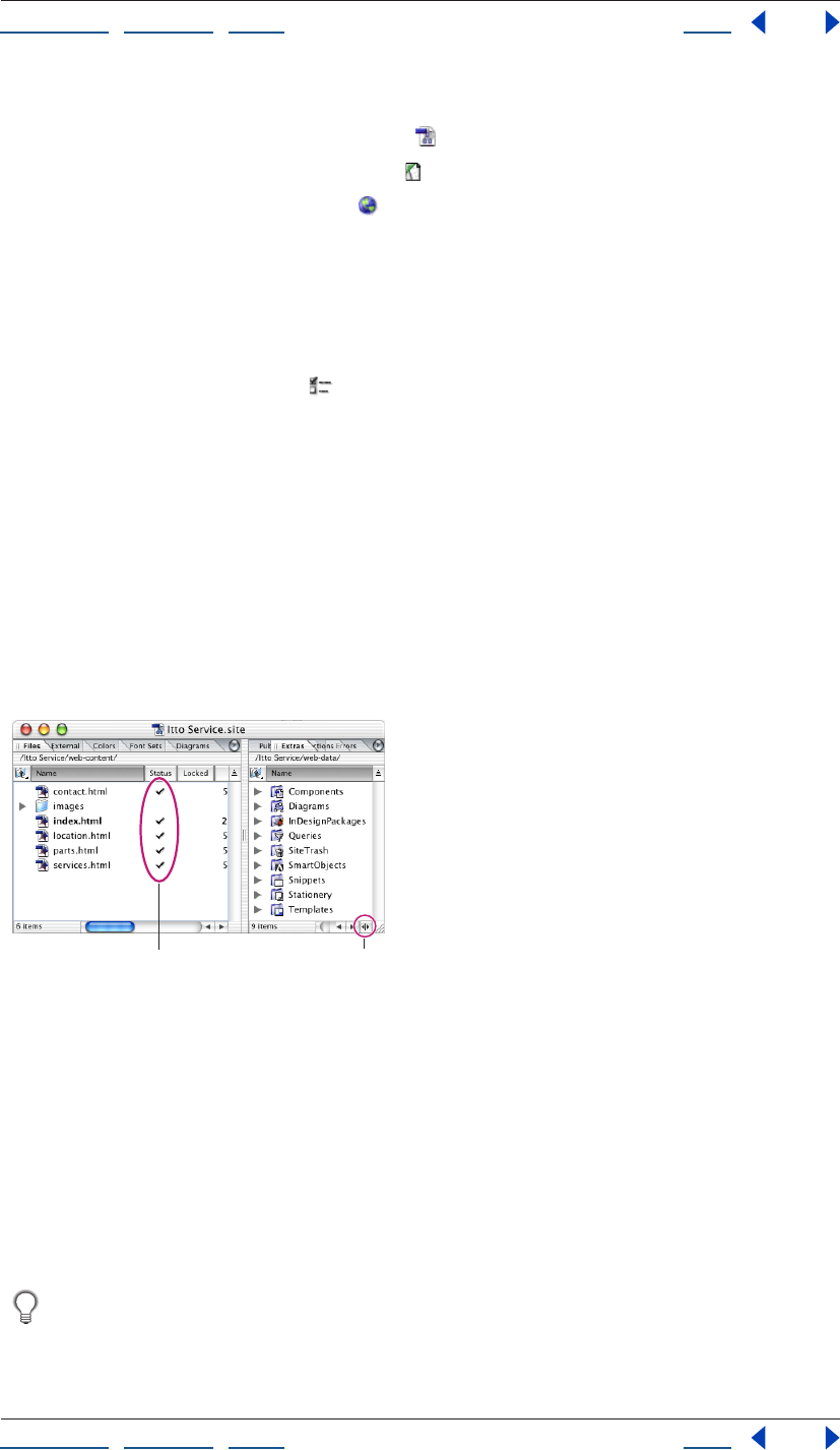
Using Help | Contents | Index Back 92
Adobe GoLive CS Help Managing and Viewing Web Sites
Using Help | Contents | Index Back 92
2 In the left pane of the Preferences dialog box, do one of the following:
• Click or expand the Site preferences icon and then select a Site category.
• Click the Script Library preferences icon .
• Click the Internet preferences icon .
3 In the right pane, set the preferences you want to apply to all sites.
4 Click OK.
To specify site-specific settings:
1 Open a site.
2 Click the Site Settings button on the toolbar or choose Site > Settings.
3 In the Site Settings dialog box, click a category in the left pane and then select options
in the right pane.
4 If the Site Specific Settings option is available for a category, select it to have the site-
specific settings override the Site preferences.
5 Click OK.
Working with the site window
The site window is your indispensable tool for building and managing a Web site, and
should contain all of the linked files used in the site.
Files tab and Extras tab in the site window
A. Current status of files B. Show/Hide right pane button.
To open a site project file (.site) in the site window:
Do one of the following:
• Choose File > Open, browse to the site project file (.site), select it, and then click Open.
• Double-click the site project file on your system desktop.
Note: Opening a site project file automatically creates a backup of the file. GoLive deletes
the backup when you save and close the site project file. You can turn this feature off for all
sites in Site preferences.
If you need to reopen a site that was open during a computer crash, open the regular
site file, not the backup site file. If it is necessary to use the backup, GoLive will
inform you.
BA
p
Using Help | Contents | Index Back 93
Adobe GoLive CS Help Managing and Viewing Web Sites
Using Help | Contents | Index Back 93
To show or hide the right pane of the site window:
Click the Toggle Split View icon in the scroll bar at the bottom of the window.
To display the contents of a tab in the site window:
Do one of the following:
• Click the tab to bring it to the front.
• Choose the tab from the site window menu.
To restore the original configuration of the site window:
Choose Default Configuration from the site window menu for either pane of the window.
To customize the display of the site window tabs:
Do any of the following:
• To change the sort order of the column the tab is currently being sorted by, click the
column’s head. In Mac OS, you can also click the Sort Order icon above the scroll bar.
• To sort the tab by another column, click the column head.
• To show and hide columns, choose the column names from the Show Columns menu in
the View palette.
• To resize a column in a tab, drag the right border of the column head to the left or right.
• To change the position of a column in the tab, drag (Windows) or Command-drag (Mac
OS) the column head to the left or right. (You can’t change the position of the left-most
column in any tab.)
• To go up one level in the folder or group whose contents are listed in the tab, click the
Upwards button (Windows) or (Mac OS) at the top of the tab.
Note: Once you’ve reached the topmost level of the folder hierarchy reflected in the site
window, GoLive opens the Local File Browser to let you navigate through the file system.
• To show or hide the anchors in a page, click the icon to the left of the page to expand or
collapse the page.
• To change the view of items in a tab, choose an option from the Site > View menu.
For more information about arranging site window tabs, see “Rearranging palettes or
tabs” on page 32.
About the site window
GoLive organizes a site into nine tabs to handle different aspects of site management:
Files Contains HTML, XHTML, XML, media, and other files, as well as folders that you can
use to organize the files.
External Displays external URLs and e-mail addresses referenced by the site files.
Diagrams Contains diagrams with a graphical view of possible site implementations.
(See “About diagrams” on page 72.)
Colors Contains a collection of colors used in your site.
Font Sets Contains a collection of font sets used in your site. The font sets are lists of alter-
native fonts that you use to override the browser’s default display font settings.
Using Help | Contents | Index Back 94
Adobe GoLive CS Help Managing and Viewing Web Sites
Using Help | Contents | Index Back 94
You can also show and hide the right pane of the site window that contains these
additional tabs:
Extras Contains all of the files and folders in the site’s web-content folder and web-data
folder. The web-data folder contains four types of reusable objects: components,
stationery pages, snippets, and page templates. The Extras tab also contains diagrams,
Smart Objects, InDesign packages, queries, and files moved to the Site Trash. (See “About
site assets” on page 304.)
Note: You can choose to not show the web-content folder in the Extras tab by doing the
following: choose Edit > Preferences (Windows) or GoLive > Preferences (Mac OS) and
select Site in the left pane; then deselect Show Web-content Folder in Extras Tab.
Errors Contains missing files, orphan files, Smart Object warnings, and files that have a
name that doesn’t meet your filename constraints. An orphan file is referenced in a link
but GoLive can’t find the file, or the file is outside the web-content folder. If you manage
files in the site window, you can avoid creating orphan files. Click a file in the Errors tab to
open the Error Inspector. For information on finding and fixing links to missing files, see
“Checking the site for missing or orphan files” on page 127.
Publish Server Displays the site on a remote server while GoLive is connected to a
publish server (an FTP, WebDAV, or local file server).
Collections Displays custom sets of one or more files that you select manually or define
as a result of a query, syntax check, or find operation.
The status column in the site window contains icons that show you each file’s status. The
checkmark icon indicates that the file is error-free—that all files referenced in it have
been found. For information on the meaning of the other status icons, see “Fixing site
errors” on page 126.
You can also display a third view of the site window that contains two graphical views:
Navigation and Links view (see “About graphical site views” on page 104).
About site files and folders
In GoLive, a site is a collection of files that are used as resources for developing and
maintaining a Web site on a Web server. Viewers of the Web site only see files that you
upload to the Web server. (See “Uploading a site” on page 328.) These files include the
home page (usually named index.html), pages linked directly or indirectly to the home
page, and media files referenced by any of these pages.
Viewers don’t see the rest of the files that are usually placed in the web-data and web-
settings folders, and normally the contents of these folders are not uploaded to the server.
The files comprising a GoLive site include the site project file and the contents of three
folders: the web-content folder, the site web-data folder, and the site web-settings folder.
• Files and file information that are managed by the site project file are displayed in the
various tabs of the site window.
• The contents of the site web-content folder are listed in the Files and Extras tabs of the
site window.
• The contents of the site web-data folder are listed in the Extras tab of the site window.
• The site web-settings folder contains XML files of site-specific settings, and settings for
the Colors tab, External tab, and Font Sets tab.
Using Help | Contents | Index Back 95
Adobe GoLive CS Help Managing and Viewing Web Sites
Using Help | Contents | Index Back 95
Inspecting file properties
The File Inspector for any selected file has a File tab with basic file information, a Name tab
with information on whether the filename matches or violates a filename constraint (see
“Naming files and folders” on page 102), and a Content tab with a thumbnail of the file. For
HTML and XHTML files, the File Inspector includes an additional Page tab with the page
title and encoding information. (See “Changing the page title” on page 53.) The Folder
Inspector includes basic folder information and a Name tab with filename status.
You can also use the File Inspector and Folder Inspector to rename files and folders, or
change their publish state and their status label. (See “Providing file status information” on
page 133.)
To inspect a file or folder:
1 Display the Inspector.
2 Select the file or folder in the site window.
3 If you selected a file, click the File, Name, Page, or Content tab in the File Inspector as
necessary. If you selected a folder, click the Folder or Name tab in the Folder Inspector as
necessary.
To show file information in Explorer (Windows) or Finder (Mac OS):
Click the Show Information in Explorer button (Windows) or the Show Information in
Finder button (Mac OS) on the toolbar.
Working with files and folders
In the site window, arrange files in folders to keep them in order. For example, create
separate folders for storing pages, images, and animations in the Files tab in the site
window.
Important: When using GoLive, you can reference files in any folder on your system.
However, if you use a system tool such as Explorer (Windows) or Finder (Mac OS) to move,
rename, or delete site files, GoLive doesn’t update link and reference information. This is
why it’s highly recommended that you work in the site window when moving, renaming,
or deleting files. If you do move, rename, or delete files with a system tool, be sure to
refresh the view of files in the site window. (See “Refreshing the site window” on page 98.)
Similarly, use the site window to arrange non-file items in groups. (GoLive treats and
displays a group in the site window as a type of folder, but all groups are stored within the
Settings folder rather than within other regular folders on your hard disk.) Items in the
Files and Extras tabs are stored in regular folders. All non-file items in the External,
Colors, and Font Sets tabs are stored in groups. Items in the Collections tab are stored in
collections.
To create a folder (group, regular folder, or collection):
1 Click the tab where you want to create the folder.
2 If you want the folder you are creating to be subordinate to an existing folder in the tab,
select the existing folder.
3 Do one of the following:
• Click the Create New Folder button on the toolbar.
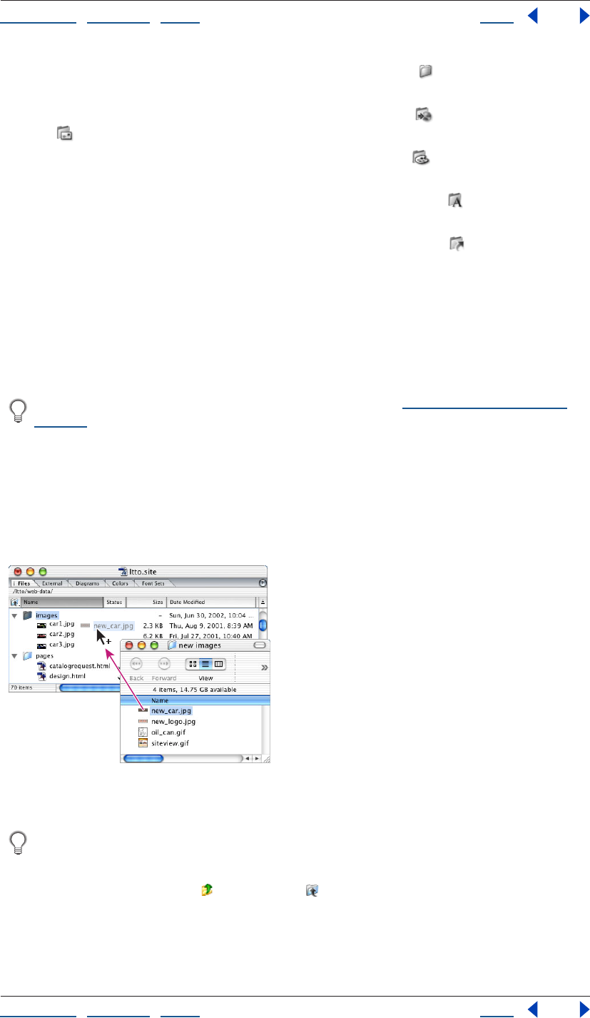
Using Help | Contents | Index Back 96
Adobe GoLive CS Help Managing and Viewing Web Sites
Using Help | Contents | Index Back 96
• To add a folder to the Files or Extras tab, drag the Folder icon from the Site set of the
Objects palette to the site window.
• To add a group to the External tab, drag the URL Group icon or the Address Group
icon from the Site set of the Objects palette to the site window.
• To add a group to the Colors tab, drag the Color Group icon from the Site set of the
Objects palette to the site window.
• To add a group to the Font Sets tab, drag the Font Set Group icon from the Site set of
the Objects palette to the site window.
• To add a collection to the Collections tab, drag the Collection icon from the Site set of
the Objects palette to the site window.
GoLive assigns a generic name of “untitled folder” for a new folder in the File tab; “untitled
collection” for a new collection in the Collections tab; and “untitled group” for a new group
in the Colors, External, or Font Sets tabs.
4 Enter a new name for the folder or group.
5 Move items into the folder as necessary.
You can also import files and other items into a site. (See “Adding existing files” on
page 52.)
To move a file or object to a folder (group or regular folder):
1 Do one of the following:
• Drag the file or object from a folder in the Explorer (Windows) or Finder (Mac OS) into a
folder or tab in the site window.
• Drag an object into a group.
Dragging a file from a desktop folder to a folder in the
site window
If you want the target folder to open so that you can see its contents, position the
pointer over its icon before releasing the mouse button. If you want to target a folder
one level up from the folder displayed in the tab you are dragging into, drag the file or
object to the Upwards button (Windows) or (Mac OS) at the top of the tab.
Using Help | Contents | Index Back 97
Adobe GoLive CS Help Managing and Viewing Web Sites
Using Help | Contents | Index Back 97
2 If you are moving a file containing links or file references, click OK in the Move Files
dialog box to update them.
Important: If you exclude any file from updating, broken links and invalid file references
might result.
To open the desktop folder containing a file or folder in the site window:
1 Select the file or folder in the site window. You can select only regular folders and files,
not groups or objects in groups.
2 Click the Reveal in Explorer (Windows) or Reveal in Finder (Mac OS) button on
the toolbar.
Tracking work on site files
The Workflow palette lets you keep track of what state your site files are in, and is useful
whether you’re working alone or in a workgroup. When you select a file in the site window,
the Workflow palette lets you indicate who is editing a file and how complete the file is.
This information is displayed in two additional columns in the Files tab of the site window
for easy reference—in the To Be Edited By column and the Completed column.
Note: You can also add metadata to a file in a site to preserve information about the
contents, copyright status, origin, and history of the file (see “Adding metadata to
documents” on page 40).
To show the state of a file or folder:
1 Choose Window > Workflow to display the Workflow palette.
Note: If Workflow does not appear in the Window menu, choose Edit > Preferences
(Windows) or GoLive > Preferences (Mac OS), and then click Modules. Make sure the
Workflow option, which is at the bottom of the list under Extend Scripts, is selected in the
right pane, and then restart GoLive.
2 Select a file or folder in the site window.
3 In the Workflow palette, enter a name in the To Be Edited By text box and then choose a
percentage from the Completed menu.
Deleting files
When you delete a file or folder from the site, you send it to a Site Trash folder or to the
system Recycle Bin or Trash. The default destination is Site Trash, but you can select the
Recycle Bin or Trash as the destination in the Site preferences. You can recover files from
the Site Trash, or you can move them to the system Recycle Bin or Trash. Deleting objects
and groups from the system Recycle Bin or Trash removes them entirely from the system.
For many purposes, updating the Files or Extras tab or removing unused objects from the
External, Colors, or Font Sets tab is preferable to deleting the file or object. (See
“Refreshing the site window” on page 98.)
To delete a file, regular folder, object, or group:
1 Select the item.
2 Click the Delete Selected Item button on the toolbar.
3 If necessary, confirm the deletion by clicking Yes.
Using Help | Contents | Index Back 98
Adobe GoLive CS Help Managing and Viewing Web Sites
Using Help | Contents | Index Back 98
To recover a file from the Site Trash:
1 If necessary, click the Toggle Split View icon in the scroll bar at the bottom of the site
window to show the right pane.
2 Click the Extras tab.
3 Open the Site Trash folder and then select the file you want to recover.
4 Do one of the following:
• If you haven’t performed any other actions since you deleted the file, choose
Edit > Undo Move to Trash.
• Drag the file to its previous location (or another location) in the Files tab.
To move files to the system Recycle Bin or Trash:
In the Extras tab, do one of the following:
• To move all files from the Site Trash to the system Recycle Bin or Trash, select the Site
Trash icon and then choose Empty Trash from the context menu.
• To move an individual file from the Site Trash to the system Recycle Bin or Trash, select
the file and then press Delete (Windows) or Command-Delete (Mac OS).
To change the destination of file and folder deletions:
1 Choose Edit > Preferences (Windows) or GoLive > Preferences (Mac OS), and then
click Site.
2 Select a trash option and then click OK.
Refreshing the site window
You can refresh the list of items in the Files, Diagrams, Collections, and Extras tabs in the
site window so that you are viewing the actual site—that is, the contents of the site’s web-
content folder (Files tab), web-data folder (Extras and Diagrams tabs), or web-settings
folder (Collections tab). You can also refresh the contents of the current directory on the
publish server if you connect to the publish server and refresh the Publish Server tab.
Refreshing the site window may result in files being added to the site window, files being
removed, or both, depending on changes you’ve made to files both in and outside GoLive.
Refresh the site window if you have been working with files outside GoLive—for example,
using the Explorer (Windows) or Finder (Mac OS) instead of GoLive to move, rename, or
delete, files in the site window.
To refresh the Files, Diagrams, Collections, or Extras tabs:
1 Do one of the following:
• Click the tab.
• Click the Files tab and then open the desired folder.
2 Click the Refresh View button on the toolbar or choose Site > Refresh View.
Note: If your site contains a password-protected PDF file, GoLive will prompt you for the
password when you refresh the site.
Using Help | Contents | Index Back 99
Adobe GoLive CS Help Managing and Viewing Web Sites
Using Help | Contents | Index Back 99
To refresh the Publish Server tab:
1 Connect to a publish server.
2 Open the server directory you want to refresh.
3 Click the Refresh View button on the toolbar or choose Site > Refresh View.
Adding items in use and removing unused items from the
site window
GoLive can scan all pages in your site for non-file items that are used on a page but are not
listed on the External, Colors, or Font Sets tabs. Once found, GoLive adds these items to
the appropriate tabs in the site window. For example, GoLive adds a color to the Colors tab
if the color is being used on a page but isn’t listed in the Colors tab.
If GoLive finds new references or addresses that need to be listed in the External tab,
GoLive creates a Scanned URLs or Scanned Addresses group for them in the tab. Similarly,
Scanned Colors or Scanned Font Sets groups are created in the Colors or Font Sets tabs if
new colors or font sets are found.
You can remove references, colors, or font sets that are not being used in your site from
the External, Colors, and Font Sets tabs.
To add items in use and remove unused items from the site window:
1 Click the External, Colors, or Font Sets tab.
2 Click the Get Used/Remove Unused button on the toolbar.
Note: By default, the Get Used/Remove Unused button adds items in use and removes
unused items. To perform a single action only, such as removing unused items, click the
triangle to the right of the Get Used/Remove Unused button and choose an option.
3 Click OK to confirm the removal of unused items, if necessary.
Updating site files that are dependent on library files
When you update site files, GoLive checks the content of the Components, Templates,
Smart Objects, and InDesignPackages folders in the site’s web-data folder for updates to
that content made outside of GoLive.
For information about components or templates, see “About site assets” on page 304. For
information about Smart Objects or InDesign packages, see “Working with Smart Objects”
on page 262 and “Adding InDesign content” on page 286.
To update site files that are dependent on library files:
1 Open a site.
2 Do one of the following:
• To check all components, templates, Smart Objects, or InDesign packages for updates,
choose Site > Update Files Dependent On > Library or click the Update Files Dependent
on Library button on the toolbar.
• To check specific components, templates, or Smart Objects for updates, select
templates, components, or Smart Objects in the Extras tab of the site window (Control-
click to select multiple files), and then choose Site > Update Files Dependent On >
Selection.
3 If necessary, select files to update in the Update Dependent Files dialog box.
Using Help | Contents | Index Back 100
Adobe GoLive CS Help Managing and Viewing Web Sites
Using Help | Contents | Index Back 100
Cleaning up a site
The Clean Up Site command is essential for maintaining your site and preparing it for
publication (uploading to a Web server for viewing by the public). Cleaning up a site gets
rid of unused links, colors, e-mail addresses, and font sets that can clutter the working
version of your locally stored site. You can also use this command to copy any files or
objects into the web-content folder that are referenced in your site, but actually located
outside the web-content folder.
When cleaning up a site, you can choose to do any combination of the following:
• Refresh the view of items listed in the site window.
• Copy files that are used in your site into the web-content folder. Used means “referenced
on some page in the web-content folder.”
• Remove unused files. Unused means “not referenced on any page in the web-content
folder.” (See “Refreshing the site window” on page 98.)
• Add references, colors, and font sets that are used in your site but are not listed in the
External, Colors, or Font Sets tabs. (See “Adding items in use and removing unused
items from the site window” on page 99.)
• Remove unused references, colors, and font sets.
To specify options for cleaning up a site:
1 Do one of the following:
• To specify options for cleaning up the active site only, click the Site Settings button
on the toolbar or choose Site > Settings. Then click Clean Up Site in the left pane, and
then select Site Specific Settings.
• To specify options for cleaning up all sites, choose Edit > Preferences (Windows) or
GoLive > Preferences (Mac OS), and then expand Site in the left pane. Then click Clean
Up Site.
2 Select options as follows:
• To refresh the view of items listed in the site window, select Refresh View.
• To copy files that are used in your site into the web-content folder if they are stored
outside the web-content folder, select Add Used Files. If you want to display a dialog
box that lets you select the files to be copied, select the Show List of Files to Copy
option.
• To add non-file items that are used in your site but are not listed in the External, Colors,
or Font Sets tabs in the site window, select Add Used External References, Add Used
Colors, or Add Used Font Sets.
• To move files not being used in your site to the Site Trash, select Remove Files Not
Linked. If you want to display a dialog box that lets you select the files to be removed,
select the Show List of Files to Remove option.
• To remove non-file items that are not being used in your site but are listed in the
External, Colors, or Font Sets tabs in the site window, select Remove Unused External
References, Remove Unused Colors, or Remove Unused Font Sets.
Using Help | Contents | Index Back 101
Adobe GoLive CS Help Managing and Viewing Web Sites
Using Help | Contents | Index Back 101
• Select Show Options Dialog if you want to display the Clean Up Site Options dialog box
every time you choose the Site > Clean Up Site command. If you select this option,
GoLive deselects the Don’t Show Again option in the Clean Up Site Options dialog box.
• Click Factory Settings to use the default settings for all options.
3 Click OK.
To clean up a site:
1 Choose Site > Clean Up Site.
2 If the Clean Up Site Options dialog box appears, select options as necessary and then
click OK.
3 If the Copy Files or Clean Up Site dialog box appears, select the files you want to copy
into or remove from the web-content folder, and then click OK. Click OK in the Update Files
dialog box.
Providing names and paths for files
When you build a Web site, you must name files so that you can properly reference them.
The connection between a link and its referenced file or object can be expressed as a path
describing the folder hierarchy. GoLive lets you customize the naming of files and the
creation of paths. You can choose from a variety of filename rules and also determine
whether a path is relative or absolute. (See “About absolute link paths” on page 103.)
About filenames
Files and folders need to be properly named so they can be uploaded correctly to the
server hardware you’re working with, whether it’s Windows, Mac OS, UNIX, DOS, or some
other operating system. GoLive comes with a set of filename rules that ensure cross-
platform compatibility. When a filename violates one of the rules, the Errors tab of the site
window and the File Inspector indicate the problem. The File Inspector also lists the rule
itself.
You can examine, modify, delete, and add filename rules. (See “Changing filename
constraints” on page 102.)
When naming files and folders, use lowercase to avoid case-sensitivity problems and
don’t include spaces in the name. Spaces in file and folder names are automatically
converted to the URL escape code “%20” during the FTP process. As a result, some links
and file references might become invalid.
Using Help | Contents | Index Back 102
Adobe GoLive CS Help Managing and Viewing Web Sites
Using Help | Contents | Index Back 102
Naming files and folders
When you create a new empty file, GoLive automatically gives it a name. If you know what
content that file will contain, you’ll probably want to rename it.
When you rename a file that is referenced by other files, you can update the other files
with the new filename at the same time. For information on updating an entire site for a
URL that other files reference, see “Editing links and URLs sitewide” on page 124.
If you use a name for a file or folder that contains illegal characters as defined by the
current filename constraint for the site (or all sites), GoLive displays warnings in the Errors
tab of the site window, the Name tab of the File or Folder Inspector, and the Status column
of the Files tab.
To rename a file:
1 Select the file in the Files tab in the site window and then enter the new name in the File
tab of the File Inspector.
2 If there are any other files that contain references to the file you renamed, the Rename
File dialog box appears. To have GoLive automatically update the references with the new
filename, leave the files selected and then click OK.
To check for filename constraint violations:
Select the file and then click the Name tab in the File Inspector to view any violations.
To rename a folder:
Select the folder in the Files tab in the site window and then enter the new name in the
Folder tab of the Folder Inspector.
Changing filename constraints
GoLive alerts you if you use a filename that doesn’t meet the designated filename
constraints. GoLive provides several constraint sets, or you can create your own sets.
GoLive’s default set is called the GoLive standard, a combination of Windows 98, NT, 2000,
XP, Mac OS, and UNIX. Other sets are GoLive strict, GoLive lower case, Windows (applies to
Windows 98, NT, 2000, XP), DOS/Windows 3.1, Mac OS, Mac OS X, and UNIX. You can also
select the File System Default set to have your operating system enforce filename
constraints instead of GoLive.
To change filename constraints:
1 Do one of the following:
• To change filename constraints for the active site only, click the Site Settings button
on the toolbar or choose Site > Settings. Then click Filename Constraints in the left
pane, and then select Site Specific Settings.
• To change filename constraints for all sites, choose Edit > Preferences (Windows) or
GoLive > Preferences (Mac OS), expand Site in the left pane, and then click Filename
Constraints.
2 Choose a set of constraints from the Selected Constraints menu.
3 Click OK.
Using Help | Contents | Index Back 103
Adobe GoLive CS Help Managing and Viewing Web Sites
Using Help | Contents | Index Back 103
To add a set of filename constraints:
1 Do one of the following:
• To add a set for the active site only, click the Site Settings button on the toolbar or
choose Site > Settings. Then click Filename Constraints in the left pane, and select Site
Specific Settings.
• To add a set for all sites, choose Edit > Preferences (Windows) or GoLive > Preferences
(Mac OS), expand Site in the left pane, and then click Filename Constraints.
2 Choose a set of filename constraints from the Selected Constraints menu that most
closely matches the set of constraints you want to use.
3 Click Duplicate. This creates a new duplicate set. You can edit and delete a duplicate set,
but you can’t delete the original.
4 Enter a name for the new set in the Selected Constraints text box.
5 Edit the set in the other text boxes as necessary.
6 Click OK.
About absolute link paths
Site pages contain paths to a variety of linked files: other pages in the site, images
displayed on the page, media items embedded in the page, and so on. GoLive automati-
cally uses relative paths—paths that point to the location of a file in relation to the current
file—for the destinations of links. In most cases, relative paths are appropriate to use. But,
if necessary for special cases, you can selectively change the paths to make them absolute,
or set a preference to have GoLive make all new paths you create absolute by default.
When you make a path absolute, the entire path from the root folder to the linked file is
provided. Otherwise only a relative path is provided.
Example A page /root/pages/info/page.html (where root is the name of the root folder)
references the image /root/images/image.gif. The absolute path to the image file is /
images/image.gif. The relative path is ../../images/image.gif.
Absolute paths are useful in the following cases:
• If a form references a CGI script at the root level of the site directory (or any other subdi-
rectory), any references to that file are usually written
as absolute.
• If a common navigation bar is used on many pages that reside in folders at various
hierarchical levels, you can use an absolute path specification throughout to reference
its image files, allowing you to copy and paste the same code snippet onto all the
pages.
However, absolute paths work only at sites where there is a Web server providing infor-
mation about the location of the site’s root folder. For the same reason, using absolute
paths prevents you from previewing pages in a Web browser on your local computer—
that is, a previewing browser has no way of locating this root folder.
Note: An absolute path in GoLive is not a full path from the file system root or a fully
qualified URL.
Using Help | Contents | Index Back 104
Adobe GoLive CS Help Managing and Viewing Web Sites
Using Help | Contents | Index Back 104
Setting up absolute link paths
You can specify absolute paths for all new links or for specific links. For information on
creating links, see “Linking files” on page 61.
To make the path of a link absolute:
1 Select the link.
2 Do one of the following:
• Choose Relative from the URL menu to the right of the Browse button in the Inspector, if
it is checked. (Unchecked indicates the link is absolute.)
• Choose Edit from the URL menu in the Inspector. In the Edit URL dialog box, click Make
Absolute, and then click OK.
You can also use the Edit URL dialog box to add query parameters to the URL. (See “Editing
URLs in links” on page 64.)
To set a preference that makes all new links absolute:
1 Choose Edit > Preferences (Windows) or GoLive > Preferences (Mac OS).
2 Expand General preferences and select URL Handling.
3 In the right pane, select Make New Links Absolute, and then click OK.
To specify a site setting that makes all new links absolute in the active site only:
1 Open a site.
2 Click the Site Settings button on the toolbar or choose Site > Settings.
3 In the left pane, select URL Handling.
4 In the right pane, select Make New Links Absolute, and then click OK.
About graphical site views
GoLive provides site views that are graphical representations of a site’s pages and the links
that connect them. You can use the graphical site views with the site window to display
and edit the content and structure of your Web site, and examine the links and relation-
ships between pages.
• The navigation view shows a tree-like hierarchy of pages (beginning with the home
page) that underlies the web of links in your site. You can add pages to the structure,
move pages around, and open pages from the navigation view. (See “About navigation
view” on page 105.)
• The links view shows a web of actual links going in and out from each page to other
pages, images, or media files in your site, and to external URLs or e-mail addresses. You
can expand or collapse the various levels of links to focus on the overall structure of
links in the site or links of a single page. (See “About links view” on page 107.)
The pages shown in each graphical site view are also listed in the Files tab of the site
window. When you select a page in a view, you can select the same page in the Files tab by
clicking the Reveal In Site button on the toolbar. By using options on the View palette,
you can expand the site views into additional panes that display a panorama of the site,
reference pages used by a selected page in the site, or scratch pages that are not linked to
any pages in the site.
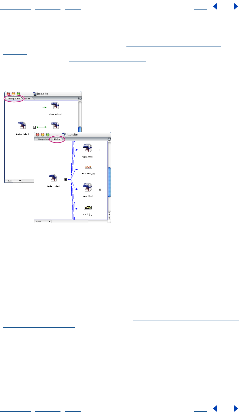
Using Help | Contents | Index Back 105
Adobe GoLive CS Help Managing and Viewing Web Sites
Using Help | Contents | Index Back 105
GoLive also provides other graphical tools for managing and viewing Web sites. You can
use the In & Out Links palette to see incoming and outgoing links for files, and change
links and file references throughout a site. (See “Editing links and URLs sitewide” on
page 124.) You can also use diagrams to show the hierarchy of pages and the connections
between site assets. (See “About diagrams” on page 72.)
Displaying a graphical site view
You can display a navigation view or links view of a site.
Navigation and Links views
To display a graphical site view:
1 Open the site project file for your site.
2 Choose Navigation or Links from the Site window menu.
About navigation view
With a new imported site, the navigation view shows the structure of the site as a tree-like
hierarchy descending from the home page. With a new blank site, the navigation view
shows a single home page, and you can build the structure of the site by adding empty
pages to the home page in the same sort of hierarchy. You can also use this method to add
pages and substructures to an imported site. (See “Adding empty pages and pending links
to a hierarchy” on page 119.)
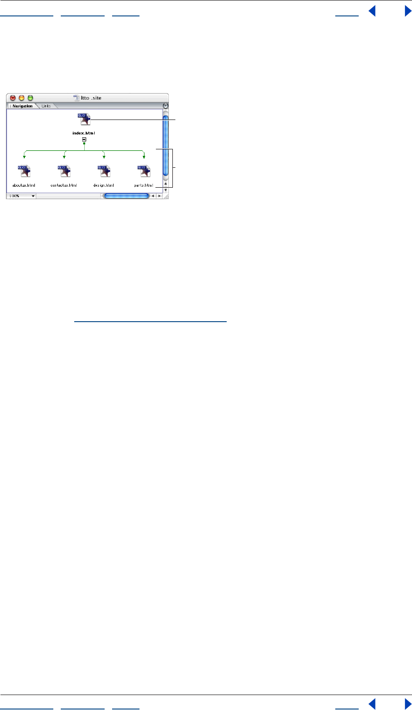
Using Help | Contents | Index Back 106
Adobe GoLive CS Help Managing and Viewing Web Sites
Using Help | Contents | Index Back 106
In either case, the hierarchy comprises logical pair relationships between pages in which a
page is either a child, a parent, a previous sibling, or a next sibling. A typical parent-child
relationship is between a home page and pages it links to.
Navigation view
A. Home page B. Children of home page
A typical sibling relationship is between the first (previous) and second (next) pages in a
book-like sequence of pages.
With the structure established, you can fill the empty pages with content and link them
together in a way that reflects the structure. Alternatively, you can rebuild the hierarchy
with different settings to establish a different structure before you reflect the structure
with links. (See “Solving a hierarchy” on page 124.)
A
B
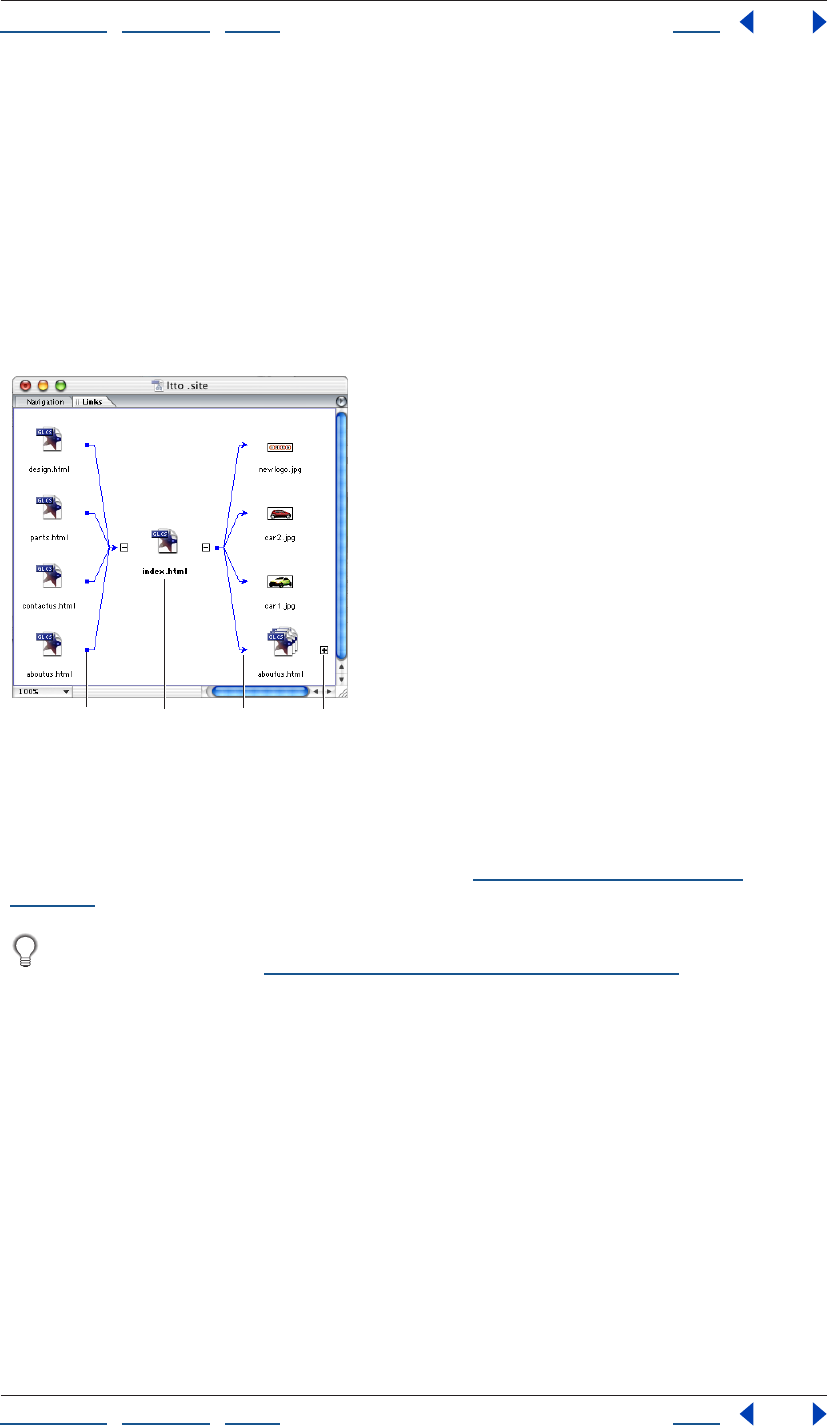
Using Help | Contents | Index Back 107
Adobe GoLive CS Help Managing and Viewing Web Sites
Using Help | Contents | Index Back 107
About links view
When you open a links view of a site, it shows the site’s home page file (often called
index.html). If the site contains pages linked to the home page, pages linked to these
pages, and so on, you can view them by expanding the view, first from the home page and
then from other pages that come into view. Each expansion displays files linked to the
expanded file. Expansions in one direction show incoming links—links with their source in
other files and the expanded file as their destination. Expansions in the opposite direction
show outgoing links—links to other files with their source in the expanded file. An
individual file can appear several times in the view—for example, as an incoming link to
the left of an expanded file, and as an outgoing link to its right.
Links view
A. Incoming link B. Home page
C. Outgoing link D. File not expanded
You can choose options for displaying incoming links only, outgoing links only, no links, or
only the link path you are currently exploring. (See “Varying the view of links” on
page 116.)
To change or fix links, use the links view to select files and the In & Out Links palette to
change or fix links. (See “Editing links and URLs sitewide” on page 124.)
A B C D
Using Help | Contents | Index Back 108
Adobe GoLive CS Help Managing and Viewing Web Sites
Using Help | Contents | Index Back 108
Modifying site views
You can move the navigation or links site views into several useful window configurations,
and vary the views within these windows in many ways that help you survey the site.
Expanding and collapsing views
When you expand or collapse a file in one of the site views, you show or hide the files
linked to it. The feature works in much the same way that expanding and collapsing
folders work in Windows Explorer or Mac OS Finder.
When you expand a file, it stays expanded until you collapse it explicitly. For example, if
you collapse a file that governs a long path of files, the entire path disappears. If you then
expand the same file, the entire path reappears, not just the files linked directly to the
expanded file.
You expand files from the home page file to view a whole site. Because most sites contain
too many files to view all at once and scrolling the view can be awkward, you sometimes
need to collapse files to view another portion of the site. However, there are a number of
more precise techniques for moving and limiting the view. (See “Magnifying and reducing
the view” on page 112 and “Centering views and displaying partial trees” on page 113.)
To expand the view of a site or a tree in the site completely:
1 In a navigation view or links view, do one of the following:
• To expand the view of a site completely, select the home page (index.html).
• To expand the view of a tree in the site completely (a selected page and all of its
children and grandchildren pages), select the page that is at the root or top of
the hierarchy.
2 Click the Unfold Hidden Child Items button on the toolbar.
To expand the view of a site incrementally:
1 Do either of the following:
• In a navigation view, click the Expand button next to a page to view its child page
or pages.
• In a links view, click the Expand button next to a page to view its incoming or
outgoing links. The location of the Expand button relative to the page determines
whether the links are incoming or outgoing.
2 Continue clicking Expand buttons until the view is expanded in the way that you want.
To collapse the view of a site incrementally:
1 Do either of the following:
• In a navigation view, click the Collapse button next to a page to hide its child page
or pages.
• In a links view, click the Collapse button next to a page to hide its incoming or
outgoing links.
2 Continue clicking Collapse buttons until the view is collapsed in the way that you want.
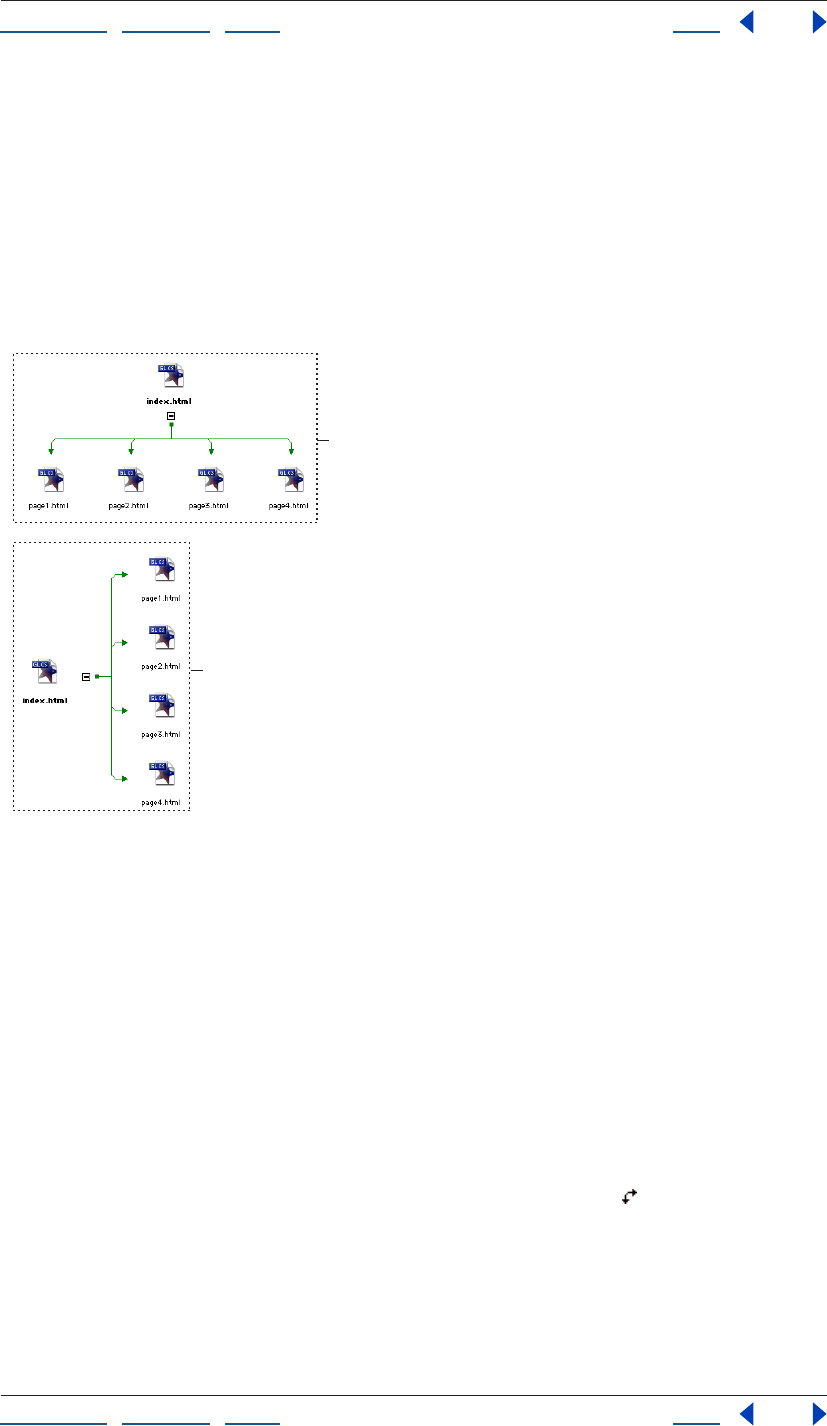
Using Help | Contents | Index Back 109
Adobe GoLive CS Help Managing and Viewing Web Sites
Using Help | Contents | Index Back 109
To get advance information about an expansion (Windows only):
If you are using GoLive on Windows, pause the pointer over the Expand button before
clicking it. A tooltip provides the number of children, incoming links, or outgoing links the
expansion contains.
Changing the orientation of a view
When you first view a site, its navigation view has a wide orientation and its links view has
a tall orientation. Both navigation view and links view can appear in either wide or tall
orientation.
Wide and tall orientations of a navigation view compared
A. Wide orientation B. Tall orientation
Both views use four directions to indicate types of links. For example, in a wide navigation
view a page’s parent page is above the page.
In wide orientation, a navigation view uses the four directions as follows: Above is the
parent page, below is the child page, left is the previous page, and right is the next page.
In tall orientation, the parent page is left and the previous page above.
In tall orientation, a links view uses two directions as follows: Left is the incoming link and
right is the outgoing link. In wide orientation, the incoming link is above.
To change the orientation of a view:
Do either of the following:
• Click the Toggle Between Horizontal/Vertical Orientation button on the toolbar.
• In the Navigation tab or Links tab of the View palette, select Tall or Wide.
Using the peripheral panes of the site views
The navigation or links site views usually have a single pane, but you can also display up to
three additional special-purpose panes on the periphery of the main pane of a view:
A
B
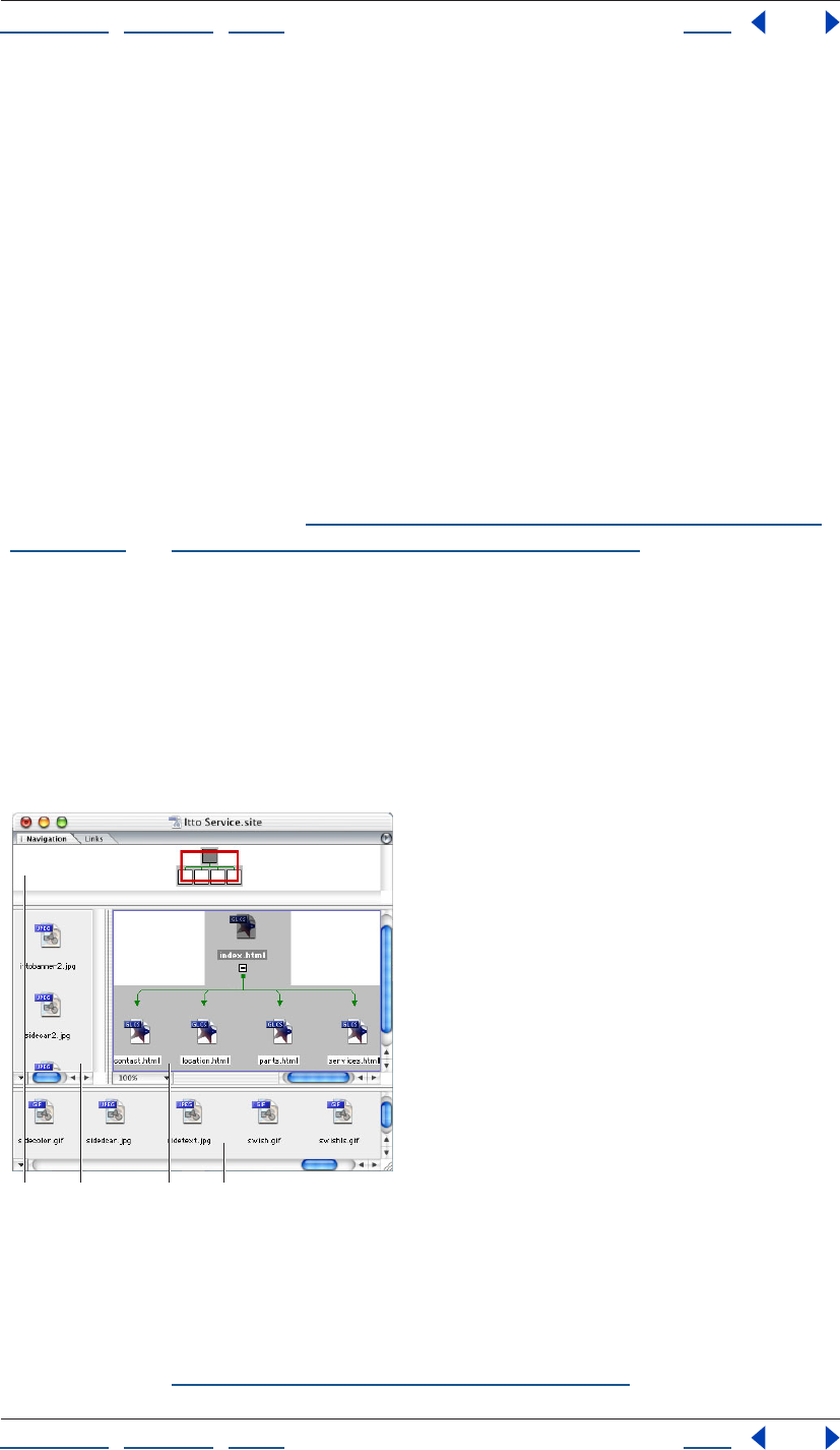
Using Help | Contents | Index Back 110
Adobe GoLive CS Help Managing and Viewing Web Sites
Using Help | Contents | Index Back 110
Panorama pane This pane is a bird’s-eye view of the entire site. The view contains a red
view box that corresponds to the current view in the main pane. You can scroll the view of
the site that is shown in the main pane by moving the red view box in the panorama pane.
You can do anything with the panorama pane that you can do with the main pane—for
example, select a page or drag a page to another page in the navigation view to make it
that page’s child or parent. The panorama pane is available in the navigation view and
links view.
Scratch pane This pane shows two kinds of files that are stored in the site’s web-content
folder and listed in the Files tab of the site window: HTML pages that aren’t part of the
site’s navigation hierarchy, and media files that aren’t referenced on any HTML page listed
in the Files tab. The scratch pane is available only in the navigation view.
You can drag HTML pages from the navigation view’s scratch pane to its main pane. You
use a navigation view’s scratch pane as you would its main pane, dragging a page to a
target page in the main pane and positioning it so that it becomes the parent, child, or
sibling of the target page. Similarly, you can build up partial trees in the scratch pane and
drag them to target pages. (See “Adding empty pages and pending links to a hierarchy”
on page 119 and “Rearranging the parts of a hierarchy” on page 121.)
Reference pane This pane shows media objects embedded in one or more pages that
are selected in the main or panorama pane. By selecting different pages in the main pane,
you can easily browse the embedded objects. The reference pane doesn’t show media
files linked to the HTML page—for example, a large image file linked to a thumbnail
version of the same image embedded in a page. The reference pane is available in the
navigation view and links view.
In practice, you would probably open only one
or two panes at a time, depending on your immediate need.
The peripheral panes in a navigation view in wide orientation
A. Panorama pane B. Reference pane
C. Main pane D. Scratch pane
The navigation view shown has a wide orientation. If a navigation view’s orientation is tall,
the panorama pane is on the left, the scratch pane is on the right, and the reference pane
is at the top. (See “Changing the orientation of a view” on page 109.)
A B C D

Using Help | Contents | Index Back 111
Adobe GoLive CS Help Managing and Viewing Web Sites
Using Help | Contents | Index Back 111
Showing and resizing peripheral panes
You can show or hide the peripheral panes and change their size relative to the size of the
main pane. After you show and resize a peripheral pane, that pane, in its current size,
becomes part of the default view until you hide the pane.
To show or hide a peripheral pane:
1 Do one of the following:
• To show or hide a peripheral pane in the navigation view, display the navigation view.
• To show or hide a peripheral pane in the links view, display the links view.
2 To show or hide a peripheral pane, do one of the following:
• Choose the peripheral pane from the Navigation or Links window menu. Panes
showing are checked on the menu. Choose a checked pane to hide the pane.
• In the Navigation tab of the View palette, select Panorama, Scratch, or Reference to
show a pane. Deselect the Show Pane options to hide panes.
• In the Links tab of the View palette, select Panorama, or Reference. Deselect the Show
Pane options to hide panes.
Using Help | Contents | Index Back 112
Adobe GoLive CS Help Managing and Viewing Web Sites
Using Help | Contents | Index Back 112
To resize a peripheral pane:
1 Show the pane you want to resize.
2 Drag the inside border of the pane toward or away from the main pane.
You can simplify site building by using the scratch pane for building site modules
(partial trees) and the main pane for assembling them.
Scrolling the view in the main pane
You can use a miniature view of an entire site to help you scroll the view of the site shown
in the main pane and focus on a particular subtree. You can use the panorama pane or Site
Navigator palette to scroll the main pane to distant parts of the site. For small movements,
you may find the scroll bars in the main pane adequate.
Both the panorama pane and Site Navigator palette show a miniature version of the
complete site with a red view box representing the portion of the site currently shown in
the main pane, and both let you scroll the main pane’s view by dragging the box. If you
resize the main pane or change the magnification percentage to zoom in or out, the size
of the red box changes accordingly in the miniature view.
There is one key difference between the Site Navigator palette and the panorama pane.
Although the Site Navigator palette is a picture of the site, the panorama pane is an actual
view, so you can work with objects in the panorama pane even if they aren’t visible in the
main pane. For example, you can drag a page in the panorama pane that is outside the
main pane into a location in the main pane.
To scroll the view in the main pane to another part of the site:
1 Do one of the following:
• Show the panorama pane.
• Choose Window > Site Navigator.
2 Do one of the following:
• In the panorama pane or Site Navigator palette, drag the red view box to another part
of the site. The view in the main pane scrolls with the box.
• Select a file entirely outside the view box—that is, one that doesn’t also appear inside
the box. The view in the main pane scrolls to show the file.
• Hold the spacebar and drag the view.
Magnifying and reducing the view
You can choose from a menu of magnification percentages or click to zoom in on a
particular area. In either case, you work separately on the main, scratch, or reference
panes. You can also use a slider in the Site Navigator palette for precise magnification of
the view in the main pane.
To magnify or reduce the view in the main pane with a Zoom menu:
Click the Zoom button at the bottom left corner of the main pane, and then
choose a magnification level from the pop-up menu.
Using Help | Contents | Index Back 113
Adobe GoLive CS Help Managing and Viewing Web Sites
Using Help | Contents | Index Back 113
To zoom in on a particular area:
1 Hold down Shift (Windows) or Option (Mac OS). If the pointer is in a pane you have
not already zoomed in on, it changes to the Zoom-in tool . Otherwise it changes to the
Zoom-out tool .
2 Do one of the following in the main, scratch, or reference pane:
• Move the pointer to the area and click. The magnification changes to 200% when you
do this the first time. It changes to 100% when you do it again in the same pane.
• Draw a rectangle defining the area and release. The area enlarges to fill the pane. You
can do this repeatedly until the magnification reaches 500%.
You can use the Site Navigator palette both for focusing the view on a particular area
and for magnifying it. This has the same effect as zooming it.
To magnify or reduce the view in the main pane with the Site Navigator palette:
1 Choose Window > Site Navigator.
2 Do one of the following:
• Click the Zoom In button or the Zoom Out button .
• Drag the zoom slider.
• Enter the percentage of magnification or reduction you want in the text box at the
bottom left corner of the Site Navigator palette.
Centering views and displaying partial trees
The Move to Center command limits a links view to a page and its incoming and outgoing
links. The Display Partial Tree command limits a navigation view to a partial tree—that is,
one or more selected pages and the logical descendents (children, grandchildren, and
so on).
The most basic way to limit a view is by expanding and collapsing it. (See “Expanding and
collapsing views” on page 108.) You also can limit a view by using the View palette to vary
and filter it. (See “Varying the view of links” on page 116 and “Filtering the contents of the
view” on page 118.)
To limit the view to a page and its incoming and outgoing links:
1 Select a page in the main pane of the links view.
2 Choose Move to Center from the context menu. The view is reduced to the file you
selected and its incoming and outgoing links.
3 If you want to center the view on another file, select the file and press the Escape key, or
choose Move to Center from the context menu again.
To display only partial trees:
1 Select one or more pages in the main pane of a navigation view.
2 Choose Display Partial Tree from the context menu. The view is reduced to the page(s)
you selected and their logical descendents (subtrees).
3 To view the complete tree, press the Escape key or choose Display Partial Tree from the
context menu again.
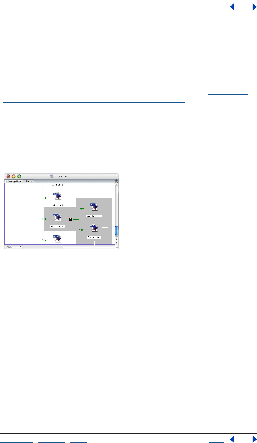
Using Help | Contents | Index Back 114
Adobe GoLive CS Help Managing and Viewing Web Sites
Using Help | Contents | Index Back 114
Creating and using collections in navigation or links view
A collection is a custom set of one or more files that you select. After creating a collection,
you can perform various file-management tasks on the files in the collection, such as
deleting or duplicating. Because you can select all of the files by selecting the collection
name, you can perform these tasks on the files quickly.
When you create a collection in navigation or links view, you identify each collection by a
unique name, and you can use different spotlight colors for each collection. To display the
files in a set, you can spotlight the collection in the navigation view. (See “Spotlighting
page groupings and collections in navigation view” on page 115.) You can start with an
empty collection and add pages to it, or start with the pages and make them a collection
all at once.
Collections you create in navigation or links view are saved in the Collections tab of the
site window.
Note: You can also create a collection by saving query, find/replace, or syntax check
results, or by dragging or copying files from the site window into the Collections tab of the
site window. (See “Using collections” on page 319.)
Using spotlights in a collection of pages
A. Spotlight B. Collection of pages
To create an empty collection in navigation or links view:
1 Choose Create Collection from the context menu in the Navigation or Links view.
2 Enter a name for the collection in the text box.
3 Make sure the Add Selection option is not selected, and then click OK.
To create a collection from a selection of pages in navigation or links view:
1 Select one or more pages in the navigation view or links view.
2 Choose Create Collection from the context menu.
3 Enter a name for the collection in the text box.
4 To add the selected pages to the collection, make sure the Add Selection option
is selected.
5 To spotlight the collection, select Spotlight Collection.
6 Click OK.
A B
Using Help | Contents | Index Back 115
Adobe GoLive CS Help Managing and Viewing Web Sites
Using Help | Contents | Index Back 115
To add pages to a collection or delete pages from a collection in navigation or links
view:
1 Select one or more pages in the navigation
view or links view.
2 Choose Toggle Collection from the context menu.
3 Do one of the following:
• To add the page(s) to a collection, choose an unchecked collection from the Toggle
Collection submenu.
• To delete the page(s) from a collection, choose a checked collection.
To select the pages of a collection in navigation or links view:
1 Choose Reselect Collection from the context menu.
2 Choose the collection from the Reselect Collection submenu.
To reveal a collection page in the Collections tab of the site window:
1 Select one or more pages in the navigation view or links view.
2 Choose Reveal in Collections from the context menu.
To rename or delete a collection:
1 Select the collection in the Collections tab of the site window and do one of the
following:
• To rename the collection, select it and type a new name in the Collection Inspector.
• To delete the collection, select it and choose Delete from the context menu.
To apply a command to a collection in navigation or links view:
1 Choose Reselect Collection from the context menu.
2 Choose the collection from the Reselect Collection submenu.
3 Apply the command to the selection.
Spotlighting page groupings and collections in navigation view
Spotlighting a navigation view is a versatile alternative to centering it. Spotlighting lets
you focus on specific pages without removing other pages from the view. You can also
spotlight collections in navigation views, where file status information is useful.
You can spotlight these types of page groupings:
• Family spotlights a selected page, its parent page, and its children.
• Incoming spotlights any page containing the source of a link to the selected page.
• Outgoing spotlights any page containing the destination of a link from the
selected page.
• Pending spotlights all pending links in the site. (See “Checking and resolving pending
links” on page 122.)
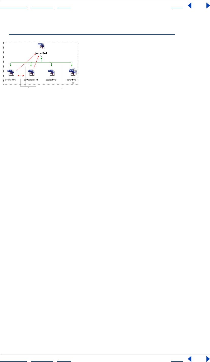
Using Help | Contents | Index Back 116
Adobe GoLive CS Help Managing and Viewing Web Sites
Using Help | Contents | Index Back 116
• Collection spotlights all pages in the site in a selected collection of pages. (See
“Creating and using collections in navigation or links view” on page 114.)
Pending links appear as arrows and their default color is red.
A. Pending links B. Hierarchy structure
To spotlight pages in a navigation view:
1 Expand the navigation view as necessary to show the pages you want to spotlight.
2 Select the page or pages you want to spotlight. (This step isn’t necessary if you want to
spotlight pending links.)
3 Do one of the following:
• Choose Spotlight Family, Spotlight Incoming, Spotlight Outgoing, or Spotlight Pending
from the navigation window menu.
• In the Navigation tab of the View palette, select Family, Incoming, Outgoing, or Pending.
4 Do either of the following as necessary:
• Select another file to move the spotlight.
• Choose another spotlight command to change the type of spotlight.
To spotlight a collection in a navigation view:
1 Expand the navigation view as necessary to show the pages you want to spotlight.
2 In the Navigation tab of the View palette, choose a collection from the Collection menu.
Choosing a collection automatically selects the Collection button to the left of the menu.
Varying the view of links
You can simplify a links view by showing only incoming links or only outgoing links. You
can also focus the view on a single path that you are exploring by expanding links.
Expanding links automatically collapses other link paths.
To vary the view of link types and link paths:
1 Display a links view.
2 In the Links tab of the View palette, select (to show), or deselect (to hide) Incoming
Links and Outgoing Links.
3 Select Multiple Link Paths or Single Link Path.
AB

Using Help | Contents | Index Back 117
Adobe GoLive CS Help Managing and Viewing Web Sites
Using Help | Contents | Index Back 117
Changing the display of the view
You can change display settings for the navigation or links view; for example, to show
items as thumbnails. If the view shows the scratch or reference panes as well as the main
pane, changes to the display settings apply only to the active pane. Changes you make for
the main pane also apply to the panorama pane.
With site views, you can change from the default graphical view to outline view. Outline
view is a hierarchical display of folders, subfolders, and files like the one in the Files tab in
the site window. Outlines show more detailed and compact representations of the files in
the main pane.
To change the display for a site view:
1 Display the navigation view or links view.
2 Click the pane you want to change (main, scratch, or reference).
3 Click the Display tab in the View palette.
4 Do any of the following:
• To show the site view graphically or in outline, select Graphical or Outline. If you select
outline, you can show and hide columns in the outline by selecting the columns from
the Show Columns menu. If you select Outline for the main pane, the panorama pane
closes.
• To specify how you want to show items in the view, select Icons, Thumbnails, Frames, or
Ovals. Ovals are oval-shaped only if the Frame Size is set to Wide. Otherwise they are
circles.
• To specify how you want to show item labels, select File Name or Page Titles.
• To change the distance between items in a pane, enter a width and height for Cell Size.
• To change the size of each item in a pane, select a frame size.
• To change the color of items in a pane, click the Item color field and select a color from
the Color palette. Or, click the lower right corner of the Item color field and choose a
color from the list of swatches that appear. The color you choose is used for the frames
of items, and a lighter tint of it is used for the fill. The color doesn’t apply if you show
items as icons.
Viewing and updating thumbnails
When you edit and save an HTML or XHTML file, its thumbnail is stored in the site project
file. You can view the thumbnail in the Content tab of the File Inspector. You can also
display pages and files as thumbnails in a navigation view or links view.
Alternatively, you can generate thumbnails for all the pages in a site at once. Updating
content thumbnails in this way is useful when you import a developed site and want
thumbnails for all its pages available in the navigation view of the site before you edit any
one of them.
To update thumbnails in a view:
1 Display a view with pages you want to show as thumbnails, either a navigation view or
links view.
2 Make sure that items in the view are set to be shown as thumbnails. If necessary, click
the Display tab in the View palette, and then select Thumbnails under Show Items As.
Using Help | Contents | Index Back 118
Adobe GoLive CS Help Managing and Viewing Web Sites
Using Help | Contents | Index Back 118
3 Do any of the following:
• Expand the pages in the view that you want updated.
• Collapse the pages that you don’t want updated.
4 Choose Diagram > Update Thumbnails. The duration of the update process depends on
the number of pages to update.
To update a thumbnail in the File Inspector:
1 Select the file in the site window that you want to update.
2 In the Content tab of the File Inspector, click the Update Thumbnail icon .
Filtering the contents of the view
Filtering a view is eliminating certain types of objects, such as media files or cyclic links.
You can filter a navigation view and a links view. If the view shows peripheral panes as well
as the main pane, the filter applies only to the active pane.
Filtering is particularly useful in the main pane of a links view as a way of simplifying the
view of complex sites.
To filter a view:
1 Display the navigation view or links view.
2 Click the pane you want to change (main, scratch, or reference).
3 Click the Filter tab in the View palette.
4 Select any combination of items you want to show. (Unselected items are hidden.)
5 Select (to show), or deselect (to hide) any combination of items in the view.
Customizing view colors
When you change settings in the View palette for a site’s navigation and links views, the
changes persist the next time you display the same site. For example, when you close and
reopen the site, GoLive uses the View palette settings for the panes shown in the site’s
navigation view. You can use this feature to customize your site views for each site.
You can also use the Site Settings dialog box to set the colors of individual parts of the
site views, such as the background colors of the individual panes or the colors of items
and links.
To change color settings of site views:
1 Do one of the following:
• To change colors for all new sites, choose Edit > Preferences (Windows) or GoLive >
Preferences (Mac OS), expand Site in the left pane, and then click Diagram Colors in the
left pane.
• To change colors for the active site only, click the Site Settings button on the toolbar,
or choose Site > Settings. In the Site Settings dialog box, click Diagram Colors in the left
pane, and then select Site Specific Settings to override the settings in the Preferences
dialog box.
Note: If you want the colors in the Preferences dialog box to apply to an existing site, open
the site and make sure Site Specific Settings is deselected in the Site Settings dialog box.
Using Help | Contents | Index Back 119
Adobe GoLive CS Help Managing and Viewing Web Sites
Using Help | Contents | Index Back 119
2 Click the lower right corner of the color field for any item you want to change, and
choose a color from the list of swatches that appear.
3 Click OK.
Refining your site map using graphical views
If you start with a blank site, it’s a good idea to begin building the site in a navigation view.
You begin by building its structure, arranging empty pages in a hierarchy of unresolved
pending links starting with links from and to the home page. At a later stage of site-
building when the pages have content, you can resolve these pending links by creating
links that reflect them.
This structural approach is also useful for adding new groups of pages to developed sites.
You simply anchor the structure of empty pages to an “away” page—a page at the site
other than the home page.
Adding empty pages and pending links to a hierarchy
The generic pages you add to a navigation view are blank HTML pages. Such pages have
the filename untitled or untitledn. For information on renaming them, see “Naming files
and folders” on page 102.
Note: Generic pages are blank but contain the basic HTML tags required to form an HTML
page.
Pages added are either pages with unresolved pending links or scratch pages. A scratch
page has no pending links of any kind. You would add scratch pages to a navigation
hierarchy simply to make it easier to link them to the hierarchy as a later step. (See
“Rearranging the parts of a hierarchy” on page 121.)
To add a single empty page with pending links:
1 Open a navigation view of the site.
2 Select a page in the view.
3 Do one of the following:
• Click the Create Parent Item button on the toolbar or choose Diagram > New > Parent
Page to insert a page between the selected page and its former parent page. The new
page is the child of the former parent page and the parent of the selected page. The
three pages are connected by “to child and back” links—that is, pending links from
parent pages to child pages, and from child pages to parent pages.
• Click the Create Child Item button on the toolbar or choose Diagram > New > Child
Page to insert a child page with “to child and back” links from the selected page.
Using Help | Contents | Index Back 120
Adobe GoLive CS Help Managing and Viewing Web Sites
Using Help | Contents | Index Back 120
• Click the Create Next Sibling Item button on the toolbar or choose Diagram > New >
Next Page to insert a next sibling page with “to adjacent siblings” links from the
selected page—that is, a pending link from the selected page to the new sibling page,
and a pending link from the new sibling page to the selected page.
• Click the Create Previous Sibling Item button on the toolbar or choose Diagram >
New > Previous Page to insert a previous sibling page with “to adjacent siblings” links
from the selected page—that is, a pending link from the selected page to the new
sibling page, and a pending link from the new sibling page to the selected page.
Note: If the page you selected is the home page, the only choice available is the Create
Child Item button or Diagram > New > Child Page.
To add a group of child pages with pending links:
1 Open a navigation view of the site.
2 Select a page in the view.
3 Choose Diagram > New Pages.
4 In the text box, enter the number of pages to create.
5 Do any or none of the following:
• To name the pages something other than untitledn, enter a filename in the Filenames
text box.
• To save the pages in a folder other than the same folder as the selected page, enter the
folder name in the Folder text box, or click the folder icon and browse for the folder.
• To use a stationery page, select Stationery and choose the stationery page from the
menu. (See “Using stationery” on page 312.)
• To use a template page, select Template and choose the template page from the menu.
(See “Using page templates” on page 305.)
6 Choose from the Parent menu to create pending links as follows:
• Choose To Each Child to create pending links from the parent page to each child page
being created.
• Choose To Child and Back to create bidirectional pending links between the parent
page and each child page being created.
• Choose To First Child Only to create a pending link from the parent page only to the first
child page being created.
• Choose None to create no pending links to the child pages being created.
7 Choose from the Sibling menu to create pending links as follows:
• Choose To Next Sibling to create previous-to-next pending links between any child
pages you are creating. (A previous-to-next link is also created between the first sibling
you create and the last of any of its siblings already created.)
• Choose To Adjacent Siblings to create bidirectional pending links between any child
pages you are creating. (A bidirectional link is also created between the first sibling you
create and the last of any of its siblings already created.)
Using Help | Contents | Index Back 121
Adobe GoLive CS Help Managing and Viewing Web Sites
Using Help | Contents | Index Back 121
• Choose To All Siblings to create bidirectional pending links between all child pages you
are creating.
• Choose None to create no sibling pending links in either direction from any child pages
you are creating.
8 Click Create. GoLive creates new pages and new unresolved pending links. You resolve
a pending link between two pages by adding a link from the source page to the desti-
nation page that reflects it. (See “Checking and resolving pending links” on page 122.)
To add an empty scratch page:
Select a folder in the Files tab and choose Site > New > Page. GoLive displays scratch
pages in the scratch pane of the site’s navigation view. (See “Using the peripheral panes of
the site views” on page 109.)
To add a pending link from one page to another:
1 In the navigation view, place the mouse pointer over the page you want to be the
source page.
2 Hold down Control-Shift (Windows) or Command (Mac OS). The pointer shows the
pick whip .
3 Drag to the destination page. A new pending link is created.
The source and destination page can be any two pages. They do not need to have a
family relationship.
To remove a page from a navigation view:
1 Select the page. If the page you select has descendants, they will be moved to the
scratch pane after you remove the selected page. (See “Using the peripheral panes of the
site views” on page 109.)
2 Do one of the following:
• To move the page to the scratch pane without deleting it, choose Diagram > Move to
Scratch.
• To delete the page, click the Delete Selected Item button on the toolbar, choose Edit
> Delete, or press the Delete key.
Rearranging the parts of a hierarchy
It’s easy to move a page from one position in the navigation view to another. You drag the
page to another page—its target page—and position it so that it becomes the parent,
child, or sibling of the target page. If the page you’re moving has children or descendants,
they move with it automatically. And the page’s own family position—its pending links to
a parent and siblings—is updated. You can make major revisions to the structure of a site
by moving a few pages.
You can also drag pages in the scratch pane to positions in the hierarchy or drag pages out
of the hierarchy to the scratch pane.
Using Help | Contents | Index Back 122
Adobe GoLive CS Help Managing and Viewing Web Sites
Using Help | Contents | Index Back 122
To move a page and its descendents to another position in the site:
In the navigation view, drag the page to its target page as follows:
• In wide orientation, drag to the top of the target page to make the page you’re
dragging its parent, to the bottom to make the page its child, to the left to make it the
previous sibling, and to the right to make it the next sibling. A line at the top, bottom,
left, or right of the target page appears to show you where to drop the page.
• In tall orientation, drag to the left of the target page to make the page you’re dragging
its parent, to the right to make the page its child, to the bottom to make it the next
sibling, and to the top to make it the previous sibling. A line at the left, right, bottom, or
top of the target page appears to shows you where to drop the page.
Moving a page in a navigation view
A. Moving the page to a new parent B. The page’s resulting position next to new siblings
To move a scratch page into position in the hierarchy:
1 Open the scratch pane in the navigation view. (See “Using the peripheral panes of the
site views” on page 109.)
2 Drag a page from the scratch pane into the appropriate position within the main pane.
Checking and resolving pending links
If you laid out your site in a navigation view before you added content to individual pages
and linked the pages, some of the pending links between pages you established may still
be unresolved.
Pending links are reminders that pairs of pages, usually pages linked logically, should be
actually linked. Like actual links, pending links are directional. For example, a pending
parent-child link can be either parent-to-child or parent-to-and-from child. If an actual link
has been created between pages to complete a pending link between them, the pending
link is resolved. Unresolved pending links have no actual link equivalent. In navigation
views, any pages that are the destinations of unresolved pending links for a page selected
in the main pane appear in the Pending Links palette.
You should check for unresolved links and resolve them as necessary.
A
B
Using Help | Contents | Index Back 123
Adobe GoLive CS Help Managing and Viewing Web Sites
Using Help | Contents | Index Back 123
To check for unresolved pending links:
1 Open a navigation view of the site.
2 Choose Window > Pending Links.
3 Do one of the following:
• To check a file for pending links, select the file in the navigation view. If the file contains
any pending links, an arrow pointing towards each destination file displays in the
Pending column in the Pending Links palette.
Pending link arrows point toward destination files.
• To display the pending links for all files, choose Spotlight Pending from the navigation
view menu to spotlight unresolved pending links with arrows. The arrows point away
from the source files that have pending links; that is, the files that don’t have an actual
link. If there are two arrows on a line between two files, both files have a pending link.
To resolve an unresolved pending link:
1 Choose Window > Pending Links.
2 Select the page in the site window or the navigation view that is the source of the
unresolved pending link. The Pending Links palette lists the destination page or pages
that the source page has unresolved pending links to. A pending link is indicated by an
arrow in the Pending column pointing towards the
destination file.
3 Open the source page in the Layout Editor.
4 Do one of the following:
• Drag a destination page from the Pending Links palette to the source page in the
Layout Editor. GoLive creates a link at the insertion point to the destination page.
• Create a link in the source page to a destination page listed in the Pending Links
palette. (See “Linking files” on page 61.)
After you create the link, GoLive removes the arrow in the Pending Links palette that
points towards the destination file.
Using Help | Contents | Index Back 124
Adobe GoLive CS Help Managing and Viewing Web Sites
Using Help | Contents | Index Back 124
Solving a hierarchy
When you import a site, GoLive automatically analyzes the links in pages and examines
the structure of folders to create a hierarchical structure for the site. This process is called
solving a hierarchy. The initial structure is based on both the pattern of links present on
site pages and the hierarchy of the web-content folder’s subfolders. The structure also
contains pending links as well as actual links; that is, it contains a record of every parent-
child or sibling-sibling relationship possible given the actual hierarchy.
You should solve a hierarchy if you have made changes in your site outside GoLive, or if
you want to base the site’s navigational structure on different principles. For example, if
the hierarchy of the web-content folder’s subfolders has nothing to do with the site’s
navigational logic, you might want to base the structure entirely on links.
To solve the hierarchy of a site:
1 Open a navigation view of the site.
2 Choose Diagram > Solve Hierarchy.
3 Select options as necessary:
• Links extrapolates the hierarchy from the pattern of links in the site’s pages.
• Folder Hierarchy bases the hierarchy on the hierarchy of the web-content folder’s
subfolders.
Use Folder Hierarchy if you designed the actual folder hierarchy to reflect the
hierarchy of the site’s pages.
4 Click OK.
Editing links and URLs sitewide
A site can contain many links to a Web page and many URLs that reference media files,
external URLs, or e-mail addresses. If you need to change the destination file referenced in
all of these links or URLs, you can change them all at once without opening the pages they
appear on. For example, you might need to change all URLs to a repeated background
image.
Sitewide link editing can’t be undone, so use the feature carefully. For example, don’t
replace a referenced image without making sure that the new image has exactly the same
size and width-to-height proportions as the one you want to replace.
Using the In & Out Links palette to view links
The In & Out Links palette is a powerful link management tool that graphically shows you
the links or file references to or from a selected file or item in the site window. It is
especially useful for troubleshooting link errors listed in the Errors tab of the site window,
and showing all of the pages linked to a missing file. You can also create a site map by
printing the contents of the In & Out Links palette.
You can use the In & Out Links palette with any file or non-file item in the web-content
folder—that is, with any file or item listed in the Files, External, Colors, Font Sets, Extras,
Collections, or Errors tabs in the site window. For example, you can use the In & Out Links
palette to show the files that use a color listed in the Colors tab, or use a font set listed in
the Font Sets tab. You can also use the In & Out Links palette with a file in the navigation
and links views, or with a diagram in the Design tab in the diagram window.
Using Help | Contents | Index Back 125
Adobe GoLive CS Help Managing and Viewing Web Sites
Using Help | Contents | Index Back 125
You can use the Renditions tab of the In & Out Links palette to view implied (not actual)
links between files. For example, the Renditions tab displays the implied link between a
Smart Object source file and its target file, or between a file and its duplicate (created by
choosing Edit > Duplicate).
To use the In & Out Links palette to view links and file references:
1 Click the Open In & Out Links Palette button on the toolbar and click the Links tab.
2 Do one of the following:
• Select the file or non-file item in the site window.
• Select the file in the navigation or links views, or a diagram in the Design tab in the
diagram window.
• Open the file in a document window.
Incoming links to the file appear on the left side of the In & Out Links palette, and
outgoing links or file references from the file appear on the right. For non-file items, the
files that reference or use the selected item appear on the left.
To limit the types of links appearing in the In & Out Links palette:
1 Choose Palette Options from the In & Out Links palette menu.
2 Select the items you want to show. (Unselected items are hidden.)
3 Click OK.
To view implied links in the In & Out Links palette:
1 Click the Open In & Out Links Palette button on the toolbar and click the
Renditions tab.
2 Do one of the following:
• Select the file or non-file item in the site window.
• Select the file in the navigation or links views, or a diagram in the Design tab in the
diagram window.
• Open the file in a document window.
The In & Out Links palette displays implied links to or from the file.
Changing the destination item of links and URLs sitewide
Use the In & Out Links palette or the Change References dialog box to change the desti-
nation item of links and URLs sitewide.
To change all links or URLs to a destination item:
1 Display the tab (Files, External, or Extras) in the site window where the destination item
you want to replace is listed—for example, a repeated background image.
2 Select the item.
3 Do one of the following:
• If the new destination item you want to use as a replacement is visible in the site
window, click the Open In & Out Links Palette button on the toolbar.
• If the new destination item you want to use as a replacement is not visible in the site
window, choose Site > Change References.
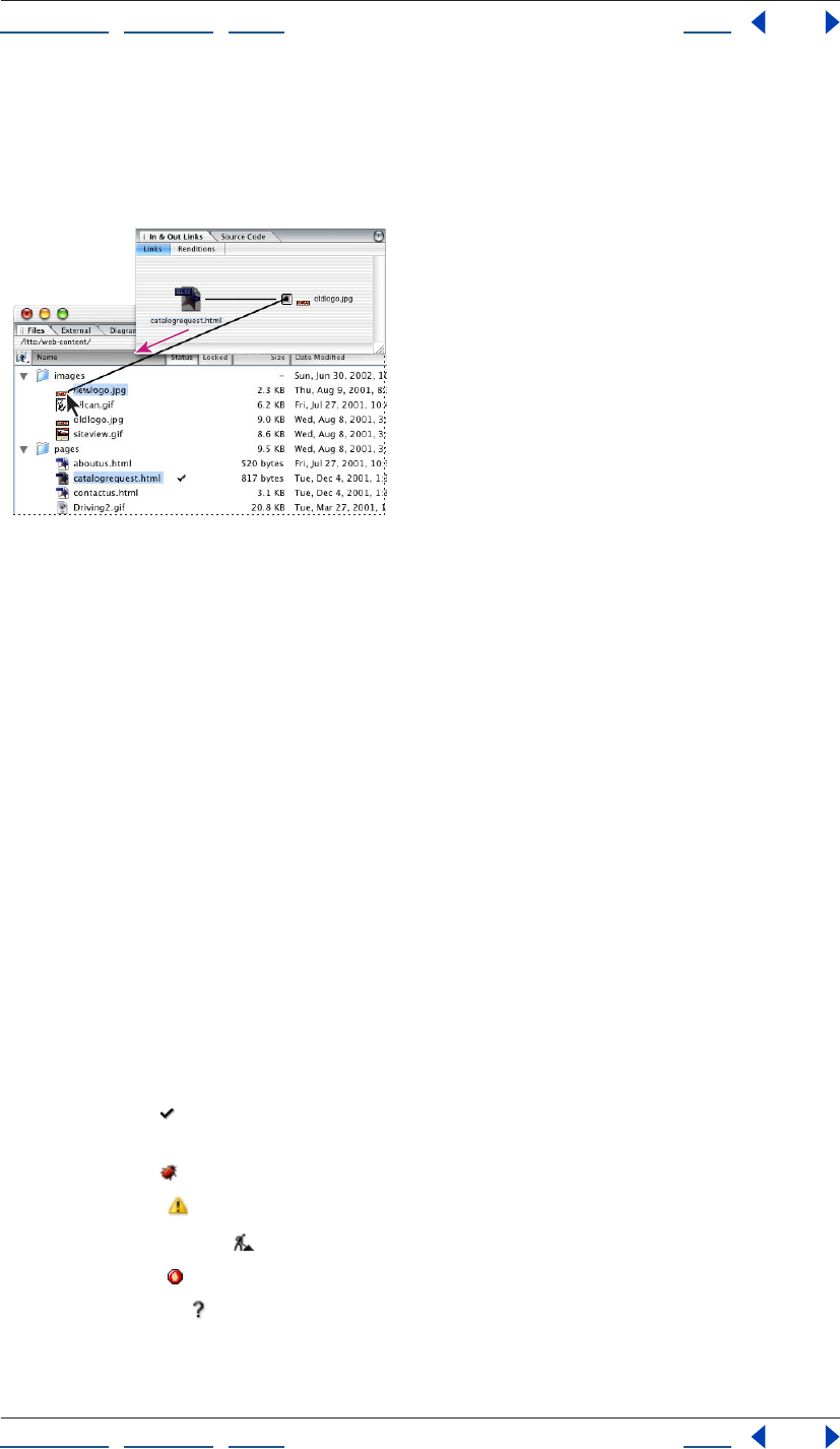
Using Help | Contents | Index Back 126
Adobe GoLive CS Help Managing and Viewing Web Sites
Using Help | Contents | Index Back 126
4 Do one of the following:
• If the replacement item is visible in the site window, drag from the pick whip in the
Links tab of the In & Out Links palette for the old item to the replacement item in the
site window.
Change all references to oldlogo.jpg by dragging from the pick whip for the incoming link to
newlogo.jpg in the site window.
• If the replacement item is not visible on the site window, enter the URL for the
replacement item in the lower text box (or browse to the item) in the Change Refer-
ences dialog box. Then click OK.
5 In the Change Reference dialog box, select the files that contain the links or URLs you
want to change (all files are selected by default), and then click OK.
Fixing site errors
If you consistently use GoLive to manage your site, site errors will rarely occur. GoLive
keeps your site intact by tracking when you move, rename, or delete files in the site
window and immediately prompts you to update all links and file references. Most site
errors are a result of using the Explorer (Windows) or Finder (Mac OS) instead of GoLive
to move, rename, or delete files. After you refresh the site window, GoLive lists these files
as missing or orphan files, and all links to the files become site errors. GoLive uses the
Errors and External tabs in the site window and the In & Out Links palette to list and track
link errors.
If a file in the site’s web-content folder contains an error or possible error, the Status
column of the Files tab in the site window shows one of the error icons rather than the
checkmark icon . The error icon also appears next to the file in navigation views and links
views. The possible error icons are as follows:
• The Bug icon indicates broken links in a Web page file.
• The Alert icon indicates a Smart Object warning or other warning.
• The Empty Page icon indicates an empty page.
• The Stop icon indicates a missing file.
• A question mark indicates a file that GoLive cannot open.
Using Help | Contents | Index Back 127
Adobe GoLive CS Help Managing and Viewing Web Sites
Using Help | Contents | Index Back 127
An error icon in the Status column for a folder indicates one or more files with that error in
the folder.
Important: Before checking the site for errors, be sure to refresh the site window to display
the latest status information. (See “Refreshing the site window” on page 98.)
To fix a broken link on a page listed with a Bug icon:
1 Make sure the Inspector is displayed.
2 Double-click the page with the broken link in the Files tab of the site window.
3 To show link warnings in the page, do one of the following:
• Click the Link Warnings button on the toolbar or in the Highlight palette.
• Choose View > Link Warnings.
4 If necessary, do either of the following to get information that may help you find the
broken link:
• Locate missing objects on the page (objects with a red border)—for example, an image
placeholder where an image should be.
• Look for link warnings—that is, objects or text with a red border.
5 Select the object or text on the page that contains the broken link.
6 Inspect the link in the URL text box in the Inspector, and then reestablish the link. (See
“Linking files” on page 61.)
Checking the site for missing or orphan files
A file referenced on a page can be missing or orphaned. The Missing File icon indicates
that GoLive can’t find a file, possibly because you used the Explorer (Windows) or Finder
(Mac OS) instead of GoLive to move, rename, or delete it. The Orphan File icon
(Windows) or (Mac OS) indicates that GoLive can find a file locally, but it is stored
outside the web-content folder.
The Errors tab in the site window lists missing and orphan files that are referenced in files
that will be uploaded to a server. For example, an image file stored outside the web-
content folder is listed in the Errors tab as an orphan file if it is referenced in a page listed in
the Files tab in the site window. The same image file is not listed in the Errors tab if it is
referenced in a template because templates are not uploaded to the server. All files in the
Extras tab (such as templates and stationery) are not uploaded to the server.
Using Help | Contents | Index Back 128
Adobe GoLive CS Help Managing and Viewing Web Sites
Using Help | Contents | Index Back 128
To find and relink a missing file:
1 Refresh the site window to display the latest status information.
2 Select the file in the Missing Files list in the Errors tab in the site window.
3 Do any of the following to get information that may help you find and relink the file:
• To check if the file has a new name, look for the file in the Files tab and, if necessary,
change the link to refer to the new name.
• To use the In & Out Links palette to show the pages that are linked to the file, click the
Open In & Out Links Palette button on the toolbar. Then use the pick whip in the
Links tab of the In & Out Links palette to fix the link. (See “Editing links and URLs
sitewide” on page 124.)
• To use the Inspector to check and fix the URL of the file, open the Inspector and choose
Edit from the menu to the right of the URL text box. In the Edit URL dialog box, edit the
URL in the Path text box, and then click OK. Select the files you want to update with the
new URL, and then click OK.
• To find the file, use the Find Site Assets window. (See “Finding files” on page 128.)
• To restore a file that has been deleted, drag the file from the Site Trash in the Extras tab
in the site window to its original location in the Files tab in the site window.
When you clean up a site, you can specify that GoLive copy all orphan files to the web-
content folder and delete the entry for the file from the Orphan list in the Errors tab.
(See “Cleaning up a site” on page 100.)
Checking external URLs and e-mail addresses in the site
An external URL references a page outside your file system—that is, a page with an
address that begins with http://, ftp://, and so on, and must include a colon. For example,
http://www.adobe.com. When specifying an e-mail address, be sure to include an @ in the
address.
You can check the validity of external URLs listed in the External tab in the site window. For
information on adding external URLs and e-mail addresses to a site, see “Using site URLs
and e-mail addresses” on page 317.
To check the validity of external URLs in a site:
1 Be sure you have online access to the Internet.
2 Open the site.
3 Click the External tab.
4 Choose Site > Get References Used to update the site.
5 Choose Site > Check External Links. The Status column in the External tab shows the
Bug icon for any invalid external links.
Finding files
You can find individual files or objects (such as colors and e-mail addresses) throughout
your site. This is particularly useful if you have a huge site with dozens or even hundreds of
pages. Instead of scrolling through long file lists in the site window, you can enter a full or
partial filename or URL.
Using Help | Contents | Index Back 129
Adobe GoLive CS Help Managing and Viewing Web Sites
Using Help | Contents | Index Back 129
To find files within a site:
1 Open a site project file, or bring an open site window to the front.
2 Click the tab that lists the type of item you want to find. That is, if you want to find a
color, click the Colors tab.
3 Click the Find Site Assets button in the toolbar.
4 In the Find Site Assets dialog box, choose search options from the pop-up menus next
to Find Item Whose.
Note: Choose Hex value to search for a color by its hexadecimal value.
5 In the text box, enter the full or partial name, URL, or hexadecimal value of the file or
object you are searching for.
6 Choose an option from the Search In menu. For example, choose Colors to search for a
color by name or hexadecimal value.
7 Click Find All. GoLive displays the first item found in the active tab in the site window.
(Click Instant Find to have GoLive start a search automatically.)
8 To reveal a file in the site, select it in the Matches section of the Find Site Assets dialog
box and click Reveal in Site.
To quickly search again for an item you previously entered in the text box, select the
item from the pop-up menu next to the text box.
Generating queries
The Queries window lets you search for files using a wide range of criteria. You can search
in open sites and collections, in a user-defined list of files, or in a result list; and you can
view the results in the Query Results window. You can define nested queries to perform
complex searches, or use GoLive’s predefined queries for simple searches. Use the Query
Editor to edit predefined queries or create new queries. Save queries to use with appli-
cation-wide searches, or save site-specific queries in the Queries folder of the Extras tab.
You can also save query results as collections in the Collections tab.
Defining queries
Define a query or edit existing queries in the Query Editor. Once you’ve defined the query,
you can test it before actually running it on a site or group of files.
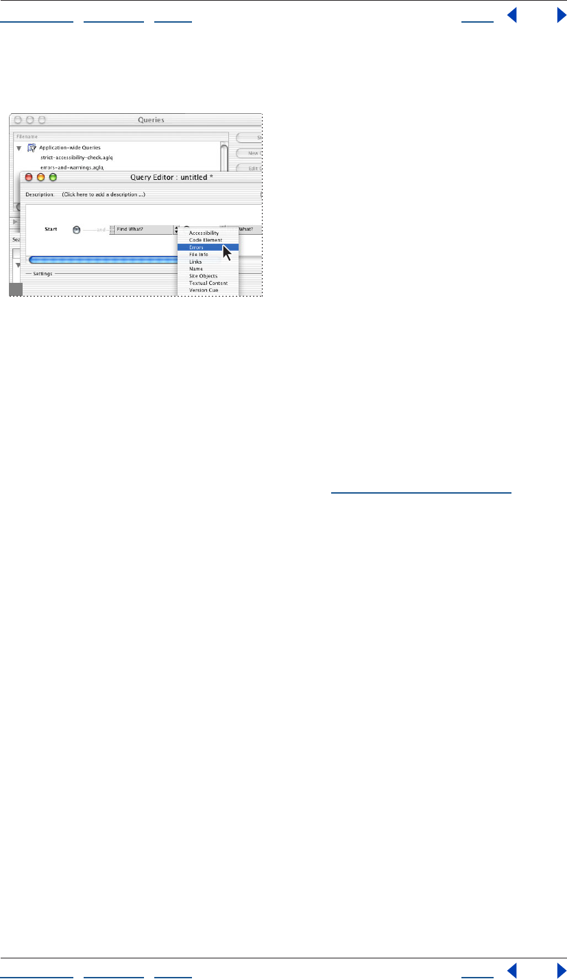
Using Help | Contents | Index Back 130
Adobe GoLive CS Help Managing and Viewing Web Sites
Using Help | Contents | Index Back 130
Queries you create and save are listed in the Filename section of the Queries window, and
are stored in the Queries folder in the Extras tab of the site window.
Structuring a query in the Query Editor.
To define a query:
1 Choose Edit > Run Query.
Note: To create an application-wide query, don’t open a site before opening the Query
Editor.
2 Click the New Query button.
3 If desired, type a description of the query in the Description field in the Query Editor.
4 Choose an option from the Find What menu (see “Query options” on page 131), and
then set options in the Settings pane.
5 To add more criteria to the query, click the arrow to the right of the Find What menu
and choose an add, or, or not item:
• Choose And to specify that all criteria must be satisfied. For example, if you select this
option and define a query to show files that were created over two weeks ago and
contain external links, the query shows only those files created over two weeks ago that
contain external links.
• Choose Or to specify that any, but not all, of the criteria must be satisfied. For example, if
you select this option and define a query to show files that were created over two
weeks ago or contain external links, the query shows the files created over two weeks
ago with or without external links, and the files that contain external links regardless of
when they were created.
• Choose Not to specify that the first set of criteria must be satisfied but the second set of
criteria must not be satisfied. For example, if you select this option and define a query
to show files that were created over two weeks ago and do not contain external links,
the query shows only those files created over two weeks ago that do not contain
external links.
6 Continue to define query criteria using the Find What menus and add, or, or not items.
You can drag and drop query criteria above, beneath, or next to other query criteria (as
you drag, black bars appear next to the existing criteria, indicating the location of the new
criteria).
7 Delete criteria by choosing Delete from the menu to the right of the Find What menu.
Using Help | Contents | Index Back 131
Adobe GoLive CS Help Managing and Viewing Web Sites
Using Help | Contents | Index Back 131
8 To test the query, click Test Query.
9 Close the Query Editor to save the query. Enter a name for the query in the Save Query
File dialog box (the .aglq extension is provided automatically), and then click Save.
To edit an existing query:
1 Choose Edit > Run Query.
2 Select the query you want to edit and click Edit Query.
3 Make changes to the query as detailed in “Defining queries” on page 129.
4 Close the Query Editor and click Yes when prompted to save changes.
Query options
When defining a query, you can choose from any of the following options in the Find What
menu:
Accessibility Shows pages that conform to a number of guidelines for making Web
content accessible to people with disabilities and persons using alternative browsing
technologies. Although these guidelines don’t offer a complete solution, they can help
determine whether your Web site is accessible.
Errors Shows pages with missing image attributes, problem titles, and HTML error and
warning flags.
File Info Shows files by type, byte size, download time, modification date, creation date,
mime type, and publish state. For HTML files, the Download Takes option in the Download
Time tab considers everything that makes up the page (such as images or QuickTime
movies) when computing download time.
Name Shows pages or URLs that are, begin with, end with, or contain a text string you
specify, or that match a regular expression you specify.
Textual Content Shows pages that match text in Layout Mode or encoded or unencoded
text in Source Mode.
Links Shows pages with external links, links to files with a certain extension, and links of
one or more protocols (for example, ftp: or mailto:). Links also show you pages that are a
certain number of clicks away from a given page.
Code Element Shows pages with HTML elements and attributes (or a combination of
these) you specify.
Site Objects Shows pages in a site that use certain components, addresses, fonts, font
sets, site colors, and labels. The items that appear in the Site Objects settings are the same
items that appear in the site window. If you added or removed items from pages, update
the items in the site window and in the Site Objects settings by cleaning up the site. See
“Cleaning up a site” on page 100.
Version Cue Shows files that are checked out of a Version Cue project site by you or by
another user. For more information about Version Cue projects, see “Working with Adobe
Version Cue managed projects” on page 45.
Using Help | Contents | Index Back 132
Adobe GoLive CS Help Managing and Viewing Web Sites
Using Help | Contents | Index Back 132
Running queries
Once you’ve defined a query, you can view the results in the Results window, and then run
another query on the result set generated from the first query. You can also save query
results as a collection and store it in the Collections tab of the site window (see “Using
collections” on page 319).
To run a query:
1 Choose Edit > Run Query.
2 Do one of the following:
• Define a new site query. (See “Defining queries” on page 129.)
• Select an existing query.
3 Choose one of the following options from the Search In list at the bottom of the Queries
window:
• Sites and Collections list all currently open sites. You can remove site folders or collec-
tions from the scope of the query by deselecting them.
• Files let you specify files on which to run the query. You can drag files into the file list
from the site window, or click the Add Files button to add files to the list.
• Result list lets you run the query on a previous set of query results (you can only use this
option after having run a query).
4 Click Start.
GoLive displays the query results in the Results window. The query tree pane of the Results
window displays the query, and the text area at the bottom of the Results window shows
files that satisfied the query criteria.
Note: Move the pointer over a query criteria in the query tree pane to see a list of files that
met that criteria.
5 Do one of the following:
• To save the query results as a collection with the currently open site, click Save
Collection. Enter a name for the collection in the Create a New Collection dialog box,
and then click OK.
• To search within the query results, click Use Result. GoLive opens the Query window
with the original query results in the Search In section. You can now run another query
on the result set.
Using Help | Contents | Index Back 133
Adobe GoLive CS Help Managing and Viewing Web Sites
Using Help | Contents | Index Back 133
Providing file status information
As you build and update a Web site, it might be useful to provide status information so you
or a person reviewing the site can determine the state of a particular file or folder. You can
provide status information about an individual file or folder by assigning it a publish state
or a status label in the File Inspector. The publish state lets you specify whether you want
to publish a file or folder on a Web server or not. A status label can provide one of several
descriptions for a file, such as “Essential.”
You can also provide status information about a group of files by creating a collection
with a significant name such as “Reviewed.” (See “Using collections” on page 319.)
Assigning publish states to files and folders
You can assign three different publish states to files or folders in a site—“publish never,”
“publish always,” and “publish if referenced.” You can then use the Honor Publish State
option in the Site Upload/Export preferences or site-specific settings to use the publish
state to determine which files or folders in a site to upload to a Web server. (See “Setting
upload options” on page 331.)
To assign a publish state to a file or folder:
1 Do one of the following:
• Select the file or folder in either the Files or Extras tab in the site window.
• Select the file in the navigation or links view.
2 In the File tab of the Inspector, choose a publish state for the file or folder from the
Publish menu.
Assigning status labels
GoLive comes with the default color-coded file status labels red, blue, orange, green,
yellow, purple, and gray. Color-coded files appear in navigation view and links view when
the display of the views is set to thumbnails, frames, or ovals. (See “Changing the display of
the view” on page 117.) You can assign any one status to any file, and add new labels to
assign to files.
Note: GoLive also uses the term “status” to indicate the state of links and references at a
site—for example, in the Status column of the Files tab in the site window. (See “Fixing site
errors” on page 126.)
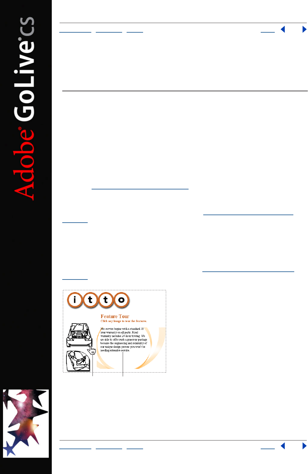
Using Help | Contents | Index Back 134
Adobe GoLive CS Help Laying Out Pages
Using Help | Contents | Index Back 134
Laying Out Pages
About page layout
The Layout Editor in the document window provides the canvas on which you drag files or
objects (usually from the site window) onto your page. Tables, layers, and special GoLive
layout grids and text boxes provide the containers for holding and positioning text,
images, animations and movies.
Table-based designs Tables are used often for page layouts because most Web browsers
can display HTML tables. GoLive provides two ways to create table-based designs for your
page layouts, using a standard HTML table or the GoLive layout grid. GoLive layout grids
are a special type of HTML table that lets you freely position objects anywhere on the
page. (See “Using the layout grid” on page 138).
GoLive provides table-design tools for using standard HTML tables. Images, text, and
other objects can be positioned on the page by placing them in table cells, other cells can
be left blank, and table borders can be hidden. (See “About GoLive table features” on
page 165.)
Layer-based layouts Like objects on a layout grid, objects in layers (also called floating
boxes) can be freely positioned anywhere on the page. Layers also have the added
advantage of being able to overlap other layers so you can create layered effects. Using
layers together with a layout grid can let you create a table-based design with dynamic or
interactive behavior on the page, such as triggering text to disappear and then reappear
when the mouse pointer is over an image link. (See “Laying out pages with layers” on
page 144.)
Image links are attached to show or hide actions for stacked
layers. Holding the pointer over an image (A) makes text in layer appear (B).
B
A
Using Help | Contents | Index Back 135
Adobe GoLive CS Help Laying Out Pages
Using Help | Contents | Index Back 135
Photoshop and Illustrator based designs Many Web design firms and professionals
create graphically rich portions of their Web page layouts in Adobe Photoshop or Adobe
Illustrator, and then bring the designs into their Web pages. When you design a page
layout in Photoshop or Illustrator, you can slice it into a table of individual images and
GoLive will automatically put the slices into a custom HTML table in your page. When you
save the image for the Web, you can reformat the HTML and JavaScript code so that any
rollovers are fully editable in GoLive.
You can use any of these methods to add your Photoshop or Illustrator designs to your
Web pages in GoLive:
• Generating HTML files from Photoshop or Illustrator that you can open directly in
GoLive.
• Dragging a Photoshop or Illustrator image file from the site window into the page
automatically creates a Smart Object link between Photoshop or Illustrator and GoLive.
If the image is sliced, GoLive places the slices into a new table and saves each slice as a
separate Web image. You can continue to update the design in Photoshop or Illustrator
and GoLive automatically optimizes the sliced images for the Web. (See “Adding sliced
Photoshop images” on page 277 and “Adding sliced Illustrator SVG images” on
page 280.)
Note: GoLive only recognizes slices in an Illustrator image saved as SVG.
• If you want to preserve multiple layers of a Photoshop design, you can import the layers
of the image as individual Web images in GoLive layers. Because the Web images are
displayed in GoLive layers, you can completely reposition them, overlap them, and
apply other actions to them such as the Show Hide action. (See “Hiding and showing
layers” on page 150 and “Adding layered Photoshop images” on page 278.)
• You can use your Photoshop-based design as a tracing image and save individual
cutouts as Web images in GoLive layers. If you want, you can create a duplicate page
that places the tracings in a table-based design by converting the layers to a layout
grid. (See “Converting layers into layout grids” on page 149 and “Building a Web page
using tracing images” on page 246).
Frame sets Another type of page layout design can be based on frame sets. You use the
Frame Editor to create a frame set and lay out frames that display individual Web pages.
(See “Working with frames” on page 154.)
CSS-based designs You can base page layouts on cascading style sheets that give your
pages a consistent presence and enable you to update the site’s styles with a single file.
Use the CSS Editor to create style sheets and link them to pages in your site. (See “About
the GoLive CSS workflow” on page 213.)
Site assets for speeding page design Site assets, such as components and page
templates, let you update common elements across your site and share your design work
with others while restricting their access to specific areas in the layout. Stationery can be
useful for setting up starting conditions in new pages and saving them with the site. (See
“About site assets” on page 304.)
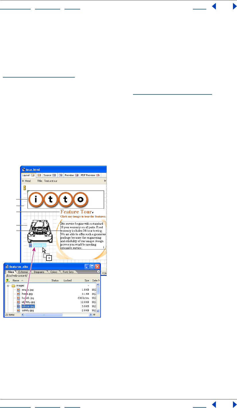
Using Help | Contents | Index Back 136
Adobe GoLive CS Help Laying Out Pages
Using Help | Contents | Index Back 136
Page layout workflow
Before you lay out the content on your pages, set up your site first—having all your media
and resource files already organized in the site makes it easy to reference them on the
page and GoLive site management tools ensure that all the reference links and Java Script-
based actions are kept up to date as you work. Because you work with an active site
window, GoLive is able to manage and properly generate your links as necessary. (See
“Creating a site” on page 46.)
You can also set up your pages with common elements like page titles, margins, and page
backgrounds before you lay out the content. (See “Setting up pages” on page 53.)
You use the Objects palette to add objects to the page, like the layout grid, layout text
boxes for holding text on the grid, and Smart Objects for linking to image files and their
source applications. The Layout Grid Inspector lets you add a background color or image
to the grid, and change the grid line spacing and the way that objects snap to the grid
lines.
You use the site window to drag images, HTML files, and custom site assets onto the
layout. Dragging objects from the site window saves you time because it automatically
sets up the reference links between the objects and their source files.
Drag to add images and other files or site assets to the
page layout.
A. Component in a layout text box B. Layout grid
C. Text in a layout text box D. Image linked to its source file
E. Text in a layer
A
B
C
D
E
Using Help | Contents | Index Back 137
Adobe GoLive CS Help Laying Out Pages
Using Help | Contents | Index Back 137
To add content to a Web page:
1 Choose the type of container you want to hold the content, such as a layout grid, a
layer, or a table, and drag its icon from the Objects palette into the Layout Editor.
To simplify page layout, place a layout grid on the entire page.
2 Add content to the container using any of the following methods:
• Drag placeholder icons (such as an image placeholder or a Smart Object) from the
Objects palette into the container and then link them to their reference files (such as an
image file) in the site window.
• Drag files directly from the site window into the container. Dragging image files to the
container bypasses the step for linking the placeholder to the reference file. Dragging
Photoshop or Illustrator files bypasses the step for linking a Smart Object placeholder
to the reference file. (See “About adding content from Adobe applications” on page 261
and “Working with Smart Objects” on page 262.)
Using Help | Contents | Index Back 138
Adobe GoLive CS Help Laying Out Pages
Using Help | Contents | Index Back 138
• Drag HTML files, URLs, or e-mail addresses from the site window to create a hypertext
link with the name of the file used as the link’s label. Selecting text in the container
before you drag the file from the site window creates a link without changing the text
label. (See “Linking files” on page 61.)
• Drag site assets, such as a component containing a navigational bar, from the Objects
palette into the container. (See “About site assets” on page 304.)
Using the layout grid
GoLive layout grids take the pain out of creating table-based designs for your Web pages.
Instead of setting up table cells, you can add a single layout grid to the page and drag
layout text boxes and other objects anywhere on the grid. As you add content and
reposition it, GoLive adjusts the properties of the layout grid. Layout grids let you position
multiple objects on your page with 1-pixel accuracy.
You can add tables to the layout grid, for example when you want to add a chart with
multiple columns and rows to the layout. (See “Creating tables” on page 165.)
Layout grids and objects on the grid remain fixed in the browser window and don’t resize
when the window is resized. If you want your page or individual objects to automatically
resize when the browser window resizes, you can convert the layout grid to a standard
HTML table after you’ve positioned all the objects on your page and are ready to publish
the page. (See “Converting a layout grid to a table” on page 143.) Then you can make the
fixed sizes of the table cells browser-resizeable using the Table Inspector. (See “Resizing
columns, rows, and tables” on page 171.)
When you convert a layout grid to a table, GoLive strips out the GoLive code and keeps the
standard HTML table format. You can also strip out the custom source code when you
export or upload the Web page to the server. (See “Exporting a site” on page 334.)
Adding a layout grid to the page
To simplify the task of laying out, grouping, and aligning multiple objects on your page,
add a layout grid and make it the same size as the window. After you’ve added the objects
to the grid, you can optimize the grid’s size to fit around the objects using the Layout Grid
Inspector. For more advanced layouts, you can add multiple layout grids to a page, for
example, to lay out objects in a header area and a footer area. However, you should not
place a layout grid on top of another layout grid. When the layout is complete, you can
convert the grid to a standard HTML table if you want. (See “Converting a layout grid to a
table” on page 143.)
If you want the layout grid to cover the entire page without any margins in the browser
window, use the Page Inspector to set the page margins to zero—the layout grid moves to
the upper left corner of the window. (See “Specifying page margins” on page 54.)
If you know that you’ll always want the page margins to be zero, you can create a page
with just this defined and set a preference to use the page whenever GoLive creates a new
page. (See “Setting preferences for opening pages” on page 42.)
All objects placed on the layout grid are considered part of the grid object. This comes
in handy if you create a nice layout grid design and wish to reuse it. You can save the
design as a component, page template, stationery, or library object and store it for later
use. (See “About site assets” on page 304.)
Using Help | Contents | Index Back 139
Adobe GoLive CS Help Laying Out Pages
Using Help | Contents | Index Back 139
To add a layout grid:
Drag the Layout Grid icon from the Basic set in the Objects palette to the page, or
double-click the icon to place it at the insertion point.
To resize the layout grid:
Do one of the following:
• Select the grid and drag one of the three resize handles on the right side, bottom, and
lower right corner of the grid. The new width and height appears in the Layout Grid
Inspector.
• In the Layout Grid Inspector, enter the desired measurements for Width and Height.
• If the layout grid has a background image, select Use Image Size in the Layout Grid
Inspector to adjust the size of the grid to the image size.
• If you have finished laying out objects on the grid, click Optimize in the Layout Grid
Inspector to automatically reduce the size of the grid to its minimum size (to fit around
the outer borders of all the objects and no more than that). You can Shift-click the
Optimize button to reduce the width only and Alt-click (Windows) or Option-click
(Mac OS) the Optimize button to reduce the height only.
To minimize horizontal page scrolling in a Web browser, make sure that the final width
of the layout grid is no larger than 580 pixels, the width of a standard 14-inch monitor.
To customize the layout behavior of the grid:
Do any of the following in the Layout Grid Inspector:
• To position objects freely on the grid with 1-pixel accuracy, deselect Snap for Horizontal
and Snap for Vertical, and press the arrow keys to move the objects pixel by pixel.
• To make objects move in increments equivalent to the spacing between the grid lines,
select Snap for Horizontal and Snap for Vertical, and press the arrow keys.
• To change the spacing between the grid lines, enter a size in pixels in the Horizontal or
Vertical text box.
• To hide the grid lines, deselect Visible for Horizontal and Visible for Vertical.
• To set the position of the grid in relation to the document window, choose an
alignment from the Align menu in the Layout Grid Inspector. Choose Default to align
the grid with the upper left corner of the page. Choose Left or Right to wrap other text
and objects around the grid.
Adding content to the layout grid
Using a layout grid, you can add text, images, and other objects anywhere you want on
the page. You add text to a layout grid using layout text boxes. Layout text boxes can also
contain images and other objects that you want to align within the text or wrap text
around. (See “Aligning images or objects within text” on page 190.)
You can store frequently used text and objects in the Library palette or in the site window
for a specific site. (See “Using snippets” on page 313.)
While dragging layers, layout grid text boxes, and image map areas, you can show
visual smart guides in the layout window by choosing View > Smart Guides before
you drag.
Using Help | Contents | Index Back 140
Adobe GoLive CS Help Laying Out Pages
Using Help | Contents | Index Back 140
To add text to the layout grid:
Drag a Layout Text Box icon from Basic set in the Objects palette onto the layout grid
and type or paste text into it. (See “Adding text to Web pages” on page 186.)
To add a background color or image to a layout text box:
1 Select the layout text box.
2 In the Layout Text Box Inspector, do one of the following:
• Select Color, click the color field, and choose a color from the Color or Swatches palette.
Or, click the lower right corner of the color field in the Inspector and choose a color
from the swatches that appear (the swatches are based on the current settings in the
Swatches palette).
• Select BgImage, and then select an image file.
To add images or other objects to the layout grid:
Do one of the following:
• Drag image files or other media files from the site window onto the layout grid or a
layout text box on the grid. Dragging the file from the site window automatically
creates a resource link between the page and the image or media file. (See “Adding
Smart Objects to the Layout Editor” on page 263, or see “Adding multimedia to a Web
page” on page 251.)
• Drag object placeholder icons (such as Smart Objects or components) from the Objects
palette onto the grid and link its source file in the Inspector. (See “Linking files” on
page 61.)
You can also paste copies of layout text boxes, images, and other objects into a layout
grid by clicking in an empty area of the layout grid to
place the blinking insertion point and choosing
Edit > Paste.
To add a tiled background image to a layout grid:
1 Select the layout grid.
2 In the Layout Grid Inspector, select Background Image, and then select an image file.
3 To resize the Layout Grid to the size of the image, select Use Image Size.
To add a background color to a layout grid:
Do one of the following in the Layout Grid Inspector:
• Select Background Color, click the color field, and select a color from the Color or
Swatches palette.
• Click the lower right corner of the color field and select a color from the swatches that
appear (the swatches are based on the current settings in the Swatches palette).
Using Help | Contents | Index Back 141
Adobe GoLive CS Help Laying Out Pages
Using Help | Contents | Index Back 141
To prevent a layout text box from automatically resizing in GoLive:
In the Layout Text Box Inspector, select Allow Content Overflow. With this option selected,
as more text is added or reformatted, the layout text box does not resize in your page
layout. This doesn’t affect how it will appear in Web browsers.
Note: In a Web browser, the layout text box automatically adjusts its size in relation to its
content, which resizes according to the platform that the browser is using—for example,
to accommodate fonts that appear smaller on Mac OS and larger on Windows. You can
assign a pixel size definition for all text using a cascading style sheet. (See “About relative,
absolute, and percentage units” on page 226.)
Grouping and ungrouping objects
Only objects placed on a layout grid can be grouped. Grouping objects is a great time
saver if you need to move multiple objects at once and don’t want their position to
change in relation to each other. (This is one of the key advantages of the layout grid
because it can’t be done using a standard HTML table.)
To group or ungroup objects:
1 Select the objects on the layout grid that you want to group or ungroup. Click to select
the first object, and then Shift-click to select each additional object. (You can’t group
layers.)
2 Click the Layout Group button or the Layout Ungroup button on the toolbar or in
the Transform palette.
Repositioning, aligning, or distributing objects
You can move objects to new positions in a page by dragging them. For layers or objects
on a layout grid, you can also use the toolbar, Transform palette, or Align palette to place
them in precise positions. When objects are within text or a layout text box, you use the
Inspector to align them in relation to the text.
For information on aligning objects within a line of text, see “Aligning images or objects
within text” on page 190.
To reposition an object or group of objects:
Select the objects and drag them on the layout grid, or enter precise pixel values for the
horizontal or vertical position using the toolbar or Transform palette.
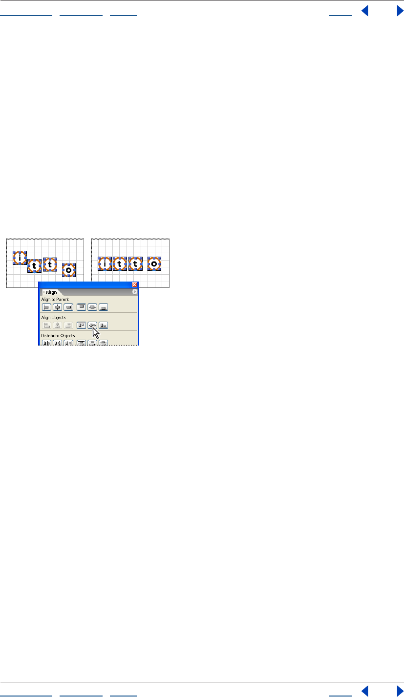
Using Help | Contents | Index Back 142
Adobe GoLive CS Help Laying Out Pages
Using Help | Contents | Index Back 142
To align objects in relation to their container:
1 Select the layers, object, or group of objects that you want to align.
2 Do one of the following:
• On the toolbar, click a horizontal or vertical alignment button.
• In the Align palette, under Align to Parent, click a horizontal or vertical alignment
button. (The buttons in the Align palette are the same as those on the toolbar.)
Note: Because you cannot move a selected object if another object is in the way, some
alignment buttons are dimmed (inactive) depending on the objects selected.
To align objects in relation to each other:
Select the layers or objects on a layout grid, and click a button under Align Objects in the
Align palette. You can align objects along the left, center, or right vertical axis or along the
top, center, or bottom horizontal axis.
Aligning objects to their center horizontal axes
To distribute objects in relation to each other:
1 Select three or more layers or objects on a layout grid.
2 In the Align palette, do one of the following:
• Under Distribute Objects, click one of the buttons to distribute objects relative to their
vertical axis (left, center, or right) or relative to their horizontal axis (top, center, or
bottom).
• Under Distribute Spacing, click one of the buttons to distribute the space (rather than
the objects) equally between the vertical or horizontal axes of the objects.
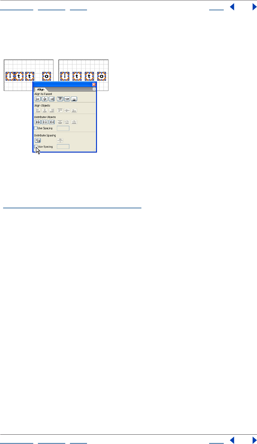
Using Help | Contents | Index Back 143
Adobe GoLive CS Help Laying Out Pages
Using Help | Contents | Index Back 143
• Before clicking one of the Distribute Objects or Distribute Spacing buttons, select Use
Spacing, and enter a value in pixels in the text box to distribute the objects or spacing
based on the value.
Distributing space between objects equally
Converting a layout grid to a table
You can convert layout grids to standard HTML tables with fixed table cell sizes and then
use the Table Inspector to make the table cells resizeable in the browser window. (See
“Resizing columns, rows, and tables” on page 171.)
When you convert a layout grid to a table, GoLive strips out all of the special code such as
cool gridx, gridy, and cntrlrow, but it leaves a “control” row of empty cells at the bottom of
the table that’s one-pixel high, a “control” column of empty cells one pixel wide at the right
ends of each row in the table, and Netscape Spacer elements inside the empty cells. You
can remove the control row and column from the converted table or you can replace the
Spacer elements within the empty cells with provided spacer.gif transparent images.
(Spacer elements or transparent GIF images are used to solve a problem displaying empty
table cells in Netscape browsers. Spacer elements are ignored by Internet Explorer
browsers.)
By removing the GoLive code, you’ll lose the ability to freely move objects around on the
page unless you convert the table back again to a
layout grid.
To convert a layout grid to a standard HTML table:
1 Select the layout grid and choose Special > Layout Grid To Table.
Note: If the Layout Grid To Table option doesn’t appear in the Special menu, you need to
enable the Layout Grid module. Choose Edit > Preferences (Windows) or GoLive > Prefer-
ences (Mac OS), select Modules, select Layout Grid in the Extend Scripts folder, and click
OK. Then restart GoLive.
Using Help | Contents | Index Back 144
Adobe GoLive CS Help Laying Out Pages
Using Help | Contents | Index Back 144
2 In the Convert dialog box, do one of the following:
• Select Strip Control Row and Column to remove the empty, one-pixel control row and
column at the bottom and right side of the grid. (This option is selected by default.)
• Deselect Strip Control Row and Column, and select Replace Spacer by Image to replace
all Netscape Spacer elements with a spacer.gif transparent image that is one pixel high.
You can also enter the name of a different image if you want, which should be located
in the GoLive application folder.
• Deselect both options to keep the control row and column, and include the Spacer
elements.
3 Click OK.
To convert a table back into a layout grid:
Select the table and choose Special > Table > Convert to Layout Grid or click the Convert
button in the Table Inspector.
Laying out pages with layers
You can use layers to divide your page into rectangles that can be formatted and
positioned individually. Layers can contain any HTML element that a page can contain—
such as an image or simple HTML text with formatting.
GoLive layers represent DHTML layers, which make it possible to overlap, hide and show,
and animate them on your page. For example, layers are commonly used with the Show/
Hide action to make them appear and disappear at the trigger of the mouse. Layers can
contain background images or color, and they can inherit properties from the page’s
cascading style sheet (see “About cascading style sheets” on page 212). They can be
positioned precisely, because they are implemented using the DIV element. The DIV
element, formatted with a CSS ID style for the width, visibility, and absolute position of the
layer, instructs the browser to create a subdivision that is not part of the normal flow of
HTML within the page.
You can import Photoshop layers as GoLive layers. See “Adding layered Photoshop
images” on page 278.
Note: To display properly, layers require Web browser versions 4.0 or later. To see what a
layer would look like in a Web browser that does not support cascading style sheets, turn
off CSS support in the browser’s preferences.
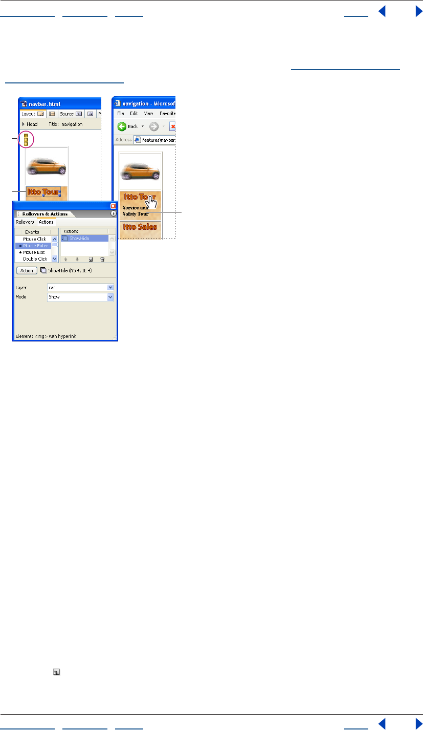
Using Help | Contents | Index Back 145
Adobe GoLive CS Help Laying Out Pages
Using Help | Contents | Index Back 145
For table-based designs, you can convert non-overlapping layers and their contents to a
new page with the contents duplicated on a layout grid. (See “Converting layers into
layout grids” on page 149.)
Layers are used to hide text and objects and make
them reappear.
A. Markers for 3 layers B. Image link with Mouse
Enter event attached to Show/Hide action C. Pointer over
image triggers layer of text to appear below
Adding layers to the page
To add a single layer to the page, you use the Objects palette or a context menu. When you
add a layer to the page, GoLive inserts a small yellow marker, which stays at the original
point of insertion after you move the layer.
It’s important to name your layers. GoLive displays the names of layers in the Layer palette
and in lists to choose from when you’re applying actions or animating them. The names
are also used for referring to layers in Java Script. Using unique names makes layers easier
to identify than the default names layer1, layer2, layer3, and so on.
You use the Layers palette to add and manage multiple layers on the page. To display the
palette, choose Window > Layers.
To add a layer to the page:
Do one of the following:
• Drag the Layer icon from the Basic set in the Objects palette onto the page. If it’s in the
middle of text, GoLive inserts a new paragraph to split the text and places the DIV
element between them.
• Click in the page to place the insertion point, and then click the Create New Layer
button in the Layers palette.
• Right-click in the page and choose Insert Object > Basic > Layer from the context menu.
A
B
C
Using Help | Contents | Index Back 146
Adobe GoLive CS Help Laying Out Pages
Using Help | Contents | Index Back 146
To name a layer:
1 Select the layer in the page or in the list in the Layers palette.
2 Enter a new name either in the Layers palette or in the Name text box in the Layer
Inspector. (Spaces and names that begin with a number are not allowed.)
Adding content to a layer
Layers can contain any valid HTML element, such as text and images. However, Web
browsers may have problems with layers that contain tables or layout grids. If you embed
a layer within another layer, the embedded box will inherit any CSS information from the
parent layer.
Note: Avoid using a background image alone in a layer. In Netscape browsers,
background images or color may not display unless there are other objects or text in the
box as well. To work around this problem, you can add a transparent GIF image to the
empty box. See “Adding special page elements” on page 161.
To add content to a layer:
Click in the layer and type or drag an image or other site asset from the site window or
Objects palette into the layer.
To add a background color or image to a layer:
1 Select the layer.
2 In the Layer Inspector, do one of the following:
• Select BgImage, and then select an image file.
• Select Color, click the color field, and select a color from the Color or Swatches palette.
Or, click the lower right corner of the color field in the Inspector and select a color from
the swatches that appear (the swatches are based on the current settings in the
Swatches palette).
You can set the contents of a layer to be invisible when the page is first loaded into the
browser. (See “Hiding and showing layers” on page 150.)
Resizing and positioning layers
You can position layers accurately using the Layer Inspector and a page grid that you
define in the Grid Settings dialog box. By assigning a z-index to each layer, you can control
the order that the boxes are stacked on top of each other (a layer with a z-index of 2
appears in front of a box with the z-index of 1, and so on).
You can also use the Transform and Align palettes to position, resize, and align multiple
layers in the same way as other objects. (See “Repositioning, aligning, or distributing
objects” on page 141.)
To select a layer:
Do one of the following:
• Click the layer marker (the small yellow icon).
• Move the pointer to the top border of the layer until it changes to a hand, and click.
• Click the name of the layer in the Layers palette.

Using Help | Contents | Index Back 147
Adobe GoLive CS Help Laying Out Pages
Using Help | Contents | Index Back 147
To move or resize a layer by dragging:
Do one of the following:
• To move the layer freely on the page, move the pointer to the top border of the layer
until it changes to a hand, and drag.
• To resize a layer, select the layer and drag one of its handles.
You can also use the arrow keys to move or resize a layer. Press an arrow key to move
the box pixel by pixel. Hold down Shift while pressing an arrow key to resize the layer
pixel by pixel. Hold down Ctrl (Windows) or Option (Mac OS) while pressing an arrow key
to toggle between pixel or grid sized movements.
To set an exact or relative size and position for the layer:
1 Select the layer.
2 Do any of the following in the Layer Inspector:
• Enter exact position coordinates (measured in pixels from the upper left corner of the
document window) in the Left and Top text boxes.
• Enter an exact size in the Width and Height text boxes.
• Choose Auto from the Width or Height menus to automatically size the layer in relation
to its contents.
• Choose Percent from the Width or Height menus to automatically size the layer in
relation to the percentage of the window width or height.
Note: Netscape browsers resize the Percent width of a layer to the width of its contents.
To use grid lines for positioning the layer:
1 Select the layer.
2 Choose Layer Grid Settings from the Layers palette menu.
3 Define the page grid and its behavior:
• Enter Horizontal and Vertical values to define the spacing between the grid lines.
• Select Snap to have the layer snap to the grid lines when you move it. You can press the
arrow keys to move the layer incrementally from one grid line to the next.
• Select Visible to display the grid when you drag the layer.
• Select Prevent Overlapping to prevent layers from overlapping.
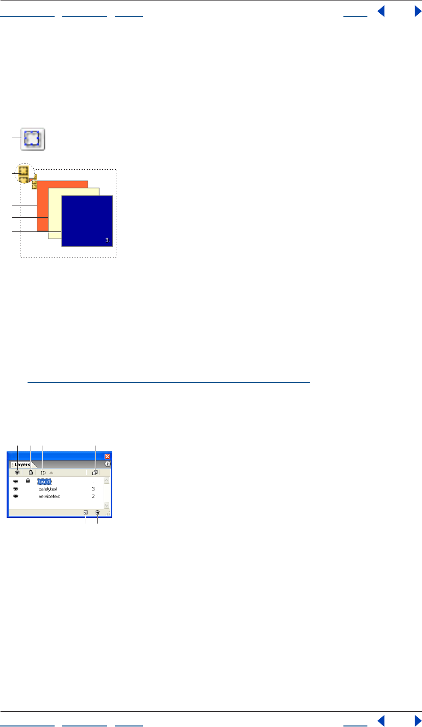
Using Help | Contents | Index Back 148
Adobe GoLive CS Help Laying Out Pages
Using Help | Contents | Index Back 148
To change the stacking order of multiple boxes:
Select a layer and enter a value in the Z-Index text box in the Layer Inspector. Enter the z-
index of 1 for the bottom layer in the stack, 2 for the next box in the stack, and so on. (You
can also change a z-index number by selecting it in the Layers palette and typing a new
number.)
Layer symbols and stacking order values
A. Layer object icon B. Layer marker C. The first layer has a z-index of 1
D. The layer in the middle has a z-index of 2 E. The layer in the front has a z-index of 3
Managing layers
You can use the Layers palette to temporarily lock, hide or show a layer as you work.
Settings in the Layers palette do not affect the display of the layers in the browser. You can
also use the Layers palette to quickly select multiple layers for alignment and grouping.
(See “Repositioning, aligning, or distributing objects” on page 141.)
Note: Some settings in the Layers palette are only temporary and will be overridden when
you switch document views or click the Play button in the DHTML Timeline Editor for an
animated layer.
Temporary settings help you work with multiple layers
regardless of their status in the Layer Inspector.
A. Temporary hide/show status B. Temporary lock/unlock status
C. Name of layer D. Stacking order of z-index values E. Create new layer
F. Delete selected layer
B
A
C
D
E
A
EF
BC D
Using Help | Contents | Index Back 149
Adobe GoLive CS Help Laying Out Pages
Using Help | Contents | Index Back 149
To temporarily lock, hide, or show a layer:
In the Layers palette, select the layer and do one of the following:
• Click in the eye column to temporarily hide or show the content of a layer. You can
also Ctrl-click (Windows) or Command-click (Mac OS) any eye icon to hide or show all
layers at once.
• Click in the padlock column to temporarily lock and unlock a layer, or Ctrl-click
(Windows) or Command-click (Mac OS) any padlock icon to lock or unlock all layers at
once. When locked, you cannot select or drag the layer or edit its content in the
document window.
• Choose Lock Visibility from the Layers palette menu to preserve all temporary hide/
show and lock/unlock settings when you click the Play button in the DHTML Timeline
Editor or switch views—for example, from the Layout Editor to Layout Preview and
back.
• Click the name of a layer to bring it to the foreground and make it temporarily visible
and editable regardless of the hide/show and lock/unlock settings.
To change the name or stacking order of a layer:
In the Layers palette, select the layer, click again to select the name or z-index number, and
type a new name or number. The name or number is automatically updated in the Layer
Inspector.
To view the hierarchy of layers nested within other layers:
In the Layers palette, choose Hierarchic from the palette menu. With this option selected,
you can drag layers in the palette to change their nesting order. (To display all the layers at
the same level in the list, choose Flat from the palette menu.)
Converting layers into layout grids
You can convert nonoverlapping layers and their contents into objects on a layout grid in
a new untitled page. This is useful if you need a table-based design for the page in
addition to your DHTML layers-based design. If the layer contains text, it converts into a
layout text box on the grid. The position, size, and background color attributes of the layer
are retained. GoLive creates a new page to contain the converted objects, keeping the
original page of layers intact.
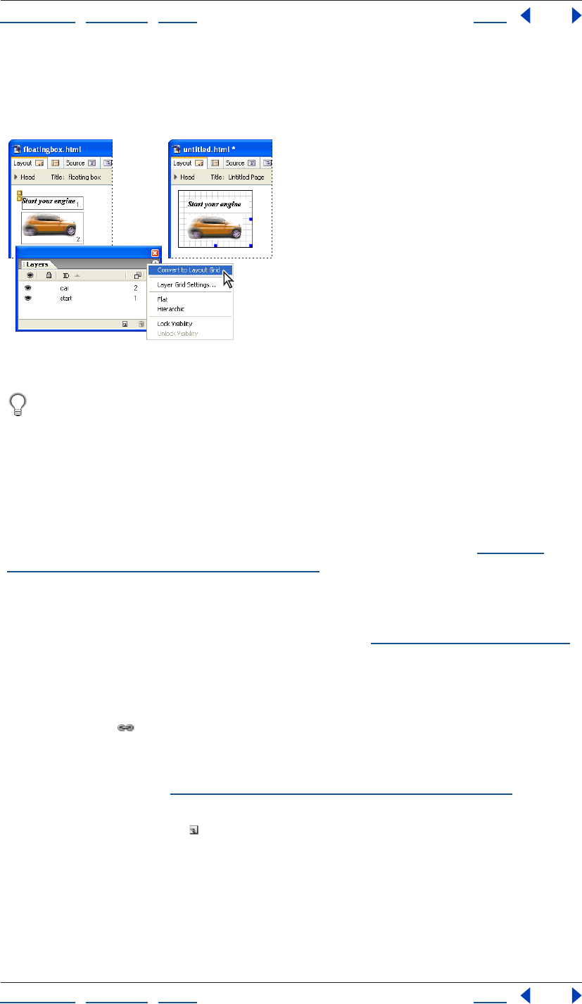
Using Help | Contents | Index Back 150
Adobe GoLive CS Help Laying Out Pages
Using Help | Contents | Index Back 150
To convert layers into a layout grid:
In the Layers palette, choose Convert To Layout Grid from the palette menu. (The option is
dimmed if any layers are overlapping.)
The text and image appear in the same positions in the new document.
You can show or hide the vertical and horizontal grid lines in the layout grid by
selecting the layout grid and then selecting or deselecting the Visible options in the
Layout Grid Inspector.
Hiding and showing layers
Layers are useful for hiding and showing images or text when viewers click or move the
mouse pointer over links on a page. When you set up show/hide actions for multiple
layers, be sure to name the boxes first in the Layer Inspector for easy identification.
You can also hide and show layers based on a given amount of time. (See “Applying
timeline-triggered actions to layers” on page 154.)
To initially hide a layer when the page is loaded:
Select the layer and deselect Visible in the Layer Inspector. (You can use the Layers palette
to temporarily show the layer in GoLive as you work. See “Managing layers” on page 148.)
To show or hide a layer using a mouse
event trigger:
1 Select the text, object, or image that will serve as the mouse event trigger and click the
New Link button in the toolbar.
2 In the Inspector, type the number symbol (#) in the URL text box. Or, if the selection will
also serve as a navigational link, enter the link’s destination URL in the text box instead of
the number symbol. (See “Specifying the destination URL for a link” on page 62.)
3 In the Actions palette, select a mouse event (such as Mouse Enter) in the Events list and
click the New Action button . Then choose Action > Multimedia > Show Hide from the
Action menu, choose your layer from the Layer menu, and choose Show, Hide, or Toggle
from the Mode menu. (Toggle shows or hides the layer according to its current visibility
status as set in the Layer Inspector.)
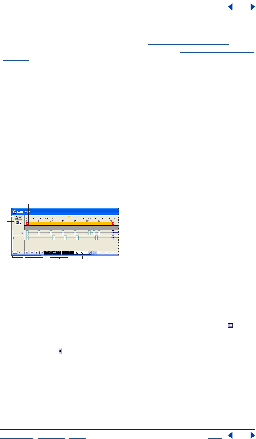
Using Help | Contents | Index Back 151
Adobe GoLive CS Help Laying Out Pages
Using Help | Contents | Index Back 151
4 Save your page and preview the action in a Web browser.
Note: Actions must be previewed in a browser. (See “Previewing files” on page 37.) For
information on using other scripted actions for your layers, see “Using GoLive actions” on
page 418.
Using the DHTML Timeline Editor
You use the DHTML Timeline Editor to insert actions for layers in a timeline, or to animate
a layer.
Animating layers
You animate a layer by inserting keyframes in its time track and repositioning the layer in
the page for each keyframe. You can also set the visibility status or the stacking order of a
layer based on a selected keyframe in its time track. You can use scenes to include multiple
animations in the same Web page.
Note: An intermittent bug in Netscape 4.0 browsers may cause the content of an
animated layer to temporarily disappear, especially if the content is an image button.
A simple workaround is to insert a nonbreaking space or a single-pixel transparent GIF
image before the image button. (See “Adding spacers, nonbreaking spaces, or transparent
GIFs” on page 163.)
The DHTML Timeline Editor contains time tracks for two layers.
A. Beginning of the play range B. End of the play range
C. Autoplay button D. Scenes options menu E. Action Track F. Time tracks
G. Loop and Palindrome controls H. Playback buttons I. Counter for keyframe position in
seconds and frames J. Frames per second K. Keyframe
To insert a keyframe in the time track:
Open the DHTML Timeline Editor by clicking the DHTML Timeline Editor button in the
upper right corner of the document window. A time track appears in the DHTML Timeline
Editor for each layer on the page. Initially, each time track contains a single keyframe.
1 Click a keyframe to select the time track of a layer. The name of the layer appears in
the Layer Inspector.
2 Ctrl-click (Windows) or Command-click (Mac OS) at the desired position on the time
track to insert a new keyframe. You can also Alt-drag (Windows) or Option-drag (Mac OS) a
copy of an existing keyframe to the desired position on the time track to create a new
keyframe.
A
C
D
E
F
GH I J K
B
Using Help | Contents | Index Back 152
Adobe GoLive CS Help Laying Out Pages
Using Help | Contents | Index Back 152
The new keyframe marks the end of the play range. This is indicated by the right play
range locator , which follows as you drag the keyframe. If you insert more keyframes, the
keyframe farthest to the right always limits the play range. The distance between
keyframes determines the playback speed—the shorter the distance, the faster the
animation plays back.
To specify the position of the layer for a keyframe:
1 In the DHTML Timeline Editor, select the keyframe in the time track for the layer.
2 In the document window, drag the layer to the position where you want it to appear for
the selected keyframe. You can also enter the desired position in the Left and Top text
boxes of the Layer Inspector.
3 Click the first keyframe in the DHTML Timeline Editor to return the layer to its start
position.
4 Click the Play button at the bottom of the window to preview your animation.
The layer travels across the document window and stops where you set the last keyframe.
The Time Cursor in the DHTML Timeline Editor stops at the right play range locator .
You can click the Stop button twice to stop playing and to reset the Time Cursor to the
beginning of the play range. Use the Backward button to return the Time Cursor by
increments to the beginning of the timeline.
To control the playback behavior:
1 Use the Loop and Palindrome buttons in the lower left corner of the DHTML Timeline
Editor to control the playback looping:
• The Loop button plays your animation in an endless loop. When it reaches the end
point of the animation path, the layer jumps back to the start and resumes traveling,
repeating this cycle indefinitely.
• The Palindrome button causes the layer to bounce back and forth between the start
and end points of the play range. (The Loop button must be active to activate the Palin-
drome button.)
2 To change the playback speed, select a new frames-per-second option from the FPS
menu at the bottom of the DHTML Timeline Editor.
Most browsers can handle the default 15 FPS setting, even if running on systems with
average video hardware. If you want to work with higher speeds, be sure to test your
animation with a wide selection of system configurations to make sure that playback is
smooth.
To set the visibility status of the layer for a keyframe:
1 Select the keyframe in the time track from which you want the layer to disappear or
reappear.
2 In the Layer Inspector, deselect or select the Visibility option.
3 Click the Play button to preview your animation.
The layer appears or disappears until such time that the Time Cursor reaches another
keyframe with a different visibility status.
Using Help | Contents | Index Back 153
Adobe GoLive CS Help Laying Out Pages
Using Help | Contents | Index Back 153
To record an animation path:
1 Open the DHTML Timeline Editor, and select the starting keyframe.
2 Click the Record button in the Layer Inspector.
3 In the document window, drag the layer along the desired path. A keyframe appears at
each major turn in the path.
4 Click each keyframe and correct the position if necessary.
To specify the shape of an animation path:
1 Select one or more keyframes in the time track.
2 Choose an option from the Animation menu in the Layer Inspector:
• None makes the layer jump between the keyframes.
• Linear is the default path shape and makes the layer move in a straight line.
• Curve creates a smooth curve between keyframes.
• Random creates a zigzag path of random lengths between keyframes.
To create multiple scenes in an animation:
1 Create an animation. GoLive names the first animation you create “Scene 1” by default.
2 In the upper left corner of the DHTML Timeline Editor, choose Rename Scene from the
pop-up menu.
3 Enter a name for the scene, and click OK.
4 Choose New Scene from the pop-up menu.
5 Enter a name for the new scene, and click OK.
6 Add keyframes and animate the layers for the new scene, and then preview the
animation for the new scene by clicking the Play button in the DHTML Timeline Editor.
To control the playback of scenes:
1 Go to the second scene, and click the Autoplay button to deselect it and disable
automatic playback.
2 Return to the first scene, and Ctrl-click (Windows) or Command-click (Mac OS) in the
Action Track anywhere before the last keyframe position to insert an action marker,
indicated by a question mark icon . (The Action Track is the horizontal gray bar between
the timeline and the time tracks.)
3 In the Action Inspector, click Show Action Palette, click the Actions tab, and choose
Action > Multimedia > Play Scene. Choose the name of the second scene from the pop-up
menu.
The Play Scene action instructs the browser to switch to the specified scene after finishing
playback of the current scene. On the Action Track, the Play Scene Action icon replaces
the marker.
4 If the first scene is a looped animation or a palindrome, you need to insert a Stop Scene
action: Ctrl-click (Windows) or Command-click (Mac OS) in the Action Track at the very last
keyframe to insert an action marker. In the Action Inspector, click Show Action Palette,
click the Actions tab, choose Action > Multimedia > Stop Scene and choose the first scene
from the pop-up menu. The Stop Scene Action icon appears in the Action Track.
Using Help | Contents | Index Back 154
Adobe GoLive CS Help Laying Out Pages
Using Help | Contents | Index Back 154
The Stop Scene action stops the playback of a scene, even if it is an endless loop. Be sure to
insert this action after the Play Scene action in the Action Track; otherwise, the animation
stops before scenes can be switched.
5 Move the Time Cursor to the beginning of the first scene and preview the animation in
the browser.
Note: To give viewers more control over your animation, you can also attach the Play
Scene action to a rollover button or hypertext link in your page. For instructions on using
actions with rollover buttons and text, see “Using GoLive actions” on page 418.
Applying timeline-triggered actions to layers
Actions are ready-to-use scripts that you can use with the DHTML Timeline Editor, rollover
buttons, links, and form elements. You can add actions to the timeline of a layer by
inserting markers in the Action Track of the Timeline Editor, and defining the actions in the
Actions Inspector.
Actions allow you to add sound, trigger the playback of animation scenes, dynamically
change the content of images, and control other processes in the browser window. For
information on actions you can use with layers, see “Using GoLive actions” on page 418.
Working with frames
Frames divide a Web browser window into sections that contain separate pages. Using
frames, you can make your page layout more visually interesting and help viewers
navigate in your Web site. Since the content of each frame is a separate page (and separate
file) with its own URL, it can be changed and scrolled independently of the pages in other
frames. For example, you can use frames to create an onscreen navigation aid or table of
contents that remains visible in one frame while the viewer scrolls through the page in
another frame.
Inline frames enable you to insert a frame within a a non-frameset page. Most older
browsers don’t support inline frames.
Note: Frame sets don’t work well with Web search engines because they have no content.
For this reason, it’s a good idea to not use a frame set for your index page. Also, you can’t
set bookmarks in the browser for frame-based Web pages because the URLs map to the
frame set rather than the desired pages.
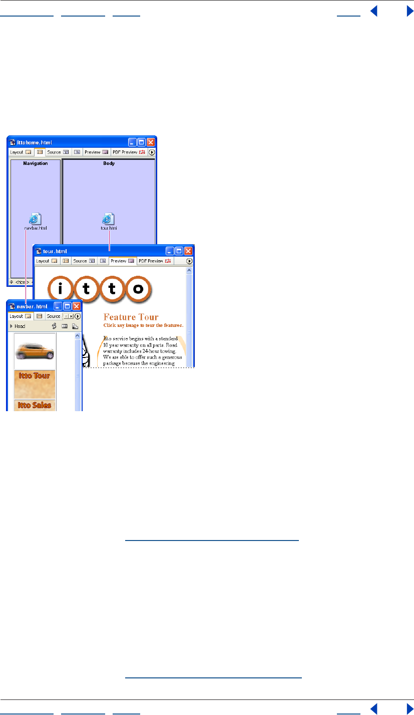
Using Help | Contents | Index Back 155
Adobe GoLive CS Help Laying Out Pages
Using Help | Contents | Index Back 155
Creating a page layout using frames
You need at least three HTML documents to create a two-frame page layout: one
document for the frame set, which holds the frame structure, and two documents for the
visible pages of content. The frame set is the master document that defines the size and
location of the frames and contains the URL reference links to the content pages. You
design the content pages to fit or scroll within specific frames in the frame set.
A frame set document with two frames: the left frame contains a navigation
page, and the right frame contains a page that’s linked from the navigation page.
When working with frames, keep in mind the following browser limitations:
• Single-frame pages do not display in Netscape browsers earlier than Netscape 6.
• Browsers tend to offset the content of a page from the edge of their main display area
and from the inner edges of frames by a few pixels. This behavior can cause sizing
problems. To help solve this problem, you can set the margins of the frame set
document to zero. (See “Specifying page margins” on page 54.)
• Nesting frame set documents within the frames of other frame sets is possible but can
cause serious navigation problems.
To create a page layout using frames:
• Create the pages of content that will be displayed in the frames and create a blank page
to use for the frame set.
• Set up the frame set and name the frames. In the frame set document, you can set
frames to scroll the content of pages and to have visible borders or no borders. You can
also set frames to be a fixed size or to resize proportionally when viewers resize their
browser windows. (See “Setting up the frame set” on page 156.)
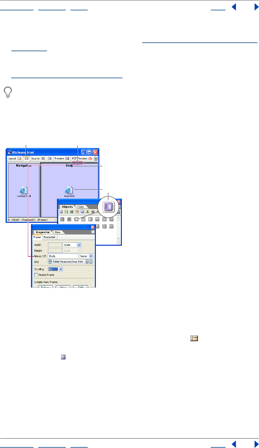
Using Help | Contents | Index Back 156
Adobe GoLive CS Help Laying Out Pages
Using Help | Contents | Index Back 156
• Link each frame to a content page. If the frame will display multiple pages, link it to the
first page you want to appear by default. (See “Setting up each frame in the frame set”
on page 157.)
• Open the content page that you plan to use as a navigational aid or table of contents,
and specify the destination pages and target frame for every link on the page. (See
“Setting up target frames” on page 159.)
You can double-click the Page icon in a frame to open the content page in another
window.
Setting up the frame set
The Objects palette contains a selection of frame sets that can be dragged to your
document window when you want to create a Web page with frames.
The left frame is fixed while the right frame resizes automatically in the browser window.
A. Frame Editor tab B. Frame set divider C. The name of the frame D. Icon representing the page
linked to this frame E. The pink-shaded areas represent frames with fixed pixel sizes.
To set up the frame set:
1 Open a new document window, and click the Frame Editor tab at the top of
the window.
2 In the Frames set of the Objects palette, drag a Frame Set icon to the page or double-
click it. When you hold the pointer over an icon in the palette, a description of the frame
set appears, indicating, for example, which frames are fixed sizes and which ones aren’t.
3 Make sure HTML 4 Frameset is chosen in the New Doctype menu, and then click OK in
the Change Doctype dialog box.
4 Select the frame set by clicking any of its horizontal or vertical dividers.
AB
C
DE
Using Help | Contents | Index Back 157
Adobe GoLive CS Help Laying Out Pages
Using Help | Contents | Index Back 157
5 In the Frame Set Inspector, do any of the following:
• Select an Orientation option to arrange the frames in the frame set horizontally (all in
one column) or vertically (all in one row). You can also select the Matrix option and
enter the number of rows and columns in the Rows and Columns text boxes.
• Select BorderSize to change the thickness of the selected divider in the document
window, and enter a value in pixels.
• To hide a horizontal or vertical border, select BorderSize, and enter 0 in the text box, and
then select BorderFrame, and choose No from the pop-up menu. (This sets the
attributes for all browsers.)
• To assign a color to all borders in the frame set, select BorderColor, click in the color
field, and then select a color from the Color palette. Or, click the lower right corner of
the color field and choose a color from the swatches that appear (the swatches are
based on the current settings in the Swatches palette). This color overrides the gray
border that most Web browsers display by default.
Note: To color the background of a frame, you must select a background color for the page
you want to display in that frame. (See “Applying images or color to the page background”
on page 70.)
6 Name the page title of the frame set document in the Layout Editor. (See “Changing the
page title” on page 53.)
7 Save the frame set document. Make sure to save it with an .html extension, for example,
Frameset.html.
To add another frame to the frame set:
Drag the Frame icon from the Frames set in the Objects palette into the frame set.
To move or copy a frame or a nested frame set:
Shift-drag to move a frame or nested frame set. Ctrl-drag (Windows) or Option-drag
(Mac OS) to copy a frame or frame set.
As you drag, you’ll notice that the frame orientation limits the direction of motion. You can
drag vertical frames sideways and horizontal frames up and down, but you cannot extend
the frame set by dragging beyond its boundaries.
You can copy a frame set to other documents or save a reusable copy of the frame set
by dragging the frame set to the Snippets tab in the Library palette. (See “Using
snippets” on page 313.)
Setting up each frame in the frame set
You use the Frame Inspector to name each frame and link it to a Web page. You can use the
name of the frame as the target when you create links to it from other pages; for example,
to make a link’s destination page appear in the frame. (Names assigned to individual
frames won’t appear in the browser window.) You can also set scrolling bars for each frame
and whether the size of the frame is fixed or automatically resizes when the browser
window is resized.
Using Help | Contents | Index Back 158
Adobe GoLive CS Help Laying Out Pages
Using Help | Contents | Index Back 158
To name a frame in the frame set:
1 Click inside the frame to select it.
2 In the Frame Inspector, choose an option from the Name/ID menu (choose Name & ID
for maximum browser compatibility), and then type a unique frame name in the Name/ID
text box.
To link a frame to a page:
Drag the page from the site window into the frame. You can also select the frame and use
the Frame Inspector to specify the page in the URL text box. (See “Linking files” on
page 61.)
Note: To make the contents of the frame change when visitors click links on a page in
another frame, you make this frame the target for each link. (See “Setting up target
frames” on page 159.)
To set scrolling bars for a frame:
In the Frame Inspector, choose Yes, No, or Auto from the Scrolling pop-up menu to show
or hide scrolling bars. Auto hides the scrolling bars if they aren’t needed and shows them if
the content is too large for the frame.
To set the size of a frame:
In the Frame Inspector, do any of the following:
• Choose Scale from the Width or Height menu if you want the frame to resize automati-
cally when the browser window is resized.
Note: At least one frame in the frame set must be resizeable.
• Choose Pixel from the Width or Height menu, and enter the desired size in pixels if you
don’t want the frame to be resizeable. For example, use this technique if the frame will
display a small image of known dimensions.
Note: If you specify an absolute size in pixels for one frame, you must set at least one more
frame of the same orientation to Scale, or the frame set scales all frames in that direction.
• Choose Percent from the Width or Height menu if you want the frame to have a fixed
ratio relative to the overall height or width of the frame set. Then enter a value in the
Width or Height text box to preset a percentage. For frames with horizontal orientation,
this attribute controls the relative height. For frames with vertical orientation, it
controls the relative width.
To resize a frame by dragging:
• Click inside the frame to select it, and drag its vertical or horizontal border to resize the
height or width.
• In the Frame Inspector, choose Pixel or Percent from the Width or Height menu, and
drag the frame border to the desired size.
To set the size of a frame border:
Select the vertical or horizontal border. In the Frame Set Inspector, select BorderSize and
enter a value in pixels in the text box.
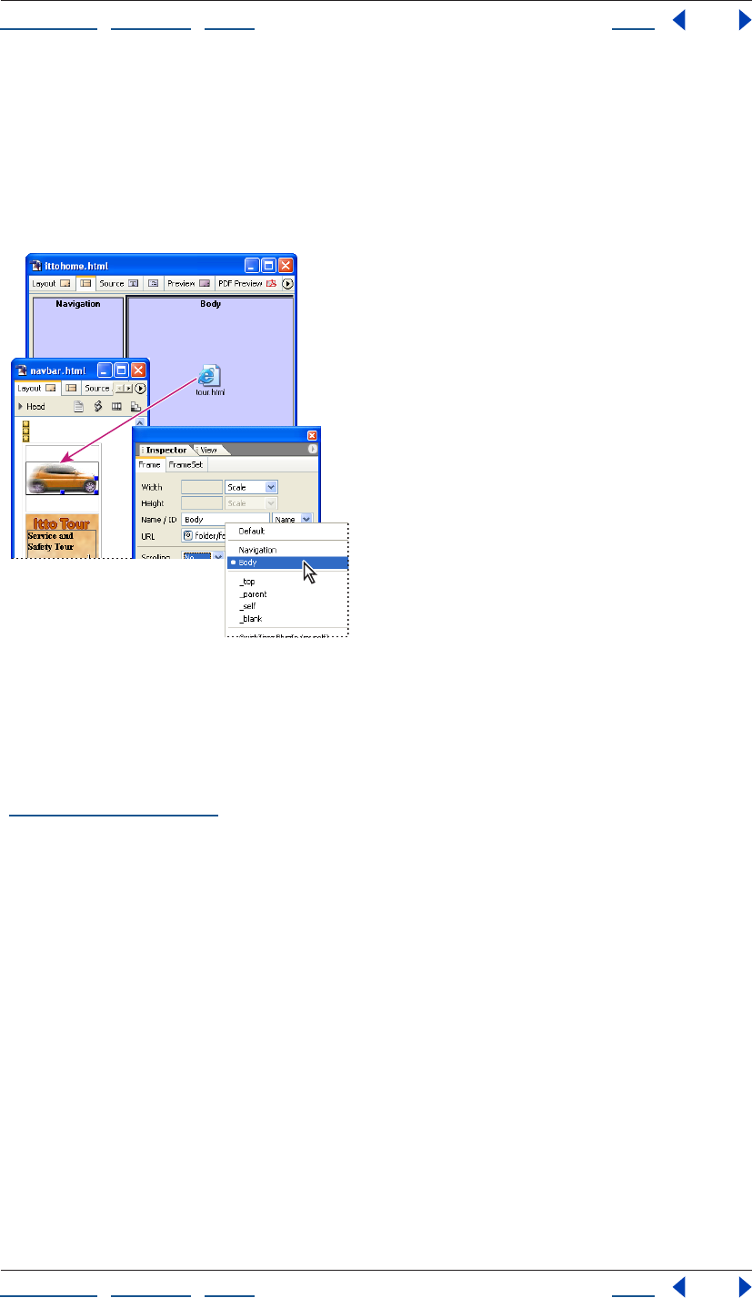
Using Help | Contents | Index Back 159
Adobe GoLive CS Help Laying Out Pages
Using Help | Contents | Index Back 159
Setting up target frames
When you set up navigation links to pages that are displayed in a frame set, you must
specify each target frame as well as the page’s URL.
For example, if you use a frame set to display a table of contents in one frame and the
pages linked to the table of contents in another frame, every link in the table of contents
must specify the target frame in which the linked page will appear.
Each navigation link specifies both destination page
(intro.html) and target frame (Body).
To specify the target frame for linked pages:
1 Open the content page that contains the navigation links. (You can double-click the
Page icon in the frame to open the page.) For information on creating navigation links, see
“Linking files” on page 61.
2 For each link, in the Text Inspector or the Link tab of the Image Inspector, specify the
target frame where you want the linked page to appear by choosing an option from the
Target menu:
• A frame’s name displays the linked page in that frame. The frame names of your open
frame set appear at the top of the menu.
• _top displays the linked page in the full Web browser window, replacing the current
frame set entirely.
• _parent displays the linked page in the parent of the current document. If the current
page has no parent, the target _self is used. (The parent is the next highest frame set in
the hierarchy.)
• _self displays the linked page in the window or frame that contains the link, replacing
the navigation page.
• _blank displays the linked page in a new untitled window.
• Default removes any previously set target for the page.
• QuickTime PlugIn (myself) replaces the QuickTime movie currently playing.
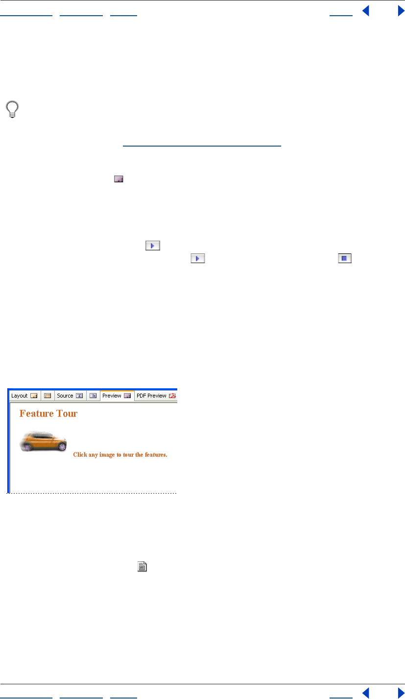
Using Help | Contents | Index Back 160
Adobe GoLive CS Help Laying Out Pages
Using Help | Contents | Index Back 160
• QuickTime PlugIn (quicktimeplayer) starts a QuickTime movie in the QuickTime Player.
• RealOne Browser (_rpbrowser) displays links in the Real Media browser pane.
• RealOne External (_rpexternal) displays links in a new RealOne window.
You can use the ForceFrame action to prevent browsers from displaying a page
outside of the frame set you’ve created for it. You can also use actions to set multiple
target frames for a single link. For information on the ForceFrame action and
Target2Frames action, see “Using GoLive actions” on page 418.)
Previewing the frame set with its contents
You use the Preview tab to preview the entire contents of the frame set in the
document window. You cannot edit the frame set or open linked pages in Preview mode.
(To open and edit linked pages, double-click their page icons in the Frame Editor.)
If you’re using GoLive for Mac OS, you can also use the Inspector to preview the content of
individual frames in the Frame Editor. To preview a frame’s content within the frame set,
click the Preview Frame button in the Frame Inspector. To hide the content, click the
button again. Use the Preview Set button and the Stop Preview button in the
Frame Set Inspector to preview the content of all the frames.
Note: GoLive for Mac OS cannot preview external URLs. You need to test external links
with a browser.
Using inline frames
Inline frames enable you to insert a frame in a non-frameset page. Web browsers typically
display the frame with horizontal and vertical scrollbars.
Note: Netscape browsers earlier than version 6 don’t support inline frames.
An inline frame embedded in a page
To insert an inline frame:
1 Open the page in which you want to insert the frame.
2 Drag the Inline Frame icon from the Frames set of the Objects palette to the page, or
double-click the icon to place it at the insertion point.
3 In the Inline Frame Inspector, browse or use the pick whip to link to the file you want
contained within the inline frame.
4 In the Inline Frame Inspector, choose an option from the Name/ID menu (choose Name
& ID for maximum browser compatibility), and then type a unique name in the Name/ID
text box.
Using Help | Contents | Index Back 161
Adobe GoLive CS Help Laying Out Pages
Using Help | Contents | Index Back 161
5 Do any of the following in the Inline Frame Inspector:
• Choose a height and width for the inline frame in pixels or percentages.
• Enter a margin width or margin height for the inline frame.
• Select alignment and scrolling options.
• Select Frameborder to display a border around the inline frame.
Adding special page elements
GoLive provides special page elements to solve specific needs in your page design.
You can also use the Browser Switch object in the Smart set of the Objects palette to
provide instructions for browsers to switch to alternative pages. (See “Adding
browser-switch scripts” on page 58.)
Adding comments
As you lay out content on your Web pages, you may want to add comments about the
design. Comments appear only in GoLive (in the Comment Inspector and the source code)
or other HTML editors and do not appear on the pages in Web browsers.
You can also add comments to the head sections of pages. (See “About head section
elements” on page 56.)
To add comments to your page:
1 Drag the Comment icon from the Basic set in the Objects palette to the desired location
in the page, or double-click the Comment icon to place it at the insertion point.
A symbol appears in the text to indicate the location of the comment.
2 In the Comment Inspector, type your comment.
Adding date and time stamps
You can display the date and time that you saved the page; for example, to tell your
viewers when you last updated the page. GoLive reads the current date or time from your
computer’s built-in clock and writes the result in a custom tag. It then updates the infor-
mation whenever you save the page.
To add a date and time stamp to your page:
1 If you want descriptive text before the date or time stamp (for example, “Last revised:”),
type the text in the page.
2 Drag the Modified Date icon from the Smart set in the Objects palette to the page, or
double-click the icon to place it at the insertion point.
3 In the Modified Date Inspector, choose a country from the Format menu and select a
date and time format in the list of options for the specific country.
Adding URL pop-up menus
If you have several hypertext links on your page, you can present them in a pop-up menu
for your viewers to choose from. To test the links in the menu, you must preview the page
in a Web browser.
Using Help | Contents | Index Back 162
Adobe GoLive CS Help Laying Out Pages
Using Help | Contents | Index Back 162
To create a URL pop-up menu for your page:
1 Drag the URL Popup icon from the Smart set in the Objects palette to your page.
You can change the Choose... label at the top of the menu
or make it blank.
A. URL pop-up menu in the page
B. URL Popup icon in the Objects palette
2 In the URL Popup Inspector, do the following:
• In the Label text box, type a new label to appear at the top of the new pop-up menu or
leave it blank.
• To add a URL to the new pop-up menu, click the New Item button . Type a new label
for the URL in the Label text box, and enter the destination of the link in the URL text
box. (See “Linking files” on page 61.) If you’re using a frame set, specify the target frame
for the URL in the Target text box. (See “Working with frames” on page 154.) You can
also click the Duplicate Selected Items button to create a copy of a URL already in the
pop-up menu and edit the label or URL in the Label, URL, and Target text boxes.
• To move an item up or down in the list, select it and click the arrow buttons.
• To remove an item from the list, select it and click the Remove Selected Items button .
For information on creating individual hypertext links, see “Linking files” on page 61.
3 Preview the URL pop-up menu and each link in a Web browser. (See “Previewing files”
on page 37.)
Adding horizontal lines
To visually separate blocks of text, you can use horizontal lines (also called rules).
Horizontal lines can be placed in layout text boxes, but should never be added directly to a
layout grid.
To add a horizontal line to a text area:
1 Drag the Line icon from the Basic set in the Objects palette into a text area, or double-
click the Line icon to place it at the insertion point in the text. (Horizontal lines should
never be placed directly on a layout grid—but in a layout text box instead.)
2 In the Line Inspector, do any of the following:
• Click a button for Style: the left button to apply a solid style, or the right button to apply
a three-dimensional style.
• Choose a measurement from the Width menu. Full and Percent are measured in relation
to the container (such as a layout text box, table cell, or the document window).
• In the Height text box, enter a new line height in pixels. You can also select the line, and
drag its handle to adjust the height.
• Click a button to align the line in relation to the layout text box, layout grid, or
document window. (The buttons are dimmed if the line is full width.)
BA
Using Help | Contents | Index Back 163
Adobe GoLive CS Help Laying Out Pages
Using Help | Contents | Index Back 163
Adding spacers, nonbreaking spaces, or transparent GIFs
Spacers are Netscape elements used for creating horizontal space between text and
objects. Because spacers are ignored by Internet Explorer browsers, you may want to use
transparent GIF images instead for creating space on your page. (If you’re using a layout
grid, you don’t need to use either.) Transparent GIF images download quickly, and can be
resized to fill any space. You can also create nonbreaking spaces within text to insert
space.
To use a transparent GIF image for spacing:
1 Create a small (1x1 pixels) transparent GIF image in your image editing software and
drag it into the Files tab of your site window.
2 Drag the transparent GIF image from the site window to the desired location in the text.
(See “Specifying the destination URL for a link” on page 62.)
3 In the document window, drag the image’s selection handles or use the Image
Inspector to resize the image. You can also use the Image Inspector to align the trans-
parent image horizontally and vertically within the text. If you have trouble selecting the
image on the page, click the <img> tag in the markup tree bar at the bottom of the
document window. (See “Repositioning, aligning, or distributing objects” on page 141.)
You can save the resized transparent GIF image for reuse on other pages by dragging
it into the Snippets tab of the Library palette. (See “Using snippets” on page 313.)
To create a nonbreaking space:
Press Shift + spacebar (Windows) or Option + spacebar (Mac OS).
To use a Netscape spacer element for spacing:
1 Drag the Horizontal Spacer icon from the Basic set in the Objects palette to the desired
location in the text.
2 In the Spacer Inspector, select a Horizontal, Vertical, or Block resizing option. (Block
allows you to resize the spacer both horizontally and vertically.)
3 Select the spacer and drag its handles to resize it, or enter values (in pixels) in the Width
and Height text box.
4 To align a block spacer in relation to the text, select it and choose an option from the
Alignment menu in the Spacer Inspector.
Note: Spacers are based on a Netscape-specific element that is recognized by Netscape
Navigator 3.0 and later. They are ignored by Microsoft Internet Explorer.
Adding scrolling marquees
Scrolling text marquees are only supported by Internet Explorer browsers. (The text does
not scroll in Netscape browsers.) To create a message that scrolls across your Web page in
both types of browsers, you may want to use a SWF animation, Java applet, or animated
GIF image instead. You can also create a similar effect using layers and the Wipe Transition
action. (See “Hiding and showing layers” on page 150, and for information on the Wipe
Transition action, see “Using GoLive actions” on page 418.)
Using Help | Contents | Index Back 164
Adobe GoLive CS Help Laying Out Pages
Using Help | Contents | Index Back 164
To create a scrolling marquee:
1 Drag the Marquee icon from the Basic set in the Objects palette to the page.
If you want to control the font and style of the marquee text on a layout grid, place the
marquee in a layout text box.
2 In the Marquee Inspector, type the message for the marquee in the Text box.
3 Choose an option from the Behavior pop-up menu:
• Scroll to cause the message to scroll
continuously.
• Slide to move the message into the marquee box and to hold it there.
• Alternate to move the message into the marquee box and to bounce it between the
edges.
4 Determine how long the marquee is visible:
• Select Forever to make the message scroll continuously.
• Enter a required number of repetitions in the Loops text box.
5 Enter the desired scrolling speed in the Amount text box (the scrolling speed is
measured in pixels between each scrolling amount in milliseconds).
6 Enter the scrolling delay between repetitions in the Delay text box.
7 Select Left or Right to determine the scrolling direction. When Left is selected, the
message appears on the right side of the window and scrolls to the left.
8 Click the More tab in the Marquee Inspector, and do any of the following:
• Enter the dimensions (in pixels or as a percentage) for the marquee in the Width and
Height text boxes.
• Enter a value in the HSpace or VSpace text box to set the horizontal or vertical space
around the marquee’s text.
• Choose an alignment from the Align menu for the marquee object in relation to text or
other objects within the text line.
• Click the color field and select a color in the Color palette for the background of the
marquee. Or, click the lower right of the color field and select a color from the swatches
that appear (the swatches are based on the current settings in the Swatches palette).
Note: The Scrolling Marquee feature is an Internet Explorer extension that does not work
in Netscape browsers.

Using Help | Contents | Index Back 165
Adobe GoLive CS Help Working with Tables
Using Help | Contents | Index Back 165
Working with Tables
About GoLive table features
You can instantly generate a table in GoLive by using a table you’ve copied in a different
application, including Adobe InDesign, Adobe FrameMaker, and third-party word-
processing or spreadsheet applications, such as Microsoft Excel or Microsoft Word. You can
also import text into a table or export text.
To build tables from scratch, drag the Table icon from the Objects palette to your page and
set the table properties in the Table inspector. The Table tab of the inspector sets
properties that affect the entire table. The Row and Cell tabs set properties for a selected
row or selected cells.
You can quickly apply a collection of table properties to a table or selection of table cells
with the predefined table styles in the Style tab of the Table palette. The Select tab of the
Table palette gives you an overview of a selected table’s dimensions and enables you to
select a group of cells or nested tables with greater ease than in the document window. In
addition, the Select tab identifies table size conflicts and enables you to fix them with one
click.
Use the Smart Photoshop object to automatically create a Smart Table that contains
optimized slices of a sliced Photoshop image. (See “Adding sliced Photoshop images”
on page 277.)
Creating tables
The heart of page design usually begins with one or more tables that define the structure
of a page. In addition to displaying information in rows and columns, you can design
tables to create visually rich page layouts. You can insert text and many kinds of objects
from the Objects palette into a table cell, including images, nested tables, Photoshop files,
and QuickTime movies. Or, add a sliced Photoshop file to a page with the Smart
Photoshop object to automatically generate a Smart Table for the optimized image slices.
(See “Adding sliced Photoshop images” on page 277.)
Positioning text and objects using tables is even easier if you use a GoLive layout grid
with layout text boxes. (See “Using the layout grid” on page 138.)
To create a new empty table:
Do one of the following:
• To place a table at the insertion point with a specific number of rows and columns,
press Ctrl (Windows) or Command (Mac OS) as you drag the Table icon in the Basic set
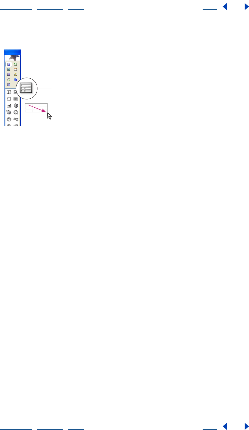
Using Help | Contents | Index Back 166
Adobe GoLive CS Help Working with Tables
Using Help | Contents | Index Back 166
of the Objects palette. Release the mouse button when the desired number of rows
and columns appear.
Interactive pop-up table in the Objects palette
A. Table icon B. Dragging to define columns and rows
• Double-click the Table icon in the Basic set of the Table palette to place a table at the
insertion point, or drag the Table icon to the document window.
To create a table from an existing table or cells:
Do one of the following:
• Select one or more cells in an existing GoLive table, and choose Edit > Copy. Then place
an insertion point and choose Edit > Paste.
• Select one or more cells in an existing GoLive table. Move the pointer over the black
square in the upper left corner of the selection until the pointer changes to a hand;
then drag the selection to a new location.
A
B
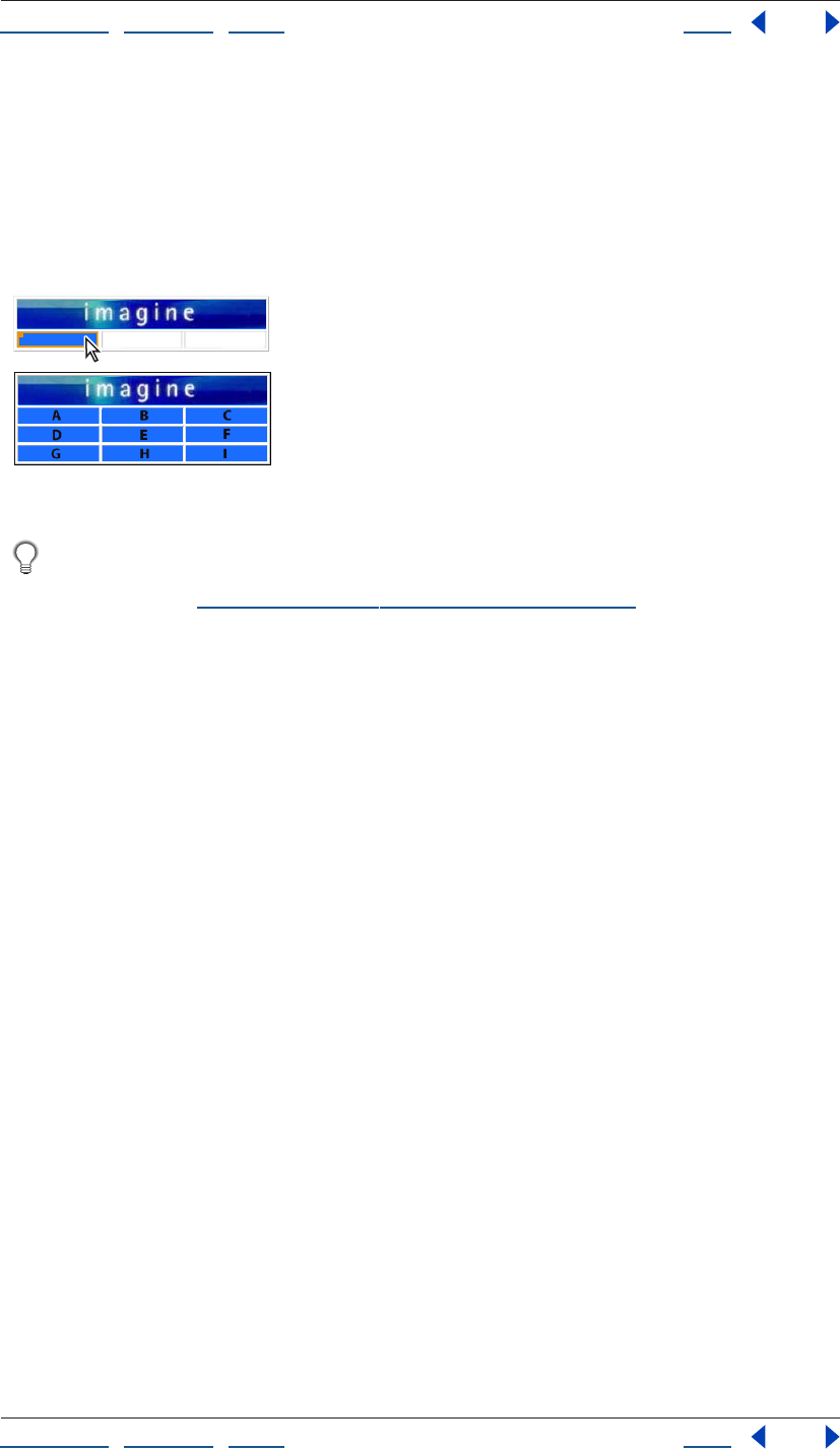
Using Help | Contents | Index Back 167
Adobe GoLive CS Help Working with Tables
Using Help | Contents | Index Back 167
To create a table from an existing table in a different application:
1 In an application other than GoLive, select and copy the table or cells you want to paste.
2 In GoLive, select an existing table cell that you want to be the upper left corner cell of
the content you copied, and then choose Edit > Paste.
The table creates additional rows and columns as needed to include all of the information
that was copied.
Original table (top) and after (bottom) pasting a table copied in a different application
To create a Smart Table from a sliced Photoshop file, drag a Smart Photoshop object
from the Smart set of the Objects palette onto your page and reference a sliced
Photoshop file. (See “Adding sliced Photoshop images” on page 277.)
Making table or cell selections
After you select a row, column, or cell in a table, you can delete the selection, copy and
paste it, or drag the selection to move it within the table or to create a new table. Selecting
cells or nested tables can become difficult as you add images and other content to a table.
GoLive provides you with a variety of ways to select cells, rows, columns, and nested tables
to suit your needs. You can make selections directly in the document window, in the
markup tree bar, or in an outline of the table in the Select tab of the Table palette. The
Select tab shows a table as a bare outline, and enables you to make cell or nested table
selections without the risk of resizing the selection or selecting content inside the cell.
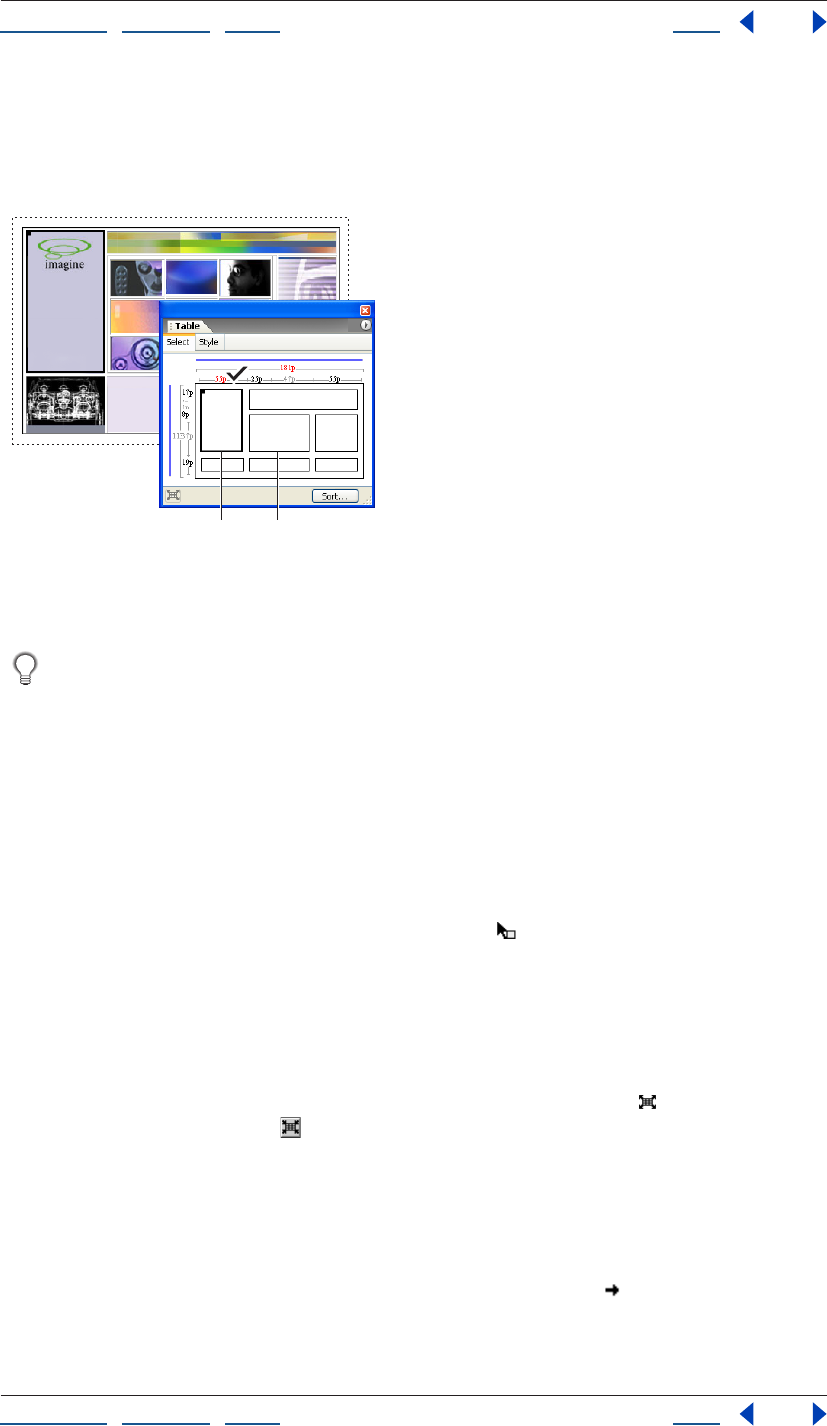
Using Help | Contents | Index Back 168
Adobe GoLive CS Help Working with Tables
Using Help | Contents | Index Back 168
Selected cells are outlined in bold in the document window and in the Table palette, and
highlighted in source code views. In the Layout editor or Table palette, you can drag the
black rectangle in the upper left corner of the selected cells to move the cells within the
table or to create a new table.
Selecting a table cell with the Select tab of the Table palette
A. Selected table cell B. Nested table (Cells within nested tables appear
only when the nested table is selected.)
If you place an insertion point in a table cell, select content in a cell, or select a table
cell, you can press Ctrl+Enter (Windows) or Control+Return (Mac OS) to expand the
selection outward.
To select a table or nested table:
Do one of the following:
• Select a cell in the table and press Ctrl+Enter (Windows) or Control+Return (Mac OS). Or
place an insertion point in the table or select content within a table cell and press the
keys twice.
• In the document window, move the pointer over the top or left edge of the table until
the pointer changes to the table selection pointer , and then click.
• In the document window, place an insertion point in the table or select content within a
table cell. Choose Select Table from the context menu in either the document window
or the Select tab in the Table palette, or click the <table> tag in the markup tree bar at
the bottom of the page.
• To select a nested table, in the Select Tab of the Table palette, move the pointer over the
nested table until the pointer changes to the Nested Table pointer and click. Click the
Select Parent Table button in the Table palette to reselect the parent table and zoom
out of the nested table.
To select rows:
Do one of the following:
• In the document window or Select tab of the Table palette, move the pointer over the
left edge of a row until it changes to the row selection pointer , and then click. Drag
up or down to add adjacent rows to your selection. Alternatively, with the row selection
pointer, Shift-click the left edge of each additional row.
AB
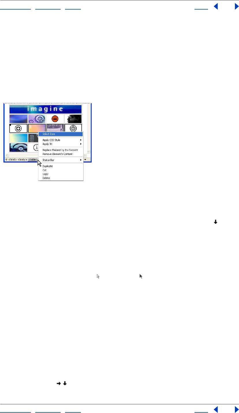
Using Help | Contents | Index Back 169
Adobe GoLive CS Help Working with Tables
Using Help | Contents | Index Back 169
• Place an insertion point in the row, and click the rightmost <tr> tag in the markup tree
bar at the bottom of the page. To add rows to your selection, move the pointer over the
left edge of each additional row in the document window until it changes to the row
selection pointer, and then Shift-click.
• Place an insertion point anywhere in the table, click the <table> tag in the markup tree
bar at the bottom of the page, drag to display a pop-up menu, and then choose the
<tr> tag for a row. To add rows to your selection, move the pointer over the left edge of
each additional row in the document window until it changes to the row selection
pointer, then Shift-click.
Selecting a table row with the markup tree bar
To select columns:
In the document window or the Select tab of the Table palette, move the pointer over the
top edge of a column until the pointer changes to the column selection pointer , then
click. Drag left or right to add adjacent columns to your selection. Alternatively, with the
column selection pointer, Shift-click the top edge of each additional column.
To select cells:
Do one of the following:
• In the document window, move the pointer over the cell’s bottom or right edge until
the pointer changes to an arrow (Windows) or (Mac OS), and then click. Drag from
the selected cell to add adjacent cells to your selection. Alternatively, Shift-click inside
each additional cell.
• Place an insertion point in the cell, and either click the rightmost <td> tag in the
markup tree bar at the bottom of the page, press Ctrl+Enter (Windows) or
Control+Return (Mac OS), or choose Special > Table > Select Cell.
• In the Select tab of the Table palette, click to select a cell. Click-drag from the selected
cell to add adjacent cells to your selection. Alternatively, Shift-click each additional cell.
• To select all cells, select any corner cell in the document window or the Select tab of the
Table palette, and then drag over all cells in the table. You can also select a cell, and
choose Edit > Select All.
• To invert the selection of cells within a row or column, move the pointer over the left
edge of the row or the top edge of the column until it changes to the row or column
selection pointer , , and then Shift-click. (GoLive deselects previously active cells in
the row or column and selects previously inactive cells.)
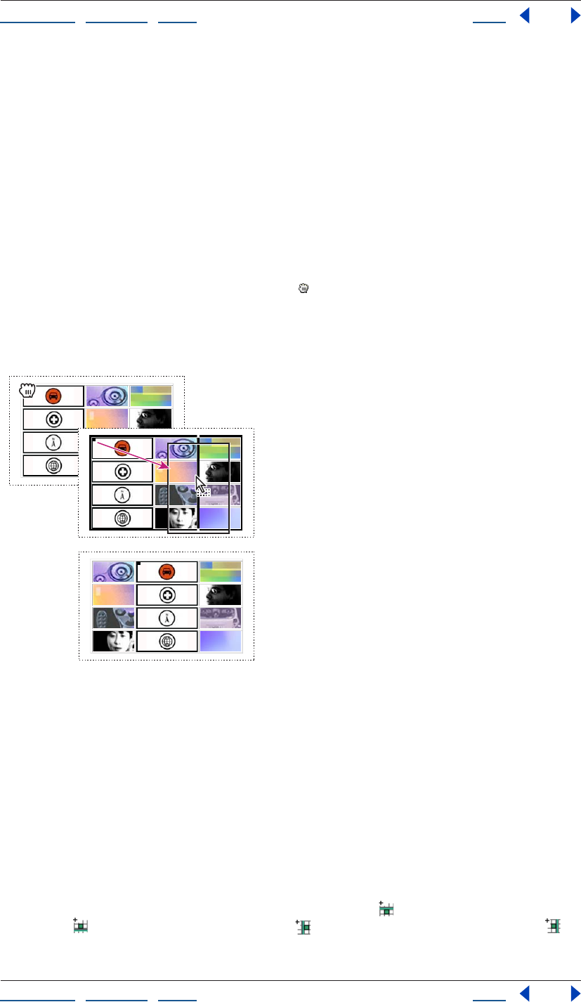
Using Help | Contents | Index Back 170
Adobe GoLive CS Help Working with Tables
Using Help | Contents | Index Back 170
Adding, deleting, and moving rows and columns
GoLive provides you with a variety of ways to change the number of rows and columns in
a table. You can drag table edges, use context menus, press a key, or simply click a button
in the Table inspector to add or remove rows and columns.
Copy and paste a selection to replace the contents of a similar block of cells in a table.
Drag a selection of cells to move the cells to a new location within the table or a different
table.
To move a column or row:
1 Select a cell or a block of adjacent cells in either the page or the Select tab of the Table
palette, and then move the pointer over the square icon in the upper left corner of the
selection until the pointer changes to a hand .
2 Drag to the desired location within the current table or to a different table. Release
when a solid black line appears in the desired location. Hold down Ctrl (Windows) or
Option (Mac OS) as you drag to move a copy of the row or column within the current table.
Moving a table column in a table in the document window.
Note: If you drag a selection of cells, you can only add the cells to a different table if the
destination table has the same number of rows as the cells that you are dragging.
Otherwise the selection becomes a nested table within a cell of the destination table.
To add rows or columns
Do one of the following:
• Select the table or a cell in the table, and enter the desired number for Rows and
Columns in the Table tab of the Table Inspector. (Rows are added to the bottom of the
table. Columns are added to the right side of the table.)
• Select a cell adjacent to where you want a new row or column to appear. In the Cell tab
of the Table Inspector, click the Add Row Above button , the Add Row Below
button , the Add Column To Left button , or the Add Column To Right button .
• Place an insertion point in the last table cell, and then press Tab.
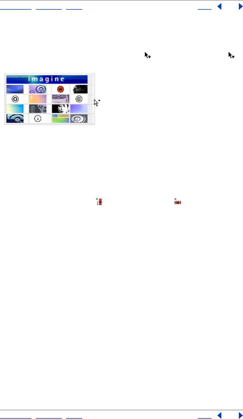
Using Help | Contents | Index Back 171
Adobe GoLive CS Help Working with Tables
Using Help | Contents | Index Back 171
• Select a cell, and choose an insert command from the Special > Table menu.
• Press Ctrl+Shift (Windows) or Command+Shift (Mac OS), and move the pointer over the
bottom edge of the table (to add rows), or the right edge of the table (to add columns),
until the pointer changes to the add rows pointer , or the add columns pointer ,
then drag away from the table.
Dragging to add table columns
To remove rows or columns:
Select the row or column or one or more cells in the row or column and do one of the
following:
• In the Table tab of the Table Inspector, enter the desired number for Rows and Columns
in the Table tab. (Rows are removed from the bottom of the table. Columns are
removed from the right side of the table.)
• Click the Delete Column button , or the Delete Row button in the cell tab of the
Table Inspector.
• Choose a delete command from the Special > Table menu.
• Choose Edit > Cut or Edit > Delete, or press Delete on the keyboard.
To replace table cells:
1 Select a single cell or a block of adjacent cells, and choose Edit > Copy.
2 Select the block of cells that you want to replace, and choose Edit > Paste to replace the
contents of a similar block of cells in a table.
Note: Your target selection must match your source selection. For example, if you copy
four cells in a row, you can only use your selection to replace the contents of another four
cells in a row.
Resizing columns, rows, and tables
The Select tab of the Table palette lets you review the size and units of every row and
column within a table, as well as those of the entire table. You can then change these
values in the document window by simply dragging a cell edge while pressing a combi-
nation of keys, or editing the table properties in the Table Inspector.
The Select tab of the Table palette also lets you identify and quickly fix conflicts in your
column, row, and table sizes. These conflicts can occur when the dimensions of content
within a table exceed the table properties or when the table properties do not add up
properly. Use the Table palette to locate the problem, and then fix it in either the Table
palette or the Table Inspector.
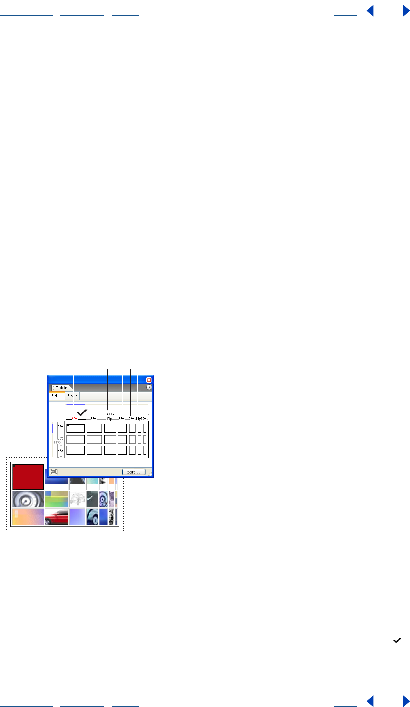
Using Help | Contents | Index Back 172
Adobe GoLive CS Help Working with Tables
Using Help | Contents | Index Back 172
To identify table, row, and column sizes in the Table palette:
1 Select a table, row, column, or cell. In the Select tab of the Table palette, selected cells
appear in bold outline, and blue lines mark the column and rows shared by the selection.
2 The width of the active table appears above the table outline between lines spanning
the table’s width. The table’s height appears to the left of the table outline between lines
spanning the table’s height. Column sizes appear above each column and row sizes
appear to the left of each row.
3 Table property sizes are shown in black, grey, or red characters to signify different value
types:
• If the table, column, or row size is shown in grey characters, the size of the property is
set to Auto in the Table Inspector. This means the size will automatically adjust to the
minimum size needed to contain any content within the row, column, or table.
• If the size is shown in black characters, the size is defined either with pixels (when the
value is followed by a “p”) or a percentage (when the value is followed by a percent sign
(%). A row or column size that is set to a percentage represents a percentage of the
table height or width. A table dimension that is set to a percentage represents a
percentage of the browser window.
• If the size is shown in red characters, the actual size of the row, column, or table
dimension is larger or smaller than the displayed value, which is the size set in the Table
inspector. For example, if the table width is set to 300 pixels, but the combined width of
the table columns is less or more than 300 pixels, then the value of the table width will
be shown in red.
Fixing a column size conflict
A. Size conflict B. Table width in pixel units C. Column width in pixel units
D. Column size in percentage units E. Column width in automatically resized pixel units
To fix table, column, or row size conflicts:
Do one of the following:
• To set a table property to the pixel size that it requires, in the Select tab of the Table
palette, move the pointer over the red pixel value until it changes to the fix pointer ,
then click.
ABCDE

Using Help | Contents | Index Back 173
Adobe GoLive CS Help Working with Tables
Using Help | Contents | Index Back 173
• To set a table property to automatically resize as needed, select the table, column, or
row that has a red pixel value and set the conflicted property to Auto or Percent in the
Table Inspector. (Fix table size conflicts with the Width or Height properties in the Table
tab of the Inspector. Fix row size conflicts with the Height property in the Cell tab of the
Inspector. Fix column size conflicts with the Width property in the Cell tab of the
Inspector.)
To resize a table:
Do one of the following:
• In the Table tab of the Table Inspector, choose an option from the pop-up menu for
Width or Height, and enter the desired measurement value. Choose Auto to automati-
cally adjust the width or height to the minimum size needed to contain any content
within the table. Choose Percent to set the size of the width or height as a percentage
of the browser window.
• To resize a table dimension using fixed pixel values, press Alt (Windows) or Option (Mac
OS), and drag the right or bottom edge of the table. (If the Width or Height is already set
to pixels, then it isn’t necessary to press the Alt or Option key while dragging.)
To resize a row or column:
Do one of the following:
• Select a cell in the row or column that you want to resize. In the Cell tab of the Table
Inspector, choose an option from the pop-up menu for Width or Height, and then enter
the desired measurement. Choose Auto to automatically adjust the width or height to
the minimum size needed to contain any content within the row or column. Choose
Percent to set the size of the row or column as a percentage of the table size.
• To resize a row or column using fixed pixel values, press Alt (Windows) or Option
(Mac OS), and drag the right or bottom border of a cell in the row or column that you
want to resize. (If the row or column is already set to pixels, then it isn’t necessary to
press the Alt or Option key while dragging.)
Formatting tables using table styles
GoLive includes a variety of predefined table styles in the Style tab of the Table palette,
which you can use to instantly format a table or portions of a table. You can apply a table
style to your table and easily remove it if it doesn’t meet your needs. You can also create
your own table style, save it, and apply it to other tables on your Web pages so you can
create a consistent appearance for tables throughout your Web site. Save different sets of
table styles to a file that can be shared with others or import table styles for use with
specific sites.
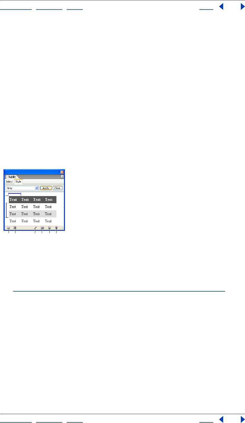
Using Help | Contents | Index Back 174
Adobe GoLive CS Help Working with Tables
Using Help | Contents | Index Back 174
About table style attributes
Tables styles can contain the following attributes:
• In the Table tab of the Table inspector: Border, Color, Cell Pad, and Cell Space.
• In the Row tab of the Table inspector: Vertical Alignment, Horizontal Alignment,
and Color.
• In the Cell tab of the Table inspector: Vertical Alignment, Horizontal Alignment, Color,
Header Style, and No Text Wrap.
You create styles from existing tables. The style repeats based on the number of rows and
columns in the original table. For example, if you create a style from a two-row by two-
column table and apply it to a six-row by six-column table, the first row style is applied to
the first, third, and fifth rows of the six by six table. Tables retain their existing property
values if a new value isn’t specified in the table style.
The Table palette displays a preview of a selected table style. Blue brackets indicate which
rows and columns contain repeating styles. For example, a blue bracket around only the
second and third rows indicates that the first row style is only applied to the first row,
while the styles of the second and third rows repeat for all other rows.
Style tab of Table palette
A. Import Table Style button B. Export Table Style button
C. Rename Table Style button D. Capture Table Style button
E. New Table Style button F. Delete Table Style button
Note: Table styles are not related to CSS styles. To apply CSS styles to a table, row, or cell,
see “Formatting tables and table content with cascading style sheets” on page 181.
AB CD E F
Using Help | Contents | Index Back 175
Adobe GoLive CS Help Working with Tables
Using Help | Contents | Index Back 175
Applying and editing table styles
You can quickly apply a table style to an entire table or selected table cells. You can edit or
remove the tables styles listed in the Table palette or add new ones to it.
To apply a table style to a table or table area:
1 Select the table or portions of a table that you want to format using a table style.
2 In the Style tab of the Table palette, choose a table style from the pop-up menu.
3 Resize the blue bracket so that it marks the desired rows or columns to contain
repeating styles. To resize a blue bracket, drag either end of it. The resizable area of the
bracket is marked by blue lines at both ends of the bracket.
Note: Depending on the table style, you may not be able to change which rows or
columns contain repeating styles. For example, if the style of all columns is the same and a
blue bracket marks the second column, you won’t be able to resize the bracket to modify
the style.
4 Click Apply or choose Apply Table Style from the Table palette menu to apply the style
to the table.
To remove a predefined style from a table or area of a table:
1 Select the table or portions of the table which you want to remove a predefined
style from.
2 In the Style tab of the Table palette, click Clear; or, from the Table palette menu, choose
Clear Table Style.
To add your own style to the Style tab of the Table palette:
1 Do one of the following:
• To create a new table style based on a table you’ve created, select the table and click the
New Table Style button or choose New Table Style from the Table palette menu. Enter
a name in the New Table Style dialog box and click OK.
• To create a new table style based on an existing table style, choose a table style in the
Style tab of the Table palette, and then click the New Table Style button or choose New
Table Style from the Table palette menu. Enter a name in the New Table Style dialog box
and click OK.
• To replace a table style with the appearance of a table you’ve created, choose a table
style in the Style tab of the Table palette, and then click the Capture Table Style
button or choose Capture Table Style from the Table palette menu.
To rename a table style:
Choose the table style and then click the Rename Table Style button or choose Rename
Table Style from the Table palette menu.
To remove a style from the Style tab of the Table palette:
1 In the Style tab of the Table palette, choose a style from the pop-up menu.
2 Click the Delete Table Style button or choose Delete Table Style from the Table
palette menu.
Using Help | Contents | Index Back 176
Adobe GoLive CS Help Working with Tables
Using Help | Contents | Index Back 176
To export or import table styles:
Do one of the following:
• To export a set of table styles, choose Export Table Styles from the Table palette menu,
name the file with a .xml extension, and then click Save.
• To import a set of table styles, choose Import Table Styles from the Table palette menu,
and then open a table styles file with a .xml extension in the filename.
To undo or redo a table style selection:
Choose Undo Select Table Style or Redo Select Table Style from the Table palette menu.
Formatting tables using the Table Inspector
A well-designed table lets you control the layout of content on your Web page and
present information in a visually effective way. GoLive lets you precisely format a table by
setting table, row, or cell properties in the Table Inspector. Properties in the Table tab of
the Table Inspector affect the entire table, and properties in the Row and Cell tabs only
affect the current selection.
Formatting tables to your own specifications can take some time and effort. You can
save and reuse a table on other pages by dragging it to the Snippets tab of the Library
palette. (See “Using snippets” on page 313.)
Formatting tables
The properties in the Table tab of the Table Inspector let you set a variety of properties that
affect all of the cells in the table, and let you set the alignment of the table relative to its
surroundings. You can also import text into the table, add a caption, or convert the table
into a layout grid.
Note: In addition to setting options in the Table Inspector, you can customize the
appearance of a table by applying a predefined table style to it. For more information on
applying predefined table styles, see “Formatting tables using table styles” on page 173.
To format a table:
1 In the Table tab of the Table Inspector, enter the desired Border width value.
If you set the border width to 0, the borders appear as a solid or dashed outline in the
Layout Editor but do not appear in the browser. To hide the border that outlines tables
with no border while you design in the Layout Editor, choose View > Hide Invisible Items.
2 To change the amount of vertical and horizontal space that appears between cell walls
and content within the cells, enter a number for Cell Pad value.
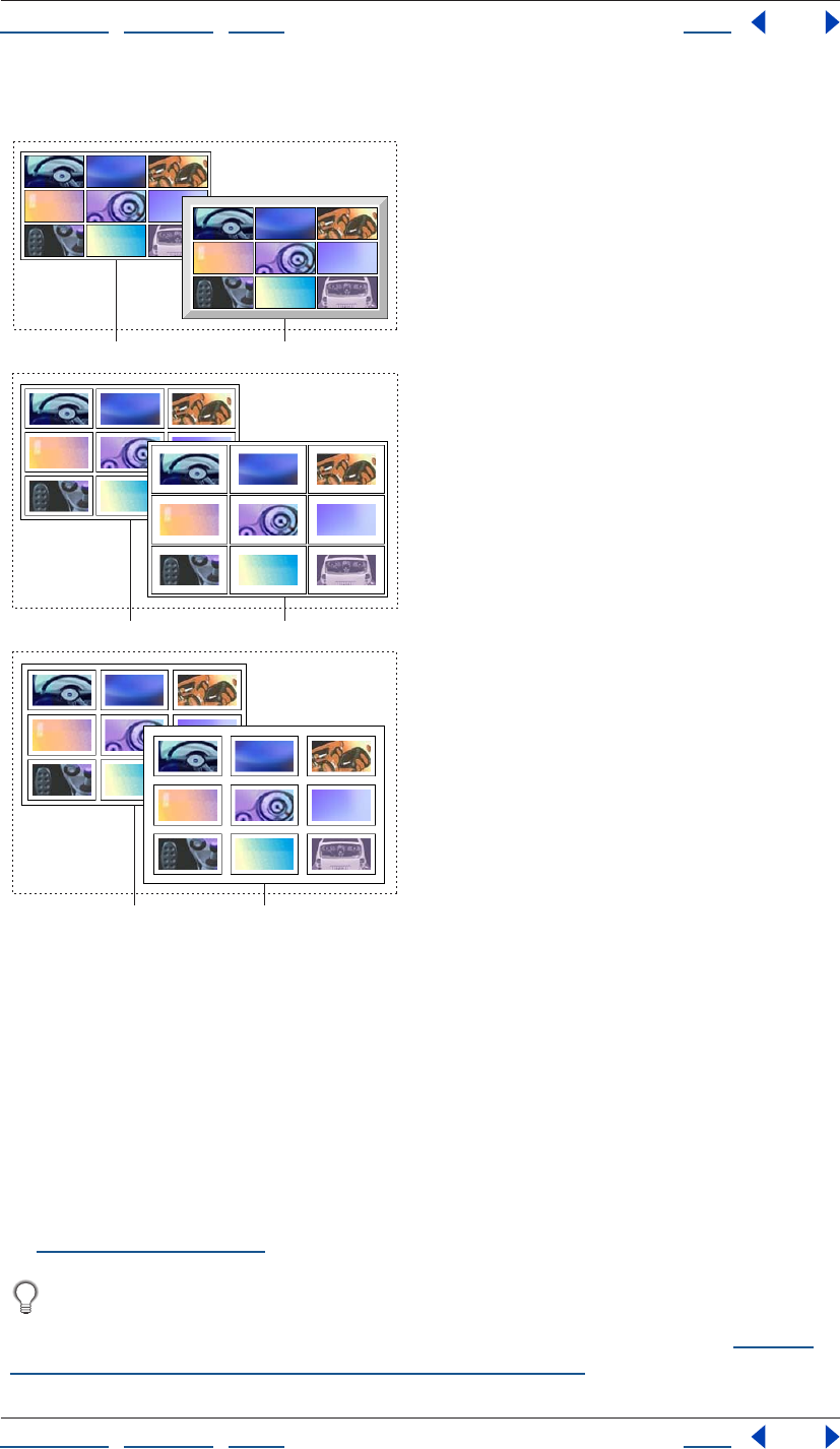
Using Help | Contents | Index Back 177
Adobe GoLive CS Help Working with Tables
Using Help | Contents | Index Back 177
3 To change the size of cell walls, enter a number for Cell Space value.
Border, Cell Pad, and Cell Space table properties compared
A. Border of 1 pixel B. Border of 10 pixels
C. Cell pad of 5 pixels D. Cell pad of 10 pixels
E. Cell space of 5 pixels F. Cell space of 10 pixels
4 Select Color to apply a background color to the table. To set the color value, do one of
the following:
• Right-click (Windows) or Control-click (Mac OS) the color field or click the black triangle
in the lower right corner of the color field, and then select a color from the color
swatches that appear.
• Click the color field and then select a color from the Color palette that appears. (See
“Using color” on page 67.)
If a table cell doesn’t contain text or other content, the table background color won’t
display while viewing the page in the Layout Editor or in some browsers. To display
background color in empty cells, insert a nonbreaking space into the cell. (See “Adding
spacers, nonbreaking spaces, or transparent GIFs” on page 163.)
AB
CD
EF
Using Help | Contents | Index Back 178
Adobe GoLive CS Help Working with Tables
Using Help | Contents | Index Back 178
5 Choose an option from the Align menu to align the table with respect to the document
window. Choose Left or Right to have surrounding text or objects wrap to the side of the
Table. Choose Default to have surrounding text or objects wrap along the bottom edge of
the table. (You can’t use the Align menu to align a table on a layout grid.)
6 Select Caption to add a caption to the table,
and then choose a location for the caption from the menu.
7 To apply a background image to the table, select BgImage and then reference an image
in the text field.
Formatting rows
The properties you set in the Row tab of the Table Inspector affect all of the cells located in
the selected row, including any cells that span downward into other rows.
To format a row or selection of rows:
1 Select the rows or a cell within a row that you want to format.
2 In the Row tab of the Table Inspector, choose a property from the Vertical Alignment
pop-up menu to set the vertical alignment of content within the row. Default aligns the
content vertically according to the browser’s preferences.
3 Choose a property from the Horizontal Alignment pop-up menu to set the horizontal
alignment of content within the row. Default aligns the text horizontally according to the
browser’s preferences.
4 Select Color to apply a background color to the row. To set the color value, do one of
the following:
• Right-click (Windows) or Control-click (Mac OS) the color field or click the black triangle
in the lower right corner of the color field, and then select a color from the color
swatches that appear.
• Click the color field and then select a color from the Color palette. (See “Using color” on
page 67.)
5 Choose an option from the Height menu to change the height of the row, and then
enter the desired measurement. Choose Auto to automatically adjust the height to the
minimum size needed to contain any content within the row. Choose Percent to set the
height as a percentage of the table height.
Formatting and merging table cells
Most of the properties you set in the Cell tab of the Table inspector will only affect selected
cells, and others enable you to merge cells from different rows and columns. Buttons at
the bottom section of the Cell tab let you add or delete columns and rows.
Note: When you merge cells, the data from the first cell is kept and the data from the other
cells is deleted. If you later split a cell you’ve previously merged, the deleted data does not
reappear.
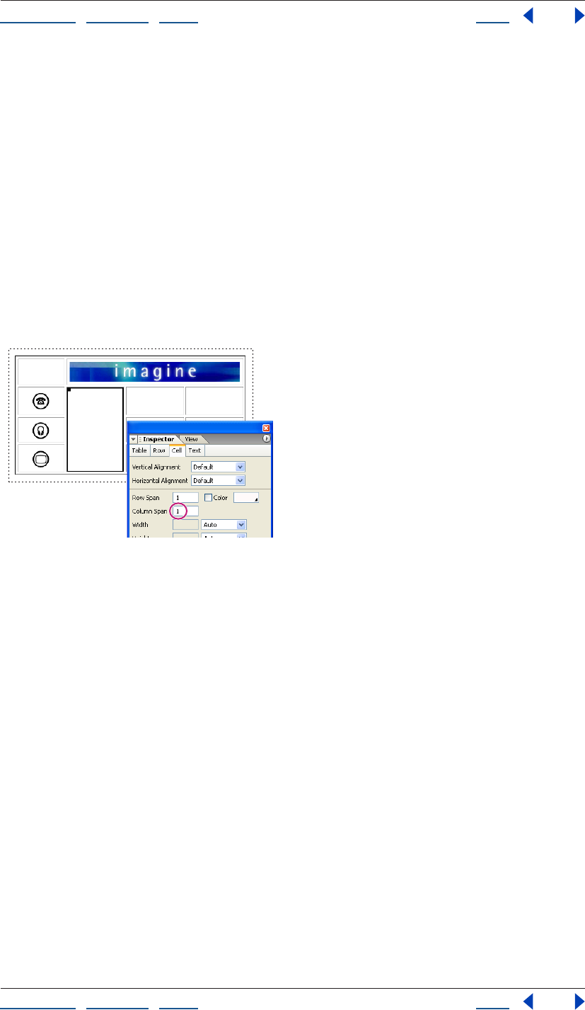
Using Help | Contents | Index Back 179
Adobe GoLive CS Help Working with Tables
Using Help | Contents | Index Back 179
To merge cells:
Do one of the following:
• Select two or more cells that are adjacent to one another and choose Special > Table >
Merge Cells.
• Select a single cell, and choose Special > Table > Merge Cells Right or Merge
Cells Down.
• To merge two or more cells in a column, select the topmost cell that you want to merge
and enter the number of rows to span in the Row Span text field in the Cell tab of the
Table Inspector, or press Shift+Down Arrow to extend the cell one row down at a time.
• To merge two or more cells in a row, select the leftmost cell that you want to merge and
enter the number of columns to span in the Column Span text field in the Cell tab of the
Table inspector, or press Shift+Right Arrow key to extend the cell one column to the
right at a time.
Cell spanning three rows
To reduce or unmerge a cell:
Select a cell that is merged with other cells, and do one of the following:
• Press Shift+Up Arrow key to shorten the cell one row up at a time.
• Press Shift+Left Arrow key to shrink the cell one column to the left at a time.
• Choose Special > Table > Reduce Merge Left or Reduce Merge Up.
• To unmerge all cells in the merged cell, choose Special > Table > Split Cell.
Using Help | Contents | Index Back 180
Adobe GoLive CS Help Working with Tables
Using Help | Contents | Index Back 180
To format a cell or selection of cells:
1 Select the cells you want to format.
2 In the Cell tab of the Table Inspector, choose a property from the Vertical Alignment
pop-up menu to set the alignment of content within the cells. Default aligns the text verti-
cally according to the browser’s preferences.
3 Choose a property from the Horizontal Alignment menu to set the horizontal
alignment of content within the cells. Default aligns the text horizontally according to the
browser’s preferences.
4 Select Color to apply a background color to the selection. To set the color value, do one
of the following:
• Click the black triangle in the lower right corner of the color field, and then select a color
from the color swatches that appear.
• Click inside the color field and then select a color from the Color palette. (See “Using
color” on page 67.)
5 Choose an option from the pop-up menu for Width or Height to adjust the height or
width of the cell, and enter the desired measurement. Choose Auto to automatically
adjust the width or height to the minimum size needed to contain any content within the
row. Choose Percent to make either dimension a percentage of the table size.
Note: When you adjust the height or width of the cell, GoLive automatically adjusts the
width or height of the entire row or column that contains the cell.
6 Select Header Style to format the cell as a subheader, which treats content within it
using a table heading style.
7 Select No Text Wrap to suppress automatic text wrapping in the cell.
8 Select BgImage to apply a background image to the cell, and then select an image file.
Selecting and linking text
You can use the Text tab of the Table Inspector as you would use the Text Inspector—to
link selected text. You can also use it (and the other tabs in the Table Inspector) as a quick
way to toggle between the text and the cell, row, and table that contains it.
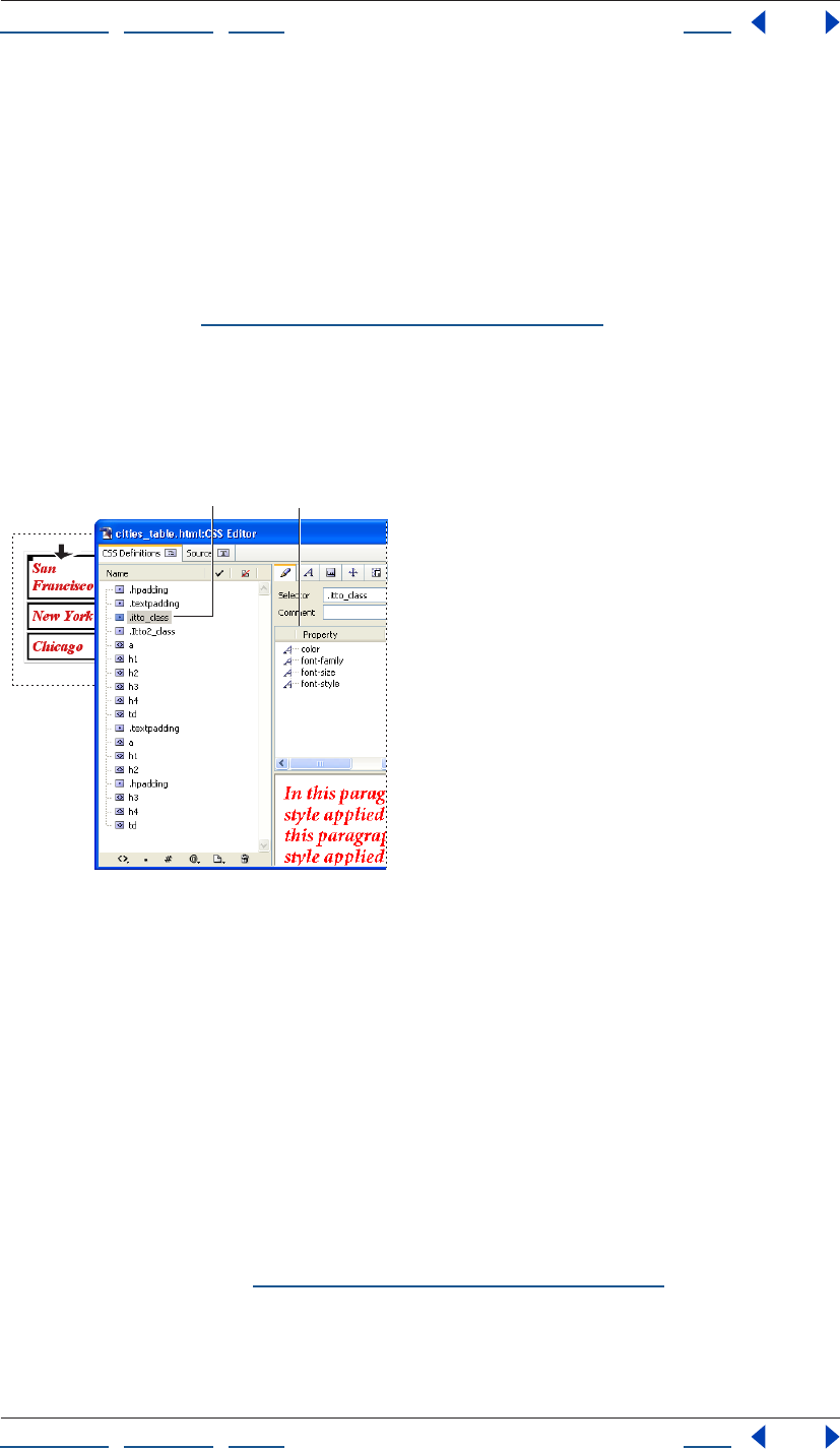
Using Help | Contents | Index Back 181
Adobe GoLive CS Help Working with Tables
Using Help | Contents | Index Back 181
Formatting tables and table content with cascading
style sheets
You can use cascading style sheets (CSS) to set the properties of tables and content within
a table. CSS styles can either apply automatically to all tables in the page or to specific
tables or cells. After you create a CSS style, you can modify it, and the properties of all
tables and cells that use the CSS style will be updated. CSS can be written in one Web page
as an internal style sheet or as a separate external style sheet file that can be used by
multiple pages. (See “About cascading style sheets” on page 212.)
Note: Some properties in the CSS Editor, such as those in the Background tab, will affect
the table, whereas other properties, such as those in the Font tab, will affect content
within a table cell. For example, if a CSS style defines a Font color property, and the style is
applied to a table cell, any text within the cell will display the color property but the table
cell will not.
Class style applied to a table column
A. Class style properties in the CSS Inspector
B. Class style listed in CSS Editor
To create a CSS element style that is automatically applied to all tables, rows, or cells
in a page:
Do one of the following:
• Create an HTML element style named after the <table> tag to set the properties of all
tables in a page.
• Create an HTML element style named after the <tr> tag to set the properties of all table
rows in a page.
• Create an HTML element style named after the <td> tag to set the properties of all table
cells in a page.
For more information, see “Creating HTML element styles” on page 220.
BA
Using Help | Contents | Index Back 182
Adobe GoLive CS Help Working with Tables
Using Help | Contents | Index Back 182
To create a style and apply it to selected tables, rows, or cells:
1 Create a class style. (See “Creating class styles” on page 222.)
2 Select a table, row, cell, or group of cells.
3 Do one of the following in the CSS palette:
• Select under the <table> column that is adjacent to the style name to apply the class to
a selected table.
• Select the <td> column that is adjacent to the style name to apply the class to a
selected row, column, or group of cells. (If a row or column is selected, the <td> column
name will be followed by the number of cells in the selection).
For more information on applying class styles, see “Applying styles” on page 233.
Adding text to tables
GoLive provides a variety of ways to add text to a table. Besides typing text directly in a
table cell, you can copy and paste text from another application, drag text between cells
or other containers, and import data from a text-only file.
When you import data into a table, you need to begin by formatting data in a text-only file
in a way that GoLive accepts. For a single-celled table, you should simply format the data
in the other application as you’d like it to appear in the table. For a multiple-celled table,
you should format the data so that each line represents the contents of a row and contains
column separators (tabs, commas, spaces, or semicolons) to separate the data between
columns. Most spreadsheet and database applications can export data to a text-only file in
one of these column-separated formats.
Rather than setting up a column-separated file to import data, you can simply copy
the data from cells in another application and paste it into a GoLive table. Rows and
columns will be added to the GoLive table as needed.
To copy and paste blocks of text:
1 Do one of the following:
• In GoLive, select the text that you want to copy, and choose Edit > Copy.
• Copy a block of text from within another application.
2 In GoLive, place an insertion point in a table cell, and choose Edit > Paste.
To drag text:
In GoLive or a different application, select the text you want to copy and then drag it to an
empty table cell in GoLive.
To import tab-delimited text into a table:
1 Select the table on the page.
2 Do one of the following:
• In the Table Inspector, click Import, select the text file that contains rows and columns of
text separated by tabs, and click Open.
• Choose Special > Table > Import Tab-Delimited Text.

Using Help | Contents | Index Back 183
Adobe GoLive CS Help Working with Tables
Using Help | Contents | Index Back 183
GoLive places the text into table cells according to how many tabs (for columns) and
paragraphs (for rows) there are in the text.
This feature is useful for quickly adding data to a table that you have exported from a
database or spreadsheet as a tab-delimited text file.
To export text in a table to tab-delimited text:
1 Select the table.
2 Do one of the following:
• In the Table tab of the Table inspector, click Export. Give the file a name and click Save.
• Choose Special > Table > Export Tab-Delimited Text.
Sorting table content
You can sort the order of rows in a table so that the contents of one or more columns
appears in numerical and alphabetical order, or you can sort the order of columns in the
table so that the contents of one or more rows appears in numerical and alphabetical
order. You can apply the sort to an entire table, specific rows, specific columns, or specific
cells. For example, if you sort the order of rows in a table and the top row contains column
headings, you can apply the sort to all rows in the table except for the top row.
GoLive performs the sort first in numerical order and second in alphabetical order. It
considers the case of characters when performing the sort. By default, GoLive performs
the sort in ascending order. If desired, you can specify for the sort to be done in
descending order.
To sort the contents of a table:
1 Select a table or group of cells you want to sort, and choose Special > Table > Sort Table.
2 In the Sort Table dialog box, choose rows or columns from the Sort pop-up menu.
Choose Rows if you want the contents of one or more columns to appear in numerical and
alphabetical order. Choose Columns if you want the contents of one or more rows to
appear in numerical and alphabetical order.
3 In the Sort By pop-up menu, do one of the following:
• If you chose Rows in step 2, choose the primary column with contents that you want to
appear in numerical and alphabetical order.
• If you chose Columns in step 2, choose the primary row with contents that you want to
appear in numerical and alphabetical order.
4 From the adjacent pop-up menu, select Ascending or Descending to specify the
sorting order.
5 In the first Then By pop-up menu, do one of the following:
• If you don’t want to specify a secondary column or row to be used in the sort criteria,
choose None.
• If you chose Rows in step 2, choose the secondary column in the table with contents
that you want to appear in numerical and alphabetical order.
• If you chose Columns in step 2, choose the secondary row in the table with contents
that you want to appear in numerical and alphabetical order.
Using Help | Contents | Index Back 184
Adobe GoLive CS Help Working with Tables
Using Help | Contents | Index Back 184
6 From the adjacent pop-up menu, select Ascending or Descending to specify the sorting
order.
7 In the second Then By pop-up menu, do one of the following:
• If you don’t want to specify a tertiary column or row to be used in the sort criteria,
choose None.
• If you chose Rows in step 2, choose the tertiary column in the table with contents that
you want to appear in numerical and alphabetical order.
• If you chose Columns in step 2, choose the tertiary row in the table with contents that
you want to appear in numerical and alphabetical order.
8 From the adjacent pop-up menu, select Ascending or Descending to specify the
sorting order.
9 From the pop-up menu at the bottom of the Sort Table dialog box, choose Sort Whole
Table to sort the entire table. Choose Sort without Header to not include the first row
when the table is sorted. If only a portion of a table is selected, you can choose Sort
Selection Only to only sort the selection instead of the entire table.
Converting tables to layout grids
You can easily convert a table to a layout grid in the Layout editor. Nested tables and cells
in the parent table that contain text or an object convert to layout text boxes, which can
be easily dragged around the layout grid. Alternatively, you may choose to convert a
layout grid to a table if you wish to edit and tweak the layout grid’s various table
properties with the Table Inspector. See “Converting a layout grid to a table” on page 143.
To convert a table and any nested tables to a
layout grid:
In the Table tab of the Table Inspector, click Convert. If desired, customize the appearance
of the layout grid and layout text boxes. For information, see “Using the layout grid” on
page 138 and “Adding content to the layout grid” on page 139.

Using Help | Contents | Index Back 185
Adobe GoLive CS Help Formatting Text
Using Help | Contents | Index Back 185
Formatting Text
About formatting HTML text
When you add text to your Web pages, it starts out as simple HTML paragraph elements.
You can make the text more interesting and easier to read by dividing it up into sections
and using HTML headings for the structure. You can add form, color, and presentation to
the structure (and to individual words within the structure) using cascading style sheets
(CSS) or HTML text formatting attributes. You can also format text as hypertext links that
jump to anchors within the page or to other pages. (See “Linking files” on page 61.)
GoLive provides three main methods for formatting text on your Web page.
Using cascading style sheets Cascading style sheets let you define text formatting
attributes once and instruct Web browsers to reuse the definitions whenever text on a
page refers to them. (This saves your pages from having lots of source code on them and
makes them faster to download.) Style sheets give you more design control than you get
with basic HTML—letting you define color, typography, alignment, page positioning,
fonts, borders, and more. It’s easier to update your site’s appearance using style sheets—
when you change a style in a style sheet, the change is instantly updated in all pages
containing text that refers to the style. (See “About cascading style sheets” on page 212.)
Individually applying HTML text attributes You can use the Type menu and the toolbar
for applying HTML structuring and formatting attributes to text. The toolbar includes
attributes for headings; bold, italic, and teletype; alignment, text size and color; and
numbered and bulleted lists. The Type menu provides these options and more, including
options for creating and applying font sets. The context menu for selected text also
provides a quick way to apply certain formatting attributes. (See “Using context menus”
on page 31.)
Using the HTML Styles palette As you apply individual HTML formatting attributes to
text in your pages, you can save them (or capture them) as a group in the HTML Styles
palette, and then use the palette to reapply the group of attributes to other text in your
site in one step. The palette contains several predefined HTML styles to give you an idea of
the type of HTML styles you can make. To save an HTML style in the HTML Styles palette,
you can either capture attributes from formatted text or choose them from a menu when
you create a new HTML style. Unlike CSS styles, HTML styles are not linked to text, so
changing an HTML style does not affect any text that the HTML style was applied to.
You can save separate sets of HTML styles from the HTML Styles palette and import
them into the palette when you want to use them. For example, you can save a set of
HTML headings and basic text structuring attributes, use the HTML Styles palette to
quickly apply them to your text, and then use your cascading style sheets to modify and
enhance them.
Using Help | Contents | Index Back 186
Adobe GoLive CS Help Formatting Text
Using Help | Contents | Index Back 186
Using both CSS and HTML text attributes Pages that use cascading style sheets load in
the browser window much faster than pages that are individually formatted with HTML
text attributes—but CSS is not supported by older browsers (including Netscape
Navigator 3.x or earlier and Internet Explorer 3.x or earlier). To cover a wider range of Web
browsers, you may want to format your text first using HTML structure elements and
attributes, making it look good for older browsers that don’t support CSS, and then use
style sheets to build on the HTML structuring, making it look great for those browsers that
support CSS.
HTML text structure elements that work well with cascading style sheets include headings
(such as the <h1> element), block quotes (creating block indents), and lists (default
numbered or unnumbered lists).
However, some HTML text formatting attributes, such as the font element, are known to
cause problems with browsers trying to interpret style sheets. In those cases, it’s best to
apply those attributes using CSS styles. (See “Applying fonts, type sizes, and color to text”
on page 194.)
To avoid browser problems, you can add a browser switch script to your pages that
redirects browsers to alternative pages strictly formatted with either HTML text
formatting attributes or CSS. (See “Adding browser-switch scripts” on page 58.)
Adding text to Web pages
You can add text to your page by typing directly in the document window, copying text
from another application and pasting it into the page, or importing text from another
application into a table on the page (see “Adding text to tables” on page 182.) You can also
add text to the page using containers, such as layout text boxes on a layout grid or in
layers. Containers make it easy to rearrange the position of the text on the page by
moving or aligning the boxes. To add text to a layout grid, you must use a layout text box.
See “Adding content to the layout grid” on page 139.
By default, when you drag to select an entire paragraph of text, GoLive does not select the
enclosing element tags (for example <p> and </p>). As a result, when you copy the
selected paragraph and paste it into the page, the text doesn’t become a new paragraph.
You can use the markup tree bar in the Layout Editor to quickly select the enclosing tags.
To add text directly to a page or container on the page:
1 Click inside the page, layout text box, table cell, or layer to place the insertion point.
2 Type the text, or choose Edit > Paste to paste any text that you copied.
You can also drag selected text from another page into the document window or from
your collection of site assets in the Library palette. (See “Using snippets” on page 313
and “Using components” on page 311.)
To copy text:
In the Layout Editor, select the text that you want to copy, and choose Edit > Copy. You can
also hold down Ctrl (Windows) or Option (Mac OS) and drag the selected text to create a
copy at a new location.
Using Help | Contents | Index Back 187
Adobe GoLive CS Help Formatting Text
Using Help | Contents | Index Back 187
To copy a paragraph of text, including the element tags (<p> and </p>):
1 Click anywhere in the paragraph that you want to copy.
2 Click the tag (<p>, <h1>, etc.) in the markup tree bar at the bottom of the document
window.
Click a tag in the markup tree bar to select the entire element.
3 Choose Edit > Copy.
Using Help | Contents | Index Back 188
Adobe GoLive CS Help Formatting Text
Using Help | Contents | Index Back 188
Formatting paragraphs
GoLive provides a variety of ways to structure paragraphs of text. You can create headings
and subheadings, align or indent paragraphs from the left and right margins, or create a
numbered or unnumbered list from multiple paragraphs. You can also control the flow of
text in paragraphs by suppressing text wrapping to keep text on the same line or adding a
line break to control how text breaks around an adjacent object. Then, once you’ve
formatted the structure of your paragraphs, you can use cascading style sheets to build on
the structured text. (See “Creating HTML element styles” on page 220.)
Using HTML paragraph formats
You can add structure to your text by using HTML paragraph formats. You can choose from
the following formats:
• Use Heading formats to replace the <p> tag with any of the six HTML heading tags:
<h1>, <h2>, <h3>, <h4>, <h5>, or <h6>. Most Web browsers use a diminishing
character point size to display the sequence of headings, where <h1> is the largest and
<h6> is the smallest size.
• Use the Address paragraph format to apply the <address> tag to a paragraph that
contains the author’s e-mail address.
• Use the Preformatted paragraph format when you want to retain the integrity of
character and line spacing in a paragraph. This is useful for evenly lining up numbers in
a column or presenting source code with its proper spacing. Browsers display all text
within the <pre> and </pre> tags in a monospaced font.
• Use the Paragraph format to apply the default paragraph format in the browser’s
preferences.
• Use the None paragraph format when you want to remove the <p> and </p> tags from
a range of text.
All paragraph formats work well with cascading style sheets. (See “Creating HTML element
styles” on page 220.)
To format a heading, address, or preformatted paragraph:
1 Click anywhere in the paragraph that you want to format.
2 Choose a format from the Type > Paragraph Format menu or the Paragraph Format
pop-up menu on the toolbar.
When you’re setting up your pages to use with cascading style sheets, drag these
formatted paragraphs into the HTML Styles palette so you can quickly apply headings
or other paragraph structures to other text. (See “Saving HTML styles” on page 198.)
To reset the current paragraph to the default format selected in the browser’s
preferences:
Choose Type > Paragraph Format > Paragraph.
To remove the <p> and </p> tags from the current paragraph:
Choose Type > Paragraph Format > None.
Besides using the History palette or choosing Edit > Undo, you can use the HTML
Styles palette to remove a paragraph format (such as the Address element) from your
Using Help | Contents | Index Back 189
Adobe GoLive CS Help Formatting Text
Using Help | Contents | Index Back 189
text. By choosing Clear Paragraph Styles from the palette menu, all styles applied to a
selected paragraph are removed. (See “Applying or removing HTML styles” on page 200.)
Formatting lists
You can format paragraphs as numbered, unnumbered, or definition lists, and create
hierarchies within the lists. The list options include Arabic numerals, Roman numerals,
letters of the alphabet, and different types of bullets. For definition (or glossary) lists, you
can format paragraphs as the term or the definition of the term.
When using cascading style sheets, first format your paragraphs of text using a default
list format in the Type > List menu, and then use a style sheet to enhance the bullets or
numbers. (See “Creating HTML element styles” on page 220.)
To format paragraphs as a list:
1 Select the paragraphs that you want to format.
2 Choose a list option from the Type > List menu.
To format the hierarchy within the list:
1 Select a paragraph in the list.
2 Choose Increase List Level or Decrease List Level from the Type > List menu.
When you apply the Decrease List Level option to a paragraph that’s at the first level in the
hierarchy, GoLive resets the paragraph to a plain style.
3 Choose a list option from the Type > List menu to assign a different leading character to
the paragraph.
Aligning or block-indenting a paragraph
You can align a paragraph to the left side, center, or right side of the page or container
(such as a layout text box). You can also apply the <blockquote> tag to indent the
paragraph from its left and right margins without affecting its alignment. If you’re using
cascading style sheets, make sure that the type of alignment matches with the corre-
sponding CSS style.
You can align, or wrap, text around images or other objects on the page or inside a layout
text box, table cell, or layer. (See “Repositioning, aligning, or distributing objects” on
page 141.)
Using Help | Contents | Index Back 190
Adobe GoLive CS Help Formatting Text
Using Help | Contents | Index Back 190
To align or block-indent a paragraph:
1 Click anywhere in the paragraph that you want to align or indent.
2 Do one of the following:
• Choose an alignment from the Type > Alignment menu. Choose Default Alignment to
remove any existing alignment from the paragraph.
• Click the Align Left button , the Align Center button , or the Align Right button
on the toolbar.
• To incrementally increase or decrease the space between the paragraph and its right
and left margins, choose Increase Block Indent or Decrease Block Indent from the
Type > Alignment menu.
Aligning images or objects within text
You can make paragraphs of text appear to wrap around an image or other object, or
create other effects such as a title or caption for a picture, by aligning the image or object
within the text. You can also use line break and nobreak elements to control the way that a
line of text breaks around an image or object. (See “Controlling text flow on a page” on
page 191.)
Keep in mind that the text wrap around the image or object will appear differently
depending on the platform and browser preferences. (See “Displaying font sizes across
platforms” on page 196 and “Previewing files” on page 37.) You can use the View palette to
view profiles of the layout on different platforms. (See “Setting view options for page
layout” on page 55.)
To wrap text around an image or object:
1 Place the image or object at the beginning or within a line of text.
2 Select the image or object and choose Left or Right from the Alignment pop-up menu
in the Inspector.
3 Drag the image or object up or down to the position that looks best within the
paragraph.
To change the alignment of an image or object within a line of text:
Select the object and choose one of the following options from the Alignment pop-up
menu in the Inspector:
• Default aligns the object with the baseline of text or adjacent objects in the line or the
left side of the document window or container.
• Top, Middle, or Bottom aligns the top, center, or bottom of the object with the top,
center, bottom, or baseline of text or adjacent objects on the line.
• Left, or Right aligns the left or right side of the object with the left or right side of the
line, document window, or container. Any text in the line moves to the left of the object.
If there are no other objects or text in the line, the object aligns with the left or right
side of the window or container.
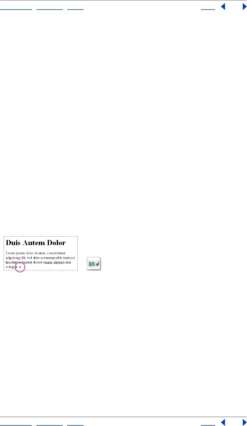
Using Help | Contents | Index Back 191
Adobe GoLive CS Help Formatting Text
Using Help | Contents | Index Back 191
• Text Top aligns the top of the object with the top of text (the top of the tallest character)
in the line.
• Abs Middle, Baseline, or Abs Bottom aligns the center or bottom of the object with the
absolute middle (half way between the top and the bottom), text baseline, or absolute
bottom (including text descenders below the baseline) of text or objects in the line.
Controlling text flow on a page
You can control how text flows by inserting line break (<br>) or nobreak (<nobr>)
elements at the end of the lines in a paragraph. For example, when you want a line to
break at a particular word, you can use the line break element to force all browsers to
break the line there regardless of the size of the browser window. When you want to keep
two words together and never break them up regardless of the size of the window, use
nobreak elements.
You can use the clear attribute together with the line break element to cause a broken line
to clear an image before it continues on in the text flow.
Also, by using line break elements, you can control the spacing between paragraphs
rather than letting Web browsers determine how much space is needed.
To insert the nobreak element:
1 Select the words in the paragraph that you want to keep on the same line.
2 Choose Type > Nobreak.
To insert the line break element:
1 Drag the Line Break icon from the Basic set in the Objects palette to the line, or double-
click the icon to insert the line break at the insertion point.
The line breaks at the same position regardless of browser
window size.
A. Line break marker B. Line Break icon
To control how text breaks after an object in the line:
1 Select the line break marker.
2 In the Line Break Inspector, select Clear and choose an option from the pop-up menu:
• All to move the text after the line break to the bottom of any object in the line.
• Left to move the text after the line break to the bottom of a left-aligned object.
• Right to move the text after the line break to the bottom of a right-aligned object.
Note: When wrapping text around an object inside a layer, the object must be left-aligned
or right-aligned for the Clear attribute to work as expected in the HTML text flow.
AB
Using Help | Contents | Index Back 192
Adobe GoLive CS Help Formatting Text
Using Help | Contents | Index Back 192
Formatting text characters
You can apply HTML physical and structural attributes to inline text that does not affect
the rest of the paragraph. These attributes work well with cascading style sheets to further
enhance the formatted text. (See “Creating a style sheet” on page 214.)
Applying HTML physical attributes to inline text
Physical text attributes, such as italic for text that needs special emphasis or bold for text
that needs a strong pronouncement, let you define the appearance of selected text
without assigning a structural classification. All Web browsers interpret the italic and bold
attributes in basically the same way. (For information on using CSS styles to apply these
attributes, see “Setting Font properties” on page 226.)
Physical text attributes include the following:
• Plain text is the basic format for standard HTML text. It can be overridden by style
sheets.
• Italic tells browsers to use an italic or oblique typeface. If the typeface is not available,
highlighting, reverse video, or underlining may be used.
• Bold tells browsers to use a bold typeface. If that is not available, browsers might use
something like reverse video or underlining.
• Underline tells browsers to underline text, spaces, and punctuation. (This attribute may
be removed from the next version of HTML.)
• Strikeout tells browsers to put a line through the middle of text. (This attribute may be
removed from the next version of HTML.)
• Superscript is used to display text one-half of a character higher than the rest of the
text.
• Subscript is used to display text one-half of a character lower than the rest of the text.
• Teletype (tt) tells browsers to display text in a monospaced typeface.
• Blink is a Netscape extension for reversing the background and foreground colors of
text to make text appear to blink on and off.
Note: Older browsers may not support these physical attributes other than the basic set:
plain, bold, and italic.
To apply an HTML physical attribute to text:
1 Do one of the following:
• Select the text that you want to format. Then choose an option from the Type > Style
menu, click the Bold button , the Italic button , or the Teletype button on the
toolbar, or choose an option from the Style context menu.
• Choose an option from the Type > Style menu and start typing. The style remains in
effect even after you press Enter or Return.
To remove all existing HTML physical attributes from the selected text:
Choose Type > Style > Plain Text.
Using Help | Contents | Index Back 193
Adobe GoLive CS Help Formatting Text
Using Help | Contents | Index Back 193
Applying HTML structural attributes to inline text
Structural text attributes (also known as HTML content-based styles) let you define
selected text in meaningful categories, such as text that needs special emphasis or a
strong pronouncement. Web browsers vary in their interpretations for structural attributes
as appropriate for their users. For example, one browser may use italics for the Emphasis
attribute, while another browser may use boldface. Another browser used by the blind or
physically impaired may use a loud voice.
Using CSS styles in your style sheets, you can build upon these structural attributes. For
example, to emphasize a word, use the Emphasis element to apply HTML structure to the
text and then use a CSS style to make the word big and bold. (See “Creating HTML element
styles” on page 220).
• The Emphasis attribute is most commonly used to emphasize text. In most browsers,
the selected text appears italicized.
• The Strong attribute is used for strongly emphasizing text. In most browsers, it makes
the selected text bold.
• The Quotation (cite) attribute is used to identify the selected text as content taken from
another source. Most browsers display quotations using a smaller font size and italics.
• The Sample attribute is used to place special emphasis on small character sequences
taken out of their normal context. Most browsers display samples using a monospaced
font.
• The Definition (dfn) attribute is used to define special terms or phrases, and to assist in
creating a page index or glossary. Most browsers display definitions as plain text.
• The Variable (var) attribute is used most often in conjunction with the Code attribute to
represent variable names or user-supplied values within the code. Most browsers
display variables with an italicized monospaced font.
• The Code attribute is used for text that represents computer source code or other
machine-readable content. Most browsers display code using a monospaced, teletype-
style font such as Courier.
• The Keyboard (kbd) attribute is used to identify the selected text as text that is typed on
the keyboard. Most browsers display keyboard entries using a monospaced font.
To apply an HTML structural attribute to text:
Do one of the following:
• Select the text that you want to format, and choose an option from the Type > Structure
menu or the Style context menu.
• Choose a style from the Type > Structure menu and start typing. The style remains in
effect even if you press Enter or Return.
To remove all existing HTML structural attributes from the selected text:
Choose Type > Structure > Plain Structure.
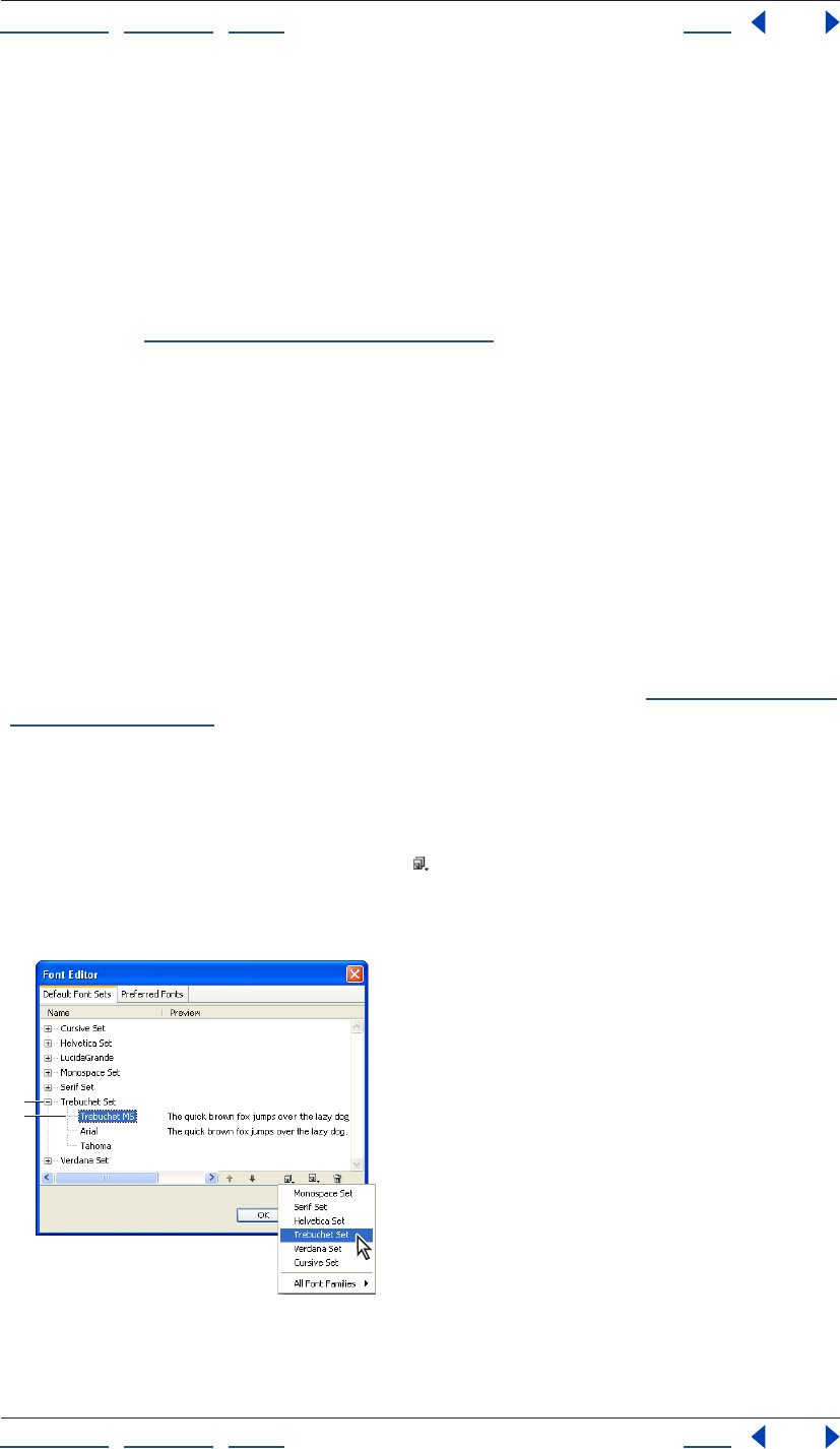
Using Help | Contents | Index Back 194
Adobe GoLive CS Help Formatting Text
Using Help | Contents | Index Back 194
Applying fonts, type sizes, and color to text
You can apply fonts, type sizes, and color to selected text using CSS styles or HTML text
formatting attributes. Font sets (groups of font choices for Web browsers) that you create
appear in the CSS Editor and the Type > Font menu. When you use the Type > Font menu
or the toolbar to apply font sets, relative sizes, or color attributes to selected text, GoLive
places them inside the font element. Because the font element is known to cause
problems with browsers interpreting style sheets, you may not want to mix your methods
for applying these attributes. (For information on using CSS styles to apply these
attributes, see “Setting Font properties” on page 226.)
Creating and applying font sets
Normally, HTML text on a page appears in the Web browser using the default proportional
font that is set in the browser preferences. You can have more control of the font that the
browser uses by applying a font set to your text. When displaying text formatted with a
font set, the Web browser attempts to display the text using the first font listed in the font
set, then the second font in the set, and so on. If none of the fonts in the set are installed
on the viewer’s computer, the browser displays the text using its default font.
The Type > Font menu lists all font sets available for the open page. Font sets saved with
the GoLive application appear at the top of the menu by default. Font sets stored in the
site project file appear only when their parent windows are open.
For information on storing font sets in the site project file and making them appear in the
CSS Editor and Type > Font menu when the site window is open, see “Collecting font sets
for a site” on page 316.
To create a font set:
1 Choose Type > Font > Edit.
2 In the Font Editor, click the Default Font Sets tab.
3 Click the Create New Font Family button and select the new font family from the list
that appears.
The new font set appears in the list.
The font set’s name is based on the first font in the set.
A. New font set B. New font
A
B
Using Help | Contents | Index Back 195
Adobe GoLive CS Help Formatting Text
Using Help | Contents | Index Back 195
GoLive names the font set based on the name of the first font in the set. (You can
customize the name of the font set by first adding the font set to your site and then using
the Font Set Inspector to rename it. See “Collecting font sets for a site” on page 316.)
4 To add more fonts to the new font set, click the Add Font button . Then choose
another font from the pop-up menu.
5 Use the Up button or the Down button to move fonts up or down in the font set.
(The order that the fonts appear in the list determines the order that the Web browser
attempts to use them.)
6 Click OK.
To edit a font set:
1 Choose Type > Font > Edit.
2 In the Font Editor, select the Default Font Sets tab.
3 Select the font set, or one or more fonts in the set. To select multiple fonts, Shift-click. To
select multiple noncontiguous fonts, Ctrl-click (Windows) or Shift-click (Mac OS).
4 Do any of the following:
• To add a new font, click the Add Font button . Then type a name for the new font in
the text box or choose a font name from the pop-up menu.
Depending on what you selected, the new font is added to the bottom of the list in the
font set or above the selected font in the list. The name of the new font is based on the
name of the selected font set or font.
• To change the name of the selected font, enter a new name in the text box or choose a
font name from the pop-up menu.
• To create a copy of the selected font set or fonts, click the Duplicate button . The copy
appears below your selection.
• To change the name of a font set, select the first font in the set. Then enter a new name
in the text box or choose a font name from the pop-up menu.
• To change the order in which a font set or group of fonts is listed in the Font Editor,
select the set or fonts and click the Up button or the Down button .
• To remove the selected font set or fonts from the list, click the Delete button .
5 Click OK.
To apply a font set to text using the Type > Font menu:
1 Select the text that you want to format.
2 Choose a font set from the Type > Font menu. Choose Default Font if you want Web
browsers to use their default fonts.
For information on adding font sets to your style sheets, see “Setting Font properties” on
page 226.
Editing the Preferred Fonts list
The Font Editor contains a Preferred Fonts tab. The Preferred Fonts tab lists the fonts that
GoLive presents as font choices to the user.
Using Help | Contents | Index Back 196
Adobe GoLive CS Help Formatting Text
Using Help | Contents | Index Back 196
To edit the Preferred Fonts list:
1 Choose Type > Font > Edit.
2 In the Font Editor, select the Preferred Fonts tab.
3 Select one or more fonts in the set. To select multiple fonts, Shift-click. To select multiple
noncontiguous fonts, Ctrl-click (Windows) or Shift-click (Mac OS).
4 Do any of the following:
• To add a new font, click the Add Font button . Then type a name for the new font in
the text box or choose a font name from the pop-up menu.
• To change the name of the selected font, enter a new name in the text box or choose a
font name from the pop-up menu.
• To remove the selected fonts from the list, click the Delete button .
5 Click OK.
Displaying font sizes across platforms
Font sizes are relative to the font size preferences set in Web browsers. In addition, fonts in
Windows are about one step larger than in Mac OS because of a difference in pixel
resolution between platforms. To make sure that your page layout can handle a range of
font sizes across platforms, here are some guidelines to follow when designing it:
• You can control the font size across platforms by using CSS styles. When specifying the
font size for a style in a cascading style sheet, use pixels rather than points. Point sizes
will vary on platforms due to pixel resolution, whereas pixels remain fixed. In the Font
tab of the CSS Editor, choose Pixel from the Size pop-up menu. (See “Setting Font
properties” on page 226.)
• Before publishing your page on the Web, preview it at a variety of font sizes on a variety
of platforms and browsers. You can also use the View palette to view a simulated
preview of your page in a Web browser for Windows or Mac OS. (See “Setting view
options for page layout” on page 55.)
• Don’t use HTML heading attributes (such as h1’s) with relative font sizes. The relative
font size can cause the heading to wrap and adversely affect your page layout.
• Use layout text boxes to control the amount of space that appears between text and an
image. When text appears at a smaller or larger font size than what you used for the
page layout, the image moves up and down as the text resizes.
• Keep in mind that a layout text box doesn’t decrease in size when the text appears at a
smaller font size than what you used for the page layout. As a result, extra space can
appear between the text in the box and objects below the box. However, a layout text
box does increase in size to accommodate the text when the text appears at a larger
font size than what you used for the page layout. When the box increases in size,
objects below the box are moved downward on the page. (However, by using pixels for
the font size in a CSS style, the font size will display the same on all platforms, and
therefore the size of the layout text box need not change.)
• Keep in mind that the default font size displayed in the Layout Editor does not neces-
sarily reflect the actual size of text in a Web browser, and neither does changing the
default font size in the Font preferences affect the actual font size of the page. (The
Font preferences are for setting the GoLive display fonts only.)
Using Help | Contents | Index Back 197
Adobe GoLive CS Help Formatting Text
Using Help | Contents | Index Back 197
Applying relative font sizes
Text formatted with a relative font size appears at a size related to the size set in the Web
browser’s preferences. Most viewers have their browsers configured to display text at 12
points. By applying a relative font size to text, you can make it appear the same as, smaller
than, or larger than the default size set in the browser’s preferences, or at a smaller or
larger size in relation to the default size or the base font size of the document.
Note: The relative size attributes are part of the font element, which is known to cause
problems with browsers interpreting style sheets. Apply font sizes to text using CSS styles
instead. (See “Setting Font properties” on page 226.)
To apply a relative font size to text:
1 Select the text that you want to format.
2 Choose a relative font size from the Type > Size menu or the Font Size pop-up menu on
the toolbar:
• Choose a size between 1 and 7 to display a size relative to the browser’s preferences.
Size 3 displays text at the default font size set in the browser’s preferences, sizes 1 and 2
display text at a smaller size, and sizes 4 through 7 display text at a larger size.
• Choose a size between +1 and +7 to display text at a size that’s larger than the default
or base font size of the document (+1 displays text one font size larger and so on).
• Choose a size between -1 and -7 to display text at a size that’s smaller than the default
or base font size of the document (-1 displays text one font size smaller and so on).
Adding color to text
You can add color to selected text without affecting the overall text color in the page.
When you use the toolbar or the Swatches or Color palette to apply color, GoLive places
the color attribute within the font element. Because the font element is known to cause
problems with browsers interpreting style sheets, you may want to use a CSS style to add
color instead. (See “Setting Font properties” on page 226.)
You can set the default color for text and the various stages of hypertext links without
using the font element or a style sheet. (See “Setting the default color for text or links in a
page” on page 70.)
To add color to text:
1 Select the text that you want to color.
2 Do one of the following:
• Click the lower right corner of the Set text color field on the toolbar and select a color
from the swatches that appear. (The swatches displayed reflect the current settings in
the Swatches palette.)
• Click the Set text color field on the toolbar and use one of the color sliders to select a
color from the Color palette. (Choose Only Web Colors from the Color palette menu to
select only Web safe colors). You can also click a color in the Recently Used Colors list.
• Choose Window > Swatches to open the Swatches palette, and then select a color.
Using Help | Contents | Index Back 198
Adobe GoLive CS Help Formatting Text
Using Help | Contents | Index Back 198
GoLive applies the color to the selected text. If you selected text at the end of a line, the
color remains in effect after you press Return or Enter and continue typing.
You can also color selected text by dragging a color from the Colors tab in the site
window to the selection in the page. (See “Using site colors” on page 315.)
To remove color from selected text:
Select the text and do one of the following:
• Choose Type > Remove Color.
• Click the lower right corner of the Set text color field on the toolbar and choose Remove
Color.
Saving HTML styles
You can use the HTML Styles palette to save formatted text as custom HTML styles and
then apply the HTML styles to other text. The HTML Styles palette also lets you create new
HTML styles based on formatting options you choose or HTML attributes and values you
type. You can save HTML styles for paragraphs or inline text, and specify whether to
supplement or replace existing formatting when you apply the HTML styles to text. You
can also share a set of HTML styles with others working on the same site project.
The HTML Styles palette is useful for quickly adding structure to your text that cascading
style sheets can then refer to. You can set up a page of text, format it with headings,
default lists, block indents, and structural attributes for inline text (such as the emphasis
element) and save them in the HTML Styles palette. You can export them from the palette
as their own set in an XML file and then import them when you want to use the set. Then
you can save the page as stationery or a page template (see “Using page templates” on
page 305 and “Using stationery” on page 312) that opens whenever you want to create a
new page (see “Setting preferences for opening pages” on page 42).
About the HTML Styles palette
GoLive provides several custom HTML styles that appear already in the HTML Styles
palette. Each HTML style in the list has a custom name and displays its formatting
attributes (such as its color, font, and size). Symbols in the left column indicate the HTML
style type—whether the HTML style will be applied to inline text or an entire paragraph
and whether the HTML style will supplement (add) or replace the text. You can use the
HTML Styles palette to export and import sets of HTML styles to and from XML files.
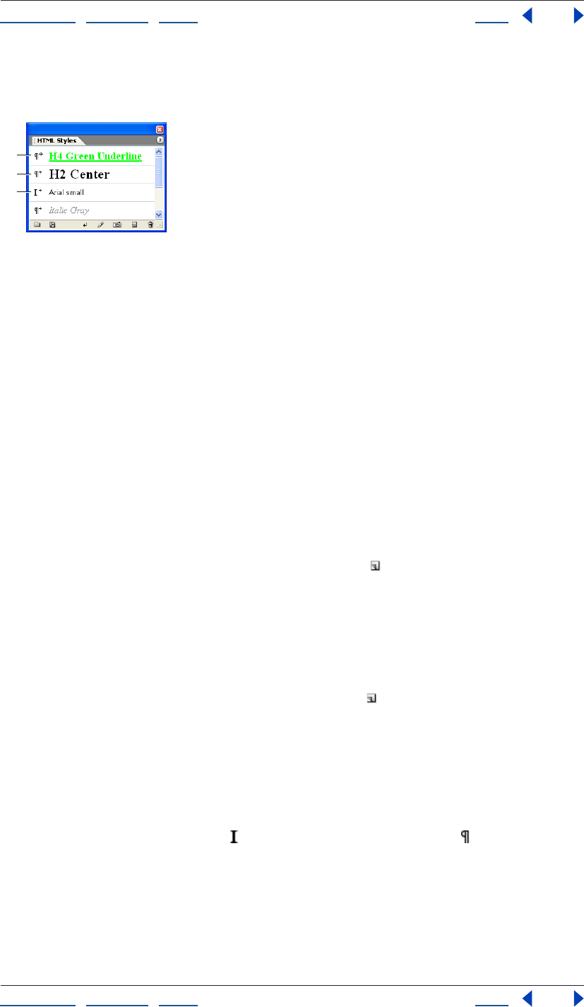
Using Help | Contents | Index Back 199
Adobe GoLive CS Help Formatting Text
Using Help | Contents | Index Back 199
To display the HTML Styles palette:
Choose Window > HTML Styles.
Symbols indicate whether an HTML style will add to or
replace a paragraph or an inline text attribute.
A. Replaces selected paragraph
B. Adds to selected paragraph
C. Adds to selected inline text
Creating and editing HTML styles
You can create an HTML style based on formatted text in the page, formatting options you
choose in the Basic tab of the New Style dialog box, or HTML attributes and values you
enter in the Advanced tab. You can save HTML styles as paragraph or inline text styles and
set them to either add to existing formatting or replace it.
You edit an HTML style by changing any of its options or attributes in the Edit Style dialog
box or applying captured attributes of selected text to the HTML style.
To create a new HTML style:
1 If you want to base the new HTML style on text that’s already formatted, select the
formatted text in the page.
2 In the HTML Styles palette, click the New Style button .
3 In the New Style dialog box, enter a descriptive name for the HTML style in the Name
text box.
4 To specify the text formatting attributes for the new HTML style, do one of the
following:
• Click the Basic tab and choose formatting options such as Font, Size, or Color.
• Click the Advanced tab and click the New Tag button to add a tag to the top of the
scrolling list. For the selected tag, enter a name, attribute, and its value in the text boxes
below the list.
If you selected formatted text in step 1, the formatting attributes appear in the New Style
dialog box. The preview pane at the bottom of the dialog box reflects the combined
attributes of
the style.
5 Click the Apply as Inline button or the Apply as Paragraph button for the HTML
style type. Inline text styles apply to selected text only and paragraph styles apply to the
entire paragraph regardless of what is selected in the paragraph.
Note: The heading, address, preformatted, and align attributes can only be saved as
paragraph styles, not as inline text styles. Clicking the Inline Text button will cause GoLive
to reset the attributes to “Paragraph.”
A
B
C
Using Help | Contents | Index Back 200
Adobe GoLive CS Help Formatting Text
Using Help | Contents | Index Back 200
6 Choose Add or Replace from the Apply Mode pop-up menu. Styles with the Add apply
mode are applied to text in addition to any existing formatting. Styles with the Replace
apply mode replace the existing text formatting.
7 Click OK.
To edit an HTML style:
1 Select the HTML style in the HTML Styles palette.
2 Do any of the following:
• To replace it with the formatting attributes of text that’s selected on the page, click the
Capture button .
• To change its formatting attributes, style type, or apply mode, click the Edit Style
button to open the Edit Style dialog box. The preview pane at the bottom of the
dialog box reflects your changes to the HTML style. Modify your selections as desired
and then click OK.
To remove an HTML style from the HTML Styles palette:
In the HTML Styles palette, select the HTML style that you want to remove and click the
Delete button .
Exporting or importing HTML styles
You can export the current HTML styles from the HTML Styles palette to an XML file and
save it as a separate set. When you import a set of HTML styles from an XML file into the
HTML Styles palette, all HTML styles in the palette are overwritten by the imported HTML
styles. By default, predefined HTML styles that come with GoLive are stored in an html.xml
file in the Adobe GoLive application’s Settings > Styles folder.
To export your current set of HTML styles:
1 In the HTML Styles palette, click the Export button .
2 Enter a filename, select a file location, and click Save.
To import a set of HTML styles:
1 Create a copy of your current set of HTML styles by exporting them to an XML file.
(Otherwise, they will be overwritten by the imported HTML styles.)
2 Do one of the following:
• In the HTML Styles palette, click the Import button . Select the XML file containing the
set of HTML styles that you want to import, and click Open.
• Drag the XML file containing the set of HTML styles that you want to import from your
desktop to the HTML Styles palette.
Applying or removing HTML styles
The symbols to the left of each HTML style listed in HTML Styles palette tell you whether
the HTML style is for inline text selections or paragraphs. Paragraph styles are applied to
the entire paragraph that contains the selected text or insertion point. The symbols also
indicate whether the HTML style will completely replace the formatting of the text or just
get added to it. You can apply more than one HTML style to selected text and you can
remove all the HTML styles at once.
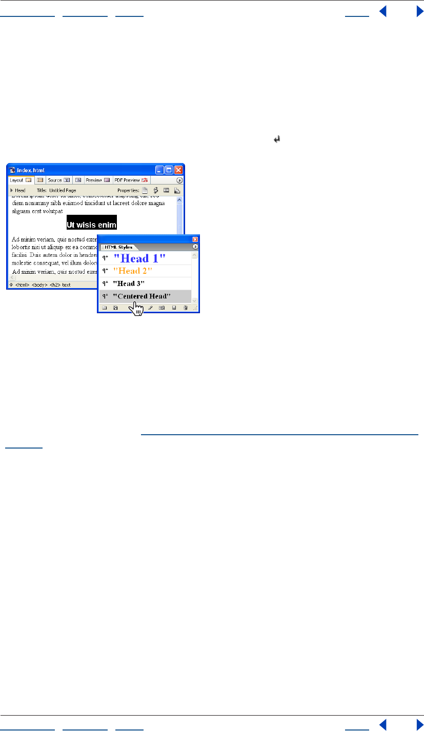
Using Help | Contents | Index Back 201
Adobe GoLive CS Help Formatting Text
Using Help | Contents | Index Back 201
To apply an HTML style to text:
1 Select the text or click anywhere in the paragraph that you want to format.
2 In the HTML Styles palette, do one of the following:
• Drag an HTML style from the palette to selected text on a page.
• Double-click an HTML style to apply it to a selection.
• Select an HTML style and click the Apply Styles button .
An HTML style can apply several HTML attributes to text
at once.
To remove all HTML styles from selected text:
In the HTML Styles palette, choose Clear Inline Styles or Clear Paragraph Styles from the
palette menu.
Note: To remove an HTML style application, you can also use the History palette or choose
Edit > Undo Apply Style. (See “Using the Undo, Redo, and Revert to Saved commands” on
page 37.)
Checking spelling
You can check the spelling of a single page or an entire site. If you are checking a site,
GoLive opens each page that contains a questionable word and closes each page when
you’re done checking it. GoLive automatically ignores the HTML when checking spelling.
When GoLive questions the spelling of a word, you can add the word to a personal
dictionary and it will be recognized as correct in the future. You can create a personal
dictionary for each language that you have installed.
To check the spelling in a page or site:
1 Select the Layout Editor tab, Source tab, or the site window.
2 Choose Edit > Check Spelling.
3 Set spelling checker options:
• Choose a spelling checker language from the Language menu.
• Select From Top to start checking at the top of an open page rather than at the i
nsertion point.
Using Help | Contents | Index Back 202
Adobe GoLive CS Help Formatting Text
Using Help | Contents | Index Back 202
• Expand More Options and specify conditions for the search, such as to ignore numbers.
4 To check the spelling in multiple files, select Check in Files and do one of the following:
• Choose a site from the Files From menu.
• Choose custom from the Files From menu and click Add Files to create a custom list.
5 Click Start.
GoLive displays a suggestion for the first questionable word in the text box.
6 To change the questionable word, do one of the following:
• Click Change to use the first suggestion.
• Double-click another suggestion in the Suggestions list box.
• Edit the suggestion in the text box and then click Change.
7 To accept the questionable word, do one of the following:
• Click Ignore to allow a single occurrence of the word.
• Click Ignore All to allow the questionable word for the current session. GoLive ignores
all occurrences of the word in the page or site.
• Click Learn to add the questionable word to your personal dictionary. GoLive recog-
nizes the word as correct in the future.
8 Click Delete to delete a questionable word from the page.
9 If you are checking a site, click Next File to quit checking the current page and start
checking the next page in the site.
10 To stop checking at any time, click Stop.
To edit a personal dictionary:
1 Choose Edit > Preferences (Windows) or GoLive > Preferences (Mac OS).
2 Click Spell Checker in the left pane of the Preferences dialog box.
3 Choose a language set of spelling rules from the Personal Dictionary pop-up menu in
the right pane of the dialog box.
4 To edit a word in the list, select it and change it in the text box below the scrolling box,
and then press Enter.
5 To add a word, click the New Word button , type the word in the text box, and press
Enter.
6 To delete a word, select it in the list, and click the Delete button .
7 Click OK.
Searching for text or HTML
Using the GoLive search tools, you can find and replace text or strings of HTML in any file
throughout your Web site. You can search multiple files at a time, specify parameters for
narrowing the search, and use wildcards in a search.
You can also use GoLive search tools to search for HTML elements with special conditions
(see “Finding elements” on page 400), search for files in a site (see “Finding files” on
page 128), and create and save extensive site queries based on a search (see “Generating
queries” on page 129).
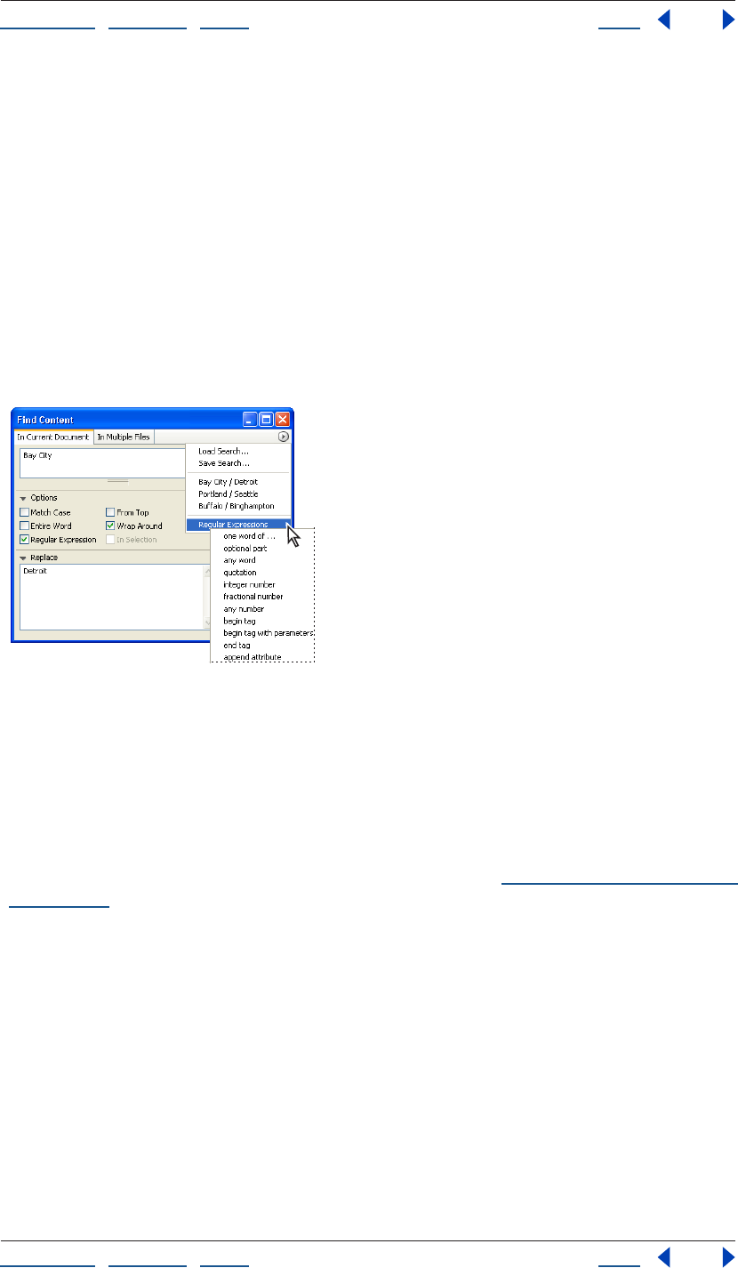
Using Help | Contents | Index Back 203
Adobe GoLive CS Help Formatting Text
Using Help | Contents | Index Back 203
Searching in the current document
You can use the Find & Replace feature in the Layout Editor, Outline Editor, or Source Code
Editor to search for text or strings of HTML code in the current document. Once you find
what you’re looking for, you can automatically change it to something else. You can also
search for selected text without opening the Find & Replace Content window.
To find and replace text or HTML in the current document:
1 Choose Edit > Find, and click the In Current Document tab.
2 Do one of the following:
• Type or paste text or HTML into the Find text box.
• Select text or HTML in the document window, and drag it into the Find text box.
• Choose an item from a previous search from the Find & Replace palette menu.
Previously used search strings appear in the search history
pop-up menu along with defined regular expressions.
3 Select options to ignore the case, look for entire words that are not embedded within
other words, start searching from the top of the page, wrap around to the beginning of
the search, or search for text using wildcards (regular expressions).
Note: Do not use the Regular Expression option unless you understand wildcard
searching. This powerful option can cause unexpected results, especially if you plan to
search and replace multiple items. For more information, see “Using wildcards in a search”
on page 206.
4 Click the triangle to expand the Replace text box, and type in replacement text.
5 Click Find. GoLive highlights the first match, if any.
6 Do one of the following:
• Click Find Next to find the next occurrence of the text.
• Click Replace to replace the found text.
• Click Replace & Next to replace the text and find the next occurrence.
• Click Replace All to automatically replace all instances of the text in the document.
To search for another selection without opening the Find & Replace Content
window:
1 In the Layout Editor or Source Code Editor, select the desired text in your document.
Using Help | Contents | Index Back 204
Adobe GoLive CS Help Formatting Text
Using Help | Contents | Index Back 204
2 Choose Edit > Find Selection.
GoLive starts looking for the text from the current selection and highlights the next occur-
rence of the text using the current settings in the Find window.
You can also find and replace text without reopening or moving the Find window to
the foreground by choosing Edit > Replace or choosing Edit > Replace & Find Next.
These commands are only available if the item searched for was found and is still selected.
Searching in multiple files
You can search and replace text or strings of HTML in multiple files or an entire site
without needing to open the files. (To specify search conditions for HTML elements, see
“Finding elements” on page 400.)
Note: If you plan to do a global search and replace in multiple files, you should be sure to
make a backup of your files and site, especially if you are using wildcard characters.
To find and replace text or HTML in multiple files:
1 Choose Edit > Find, and click the In Multiple Files tab.
2 Choose one of the following:
• Choose Text in Layout Mode to search for plain text in Layout Mode only.
• Choose Text in Source Mode (encoded) to perform a text-based search in the
document’s source code.
• Code Elements searches for HTML code. For detailed information about using this
option, see “Finding elements” on page 400.
3 Type the text or HTML code in the Find text box and the Replace text box, and then
select search options.
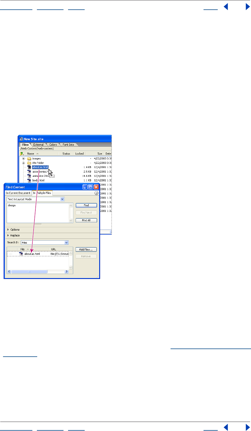
Using Help | Contents | Index Back 205
Adobe GoLive CS Help Formatting Text
Using Help | Contents | Index Back 205
4 Do one of the following to specify the search scope:
• To select a site or a site collection, open the site and choose Sites and Collections from
the Search In menu. Select the site folders or collections you want to search.
• To select individual file(s) from a site, open the site window, choose Files from the
Search In menu, and then drag the file(s) from the site window to the file list in the
Search In section.
• To browse and select individual file(s), choose Files from the Search In menu and click
Add Files. In the Add Files dialog box, click Add All or select the files you want searched
and click Add, and then click Done.
• To search within a previous result set (an open list of matches that resulted from a
previous search), choose Result List from the pop-up menu in the Search In section.
Drag files into the Find window to add them to the search.
5 Select options to ignore the case, look for entire words that are not embedded within
other words, start searching from the top of the page, wrap around to the beginning of
the search, or search for text using wildcards (regular expressions).
Note: Do not use the Regular Expression option unless you understand wildcard
searching. This powerful option can cause unexpected results, especially if you plan to
search and replace multiple items. For more information, see “Using wildcards in a search”
on page 206.
6 Click Find.
GoLive shows you the first file found containing matching text and opens the file.
7 Do one of the following:
• Click Find Next to find or view the next match in the same or next document.
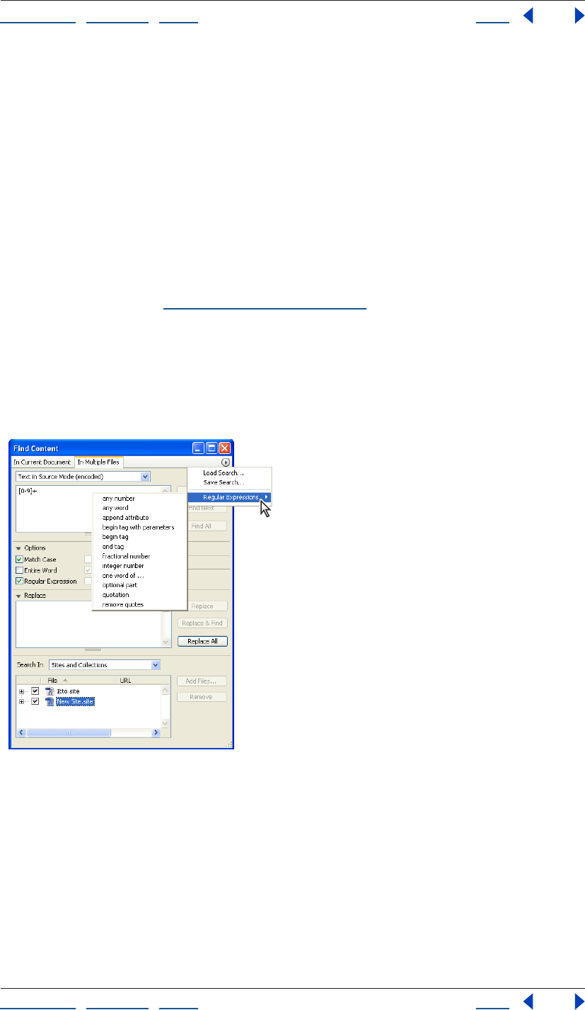
Using Help | Contents | Index Back 206
Adobe GoLive CS Help Formatting Text
Using Help | Contents | Index Back 206
• Click Find All to find or view all matches. In the Result window, all files with matches are
marked by a number appearing in the Hits column. Double-click a file with a hit count
to open the file and show the first match highlighted.
To save result sets from the Result window for use in another search:
Do one of the following:
• If you’d like to search within the result set, click Use Result in the Results window. You
can remove files from the result set by selecting them and clicking Remove.
• Click Save Collection in the Results window if you’d like to save the results as a
collection in the currently open site (a site must be open for the Save Collection option
to be available). You can remove files from the Results window by clicking Remove
before saving the collection. Saved collections are displayed in the Collections tab of
the Site window (see “Using collections” on page 319).
Using wildcards in a search
When you select Regular Expression in the Find & Replace Content window, you activate
wildcard searching. GoLive makes wildcard searching easier by allowing you to use
editable wildcard patterns from the Regular Expressions pop-up menu in the Find &
Replace Content window.
Wildcard patterns appear below the separator line in the search history menu.
To use wildcards in a search:
1 In the In Current Document or In Multiple Files tab of the Find & Replace Content
window, choose a wildcard pattern from the Regular Expression pop-up menu at the top
of the window or type a search string in the Find text box. (See the wildcard search options
in the following table.)
2 Select Regular Expression.
3 Click Find.
Using Help | Contents | Index Back 207
Adobe GoLive CS Help Formatting Text
Using Help | Contents | Index Back 207
Use these guidelines when wildcard searching:
• Characters that are used to specify wildcard options, such as “?”, “\”, “[”, and “]”, must be
preceded by a backslash. For example, “\?” finds any question mark.
• The caret serves as a wildcard character only when it precedes a range of characters, as
in “[^A-Z]”.
• The dash does not act as a wildcard character if it precedes a range of characters, as in
“[-ABC]” or “[^-ABC]”. At any other location, it acts as a wildcard character indicating a
“from…to” relationship.
The following table lists available wildcard search options:
Wildcard Option Action
Wildcards for Single Characters
. Finds any single character.
[] Finds any one of the characters in square brackets.
For example: “[0123456789]” finds any digit. “[a-zA-Z]” finds any alphabet-
ical character.
Finds any one character in a range enclosed in square brackets.
For example: “[0-9]” finds any digit.
[^] Finds any character other than the characters following the caret symbol
(^) in the brackets.
For example: “[^ab]” finds any character, except for “a” and “b”
\d (or [0-9]) Finds any digit.
\D (or [^0-9]) Finds any character other than a digit.
\w (or [a-zA-Z]) Finds any character.
[a-zA-Z]+ Finds any word.
\W (or [^a-zA-Z]) Finds any character other than alphabetical characters.
\s (or [SPACE+\t]) Finds any white space (SPACE = space key).
\S Finds any character other than a white space.
\r Finds any line break (in HTML source code).
\t Finds any tab character, such as indentations in HTML source code.
\x00 - \xff Finds any character, as identified by its ASCII value.
For example: “\X43” finds “C”
Quantifiers
? The question mark makes the preceding character or string (enclosed in
parentheses) optional.
For example: “(Adobe )?GoLive” finds
“GoLive” and “Adobe GoLive”.
Using Help | Contents | Index Back 208
Adobe GoLive CS Help Formatting Text
Using Help | Contents | Index Back 208
+ The plus sign finds one or more occurrences of the preceding character or
search string in a row.
For example: “ba+” finds “ba”, “baa”, “baaa”, etc.
* The star is equivalent to a “?” and a “+”, and can result in a “not found” mes-
sage if no occurrences are found. The character preceding the “*” is
optional.
For example: “ba*” finds “b”, “ba”, “baa”, etc.
Other Search String Modifiers
| The vertical bar serves as a separator for alternative search strings.
For example: “Adobe|GoLive|4.0” finds “Adobe”, “GoLive”, and “4.0”.
() Parentheses enclose a search string that serves as a definition for quanti-
fiers.
For more information, see the description of “?” above.
^ In source mode, the caret finds the start of a line. In the Layout Editor, it
finds the beginning of a paragraph.
$In source mode, the dollar sign finds the end of a line. In the Layout Editor,
it finds the end of a paragraph.
Search String Finds
Adobe|GoLive "Adobe" or "GoLive"
m(i|a)ll "mill" or "mall"
Adobe(GoLive)? "GoLive" if the latter exists, else "Adobe"
</?HTML> "<HTML>" and "</HTML>"
Ye+s The word "Yes", containing any number of successive "e" charac-
ters, such as "Yes", "Yees", "Yeees", etc.
Michael J[a-z]* Any string beginning with "Michael J", followed by any number of
lowercase letters, such as "Michael Jones", "Michael Jamrosy", and
"Michael Jordan"
<H[1-6]> HTML headings H1 through H6, including “H1”, “H2”, “H3”, etc.
<[a-zA-Z][a-zA-Z0-9]*> Any start tag that has no attributes, such as "<P>", "<b>", "<H2>",
"<ImaGe>"
<[a-zA-Z][a-zA-Z0-9]*[^>]*> Any start tag, including those with attributes, such as "<image
width=20>"
Wildcard Option Action

Using Help | Contents | Index Back 209
Adobe GoLive CS Help Formatting Text
Using Help | Contents | Index Back 209
Using back-references in wildcard searches
Back-references let you replace a selection with part of the wildcard string you entered in
the Find text box. A back-reference consists of a backslash character followed by a
number, for example “\1”, “\2”, and so on. The number refers to a subexpression (enclosed in
parentheses) of the wildcard search pattern in the Find text box:
• “\1” refers to the first subexpression in the wildcard search pattern. This subexpression
starts at the first opening bracket from the left and ends with the complementary
closing bracket.
• “\2” refers to the second subexpression, which starts at the second opening bracket
from the left and ends with the complementary closing bracket.
When you click the Replace button, each selection is replaced with the part of the
matching text that has been recognized by the subexpression that the back-reference
refers to.
For example, you enter the wildcard search pattern ((Adobe)?GoLive) in the Find text box
to find any occurrence of “GoLive” or “Adobe GoLive”. The “?” character makes the “Adobe”
enclosed in the second pair of parentheses optional. If you enter the back-reference \1 CS
in the Replace text box, the found text is replaced with the contents of the first pair of
parentheses plus the letters CS. If the match is “Adobe GoLive”, the result is Adobe GoLive
CS. If the match is “GoLive”, the result is GoLive CS.
Working with nonroman character sets
Your ability to switch between roman and nonroman character sets depends on your
operating system.
In Windows versions earlier than 2000, you can’t directly create nonroman (double-byte)
Web pages using a roman (single-byte) operating system. However, you can import
double-byte HTML files created with another operating system. You can then view the
HTML source code in GoLive, although the double-byte text doesn’t display correctly in
the Layout Editor or Preview. Microsoft Internet Explorer 4.0 and later versions are able to
display double-byte scripts, so you can preview double-byte files using the Show in
Browser command in GoLive.
The Windows 2000 and XP operating systems with Microsoft Internet Explorer 6.0 or later
let you view and create double-byte content without the entire native script operating
system. You can custom install the Language Pack for the script you need. See your system
documentation for further information.
Mac OS 9.1 and later operating systems include Multilingual Internet Access as an optional
installation. This software lets GoLive display double-byte scripts, even without the native
operating system. With the appropriate Language Kit custom installed, you can create and
edit nonroman text. See your system documentation for further information.

Using Help | Contents | Index Back 210
Adobe GoLive CS Help Formatting Text
Using Help | Contents | Index Back 210
Using double-byte text in GoLive (Windows 2000 and
Mac OS only)
When you install the English version of GoLive, any page that you create defaults to the
Western (Latin 1) encoding in Windows and the GL-Western encoding in Mac OS. If the
text on your page will be created using any Western language (such as U.S. or British
English, German, French, Spanish, or Swedish), you don’t need to change this selection.
You can type text directly in the document window. But to create content in a language
with a different script system, you need the appropriate system resources and fonts. You
must change the Encodings preferences to activate the language script you want to use so
that it appears in the File > Document Encoding submenu. The supported document
encodings are determined by the system software. The defaults include: Western, Multi-
lingual UTF-16 and UTF-8, and Japanese encoding.
Setting language scripts and font preferences
The Encodings and Fonts preferences settings let you select the default language script,
activate language scripts so they appear in the Document Encoding submenu, and set
default fonts for languages.
Note: Language scripts that are not activated and supported by the system software don’t
appear in the File > Document Encoding submenu.
To activate encodings for language scripts:
1 Choose Edit > Preferences (Windows) or GoLive > Preferences (Mac OS), and click the
Encodings icon in the left pane of the Preferences dialog box.
2 In the right pane of the dialog box, select the desired language encoding option to
activate it.
3 To make an encoding option the default,
select the name of the option, and then select Default Encoding, or simply double-click
the option name.
The name of the default selection appears in boldface and underlined.
4 Select Use Charset Info to include the encoding and character set information in the
Content attribute of the Meta element. When this option is selected, GoLive tries to
recognize the encoding based on the characters used. Deselect this option to eliminate
language information from the HTML page head section.
5 In the Scanning Limit Characters text box, enter the number of bytes that you want
GoLive to search in order to find encoding and character set information when it opens a
file. Deselect Use Charset Info to turn off this option automatically.
To select default fonts for a language script:
1 Click the Fonts icon in the left pane of the Preferences dialog box.
2 Click the triangle to expand the language script options.
3 For each option, choose a font and size from the Font and Size pop-up menus.
4 To preview your selection, click the Font Sample triangle (Mac OS).
5 Click OK, and restart GoLive.
Note: Only installed double-byte fonts appear in the Font menu. See your operating
system documentation for information on installing fonts.
Using Help | Contents | Index Back 211
Adobe GoLive CS Help Formatting Text
Using Help | Contents | Index Back 211
To create double-byte language pages:
1 If you are creating text in a non-Western language, make sure that you have installed
the appropriate double-byte script system software and fonts.
2 Open a new document window.
3 Choose File > Document Encoding, and choose the appropriate language encoding
option.
Be sure that it is equivalent to the internal operating system encoding—for example,
Japanese (Shift JIS)—to add that meta information to the head section.
4 Proceed to add text to your page in GoLive.
Importing foreign-encoded text files
Before importing foreign-language files or text files from other platforms, you need to
know the type of encoding they were written with. If the text was saved with an encoding
not recognized by your operating system, it won’t display properly. However, the HTML
code is still valid. To insert foreign script, you must display your GoLive document in the
Source Code Editor, and paste the double-byte text into it.
To import foreign-encoded text files:
1 Open a new document window.
2 Choose File > Document Encoding, and choose the language encoding of the file that
you want to import.
This inserts the encoding information in the head section of the page. (For information on
adding language encodings to the File > Document Encoding menu, see “Setting
language scripts and font preferences” on page 210.)
3 Copy the text from the file that you want to import.
4 Return to GoLive, and display your GoLive document in the Source Code Editor.
5 Paste the copied text between the <body> and </body> tags. Make sure that you don’t
type over any of the HTML tags.
If your text contains characters that are used in HTML syntax, such as “<”, “>”, and “&”, you
must use the proper HTML notation for special characters, such as “<”, “>”, and “&”;
otherwise, GoLive interprets them as HTML tags when it reads the text-only file.
6 Choose File > Save As to save the page with the .html extension after the filename.
The text will not display properly without the necessary operating system and fonts. To
preview the page, you must use a Web browser with the correct encoding running on the
necessary operating system.
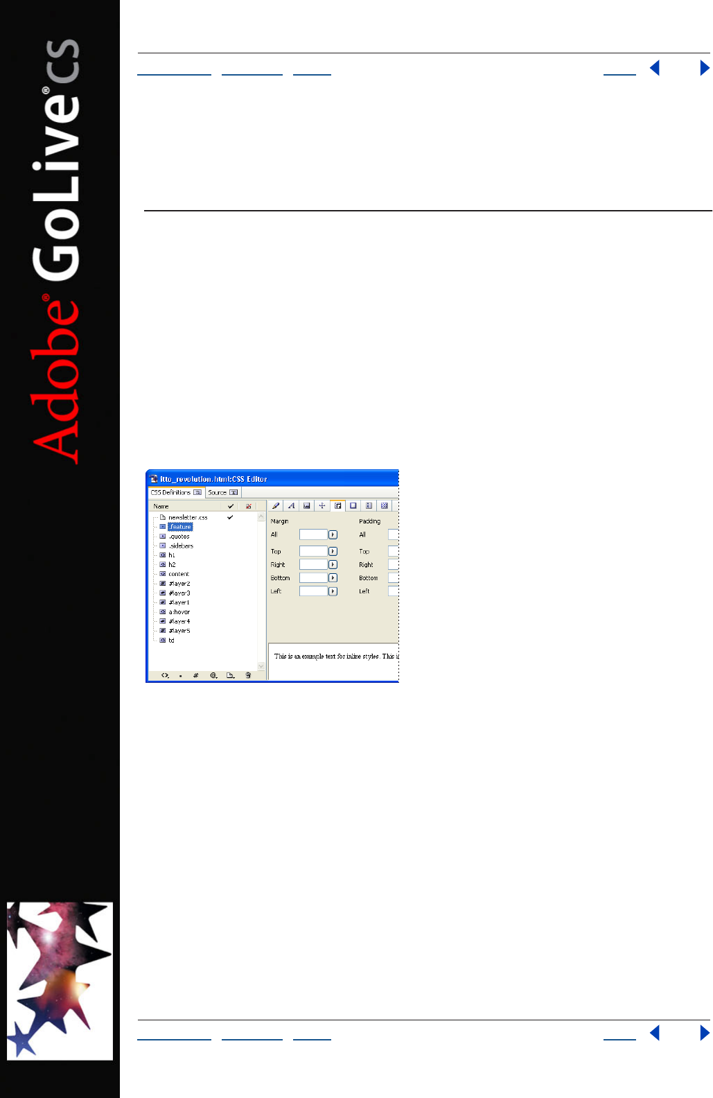
Using Help | Contents | Index Back 212
Adobe GoLive CS Help Using Cascading Style Sheets
Using Help | Contents | Index Back 212
Using Cascading Style Sheets
About cascading style sheets
Cascading style sheets (CSS) simplify the maintenance of text properties and other
attributes in a page and throughout a Web site. If a CSS style needs to be updated, you
simply edit the style rule and all content that hosts the style will automatically reflect the
new properties. With style sheets you can set text size to display more consistently across
different platforms and control the position of content on a page with pixel-level
precision. An external style sheet can be shared by an entire site, giving your pages a
consistent presence and enabling you to update the site’s styles with a single file. With
HTML element styles you can automatically set the properties of HTML tags throughout a
page or site. Class styles are more flexible because they can be applied to specific selec-
tions in a page and to different types of content, without relying upon a single tag.
Styles and external style sheets listed in the CSS Editor
One of the fundamental features of CSS is that style sheets cascade—in other words,
several external style sheets, in addition to the internal style sheet, may define the
properties of a single page and override one another according to certain rules of prece-
dence. When several style sheets apply their formatting rules to a page, conflicts may arise.
These conflicts are resolved by assigning a level of precedence to each style rule. Internal
style sheets will override a rule in an external style sheet, and external style sheets are
assigned a level of precedence relative to other sheets. By default, the Web page’s style
sheet overrides the browser’s default values.
Some viewers can’t see CSS style properties because their browser doesn’t support CSS,
the browser’s CSS support has been turned off, or the browser is set to override page
styles with a CSS file supplied by the viewer. In addition, Web browser support for CSS
varies greatly between both browser vendors and browser versions.
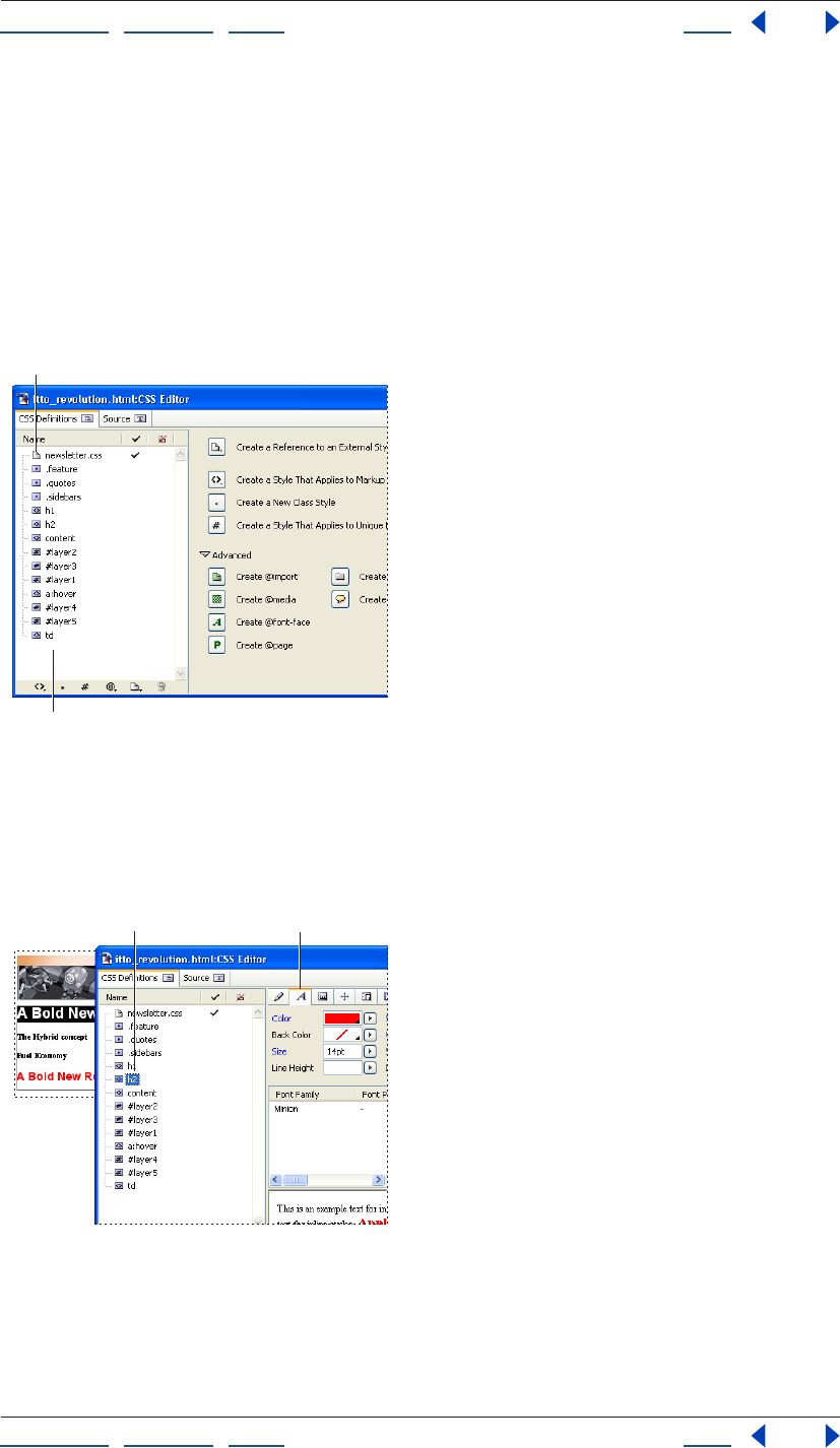
Using Help | Contents | Index Back 213
Adobe GoLive CS Help Using Cascading Style Sheets
Using Help | Contents | Index Back 213
About the GoLive CSS workflow
Use the CSS Editor to create CSS styles in a style sheet and to add external style sheets. Use
the CSS palette or the inline CSS Style preview (an inline version of the CSS palette’s Style
Apply tab) to apply class styles to content in a Web page.
The typical workflow for building cascading style sheets in GoLive includes the following:
1 Use the CSS Editor to add CSS styles to a Web page, link to an external style sheet or
create a new external style sheet. You can also import CSS styles from a different Web page
or from an external style sheet.
Internal style sheet in the CSS Editor
A. External style sheet reference B. List of internal styles
2 Use the CSS Editor to define the properties of each CSS style. Properties that you can
define include font sets, text size, border attributes, list attributes, background attributes,
and absolute position coordinates.
Define style properties in the CSS Editor
A. Selected style
B. Selected style’s properties
A
B
AB
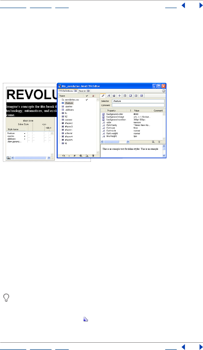
Using Help | Contents | Index Back 214
Adobe GoLive CS Help Using Cascading Style Sheets
Using Help | Contents | Index Back 214
3 If you’re using an external style sheet, you can link to it from an individual Web page
with the CSS Editor, or link multiple Web pages to it with the CSS palette and the site
window.
4 Apply class styles to text and other items. You must manually apply class styles to
selections in your page with the CSS palette. Element styles, in contrast, are automatically
applied to HTML tags in your Web page.
5 You can continue to modify any style’s properties with the CSS Editor. All content that
uses the style will automatically reflect the changes.
Apply class styles to selections with the CSS palette.
Creating a style sheet
The first step in designing with cascading style sheets is to create the internal or external
style sheet that contains your CSS styles. The CSS Editor lets you define the styles for an
internal or external style sheet, and lets you reference external style sheets.
Creating internal and external style sheets
To create a style sheet, first determine whether the style sheet should be internal or
external. An internal style sheet is written into the head section of a Web page and is
typically used if the styles aren’t used on more than one page. An external style sheet
exists as a separate file, which is useful if you want multiple pages to share the same styles.
In addition, GoLive lets you import the styles from an external style sheet into an internal
style sheet or export an internal style sheet to an external style sheet file. You can use both
an internal style sheet and external style sheets in a single Web page.
Note: Except for their title bars, internal and external CSS Editors appear identical. An
internal CSS Editor displays the Web page’s file name in the title bar. An external CSS Editor
displays the external style sheet’s file name in the title bar.
Create different external style sheets and apply each external style sheet separately to
a page to quickly preview different sets of styles.
To create an internal style sheet:
1 Click the Open CSS Editor button in the upper right corner of the Layout Editor.
2 Add styles to the style sheet with one or more of the following methods:
Using Help | Contents | Index Back 215
Adobe GoLive CS Help Using Cascading Style Sheets
Using Help | Contents | Index Back 215
• To create new styles, see “Creating CSS styles in a style sheet” on page 219.
• To reference an external style sheet file, see “Using external style sheets” on page 217.)
• To import styles from an external style sheet, see “Importing styles from an external
style sheet” on page 220.
To create an external style sheet:
1 Do one of the following:
• To create a new external style sheet, choose File > New Special > Cascading Style Sheet.
The external CSS Editor displays.
• To create an external style sheet based upon the styles of a page’s internal style sheet,
open the Web page, and click the Open CSS Editor button . Choose File > Export >
Internal Style Sheet. Name the file using .css as the extension, and save the file to your
site folder.
2 Add styles to the style sheet. (See “Creating CSS styles in a style sheet” on page 219.)
Note: To reference an external style sheet in an external style sheet, use the @import
button, see “Referencing external style sheets from an external style sheet” on page 218.
3 Reference the external style sheet from one or more pages. (See “Using external style
sheets” on page 217.)
To see all the pages that use an external style sheet, open the In & Out Links palette
and then select an external style sheet in a site window.
To add comments to a style sheet:
1 In the CSS Definitions tab in the CSS Editor, click in a blank white area to display the
Create buttons on the right side of the Editor.
2 Click Create Comment in the Advanced section.
3 With the comment selected under the Name column, enter comments in the text field
on the right side of the CSS Editor.
Using the CSS Editor
The CSS Editor lets you create CSS styles, edit style properties, reference or create external
style sheets, and preview how some style properties may appear. You can also use the
Source tab in the CSS Editor to view and edit the style sheet source code.
To display the CSS Editor:
1 Do one of the following:
• Open a Web page and click the Open CSS Editor button in the upper right corner.
• Open an external style sheet that is named with the .css file extension.
2 To change the display on the right side of the CSS Editor in the CSS Definitions tab, do
one of the following in the Name column:
• To display the Create buttons, deselect all styles.
• To display style properties, select a style.
• To display external style sheet properties (though not the style properties within it),
select an external style sheet.
Using Help | Contents | Index Back 216
Adobe GoLive CS Help Using Cascading Style Sheets
Using Help | Contents | Index Back 216
3 To display the style sheet source code, click the Source tab in the CSS Editor. To change
the CSS source code color display, edit the Themes preference for CSS Syntax. (See
“Setting Source preferences” on page 375.)
To set viewing options for the CSS Editor:
1 Open the CSS Editor.
2 To display a preview of a selected style’s effect in the lower right pane of the CSS Editor,
choose View > Preview Styles from the CSS Editor menu.
3 Choose one of the following from the CSS Editor menu’s View submenu or select the
options in the View palette:
• Folder for Sections separates the CSS Definitions tab of the CSS Editor into an Internal
folder which lists internal styles, and an External folder which lists referenced external
style sheets.
• Show Statement Filter to display the Show all Statements pop-up menu.
Using Help | Contents | Index Back 217
Adobe GoLive CS Help Using Cascading Style Sheets
Using Help | Contents | Index Back 217
To edit the styles listed in the New Style submenu in the CSS Editor menu:
1 Choose New Style > Edit Style Examples from the CSS Editor menu.
2 In the exampleStyles.css CSS Editor window, do one of the following:
• To edit an existing style, select a style to edit under the Name column.
• To add a style to the list, use any method for creating a new style. (See “Creating CSS
styles in a style sheet” on page 219.)
3 Edit the style properties in the CSS Editor. (See “Defining style properties” on page 225.)
4 When you are finished editing styles, choose File > Save and close the example-
Styles.css CSS Editor window.
Using external style sheets
If multiple pages share style elements, you can create an external style sheet that you
reference from the individual pages. Using external style sheets helps to keep your page
sizes small and lets you update the entire site’s styles from within the single external style
sheet.
The order of the external style sheets in the CSS Editor indicates their order of precedence
(cascading order). Sheets that are lower in the list take precedence over sheets that are
higher in the list.
To see all of the pages that reference an external style sheet in your site, select the
style sheet file in your site window, and view all the references in the In & Out Links
palette.
Referencing external style sheets from an internal style sheet
Use the CSS Editor to reference the external style sheets from the pages that use them.
To reference an external style sheet:
1 Do one of the following:
• To reference an external style sheet for a single Web page, in the CSS Editor click the
New Link To External CSS button , or choose New Link To External CSS from the CSS
Editor menu. Select the empty reference under the Name column and reference the
external style sheet in the Reference text box.
• To reference an external style sheet for multiple Web pages, select two or more pages
within the site window’s File tab. In the CSS palette, click New Link To External CSS
button and then reference an external style sheet in the text box.
2 Add additional external style sheets as needed.
3 To change the order of precedence of an external style sheet relative to other external
style sheets referenced in the same page, drag the external style sheet to a new position in
the Name column in the CSS Editor of the page.
To easily reference a style sheet document from a page within the same site, drag the
style sheet file icon from the site window to either the page icon in the upper right
corner of the page or to a page’s CSS Editor.
Using Help | Contents | Index Back 218
Adobe GoLive CS Help Using Cascading Style Sheets
Using Help | Contents | Index Back 218
To view or edit a referenced external style sheet:
Do one of the following:
• Double-click the external style sheet in the CSS Editor or the site window.
• Select the external style sheet in the CSS Editor and click Edit.
To replace an external style sheet reference:
1 In the Files tab of the site window, select the.css file you want to replace.
2 In the In & Out Links palette, use the pick whip that is adjacent to the .css file and
reference a different style sheet document in the site window.
3 In the Change Reference dialog box, if necessary, deselect any files that you do not want
to update, and then click OK.
All selected files in the Change Reference dialog box use the new external style sheet.
Unselected files use the existing external style sheet.
To remove a reference to an external style sheet:
Do one of the following:
• In the CSS Editor of a page, select the external style sheet and click the Remove
Selected Items button .
• Select one or more pages in the site window, and then select the external style sheet in
the CSS palette and click the Remove Selected Items button.
Referencing external style sheets from an external style sheet
To reference an external style sheet from another external style sheet, you must use the
@import rule.
To reference an external style sheet from another external style sheet:
1 Open the CSS Editor for the page or .css file that you want to reference the external
style sheet.
2 In the CSS Definitions tab, click an empty area to display the Create buttons on the right
side of the Editor.
3 Expand the Advanced section and click the Create @import button.

Using Help | Contents | Index Back 219
Adobe GoLive CS Help Using Cascading Style Sheets
Using Help | Contents | Index Back 219
4 Do one of the following:
• Reference an external style sheet in the Reference text box.
• Click the Create button to create a new external style sheet. In the Save As dialog box,
type a file name for the external style sheet, and click Save. Display the CSS Editor for
the page that will reference the external style sheet you just created, and reference it in
the Reference text box.
5 If the styles in the style sheet are designed for certain media (such as a speech synthe-
sizer, braille device, or PDA) specify the media type in the Media text box.
6 Do any of the following:
• To edit the external style sheet, click Edit.
• To display the In & Out Links palette, click In & Out Links.
Creating CSS styles in a style sheet
You can create new CSS styles from scratch or import CSS styles from an external style
sheet. There are three different types of styles you can define in a style sheet:
• HTML element styles are “hard-wired” to specific HTML tags. This means the style
properties automatically apply to a tag, and any content it might enclose, wherever the
tag appears in a Web page. This style type lets you display pages in CSS-enabled
browsers exactly as you want them to appear. Simultaneously, browsers with no CSS-
support, or incomplete CSS-support, will have the benefit of the HTML-based
formatting that is inherent in the tag you specify in the style name. For example, if an
HTML element style is named for the <h3> tag, any style properties you add to the style
will be applied to any text that uses the Header 3 paragraph format in the page when
viewed in CSS-enabled browsers. Browsers without CSS-support will display the text
using the default Header 3 text properties.
• Class styles apply to selected text or objects in a document, similar to the way word
processor styles function. Any number of elements inside the BODY section of a page
can host a class style. If you modify the class style’s properties, the changes affect all
text and objects to which the style was applied. Class styles are more flexible than
HTML element styles because a class style can be applied to multiple types of content
and only to items you select. For example, you can apply a class style to some of the
headings that use the Header 4 paragraph format in a page to distinguish them from
other Header 4 headings in the page.
• ID styles define unique style properties for one element on a page. This style type is
used if the style properties of an item must be distinct from all other items on the page.
Consider using a class style instead since it can also be applied to a single item and is
more flexible.

Using Help | Contents | Index Back 220
Adobe GoLive CS Help Using Cascading Style Sheets
Using Help | Contents | Index Back 220
Two major style categories are used with cascading style sheets:
• Simple Styles match elements based on the element type and/or attributes, not the
element’s position in the document structure. H1 (all level 1 headers) and H1.headline
(all level 1 headers with the CLASS attribute.headline) are examples of
simple styles.
• Contextual Styles match elements based on their position in the document structure. A
contextual style consists of several simple styles. H1.headline B (all level 1 headers with
the CLASS attribute .headline and bold typeface) is an example of a contextual style
consisting of two simple selectors, H1.headline and B.
Importing styles from an external style sheet
You can import styles from an external style sheet into a Web page’s internal style sheet.
1 To import styles from an external style sheet:
2 Open the CSS Editor for the page to which you want to import the CSS styles.
3 Choose File > Import > External Style Sheet.
4 Select an external style sheet, and click Open. The external style sheet’s styles are added
to the list of internal styles in the CSS Editor.
Creating HTML element styles
One of the more powerful features of cascading style sheets is the ability to change the
properties of a Web page based on its HTML elements (tags). By using element styles, you
can enhance the presentation of a document and maintain downward compatibility as a
courtesy to viewers with browsers that don’t support CSS; browsers that support CSS
display the enhanced formatting that CSS permits, while the browsers that don’t support
CSS display HTML-based formatting and structure.
You can use element styles in two different ways:
• Simple element styles reformat all instances of a particular element within your page.
For example, if you create a style with the text property 36 point and name it with the
<h1> tag, all text that uses that tag (the Header 1 paragraph format) will display with
size 36 point.
Using Help | Contents | Index Back 221
Adobe GoLive CS Help Using Cascading Style Sheets
Using Help | Contents | Index Back 221
• Contextual element styles reformat all instances of a particular element nested within
another element. For example, if you create a style named with the <h1> <i> tags and
assign the style a lime color, all text between <i> start and end tags (italic style) that are
also within <h1> start and end tags will display in the lime color. (The proper style
name for this example is “h1 i” without the quotation marks. If a comma is inserted in
the style name, as in “h1,i” then any text between <h1> or <i> start and end tags will
use the style.)
To create hypertext links that change color when the mouse pointer hovers over the
link, use a contextual element style named after the <a> “link” tag. In the CSS Editor,
choose a:hover from the New Element Style button’s menu or the CSS Editor menu.
To create an HTML element based style:
1 In the CSS Editor, do one of the following:
• Click the New Element Style button .
• In the CSS Editor, choose a tag from the New Element Style button’s menu.
To add a HTML tag to both menus, choose Edit Style Examples from the New Element
Style button’s menu. (See “Using the CSS Editor” on page 215.)
• Select an existing HTML element style in the CSS Editor, and choose Edit > Duplicate.
2 Select the new style in the CSS Editor, and select the Selector and Properties tab . If
you didn’t choose a tag in step one, type an HTML element (tag) name in the Name text
box. If you want to apply the same properties to multiple elements, separate each element
name with a comma in the Name text box.
Element styles use HTML start tags without the less than (<) and greater than (>)
characters—for example, h2 for second-level headers, p for paragraphs, td for table cells,
and the letter a for hypertext links. For more information on naming HTML element styles
to format tables and table content, see “Formatting tables and table content with
cascading style sheets” on page 181.
You can set the shared properties of all text in a page by creating an HTML element
style that is named after the tags <body>, <div>, and <td> (for table cells). Add one
new HTML element style to the CSS Editor, and in the Basic set of the CSS Inspector, enter
the name as “td, body, div” without the quotation marks.
3 In the CSS Editor, add style properties to the selected style. (See “Defining style
properties” on page 225.)
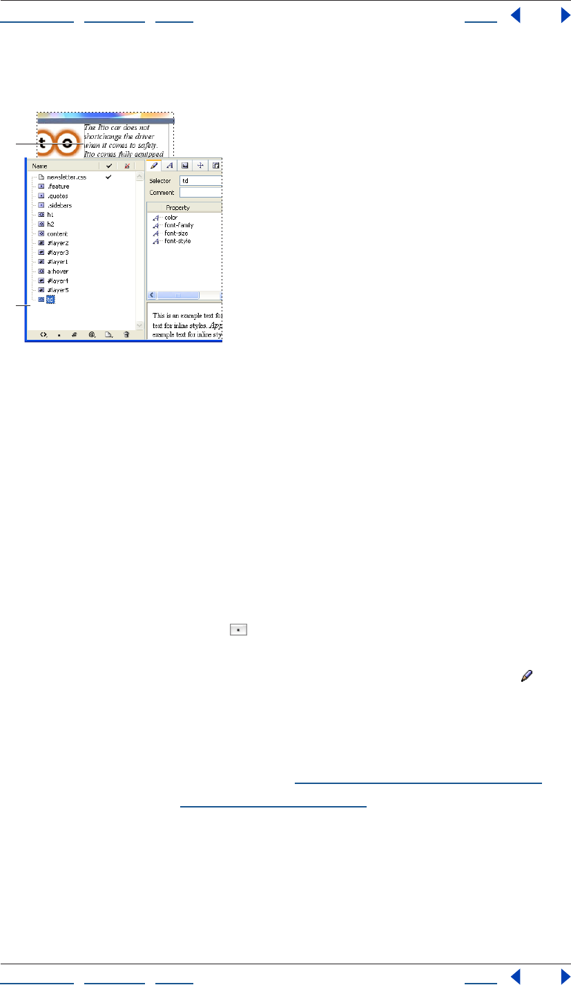
Using Help | Contents | Index Back 222
Adobe GoLive CS Help Using Cascading Style Sheets
Using Help | Contents | Index Back 222
Any properties you add are automatically applied to the HTML element that the style is
named after wherever the tag appears in the page.
CSS Editor
A. Element style name B. Style properties
C. TD style is automatically applied to text in table cells in
the page
Creating class styles
You can apply class styles to any number of selections in a page and most any type of
content including a block of text, a single table cell, an image, and a layer. Typical uses of
classes include distinctive formatting for headings, quotes, warning notes, or other special
information-carrying items that need to stand out from the rest of the text. You can also
use classes to create typographical effects, such as varying font sizes or font colors within a
word.
To create a class style:
1 In the CSS Editor, do one of the following:
• Click the New Class Style button .
• Select an existing class style, and choose Edit > Duplicate.
2 Select the new style in the CSS Editor, and click the Selector and Properties tab . Type
an alphanumeric name, preceded by a period in the Selector text box and with no
spaces—for example, .myboldclass.
Important: The leading period must precede the class style’s name; otherwise, the style
changes to an element style and can’t be used.
3 In the CSS Editor, add style properties. (See “Defining style properties” on page 225.)
To apply the class style, see “Applying styles” on page 233.
A
B
Using Help | Contents | Index Back 223
Adobe GoLive CS Help Using Cascading Style Sheets
Using Help | Contents | Index Back 223
Creating media, font, and page rules
You can specify media, font, and page information using CSS rules:
• Use the @media rule to specify styles for different types of media. For example, use
@media to specify the font size for print media and a separate font size for the screen.
• Use the @font-face rule to specify a font and its URL location to ensure the font will
display on systems without it.
• Use the @page rule to specify the size of pages.
To create an @media, @font-face, or @page rule:
1 Open the CSS Editor for the page or .css file.
2 In the CSS Definitions tab, click an empty area to display the Create buttons on the right
side of the Editor.
3 Expand the Advanced section and do one of the following:
• Click the Create @media button and choose the media type from the Media menu. In
the Source tab, enter the property and value pairs for the rule. (See “Editing cascading
style sheets manually” on page 224.)
• Click the Create @font-face button; then click the Create New Item button. In the Font
Source tab, specify the URL of the font, and in the Font Styling tab, specify font
properties.
• Click the Create @page button. Choose a selector from the Selector menu, and then
choose the type of marks you want from the Marks menu. Enter the margin and size
settings for the selector.
Creating ID styles
Unlike classes, which you can apply to an unlimited number of items in a page, an ID style
lets you apply a specific style only once in a document. Use IDs for a unique paragraph or
range of text, such as a headline, warning message, or other text that needs unique and
very restrictive treatment to distinguish it from other content in the page.
GoLive layers use ID styles to define their properties. If your document contains layers,
the document’s CSS Editor lists an ID style for each layer. You can use the CSS Editor to
edit many layer properties, such as border size and style, that are not available through the
Layer Inspector. (Many of these properties are not available in the Inspector because some
browsers may not consistently support them at this time.)
To create an ID style:
1 In the CSS Editor, do one of the following:
• Click the New ID Style button .
• Select an existing ID style, and choose Edit > Duplicate.
2 Select the new style in the CSS Editor, and click the Selector and Properties tab . Type
a unique alphanumeric ID name in the Name text box, preceded by a pound symbol(#)
and with no spaces—for example, #myheaderid.
Important: The pound symbol must precede the id style’s name; otherwise, the style
changes to an element style and can’t be used.
Using Help | Contents | Index Back 224
Adobe GoLive CS Help Using Cascading Style Sheets
Using Help | Contents | Index Back 224
3 In the CSS Editor, add style properties. (See “Defining style properties” on page 225.)
4 To apply the ID style, you must hand-edit the source code of your page. (See “Applying
styles” on page 233.)
Removing styles or external style sheets
You can remove styles or external style sheets from a Web page with the CSS Editor.
To delete a style or external style sheet from a Web page:
1 Select one or more styles or external style sheets in the CSS Editor; press Shift to select
adjacent items or press Ctrl to select nonadjacent items.
2 Click the Remove Selected Items button in the CSS Editor.
Editing cascading style sheets manually
If you prefer to manually edit the source code of your cascading style sheets, you can do so
in the Source tab of the internal or external CSS Editor.
Use the following basic guidelines when editing your style sheets in the Source tab of the
CSS Editor.
Begin each style on a new line. Use the following basic CSS syntax definitions:
Class styles The syntax consists of a period followed by a unique class name, and a
property: value definition enclosed by braces:
.classname { property: value }
HTML element styles The syntax consists of an HTML tag, without the angle brackets <
>, followed by a property: value definition enclosed by braces:
tag { property: value }
ID styles The syntax consists of a pound symbol (#) followed by a unique alphanumerical
name, and a property: value definition enclosed by braces:
#idname {property: value}
If a style has more than one property: value pair, separate each pair with a semicolon. For
example:
.classname { property: value; property: value}
For more information on editing cascading style sheets, see “Creating CSS styles in a style
sheet” on page 219 and “Defining style properties” on page 225.
Using Help | Contents | Index Back 225
Adobe GoLive CS Help Using Cascading Style Sheets
Using Help | Contents | Index Back 225
Defining style properties
After you have added a style to your cascading style sheets, you set the properties of the
style in the CSS Editor, which contains all of the style properties that GoLive supports.
Some style properties are automatically inherited by items contained within the item that
hosts a style.
The CSS Editor includes properties that cover the major part of the CSS specification, with
the exception of some style options that browsers don’t consistently support. If a property
you want to add is not included in the CSS Editor, you can enter the property and value in
the Selector and Properties tab or manually in the Source tab of the CSS Editor.
If multiple styles will share a set of properties, you can set the shared properties for
each style simultaneously. In the CSS Definitions tab of the CSS Editor, Shift-click to
select every style that will share the properties, and then set the shared properties in the
CSS Editor.
About property inheritance
Content and tags contained within an item that hosts a style will automatically inherit the
inheritable style properties. If you assign a style to an HTML tag or a selection in your
document, any tags and content contained between the start and end tags or within the
selection will inherit those style specifications. For example, consider an HTML element
style named after the <h1> tag (Header 1 paragraph format) and given a blue color
property. If the page has text that uses the Header 1 paragraph format, and some of that
header text is also italicized with the <i> tag, the italicized text will inherit the blue
properties of the <h1> start and end tags that contain it.
<h1>This is a heading of <i>size one<i>.</h1>
If we create an additional HTML element style named after the <i> tag and apply a pink
color property to it, the <i> tag HTML element style will take precedence over the <h1>
tag HTML element style because the <i> tags are nested within the <h1> tags. The itali-
cized text would display in pink, and the rest of the heading would display in blue.
Inheritance can also impact the value of a style. The value of a style property can be given
as a percentage that refers to a property that precedes it. In the following example, the
line-height value of 120% is determined by the font-size property that precedes it in the
style sheet.
H1 { font-size: 24pt }
H1 { line-height: 120% }
Children of H1 will inherit the computed value of line-height and be set to 28.8 pt, but
they will not inherit the percentage.
When applying a style property to your pages, make sure you test it in all major browsers
that support CSS. For more information on browsers that support CSS, visit the World Wide
Web Consortium’s Cascading Style Sheets Home Page at http://www.w3.org/Style/CSS/.
Using Help | Contents | Index Back 226
Adobe GoLive CS Help Using Cascading Style Sheets
Using Help | Contents | Index Back 226
About relative, absolute, and percentage units
There are two types of length units: relative and absolute. Relative units specify a length
relative to another length property. Style sheets that use relative units will scale more
easily from one output medium to another (for example, from a computer display to a
laser printer). Relative units may also reduce the differences in font size that occur when a
page is viewed on different platforms.
The following relative units are supported:
• pixel is relative to the resolution of the computer display. This unit is best for reducing
size display differences between browsers on Windows and Mac OS.
• em represents the height of the style item’s font.
• ex represents the Height of the letter x.
• % Percentage values are always relative to another value—for example, a length unit.
• Keywords such as XX-small through X-large specify font size relative to the parent
element.
Absolute length units are only useful when the physical properties of the output medium
are known.
The following absolute length units are supported:
• Inch (in) is equivalent to 2.54 centimeters.
• Centimeters (cm).
• Millimeters (mm).
• Point (pt) is equivalent to 1/72 of an inch.
• Pica (pc) is equivalent to 12 points.
Some properties allow negative length units, but this may complicate the formatting and
there may be browser-specific limitations.
Setting Font properties
The Font Properties tab in the CSS Editor lets you define a font family and make font
style settings, including color, font size, and line height. As you set font property options, a
preview of the text properties displays in the lower right section of the CSS Editor.
To edit the font properties of a style:
1 Select a style in the CSS Editor and click the Font Properties tab .
2 To set the text color, do one of the following:
• Choose a color from the color field menu .
• Choose a color name from the Color menu .
• Click the color field, and then select a color from the Color palette.
3 To display a color behind text, do one of the following:
• Choose a Web-safe color from the Back Color color field menu .
• Choose a color name from the Back Color menu.
• Select the Back Color field, and then select a color in the Color palette. To set the font
size, choose an absolute, relative, length unit, or a percentage from the Size menu. If
you choose a length or percentage unit, enter a font size or percent in the Size text box.
Using Help | Contents | Index Back 227
Adobe GoLive CS Help Using Cascading Style Sheets
Using Help | Contents | Index Back 227
For more information on units, see “About relative, absolute, and percentage units” on
page 226.
Choose Pixel units to ensure that a font size will display the same across the Mac OS
and Windows platforms.
4 To set the distance between the baselines of two adjacent lines of text, choose a unit
from the Line Height menu, and enter a number in the text box.
5 To choose the style’s preferred font family and alternate fonts and font families to use if
the font is not available on the viewer’s system, do one of the following:
• To add a font set, choose a set from the New Font Family menu . After choosing a font
family, each font from the font set is listed with a plus sign to the left of the font.
• To add a font, click New Font , and then choose a font from the Font menu or enter a
font name in the text field.
• To change the order of preference, select an entry in the list, and then click the Move
Item Upwards and Downwards buttons to shift the selection. A font that is higher in the
list takes precedence over fonts that are lower in the list. If none of the listed fonts is
available on the viewer’s system, a font that matches a listed font specification, such as
sans serif, is used.
• To change a font in the list, select the listed font and then either type a different font
name in the text field or choose a font from the pop-up menu .
6 To set the font style, choose a font style from the Style menu.
7 To set the font weight, choose a font weight from the Weight menu. Values of 100–300
are lighter than normal, and values of 500–900 are heavier than normal. Lighter and
Bolder apply font weights that are relative to the weight inherited from the parent item.
8 To set text-decoration properties, select any of the following Decoration options: None,
Underline, Strike (to display a line through text), Overline (to display a line above text), or
blink.
To remove underlines from hyperlinked text, create an HTML element style named “a”
after the <a> tag that is used for links. In the Font set of the CSS Inspector, set the
style’s Decoration property to None.
Using Help | Contents | Index Back 228
Adobe GoLive CS Help Using Cascading Style Sheets
Using Help | Contents | Index Back 228
Setting Text properties
The Text set of the CSS Inspector lets you define spacing, case, and alignment
properties for the selected style. For more information on units, see “About relative,
absolute, and percentage units” on page 226.
To edit the text spacing, case, and alignment properties of a style:
1 Select a style in the CSS Editor, and click the Text Properties set.
2 To set the horizontal alignment, choose an option from the Text Alignment menu.
3 To use small caps, choose Small Caps from the Font Variant menu.
4 To specify inheritance, choose Inherit from the Font Variant menu.
5 To specify the text case, choose an option from the Transformation menu.
6 To set the text indentation, choose a unit of measurement from the Text Indent menu,
and then enter a value in the Text Indent text box.
7 To set word spacing, choose a unit of measurement from the Word Spacing menu, and
enter a value in the Word Spacing text box. (This option adds to the default word spacing.)
8 To set letter spacing, choose a unit of measurement from the Letter Spacing menu, and
then enter a value in the Letter Spacing text box. (This option adds to the default letter
spacing.)
9 Choose an option from the Vertical Align menu:
• % raises or lowers the line-height property of the item relative to its parent. Enter a
value followed by the percent symbol (%).
• Baseline aligns the baseline of the style item with the baseline of the parent.
• Sub subscripts the style item.
• Super superscripts the style item.
• Top aligns the top of the style item with the tallest item on the line (relative to the
formatted line that the style item is a part of).
• Text Top aligns the top of the style item with the top of the parent’s font.
• Middle aligns the vertical midpoint of the style item (typically an image) with the
baseline plus half the x-height of the parent.
• Bottom aligns the bottom of the style item with the lowest item on the line (relative to
the formatted line that the style item is a part of).
• Text Bottom aligns the bottom of the style item with the bottom of the parent’s font.
Setting Block properties
The Block set of the CSS Inspector lets you define the dimensions of the item’s area.
Some of the properties in this set are not consistently supported across browsers and
platforms. Be sure to test your pages on multiple browsers, browser versions, and
platforms.
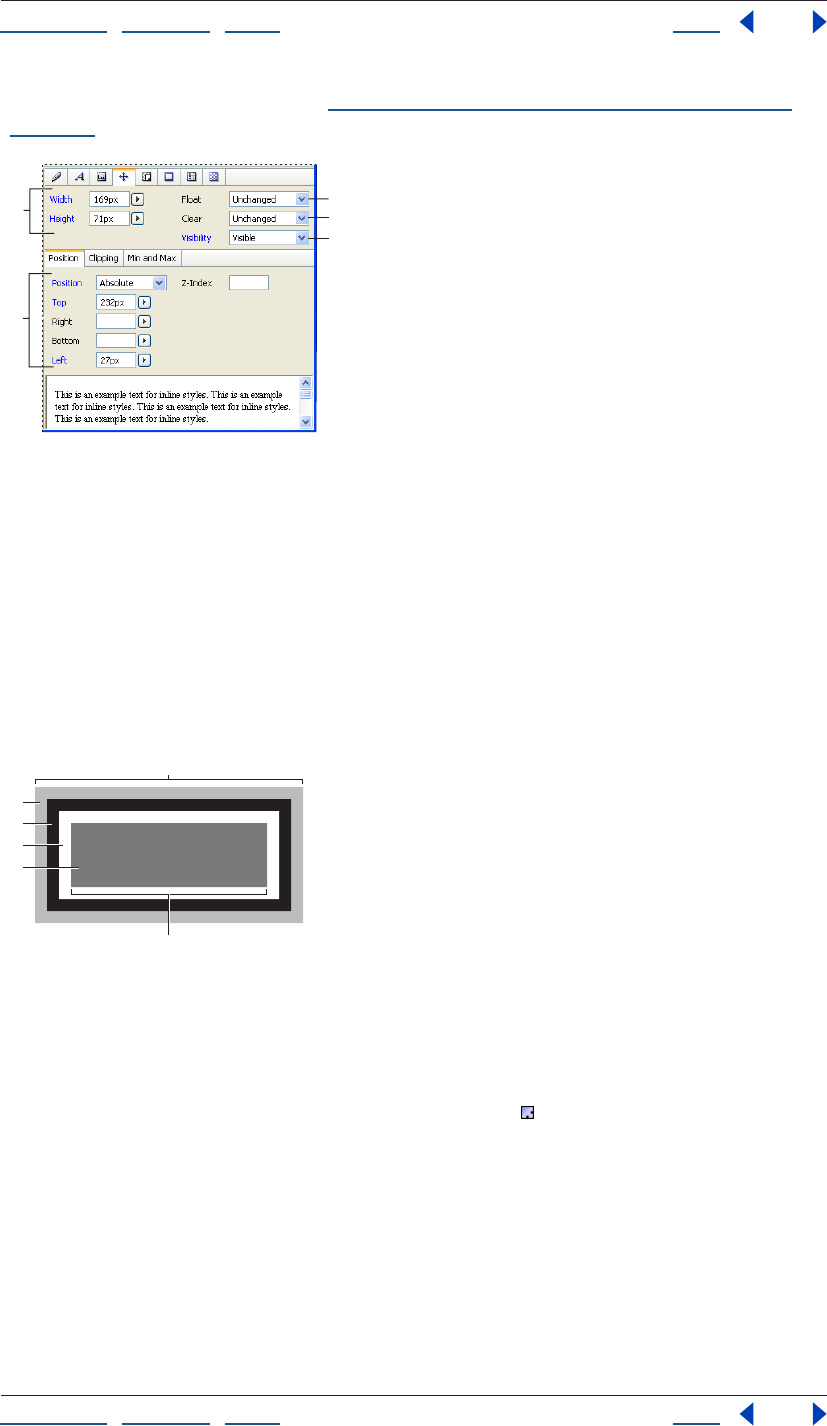
Using Help | Contents | Index Back 229
Adobe GoLive CS Help Using Cascading Style Sheets
Using Help | Contents | Index Back 229
For more information on units, see “About relative, absolute, and percentage units” on
page 226.
Block set of CSS Inspector
A. Sets invisible margins around the style item
B. Sets floating style item position and size
C. Sets distance between border and style item
D. Formats style item as a layer
E. Clears or allows layers on either side of the style item
Cascading style sheets are based on a simple block-oriented formatting model. Each item
that hosts a style consists of one or more rectangular blocks, each of which has a core
content area with optional surrounding padding, border, and margin areas. (Use the
Margin and Padding Properties set to format surrounding areas.) This formatting model
gives you much more flexibility in controlling spacing between objects.
Cascading style sheet block properties
A. Block width B. Margin (transparent) C. Border
D. Padding E. Content F. Element width
To edit the block properties of a style:
1 Select a style in the CSS Editor and click the Block set of the CSS Inspector.
2 Specify the Width and Height properties for any item formatted with the current style
by doing one of the following:
• Choose a unit of measurement from either the Width or Height Units menu, and enter a
value in the text box. Leave one dimension set to Auto to ensure that the item scales
proportionally.
• Leave both Width and Height set to Auto to display the referenced item in its
original size.
Note: Setting Width and Height is most useful with replaced elements, such as images.
C
A
B
D
E
B
E
D
C
F
A
Using Help | Contents | Index Back 230
Adobe GoLive CS Help Using Cascading Style Sheets
Using Help | Contents | Index Back 230
3 In the Float menu, the float property creates a style item that is not part of the normal
flow of text. Choose any of the following options:
• Left moves the style item to the left, so the text wraps on the right side of it.
• Right moves the style item to the right, so the text wraps on the left side of it.
• None causes the style item to appear where it occurs in the text.
4 In the Clear pop-up menu, specify how an element accepts floating elements.
• Left moves the element below any floating element on the left side.
• Right moves the element below any floating element on the right side.
• Both does not allow floating elements on either side.
• None allows floating elements on all sides.
5 In the Visibility menu, specify whether the element should be visible, hidden,
or inherited.
Setting Margin and Padding properties
The Margin and Padding set lets you specify the space around the content area of an
element.
To specify margins and padding:
1 Select a style in the CSS Editor and click the Margin and Padding set.
2 Choose a unit of measurement and enter a numeric value in any of the Top, Right,
Bottom, and Left Margin text boxes, or use the All Margins text box to specify the margin
in all four directions at once.
You can decrease the spacing between surrounding elements by entering negative
values, which causes two elements to overlap.
Using the View palette while in the Layout Editor, select Allow Overlapping
Paragraphs to simulate how items with negative margin values overlap
adjacent items.
3 In the Padding section, set the amount of space between the block border and the
style item.
Choose a unit of measurement (percentage is recommended for better scalability), and
then enter a number in any of the Top, Right, Bottom, and Left Padding text boxes. Or, to
specify the spacing in all four directions at once, use the All Paddings text box.
Setting Border properties
The Border set of the CSS Inspector lets you set the borders of the block generated by a
style, including line width, color, and line style. For information on the CSS block model,
see “Setting Block properties” on page 228. Some of the properties in this set are not
consistently supported across browsers and platforms. Be sure to test your pages on
multiple browsers, browser versions, and platforms.
For information on units, see “About relative, absolute, and percentage units” on page 226.
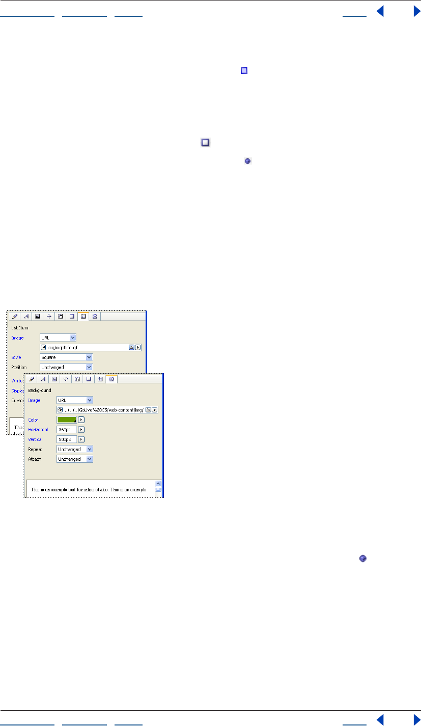
Using Help | Contents | Index Back 231
Adobe GoLive CS Help Using Cascading Style Sheets
Using Help | Contents | Index Back 231
To edit the border properties of a style:
1 Select a style in the CSS Editor. In the Border set of the CSS Inspector, choose a unit
from any of the Units pop-up menus, and enter a number in the adjacent border text
boxes to set the border width for the top, right, bottom, or left borders. Use the All Borders
menu to set all four borders at once.
2 To set the border color, do any of the following:
• Choose a color from a color field menu .
• Choose a color name from a color pop-up menu .
• Click a color field, and then select a color from the Color palette.
3 Choose a line style from the Line Style pop-up menu.
Setting Image and List properties
The List Item and Other Properties set lets you set the appearance of list item markers—
for example, the appearance of a bullet in a bulleted list. You can set list item marker
shapes and marker positioning, or specify a custom image to serve as the marker. Some of
the properties in this set are not consistently supported across browsers and platforms.
Note: Be sure to test your pages on multiple browsers, browser versions, and platforms.
Background Image and List Properties set of CSS Editor
To edit the list item marker properties:
1 Select a style in the CSS Editor and click the Image and List Properties set .
2 Select the Image option, and then reference the image file to use a custom image as a
list item marker.
3 To set the type of the list item marker, choose from the following properties in the Style
pop-up menu:
• To create bulleted lists, choose Disc, Circle, or Square.
• To create numbered lists, choose Decimal, Lower Roman, or Upper Roman.
• To create an alphabetical list, choose Lower Alpha or Upper Alpha.
Using Help | Contents | Index Back 232
Adobe GoLive CS Help Using Cascading Style Sheets
Using Help | Contents | Index Back 232
4 To set the position where the list item marker appears, choose one of the following
from the Position pop-up menu:
• Inside sets the list item marker flush with the second, third, and following lines of text.
• Outside adds a first-line indent, letting the list item marker stand out from the rest of
the text (like the bullet at the start of this item).
Setting Background properties
The Background set of the CSS Inspector lets you set a background image in the block
generated by a style. Some of the properties in this set are not consistently supported
across browsers and platforms. For information on the CSS block model, see “Setting Block
properties” on page 228.
To edit the background properties of a style:
1 Select a style in the CSS Editor and click the Background Image and List
Properties set .
2 Select the Image option, and then reference an image file to set a background image.
3 To tile the background image horizontally, vertically, or in both directions, choose an
option from the Repeat pop-up menu.
• Repeat tiles the image both horizontally and vertically.
• Repeat x tiles the image horizontally.
• Repeat y tiles the image vertically.
• Once disables tiling—that is, the image does not repeat.
4 To set a background to scroll or not scroll with other elements on the page, choose an
option from the Attach pop-up menu:
• Scroll makes the image scroll.
• Fixed prevents the image from scrolling.
5 To set the position of the image within the style item block, choose any of the Left,
Center, Right, or Top, Center, Bottom keyword options from the Top and Left Units menu.
Or choose a length unit or a percentage, and enter a number in the Top and Left
text boxes.
Setting unsupported properties
To ensure upward compatibility with future releases of the CSS Specification, GoLive lets
you specify new properties and their values.
To specify a new property for a style:
1 Select a style in the CSS Editor, and do one of the following:
• In the Selector and Properties set of the CSS Inspector, click the New Property
button . Enter the new property name in the first text box, and enter a property value
in the second text box.
• In the Source tab of the CSS Editor, enter the property and value manually within the
braces that appear adjacent to the style name. For more information, see “Removing
styles or external style sheets” on page 224.
Using Help | Contents | Index Back 233
Adobe GoLive CS Help Using Cascading Style Sheets
Using Help | Contents | Index Back 233
Applying styles
After you’ve created your cascading style sheet, added styles to it, and edited the style
properties, you need to apply class and ID styles to text or objects in your pages and
reference external style sheets from your pages. Element styles automatically apply to
tags of the same name. (For more information on style types, see “Creating CSS styles in a
style sheet” on page 219.)
Applying styles
You can apply styles to text and other objects in one of three different ways, depending on
the
style type:
• Element styles apply automatically to the HTML tags that share the element style names.
• Class styles require that you select text or other items in the page and apply the style
with the CSS palette or the inline CSS Style preview. The CSS palette lists all available
class styles defined in a page’s internal or external style sheets. The inline CSS Style
preview displays the Style Apply tab of the CSS palette inline for selected text.
• ID styles require that you apply the style in layout using the Visual Tag Editor or
manually in the page’s Source Code Editor.
To apply a class style:
1 Do one of the following:
• To apply the style to an object on a page, select the object, including text, table, table
cell, image, or markup tree tag.
• To apply a style to the entire body of a page, select the <body> tag in the markup tree
at the bottom of the page, and then use the <body> option (as explained in step 2).
2 Do one of the following:
• In the CSS palette, select a formatting option adjacent to the class style’s name.
• Choose Type > CSS > [format].
• Choose Type > CSS Style, and then select the formatting option in the inline pane that
appears. (You can also preview styles by placing the pointer over a formatting option.)
Note: The options in the CSS palette and the CSS commands in the Type menu vary
depending on the selection in the document window. For example, if text is selected, the
CSS palette displays Inline, Par, and Div options. If a table cell is selected, the palette
displays one option for the <td> tag.
You can choose from the following formatting options:
Inline Style or <span> (CSS palette) Formats an item inline.
Block Style (CSS palette) Creates a division that is disconnected from the normal flow of
HTML.
<p> (CSS palette) Formats an entire paragraph with a style. You don’t need to select the
entire paragraph; either place an insertion point in the paragraph or select a portion of it.
<body> (CSS palette) Applies a style to the entire body of a page. If this option isn’t
listed in the CSS palette, select the <body> tag in the markup tree at the bottom of the
page, or place an insertion point anywhere in the Layout Editor, except inside a table or
layer.
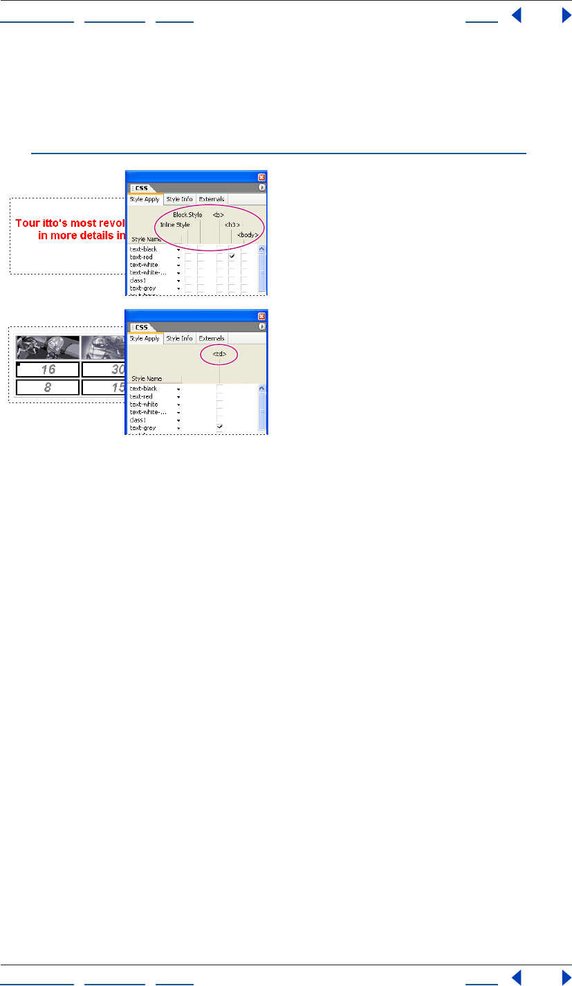
Using Help | Contents | Index Back 234
Adobe GoLive CS Help Using Cascading Style Sheets
Using Help | Contents | Index Back 234
Specific HTML tags (CSS palette) Apply the style to a selected object, such as a table
cell, image, or layer. For example, the <td> tag for a table cell, the <img> tag for an image
object, and the <div> tag for a layer.
For more information on naming HTML element styles to format tables and table content,
see “Formatting tables and table content with cascading style sheets” on page 181.
Applying a style to a paragraph and another style to a selection of table cells
To apply an ID style:
1 In the Layout Editor, select the text, paragraph, or object to which you want to assign
the ID and do one of the following:
• If the text to be reformatted is a portion of the text within a paragraph, Press
Ctrl+Shift+E (Windows) or Command+Shift+E (Mac OS) to open the Visual Tag Editor.
Type SPAN ID=[myID] or DV ID=[ myID] within the brackets.
• Click the Source Editor tab and locate the highlighted source code for the selected item.
Add the ID style name (without the pound (#) symbol) as an attribute to the selected
item’s start tag. For example, if the ID style name is #headerbox, and we want to apply it
to the entire paragraph, we would edit the code as follows:
<P ID="headerbox">Welcome to TravelEZ</P>
2 View the effect in the Layout Preview.

Using Help | Contents | Index Back 235
Adobe GoLive CS Help Adding Images and Multimedia
Using Help | Contents | Index Back 235
Adding Images and Multimedia
About images and multimedia
GoLive offers two primary methods for adding images. You can add pre-optimized images,
which you optimize for the Web in another application. Or, for maximum control and
versatility, you can add Smart Objects, which you optimize in GoLive.
Pre-optimized images and Smart Objects share many features, such as rollovers and image
maps. Smart Objects, however, also provide many additional features. For more infor-
mation about Smart Objects, see “Working with Smart Objects” on page 262.
GoLive also supports a variety of plug-ins that let you incorporate multimedia into a Web
page. With these plug-ins, you can enhance a Web site with video, audio, and animations.
For more information, see “Adding multimedia to a Web page” on page 251.
Adding pre-optimized images
You can add pre-optimized images in the GIF, JPEG, PNG, and WBMP formats. When you
add a pre-optimized image to a page, GoLive references the pathname to the image file.
To ensure that GoLive can properly manage these references and publish image files,
place image files in the site window before adding them to a page. Many Web designers
store all images in an images folder in the site window. That approach lets you manage
numerous image files more easily.
Smart Objects offer more flexibility than pre-optimized images. For example, GoLive
automatically reoptimizes Smart Objects if you resize them in the Layout Editor. For more
information, see “Working with Smart Objects” on page 262.
To insert a pre-optimized image:
1 Do one of the following:
• Drag the image file from the site window into the Layout Editor.
• Drag the Image icon from the Basic set in the Objects palette into the document
window, or double-click the icon in the palette. In the Image Inspector, specify an
image file in the Source text box.
Resizing pre-optimized images
You can resize pre-optimized images to change the design of a page. Before doing so,
however, note the following considerations:
• If you shrink a pre-optimized image, your page still references the unnecessarily large
image file, resulting in inefficient use of bandwidth.
• If you enlarge a pre-optimized image, it will appear pixellated.
Using Help | Contents | Index Back 236
Adobe GoLive CS Help Adding Images and Multimedia
Using Help | Contents | Index Back 236
When you change the size of an image, GoLive displays a resize warning icon on top of
the image to warn you that the image may have an unnecessarily large file size and is not
displayed at its optimum resolution. You can restore the image to its original proportions
by clicking the Set to Original Size button in the Image Inspector.
If you often resize images, use Smart Objects for maximum flexibility. For more infor-
mation, see “Resizing Smart Objects” on page 264.
To resize an image disproportionately:
1 Select the image in the Layout Editor.
2 In the Image Inspector, click the Basic tab.
3 From the Width and Height menus, choose Pixel or Percent, and then enter new values.
To resize an image and constrain proportions:
1 In the Basic tab of the Image Inspector, choose Image from either the Width menu or
the Height menu.
2 Choose Pixel from the pop-up menu for the remaining size attribute (Width or Height).
3 Type a value in the Width or Height text box, and press Enter (Windows) or
Return (Mac OS).
Setting basic image options
After you add an image to a page, you can set basic image options for borders and alter-
native text.
You can also add links to images. For more information, see “Creating resource and
navigational links” on page 61.
Adding alternative text
Alternative text replaces images in browsers that are configured to omit images; it is also
read aloud by software for the visually impaired. Even in browsers that display images,
however, alternative text can be useful. For example, in an image-based menu, alternative
text appears while the images download.
To enter alternative text for images:
1 Select the image or Smart Object on your Web page.
2 In the Basic tab of the Image Inspector, type text in the Alt Text text box.
Creating image borders
You can create image borders to highlight images on a page. Borders around linked and
non-linked images appear in the default colors for links and text, respectively. (For more
information about default text and link colors, see “Setting the default color for text or
links in a page” on page 70.)
To create an image border and adjust its width:
1 Select the image, and then select Border in the More tab of the Image Inspector.
2 Type in the desired border width in pixels, and press Enter (Windows) or
Return (Mac OS).
Using Help | Contents | Index Back 237
Adobe GoLive CS Help Adding Images and Multimedia
Using Help | Contents | Index Back 237
Choosing a format for optimized images
Web-optimized images must be saved in a format recognized by Web browsers and have a
file size small enough to accommodate the bandwidth available to most Web users.
Optimized images strike a balance between image quality and small file size.
The file format you choose for an optimized image is determined by the color, tonal, and
graphic characteristics of the original image. In general, continuous-tone images such as
photographs should be compressed as JPEG or PNG-24 files. Illustrations with flat color or
sharp edges and crisp detail, such as type, should be compressed as GIF or PNG-8 files.
Vector graphics that are scalable or linked to scripts and variables should be optimized in
SVG or SWF format. And if you’re preparing an image for display on a wireless device,
choose GIF or WBMP.
Caution: Some browser versions do not display PNG format correctly.
Depending on the format, you can specify image quality, background transparency or
matting, color display, and downloading method.
About JPEG format
The JPEG format supports 24-bit color and preserves the broad range and subtle varia-
tions in brightness and hue found in photographs and other continuous-tone images.
JPEG is supported by most browsers.
JPEG compresses file size by selectively discarding data. Because it discards data, JPEG
compression is referred to as lossy. A higher quality setting results in less data being
discarded, but the JPEG compression method can degrade sharp detail in an image,
particularly in images containing type or vector art.
Note: You should always save JPEG files from the original image, not from a previously
saved JPEG. Artifacts, such as wave-like patterns or blocky areas of banding, are added to
a file each time you save in JPEG format.
You can create a progressive JPEG file. A browser immediately starts rendering a
progressive JPEG when it receives the first data representing the image. As the remainder
of the progressive JPEG file is received, the image increases in resolution.
The JPEG format does not support transparency, but you can simulate the effect of
background transparency by specifying a Matte color that matches the Web page
background color.
About JPEG2000 format
The JPEG2000 format builds on the JPEG standard with improved compression schemes
and performance.
GoLive can import JPEG2000 files, but not create them. Though you use the Image object
to import standard JPEG files, JPEG 2000 files require the generic Plug-in object. (See
“Adding multimedia files” on page 251.)
Note: To display JPEG2000 files, most browsers require an additional plug-in.
About GIF format
The GIF format uses 8-bit color and efficiently compresses solid areas of color while
preserving sharp detail, such as the detail in line art, logos, or illustrations with type. You
also use the GIF format to create animated images. GIF is supported by most browsers.

Using Help | Contents | Index Back 238
Adobe GoLive CS Help Adding Images and Multimedia
Using Help | Contents | Index Back 238
The GIF format traditionally uses a lossless compression method, in which no data is
discarded during compression. You can save a GIF file multiple times without discarding
data. However, because GIF files are 8-bit color, optimizing an original 24-bit image as an
8-bit GIF will generally degrade image quality.
In addition, GoLive lets you create a lossy version of a GIF file. The lossy GIF format includes
small compression artifacts (similar to those in JPEG files) but yields significantly smaller
files.
GIF supports background transparency and background matting, in which you blend the
edges of the image with a Web page background color.

Using Help | Contents | Index Back 239
Adobe GoLive CS Help Adding Images and Multimedia
Using Help | Contents | Index Back 239
About PNG-8 format
The PNG-8 format uses 8-bit color. Like the GIF format, PNG-8 efficiently compresses solid
areas of color while preserving sharp detail, such as the detail in line art, logos, or illustra-
tions with type.
Because PNG-8 is not supported by all browsers, it may be advisable to avoid this format
when your image must be accessible to the widest possible Web viewing audience. For
more information about browser support for PNG, see your browser’s documentation.
The PNG-8 format uses a lossless compression method, in which no data is discarded
during compression. However, because PNG-8 files are 8-bit color, optimizing an original
24-bit image as a PNG-8 can degrade image quality. PNG-8 files use more advanced
compression schemes than GIF, and can be 10%–30% smaller than GIF files of the same
image, depending on the image’s color patterns.
Note: With certain images, especially those with very few colors and very simple patterns,
GIF compression may create a smaller file than PNG-8 compression. View optimized
images in GIF and PNG-8 formats to compare file size.
As with the GIF format, you can reduce the number of colors in the image and choose
options to control the way colors dither in the application or in the browser. The PNG-8
format supports background transparency and background matting, in which you blend
the edges of the image with a Web page background color.
About PNG-24 format
The PNG-24 format supports 24-bit color. Like the JPEG format, PNG-24 preserves the
broad range and subtle variations in brightness and hue found in photographs. Like the
GIF and PNG-8 formats, PNG-24 preserves sharp detail, such as the detail in line art, logos,
or illustrations with type.
Because PNG-24 is not supported by all browsers, it may be best to avoid this format when
your image must be accessible to the widest possible Web viewing audience. For more
information about browser support for PNG, see your browser’s documentation.
The PNG-24 format uses the same lossless compression method as the PNG-8 format, in
which no data is discarded. For that reason, PNG-24 files are usually larger than JPEG files
of the same image. PNG-24 browser support is similar to that for PNG-8.
Like the PNG-8 format, the PNG-24 format supports background transparency and
background matting, in which you blend the edges of the image with a Web page
background color. In addition, the PNG-24 format supports multilevel transparency, in
which you can preserve up to 256 levels of transparency to blend the edges of an image
smoothly with any background color. However, multilevel transparency is not supported
by all browsers.
About SVG format
SVG, which stands for Scalable Vector Graphics, revolutionizes the way graphics look and
function on the Web. SVG is a vector format, as opposed to GIF, JPEG, and PNG, which are
bitmap formats. Because bitmap files have to include every pixel needed to display an
image, they tend to be bulky, be limited to a single (often low) resolution, and consume
large amounts of bandwidth on the Web.
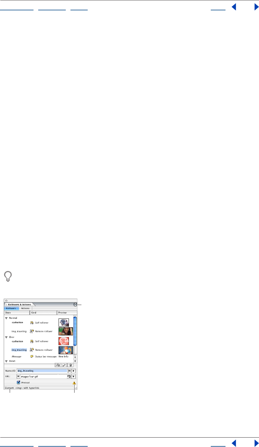
Using Help | Contents | Index Back 240
Adobe GoLive CS Help Adding Images and Multimedia
Using Help | Contents | Index Back 240
SVG provides a more efficient approach to Web graphics. Because SVG files describe
images as shapes, paths, text, and filter effects, the files are compact and provide high-
quality graphics on the Web, in print, and even on resource-constrained, handheld
devices. Users can magnify their view of an SVG image on-screen without sacrificing
sharpness, detail, or clarity. In addition, SVG provides superior support for text and colors.
The SVG format is entirely XML-based, a fact that offers many advantages to developers
and users alike. With SVG, you can use XML and JavaScript to create Web graphics that
respond to user actions with sophisticated effects, such as highlighting, tool tips, audio,
and animation.
Note: Users must have the SVG viewer installed to view SVG files.
About SWF format
The Macromedia® Flash™ (SWF) file format is a vector-based graphics file format for the
creation of scalable, compact graphics for the Web. Since the file format is vector-based,
the artwork maintains its image quality at different resolutions and is ideal for the creation
of animation frames. Although the SWF format saves graphics using vector data, it also
uses bitmap data when appropriate.
Note: Users must have the SWF browser plug-in installed to view SWF files.
Creating rollovers
Rollovers respond to a viewer’s mouse movements and clicks, providing interactivity on a
Web page. To aid navigation, you can use rollovers to highlight hyperlinked images. To
further enhance interactivity, you can combine rollovers with actions.
Rollovers require separate images for each rollover state: Normal, Over, Down, Click, Up,
and Out. The Normal state appears when the mouse is over another part of the page. The
remaining states appear when the viewer moves or clicks the mouse over a rollover
object.
Normally, images for all states of a rollover have identical dimensions. If a rollover has
an image with different dimensions, you can either resize it in a graphic editor, or
choose Image from the Width or Height menu in the Image Inspector.
Rollovers tab of Rollovers & Actions palette:
A. HTML element of trigger object
B. Expert Mode warning icon C. Palette menu button
BA
C
Using Help | Contents | Index Back 241
Adobe GoLive CS Help Adding Images and Multimedia
Using Help | Contents | Index Back 241
Creating self rollovers
With self rollovers, the most common rollover type, mouse actions over an image cause
changes in that image alone.
To create a self rollover:
1 In the Layout Editor, select the desired image.
2 In the Rollovers & Actions palette, click the Rollovers tab.
3 Select the desired rollover state, and then click the New Rollover Image button .
4 In the URL text box, specify an image for the state.
5 To force browsers to fully download the image before enabling the rollover, click
Preload.
Note: Don’t select Preload for a state that contains an animated GIF file. Some browsers
will immediately play the animation after preloading the file.
Creating remote rollovers
While self rollovers change trigger images, remote rollovers change images located
elsewhere on the page. Because these changes occur elsewhere, trigger objects for
remote rollovers can include paragraphs, table cells, or any other HTML element. Only
trigger images, however, can combine remote rollovers with self rollovers.
To create a remote rollover:
1 In the Layout Editor, select the trigger object.
2 In the Rollovers & Actions palette, click the Rollovers tab.
3 Select the state that will trigger the rollover, and then click the New Rollover Image
button .
4 In the Name/ID text box, specify the remote image object.
Note: Use the pick whip to specify an object that lacks a name or ID. If you type a name
or ID that doesn’t exist, GoLive displays a bug in the Kind column of the Rollovers & Actions
palette.
5 In the URL text box, specify the image file for the remote image object.
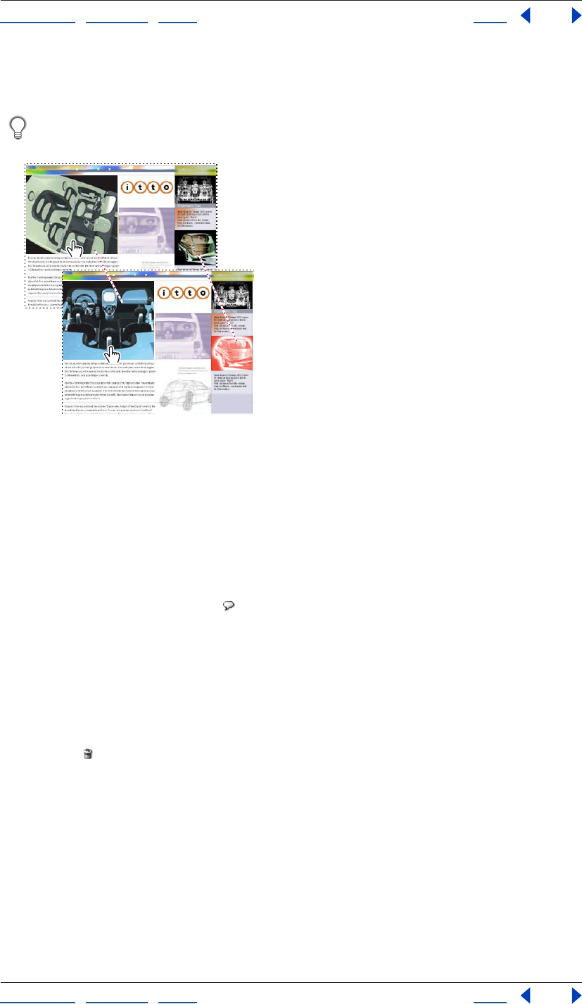
Using Help | Contents | Index Back 242
Adobe GoLive CS Help Adding Images and Multimedia
Using Help | Contents | Index Back 242
6 To force browsers to fully download the image before enabling the rollover, click
Preload.
To trigger multiple remote rollovers from an object, add more than one rollover image
to a state.
Combining self and remote rollovers:
A. Normal state. B. Down state
Adding status bar messages to rollover states
For any rollover state, you can add a message that appears in the status bar of the browser.
Such messages can provide helpful additional information for the viewer.
To add a message to a rollover state:
1 In the Rollovers tab of the Rollovers & Actions palette, select the state.
2 Click the New Message button , and then type in the Message text box.
Removing rollover states
You can remove individual rollover images, entire rollover states, or all states for an object.
To remove a rollover image or state:
1 In the document window, select the object that contains the image or state.
2 In the Rollovers tab of the Rollovers & Actions palette, drag the image or state to the
Delete icon .
To remove all states for an object:
1 In the document window, select the object.
2 In the Rollovers & Actions palette, click the Rollovers tab, and then choose Remove All
Rollover States from the palette menu.
Changing the size of rollover thumbnails
You can change the size of rollover thumbnail images in the Rollover & Actions palette.
A
B
Using Help | Contents | Index Back 243
Adobe GoLive CS Help Adding Images and Multimedia
Using Help | Contents | Index Back 243
To change the size of rollover thumbnails:
1 In the Rollovers & Actions palette, click the Rollovers tab.
2 From the palette menu, choose View, and then choose No Thumbnails, Small Thumb-
nails, Medium Thumbnails, or Large Thumbnails.
Assigning rollover images automatically
The Detect Rollover Images feature automatically assigns images to rollover states. After
you specify the filename of the Normal image, GoLive automatically searches for Over,
Down, Click, Up, and Out files that use a similar naming convention. For example, if you
specify a Normal image named myimage_Base.gif, GoLive looks for myimage_Over.gif.
You can edit the rollover naming conventions that GoLive uses. (See “Viewing and editing
rollover naming conventions” on page 243.)
To use the Detect Rollover Images feature, you must place images for all rollover states
(Normal, Over, Down, etc.) in the same folder. If images for some states are not yet
complete, you can manually start the rollover detection process after adding the needed
images to the folder.
The Detect Rollover Images feature is on by default, but you can turn it off if you prefer to
assign rollover images manually.
To automatically display the Rollovers & Actions palette when GoLive detects
rollovers:
1 In the Rollovers & Actions palette, click the Rollovers tab, and then choose Rollover
Detection Settings from the palette menu.
2 Select Automatically Open Rollover Palette.
To turn off the Detect Rollover Images feature:
1 In the Rollovers & Actions palette, click the Rollovers tab, and then choose Rollover
Detection Settings from the palette menu.
2 Deselect Automatically Detect Rollover Images.
To manually start the Detect Rollover Images feature:
1 Select a rollover object in the Layout Editor.
2 In the Rollovers & Actions palette, click the Rollovers tab, and then select Detect
Rollover Images from the palette menu.
Viewing and editing rollover naming conventions
You can view the sets of naming conventions used by the Detect Rollover Image feature.
GoLive also lets you edit the settings if you have your own naming convention for rollover
images.
To view or edit the default naming conventions:
1 In the Rollovers & Actions palette, click the Rollovers tab, and then choose Rollover
Detection Settings from the palette menu.
Using Help | Contents | Index Back 244
Adobe GoLive CS Help Adding Images and Multimedia
Using Help | Contents | Index Back 244
2 To overwrite a naming convention set, select it, and type new suffixes in the text boxes
for each rollover state.
If you work with ImageReady, do not overwrite the third default set, which conforms
to ImageReady’s rollover naming conventions.
Using Expert Mode for rollovers
To ensure that rollovers behave as most viewers expect, GoLive creates additional rollover
states that it doesn’t display in the Rollovers & Actions palette. For example, when you add
an Over state, GoLive creates an Out state that uses the Normal image. Without this extra
state, the Over image would remain when the mouse left the trigger area.
To prevent GoLive from creating these extra states, or to delete them from existing
rollovers, use the Expert Mode for rollovers. In Expert Mode, only states displayed in the
Rollovers & Actions palette are added to the JavaScript code.
When Expert Mode is enabled, GoLive displays a warning icon in the Rollovers &
Actions palette.
To use the Expert Mode for rollovers:
1 In the Rollovers & Actions palette, click the Rollovers tab.
2 From the palette menu, select Expert Mode.
Importing rollovers from ImageReady
To import ImageReady rollovers, use Smart Photoshop objects. If you change the original
ImageReady PSD file, GoLive can automatically update the Smart Photoshop object. (See
“Working with Smart Objects” on page 262.)
In GoLive, you can view all states in ImageReady rollovers, but you can edit only remote
rollover states; self rollover states must be edited in ImageReady. You can use GoLive,
however, to create additional self or remote rollover states.
Attaching actions to a rollover
The Action tab of the Rollover & Actions palette lets you attach scripted actions to a
rollover—for example, an action that changes the background color of the page. For more
information, see “Setting up actions” on page 414.
To ensure that scripted actions work with rollovers, follow these guidelines: Make sure that
all images on a page have a unique name (button1, button2, and so on). Avoid names that
contain only numbers (1, 2, 3, and so on) or that start with a number; the names won’t
work in all browsers. Finally, do not include spaces or special characters.
Adding rollover and action code for images
By default, GoLive adds rollover and action code for images to a hyperlink surrounding the
image element. This default behavior ensures compatibility with the largest number of
browsers. To create smaller code, however, you can instead configure GoLive to apply
rollover and action code directly to the image element.
To specify how GoLive adds rollover and action code for images:
1 Choose Edit > Preferences (Windows) or GoLive > Preferences (Mac OS).
2 In the list on the left, expand General, and then select Images.
Using Help | Contents | Index Back 245
Adobe GoLive CS Help Adding Images and Multimedia
Using Help | Contents | Index Back 245
3 Select one of the following:
• Apply to Hyperlink around <img> Element.
• Apply to <img> Element.
Creating image maps
Image maps consist of clickable hotspots in an image. Image maps are helpful naviga-
tional tools, because each hotspot can link to a different destination and have a unique
size and shape. GoLive lets you create and edit image maps, and associate them with
actions and rollovers.
To create a clickable image map:
1 Select an image on your Web page.
2 In the Smart Image or Image Inspector, click the More tab and select the Use Map
option.
Note: By default, GoLive assigns a unique ID to the image map and enters the ID in the
Name text box. You can replace this ID by typing a name for the image map in the Name
text box on the More tab.
3 In the toolbar, select the Rectangular tool , the Circular tool , or the Polygonal
tool .
4 Drag in the image to define the hotspot. (If you are using the Polygonal tool, click to
define each point of the polygon.)
5 In the Map Area Inspector, specify a file for the link destination of the selected hotspot.
6 Use the Target text box to specify the target frame in the destination frame set (if any).
7 Type additional information in the Title text box. Some browsers use this information to
display tool tips or voice annotations.
You can also click an image and use the context menu to create a clickable image
map.
To customize the appearance of a hotspot:
1 Select the hotspot in the image.
2 Use the following tools available in the toolbar:
• Use the Select Map Area tool to move or resize the hotspot by dragging.
• Click the URL button to display the destination URL in the hotspot. The URL appears in
the GoLive Layout Editor for your convenience; it does not appear on the Web page.
• Click the Frame or Color buttons to edit or turn border and color display on and off,
respectively, while editing.
• Click the Color button to change the color used for highlighting.
• If you are working with multiple overlapping hotspots, use the Bring Region to Front
button and the Send Region to Back button in the toolbar to change the stacking
order.
Note: The Bring to Front and Send to Back buttons are also available in the
Transform palette.
Using Help | Contents | Index Back 246
Adobe GoLive CS Help Adding Images and Multimedia
Using Help | Contents | Index Back 246
To add actions to image maps:
1 Select a hotspot in an image map.
2 In the Actions tab of the Rollovers & Actions palette, choose a mouse or key event, and
click the New button .
3 Choose the desired action from the Action menu.
For more information about actions, see “Setting up actions” on page 414.
To associate a rollover with an image map:
1 Select a hotspot in the image map.
2 In the Rollovers tab of the Rollovers & Actions palette, create and edit rollover states.
For more information about rollovers, see “Creating rollovers” on page 240.
Building a Web page using tracing images
You can design Web pages by using tracing images as visual guides. As a design develops,
you can cut out parts of a tracing image and convert them into Smart Objects on the final
Web page. (See “Working with Smart Objects” on page 262.)
You can import the following formats as tracing images: Illustrator AI, Photoshop PSD, JPG,
JP2, GIF, PNG, BMP, TARGA, EPS, PCX, PDF, PICT, PIXAR, SVG, TIFF, and Amiga IFF.
To add a tracing image to your Web page:
1 Select Window > Tracing Image.
2 In the Tracing Image palette, select Source and specify a file for the tracing image.
3 If the source is a PDF file, rotate the document if desired, and then select a page.
4 Set the opacity of the tracing image in the Tracing Image palette.
5 Do one of the following to position the image in the Layout Editor:
• Type pixel values in the Position text boxes.
• Click the Move Image tool in the Tracing Image palette, and drag the image in the
Layout Editor. When you’re done, click the Move Image tool again to disable the tool.
Note: You can quickly resize the window to fit the tracing image by selecting Tracing
Image from the Change Window Size pop-up menu in the bottom right corner of the
document window.
To align a tracing image with an object in the document window:
1 Select the object.
2 From the Tracing palette menu, choose Align with Selection.
You can align tracing images with objects such as table cells and GoLive layers.
To return a tracing image to the default position:
From the Tracing palette menu, choose Reset Position. The image returns to the upper left
corner of the page.
To remove a tracing image:
Deselect the Source check box in the Tracing Image palette.
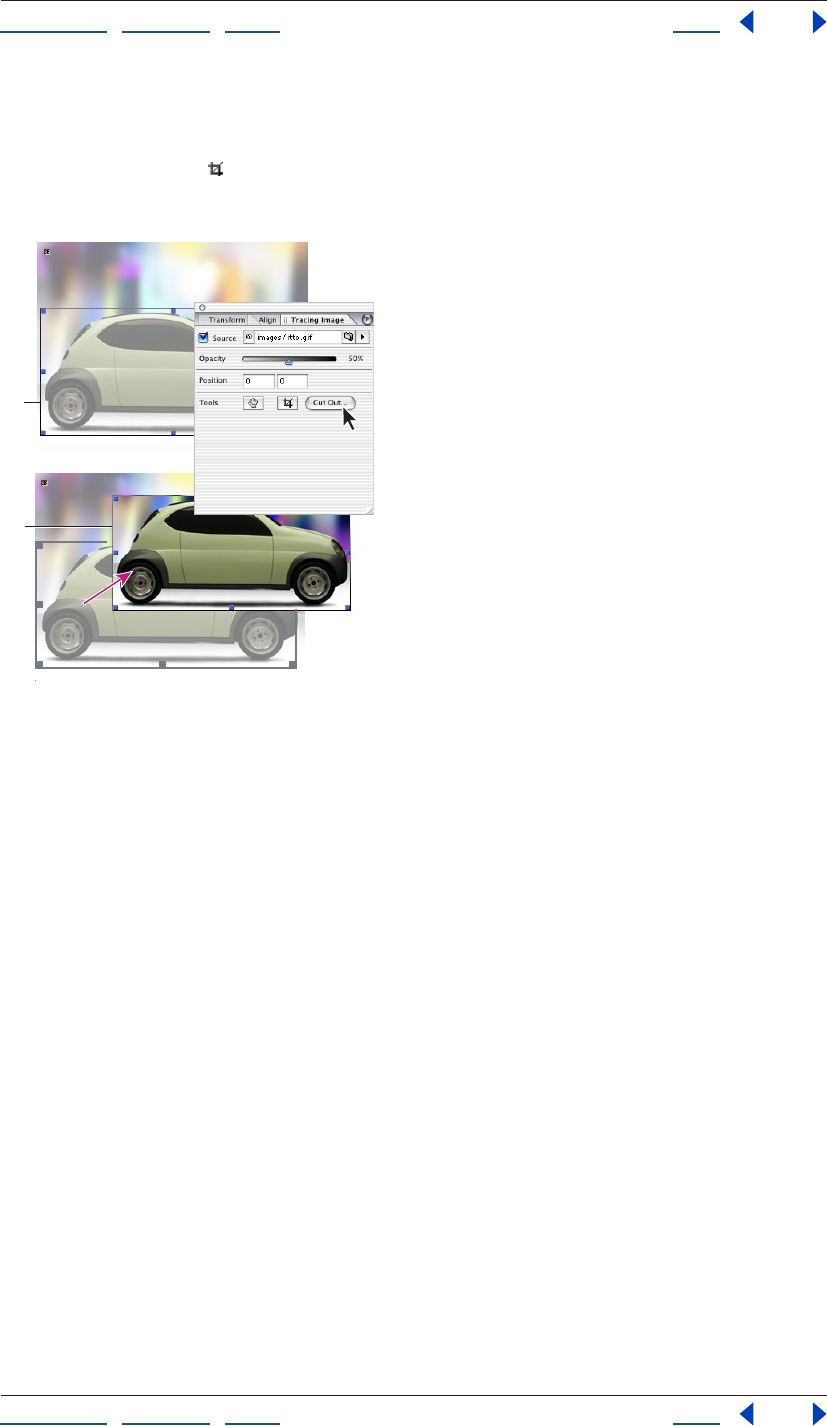
Using Help | Contents | Index Back 247
Adobe GoLive CS Help Adding Images and Multimedia
Using Help | Contents | Index Back 247
To cut out a portion of a tracing image:
1 Select the tracing image.
2 Click the Crop tool and select a rectangular portion of the tracing image.
Note: You can cancel the cut out process by clicking the Cut Out tool again.
Cutting out a portion of a tracing image
A. The Cut Out tool selects a portion of the tracing image.
B. Save For Web generates a target file from the cut out portion.
3 Double-click the selection in the Layout Editor, or click Cut Out in the Tracing
Image palette.
4 In the Save For Web dialog box, make your desired optimization settings, and click Save.
5 Specify a destination for the file and click Save. The cutout becomes a Smart Object in
the document window.
Generating low source images
A low source image is a low-resolution version of an image that displays until the full-
resolution image downloads. Low source images are particularly useful for Web audiences
with low bandwidth and images with very large file sizes.
You can either specify an existing low source image or have GoLive generate one for you.
To specify or generate a low source image:
1 In the Image Inspector, click the More tab.
2 Select Low, and then do one of the following:
• Specify an existing low source image in the text box.
• Click Generate to create a low source image. To regenerate the low source image if the
original image changes, also select Auto-update.
A
B

Using Help | Contents | Index Back 248
Adobe GoLive CS Help Adding Images and Multimedia
Using Help | Contents | Index Back 248
To change default settings for low source images:
1 Choose Edit > Preferences (Windows) or GoLive > Preferences (Mac OS).
2 In the list on the left, expand General, and select Images.
3 Select a default color mode: Color or Black and White.
4 Do one of the following:
• Select Place in Same Folder as Source to store low-resolution images generated by
GoLive in the same folder as the high-resolution source images.
• Select Place in Import Folder to store low-resolution images temporarily before you
move them to the site folder.
5 Select the Auto-Generate by Default option to instruct GoLive to automatically create a
low-resolution copy of each image you import and add it to the page.
Managing color in images
GoLive provides many of the same color management features found in other Adobe
applications, such as Adobe Photoshop and Adobe Illustrator. With these features, you can
use ICC profiles to ensure that images have consistent color when displayed on different
monitors or printed on different printers.
Most current browsers do not fully support color management, but you can color-manage
files for use in both GoLive’s PDF Preview and future browsers.
Setting up color management
GoLive simplifies the task of setting up a color-managed workflow by gathering most
color management controls in a single Color Settings dialog box. You can select from a list
of predefined color management settings, or you can adjust the controls manually to
create your own custom settings. You can even save customized settings to share them
with other users and other Adobe applications that use the Color Settings dialog box.
GoLive also uses color management policies, which determine how to handle color data
that does not immediately match your current color management workflow. Policies
provide guidelines on what to do when you open a document or import color data into an
active document.
Using Help | Contents | Index Back 249
Adobe GoLive CS Help Adding Images and Multimedia
Using Help | Contents | Index Back 249
To specify color management settings:
1 Choose Edit > Color Settings (Windows) or GoLive > Color Settings (Mac OS).
2 Do one of the following:
• To set up a predefined color management workflow, see “Using predefined color
management settings” on page 249.
• To customize your own color management settings, see “Customizing color
management settings” on page 250.
Using predefined color management settings
GoLive offers a collection of predefined color management settings designed to produce
consistent color for a common publishing workflow, such as preparation for the Web or
offset press output. In most cases, the predefined settings provide sufficient color
management for your needs. These settings can also serve as starting points for custom-
izing your own workflow-specific settings.
To choose a predefined color management setting:
Choose one of the following options from the Settings menu in the Color Settings
dialog box:
Color Management Off Uses passive color management techniques to emulate the
behavior of applications that do not support color management. Although working space
profiles are considered when converting colors between color spaces, Color Management
Off does not tag documents with profiles.
ColorSync Workflow (Mac OS only) Manages color using the ColorSync CMS with the
profiles chosen in the ColorSync control panel. Use this option if you want to use color
management with a mix of Adobe and non-Adobe applications. This color management
configuration is not recognized by Windows systems, or by versions of ColorSync earlier
than 3.0.
Emulate Acrobat 4 Emulates the color workflow used by Adobe Acrobat 4.0.
Emulate Photoshop 4 Emulates the color workflow used by the Mac OS version of
Adobe Photoshop 4.0 and earlier.
Europe Prepress Defaults Manages color for content that will be output under common
press conditions in Europe.
Japan Prepress Defaults Manages color for content that will be output under common
press conditions in Japan.
Photoshop 5 Default Spaces Prepares content using the default working spaces from
Photoshop 5.
U.S. Prepress Defaults Manages color for content that will be output under common
press conditions in the U.S.
Web Graphics Defaults Manages color for content that will be published on the World
Wide Web.
When you choose a predefined configuration, the Color Settings dialog box updates to
display the specific color management settings associated with the configuration.
Using Help | Contents | Index Back 250
Adobe GoLive CS Help Adding Images and Multimedia
Using Help | Contents | Index Back 250
Customizing color management settings
Although the predefined settings should provide sufficient color management for many
publishing workflows, you may sometimes want to customize individual options in a
configuration. For example, you might want to change the CMYK working space to a
profile that matches the proofing system used by your printer or your service bureau.
Note: For Web publishing, the recommended RGB working space is sRGB, which reflects
common Windows monitors used by most of the Web audience.
To customize color management settings:
1 Choose Edit > Color Settings (Windows) or GoLive > Color Settings (Mac OS).
2 To use a preset color management configuration as the starting point for your custom
settings, choose that configuration from the Settings menu.
3 Specify the desired color settings (working spaces and policies). As you make adjust-
ments, the Settings menu option changes to Custom by default.
4 To enable color management for pages, select Use Color Management When
Displaying Images on Web Pages. (Because most browsers don’t support color
management, this option is deselected by default to optimize the performance of GoLive.)
For detailed information about working spaces, color management policies, and
conversion options, see Adobe Photoshop, Adobe Illustrator, or Adobe InDesign Help.
Associating profiles with pages and images
GoLive lets you associate ICC profiles with entire pages or individual images. You can
associate all pages and images with separate, external profiles, but only JPEG images
support embedded profiles. Include external profiles in the site window so GoLive can
properly manage and publish them.
To change a page profile:
1 In the upper right corner of the document window, click the Page icon .
2 In the Page Inspector, click the Color Profile tab.
3 Select one of the following:
• Default to use the system profile.
• Profile to specify a desired profile.
• None to specify no profile.
To change an image profile:
1 Select the image in the document window.
2 In the Image Inspector, click the Color Profile tab.
3 Select one of the following:
• Default to use the embedded profile listed in the Embedded text box, the page profile if
an embedded profile doesn’t exist, or the system profile if a page profile doesn’t exist.
• Profile to specify a desired profile. If an embedded profile exists, this option overrides it.
• None to specify no profile.
Using Help | Contents | Index Back 251
Adobe GoLive CS Help Adding Images and Multimedia
Using Help | Contents | Index Back 251
Adding multimedia to a Web page
GoLive supports a variety of plug-ins that let browsers play back multimedia over the Web,
allowing you to place video and audio clips on your page. You can preview supported
media clips from within GoLive.
GoLive offers a generic Plug-in object that you configure, as well as predefined SWF ,
QuickTime , RealOne , SVG , and Windows Media plug-in objects. You can also
associate other file types with plug-ins. (See “Setting plug-in preferences” on page 258.)
Important: Before uploading QuickTime movies, you must make them self-contained—
that is, convert them to a “Web-compatible” sequential format. For information on
creating QuickTime movies, see the GoLive CS Multimedia Authoring Guide, available on
the Adobe Web site.
Adding multimedia files
To add multimedia files to Web pages, use plug-in objects.
To add a multimedia file:
1 From the Basic set of the Object palette, drag the desired plug-in object to the
document window.
2 In the Basic tab of the Plug-in Inspector, specify a file for your plug-in.
Setting basic plug-in options
To set basic plug-in options, use the Basic tab of the Plug-in Inspector. For the SWF,
QuickTime, RealOne, SVG, and Windows Media plug-in objects, most basic options are
predefined. For the generic Plug-in object, however, you must manually specify the
MIME type.
To set basic plug-in options:
1 In the Layout Editor, select a plug-in object.
2 In the Plug-in Inspector, click the Basic tab.
3 If you are setting up a generic Plug-in object , select Mime, and choose the MIME type
from the pop-up menu.
4 Enter a value in the Width text box for the width of the media clip in pixels or as a
percentage.
5 Enter a value in the Height text box for the height of the media clip in pixels or as a
percentage.
6 Choose an alignment option from the Alignment pop-up menu:
• Default to position the icon according to the browser’s preferences. If the browser does
not specify any alignment preferences, the clip will be left-aligned. (Most browsers do
not specify alignment preferences.)
• Left to position the icon in the upper left corner.
• Middle to position the icon in the upper middle.
• Right to position the icon in the upper right corner.
Using Help | Contents | Index Back 252
Adobe GoLive CS Help Adding Images and Multimedia
Using Help | Contents | Index Back 252
7 From the HTML menu, choose the tags that browsers will use to detect the
required plug-in.
Note: If you choose the <object> or <object> <embed> tags for a generic Plug-in object,
you must also specify a plug-in class in the Class text box.
Setting additional plug-in options
In the More tab of the Plug-in inspector, you can set additional plug-in options.
To set additional plug-in options:
1 Click the More tab in the Inspector.
2 Type a unique name for the multimedia element in the Name text box.
3 Select Page, and specify a file for the link destination for the Plug-in installation instruc-
tions. For a SWF or QuickTime plug-in, a destination link appears by default.
4 Select Code for RealOne and SVG plug-ins, and specify a file for the link destination for
the code base. The Macromedia® Flash™ code base, for example, specifies the location of
the Macromedia® Flash™ player ActiveX control that the browser can download if the
control is not installed. The code base is provided by default when you use the predefined
SWF or QuickTime plug-in.
5 From the Palette pop-up menu, select an option to determine whether the plug-in
appears in the Foreground or Background palette. Select Default to place the palette in
the background.
6 Enter a value in the HSpace text box to set the horizontal space between the multi-
media element and the surrounding text (the padding to the left and right).
7 Enter a value in the VSpace text box to set the vertical space between the multimedia
element and the surrounding text (padding above and below).
8 Select Is Hidden to hide the plug-in on the page. You might want to hide the plug-in if
you want to play an audio clip as soon as the page is loaded (without any controls being
displayed on the page).
Setting plug-in attributes
The Attribs tab of the Plug-in Inspector lets you add, edit, and delete plug-in attributes
manually. You can use this tab with the generic Plug-in object to edit the attributes of
multimedia files that GoLive does not support directly.
To set plug-in attributes:
1 In the Attribs tab of the Plug-in Inspector, click New to add a new attribute. In the left
text box below the list box, type an attribute name. The attribute name appears in the
Attribute column of the list box.
2 In the right text box, enter an attribute value. The attribute value appears in the Value
column of the list box.
3 To delete an attribute, select the desired entry from the list box, and click Delete .
SWF plug-in options
When you select an SWF object, the SWF tab of the Plug-in Inspector offers the following
options:
Autoplay Plays the SWF movie as soon as the page is loaded.

Using Help | Contents | Index Back 253
Adobe GoLive CS Help Adding Images and Multimedia
Using Help | Contents | Index Back 253
Loop Plays the movie in an endless loop.
Quality Balances visual appearance versus playback speed. From the pop-up menu,
choose one of the following:
• Default to use the player settings.
• High to give priority to appearance over playback speed.
• Autohigh to emphasize appearance but to improve speed when the frame rate drops
below the specified frame rate.
• Autolow to emphasize speed but to improve appearance when the Macromedia®
Flash™ player determines that the processor can handle it.
• Low to give priority to playback speed over appearance.
Scale Specifies how the movie is placed within the browser window if the Width and
Height settings specified in the Basic tab are different from those of the movie clip. From
the pop-up menu, choose one of the following:
• Default to make the entire movie visible in the specified area while maintaining the
original aspect ratio of the movie. No distortion occurs. Transparent or matte-colored
borders may appear on two sides of the movie.
• No Border to scale the movie to fill the specified area while maintaining the original
aspect ratio of the movie. Portions of the movie may be cropped. No distortion occurs.
• Exact Fit to make the entire movie visible in the specified area. No attempt is made to
preserve the original aspect ratio. Distortion may occur.
Using Help | Contents | Index Back 254
Adobe GoLive CS Help Adding Images and Multimedia
Using Help | Contents | Index Back 254
SWF Detect plug-in options
When you select an SWF object, the Detect tab of the Plug-in Inspector offers the
following options:
Type Specifies how the SWF object relates to the containing Web page. Choose from the
following options:
• Detect Page to display the SWF file in a separate Web page, or display an alternate Web
page if the browser doesn’t have a compatible Flash plug-in.
• Inline with HTML to display the SWF file inline, or insert the contents of an HTML file if
the browser doesn’t have a compatible Flash plug-in.
• Inline with Image to display the SWF file inline, or display an alternate image if the
browser doesn’t have a compatible Flash plug-in.
Version Specifies the required Flash version.
Require Current Player Revision Prevents the SWF file from loading if the installed Flash
plug-in is outdated.
To specify additional Detect Page options:
1 Select Store Results in a Cookie to limit browsers to one SWF detect process per session.
2 In the Flash Page text box, specify the Web page for the SWF file.
3 In the Alternate text box, specify the alternate Web page.
4 Click Create Page to generate the Web page for the SWF file.
To specify additional Inline with HTML options:
1 Select Load Player Stats from Cookie to limit browsers to one SWF detect process per
session.
2 In the Source text box, specify the HTML file to insert if a Flash plug-in isn’t installed.
To specify additional Inline with Image options:
1 Select Load Player Stats from Cookie to limit browsers to one SWF detect process per
session.
2 In the Source text box, specify the image file.
3 Specify remaining image size, alignment, alternative text, and Name/ID options as
desired. For more information, see “Resizing pre-optimized images” on page 235 and
“Setting basic image options” on page 236.
Windows Media plug-in options
When you select a Windows Media object, the Windows Media tab of the Plug-in Inspector
offers the following options:
Autoplay Starts the media file automatically when the page opens.
Invoke URLs Starts the default Web browser automatically in response to URL events; no
mouse click is required.
Enable Context Menu Enables the context menu in the Windows Media Player window.
Mute Audio Mutes audio.
Enable Controls Reveals player controls during full-screen playback.
Using Help | Contents | Index Back 255
Adobe GoLive CS Help Adding Images and Multimedia
Using Help | Contents | Index Back 255
Stretch to Fit Enlarges video to fit the dimensions of the video window.
Full Screen Plays video in full-screen mode.
Windowless Video Displays video directly in the browser window, rather than in the
Windows Media Player window. (Requires Internet Explorer for Windows XP or later.)
Base URL Converts relative links into absolute links. (Requires a Base element in the Head
section of the page. For more information, see “Adding elements or scripts to the head
section” on page 56.)
Default Frame Specifies the default target frame for URL events. (For more information
about target frames, see “Setting up target frames” on page 159.)
Caption ID Identifies the HTML tag used to display captions. (Requires a tag that
supports the innerHTML attribute.)
Current Position Indicates the start position of the media file in seconds from the
beginning.
Current Marker Starts playback from the specified marker.
Play Count Specifies how many times the media file will play.
UI Mode Specifies which interface elements appear. Choose one of the following from
the pop-up menu:
• Invisible to hide all controls and media files.
• None to reveal only media files.
• Mini to reveal media files, the status bar, and play, pause, stop, mute, and volume
controls.
• Full to reveal all media files and controls.
Play Rate Determines playback speed. Default value is 1; values such as .5 and 2 equal
half-speed and double-speed, respectively. (WMV and ASF files also support negative
values, which cause reverse playback.)
Balance Determines audio balance between left and right speakers. Possible values
range from
-100 (full left) to 100 (full right).
Volume Determines audio volume. Possible values range from 0-100.
File Specifies a Synchronized Accessible Media Interchange (SAMI) file containing closed
captions.
Language Specifies which language to access from a SAMI file.
Style Specifies which style definition to access from a SAMI file.
RealOne plug-in options
When you select a RealOne object, the Real tab of the Plug-in Inspector offers the
following options:
Autostart Plays the audio or video as soon as the viewer opens the page.
No Labels Suppresses display of information such as title, author, and copyright.

Using Help | Contents | Index Back 256
Adobe GoLive CS Help Adding Images and Multimedia
Using Help | Contents | Index Back 256
Controls Determines what controls are displayed. Choose from the following options in
the Controls pop-up menu:
• Image Window to provide a context menu that allows the viewer to control playback in
the playback area using controls such as Play and Stop. This context menu provides a
choice of controls to let the viewer control the playback directly in the playback area.
(Image Window is available only for videos and animations.)
• Control Panel (or Default) to display the default RealOne Player control panel, which
contains Play, Pause, Stop, Fast Forward, and Rewind buttons, Position and Volume
sliders, and a Mute button that appears when the speaker is selected.
• Play Button to display a Play/Pause button.
• Play Only Button to display a Play button.
• Mute Control to display a Mute button.
• Mute Volume to display a Mute button and volume slider.
• Position Slider to display a clip position slider.
• Clip Information to display an information field for information about the RealOne clip.
• Home Control to display the RealOne logo.
• Info Volume to display presentation information as well as a volume slider and a Mute
button.
• Info Panel to display the presentation information panel.
• Status Bar to display informational messages, the network congestion LED, and the
position field, which indicates the current place in the presentation timeline along with
total clip length.
• Status Field to display the message text area of the status bar. If no status field or status
bar is embedded, error messages display in the browser’s status bar.
• Position Field to display the clip’s current place in the presentation timeline and the
total clip length.
Note: You must have one RealOne object for each control. For example, Play and Pause
buttons require two separate RealOne objects. For more information, see the GoLive 7
Multimedia Authoring Guide, available on the Adobe Web site.
Console Groups multiple controls using an option you choose from the Console menu.
For example, you can place different controls, such as a Play button and a Volume slider, in
different HTML table cells. You can then tie these controls together by assigning the same
Console name to each of them. You can assign a user-specified name in the Console text
box, or you can choose a predefined name from the Console menu:
• Default to assign no Console name.
• _master to link the control to all other controls or groups of controls.
• _unique to avoid linking the control to any other control.
Controls that have no Console attribute assigned will be grouped together.
Using Help | Contents | Index Back 257
Adobe GoLive CS Help Adding Images and Multimedia
Using Help | Contents | Index Back 257
SVG plug-in options
When you select an SVG object, the SVG tab of the Plug-in Inspector offers the following
option:
Select Use Compressed SVG Indirectly links the plug-in with the compressed SVGZ file
via the uncompressed SVG file.
QuickTime plug-in options
When you select a QuickTime object, the QuickTime tab of the Plug-in Inspector offers the
following options:
Show Controller Shows playback controls.
BGColor Displays a background color you specify in the color field. For more information,
see “Using color” on page 67.
Cache Enables caching through the browser when the movie is played back.
Volume Sets the audio volume. Enter a value from 0 (mute) to 100 (full volume).
Autoplay Plays the movie automatically when the page opens.
Scale Resizes the movie. Enter one of the following values:
• Tofit to scale the movie to the size of the embedded player window.
• Aspect to scale the movie to the size of the embedded window but maintain aspect
ratio.
• A number to scale the movie by a specific percentage. For example, .5 scales the movie
to 50%, and 1.5 scales the movie to 150%.
Loop Plays the movie in an endless loop.
Palindrome Plays the movie in a loop from beginning to end and then from end to
beginning.
Play Every Frame Plays all frames of the movie even if it’s necessary to play at a slower
rate to do so. This attribute is useful to play simple animations. (Selecting this attribute will
turn off all audio tracks in the movie.)
Don’t Flatten Maintains references to movie assets, rather than flattening them into the
movie file.
Auto HREF Immediately loads any URL specified in the HREF parameter, without waiting
for a mouse click.
Enable JavaScript Enables JavaScript functions to control movies.
Kiosk Mode Disables Save commands, including drag and drop functionality.
Link Provides a link to another page or movie when the movie is clicked.
Target Specifies the HTML frame targeted by the Link attribute. If a target isn’t specified,
links open in the same frame as the current movie. In addition to standard target options
such as _self and _top, two QuickTime-specific options exist:
• QuickTime PlugIn (myself) replaces the QuickTime movie currently playing. This option
is useful for poster movies (still frames that link to full movie files).
• QuickTime PlugIn (quicktimeplayer) starts a QuickTime movie in the QuickTime Player
instead of the browser.
Using Help | Contents | Index Back 258
Adobe GoLive CS Help Adding Images and Multimedia
Using Help | Contents | Index Back 258
Save Embed Tags Applies the current plug-in settings to another movie started via the
Link, Hotspots, or QTNext options.
Allow Embed Tags Overrides Enables plug-in settings to be overridden by user prefer-
ences or settings embedded in subsequently loaded movies.
Tags From the Tags menu, choose a tag to access additional options for that tag. For more
information, see “QuickTime tag options” on page 258.
Open Movie Previews the movie in the QT Movie Viewer.
QuickTime tag options
The Tags menu on the QuickTime tab provides the following options:
Hotspots Links a hotspot to the specified URL.
Identifiers Identifies the movie name and ID for use in wired actions.
QTNext Specifies the URL of a movie that will play after the current movie.
QTSrc Forces browsers to use the QuickTime plug-in for the specified file, regardless of
MIME type. Specify data rate in the Speed text box, and choose one of the following
caching options from the Use Browser menu:
• Default to use the browser’s caching setting.
• True to prevent browser caching.
• False to allow browser caching.
URL Substitute Replaces every instance of the specified string with the specified URL
Substitute.
Time Specifies start and end frames for the movie.
XML List Specifies an XML list for controlling movie playback.
Setting plug-in preferences
In the Preferences dialog box, you can assign multimedia file types to the plug-ins
installed in the GoLive program folder. This allows GoLive to play back multimedia files
using the appropriate resources.
You can also configure GoLive to embed multimedia files for which it has no equivalent
plug-in, but you won’t be able to play the files in the document window.
To assign a multimedia file type to a plug-in:
1 Choose Edit > Preferences (Windows) or GoLive > Preferences (Mac OS).
2 Select Plug-ins from the list on the left.
3 Click New Item .
4 In the Mime Type text box, type a media file type and a MIME subtype.
5 If GoLive has no equivalent plug-in and can’t recognize the MIME type, type associated
file extensions in the Extensions text box.
Using Help | Contents | Index Back 259
Adobe GoLive CS Help Adding Images and Multimedia
Using Help | Contents | Index Back 259
Working with Java applets
GoLive lets you insert Java applets on a layout grid or in the flow of HTML code, so you can
add animation or other advanced features to your page. In Mac OS, you can play Java
applets in Layout and Preview modes from within GoLive; you don’t need to start a
browser to preview the applets. In Windows, you can play Java applets in Preview mode
only.
Setting up Java applets
When you set up Java applets, the name of the .class file containing the applet appears in
the Code text box of the Java Applet Inspector. The name of the applet appears in the Java
Applet icon in the document window.
To set up a Java applet:
1 Drag the Java Applet icon from the Basic tab in the Objects palette to the Layout
Editor, or double-click the icon in the Objects palette.
2 In the Basic tab of the Java Applet Inspector, specify an applet file in the Base text box.
Note: With some Java applet generator programs, the .class extension is not added
correctly to the CODE attribute. These applets work in the browser, but they won’t display
in GoLive.
3 Name the applet by typing a unique name in the Name text box. The name cannot be
used by any other object on your page.
4 Resize the applet by dragging the resize handles, or type Width and Height values in
the Java Applet Inspector. (The values can be pixels or percentages.)
5 To align an applet with surrounding text when you are not using a layout grid, use the
Hspace and Vspace text boxes and the Align pop-up menu.
Using Java applets as HTML Containers
GoLive lets you enter alternative text or HTML objects in the Java Applet icon . The
browser displays alternative text if the applet element is understood but applet loading is
turned off; the HTML is used when Java is not supported. By adding images or other HTML
objects, you can edit or enrich the text or HTML content of the Java applet.
To display alternative text or HTML within the Java Applet icon:
1 With the Java Applet icon selected, click the Alt tab of the Java Applet Inspector.
2 Do one of the following:
• In the Alt Text text box, type the text you would like to display in place of the Java
applet.
• Select Show Alternative HTML. In the document window, type the HTML directly into
the applet icon, or drag any Basic or Forms icons from the Objects palette to the icon.
Using W3CObject controls
GoLive lets you insert and set up W3CObject controls, which can be downloaded and
executed by a Web browser. W3CObject controls support ActiveX on Windows.
Using Help | Contents | Index Back 260
Adobe GoLive CS Help Adding Images and Multimedia
Using Help | Contents | Index Back 260
Setting up W3CObject controls
In Windows, you can set up W3CObject controls with a specific ActiveX object. In Mac OS,
however, you can’t specify an ActiveX object.
To set up a W3CObject control:
1 Drag the W3CObject Control icon from the Basic tab in the Objects palette to the
Layout Editor, or double-click the icon in the Objects palette.
2 In Windows, click Select in the Object Inspector to open a list of installed ActiveX
objects. Select an object to install, and click OK. The object appears in the W3CObject
rectangle.
To view the W3CObject component while resizing, Ctrl-drag a corner handle.
Editing the attributes of W3CObject controls
The Properties tab of the W3CObject Inspector lets you enter and edit the properties of
the W3CObject control. If you select a Windows ActiveX control, its properties are
displayed; you can edit but not delete them.
Many Windows ActiveX controls have built-in dialog boxes that let you edit the properties.
Click the Properties button in the Inspector or double-click the Windows ActiveX control
to activate the built-in dialog box.
To add a property:
Click the Add button and type its name and value.
To remove a property:
Select it and click Delete.
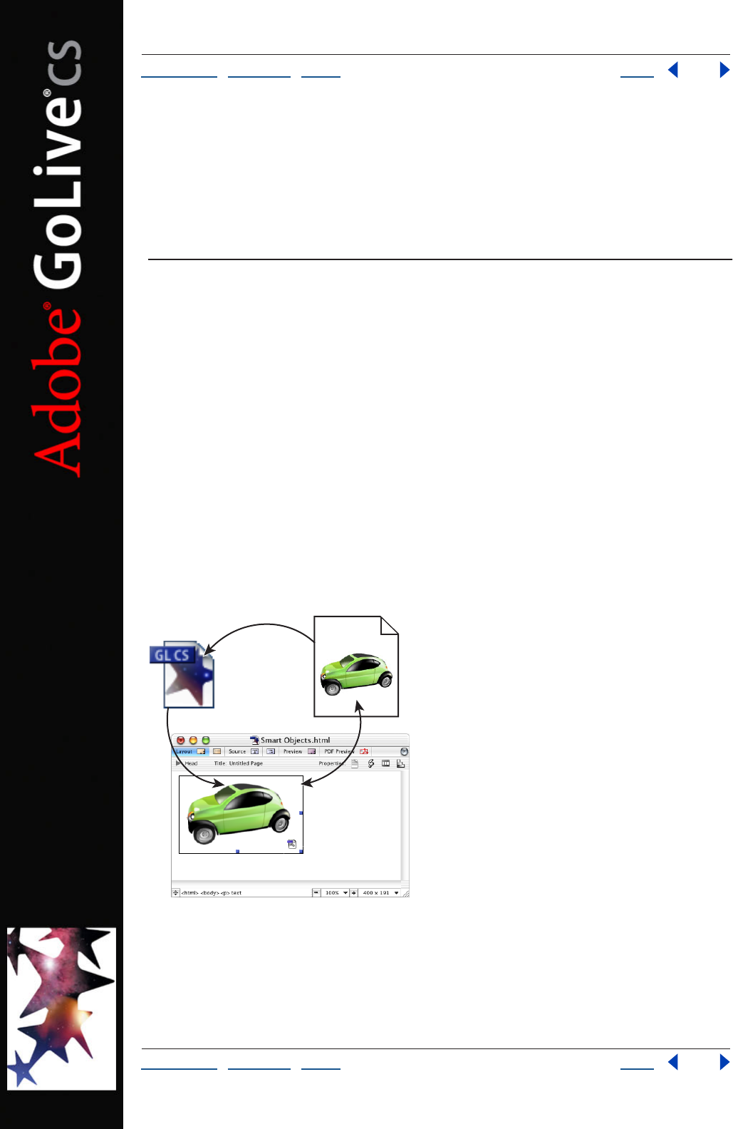
Using Help | Contents | Index Back 261
Adobe GoLive CS Help Adding Content from Adobe Applications
Using Help | Contents | Index Back 261
Adding Content from Adobe
Applications
About adding content from Adobe applications
Adobe GoLive revolutionizes the way you can incorporate content from other Adobe
applications to save time and effort. Smart Objects, for example, eliminate the need to
preoptimize images outside of GoLive. With Smart Objects, you can import source files in
formats such as native Photoshop and Illustrator, and then use GoLive’s Save for Web
feature to create Web-optimized images.
Smart Objects let you automate many common image-related tasks. For example, when
you resize a Smart Object in the Layout Editor, GoLive automatically reoptimizes the
image, keeping its appearance clear and sharp. Likewise, when you change the content of
a Smart Object in another application, GoLive automatically updates the object’s
appearance on your Web pages. Smart Objects also streamline the process of adding
sliced images to a page: GoLive automatically creates a table with cells for each slice.
The versatility of Smart Objects extends far beyond automated image optimization. They
also provide features that let you convert HTML text to an image, create multiple image
variations from a single image file, and import text and graphics from Adobe InDesign.
Smart Objects:
A. Source file added to the Layout Editor B. GoLive generates Web-optimized target file
C. Smart Object in Layout Editor maintains link between source and target files
B
A
C

Using Help | Contents | Index Back 262
Adobe GoLive CS Help Adding Content from Adobe Applications
Using Help | Contents | Index Back 262
Working with Smart Objects
Smart Objects offer an efficient and powerful way to add images to Web pages. After you
specify a source file in a format such as Photoshop, Illustrator, PDF, or EPS, GoLive creates a
target file in a Web-optimized format and maintains a link to the source file.
When you move, resize, or reoptimize a Smart Object, you’re really manipulating the target
file; the source file does not change. This process lets you generate multiple image varia-
tions from a single source file throughout your Web site.
Using Help | Contents | Index Back 263
Adobe GoLive CS Help Adding Content from Adobe Applications
Using Help | Contents | Index Back 263
When you double-click a Smart Object in the Layout Editor, the source file opens in its
original application. If you make changes to the source image, GoLive can automatically
update the target file.
Adding Smart Objects to the Layout Editor
To add files in the Photoshop, Illustrator, or PDF formats, use the Smart Photoshop, Smart
Illustrator, or Smart PDF objects. To add files in other formats, use the Smart Generic
object. The Smart Generic object supports the following formats: BMP, PCX, Pixar, Amiga
IFF, TIFF, TARGA, PDF, EPS, JPEG, JPEG 2000, PNG, and PICT (Mac OS only).
When you add a Smart Photoshop or Smart Illustrator object, you can access many
additional features, such as slices and variables. (See “Adding Photoshop images” on
page 277 and “Adding Illustrator artwork” on page 279.) Similarly, when you add a Smart
PDF object, you can add a PDF page as an image. (See “Adding PDF pages as images” on
page 285.)
To add a Smart Object to your Web page:
1 From the Smart set in the Objects palette, drag a Smart Photoshop , Smart Illus-
trator , Smart PDF , or Smart Generic object to the Layout Editor.
2 In the Smart Image Inspector, specify a file for the image.
You can also add a Smart Object by dragging a Smart Object-compatible file to the
Layout Editor.
Storing Smart Object files
When working with Smart Objects, store source and target files in two different places in
the site window. Store source files in the Smart Objects folder in the Extras tab, and store
target files in the Files tab. From those locations, GoLive can properly update source files
and upload target files.
You can store target files anywhere in the Files tab, but many Web designers use an images
folder to manage numerous image files more easily.
Editing Smart Object source files
To edit a source file, use the file’s native application. When you return to GoLive, you can
quickly update related target files to reflect your edits.
To edit a Smart Object source file:
1 In the Layout Editor, double-click the Smart Object.
2 In the native application, edit and resave the file.
Note: In Windows, an SVG file opens in the default browser. To change this behavior, use
the Web Settings dialog box to map a different application to SVG files. For more infor-
mation, see “About Web Settings” on page 448.
To update target files for an edited source file:
Do either of the following:
• Open any pages that contain the target files.
• Use the Update Files Dependent On command. For more information, see “Updating
site files that are dependent on library files” on page 99.
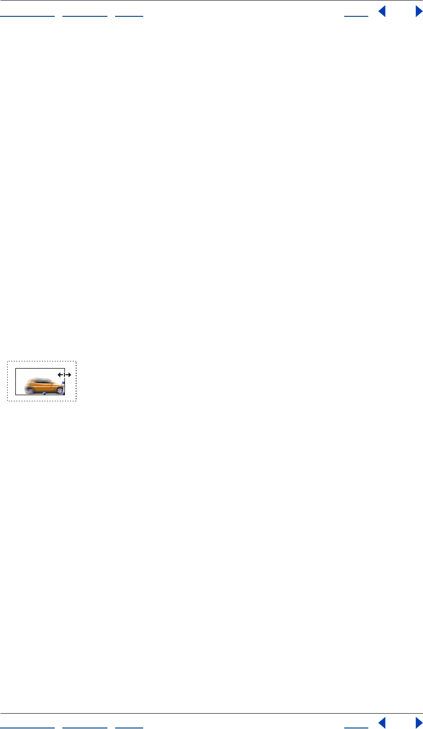
Using Help | Contents | Index Back 264
Adobe GoLive CS Help Adding Content from Adobe Applications
Using Help | Contents | Index Back 264
To configure GoLive to open source files in a separate application:
1 Choose Edit > Preferences (Windows) or GoLive > Preferences (Mac OS).
2 In the list on the left, select General, and then select User Interface.
3 Select Launch Other Applications to Edit Media Files.
Reoptimizing Smart Object target files
To reoptimize a target file, you access the Save for Web dialog box from the Smart Image
Inspector.
To reoptimize a Smart Object target file:
1 Select the Smart Object in the Layout Editor.
2 Click the Settings button in the Smart Image Inspector.
3 Specify new settings in the Save for Web dialog box.
Resizing Smart Objects
To resize a Smart Object, you can simply drag one of its resizing handles. When you release
the mouse, GoLive regenerates the target file using the last-applied optimization settings.
Resizing sliced images is also very easy with Smart Objects. When you resize a sliced Smart
Object, GoLive automatically generates a new table and reoptimizes each slice.
Note: Because the SWF and SVG formats are vector-based and scalable, target files in
those formats are not reoptimized.
Resizing a Smart Object.
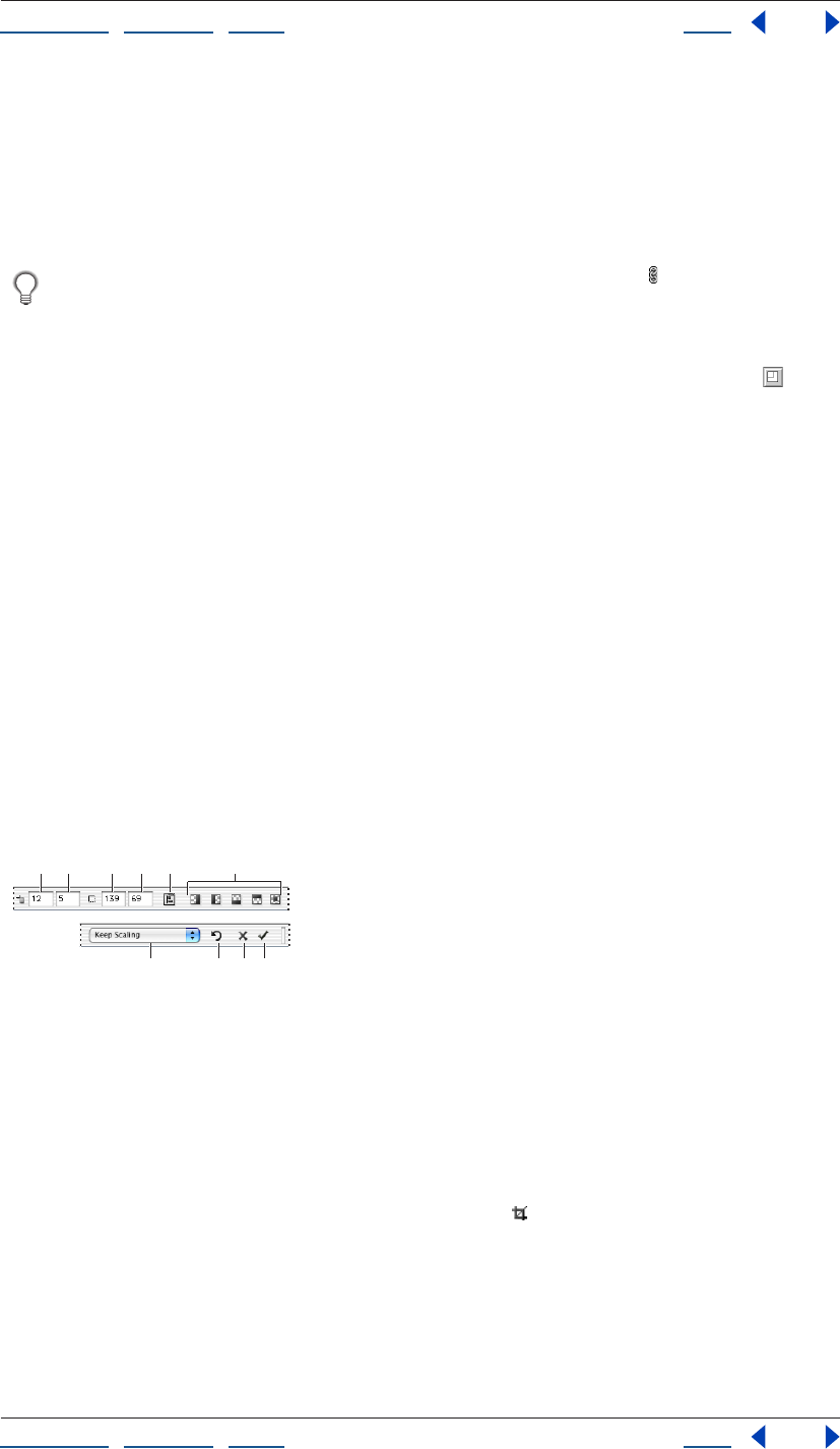
Using Help | Contents | Index Back 265
Adobe GoLive CS Help Adding Content from Adobe Applications
Using Help | Contents | Index Back 265
To resize a Smart Object:
In the Layout Editor, select the object, and then do one of the following:
• Drag a side handle to change width or height.
• Drag a corner handle to change both dimensions. (Hold down Shift while dragging to
resize proportionately.)
To resize proportionately, click the Constrain Proportions button in the Smart Image
inspector.
To return a Smart Object to its original size:
In the Basic tab of the Smart Image Inspector, click the Set to Original Size button .
Fitting Smart Objects in table cells and template regions
You can specify how a Smart Object fits in a smaller table cell or template region.
To fit a Smart Object in a cell or region:
In the Basic tab of the Smart Image Inspector, choose one of the following from the Scale
menu:
• Exact Fit to disproportionately scale the image to the cell or region borders.
• No Border to proportionately crop the image at cell or region borders.
• Show All to proportionately scale the image to the largest size that fits the cell or
region.
Cropping Smart Objects
If Web page redesigns require you to crop images, Smart Objects are the perfect solution.
With Smart Objects, you can create multiple cropped versions of a single source file—
without leaving GoLive.
Cropping options in the toolbar:
A. Horizontal position B. Vertical position C. Width
D. Height E. Open Alignment palette F. Crop Transparent Pixels options
G. Scaling menu H. Use Original Image
I. Cancel J. Crop
To crop a Smart Object:
1 In the Layout Editor, select the object.
2 In the Smart Image Inspector, click the Crop button .
3 In the Layout Editor, drag across the object to define crop boundaries.
4 To refine the position of crop boundaries, do any of the following:
• In the Layout Editor, place the cursor inside the crop boundaries, and drag with the
Hand tool.
GHI J
BCDE FA
Using Help | Contents | Index Back 266
Adobe GoLive CS Help Adding Content from Adobe Applications
Using Help | Contents | Index Back 266
• In the toolbar, enter pixel coordinates in the Horizontal Position or Vertical Position
text boxes.
• In the toolbar, click the Open Alignment Palette button , and then click one or more
Align to Parent options. For more information, see “Repositioning, aligning, or distrib-
uting objects” on page 141.
5 To refine the size of crop boundaries, do one of the following:
• In the Layout Editor, place the cursor over a corner or side handle, and drag.
• In the toolbar, enter pixel dimensions in the Width and Height text boxes.
6 To place crop boundaries at opaque image edges, click one of the following buttons in
the toolbar:
• Crop Left Transparent Pixels .
• Crop Right Transparent Pixels .
• Crop Top Transparent Pixels .
• Crop Bottom Transparent Pixels .
• Crop All Transparent Pixels .
7 From the scaling menu in the toolbar, choose one of the following options:
• Keep Scaling to maintain the current scale of the target image relative to the source
image.
• Keep Size to resample the cropped area so it fills the current image dimensions.
• Resize to Original to scale the cropped area to its dimensions in the original source file.
Note: If you use the Keep Size option, the image may become blurry.
8 To apply the crop, either click the Crop Image button in the toolbar, or press Enter
(Windows) or Return (Mac OS).
To cancel a crop:
Click the Cancel button in the toolbar, or press the Esc key.
To restore a cropped Smart Object to its original size:
1 In the Layout Editor, select the object.
2 In the Smart Image Inspector, click the Crop button .
3 In the toolbar, click the Use Original Image button .
Using Help | Contents | Index Back 267
Adobe GoLive CS Help Adding Content from Adobe Applications
Using Help | Contents | Index Back 267
Copying Smart Objects
If you copy a Smart Object to a different location, the copy references the same source file,
but you must create a new, unique target file. With unique target files, you can indepen-
dently resize and optimize several Smart Objects created from one source file.
Note: If a Smart Object doesn’t have a unique target file, GoLive displays a warning icon
in the upper-left corner of the image.
To create a new target file:
1 In the Layout Editor, select the Smart Object.
2 In the Basic tab of the Image Inspector, click the folder icon to the right of the Target
text box.
To create new target files throughout a site, right-click the Smart Object and choose
Source Link > Open All Smart Object Pages.
Changing the matte color of Smart Objects
To create the illusion of transparency on a page, you can change the matte color of a
Smart Object to match the background color of the page. (In the target file, the matte
color replaces transparency found in the source file.)
To change the matte color of a Smart Object:
1 In the Layout Editor, select the Smart Object.
2 In the Basic tab of the Smart Image Inspector, specify a color in the Matte color box.
3 Click Apply.
Note: Smart Illustrator objects that use SVG or SWF format do not support matte color.
Converting Smart Objects into regular image objects
You can convert a Smart Object into a regular image object to unlink the source and target
files. When these files are unlinked, changes to the source do not affect the target.
To convert a Smart Object to a regular object:
1 Right-click (Windows) or Control-click (Mac OS) a Smart Object.
2 Do one of the following:
• If your Smart Object is a bitmap image, choose Convert to Regular Image.
• If your Smart Object is an image in SVG or SWF format, choose Convert to
Regular Plugin.
• If your Smart Object is a sliced Photoshop or Illustrator image, choose Convert to
Regular Table.
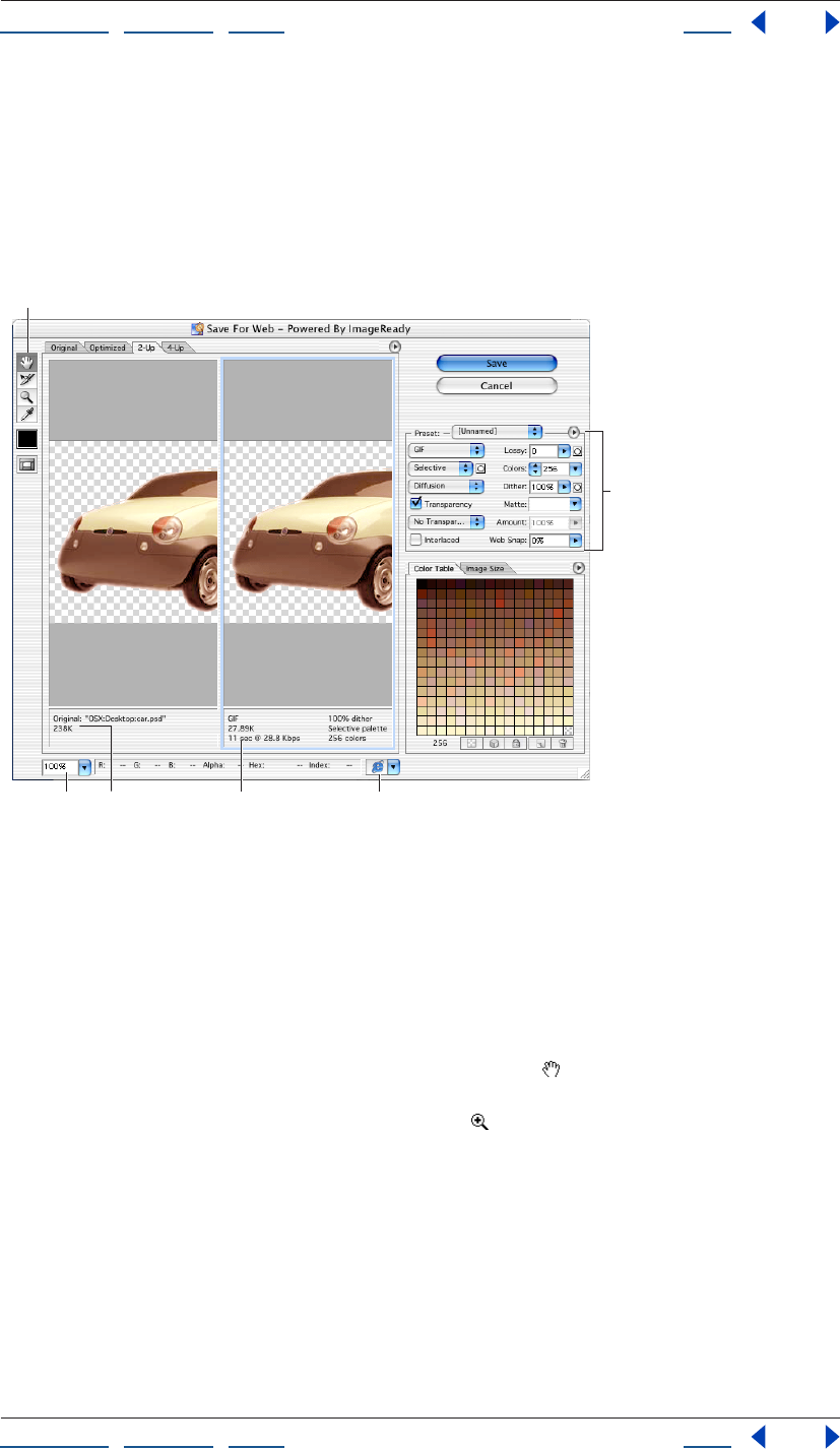
Using Help | Contents | Index Back 268
Adobe GoLive CS Help Adding Content from Adobe Applications
Using Help | Contents | Index Back 268
Using the Save For Web dialog box
To create Web-optimized target files for Smart Objects, use the Save for Web dialog box.
The View options in the Save For Web dialog box let you switch easily between optimized
and original versions of an image. You can preview up to four versions of an optimized
image simultaneously. After evaluating these previews, you can select the version that
best balances image quality and file size.
Save For Web dialog box
A. Toolbox B. Zoom text box C. Annotations for original image D. Annotations for optimized
image E. Preview In pop-up menu F. Settings panel
Viewing images Click a tab at the top of the image area to select a display option:
Original to view the image with no optimization, Optimized to view the image with the
current optimization settings applied, 2-Up to view two versions of the image side by side,
or 4-Up to view four versions of the image side by side.
If the entire artwork is not visible in the Save For Web dialog box, you can use the Hand
tool to bring another area into view. Select the Hand tool (or hold down the spacebar),
and drag in the view area to pan over the image. You can also use the Zoom tool to
magnify or reduce the view. Select the Zoom tool and click in a view to zoom in; hold
down Alt (Windows) or Option (Mac OS) and click in a view to zoom out. Alternatively, you
can specify a magnification level in the Zoom text box at the bottom of the Save For Web
dialog box.
Selecting a view Click a different pane in the Save For Web dialog box to select a new
view. If you’re working in 2-Up or 4-Up view, you must select a view before you apply
optimization settings. The selected view is indicated by a colored frame.
BC D
F
E
A
Using Help | Contents | Index Back 269
Adobe GoLive CS Help Adding Content from Adobe Applications
Using Help | Contents | Index Back 269
Viewing annotations The annotation area in the Save For Web dialog box provides
valuable optimization information. For the original image, the annotation area shows the
file name and file size. For the optimized image, the annotation area shows the current
optimization options, the size of the optimized file, and the estimated download time
using the selected modem speed. You use the Preview pop-up menu to select the modem
speed for which you want to view the estimated download time. To open the Preview pop-
up menu, click the triangle to the right of the optimized image.
Using preset optimization settings
You can save optimization settings as a named set and apply the settings when you work
with other images. Settings that you save appear in the Preset menu in the settings panel
of the Save For Web dialog box. GoLive also includes several predefined named settings.
When you adjust optimization settings so that they no longer match a named set, the
Preset menu displays the term “Unnamed.”
To save optimization settings:
1 With desired settings selected in the Optimize panel of the Save For Web dialog box,
choose Save Settings from the Optimize menu in the settings panel. (Click the triangle
to the right of the Preset pop-up menu to view the Optimize menu.)
2 Name the settings and save them in the GoLive CS/Settings/SaveForWeb/Optimize
folder. (This is the only location where the settings will be recognized by GoLive so they
appear in the Optimize menu.)
3 Click Save.
To apply named optimization settings to an image:
With an optimized image displayed, select a named set of optimization settings from the
Preset menu in the settings panel.
To edit a named set of optimization settings:
1 Select the named set from the Preset pop-up menu in the Save For Web dialog box.
2 Adjust the settings in the settings panel.
3 Choose Save Settings from the Optimize menu in the Settings panel, and then save the
settings with the name of the original set.
4 Click Save, and then click Replace.
To delete named optimization settings:
1 In the Optimize panel of the Save For Web dialog box, select a named set of optimi-
zation settings from the Preset pop-up menu.
2 Choose Delete Settings from the Optimize menu in the settings panel.
Applying optimization settings
You use the settings panel in the Save For Web dialog box to set optimization options. If
you’re working in 2-Up or 4-Up mode, you can repopulate the views to automatically
generate lower-quality versions of the image based on the selected settings.
Using Help | Contents | Index Back 270
Adobe GoLive CS Help Adding Content from Adobe Applications
Using Help | Contents | Index Back 270
To apply optimization settings:
1 Select a view in the Save For Web dialog box. If your artwork contains multiple slices,
select one or more slices to which you want to apply the optimization settings.
2 Do one of the following:
• Choose a named optimization setting from the Preset pop-up menu. (See “Using preset
optimization settings” on page 269.)
• Choose a file format from the file format pop-up menu and set additional optimization
options.
When using the Import > Photoshop Layers command, you can apply an optimization
setting to all layers by holding down Ctrl (Windows) or Control (Mac OS) while clicking
Save. (See “Adding layered Photoshop images” on page 278.)
To apply optimization settings based on file size:
1 Choose Optimize to File Size from the Optimize menu. (Click the triangle to the right
of the Preset pop-up menu to view the Optimize menu.)
2 Specify a Start With option:
• Current Settings to use current optimization settings.
• Auto Select GIF/JPEG to automatically generate a GIF or JPEG file. (GoLive analyzes the
colors in the image and automatically selects GIF or JPEG format.)
3 To determine which slices are optimized to the specified file size, select a Use option:
Current Slice, Each Slice, or Total of All Slices.
4 Enter a value for file size, and click OK.
To repopulate optimization settings:
1 Apply optimization settings to a view in the
2-Up or 4-Up mode.
2 Choose Repopulate Views from the Settings panel menu.
The selected view and the original view are not altered during repopulation. For this
reason, the Repopulate Views option works with 2-Up view only if the original version of
the image is not displayed.
To reset optimization settings:
Press Alt (Windows) or Option (Mac OS), and click Reset.
The file size displayed in the Save For Web dialog box may be larger than the size on
your local hard disk because GoLive adds Smart Object optimization settings to the
target file. To remove this extra information from uploaded target files, select the “Strip
GoLive data from media files” option in the Upload/Export panel of the Site preferences.
Using Help | Contents | Index Back 271
Adobe GoLive CS Help Adding Content from Adobe Applications
Using Help | Contents | Index Back 271
Optimization options for GIF and PNG-8 formats
GIF is the standard format for compressing images with flat color and crisp detail, such as
line art, logos, or illustrations with type. You can lower the size of GIF images by reducing
the number of colors in the file. Like the GIF format, the PNG-8 format efficiently
compresses solid areas of color while preserving sharp detail; however, not all Web
browsers can display PNG-8 files. PNG-8 settings are very similar to the GIF settings. (For
additional general information about these formats, see “About GIF format” on page 237
or “About PNG-8 format” on page 239.)
When optimizing images for wireless devices such as i-mode cellphones, you must
use the GIF format. For more information, see “Creating wireless content in GoLive” on
page 354.
Lossy (GIF only) Specify a value to allow for lossy compression. Lossy compression
reduces file size by selectively discarding data—a higher Lossy setting results in more
discarded data. You can often apply a Lossy value of 5–10, and sometimes up to 50,
without degrading the image. File size can often be reduced 5%–40% using the Lossy
option.
Note: You cannot use the Lossy option with the Interlaced option, or with Noise or Pattern
Dither algorithms.
Colors Choose a method for generating a color table from the Color Table pop-up menu.
(See “Using the Color Table palette” on page 273.) Then specify the maximum number of
colors in the Colors text box. If you choose Web from the Color Table pop-up menu, the
Auto option becomes active in the Colors pop-up menu. Use the Auto option if you want
GoLive to determine the number of colors in the color table based on the frequency of
colors in the image.
Note: If the image contains fewer colors than the number specified, the color table
contains only the number of colors in the image.
Dither Choose a dithering method from the Dithering menu, and specify the amount of
application dithering. Dithering refers to the method of simulating colors not available in
the color display system of your computer. A higher dithering percentage creates the
appearance of more colors and more detail in an image, but can also increase the file size.
For optimal compression, use the lowest percentage of dither that provides the color
detail you require. Images with primarily solid colors or with fine lines may display better
with no dither. Images with continuous-tone color (especially color gradients) may require
dithering to prevent color banding. Choose No dither or select from the following options
in the Dithering algorithm pop-up menu:
• Diffusion applies a random pattern that is usually less noticeable than Pattern dither.
The dither effects are diffused across adjacent pixels.
• Pattern applies a halftone-like square pattern to simulate any colors not in the color
table.
• Noise applies a random pattern similar to the Diffusion dither method, but without
diffusing the pattern across adjacent pixels. No seams appear with the Noise dither
method.
Transparency and Matte Select a combination of Transparency and Matte options to
specify how transparent pixels in the image are optimized:
Using Help | Contents | Index Back 272
Adobe GoLive CS Help Adding Content from Adobe Applications
Using Help | Contents | Index Back 272
• To make fully transparent pixels transparent and blend partially transparent pixels with
a color, select Transparency and select a matte color.
• To make all pixels with greater than 50% transparency fully transparent and all pixels
with 50% or less transparency fully opaque, select Transparency and choose None from
the Matte pop-up menu.
• To fill fully transparent pixels with a color and blend partially transparent pixels with the
same color, select a matte color and deselect Transparency.
To select a matte color, click the Matte color swatch and select a color in the color picker.
Alternatively, choose an option from the Matte pop-up menu: Eyedropper (to use the
color in the eyedropper sample box), White, Black, or Other (to use the color picker).
Interlaced Select Interlaced to create an image that displays in low resolution in the
browser while the full image file is downloading. Interlacing can make downloading time
seem shorter and assures viewers that downloading is in progress. However, interlacing
also increases file size.
Web Snap Specify a tolerance level for shifting colors to the closest Web palette equiva-
lents (and prevent the colors from dithering in a browser). A higher value shifts more
colors.
Optimization options for JPEG format
JPEG is the standard format for compressing continuous-tone images such as photo-
graphs. Optimizing an image as a JPEG relies on lossy compression, which selectively
discards data. (For additional general information about this format, see “About JPEG
format” on page 237.)
Quality Choose an option from the Quality menu or specify a value in the Quality text
box. The higher the Quality setting, the more detail the compression algorithm preserves.
However, using a high Quality setting results in a larger file size than using a low Quality
setting. View the optimized image at several quality settings to determine the best
balance of quality and file size.
Optimized Select Optimized to create an enhanced JPEG with a slightly smaller file size.
The Optimized JPEG format is recommended for maximum file compression; however,
some older browsers do not support this feature.
Progressive Select Progressive to create an image that displays progressively in a Web
browser. The image will display as a series of overlays, enabling viewers to see a low-
resolution version of the image before it downloads completely. The Progressive option
requires use of the Optimized JPEG format.
Blur Specify the amount of blur to apply to the image. This option applies an effect
identical to that of the Gaussian Blur filter while compressing the file more, resulting in a
smaller file size. A setting of 0.1 to 0.5 is recommended.
ICC Profile Select ICC Profile to preserve the ICC profile of the artwork with the file. ICC
profiles are used by some browsers for color correction. This option is only available after
you’ve saved an image with an ICC profile—it is not available for unsaved images. (For
more information about ICC profiles, see “Managing color in images” on page 248.)
Matte Specify how to optimize transparent pixels in the image:
• To fill fully transparent pixels and blend partially transparent pixels with a matte color,
click the Matte color swatch and select a color in the color picker. Alternatively, choose
Using Help | Contents | Index Back 273
Adobe GoLive CS Help Adding Content from Adobe Applications
Using Help | Contents | Index Back 273
an option from the Matte pop-up menu: Eyedropper (to use the color in the
eyedropper sample box), White, Black, or Other (to use the color picker).
• To make all pixels with greater than 50% transparency fully transparent and all pixels
with 50% or less transparency fully opaque, choose None from the Matte pop-up menu.
Optimization options for PNG-24 format
PNG-24 is suitable for compressing continuous-tone images; however, it produces much
larger files than JPEG format. (See “About PNG-24 format” on page 239.)
The advantage of using PNG-24 is that it can preserve up to 256 levels of transparency in
an image (whereas JPEG saves pixels as fully opaque). To save an image with multilevel
transparency, select Transparency. For more information about the Interlaced, Trans-
parency, and Matte options, see “Optimization options for GIF and PNG-8 formats” on
page 271.
Using the Color Table palette
The Color Table palette in the Save For Web dialog box gives you precise control over
the colors in optimized GIF and PNG-8 images. With a maximum of 256 colors, you can add
and delete colors in the color table, shift selected colors to Web-safe colors, and lock
selected colors to prevent them from being dropped from the palette.
Using the Color Table palette menu The Color Table palette menu contains commands
for working with colors. To view the menu, click the triangle above the right corner of
the Color Table palette.
Sorting the color table You can sort colors by hue (neutral colors are assigned a hue of 0
and located with the reds), luminance (the lightness or brightness of a color), or
popularity, making it easier to see an image’s color range and locate particular colors.
Choose a sorting command from the Color Table palette menu.
Adding new colors Select the Eyedropper tool and click a color in the image. (Or, click
the color selection box and use the color picker to select a color.) Then click the New Color
button , or select New Color from the Color Table palette menu. A small white square
with a dark center appears in the lower right corner of the new color, indicating that the
color is locked.
Note: If the color table already contains the maximum number of colors (256, or 255 with
transparency), you cannot add a new color.
Selecting colors To select a color in the image, select the Eyedropper tool , and click a
color in the image. A white border appears around that color in the Color Table palette. To
select a color in the Color Table palette, click the color. To select a contiguous group of
colors, press Shift and click another color. All colors in the rows between the first and
second selected colors are selected. To select a discontiguous group of colors, press Ctrl
(Windows) or Command (Mac OS) and click each color that you want to select.
The Color Table palette menu provides commands for selecting colors. Choose Select All
Colors, Select All Web-Safe Colors, Select All Non-Web Safe Colors, or Deselect All Colors.
Note: The Select All Web-Safe Colors command is not available when the optimized image
does not contain Web-safe colors; likewise, the Select All Non-Web Safe Colors command is
not available when the optimized image contains only Web-safe colors.
Using Help | Contents | Index Back 274
Adobe GoLive CS Help Adding Content from Adobe Applications
Using Help | Contents | Index Back 274
Editing colors You can change a selected color in the Color Table palette to any other
RGB color value. Double-click the color in the Color Table palette to display the default
color picker, and then select a color. A small plus sign appears in the center of each edited
color. When you regenerate the optimized image, the selected color changes to the new
color wherever it appears in the image.
Mapping colors to transparency You can add transparency to an optimized image by
mapping existing colors to transparency. Select one or more colors in the optimized
image or the color table, and then click the Map Transparency button in the Color Table
palette. The transparency grid appears in half of each mapped color swatch. The small
square at the lower right of the swatch indicates that the color is locked.
Shifting to Web-safe colors You can shift colors to their closest equivalents in the Web
palette to prevent the colors from dithering in a browser. Select the colors you want to
shift, and click the Web Shift button in the Color Table palette. (Or, choose Web Shift/
Unshift Selected Colors from the Color Table palette menu.) A small white diamond
appears in the center of any color that has been Web-shifted (and in any Web-safe color).
Once you’ve shifted colors, you can revert them to their original values using commands
in the Color Table palette menu. Choose Web Shift/Unshift Selected Colors or Unshift All
Colors. Or, select a Web-shifted color and click the Web Shift button to revert it. To
specify a tolerance for shifting colors, specify a value for Web Snap in the Settings panel of
the Save For Web dialog box. A higher value shifts more colors.
Deleting colors You can delete selected colors from the color table to decrease the
image file size. To delete selected colors, click the Delete button or choose Delete Color
from the Color Table palette menu. When you delete a color, areas of the optimized image
that previously included that color are rerendered using the closest color remaining in the
palette.
Note: Deleting a color changes the color palette type to Custom to prevent the color from
being added back to the palette if you reoptimize the image.
Locking and unlocking colors You can lock selected colors in the color table to prevent
them from being dropped or dithered if you reduce the number of colors in the image.
Click the Lock button , or choose Lock/Unlock Selected Colors from the Color Table
palette menu. A white square with a red center appears in the lower right corner of each
locked color.
To unlock all colors, choose Unlock All Colors from the Color Table palette menu.
Saving and loading color tables You can save color tables from optimized images to
use with other images and load color tables created in other applications. To save a color
table, choose Save Color Table from the Color Table palette menu. By default, the filename
extension .act (Adobe Color Table) is added to the color table file. To load a color table,
choose Load Color Table in the Color Table palette menu. You can load a color table from
an .act file or a GIF file (to load the file’s embedded color table).
Once you load a new color table, the colors in the optimized image change to reflect the
new color table.
Using the Image Size palette
The Image Size palette in the Save For Web dialog box lets you specify a new size for the
target file.
Width and Height You can enter values for the new width and height of the target file.
Using Help | Contents | Index Back 275
Adobe GoLive CS Help Adding Content from Adobe Applications
Using Help | Contents | Index Back 275
Constrain Proportions You can select Constrain Proportions, and then specify the new
size by entering a Percent value. Or, you can enter a value for either the width or the
height, and the accompanying dimension will adjust its size accordingly.
Quality Choose from the following resampling methods:
• Nearest Neighbor to resample quickly but imprecisely. This method preserves hard
edges and produces a smaller file size.
• Bilinear to resample moderately quickly and precisely.
• Bicubic to resample slowly but precisely. This method results in the smoothest tonal
gradations.
• Bicubic Smoother to greatly enlarge images.
• Bicubic Sharper to greatly reduce images.
Apply Click to apply the values you entered in the Image Size palette.
Working with slices during optimization
If your Photoshop (PSD) or Illustrator SVG file contains multiple slices, you can specify the
slices to which you want to apply optimization settings. You can also share optimization
settings between slices by linking slices together. Linked slices in GIF and PNG-8 format
share a color palette and dither pattern to prevent the appearance of seams between the
slices.
You can also assign a URL link, specify which frame the URL opens, and add Alt text, a
status message, and a background color to a slice.
To show or hide slices in the Save For Web dialog box:
Click the Toggle Slice Visibility button .
To select slices in the Save For Web dialog box:
1 Select the Slice Select tool .
2 Click a slice to select it. Shift-click or Shift-drag to select multiple slices.
To set options for a user slice:
1 Double-click the slice with the Slice Select tool.
2 In the Slice Options dialog box, do any of the following, and click OK:
• Type the slice name in the Name text box. By default, GoLive uses the slice name as the
file name when you save the Web page.
• Specify a URL to make the slice area a hotspot in your Web page. You can type a relative
URL or a full URL (including http://), or choose a previously created URL from the pop-
up menu.
• If you specified a URL, specify the frame you want the link to target in the Target text
box. You can type the name of a target frame, or choose a standard option from the
pop-up menu.
• Type text in the Message text box that will appear in the browser’s status area when the
mouse is positioned over an image.
• Type text in the Alt text box that will appear in place of image data in nongraphical
browsers (and will be used by voice-recognition software).
Using Help | Contents | Index Back 276
Adobe GoLive CS Help Adding Content from Adobe Applications
Using Help | Contents | Index Back 276
• Choose a color that will appear in the slice area of your Web page from the Background
pop-up menu.
Saving optimized images
When you’ve applied a combination of settings that achieve a balance between quality
and file size, you’re ready to save the optimized image. GoLive lets you change the optimi-
zation settings for existing Smart Objects at any time. (See “Reoptimizing Smart Object
target files” on page 264.)
To save an optimized image:
1 Select the view with the desired optimization settings in the Save For Web dialog box,
and click Save.
2 Specify a filename and location for the resulting file or files.
3 Click Save.
Editing output settings for optimized files
When you save an optimized image, you can specify how slices and files are named, and
how background images are handled. You set these options in the Output Settings dialog
box.
Using the Output Settings dialog box
The Output Settings dialog box displays different sets of output options. In GoLive, you
can save your output settings and apply them to other files.
Displaying the Output Settings dialog box: Choose Edit Output Settings from the
Optimize menu in the Save For Web dialog box. (Click the triangle to the right of the
Preset pop-up menu to view the Optimize menu.)
Displaying predefined output options Choose an option from the Settings menu.
Switching to a different set of options Choose an options set from the pop-up menu
below the Settings menu. Or, click Next to display the next set in the menu list, and click
Prev to display the previous set.
Saving output settings Set the options as desired, and click Save. Type a filename,
choose a location for the saved file, and click Save.
You can save the output settings anywhere. However, place the file in the GoLive CS/
Settings/SaveForWeb folder to ensure that the file will appear in the Settings menu in
GoLive.
Loading output settings Click Load, select a file, and click Open.
Setting slice output options
In the Output Settings dialog box, you can set the following options for the Slices set:
Empty Cells Specifies how empty slices are converted to table cells. Select GIF, IMG W&H
to use a one-pixel GIF with width and height values specified on the IMG tag. Select GIF, TD
W&H to use a one-pixel GIF with width and height values specified on the TD tag. Select
NoWrap, TD W&H to place a nonstandard NoWrap attribute on the table data and also
place width and height values specified on the TD tags.
Using Help | Contents | Index Back 277
Adobe GoLive CS Help Adding Content from Adobe Applications
Using Help | Contents | Index Back 277
TD W&H Specifies when to include width and height attributes for table data: Always,
Never, or Auto (the recommended setting).
Spacer Cells Specifies when to add one row and one column of empty spacer cells
around the generated table: Always, Never, or Auto (the recommended setting). Adding
spacer cells is necessary with table layouts in which slice
boundaries do not align, to prevent the table from breaking apart in some browsers.
Default Slice Naming Choose elements from the pop-up menus or enter text into the
fields to be combined into the default names for all user slices. Elements include
document name, the word slice, numbers or letters designating slices or rollover states,
slice creation date, punctuation, or none.
Setting file saving options
In the Output Settings dialog box, you set the following options for the Saving Files set:
File Naming Choose elements from the pop-up menus or enter text into the fields to be
combined into the default names for all files. Elements include document name, slice
name, rollover state, trigger slice, file creation date, slice number, punctuation, and file
extension. Some options are relevant only if the file contains slices or rollover states.
The fields let you change the order and formatting of the filename parts (for example,
letting you indicate rollover state by an abbreviation instead of the full word).
File Name Compatibility Select one or multiple options to make the filename
compatible with Windows (permits longer filenames), Macintosh, and UNIX operating
systems.
Note: Filenames may be truncated after 31 characters.
Put Images In Folder Specifies a folder name where optimized images are saved
(available only with documents containing multiple slices).
Copy Background Image When Saving Copies the background image file specified in
the Background set into the images folder for the Web page.
Include Copyright Includes copyright information with the image.
Adding Photoshop images
GoLive provides extensive support for images in Photoshop format. With Smart
Photoshop objects, you can access slices and edit variables for text content and layer
visibility. With the Import > Photoshop Layers command, you can independently optimize
and position image layers. (For more information about variables, see “Using variables in a
Photoshop file” on page 284.)
Adding sliced Photoshop images
To add a sliced Photoshop image to a page, use the Smart Photoshop object . After you
specify the source Photoshop file and optimize each slice in the Save for Web dialog box,
GoLive automatically creates a table to contain the sliced image. For more information,
see “Working with slices during optimization” on page 275.
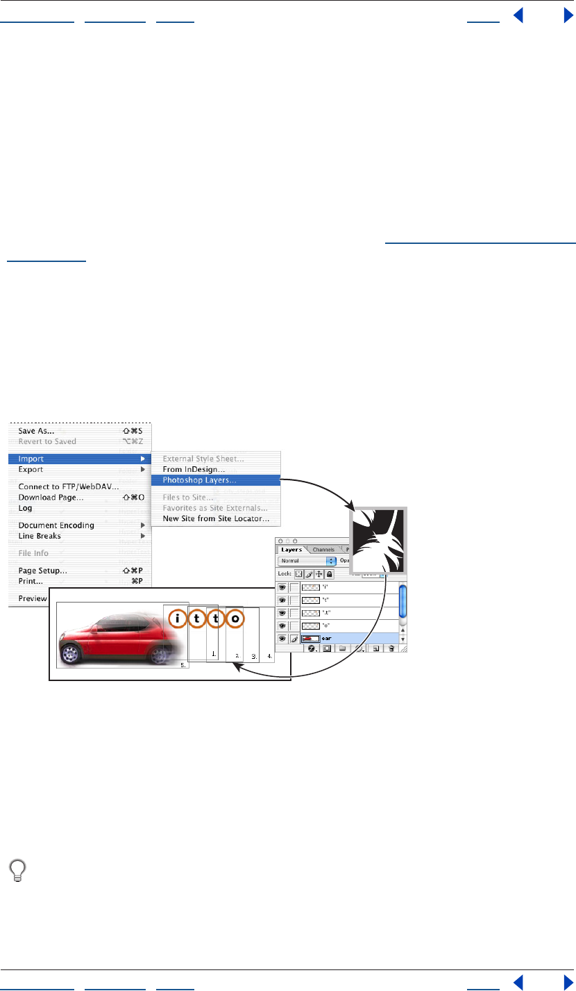
Using Help | Contents | Index Back 278
Adobe GoLive CS Help Adding Content from Adobe Applications
Using Help | Contents | Index Back 278
GoLive saves the optimized target file for each slice in an image_name.data folder. Place
this folder in the site folder so that GoLive can properly manage and publish the target
files.
Note: To edit the table attributes of a sliced Photoshop file, you must use Photoshop.
Adding layered Photoshop images
GoLive lets you import Photoshop layered images so that each layer in the image is
converted into an appropriate Web-safe format of your choosing. The imported
Photoshop layers appear in the Web page as separate GoLive layers, which can later be
converted to a layout grid or table if they don’t overlap. (See “Laying out pages with layers”
on page 144.)
Note: This method of importing Photoshop images doesn’t involve Smart Photoshop
objects, which are flattened into one layer.
GoLive uses Photoshop layer names to generate names for the corresponding GoLive
layers. Because some browsers incorrectly interpret GoLive layers with names that begin
with numbers, avoid creating layer names that begin with numbers in Adobe Photoshop.
(If necessary, you can change the names of GoLive layers after importing a layered
Photoshop file.)
Import > Photoshop Layers command:
A. A layered PSD file brought into GoLive using the Import > Photoshop Layers command. B. Save
for Web generates separate target files from each layer of the PSD file. C. Target files appear in the
Layout Editor in separate layers.
To import a layered Photoshop image:
1 Choose File > Import > Photoshop Layers.
2 Select the folder where you want to save the layers, and click Open.
If you import many layered images, you may want to organize each one into a
separate destination folder (for instance, a subfolder within your images folder).
3 In the Save For Web dialog box, choose the optimization settings you want for the first
layer, and then do one of the following:
A
C
B
Using Help | Contents | Index Back 279
Adobe GoLive CS Help Adding Content from Adobe Applications
Using Help | Contents | Index Back 279
• Click Save. GoLive adds the first layer as a lowest layer on the page, and then opens the
Save For Web dialog box for each remaining layer. Repeat the process of choosing an
optimization setting and clicking Save for each layer. Each Photoshop layer is placed in
a separate GoLive layer in the Layout Editor.
• Hold down the Ctrl key and click Save All. Save All applies the same settings to all layers
in the imported Photoshop file. Each layer is placed in a separate layer in the Layout
Editor.
Note: Clicking Cancel only cancels the import process for the current layer. Press Ctrl while
clicking Cancel to cancel the import process for all remaining layers.
Adding Illustrator artwork
With Smart Illustrator objects, you can import AI and SVG files, edit their contents, and
optimize them for the Web. Smart Illustrator objects support many powerful Web design
tools, such as slices and variables. For more information, see “Adding sliced Illustrator SVG
images” on page 280 and “Using variables in an Illustrator SVG file” on page 284.
Choosing a format for Illustrator source files
For Smart Illustrator objects, you can specify source files in AI or SVG format. You can
optimize AI files in both vector and bitmap formats, but SVG files only in bitmap formats.
You must use SVG source files, however, if you want to edit slices and variables created in
Illustrator.
Note: GoLive does not support multilayered Illustrator files. Layered Illustrator images are
flattened during the optimization and conversion process.
Choosing a format for Illustrator target files
From an Illustrator AI source file, you can create target files in either the bitmap GIF, JPEG,
PNG, or WBMP formats, or the vector SVG, SVGZ, and SWF formats. From an Illustrator SVG
source file, you can create target files only in the bitmap formats.
When you specify an AI source file, you must choose between the bitmap and vector
optimized formats. If you choose the bitmap formats, you optimize the file in the Save for
Web dialog box. If you choose the vector formats, you optimize the file in Illustrator.
To choose an optimized format for an AI file:
1 In the Layout Editor, add a Smart Illustrator object .
2 In the Basic tab of the Smart Illustrator Image Inspector, reference the AI file in the
Source text box.
3 In the Conversion Settings dialog box, choose one of the following:
• Bitmap Formats to open the Save for Web dialog box and optimize the file in GIF, JPEG,
PNG, or WBMP format.
• SVG or SVG Compressed to open Illustrator and set optimization options in the SVG
Options dialog box.
• SWF to open Illustrator and set optimization options in the Macromedia Flash (SWF)
Format Options dialog box. For more information, see “Setting optimization options for
SVG and SWF files” on page 280.
Using Help | Contents | Index Back 280
Adobe GoLive CS Help Adding Content from Adobe Applications
Using Help | Contents | Index Back 280
Adding sliced Illustrator SVG images
If you use a Smart Illustrator object, GoLive can work with slices established in Illustrator
SVG files. As with sliced Photoshop images, you can assign links to slices and optimize
them independently. (See “Working with slices during optimization” on page 275.)
GoLive saves the optimized target file for each slice in an image_name.data folder. Place
this folder in the site folder so that GoLive can properly manage and publish the target
files.
Updating links in an SVG file
GoLive can track links in Illustrator SVG files. If a link destination moves, GoLive automati-
cally prompts you to update the link. Use the In & Out Links palette to re-establish or
change links in SVG files.
To update a link in an SVG file:
1 In the Layout Editor, select the SVG object that contains the link.
2 Choose Window > In & Out Links, and then specify the link destination in the In & Out
Links palette.
It’s useful to click the External tab in the site window so you can view any redirected
external links.
Setting optimization options for SVG and SWF files
When you optimize a Smart Illustrator object in SVG or SWF format, GoLive opens Illus-
trator so you can access several advanced optimization options. In an SVG file, for example,
you can store subsets of fonts and preserve Illustrator-specific data. In an SWF file, you can
export Illustrator layers to SWF frames, specify the frame rate, and more.
Optimization options for SVG format
The SVG Options dialog box opens when you add a Smart Illustrator object to the Layout
Editor and save the object in SVG format. SVG files can contain sophisticated elements
created in Illustrator, such as gradients, animation, and filter effects. (See “About SVG
format” on page 239.)
Fonts Subsetting Specifies a method for choosing which glyphs are saved with the SVG
file. If you are likely to change the text content of the file—for example, if you plan to set
variables—do not choose None (Use System Fonts) or Only Glyphs Used; choose one of
the other options.
• All Glyphs—the full set of English and Roman-letter font characters.
• None (Use System Fonts)—omits all fonts, which keeps the file size as small as possible.
However, this setting relies on the fonts being installed on the user’s system.
• Only Glyphs Used—the set of glyphs for text that exists in the document. This option is
not available for linked fonts. Do not use this option if the textual content of the SVG file
might change.
• Common English—the set of English font characters.
• Common English & Glyphs Used—the set of English font characters plus all other
glyphs used in the document.

Using Help | Contents | Index Back 281
Adobe GoLive CS Help Adding Content from Adobe Applications
Using Help | Contents | Index Back 281
• Common Roman—the set of Roman-letter font characters.
• Common Roman & Glyphs Used—the set of Roman-letter font characters plus all other
glyphs used in this document.
Font Location Select either Embed Fonts or
Link Font:
• Embed—increases file size but ensures that the fonts will always be available, even if
they are not installed on the user’s system. This is useful, for example, if you distribute
the SVG file via e-mail.
• Link—links the document to a separate exported font file from the original Illustrator
file. This is useful if you have several SVG files that share the same fonts. Illustrator saves
fonts in CEF (Compact Embedded Font) format.
Images Location Determines whether images are embedded or linked. If your AI file
contains a rasterized image, select Embed Images, not Link for Images. Embedding images
increases file size but ensures that rasterized images will always be available for viewing by
the user.
Preserve Illustrator Editing Capabilities Preserves Illustrator-specific data in the SVG
file.
Advanced SVG options
Click the Advanced button in the SVG Options dialog box to use the following options.
CSS Properties Choose an option from the CSS Properties pop-up menu to determine
how style attributes are saved in the SVG code. The default method, Style Attributes
<Entity Reference>, results in faster rendering times and reduced SVG file size. Use the
Style Attributes method if the SVG code will be used in transformations—for example,
transformations using Extensible Stylesheet Language Transformation (XSLT)—but be
aware that this results in slightly larger file size. Use the Style Element method when
sharing files with HTML documents. By selecting Style Element, you can then modify the
SVG file to move a style element into an external stylesheet file that is also referenced by
the HTML file. However, the Style Element option also results in slower rendering speeds.
Decimal Places Specifies the precision of vector data in the SVG file. You can set a value
of 1 to 7 decimal places. A high value results in a larger file size and increased image
quality.
Encoding Choose a method from the Encoding pop-up menu to determine how to
encode characters in the SVG file. ISO 8859-1 is suitable for most European languages,
while UTF (Unicode Transformation Format) is preferred for non-Roman languages. (UTF-8
is an 8-bit format and usually creates smaller files without losing any information
compared to the 16-bit UTF-16 format.)
Optimize for Adobe SVG Viewer Optimizes for the Adobe SVG viewer through an
Adobe XML namespace. This option takes advantage of faster rendering for features such
as filter effects.
Include Extended Syntax for Variable Data Includes all information needed for variable
substitution in the SVG file. Select this option if you’re exporting a template for use in
GoLive or AlterCast.
Include Slicing Data Preserves slice locations and optimization settings.
Using Help | Contents | Index Back 282
Adobe GoLive CS Help Adding Content from Adobe Applications
Using Help | Contents | Index Back 282
Include File Info Preserves information about your document. This is useful to track
information such as “Author,” “Date Created,” and “Date Modified.”
Optimization options for SWF format
The Macromedia Flash (SWF) Format Options dialog box opens when you add a Smart
Illustrator object to the Layout Editor and save it in SWF format. Since SWF is a vector-
based format, the artwork maintains its image quality at different resolutions and is ideal
for the creation of animation frames. (See “About SWF format” on page 240.) Although the
SWF format uses vector data, it also uses bitmap data when appropriate.
Export As Specifies a static or animated SWF file. Choose AI File to SWF File to export the
artwork to a single SWF frame. Choose AI Layers to SWF Frames to export the artwork on
each layer to a separate SWF frame, creating an animated SWF.
Note: Select AI File to SWF File to preserve layer clipping masks.
Frame Rate Specifies the rate at which the animation will be played in a SWF viewer. (This
option is only available when you choose AI Layers to SWF Frames.)
Looping Causes the animation to loop continuously, rather than play once and then stop,
when played in a SWF viewer. (This option is only available when you choose AI Layers to
SWF Frames.)
Read Only Prohibits users from modifying the exported SWF file.
Clip to Artboard Size Exports only artwork that falls within the page borders of the Illus-
trator file.
Curve Quality Determines the accuracy of the bezier curves. A low number decreases
the exported file size with a slight loss of curve quality. A higher number increases the
accuracy of the bezier curve reproduction, but results in a larger file size.
Image Options Specifies the resolution and format for bitmap images in the SWF file.
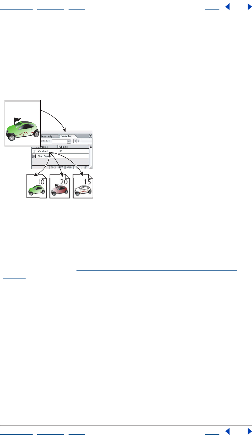
Using Help | Contents | Index Back 283
Adobe GoLive CS Help Adding Content from Adobe Applications
Using Help | Contents | Index Back 283
Creating multiple versions of an image
In GoLive, variables let you create multiple image versions from one image file. You first
establish variables in Photoshop or Illustrator; then you edit them in GoLive by using
Smart Objects. Variables can control elements such as text content and layer visibility. For
example, you might have an image with text containing the price of an item. If you want to
quickly modify the price, there’s no need to create separate image files in another appli-
cation. Instead, you can simply modify a text variable in GoLive.
Creating different versions of an image using variables:
A. Source file B. Variables palette in Illustrator
C. Different versions of an image in separate target files, each with different variable settings
The power of variables is that you can create more than one target file, each with different
images and text created by assigning different variable settings. Because variables use
Smart Objects, you can edit the source file and quickly update all related versions
throughout your site. (See “Updating site files that are dependent on library files” on
page 99.)
For information about assigning variables in an Illustrator or Photoshop file, see the Adobe
Illustrator CS or Adobe Photoshop CS documentation.
C
B
152030
A
30
Using Help | Contents | Index Back 284
Adobe GoLive CS Help Adding Content from Adobe Applications
Using Help | Contents | Index Back 284
Using variables in an Illustrator SVG file
In an Illustrator SVG file with variables, you can control text content and object visibility.
To set variables in an Illustrator SVG file:
1 Using a Smart Illustrator object , add an Illustrator SVG file with variables to the
Layout Editor.
2 In the Variable Settings dialog box, do any of the following:
• Select the Use option for a text variable and enter text in the text box to change the
original text.
• Select the Use option for an object, then choose from the menu to specify whether an
object is visible or invisible in the target file.
• Leave the Use option deselected for variables you wish to leave as is.
Important: If you select the Use option for a text variable and don't enter any text, the
original text is deleted. GoLive will treat the empty text box as the new value of the text
variable.
Using variables in a Photoshop file
In a Photoshop file with variables, you can change the content of text layers and the
visibility of image layers.
If you import a file with text layers, GoLive automatically imports the topmost text layer as
a text variable. GoLive can also import lower text layers as text variables, but only if you
first assign variables to the layers in Photoshop.
To set variables in a Photoshop file:
1 Using a Smart Photoshop object , add a PSD file with a text layer to the Layout Editor.
2 In the Variable Settings dialog box, do any of the following:
• Select the Use option for a text variable and enter text in the text box to change the
original text.
• Select the Use option for an image layer, and then choose from the menu to specify
whether the layer is visible or invisible in the target file.
• Leave the Use option deselected to accept the original layer as is.
Important: If you select the Use option for a text variable and don't enter any text, the
original text is deleted. GoLive will treat the empty text box as the new value of the text
variable.
Updating variables in a target file
After you create a target file containing variables, you can update those variables at any
time.
To update variables in a target file:
1 Select the desired Smart Object in Layout Editor.
2 In the Smart Image Inspector, click the Variables button.
3 Make the desired changes in the Variable Settings dialog box, and click OK.
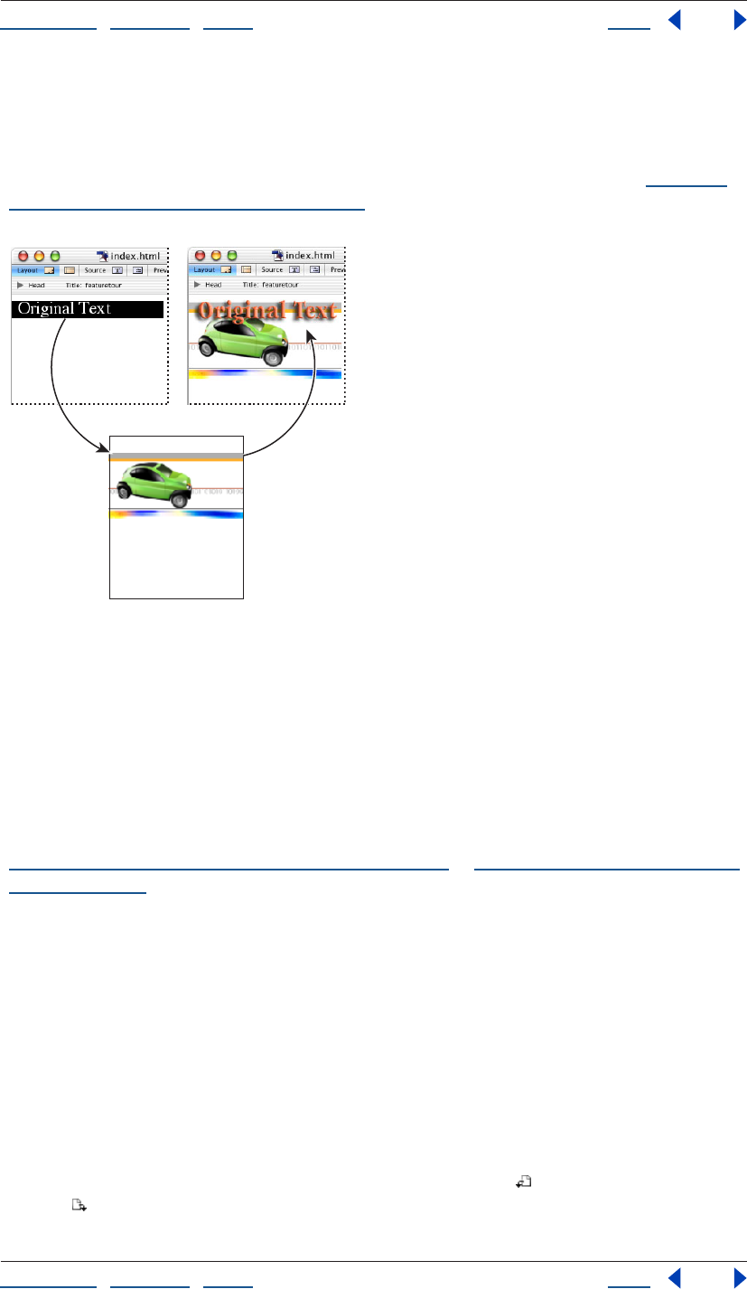
Using Help | Contents | Index Back 285
Adobe GoLive CS Help Adding Content from Adobe Applications
Using Help | Contents | Index Back 285
Converting text to an image
You can convert HTML text into an image using the Convert Text to Banner command. This
command replaces the HTML text with a Smart Object and requires an Illustrator SVG or
Photoshop PSD file with variables. (For more information about variables, see “Creating
multiple versions of an image” on page 283.)
Convert Text to Banner:
A. HTML text selected in Layout Editor B. Source file with text variable
C. Target file replaces original HTML text
To convert text to an image:
1 Select text in the Layout Editor.
2 Choose Special > Convert Text to Banner. GoLive replaces the text with a Smart Object.
3 Specify an Illustrator SVG or Photoshop PSD source file with variables, and click Open.
4 To change the text, edit it in the text box of the Variables Settings dialog box. (See
“Using variables in an Illustrator SVG file” on page 284 or “Using variables in a Photoshop
file” on page 284.)
5 Set optimization options in the Save for Web dialog box.
Adding PDF pages as images
When you add a Smart PDF object, you specify a PDF page that becomes an image on the
Web page. If you revise the PDF page in the future, GoLive updates the image to reflect
your changes.
To add a PDF page as an image:
1 Add a Smart PDF object to the Layout Editor, and specify a PDF file in the Source text
box of the Smart PDF Image Inspector.
2 In the PDF Options dialog box, click the Rotate Left button or the Rotate Right
button if desired.
Text Variable
AC
B
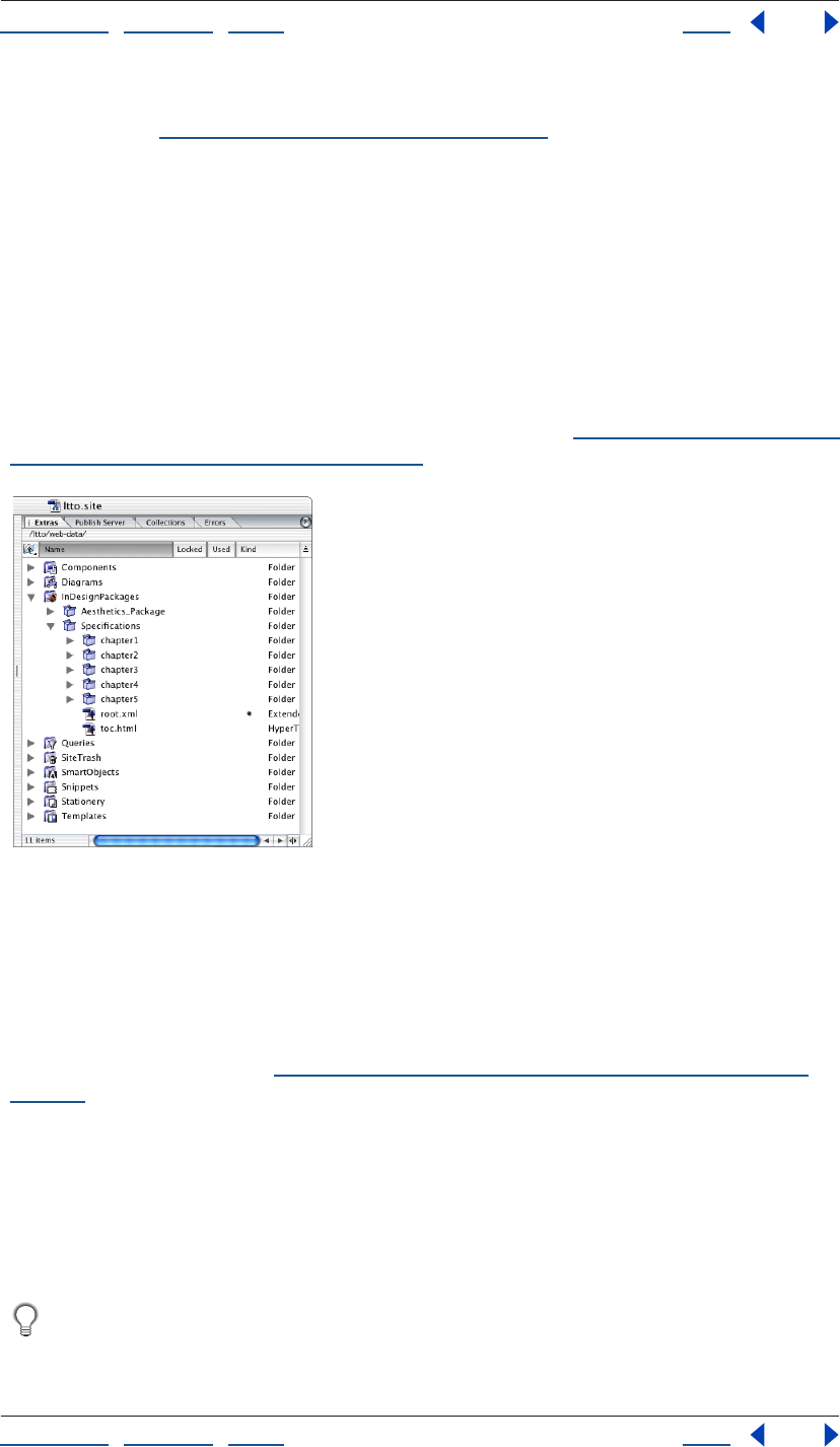
Using Help | Contents | Index Back 286
Adobe GoLive CS Help Adding Content from Adobe Applications
Using Help | Contents | Index Back 286
3 Use the navigation options to locate the desired page, and then click the page
thumbnail. (See “Navigating PDF documents” on page 347.)
Adding InDesign content
With InDesign’s Package for GoLive feature, you can easily incorporate content from
InDesign documents into GoLive Web pages. From a PDF preview of these packages, you
can simply drag text, tables, and graphic assets into GoLive pages. If you plan to update
package assets throughout a site, you can add text and tables as components, and add
graphics as Smart Objects.
You can also import tagged InDesign objects into co-author fields that reflect the tag
names. With this powerful functionality, you can quickly revise an online co-author section
to match related print documents. For more information, see “Importing tagged InDesign
objects into co-author sections” on page 292.
InDesign packages imported into a site:
A. Package of one InDesign document B. Package of InDesign book with multiple documents
Importing InDesign packages into sites
If you plan to regularly update a package’s assets throughout a site, import the package
into the site window. When you later update the package in InDesign, you can reimport it
and use the Update Files Dependent On command to ensure that the site uses the most
current package assets. (See “Updating site files that are dependent on library files” on
page 99.)
To import a package into a site:
1 Open the site.
2 Choose File > Import > From InDesign, navigate to the package folder, and then
click OK.
3 When GoLive asks if you want to copy the package into the site, click Yes.
To export a package into a site from InDesign, save the package in the site’s web-data/
InDesignPackages folder.
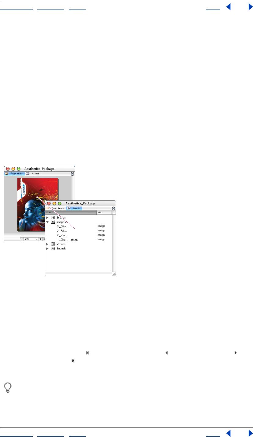
Using Help | Contents | Index Back 287
Adobe GoLive CS Help Adding Content from Adobe Applications
Using Help | Contents | Index Back 287
To open a previously imported package in a site:
In the Extras tab of the site window, double-click the InDesignPackages folder, and then
double-click the folder for the package.
Importing stand-alone InDesign packages
If you need to quickly import package assets that won’t later be updated in InDesign,
import a stand-alone package.
To import a stand-alone package:
1 Choose File > Import > From InDesign, navigate to the package folder, and then
click OK.
2 If GoLive asks if you want to copy the package to an open site, click No.
Using the package window
Using the package window, you can quickly navigate a package, get detailed information
about the assets it contains, and add those assets to Web pages.
An asset in the Page Items and Assets tabs of the
package window.
To add a package asset to a Web page
Drag the asset from the package window to the document window.
To view a different page of a package:
In the status bar of the package window, do either of the following:
• Click the First Page button , the Previous Page button , the Next Page button , or
the Last Page button .
• Type in the Page Number text box.
You can also double-click page borders to view a different page. Double-click the left
or top borders to view the previous page; double-click the right or bottom borders to
view the next page.
Using Help | Contents | Index Back 288
Adobe GoLive CS Help Adding Content from Adobe Applications
Using Help | Contents | Index Back 288
To view package assets by category:
Click the Assets tab, and expand one or more of the following asset categories: Stories,
Images, Movies, or Sounds.
When you click the Assets tab, the InDesign Package Content Inspector displays the
package preview. To zoom in on an asset, double-click it.

Using Help | Contents | Index Back 289
Adobe GoLive CS Help Adding Content from Adobe Applications
Using Help | Contents | Index Back 289
Selecting objects in the package preview
The package preview lets you easily identify and select specific objects.
To zoom in on an object:
Double-click the object in the package preview. (To zoom back out, double-click the
object again.)
To select an object from a stack:
Right-click (Windows) or Control-click (Mac OS) the stack, and choose Select > [object
name] from the context menu.
To prevent an object from being selected:
Right-click (Windows) or Control-click (Mac OS) the object, and choose Hide from the
context menu.
To re-enable an object to be selected:
1 In the View palette, select Hidden.
2 In the package preview, right-click (Windows) or Control-click (Mac OS) the object, and
choose Reveal from the context menu.
Customizing the package preview
The View palette lets you customize the package preview to show and hide different types
of InDesign objects.
Highlight Page Items Colors objects gray. This option is particularly useful for text
frames.
Show Tag Colors Colors tagged InDesign objects with the tag color specified in InDesign.
Untagged Shows untagged InDesign objects.
Tagged Shows tagged InDesign objects.
Inline Shows graphic objects placed inside text frames.
Native Shows graphic objects created in InDesign, such as polygons and rectangles.
Note: When you add a native object to a Web page, it becomes a Smart PDF object.
Hidden Allows you to select objects disabled by the Hide command.
Adding images from InDesign packages
When you create a package in InDesign, you can save original and optimized versions of
each image. If you save optimized versions, you can also include formatting, such as
clipping paths and borders. GoLive lets you specify which version of an image to use from
a package.
After you specify the desired version of an image, you can add it to a page as either a
Smart Generic object or a regular image object.
Note: InDesign supports some image features, such as spot colors, that GoLive does not
support. For best results, optimize complex images in JPEG or GIF format when creating
packages in InDesign. For more information, see the Adobe InDesign CS documentation.
Using Help | Contents | Index Back 290
Adobe GoLive CS Help Adding Content from Adobe Applications
Using Help | Contents | Index Back 290
To add an image from a package:
1 From the package window, drag the image asset to a page.
2 If the Save for Web dialog box appears, set optimization options for the target file, and
then click Save.
To specify which packaged version of an image to use:
1 In the Page Items tab of the package window, select the image.
2 In the toolbar, choose one of the following from the Data menu:
• Copy Image to use the original version.
• Optimized Image to use the optimized version.
• Format Image to use the optimized version that includes formatting.
Note: The options above are available only if corresponding original and optimized
images were exported from InDesign.
To specify whether an image becomes a Smart Object or a regular image object:
1 In the Page Items tab of the package window, select the image asset.
2 In the toolbar, choose Image from the Generator menu, and then click the Settings
button.
3 In the Image Options dialog box, do one of the following:
• Select Generate Smart Object to create a Smart Generic object for original image
versions. To create a regular image object for optimized image versions, also select
Automatic.
• Deselect Generate Smart Object to create a regular image object for all image versions.
To apply settings to all images in a package, hold down Alt (Windows) or Option (Mac
OS) while clicking OK.
Adding text frames and tables from InDesign packages
From InDesign packages, you can add text frames and tables as either HTML elements or
XML components. XML components function exactly like GoLive’s HTML components; if
you update a package, GoLive updates all related components throughout a site. (See
“Using components” on page 311.)
When you import packages, GoLive converts InDesign paragraph and characters styles
into CSS styles. These CSS styles are stored with packages in an internal style sheet, but
you can also create an external style sheet for a package. Internal style sheets determine
how assets appear when you first add them to Web pages; external style sheets allow you
to automatically update package assets throughout a site. You can edit both types of style
sheets in the CSS editor. (See “Using the CSS Editor” on page 215.) Be aware, however, that
CSS doesn’t preserve all InDesign character and paragraph attributes. For more infor-
mation, see the Adobe InDesign CS documentation.
Note: The character encoding of the Web page must match the character encoding
specified in InDesign’s Package For GoLive dialog box; otherwise, characters like
apostrophes and curly quotes may drop out. For information about character encoding,
see“Adding elements or scripts to the head section” on page 56.
Using Help | Contents | Index Back 291
Adobe GoLive CS Help Adding Content from Adobe Applications
Using Help | Contents | Index Back 291
To add a text frame or table from an InDesign package:
From the package window, drag the text frame or table to a page.
To add a text frame or table as a graphic, hold down Shift while dragging; the text
becomes a resizable Smart Object.
To edit the internal style sheet for a package:
From the package window menu, choose CSS Styles > Edit.
To revert to the original internal style sheet:
From the package window menu, choose CSS Styles > Generate.
To create an external style sheet for a package:
1 From the package window menu, choose CSS Styles > Save to Site.
2 Name the style sheet, specify a location in the site folder, and then click Save.
To specify how a text or table asset uses CSS styles and components:
1 In the Page Items tab of the package window, select the text or table asset.
2 In the toolbar, choose InCopy from the Generator menu, and then click the
Settings button.
3 In the InCopy Translation Options dialog box, choose one of the following from the CSS
Style Definition menu:
• None to write no CSS styles.
• Internal CSS to write styles to the internal style sheet.
• External CSS to write styles to an external style sheet.
4 If you chose External CSS in step 3, specify the style sheet in the CSS Style Sheet
text box.
5 From the CSS Style Usage menu, choose one of the following:
• Use to include styles for both <p> and <span> tags.
• Do Not Use to use plain text.
6 From the Content Usage menu, choose one of the following:
• Component to add the asset as a component.
• Direct to add the asset as inline HTML code.
To apply settings to all text assets in a package, hold down Alt (Windows) or Option
(Mac OS) while clicking OK.
Using Help | Contents | Index Back 292
Adobe GoLive CS Help Adding Content from Adobe Applications
Using Help | Contents | Index Back 292
Importing tagged InDesign objects into co-author sections
By using InDesign packages, you can import tagged InDesign objects into fields in co-
author sections and quickly match related print and Web designs. For more information
about co-author sections, see “Creating co-author sections” on page 339. For more infor-
mation about InDesign tags, see the Adobe InDesign CS documentation.
To import tagged InDesign objects into a co-author section:
1 In InDesign, use tag names that correspond to field names in the co-author section.
2 In GoLive, import the package into the site that contains the co-author section.
3 From the package window menu, choose Template Workflow > Data Tables > New Data
Table from Co-Author Section.
4 In the Select Co-Author Section dialog box, select the section from the pop-up menu.
5 From the package window menu, choose Template Workflow > Data Tables > Export to
Co-Author Section.
6 In the Select Co-Author Section dialog box, select the section from the pop-up menu.
7 In the Co-Author Editor, preview and test the imported package objects if desired, and
then click Generate to update pages in the section.
Working with data tables for co-author sections
When you import tagged InDesign objects into an existing co-author section, GoLive
automatically creates a data table with fields that correspond to each tag. If a co-author
section doesn’t yet exist for an InDesign package, however, you can manually create and
edit a data table. When you later create the co-author section, you must use field names
that match those in the data table.
To create a data table:
1 From the package window menu, choose Template Workflow > Data Tables > New Data
Table.
2 Type a name for the table, and click OK.
To delete a data table:
1 In the package window, click the tab for the table.
2 From the package window menu, choose Template Workflow > Data Tables > Delete
Data Table.

Using Help | Contents | Index Back 293
Adobe GoLive CS Help Adding Content from Adobe Applications
Using Help | Contents | Index Back 293
To rename a data table:
1 In the package window, click the tab for the table.
2 From the package window menu, choose Template Workflow > Data Tables > Rename
Data Table.
3 Type a new name for the table, and click OK.
To add a field to a data table:
1 In the package window, click the tab for the table.
2 From the package window menu, choose Template Workflow > Data Fields > New Data
Field.
3 Type a name for the field, and click OK.
To delete a field from a data table:
1 In the package window, click the tab for the table, and then click the field name.
2 From the package window menu, choose Template Workflow > Data Fields > Delete
Data Field.
To rename a field in a data table:
1 In the package window, click the tab for the table, and then click the field name.
2 From the package window menu, choose Template Workflow > Data Fields > Rename
Data Field.
3 Type a new name for the field, and click OK.

Using Help | Contents | Index Back 294
Adobe GoLive CS Help Creating Forms
Using Help | Contents | Index Back 294
Creating Forms
About forms
A form gives your viewers the opportunity to send you information. You can design forms
to let viewers sign up for a newsletter, make purchases, and complete a questionnaire. You
can use text fields, buttons, lists, and images in your form. You can also add actions and
events to your form.
You create the form in GoLive, but your Web server actually processes the information
using a CGI script. All GoLive form elements fully support HTML 4.0 standards, including
labels, tab order, and access keys—and are backward compatible with the HTML 3.2 speci-
fication.
The appearance of your form may vary between computer platforms and Web browsers.
With GoLive you can get predictable results if you place form elements in HTML tables,
rather than on layout grids or directly on a page.
Designing forms
You design forms on an HTML page by dragging form elements from the Objects palette
onto your page and setting element options in the Inspector.
To design a form:
1 Plan your form on paper. A clear understanding of the purpose, the kind of information
you need from your viewers, and how the form will look are very important. Mock up
several layouts, test the logic of the flow, and the ease of use.
2 Drag the Form icon onto a GoLive page to create a form element. The form element
tells the browser that the page is a form and specifies the location of the script that
processes the viewer’s data. The form element contains all the other elements of your
design.
3 Add a table to your page to provide the form’s structural foundation. Tables help
you arrange the form fields more easily and give you more predictable results across
the different browsers and operating systems. You can control the table using the
Table Inspector.
4 Add form elements by dragging them into the table cells. The form elements become
the fields your viewers will use to enter and post information. The Inspector lets you
customize the fields and manage the collected data.
5 Add a submit button so your viewers can submit their data to the server.
6 Create a tabbing chain to help your viewers navigate within the form using the tab key.
You can specify the order in which the focus moves from one field to the next.
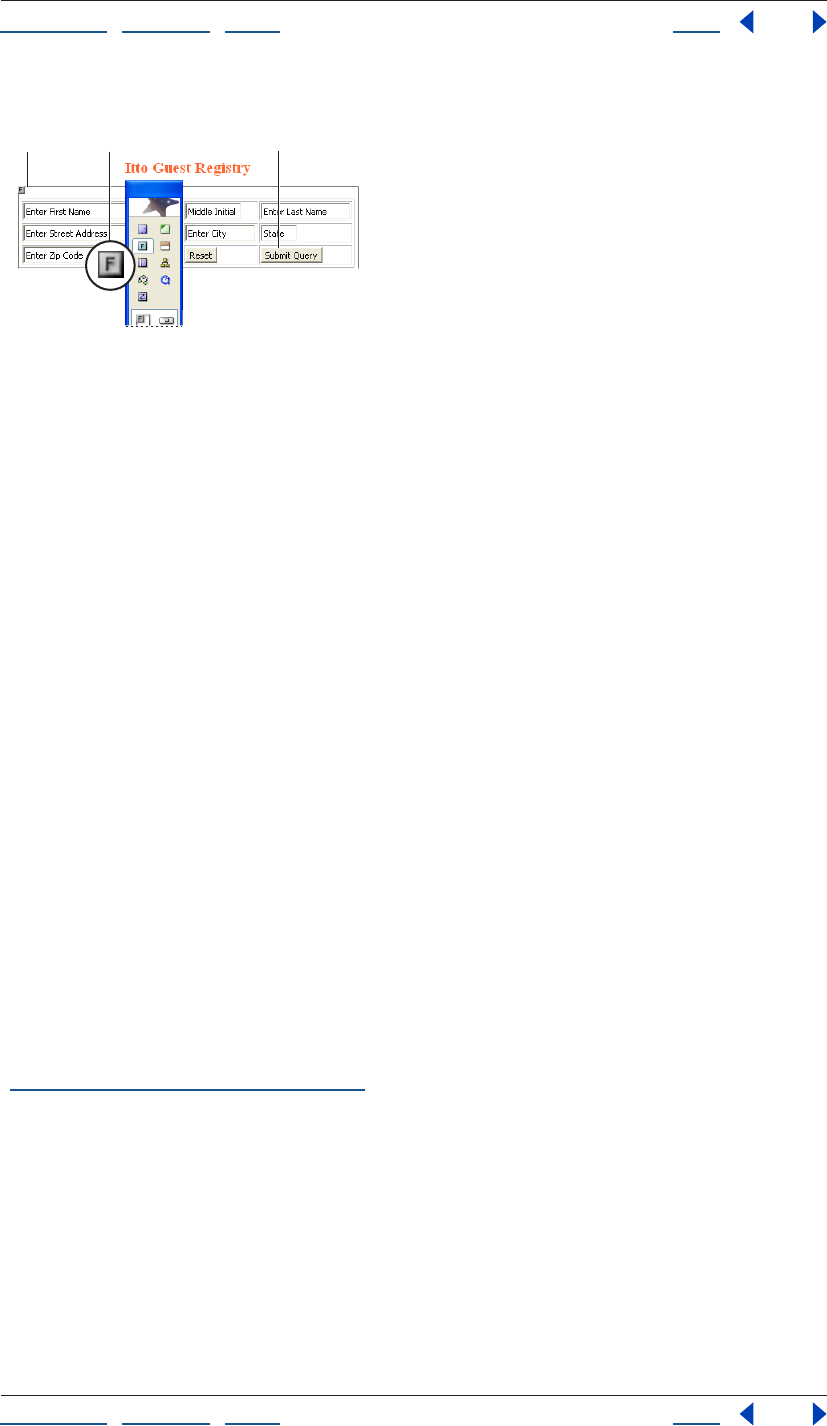
Using Help | Contents | Index Back 295
Adobe GoLive CS Help Creating Forms
Using Help | Contents | Index Back 295
7 Preview your form in a browser and test its functionality.
Designing a form
A. Form icon contains all elements of a fill-in form
B. Form icon C. Individual form elements placed in table cells
Setting up the form element
The form element identifies the current Web page or section of a Web page as a form and
instructs the browser where and how to return form information for processing. The
content of your form must be contained in the box that surrounds the Form icon in the
document window. If you are using an HTML table to design your form, be sure to put the
Table icon in the box that surrounds the Form icon in the document window. The form
element must precede any other form elements.
To set up the form element:
1 Drag the Form icon from the Forms set in the Objects palette, or double-click the icon.
2 In the Form Inspector, choose an option from the Name/ID menu (choose Name & ID for
maximum browser compatibility), and then type a unique form name in the Name/ID text
box. A unique name is especially important if you have more than one form on your page,
or if you use CGI scripting.
3 In the Action text box, specify or type the directory and file name of the CGI script
where the information will be sent when the viewer clicks the Submit button.
Note: Check with your Internet service provider for information on CGI scripts available to
you and the location of scripts on the server. Avoid using a mailto link in the form’s action
because your viewers may not have their browsers configured properly for sending the
data to the server.
4 If your form is embedded in a frame set and you want to control where the HTML page
returned by the Web server appears, choose a target location from the Target menu. (See
“Setting up target frames” on page 159.)
CAB
Using Help | Contents | Index Back 296
Adobe GoLive CS Help Creating Forms
Using Help | Contents | Index Back 296
5 Select an encoding method from the Encode pop-up menu:
• Default and application/x-www-form-url-encoded are the same. These use the ASCII
character set.
• Multipart/form-data tells the server where the files begin and end.
• Text/plain sends the form data as plain text.
6 In the Method pop-up menu, determine how the form information will be sent:
• Post returns data entered by the viewer information separately from the Web page.
• Get sends the viewer’s entries appended to the URL in the Action text box.
• Default omits the Method attribute.
Note: It is recommended that you use the Post option. Using Get to append information to
the destination file may exceed the URL length limit and possibly cause data loss.
Adding different elements to a form
The Forms set in the Objects palette contains a complete inventory of form elements,
including buttons, check boxes, text fields, list boxes, pop-up menus, special elements,
and HTML 4.0 elements.
Note: Icons from the Forms set in the Objects palette must be added in the box that
encloses the Form icon in the document window; otherwise they will not be part of the
form.
Creating buttons and check boxes
You can set up several types of buttons and check boxes on your Web page form.
• The Submit button is labeled Submit Query, and sends data entered in the form to the
CGI script for processing.
• The Reset button is labeled Reset, and clears the current data, resetting the form to its
default values.
• Radio buttons let viewers select one item from a list. To make sure that the selection
works properly, create logical groups of complementary radio buttons in the Form
Radio Button Inspector.
• A custom button behaves exactly like a standard Reset, Submit, or Normal button, but
you can customize its appearance. You can insert formatted or unformatted text, an
image, or other content to make the form’s user interface intuitive.
• The Check Box lets the viewer select multiple items from a list of options.
For information on adding labels to buttons and check boxes, see “Adding labels” on
page 299.
To create a Submit, Reset, or custom button:
1 Drag the Submit Button icon , the Reset Button icon , or the Button icon from
the Forms set in the Objects palette to your form.
2 To change the label on the face of a Submit or Reset button, select Label in the Input
Button Inspector and type a label (for example, Send).
3 To create a custom button, set Button to Normal, and specify any of the following Form
Button Inspector options:
Using Help | Contents | Index Back 297
Adobe GoLive CS Help Creating Forms
Using Help | Contents | Index Back 297
• In the Name text box of the Inspector, enter a unique button name.
• In the Value text box, specify an action or a value to be passed to the CGI script (if
necessary).
4 Customize the button face by typing a label in the text box, or by dragging a Form Input
Image icon from the Forms set in the Objects palette to the button, and then linking the
icon to a graphic in the Form Input Image Inspector.
Note: Use the Type menu commands to format the label.
To create a Radio Button:
Drag the Radio Button icon to your form and set the options in the Form Radio Button
Inspector:
• In the Group text box, type a group name, or select an existing group name from the
pop-up menu.
• In the Value text box, type a value or a descriptive name for the radio button that
identifies it within the group. When a viewer clicks the Submit button in the form, this
value is passed to the CGI script if the viewer selects the radio button.
• Select Selected to make the radio button appear selected by default.
To create a check box:
Drag the Check Box icon to your form and set the options in the Form Check Box
Inspector:
• In the Name text box, type a unique name to identify the check box.
• In the Value text box, type the value for the check box. When a viewer clicks the Submit
button in the form, this value will be passed to the CGI script if the viewer selects the
check box.
• Select Selected to make the check box appear selected by default.
Creating text fields
You can create text fields, password fields, and text areas on your Web page form. The text
and password fields let viewers enter a single line of text, or a required password. The text
area field lets viewers enter multiple lines of text. When a viewer clicks the Submit button,
the form passes the text to the CGI script.
To create a text field or a password field:
1 Drag the Text Field icon or the Password icon from the Forms set in the Objects
palette to your form and set the options in the Inspector.
• In the Name text box, type a unique name to identify the text field or password field.
• In the Value text box, type default text that can be overwritten by viewers, or leave the
text
box empty.
• In the Visible text box, type the number of characters to be visible in the text field.
• In the Max text box, type in the maximum number of characters accepted by the text
field before truncation occurs. The default is to leave it empty. If empty, this limit is
determined by the Web browser used to view the form.
Using Help | Contents | Index Back 298
Adobe GoLive CS Help Creating Forms
Using Help | Contents | Index Back 298
• Select Is Password Field if the text field is a password text field. If selected, GoLive
displays bullets rather than text as the viewers type.
Note: Password protection of Web pages is an interactive feature that requires processing
of viewer entries through a CGI script on the Web server. What you implement in GoLive is
the visual representation of the password protection mechanism.
To create a text area:
1 Drag the Text Area icon from the Forms set in the Objects palette to your form, and
set the options in the Form Text Area Inspector:
• In the Name text box, type a unique name to identify the text area.
• In the Rows text box, type the number of rows to determine the maximum number of
rows visible in the text area.
• In the Columns text box, type the number of characters to determine the width of the
visible text area.
2 Choose the appropriate option from the Wrap pop-up menu to control line breaks:
• Default uses the default text area settings of the browser.
• Off instructs the browser to ignore the Columns limit and prevents text entered into the
text area from wrapping.
• Virtual wraps the text on-screen, but not when the data is processed.
• Physical wraps the text on-screen, and when it’s processed.
3 If necessary, in the Content text box, type in default text that the viewer can overwrite.
Setting up list boxes and pop-up menus
The List Box icon inserts a scrolling list box with multiple options to choose from. The
Popup icon inserts a pop-up menu with multiple options to choose from.
To set up a list box or a pop-up menu:
1 Drag the List Box icon or the Popup icon from the Forms set in the Objects palette
to your form, and set the options in the Inspector.
• In the Name text box, type in a unique name to identify the list box or pop-up menu.
• In the Rows text box, type in the number of rows you want to be visible. For a pop-up
menu, this is the number of rows viewers see when scrolling through the menu.
• Select Multiple Selection to allow viewers to select one or more options.
2 Select an option from the Label/Value list box. Check the box next to the Label and
Value text boxes to have the browser display that option as the default selection.
Using Help | Contents | Index Back 299
Adobe GoLive CS Help Creating Forms
Using Help | Contents | Index Back 299
3 Edit the labels and values:
• Select an item, and enter a new label and appropriate value.
• Click New Item to add new options as necessary.
Adding labels
The Label icon inserts a visual label that you can use to identify the purpose of your form
elements. Clicking the label activates or deactivates the associated object—for example, a
check box.
To insert a label:
1 Drag the Label icon from the Forms set in the Objects palette to your form.
2 Select the text on the face of the label and type the text for the label.
Note: Use the Type menu commands to format the label.
3 To link the label with the form element, select the label and then do one of the
following:
• In the Form Label Inspector, drag from the pick whip to the form element you want to
label.
• Alt-click (Windows) or Command-click (Mac OS) the border of the label, and drag to the
form element you want to label.
The Reference text box of the Form Label Inspector displays the ID that controls the associ-
ation between the form element and its label.
Grouping elements in a form
The Fieldset icon inserts a bounding box that visually groups form elements. You can use
the legend to tell viewers the purpose of the options grouped in the field set.
The Fieldset Legend marker
Note: The bounding box and legend may not render correctly in all browser versions.
Be sure to test your form with the preview in browser feature, and live before publishing
your form.
To insert a Fieldset and Legend:
1 Drag the Fieldset icon from the Forms set in the Objects palette to your form.
2 In the Form Fieldset Inspector, select Use Legend if you want a legend to appear in the
field-set boundary.
3 Choose the legend alignment from the Alignment pop-up menu:
• Default positions the legend according to the browser’s preferences. (If the browser
does not specify any legend alignment preferences, the legend will be left-aligned.)
• Left positions the legend in the upper left corner of the field set.
• Center positions the legend in the upper middle of the field set.
• Right places the legend in the upper right corner of the field set.
Using Help | Contents | Index Back 300
Adobe GoLive CS Help Creating Forms
Using Help | Contents | Index Back 300
4 Double-click the legend in the field set, and then type a name.
Providing form navigation
You can make your forms easy to navigate by using keyboard shortcuts. The Focus section
of the different Inspectors lets you control the tab order of your fields.
In an HTML form, each element must receive focus from the viewer to become active and
perform its task. In addition to clicking in a specific field, there are two alternative ways of
navigating a form using the keyboard:
• You can define a tabbing chain, and then type text or press Enter to trigger some form-
specific action.
• You can provide a platform-specific access key combination, and then type text or press
Enter to trigger some form-specific action.
Note: Not all browser versions support form navigation control keys.
Setting up tabbing chains
A tabbing chain lets you define the order in which form elements are selected when
viewers press the Tab key repeatedly. You can assign a tab index value to each element.
Navigation proceeds from the element with the lowest index value to the element with
the highest index value. Tab index values need not be contiguous or start at any particular
value. If you assign the same tab index value to two elements, the sequence in the HTML
stream determines the tabbing order. Labels, text fields, password fields, text areas,
Submit buttons, Reset buttons, check boxes, radio buttons, pop-up menus, and list boxes
support tab indexing.
To assign or change tab index values:
1 In Layout view, choose Special > Start Tabulator Indexing.
Small yellow index boxes appear on top of or inside indexable elements throughout your
form, and a pound sign is appended to the pointer .
2 Click each element successively in the required tabbing order. A tab index number
appears in each index box and in the Tab text box of the Inspector.
3 When you have specified the tabbing chain, choose Special > Stop Tabulator Indexing,
or click the Start/Stop Indexing button in the Inspector.
4 Test the result in a browser that supports tabbing navigation, such as Microsoft Internet
Explorer 4.0 or later.
You can also select the form elements one at a time in the desired tabbing order, and enter
a number in the Tab text box of the Inspector.
Using Help | Contents | Index Back 301
Adobe GoLive CS Help Creating Forms
Using Help | Contents | Index Back 301
You can edit the tab index order at any time. The first element in the tab index order is
numbered one and GoLive sequentially numbers successive elements.
Assigning tab index values
A. Text boxes in a form
B. Yellow index boxes identify indexable elements
C. Click elements sequentially to set the tabbing order.
Defining access keys
You can define a unique access key for any form element on a page. An access key lets
viewers focus on an element by pressing a modifier key and a dedicated alphanumeric key
simultaneously
(Alt-S, for example, to activate the Submit button in a Microsoft Windows-based browser).
Legends, labels, text fields, password fields, text areas, Submit buttons, Reset buttons,
check boxes, and radio buttons support access keys.
To define an access key:
1 Select the element you want to assign a key combination to.
2 In the Key text box of the Inspector, type any alphanumeric character.
3 Add a visual indication of the access key—for example, add a label or text that gives the
key combination.
4 Repeat steps 1 through 3 for the next form element. Do not assign the same access key
to two form elements.
5 Test the result in a browser that supports navigation using access keys, such as
Microsoft Internet Explorer 4.0 or later.
Setting up special HTML elements
A number of special HTML elements let you add images to your form buttons, insert
hidden data, include cryptographic keys, and insert a file selection dialog box.
• The Form Input Image icon lets you use an image, such as a graphical Submit button.
Inserting graphics can help viewers navigate through your pages.
• The Hidden icon inserts an HTML tag that does not display when you view the form in
the browser. However, the form submits the HTML tag values with the rest of the form
data.
• The Key Generator icon lets viewers address an encryption algorithm for
safeguarding transactions with your Web site. For more information about form crypto-
graphic issues, contact your ISP or Web site administrator.
• The File Browser icon inserts a file selection dialog box, but is rarely used.
AC
B
Using Help | Contents | Index Back 302
Adobe GoLive CS Help Creating Forms
Using Help | Contents | Index Back 302
To insert an input image placeholder:
1 Drag the Form Input Image icon from the Forms set in the Objects palette to your form.
2 Link the image placeholder with a graphic by using the pick whip or the Browse button
in the Form Input Image Inspector. (See “Linking files” on page 61.)
3 In the Form Input Image Inspector, choose an option from the Name/ID menu (choose
Name & ID for maximum browser compatibility), and then type a unique form input image
name in the Name/ID text box.
Note: Naming the image is especially important when you are using several graphical
Submit buttons within the same form. This name is appended to the x and y coordinates
that the CGI script uses to indicate that viewers clicked that specific input image, and to
trigger a button-specific action..
4 Select the More tab and set up the input image as desired. (See “Setting basic image
options” on page 236, “Providing form navigation” on page 300, and “Setting up inactive
elements in a form” on page 303.)
Note: If you plan to use the image as a clickable button, make sure to select Is Form. (This
option is selected by default.)
To set up a hidden tag, key generator, or file browser:
1 Drag the Hidden, Key Generator, or File Browser icon from the Forms set in the Objects
palette to your table.
2 Select the icon in the document window. In the Inspector, enter a unique name in the
Name text box.
3 Enter a value:
• For a Hidden tag, type a default value in the Value text box.
• For a Key Generator tag, type the security level in the Challenge text box.
• For a File Browser, type the file browser window width value in the Visible text box.
Setting up read-only elements in a form
You can set individual HTML form elements to read-only status. For example, you might
want to include text that must accompany the form. Text fields, password fields, and text
areas support read-only status.
To set an element to read-only status:
Select the element you want to set to read-only, and select Read-only in the Inspector.

Using Help | Contents | Index Back 303
Adobe GoLive CS Help Creating Forms
Using Help | Contents | Index Back 303
Setting up inactive elements in a form
You can give viewers access to form elements only in specific situations by building HTML
forms with dimmed elements that can be conditionally activated by a script. On the HTML
side, you add a “disabled” attribute to each form element that should be unavailable when
a viewer loads the form. The form’s CGI script monitors elements of another form for a
particular event and activates the item when the event occurs. For example, you can keep
a form’s Submit button inactive until viewers enter some required data.
Text fields, password fields, text areas, Submit buttons, Reset buttons, check boxes, and
Radio buttons support inactive status.
To disable an element:
1 In the document window, select the element you want to deactivate.
2 Select Disabled in the Inspector.
3 Write the script to implement the logic that dynamically enables the item, and attach
the script to the page or to another button.

Using Help | Contents | Index Back 304
Adobe GoLive CS Help Working with Site Assets
Using Help | Contents | Index Back 304
Working with Site Assets
About site assets
Site assets include templates for pages and sites, and custom sets of files, text, objects,
colors, fonts, and URLs that you can collect and use on any page in your site. These can be
especially useful when several people are building a site. You collect and store site assets
in the site window, in your site’s web-data folder, and as objects in the Library palette. The
Library palette enables you to store application-wide or site-specific assets, and displays
previews of site assets in its preview pane.
You can turn off the Library palette preview: deselect Show Preview from the Library
palette menu.
GoLive includes many preset page templates, stationery files, and snippets for common
Web design tasks. These presets are organized in the application-wide groups in the
Templates, Stationery, and Snippets tabs of the Library palette.
Page templates You can use page templates to prevent others from changing certain
parts of a page layout in new pages. Any area of the layout that you don’t mark as an
editable region is automatically locked when you create a new page from the template.
New pages created from a page template remain linked to the template—when you
change the template, GoLive automatically updates the pages without affecting any
content that has been added to them.
Use co-author templates to design a site that others can update using a simple,
streamlined story editor (see “Creating co-author templates” on page 342).
Components Components are HTML source files that you can add to a page as a single
object, such as a navigation bar with hypertext links. You can use components to store
text, objects, and attributes that you want to reuse on multiple pages in your site. Compo-
nents on a page remain linked to their source files—you can double-click them to open
the source files. When you change a component’s source file, all the pages containing the
component are automatically updated.
Stationery Stationery files are like page templates except that new pages created from
stationery files do not remain linked to the files—changes you make in a stationery file are
not updated in the new pages. Stationery is useful when you want to set up starting
elements for a page (such as a background color, no page margins, and an external
cascading style sheet) and then set GoLive to use the stationery page whenever it creates
a new untitled page. (See “Setting preferences for opening pages” on page 42.)
Snippets You can save snippets of source code, text, images, and other objects and add
them to pages as single objects. Snippets are similar to components except that snippets
do not remain linked to their source files when you add them to a page.
Using Help | Contents | Index Back 305
Adobe GoLive CS Help Working with Site Assets
Using Help | Contents | Index Back 305
Colors and font sets Colors and font sets are attributes that you can save and reuse on
pages for a site. You collect and name site colors and font sets in the Colors and Font Sets
tabs in the site window. You can then choose your custom site colors and font sets from
the Swatches palette or from the Type > Font menu. Site colors and font sets remain linked
to pages you use them on, so whenever you change a site color or font set GoLive updates
every place where the color or font set is used.
URLs and e-mail addresses URLs and e-mail addresses are Href attributes that you can
collect in the External tab in the site window and then reuse the same attribute values for
links in your site. When you change the value of a site URL, links on the pages that
reference the URL are automatically updated.
Collections Collections are sets of symbolic links to files in the site that you can manage
in the Collections tab of the site window. Collections enable you to save groups of files
that you work on frequently, or that are closely related. You can define a collection by
dragging or copying files from the Files or Extras tab of the site window to the Collections
tab, or by saving the results of a query, syntax check, or find operation as a collection.
Site templates Site templates are groups of files and folders that GoLive uses to create
new sites. You can create site templates to ensure a standard look and functionality to
pages in multiple sites. For example, use templates when you need to maintain standards
on your company’s departmental Web sites. You store site templates in a folder in the
Adobe GoLive CS folder.
Using page templates
You can save any page as a page template and use it to control the layout and appearance
of other pages in your site. Any part of the page template that is not marked as an editable
region is automatically locked so that when you or others on the same site project create
new pages from the template, only the editable regions can be changed.
Note: You can use co-author templates to design a site that others can update using a
simple, streamlined story editor (see “Creating co-author templates” on page 342).
You use color highlighting to show the difference between locked and editable regions.
New pages based on a template are automatically updated whenever you make changes
to the template (content in the editable regions is not affected).
Use Smart Objects for images in your page templates. If you resize a Smart Object in a
template, GoLive automatically resizes and optimizes its Web image in every page
that’s connected to the template.
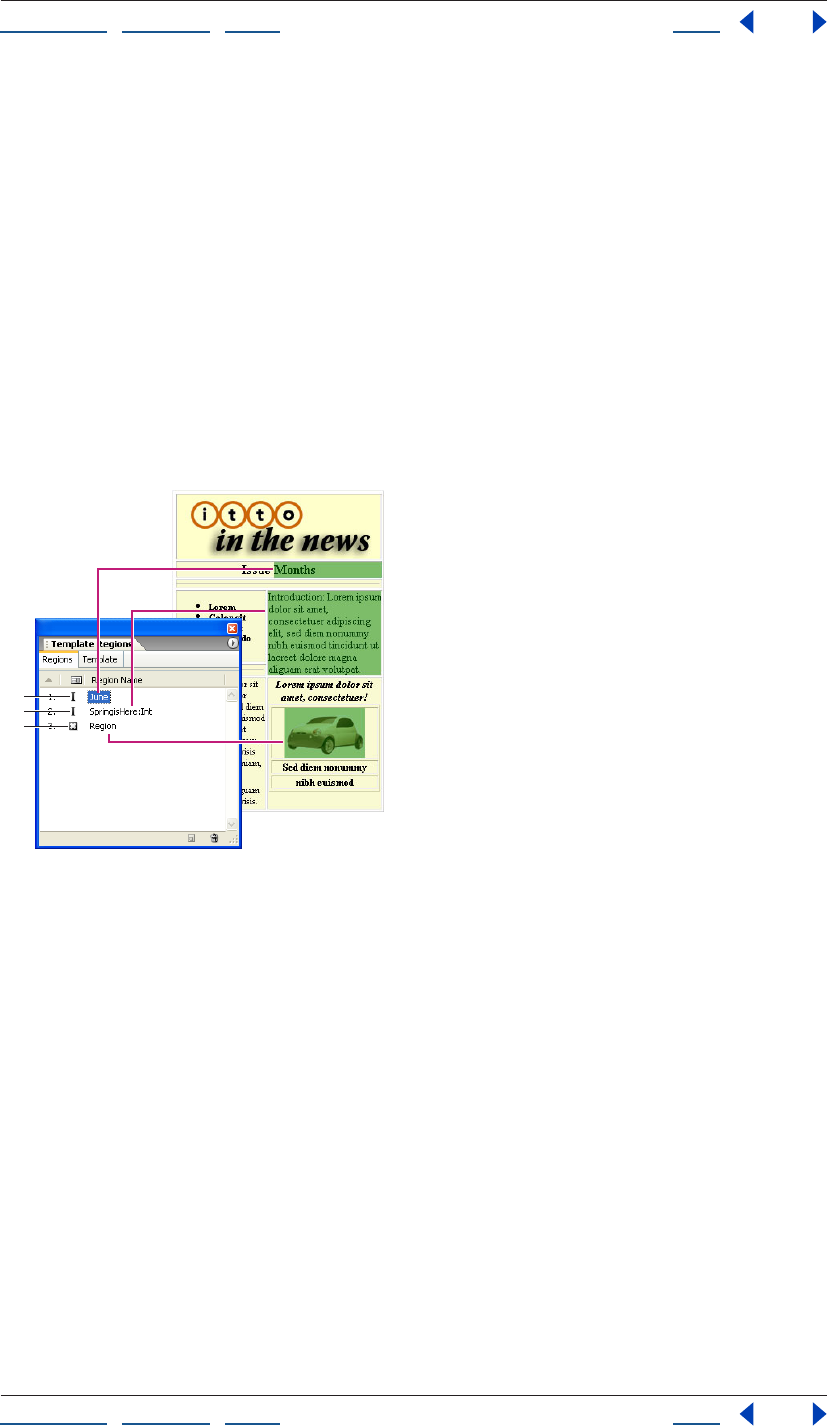
Using Help | Contents | Index Back 306
Adobe GoLive CS Help Working with Site Assets
Using Help | Contents | Index Back 306
GoLive includes many preset page templates. These presets are organized in the appli-
cation-wide group in the Templates tab of the Library palette.
Creating a page template
You use the Template Regions palette to mark regions of the page as editable. You can
create three types of editable regions: paragraphs, inline selections within a paragraph,
and objects, such as layers, images, or tables. When a region is marked as an inline text
style, you can’t insert paragraphs in the region—in other words, you can type in the region
but you can’t press return to start a new paragraph.
You can lock or unlock everything in the template that is not marked as an editable region
and use the Highlight palette to set the color highlighting for locked and editable regions.
(Regardless of whether you lock the uneditable regions in the template or not, these
regions are automatically locked in all pages created from the template.)
You can save templates with a specific site, or as application-wide templates.
Symbols indicate the type of editable region.
A. Inline text region B. Paragraph region C. Object region
To create a page template:
1 Select an area in the page that you want to mark as an editable region. To select an
entire paragraph, click inside it and then click the <p> tag in the markup tree bar at the
bottom of the document window.
A
B
C
Using Help | Contents | Index Back 307
Adobe GoLive CS Help Working with Site Assets
Using Help | Contents | Index Back 307
2 In the Template Regions palette, click the Create New Editable Region button at the
bottom of the palette.
By default, names of new regions are based on the first few characters in a text selection or
its object type. To automatically name new regions Region, Region2, Region3, and so on,
deselect Selection Defines Region Name by choosing it from the Template Regions palette
menu.
3 Select the new region listed in the palette and type a new name for it. (Spaces and
underscores are not allowed in the name.)
4 Repeat steps 1 through 3 for every region you want to mark as editable.
You can also mark the selection as an editable region by choosing Special >
Template > New Editable Region.
5 Choose options for working in the editable regions from the Template Regions palette
menu:
• Auto Selection selects the entire content of the editable region when you click in it.
• Cyclic Tabbing lets you use the Tab key to cycle through the editable regions on the
page.
6 Open the site window and do any of the following to save the page as a template:
• Choose File > Save As, name the template, choose Templates from the Site Folder menu,
and click Save.
• Choose Save As > Save As Template from the document window menu, name the
template, and click Save.
• In the site window, drag the page from the Files tab to the Templates folder in the Extras
tab, or to the application-wide or site-specific section of the Templates tab of the
Library palette.
Note: Site-specific page templates are stored in the site’s web-data/Templates folder and
appear in the Extras tab of the site window and the Templates tab of the Library palette.
To set the color highlighting of editable and locked regions:
In the Highlight palette, click the Colors tab, and do any of the following:
• Click the color field for the Locked Regions or Editable Regions and then select a new
color in the Color palette. Or, click the lower right corner of the color field and select a
color from the swatches that appear.
• Drag a color slider to adjust the color opacity for Locked Regions or Editable Regions.
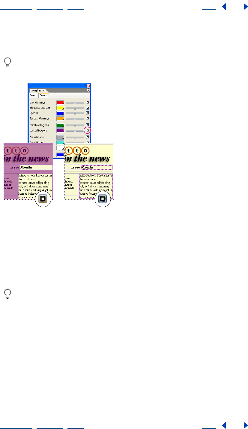
Using Help | Contents | Index Back 308
Adobe GoLive CS Help Working with Site Assets
Using Help | Contents | Index Back 308
• Click the button to the right of the color slider for the Locked Regions or Editable
Regions to toggle between color highlighting the borders or the background fills of
these areas.
To see the color highlighting applied to the locked regions in the template, choose
Special > Template > Lock Page, or choose Lock Page from the Template Regions
palette menu.
Toggle the button for borders or fills.
A. Highlights background fill of locked regions.
B. Highlights borders of locked regions.
Using a page template to create new pages
You can use a variety of methods to create new pages from a page template. Depending
on the method you use, GoLive may open the new page in an untitled.html document
window or name the file based on the name of the template (for example, New from
Template1.html).
Page templates with locked and editable regions can be used interchangeably with
Macromedia Dreamweaver to create new pages either in Dreamweaver or GoLive.
To create a new page using a page template:
Do one of the following:
• Choose File > New Special > Page From Template, then select a page template and click
Open.
• Select the template from the Templates tab of the Library palette. Then drag the
template’s icon into an empty document window or the Files tab in the site window, or
onto a page in navigation view. (In navigation view, hold the template’s icon over the
page until a bar appears above, below, or at the side of the page, and then release the
mouse.)
• Double-click the template’s icon in the Templates tab of the Library palette or in the
Extras tab in the site window, and click Create.
AB
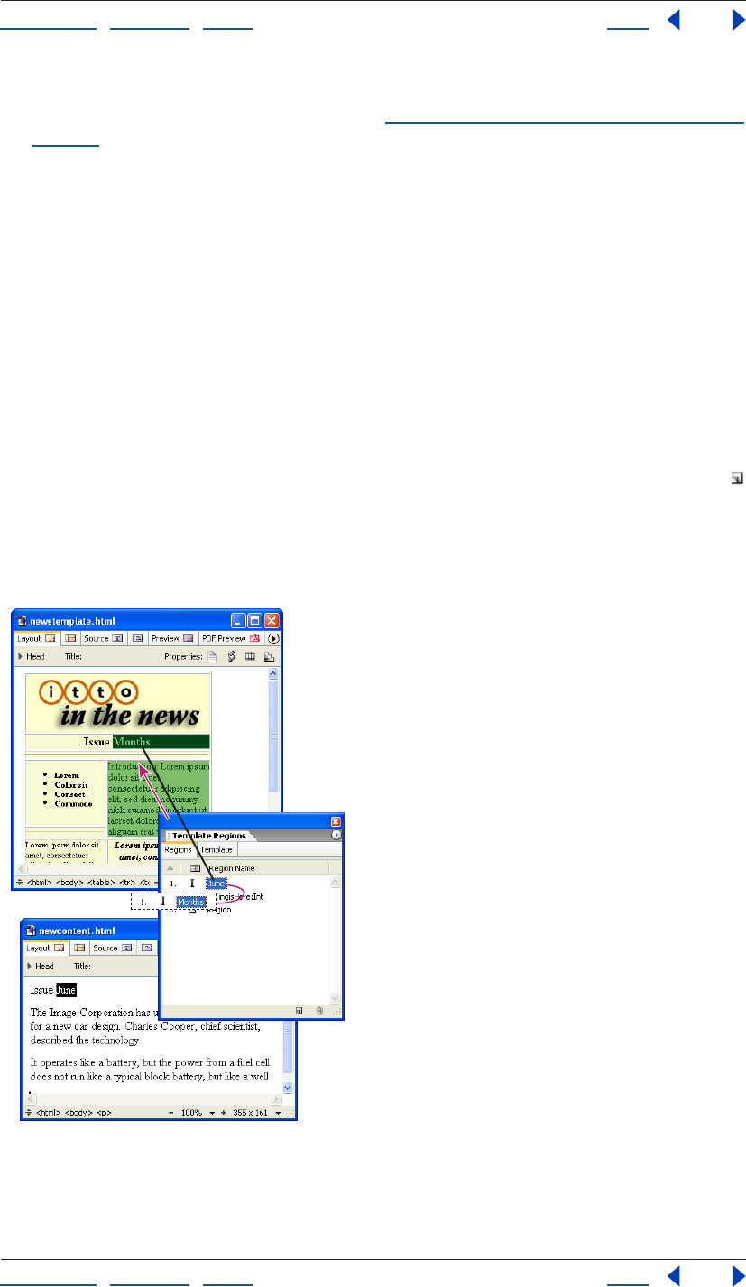
Using Help | Contents | Index Back 309
Adobe GoLive CS Help Working with Site Assets
Using Help | Contents | Index Back 309
• Set a preference to use the template for all new pages by default, and then choose
File > New Page or Site > New > Page. (See “Setting preferences for opening pages” on
page 42.)
Applying a page template to existing pages
You can apply a page template to pages that already have content in them. When you
apply a page template, GoLive looks for matching names of marked editable regions in
the existing content. If any are found, GoLive automatically moves the existing content
into the regions. If no matches are found, GoLive displays a list of regions in the template
to choose from and the option to overwrite the content by not choosing a specific region.
Using the Template Regions palette, you can quickly prepare existing content for a
template by marking new editable regions of the same type (paragraph, inline, or object)
and automatically renaming the regions with matching names from the template.
To prepare content on a page with matching region names:
1 Display the template and the page side by side.
2 Select the content on the page, and then click the Create New Editable Region button
in the Template Regions palette.
3 Alt-drag (Windows) or Command-drag (Mac OS) from the new region in the palette to
the region in the template that has the name you want to use for the new region. GoLive
applies the name of the template’s region to the new region.
Alt-drag or Command-drag to apply the template’s region name “Months” to a new region.
Using Help | Contents | Index Back 310
Adobe GoLive CS Help Working with Site Assets
Using Help | Contents | Index Back 310
To apply a page template to an existing page:
1 Do one of the following:
• Drag the template’s icon from the Templates tab of the Library palette into the page.
• Choose Special > Template > Apply Template. Then select the template and click Open.
If all editable region names in the page match region names in the template, GoLive
moves the page content into the regions defined in the template. The Select Editable
Region dialog box appears if there is content on the page that is unmarked or marked
with nonmatching region names.
2 If the Select Editable Region dialog box appears, do one of the following:
• Select a region in the template to move the content into and click OK.
• Select None to overwrite the content on the page and click OK.
To try out multiple templates with matching region names on existing pages:
1 Apply the first template to the pages.
2 Select the template in the Extras tab in the site window, and open the In & Out
Links palette.
3 Choose Palette Options from the palette menu, select Links to File, and click OK to
display all pages that are linked to the template.
4 Drag the pick whip in the Links tab of the In & Out Links palette to the second
template in the Extras tab in the site window.
5 Click OK to change the reference.
For more information, see “Using the In & Out Links palette to view links” on page 124.
Updating or detaching a page template
Pages that you create based on a page template remain linked to the template, so that
when you make changes to the template, the pages are automatically updated. You can
detach the page template from the pages so there is no longer a link between them.
To update a page template:
1 Double-click the template file in the Templates tab of the Library palette or in the Extras
tab in the site window, and click Modify.
2 Make changes to the template’s page layout as desired, and then do any of the
following in the Template Regions palette:
• Click the Create New Editable Region button to apply an editable region to a
selection in the layout.
• Select a region name and enter a new name.
• Select a region and click the Undefine Editable Region button .
Note: You must unmark an editable region before you can delete its content in the
document window.
3 Choose File > Save.
4 In the Updating Template dialog box, select the pages that you want to be updated
from the modified template, and click OK.
Using Help | Contents | Index Back 311
Adobe GoLive CS Help Working with Site Assets
Using Help | Contents | Index Back 311
To detach a page from a page template:
Click in the page and choose Template > Detach from Template from the context menu.
Using components
You use GoLive components in your pages to reference one or more elements stored in a
single source file. Components are useful for buttons, logos, headers, mastheads, or other
common navigation elements that you want to use throughout your site. Changes you
make to elements in a component’s source file are updated dynamically in the pages that
use the component.
When you add a component to a page, the component remains linked to its source file
until you detach it. You can double-click components on the page to open their source
files and edit the files. You can save components with a specific site, or as application-wide
components.
Note: Components cannot contain objects from the Head set in the Objects palette. Also,
you should make sure to use the same character encoding for a component’s source file as
the character encoding in the pages that use the component. (See “Adding elements or
scripts to the head section” on page 56.)
To create a component source file:
1 In a new document window, add the desired content for the component—for example,
a layout grid with your corporate logo and headline—and then click the Show Page
Properties icon in the upper right corner of the window.
2 In the Page Inspector, click the HTML tab, select Write Code into Page, and then click
Component to set up the current page for use as a dynamic component.
This ensures that the component can be easily edited in the Layout Editor. The Import
GoLive Script Library setting is necessary if your component uses GoLive actions.
3 Open the site window and do any of the following to save the page as a component:
• Choose File > Save As, name the component, choose Components from the Site Folder
menu, and click Save.
• Choose Save As > Save As Component from the document window menu, name the
component, and click Save.
• In the site window, drag the page from the Files tab to the Components folder in the
Extras tab, or to the site-specific or application-wide section of the Components tab in
the Library palette.
Note: Site-specific components are stored in the site’s web-data/Components folder and
appear in the Components tab of the Library palette and the Extras tab of the site window.
To use a component:
Do one of the following:
• Drag the component’s icon from the Components tab of the Library palette to the page.
• From the Smart set in the Objects palette, drag the Component placeholder icon to the
page. Then, in the Component Inspector, specify the destination of the link by dragging
from the pick whip to the component’s source file in the Extras tab in the site window.
Using Help | Contents | Index Back 312
Adobe GoLive CS Help Working with Site Assets
Using Help | Contents | Index Back 312
To edit the component’s source file:
1 Double-click the component on the page to open the source file.
2 Make the desired changes and save the source file.
3 Click OK to update all pages that use the component.
Note: Components are updated only while you work on your local hard disk. To update
components on the Web server, you must upload each component’s source file and also
the pages that use the component to update your site after changing a source file.
To detach a component from its source file:
Select the component on the page, choose Special > Detach Selected Component, and
then click OK. You can detach all components on the page by choosing Special > Detach
All Components.
The detached component is now fully a part of the page with no dependent link to the
source file—changing the source file will no longer affect the detached component in the
page.
Using stationery
Stationery files can be used as templates for creating new pages. Like page templates, you
can mark areas in a stationery document’s layout as editable regions and lock the rest of
the content. Unlike page templates, stationery has no dynamic link with the pages created
from it. Changes you make to a stationery file do not affect pages already created from
that file.
You can save stationery files with a specific site, or as application-wide stationery.
GoLive includes many preset stationery files. These presets are organized in the appli-
cation-wide group in the Stationery tab of the Library palette. For more information about
the preset stationery files, refer to the Partners folder on the Adobe GoLive CS CD.
To create a stationery file:
1 Prepare the content and layout for the stationery document in the Layout Editor in the
document window. You can use the Template Regions palette to mark locked and editable
regions in the layout. (See “Creating a page template” on page 306.)
2 Open the site window and do any of the following to save the page as stationery:
• Choose File > Save As, name the stationery, choose Stationery from the Site Folder
menu, and click Save.
• Choose Save As > Save As Stationery from the document window menu, name the
stationery, and click Save.
• In the site window, drag the page from the Files tab to the Stationery folder in the Extras
tab or to the application-wide or site-specific section of the Stationery tab in the Library
palette.
Note: Site-specific stationery files are stored in the site’s web-data/Stationary folder and
appear in the Stationery tab of the Library palette and the Extras tab of the site window.
Using Help | Contents | Index Back 313
Adobe GoLive CS Help Working with Site Assets
Using Help | Contents | Index Back 313
To create a new page using stationery:
1 Do one of the following:
• Choose File > New Special > Page From Stationery, choose stationery in the Select
Stationery dialog box, click Open, and then click Create.
• Double-click the Stationery icon in the Stationery tab of the Library palette or the
Stationery folder in the Extras tab in the site window, and click Create.
• In the site window, drag the stationery file from the Extras tab into the Files tab, and
click Create.
• Select the stationery from the Stationery tab of the Library palette. Then drag the
Stationery icon to the Files tab in the site window, or onto a page in navigation view. (In
navigation view, hold the Stationery icon over the page until a bar appears above,
below, or at the side of the page, and then release the mouse.)
• Set a preference to use the stationery file for all new pages by default, and then choose
File > New Page or Site > New > Page. (See “Setting preferences for opening pages” on
page 42.)
GoLive creates a new page based on the stationery template. If you used the navigation
hierarchy, the new page is stored in the New Files folder in the site.
2 Use the File and Page tabs in the File Inspector to change the filename and title of the
new page.
Using snippets
You can copy text, objects, and snippets of source code from pages in GoLive or
documents in other applications and save them as snippets with a specific site, or to use
on pages in any site. Snippets, like components, are source files that you can add to a page
as single objects. Unlike components, snippets do not remain linked to their source files
when they are added to a page.
Collecting and organizing snippets
You collect snippets in the Snippets tab of the Library palette. When you save a site-
specific snippet, GoLive adds a corresponding source file to the site’s web-data folder and
displays it in the site-specific section of the Snippets tab in the Library palette and in the
Snippets folder in the Extras tab in the site window. Snippets are not limited to HTML—for
example, you can drag image files from the site into the Snippets tab of the Library
palette.
GoLive includes many preset snippets for common Web design tasks. These presets are
organized in the application-wide group in the Snippets tab of the Library palette.
Collect snippets in the site-specific section of the Snippets tab in the Library palette if
you plan to work with the site on more than one computer. That way, the snippets will
be included in the site project file, which moves between computers.
To create a snippet:
1 Open a site.
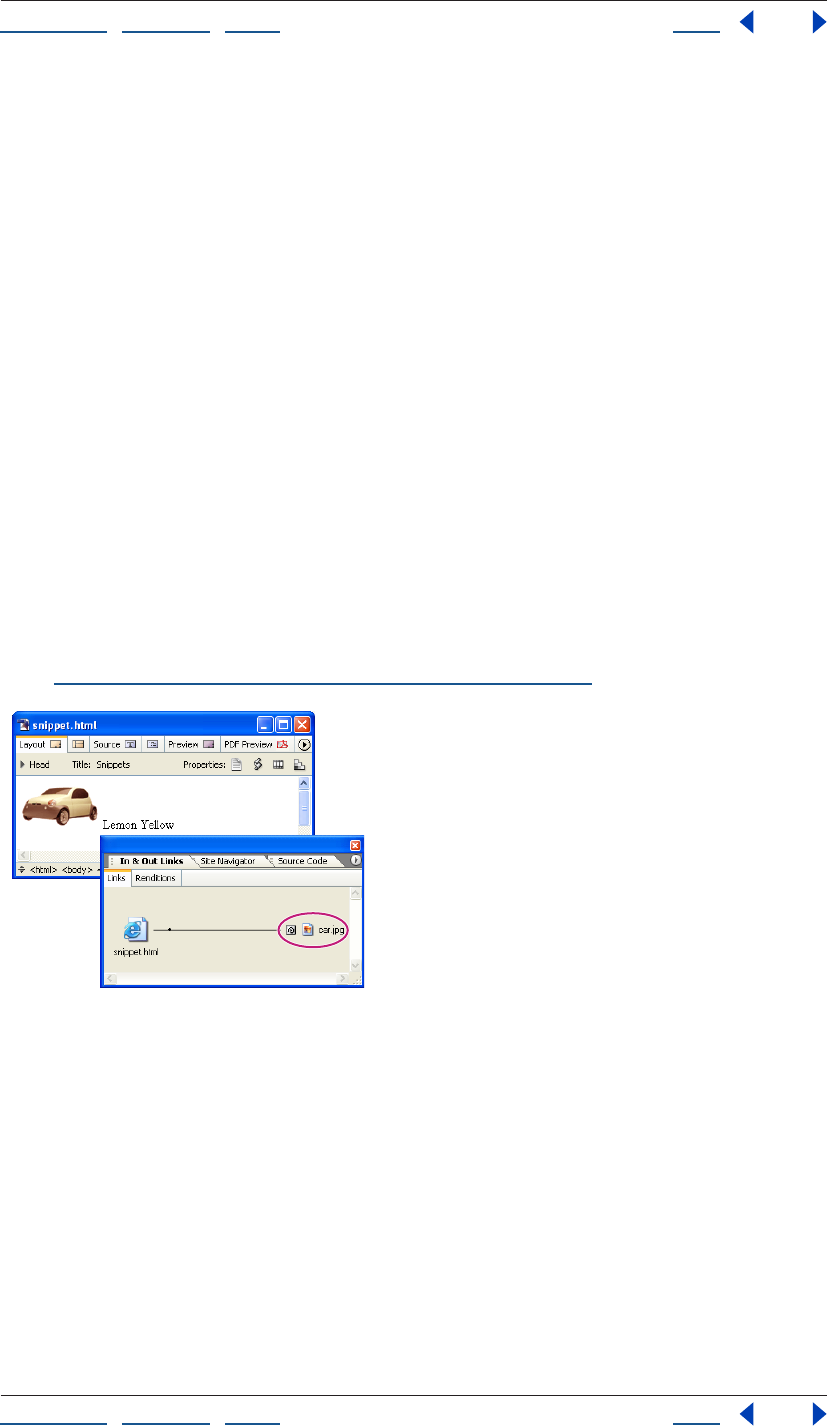
Using Help | Contents | Index Back 314
Adobe GoLive CS Help Working with Site Assets
Using Help | Contents | Index Back 314
2 Select the text, object(s), or source code in GoLive or another application. You can also
select a snippet from another site.
Note: To select paragraph formatting for text in the Layout Editor, you need to select the
paragraph or heading element in the markup tree bar at the bottom of the document
window.
3 Drag the selection from the document window or another site window into the appli-
cation-wide or site-specific section of the Snippets tab of the Library palette.
Note: Site-specific snippets are stored in the site’s web-data/Snippets folder and appear in
the Snippets tab of the Library palette and the Snippets folder in the Extras tab of the site
window.
To name a snippet:
Select the snippet in the Snippets tab of the Library palette and type a new name.
Using snippets on your pages
You can add snippets directly from the Snippets tab of the Library palette to the Layout
Editor or Source Code Editor in the same way that you add other objects from the Objects
palette.
You can use the In & Out Links palette to display snippets containing placeholders for
other files (such as image files). The In & Out Links palette shows the resource links to the
files. If the source file is moved, GoLive displays a dialog box so you can update the link.
(See “Using the In & Out Links palette to view links” on page 124.)
This snippet contains a resource link to an image file.
To add a snippet to a page:
Drag the snippet from the Snippets tab in the Library palette to the Layout Editor or
Source Code Editor.
Note: If you drag the snippet’s source file from the Extras tab in the site window to the
Layout Editor, you’ll create a hypertext link in the page with a reference to the source file as
the link’s destination.
Editing snippet source files
Editing the contents of a snippet’s source file does not affect any pages that already use
the snippet.
Using Help | Contents | Index Back 315
Adobe GoLive CS Help Working with Site Assets
Using Help | Contents | Index Back 315
To edit a snippet’s source file:
Double-click the file in the Snippets tab of the Library palette, modify the contents using
either the Layout Editor or the Source Code Editor, and then choose File > Save.
Using site colors
You can collect and organize colors for a site and apply them to text and objects on pages
in the site. Site colors remain linked to the pages they’re used on, so you can change a site
color and update any page that uses the color. The Colors tab in the site window lets you
list site colors individually or in groups. For each color, the list includes a name that you
assign, the HTML color name and value, whether the color is Web-safe or not, and whether
the color has been used on a page in the site. The colors collected in the Colors tab also
appear in the Site Colors List of the Swatches palette (see “Using the Swatches palette” on
page 68).
After you use a site color on a page, you can update the list in the site window to show that
the color has been used. For information about updating the list of site colors or removing
colors from a site, see “Adding items in use and removing unused items from the site
window” on page 99. For information about organizing site colors in group folders, see
“Working with files and folders” on page 95.
To add colors to your site collection:
1 Do one of the following:
• Select colored text in the document window and drag it to the Colors tab in the site
window. If you select text with multiple colors assigned to it, each color is added to the
list of site colors.
• Select a site color in the Colors tab of another site window and drag it to the Colors tab
in the site window.
• Drag the Color icon from the Site set of the Objects palette to the Colors tab of the site
window, and then click the color field in the Color Inspector and select a new color from
the Color palette, or click the lower right corner of the color field and select a new color
from the swatches that appear.
• Select the Colors tab in the site window and choose Site > Get Colors Used to add all
colors to the list that have been used on pages in the site.
2 Rename the new site color(s) by entering the new names in the Colors tab in the site
window or the Name text box in the Color Inspector.
To apply a site color to text or objects on a page:
1 Select the text or objects to be colored.
2 Do one of the following:
• Select a site color from the Site Color List in the Swatches palette.
• Click the color field in the Inspector and then select a color in the Site Color List of the
Swatches palette.
• Drag the site color from the Colors tab in the site window to the selection on the page.
To change a site color and update pages that use it:
1 Do one of the following:
Using Help | Contents | Index Back 316
Adobe GoLive CS Help Working with Site Assets
Using Help | Contents | Index Back 316
• Select the site color, click the color field in the Color Inspector and select a new color
from the Swatches or Color palette, or click the lower right corner of the color field in
the Color Inspector and select a new color from the swatches that appear.
2 In the Change Reference dialog box, select the pages that you want to update, and
click OK.
Note: The Change Reference dialog box displays only pages that are closed.
Collecting font sets for a site
You can collect and name font sets for specific sites. Site font sets can be shared between
others working on the same site project on different computers. A font set applied to text
provides the Web browser with a choice of fonts to use for displaying the text. (See
“Creating and applying font sets” on page 194.)
Site font sets remain linked to the pages they’re used on, so you can change a font set and
update any page that uses it.
To add a font set to a site:
1 Select the Font Sets tab in the site window.
2 Do one of the following:
• Drag text that uses the font set from the page into the Font Sets tab.
• Choose Site > Get Font Sets Used to add all the font sets currently used by pages in
the site.
• Drag a font set from another site window into the Font Sets tab in the site window.
• Choose Site > New > Font Set and use the Font Set Inspector to add fonts to the set.
• Drag the Font Set icon from the Site set of the Objects palette to the Font Sets tab of the
site window and use the Font Set Inspector to add fonts to the set.
To name a site font set:
1 Select the site font set.
2 Do one of the following:
• Enter a name for the font set in the Font Sets tab in the site window.
• In the Font Set Inspector, enter a name in the Name text box.
To add, reorder, or delete fonts in a site font set:
1 Select the font set in the Font Sets tab in the site window.
2 In the Font Set Inspector, do any of the following:
• Click the Create New Font button or the Create New Font Family button and choose
a font or font family from the pop-up menu.
• Select a font and click the arrow buttons to move it up or down in the list.
• Select a font and click the Remove Selected Fonts button to remove the font from
the list.
To use a site font set:
1 Select the text on the page.
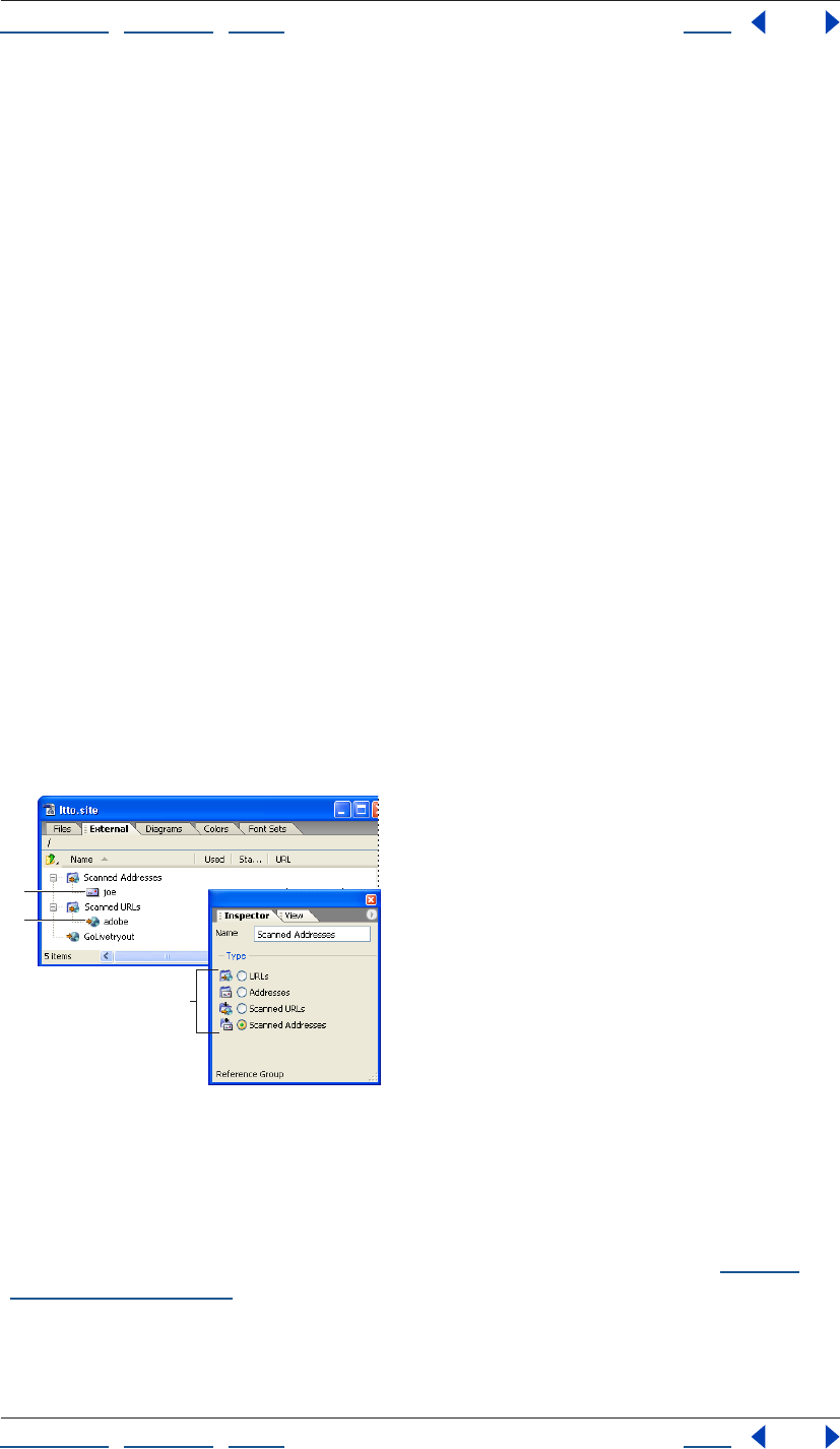
Using Help | Contents | Index Back 317
Adobe GoLive CS Help Working with Site Assets
Using Help | Contents | Index Back 317
2 Drag the font set from the Font Sets tab to the selected text.
To change a site font set and update pages that use it:
1 Select the font set in the Font Set tab in the site window.
2 Add, reorder, or delete fonts in the font set in the Font Set Inspector.
3 In the Change Reference dialog box, select the pages that you want to update, and
click OK.
Note: The Change Reference dialog box displays only pages that are closed.
To organize font sets in group folders:
1 Drag the Font Set Group icon from the Site set in the Objects palette to the Font Sets
tab in the site window.
2 Name the group folder as desired.
3 In the Fonts tab in the site window, drag font sets into the group folder.
Using site URLs and e-mail addresses
You can use site URLs or e-mail addresses on multiple Web pages without having to type
them each time you use them. You collect site URLs in the External tab in the site window.
You can get the URLs for your site collection by importing them from your Web browser’s
favorite URLs, copying them from other pages or sites, or entering them once in the
site window.
If you need to change the value of a site URL or e-mail address that you’ve used on several
pages, you can change it in the site window. GoLive then updates all the pages at once.
Use the Reference Group Inspector to specify type of folder.
A. A site e-mail address B. A site URL
C. Four types of group folders
Note: By default, GoLive treats URLs containing the @ symbol as e-mail addresses and
adds “mailto:” to the URL text box in the Inspector. To avoid this, deselect the option Auto
Add “Mailto:” To Addresses in the Site Settings or Preferences dialog box. (See “Setting
preferences” on page 42.)
To add a URL or e-mail address to the site:
Do one of the following:
A
B
C
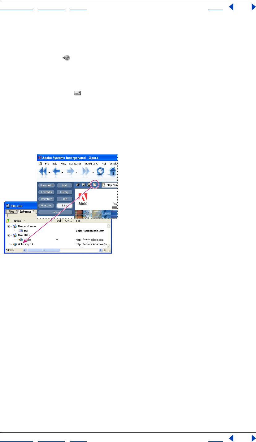
Using Help | Contents | Index Back 318
Adobe GoLive CS Help Working with Site Assets
Using Help | Contents | Index Back 318
• Select the External tab in the site window and choose Site > Get References Used.
GoLive retrieves all the URL and e-mail addresses referenced on pages in the site and
lists them in the External tab.
• Drag the URL icon from the Site set in the Objects palette into the External tab in the
site window. In the Reference Inspector, enter a name for the site URL in the Name text
box, and type or paste the complete URL beginning with the server type such as “http:/
/” or “ftp://” in the URL text box.
• Drag the Address icon from the Site set in the Objects palette to the External tab in
the site window. In the Reference Inspector, enter a name for the site e-mail address in
the Name text box, and type or paste the address (beginning with “mailto:”) in the URL
text box. If you are creating an address list, use commas to separate the multiple
addresses you provide.
• Select the URL in the browser window and drag it (or the icon to its left) to the External
tab in the site window.
Drag the icon to the External tab to add the URL.
• Choose File > Import > Favorites As Site Externals. Then select a Bookmarks, Address
Book, Nickname, or Favorites file from a Web browser or Eudora Pro, and click Open. If
the file contains multiple URLs or e-mail addresses, GoLive imports them as URL or
Address groups.
• Drag a site URL or e-mail address from the External tab of another site window to the
External tab in the site window.
Using Help | Contents | Index Back 319
Adobe GoLive CS Help Working with Site Assets
Using Help | Contents | Index Back 319
To rename or edit a site URL or e-mail address:
1 Select the site URL or e-mail address in the External tab.
2 Do any of the following:
• Type a new name in the External tab in the site window or the Name text box in the
Reference Inspector.
• Type a new value for the URL or address in the URL text box of the Reference Inspector.
• Click Edit in the Reference Inspector, enter a new URL or address, and click OK. (See
“Editing URLs in links” on page 64.)
3 If the Change Reference dialog box appears, click OK to confirm the new URL or address
and update all pages in the site that use it. (If you want to exclude a page from updating,
deselect it before clicking OK.)
To organize URLs and e-mail addresses in group folders:
1 Drag the URL Group or Address Group icon from the Site set in the Objects palette to
the External tab in the site window.
2 Name the group folder as desired.
3 In the External tab in the site window, drag URLs or e-mail addresses into the
group folder.
To use a site URL or e-mail address on a page:
1 Select the text or object on the page that you want to use as a link.
2 Do one of the following:
• Drag the site URL or e-mail address from the site window’s External tab to the selection
in
the page.
• In the Inspector, specify the site URL or e-mail address as the destination in the Source
or Href text box. (See “Linking files” on page 61.)
Using collections
A collection is a custom set of files that you select. For example, you can collect groups of
files that you use frequently in a site. You can perform various file-management tasks on
the files in a collection, such as deleting or duplicating one or more files. Because you can
select all of the files in a collection by selecting the collection, you can perform these tasks
quickly. You can also attach queries to collections to load query result sets into the
respective collection.
Files in collections are bound to their originals in the Files or Extras tab. If you delete a file
in a collection, GoLive asks if you want to delete the collection file, or the collection file
and the original.
Using Help | Contents | Index Back 320
Adobe GoLive CS Help Working with Site Assets
Using Help | Contents | Index Back 320
Creating and using collections
You create collections by copying files or folders from the Files tab or files from the Extras
tab to the Collections tab of the site window, or by saving the results of a query, syntax
check, or find operation.
Note: You can also create collections by using the navigation view of the site. See
“Creating and using collections in navigation or links view” on page 114.
To create a collection by copying files:
1 Open a site.
2 In the Collections tab, do one of the following:
• Choose Site > New > Collection.
• Click the Create New Collection button in the Site toolbar.
• Drag the Collection object from the Site set of the Objects palette to the Collections tab
in the site window.
3 Type a name for the new collection folder in the Collections tab of the site window or
the Name text box in the Collection Inspector.
4 Drag files or folders from the Files or Extras tab to the new folder in the Collections tab.
To create a collection by saving query, syntax check, or find operation results:
1 Open a site.
2 Do one of the following:
• Choose Edit > Run Query and run a query, then click Save Collection in the Result dialog
box and type a name for the collection in the Create a New Collection dialog box.
• Choose Edit > Check Syntax and run a syntax check, then click Save Collection in the
Check Syntax Result dialog box and type a name for the collection in the Create a New
Collection dialog box.
• Choose Edit > Find > Find Content, click the In Multiple Files tab, enter search criteria,
and click Find All, then click Save Collection in the Result dialog box and type a name
for the collection in the Create a New Collection dialog box.
Note: For information about running a query, syntax check, or find operation, see “Gener-
ating queries” on page 129, “Checking syntax” on page 386, and “Finding files” on
page 128.
To reveal the original collection files in a site:
Select the collection file and choose Reveal in Site from the context menu.
To move or delete collection files:
Select the collection file and do one of the following:
• To move the file, drag or copy it to another folder in the Collections tab.
• To delete the file, click the Delete Selected Item button on the toolbar, then click
Remove Linked Item to remove only the collection file, or click Remove Both to remove
both the collection file and its original.
Using Help | Contents | Index Back 321
Adobe GoLive CS Help Working with Site Assets
Using Help | Contents | Index Back 321
Attaching queries to collections
You can attach queries to a collection. Each time you run the query, the most recent result
set is loaded into the respective collection.
To attach a query to a collection:
1 Open a site.
2 Select a collection in the Collections tab of the site window.
3 Select Attach in the Query section of the Collections Inspector.
4 Do one of the following:
• Choose a site-specific or application-wide query from the Query list.
• Browse to a query in the site’s web-data folder, or drag the pick whip to select a query in
the Extras tab of the site window.
• Drag a query from the Queries folder in the Extras tab of the site window to a folder in
the Collections tab.
To detach a query from a collection:
Select the collection, and then deselect Attach in the Query section of the Collections
Inspector.
To run a query attached to a collection:
1 Select a collection in the Collections tab of the site window.
2 Click Run in the Collections Inspector.
To edit a query attached to a collection:
1 Select a collection in the Collections tab of the site window.
2 Click Edit in the Collections Inspector, and then edit the Query in the Query Editor (see
“Generating queries” on page 129).
Using site templates
You can create your own site templates to use for creating new sites. When you create a
site template, you can attach two image files to it that visually describe the site’s layout
and structure. These preview images will appear as small thumbnails next to the site
template’s name when you create a new site. You should create these images before you
create the site template. For example, you might create an image of the site’s home page
for the layout image and an image of the site’s navigation view for the structure image.
To create a custom site template:
1 Create a blank site or copy an existing site, including the project folder, the site project
file, the site’s web-content, web-data, and web-settings folders, and the folder contents.
2 Place the site and any preview image files in the Adobe GoLive CS/Site Templates folder.
3 Open the site.
Using Help | Contents | Index Back 322
Adobe GoLive CS Help Working with Site Assets
Using Help | Contents | Index Back 322
4 Choose Site > Settings, or click the Site Settings button on the toolbar.
5 Set any of the following options in the Template Info section of the Site Settings dialog
box:
• Enter a description of the site.
• Click Set, and select the image file for the site’s layout.
• Click Set, and select the image file for the site’s structure.
6 Click OK and save the site.
To use a site template for creating new sites:
1 Choose File > New Site.
2 In the site wizard, select Single User and then click Next.
3 Select Copy from Template, click Next, and follow the instructions in the wizard to select
the template and specify a location for the new site.
Using Help | Contents | Index Back 323
Adobe GoLive CS Help Transferring Files and Publishing Web Sites
Using Help | Contents | Index Back 323
Transferring Files and
Publishing Web Sites
About transferring files and publishing a site
Publishing a site is uploading (transferring) it to a publish server so the site can be visited
by the public. A publish server is a server that hosts your site files—for example, an FTP or
WebDAV server. Publishing a site also means updating the server-based site with new files
and changed files.
Note: WebDAV servers enable version control and provide increased security during file
transfer, comparable to that provided by SFTP (Secure File Transfer Protocol). (See “About
WebDAV” on page 336.)
Adobe GoLive makes it easy for you to publish a site to a publish server. You don’t need to
launch a third-party file transfer client to upload files to a server. GoLive has two built-in
publish server clients: the Publish Server tab in the site window and the file browser. In
fact, by using the Publish Server tab, you never have to leave the workspace of the site
window.
It’s easy to configure GoLive to connect to a server. You set up a list of publish servers
available to the application, and then specify one or more of them for your site. (See
“Setting up access” on page 326.)
Publish Server tab When you’re ready to publish your site, just connect to the server by
clicking the Connect to Publish Server button in the toolbar. The server directories
appear in the Publish Server tab of the site window. Using the Publish Server tab is the
simplest, most flexible method for uploading your site. And, using the Publish Server tab
keeps the modification dates of your uploaded files on the server in sync with your local
files. This lets you streamline and customize the file transfers by using modified-item
uploads. (See “About uploads” on page 328.)
Using Help | Contents | Index Back 324
Adobe GoLive CS Help Transferring Files and Publishing Web Sites
Using Help | Contents | Index Back 324
File browser For general file transfers to a publish server, GoLive provides a file browser.
The browser lets you choose from a list of publish servers you define. You upload files and
folders by dragging them into the file browser window. (See “Transferring files with the file
browser” on page 333.)
An overview of publishing a site
For the public to view your Web site, the files must reside on a publish server. It’s general
practice for the files to be transferred (uploaded and downloaded) via an FTP or HTTP
(if you’re using WebDAV) server. The entire process is called publishing your site.
You clean a site to make sure the listings in the primary site window reflect its current
contents. Along with errors such as broken links and missing pages, you may need to
check the site for unresolved pending links. Also, make sure that the Script Library has
been flattened. (See “Cleaning up a site” on page 100 and “Flattening the script library” on
page 410.) Exporting a site is converting it to a structure suitable for the particular publish
server to which you are uploading it. (See “Exporting a site” on page 334.)
To prepare a site for publication:
1 If necessary, clean the site.
2 Check the site for errors.
3 If necessary, export the site.
The export step is rarely necessary. Consult your server administrator to find out
if it’s required.
To publish a site:
1 Connect to the publish server using the GoLive Publish Server tab.
2 Upload or update the site.
Setting up Internet access
Before you can use GoLive to connect to a publish server, you may need to customize your
network settings to access the Internet. For example, your Internet service provider (ISP)
may require you to use a proxy server for security reasons or use passive mode to work
with a firewall that forbids incoming connections.
To set up Internet access:
1 Choose Edit > Preferences (Windows) or GoLive > Preferences (Mac OS).
2 Click the Internet icon .
3 Select Internet options as follows:
• (Mac OS) If you want to use your computer’s system proxy settings for GoLive Internet
access, click the Import Now button, and then select Always.
• If you need to use an FTP proxy or HTTP proxy, select Use FTP Proxy or Use HTTP Proxy
and provide a host name and port number. For information, ask your server adminis-
trator.
Note: Select Use Proxy when you set up a server to ensure that GoLive uses the proxy
settings you configured in Internet preferences. (See “Setting up access” on page 326.)
Using Help | Contents | Index Back 325
Adobe GoLive CS Help Transferring Files and Publishing Web Sites
Using Help | Contents | Index Back 325
• (Mac OS) If you use the system Keychain feature for storing passwords, select the Use
System Keychain for Passwords option.
• (Mac OS) Keep the Use ISO 8859-1 Translation option selected to use the Latin 1
character encoding set, which encompasses the majority of Western European
languages.
• If you need to connect to an FTP server in passive mode, select Use Passive Mode and
click OK.
Note: If you need to connect in passive mode, be sure to select Passive Mode when you set
up an FTP server. (See “Setting up access” on page 326.)
• Enter values in the FTP Timeout and HTTP Timeout text boxes to specify how long
GoLive will try to connect to a publish server before cancelling the connection.
• If you want GoLive to display details after an upload, download, or synchronization,
select Ask for Publish Server Report.
4 Click OK.
If you receive the message, “Can’t connect to server <servername>. Reason: Cannot
connect to <protocol>.” check your proxy settings. Information on proxy settings is
available in the support knowledgebase on the Adobe Web site.
Accessing a publish server
GoLive connects to an FTP server using File Transfer Protocol (FTP) and to a WebDAV server
using HyperText Transfer Protocol (HTTP). GoLive can also connect to a folder on your local
file system or network using the File protocol.
Note: FTP and HTTP require Internet access.
About GoLive publish server clients
Publish server clients connect to the Internet and use the services (such as access to files)
provided by a server. GoLive has two publish server clients—the Publish Server tab in the
site window and the file browser. Both clients list the files and folders in the current
publish server directory along with file size, modification date, and file type.
Note: The Publish Server Inspector, available when you select a file or folder in the Publish
Server tab or the file browser, provides further information about individual files and
folders. (See “Inspecting file properties” on page 95.)
• Use the Publish Server tab in the site window for uploading and maintaining a one-to-one
synchronized relationship between local and remote files. The Publish Server tab gives
you access to commands that permit modified and synchronized uploading and
downloading, as well as one-step exporting and uploading. The Publish Server tab
gives you direct access to all the assets in the site window. Do not use the Publish
Server tab for general-purpose file transfer, especially not for dragging files from the
desktop to transfer to a server. Doing so causes the site to request deletion of these files
the next time you synchronize your site.
• Use the file browser for general-purpose file transfer. The file browser saves you the
trouble of launching a third-party file transfer application.

Using Help | Contents | Index Back 326
Adobe GoLive CS Help Transferring Files and Publishing Web Sites
Using Help | Contents | Index Back 326
Setting up access
To connect to a publish server, you need to know the server address and other values.
When you enter the values, you can connect to the server immediately or save the values
for reuse.
You can set up a list of publish servers available to the application, and then specify one or
more of them for your site. If you change information about a publish server, GoLive
updates every site that uses it.
Important: Before you set up access, make sure that you have TCP/IP networking set up
properly on your computer. Consult your computer’s Help for details.
To set up a publish server:
1 Choose Edit > Server (Windows) or GoLive > Server (Mac OS).
2 Click New in the Edit Publish Server dialog box.
3 Type a name in the Nickname text box. This prevents confusion if you add more servers
to the available servers list.
4 Choose a protocol from the Protocol menu:
• File publishes files to folders on your local file system or on your network.
• FTP transfers files via FTP to a publish server.
• HTTP transfers WebDAV files to a WebDAV server.
5 If you chose File from the Protocol menu, browse or type the path to the directory to
which you want to transfer files, and then click OK.
6 If you chose FTP or HTTP from the Protocol menu, do all of the following, using values
provided by the publish server administrator, and then click OK:
• Type an address in the Server text box (don’t include the protocol).
• Type a path name in the Directory text box (click the Browse button to browse to your
directory on the server). If your access privileges on an FTP server are limited to your
personal folder, you may be able to leave the text box blank.
• Type a user ID in the Username text box.
• Type a password in the Password text box. Select Save if you want GoLive to save the
password.
Using Help | Contents | Index Back 327
Adobe GoLive CS Help Transferring Files and Publishing Web Sites
Using Help | Contents | Index Back 327
7 If necessary, select FTP options:
• Select Use Passive Mode if the FTP server is protected by a firewall.
• Keep the Use ISO 8859-1 Translation option (Mac OS only) selected to use the Latin 1
character encoding set, which encompasses the majority of Western European
languages.
To specify a publish server for a site:
1 Open a site.
2 Do one of the following:
• Click the Site Settings button on the toolbar, and select Publish Server.
• Choose Site > Settings, and select Publish Server.
3 Select a server.
4 Click OK. The server you set up becomes the current server for the site—the server you
connect to when you click the Connect to Publish Server button on the toolbar.
Note: If no server is available, click Add and select a server from the Select Publish Server
dialog box. If there are no servers listed, click New and follow the instructions in the
preceding steps for setting up a connection to a publish server.
Connecting to a publish server
You connect to a publish server in order to upload or download a site or perform any file
transfer operation. Before you can connect to a publish server for the first time, you must
set up access to it. (See “Setting up access” on page 326.) GoLive lets you store access to
more than one publish server.
If GoLive can’t connect to the publish server, the Log window displays errors regarding the
failed connection. You can use this information to troubleshoot the connection with the
publish server administrator.
To connect to a publish server from the Publish Server tab:
1 Open a site.
2 Click the Connect to Publish Server button on the toolbar, or choose Site > Publish
Server > Connect.
Note: The site window automatically opens the Publish Server tab once you connect to a
server.
To connect to a server from the file browser:
1 Choose File > Connect To FTP/WebDAV.
2 Do one of the following:
• Click Connect to connect to the current server.
• Choose a server from the Server menu and click Connect.
• Click Browse Local to browse to a folder in your local file system.
Note: If no server is available, click Edit Servers and select a server from the Select Publish
Server dialog box. If there are no servers listed, click New and follow the instructions in
“Setting up access” on page 326 to set up a connection to a publish server.
Using Help | Contents | Index Back 328
Adobe GoLive CS Help Transferring Files and Publishing Web Sites
Using Help | Contents | Index Back 328
To change the current server:
With the site window active, use the context menu to choose Publish Server, then choose
a server.
Uploading and downloading files
You use the same connection methods to upload new sites and update existing sites to a
publish server. You can download a site from the server in order to update your local copy
of the site.
When GoLive uploads, downloads, or synchronizes files, it displays details regarding the
transfer. You can use this information to troubleshoot failed transfers with the publish
server administrator. If you don’t want GoLive to display transfer details, deselect Ask for
Publish Server Report in Internet preferences (see “Setting up Internet access” on
page 324).
About uploads
For a first-time upload, the entire site is copied to the server. Subsequent uploads are
normally updates that synchronize the local and the server-based sites.
• Modified-item uploads copy only new site files and site files that have been modified in
GoLive since the last upload.
• Synchronizing compares the local modification time with the server modification time
to decide which files to upload or download. You can confirm synchronization actions
assigned to individual files and assign a different synchronization action to a file before
uploading.
• Selection uploads copy your own selection of site files.This method is useful if an update
method causes problems—for example, if your system has crashed during a synchroni-
zation so that the server has incomplete files that need replacing.
Uploads and modification times
When uploading files to a publish server, GoLive caches the local modification time for any
file you transfer to the server. When an upload is successfully finished, GoLive gets a file
listing with the time of the file modifications on the server. GoLive stores both modifi-
cation times in the site file and a reference so GoLive can distinguish newer files from older
ones. This enables GoLive to perform modified-item uploads and synchronizations.
In the event that the modification times for the local and server files become out of sync
because you used a third-party file transfer client or because an upload was unsuccessful,
GoLive lets you manually synchronize the modification times on both the server and local
files without transferring any data. (See “Synchronizing files without transferring data” on
page 332.)
Uploading a site
You can upload selected files, upload all files, or use the modified-item method for both
first-time uploads and subsequent updates.
When transferring files, you might receive an FTP reply code that indicates the state of
the server you’re connecting to. A list of FTP reply codes is available in the support
Using Help | Contents | Index Back 329
Adobe GoLive CS Help Transferring Files and Publishing Web Sites
Using Help | Contents | Index Back 329
knowledgebase on the Adobe Web site. You can also consult the World Wide Web
Consortium’s (W3C) Web site at http://www.w3.org.
To upload a site to a publish server:
1 Open the site and connect to the server. (See “Accessing a publish server” on page 325.)
2 Do one of the following:
• Click the Upload Modified Files button on the toolbar or choose Site > Publish Server
> Upload Modified Files. Review the files to be uploaded in the Upload dialog box, and
then click OK.
Note: Three different commands are associated with the Upload button. To change the
button command, click the arrow to the right of the Upload button and choose an option
from the Change Upload Button To menu.
• Select the folder or individual files to upload in the Files tab, and click the Upload
Selection button on the toolbar or choose Site > Publish Server > Upload Selection.
• Click the Upload All button on the toolbar or choose Site > Publish Server > Upload All.
Review the files to be uploaded in the Upload dialog, and then click OK.
To upload selected files manually:
1 Select the desired file or folder in the Files tab of the site window.
2 Drag the file or folder into the desired location in the Publish Server tab.
Synchronizing a site
Once you’ve uploaded a site, you can synchronize it to ensure that the local site and the
site on the server match. (You can also use the synchronize feature for a first-time upload.)
The Synchronize dialog box indicates which files will be uploaded to the server and which
files will be downloaded to the local copy of the site. Missing files are indicated by grayed-
out file icons on either site. You can change the view of the files by selecting the Show
Skipped Items option. Or, you can view your files as they exist on the server in folders by
selecting the Show Folder Structure option.
To perform a synchronized upload for an entire site:
1 Open the site and connect to the server. (See “Accessing a publish server” on page 325.)
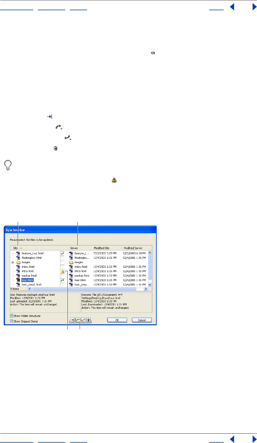
Using Help | Contents | Index Back 330
Adobe GoLive CS Help Transferring Files and Publishing Web Sites
Using Help | Contents | Index Back 330
2 Do one of the following:
• Choose Site > Publish Server > Synchronize.
• Click the Synchronize With Publish Server button on the toolbar.
Note: If you want detailed information on a file to be uploaded or downloaded, select the
file in the Synchronize dialog box. The two text panes at the bottom of the dialog box
display local and server information on the file.
3 Confirm the synchronization actions assigned to individual files. If you want to assign a
different synchronization action to a file, select the file and click one of the options below
the files list:
• Choose Skip to exclude the file from synchronization.
• Choose Upload to upload the file to the server.
• Choose Download to download the file from the server to the local site.
• Choose Delete to remove the file from both the server and the local site.
You can also cycle through the various synchronization options and select one by
simply clicking the Synchronization Action icon displayed in the column next to a file.
4 If the Synchronization Conflict icon appears by a file name, the file has been changed
on the server and the local site. Assign a synchronization action to the file so that it is not
excluded from the synchronization.
5 Click OK to start the synchronization process.
Assigning synchronization actions to files.
A. Local files. B. Server files. C. Synchronization Conflict icon D. Synchronization Action icons
D
AB
C
Using Help | Contents | Index Back 331
Adobe GoLive CS Help Transferring Files and Publishing Web Sites
Using Help | Contents | Index Back 331
Setting upload options
Uploads are carried out according to options that you can leave as is or change as
necessary.
To select upload options:
1 Do one of the following:
• To select options for the active site only, click the Site Settings button on the toolbar
or choose Site > Settings, then click Upload/Export and then select Site Specific
Settings.
• To select options for all sites, choose Edit > Preferences (Windows) or GoLive > Prefer-
ences (Mac OS), expand Site and click Upload/Export.
2 Select upload options as follows:
• In the Publish States section, select an Honor Publish State Of option to use Publish
settings for individual files or folders. To override individual publish state settings for
files and folders, deselect the respective options. (See “Assigning publish states to files
and folders” on page 133.)
• Select Linked Files Only to upload only those files that are part of the site hierarchy.
GoLive enables this option only if you haven’t checked the Honor Publish State
Of options.
3 Select Cleanups options as follows, and then click OK:
• Select Comments and Spaces to streamline the source code without affecting the
appearance of pages.
• Select Adobe GoLive Elements to remove GoLive tags and attributes that let you edit
your animations, scripted actions, and so on.
• Select Strip GoLive Data from Media Files to check all GIF, JPEG, PNG, SWF, and SVG files
for Smart Object data and remove the data to make the files smaller.
• Select Flatten Script Library to scan all files that use the GoLive JavaScript library and
rewrite the external files so they contain only the exact JavaScript code needed for the
site. (See “Flattening the script library” on page 410.)
• Select Rewrite PDF Files to scan all PDF files in the site and optimize them for
quicker upload.
Downloading a site to update it
You can update local site files with files on a publish server by downloading as well as
uploading. Update the files by downloading if you make changes at the server-based site
that need to be reflected at the local site.
Note: You can also perform a synchronization to download files from the publish server to
the local site. (See “Synchronizing a site” on page 329.)
For downloading, you have three options:
• Download all options copy all files from the server.
• Newer downloads copy only site files with modification times on the server that are
newer than the modification times of the corresponding local files. (If a local file has a
newer modification time, GoLive won't download the corresponding server file.)
Using Help | Contents | Index Back 332
Adobe GoLive CS Help Transferring Files and Publishing Web Sites
Using Help | Contents | Index Back 332
• Selection downloads copy your selection of files from the server. They are useful for the
same reasons that selection uploads are useful. (See “About uploads” on page 328.)
Note: If you remove GoLive tags and attributes from files, upload the files to a server, and
then download them to your local site, GoLive overwrites your local files with the versions
that don’t contain GoLive tags and attributes. This may cause unexpected results. Use care
when replacing local files with files from the server. (See “Setting upload options” on
page 331.)
To update a site by downloading it:
1 Open the site and connect to the publish server.
2 Do one of the following:
• Click the Download All button on the toolbar.
Note: Three different commands are associated with the Download button. To change the
button command, click the arrow to the right of the Download button and choose an
option from the Change Download Button To menu.
• Click the Download Newer button on the toolbar.
• Click the Download Selection button on the toolbar.
Synchronizing files without transferring data
You must keep both local and server files synchronized for GoLive to perform synchro-
nized uploads and newer downloads. GoLive lets you manually synchronize the modifi-
cation times for your local site files and server files without transferring data. This is useful
for cases in which the modification times of the local and the server files are out of sync
even though you know that the files are identical.
Files can get out of synchronization in a variety of ways. For instance, if you use a file
transfer client other than GoLive to upload the file, and later try to synchronize the file
from within GoLive, your local file appears older than the server file. The local file appears
older because GoLive still refers to the timestamps it created the last time it uploaded the
file. In order to keep the files synchronized, GoLive will try to download the server file that
appears to be newer. Such downloads are unnecessary and might take a long time if
multiple files are involved.
Note: Synchronizing modification times for an entire site changes the modification times
of all files, including any that have been edited but not yet uploaded to the server. These
files will not be uploaded by GoLive the next time you do a synchronized upload because
the modification times of the local files will match those on the server. If an upload gets
interrupted, make sure you don’t apply the Sync Modification Times command to files that
weren’t uploaded.
To manually synchronize modification times without transferring files:
With the site open and GoLive connected to the publish server, do one of the following:
• To synchronize the entire site, choose Site > Publish Server > Sync Modification Times
All.
• To synchronize a selection of files, select a file, a folder, or a selection of files and folders
in the Files tab of the site window and choose Site > Publish Server > Sync Modification
Times Selection.
Using Help | Contents | Index Back 333
Adobe GoLive CS Help Transferring Files and Publishing Web Sites
Using Help | Contents | Index Back 333
Downloading a Web page
You can download a Web page, complete with all its media and references, from any Web
site that you can visit with a Web browser. You don’t need FTP access to the directories
containing the page and its images. The page you download opens in a GoLive document
window when the download is complete.
The page is downloaded to a location you specify, and its media are placed in a folder
alongside the page. This folder structure might not reflect the relative locations of the files
on the original Web site. Media files or media referenced by scripting languages like JavaS-
cript are not downloaded. (For example, rollover images are not downloaded.)
Note: You can also download Web pages by using the Import from Server function in the
Site Wizard (see “Creating a site” on page 46) or the Download command in the context
menu of either the External tab of the site window or the In & Out Links palette. (See
“Importing sites from remote servers” on page 48.)
To download a Web page:
1 Be sure you have a live Web connection.
2 Choose File > Download Page.
3 Enter the URL for the page.
4 Click Save As, specify a location, then click Save.
Since the page you’ll download probably consists of several files, consider creating a
new folder for them.
Transferring files with the file browser
Use GoLive’s file browser to connect to a publish server and transfer files from the Files tab
or your system desktop. You can use the browser for any file transfer purpose, not just for
transferring Web site files. You can open multiple instances of the file browser and even
drag files between them.
Note: If you want to upload an entire site, or perform an update so that the local site and
the server-based site are synchronized, use one of the Upload commands on the Site >
Publish Server submenu (or the equivalent button on the toolbar), rather than the file
browser.
To perform simple file transfers with the file browser:
1 Choose File > Connect To FTP/WebDAV.
2 Choose a server from the Server menu and click the Connect button.
Note: If no server is available, click Edit Servers and select a server from the Select Publish
Server dialog box. If there are no servers listed, click New and follow the instructions in
“Setting up access” on page 326 to set up a connection to a publish server.
3 Do one of the following:
• To upload a file or folder, drag it from a site-window tab or the desktop to the file
browser.
• To download a file or folder, drag it from the file browser to a site window tab.
• (Mac OS only) To download a file or folder, drag it from the file browser to the desktop.
Using Help | Contents | Index Back 334
Adobe GoLive CS Help Transferring Files and Publishing Web Sites
Using Help | Contents | Index Back 334
Exporting a site
Exporting a site is adapting its folder structure and other details to a particular publish
server, the one you plan to upload it to. Exporting is distinct from uploading; you export to
a local drive as a separate step before uploading.
Note: Few Web servers require that GoLive sites be exported. Consult your server adminis-
trator for information before beginning the export process.
To select site export options:
1 Do one of the following:
• To select options for the active site only, click the Site Settings button on the toolbar
or choose Site > Settings, click Upload/Export, and select Site Specific Settings.
• To select options for all sites, choose Edit > Preferences (Windows) or GoLive > Prefer-
ences (Mac OS), expand Site, and click Upload/Export.
2 In the Publish States section, select an Honor Publish State Of option to use Publish
settings for individual files or folders. To override individual publish state settings for files
and folders, deselect the respective options. (See “Assigning publish states to files and
folders” on page 133.)
3 Select Linked Files Only to upload only those files that are part of the site hierarchy.
4 Select Export options as follows:
• The As in Site option maps the hierarchy of groups, pages, and resources within your
site window to the resulting root folder.
• Separate Pages and Media creates a root folder that contains two subfolders for HTML
pages and media, respectively.
• Flat creates a root folder that contains all HTML pages and media, but no subfolders.
• Folder Name entries apply to the Separate Pages and Media option. For files that are not
in the site, the Folder Name entry applies only when you select the Export Linked Files
That Are Not Part Of This Site option.
• Export Linked Files That Are Not Part Of The Site includes orphan files.
• Show Options before Export displays these options at the time of each export.
5 Select Cleanups options as follows:
• Strip HTML Code for Comments and Spaces streamlines the source code without
affecting the appearance of pages.
• Strip HTML Code for Adobe GoLive Elements removes GoLive tags and attributes that
let you edit your animations, scripted actions, and so on.
• Strip GoLive Data from Media Files checks all GIF, JPEG, PNG, SWF, and SVG files for data
that has been added to those files to enable the Smart Object workflow. This data is
only added to the target files of Smart Objects. The option then removes the data to
make the files smaller.
• Flatten Script Library scans all files that use the GoLive JavaScript library and rewrites
the external files so they contain only the exact JavaScript needed for the site. (See
“Flattening the script library” on page 410.) This option is recommended.
• Rewrite PDF files scans all PDF files that are part of the site and optimizes them for
quicker upload.
Using Help | Contents | Index Back 335
Adobe GoLive CS Help Transferring Files and Publishing Web Sites
Using Help | Contents | Index Back 335
To export a site to a local drive:
1 Open the site.
2 Choose File > Export > Site.
3 If the Export Site Options dialog box appears, review the options and make changes as
needed. The changes you make apply to the current export only.
4 Click Export. By default, the settings in the Export Site Options dialog are identical to
those in the Site Settings under Upload/Export.
5 Specify a location on a local drive for the exported root folder of the site.
6 Click Save.
7 Click Yes or No. Clicking Yes displays information about the export: the files exported,
the files not exported and the reasons they weren’t exported, and the export options
used.
Note: If you want the Export Site Options dialog box to appear each time you export a site,
choose Edit > Preferences (Windows) or GoLive > Preferences (Mac OS), expand the Site
settings, click Upload/Export and make sure the Show Options Before Export Dialog
option is selected.
To upload a site you have exported to a local drive:
Drag the exported root folder or its contents to its destination folder in the file browser
window. (See “Transferring files with the file browser” on page 333.) You can’t use one of
the Upload commands on the Site > Publish Server submenu or the Upload button on the
toolbar for this operation.
Drag the contents of the folder if dragging the folder itself would create an unnec-
essary extra folder level on the server.
Setting up distributed Web sites
If you plan to distribute your Web site across several servers (subsites), you can still
develop and test the site as a whole on your local file system. To do so, you need to set up
the distributed site with URL mappings between local addresses and server addresses.
The advantage of URL mappings is that you can easily manage multiple sites without
having to rewrite URLs or duplicate files. The sites may share many of the same files and
may even link to each other.
To set up a Web site distributed among several servers:
1 Create a separate site document for each server.
2 Keep index.html as the filename for home page of the site that is the entry point of your
distributed site.
3 Rename the home page filename for all the other subsites. This avoids duplicate
filenames in your distributed site.
4 Add pages and links for all the subsites, linking between subsites as you would if you
were linking to another local site. For example, a link from a page in the Soccer subsite to
the Putters.html page in the Golf subsite might be addressed file:///path/Golf/
Putters.html. Links between subsites can use either relative or full paths.
Using Help | Contents | Index Back 336
Adobe GoLive CS Help Transferring Files and Publishing Web Sites
Using Help | Contents | Index Back 336
5 Make the site window containing the index.html home page active.
6 Click the Site Settings button on the toolbar, or choose Site > Settings.
7 Click URL Mappings, then click the Create New Item button .
8 Choose Root of this Site from the menu next to the Map Local Folder or Remote Server
text box.
This displays the path to the root folder corresponding to the current site document.
When you provide an external link to an address on the server in the next step, you can
probably preserve some of this path.
9 Edit the path so it contains the URL to the location this root folder will have on the
server.
Note: You can also use URL Mappings to map a local folder. You would do this if you
wanted to conceal your site’s folder hierarchy.
10 Choose Root of this Site from the With Local Folder menu.
This maps the current location of the root folder to its future location on the server.
11 Click OK to save the site settings, or repeat steps 4 through 10 for each of the site
documents you renamed in step 3.
Important: If you plan to use the Clean Up Site command with any of the subsites you
have created, first deselect Add Used Files and Add Used External References in the Clean
Up Site Options dialog box. Otherwise, using the Clean Up Site command will destroy the
structure of the distributed site.
To test a distributed site in a Web browser before uploading it:
1 View a page in any of the root folders that contains a link that references a page in
another root folder.
2 Move the cursor over the link. The link should contain the local path to the page.
3 Repeat these steps for every link referencing a page in another root folder.
Managing a Web site with WebDAV
GoLive lets you easily connect to a WebDAV server, lock files so others cannot work on
them at the same time as you are, download and upload files, obtain information about
files, and keep a local site and server site fully synchronized.
About WebDAV
GoLive supports a server technology known as Web Distributed Authoring and Versioning
(WebDAV). WebDAV is a standard (RFC 2518). This technology extends the HTTP protocol
with extensions that let authors safely work on a Web site in a workgroup environment
with features such as file locking so that documents will not be accidentally overwritten or
updates lost. You can find detailed information and the latest news about WebDAV at
www.webdav.org.
To use WebDAV, you must have connection to a server with WebDAV capability. That
includes:
• Adobe Version Cue Workspace (a feature of the Adobe Creative Suite)
• Mac OS X and Mac OS X Server (with mod_dav installed)
Using Help | Contents | Index Back 337
Adobe GoLive CS Help Transferring Files and Publishing Web Sites
Using Help | Contents | Index Back 337
• Microsoft IIS 5 (included with Windows 2000) and Microsoft IIS 6
• Microsoft Exchange Server
• Apache (with mod_dav module installed)
• Novell NetWare 6.0
• Tomcat (with Jakarta and Slide)
• Tamino WebDAV Server
• Jigsaw
• Python WebDAV Server
A Web team can work on a WebDAV production server in house, and then use the GoLive
Publish Server feature to upload the site to a public server without WebDAV capability.
Locking files
The WebDAV protocol supports two kinds of locks—exclusive and shared:
• An exclusive lock set by someone else is indicated by the padlock icon . Only the user
who locked the file can edit it. Other users have read-only access to the file.
• An exclusive lock assigned to you is indicated by the pencil icon . This indicates that
only you can edit the file.
• A shared lock assigned to other users is indicated by the shared lock icon . Unlike an
exclusive lock, the shared lock simply alerts people that several individuals are editing
the same file. It does not actually lock the file. People without a shared lock can only
read the document.
• A shared lock you participate in is indicated by a variation of the shared lock icon .
Note: Keep in mind that shared locking is not supported by all servers.
To lock files on a WebDAV server:
1 In the Publish Server tab of the site window, select the file you want to lock.
2 Right-click (Windows) or Control-click (Mac OS) the selected file, and choose Lock or
Shared Lock from the context menu, depending on whether you want an exclusive or
shared lock. An exclusive lock or shared lock icon appears to the right of the file name in
the Publish Server tab.
To lock a folder on a WebDAV server:
1 In the Publish Server tab of the site window, Right-click (Windows) or Command-click
(Mac OS) the folder you want to lock.
2 Choose Lock All or Shared Lock All from the context menu.
Note: Locking folders is unsupported by many servers, including Microsoft IIS 5. Only
single files can be locked and unlocked.
To lock a selection of files on a WebDAV server:
1 In the Publish Server tab of the site window, Control-click the files you want to lock.
2 Right-click (Windows) or Control-click (Mac OS) the selected files, and choose Lock or
Shared Lock from the context menu, depending on whether you want an exclusive or
shared lock. An exclusive lock or shared lock icon appears to the right of each file name in
the Publish Server tab.
Using Help | Contents | Index Back 338
Adobe GoLive CS Help Transferring Files and Publishing Web Sites
Using Help | Contents | Index Back 338
To unlock files on a WebDAV server:
1 In the Publish Server tab of the site window, select the files or folders you want to
unlock.
2 Right-click (Windows) or Control-click (Mac OS) the selected file, and choose Unlock
from the context menu. The locked icon to the right of the file names in the Publish Server
tab
disappears.
Managing files and folders
GoLive lets you manage files and folders on a WebDAV server much as you manage files on
your desktop, including the ability to copy, delete, rename, and move Web pages.
To rename or delete a file or folder using the context menu:
Right-click (Windows) or Control-click (Mac OS) the file or folder and choose the desired
command from the context menu:
• Choose the Rename command to rename a file or folder.
• Choose the Delete command to delete the selected file or folder.
The context menu also lets you refresh the current view, select all files, and create a new
folder, as well as set locks and synchronize a site. You can copy and move files using the
standard desktop commands for your computer platform.
Getting information about files
You can use the File Properties Inspector to get information about files on a WebDAV
server, including name, URL, creation date, modification date, size, and lock status.
To see information about a file:
1 Select the file in the Publish Server tab of the site window.
2 If the Publish Server Inspector is not showing, choose Window > Inspector.
3 Click one of the tabs in the Inspector:
• The File tab displays a file’s name, URL, creation and modification dates, and size.
• The WebDav Lock tab provides information on the file’s lock status, including the lock
type, owner, access type available, scope of the lock (exclusive or shared), and lock
timeout.

Using Help | Contents | Index Back 339
Adobe GoLive CS Help Creating and Maintaining Co-Author Sections
Using Help | Contents | Index Back 339
Creating and Maintaining
Co-Author Sections
About the GoLive Co-Author feature
The Co-Author feature in Adobe GoLive allows Web designers to design sections of a site
that other people can then easily maintain. Sites can include regular pages that the Web
designer updates, and template-based pages that the co-author updates. The Co-Author
feature is especially useful when someone unfamiliar with Web site design needs to
update or maintain information in targeted areas of a site.
Web designers must use the full version of Adobe GoLive CS to create the site and the co-
author sections. Co-authors use only the Adobe Co-Author Editor to maintain the site. The
Co-Author Editor provides only those features required by the co-author. You cannot have
both GoLive CS and the Co-Author Editor installed on the same computer. (The serial
number used to install GoLive CS determines the installed version.)
Creating co-author sections
The co-author process includes two distinct phases: creating co-author sections and
maintaining co-author sections. A Web designer builds a site by creating co-author
sections that specify the items (content and type) that a co-author can update; then the
designer links each section to a template. The templates contain editable regions, created
by the Web designer, that match the items in the co-author sections.
Once the sections and templates are created and linked, either the Web designer or the
co-author creates stories for each section in the Co-Author Editor. GoLive uses the stories
to create the actual Web pages. (Co-authors can add and edit stories during the mainte-
nance phase.)
Understanding the Web designer workflow
The Web designer creates the original content and builds the section that the co-author
maintains. The Web designer completes the following tasks, and then hands off the
section to the co-author for maintenance:
1 Decide which content needs regular updating, and then design the site structure and
page layouts appropriate for the content. Use the GoLive Diagram feature to help you
conceive your site. See “Developing diagrams” on page 74.
2 Create a co-author section to hold the data (stories), templates, section file, and other
resources Adobe GoLive uses to generate the co-author Web pages. (See “Creating co-
author sections and items” on page 340.)
3 Create the templates that the site’s pages will be based on. Use the Co-Author palette to
specify the regions that co-authors can edit, and match the region names to the item
names in the co-author section.(See “Creating co-author templates” on page 342.)
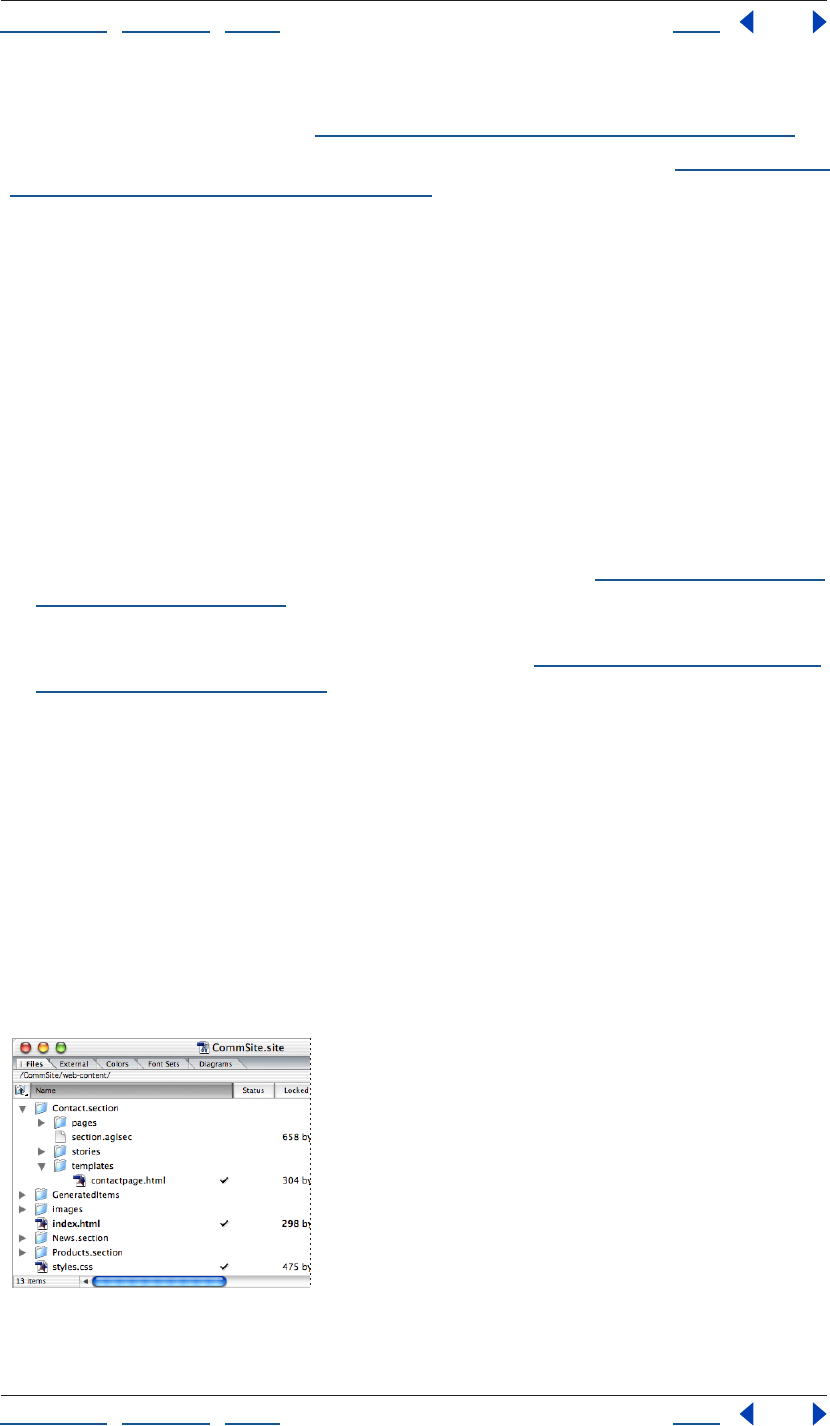
Using Help | Contents | Index Back 340
Adobe GoLive CS Help Creating and Maintaining Co-Author Sections
Using Help | Contents | Index Back 340
4 In the Co-Author Editor (Special > Co-Author Editor), create stories that GoLive will use
to generate the .html pages. (See “Creating and editing co-author stories” on page 344.)
5 Generate the co-author pages, and then preview and test the site. (See “Generating and
publishing co-author Web pages” on page 345.)
6 Export the Site Locator file that the co-author uses to download the site for mainte-
nance. (See XREF to exporting a site locator file in chapter 2.)
7 Hand off the section to the co-author for maintenance.
Note: The co-author typically performs steps 4 and 5. However, during the initial site
creation the Web designer can perform them to populate the site and provide examples
for the co-authors.
Understanding the co-author workflow
After the Web designer creates the site, the co-author maintains the pre-determined
sections using the Co-Author Editor.
A co-author can perform the following tasks:
• Access the site in the Co-Author Editor.
• Update, delete, or add stories, including text and images. (See “Creating and editing co-
author stories” on page 344.)
• Generate updated Web pages and upload them, if necessary. The co-author can easily
accomplish each of these tasks with a single click. (See “Generating and publishing co-
author Web pages” on page 345.)
Creating co-author sections and items
A Web designer uses co-author sections to organize the editable content into major
groups, and to specify the individual items, or content containers, within each group.
Examples of editable items a Web designer can create include headlines, images and
articles for a news site, or product names, photos, descriptions and prices for a catalog site.
The designer then links the section to a template, which specifies the layout of the items
on the page—each item is placed into an editable region of the template. A single item
can be used in multiple templates.
When the Web designer creates a section, a section folder appears in the site window. This
folder contains a section.aglsec file (used to manage the items and link to the preview
page), as well as separate pages, stories, and templates folders.
Co-author section in the site window
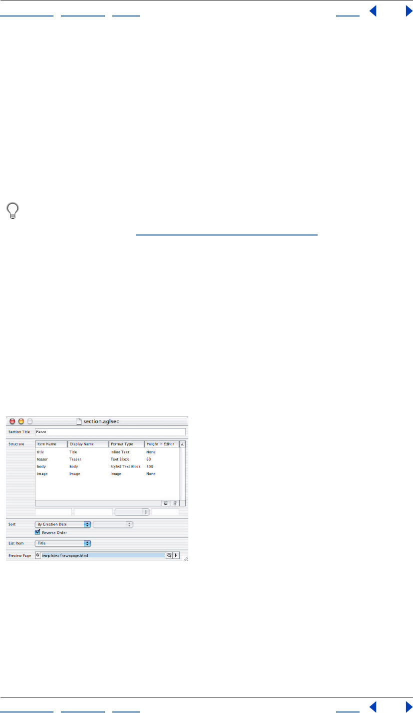
Using Help | Contents | Index Back 341
Adobe GoLive CS Help Creating and Maintaining Co-Author Sections
Using Help | Contents | Index Back 341
To create a co-author section and co-author items:
1 Create a new site or open an existing site.
2 Choose Special > Create Co-Author Section, and then enter a Section Title in the
section.aglsec window that appears.
3 Select Name under the Item Name column. When you select an item, it appears in the
editable fields at the bottom of the list.
4 In the editable fields, enter the Item Name and the Display Name, choose the Format
Type for the selected item and, if necessary, specify the height of the item in the Co-Author
Editor. (The Display Name is the name that appears next to the editable field in the Co-
Author Editor.)
Match the Item Name to the corresponding Region name in the template file to
which you’ll link the section. Matching the names ensures that the stories populate
the templates correctly. (See “Creating a page template” on page 306.)
5 Click the Create New Item icon, and then for each item you want to add to the section,
repeat step 2, selecting the newly created item.
6 Choose the sort order for the Co-Author Editor Stories list from the Sort menu:
• By Creation Date sorts the stories list in the order the items were created.
• By Data Item sorts the stories list in the order of the specified data item.
7 From the List Item menu, specify the field that you want to appear in the stories list of
the Co-Author Editor. (The Sort order and List Item field do not necessarily need to match.
For example, you can view product names (List Item) in the stories list, and then sort them
by their prices (Data Item).)
8 In the Preview Page field, specify the page that you want to appear in the Preview tab of
the Co-Author Editor. You must create and save the page file before you can specify it.
The co-author section.aglsec file used to create and manage sections.
Using Help | Contents | Index Back 342
Adobe GoLive CS Help Creating and Maintaining Co-Author Sections
Using Help | Contents | Index Back 342
Creating co-author templates
Co-author templates specify the layout of items by using editable regions. A co-author
section can have an unlimited number of templates. You can create two types of
templates: page templates and list templates. Page templates let you create a separate
Web page for each story in the co-author section. List templates let you create a single
Web page that contains a list of the items (editable regions) from multiple stories.
You can use a list template as a component to populate table cells on a static Web
page. Create the list template and then link a cell’s component to the template using
the Inspector. After you create stories and generate the Web pages, the table cell contains
a list of the repeated regions from multiple stories.
To create a page or list template:
1 Open a new page, and then choose Window > Co-Author. The Co-Author palette opens.
2 Choose File > Save As and save the template file to the section’s Templates folder.
Saving the file to the Templates folder lets you assign editable regions to it.
3 In the Layout window, select the contents of the first editable region you want
to create. In the Co-Author palette, select the corresponding Item from the Apply
Region menu.
4 If you want to create a list template, select the element that contains the regions you
want to repeat (such as a table that contains name and price regions), and then select
Repeat. By default, GoLive uses all the stories to generate the list. If you want to use only
certain stories, enter the number of the first story (according to the sort order) in the Start
field, and then enter the total number of stories to use in the Count field.
5 Repeat steps 3 and 4 until you’ve created editable regions for all the items you want to
use in the template.
6 Save the file.
Linking to co-author templates
Creating links between and within templates, and from the templates to other pages in
the site, is an important part of creating Co-Author sections. You can create the following
types of links, as necessary:
• Links between page templates. Use these links to link the generated pages in a one-to-
one relationship. For example, if a co-author section contains two template pages, then
GoLive generates two separate Web pages per story, and links the first page for each
story to the corresponding second page.
• Links within page templates. Use these links to create navigational links between the
pages generated from each story in the section. To create the links, use the “#next” and
“#previous” strings in the link field of the Inspector. When no previous or subsequent
story exists, as with the first and last story in the list, the links and their content do not
appear.
• Links between list and page templates. Use these links to create navigational compo-
nents and tables of contents. When you link from a repeated region of a list template,
each item (story) in the generated list page contains a link to its corresponding page
(generated via the page template).
Using Help | Contents | Index Back 343
Adobe GoLive CS Help Creating and Maintaining Co-Author Sections
Using Help | Contents | Index Back 343
Understanding images in co-author pages
Co-author sections can include image items. You can add an image to a co-author
template in the following ways:
• Use the image icon from the Objects palette to place an image in the template, and
then assign the appropriate co-author item region. The width and height of the image
used in the template determine the bounding box for the images used in the
generated pages. GoLive resizes the image proportionally and converts it to a JPEG
image.
• Use a Smart Object. Place a Smart Object in the template and assign it an item region.
Choose a source for the Smart Object and create a target image file in the desired
format and with the desired settings. In this method, the source file is unimportant—it’s
the target file that specifies the image settings. Make sure you place the source file into
the section’s template folder.
• Use a Smart Object with variables (assigned in Adobe ImageReady®) to automatically
specify the item region according to the variables. Make sure that the variable name
matches the item name. Place the image target files in the section’s Templates folder.
Creating the initial co-author stories
The Web designer may want to create the initial stories (and resulting Web pages) to
provide examples for the co-author, and to preview and test the site. To create co-author
stories, see “Creating and editing co-author stories” on page 344.
Generating the initial co-author Web pages
Typically, the co-author adds and edits stories, and then generates the updated Web
pages. However, during co-author site development, the Web designer may generate the
initial pages. Generating the initial pages not only provides an example of how the pages
appear for the co-author, but also allows the Web designer to preview and test the pages
to ensure the site is functional and complete.
You can generate co-author Web pages by using GoLive commands or by using the Co-
Author Editor. To generate co-author pages using the Co-Author Editor, see “Generating
and publishing co-author Web pages” on page 345.
To generate co-author Web pages using GoLive commands:
1 Open a section.aglsec file.
Note: In order to generate pages, you must have previously created a co-author section
with items, set-up a template with editable regions, and created stories in the Co-Author
Editor. (See “Understanding the Web designer workflow” on page 339.)
2 Choose Special > Generate Co-Author Pages. GoLive generates a page for each story,
placing them in the section’s pages folder.
Previewing co-author Web pages
The Web designer can preview co-author Web pages by using either the Preview tab of the
page’s document window (see “Previewing files” on page 37) or the Co-Author Editor (see
“Previewing co-author Web pages” on page 345). Co-authors preview the pages only from
within the Co-Author Editor.

Using Help | Contents | Index Back 344
Adobe GoLive CS Help Creating and Maintaining Co-Author Sections
Using Help | Contents | Index Back 344
The Co-Author Editor lets you edit the page content, but not the layout. The document
window lets you edit the layout, but not the content. Keep in mind that co-author pages
are based on templates—and only the Web designer can edit the templates.
Updating co-author Web pages
Co-authors can update existing co-author Web pages and create new ones using the Co-
Author Editor. To update co-author pages, you open or download the site to be updated,
edit and create the stories (content) for the Web pages, and then generate and publish
new pages.
You can update only certain types of content on co-author Web pages, including text,
links, and images. You cannot change the layout of the pages or otherwise edit them.
Note: Web designers can access the Co-Author Editor in GoLive by choosing Special > Co-
Author Editor.
Opening and downloading sites
Use the Co-Author Editor to open or download the sites you want to update.
To open a Web site to update:
1 Start Adobe GoLive CS, and then click Edit Web Site.
2 Locate and select a site file, and then click Open. The site file, [SITENAME].site, is at the
root level of the site folder.
To download a Web site to update:
1 Start Adobe GoLive CS, and then click Download Web Site.
2 In the Open dialog box, locate and select the site locator file (provided by the Web
designer), and then click Open. GoLive downloads the site to the local hard disk and then
opens the site in the Co-Author Editor.
Creating and editing co-author stories
Co-author stories contain the content (organized by Item Names) that Adobe GoLive
places in a template to generate the co-author Web pages. The co-author can edit existing
stories and create new ones.
To edit an existing story or create a new one:
1 In the Co-Author Editor, open the site containing the co-author sections.
2 From the Sections menu, choose the section you want to update.
3 In the Stories list, select the story you want to edit, or click New Story to create a new
story. (Stories are named according to the item specified in the List Item field of the
section.aglsec file.)
4 In the Edit tab, update the item fields as appropriate:
• For text blocks, you can specify bold and italic styles by using the buttons above the
text block, and you can add or update links by using the Link button.
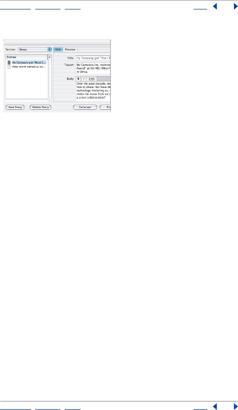
Using Help | Contents | Index Back 345
Adobe GoLive CS Help Creating and Maintaining Co-Author Sections
Using Help | Contents | Index Back 345
• For image items, you can click Browse to specify a different image.
Editing a story in the Co-Author Editor.
Previewing co-author Web pages
You can preview a Web page using the Preview tab of the Co-Author Editor. Previewing
lets you see how the page will look and test its functionality.
Note: Links are disabled in the Preview tab.
To preview a co-author Web page:
1 In the Stories column of the Co-Author Editor, select the story for the page you want
to preview.
2 Click the Preview tab.
Generating and publishing co-author Web pages
As the co-author, after you have created and edited the stories, you can generate the Web
pages and publish them, as necessary.
In some instances, you may want to have the pages reviewed before you publish them; in
other instances (such as when you’ve simply made text corrections), you may want to
publish them directly. Coordinate with the Web designer or an administrator to determine
the best workflow for a site.
To generate or publish co-author Web pages:
1 In the Co-Author Editor, select a section from the Section menu.
2 Select one of the following:
• Generate to create the Web pages and place them in the section’s pages folder.
• Publish to create the Web pages, place them in the section’s pages folder, and then
upload them to the server specified by the Web designer during the site’s creation.
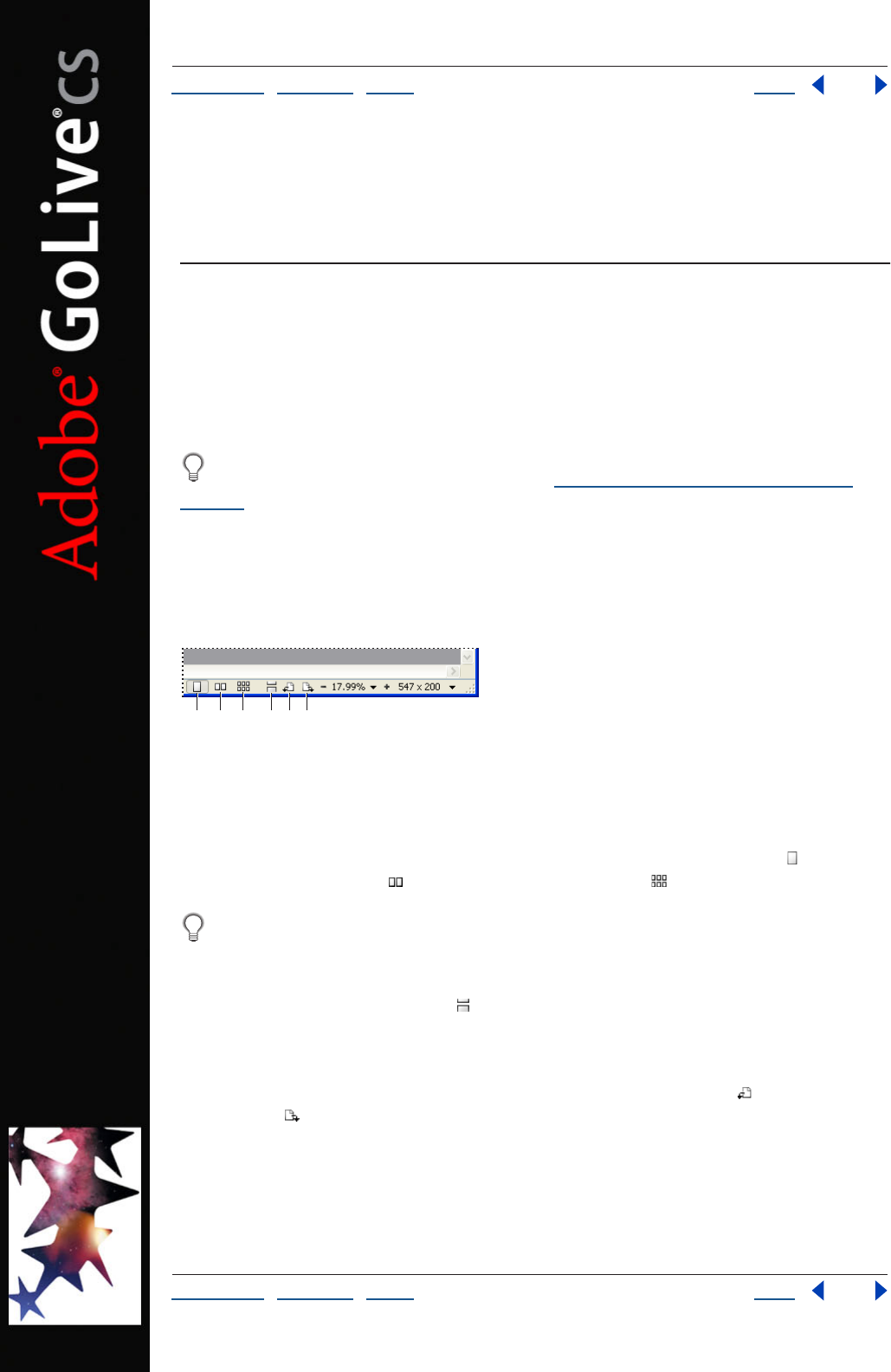
Using Help | Contents | Index Back 346
Adobe GoLive CS Help Working with PDF Documents
Using Help | Contents | Index Back 346
Working with PDF Documents
About working with PDF documents
Use GoLive to fully integrate PDF documents into Web sites. You can export Web pages to
PDF files, which can be distributed for review or added to a site. You can also open existing
PDF files and edit links to PDF bookmarks, HTML anchors, and other destinations. GoLive
lets you manage PDF links with the same site management tools you use for HTML links.
You can create PDF versions of site design diagrams, which are particularly well-suited
for a PDF review. For more information, see “Printing and exporting diagrams” on
page 88.
Displaying PDF documents
To display PDF documents differently, you can rotate pages, change the number of pages
displayed concurrently, and smooth the edges of text, line art, and images.
Display options in the status bar:
A. Single-Page View B. Double-Page View C. Multi-Page View
D. Continuous Mode E. Rotate left F. Rotate right
To change the number of pages displayed concurrently:
In the status bar of the document window, click the Single-Page View button , the
Double-Page View button , or the Multi-Page View button .
To view more pages at one time in double- or multi-page view, either enlarge the
document window or decrease magnification.
To view pages continuously, rather than in sets:
Click the Continuous Mode button in the status bar of the document window. In
Continuous Mode, you can use the vertical scroll bar to move from page to page.
To rotate the view:
In the status bar of the document window, click the Rotate Left button or the Rotate
Right button .
ABC DEF
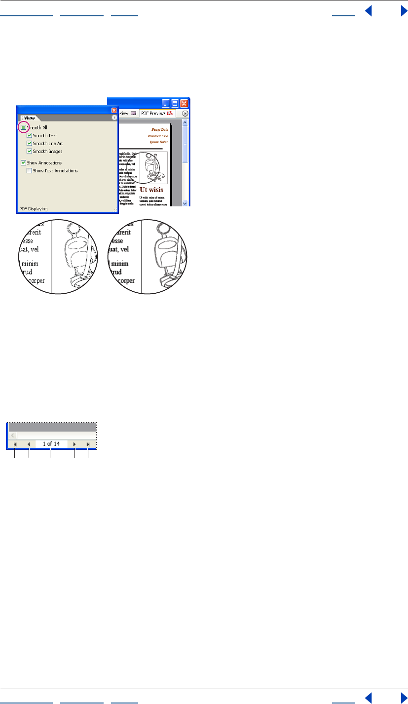
Using Help | Contents | Index Back 347
Adobe GoLive CS Help Working with PDF Documents
Using Help | Contents | Index Back 347
To smooth text, line art, or images:
In the View palette, select from the following options: Smooth All, Smooth Text, Smooth
Line Art, or Smooth Images.
Smoothing text, line art, and images:
A. Smooth options deselected B. Smooth All selected
Navigating PDF documents
You can quickly navigate to a specific page of a PDF document or a specific area of a page.
If you don’t know which page contains the desired information, you can visually locate
and then select the page.
Navigation options in the status bar:
A. First Page B. Previous C. Page number
D. Next E. Last Page
AB
AB C DE
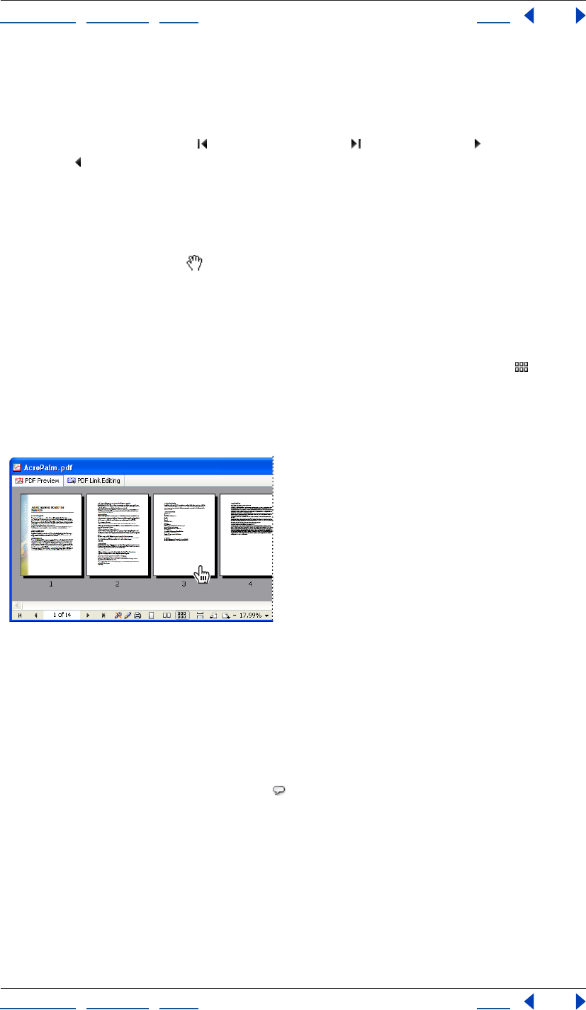
Using Help | Contents | Index Back 348
Adobe GoLive CS Help Working with PDF Documents
Using Help | Contents | Index Back 348
To navigate to a specific page or set of pages:
Do one of the following in the status bar of the document window:
• Type the page number in the Page Number text box, and then press Enter or Return.
• Click the First Page button , the Last Page button , the Next button , or the Previous
button .
• Press the Page Up or Page Down key.
To navigate to a specific area of a page:
Do one of the following in the document window:
• Drag with the Hand tool .
• Use the horizontal and vertical scroll boxes.
• Hold down the Control key, and press the arrow keys.
To visually locate and then select a page:
1 In the status bar of the document window, click the Multi-Page View button .
2 Navigate to the desired set of pages by using the First Page, Last Page, Next, and
Previous buttons.
3 In the document window, click the desired page.
Visually locating and selecting a page.
Viewing and editing PDF comments
When you open an existing PDF file, you can create, view, and edit PDF comments.
To create, view, or edit a PDF comment:
1 Open a PDF file.
2 In the toolbar, click the Comment tool .
3 In the Layout Editor, do either of the following:
• Select an existing comment.
• Click to create a new comment.
4 In the text box of the PDF Commenting Inspector, view or edit the comment.
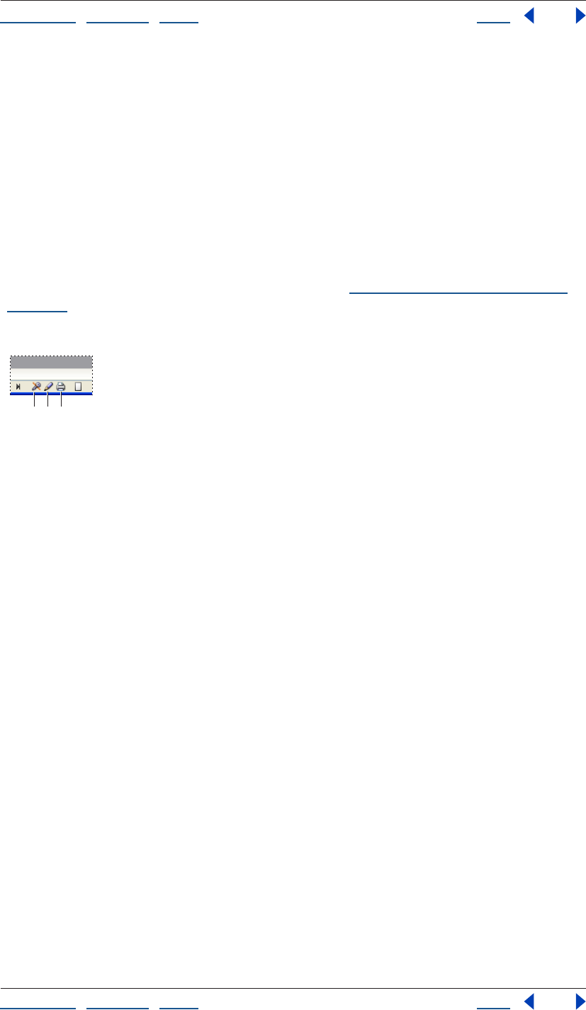
Using Help | Contents | Index Back 349
Adobe GoLive CS Help Working with PDF Documents
Using Help | Contents | Index Back 349
To hide PDF comments:
In the View palette, deselect Show Annotations to hide all comments or Show Text
Annotations to hide only text comments.
Viewing saved page setup and security settings
When you view an existing PDF file, the status bar of the document window displays the
file’s page setup and security settings, including editing and printing restrictions. GoLive
honors these settings but doesn’t let you change them. For example, if a PDF file has a
printing restriction, you can’t print the file in GoLive—even if you enter the master
password to open the file.
For more information about page setup settings, see “Exporting Web pages to PDF” on
page 349. For more information about security settings, see Adobe Acrobat Help.
Note: GoLive supports standard Acrobat security, but not Self-Sign Security.
Saved security settings in the status bar:
A. Security off. B. Editing allowed. C. Printing allowed.
Hiding PDF options in the status bar
By default, the status bar shows all PDF display, navigation, and security options, but you
can hide these options by using the document window pop-up menu.
To hide PDF status bar options:
From the document window pop-up menu, choose Status Bar, and then select from the
following options:
• PDF Page Control to hide page navigation controls.
• PDF Info to hide security settings.
• PDF Page Rotation to hide rotation buttons.
• PDF Display Mode to hide display options.
Exporting Web pages to PDF
You can export Web pages to PDF, while retaining formatting and features such as links,
form elements, and QuickTime movies. You can use this powerful functionality to quickly
create documents such as interactive PDF forms and print-ready versions of Web pages.
ABC
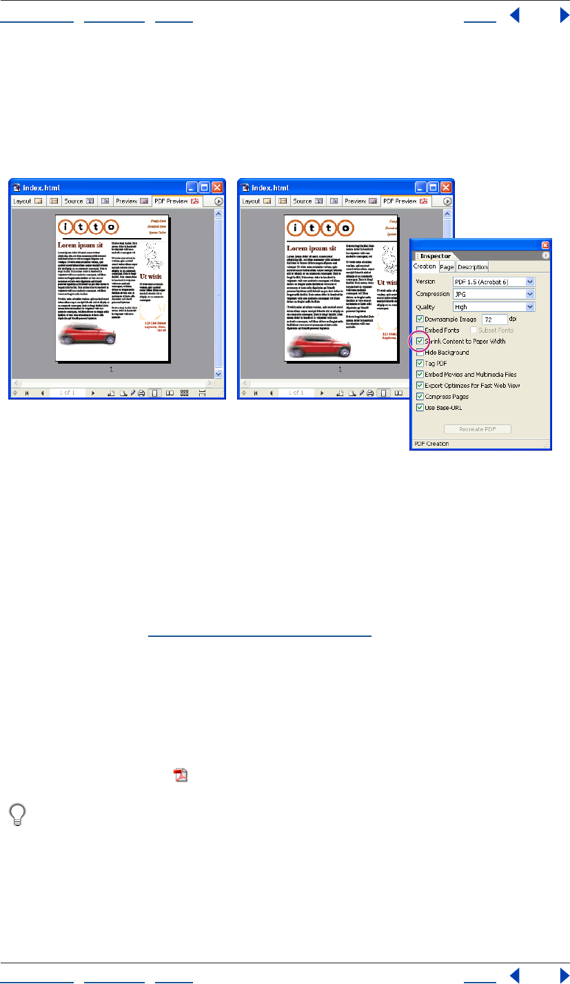
Using Help | Contents | Index Back 350
Adobe GoLive CS Help Working with PDF Documents
Using Help | Contents | Index Back 350
When you export to PDF, you can customize the exported file in many ways. For example,
you can adjust compression settings, embed fonts, and proportionally shrink a Web page
that’s wider than the selected paper size. To produce a PDF file that prints clearly on black-
and-white printers, you can hide Web page backgrounds, replacing them with a white
background that emphasizes the content of a page. After adjusting such settings, you can
re-create the PDF preview to see their effect.
Using the Shrink Content to Paper Width option:
A. PDF Preview tab with Shrink Content to Paper Width deselected B. Shrink Content to Paper Width
selected C. PDF Page Setup Inspector
Note: Frames, HTML comments, text marquees, and JavaScript do not export to PDF.
To export a Web page to PDF:
1 In the document window, click the PDF Preview tab.
2 In the PDF Creation Inspector, click the Creation tab, and set options as desired. For
more information, see “PDF creation options” on page 351.
3 Click the Page tab, and set page formatting options as desired. Then, to proportionally
shrink a Web page that’s wider than the selected paper size, select Shrink Content to Paper
Width.
4 Click the Description tab, and enter file information for Title, Author, Subject, and
Keywords as desired.
5 Click Recreate PDF to regenerate the PDF preview using the new settings.
6 Click the Export button in the toolbar.
Exported anchors become bookmarks in the PDF file.
AB
C
Using Help | Contents | Index Back 351
Adobe GoLive CS Help Working with PDF Documents
Using Help | Contents | Index Back 351
PDF creation options
In the Creation tab of the PDF Creation Inspector, GoLive provides the following options:
Version Specifies the Acrobat or PDF/X version. Choose the version that is compatible
with the intended PDF viewing application.
Compression Specifies the image compression method. Choose one of the following:
• Deflate (Lossless) to compress minimally and retain image quality, but only moderately
decrease file size.
• JPG to compress with a lossy algorithm and greatly reduce file size, but introduce image
artifacts.
• JPG 2000 to compress equally to JPG, but introduce fewer image artifacts. (This option
requires an Acrobat 6 viewer.)
Quality Specifies the desired level of image compression: Maximum, High, Medium, Low,
or Minimum.
Downsample Image Applies the image resolution specified in the dpi text box.
Embed Fonts Includes complete fonts in the exported file.
Subset Fonts Includes only the specific font characters present in the document.
Hide Backgrounds Hides background colors, background images, and CSS background
styles.
Tag PDF Creates PDF tags for paragraphs and tables in the exported file. For more infor-
mation about PDF tags, see Adobe Acrobat 6.0 Help.
Embed Movies and Multimedia Files Includes such files in the exported file. (This
option requires an Acrobat 6 viewer.)
Export Optimizes for Fast Web View Displays the first page while the full PDF file
downloads.
Compress Pages Compresses text and line art.
Use BaseURL Converts relative Web links into absolute PDF links.
Note: The Use BaseURL option is available only if a Base element exists in the head section
of the Web page. For more information about the Base element, see “About head section
elements” on page 56.
Editing PDF link regions
With the PDF link editor, you can use GoLive to create, move, resize, and delete link regions
in any existing PDF file. You can also specify link destinations such as Web pages, HTML
anchors, PDF pages, and PDF bookmarks. When you’ve finished editing links, you can test
them by using the PDF Preview tab.
You can manage PDF links with the same site management tools used for HTML links,
including the In & Out Links palette. For more information, see “Editing links and URLs
sitewide” on page 124.
To link from an HTML file to a PDF bookmark, use the Edit PDF Anchor option. For
more information, see “Linking files” on page 61.
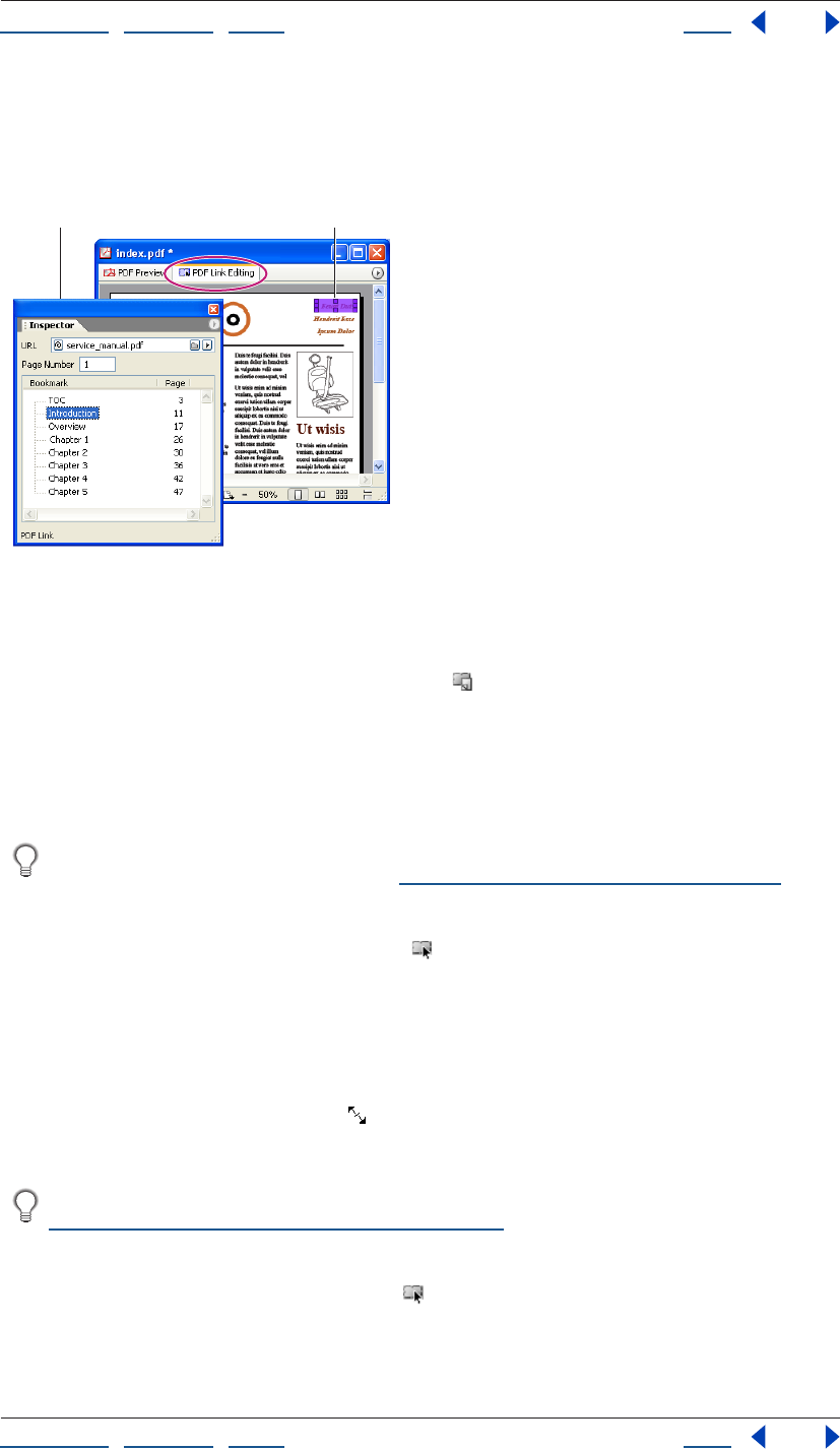
Using Help | Contents | Index Back 352
Adobe GoLive CS Help Working with PDF Documents
Using Help | Contents | Index Back 352
To access the PDF link editor:
1 Open an existing PDF file.
2 Click the PDF Link Editing tab in the document window.
Linking to another PDF file:
A. PDF Link Inspector options B. New link
To create a new link region:
1 In the toolbar, click the Add New Link button .
2 In the document window, drag across the area you want to link.
3 In the URL text box of the PDF Link Inspector, specify the destination file or anchor. If
you specify a PDF file, also enter the destination page number in the Page Number text
box, or choose the destination bookmark from the Bookmark list.
To change the color used to highlight link regions, specify a new Link Editing Color
preference. For more information, see “Changing PDF preferences” on page 353.
To move, resize, or delete a link region:
1 In the toolbar, click the Edit Links button .
2 In the document window, click the link to select it.
3 Do one of the following:
• To move the link region, drag it to the desired location on the page.
• To resize the link region, position the pointer over a corner or side handle. When the
pointer becomes a double arrow , drag.
• To delete the link region, press Delete.
To precisely move or resize a link, increase display magnification. For instructions, see
“Magnifying and reducing a document” on page 41.
To change a link destination:
1 In the toolbar, click the Edit Link button .
2 In the document window, select the desired link region.
AB
Using Help | Contents | Index Back 353
Adobe GoLive CS Help Working with PDF Documents
Using Help | Contents | Index Back 353
3 In the URL text box of the PDF Link Inspector, specify the destination file or anchor. If
you specify a PDF file, also enter the destination page number in the Page Number text
box, or choose the destination bookmark from the Bookmark list.
You can point and shoot to a destination file by holding down Alt (Windows) or
Command (Mac OS) and dragging from the link region in the document window.
Changing PDF preferences
GoLive lets you change several conversion and display preferences for PDF documents. If
you regularly use certain settings, changing the preferences can help you work more
efficiently.
To ensure that uploaded PDF files have the smallest file size possible, select Rewrite PDF
Files in the Site preferences. For more information, see “Exporting a site” on page 334.
To change PDF preferences:
1 Choose Edit > Preferences (Windows) or GoLive > Preferences (Mac OS).
2 In the list on the left, expand Adobe PDF, and then select from the following groups of
default settings:
• Adobe PDF to enable or disable Optimize for Fast Web View.
• Paper Size to set paper size, margins, and page orientation.
• Conversion to set HTML-to-PDF conversion options.
• Display to set options for Zoom Factor, Display Mode, Smoothing, Annotations, and
Colors.
• Description to specify Title, Author, Subject, and Keywords.
For more information about these settings, see “Exporting Web pages to PDF” on
page 349 and “Displaying PDF documents” on page 346.

Using Help | Contents | Index Back 354
Adobe GoLive CS Help Authoring Wireless Web Sites
Using Help | Contents | Index Back 354
Authoring Wireless Web Sites
About the wireless Web
Web sites designed for wireless viewing are made with markup languages designed for
the wireless internet.The following languages are available for wireless:
• Extensible Hypertext Markup Language (XHTML-Basic and XHTML-Mobile) is the
XHTML specification for wireless, and alternative mobile and untethered devices.
XHTML is the standard for 2.5G and 3G (third generation) devices.
• Multimedia Messaging Services, or MMS, is based on Synchronized Multimedia
Integration Language (SMIL). SMIL is an XML-compliant markup language that lets you
lay out and synchronize multiple streaming and static media tracks in a multimedia
presentation for MMS-compatible portable devices. 2.5G and 3G devices support MMS.
• Compact Hypertext Markup Language (cHTML), or i-HTML (trademarked as i-mode) is a
special subset of the HTML 2.0, HTML 3.2, and HTML 4.0 specifications, commonly
known by the NTT DoCoMo trademark i-mode. I-mode (also known as iHTML) is the
default standard for 2.5G devices that support i-mode networks.
• Wireless Markup Language (WML) is a tag-based standard based on XML and used by
2G (second generation) devices.
Sites authored with these languages are in increasing use throughout the world. If your
mobile telephone service provider offers wireless browsing, you can visit Web sites
created in these languages.
Developing a successful wireless Web site requires working within special constraints.
Many users pay additional fees for Web browsing on their mobile telephones and
handheld computers. You need to design your site so that text, images and navigation are
optimized for small screens and file size is optimized for minimal download times.
Creating wireless content in GoLive
You author your wireless content in GoLive using the same tools and approach that you
use for other sites. If you are already familiar with GoLive, you’ll be able to quickly learn
wireless authoring techniques.
Organize and plan your site Use the site window to keep your files organized and links
between pages valid. The site project file manages links and site assets, letting you use site
diagramming to design the structure of your site, and save pages as templates and
stationery to increase your consistency and efficiency.
Add content to pages You add and format text and images, link pages, and develop
forms for user input using the GoLive toolbars, menus, Objects palette and Inspector.
Using Help | Contents | Index Back 355
Adobe GoLive CS Help Authoring Wireless Web Sites
Using Help | Contents | Index Back 355
Use unique GoLive features to simplify development Smart Objects let you add
graphic files and optimize them for wireless Web sites from within GoLive. Using template
pages, you can set up default pages with the settings and content you want on every
page.
Design with the wireless user in mind As you develop XHTML and cHTML/iHTML, you
can set up your view of the document window to resemble a phone browser layout. Use
the available mobile phone emulator SonyEriccson, Nokia, or NTT DoCoMo to preview
your wireless pages as they appear on a specific phone. (See “Previewing wireless pages in
a phone emulator (Windows only)” on page 374.)
Creating XHTML-Basic and XHTML-Mobile pages
The WAPForum/OMA (Open Mobile Alliance) developed XHTML-Mobile and XHTML-Basic
for use with mobile phones and handheld devices. XHTML-Mobile delivers content in a
compact format that is accessible by a wide range of devices that support XHTML.
XHTML-Mobile and XHTML-Basic are the new standard that all microbrowsers support.
(Microbrowsers are included on devices such as wireless handsets, home appliances, and
car telematic systems.) Many microbrowsers on new mobile devices are dual-mode, so
they are able to support WML 1.0 as well as XHTML-Mobile and XHTML-Basic content.
As you develop XHTML mobile profile pages (using either XHTML-Mobile or XHTML-Basic),
work in a site project file and follow these guidelines to take advantage of all the benefits
of GoLive.
Set up the environment and pages. Configure the Objects palette so that you can drag
only valid XHTML elements to your page. Set the page to the XHTML doctype and choose
a browser preview setting. When you set the doctype, only text formatting options that
are valid in XHTML are available.
Add content You can add text, links, form elements, and images just like any other
GoLive page. To view only supported elements, configure the Objects palette for XHTML.
(See “Configuring the Objects palette for cHTML/iHTML” on page 357.)
Preview pages in the phone emulator Preview your wireless pages as you preview
regular Web pages in GoLive. (See “Previewing files” on page 37.) You can specify a phone
emulator (such as Nokia) instead of an HTML browser (such as Internet Explorer) to
provide an accurate preview. (See “Previewing wireless pages in a phone emulator
(Windows only)” on page 374.)
Configuring the Objects palette for XHTML
XHTML mobile profiles are a subset of XHTML. Not all elements and attributes are available
in XHTML mobile profiles. You can configure the Objects palette to display the icons that
represent only valid XHTML mobile profile elements.
To configure the Objects palette for XHTML authoring:
In the Objects palette menu , choose Configure > [XHTML type].
Setting up an XHTML page
Before you add content to an XHTML page, set up the page and save it. When you do this,
you can set up other page properties such as title and link text color.
Using Help | Contents | Index Back 356
Adobe GoLive CS Help Authoring Wireless Web Sites
Using Help | Contents | Index Back 356
To create and set up an XHTML page:
1 Do one of the following:
• To create a new page, choose File > New Special > [XHTML type].
• To convert an existing page to XHTML, open the page and choose Markup > Convert to
XHTML from the document window menu , and then specify the conversion options
as necessary.
2 To specify a page title, see “Changing the page title” on page 53.
Note: The page title is saved as a bookmark name on the phone when users bookmark
a page.
3 To set text and link colors or a page background, see “Applying images or color to the
page background” on page 70 and “Setting the default color for text or links in a page” on
page 70.
Adding content to an XHTML page
You can add text, images, and form elements to XHTML pages in much the same way that
you add content to HTML pages.
You can format text using the menus and toolbars, or by using cascading style sheets. If
you set the browser view, you will see an approximation of how your pages will look on a
Nokia phone.
To add content to XHTML pages:
Drag icons from the Objects palette to the page, and then specify options in the Inspector.
Note: If you configure the Objects palette for XHTML, only valid XHTML objects appear in
the palette.
Publishing XHTML pages
You publish XHTML-Basic pages using the GoLive FTP file transferring features. For infor-
mation on publishing your Web site, see “About transferring files and publishing a site” on
page 323.
Working with cHTML/iHTML
cHTML/iHTML is a markup language for information devices, such as PDAs, smart phones,
and cellular phones. cHTML/iHTML is most widely used in Japan for the popular i-mode
mobile phone service. In GoLive, you can easily develop sites for both Roman and double-
byte (Asian) languages.
Follow these basic steps and guidelines to develop your site.
Set up the environment and pages. Configure the Objects palette so that you can drag
only valid cHTML/iHTML elements to your page. If you are creating a Japanese i-mode site,
configure Golive to use the Shift-JIS or Unicode UTF-8 document encoding. Finally, set the
page to the cHTML doctype and choose a browser preview setting. Once you set the
doctype, only formatting options that are valid in cHTML are available.
Add content You can add text, links, form elements, and images in the same way you add
content to any other GoLive page. However, not all HTML elements are supported, so they
don’t appear in the Objects palette when it’s configured for cHTML.
Using Help | Contents | Index Back 357
Adobe GoLive CS Help Authoring Wireless Web Sites
Using Help | Contents | Index Back 357
Preview pages in the phone emulator Preview your wireless pages as you preview
regular Web pages in GoLive CS. (See “Previewing files” on page 37.) You can specify a
phone emulator (such as Nokia) instead of an HTML browser (such as Internet Explorer) to
provide an accurate preview. (See “Previewing wireless pages in a phone emulator
(Windows only)” on page 374.)
You publish cHTML pages using the GoLive FTP file transferring features. (See “About
transferring files and publishing a site” on page 323.)
Configuring the Objects palette for cHTML/iHTML
cHTML/iHTML is subset of HTML. Not all elements and attributes are available in cHTML,
and you can configure the Objects palette to display only the icons that represent valid
cHTML elements.
Important: After you’ve configured the Objects palette and set the doctype, the GoLive
context menus will continue to display all elements—including those that are not valid.
Avoid using the context menus for adding cHTML elements and formatting text.
To configure the Objects palette for cHTML authoring:
In the Objects palette menu , choose Configure, and then choose an i-mode option
depending on the i-mode HTML specification of the site you are creating: i-mode HTML
1.0, 2.0, 3.0, 4.0, or 5.0.
Note: While the Div element is part of the cHTML specification, you shouldn’t use GoLive
layers in your cHTML pages. Layers include nonvalid cHTML tags on your page.
Enabling encoding for Japanese cHTML authoring
Japanese cHTML pages must use the Shift JIS and Unicode UTF-8 character set encoding.
Also, to use emoji characters in your pages, the i-mode Emoji module must be active.
Note: The UTF encoding is enabled by default. Use the following procedures to enable the
Shift JIS encoding as well.
To turn on the Shift JIS encoding and the i-mode emoji module:
1 Choose Edit > Preferences (Windows) or GoLive > Preferences (Mac OS).
2 Select Enclodings from the list on the left.
3 Select the shift_jis Japanese charset.
4 Select Modules from the list on the left.
5 Select Extend Script and click OK. Quit and then restart GoLive.
6 Choose Edit > Preferences (Windows) or GoLive > Preferences (Mac OS) and select
Modules from the list on the left.
7 Check i-mode Emoji under the Extend Scripts, and click OK. Quit and then
restart GoLive.
Setting up a cHTML page
After you define the appropriate doctype, and also the document encoding if needed,
creating a cHTML page is just like setting up a standard Web page.
To create and set up a cHTML page:
1 Choose File > New Page.
Using Help | Contents | Index Back 358
Adobe GoLive CS Help Authoring Wireless Web Sites
Using Help | Contents | Index Back 358
2 In the document window menu (in the upper right side of the document window),
choose DocType > i-mode HTML [1.0-5.0].
3 If you are developing a Japanese cHTML site, choose File > Document Encoding >
Japanese (Shift_JIS) and click OK.
4 To set the layout view to simulate the page and type size of a phone browser, move the
pointer over the document window, choose View > Browser Profile from the context
menu, and then choose a profile from the list.
5 To specify a page title, see “Changing the page title” on page 53.
Note: The page title is saved as a bookmark name on the phone when users bookmark
a page.
6 To set text and link colors or a page background, see “Applying images or color to the
page background” on page 70 and “Setting the default color for text or links in a page” on
page 70.
To organize the page into different sections, you can use horizontal rules.
To save a page as cHTML/iHTML:
1 Choose File > Save As, and then type a file name.
2 To save the file in your site folder, choose Root from the Site Folder pop-up menu.
The most efficient way to develop an i-mode site is to set up a template page in your
site and save it as a cHTML page with your usual browser view selected. Then you can
quickly create new pages with these characteristics by opening your template page in the
site’s Templates folder.
Adding text to cHTML and iHTML pages
Adding text to a cHTML or iHTML page is no different than adding text to a standard Web
page; however, formatting options for text are limited in cHTML. Options that are not valid
are dimmed (except context menus).
For information on adding and formatting text, see “Adding text to Web pages” on
page 186, “Formatting paragraphs” on page 188, “Applying fonts, type sizes, and color to
text” on page 194, and “Adding scrolling marquees” on page 163.
Note: Scrolling marquees are only available for i-mode HTML 2.0 - 5.0 cHTML pages.
Adding emoji characters to a cHTML page
Emoji characters are picture symbols in the i-mode font set. The glyph, or visual represen-
tation of the character, is a picture instead of a letter. Because an emoji is a character, it
only takes up two bytes of memory—much less than a tiny GIF image. There are 176 basic
emoji characters and 76 extended characters, so you can communicate information very
efficiently. In cHTML, emoji are represented by name and category group, by default. You
can select one of three methods to insert your emoji entities: Shift JIS Decimal Code, Shift
JIS Binary, and Unicode Hexadecimal Code. (Page character encoding must be set to
Unicode UTF-8.)

Using Help | Contents | Index Back 359
Adobe GoLive CS Help Authoring Wireless Web Sites
Using Help | Contents | Index Back 359
An emoji entity is comprised of an ampersand, a pound sign followed by 5 digits, and an
ending semicolon. For example, the entity  represents the character “fine” (as in
“fine weather”), and looks like a shining sun. Using the ampersand code, you do not need
Shift_JIS page encoding when creating content for Roman language sites.
Note: If users are viewing your site on a computer, they must have the emoji font installed.
To set the emoji settings:
1 Choose Special > i-mode Emoji Settings.
2 Select a default method and appearance, and then click OK.
Note: If the emoji characters appear as a question mark in the Layout window, make sure
that the Default Method setting for emoji is set correctly.
Using Help | Contents | Index Back 360
Adobe GoLive CS Help Authoring Wireless Web Sites
Using Help | Contents | Index Back 360
To add and edit emoji:
1 Drag the i-mode Emoji icon from the Objects palette to the layout window for a page.
2 Use the Inspector to add and update the emoji characters.
Adding images to cHTML and iHTML pages
You can place GIF images on a cHTML or iHTML page, but make sure that the image file
size is small. Do your major image editing in a graphics application such as Adobe
Photoshop CS or Adobe Illustrator CS, and then save a copy of the image as a GIF image.
Or better yet, use GoLive Smart Objects and link the original Photoshop or Illustrator
image directly to your page. Then, you can optimize and resize the GIF image within
GoLive.
To add an image to a cHTML page:
1 Do one of the following:
• If your image isn’t optimized for cHTML, set up a Smart Photoshop, Smart Illustrator, or
Smart Generic object in your page. Choose either GIF i-mode 1bit (for simple black-and
white-graphics) or GIF i-mode 256 (for color images or monochrome images with inter-
mediate shades) from the Settings menu in the Save For Web dialog box.
• If your image is already optimized for cHTML and is in GIF format, add the file to the
page using the Image icon.
Creating links in cHTML and iHTML pages
You can create navigation links from text and images in cHTML pages to other cHTML
pages or to other places on the same page. You can also easily link emoji if it is within
inline linked text. To link to a place on the same page or a specific spot on any page, you
first add an anchor to the place you want to link to. You can also set up a link that automat-
ically dials a phone number.
For information on creating navigational links, see “Creating resource and navigational
links” on page 61 and “Using anchors for links” on page 66.
To link text to dial a phone number:
1 Select the text you want to link to the phone number.
2 In the Text Inspector, click the New Link button . Then, in the text box next to the
button, type tel: followed by the phone number. For example, tel:5555555555.
Using Help | Contents | Index Back 361
Adobe GoLive CS Help Authoring Wireless Web Sites
Using Help | Contents | Index Back 361
Adding form elements to cHTML and iHTML pages
cHTML supports forms so viewers of your site can interact with your pages. The infor-
mation your viewers send with the form must be processed by a Common Gateway
Interface (CGI) script on the host server. Talk with your Web hosting provider to set up your
CGI functions. Most of the HTML form elements are supported, but be sure to test your
form on all the devices you want to reach. (See “Creating Forms” on page 294 and “Adding
different elements to a form” on page 296.)
Note: Make sure you’ve configured the Objects palette correctly before dragging form
icons from it. (See “Configuring the Objects palette for cHTML/iHTML” on page 357.)
To add form elements:
1 Drag the Form icon from the Form set in the Objects palette to your page. All other
form elements should be within this container. See “Setting up the form element” on
page 295.
2 Drag other form icons from the Form set in the Objects palette to your page, and
configure their Inspectors.
As you add form elements to cHTML pages, keep the following tips in mind:
• Set the visible attribute of text fields to fit within the Phone screen. Usually it’s safe to
set the visible attribute to 15.
• For form text fields, add the istyle attribute to specify the allowed input type, rather
than relying on your users to change it on their phones. You can quickly set the istyle
attribute in the Outline Editor by choosing it from the <input> tag’s attribute pop-up
menu. Japanese is the default when you don’t specific istyle. Set istyle to 1 for full-width
Japanese Kana. Set istyle to 2 for half-width Japanese Kana. Set istyle to 3 for half-width
roman alphanumeric characters (English). Set istyle to 4 for half-width roman numeric
characters (English).
• To allow users to quickly select an option using their keypads, set the access option in
the Inspector for that element. Generally you’ll set a number from 1-9. Also remember
to label the option with the access key number.
Previewing a cHTML page in a phone emulator (Windows only)
Preview cHTML pages as you preview regular Web pages in GoLive CS. (See “Previewing
files” on page 37.) You can specify a phone emulator, such as Nokia, instead of an HTML
browser, such as Internet Explorer, to provide an accurate preview. (See “Previewing
wireless pages in a phone emulator (Windows only)” on page 374.)
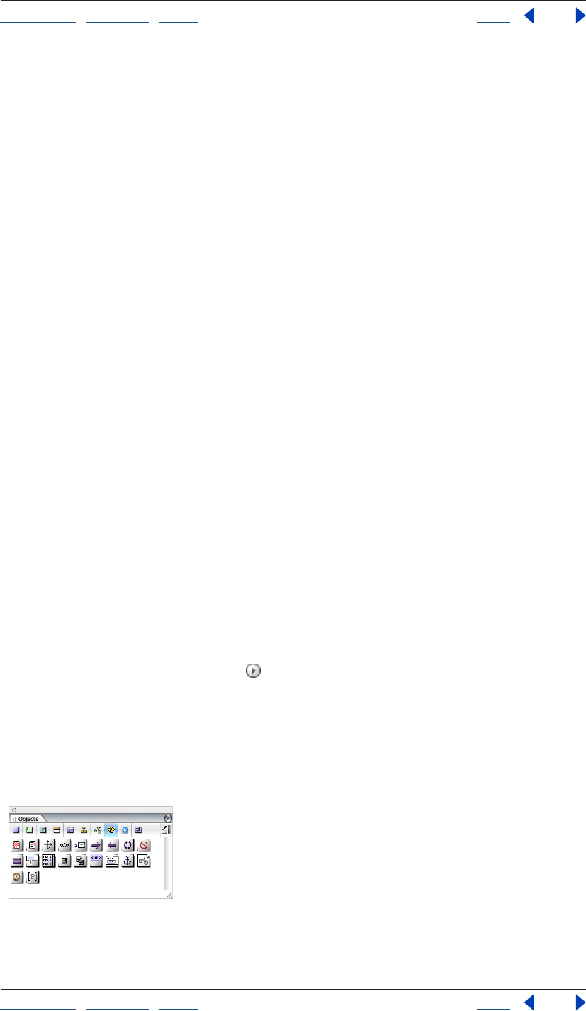
Using Help | Contents | Index Back 362
Adobe GoLive CS Help Authoring Wireless Web Sites
Using Help | Contents | Index Back 362
Working with WML
WML (Wireless Markup Language) is a markup language for displaying information on
wireless devices, such as mobile phones.
WML is based on a hierarchy of decks and cards. A deck is the container element for a WML
document and is made up of a series of cards. A deck of cards is downloaded to the user’s
phone all at once. Cards can contain text, images, user input elements, and WML-specific
elements that allow navigation and handle user events (such as a user pressing a key on
the device).
Setting WML preferences
You must enable the WML module before you can author in WML. When you enable the
module, you’ll see the WML Elements set in the Objects palette.
To enable the WML module:
1 Choose Edit > Preferences (Windows) or GoLive > Preferences (Mac OS).
2 Display the Modules section of the Preferences dialog box, and select WML in the
Extend Scripts folder.
3 Restart GoLive.
Creating a WML deck
Decks are the container element for a WML document. When you create a deck, GoLive
automatically specifies a document type definition (DTD) for the deck. By default, the DTD
version is 1.3; however, you can also specify DTD version 1.1 and 1.2.
The document window for a WML deck has three views. Use Layout view to design a WML
deck. Use Source view to view WML code in a text editor. Use Outline view to view the
structure of a deck in a hierarchical format.
To create a new WML deck:
Choose File > New Special > WML Deck.
To change the DTD version:
Click the Document Window palette in the top right corner of the document window,
and choose a version from the Doctype submenu.
Working with WML elements
Elements are the building blocks of a WML document. You add elements to a document by
dragging icons from the WML Elements set of icons in the Objects palette to the
document window.
WML Elements set in the Objects
Keep the following in mind as you work with elements:
Using Help | Contents | Index Back 363
Adobe GoLive CS Help Authoring Wireless Web Sites
Using Help | Contents | Index Back 363
• Use only WML elements in your deck. If you place elements from the Basic set in the
Objects palette into a WML document, the deck will not work correctly.
• Every element has content rules that determine what the element can contain. For
example, a deck element can contain a template element and card elements. The
content rules for an element are displayed to the right of the element name in the
document window and at the bottom of the Objects palette when you point to an
element icon. The content rules show which elements (and the number permitted) are
allowed within an element. A question mark (?) next to an element name means 0 or 1
of those elements are allowed, a plus sign (+) means 1 or more, an asterisk (*) means 0
or more, and the pipe symbol ( | ) between two elements means either element is
allowed. For example, the content rule for a card is OnEvent?, Timer*, (Do | P)*. This
content rule means zero or one OnEvent element is allowed, zero or more Timers, and
zero or more Do or P elements are allowed.
• Limit the size of decks. WML browsers have memory restrictions, and a single large deck
can fill up memory very quickly. The recommended size for decks is 500 bytes or less.
Choose Special > Document Statistics to display the document size.
• If you edit the WML source code, keep in mind that WML is a case-sensitive language.
For example, CARD and card mean different things.
Note: You must enable the WML module in order to view the WML Elements in the Objects
palette. (See “Setting WML preferences” on page 362.)
To add an element to a deck:
1 Drag an element icon from the WML Elements set in the Objects palette into the
document window. Release the mouse button when the pointer is over the colored area of
the parent element.
Note: If you drop an element in a location where it is not allowed by the content model, a
warning appears and a red border is displayed around the element.
2 Set attributes for the element in its Inspector, including the following common optional
attributes.
• id to specify an identifier for the element that you’ll use later to link to it or use in server-
side transformations. GoLive assigns a unique number to the id attribute by default, but
you may want to change it to a more meaningful name.
• class to affiliate the element with one or more classes that you can use to group the
elements. Separate multiple class names with spaces.
To select an element:
Click in the colored area of the element in the document window. A border appears
around the element when it is selected.
To move an element:
Select the element in the document window, and drag it to a new location.
To delete an element:
Select the element in the document window, and press the Back space or Delete key.

Using Help | Contents | Index Back 364
Adobe GoLive CS Help Authoring Wireless Web Sites
Using Help | Contents | Index Back 364
Creating WML cards
A card is a small collection of data that is displayed in a WML browser. A card can contain
text, images, and additional WML elements that allow users to input data and navigate
between cards.
When designing a WML deck, keep in mind that navigation between cards is somewhat
different than navigation between pages on the Web. In WML, navigation between cards
typically goes only between cards in the same deck, or back to the top level. Easy
navigation is critical when viewing information on a wireless device, so make sure that
your WML deck is usable in this constrained environment.
To add a card to a deck:
Drag the Card icon from the WML Elements set in the Objects palette into the document
window. Release the mouse button when the pointer is over the colored area of the wml
element.
To specify card attributes:
1 Select a card in the document window.
2 In the Card Inspector, enter a card title in the title text box.
WML browsers render card titles in a variety of ways (as bookmark names, tooltips, and so
on). Limit titles to 15 characters or fewer to prevent truncation of the text.
Using Help | Contents | Index Back 365
Adobe GoLive CS Help Authoring Wireless Web Sites
Using Help | Contents | Index Back 365
3 Set the following optional attributes in the Card Inspector:
• newcontext to choose whether or not the browser context should be reinitialized when
a user accesses the card. Choose true if you want the browser to clear variables binding
and navigational history when a user accesses the card.
• ordered to specify how the card is organized. Choose true if the card will have fields that
should be completed in a linear order. Choose false if the card will have fields that can
be completed in any order.
• onenterforward, onenterbackward, and ontimer to include event bindings inside the
card element. (See “Working with events in WML decks” on page 368.)
Using a template in a WML deck
A WML template contains events that apply to all the cards in a deck. (See “Working with
events in WML decks” on page 368.) The template element must be the first element in a
deck.
To add a template to a deck:
Drag the Template icon from the WML Elements set in the Objects palette into the
document window. Release the mouse button when the pointer is over the colored area of
the wml element. If necessary, drag the template element to the top position in the deck.
To specify template attributes:
1 Select a template element in the document window.
2 Set the following optional attributes in the Template Inspector:
• onenterforward, onenterbackward, and ontimer to include event bindings inside the
template element. (See “Working with events in WML decks” on page 368.)
Adding text to WML elements
You add text by typing in the white space of an element. By default, text is enclosed in a p
element; however the p element is not displayed when you are working in Layout view.
You can also use the pre element to enter preformatted text.
To enter text:
Click the white area of an element, and enter text. Press Return to start a new paragraph.
To use the pre element:
Drag the Pre icon from the WML Elements set in the Objects palette into the document
window. Release the mouse button when the pointer is in the desired paragraph.
Adding images to WML cards
You add images to a card using the WML img element. Images must be in WBMP format.
You can convert an image to WBMP format by adding a Smart Object to an HTML
document in GoLive. (See “About images and multimedia” on page 235.)
To add an image to a card:
Drag the Img icon from the WML Elements set in the Objects palette into the document
window. Release the mouse button when the pointer is in the desired location in a
paragraph, or place the img element in an anchor element to create a linked image.
Using Help | Contents | Index Back 366
Adobe GoLive CS Help Authoring Wireless Web Sites
Using Help | Contents | Index Back 366
To specify image attributes:
1 Select an img element in the document window.
2 In the Img Inspector, set the following attributes:
• alt to specify alternative text for the image. A WML browser displays alternative text
when it does not support images or when the image file cannot be found.
• src to specify a URL for the image file.
3 Set the following optional attributes in the Img Inspector:
• localsrc to specify an image file that is local to (saved on) the wireless device. This image
file takes precedence over the image file specified by the src attribute.
• vspace and hspace to specify the amount of white space that you want a WML browser
to insert around the image in pixels or a percentage. Some browsers may ignore this
attribute.
• align to specify how the image is aligned within a paragraph. Choose bottom to align
the bottom of the image with the current line. Choose middle to center the image on
the current line. Choose top to align the top of the image with the current line. Some
browsers may ignore these attributes.
• height and width to specify the dimensions of the image in pixels or a percentage.
Some browsers may ignore these attributes.
• xml:lang to specify the language of the element or its attributes.
Getting user input in WML decks
You can capture input from users with the following WML elements:
• The input element creates a text entry field.
• The fieldset element creates a grouping of text entry fields.
• The select element creates a list of options from which a user can choose.
• The option element adds a single option to a selection list.
• The optgroup element groups options together in a selection list.
To create a text entry field:
1 Drag the Input icon from the WML Elements set in the Objects palette into the
document window. Release the mouse button when the pointer is in the desired location
in a paragraph.
2 In the Input Inspector, specify the name of the variable to set with the user’s input in the
name text box. (See “Using variables in a WML deck” on page 370.)
3 Set the following optional attributes in the Input Inspector:
• type to choose whether a user will enter text or a password. If you choose password, the
WML browser can obscure the text while a user enters it, such as displaying asterisks in
place of characters.
• emptyok to choose whether or not the user is required to enter text in the input area. If
you choose false, the user must enter text before continuing.
• size to specify the width in characters on the input area. Some browsers may ignore this
attribute.
Using Help | Contents | Index Back 367
Adobe GoLive CS Help Authoring Wireless Web Sites
Using Help | Contents | Index Back 367
• maxlength to specify the maximum number of characters that a user can enter in the
input area. To allow an unlimited number of characters, leave this attribute blank.
• tabindex to specify the position of the element in the tabbing order (the order in which
elements are activated when a user presses the tab key). Enter 1 if you want the
element to be first in the tabbing order. Some browsers may ignore this attribute.
• xml:lang to specify the language of the element or its attributes.
• value to specify the default value of the variable specified in the name attribute.
• format to specify the range of characters that a user can enter.
• title to specify a title for the element.
• accesskey to specify a key that a user can press to activate the input area. The avail-
ability of keys depends on the wireless device. For example, phones have 1 through 9
keys and a pound key. Some browsers may ignore this attribute.
To create a group of text entry fields:
1 Drag the Fieldset icon from the WML Elements set in the Objects palette into the
document window. Release the mouse button when the pointer is in the desired location
in a paragraph.
2 Set the following optional attributes in the Fieldset Inspector:
• title to specify a title for the element.
• xml:lang to specify the language of the element or its attributes.
3 Add input elements to the fieldset element.
To create a selection list:
1 Drag the Select icon from the WML Elements set in the Objects palette into the
document window. Release the mouse button when the pointer is in the desired location
in a paragraph.
2 Set the following optional attributes in the Select Inspector:
• name to specify the name of the variable to set with the result of the selection (as deter-
mined by the value attribute of the option element). (See “Using variables in a WML
deck” on page 370.)
• multiple to specify whether or not the user can make multiple selections.
• tabindex to specify the position of the element in the tabbing order (the order in which
elements are activated when a user presses the tab key). Enter 1 if you want the
element to be first in the tabbing order. Some browsers may ignore this attribute.
• title to specify a title for the element.
• value to specify the default value of the variable named in the name attribute.
• iname to specify the name of the variable to set with the index result of the selection.
The first option in the list has an index value of 1, the second option in the list has an
index value of 2, and so on. If the user does not select an option, the variable is set to 0.
• xml:lang to specify the language of the element or its attributes.
• ivalue to specify a default index value to be used if the variable specified in the iname
attribute is not set when the element is displayed.
Using Help | Contents | Index Back 368
Adobe GoLive CS Help Authoring Wireless Web Sites
Using Help | Contents | Index Back 368
To add options to a selection list:
1 Drag the Option icon from the WML Elements set in the Objects palette into the
document window. Release the mouse button when the pointer is over the colored area of
a select element.
2 Enter text for the option in the white area of the option element.
3 Set the following optional attributes in the Option Inspector:
• title to specify a title for the element.
• value to specify the value with which to populate the select element’s name variable if a
user selects the option.
• xml:lang to specify the language of the element or its attributes.
To create a group of options in a selection list:
1 Drag the Optgroup icon from the WML Elements set in the Objects palette into the
document window. Release the mouse button when the pointer is over the colored area of
a select element.
2 Set the following optional attributes in the Optgroup Inspector:
• title to specify a title for the element.
• xml:lang to specify the language of the element or its attributes.
3 Add option elements to the optgroup element.
Working with events in WML decks
When a user performs an action on a wireless device, the WML browser captures the user’s
input. In technical terms, the user’s action is called an event. You can use events to execute
tasks in your WML deck. (See “Using tasks in WML decks” on page 369.)
The following elements let you bind a task to an event:
• The onevent element specifies a task to be executed when an intrinsic event occurs. An
intrinsic event is generated when a user interacts with an element in the WML deck. For
example, a user entering a card via the go element is an intrinsic event.
• The do element specifies a task to be executed when an extrinsic event occurs. An
extrinsic event is generated when a user presses a key on the device. For example, a
user pressing a soft key is an extrinsic event.
You can add these event-binding elements to both cards and templates. When you add a
do element or onevent element to a template, the events apply to all the cards in a deck.
(See “Using a template in a WML deck” on page 365.)
To add an onevent element:
1 Drag the Onevent icon from the WML Elements set in the Objects palette into the
document window. Release the mouse button when the pointer is over the colored area of
a card element, template element, or option element.
2 Choose the type of event to which you want to bind the task from the type
pop-up menu.
3 Add a task to the onevent element.
Using Help | Contents | Index Back 369
Adobe GoLive CS Help Authoring Wireless Web Sites
Using Help | Contents | Index Back 369
To add a do element:
1 Drag the Do icon from the WML Elements set in the Objects palette into the document
window. Release the mouse button when the pointer is over the colored area of a card or
template element.
2 Choose the type of event to which you want to bind the task from the type pop-up
menu.
3 Set the following optional attributes in the Do Inspector:
• label to specify a text label for the element. A WML browser may display the text as a
graphical button. Limit labels to six characters or fewer to prevent truncation of the
text.
• name to specify a name for the event binding.
• optional to choose whether or not the browser can ignore the do element.
• xml:lang to specify the language of the element or its attributes.
4 Add a task to the do element.
Using tasks in WML decks
Tasks specify processing that is performed in response to an event, such as a user pressing
a key, entering a card, or activating a hypertext link. You add tasks to a card using the
following elements:
• The go element navigates to a URL.
• The prev element navigates to the previous URL or the last viewed page.
• The refresh element refreshes the content of a card.
• The noop element specifies that nothing should be done.
To add a go element:
1 Drag the Go icon from the WML Elements set in the Objects palette into the document
window. Release the mouse button when the pointer is over the colored area of a do,
onevent, or anchor element.
2 In the Inspector, enter the URL of the card to display in the href text box.
3 Set the following optional attributes in the Go Inspector:
• method to choose a method for submitting data to a server, either get or post. This
attribute is only used when sending information for processing on a server.
• accept-charset to enter a list of character encoding (charset) names for data that the
origin server accepts when processing input. Separate the character encoding names
with spaces or commas. This attribute is only valid when the post method is selected.
• sendreferer to choose whether or not the browser sends the URL of the current deck
along with the URL request. If you choose true, the server can control access to the
destination card based on the current deck.
4 Add a setvar or postfield element to the task. (See “Using variables in a WML deck” on
page 370.)
Using Help | Contents | Index Back 370
Adobe GoLive CS Help Authoring Wireless Web Sites
Using Help | Contents | Index Back 370
To add a prev, refresh, or noop element:
1 Drag the Prev icon, the Refresh icon, or the Noop icon from the WML Elements set in the
Objects palette into the document window. Release the mouse button when the pointer is
over the colored area of a do, onevent, or anchor element.
2 For prev and refresh elements, add a setvar element to the task. (See “Using variables in
a WML deck” on page 370.)
Using variables in a WML deck
WML variables make it possible to process data from users and pass data between
elements in a deck. You set variables using the setvar element. The postfield element is
similar to a variable in that it specifies a field name and value for transmission to a server
during a URL request. (See “Using tasks in WML decks” on page 369.)
To set a variable or postfield element:
1 Drag the Setvar icon or Postfield icon from the WML Elements set in the Objects palette
into the document window. Release the mouse button when the pointer is over the
colored area of a go, prev, or refresh element.
2 In the Inspector, specify a name and value for the variable or postfield element.
Adding hypertext links toWML cards
You can add HTML-style links to a card using the WML anchor element and <a> element.
The anchor element allows you to bind text and images to a go, prev, or refresh task. The
<a> element is a short form of the anchor element.
To add a hypertext link:
1 Drag the Anchor icon or the A icon from the WML Elements set in the Objects palette
into the document window. Release the mouse button when the pointer is in the desired
location in a paragraph.
2 Do one of the following:
• Enter text in the white area of the element. (See “Adding text to WML elements” on
page 365.)
• Drag an image element into the white area of the element. (See “Adding images to
WML cards” on page 365.)
3 If you added an <a> element, specify a URL for the link in the href text box.
4 Set the following optional attributes in the Inspector:
• title to specify a title for the element.
• accesskey to specify a key that a user can press to activate the link. The availability of
keys depends on the wireless device. For example, phones have 1 through 9 keys and a
pound key. Some browsers may ignore this attribute.
• xml:lang to specify the language of the element or its attributes.
5 If you added an anchor element, add a go, prev, or element task to it. (See “Using tasks
in WML decks” on page 369.)
Using Help | Contents | Index Back 371
Adobe GoLive CS Help Authoring Wireless Web Sites
Using Help | Contents | Index Back 371
Adding timers
Each card can have one timer. The timer is initialized when a user enters the card and stops
when the user exits the card. You can use a timer to trigger a task after a specified amount
of time has passed.
To add a timer element:
1 Drag the Timer icon from the WML Elements set in the Objects palette into the
document window. Release the mouse button when the pointer is over the colored area of
a card.
2 If the card contains other elements, move the timer element to the top position in
the card.
3 In the Inspector, enter the timer value (in tenths of seconds) in the Value text box.
4 Set the optional name attribute in the Inspector to specify a variable to use when initial-
izing the timer.
Publishing WML pages
Publishing and making your site available to users requires a WAP (Wireless Application
Protocol) gateway. See your wireless site service provider for more information. To transfer
your site to the server, you can use the GoLive FTP file transferring features. GoLive makes
it easy to publish your entire site at once, and to publish updated or new portions of your
site incrementally. For information on publishing your Web site, see “About transferring
files and publishing a site” on page 323.
Creating MMS content
Multimedia Messaging Service (MMS) technology lets you deliver interactive multimedia
content to MMS compatible devices.
Creating and displaying MMS documents
You can create MMS documents for phones that support the MMS technology. Adobe
GoLive CS provides a visual model to help with layout.
To create a new MMS document:
1 Choose File > New Special > MMS document.
2 To change the MMS device simulator that displays in the MMS document window,
choose a device model from the Device menu in the Mobile tab of the MMS Compatible
Mobile Device Inspector.
To change the default device model GoLive uses to preview MMS documents:
1 Choose Edit > Preferences (Windows) or GoLive > Preferences (Mac OS).
2 Select MMS.
3 Choose a device model in the Default menu.
To edit the MMS device models or create new models:
1 Do one of the following:
• Choose Edit > Preferences (Windows) or GoLive > Preferences (Mac OS). Select MMS.
Click Configure.
Using Help | Contents | Index Back 372
Adobe GoLive CS Help Authoring Wireless Web Sites
Using Help | Contents | Index Back 372
• Open a MMS document window, and click Configure in the MMS Compatible Mobile
Device Inspector.
2 Do one of the following, in the MMS Mobile Phone Configuration dialog box:
• To delete a listed device, select the device and click the Delete button , and click OK.
• To change the properties of an existing device, select the device you want to configure.
• To create a new device, click Create New Item , and then select the new Custom
Mobile Phone item.
3 To modify the device model name, enter a name in the Phone text box.
4 To change the distance of the MMS display area relative to the left and top edges of the
GoLive document window, enter a value in the Left and Top text boxes. The values
represent pixels.
5 To change a device model’s location in the menu list, select the device and click the up
or down arrows.
6 To specify an image of a MMS device model to display behind the MMS display area in
the GoLive document window, click Choose, select an image, and click Open.
7 To change the MMS device model’s color profile, click Profile. Set options in the Save For
Web dialog box, and click Save. (Save For Web is typically used to save optimized images;
in this instance, it only saves the profile.)
8 Click OK.
Creating slideshows for MMS devices
You can create a slideshow of images, audio, and text for MMS devices.
To create and edit slideshows:
1 Open a MMS document.
2 Select the Message tab of the MMS Compatible Mobile Device Inspector.
3 To add a slide, click Create New Item .
4 To edit a slide, select the slide and do any of the following:
• To set the amount of time before the next slide displays, enter a number of seconds in
the Duration text box.
• To add an image and/or audio to the slide, select Image and/or Audio. Reference a file in
the text box adjacent to the option you selected.
• To add text to a slide, select Text, and reference a text file in the adjacent text box. The
text in the text file displays in the text box below. To change the text in the referenced
text file and that will display in the device, modify the text that appears in the bottom
text box and click Replace. To add text directly, without referencing a file, simply enter
your text in the window, and then click Replace. (You must save the MMS document
before you can add text directly.)
• To change a slide’s location relative to the other slides, click the up and down
arrow buttons.
• To delete a slide, click the Delete button.
5 To define the slideshow’s maximum size, choose one of the following from the Max.
Data Size menu in the Slideshow tab of the MMS Compatible Mobile Device Inspector:
Using Help | Contents | Index Back 373
Adobe GoLive CS Help Authoring Wireless Web Sites
Using Help | Contents | Index Back 373
• A preset kilobyte value.
• None to set no maximum size for the slideshow.
• Custom to define a kilobyte value that isn’t listed in the menu. Enter a number of
kilobytes in the text box below the Max. Data Size menu.
6 Select one of the following:
• Use Mobile Phone Color Profile to apply the MMS device’s color profile to the slideshow.
(For more information on setting the device’s color profile, see “Creating and displaying
MMS documents” on page 371.)
• No Color Profile.
7 Click Create Slideshow. To add an entire folder of images, select the folder and click Add.
To add individual images, select an image and click Add.
8 To use images, text, or sound from the Album tab of the inspector in a slide, select a
slide in the Message tab of the inspector. In the Album tab, select the item you want to use
and choose Add Text/Image/Sound To Slide or Replace Text/Image/Sound In Slide from the
palette menu.
9 To add media to the Album tab of the inspector, choose Add Media To Album from the
palette menu.
10 To add an MMS card to the album, choose Add MMS To Album from the palette menu.
The current slideshow is converted to an MMS card and added to the Album. MMS cards
are SMIL files, complete with links to images, text, and audio. To replace a slideshow with
an MMS card, right-click (Windows) or Option-click (Mac OS) and choose Use MMS Card
from the menu that appears.
11 To preview the MMS presentation as a QuickTime movie, choose Export MMS As
Movie from the Inspector palette menu.
To optimize MMS presentations:
1 Open a MMS presentation.
2 Choose MMS Optimizer in the Inspector palette menu.
3 In the MMS Messages section of the MMS Optimizer dialog box, click the Create New
Item button.
4 In the Open dialog box, add the items you want to optimize to the Select Item To Add
text box and click Done.
5 To preview a MMS Message, select the file in the list of Messages and then click the Play
button . To stop the playback, click the Stop button .
6 Select one or more devices in the MMS Device list for which you want to optimize the
MMS messages, and click Add.
7 To change a mobile device’s color profile, select the device and click Profile. Set options
in the Save For Web dialog box, and click Save.
8 Click Optimize. In the Browse For Folder dialog box, select a location for the optimized
messages, and click OK.
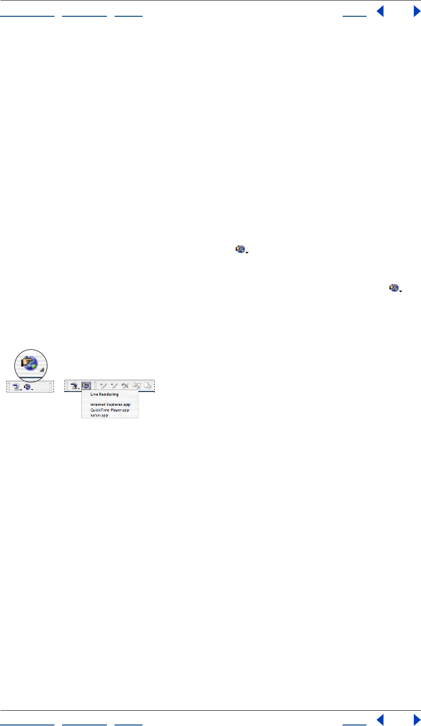
Using Help | Contents | Index Back 374
Adobe GoLive CS Help Authoring Wireless Web Sites
Using Help | Contents | Index Back 374
Previewing wireless pages in a phone emulator
(Windows only)
You can preview your XHTMS mobile profile, cHTML/iHTML content, and WML content
using emulators provided by mobile phone manufacturers. See the Nokia, SonyEriccson,
DoCoMo, or Opera Web site for information on acquiring an emulator.
To set up preferences for previewing in a phone emulator:
1 Make sure that you have a mobile phone emulator installed on your hard disk.
2 Choose Edit > Preferences (Windows) or GoLive > Preferences (Mac OS), and select
Browsers from the list on the left.
3 Click Add, navigate to the emulator, select it, and click Open.
4 If you want the phone emulator to be the default browser to preview your page, select
it in the scrolling window. Any browsers selected in the list will open and preview your
page when you click the Show in Browser button on the toolbar.
To preview your page in a phone emulator:
If you have set up the emulator to be the default, click the Show in Browser button on
the toolbar.
If the emulator is not the default, choose it from the Show in Browser menu on the toolbar.
Or, choose it from the File > Preview In submenu.
Show in Browser button and pop-up menu
After the emulator is open, you can use the Launcher window to choose any of the listed
phones to emulate. In the Viewer window, use the arrow keys and the Enter button to
navigate as you would on a phone. Generally, you can ignore the Menu button since
GoLive automatically sets the path to your file when you use the Preview in Browser
button on the toolbar.

Using Help | Contents | Index Back 375
Adobe GoLive CS Help Working with Source Code
Using Help | Contents | Index Back 375
Working with Source Code
Using the GoLive source code editors
When you work in the Layout Editor, GoLive codes all of the HTML for you. If you want to
work directly with HTML or JavaScript source code, you can use several different source
code editors:
• The Source Code Editor lets you edit your document’s HTML source code directly.
• The source code pane and the Source Code palette let you work in the Layout Editor,
the Frame Editor, or the Outline Editor and edit the document’s source code without
switching tabs in the document window.
• The Visual Tag Editor lets you insert HTML code or make changes to existing code while
working in the Layout Editor.
• The Outline Editor presents the HTML code of your documents in a hierarchical,
organized way.
• The JavaScript Editor lets you build scripts in the application, embed them in your
document, and test them immediately by launching the targeted browser.
You can save parts of your document as snippets or as components that can be reused
and dynamically updated in GoLive. (See “Using snippets” on page 313 and “Using
components” on page 311.)
Setting Source preferences
You can set the following Source preferences to control how the Source Code and JavaS-
cript Editors work, and how source code appears in the Source Code and JavaScript
Editors:
• The general Source preferences turn on and off support for dragging marked text, and
control how source code appears in the Source Code and JavaScript Editors. A preview
pane in the Preferences dialog box shows you how the source code appears as a result
of the options you select.
• Themes preferences let you select, customize, and rename source code themes, as well
as set color, font face, and font size options for elements in different languages (for
example, PHP, JavaScript, and HTML). Key sets enable you to control how HTML tags are
displayed in the Source Code Editor. For example, you can create a key set that displays
the table tag in a certain color, face, and size.
• Syntax preferences enable you to turn on context-sensitive code completion options in
the Source Code and JavaScript Editors.
To set general Source preferences:
1 Choose Edit > Preferences (Windows) or GoLive > Preferences (Mac OS), and then click
the Source icon.

Using Help | Contents | Index Back 376
Adobe GoLive CS Help Working with Source Code
Using Help | Contents | Index Back 376
2 Set the following preferences to control how the Source Code and JavaScript
Editors work:
• Enable Dragging for Marked Text turns dragging on or off.
• Auto Indent controls the automatic indenting of lower level elements.
• Tab Size sets the tab size of the auto indent and the number of characters added when
you press the Tab key.
• Line Numbers displays line numbers at the left margin of the Source Code or JavaScript
Editor.
• Word Wrap wraps the source code in the Source Code or JavaScript Editor.
• Default Theme enables you to select the default theme the Source Code or JavaScript
Editor uses to display source code.
3 Click OK.
To set Themes preferences:
1 Choose Edit > Preferences (Windows) or GoLive > Preferences (Mac OS), and then select
Themes under Source Preferences.
2 Do any of the following:
• To specify a theme for the source code, choose a theme from the Theme menu.
• To customize a theme, choose it from the Theme pop-up menu and select options from
the Text Color, Background, Script, Font, and Size menus.
• To rename a theme, choose it from the Theme menu and click Rename; then enter a
new name and click OK.
To customize the appearance of a specific language in the Source Code Editor:
1 Choose Edit > Preferences (Windows) or GoLive > Preferences (Mac OS), and then click
Themes under Source preferences.
2 Choose a language from the Syntax menu.
3 Select an option from the list beneath the Syntax menu to specify what you want to
customize.
4 Specify a color, face, and font size.
5 Repeat steps 2 through 4 for each language and option you want to customize; then
click OK.
To set key sets for HTML elements:
1 Choose Edit > Web Settings.
2 In the Markup tab, choose an HTML element (for example, Table).
3 Click the Output tab of the Web Settings Element Inspector.
4 Choose a key set from the Group menu, and then close the Web Settings window.
5 Choose Edit > Preferences (Windows) or GoLive > Preferences (Mac OS), and then select
Themes under Source Preferences.
6 Choose HTML Syntax from the Syntax menu.
7 Select the key set (from step 4) in the list beneath the Syntax menu.
Using Help | Contents | Index Back 377
Adobe GoLive CS Help Working with Source Code
Using Help | Contents | Index Back 377
8 Specify color, face, and size for the key set. GoLive displays the HTML element repre-
sented by the key set with these attributes in the Source Code Editor.
To set Code Completion preferences:
1 Choose Edit > Preferences (Windows) or GoLive > Preferences (Mac OS), and then select
Syntax under Source Preferences.
2 Select Enable Code Completion to turn code completion on.
3 Select Enable Immediate Completion to automatically insert End tags in the code.
4 Select Balance While Typing to automatically jump to the next open bracket when you
type a close bracket.
5 Drag the Delay slider to specify a delay speed, and then click OK.
Editing HTML code in the Source Code Editor
In the Source Code Editor, you can view your document’s source code, check the syntax,
fine-tune your code, or even build documents from scratch. If you are a seasoned HTML
programmer with a good working knowledge of HTML and have been using other text-
oriented HTML editors, you’ll find the Source Code Editor very useful for tweaking and
fine-tuning the underlying source code. Working in the Source Code Editor is like working
in any HTML text editor. You can create a new document or open existing GoLive, HTML, or
text documents. You can type or paste text from another document or application, and
make and save changes.
GoLive uses different colors to visually separate elements, attributes, and document
content in the Source Code Editor, and to make it easier for you to keep track of the
source code.
Opening the Source Code Editor
You can open and use the Source Code Editor within the Source tab of the document
window, or within the source code pane of the Layout Editor, the Frame Editor, or the
Outline Editor.
The source code pane in the document window contains a view of the Source Code Editor.
The source code pane lets you work in the Layout Editor, the Frame Editor, or the Outline
Editor, and see the underlying source code at the same time. Changes you make in the
editors are reflected in the source code pane, and vice versa, after you click the editor pane
again. For example, you can do most of your layout work in the Layout Editor, and then
fine-tune the source code or enter new code that must be entered manually in the source
code pane.
To open the Source Code Editor:
1 Do one of the following:
• Click the Source tab of the document window. The Source Code toolbar appears
below the Source tab. (If you don’t see the Source Code toolbar, choose View > Toolbar
from the context menu.)
• Click the Toggle Split View button in the document bar at the bottom of the Layout
Editor, the Frame Editor, or the Outline Editor. To close the source code pane, click the
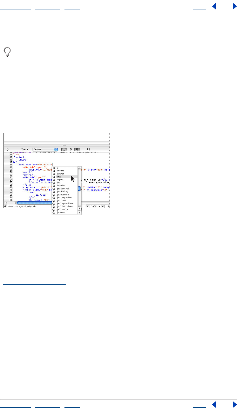
Using Help | Contents | Index Back 378
Adobe GoLive CS Help Working with Source Code
Using Help | Contents | Index Back 378
Toggle Split View button again. You can also open and close the source code pane by
choosing View > Show Split Source.
To quickly change the location and orientation of the source code pane, Alt-click
(Windows) or Option-click (Mac OS) the Toggle Split View button. The source code
pane moves to the right side of the document window and changes from a horizontal to a
vertical orientation. To move the source code pane to the top of the document window
(and subsequently to the left, and then back to the bottom), repeat this step.
Dragging icons and other items to the Source Code Editor
When working in the Source Code Editor, you can drag an HTML element icon from the
Objects palette into your source code and use it as a starting point for coding the element.
After inserting an element, you can edit its attributes and attribute values while the Source
Code Editor monitors your input and highlights typing errors or incomplete syntax.
Inserting a line element by dragging the Line icon to the Source Code Editor
You can also drag documents and URLs from the site window to the Source Code Editor to
create a link.
Formatting text
When working in the Source Code Editor, you can apply basic text formatting commands
from the Type menu to selected text in the body of your document. (See “Formatting text
characters” on page 192.)
To format text:
In the Source Code Editor, do one of the following:
• Select a paragraph, and then choose a command from one of the submenus under the
Type menu.
• Double-click the text to highlight a single word, or click and drag to highlight more
text. Choose the desired formatting command from one of the submenus under the
Type menu.
After you click in the Layout Editor, the formatting changes become visible in the
document.
Using Help | Contents | Index Back 379
Adobe GoLive CS Help Working with Source Code
Using Help | Contents | Index Back 379
Using smart selection
GoLive’s smart selection feature lets you quickly select the contents of an HTML element,
attribute, value, or CSS property in the Source Code Editor by clicking a delimiter.
To use smart selection:
Open the Source Code Editor and do one of the following:
• To select an element and its contents, double- click the angle bracket preceding the
element.
• To select only the contents of an element, double-click the angle bracket following the
element.
• To select an attribute and its value, double-click the equal sign following the attribute.
• To select only the value of an attribute, double-click the quotation marks preceding the
value.
• To select a CSS property and its value, double click the colon preceding the value.
Modifying the appearance of syntax items in the Source
CodeEditor
As you enter and edit code in the Source Code Editor, GoLive continuously monitors your
code and compares it with the content and rules specified in Web Settings. When GoLive
recognizes an element, it shows the start and end tags and attributes in color in the
Source Code Editor to indicate that the syntax is complete.
You can use the Source Code Editor toolbar to choose different themes that affect the
appearance of your source code, and to choose whether you want GoLive to display line
numbers or wrap your source code at the margins of the Source Code Editor. For infor-
mation on changing the colors of items, see “Setting Source preferences” on page 375.
To modify the appearance of code in the Source Code Editor:
Do one of the following:
• Choose a theme for the current document from the Theme menu in the Source Code
toolbar.
• Click the Colorize Nothing button in the Source Code toolbar to turn off the colors
of all items.
To turn word wrapping on and off:
Click the Word Wrap button in the Source Code toolbar.
To show line numbers:
Click the Line Numbers button in the Source Code toolbar.
Note: You can also set options for word wrapping and line numbers in the View palette
when you are working in the Source Code Editor.
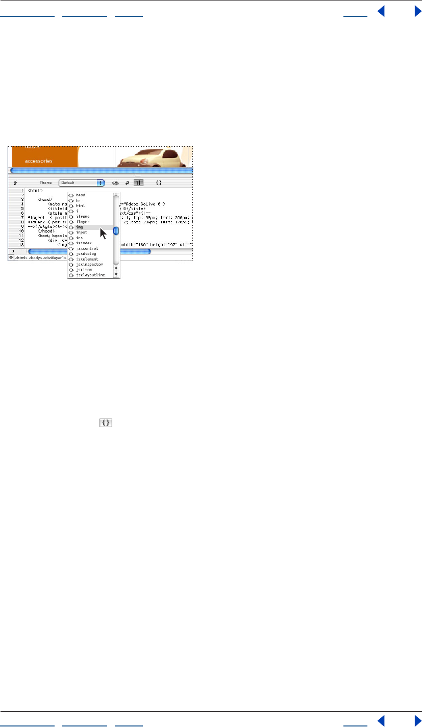
Using Help | Contents | Index Back 380
Adobe GoLive CS Help Working with Source Code
Using Help | Contents | Index Back 380
Automatically completing code
GoLive’s code completion feature enables you to write code without looking up hard-to-
remember elements, attributes, or functions. You can use code completion while writing
HTML code, as well as other languages such as JavaScript and PHP. Code completion is
context-sensitive. For example, if you’re coding in JavaScript, GoLive displays only JavaS-
cript options in the code completion menu.
Automatically completing code in the Source Code Editor
To use code completion:
1 Begin typing code in the Source Code or JavaScript Editor.
2 Scroll through the pop-up menu that appears, and then press Enter (Windows) or
Return (Mac OS) to select the desired element, attribute, or function.
Navigating through code
The Function menu in the Source Code Editor, JavaScript Editor, and CSS Editor
toolbars enables you to navigate through code by function. If you’re using the JavaScript
Editor, navigate using functions of languages such as JavaScript, VBScript, ASP, Perl, and
Java. If you’re using HTML, the Function menu lets you navigate through HTML code using
tags that contain the name attribute. If you’re using CSS, you can navigate through the
code using CSS definitions in the CSS Editor.
Functions are listed in the Function menu in the order they appear in the code. You can
insert markers to tag specific locations in the code.
To navigate through code:
Choose a function from the Function menu. GoLive inserts the cursor in the line of code
that contains the function.
To list functions in alphabetical order:
Control-click (Windows) or Alt-click (Mac OS) the Function menu.
To insert markers:
1 Insert the cursor in the line of code you want to mark.
2 Choose New Marker from the Function menu.
3 Type a name for the marker in the Add Marker dialog box and click OK.
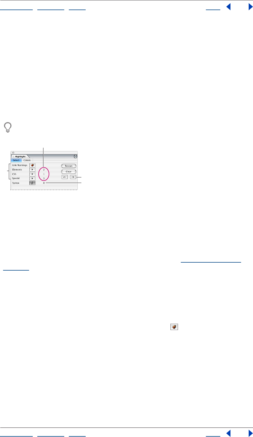
Using Help | Contents | Index Back 381
Adobe GoLive CS Help Working with Source Code
Using Help | Contents | Index Back 381
Using the Highlight palette
The Highlight palette lets you highlight particular items, warnings, and errors while you
are working in the Layout Editor, Source Code Editor, or Outline Editor. For example, you
can highlight all elements that contain a URL, all text that has a particular CSS definition,
or all syntax and link errors. After highlighting the items, you can use the Highlight palette
to select each highlighted item one at a time. You can save different highlighting settings
(such as all elements that contain a URL) as a Highlight set, and use any set later with any
document.
You can also use the Colors tab in the Highlight palette to set the highlighting properties
(such as colors and borders) of classes of items, such as making all link warnings blue.
Use the Highlight palette to highlight all elements that have JavaScript actions
attached.
Using the Highlight palette
A. Select the elements and items in your document you want to highlight. B. Number of items
highlighted C. Click these buttons to select the previous and next highlighted item.
D. Number of syntax errors and warnings
Highlighting elements and other items
You can use the Highlight palette to highlight a single item or any combination of
elements and items. You can also highlight link warnings and use the Syntax Checker to
check for syntax errors while also highlighting other items. (See “Checking syntax” on
page 386.)
To highlight elements and other items:
1 In the Layout Editor, Source Code Editor, or Outline Editor, choose Window > Highlight
to open the Highlight palette.
2 Do any of the following:
• To highlight all broken links and invalid file references, click Link Warnings. (You can also
show link warnings by clicking the Link Warnings button on the toolbar.)
• To highlight one or more particular elements, choose the element(s) from the Elements
menu.
• To highlight text that has a particular CSS definition, choose the definition from the
CSS menu.
• To highlight all elements that have JavaScript actions attached, choose JavaScript
Actions from the Special menu.
• To highlight all items that have a URL, choose Items with URLs from the Special menu.
• To highlight all text items, choose Text Items from the Special menu.
• To highlight all comments, choose Comment Items from the Special menu.
A
B
C
D
Using Help | Contents | Index Back 382
Adobe GoLive CS Help Working with Source Code
Using Help | Contents | Index Back 382
• To highlight all generic items (see “Adding a generic element or item” on page 399),
choose Special Items from the Special menu.
To select the previous or next highlighted item:
To select the previous or next highlighted item, click the Previous button or the Next
button in the Highlight palette.
To clear all highlighting and settings in the Highlight palette:
Click Clear in the Highlight palette. GoLive clears all highlighting in the document and all
settings in the Highlight palette.
To rescan after adding new items to the document:
Click Rescan in the Highlight palette.
To show and hide all highlighting:
Choose Show All Highlighting from the Highlight palette menu. A checkmark indicates
the highlighting is shown.
To show and hide highlighting of element content:
Choose Highlight Content Too from the Highlight palette menu. A checkmark indicates
content is also highlighted.
To show highlighting in preview:
Choose Show Highlighting in Preview from the Highlight palette menu. A checkmark
indicates the highlighting is shown.
Saving and loading highlighting settings
You can save the settings in the Highlight palette as a Highlight set and then use the set
later with any document. For example, you can save and reuse a Highlight set that
contains the settings to highlight all img elements, and another Highlight set that
highlights all elements that have JavaScript actions attached.
To save the current highlighting settings:
1 Choose Save Highlighting Set from the Highlight palette menu.
2 Enter a name for the highlighting set, and then click OK.
To load a set of highlighting settings:
1 Choose Load Highlighting Set from the Highlight palette menu.
2 Select the highlighting set, and then click Open.
Setting highlight colors and style
You can also use the Colors tab in the Highlight palette to set the highlighting colors and
color opacity that GoLive applies to categories of items, such as making all link warnings
blue. You can also set the style of highlighting for each category: colored border or shaded
background. For example, you can use a green border around all text items, and a yellow
background for all comment items.
To set highlight colors and appearance of items:
1 Click the Colors tab in the Highlight palette.
Using Help | Contents | Index Back 383
Adobe GoLive CS Help Working with Source Code
Using Help | Contents | Index Back 383
2 Do any of the following:
• To set the color of a category of items (such as all Link Warnings), click the color field
next to the category and select a color in the Color palette, or click the lower right
corner of the color field and choose a color from the swatches that appear.
• To set the color opacity that is applied to a category, drag the color slider next to the
category.
• To set the style of highlighting for each category, click the button to the right of the
category to toggle between colored borders or colored background shading.
Note: The settings for Editable Regions in the Highlight palette apply to editable regions in
page templates. (See “Using page templates” on page 305.) The settings for Locked
Regions apply to locked regions in a document based on a page template.
Setting the doctype of a document
A document’s doctype, which is specified in the !DOCTYPE declaration at the beginning of
the document, tells HTML validators and browsers which Document Type Definition (DTD)
to use when handling the document. The DTD specifies the elements that are allowed in
the document and the attributes for each element. For example, the HTML 4.0 Strict DTD
doesn't allow frames in documents, and the XHTML Basic DTD doesn’t allow font
elements.
By setting a document’s doctype, you are declaring that the document complies with a
particular DTD, which some devices now require. Some cell phones, for example, require
documents to comply with the XHTML Basic DTD. If you are designing a document for
display on cell phones, be sure to set the doctype of the document to XHTML Basic. Most
current versions of browsers can display documents that are not compliant with the
document’s declared DTD. But, by setting the doctype and making sure the document is
compliant, you are preparing the document for future versions of browsers that will
require compliance. If a document doesn’t have a doctype, which is the case for most
older documents, browsers can still display the document.
If you set a document’s doctype and then use the Syntax Checker, GoLive checks the
document’s structure and syntax, and then highlights any elements that are not
compliant with the DTD declared in the doctype. (See “Checking syntax” on page 386.)
Changing the doctype of a document
If you choose File > New Special to create an HTML document, an XHTML document, an
MMS, a RealOne Player Document, or a SMIL document, GoLive automatically sets the
doctype for you and selects a default DTD. (See “Creating special documents” on page 51.)
If you choose File > New Page, GoLive automatically sets the doctype to HTML 4.01 Transi-
tional.
You can set or change the doctype after the document has been created, within certain
restrictions. For example, you can change the doctype of an HTML document, or you can
convert a document from HTML to XHTML and then choose an XHTML doctype. For best
results, start by creating the type of special document you want to ultimately deploy.
Using Help | Contents | Index Back 384
Adobe GoLive CS Help Working with Source Code
Using Help | Contents | Index Back 384
After you choose a doctype from the Doctype menu, GoLive sets the document’s doctype
by inserting or changing the !DOCTYPE declaration at the beginning of the document’s
source code. The doctype you set is also selected as the default DTD in the Syntax Checker.
(See “Checking syntax” on page 386.)
To set or change the doctype of a document:
1 In the Layout Editor, display the document window menu.
2 Choose Doctype, and then choose a doctype from the menu. The menu is context-
sensitive—that is, if you are editing an HTML document, the valid HTML DTDs are
available. For an XHTML document, the XHTML DTDs are available, and for any other
doctype, the associated DTDs in the Markup tab of Web Settings are available. (See “Using
the Markup tab” on page 451.)
Note: If you associate imported DTDs with text or XML files in the Markup tab of Web
Settings, those DTDs are also available on the Doctype menu.(See “Importing a Document
Type Definition (DTD) file” on page 455.)
To set or change the doctype of multiple files in a site:
1 Open a site and select files in the Files tab of the Site window (Shift-click to select
contiguous files, Ctrl-click to select non-contiguous files).
2 Choose Edit > Site Aware Commands > Change Doctype.
3 In the Change Doctype dialog box, choose a doctype from the New Doctype menu, and
click OK.
To convert the doctype of a document from HTML to XHTML:
1 Do one of the following:
• To convert a single document, choose Markup from the document window menu in the
Layout Editor, and then choose Convert to XHTML. The Convert to XHTML dialog box
opens.
• To convert multiple documents, open a site, select files you want to convert (Shift-click
to select contiguous files, Ctrl-click to select non-contiguous files), and then choose Edit
> Site Aware Commands > Convert to XHTML. The Convert to XHTML dialog box opens.

Using Help | Contents | Index Back 385
Adobe GoLive CS Help Working with Source Code
Using Help | Contents | Index Back 385
2 To make your converted XHTML document compatible with more browsers, select the
following options to set how GoLive converts the document from HTML to XHTML:
• Wrap <style> Content Into CDATA wraps all of the text inside style sheets to prevent
GoLive from mistakenly interpreting the special characters in the style element.
• Wrap <script> Content Into CDATA wraps all of the text inside scripts to prevent GoLive
from mistakenly interpreting the special characters in the script element.
• Put a Space Character In Front of “/>” converts empty tags such as <empty> to
<empty /> instead of <empty/> (no blank space before the slash). This option helps
make your document compatible with some browsers that can't handle end tags that
have the correct syntax according to standards published by the W3C.
• Remove <meta> Encoding Element removes the meta encoding element from the
head section because the starting XML element contains encoding information.
• Remove Encoding Information If It Is UTF-8 removes the encoding information if it is
UTF-8, which is the default encoding for XML.
• Remove <?xml?> declaration if encoding is UTF-8 or UTF-16 removes the <?xml?>
declaration if the page’s encoding is set to UTF-8 or UTF-16. <?xml?> declarations are
not required if the document’s encoding is set to UTF-8 or UTF-16.
3 Use the following options to set how you want GoLive to handle the conversion of the
name attribute used in the following elements: a, form, img, and map. The conversion of
the name attribute can cause compatibility problems in some browsers. HTML requires
the name attribute for functionality, but the XHTML Strict DTD doesn’t allow the name
attribute in those elements.
• Do Not Touch does not change the name attribute or its value. For example, <form
name="formName"> remains <form name="formName"> after conversion.
• Copy To Attribute “ID” copies the name attribute and its value to an ID attribute. For
example, <form name="formName"> becomes <form name="formName"
ID="formName"> after conversion.
• Convert To Attribute “ID” converts the name attribute to an ID attribute. For example,
<form name="formName"> becomes <form ID="formName"> after conversion.
Note: If you select the Do Not Touch option or the Copy To Attribute “ID” option and your
document has an XHTML Strict doctype, the Syntax Checker reports an error on the name
attribute, but the document works correctly in a browser. If you select the Convert To
Attribute “ID” option, and your document has an XHTML Strict doctype, the Syntax
Checker doesn’t report an error, but the document might not work correctly in a browser.
4 Click OK.
To convert the doctype of a document from XHTML to HTML:
Do one of the following:
• To convert a single document, choose Markup from the document window menu in the
Layout Editor, and then choose Convert to HTML.
• To convert multiple documents, open a site and select the files you want to convert
(Shift-click to select contiguous files, Ctrl-click to select non-contiguous files), and then
choose Edit > Site Aware Commands > Convert to HTML.
Using Help | Contents | Index Back 386
Adobe GoLive CS Help Working with Source Code
Using Help | Contents | Index Back 386
Configuring the Objects palette for a doctype
After you set a document’s doctype, GoLive automatically disables buttons on the toolbar
and menu commands so that you can’t add elements that are not compliant with the DTD
for the current doctype. For example, because font elements are not compliant with the
XHTML Basic DTD, GoLive automatically disables the Bold, Italic, and Color buttons in the
toolbar and the Font menu commands.
The one exception where GoLive does not automatically disable tools are the icons in the
Objects palette. You must manually configure the Objects palette if you want to hide the
icons for elements that are not allowed in the current doctype.
Note: You can’t configure the Objects palette for an imported DTD.
To configure the Objects palette for a doctype:
1 In the Objects palette, choose Configure from the palette menu.
2 Do one of the following:
• Choose GoLive to show all icons in the Objects palette.
• Choose the current doctype to hide the icons for elements not allowed in the
current doctype.
Checking syntax
The Syntax Checker included with GoLive lets you make sure that your documents contain
valid and error-free source code. You can have the Syntax Checker parse your source code
to verify if your documents meet standards of well-formedness, or to verify if your
documents are compliant with a particular DTD. (See “Setting the doctype of a document”
on page 383.) Each DTD has different requirements regarding code syntax and the use of
elements. You can have the Syntax Checker use the DTD assigned to the document, or
another DTD you want to check against, when checking syntax and searching for illegal
code elements.
After parsing the source code, the Syntax Checker highlights faulty code elements in the
editors, and lists the errors and warnings in the Check Syntax Result window. You can also
see the errors next to each element in the Outline Editor where the error is located in your
document. (See “Editing source code in the Outline Editor” on page 394.)
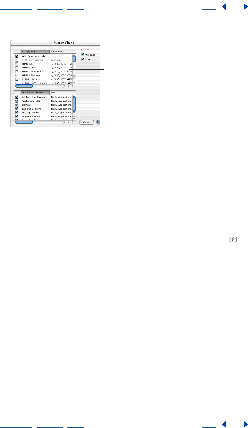
Using Help | Contents | Index Back 387
Adobe GoLive CS Help Working with Source Code
Using Help | Contents | Index Back 387
You can check individual pages, or an entire site.
Using the Syntax Checker
A. Compatibility list—select well-formedness, or select the DTDs you want to check compatibility
with. B. Additional elements to allow—select any additional code elements you want to allow in
your documents. C. Location of DTD
Using the Syntax Checker
You can use the Syntax Checker across an entire site, or in any of the editors.
To check syntax:
1 Do one of the following:
• To check the syntax for all files in a site, open the site.
• To check syntax for a single page, select it in the Files tab of the Site window, or open
the page in any editor.
2 Choose Edit > Check Syntax, or, if you’ve opened a page, click the Syntax button in
the Highlight palette or in the toolbar of the Source Editor.
3 Select the DTDs in the compatibility list (upper list box) in the Syntax Checker:
• Well-formedness Only to check your document for compatibility with well-formedness
standards, but not for compatibility with a DTD or browser set. For example, the Syntax
Checker generates error messages for required closing endtags that are missing,
attribute values that are required to be enclosed in brackets, or when an attribute is
defined more than once. When checking for well-formedness only, the Syntax Checker
doesn’t generate error messages for closing end tags that are not required, or for
attribute values that are not required to be enclosed in brackets.
C
A
B
Using Help | Contents | Index Back 388
Adobe GoLive CS Help Working with Source Code
Using Help | Contents | Index Back 388
• !DOCTYPE assigned to check compliance with the DTD for the doctype declared for the
document. To use this option, you must have already specified a doctype for the
document. (See “Setting the doctype of a document” on page 383.) The Syntax Checker
uses the !DOCTYPE declaration to locate the DTD, which can be on your computer, on a
local network, or on the Internet.
Note: If the DTD specified for your document is on the Internet, GoLive checks whether the
DTD is already cached. If it is, GoLive uses the cached DTD. If it isn’t cached, GoLive displays
an alert asking you for permission to access the Internet. If you agree, GoLive downloads
the DTD. If you refuse permission, GoLive checks your document for well-formedness, but
does not check for compliance with the DTD. The cache is cleared when you quit GoLive.
• A particular DTD (such as HTML 4 Strict) to check compliance with that DTD.
4 If your document contains any custom elements or attributes you added to the Markup
tab in Web Settings but are not defined in a DTD, select User Elements in the lower list box
in the Syntax Checker.
5 If you want to allow any additional elements in your document, select the sets of
elements in the lower list box in the Syntax Checker.
6 To control what to check for and how the Syntax Checker works, select the following
options:
• Warnings checks for syntax warnings. For example, GoLive displays a warning if the
value of an attribute is invalid, such as <body bgcolor=”redd”>. Warnings are much less
common than errors.
• Errors checks for syntax errors. The Syntax Checker displays an error if it can identify
incorrect HTML syntax, or if your document is not compliant with the specified DTD. For
example, the Syntax Checker displays an error if your document contains a start tag
without a corresponding end tag. For most problems, the Syntax Checker displays
errors.
7 Click OK.
GoLive displays errors and warnings in the Check Syntax Result window, as well as
highlighting the errors and warnings in the Source and Outline editors. The Highlight
palette also opens and displays the total number of errors and warnings.
8 Do one of the following:
• Click Close to close the Check Syntax Result window.
• Click Create Collection to create a collection of the syntax results in the currently open
site. For more information about collections, see “Using collections” on page 319.
To locate and examine errors in your document:
1 Do one of the following:
• View the errors in the Check Syntax Result window.
• Open the Outline Editor. Each error appears next to the element where the error is
located in your document. (See “Editing source code in the Outline Editor” on
page 394.)
2 Correct each error, and then check your source code again by choosing
Edit > Check Syntax.

Using Help | Contents | Index Back 389
Adobe GoLive CS Help Working with Source Code
Using Help | Contents | Index Back 389
Rewriting source code automatically
You can use GoLive to automatically rewrite source code that you manually entered
yourself. GoLive rewrites the code with indents and line breaks, changes the case of tags
and attributes, and sets quotes for attribute values as specified in the Rewrite Source Code
dialog box.
To rewrite source code automatically:
1 Open a page in any of the editors, or select multiple pages in the Files tab of the Site
window (Shift-click to select contiguous files or Ctrl-click to select non-contiguous files).
2 Choose Edit > Document Content > Rewrite Source Code.
3 Specify options as desired.
4 Do one of the following:
• Click Web Settings Default to rewrite source code as specified in Web Settings.
• Click No Change to revert any unwanted changes you’ve made.
5 Click OK.
Using the Source Code palette
Just like the source code pane, the Source Code palette lets you work in the Layout Editor,
Frame Editor, or Outline Editor and see the underlying source code at same time. But the
Source Code palette also provides two advantages for working with source code. The first
advantage is that if your computer uses dual monitors, you can view a document in the
Layout Editor on one monitor, while also viewing the underlying source code in the
Source Code palette on the second monitor. Changes you make in the Layout Editor are
reflected in the Source Code palette, and vice versa after you click in the Layout Editor
again.
The other advantage is that you can set the Source Code palette to Local Mode and
display the code only for the element(s) currently selected in the Layout Editor, Frame
Editor, or Outline Editor. Normally, the Source Code palette displays code for the entire
document. The Local Mode option lets you limit the amount of code displayed for easier
editing.
To use the Source Code palette:
1 In the Layout Editor, Frame Editor, or Outline Editor, choose Window > Source Code.
2 Choose any of the following from the Source Code palette menu:
• Local Mode displays the code for the currently selected element only in the Layout
Editor, Frame Editor, or Outline Editor.
• Word Wrap wraps the contents to the margin of the Source Code palette. If you resize
the palette with this option enabled, the contents wrap to the palette’s new size.
• Display Line Numbers shows code line numbers.
• Dim When Inactive dims the contents of the Source Code palette when you’re working
in the Layout Editor, Frame Editor, or Outline Editor. The dimming turns off when you
click in the Source Code palette.
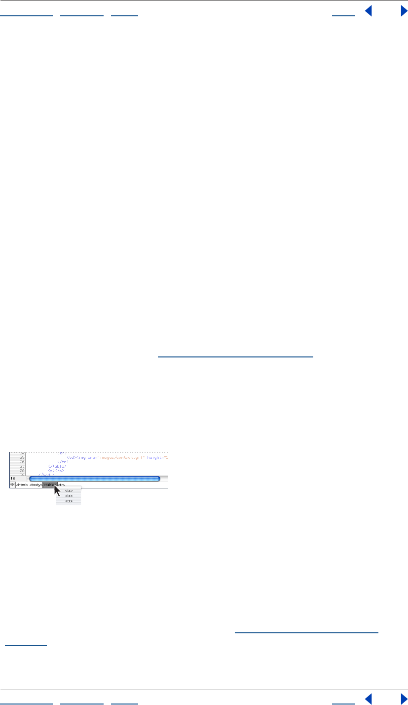
Using Help | Contents | Index Back 390
Adobe GoLive CS Help Working with Source Code
Using Help | Contents | Index Back 390
Using the markup tree bar
The markup tree bar at the bottom of the document window provides a navigational tool
that makes selecting HTML elements quick and precise, even in complex documents. The
markup tree bar represents the current selection in the Layout Editor, Frame Editor, source
code pane, or Outline Editor as a path or series of element tags from the root to the
currently selected element. For example, with a table cell selected, the markup tree bar
displays a path of tags starting with the HTML element, and then the body, table, table
row, and table cell elements. When you select an element’s tag in the markup tree bar, the
complete element and its contents (including start and end tags) is selected in the
document window and in the Source Code palette.
You can use the markup tree bar to select an element within the currently selected
element—that is, at the next level lower in the HTML hierarchy. For example, you can
select a table row within the currently selected table. Or, you can use markup tree bar to
select an element that is outside the currently selected element—that is, at a level higher
or closer to the root. For example, if a table cell is currently selected, you can select the
table row or the table where the cell is located.
To select an element within an element (lower in the hierarchy):
1 Display the document in the Layout Editor, Frame Editor, source code pane, or Outline
Editor.
2 Do one of the following:
• Move the mouse pointer over a tag, such as <table>, on the markup tree bar and
display the context menu. (See “Using context menus” on page 31.) Then choose a tag
from the Select Item submenu. The submenu lists all of the elements that are allowed
within the currently selected element. For example, a table row (tr) element is allowed
within a table element. If the selected element is at the lowest level, such as a table cell,
the Select Item submenu is not listed on the context menu.
• Hold down the mouse button (or drag slowly) on a tag on the markup tree bar and then
choose an element from the pop-up menu.
Using the markup tree bar to select an element within
another element
To select an element outside an element (higher in the hierarchy):
Click any tag currently displayed in the markup tree bar. For example, you can select a
table element directly (and all elements within the table such as its rows and cells) by
clicking the table tag in the markup tree bar.
Note: The Visual Tag Editor also contains a markup tree bar that works the same way as
the markup tree bar in the document window. (See “Using the Visual Tag Editor” on
page 391.)
Using Help | Contents | Index Back 391
Adobe GoLive CS Help Working with Source Code
Using Help | Contents | Index Back 391
Selecting the upper block of an HTML hierarchy
You can use the Select Upper Block command to quickly select the HTML element in the
next higher level in the hierarchy that encloses the currently selected element. For
example, with a table cell selected, the Select Upper Block command selects the table row.
You can use the Select Upper Block command in the Layout Editor, Source Code Editor, or
Outline Editor.
To select the upper block:
With text or an element selected in the Layout Editor, Source Code Editor, or Outline
Editor, choose Special > Select Upper Block. GoLive selects the element in the next higher
level in the hierarchy.
Comparing source code in files
The Find Differences dialog box lets you compare the source code of two files in a site.
GoLive displays differences and lets you set options to control the display.
To compare two files:
1 Open a site.
2 Choose Site > Find Differences.
3 In the Find Differences dialog box, drag the pick whip to the two files you want to
compare, or browse for and select the two files you want to compare.
4 Click OK.
GoLive displays the source code of each file in the Find Differences window, and highlights
the differences.
5 Click Previous Difference or Next Difference to navigate through different code strings.
6 Customize the view by selecting any of the following Compare Options:
• Skip Empty Lines to skip empty lines in the code.
• Show Different Colors to use a different color for each code display.
• Hide Identical Lines to hide lines of code that are identical.
• Synchronize Scrolling to scroll both code displays simultaneously.
Using the Visual Tag Editor
The Visual Tag Editor lets you inspect and edit the source code of a single HTML element in
the Layout Editor without having to use the Source Code Editor or Source Code palette.
The Visual Tag Editor also lets you insert new source code.
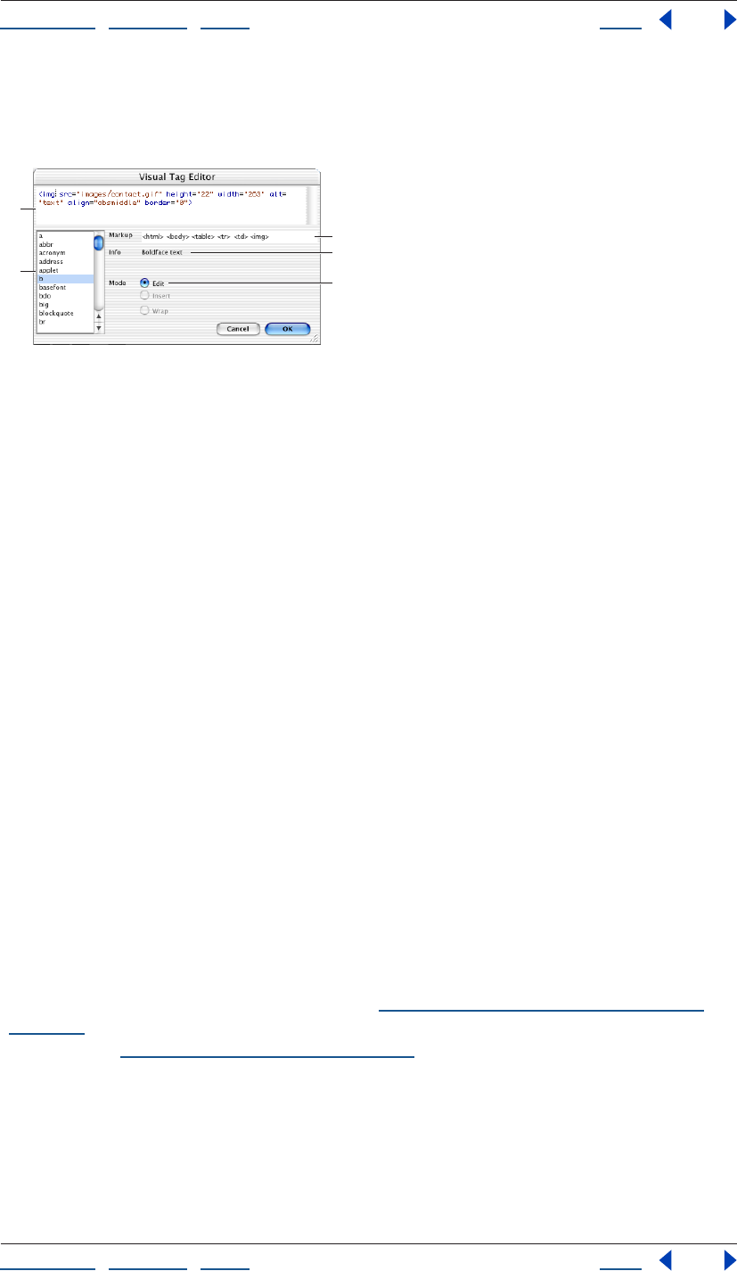
Using Help | Contents | Index Back 392
Adobe GoLive CS Help Working with Source Code
Using Help | Contents | Index Back 392
The Visual Tag Editor is a good tool for making quick, on-the-fly changes to the source
code of a document without leaving the Layout Editor. If you need to perform more
extensive editing of the code, use the Source Code Editor or Source Code palette instead.
Using the Visual Tag Editor
A. Inspect and edit the source code associated with the current selection. B. Context-sensitive list
of valid tags, attributes, and values C. The markup tree bar lets you select other elements for editing.
D. Information on the element or attribute being edited E. Current mode
Inserting new source code
By using the Visual Tag Editor, you can easily insert new source code while working in the
Layout Editor.
To insert new source code:
1 In the Layout Editor, place the cursor where you want to insert source code. Be careful
to avoid selecting existing text or elements, which would open the Visual Tag Editor in Edit
mode.
2 Choose Special > Visual Tag Editor.
3 To insert an element with the Visual Tag Editor, do one of the following:
• Type the element’s tag in the upper pane displaying the empty tag.
• Double-click the tag in the list box.
4 To insert an attribute, do the following:
• Type a blank space after the tag. Whenever you type a space after a tag, GoLive displays
the relevant attributes for that tag in the list box.
• Insert an attribute by typing the attribute in the upper pane or double-clicking it in the
list box.
• Type a value for the attribute.
Note: GoLive obtains the tags, attributes, and values for the list box in the Visual Tag Editor
from the DTD set by the current doctype. (See “Setting the doctype of a document” on
page 383.) If the document doesn’t have a doctype, GoLive uses the Markup tab in Web
Settings. (See “Using the Markup tab” on page 451.)
5 When you have finished entering the source code, click OK.
Editing existing objects or elements
You can use the Visual Tag Editor to quickly edit existing objects, elements, or attributes.
A
C
B
D
E
Using Help | Contents | Index Back 393
Adobe GoLive CS Help Working with Source Code
Using Help | Contents | Index Back 393
To edit an object or element:
1 In the Layout Editor, do one of the following to open the Visual Tag Editor in Edit mode:
• Select the object you want to edit by clicking it.
• Select the element you want to edit by using the markup tree bar at the bottom of the
document window. (See “Using the markup tree bar” on page 390.)
• Select more than one paragraph, objects, or elements by dragging in the Layout Editor.
2 Choose Special > Visual Tag Editor.
3 Edit the element by doing any of the following:
• Edit an existing attribute by clicking the attribute in the upper pane and typing directly
in the upper pane. You can replace the existing attribute by double-clicking another
attribute in the list box.
• Add a new attribute by placing the cursor before or after an existing attribute in the
upper pane, and typing a blank space. Then type the new attribute, or double-click an
attribute in the list box.
• If an attribute has predefined values, you can select a value by placing the cursor in the
attribute’s value in the upper pane, and double-clicking the value in the list box.
To select a different element without closing the Visual Tag Editor, use the markup tree
bar in the Visual Tag Editor. The markup tree bar works the same way in the Visual Tag
Editor as it does in the document window. (See “Using the markup tree bar” on page 390.)
4 When you have finished editing the source code, click OK.
Wrapping a new tag around a current selection
You can also use the Visual Tag Editor to quickly wrap a new tag around selected text and
objects within a single paragraph. For example, if you select a range of text within a
paragraph and select a <b> tag in the Visual Tag Editor, GoLive inserts a <b> start tag at
the beginning of the selection, and a </b> end tag at the end. You can also select text and
an object (such as a plug-in) within a paragraph, and wrap the selection with the
<noembed> and </noembed> tags.
To wrap a new tag around a selection:
1 In the Layout Editor, select a range of text, or text plus an object within a single
paragraph.
2 Choose Special > Visual Tag Editor.
3 Do one of the following:
• Type a single start tag (such as <b>) in the upper pane of the Visual Tag Editor.
• Double-click a tag in the list box.
4 Click OK.
GoLive inserts the start tag at the beginning of the current selection, and a corresponding
end tag at the end.
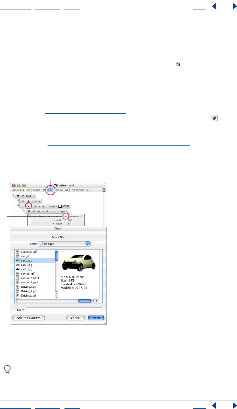
Using Help | Contents | Index Back 394
Adobe GoLive CS Help Working with Source Code
Using Help | Contents | Index Back 394
Editing source code in the Outline Editor
The Outline Editor displays HTML elements in a hierarchical, structured view. Using the
Outline Editor, you can generate clean, valid source code without typing code. You select
elements and attributes from a context-sensitive menu, drag items from the site window
or the Objects palette to the Outline Editor, and use the pick whip to link documents
and graphics. You can build documents from scratch, fine-tune your code, and drag
elements in the Outline Editor to quickly move elements and their contents in your
document.
After checking the syntax of your document and finding errors, you can see an error
description next to each element in the Outline Editor where an error is located in your
document. (See “Checking syntax” on page 386.) You can also highlight all broken links
and invalid file references (in red, by default) by using the Link Warnings button on the
toolbar while you are working in the Outline Editor.
Note: To use the Outline Editor, the Outline Mode module must be enabled in the Modules
preferences. (See “Setting preferences for program modules” on page 44.)
To open the Outline Editor:
Click the Outline Editor tab in the document window.
The Outline Editor
A. Outline Editor tab B. Triangle control (Mac OS) or +/- sign (Windows) expands or collapses
element. C. Path pointer lets you open the referenced file. D. The Open dialog box appears when
you click the path pointer.
You can drag frequently used HTML-based elements from the Objects palette to the
Outline Editor, just as you would in the Layout Editor. After adding an element, you
can edit its attributes.
A
B
C
D
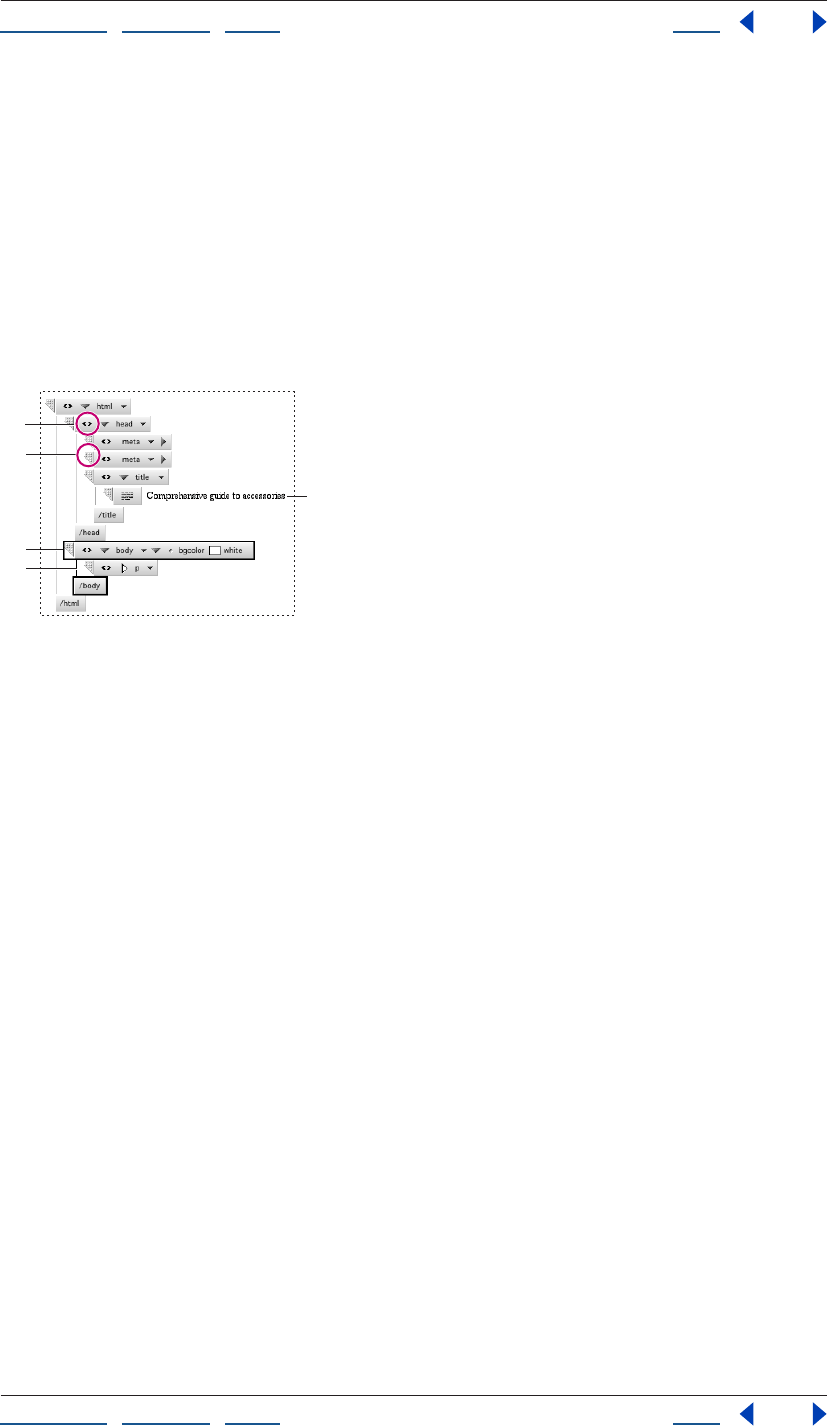
Using Help | Contents | Index Back 395
Adobe GoLive CS Help Working with Source Code
Using Help | Contents | Index Back 395
Navigating in the Outline Editor
The outline that appears when you create or view a document in the Outline Editor
contains all of the essential elements of an HTML document. You can use this structure as a
template and fill it with your own content.
• An element is represented as a box symbol that is labeled with the element’s tag.
• Indents indicate an item’s position within the HTML hierarchy. The head and body
elements are indented to show that they are contained within the HTML element. The
head element in turn contains a title element.
• Start and end tags are connected by vertical lines to show that they are complementary
items.
Working in the Outline Editor
A. Triangle control (Mac OS) or =/- sign (Windows) on html element expands and collapses entire
outline. B. Use this handle to drag an element to another location in the outline. C. Currently
selected element D. Start and end tag connectors E. Contents of the title element
To navigate in the Outline Editor:
Do one of the following:
• To collapse or expand the entire outline in the Outline Editor, click the triangle (Mac OS)
or +/- sign (Windows) to the left of the html element name at the top of the hierarchy.
• To expand or collapse the currently selected element, click the triangle (Mac OS) or +/-
sign (Windows) control to the left of the element name, or press Enter (Windows) or
Return (Mac OS). This is only possible with binary tags (tags always used in pairs).
A
B
C
D
E
Using Help | Contents | Index Back 396
Adobe GoLive CS Help Working with Source Code
Using Help | Contents | Index Back 396
• To select a different item in the Outline Editor, click the item or use the arrow keys. The
Up arrow selects the item above the current selection, and the Down arrow selects the
one below. If the cursor is in a text box displaying the contents of an element, the arrow
keys move the cursor within the text box.
• To activate the next text box, press Tab. To activate the preceding text box, press
Shift-Tab.
Moving elements
You can use the Outline Editor to quickly move a single element or selection of elements
and their content to a new location in your document.
To move elements in the Outline Editor:
Drag the handle on the element box to the new location in the outline. While you are
dragging, Golive displays a horizontal line indicating the element’s new location.
Note: To move multiple elements, Shift-click to select them and then drag the element
handle to the new location in the outline.
Adding new HTML elements
While working in the Outline Editor, you can quickly add HTML elements along with their
start and end tags. You can select an element from a context menu that lists all elements
defined in Web Settings, or only the elements that the document’s DTD allows within or
after the currently selected element. For information on DTDs, see “Setting the doctype of
a document” on page 383. Or, you can define a new element by typing the element’s tag
directly in the Outline Editor.
When adding an element, you can choose to either add the new element at the same level
in the HTML hierarchy as the selected element, or at the next level deeper than the
selected element.
To add an element:
1 In the Outline Editor, select the existing HTML element that is immediately above the
location in the outline where you want to add the new element. For example, to add a
paragraph element below a table element, select the table element.
2 To add an element at the same level in the HTML hierarchy as the selected element, do
one of the following:
• Display a list of elements that the document’s DTD allows after the currently selected
element by choosing Add Item After > By Syntax from the context menu. Then choose
an element from the By Syntax submenu. Two boxes representing the start and end
tags for the element are added to the outline after the end tag of the previously
selected element.
Note: Certain elements, such as img or meta elements, cannot have end tags, so only one
box will be added.
The By Syntax submenu is especially useful for adding elements to documents that
must comply with an XML DTD.
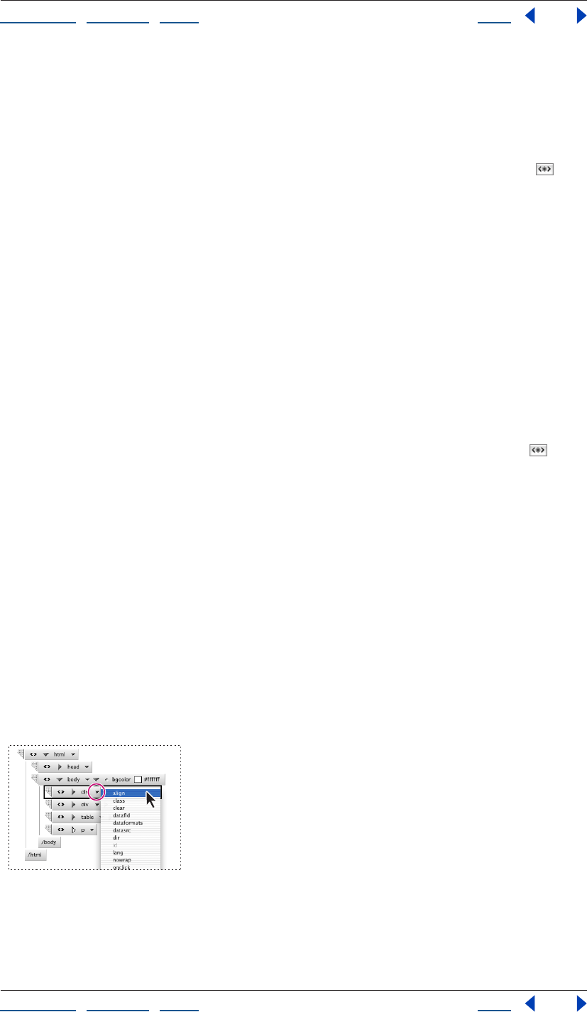
Using Help | Contents | Index Back 397
Adobe GoLive CS Help Working with Source Code
Using Help | Contents | Index Back 397
• Display a list of elements from the Markup tab of Web Settings by choosing Add Item
After > New Element from the context menu. Then choose an element from the New
Element submenu. Alternatively, you can choose Any from the New Element submenu
and then enter a name for the new element in the text box. The new element is added
after the end tag of the previously selected element.
• Collapse the existing selected element and then click the New Element button on
the toolbar. Then enter a name for the new element in the text box. The new element is
added after the end tag of the previously selected element.
3 To add an element within another element (that is, at the next level deeper in the HTML
hierarchy), do one of the following:
• Display a list of elements that the document’s DTD allows within the currently selected
element by choosing Add Item Into > By Syntax from the context menu. Then choose
an element from the By Syntax submenu. The new element is added between the start
and end tags of the previously selected element.
• Display a list of elements from the Markup tab of Web Settings by choosing Add Item
Into > New Element from the context menu. Then choose an element from the New
Element submenu. Alternatively, you can choose Any from the New Element submenu
and then enter a name for the new element in the text box. The new element is added
between the start and end tags of the previously selected element.
• Expand the existing selected element and then click the New Element button on
the toolbar. Then enter a name for the new element in the text box. The new element is
added between the start and end tags of the previously selected element.
Adding attributes
You can fine-tune the appearance of your document by adding attributes for an element.
Attributes control the way an element is displayed by the browser. Many elements
support attributes for specifying special formatting instructions, such as element
alignment, color, and directory paths to resource files.
To add a new attribute:
1 In the Outline Editor, select the element you want to add an attribute to.
2 Do one of the following:
• Click the Attributes triangle, and choose an attribute from the menu. The menu lists all
of the attributes that are defined for the selected element.
Using the Attributes triangle
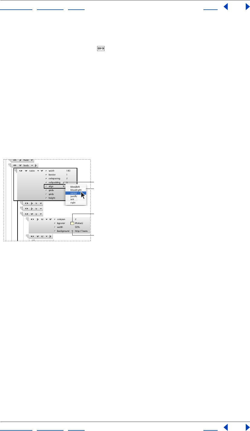
Using Help | Contents | Index Back 398
Adobe GoLive CS Help Working with Source Code
Using Help | Contents | Index Back 398
• Display the context menu and choose an attribute from the Add Attribute submenu.
The submenu lists all of the attributes that are defined for the selected element.
• Click the New Attribute button on the toolbar. Alternatively, you can display the
context menu and choose Any from the Add Attribute submenu. Then enter an
attribute name in the text box.
If the attribute is recognized as an enumeration type (such as a color or path), a triangle,
color field, path pointer, or comment sign appears to the right of the attribute name.
Note: If you are not sure whether an attribute name is valid, refer to the World Wide Web
Consortium’s (W3C) Web site at www.W3.org or use GoLive’s Syntax Checker.
3 To specify a value for the attribute, do one of the following:
• Click the text box to the right of the attribute name, and then enter a value.
• If there are predefined values for the attribute, the Outline Editor displays the Attribute
Values triangle. Click the Attribute Values triangle, and then select a predefined
attribute value from the menu.
Specifying attribute values
A. Attribute Values triangle B. Menu of predefined
attribute values C. Color field D. Path pointer
• If the attribute uses a color value (such as a font color), a color field and a color code
appear to the right of the attribute name.
• If the attribute uses a path (such as a path to an image file), a path pointer appears to
the right of the attribute name. Click the path pointer, then select a file in the Select File
dialog box, and then click OK.
To show images in the Outline Editor:
Select Images in the View palette.
If you specified low source (low resolution) images in the More tab of the Image Inspector,
you can show the low source images in the Outline Editor by selecting Low Source in the
View palette.
C
B
D
A
Using Help | Contents | Index Back 399
Adobe GoLive CS Help Working with Source Code
Using Help | Contents | Index Back 399
Adding text or comments
After adding an element, you can use the Outline Editor to quickly add the contents of
that element, such as the text you want to display in your document. For example, you
might enter heading text in an h1 element. You can also add a comment for an element,
which is any text you want to save but not display in your document when it is viewed in a
browser window. Comments are useful for storing notes for editing documents at later
dates—for example, if you intend to embed advanced features that require significant
background information.
To add text or a comment:
1 In the Outline Editor, select an HTML element that is immediately above the location in
the outline where you want to add the new text or comment.
2 Do one of the following:
• To add the text or a comment between the start and end tags for the selected element,
expand the element and then click the New Text button or the New Comment
button on the toolbar. A text box with default text or comment is added to
the outline.
• To add the text or a comment after the end tag for the selected element or item,
collapse the element and then click the New Text button or the New Comment
button on the toolbar.
Note: You can add a comment anywhere in your document, even before or after the HTML
element.
3 Enter your text or comment in the text box. If you temporarily stop entering text
and then deselect the text box, you can resume your work by inserting the cursor in the
text box.
Adding a generic element or item
You can add a generic element or item that contains non-HTML code in your document.
For example, you can add a generic item that contains ASP code.
To add text or a comment:
1 In the Outline Editor, select an element or item that is immediately above the location
in the outline where you want to add the generic element or item.
2 Do one of the following:
• To add the generic element or item between the start and end tags for the selected
element, expand the element and then click the New Generic Item button on
the toolbar.
• To add the generic element or item after the end tag for the selected element, collapse
the element and then click the New Generic Item button on the toolbar.
A text box with default text is added to the outline.
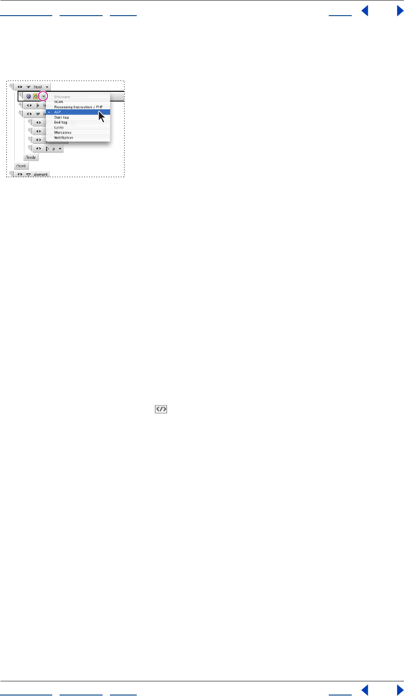
Using Help | Contents | Index Back 400
Adobe GoLive CS Help Working with Source Code
Using Help | Contents | Index Back 400
3 Click the Subtype triangle and choose a subtype for the generic item, such as ASP, from
the menu.
Using the Subtype triangle to specify
the subtype of a generic item
4 Enter the text content of the generic item in the text box. For example, if you selected
an ASP subtype for the generic item, enter ASP code in the text box.
Toggling the binary format
You can toggle the binary tag format on and off, which allows you to determine whether a
new tag has a complementary end tag or not. Most tags are binary tags, or container tags.
Binary tags enclose the content of an element in a pair of tags, called start and end or
open and close tags. By default, GoLive displays both parts of a binary tag. A few tags
(called unary tags), however, don’t need an end tag. One of the most frequently used
unary tags is the <img> tag for embedding images.
You can toggle the binary tag format for the currently selected element only.
To toggle the binary format on and off:
1 In the Outline Editor, select an element that has binary tags.
2 Click the Toggle Binary button in the Outline Editor toolbar.
Finding elements
Use the Code Elements feature in the In Multiple Files tab of the Find & Replace Content
window to find and manipulate elements in a document or throughout an entire site. This
feature offers several advantages over the search feature in the In Current Document tab
or the Text in Source Mode (encoded) feature of the In Multiple Files tab, which search for
literal text strings. For example, if you use the In Current Document tab or the Text in
Source Mode (encoded) feature to search for <body bgcolor=“red”>, you won’t find
instances of the element that lack the quotation marks or have other attributes included,
such as <body bgcolor=red> or <body text=“black” bgcolor=“red”>. The Code Elements
feature, on the other hand, does catch these variations. In addition, the Code Elements
feature lets you quickly add, delete, or modify attributes of existing elements; delete the
content of elements; or replace the plain text contents of elements.
The Code Elements feature includes three sections:
• Find options let you select search criteria, including elements and attributes.
• Change options let you specify changes or actions that you want carried out on any
elements or attributes found during a search.
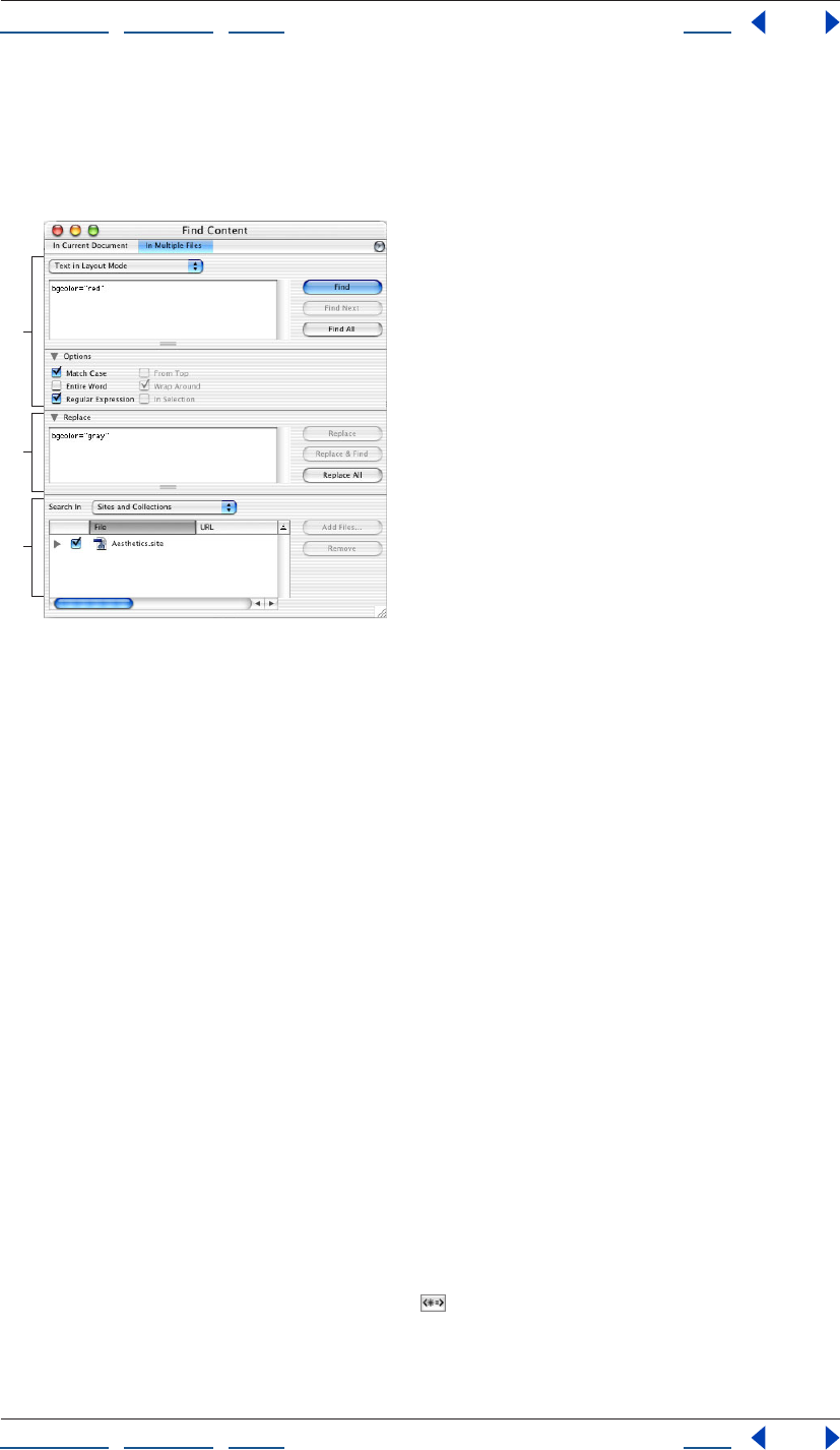
Using Help | Contents | Index Back 401
Adobe GoLive CS Help Working with Source Code
Using Help | Contents | Index Back 401
• Search In options let you specify the scope of a search: one file, several files, an entire
site or collection, or a list of previous results. You can also preview and modify the list of
files that you want changed by the specified actions, before you have GoLive carry out
the actions.
The In Multiple Files tab in the Find & Replace Content window
A. Search section B. Action section C. Find In section
By default, the Code Elements feature appears in structured mode, which enables you to
perform a structured search without any coding knowledge.
If you want to enter complex search criteria, click Advanced in the In Multiple Files tab to
open advanced mode.
Searching for elements
Use the Code Elements feature to perform either simple search tasks involving elements
or sophisticated operations that edit and manipulate elements or their plain- text
contents.
To search for elements:
1 Choose Edit > Find.
2 In the Find & Replace Content window, click the In Multiple Files tab.
3 Choose Code Elements from the topmost pop-up menu in the Find section.
4 In the Find section, specify Element options as follows:
• Choose Is or Matches from the Element menu.
• In the Element text box, either type the name of the element you’re searching for or
choose an element from the menu.
5 For a Structured search, choose the attribute in the Attribute menu in the Find section,
and choose an operator and attribute value in the menus that follow. To add another
attribute to the search, click the Add button , and then specify another attribute,
operator, and attribute value.
6 For an Advanced search, click Advanced and do the following in the Find section:
A
B
C
Using Help | Contents | Index Back 402
Adobe GoLive CS Help Working with Source Code
Using Help | Contents | Index Back 402
• Type the attributes, operators, and attribute values you want to use as search criteria in
the text box, or select attributes and operators from the Attribute and Operator menus.
• To search for elements by comparing attribute values, type two attributes and an
operator. For example, to search for elements that have a width greater than the height,
type the following:
height>width
• To search for the plain text contents of an element, enter the keyword content, an
equal sign operator, and the text contents in quotes. For example, to search for all
occurrences of “June” (no style applied) in the element you specified, type the
following:
content="June"
After specifying the search criteria for plain text, you can specify the text you want to
use as a replacement. For example, you can replace all occurrences of “June” in a
specified element with “July.” To replace the text contents of an element, use the Replace
Content action. (See “Editing elements in multiple files” on page 403.)
7 Define the scope of your search by doing one of the following:
• To select a site or a collection that is saved with a site, choose Sites and Collections from
the Search In menu, and then select the site folders, files, or collections you want to
search. (The site must be open for it to appear in the window.)
• To select individual files from a site, open the site window, drag or Shift-drag the files
from the site window to the file list in the Find & Replace window.
• To browse and select individual files, choose Files from the Search In menu, and click
Add Files. In the Add Files dialog box, locate and select the files you want (click Add All
to select all files in a folder), and then click Done.
• To select an open page, drag the Show Page Properties icon from the top right
corner of the document window to the file list in the Find & Replace window.
• To search within a previous result set (an open list of matches that resulted from a
previous search), choose Result List from the Search In menu.
8 Click Find All. GoLive displays the hits in the Result window.
To save result sets for use in another search:
In the Result window, do one of the following:
• To search for another element within the result set, click Use Result. You can remove
files from the result set by selecting them and clicking Remove.
Using Help | Contents | Index Back 403
Adobe GoLive CS Help Working with Source Code
Using Help | Contents | Index Back 403
• To save the results as a collection in the currently open site, click Save Collection, type a
name for the collection in the Create a New Collection dialog box, and then click OK (a
site must be open for the Save Collection option to be available). Saved collections are
displayed in the Collection tab of the Site window. For more information, see “Using
collections” on page 319.
Editing elements in multiple files
In addition to simply finding elements, you can manipulate elements in a variety of ways
by using these commands on the pop-up menu in the middle Change section of the In
Multiple Files tab:
Keep Keeps the element and sets, updates, or deletes its attribute.
Rename Renames the element, but keeps the element’s contents. You can keep the
element’s attributes or change them with an Attribute action.
Delete with Content Deletes the element completely, including its start and end tags as
well as its contents.
Replace by its Content Deletes only the element’s start and end tags, leaving its
contents untouched.
Delete Content Only Deletes only the contents of the element, leaving its start and end
tags in place.
Replace Content Replaces only the contents of the element, leaving its start and end
tags in place. This command works on plain text contents only—for example, text that has
a style applied to it such as bold is not affected by this command.
To modify an existing element:
1 Define the search criteria and scope of the search as described in “Searching for
elements” on page 401.
2 In the Change section of the Find & Replace Content window, choose Keep from the
Element menu.
3 In the Change section, choose an attribute from the Attribute menu, or type an
attribute in the text box.
4 Choose one of the following options from the pop-up menu to the right of the
Attribute menu:
• Set sets the specified attribute and value for the element whether or not the attribute
already exists.
• Update updates the attribute only if it already exists in the specified element. It does
not add the attribute.
• Remove removes the attribute and its value wherever it appears.
5 Choose an attribute value or type a value in the third Attribute text box.
6 To add another change attribute, click the Add button , and then specify another
attribute, operator, and attribute value.
Note: To remove an attribute, click the attribute’s Remove button.
7 Click Apply to All to begin the search and carry out the specified action.
Using Help | Contents | Index Back 404
Adobe GoLive CS Help Working with Source Code
Using Help | Contents | Index Back 404
The In Multiple Files tab also lets you create multiple Attribute actions to be performed
during a Keep Element action. Click the Add Attribute button and follow the steps
outlined here before you click Apply to All. GoLive performs each Attribute action defined
in the Change section. You can remove an Attribute action by selecting it in the list and
clicking the Remove Attribute button.
To rename, delete, or replace an existing element:
1 Define the search criteria and scope of the search as described in “Searching for
elements” on page 401.
2 In the Change section of the Find & Replace Content window, do one of the following:
• Choose Rename from the Element menu. Then type a new element name in the New
Name text box. (You can create Attribute actions for a Rename Element action, if
desired.)
• Choose Delete with Content from the Element menu.
• Choose Replace by its Content from the Element menu.
3 Click Apply to All to begin the search and carry out the specified action.
To replace the plain text contents of an element:
1 Define the search criteria and scope of the search as described in “Searching for
elements” on page 401.
2 In the Change section of the Find & Replace Content window, choose Replace Content
from the Element menu. Then type the replacement text in the Content text box. It is not
necessary to use quotes around the text.
3 Click Apply to All to begin the search and carry out the specified action.
To delete the contents of an element:
1 Define the search criteria and scope of the search as described in “Searching for
elements” on page 401.
2 In the Change section of the Find & Replace Content window, choose Delete Content
Only from the Element menu.
3 Click Apply to All to begin the search and carry out the specified action.
Saving a search task for later use
After you specify the settings for a search task in the In Multiple Files tab, you can save the
settings for later use.
To save a task:
1 Choose Save Search from the Find & Replace Content window menu.
2 Type a name and click Save.
To reapply a saved task:
1 Choose Load Search from the Find & Replace Content window menu.
2 Select the desired task, and then click Open.
3 Select the files you want to apply the task to in the Search In section, and then click
Find All.
Using Help | Contents | Index Back 405
Adobe GoLive CS Help Working with Source Code
Using Help | Contents | Index Back 405
To reapply a recently saved task:
Choose the task from the Find & Replace Content window menu.
Adding unknown elements
HTML is an ever-evolving language, and new elements are created often. To ensure that
your documents are always up to date and use the latest technology, you can use the Tag
icon to insert placeholders for elements that GoLive doesn’t recognize.
You can also use the Tag icon to prevent GoLive from parsing or changing your source
code. After you drag the Tag icon from the Objects palette to the document window,
GoLive adds <noedit> and </noedit> start and end tags to your source code, and inserts a
Tag placeholder in your document in the Layout Editor. You can then enter the code you
don’t want parsed in the Content tab of the Tag Inspector. GoLive inserts your code
between the <noedit> tags without changing it.
To add an unknown element:
1 In the Layout Editor, drag the Tag icon from the Basic set in the Objects palette to the
document window.
Using the Tag icon
A. The Tag placeholder as it appears in the Layout Editor
B. Tag icon in the Objects palette
2 In the Element tab of the Tag Inspector, enter the name of the new element in the
Element
text box.
3 Click the New Item button at the bottom of the Element Inspector. (This activates
the text boxes below the list box.)
4 Enter an attribute name in the left text box, and then enter an attribute value in the
right text box.
5 To delete the currently selected attribute, click the Remove Selected Items button .
Note: To add an unknown element to the head section of your document, drag the
Element icon from the Head tab of the Objects palette to the head section pane of the
document window.
To enter code for an unknown element:
1 Select the Tag placeholder for the unknown element.
2 In the Content tab of the Tag Inspector, enter the source code. You can inspect the code
in the Source Code Editor or source code pane.
AB
Using Help | Contents | Index Back 406
Adobe GoLive CS Help Working with Source Code
Using Help | Contents | Index Back 406
Using JavaScript
The GoLive built-in support for JavaScript and JScript lets you add interactivity to your
documents, verify form input, enhance visual displays, and dynamically control the
browser. The JavaScript Editor lets you build scripts in the application, embed them in your
document, and test them immediately by launching the targeted browser.
To make it easy for you to add JavaScript, GoLive provides a complete inventory of
building blocks for all major JavaScript dialects and versions. Whenever you drag a Script
icon from the Objects palette to the head section pane, you specify the targeted appli-
cation in the Inspector, which then configures the JavaScript Editor accordingly.
Combined with the ability of
JavaScript to identify browsers, this feature makes it easy for you to build documents with
multiplatform support.
Important: Not all browsers implement JavaScript in the same way. Test all JavaScripts on
all of your target browsers.
You can become familiar with the JavaScript environment in GoLive by entering
JavaScript expressions into the JavaScript Debugger accessed via the Special menu.
This window provides a command line you can use to communicate interactively with the
JavaScript engine built into GoLive. For more information on using the JavaScript
Debugger, see the SDK documentation.
Setting up JavaScript
You can add JavaScripts to your document. You can also insert JavaScripts in the head
section pane of the document window to allow a script to be executed while the visible
section of the document is still being loaded.
To set up a JavaScript:
1 Do any of the following:
• To add a JavaScript to the body section of a page, drag the JavaScript icon from the
Basic tab of the Objects palette to your document window.
• To add a JavaScript to the head section of a page, drag the Script icon from the Head
tab of the Objects palette to the document window or the head section pane.
2 If it’s not already selected, select the JavaScript icon in the document window, or the
Script icon in the head section pane.
3 In the Inspector, enter a descriptive name in the Name text box. Choose a target
browser from the Language pop-up menu. The language version corresponding to your
browser selection appears in the text box below the menu.
Using Help | Contents | Index Back 407
Adobe GoLive CS Help Working with Source Code
Using Help | Contents | Index Back 407
4 To reference an external script file (which must have the .js extension), select Source
and do one of the following:
• Enter a resource locator for your script file.
• Click the Browse button to select a script.
• Drag from the pick whip in the Inspector to a script in the site window.
Using the JavaScript Editor
When using the JavaScript Editor, you can use the following items on the JavaScript Editor
toolbar:
Note: See “Setting Source preferences” on page 375 for information about setting JavaS-
cript Editor preferences.
• The Toggle Error Display button shows and hides a pane in the top section of the
JavaScript Editor. After you check the syntax of your code, any errors are listed in the
error display pane. You can move the cursor where an error is located in your code by
clicking the error in the error display pane.
• The Check Syntax button checks the syntax of your code. If any errors are found, the
error display pane opens (if it’s not already open) and the cursor is placed where the
first error is located in your code.
• The Display Errors button shows the number of errors to the right of the button.
• The Display Warnings button shows the number of warnings to the right of the
button.
• The Word Wrap button toggles the wrapping of source code at the margin of the
JavaScript Editor on and off.
• The Numbers button shows the code line numbers.
• The Colorize None button turns off the color for all items.
• The Theme menu enables you to choose a theme for the current document (see
“Setting Source preferences” on page 375).
• The Function pop-up menu enables you to navigate through code (see “Navigating
through code” on page 380).
Editing an existing JavaScript
You can use the JavaScript Editor to edit existing JavaScripts.
To edit an existing JavaScript:
1 To open the JavaScript Editor, do one of the following:
• Double-click the JavaScript icon in the document window.
• Select the JavaScript icon in the document window, and then click the Edit button in
the Inspector.
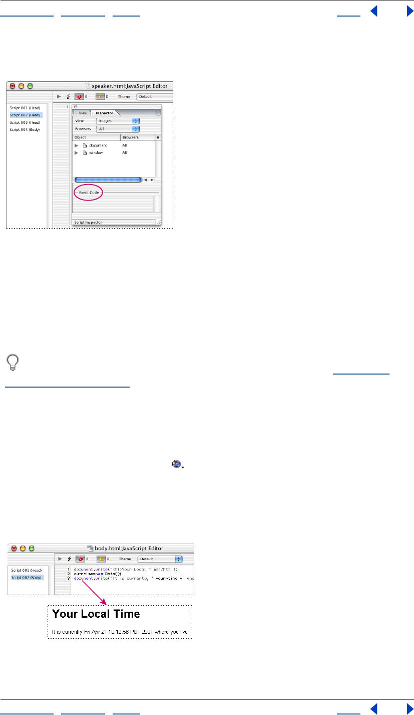
Using Help | Contents | Index Back 408
Adobe GoLive CS Help Working with Source Code
Using Help | Contents | Index Back 408
2 If the icons on the toolbar in the JavaScript Editor are inactive, choose a script name
from the list at the left side of the JavaScript Editor.
Create event definitions by entering event codes in the
Event Code text box.
3 Choose an option from the View menu, then drag an object from the Object list in the
Script Inspector to the JavaScript Editor window. For example, choose Events from the
View menu to display a list of JavaScript events that you can insert in your JavaScript.
4 In the Script Inspector, enter event code in the Event Code text box to create event
definitions.
Choose a function declaration from the Function pop-up menu in the JavaScript
Editor toolbar to navigate directly to that location in the script. (See “Navigating
through code” on page 380.)
5 Close the JavaScript Editor to save your work.
6 Do one of the following to open your Web page in the browser you selected for
previewing and testing in the Preferences dialog box:
• Choose File > Preview In > Default Browser.
• Click the Show in Browser button on the toolbar.
Note: In Mac OS, you cannot preview the effects of
a JavaScript.
The following sample JavaScript code shows how to use a simple JavaScript to display the
time and date obtained from the viewer’s operating system.
JavaScript sample code and result
Using Help | Contents | Index Back 409
Adobe GoLive CS Help Working with Source Code
Using Help | Contents | Index Back 409
• The document.write() method on the “Your Local Time” line writes an H1-formatted
text string from the document to the screen of the browser.
• The new Date() method creates a new date object containing the long version of the
current date from the viewer’s operating system. This object is assigned to currtime.
• The last line is output to the browser’s screen using a document.write() method,
with the embedded currtime variable set to the current time and date.
Shifting code to an external library
GoLive can automatically create an external
JavaScript library file that stores shared code from JavaScript actions, rollovers, dynamic
components, and animated scenes created in the DHTML Timeline Editor. At the same
time, it replaces the shared code in the page with a reference to the library file, leaving
only page-specific declarations and parameters in place. The library is then uploaded to
the Web server to make it available for every page in the site that needs the script.
Benefits of using external JavaScript libraries
Apart from streamlining the code in your pages, this library offers two advantages:
• It remedies a problem associated with the structure of dynamic GoLive components:
GoLive invariably places common code for DHTML items and actions in the head
section of a page. While this structure works well with “straight” pages, problems could
occur in earlier versions when a dynamic component contained DHTML items and
scripted actions. As the browser loads only the body section of a dynamic component,
it ignores any script code contained in the head section. This problem can be solved by
using the external JavaScript library, making JavaScript code in dynamic components
work as expected.
• The browser caches the JavaScript library file and less code is written into every page,
making the pages load faster.
Using the JavaScript library
You can choose the external JavaScript library feature on a per-page basis, as a site-wide
setting, or as an application-wide preference. If you choose the option in the application
preferences or site settings, all new pages and existing pages without preexisting JavaS-
cript will use the new preference setting. Pages that already had actions and other JavaS-
cript added to them will retain their existing JavaScript Functions setting. You must
change the setting for these pages in the HTML tab of the Page Inspector.
To set the JavaScript library preference:
1 Do one of the following:
• To affect all new pages, set the application
JavaScript library preference: Choose Edit > Preferences, and select Script Library in the
left pane.
• To affect all new pages in a site window, set the JavaScript library preference in the site
settings: Click the Site Settings button in the toolbar, select Script Library in the left
pane, and select Site Specific Settings in the right section.
• To set the preference for a single page, open the HTML tab of the Page Inspector.

Using Help | Contents | Index Back 410
Adobe GoLive CS Help Working with Source Code
Using Help | Contents | Index Back 410
2 Use the JavaScript options as follows:
• Select Write Code Into Page to have GoLive write any required JavaScript code into
the page(s).
• Select Import GoLive Script Library to shift all shared JavaScript to an external JavaS-
cript file. The file is saved to a folder named Generated Items by default.
If you select the Import GoLive Script Library option, GoLive reacts in one of two ways,
depending on whether or not you have a site document open:
• If the site document is open, it will create a library file in a new folder named Generated
Items at the root level of the site folder when you save the page.
• If you don’t have a site document open in the background when you save the page,
GoLive writes the code to a default library file, which can be found in the Modules/
JScripts/GlobalScripts subfolder of the GoLive application folder.
Note: Selecting the Import GoLive Script Library option in the Preferences or Site Settings
dialog boxes does not modify the Script Library settings for pages that contained preex-
isting JavaScript. To move code from those pages to the library, select Import GoLive Script
Library in the HTML tab of the Page Inspector for each page.
3 To rebuild the JavaScript library if it is damaged, click Rebuild in the application JavaS-
cript preferences or in the Site Settings dialog box.
4 Type a folder name for the JavaScript library and a library name with the suffix .js.
Flattening the script library
The external JavaScript library file contains the entire GoLive JavaScript library even if your
pages don’t use all of the functions within it. You can flatten the file to remove any JavaS-
cript that is not used in the site. This reduces the library’s file size and decreases its
download time. You can manually flatten the library file of a single site, set a site’s Site
Upload or Export preferences to automatically flatten the library file, or set the application
preferences to flatten the library file of all sites before upload or during export.
To manually flatten the JavaScript library of a single site:
Open a site window and choose Site > Flatten Script Library.
To set a site’s preferences to flatten the JavaScript library upon upload or export:
1 In the Site Settings dialog box, select Upload/Export.
2 Select Site specific settings.
3 Select Flatten Script Library and click OK.
To set all sites to flatten the JavaScript library upon upload or export:
1 Choose Edit > Preferences.
2 Expand Site and select Upload / Export.
3 Select Flatten Script Library and click OK.

Using Help | Contents | Index Back 411
Adobe GoLive CS Help Working with Source Code
Using Help | Contents | Index Back 411
Using text macros with source code editors
Text macros can save you time if you frequently use the Source Code Editor and the JavaS-
cript Editor. They eliminate typing lengthy strings of source code for often-used tags and
script elements.
The text macros are stored in an editable file, Default.macro, that resides in a special Code
folder within the Settings folder in the GoLive program folder.
The Default.macro file can hold any combination of text, HTML or CSS elements and JavaS-
cript strings. You can insert these objects in any of GoLive’s editors.
The Default.macro file is loaded when GoLive starts up to make it available throughout the
application.
Inserting text macros into the source code
To insert automated source code, type the macro name and press Shift+Ctrl+M (Windows)
or Shift+Command+M (Mac OS). This inserts the text macro identified by the word behind
or below the text cursor, provided it exists in the default source macro file.
Text macros are case-insensitive, which means that you can enter their names in lowercase
or uppercase characters, or any combination of lowercase and uppercase.
Defining text macros
You define text macros by opening the Default.macro file with GoLive or a text editor and
then typing, copying and pasting, or dragging the appropriate code. Text macro defini-
tions must have the following basic format:
<macro name="XY" type="Syntax-Context"><![CDATA[macro-
content]]></macro>
The first element in a macro definition is the macro name and type, which defines the
syntax context. With the exception of spaces and tabs, you can use any combination of
characters for a macro name, but you should restrict yourself to using letters and digits.
The source code editors differ in what they regard as self-contained words. For example,
using a dollar sign ($) in a macro name might work in the Source Code Editor but will fail in
the JavaScript Editor because this character is an integral part of the JavaScript syntax.
The second element specifies the content of the macro—that is, the CDATA tag specifies
the replacement text. The selection in the replaced text is defined by the percent
character (%). If you require a different selection character, you can add the attribute,
“selchar=(character)”. The content element must be enclosed in two identical or comple-
mentary delimiter characters. When you prompt GoLive to insert a text macro, the macro
interpreter will regard the first character after the separating blank space as the delimiter
and look for an identical character to determine where the content ends.
For example, an image element macro with basic attributes could look like this:
image «<img "src=../GIFS/???.GIF" width="20" height="20">»
You can also use a text macro to insert a string of formatted text. Here is an example:
webdesign $This Web Site was designed using <B>GoLive.</B>$

Using Help | Contents | Index Back 412
Adobe GoLive CS Help Working with Source Code
Using Help | Contents | Index Back 412
Using delimiters
As already noted, delimiters tell GoLive’s text macro interpreter where the content of a text
macro starts and ends. You can use any character as a delimiter, as long as you follow one
basic rule: The delimiter may not occur in the macro content itself. You can even use blank
space and carriage returns to insert structured text and multi-line code, respectively.
Here is an example of improper delimiter usage:
image "<img "src=../GIFS/???.GIF" width="20" height="20">"
This macro definition won’t produce a usable result because it uses double quotes as
delimiters. The double quotes are already used to enclose attributes in the HTML element
definition, so GoLive will only insert the text before the second double quote character.
The result would be:
image "<img
Note: As a general rule, avoid using characters that are typically used as structural
elements within the source code syntax, such as the less than (<) and greater than signs
(>) enclosing HTML tags.
Automating insertion point placement and text selection
Normally, when inserting a text macro, GoLive’s Text Macro tool selects the entire insert. To
ensure a smoother workflow, however, you can also place the insertion point or select text
for overtyping anywhere in the insert.
Placing the insertion point in an insert is accomplished by adding a “vertical bar” character
(“|”). Here is an example:
image «<img "src=|" width="20" height="20">"»
The vertical bar after the src attribute and “equal to” sign places the insertion point so that
you can enter the attribute value without having to move the cursor to the desired
location.
Selecting text for overtyping is accomplished by enclosing a placeholder word or string in
single quotes. Here is an example:
image «<img "src=../GIFS/'???'.GIF " width="20" height="20">"»
The three question marks enclosed in quotes will be selected when you insert this
example macro, allowing them to be overtyped with macro name “C” instead.

Using Help | Contents | Index Back 413
Adobe GoLive CS Help Working with Source Code
Using Help | Contents | Index Back 413
Using keywords as substitutes for control characters
As already noted, you can use three control characters to specify what happens when a
text macro is inserted:
• Single quotes (‘’) mark out a selection.
• The vertical bar places the insertion point.
• Dollar signs are used to reference another
text macro.
Now and then, syntax rules may require that you insert a macro with any of those
characters in it. For example, JavaScript syntax requires that text strings be enclosed in
single quotes. This conflict is solved by substituting percent signs (or any other suitable
character) for single quotes. The GoLive Text Macro tool has three built-in keywords that
allow you to redefine control characters:
• Selection lets you redefine the selection markers if single quotes are not allowed. Here
is an example:
Selection = %
write.document.write('%what%')
• Caret lets you redefine the insertion point marker if the vertical bar is not allowed—for
example, because it is used to express a bitwise OR operation in JavaScript.
CARET = %
• Macro lets you redefine the dollar signs enclosing a macro name.
MACRO = %
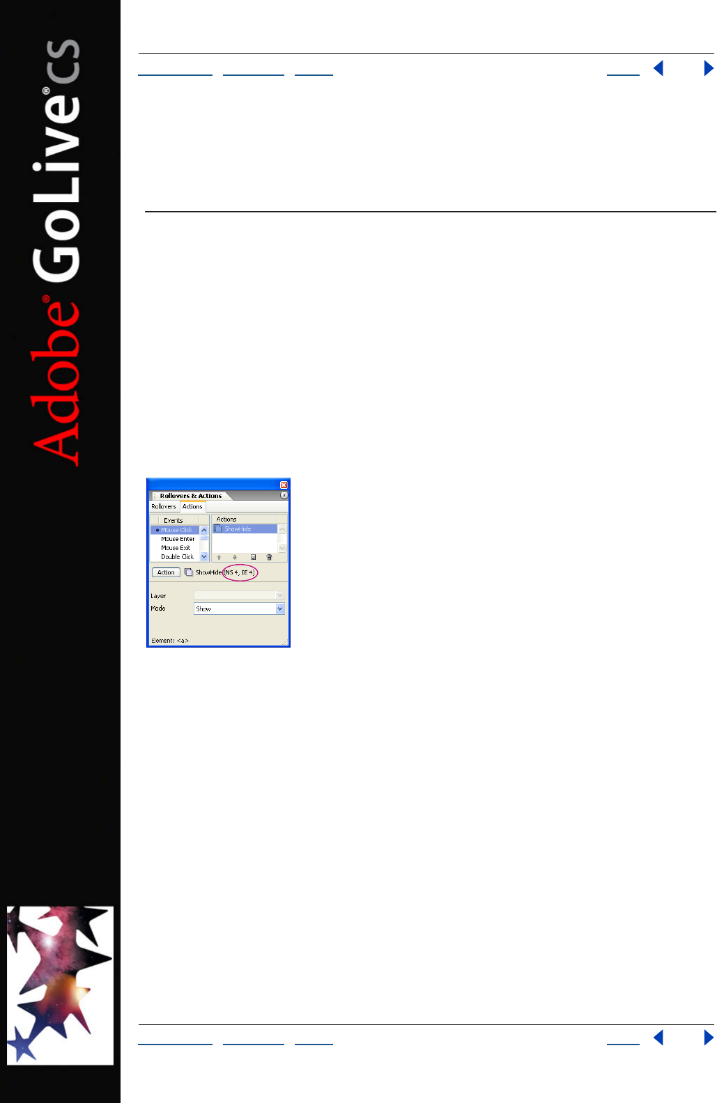
Using Help | Contents | Index Back 414
Adobe GoLive CS Help Using Actions
Using Help | Contents | Index Back 414
Using Actions
Setting up actions
In Adobe GoLive, actions are triggered in response to events. These events may be
browser-triggered, such as loading a page, or user-triggered, such as moving the pointer
over an image. Actions also can be triggered by a point in time in a timeline sequence. To
facilitate setting up actions, the Actions tab displays the selected item at the bottom (to
ensure that you’re working with the right tag), and the Actions menu displays recently
applied actions at the top (for quick selection).
You should always preview actions in a variety of Web browsers and platforms to
determine potential browser differences or incompatibilities. The earliest browser versions
that support each action are displayed next to the selected action name in the Action
Inspector or the Rollovers & Actions palette.
Browser compatibility for a selected action in parenthesis
To highlight actions in the current document window editors:
Select the Actions tab in the Rollovers & Actions palette and choose Highlight Actions in
Document from the palette menu.
User-triggered actions are highlighted in the Layout Editor, Source Code Editor, Outline
Editor, and markup tree bar. Browser-triggered and timeline-triggered actions highlight
the body section of the page.
Creating an action filter
If you want to ensure that particular versions of Internet Explorer and Netscape Navigator
support the actions you choose, you can set an action filter in the Actions tab of the
Rollovers & Actions palette. If an action is not supported by the browsers selected in the
action filter, the action will be dimmed in the Action menu.
To set an action filter:
1 Select the Actions tab in the Rollovers & Actions palette, and choose Set Action Filter
from the palette menu.
Using Help | Contents | Index Back 415
Adobe GoLive CS Help Using Actions
Using Help | Contents | Index Back 415
2 Select the lowest Netscape Navigator version and Internet Explorer version that you
want to support.
Setting up browser-triggered actions
Browser-triggered actions take place automatically as the result of browser activity or
when the action is “called” (triggered) by another action. You can set up a browser-
triggered action to take place as a page loads, when the page is finished loading, when
the browser loads a specific line of code in the body or head section of a page, or when
another action triggers the action.
To set up a head action:
1 Drag the Head Action icon from the Smart Objects set of the Objects palette to the
page or choose Insert Object > Smart > Head Action from the context menu in the head
section of the page.
2 In the Actions tab of the Rollovers & Actions palette, select a trigger option from the
Events list to specify how and when the action executes:
• OnLoad triggers the action after the browser has loaded the page.
• OnUnload triggers the action when the browser leaves the page.
• OnParse triggers the action when the browser reads that section of the source code.
This triggers the action before any user interaction occurs.
• OnCall triggers the action later in the browser session by using the Call Action action.
3 Choose an action from the Action menu, and set the action’s properties.
To set up a body action:
1 Drag the Body Action icon from the SmartObjects set of the Objects palette to the
document window or choose Insert Object > Smart > Body Action from the context menu
in the body section of the page.
There are no trigger options to set up. The action triggers automatically when the browser
loads the page section in which the body action resides.
2 Choose an action from the Action pop-up menu, and set the action’s properties.
Setting up user-triggered actions
User-triggered actions occur when a user interacts with some item on the page such as an
image, rollover, text, or form element.
Note: In Netscape Navigator 5 and earlier and Internet Explorer 4 and earlier, actions
added to images without rollover states, and objects other than form objects and
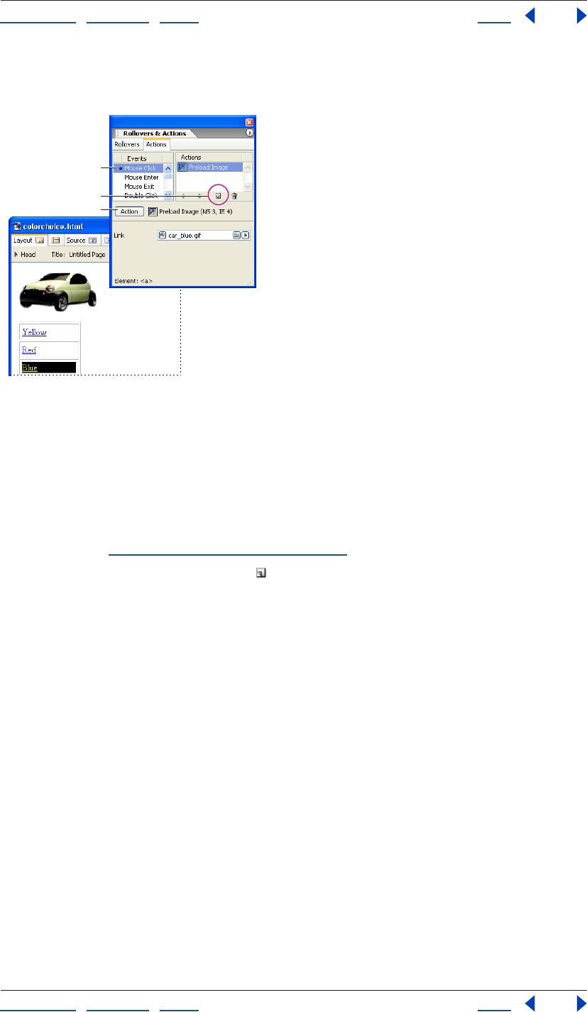
Using Help | Contents | Index Back 416
Adobe GoLive CS Help Using Actions
Using Help | Contents | Index Back 416
rollovers, require you to add a link to the text or object and select a mouse or key event to
trigger the action.
Set up user-triggered actions in the Actions palette.
A. Choose a mouse or key event to trigger the action.
B. Click the New Item button.
C. Choose an action from the Action pop-up menu.
To set up a user-triggered action:
1 In the Layout Editor, select text or an object on the page.
2 In the Actions tab of the Rollovers & Actions palette, select a trigger option from the
Events list. (See “User-triggered actions” on page 416.)
3 Click the Create New Action button .
4 Choose an action from the Action pop-up menu, and set the action’s properties.
To remove all user-triggered actions from a trigger:
Select the user trigger (linked text, linked objects, or form objects) in the page and choose
Delete All Actions from the Actions tab in the Rollovers & Actions palette menu.
User-triggered actions
GoLive includes the following user-triggered actions:
• Mouse Click triggers an action after a single mouse click on the linked item.
• Mouse Enter triggers an action when the pointer is moved over the linked item.
• Mouse Exit triggers an action when the pointer is moved away from the linked item.
• Double Click triggers an action when the viewer double-clicks the linked item.
• Mouse Down triggers an action when the viewer presses the mouse button while the
pointer is over the linked item.
• Mouse Up triggers an action when the viewer releases the mouse button while the
pointer is over the linked item.
• Key Down and Key Press trigger an action when the viewer presses any key.
• Key Up triggers an action when the viewer releases any key.
A
B
C
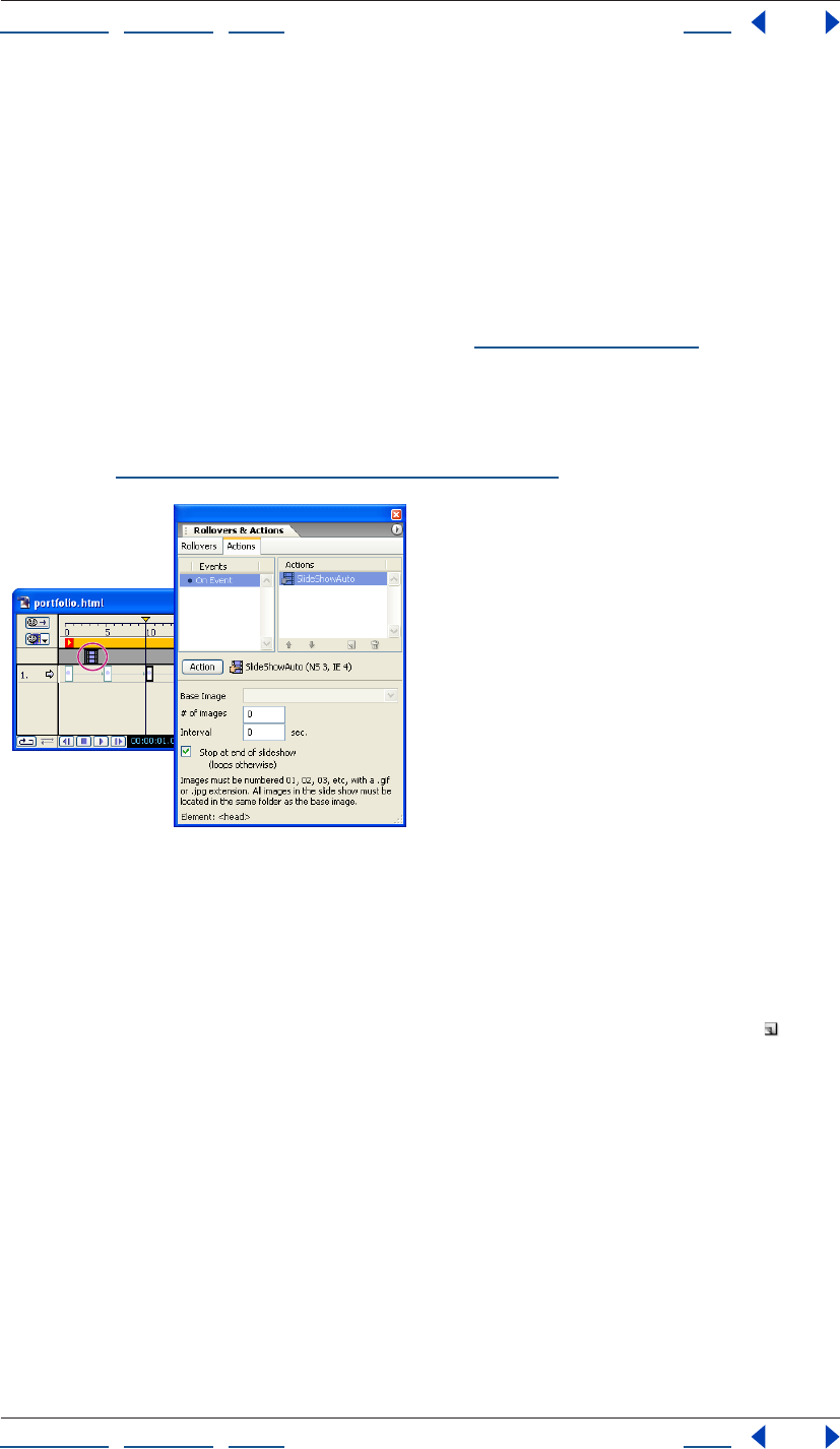
Using Help | Contents | Index Back 417
Adobe GoLive CS Help Using Actions
Using Help | Contents | Index Back 417
• Key Focus (form fields only) triggers an action when the field is selected, an insertion
point is placed in the field, or when the viewer tabs to it.
• Text Change (form fields only) triggers an action after text is entered into the field and
another field is selected.
• Key Blur (form fields only) triggers an action when the viewer tabs out of the field.
Note: If a Mouse Click action is applied to a Rollover object, the Rollover’s navigational
link (the URL field in the Rollover Inspector) will be disabled. After setting up an action with
the Mouse Click event, add a GoTo Link Action as the last action assigned to the Mouse
Click event to set Rollover’s navigational link. (See “Goto Link” on page 422.)
Setting up timeline-triggered actions
Timeline actions are triggered at the point in time they are located in the DHTML Timeline
Editor. In this way, you can initiate time-based actions or actions that interact with a given
scene. (See “Using the DHTML Timeline Editor” on page 151.)
Set up timeline-triggered actions in the DHTML
Timeline editor
To set up a timeline-triggered action:
1 Ctrl-click (Windows) or Command-click (Mac OS) the Actions Track of the DHTML
Timeline Editor to insert an action placeholder.
2 In the Actions tab of the Rollovers & Actions palette, click the New Item button .
3 Choose an action from the Action pop-up menu, and set the action’s properties.
4 To delete a timeline-triggered action, select the action in the Actions Track of the
DHTML Timeline Editor, and press Delete, or Backspace (Windows).
Using Help | Contents | Index Back 418
Adobe GoLive CS Help Using Actions
Using Help | Contents | Index Back 418
Using GoLive actions
GoLive comes with a complete set of ready-to-use scripted actions. Most of the actions are
fully compatible with the 4.0 and later releases of Netscape Navigator and Microsoft
Internet Explorer. Some actions will work with older 3.0 browsers while others require
browsers that are at least version 5 or 6. The earliest browser versions that support each
action are displayed next to the selected action name in the Action Inspector or the
Actions palette.
Create an action filter to make sure you only choose actions that a particular browser
version can support. (See “Creating an action filter” on page 414.)
Getters
The Getters menu in the Actions tab of the Rollovers & Actions palette contains actions
that work with Web page forms and layers.
Field Validator
The Field Validator action validates an entry in a form text, text area, or password field. If
the action is applied to a text field, the action is triggered when the viewer tabs out of the
field, or enters text in the field and then selects a different field. The action uses one of
seven validation criteria.
Select a form text, text area, or password field. In the Actions palette, select a trigger
option: Select the Key Blur event for validating entries when the viewer tabs out of the
field or the Text Change event for validating entries when the viewer enters text and then
selects another field. Choose Action > Getters > Field Validator.
Type the name of the form that contains the text field, and the name of the text field to
validate. Select a validation criterion from the Validation to Perform pop-up menu. If you
choose the Field Has This Many Characters option, define a numerical value in the # Of
Characters text box. If you choose the Field = Exact Text String option, type the text
viewers must enter in the field in the Exact Text String text box.
Type an alert message to display if the field entry is not valid.
Note: If there are adjacent fields with Field Validator actions assigned to Key Blur events,
separate the fields with a field that doesn’t have a Key Blur event. Or separate the fields
with a label, and assign a tabbing order to the field and labels. (A label must contain at
least one character, but you can make it appear blank by entering a space character.)
Get Layer Position
The Get Layer Position action reads the current position of a layer. You can process this
information using, for example, an Idle action that moves a second layer to the current
position of that layer. This creates the impression that the second object trails the first.
Trigger the action with a browser-triggered event set to OnCall in the head section of the
page. In the Head Action Inspector, choose Action > Getters > Get Layer Pos. Choose
OnCall from the Exec pop-up menu and give the action a unique alphanumeric name.
Using Help | Contents | Index Back 419
Adobe GoLive CS Help Using Actions
Using Help | Contents | Index Back 419
Set up a timeline-triggered action to retrieve the layer coordinates from the Get Layer
Position action. Some actions you can consider using include Move By and Move To. Either
of these actions can be used alone or in combination with a Condition or Idle action. When
setting up a Move By or Move To action, click the red “C” icon twice adjacent to the
Position property until it changes to a green question mark icon , and choose the Get
Layer Position action name from the menu. For more information on setting up these
actions, see “Move By” on page 430, “Move To” on page 431, “Condition” on page 441, or
“Idle” on page 442.
Get Form Value
The Get Form Value action reads the content of a form text, text area, or password field in
the current page. This action depends on input from the viewer in the form text field.
Trigger the action with a browser-triggered event set to OnUnload (or OnCall if you attach
it to a form image that serves as a Submit button). In the Head Action Inspector, choose
Action > Getters > Get Form Value. Enter the name of the form in the Form text box and
the name of text field in the Element text box.
If your form contains more fields you want to have read, insert more Get Form Value
actions and set them up as required. Set up companion actions that process the result—
for example, a Set Cookie action that stores the contents of various Get Form Value actions
on the viewer’s hard disk. (See “WriteCookie” on page 446.)
Image
The Image menu in the Actions tab of the Rollovers & Actions palette contains actions that
enable you to preload images, set an image to automatically change based on certain
criteria, and create remote rollovers.
DailyImageURL
DailyImageURL lets you display a different image for each day of the week, according to
the date in the viewer’s computer. For example, you can create a banner that changes
daily when the page is loaded, or you can create an image viewers can click to replace with
the picture of the day.
In the page, select the image you want to replace based on the day of the week. In the
More tab of the Image Inspector, enter a unique alphanumeric name in the Name text box.
Normally, all images will display with the dimensions of the placeholder image. To
enable the images to display with different dimensions, change the placeholder
image’s Width and Height values from Pixel to Image in the Image Inspector.
Trigger the action with a browser-triggered event set to OnLoad, or a user-triggered event.
Choose Action > Image > DailyImageURL. Choose the placeholder image’s name from the
Image menu. (This is the image that is replaced with another image for that day.) For each
day, reference the image you want to replace the base image.
Using Help | Contents | Index Back 420
Adobe GoLive CS Help Using Actions
Using Help | Contents | Index Back 420
Preload Image
The Preload Image action forces the browser to cache specified images before the page
displays. This is useful if there are images that don’t display until after a user interacts with
the page, such as a rollover image, or until a certain point in time. Although the page may
take longer to load initially, preloaded images are immediately available when loading is
complete. Preloading images enables rollover images to display faster when the viewer
interacts with them, and DHTML animations and actions can immediately swap images.
Note: The rollover images referenced in a GoLive Rollover object are automatically
preloaded. An additional Preload Image action is not required for it. An Image object with
rollover states has a Preload option that can be selected in the Image Inspector.
Trigger the action with a browser-triggered event set to OnLoad. In the Head Action
Inspector, choose Action > Image >Preload Image. Reference an image file you want to
preload.
If you need to preload multiple images, rather than adding a new Head Action icon
for each image, set up one Head Action icon with the Action Group action and add
each Preload Image action to it. (See “Action Group” on page 441.)
RandomImage
The RandomImage action randomly swaps the contents of an image placeholder with one
of three images each time the page is loaded.
In the page, select the image you want to replace, and in the More tab of the Image
Inspector, enter a unique alphanumeric name in the Name text box.
Normally, all images will display with the dimensions of the placeholder image. To
enable the images to display with different dimensions, change the placeholder
image’s Width and Height values from Pixel to Image in the Image Inspector.
Trigger the action with a browser-triggered event set to OnLoad or a user-triggered event.
Choose Action > Image > RandomImage. In the Base Image pop-up menu, choose the
base image you want to have replaced. Reference each of the alternate image files.
Important: You must reference all three images to replace the placeholder image;
otherwise the image will randomly appear as an empty reference.
Set Image URL
The Set Image URL action lets you create remote rollovers, also known as secondary or
disjointed rollovers, which swap the content of a placeholder image when the viewer
interacts with other content on the page. You can also set up multiple timeline-based Set
Image URL actions to create a slide show.
In the page, select the image placeholder you want to replace, and in the More tab of the
Image Inspector, enter a unique alphanumeric name in the Name text box.
Normally, all images will display with the dimensions of the placeholder image. To
enable the images to display with different dimensions, change the placeholder
image’s Width and Height values from Pixel to Image in the Image Inspector.
Trigger the action with a user-triggered or timeline-triggered event. Choose Action >
Image > Set Image URL. Choose the image you want to replace from the Image pop-up
menu and reference the image that will replace the base image.

Using Help | Contents | Index Back 421
Adobe GoLive CS Help Using Actions
Using Help | Contents | Index Back 421
To restore the base image to its original image, trigger a second mouse event (such as
Mouse Exit), key event, or timeline event, and set up a Set Image URL action that specifies
the same placeholder image and references the original base image.
Link
The Link menu in the Actions tab of the Rollovers & Actions palette contains a wide variety
of actions that link to new pages or files, redirect a browser depending on certain criteria,
or work within a frame set.
CSS Redirect
The CSS Redirect action applies a particular external cascading style sheet to the Web
page if the action detects a specified platform and browser.
Trigger the action with a browser-triggered event set to OnParse in the head section of the
page. In the Head Action Inspector, choose Action > Link > CSS Redirect. Choose a
platform and browser from the pop-up menu, and reference the external style sheet that
will be used if the selected platform and browser are detected. Add additional Head
Action icons, and repeat for any additional platform and browser-specific external
cascading style sheets.
Close Window
The Close Window action closes the current window. Some browsers will prompt the user
to approve or cancel the window closure.
Trigger the action with a user-triggered or timeline-triggered event. Choose Action >
Link > Close Window.
ConfirmLink
ConfirmLink displays a confirmation dialog box before loading the linked page. This
enables the viewer to confirm whether they want to go to the link or remain on the
current page.
Trigger the action with a user-triggered event. In the Actions palette, choose Action >
Link > ConfirmLink. Enter the confirmation message in the Message text box. You can
force a line break within the message by typing \n. Reference the page you want to link to
in the Go To This URL on OK text box. If the current page is in a frame set, enter the frame
name you want the linked page to appear within in the Target Frame Name text box. Or
leave it blank to replace the entire frame set with the linked page.
DailyRedirect
DailyRedirect lets you display a different Web page for each day of the week, based on the
date set in the viewer’s computer.
Trigger the action with a user-triggered event, browser-triggered event set to OnLoad, or
timeline-triggered event. Alternatively, to trigger the action when the viewer leaves the
current page, use a browser-triggered event set to OnUnload. Choose Action > Link >
DailyRedirect. For each day of the week, reference a page in your site or an external URL
you want to display.
Using Help | Contents | Index Back 422
Adobe GoLive CS Help Using Actions
Using Help | Contents | Index Back 422
ForceFrame
ForceFrame prevents a page that appears within a frame set from being viewed outside of
the frame set. For example, a search engine might link directly to a Web page that is
supposed to appear in a frame of a frame set page. With ForceFrame, a browser that loads
the search engine’s link to your page would load the entire frame set page instead of just
the single page. This action is particularly useful if the other frames in your page contain
elements such as banner logos that identify your site, or buttons for navigating through
the site.
Trigger the action with a browser-triggered event set to OnLoad. The trigger can be
applied to all pages that appear within the frame set, but not to the frame set document.
In the Head Action Inspector, choose Action > Link > ForceFrame. For the frame set link
destination, reference the frame set page in which you want to contain the current page.
For Frame, enter the name of the frame in which you want the content page to appear.
Go Last Page
The Go Last Page action forces the browser to jump to the last page visited.
Trigger the action with a user-triggered or timeline-triggered event. Alternatively, to
trigger the action when the viewer leaves the current page, trigger the action with a Head
Action icon set to OnUnload. Choose Action > Link > Go Last Page.
Goto Link
The Goto Link action links to a page in your site or an external URL. If applied as a timeline-
triggered action, the Goto Link action can be used to link to a new page at a certain point
in time. If applied as a browser-triggered action set to OnCall, this action can be used to
make it easier to maintain links that reference the same URL. In this example, you would
apply the Call Action to the links to trigger the Goto Link. (See “Call Action” on page 441.)
Trigger the action with a user-triggered event, browser-triggered event set to OnCall, or
timeline-triggered event. Alternatively, to trigger the action when the viewer leaves the
current page, use a browser-triggered action set to OnUnload. Choose Action > Link >
Goto Link. In the Link text box, reference a page or URL. If the current page is located in a
frame set, enter the frame name you want to target in the Target text box, or leave it blank
to have the link replace the current frame.
To link to a URL that you retrieve from a variable, click the small red “C” icon adjacent to
the pick whip to change it to a blue circle icon , and choose a variable from the pop-up
menu. To link to a URL that you retrieve from a browser-triggered action set to OnCall in
the head section, click the icon again to change it to a question mark , and select an
action from the pop-up menu.
Key Press
The Key Press action triggers another action when the viewer presses a specified key. You
can set one to four keys to trigger different actions.

Using Help | Contents | Index Back 423
Adobe GoLive CS Help Using Actions
Using Help | Contents | Index Back 423
Before you add the Key Press action, create up to four browser-triggered actions that will
be triggered by a key press event and set each to execute OnCall. Enter an alphanumeric
name for each action in the Name text box of the Head Action Inspector. Trigger the Key
Press action with a browser-triggered event set to OnLoad. Choose Action > Link > Key
Press. Enter a single number or lowercase letter in a Key text box and choose an action
name from the pop-up menu.
Note: There can only be one Key Press action in a page. If a second Key Press action is
added, the first Key Press action will not function.
KillFrame
KillFrame prevents pages from being loaded into a frame of a frame set. You can use this
action to prevent a different Web site from displaying your page in a frame, and their logo
or advertising in another frame on their Web page.
Trigger the action with a browser-triggered event set to OnLoad. Choose Action > Link >
KillFrame.
Navigate History
The Navigate History action makes the browser jump backward or forward through the
browser’s history of links by a specified number of pages.
Trigger the action with a user-triggered or timeline-triggered event. Choose Action >
Link > Navigate History. To go backward in the history of links, enter a negative integer in
the Go Where text box. To go forward, enter a positive integer.
Open Window
The Open Window action lets you open a link in a new browser window on top of the
current window.
Trigger the action with a browser-triggered event set to OnLoad or a user-triggered event.
Alternatively, to trigger the action when the viewer leaves the current page, use a
browser-triggered action set to OnUnload. Choose Action > Link > Open Window.
Reference a page or external URL for the link destination.
If you plan to use multiple Open Window actions in the current page, and want each link
to open in a new window, rather than share a single new window, leave the Target text box
blank for each action. To open all links triggered by an Open Window action in the same
new window, enter the same alphanumeric name in the Target text box for each action.
Enter the pixel width of the new window in the first Size text box, and the pixel height in
the second Size text box. Select any of the remaining options to define the new window
properties. Resize and Scroll enable the viewer to resize the browser window and if
necessary scroll in the window. The other options will show or hide a browser feature.
Open Window Prompt
The Open Window Prompt action prompts the viewer to enter width and height pixel
values, and then opens the current page in a new window sized to those dimensions.
Trigger the action with a user-triggered event, browser-triggered event set to OnLoad, or
timeline-triggered event. Choose Action > Link > Open Window Prompt. Select any of the
remaining options to define the new window properties. Resize and Scroll enable the
viewer to resize the browser window and if necessary scroll in the window. The other
options will show or hide a browser feature.
Using Help | Contents | Index Back 424
Adobe GoLive CS Help Using Actions
Using Help | Contents | Index Back 424
PDF Redirect
The PDF Redirect action detects the Adobe Portable Document Format (PDF) browser
plug-in and sends the browser to a specified PDF file or Web page if the plug-in is installed.
If the plug-in is not installed, the browser displays the page in which the PDF Redirect
action resides.
Create a page designed for browsers that don’t have the PDF plug-in. For example, you
can provide the PDF content in HTML format, or include a link to a Web page where
viewers can download the plug-in.
In the page you designed for browsers that don’t have the plug-in, trigger the action with
a browser-triggered event set to OnParse in the head section of the page. Choose Action >
Link > PDF Redirect. For the PDF Page text box, reference the PDF file or page that viewers
will see if their browser has the plug-in installed.
Random Links
The Random Links action redirects a browser to six random links, and hides the browser
window’s toolbar and address bar.
Trigger the action with a user-triggered event, browser-triggered event set to OnLoad, or
timeline-triggered event. Alternatively, to trigger the action when the viewer leaves the
current page, use a Head Action icon set to OnUnload. Set Target to one of the
following:
• To replace the current page or frame with the link, leave the text box blank or enter
_self.
• To open the link in a new window every time the action is triggered, enter _blank.
• To open the link and each subsequent trigger of the action in the same new window,
enter a unique alphanumeric name.
• To open the link in a frame, enter the frame name. The page must be in a frame set to
target a frame.
Redirect Prompt
The Redirect Prompt action prompts the viewer for one of up to five answers and redirects
them to a specific page according to their answer.
Trigger the action with a browser-triggered event set to OnLoad, a user-triggered event, or
a timeline-triggered event. Choose Action > Link > Redirect Prompt. In the Question text
box, enter a question that prompts the viewer for one of up to five answers. Optionally, in
the Display Possible Answers text box, enter a message that contains the possible answers.
(This message will be the default text in the text box that the viewer uses to enter an
answer.) In the Alert If Invalid Answer text box, enter a message that will prompt viewers if
they enter an invalid answer.
If you want to redirect the viewer to the same page each time they visit the current page,
select the Remember Choice And Auto-redirect Next Time option. (If a viewer’s browser is
set to disable cookies, this option will not function.) Enter a name for the cookie.
SWF Redirect
The SWF Redirect action detects the SWF (Macromedia® Flash™) browser plug-in, and
sends the browser to a page with SWF content if the plug-in is installed. If the plug-in is
not installed, the browser displays the page in which the action resides.
Using Help | Contents | Index Back 425
Adobe GoLive CS Help Using Actions
Using Help | Contents | Index Back 425
To set up the SWF Redirect action, create a page designed for browsers that don’t have the
SWF plug-in. (For example, you can provide the SWF content in a different format, or add a
link to a Web page where viewers can download the plug-in.)
Trigger the action with a browser-triggered event set to OnParse in the head section of the
page. In the Head Action Inspector, choose Action > Link > SWF Redirect. For the SWF
Page link destination, specify the Web page with SWF content that viewers will see if their
browser has the plug-in installed. To display a custom message for viewers without the
plug-in, select Display Alert if No Plug-in Found, and enter a message in the Alert text box.
Slide New Window
The Slide New Window action opens a new browser window and slides it to the center of
the screen.
Trigger the action with a browser-triggered event set to OnLoad, a user-triggered event, or
a timeline-triggered event. Choose Action > Link > Slide New Window. Reference the
document that will open in the new window. In the Window Name text box, enter a
unique alphanumeric name, without spaces. (If the window name is left blank, some
browsers will display a new window each time the page containing the action is visited.)
Enter the pixel width of the new window in the first Size text box, and the pixel height in
the second Size text box. Select any of the remaining options to define the new window
properties. Resize and Scroll enable the viewer to resize the browser window and if
necessary scroll in the window. The other options will show or hide a browser feature.
Target2Frames
Target2Frames lets you target two frames of a frame set with links to two different Web
pages from a single link.
Trigger the action with a user-triggered event on a page that resides in a frame of a frame
set. Choose Action > Link > Target2Frames. In Frame 1, enter the name of the frame in
which you want the first link to appear when the action is triggered. Reference the link
destination in the Link text box, or enter an external URL. In Frame 2, enter the name of the
frame in which you want the second link to appear when the action is triggered. Reference
the link destination in the Link text box, or enter an external URL.
TargetRemote
The TargetRemote action opens a link in a window that is already open. The
TargetRemote action is applied within a page that has been opened with the Open
Window action from another page. For example, you can use Target Remote to set up a
small hyperlinked menu outside the main browser window so that when a viewer clicks an
item in the menu window, the target URL opens in the main browser window.
Set up an Open Window action in one page to open another page in a new window. (See
“Open Window” on page 423.)
Important: If remote windows are resized in Netscape Navigator, they cannot target the
original window. For this reason, the OpenWindow action should not have the Resize
option selected.
Using Help | Contents | Index Back 426
Adobe GoLive CS Help Using Actions
Using Help | Contents | Index Back 426
In the page that is opened by the Open Window action, trigger the TargetRemote action
with a user-triggered event. In the Actions palette, choose Action > Link > TargetRemote.
For the URL Link, reference the page or external URL that you want to load in the original
window when the link is clicked. If the original window contains a frame set and you want
the linked page to open in one of the frames, enter the name of the frame in the Optional
Target Frame Name text box. Add additional user-triggered events to the page as needed
and repeat.
TextSwap
The TextSwap (ID) action can replace text on a page or the contents in either a layer or a
table cell with new text. Any content within the layer or table cell will be replaced by the
new text. If the item to be replaced is text or the contents of a table cell, either must use an
ID style. (See “Creating ID styles” on page 223 and “Applying styles” on page 233.) The new
text can either display for a set number of seconds before reverting to the original content
or it can disappear without restoring the original content.
Important: This action works on Internet Explorer 5+ and Netscape 6+ browsers.
Trigger this action with a user-triggered or timeline-triggered event. Choose Action > Link
> TextSwap (ID). If the content to be replaced is inside a layer, choose the layer name from
the Layer pop-up menu. If the content to be replaced is text or the contents of a table cell,
enter the ID style name used without its # symbol in the Element ID text box. Enter the
new text.
Enter the number of seconds the new text will display before it reverts to the original
content or simply disappears. If you don’t want the original text or content to return to the
page when the new text disappears, select Disappear Instead Of Revert. If you want to
customize the formatting of the new text, enter an HTML start tag with attributes in the
<open> text box and enter its closing tag in the </close> text box. For example, if you
want the new text to display in green at size 5, you can enter
<font color="#00FF00" size="5">
in the <open> text box and
</font>
in the </close> text box.
TimeRedirect
TimeRedirect lets you display a different Web page, based on the time set in the viewer’s
computer. When a viewer loads the page or clicks an item, the browser is redirected to one
page if the current time is before the specified time and redirects to a different page if the
current time is at or after the specified time.
Trigger the action with a user-triggered or a browser-triggered event. Choose Action >
Link > TimeRedirect. For Time, enter the hour before or after you want the redirection to
occur as an integer between 1 and 12. Select PM to set the hour as PM; leave it unselected
to set the hour as AM. Select Before, and specify a page or URL to display before that time;
leave this option unselected if you don’t want to redirect the page before the specified
time. Select At/After, and reference a page or external URL to display at or after the
specified time; leave this option unselected if you don’t want to redirect the page at or
after the specified time.
Using Help | Contents | Index Back 427
Adobe GoLive CS Help Using Actions
Using Help | Contents | Index Back 427
Message
The Message menu in the Actions tab of the Rollovers & Actions palette contains actions
that write text on a page, display the date a page was last uploaded to the server, open an
alert message, request a password from the viewer, and display text in the browser
window’s status bar.
Document Write
The Document Write action is applied with a browser-triggered body action. When the
browser gets to the action’s code in the page, the Document Write action replaces the
body action with text or code you specify, the current value retrieved by an action, or the
value of a variable.
Trigger the action with a browser-triggered event at a convenient location in the body
section of the page. Choose Action > Message > Document Write. Enter the text or code
that you want to be written. To retrieve and write text from a variable, click the small red
“C” icon adjacent to the HTML text box to change it to a blue circle icon , and choose
a variable from the pop-up menu. To retrieve text from a browser-triggered action set to
OnCall in the head section, click the icon again to change it to a question mark icon ,
and select an action from the pop-up menu.
Last Modified (ID)
The Last Modified (ID) action displays the date the page was last uploaded to the server.
The date can replace placeholder text on the page, or display in either a layer or a table
cell. All content within the layer or table cell will be replaced by the last modified date. If
the action is applied to placeholder text or to the contents of a table cell, either must use
an ID style. (See “Creating ID styles” on page 223 and “Applying styles” on page 233.)
Important: This action works on Internet Explorer 5+ and Netscape 6+ browsers.
Trigger the action with a browser-triggered event set to Onload or a user-triggered event.
Choose Action > Message > Last Modified (ID). If you want the date to appear inside a
layer, choose the layer name from the Layer pop-up menu. If the date will appear in place
of text on the page or the contents of a table cell, enter the ID style name used without the
# symbol in the Element ID text box.
Using Help | Contents | Index Back 428
Adobe GoLive CS Help Using Actions
Using Help | Contents | Index Back 428
Choose a numerical Date Format from the menu. To display the day of the week preceding
the numerical date, select Include Day Of Week. In the Lead In Text textbox, enter the text
you want to precede the date. If you want to customize the text formatting of the date,
enter an HTML start tag with attributes in the <open> text box and enter its closing tag in
the </close> text box. For example, if you want the new text to display in green at size 5,
you could enter
<font color="#00FF00” size="5">
in the <open> text box and
</font>
in the </close> text box.
Last Modified (form)
The Last Modified (form) action displays the date the page was last uploaded to the server.
The date displays in a form field and has the option to also display in a browser alert
message.
Trigger the action with a browser-triggered event set to OnLoad. Choose Action >
Message > Last Modified (form). Enter the form name in the Form text box. (For Internet
Explorer viewers, the form name cannot be “form”.) Enter the text field name in the Field
text box. Choose a numerical Date Format from the menu. To display the day of the week
as a word preceding the numerical date, select Include Day Of Week. An alert message
that displays the date appears by default. Select Disable Alert to not display this alert.
Open Alert Window
The Open Alert Window action lets you open an alert dialog box with a custom text
message.
Trigger the action with a user-triggered event, browser-triggered event set to OnLoad, or
with a timeline-triggered event. Choose Action > Message > Open Alert Window. Enter
the message that will appear in the Alert dialog box. Or to retrieve text from a variable,
click the small red “C” icon adjacent to the Message text box to change it to a blue circle
icon , and choose a variable from the pop-up menu. To retrieve text from a browser-
triggered action set to OnCall in the head section, click the icon again to change it to a
question mark icon , and select an action from the pop-up menu.
Password
The Password action lets you protect pages with a reasonable level of security without any
server-side scripting. Unlike other JavaScript password-protection scripts, this action uses
an encrypted password and cannot be bypassed by turning off JavaScript in the browser
or viewing the source code. Creating the Password action consists of three parts: using a
provided HTML file to generate an encrypted password, naming the password-protected
page appropriately, and applying a Password action to a page that refers to the password-
protected page.
Although the Password action provides a reasonable level of security, it is still possible to
bypass the password. It is therefore not recommended for sites that require a high level of
security. Also, the password-protected file must be placed in a directory that contains a
default root page such as index.html (depending on your ISP), so that the contents of the
directory cannot be viewed by entering the directory location into the browser.
Using Help | Contents | Index Back 429
Adobe GoLive CS Help Using Actions
Using Help | Contents | Index Back 429
Use your browser to open the file makepassword.html located in the GoLive 6.0/Modules/
JScript/Actions/Message folder. The password you choose is case-sensitive and should not
contain any spaces. Click the link on the makepassword.html page. Enter the password
you want to use in the dialog box that appears and click OK. Write down the encrypted
version of the password that follows “The encrypted password is” in the alert message.
Name the page that will be password-protected using the nonencrypted version of your
password plus the suffix .html. For example, if your password is Sommer, the password-
protected page name must be Sommer.html.
Trigger the action with a user-triggered event in a page other than the page that will be
password-protected. (Do not link to the password-protected page or to anything else with
the trigger link.) Choose Action > Message > Password. In the Encrypted Password text
box, enter the encrypted password you wrote down. For Alert On Correct Login, enter any
message you want to display when viewers enter the correct, nonencrypted password.
Make sure the password-protected page and the page that links to it are located in the
same directory.
Set Status
The Set Status action allows you to display a custom message in the status line at the
bottom of the browser window.
Trigger the action with a browser-triggered event set to OnLoad, user-triggered event, or
timeline-triggered event. Choose Action > Message > Set Status from the Message. Enter a
message in the text box.
Multimedia
The Multimedia menu in the Actions tab of the Rollovers & Actions palette contains
actions that interact with layers, sound, or images on a page.
Drag Layer
The Drag layer action allows viewers to drag a layer around the page in their browser
window. Make sure that your page has a layer with content within it or visible properties
before you create the action. (See “Laying out pages with layers” on page 144.) Trigger the
action with a browser-triggered event set to OnLoad. Choose Action > Multimedia > Drag
Layer. Choose the layer you want to make draggable from the Layer pop-up menu.
Flip Move
When triggered for the first time, the Flip Move action moves a layer to a new specified
position. When triggered for the second time, it moves the layer to a second specified
position that can be the original starting location or a new location. For example, you can
attach this action to a button to let the viewer flip an object into view that is initially
hidden beyond the edge of the browser window and flip it back out of sight again.
Using Help | Contents | Index Back 430
Adobe GoLive CS Help Using Actions
Using Help | Contents | Index Back 430
Make sure your page has a layer with content within it or visible properties before you
create the action. Trigger the action with a user-triggered or timeline-triggered event.
Choose Action > Multimedia > Flip Move. Choose the layer you want to move from the
Layer pop-up menu. The text boxes adjacent to Position 1 represent the location (Left and
Top values) the layer will be moved to when the action is first triggered. Either enter the
left and top values in the text boxes, or move the layer to the desired location and click Get
to retrieve its current Left and Top coordinates. Position 2 represents the location the layer
will be moved to when the action is triggered a second time. Enter the values, or move the
layer to the desired location and click Get.
To make the layer slide to each location, select the Animation option, and enter a positive
integer in the Ticks text box to specify the animation speed. One tick equals 1/60 of a
second. The higher the number of ticks, the slower the movement. If Animation is not
selected, the layer instantly appears in each specified location when the action is
triggered.
Float Layer
The Float Layer action locks a layer’s position relative to the browser window as the viewer
scrolls the page.
Make sure your page has a layer with content within it or visible properties before you
create the action. (See “Adding layers to the page” on page 145 and “Adding content to a
layer” on page 146.)
Important: Internet Explorer 4.5 and earlier will not see the layer in the specified position
unless a Move To action is set up for the layer before the Float Layer action. (See “Move To”
on page 431.) The Float Layer action will work in other browsers whether or not there is a
Move To action in the page.
Trigger the action with a browser-triggered action set to OnLoad, user-triggered or
timeline-triggered event. Choose Action > Multimedia > Float Layer. Select the layer name
from the pop-up menu. Enter the desired position to lock the layer in the Page Position
text boxes. (The values use pixel units.)
Mouse Follow
The Mouse Follow action makes a layer follow the viewer’s pointer inside the browser
window. (The layer appears below and to the right of the pointer.) If the pointer moves off
the window, the layer remains near where the pointer last appeared.
Make sure that your page has a layer with content within it or visible properties before you
create the action. (See “Adding layers to the page” on page 145 and “Adding content to a
layer” on page 146.) Trigger the action with a browser-triggered event set to OnLoad, user-
triggered or timeline-triggered event. Choose Action > Multimedia > Mouse Follow.
Choose the layer from the Layer pop-up menu.
Move By
The Move By action moves a layer horizontally, vertically, or both by a specified distance.
Using Help | Contents | Index Back 431
Adobe GoLive CS Help Using Actions
Using Help | Contents | Index Back 431
Make sure your page has a layer with content within it or visible properties before you
create the action. (See “Adding layers to the page” on page 145 and “Adding content to a
layer” on page 146.) Trigger the action with a user-triggered or timeline-triggered event.
Choose Action > Multimedia > Move By. Choose the layer you want to move from the
Layer pop-up menu. Enter values in the DeltaX and DeltaY text boxes. (DeltaX represents
the distance in pixels to move the layer to the right, and DeltaY is the distance to move the
layer down.) Or to retrieve values from a variable, click the small red “C” icon adjacent to
the Message text box to change it to a blue circle icon , and choose a variable from the
pop-up menu. To retrieve text from a browser-triggered action set to OnCall in the head
section, click the icon again to change it to a question mark , and select an action from
the pop-up menu.
Move To
The Move To action moves a layer to a new position on the page.
Make sure that your page has a layer with content within it or visible properties before you
create the action. (See “Adding layers to the page” on page 145 and “Adding content to a
layer” on page 146.) Trigger the action with a user-triggered or timeline-triggered event.
Choose Action > Multimedia > Move To. Choose the layer you want to move from the
Layer pop-up menu.
Enter values in the Position text boxes (the first text box represents the distance in pixels
to move the layer to the right, and the right text box is the distance to move the layer
down), or move the layer to the desired location and click Get. Or, to retrieve values from a
variable, click the small red “C” icon adjacent to the Message text box to change it to a
blue circle icon , and choose a variable from the pop-up menu. To retrieve text from a
browser-triggered action set to OnCall in the head section, click the icon again to change
it to a question mark icon , and select an action from the pop-up menu.
To make the layer slide to the new location, select the Animated option, and enter a
positive integer in the Ticks text box to define the animation speed. One tick equals 1/60
of a second. The higher the number of ticks, the slower the movement. If Animated is not
selected, the layer instantly appears in the new location when the action is triggered.
Play Scene and Stop Scene
The Play Scene and Stop Scene actions let you manage the playback of single-scene or
multiple- scene animations created in the DHTML Timeline Editor. You can control
multiple-scene animations dynamically by creating timeline-triggered Play Scene and
Stop Scene actions or let the viewer control scene playback when they click buttons on
the page.
Make sure the page has one or more scenes in it before you create the Play Scene or Stop
Scene action. Trigger the action with a user-triggered or timeline-triggered event. Choose
Action > Multimedia > Play Scene or Stop Scene. Inserting a Stop Scene action is a good
practice before inserting a Play Scene action; it stops any other animation that may still be
playing when the viewer clicks the Play button. To set up a Stop Scene action or Play Scene
action, choose the scene you want the browser to stop or play back from the Scene pop-
up menu.

Using Help | Contents | Index Back 432
Adobe GoLive CS Help Using Actions
Using Help | Contents | Index Back 432
Play Sound and Stop Sound
The Play Sound and Stop Sound actions let you manage the playback of an audio plug-in
on a page. You can control sounds dynamically by creating timeline-triggered Play Sound
and Stop Sound actions or let the viewer control sound playback when they click buttons
on the page.
Note: The Play Sound action requires a cross-platform, cross-browser audio plug-in that
can be controlled by JavaScript, such as the LiveAudio plug-in.
Make sure you have an audio plug-in on the page and that it is named in the More tab
of the Inspector. Trigger the action with a user-triggered or timeline-triggered event.
Choose Action > Multimedia > Play Sound or Stop Sound. Inserting a Stop Sound action is
good practice before inserting a Play Sound action; it stops any other sound track that
may still be playing when the viewer clicks the Play button. To set up a Play Sound or Stop
Sound action, choose the sound you want to start playing back or the sound you want to
stop from the Name pop-up menu.
ShowHide
The Show/Hide action lets you show or hide the content of a layer in the page. For
example, you can use this action to create drop-down menus that appear when the viewer
clicks on a menu item and hide when the pointer rolls off the item. Alternatively, you can
show or hide objects dynamically by inserting two keyframes in the DHTML Timeline
Editor and adding Show Hide actions to the time track of the layer.
Make sure that your page has a layer with content within it or visible properties before you
create the action. If you want a layer to not appear on the page until it is targeted to show
by a ShowHide action, deselect Visible in the Layer Inspector. Trigger the ShowHide action
with a user-triggered or timeline-triggered event. Choose Action > Multimedia >
ShowHide. In the Layer menu, choose a layer. In the Mode menu, choose what should
happen to the layer:
• Hide hides the layer until a Show action that targets it is triggered.
• Show displays the layer until a Hide action that targets it is triggered.
• Toggle shows or hides the layer, depending on its current visibility status.
SlideShow and SlideShowAuto
SlideShow and SlideShowAuto let you manage the playback of a series of images.
SlideShow lets viewers cycle through a series of images by clicking a link. Each click
displays the next image in the series. SlideShowAuto displays a series of images automati-
cally with a specified time interval between images (similar to an animated GIF).
The following rules apply to images used for the SlideShow and SlideShowAuto actions:
• They must be in the same folder as the first image placed on the page.
• They can be either GIF or JPEG images, but you cannot mix GIF and JPEG images in the
same slide show.
• They must be named in sequence, ending with 01 and the .gif or .jpg extension. For
example, the starting GIF image could be named poster01.gif, and the others would be
named poster02.gif, poster03.gif, and so on. Alternatively, you could name the images
simply 01.gif, 02.gif, 03.gif, and so on.
Using Help | Contents | Index Back 433
Adobe GoLive CS Help Using Actions
Using Help | Contents | Index Back 433
• You cannot have more than one SlideShow action and SlideShowAuto action on the
same page.
Place the slide show’s first image in the page, and enter a unique alphanumeric name in
the More tab of the Image Inspector. Trigger the SlideShow action with a user-triggered or
timeline-triggered event, or trigger the SlideShowAuto action with a user-triggered or
timeline-triggered event, or with a browser-triggered event set to OnLoad. Choose
Action > Multimedia > SlideShow or SlideShowAuto. From the Base Image menu, choose
the starting image. For # of Images, enter the total number of images in the slide show.
If you are using the SlideShow action, select any of the following playback options:
• Loop repeats the slide show after the final image is shown.
• Play Backwards displays the images from the last to the first. This option lets you create
forward and backward links for the slide show.
• Palindrome plays the slide show forward and then backward continuously. To use this
option, you must select Loop as well.
Leaving all three options unselected plays the slide show a single time.
If you are using the SlideShowAuto action, set the following playback options:
• For Interval (in Secs.), enter the number of seconds to wait between displaying images.
• Select Stop at End of Slideshow to play the slide show a single time only. Otherwise, the
slideshow will play continuously.
Normally, all images will display with the dimensions of the base image. To enable
each image to display with its own dimensions, change the base image’s Width and
Height values from Pixel to Image in the Image Inspector.
SlideShowAutoStop
SlideShowAutoStop is a companion action to SlideShowAuto and lets viewers pause or
continue an automatic, timed slide show. For example, to create a “pause” button, you can
apply this action to a button on the same page as the automatic slide show. This action
can only be used on a page where the SlideShowAuto action is applied.
Trigger the action with a user-triggered event. Choose Action > Multimedia > Slide-
ShowAutoStop.
Stop Complete
The Stop Complete action stops all animation in the browser’s window. As a courtesy to
viewers with slow connections, include a Stop Animation button in any animated page
you create.
Trigger the action with a user-triggered event. Choose Action > Multimedia > Stop
Complete.
Wipe Transition
The Wipe Transition action uses a sliding mask effect to gradually reveal or conceal the
content in a layer.
Using Help | Contents | Index Back 434
Adobe GoLive CS Help Using Actions
Using Help | Contents | Index Back 434
Make sure that your page has a layer with content within it or visible properties before you
create the action. Trigger the action with a user-triggered or timeline-triggered event.
Choose Action > Multimedia > Wipe Transition. Choose a layer in the Layer menu. Select
an option from the Transition menu to determine the way the layer will be wiped in
(revealed) or out (concealed). Enter a positive integer in the Steps text box to determine
the number of steps for the transition. The higher the number of steps, the smoother the
transition appears.
Others
The Others menu in the Actions tab of the Rollovers & Actions palette contains actions
that display clocks, set browser window properties, print a page, set the page background
color, display search engine results, or fix a Netscape CSS and layer-related problem.
Clock Date (ID)
The Clock Date (ID) action displays a live text-based clock that can display the local date,
local time, or both. The clock uses the viewer’s system clock to determine the local date
and time. The clock can replace placeholder text on the page, or display in a layer or a
table cell. If the action is applied to placeholder text or the content in a table cell, either
must use an ID style. (See “Creating ID styles” on page 223 and “Applying styles” on
page 233.)
Important: This action works on Internet Explorer 5+ and Netscape 6+ browsers.
Trigger the action with a browser-triggered event set to OnLoad. Choose Action >
Others > Clock Date (ID). If you want the clock to appear inside a layer, choose the layer
name from the Layer pop-up menu. (All content within the layer will be replaced by the
clock.) If the date will appear in place of text on the page or the contents of a table cell,
enter the ID style name used without the # symbol in the Element ID text box.
Select Show Local Time if you want to display the time. Select Use 24-hour Time to display
24-hour time, or leave it unselected to display 12-hour A.M. and P.M. time. To display the
local date, select Show Date and choose a numerical date format from the pop-up menu.
To display the day of the week as a word preceding the numerical date, select Include Day
Of Week. In the Lead In Text textbox, enter the text you want to precede the date. If you
want to customize the text formatting, enter an HTML start tag with attributes in the
<open> text box and enter the HTML closing tag in the </close> text box. For example, if
you want the new text to display in green with a size of 5, you could enter
<font color="green" size="5">
in the <open> text box and
</font>
in the </close> text box.
Digital Clock
The Digital Clock action displays a live clock that displays the local time using images that
you provide. The clock uses the viewer’s system clock to determine the local time.
Using Help | Contents | Index Back 435
Adobe GoLive CS Help Using Actions
Using Help | Contents | Index Back 435
Create ten different images to represent the numbers 0 through 9 and place them in the
same folder. The images must all be either GIFs or JPEGs, and cannot be a combination of
both. The images must be named either 0.gif, 1.gif, 2.gif, and so on, or 0.jpg, 1.jpg, 2.jpg,
and so on. Place any four of the images on your page to serve as placeholders for the clock
digits. In the More tab of the Image Inspector, enter a unique name for each image place-
holder.
Normally, all images will display with the dimensions of the base image. To enable the
images to display with different dimensions, change the base image’s Width and
Height values from Pixel to Image in the Image Inspector.
Trigger the action with a browser-triggered event set to OnLoad. Choose Action > Others
> Digital Clock. Choose an image name from each of the Digit pull-down menus to
associate each clock digit with one of the placeholder images. Select Use 24-hour Time to
display 24-hour time, or leave it unselected to display 12-hour A.M. and P.M. time. To
identify the clock’s image directory, reference any of the ten images that represent the
clock numbers.
Netscape CSS Fix
The Netscape CSS Fix action is a workaround for a program error in Netscape Navigator 4.x
that causes Web pages to lose cascading style sheet information when the viewer resizes
the browser window. Use this action on any pages that contain layers because layers are
built with cascading style sheets.
Trigger the action with a browser-triggered event set to OnLoad in the head section of the
page. Choose Action > Others > Netscape CSS Fix. Test your animations or actions in
Netscape Navigator 4.0.
Note: With frame sets, be sure to use the action in the head section of the pages that
appear within the frames and not the frame set.
Print Document
The Print Document action displays the browser’s print dialog box to print the current
Web page or frame of a frame set. The action must reside within the page or frame you
want to print and cannot target a different page or frame.
In the page that you want to print, trigger the action with a user-triggered or browser-
triggered event. If the page you want to print is part of a frame set, enter the page’s frame
name.
Note: This action works with Netscape Navigator 4+ and Internet Explorer 5+ browsers.
ResizeWindow
The ResizeWindow action resizes the browser window. Trigger the action with a user-
triggered or timeline-triggered event. Choose Action > Others > ResizeWindow. Enter
pixel values for the Width and Height text boxes.
Scroll Down, Left, Right, Up
The Scroll Down, Scroll Left, Scroll Right, and Scroll Up actions let you dynamically scroll
the browser window. For example, you can use these actions to let the viewer follow the
path of a layer traveling beyond the margin of the window.

Using Help | Contents | Index Back 436
Adobe GoLive CS Help Using Actions
Using Help | Contents | Index Back 436
Trigger the action with a user-triggered or timeline-triggered event. Choose Action >
Others > Scroll Down, Left, Right, or Up. Enter a pixel value in the Scroll Pixels text box to
specify the distance that you want the window to scroll. Enter a pixel value in the Scroll
Speed text box to specify how fast you want the window to scroll. The higher the value
you enter, the faster the speed.
Scroll Status
The Scroll Status action displays a text message that scrolls horizontally in the status bar at
the bottom of the browser’s window.
Trigger the action with a user-triggered event, browser-triggered event set to OnLoad, or
timeline-triggered event. Choose Action > Others > Scroll Status. Enter a message in the
message field. Enter a value between 1 and 1000 for the scrolling speed (1 represents the
fastest speed, and 1000 the slowest). Select Scroll Reverse (Left To Right) to have the text
scroll from the left side of the window to the right and repeat when the text first reaches
the right side of the window. Deselect this option to have the text scroll from the right to
the left and off the page in a seamless loop.
Search Engine
The Search Engine action uses input from a predefined search string or viewer input from
a form, and opens a new browser window that contains the search engine results.
Trigger the action with a browser-triggered event set to OnLoad, a user-triggered event, or
a timeline-triggered event. User-triggered events can be attached to form objects, a
submit button, or a form event. (If your action is using viewer input from a form, first
create a form and name it, and then choose the trigger.) If the action is attached to a text
field, trigger the action with the Key Blur event. If the action is attached to a Text Area field,
trigger the action with the Text Change event. Choose Action > Others > Search Engine,
and do one of the following:
• To use input from a predefined search string, leave the Form Name and Field Name
blank. Select Define Your Own Search String, and enter a text string with a plus sign (+)
between each word.
• To use viewer input from a form, enter the name of the form, and the name of the field
that will gather the search string. Make sure that Define Your Own Search String is not
selected.
Choose a search engine from the Use This Search Engine menu. If you want the search
engine results to display in an existing window or frame, enter the window or frame name.
To display search results from multiple search engines, add a new Search Engine action for
each desired search engine. If you triggered the first Search Engine action with a user-
triggered event, use the same trigger.
Set BackColor
The Set BackColor action lets you change the background color of the browser window.
Trigger the action with a user-triggered or timeline-triggered event. Choose Action >
Others > Set BackColor. Click the Background Color field and select a color from the Color
palette.
Using Help | Contents | Index Back 437
Adobe GoLive CS Help Using Actions
Using Help | Contents | Index Back 437
World Clock
The World Clock action displays a live clock showing the time of a specified world time
zone. The clock displays in the browser's status bar, in an existing form field on the page, or
both.
Important: To create an accurate clock, the local time zone on your computer must be set
to the correct time.
Trigger the action with a browser-triggered event set to OnLoad or a user-triggered event.
Choose Action > Others > World Clock. To display a message to the left of the clock, enter
the message in the Clock Message text box. Select the Use 24-hour Time option to display
24-hour time, or leave it unselected to display 12-hour A.M. and P.M. time.
In the GMT Offset text box, enter the number of hours between your desired location and
Greenwich mean time (GMT) as a value between
-12 and +12. You can click the Globe icon next to the GMT offset text field to look up a
city’s GMT offset. The button launches the default browser, which opens a time zone chart
at
http://www.timeanddate.com/worldclock/. Click on a city to look up its GMT offset. (GMT
is zero; time zones west of GMT have a negative offset value, and time zones east of GMT
have a positive offset value. For example, U.S. eastern standard time (EST) is five time
zones to the west of GMT and has a GMT offset of –5; central Europe time (CET) is one time
zone to the east of GMT and has a GMT offset of +1.)
Select the Daylight Savings Time option if daylight savings time (DST) occurs in the
selected time zone. Select the Status Bar option to display the clock in the browser’s status
bar, and select the Form Field option to display the clock in an existing form on the page. If
you selected Form Field, enter the form name and field name for the text field in which the
clock will display.
RealOne
The RealOne menu in the Actions tab of the Rollovers & Actions palette lists actions you
can use to control the playback of presentations in RealOne Player documents or Real
media in the RealPlayer plug-in. In addition, you can retrieve information about the
RealOne Player that a viewer is using or about the clips that are playing.
Except for the Embedded Actions action (which appear in the browser itself), you set up
RealOne Player actions in the Web page that appears in the Browser Pane frame or the Info
Pane frame of your RealOne Player document. Trigger the action with a user, timeline, or
browser-triggered action, and then choose an action from the Action > RealOne menu.
For more information on scripting for the RealOne Player, see the RealOne Scripting Guide
available on the RealNetworks Web site at http://service.real.com/help/library/
encoders.html.
For more information about creating RealOne Player documents in GoLive, see the Adobe
GoLive CS Multimedia Authoring Guide on the Adobe Web site.

Using Help | Contents | Index Back 438
Adobe GoLive CS Help Using Actions
Using Help | Contents | Index Back 438
Add To Now Playing List
Opens the “Now Playing” list and adds a URL to the clip list after the current clip.
Optionally, it displays an associated URL in the page that appears in the Info Pane frame
with the specified height and width when the added clip plays, and a URL to the page in
the Browser Pane frame.
Choose Action > Real One > AddToNowPlayingList.
Reference the URL that you want to add to the RealOne Player clip list in the Clip URL text
field. To display a page in the Info Pane frame when the added clip plays, reference the
page in the Info Pane URL text field. Use the value, “_keep” in the Info Pane URL to keep the
current info pane. To define the width and height of the Info Pane frame, enter a pixel
value in the Info Pane Width and Height text boxes. If no value is defined, the width
defaults to 320 pixels and the height is the same as the document that displays in the
Media Pane frame.
To display a media file in the Media Pane frame or in a new browser window, reference the
URL in the Media Browser URL text field, and then choose a display option from the Media
Browser Target menu. To display information about the clip that is playing, enter values in
the Clip Infos text boxes.
Clear Now Playing List
Clears the RealOne Player’s current playlist and stops any clips currently playing. Call this
method before using any of the other methods to synchronize playback.
Choose Action > Real One > ClearNowPlayingList.
Embedded Actions
Choose from a wide variety of different actions, including setting playback controls,
retrieving or setting media and clip information, changing embedded player attributes,
and specifying clips to play.
Open the Web page that contains an embedded RealPlayer plug-in or RealPlayer active X
control, select the RealOne placeholder on the page, and enter a name for it in the More
tab of the Plug-in Inspector. Trigger the action with a user, timeline, or browser-triggered
action in the Web page. Choose Action > Real One > EmbeddedActions in the Actions tab
of the Rollovers & Actions palette. Choose the RealOne file from the RealOne Object menu,
and choose an action from the Method menu.
For more information about the actions listed in the Method menu, see the RealOne
Scripting Guide available on the RealNetworks Web site at http://service.real.com/help/
library/
encoders.html.
Get Clip Info
Retrieves the specified value of the clip information as authored by the media provider.
This method only works for clips launched from HTML in the Info Pane frame.
Choose Action > Real One > GetClipInfo. Choose the clip property you want to retrieve
from the Property menu.

Using Help | Contents | Index Back 439
Adobe GoLive CS Help Using Actions
Using Help | Contents | Index Back 439
Get Installed Components
Returns a string containing all of the DLLs installed by RealOne Player and their associated
version numbers. The component type and version number are separated by a colon (:).
Each DLL is separated by a pipe symbol (|).
Choose Action > Real One > GetInstalledComponents.
Get Player Property
Retrieves the value of a property you specify.
Choose Action > RealOne > GetPlayerProperty. Choose a property from the Property
menu. For more information on the properties listed in the Property menu, see the
RealOne Scripting Guide available on the RealNetworks Web site at http://
service.real.com/help/library/
encoders.html.
Get Player State
Returns an integer to describe the current player state: 0 indicates the player is stopped;
1is contacting; 2 is buffering; 3 is playing; 4 is paused; 5 is seeking; 6 is showing a modal
dialog box.
Choose Action > Real One > GetPlayerState.
Get Version Number
Returns the RealOne Player version of the current player or other media plug-in. For more
information on this action, see the RealOne Scripting Guide available on the RealNetworks
Web site at http://service.real.com/help/library/
encoders.html.
Choose Action > Real One > GetVersionNumber. Choose an item from the Application/
Component menu; or, to specify an item that isn’t listed, enter its name in the Component
text field. Enter the Major and Minor version numbers of the RealOne Players that support
your presentation in the max Version and min Version text fields. Select unpack to return
the version number in a more readable format.
Handle Action
Performs a specified action. CD, MyDevices, Radio, and Web display the respective tab in
the player. Now Playing displays the “Now Playing” list, and ShowEqualizer displays the
player’s Equalizer dialog box.
Choose Action > Real One > Handle Action. Then choose the desired action from the
Action pop-up menu.
Navigate To URL
Opens a specified URL in a specified target window, and has the option to delay when the
URL displays.
Choose Action > Real One > NavigateToURL. Enter the URL to display in the Media Browser
URL text field, and choose where to display the URL from the Media Browser Target menu.
To display the URL after the clip starts playing, enter the number of seconds to delay the
clip in the Media Browser Delay text box.

Using Help | Contents | Index Back 440
Adobe GoLive CS Help Using Actions
Using Help | Contents | Index Back 440
Play Clip
Plays a clip from a specified URL in the Media Pane frame, and can also display a URL in the
Media Pane frame or a new browser window.
Choose Action > Real One > PlayClip. Reference the URL to play the clip. To display a page
in the Info Pane frame when the added clip plays, reference the page in the Info Pane URL
text field. To define the width and height of the Info Pane frame, enter a pixel value in the
Info Pane Width and Height text boxes. If no value is defined, the width defaults to 320
pixels and the height is the same as the document that displays in the Media Pane frame.
To display a Web page in the Media Pane frame or in a new browser window, reference the
URL in the Media Browser URL text field, and then choose a URL display option from the
Media Browser Target menu. To display the URL after the clip starts playing, enter the
number of seconds you want to delay the clip in the Media Browser Delay text box. To add
the clip to the “Now Playing” list, select that option. To display information about the clip
that is playing, enter values in the Clip Infos text boxes.
Preload URL
Retrieves a specified Web page URL to store in memory to be opened later. This enables
the specified URL to playback more reliably.
Choose Action > Real One > PreloadURL.
Set Video Background Color
Sets the video background to a specfied color, and has the option to delay when the color
displays.
Choose Action > Real One > SetVideoBackgroundColor. To set the Video Background Color
value, either click in the text box to define a color in the Color palette, or click the lower
right corner of the Video Background Color text box to choose a color from the pop-up
menu. To display the color after the clip starts playing, enter the number of seconds to
delay the clip in the Media Browser Delay text box.
Show Artist Info
Shows or hides the artist information in the Info Pane frame.
Choose Action > Real One > ShowArtistInfo. Select Show Info to show the artist infor-
mation or deselect it to hide the information.
Show Preferences
Displays the player’s Preferences dialog box with a specified category and page.
Choose Action > Real One > ShowPreferences. Choose a category and page to display
from the pop-up menu.
Using Help | Contents | Index Back 441
Adobe GoLive CS Help Using Actions
Using Help | Contents | Index Back 441
Specials
The Specials menu in the Actions tab of the Rollovers & Actions palette contains actions
that manage or interact with other actions in a page, or call upon other values in a page.
Action Group
The Action Group action lets you group other actions and trigger them together. This
action is most useful on the Actions Track of the Timeline Editor, but can also be used with
buttons or a text link if you want to let the viewer decide whether to run the grouped
actions or not.
Trigger the action with a user-triggered, timeline-triggered, or browser-triggered action.
In the Action Inspector, choose Action > Specials > Action Group. Click the Create New
Item button , choose an action from the Action pop-up menu, and set its options.
Continue to add and choose actions to the Actions List until you have added all the
desired actions to the Action Group.
Call Action
The Call Action triggers another action on the page. For Call Action to work, the action it
triggers must be set to OnCall (see “Setting up browser-triggered actions” on page 415).
The Call Action action can be used to make your actions modular and easier to maintain.
For example, if your page contains a button and a text link that jump to the same URL, you
can add a GoToLink action set to OnCall in the header and trigger it with the Call Action
applied to the button and the text link. If you decide to change the URL referenced by the
two controls, you will only need to change the GoToLink action.
Make sure there are one or more actions set to OnCall on the page. Trigger the CallAction
with a user-triggered or timeline-triggered event. Choose Action > Specials > Call Action.
Choose an action from the pop-up menu.
Call Function
The Call Function action calls a function from the head section of the page.
Make sure there are one or more functions defined in the head section of the page. Trigger
the action with a browser-triggered event set to OnLoad. Choose Action > Specials > Call
Function. Choose a function from the Function pop-up menu, and enter a comma-
separated list of function arguments in the Argument text box.
Note: Action-based JavaScript calls will make it easier for JavaScript-savvy developers to
create new actions.
Condition
The Condition action monitors the browser window for the occurrence or nonoccurrence
of an event and triggers one of two other actions if the specified condition is true or false.
You can choose among four actions to be the condition: Intersection, KeyCompare,
Timeout, and Test Variable. (See “Intersection” on page 442, “KeyCompare” on page 442,
“Timeout” on page 443, and “Test Variable” on page 445.) To monitor multiple occurrences
of an event in a session, set up an Idle action.
Using Help | Contents | Index Back 442
Adobe GoLive CS Help Using Actions
Using Help | Contents | Index Back 442
Trigger the action with a browser-triggered event set to OnLoad or a user-triggered event.
Choose Action > Specials > Conditions. In the Condition tab of the Action Inspector,
choose one of the four conditions from the Action > Specials or Action > Variables menu.
In the True tab, specify an action to be executed when the specified condition evaluates to
true. In the False tab, specify an action to be executed when the specified condition
evaluates to false. For example, if you have an image on your page, you can use the Set
Image URL action (see “Set Image URL”) to swap the image content based on the result of
the condition action.
Idle
The Idle action inserts a script that monitors the browser window for a specified condition
and triggers other actions, depending on whether the condition is true or false. You can
choose among four actions to be the condition: Intersection, KeyCompare, Timeout, and
Test Variable. (See “Intersection” on page 442, “KeyCompare” on page 442, “Timeout” on
page 443, and “Test Variable” on page 445.) These are best used in the head section of the
page because the conditions are monitored automatically.
Intersection
The Intersection action is designed for use with the Idle or Condition action, which must
reside in the head section as a browser-triggered event.The Intersection condition
monitors the browser window for the physical intersection of two layers. It is true when
the layers overlap in the browser window and false while they don’t. You can use the result
of this action to trigger two further actions.
This action supplements the Drag Layer action (see “Drag Layer” on page 429). An inter-
section occurs when the paths of two layers cross. The Intersection action may be
connected, for example, with a Set BackColor action.
To set up an Intersection action, trigger the action with a browser-triggered action set to
OnLoad. Choose Action > Specials > Idle or Condition. In the Condition or Idle tab of the
Action Inspector, choose Action > Specials > Intersection. If you chose Idle and want the
action to terminate the first time the Timeout Intersection condition is true, select the Exit
Idle If Condition Returns True option. By activating this option, you instruct the script to
monitor the browser window for a single event.
Select the layers you want to monitor for the intersection from the two Layer
pop-up menus. In the True tab, choose the action you want to have triggered when an
intersection occurs. In the False tab, choose the action to be executed while the layers
don’t overlap.
KeyCompare
The KeyCompare action launches an action when the viewer presses a selected key. This
action is designed for use with the Idle action, which must reside in the head section of
the page as a browser-triggered event. You can use the KeyCompare action, for example,
to simulate Windows-style access keys for objects on your page.

Using Help | Contents | Index Back 443
Adobe GoLive CS Help Using Actions
Using Help | Contents | Index Back 443
To set up a KeyCompare action, trigger the action with a browser-triggered action set to
OnLoad. Choose Action > Specials > Idle. In the Condition tab of the Action Inspector,
choose Action > Specials > KeyCompare. Enter the ASCII character code that corresponds
to the desired keystroke in the CharCode text box. In the True tab, choose the action you
want the keystroke to trigger. Return to the page and add a visual hint for the viewer—for
example, an instruction such as “Press K”.
Important: Do not specify an action in the False tab. If an action is specified in the False
tab, it will be triggered before the user has a chance to press a key to trigger the True
condition.
Timeout
The Timeout action is a timer and switch combination that lets you specify a time span
after which the browser should switch between two states. This action is designed for use
with the Idle action, which must go into the head section of the page as a browser-
triggered event. The condition it monitors is false while the timeout period still lasts and
true when the timeout period has elapsed. Either state has its own action. You can use this
action to implement a timed switch in the browser window—for example, to switch the
content of a banner image.
To set up a Timeout action, trigger the action with a browser-triggered event set to
OnLoad. In the Head Action Inspector, choose Action > Specials > Idle. In the Condition
tab of the Action Inspector, choose Action > Specials > Timeout. If you want to have the
action stop the first time the Timeout condition is true, select Exit Idle If Condition Returns
True. By activating this option, you instruct the browser to switch states once only.
Enter a time span in seconds in the Timeout (secs.) text box. In the True tab, choose the
action to be triggered when the Timeout limit has elapsed. For example, set the Timeout
action to trigger a Set Image URL action (see “Set Image URL”), causing the browser to
change the content of an image. In the False tab, choose the action to be executed while
the Timeout period still lasts. In the example above, you would use a second Set Image
URL action that supplies an alternative image.
Variables
GoLive features a set of actions in the Actions tab of the Rollovers & Actions palette that
allows you to use variables. You can use variables as input for other scripted actions,
replacing settings you would make in the Inspector.
There are two major uses for assigning values to variables at runtime, which you define
with the Set Variable action:
• You can use variables as pseudo-constants to specify a fixed value for another action.
• You can dynamically store object properties in variables at runtime and set a cookie to
write them to the viewer’s hard disk. This is possible for selected properties of the
browser window, such as background color.
To use a variable in a page, you must declare it with the Declare Variable action first. After
declaring a variable, you may want to initialize it with the Init Variable action.
Declare Variable
To use a variable in a page, you must declare it with the Declare Variable action first.

Using Help | Contents | Index Back 444
Adobe GoLive CS Help Using Actions
Using Help | Contents | Index Back 444
Trigger the action with a browser-triggered event set to onParse in the head section of the
page. Choose Action > Variables > Declare Variable.
Enter a unique name in the Name text box. Choose an appropriate data type from the
Type menu:
Boolean Any on/off state.
Integer Any integer value.
Float Any floating point value.
String Any string value.
Layer Any layer in the current page.
Layer Position Location of a layer in the current page.
Image Any image in the current page.
URL Any URL in the current page.
Color Any color in the current page.
Scene Any scene in the current page.
OnCall Action Any action from the head section of the page whose trigger is set to
OnCall.
Function Any function declared in the head section of the page.
Use the Cookie text box to enter the name of the cookie in which you want to store the
value of the variable on the viewer’s hard disk. Then use the Write Cookie and Read Cookie
actions to set the cookie and read its content, respectively.
DeleteCookie
DeleteCookie is a companion action to VisitorCookie. It lets you delete an existing cookie
by entering the cookie’s name. This is useful for testing the VisitorCookie action. For
example, you might be sent to one page the first time you test the VisitorCookie action,
and then to another page on subsequent visits. By using the DeleteCookie action, you can
change the original page and still be able to revisit it.
Trigger the action with a user-triggered event, or a browser-triggered event set to OnLoad
in the head section of the page. Choose Action > Variables > DeleteCookie. For Cookie
Name, enter the name of the cookie you want to delete.
Init Variable
After declaring a variable, you may want to initialize it with the Init Variable action. Trigger
the action with a browser-triggered event set to onParse in the head section of the page.
Choose Action > Variables > Init Variable. Choose the variable you want to initialize from
the Variable menu. (You must declare your variable beforehand for it to appear in the pop-
up menu.)
The Value item changes automatically with the type of the variable. Use the appropriate
control to supply an initial value:
Boolean A check box (selected is true, unselected is false).
Integer A text box that accepts whole numbers only.
Float A text box that accepts numbers with decimal points.
String A text box that accepts any string of text.
Using Help | Contents | Index Back 445
Adobe GoLive CS Help Using Actions
Using Help | Contents | Index Back 445
Layer A pop-up menu showing all layers in the page.
LayerPos Two x and y text boxes for the position of a layer and a Get button that reads
the current position.
Image A pop-up menu listing the named images in the current page.
URL A typical text box, Browse button, and pick whip combination for specifying URLs.
Color A color field that brings up the Color palette when clicked.
Scenes A pop-up menu that lists all scenes in the current page.
OnCall Action A pop-up menu listing all actions from the head section that have their
trigger set to OnCall.
Functions A pop-up menu that lists all function declarations from the head section of the
current page.
Read Cookie
The Read Cookie action retrieves information stored in a cookie at runtime and writes a
cookie value into all variables assigned to that cookie. A cookie can be read when the page
loads, or when a viewer clicks an item in the page.
To have the browser read the cookie when the page loads, trigger the action with a
browser-triggered event set to OnLoad in the head section of the page. To have the
browser read a cookie when a viewer clicks a specific item in your page, trigger the action
with a user-triggered event. Choose Action > Variables > Read Cookie. Enter the name of
the cookie specified in the Write Cookie action in the Name text box.
Set Variable
You may want to assign a certain value to a variable at runtime.Trigger the action with a
browser-triggered event set to OnLoad in the head section of the page or a user-triggered
event. Choose Action > Variables > Set Variable. Enter a unique name for the Set Variable
action in the Name text box.
Choose the variable whose value you want to set from the Variables pop-up menu. The
Value item changes automatically with the type of the variable. Use the appropriate
control to supply an initial value, as explained in the section on variable initialization. (See
“Init Variable” on page 444.)
Test Variable
Test Variable is an extension to the Idle action that allows you to read the current value of a
variable at runtime and compare it with a value you specify. This comparison evaluates
either as true or false, and the result can be used to trigger two alternative actions.
Trigger the action with a browser-triggered event set to OnLoad in the head section of the
page. In the Head Action Inspector, choose Action > Special > Idle. In the Condition tab of
the Action Inspector, choose Action > Variables > Test Variable. Choose the variable whose
value you want to compare from the Variable menu. The Value item changes automatically
with the type of the variable. Use the appropriate control to supply a value you want to
test the variable against, as explained in the section on variable initialization. (See “Init
Variable” on page 444.) Choose the type of comparison from the Operation menu.
Note: Not all comparison operators work with all types of variables. For example, using
“Greater than” with a string variable will result in a JavaScript error in the browser because
the browser expects a number.
Using Help | Contents | Index Back 446
Adobe GoLive CS Help Using Actions
Using Help | Contents | Index Back 446
Times Visited
The Times Visited action displays messages that are customized according to the number
of times a viewer visits the Web page. (This action uses cookies. If a viewer’s browser is set
to disable cookies, the action will not function.)
Trigger the action with a browser-triggered event set to OnLoad, a user-triggered event, or
a timeline-triggered event. Choose Action > Variables > Times Visited. Enter a message in
the 1st Time Visitor Message text box. To display a different message when the viewer
revisits the page, select the Show This Message + Total Visits option, and enter a message.
(The number of times the viewer has visited the page will appear next to the message in
the browser alert window.) To have an additional message appear after the viewer has
visited the page a specified number of times, select the Optional Message option, enter a
message, and enter the number of visits criterion. Enter a name for the cookie.
When you preview the action multiple times in a browser, you can simulate the
browser’s behavior when viewers visit the page for the first time by renaming the
cookie before previewing the page.
VisitorCookie
VisitorCookie lets you create a custom page for first-time visitors. The first time a viewer
visits the page or performs a specific mouse event, the VisitorCookie action creates a
cookie. The cookie is stored on the viewer’s computer if they have not set up their browser
to deny cookies. On subsequent visits or mouse events, the viewer is redirected to a
different page. For example, you might want first-time visitors to go to a special page with
a “Welcome” message, but to the main page on subsequent visits.
Trigger the action with a user-triggered event, or a browser-triggered event set to OnLoad.
Choose Action > Variables > VisitorCookie. Enter a name in the Give Your Cookie A Unique
Name text box. For Redirect After 1st Visit link destination, reference a page to display the
next time the viewer triggers the action.
WriteCookie
The WriteCookie action allows you to store the value of a variable temporarily on the
viewer’s hard disk. This function enables you to make viewer-customizable pages, because
it allows the viewer to change the properties of the browser window and reload their own
personalized version of the page later on.
Trigger the action with a browser-triggered event set to OnLoad in the head section of the
page. Choose Action > Special > WriteCookie. Enter a name for the cookie in the Name
text box. This name will be used when the Write Cookie action sets the cookie at runtime.
In the Expires After text box, enter an expiration date (in hours) to determine how long the
cookie will last after it has been set. Set optional attributes:
• Path lets you specify the subset of URLs in a domain for which the cookie is valid. If a
cookie has already passed domain matching, then the path name component of the
URL is compared with the path attribute, and if there is a match, the cookie is
considered valid and is sent along with the URL request.
• Domain lets you specify a valid Internet domain name. When searching the cookie list
for valid cookies, the attribute you specify here for the current cookie is compared with
the Internet domain name of the host from which the URL will be fetched. If the tails of
both domain names match, then the cookie will go through path matching to see if it
should be sent.

Using Help | Contents | Index Back 447
Adobe GoLive CS Help Using Actions
Using Help | Contents | Index Back 447
• Secure lets you ensure that the cookie will be transmitted only if the communications
channel with the host is a secure one. If secure is not specified, a cookie is considered
safe to be sent in the clear over unsecured channels.
Using Help | Contents | Index Back 448
Adobe GoLive CS Help Using Web Settings
Using Help | Contents | Index Back 448
Using Web Settings
About Web Settings
Web Settings is an essential component of GoLive that makes sure your Web documents
are written with valid source code. It comes with a complete inventory of HTML elements,
special character codes, file mappings, and browser display profiles. The Web Settings
window contains several different tabs that you can edit to accommodate new or
modified elements as standards evolve. Web Settings also serves as a reference manual,
assisting Web authors in choosing the proper elements and attributes for their Web pages.
Restoring default Web Settings
If you’ve made changes to Web Settings that you’d like to remove, you have several
options. You can prevent the window from saving the changes when you close it, you can
restore the default settings of selected items or all settings in a Web Settings tab, or restore
the entire set of Web Settings to the default settings.
To view Web Settings:
Choose Edit > Web Settings (Windows) or GoLive > Web Settings (Mac OS).
To close Web Settings without saving any changes:
1 Press Alt (Windows) or Option (Mac OS) and close the Web Settings window.
2 Click No when asked if you want to save Web Settings.
3 Exit or quit GoLive, and restart the application.
Web Settings is restored to the settings it contained before you last opened it.
To restore the default settings of selected items:
1 In the Markup, Characters, or File Mappings tab, select any element, attribute, enumer-
ation, character, or suffix that is labeled “change” or “x” under the User column.
2 Press Delete on the keyboard.
3 Click Yes when prompted to confirm the removal of all changes from the selected item.
To restore the Web Settings defaults:
1 Exit or quit GoLive.
2 Locate the Settings7 folder:
• (Windows) Documents and Settings/[username]/Application Data/Adobe/Adobe
GoLive/Settings7
• (Mac OS) Mac OS X/Users/[username]/Library/Preferences/ Adobe/GoLive /Settings7
3 Delete the FileMappings, MarkupBasics, and MarkupGlue folders.
Note: Do not delete the FileMappings, MarkupBasics, and MarkupGlue folders that are
located in the GoLive application folder.
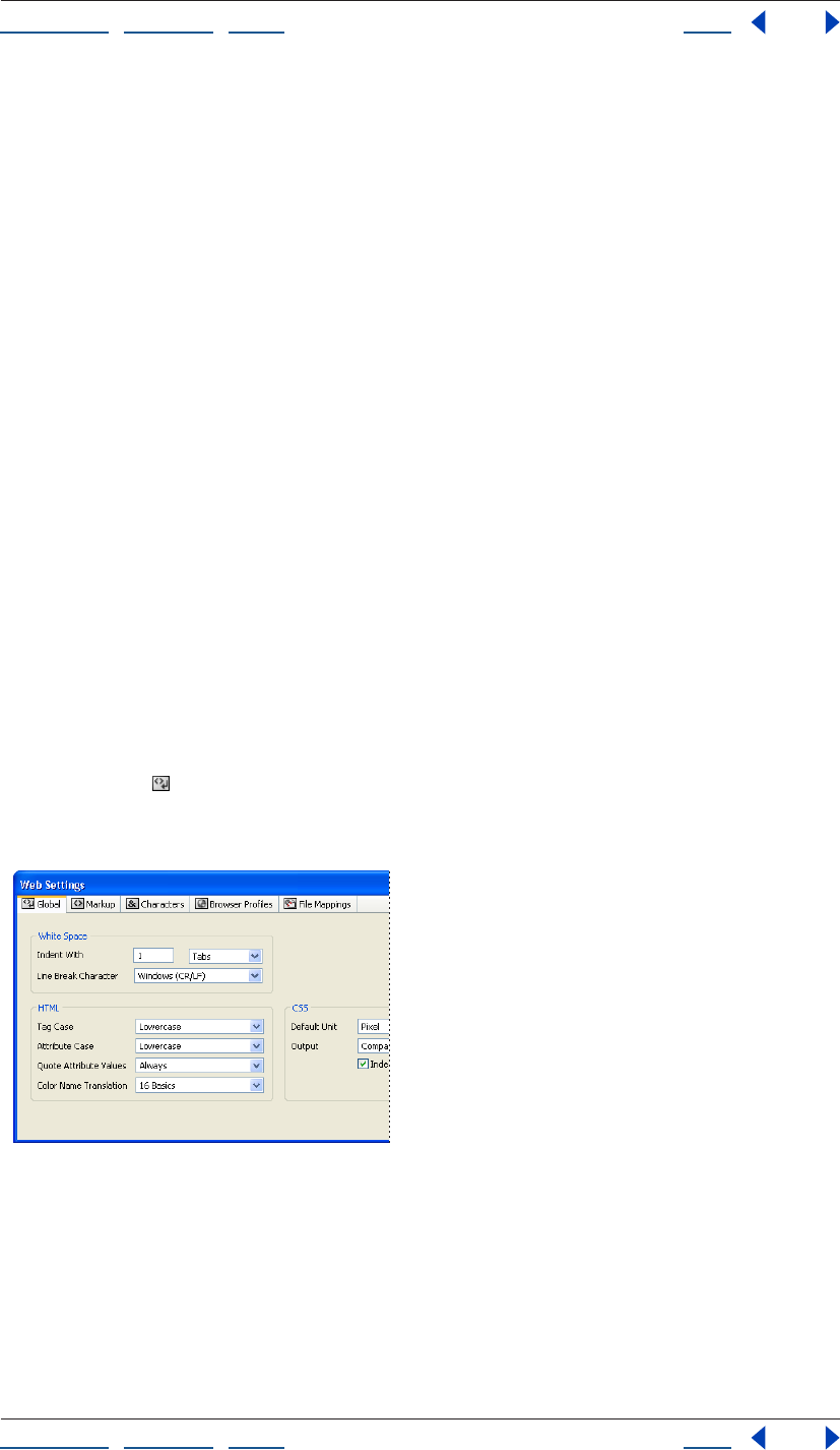
Using Help | Contents | Index Back 449
Adobe GoLive CS Help Using Web Settings
Using Help | Contents | Index Back 449
4 Restart GoLive.
A default set of Web Settings is created.
To restore a particular tab of Web Settings to its default settings:
1 Locate the Settings7 folder:
• (Windows) Documents and Settings/[username]/Application Data/Adobe/Adobe
GoLive/Settings7
• (Mac OS) Mac OS X/Users/[username]/Library/Preferences/ Adobe/GoLive/Settings7
2 Do one of the following:
• To only restore the Global tab, delete the MarkupBasics folder.
• To only restore the Markup tab, delete the MarkupGlue folder.
• To only restore a specific panel of the Markup tab, delete a folder in the MarkupGlue
folder.
• To only restore the Characters tab, delete the “user_entities.aglmga” file in the
MarkupGlue/html folder.
• To only restore the File Mappings tab, delete the FileMappings folder.
To delete new items added to the Markup, Characters, and File Mappings tabs:
Select an item that is marked “new” or “x” in the User column of the Markup, Characters, or
File Mappings tab, and press Delete on the keyboard.
Using the Global tab
The Global tab of the Web Settings window contains options for formatting the source
code, such as indentation, and lowercase and uppercase usage. You can preview most
changes you make to the Global panel options in the Source Code palette.
Global tab of Web Settings
You can set options relating to white space, HTML code, and cascading style sheets:
Indent with: Sets the indentation value and the type of indentation between sets of
container tags in the source code.
Line break character: Specifies how line breaks are written for your Web server platform:
• Macintosh (CR) inserts a carriage return character only.

Using Help | Contents | Index Back 450
Adobe GoLive CS Help Using Web Settings
Using Help | Contents | Index Back 450
• Unix (LF) inserts a line feed character only.
• Windows (CR/LF) inserts a carriage return and line feed character combination.
Tag case, Attribute case: Specifies how HTML tags or attributes are written:
• Upper Case uses only uppercase characters in the tag or attribute name.
• Lower Case uses only lowercase characters in tags or attributes.
• Capital capitalizes the first letter of each tag or attribute name.
Quote attribute values: Determines whether values for HTML tag attributes are
enclosed in straight quotation marks:
• Always inserts quotation marks around all attribute values, for example,
<IMG SRC="logo.gif">.
• Except Numbers encloses all attribute values, except for numerals, for example,
<IMG SRC="logo.gif" width=50>.
• Only if Necessary inserts quotation marks if there is a risk of ambiguity.
Color name translation: Determines whether color values are written using color
names:
• Do Not uses hexadecimal RGB values, for example, “#000000” for “Black”.
• 16 Basics uses the color names for sixteen basic colors, such as “purple” for the
hexadecimal value “#800080”, and uses the hexadecimal value for all other colors.
• Netscapes uses the Netscape-specific color names for certain RGB color values, such as
“Lime” for the RGB value “0, 255, 0,” and uses the hexadecimal value for all other colors.
Default Unit: Specifies the default unit used in Cascading Style Sheets (CSS).
Output: Determines the spatial format used to arrange CSS source code.
Indent: Specifies whether CSS source code is indented.
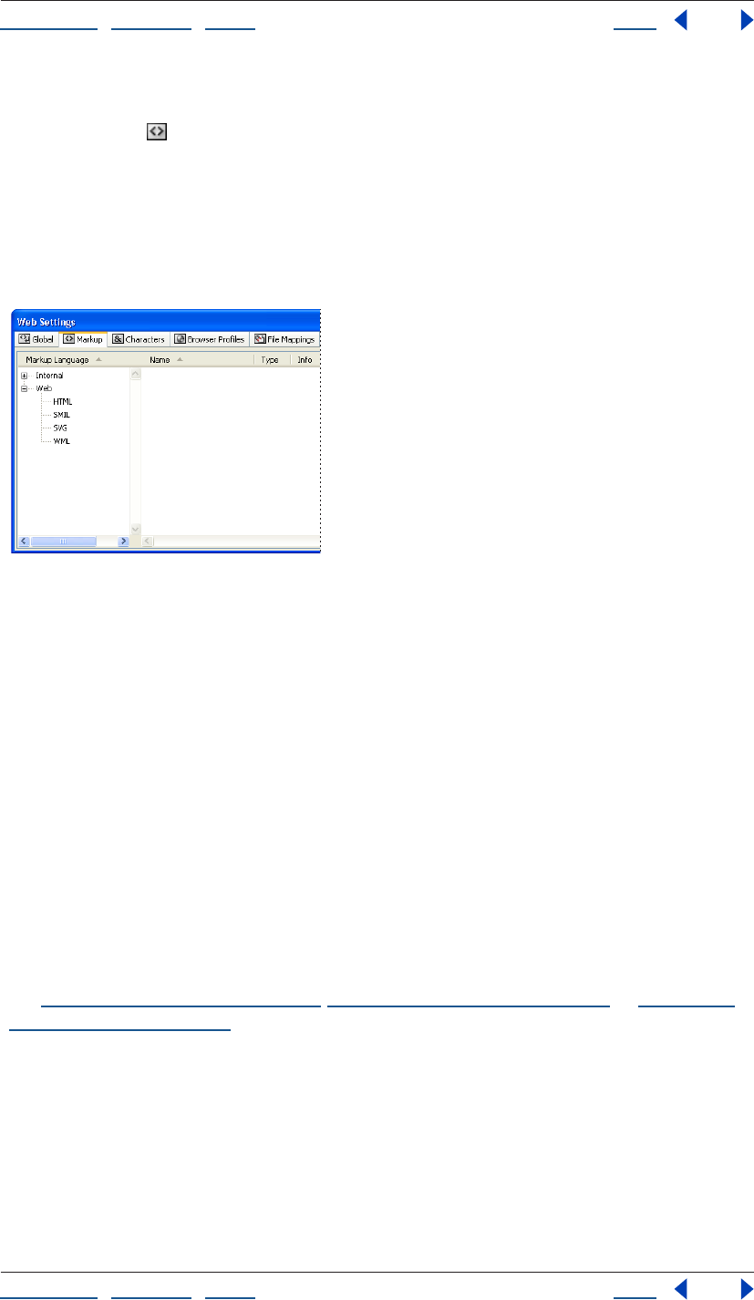
Using Help | Contents | Index Back 451
Adobe GoLive CS Help Using Web Settings
Using Help | Contents | Index Back 451
Using the Markup tab
The Markup tab of Web Settings contains the entire range of HTML, SMIL, SVG, WML,
and GoLive proprietary elements that GoLive can read and write. The information stored
in the Markup tab is used by GoLive’s Syntax Checker. HTML-standard elements include all
those specified by the HTML 2.0 and 3.2 standard publications, plus HTML 4.0 forms tags.
You can add elements to the list and edit existing elements as the current HTML standard
evolves. In addition, you can import an XML Document Type Definition (DTD) file and bind
it to file extensions and mime types.
HTML pane in the Markup tab of Web Settings
Viewing elements in Web Settings
You can use Web Settings to look up the proper use of an HTML, SMIL, SVG, or WML
element and its attributes. The panes can be organized into sections, or you can view all
the elements alphabetically. Element, attribute, or enumeration information is displayed
in the Inspector.
To view elements:
1 In the Markup tab of Web Settings, expand a section and select a Markup Language.
2 In the Markup tab, scroll through the list in the right pane (if the view is set to Struc-
tured, expand a section), and select an element. The Web Settings Element Inspector
displays the structural information for that element.
3 In the Markup tab, to see an element’s attributes, expand the tag, and select the
attribute (some tags do not have attributes). To see an attribute’s enumeration, expand the
attribute, and select the enumeration (Some attributes do not have enumerations). For
more information regarding the tag, attribute, and enumeration options in the Inspector,
see “Editing an element” on page 452, “Editing an attribute” on page 454, or “Editing an
enumeration” on page 455.
To show or hide columns in the Markup tab:
From the context menu of any of the column heads, Right-click (Windows) or Control-click
(Mac OS), and choose a column name or an option. You can show or hide all of the
columns, or show a selection of columns.
Using Help | Contents | Index Back 452
Adobe GoLive CS Help Using Web Settings
Using Help | Contents | Index Back 452
Editing the Markup tab
The Markup tab in the Web Settings window provides a convenient editing environment
for adding, modifying, or removing elements and their attributes, and enumerations. All
new and existing items in the Markup tab of Web Settings are used by the Syntax Checker.
For information on closing Web Settings without saving changes or on restoring default
Web Settings, see “Restoring default Web Settings” on page 448.
Important: Errors made while editing Web Settings can cause serious damage to your
documents. Before making any changes, check the current HTML specifications defined by
the World Wide Web Consortium (W3C) at http://www.w3c.org.
To add a new item to the Markup tab:
1 In the Markup tab of the Web Settings window, select a Markup language in the left
pane, click in the right pane, and do one of the following:
• To add an element, click the New Element button in the toolbar or choose Add
Element from the context menu.
• To add an attribute to an element, select an element or an existing attribute of the
element, and click the New Attribute button in the toolbar.
• To add an enumeration to an attribute, select the attribute. In the Basic tab of the
Inspector, choose Enumeration from the Value Type pop-up menu, and click the New
Enumeration button in the toolbar.
• To duplicate an element, attribute, or enumeration, select it and click the Duplicate
button in the toolbar.
2 With the new item selected, edit the properties in the Inspector. (See “Editing an
element” on page 452, “Editing an attribute” on page 454, or “Editing an enumeration” on
page 455.)
Note: To add new Web Settings elements to a document, you must hand-code them in the
document’s Source Code Editor. To add new element attributes or enumerations to a
document, you must hand-code them in the Source Code Editor, or select them from the
attribute or enumeration pop-up menus in the Outline Editor.
To delete items that were added to the Markup tab:
Select the item, and press Delete on the keyboard.
Note: You cannot delete any elements that are installed by default.
Editing an element
Use the Web Settings Element Inspector to set an element’s function and structure. You
can edit elements or define new elements.
For information on closing Web Settings without saving changes or on restoring default
Web Settings, see “Restoring default Web Settings” on page 448.
Important: Errors made while editing Web Settings can cause serious damage to your
documents. Before making any changes, check the current HTML specifications defined by
the World Wide Web Consortium (W3C) at http://www.w3c.org.
To edit an element:
1 Select the element in the Markup tab of Web Settings, and in the Basic tab of the
Inspector enter the element name in the Name text box.

Using Help | Contents | Index Back 453
Adobe GoLive CS Help Using Web Settings
Using Help | Contents | Index Back 453
2 Enter a description in the Comment text box.
3 Choose one of the following from the Structure pop-up menu:
• Block creates a block-level container element that can contain other elements (for
example, the <BODY> tag).
• Inline Visible creates an element that has visible content. This element can only exist
within a container element, such as the <IMG> tag.
• Inline Invisible creates an element that can only exist within a container element, has
visible content, but isn’t visible itself (although it influences a visual property of the
content), such as the <BOLD> tag.
• Inline Container creates a container element that can only exist within another
container element. It can have both non-HTML content and visible HTML content, such
as the <APPLET> tag.
• Inline Killer is reserved for use with the <BR> tag.
4 Choose one of the following options from the Content pop-up menu to define how the
content of an element is treated:
• Normal treats the content as specified by the Structure property.
• Get All Spaces keeps all extra white space when reading the tags. For example, this
option enables GoLive to display all spaces between the start and end <PRE></PRE>
tags.
• Core Text preserves the content of a tag without adding or deleting anything.
5 Choose an option from the End Tag pop-up menu:
• Required specifies that the element needs an end tag.
• Optional (do not write) indicates that the element does not need an end tag and that
GoLive is not supposed to read or write one.
• Optional (write) indicates that the element does not require an end tag but GoLive adds
it anyway.
• Attribute indicates that GoLive will not change the current end tag setting when
rewriting source code.
6 Choose one of the following:
• Can Be Stripped indicates that the element can be removed from the source code
before publishing the page.
• Can Have Any Attribute
Controlling tag spacing in the source code
For any element within Web Settings, you can control some basic formatting options in
the Output tab of the Web Settings Element Inspector.
To set basic formatting for an element:
1 Select the element in the Markup tab of Web Settings.
2 In the Output tab of the Web Settings Element Inspector, choose a property for the
following separation options:
• Outside controls the vertical spacing between the start and end tags, and elements
above and below them.
Using Help | Contents | Index Back 454
Adobe GoLive CS Help Using Web Settings
Using Help | Contents | Index Back 454
• Inside controls the vertical spacing between the start and end tags, and their content.
3 Select the Indent Content option to indent content between start and end tags.
Editing an attribute
You can use the Web Settings Attribute Inspector to set an attribute’s function, value type,
and default value. You can edit attributes or define new attributes.
For information on closing Web Settings without saving changes or on restoring default
Web Settings, see “Restoring default Web Settings” on page 448.
Important: Errors made while editing Web Settings can cause serious damage to your
documents. Before making any changes, check the current HTML specifications defined by
the World Wide Web Consortium (W3C) at http://www.w3c.org.
To edit an attribute:
1 Enter the attribute’s name in the Attr Name text box.
2 Enter a description in the Comment text box.
3 The Attribute Is value is used by the GoLive Syntax Checker to report code errors, but
does not determine whether the attribute is written by GoLive. Choose a property from
the Attribute Is pop-up menu:
• Optional specifies that the attribute is not necessary.
• Required specifies that the attribute is required in order for the tag to be read correctly.
• Alternate specifies that Optional, Required, or not defined are acceptable.
• Fixed specifies that the property has a permanent default value.
4 Choose a property from the Value Type pop-up menu:
• Text allows any Western-encoded alphanumeric character string. Use this option if you
are not sure about the usage.
• Encoded Text allows any alphanumeric character string in any encoding.
• Number allows a numerical value only.
• Enumeration indicates that a fixed set of properties are available.
• Color permits an RGB color code only.
• URL allows a Universal Resource Locator only.
• JavaScript allows JavaScript code only.
• ID allows a unique string.
• IDRef allows a link to an ID.
• IDRefs allows a link to a group of IDs.
• Entity allows any special character entity.
• Entities allows a group of special character entities.
• Nmtoken, Nmtokens, and Notation specify valid names and are used in XML.
5 Select Create This Attribute, and choose a property from the pop-up menu (if one is
available), or enter a value in the text box.
Note: When Create This Attribute is selected and a value is entered in the text box, some
attributes are automatically inserted in the source code when the tag is added to a page. If
Using Help | Contents | Index Back 455
Adobe GoLive CS Help Using Web Settings
Using Help | Contents | Index Back 455
the attribute is not inserted by GoLive, you can insert it from the tag’s attribute pop-up
menu in the Outline Editor or enter it manually in the Source Code Editor.
Editing an enumeration
You can use the Web Settings Enumeration Inspector to add comments to an enumer-
ation. All enumerations appear in the Value pop-up menu of the Web Settings Attribute
Inspector and in the attribute’s Enumeration pop-up menu in the Outline Editor.
Note: For information on closing Web Settings without saving changes or on restoring
default Web Settings, see “Restoring default Web Settings” on page 448.
Important: Errors made while editing Web Settings can cause serious damage to your
documents. Before making any changes, check the current HTML specifications defined by
the World Wide Web Consortium (W3C) at http://www.w3c.org.
To edit an enumeration:
1 Enter the enumeration name in the Enum Name text box of the Web Settings Enum
Inspector.
2 Enter a description in the Comment text box.
Importing a Document Type Definition (DTD) file
An imported Document Type Definition (DTD) file can be bound to file extensions and
mime types. This enables GoLive to open any file of that extension and associate it with
the imported DTD for syntax checking, and element placement in the Outline Editor.
To import an XML DTD file:
1 In the Markup tab of Web Settings, choose Import XML-DTD from the context menu of
the left pane.
2 Open a DTD file.
The DTD file appears within a folder named Imported in the Markup tab. Elements,
entities, and notations contained in the DTD are listed in the right pane.
To edit an XML DTD file:
1 In the Markup tab of Web Settings, select the DTD filename in the left pane.
2 In the XML DTD Inspector, enter an extension, or multiple extensions separated by
commas, in the Extensions text box.
3 Edit the elements, attributes, and enumerations as needed. (See “Editing an element”
on page 452, “Editing an attribute” on page 454, and “Editing an enumeration” on
page 455.)
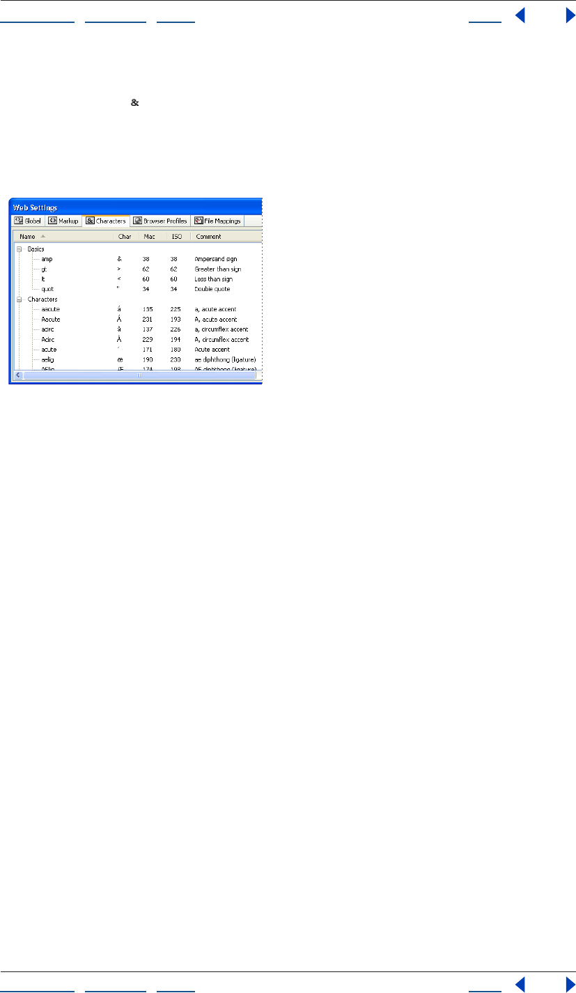
Using Help | Contents | Index Back 456
Adobe GoLive CS Help Using Web Settings
Using Help | Contents | Index Back 456
Using the Characters tab
The Characters tab of Web Settings includes all the special characters specified by ISO
8859-1 and the HTML 3.2 standard. HTML uses a specific notation for encoding special
characters to ensure a uniform display across multiple computer platforms. GoLive uses
the content of the Characters tab to map special characters added to your HTML
documents to their Web-specific character entity references.
Characters tab of Web Settings in Flat (alphabetical) view
Viewing special characters
You can view the characters sorted by category (Structured), or you can view them alpha-
betically (Flat). If a character can’t be displayed in the system font, a small box (Windows)
or x (Mac OS) is displayed in the Char column of the Characters tab of Web Settings instead
of the character.
Using Help | Contents | Index Back 457
Adobe GoLive CS Help Using Web Settings
Using Help | Contents | Index Back 457
To view special characters:
1 Open the Characters tab of Web Settings, and in the View palette select one of the
following options:
• To view the characters alphabetically, select Flat.
• To view the characters grouped by category, select Structured.
2 Scroll through the list of characters (if the view is set to Structured, then expand a
category), and select a character under the Name column. The Web Settings Entity
Inspector displays the following information for the character:
• The left Name text box displays the character’s HTML name, and the right text box
shows the HTML code that is inserted by default into the source code.
• Comment describes the character.
• The left ISO Code text box (Windows and Mac OS) displays the character’s ISO codes,
the middle (Windows) or right (Mac OS) text box displays the byte code, and the right
text box (Windows only) displays the character’s visual representation. You can select
and copy the character in the right ISO code text box, and paste it into the Layout Editor
of a document.
• If Mac is selected, the left Mac text box displays the Mac mnemonic code (Windows and
Mac OS), the right (Windows) or middle (Mac OS) text box displays the byte code, and
the right text box (Mac OS only) displays the character’s visual representation.
• Select Write to write the adjoining text box into the document rather than the left
Name text box. Enter the character entity reference without the starting ampersand
and closing semicolon. GoLive will insert the new character entity instead of the default
entity. This option might be used when you want GoLive to insert a character’s numeric
HTML entity rather than the named HTML entity.
To show or hide columns in the Characters tab:
From the context menu of any of the column heads, Right-click (Windows) or Control-click
(Mac OS), and choose a column name or an option. You can show or hide all of the
columns, or show a selection of columns.
To add a special character to a document:
1 In the Characters tab of Web Settings , select the character.
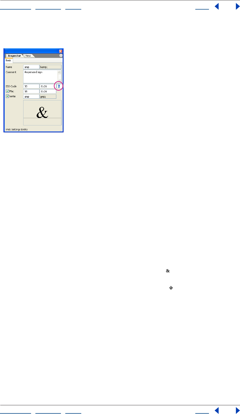
Using Help | Contents | Index Back 458
Adobe GoLive CS Help Using Web Settings
Using Help | Contents | Index Back 458
2 In the Web Settings Entity Inspector, select the character in the third ISO Code text box
(Windows) or the third Mac text box (Mac OS), and choose Copy from the context menu.
Copying a character entity in
the Web Settings Entity Inspector
3 In the document Layout Editor, choose Edit > Paste in the desired insertion point.
Adding and editing special characters to Web Settings
Use the following guidelines when adding new characters:
• New characters must be W3C-specified characters that are supported by browsers.
• GoLive for Mac OS doesn’t display all characters. To preview such characters, you may
have to launch a browser.
• Characters specific to Mac OS can be added, but they won’t display in browsers.
To add a special character:
1 In the Characters tab of the Web Settings window, select an existing character or a
category to which you want to add a character.
2 Do one of the following:
• To add a new character, click the New Enumeration button on the toolbar or choose
Add Entity from the context menu.
• To duplicate a selected character, click the Duplicate button .
3 Select the new character, or copy and edit its properties in the Web Settings Entity
Inspector:
• Enter the HTML name of the new character in the Name text box.
• Enter a description in the Comment text box.
• Enter the ISO mnemonic code and its equivalent byte code in the ISO Code text boxes.
• If there is a Mac OS equivalent, select Mac, and enter the mnemonic code and its equiv-
alent byte code. Mac OS characters are displayed in the preview pane.
• Select Write to write the adjacent text box into the document rather than the Name text
box. Enter the character entity reference without the starting ampersand and closing
semicolon.
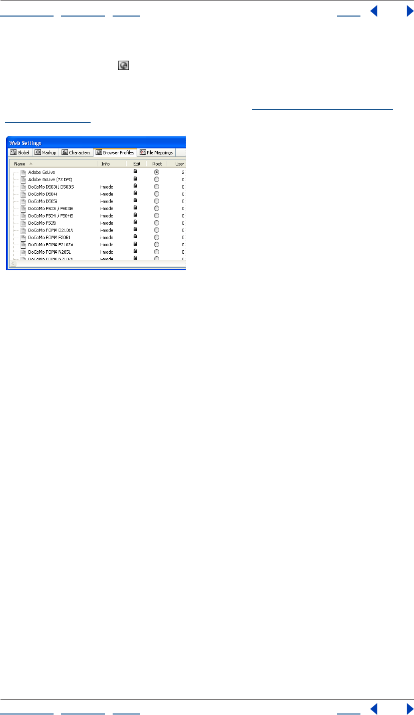
Using Help | Contents | Index Back 459
Adobe GoLive CS Help Using Web Settings
Using Help | Contents | Index Back 459
Using the Browser Profiles tab
The Browser Profiles tab of Web Settings contains display profiles of popular browsers
on Windows and Mac OS. You can select any listed browser and platform to serve as the
default profile for viewing documents in the Layout Editor. The alternate profiles can be
used for previewing pages with the View palette. (See “Setting view options for page
layout” on page 55.)
Browser Profiles tab of Web Settings
The profiles let you simulate how fonts and other design elements display on Windows
and Mac OS. They do not affect how GoLive writes HTML code, or what the viewer sees
when visiting your site. The profiles are made with cascading style sheets that use element
selector styles. If you know how to build cascading style sheets, you can duplicate an
existing profile and edit it to create a new browser profile.
Note: The style sheets that you create in the CSS Editor are not affected by or related to the
style sheet-based profiles in the Browser Profiles tab of Web Settings.
Viewing the browser profiles
The browser profiles in the Browser Profiles tab of Web Settings are write-protected. You
can only inspect their properties.
To view the profile properties:
1 In the Browser Profiles tab of the Web Settings window, select a profile from the list.
2 In the Root Style Sheet Inspector, click the Basic tab to view the profiled system and
comments.
3 Select the Settings tab to view the screen resolution and other options.
Creating a new browser profile
You can create a new browser profile if you want more Profile options in the View palette.
To create a new browser profile:
1 In the Browser Profiles tab of the Web Settings window, select the profile that best
resembles your target browser, and choose Duplicate from the context menu.
2 Select the new duplicate profile, and in the Basic tab of the Root Style Sheet Inspector,
enter a name, system information, and comments.
3 In the Settings tab of the Inspector, enter a screen resolution (96 is typical for Windows,
72 for Mac OS) in the DPI text box, and select Can Handle Style Sheets.
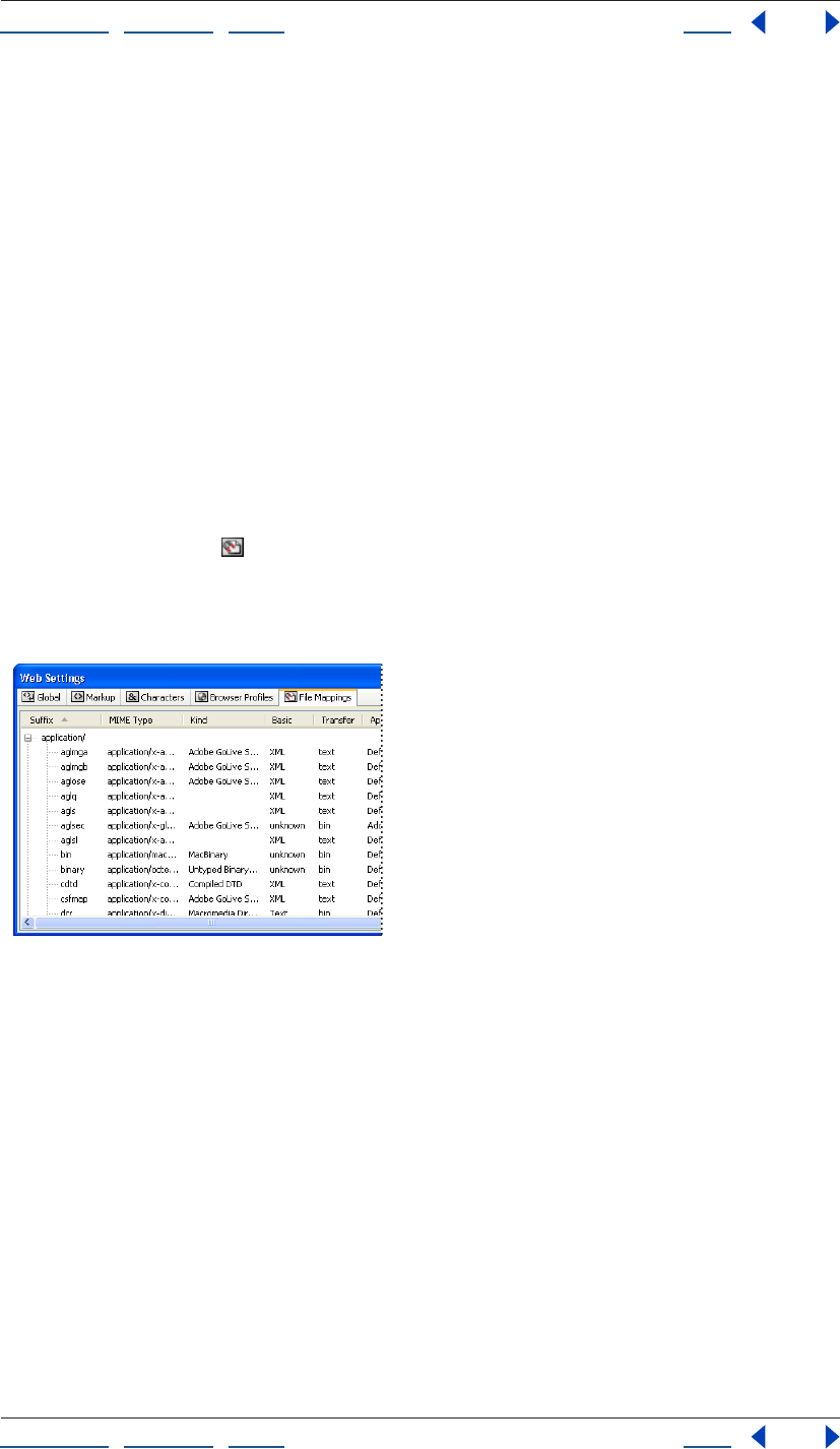
Using Help | Contents | Index Back 460
Adobe GoLive CS Help Using Web Settings
Using Help | Contents | Index Back 460
4 The new profile appears in the Profile pop-up menu of the View palette.
Simulating the effects of different browsers and platforms
The Root profile in the Browser Profiles tab of Web Settings determines the default profile
used to display your documents in the Layout Editor. You can use the Profiles menu in the
View palette to simulate your document’s appearance in different browsers and platforms.
To preview your pages with different browser profiles:
Open your document’s Layout Editor, and in the View palette, select a profile from the
Profile menu.
To set a browser profile as the default used in the Layout Editor:
In the Browser Profiles tab of Web Settings, select the Root Radio button adjacent to the
browser profile under the Root column.
Using the File Mappings tab
The File Mappings tab shows the MIME type for various file extensions and the appli-
cation that is assigned to open each of them. If the Application column in the Web
Settings window is set to Default, the application that will be launched is the same as that
mapped in the operating system. You can modify the existing mappings or add new ones.
File Mappings tab of Web Settings in Flat (alphabetical) view
Viewing file mappings
You can view all of the filename suffixes defined in Web Settings, and also the type of file,
Mime type, and the application mapped to each.
To change the display of file mappings:
Open the File Mappings tab of the Web Settings window, and in the View palette select a
View property.
To show or hide columns on the File Mappings tab:
In the File Mappings tab of Web Settings, choose an item from the context menu of any of
the column heads, and Right-click (Windows) or Control-click (Mac OS). You can show or
hide all of the columns, or show a selection of columns.
Using Help | Contents | Index Back 461
Adobe GoLive CS Help Using Web Settings
Using Help | Contents | Index Back 461
Adding and editing file mappings
You can add and edit file mappings in the File Mappings tab in Web Settings. To remove
changes you’ve made to a default file mapping, see “Restoring default Web Settings” on
page 448.
To add or delete a new file mapping:
In the File Mappings tab of Web Settings, do one of the following:
• To add a mapping, select By Mime Type in the View palette. Select a Mime type
category in the Web Settings window, and click the New Extension button in the
toolbar. Edit the new mapping in the File Info Extension Inspector.
• To delete a new mapping, select the suffix, and choose Delete from the context menu
or press Delete on the keyboard.
To edit a file mapping:
In the File Mappings tab of Web Settings, select the extension suffix, and set options in the
File Info Extension Inspector:
• To set the FTP method, choose a Transfer property.
• (Mac OS) To change the application that is launched when the file is double-clicked in
GoLive, specify the Mac File Type and File Creator in the File Info Extension Inspector.
Alternatively, click the Browse button next to the Application text box, and browse to
the application.
• (Windows) To change the application that is launched when the file is double-clicked in
GoLive, click the Browse button next to the Application text box in the File Info
Extension Inspector, and browse to the application.
To delete changes you’ve made to a default file mapping:
Select an item marked “x” in the User column, and press Delete on the keyboard.

Using Help | Contents | Index Back 462
Adobe GoLive CS Help GoLive Extensibility
Using Help | Contents | Index Back 462
GoLive Extensibility
About GoLive Extensibility
You can add and customize GoLive features by using either pre-made extensions or the
GoLive Extend Script SDK.
The Adobe Exchange
Pre-made extensions are available from the Adobe Exchange Web site
(www.share.studio.adobe.com), where you can find thousands of extensions for Adobe
products, many available for free.
The GoLive Extend Script SDK
The GoLive Extend Script SDK, available on the Adobe GoLive CD or online
(www.partners.adobe.com/asn/golive), provides documentation, tools, and samples that
let you further customize the features and user interface of GoLive. You can create an
Extend Script extension by simply creating a Web page with familiar GoLive tools.
GoLive Extensibility isn’t limited to simple extensions. Developers can also create custom
libraries that access all the capabilities of Windows and Mac OS or integrate with other
applications.
What you can do with extensions
With extensions, you can create your own GoLive commands to automate repetitive tasks
or add powerful new features. You can design extensions by using HTML, JavaScript, or
XML code to access the following elements of GoLive:
• Menus and menu items
• Floating palettes
• Task-specific dialog boxes that include text, graphics, and controls
• Custom HTML elements, such as <mytag>, that can be edited in an Inspector palette
• Customized content such as drag-and-drop items in the Objects palette
• The site window
• Site reports
• Document parsing options for encoding, translation, localization, and non-HTML tags

Using Help | Contents | Index Back 463
Adobe GoLive CS Help Keyboard Shortcuts
Using Help | Contents | Index Back 463
Keyboard Shortcuts
Keys for working in windows
Result Windows Mac OS
Close a window without
saving
Command+D
Duplicate selected object Ctrl-drag Option-drag
Move boxes in Layout
Grid (by pixel)
Ctrl+Alt+Left Arrow, Right
Arrow, Up Arrow, or Down
Arrow
Option+Left Arrow, Right
Arrow, Up Arrow, or Down
Arrow
Move boxes based on
Snap-to-Grid setting
Left Arrow, Right Arrow, Up
Arrow, or Down Arrow
Left Arrow, Right Arrow, Up
Arrow, or Down Arrow
Show next window in work-
space
Ctrl+Tab
Show previous window
in workspace
Shift+Ctrl+Tab
Change focus to Text In
spector Link field
With cursor in Document win-
dow,
Command+, (comma)
Change focus to Document
window
With cursor in Text Inspector,
Command+; (semicolon)
Using Help | Contents | Index Back 464
Adobe GoLive CS Help Keyboard Shortcuts
Using Help | Contents | Index Back 464
Keys for handling text
Keys for handling source code
Result Windows Mac OS
Cursor to beginning of current
word
Ctrl+Left Arrow Option+Left Arrow
Cursor to next word Ctrl+Right Arrow Option+Right Arrow
Cursor to beginning/end
of line
Home Command+Left Arrow
Cursor to end of line End Command+Right Arrow
Select a word Double-click Double-click
Select a line Triple-click Triple-click
Select a paragraph Quadruple-click Quadruple-click
Increase selection Shift+Left Arrow, Right Arrow,
Up Arrow, or Down Arrow
Shift+Left Arrow, Right Arrow,
Up Arrow, or Down Arrow
Select to beginning of line Shift+Home Command+Shift+Left Arrow
Select to end of line Shift+End Command+Shift+ Right
Arrow
New line instead of paragraph Shift+Enter Shift+Return
Nonbreaking space Shift+Spacebar Option+Spacebar
Insert word break tag <WBR>,
enabling the browser to
hyphenate the work at the
point of insertion
Ctrl+dash
Result Windows Mac OS
Cursor to next word Ctrl+Right Arrow Option+Right Arrow
Cursor to preceding word Ctrl+Left Arrow Option+Left Arrow
Cursor to beginning of line Home Command+Left Arrow
Cursor to end of line End Command+Right Arrow
Select a word Double-click Double-click
Select a line Triple-click Triple-click
Decrease selection one
character
Shift+Left Arrow Shift+Left Arrow
Increase selection one
character
Shift+Right Arrow Shift+Right Arrow
Using Help | Contents | Index Back 465
Adobe GoLive CS Help Keyboard Shortcuts
Using Help | Contents | Index Back 465
Keys for using the site window
Keys for using Links view or Navigation view in site
window
Decrease selection one word Ctrl+Shift+Left Arrow Option+Shift+Left Arrow
Increase selection one word Ctrl+Shift+Right Arrow Option+Shift+Right Arrow
Decrease selection one line Shift+Up Arrow Shift+Up Arrow
Increase selection one line Shift+Down Arrow Shift+Down Arrow
Decrease selection to begin-
ning of source code
Home+Shift+Up Arrow Command+Shift+Up Arrow
Decrease selection to end of
source code
Home+Shift+Down Arrow Command+Shift+Down
Arrow
Increase selection to begin-
ning of source code
End+Shift+Up Arrow Command+Shift+Up Arrow
Increase selection to end of
source code
End+Shift+Down Arrow Command +Shift+Down
Arrow
Result Windows Mac OS
Activate tab on drag and drop Move over tab while dragging Move over tab while dragging
Locate file in Explorer Right-click file, choose Open/
Reveal in Explorer in the con-
text menu
Command+click file
Show properties information
for object
Right-click file, choose Open/
Show Properties
Ctrl+click file, choose Open/
Show Properties
Result Windows Mac OS
Select next file in x-direction Left Arrow, Right Arrow, Up
Arrow, or Down Arrow
Left Arrow, Right Arrow, Up
Arrow, or Down Arrow
Start a partial tree from
selection
Ctrl+Up Arrow Command+Up Arrow
Toggle expand button
(hide/show children)
Ctrl+Down Arrow Command+Down Arrow
Add parent to selection Shift+Up Arrow Shift+Up Arrow
Add children to selection Shift+Down Arrow Shift+Down Arrow
Select previous sibling or
jump to nearest item to the
left of selection
Ctrl+Left Arrow Option+Left Arrow
Using Help | Contents | Index Back 466
Adobe GoLive CS Help Keyboard Shortcuts
Using Help | Contents | Index Back 466
Select next sibling or jump to
nearest item to the right of
selection
Ctrl+Right Arrow Option+Right Arrow
Select the closest item above
selection
Ctrl+ Up Arrow Option+Up Arrow
Select the closest item below
selection
Ctrl+Down Arrow Option+Down Arrow
Toggle partial tree from selec-
tion and
move to center
Esc Esc
Select top-level references Ctrl+ Home Command+ Home
Select first sibling Home Home
Select last sibling End End
Open the selected references Enter or double-click Return or double-click
Hand tool for scrolling Spacebar Spacebar
Select the reference with
matching text
Type any characters Type any characters
Zoom toggle (between 100%
and 200%)
Shift-click Option-click
Create a “zoom box” (once the
mouse is released, the
selected region zooms to fit
the screen)
Shift-drag Option-drag
Using Help | Contents | Index Back 467
Adobe GoLive CS Help Keyboard Shortcuts
Using Help | Contents | Index Back 467
Keys for handling tags
Keys for using the Timeline (DHTML)
Result Windows Mac OS
Expand or collapse the
selected tag
Enter (numerical keypad) Return
Recursively expand or col-
lapse
the selected tag
Shift+Enter (numerical key-
pad)
Option+Return
Show or hide the tag attribute
list
Enter (numerical keypad) Enter
Recursively show or hide the
tag attribute list
Shift+Enter (numerical key-
pad)
Option+Enter
Activate the next text box Tab Tab
Activate the preceding text
box
Shift+Tab Shift+Tab
Activate the tag selection
pop-up menu
Ctrl-click tag name Command-click tag name
Result Windows Mac OS
Select next keyframe Right Arrow Right Arrow
Select previous keyframe Left Arrow Left Arrow
Select next track Down Arrow Down Arrow
Select previous track Up Arrow Up Arrow
Play a scene beginning at the
current
time cursor location
Enter (numerical keypad) Enter (numerical keypad)
Stop scene playback 0 (numerical keypad) 0 (numerical keypad)
Create a new keyframe Ctrl-click a time track Command-click a time track
Duplicate a keyframe Alt-drag keyframe Option-drag keyframe
Create an action placeholder Ctrl-click action on action
track
Command-click action on
action track
Scale an animation while
maintaining the relative time
positions of all keyframes on
the same time track
Ctrl+Shift-drag Ctrl-drag
Using Help | Contents | Index Back 468
Adobe GoLive CS Help Keyboard Shortcuts
Using Help | Contents | Index Back 468
Keys for using Tables in Layout view
Result Windows Mac OS
Change height and width of a
row or column
Alt+resize Option+resize
Select cells Click cell border Click cell border
Select multiple adjacent cells Click+drag Click+drag
Select multiple nonadjacent
cells
Shift-click additional cells Shift-click additional cells
Select all cells in column Click top edge of column Click top edge of column
Select all cells in row Click left edge of row Click left edge of row
Add row above * *
Add columns to the left + +
Add columns to the right - -
Interactively add cells and
rows
Ctrl+Shift-drag bottom/right
edge of table
Command-drag bottom/right
edge of table
Delete current column Ctrl+Del Backspace
Delete current row Shift+Ctrl+Del Shift+Backspace
Span columns, joining current
cell
with cell to the right
Shift+Right Arrow Shift+Right Arrow
Reduce column span, splitting
the current cell
Shift+Left Arrow Shift+Left Arrow
Span rows, joining current cell
with cell below
Shift+Down Arrow Shift+Down Arrow
Reduce row span, splitting the
current cell
Shift+Up Arrow Shift+Up Arrow
Move text cursor to next cell
to the right
Tab Tab
Move text cursor to next cell
to the left
Shift+Tab Shift+Tab
Switch from text entry
to cell selection mode
Ctrl+Enter Ctrl+Return
Switch from cell selection
to text entry mode
Enter Return
Using Help | Contents | Index Back 469
Adobe GoLive CS Help Keyboard Shortcuts
Using Help | Contents | Index Back 469
Keys for using QuickTime editor
Keys for working with links
Result Windows Mac OS
Select keyframe of the upper
or lower
tracks and samples displayed
in the
Timeline window
Up Arrow or Down Arrow Up Arrow or Down Arrow
In the Track Content area,
select previous or next sample
Left Arrow or Right Arrow Left Arrow or Right Arrow
In the Track Content area,
select upper or lower sample
or track
Up Arrow or Down Arrow Up Arrow or Down Arrow
In the Track List area, select
upper or lower track
Up Arrow or Down Arrow Up Arrow or Down Arrow
In the Track Ruler area, step
forward or backward
Right Arrow or Left Arrow Right Arrow or Left Arrow
Drag and copy track Ctrl-drag in the Content or List
area
Option-drag in the List area
Create keyframe sample of a
sprite
Ctrl-click Command-click
Drag and copy keyframe sam-
ple of a sprite
Option-drag in Content area
Select next time marker Shift+Right Arrow or Left
Arrow
Shift+Right Arrow or Left
Arrow
Open or close tracks, sub-
tracks
Ctrl+Up Arrow or Down Arrow Command+Up Arrow or
Down Arrow
Scale sample time Shift-drag Shift-drag
Jump to start or end of movie
in timeline
Ctrl+Left Arrow or Right
Arrow
Command+Left Arrow or
Right Arrow
Result Windows Mac OS
Create new link Select item+Alt-drag to
desired
destination. Release mouse
when the object highlights.
Select item+Command-drag
to desired
destination. Release mouse
when the object highlights.
Link frame with desired con-
tent file
Ctrl-drag to desired page in
site window
Command-drag to desired
page in site
window

Using Help | Contents | Index Back 470
Adobe GoLive CS Help Legal Notices
Using Help | Contents | Index Back 470
Legal Notices
Copyright
© 2003 Adobe Systems Incorporated. All rights reserved.
Adobe® GoLive® CS User Guide for Windows® and Macintosh
If this guide is distributed with software that includes an end user agreement, this guide, as well as the software described in it, is furnished
under license and may be used or copied only in accordance with the terms of such license. Except as permitted by any such license, no part of
this guide may be reproduced, stored in a retrieval system, or transmitted, in any form or by any means, electronic, mechanical, recording, or
otherwise, without the prior written permission of Adobe Systems Incorporated. Please note that the content in this guide is protected under
copyright law even if it is not distributed with software that includes an end user license agreement.
The content of this guide is furnished for informational use only, is subject to change without notice, and should not be construed as a
commitment by Adobe Systems Incorporated. Adobe Systems Incorporated assumes no responsibility or liability for any errors or inaccuracies
that may appear in the informational content contained in this guide.
Please remember that existing artwork or images that you may want to include in your project may be protected under copyright law. The
unauthorized incorporation of such material into your new work could be a violation of the rights of the copyright owner. Please be sure to
obtain any permission required from the copyright owner.
Any references to company names in sample templates are for demonstration purposes only and are not intended to refer to any actual
organization.
Adobe, the Adobe logo, Acrobat, Acrobat Reader, After Effects, Classroom in a Book, Co-Author, GoLive, Illustrator, ImageReady, InDesign,
Adobe Premiere, Photoshop, Reader, Version Cue, and 360Code are either registered trademarks or trademarks of Adobe Systems Incorpo-
rated in the United States and/or other countries. ActiveX, Microsoft, Windows, and Windows NT are either registered trademarks or trade-
marks of Microsoft Corporation in the United States and/or other countries. Apple, AppleScript, ColorSync, Mac, Macintosh, and Power
Macintosh are trademarks of Apple Computer, Inc. registered in the U.S. and other countries. QuickTime and the QuickTime logo are trade-
marks used under license. The QuickTime logo is registered in the U.S. and other countries. RealOne and the RealOne logo are trademarks or
registered trademarks of RealNetworks, Inc. Pentium is a registered trademark of Intel Corporation. SVG is a trademark of the World Wide Web
Consortium; marks of the W3C are registered and held by its host institutions MIT, INRIA, and Keio. Macromedia and Flash are trademark or
registered trademark of Macromedia, Inc. in the United States and/or other countries. Solaris is a trademark of Sun Microsystems, Inc. in the
United States and other countries. All SPARC trademarks are used under license and are trademarks or registered trademarks of SPARC Interna-
tional, Inc. Products bearing SPARC trademarks are based upon an architecture developed by Sun Microsystems, Inc. All other trademarks are
the property of their respective owners.
This software is based in part on the work of the Independent JPEG Group. This product includes software developed by the Apache Software
Foundation (http:www.apache.org/). The Proximity/Franklin Database ©1994 Franklin Electronic Publishers, Inc., ©1990 All Rights Reserved.
Proximity Technology, Inc. The Proximity/Merriam-Webster Database ©1990 Merriam-Webster Inc., ©1990 All Rights Reserved. Proximity
Technology, Inc. The Proximity/Collins Databases ©1990 William Collins Sons & Co. Ltd., ©1990 All Rights Reserved. Proximity Technology Inc.
The Proximity/ Munksgaard Database ©1990 Munksgaard International Publishers Ltd., ©1990 All Rights Reserved. Proximity Technology Inc.
The Proximity/Van Dale Databases ©1990, 1995 Van Dale Lexicografie bv., ©1990, 1996 All Rights Reserved. Proximity Technology Inc. The
Proximity/IDE Databases ©1990 IDE a.s., ©1990 All Rights Reserved. Proximity Technology Inc. The Proximity/Hachette Database ©1992
Hachette, ©1992 All Rights Reserved. Proximity Technology Inc. The Proximity/Bertelsmann Database ©1997 Bertelsmann Lexikon Verlag,
©1997 All Rights Reserved. Proximity Technology Inc. The Proximity/Text & Satz Database ©1991 Text & Satz Datentechnik, ©1991 All Rights
Reserved. Proximity Technology Inc.
Contains an implementation of the LZW algorithm licensed under U.S. Patent 4,558,302.
Adobe Systems Incorporated, 345 Park Avenue, San Jose, California 95110, USA.
Notice to U.S. Government End Users. The Software and Documentation are “Commercial Items,” as that term is defined at 48 C.F.R. §2.101,
consisting of “Commercial Computer Software” and “Commercial Computer Software Documentation,” as such terms are used in 48 C.F.R.
§12.212 or 48 C.F.R. §227.7202, as applicable. Consistent with 48 C.F.R. §12.212 or 48 C.F.R. §§227.7202-1 through 227.7202-4, as applicable, the
Commercial Computer Software and Commercial Computer Software Documentation are being licensed to U.S. Government end users (a)
only as Commercial Items and (b) with only those rights as are granted to all other end users pursuant to the terms and conditions herein.
Unpublished-rights reserved under the copyright laws of the United States. Adobe Systems Incorporated, 345 Park Avenue, San Jose, CA
95110-2704, USA. For U.S. Government End Users, Adobe agrees to comply with all applicable equal opportunity laws including, if appropriate,
the provisions of Executive Order 11246, as amended, Section 402 of the Vietnam Era Veterans Readjustment Assistance Act of 1974 (38 USC
4212), and Section 503 of the Rehabilitation Act of 1973, as amended, and the regulations at 41 CFR Parts 60-1 through 60-60, 60-250, and 60-
741. The affirmative action clause and regulations contained in the preceding sentence shall be incorporated by reference.

Using Help | Contents | Index Back 471
Adobe GoLive CS Help Index
Using Help | Contents | Index Back 471
A B C D E F G H I J K L M N O P Q R S T U V W X Y Z
Index
A
absolute length units for style sheets 226
absolute link paths
about 103
setting up in preferences 104
using in links 104
access keys, in forms 301
Action Group action 441
Action Inspector 414, 415, 417
actions
See also individual action names
about 414
attaching to rollovers 244
audio playback 432
browser-triggered 415
browser-window-related 421, 428, 429, 434
clock-related 434
form-related 418, 427, 428
frame-related 421
getters 418
grouping 441
image-related 419
in layer timelines 151, 154
link 421
message 427
monitoring events 441
Others 434
RealOne 437
scene playback control 431
scrolling 435
shifting code to an external library 409
showing and hiding objects 429
specials 441
swapping images 420
Text Swap 426
timeline-triggered 417
user-triggered 415, 416
variables 443
Actions palette
setting up actions 414
showing/hiding layers 150
user-triggered actions 415
Address tags 188
AddToNowPlayingList action 438
Adobe GoLive
importing GoLive 4.0 files 46
preference file 42
Styles folder 200
tutorials 11
work area 28
Adobe Illustrator files
images as page layout designs 135
Adobe PDF format. See PDF files
Adobe Photoshop files
adding to a Web page 135
images as page layout designs 135
Adobe Version Cue 45
Advanced URL Handling, setting options 48
AI File to SWF File option 282
AI files. See Illustrator files
AI Layers to SWF Frames option 282
Align palette 87, 142
aligning
images within text 190
objects 141, 142
Allow Content Overflow option 141
alternate pages for browsers 58
alternative text
for images 236
for slices 275
Anchor Inspector 66
Using Help | Contents | Index Back 472
Adobe GoLive CS Help Index
Using Help | Contents | Index Back 472
A B C D E F G H I J K L M N O P Q R S T U V W X Y Z
anchors
diagrams 81
for link destinations 66
for PDF bookmarks 65
animations
animating layers 151
previewing 152
stopping 433
Annotation Inspector 85
annotations in diagrams
adding and editing 85
using in presentations 88
Annotations tab of diagram window 85
Apply Template command 310
arrow keys, moving and resizing layers 147
attributes
adding in Outline Editor 397
checking validity of 398
selecting values for 398
audio, adding to a page 251
B
background
formatting for tables 176
images or color for pages 70
properties for style sheets 232
Set BackColor action 436
background color
matching in Smart Objects 267
back-references in wildcard searches 209
Base elements in head sections 58
basic properties for style sheets 221
binary tag display, toggling in Outline Editor
400
blank sites, creating 47
blinking text 192
block properties for style sheets 228, 229
blockquote tag 189
Body Action icon 415
Body Action Inspector 415
bold text 192
borders
for images 236
properties for style sheets 230
Box Inspector 85
browser dithering 274
Browser Profiles tab in Web Settings 459
Browser Switch Inspector 59
browser window, opening second 423
browsers. See Web browsers
browser-switch scripts 58, 186
browser-triggered actions 415
bug icon 126
bulleted lists 189
buttons, adding to forms 296
byte sizes of documents 39
C
Call Action action 441
Call Function action 441
canvas settings for diagrams 83
captions
creating in diagrams 84, 85
tables 178
Card Inspector 364
Cascade command 34, 35
cascading style sheets
about 212
applying CSS styles 224, 233
background properties 232
block properties 228
border properties 230
cascading order 217
classes 219, 222, 233
creating 215, 222, 223
creating styles 219
CSS Inspector 225
CSS1 formatting model 229
default style sheets 459
default units 449
deleting styles 224
DIV element 234
editing the source code 224
Using Help | Contents | Index Back 473
Adobe GoLive CS Help Index
Using Help | Contents | Index Back 473
A B C D E F G H I J K L M N O P Q R S T U V W X Y Z
external style sheets 215
font properties 226
ID styles 223, 233
importing or exporting 225
internal style sheets 214
length units 226
linking 217
list properties 231
Netscape CSS Fix action 435
source code formatting 449
SPAN element 234
supported style properties 225
tables 181
text properties 227
unsupported properties 232
viewing 218
CGI scripts, in forms 294, 295, 298, 361
character counts of documents 39
character set encoding 57
Characters tab in Web Settings 456
Check External Links command 128
check in/out, Version Cue projects 45
Check Spelling command 201
Check Staging command 89
cHTML
(i-mode) 358
about 354
working with 356
class attribute 363
class attributes as CSS selectors 222
class styles 219, 222, 233
Clean Up command 64
Clean Up Site command 336
Clear attribute 191
Clear Inline Styles command 201
Clear Paragraph Styles command 188, 201
ClearNowPlayingList action 438
clock actions 434
Clock Date (ID) action 434
Close Window action 421
Co-Author Editor 340
Co-Author sections
co-author workflow 340
creating 339
creating and editing stories 343
creating templates 342
data tables for InDesign packages 292
generating and publishing pages 345
generating stories using GoLive interface
343
generating Web pages 343
importing InDesign packages 292
opening and downloading sites with 344
previewing 345
updating 344
Web designer workflow 339
Co-Author sites
creating and editing stories 344
code completion 380
Code Elements feature 400
collections
about 305, 319
attaching queries to 320
creating 321
creating in navigation or links view 114
detaching queries from 321
spotlighting 115
Collections tab 94
collision avoidance in diagrams 80, 82
color fields 70
Color Inspector 315
color management
customizing settings 250
predefined settings 249
setting up 248, 249, 250
Color palette
about 67
adding color to site collection 315
adding color to text 197
changing color model 67
using the recent color list 68
color profiles. See ICC profiles
Color Settings
customizing 250
Using Help | Contents | Index Back 474
Adobe GoLive CS Help Index
Using Help | Contents | Index Back 474
A B C D E F G H I J K L M N O P Q R S T U V W X Y Z
overview 248
predefined settings 249
Color Table palette 273
colors
applying from site color lists 315
applying to objects 69
applying to selected text 194, 197
for normal, active, and visited links 70
highlighting page template regions 305
naming 315
removing color 70
row background 180
saving with a site 305, 315
searching site for 128
setting frame background 157
table background 177
using Web-safe colors 69
Web-shifting 274
Colors tab
about 93
in Highlight palette 307
in site window 315
removing unused references from 99
Comment Inspector 161
comments
adding to head section 57
adding to pages 161
adding with Outline Editor 399
in body of page 161
components
See also snippets
about 304, 311
adding to pages 311
creating 311
detaching source files 312
editing source files 312
updating site files dependent on 99
Condition action 441
ConfirmLink action 421
conflict alerts, in Version Cue projects 45
Connect Publish Server command 327
Connect To FTP/WebDAV command 327, 333
Connect To Version Cue command 45
connecting to Web servers 325
connectors in diagrams 83
Contents tab 95
context menus
containing lists of recently linked files 63
using 31
Conversion Settings dialog box 279
Convert Text to Banner command
about 285
Convert To Layout Grid command 150
converting
layers to layout grids 149
layout grids to tables 143
tables to layout grids 144
cookies
cookie-related actions 443
deleting 444
cool gridx code 143
copying
objects in diagrams 80
Smart Objects 267
copyright, adding to files 40
Create Collection command 114
Create Link button 62
Create Script Item button 408
creating links
See also links, linking
by dragging destination files 63
empty reference 62
navigational 61
resource 61
to anchors in pages 66
using recently linked files 64
using the Browse button 64
using the pick whip 63
creating new pages
for a site 50
from page templates 308
creating sites
about 46
using site templates 322
Using Help | Contents | Index Back 475
Adobe GoLive CS Help Index
Using Help | Contents | Index Back 475
A B C D E F G H I J K L M N O P Q R S T U V W X Y Z
cropping
Smart Objects 265
CSS
@font-face rule 223
@media rule 223
@page rule 223
CSS documents, creating 51
CSS Editor
about 213
creating class styles 222
creating external style sheets 214
creating HTML element styles 220
creating ID styles 223
creating internal style sheets 214
Edit Style Examples command 217
managing styles 224
viewing options 216
CSS ID style for layers 144
CSS Inspector
about 213
Background set 232
Basics set 221
Block set 229
Border set 230, 231
Font set 226
Font sets 194
List & Others set 231, 232
Text set 228
CSS palette
about 213
applying class styles 233
CSS Redirect action 421
CSS1 formatting model 229
curving link lines in diagrams 87
custom objects in diagrams
adding 77
editing 79
submitting 89
tool tips for 78
D
DailyImageURL action 419
DailyRedirect action 421
data folder 46
databases, importing data into tables 183
date and time stamps 161
Declare Variable action 443
Default Browser command 39
Default Font command 195
Default Workspace command 32, 44
Default.macro file 411
defaults
font size 196
link colors and text colors 70
definition lists 189
deflecting link lines in diagrams 87
DeleteCookie action 444
Design tab
of diagram window 73
of View palette 82
design view 73
destinations, specifying in links 62
Detach Component command 312
Detach from Template command 311
detaching
component source files 312
page template source files 310
DHTML layers 144
DHTML Timeline Editor
about 151
Action track 151
action tracks 417
animation play range 152
Autoplaying 153
inserting keyframes 151
looping 152
opening 151
playing 152
recording 153
Scenes menu 153
specifying fps 152
using palindromes 152
diagram window
Annotations tab of 85
Using Help | Contents | Index Back 476
Adobe GoLive CS Help Index
Using Help | Contents | Index Back 476
A B C D E F G H I J K L M N O P Q R S T U V W X Y Z
Design tab of 73
Master tab of 84
Staging tab of 81, 89
diagrams
adding and editing links in 76, 87
adding custom objects to 77
adding objects to 75
adding pages 74
anchoring 81
annotating 85
boxes in 84
brackets in 86
checking staging of 88
creating and opening 73
editing objects in 77, 79, 80, 87
presenting 84
printing and exporting 88
recalling and updating 90
submitting 88, 89, 90
viewing 82
Diagrams command 73
Diagrams tab
about 93
refreshing 98
using 73
dictionaries for spelling 201
Digital Clock action 434
Display Partial Tree command 113
Display tab of View palette 82
distributed sites
setting up 335
testing 336
distributing objects in diagrams 87
dithering, browser 274
DIV element 144, 234
doctype
about 383
configuring Objects palette for 386
converting HTML or XHTML documents 384
declarations 59
declarations in special documents 51
setting for document 383
DocType command 358
Document Statistics dialog box 39
Document Type Definition 386
Document Type Definition (DTD)
adding and changing 59
for special documents 51
importing in Web Settings 455
document window
default views 43
displaying editors or previews 30
head section pane in 29
laying out pages 134
opening 29
resizing 54
source code pane in 30
specifying templates 43
Document Write action 427
documents
configuring Objects palette for doctype 386
converting doctype of 384
doctype of 383
special 51
double-byte languages 210, 211
Download All command 332
Download command 49
Download Newer command 332
Download Selection command 331, 332
download times, viewing for documents 39
downloading
sites 331
Web pages 333
Drag Layer action 429
Duplicate command 80
dynamic effects. See layers, actions
E
Edit Font Sets command 194
Edit Style dialog box 199, 200
editable regions in page templates 306
editing
links sitewide 124
Using Help | Contents | Index Back 477
Adobe GoLive CS Help Index
Using Help | Contents | Index Back 477
A B C D E F G H I J K L M N O P Q R S T U V W X Y Z
editors
displaying in document window 30
source code 375
elements
adding 58
adding unknown 405
searching for 401
e-mail addresses
saving with a site 305, 317
searching for 128
EmbeddedActions 438
emoji 357, 358
emphasizing text 193
empty
pages, adding 119
reference links 61, 62
encoding
default language 210
for double-byte text 210
text character, for existing pages 58
text character, for new pages 52
Encoding Inspector 57
encryption in forms 301
errors
checking 126
fixing broken links 127
icons for 126
proxy servers 325
viewing after using Syntax Checker 388
Errors tab 64, 94
events
onload actions 415
setting up key or mouse events 415
Export command 88
exporting
PDF documents 349
sites 324, 334
style sheets 214, 225
tab-delimited text from tables 183
external code library 409
external style sheets
creating 214, 215
referencing 233
referencing from one to another 218
styles 214
External tab 317
importing URLs from site levels 49
removing unused references from 99
external URLs
checking 128
saving with a site 305, 317
Extras tab
about 93
refreshing 98
F
fading out and fading in 433
Favorites As Site Externals command 317
Fetch URL. See pick whip
Field Validator action 418
fieldsets, in forms 299
file browser
about 324
elements in forms 302
using 333
file creator, changing 57
File Info command 40
file information 40
File Inspector 95
File Mappings tab in Web Settings 460
file references, updating 124
file status
publish states and labels 133
File tab of File Inspector 95
File Transfer Protocol. See FTP
filenames
changing 102
changing constraints for 102
files
adding to a site 52
checking for errors 126
deleting 97
dragging 28
linking 61
Using Help | Contents | Index Back 478
Adobe GoLive CS Help Index
Using Help | Contents | Index Back 478
A B C D E F G H I J K L M N O P Q R S T U V W X Y Z
locking on WebDAV servers 337
moving to folders 95
recovering 98
referencing 42
renaming 102
revealing in system 97
searching for 128
specifying 42
transferring with the file browser 333
unlocking 52
unlocking on a WebDAV server 338
Files tab
about 93
refreshing 98
showing files submitted from diagram 89
unlocking files in Locked column 52
filtering site views 118
Find & Replace Content window 203, 205
Find & Replace tab 203
Find command 203, 204
Find Differences command 391
Find Selection command 204
finding and replacing
See also searching
strings of HTML 202
text 202
finding missing files 127
fixing broken links 127
Flash files. See SWF files
flattening the Script Library 410
Flip Move action 429
Float Layer action 430
floating boxes. See layers
folders
creating 95
deleting 97
inspecting 95
revealing in system 97
font element 67, 186, 197
font properties for style sheets 226
Font Set Editor 194, 195, 196
Font Set Inspector 195, 316
font sets
See also site fonts
applying to text 194, 317
creating and editing 194, 195, 196
naming 195
saving with a site 305, 316
Font Sets tab
about 93
collecting font sets 316
removing unused references from 99
font size guidelines 196
fonts
editing preferred fonts list 195
Fonts preferences 196
ForceFrame action 160, 422
foreign-language files, importing 211
form elements
adding 295, 296
adding to cHTML pages 361
grouping 299
inactive 303
read-only 302
Form Inspectors 294, 296, 299
forms
adding buttons to 296
adding check boxes to 296
adding elements to 296
conditionally disabled elements in 303
creating 294
custom buttons in 296
hidden data in 301
labels in 299
Last Modified (form) action 428
list boxes in 298
navigation in 300
pop-up menus in 298
reading values from 419
read-only 302
setting up form-related actions 418
special HTML elements in 301
text fields and text areas in 297
using tables for layout 294
Using Help | Contents | Index Back 479
Adobe GoLive CS Help Index
Using Help | Contents | Index Back 479
A B C D E F G H I J K L M N O P Q R S T U V W X Y Z
Frame Editor 30, 156, 160
Frame Inspector 157
frame set documents
about 155
forms in 295
naming and saving 157
setting up 156
Frame Set Inspector 157
frame sets, page layout designs 135
frames
about 154
adding to pages 156
border sizes 158
browser limitations 155
displaying two from one link 425
ForceFrame action 422
frame-related actions 421
hiding borders 157
hypertext links to 62
in a frame set document 155
inline frames 160
KillFrame action 423
linking to pages 158
moving and copying 157
naming 158
preventing page loading 423
previewing 160
resizing 158
setting background colors 157
setting fixed and relative sizes 158
setting scrolling bars 158
setting up frame set 156
table of contents or navigation bar 154, 159
Target2Frames action 425
targets for page links 159
FTP
about 325
options 327
reply codes 328
FTP servers, importing files from 48
Function menu 380
functions and Call Function action 441
G
generic elements, adding 399
Get Colors Used command 315
Get Form Value action 419
Get Layer Position action 418
Get References Used command 317
GetClipInfo action 438
GetInstalledComponents action 439
GetPlayerProperty action 439
GetPlayerState action 439
getters actions 418
GetVersionNumber action 439
GIF files
about 237
in cHTML pages 360
lossless compression of 238
optimizing for the Web 271
Global tab in Web Settings 449
glossary lists 189
GL-Western encoding 210
Go Last Page action 422
GoLive data, stripping 331, 334
Goto Link action 422
grid in design view 82, 83
grid lines, showing and hiding 139
Grid Settings dialog box 146
Grid tab of View palette 82
Group command 80
Group Inspector 80
grouping
creating groups 95
form elements 299
in diagrams 80, 81
objects 141
H
handle action 439
Head Action icon 415
Head Action Inspector 415
Head Script Inspector 57
head section
adding elements or scripts 56
Using Help | Contents | Index Back 480
Adobe GoLive CS Help Index
Using Help | Contents | Index Back 480
A B C D E F G H I J K L M N O P Q R S T U V W X Y Z
adding internal style sheets 214
adding unknown elements 405
displaying 29
Heading tags 188
Help 6
hidden data in forms 301, 302
hidden elements, displaying 55
Hide Grid command 82
hierarchical lists 189
hierarchy of objects in diagrams
adding custom objects to 79
adding pages to 74, 75
laying out 83
repositioning objects in 80
hierarchy of pages
adding pages 119
adding pending links 119
adding scratch pages 121
building 119
rearranging 121
removing pages from navigation views 121
solving 124
Highlight palette 307
about 381
clearing highlighting 382
highlighting elements 381
saving and loading settings 382
selecting previous and next 382
setting highlighting colors and appearance
382
using with template regions 306
History palette 36, 188, 201
horizontal lines in text 162
Horizontal Spacer icon 163
hotspots
See also image maps
hotspots
in sliced images 275
Href attributes 305
HTML
editing in Web Settings 451
formatting 449, 453
HTML element styles
applying 233
creating 219, 220
HTML elements
adding in Outline Editor 396
adding to forms 296, 301
HTML Source.macro file 411
HTML Styles palette
about 185, 198
adding styles 199
applying styles from 200
capturing styles 200
editing styles 199
exporting or importing styles 200
symbols in 200
HTML tags
as CSS selectors 220
editing in Web Settings 452, 454, 455
HTML text
formatting attributes 185, 188, 192, 193
headings 196
paragraph attributes 188
physical attributes 192
saving attributes in a palette 198
structural attributes 193
HTTP servers, importing files from 48
I
ICC profiles
associating with images and pages 250
retaining during JPEG optimization 272
icons in diagrams 82
id attribute 363
ID selectors in style sheets 223, 233
ID styles 219
applying 233
creating 223
Last Modified ID action 427
Text Swap action 426
Idle action 442
Illustrator files
about adding 279
Using Help | Contents | Index Back 481
Adobe GoLive CS Help Index
Using Help | Contents | Index Back 481
A B C D E F G H I J K L M N O P Q R S T U V W X Y Z
layered 279
sliced 280
image actions 419
image maps, creating 245
Image Size palette 274
images
adding to a page 262
adding to buttons in forms 301
adding to layers 146
adding transparent GIFs 163
alternative text for 236
as Smart Objects 262
background 70
borders for 236
changing daily 419
in diagrams 77, 84
displaying in low resolution 55
dynamic swapping 420
editing Smart Object source files for 263
formats for Web-optimization 237
importing 235
low source 247
managing color in 248
optimizing to file size 270
Photoshop, sliced images 135
Photoshop, tracing images 135
preloading 420
resize warning icons 264
resizing 264
showing or hiding in layers 150
swapping in random sequence 420
table background 178
tiling 232
tracing 246
variables in 283
i-mode
about 354
configuring Objects palette 357
Import GoLive Script Library button 410
importing
Photoshop image layers 135
style sheets 214, 225
tab-delimited text 182, 186
text into a table 182
In & Out Links palette
about 124
editing links sitewide 124
importing external URLs 49
In Multiple Files tab 204
editing elements 403
saving and loading search tasks 404
inactive form elements 303
InDesign files see Package for GoLive
Init Variable action 444
inline frames 160
inline text styles, HTML Styles palette 199
inline text, formatting 192, 200
input image, creating in forms 302
Inspector palette menu 63
Inspectors.See individual Inspector names
interactive file browsing in forms 301
interactivity. See layers, actions,rollovers
Interlace option for GIF and PNG-8 272
internal preview. See live rendering
internal style sheets
creating 214
exporting to external style sheets 214
importing 214
referencing external style sheets 233
Internet access, setting up 48, 324
Internet Explorer, previewing files in 37
Internet search engines 53, 154
Intersection action 442
Intro screen, options 29
Invisible Elements preferences 59
IsIndex element 58
italic text 192
J
Japanese (Shift JIS) encoding 211
Java applets
about 259
as HTML containers 259
setting up 259
Using Help | Contents | Index Back 482
Adobe GoLive CS Help Index
Using Help | Contents | Index Back 482
A B C D E F G H I J K L M N O P Q R S T U V W X Y Z
JavaScript
See also JavaScript Editor
adding to head sections 57
documents, creating 51
flattening the Script Library 410
JavaScript and JScript support 406
libraries, external 409
shifting code to an external library 409
JavaScript Editor
about 406
adding JavaScripts 406
building blocks 406
editing JavaScripts 407
navigating to a function 408
preferences for 375
previewing JavaScripts 408
using text macros 411
JavaScriptSource.macro file 411
JPEG 2000 format 237
JPEG files
about 237
color managing 250
lossy compression 237
optimizing for the Web 272
progressive 237
K
key generator elements in forms 302
Key Press action 422
keyboard shortcuts
customizing 44
handling source code 464
handling tags 467
handling text 464
Link view in site window 465
links 469
for navigation in forms 300
Navigation view in site window 465
QuickTime editor 469
site window 465
Tables in Layout view 468
Timeline (DHTML) 467
working in windows 463
KeyCompare action 442
keyframes in layer animations 151
keywords 56
Keywords Inspector 57
keywords, adding to head section 57
KillFrame action 423
L
labels, adding to forms 299
language encoding
for double-byte text 210
languages, spelling rules 201, 202
Last Modified (form) action 428
Last Modified (ID) action 427
Launch Other Programs to Edit Media Files
preference 43
Layer Inspector 146
adding content to a layer 146
resizing layers 147
showing and hiding layers 150
Layer palette 145, 150
layered effects. See layers
layers
about 144
actions 418
adding text and images 146, 186
adding to a page 145
animating 151, 152
changing stacking order 148
converting from Photoshop files 278
converting to layout grids 149
in page layout designs 134, 144
locking 149
managing 148
moving or resizing 147
naming 145, 146
overlapping 148
positioning with Layer Grid Settings
command 147
recording animation path 153
SB marker 146, 148
selecting 146
Using Help | Contents | Index Back 483
Adobe GoLive CS Help Index
Using Help | Contents | Index Back 483
A B C D E F G H I J K L M N O P Q R S T U V W X Y Z
Show Hide using mouse event trigger 150
temporarily hiding in Layout Editor 149
timeline-triggered actions 417
user-triggered actions 415
using DHTML Timeline Editor 151
using Show Hide actions 144, 150
using the Flat option 149
viewing hierarchy 149
z-index attribute 146, 148
Layout Editor
displaying new pages 50
displaying source code pane 30
setting default browser profile 460
using for page layout 134
layout grid
converting to tables 143
resizing with Optimize 139
Layout Grid Inspector 136, 139
Layout Grid module 143
layout grids
See also tables
about 138
adding text, images, and objects 139
adding to a page 138
aligning and distributing objects 141
aligning with document windows 139
converting from layers 149
converting from tables 184
converting to tables 143
distributing objects 142
for page layout designs 134
grouping objects 141
hiding grid lines 139
resizing 139
spacing between lines 139
using for page layouts 137
Layout Preview 30, 160
layout rulers, showing/hiding 30
Layout tab of Inspector 83
Layout Text Box Inspector 141
layout text boxes
adding text, images, or objects 139, 186
controlling space between images
and text 196
resizing in browsers 141
Level Inspector 86
level objects in diagrams 86
library files, updating site files dependent on
99
Library palette 304
Line Break Inspector 191
line break marker 59
line breaks 191
Line Inspector 162
lines, horizontal 162
link actions 415, 421
Link element 58
Link Inspector 77, 87, 218
Link Types command 77
linking
See also creating links
images and objects to source files 61
pages to external style sheets 215
text, images, and objects to pages 61
links
See also creating links
adding and editing in diagrams 76
applying site URLs or e-mail addresses 319
creating using Browse button 64
default colors for normal, active, or visited
70
deflecting link lines in diagrams 87
displaying in diagrams 83
editing sitewide 124, 125
fixing for missing files 127
in PDF documents 351
in presentations of diagrams 88
removing 62
titles for 62
updating in submitted diagrams 89
viewing incoming and outgoing 124
visited, active, hover, and focus viewing
options 55
Links tab 32
Using Help | Contents | Index Back 484
Adobe GoLive CS Help Index
Using Help | Contents | Index Back 484
A B C D E F G H I J K L M N O P Q R S T U V W X Y Z
links view
about 107
changing orientation of 109
peripheral pane 109
showing and hiding 111
list boxes, in forms 298
list properties for style sheets 231, 232
lists
formatting 189
hierarchical 189
live rendering
about 37
setting options 38
Lock command 337
Lock Page command 308
locked files, unlocking 52
locking files on WebDAV servers 337
locking text. See page templates
login information 48
Loop and Palindrome controls 151
lossless compression
GIF files 238
PNG-24 files 239
PNG-8 files 239
low source images 247
M
Macromedia Dreamweaver 308
Macromedia Flash. See SWF files
magnifying a layout 41
magnifying and reducing site views 113
mailto URLs 317
Make Absolute command 65
Make Relative command 65
Manage Workspaces command 36
managing sites
about 94
broken links 127
collections in navigation or links view 114
creating folders and groups 95
deleting files and folders 97
errors 126
finding missing files 127
graphical views of 104
moving folders 95
naming files 101
recovering files 98
refreshing site windows 98
removing unused references 99
setting preferences 91
tools for 91
tracking status 97
updating thumbnails 117
margins 54
removing offset 54
markers
adding to Function menu 380
markup snippets. See snippets
Markup tab in Web Settings 451
markup tree bar
about 390
selecting elements 390
selecting tables or table cells 167
using in Visual Tag Editor 393
Marquee Inspector 164
marquees, scrolling 163
master items, adding to diagrams 84
Master tab of diagram window 84
matte color
changing in Smart Objects 267
menus
external, hypertext linked 425
in forms 298
See also context menus, palette menus
message actions 427
meta element, adding to head section 57
meta information tag 43
Meta Inspector 57
metadata 40
Methods attribute 58
microbrowser 355
MIME type, setting for plug-ins 251
missing files 127
Using Help | Contents | Index Back 485
Adobe GoLive CS Help Index
Using Help | Contents | Index Back 485
A B C D E F G H I J K L M N O P Q R S T U V W X Y Z
MMS
slideshows 372
mobile phone emulators 374
Modified Date icon 161
Modified Date Inspector 161
modified-item uploads 328
modules 44
Modules Manager 44
mouse event triggers 416
Mouse Follow action 430
Move By action 430
Move Item Downwards button 217
Move Item Upwards button 217
Move To action 431
Move to Center command 113
moving objects in diagrams 79
Multilingual Internet Access 209
My Projects 45
N
Name tab 95
naming files
in File Inspector 102
Navigate History action 423
NavigateToURL action 439
navigation aids in frames 154
Navigation tab 32
navigation view
about 105
changing orientation of 109
peripheral pane 109
showing and hiding 111
navigational links
about 29
creating 61
to pages in frames 159
negative margins, setting 55
Netscape CSS Fix action 435
Netscape Spacer elements 143, 163
Netscape, previewing files in 37
network settings, customizing 324
new
child items, creating 119
folder, creating 95
next sibling items, creating 119
parent items, creating 119
previous siblings, creating 119
visitors, creating custom page for 446
New Class Style button 214, 215, 222
New Comment button 399
New Diagram command 73
New Editable Region command 307
New Element button 397
New Element Style button 214, 215, 221
New Folder command 95
New ID Style button 214, 215, 223
New Link to External CSS button 217
New Page command 50
New Pages command 74
New Site command 47
New Special command 51
New Style dialog box 199
New Tag button 221
New Text button 399
no edit elements 58
nobreak elements 191
nonbreaking spaces 163
None tag in Paragraph Format menu 188
nonroman character sets 209
numbered lists 189
O
Object Inspector 79
objects
adding to diagrams 73
aligning and distributing 141
aligning in diagrams 87
grouping 141
saving with a site 313
Objects palette
Diagram set 73
Forms set 294
i-mode configuration 357
Using Help | Contents | Index Back 486
Adobe GoLive CS Help Index
Using Help | Contents | Index Back 486
A B C D E F G H I J K L M N O P Q R S T U V W X Y Z
OnCall action triggers 415
online Help 6
OnLoad action triggers 415
OnParse action triggers 415
OnUnload action triggers 415
Open Alert Window action 428
Open CSS Editor button 214
Open Window action 423
Open Window Prompt action 423
opening pages in an editor or preview 55
Opera, previewing files in 37
optimization settings
applying 269
editing 269
removing from target file 270
saving 269
Optimize to File Size option 270
orphan files, fixing 127
Others actions 434
Outline Editor
about 394
adding attributes 397
adding comments 399
adding elements 394, 396, 399
adding text 399
expanding and collapsing outline 395
moving elements 396
navigating in 395
toggling binary tag display 400
outline links in diagrams 83
Outline Mode module 394
Output Settings dialog box
file saving options 277
loading and saving settings 276
options in 276
slice options 276
overlapping layers 148
P
Package for GoLive
about 286
adding assets from 287
adding images from 289
adding tables and text from 290
co-author sections and 292
customizing preview of 289
data tables for Co-Author sections 292
importing 286, 287
viewing assets and pages in 287
padding properties for style sheets 229, 230
padlock icon in site window 52
Page From Template command 308
Page Inspector 53, 70, 138, 311
page layout designs 135
layers 134
Page Properties command 54
Page properties, shifting code to an
external library 409
page scrolling, minimizing 139
Page tab 95
page templates
about 304
applying to new pages 308
applying to pages with content 309
color highlighting regions 305
detaching from pages 310
fitting Smart Objects in regions of 265
updating attached pages 310
updating site files dependent on 99
using 305
page titles
changing 53
in File Inspector 95
in head sections 56
pages
adding content 136
adding font sets 194, 195, 196, 316
adding frames 156
adding horizontal lines 162
aligning objects 141
background images or color, applying 70
browser switching to alternates 58
changing daily or hourly in the
browser 421, 426
creating 50
Using Help | Contents | Index Back 487
Adobe GoLive CS Help Index
Using Help | Contents | Index Back 487
A B C D E F G H I J K L M N O P Q R S T U V W X Y Z
creating from page templates 308
in diagrams 74
downloading 49, 333
exporting to PDF 349
HTML head section elements 56
in diagrams 76
layout grids 138
margins, specifying 54
minimizing scrolling 139
opening in an editor or preview 55
preference for opening/creating default 42
previewing 37
refreshing in browser window 57
removing margin offset 54
retitling 53
revealing in site 104
reverting and restoring changes 36
saving with a site 60
selecting window sizes 54
setting up 53
titles for 53
URL pop-up menu elements 161
viewing document information 39
Web browser profiles for previewing 55
palettes
See also individual palette names
about 29
collapsing into side tabs 34
docking 33
grouping 31, 33
moving 32
showing/hiding 31
Paragraph Format menu 188
paragraph styles, HTML Styles palette 199
paragraphs
aligning and indenting 189
applying attributes from a palette 200
default paragraph format 188
formatting with HTML structure
elements 188
inserting line breaks 191
inserting nonbreaking spaces 191
lists 189
removing paragraph element tags 188
selecting paragraph elements 186, 187
passive mode 327
Password action 428
password fields in forms 297
pasting text 186
PDF documents
adding pages as images 285
changing preferences for 353
comments in 348
displaying 346
editing links in 351
exporting 349
hiding status bar options for 349
managing links in 346, 351
navigating 347
opening 346
presenting diagrams as 88
previewing 349
security settings, viewing 349
PDF Redirect action 424
pending links
adding and editing in diagrams 76
in presentations of diagrams 88
resolving 122
updating in submitted diagrams 89
Pending Links palette 89
peripheral pane of navigation or
links view 110
personal dictionaries for spelling 201, 202
phone emulator 374
phone number 360
Photoshop files
about adding 277
layered 278
sliced 277
variables in 284
Photoshop Layers command 278
pick whip 35, 63
pixels for font sizes 196
play range locator 152
Play Scene action 153, 431
Play Sound action 432
Using Help | Contents | Index Back 488
Adobe GoLive CS Help Index
Using Help | Contents | Index Back 488
A B C D E F G H I J K L M N O P Q R S T U V W X Y Z
PlayClip action 440
Plug-in Inspector, Attribs tab 252
Plug-in Preferences dialog box 258
plug-ins
advanced options 252
basic options 251
MIME type 258
preferences for 258
PNG files
about PNG-24 239
lossless compression of PNG-24 239
lossless compression of PNG-8 239
optimizing for the Web 271, 273
PNG-8 files
about 239
Point and Shoot button. See pick whip
pop-up menus
in forms 298
on pages 161
position properties for style sheets 231
preferences
See also site settings
about 42
Adobe PDF 353
Browsers 38
default font size 196
Encodings 210
Fonts 210
General 43
Internet 324
Invisible Elements 59
location 42
Modules 44, 357
Network 91, 324
opening/creating default pages 42
Preview Mode module 37
Script Library 91
SetTitle extend script 53
Show Intro Screen option 43
Site 91
Source 57, 375
Spell Check 202
spelling checker 201
Syntax 377
Themes 376
User Interface 43
preferred font tab 195
Preformatted tags 188
Preload Image action 420
PreloadURL action 440
pre-optimized images
adding to a page 235
resizing 235
Preview in Browser command 39
Preview Mode module 37
Preview tab 37
previewing
cascading style sheets 460
displays in document window 30
link colors 55
pages 37
table styles 173
Web browser profiles for 55
Print command 88
Print Document action 435
printing diagrams 88
profiling, simulated preview of pages 55
progressive JPEG files 237
Progressive option for JPEG files 272
proxy servers
error messages 325
setting up 324
PSD files. See Photoshop files
Publish Server tab
about 94, 325
benefits of using 323
publish servers
about 323
clients 325
connecting to 325, 327
preferences 326
setting up access to 326
setting up connection to 324
publish states of files, assigning 133
Using Help | Contents | Index Back 489
Adobe GoLive CS Help Index
Using Help | Contents | Index Back 489
A B C D E F G H I J K L M N O P Q R S T U V W X Y Z
publishing Co-Author sites 345
publishing sites
See also uploading a site, updating a site
defined 323
overview 324
Q
Quality option, for JPEG 272
queries
defining 129
running 132
query parameters, adding to URLs 64
QuickTime
documents, creating 51
movies, adding to a Web page 251
plug-in options 257
tag options 258
R
radio button groups, in forms 296, 297
Random Links action 424
RandomImage action 420
Read Cookie action 445
read-only
files, unlocking 52
forms 302
RealOne
documents, creating 51
files, adding to a Web page 251
RealOne actions 437
RealOne plug-in options 255
RealPix documents, creating 51
Recall All command 90
Recall Items command 90
recalling diagrams 90
recovering files or folders 98
Redirect Prompt action 424
Redo command 37
reducing a layout 41
Reference Inspector 317
reference link. See resource link
reference pane of navigation or links view 110
referencing files 42
Refresh meta element 57
refresh view
site windows 98
Refresh View button 52
refresh view of a site 52
relative font sizes 197
relative length units for style sheets 226
relative paths in URLs 65
remote rollovers, creating 420
remote servers, importing files from 48
Remove Color command 198
Remove Unused command 99
Replace & Find Next command 204
Replace command 204
Repopulate Views command 270
reset buttons in forms 296
Resize Window action 435
resizing
layers 147
sliced images 264
Smart Objects 264
resolving pending links 122
resource links
about 29
creating 61
retitling HTML pages 53
Reveal in Site command 320
Reveal Object command 97
Revert to Saved command 37
Rewrite Source Code command 389
rewriting source code automatically 389
rollovers
about 240
adding status bar messages to 242
attaching actions to 244
automatically detecting images for 243
changing thumbnail size 242
code for 244
creating secondary or remote 420
deleting states for 242
editing naming conventions for 243
Using Help | Contents | Index Back 490
Adobe GoLive CS Help Index
Using Help | Contents | Index Back 490
A B C D E F G H I J K L M N O P Q R S T U V W X Y Z
Expert Mode for 244
importing from ImageReady 244
remote 241
self 241
roman character sets 209
root folder 50
See also web-content folder
Root Style Sheet Inspector 459
rule
@import 218
@media 223
rule lines in text 162
S
Safari, previewing files in 37
Save For Web dialog box
about 268
applying optimization settings in 269
Color Table palette 273
Image Size palette 274
previewing download time 269
saving images from 276
saving optimization settings 269
viewing annotations 269
working with slices 275
Save Workspace command 35
Scenes menu 153
scratch items 89, 90
scratch pane of navigation or links view 110
screen elements, showing/hiding 59
Script icon 406
Script Library
about 409
flattening 410
preferences 410
scripts, adding to head section 57
scripts, executing as document loads 57
Scroll Down action 435
Scroll Left action 435
Scroll Right action 435
Scroll Status action 436
Scroll Up action 435
scrolling marquees 163
Search Engine action 436
search engines 53, 57, 154
search history menu 206
searching
See also finding and replacing
defining criteria and scope 402
for elements 401
for files within site 128
for multiple files 204
for text 203
generating queries 129
In Multiple Files tab 400
Query Editor 129
saving result sets 402
using back-references with wildcards 209
using regular expressions 206
using wildcards 206
secondary rollovers, creating 420
Section Inspector 75
sections
co-author 339
creating in diagrams 75
Select Parent Table button 168
Select Upper Block command 391
Select Window button 35
selecting objects in diagrams 77
selection downloads 331
selection uploads 328
selectors for style sheets 220
server requests 64
Set BackColor action 436
Set Image URL action 420
Set Page Margins To Zero command 54
Set Status action 429
Set Title dialog box, hiding 53, 60
Set Variable action 445
settings folder 46
SetVideoBackgroundColor action 440
SFTP, using WebDAV as alternative to 323
Shared Lock command 337
sharing files, using Adobe Version Cue 45
Using Help | Contents | Index Back 491
Adobe GoLive CS Help Index
Using Help | Contents | Index Back 491
A B C D E F G H I J K L M N O P Q R S T U V W X Y Z
Shift JIS 357
shifting code to an external library 409
shortcuts. See keyboard shortcuts
Show Grid command 82
Show Hide actions
in timelines 150
with layers 144, 150
Show Intro Screen preference 43
Show Invisible Items command 55
Show Page Properties icon 70
ShowArtistInfo action 440
ShowHide action 432
ShowPreferences action 440
single user sites
about 46
creating 47
site assets, about 304
Site Color List 67, 197, 315
site colors
about 305, 315
applying to pages 315
naming 315
site design. See diagrams
Site Folder menu 51
site folders, described 94
site fonts
See also font sets
about 305, 316
adding and applying 316
site map, refining 119
Site Navigator 112, 113
site project files
backup file, described 92
creating 46
opening 92
site templates
about 305, 321
applying to new sites 322
creating 321
specifying preview images 321
Site Trash folder 97
site URLs and e-mail addresses
about 305
using 317
site windows
about 92
Collections tab of 94
Colors tab of 93
customizing the display of 93
Diagrams tab of 73, 93
dragging files to a page 136
Errors tab of 94
expanding into two panes 29
External tab of 93
Extras tab of 94
Files tab of 89, 93
Font Sets tab of 93
opening 29
opening site project file 92
Publish Server tab of 94
refreshing 98
restoring default configuration of 93
showing right pane of 93
tabs in 93
unlocking locally locked files 52
site wizard
about 46
creating single-user sites 47
sites
about 94
adding new pages and resource files 50
checking for errors 126
cleaning by flattening Script Library 410
copying from templates 47
creating 46
diagrams of 72
distributed 335
downloading 331
downloading files from external URLs 49
exporting 334
graphical views of 104
importing from folders 47
importing from servers 48
links view 107
Using Help | Contents | Index Back 492
Adobe GoLive CS Help Index
Using Help | Contents | Index Back 492
A B C D E F G H I J K L M N O P Q R S T U V W X Y Z
navigation view 105
preferences for 91
refreshing 52
saving colors 315
saving font sets 316
site-specific settings 91
synchronizing 328, 332
updating 328
uploading 328
viewing 91
Slice Select tool 275
sliced images
adding from Photoshop 135, 277
optimizing for the Web 270, 275
resizing 264
slices
alternative text for 275
options 275
selecting 275
setting output settings for 276
showing and hiding 275
specifying hotspots for 275
viewing slice options 275
Slide New Window action 425
slide shows
pausing 433
using Refresh meta element 57
SlideShow action 432
SlideShowAuto action 432
SlideShowAutoStop action 433
Smart Illustrator objects
choosing source format for 279
See also SVG files, SWF files
Smart Objects
about 261, 262
adding to a Web page 263
changing matte color of 267
converting to regular image objects 267
copying 267
cropping 265
fitting in table cells and template
regions 265
in page templates 304, 305, 342
optimizing for the Web 268
resizing 264
setting up Head or Body Action icon 415
supported file formats 262
updating 263
updating site files dependent on 99
variables in 283
smart selection 379
SMIL
about 354
documents, creating 51
MMS presentations 372
snapping diagram objects to grid 82
snippets
about 304, 313
creating for a specific site 314
editing source files 314
naming 314
using in page layouts and source code 314
source code
comparing 391
formatting 449, 453
HTML element (tag), SMIL, SVG, and WML
databases 451
Source Code Editor
about 377
checking syntax 386
customizing appearance 379
dragging elements into 378
preferences for 375
toolbar 31, 379
Source Code palette 389
source code pane 30, 377
source code, editing in
JavaScript Editor 406
Outline Editor 394
Source Code Editor 377
source code pane 377
Visual Tag Editor 391
Source preferences 57, 375
Spacer elements 163
Spacer Inspector 163
spacer.gif images 143, 163
Using Help | Contents | Index Back 493
Adobe GoLive CS Help Index
Using Help | Contents | Index Back 493
A B C D E F G H I J K L M N O P Q R S T U V W X Y Z
spaces, nonbreaking 163
SPAN element in style sheets 234
special characters, adding 457, 458
specials actions 441
specifying files 42
spelling, checking 201
spotlighting collections 115
spreadsheets, importing data into tables 183
stacking layers 148
staging of diagrams
checking 88
displaying staging icons 82
fixing 89
Staging tab of diagram window 81, 89
start and end tags, editing 58
Start Tabulator Indexing command 300
stationery 304
status
icons in Files tab described 126
labels 133
providing file information 133
publish states of files 133
viewing file status 94
Stay on Same Server option 49
Stop Complete action 433
Stop Scene action 153, 431
Stop Sound action 432
Stop Tabulator Indexing command 300
strikeout text 192
Strip GoLive Data from Media Files option 270
Strip HTML code option 334
Style Sheet toolbar
New ID Style button 223
New Link to External CSS button 217
New Tag button 221
Style Sheet window, Export Internal CSS
command 215
style sheets. See cascading style sheets
styles
applying 233
applying to tables or table content 181
block properties 228
border properties 230
class styles 219, 222
contextual styles 220
creating 219
editing background properties 232
editing properties 225
font properties 226
HTML element styles 219, 220
ID styles 219, 223
list properties 231
managing 224
property inheritance for 225
relative, absolute, and percentage units 226
simple styles 220
tables 173
text properties 228
Styles folder 200
Submit All command 90
submit buttons in forms 296
Submit Items command 90
Submit Items to Scratch command 90
submitting diagrams 88, 89, 90
subscript text 192
superscript 192
SVG files
about 239
advanced optimization options 281
editing links in 280
optimization options 280
presenting diagrams as 88
variables in 284
SVG Options dialog box 280
SVG plug-in options 257
Swatches palette
applying color 69
using 68
SWF files
about 240
adding Illustrator artwork as 282
SWF Redirect action 424
SWF plug-in options 252, 254
SWF Redirect action 424
Synchronize command 330
Using Help | Contents | Index Back 494
Adobe GoLive CS Help Index
Using Help | Contents | Index Back 494
A B C D E F G H I J K L M N O P Q R S T U V W X Y Z
synchronized uploads 328
Syntax Checker
about 386
displaying errors in 388
syntax, general HTML rules 449
T
tabbing in forms 300
table cells
fitting Smart Objects in 265
Table Inspector
about 165
editing rows and columns 170
table of contents in frames 154, 159
Table palette
about 165
tables
See also layout grids
adding rows or columns 170
adding text 182, 186
aligning cell text 180
aligning text in rows 178
aligning with document windows 178
applying background colors 177
applying CSS styles 233
captions 178
cell spacing 177
converting to layout grids 144
creating 165
creating table styles 173, 175
customizing 176
deleting table styles 175
editing rows and columns 170
formatting cells 178
formatting rows 178
formatting with CSS 181
formatting with Table Inspector 176
formatting with table styles 173
hiding borders 176
identifying table properties 171
importing data as text 182
importing spreadsheets 183
importing tab-delimited text 182
merging cells 178
padding cells 176
removing predefined styles 175
resizing tables, columns and rows 171
resolving table size conflicts 171
saving table properties 173
selecting cells, rows, columns and tables 167
setting border widths 176
sorting content 183
spanning columns 179
spanning rows 179
used in laying out forms 294
using in page layout designs 134
workflow 165
wrapping text 180
tabs, about 32
tags
for no edit elements 58
removing paragraph 188
target files
defined 262
reoptimizing 264
updating 264
target frames 159
Target2Frames action 425
TargetRemote action 425
teletype text 192
Template Regions palette 306, 307, 309
templates
See also page templates
Co-Author templates 342
terms, in glossary lists 189
Test Variable action 445
text
See also paragraphs, layout text boxes
about formatting 185, 186
adding color to selections 197
adding horizontal lines 162
adding to a page 185, 186
adding to layers 146
adding to tables 182
Using Help | Contents | Index Back 495
Adobe GoLive CS Help Index
Using Help | Contents | Index Back 495
A B C D E F G H I J K L M N O P Q R S T U V W X Y Z
adding with Outline Editor 399
applying fonts, sizes, and color 194
blinking 192
bold 192
character encoding for new pages 52
checking spelling 201
code option 193
controlling text flow 191
converting to an image 285
copying 186
default color 70
definition option 193
double-byte 210
emphasis 193
formatting in the Source Code Editor 378
HTML physical attributes 192
inline character formatting 192, 200
italic 192
keyboard option 193
keyboard shortcuts 467
Last Modified (ID) action 427
line breaks 191
nonbreaking spaces 163
Plain Structure command 193
plain text 192
positioning using layout grids 139
quotation 193
roman and nonroman character sets 209
sample 193
saving formatting attributes 185
scrolling marquees 163
searching for selected text 204
showing/hiding in layers 150
Strikeout 192
strong 193
structure 193
styles, capturing 200
subscript 192
superscript 192
suppressing wrapping 191
Teletype 192
text message actions 427
Text Swap action 426
underline 192
variable option 193
wrapping around images 190
text areas in forms 297
text fields in forms 297
text files
creating 51
importing foreign language encoded 211
importing tab-delimited 183
Text Inspector 62, 159
text macros
about 411
case sensitivity 411
controlling automatic selection 412
defining 411
examples 411
inserting into source code 411
redefining control characters 413
text properties for style sheets 227, 228
Text Swap action 426
thumbnails
in diagrams 82
updating 117
Tile Horizontally command 34
Tile Vertically command 34
tiling images 232
time and date stamps 161
time tracks for layers 151
timelines. See DHTML Timeline Editor,
Timeline Editor for QuickTime movies
timeline-triggered actions 417
Timeout action 443
TimeRedirect action 426
Times Visited action 446
titles
changing for pages 53
for links 62
Toggle Binary button 400
Toggle Orientation command 32
Toggle Split View button 377
toolbars
See also Source Code toolbar
Using Help | Contents | Index Back 496
Adobe GoLive CS Help Index
Using Help | Contents | Index Back 496
A B C D E F G H I J K L M N O P Q R S T U V W X Y Z
30
tour links, adding to diagrams 76
tracing images 135
designing Web pages with 246
transferring files with the file browser 333
Transform palette 80, 81, 141
transparent GIF images 163
triggers
action 416
browser 415
tutorials 11
type sizes 194
type, formatting
keyboard shortcuts 468
type. See font sets and text
U
underlining text 192
Undo command 37, 188, 201
Ungroup command 81
ungrouping
objects 141
objects in diagrams 81
unknown elements, adding 405
unlocking files on a WebDAV server 338
unnumbered lists 189
unresolved links, resolving 122
Unshift All Colors command 274
unsupported properties for style sheets 232
Update Files Dependent On command 99
updating
a site 328
a site by downloading it 331
diagrams 90
Smart Objects 263
See also uploading a site
Upload All command 329
Upload Modified Files command 329
Upload Selection command 329
Upload/Export Options 331
uploading a site
about 328
after exporting 335
modification times, synchronizing 328
modified items only 328
options 331
preparing for 324
selected files 328
uploading files 329
URL character encoding, UTF8 48
URL mappings 335
URL Popup Inspector 162
URLs
adding query parameters 64
changing relative paths to absolute 64
saving with a site 305, 317
URNs 58
User Interface preferences 43
users, in Version Cue projects 45
user-triggered actions 415
V
variables
about 283
actions 443
in Illustrator SVG files 284
in Photoshop files 284
reading value from cookie 445
setting at runtime 445
setting up 443
updating 284
Version Cue
projects 45
toolbar 45
Version Cue Server settings 45
video clips, adding to a Web page 251
View palette
adding profiles 459
changing default profiles 460
options for cascading style sheets 216
setting controls for diagrams 82
viewing sites
about 91
customizing views 108, 118
Using Help | Contents | Index Back 497
Adobe GoLive CS Help Index
Using Help | Contents | Index Back 497
A B C D E F G H I J K L M N O P Q R S T U V W X Y Z
filtering views 118
links and references 124
magnifying and reducing views 112
panes 110
scrolling views of 112
spotlighting 115
visible items, creating custom sets 59
VisitorCookie action 446
Visual Tag Editor
about 391
editing objects and elements 392
inserting source code 392
wrapping tags around selections 393
W
W3CObject controls
adding to a page 259
editing attributes of 260
WAP 371
WBMP 365
Web browsers
adding to Show in Browser menu 38
browser-window-related actions 421
default font 197
font size guidelines 196
interpreting structural text attributes 193
limitations for frames
setting status line text 429
switching to alternate pages 58
testing links to anchors 66
using fonts in font sets 194
Web Color List 69, 197
Web Distributed Authoring and Versioning.
See WebDAV Servers
Web Name List 69, 70
Web safe colors 70, 197
Web servers, connecting to 325
Web Settings
adding sections, tags, and enumerations
452
adding special characters 458
Browser Profiles tab 459
Characters tab 456
editing attributes 454
editing enumerations 455
editing HTML elements 452
File Mappings tab 460
Global tab 449
Markup tab 451
restoring 448
setting element formatting 453
viewing elements in 451
Web Shift button 274
Web Shift/Unshift Selected
Colors command 274
Web site management. See managing sites
Web sites. See sites
Web Snap slider 274
web-content folder
about 46
in Version Cue projects 45
location in site window 94
WebDAV servers
See also Adobe Version Cue
about 336
getting information about files 338
locking and unlocking files 337
managing files and folders 338
setting up 326
WebObjects Source.macro file 411
Web-optimized images.
See pre-optimized images
Web-safe colors 274
Western (Latin 1) encoding 210
wildcard searches
back-references 209
guidelines for 207
windows
about 29
arranging 34
bringing to front 64
switching 35
Windows Media plug-in options 254
Wipe Transition action 433
wireless
viewing of Web sites 354
Using Help | Contents | Index Back 498
Adobe GoLive CS Help Index
Using Help | Contents | Index Back 498
A B C D E F G H I J K L M N O P Q R S T U V W X Y Z
Wireless Markup Language
see WML 362
wizard, site 47
WML
about 354, 362
anchor element 370
card element 364
deck 362
do element 369
fieldset element 367
go element 369
img element 365
input element 366
module 362
noop element 370
onevent element 368
optgroup element 368
option element 368
postfield element 370
pre element 365
prev element 370
refresh element 370
select element 367
setvar element 370
template element 365
timer element 371
word counts of documents 39
Workflow palette 97
workgroups
using Adobe Version Cue 45
workspace
saving custom 35
World Clock action 437
wrapping text around images 190
WriteCookie action 446
X
XHTML documents, creating 51
XHTML-Basic
about 354
creating pages 355
XMP (eXtensible Metadata Platform) 40
XMP Software Development Kit 40
Z
z-index attribute for layers 146, 148
