Adobe InDesign CS4 Solutions In Design
User Manual: adobe InDesign - CS4 - Solutions Free User Guide for Adobe InDesign Software, Manual
Open the PDF directly: View PDF  .
.
Page Count: 307 [warning: Documents this large are best viewed by clicking the View PDF Link!]
- Introduction
- Layout
- Getting Started
- Documents
- Acquiring a Reference to a Document
- Creating a Document
- Opening an Existing Document
- Saving a Document
- Closing a Document
- Iterating through Documents
- Finding the Default InDesign Document Setup
- Changing the Default InDesign Document Setup
- Getting Notified when Documents are Created, Opened, Saved, or Closed
- Spreads and Pages
- Acquiring a Reference to a Spread
- Creating a Spread
- Deleting a Spread
- Iterating through Spreads
- Rearranging the Order of Spreads
- Copying a Spread
- Iterating through the Content of a Spread
- Acquiring a Reference to a Page
- Creating a Page
- Deleting a Page
- Iterating through Pages
- Rearranging Pages
- Copying a Page
- Iterating through Page Content
- Finding Page Size
- Changing Page Size
- Finding Page Margins
- Changing Page Margins
- Finding Page Column Guides
- Changing Page Column Guides
- Getting Notified of Spread and Page Operations
- Layers
- Acquiring a Reference to a Layer
- Creating a Layer
- Deleting a Layer
- Iterating through Layers
- Rearranging the Order of Layers
- Copying a Layer
- Iterating through Layer Content
- Locking and Unlocking a Layer
- Showing and Hiding a Layer
- Renaming a Layer
- Changing Layer Color
- Merging Layers
- Getting Notified of Layer Operations
- Master Spreads and Master Pages
- Acquiring a Reference to a Master Spread
- Creating a Master Spread
- Deleting a Master Spread
- Rearranging the Order of Master Spreads
- Copying a Master Spread
- Saving a Spread as a Master Spread
- Renaming a Master Spread
- Acquiring a Page’s Master Page
- Distinguishing a Master Page from a Page
- Applying a Master Page to a Page
- Showing and Hiding Master Page Items
- Overriding Master Page Items
- Removing a Master Page Item Overrides
- Getting Notified of Master Spread and Master Page Operations
- Page Items
- Creating a Page Item
- Deleting Page Items and their Contents
- Moving Page Items from one Spread to Another
- Moving Page Items from one Layer to Another
- Copying Page Items within or across Documents
- Copying Page Items to the Clipboard
- Pasting Page Items from the Clipboard
- Removing Page Items from a Hierarchy
- Adding Page Items to a Hierarchy
- Iterating through Frame Content
- Finding the Frames in a Spread
- Searching for Page Items (Objects) with Certain Attributes
- Replacing Page Items (Objects) with New Attributes
- Guides and Grids
- Layout Windows and Layout Views
- Acquiring a Reference to a Layout Window
- Opening a Layout Window on a Document
- Closing a Layout Window
- Iterating through Open Layout Windows
- Acquiring a Reference to a Layout View
- Setting the Spread Targeted for Edit Operations
- Setting the Layer Targeted for Edit Operations
- Setting the Page viewed in a Layout Window
- Fitting a Spread or Page in a Layout Window
- Setting the Zoom for the Layout Window
- Text
- Getting Started
- Stories
- Story Text
- Accessing a Story’s Raw Text Content
- Counting the Paragraphs in a Story
- Counting the Words in a Story
- Inserting Text into a Story
- Deleting Text from a Story
- Replacing Text in a Story
- Copying Text within and between Stories
- Moving Text within and between Stories
- Iterating across Text Story Threads in a Story
- Obtaining the Text Story Thread for the Current Selection
- Inserting an Inline Graphic into a Story
- Modifying an Inline Object’s Position
- Deleting an Inline Object
- Inserting a Footnote into a Story
- Deleting a Footnote from a Story
- Determining if a Text Range is within a Footnote
- Determining if a Page Item can have Text along its Path
- Determining if a Page Item has Text on its Path
- Adding Text along the Path of a Page Item
- Adding Text to Existing Text on a Path
- Deleting the Text on a Path
- Inserting Page Numbering and Title Heading into a Story
- Text Formatting
- Accessing the Set of Supported Styles
- Accessing a Style using its Path
- Accessing a Style using its Name and Parent Style Group UID
- Determining a Style’s Type
- Determining a Style’s Parent Style
- Determining the Value of an Attribute within a Style
- Creating a New Style
- Modifying an Existing Style
- Deleting a Style
- Applying a Style to Text
- Removing a Style from Text
- Obtaining the Style of Text
- Obtaining the Value of an Attribute applied to Text
- Modifying the Value of an Attribute for Text
- Clearing Attribute Overrides for Text
- Determining the Type of an Attribute
- Defining a Custom Text Attribute
- Text Containers
- Creating a Text Frame
- Converting a Page Item into a Text Frame
- Examining the Characteristics of a Text Frame
- Modifying the Characteristics of a Text Frame
- Deleting a Text Frame
- Detecting if a Page Element is a Text Frame
- Navigating to the Text Frame for a Page Item
- Navigating to the Text Frame for Text on a Path
- Finding the Range of Characters displayed by a Text Frame
- Finding the Page Item that displays a given TextIndex
- Finding the Story associated with a Parcel
- Finding the Range of Text displayed by a Parcel
- Finding the Parcel that displays a TextIndex
- Detecting Overset Stories
- Detecting Overset Text Frames
- Detecting Overset Parcels
- Determining if Text is “On a Path” (TOP)
- Threading Text Frames
- Unthreading Text Frames
- Navigating between Threaded Text Frames
- Modifying Text Frame Options
- Modifying the Default Text Frame Options
- Manipulating Text Wrap
- Rendered Text
- Text Composition
- The Need to Recompose Text in a Story
- Recomposing Text
- Recomposing all Stories in a Document
- Getting Notified when Text is Recomposed
- Observing Changes that affect Text
- Controlling the Paragraph Composer used to Compose Text
- Scanning Text
- Estimating Text Width
- Measuring Composed Width or Depth more Accurately
- Text Hyphenation
- Turning Off Hyphenation
- Specifying Hyphenation of Capitalized Words
- Specifying Hyphenation of Last Word in a Paragraph
- Specifying the Minimum Number of Characters before a Hyphen
- Specifying the Minimum Number of Characters after a Hyphen
- Specifying the Minimum Length of a Candidate Word for Hyphenation
- Specifying the Maximum Number of Consecutive Hyphens
- Specifying the Hyphenation Zone
- Specifying the Hyphenation Weight
- Marking Text Unbreakable
- Fonts
- Iterating through available Fonts
- Controlling the Set of Installed Fonts
- Finding a Font
- Finding the Font used to Display a Story's Text
- Changing the Font used to Display a Story's Text
- Getting the Name of a Font from its UID
- Obtaining the List of Fonts used in all Stories
- Obtaining the List of Fonts used in or referenced from Placed Assets
- Obtaining the List of Fonts persistent in a Document
- Determining Restrictions that Apply to Installed Fonts
- Detecting Font Subsystem Changes
- Detecting Accesses to Unavailable Fonts
- Dealing with Font Face Variants
- Find/Change Text
- Tables
- Getting Started
- Tables
- Tables and Cells
- Inserting and Deleting Rows and Columns
- Changing the Dimensions of a Table
- Changing the Height of Table Rows
- Merging or Splitting Cells
- Editing Table and Cell Options using Table Attributes
- Setting the Stroke for a Cell
- Setting the Fill Color for a Cell
- Changing the Cell Content Text Direction
- Adding a Background Image to a Cell
- Acquiring a Reference to a Table Frame
- Text in Tables
- Table and Cell Styles
- Accessing the List of Supported Table/Cell Styles
- Getting all Attributes of a Table/Cell Style
- Determining the Value of an Attribute within a Style
- Creating a New Table/Cell Style
- Modifying an Existing Table/Cell Style
- Deleting a Table/Cell Style
- Applying a Table/Cell Style to Table/Cell Selection
- Obtaining the Applied Style of a Table/Cell
- Clearing Attribute Overrides for a Table/Cells
- Obtaining the Regional Cell Style of a Table Style
- Setting the Regional Cell Style of a Table Style
- Graphics
- Introduction
- Paths
- Graphic Page Items
- Placing a Graphics File into a Spread
- Placing a Graphics File into an Existing Graphics Frame
- Getting a Graphic Object from a Layout Selection
- Moving a Graphic Page Item within a Frame
- Fitting Graphics Content to its Frame
- Creating a Clipping Path for a Selected Page Item
- Setting Text Wrap Mode
- Setting Text Wrap Contour Options
- Modifying Settings of a Display Performance Group
- Changing Layout Display Performance Settings
- Displaying High-resolution Graphics
- Colors and Swatches
- Graphic Attributes
- Applying Multiple Graphic Attributes to Page Items
- Applying Graphic Attributes to the Active Selection
- Applying one Graphic Attribute to Page Items
- Getting one Graphic Attribute of a Page Item
- Getting all Graphic Attributes of a Page Item
- Clearing Graphic Attributes from a Page Item
- Changing Graphic Attributes of the Graphics State
- Applying Gill Color or a Gradient to a Page Item
- Applying Stroke Color or Gradient to a Range of Text
- Setting Transparency Effect Attributes
- Getting Transparency Effect Attributes
- Determining whether a Page Item or its Stroke, Fill, or Content has Transparency Effects Applied
- Drawing
- Frequently Asked Questions
- How do I open or close a path?
- Can I manually change clipping path points?
- How do I obtain an active swatch list?
- How do I determine whether a swatch exists?
- How do I delete a swatch?
- How do I add a new type of rendering object?
- How do I get the current working RGB and CMYK profile?
- How do I turn off color management?
- How do I obtain IGraphicStateRenderObject?
- How do I apply rendering attributes to page items?
- Can rendering attributes be applied using the commands that apply to other kinds of graphic attributes?
- How do I write a new transparency effect?
- How do I change the stroke weight of a frame?
- How do I change the stroke color of a frame?
- How do I change the fill color of a frame?
- How do I change the default stroke weight?
- Why do some methods of IGraphicsAttributeSuite take three parameters (int32 whichAttribute, ClassID, interfaceID)?
- What is TargetType of GraphicState?
- How do I get IGraphicsPort from GraphicsData
- How do I detect a drawing device using drawing flags?
- How do I detect a drawing device using the viewport boss?
- How do I invalidate a layout view?
- How do I obtain a viewport?
- How do I get (instantiate) graphics context in a control view?
- How do I sort page items by z-order
- How do I add or remove adornments?
- How do I import InDesign documents?
- Selection
- Getting Started
- Working with Selection Suites Provided by the API
- Creating Selection Suites
- Determining you need a Custom Suite
- Defining the Interface of a Suite
- Implementing an Integrator Suite
- Implementing a CSB Suite
- Writing the Client Code
- Determining which CSBs to Support
- Adding a Selection Extension ImplementationID
- Adding a Selection Extension Resource
- Implementing the Selection Extension Member Functions
- Calling Selection Extensions when Selection Attributes Change
- Registering the Selection Extension Implementation
- Determining Why your Selection Extension is not being Called
- Determining Why your Selection Extension's SelectionAttributeChanged is not being Called
- User Interfaces
- Getting Started
- Menus
- Alerts
- Progress Bars
- Dialogs
- Palettes and Panels
- Using a Panel Widget
- Creating a Panel Widget
- Creating Dynamic Panels
- Showing and Hiding Palettes and Panels
- Creating a Control Strip
- Creating Kits
- Creating Resizable Panels
- Manipulating Panel Widgets
- Iterating over a Panel’s Child Widgets
- Finding a Widget in the Panel Widget Hierarchy
- Grouping Widgets
- Controlling Level of Detail on Panels
- Varying the Set of Widgets Displayed on a Panel
- Setting the Minimum Size for a Resizable Panel
- Using Widgets on Panels
- Adding a Multi-line Static Text Widget to a Panel
- Adding a Text Edit Box to a Panel
- Adding a Specialized Combo Box to a Panel
- Overriding the Default Draw Behavior for Panels
- Organizing Panels with Workspace Extensions
- Static Text Widgets
- Check Boxes and Radio Buttons
- Button Widgets
- Edit Boxes
- Image Widgets
- Drop-Down Lists and Combo Boxes
- Splitter Widgets
- Scroll Bars
- Sliders
- Tree-view Widgets
- The Quick Apply Dialog
- XML
- The XML User Interface
- XML Import
- Changing XML Import Options on a Document to Import
- Importing an XML File with no Selection in the Structure View
- Importing an XML File into a Selected Element
- Importing Repeating Elements into an XML Template
- Importing into an XML Template and Deleting Unmatched (Template) Elements
- Importing into an XML Template and Deleting Unmatched Incoming Elements
- Importing a CALS Table as an InDesign Table
- Taking Control when the DOM is Serialized into the Document
- Reading a Configuration from an XML File
- XML Export
- Tags
- Acquiring the Correct Workspace for Storing or Obtaining Tags and Related Objects
- Loading Tags
- Saving Tags
- Creating Tags
- Acquiring a Reference to a Tag
- Finding a Tag’s Color
- Changing Tag Properties
- Creating a Mapping from Tag to Style
- Creating a Mapping from Style to Tag
- Applying Tag-to-Style Mapping to Style Incoming XML
- Applying Style-to-Tag Mapping to Structure a Document
- Elements and Content
- Acquiring a Reference to the Root Element
- Acquiring a Reference to the Document Element
- Iterating through the Logical Structure
- Determining what can be Tagged
- Finding Text associated with Tagged Text Ranges
- Creating New Elements with Parent Selected
- Creating New Elements with No Selection
- Modifying Attributes in a Selected Element
- Modifying Attributes without a Selection
- Tagging Graphics
- Tagging a Story
- Tagging a Text Range
- Tagging a Table
- Adding Comments and Processing Instructions
- Modifying and Deleting Comments and Processing Instructions
- Getting Notified of XML-related Changes in a Document
- Associating a DTD with a Document
- Validating Logical Structure against a DTD
- Finding Valid Elements to Insert, given a DTD
- XSLT
- Versioning Persistent Data
- Getting Started
- Working with Data Conversion Strategies
- Prerequisite: Adding a Conversion Provider
- Changing the Format of Data Stored by a Persistent Implementation
- Adding and Removing Boss Classes or Implementations
- Changing the ID of a Boss Class or Implementation
- Adding, Moving, or Removing a XferID() Call for ClassIDs or ImplementationIDs
- Incrementing Format Number without Changing Data Format (Null Conversions)
- Changes to Data Conversion-related APIs
- Why InDesign Won't Open Documents Saved with Older Versions of Your Plug-in
- Which Types use Implicit Type Conversion
- Commands
- Notification
- Snippets
- Working with snippet export
- Working with snippet import
- Working with snippets and libraries
- InCopy: Assignments
- Flash/FlexUI

ADOBE® INDESIGN® CS4
ADOBE INDESIGN CS4 SOLUTIONS
© 2008 Adobe Systems Incorporated. All rights reserved.
Adobe InDesign CS4 Solutions
If this guide is distributed with software that includes an end user agreement, this guide, as well as the software described in it, is furnished under license and may be
used or copied only in accordance with the terms of such license. Except as permitted by any such license, no part of this guide may be reproduced, stored in a retrieval
system, or transmitted, in any form or by any means, electronic, mechanical, recording, or otherwise, without the prior written permission of Adobe Systems
Incorporated. Please note that the content in this guide is protected under copyright law even if it is not distributed with software that includes an end user license
agreement.
The content of this guide is furnished for informational use only, is subject to change without notice, and should not be construed as a commitment by Adobe Systems
Incorporated. Adobe Systems Incorporated assumes no responsibility or liability for any errors or inaccuracies that may appear in the informational content
contained in this guide.
Please remember that existing artwork or images that you may want to include in your project may be protected under copyright law. The unauthorized incorporation
of such material into your new work could be a violation of the rights of the copyright owner. Please be sure to obtain any permission required from the copyright
owner.
Any references to company names in sample templates are for demonstration purposes only and are not intended to refer to any actual organization.
Adobe, the Adobe logo, Acrobat, Bridge, Creative Suite, Flex, Flex Builder, Illustrator, InCopy, InDesign, Photoshop, and Reader are either registered trademarks or
trademarks of Adobe Systems Incorporated in the United States and/or other countries. Microsoft and Windows are either registered trademarks or trademarks of
Microsoft Corporation in the United States and/or other countries. Apple and Mac OS are trademarks of Apple Computer, Incorporated, registered in the United
States and other countries. All other trademarks are the property of their respective owners.
Adobe Systems Incorporated, 345 Park Avenue, San Jose, California 95110, USA. Notice to U.S. Government End Users. The Software and Documentation are
“Commercial Items,” as that term is defined at 48 C.F.R. §2.101, consisting of “Commercial Computer Software” and “Commercial Computer Software
Documentation,” as such terms are used in 48 C.F.R. §12.212 or 48 C.F.R. §227.7202, as applicable. Consistent with 48 C.F.R. §12.212 or 48 C.F.R. §§227.7202-1
through 227.7202-4, as applicable, the Commercial Computer Software and Commercial Computer Software Documentation are being licensed to U.S. Government
end users (a) only as Commercial Items and (b) with only those rights as are granted to all other end users pursuant to the terms and conditions herein.
Unpublished-rights reserved under the copyright laws of the United States. Adobe Systems Incorporated, 345 Park Avenue, San Jose, CA 95110-2704, USA. For U.S.
Government End Users, Adobe agrees to comply with all applicable equal opportunity laws including, if appropriate, the provisions of Executive Order 11246, as
amended, Section 402 of the Vietnam Era Veterans Readjustment Assistance Act of 1974 (38 USC 4212), and Section 503 of the Rehabilitation Act of 1973, as
amended, and the regulations at 41 CFR Parts 60-1 through 60-60, 60-250, and 60-741. The affirmative action clause and regulations contained in the preceding
sentence shall be incorporated by reference.

3
Introduction . . . . . . . . . . . . . . . . . . . . . . . . . . . . . . . . . . . . . . 7
Layout . . . . . . . . . . . . . . . . . . . . . . . . . . . . . . . . . . . . . . 9
Getting Started . . . . . . . . . . . . . . . . . . . . . . . . . . . . . . . . . . . . . . . . . . . . . . . . . . . . . . 9
Documents. . . . . . . . . . . . . . . . . . . . . . . . . . . . . . . . . . . . . . . . . . . . . . . . . . . . . . . . 11
Spreads and Pages . . . . . . . . . . . . . . . . . . . . . . . . . . . . . . . . . . . . . . . . . . . . . . . . . . . 16
Layers . . . . . . . . . . . . . . . . . . . . . . . . . . . . . . . . . . . . . . . . . . . . . . . . . . . . . . . . . . . 24
Master Spreads and Master Pages . . . . . . . . . . . . . . . . . . . . . . . . . . . . . . . . . . . . . . . . . 29
Page Items . . . . . . . . . . . . . . . . . . . . . . . . . . . . . . . . . . . . . . . . . . . . . . . . . . . . . . . . 35
Guides and Grids . . . . . . . . . . . . . . . . . . . . . . . . . . . . . . . . . . . . . . . . . . . . . . . . . . . . 41
Layout Windows and Layout Views . . . . . . . . . . . . . . . . . . . . . . . . . . . . . . . . . . . . . . . . 45
Text . . . . . . . . . . . . . . . . . . . . . . . . . . . . . . . . . . . . . . 49
Getting Started . . . . . . . . . . . . . . . . . . . . . . . . . . . . . . . . . . . . . . . . . . . . . . . . . . . . . 49
Stories . . . . . . . . . . . . . . . . . . . . . . . . . . . . . . . . . . . . . . . . . . . . . . . . . . . . . . . . . . . 51
Story Text . . . . . . . . . . . . . . . . . . . . . . . . . . . . . . . . . . . . . . . . . . . . . . . . . . . . . . . . . 55
Text Formatting . . . . . . . . . . . . . . . . . . . . . . . . . . . . . . . . . . . . . . . . . . . . . . . . . . . . . 62
Text Containers . . . . . . . . . . . . . . . . . . . . . . . . . . . . . . . . . . . . . . . . . . . . . . . . . . . . . 71
Rendered Text . . . . . . . . . . . . . . . . . . . . . . . . . . . . . . . . . . . . . . . . . . . . . . . . . . . . . . 84
Text Composition . . . . . . . . . . . . . . . . . . . . . . . . . . . . . . . . . . . . . . . . . . . . . . . . . . . . 87
Text Hyphenation. . . . . . . . . . . . . . . . . . . . . . . . . . . . . . . . . . . . . . . . . . . . . . . . . . . . 92
Fonts . . . . . . . . . . . . . . . . . . . . . . . . . . . . . . . . . . . . . . . . . . . . . . . . . . . . . . . . . . . . 96
Find/Change Text . . . . . . . . . . . . . . . . . . . . . . . . . . . . . . . . . . . . . . . . . . . . . . . . . . . .100
Tables . . . . . . . . . . . . . . . . . . . . . . . . . . . . . . . . . . . . . 105
Getting Started . . . . . . . . . . . . . . . . . . . . . . . . . . . . . . . . . . . . . . . . . . . . . . . . . . . . .105
Tables . . . . . . . . . . . . . . . . . . . . . . . . . . . . . . . . . . . . . . . . . . . . . . . . . . . . . . . . . . .107
Tables and Cells . . . . . . . . . . . . . . . . . . . . . . . . . . . . . . . . . . . . . . . . . . . . . . . . . . . . .109
Text in Tables . . . . . . . . . . . . . . . . . . . . . . . . . . . . . . . . . . . . . . . . . . . . . . . . . . . . . .111
Table and Cell Styles . . . . . . . . . . . . . . . . . . . . . . . . . . . . . . . . . . . . . . . . . . . . . . . . . .113
Contents

Contents
4Adobe InDesign CS4 Solutions
Graphics . . . . . . . . . . . . . . . . . . . . . . . . . . . . . . . . . . . . . 119
Introduction . . . . . . . . . . . . . . . . . . . . . . . . . . . . . . . . . . . . . . . . . . . . . . . . . . . . . . .119
Paths. . . . . . . . . . . . . . . . . . . . . . . . . . . . . . . . . . . . . . . . . . . . . . . . . . . . . . . . . . . .119
Graphic Page Items. . . . . . . . . . . . . . . . . . . . . . . . . . . . . . . . . . . . . . . . . . . . . . . . . . .122
Colors and Swatches . . . . . . . . . . . . . . . . . . . . . . . . . . . . . . . . . . . . . . . . . . . . . . . . . .130
Graphic Attributes . . . . . . . . . . . . . . . . . . . . . . . . . . . . . . . . . . . . . . . . . . . . . . . . . . .133
Drawing. . . . . . . . . . . . . . . . . . . . . . . . . . . . . . . . . . . . . . . . . . . . . . . . . . . . . . . . . .141
Frequently Asked Questions . . . . . . . . . . . . . . . . . . . . . . . . . . . . . . . . . . . . . . . . . . . . .143
Selection . . . . . . . . . . . . . . . . . . . . . . . . . . . . . . . . . . . . . 153
Getting Started . . . . . . . . . . . . . . . . . . . . . . . . . . . . . . . . . . . . . . . . . . . . . . . . . . . . .153
Working with Selection Suites Provided by the API . . . . . . . . . . . . . . . . . . . . . . . . . . . . . .154
Creating Selection Suites . . . . . . . . . . . . . . . . . . . . . . . . . . . . . . . . . . . . . . . . . . . . . . .160
User Interfaces . . . . . . . . . . . . . . . . . . . . . . . . . . . . . . . . . . . . 169
Getting Started . . . . . . . . . . . . . . . . . . . . . . . . . . . . . . . . . . . . . . . . . . . . . . . . . . . . .169
Menus . . . . . . . . . . . . . . . . . . . . . . . . . . . . . . . . . . . . . . . . . . . . . . . . . . . . . . . . . . .171
Alerts . . . . . . . . . . . . . . . . . . . . . . . . . . . . . . . . . . . . . . . . . . . . . . . . . . . . . . . . . . .174
Progress Bars. . . . . . . . . . . . . . . . . . . . . . . . . . . . . . . . . . . . . . . . . . . . . . . . . . . . . . .175
Dialogs . . . . . . . . . . . . . . . . . . . . . . . . . . . . . . . . . . . . . . . . . . . . . . . . . . . . . . . . . .176
Palettes and Panels. . . . . . . . . . . . . . . . . . . . . . . . . . . . . . . . . . . . . . . . . . . . . . . . . . .181
Static Text Widgets . . . . . . . . . . . . . . . . . . . . . . . . . . . . . . . . . . . . . . . . . . . . . . . . . . .193
Check Boxes and Radio Buttons. . . . . . . . . . . . . . . . . . . . . . . . . . . . . . . . . . . . . . . . . . .196
Button Widgets . . . . . . . . . . . . . . . . . . . . . . . . . . . . . . . . . . . . . . . . . . . . . . . . . . . . .198
Edit Boxes. . . . . . . . . . . . . . . . . . . . . . . . . . . . . . . . . . . . . . . . . . . . . . . . . . . . . . . . .202
Image Widgets . . . . . . . . . . . . . . . . . . . . . . . . . . . . . . . . . . . . . . . . . . . . . . . . . . . . .206
Drop-Down Lists and Combo Boxes . . . . . . . . . . . . . . . . . . . . . . . . . . . . . . . . . . . . . . . .208
Splitter Widgets . . . . . . . . . . . . . . . . . . . . . . . . . . . . . . . . . . . . . . . . . . . . . . . . . . . . .211
Scroll Bars. . . . . . . . . . . . . . . . . . . . . . . . . . . . . . . . . . . . . . . . . . . . . . . . . . . . . . . . .212
Sliders . . . . . . . . . . . . . . . . . . . . . . . . . . . . . . . . . . . . . . . . . . . . . . . . . . . . . . . . . . .213
Tree-view Widgets . . . . . . . . . . . . . . . . . . . . . . . . . . . . . . . . . . . . . . . . . . . . . . . . . . .216
The Quick Apply Dialog . . . . . . . . . . . . . . . . . . . . . . . . . . . . . . . . . . . . . . . . . . . . . . . .225

Adobe InDesign CS4 Solutions 5
Contents
XML . . . . . . . . . . . . . . . . . . . . . . . . . . . . . . . . . . . . . 227
The XML User Interface . . . . . . . . . . . . . . . . . . . . . . . . . . . . . . . . . . . . . . . . . . . . . . . .227
XML Import . . . . . . . . . . . . . . . . . . . . . . . . . . . . . . . . . . . . . . . . . . . . . . . . . . . . . . .229
XML Export. . . . . . . . . . . . . . . . . . . . . . . . . . . . . . . . . . . . . . . . . . . . . . . . . . . . . . . .236
Tags . . . . . . . . . . . . . . . . . . . . . . . . . . . . . . . . . . . . . . . . . . . . . . . . . . . . . . . . . . . .238
Elements and Content. . . . . . . . . . . . . . . . . . . . . . . . . . . . . . . . . . . . . . . . . . . . . . . . .247
XSLT . . . . . . . . . . . . . . . . . . . . . . . . . . . . . . . . . . . . . . . . . . . . . . . . . . . . . . . . . . . .259
Versioning Persistent Data . . . . . . . . . . . . . . . . . . . . . . . . . . . . . 261
Getting Started . . . . . . . . . . . . . . . . . . . . . . . . . . . . . . . . . . . . . . . . . . . . . . . . . . . . .261
Working with Data Conversion Strategies . . . . . . . . . . . . . . . . . . . . . . . . . . . . . . . . . . . .262
Commands . . . . . . . . . . . . . . . . . . . . . . . . . . . . . . . . . . . . . 269
Finding commands provided by the API . . . . . . . . . . . . . . . . . . . . . . . . . . . . . . . . . . . . .269
Spying on command processing . . . . . . . . . . . . . . . . . . . . . . . . . . . . . . . . . . . . . . . . . .270
Processing a command . . . . . . . . . . . . . . . . . . . . . . . . . . . . . . . . . . . . . . . . . . . . . . . .271
Scheduling a command. . . . . . . . . . . . . . . . . . . . . . . . . . . . . . . . . . . . . . . . . . . . . . . .272
Processing a command sequence . . . . . . . . . . . . . . . . . . . . . . . . . . . . . . . . . . . . . . . . .273
Processing an abortable command sequence. . . . . . . . . . . . . . . . . . . . . . . . . . . . . . . . . .274
Fixing assert “DataBase change outside of Begin/End Transaction!” . . . . . . . . . . . . . . . . . . .275
Notification . . . . . . . . . . . . . . . . . . . . . . . . . . . . . . . . . . . . . 277
Finding responder events and their associated ServiceID . . . . . . . . . . . . . . . . . . . . . . . . . .277
Spying on observer notification broadcasts . . . . . . . . . . . . . . . . . . . . . . . . . . . . . . . . . . .280
Accessing lazy notification data objects used by the application. . . . . . . . . . . . . . . . . . . . . .280
Using lazy notification data . . . . . . . . . . . . . . . . . . . . . . . . . . . . . . . . . . . . . . . . . . . . .281
Snippets . . . . . . . . . . . . . . . . . . . . . . . . . . . . . . . . . . . . . 285
Working with snippet export . . . . . . . . . . . . . . . . . . . . . . . . . . . . . . . . . . . . . . . . . . . .285
Working with snippet import . . . . . . . . . . . . . . . . . . . . . . . . . . . . . . . . . . . . . . . . . . . .289
Working with snippets and libraries . . . . . . . . . . . . . . . . . . . . . . . . . . . . . . . . . . . . . . . .291

Contents
6Adobe InDesign CS4 Solutions
InCopy: Assignments . . . . . . . . . . . . . . . . . . . . . . . . . . . . . . . . . 295
Creating an assignment. . . . . . . . . . . . . . . . . . . . . . . . . . . . . . . . . . . . . . . . . . . . . . . .295
Adding content to an assignment . . . . . . . . . . . . . . . . . . . . . . . . . . . . . . . . . . . . . . . . .296
Examining the content of an assignment. . . . . . . . . . . . . . . . . . . . . . . . . . . . . . . . . . . . .296
Deleting an assignment. . . . . . . . . . . . . . . . . . . . . . . . . . . . . . . . . . . . . . . . . . . . . . . .297
Flash/FlexUI . . . . . . . . . . . . . . . . . . . . . . . . . . . . . . . . . . . . . 299
Getting Started . . . . . . . . . . . . . . . . . . . . . . . . . . . . . . . . . . . . . . . . . . . . . . . . . . . . .299
Flash/Flex from a C++ plug-in . . . . . . . . . . . . . . . . . . . . . . . . . . . . . . . . . . . . . . . . . . . .300
Flash/Flex from ScriptUI. . . . . . . . . . . . . . . . . . . . . . . . . . . . . . . . . . . . . . . . . . . . . . . .304
Limitations . . . . . . . . . . . . . . . . . . . . . . . . . . . . . . . . . . . . . . . . . . . . . . . . . . . . . . . .307

Introduction 7
Introduction
Introduction
This document offers step-by-step instructions to developers embarking on Adobe® InDesign®
development tasks. It includes references to other SDK documentation, tools, and samples, and
it helps developers determine which InDesign API to use for different tasks.
Before the information in this document is of much value, you will need to become familiar
with the architecture. If you are new to InDesign development, we recommend approaching
the documentation as follows:
1. Getting Started With the Adobe InDesign CS4 Products SDK provides an overview of the
SDK, as well as a tutorial that takes you through the tools and steps to build your first plug-
in.
2. Learning Adobe InDesign CS4 Plug-in Development introduces the most common program-
ming constructs for InDesign development. This includes an introduction to the InDesign
object model and basic information on user-interface options, scripting, localization, and
best practices for structuring your plug-in.
3. The SDK itself includes several sample projects. All samples are described in the “Samples”
section of the API reference. This is a great opportunity to find sample code that does some-
thing similar to what you want to do, and study it.
4. This manual provides step-by-step instructions (or “recipes”) for accomplishing various
tasks. If your particular task is covered by this guide, reading it can save you a lot of time.
5. Adobe InDesign CS4 Products Programming Guide provides the most complete, in-depth
information on plug-in development for InDesign CS4 products.

Introduction
8

Layout 9
Layout
Getting Started
Layout
Getting Started
This chapter presents layout-related use cases. To solve a layout-related programming problem,
like creating a spread or finding the frames in a spread, look for a use case that matches your
needs.
To learn about how layout works and is organized under the hood, do the following:
zRun through the activities in “Exploring Layout with SnippetRunner” on page 9, to learn
how to explore the layout-related objects in a document and familiarize yourself with lay-
out-related sample code.
zRead the “Layout Fundamentals” chapter in Adobe InDesign CS4 Programming Guide.
Exploring Layout with SnippetRunner
SnippetRunner is a plug-in that lets you run code snippets provided in the SDK. Several code
snippets are provided that let you explore the layout-related objects in a document.
Solution
1. Run Adobe® InDesign® with the SnippetRunner plug-in present. For instructions on using
the plug-in, see the API documentation page for SnippetRunner.
2. Run the CreateDocument code snippet.
3. Run the InspectLayoutModel code snippet to create a textual report about the objects in the
document’s layout hierarchy.
4. Run the CreateFrame code snippet.
5. Deselect the new frame and run the InspectLayoutModel code snippet, to see how the doc-
ument’s layout hierarchy has changed. A new kSplineItemBoss is created.
NOTE:If an object is selected, InspectLayoutModel reports the hierarchy of only the selected
object. If nothing is selected, it reports the hierarchy of the entire document.
6. Run the PlaceFile code snippet, and place an image file.
7. Make sure the placed frame is selected, and run the InspectLayoutModel code snippet to
report the objects in the hierarchy of the graphic frame.

Layout
Getting Started
10
8. Create other objects in a document or open documents containing layouts you want to
examine, and use InspectLayoutModel to examine the boss objects representing the layout
hierarchy.
9. Browse the sample code in the snippets you have been running.
Sample Code
zSnpCreateDocument
zSnpInspectLayoutModel
zSnpCreateFrame
zSDKLayoutHelper
Related APIs
zIDocument
zIDocumentLayer
zIHierarchy
zIMasterSpreadList
zISpread
zISpreadLayer
zISpreadList
Finding Layout-related Resources in the SDK
You can locate assets in the SDK that will help you program with the layout subsystem.
Solution
1. See Adobe InDesign CS4 Programming Guide, in the docs/guides folder. The “Layout Funda-
mentals” chapter covers the layout subsystem.
2. See the API documentation in docs/references/index.chm or in HTML format. There are
documentation pages for boss classes and interfaces. Sample code related to layout is on the
Layout Samples page.

Layout 11
Layout
Documents
Documents
Acquiring a Reference to a Document
Solution
A document (kDocBoss) is characterized by the IDocument interface. A UIDRef that can
instantiate an IDocument interface is a document.
To iterate through documents, use IDocumentList to list the documents the application has
open. See “Iterating through Documents” on page 14.
If you have an IDataBase pointer, call IDataBase::GetRootUID. The document associated with
a database (if any) can be discovered using code like the following:
InterfacePtr<IDocument> document(db, db->GetRootUID(), UseDefaultIID());
if (document != nil) // use the document interface
If you have a UIDRef, follow these steps:
1. Call UIDRef::GetDataBase to discover the IDataBase pointer.
2. Use the pointer to acquire the document as described above.
If you have an interface pointer for any interface on a UID-based object (for example, an IHier-
archy interface), follow these steps:
1. Call the PersistUtils function ::GetDataBase to discover the IDataBase pointer.
2. Use the pointer to acquire the document as described above.
If you have an IActiveContext interface, call IActiveContext::GetContextDocument. The docu-
ment associated with this context (if any) can be found using code like the following:
IDocument* document = activeContext->GetContextDocument();
if (document != nil) // use the document interface
If you have a layout view, call ILayoutControlData::GetDocument. For details, in the “Layout
Fundamentals” chapter of Adobe InDesign CS4 Programming Guide, see “The Layout Window
and View” section. This call often is used by trackers (ITracker).
To work with the document the user is editing, call ILayoutUIUtils::GetFrontDocument.
Related API
IDocument

Layout
Documents
12
Creating a Document
Creating a Document with a Setup of your Own Choice
You can create a document and specify the number of pages, page size, and so on that the new
document should have.
Solution
1. To create the command, call IDocumentCommands::CreateNewCommand.
2. Populate the command's INewDocCmdData data interface to describe the desired set-up.
3. Process the command.
Sample Code
zSDKLayoutHelper::CreateDocument
zSnpCreateDocument
Creating a Document using the Default Document Setup
Solution
Call IDocumentCommands::New with the syleToUse parameter set to nil.
Related APIs
zIDocument
zIDocumentCommands
zIPageSetupPrefs
Creating a Document from a Document Preset
Solution
1. Using IDocStyleListMgr, find the name of the preset style (kDocStyleBoss) on which you
want to base your document.
2. Call IDocumentCommands::New, passing the name of the preset in the syleToUse parame-
ter.
Related APIs
zIDocument
zIDocumentCommands

Layout 13
Layout
Documents
Opening an Existing Document
Solution
Use IDocumentCommands::Open.
Sample Code
SDKLayoutHelper::OpenDocument
Related APIs
zIDocumentCommands
zIDocument
Saving a Document
Saving a Document to a File
Solution
If you already know where the file to save into is located or you want full control over how the
user is prompted for the file location, call IDocumentCommands::SaveAs.
If you want the user to be asked to identify the file to save to using the application’s save file dia-
log, call IDocFileHandler::SaveAs.
Sample Code
SDKLayoutHelper::SaveDocumentAs
Related API
IDocumentCommands
Saving a Document
You can save a document that was saved to a file at least once before (IDocument::IsSaved indi-
cates this).
Solution
Call one of the following
zIDocumentCommands::Save
zIDocFileHandler::Save
Related APIs
zIDocument
zIDocumentCommands
zIDocFileHandler

Layout
Documents
14
Closing a Document
Solution
To close any layout windows that are open, then schedule a command to close the document,
use IDocFileHandler::Close.
To process a command to close the document immediately, use IDocumentCommands::Close.
Sample Code
SDKLayoutHelper::CloseDocument
Related API
IDocument
Iterating through Documents
You can examine all open documents.
Solution
1. Use the session returned from GetExecutionContextSession() to call ISession::QueryAppli-
cation.
2. Call IApplication::QueryDocumentList.
3. Examine the documents using IDocumentList
Sample Code
InterfacePtr<IApplication> application(GetExecutionContextSession()-
>QueryApplication());
InterfacePtr<IDocumentList> documentList(application->QueryDocumentList());
for (int32 i = 0; i < documentList->GetDocCount(); i++) {
IDocument* document = documentList->GetNthDoc(i);
PMString name;
document->GetName(name);
}
Related API
IDocument

Layout 15
Layout
Documents
Finding the Default InDesign Document Setup
You can find the properties displayed in the File > Document Setup and File > New Document
dialogs.
Solution
To get the defaults inherited by new documents, use IPageSetupPrefs on kWorkspaceBoss.
To get the settings for a document, use IPageSetupPrefs on kDocWorkspaceBoss.
Sample Code
SnpModifyLayoutGrid
Related API
IPageSetupPrefs
Changing the Default InDesign Document Setup
Solution
Use kSetPageSetupPrefsCmdBoss.
Related Documentation
zSee “Finding the Default InDesign Document Setup” on page 15.
Related API
IPageSetupPrefs
Getting Notified when Documents are Created, Opened, Saved, or Closed
Solution
Implement a document signal responder service (IResponder).
Sample Code
DocWatch
Related APIs
zDocWchResponder::Respond catalogs the ServiceIDs.
zIK2ServiceProvider
zIResponder

Layout
Spreads and Pages
16
Spreads and Pages
Acquiring a Reference to a Spread
Solution
A spread (kSpreadBoss) is characterized by the ISpread interface. A UIDRef that can instanti-
ate an ISpread interface is a spread.
To iterate through the spreads (kSpreadBoss) in a document (see “A c q u i r i n g a R e f e r e n c e t o a
Document” on page 11), use ISpreadList.
If you have an IHierarchy interface on a page item, use the following:
zIHierarchy::GetSpreadUID.
zIPasteboardUtils::QuerySpread. This utility gives you the ISpread interface of the spread
that owns the object whose IHierarchy interface you already have.
NOTE:If you have another page item interface like IGeometry or ITransform, query that
interface for IHierarchy, then call the method above to get a reference to the spread.
If you have a layout view and want to find the spread being edited, use ILayoutControl-
Data::GetSpread.
If you have a document and want to find the spread being edited, use
IID_ICURRENTSPREAD on kDocBoss. This is an IPersistUIDData interface that stores the
current spread for a document.
To hit test for a spread, use IPasteboardUtils.
Sample Code
zBscDNDCustomFlavorHelper::ProcessDragDropCommand
zCHMLFiltHelper::collectGraphicFrames
zSnapTracker::BeginTracking
zSnpInspectLayoutModel
Related APIs
zISpread
zkSpreadBoss

Layout 17
Layout
Spreads and Pages
Creating a Spread
Solution
Use kNewSpreadCmdBoss.
Related APIs
zISpread
zkSpreadBoss
Deleting a Spread
Solution
Use kDeleteSpreadCmdBoss.
Related APIs
zISpread
zkSpreadBoss
Iterating through Spreads
You can examine all spreads in a document.
Solution
Use ISpreadList.
Sample Code
zCHMLFiltHelper::collectGraphicFrames
zSnpInspectLayoutModel
Related APIs
zISpread
zkSpreadBoss

Layout
Spreads and Pages
18
Rearranging the Order of Spreads
You can rearrange the order of spreads in a document; for example, move the spread contain-
ing pages 2 and 3 so these pages precede the spread containing pages 6 and 7.
Solution
Use kMoveSpreadCmdBoss.
Related APIs
zISpread
zISpreadList
Copying a Spread
You can duplicate a spread and the page items it contains.
Solution
To append the duplicated spread to the spread list (ISpreadList) in the target document, pro-
cess kCreateSpreadFromSpreadCmdBoss.
To control where in the spread list (ISpreadList) the spread is positioned, follow these steps:
1. Process kNewSpreadCmdBoss to create a new spread at a position of your choice in the tar-
get document’s spread list.
2. Process kDuplicateSpreadCmdBoss to copy the source spread.
Iterating through the Content of a Spread
Solution
Use IHierarchy on kSpreadBoss.
Related Documentation
z“Iterating through Page Content” on page 21.
z“Iterating through Layer Content” on page 27.
Sample Code
zSnpInspectLayoutModel
zIn the “Layout Fundamentals” chapter of Adobe InDesign CS4 Programming Guide, see two
examples: “Code that Iterates through Spreads and Visits their Children via IHierarchy” and
“Code that Iterates through Spreads and Filters Items by Page via ISpread”.

Layout 19
Layout
Spreads and Pages
Acquiring a Reference to a Page
Solution
A page (kPageBoss) is characterized by the IMasterPage interface. A UIDRef that can instanti-
ate an IMasterPage interface is a page.
If you have a document (see “Acquiring a Reference to a Document” on page 11) and want to
iterate through its pages, use IPageList. See “Acquiring a Reference to a Page” on page 19.
If you have a spread (see “Acquiring a Reference to a Spread” on page 16) and want to iterate
through its pages, use the following:
zISpread::GetNumPages and ISpread::GetNthPageUID provide easy access to the pages.
zISpread::QueryPagesLayer provides access to the spread layer that stores the pages on its
IHierarchy. The child boss objects of this spread layer are the pages owned by the spread.
If you have a page item and want to know the page, if any, on which it lies or is drawn, use the
following:
zILayoutUtils::GetOwnerPageUID
zILayoutUtils::GetDrawingPageUID
If you have a layout view(kLayoutWidgetBoss), use ILayoutControlData::GetPage, to get the
page being viewed by the user in layout view.
Sample Code
zCHMLFiltImportProvider::LoadImage
zSnpCreateInddPreview::CreateFirstPagePreview
Related API
kPageBoss
Creating a Page
Solution
Use kNewPageCmdBoss.
Related API
kPageBoss

Layout
Spreads and Pages
20
Deleting a Page
You can delete a page and the page items on it.
Solution
Use kDeletePageCmdBoss.
Related API
kPageBoss
Iterating through Pages
You can examine the pages in a document or the pages in a spread.
Solution
To iterate through all pages in a document, use IPageList.
NOTE:IPageList does not list master pages (the pages owned by master spreads). It lists only
pages owned by spreads (kSpreadBoss).
To iterate through all pages in a spread, use ISpread.
Sample Code
CHMLFiltImportProvider::LoadImage
Related APIs
zIPageList
zISpread
zkPageBoss
Rearranging Pages
You can rearrange the order of pages in a document.
Solution
Use kMovePageCmdBoss.
Related APIs
zIPageList
zkPageBoss

Layout 21
Layout
Spreads and Pages
Copying a Page
You can duplicate a page together with the page items on it.
Solution
To append the duplicated page to the target document, use kCreatePageFromPageCmdBoss.
To control the spread in which the duplicate is made, do one of the following:
zCreate a new spread for the page using kNewSpreadCmdBoss.
zProcess kDuplicatePageCmdBoss.
Related API
kPageBoss
Iterating through Page Content
You can iterate through page items on a page.
Solution
Use ISpread::GetItemsOnPage.
Sample Code
zCHMLFiltImportProvider::LoadImage
zIn the “Layout Fundamentals” chapter of Adobe InDesign CS4 Programming Guide, see the
example entitled “Code that Iterates through Spreads and Filters Items by Page via ISpread.”
Related APIs
zISpread
zkPageBoss
Finding Page Size
Solution
If you have a reference to a page (kPageBoss), use IGeometry::GetStrokeBoundingBox to get
the size of each page.
If you have a reference to the document’s workspace (kDocWorkspaceBoss), use
IPageSetupPrefs to get the default page size inherited by new pages.
NOTE:The size of each page (kPageBoss) in a document is the same and always agrees with the
default page size stored in IPageSetupPrefs.
Sample Code
SnpModifyLayoutGrid

Layout
Spreads and Pages
22
Related API
kPageBoss
Changing Page Size
You can change the size of all pages in a document.
Solution
Use kSetPageSetupPrefsCmdBoss to change the default page size and the size of all pages.
Related API
kPageBoss
Finding Page Margins
Solution
Use IMargins. Each page (kPageBoss) has its own margins.
Sample Code
zCHMLFiltHelper::addGraphicFrameDescription
zSDKLayoutHelper::PageToSpread
zSnpModifyLayoutGrid
Related API
kPageBoss
Changing Page Margins
Solution
Use kSetPageMarginsCmdBoss.
Sample Code
SnpModifyLayoutGrid
Related API
kPageBoss

Layout 23
Layout
Spreads and Pages
Finding Page Column Guides
Solution
Use IColumns. Each page (kPageBoss) has its own column guides.
Sample Code
zSnpModifyLayoutGrid
Related API
kPageBoss
Changing Page Column Guides
Solution
Use the following:
zkSetPageColumnsCmdBoss
zkSetColumnGutterCmdBoss
Sample Code
SnpModifyLayoutGrid
Related API
kPageBoss
Getting Notified of Spread and Page Operations
Solution
Implement a document observer interested in IID_ISPREADLIST.
NOTE:This approach works for commands that create, delete, arrange, and copy spreads and
pages but not for all spread and page manipulations. For details of the subject you need
to observe, see the API documentation for the command used to perform the operation
in which you are interested.
Related APIs
zIDocument
zIObserver
zISubject

Layout
Layers
24
Layers
Acquiring a Reference to a Layer
A layer comprises a document layer with two corresponding spread layers in each spread in the
document. Spread layers own page items. If you want a boss object to act as a parent for a new
page item, you will need a reference to a spread layer.
Acquiring a Reference to a Document Layer
Solution
A document layer (kDocumentLayerBoss) is characterized by the IDocumentLayer interface.
A UIDRef that can instantiate an IDocumentLayer interface is a document layer.
If you have a document (see “Acquiring a Reference to a Document” on page 11) and want to
examine all the document layers, use ILayerList.
If you have a document and want to find the document layer targeted for edit operations, use
ILayerUtils::QueryDocumentActiveLayer.
If you have a spread layer and want to find its associated document layer, use ISpread-
Layer::QueryDocLayer.
If you have a reference to a page item and want to find its associated document layer, Call
ILayerUtils::GetLayerUID to get the spread layer that owns the page item, then call ISpread-
Layer::QueryDocLayer.
If you have a layout view and want to find the document layer targeted for edit, use ILayout-
ControlData::QueryActiveDocLayer or ILayoutControlData::GetActiveDocLayerUID give the
active document layer.
If you have an IActiveContext interface, use ILayerUIUtils::QueryContextActiveLayer.
Sample Code
zSDKLayoutHelper
zSnpInspectLayoutModel
Related API
kDocumentLayer

Layout 25
Layout
Layers
Acquiring a Reference to a Spread Layer
Solution
A spread layer (kSpreadLayerBoss) is characterized by the ISpreadLayer interface. A UIDRef
that can instantiate an ISpreadLayer interface is a spread layer.
If you have a spread (see “Acquiring a Reference to a Spread” on page 16) and a document layer
(see “Acquiring a Reference to a Document Layer” on page 24), use ISpread::QueryLayer to get
the content or guide spread layer (kSpreadLayerBoss) associated with the document layer.
If you have a page item and want to know the spread layer that owns it, use IHierarchy::Get-
LayerUID.
NOTE:Some hierarchies, like those for an inline frame (kInlineBoss), return kInvalidUID. If
you are working with inline frames, use IPageItemUtils::QueryInlineParentPageItem to
find the page item in the layout hierarchy first, then find the spread layer.
If you have a layout view and want to find the spread layer targeted for edit operations, use
ILayoutControlData::QueryActiveLayer or ILayoutControlData::GetActiveLayerUID to get
the active spread layer. This is useful if you want to parent page items created by your plug-in
on the same layer the user is editing.
Sample Code
zSDKLayoutHelper::GetActiveSpreadLayerRef
zSnpInspectLayoutModel
Related API
kSpreadLayer
Creating a Layer
Solution
Use kNewLayerCmdBoss.
Sample Code
SnpProcessDocumentLayerCmds::CreateNewLayer
Related APIs
zkDocumentLayer
zkSpreadLayer

Layout
Layers
26
Deleting a Layer
You can delete a layer and its associated content.
Solution
Use kDeleteLayerCmdBoss.
Related APIs
zkDocumentLayer
zkSpreadLayer
Iterating through Layers
You can examine the layers in a document.
Solution
zUse ILayerList to get the document layers(kDocumentLayerBoss).
zUse ISpread::QueryLayer to get the spread layers associated with a document layer.
Sample Code
zSnpInspectLayoutModel
zIn the “Layout Fundamentals” chapter of Adobe InDesign CS4 Programming Guide, see the
example entitled “Code that Iterates through Spreads in a Document, then Iterates through
Document Layers, to visit Items on the Spread Layer associated with each Document Layer.”
Related APIs
zILayerList
zISpread
zkDocumentLayer
zkSpreadLayer
Rearranging the Order of Layers
Solution
Use kMoveLayerCmdBoss.
Related APIs
zkDocumentLayer
zkSpreadLayer

Layout 27
Layout
Layers
Copying a Layer
Solution
To append the duplicated layer to the end of the layer list (ILayerList) in the target document,
use kCreateLayerFromLayerCmdBoss.
To position the duplicate at a position of choice in the layer list (ILayerList), use the following:
1. kNewLayerCmdBoss creates a new layer.
2. kMoveLayerCmdBoss positions the new layer.
3. kDuplicateLayerCmdBoss copies the content.
Related APIs
zkDocumentLayer
zkSpreadLayer
Iterating through Layer Content
You can examine all page items assigned to a given layer on a spread.
Solution
1. Iterate through document layers using ILayerList.
2. Iterate through spreads using ISpreadList.
3. Iterate through the spread layers using ISpread::QueryLayer.
4. Examine the page items on the IHierarchy of each spread layer.
Sample Code
zSnpInspectLayoutModel
zIn the “Layout Fundamentals” chapter of Adobe InDesign CS4 Programming Guide, see the
example “Code that Iterates through Spreads in a Document, then Iterates through Docu-
ment Layers, to visit Items on the Spread Layer associated with each Document Layer.”
Locking and Unlocking a Layer
Solution
Use kLockLayerCmdBoss.
Related API
kDocumentLayer

Layout
Layers
28
Showing and Hiding a Layer
Solution
Use kShowLayerCmdBoss.
Related API
kDocumentLayer
Renaming a Layer
Solution
Use kChangeLayerNameCmdBoss.
Related API
kDocumentLayer
Changing Layer Color
Solution
Use kSetLayerColorCmdBoss.
Related API
kDocumentLayer
Merging Layers
You can merge two or more layers and the page items assigned to them into one layer.
Solution
Use kMergeLayersCmdBoss.
Related APIs
zkDocumentLayer
zkSpreadLayer

Layout 29
Layout
Master Spreads and Master Pages
Getting Notified of Layer Operations
Solution
Implement a document observer that’s interested in IID_ILAYERLIST
Related APIs
zIDocument
zkDocumentLayer
zIObserver
zISubject
Master Spreads and Master Pages
Acquiring a Reference to a Master Spread
Solution
A master spread (kMasterpagesBoss) is characterized by the IMasterSpread interface. A
UIDRef that can instantiate an IMasterSpread interface is a master spread.
If you have a document (see “Acquiring a Reference to a Document” on page 11) and want to
examine all the master spreads, use IMasterSpreadList.
If you have a page (see “Acquiring a Reference to a Page” on page 19) and want to find its mas-
ter spread, use IMasterPage::GetMasterPageUID.
Related APIs
zIMasterPage
zIMasterSpread
zkMasterPagesBoss
zkPageBoss

Layout
Master Spreads and Master Pages
30
Creating a Master Spread
Solution
Use kNewMasterSpreadCmdBoss.
Related Documentation
z“Copying a Master Spread” on page 31
Related APIs
zIMasterPage
zkMasterPagesBoss
zIMasterSpread
zIMasterSpreadList
zkPageBoss
Deleting a Master Spread
Solution
Use kDeleteMasterSpreadCmdBoss.
Related APIs
zIMasterPage
zIMasterSpreadList
zkMasterPagesBoss
zIMasterSpread
zkPageBoss
Rearranging the Order of Master Spreads
Solution
The order of master spreads in the document is given by their index order in IMaster-
SpreadList. To re-arrange the order process, use kMoveMasterSpread.
Related APIs
zIMasterPage
zkMasterPagesBoss
zIMasterSpread
zkPageBoss

Layout 31
Layout
Master Spreads and Master Pages
Copying a Master Spread
You can duplicate a master spread and the page items it contains.
Solution
To append the duplicated master spread to the master spread list (IMasterSpreadList) in the
target document, use kCreateMasterFromMasterCmdBoss.
To control where in the master spread list (IMasterSpreadList) the master spread is positioned,
follow these steps:
1. Use kNewMasterSpreadCmdBoss to create a new master spread at a position of your choice
in the target document’s master spread list.
2. Use kDuplicateSpreadCmdBoss to copy the source spread.
Saving a Spread as a Master Spread
You can create a master spread from a spread and the page items it contains.
Solution
To append the duplicated spread to the master spread list (IMasterSpreadList) in the target
document, use kCreateMasterFromSpreadCmdBoss.
To control where in the master spread list (IMasterSpreadList) the master spread is positioned,
follow these steps:
1. Use kNewMasterSpreadCmdBoss to create a new master spread at a position of your choice
in the target document’s master spread list.
2. Use kDuplicateSpreadCmdBoss to copy the source spread.
Related APIs
zIMasterPage
zIMasterSpread
zkMasterPagesBoss
zkPageBoss

Layout
Master Spreads and Master Pages
32
Renaming a Master Spread
You can change the name or prefix of a master spread.
Solution
Use kRenameMasterSpreadCmdBoss.
Related APIs
zIMasterPage
zIMasterSpread
zkMasterPagesBoss
zkPageBoss
Acquiring a Page’s Master Page
Solution
To get hold of a page if you do not have one, see “Acquiring a Reference to a Page” on page 19.
Follow these steps:
1. Use IMasterPage::IsValid to determine whether the page has a master (if so, kTrue is
returned).
2. Use IMasterPage::GetMasterPageUID to return the UID of the associated master spread
(kMasterPagesBoss).
3. Use IMasterPage::GetMasterIndex to get the index of the master page in the master spread.
4. With the index, use ISpread::GetItemsOnPage to get the master spread’s ISpread interface,
and call it to collect a list of all page items on the master page.
Sample Code
SnpInspectLayoutModel::TracePageNode
Related APIs
zIMasterPage
zIMasterSpread
zkMasterPagesBoss
zkPageBoss

Layout 33
Layout
Master Spreads and Master Pages
Distinguishing a Master Page from a Page
Solution
Both pages and master pages are represented by the same boss class kPageBoss (see “A c q u i r i n g
a Reference to a Page” on page 19). To tell them apart, call ILayoutUtils::IsAMaster. A master
page is a page owned by a master spread (kMasterPagesBoss). This utility encapsulates the tests
that need to be made to determine this.
Related APIs
zIMasterPage
zIMasterSpread
zkMasterPagesBoss
zkPageBoss
Applying a Master Page to a Page
Solution
Use kApplyMasterSpreadCmdBoss.
Related APIs
zIMasterPage
zIMasterSpread
zkMasterPagesBoss
zkPageBoss
Showing and Hiding Master Page Items
Solution
Use kShowMasterItemsCmdBoss.
Related API
kSpreadBoss

Layout
Master Spreads and Master Pages
34
Overriding Master Page Items
Solution
To override master page items of your choice, use kOverrideMasterPageItemCmdBoss.
To override all the master page items associated with a range of spreads of pages, use IMaster-
SpreadUtils::CreateOverrideMasterPageItemsCmd.
Related APIs
zIMasterOverrideList
zIMasterPage
zIMasterSpread
zkMasterPagesBoss
zkPageBoss
Removing a Master Page Item Overrides
Solution
To remove the master page item overrides of your choice, use kRemoveMasterPageOverrideC-
mdBoss.
To remove master page item overrides of objects that are selected, use IMasterPageSuite.
Related APIs
zIMasterOverrideList
zIMasterPage
zIMasterSpread
zkMasterPagesBoss
zkPageBoss
Getting Notified of Master Spread and Master Page Operations
Solution
Implement a document observer interested in IID_ISPREADLIST.
NOTE:This approach works for commands that create, delete, arrange, and copy spreads and
pages but not for all spread and page manipulations. For details of the subject you need
to observe, see the API documentation for the command used to perform the operation
in which you are interested.

Layout 35
Layout
Page Items
Related APIs
zIDocument
zIObserver
zISubject
Page Items
Creating a Page Item
Creating an Empty Graphic Frame
Solution
1. Determine the UIDRef of the parent. The parent is the object that will own the frame. Nor-
mally, it is a spread layer (see “Acquiring a Reference to a Spread Layer” on page 25).
2. Determine the bounding box for the frame to position and size it as desired. Normally,
frames are positioned relative to a page (see “Acquiring a Reference to a Page” on page 19).
3. Create the frame by calling the IPathUtils method that creates the path you want:
zUse IPathUtils::CreateRectangleSpline to create a rectangular path.
zUse IPathUtils::CreateOvalSpline to create an elliptical path.
zUse IPathUtils::CreateRegPolySpline to create a regular polygon path.
zUse IPathUtils::CreateSpline to get complete control of the path.
zUse attrType= INewPageItemCmdData::kGraphicFrameAttributes to create a placeholder
graphic frame (a frame with an X in it).
Example 1 shows code that, given a UIDRef to a document (kDocBoss), creates a frame at the
origin of the first page in the document. The parent for the frame is the spread layer associated
with the first content layer in the first spread in the document.
EXAMPLE 1 Create a 100*100 Point Square Graphic Frame at the Origin of the First Page
// 1. Determine the UIDRef of the parent.
InterfacePtr<ISpreadList> spreadList(docUIDRef, UseDefaultIID());
InterfacePtr<ISpread> spread(docUIDRef.GetDataBase(), spreadList-
>GetNthSpreadUID(0), UseDefaultIID());
InterfacePtr<ILayerList> layerList(docUIDRef, UseDefaultIID());
IDocumentLayer* documentLayer = layerList->GetLayer(1);
InterfacePtr<ISpreadLayer> spreadLayer(spread->QueryLayer(documentLayer));
UIDRef parentUIDRef = ::GetUIDRef(spreadLayer);

Layout
Page Items
36
if (spreadLayer->IsLocked() == kFalse) {
// 2. Determine the bounding box of the frame.
PMRect boundingBox(0, 0, 100, 100);
InterfacePtr<IGeometry> pageGeometry(spread->QueryNthPage(0));
::InnerToPasteboard(pageGeometry, &boundingBox);
// 3. Create the frame.
UIDRef frameUIDRef = Utils<IPathUtils>()->CreateRectangleSpline(parentUIDRef,
boundingBox,
INewPageItemCmdData::kGraphicFrameAttributes,
kTrue, Transform::PasteboardCoordinates() );
}
Sample Code
zSDKLayoutHelper::CreateRectangleFrame
zSnpCreateFrame
Related API
kSplineItemBoss
Creating a Path
Solution
1. See “Creating an Empty Graphic Frame” on page 35 for the basic approach. Frames and
paths both create spline item boss objects, kSplineItemBoss. The significant difference is
that a graphic frame is designated as being a container for a graphics page item.
2. On calling the IPathUtils create spline method that creates the path you want, use attrType=
INewPageItemCmdData::kGraphicAttribute to create a path.
Related Documentation
See “Creating an Empty Graphic Frame” on page 35.
Sample Code
zSDKLayoutHelper::CreateRectangleGraphic
zSDKLayoutHelper::CreateSplineGraphic
zSnpCreateFrame
Related API
See Example 1 in “Creating an Empty Graphic Frame” on page 35.

Layout 37
Layout
Page Items
Creating a Text Frame
Solution
Use kCreateMultiColumnItemCmdBoss.
Sample Code
zSDKLayoutHelper::CreatetextFrame
zSnpCreateFrame
Related APIs
zkMultiColumnItemBoss
zkSplineItemBoss
Deleting Page Items and their Contents
Solution
Use kDeleteCmdBoss.
Moving Page Items from one Spread to Another
Solution
Use kMoveToSpreadCmdBoss.
Moving Page Items from one Layer to Another
Solution
To move page items of your choice between layers, use kMoveToLayerCmdBoss.
To move page items that are currently selected between layers, use ILayerSuite
Copying Page Items within or across Documents
You can copy a page item and any nested page items it contains, either within the same docu-
ment or into another document.
Solution
Use kCopyCmdBoss.

Layout
Page Items
38
Copying Page Items to the Clipboard
Solution
To copy page items of your own choice to the clipboard, use kCopyCmdBoss.
To copy page items that are currently selected to the clipboard, use IScrapSuite::CanCopy and
IScrapSuite::Copy.
Pasting Page Items from the Clipboard
Solution
To paste page items from the clipboard into a document of your choice (the spread layer that
will be the parent of the pasted objects is specified by you), use kPasteCmdBoss.
To paste page items on the clipboard into a document being edited in layout view (the spread
and layer that will contain the pasted objects is designated by the view’s ILayoutControlData),
use IScrapSuite::CanPaste and IScrapSuite::Paste.
Removing Page Items from a Hierarchy
Solution
To remove one page item from its hierarchy, use IHierarchyUtils::RemoveFromHierarchy.
To more than one page item from its associated hierarchy, use kRemoveFromHierarchyCmd-
Boss.
Related API
IHierarchy
Adding Page Items to a Hierarchy
Solution
To add one page item into a hierarchy, use IHierarchyUtils::AddToHierarchy.
To add more than one page items to a hierarchy, use kAddToHierarchyCmdBoss.
Iterating through Frame Content
You can examine the content of a frame.
Solution
Query the frame for IFrameType to find the type of frame you have

Layout 39
Layout
Page Items
Finding the Frames in a Spread
Solution
1. Call ISpread::GetItemsOnPage to get the page items
2. Call IPageItemTypeUtils to find the type of each page item, or query the page items for an
IFrameType interface.
Sample Code
CHMLFiltHelper::collectGraphicFrames
Related APIs
zIHierarchy
zISpread
Searching for Page Items (Objects) with Certain Attributes
You may want to search/replace page items with certain graphic attributes. This section
describes how to set search/replace options and find page items (objects) according to object
style, frame type, and graphic attributes.
Solution
1. Set search mode to IFindChangeOptions::kObjectSearch, using kFindSearchModeCmd-
Boss.
2. In IFindChangeOptions, set object type to find, using kObjectSearchTypeCmdBoss. You
can choose from all frame types, graphic frames, and unassigned frames.
3. Set search scope using kScopeCmdBoss. The scope can be current document, all open doc-
uments, or within current selection. Do not forget to explicitly set the
IID_IFINDCHANGEMODEDATA interface on the command bosses to IFindChangeOp-
tions::kObjectSearch search mode.
4. Choose an object style to search, and prepare an attribute boss list to store graphic attributes
your found page item should have. Then, set the find object style and find attribute list
using kFindChangeFormatCmdBoss.
5. Perform a search by creating kFindChangeServiceBoss and calling IFindChangeSer-
vice::SearchObject().
Sample Code
SnpFindAndReplace::Do_FindObject

Layout
Page Items
40
Related APIs
zIFindChangeOptions on kWorkspaceBoss maintains all find/change options.
zIFindChangeService on kFindChangeServiceBoss provides find/change object services.
zCommands: kFindSearchModeCmdBoss, kScopeCmdBoss, kFindChangeFormatCmdBoss,
and kFindObjectBoss.
Replacing Page Items (Objects) with New Attributes
After finding an object, we may want to replace it with new attributes or replace and find the
next object. You also may want to find objects with specific attributes and replace them with
new attributes. This section describes how to set search/replace options and replace page items
(objects) according to both search/replace object style and graphic attributes.
Solution
Replacing shares most steps with searching. The following are the steps to set up options and
perform search and replace.
1. Set search mode to IFindChangeOptions::kObjectSearch, using kFindSearchModeCmd-
Boss.
2. In IFindChangeOptions, set object type to find, using kObjectSearchTypeCmdBoss. You
can choose from all frame types, graphic frames, and unassigned frames.
3. Set search scope using kScopeCmdBoss. The scope can be current document, all open doc-
uments, or within current selection. Do not forget to explicitly set the
IID_IFINDCHANGEMODEDATA interface on the command bosses to IFindChangeOp-
tions::kObjectSearch search mode.
4. Choose an object style to search and prepare an attribute boss list to store graphic attributes
your resulting page item should have. Then, set the find object style and find attribute list
using kFindChangeFormatCmdBoss.
5. Choose an object style to replace, and prepare an attribute boss list to store graphic
attributes your resulting page item should have. Then, set the change object style and
change attribute list using kFindChangeFormatCmdBoss. You may combine this step with
the previous step to the command is processed only once.
6. Perform a search by creating kFindChangeServiceBoss. Depending on what you want to do
with the found object(s), call IFindChangeService::ReplaceObject(), ReplaceAndSearchOb-
ject(), or ReplaceAllObject().
Sample Code
SnpFindAndReplace::Do_ReplaceObject

Layout 41
Layout
Guides and Grids
Related APIs
zIFindChangeOptions on kWorkspaceBoss maintains all find/change options.
zIFindChangeService on kFindChangeServiceBoss provides find/change object services.
zCommands: kFindSearchModeCmdBoss, kScopeCmdBoss, kFindChangeFormatCmdBoss,
kReplaceObjectCmdBoss, kReplaceFindObjectCmdBoss, and kReplaceAllObjectCmdBoss.
Guides and Grids
Acquiring a Reference to a Ruler Guide
Solution
A ruler (kGuideItemBoss) is characterized by the IGuideData interface. A UIDRef that can
instantiate an IGuideData interface is a ruler guide.
Follow these steps:
1. Acquire a reference to the spread containing the ruler guides (see “Acquiring a Reference to
a Spread” on page 16). If you are starting from a page (kPageBoss), find the spread that
owns the page, then examine the spread layers that store guides as described below
2. To get the guide spread layers, call ISpread::QueryLayer with wantGuideLayer set to kTrue.
3. Examine the child objects on the spread layer’s IHierarchy. These are ruler guides
Sample Code
SnpInspectLayoutModel
Related API
kGuideItemBoss
Creating a Ruler Guide
Solution
Use kNewGuideCmdBoss.
Ruler guide properties are given by the IGuideData interface on kGuideItemBoss. When you
are creating a ruler guide, you specify the coordinates in their parent’s space, normally spread
coordinate space.

Layout
Guides and Grids
42
Sample Code
Example 2 demonstrates how to create a vertical guide item on the first page of the active
spread. For code simplicity, error checking is omitted.
EXAMPLE 2 Create a Vertical Ruler Guide
InterfacePtr<ILayoutControlData> layoutData(Utils<ILayoutUtils>()-
>QueryFrontLayoutData());
// Get the active document layer
InterfacePtr<IDocumentLayer> docLayer(layoutData->
QueryActiveDocLayer());
InterfacePtr<ISpread> spread(layoutData->GetSpread(), IID_ISPREAD);
IDataBase* db = ::GetDataBase(spread);
// Get the guide spread layer for the active spread.
InterfacePtr<ISpreadLayer> spreadLayer(spread->QueryLayer(docLayer, nil, kTrue));
// The parent for the new guide is the guide spread layer.
UID parent = ::GetUID(spreadLayer);
UIDRef parentUIDRef(db, parent);
// Get the first page UID. ownerUID is a page for short guides.
UID ownerUID = spread->GetNthPageUID(0);
// Note: The parent for the guide we are to create is the spread. Each
// page owns its guides. We need to convert the guide coordinates
// to its parent space - spread space.
// Get the bounding box of the page in spread space.
InterfacePtr<IGeometry> geometry(db, ownerUID, IID_IGEOMETRY);
PBPMRect bBox = geometry->
GetStrokeBoundingBox(::InnerToParentMatrix(geometry));
InterfacePtr<ICommand> newGuideCmd(CmdUtils::CreateCommand(kNewGuideCmdBoss));
InterfacePtr<INewGuideCmdData> newGuideCmdData(newGuideCmd, IID_INEWGUIDECMDDATA);
// The distance the guide is located at.
PMReal distance = bBox.Left() + bBox.GetHCenter();
// Get the default guide preference
InterfacePtr<IGuidePrefs>
iGuideDefault((IGuidePrefs*)::QueryPreferences(IID_IGUIDEPREFERENCES,
kGetFrontmostPrefs));
// Get the guide threshold and the color index
PMReal guideThreshold = iGuideDefault->GetGuidesThreshold();
int32 guideColorIndex = iGuideDefault->GetGuidesColorIndex();
newGuideCmdData->Set(parentUIDRef, kFalse, distance, ownerUID, kTrue,
guideThreshold, guideColorIndex);

Layout 43
Layout
Guides and Grids
if (CmdUtils::ProcessCommand(newGuideCmd) != kSuccess)
// Report process command failure.
Related APIs
zIGuideData
zIGuidePrefs
zkGuideItemBoss
zkNewGuideCmdBoss
Deleting a Ruler Guide
Solution
Use kDeleteCmdBoss.
Moving a Ruler Guide
Solution
To move the guide relative to its current position, use kMoveGuideRelativeCmdBoss.
To move the guide to an absolute position, use kMoveGuideAbsoluteCmdBoss.
Related API
kGuideItemBoss
Changing the Color, View Threshold, or Orientation of Ruler Guides
Solution
To change the color of a ruler guide, process the command created by calling IGui-
deUtils::MakeChangeColorGuideCmd.
To change the view threshold of a ruler guide, use kSetGuideViewThresholdCmdBoss.
To change the horizontal or vertical orientation of a ruler guide, use kSetGuideOrientationCm-
dBoss.
Related API
kGuideItemBoss

Layout
Guides and Grids
44
Showing and Hiding Guides
Solution
To show or hide all guides, use kSetGuidePrefsCmdBoss.
To show or hide ruler guides associated with a specific layer, use kShowGuideLayerCmdBoss.
Related API
kGuideItemBoss
Locking and Unlocking Guides
Solution
To lock or unlock all guides, use kSetGuidePrefsCmdBoss.
To lock or unlock ruler guides associated with a specific layer, use kLockGuideLayerCmdBoss.
Related API
kGuideItemBoss
Turning Snap to Guides On and Off
Solution
Use kSetSnapToPrefsCmdBoss.
Related API
kGuideItemBoss
Getting Notified of Guide and Grid Operations
Solution
1. Determine the command that is making the change in which you are interested.
2. See the API documentation page for that command.
3. Attach an observer to the subject changed by that command.
Related APIs
zIObserver
zISubject

Layout 45
Layout
Layout Windows and Layout Views
Layout Windows and Layout Views
Acquiring a Reference to a Layout Window
Solution
If you have a reference to a document (kDocBoss), use IPresentationList on kDocBoss to get
the windows (kLayoutPresentationBoss) open on a document (see “Acquiring a Reference to a
Document” on page 11).
If you have an IActiveContext interface, use IActiveContext::GetContextView to get the layout
view associated with the context. From there, code like that in Example 3 gives the layout win-
dow:
EXAMPLE 3 Navigating from Layout View to Layout Window via IWidgetParent
// If you have a reference to a layout view (kLayoutWidgetBoss) the
// code below will find the associated layout window:
InterfacePtr<IWidgetParent> widgetParent(layoutView, UseDefaultIID());
InterfacePtr<IWindow> myWindow((IWindow*)widgetParent-
>QueryParentFor(IWindow::kDefaultIID));
To work with the window displaying the document the user is editing, use ILayoutU-
IUtils::QueryFrontView to get the layout view (kLayoutWidgetBoss) of the front document.
See Example 3 for the code that then gets the layout window.
To hit test for a layout window or iterate through windows on a document, use IDocumentU-
IUtils.
Related API
kLayoutPresentationBoss
Opening a Layout Window on a Document
Solution
Use kOpenLayoutCmdBoss.
Related Documentation
z“Opening an Existing Document” on page 13
Sample Code
SDKLayoutHelper::OpenLayoutWindow

Layout
Layout Windows and Layout Views
46
Closing a Layout Window
Solution
Use kCloseLayoutCmdBoss.
Related Documentation
z“Closing a Document” on page 14
Related API
kLayoutPresentationBoss
Iterating through Open Layout Windows
Solution
1. Use IDocumentList, to list the documents the application has open. See “Iterating through
Documents” on page 14.
2. Use IPresentationList on each document, to list the windows open on it.
Related API
kLayoutPresentationBoss
Acquiring a Reference to a Layout View
Solution
If you have an IActiveContext interface, use IActiveContext::GetContextView.
If you have a layout window (kLayoutPresentationBoss) reference, use IPanelControl-
Data::FindWidget. Call with widgetId=kLayoutWidgetBoss) to get the window’s layout view.
To work with the layout view that is editing the document, follow these steps:
1. Use ILayoutUIUtils::QueryFrontView to get the layout view of the front document.
2. Use ILayoutUIUtils::QueryFrontLayoutData to get the ILayoutControlData interface for the
layout view of the front document.
Related API
kLayoutWidgetBoss

Layout 47
Layout
Layout Windows and Layout Views
Setting the Spread Targeted for Edit Operations
Solution
Use kSetSpreadCmdBoss.
Sample Code
zBscDNDCustomFlavorHelper::ProcessDragDropCommand
zSnapTracker::CreateAndProcessSetSpreadCmd
Related APIs
zILayoutControlData::GetSpread
zIID_ICURRENTSPREAD on kDocBoss
Setting the Layer Targeted for Edit Operations
Solution
Use kSetActiveLayerCmdBoss.
Sample Code
SnpProcessCmds
Related APIs
zILayoutControlData::QueryActiveDocLayer
zILayoutControlData::QueryActiveLayer returns the active spread layer (kSpreadLayer-
Boss).
zILayerUtils::QueryDocumentActiveLayer
Setting the Page viewed in a Layout Window
Solution
1. Get the ILayoutControlData interface of the layout view (kLayoutWidgetBoss).
2. Process kSetPageCmdBoss.
NOTE:The page being viewed is not stored anywhere. It is calculated each time
ILayoutControlData::GetPage is called, by finding the page whose center point is
closest to the center of the view.

Layout
Layout Windows and Layout Views
48
Related APIs
zILayoutControlData::GetPage
zILayoutUIUtils::GetVisiblePageUID
zkLayoutWidgetBoss
Fitting a Spread or Page in a Layout Window
Solution
To fit a spread in a layout view, follow these steps:
1. Follow the steps described in “Setting the Spread Targeted for Edit Operations” on page 47.
2. Create a zoom command using ILayoutUIUtils::MakeZoomCmd with fit = ILayoutCon-
trolData::kFitSpread.
3. Run the zoom command.
To fit a page in a layout view, follow these steps:
1. Follow the steps described in “Setting the Page viewed in a Layout Window” on page 47.
2. Create a zoom command using ILayoutUIUtils::MakeZoomCmd with fit = ILayoutCon-
trolData::kFitPage.
3. Run the zoom command.
Related APIs
zILayoutControlData
zkLayoutWidgetBoss
Setting the Zoom for the Layout Window
You can increase or decrease the magnification applied by the window.
Solution
Process one of the zoom-related commands created by ILayoutUIUtils; for example, ILayoutU-
IUtils::MakeZoomCmd.

Text 49
Text
Getting Started
Text
Getting Started
This chapter presents table-related use cases. To learn about how text layout is organized, do
the following:
zRun through the activities in “Exploring Text with SnippetRunner” on page 49, to learn how
to explore text and familiarize yourself with fundamental text-Sample Code.
zRead the “Text Fundamentals” chapter in Adobe InDesign® CS4 Programming Guide.
To solve a text-related programming problem, do the following:
zLook in this document for a use case that matches your problem.
zAs references, see the API reference documentation and the “Text Fundamentals” chapter
mentioned above.
Exploring Text with SnippetRunner
SnippetRunner is a plug-in that lets you run code snippets provided on the SDK. Several code
snippets are provided that let you explore the text-related objects in a document.
Solution
1. Run InDesign with the SnippetRunner plug-in present. For instructions on using the plug-
in, see the API documentation page for SnippetRunner.
2. Browse the sample code in the snippets you have been running.
Sample Code
zBscShpHandleShape::DrawLabelHandles in sample basic shape on the SDK
zCHMLFiltTextHelper in sample chmlfilter
zSingleLineComposer
zSnpApplyTextStyleAttributes
zSnpApplyTextStyleAttributes::ApplyFontVariant
zSnpCreateFrame
zSnpEstimateTextDepth
zSnpInsertGlyph
zSnpInspectFontMgr
zSnpInspectTextModel

Text
Getting Started
50
zSnpInspectTextStyles
zSnpManipulateInline
zSnpManipulateTextFootnotes
zSnpManipulateTextModel
zSnpManipulateTextOnPath
zSnpManipulateTextStyle
zSnpManipulateTextFrame
zSnpManipulateTextPresentation
zSnpPerformCompFont
zSnpPerformFontGroupIterator
zSnpPerformTextAttr*
zSnpTextAttrHelper
Related APIs
zICompositeFont represents a composite font.
zIDocFontMgr represents the persistent fonts in the session or document.
zIDocumentFontUsage provides a shell around IUsedFontList and IFontNames.
zHighLevelAPI::ITextWrapFacade provides functions to determine the word-wrap behavior
a particular page item forces onto text.
zIFontFamily represents a group of related styles of fonts.
zIFontGroup (not derived from IPMUnknown) represents a font family within cooltype.
zIFontInstance (not derived from IPMUnknown) is an instance of a cooltype font, character-
ized by a particular font size.
zIFontMgr on the session that is the cooltype (font subsystem) wrapper.
zIFontNames allows access to the set of fonts on which a placed asset (PDF or EPS) depends
zIFrameContentSuite/IFrameContentFacade converts a page item to a container for text and
manipulates the size of the page item relative to the text content.
zIFrameList provides a list of containers (frames) used to display the text from a single story.
zIHierarchy defines the relations of the containers within the document.
zIMissingFontSignalData provides the context for missing font responders.
zIMultiColumnTextFrame provides access to the associated story, frame list, and the range of
text displayed.
zIParcel represents an area within a frame into which some sub-text for a story can flow; for
example, a table cell or story footnote.
zIParcelList represents a set of parcels into which some sub-text for a story can flow; for
example, footnotes that span multiple page items.

Text 51
Text
Stories
zIPMFont (not derived from IPMUnknown) represents a single font within cooltype.
zITextAttrFont represents the text attribute defining the font applied to text.
zITextAttributeSuite represents the capabilities and functionality that can be applied to the
formatting of selected text.
zITextFrameColumn represents a column within a text frame.
zITextFrameOptionsSuite provides the ability to access and manipulate text frame options
(like number of columns or gutter width) on the session workspace, document workspace,
or a set of text containers.
zITextModel represents a story within the document.
zITextModelCmds provides prepackaged commands that modify a text story.
zITextParcelList provides the relationship between the rendered text (known as the wax) in a
parcel list and the parcel list.
zITextSelectionSuite represents capabilities and functions that can be applied to selected text.
zITextUtils provides higher level APIs to modify and access text content.
zIUsedFontList represents fonts used within text frames.
zIWaxStrand represents the final rendered text. It provides an iterator (IWaxStrand::New-
WaxIterator) that allows the individual lines of rendered text (wax) to be accessed.
Stories
A text story represents a single body of textual content within the application. It encompasses
the raw text and formatting applied to this text; t can be viewed as a container for all this infor-
mation. This section describes common use cases when working with text stories.
For more information see the “Text Fundamentals” chapter in Adobe InDesign CS4 Program-
ming Guide.
Accessing the Stories in a Document
A document can contain zero or more stories. You can access the set of stories contained in a
single document.
Solution
A document is represented by the kDocBoss boss class.
IStoryList on kDocBoss maintains the stories contained within a document. A document can
contain stories purely for internal use.
Use IStoryList::GetUserAccessibleStoryCount and IStoryList::GetNthUserAccessibleStoryUID
to identify and access the user-accessible stories in a document.

Text
Stories
52
Use IStoryList::GetAllTextModelCount and IStoryList::GetNthTextModelUID to access all sto-
ries in a document.
Use IStoryList::GetNthTextModelAccess to test whether a particular story is user accessible.
Sample Code
SnpInspectTextModel::ReportStories
Accessing the Stories under the Current Focus
You can get the story that maintains the current text focus.
Solution
When dealing with a selection, you need to implement a selection extension pattern, which
allows you to participate in the selection subsystem. As part of this extension pattern, you pro-
vide an add-in implementation of a concrete selection interface on the kTextSuiteBoss (and
associated add-in implementation of an abstract selection interface on the kIntegratorSuite-
Boss). For details on implementing this extension pattern, see the “Selection” chapter of Adobe
InDesign CS4 Products Programming Guide.
Use ISelectionUtils::GetActiveSelection to obtain your abstract selection, which can then pro-
vide access to the concrete selection.
ITextTarget (on kTextSuiteBoss) resides on the same boss class as your selection.
Use ITextTarget::QueryTextModel to get the text model for the selection. This interface pro-
vides other information about the text selection, like its range.
To manipulate the model through the selection, add a new suite interface onto the kTextSuite-
Boss class. This provides the mechanism required to keep actual selection types separate from
the selection architecture. For an example, see the use of the interface IDataUpdaterSuite in the
XmlDataUpdater plug-in.
Accessing a Story, given a Page Item
You can get from a page item to (potentially) the text story representing the text it contains.
Solution
Use ITextUtils::GetSelectedTextItemsFromUIDList on kUtilsBoss to extract text item entities
from a list of UID items. Specifying a non-nil UIDList for either of the out parameters causes
the associated UIDList to be populated with the set of page items containing text.
IGraphicFrameData::GetTextContentUID (the interface is on the page item) provides kInvali-
dUID if the page item is not a text container. This more direct approach is more effective if you
are interested only in whether the page item contains text, rather than getting access to the text.
Sample Code
SnpManipulateTextFrame

Text 53
Text
Stories
Creating a Story
You can create a story programmatically.
Solution
Stories are rarely created directly. Normally, they are created as a side effect of creating a text
frame.
Sample Code
SDKLayoutHelper::CreateTextFrame
Related APIs
zThe kNewStoryCmdBoss command creates a new story. It is unlikely you will have to use
this command directly.
zThe kCreateMultiColumnItemCmdBoss command creates a text frame (and the associated
story).
Deleting a Story
You can delete a story programmatically.
Solution
Stories are rarely deleted directly. Normally, a story is deleted as a side effect of deleting the last
text frame item that displays its text.
Sample Code
SnpManipulateTextFrame::DeleteTextFrame
Related API
kDeleteStoryCmdBoss deletes a text story. It is unlikely you will have to use this command
directly.
Detecting when Stories are Created
You can invoke your code on story creation.
Solution
Implement a responder extension pattern. Specifically, a custom implementation of IRe-
sponder is required (indicating a service ID of kNewStorySignalResponderService). To imple-
ment the responder, use the CResponder helper implementation.
The extension pattern requires an implementation of IK2ServiceProvider. The API provides an
implementation; the implementation ID is kNewStorySignalRespServiceImpl.

Text
Stories
54
When the responder is called, query the ISignalMgr parameter for the INewStorySignalData
interface. This interface provides access to the command that created the story and the under-
lying text model. Set the global error state from within the respond, to suppress story creation.
Detecting when Stories are Deleted
You can get called when a story is deleted.
Solution
Implement a responder extension pattern. Specifically, a custom implementation of IRe-
sponder is required (indicating a service ID of kDeleteStoryRespService). To implement the
responder, use the CResponder helper implementation.
The extension pattern requires an implementation of IK2ServiceProvider. The API provides an
implementation; the implementation ID being kDeleteStoryRespServiceImpl.
When the responder is called, query the ISignalMgr interface for the command (ICommand)
invoked for the delete operation. Set the global error state, to suppress the story deletion.
Navigating from the Story (Text Model) to a Strand
You can get from the text model (kTextStoryBoss, the main boss class that represents a story) to
a particular strand. Strands are a low-level abstraction; there are higher level APIs that allow
you to accomplish most tasks.
Solution
You can get a particular strand from the text model (ITextModel) interface on the text story
(kTextStoryBoss), using ITextModel::QueryStrand.
Sample Code
zSee SnpInspectTextModel::CountStoryOwnedItems for an example of moving from the
story (kTextModelBoss) to the owned item strand (kOwnedItemStrandBoss).
zThe SnpManipulateTextStyle::CreateParaStyle sample shows how to navigate from the story
(kTextModelBoss) to the character (kParaAttrStrandBoss) and paragraph (kCharAttr-
StrandBoss) attribute strands.
Related API
See IStrand, the signature interface for a story strand.

Text 55
Text
Story Text
Story Text
In many cases require working on the raw text in a story; for example, spell checking.
find/replace, and word count. This section includes use cases that deal with purely the text of a
story.
For details, see the “Text Fundamentals' chapter of Adobe InDesign CS4 Programming Guide.
For related APIs, see the following:
zITextModel on kTextStoryBoss is the signature interface for the story abstraction within the
application.
zIStoryList on kDocBoss maintains all stories in the document.
Accessing a Story’s Raw Text Content
You can access the raw content (the body of characters) of a text story.
Solution
Use text iterators to access the raw content of a story. For an example, see SnpTextModel-
Helper::GetWideStringFromTextRange.
The compose scanner (IComposeScanner) on the story (kTextStoryBoss) supports the Copy-
Text method. For an example of its use, see SnpManipulateTextFootnotes::GetStoryThread-
Contents.
Counting the Paragraphs in a Story
You can calculate the number of paragraphs in a story.
Solution
The IComposeScanner interface, available on kTextStoryBoss, has a method (FindSurround-
ingParagraph) that determines the extent of each paragraph in the story. It can be used to scan
a story, counting the paragraphs.
You can use a similar technique with the low-level IStrand interface on the paragraph attribute
stand (kParaAttrStrandBoss) For each paragraph, a run exists on the IStrand interface on the
paragraph attribute strand (kParaAttrStrandBoss). The number of runs is equal to the number
of paragraphs. Iterate using IStrand::GetRunLength on all runs in the strand.
Sample Code
SnpInspectTextModel::ReportParagraphs

Text
Story Text
56
Counting the Words in a Story
You can calculate the number of words in a story.
Solution
The IComposeScanner interface, available on kTextStoryBoss, has a method (FindSurround-
ingWord) that determine the extent of each word in the story. It can be used to scan across a
story, counting the words.
Inserting Text into a Story
You can insert text into a story, using text commands or via a text selection.
Solution
If there is a valid text selection, use ITextEditSuite::InsertText (after testing ITextEdit-
Suite::CanEditText to determine whether the operation is allowed).
To insert characters at an arbitrary position in a story, use the command generated by IText-
ModelCmds::InsertCmd. ITextModelCmds is available on the kTextStoryBoss. Use the IText-
Model::IsModelLocked method to test whether a lock exists on the text model.
Put the inserted data into a reference counted K2::shared_ptr with type WideString, and pass it
into the InsertCmd, so the memory occupied by the data is purged when no one is referencing
it. For more information, see K2SmartPtr.h.
Sample Code
SnpManipulateTextModel::InsertText
Deleting Text from a Story
You can delete a range of text from a story, using text commands or via a text selection.
Solution
If there is a valid text selection, use ITextEditSuite::Delete to delete selected text (after testing
ITextEditSuite::CanEditText to determine whether the operation is allowed).
To delete an arbitrary range of text, use the command generated by ITextModelC-
mds::DeleteCmd. ITextModelCmds is available on kTextStoryBoss.
Before performing the modification, check the model to ensure it is not locked (IText-
Model::IsModelLocked).
Sample Code
SnpManipulateTextModel::DeleteText

Text 57
Text
Story Text
Replacing Text in a Story
You can replace a range of text with alternative text.
Solution
Use the command generated by ITextModelCmds::ReplaceCmd to replace text within a story.
Put the replaced data into a reference counted K2::shared_ptr with type WideString, and pass it
into the InsertCmd, so the memory occupied by the data is purged when no one is referencing
it. For more information, see K2SmartPtr.h.
Before performing the modification, check the model to ensure it is not locked (IText-
Model::IsModelLocked).
Sample Code
SnpManipulateTextModel::ReplaceText
Copying Text within and between Stories
You can programmatically copy text within or across text stories.
Solution
To copy text within and between stories, use the command provided by the ITextUtils::Query-
CopyStoryCommand utility facade. Variants of this API allow common use cases of text copy
to be handled; for example, copying a range from source to a range in the destination and copy-
ing the complete source story to the end of the destination story.
To copy text within the same story, source and destination references should be the same.
When specifying ranges for this operation, take care they do not overlap.
Before performing the modification, check the model to ensure it is not locked (IText-
Model::IsModelLocked).
Moving Text within and between Stories
You can programmatically move text within or across text stories.
Solution
To move text within and between stories, use the command provided by the ITextUtils::Query-
MoveStoryCommand utility facade. Variants of this API allow common use cases of text move
to be handled; for example, moving a range from source to a range in the destination and mov-
ing the complete source story to the end of the destination story.
To move text within the same story, source and destination references should be the same.
When specifying ranges for this operation, take care they do not overlap.
Before performing the modification, check the model to ensure it is not locked (IText-
Model::IsModelLocked).

Text
Story Text
58
Sample Code
SnpManipulateTextFootnotes::ConvertSelectionToFootnote shows how to move the contents
of one story thread to another, which would be the case if you want to move text cell contents
or footnotes.
Iterating across Text Story Threads in a Story
Given a story comprises one or more text story threads, each of which represents a discrete
subcomponent (like table cell text or a footnote), you may need to iterate or otherwise discover
text story threads within a story.
Solution
To be able to deal with distinct text units like table cell contents or footnotes, a hierarchy is built
on top of the simple linear model maintained by the various strands. The nodes of this hierar-
chy are represented by text story thread dictionaries (ITextStoryThreadDict, maintained on
boss classes representing the subcomponent, such as kFootnoteReferenceBoss). The root of the
hierarchy is the primary story thread. (All stories have a primary story thread; see IText-
Model::GetPrimaryStoryThreadSpan.). Story thread dictionaries maintain a mapping to a set
of text story threads (ITextStoryThread). For example, the story thread dictionary for a table is
on the table model (kTableModelBoss). It maintains the mapping to the actual text story
threads for each cell (kTextCellContentBoss). The dictionary provides the mechanism required
to iterate through all text story threads it manages.
The story (kTextModelBoss) models the inherent hierarchy using ITextStoryThreadDictHier.
Using ITextStoryThreadDictHier::NextUID, you can access all story threads in the order in
which they appear within the story.
With this background, the solution becomes apparent. For each text story thread dictionary
obtained from ITextStoryThreadDictHier::NextUID, obtain the supported set of text story
thread keys using ITextStoryThreadDict::GetFirstKey/GetNextKey before calling ITextSto-
ryThreadDict::QueryThread.
Sample Code
zSnpIterTableUseDictHier
zSnpInspectTextModel::InspectStoryThreadDicts
Obtaining the Text Story Thread for the Current Selection
If you have a valid text selection, you can determine the text story thread that maintains the
contents,
Solution
When dealing with a selection, you need to implement a selection extension pattern, which
allows you to participate in the selection subsystem. As part of this extension pattern, you pro-
vide an add-in implementation of a concrete selection interface on the kTextSuiteBoss (and
associated add-in implementation of an abstract selection interface on the kIntegratorSuite-

Text 59
Text
Story Text
Boss). For details on implementing this extension pattern, see the “Selection” chapter of Adobe
InDesign CS4 Products Programming Guide.
Use ISelectionUtils::GetActiveSelection to obtain your abstract selection, which can then pro-
vide access to the concrete selection.
ITextTarget (on kTextSuiteBoss) resides on the same boss class as your concrete selection.
ITextTarget::QueryTextModel provides the text model for the current selection. This interface
provides access to the text model as well as information on the range to which the selection
applies.
Use ITextModel::QueryStoryThread along with the index provided by the ITextTarget, to
obtain the text story thread.
Inserting an Inline Graphic into a Story
You can insert an inline graphic into the story at a particular position.
Solution
An inline graphic is represented within the text of a story using the special character
kTextChar_Inline; known as the anchor character. This character indicates to the text sub-
system that there is an inline item embedded at this position. The inline itself is represented on
the owned item strand (kOwnedItemStrandBoss). The owned item strand maintains a (persis-
tent/UID-based) reference to the actual inline item (kInlineBoss) through the IItemStrand
interface.
Two actions are required to add an inline to a story:
zAdd the anchor character to the story at the required text index.This is done using standard
text content manipulation.
zCreate and add the inline reference to the owned item strand, using the kChangeILGCmnd-
Boss command.
Sample Code
SnpManipulateInline::ChangeToInline
Modifying an Inline Object’s Position
Solution
Positioning information for an inline object is maintained on the IAnchoredObjectData inter-
face for the inline. There are many options that define the placement of the inline relative to the
anchor point within the text. You can modify the position of an inline using the IAnchoredOb-
jectSuite interface or the kChangeAnchoredObjectDataCmdBoss low level command.
Sample Code
SnpManipulateInline::ModifyAnchorPosition

Text
Story Text
60
Deleting an Inline Object
Solution
Delete the character that anchors the object into the story.
Inserting a Footnote into a Story
You can create a footnote and insert it into an existing story.
Solution
A footnote is maintained within the story as a special inline object. The character used in the
story to indicate a footnote reference is kTextChar_FootnoteMarker. The footnote is repre-
sented on the owned item strand by a reference to a kFootnoteReferenceBoss. The textual con-
tents for the footnote reside in a distinct text story thread within the story.
Three actions are required to add a footnote to a story:
1. Add the anchor character to the story at the required text index. This is done using standard
text content manipulation.
2. Create and add the footnote reference boss object to the owned item strand, using the kCre-
ateFootnoteCmdBoss command.
3. After processing, the kCreateFootnoteCmdBoss command provides the text story thread
(ITextStoryThread) for the newly created footnote in the IUIDData interface on the com-
mand boss object. Add text to this text story thread using standard text content manipula-
tion.
Sample Code
SnpManipulateTextFootnote::InsertFootnote
Deleting a Footnote from a Story
Solution
Delete the footnote’s anchor character.
Sample Code
SnpManipulateTextFootnote::DeleteAllStoryFootnotes

Text 61
Text
Story Text
Determining if a Text Range is within a Footnote
Given a range or selection within a text story, there are some operations that are invalid if that
range is within a footnote. You can determine whether the range or selection is within the text
of a footnote.
Solution
Use ISelectionUtils::QueryActiveTextSelectionSuite on the kUtilsBoss to get the active text
selection (ITextSelectionSuite).
ITextSelectionSuite::IsTextSelectionInFootnote indicates whether the selection is in a footnote.
To determine whether an arbitrary text range is within the text story thread of a footnote, use
the ITextUtils::IsFootnote from the kUtilsBoss class. The API can be used to determine
whether the range is within a footnote and to get the footnote reference (kFootnoteReference-
Boss) object through the parameter list.
Determining if a Page Item can have Text along its Path
You can determine whether it is legal for a defined page item to have text along its path.
Solution
A page item can have text flowed along its path if it has one path with at least one segment with
at least two points (i.e., it cannot be a compound path or a single point). The page item cannot
be an inline item.
Sample Code
SnpManipulateTextOnPath::CanAddTextOnPath
Determining if a Page Item has Text on its Path
Solution
IPageItemTypeUtils::IsTextOnAPath on the kUtilsBoss has an API that returns true if the page
item has text along its path.
Adding Text along the Path of a Page Item
Solution
Use the kAddTextOnPathCmdBoss API command to create the text model that supports the
text on the path. This newly created text model is a candidate for traditional text content
manipulation operations.
Sample Code
SnpManipulateTextOnPath::AddTextOnPath

Text
Text Formatting
62
Adding Text to Existing Text on a Path
Solution
To navigate from a page item with associated text on its path, get the IMainTOPData interface
from the spline object. You can get the text frame associated with the text on the path using
IMainTOPData::QueryTOPFrameData. From the ITOPFrameData interface (on the kTOP-
FrameItemBoss object), you can get the ITextFrameColumn and call the QueryTextModel
interface to get the text model interface. You can manipulate the text model using the mecha-
nisms described above.
Sample Code
SnpManipulateTextOnPath::InsertTextIntoTextOnPath
Deleting the Text on a Path
Solution
To delete the text on a path for a spline item, use the kTOPDeleteCmdBoss API command.
Specify the spline to be processed on the item list.
Sample Code
SnpManipulateTextOnPath::DeleteTextOnPath
Inserting Page Numbering and Title Heading into a Story
Solution
The text composition engine provided with the application automatically replaces special char-
acters in the text stream with page numbering and/or section header text (the exact format
defined by the preferences). For page numbering, insert the kTextChar_PageNumber character
into the text story. For headings, insert the kTextChar_SectionName special character into the
text model.
Text Formatting
This document contains use cases related to formatting text and managing text styles within
the application.
Text is formatted to give it a particular look, like underlined or in a particular font face. The
desired look of text can be described by a set of attributes; for example, a point size or text
color. Attributes are defined to be either character or paragraph based. Character attributes can
be applied to text at any granularity, from a single character to the entire story. Paragraph
attributes are settings that work at the granularity of a paragraph (for example, hyphenation
behavior or horizontal justification).

Text 63
Text
Text Formatting
Generally, attributes are grouped together to describe a common theme (for example, a head-
ing or body text); these themes are called styles. Attributes also can be applied to text indepen-
dently of any applied style. These attributes are said to be overrides, as they override the
definition of that attribute in the style.
A style is a mechanism for identifying groups of attributes. In the application, character and
paragraph styles are supported (along with table styles, which are not considered here). Char-
acter styles contain only character-based attributes. Paragraph styles can contain either charac-
ter- or paragraph-based attributes. The style can be queried to determine its type
(IStyleInfo::GetStyleType). All text has a character and paragraph style applied to it (repre-
sented on the character and paragraph attribute strands, respectively).
For more information, see the “Text Fundamentals” chapters of Adobe InDesign CS4 Program-
ming Guide.
Accessing the Set of Supported Styles
Styles can exist for all documents on a session or a particular document. They are accessed
through the workspace and are modeled within the application using the persistent kStyleBoss.
Session workspace styles are inherited into the document workspace (thus preventing the style
not being available at a later date or on another machine).
You can access the set of styles available to a particular document.
Solution
Styles can exist on either the session or document workspace. Session workspace styles are
available for all documents; document workspace styles are available only for that document.
The workspace boss classes support two implementations of the IStyleGroupManager inter-
face, IID_IPARASTYLEGROUPMANAGER for paragraph styles and
IID_ICHARSTYLEGROUPMANAGER for character styles. The interface provides the
GetRootHierarchy() API, which returns a pointer to IStyleGroupHierarchy at the root level.
Use IStyleGroupHierarchy to iterate across the supported styles.
Sample Code
SnpInspectTextStyles::Inspect
Accessing a Style using its Path
The IStyleGroupManager::FindByName(PMString fullPath) method returns the UID of a
kStyleBoss in the style group hierarchy specified in the fullPath. The fullPath to pass into the
method is the “internal” path name. Normally, you cannot construct an internal path name
using a string literal, because the internal path uses a path delimiter that is not accessible by
keyboard. This is necessary because a style name can include most of the common path delim-
iters (like “:”and “/”). A main reason for this is to provide backward compatibility for styles cre-
ated before the style group concept was introduced in InDesign CS4. Previously, many users
named styles with “:” to better organize their styles. Therefore, if you construct a PMString
path with string literals and pass it into the IStyleGroupManager::FindByName(PMString full-

Text
Text Formatting
64
Path) method, you are asking IStyleGroupManager to find a style with the passed-in name at
the root level. For example, if you pass “My Group:Style 1” (as PMString) into FindByName(),
IStyleGroupManager still treats the whole string as the style name, not as the path (as you
expect). This string literal is used to find the style with the name “My Group:Style 1” on the
root level.
To use the IStyleGroupManager::FindByName(PMString fullPath) method, pass in a valid
internal path for a style. To get the internal path, use the IStyleGroupHierarchy::GetFullPath()
method. IStyleGroupHierarchy is aggregated on three bosses: kStyleGroupHierarchyBoss,
kStyleGroupBoss, and kStyleBoss. This means to find a style by name using a internal full path,
you need to have previously accessed the style or style group. For example, if you have a UID
for a style, you can use the UID to query its IStyleGroupHierarchy and ask for its internal full
path using GetFullPath(); later, you can use the path to find the style again.
Solution
Use SnpApplyTextStyleAttributes::CreateParaStyle.
Accessing a Style using its Name and Parent Style Group UID
As explained in “Accessing a Style using its Path” on page 63, there is no easy way to specify a
path to find a style. IStyleGroupManager defines an overloaded FindByName(UID parent,
const PMString& name), so if you have access to a style group UID and you know the name of
style you are looking for, you can use this method to find the corresponding style. It returns the
UID of the style whose name matches the passed name within the specified parent style group
node.
Solution
Use SnpApplyTextStyleAttributes::ApplyParaStyle.
Determining a Style’s Type
You can determine the style a particular kStyleBoss represents.
Solution
From the kStyleBoss, use the IStyleInfo::GetStyleType API.
Determining a Style’s Parent Style
InDesign has the concept of a root style. All other styles inherit from the root style, maintaining
within their definition only how they differ from their parent. For a particular style, you can
determine its parent; i.e. the style on which it is based.
Solution
IStyleInfo on kStyleBoss provides the API IStyleInfo::GetBasedOn. This provides either the
parent style UID or kInvalidUID if the style is the root.

Text 65
Text
Text Formatting
Determining the Value of an Attribute within a Style
You can determine what a style means to a particular attribute; that is, what value for a particu-
lar attribute would be applied to text (as long as there are no local overrides).
Solution
Since styles do not maintain a full set of attributes (they record only the differences from the
style on which they are based), you can determine the setting for a particular attribute by
obtaining the list of attributes supported by the style (ITextAttributes). Querying this interface
for the particular attribute of interest (ITextAttributeList::QueryByClassID, say) returns either
the attribute (if this style specifies it) or nil. In the latter case, the parent style needs to be inter-
rogated to determine whether it specifies the attribute. Continue until the attribute is found.
For paragraph styles, the attribute is found at some point; the terminal case is the root style. For
character styles, the root style is empty, deferring the attribute values to the paragraph style. In
this case, if the attribute is not defined by any (parent) character style, the root paragraph style
provides the value.
Creating a New Style
You can create a new character or paragraph style.
Solution
Use kCreateParaStyleCmdBoss or kCreateCharStyleCmdBoss. The item list for each of these
commands identifies the workspace the style is to be added to (generally the session or docu-
ment workspace). Beginning in InDesign CS4, a new Interface IStylePositionInfo is added to
kCreateParaStyleCmdBoss and kCreateCharStyleCmdBoss. IStylePositionInfo allows the style
to be created inside a style group, as explained in the “Text Fundamentals” chapter of Adobe
InDesign CS4 Programming Guide. To create a style group, use kCreateStyleGroupCmdBoss.
Sample Code
See SnpManipulateTextStyle::CreateParaStyle for an example of how to create a new paragraph
style inside a style group. This sample provides its own implementation for generating a unique
style name; however, the style utility interface on the utils boss class provides an API that pro-
vides this functionality (IStyleUtils::CreateUniqueName).
Modifying an Existing Style
You can modify a style by either modifying the attributes the style represents or changing some
aspect of the style, like its name.
Solution
Changes to styles are handled through the kEditTextStyleCmdBoss command. The UIDData
interface on this boss class identifies the style being manipulated. The ITextAttributes interface
identifies the list of attributes that will exist in the style after the command is processed (this is
an absolute list, so to modify an existing attribute on the style, representing the attribute within

Text
Text Formatting
66
this list will update it in the style). The IStyleInfo interface defines the metadata (like style
name), the style it is based on, and what the next style should be (for paragraph styles).
There are utility methods in IStyleUtils (on the UtilsBoss) that construct the kEditTextStyleC-
mdBoss commands. These methods allow the caller to determine sets of attributes that should
be added or deleted from the style (rather than forcing them to define an absolute set that is left
in the style once the command completes).
Related API
IStyleUtils::CreateEditStyleCmd
Deleting a Style
You can delete a style from a style name table. There are implications for text already formatted
with the deleted style.
Solution
Use the kDeleteParaStyleCmdBoss or kDeleteCharStyleCmdBoss command. The command
boss supports IBoolData. Setting this interface indicates formatting should not be stripped
from text using the style; the formatting is maintained by a set of local attribute overrides. The
IUIDData interface (identified with the ID IID_IREPLACEUIDDATA interface) allows an
alternate style to be specified as a replacement style. The style to be deleted is identified
through the IUIDData (default IID) interface. The item list identifies the workspace from
which the style is deleted.
Sample Code
SnpManipulateTextStyle::DeleteParaStyle
Applying a Style to Text
You can apply a style to a range of text or the current selection.
Solution
If you are dealing with a selection, use ISelectionUtils::QueryActiveTextSelectionSuite on the
kUtilsBoss to get the active text selection (ITextSelectionSuite). The same boss class supports
the ITextAttributeSuite interface.
Use ITextAttributeSuite::ApplyStyle to set the new style or revert the style back to the root style
(in this case, with the option to leave the formatting intact as a set of attribute overrides).
To apply a style to an arbitrary range of text, use the command provided by ITextModelC-
mds::ApplyStyleCmd (the ITextModelCmds interface is available on the kTextStoryBoss class).
Before performing the modification, check the model to ensure it is not locked (IText-
Model::IsModelLocked).

Text 67
Text
Text Formatting
Sample Code
See SnpApplyTextStyleAttributes::ApplyParaStyle for an example of using ITextAttributeSuite.
Removing a Style from Text
You can remove a style from a text selection or an arbitrary text range.
Solution
If you are dealing with a selection, use ISelectionUtils::QueryActiveTextSelectionSuite on the
UtilsBoss to get the active text selection (ITextSelectionSuite). The same boss class supports the
ITextAttributeSuite interface. This interface has the API ApplyStyle, which can be used to set
the new style as the root style, in effect removing the style.
To remove a style from an arbitrary range of text, use the command provided by ITextModelC-
mds::UnapplyStyleCmd (the ITextModelCmds interface is available on the kTextStoryBoss
class).
Before performing the modification, check the model to ensure it is not locked (IText-
Model::IsModelLocked).
Sample Code
See SnpApplyTextStyleAttributes::ApplyParaStyle for an example of using ITextAttributeSuite.
Obtaining the Style of Text
You can determine the character or paragraph style for a particular text position (identified
through a selection or arbitrary text index).
Solution
If you have a selection, obtaining the text attribute suite interface (ITextAttributeSuite) from
the text selection (ISelectionUtils::QueryActiveTextSelectionSuite) allows you to determine
how many styles are in the selection (using ITextAttributeSuite::CountParagraphStyles and
ITextAttributeSuite::CountCharacterStyles), and iterate through them (using ITextAttributeSu-
ite::GetNthParagraphStyle and ITextAttributeSuite::GetNthCharacterStyle).
To get the style from an arbitrary position in the story, navigate to the appropriate strand—
either the paragraph (kParaAttrStrandBoss) or character (kCharAttrStrandBoss) attribute
strands. Obtain the IAttributeStrand interface, which supports the IAttributeStrand::Get-
StyleUID method, returning the style for a particular text position.
Sample Code
See SnpManipulateTextStyle::UpdateParaStyle for an example of accessing the style at a given
text index.

Text
Text Formatting
68
Obtaining the Value of an Attribute applied to Text
You can access the single named attribute that applies to a text selection or a text index or
range.
Solution
If you have a selection, obtaining the text attribute suite interface (ITextAttributeSuite) from
the same boss class as the text selection (ISelectionUtils::QueryActiveTextSelectionSuite) pro-
vides you with methods that expose the state of a particular attribute (see ITextAttributeSu-
ite::FeatureState). For example, ITextAttributeSuite::GetCapsModeState indicates whether a
certain mode applies to all the text, none of the text, or some of the text (if the attribute changes
along the selection).
To determine whether there is an attribute override, use ITextAttributeSuite::CountAttributes,
passing in the ClassID for the attribute of interest. An attribute is provided for each time the
attribute value changes across the range of the selection. ITextAttributeSuite::QueryAttributeN
provides the set of attributes that apply to the selection for a particular attribute class.
To get the attribute value from an arbitrary position in the story, use the IComposeScanner
interface (on kTextStoryBoss). The method IComposeScanner::QueryAttributeAt provides the
attribute that applies to the identified text index.
There is an iterator class (TextAttributeRunIterator) that allows the set of attributes that apply
to a range of text to be accessed, dealing with the changes in attributes that can occur across
ranges.
Sample Code
zSee SnpApplyTextStyleAttributes::CycleSmallAllCaps for an example.
zSee SnpInspectTextModel::InspectStoryPointSizes for an example of using a TextAt-
tributeRunIterator to access the attributes in a range of text.
Modifying the Value of an Attribute for Text
You can modify an attribute applied to a text selection or text range.
Solution
If you have a selection, obtaining the text attribute suite interface (ITextAttributeSuite) from
the same boss class as the text selection (ISelectionUtils::QueryActiveTextSelectionSuite) pro-
vides you with methods that allow you to modify the format of the selection (for example,
ITextAttributeSuite::ToggleItalic, or ITextAttributeSuite::IncrementPointSize). The suite also
provides mechanisms for setting the value of attributes that have non-exotic data requirements.
For example, use ITextAttributeSuite::SetInt16Attribute to specify that an override for an
attribute of a particular type should be applied to the text, with a particular value. For attributes
with more exotic data requirements, use ITextAttributeSuite::ApplyAttribute, though the onus
for the creation of the attribute falls on the client.
Before manipulating the selection in this way, test that the operation is valid (ITextAttributeSu-
ite::CanApplyAttributes).

Text 69
Text
Text Formatting
To modify the attribute given an arbitrary range of text, use ITextModelCmds interface (on
kTextStoryBoss), which provides a command through the ITextModelCmds::ApplyCmd API
that modifies the attributes. This command expects a K2::shared_ptr. The AttributeBossList
that defines the attributes to be applied should be allocated on the heap and wrapped in a
K2::shared_ptr. This implements reference counting for the attribute list and automatically
deletes it when it is no longer used.
It is important to apply attributes to the correct strand: paragraph attributes should be applied
to the paragraph-attribute strand, and character attributes should be applied to the character-
attribute strand. For example, it would make no sense to try to set the justification of text on
the character-attribute strand, as justification is a paragraph attribute. Likewise, it would not
make sense to set the point size of text on a paragraph strand.
Although you cannot apply character-attribute overrides directly to the paragraph-attribute
strand, you can do so indirectly by defining a paragraph style with the character-attribute over-
ride defined, and applying this style to the paragraph-attribute strand.
Before performing the modification, check the model to ensure it is not locked (IText-
Model::IsModelLocked).
Sample Code
zSee SnpApplyTextStyleAttributes::ApplyFontVariant for an example of using ITextAt-
tributeSuite::ApplyAttribute.
zSee SnpTextModelHelper::ApplyOverrides for an example of using ITextModelC-
mds::ApplyCmd.
Clearing Attribute Overrides for Text
You can remove local formatting overrides for a text selection or text range (leaving the text
formatted to the specification of whatever style is applied).
Solution
If you have a selection, obtaining the text attribute suite interface (ITextAttributeSuite) from
the same boss class as the text selection (ISelectionUtils::QueryActiveTextSelectionSuite) pro-
vides you with methods that allow you to remove character-attribute overrides (ITextAttribute-
Suite::ClearCharacterOverrides), paragraph-attribute overrides
(ITextAttributeSuite::ClearParagraphOverrides), or both (ITextAttributeSuite::ClearAllOver-
rides).
Before removing the formatting information, test the capability using ITextAttributeSu-
ite::CanRemoveFormatting.
To remove all the attributes that are overridden given an arbitrary range of text, use the IText-
ModelCmds interface (on kTextStoryBoss) which provides a command through the ITextMod-
elCmds::ClearOverridesCmd API that removes all specified overrides for a particular strand.
To specify all overrides, navigate to the stand of interest (ITextModel::QueryStrand on kText-
StoryBoss), obtain the IAttributeStrand interface, and use IAttributeStrand::GetLocalOverrides
to obtain a list of all attribute overrides that exist at a particular text index.

Text
Text Formatting
70
Before performing the modification, check the model to ensure it is not locked (IText-
Model::IsModelLocked).
Sample Code
See SnpTextModelHelper:ClearOverrides for an example of using ITextModelC-
mds::ClearOverridesCmd.
Determining the Type of an Attribute
Paragraph attributes should be applied only to the paragraph-attribute strand; character
attributes, to the character-attribute strand. You can determine the type of an attribute.
Solution
The signature interface for an attribute boss class is IAttrReport. It supports a method, IsPara-
graphAttribute, that indicates whether the attribute is a paragraph attribute.
Defining a Custom Text Attribute
Most attributes control some aspect of the final appearance of rendered text, like point size or
font. The composition engines delivered with the application understand and interpret these
attributes when rendering the text. You can add custom text attributes to the application using
the text attribute extension pattern.
A text-adornment extension pattern can be used to decorate the text; it provides a hook into
the drawing of the text. Custom text attributes are used to control the drawing behavior of the
adornment for ranges of text.
Text attributes also can be used to give a range of text special meaning; that is, overlay use-spe-
cific information on the text story for ranges of characters. For example, imagine you want
some text in a story to be variable and replaced with text from database records when doing a
print run.
Sometimes, you want to add another attribute, something that can be applied to text to give the
rendered appearance a specific effect. You need to add a custom attribute for this (in fact, you
also need to define a custom composition engine, as there is no mechanism to direct the sup-
plied composers to interpret custom attributes).
Solution
Implement a custom text-attribute extension pattern. To do this, provide an implementation of
the IAttrReport interface in a boss class. Further, if the attribute has some meaning for tagged
text import/export, provide an implementation of IAttrImportExport.
Sample Code
See the BasicTextAdornment sample from the SDK for an example of using a custom text
attribute to control the behavior of a text adornment.

Text 71
Text
Text Containers
Text Containers
Raw text content is presented to the user through a process known as composition. Raw text
content is defined as the Unicode text along with some idea how it is to be displayed. The pro-
cess of composition needs some notion of where to place the text. It works with containers,
which are parcels into which the text can be placed. Several types of containers are supported:
zText frames, like those created using the “Type Tool.”
zText on the path of a spline (text on a path), such as you could create using the “Type on a
Path Tool.”
zText in a foot note.
zText within a table cell (this is covered in the tables documentation).
A story (i.e., a discrete body of textual work) can be spread across multiple columns of a page
element. The story can have embedded tables and footnote references, and it can be spread
across several page elements (on different pages of the document).
This section presents use cases for interacting with text containers and controlling options that
apply to them.
For more information, see Adobe InDesign CS4 Programming Guide.
Creating a Text Frame
You can create a page item to hold text.
Solution
Use the kCreateMultiColumnItemCmdBoss command. To specify the characteristics of the
new text item, use the IMultiColumnData and ICreateFrameData interfaces.
Sample Code
zSDKLayoutHelper::CreateTextFrame
zSnpCreateFrame::CreateTextFrame
Converting a Page Item into a Text Frame
You can modify a page item so it can be a container for text.
Solution
Given a selection, follow these steps:
1. Obtain the IFrameContentSuite, using ISelectionUtils::QuerySuite on the kUtils boss class.
2. Check the capability by calling IFrameContentSuite::CanConvertItemToText

Text
Text Containers
72
3. Use IFrameContentSuite::ConvertItemToText to convert selected items that are candidates
for conversion.
Given an arbitrary set of page items, follow these steps:
1. Use IFrameContentFacade::CanConvertItemToText (an interface on the kUtils boss class)
to test the capability
2. Use IFrameContentFacade::ConvertItemToText to convert items that are candidates for
conversion.
Sample Code
SnpManipu lateTextPresent ation::C onve r tToText
Examining the Characteristics of a Text Frame
Solution
Given a selection, follow these steps:
1. Obtain the interface using ISelectionUtils::QuerySuite on the kUtils boss class.
2. Use ITextFrameOptionsSuite::GetTextFrameOptionsData to provide a reference to the
ITextFrameOptionsData interface, which can be interrogated for the text frame options.
Given an arbitrary set of page items, do the following:
1. Navigate to the kMultiColumnItemBoss object (child of kSplineItemBoss via IHierarchy).
2. Use ITextColumnSizer to provide access to attributes of the frame (gutter width, inset,
number of columns etc.).
Sample Code
SnpManipulateTextFrame::InspectTextFrame
Modifying the Characteristics of a Text Frame
Solution
Given a selection, follow these steps:
1. Obtain the interface using ISelectionUtils::QuerySuite on the kUtils boss class.
2. Use ITextFrameOptionsSuite::CanApplyTextFrameOptions to test the capability to modify
options on the selection.
3. Use ITextFrameOptionsSuite::SetTextFrameOptionData to manipulate the options on the
frame. This API takes a reference to the ITextFrameOptionsData interface. The API pro-
vides a boss class (kObjStylesTFOptionsCollectDataBoss) that can be used to hold the text
frame options for this API.

Text 73
Text
Text Containers
Given an arbitrary set of page items, there is no one way to manipulate text frame options. You
can do the following:
zChange the number of columns with kChangeNumberOfColumnsCmdBoss.
zManipulate the text inset with kSetTextInsetCmdBoss.
zModify the column gutter with kSetColumnGutterCmdBoss.
Sample Code
zSnpManipulateTextFrame::IncrementTextInset
zSnpManipulateTextPresentation::IncrementFrameColumns
Deleting a Text Frame
Solution
You delete page items holding text like any other page item. If the text is linked through other
page items, it continues to exist (reflowing through linked items), and no text is deleted. If the
text is contained only within the single page item, deleting the page item causes the associated
text objects to be deleted.
To delete an arbitrary page item, use kDeleteCmdBoss.
Sample Code
SnpManipulateTextFrame::DeleteTextFrame
Detecting if a Page Element is a Text Frame
Arbitrary page items can contain text, and the relationship between container and text is main-
tained as an association between two sets of objects. You can determine whether a page item
has this association.
Solution
Call IPageItemTypeUtils::IsTextFrame.
Sample Code
SnpManipulateTextFrame::IsTextFrame code snippet

Text
Text Containers
74
Navigating to the Text Frame for a Page Item
Suppose you have a reference to a page element (that could have been obtained through a selec-
tion, for instance). You can navigate to the associated text container object(s) for that page ele-
ment, assuming they exist.
Solution
1. Obtain the hierarchy (IHierarchy) interface from the page item object. The text container
objects are maintained as part of the page item hierarchy.
2. Child 0 (zero) on the hierarchy is a column object (kMultiColumnItemBoss) that represents
the set of text columns an individual page item can have.
3. With respect to the hierarchy (IHierarchy) on the multi-column object, each child is an
individual frame (kFrameItemBoss), representing one column of text in the page item.
4. To get the parcel related to a particular frame, use the IParcel interface on the frame item
boss object (kFrameItemBoss).
5. If you are interested in other parcels associated with the frame (for example, for a footnote),
note the frame (kFrameItemBoss) object does not maintain the association. A list of all par-
cels used to display text for a particular story is provided through the frame list boss object
(kFrameListBoss). You can obtain this interface from the frame item (kFrameItemBoss)
using IParcel::QueryParcelList.
Sample Code
SnpManipulateTextFrame::InspectTextFrame code snippet
Navigating to the Text Frame for Text on a Path
Suppose you have a reference to a page element (that could have been obtained through a selec-
tion, for instance). You can navigate to the associated text container object(s) for text that
might appear on the item’s path.
Solution
1. Obtain the hierarchy (IHierarchy) interface from the page item object (kTOPSplineItem-
Boss). The text container objects are maintained as part of the page item hierarchy.
2. Child 0 (zero) on the hierarchy is a column object (kMultiColumnItemBoss) that represents
the set of text columns an individual page item can have.
3. With respect to the hierarchy (IHierarchy) on the multi-column object, there should be one
frame item (kTOPFrameItemBoss) object.
4. To get the parcel related to a particular frame, use the IParcel interface on the frame item
boss object (kFrameItemBoss).

Text 75
Text
Text Containers
Sample Code
SnpManipulateTextFrame::InspectTextFrame code snippet
Finding the Range of Characters displayed by a Text Frame
You can determine the range of the primary story thread displayed in a text frame. For details
on accessing the raw text for a range, see “Story Text” on page 55.
Solution
The text must be fully composed. Follow these steps:
1. Use IMultiColumnTextFrame::TextSpan to get the number of characters from the primary
story thread that exist in the frame.
2. Use IMultiColumnTextFrame::TextStart to get the index within the primary story thread of
the first character in the text frame.
The range is from the text start until the text start plus the text span. It may include the final
terminating character of the primary story thread. The range of characters relates to all col-
umns of text in the text frame. If the ITextFrame interface being queried is from a frame item
(kFrameItemBoss), the range of characters relates to one column.
Sample Code
SnpManipulateTextFrame::GetTextFrameTextRange
Finding the Page Item that displays a given TextIndex
You can get the text frame (kFrameItemBoss) for a given text index within a story.
Solution
The text must be fully composed. Follow these steps:
1. Use ITextModel::QueryFrameList to get the frame list (IFrameList) on the frame list boss
object (kFrameListBoss).
2. Use IFrameList::QueryFrameContaining to get the text frame (ITextFrameColumn) for the
frame boss object (kFrameItemBoss).
3. Use IHierarchy::QueryParent to get the multi-column frame item (kMultiColumnItem-
Boss). Use the equivalent call on the multi-column item to get the page item (kSplineItem-
Boss).
NOTE:The index need not belong to the primary story thread; it could reference text within
another story thread, like a table cell or footnote.
Sample Code
SnpManipulateTextFrame::QueryTextFrameContaining

Text
Text Containers
76
Finding the Story associated with a Parcel
Given a parcel (IParcel), you can determine the story with which it is associated.
Solution
The text must be fully composed. Follow these steps:
1. Use IParcel::QueryFrame on the parcel object to get the text frame interface (ITextFrame-
Column) on the text frame boss object (kFrameItemBoss) with which the parcel is associ-
ated.
2. Use ITextFrameColumn ::QueryTextModel to get the text model for the text that flows in
the text frame.
Alternatively, navigate using the text parcel list (ITextParcelList), as follows:
1. Use IParcel::QueryParcelList on the parcel object to get the parcel list (IParcelList) that
maintains the relationship for associated parcels.
2. Use ITextParcelList::GetTextModelRef to get the UIDRef for the text model (kTextModel-
Ref) associated with the parcel. ITextParcelList is on the same boss object as the IParcelList
interface.
Sample Code
SnpEstimateTextDepth::GetParcelTextRange code snippet
Finding the Range of Text displayed by a Parcel
You can determine the range of a particular text story displayed in a particular parcel (IParcel).
Solution
The text must be fully composed. Follow these steps:
1. Use IParcel::GetParcelKey to obtain the parcel key.
2. Use IParcel::QueryParcelList on the parcel object to get the parcel list (IParcelList) that
maintains the relationship between text story threads and associated parcels.
3. Get the text parcel list interface (ITextParcelList) from the same boss object.
4. ITextParcelList::GetTextRange returns the range of text in the specified parcel.
Sample Code
zSnpTextModelHelper::GetParcelTextRange code snippet
zSnpTextModelHelper::GetWideStringFromParcel code snippet
For details on accessing the raw text for a particular range, see “Story Text” on page 55.
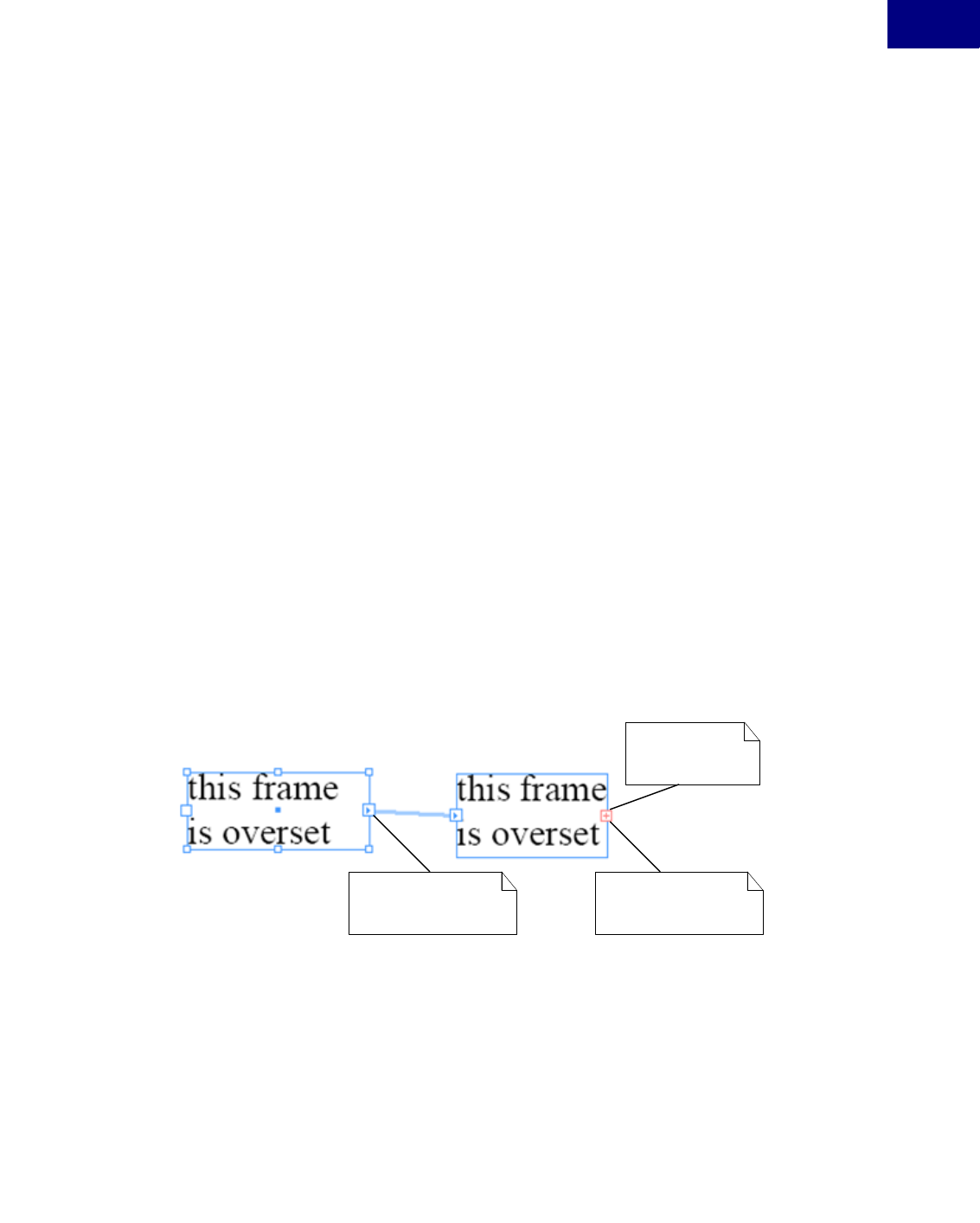
Text 77
Text
Text Containers
Finding the Parcel that displays a TextIndex
Given a particular text story (ITextModel), you can find the parcel (IParcel) into which the text
from a particular index in the text model is composed.
Solution
The text must be fully composed. Follow these steps:
1. Use ITextModel::QueryTextParcelList to get the text parcel list (ITextParcelList).
2. ITextParcelList::GetParcelContaining returns the key for the parcel you need.
3. Get the parcel list interface (IParcelList) from the same boss object as ITextParcelList.
4. IParcelList::GetParcelContaining returns the required parcel (IParcel).
Sample Code
SnpTextModelHelper::QueryParcelContaining code snippet
Detecting Overset Stories
Figure 1 shows a story that is overset: the combined area of all linked frames associated with the
story is not large enough to contain the text in the story. The figure shows a story associated
with two linked frames. Both frames are overset, as is the story. You can determine whether a
story is overset.
FIGURE 1An Overset Story with Two Frames
Text frame is overset Text frame is overset
Story is overset

Text
Text Containers
78
Solution
The text must be fully composed. Follow these steps:
1. Navigate to the frame list boss (kFrameListBoss), in one of two ways. If dealing with a page
item, you can use IHierarchy::QueryChild, then IMultiColumnTextFrame::QueryFrameList
from the multi-column boss object (kMultiColumnItemBoss). If dealing with a text story
(kTextStoryBoss), you can use ITextModel::QueryFrameList.
2. Use ITextUtils::IsOverset (the interface is available on the kUtilsBoss) to determine whether
all the text is represented in a parcel. If only the final (required) carriage return is overset,
the text is not defined to be overset.
Sample Code
SnpEstimateTextDepth::IsStoryOverset code snippet
Detecting Overset Text Frames
Figure 1 shows two linked text frames associated with a story. Both are said to be overset, as the
text in the story overruns each frame. You can determine whether a text frame is overset.
Solution
If the frame has a span of 0 (zero), it is underset (i.e., no characters flow into it from a preceding
frame). If the final character of the primary story thread, not including the mandatory carriage
return, does not exist in the frame, it is overset.
The text must be fully composed. Follow these steps:
1. Use IMultiColumnTextFrame::TextSpan to get number of characters in the frame. If this is 0
(zero), the frame is underset.
2. Use IMultiColumnTextFrame::TextStart to get the starting character for the primary story
thread within the frame. Add the text span to get the primary story thread index for the last
character displayed in the text frame.
3. Use IMultiColumnTextFrame::QueryTextModel to get the text model (ITextModel) inter-
face on the text story (kTextStoryBoss).
4. Use ITextModel::GetPrimaryStoryThreadSpan to get the number of characters in the pri-
mary story thread. If this number is greater than the index of the last character in the frame
(calculated above), the text frame is overset.
Sample Code
SnpEstimateTextDepth::IsTextFrameOverset code snippet

Text 79
Text
Text Containers
Detecting Overset Parcels
You can determine whether the characters in a particular story thread extend beyond a partic-
ular parcel (IParcel).
Solution
If the parcel has a span of 0 (zero), it is underset (i.e., no characters flow into it from a preced-
ing parcel). If the final character of the primary story thread, not including the mandatory car-
riage return, does not exist in the parcel, it is overset.
This solution depends on the text being fully composed.
To detect is a parcel is overset, follow these steps:
1. Use IParcel::GetParcelKey to obtain the parcel key.
2. Use IParcel::QueryParcelList on the parcel object to get the parcel list (IParcelList) that
maintains the relationship between text story threads and associated parcels.
3. Get the text parcel list interface (ITextParcelList) from the same boss object.
4. Use ITextParcelList::GetParcelIsEmpty to determine whether the parcel is empty. If so, is
underset.
5. Use ITextParcelList::QueryStoryThread to get the story thread (ITextStoryThread) that rep-
resents the text in the parcel list.
6. Use ITextStoryThread:GetTextSpan to get the number of characters in the text story thread
that is composed into this particular parcel list.
7. Use ITextParcelList::GetParcelContaining to access the parcel key that contains the final
character for the text story thread. If this parcel key differs from the parcel key obtained
above, the parcel is overset.
Sample Code
SnpEstimateTextDepth::IsParcelOverset code snippet
Determining if Text is “On a Path” (TOP)
Given a particular index, you can determine whether the composed text referred to by the
index falls on a spline (rather than within a standard text frame (kFrameItemBoss).
Solution
The text must be fully composed. Follow these steps:
1. Obtain the frame item (in this case a kTOPFrameItemBoss) for the index as you would any
other frame item. See “Finding the Page Item that displays a given TextIndex” on page 75.
2. Test the frame item for the signature interface, ITOPFrameData.

Text
Text Containers
80
Threading Text Frames
Given two text containers (IMultiColumnTextFrame), you can link them to allow one story to
be associated with both.
Solution
Use ITextUtils::LinkTextFrames to link the two frames. If you need finer control over what
happens with the text contained within the pre-existing text frames, first manipulate the text
content in the required fashion (see “Story Text” on page 55), then use the kTextLinkCmdBoss
to link the frames. This command requires the kMultiColumnItemBoss for both frames to be
linked to be placed on the command’s item list.
Sample Code
zSnpManipulateTextFrame::CanThreadTextFrames code snippet
zSnpManipulateTextFrame::ThreadTextFrames code snippet
Unthreading Text Frames
Given two linked text frames (IMultiColumnTextFrame), you can unlink them.
Solution
Use kTextUnlinkCmdBoss, passing in the frame the break is to occur after, on the command
item list.
Sample Code
zSnpManipulateTextFrame::CanUnlinkTextFrame code snippet
zSnpManpulateTextFrame::UnlinkTextFrames code snippet
Navigating between Threaded Text Frames
Given a text frame (IMultiColumnTextFrame), you can navigate to the next frame through
which the primary story thread flows.
Solution
1. Use IMultiColumnTextFrame ::QueryFrameList to get the list of frames.
2. IFrameList::GetFrameIndex returns the index of the current frame in the list of frames.
3. Use IFrameList::GetFrameCount to get the total number of frames in the list.
4. Use IFrameList::QueryNthFrame to get a specified frame.
Sample Code
SnpManipulateTextFrame::InspectFrameList code snippet

Text 81
Text
Text Containers
Modifying Text Frame Options
A text frame has a set of associated options that describe how the text flows within the con-
tainer, including the following:
zNumber of columns.
zColumn width.
zGutter (space between columns) width.
You can modify the options for a text frame.
Solution
To change the frame options for the current selection, use the ITextFrameOptionsSuite suite.
For example, to increment the number of columns, follow these steps:
1. Use ISelectionUtils::QuerySuite (on the kUtilsBoss class) to get the text frame options suite
interface (ITextFrameOptionsSuite).
2. Use ITextFrameOptionsSuite::GetColumnsAndGutter to get the number of existing col-
umns.
3. Use ITextFrameOptionsSuite::CanApplyTextFrameOptions to test the ability to modify the
frame options.
4. This suite uses a data object to maintain the collection of options available for text frame.
The API provides an implementation that can be used (see ITextFrameOptionsData inter-
face available on kObjStylesTFOptionsCollectDataBoss). Create this boss object, and set the
required state.
5. Use ITextFrameOptionsSuite::SetTFOColumns to apply the new columns value defined in
the data object to the selection.
To change the frame options for an arbitrary text frame (IMultiColumnTextFrame on kMulti-
ColumnItemBoss), use API-supplied commands. See Figure 2).
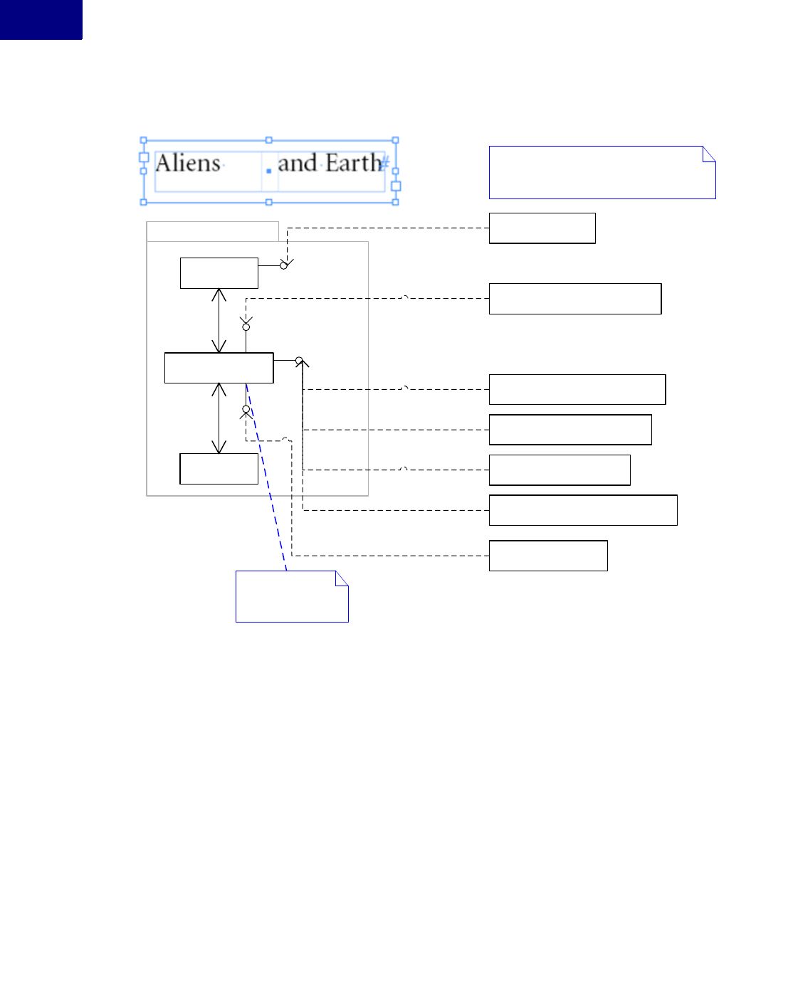
Text
Text Containers
82
FIGURE 2Commands that Mutate Text Frame Options
Sample Code
zSee the SnpManipulateTextFrame::IncrementNumberOfColumns code snippet for an
example of using lower-level commands to modify text-frame options.
Modifying the Default Text Frame Options
Description
A text frame has a set of associated options that describe how the text flows within the con-
tainer. These options exist on the workspace (the session workspace, which is inherited by new
documents on the document workspace). They include the following:
zNumber of columns.
zColumn width.
zGutter (space between columns) width.
«boss class»
kSplineItemBoss
«boss class»
kMultiColumnItemBoss
1
1
«boss class»
kFrameItemBoss
1
1..*
ITextInset
ITextColumnSizer
IMultiColumnTextFrame
Text frame
IBoolData
IID_IIGNOREWRAP
The item list for the commands given below
should refer to the kSplineItemBoss objects
of the text frames to be changed.
«boss class»
kSetTextInsetCmdBoss
«boss class»
kChangeNumberOfColumnsCmdBoss
«boss class»
kSetFrameMinFirstLineOffsetCmdBoss
«boss class»
kSetMaxVJInterParaSpaceCmdBoss
«boss class»
kSetFrameVertJustifyCmdBoss
«boss class»
kSetFrameFirstLineOffsetMetricCmdBoss
«boss class»
kSetIgnoreWrapCmdBoss

Text 83
Text
Text Containers
You can modify the default options for a text frame.
Solution
Use the ITextFrameOptionsSuite suite. For example, to increment the number of columns, fol-
low these steps:
1. Use ISelectionUtils::QuerySuite (on the kUtilsBoss class) to get the text frame options suite
interface (ITextFrameOptionsSuite). With no open document, the suite applies to the ses-
sion workspace defaults. With a document open and no selection, the suite applies to the
document workspace defaults.
2. Use ITextFrameOptionsSuite::GetColumnsAndGutter to get the number of existing col-
umns.
3. Use ITextFrameOptionsSuite::CanApplyTextFrameOptions to test the ability to modify the
frame options.
4. This suite uses a data object to maintain the collection of options available for text frame.
The API provides an implementation that can be used (see ITextFrameOptionsData inter-
face available on kObjStylesTFOptionsCollectDataBoss). Create this boss object, and set the
required state.
5. Use ITextFrameOptionsSuite::SetTFOColumns to apply the new columns value defined in
the data object to the selection.
Alternatively, to modify the default settings regardless of whether a document is open (for
example, to target a particular document or the session default value rather than the front-most
document default value), use kSetFramePrefsCmdBoss. See Figure 3, which shows the relation-
ships between workspaces and text-frame options.
FIGURE 3Commands that Mutate and Use Default Text-Frame Options
«boss class»
kDocWorkspaceBoss
«boss class»
kWorkspaceBoss
ITextOptionsITextOptions
Session specific defaults that are
inherited by new documents.
Document specific defaults that are
inherited by new text frames.
Command used to change ITextOptions.
«boss class»
kSetFramePrefsCmdBoss
«boss class»
kCreateMultiColumnItemCmdBoss
Text Frame
Command used to create
new text frame. The defaults
can be overriden by passing
values in this command's
data interfaces..
IWorkspace IWorkspace

Text
Rendered Text
84
Sample Code
See the SnpManipulateTextPresentation::IncrementFrameColumns code snippet for an exam-
ple of using the ITextFrameOptionsSuite suite interface to manipulate default text-frame
options.
Manipulating Text Wrap
A page item can define a relationship with text. This relationship specifies what happens when
a text frame overlaps the page item, and it affects line-wrapping behavior. The behavior that
can be specified includes the following:
zWrapping text around the page item bounding box.
zWrapping text around the spline shape.
zFlowing text only where the frame and bounding box (or spline shape) of the page item
intersect.
You can prescribe the wrapping behavior a page item can enforce on text it overlaps.
Solution
Use HighLevelAPI::ITextWrapFacade to control text-wrapping behavior.
Sometimes, you may need to use lower-level API commands such as the following:
zkStandOffModeCmdBoss
zkStandOffFormCmdBoss
zkStandOffMarginCmdBoss
Sample Code
SnpManipulateTextFrame::ChangeTextWrapMode code snippet
Rendered Text
This section contains common use cases related to rendered text. The set of glyphs that make
up rendered text is called the wax.
Getting Notified of Composition Completion
You can when text is composed.
Solution
On completion of composition within a text frame, the message kRecomposeBoss is transmit-
ted along the IID_IFRAMECOMPOSER protocol to the frame item(kFrameItemBoss), spread
(kSpreadBoss), and document (kDocBoss). To be notified of composition completion, attach

Text 85
Text
Rendered Text
an observer to one of these objects. Which object you attach to depends on whether you want
to restrict the notifications to a single spread or page item.
Iterating the Wax for a Story
The SnpInspectTextModel::ReportWaxLineLeading SDK snippet iterates over each wax line
and reports the leading for all lines of text in a story.
You must keep your IWaxIterator in scope, to keep an IWaxLine interface pointer valid. The
following sample code demonstrates a common error caused when IWaxIterator is not kept in
scope:
static IWaxLine* QueryWaxLineContaining(
IWaxStrand* waxStrand, const TextIndex& textIndex)
{
IWaxLine* line = nil;
do{
K2::scoped_ptr<IWaxIterator> waxIterator =
waxIterator(waxStrand->NewWaxIterator());
if (waxIterator == nil)
break;
IWaxLine* waxLine = waxIterator->GetFirstWaxLine(textIndex);
if (waxLine == nil)
break;
line = waxLine;
line->AddRef();
// associated IWaxLine no longer valid when IWaxIterator is destructed.
} while(false);
return line; // Not a valid IWaxLine
}
To maintain references to several wax lines simultaneously, keep a wax iterator in scope for
each wax line. The sample code discussed in “Estimating the Composed Depth of Text in a
Frame or Parcel” on page 86 demonstrates this.
Creating Wax Lines and Wax Runs
Wax lines and wax runs are created by a paragraph composer. The SingleLineComposer SDK
sample is a paragraph composer that works on one line at a time. This sample demonstrate the
construction of wax lines and wax runs.

Text
Rendered Text
86
Finding the Wax displayed for a Range of Text
You can access the wax for a particular range of text.
Solution
The text must be fully composed. Follow these steps:
1. Navigate to the frame list boss (kFrameListBoss), in one of two ways. If dealing with a page
item, use IHierarchy::QueryChild, then IMultiColumnTextFrame ::QueryFrameList from
the multi-column boss object (kMultiColumnItemBoss). If dealing with a text story (kText-
StoryBoss), use ITextModel::QueryFrameList.
2. Obtain the wax strand (IWaxStrand) from the same boss object.
3. Use IWaxStrand::NewWaxIterator to get and iterator for the composed wax.
4. IWaxStrand::GetFirstWaxLine (IWaxStrand::GetNextWaxLine) returns a wax line (IWax-
Line on kWaxLineBoss).
Sample Code
SnpEstimateTextDepth code snippet
Estimating the Composed Depth of Text in a Frame or Parcel
You can estimate the depth of text in a text frame (kFrameItemBoss).
Solution
The text must be fully composed. Follow these steps:
1. Navigate to the frame list boss (kFrameListBoss), in one of two ways. if dealing with a page
item, use IHierarchy::QueryChild, then IMultiColumnTextFrame::QueryFrameList from
the multi-column boss object (kMultiColumnItemBoss). if dealing with a text story (kText-
StoryBoss), use ITextModel::QueryFrameList.
2. Obtain the wax strand (IWaxStrand) from the same boss object.
3. User IWaxStrand::NewWaxIterator to get an iterator for the composed wax. It takes an
index into the wax; determine the start character index and end character index for the
range of text you want to estimate. Create an iterator for each of these.
4. Use IWaxStrand::GetFirstWaxLine to get the wax line (IWaxLine on kWaxLineBoss) for
each iterator. You now have the wax line (IWaxLine) relating to the first and last lines in the
frame/parcel.
5. Use IWaxLine::GetYPosition to get the y position for the wax line. For horizontal text, the
depth of the text in a frame can be roughly estimated as the y position of the last line of wax
in the frame, minus the y position of the first line, plus the leading for the first line.

Text 87
Text
Text Composition
Sample Code
SnpEstimateTextDepth code snippet
Text Composition
The Need to Recompose Text in a Story
Normally, damaged text that requires recomposition is fixed by background composition. Your
code, however, may find the text in which it is interested is damaged; if so, it can force recom-
position to fix the damage. For example, always check for damage before scanning the wax or
relying on any spans that indicate the range of text stored in a frame or parcel.
Recomposing Text
You can recompose text within a story by either the index into the text model (TextIndex) or
the visual container used to display the text (a frame or parcel). The most general approach is
to use the parcel list composer (ITextParcelListComposer), which works for any text that can
be composed. For example, it works whether the text is displayed in a frame or a table cell.
Do not assume all text in the text model can be composed. Some features may store text in the
text model that is never composed for display. See HidTxtParcelListComposer.cpp in the Hid-
denText example.
Example 4 through Example 7 show the most common approaches used to force text to be
recomposed.
EXAMPLE 4 Recomposing Story Text by TextIndex using ITextParcelListComposer
// Recompose text up to a given TextIndex. By using the parcel list
// composer, you can compose text that is displayed in frames, tables, or
// any other feature that supports text composition.
static void MyRecomposeThruTextIndex(ITextModel* textModel, TextIndex at)
{
if (at >= 0 && at < textModel->TotalLength()) {
InterfacePtr<ITextParcelList> tpl(textModel->QueryTextParcelList(at));
InterfacePtr<ITextParcelListComposer> tplc(tpl, UseDefaultIID());
if (tplc) {
tplc->RecomposeThruTextIndex(at);
}
}
}

Text
Text Composition
88
EXAMPLE 5 Recomposing by Parcel using ITextParcelListComposer
// Recompose text in the given parcel and preceding damaged parcels.
static void MyRecomposeThruParcel(IParcel* parcel)
{
InterfacePtr<IParcelList> pl(parcel->QueryParcelList());
InterfacePtr<ITextParcelList> tpl(pl, UseDefaultIID());
InterfacePtr<ITextParcelListComposer> tplc(tpl, UseDefaultIID());
if (tplc)
{
const ParcelKey key = parcel->GetParcelKey();
tplc->RecomposeThruNthParcel(pl->GetParcelIndex(key));
}
}
EXAMPLE 6 Recomposing Story Text by TextIndex using IFrameListComposer
// Recompose text in the primary story thread up to a given TextIndex.
static void MyRecomposeThruTextIndexByFrameList(ITextModel* textModel, TextIndex
at)
{
if (at >= 0 && at < textModel->GetPrimaryStoryThreadSpan()) {
InterfacePtr<IFrameList> frameList(textModel->QueryFrameList());
InterfacePtr<IFrameListComposer> flc(frameList, UseDefaultIID());
if (flc) {
flc->RecomposeThruTextIndex(at);
}
}
}
EXAMPLE 7 Recomposing by Text Frame using IFrameComposer
// Recompose text in the given frame and preceding damaged frames.
static void MyRecomposeThruFrame(ITextFrameColumn* textFrame)
{
InterfacePtr<IFrameComposer> fc(textFrame, UseDefaultIID());
if (fc != nil) {
fc->RecomposeThruThisFrame();
}
}
Recomposing all Stories in a Document
IGlobalRecompose provides methods that force all stories to recompose. The interface marks
damage that forces recomposition, even though the stories have not changed. See Example 8.
EXAMPLE 8 Recompose all Stories in a Document
static void MyRecomposeAllStories(IDocument* document)
{
InterfacePtr<IGlobalRecompose> globalRecompose(document, UseDefaultIID());
if (globalRecompose != nil) {
globalRecompose->RecomposeAllStories();
globalRecompose->ForceRecompositionToComplete();

Text 89
Text
Text Composition
}
}
Getting Notified when Text is Recomposed
It is hard to observe recomposition, because to do so, you need to maintain an observer on each
frame (kFrameItemBoss). See “Observing Changes that affect Text” on page 89 for an alterna-
tive approach that relies on observing the cause rather than the effect.
Observing Changes that affect Text
Because many types of changes affect text, observing changes quickly becomes complex; for
example:
zChanges to the geometry of the text layout (such as resize and text inset) are observed using
a document observer.
zChanges to character and text attributes are observed by attaching an observer to each text
model of interest.
zChanges to text styles are observed by attaching observers to the style name tables in the
workspace.
An optimal strategy is to be aware recomposition has occurred and not try to observe every-
thing that might happen.
Any change to text, attributes, styles, or layout that affects lines breaks causes damage. The
change counter on the frame list (IFrameList::GetChangeCounter) is incremented any time
something happens that requires recomposition. No notification is broadcast when the change
counter is incremented, so you cannot catch the change immediately. In general, though,
immediate feedback is not needed; the fact that something changed in a way that affects text
needs to be determined only at fixed times.
For example, export a story from InDesign to a copy-editor application. When the story is
imported back into InDesign, you may want to tell the user about changes to the layout or text
styling that were made through InDesign. To arrange this, cache the value of IFrameL-
ist::GetChangeCounter when you export the story. You can then compare this cached value to
the actual value when the story is imported. To notify users when layout changes are made that
affect text, check IFrameList::GetChangeCounter using an idle task.
Controlling the Paragraph Composer used to Compose Text
In the “Text Fundamentals” chapter of Adobe InDesign CS4 Programming Guide, see the section
on “Paragraph Composers” for information on how to control the paragraph composer used to
compose text. Programmatically, set the kTextAttrComposerBoss paragraph attribute to refer-
ence the paragraph composer to be used.

Text
Text Composition
90
Scanning Text
If you require access to only the character code data of a story, the simplest API to use is the
TextIterator class. There are many code snippets that show how it is used, including SnpIn-
spectTextModel::ReportCharacters. If you do not want to process character by character, use
IComposeScanner to access the characters in a story in larger chunks. For a fully functional
example, see the TextExportFilter SDK plug-in.
To access styled runs of text, use IComposeScanner. For an example, see “Estimating Text
Width” on page 90.
Estimating Text Width
You can estimate of the width of a character string for a given horizontal font using IFontIn-
stance::MeasureWText. Code in the FrameLabel SDK sample plug-in FrmLblAdornment::Get-
PaintedBBox() demonstrates how to do this.
To apply this estimate to a range of text in a story, use IComposeScanner to access runs of char-
acters with the same drawing style. Example 9 illustrates this.
EXAMPLE 9 EstimateTextWidth
/** Returns estimated width of given text range by scanning text using
IComposeScanner, then estimating width using IFontInstance.
@param textModel text model to be scanned.
@param startingIndex of the first character to be measured.
@param span the number of characters to be measured.
@return total estimated width of a given text range.
*/
static PMReal EstimateTextWidth(
ITextModel* textModel, const TextIndex& startingIndex, const int32& span)
{
// Use the story's compose scanner to access the text.
InterfacePtr<IComposeScanner> composeScanner(textModel, UseDefaultIID());
ASSERT(composeScanner);
if (!composeScanner) return PMReal(0.0);
// Width of the given text range.
PMReal totalWidth = ::ToPMReal(0.0);
// Drawing style for the current run.
InterfacePtr<IDrawingStyle> drawingStyle(nil);
// Font for the current run.
InterfacePtr<IFontInstance> fontInstance(nil);
// Current index into the text model.
TextIndex index = startingIndex;
// Number of characters still to be processed
int32 length = span;
// Number of characters returned by the compose scanner.
int32 chunkLength = 0;
// Character buffer.
WideString run;

Text 91
Text
Text Composition
// The compose scanner may not return all the text
// in one call. So call it in a loop.
while (length > 0) {
// Drawing style for the next run.
IDrawingStyle* nextDrawingStyle = nil;
// Get a chunk of text.
TextIterator iter = composeScanner->QueryDataAt(
index, &nextDrawingStyle, &chunkLength);
if (iter.IsNull() || chunkLength == 0) break; // no more text.
ASSERT(nextDrawingStyle);
if (!nextDrawingStyle) break;
// If the drawing style changes measure the width of
// buffered text and switch to the new style and font.
if (nextDrawingStyle != drawingStyle) {
if (run.CharCount() > 0) {
totalWidth += EstimateStringWidth(run, fontInstance);
run.Clear();
}
drawingStyle.reset(nextDrawingStyle);
fontInstance.reset(drawingStyle->QueryFontInstance(kFalse)); // assume horizontal.
ASSERT(fontInstance);
if (!fontInstance) break;
} // end drawing style change
else {
// No change to drawing style but we still need to release.
nextDrawingStyle->Release();
nextDrawingStyle = nil;
}
// Buffer the characters returned by the compose scanner.
if (chunkLength < length) {
// Add all the characters to the run
iter.AppendToStringAndIncrement(&run, chunkLength);
}
else {
// Add only the characters we want to the run.
// The compose scanner may more data than we need.
iter.AppendToStringAndIncrement(&run, length);
}
// Prepare for next iteration
index += chunkLength;
length -= chunkLength;
} // end while
// Process any buffered text.
if (run.CharCount() > 0 && fontInstance != nil) {
totalWidth += EstimateStringWidth(run, fontInstance);
}
return totalWidth;
} // end EstimateTextWidth

Text
Text Hyphenation
92
Measuring Composed Width or Depth more Accurately
Have the text flow into a story with a layout (text frames), and compose it with whatever para-
graph composer you want. You can then scan the wax generated to find the width and depth
measurement you want. This is the only way you can account for the many properties that
affect the composed text, such as the paragraph composer’s line-breaking algorithm, hyphen-
ation, and text-style changes like font, point size, and leading, as well as the effect of layout
properties like text wrap and first baseline offset. The SnpEstimateTextDepth SDK code snip-
pet provides an example of wax scanning.
It is much harder to estimate the width or depth of text without having the text of a story flow
into a layout. In principle, you can use the scanner and drawing style (IComposeScanner and
IDrawingStyle) to scan the text and apply your own line-breaking rules. This quickly becomes
a sort of mini paragraph composer and requires some of the code in sample plug-ins like Sin-
gleLineComposer. Look at this sample’s SLCTileComposer class for the kind of code you might
use.
Text Hyphenation
Hyphenation is a service provided to composition. A composition engine use the set of
hyphenation providers installed and registered with the application. Hyphenation providers are
responsible for providing the set of hyphenations points that exist for a particular word. This is
used by the composition engine to help define line-breaking policies. The hyphenation service
can be controlled by a set of paragraph attributes. This section contains use cases for control-
ling the default application hyphenation service.
Turning Off Hyphenation
For a particular paragraph, you can turn off hyphenation.
Solution
Hyphenation function is controlled on a per-paragraph basis, using the kTextAttrHyphen-
ModeBoss (signature interface ITextAttrHyphenMode) paragraph-level text attribute.
While four “modes” are defined by the interface (off, manual, dictionary, and algorithm), the
default supplied hyphenation service uses only manual and algorithm. In manual mode, only
hard hyphens and discretionary hyphens (added to the text using “Insert Special Character”)
are used. For the algorithm mode, hyphenation behavior is determined by hard hyphens, dis-
cretionary hyphens, hyphenation points provided by the dictionary, and a sophisticated algo-
rithm used to determine best hyphenation.
Related Documentation
z“Modifying the Value of an Attribute for Text” on page 68

Text 93
Text
Text Hyphenation
Sample Code
SnpHyphenation
Specifying Hyphenation of Capitalized Words
With the default hyphenation service, you can control hyphenation of capitalized words.
Solution
Use the kTextAttrHyphenCapBoss paragraph-level text attribute (interface ITextAttrBoolean).
If this is turned off, capitalized words with discretionary hyphens are still hyphenated.
Related Documentation
z“Modifying the Value of an Attribute for Text” on page 68
Sample Code
SnpHyphenation
Specifying Hyphenation of Last Word in a Paragraph
With the default hyphenation service, you can control hyphenation of the last word in a para-
graph.
Solution
Use the kTextAttrHyphenLastBoss paragraph-level text attribute (interface ITextAttrBoolean).
If this is turned off, last words with discretionary hyphens are still hyphenated.
Related Documentation
z“Modifying the Value of an Attribute for Text” on page 68
Sample Code
SnpHyphenation
Specifying the Minimum Number of Characters before a Hyphen
Solution
Use the kTextAttrMinBeforeBoss paragraph-level attribute (interface ITextAttrInt16).
If there are discretionary hyphens before the first hyphenation point, they are ignored; that is,
the word does not hyphenate at discretionary hyphens that occur before the minimum number
of characters, as specified by this attribute.
Related Documentation
z“Modifying the Value of an Attribute for Text” on page 68

Text
Text Hyphenation
94
Sample Code
SnpHyphenation
Specifying the Minimum Number of Characters after a Hyphen
Solution
Use the kTextAttrMinAfterBoss paragraph-level attribute (interface ITextAttrInt16).
If there are discretionary hyphens after a hyphenation point, they are ignored; that is, the word
does not hyphenate at discretionary hyphens that occur after the minimum number of charac-
ters, as specified by this attribute.
Related Documentation
z“Modifying the Value of an Attribute for Text” on page 68
Sample Code
SnpHyphenation
Specifying the Minimum Length of a Candidate Word for Hyphenation
Solution
Use the kTextAttrShortestWordBoss (interface ITextAttrInt16) paragraph-level attribute.
If there are discretionary hyphens in a word whose length is less than that specified by this
attribute, they are ignored; that is the word is never be a candidate for hyphenation).
Related Documentation
z“Modifying the Value of an Attribute for Text” on page 68
Sample Code
SnpHyphenation
Specifying the Maximum Number of Consecutive Hyphens
You can define the maximum number of consecutive hyphens (the ladder) for text.
Solution
Use the kTextAttrHyphenLadderBoss paragraph-level attribute (interface ITextAttrInt16).
Related Documentation
z“Modifying the Value of an Attribute for Text” on page 68

Text 95
Text
Text Hyphenation
Sample Code
SnpHyphenation
Specifying the Hyphenation Zone
The hyphenation zone dictates the minimum space required by the word that is the hyphen-
ation target. If that space is not available (i.e., the previous word encroaches on this zone), no
hyphenation is done, and the hyphenation candidate is moved to the next line. You can control
this function.
Solution
Use the kTextAttrHyphenZoneBoss paragraph-level attribute (interface ITextAttrRealNum-
ber). This specifies the minimum width assigned to a candidate word before a hyphenation
point (modulo any preceding whitespace), before the word is pushed to the next line.
Related Documentation
z“Modifying the Value of an Attribute for Text” on page 68
Sample Code
SnpHyphenation
Specifying the Hyphenation Weight
The algorithm used by the composer (in conjunction with the hyphenation service) to deter-
mine the hyphenation policy for text is complex. The hyphenation weight is a heuristic input
used to guide the number of resulting hyphens. You can control this function.
Solution
Use the kTextAttrHyphenWeightBoss paragraph-level attribute (interface ITextAttrInt16).
Related Documentation
z“Modifying the Value of an Attribute for Text” on page 68
Sample Code
SnpHyphenation

Text
Fonts
96
Marking Text Unbreakable
Description
Text can be specified as no break; that is, the text is not to be considered as a candidate for
hyphenation.
Solution
Use the kTextAttrNoBreakBoss character-level attribute (interface ITextAttrBoolean).
Related Documentation
z“Modifying the Value of an Attribute for Text” on page 68
Sample Code
SnpHyphenation
Fonts
Iterating through available Fonts
You can determine all fonts available to the application through the font subsystem.
Solution
The SnpInspectFontMgr::ReportAllFonts code snippet shows how to iterate through all fonts
available to the application, by calling IFontMgr directly.
The SnpPerformFontGroupIterator code snippet shows how to implement a FontGroupItera-
torCallBack (see IFontMgr.h) to iterate all fonts.
Controlling the Set of Installed Fonts
You can restrict the set of available fonts to a predefined set.
Solution
Controlling the set of installed fonts is an operating-system-wide issue that cannot be solved
directly with InDesign APIs. InDesign APIs can be used to detect installed fonts (in both the
system folder and application fonts folder). To manage fonts, use operating-system platform
APIs.

Text 97
Text
Fonts
Finding a Font
You can obtain a particular, named font.
Solution
The solution depends on what information you have that identifies the font. See the SnpIn-
spectFontMgr code snippet for several approaches, such as SnpInspectFontMgr::QueryFont.
Alternatively, implement a FontGroupIteratorCallBack (see SnpPerformFontGroupItera-
tor.cpp) that finds the name of a PostScript font, given the full name of the font as returned by
IPMFont::AppendFullName. For example, if you search for Courier Bold, you get the name of
the PostScript font Courier-Bold.
Finding the Font used to Display a Story's Text
Solution
Use the values of the kTextAttrFontUIDBoss and kTextAttrFontStyleBoss text attributes. The
UID in kTextAttrFontUIDBoss’s ITextAttrUID interface can be used to instantiate an IFont-
Family object. The PMString in kTextAttrFontStyleBoss’s ITextAttrFont interface gives you the
stylistic variant (for example, Regular or Bold). From these, you can find the name of the font,
as shown in Example 10:
EXAMPLE 10 Finding a Font Name from Text Attributes
static PMString FindFontName(
IDataBase* db,
ITextAttrUID* fontUID,
ITextAttrFont* fontStyle)
{
InterfacePtr<IFontFamily> family(db, fontUID->GetUIDData(), UseDefaultIID());
InterfacePtr<IPMFont> font(family->QueryFace(fontStyle->GetFontName()));
PMString fontName;
font->AppendFontName(fontName);
return fontName;
}
Alternately, use IComposeScanner to get the drawing style (IDrawingStyle) at a particular
index in the text model, as shown in Example 11:
EXAMPLE 11 Finding a Font Name from the Drawing Style
InterfacePtr<IComposeScanner> scanner(textModel, UseDefaultIID());
IDrawingStyle* style = scanner->GetCompleteStyleAt(textIndex);
InterfacePtr<IPMFont> font(style->QueryFont());

Text
Fonts
98
Changing the Font used to Display a Story's Text
You can change the font used for either text in a story or a style that can be applied to text in a
story.
Solution
To set the font used to display text in a story, override the kTextAttrFontUIDBoss and kTextAt-
trFontStyleBoss text attributes in the text model. For information on overriding text attributes,
see the “Text Fundamentals” chapter in Adobe InDesign CS4 Programming Guide.
To set the font for a text style, add or change the value of the kTextAttrFontUIDBoss and kTex-
tAttrFontStyleBoss text attributes in the style.
Getting the Name of a Font from its UID
Solution
Use the UID to instantiate an IFontFamily interface, and get the name from there. Typically, the
UID of a font is obtained from the kTextAttrFontUIDBoss text attribute, IDocFontMgr::Get-
FontGroupUID, or IDocumentFontUsage::GetNthUsedFontUID.
Obtaining the List of Fonts used in all Stories
You can get information on the present or missing fonts used for the text in a story (not includ-
ing non-rendered text, like that used in the notes feature).
Solution
SnpInspectFontMgr::ListFontsInDocument shows how to use IUsedFontList on kDocBoss to
determine which fonts are in use in a document’s stories. SnpInspectFontMgr::ReportDocu-
mentFontUsage shows how to use the simpler IDocumentFontUsage API (existing on kDoc-
Boss), a higher-level facade over the fonts used in a document. This mechanism does not
report the fonts used in text for features like notes (text that is not displayed as part of the
story). To catch all fonts used in all text in a story, regardless of whether it is visible in an
exported asset, use the solution in “Finding the Font used to Display a Story's Text” on page 97.
Obtaining the List of Fonts used in or referenced from Placed Assets
You can get font information from (EPS or PDF) assets placed in a document.
Solution
IFontNames (on kEPSItem or kPlacedPDFItemBoss) holds the set of fonts required by or
embedded in a particular placed asset. SnpInspectFontMgr::TestAssetsForFonts shows how to
obtain font information for placed assets. SnpInspectFontMgr::ReportDocumentFontUsage
shows how to use the simpler IDocumentFontUsage API (existing on kDocBoss, a higher-level
facade over the fonts used in a document.

Text 99
Text
Fonts
Obtaining the List of Fonts persistent in a Document
The set of fonts that are persistent in a document do not need to match the fonts used. You can
access all fonts that exist in the persistent document.
Solution
Use IDocFontMgr (on session or document workspace) to access the fonts in the workspace.
For the session workspace, this represents the set of default fonts. For the document workspace,
this includes all fonts used in the document (text frames, text notes, etc.); however, it does not
include fonts contained in placed assets.
Determining Restrictions that Apply to Installed Fonts
Given a particular font, sometimes it is useful to detect any use restrictions that might apply.
Solution
SnpInspectFontMgr::ReportFontsWithRestrictions shows how to determine any use restric-
tions a particular font (IPMFont) might have.
Detecting Font Subsystem Changes
If the user modifies the fonts installed during an instance of the application, the cooltype font
subsystem is updated. You can be called when the application detects the font subsystem was
updated (e.g., a font was added or removed).
Solution
Attach an observer to the session (obtained from GetExecutionContextSession()) using the
IID_IFONTMGR protocol, listening for the kFontSystemChangedMessage.
Detecting Accesses to Unavailable Fonts
Your plug-in can be called when an attempt is made to access a nonexistent font.
Solution
Missing font responder services (IResponder implementation with service ID kMissingFon-
tSignalResponderService) are called whenever the application queries the font manager for an
unavailable font. The responder has the opportunity to respond with an alternative font to use
(by populating the IMissingFontSignalData::SetResult with a valid font).
Only one missing font responder can dictate the font-replacement policy.

Text
Find/Change Text
100
Dealing with Font Face Variants
A font face can be described using different names (for example, “Regular” or “Plain” for a
plain font face, “Italic” or “Cursive” for an italic font face, and “Bold” or “Heavy” for a bold font
face).
Solution
ITextUtils has four methods that can help you deal with font face variants:
zITextUtils::IsPlainStyleName
zITextUtils::IsItalicStyleName
zITextUtils::IsBoldStyleName
zITextUtils::IsBoldItalicStyleName
These methods implement the naming heuristics that define alternative names for font faces.
Given a particular font family (IFontFamily), you can get the index that identifies the correct
font face, using the API IFontFamily::CorrectVariantIndex.
Find/Change Text
InDesign gives users more control over the parts of a document that can searched and modi-
fied via the find/change dialog. Similarly, there are interfaces that allow you to work more
effectively with find/change.
InDesign not only provides interfaces to find/change plain text, but also to find/change text
using grep (Global Regular Expression Parser) strings, glyphs using glyph IDs, and objects
using frame attributes. Find/change object are discussed in the “Layout Fundamentals” chapter
of Adobe InDesign CS4 Products Programming Guide. This section contains use cases dealing
with text, grep, and glyph search.
For more information, see the “Text Fundamentals” and “Layout Fundamentals” chapters of
Adobe InDesign CS4 Programming Guide.
Related APIs
zIFindChangeOptions on kWorkspaceBoss maintains all find/change options.
zIFindChangeService on kFindChangeServiceBoss provides find/change individual
find/change service.
zCommands — kCaseSensitiveCmdBoss, kEntireWordCmdBoss, kFindChangeFormatCm-
dBoss, kFindChangeGlyphIDCmdBoss, kFindSearchModeCmdBoss, kFindStringCmd-
Boss, kIncludeFootnotesCmdBoss, kIncludeHiddenLayersCmdBoss,
kIncludeLockedLayersForFindCmdBoss, kIncludeLockedStoriesForFindCmdBoss, kInclu-
deMasterPagesCmdBoss, kKanaSensitiveCmdBoss, kScopeCmdBoss, kReplaceAllTextCm-

Text 101
Text
Find/Change Text
dBoss kReplaceFindTextCmdBoss, kReplaceStringCmdBoss, kTWReplaceTextCmdBoss,
kWidthSensitiveCmdBoss
NOTE:Although we use the same command boss to set find/change options for different
search mode, you must explicitly set the IID_IFINDCHANGEMODEDATA interface
on the command bosses to appropriate search mode. Otherwise, these commands will
use default mode, which is kTextSearch, and result in unexpected behavior.
Searching for Text Strings
Solution
To set up options and perform search, follow these steps:.
1. Set the search mode to IFindChangeOptions::kTextSearch using kFindSearchModeCmd-
Boss.
2. Set the string to find in IFindChangeOptions, using kFindStringCmdBoss.
3. Set the search scope using kScopeCmdBoss. The scope can be current document, all open
documents, a story, or within a selection.
4. Set other options, such as Entire Word, Case Sensitive, Include Locked Layers, Include
Locked Stories, Include Hidden Layers, Include Master Pages, and Include FootNotes (cor-
responding to check boxes in the find/change dialog), using their respective commands.
5. Optionally, specify that you are looking for text with certain text attributes, by using kFind-
ChangeFormatCmdBoss.
6. Perform search by doing either of the following:
zCreate kFindTextCmdBoss, set up appropriate text walker, then process the command.
zCreate kFindChangeServiceBoss and call IFindChangeService::SearchText().
Sample Code
SnpFindAndReplace::Do_FindText
Replacing Text Strings
Solution
To set up options and perform search, follow these steps. The first several steps are the same as
for searching text strings.
1. Set the search mode to IFindChangeOptions::kTextSearch using kFindSearchModeCmd-
Boss.
2. Set the string to find in IFindChangeOptions, using kFindStringCmdBoss.
3. Set the search scope using kScopeCmdBoss. The scope can be current document, all open
documents, a story, or within a selection.

Text
Find/Change Text
102
4. Set other options, such as Entire Word, Case Sensitive, Include Hidden Layers, Include
Master Pages, and Include FootNotes (corresponding to check boxes in the find/change dia-
log), using their respective commands.
5. Set the replace string in IFindChangeOptions, using kReplaceStringCmdBoss.
6. Optionally, specify find/change text attributes, by using kFindChangeFormatCmdBoss.
7. Perform the replace text action specified by the replace mode. If you already did a successful
search, you can choose among replace all text, replace and search text, and replace found
text. If you did not do a successful search yet, the only choice available is replace all text. You
can do either the following:
zCreate kReplaceAllTextCmdBoss, kReplaceFindTextCmdBoss, or kTWReplaceTextCmd-
Boss, depending on the replace mode, set up an appropriate text walker, then process the
appropriate command.
zCreate kFindChangeServiceBoss and call IFindChangeService::ReplaceAllText(), Replace-
AndSearchText(), or ReplaceText().
Sample Code
SnpFindAndReplace::Do_ReplaceText
Searching Text using grep
You can search text matching regular expressions specified by a grep string.
Solution
Searching using grep has the same interfaces as regular searching, and the processes are almost
identical. The only differences are as follows:
zThe search mode should be set to IFindChangeOptions::kGrepSearch.
zThe find string stores the grep string, not the text.
Sample Code
See SnpFindAndReplace::Do_FindText. For grep search, IFindChangeOptions::kGrepSearch is
passed in.

Text 103
Text
Find/Change Text
Replacing Text using grep
You can text matching regular expressions specified in a grep string with new string also speci-
fied in grep.
Solution
Replacing text with grep has the same interfaces and commands as standard text replacement.
The only differences are as follows:
zThe search mode should be set to IFindChangeOptions::kGrepSearch.
zThe find string stores the grep string, not the text.
zThe replace string stores the grep string, not the text.
Sample Code
See SnpFindAndReplace::Do_ReplaceText. For grep find/change, IFindChangeOp-
tions::kGrepSearch is passed in.
Searching for a Glyph
Solution
Like searching for text, searching for a glyph involves setting find/change options and then per-
forming a search. Follow these steps:
1. Set the search mode to IFindChangeOptions::kGlyphSearch, using kFindSearchModeCmd-
Boss.
2. Set the glyph to find in IFindChangeOptions, using kFindChangeGlyphIDCmdBoss.
Remember to set the IBoolData on the command boss to kTrue. This tells the command to
set the find glyph ID.
3. Set the search scope, using kScopeCmdBoss. The scope can be current document, a story,
or within a selection.
4. Set other options, such as Include Locked Layers, Include Locked Stories, Include Hidden
Layers, Include Master Pages, and Include FootNotes, using their respective commands.
5. Perform a glyph search action. You can do either of the following:
zCreate kFindTextCmdBoss, set up an appropriate text walker, then process the appropriate
command.
zCreate kFindChangeServiceBoss and call IFindChangeService::SearchText().
Sample Code
SnpFindAndReplace::Do_FindGlyph

Text
Find/Change Text
104
Replacing a Glyph
Solution
The relationship between finding and replacing a glyph is similar to that between finding and
replacing text. In addition to setting find options, we also need to specify change options. Fol-
low these steps:
1. Set the search mode to IFindChangeOptions::kGlyphSearch, using kFindSearchModeCmd-
Boss.
2. Set the glyph to find in IFindChangeOptions, using kFindChangeGlyphIDCmdBoss.
Remember forget to set the IBoolData on the command boss to kTrue. This instructs the
command to set the find glyph ID.
3. Set the replace glyph in IFindChangeOptions, using the same kFindChangeGlyphIDCmd-
Boss. Remember to set the IBoolData on the command boss to kFalse. This instructs the
command to set the change glyph ID.
4. Set the search scope, using kScopeCmdBoss. The scope can be current document, a story,
or within current selection.
5. Set other options, such as Include Hidden Layers, Include Master Pages, and Include Foot-
Notes, using their respective commands.
6. Perform the replace glyph action specified by the replace mode. If you already did a success-
ful glyph search, you can choose among replace all find glyph, replace and search text, and
replace found text. If you did not do a successful search yet, the only choice available is
replace all text. You can do either of the following:
zCreate kReplaceAllTextCmdBoss, kReplaceFindTextCmdBoss, or kTWReplaceTextCmd-
Boss (depending on the replace mode), set up an appropriate text walker, then process the
appropriate command.
zCreate kFindChangeServiceBoss and call IFindChangeService::ReplaceAllText(), Replace-
AndSearchText(), or ReplaceText().
Sample Code
SnpFindAndReplace::Do_ReplaceGlyph

Tables 105
Tables
Getting Started
Tables
Getting Started
This chapter presents table-related use cases. To learn to program with tables, do the following:
zRead “Exploring Tables with SnippetRunner” on page105, to familiarize yourself with
available related sample code and documentation.
zRead the “Tables” chapter in Adobe® InDesign CS4 Programming Guide.
zStudy the TableAttributes and TableBasics SDK samples.
For help with specific programming issues, see the sections below for a use case that matches
your needs.
Exploring Tables with SnippetRunner
SnippetRunner is a plug-in supplied by the SDK that lets you run code snippets, which can help
you explore your use case.
Run InDesign with the SnippetRunner plug-in loaded. Use SnippetRunner to run the snippets
listed below under “Sample Code.” See the “Snippets” section of the API reference documenta-
tion for more information regarding snippets and instructions on using SnippetRunner itself.
Browse the source code of the sample snippets.
Sample Code
zSnpAccessTableContent
zSnpCreateTable
zSnpInspectTableModel
zSnpIterTableUseDictHier
zSnpManipulateTableStyle
zSnpModifyTable
zSnpSetTableFill
Related APIs
zICellContentManager
zICellStyleSuit
zICellStylesFacade
zITableAttrAccessor
zITableAttributes

Tables
Getting Started
106
zITableAttrReport
zITableCommands
zITableFrame
zITableFrameList
zITableLayout
zITableModel
zITableSuite
zITableStyleSuite
zITableStylesFacade
Editing Table and Cell Options with ITableSuite
A starting point for writing a plug-in that modifies a table through an active selection is to
become familiar with the ITableSuite interface.
You can obtain the ITableSuite interface for the active selection from the ISelectionUtils inter-
face aggregated on kUtilsBoss with code like the following:
InterfacePtr<ITableSuite> iTableSuite(static_cast<ITableSuite*>(
Utils<ISelectionUtils>()->QuerySuite(ITableSuite::kDefaultIID)));
Obtaining this interface pointer does not necessarily mean you can exercise the capabilities.
Always test the ITableSuite::Can<DoSomething> method to determine a particular capability
is available in the target, before calling ITableSuite::<DoSomething>.
If there are capabilities that cannot be obtained through this interface—like adding text to a
table cell—but you still want to work with an active selection, use the suite pattern to imple-
ment your own suite. To implement your own suite, you need to write add-ins for the integra-
tor suite boss class and at least the table suite and text suite boss classes (if modifying an
existing table) or the text suite boss class (if creating a new table in an existing story). Suite
implementation code can obtain an ITableModel interface pointer (effectively, a reference to a
kTableModelBoss object) in a straightforward way through ITableTarget. You can then use the
core APIs (like ITableCommands) in addition to ITableModel, to manipulate the table proper-
ties.
If client code needs to work with tables that are chosen programmatically (rather than with
tables for which the end user varies the active selection), you need to program using the APIs
exposed on kTableModelBoss. Your task then is to find a table model (see “A c q u i r i n g a Ta b l e
Model Reference” on page 107).

Tables 107
Tables
Tables
Tables
Acquiring a Table Model Reference
How you acquire an interface on an instance of kTableModelBoss depends on whether you are
working with an active selection or searching through all tables in a given story or the story list.
If working with an active selection, first be sure you need to use the API on kTableModelBoss.
If the capability exists on ITableSuite, use it first. If you definitely need to work with the kTa-
bleModelBoss API (e.g., ITableModel or ITableCommands), implement a suite pattern. ITable-
Target identifies the table targeted for editing by a suite. For sample code, see TableBasics.
There are two ways to search through the story list (see the IStoryList interface):
zThe recommended way is to use ITextStoryThreadDictHier, aggregated on kTextStoryBoss.
This contains a collection of references to objects, some of which expose an ITableModel
interface. These are the tables embedded in the story represented by the given instance of
kTextStoryBoss. See SnpIterTableUseDictHier.cpp for an example of how to acquire table
model references through this mechanism.
zThere also is an ITableModelList aggregated on kTextStoryBoss, but this should be regarded
as deprecated; do not depend on it. For an example of this mechanism, see the SnpIterTa-
bleStories.cpp code snippet.
Iterating over Tables in a Document
The recommended mechanism for iterating over tables in a document involves using the IText-
StoryThreadDictHier interface to look for boss objects that have both the ITextStoryThread-
Dict and ITableModel interfaces.
Tables are embedded in stories, so first you need to iterate over the stories in a document
through the IStoryList interface. Once you have a story, use its ITextStoryThreadDictHier
interface and NextUID (beginning with the UID of the story) to iterate over the collection of
story thread dictionaries. If a boss object with an ITextStoryThreadDict interface also has an
ITableModel interface, it is a table model.
For an example of using this mechanism to locate tables, see the SnpIterTableUseDictHier code
snippet.
There is another mechanism that can be used to iterate over tables in a document, but we do
not recommend it: ITableModelList should be used only with caution, as this interface may not
be in a future version of the API. From ITableModelList, you can iterate through the tables
using the GetModelCount and QueryNthModel methods.

Tables
Tables
108
Creating a New Table in a Story
To create a table in the story targeted by the active text selection, use ITableSuite::CanInsertTa-
ble and ITableSuite::InsertTable. To create a table at a TextIndex in a story chosen programmat-
ically, call ITableUtils::CanInsertTableAt and ITableUtils::InsertTable. For sample code, see the
SnpCreateTable SDK code snippet. The command that creates the table is kNewTableCmd-
Boss; however, as noted above, you do not need to process this command directly.
To convert the text range identified by the active text selection to a table, use ITableSuite::Can-
ConvertTextToTable and ITableSuite::ConvertTextToTable. To convert a range of text in a story
chosen programmatically to a table, call ITableUtils::ConvertTextToTable. The command that
creates the table is kTextToTableCmdBos; however, as noted above, you do not need to process
this command directly.
Deleting a Table from a Story
To delete a table that is selected, use ITableSuite::CanDeleteTable and ITableSuite::DeleteTable.
To delete a table chosen programmatically, process the command returned by ITableCom-
mands::QuertyDeleteTableCmd. The command used to delete a table is kDeleteTableCmd-
Boss;, however, as noted above, you do not need to process this command directly.
Copying and Pasting a Table
To copy and paste a table, use the kTableCopyPasteCmdBoss command. The data interface for
this command, ITableCopyPasteCmdData, specifies the source and destination tables’ UIDRef
values, the grid address of the destination table at which you want to paste the source content,
and the level to which you want to copy attributes from the source to the destination tables.
For sample code, see the SnpCopyPasteTable SDK code snippet.
Sorting the Data in a Table
The SnpSortTable SDK code snippet indicates how to sort table data using table iterators, con-
tent access methods, and standard collections like K2Vector.
If the table has split or merged cells, the sorting operation is not well defined.
For most cases, sorting is done by the WideString < operator; however, if there is a special
glyph in the text, you must define your own comparator function object. SnpSortTable.cpp
indicates how to go about this, defining a comparator function object for a custom data class.
If your text contains end-user-defined characters (EUDC), you must get the character attribute
at the special placeholder textchar (kTextChar_SpecialGlyph or
kTextChar_NonRomanSpecialGlyph). The glyph ID is inserted as a character attribute strand
so the composer can render it; this information is relevant to sorting.

Tables 109
Tables
Tables and Cells
Tables and Cells
Inserting and Deleting Rows and Columns
To edit a table selected by the end user using active selection, use methods on ITableSuite to
insert or delete rows or columns. For example, call ITableSuite::CanInsertRows to determine
whether you can insert rows into the selected table; if so, call ITableSuite::InsertRows. To get
ITableSuite, query the selection manager (ISelectionManager) for it or call ISelection-
Utils::QuerySuite to get ITableSuite for the active selection.
To edit a table selected programmatically, use ITableCommands.
See Also
SnpModifyTable code snippet
Changing the Dimensions of a Table
To change the dimensions of a table selected by the end user using active selection, use ITable-
Suite. Call ITableSuite::CanChangeTableDimensions to determine whether the selection target
supports the capability you require; if it does, call ITableSuite::ChangeRowDimensions.
To change the dimensions of a table selected programmatically, use ITableCommands aggre-
gated on kTableModelBoss.
Changing the Height of Table Rows
Row height is one of many table attributes (see the ITableAttrReport interface). It is represented
by kRowAttrHeightBoss. This attribute can be applied when the user selects a table through
ITableSuite::ApplyRowOverrides, but it is more convenient to use the ITableSuite::ResizeRows
wrapper method or ITableCommands::ResizeRows when the table is chosen programmatically.
Merging or Splitting Cells
Merging or splitting cells can be done through ITableSuite for an abstract selection or through
ITableCommands for a specific location within the table. The command of class kSplitCellCm-
dBoss does the work, but you can use ITableCommands::SplitCells and ITableCSuite::SplitCells
rather than using the command directly.
Editing Table and Cell Options using Table Attributes
You can set a table option that controls the appearance of the table or cell. For example, you
may want to set the stroke or fill.
Apply an override for the table attribute. Table attributes define how the table appears. A table
attribute (ITableAttrReport interface) describes a single table property.

Tables
Tables and Cells
110
To apply an override to the selected table or cells, use ITableSuite. To get ITableSuite, query the
selection manager (ISelectionManager) for it or call ISelectionUtils::QuerySuite to get ITable-
Suite for the active selection.
To apply an override to a table or cells chosen programmatically, use ITableCommands.
See Also
zSnpSetTableFill SDK code snippet
zTableAttributes SDK sample
zAPI reference documentation page for ITableAttrReport, for a complete list of all table
attributes. Table attribute overrides are applied using methods provided by ITableSuite or
ITableCommands.
Setting the Stroke for a Cell
To set the stroke for a cell, apply an attribute override. Use ITableSuite::ApplyCellStrokes to edit
the stroke of cells that are selected. Use ITableCommands::ApplyCellStrokes to edit the stroke
of cells chosen programmatically. This requires populating a data object defined in ICellStroke-
AttrData, to target the cell sides to stroke and carry the parameters.
The following code fragment populates the data object for applying cell strokes to a cell:
ICellStrokeAttrData::Data data;
data.attrs.Set(ICellStrokeAttrData::eWeight);
data.attrs.Add(ICellStrokeAttrData::eTint);
data.sides = Tables::eTopSide;
data.weight = newWeight; // a PMReal specifying new weight in points
data.tintPercent = newTintPercent; // a PMReal giving tint in percent
Setting the Fill Color for a Cell
To set the fill for a cell, apply an attribute override. Use ITableSuite to edit the fill of cells that
are selected. Use ITableCommands to edit the fill of cells chosen programmatically. For sample
code, see the SnpSetTableFill code snippet.
Changing the Cell Content Text Direction
You can get the “rotation-follow-story” (yes or no) and rotation (angle) attributes using kCel-
lAttrRotationFollowStoryBoss or kCellAttrRotationBoss. You may need to take account of the
text direction when you determine whether a cell is overset.
Adding a Background Image to a Cell
In some cases, the best approach is to put an inline graphic into the text model, into the text
span associated with the cell, although this may not fill the cell exactly.

Tables 111
Tables
Text in Tables
Acquiring a Reference to a Table Frame
The table layout (ITableLayout) is aggregated on kTableModelBoss. It provides very detailed
information about the layout of the table. Use ITableFrame::GetParcelFrameUID to get at an
individual table frame to which a parcel is mapped. This method yields a reference to a kTable-
FrameBoss object. Alternately, IParcelList, which is aggregated on the kTableCellContentBoss
(as described in the “Getting a Parcel, given a Grid Address” on page 112) also has a method,
GetParcelFrameUID, that you can use it to get to the corresponding frame.
It also is possible to discover the table frames in a story from the owned item strand. This
mechanism is more delicate and requires additional information (from ITextStrand) to deter-
mine where one table ends and another begins.
Text in Tables
Finding the Text Model in which a Table is Embedded
Table model boss objects (see kTableModelBoss) are dependants of a story (see kTextStory-
Boss). Many tables can be nested within a single story, and tables can be nested within one
another to an arbitrary depth.
The interface ITableTextContainer provides a connection between the table model (kTableM-
odelBoss) and the text model (on kTextStoryBoss) that encapsulates its textual content.
If you have an ITableModel interface, you can find the text model in which it is embedded, by
querying for ITableTextContainer through this interface and using ITableTextContainer::Que-
ryTextModel.
Editing the Text Displayed in a Table Cell
You can edit the text displayed in a table cell.
To set the text for a table cell, use ITableCommands::SetCellText.
To get the text for a table cell, locate the story thread (see interface ITextStoryThread) that
stores the text the cell displays, then use TextIterator to access that range of text.
To format the text for a table cell, locate the story thread (see interface ITextStoryThread) that
stores the text that the cell displays, then use ITextModelCmds::Apply::ApplyCmd to apply text
attributes to that range of text.
See Also
zTableBasics, TblBscSuiteTextCSB::GetCellText, and TblBscSuiteTextCSB::SetCellText, SDK
code samples
zSnpAccessTableContents SDK code snippet

Tables
Text in Tables
112
Relationship between Parcels and Cells
For every cell in the table, there is an associated parcel (IParcel) in a parcel list represented by
IParcelList. Parcels are about geometry and represent the bounds of regions into which text
composition can occur.
Difference between IParcelList and ITextParcelList
The interface IParcelList should not be confused with ITextParcelList, which is a cache for the
text spans associated with each parcel. ITextParcelList is a key part of text composition but does
not represent geometry. ITextParcelList is not likely to be used in client code in most cases,
unless you are trying to determine whether a particular cell is overset.
Getting a Parcel, given a Grid Address
Text cells are represented by kTextCellContentBoss. This class aggregates an IParcelList inter-
face, which contains a list of parcels; the length of the list is likely to be at most one.
The parcel list on a kTextCellContentBoss object might contain, for example, one instance of a
kTextCellParcelBoss object, which exposes an IParcel interface.
To work with a table, if you have a grid address and an ITableModel, you can get a reference to
a kTextCellContentBoss. There are at least two ways to get to a kTextCellContentBoss:
zThe easiest way is to use ITableModel::QueryCellContentBoss, passing it the GridAddress
of an anchor cell.
zA more efficient way is to use ITableModel::CreateContentBossAccessor, which is faster but
cannot be used across structure changes (rows/columns being added or deleted, merges and
splits, etc.).
The boss class kTextCellContentBoss aggregates ICellContent; when you have ICellContent,
you can simply use QueryInterface to get IParcelList. Then you can use the methods on IPar-
celList (GetParcelCount and QueryNthParcel) to iterate over the parcel collection. There
should be just one parcel that can be used to determine the bounds into which the cell text will
be flowed. The SnpGetTableParcel SDK code snippet illustrates this concept.
Getting to the Text, given a Grid Address
Given a grid address, there are several ways to get to cell text. You can use the method
described above (“Getting a Parcel, given a Grid Address” on page 112) to acquire a reference
to a cell content boss. For instance, when you have a content boss, check whether it aggregates
ITextStoryThread; if it does, you can be confident it is a text cell. When you have an ITextSto-
ryThread, you can ask it for the associated start, span, and text model (ITextModel). Once you
have these three pieces of information, you can get the characters. For an example, see the
SnpAccessTableContent::GetTextFromCell method SDK code snippet.
Alternatively, given an ITextModel (on kTextStoryBoss), query for IComposeScanner and use
methods like IComposeScanner::QueryDataAt to acquire the characters.

Tables 113
Tables
Table and Cell Styles
It also is possible to use the ITableModel and ITextModel methods without interacting with
ITextStoryThread methods directly. This is relatively easy. Given a GridAddress, turn it into a
GridID by using ITableModel::GetGridID. Once you have a GridID, you can determine the text
story thread associated with the given GridID. If you already have a table model reference, the
quickest route is to use the ITableTextContainer interface (also on kTableModelBoss) to get the
ITextModel (on kTextStoryBoss) in which the table is embedded, then find the thread start and
span from the ITextModel.
Knowing when a Cell is Overset
There is an ITextParcelList interface that is aggregated on kTextCellContentBoss. The ITex-
tUtils::IsOverset method takes an ITextParcelList as a parameter.
To find out which cells in a given table were overset, do the following:
zIterate through all cells in the table.
zUse one of the content access methods shown in SnpAccessTableContent.cpp to get refer-
ences to each kTextCellContentBoss object that represents the content.
zQuery for the ITextParcelList.
zUse the ITextUtils::IsOverset method.
Table and Cell Styles
Accessing the List of Supported Table/Cell Styles
Like paragraph and character styles, table and cell styles exist on the session or a particular
document. You can get a list of table or cell styles available to a session or a document.
Solution
Table style and cell style are represented by kTableStyleBoss and kCellStyleBoss, respectively.
To get the list of the styles, obtain the session or document workspace, then query the IStyle-
GroupManager interface identified by IID_ITABLESTYLEGROUPMANAGER (for table
styles) or IID_ICELLSTYLEGROUPMANAGER (for cell styles). The interface provides the
API, GetRootHierarchy(), which returns a pointer to IStyleGroupHierarchy at the root level.
Use IStyleGroupHierarchy to iterate through the available styles.
Sample Code
SnpManipulateTableAndCellStyle::ChooseStyle()

Tables
Table and Cell Styles
114
Getting all Attributes of a Table/Cell Style
Within the document or application workspace, there is the concept of a root style. Except for
the root table or cell style, each table or cell style has a parent style. A style inherits all attributes
from its parent, maintaining only those attributes that are different from its immediate parent
in its own attributes boss list. You can get all attributes of a given style.
Solution
IStyleInfo on kTableStyleBoss and kCellStyleBoss provide the API IStyleInfo::GetBasedOn that
stores its immediate parent style. You can traverse up to root to collect all applicable attributes.
However, we recommend using either ITableStylesFacade::GetTableStyleAttrsResolved() or
ICellStylesFacade::GetCellStyleAttrsResolved() to get the complete list of attributes.
Sample Code
SnpManipulateTableAndCellStyle::GetRegionalStyle
Determining the Value of an Attribute within a Style
You can determine what a style means to a particular attribute; that is, what value for a particu-
lar attribute would be applied to a table or cell.
Solution
1. Since styles do not maintain a full set of attributes, you need to obtain a complete list of a
style. See “Getting all Attributes of a Table/Cell Style” on page 114.
2. Query the list for the particular attribute of interest (use AttributeBossList::QueryByCla-
ssID() ). This returns the desired attribute.
3. Obtain the value of the attribute via the appropriate interface.
Sample Code
SnpManipulateTableAndCellStyle::GetRegionalStyle
Creating a New Table/Cell Style
Solution
You can create table and cell styles by processing the required command (kCreateTableStyleC-
mdBoss or kCreateCellStyleCmdBoss); however, we recommended you use ITableStylesFa-
cade::CreateTableStyle() or ICellStylesFacade::CreateCellStyle(). You may pass style name,
parent style (based on style), and your own attributes that are different from the parent’s.
The style name should be unique. To generate a unique name, call IStyleUtils::CreateUnique-
Name().

Tables 115
Tables
Table and Cell Styles
Sample Code
zSnpManipulateTableAndCellStyle::CreateCellStyle
zSnpManipulateTableAndCellStyle::CreateTableStyle
Modifying an Existing Table/Cell Style
Given a table or cell style, you might need to modify it, either by modifying the attributes the
style represents or changing some other definitions of the style, like its style name.
Solution
You can handle changes to styles through the kEditTableStyleCmdBoss or kEditCellStyleCmd-
Boss command; however, we recommend using their respective facades: ITableStylesFa-
cades::EditTableStyle() and ICellStylesFacades::EditCellStyle(). Generally, you will do the
following:
1. Get and store current style definitions, like style name, parent style, and local attributes boss
list. Since you are likely to change only some of the definitions, it is desirable to keep a copy
of the original data.
2. Prepare the piece of data you want to change. For example, to change style name, you need
to get a new unique name; to change a specific attribute, apply the new attribute to the
attribute boss list obtained in previous step.
3. Modify the style by calling ITableStylesFacades::EditTableStyle() or ICellStylesFa-
cades::EditCellStyle().
NOTE:If a style’s parent style is changed, all inherited attributes of the style are changed except
those attributes with local overrides.
Related APIs
zSnpManipulatetableAndCellStyle::ModifyCellStyle
zSnpManipulatetableAndCellStyle::ModifyTableStyle
Deleting a Table/Cell Style
You can delete a style from a document or a session.
Solution
Since a table or cell could have been applied to table and cell in the document or used in to
define other styles, you must provide an alternate style as a replacement style before deletion.
To delete an existing style, call ITableStylesFacades::DeleteTableStyle() or ICellStylesFa-
cades::DeleteCellStyle().

Tables
Table and Cell Styles
116
Sample Code
zSnpManipulateTableAndCellStyle::DeleteCellStyle
zSnpManipulateTableAndCellStyle::DeleteTableStyle
Applying a Table/Cell Style to Table/Cell Selection
Given a table or cell style, you can apply it to a table, cell, or the current selection.
Solution
If you are dealing with a table/cell selection, query ITableStyleSuite or ICellStyleSuite from the
active selection manager and call the ApplyTableStyle or ApplyCellStyle method to apply table
or cell style to the selected table or cells.
To to apply a table style to a table specified as a UIDRef of the table model, use ITableStylesFa-
cade::ApplyTableStyle(). You have the options to override current table attribute overrides and
cell styles applied.
To apply a cell style to one or more cells, use ICellStylesFacade::ApplyCellStyle(). You can spec-
ify the cell with a UIDRef of the table and a GridArea of the table.
Sample Code
zSnpManipulateTableAndCellStyle::ApplyCellStyle
zSnpManipulateTableAndCellStyle::ApplyTableStyle
Obtaining the Applied Style of a Table/Cell
You can determine the table or cell style for a specific table or cell.
Solution
If you have a table/cell selection, obtain the selection suite interface ITableStyleSuite and ICell-
StyleSuite from the active selection manager and call the GetSelectedTableStyle or GetSelected-
CellStyles method to get the applied table or cell styles.
To get the table style from a table specified as a UIDRef, use ITableStylesFacade::GetTable-
Style().
To get the cell styles from cells specified by a UIDRef of the table and a GridArea, use ICell-
StylesFacade::GetSelectedCellStyles().

Tables 117
Tables
Table and Cell Styles
Clearing Attribute Overrides for a Table/Cells
You can remove overrides of a table or cells, to leave the table and cells formatted to the applied
table or cell style.
Solution
If you have a table/cell selection, obtain the suite interface ITableStyleSuite or ICellStyleSuite
via the active selection manager, then call ITableStyleSuite::ClearLocalOverrides() or ICell-
StyleSuite::ClearOverrides().
To to remove local overrides from a table specified by a UIDRef of the table model, use ITable-
StylesFacade::ClearLocalOverrides(). You have an option to clear all cell styles applied to the
table cells.
To remove local overrides from cells specified by a UIDRef of the table and a GridArea, use
ICellStylesFacade::ClearCellStyleOverrides().
Obtaining the Regional Cell Style of a Table Style
Each table style defines a set of regions such as headers and body rows. Each region can be
assigned a cell style. You can get the cell style for a specific region in a table style.
Solution
Regional cell styles are considered table attributes of a table style. To get the attribute value of
the related attributes, see “Determining the Value of an Attribute within a Style” on page 114.
The steps are described briefly below:
1. Get a complete list of table attributes of the table style, using ITableStylesFacade::GetTable-
StyleAttrsResolved().
2. Prepare ClassIDs to represent table regions. Predefined regions include header rows, footer
rows, left column, right column, and body rows. Except for body rows, each region has two
related attributes, “cell style” and “use body,” that determine a regional style. For example,
kTableAttrHeaderCellStyleBoss and kTableAttrHeaderUseBodyCellStyleBoss determine
header rows regional style. Body rows regional style do not have a “use body” attribute.
3. Query the “cell style” and “use body” attributes from the complete list of attributes of the
table style.
4. Get the result. If the region is not “body rows” and the value of the ITableAttrBool16 inter-
face of the “use body” attribute is kTrue, the regional cell style is the same as body rows; oth-
erwise, the regional cell style is the value of the ITableAttrUID interface of the “cell style”
attribute.
See Also
For a table of bosses that define regions, see the “Tables” chapter of Adobe InDesign CS4 Pro-
gramming Guide.

Tables
Table and Cell Styles
118
Sample Code
SnpManipulateTableAndCellStyle::GetRegionalStyle
Setting the Regional Cell Style of a Table Style
You can set the cell style for specific regions in a table style.
Solution
Setting regional cell styles is the same process as modifying a table style. The steps are
described briefly below:
1. Get the original settings of a table style, as described in “Modifying an Existing Table/Cell
Style” on page 115.
2. According to the region of interest, create appropriate “cell style” and/or “use body”
attributes. (If the region is body rows, you do not need the “use body” attribute.) For exam-
ple, if the region is the header row, create attribute kTableAttrHeaderCellStyleBoss and set
ITableAttrUID to the cell style you want to set, then create kTableAttrHeaderUseBodyCell-
StyleBoss and set ITableAttrBool16 to kFalse.
3. Add the newly created attributes to the local attribute list of the table style, using Attribute-
BossList.ApplyAttribute().
4. Update the table style by calling ITableStylesFacade::EditTableStyle().
See Also
For a table of bosses that define regions, see the “Tables” chapter of Adobe InDesign CS4 Pro-
gramming Guide.
Sample Code
SnpManipulateTableAndCellStyle::SetRegionalStyle

Graphics 119
Graphics
Introduction
Graphics
Introduction
This chapter provides implementation hints for common use cases and answers frequently
asked questions involving the Adobe InDesign graphics API.
Paths
Obtaining Path Information
You can get path information from a page item, such as a spline item, text outline, and text
wrap.
Solution
Use the IPathGeometry interface to retrieve the path information, as follows:
1. Determine what type of path you are looking for, and make sure you look in the right page
item for the path. (Do not confuse the graphic page item with the graphics frame.) For
example:
zFor information about the clipping path, look in the graphic page item, not the graphics
frame.
zFor information about the text wrap path of a graphic page item, look for the text wrap
object (defined as kStandOffPageItemBoss).
zFor information about the path of a spline item (frames, lines, and curves), look for the
kSplineItemBoss item.
zFor information about the outline paths of characters in a segment of text, you need to cre-
ate the text outline and look for the newly created inline spline item.
2. Query the IPathGeometry interface on the page item boss to get the path information you
want, using various methods to get such information as the number of paths, number of
segments, number of path points, and path bounding box.

Graphics
Paths
120
Sample Code
zSnpInspectPathInfo.cpp
zSnpSelectShape.cpp
Related API
zIPathGeometry
Inserting a New Point into an Existing Path
Solution
Use the kAddSplinePointsCmdBoss command, as follows:
1. First construct the PMPathPoint item for the new path point, with an anchor point and two
direction points.
2. Transform the coordinates of the new point such that they are in the same coordinate sys-
tem as the existing points’ coordinates. For example, if the coordinates of your new point
are in pasteboard coordinates, apply a transformation to convert from pasteboard to inner
coordinates.
3. Create the kAddSplinePointsCmdBoss command.
4. Query IModifyPathPointsCmdData on the command. Specify the path index of the path
into which you want to insert the new point, the point index of the point before which you
want to insert the new point, and the number of points you want to insert.
5. Query IPathGeometry on the command. Add a new path and append to it the path point
you constructed in Step 1.
6. Process the command.
Related APIs
zIModifyPathPointsCmdData
zIPathGeometry
zkAddSplinePointsCmdBoss
Creating a Compound Path or Compound Shape from Selection
You can create a compound path or shape from selected paths or graphics frames that overlap
each other. (Compound shapes are created with Pathfinder commands in the InDesign user
interface). See “Creating a Compound Path from Page Items” on page 121.

Graphics 121
Graphics
Paths
Solution
1. Query for IPathOperationSuite, which provides methods for operations related to com-
pound paths and compound shapes.
2. Call the appropriate precondition method to check whether the desired operation is possi-
ble on the selection target. (Normally, precondition method names are of the form Can-
DoXXX; for example, CanMakeCompoundPath.)
3. If the desired operation is possible on the selection target, call the performing method to
execute the operation. (Normally, performing method names are of the form DoXXX; for
example, MakeCompoundPath to make a compound path.) Check the returned error code
to see whether the operation executed as expected.
Sample Code
SnpManipulatePathandGraphics.cpp
Related APIs
IPathOperationSuite
Creating a Compound Path from Page Items
You can create a compound path from the paths of a several page items, which may or may not
be selected. (If all the page items are selected, you can use the solution described in “Creating a
Compound Path or Compound Shape from Selection” on page 120.) Since you will combine
the page items into one page item, you can manipulate the resulting page item as a whole; for
example, assign graphic attributes.
Solution
1. Create the kMakeCompoundPathCmdBoss command.
2. Prepare the list of page items. InDesign cannot make a compound path from a text-on-path
object, a locked page item, or a page item without paths. To filter out these items, use
ISplineUtils::FilterMakeCompoundPathList.
3. Set the IBoolData field of the command boss to kTrue, to tell the command to reverse every
other path (so releasing the compound path results in exactly the same original objects).
4. Process the command.
Sample Code
SnpManipulatePathandGraphics.cpp
Related APIs
zISplineUtils
zkMakeCompoundPathCmdBoss

Graphics
Graphic Page Items
122
Converting a Selected Spline Item to a New Shape
You can see the visual effects of using different shapes in the same bounding box. You can
select an object and convert it to a new type of shape programmatically.
Solution
The following steps assume the graphics frame already is selected.
1. Query for IConvertShapeSuite using ISelectionUtils.
2. Determine the shape you want to convert the selected item to, such as line, oval, rectangle,
or polygon.
zTo convert to a polygon, you also need to determine the number of edges and star inset of
the polygon.
zTo convert to a rectangle, you also may choose the corner effects you want to apply.
3. Call the ConvertPageItemShape method.
NOTE:IConvertShapeSuite has additional methods for connecting path points; however, these
methods are not tested.
Sample Code
SnpManipulatePathandGraphics.cpp
Related APIs
IConvertShapeSuite
Graphic Page Items
Placing a Graphics File into a Spread
You can import a graphics file into an InDesign document and let the end user choose a posi-
tion and size for placing the file in a spread.
Solution
Use the kImportAndLoadPlaceGunCmdBoss command to import the file and load the place
gun, so the end user can place the item in the spread. Follow these steps:
1. Create kImportAndLoadPlaceGunCmdBoss.
2. Query IImportFileCmdData on the command and set the command data, including the
IDataBase of the document, the IDFile of the graphics file, and the UI flag.
3. Process the command.

Graphics 123
Graphics
Graphic Page Items
NOTE:Generally, the process for importing a graphics file is the same as for importing other
types of assets, like text.
Related Documentation
zFor other import commands, see the Adobe knowledge-base document http://sup-
port.adobe.com/devsup/devsup.nsf/docs/52421.htm.
Sample Code
zXDocBkXMLPostImportIteration::ImportImage
zPnlTrvUtils::ImportImageAndLoadPlaceGun
zSDKLayoutHelper::PlaceFileInFrame
Related APIs
zIImportFileCmdData
zkImportAndLoadPlaceGunCmdBoss
Placing a Graphics File into an Existing Graphics Frame
Solution
Use kImportAndPlaceCmdBoss to import the file and place the item into an existing graphics
frame, as follows:
1. Create kImportAndPlaceCmdBoss.
2. Query IImportFileCmdData on the command and set the command data, including the
IDataBase of the document, the IDFile of the graphics file, and the UI flag.
3. Query IPlacePIData on the command, set the graphics frame as the parent page item, pro-
vide initial position, and set usePlaceGunContents to kFalse.
4. Process the command.
Related Documentation
zFor other import commands, see the Adobe knowledge-base document http://sup-
port.adobe.com/devsup/devsup.nsf/docs/52421.htm.
Sample Code
SDKLayoutHelper.cpp
Related APIs
zIImportFileCmdData
zkImportAndPlaceCmdBoss
zIPlacePIData

Graphics
Graphic Page Items
124
Getting a Graphic Object from a Layout Selection
You can get the graphic page item from the layout selection, regardless of what is selected. You
can get a list of page items from the layout selection target, but you do not know whether a
selected item is the graphic page item itself or its graphics frame, and some settings are valid
only on graphic page items, lik e clipping path and text wrap.
Solution
Traverse the page item hierarchy and use an interface specific to graphic page items (like IIm-
ageDataAccess) to identify graphic page items. Follow these steps:
1. For each page item, try to query IImageDataAccess.
2. If the interface exists and has a low-resolution proxy image associated with it (using IImage-
DataAccess::GetLowResImageUID), the item is the graphic page item itself.
3. If the item is not the graphic page item itself, check the item’s children.
zIf the item has more than one hierarchical child, the item is not a graphic page item.
zIf the item has only one hierarchical child, check whether the child has the IImageDataAc-
cess interface by querying for it and a low-resolution proxy image associated with it. If the
child has the interface, the child is the graphic page item; return it. Otherwise, the selected
item does not contain graphics.
Sample Code
SnpGraphicHelper.cpp
Related APIs
zIImageDataAccess
zIHierarchy
Moving a Graphic Page Item within a Frame
You can shift a graphic within the graphics frame in which it was already placed.
Solution
Graphic-page-item transformations (like moves) are performed the same as for page items.
Follow these steps:
1. Query ITransformFacade, and call the TransformItems method.
2. Create kTransformPageItemsCmdBoss, set the command’s parameter, and process the com-
mand.
Sample Code
BscDNDCustomFlavorHelper.cpp

Graphics 125
Graphics
Graphic Page Items
Related API
ITransformCmdData, kTransformPageItemsCmdBoss.
Fitting Graphics Content to its Frame
You can fit a graphic page item to its graphics frame or fill the frame with the graphic page
item.
Solution
If the content and/or frame is selected, use appropriate methods on IFrameContentSuite. This
suite provides operations on selected items, like the IFrameContentSuite::FitFrameToContent
method.
If you have a list of items, use appropriate methods on IFrameContentFacade, like the IFrame-
ContentFacade::FitFrameToContent(UIDList& items) method.
Alternatively, create and directly process appropriate commands, like kFitFrameToContentC-
mdBoss, kFitContentToFrameCmdBoss, kFitContentPropCmdBoss, and kCenterContentIn-
FrameCmdBoss. Note the following:
zkFitFrameToContentCmdBoss needs the frame as its item list; other commands need the
contents as their item list. You can use IFrameContentUtils to get contents from frames and
vice versa.
zkFitContentPropCmdBoss has an IBoolData interface that controls whether the command
fits content to just barely fill the frame (kFalse to fit content proportionally) or fills all white
space by stretching content to be larger than the frame (kTrue to fill frame proportionally).
Sample Code
zSnpManipulatePathandGraphics.cpp
zSDKLayoutHelper.cpp
Related APIs
zIFrameContentFacade
zIFrameContentSuite
zIFrameContentUtils
zkCenterContentInFrameCmdBoss
zkFitContentToFrameCmdBoss
zkFitContentPropCmdBoss
zkFitFrameToContentCmdBoss

Graphics
Graphic Page Items
126
Creating a Clipping Path for a Selected Page Item
With graphics placed on a spread, you can create or set clipping paths for the graphic page
item.
Solution
Use IClippingPathSuite. This selection suite has everything that you need to perform clipping
path operations, including getting the embedded Photoshop path and alpha channel, setting a
clipping path, and converting a clipping path to a frame. Follow these steps:
1. Query IClippingPathSuite and get current clipping path settings by calling QueryActive-
ClipSettings.
2. Make necessary changes and call appropriate methods to set the settings.
NOTE:If the item is not selected, we recommend you first select the item first. It is much easier
to use the selection suite than to set a clipping path directly.
Sample Code
SnpManipulatePathandGraphics.cpp
Related APIs
ConvertPSResourcesToPMTags.h, IClippingPathSuite
Setting Text Wrap Mode
You ca n s et te xt w rap mo d e for a list of page items.
NOTE:When a page item is created, the text wrap mode is set to IStandOff::kNone by default.
This applies to graphic page items, as well.
Solution
Do one of the following:
zWe recommend you use the API ITextWrapFacade::SetMode facade.
zAlternatively, create and process kStandOffModeCmdBoss directly. Make sure the text wrap
modes for the graphics frame and the graphic page item are the same; otherwise, the
graphic page item’s text wrap mode takes priority. You can set the graphics frame’s mode to
kNone and set the graphic page item’s mode to the desired setting.
Sample Code
SnpManipulateTextFrame.cpp

Graphics 127
Graphics
Graphic Page Items
Related APIs
zITextWrapFacade
zITextWrapSuite
zkStandOffModeCmdBoss
Setting Text Wrap Contour Options
The effect of setting options is seen when the mode is set to Wrap Around Object Shape
(IStandOff::kManualContour).
Solution
The recommended solution is very similar to that for setting text wrap mode. We recommend
you use ITextWrapFacade when possible. Normally, setting contour options involves the fol-
lowing steps:
1. Query ITextWrapFacade.
2. If the page item you have is a graphics frame, get the graphic page item. (See “Getting a
Graphic Object from a Layout Selection” on page 124.)
3. Get current contour settings by calling the GetContourWrapSettings method. This method
returns settings like threshold, tolerance, alpha channel index, and Photoshop path index.
4. Change parameters as needed, and call the SetContourWrapSettings method.
NOTE:You can process kSetContourWrapCmdBoss directly; however, you still need to get
settings from the facade before you can set the command data.
Sample Code
SnpManipulatePathandGraphics.cpp
Related APIs
zITextWrapFacade
zITextWrapSuite
zkSetContourWrapCmdBoss
Modifying Settings of a Display Performance Group
You can change the settings of a display performance group. (For most cases, the default set-
tings are suitable.) Display performance groups are defined as session preferences.

Graphics
Graphic Page Items
128
Solution
Use kSetDrawOptionsCmdBoss, as follows:
1. Declare a local DrawOptionsSet object. You can initialize the object by getting a display per-
formance group set by ID from the IDrawOptions session preferences.
2. Choose one or more categories you want to change. For example, to change raster image
settings, assign the DrawOptionsSet raster field to IDrawOptions::kRasterProxy or another
value defined in IDrawOptions.
3. Create kSetDrawOptionsCmdBoss, set the command data, and process the command.
There are additional flags on the command that do not change the performance group but do
change global preferences:
zPass kTrue as the second parameter of ISetDrawOptionsCmdData::SetSet method, to set
this performance group as the active group.
zPass kTrue to ISetDrawOptionsCmdData::SetIgnore, to ignore page item overrides.
zPass kTrue to ISetDrawOptionsCmdData::SetSaveLocalOverrides, to let page item over-
rides be saved with the document.
Sample Code
SnpManipulateDisplayPerformance.cpp
Related APIs
zDrawOptionsSet
zIDrawOptions
zkSetDrawOptionsCmdBoss
Changing Layout Display Performance Settings
You can use a display performance group other than the default performance group for a layout
window. Each layout window has a default display performance group.
For instructions to modify group settings, see “Modifying Settings of a Display Performance
Group” on page 127.
Solution
1. Obtain the layout window for which you want to change the display performance group.
2. Query IDrawOptionsSetID on kLayoutWidgetBoss.
3. Call IDrawOptionsSetID::SetID(groupID). The groupID could be set to IDrawOp-
tions::kFastGroup, IDrawOptions::kTypicalGroup, or IDrawOptions::kHighQualityGroup.
Sample Code
SnpManipulateDisplayPerformance.cpp

Graphics 129
Graphics
Graphic Page Items
Related APIs
zIDrawOptionsSetID
zkLayoutWidgetBoss
Displaying High-resolution Graphics
Each graphic page item inherits the default display performance settings from the layout when
the graphic page item is placed; however, you can force some graphic page items to be dis-
played at high resolution—using the high-quality performance group—under all circum-
stances.
Solution
If you are setting display performance for selected page items, use IDisplayPerformanceSu-
ite::SetSelectionToHighQuality. Otherwise, if you want to set display performance settings for
an arbitrary set of graphic page items, follow these steps:
1. Create kSetDrawOptionOverrideCmdBoss.
2. Query ISetDrawOptionOverrideCmdData on the command, and pass IDrawOp-
tions::kHighQualityGroup to the SetDisplayOption method.
3. Set the graphic page items as the command’s ItemList.
4. Process the command.
This procedure sets the page item to be displayed using the high-quality performance group
(group ID kHighQualityGroup). In standard setting, the high-quality performance group sets
the highest quality possible in each category. In certain situations—for example, if the raster
category of the group kHighQualityGroup is set to IDrawOptions::kRasterGrayOut— the ras-
ter image is displayed as a gray box.
To ensure the item always is displayed at high quality, set the display settings of the perfor-
mance group first (see “Modifying Settings of a Display Performance Group” on page 127), and
then set the page item’s override to this group.
To let the page item override take effect, the Allow Object-Level Display Setting flag must be
selected (View > Display Performance menu). To set this flag programmatically, process kSet-
DrawOptionsCmdBoss and pass kFalse to ISetDrawOptionsCmdData::SetIgnore.
Sample Code
SnpManipulateDisplayPerformance.cpp
Related APIs
zIDisplayPerformanceSuite
zIDrawOptions
zkSetDrawOptionOverrideCmdBoss

Graphics
Colors and Swatches
130
Colors and Swatches
Adding a Custom Color
You can add a custom color; for example, to simulate a color from the Pantone Solid Coated
library, PANTONE 368 C.
Solution
1. Determine the setting of the color. For example, PANTONE 368 C is defined as follows:
CMYK 0.57 0 1 0 (PANTONE 368 C).
2. Create a temporary rendering object (as kPMColorBoss).
3. Set color data, including color space, color array, and ink type, as well as attributes of IRen-
deringObject, like swatch name.
4. Use ISwatchUtils::CreateNewSwatch to create a new color swatch.
Sample Code
SnpManipulateSwatches
Related APIs
zIColorData
zIInkData
zIRenderingObject
zISwatchList
zISwatchUtils
zkPMColorBoss
Creating a New Gradient Swatch
You can create a new gradient swatch based on an existing color.
Solution
1. Create a temporary rendering object (as kGradientRenderingObjectBoss).
2. Populate this temporary rendering object with the required information about stop colors,
midpoints, and so on.
3. Use ISwatchUtils::CreateNewSwatch to create a new gradient swatch.
Sample Code
SnpManipulateSwatches

Graphics 131
Graphics
Colors and Swatches
Related APIs
zIRenderingObject
zISwatchList
zISwatchUtils
zIGradientFill
zkGradientRenderingObjectBoss
Iterating through a Swatch List
You can iterate through the swatch list of a document or workspace to get information about
the color or gradient information of the swatches.
Solution
1. Obtain ISwatchList on the application workspace or on the document workspace. You can
get the active swatch list using ISwatchUtils. (See “How do I obtain an active swatch list?”
on page 144.)
2. To get information about reserved swatches, such as None, Paper, and Black, use the appro-
priate methods on ISwatchList.
3. Iterate over the swatch list. Based on the type of swatch (color, gradient, none, or AGM-
Black), instantiate respective interfaces on the boss and get the information you want.
Sample Code
SnpManipulateSwatches::IterateSwatchList
Related APIs
zIColorData
zIColorOverrides
zIGradientFill
zIInkData
zIPersistUIDData
zIRenderingObject
zISwatchList
zISwatchUtils

Graphics
Colors and Swatches
132
Iterating through an Ink List
You can iterate through the ink list of a document or workspace to get information about inks
used.
Solution
1. Obtain IInkList on the application workspace or document workspace. You also can get the
ink list using methods provided by IInkMgrUtils. (See “Using the Ink Manager” on
page 132.)
2. Iterate through the ink list. To get the information you want, instantiate appropriate inter-
faces, like IPMInkBossData on kPMInkDataBoss.
Sample Code
SnpManipulateSwatches::IterateInkList
Related APIs
zIInkList
zIInkMgrUtils
zIPMInkBossData
zkPMInkDataBoss
Using the Ink Manager
You can get information on inks, such as what inks are defined in a workspace and a document,
what inks are used for document preflight, and ink alias information.
Solution
1. Obtain the utility class IInkMgrUtils on kUtilsBoss.
2. Use methods on the interface to perform various tasks, like assigning, changing, or viewing
ink aliases; finding spot swatches corresponding to the spot ink; and obtaining ink lists
from the document or workspace.
3. You also can get the utility class IInkMgrUIUtils on kUtilsBoss to invoke the Ink Manager
dialog box.
Related APIs
zIInkList
zIInkMgrUIUtils
zIInkMgrUtils
zIPMInkBossData
zkPMInkDataBoss

Graphics 133
Graphics
Graphic Attributes
Getting all Images that use the same ICC Profile
You can get all images in a document that use a particular ICC profile; for example, the same
profile as that used by the image you currently have.
Solution
There is no backward link from the profile to the images that use that profile, so you must iter-
ate through the images using the link manager interfaces to find the images that use a specific
profile. Follow these steps:
1. Get the UID of the profile the current image uses, by querying the IID_ICMSPROFILEUID
interface and using IPersistUIDData->GetUID.
2. Get the ILinksManager interface from the document boss.
3. For each UIDRef of a link item gotten from ILinksManager::GetNthLinkUID, instantiate
IID_ICMSPROFILEUID and compare the UID of the ICC profile with the current image’s
profile UID. When the UIDs match, add the image to the list.
Related APIs
zICMSProfile
zICMSProfileList
zICMSUtils
zILinksManager
zIPersistUIDData
Graphic Attributes
Applying Multiple Graphic Attributes to Page Items
You can apply multiple graphic attributes to page items.
Solution
1. Determine the attributes you want apply. Typically, you should know the boss ClassID for
each attribute.
2. Create kGfxApplyMultAttributesCmdBoss using CmdUtils::CreateCommand, and set a
UIDList of the page items in the command’s item list.
3. Create an instance of each appropriate attribute boss object, and set the appropriate
attribute value. This can be done by using the CreateObject method (from CreateObject.h),
querying for the attribute data interface (such as IGraphicAttrRealNumber), and setting the
value. You also can use existing utility methods on IGraphicsAttributeUtils directly.

Graphics
Graphic Attributes
134
4. Obtain the IApplyMultAttributesCmdData command data interface, then call IApplyMul-
tAttributesCmdData::AddAnAttribute to add the attribute to the list in the command.
Repeat for all desired attributes.
5. Process the command.
NOTE:If you are applying attributes to the active selection, you may use a selection suite; for
example, IGraphicAttributeSuite for page items, ITextAttributeSuite for text, or
ITableSuite for tables. (See “Applying Graphic Attributes to the Active Selection” on
page 134.)
Sample Code
zSnpManipulateGraphicAttributes
zSnpGraphicHelper
Related APIs
zGraphic attributes — IGraphicAttributeSuite and IGraphicsAttributeUtils
zGeneral — CmdUtils and CreateObject
Applying Graphic Attributes to the Active Selection
You can apply graphic attribute to selected page items.
Solution
Use a selection suite, like IStrokeAttributeSuite or IGraphicAttributeSuite for page items, ITex-
tAttributeSuite for text, or ITableSuite for tables.
Sample Code
zSnpManipulateGraphicAttributes
zStrokeWeightMutator sample
Related APIs
zIGraphicAttributeSuite
zIStrokeAttributeSuite
zITableSuite
zITextAttributeSuite

Graphics 135
Graphics
Graphic Attributes
Applying one Graphic Attribute to Page Items
You can apply a single graphic attribute to any number of page items.
Solution
Use the solution for multiple attributes presented in “Applying Graphic Attributes to the Active
Selection” on page 134, or do one of the following:
zIf there is an IGraphicAttributeUtils::Create<XXX>Command method for the attribute you
want to apply, call that method, passing the attribute value. These methods create kGfxAp-
plyAttrOverrideCmdBoss or kBoss_GfxStateApplyROAttributeCmd internally.
zCreate an appropriate command. For information on what such a command should do, see
“Applying Graphic Attributes to the Active Selection” on page 134. If the attribute you want
to apply is a rendering attribute, use kBoss_GfxStateApplyROAttributeCmd; if the attribute
is not a rendering attribute, use kGfxApplyAttrOverrideCmdBoss. Process the command.
Sample Code
zBscDNDDragSource
zBscShpActionComponent
Related APIs
zGraphic attributes — IGraphicsAttributeUtils
zCmdUtils
zCreateObject
Getting one Graphic Attribute of a Page Item
You can get a specific graphic attribute value, like stroke weight or fill color, from a page item.
Solution
1. Acquire IGraphicStyleDescriptor by querying the interface on the page item.
2. Look for an appropriate Get method on IGraphicAttributeUtils; for example, GetStroke-
Weight for stroke weight. If such a method exists, call it to get the attribute value.
3. If no Get method is available for the graphic attribute you want, call that QueryAttribute
method on the IGraphicStyleDescriptor directly, passing in the attribute ClassID and inter-
face ID of the attribute value.
Sample Code
SnpManipulateGraphicAttributes
Related APIs
IGraphicsAttributeUtils

Graphics
Graphic Attributes
136
Getting all Graphic Attributes of a Page Item
You can to get a list of all graphic attributes of a page item.
Solution
1. Acquire IGraphicStyleDescriptor by querying the interface on the page item.
2. Call the IGraphicStyleDescriptor::CreateDescriptorCopy method to get a list of attributes
associated with the graphic style and overrides. This list is of type IGraphicStyleAttribute-
BossList.
3. (Optional) Call IGraphicStyleAttributeBossList::GetAttributeCount to get the number of
attributes on the page item.
4. Call IGraphicStyleAttributeBossList::CreateAttributeNCopy to iterate through each
attribute. To get specific values of attributes, you must further query for the data interface
(for example, IGraphicAttrBoolean, IGraphicAttrRealNumber, IGraphicAttrInt16,
IGraphicAttrInt32, and IPersistUIDData).
Related APIs
zIGraphicsAttributeUtils
zIGraphicStyleAttributeBossList
zIGraphicStyleDescriptor
Clearing Graphic Attributes from a Page Item
You can clear specific graphic attributes from a page item's override list. For example, when a
new rendering attribute is changed, you need to remove the graphic attribute first, so the
unused attribute boss is released.
Solution
1. Call IGraphicStateUtils::CreateGfxClearOverrideCommand with the specific graphic
attribute boss and a list of page items. This creates an underlying kGfxClearAttrOverrideC-
mdBoss command.
2. Process the command.
Related APIs
zIGraphicStateUtils
zIGraphicStyleAttributeBossList
zkGfxClearAttrOverrideCmdBoss

Graphics 137
Graphics
Graphic Attributes
Changing Graphic Attributes of the Graphics State
You can change or set the graphic attributes of the graphics state.
NOTE:Changing graphic state is complex and should be avoided if possible.
Solution
Check whether there is a selection suite (e.g., IStrokeAttributeSuite) you can use. If nothing is
selected, calling a selection suite changes defaults (the graphics state).
Alternatively, look at utility methods in IGraphicStateUtils, such as ProcessGfxStateApplyAt-
tribute or ProcessGfxStateAddMultAttributes, with the specific graphic attribute boss or
attribute list passed in.
Otherwise, create appropriate commands. For rendering attributes, use kUpdateDefRender-
DataCmdBoss and kPrivateSetGSRenderDataCmdBoss; for other attributes, use kGfxState-
ChangeAttributeCmdBoss. You also can use kAddMultAttributesCmdBoss to set any number
of attributes. Fill in suitable command data and process the command.
Related APIs
zIGraphicStateUtils
zIGraphicStyleAttributeBossList
zIStrokeAttributeSuite
Applying Gill Color or a Gradient to a Page Item
You can fill a layout page item with color.
Solution
Follow the procedure in “Applying Graphic Attributes to the Active Selection” on page 134 or
“Applying one Graphic Attribute to Page Items” on page 135.
To fill page items that are selected, use the IGraphicAttributeSuite::ChangeFillRenderOb-
ject(ClassID renderClassID, UID renderUID) method, where renderClass is kPMColorBoss or
kGradientRenderingObjectBoss, and renderUID is the UID of the color or gradient swatch.
Alternatively, to fill arbitrary page items, use utilities and commands as follows:
1. Create a kBoss_GfxStateApplyROAttributeCmd command.
2. The graphic attribute boss class kGraphicStyleFillRenderingAttrBoss represents the fill
associated with a graphic page item in the layout. This boss class aggregates the interface
IPersistUIDRefData (with interface identifier of IID_IPERSISTUIDDATA), which holds
the UID of the fill color.
3. The command boss aggregates an IPMUnknownData interface. This needs to be populated
with a reference to an attribute boss object created in the previous step. Fill in other infor-
mation of the command data with IApplyRendObjAttrCmdData. You also can get the com-
mand filled with command data by using the utility method

Graphics
Graphic Attributes
138
IGraphicAttributeUtils::CreateFillRenderingCommand or IGraphicStateUtils::CreateGfx-
ApplyOverrideCommand, passing in rendering class ID, rendering UID, and attribute boss
class ID (in this case, kGraphicStyleFillRenderingAttrBoss).
4. Process the command.
Sample Code
zBscDNDDragSource
zBscShpActionComponent
Related APIs
zIApplyRendObjAttrCmdData
zIGraphicsAttributeUtils
zIGraphicStateUtils
zIPersistUIDRefData
zkPMColorBoss
Applying Stroke Color or Gradient to a Range of Text
You can set a stroke color for of a range of text.
Solution
To set the stroke color of text that is selected, use IGraphicsAttributeSuite. Pass in graphic
attributes instead of text attributes (e.g., kGraphicStyleStrokeRenderingAttrBoss).
Alternatively, set stroke color using commands, as follows:
1. Create an instance of an attribute override of type kTextAttrStrokeColorBoss. The key inter-
face on this boss class is ITextAttrUID. This interface should be populated with the UID of a
swatch, which can be created with methods on ISwatchUtils. Before creating the swatch,
verify that it does not already exist.
2. Create a kUserApplyAttrCmdBoss command and set it to apply to a text range, specified by
a position and length or by a RangeData object. There are several ways to create an instance
of this command. There is a helper class, ITextAttrUtils, that can be used to create the com-
mand.
3. Process the command.
Related Documentation
z“Applying Graphic Attributes to the Active Selection” on page 134.
z“Applying one Graphic Attribute to Page Items” on page 135.
z“Applying Gill Color or a Gradient to a Page Item” on page 137.

Graphics 139
Graphics
Graphic Attributes
Sample Code
zCHDMUtils
zSnpInsertGlyph
zSnpTextAttrHelper
Related APIs
zIGraphicsAttributeSuite
zITextAttrUtils
zITextAttrUID
zkPMColorBoss
Setting Transparency Effect Attributes
You can set up the attribute values of a transparency effect.
Solution
We recommend using utility functions provided in IXPAttributeSuite and IXPAttributeUtils.
For example, to put a directional feather with a top width of 10 points on a given page item, see
Example 12:
EXAMPLE 12 Set Transparency Attributes
IXPAttributeSuite::AttributeList myList;
myList.push_back(IXPAttributeSuite::AttributeTypeAndValue(IXPAttributeSuite::kDirec
tionalFeatherApply, IXPAttributeSuite::AttributeValue(kTrue));
myList.push_back(IXPAttributeSuite::AttributeTypeAndValue(IXPAttributeSuite::kDirec
tionalFeatherWidthTop, IXPAttributeSuite::AttributeValue(PMReal(10)));
Utils<IXPAttributeUtils>()->ApplyAttributes(myList, UIDList(pageItemRef));
Related APIs
zIXPAttributeSuite
zIXPAttributeUtils
Getting Transparency Effect Attributes
You can determine whether a page item has a particular transparency effect applied and the
value of a transparency attribute.
Solution
We recommend using utility functions provided in IXPAttributeSuite and IXPAttributeUtils.
Find the attribute in which you are interested, then use the utility functions to get the value of
the attribute. For example, to determine whether a given page item has a directional feather
applied, see Example 13:
Graphics
Graphic Attributes
140
EXAMPLE 13 Get Transparency Attributes
InterfacePtr<IGraphicStyleDescriptor> iGfxDesc(pageItemRef, UseDefaultIID());
IXPAttributeSuite::AttributeValue applied;
Utils<IXPAttributeUtils>()-
>GetAttributeValue(IXPAttributeSuite::kDirectionalFeatherApply, applied, iGfxDesc);
If (applied.GetBoolean())
{
// yes, it's enabled on this page item
}
Related APIs
zIXPAttributeSuite
zIXPAttributeUtils
Determining whether a Page Item or its Stroke, Fill, or Content has
Transparency Effects Applied
You can determine whether a page item has any transparency effect applied.
Solution
You must iterate through all transparency attributes that determine whether a particular
attribute is applied. To get these attributes, see “Getting Transparency Effect Attributes” on
page 139. Table 1 lists the attributes you should check to see if a page item has transparency
effects. If any attribute value is not equal to the value in column 3 of the table, that effect is
applied.
TABLE 1 Transparency Attributes that Determine whether an Effect is Applied
Transparency Effect Attribute Type Value When No Effect is Applied
Basic transparency kBSOpacity PMReal(100.)
kPMBlendNormal kPMBlendNormal
kBSKnockoutGroup kFalse
kBSIsolationGroup kFalse
Drop shadow kDSMode kDSMNone
Basic feather kVTMode kVTMNone
Inner shadow kInnerShadowApply kFalse
Outer glow kOuterGlowApply kFalse
Inner glow kInnerGlowApply kFalse
Bevel and emboss kBevelEmbossApply kFalse
Satin kSatinApply kFalse

Graphics 141
Graphics
Drawing
NOTE:To check whether any transparency effect is applied to stroke, fill or content, you need
to check their respective attribute types corresponding to the types listed in Table 1. For
more information about transparency effect attribute types, see the “Graphic
Fundamentals” chapter of Adobe InDesign CS4 Programming Guide.
Related APIs
zIXPAttributeSuite
zIXPAttributeUtils
Drawing
Detecting the Page Item Drawing Device
You can let a page item determine the device to which it is drawing. In theory, it should not
matter to a page item whether it is drawing to print, PDF, or screen. The fact that the graphics
port is specialized for different devices in these three cases is transparent to the drawing code.
There may be situations, however, in which the context determines how an item draws. For
example, guides can be set to draw to the screen but not to print.
Solution
Use the IShape flag passed into the IShape::Draw method by the draw manager. See “How do I
detect a drawing device using drawing flags?” on page 149.
Alternatively, use the viewport information from the GraphicsData pointer passed into the
DrawShape method. See “How do I detect a drawing device using the viewport boss?” on
page 149.
Sample Code
BscDEHDrwEvtHandler.cpp
Related APIs
zGraphicsData
zIShape
Directional feather kDirectionalFeatherApply kFalse
Gradient feather kGradientFeatherApply kFalse
Transparency Effect Attribute Type Value When No Effect is Applied

Graphics
Drawing
142
Creating a Custom Shape
You can create a custom shape for a new type of page item.
NOTE:To do custom drawing of existing page items, use page item adornment or draw events.
Solution
1. In resource definitions, define a new type of page item by inheriting kPageItemBoss or
another existing page item.
2. Override the implementation of IID_ISHAPE, IID_IHANDLESHAPE, and
IID_IPATHEHANDSHAPE by modifying CShape.cpp, CPathShape.cpp, CGraphicFrame-
Shape.cpp, and CHandleShape.cpp, included in the SDK.
Sample Code
zBasic shape sample plug-in
Related APIs
zIHandleShape
zIShape
Creating Thumbnail Images for Page Items
You can create thumbnail images for page items. For example, you may want these images for
previews.
Solution
Use SnapshotUtilsEx, as follows:
1. Create and execute kGroupCmdBoss, to group the page items into a group.
2. Determine scale and resolution. You may want set them according to your desired minimal
resolution, image size, and group bounding box.
3. Create an instance of SnapshotUtilsEx with additional parameters.
4. Draw a snapshot using the SnapshotUtilsEx::Draw method.
5. Export the snapshot to the thumbnail files in the desired format.
6. Ungroup the group item created in Step 1, by creating and executing kGroupCmdBoss.
Alternatively, use SnapshotUtilsEx, as follows:
1. Determine the boundaries of the page items. You will need the union of each individual
bounding box, which can be obtained through IShape::GetPrintedBBox(::ParentToPaste-
boardMatrix(spreadShape)). You also may want to outset the bounds a little bit, so entire
items fits within the bounds.

Graphics 143
Graphics
Frequently Asked Questions
2. Determine scale and resolution. You may want to set them according your desired minimal
resolution, image size, and bounding box calculated from the previous step.
3. Create an instance of SnapshotUtilsEx with additional parameters. Use the version of the
constructor with the IDataBase* parameter.
4. Draw each page item onto the snapshot, using the SnapshotUtilsEx::Draw method.
5. Export the snapshot to thumbnail files in the desired format.
Sample Code
zSnapshot sample plug-in
zSnpCreateInddPreview.cpp
Related APIs
zICommand
zIDrawMgr
zIShape
zkGroupCmdBoss
zSnapshotUtils
zSnapshotUtilsEx
Frequently Asked Questions
How do I open or close a path?
Use the kOpenPathCmdBoss or kClosePathCmdBoss command.
Before processing the command, determine whether the path already is open or closed, using
IPathGeometry::IsPathOpen.
Can I manually change clipping path points?
You can change the clipping path through the user interface, by dragging path points using the
Direct Selection tool. Programmatically, you can query IPathGeometry on the graphic page
item and change the path points directly. We strongly recommend you use a command to
change the points or encapsulate your changes in a command. See “Inserting a New Point into
an Existing Path” on page 120.

Graphics
Frequently Asked Questions
144
How do I obtain an active swatch list?
The swatch list is accessible through the interface ISwatchList on the application workspace or
on the document workspace.
To obtain the active swatch list, use the code in Example 14:
EXAMPLE 14 Obtaining the Swatch List
InterfacePtr<ISwatchList> iSwatchList(
Utils<ISwatchUtils> ()->QueryActiveSwatchList());
How do I determine whether a swatch exists?
Before another swatch object (instance of kPMColorBoss) is created through a call to one of
the ISwatchUtils::Create<XXX> methods, your code should verify whether it is necessary to do
so—that is, whether the swatch already exists—using ISwatchUtils::GetNamedSwatch. If kIn-
validUID is returned, the swatch does not exist in the current database and can be created.
How do I delete a swatch?
We recommend you first find a swatch that can be used as a substitute for the swatch to be
deleted. Use ISwatchUtils::ReplaceAndDeleteSwatches to delete the swatch and replace it with
the substitute. By providing a substitute, you ensure the document will not have a dangling,
broken reference to the deleted swatch.
How do I add a new type of rendering object?
Adding a new rendering type is difficult and risky. Theoretically, you could implement a kRen-
deringObjectService and define a new rendering object with IID_IRENDERINGOBJECT and
other interfaces. The following is a brief list of interface a new rendering type needs to provide:
zIID_IINKRESOURCES
zIID_IRENDERINGOBJECT
zIID_IRENDERINGOBJECTAPPLYACTION
zIID_IRENDEROBJECTSERVICE
zIID_IREFERENCECONVERTER
zIID_IRIDXNOTIFIERHANDLER
zIID_ISCRIPT
zIID_ISCRIPTPROVIDER
zIID_ISWATCHREFERENCEDATA
If this new rendering object type is to have user-interface components that the user can create,
edit, delete, duplicate, and interact with the graphic state and object styles, more is required.
We recommend you avoid implementing a new type of rendering object.

Graphics 145
Graphics
Frequently Asked Questions
How do I get the current working RGB and CMYK profile?
We recommend you get the current workspace first, then query for the IColorPresetsSettings
interface and get the working profile. See the sample code in Example 15 and Example 16:
EXAMPLE 15 Getting the Working Color Profile
InterfacePtr<IWorkspace> (Utils<ILayoutUIUtils>()->QueryActiveWorkspace());
InterfacePtr<IColorPresetsSettings>
iColorPresetsSettings(workspace, UseDefaultIID());
InterfacePtr<ICMSProfile>
iRGBProfile(iColorPresetsSettings->QueryWorkingRGB());
InterfacePtr<ICMSProfile>
iCMYKProfile(iColorPresetsSettings->QueryWorkingCMYK());
You may also use ICMSUtils to get IColorPresetsSettings directly
EXAMPLE 16 Getting IColorPresetsSettings
InterfacePtr<IColorPresetsSettings>
iColorPresetsSettings(Utils<CMSUtils>()->QueryColorPresetsSettings());
How do I turn off color management?
You cannot entirely disable color management; however, InDesign CS4 allows you to emulate
the Color Management Off behavior of InDesign CS2 and earlier: use the ICMSUtils::DoCol-
orPresetsSettingsSetCmd method. Remember to set the first parameter to kTrue. You also may
pass other parameters from current color preset settings.
How do I obtain IGraphicStateRenderObject?
To acquire the interface through the active graphic state, use the sample code in Example 17
and Example 18:
EXAMPLE 17 Acquiring IGraphicStateRenderObject through Active Graphic State
InterfacePtr<IGraphicStateRenderObjects> iGfxStateRenderObjects (
static_cast<IGraphicStateRenderObjects*>
(Utils<IGraphicStateUtils> ()->QueryActiveGraphicState(
IID_IGRAPHICSTATE_RENDEROBJECTS)));
To acquire the interface through IDataBase:
EXAMPLE 18 Acquiring IGraphicStateRenderObject through Database
InterfacePtr<IGraphicStateRenderObjects>iGfxRenderObjects (
static_cast<IGraphicStateRenderObjects*>
(Utils<IGraphicStateUtils> ()->QueryGraphicState (iDataBase,
IID_IGRAPHICSTATE_RENDEROBJECTS)));

Graphics
Frequently Asked Questions
146
How do I apply rendering attributes to page items?
If you are applying a rendering attribute to a selection, use methods on IGraphicAttributeSuite;
otherwise, use methods on IGraphicStateUtils or IGraphicsAttributeUtils to create appropriate
commands and process them.
The code fragment in Example 19 uses a command to change the fill color of a spline:
EXAMPLE 19 Applying a Rendering Attribute
// Assume that splineUIDRef is the UIDRef of the page item
// to change fill color for, and we're going to fill it
// with a swatch with UID of colorUID
InterfacePtr<IPersistUIDData> fillRenderAttr(
(IPersistUIDData*)::CreateObject(
kGraphicStyleFillRenderingAttrBoss,
IID_IPERSISTUIDDATA));
fillRenderAttr->SetUID(colorUID);
InterfacePtr<ICommand>
gfxApplyCmd(CmdUtils::CreateCommand(kBoss_GfxStateApplyROAttributeCmd));
gfxApplyCmd->SetItemList(UIDList(splineUIDRef));
InterfacePtr<IPMUnknownData> pifUnknown(gfxApplyCmd,UseDefaultIID());
pifUnknown->SetPMUnknown(fillRenderAttr);
InterfacePtr<IApplyRendObjAttrCmdData> iCommandData(gfxApplyCmd, UseDefaultIID ());
iCommandData->SetAttributeClassID (kGraphicStyleFillRenderingAttrBoss);
iCommandData->SetRenderingClassID (kPMColorBoss);
iCommandData->SetDataBase (splineUIDRef.GetDataBase());
ErrorCode err = CmdUtils::ProcessCommand(gfxApplyCmd);
Can rendering attributes be applied using the commands that apply to
other kinds of graphic attributes?
The short answer is no. To apply rendering attributes, use
kBoss_GfxStateApplyROAttributeCmd. For other attributes, use kGfxApplyAttrOverrideCmd-
Boss.
By using utility methods from IGraphicAttributeUtils, however, you need to determine only
the name of your attribute; the implementation of these methods selects the appropriate com-
mand for you.
How do I write a new transparency effect?
InDesign provides API support for types like new and improved drop shadows and new
feather-like features. See IXPUtils::CreateImagePaintServer, which along with IGraphic-
sPort::SetAlphaServer allows you to do various kinds of soft masks, including drop shadows.
The SnapshotUtilsEx class can obtain a grayscale alpha representation of any page item. Using
these two, you can create a drop shadow, outer glow, or feather effect.

Graphics 147
Graphics
Frequently Asked Questions
Other effects, like inner glow on text, are very difficult to create because of the inability to
dynamically clip the effect to text as it is edited.
It is important to let the transparency manager know about changes to an item’s transparency
state, so it can properly track which pages have transparency. This is done through IXPMan-
ager::ItemXPChanged, which finds the transparency in your adornment only if your adorn-
ment implements the IFlattenerUsage interface, and responds appropriately.
Also, it is important to understand how to use the IGraphicsPort methods SetAlpha and SetAl-
phaServer, as well as starttransparencygroup and endtransparencygroup. These methods are
critical for getting effects to draw correctly.
Two sample plug-ins are supplied in the SDK. The TransparencyEffect and TransparencyEffec-
tUI SDK samples demonstrate how to create new transparency effects within InDesign docu-
ments.
How do I change the stroke weight of a frame?
If there is a selection, use the IStrokeAttributeSuite::ApplyStrokeWeight method; otherwise,
use IGraphicAttributeUtils::CreateStrokeWeightCommand to create a command, then process
the command.
How do I change the stroke color of a frame?
If there is a selection, use the IGraphicAttributeSuite::ChangeStrokeRenderObject method;
otherwise, use IGraphicAttributeUtils::CreateStrokeRenderingCommand to create a com-
mand, then process the command.
How do I change the fill color of a frame?
If there is a selection, use the IGraphicAttributeSuite::ChangeFillRenderObject method; other-
wise, use IGraphicAttributeUtils::CreateFillRenderingCommand to create a command, then
process the command.
See “Applying Gill Color or a Gradient to a Page Item” on page 137.
How do I change the default stroke weight?
If nothing is selected, call the IStrokeAttributeSuite::ApplyStrokeWeight method; otherwise,
follow the example in Example 20:
EXAMPLE 20 Changing Default Stroke Weight
// Create stroke weight attribute
InterfacePtr<IGraphicAttrRealNumber> newStrokeWeight
(Utils<IGraphicAttributeUtils>()->CreateStrokeWeightAttribute(newWeight));

Graphics
Frequently Asked Questions
148
// Create command
InterfacePtr<ICommand>command
(CmdUtils::CreateCommand(kGfxStateChangeAttributeCmdBoss));
// Set command data. Assuming iDataBase is the default data base
InterfacePtr<IGraphicStateCmdData> gsCmdData(command, UseDefaultIID());
InterfacePtr<IPMUnknown> iGfxStateData (Utils <IGraphicStateUtils> ()-
>QueryGraphicState (iDataBase));
gsCmdData->SetGraphicStateUIDRef(iDataBase, iGfxStateData);
gsCmdData->SetTarget(IGraphicStateData:kDefaultTarget, kTrue);
InterfacePtr<IPMUnknownData> attrInterface(command, UseDefaultIID());
attrInterface->SetPMUnknown(newStrokeWeight);
// Process command
error = CmdUtils::ProcessCommand(command);
See “Changing Graphic Attributes of the Graphics State” on page 137.
Why do some methods of IGraphicsAttributeSuite take three parameters
(int32 whichAttribute, ClassID, interfaceID)?
IGraphicsAttributeSuite is a selection-based suite. There is an implementation for selection and
another for defaults (when there is no selection). Attributes have unique values when referring
to defaults. All attribute classes may have multiple values when there are multiple selections.
For example, suppose the current selection contains a red-filled rectangle, a blue-filled oval,
and a yellow-filled rectangle, and all three items have black stroke. If you query the active
graphic attribute suite for the fill rendering attribute, it returns an attribute count of 3, because
there are three different fills. It returns an attribute count of 1 for the stroke rendering attribute.
In the fill case, if you want to know what the three fills are, you can use QueryAttribute and
iterate on whichAttribute from index = 0 to index < 3. The attribute count tells you whether
you have unique fill values.
What is TargetType of GraphicState?
IGraphicStateData::TargetType enumerates three values:
zkCurrentTarget — Current means the current target and could be the same target as Default
or Eyedropper.
zkDefaultTarget — Default refers to a state when nothing is selected or there is no document.
zkEyedropperTarget — Eyedropper is a special target for when the eyedropper tool is acti-
vated; this is where we temporarily store graphic attributes when using the eyedropper tool.
How do I get IGraphicsPort from GraphicsData
The GraphicsData class provides the GetGraphicsPort method to directly access the graphics
port in preparation for drawing. Example 21 shows a sample code snippet:

Graphics 149
Graphics
Frequently Asked Questions
EXAMPLE 21 Getting the Graphics Port from GraphicsData
void MyShape::DrawShape(GraphicsData* gd, int32 flags)
{
// default DrawShape draws a frame with an X through it.
IGraphicsPort* gPort = gd->GetGraphicsPort();
// Draw to port...
}
How do I detect a drawing device using drawing flags?
The IShape class defines an enumeration of bit masks for the drawing flag argument supplied
to IShape::Draw from the InDesign Draw Manager. The IShape::kPrinting mask indicates
printing or PDF is taking place, as shown in Example 22:
EXAMPLE 22 Detecting a Drawing Device using IShape Drawing Flags
void MyShape::DrawShape(GraphicsData* gd, int32 flags)
{
if (flags & IShape::kPrinting)
{
// Device is PDF or print device...
}
}
How do I detect a drawing device using the viewport boss?
The GraphicsData class provides finer detail about the drawing device. As shown in
Example 23, the GraphicsData class provides an accessor to the viewport attribute interface,
which resides on the viewport boss associated with the current drawing operation. From the
viewport attribute interface, the code queries for the IPDFDocPort interface. Its presence
means the viewport boss is a kPDFViewPortBoss, indicating PDF output. If the port is not for
PDF output, the next step is to test for a printing port. This is done using a method on the
viewport attribute interface of the window port boss. The GetViewPortIsPrintingPort method
reflects the value of the IShape drawing flag value for printing. If the port is a printing port, the
IPrintObject interface verifies it is a PostScript printing port; otherwise, the window port cor-
responds to a screen draw.
EXAMPLE 23 Determining Port Type
// From a GraphicsData* gd, get an interface on the window port boss
IViewPortAttributes* iViewPortAtt = gd->GetViewPortAttributes();
// Is this a PDF?
InterfacePtr<IPDFDocPort> pdfDocPort(iViewPortAtt, IID_IPDFDOCPORT);
if (pdfDocPort != nil)
{
// PDF export...
}
else
{

Graphics
Frequently Asked Questions
150
// Is it a printing port?
if (iViewPortAtt->GetViewPortIsPrintingPort())
{
// OK, it's a printing port. But what kind? Ask the print object.
// See PrintID.h, GraphicsExternal.h
IGraphicsPort* gPort = gd->GetGraphicsPort();
InterfacePtr<IPrintPort> iPrintPort (gPort, IID_IPRINTPORT);
InterfacePtr<IPrintObject> iPrtObj(iPrintPort->GetPrintObject(),
IID_IPRINTOBJECT);
AGMDeviceType devType = kAGMPPostScript;
iPrtObj->GetObject(kAGMPrtObjectItmsDeviceType, nil, &devType);
if (devType == kAGMPPostScript)
{
// PS output
}
}
else
{
// Screen drawing...
}
}
How do I invalidate a layout view?
Invalidation can be caused by changes to the model (persistent data in a document) or direct
invalidation. Both use the same mechanism for invalidating a view.
Views can be invalidated directly by using the ILayoutUtils::InvalidateViews method. The code
segment in Example 24 invalidates all views of the front document:
EXAMPLE 24 Invalidating Front View
IDocument* fntDoc = Utils<ILayoutUtils>()->GetFrontDocument();
if (fntDoc != nil)
Utils<ILayoutUtils>()->InvalidateViews( fntDoc );
How do I obtain a viewport?
You can get a viewport directly from a window or a control view through the ViewPortAccess
template and AcquireViewPort class. See Example 25.
EXAMPLE 25 Acquiring a Viewport
ViewPortAccess<IWindowPort> windowPort(WindowOrView, IID_IWINDOWPORT);
AcquireViewPort aqViewPort(windowPort);
Constructing an AcquireViewPort object lets you acquire the focus for the viewport, so you can
do various drawing.
You also can access a viewport by doing either of the following:
zGiven a graphics context, use IGraphicsContext::GetViewPort.
zGiven a GraphicsData*, use GraphicsData::GetGraphicsPort.

Graphics 151
Graphics
Frequently Asked Questions
How do I get (instantiate) graphics context in a control view?
An IGraphicsContext can be formed using the following:
AGMGraphicsContext gc(viewPort, this, invalidRgn);
viewPort and invalidRgn are the two parameters passed into the IControlView::Draw method.
The “this” parameter is the “this” pointer to the control view object.
How do I sort page items by z-order
Use ArrangeUtils. The code segment in Example 26 illustrates the usage:
EXAMPLE 26 Arranging by Z-order
UIDList unsortedItems;
Arranger arranger( &unsortedItems, Arranger::kNotSorted ) ;
arranger.SortItemsBackToFront( &unsortedItems );
How do I add or remove adornments?
Adornment is part of the drawing for decorated page items. Any page item that can have an
attached adornment has the IPageitemAdornmentList interface, which provides the methods
for adding and removing adornments. These methods are encapsulated in the commands listed
in Table 2:
TABLE 2 Page Item Adornment Commands
How do I import InDesign documents?
You import InDesign documents the same way as other graphics files. To place an InDesign file
into a document, follow the steps in “Placing a Graphics File into a Spread” on page 122 and
“Placing a Graphics File into an Existing Graphics Frame” on page 123.
Command Boss Description
kAddPageitemAdornmentCmdBoss Add page item adornment.
kRemovePageitemAdornmentCmdBoss Remove adornments.
kAddPageitemHandleAdornmentCmdBoss Add page item handle adornments.
kRemovePageitemHandleAdornmentCmdBoss Remove page item handle
adornments.

Graphics
Frequently Asked Questions
152
Selection 153
Selection
Getting Started
Selection
Getting Started
To learn how selection works, read the “Selection Fundamentals” chapter in Adobe InDesign
CS4 Programming Guide. For help with your specific programming needs, look in this chapter
for a use case that matches your needs.
Exploring Selection with SDK Sample Code
The SDK provides several examples that help you learn how to work with selection. See Table 3
and Table 4.
TABLE 3 Samples that use Selection Suites Provided by the API
TABLE 4 Samples that create New Selection Suites
SDK Sample Description
StrokeWeightMutator Displays and changes stroke weight using a suite provided by
the API (IStrokeAttributeSuite). Observes the selection and
widgets in a single-observer implementation.
TableAttributes Displays and changes table attributes using a suite provided
by the API (ITableSuite). Observes the selection and widgets
with multiple distinct observer implementations.
SDK Sample Description
TableBasics Implements a basic suite.
BasicPersistInterface Extends the layout model by adding a custom data interface to
a page item that stores an attribute. This implements an
advanced suite to access and change this attribute, and it uses
a selection extension to notify an ActiveSelectionObserver
when this selection attribute changes.
BasicMenu Enables an action or menu based on the state of the selection.
Refer to this sample and to Adobe InDesign CS4 Porting Guide
for information on porting Adobe InDesign® 2.x code that
used IID_NEED_LAYOUTSELECTION or similar.
TransparencyEffectUI Uses a suite from a dialog that can be previewed.
TransparencyEffect Implements a suite for use by a dialog that can be previewed.

Selection
Working with Selection Suites Provided by the API
154
Related APIs
zkIntegratorSuiteBoss — The API reference documentation page for this boss has a complete
list of selection suites provided by the API.
zTo use the selection suites provided by the API — ISelectionManager, ISelectionUtils, ILay-
outSelectionSuite, ITextSelectionSuite, ITableSelectionSuite, and IXMLNodeSelectionSuite.
zTo have your code be notified when the selection changes — ActiveSelectionObserver and
ISelectionMessage.
zTo create a new selection suite — ILayoutTarget, ITextTarget, ITableTarget, IXMLNodeTar-
get, IIntegratorTarget, ISelectionExtension, and ISelectionMessage.
Working with Selection Suites Provided by the API
Finding Selection Suites Provided by the API
Description
You want to access or change a property of an object selected by the user, and you want to know
whether the API provides a selection suite you can use.
Solution
See the API reference documentation page for kIntegratorSuiteBoss, which lists all suites avail-
able for use by client code; for example, IGraphicAttributeSuite and ITextAttributeSuite Look
first at the suite interface names; an interface name can help you decide whether the suite is
likely to help you. Next, look at the methods on the interface, to see whether they do what you
want to do. For information on how to acquire and then call a suite interface, see “Calling a
Selection Suite” on page 155.
Accessing or Changing the Properties of a Selected Object
Description
You want to access or change a property of an object selected by the user.
Solution
zUse a suite interface obtained from the selection manager. See “Calling a Selection Suite” on
page 155.
zClient code can use a suite interface provided by the API, if one is available that meets your
needs. See “Finding Selection Suites Provided by the API” on page 154.
zIf the API does not provide a suite interface that meets your needs, your client code must
use a custom suite implementation you write yourself. For an example, see the BasicPer-
sistInterface sample. See “Creating Selection Suites” on page 160.

Selection 155
Selection
Working with Selection Suites Provided by the API
Calling a Selection Suite
Description
You want to call a selection suite interface (e.g., ITableSuite). How do you get its interface
pointer?
Solution
To get a selection suite interface pointer, you must query a selection manager (see the ISelec-
tionManager interface) for the suite in which you are interested. If the suite is available, its
interface pointer is returned; otherwise, nil is returned.
Choosing the selection manager interface to query for the suite depends on the kind of code
you are writing (see “Obtaining the Selection Manager” on page 156). To work with the active
selection, use ISelectionUtils to get its selection manager. The following code queries the active
selection manager to get ITableSuite. If the suite is obtained, it is asked whether the capability
GetCellWidth is available. If the capability is available, it is used.
ISelectionManager* iSelectionManager = Utils<ISelectionUtils>()-
>GetActiveSelection();
InterfacePtr<ITableSuite> iTableSuite(iSelectionManager, UseDefaultIID());
if (iTableSuite && iTableSuite->CanGetCellWidth()) {
PMReal cellWidth = iTableSuite->GetCellWidth();
// ...
}
The ISelectionUtils::QuerySuite utility provides a handy shortcut for obtaining a suite from the
active selection. The following code queries the active selection manager for the suite, because
nil is passed as the second parameter.
InterfacePtr<ITableSuite> tableSuite(
static_cast<ITableSuite*>
Utils<ISelectionUtils>()->QuerySuite(ITableSuite::kDefaultIID,nil)));
Before using the active selection to obtain a suite as shown above, be sure this is the correct
selection manager to use. Sometimes, the selection manager you should use is passed as a
parameter (often as an IActiveContext parameter) or made available as a member of a C++ API
base class. See “Obtaining the Selection Manager” on page 156 for details.
Related Sample Code
TblAttQueryMutHelper
Related APIs
zISelectionUtils
zISelectionManager

Selection
Working with Selection Suites Provided by the API
156
Obtaining the Selection Manager
Description
You want to acquire a selection manager interface (ISelectionManager); this is likely so you can
obtain a suite interface from it (see “Calling a Selection Suite” on page 155).
Solution
The selection manager (see the ISelectionManager interface) is the interface that identifies a
boss class to be an abstract selection boss (ASB). Each document view has its own selection
manager. The active selection is the selection manager for the document view with which the
user is editing (i.e., the front document view).
To work with the active selection, use the utility ISelectionUtils to get its selection manager.
Most of the time, however, either client code is passed a parameter that identifies the selection
manager to use or the selection manager is implied by the kind of code being written.
Follow these steps:
zTo implement client code that works with whatever is actively selected, use ISelection-
Utils::GetActiveSelection to get the selection manager:
Utils<ISelectionUtils> iSelectionUtils;
if (iSelectionUtils != nil) {
ISelectionManager* iSelectionManager = iSelectionUtils->GetActiveSelection();
}
zWhen you implement an action component (IActionComponent) or a dialog controller
(IDialogController), use the IActiveContext parameter you are passed to get the selection
manager (IActiveContext::GetContextSelection):
void FooActionComponent::DoAction(IActiveContext* ac, ActionID actionID, ...)
{
...
InterfacePtr<IFooSuite> fooSuite(ac->GetContextSelection(), UseDefaultIID());
if (fooSuite) {
// Use the suite.
}
...
}
zWhen you implement a selection observer (ActiveSelectionObserver), the fCurrentSelec-
tion data member gives the selection manager:
void FooSelectionObserver::HandleSelectionChanged(const ISelectionMessage* msg)
{
InterfacePtr<IFooSuite> fooSuite(fCurrentSelection, UseDefaultIID());
if (fooSuite) {
// Use the suite.
}
}

Selection 157
Selection
Working with Selection Suites Provided by the API
zWhen you implement a tracker (ITracker), use ISelectionUtils::QueryViewSelectionMan-
ager to acquire the selection manager.
zWhen you implement a widget that is part of a layout document window, such as a descen-
dant in the layout widget hierarchy, you probably are interested only in the selection man-
ager of its ancestor (the layout widget). In this case, call
ISelectionUtils::QueryViewSelectionManager to acquire the selection manager.
Related Sample Code
zFor sample code that uses suites provided by the API — StrokeWeightMutator and TableAt-
tributes
zFor samples that create and use their own selection suites — BasicMenu and BasicPer-
sistInterface
Related APIs
zISelectionManager
zISelectionUtils
Making a Selection Programmatically
The interfaces in Table 5 can be used to vary the selection programmatically.
TABLE 5 Interfaces used to make a Selection
Related Sample Code
zFor use of ISelectionManager — SnpManipulateXMLSelection
zFor usage of ILayoutSelectionSuite — SnpManipulateTextFrame
zFor usage of ITextSelectionSuite — SnpManipulateTextModel
API Purpose
ILayoutSelectionSuite Select page items.
ISelectionManager Select/deselect all.
ITableSelectionSuite Select table cells.
ITextSelectionSuite Select text in layout view,gGalley view, story editor view,
and note view.
IXMLNodeSelectionSuite Select XML structure.

Selection
Working with Selection Suites Provided by the API
158
Updating the User Interface when the Selection Changes
Description
You want to update your user interface or another piece of selection client code when the selec-
tion changes.
Solution
Implement a selection observer (see ActiveSelectionObserver) and update your user interface
when you receive messages from a suite. For sample code, see StrokeWeightMutator and Table-
Attributes.
NOTE:Selection observers may get called for changes that are not of interest. It is important
you examine the content of any ISelectionMessage* parameter passed and update your
user interface only if necessary. For an example of how to do this, see the sample code in
StrMutSelectionObserver::HandleSelectionAttributeChanged.
If you cannot find an existing suite that sends the messages you need, implement a custom suite
with a selection extension.
Most likely, you must make a design decision about how to observe changes to your widgets
and to the selection. For example, suppose you have a widget that displays the stroke weight
associated with the selection and allows that stroke weight to be changed. To synchronize the
stroke weights displayed in the widget with the values associated with the selection, use a selec-
tion observer. To recognize a request by the user to change the stroke weight, use a widget
observer. The main design decisions are as follows:
zShould you use one observer that observes both widgets and the selection or two distinct
observers, a selection observer and a widget observer?
zWhich selection manager should you use to get the suite that lets you get and change the
attribute of interest?
Using One Observer to Update the User Interface when the Selection Changes
The StrokeWeightMutator sample plug-in is based on a design that uses a single observer on
the widget boss class to observe both the widget's subject and the selection. The observer sub-
classes ActiveSelectionObserver and, therefore, observes the active selection. To observe
changes to your widget, follow these steps:
1. To attach and detach the appropriate protocols on the widget's subject, override ActiveSe-
lectionObserver::AutoAttach and ActiveSelectionObserver::AutoDetach.
2. To handle messages from your widget, override ActiveSelectionObserver::HandleSelection-
Update.
3. Call the superclass ActiveSelectionObserver methods from your specializations. The
observer uses the selection manager referred to by ActiveSelectionObserver::fCurrentSelec-
tion to obtain any suite it needs.

Selection 159
Selection
Working with Selection Suites Provided by the API
Using Two Observers to Update the User Interface when the Selection Changes
The TableAttributes sample plug-in is based on a design that uses two observers on the widget
boss class.
The first observer is a selection observer that subclasses ActiveSelectionObserver. It updates
the value displayed by the widget when it receives messages from a suite. It uses the selection
manager referred to by ActiveSelectionObserver::fCurrentSelection to obtain any suite it
needs.
The second observer observes the widget's subject and calls a suite to change the value of an
attribute of the selection when the user changes the value of the widget. This is a good
approach, and much of the application’s user interface code uses it. A disadvantage to this
approach is the lack of communication between the two observers. For example, how does the
widget observer find the selection manager to use when it needs a suite? Most widgets use the
application's active selection manager, because they are on panels and intended to reflect or
change the active context. In this scenario, the widget's widget observer uses the selection man-
ager found with ISelectionUtils::GetActiveSelection to obtain any suite it needs.
Related Sample Code
StrokeWeightMutator, TableAttributes, and BasicPersistInterface
Obtaining ITextSelectionSuite
Select text using interface ITextSelectionSuite; however, if you query for this interface using its
default PMIID, you will not obtain it for note, galley, and story editor view selections. This
interface does not use the default PMIID on these CSBs; instead, it uses
IID_ITEMPTEXTSELECTION_SUITE. To obtain the suite, use code similar to the following:
InterfacePtr<ITextSelectionSuite> textSelectionSuite(selectionManager,
UseDefaultIID());
if(!textSelectionSuite) {
// Temporary until text selection suites are unified.
textSelectionSuite.reset(InterfacePtr<ITextSelectionSuite>(selectionManager,
IID_ITEMPTEXTSELECTION_SUITE).forget());
}
if (textSelectionSuite) {
textSelectionSuite->ChangeTextSelection(
ITextSelectionSuite::kExtendSelection,
ITextSelectionSuite::kWord, ITextSelectionSuite::kNext,
Selection::kScrollIntoView);
}
Related APIs
zITextSelectionSuite
zISelectionManager

Selection
Creating Selection Suites
160
Creating Selection Suites
Determining you need a Custom Suite
Before implementing a custom suite, look for a suite provided by the API to help you. In some
cases, none of the suites provided by the API meets your exact needs. For example, suppose you
want to detect whether one or more characters of text are selected, enable an action when text
is chosen, and modify the selected text in some way when the action is chosen. Several inter-
faces (like ITextAttributeSuite) are available and provide methods to modify the selected text,
but not in the specific way in which you want your action to modify the selected text. As a
result, you must implement a custom suite.
Defining the Interface of a Suite
Two kinds of method are required for a suite interface. The first kind of method returns kTrue
if an action can be done; the second kind of method does the action:
class IYourSuite : public IPMUnknown
{
public:
enum { kDefaultIID = IID_IYOURSUITE };
virtual bool16 CanDoSomething(void) const = 0;
virtual ErrorCode DoSomething(void) = 0;
};
In your plug-in’s ID.h file, declare a PMIID for the suite interface:
DECLARE_PMID(kInterfaceIDSpace, IID_IYOURSUITE, kYourPrefix + 10)
Related Sample Code
<SDK>/source/sdksamples/tableattributes/TblAttQueryMutHelper.cpp
Related APIs
zITableSuite
zISelectionUtils
Implementing an Integrator Suite
Integrator suites have a very standard construction and usually are based on the templates pro-
vided in the API (see SelectionASBTemplates.tpp). The template is used to forward the call to
the CSB suite and return its result to the caller, as follows:
bool16 YourSuiteASB::CanDoSomething(void) const
{
return(AnyCSBSupports(make_functor(&IYourSuite::CanDoSomething), this));
}
ErrorCode YourSuiteASB::DoSomething(void)

Selection 161
Selection
Creating Selection Suites
{
return(Process(make_functor(&IYourSuite::DoSomething), this));
}
To prevent dead-stripping, declare an ID for the implementation and register it:
// put into the plug-in's ID.h file
DECLARE_PMID(kImplementationIDSpace, kYourSuiteASBImpl, kYourPrefix + 10)
// put into the plug-ins FactoryList.h file
REGISTER_PMINTERFACE(YourSuiteASB, kYourSuiteASBImpl)
Related Sample Code
<SDK>/source/sdksamples/basicmenu/BscMnuSuiteASB.cpp
Related API
SelectionASBTemplates.tpp
Implementing a CSB Suite
The CSB suite implementation is made available to text selections using an AddIn on the text
suite boss (kTextSuiteBoss):
AddIn
{
kTextSuiteBoss,
kInvalidClass,
{
IID_IYOURSUITE, kYourSuiteTextCSBImpl,
}
},
NOTE:If you use only one AddIn, the suite is available to text selections in layout view, but not
in story editor, galley, or note view. For your suite to be available for text selections in
these other views, add your suite implementation into more suite boss classes. Often
you can re-use the same implementation to do so.
Examine the text target (ITextTarget) to see if one or more characters are selected. If so, do
something with the text selection:
bool16 YourSuiteTextCSB::CanDoSomething(void) const
{
bool16 result = kFalse;
InterfacePtr<ITextTarget> textTarget(this, UseDefaultIID());
if(textTarget) {
RangeData range = textTarget->GetRange();
if (range.Length() > 0)
result = kTrue;
}
return (result);
}

Selection
Creating Selection Suites
162
ErrorCode YourSuiteTextCSB::DoSomething(void)
{
bool16 result = kFailure;
InterfacePtr<ITextTarget> textTarget(this, UseDefaultIID());
if(textTarget) {
// Perform your unique action on this selection
...
}
return (result);
}
To prevent dead-stripping, declare IDs for the implementations and register them:
// into the plug-in's ID.h file
DECLARE_PMID(kImplementationIDSpace, kYourSuiteTextCSBImpl, kYourPrefix + 11)
// into the plug-ins FractoryList.h file
REGISTER_PMINTERFACE(YourSuiteTextCSB, kYourSuiteTextCSBImpl)
The implementation of a CSB suite deals with the selection format of that CSB. The only selec-
tion information the suite should need is from other interfaces on the CSB, primarily the target
interface that identifies the selection target.
CSB suite implementation class names should align with the CSB they support; for example,
XxxxSuiteLayoutCSB.cpp or XxxxSuiteTextCSB.cpp.
Your implementation can depend on the availability of interfaces on the suite boss class. For
example, a text CSB suite can rely on any interface on kTextSuiteBoss. To access an interface on
the CSB itself (for example, kTextSelectionBoss), check whether the returned interface pointer
is nil, and gracefully handle the case when it is not available. Also do this to access one of the
caches, such as ICellFocus on kTextSelectionBoss. This is required because scripting may re-
use the suite boss classes, so some CSB interfaces may not be available all the time. For exam-
ple, kTextScriptingSuiteBoss derives from kTextSuiteBoss and could use your suite.
Related Sample Code
<SDK>/source/sdksamples/basicmenu/BscMnuSuiteLayoutCSB.cpp
Related API
ILayoutTarget
Writing the Client Code
This example implements an action component (IActionComponent) that uses the suite to
enable an action.
Add the following ActionDef to your plug-in's .fr file:
kYourActionComponentBoss,
kYourDoSomethingActionID,
kYourDoSomethingMenuItemKey,
kOtherActionArea,
kNormalAction,
kDisableIfSelectionDoesNotSupportIID | kCustomEnabling,

Selection 163
Selection
Creating Selection Suites
IID_IYOURSUITE,
kSDKDefInvisibleInKBSCEditorFlag,
The kDisableIfSelectionDoesNotSupportIID flag indicates the action is disabled if the suite is
not available. Your action component is not called unless the selection supports your suite. If
the suite is available, the kCustomEnabling flag indicates your action component is to be called.
A call to the suite finds out whether the action should be enabled:
void YourActionComponent::UpdateActionStates(
IActiveContext* ac, IActionStateList* listToUpdate, GSysPoint mousePoint,
IPMUnknown* widget)
{
...
case kYourActionID:
{
InterfacePtr<IYourSuite> iYourSuite(ac->GetContextSelection(), UseDefaultIID());
if (iYourSuite != nil && iYourSuite->CanDoSomething()==kTrue)
{
listToUpdate->SetNthActionState(count,kEnabledAction);
}
}
break;
...
}
Your suite can now enable an action and change the selected text when that action is clicked.
Here is how to call your suite from your action component:
void YourActionComponent::DoAction(
IActiveContext* ac, ActionID action, GSysPoint mousePoint, IPMUnknown* widget)
{
...
case kYourActionID:
{
InterfacePtr<IYourSuite> iYourSuite(ac->GetContextSelection(), UseDefaultIID());
if (iYourSuite) {
iYourSuite->DoSomething();
}
}
break;
...
}
Related Sample Code
<SDK>/source/sdksamples/persistentlistui/PstLstUIActionComponent.cpp
Related API
IActiveContext
Selection
Creating Selection Suites
164
Determining which CSBs to Support
Look for information about the CSBs on which your suite should be available. See Table 6.
TABLE 6 Concrete Selection Boss Classes and their Parent Suite Boss Classes
Adding a Selection Extension ImplementationID
In your ID.h file, declare an ImplementationID for the selection extension.
This declaration is in addition to the ImplementationID needed for the basic suite implementa-
tion. The ImplementationID is of an ISelectionExtension interface, as shown below:
DECLARE_PMID(kImplementationIDSpace, kBPISuiteLayoutSelectionExtImpl, kBPIPrefix +
10)
Related Documentation
<SDK>/source/sdksamples/hiddentext/HidTxtSuiteTextCSB.cpp
Related Sample Code
BPIID.h
Related API
ISelectionExtension
CSB Suite Boss Class Target Interface
kNewLayoutSelectionBoss kLayoutSuiteBoss ILayoutTarget
kTextSelectionBoss kTextSuiteBoss ITextTarget
kTableSelectionBoss kTableSuiteBoss ITableTarget
kXMLStructureSelectionBoss kXMLStructureSuiteBoss IXMLNodeTarget
kNoteTextSelectionBoss kNoteTextSuiteBoss ITextTarget
kGalleyTextSelectionBoss kGalleyTextSuiteBoss ITextTarget
kStoryEditorSelectionBoss kGalleyTextSuiteBoss(kStoryE
ditorSelectionBoss sub-classes
kGalleyTextSelectionBoss)
ITextTarget
kDocWorkspaceBoss kDocumentDefaultSuiteBoss Not applicable. The
suite targets
whichever
workspace interface
contains its defaults
kWorkspaceBoss kApplicationDefaultSuiteBoss Not applicable

Selection 165
Selection
Creating Selection Suites
Adding a Selection Extension Resource
This resource associates the selection extension implementation with its suite implementation:
resource kSelectionSuiteExt(1)
{
kNewLayoutSelectionBoss,
{
kBPISuiteLayoutCSBImpl, kBPISuiteLayoutSelectionExtImpl,
}
};
NOTE:You do not need to aggregate the selection extension implementation on any boss class;
the selection subsystem creates it when needed.
Related Sample Code
<SDK>/source/sdksamples/candlechart/CdlChart.fr
Related API
kSelectionSuiteExt
Implementing the Selection Extension Member Functions
Modify the suite implementation file as follows:
1. Include the selection extension templates:
#include "SelectionExtTemplates.tpp"
2. Add the following member functions to the suite declaration:
virtual void Startup(void);
virtual void Shutdown(void);
virtual void SelectionChanged(SuiteBroadcastData*, const PMIID&, void*);
virtual void SelectionAttributeChanged(SuiteBroadcastData*, const PMIID&, void*);
virtual void HandleIntegratorSuiteMessage(
void*, const ClassID&, ISubject*, const PMIID&, void*, ISelectionManager*);
virtual ProtocolCollection* CreateObserverProtocolCollection(void);
3. Instantiate the template to make the selection extension implementation available to the
application's object model. The parameter to the template is the suite implementation class:
template class SelectionExt<BPISuiteLayoutCSB>;
CREATE_PMINTERFACE (SelectionExt<BPISuiteLayoutCSB>,
kBPISuiteLayoutSelectionExtImpl)
NOTE:This implementation is in addition to the CREATE_PMINTERFACE needed for your
basic suite implementation.
4. Define the selection extension member functions in your suite. You do not need to write
any code for the ISelectionExtension interface that provides the bridge between selection
and these member functions in your suite.

Selection
Creating Selection Suites
166
Related Sample Code
zBPISuiteCSB.cpp
zBPISuiteLayoutCSB.cpp
Calling Selection Extensions when Selection Attributes Change
Each CSB is responsible for defining the mechanism used to call selection extensions when
selection attributes change.
zThe layout CSB uses a document observer all selection extensions can use. By returning
additional protocols through their CreateObserverProtocolCollection suites, they use this
shared observer to attach additional protocols to the document's subject.
zThe text CSB uses a text focus (ITextFocus) on the kTextSelectionFocusBoss boss class to
connect the selection to attribute changes.
zThe table CSB uses a cell focus (ICellFocus).
Also, the text and table CSBs share the layout CSB’s mechanism of observing the document's
subject. This is required for commands that do not notify through the text focus or cell focus,
but instead broadcast on the document's subject; for example, kChangeNumberOfColumnsC-
mdBoss and kOpticalMarginAlignmentCmdBoss. If you add custom attributes and find your
selection extension is not being called when these attributes change, check that the command
notifies the change on the appropriate subject.
Registering the Selection Extension Implementation
The selection extension template must be used.
To prevent dead-stripping of your selection extension implementation, call the
REGISTER_PMINTERFACE macro:
REGISTER_PMINTERFACE (SelectionExt<BPILayoutCSB>, kBPILayoutCSBSelectionExtImpl)
Related Sample Code
BPIFactoryList.h
Determining Why your Selection Extension is not being Called
Try the following:
zVerify you declared a kSelectionSuiteExt resource for it in your plug-in's .fr file.
zVerify you registered your selection extension.

Selection 167
Selection
Creating Selection Suites
Determining Why your Selection Extension's SelectionAttributeChanged is
not being Called
Try the following:
zSee whether the concrete selection you are targeting can extend the selection attributes for
which changes can trigger notification.
zVerify you defined CreateObserverProtocolCollection to indicate the PMIIDs of any addi-
tional protocols to be observed (e.g., the PMIID of an interface you added to a page item).
zVerify your custom commands that change any custom data interfaces trigger notification
of change through the subject the CSB is observing.

Selection
Creating Selection Suites
168

User Interfaces 169
User Interfaces
Getting Started
User Interfaces
Getting Started
Factoring Model and User Interface Code
Before starting to develop a user interface, we recommend you factor your code into at least
two plug-ins:
zA user-interface plug-in that is responsible for presentation to and interaction with the end
user.
zA model plug-in that manipulates the model; for instance, implements extension patterns
that enable you to store persistent data in a document or participate in a process like draw-
ing or printing.
If you write a model plug-in that implements commands and/or suites, write a user interface
plug-in that drives these commands and/or suites as a client. For example, to add a new feature
<X> and drive this through a panel, write two plug-ins: one named <X> and the other <X>UI.
This particular factorization is employed widely throughout the application code base. such as
the TransparencyEffects/UI or CustomDataLink/UI SDK sample plug-ins.
Developing a User Interface Plug-in
First, take full advantage of the tools delivered in the SDK. If you have a good idea of what the
user interface is going to be, then with little effort, DollyXs generate most of the boilerplate you
need for menus, dialogs, or panels, and they can create an arbitrary number of menu items for
you.
Writing a user interface for an Adobe® InDesign CS4 plug-in is a complex task. This is because
there is a strong connection between the user interface programming model and the persis-
tence model for InDesign CS4. In addition, writing a cross-platform user interface API is diffi-
cult, and it is not easy to shield developers from the inherent complexity of the task. Not only is
the API cross-platform, it operates across multiple locales, adding even more complexity. The
following are the steps that a developer of a plug-in interface typically performs:
1. Discover the widget boss classes and ODFRez custom resource types needed in the initial
analysis phase.
2. Work out what must be subclassed (both the widget boss class, and the ODFRez custom
resource type) to achieve desired functionality, or whether widgets can be used as is (for
example, static text widgets that display invariant text).
3. Determine widget hierarchy and geometry; this consists of determining the containment
relationships for widgets and their bounding boxes.

User Interfaces
Getting Started
170
4. Define symbolic constants, like constants for boss class IDs if there are subclassed widget
boss classes, widget IDs, implementation IDs, and string table keys and their translations in
the localized string tables for target locales.
5. Define new boss classes and associated ODFRez types, if needed.
6. Create ODFRez data statements to specify the initial states of the user interface elements
and localized string data.
7. Implement required interfaces. For example, for the tree view control, there are two inter-
faces client code must implement.
8. Write observer implementations to handle Update messages from the change manager.
Subclassing Widget Boss Classes and ODFRez Custom Resource Types
If all your controls are on a dialog and you want to collect the state of all the controls only when
the dialog is being dismissed, you do not need to subclass. Typically, an existing boss class is
subclasses to add an IObserver interface to a subclass of the widget boss class, to enable notifi-
cation about changes to the data model of the widget boss object to be received. When an exist-
ing widget boss class is being subclassed, a new boss class should be defined in the boss type
definition file (typically named <project>.fr). In more specialized cases, you must subclass to
provide your own implementation of required interfaces, such as for a tree view control. To also
change the drawing behavior, you may want to override the IControlView interface.
If a widget boss class is subclassed, there also must be a new ODFRez custom resource type cre-
ated that is bound to the new boss class by class ID. When existing ODFRez custom resource
types are extended, define the new ODFRez custom resource types to be added to the top-level
framework resource file.
Showing, Hiding, Enabling, and Disabling a Widget
Use the IControlView interface of a widget boss object; it has methods like SetVisible and
Enable, which can toggle the state of a widget boss object. There are many other methods on
this interface that can be used; for example, to vary its dimensions.
Adding Tips to a Widget
There are two ways to add tips:
zTips can be defined entirely in the resource data, in which case they are static tips.
zIf a custom tip is required, a widget boss class can be extended to override the base imple-
mentation of the interface ITip (on kBaseWidgetBoss).

User Interfaces 171
User Interfaces
Menus
Overriding an Event Handler (or not)
Typically, to be notified about widget events, you need to implement only IObserver; you sub-
class an existing widget boss class, adding in your implementation of IObserver to the new boss
class. Overriding the event handler for a widget is required only when adding highly special-
ized behavior.
Writing Safe Code and Debugging
Methods prefixed by “Get,” or “Find,” like IPanelControlData::GetWidget or FindWidget, do
not increment the reference count, and the pointer returned should not be used as a construc-
tor argument for an InterfacePtr. Methods named “Query”<name>, like IDialogControl-
ler:QueryListControlDataInterface, are used as constructor arguments for an InterfacePtr,
because the constructor tries to call AddRef and the destructor Release on the encapsulated
pointer.
Encapsulate tests for interface pointers that can be nil in a construct, like the do ... while block
in the following code, breaking when a nil pointer is encountered rather than causing the appli-
cation to crash. We recommend the following pattern:
do {
// code here...
ASSERT(iMyInterfacePtr);
if(iMyInterfacePtr == nil) {
break;
}
// more code here...
} while(kFalse);
Use statements like ASSERT and TRACEFLOW to check your assumptions. For instance, if
you have an IControlView interface, see the API documentation to determine which boss
classes aggregate this interface in the core set.
Menus
Creating Menu Entries
The easiest way to create menu entries is to use DollyXs. The main requirement is to create a
boss class with an implementation of IActionComponent; for an example, see kBscMnuAction-
ComponentBoss.
You also must create ODFRez data statements (ActionDef and MenuDef) specifying the menu
properties. For every ActionID defined, there should be a corresponding MenuDef and
ActionDef entry. The MenuDef specifies where a menu item appears in the set of menus, and
the ActionDef specifies how it is handled and its enabling conditions; for instance, if it should
be enabled only when there is a front document. Example 27 has extracts from the MenuDef
and ActionDef resources for the BasicMenu SDK sample:

User Interfaces
Menus
172
EXAMPLE 27 Menu-related Resources
// In the ID.h file:
DECLARE_PMID(kActionIDSpace, kBscMnuAboutActionID,kBscMnuPrefix + 0)
// In .fr file:
resource MenuDef (kSDKDefMenuResourceID)
{
{
// The About Plug-ins sub-menu item for this plug-in.
kBscMnuAboutActionID,// ActionID
kBscMnuAboutMenuPath,// Menu Path.
kSDKDefAlphabeticPosition, // Menu Position.
kSDKDefIsNotDynamicMenuFlag, // Whether dynamic or not
// other entries omitted
}
};
resource ActionDef (kSDKDefActionResourceID)
{
{
kBscMnuActionComponentBoss, // ClassID supporting this ActionID.
kBscMnuAboutActionID,// ActionID.
kBscMnuAboutMenuKey,// Sub-menu string.
kHelpMenuActionArea,// Area name (see ActionDefs.h).
kNormalAction,// Type of action (see ActionDefs.h).
kDisableIfLowMem,// Enabling type (see ActionDefs.h).
kInvalidInterfaceID,// Selection InterfaceID
kSDKDefInvisibleInKBSCEditorFlag,
// Other entries omitted
}
};
You also need to define string keys for the menu path components, and translations of these
keys when adding strings that do not already have translations. If you need to put your menu
item in an existing menu, then you need have the parent menu’s full path in the MenuDef. You
would also need to know the positions of the menu items surrounding your intended menu
location. To gather such information, the easiest way is to use the debug facility available in
InDesign Build as describe below.
1. Choose Test:TRACE: menu - first turn on the trace output to either Debug Window, note-
pad.exe or Debug log.
2. Choose Test:TRACE menu and turn on the trace category for 'menu building'
3. Click on the menu you care about, and look at the trace output. There's a bunch of output
there, but the menu key strings are part of it.
Or alternatively, you can choose a test menu to output all the menu information to the trace
output of your choice by choosing the following test menu:
Test>UI>Actions>Dump MenuMgr Info(all)

User Interfaces 173
User Interfaces
Menus
You should see a long log in your start up volume containing information such as:
Menu path #CondTextUI_PanelMenu
#CondTextUI_NewConditionTagMenu(kNewConditionTagActionID[ConditionalTextUI + 2
(0x20802)]), pos 100.0000, Flags normal
#CondTextUI_DeleteConditionTagMenu
(kDeleteConditionTagActionID[ConditionalTextUI + 11 (0x2080b)]), pos 110.0000,
Flags normal
(kEditConditionSeperatorActionID[ConditionalTextUI + 12 (0x2080c)]), pos
120.0000, Flags separator
#CondTextUI_EditConditionTagMenu(kEditConditionTagActionID[ConditionalTextUI +
13 (0x2080d)]), pos 130.0000, Flags normal
(kLoadSeperatorActionID[ConditionalTextUI + 8 (0x20808)]), pos 200.0000, Flags
separator
#CondTextUI_LoadConditionTagsMenu(kLoadConditionTagsActionID[ConditionalTextUI
+ 6 (0x20806)]), pos 300.0000, Flags normal
#CondTextUI_LoadConditionTagsAndSetsMenu
(kLoadConditionTagsAndSetsActionID[ConditionalTextUI + 7 (0x20807)]), pos 400.0000,
Flags normal
The above entry tells you there is a menu path called “#CondTextUI_PanelMenu”, it has an
action associated with it which is called #CondTextUI_NewConditionTagMenu. Followed by
the ActionID for the action, it’s position in the menu and the menu flag as defined in the
MenuDef. Then same action information follows for another action associated with the same
menu.
Handling Menu Items
When implementing a menu, you provide an implementation of the IActionComponent inter-
face. The application framework calls the methods on the IActionComponent interface when
the menu item is activated and at other points, such as if there is custom enabling specified in
the ODFRez data statements.
Provide menu handling for each menu item you care about in the implementation of your
IActionComponent interface.
Adding a Contextual Menu to a Plug-in
There are several contextual menus, one for each context the application recognizes. The pro-
cess of adding menu items to these context-sensitive menus is like that of adding normal menu
items: in the MenuList resource, specify where the items should go and what the contents of the
menu entries should be, by providing keys into the string tables.
Finding the Panel to which a Pop-up Menu Belongs
IPalettePanelUtils contains a method for locating a panel given a WidgetID. Several SDK sam-
ples show how to navigate from the menu boss object to the panel boss object.

User Interfaces
Alerts
174
Alerts
Creating a Basic Alert
Alerts provide notifications to an end user; for instance, a warning or message about an error.
They also can solicit a response from the end user, such as Yes, No, or some other response, so
they can provide a means of data entry.
The function to create and work with alerts comes from the CAlert helper class; for details, see
its API documentation. The CAlert class is straightforward to use, involving static methods
with many default arguments. Example 28 shows how to create a warning alert from client
code:
EXAMPLE 28 Displaying an Alert
// Here, translation(s) must exist for kWarningMessageKey.
PMString string(kWarningMessageKey);
CAlert::WarningAlert(string);
Alerts are an exception in the InDesign API, because you do not need to be concerned with
boss classes or ODFRez types; these alerts are created using methods on the CAlert API helper
class.
NOTE:The user interface PMString arguments always are translated, unless the client code
explicitly marks them as non-translatable. Use non-translated strings only for internal
strings or debugging purposes; otherwise, in accordance with the user interface
architecture, provide string translations for any locale your user interface is likely to
need.
Creating an Error Alert
A common alert use is to display an error message of some kind. Example 29 shows a very
common pattern for this:
EXAMPLE 29 Displaying an ErrorAlert
// assume some other code invoking PMSetGlobalErrorCode()
ErrorCode result = possibleFailure();
// determine the appropriate error message to display
PMString string = ErrorUtils::PMGetErrorString(result);
if(!string.IsNull()) {
// Display the translated error message
CAlert::ErrorAlert(string);
// reset the global error code to clear the error
ErrorUtils::PMSetGlobalErrorCode(kSuccess);
}

User Interfaces 175
User Interfaces
Progress Bars
Creating other Kinds of Alerts
The ModalAlert methods provide the most flexibility in terms of labels on buttons, icons dis-
played, ordering of buttons, and return value to be queried. Instances of this are used across the
SDK samples; for instance, the Snapshot sample uses a ModalAlert to solicit a yes/no response.
Soliciting a Binary or Ternary Choice
Create a CAlert with two or three buttons. CAlert::ModalAlert returns the index of the button
that was pressed, starting with “1” for the leftmost button.
Line-breaking in Alert Messages
Line-breaking algorithms for the text displayed in alerts depend on the routines provided by
the platform API; there is no control over the composition of text for alerts.
If you do not want to depend on the platform algorithm to break strings for display in an alert,
you can segment the text to be displayed by using the kLineSeparatorString constant (defined
in CoreResTypes.h) to specify where lines of text in the alert should break. Example 30 shows
how to define a string that would break across two lines in a predictable way:
EXAMPLE 30 A String with Explicit Line Breaks
"Here is a string" kLineSeparatorString " that takes up two lines."
//The resource compiler combines these into one string with a carriage return.
Progress Bars
Creating Progress Bars
A progress bar widget shows progress on a lengthy task, like import, export, or an elaborate
conversion. The progress bar manager (IProgressBarManager) mediates creation and interac-
tion with progress bars; for details, see its API documentation.
A progress bar appears in its own dialog (kProgressBarDialogBoss), which consists of a
progress bar widget (kProgressBarWidgetBoss) and a cancel button (kProgressBarCancelBut-
tonBoss) to end the current task.
A progress bar combines information about the number of tasks and the range of display asso-
ciated with each task. The default display range is the interval [0,1], and each task added fills in
another division on the progress bar when completed.
To create a progress bar, use a subclass of BaseProgressBar, like RangeProgressBar or TaskPro-
gressBar (see ProgressBar.h).
User Interfaces
Dialogs
176
Modifying a Progress Bar
Use progress bar helper class methods; for example, BaseProgressBar::SetPosition.
Suppressing Progress Bars
Use the SuppressProgressBarDisplay API class.
Dialogs
Using a Dialog
Dialogs are used to solicit input from an end user. In InDesign CS4, this is a modal process; the
end user must supply input or dismiss the dialog with a cancel gesture before returning to the
main application.
A dialog created with the API is a window (kMovableModalWindowBoss) with a panel inside
it. The kDialogBoss boss class and its descendants provide the panel’s behavior. Classes
k<whatever>DialogBoss, therefore, are panel boss classes; kDialogBoss extends kPrimaryRe-
sourcePanelWidgetBoss. Remember, when implementing the dialog, you are defining widgets
within a panel that happens to be housed in a modal, movable window. Table 7 lists dialog boss
classes:
TABLE 7 Dialog Boss Classes
Most dialogs should have least two buttons:
zA button to accept the choices made (Done or OK, in English locales).
zA button to indicate the choices are to be revoked (Cancel).
Typically, the buttons derive their behavior from kButtonWidgetBoss and kCancelButtonWid-
getBoss, respectively. The default value of the ButtonAttributes member is kTrue, meaning the
OK control grabs the input focus when the dialog appears.
Widget Boss Class ODFRez Custom Type Example of Use
kDialogBoss DialogBoss Ancestor for all dialog boss
classes.
kResizeDialogBoss ResizeDialogWidget Create a resizable dialog.
kSelectableDialogBoss SelectableDialogBoss Create a selectable dialog.
kTabSelectableDialogBoss TabSelectableDialogBoss Create a tab-selectable
dialog.

User Interfaces 177
User Interfaces
Dialogs
Although dialogs and panels appear to be quite different types of widgets, they share much
behavior. The panel widget (kPalettePanelWidgetBoss) that provides the behavior for a panel
housed within a floating palette uses much of the same code as the kDialogBoss class, which
provides the behavior for a panel within a modal, moveable window.
The dialog architecture provides sophisticated features like preview capability, with the condi-
tion that dialogs that can be previewed also must be modal. A modal dialog is one in which the
user must make a set of commitments (optionally previewing the result) and then dismiss the
dialog with an affirmation to execute (OK or Done) or a Cancel. The end user cannot carry on
with other activities while the modal dialog is open. The end user is blocked from other tasks,
and the application waits for the end user to finish with a modal dialog before further process-
ing can occur.
There are several examples in the SDK that involve working with dialogs, such as the BasicDia-
log SDK plug-in.
ResizeDialogWidget is a dialog resource that overrides the IControlView interface and replaces
it with an ErasablePanelView implementation, to create a resizable dialog. For an example, see
the Map Tags to Styles dialog on the Tags panel.
Although dialogs written with the InDesign API can be declared to be movable and modeless,
in practice all dialogs in the application are movable but modal (see kMovableModalWindow-
Boss).
An abstraction called the dialog manager (IDialogMgr) instantiates new dialogs and queries
for information about dialogs. Plug-ins that create dialogs, like BasicDialog, use this interface
to instantiate the dialog. There also are selectable dialogs, where a list control is used to page
through the dialog panels, and a tab-selectable dialog.
Creating a Dialog
The standard method is to create a new boss class that subclasses kDialogBoss, a panel boss
class. By convention, you also create other user interface elements that enable the dialog to be
shown, like a menu component, shortcut, or button that brings up the dialog. Use the DollyXs
template dialog to get a basic dialog.
The ancestor for all dialog boss classes is kDialogBoss. It is specialized by many subclasses, like
kSelectableDialogBoss, providing behavior for a selectable dialog. It supports a preview capa-
bility, so end users can preview the effect of changes they might make without having to com-
mit to changing the document.
The usual process to create a dialog is to subclass the kDialogboss class and provide an imple-
mentation of two interfaces, IDialogController (using the CDialogController helper class) and
IObserver (using CDialogObserver).
The CDialogObserver partial implementation class has several responsibilities: it attaches
observers to the standard OK (which should have the widget identifier kOKButtonWidgetID),
Cancel (kCancelButtonWidgetID), and Preview buttons (kPreviewButtonWidgetID).
When creating a new dialog boss class, subclass the ODFRez custom resource type DialogBoss,
and bind it onto the new dialog boss class. Also, define the view resources for each locale in a
LocaleIndex resource.

User Interfaces
Dialogs
178
Several SDK samples create dialogs; BasicDialog is the most stripped-down example.
Creating a Selectable Dialog
Selectable dialogs have multiple panels, only one of which is visible at any time. This mecha-
nism has been widely used across many applications. To move between panels in a selectable
set, the dialog typically provides Prev (previous) and Next buttons (in the English locale). kSe-
lectableDialogBoss and kTabSelectableDialogBoss provide the behavior for selectable dialogs.
See the BasicSelectableDialog SDK sample.
The standard method is to create a new boss class that is a subclass of kSelectableDialogBoss or
kTabSelectableDialogBoss. You must provide an implementation of the IDialogCreator inter-
face and to add an IK2ServiceProvider interface that returns a number identifying the boss
class as a dialog service provider. For more information, see the BasicSelectableDialog SDK
sample plug-in.
There are two main use cases when working with selectable dialogs:
1. Adding a panel to an existing selectable dialog.
2. Creating a selectable dialog of one’s own. This is shown in the BasicSelectableDialog SDK
sample, which shows how to create a standard selectable dialog (like the Preferences dialog
of the application) and a tab-selectable dialog.
Creating a Previewable Dialog
Previewable dialogs allow an action to be previewed before it is committed. Previews of param-
eter effects are found in the context of modal dialogs within applications, like the Transform
dialogs (move, rotate, scale, and shear). With modeless panels, it is harder to define the commit
semantics than for modal dialogs; consequently, the preview feature is restricted to modal dia-
logs.
There must be a check box widget with identifier kPreviewButtonWidgetID. The expectation is
that it has an ITriStateControlData interface, which is consistent with the radio and check box
buttons.
A previewable dialog involves subclassing kDialogBoss; it should have a check-box widget with
the well known widget ID kPreviewButtonWidgetID. The preview subsystem commits the
commands executed only when the dialog is dismissed with a positive confirmation, like OK or
Done; otherwise, a previewable dialog is an ordinary dialog. It requires no new interfaces to be
added to the dialog boss class than would be required for a non-previewable dialog implemen-
tation; however, some specialized implementation code is required. The TransparencyEffects
SDK sample shows how to make use of this feature.
Dealing with Child Widgets
The kDialogBoss boss class and its descendants (typically named k<whatever>DialogBoss)
aggregate the IDialogController and IObserver interfaces. To create and work with a dialog
from client code, subclass kDialogBoss (or one of its descendants) and provide your own
User Interfaces 179
User Interfaces
Dialogs
implementations of IDialogController and IObserver by specializing CDialogObserver, to han-
dle notifications from the child controls.
The interfaces exposed by boss class kDialogBoss are in the SDK online documentation.
Table 8 lists the responsibilities of some interfaces on this boss class:
TABLE 8 Interfaces Exposed by kDialogBoss
Receiving Messages
There are two key aspects of messaging associated with dialogs:
zReceiving notification about the controls on the dialog themselves (through IObserver,
based on CDialogObserver).
zMessages sent through IDialogController that conform to the dialog protocol.
The dialog protocol consists of the message sequence sent to the IDialogController:
1. IDialogController::InitializeDialogFields
2. IDialogController::ValidateDialogFields
3. IDialogController::ApplyDialogFields
NOTE:It is possible that instead of IDialogController::ApplyDialogFields, the last message is
IDialogController::ResetDialogFields. This happens when a Cancel button changes to a
Reset button with the correct keyboard modifiers. In the event of
IDialogController::ResetDialogFields, the IDialogController::InitializeDialogFields
message is sent again.
Interface Description
IPanelControlData Used to access the child widget hierarchy on the dialog.
ITextControlData Used to set the dialog name.
IControlView Uses the same implementation as panels to draw the appearance
of the dialog panel.
IDialogController Supports the dialog protocol and is unique to dialog boss classes.
Helper methods connected with edit boxes are used to query and
retrieve both strings and typed values, like real-valued numbers.
Using the helper methods avoids locating the widget using
methods like IPanelControlData::FindWidget, or querying for
an ITextControlData or ITextValue interface. Helper dmethods
for boolean and tri-state controls provide shortcuts to query and
set the state of these controls.
IObserver Receives notifications about changes in the state of the dialog
controls. By default, the partial implementation
CDialogObserver handles the OK, Cancel, and Preview buttons.
Subclass CDialogObserver for the IObserver implementation
added to a dialog boss class.

User Interfaces
Dialogs
180
Once the dialog is created, the first call made on the dialog is Open on the IDialog interface.
Behind the scenes, this calls InitializeDialogFields on a IDialogController interface pointer
obtained from the dialog boss object. Typically, a dialog uses the CDialogController utility
class to provide most of the implementation of the methods of this interface, with an override
of at least ApplyDialogFields. The following are the other key methods that can be overridden:
1. InitializeDialogFields — Delegates initially to the CDialogController::InitializeDialogFields
method, and sets up initial values.
2. ValidateDialogFields — Returns kDefaultWidgetId if all fields are valid; otherwise, the
offending widget ID.
3. ApplyDialogFields — the user accepted the choices and pressed the Done or OK button.
The implementation code behind dialogs provides careful bracketing of multiple commands
invoked on ApplyDialogFields in the dialog controller. This ensures a command sequence is
run when the OK button is pressed and the command sequence is aborted when the Cancel
button is pressed. This mechanism works hand-in-hand with the preview capability to ensure
that, when preview is operating, even if the effects of a command or command sequence are
previewed, changes are not committed when the dialog is dismissed with a Cancel.
Adding a Panel to a Selectable Dialog
Add a service that advertises itself as a panel creator. Provide an implementation of the IPanel-
Creator interface, and make a binding in ODFRez code to the dialog to which the panel should
be added.
Adding Buttons to a Dialog
Typically, when adding buttons to a dialog, you should ensure at least OK (or Done) and Can-
cel buttons are present. These type of buttons should use the widget boss classes named kDe-
faultButtonWidgetBoss and kDefaultCancelButtonWidgetBoss, bound to the ODFRez types
named DefaultButtonWidget and DefaultCancelButtonWidget. The buttons should use the
standard widget identifiers.
Adding a Check Box to a Panel
Create a new boss class that extends the kCheckBoxWidgetBoss boss class, and add an IOb-
server interface to this new boss class. When the widget is shown, the AutoAttach message gets
sent; when hidden, AutoDetach.
Adding a Check Box to a Dialog
Add ODFRez data statements that use the ODFRez type named CheckBoxWidget. The client
code attaches to the widget boss object on an AutoAttach message (when the dialog is shown)
to the IObserver implementation, and detaches on AutoDetach (when the dialog is hidden).
Helper methods in CDialogObserver, like as AttachToWidget, are useful for this process. The
User Interfaces 181
User Interfaces
Palettes and Panels
client code registers for notifications along the IID_ITRISTATECONTROLDATA protocol.
When the check box is clicked, update messages are sent to this observer.
Finding Out when a Dialog Repaints
One way to discover when a dialog is being repainted is to subclass the IControlView interface
on a panel that covers the area of interest. On repainting, the IControlView::Draw message is
sent.
Palettes and Panels
A palette is an Adobe common user interface object, represented by a PaletteRef, which serves
as a container for panels. A panel is a container for widgets (see IPanelControlData).
Using a Panel Widget
This section introduces some of the panel widgets in the InDesign API. There are two main
distinctions for panel widgets:
zThose that can function as “root panels” in a tabbed-palette widget.
zThose intended to be general-purpose widget containers, but not necessarily the root panel
in a floating palette.
A generic panel widget (kGenericPanelWidgetBoss) is a general-purpose container and is used
in many places within the application. For example, the character panel consists of a set of
generic panel widgets, with separator widgets to draw the lines on the panel. The generic panel
widget is used on panels like the paragraph panel, transform panel, tab panel, and library panel.
Table 9 lists a selection of panel boss classes:
TABLE 9 Panel Boss Classes
Widget boss class ODFRez custom type Description
kClusterPanelWidgetBoss ClusterPanelWidget Grouping widget required for
mutually exclusive behavior of
radio buttons (or check boxes).
It draws without a border.
kControlStripWidgetBoss ControlStripWidget Basis of a control-strip panel.
kDetailKitPanelWidgetBoss DetailKitPanelWidget Used to provide your own
PanelDetailController.
kErasableKitPanelWidgetBoss ErasableKitPanelWidget Top level kit. Erases before
drawing.
User Interfaces
Palettes and Panels
182
Creating a Panel Widget
Panels are containers for widgets and/or groups of widgets. Some are suitable as a root panel,
while others can be only general-purpose containers. Table 9 describes some capabilities and
intended uses of panel boss classes.
kErasablePrimaryResourcePanelWidgetBoss ErasablePrimaryResourcePanel
Widget
Used for a root panel in a
palette, like the Links panel,
that uses this rather than a
PalettePanelWidget.
kGenericPanelWidgetBoss GenericPanelWidget Workhorse panel widget that
can be used as a container for
other widgets without border
decoration.
kGroupPanelWidgetBoss GroupPanelWidget Widget for enclosing a group,
which draws a border with an
optional title.
kKitPanelWidgetBoss KitPanelWidget Top level kit. Does not erase
before drawing.
kKitViewHorzBoss KitViewHorzWidget Container for kit views in the
horizontal dock.
kKitViewTabPanelBoss KitViewTabPanelWidget Container for kit views in a
standard tabbed palette. Best
used if the view has one control
set.
kKitViewTabPanelWithDetailBoss KitViewTabPanelWithDetailW
idget
Container for kit views in a
standard tabbed palette. Allows
cycling widget to operate on
control sets specified in the
resource.
kKitViewVertBoss KitViewVertWidget Container for kit views in the
vertical dock.
kPalettePanelWidgetBoss PalettePanelWidget Used for the root panel in a
tabbed palette.
kPanelWithHiliteBorderWidgetBoss PanelWithHiliteBorderWidget Border-decorated panel.
kPanelWithInverseHiliteBorderWidgetBoss PanelWithInverseHiliteBorder
Widget
Border-decorated panel.
kPrimaryResourcePanelWidgetBoss PrimaryResourcePanelWidget Used as a root panel in a tabbed
palette.
Widget boss class ODFRez custom type Description

User Interfaces 183
User Interfaces
Palettes and Panels
The type definition for one of the key panel widgets is shown in Example 31, and an instance of
the ODFRez data defining a widget of the same type is shown in Example 32.
EXAMPLE 31 Type Definition for a Panel Widget
// From Widgets.fh, NOT for use in your resource
type PrimaryResourcePanelWidget (kViewRsrcType) : Widget(ClassID =
kPrimaryResourcePanelWidgetBoss)
{
ResourceSrcFileInfo;
CControlView;
CTextControlData;
CPanelControlData;
};
EXAMPLE 32 Sample Panel Widget Definition
PrimaryResourcePanelWidget
(
// ResourceSrcFileInfo properties
PlatformPMString, // fFilename
longint, // fLineno
// CControlView properties
kInvalidWidgetID, // widget ID
kSysStaticTextPMRsrcId, // PMRsrc ID
kBindNone, // frame binding
Frame(0,0,85.0,25.0) // (left, top, right, bottom)
kTrue, // visible
kTrue, // enabled
// CTextControlData properties
PlatformPMString, // control label
// CPanelControlData properties
{
// Put your child widgets here.
// Note: CPanelControlData is defined in Widgets.fh
}
),
Creating Dynamic Panels
Panels can be created dynamically. The DynamicPanel SDK sample shows one mechanism to
instantiate panels dynamically, and it creates an arbitrary sequence of panels that can be
destroyed in the reverse order.
The general process for creating a dynamic panel is as follows:
1. Create a panel object (IControlView), using the RsrcSpec defined in your .fr file.
2. Set up the panel's attributes, like widget ID and panel text string.
3. Call IPanelMgr::RegisterPanel to put the panel in the new palette.
4. Add the panel action to Action Manager.

User Interfaces
Palettes and Panels
184
Showing and Hiding Palettes and Panels
PaletteRefUtils provides the methods necessary to show and hide a palette using a PaletteRef.
IPanel manager provides methods to show and hide panels based on widget and action identi-
fiers. When the last panel in a palette is hidden, the palette also is hidden. The SnpShowPalette
sample demonstrates these APIs.
To show and hide a palette, follow these steps:
1. Query IPanelMgr (aggregated on kPanelManagerBoss) directly from the application (IAp-
plication::QueryPanelManager, where IApplication is available through GetExecutionCon-
textSession()).
2. Use IPanelMgr::GetPanelFromWidgetID or IPanelMgr::GetPanelFromActionID to get to
IControlView of the panel.
3. Call IPanelMgr::GetPaletteRefContainingPanel, passing in the panel’s IControlView, to
obtain the PaletteRef.
4. Call PaletteRefUtils::ShowHidePalette with the PaletteRef obtained from step 3 to
show/hide the palette.
To show/hide a panel, follow these steps:
1. Query the IPanelMgr as described above for showing/hiding a palette.
2. Call IPanelMgr::ShowPanelByWidgetID or IPanelMgr::HidePanelByWidgetID with the
panel’s widget ID.
Creating a Control Strip
The control strip is a panel based on ControlStripWidget, which uses the new selection archi-
tecture to gather different sets of widgets into itself, based on the current selection. Existing
widgets from other panels are relatively easy to add to the control strip; observers are taken care
of automatically. New controls also can be added, but with much more effort.
The appearance of the control strip changes depending on document and selection state. This
is shown in Figure 4 in a text-frame-selected state.
FIGURE 4Control Strip
User Interfaces 185
User Interfaces
Palettes and Panels
Creating Kits
Kits are a form of dockable panel that collapses against the side of the workspace, as seen in the
swatches panel. They are tab-selectable and open or collapse based on toggle-clicking the tab.
ErasableKitPanelWidget is the top-level kit. It erases before drawing. Most kits should use this.
KitPanelWidget also is a top-level kit, but it does not erase before drawing. KitViewHorzWid-
get is the container for kit views that will be in the horizontal dock, and it also can be used for a
tab-less floater view. KitViewVertWidget is the container for kit views that will be in the verti-
cal dock, and it also can be used for a floater view without tabs.
KitViewTabPanelWidget is the container for kit views that will be in a standard tabbed palette.
These are best used where the view has only one control set (especially a resizable one, since
you must override the DetailController anyway). KitViewTabPanelWithDetailWidget is the
deluxe container for kit views that will be in a standard tabbed palette. It is specialized to allow
the cycling widget to operate on the specific control sets specified in resource, and it should be
used most of the time.
Figure 5 shows a kit-view widget participating in a tabbed palette. The same widget also can
participate in a horizontal or vertical dock situation.
FIGURE 5Kit View in Tabbed Panel
Creating Resizable Panels
Many panels within the user interface, like the Links panel, can be resized. The typical mecha-
nism to create a resizable panel is to attach a window size-box widget to the panel to be resized.
The developer must ensure the panel knows how to respond correctly to resize events. In prac-
tice, the key method to be implemented is IControlView::ConstrainDimensions. Resize events
are generated automatically when the window size-box widget is activated by the end user. For
an example of a resizable panel, see the SnippetRunner sample.
Figure 6 shows a resizable panel, the Paragraph Styles panel from the application. The end user
can change the size with the window size box widget.

User Interfaces
Palettes and Panels
186
FIGURE 6Resizable Panel
Manipulating Panel Widgets
Typically, panel widgets are defined in terms of their relationship with their children. The key
data interface is IPanelControlData, which allows access to their child widget hierarchy. Some
widgets have a text label, accessible through ITextControlData.
Navigation through the child widgets on a panel is facilitated by IPanelControlData, the signa-
ture interface for a panel. The IControlView interface for panel widgets manipulates the visual
representation. Typically, this involves delegating to the children to ensure they draw after the
panel widget has drawn itself and any decorations. The ITextControlData interface allows the
panel name to be set and queried.
Iterating over a Panel’s Child Widgets
A panel is a container widget that supports IPanelControlData. Given such an interface, it is
necessary to call only GetWidget for the widget list of the panel control data; this navigates over
the immediate children of a container, as follows:
// Assume panelControlData is valid ptr
// on a container widget boss object
for(int i=0; i < panelControlData->Length(); i++)
{ IControlView* nextWidget = panelControlData->GetWidget(i);
ASSERT(nextWidget); // Go ahead and use nextWidget...
}
To add new child widgets, given a pointer to an IControlView on the child widget boss object,
use IPanelControlData::AddWidget.
User Interfaces 187
User Interfaces
Palettes and Panels
Finding a Widget in the Panel Widget Hierarchy
The interface on the IPanelControlData container widget boss class provides a mechanism to
traverse the widget hierarchy in the direction of the leaves, to search for a widget by ID. Then
you can use the IPanelControlData::FindWidget method to get an IControlView pointer refer-
ring to that widget boss object.
Grouping Widgets
A widget is contained within another widget when it is in the CPanelControlData list of the
other widget. If the grouping widget is simply a frame, the ODFRez type GroupPanelWidget is
appropriate. In the case of clustering of buttons, like radio buttons, check boxes, or other but-
tons that should be mutually exclusive, a ClusterPanelWidget is the correct type to use. This
does not draw a frame, so a group panel widget is still required if a visible frame for the collec-
tion of widgets is required.
Controlling Level of Detail on Panels
Many panels within the application show a feature of detail control, where either the set of wid-
gets displayed or the physical properties of the widgets (like the height of rows in a tree view)
change in response to a user gesture. This feature allows you to provide both a simplified user
interface and a more elaborate interface for expert users. Alternatively, users may not always
want to see the full range of configuration options, and this allows the widget set displayed in a
panel to be varied by an end user. The SDK sample DetailControlListSize shows an example of
varying tree-view row height.
Figure 7 shows the swatches panel at two different levels of detail. The IPanelDetailController
interface can switch the level of detail. There are two implementations, for widget size and wid-
get set composition. For a detail-controlled set of widgets, override IControlView::Constrain-
Dimensions. This provides the correct behavior on resize of the detail-controlled panel,
because changing the detail control level typically forces a resize when updating the panel.
FIGURE 7Detail-controlled Panel, showing Large and Small Rows

User Interfaces
Palettes and Panels
188
Varying the Set of Widgets Displayed on a Panel
You must add an IPanelDetailController interface to a panel boss class that hosts the variable
numbers of elements.
Setting the Minimum Size for a Resizable Panel
Override IControlView::ConstrainDimensions, a resizable panel control view. The client code
defines the upper and lower dimensions of the panel. See the SnippetRunner SDK sample.
Using Widgets on Panels
Working with controls on panels is not as straightforward as with controls on dialogs. Two pat-
terns can be used:
zObserve the changes directly for each control by adding an IObserver interface to the wid-
get boss class of interest, and attaching to the widget to listen for changes. This requires cre-
ating many new boss classes and new ODFRez custom resource types, and it leads to code
bloat. We recommended this only if you have a small number of widgets to observe.
zUse the procedure described in the “User Interface Fundamentals” chapter of Adobe InDe-
sign CS4 Programming Guide, in the section on “Widget Observer Pattern.” IControl-
ViewObservers is useful for plug-in client code if you want to observe changes in the active
context as well as widget-related changes. This is because you can add an observer interface
for the active selection (CActiveSelectionObserver makes this easier) and one observer
interface for all your widgets. This pattern is used widely throughout the InDesign code
base for user interface plug-ins.
Adding a Multi-line Static Text Widget to a Panel
You can add a multi-line static text widget to a panel and associate it with a scroll bar almost
entirely with ODFRez data statements. The ODFRez custom resource type StaticMultiLineTex-
tWidget or the ODFRez type DefinedBreakMultiLineTextWidget is associated with the
ODFRez type ScrollBarWidget through widget identifiers. Unless you require notification of
changes associated with the widgets, this suffices to create a multi-line static text widget.
Adding a Text Edit Box to a Panel
There are edit boxes that provide highly specialized behavior; for instance, edit boxes can be
created with an associated nudge control that is specialized for the display of text measures
(like points) or units (like degrees). If the edit box is being added to a dialog, it typically is nec-
essary to use only the correct ODFRez type and manipulate the edit-box widget through the
utility methods on the CDialogController and CDialogObserver helper classes.
In the case where the edit box is added to a panel, if update events associated with Return or
Enter being pressed are required, a subclass of an existing edit-box widget boss class is

User Interfaces 189
User Interfaces
Palettes and Panels
required. This subclass exposes an IObserver interface. In addition, the associated ODFRez
custom resource type is subclassed and bound to the new boss class.
Adding a Specialized Combo Box to a Panel
Suppose you need to add a combo box that displays measurements in points. The correct pro-
cedure is to subclass the kTextMeasureComboBoxWidgetBoss API widget boss class to add an
IObserver interface, and attach to the widget boss object in the AutoAttach method of the
observer implementation. Similarly, there is a data statement in ODFRez in the localized
framework resource file involving a subclass of the ODFRez custom resource type named Text-
MeasureComboBoxWidget.
The widget boss observer listens for changes along the IID_ITEXTCONTROLDATA protocol.
You must subclass the combo box when adding it to a panel, to get notified of change. Be sure
the name you choose for the ODFRez subclass contains the name of the superclass. For exam-
ple, MyTextMeasureComboBoxWidget is an acceptable name; MyWidget is not.
Overriding the Default Draw Behavior for Panels
To create owner draw controls, override the IControlView::Draw method; however, the imple-
mentations of IControlView for the widgets in the widget set are complex, and the helper class
CControlView provides only a minimal implementation. Usually, it is necessary to have the
implementation header for the existing implementation (and its ancestors), and then subclass
this implementation class.
For owner draw panels in the SDK, see the PanelTreeView and CustomDataLink SDK samples.
Organizing Panels with Workspace Extensions
InDesign saves data related to panel-geometry properties in workspace XML files. There are a
variety of preconfigured workspace files that get installed to InDesign's presets folder (<app
folder>/Presets/InDesign Workspaces/en_US/). The default workspace is named Essentials.
When InDesign starts up with no saved preferences, the Essentials workspace is used to
arrange the palettes and menus in the workspace.
When a user creates a new workspace from the Window > Workspace > New Workspace...
menu, a workspace file with the specified name is saved to the Workspaces folder within the
User's InDesign preferences folder. If the user modifies a workspace (e.g., dragging or hiding a
panel), the updated workspace is saved to a new file in the User's InDesign Workspaces prefer-
ence folder. The new file's name is the original workspace name with
“_CurrentWorkspace.xml” appended.
In the default workspace, all third-party panels are grouped in one panel container, and the
container is not visible at start-up. As a result, when InDesign is installed and run for the first
time, third-party panels are not visible. When the user chooses to show a third-party panel, it is
shown in the same panel container as other third-party panels. To override this default work-
space behavior, you can add a workspace extension.

User Interfaces
Palettes and Panels
190
Essentially, a workspace extension is a workspace XML file located in a predetermined loca-
tion, so InDesign reads the XML file at startup. The extension file contains the definition of
panel properties you want to override in the default workspace. Extension files are loaded after
the “default” workspace, but before the “current” workspace. This allows your extension to
override default settings for your panel, but it preserves any workspace changes made by the
user.
Generating a Workspace Extension
We recommend the following steps for generating your own workspace extension XML file:
1. Remove the InDesign preferences folder.
2. Launch InDesign with your plug-ins loaded, so your panels are available in the user inter-
face.
3. Organize the panels as you want your user to see them for the first time.
4. Exit InDesign normally.
5. Locate the “Essentials_CurrentWorkspace.xml” file in the InDesign preferences folder.
Duplicate the file and edit it to remove extraneous tags, leaving the dock tags that contain
your panels.
6. Distribute/Copy the workspace-extension XML file in the InDesign Workspace Extension
folder (<app folder>/Presets/InDesign Workspaces/en_US/Workspace Extensions). If the
“Workspace Extensions” folder does not exist, create it. The easiest way to distribute the
workspace-extension XML file might be in the same installer used to install your plug-ins.
NOTE:There also is an InCopy Workspaces folder, inside the Presets folder. It can be used to
organize panels for InCopy.
NOTE:InDesign CS4 is backward compatible with InDesign CS3 workspace-extension files.
The CS3 format allows you to define individual panel overrides, whereas the CS4
format requires you to define an entire workspace. For more information on the CS3
format, download the InDesign CS3 Products SDK and read “Working with User
Interfaces.”
Workspace Containment Hierarchy
Figure 8 is an overview of the InDesign workspace hierarchy. The XML structure of an InDe-
sign workspace file follows this hierarchy, with one PaletteWorkspace root containing child
nodes representing the elements shown here.
User Interfaces 191
User Interfaces
Palettes and Panels
FIGURE 8Palette Workspace Hierarchy
Table 10 explains the relevant objects in the hierarchy for panel arrangement.
TABLE 10 Relevant Objects in the Palette Workspace for Organizing Panels
Name Workspace XML Tag Description
Tab Palette <palette> The palette is the object the user perceives as a
unit whose position and size can be controlled.
Each tab palette contains an InDesign panel.
Tab Group <tab-group> A collection of one or more palettes. A tab group
has at most one active palette. The active palette
is the tab whose content is shown and whose tab
is front-most.
Tab Pane <tab-pane> An anchored container for tab groups.
Dock <dock> A list of connected tab panes.
Palette Workspace
Monitor Edge Docks
(palette-based)
(4; one per edge)
Control Bar Dock
(floating only)
Floating Docks
(palette-based or
document-based)
Application Container
(only one)
Control Bar Docks
(hoizontal non-
floating only)
Tab Panes
Application Container
Edge Docks
(4; one per edge)
Document Dock
(document-based)
Tab Groups
Palette-Based Dock
Toolbar Docks
(vertical or non-
floating only)
Tab Palettes
Control Bar Panes
(InCopy, horizontal
only)
Control Bar Docks
(non-floating,
horizontal only)
Document-Based Dock
Tab Panes
Tab Groups
Document
Presentations
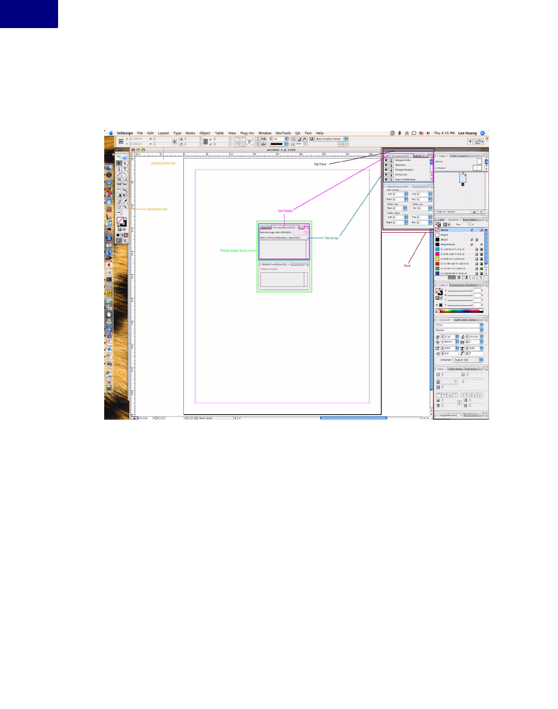
User Interfaces
Palettes and Panels
192
Figure 9 shows a typical InDesign workspace, where toolbars and control bars are docked, and
tab palettes are floating or docked.
FIGURE 9Sample Palette Workspace
SDK Workspace Extensions
The SDK contains sample workspace extension files, in <SDK>/presets/InDesign Work-
spaces/workspace extensions. To use a sample extension file, follow these steps:
1. Delete the InDesign Preferences folder
2. Copy the SDK sample workspace extension file to the InDesign Workspace Extension folder
(<app folder>/Presets/InDesign Workspaces/en_US/Workspace Extensions). If the “Work-
space Extensions” folder does not exist, create it.
3. Start InDesign.
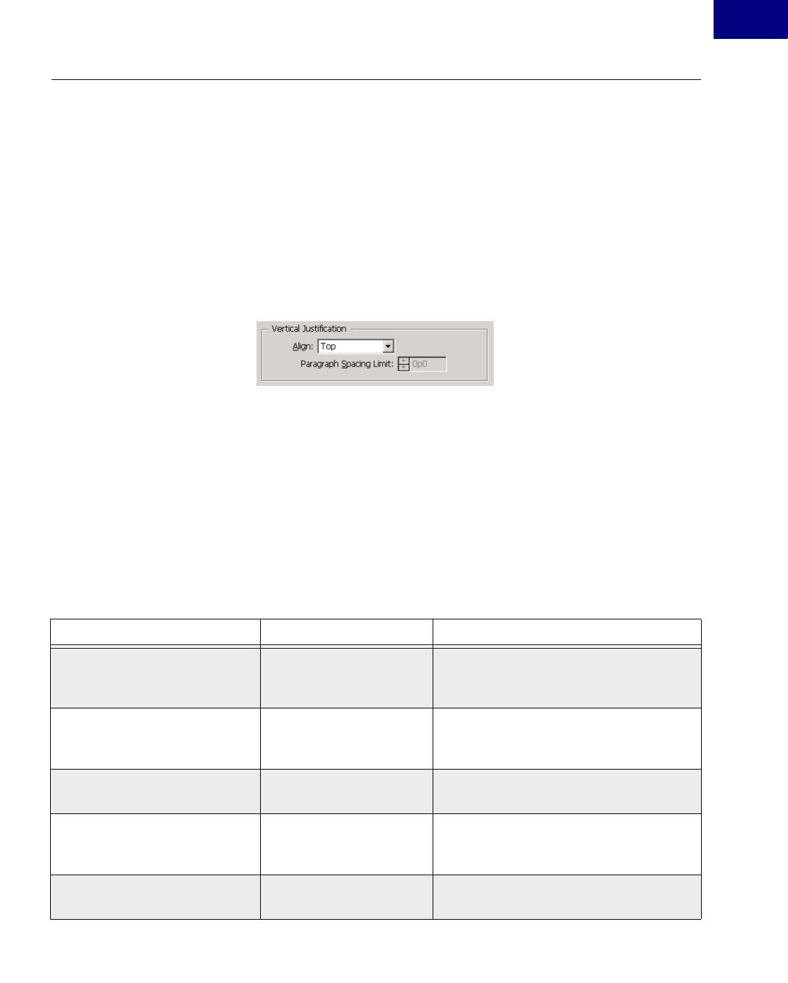
User Interfaces 193
User Interfaces
Static Text Widgets
Static Text Widgets
Using a Static Text Widget
Static text widgets are widely used throughout the application, typically as labels on panels and
dialogs. They can display longer runs of text and provide for a scrolling display over multiple
lines of text, with or without specified line breaks. In Figure 10, static text widgets are used as
labels on both the panel widget that frames the combo boxes and the combo boxes.
FIGURE 10 Static Text Widgets
Although static text widgets cannot be edited, it is possible to vary the appearance and text in
response to user events.
There are text widgets provided by the API that also display large amounts of text that can be
scrolled through. There also are fitted text widgets, which make sure the frame of the widget
always allows text to be displayed with a fixed padding around the text, regardless of the font.
There is another variant that allows the font to be both specified in the ODFRez data state-
ments and, potentially, dynamically varied through a particular interface on the boss class.
Table 11 shows the widget boss classes for static text widgets and the types they bind to, along
with sample use in the application.
TABLE 11 Static Text Widget Boss Classes
Widget Boss Class ODFRez Custom Type Use
kStaticTextWidgetBoss StaticTextWidget Displays a single line of static text. An
example is on the Stroke panel, in the widget
that displays Weight.
kFittedStaticTextWidgetBoss FittedStaticTextWidget Displays text that always fits inside its frame.
Helpful where the full text always must be
displayed.
kGroupPanelTitleTextWidgetBoss GroupPanelTitleTextWidge
t
Renders text in theme color if WinXP theme
is on.
kInfoStaticTextWidgetBoss InfoStaticTextWidget Displays text in a font that can be specified in
the ODFRez data statements. Can be used
where a bold font might be required.
kInfoStaticTextAngleWidgetBoss InfoStaticTextAngleWidget Same as InfoStaticTextWidget, but validates
degree entries.
User Interfaces
Static Text Widgets
194
Creating a Static Text Widget
The ancestor of all static text widget boss classes is kStaticTextWidgetBoss. Text widgets using
kInfoStaticTextWidgetBoss can have a variable font displayed. Text widgets using kFittedStatic-
TextWidgetBoss have a frame that is fitted to the size of the string in the font to display, with a
specified padding. There also are two multi-line static text widgets, kStaticMultiLineTextWid-
getBoss for the basic multiline widget, and kDefinedBreakMultiLineTextWidgetBoss for the
type that accepts predefined line breaks.
Fitted static text widgets resize their frame to try to fit the text in the current drawing font with
the specified padding. The kFittedStaticTextWidgetBoss boss class does not add any new inter-
faces compared with kStaticTextWidgetBoss. It overrides the implementation of the IControl-
View interface only to ensure the text fits when drawn.
The principal collaboration of interest is between the multi-line text widget types and the
scroll-bar widget type, kScrollBarWidgetBoss. An association is established in the ODFRez
between the multi-line text widgets and a scroll bar that is responsible for adjusting the views of
the text drawn.
The ODFRez custom type associated with the kStaticTextWidgetBoss class is StaticTextWidget.
Example 33 shows the type definition, which is found in Widgets.fh:
kInfoStaticTextIntWidgetBoss InfoStaticTextIntWidget Same as InfoStaticTextWidget, but validates
integer entries.
kInfoStaticTextPercentageWidgetB
oss
InfoStaticTextPercentageWi
dget
Same as InfoStaticTextWidget, but validates
percentage entries.
kInfoStaticTextXMeasurementWi
dgetBoss
InfoStaticTextXMeasureme
ntWidget
Same as InfoStaticTextWidget, but validates
X measurement entries.
kInfoStaticTextYMeasurementWid
getBoss
InfoStaticTextYMeasureme
ntWidget
Same as InfoStaticTextWidget, but validates
Y measurement entries.
kStaticMultiLineTextWidgetBoss StaticMultiLineTextWidget Displays multiple lines of text. Typically used
in conjunction with a scroll bar widget for
viewing.
kDefinedBreakMultiLineTextWid
getBoss
DefinedBreakMultiLineTex
tWidget
Allows developers to specify a character
sequence that will create line breaks in a
block of text. Any occurrences of the
specified character sequence in the input text
is replaced by a line break in the edit control.
Widget Boss Class ODFRez Custom Type Use

User Interfaces 195
User Interfaces
Static Text Widgets
EXAMPLE 33 Type Definition for Static Text Widget
// From Widgets.fh, NOT for use in your resource
type StaticTextWidget (kViewRsrcType) : Widget (ClassID = kStaticTextWidgetBoss)
{
CControlView;
StaticTextAttributes;
CTextControlData;
AssociatedWidgetAttributes;
};
Example 34 shows a sample data definition for a static text widget:
EXAMPLE 34 Sample Static Text Widget
// Sample data definition for widget
StaticTextWidget
(
// CControlView properties
kInvalidWidgetID, // widget ID
kSysStaticTextPMRsrcId, // PMRsrc ID
kBindNone, // frame binding
Frame(5.0,5.0,85.0,25.0) // left, top, right, bottom
kTrue, // visible
kTrue, // enabled
// StaticTextAttributes properties
kAlignLeft, // Alignment
kDontEllipsize, // Ellipsize style
// CTextControlData properties
"", // control label
// AssociatedWidgetAttributes properties
kInvalidWidgetID, // associated widget ID
),
Manipulating a Static Text Widget
This control encapsulates data of type PMString. The text for a static text widget is initialized
through the ITextControlData interface, using the SetString method. The initial value is
defined in a key-value pair in the StringTable for each locale of interest, where the key is placed
in the CTextControlData field in the ODFRez data statement.
The ITextControlData interface stores the state of the label on the static text widget. IStatic-
MultiLineTextAttr finds the associated scroll bar widget to scroll a multi-line text widget. Once
a reference to the scroll bar widget is obtained (use IControlView::FindWidget), query for its
ICounterControlData, and use the methods on this interface to control the view.
Changing the Font of a Static Text Widget
Use the info-static text widget (kInfoStaticTextWidget), which is bound to the ODFRez type
named InfoStaticTextWidget. The initial font the widget uses is defined in ODFRez data state-
ments, and the font displayed can be changed through the IUIFontSpec interface on the widget
boss object.
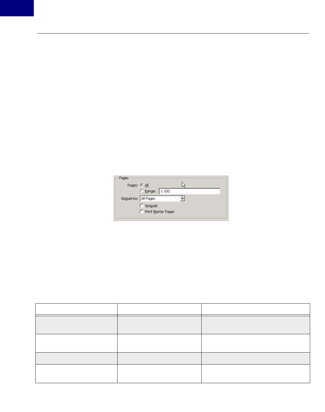
User Interfaces
Check Boxes and Radio Buttons
196
Check Boxes and Radio Buttons
Using Check Boxes and Radio Buttons
The API provides check-box buttons (kCheckBoxWidgetBoss) and radio buttons (kRadioBut-
tonWidgetBoss) that operate like the equivalent platform controls. There also are fitted ver-
sions of the check boxes and radio buttons provided by the API; these have the additional
feature that the button and associated text always fit within the frame, subject to a padding
around the boundary. Radio button and check boxes are tri-state controls, and they aggregate
an ITriStateControlData interface to represent their state.
Figure 11 shows a pair of radio buttons and a pair of check boxes. The cluster panel widget that
owns the radio button widgets is not shown, but it has a bounding box that contains the radio
buttons it owns.
FIGURE 11 Radio Buttons and Check Boxes
Radio buttons that operate as a logical unit should be contained within a cluster panel widget
(kClusterPanelWidgetBoss), which has a bounding box that contains the union of their indi-
vidual frames. Use the ClusterPanelWidget ODFRez type as an immediate parent.
The ODFRez custom resource type CheckBoxWidget is bound to the kCheckBoxWidgetBoss
boss class. The ODFRez custom resource type RadioButtonWidget is bound to the kRadioBut-
tonWidgetBoss boss class.
Check box and radio button widgets provided by the API are shown in Table 12.
TABLE 12 Check Box and Radio Button Boss Classes
Widget Boss Class ODFRez Custom Type Associated Use
kRadioButtonWidgetBoss RadioButtonWidget Displays a mutually exclusive set of choices,
in conjunction with a cluster panel widget.
kFittedRadioButtonWidgetBoss FittedRadioButtonWidget A radio button that always fits within its
frame.
kCheckBoxWidgetBoss CheckBoxWidget A standard check box.
kFittedCheckBoxWidgetBoss FittedCheckBoxWidget Check box that fits within frame, as frame
resizes, with padding.

User Interfaces 197
User Interfaces
Check Boxes and Radio Buttons
Creating Check Boxes and Radio Buttons
The check box (kCheckBoxWidgetBoss) and radio button (kRadioButtonWidgetBoss) aggre-
gate similar sets of interfaces. The fitted variants have the same interface profile, typically just
replacing the IControlView implementation with one that draws the fitted text label. The inter-
faces aggregated are shown in the SDK online documentation. The ODFRez type expressions is
in Widgets.fh.
Example 35 shows the type expression for the ODFRez type RadioButtonWidget. It comprises
the ODFRez type CControlView (bound to IControlView) and the ODFrez type CTextCon-
trolData, bound to ITextControlData, which represents the label.
EXAMPLE 35 Type Definition for Radio Button Widget
// From Widgets.fh, NOT for use in your resource
type RadioButtonWidget (kViewRsrcType) :
Widget (ClassID = kRadioButtonWidgetBoss)
{
CControlView;
CTextControlData;
};
Example 36 shows a radio button widget being defined in ODFRez data statements:
EXAMPLE 36 Radio Button Widget
RadioButtonWidget
(
// CControlView properties
kInvalidWidgetID, // widget ID
kSysRadioButtonPMRsrcId, // PMRsrc ID
kBindNone, // frame binding
Frame(5.0,5.0,100.0,21.0) // (left, top, right, bottom)
kTrue, // visible
kTrue, // enabled
// CTextControlData properties
'', // control label string key would go here
),
Manipulating Check Boxes and Radio Buttons
Check boxes and radio buttons have a data interface, ITriStateControlData, to access their state.
Check boxes and radio buttons are said to be tri-state. The states are defined in an enumeration
in the scope of the definition of ITriStateControlData. The states a tri-state control can be in
are unselected, selected and unknown (or mixed). The state of these tri-state controls can be
queried and set through the interface.

User Interfaces
Button Widgets
198
Receiving Messages
The data model for kCheckBoxWidgetBoss and kRadioButtonWidgetBoss is tri-state and can
be in one of following states: selected, unselected, or mixed. It is represented by the value stored
on the ITriStateControlData of the given widget boss object.
When the state of controls, like kRadioButtonWidgetBoss and kCheckBoxWidgetBoss,
changes, notification is sent along the IID_ITRISTATECONTROLDATA protocol. The follow-
ing messages are sent when the data model changes:
{ kTrueStateMessage, kFalseStateMessage, kUnknownStateMessage }
Messages are sent along the IID_ITRISTATECONTROLDATA protocol. To receive notifica-
tion of these changes, attach an observer to the button. If your controls are on a dialog, an
implementation derived from CDialogObserver makes it straightforward to attach and detach
from the widget of interest. The API on IDialogController also makes it easy to initialize the
state of the check boxes or radio buttons.
NOTE:It is worth setting the doNotify flag on the calls to change the state to be kFalse. This
avoids triggering unwanted IObserver::Update messages to one’s own observer that are
brought about by your own code rather than end user events.
Ensuring Radio Buttons in a Group have Mutually Exclusive Behavior
Use a cluster panel widget. For example, for a radio button to interoperate with other radio but-
tons and ensure mutually exclusive selection, a collection of widgets of ODFRez type
RadioButtonWidget are defined as children of an ODFRez ClusterPanelWidget.
This enforces mutually exclusive behavior among a group of widgets (not only radio buttons)
that expose IBooleanControlData or ITriStateControlData interfaces.
Button Widgets
Using a Button Widget
This section describes some button widgets available in the API. We focus on kButtonWidget-
Boss and its descendants. Iconic buttons are discussed in “Image Widgets” on page 206.
There is a nudge control widget (kNudgeControlWidgetBoss), which is a composite of two but-
ton-like widgets and is discussed briefly in this section. It is used in conjunction with edit boxes
and combo boxes to provide the capability to nudge values up or down.
Buttons are used in many dialogs within the application. We do not recommend using the stan-
dard button (kButtonWidgetBoss) or its descendants on palette panels. Instead, use iconic but-
tons on palette panels, to conform with the application’s look and feel. Buttons that derive
behavior from kButtonWidgetBoss or a descendant of this boss class are bi-state controls.
User Interfaces 199
User Interfaces
Button Widgets
Figure 12 shows a selection of button widgets. OK and Cancel buttons are on all dialogs.
Whether other buttons are present depends on the requirements for the dialog. The enabling
state of the buttons is set up initially by the dialog controller and can be modified by the dialog
observer depending on the actions of the end user.
FIGURE 12 Button Widgets
A default button is one that has keyboard focus by default. If the user pressed Return, the
default button’s event handler processes the event, and an observer on the default button
receives an IObserver::Update message. kButtonWidgetBoss and an ODFRez type DefaultBut-
tonWidget can be used if the default button is OK or Done—the button that allows an end user
to confirm they accept their choices. The default button need not be OK or Done; it also can be
Cancel (kCancelButtonWidgetBoss).
Table 13 lists button widget boss classes.
TABLE 13 Button Widget Boss Classes
Widget boss class ODFRez type Use
kButtonWidgetBoss ButtonWidget Used for any buttons on a
panel or dialog.
kButtonWidgetBoss DefaultButtonWidget Represents the OK button on
a dialog. Selected when the
dialog appears.
kCancelButtonWidgetBoss CancelButtonWidget Used for a Cancel button on
dialog.
kNudgeControlWidgetBoss NudgeControlWidget Wraps a nudge-up and a
nudge-down button. Used
with edit boxes and combo
boxes.

User Interfaces
Button Widgets
200
Creating a Button Widget
See the SDK online documentation for kButtonWidgetBoss and its descendants, to see the
interfaces aggregated by button widgets, as well as some descendants of kButtonWidgetBoss in
the required plug-in set.
The kButtonWidgetBoss class, in addition to taking the focus when a dialog appears, provides
behavior to dismiss a dialog with an affirmation that the action should be executed or the com-
mitments are completed. This class provides the behavior behind the button with a label like
OK or Done that is intended to dismiss the dialog when it is pressed. kCancelButtonWidget-
Boss is its counterpart and provides behavior behind a standard Cancel button on a dialog.
Nudge buttons collaborate with edit boxes and combo boxes to allow incremental changes in
the control data model. The association is created by referencing a nudge button by widget ID
in the definition of the edit box and combo box. Both these types of widgets have an ancestor
responsible for dealing with any associated nudge buttons.
The ODFRez custom resource type corresponding to kButtonWidgetBoss is ButtonWidget or
DefaultButtonWidget. The CTextControlData field specifies the label on the button. The type
expression for ButtonWidget is shown in Example 37.
EXAMPLE 37 Type Definition for a Button Widget
// From Widgets.fh, NOT for use in your resource
type ButtonWidget (kViewRsrcType) : Widget (ClassID = kButtonWidgetBoss)
{
CControlView;
ButtonAttributes;
CTextControlData;
};
Example 38 shows ODFRez data statements defining a button widget. Because the ODFRez
type ButtonWidget is not subclassed, changes in the data model of this control are handled by
the dialog observer rather than an observer for the individual button widget.
EXAMPLE 38 Sample Button Widget
ButtonWidget
(
// CControlView properties
kInvalidWidgetID, // widget ID
kSysButtonPMRsrcId, // PMRsrc ID
kBindNone, // frame binding
Frame(5.0,5.0,100.0,25.0) // (left, top, right, bottom)
kTrue, // visible
kTrue, // enabled
// ButtonAttributes
kTrue, // default look true
// CTextControlData properties
'', // control label (string key) goes here
),

User Interfaces 201
User Interfaces
Button Widgets
Manipulating Button Widgets
IBooleanControlData and ITriStateControlData are the key interfaces in working with button
widgets. The IBooleanControlData interface provides access to the data model of bi-state but-
tons. A boolean control like a standard button can be in one of two states, selected or unse-
lected. The state is set through the IBooleanControlData interface. Update messages are sent
along the IID_IBOOLEANCONTROLDATA protocol.
For the bi-state buttons, it is possible to change the state and suppress the notification by calling
the mutators with the notifyOfChange parameter set to kFalse.
The ITextControlData interface allows you to set button labels. The boss classes share the
default implementation used by many of the controls.
Receiving Messages
The data model for kButtonWidgetBoss and its descendants is a boolean, so these are bi-state
controls. Their state is represented by the value stored on their IBooleanControlData interface,
and they notify of changes in this state along the default identifier for this interface,
IID_IBOOLEANCONTROLDATA.
The button widget boss classes aggregate I<whatever>ControlData interfaces to allow the state
to be queried and set. Usually, this results in a message being sent to attached observers that the
control state has changed. It also is possible to set the state but suppress the notification about
the change, to prevent observers from performing inappropriate updates when the state is set.
In other words, the control change can be muted. This is done by setting the notifyOfChange to
be kFalse in the mutator methods on these interfaces. This approach can be used when an
observer listening for a notification on one or more controls wants to set up the state of a con-
trol it is observing, without receiving another notification about the state change. It is impor-
tant not to be confused about how these controls work; typically the change parameter is
expressed as a message identifier, rather than something more identifiable as a ClassID.
When the state of the controls that descend from kButtonWidgetBoss changes, notifications
are sent along the IID_IBOOLEANCONTROLDATA protocol. Additional information is sent
via the ClassID. To receive notification about the state change caused by a button press, attach
to the button widget boss object’s ISubject interface, and listen along the
IID_IBOOLEANCONTROLDATA protocol.
User Interface Guidelines
The user interface guidelines recommend the widget should be 20 pixels high and a multiple of
5 pixels wide.
NOTE:InDesign does not use standard button widgets (other than iconic varieties) on panels,
and we recommend you not put standard button widgets on panels; use the iconic
varieties instead.

User Interfaces
Edit Boxes
202
Using Buttons on Dialogs
Where controls are placed on a dialog, client code can use the helper partial implementation
class CDialogController and specialize or implement the appropriate methods. CDialogOb-
server typically implements an IObserver. The IDialogController interface has utility methods
relevant to working with button widgets that set the initial state.
We recommend the IObserver interface be added to the dialog boss object with the superclass
CDialogObserver, which provides helper methods like AttachToWidget() and DetachFrom-
Widget(). These methods simplify the process of attaching to or detaching from a widget.
When a button is pressed, an IObserver::Update message is sent through the IObserver inter-
face on the dialog boss object. Check the classID of the change to determine whether it is a
kTrueStateMessage.
Edit Boxes
Using an Edit-Box Widget
Edit boxes are displays of information that can be edited. In the application, they allow an end
user to enter a value. The value can be constrained to be an integer or to be expressed in spe-
cific units, like picas, points, or degrees.
Edit boxes often are used with nudge button controls. The nudge button control provides pre-
cise, incremental control over the contents of edit boxes, particularly when control over param-
eters in layout-specific units is a requirement. This close coupling between the nudge and edit
controls helps explain, in part, why the edit box boss classes descend from the kNudgeEditBox-
WidgetBoss boss class.
The treatment of edit boxes is slightly different when they are used in dialogs rather than pan-
els. In panels, typically a new boss class is created that derives from one of the <variant>Edit-
BoxWidgetBoss classes, and it exposes an IObserver interface implemented in client code. This
interface receives notifications of changes in the text edit box data model. If the specific
ODFRez field controlling this property is kTrue, an observer attached to a particular control is
notified on every keystroke. Table 14 lists a selection of the edit-box-related boss classes.
TABLE 14 Edit Box Boss Classes
Widget boss class ODFRez custom type Use
kTextEditBoxWidgetBoss TextEditB oxWidget Displays values that are strictly
textual, or where you want to parse a
value in your own code.
kAngleEditBoxWidgetBoss AngleEditBoxWidget Displays values in angular units. See
the Rotation dialog.
User Interfaces 203
User Interfaces
Edit Boxes
Creating an Edit-Box Widget
The main responsibility of the edit-box widget boss classes is to provide for managed input and
display of text strings and unit-specific values. Unit-specific variants remove the responsibility
for parsing the input strings from the developer. Similarly, the client-code developer does not
need to format the output strings when using unit-specific edit boxes. The edit-box widget boss
classes also provide for validation of data entry, which is conditional on settings in the ODFRez
data statements.
The principal collaboration is with the kNudgeControlWidgetBoss class, which provides the
behavior for nudge controls used to bump values up and down by small increments. The map-
ping between an edit box and a nudge control is established through the ODFRez data state-
ment for an edit box; no code needs to be written to enforce this collaboration.
The main point about the class hierarchy of the edit-box widget bosses is that there is a com-
mon ancestor for all edit boxes, which is a nudge edit-box widget boss class (kNudgeEditBox-
WidgetBoss). There also are specialized edit boxes that work in units like degrees, percent, real,
or integer values, or in measurements like line weight, text, and the measurement unit cur-
rently in force in the horizontal or vertical direction.
NOTE:Treat the kNudgeEditBoxWidgetboss boss class as if it were an abstract type and not
used directly.
There are ODFRez custom resource types that map directly onto each of these boss classes,
with the usual naming convention that k<variant>EditBoxWidgetBoss has a related ODFRez
custom resource type named <variant>EditBoxWidget. Example 39 shows ODFRez data state-
ments defining an edit-box widget.
kIntEditBoxWidgetBoss IntEditBoxWidget Displays integer values. See the Page
Setup dialog.
kRealEditBoxWidgetBoss RealEditBoxWidget Displays floating point values. See the
Scale dialog.
kPercentageEditBoxWidgetBoss PercentageEditBoxWidget Displays values in percentage units.
See the Scale dialog.
kTextMeasureEditBoxWidgetBoss TextMeasureEditBoxWidget Displays values in the current text
measurement units. See the Character
panel (line weight element).
kLineWtMeasureEditBoxWidgetBoss LineWtMeasureEditBoxWidget Displays values in line weight units.
See the Stroke panel, when the
Dashed line type is selected.
kXMeasureEditBoxWidgetBoss XMeasureEditBoxWidget Displays values in current horizontal
measurement units.
kYMeasureEditBoxWidgetBoss YMeasureEditBoxWidget Displays values in current vertical
measurement units.
Widget boss class ODFRez custom type Use

User Interfaces
Edit Boxes
204
EXAMPLE 39 Sample Edit-Box Widget
IntEditBoxWidget
(
// CControlView properties
kInvalidWidgetID, // widget ID
kSysEditBoxPMRsrcId, // PMRsrc ID
kBindNone, // frame binding
Frame(4.0,5.0,84.0,25.0) // left, top, right, bottom
kTrue, // visible
kTrue, // enabled
// CEditBoxAttributes
0, // nudgeWidgetId (0 or kInvalidWidgetID if no nudge required)
1, // small nudge amount
5, // large nudge amount
0, // max num chars
kFalse, // read only flag
kFalse, // should notify on each key stroke
// TextDataValidation properties
kTrue, // range checking enabled
kFalse, // blank entry allowed
30, // upper limit
0, // lower limit
// CTextControlData properties
"3", // control label
),
All edit boxes share the same ODFRez custom resource types in their composition as the IntE-
ditBoxWidget. The notable exception is the FontSpecTextEditBoxWidget type, which adds
another ODFRez field of UIFontSpec type.
Manipulating Edit Boxes
The kNudgeEditBoxWidgetBoss boss class aggregates interfaces like ITextControlData, ICur-
sorRegion, INudgeObserver, and IEditBoxAttributes, along with other key interfaces like
IControlView and IEventHandler. ITextValue queries and sets the value for any unit-specific
edit-box widgets. ITextValue accesses the data model of unit-specific edit boxes without having
to parse the input string or format the output string. It allows a unit-specific value to be set or
queried in an edit box.
ITextControlData is used for untyped edit-box widgets, like the widget with behavior provided
by kTextEditBoxWidgetBoss. The implementation of ICursorRegion determines how or
whether the cursor changes when it enters an edit box.
Receiving Messages
Attaching an observer to a subclass of an edit-box widget boss class provides for notification
about changes when the end user presses Return or Enter within the edit control. It also is pos-
sible to get notification about every keystroke, by setting a flag in the ODFRez data statement
associated with the edit-box definition. For examples, see any sample that uses an edit box.

User Interfaces 205
User Interfaces
Edit Boxes
An edit-box widget boss class has a data model that typically consists of a string, which is
accessed through the ITextControlData interface aggregated by the particular edit-box widget
boss class. The ITextControlData interface provides controlled access to the control’s data
model for simple text strings. This is appropriate for boss classes like kTextEditBoxWidgetBoss.
For unit-specialized edit boxes, the key interface to get and set values is ITextValue. This
enables access to the measurement data in points, regardless of what measurement is being dis-
played. This eliminates the need to parse the string read back from the control or format the
data for the control when setting a value.
When the data model changes, registered observers are sent an update message with class ID
kTextChangeStateMessage along the IID_ITEXTCONTROLDATA protocol. For an observer
on a unit-specific edit box, the client code in the update message should query for the ITex-
tValue interface and call the GetTextAsValue method to determine the state of the edit box data
model.
The most basic use of an edit box is in conjunction with a dialog. In this case, the value of the
edit box can be queried only when the dialog is dismissed or the preview check box is selected,
in the case of dialogs that allow preview. When the edit box is used on a panel, it is more prac-
tical to attach an observer to the edit control. The observer receives an update message when
the content of the edit control changes; all keystrokes within the control result in a notification
being sent to registered observers.
The simplest case to consider is when the edit box is attached to a dialog. If the dialog is imple-
mented as recommended, using the CDialogController and CDialogObserver helper classes,
setting and getting values from the text control is particularly simple. The application frame-
work sends a sequence of messages to the dialog controller in this order:
zInitializeDialogFields()
zValidateDial og Fields()
zApplyDialogFields()
This sequence of messages is referred to as the dialog protocol. In the case of the layer options
dialog described previously, when the InitializeDialogFields message is sent to the dialog con-
troller, the edit box is set up with an initial value through the CDialogController::SetTextCon-
trolData method. When the user presses OK, the dialog controller is sent a
ValidateDialogFields message by the application framework; if this returns kDefaultWidgetId,
an ApplyDialogFields message is sent.
User Interface Guidelines
Adobe user interface guidelines specify that buttons should be 20 pixels high and a multiple of
5 pixels wide.

User Interfaces
Image Widgets
206
Image Widgets
Using an Image Widget
This section describes widgets used to display images, including icons. These widgets also can
have button-like functionality. Image-based widgets are found throughout the application.
There are many image-widget boss classes, but few are relevant when writing client code.
There are several icon and picture widgets in the API. Which widget to use depends on
whether an icon resource has enough image information or a bitmap or PICT image is
required. In either case, a platform-specific resource must be created to hold the image and a
binding must be made in ODFRez data statements. If icon resources are sufficient and no but-
ton-like behavior is required, the ODFRez type IconSuiteWidget can be used. If a bitmap or
PICT image is necessary, the ODFRez type PictureWidget is appropriate. See the PictureIcon
SDK sample.
A good example is the Layers panel, which changes the image associated with the eyeball icon
depending on whether the layer is visible. The key is to acquire an IControlView interface
pointer from an image-widget boss object and call SetRsrcID on this interface to change the
picture.
Some of the widget boss classes shown in Table 15 do not respond to button clicks. Others are
described here as pseudo buttons, to differentiate them from the boss classes that descend from
kButtonWidgetBoss; however, they still respond to clicks and aggregate an IBooleanControl-
Data interface. If you have a more complex requirement, like creating an image preview in a
widget, the PanelTreeView SDK sample shows how to use a custom control view for a panel
rather than an existing image-based widget.
To simplify the domain, client code should be able to perform most tasks using the following
few widgets:
zkIconSuiteWidgetBoss, with its counterpart ODFRez IconSuiteWidget (for icons on panels
and dialogs). See the PictureIcon SDK sample plug-in.
zkPictureWidgetBoss, and its counterpart ODFRez PictureWidget (for bitmap/PICT based
widgets). See the PictureIcon SDK sample plug-in.
zSubclassing the kRollOverIconButtonBoss and one of the several ODFRez types to which it
is bound (depending on your specific requirements). All SDK samples that have an About
icon use this button.
TABLE 15 Image-Widget Boss Classes
Widget Boss Class ODFRez Custom Type Description
kChainButtonBoss ChainButtonWidget Used for the constrain proportions
button.
kIconFieldWidgetBoss IconFieldWidget Used in warnings;
RollOverIconButtonWidget.
User Interfaces 207
User Interfaces
Image Widgets
Creating an Image Widget
Most ODFRez types comprise nothing more than a CControlView field with an additional flag
specifying whether some appearance should be applied.
Modifying Image Widgets
The principal interfaces of interest to client-code developers are IControlView (for switching
the image displayed) and IBooleanControlData (or at least the role it plays in notification). The
IControlView interface dynamically varies the visual representation of a widget. There may be
occasions to switch to a different picture depending on state; the methods on the IControlView
interface, like SetPluginRsrcID and SetRsrcID, are relevant in this context.
Manipulating Image Widgets
Clients of the buttons with behavior provided by boss classes like kRollOverIconButtonBoss
and derivatives can attach to the ISubject interface of an instance of a boss object and request
notifications on the IID_IBOOLEANCONTROLDATA protocol. An update message is sent
depending on the state of the pseudo-button widget. If selected, a kTrueStateMessage value is
kIconPopupBoss No corresponding ODFRez
custom resource type.
Used on tabbed palettes as the triangle
icon for the pop-up menu. For
internal use only.
kIconSuitePopupWidgetBoss IconSuitePopupWidget Used in places like the Info panel,
where you see a small icon with a tiny
triangle on the right-bottom corner.
Clicking on the icon pops up a
contextual menu.
kIconSuiteWidgetBoss IconSuiteWidget Used for icons on panels and dialogs.
Examples include the warning icons
on the Links panel and the top left
icon on the Transform panel.
kOverPrintIconPushButtonBoss OverPrintWidget Not used.
kPictureWidgetBoss PictureWidget Used for some CJK widgets. The
Toolbox has an instance of this boss
class being subclassed.
kRollOverIconButtonBoss RollOverIconButtonWidget Widely used for example SDK
samples.
kRollOverIconPushButtonBoss RollOverIconPushButtonWidget Used in a control strip for vertical
justification mode buttons.
kSimpleIconSuiteButtonWidgetBoss SimpleIconSuiteButtonWidget Little used. See the Stroke panel.
Widget Boss Class ODFRez Custom Type Description
User Interfaces
Drop-Down Lists and Combo Boxes
208
sent for the ClassID of the Update message with the IID_IBOOLEANCONTROLDATA proto-
col. If the button is unselected, the ClassID is kFalseStateMessage with the same protocol.
A common requirement is using a change in the displayed image to signal a state transition.
For example, the Layers panel uses iconic buttons to indicate that a layer is locked or unlocked,
visible or invisible. This can be done through the IControlView interface on a particular wid-
get. To switch the icon or picture displayed, acquire an IControlView interface through IPanel-
ControlData::FindWidget, and send a SetRsrcID message to the widget boss object to change
the image being displayed.
Drop-Down Lists and Combo Boxes
Using Drop-Down and Combo-Box Widgets
This section describes two widely used and closely related widget groups, drop-down lists and
combo boxes. Drop-down lists are non-editable displays of lists of information; combo boxes
also are used to display non-editable drop-down lists of information, but the end user interacts
with the list in a different way. The relation between the two is that a combo box is a composite
of an edit-box control (with nudge buttons) and a drop-down list. A combo box allows a user
to select from a drop-down list or use a text-edit box to enter a new choice. For example, the
Character panel in the application uses several different kinds of combo boxes; see Figure 13.
The widget that displays available fonts is a type-ahead combo box. There are several special-
ized combo boxes that display information in measurement units (see Table 16).
FIGURE 13 Widgets used in the Character Panel
K4YPEAHEAD4EXT#OMBO"OX7IDGET"OSS
K4EXT-EASURE#OMBO"OX7IDGET"OSS
K)NT#OMBO"OX7IDGET"OSS
K4EXT-EASURE#OMBO"OX7IDGET"OSS
K0ERCENTAGE#OMBO"OX7IDGET"OSS
K$ROP$OWN,IST7IDGET"OSS
User Interfaces 209
User Interfaces
Drop-Down Lists and Combo Boxes
TABLE 16 Drop-down List and Combo-box Boss Classes
The API has many combo-box widget boss classes that provide rich behavior for combo boxes.
The combo box can cooperate with a nudge control widget, to allow incremental changes in
input parameters. Combo boxes are appropriate for displaying units like measurement units,
angles, and percentages.
When input is selected from a list of values, the combo box is more convenient than the drop-
down list. Type-ahead combo boxes allow quick access to a value in a sorted list; the user can
Widget Boss Class ODFRez Custom Type Example
kAngleComboBoxWidgetBoss AngleComboBoxWidget Displays a set of values in
angular units. See the
Transform panel.
kDropDownListWidgetBoss DropDownListWidget Displays a set of text values
rather than numeric values,
where no type-ahead or nudge
is required. See the Stroke panel
(Stroke-type).
kIntComboBoxWidgetBoss IntComboBoxWidget Displays a set of integer values.
See the kerning combo box on
the Character panel.
kLineWtMeasureComboBoxWidgetBoss LineWtMeasureComboBoxWidget Displays values in line weight
units. See the Stroke panel.
kPercentageComboBoxWidgetBoss PercentageComboBoxWidget Displays values in percentage
units. See the Transform panel.
kRealComboBoxWidgetBoss RealComboBoxWidget Displays a set of floating-point
values.
kTextComboBoxWidgetBoss TextComboBoxWi dget Displays textual values. See the
Find/Change dialog.
kTextMeasureComboBoxWidgetBoss TextMeasureComboBoxWidget Displays units in the current
text-measurement units. Use in
the Character panel to specify
leading.
kTypeaheadTextComboBoxWidgetBoss TypeaheadTextComboBoxWidget Allows a user to enter partial
string and have the control
predict the value to select. Used
in the Character panel to
display font families.
kXMeasureComboBoxWidgetBoss XMeasureComboBoxWidget Displays values in the current
horizontal measurement units.
kYMeasureComboBoxWidgetBoss YMeasureComboBoxWidget Displays values in the current
vertical measurement units.

User Interfaces
Drop-Down Lists and Combo Boxes
210
enter keystrokes matching items in the list. For example, the font family combo box on the
Character panel allows the first few characters of the font name to be entered, which scrolls the
list to the desired location. The API has many types of combo boxes, some of which are shown
in “Widgets used in the Character Panel” on page 208.
The following are the measurement units specific to the layout of drop-down lists and combo
boxes:
zx-measurement units
zy-measurement units
zLine-weight measure
zText measure
A different measurement system may be in force for each of these, and a combo box of a spe-
cialized type displays the choices in the contextually appropriate units. Table 16 shows a selec-
tion of the combo boxes available in the API.
Creating a Combo Box
Combo boxes are panel widgets; combo-box widget boss classes descend from kGenericPanel-
WidgetBoss. When instantiated, a combo-box widget boss object creates two children, a drop-
down-list widget boss object and an edit-box widget boss object. There appear to be many wid-
get boss classes related to combo boxes in the API, but those related to the encapsulated drop-
down list and edit box within the combo-panel are implementation boss classes and not
required for writing client code.
Modifying a Combo Box
The data model for combo boxes consists of a string-list control data model for the drop-down
(accessed via the IStringListControlData interface) and the data model for an edit box, repre-
sented by the ITextControlData interface. Changes in selection by the end user are sent to cli-
ent code along the IID_ITEXTCONTROLDATA protocol. The edit box does not have an
independent data model to the string list; it reflects the current selection in the drop-down list.
Capabilities
IStringListControlData populates both drop-down lists and combo boxes dynamically. IDrop-
DownListController changes the state of a drop-down list or combo box drop-down, and it
controls the current selection of the drop-down list or combo box. For example, to specify the
item selected, enable or disable the control. The ITextControlData interface exposed by the
kComboBoxWidget boss relates to the child edit-box widget. Similarly, the IEditBoxAttributes
interface relates to the child edit-box widget. However, changes to selection are notified along
the IID_ITEXTCONTROLDATA protocol for a combo box, which is not intuitive; a list-con-
trol data protocol might have been expected.

User Interfaces 211
User Interfaces
Splitter Widgets
Splitter Widgets
Using the Splitter Widget
The splitter widget manages the dimensions of multiple panels within one container. For exam-
ple, the Pages panel exploits a splitter widget to create two regions that can be sized co-depen-
dently. The splitter widget divides both vertically and horizontally. The setting is determined by
the bindings, normally specified on the CControlView-related portion of the ODFRez data
statements that define the splitter. Table 17 shows some boss classes that implement splitters.
TABLE 17 Splitter Boss Classes
Creating a Splitter Widget
The kSplitterWidgetBoss boss class and the kSplitterTrackerBossMessage tracker boss class
cooperate to provide the behavior of the splitter widget. The splitter widget is initialized by
ODFRez data statements. There is little need for additional customization of the splitter widget.
The ODFRez custom resource type SplitterWidget is bound to the kSplitterWidgetBoss boss
class. The superclass of kSplitterWidgetBoss is the base widget boss class, kBaseWidgetBoss.
Manipulating a Splitter Widget
The kSplitterWidgetBoss boss class exposes interfaces like ISplitterControlData, which pro-
vides access to the list of managed widgets. The ICursorRegion interface effectively is a signa-
ture that the widget is bound to a cursor provider. The ISplitterControlData interface provides
access to the list of splitter-managed widgets and queries methods about the properties of the
control.
The kSplitterTrackerBossMessage boss class provides the behavior behind the tracker. Much of
the widget’s capability comes from the implementation of ITracker on this widget boss class.
The splitter-widget boss class event handler serves only to create the tracker and send it a
BeginTracking message.
Widget Boss Class ODFRez Custom Type Description
kSplitterWidgetBoss SplitterWidget Used in InCopy's Thesaurus panel.
kSplitterPanelWidgetBoss SplitterPanelWidget Used in XML panel.
kLayoutSplitterPanelWidgetBoss LayoutSplitterPanelWidget Used in Page panel.
kLinkedSplitterPanelWidgetBoss LinkedSplitterPanelWidget Used in XML Mapping and Word Preferences
dialogs.
User Interfaces
Scroll Bars
212
Scroll Bars
Using a Scroll Bar
To provide scrolling views in the user interface, the API uses a pattern or assembly consisting
of three elements, listed in Table 18:
TABLE 18 Elements for Providing Scrolling Views
A fundamental application of these elements is the layout widget. Scroll bars and panoramas
occur widely within the application’s plug-in code base.
Scroll bars are widgets with behavior deriving from kScrollBarWidgetBoss. The scroll bar data
model is accessed through the ICounterControlData interface. Panoramas are aspects of
objects that scroll; the IPanorama interface scrolls a view. The boss classes mentioned below
expose an IPanorama interface.
Creating a Scroll Bar
The kScrollBarWidgetBoss boss class extends kBaseWidgetBoss and is bound to the ODFRez
custom resource type ScrollBarWidget. When a scroll bar is added to a control like a StaticMul-
tiLineTextWidget, it works hand-in-hand with a panorama (IPanorama) to produce the correct
scrolling behavior of the dependent widgets. The scroll bar receives input from the end user,
and the implementation code manipulates the view through the IPanorama interface.
Manipulating a Scroll Bar
The ICounterControlData interface is the key interface for scroll bars. It accesses the data
model of a scroll-bar widget boss object and changes its state. The IPanorama interface manip-
ulates a scrollable object’s view.
Elements Description
Panoramas An aspect of a scrollable object that can be accessed through an
IPanorama interface. Scrollable objects expose this interface.
Panorama
syncs
Abstractions in the API that coordinate a scrollable view with scroll-bar
controls, with behavior provided by one of two boss classes named
xxxScrollBarPanoramaSyncBoss. For internal use.
Scroll bars Controls whose behavior derives from the kScrollBarWidgetBoss
widget boss class.

User Interfaces 213
User Interfaces
Sliders
Receiving Messages
The kScrollBarWidgetBoss class exposes ICounterControlData, the data model for a scroll bar
widget.
An observer requesting changes in the data model of a scroll bar widget boss object attaches to
its ICounterControlData interface and requests notification on the
IID_ICOUNTERCONTROLDATA protocol. When the counter control data changes, regis-
tered observers are notified with an update message with the classID parameter of kCounter-
ChangeStateMessage. The client also gets passed a pointer to a CounterControlUpdateParams
object as the changedBy parameter of an IObserver::Update message.
Sliders
Using a Slider
A slider control is appropriate for situations in which an end user can enter a parameter that
can vary continuously over a finite, determinate range. There are several standard sliders
(descendants of kStdSliderWidgetBoss) in the application’s user interface, such as on the Color
panel, shown in Figure 14.
FIGURE 14 Slider Widgets
A pop-up slider (descendant of kPopupSliderBoss) can be used in the same situation, when the
slider should appear only when the user wants to change a particular value rather than be con-
tinuously visible. Figure 15 shows an example of a pop-up slider in the Transparency panel.
This slider controls the opacity of the selected page items. There also is a pop-up slider on the
Swatches panel, which is used to vary the tint associated with a particular color in a swatch.
This uses a class of pop-up slider specialized for the input of real-valued numbers.
FIGURE 15 Pop-up Slider Combo-Box Widget
User Interfaces
Sliders
214
Pop-up slider combo-box controls combine an edit box and a button. They are child widgets of
a panel. The pop-up slider appears only when the end user clicks a button to show the slider in
its own floating window. This pop-up slider is a relatively complex control, consisting of a
cooperating assembly of an edit box, a button, a floating window, and a slider, which are owned
and/or managed by a parent boss object that is a descendant of the generic panel widget boss
class (kGenericPanelWidgetBoss). It allows you to pack more user interface into a given area of
screen real estate than is possible with standard slider controls.
Table 19 shows boss classes that implement sliders:
TABLE 19 Slider Boss Classes
Creating a Slider
To use the standard slider widget (kStdSliderWidgetBoss), create a new ODFRez custom
resource type that can extend the ODFRez custom resource type CControlView, and add an
ODFRez SliderControlData field. This new type is then bound to the subclass of kStdSlider-
WidgetBoss (k<whatever>SliderWidgetBoss). This new ODFRez custom resource type is
bound to the boss class delivered by your own plug-in that extended the kStdSliderWidgetBoss
boss class. There are other, subtle dependencies and interfaces required for the standard slider
implementation to work correctly.
The slider pop-up widget is a compound widget, consisting of a panel, edit box, button widget,
and slider. It is called a combo-box slider because it functions as if it were a combo box, with a
slider replacing the traditional combo-box drop-down list.
The kPopupSliderComboBoxWidgetBoss boss class provides the core of the behavior for the
combo-box slider. This boss class extends the kComboBoxWidgetBoss boss class. Do not use
this kPopupSliderComboBoxWidgetBoss boss class directly; instead, use one of its subclasses,
which have specified associated measurement units.
A pop-up slider has much functionality in common with combo-box widgets. A pop-up slider
has part of its behavior provided by the kPopupSliderBoss boss class, which extends the stan-
dard slider widget boss (kStdSliderWidgetBoss).
Widget Boss Class ODFRez Custom Type Example
kStdSliderWidgetBoss (none: you create your own) Slider that is continuously
available, as on the Color
panel.
kRealPopupSliderComboWidgetBoss RealPopupSliderComboBoxWidget Pop-up slider, as on the
Swatches panel.
kIntPopupSliderComboWidgetBoss IntPopupSliderComboBoxWidget Pop-up slider with integer
values, as on the Inks panel.
kPercentPopupSliderComboWidgetB
oss
PercentPopupSliderComboBoxWidget Pop-up slider with percentage
values, as on the Transparency
panel.

User Interfaces 215
User Interfaces
Sliders
The pop-up slider widget does not require an ODFRez CSliderControlData field to be initial-
ized. Internally, the slider widget on the floating window does have an ISliderControlData
interface, because the class kPopupSliderBoss derives from kStdSliderWidgetBoss; however, a
pop-up slider is initialized by the settings obtained by querying through the ITextDataValida-
tion interface. These setting specify the range through the interior ISliderControlData interface
on the kPopupSliderBoss. The fields of the ODFRez type TextDataValidation in the ODFRez
data statements defining the pop-up slider specify the maximum and minimum slider values.
Manipulating a Slider
ISliderControlData is an interface aggregated on the kStdSliderWidgetBoss boss class. It encap-
sulates information about the maximum and minimum values exposed in the control’s range,
and the current value of the slider setting. If the data value changes, notifications with ClassID
equivalent to kRealChangeStateMessage are sent to registered observers of the slider boss
object.
The boss class aggregates an IEventHandler interface. This should not need to be overridden.
The event handler with implementation ID of kCSliderEHImpl is responsible for creating a
tracker if required and calling the tracker methods in the appropriate sequence. There is an
IControlView interface on the slider control, whose default implementation uses the ISlider-
StateData and ISliderControlData interfaces on the widget boss object to determine how to
draw the visual representation of the control.
When the data model of a pop-up slider changes, an IObserver::Update message is sent to
attached observers. Interested client code queries for the state of the pop-up slider by using the
ITextValue interface. This allows the value of the slider state (percent, real, or integer) to be
queried. Similarly, to set the state of the pop-up slider, use the ITextValue interface. Other
properties of the pop-up slider are queried through the ISliderControlData interface. For
example, this is used to determine the minimum or maximum of the pop-up slider range.
Receiving Messages
The state of the standard slider is represented by ISliderControlData. Changes to this state are
broadcast along IID_ISLIDERCONTROLDATA.
The state of a pop-up slider is represented by ITextValue. Changes are broadcast with the
IID_ISLIDERCONTROLDATA protocol.
Notifications about changes to the state of a standard slider control are sent along the
IID_ISLIDERCONTROLDATA protocol to registered observers. The usual process in process-
ing the IObserver::Update message is to query the data value through ISliderControl-
Data::GetValue, to determine the control state. Add an IObserver interface to the
kStdSliderWidgetBoss by subclassing. On receiving an AutoAttach message from the applica-
tion core, the client code queries for the ISubject interface on the widget boss object and
requests notifications along the IID_ISLIDERCONTROLDATA protocol. The observer then
detaches in AutoDetach.

User Interfaces
Tree-view Widgets
216
When changes occur in the slider control’s data, IObserver::Update messages are sent to this
observer. A message with ClassID of kRealChangeStateMessage is sent to the observer. The
ISliderControlData interface then retrieves the current data value associated with the slider.
Pop-up slider notifications also are sent along the IID_ISLIDERCONTROLDATA protocol;
however, the ClassID of the message is unique to the pop-up slider and is one of the following:
zkPopupSliderOpenMessage, sent when the slider opens.
zkPopupSliderApplyChangeMessage, sent when the value is being committed by the end
user.
zkPopupSliderCloseMessage, sent when the slider is about to close.
Implementation Details
The superclass for all pop-up sliders is kPopupSliderComboBoxWidgetBoss. The core behavior
of pop-up sliders comes from the IControlView implementation aggregated on this boss class.
Another boss class, kPopupSliderButtonBoss, provides the behavior behind the button on the
pop-up slider combo-box widget. The IEventHandler implementation aggregated on this
kPopupSliderButtonBoss class is responsible for creating a floating window and adding a child
widget, which is the slider the user manipulates.
The appearance of the pop-up slider is determined by the implementation of the IControlView
interface with identifier kPopupSliderComboBoxViewImpl. This implementation is responsi-
ble for creating the child widgets that provide the behavior of the pop-up slider. When the pop-
up slider is restored from persistent data (plug-in binary resource first time, or saved data data-
base if its representation exists in it), it creates an object of class kPopupSliderButtonBoss to
provide the behavior behind the button that shows the slider. An object of class kComboB-
oxEditBoxWidgetBoss also is created, to support the behavior of the edit box in the pop-up
slider combo-box widget. The pop-up slider itself (kPopupSliderBoss) is created on demand by
the class that implements the IEventHandler interface for the composite pop-up slider combo-
box widget. Typically, the slider is shown on a left-button down event. The implementation cre-
ates an object of class kWindowBoss and specifies it is a floating window. It then creates an
object of class kPopupSliderBoss and adds it as a child of this new window boss object.
Tree-view Widgets
Using a Tree View
A tree-view widget allows you to display hierarchical data; users can expand or contract nodes
in the tree to increase or decrease the amount of detail displayed. A tree-view widget can have
vertical and/or horizontal scroll bars, to allow end users to scroll within the view of the tree
structure.
The tree-view control is complex. The basic procedure is as follows:
User Interfaces 217
User Interfaces
Tree-view Widgets
1. Create a new ODFRez custom resource type for a tree-view widget that extends the
ODFRez type TreeViewWidget. Define a resource of this new type, and add it to the dialog
or panel where the tree view control will appear.
2. Create a new ODFRez custom resource type for a tree-node widget that extends the
ODFRez type PrimaryResourcePanelWidget, Define branch node and leaf node resources
based on this tree node widget type.
3. Define a tree-view widget boss that extends kTreeViewWidgetBoss. In this boss, aggregate
at least ITreeViewHiearchyAdapter and ITreeViewWidgetMgr.
4. Provide an implementation for the ITreeViewHierarchyAdapter and ITreeViewWidgetMgr
interfaces.
5. Initialize the tree view with ChangeRoot() of ITreeViewMgr. Also, inform InDesign of any
tree model change through ITreeViewMgr.
Figure 16 shows a tree view and indicates the widget boss classes that provide the behavior for
the components of the tree view. The kTreeViewWidgetBoss class provides the behavior for the
main control, the kTreeNodeWidgetBoss class provides the bulk of the behavior for nodes in
the tree, and kTreeExpanderWidgetBoss provides the behavior of the triangle-icon that can be
used to show or hide the children shown for a specific node.
FIGURE 16 Widgets involved in the Tree View
The following sections describe how to work with the tree-view control. The control is rela-
tively complex and can be tricky to use. The PanelTreeView SDK sample shows how to use
these controls.
The API to use a tree-view control is written differently than platform-specific APIs, such as
the API for the TreeView control on Windows or the Java™/Swing tree-control. Instead of add-
ing nodes to an InDesign tree-view control directly, client code provides the means for navigat-
ing through its own tree model. The tree-view control widget boss object
(kTreeViewWidgetBoss) handles navigation, sends queries about the tree model, and asks for
widgets for a particular node when it needs them. This is carried out by the framework sending
messages to the client code, asking for, say, a root node in the tree or a widget that can be used
to display a particular uniquely identified node.
kTreeExpanderWidgetBoss
kTreeNodeWidgetBoss
kTreeViewWidgetBoss
User Interfaces
Tree-view Widgets
218
Table 20 shows boss classes that implement tree views:
TABLE 20 Tree View Boss Classes
The essence of working with the tree-view control is to subclass kTreeViewWidgetBoss and
aggregate on it your implementation of the ITreeViewHierarchyAdapter interface. This enables
you to adapt your data model to the needs of the InDesign tree-view control. You also are
required to provide an implementation of the ITreeViewWidgetMgr interface, which allows
your client code to specify which user interface widgets to create to display a given node, and
also allows your client code to specify how the widgets should be placed.
Client code is required to notify the application framework when changes in the tree model
take place, like nodes being added or deleted. This helps keep the tree model (based on your
data) and the tree view synchronized. The key responsibilities of client code are as follows:
1. Return the representation of nodes at given locations in the tree’s data model, such as the
root, or at a given index in the children of a given node.
2. Manufacture widgets to render tree nodes given a uniquely identified node.
3. Render views of data at uniquely identified nodes.
4. Optionally provide information about the intended geometry of rendered nodes within the
tree.
Client code provides methods for returning the root node and the parent or child node at a
given index from any given node. Each node within the tree can have an associated data item.
This might be a UID, in which case an API class (UIDNodeID) is used to represent each node.
Alternatively, the data items may be entirely custom items that are unique to your client code,
in which case it may be necessary to subclass an API type. Each node should be identified
uniquely. This enables the application to render the correct view of the underlying data model
provided by the client code.
When the tree view is updated, the application core may pass to the client code a reference to
any node. It is up to the client code to provide an appropriate widget to render the node and
populate the widget with a view of the associated data.
Adapter Pattern
The tree-view control in the API uses the design pattern adapter, described in “Design Pat-
terns” (Gamma, Helm, Johnson, and Vlissides, Design Patterns, Addison-Wesley, 1995). At its
Widget Boss Class ODFRez Custom Type Responsibility
kTreeViewWidgetBoss TreeViewWidget Provides the main behavior for tree controls.
kTreeNodeWidgetBoss TreeNodeWidget Represents a node in tree view. Subclass to hear
expand/collapse events with an observer or to override the
event handler.
kTreeExpanderWidgetBoss TreeExpanderWidget Provides behavior to expand/collapse nodes of tree with
children.
User Interfaces 219
User Interfaces
Tree-view Widgets
most basic, the adapter pattern allows two existing but incompatible classes to work together
without changing the public interface of either class. The classes required to work together are
named in the pattern as client and adaptee.
NOTE:Do not confuse client in this pattern with client in plug-in client code.
An instance of the client sends particular messages to the target, an abstract API implemented
by the adapter. The messages sent by the client are translated by the adapter into method calls
on an adaptee. The adapter then manufactures an appropriate return value, if required, based
on the adaptee’s response. In terms of the tree control, the roles are occupied as shown in
Table 21.
TABLE 21 Roles in the Adapter Pattern
Factory Method Pattern
The factory method pattern described in [Gamma et al, 1995] is used in implementing a work-
ing tree-view control. This pattern can be used when a framework needs to instantiate classes
but has knowledge of only abstract classes, which cannot be instantiated directly. In imple-
menting a tree control, a parameterized factory method is used, where an identifier is passed in
by the framework specifying what type of object to manufacture. There is a factory method,
ITreeViewWidgetMgr::CreateWidgetForNode, which is parameterized by passing a reference
to the node being rendered. Client code is responsible for returning a new instance of an ICon-
trolView interface on a newly created widget boss object that can be used to render the node’s
associated data.
Creating a Tree View
The core behavior for the tree view widget is determined by the kTreeViewWidgetBoss class.
The first responsibility of client code is to subclass this boss class and create one’s own boss
class that provides implementations of ITreeViewHierarchyAdapter and ITreeViewWidgetMgr.
The behavior of individual nodes in the tree view control is provided by the kTreeNodeWidget-
Boss boss class. Subclass this where you want to add an IObserver interface to obtain notifica-
tion about, for instance, expansion or contraction events associated with tree nodes. There is a
tree expander widget, with behavior provided by the kTreeExpanderWidgetBoss boss class.
Key boss classes and their responsibilities are listed below.
Role Occupied by ...
Adaptee The data model, such as a tree model representing the XML logical
structure of a document.
Adapter The plug-in client code’s implementation of ITreeViewHierarchyAdapter.
Client Application core, specifically, the widget run-time subsystem (not client
code).
Target The abstract API on ITreeViewHierarchyAdapter.

User Interfaces
Tree-view Widgets
220
There is an ODFRez custom resource type TreeViewWidget. Because client code must subclass
kTreeViewWidgetBoss, it always is necessary to perform a corresponding subclass of Tree-
ViewWidget and bind it to the new widget boss class, such as kMyTreeViewWidgetBoss. The
ODFRez custom resource type TreeExpanderWidget is used on panels to render individual
nodes in the tree. This widget allows the descendant nodes of a node to be displayed or col-
lapsed. If no children are associated with a given node, a correct implementation is to hide this
widget.
There also is a new ODFRez custom resource type created for displaying each node in the tree-
view control. For tree-view controls on panels, a subclass of PrimaryResourcePanelWidget is
appropriate. For tree-view controls on dialogs, an erasable panel is required, as the tree-view
control does not know anything about erasing its own background. The PanelTreeView SDK
sample shows how to use a tree-view control on a dialog and how to receive notification about
different tree-related events.
Manipulating a Tree View
ITreeViewHierarchyAdapter
This is one of the two interfaces you should implement to obtain a working tree-view control.
The ITreeViewHiearchyAdapter interface provides the means for navigating through your tree
model. It is like the adapter pattern, in that it provides a way for the TreeView widget to navi-
gate your tree model without requiring your tree model to conform to any given interface.
ITreeViewWidgetMgr
Provide an implementation of this interface. ITreeViewWidgetMgr is where you create the
tree-view control widgets in your client code and apply node data to the widget. There is a par-
tial implementation of ITreeViewWidgetMgr, called CTreeViewWidgetMgr, that takes care of
the widget placement implementation and simplifies the implementation of this interface.
ITreeViewMgr
This interface is aggregated on the kTreeViewWidgetBoss boss class; you are not expected to
provide your own implementation of this interface. The principal responsibility of this inter-
face is to keep the tree view synchronized with changes to the tree model. Client code should
call methods in this interface to let the tree know when changes to the tree occur.
For example, client code should call ITreeViewMgr::ChangeRoot() to initialize the tree-view
control. Call this whenever you want to regenerate the tree, like when the tree view control was
in a state where it did not hear about changes to the data model and wants to start fresh. There
also is a debug-only version of ChangeRoot() that validates an implementation of ITreeViewH-
ierarchyAdapter.
Client code calls ITreeViewMgr::NodeAdded() and ITreeViewMgr::BeforeNodeDeleted()
when nodes are added and about to be removed from the tree model. Failure to call these
methods when changes occur in the tree model causes problems in the tree view, like nodes
unintentionally disappearing.

User Interfaces 221
User Interfaces
Tree-view Widgets
ITreeViewMgr::NodeChanged() should be called when a nodes data has changed that will not
affect the nodes height. If the change will affect the node’s height, call ITreeViewMgr::BeforeN-
odeDeleted(), followed by ITreeViewMgr::NodeAdded().
Uniquely identifying each Node
On examining the ITreeViewHierarchyAdapter interface, notice the extensively used class
NodeID. This is best explained by looking at the problem it is trying to solve. When the tree
view asks for the root node, the client needs to uniquely identify that node. In a simple case, a
UID may be all that is needed to identify the node.
Not all tree models, however, have UIDs associated with each node. For example, the Panel-
TreeView SDK sample represents views onto the local file system, and each node encapsulates a
path in the file system, not a UID-based object. That leads us to return a class that can be spec-
ified by the client but derives from a class providing the methods required by the tree-view
control.
The main problem is that we would need to return a pointer to this class, which leads to poten-
tial problems with clean-up. To make clean-up easier, the framework uses the NodeID class as a
smart pointer. NodeID is a class that holds and deletes pointers to NodeIDClass classes.
If your tree is UID-based, there is an existing NodeIDClass-based class you can use, UIDNo-
deID. If you require different data to identify your tree nodes, create your own class based on
NodeIDClass.
NodeID and Related Classes
There are several classes that can be found as arguments and return types in the interfaces that
should be implemented to create a working tree-view control. These are defined in the
NodeID.h API header file. They have similar names, and confusion can arise between NodeID,
which is like a smart pointer for the type NodeIDClass, and other classes, like UIDNodeID,
which is a subclass of NodeIDClass. There also is a smart pointer, TreeNodePtr, which is used
for descendants of type NodeIDClass, like UIDNodeID.
As discussed earlier, every node need to be identified uniquely. In InDesign, the NodeIDClass
class represents an individual node. A subclass of this class, UIDNodeID, is available in the
API. In reading UIDNodeID, remember it should have the suffix “-Class.”
To muddy the water further, there is a NodeID class that is like a smart pointer and is used to
manage the lifetime of dynamically created NodeIDClass objects. This class is found as a
parameter on methods in ITreeViewHierarchyAdapter and ITreeViewWidgetMgr.
In certain situations, it may be adequate to use a UID to identify a tree node. There is a class in
the API called UIDNodeID that can be used for these cases. Otherwise, you need to implement
your own subclass of NodeIDClass that identifies each node uniquely. For an example of how
this can be done, see PanelTreeView.
Table 22 lists the classes related to the tree-view widget.
User Interfaces
Tree-view Widgets
222
TABLE 22 C++ Classes related to the Tree-View Widget and their Responsibility
Node Recycling
The tree-view widget contains instantiated widgets for visible nodes. For example, when the
end user scrolls down, the node that was on top is no longer visible, and there is a new visible
node at the bottom. The application framework removes the top widget, and if it is of the same
type (based on the WidgetID obtained from ITreeViewWidgetMgr::CreateWidgetForNode())
as the widget needed for the bottom node, the framework re-uses the widget for the bottom
node. This is one reason the ITreeViewWidgetMgr::CreateWidgetForNode() and ITreeView-
WidgetMgr::ApplyNodeIDToWidget() methods are distinct. It is necessary for the application
framework to create new widgets only when there are no widgets of the right type to recycle.
Tree-View Attributes
The tree-view control also has attributes that determine scroll information and whether the
root item is shown. The attributes are set in the resource for the TreeView. Vertical and hori-
zontal scroll bars are provided by the tree view (if desired), so you do not need to add them
yourself. Specify in the resource whether you want no scroll bar, vertical only scroll bars, or
horizontal and vertical scroll bars.
The scroll amounts for both horizontal and vertical scroll bars also are set in the resource. You
must set two values for each scroll bar:
zThe scroll-button increment is the number of pixels that will scroll when you click on either
scroll button.
zThe thumb-scroll increment is the smallest number of pixels that will scroll when an end
user moves the scroll bar thumb.
For example, the tree view control can be configured so the scroll button moves 20 pixels, but
the thumb scroll moves just 1 pixel, allowing for greater accuracy. The thumb-scroll increment
must be a factor of the scroll-button increment.
Another attribute on the TreeView specifies whether to display the root element. You should
have only one root element, but you may not necessarily want to show it.
C++ Class Responsibility
NodeIDClass The data associated with each node. Allows each node to be uniquely
identified. Subclass this type to create custom data nodes.
TreeNodePtr A smart pointer that is the equivalent of InterfacePtr for NodeIDClass
descendants.
NodeID_rv A class for method return values similar to NodeID, except it gives up
control of the encapsulated NodeIDClass rather than copying it.
NodeID Manages the lifetime of objects of type NodeIDClass.

User Interfaces 223
User Interfaces
Tree-view Widgets
Receiving Messages
Some APIs have an explicit tree model behind the tree control (for instance, in Java Swing).
The InDesign API control, however, leaves it up to the client code to determine how the tree
data model is represented. It requires only that client code can provide certain kinds of infor-
mation as requested about its data model, like the number of children it has.
Other controls have a simpler data model and a simple notification structure that relates
directly to this data model. For example, an edit box has an ITextControlData interface that,
when changed, notifies along the IID_ITEXTCONTROLDATA protocol. The situation is more
complex for tree view controls.
There are at least two kinds of changes in which client code might be interested:
zThe end user changes the node selected in the tree-view control. To receive notifications of
this, attach an observer (IObserver implementation of your own) to the ISubject interface of
your kTreeViewWidgetBoss subclass, and listen along the
IID_ITREEVIEWCONTROLLER protocol.
zA node in the tree expands or collapses. In this case, attach an observer (IObserver) to the
ISubject interface of the kTreeNodeWidgetBoss subclass, and listen along the
IID_ITREEVIEWMGR protocol.
If you use the shadow (proxy) event-handler pattern shown in the PanelTreeView SDK sample,
it also is possible to receive notification of events like double-clicks within the nodes of the tree
view.
Implementing the Required Interfaces
Implementing ITreeViewHierarchyAdapter
The ITreeViewHierarchyAdapter interface provides the means for navigating your tree. Its
GetRootNode() method returns an instance of a node that represent your root node, with data
allowing it to be uniquely identified as such.
The ITreeViewHierarchyAdapter::GetParentNode() method requests the parent node of a
given node. If the given node is a root node, there is no parent for a root node, so return nil;
otherwise, depending on the location of the node in your tree model, return its parent.
In implementing ITreeViewHierarchyAdapter::GetNumChildren(), return the number of chil-
dren, given a node that is in your tree model. The ITreeViewHierarchyAdapter::GetNthChild()
method is the counterpart to ITreeViewHierarchyAdapter::GetParentNode(). Since a node can
have multiple children but only one parent, this method passes in the index position of the
child node it is querying.
In implementing ITreeViewHierarchyAdapter::GetChildIndex(), the index refers to the index
position used in the ITreeViewHierarchyAdapter::GetNthChild(), and the range of the index is
from 0 to (number of children-1).
In implementing the ITreeViewHierarchyAdapter::GetGenericNodeID() method, simply
return a dummy node that makes a generic node. This method is used primarily for persis-
tence. When something is purged and the application framework must write out a

User Interfaces
Tree-view Widgets
224
NodeIDClass, it uses the ReadWrite() method on the NodeIDClass. When the application
framework needs to read it back in, it needs to be able to create instances of that NodeIDClass.
It uses ITreeViewHierarchyAdapter::GetGenericNodeID() to create an instance, then calls
ReadWrite() on the NodeIDClass to initialize it.
Implementing ITreeViewWidgetMgr
The next implementation you need to provide is for ITreeViewWidgetMgr. This interface is
like a widget factory method, because this is where you create widgets for the nodes in the tree.
The two main methods are CreateWidgetForNode() and ApplyNodeIDToWidget().
The purpose of ITreeViewWidgetMgr::CreateWidgetForNode()is to create the right widget for
the NodeID passed in. In this method, create the widget, but do not change the widget data to
match the node.
Changing the widget data, such as setting the text of a static text widget on a panel to render the
data associated with a node, happens in ITreeViewWidgetMgr::ApplyNodeIDToWidget().
These two methods are distinct, because the application framework re-uses widgets that are
not needed. The framework creates the widget once in ITreeViewWidgetMgr::CreateWidget-
ForNode(), then uses it several times by calling ITreeViewWidgetMgr::ApplyNodeIDToWid-
get() and passing in a different NodeID. In this way, the framework is not continually creating
and deleting widgets.
The implementation of the ITreeViewWidgetMgr::CreateWidgetForNode() method is where
client code creates the widget from the resource, given a node. When the application frame-
work wants to re-use a widget, it calls ITreeViewWidgetMgr::GetWidgetTypeForNode() to
determine what widgets can be used with that node. GetWidgetTypeForNode() returns a Wid-
getID corresponding to the type of widget given.
When creating widgets for different types of nodes, the ITreeViewWidgetMgr::GetWidget-
TypeForNode() method becomes significant. In the ITreeViewWidgetMgr::CreateWidgetFor-
Node() method, you can look at the NodeID and determine what type of node to create.
The framework uses the widget’s WidgetID to discriminate between different node types in the
tree. The framework only calls ITreeViewWidgetMgr::ApplyNodeIDToWidget() with a widget
that has the WidgetID returned in ITreeViewWidgetMgr::GetWidgetTypeForNode(). For this
reason, widgets of the same type must have the same WidgetID.

User Interfaces 225
User Interfaces
The Quick Apply Dialog
The Quick Apply Dialog
Adding Elements to the Quick Apply Dialog
Elements are added to the quick-apply dialog using a quick-apply service-provider boss (signa-
ture interface IQuickApplyService). The quick-apply service provides a set of QuickApplyFind-
ListNodes to the application. These identify the name of the item to be added, a type, and an
icon to accompany the item in the quick-apply dialog. Once the user selects an item in the
quick-apply dialog, each quick-apply service is called in turn until one handles the item.
The procedure for implementing a quick-apply service is as follows:
1. Create the quick-apply service boss class, using the standard kQuickApplyRegisterProvider-
Impl implementation for the IK2ServiceProvider, along with a custom implementation of
the IQuickApplyService.
2. Define the action ID for the type of item to be used by the quick-apply service.
3. Provide the implementation of the IQuickApplyService interface. In the IQuickApplySer-
vice::GetItemTypesHandled, ensure the prefix key provided in the set of QuickApplyItem-
Records does not clash with any previously registered prefix keys (available through the
existingItemTypes parameter).
For an example of implementing a quick-apply service, see the SnippetRunner SDK sample.
Filtering Elements from the Quick Apply Dialog
The quick-apply subsystem supports the ability to filter out elements as the quick-apply dialog
is being populated through the quick-apply filter service. This is called as entities are added to
the quick-apply dialog.
To implement a quick-apply filter service, follow these steps:
1. Create the quick-apply filter service boss class, providing a custom implementation for the
IK2ServiceProvider, along with a custom implementation of the IQuickApplyFilterService.
2. In the custom service-provider implementation, the GetServiceID method should return
kQuickApplyFilterService.
3. In the custom filter service implementation, remove the elements to be filtered from the
workingList parameter of the FilterItems method.
For an example of implementing a quick-apply filter service, see the SuppUI SDK sample.

User Interfaces
The Quick Apply Dialog
226

XML 227
XML
The XML User Interface
XML
The XML User Interface
Showing or Hiding Tagged Frames or Element Markers
You can highlight information about tagged content items, by turning on the feature that shows
either tagged frames or element markers in stories.
Solution
1. The IXMLPreferences interface stores this information on the (kWorkspaceBoss) session
workspace. Its contents can be changed by processing low-level commands.
2. To change the visibility of tag markers, use the low-level command kShowTagMarkersCmd-
Boss. To change the visibility of tagged frames, use kShowTaggedFramesCmdBoss.
Sample Code
SnpXMLHelper::ShowHideTaggedFrames
Related APIs
zIXMLPreferences
zkWorkspaceBoss
Changing the Visibility of the Structure View
You can show or hide the structure view.
Solution
1. The visibility of the structure view is stored in an IBoolData interface with PMIID of
IID_ISTRUCTUREISSHOWNBOOLDATA on a document window (kDocumentPresenta-
tionBoss). See SnpManipulateStructureView::IsStructureViewShowing().
2. If the structure view is not visible and you want to open it, you can toggle its state via an
action. Ask the action manager (IActionManager) to perform an action on (kOpenStruc-
tureWinActionID), which toggles the visibility of the structure view. See SnpManipulat-
eStructureView::ChangeStructureViewState.
Sample Code
SnpManipulateStructureView

XML
The XML User Interface
228
Related APIs
zIActionManager
zIBoolData
Changing the Appearance of the Structure View
The structure view can show or hide information about element attributes, XML comments,
processing instructions, and, if required, it can show snippets of text from XML elements that
have text content. You can vary the information presented to your end users through the struc-
ture view and control its appearance.
Solution
You can change the appearance of the structure view if you know how to change the data stored
in the interface that controls its appearance. The appearance of the structure view is controlled
by preferences stored in IStructureViewPrefs on the session workspace (kWorkspaceBoss). You
can change these in one of two ways:
zAsk the action manager (IActionManager) to perform the appropriate action. For example,
to toggle the visibility of text snippets in the logical structure view, ask the action manager
to perform kStructureShowTextSnippetsActionID.
zUse the low-level command (kChangeStructureViewPrefsCmdBoss) that changes the data
stored on this interface.
Sample Code
SnpManipulateStructureView
Related APIs
zIActionManager
zIStructureViewPrefs
zkChangeStructureViewPrefsCmdBoss
zkDocWorkspaceBoss
Making a Selection in the Structure View
Description
You can make a programmatic selection in the structure view; for example, to specify the target
node in the logical structure where XML should be imported. You should do so only if you are
not concerned about trampling on the end-user’s selection, because there is no easy way for you
to restore the end-user’s selection after setting your own selection programmatically.
If there is a selection in the structure view, you can use the high-level suite interfaces to manip-
ulate logical structure; for instance, to create, modify, and delete elements and attributes
(IXMLStructureSuite).

XML 229
XML
XML Import
Solution
Use the selection suite named IXMLNodeSelectionSuite to select nodes in the structure view.
An instance can be acquired from the selection manager (ISelectionManager).
The structure view must be visible to use the IXMLStructureSuite suite interface associated
with an XML selection. The selection architecture is relatively complex but critical to program-
ming InDesign; for details, see the “Selection” chapter of Adobe InDesign CS4 Products Pro-
gramming Guide. The selection subsystem is a facade that tries to abstract away the model-
specific details of different selection formats, to let client code deal with selections at a more
abstract level.
Follow these steps:
1. Make sure the structure-view window is visible; if required, open it. See “Changing the Vis-
ibility of the Structure View” on page 227.
2. Acquire a reference to the panel in the structure view by widget ID (kXMLPanelWidgetID),
defined in the header file XMediaUIID.h.
3. Obtain an ISelectionManager interface and from it IXMLNodeSelectionSuite, and use this
to make the selection. You need to pass a vector of XMLReference objects, meaning you
need to have a reference to each object you want to select.
Sample Code
SnpManipulateStructureView
Related API
zISelectionManager
zIXMLNodeSelectionSuite
zkSelectionInterfaceAlwaysActiveBoss
zXMLReference
XML Import
Changing XML Import Options on a Document to Import
Suppose you are importing XML and you want to import XML into the selected element. For
instance, you set a selection using the method described in “Making a Selection in the Struc-
ture View” on page 228. You have the choice of changing the option persisted with the docu-
ment or setting the option to import into the selected element for one specific import.

XML
XML Import
230
Solution
The preference you want is stored in IXMLImportOptions. To set up the option for a one-time
import, you parameterize an instance of kImportXMLDataBoss through its IXMLImportOp-
tions interface. To change the option stored in the document workspace, follow these steps:
1. Acquire the document workspace (kDocWorkspaceBoss) for the document of interest. See
“Acquiring the Correct Workspace for Storing or Obtaining Tags and Related Objects” on
page 238.
2. Use the low-level command kChangeXMLImportOptionsCmdBoss to change the interface
IXMLImportOptions on the document workspace (kDocWorkspaceBoss).
Sample Code
zSnpXMLHelper::SetImportIntoSelected
Related API
zIXMLImportOptions
zkChangeXMLImportOptionsCmdBoss
zkDocWorkspaceBoss
Importing an XML File with no Selection in the Structure View
Suppose that you know the path to an XML data file to import, the parent element for the
imported elements, and that there is no selection in the structure view. You can import an XML
file in this situation.
Solution
To import an XML file without a selection, use a low-level command. You can specify the XML
element to parent the new elements or specify kInvalidXMLReference, in which case the root
becomes the parent for the new elements. Follow these steps:
1. Create an instance of a kImportXMLDataBoss boss class.
2. Set up its IImportXMLData interface to specify the “import destination,” meaning the par-
ent element.
3. Set up its IXMLImportOptions interface; for instance, you might copy IXMLImportOp-
tions from the document workspace (kDocWorkspaceBoss).
4. You can ignore the other interfaces, unless you are interested in other use cases, like “Trans-
forming Imported XML” on page 259.
5. Create an instance of the low-level command kImportXMLFileCmdBossand parameterize
its IPMUnknownData to refer to the data-boss object created above. Process the command.
Sample Code
SnpImportExportXML

XML 231
XML
XML Import
Related API
zIImportXMLData
zIXMLImportOptions
zkImportXMLFileCmdBoss
Importing an XML File into a Selected Element
If you have a selected XML element in the structure view, you can set up the import option to
import into the selected node and use a high-level suite interface.
Solution
1. The preference to import into a selected node is controlled by IXMLImportOptions. See
“Changing XML Import Options on a Document to Import” on page 229.
2. Use IXMLStructureSuite to perform the import, testing IsImportable.
Sample Code
SnpImportExportXML
Importing Repeating Elements into an XML Template
Description
Suppose you have XML content that contains repeat elements; for example, a set of classified
advertisements. Suppose you want to flow all the ads into one tagged story, creating new ele-
ments within the story for each occurrence of the classified ad. You can do this by turning on
the feature to import repeating elements. Since this feature is on by default, unless you do not
want it on sometimes and need to turn it off and back on, or the user turns the feature off, you
normally may not need to do anything.
Solution
This is almost the same as importing XML normally, but you must enable the service that con-
trols import of repeating elements if it is not enabled. The service is an instance of an import
matchmaker service (kXMLRepeatTextElementsMatchMakerServiceBoss). For the service to
run during import, the IXMLImportPreferences preference needs to be set up correctly.
1. Acquire the document workspace (kDocWorkspaceBoss) for the document of interest. See
“Acquiring the Correct Workspace for Storing or Obtaining Tags and Related Objects” on
page 238. Obtain the IXMLImportOptionsPool interface from the document workspace.
2. Look up the import matchmaker service (kXMLRepeatTextElementsMatchMakerService-
Boss) in the service registry (IK2ServiceRegistry).

XML
XML Import
232
3. Set up its service-specific preference (IXMLImportPreferences) to turn on the preference to
use the service. To see how XML import preferences (IXMLImportPreferences) are
changed, see the XDocBookWorkflow sample.
4. Import XML as described elsewhere; see “Importing an XML File with no Selection in the
Structure View” on page 230.
Sample Code
zXDocBkFacade
zXDocBookWorkflow: XDocBkChangeServiceXMLImportPrefsCmd
Related APIs
zIXMLImportOptionsPool
zIXMLImportPreferences
zIK2ServiceRegistry
zkDocWorkspaceBoss
zkXMLRepeatTextElementsMatchMakerServiceBoss
Importing into an XML Template and Deleting Unmatched (Template)
Elements
Suppose you have an XML template with optional elements (e.g., <copyright>). If these
optional elements are not in the input, you can delete them from the XML template, which has
placeholders for them, during the import process.
Solution
This is almost the same as importing an XML file normally (as described in “Importing an
XML File with no Selection in the Structure View” on page 230). The main difference is that
you must set up service-specific preferences (IXMLImportPreferences), as the feature is not
enabled by default. Follow these steps:
1. Acquire the document workspace (kDocWorkspace) from the document (kDocBoss) of
interest, corresponding to your XML template document.
2. Look up the required import matchmaker service (kXMLImportMatchMakerSignalSer-
vice) by ClassID (kXMLThrowAwayUnmatchedRightMatchMakerServiceBoss) in the ser-
vice registry (IK2ServiceRegistry). This is the service that supports deleting unmatched
existing elements. “Right” elements correspond to those in the XML template document;
“left” elements, those in the incoming XML. The service object obtained should support the
IXMLImportMatchmaker interface.

XML 233
XML
XML Import
3. Change the service-specific preference (IXMLImportPreferences); the zero-th (boolean)
preference controls turning the service on or off. To see how XML import preferences
(IXMLImportPreferences) are changed, see the XDocBookWorkflow sample.
4. Do the XML import as usual; see “Importing an XML File with no Selection in the Structure
View” on page 230.
Sample Code
zXDocBkChangeServiceXMLImportPrefsCmd
zXDocBkFacade
zXDocBookWorkflow
Related APIs
zIK2ServiceRegistry
zkDocWorkspaceBoss
zIXMLImportMatchMaker
zIXMLImportOptionsPool
zIXMLImportPreferences
zkXMLThrowAwayUnmatchedRightMatchMakerServiceBoss
Importing into an XML Template and Deleting Unmatched
Incoming Elements
Suppose you created an XML template and have XML-based data to import, with tagged place-
holders for elements in the incoming XML you want to include in your document. There are
optional elements in the incoming XML, which you do not want to include in your InDesign
document once imported; for instance, an element <media-metadata>. You can delete incom-
ing elements that do not have a match in the XML template.
Solution
This is almost the same as importing an XML file normally (as described in “Importing an
XML File with no Selection in the Structure View” on page 230). The main difference is that
you must set up service-specific preferences (IXMLImportPreferences), as the feature is not
enabled by default. Follow these steps:
1. Acquire the document workspace (kDocWorkspace) from the document (kDocBoss) of
interest, corresponding to your XML template document.
2. Look up the required import matchmaker service (kXMLImportMatchMakerSignalSer-
vice) by ClassID (kXMLThrowAwayUnmatchedLeftMatchMakerServiceBoss) in the service
registry (IK2ServiceRegistry). This is the service that supports deleting unmatched incom-
ing XML elements. “Right” elements correspond to those in the XML template document;
“left” elements, those in the incoming XML. The service object obtained should support the
IXMLImportMatchmaker interface.

XML
XML Import
234
3. Set the service-specific preferences (IXMLImportPreferences); the zero-th (boolean) pref-
erence controls turning the service on or off. To see how XML import preferences (IXM-
LImportPreferences) are changed, see the XDocBookWorkflow sample.
4. Do the XML import as usual; see “Importing an XML File with no Selection in the Structure
View” on page 230.
Sample Code
zXDocBkFacade
zXDocBookWorkflow: XDocBkChangeServiceXMLImportPrefsCmd
Related APIs
zIK2ServiceRegistry
zIXMLImportOptionsPool
zIXMLImportPreferences
zkDocWorkspaceBoss
zkXMLThrowAwayUnmatchedLeftMatchMakerServiceBoss
Importing a CALS Table as an InDesign Table
Suppose you have XML data that includes tables specified in CALS table format. You can
import these tables into InDesign and manipulate them like InDesign tables.
Solution
This is almost the same as importing an XML file normally (as described in “Importing an
XML File with no Selection in the Structure View” on page 230). The main difference is that
you must set up service-specific preferences (IXMLImportPreferences). Follow these steps:
1. Acquire the document workspace (kDocWorkspace) from the document (kDocBoss) of
interest, corresponding to your XML template document.
2. Look up the required import matchmaker service (kXMLImportMatchMakerSignalSer-
vice) by ClassID (kXMLTableMatchMakerServiceBoss) in the service registry
(IK2ServiceRegistry). The service object obtained should support the IXMLImportMatch-
maker interface.
3. Query and set the service-specific preferences (IXMLImportPreferences), using the
IID_IXMLIMPORTCALSPREFERENCES identifier. The zero-th (boolean) preference
controls turning the service on or off. To see how XML import preferences (IXMLImport-
Preferences) are changed, see the XDocBookWorkflow sample. This service also supports
deleting unmatched incoming XML elements (“left”) and/or existing elements (“Right”) for
table cells.
4. Do the XML import as usual; see “Importing an XML File with no Selection in the Structure
View” on page 230.

XML 235
XML
XML Import
Sample Code
zXDocBkFacade
zXDocBookWorkflow: XDocBkChangeServiceXMLImportPrefsCmd
Related APIs
zIK2ServiceRegistry
zIXMLImportOptionsPool
zIXMLImportPreferences
zkDocWorkspaceBoss
zkXMLThrowAwayUnmatchedLeftMatchMakerServiceBoss
Taking Control when the DOM is Serialized into the Document
Suppose you have custom content defined in an XML vocabulary embedded in XML that is
being imported. You can take control when the DOM is serialized into the document.
Solution
Implement a SAX DOM serializer handler (ISAXDOMSerializerHandler).
For instance, InDesign supports XML round-tripping of untagged tables and Ruby (annota-
tions intended for Japanese and other ideographic writing systems) through this mechanism.
Sample Code
zXDocBookWorkflow: XDocBkCALSContentHandler
zXMLDataUpdater: DataUpdaterDOMSerializerHandler
Related API
ISAXDOMSerializerHandler
Reading a Configuration from an XML File
Suppose you have configuration data expressed in XML, and you want to read this data but are
not interested in importing the XML directly into a document. You can read XML data but use
the application’s XML parser.
Solution
Implement a custom SAX content handler (ISAXContentHandler), which lets you take control
when the XML parser encounters elements you registered to handle.
Sample Code
XMLCatalogHandler

XML
XML Export
236
Related API
ISAXContentHandler
XML Export
Controlling XML Export Options
You can vary XML export options, like whether to export from the selected element or vary the
encoding of the XML exported from the default UTF-8.
Solution
1. Export options are stored in the IXMLExportOptions interface of the workspace. Acquire
the correct workspace, namely the document workspace (kDocWorkspaceBoss) for the
document of interest. See “Acquiring the Correct Workspace for Storing or Obtaining Tags
and Related Objects” on page 238.
2. Use the low-level command kChangeXMLExportOptionsCmdBoss to change the data
stored on the workspace interface.
Sample Code
SnpXMLHelper::SetExportFromSelected
Related APIs
zIXMLExportOptions
zkChangeXMLExportOptionsCmdBoss
zkDocWorkspaceBoss
Exporting XML Data from a Selection in the Structure View
If you have one or more nodes selected in the structure view, you can export this as an XML
data file.
Solution
1. To perform the export, use IXMLStructureSuite, which depends on a selection of nodes in
the structure view. Obtain this interface from the selection manager (ISelectionManager).
2. Verify the preconditions, and call the required method on IXMLStructureSuite.
Sample Code
SnpManipulateXMLSelection::ExportFromSelection

XML 237
XML
XML Export
Related API
IXMLStructureSuite
Exporting XML Data without a Selection in the Structure View
Suppose you want to export XML from the logical structure of your InDesign document. If you
have a selection in the structure view, use a high-level suite interface, as described in “Export-
ing XML Data from a Selection in the Structure View” on page 236. Without a selection, you
can use the lower-level export provider mechanism.
Solution
XML export uses the standard export provider architecture, so you can use the service registry
(IK2ServiceRegistry), as follows:
1. Obtain a reference to the XML export service from the service registry
(IK2ServiceRegistry). You need the ServiceID that identifies an export service (kExport-
ProviderService) and a ClassID for the XML export service (kXMLExportProviderBoss).
2. Pass a reference to a file to which you want to export (use SDKFileSaveHelper), and use the
methods on IExportProvider to export the data.
Sample Code
SnpImportExportXML
Related APIs
zIExportProvider
zIXMLExportOptions
zkDocWorkspaceBoss
zkWorkspaceBoss
zkXMLExportProviderBoss
Exporting XML from a Table
Description
You can export a tagged table as an XML data file.
Solution
1. If the table is tagged, it can be exported as part of XML export. A table is represented by
kTableModelBoss, which may be associated with an element (IIDXMLElement) via IXML-
referenceData interface, if it is a tagged table.
2. Locate the associated element via IXMLReferenceData interface on the table (kTableModel-
Boss).

XML
Tags
238
3. Export from the associated element using an appropriate method. See SnpImportEx-
portXML::ExportElement.
Sample Code
zSnpImportExportXML::ExportElement
zSnpImportExportXML::ExportTable
Related APIs
zIIDXMLElement
zIXMLReferenceData
zkTableModelBoss (ITableModel)
Altering XML Structure during Export
If you have custom XML content, you can control the format of the content element when it is
exported to XML file.
Solution
Use the XML Export handler extension pattern. Implement an XML export handler (IXMLEx-
portHandler) as the provider of kXMLExportHandlerSignalService. In the provider, you can
specify your custom way to write out specific XML elements.
For example, in the XML data updater sample plug-in, each data field is an XML element; how-
ever, during export, you can group all fields of a record into one XML element, to provide a
more readable format.
Sample Code
XMLDataUpdater: DataUpdaterExportHandler.
Related API
IXMLExportHandler
Tags
Acquiring the Correct Workspace for Storing or Obtaining Tags and Related
Objects
When you are creating tags and related objects (like tag-style mappings), you must decide
where to store them. If you are acquiring references to objects that already exist, you also need
to know where to look for them.

XML 239
XML
Tags
Solution
The choice is highly constrained for objects like tags (kXMLTagBoss) and related tag-style
mappings (IXMLTagToStyleMap, IXMLStyleToTagMap); it will be a workspace (IWorkspace)
of some kind.
Tags are in the session workspace (kWorkspaceBoss) or document workspace (kDocWorkspa-
ceBoss). To establish default tags for new documents, create tags in the session workspace
(kWorkspaceBoss). If you want the objects to be available only within a particular document,
you create tags in the document workspace (kDocWorkspaceBoss) for the document of inter-
est; see IDocument::GetDocWorkspace().
There are other kinds of information stored at the workspace level; see the API documentation
for kWorkspaceBoss or kDocWorkspaceBoss, and examine the interfaces that contain “XML.”
Tag-to-style maps, style-to-tag maps, and import/export options are among the other kinds of
information stored in workspaces.
To change this information, you must identify the target workspace in which the change is to
take place.
How to obtain a reference to the workspace of interest depends on whether you are writing cli-
ent code (user interface code) or model (model manipulation) code:
1. If you are writing client code and have an IActiveContext interface pointer, use IActiveCon-
text::GetContextWorkspace().
2. If you are writing model code, use IDocument::GetDocWorkspace() to acquire a reference
to the kDocWorkspaceBoss for a given document (IDocument).
There are several methods on IXMLUtils that let you acquire XML-related interfaces on the
workspaces, given a document database (IDataBase).
Sample Code
zSnpManipulateXMLTags
zSnpXMLHelper
Related APIs
zIActiveContext
zIDocument
zIWorkspace
zIXMLUtils

XML
Tags
240
Loading Tags
Loading a set of tags from an XML file means they can be used to mark up content items in the
document. You also can load tags through importing a DTD, in which case InDesign creates
tags when it finds element declarations in the DTD.
Solution
The tag list (see the API documentation for IXMLTagList) for a document is in the document
workspace (kDocWorkspaceBoss). You can change the contents of the tag list through IXMLT-
agCommands, as follows:
1. Use the IXMLTagCommands command facade to load the tag list from the file specified.
2. Choose the workspace to target. See “Acquiring the Correct Workspace for Storing or
Obtaining Tags and Related Objects” on page 238.
3. Use SDKFileHelper to make presenting a file-open dialog more straightforward, if one is
required.
Loading tags means changing the tag list (IXMLTagList) stored in a workspace. Which work-
space to target depends on whether you just want to set up a default tag set for subsequent new
documents or create a tag set for a given document. Note the following:
zTags loaded into the session workspace (kWorkspaceBoss) become the default set for new
documents.
zTags loaded into the document workspace (kDocWorkspaceBoss) can be used to mark up
content items and create elements in the document.
Under the hood, the low-level command kLoadTagListCmdBoss is processed whenever a tag-
list is imported.
Example 40 is a sample tag list.
EXAMPLE 40 Sample Tag List
<?xml version="1.0" encoding="UTF-16" standalone="yes"?>
<article colorindex="4">
<articleinfo colorindex="6"/>
... (other elements omitted)
<ulink colorindex="19"/>
</article>
Sample Code
SnpManipulateXMLTags::LoadTags

XML 241
XML
Tags
Related API
zIXMLTagCommands
zIXMLTagList
zkDocWorkspaceBoss
zkWorkspaceBoss
Saving Tags
You can save the tag list from a document, to enable the tags to be used in other documents or
as defaults for new documents.
Solution
First, decide which tag list you want to save; that is, what workspace does it come from, and
where to save it in the file system. Then follow these steps:
1. To save a tag list programmatically, use IXMLTagCommands::SaveTags().
2. Choose the workspace to target, which is most likely a document workspace (kDocWork-
spaceBoss) from a document of interest. See “Acquiring the Correct Workspace for Storing
or Obtaining Tags and Related Objects” on page 238.
3. Specify the target file to save the tag list to, which normally has an extension of “.xml.” Use
SDKFileHelper to make presenting a file-save dialog to the end user more straightforward,
if one is required.
The tag list is exported as an XML document, with elements specifying the name and color
index for each tag. A fragment of a tag list is shown in Example 40.
Sample Code
zSnpManipulateXMLTags::SaveTags
Related APIs
zIXMLTagCommands
zIXMLTagList
zkDocWorkspaceBoss
zkWorkspaceBoss
zSDKFileHelper

XML
Tags
242
Creating Tags
To tag document content (for example, with tags like “headline”), you need to create tag objects
(kXMLTagBoss) in the document’s tag list.
Solution
Tag objects (kXMLTagBoss) are managed by the IXMLTagList interface on kDocWorkspace-
Boss or kWorkspaceBoss. Follow these steps:
1. Choose the workspace in which the tag is to be created. See “Acquiring the Correct Work-
space for Storing or Obtaining Tags and Related Objects” on page 238.
2. Use IXMLTagCommands::CreateTag() to create a tag object (kXMLTagBoss).
Sample Code
SnpXMLHelper::AcquireTag
Related APIs
zIXMLTag
zIXMLTagCommands
zIXMLTagList
zkDocWorkspaceBoss
zkWorkspaceBoss
zkXMLTagBoss
Acquiring a Reference to a Tag
To create an XML element, you need a reference to a tag (kXMLTagBoss) that represents its
name. Similarly, to apply a tag to content, like a story (kTextStoryBoss), graphic frame, or text
range, you need a reference to a tag object.
Tags (kXMLTagBoss) are stored in the tag list (IXMLTagList) in a workspace (kDocWorkspace-
Boss, kWorkspaceBoss). The tags specific to a document are held in its workspace (kDocWork-
spaceBoss). The tag list is a collection of boss objects (kXMLTagBoss) that represent tags.
Solution
1. Choose the workspace in which the tag is stored. See “Acquiring the Correct Workspace for
Storing or Obtaining Tags and Related Objects” on page 238.
2. IXMLTagList::GetTag() returns the UID of the tag object (kXMLTagBoss) with the specified
name, which can be used to instantiate an IXMLTag interface.
3. If the named tag does not exist, use IXMLTagCommands (kUtilsBoss) to create a new one
with the specified name.

XML 243
XML
Tags
Sample Code
SnpXMLHelper::AcquireTag
Related APIs
zIXMLTag
zIXMLTagCommands
zIXMLTagList
zkDocWorkspaceBoss
zkWorkspaceBoss
zkXMLTagBoss
Finding a Tag’s Color
Tags are represented by kXMLTagBoss. The IPersistUIDData interface on kXMLTagBoss refers
to an instance of kUIColorDataBoss, which stores the tag color.
Solution
1. Acquire a reference to the tag whose color you want to find of; see “A c q u i r i n g a R e f e r e n c e t o
a Tag” on page 242
2. To determine the color of the tag as it appears in the user interface, navigate from the kXM-
LTagBoss object to the associated kUIColorDataBoss object that stores its color.
Sample Code
SnpXMLHelper::AsString(const UIDRef& tagUIDRef)
Related APIs
zIColorData
zIPersistUIDData
zIXMLTag
zIXMLTagCommands
zIUIColorUtils
zkUIColorDataBoss
zkXMLTagBoss

XML
Tags
244
Changing Tag Properties
You can change a tag’s name and/or color. If you change the name, any tagged content items
that used the old tag are tagged with the new tag.
Solution
1. Acquire a reference to the tag you want to change the properties; see “A c q u i r i n g a R e f e r e n c e
to a Tag” on page 242.
2. To change its properties, use the IXMLTagCommands command facade (kUtilsBoss). To
change its color, acquire the UID of a kUIColorDataBoss object. One way to do this is
through IUIColorUtils::GetUIColor(). To create a completely new UI color (kUIColorDa-
taBoss), use kNewUIColorCmdBoss.
Sample Code
SnpXMLHelper::ChangeTagName
Related APIs
zIUIColorUtils
zkUIColorDataBoss
zkNewUIColorCmd
zkXMLTagBoss
zIXMLTagCommands
Creating a Mapping from Tag to Style
You can specify the appearance of XML-based content once it is imported into InDesign.
Solution
This mapping is stored in the IXMLTagToStyleMap interface on a workspace (kDocWorkspa-
ceBoss/ kWorkspaceBoss). Follow these steps:
1. Choose the workspace containing the tag-to-style map to which you want to add. See
“Acquiring the Correct Workspace for Storing or Obtaining Tags and Related Objects” on
page 238.
2. Use IXMLMappingCommands::MapTagToStyle() to set up an association between a tag
and a paragraph or character style.
Sample Code
SnpManipulateXMLTags
Related API
IXMLMappingCommands

XML 245
XML
Tags
Creating a Mapping from Style to Tag
Suppose that have a document with systematically applied styles (character/paragraph styles);
you can create a logical structure that takes advantage of the systematic way the styles are used.
Solution
The first part of this process is creating a set of associations between styles that exist in the doc-
ument and tags that will be used to mark up content in each style. This mapping (IXMLStyle-
ToTagMap) is held in a workspace (kDocWorkspaceBoss/ kWorkspaceBoss). Follow these
steps:
1. Choose the workspace containing the style-to-tag map to which you want to add. See
“Acquiring the Correct Workspace for Storing or Obtaining Tags and Related Objects” on
page 238.
2. Acquire a reference to the style (kStyleBoss) you want to associate with a tag. These are held
in the style-name tables (IStyleNameTable) on a workspace, with different PMIIDs for para-
graph styles and character styles.
3. Acquire a reference to the tag you want to associate with the given style, and use IXMLMap-
pingCommands::MapStyleToTag().
Sample Code
SnpManipulateXMLTags
Related API
IXMLMappingCommands
Applying Tag-to-Style Mapping to Style Incoming XML
You can use styles in a document to style incoming XML. Assume you already set up the asso-
ciations between tags and styles in the XML template (as described in “Creating a Mapping
from Tag to Style” on page 244). What you need to do is apply the mapping that is already set
up within the document.
Solution
Even if you added to the mapping new associations between tags and styles, the document
would not appear any different until you apply the mapping to the document. To do this, you
must process a low-level command, as follows:
1. Acquire the document workspace (kDocWorkspaceBoss) for the document of interest. See
“Acquiring the Correct Workspace for Storing or Obtaining Tags and Related Objects” on
page 238.
2. Use kXMLApplyTagToStyleMappingCmdBoss, which applies the tag-to-style map stored in
the IXMLTagToStyleMap interface of the document workspace (kDocWorkspaceBoss).

XML
Tags
246
Sample Code
SnpManipulateXMLTags
Related APIs
zIXMLTagToStyleMap
zkDocWorkspaceBoss
zkXMLApplyTagToStyleMappingCmdBoss
Applying Style-to-Tag Mapping to Structure a Document
Assume you created an associative mapping from styles to tags, because you want to apply
structure to a document with systematically applied styles; see “Creating a Mapping from Style
to Tag” on page 245. Having created the mapping within the document workspace, you need to
apply the mapping, for the structure to be created in the document.
Solution
1. Acquire the document workspace (kDocWorkspaceBoss) for the document of interest. See
“Acquiring the Correct Workspace for Storing or Obtaining Tags and Related Objects” on
page 238.
2. Identify the tag (kXMLTagBoss) you want to be applied.
3. Use kXMLCreateStyleToTagElementsCmdBoss, which styles the text in the document with
the rules specified in the style-to-tag map stored in the IStyleToTagMap interface of the
document workspace (kDocWorkspaceBoss).
4. Untagged stories after processing the command are tagged with the tag specified on the
command data interface (IXMLCreateStyleToTagElementsCmdData). Text ranges in the
styles identified in the mapping from styles-to-tags are tagged with the corresponding tags.
Pay attention to naming in this area, as there is a low-level command to process, kXMLCreat-
eStyleToTagElementsCmdBoss, which has a slightly different name than the low-level com-
mand in “Applying Tag-to-Style Mapping to Style Incoming XML” on page 245. The name
“kXMLCreateStyleToTagElementsCmdBoss” is logically correct, since when applying a style-
to-tag mapping, you are creating new XML elements in the logical structure. The operation of
applying a tag-to-style map does not create new styles, it only applies existing ones with the
specified names.
Sample Code
SnpManipulateXMLTags

XML 247
XML
Elements and Content
Related APIs
zIXMLCreateStyleToTagElementsCmdData
zIXMLStyleToTagMap
zIXMLTag
zkDocWorkspaceBoss
zkXMLCreateStyleToTagElementsCmdBoss
zkXMLTagBoss
Elements and Content
Acquiring a Reference to the Root Element
You can iterate through the logical structure from its root or start validating the logical struc-
ture from the root. For these use cases, you need a reference to the root element in the logical
structure.
The root element is represented by a kTextXMLElementBoss class, manipulated through its
IIDXMLElement interface.
Solution
1. Get a reference to the root object through a method on IXMLUtils, given a reference to the
document (IDocument, on kDocBoss) or its database (IDataBase). See Example 41.
2. The interface pointer IIDXMLElement returns references to an instance of kTextXMLEle-
mentBoss, corresponding to the root element visible when the structure view is shown.
EXAMPLE 41 Root Element
// If you have a reference to a document database (IDataBase), you can write:
// InterfacePtr<IIDXMLElement> rootXMLElement(
Utils<IXMLUtils>()->QueryRootElement(dataBase));
// Alternatively, pass a reference to a document (IDocument).
// See API docs for details.
Sample Code
SnpManipulateXMLElements
Related APIs
zIIDXMLElement
zIXMLUtils
zkTextXMLElementBoss

XML
Elements and Content
248
Acquiring a Reference to the Document Element
The document element is the parent of the root element and peers of the root element, such as
the DTD element and comments and processing instructions at the document level. To to iter-
ate through these top-level elements, you need a reference to the document element. You also
need a reference to the document element when dealing with XML validation.
The document element is represented by the kXMLDocumentBoss class.
Solution
Use a method on IXMLUtils to acquire a reference to the instance of kXMLDocumentBoss that
represents the XML element for a given InDesign document.
Sample Code
SnpManipulateXMLElements
Related APIs
zIIDXMLElement
zIXMLUtils
zkXMLDocumentBoss
Iterating through the Logical Structure
You can traverse the tree of XML elements in a document; for example, to find elements that
match a particular specification and then take some action.
Solution
To iterate through the logical structure during import, implement an extension pattern; in the
“XML Fundamentals” chapter of Adobe InDesign CS4 Programming Guide, see the section on
“Post-Import Responder.” To iterate through the logical structure once the document is fully
loaded, start from the root, iterate through its children, and descend the tree recursively. Follow
these steps:
1. Start by acquiring a reference to the root element, which gives you an IIDXMLElement
interface pointer as a starting point.
2. Traverse the tree using the methods on IIDXMLElement like GetChildCount() and Get-
NthChild. For each XMLReference, use XMLReference::Instantiate to acquire an interface
IIDXMLElement to continue the iteration.
3. Recursively descend the element tree using these methods. This lets you iterate over the ele-
ments (IIDXMLElement).
4. If the parent element is a story (kTextStoryBoss) and you are interested in the text ranges
associated with children, use XMLContentIterator (constructed via a reference to an IIDM-
LElement) to quickly find out the range of text associated with each XML element.

XML 249
XML
Elements and Content
Sample Code
SnpManipulateXMLElements
Related APIs
zIIDXMLElement
zkXMLCommentBoss
zkTextXMLElementBoss
zkXMLPIBoss
zXMLContentIterator
zXMLReference
Determining what can be Tagged
If you have a reference to a page item or other object, you can determine whether it can be
tagged.
Solution
The IXMLUtils utility interface has a method, IsTaggablePageItem, that allows client code to
determine whether a given boss object can be tagged. There also is a method on IXMLUtils,
GetActualContent, which lets client code acquire a reference (UIDRef) to the underlying
object supporting the tagging operation (see IXMLReferenceData).
Sample Code
SnpInspectSelectionXMLProperties::InspectLayoutObject
Related APIs
zIXMLReferenceData
zIXMLUtils
Finding Text associated with Tagged Text Ranges
If you have a tagged story, you can find out what text is tagged and by what element within each
story.
Solution
Use XMLContentIterator to traverse the child elements of a given element. This is particularly
useful for elements with text content; e.g. tag text ranges.
Sample Code
SnpInspectSelectionXMLProperties::InspectText

XML
Elements and Content
250
Related API
XMLContentIterator
Creating New Elements with Parent Selected
If you have a selection, or you know how to create a selection in the structure view program-
matically, you can create new elements in the logical structure easily. If you have no selection or
it is inconvenient or not possible to create one, use the method described in “Creating New Ele-
ments with No Selection” on page 250.
One way to add and remove elements from the logical structure is to use the IXMLNodeSelec-
tionSuite suite interface to program a selection in the structure view, then use IXMLStructure-
Suite, which acts on a selection in the structure view.
Under the hood, when an element is created, the low-level command kXMLCreateElementC-
mdBoss is processed. When an element is deleted, the low-level command kXMLDeleteEle-
mentCmdBoss is processed.
You can create, modify, and delete attributes with methods on IXMLAttributeCommands.
Solution
1. Make a selection in the structure view, if one does not exist already.
2. Obtain the tag (kXMLTagBoss) you need from the tag list (IXMLTagList) or add a tag for
the element you want if it does not exist already.
3. Obtain the IXMLStructureSuite suite interface and use it to add an element based on the
required tag.
Related Documentation
“Making a Selection in the Structure View” on page 228
Sample Code
SnpManipulateXMLSelection::CreateElementsInSelection
Related API
IXMLStructureSuite
Creating New Elements with No Selection
Description
You can create new elements in the logical structure, with a known parent and no selection in
any view. If you have a selection in the structure view that indicates the new parent, use the
method described in “Creating New Elements with Parent Selected” on page 250.

XML 251
XML
Elements and Content
Solution
The IXMLElementCommands command facade provides methods (CreateElement overloads)
to create a new element in the logical structure not associated with a content item. Follow these
steps:
1. You need to know the XMLReference of the parent. For instance, use the XMLReference of
the root element to create an element as a child of the root.
2. You need a reference to the tag (kXMLTagBoss) that will be associated with the element.
3. Use the IXMLElementCommands facade to create an instance of a new element (IIDXM-
LElement).
Sample Code
zSnpManipulateXMLElements
zSnpManipulateXMLTags
Related APIs
zIIDXMLElement
zIXMLTagList
zkTextXMLElementBoss
zkXMLTagBoss
Modifying Attributes in a Selected Element
If you have a selected element in the structure view, you can modify its attributes; for example,
create a new attribute, change an existing attribute, or delete an attribute.
Solution
The IXMLStructureSuite suite interface, which can be used in the case of a selection in the
structure view, provides methods to make this straightforward. Follow these steps:
1. Obtain an IXMLStructureSuite interface from the selection manager (ISelectionManager).
2. Verify CanAddAttribute/ CanAddSpecificAttribute and call AddAttribute.
Sample Code
SnpManipulateXMLSelection
Related APIs
zIXMLStructureSuite
zkUtilsBoss

XML
Elements and Content
252
Modifying Attributes without a Selection
Assume that there is no selection of any kind. You can create, modify, or delete attributes of an
element in the logical structure.
Solution
There is a command facade (IXMLAttributeCommands) on the kUtilsBoss boss class, which
provides methods to make this straightforward. Follow these steps:
1. Acquire an IXMLAttributeCommands interface from kUtilsBoss.
2. Use the appropriate facade method to create, delete, or update an attribute.
Related API
IXMLAttributeCommands
Tagging Graphics
You can tag a graphic frame as a placeholder for an image you will import later or already
imported.
Solution
The procedure depends on whether you have a selection. If you have no selection of any kind,
follow these steps:
1. Acquire a reference to the tag that you want to use; see “Acquiring a Reference to a Tag” on
page 242.
2. Acquire a reference to the graphic frame you want to tag; for instance, an object that
exposes the IGraphicFrameData interface. The object you are trying to tag needs to support
IXMLUtils::IsTaggablePageItem().
3. Use IXMLElementCommands to tag the graphic frame; look for the overloaded CreateEle-
ment methods with the “UID contentItem” parameter in their method signature. Tagging
an object in the layout creates an XML element; this is why you need the CreateElement
methods.
If you have a selection, use the IXMLTagSuite interface. This suite is available in many views;
for instance, if the graphic frame to be tagged is selected in the layout view, use IXMLTagSuite.
Sample Code
zSnpManipulateXMLElements
zSnpManipulateXMLSelection
Related APIs
zIXMLElementCommands
zIXMLTagSuite

XML 253
XML
Elements and Content
Tagging a Story
Description
You can tag a story as a placeholder for stories in incoming XML, or tag an existing story.
Solution
The solution depends on whether you have an existing selection. If there is no selection, follow
these steps:
1. Acquire a reference to the story (kTextStoryBoss) of interest; for instance, through its IText-
Model interface.
2. Acquire a reference to the tag (kXMLTagBoss) you want to use. See “A c q u i r i n g a R e f e r e n c e
to a Tag” on page 242.
3. Use IXMLElementCommands facade. There is an overloaded CreateElement that takes the
UIDRef of the tag and the story.
If there is an existing selection, follow these steps:
1. Acquire an IXMLTagSuite interface pointer.
2. Acquire a reference to the tag (kXMLTagBoss) you want to use.
3. Use the appropriate method on IXMLTagSuite (SetTag) to tag the story, verifying the pre-
conditions (CanTag) before executing it.
Sample Code
zSnpManipulateXMLElements
zSnpManipulateXMLSelection
Related APIs
zIXMLElementCommands
zIXMLTagSuite
zkXMLTagBoss
Tagging a Text Range
You can tag a range of text, either text within a paragraph or a paragraph itself.
Solution
1. Tag the story in which the text range is located with the desired story-level tag, if it is not
already tagged. Otherwise, the default Story tag is used.
2. Use the IXMLElementCommands command facade (kUtilsBoss).

XML
Elements and Content
254
Sample Code
zSnpManipulateXMLElements
zSnpManipulateXMLSelection
zXMLMarkupInjector
Related API
zIXMLElementCommands
Tagging a Table
If you have an InDesign table, you can turn it into a structured table; for example, so it can be
round-tripped through XML.
Solution
1. Acquire a reference to the table model (kTableModelBoss) you want to tag; for instance,
through its ITableModel interface. In the CHM documentation, search for the string literal
“virtual ITableModel” (with quotes).
2. Use IXMLElementCommands::CreateTableElement to create an element for the table, and
specify the names of tags to use for the table and cells within the table.
Sample Code
SnpManipulateXMLElements::TagTable
Related APIs
zITableModel
zkTableModelBoss
zIXMLElementCommands
Adding Comments and Processing Instructions
Description
You can add comments and/or processing instructions, regardless of whether there is a selec-
tion.
Solution
zIf there is a selection, use IXMLTagSuite to add a comment and/or processing instructions,
based on the selected text.
zIf there is no selection, you must process low-level commands yourself. To create a com-
ment (kXMLCommentBoss), process an instance of the kXMLCreateCommentCmdBoss
command boss class. To create a processing instruction (kXMLPIBoss), process an instance
of the kXMLCreatePICmdBoss command boss class.

XML 255
XML
Elements and Content
Sample Code
zSnpManipulateXMLElements
zSnpManipulateXMLSelection
Related APIs
zIXMLTagSuite
zkXMLCommentBoss
zkXMLCreateCommentCmdBoss
zkXMLCreatePICmdBoss
zkXMLPIBoss
Modifying and Deleting Comments and Processing Instructions
Solution
Again the solution depends on whether there is a selection and, if there is a selection, what type
of selection it is. Modifying comments and processing instructions without a selection involves
processing low-level commands.
When there is a selection, follow these steps:
zTo modify a comment or processing instruction, use IXMLTagSuite.
zIf there is a selection in the structure view, you also can delete a comment or processing
instruction, using the IXMLStructureSuite suite interface.
If there is no selection, follow these steps:
zTo change an XML comment, use low-level commands like kXMLSetCommentCmdBoss.
To change a processing instruction, use the low-level command kXMLPISetCmdBoss.
There are no wrapper methods for these.
zDeleting processing instructions and comments is like deleting other XML elements, since
they all aggregate IIDXMLElement, from which you can get an XMLReference (see IIDXM-
LElement::GetXMLReference). To delete comments and processing instructions, use the
IXMLElementCommands command facade.
Sample Code
SnpManipulateXMLElements
Related APIs
zIIDXMLElement
zIXMLElementCommands
zIXMLStructureSuite
zIXMLTagSuite
zkXMLCommentBoss

XML
Elements and Content
256
zkXMLPIBoss
zkXMLSetCommentCmdBoss
zkXMLSetPICmdBoss
Getting Notified of XML-related Changes in a Document
You can be notified when particular XML-related changes occur, such as an element being
deleted.
When the logical structure is changed (e.g., elements are added or deleted, or associations are
added to the tag-style mappings), notifications are sent out. If you know how the change is
identified, you can attach your own observer to the correct subject and listen for these notifica-
tions.
Changes are notified to observers of changes to the backing-store subject. For instance, the
structure-view tree widget has an observer on the backing store subject, to enable it to synchro-
nize its state with the model’s state.
Solution
1. Acquire a reference to the backing store, a non-user-accessible story (kTextStoryBoss). See
Example 42.
2. Attach to its ISubject interface as an observer along the protocol of interest; for instance,
IID_IIDXMLELEMENT.
EXAMPLE 42 Code Acquiring the Backing Store Subject
// The XML document element lives in the backing store
InterfacePtr<IIDXMLElement> docElement(Utils<IXMLUtils>()->QueryDocElement(db));
UIDRef baseUIDRef = docElement->GetXMLReference().GetUIDRef();
// baseUIDRef now refers to the backing store
InterfacePtr<ISubject> backingSubject(baseUIDRef, UseDefaultIID());
// This is the subject you need to attach to for notification on XML changes
Related APIs
zISubject
zkTextStoryBoss
zXMLReference

XML 257
XML
Elements and Content
Associating a DTD with a Document
Description
You can associate a DTD with the logical structure of a document, to allow you to perform val-
idation and other functions, like discovering what elements are valid to insert at a given node
in the logical structure.
Solution
Process the low-level command kXMLLoadDTDCmdBoss. This creates an instance of the boss
class kXMLDTDBoss in the document’s backing store.
Sample Code
SnpManipulateXMLElements
Related API
kXMLLoadDTDCmdBoss
Validating Logical Structure against a DTD
If you associated a DTD with the logical structure of a document, you can determine the valid-
ity of the logical structure, given the grammar represented by the DTD.
Solution
There are several ways to validate the logical structure of a document against a DTD:
zUse the action manager (IActionManager) to perform the equivalent action to when the
corresponding structure menu item is executed (kStructureValidateRootActionID to vali-
date from the root, for instance). If you have a selection in the structure view, you also can
execute kStructureValidateElementActionID.
zUse IXMLUtils::ValidateXML and report the validation errors yourself.
zWhen there is a selection, use the IXMLStructureSuite suite interface and report the errors
yourself. When the validation has run, IXMLValidator (on kXMLDocumentBoss) stores a
collection of instances of XMLDTDValidationError containing information about the
errors.
The ActionID for actions to validate the logical structure from the root can be found in the
header file source/public/includes/XMediaUIID.h. Note that there is no public API to give you
easy access to change the contents of the validation window in the InDesign user interface (see
“XML validation errors window” in the Programming Guide chapter titled “XML fundamen-
tals”) and you have to figure out how to display these errors yourself if you take this route.

XML
Elements and Content
258
Sample Code
zSnpManipulateStructureView
zSnpManipulateXMLElements
Related APIs
zIActionManager, IXMLUtils
zIXMLValidator, IIDXMLElement, kXMLDocumentBoss
Finding Valid Elements to Insert, given a DTD
Description
Suppose you imported a DTD into an InDesign document, as in “Associating a DTD with a
Document” on page 257. You can constrain the elements that can be added by an end user at a
given node in the logical structure.
Solution
1. Use IIDXMLElement. On each XML element in the logical structure, this provides methods
enabling you to find the list of elements that are valid to insert as a child or sibling of the ele-
ment or are valid replacements for the element (given the DTD).
2. Pass the objects representing valid elements to insert directly to the command facade to cre-
ate new elements (IXMLElementCommands).
Related APIs
zIIDXMLElement
zIXMLElementCommands
zXMLDTDInsertElement
zXMLDTDInsertElementList

XML 259
XML
XSLT
XSLT
Transforming Imported XML
You can transform incoming XML with an XSL stylesheet. Specifically, you can translate one
XML vocabulary in which the source XML is expressed into another XML vocabulary that
your XML template understands.
Solution
In addition to implementing an XML transformer, you need to invoke the built-in XSLT engine
within InDesign. Follow these steps:
1. If you implement an XML transformer that manipulates the DOM, use IXSLSer-
vices::Transform.
2. When implementing an XML transformer to transform incoming XML with XSLT, you can
pass a reference to the stylesheet (IStylesheetData) to the import XML command through
its data object (instance of kImportXMLDataBoss). The kImportXMLDataBoss boss class
exposes the IStylesheetData interface.
3. From the context of the XML transformer, you have a reference to the importer governor
(kXMLImporterBoss). The IPMUnknownData interface on this lets you acquire a reference
to the data object (kImportXMLDataBoss). From the data object, you can recover the
stylesheet (IStylesheetData) and parameters passed in from the client code processing the
import, via kImportXMLFileCmdBoss.
4. Alternatively, if the inbound XML uses the “xml-stylesheet” processing instruction, you can
parse this processing instruction in your XML transformer implementation, to discover
what XSL stylesheet to use.
Sample Code
zXDocBkXMLTransformer
zXDocBookWorkflow sample
Related APIs
zIImportXMLData
zIStylesheetData
zIXSLServices

XML
XSLT
260

Versioning Persistent Data 261
Versioning Persistent Data
Getting Started
Versioning Persistent Data
Getting Started
To learn how versioning persistent data works:
zWork through the activities in “Exploring Versioning Persistent Data with SnippetRunner”
on page 261 to familiarize yourself with available sample code and documentation.
zRead the “Persistent Data and Data Conversion” chapter in Adobe InDesign CS4 Program-
ming Guide.
For help with your specific programming problem, see the sections below for a use case that
matches your need.
Exploring Versioning Persistent Data with SnippetRunner
Description
SnippetRunner is an SDK-supplied plug-in that lets you run code snippets, which can help you
explore your use case.
Recommendations
1. See the related sample code listed below, to see whether SDK code snippets exist to help you
explore versioning persistent data.
2. If so, run Adobe InDesign® with the SnippetRunner plug-in loaded.
3. See <sdk>/docs/references/index.chm (or HTML format), and select the “Snippets” tab for
more information about a snippet or instruction on using SnippetRunner itself.>
4. Browse the sample code of the snippets you have been running.
5. For additional help, see “Related API” below.
Related Sample Code
zFor help identifying the string value of IDs when you are investigating versioning, see
<SDK>/source/sdksamples/codesnippets/SnpXMLResolutionHelper.cpp.
Related API
zIConversionProvider, IContentIteratorRegister

Versioning Persistent Data
Working with Data Conversion Strategies
262
Finding Resources related to Versioning Persistent Data on the SDK
Description
Suppose you are looking for assets on the SDK that will help you program with versioning per-
sistent data.
Recommendations
See <SDK>/docs/references/index.chm (or HTML format). SDK sample plug-in descriptions
are available from the “Samples” tab. API documentation is available from the “API Classes”
tab. Documentation for boss classes and their aggregated interfaces is available from the “Boss
Classes” tab.
Working with Data Conversion Strategies
Prerequisite: Adding a Conversion Provider
To use the schema-based conversion mechanism, tell the conversion manager that your plug-in
has a conversion provider. For an example, see <SDK>/source/sdksamples/persis-
tentlist/PstLst.fr.
Implementations are supplied by the SDK. Remember to include ShuksanID.h in your .fr file.
Changing the Format of Data Stored by a Persistent Implementation
To determine how to change the format of your plug-in's persistent data, follow these steps:
1. Note the current format number, and identify how your data is rearranged in each of your
ReadWrite() methods. This helps you track changes.
2. Determine what you need to modify:
zDoes the order of any of the data types for the data change, or are you removing some data
within an implementation? If so, write a schema for the SchemaList resource. (For details
on these resources, see the “Persistent Data and Data Conversion” chapter in Adobe InDe-
sign CS4 Programming Guide.) Then modify the ReadWrite() methods as needed.
zAre you changing any boss class or implementation IDs? If so, add a set of directives in a
DirectiveList resource. See “Changing the ID of a Boss Class or Implementation” on
page 263.

Versioning Persistent Data 263
Versioning Persistent Data
Working with Data Conversion Strategies
Adding and Removing Boss Classes or Implementations
No conversion is required to add boss classes or implementations. To remove a boss class or an
implementation at a specific format number, use the RemoveClass, RemoveImplementation, or
RemoveAllImplementation directives.
Example 43 shows a resource that holds a list of individual directives that define the history of
the plug-in's bosses and implementations:
EXAMPLE 43 DirectiveList Resource for Removing Boss Classes or Implementations
resource DirectiveList(kMyDirectiveRsrcID)
{
{
{RemoveClass{kSomeBoss, {1, 2}} },
{RemoveImplementation{kMyBoss, kMyDataImpl, {2, 1}} },
{RemoveAllImplementation {kMyDeadImpl, {4, 2}} },
}
};
You can put as many individual directives into a single DirectiveList resource as you like. Line
by line, the preceding list of directives tells the conversion manager the following:
zClass kSomeBoss was completely removed from the document at format number 1.2.
zImplementation kMyDataImpl was removed from class kMyBoss at format number 2.1.
zImplementation kMyDeadImpl was removed from all classes at format number 4.2.
You might need to use this technique in the following situations:
zIf you remove a persistent data interface from a page item, story, or workspace, record this
removal in a DirectiveList.
zIf you remove a dialog boss class from your plug-in, record this removal to allow the saved
user interface state to recover properly.
Changing the ID of a Boss Class or Implementation
To change the ID of a boss or of an implementation, use the ReplaceClass or ReplaceImple-
mentation directives. See Example 44.
EXAMPLE 44 DirectiveList Resource for Changing Boss Classes or Implementations
resource DirectiveList(kMyDirectiveRsrcID)
{
{
{ReplaceClass {kOldBossID, kNewBossID, {5, 2}} },
{ReplaceImplementation {kSomeBoss, kOldImplID, kNewImplID, {4, 12}} },
{ReplaceAllImplementation {kOldImplID, kNewImplID, {4, 12}} },
}
};

Versioning Persistent Data
Working with Data Conversion Strategies
264
Line by line, the preceding list of directives tells the conversion manager the following:
zChange the ID from kOldBossID to kNewBossID. The new format number was first used in
format number 5.2.
zChange implementation kOldImplID to kNewImplID for boss kSomeBoss. The new format
number was first used in format number 4.12.
zChange implementation kOldImplID to kNewImplID in all boss classes. The new format
number was first used in format number 4.12.
Adding, Moving, or Removing a XferID() Call for ClassIDs or
ImplementationIDs
If you change the ReadWrite() of a persistent implementation such that you are adding, mov-
ing, or removing an XferID() call (used to read or write ClassIDs and implementationIDs), you
need a content iterator. If you do not have one, you will get an assert when the debug applica-
tion shuts down, to remind you that you need one.
The conversion manager algorithm relies on the ability to find every ClassID and Implementa-
tionID in a document. It then determines, for each ID, whether it needs to be converted. It
finds all these IDs by iterating through the document database. At the outermost level, the con-
version algorithm iterates through all UIDs in the database. Because each UID is a class, it first
asks whether the class needs conversion. Next, it gets the content iterator for the class and iter-
ates through all ImplementationIDs the class contains.
If an implementation does not need to be converted, the conversion manager checks whether
there is a content iterator associated with the implementation. Unless the implementation con-
tains embedded ClassIDs or ImplementationIDs, usually there is not an iterator, because the
implementation reads and writes only simple data (for example, PMString and Int32). If there
is a content iterator, however, the conversion manager looks at each ClassID and Implementa-
tionID the implementation contains, to see whether it needs conversion. (This process is recur-
sive.) The content iterator must match what the ReadWrite() routine does, or it fails.
To add a content iterator for your implementation, follow these steps:
1. Add a Content Iterator Register boss to your plug-in's ClassDescriptionTable, as shown
below:
Class
{
kSnapIteratorRegisterBoss,
kInvalidClass,
{
IID_ICONTENTITERATORREGISTER, kSnapIteratorRegisterImpl,
IID_IK2SERVICEPROVIDER, kContentIteratorRegisterServiceImpl,
} },
2. Implement your own content iterator register, by extending IContentIteratorRegister. See
<SDK>/source/sdksamples/snapshot/SnapIteratorRegister.cpp.

Versioning Persistent Data 265
Versioning Persistent Data
Working with Data Conversion Strategies
3. Use the schema-based iterator to provide a schema that describes what the data looks like,
as shown below:
resource Schema(kFormatRsrcID)
{
kFooImpl, // ImplementationID
{RezLong(1), RezLong(0)}, // format number
{
// FieldID 1, default is empty string
{PMString {0x0001, ""}}, // FieldID 2, default = 0
{ClassID {0x0002, 0}}, // FieldID 3, default = 1.0
{Real {0x0003, 1.0}}, // FieldID 4, default = 0
{Bool16 {0x0004, 0}}, // FieldID 5, default = 512
{Int32 {0x0005, 512}},
}
};
For a working example of a content iterator, see <SDK>/source/sdksamples/snapshot.
Incrementing Format Number without Changing Data Format
(Null Conversions)
You might want to increment a plug-in's format number in the PluginVersion resource, even
though you did not change the data format. In this case, you can perform a null conversion to
tell the content manager about the new format number. See Example 45.
EXAMPLE 45 SchemaFormatNumber Resource
resource SchemaFormatNumber(1)
{
{
{ kMyFirstPersistMajorVersionNumber, kMyFirstPersistMinorVersionNumber, }
{ kMyFirstPersistMajorVersionNumber, kMySecondPersistMinorVersionNumber, }
}
};
This resource, along with the lack of any DirectiveList resources specific to these versions,
causes the schema-based converter to generate a null conversion from format number 1.0 of
each implementation to format number 2.1. Not including this resource causes an
assert:Assert: “ConversionMgr::AddTargetConversion() - Unable to convert plugin 'MYPLU-
GIN.PLN' from format 1.0 to format 2.0."
NOTE:If you did not change the persistent data format, it is not necessary to increment the
format number; leave it unchanged. Because the SDK samples use a macro for format
numbers, you might need to edit your PluginVersion resource so the actual number
stays the same. By not changing the format number, you can avoid unnecessary work by
the conversion manager, and you will not need a conversion provider.

Versioning Persistent Data
Working with Data Conversion Strategies
266
Changes to Data Conversion-related APIs
To find out about changes to data conversion-related APIs, see the API Advisor reports, found
at <SDK>/docs/references/APIAdvisorID3_vs_ID4.html.
Why InDesign Won't Open Documents Saved with Older Versions of Your
Plug-in
If your plug-in stores a persistent preference PMString on the kDocWorkspace, you might have
done either of the following:
zChanged your persistent data implementation in some way but forgotten to tell the conver-
sion manager. See “Changing the Format of Data Stored by a Persistent Implementation” on
page 262.
zChanged the format number unintentionally, without changing your persistent data imple-
mentation. See “Incrementing Format Number without Changing Data Format
(Null Conversions)” on page 265, or change the persistent data format number to be the
same as that in the 2.0 version of your plug-in, so no conversion occurs.
Which Types use Implicit Type Conversion
When specifying a schema resource, some fields might require implicit type conversion.
Table 23 shows which data types can be implicitly converted and which cause an illegal conver-
sion. In the table, Y denotes a legal conversion, and N denotes an illegal conversion. Here are
further notes on Y:
1. Y1 — False converts to zero; true converts to one.
2. Y2 — Zero converts to false; any other value converts to true.
3. Y3 — Nonnegative values are converted; negative values are a conversion error.
4. Y4 — Like Y3, with the restriction that positive values outside the range of the target are
conversion errors.
5. Y5 — The real number is rounded to an integer, then treated like Y4.
6. Y6 — Values outside the range of the target are conversion errors.
7. Y7 — The real number is rounded to an integer, then treated like Y6.
8. Y8 — If the ID is invalid, the data is converted to kFalse; otherwise, it is converted to kTrue.

Versioning Persistent Data 267
Versioning Persistent Data
Working with Data Conversion Strategies
TABLE 23 Implicit Type Conversion
Bool8 Bool16 Int8 Uint8 Int16 Uint16 Int32 Uint32 Real ID Obj Ref
Bool8 --- YY1 Y1 Y1 Y1 Y1 Y1 N N N N
Bool16Y --- Y1Y1 Y1 Y1 Y1Y1 NNNN
Int8 Y2 Y2 --- Y3 YY3 YY3 Y N N N
Uint8 Y2 Y2 Y6 --- Y Y Y Y Y N N N
Int16 Y2 Y2 Y6 Y4 --- Y3 YY3 Y N N N
Uint16 Y2 Y2 Y6 Y6 Y6 --- Y Y Y N N N
Int32 Y2 Y2 Y6 Y4 Y6 Y4 --- Y3 Y N N N
Uint32 Y2 Y2 Y6 Y6 Y6 Y6 Y6 --- Y N N N
Real N N Y7 Y5 Y7 Y5 Y7 Y5 --- NNN
ID Y8 Y8 N N N N N N N --- N N
Obj N N N N N N N N N N --- N
Ref NN NNNN NN NNN---

Versioning Persistent Data
Working with Data Conversion Strategies
268

Commands 269
Commands
Finding commands provided by the API
Commands
This chapter describes use cases and frequently asked questions related to commands.
Finding commands provided by the API
Description
Suppose you want to find out whether an API is provided that can help you perform a task,
such as the following:
zCreate, open, save, or close a document.
zCreate, modify, or delete an object in a document. For example, you may want to modify a
text style, create a frame, or copy a frame to another document.
zCreate, modify, or delete an object in defaults. For example, you may want to modify a text
style preference.
Solution
To find out whether an API is provided that will help you, follow these steps:
zSee the chapters of this manual and Adobe InDesign CS4 Solutions on the domain that con-
tains the objects you want to change. For example, to manipulate page items, see the “Lay-
out Fundamentals” chapter of this manual and the “Layout” chapter of Adobe InDesign CS4
Solutions.
zLook for a utility that encapsulates processing of the commands required and saves you
writing the code that processes commands. See kUtilsBoss in the API Reference for a list of
utility interfaces. See IDocumentCommands, IPathUtils, ITextModelCmds, ITableCom-
mands, and IXMLUtils for examples of those that are used often.
zTo modify objects that are selected, or form part of the active context, look for a suite that
does the modification you want. See kIntegratorSuiteBoss in the API Reference and the
“Selection Fundamentals” chapter.
zDetermine the command the application uses to effect the change in which you are inter-
ested. See “Spying on command processing” on page 270.
zExamine the API Reference page for the command, for detailed documentation. For exam-
ple, see kNewSpeadCmdBoss.

Commands
Spying on command processing
270
See also
zFor a list of all commands: ICommand in the API Reference. Alternatively, search the API
Reference for the string “k*CmdBoss.”
z“Spying on command processing” on page 270.
Spying on command processing
Description
Suppose you want to discover the commands the application uses to effect some change. For
example, you want to find out the command that is processed when you use the Paragraph
Options dialog to change a text style.
Solution
Using the Spy plug-in, follow these steps:
zStart the debug build of InDesign.
zOpen the Preferences dialog, by selecting Test > Spy > Spy Preferences...
zCheck the EnableSpy > SpyOnCommand preference, and check the output sink you want to
use to log the commands. For output on Windows®, use Notepad; on Mac OS®, use Debug
Log.
zPerform the gesture in the application you are interested in, and examine the output to see
the commands that were processed.
Using the Diagnostics plug-in, turn on command tracing, by selecting Test > Diagnostics >
Command > Trace All Commands.
Treat the output with caution. It reveals the commands used to make the change, but a utility
may exist that can process this command for you. Check the command’s documentation in the
API Reference for information on available utilities.
See also
“Finding commands provided by the API” on page 269.

Commands 271
Commands
Processing a command
Processing a command
Description
Suppose you need to modify an object that persists in a document or defaults.
Solution
Objects that persist in a database that supports undo, such as documents (see kDocBoss) or
defaults (see kWorkspaceBoss), must be modified using commands. You must not call inter-
faces that set persistent data on these objects directly.
NOTE:Utilities are provided to encapsulate the processing of many commands, so you need
not write that. See “Finding commands provided by the API” on page 269.
To process a command, follow these steps:
1. Create the command, using CmdUtils::CreateCommand.
2. Specify the command’s input parameters. Parameters are passed into a command using data
interfaces on the command object and the command’s item list. Often, the objects to be
operated on by the command are passed using the item list (see ICommand::GetItemList).
Some other commands operate on predetermined objects or objects identified using a data
interface on the command.
3. Process the command, using CmdUtils::ProcessCommand.
4. Check for errors. CmdUtils::ProcessCommand returns an error code; check for kSuccess
before continuing. Alternatively, check the global error code (ErrorUtils::PMGetGlobalEr-
rorCode).
5. On error, do not continue to process commands, just return to your caller. The application
is responsible for reverting the model back to its state before the command was processed
and informing the user of the error.
NOTE:If you continue to process commands while the global error code is set, protective
shutdown occurs.
6. On success, continue and get the command’s output parameters (if appropriate).
NOTE:If you need more sophisticated flow control that allows for fail/retry semantics, use an
abortable command sequence . See “Processing an abortable command sequence” on
page 274.

Commands
Scheduling a command
272
See also
zCmdUtils and ICommand in the API Reference.
zFor sample code: SnpProcessDocumentLayerCmds::CreateNewLayer and BPIHelper::Pro-
cessBPISetDataCmd.
Scheduling a command
Description
Suppose you want to make a change to a document or defaults, but you need to delay the
change so it occurs later. For example, when the application is launched, you want to automati-
cally load some data into defaults. There is a service you can use to get called on start-up (see
the IStartupShutdownService interface), but you need to wait until the application is fully ini-
tialized before loading the data.
Solution
Schedule a command to be processed at a later time. The command is processed when the
application is idle, based on the specified priority.
To schedule a command, follow these steps:
1. Create the command, using CmdUtils::CreateCommand
2. Specify the command’s input parameters. Parameters are passed into a command using data
interfaces on the command object and the command’s item list.
3. Schedule processing of the command, using CmdUtils::ScheduleCommand.
4. CmdUtils::ScheduleCommand returns an error code that indicates whether the command
was scheduled successfully.
5. The application processes the command later, using an idle task. If the command returns
with the global error code set, the application is responsible for reverting the model back to
its state before the command was processed and informing the user of the error.
See also
zIStartupShutdownService in the API Reference.

Commands 273
Commands
Processing a command sequence
Processing a command sequence
Description
Suppose you want to group a set of modifications into one undoable operation. For example,
you want to place a set of images into a document and apply a special effect to each one. On
undo, all images should be removed from the document; on redo, they should be restored.
Solution
Process the commands that perform the changes within a new command sequence. Follow
these steps:
1. Create an instance of the SequencePtr helper class. This class calls CmdUtils::BeginCom-
mandSequence to begin a new command sequence in its constructor:
CmdUtils::SequencePtr cmdSeq;
NOTE:If you prefer that your commands join an existing command sequence if one exists, use
SequenceContext as the helper class.
2. Optionally, give the sequence a name, using ICommandSequence::SetName. If you do not
set the name, the sequence inherits the name of the first command processed within it.
cmdSeq->SetName("Your sequence name");
3. Process the first command. See “Processing a command” on page 271.
4. Check for errors. CmdUtils::ProcessCommand returns an error code; check for kSuccess
before continuing. If you called another utility that returns an error code, check it instead.
Otherwise, check the global error code (ErrorUtils::PMGetGlobalErrorCode) for kSuccess.
5. On success, process the next command.
6. On error, do not continue processing commands. Optionally, you can change the global
error code (ErrorUtils::PMSetGlobalErrorCode) to some other error, but you must not set it
back to kSuccess.
NOTE:If you continue processing commands while the global error code is set, protective
shutdown occurs.
7. When the SequencePtr class goes out of scope, its destructor ends the sequence using
CmdUtils::EndCommandSequence.
8. Return to your caller. If an error was detected, either return an error code to your caller (if
appropriate), or make sure the global error code is set before returning. The application is
responsible for reverting the model back to its state before the command was processed and
informing the user of the error.

Commands
Processing an abortable command sequence
274
See also
zFor sample code: CmdUtils::SequencePtr in the API reference and SnpManipulateIn-
line::InsertInline.
zFor sample code: CmdUtils::SequenceContext in the API Reference and SnpPerformXMP-
Commands::ReplaceMetaDataFromFile.
zFor sample code: ICommandSequence in the API Reference and SnpProcessDocument-
LayerCmds::CopyToNewLayer.
Processing an abortable command sequence
Description
Suppose you want to group a set of modifications into one undoable operation and, within this
operation, you need sophisticated flow control that allows for fail/retry semantics. For example,
while refreshing the content of the files linked to a document, you find a file is missing and
want to allow the user to browse for the missing file and then proceed.
NOTE:Abortable command sequences should be used only where absolutely necessary, since
they incur a heavy performance overhead. If you are in any doubt, use a regular
command sequence; see “Processing a command sequence” on page 273.
Solution
To process two or more commands within an abortable command sequence, follow these steps:
1. Begin the sequence, using CmdUtils::BeginAbortableCmdSeq
2. Optionally, give the sequence a name using IAbortableCmdSeq::SetName. If you do not set
the name, the sequence inherits the name of the first command you process.
3. Process commands and use CmdUtils::SetSequenceMark to mark points in the sequence to
which you want to be able to roll back. On failure, use CmdUtils::RollBackCommandSe-
quence to roll back. Reset the global error code (ErrorUtils) to kSuccess, and then process
the commands in your retry strategy.
4. On success, end the sequence using CmdUtils::EndCommandSequence. On failure, end the
sequence using CmdUtils::AbortCommandSequence; any changes made are aborted.
NOTE:If you continue processing commands while the global error code is set, protective
shutdown occurs.

Commands 275
Commands
Fixing assert “DataBase change outside of Begin/End Transaction!”
EXAMPLE 46 Example of fail/retry semantics in an abortable command sequence
IAbortableCmdSeq* sequ = CmdUtils::BeginAbortableCmdSeq();
SequenceMark sequenceMark = CmdUtils::SetSequenceMark(sequ);
ErrorCode status = TrySomeCommands();
if (status != kSuccess)
{
status = CmdUtils::RollBackCommandSequence(sequ, sequenceMark);
if (status == kSuccess)
{
ErrorUtils::PMGetGlobalErrorCode(kSuccess);
status = RetryOtherCommands();
}
}
if (status == kSuccess)
{
CmdUtils::EndCommandSequence(sequ);
}
else
{
CmdUtils::AbortCommandSequence(sequ);
}
See Also
zIAbortableCmdSeq and CmdUtils in the API Reference.
z“Processing a command sequence” on page 273.
Fixing assert “DataBase change outside of Begin/End
Transaction!”
Description
Suppose you call a method on an interface, and you get an assert “DataBase change outside of
Begin/End Transaction!”
Solution
You must process a command to modify that interface. Call a utility that processes the com-
mand for you.
See also
z“Finding commands provided by the API” on page 269 and “Processing a command” on
page 271.

Commands
Fixing assert “DataBase change outside of Begin/End Transaction!”
276
Notification 277
Notification
Finding responder events and their associated ServiceID
Notification
This section describes solutions to problems that can be encountered when working with noti-
fication.
Finding responder events and their associated ServiceID
Description
Suppose you want to know the predefined set of events for which the application calls respond-
ers. For example, the application can call responders when documents open and close.
Solution
Each event has a corresponding ServiceID. A responder can register interest in one or more of
these events by returning the ServiceIDs of interest from its IK2ServiceProvider implementa-
tion. Table 24 lists the ServiceIDs for events in which responders frequently are interested.
TABLE 24 Frequently used responder events and ServiceIDs
Event ServiceID Signal-manager boss class
Create document kBeforeNewDocSignalResponderService kDocumentSignalMgrBoss
kDuringNewDocSignalResponderService kDocumentSignalMgrBoss
kAfterNewDocSignalResponderService kDocumentSignalMgrBoss
Open document kBeforeOpenDocSignalResponderService kDocumentSignalMgrBoss
kDuringOpenDocSignalResponderService kDocumentSignalMgrBoss
kAfterOpenDocSignalResponderService kDocumentSignalMgrBoss
Save document kBeforeSaveDocSignalResponderService kDocumentSignalMgrBoss
kAfterSaveDocSignalResponderService kDocumentSignalMgrBoss
Save document as a new file kBeforeSaveAsDocSignalResponderService kDocumentSignalMgrBoss
kAfterSaveAsDocSignalResponderService kDocumentSignalMgrBoss
Save copy of document kBeforeSaveACopyDocSignalResponderService kDocumentSignalMgrBoss
kDuringSaveACopyDocSignalResponderService kDocumentSignalMgrBoss
kAfterSaveACopyDocSignalResponderService kDocumentSignalMgrBoss
Notification
Finding responder events and their associated ServiceID
278
Table 24 is not a complete list of the responder services provided by the application. See the
documentation on working with a particular domain, such as layout or text, for information on
the responder services the domain provides. If you do not find the information you need, you
can determine the current set of responder services supported by the application as follows:
1. Search the public API headers for the string “kServiceIDSpace.” This gives the complete set
of services available (only a subset of which are responder services). For example:
DECLARE_PMID(kServiceIDSpace, kComponentVersionService, ...)
DECLARE_PMID(kServiceIDSpace, kMenuRegisterService, ...)
...
2. Search the results above for the string “Resp”. For example:
DECLARE_PMID(kServiceIDSpace, kAppChangesSignalResponderService, ...)
DECLARE_PMID(kServiceIDSpace, kDocChangesSignalResponderService, ...)
...
3. This yields in the list of ServiceIDs for the predefined set of events the application makes
available for responders to register interest in.
If the responder is to handle a single event, the API provides service-provider implementations
that can be used to register interest. As a result, you need not write the C++ class that imple-
ments IK2ServiceProvider. For example, if a responder is required that reacts to the before
close signal, the existing API-supplied implementation (kBeforeCloseDocSignalRespService-
Impl) can be declared in the boss class definition. Table 25 lists frequently used service-pro-
vider implementations provided by the API.
TABLE 25 Frequently used responder service-provider implementations
Revert document kBeforeRevertDocSignalResponderService kDocumentSignalMgrBoss
kAfterRevertDocSignalResponderService kDocumentSignalMgrBoss
Close document kBeforeCloseDocSignalResponderService kDocumentSignalMgrBoss
kAfterCloseDocSignalResponderService kDocumentSignalMgrBoss
Create new page item kNewPISignalResponderService kNewPISignalMgrBoss
Create new story kNewStorySignalResponderService kNewStorySignalMgrBoss
Delete story kDeleteStoryRespService kDeleteStoryCmdBoss
ServiceID API-provided ImplementationID
kBeforeNewDocSignalResponderService kBeforeNewDocSignalRespServiceImpl
kDuringNewDocSignalResponderService kDuringNewDocSignalRespServiceImpl
kAfterNewDocSignalResponderService kAfterNewDocSignalRespServiceImpl
kBeforeOpenDocSignalResponderService kBeforeOpenDocSignalRespServiceImpl
Event ServiceID Signal-manager boss class
Notification 279
Notification
Finding responder events and their associated ServiceID
See also
zFor general documentation on services: the “Service Providers” chapter.
zFor a sample of a service provider implementation that registers interest in multiple events:
DocWchServiceProvider in the DocWatch plug-in.
zFor a sample of a responder that re-uses a service-provider implementation provided by the
API: the boss class definition for kBPINewDocResponderBoss in the BasicPersistInterface
sample.
kDuringOpenDocSignalResponderService kDuringOpenDocSignalRespServiceImpl
kAfterOpenDocSignalResponderService kAfterOpenDocSignalRespServiceImpl
kBeforeSaveDocSignalResponderService kBeforeSaveDocSignalRespServiceImpl
kAfterSaveDocSignalResponderService kAfterSaveDocSignalRespServiceImpl
kBeforeSaveAsDocSignalResponderService kBeforeSaveAsDocSignalRespServiceImpl
kAfterSaveAsDocSignalResponderService kAfterSaveAsDocSignalRespServiceImpl
kBeforeSaveACopyDocSignalResponderService kBeforeSaveACopyDocSignalRespServiceImpl
kDuringSaveACopyDocSignalResponderService kDuringSaveACopyDocSignalRespServiceImpl
kAfterSaveACopyDocSignalResponderService kAfterSaveACopyDocSignalRespServiceImpl
kBeforeRevertDocSignalResponderService kBeforeRevertDocSignalRespServiceImpl
kAfterRevertDocSignalResponderService kAfterRevertDocSignalRespServiceImpl
kBeforeCloseDocSignalResponderService kBeforeCloseDocSignalRespServiceImpl
kAfterCloseDocSignalResponderService kAfterCloseDocSignalRespServiceImpl
kNewPISignalResponderService kNewPISignalRespServiceImpl
kNewStorySignalResponderService kNewStorySignalRespServiceImpl
kDeleteStoryRespService kDeleteStoryRespServiceImpl
ServiceID API-provided ImplementationID

Notification
Spying on observer notification broadcasts
280
Spying on observer notification broadcasts
Description
Suppose you want to discover the broadcasts the application makes to notify a change.
Solution
The Spy plug-in can be configured to log all commands that are executing, along with the sub-
jects notified, the protocol used for notification, and the change that occurs. Perform the action
of interest, and Spy provides the information required to observe the action.
Using the Spy plug-in, do the following:
zStart the debug build of InDesign.
zOpen the preferences dialog, by selecting Test > Spy > Spy Preferences...
zCheck the EnableSpy > SpyOnBroadcast preference, and check the output sink you want to
use to log the commands. For output on Windows, use Notepad; for Mac OS, use Debug
Log.
zPerform the gesture in the application you are interested in, and examine the output to see
the notifications that were broadcast. For example, the ClassID of the subject and the mes-
sage protocol used for the notification performed when you use the Paragraph Options dia-
log to change a text style is reported after the @ sign in the output:
> kEditTextStyleCmdBoss @ kDocWorkspaceBoss (IID_ISTYLEINFO)
Accessing lazy notification data objects used by the
application
Description
Suppose you use lazy notification to observe objects in the model and want to access the infor-
mation in the lazy notification data that is broadcast by the application.
Solution
The lazy notification data objects used within the application are not documented in the public
API.
NOTE:Refresh the observer’s state entirely when IObserver::LazyUpdate is called.
Notification 281
Notification
Using lazy notification data
Lazy notification data objects are data-carrying (C++) objects created by the message origina-
tor before they call ISubject::ModelChange. The type of data contained in a lazy notification
data object varies. Each notification protocol used by the application either has a fixed C++
data type or does not use lazy notification data at all. Observers need to know the type, so they
can safely cast a LazyNotificationData pointer to a concrete class. For example, changes to the
spread list are notified on protocol IID_ISPREADLIST, using a type of ListLazyNotification-
Data<UID>.
See also
zMaterial about lazy notification in the “Notification” chapter of Adobe InDesign CS4 Solu-
tions.
Using lazy notification data
Description
Suppose you need to optimize lazy notification. For example, you observe a large number of
objects in the model and present a view of all these objects in your user interface. Your com-
mand is changing only a small subset of those objects, and you want the observer to refresh the
data in the view for only the objects that change.
Solution
The API provides the templated lazy notification data types identified in Table 26, which can
be used to pass information about the objects that change, from the message originator into
IObserver::LazyUpdate.
TABLE 26 Useful lazy notification data types
For example, consider a plug-in that adds a list of custom styles to a document and a panel that
displays them. The panel has an observer that receives lazy notification when custom styles are
API Note
ListLazyNotificationData Templated class used to pass a list containing a given
type. For example, ListLazyNotificationData<UID> can
be used for a list of UIDs, and
ListLazyNotificationData<ClassID> can be used to pass a
list of ClassIDs.
TreeLazyNotificationData Templated class used to pass a tree containing a given
type. For example, TreeLazyNotificationData<UID> can
be used to pass a tree of UIDs.

Notification
Using lazy notification data
282
modified. If the observer receives a nil-pointer for the lazy notification data, this indicates that
all custom styles were modified. The observer should examine all custom styles in the docu-
ment and refresh the entire panel. If the observer receives a lazy notification data object that is
not nil, the object can be used to discover the subset of custom styles that were modified. The
observer needs to examine only the affected custom styles in the document and refresh their
associated data in the panel.
Consider a command that can lock one custom style object at a time. The command notifies
using the document’s ISubject interface and broadcasts the UID of the affected custom style in
a lazy notification data object, as shown in Example 47.
EXAMPLE 47 Broadcasting the UIDs of an affected object using ListLazyNotificationData<UID>
void LockYourStyleCmd::DoNotify()
{
// Broadcast change to document subject
UIDRef styleRef = this->GetItemList()->GetRef(0);
IDataBase* db = styleRef.GetDataBase();
InterfacePtr<IDocument> iDoc(db, db->GetRootUID(), UseDefaultIID());
InterfacePtr<ISubject> docSubject(iDoc, UseDefaultIID());
if (docSubject)
{
ListLazyNotificationData<UID>* lnData = new ListLazyNotificationData<UID>;
// This command only locks one style at a time.
lnData->ItemChanged(styleRef.GetUID());
docSubject->ModelChange(kLockCustomStyleCmdBoss, IID_ICUSTOMSTYLELIST, this,
lnData);
}
}
Consider an observer that refreshes a list of these custom styles in a panel. It is attached to a
document’s ISubject interface for lazy notification when custom styles change. It can use the
lazy notification data object to discover the custom style that was affected and optimize the
objects that are refreshed, as shown in Example 48.
EXAMPLE 48 Receiving UIDs of affected objects via ListLazyNotificationData
void YourStyleObserver::LazyUpdate(ISubject* theSubject, const PMIID &protocol,
const LazyNotificationData* data)
{
if (protocol == IID_ICUSTOMSTYLELIST)
{
// Cast the data pointer to the concrete type.
const ListLazyNotificationData<UID>* lnData =
static_cast<const ListLazyNotificationData<UID>*>(data);
this->HandleUpdate(theSubject, lnData);
}
}

Notification 283
Notification
Using lazy notification data
void CustomStyleObserver::HandleUpdate(ISubject* theSubject, const
ListLazyNotificationData<UID>* lnData)
{
if (lnData == nil)
{
// Refresh all objects in the panel...
}
else
{
// Discover the affected objects using the data.
IDataBase* db = ::GetDataBase(theSubject);
K2Vector<UID> addedItems;
K2Vector<UID> deletedItems;
K2Vector<UID> changedItems;
lnData->BreakoutChanges(&addedItems, &deletedItems, &changedItems);
// Refresh the affected objects in the panel...
}
}
Lazy notification data-object lifetime
A lazy notification data object is created and populated by a message originator (the entity that
calls ISubject::ModelChange, usually a command). The lazy notification data object is allocated
on the heap using the new operator, and it is passed to the subject via the ISubject::Model-
Change method; ownership passes to the application core. Since only one update message is set
to observers for all messages sent (per protocol on a subject) in a sequence, changes in the lazy
notification data object accumulate (see LazyNotificationData::Add()). For example, if within a
command sequence a loop creates several page items, the creation of the page items being
broadcast using lazy notification. Any lazy notification data objects passed into the ISub-
ject::ModelChange method of the subject by the command creating the individual page items
are merged. Only one lazy notification data object is passed to the lazy observers. Lazy notifica-
tion data objects are tied to the lifetime of the command history; however, they can be purged
in certain situations (such as low memory). Observers using lazy notification must not assume
the existence of an lazy notification data.
Lazy-notification data and undo/redo
Lazy notification data objects must deal appropriately with undo and redo. For example, if the
do operation creates a page item, resulting in a UID being placed in the lazy notification data,
some understanding of what this means must be provided for undo/redo. API-supplied lazy
notification data objects dealing with UIDs generally maintain three sets, those that were
added, those that were removed, and those that changed. On undo/redo, the lazy notification
data object is invoked to provide a clone (see LazyNotificationData::Clone()). For our simple
example, this means on undo the “removed” and “added” lists are swapped, and the observer is
called with the cloned list.
Lazy-notification data values
A lazy notification data parameter can be nil; in this case, the observer must re-build whatever
information it requires directly from the model. The parameter also can be nil under certain
circumstances (such as low memory conditions) controlled by the core application.

Notification
Using lazy notification data
284
Implementation
The abstract base class for lazy notification data classes is LazyNotificationData. To use the
templated classes ListLazyNotificationData or TreeLazyNotificationData for your own types,
follow the instructions provided in the API Reference. To implement a new type of lazy notifi-
cation data object, provide an implementation of LazyNotificationData.
See also
zMaterial about lazy notification in the “Notification” chapter of Adobe InDesign CS4 Solu-
tions.

Snippets 285
Snippets
Working with snippet export
Snippets
This chapter presents case studies of working with snippet export, snippet import, and snippets
and libraries.
Working with snippet export
Exporting a snippet from a selection
Description
Suppose you have a selection or want to make one programmatically and export a snippet from
the selection.
Solution
1. If you have no selection but want to create one and are not concerned about trampling the
user selection, you can create a selection. For example, you can create a selection in the lay-
out with ILayoutSelectionSuite, or select nodes in the structure view with IXMLNodeSelec-
tionSuite.
2. Now that you have a selection, you can export (via ISnippetExportSuite) either a selection
of XML elements in the structure view, or a text selection (as InCopy Interchange) or page
items from the layout view.
See also
“Selection” chapter
Related APIs
zILayoutSelectionSuite
zISnippetExportSuite
zITextSelectionSuite
zIXMLNodeSelectionSuite
Related function
zTest > Snippet > Export Selection (menu item on testing menu)

Snippets
Working with snippet export
286
Exporting page items to a snippet (without selection)
Suppose you want to export page items as a snippet, without involving the selection subsystem;
for example, because you do not want to trample the end-user selection, or you do not have a
view open onto the document.
Solution
If you want to export without involving selection, you are responsible for collecting the root
objects for your snippet, which should have IDOMElement interfaces. That is, these objects
must participate in the scripting DOM. To export page items, you need to create a PageItem
snippet, which uses the default export policy. Follow these steps:
1. Identify the root objects you want to export; you need IDOMElement interfaces to refer to
these objects for export. For information on acquiring references to page items in the lay-
out, see the “Layout Fundamentals” chapter.
2. Once you identify the content you want to export and created a stream (IPMStream), you
can use ISnippetExport::ExportPageitems.
See also
z“Snippet Fundamentals” chapter of Adobe InDesign CS4 Products Programming Guide
Sample code
zSnpImportExportSnippet
Related APIs
zIDOMElement
zISnippetExport
Exporting swatches to a snippet
Suppose you want to export all swatches in a given document to a snippet file, including all the
gradients, solid colors, and tints. Alternately, you might be interested in exporting one or a set
of swatches from a given document.
Solution
Use ISnippetExport::ExportDocumentResource(), as demonstrated in the SnpImportExportS-
nippet code snippet.
See also
z“Snippet Fundamentals” chapter of Adobe InDesign CS4 Products Programming Guide
z“Graphics Fundamentals” chapter (look for more information on swatches)
Sample code
SnpImportExportSnippet

Snippets 287
Snippets
Working with snippet export
Related APIs (for swatches)
zIRenderingObject
zISwatchList
zISwatchUtils
zkGradientRenderingObjectBoss
zkPMColorBoss
Exporting text styles to a snippet
Suppose you want to export all paragraph styles and character styles from a document, or
export a subset of the styles to a snippet.
Solution
Use ISnippetExport::ExportAppPrefs(), as demonstrated by the SnpShareAppResources code
snippet.
See also
z“Snippet Fundamentals” chapter of Adobe InDesign CS4 Products Programming Guide
z“Text Fundamentals” chapter
Sample code
zSnpShareAppResources
zSnpInspectTextStyles
zSnpManipulateTextStyle
Exporting object styles from a document to a snippet
Suppose you want to export all object styles in a given document, or a subset of those styles, to
a snippet.
Solution
Use ISnippetExport::ExportDocumentResource(), as demonstrated by the SnpImportExport
code snippet.
Sample code
zSnpImportExportSnippet::ExportObjectStyles

Snippets
Working with snippet export
288
Related APIs
zIObjectStyleInfo
zIObjectStylesFacade
zIObjectStylesSuite
zIStyleNameTable
Exporting XML elements as a snippet
Suppose you want to export a set of nodes in the logical-structure tree, along with the placed
content items, because you want to transfer the logical structure and the associated content
items into another document. For example, you want to transfer part of one XML template into
another, including the frames in the first document, as well as the logical structure.
Solution
Export a snippet based on the set of XML elements of interest. This lets you import the snippet
into another document, and the placed content items would be transferred over into the new
document.
The difference between this and a normal XML export is that the normal export does not know
how to export any information about the native InDesign document objects; for example,
exported XML does not carry information about text frames, graphic frames, spread layers and
so on. This information is represented in the snippet, which lets you interchange chunks of an
InDesign document with another, carrying over all the dependencies.
Follow these steps:
1. Identify the elements (by XMLReference) you want to export.
2. Create a stream (IPMStream). See SDKFileSaveChooser to ease the process of selecting an
output file.
3. Acquire ISnippetExport (from kUtilsBoss), and call the appropriate overload of Export-
toStream.
See also
z“Snippet Fundamentals” chapter of Adobe InDesign CS4 Products Programming Guide
Sample code
zSnpImportExportSnippet::ExportTaggedContentItem

Snippets 289
Snippets
Working with snippet import
Working with snippet import
Importing swatches from a snippet
Suppose you already exported some or all of the swatches from a document, and you want to
import them into another document.
Solution
You need to decide what node in the scripting DOM will be the target for the import. You need
to target the document, which means you should parent the incoming snippet on the docu-
ment (kDocBoss). Follow these steps:
1. Assume you opened a stream (IPMStream) onto the snippet file you want to import.
2. If you have a document interface (IDocument, say), you only need to query its IXMLFrag-
ment interface and use that in ISnippetImport::ImportFromStream.
3. Since you are importing into the document element in the scripting DOM, you should have
an import policy of kDocElementImportBoss.
See also
z“Snippet Fundamentals” chapter of Adobe InDesign CS4 Products Programming Guide.
Sample code
zSnpImportExportSnippet::ImportToDocumentElement
Importing paragraph and character styles from a snippet
Suppose you want to import a set of paragraph and/or character styles from a snippet.
Solution
You can import these into the document element. If you have a document reference (IDocu-
ment), acquire the IXMLFragment interface and use ISnippetImport::ImportFromStream.
See also
z“Snippet Fundamentals” chapter of Adobe InDesign CS4 Products Programming Guide
Related API
zISnippetImport
Sample code
zSnpShareAppResources

Snippets
Working with snippet import
290
Importing object styles from a snippet
Suppose you want to import object styles previously exported as a snippet.
Solution
Use ISnippetImport::ImportFromStream, as demonstrated in SnpImportExportSnippet.
Importing styled text from a snippet
Suppose you want to import some styled text, and you are not sure exactly what the target for
the import should be. Assume you exported a story and already have one in a snippet.
The behavior of the application when it comes to snippets containing text needs to be exam-
ined carefully. If the root object in the snippet is a story (from a kTextStoryBoss object), the
snippet expects to be inside an ICML or INCX file. If you drag this onto a document, it places
the styled text as you expect. If you change the snippet file extension to .idms or .inds, instead
of .icml or .incx, the snippet will not create styled text on import; instead, you will see the XML
content.
On the other hand, if you export from the containing frame, you can drag in an .idms or .inds
file containing styled text and get back a text frame with your styled text in it.
Solution
Using the low-level snippet-import mechanism is not easy when importing a story from INCX.
It is safer to use the InCopy import provider (IImportProvider).
See also
Adobe InDesign CS4 Interchange (INX) File Format
Importing page items from a snippet
Suppose you want to import some page items you have already exported as described in
“Exporting page items to a snippet (without selection)” on page 286.
Solution
1. If you want the imported page item to be at the exact same location as when it was exported,
set the “snippet import uses original location” preference (kSetSnippetImportLocation-
PrefCmdBoss) to kTrue; otherwise, set it to kFalse.
2. If these are to be top-level elements on the page, target the spread element (kSpreadBoss in
the boss DOM).
3. You may be importing into a group (kGroupItemBoss). For more information, see the “Lay-
out Fundamentals” chapter; in particular, the section on groups.
Sample code
SnpImportExportSnippet::ImportToSpreadElement

Snippets 291
Snippets
Working with snippets and libraries
Importing XML elements from a snippet
Suppose you want to import a set of XML elements that were already exported as described in
“Exporting XML elements as a snippet” on page 288. Suppose the XML elements were placed,
and you want to create content in the layout on import.
Solution
1. Open a stream (IPMStream) onto the snippet.
2. Decide what element on the scripting DOM (IDOMElement) to import the snippet into. To
do this, you decide what XMLReference in the logical structure to target.
3. You may have to construct a proxy boss object (kXMLItemProxyScriptObjectBoss) associ-
ated with the XMLReference that should parent the snippet content. This lets you acquire
an IXMLFragment reference that you need for ISnippetImport::ImportFromStream.
See also
“Snippet Fundamentals” chapter of Adobe InDesign CS4 Products Programming Guide
Sample code
SnpImportExportSnippet::ImportXMLElements
Working with snippets and libraries
Using asset libraries
To a large extent, the dependence of asset libraries on snippets is hidden from end users. If your
customers use asset libraries in their workflow, however, and you have persistent data added to
document objects, you need may need to add function so you can round-trip your data
through snippets, because that is how assets with your data would be stored in asset libraries.
Solution
Be sure any persistent data you add to the boss DOM also is added into the scripting DOM.
This means making at least the persistent data in your plug-in scriptable.
See also
zThe “Scriptable Plug-in Fundamentals” chapter
Sample code
CandleChart

Snippets
Working with snippets and libraries
292
Converting the InDesign CS (Version 3) asset library to the current version
Suppose you have an InDesign CS (version 3) asset library (INDL) file, and you want to update
it to the current version.
Solution
Use the ConvertToSnippets method on ILibraryAssetCollection.
See also
zThe “Scriptable Plug-in Fundamentals” chapter
Sample code
zCandleChart
Exporting snippets directly from an asset library
Since assets are held as snippet in library files, is there some way to get at the data? For example,
suppose your end users create asset libraries locally, but you do not want to store libraries in the
back-end database; rather, you want to just store the assets in them as individual snippets, and
re-create the libraries from snippets stored in your back-end database. You then have a require-
ment to break apart an asset library into individual snippets. Fortunately, because the asset
library is just a wrapper around snippets with other directory-type information, it is relatively
easy to do this.
Solution
If you just wanted to place a page item from an existing asset library to a document, you would
use the existing API; e.g., ILibrarySuite or ILibraryCmdUtils. Both of these require you to be
familiar with the representation of assets in the library, so some of the content is still relevant to
that use case.
Suppose, however, you want to export the contents of an asset library as individual snippet
files. Follow these steps:
1. Assets in an asset library (kSnippetBasedCatalogBoss) are represented by kLibraryAsset-
Boss. If you examine the profile of the interfaces kLibraryAssetBoss exposes, you can see
ILibraryAssetContents.
2. ILibraryAssetContents has methods to let you acquire the data for the asset as a sequence of
bytes, which correspond to the serialized asset in snippet format.
3. Save the memory-based buffer to a file-based stream (IPMStream), and you have a snippet
file.
Sample code
SnpImportExportSnippets

Snippets 293
Snippets
Working with snippets and libraries
Related APIs
zILibrary
zILibraryAsset
zILibraryAssetCollection
zILibraryAssetContents (kLibraryAssetBoss)
Adding a snippet directly to an asset library
Suppose you have a snippet file and want to somehow add it directly into an asset library, with-
out going through the operation of placing the file into a document and then adding it from the
document into the asset library.
Solution
If you just want to add an existing page item in a document to an asset library (kSnippetBased-
CatalogBoss), there are APIs like ILibrarySuite and ILibraryCmdUtils that help in this opera-
tion.
A more interesting operation from the snippet perspective is adding a snippet directly from a
file into an asset library (kSnippetBasedCatalogBoss), without first placing the snippet in a
document. Implementing this operation on the current public API is impossible. You might
think of going through the scrap database rather than having to create a document, but you
cannot import a snippet file into the scrap database, as it does not have a DOM element
(IDOMElement) hierarchy; see kScrapDocBoss and compare with kDocBoss.

Snippets
Working with snippets and libraries
294

InCopy: Assignments 295
InCopy: Assignments
Creating an assignment
InCopy: Assignments
Creating an assignment
Suppose you want to create a new assignment in an InDesign document.
Solution
There are several ways to create a new assignment:
zIf you want the end user to have full user-interface control, call IAssignmentU-
IUtils::NewAssignment, which returns a UIDRef of the new assignment. You can get IAs-
signmentUIUtils because it is aggregated into kUtilsBoss.
zIf you do not want any user interface, use IAssignmentMgr::CreateAssignmentCmd, which
returns an IAssignment pointer. You can get IAssignmentMgr from kSessionBoss because it
is aggregated into kSessionBoss.
zTo use kAssignDocCmdBoss directly, you need to pass the command various data. For an
example, see the code snippet provided in the SDK.
Sample code
SnpManipulateAssignment::NewAssignment
Related APIs
zIAssignment
zIAssignmentMgr
zIAssignmentUIUtils
zkAssignDocCmdBoss

InCopy: Assignments
Adding content to an assignment
296
Adding content to an assignment
Suppose you want to add text stories or images to an existing assignment.
Solution
1. Get IAssignmentSelectionSuite from active context.
2. Use IAssignmentSelectionSuite::Assign.
Sample code
SnpManipulateAssignment::AddToAssignment
Related APIs
zIAssignmentMgr
zIAssignmentSelectionSuite
zkAddToAssignmentCmdBoss
Examining the content of an assignment
Suppose you want to know the content of an assignment.
Solution
1. Instantiate the IAssignment interface of the assignment.
2. Get information about the assignment from the interface, like assignment name, assignee,
and assignment file path.
3. Get a list of IAssignedStory objects from IAssignment::GetStories.
4. See whether each assigned story is a text story or an image story, by examining the ClassID
of the object.
5. Get information about each assigned story through the IAssignedStory interface.
Sample code
SnpManipulateAssignment::InspectAssignment

InCopy: Assignments 297
InCopy: Assignments
Deleting an assignment
Related APIs
zIAssignedStory
zkAssignedStoryBoss
zIAssignment
zkAssignedImageBoss
Deleting an assignment
Suppose you want to delete an existing assignment from a document.
Solution
1. Create kUnassignDocCmdBoss.
2. Get the assignment file path from the IAssignment interface.
3. Pass the document UIDRef as the command’s ItemList, and pass the assignment file path as
command data.
4. Process the command.
Sample code
SnpManipulateAssignment::DeleteAssignment
Related APIs
zIAssignment
zIID_ISTRINGDATA
zkUnassignDocCmdBoss

InCopy: Assignments
Deleting an assignment
298

Flash/FlexUI 299
Flash/FlexUI
Getting Started
Flash/FlexUI
Getting Started
InDesign CS4 can display Flash SWF content internally. This is implemented in several ways;
here, we discuss how to do it with a C++ plug-in and with ScriptUI.
Why use Flash/Flex in InDesign?
zAdobe Flex® provides a very easy way to build a user interface.
zInDesign can export to SWF and can contain Flash content. The ability to show Flash con-
tent in a panel can be very useful; for example, in page transitions.
zYou gain the ability to re-use a user interface in multiple applications; for example, a kuler
panel that works in Photoshop, InDesign, etc.
Guidelines for using a C++ plug-in versus ScriptUI
Use a C++ plug-in in the following cases:
zYour user interface is displaying/accessing data not accessible from scripting.
zYou are building a panel that displays information about the InDesign model and must
remain up to date.
zYou want to add a Flash user interface to an existing plug-in user interface or replace an
existing plug-in user interface.
Use ScriptUI in the following cases:
zYour data is accessible from scripting.
zIt is acceptable if your user interface is not always up to date. (This probably is best as a
modal dialog solution.)
zYou want to add a Flash user interface to an existing ScriptUI solution.

Flash/FlexUI
Flash/Flex from a C++ plug-in
300
Flash/Flex from a C++ plug-in
Introduction and use
zHow to implement a panel containing a Flash SWF.
zHow to connect a selection observer to an OWLFlashPlayerWidget by specializing Active-
SelectionObserver.
zHow to call methods within a Flash SWF from a plug-in.
zHow to call methods within a C++ plug-in from a Flash SWF.
The flexuistroke sample plug-in shows how to implement FlexUI in InDesign using an
OWLFlashPlayerWidget in a panel. If the panel is not visible on start-up, it can be shown from
the Windows menu. The panel contains an OWLFlashPlayerWidget, and it aggregates an
ActiveSelectionObserver. When the panel is created, the observer loads the flexuistroke SWF
into the OWLFlashPlayerWidget. The combo-box component in the SWF is programmed to
mimic the behavior of the weight widget on the application's Stroke Weight panel.
The flexuistroke sample plug-in comprises two projects: an InDesign plug-in and a Flex
Builder™ 3 project. The InDesign plug-in components are in the typical SDK sample locations,
and the Flex Builder component is in the flexuistrokemxml folder within the plug-in's source
folder. The SWF file has already been built for this plug-in; it is in flexuistrokemxml/bin. The
plug-in expects to find the SWF file (flexuistroke.swf) in the same folder as the plug-in's exe-
cutable file (on Windows, FlexUIStroke.sdk.pln; on Mac OS, FlexUIStroke.sdk.InDesignPlu-
gin).
The plug-in project files have a custom build step that copies the SWF from its bin folder to the
same folder as the plug-in's executable.
The Flex Builder project is available in the flexuistrokemxml folder. To use the Flex project, fol-
low these steps:
zRun Flex Builder 3.
zRight click in the Flex Navigator window and choose Import... > General > Existing Projects
into Workspace.
zClick Next.
zChoose “Select root directory” and browse to the flexuistroke sample plug-in's flexuist-
rokemxml folder.
zClick Finish.
Classes
zFlexUIStrokeActionComponent — Implements IActionComponent; performs the actions
that are executed when the plug-in's menu items are selected.
zFlexUIStrokePanelSelectionObserver — Implements an observer, IObserver based on
ActiveSelectionObserver, that updates the stroke weight displayed in the panel's widget

Flash/FlexUI 301
Flash/FlexUI
Flash/Flex from a C++ plug-in
when the stroke weight of the selected objects change, and updates the stroke weight of the
selected objects when the user changes the value of the panel's stroke weight widget.
zkFlexUIStrokeActionComponentBoss — This boss class supports two interfaces: IAction-
Component and IPMPersist.
zkFlexUIStrokePanelWidgetBoss — This boss class inherits from an API panel boss class,
and adds an interface to control a pop-up menu on the panel.
Architecture
The plug-in has a panel, kFlexUIStrokePanelWidgetBoss, which contains an OWLFlashPlayer-
Widget, kOWLFlashPlayerWidgetBoss. The OWLFlashPlayerWidget is responsible for loading
and sending communication to and from the Flash SWF. The panel aggregates a selection
observer, FlexUIStrokePanelSelectionObserver, that has been extended to observe selection.
When the selection changes in InDesign, FlexUIStrokePanelSelectionObserver queries for the
current stroke weight via the IStrokeAttributeSuite suite. Then, the stroke weight is sent to the
SWF, by calling IOWLFlashPlayerController's CallMovieFunction. The SWF is then responsi-
ble for displaying the stroke weight in its combo-box component.
When the user selects a new stroke weight in the Flex combo-box component, the SWF uses
ExternalInterface to send the selected weight to the FlexUIStrokePanelSelectionObserver's reg-
istered callback function, FlexUIStrokeSWFCallback. This function tells the IStrokeAttribute-
Suite to change the current selection's stroke weight to the one passed in from the SWF.
Connecting Flex and InDesign
There are two connection points in a plug-in where you can connect to your SWF. Both points
are implemented by OWLFlashPlayerController. OWLFlashPlayerController passes along
incoming transactions by calling a static method in your plug-in, and it provides a method to
send outgoing transactions to your SWF.
There also are two connection points in a SWF where you can connect to your plug-in. Both
points are implemented by ExternalInterface. ExternalInterface allows you to define callback
methods in your SWF, and it provides a method for calling the methods located in your plug-
in.
Incoming transactions (from SWF to plug-in)
Create a static member function in your plug-in, and call OWLFlashPlayerController's SetAp-
pFunctionCallback() to define the static method as the callback method in your plug-in. Then,
from your ActionScript code, use ExternalInterface.call() to call the plug-in's static method.
In C++ class declaration:
static PMString MySWFCallback(const PMString& request, void* refPtr);
// note: refPtr is the object who owns the static callback method.
In C++, after loading the SWF into the panel:
ErrorCode err = playerController->SetAppFunctionCallback (&MySWFCallback, this);

Flash/FlexUI
Flash/Flex from a C++ plug-in
302
In ActionScript:
if(ExternalInterface.available) {
ExternalInterface.call("MySWFCallback", parameter1, parameterN);
}
Outgoing transactions (from plug-in to SWF)
In ActionScript, use ExternalInterface to declare your SWF's method as a callback. The first
parameter specifies the callback name to use from your plug-in, and the second parameter is a
reference to your callback method. Then, from your C++ plug-in, call the SWF's callback by
using OWLFlashPlayerController's CallMovieFunction() method.
In ActionScript:
public function Init() : void {
ExternalInterface.addCallback
("myPlugInCallback", myPlugInCallbackHandler);
}
public function myPlugInCallbackHandler(parameter:String) : void {
doSomething();
}
In C++:
PMString request("<invoke name=\"myPlugInCallback\" returntype=\"xml\">");
request.Append("<arguments>");
request.Append("<string>" + paramStr + "</string>");
request.Append("</arguments>");
request.Append("</invoke>");
InterfacePtr<IOWLFlashPlayerController> playerController
(flashWidgetView, UseDefaultIID());
if (playerController) {
PMString result;
ErrorCode err = playerController->CallMovieFunction(request, result);
}
XML packets
For both connection points, communication is achieved by sending XML packets back and
forth. In your plug-in, this XML packet is a PMString containing XML data. Your plug-in is
responsible for creating outgoing XML and parsing incoming XML. In your SWF, Exter-
nalInterface takes care of creating and parsing the XML for you.
zRequest packet — A request packet is used when calling a SWF method and when the SWF
calls your plug-in. A typical request uses an <invoke> tag to specify the method being
called, along with an <arguments> tag to specify the arguments to the method. For exam-
ple:

Flash/FlexUI 303
Flash/FlexUI
Flash/Flex from a C++ plug-in
<invoke name="functionName" returnType="xml">
<arguments>
<string>Trevor</string>
<number>31</number>
<true/>
</arguments>
</invoke>
zResult packet — A result packet is used for sending a plug-in method's result back to the
SWF and when the SWF returns a value from one of its methods. A typical result uses an
<object> tag, along with <property> tags defining the member data of that object. For
example:
<object>
<property id="strokeWeight">
<string>strokeWeightValue</string>
</property>
</object>
zValid types — The valid type tags that can be used are as follows:
<number>2.5</number>
<string>Trevor</string>
<false/>
<true/>
<null/>
<undefined/>
<date>1137840611674</date>
<class>com.adobe.MyClass</class>
<object>
<property id="x"><string>value10</string></property>
<property id="y"><string>value12</string></property>
...
</object>
<array>
<property id="0"><string>value10</string></property>
<property id="1"><string>value12</string></property>
...
</array>
Notes:
zThe <date> type represents the number of milliseconds since Jan 1 1970 GMT. This is the
standard representation ECMAScript uses to represent time.
zThe <class> type is used to represent a class object. It is of type Class in ActionScript.
zThe <property> values of <object> or <array> can be any of the above types, including
other objects and arrays. This can be used to build nested data structures, but it cannot con-
tain circular references.

Flash/FlexUI
Flash/Flex from ScriptUI
304
See also
zIStrokeAttributeSuite
zIGraphicAttributeSuite
z“Selection Fundamentals” chapter in Adobe InDesign CS4 Products Programming Guide
Flash/Flex from ScriptUI
Introduction and use
zHow to implement a ScriptUI panel containing a Flash SWF.
zHow to call methods within a Flash SWF from a JavaScript script.
zHow to call methods within a JavaScript script from a Flash SWF.
zHow to attach a script to document events.
The FlexUIBasicScriptUI sample plug-in shows how to implement FlexUI in InDesign using
flashplayer in a ScriptUI palette window. If the palette window is not visible on start-up, it can
be shown from the Windows menu by invoking the FlexUIBasicScriptUI item. The palette
window contains a flashplayer component. When the palette window is created, the JavaScript
script uses the loadMovie method of the flashplayer to load our SWF that was created using
Flex.
The FlexUIBasicScriptUI sample plug-in comprises a JavaScript file, FlexUIBasicScriptUI.jsx,
and the FlexBuilder 3 components necessary to build the SWF: FlexUIBasicScriptUI.mxml and
the Flex project files (.actionScriptProperties, .flexProperties, and .project). The SWF file has
already been built for this plug-in; it is located at the top level of the flexuibasicscriptui folder.
To run the sample, copy both FlexUIBasicScriptUI.jsx and FlexUIBasicScriptUI.swf to your
Scripts/Startup Scripts folder in your InDesign installation. If the Startup Scripts folder does
not already exist, create it.
The SWF contained in the panel has two tabs, Document Info and Add Page.
zThe Document Info tab displays the document name, number of pages, and the list of para-
graph styles for the document, and it has an Update Info button. Use the Update Info button
to force an update to the info for the current document. The information is updated auto-
matically for some events, because the script attaches itself to afterNew, afterOpen, after-
Close, and afterSave events. When one of these events occurs, the script is notified, and it
performs the update. You will notice that the Document Info panel does not always stay
current. For example, if you use InDesign's Layout menu to add pages or you select another
document, the information does not update. This is because scripting does not provide us
with attach points for events like model- or selection-change events. If you use the Update
Info button, the information is updated. If you want to have your FlexUI respond to other
events (like selection changes or object model changes), you need to implement a C++ plug-
in that uses an observer to detect the change. The C++ plug-in can create a panel that hosts

Flash/FlexUI 305
Flash/FlexUI
Flash/Flex from ScriptUI
a SWF, and it can communicate with the SWF through the panel's flashPlayer via Exter-
nalInterface. The SDK sample, flexuistroke, demonstrates this technique using a selection
observer.
zThe Add Page tab contains a text-entry box and an Add Page button. Use the text-entry box
to enter the text you want to be displayed on the new page. Click Add Page to add a new
page to the current document. The new page contains a page-sized text frame with the text
you entered. If no document is open, a new document is created, and the first page of the
document contains the text you typed.
To use the Flex project, follow these steps:
zRun Flex Builder 3.
zRight click in the Flex Navigator window and choose Import... > General > Existing Projects
into Workspace.
zClick Next.
zChoose “Select root directory” and browse to the flexuibasicscriptui folder.
zClick Finish.
FlexBuilder is not required to compile the MXML into a SWF. Instead, you can install the free
Flex3 SDK and use the command-line compiler. The compiler is located in the bin folder of the
Flex SDK installation folder. Open a command line or Terminal window, set the current direc-
tory to the bin folder, the use the following command line (changing the path to flexuibasic-
strokeui.mxml as necessary):
mxmlc <SDK>/source/sdksamples/flexuibasicscriptui/FlexUIBasicScriptUI.mxml
Architecture
The JavaScript script (FlexUIBasicScriptUI.jsx) uses ScriptUI to create a palette window con-
taining a flashplayer widget. The flashplayer widget is responsible for loading and communi-
cating with the Flash SWF (FlexUIBasicScriptUI.swf).
The JavaScript script contains two methods that the SWF can call, addPage and getDocInfo.
These methods are called from Flex by using the ExternalInterface call method.
The flex ActionScript code has one method that can be called from the JavaScript script, doUp-
dateDocInfo. This method is called from the JavaScript by using the flashplayer component's
invokePlayerFunction method.
Data types
ExternalInterface serializes and de-serializes common data types, allowing Flex and JavaScript
to pass data back and forth. The allowed ActionScript types include String, Number, Array, and
Object. An Object contains named properties which also are of the common types. When cre-
ating an object with named properties in JavaScript, you must declare the object using new
Object(). For details, go to:
http://livedocs.adobe.com/flex/3/html/help.html?content=passingarguments_4.html

Flash/FlexUI
Flash/Flex from ScriptUI
306
The FlexUIBasicScriptUI sample plug-in uses an object with named properties to represent the
InDesign Document info. The object is created in the JavaScript method, getDocInfo(), and it
contains the following named properties:
name: String
numPages: Number
paragraphStyles: Array of String
Events
The script attaches itself to afterNew, afterOpen, afterClose, and afterSave events. When one of
these events occurs, updateDocInfoEvent() in the JavaScript gets called. updateDocInfoEvent()
calls getDocInfo(), which creates a new object with the named properties specified above and
populates the object with information about the document. updateDocInfoEvent() then calls
invokePlayerFunction() on the flashplayer component, passing doUpdateDocInfo as the
method to call in the SWF and passing the docInfoObject as a parameter to the doUpdate-
DocInfo method.
JavaScript target engine
To implement a ScriptUI in InDesign, the JavaScript needs to remain active while InDesign is
running. In InDesign scripting, this is done by using the script as a Startup Script (place the
script in the startup scripts folder), and creating a target engine for the script:
#targetengine "FlexUIBasicScriptUI"
The target engine is declared as an object containing data and methods. All methods and data,
except the initialization code in the main body of the script are defined as members of the tar-
get engine. The target engine must have a unique name; in the FlexUIBasicScriptUI sample
plug-in, it is named FlexUIBasicScriptUI.
To define a method in the target engine, we use the following syntax:
FlexUIBasicScriptUI.invokeMenuItem = function() {...}
To define data in the target engine, we use the following syntax:
FlexUIBasicScriptUI.myPath = "";
To call a function of the target engine, we use the following syntax:
FlexUIBasicScriptUI.installMenuItem();
Connecting Flex and InDesign ScriptUI
There are two connection points in an InDesign JavaScript script where you can connect to
your SWF. Both points are implemented by the ScriptUI component, flashplayer. The flash-
player component allows you to define callback methods in your script, and it provides a
method for calling the methods located in your SWF.
There also are two connection points in an SWF where you can connect to your InDesign
script. Both points are implemented by ExternalInterface. ExternalInterface allows you to
define callback methods in your SWF, and it provides a method for calling the methods located
in your InDesign script.

Flash/FlexUI 307
Flash/FlexUI
Limitations
Incoming transactions (from SWF to InDesign script)
Create a named property in your flashplayer component, setting both its name and value to the
name of the JavaScript method. Then, from your ActionScript code, use ExternalInter-
face.call() to call the InDesign script's method.
In JavaScript, after loading the SWF into the panel:
FlexUIBasicScriptUI.flashPlayerRef.getDocInfo = FlexUIBasicScriptUI.getDocInfo;
FlexUIBasicScriptUI.getDocInfo = function(myDocument) {...}
In ActionScript:
var docInfo:Object = ExternalInterface.call("getDocInfo");
Outgoing transactions (from InDesign script to SWF)
In ActionScript, use ExternalInterface to declare your SWF's method as a callback. The first
parameter specifies the callback name to use from your InDesign script, and the second
parameter is a reference to your callback method. Then, from your InDesign script, call the
SWF callback by using the flashplayer component's invokePlayerFunction() method.In Action-
Script:
ExternalInterface.addCallback("updateDocInfo", doUpdateDocInfo);
public function doUpdateDocInfo(docInfo:Object):void {...}
In JavaScript:
FlexUIBasicScriptUI.flashPlayerRef.invokePlayerFunction("updateDocInfo",
docInfoObject);
Limitations
zYou cannot drag/drop from the Flash user interface to InDesign.
zFlex widgets do not have the same conversion routines and input limiters built-in as InDe-
sign widgets.
zScriptUI solutions can respond to only a limited number of events, and they cannot imple-
ment an observer on the model.
